Rafal Milach was born in 1978 in Gliwice Poland, and is known as a Polish visual artist/ photographer. He undertakes large-term projects and is known as a nominee member of Magnum Photos. He graduated from the Academy of Fine Arts in Katowice and studied at the Institute of Creative Photography.
He was invited to take part in the Kolekcja Wrzesnia artist residency program and there was when he became part of the children’s protest which had occurred while the Germans occupied Poland. The town became known for this protest as they attempted to change things such as getting rid of Polish from the school curriculum, which led to over 100 children from Catholic People’s school going on strike as protest of their education and schools.
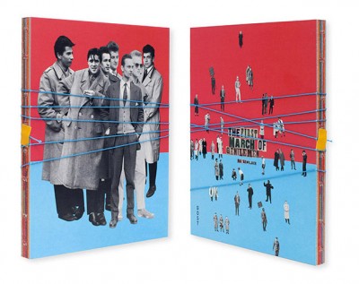
During this time, there were mass rallies do to the government trying to gain more power, which inspired children to march along with the rallies which was an inspiration for Milach’s most well known book, “The First March of Gentlemen”. This book includes photo montages which show the 1902’s children strike, with characters who lived in the communist era. This book allowed him to create archive images.
The Book “The First March of Gentlemen”
The book was brightly coloured and included a long piece of blue string which shut the book together. Inside, lots of shapes and colours which along with the string make it look like a children’s book which was the overall inspiration for the project.
Mood Board of Inside the Book
Photo Analysis
Technical Analysis- After researching about the work, we known that this book was created using archival images with brightly coloured backgrounds. However, we do not know if this has been done digitally or done by hand.
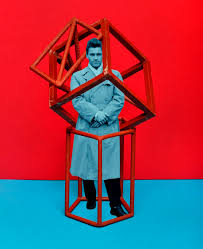
Visual Analysis- Visually, we can see that the man in the image is dressed in black and white which are typically vintage colours which helps to portray the image of an adult. However, the rest of the image is very colourful and the background is half red and half blue. The colouring helps to draw the audiences attention as it is very overpowering. Their has been a geometrical shape used on the outside of the positioning of the man which could be seen as a symbolism of being trapped. The expression on the man’s face is very calm.
Contextual Analysis- This is an image from Rafal’s book which shows political activism.
Conceptual Analysis- Conceptually, a metaphor is being created by the bright colours and shapes in the image which can be seen as quite childish and this is helping to contrast the old, calm man in the centre of the image.
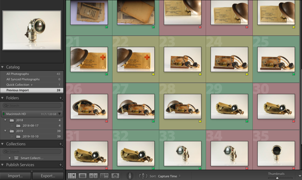
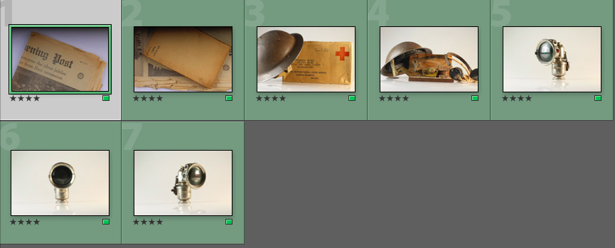
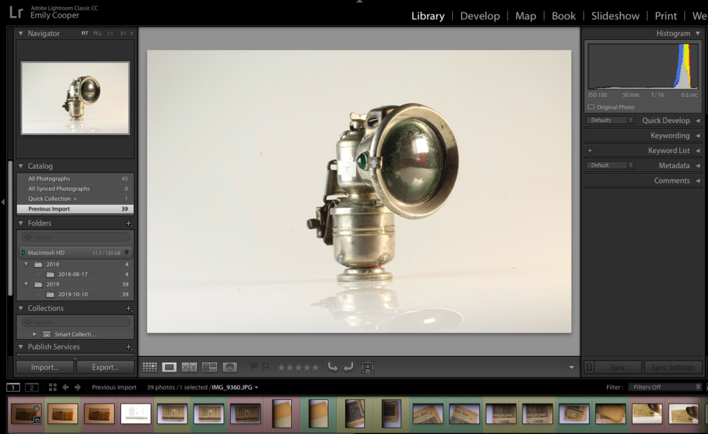
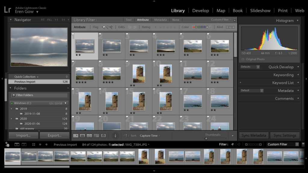
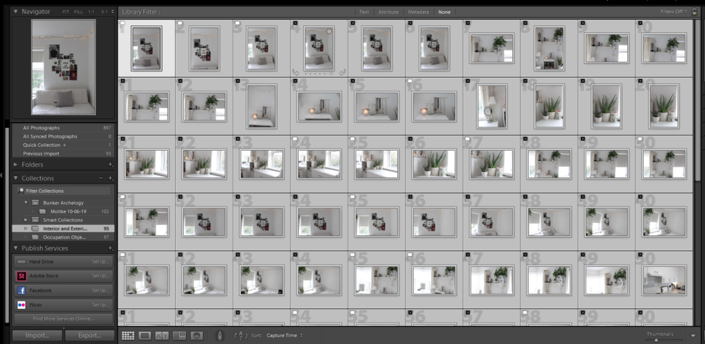
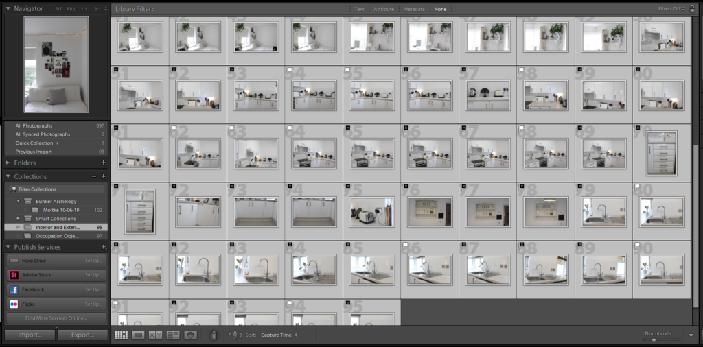
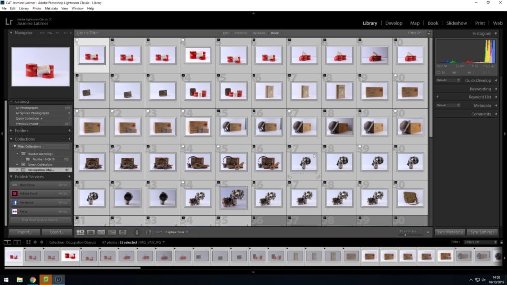
Once I was confident with my understanding of the lights and layout of the studio, I could begin taking photographs of the archival objects that were loaned from the Jersey Archives. I made use of the cameras already attached to the tripods but used my own SD card. After taking a series of images, I came out with the below series (unedited):
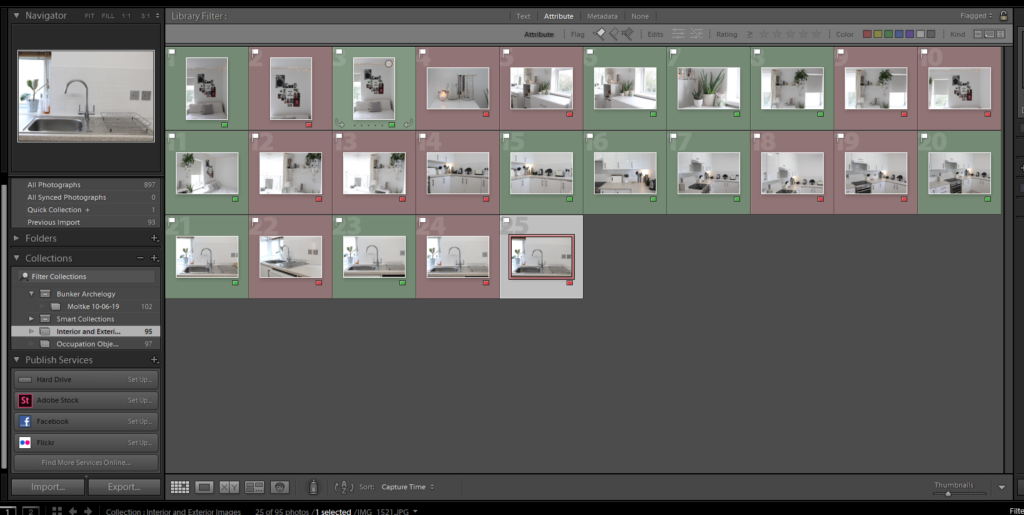
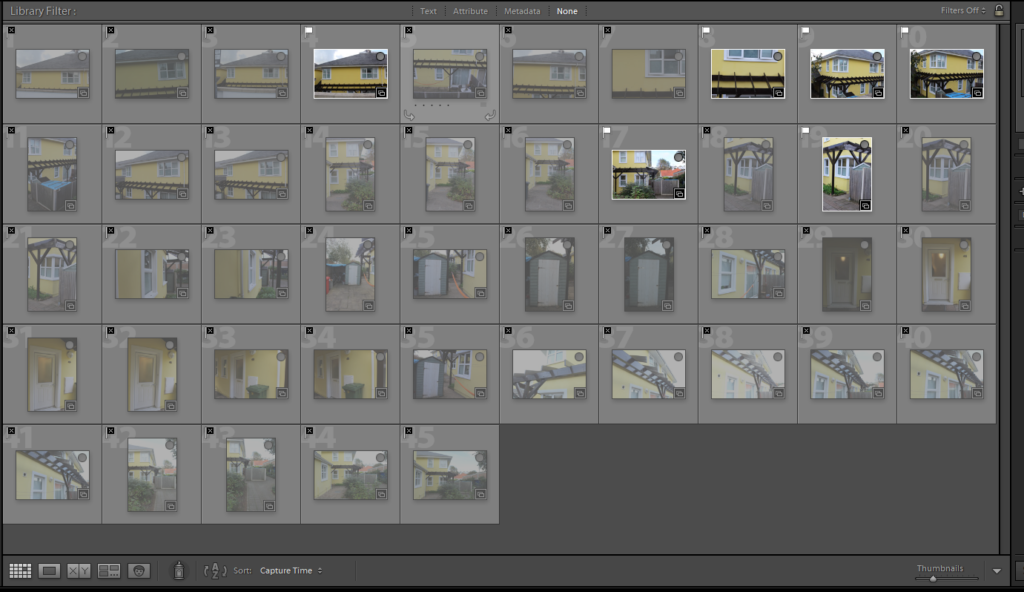
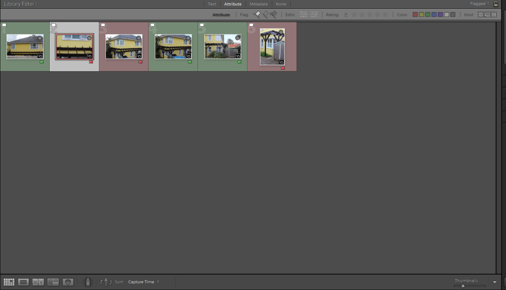
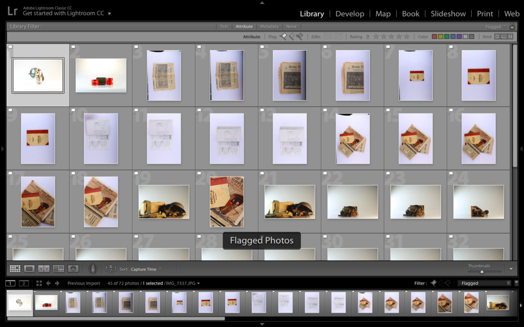
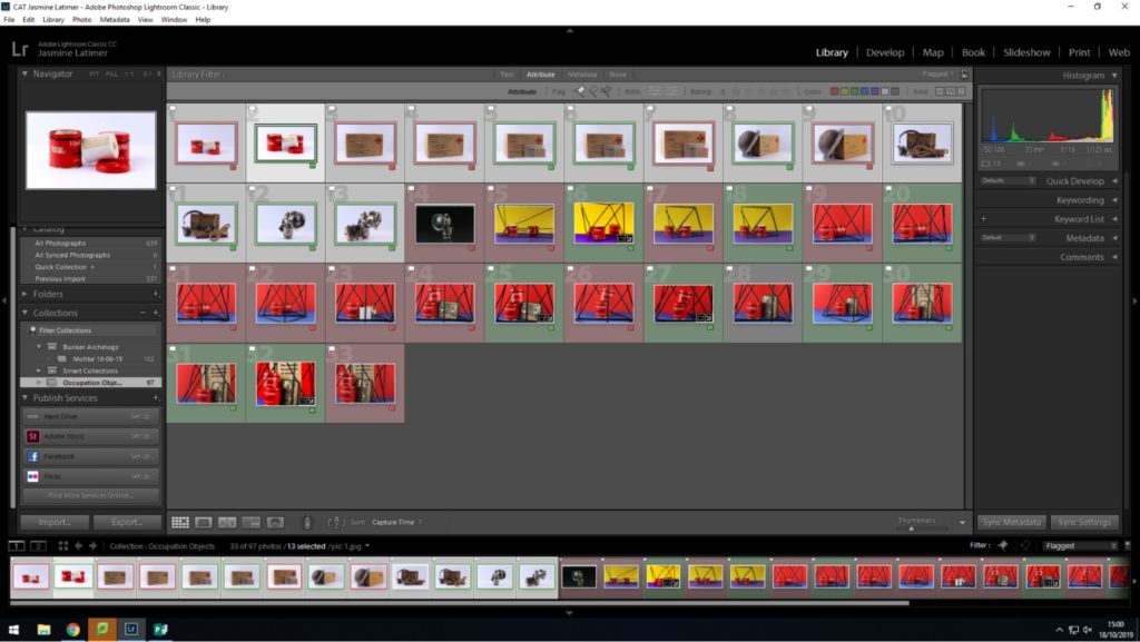
As some of the images were either overexposed, underexposed, or had the wrong composition, I uploaded the images into Light-room, and used the colour option to highlight which images I wanted to use, and which images I would reject. The following screenshot is the collection of all of my images after they had been colour coded:
Key: Green: Final images Yellow: Possible final images (need more editing) Red: Rejected images
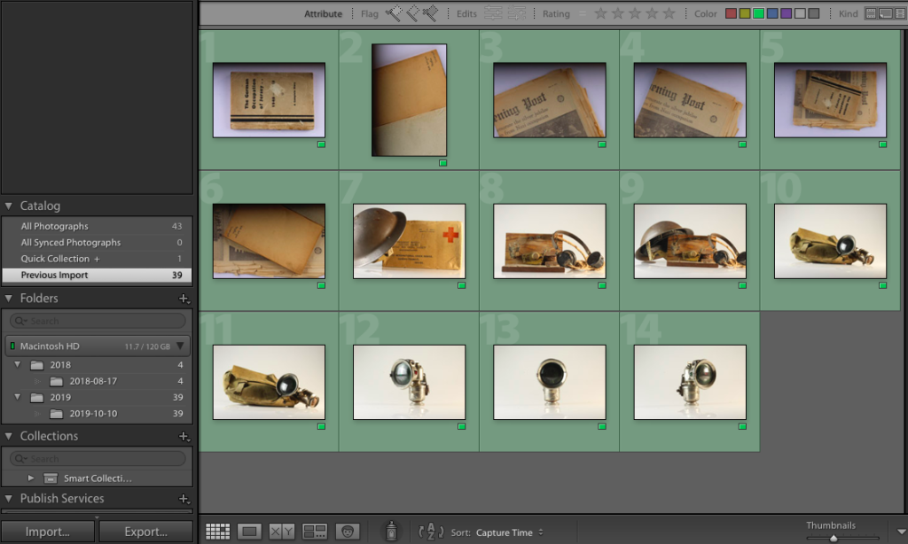
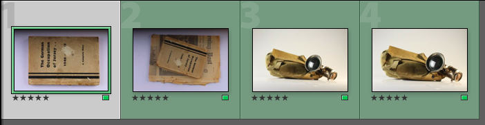
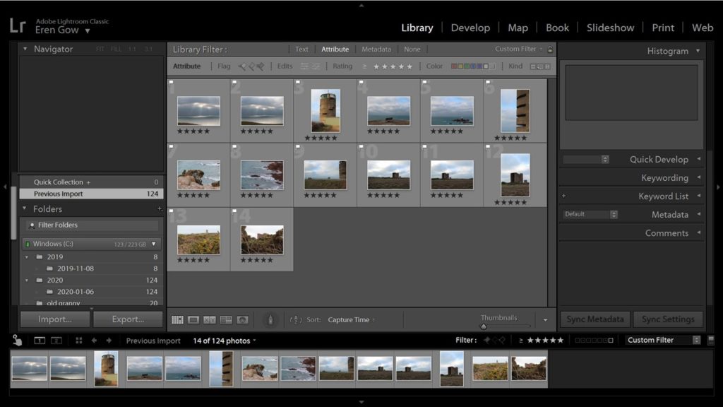
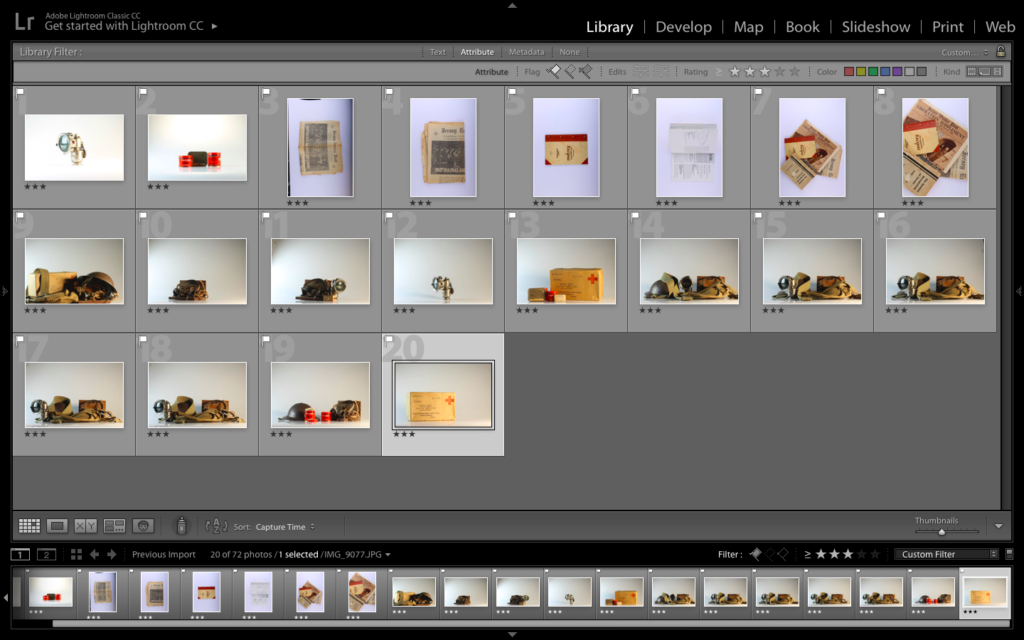
Out of the images I uploaded to Light-room, I only decided to edit 14 of my best (those highlighted green). The final 14 images can be seen below:
I took some of these images with the knowledge I would most likely use them in a series/pattern (for example, the final 3 images are the same object at different angles, which I took under the assumption that I would use them in series)
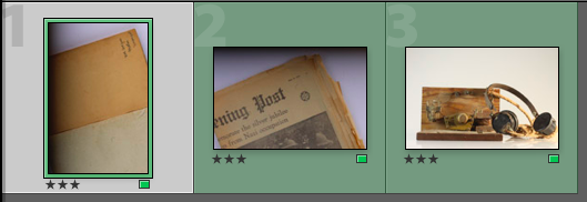
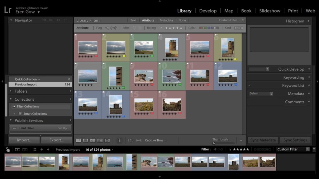
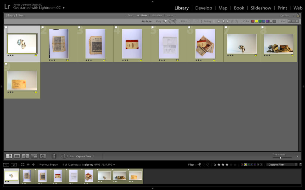
As a further method of rating each image, I decided to rate each of the green images /5 in order to record which images I felt would work best, and which ones I felt needed the most editing during the development stage:
The ratings of the above images ranges from 3/5 to 5/5, showing a variation of images at different levels.
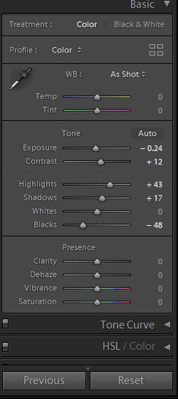
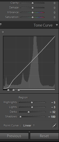
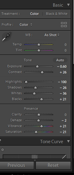
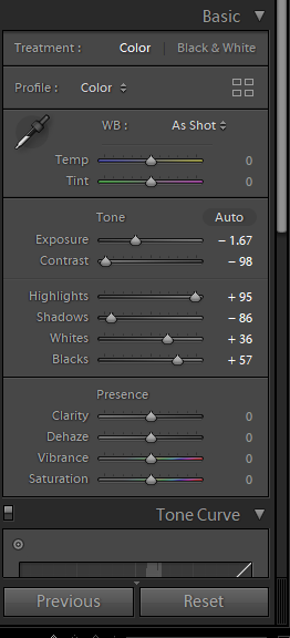
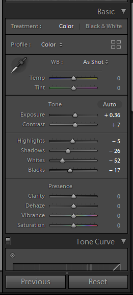
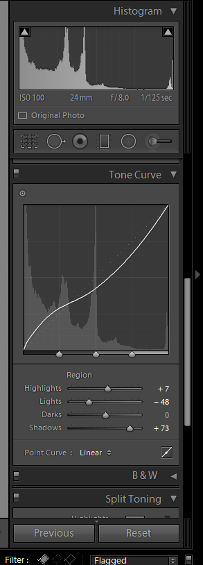
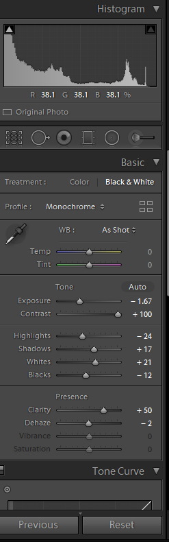
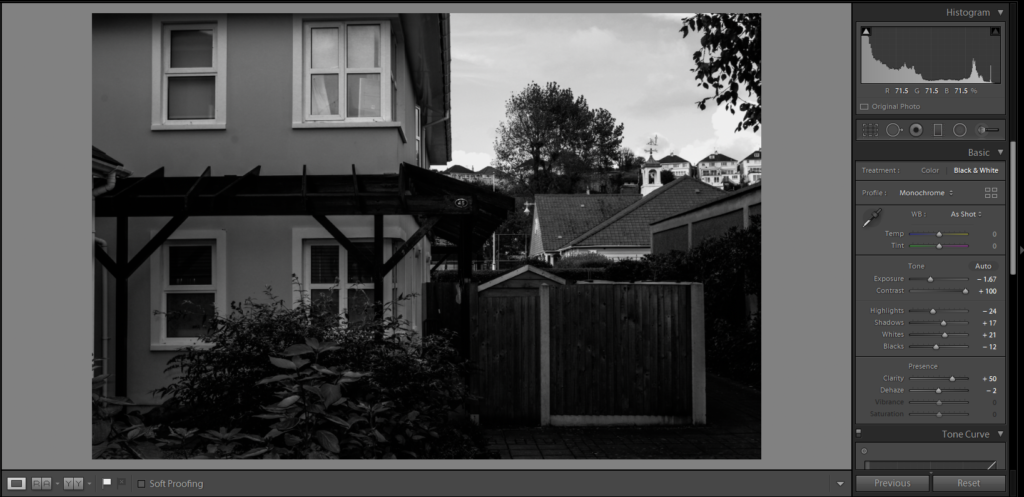
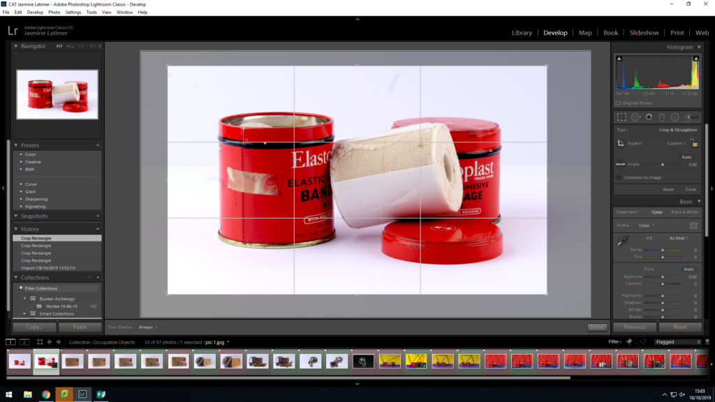
I then began the development process, in which I would edit the images that I had labelled green. I used the Light-room editing software, as I find it more detailed and specific than the Photo-shop software. I found that editing the colour gradients and contrasts of my images would be the most important part of this process, along with altering the orientation of some of the images so that the objects lay parallel to the bottom of the image frame.
This is the layout I used for the editing process of my images
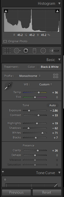
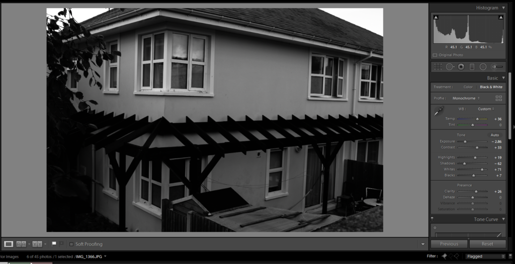
For many of the images, I increased the contrast of the colours in order to produce bolder outlines and harsher colours. I felt that this helped to make the images appear more sharp and clinical, and gave harsher outlines and contrast in the colours and shadows. I decided to do this as I feel this harsh, sharp appearance reflects the atmosphere of the occupation, as the occupation of Jersey can be seen as a harsh and cruel event that made the lives of the occupants of the island much harder.
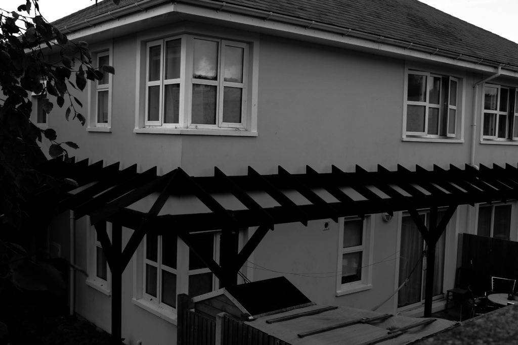
This is an example of the outcome of an image that I increased the contrast on.
I also increased the highlights of this image in order to bring out the contrasting lighter colours, and I reduced the shadows to get rid of the darker effect to the right of the image, caused by a lack of studio light.
Furthermore, I decided to increase the clarity of some of my images. I found that by raising the clarity, the clarity of every small damaged area/detail was emphasized, making the objects of each image look more worn and used. I decided to use this on a range of occasions to emphasize the time difference between now and the occupation, and to emphasize that, although these objects represent a time man years ago, the implications of this event is no less relevant.
Here is an example of an image in which the clarity is heightened, and the vibrance is lowered
I also decided to lower the vibrance of some images, as I found that this reduced the vibrance of the colours, and therefore provided a much more bleak image (which reflects the mood of the occupation more)
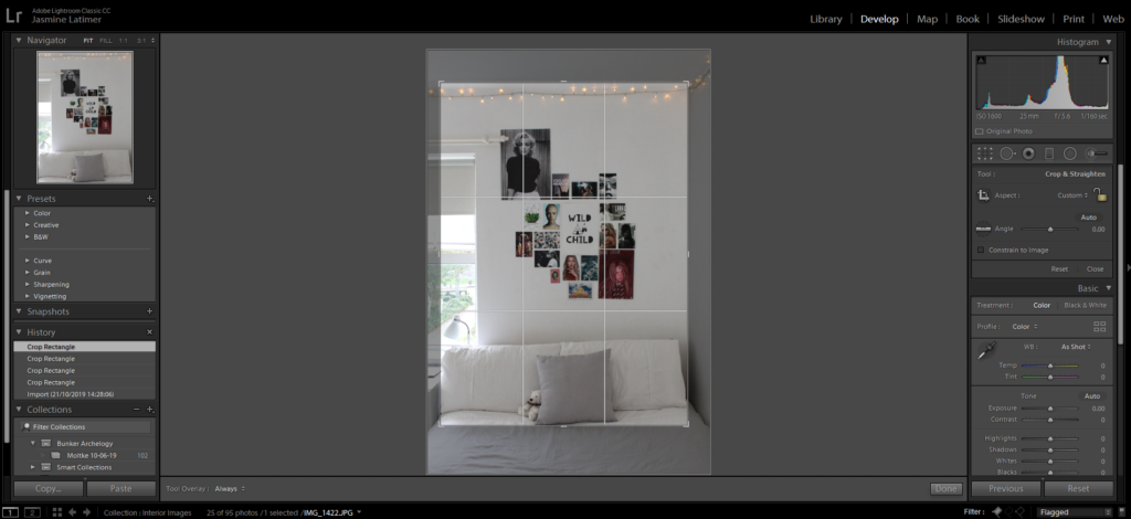
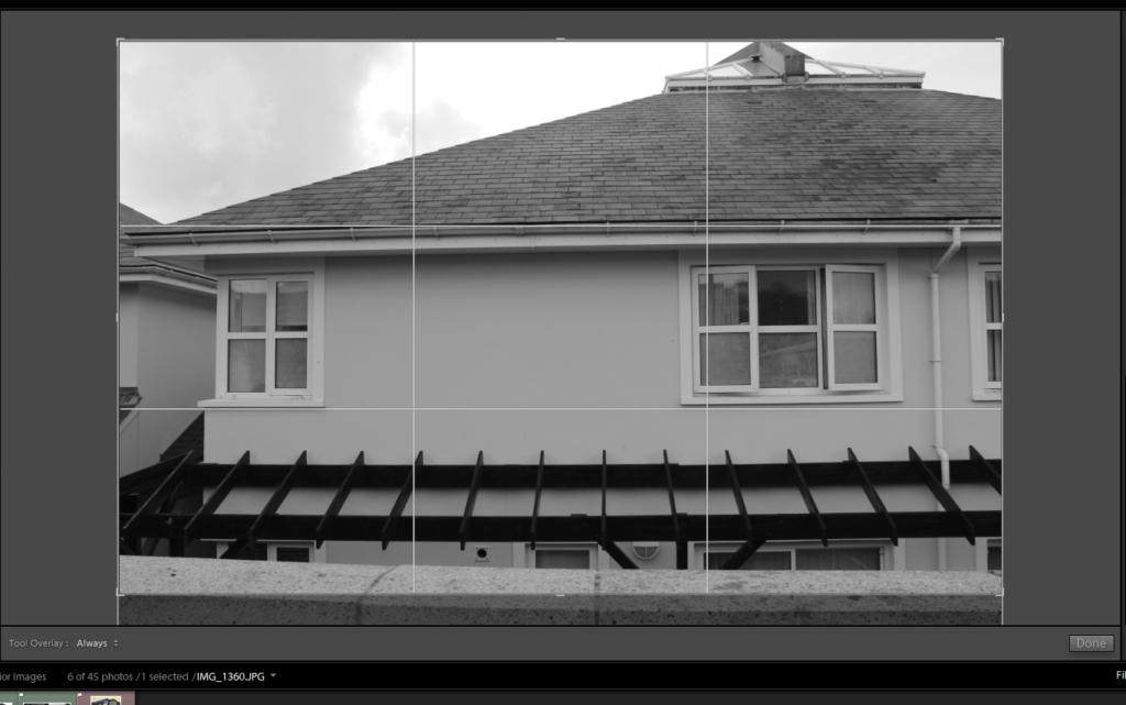
I also adjusted the orientation of some of my images, as the way the tripod was set out meant that the camera took some of the images at a slight angle, meaning the lines of the objects were not parallel to the bottom lie of the image frame. I found this to be a small issue which could have reduced the viewers focus on the subject itself, as their attention may instead have been drawn to the conflicting angles at the bottom of the image. I altered this using the crop option found on the tool bar at the side of the screen, and simply rotated the image until the lines were parallel:
Here, I had to rotate the image so that the object did not appear to be at an angle
I rotated this image so that the base line of the object was parallel to the bottom of the frame
After the editing process, I was able to save the below images as my final images:
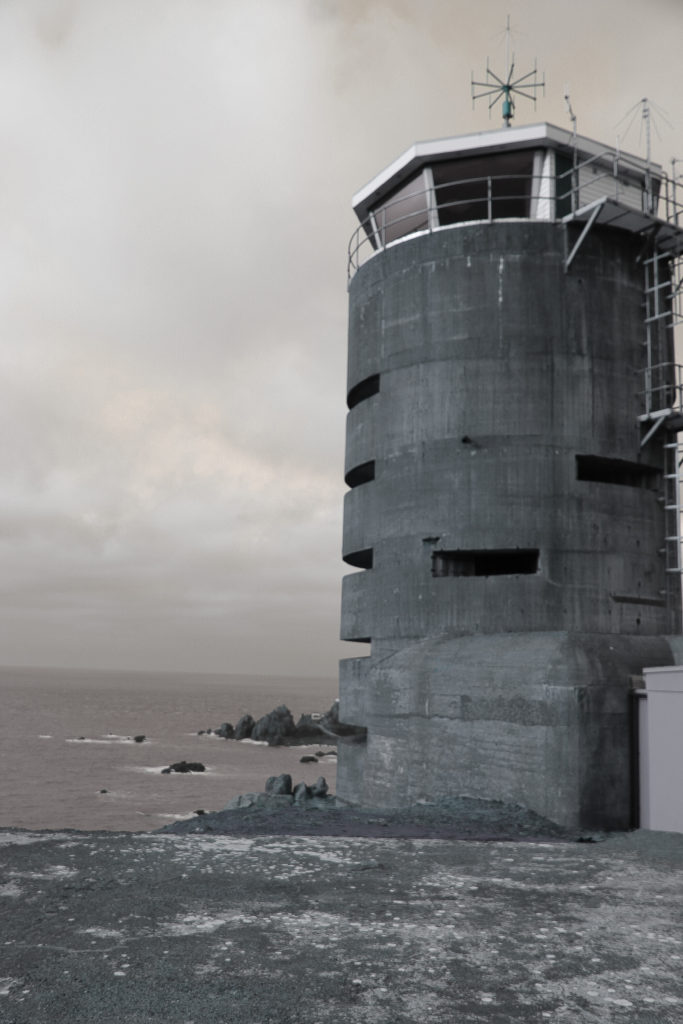
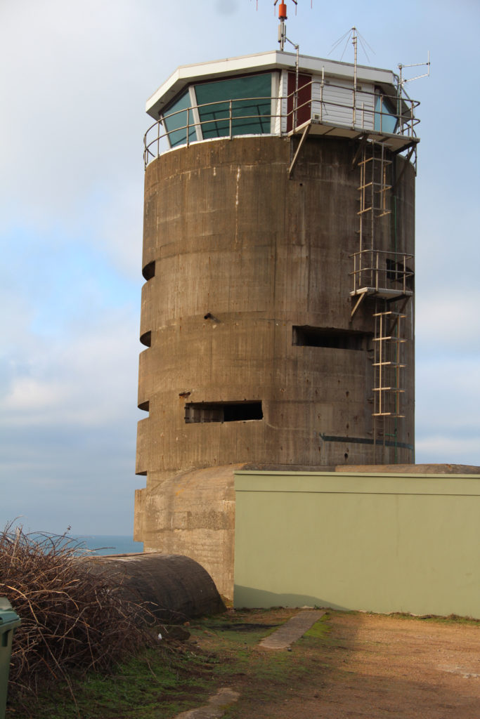
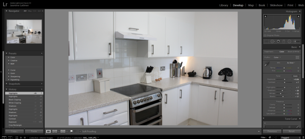
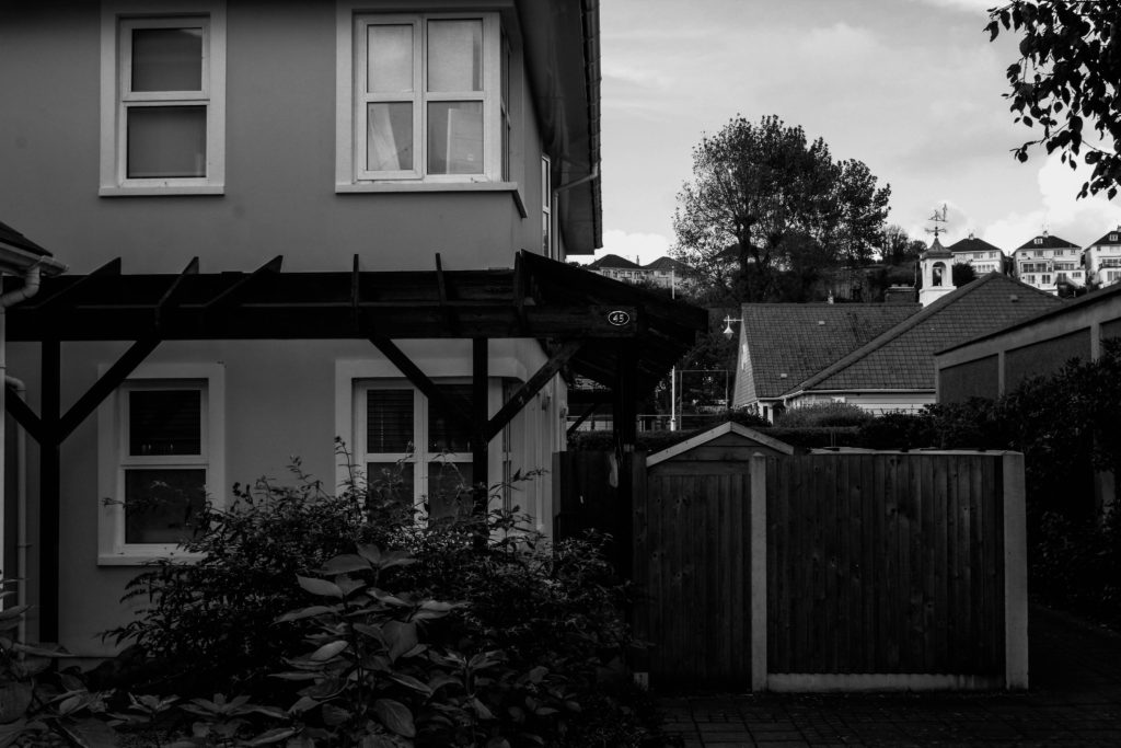
After visiting the different bunkers around the island and having different opportunities to further my photographic understandings and capabilities when capturing historical land marks, it was time to investigate by myself and explore other significant landmarks on the island. I did some research on historical bunkers around the island and decided on the features down at Corbiere Saint Ouens. For this shoot i decided to shoot during the day as i know their are lots sea views and wanted the chance to possibly get some imaged where the sun is reflecting off the ocean. So on a Sunday afternoon i drove down to the lighthouse and took my images of the bunkers, the lighthouse and the tower; when i returned home i put al my images on my computer and opened them upin Light Room Classic which enabled me select my best images and categories them in star rating which helped me slim down my choices for the final image selection.
MY FINAL EDITS:
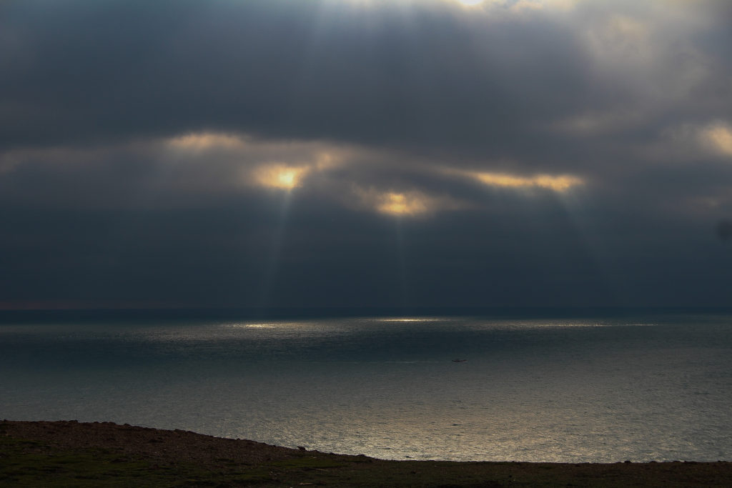
For this image I wanted to highlight the significance of the sunbeam seeping in through the clouds and reflecting off the ocean, to do this i darkened the clouds and lightened the sun rays which help contrast them against each other.
For the two above pieces i wanted into reflect the old and the new, from the beginning to the end of the Second World War and show the significant features that are laid on our ground and continue to show the history that the island went through during that time period. Furthermore, I presented this idea through having one of the images in a much darker colour using black and white shade along side a background of warmth which adds more feeling and thought to the picture; compared to the opposite image which has lots of colour and warm radiating from the natural sunlight.
I liked this image a lot and decided to include it in my final collection as the focus of the image is on the tree and the rocks are blurred which I believes gives an enticing contrast and makes it original from the rest of my images
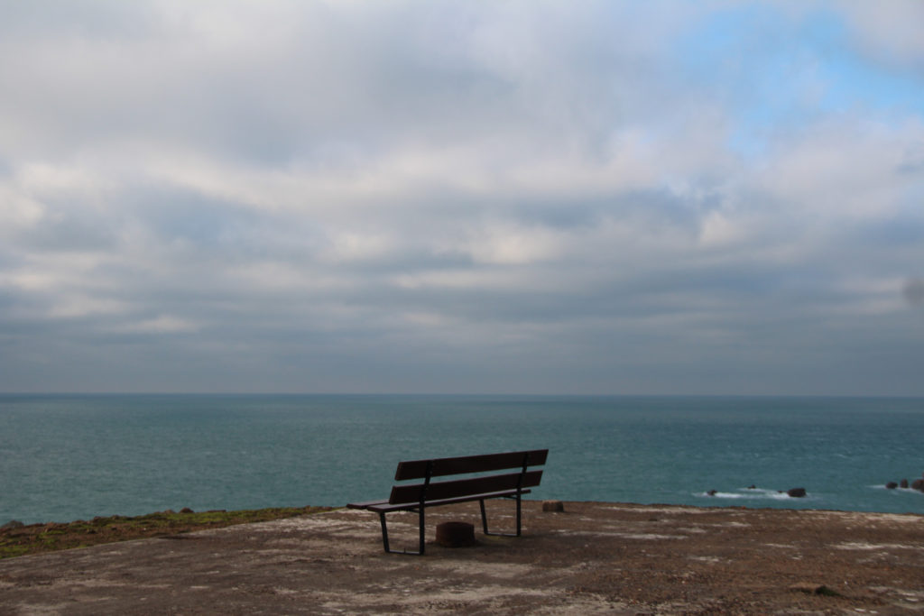
For this particular image I liked the idea of the isolation of the bench and the idea of looking out to a infinity of ocean and help point out historical meaning of what it may have felt like to be part of the Second World War
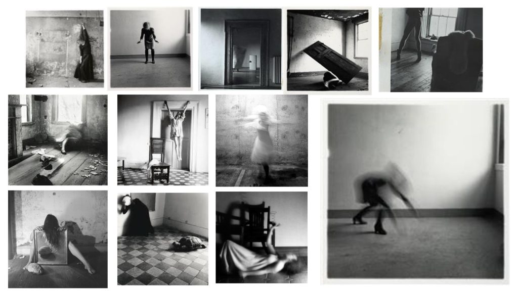
Francesca Stern Woodman was born in 3rd April 1958 and died on the 19th January in 1981, and was an American photographer and was best known for her work based around black and white images using her self in self portraits or a female model to represent herself. In her images they were often blurred this was due to the movement of the model and the long shutter speed, and the subject would often start to merge with the background and surroundings of the image or faces and appearance would often be fairly obscure. From her personal life its important to consider her struggles that she experiences, in the late 1980, Woodman began to shows signs of depressions which was due to the consistent failure of her work to attract attention which was produced from a broken relationship, this was where she survived her fist suicide attempt in the Autumn of 1980 when in Manhattan. Tragically on January 1981 Woodman jumped out of a loft window at the age of twenty-two and died. ‘An acquaintance wrote, “things had been bad, there had been therapy, things had gotten better, guard had been let down”. ‘ Davison, Peter. Girl, seeming to disappear. Atlantic Monthly, 2000 May;285(5):108–111.
MOOD BOARD:
Visual:
Francesca Woodman’s images are always portrayed with such a strong once looking at them. In this image you see an empty room which some what looks dirty with the walls being marked. The room gives off a cold feeling and lonely feeling with the image of the woman, doing what looks like reaching down to the floor. However her whole figure is distorted and blurred so you are unable to see any feature of her body or face. Although her shoes are still in fair quality this will be down to the fact she hadn’t yet moved when the photo was being taken. By being able to see her shoes it implies a woman is being photographed due to the high heels that are worn. The woman is positioned to the left of the image and what feels fairly manipulated to be presented as far away from the camera right up near the wall.
Technical:
In this image there is a clear representation of shadows being produced this could have been effected by natural daylight shining in through the window. The main focus of the image is the woman who is located on the fair left and positioned far back at the wall from the camera. It’s clear that for this image to have the appearance it does the camera must have had an extremely low shutter speed in order to create the blurriness of the figures movement. To me this image is displaying a mixture of texture with the wall and floor almost feeling gritty and unsmooth compared to the figure who is over ‘’smooth’’ in the sense that there are no lines or clear outline to the woman creating a distorted feeling to the image.
Conceptual:
How does this image make you feel? The image present the feeling of loneliness this is represented through the feeling of the rustic empty and oversized room. With then only one distorted figure cramped in the order. Her movement almost like she’s trying to break out from that corner and start to spread out. The blurred figure gives the feeling of rushing that she was moving fast, possibly wanting to get away from something- the loneliness?
Contextual:
From research it is clear that Francesca Woodman ad a hard and what she felt dark. With loving photography so much and no one else appreciating it like she did. The idea of the loneliness in this image could be portrayed as Woodman emotions of her own work the idea that she was alone with no one else to look and view her work.
The definition of ‘Interior’ is the inside of something, eg a house. ‘Interior Design’ also relates to this as it is the art/science of enhancing the inside of a building to achieve a healthy and aesthetically pleasing home.
Interior Photographer- Laura Blight
Laura Blight is a visual artist/ photographer who works and lives in London, but comes from Essex. She adopts an intuitive approach to image making where people are absent and she gives a strange everyday look to images. Blight studied at ‘Middlesex University’ 2007-2010 where she got her BA Cons in Photography, and later on went back to study her masters at the ‘University of the Arts London’ where she received a Distinction.
Laura is currently participating in the ‘Collective Strategies’ programme which is based in London, along with the ‘Hemera Collective’ which she was selected for and develops concepts in a group where they all work together to create a new work for the group show, presented in October 2019.
Most of her individual work is about photographing the difference between domestic and undomestic environments in order to create strange everyday images.
Laura Blight’s Image Moodboard
Her Style..
Takes images of Domestic Household Items
Has a white aesthetic following throughout
Quick shutter speed for fully focused images
No depth of field used
Main focus of image usually in centre
Analysation Image
Technical Analysis- Technically we can see that a good quality camera has been used to take this image, as well as a quick shutter speed being used for the photo which was around 1/250 as it is a fully focused image which has no depth of field to it. It is also suggested that a low ISO must have been used as their is no grain in the image. The overall exposure of the image could have also been high because of the amount of light being let into the image, making it a well lit image. It is suggested that a natural lighting has been used for the photograph due to the even colours in the image.
Visual Analysis- Visually we can see that this is a colour image with two chairs in the centre of it, one white and one wooden. A worn out purple carpet is laying on the floor which if you look in detail you can see that it hasn’t been cut very accurately to the wall. They’re is a white and flower print wall paper on the wall , as well as a radiator in the background of the two chairs.
Conceptual Analysis- Conceptually, the two different coloured chairs is suggesting to me the old and new in a house. Due to this project photo being from the project ” House Clearance” this along with this picture are creating a mood of old and new. However, in comparison to the carpet, we can see that inaccurate cutting has been done to the carpet, suggesting the oldness in it.
Contextual analysis- This is an image from her “House Clearance” shoot which is posted on her website, along with other projects.
Planning my Photo Shoot
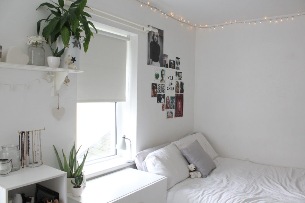
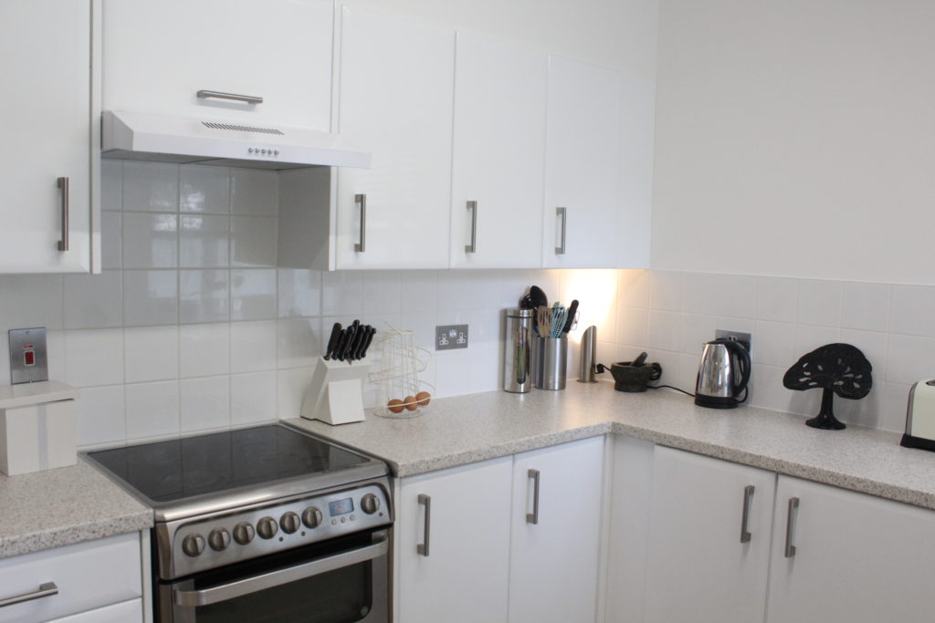
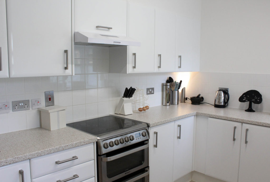
For my photo shoot I will be taking images with heavy inspiration from the photographer above, Laura Blight. I will look into domestic objects in a household which will be done with a personal manner as I will take the images of my own home. Locations I plan to use will be my bedroom, as well as my family kitchen. Laura’s style includes a lot of white backgrounds and she keeps to an aesthetic throughout her photography pieces, therefore I will follow these elements and have chosen to use my bedroom and kitchen as the focuses of the images as they include a lot of white elements in.
On Laura’s website, she has a number of different titles for different projects of hers, after going through a couple of them I have decided that in order to focus on the ‘Interior’ of a home I am going to follow her photoshoot named “House Clearance”. This project shows plain rooms with a small amount of objects In which helps an convey an image. She uses different depth of fields throughout which also will allow me to be able to have freedom with the photos.
I plan to use Manual Focus on a Canon Camera, due to the location being inside, I will set my ISO to 1600, the F stop to around F.5/F.6. Their will be a shutter speed of 1/250 to allow light into the image which will contrast with the auto focus white balance which will help to create an evenly balanced image. The overall Manual Focus setting will allow for me to have freedom with zooming in and out of objects, as well as experimenting with the depth of field.
Process of Elimination
These are all images from my coloured photo shoot. In order to get the best images out of the shoot i have flagged the images which i think are the best out of the shoot and will later colour code them.
These are all images from my coloured photo shoot. In order to get the best images out of the shoot i have flagged the images which i think are the best out of the shoot and will later colour code them.
After selecting my best images using the flag tool on Light room, i have now gone and colour coded my overall best unedited images. The best images are coded green, while the eliminated ones being red. I will edit the green coded ones.
Planning my Editing Process
I am very happy with how my images turned out. However i do feel as if there are elements such as the overall size of the image which I would like to crop, as well as simple edits which will allow the images to have an aesthetic like Laura’s do.
I will use Adobe Lightroom Classic in order to edit my photos and will also screenshot my process.
Editing my Photos
I firstly cropped my image to ensure the picture wall was at a position I liked.
This is the overall edit process I used.
These are additional edits I added to my image.
Image after edits.
Final edited image.
I firstly cropped my image to ensure there was no unnecessary wall in the image.
This is the overall edit process I used.
Image after edits.
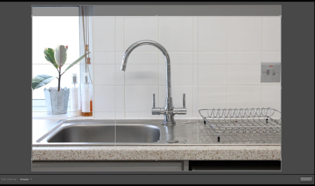
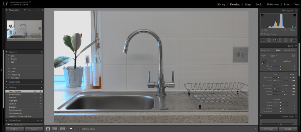
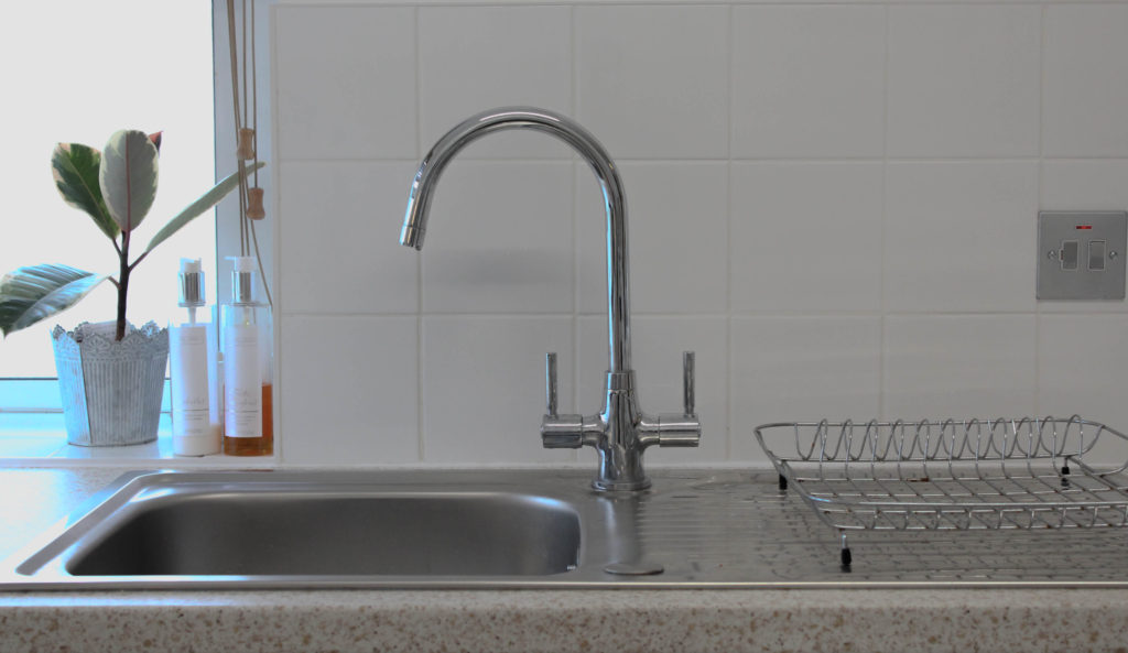
I firstly cropped my image to ensure the tap was in the middle of the image.
This is the overall edit process I used.
Image after edits.
I firstly cropped the toaster out of the image as I felt as if it ruined the aesthetic in the image.
This is the overall edit process I used.
Image after edits.
Best Edited Images
Technical Analysis X4 – I used a Canon Camera on a Manual Focus setting, the ISO was set to 1600, the aperture being F.6. There was a shutter speed of 1/250 which allowed light into the image. The white balance was set to the auto setting and I included no depth of field in ant of my images.
Visual Analysis- Visually we can see that there is a white aesthetic in this image which is a representation of Laura’s work. There is also not many unnecessary objects In the image which again is linking to Lauras style as it is very simplistic.
Edits- I mainly made small edits to the image such as the Exposure, Contrast, Highlights, Shadows, etc. This was all in order to ensure their was an aesthetic going throughout and the images linked to the influences work.
Comparing Unedited and Edited Images
What is Exterior?
The definition of ‘Exterior’ is the outside of something, eg the outside of a house, building.
Exterior Photographer- Robert Adams
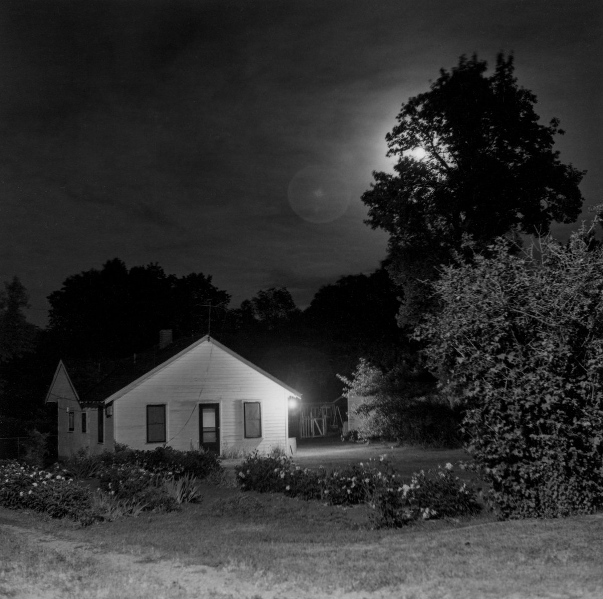
Robert Adams was born in 1937 in the location of New Jersey and is known for his photographs of the Modern American West. He revisits the classic collection of nocturnal landscapes which he takes near his home in Longmont, Colorado. He published all images in this area in a book called “Summer Nights” which he started working on in the 70s and was finally published in 1985, 15 years later.
Adams won the Spectrum International Prize for Photography and the Deutsche Borse Photography Prize for his many books. Some of the most well known photographic books of his are ‘Summer Nights’ (1985) , ‘Missouri West (1980), ‘Beauty in Photography (1981), as well as ‘New West’.
Robert Adam’s Image Mood Board
His Style…
Images taken at nighttime
Black and White Effects used
Landscape images
Heavy Contrast in some images
Quick Shutter Speed
No Depth of Field used
Non-Grainy images, ie low ISO used
Image Analysis
Image from his book series “Summer Nights”
Technical Analysis- Technically we can see that this is a fully focused image, meaning a quick shutter speed would of been used and had a setting of around 1/250. There is also very little grain to the image suggesting a low ISO would have been used. I cannot figure out the exposure of the image due to the black and white edit.
Visual Analysis- Visually, we can see that there is a house on the left hand side of the image and this is an overall black and white edited image. There are also trees and grass included in the image showing nature and also helping to give a dark vibe to the image because of their shadows. The black and white edit used is helping to create light and shade in the picture, showing contrast between the light house which is painted a light colour, with the surroundings of dark trees.
Conceptual Analysis- Conceptually, I think that the use of the black and white effect in this image is allowing for a debate to be opened up around the light and shade.
Contextual Analysis- This image is from the picture book “Summer Nights” which was published by Robert Adams in 1985. The images are taken from around his come in Colorado.
Planning my Photoshoot
After looking at Adams work, I have decided to use his photo book “Summer Nights” as my inspiration for my Exterior images. I will take pictures at night and will experiment with using street lighting as well as flash photography in order to take pictures of my home.
I plan to use Manual Focus on a Canon Camera, due to the location being inside, I will set my ISO to 1600, the F stop to around F5. Their will be a shutter speed of 1/250 to allow light into the image which will contrast with the auto focus white balance which will help to create an evenly balanced image. The overall Manual Focus setting will allow for me to have freedom with zooming in and out of objects, as well as experimenting with the depth of field.
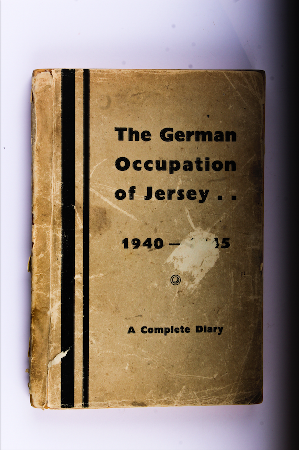
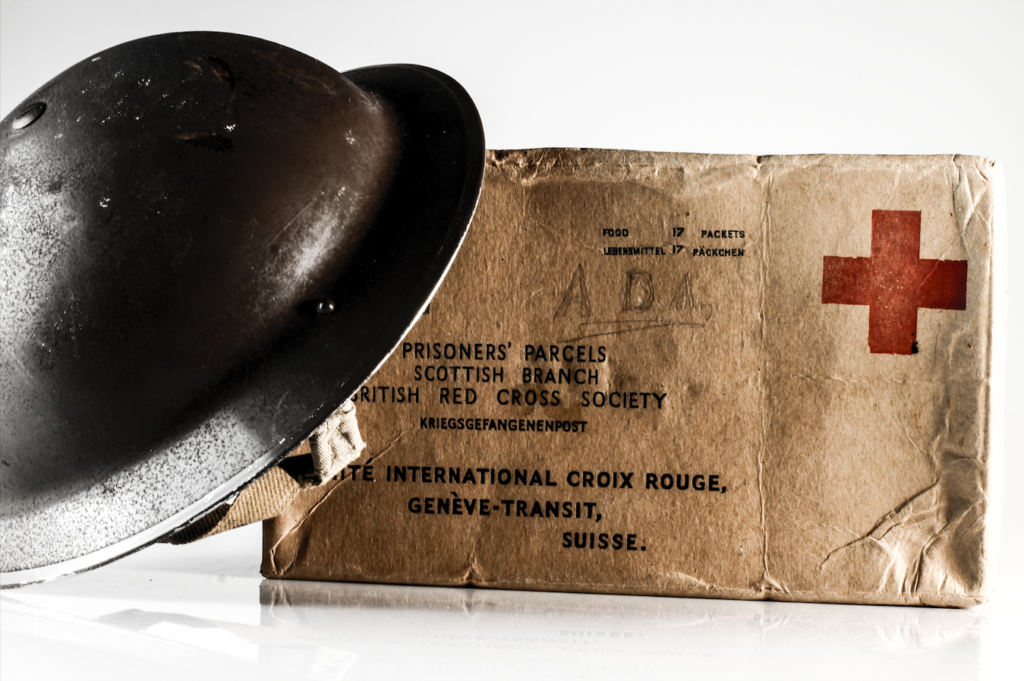
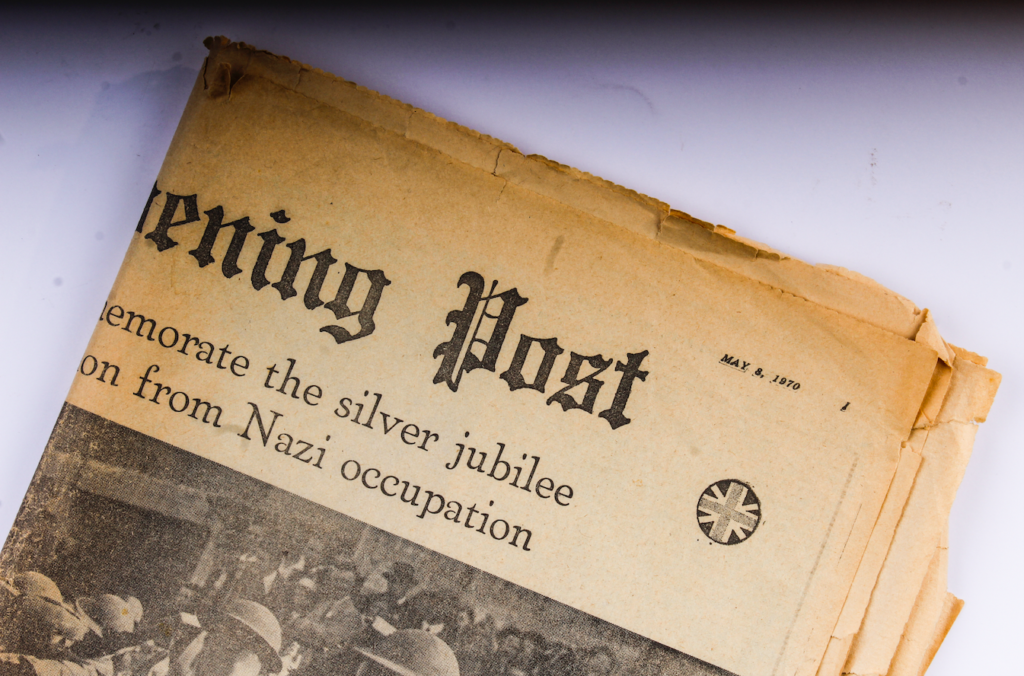
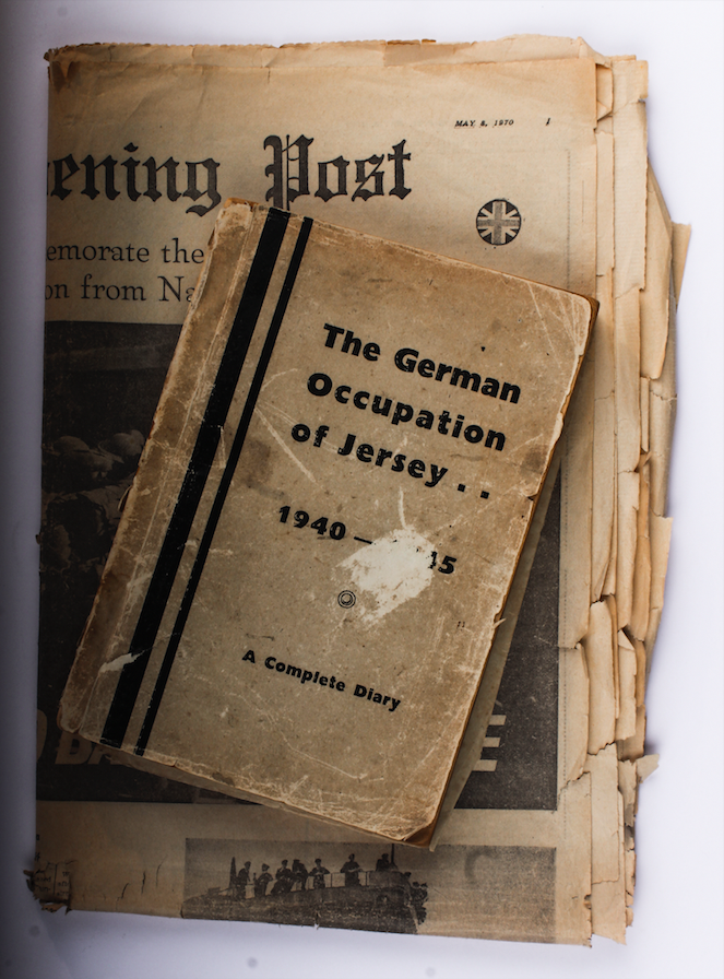
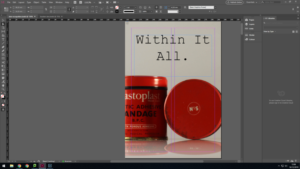
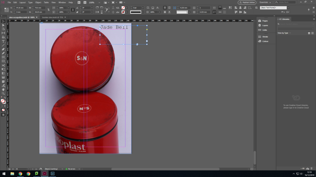
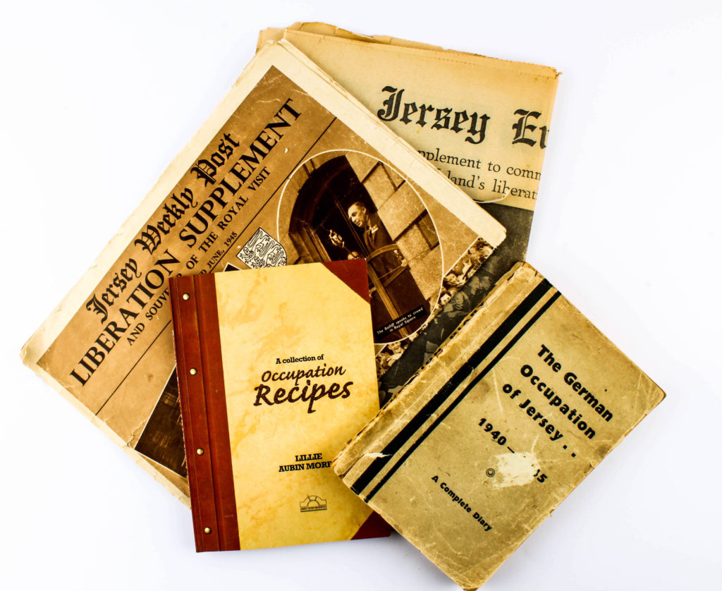
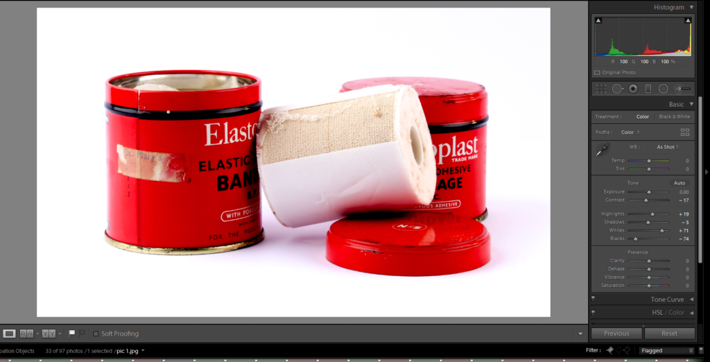
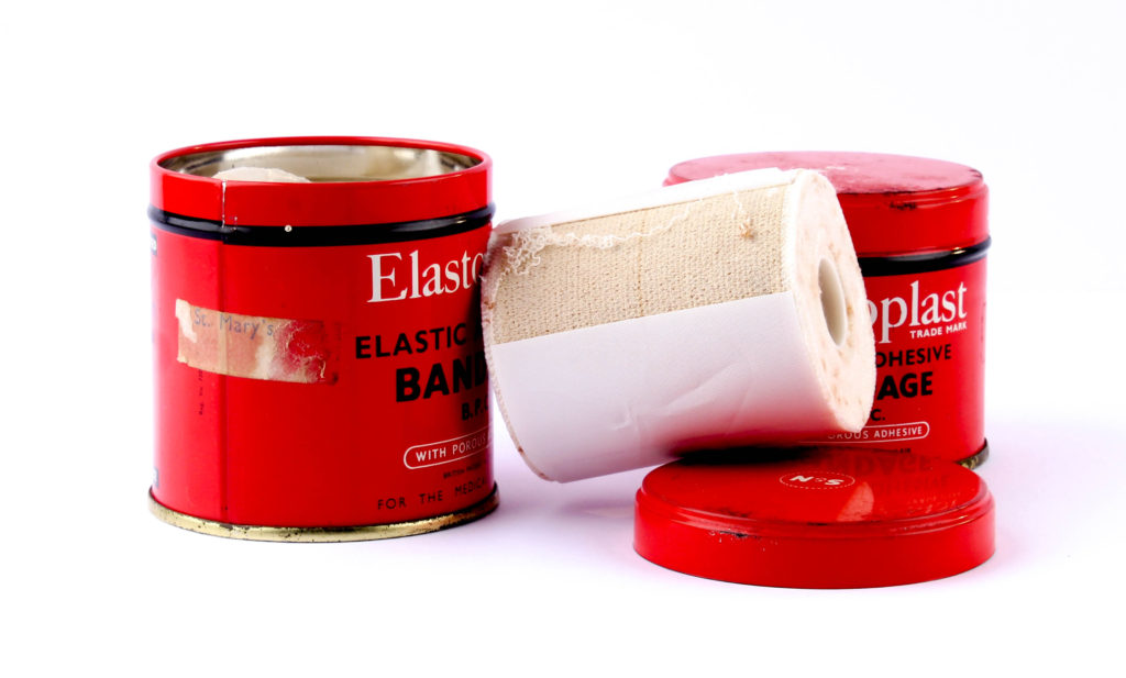
The title ‘Within it All’ suits my zine narrative as it is about living amongst chaos. For the typography I have used ‘New Courier’, I chose it as it looks like type writer font, which would have been used by people at the time of the war to document daily life. My front cover features a bandage from the time of the occupation, it represents the start of the occupation and how a lot of damage was about to be caused.
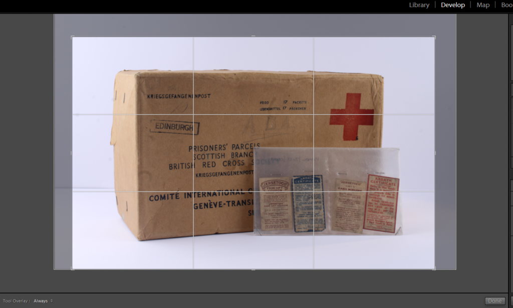
This is my first double page spread and features a photo-montage. The first step was taking a photo of the Archive’s occupation diary, then I trimmed an image of the Radio Tower during the occupation and placed that layer on top of the diary. This montage emphasizes the importance of historic documents and stories. The Radio Tower symbolizes the diaries context coming to life and educating us on Jersey’s past, without writing these bunkers wouldn’t have a narrative. It fits into my narrative as signifies the start of the people of Jersey’s new story in life.
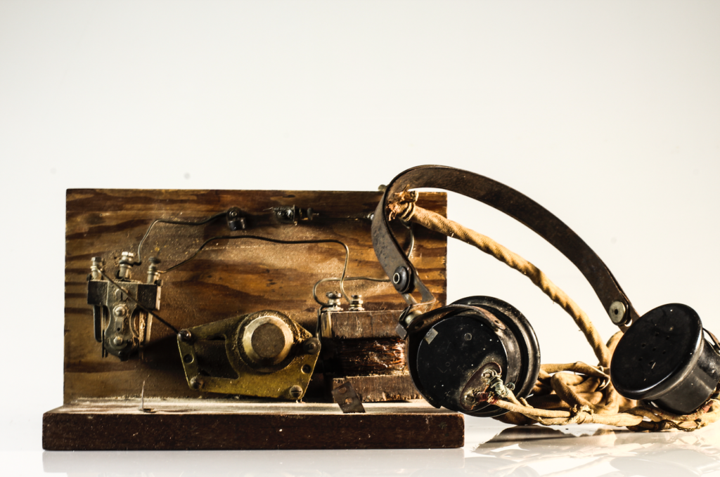
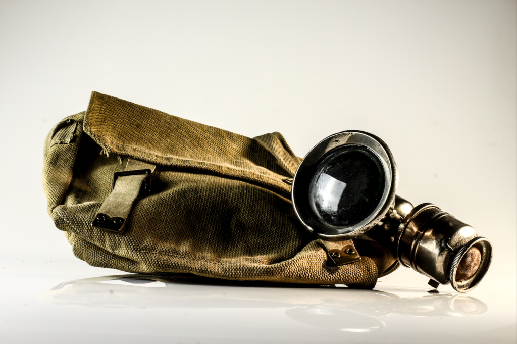
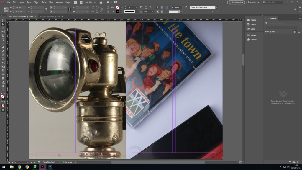
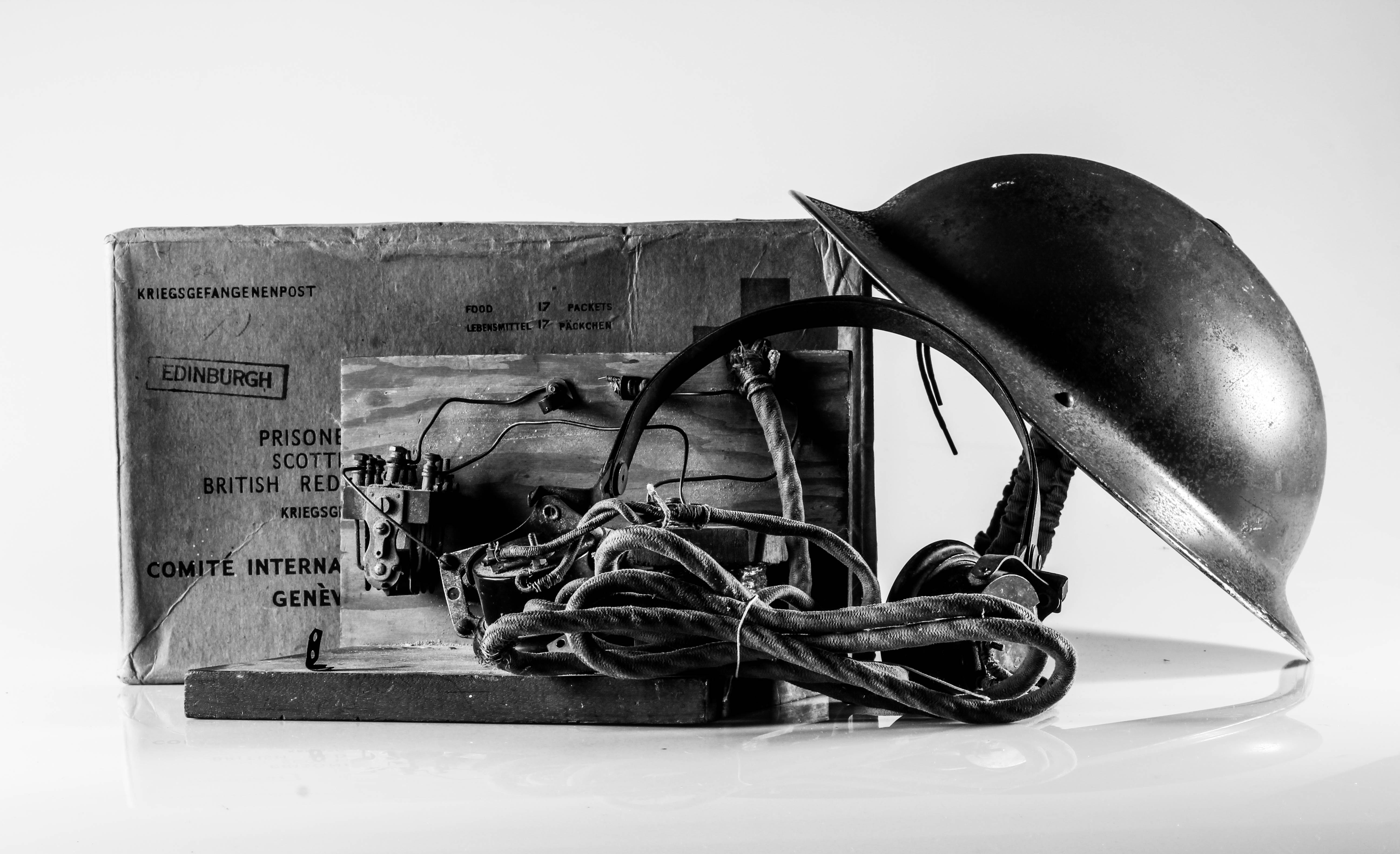
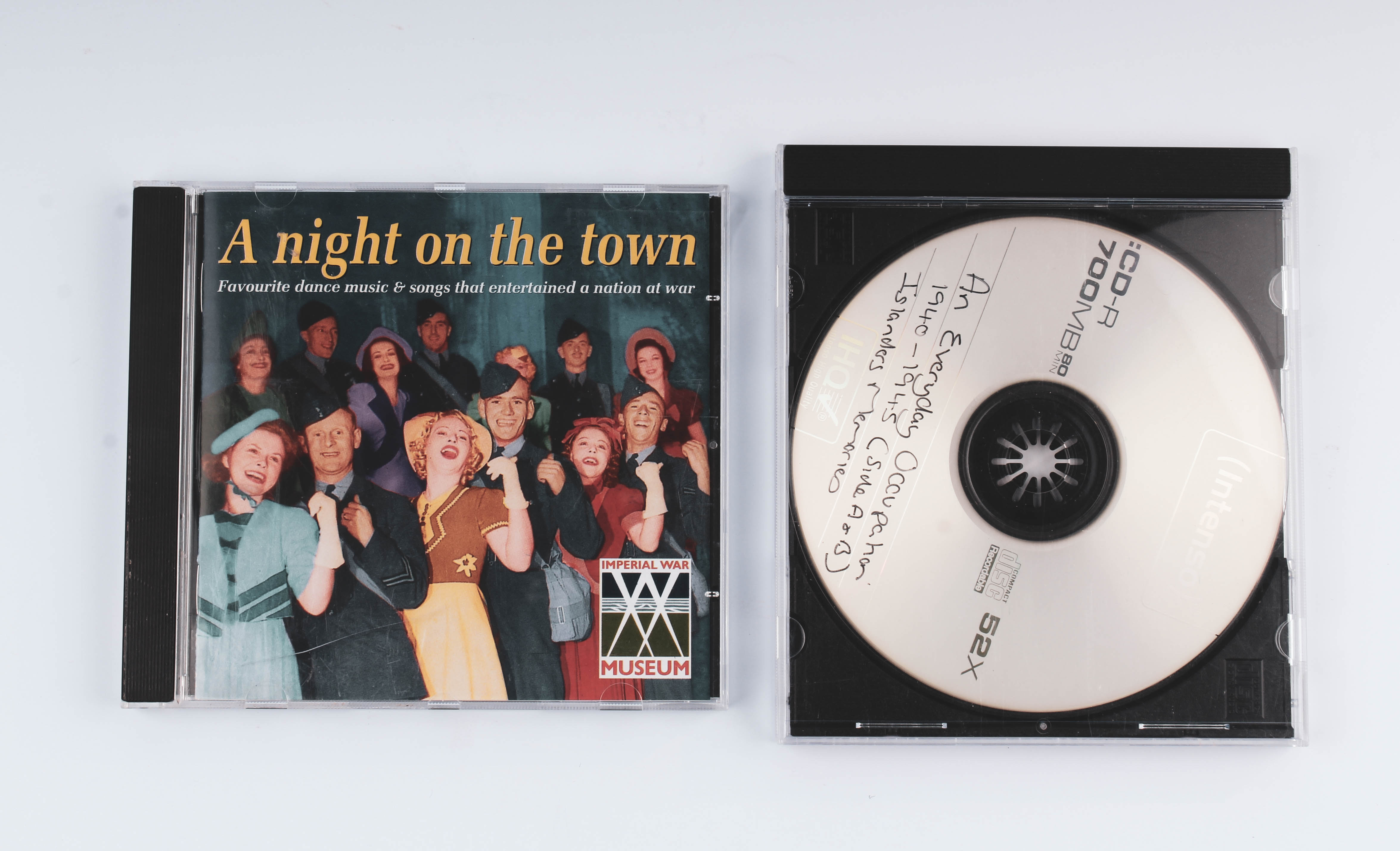
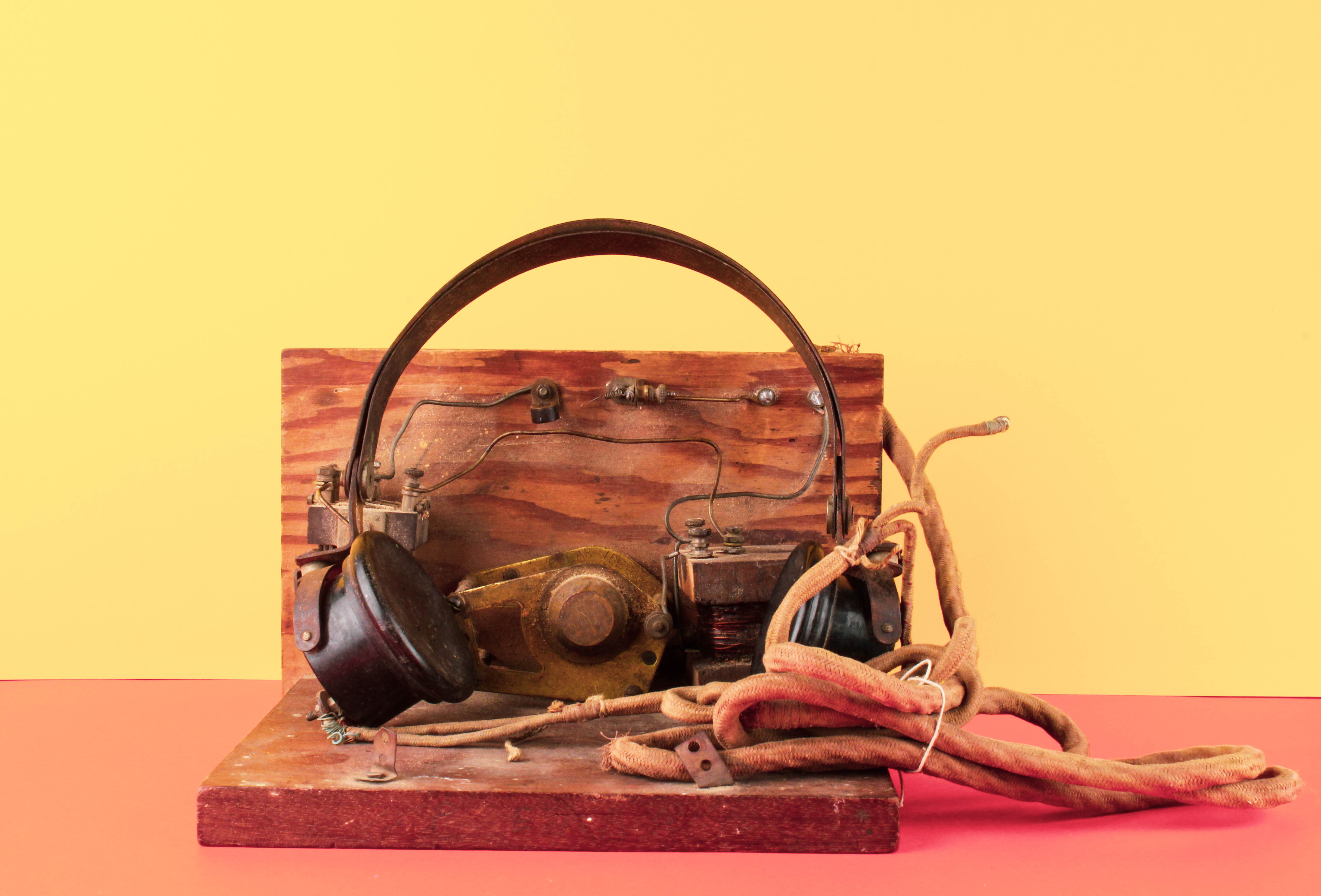
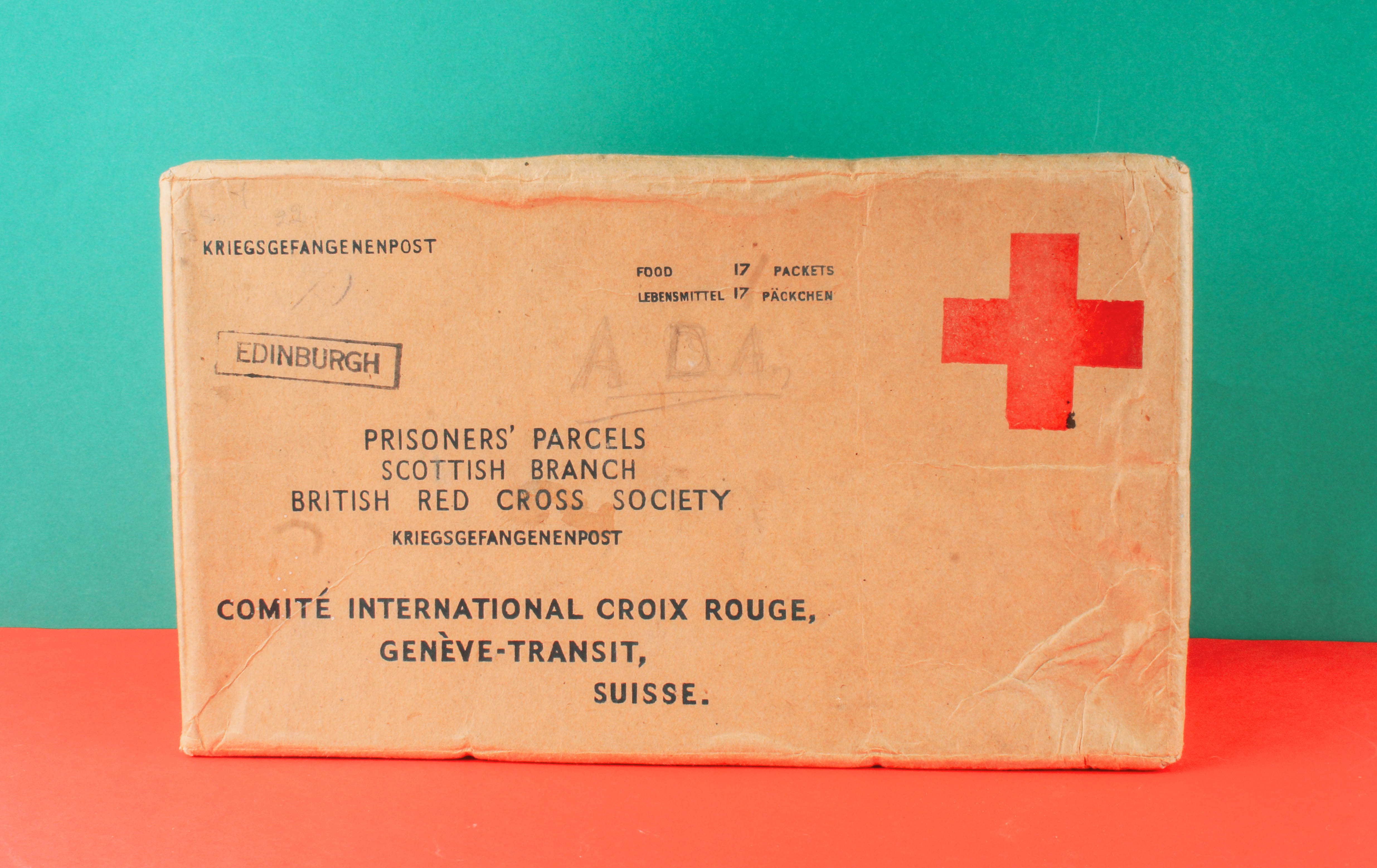
These pages are close ups of more objects from the Jersey Archive. The first is of a flash light used to guide people in the dark when they are making their way home before curfew hours commence. The second image is of a CD and cassette of music played by those who were occupied. These two photos displayed objects that made life easier for people to live. The light was an essential to everyone during the winter season, when is was dark and there were no street lights to guide them to the comfort of their homes. Music to this day is used for entertainment purposes, for me personally a good song puts me in a good mood, it was a way for people to enjoy themselves in times of such sadness. These two pictures represent a rebellion to the Nazi’s and how the people of Jersey wanted to prove that even though they are being oppressed, it isn’t going to stop them having a good time.
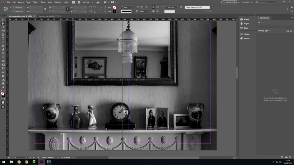
This image was taken from my Home Sweet Home shoot where I took pictures of my gran’s house. She was only a baby when the war ended so she didn’t experience the full hardship of war but nonetheless her parents still did. Her parents are both situated on the right hand side of the fire ledge, they represent the eyes of the war, these were the people who listened to music, used flashlights and wrote occupation diaries, they are the story tellers. I chose to use black and white to symbolize war photography and how colour hadn’t become popular or affordable. This image relates the narrative as it a shift in tone from reminiscing the past to actually being part of the past.
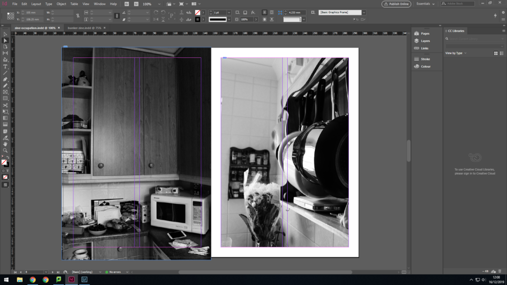
I used my gran’s kitchen as the interior is relatively out-dated compared to modern day minimalism. I don’t mean this in a bad way, my gran’s house has character and holds great memories of my childhood. The kitchen in my opinion is something out of an old black and white sitcom. The ancient micro-wave, the tiled walls and the neatly arranged spices. The pots and pans fit into the narrative as they emphasis the gender roles of the time at the start of the occupation. Women were seen as inferior, they were house wife’s destined for a life of cooking and cleaning, the men were the ones providing for the family.
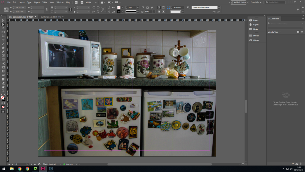
This double page spread is of my gran’s fridge and fridge magnet collection of all the places she has visited in her life. This moves the narrative to times when females were sent to go and do the men’s jobs as they were busy at war. This was a significant time of gender equality, the magnets symbolize how women have their own lives now thanks to women who stood up for their rights. My gran still goes away, she has a social life but her mother would have had a very different life of staying indoors and looking after her and her sisters.
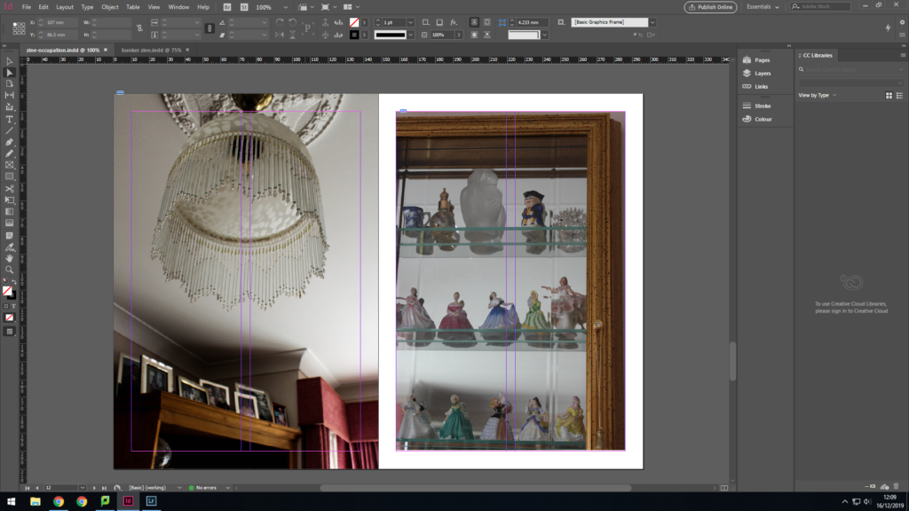
The lamp shade represents the idea of light at the end of the tunnel, the liberation is near, the men can soon come home. The large amount of family photos emphasize the importance of family during the occupation, how a strong family bond can make or break a person even today. When the men went away to war, they were missed, families dreaded receiving letters of death from the post-men. The box of tinkets are a metaphor for the people of Jersey and how they were locked away during the occupation, the Nazi’s held the key to everything, whether they could go for a walk, move house, buy food.
I used 3D triangular steel poles and miniature people as the objects, the background was created via yellow and green card. The poles symbolize the change the war has created in Jersey e.g bunkers. The miniature people represent the people of Jersey after the occupation and how they have to work around such change to everyday life on the island. This image relates most to the the title ‘within it all’ as the mini people are having it carry on as normal once they are liberated despite the mental distress they have encountered as well as the physical changes to the island.
I used the same bandage box as my back cover but from a different angle. The front cover image represented the damage the occupation was going to the cause, whereas this bandage suggests a different sort of damage. The bandage is now a symbol for liberation and now there is different damage to sort out. Plasters and bandages don’t always heal the area, sometimes it’s just a way of masking the pain and procrastinating about the problem. This relates to the liberation as people had gone through so much trauma yet they were given the news of liberation and were expected to return to normal.
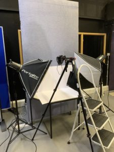
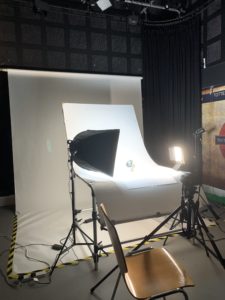
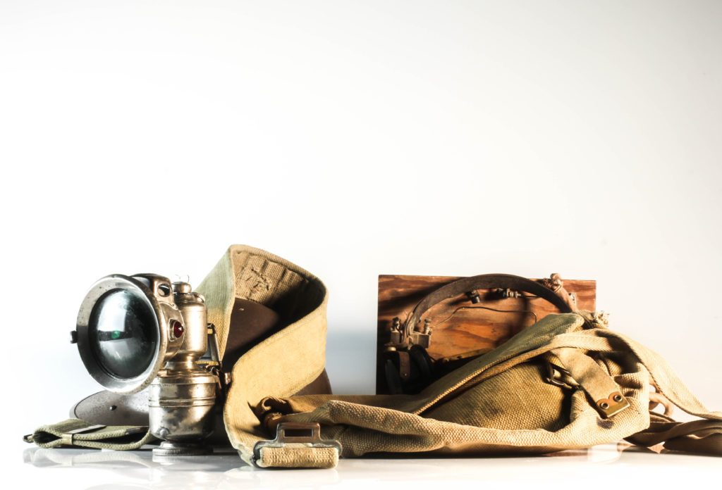
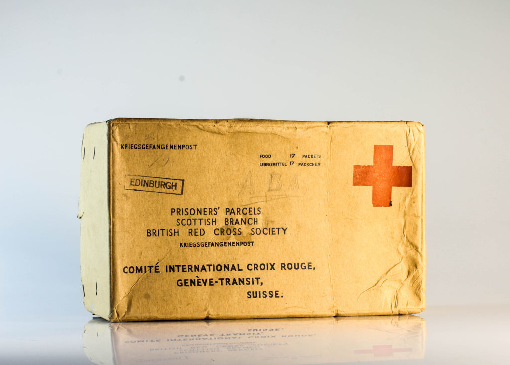
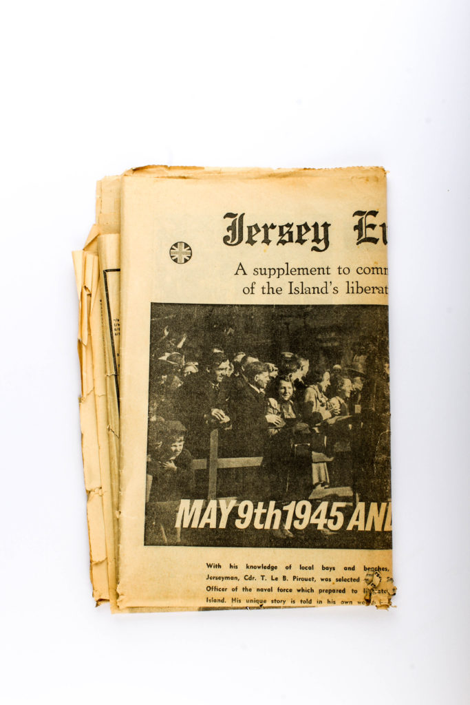
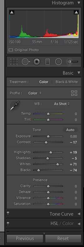
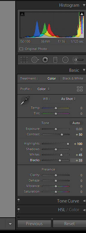
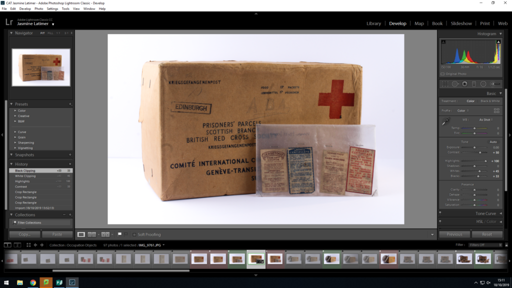
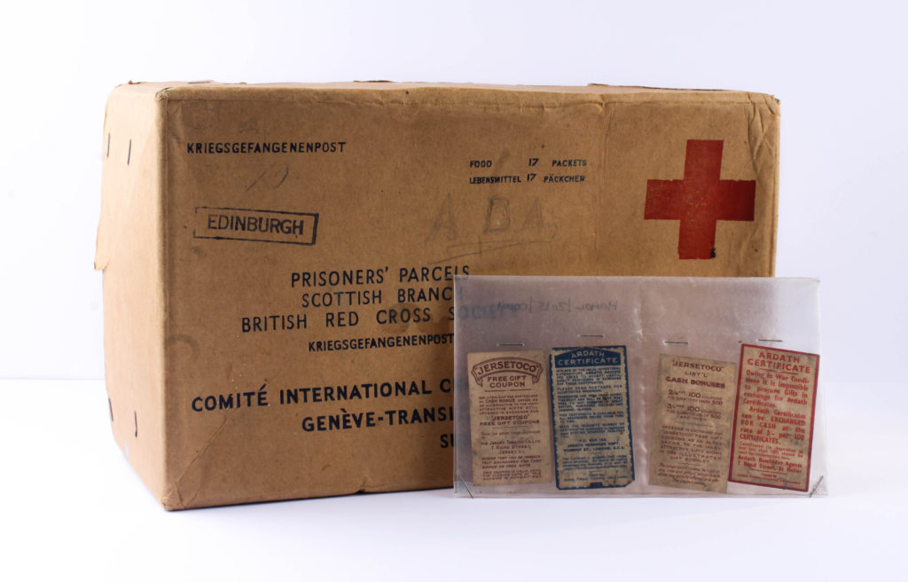
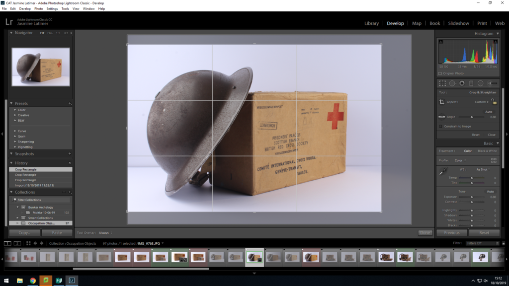
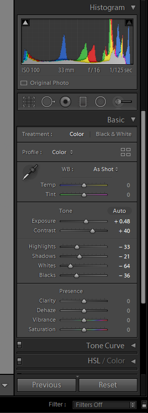
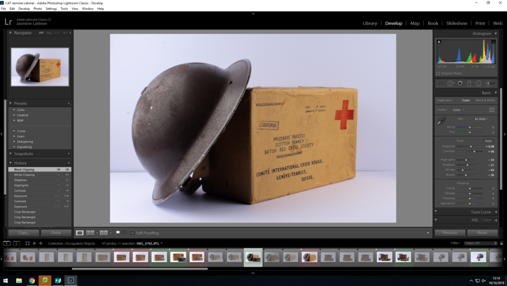
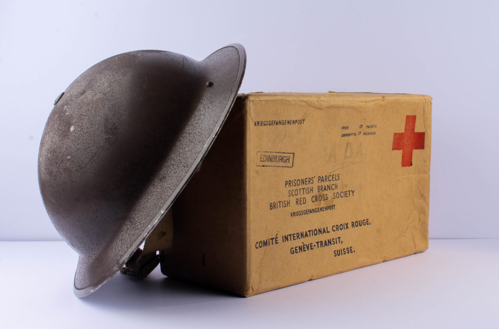
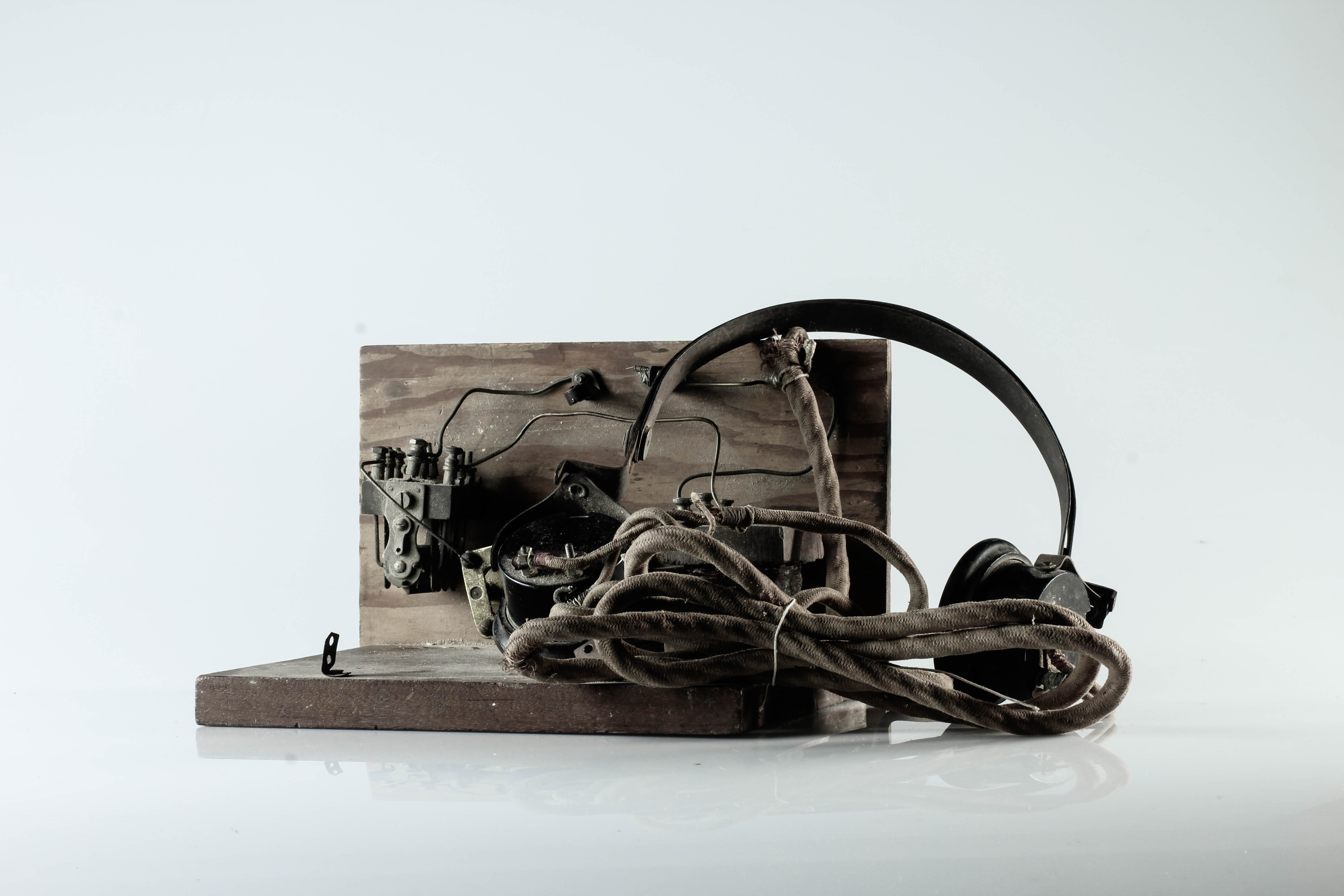
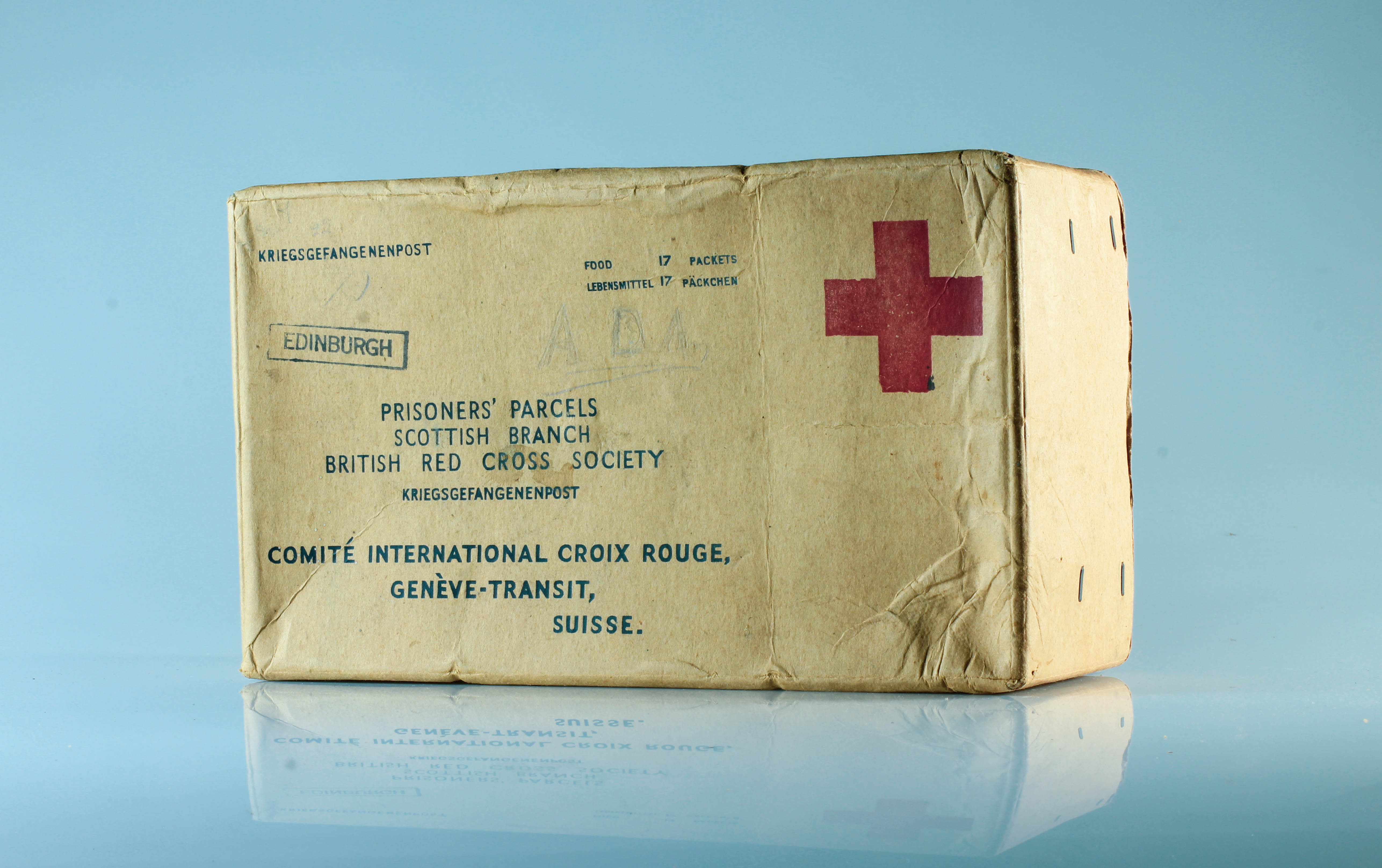
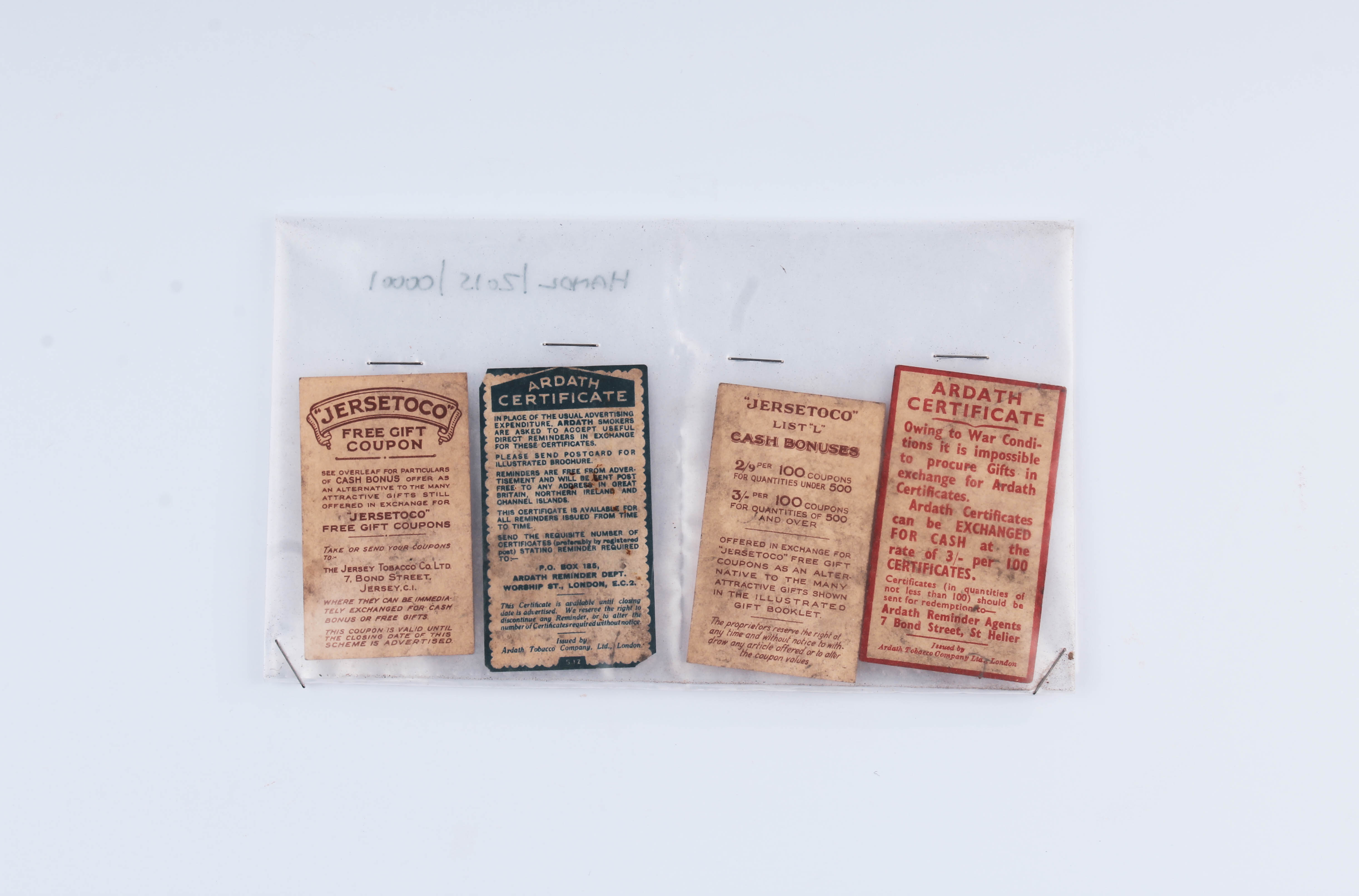
For this photoshoot I intended to photograph objects from the war, which was given to me by the Jersey Archives. There is a mixture of objects such as Red Cross packages, Tins, Helmets, Newspaper’s, Letters and many more which symbolically represented the war. Having this many items, I used two set ups, the first for more flat objects (Birds Eye View) and one for 3-Dimensional objects (Straight on Angle). These two set ups required different lighting rigs, which is explained below. With my camera settings I put the mode to Manual, the ISO to 100 and the aperture to F16, allowing a wide depth of field to be utilised. The shutter speed for the Birds Eye View was between 1/250 – 1/200 and the straight on angle’s shutter speed was 0.5 – 0.8. The white balance for both was set onto daylight, with manual focus being used.
Birds Eye View Lighting Setup:
For the Birds eye view set up, I used two flash head lights, set on a 2.0 power output. The lights where paced either side of the table, slightly facing downwards towards the object. On my camera I used a transmitter which triggered the flash heads to operate as I captured my imagery. In addition, I also used a pilot light in order to position a and frame my composition, this was located at the back of the table (on right) and did not affect the colouring or the outcomes of my image. The camera itself was placed on a tripod looking down at the table.
Straight On Angle Lighting Set Up:
For the straight on angle set up I used a continuous light set up. I used a fill light illuminating the object, with a secondary (tungsten light) light source to reduce the shadows and clearly showcase the object. I also experimented with back lights, but felt that it was not successful and did not justify the objects, thus I stopped using the back light. The camera was on a tripod with a 50mm lens.
Edits:
First Edit – FlaggedSecond Edit – Star RatingThird Edit – Colour Rating
Straight On Angle Edits:
For my straight on angle edits, I began by cropping the photographs, to ensure that the object is in the centre of the composition. I then focused on adjusting the whites, blacks, shadows, contrast and structure in order to accurately portray the objects. This also ensured a complete white background, allowing the objects to be the main focal point within the photograph. Within each photograph, there is a sense of warmth through the artificial lighting, which presents a positive view point towards the contextual meaning of the objects.
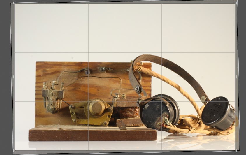
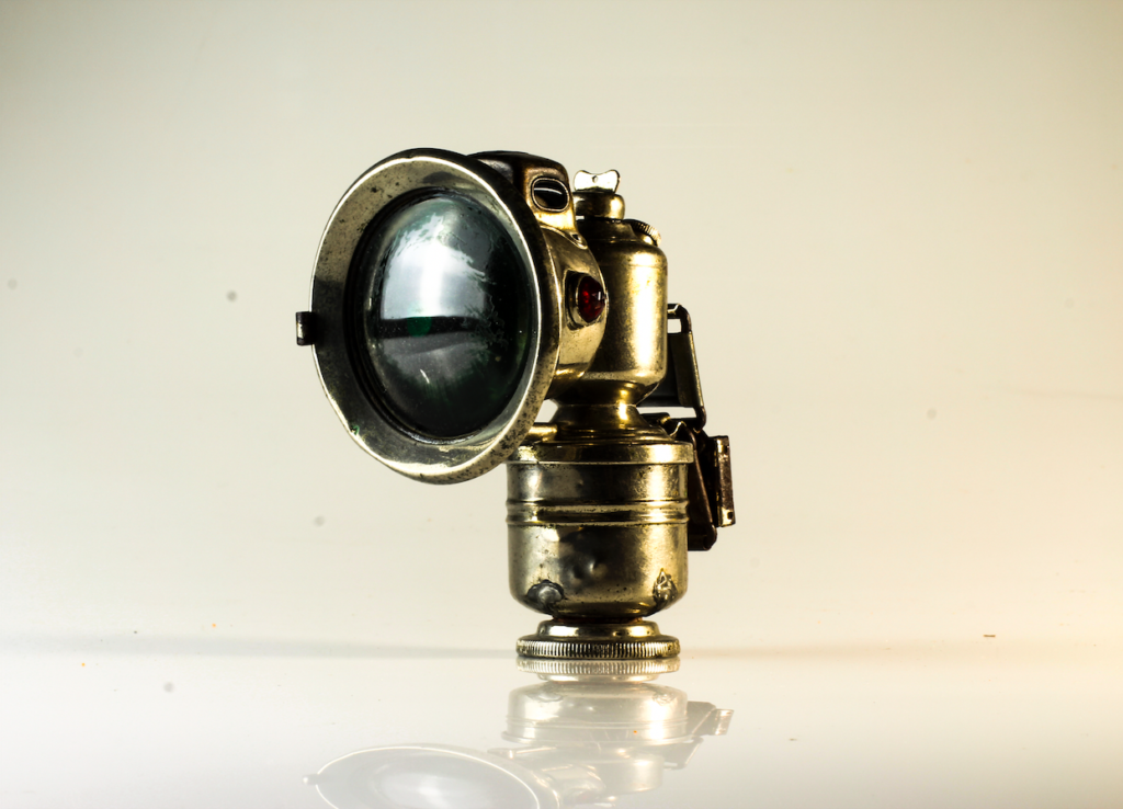
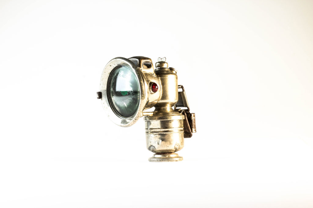
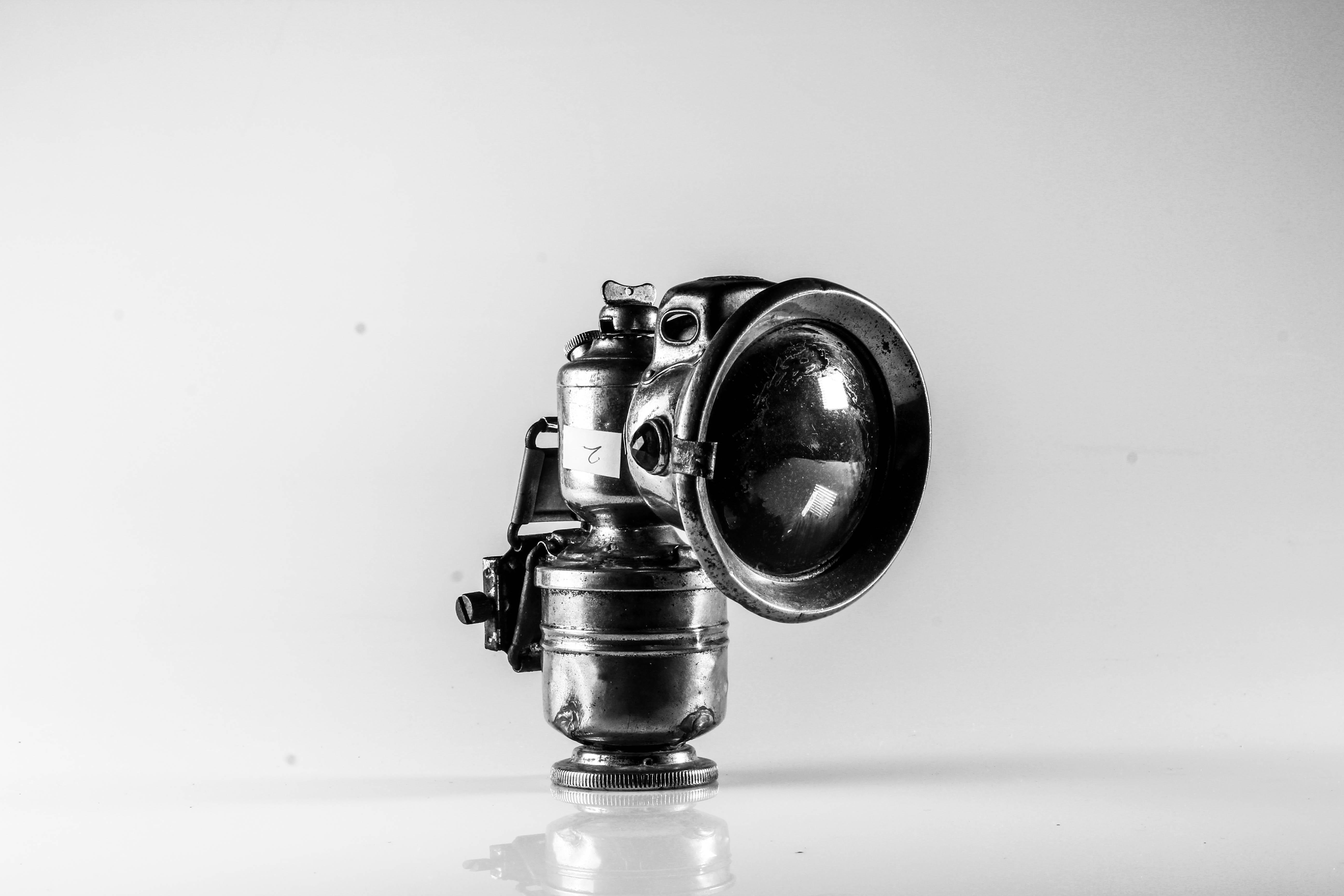
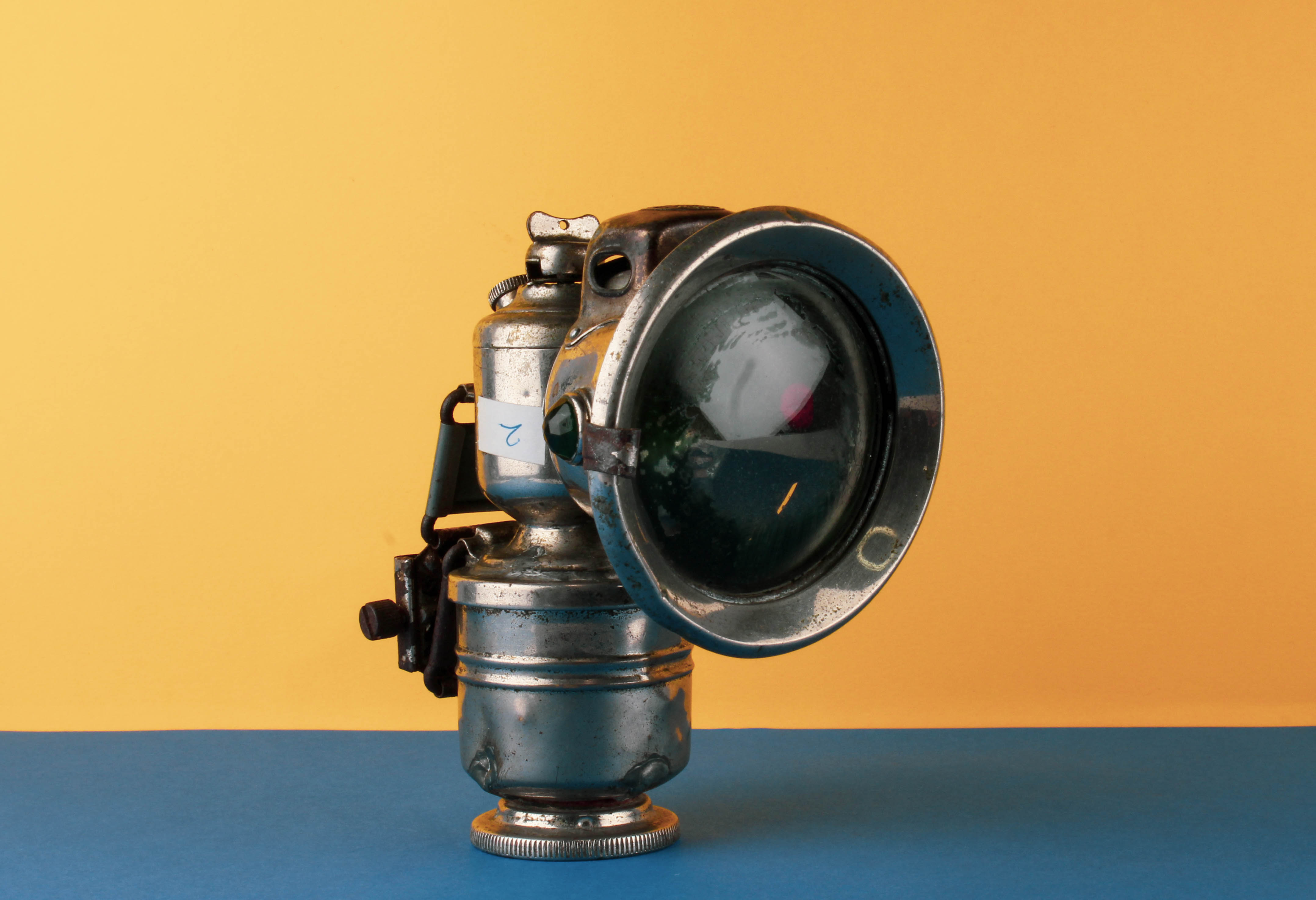
The image above is my top photograph from this exploration of still life photography. Visually, we are presented with a light used in the mines during the occupation of Jersey in 1940-45. This object is the main focal point due to the positioning of it in the frame, and it being the only item within the frame of the photograph. The use of artificial lighting allows reflection on the metal object creating tonal contrast of the rust and decay of the object to clearly be presented. When analysing the main formal elements within the frame, we are clearly presented with a sense of space, and emptiness (showcasing the lack of purpose the item now has within today’s society) form, colour and texture. The photograph captures the object at a straight on angle which works in harmony with the plain background, allowing emphasis on the conceptual and contextual factors.
Contextually, the photograph brings viewers back to the second world war and the impact it had on Jersey. It showcases the torch and how slaves, who were taken (from places such as Russia etc) and forced to work digging out tunnels, such as the underground hospital. This conceptually remind us of the importance of this object in Jersey’s history and enriches our understanding of what life was like for the slaves who were forced to work.
Technically, the photograph uses a slow shutter speed, allowing enough light to be presented within the photograph to emphasis the object, which did not create any blur due to a tripod being utilised when capturing the photograph. The ISO was kept at 100 to ensure that no noise is presented within the frame and the aperture was set to F16 which has let a wide depth of field to be used on top of allowing enough light into the exposure of the photograph. The white balance was sunlight, allowing a clear white balance correction which complemented the warm artificial light source used (a two point lighting set up, with a tungsten light).
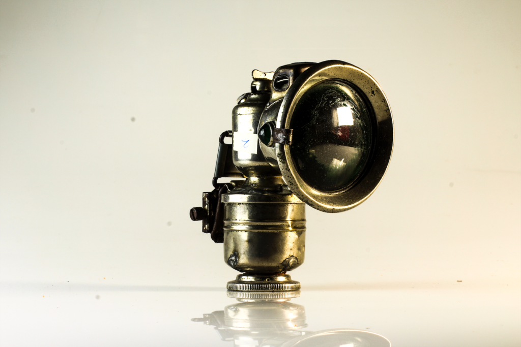
Birds Eye View Angle Edits:
With my birds eye view photographs, I began by cropping the photographs, to ensure that the object is in the centre of the composition. I then focused on adjusting the whites, blacks, shadows, contrast and structure in order to accurately portray the objects. After ‘correcting’ the photograph I then decided to try and make the object stand out for it’s background, almost as if it has been raised and is separated from the background. To do this I looked at further increasing the shadows and blacks, although I achieved this effect, it has meant that the background now has grey tones, which slightly distracts viewers from the focal point of the photograph
Evaluation:
To evaluate my attempt at still life photography, I believe I have been able to produce clear example of my exploration with this style of photography. From taking the photographs at different angles with different lighting set ups, to applying my artist inspiration within my work, I have successfully been able to conceptually and contextually showcase the importance of these items to Jersey’s history. The simplistic editing used within these outcomes have worked well, as it does not distract viewers from the true values of the outcomes, which showcases my aesthetic for the photo shoot. To conclude, I am happy with the outcomes I have produced due to the high quality images created, through correct camera settings, and good edits. If I was to improve this I would look at producing another photo shoot capturing more objects, singularly, at a straight on angle, allowing me then to explore with typologies as a format for displaying the objects.
In order to be fully prepared to take my images successfully in the photo studio, i am going to briefly look into the elements needed for a good image.
Lighting– Different lighting points could be played with in order to get the image you are looking for. The lights used could be a soft light, spot light, ring light, hand above light etc..
Recording- When recording/taking the picture, it should be taken from different angles so that you capture different view points of the object. Different angles could include from above, right side, left side, front, back.
Planning my photo shoot
In this photo shoot I plan to take images of object from the Occupation in Jersey which has been gifted by Jersey Archive. Their are many objects to take images of and I will chose a few which stand out to me and which i find interesting due to them symbolising elements in the war. I will use two set ups for my photos, one for flat objects which will be done from a birds eye view, as well as a 3D objects which will be photographed straight on. The set ups will require different lighting points. The overall camera settings I have used is my camera is to be put to Manual focus, the ISO to 100, as well as the aperture to F16. These settings will allow me to adjust the depth of field, giving me more freedom with my photography. The white balance for both will be on the daylight setting to allow more light in, as well as the shutter speed for the 3D shoot being 0.6 and the birds eye being 0.5.
Straight on Angle Lighting Set Up
For this set up I used a fill light illuminating object with an extra tungsten light in order to reduce shadowing and to show the object clearly. I also used a continuous light set up which helped all the elements work together. I used a tripod also with a 50mm lens.
Birds Eye View Lighting Set Up
For the birds eye view set up, I placed two box lights on either side of the table, facing slightly towards where the objects would be sitting and used these as two flash headlights with a 2.0 power output. I used a transmitter on the camera which triggered the flash in the box lights to illuminate the object and capture my image. I was advised to use a pilot light to position my frame and cannot be seen in the image as it is hiding behind one of the box lights, and is located at the back of the table. This didn’t effect the colour of the image. I also used a tripod to hold the camera which I adjusted when needed.
Process of Elimination
These are all images from my coloured photo shoot. In order to get the best images out of the shoot i have flagged the images which i think are the best out of the shoot and will later colour code them.
After selecting my best images using the flag tool on Light room, i have now gone and colour coded my overall best unedited images. The best images are coded green, while the eliminated ones being red. I will edit the green coded ones. (IGNORE IMAGES WITH COLOURED BACKGROUNDS)
Planning Editing Process
Through my editing process, i going to try to make as little edits as possible in order to ensure the pictures don’t look overally edited and still looks realistic. Therefore the edits i used were simple such as editing the contrast, highlights, cropping the photos etc.
Editing my Images
I firstly cropped the image to ensure the focuses were in the middle of the image and that they were in a good position.
This is a detailed shot of what the edit panel looked like once i had fiddled around with the settings in order to create a image which i was happy with.
This screenshot is together with the image above, and shows what the editing settings have done to the image.
Best Finished Edited Images
Technical Analysis (X3 Images)- I used a Canon Camera on a Manual Focus, the ISO to 100, as well as the aperture to F16. These settings will allow me to adjust the depth of field, giving me more freedom with my photography. The white balance was on the daylight setting to allow more light in, as well as the shutter speed for the shoot being 0.6. The camera was also connected to a transmitter which set off a flash when i pressed the camera setting, allowing the objects to retain light.
Visual Analysis- Visually we can see that the objects photographed have been positioned into the middle of the photograph with the help of the cropping tool on Lightroom. There has been a plain white background used, helping the objects to stand out, and this works well with the flash of the soft box lights as it helped to create an aesthetically pleasing image.
Edits- When editing the images I ensured that the images still looked as if they were real objects and weren’t overly edited. This meant that I kept editing on a low and only cropped the image and changed simple elements such as the Exposure, Contrast, Highlights, and Shadows.
We had to present the Occupation objects from the Jersey Archives in a creative way and use a special still-life table and its translucent backdrop. I photographed the objects using different angles, both from above, side and front. I chose to either photograph each object individually or group together several objects for a more complex still life arrangement.
LIGHTING:
To photograph the Occupation objects in the studio, we experimented with different lighting set-ups, both continuous lights and flash lights. Continuous lighting has studio lights that stay on. You can power them up or down, based on what lighting you need. Flash lighting, lights up when you trigger it. You cannot see how the scene will be captured until the flash is triggered. When it is, a high intensity light will pulse for just a fraction of a section, lighting the scene.
TECHNICAL:
Continuous lights – To photograph objects three dimensionally
Camera setting: Manual Mode
ISO: 100
White Balance: Daylight
Aperture: F/16
Shutter: 0.5 sec to 0.8 sec
Lights in the room had to be switched off to avoid reflections
Flash lights – To photograph images, documents, books, newspapers, etc.
Camera setting: Manual Mode
ISO: 100
White Balance: Daylight
Aperture: F/16
Shutter: 1/125 – 1/200
Flash heads set to power output: 2.0
Pilot light was used for focusing
EDITING:
After photographing in the studio, I uploaded my images from the photo shoot on to Lightroom and made a rough edit of 6 images. I used the presets Desaturated Contrast, B&W Punch, Warm Contrast and Red Lift Matte. After selecting the filter, I adjusted the contrast, shadows and highlights. I also cropped unwanted areas to centre the Occupation objects in the middle of the frame.
MY RESPONSE:
FIRST PHOTO-SHOOT
To evaluate my first still life photo-shoot, I believe that I have been able to produce photographs that explore my own style of capturing Occupation objects. I have shot these images using different angles and lighting to contextually showcase the significance of these objects during World War 2. I believe that my outcomes turned out well since they capture the detail and textures of the objects. The minimal editing and central framing helps to draw the viewer’s attention, further emphasising the point that these items are of importance.
SECOND PHOTO-SHOOT
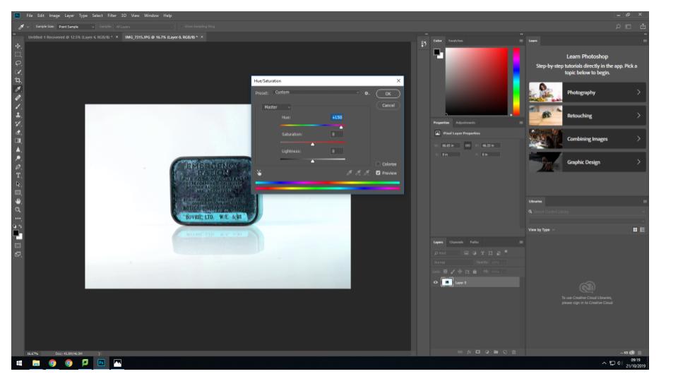
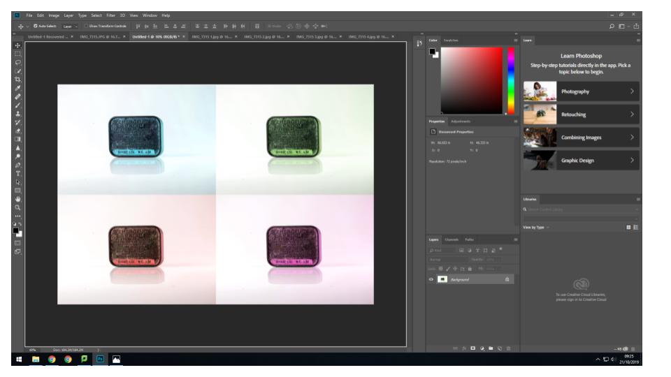
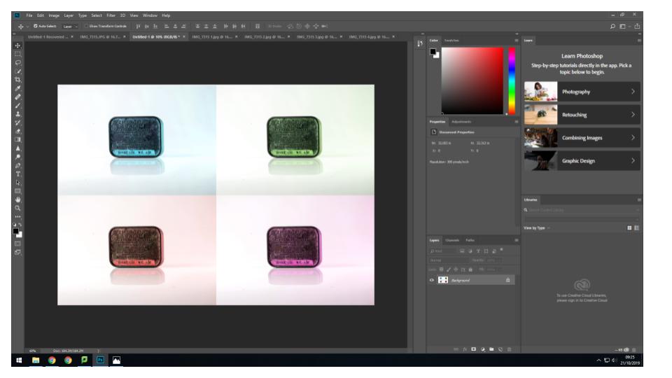
For my second photo-shoot, I decided to capture photos with a contemporary approach by using coloured backdrops which has been inspired by Rafal Milach’s work. Using his photographic style has allowed me to further develop my response to still life Occupation objects. Below are my 5 final outcomes for the colour photo-shoot that have been edited on Lightroom to enhance the saturation of backgrounds. I love how the coloured edits turned out because it makes the objects appear childish, as if it was a toy. This juxtaposes and camouflages the serious subject matter of World War 2.
To evaluate I believe that I have produced imagery which clearly conveys my own understanding of Rafal Milach’s work and my ability to apply his photomontage style into my own photographs. This new way of capturing still life Occupation objects has furthered my exploration since I am now presenting coloured outcomes which creates a strong link to Milach’s work.