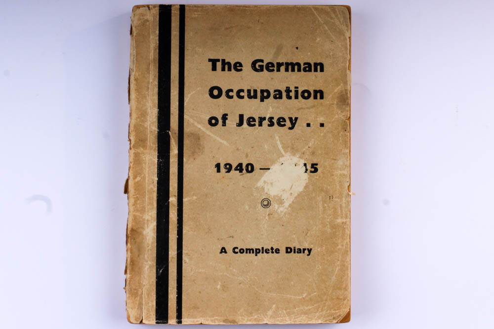
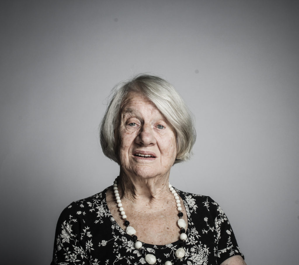
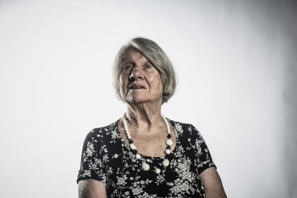
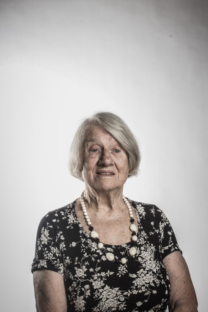
To get a better understanding of the Occupation, Jersey Heritage kindly allowed us to borrow some object from their collection to photograph.
The best way to photograph object is by placing them on a table top and with a continuous background. Documents can be photographed by placing them on top of a table and photographing from above.
Objects
Documents
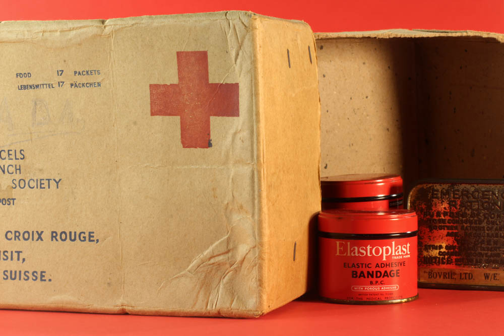
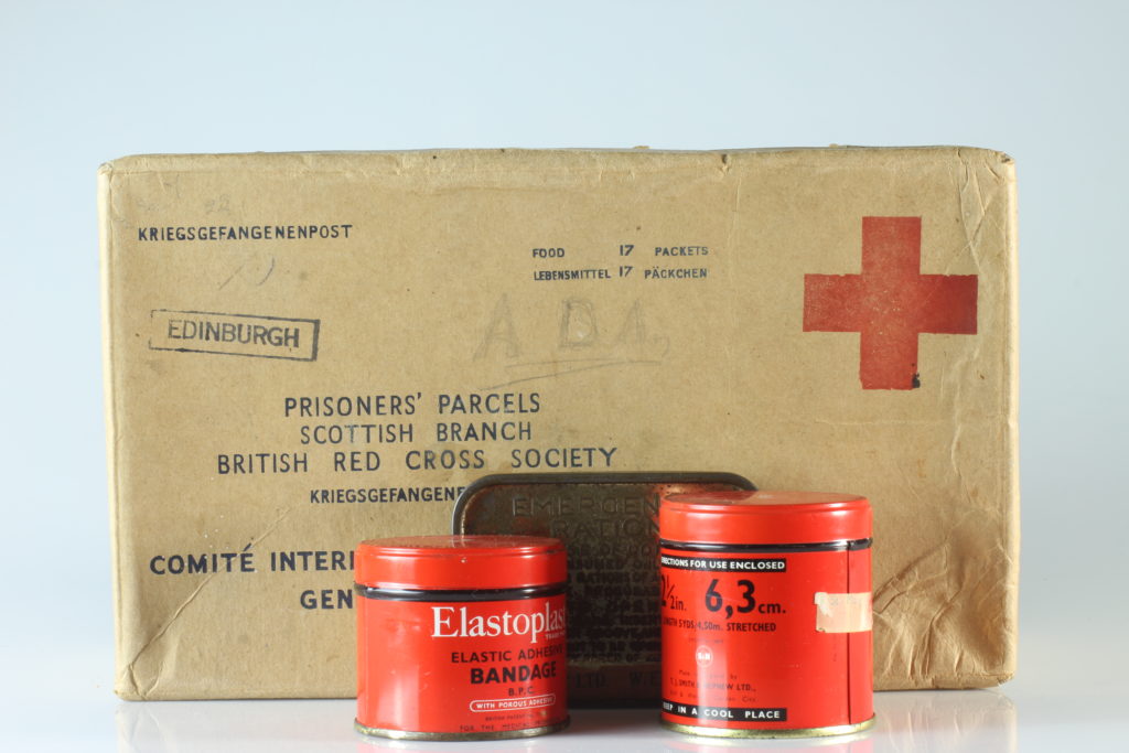
Image one:
Context/Concept:
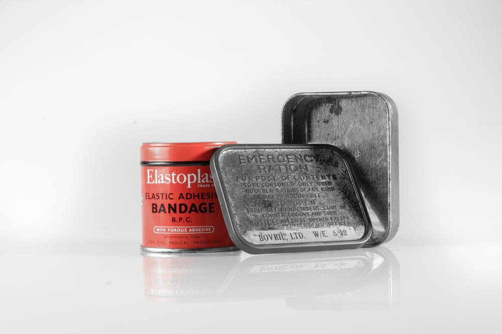
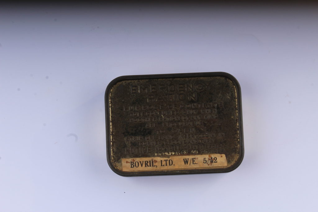
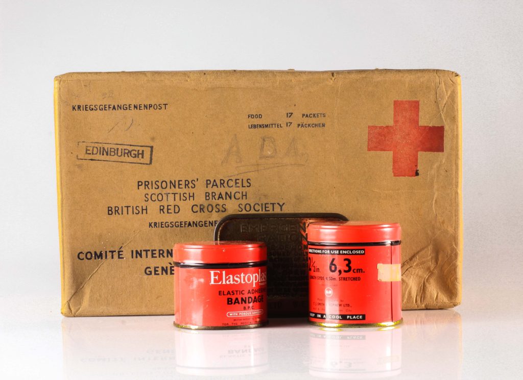
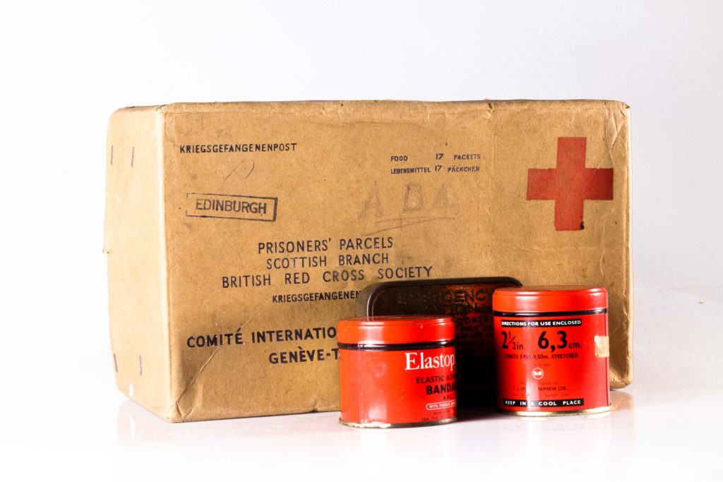
Food shortages were common across Europe during WWII and despite rationing, people often went days without food. By December 1944, Jersey was short on food, fuel and medical supplies. The SS Vega first arrived in St. Helier on December 30th 1944, bringing with it much needed Red Cross packages. While the SS Vega sailed from Lisbon, its packages were from Canada and New Zealand. Without the Red Cross packages, many islanders across the Channel Islands would have starved to death.
Visual:
This image shows an open Red Cross package along with two bandage tins and an emergency rations tin. The objects are arranged as if the three tins were inside of the Red Cross package. A red background can also be seen.
Technical:
I took this image using an aperture of F/16, a shutter speed of 1/2 seconds and an ISO of 100. The objects were placed under soft lighting, with a soft box on the left and an LED light on the right. To give the image a red background, I placed two pieces of red A3 paper under the objects, concealing where I’d joined the paper to created a continuous effect.
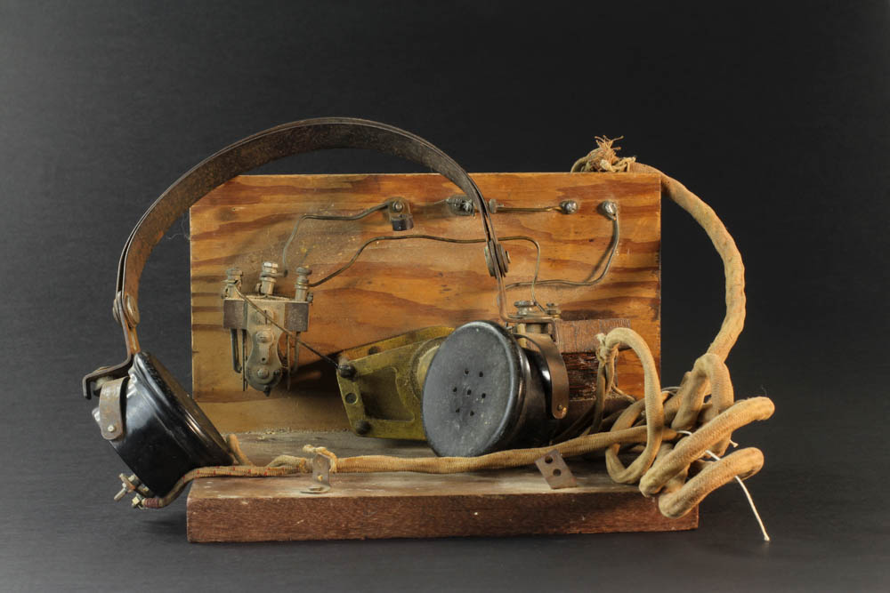
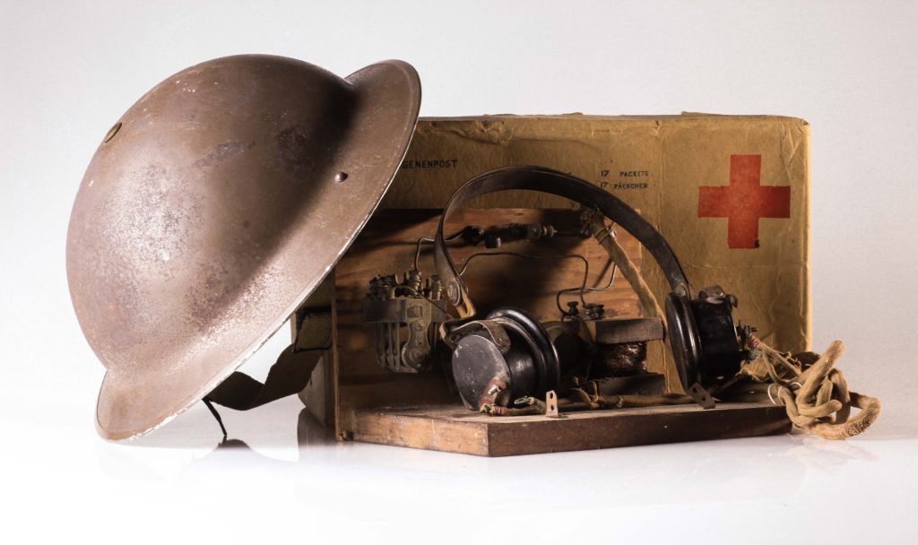
Image Two:
Context/Concept:
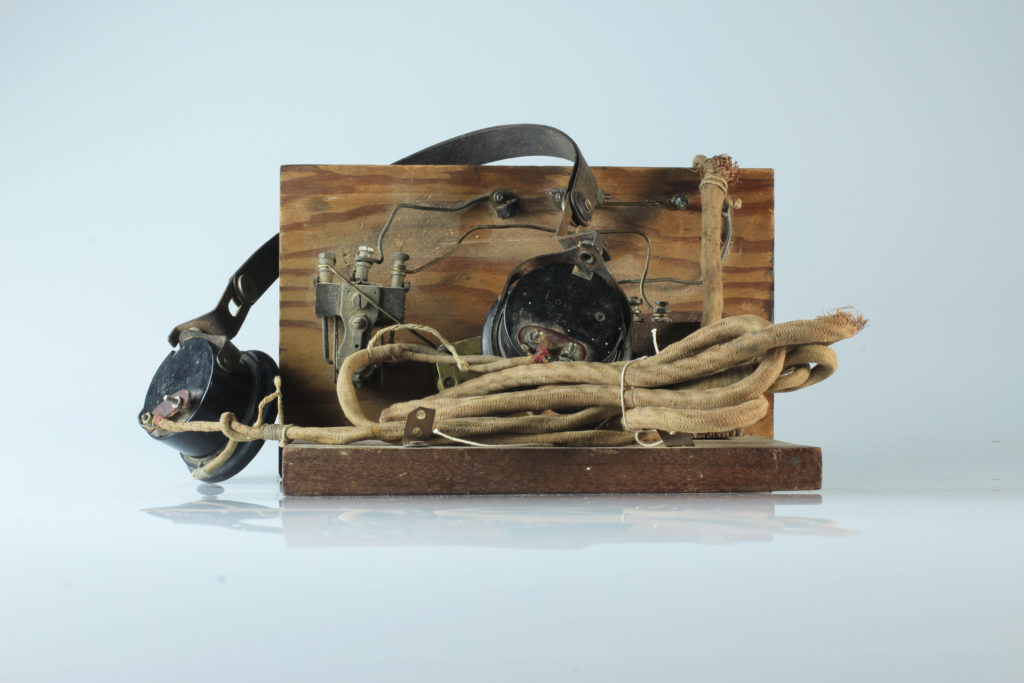
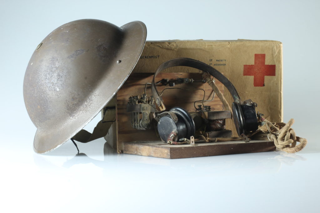
During the Occupation, radios were banned to prevent Islander from receiving news about the War from Britain and France. All radios were to be confiscated, however, many Islanders hid their radios or even built their own crystal radio sets (as seen above).
Technical:
To take this image I again used an aperture of F/16, a shutter speed of 1/2 seconds and an ISO of 100. Soft lighting was also used from both the left and right and two black pieces of A3 paper used as a background.
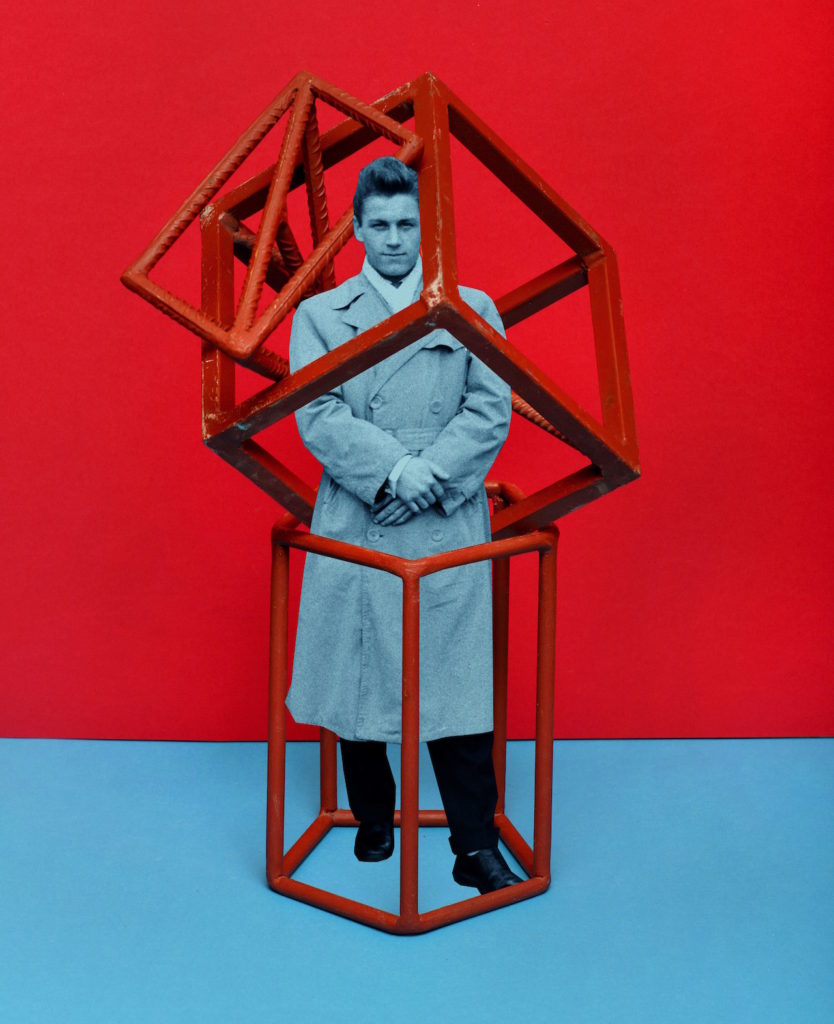
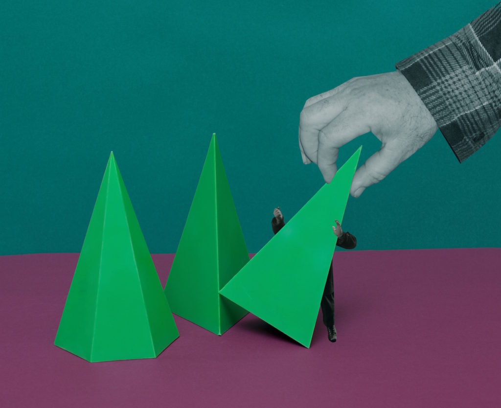
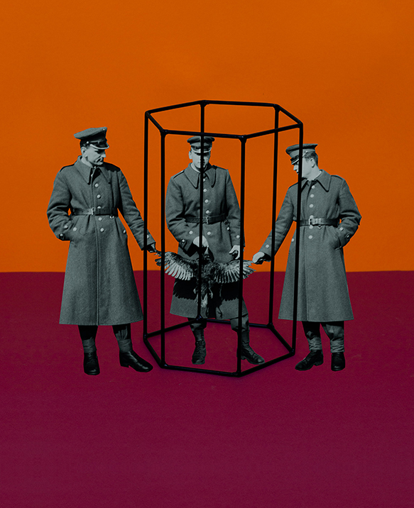
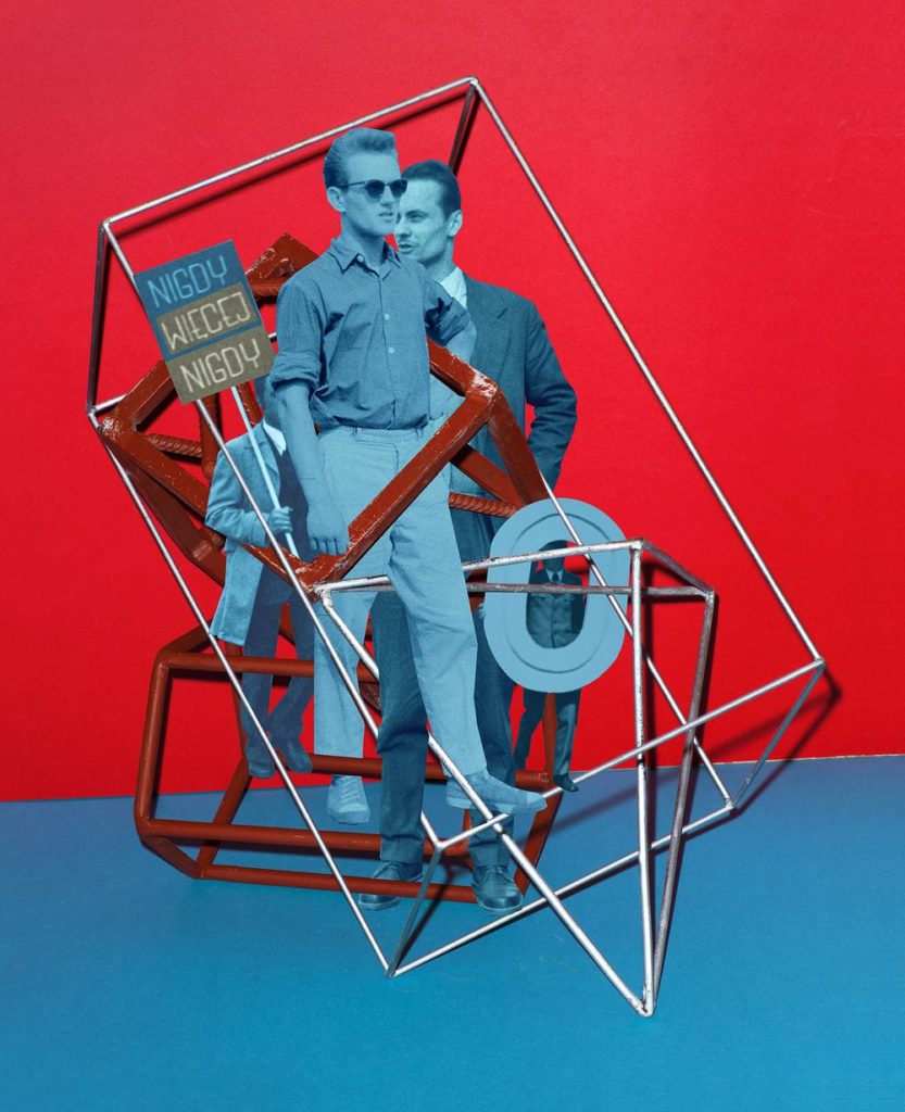
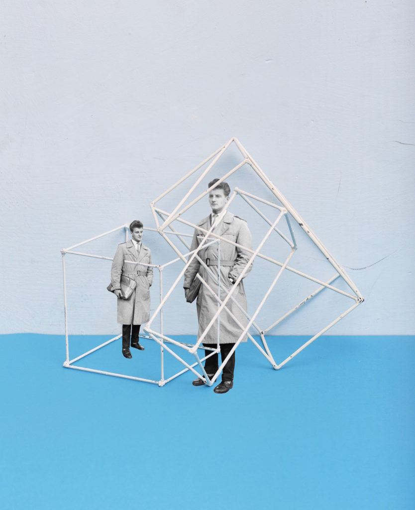
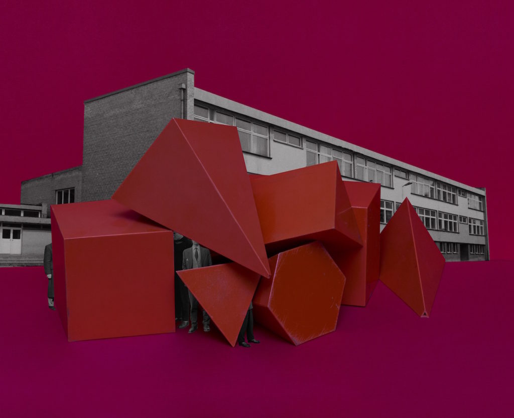
 The First March of Gentlemen, a 72-page photobook composed of collages that mingle elements illustrating the 1902 Children’s Strike in the city Września. The children striked against the Germanisation of their education. Ther Germanisation would mean that physical violence would be enforced and Polish, their mother tongue would be eradicated from the classroom. It has become synomynous with Września.

The First March of Gentlemen is a fictitious narrative that can be read as a metaphor, commenting on the social and political tensions of the present day.

Rafal Milach explained that “The most important thing was to create a story that would be accessible to everyone because this is, in the first place, my vision of a society, in which individuals can protest in the public space, regardless of consequence,” he explains. “The initial idea of working with the archive was sustained, but the topic changed as I began looking for material that could occupy two spheres – discipline and pacification, and the sphere of freedom – and to bring these elements together in a series of collages.”
Milach found and used the work of ametuer photographer  Ryszard Szczepaniak. His archive consisted of images shot in  Września during the 1950's and 1960's. He photographed his and his brother’s friends in formal street poses, many of them while on leave from the military, some of whom came from the Armia Ludowa, a communist partisan force set up by the Polish Workers’ Party while under German occupation during World War II.

 Milach detaches them physically, cutting out the figures and pasting them onto brightly coloured backgrounds, hinting at ideas of contrast and displacement. The book was designed by his wife Ania Nałęcka-Milach, and it references a children’s exercise book in its choice of size and coloured papers, bound by a long red thread to contain its assembly.

The design is “like a toy, like a candy – something nice to look at and to touch,” Milach says. “But it’s only a camouflage; a beautiful skin to disguise these spheres, to somehow smuggle them into your daily life” – just like the jubilant propaganda posters of the 1950s, or the cheery chat shows on the newly nationalised television stations of today.
With the images from my visit to Batterie Moltke, I am going to experiment with various techniques such as cropping and colour adjustment as well as Desaturating images entirely to create a series of variation in my images
Cropping
Below I have included some of my original images followed by cropped edits. Cropping is used to remove irrelevant or unwanted subjects fro an image which allows for more focus and emphasis on the main subject. Cropping also helps change the aspect ratio of an image and also allows for an overall improvement in terms of the images composition
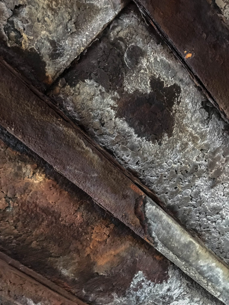
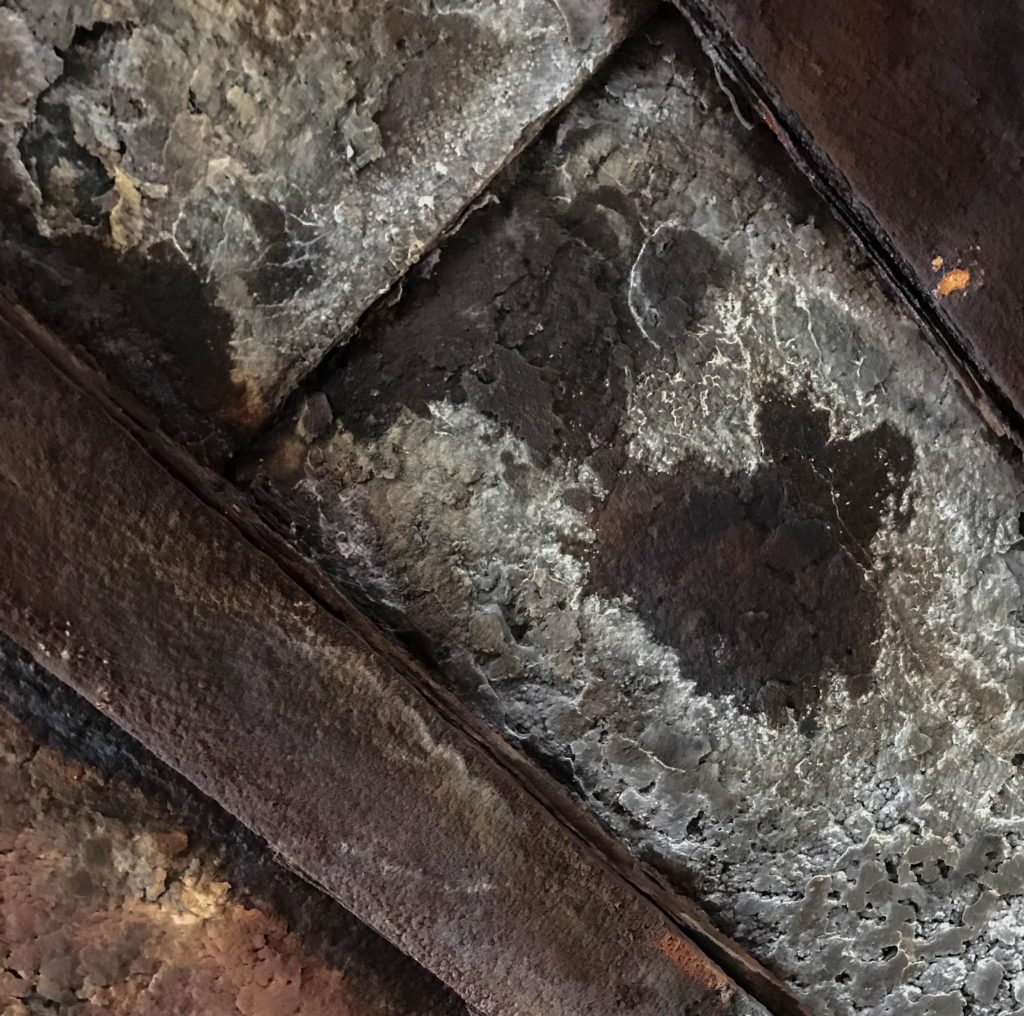
Above is an image of a corroded ceiling inside of the German MP4 Radio Tower. I like the texture given off in the image as it shows a true sense of age and decay, However I find that a crop could benefit the image well in terms of overall composition. Below is my Cropped Image
I have decided in this edit to focus more on the patch of decaying brown material in the roof rather than focus on the wider Image as I found there was too much to take in #
Colour Adjustment
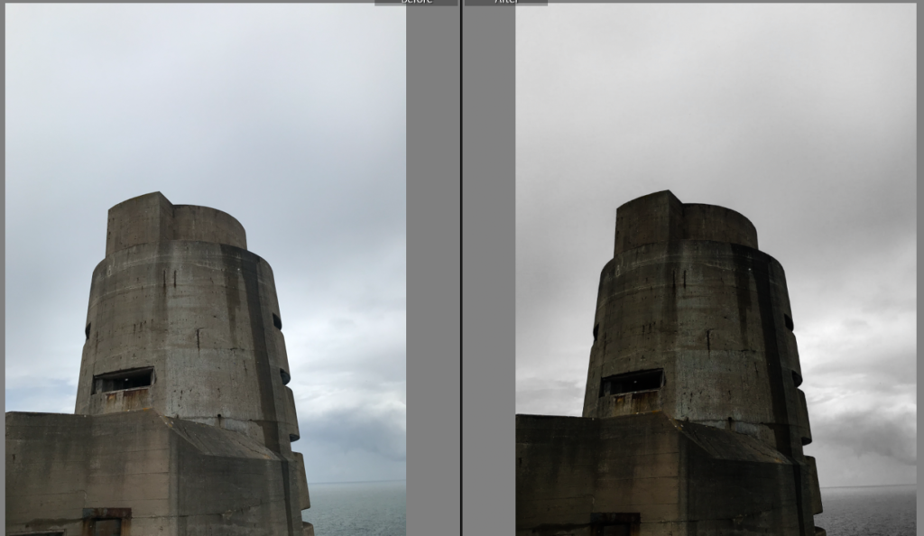
Colour Adjustment involves utilizing the colour palette in an image to create variation. In Adobe Lightroom, There is a whole HSL/Colour control panel which enables the user to have control over the various colours in an image and allows for the Hue, Saturation and luminescence to be controlled with sliders. Below is an example of an image where I used this function to alter the colours to create a dramatic image
For this image, I took control of the Aqua and blue colour filters and completely desaturated the image, Leaving the Gray/ brown of the concrete bunker as the only subject with colour in the image. This method also helps to isolate the main subject to give it much more emphasis and make it stand out from the image. I further altered the contrast and exposure to create a dark and moody image
Black and White
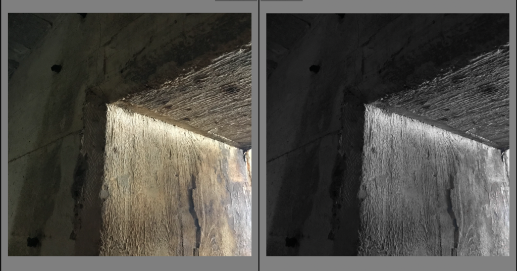
Desaturating an image is a great way to create an atmosphere within the image. This process is acheived through desaturating the image and then dependent on the mood of the image the photographer/ editor wants to give off, The contrast, exposure, shadows and highlights are altered to give off the desired effect.
For this image I desaturated all of the yellows, Greens and oranges within the image as these are the only colours present and turned up the contrast slightly and altered the exposure to create an effect involving the light and the darkness inside of the wall. I find that using black and white gives a great emphasis of contrast within the image
For our studio objects photo shoot, we used continuous light on an infinity screen so that there was limited shadows and no distractions from the central object. For the birds eye view set up, we used flash head lights to give an even diffusion of light.
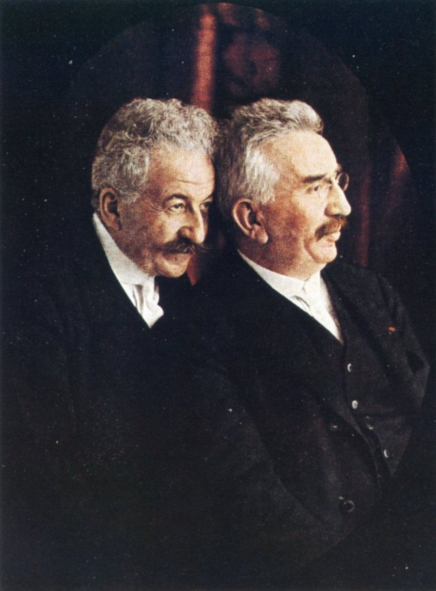
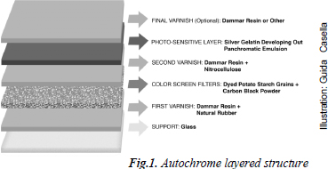
Autochrome: an early form of color photography created by the Lumiere brothers in France.
Lumiere Brothers
Emile F.Guiton
Born 1879 in Jersey, he was a member of Societe Jersiaise and was a curator of the museum. He was an amateur photographer who experimented with color during the early days of auto chrome. He had a fascination of how buildings change over times. He recognized the importance of collecting and recording photographers, and donated many images to the Societe Jersiaise .
Emile F. Guiton
Examples of his work:
His Style:
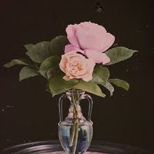
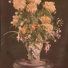
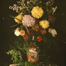
Some of his images are in black and white and other starting to incorporate color in the style of early color photography, auto chromes. His auto chromes are most famously still life images of flowers on tables against black backgrounds. His Auto chromes naturally have a faded looking blur to them that make them look like really detailed oil paintings. In some of his images he includes wilting flowers.
Analysis
Technical
The light appears to artificial and coming from the left side of the image because one half to the image is lit whilst the other part has shadow to it creating tonal range. The color balance is quite warm but that is probably because it’s an auto chrome.
Visual
Because of the fact it’s an auto chrome and looks like an oil painting the image looks quite flat. Because of the flowers there is a lot of texture in the image because he’s chosen flowers with lots of petals and leaves. He’s composed the image so the vase in the center of the shot and has framed it with the black background. The vase is on a surface which he has tried to cover with leaves in order to disguise it.
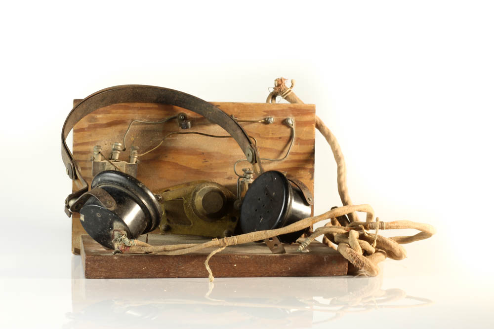
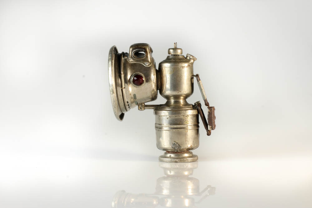
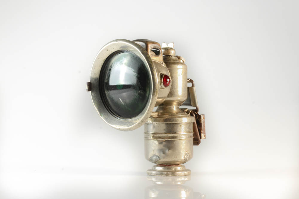
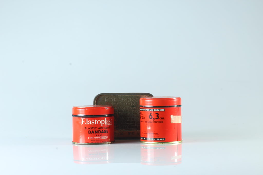
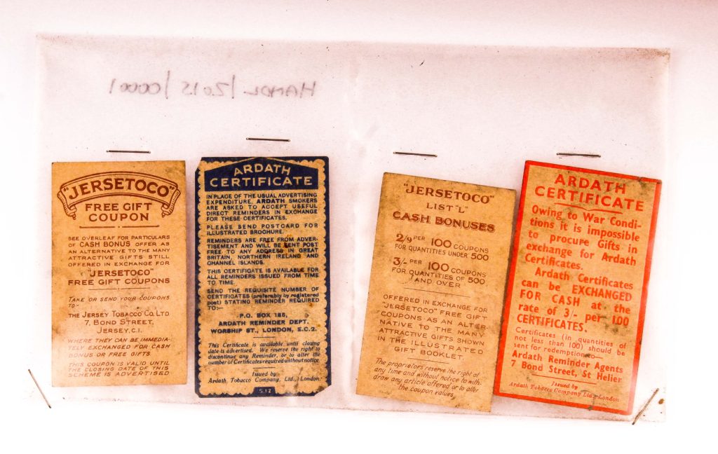
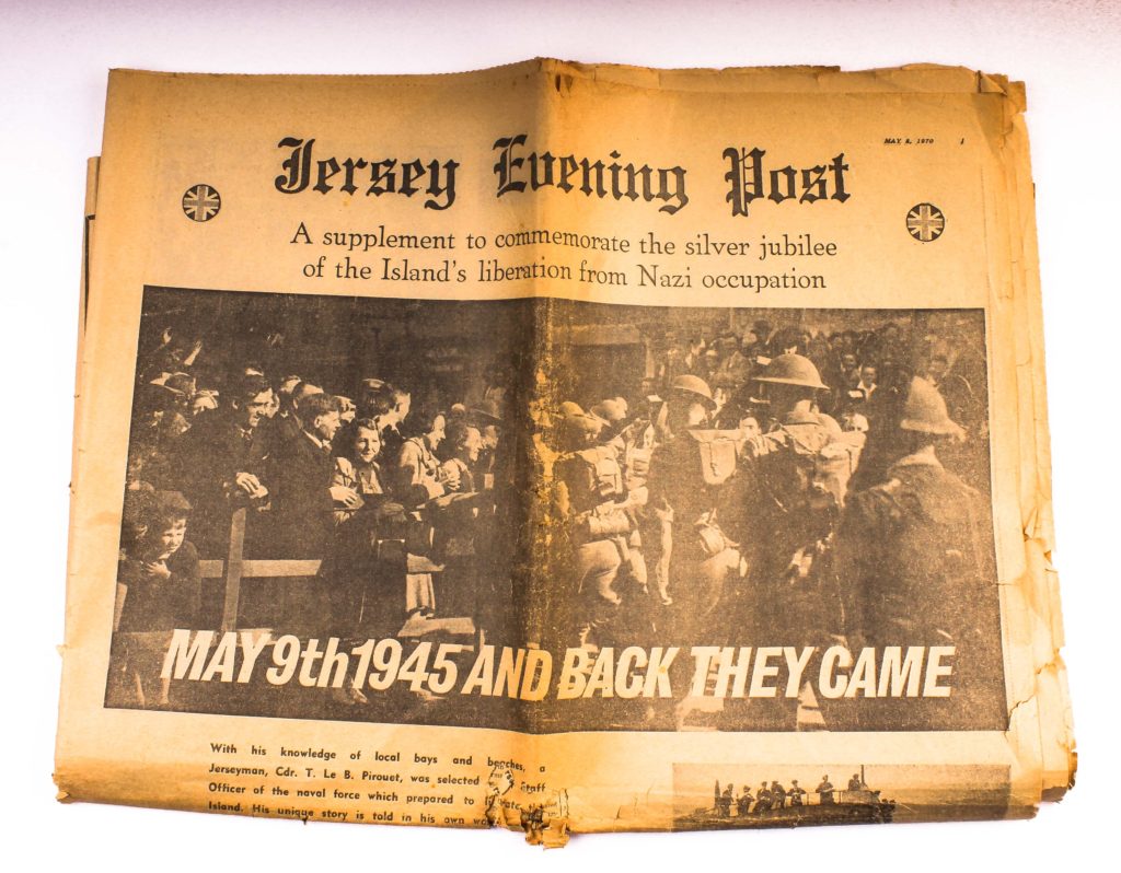
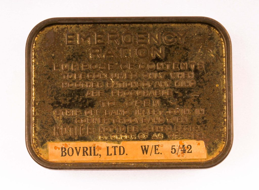
We managed to get some objects from the war from the Jersey Archive. This included stuff such as a war helmet, tins of bandages, a red cross package, a bar of soap, coupons and much more. We decided to take still life images of these in the studio with two types of lighting – Continuous lighting and flash lighting.
Continuous lighting is what it’s name suggests – lighting which doesn’t change. With this lighting we paired it with an infinity board to make the objects look secluded and in an area bigger than it actually is.
Flash lighting is when the lighting flashes as the image is taken. This is done by putting a sensor on the camera so it can time when to turn the lights on. This type of lighting was more used with a birds eye view angle – the camera was put on a special stand which positions it looking down at the subject from above.
Light room work :
Original pictures
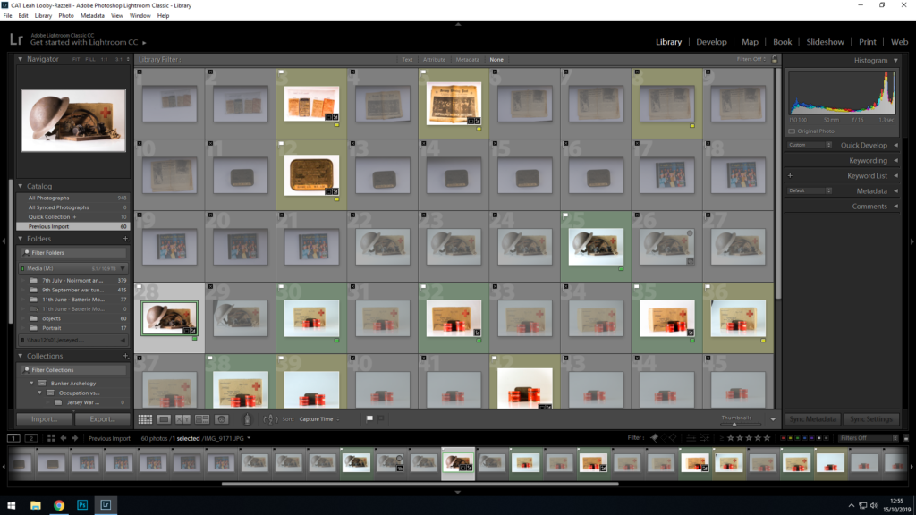
Originally I had taken 60 still life images in total of the objects, and from there i uploaded them onto light room and sorted through them, flagging the ones I wanted to use.
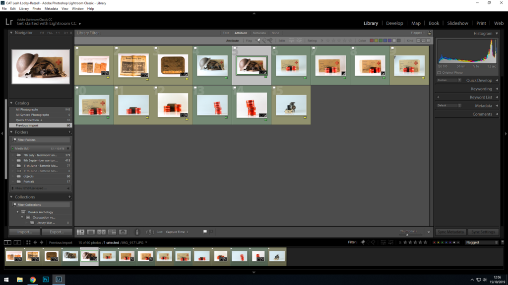
After I had flagged the images I wanted.
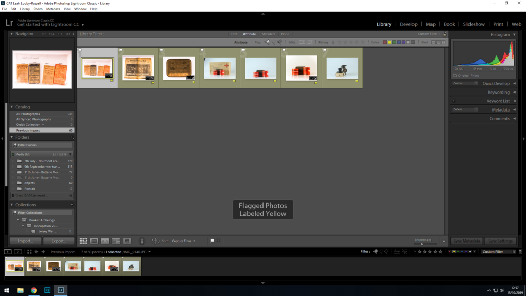
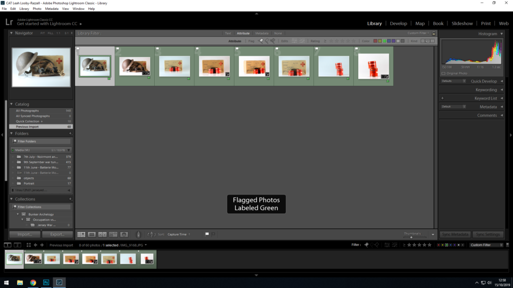
After flagging my wanted images I was left with 15 images to choose from. I went and colour coded each image. Yellow means that there’s a chance I might use the image, green means that I will defiantly be using the image for my blog.
Images which have been colour coded yellow
Images which I have been colour coded green
Chosen images:
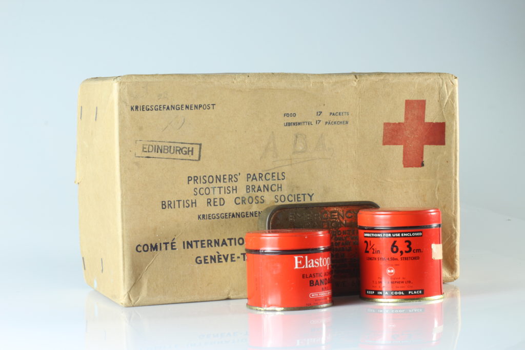
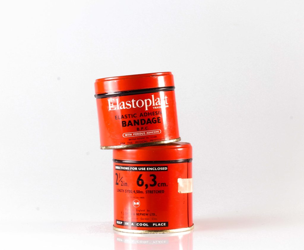
Red cross package with tins of bandages and an emergency tin.
Two tins with bandages with an emergency tins.
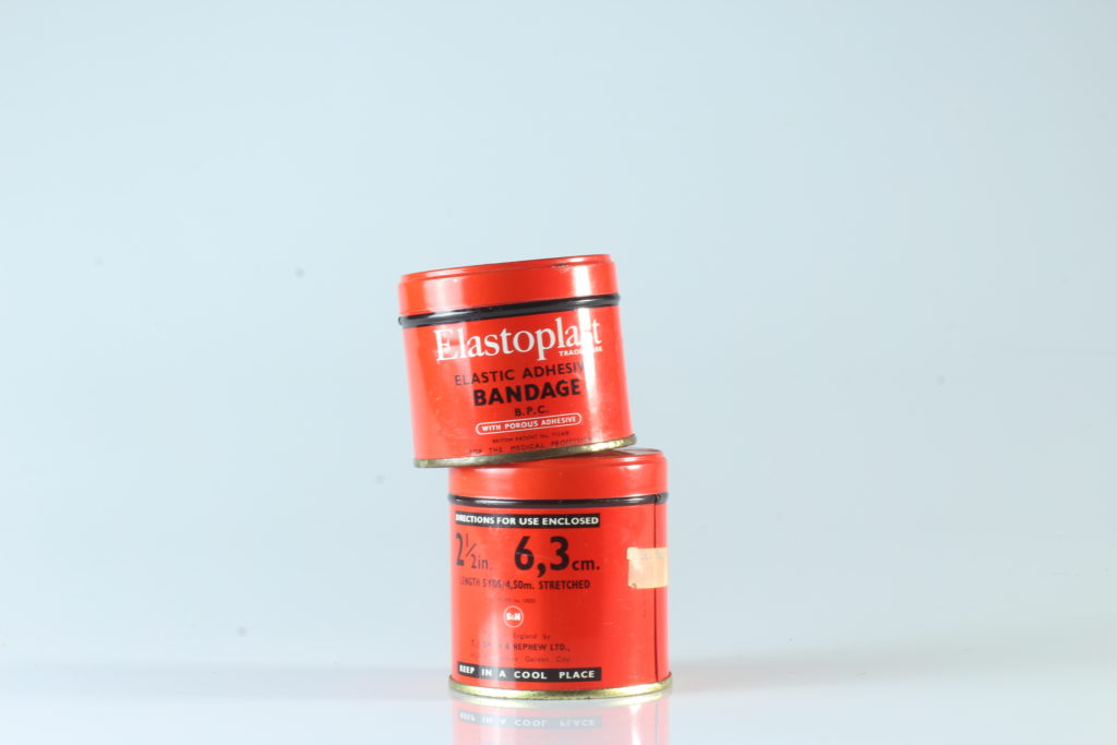
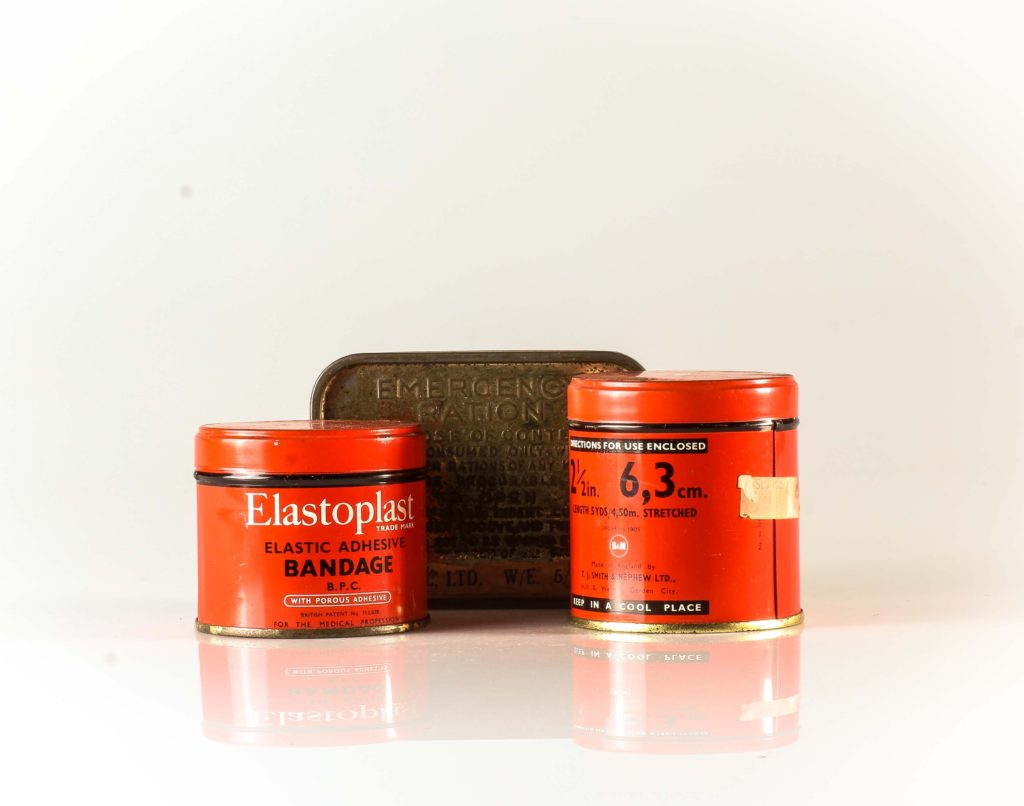
Two tins of bandages
Red cross package with two tins of bandages and an emergency tin.
Red cross box with a crystal radio box and a war helmet.
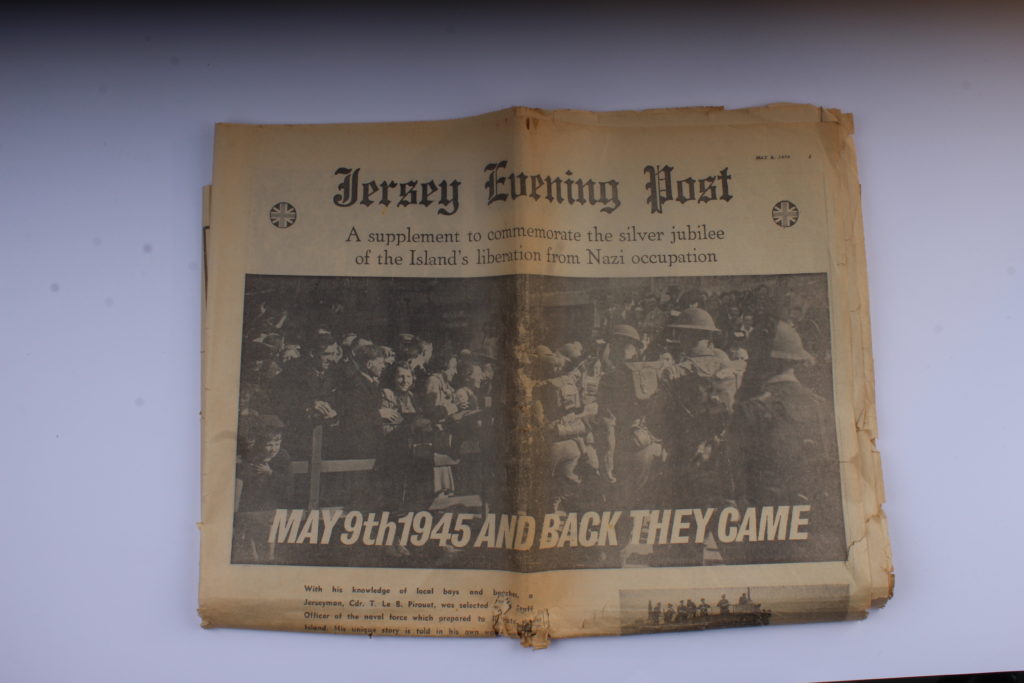
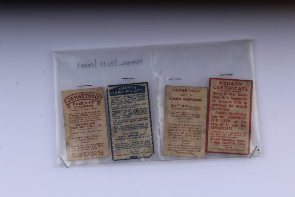
In a lot of these images I was going for a warm tone. In the images of the coupons and newspaper, this warm tone brought out the yellowing of the aging paper. I also tried getting the objects to stand out against the background, to be bright and focused so it’s the only thing that the viewer can concentrate on. I also liked the look of the reflections on the floor, caused by the infinity board. It makes it look like the objects are in fact on something and aren’t floating in space, but it also doesn’t take much attention away from the object itself.
For the continuous light, my settings on my camera were:
Camera setting: Manual Mode ISO: 100 White Balance: Daylight Aperture: F/16 Shutter: 0.5 sec to 0.8 sec
For the flashing light, my setting on my camera were :
Camera setting: Manual Mode ISO: 100 White Balance: Daylight Aperture: F/16 Shutter: 1/125-1/200 Flash heads set to power output: 2.0
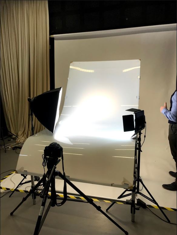
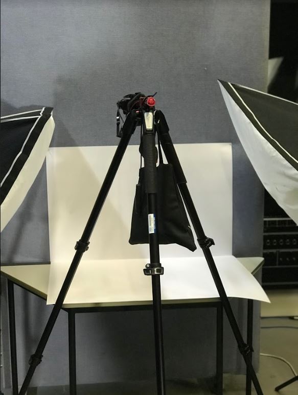
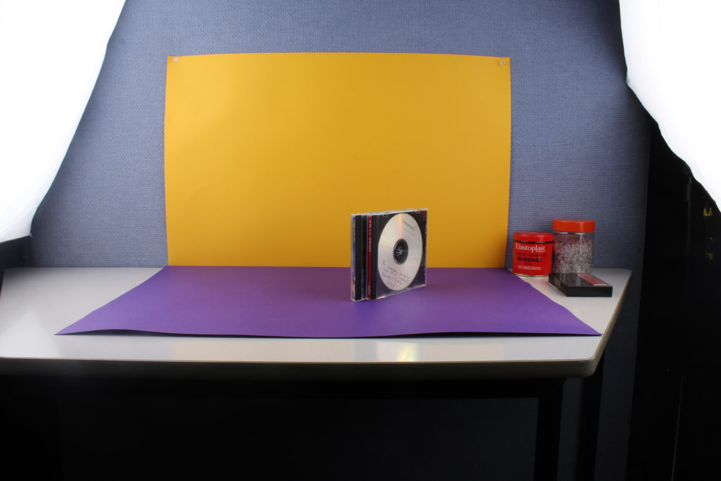
Here is a photo taken of the setup used with colour-block backgrounds. The object is placed in the middle; on top of a colourful sheet, with a second sheet behind it. It is difficult to see because of the flash being on, but there is a small pilot light to the right, which makes it easier to focus and adjust the image when the flash is off. Then there are the two flashes either side of the object being photographed, this helps give the photo bright and even lighting. As this photo was taken using the camera the camera setup cannot be seen in this photo, but it consisted of a camera with a flash transmitter attached, placed on a tripod with a sandbag to prevent it falling over. There was also a shutter cable release used in order to reduce camera shake when pressing the shutter button on the actual camera.
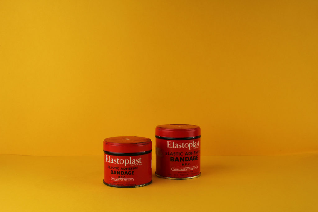
This is an example of a raw image from the colour-block background photo shoot. It is unedited yet extremely vibrant and popping out of the page, this is thanks to the high contrast between the background and object being photographed in the foreground which is possible due to this method.
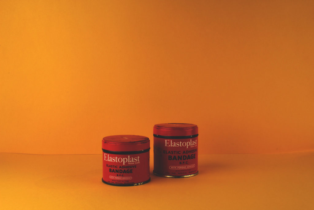
This is an example of a finished photo from the shoot. I will go into further detail about it in the next blog post.
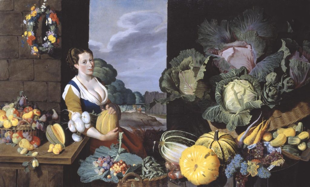
The cook maid and market scenes, popular in the seventeenth century evolved in the low countries from a genre practiced by Pieter Aertsen ( c.1533 – c.1573) and his colleague Joachim Beucklaear, which combined contemporary kitchen scenes with a new testament episode beyond. Bacon could have been inspired by the work he had seen on his visit he made to the low countries in 1613.
Religiously, this image would have suited the era in which it was painted. Symbolically, the idea that their is a house wife in the kitchen would have suited the traditional values that would have had to be upheld during this time. A woman would always be the one that sat at home and cooks for her family .