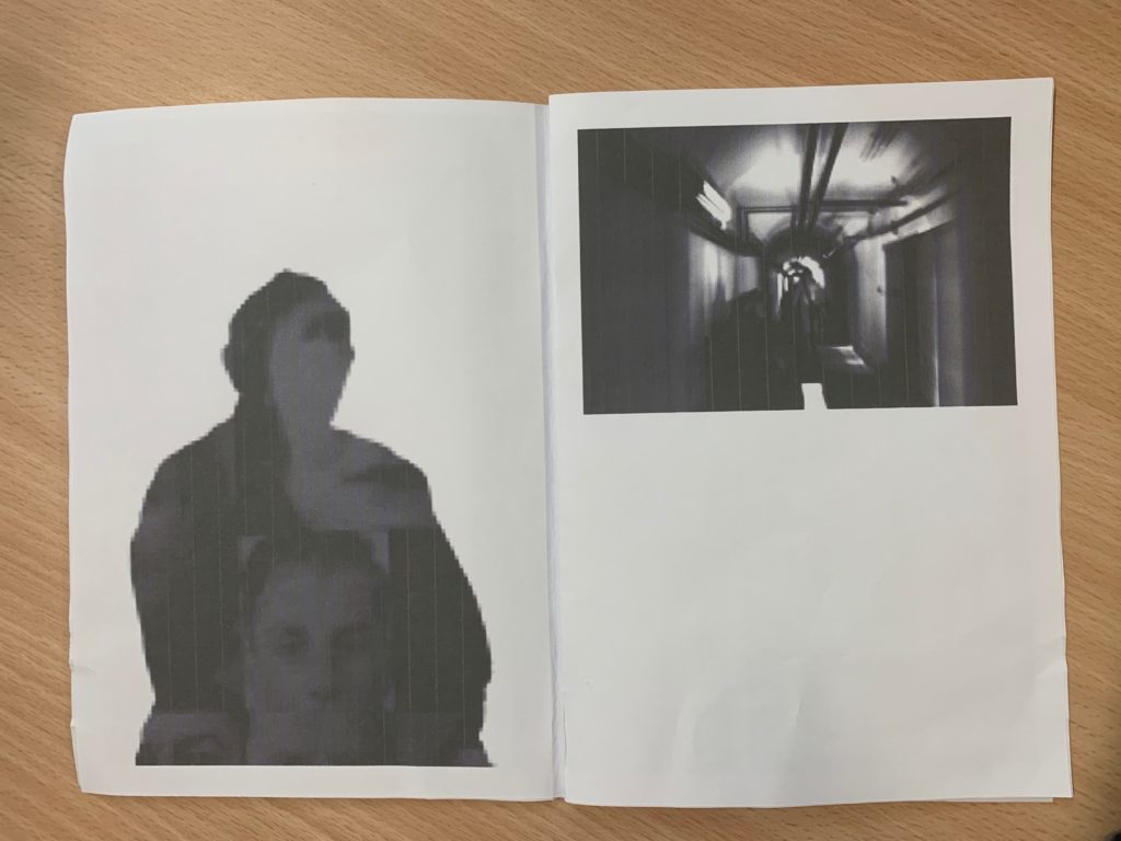


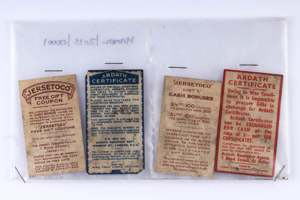
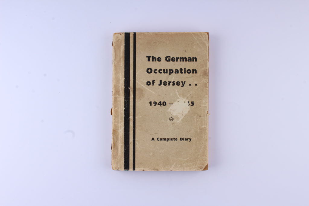
Still Life / Objects – Post 5 (Final Images)
Final Images:

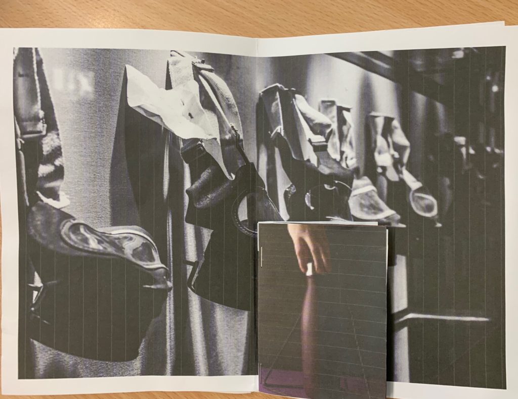
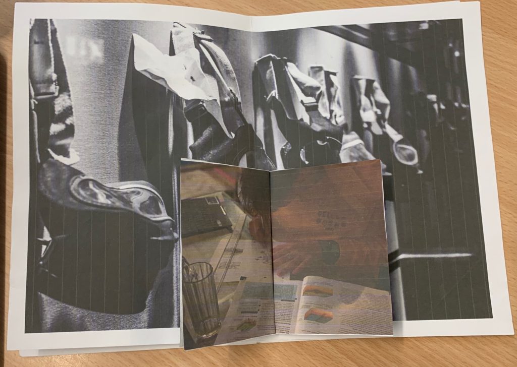
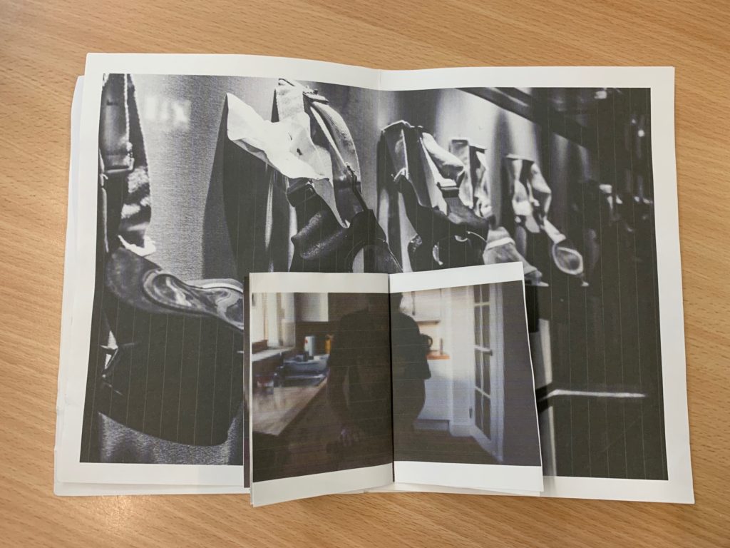
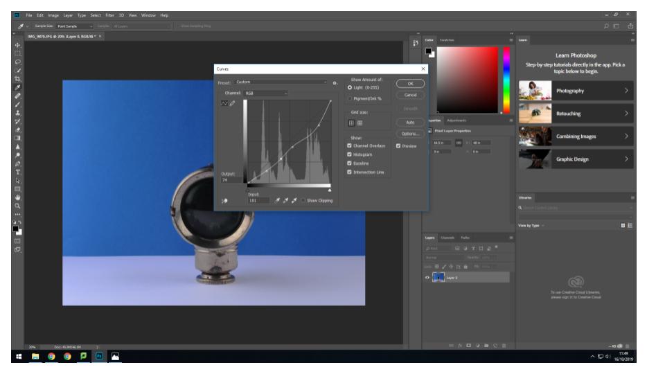
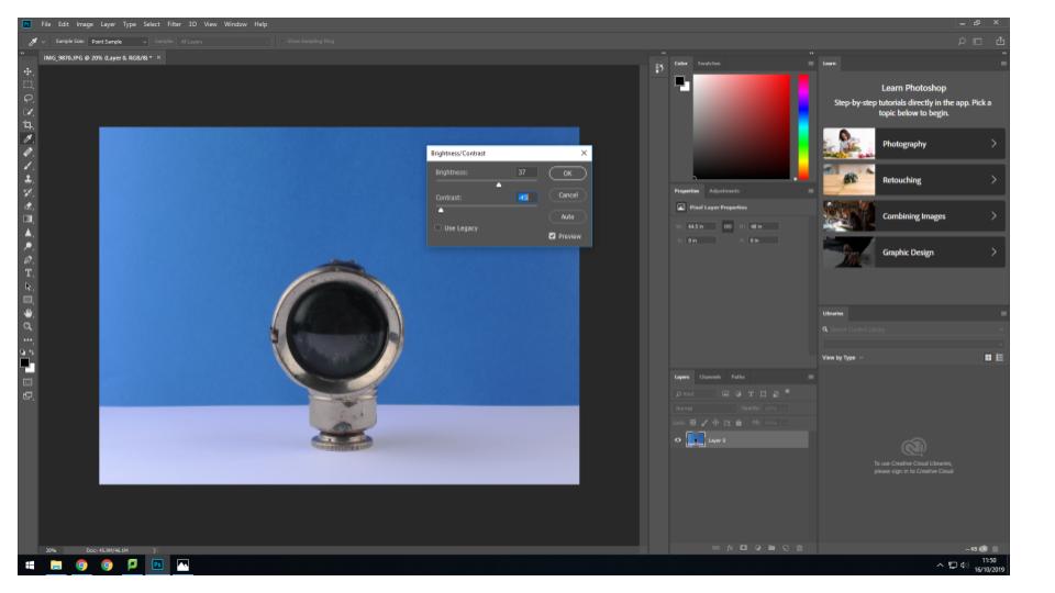
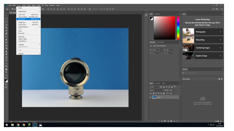
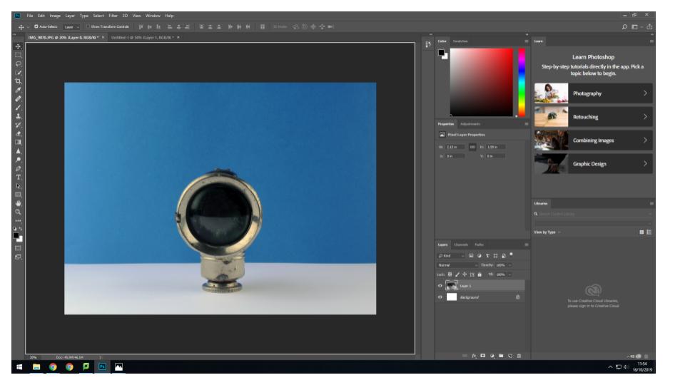
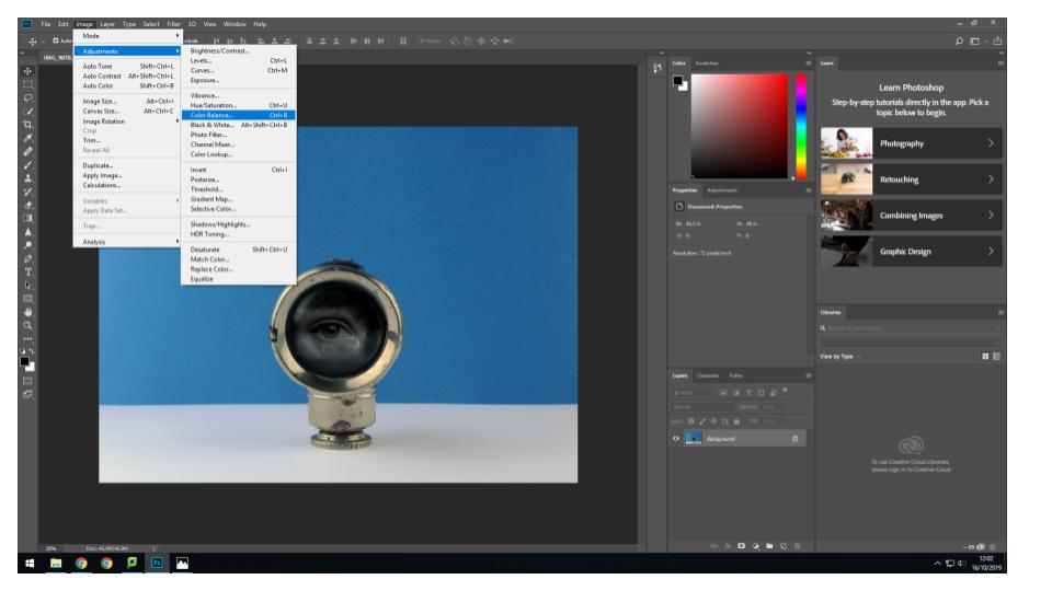
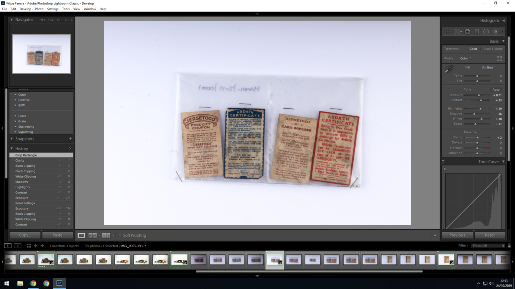
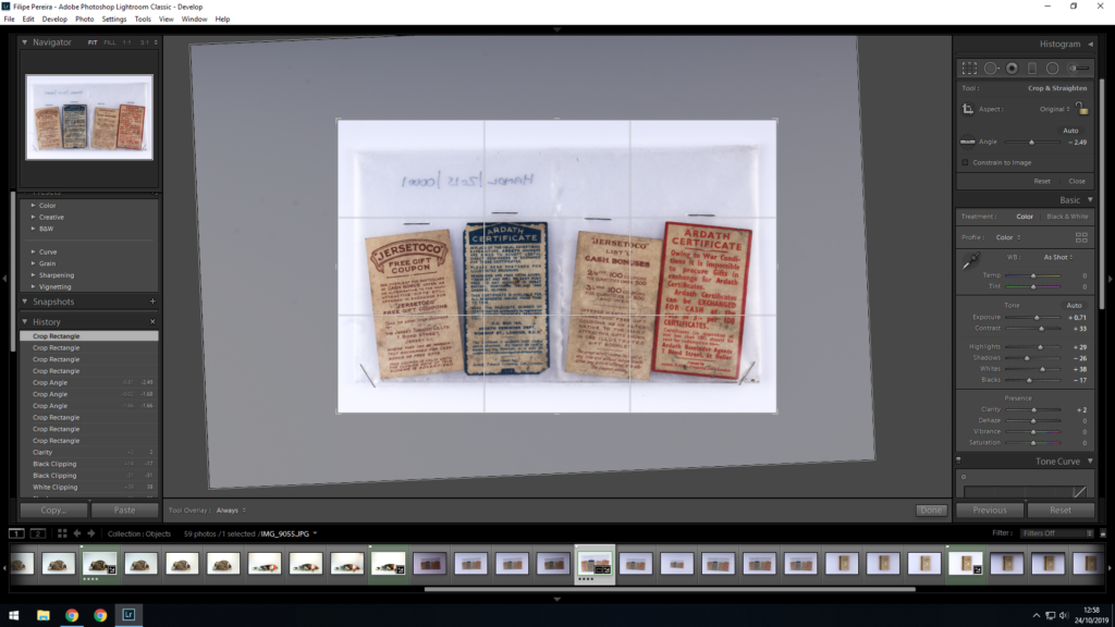
Still Life / Objects – Post 4 (Montage Experimentation: Editing)
Editing Process:


Set Up in studio still Image
There are two ways for photographing still life:
Photographing Objects:
This set up has 3 lights, you have fill lights, the key light and u have a light at the back of the screen
Photographing books and flat items:
You have 2 flash heads which is then set off by the flash on the camera. By doing this you can get a perfectly lit image
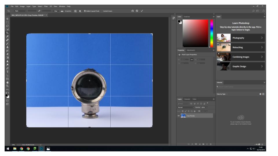
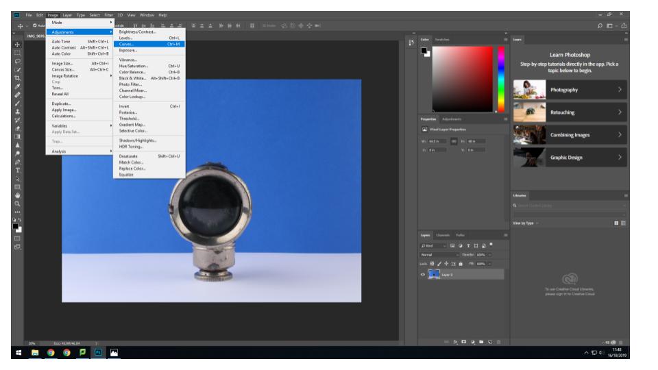
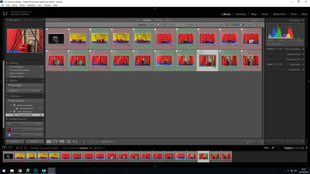
Objects – Studio Shoot: Editing and Experimenting
With the images I gathered from the objects photo shoot i tried out different things such as putting the images into black and white. Other than that I didn’t really touch the images apart from some slight cropping and exposure/contrast adjustments. I did sharpen some of the images slightly to make the reflections more prominent. I really wanted the objects to stand out and really show their history and their age. The reason I didn’t really want to edit the images was because I thought the objects should be centre focus, they have a story to tell and any major editing would take away from it.

Experimenting with Rafal Milach’s Technique
Planning my Photo shoot
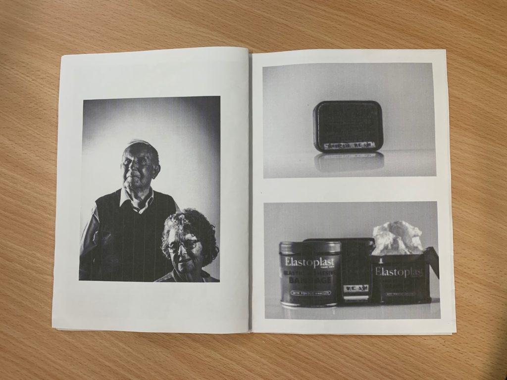
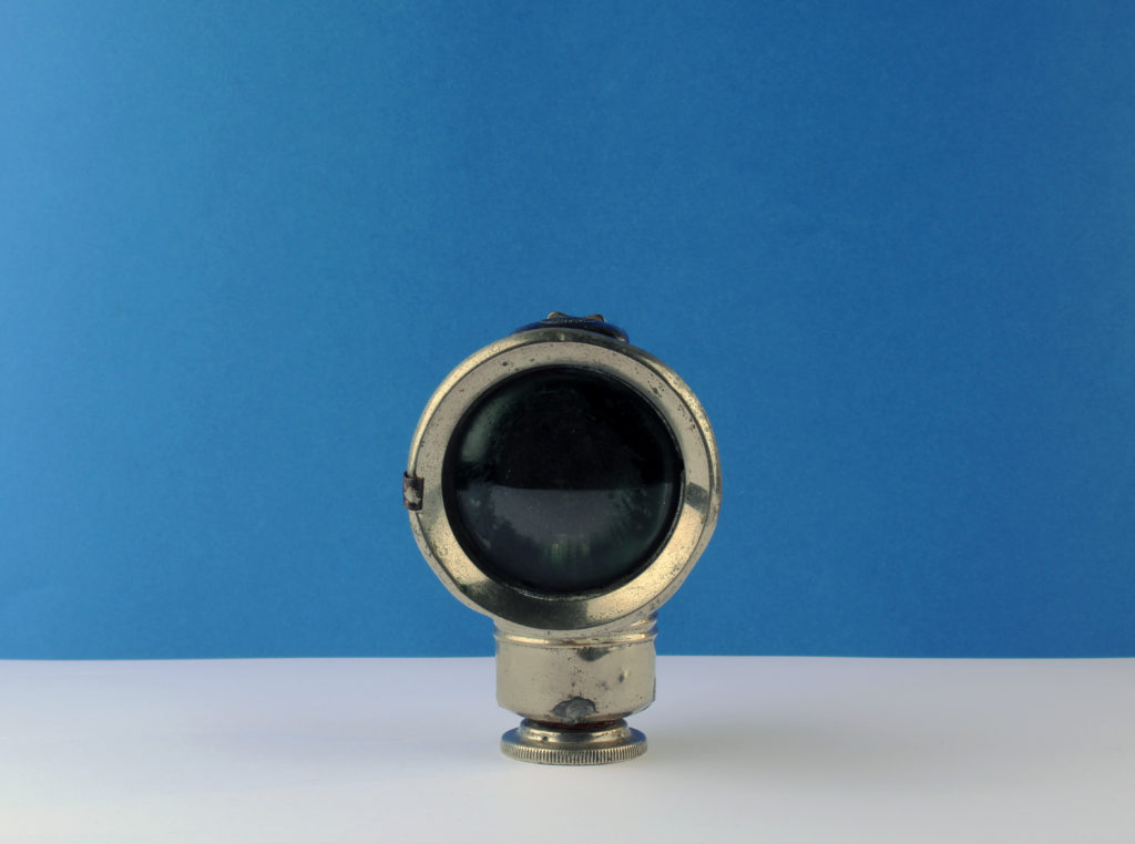
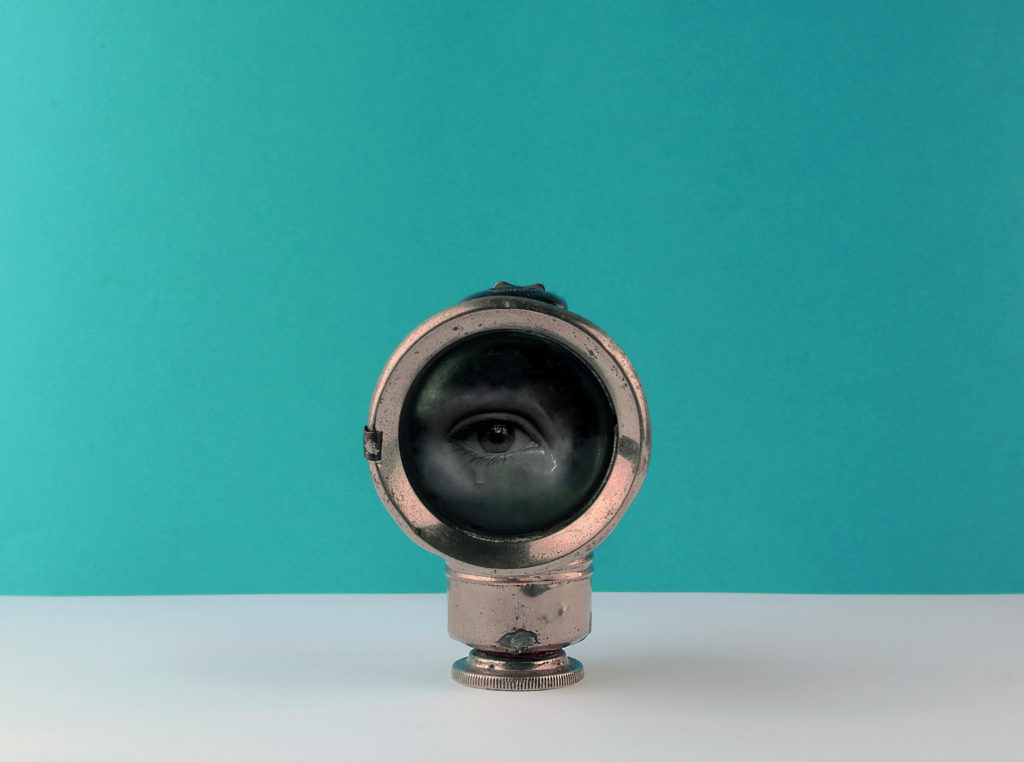
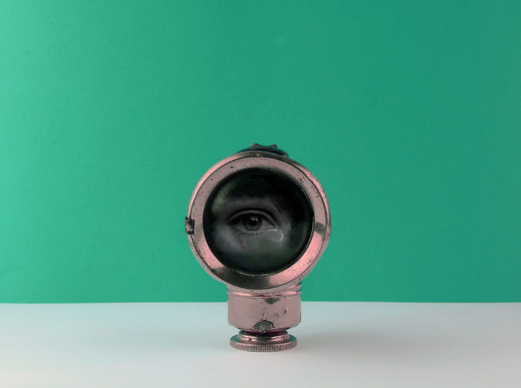
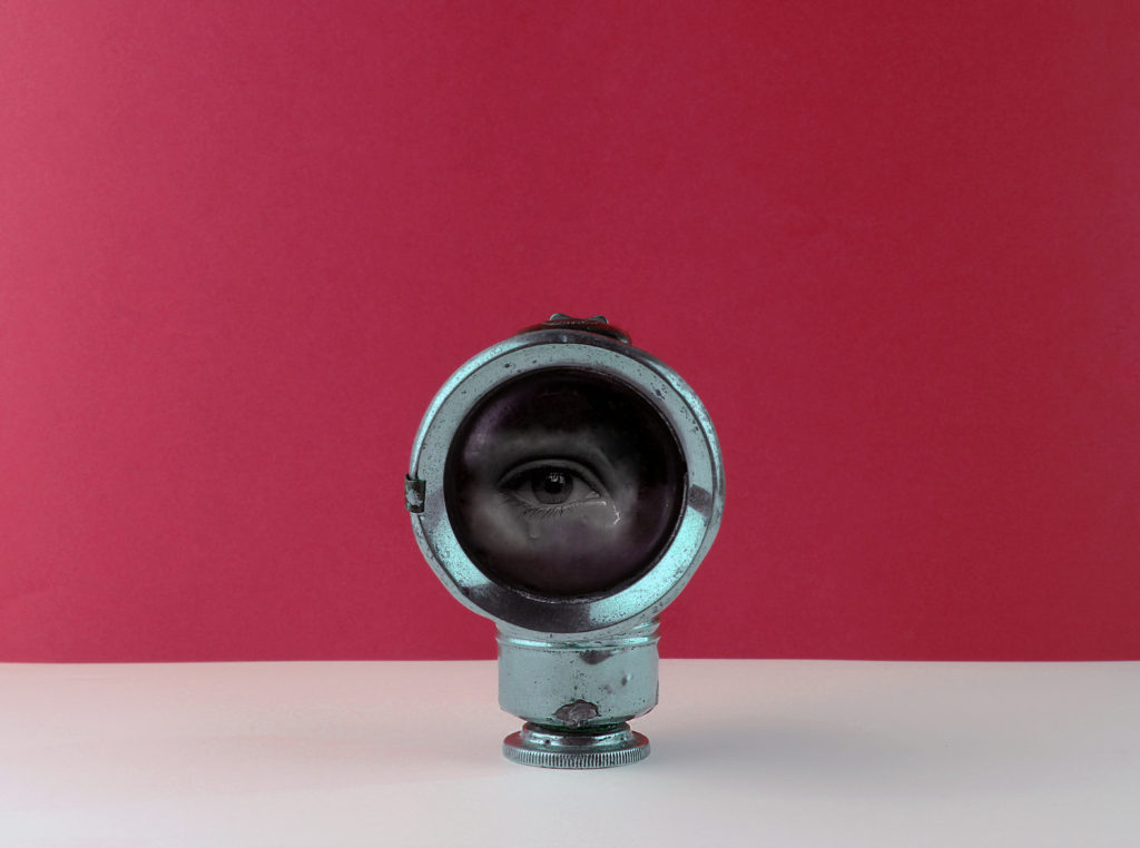
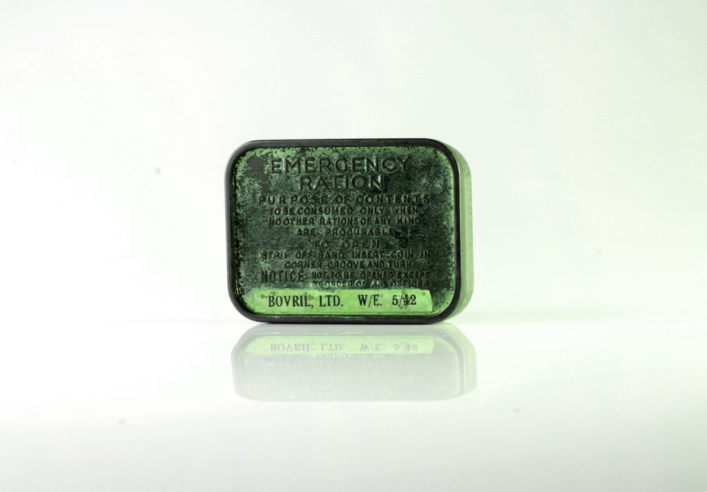
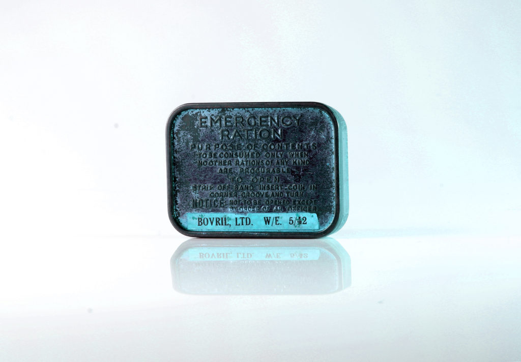
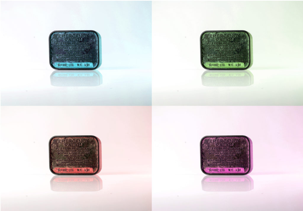
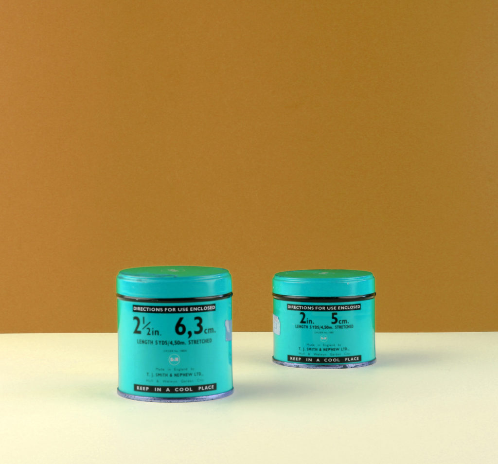
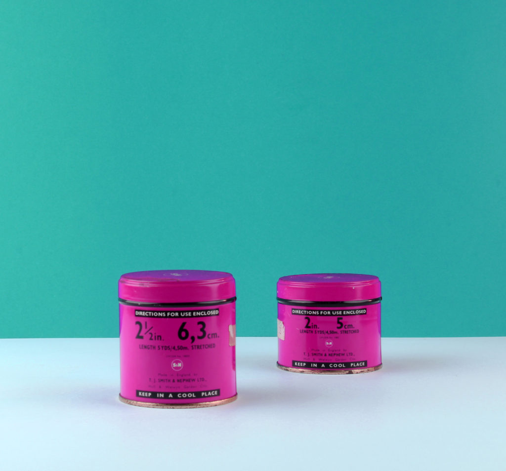
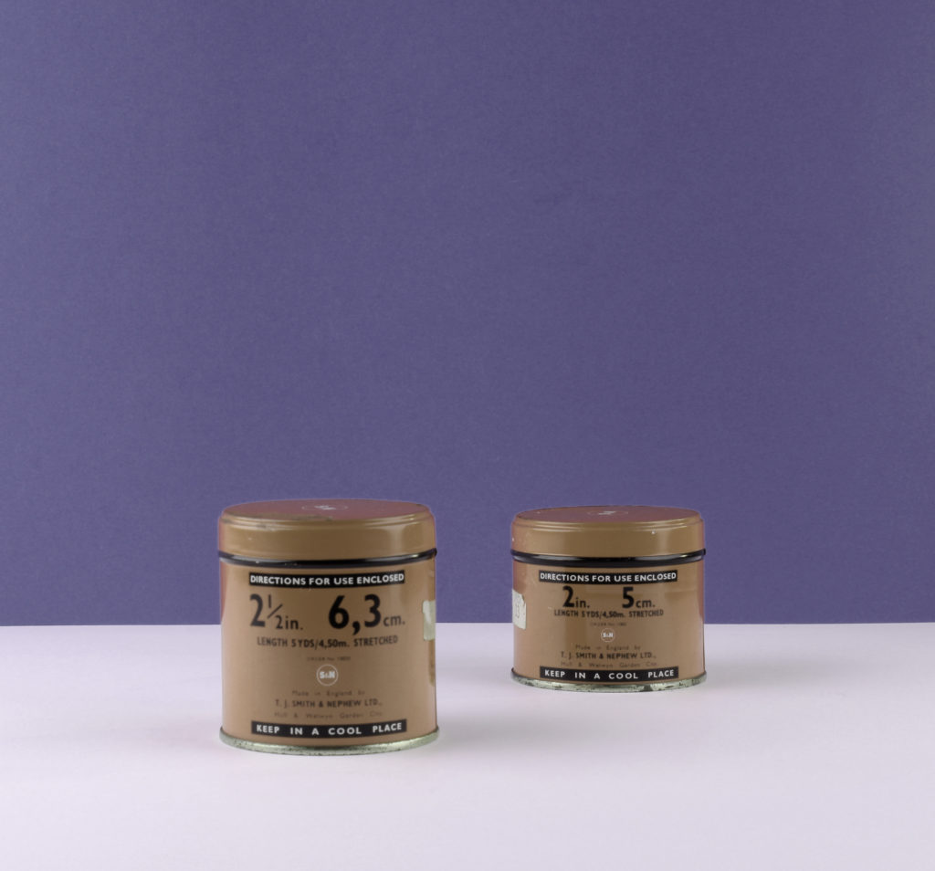
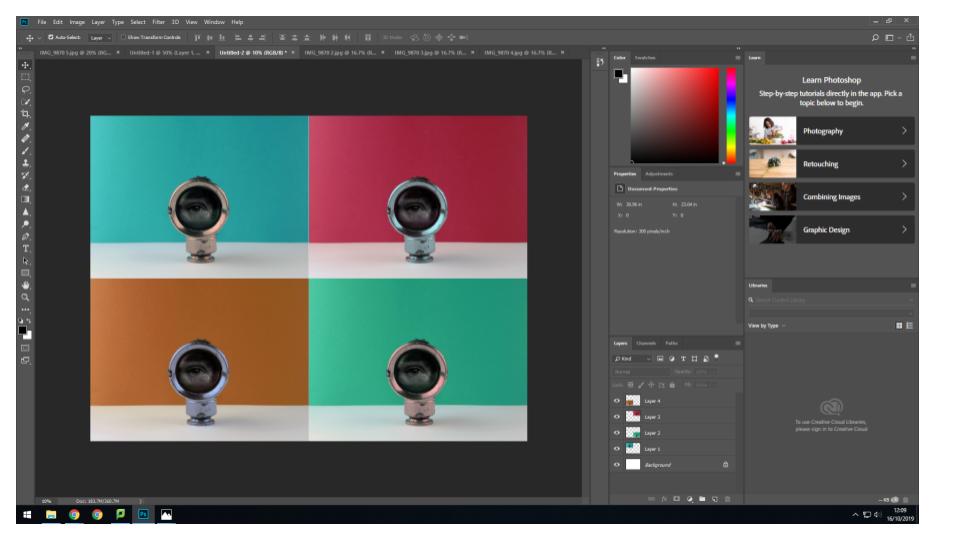
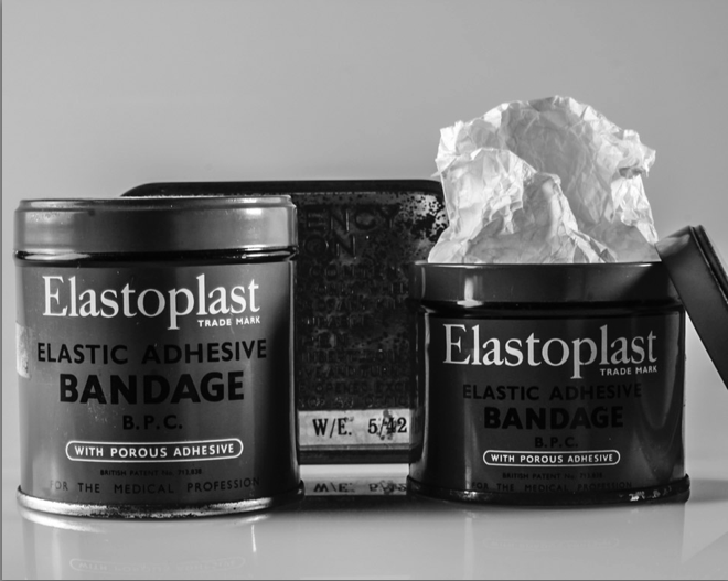
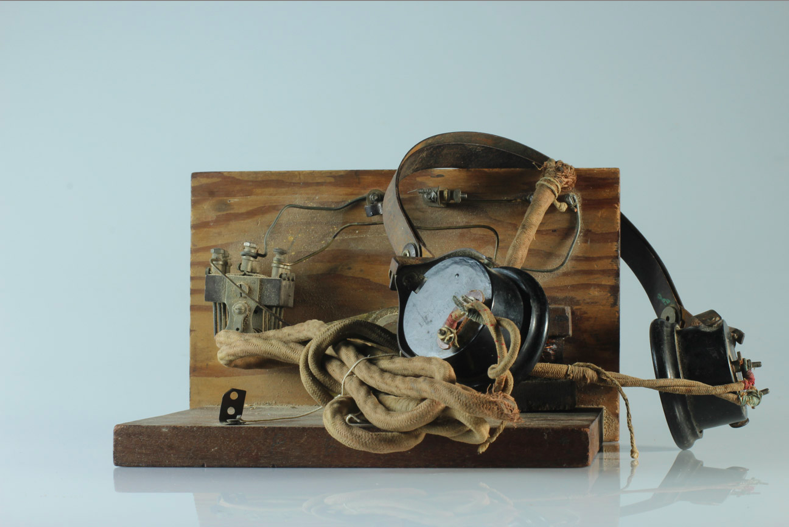
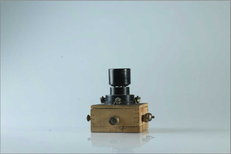
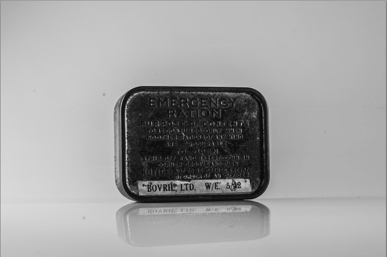
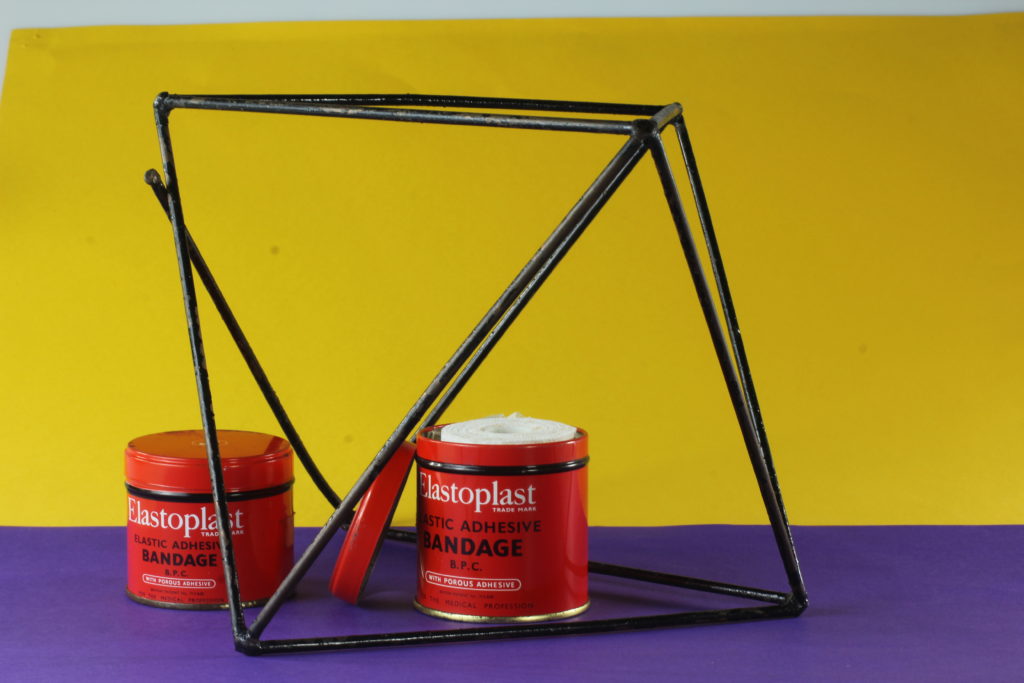
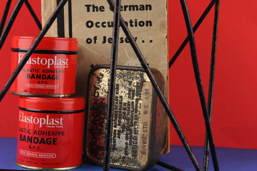
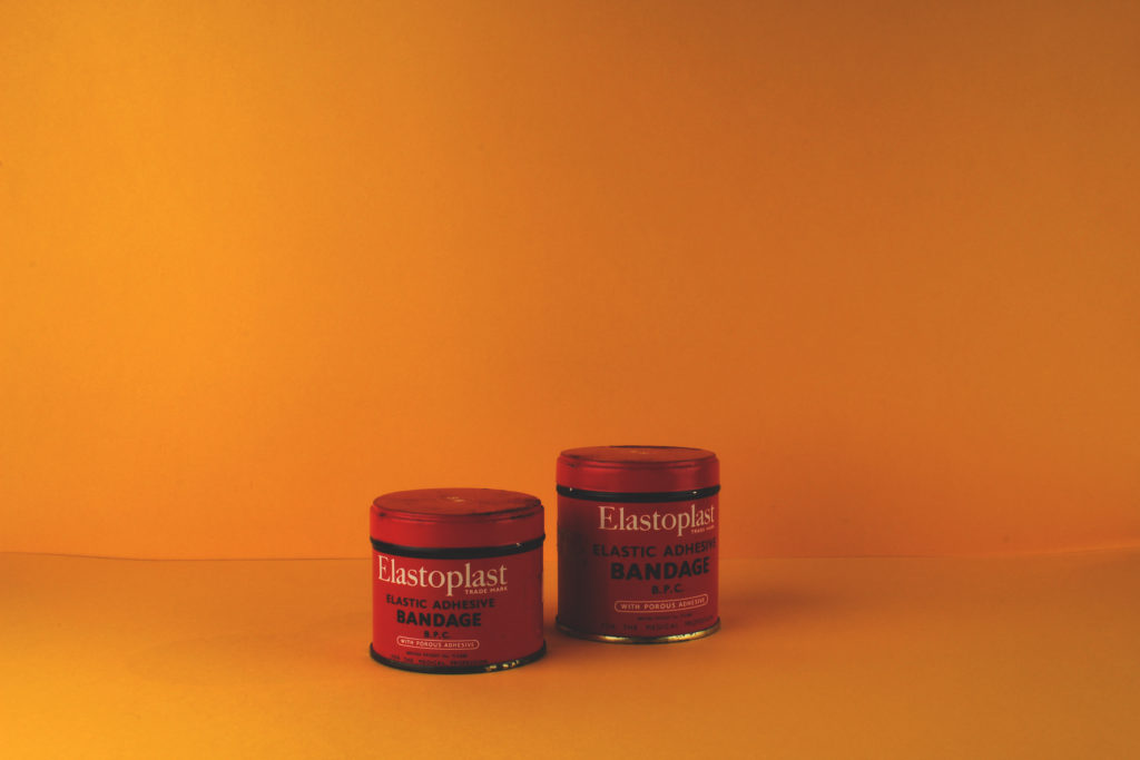
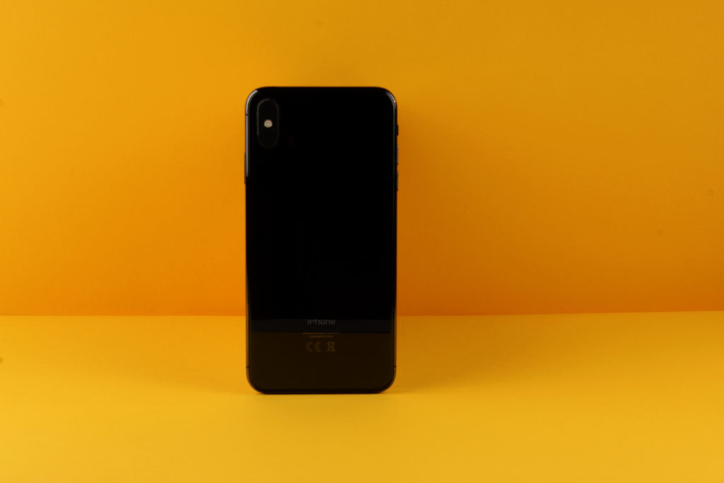
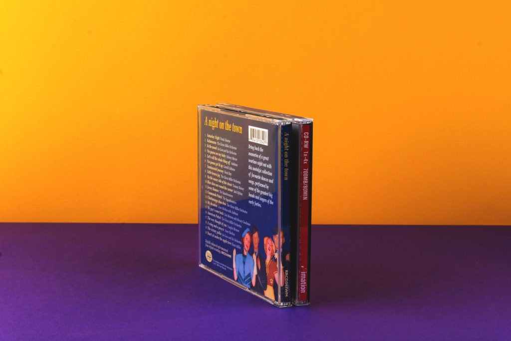
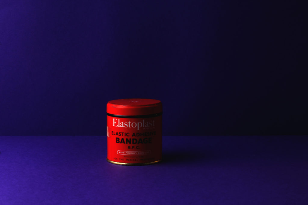
For my photo shoot, i am going to be taking images which have been inspired my Rafal Milach. This style includes bold coloured backgrounds, geometrical shapes as well as objects. I will use his influence of the coloured background as well as the geometrical shapes. These elements will be used to show off the occupational objects, provided by Jersey Archive. These objects will be things such as books on the occupation, old bike lights, bandages, and emergency ration pots.
I also plan to use a Canon Camera on a Manual Focus, set the ISO to 100, as well as the aperture to F16. These settings will allow me to adjust the depth of field, giving me more freedom with my photography. The white balance was on the daylight setting to allow more light in, as well as the shutter speed for the shoot being 0.6. The camera will also be connected to a transmitter which will set off a flash on the two soft box lights, positioned to each side of the objects.
Process of Elimination
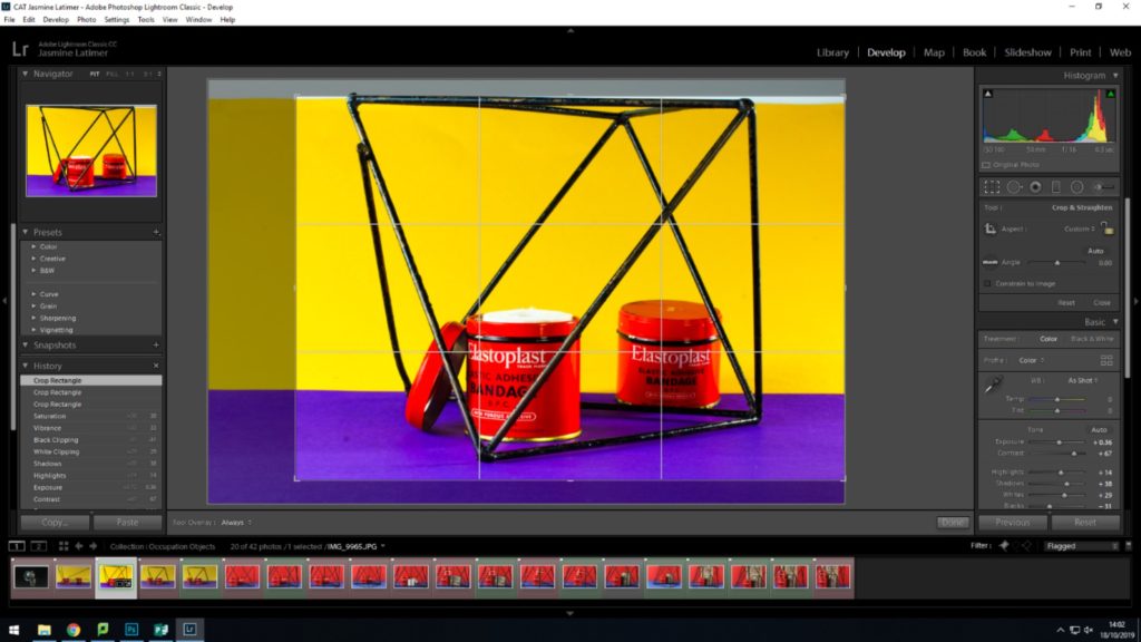
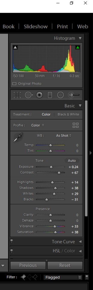
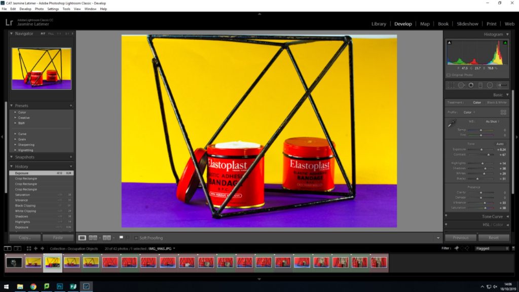
Planning my Editing Process
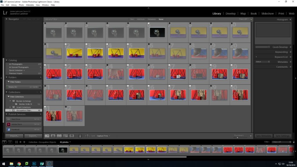
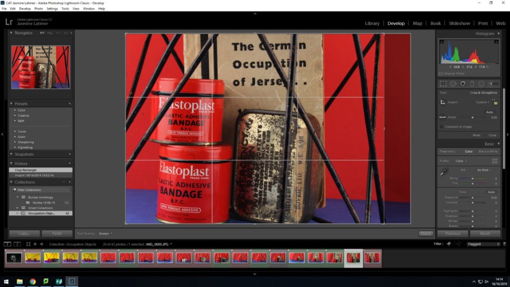
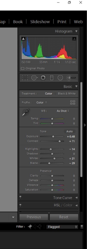
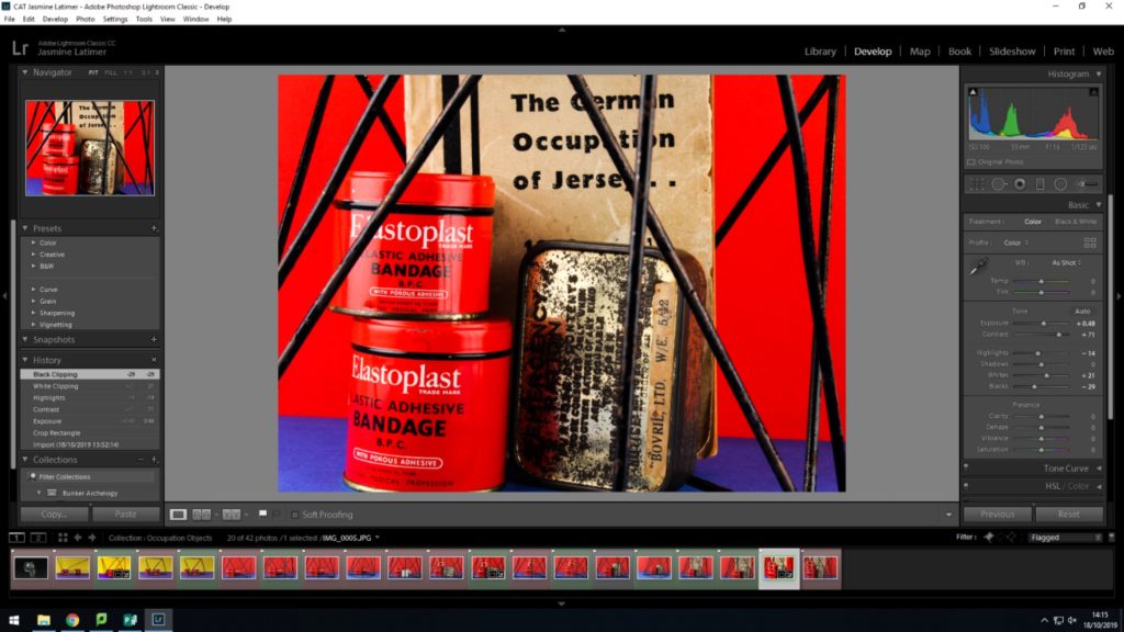
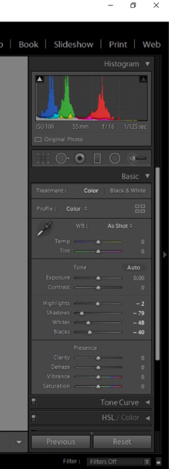
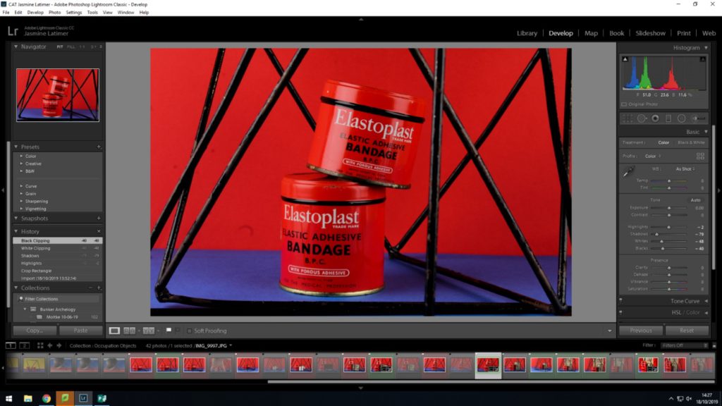
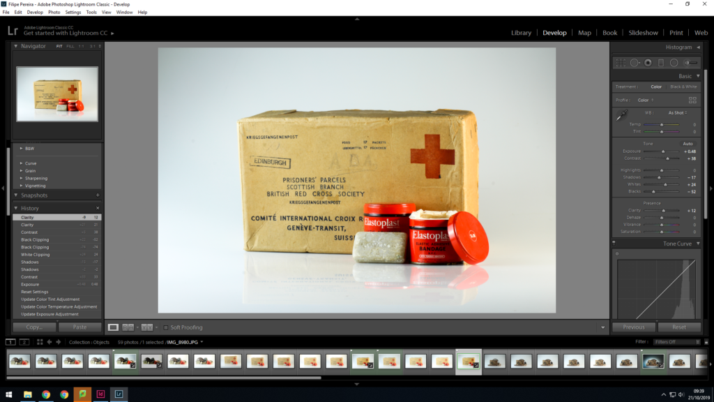
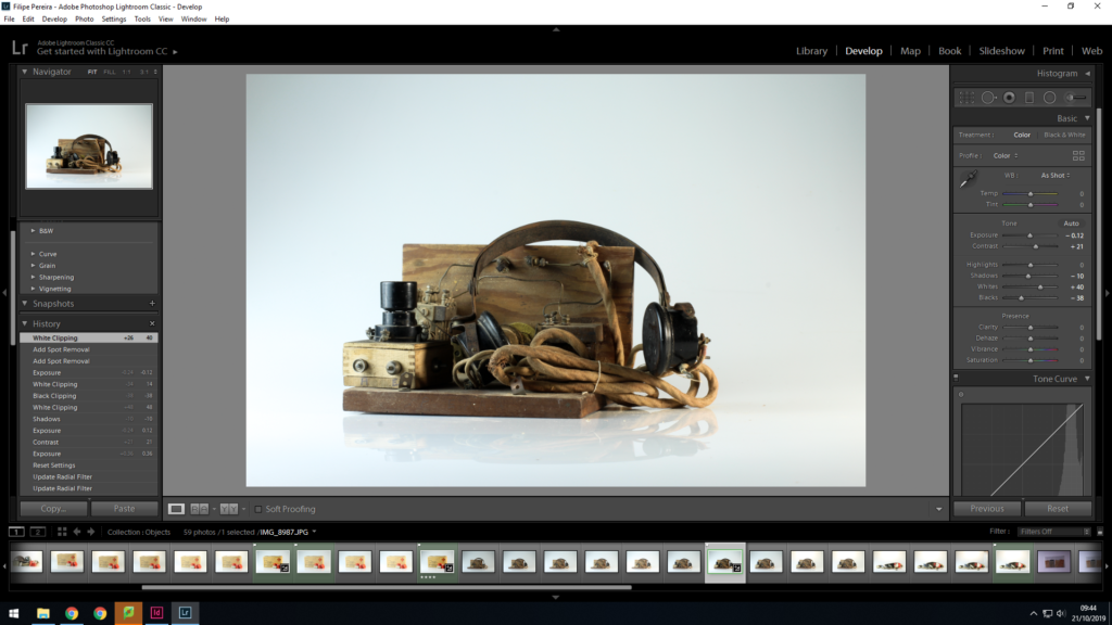
I am very happy with how my images turned out. However i do feel as if their are elements such as the placing of the objects, and how vibrant the images are needs to be edited in order to make a strong image. I will use Adobe Lightroom Classic to edit my images and will do simple edits. Screenshots of my process will also be shown.
Editing my Images


Best Edited Images
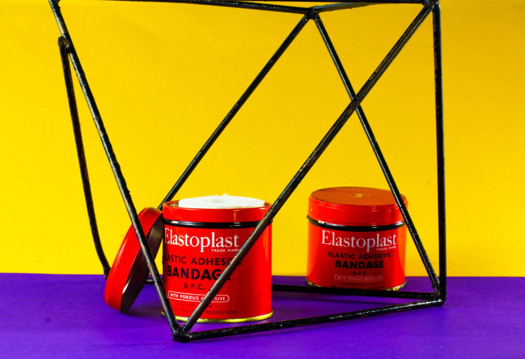
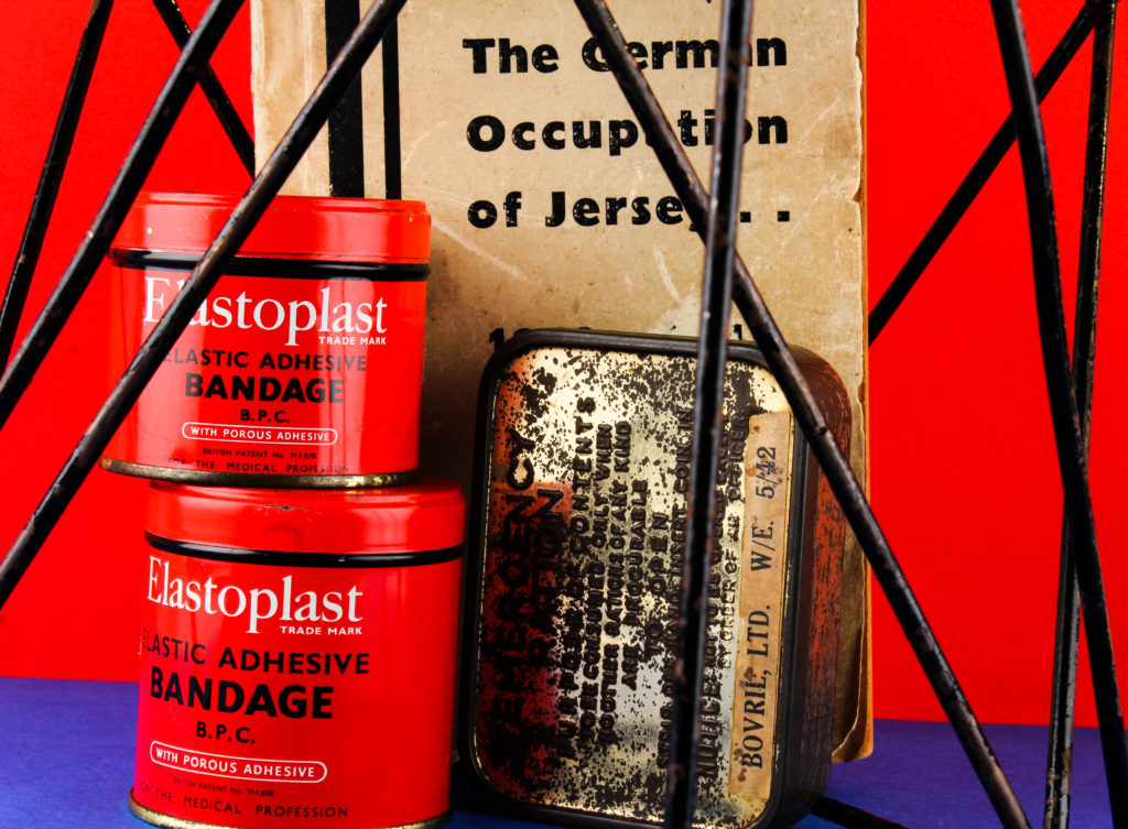
Technical Analysis- I used a Canon Camera on a Manual Focus, the ISO to 100, as well as the aperture to F16. These settings will allow me to adjust the depth of field, giving me more freedom with my photography. The white balance was on the daylight setting to allow more light in, as well as the shutter speed for the shoot being 0.6. The camera was also connected to a transmitter which set off a flash when i pressed the camera setting, allowing the objects to retain light.
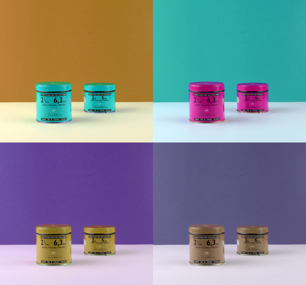
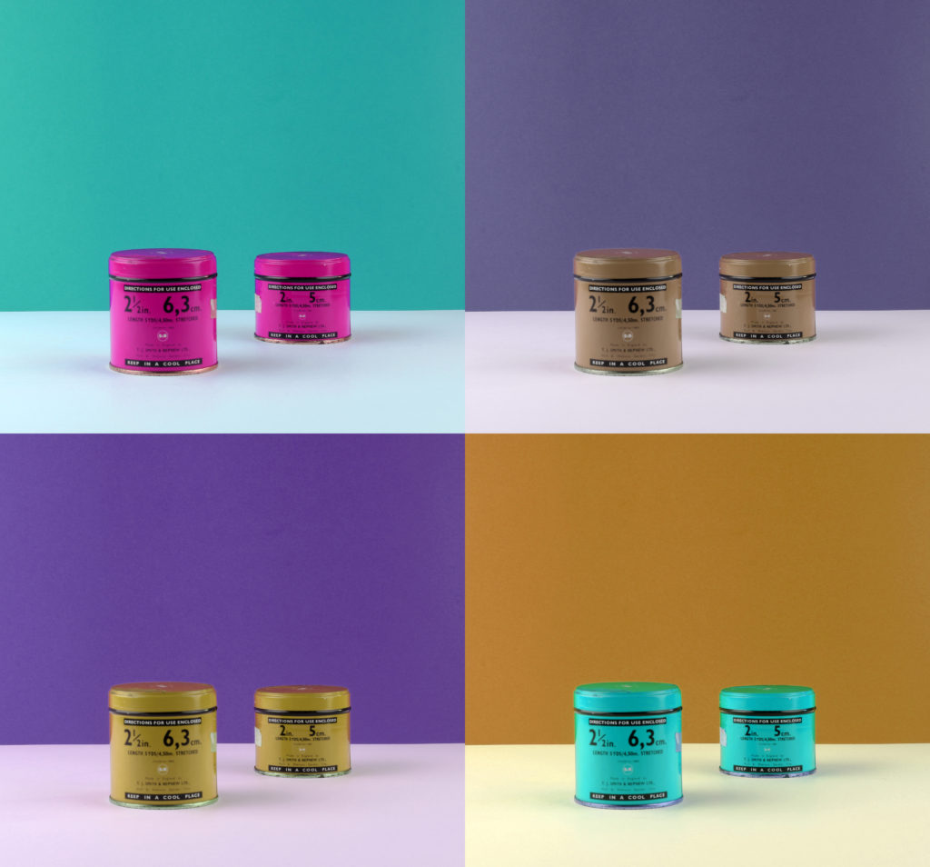
Visual Analysis- Visually we can see that the bold coloured colour background has been used which is a typical representation of what Milach used in his photos. Geometric grids have also been used to again show the influence of Milach’s style and they helped add detail to the image. We can see the objects from the occupatin have been edited so that they are seen to be in the middle of the pictures.
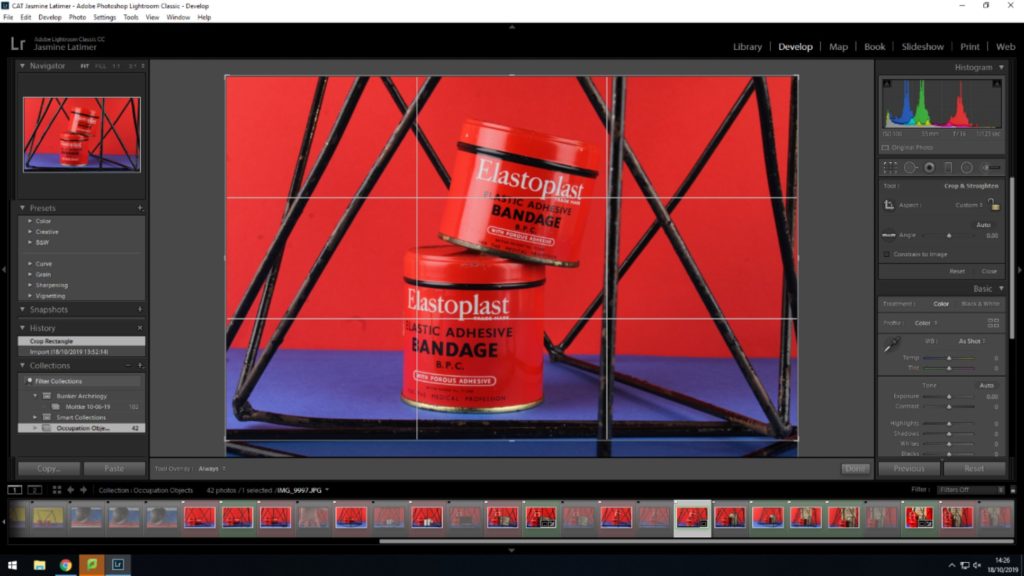
Edits- When editing the images, i ensured that the main focuses were in the middle of the image by using the cropping tool on Lightroom. I also changed simple elements such as the Exposure, Contrast, Highlights, Shadows, etc, in order to ensure that the picture was vibrant enough to be symbolized as a look a-like of Milach’s.
Comparing Unedited and Edited Images


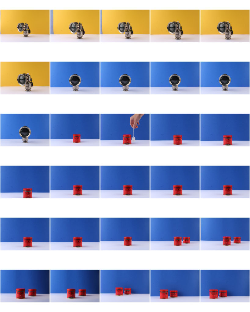
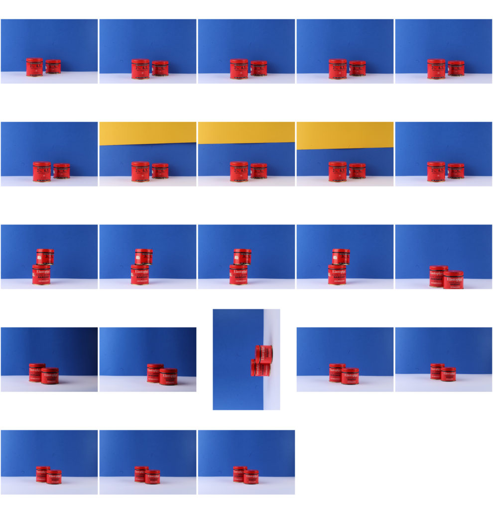
Colour-block final images
I have chosen these four photos out of many others which I have edited; this is as due to the colour block theme most of the images look similar, and these four are a good representation of the whole photo shoot.
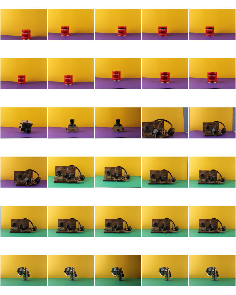
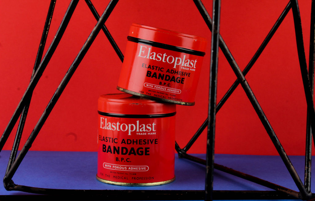
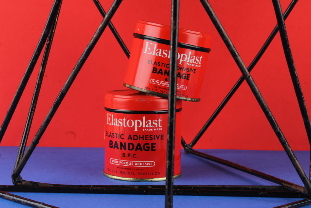
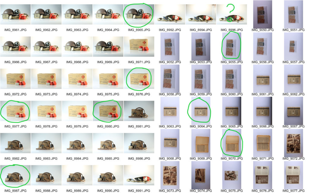
Still Life Photo Shoot
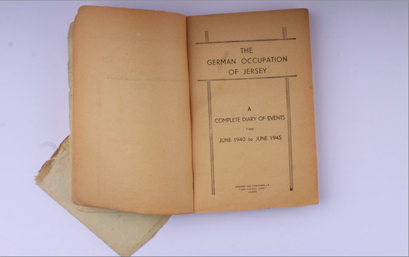
The main focus of this photo shoot was to capture objects from the German occupation in Jersey. There were two different camera set ups to capture the objects, one being straight on and the other from a birds eye view. The straight on set up was used to capture bigger objects that could stand up by themselves, such as helmets, boxes, lights. Whereas the birds eye view angle was used to take photos of objects that couldn’t stand up such as books, newspapers and magazines.
Contact Sheets:
Edit 1:
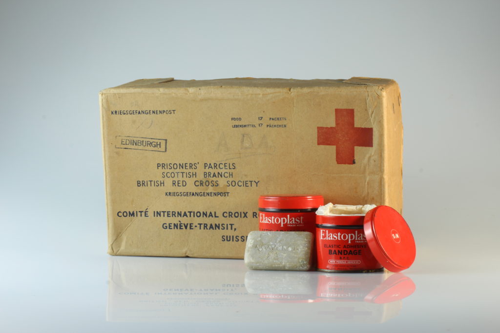
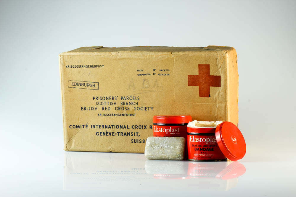
In this edit I began by trying to make the background brighter so that the object would stand out a little more and to also brighten up the image. I did this by increasing the exposure and the white sections in Lightroom. The next thing I did was tried to make some of the details on the box and tubs become clearer, and I did this by increasing the contrast and decreasing the shadow sections to make so that the shadows would stand out more and so that there would be more of a contrast between the dark and light sections of the edit. To conclude the edit I increased the clarity just so that some of the creases and damage on the box could stand out and give the box a bit of texture.
Edit 2:
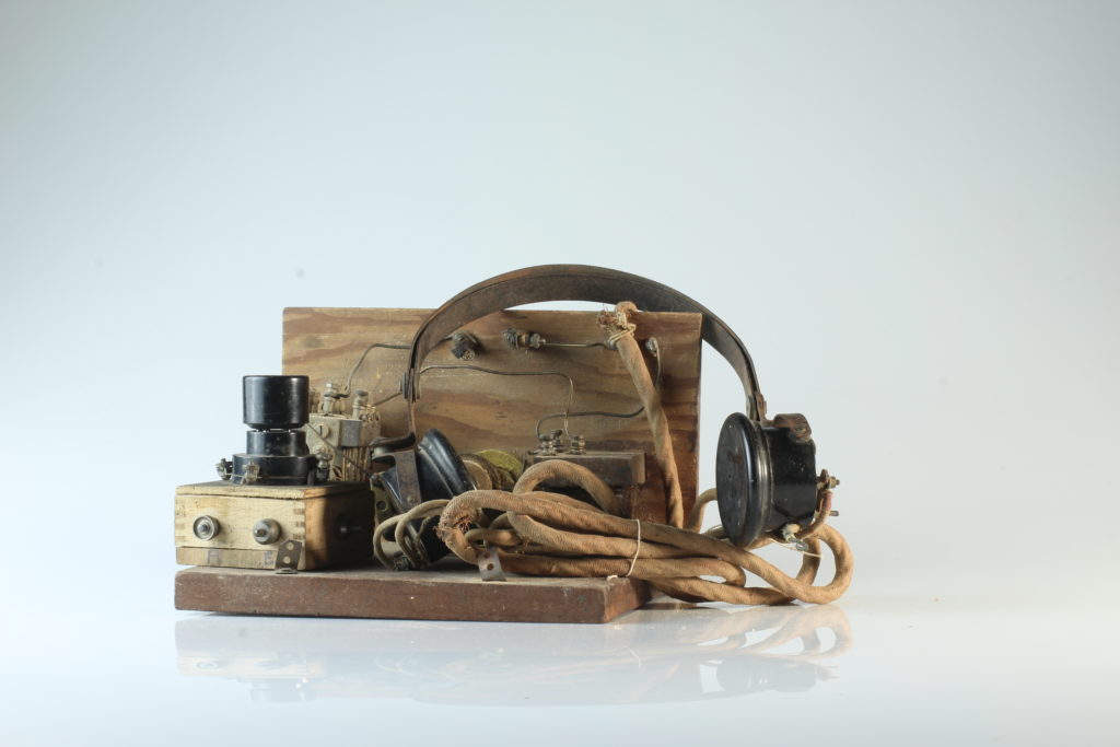
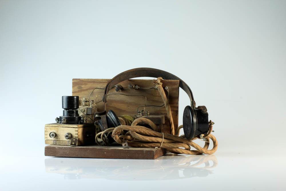
In this edit my main aim was to make the detail on the wood and the headphone wires clearer. To do this I began by increasing the contrast to try make the little bumps on the headphone wires stand out and make the little cracks and scuffs on the wood clearer. I also increased the amount of white and black in the photo to make the background brighter and to also make and lighter shades on the wood and headphones brighter to try create more of a contrast.
Edit 3:
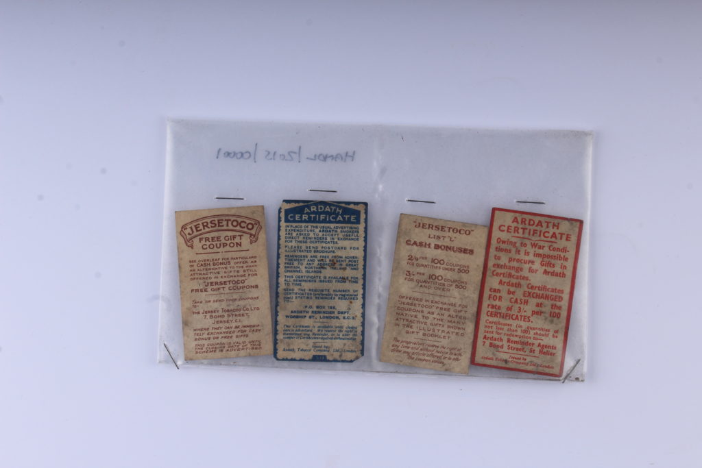
I began this edit by increasing the contrast and shadows in order to make the red and blue stand out more from the brown paper and also to make the pieces of paper stand out from the background. To also help create a contrast between the pieces of brown paper and the white background I also increased the whites in the image and the exposure. I finished off the edit by cropping out the extra white background and by making sure the subject of the image was adjusted so that it looked straight.
Edit 4:
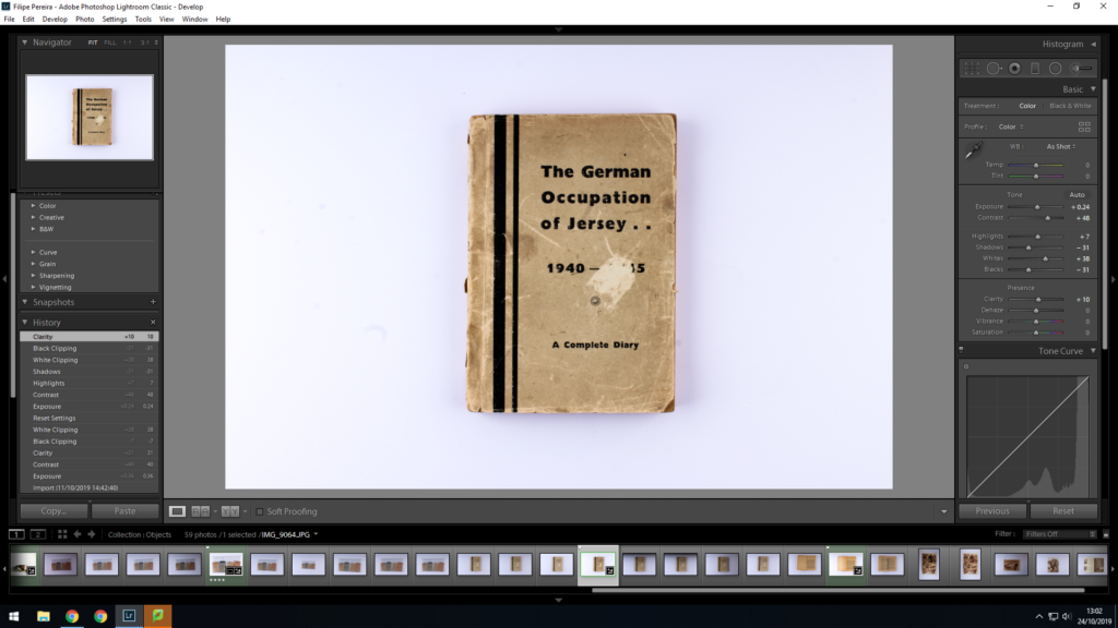
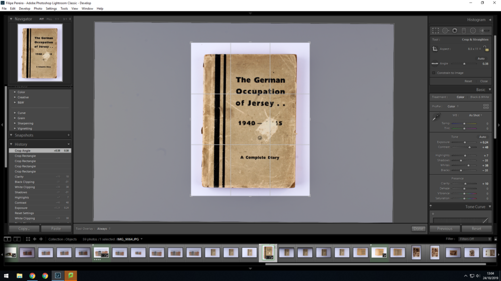
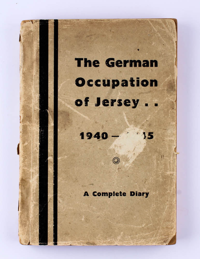
When editing this image I tried to make the details in the book stand out as much as possible. To do this I started by adjusting the contrast and shadows in Lightroom to try get all the little detail on the book cover. I also increased the whites in Lightroom to try get the background a light as possible without making the image too overexposed, and to also make the book stand out from the background a little more. I also increased the blacks to make the writing on the book a little darker. I finished the edit off by cropping the image to get rid of the extra white back ground and making sure that the book looked straight.
History of the Autochrome – Emile Guiton
The first practicable method of colour photography was the autochrome process, invented in France by Auguste and Louis Lumière. Best known for their invention of the Cinématographe in 1895, the Lumières began commercial manufacture of autochrome plates in the early 20th century.
Emile Guiton was a keen amateur photographer and practised throughout his long life. He experimented with colour at the beginning of the twentieth century in “Autochromes”. His subjects include the recording of archaeological excavations and he was one of the few people in Jersey permitted to take photographs during the German Occupation of 1940 – 1945. Emile Guiton also recognised very early on the importance of collecting photographs, both as a valuable social historic resource and as interesting artefacts – examples of developments in science and technology. He donated many images to the Société Jersiaise. He died in 1972.

https://blog.scienceandmediamuseum.org.uk/autochromes-the-dawn-of-colour-photography/ https://www.independent.co.uk/life-style/autochrome-lumiere-colour-photos-oldest-potato-starch-dyes-a8190846.html https://edition.cnn.com/2015/06/03/world/gallery/autochrome-christina/index.html
Still Life / Objects – Post 3 (Montage Photoshoot)
Contact Sheet: