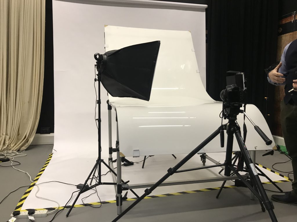
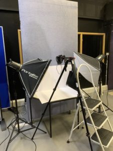
CONTINUOUS LIGHTS – PHOTOGRAPH OBJECTS THREE DIMENSIONAL
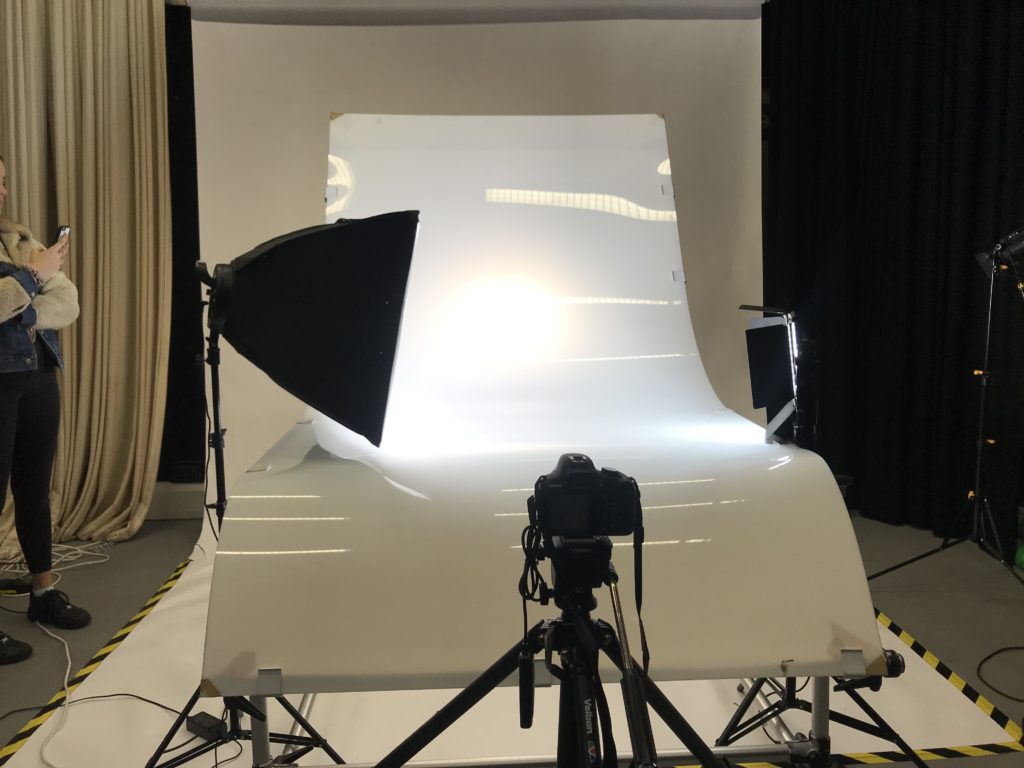
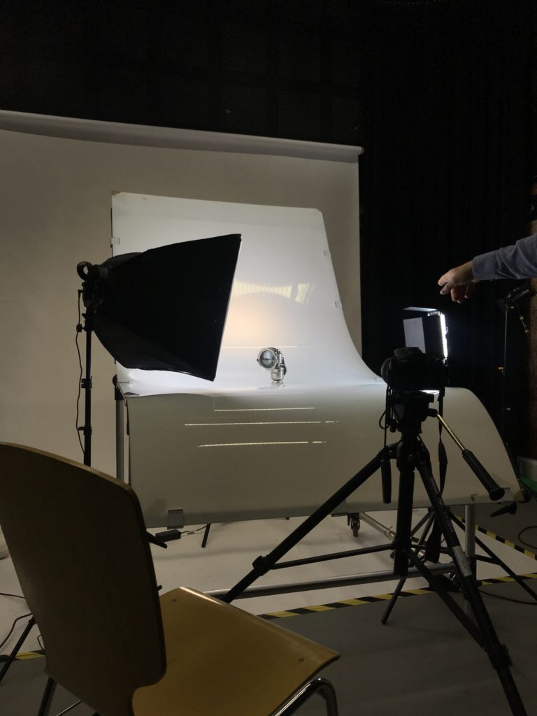
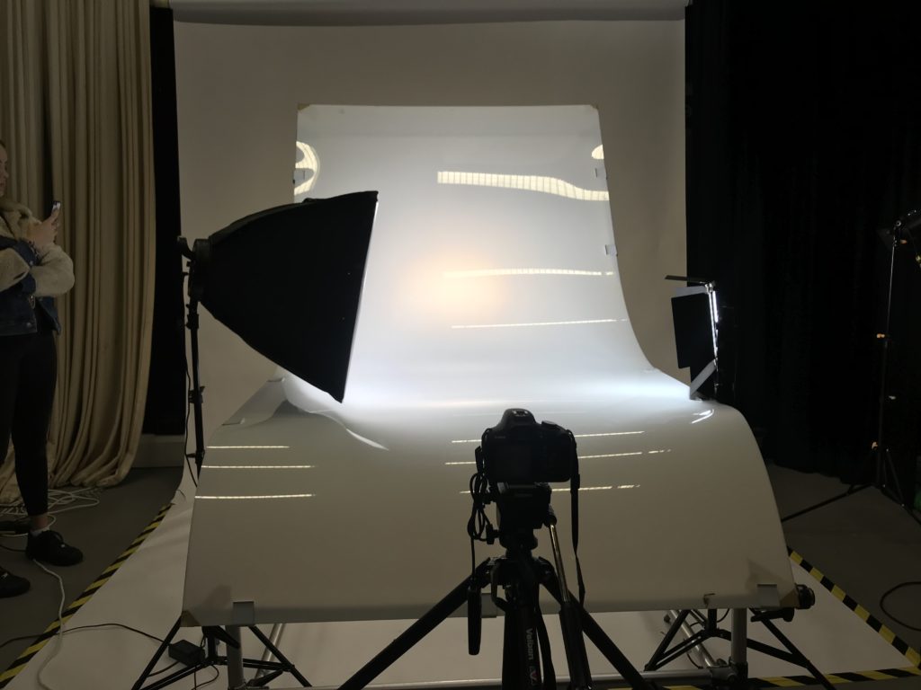
The camera setting for the shoot when the lights had been turned off would be on manual mode, this is because if the lights are on there would have been reflections in the image. The ISO for this was on 100, the white balance is on daylight and aperture is on F/16 and the shutter speed is on 0.5 sec to 0.8 sec. (depending on the reflection of each objects)
Birds Eye View Lighting Setup:
This is the set up for the birds eye view images. The camera is placed on a tripod looking down at the table. To produce these images we had to place the object in the center of the white sheet of paper and put 2 flash lights either side of the table so the image has just the correct amount of lighting. The flash lights are normally used to photograph images, documents, books and newspapers. The camera setting for this particular shoot is manual mode, the ISO setting was on 100 and the white balance was on daylight, Apeture on F/16, the shutter speed was on 1/125- 1/200 depending on reflection of each object. Flash heads set to power output: 2.0.
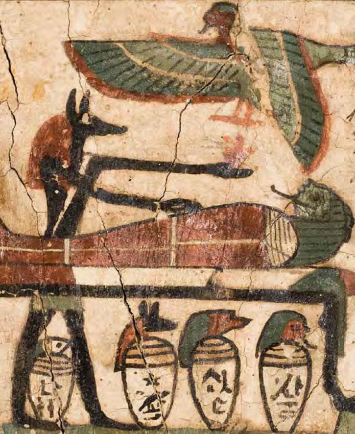
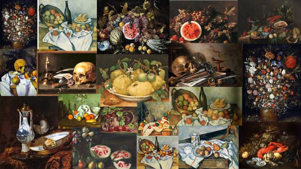
Still life is a work of art, a drawing or painting of a group of objects. Objects do not move, hence the word ‘still.’ In the past the objects tended to be flowers,fruit and other kinds of food or dead animals- hence ‘life.’ The French for still life is ‘nature morte’ meaning ‘dead nature.’ Nowadays, though, still life can mean any objects small enough to be put infront of us, usually on a table. The Ancient Egyptian people have been painting collections of objects for a thousand of years. The ancients Egyptians painted stacks offering for thousands of years. The Egyptians painted objects typically to offer them to Gods in temples or tombs.
The earliest known still life painting was created by the Egytpians in the 15th Century BCE. They produced paintings of food, including crops, fish and meat some of this fabulous artwork has been discovered and retrieved out of ancient burial sites. Ancient Greeks and Romans also created similar deceptions of inanimate objects.
The goal of a still life composition is to direct the viewer’s eye through a painting and lead them toward what the artist thinks is important. Many beginning painters tend to devote their energy to drawing and painting objects accurately, and find it difficult to create a strong composition.
Mood Board for still life objects Cook maid with the still life vegetables by British painter Sir Nathaniel Bacon
The cook maid and market scenes, popular in the seventeenth century evolved in the low countries from a genre practiced by Pieter Aertsen ( c.1533 – c.1573) and his colleague Joachim Beucklaear, which combined contemporary kitchen scenes with a new testament episode beyond. Bacon could have been inspired by the work he had seen on his visit he made to the low countries in 1613.
Religiously, this image would have suited the era in which it was painted. Symbolically, the idea that their is a house wife in the kitchen would have suited the traditional values that would have had to be upheld during this time. A woman would always be the one that sat at home and cooks for her family .
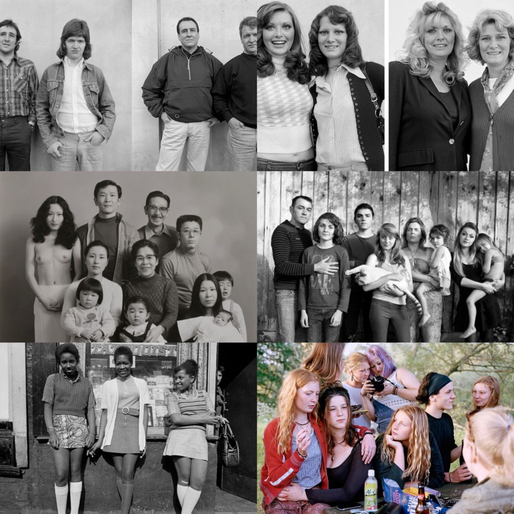
What is an establishing shot? An establishing shot usually requires more than one individual in the shot. The photographer positions the individual in order to tell a story making this the main element to an establishing shot. Most photographers interpret this topic by either presenting it through an individual or the environment they’re in.
DIFFERENT ESTABLASHING SHOTS
Here is a selection of Alain Laboile, Sian Davey and Masahisa Fukase
Sian Davey
A photographer that particularly stood out when researching about the establishing shot was Sian Davey.
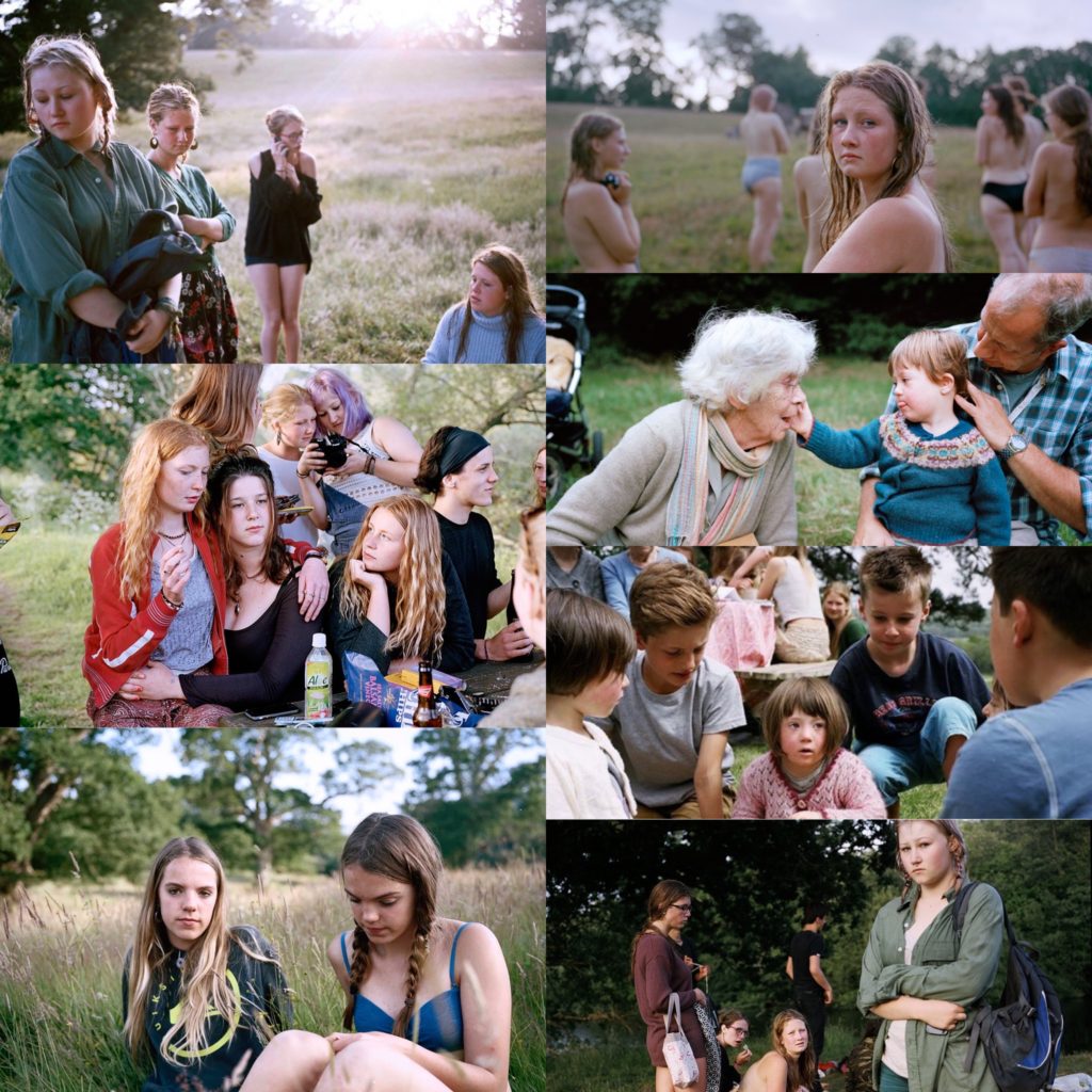
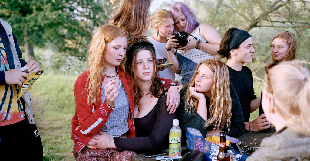
Sian Davey’s work mainly focuses on her family, community and self and is informed by her backgrounds. She has a famous series called ‘Looking for Alice’ which is portraits of her daughter who has down syndrome. Davey’s older daughter participated in the making of “looking for Alice” which then lead to her other famous series is from her other daughter ‘Martha.” This series Davey explores her older daughter and her teenage life and friends. In 2017 Davey published a new series of images which this time was called “We Are Family” for this series she travelled all across Britain and photographed 31 families in 21 days.
Martha series
The image above is the image I have chosen to focus on. It was one of my favourites from her “Martha” series.
Visually, within her shot she has captured a series of things making the image almost seem busy in a sense. It contains different focal points when first glancing at the image however her main focus in this being the 3 girls directly in the centre. The background of the image from I can see looks a Forrest or park of some sort where people go and hang out which also suggests why there’s a bench and table. She’s captured this image from a straight on As the focus is on the girls we can see that one of the girls is smoking whilst the others have an alcoholic drink in-front of them. Davey’s capturing the moments of her teenage transition which in this case is breaking laws as she was 16 when these images were taken, therefore she’s creating an establishing shot as her daughter is the subject and her narrative is rebelling against what she’s been told not to do. The image doesn’t looked staged as its captured in a realistic environment of people doing realistic actions which adds the narrative Daveys trying to convey.
Technically, the lighting used in the image above is natural daylight which is seen by the use of her outdoor environment that she’s placed her daughter in. The lighting has undertones of yellow indicating she’s placed it on a warmer setting in order to achieve the image above she’s corrected the white balance to suit her outdoor scene. Along with changing this she would correct the ISO to a low sensitivity as the image isn’t grainy. Her shutter speed for the image would’ve been quick as there is no blur in the image however she would have raised the aperture as slight depth of field is being shown focusing on the 3 girls with the other being slightly blurred.
Conceptually, the story she’s capturing through the image is her eldest daughter growing up around her teenage friends rebelling to rules she’s been told to comply with. Davey tries to convey this weirdness through her images, a quirky side to society that isn’t normally shown or is frowned upon. However she captures the reality and is spreading the idea that this does happen and all this is out there, its a part of growing up and will last forever.
A Candid portrait is one where the subject is unaware that a photo has been taken. The idea of a candid portrait is to capture people acting naturally. They should be unaware they are being photographed, as their behaviour often changes once they become aware of the camera.
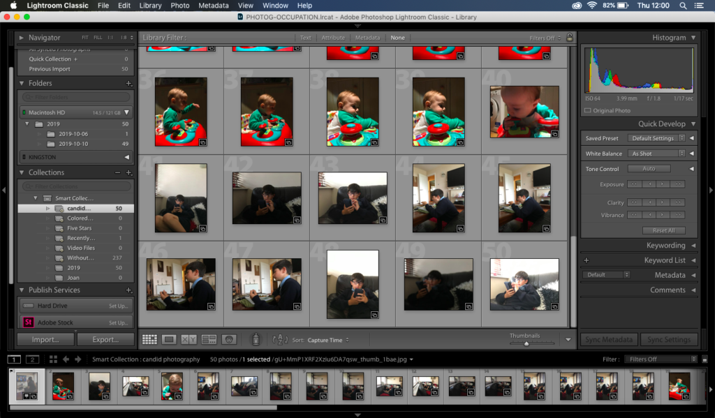
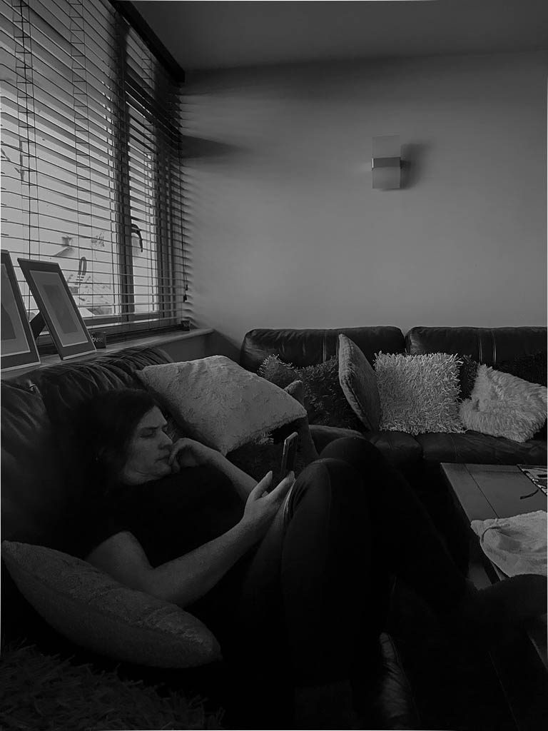
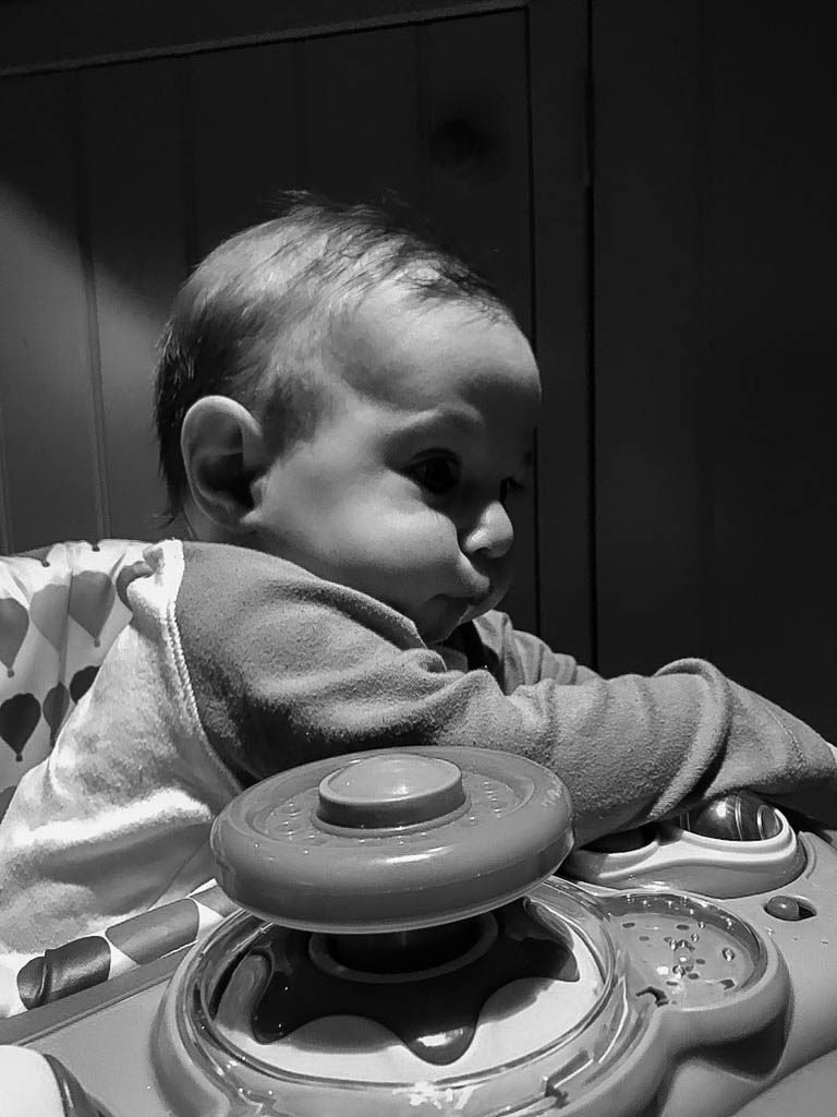
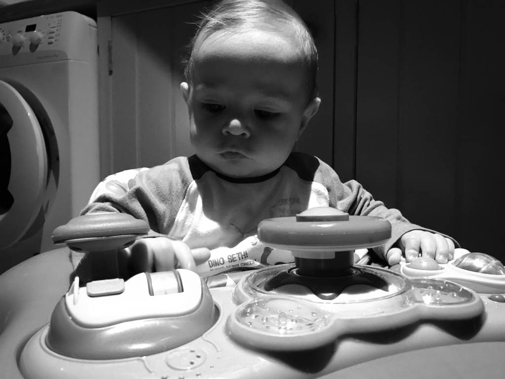
Above is my photoshoot for candid photography.
The final images I have chosen are:
Out of all the images I decided that these were the best outcomes. These shoots didn’t work out the way I wanted due to the timing of day I chose to do it. Underestimating how dark it is now in the afternoon my images have a slightly darker tone to them than desired. Nevertheless I have used Lightroom and photoshop and edited the brightness and exposure of each image making it slightly lighter but keeping the contrast to a middle tone so the image wouldn’t look less focused and too dark in some areas.
If I was to do this shoot again I would definitely do it during the day and try and photograph outside rather than inside. The lighting being used in the first 3 pictures is normal daylight simply shining through my lounge windows. However in the last image of my younger baby brother I was indoors using artificial light which meant that already some of my images have turned out with these yellow undertones which is why I have decided to change my images too black and white.
A zine is a photo book that is mostly produced on a small scale and by hand. Most of the time they are self published and will be distributed by the artist or by small scale businesses.
There are different kinds of zine, the differences can be based on the content and the way that they are created and presented. The genera that I will be studying is the photo zine; in which a photographer will present their photographs in a way that can tell a story or impact on a reader.
An example of a zine is from the Italian photographer Lorenzo vitturi called ‘Dalston Anatomy’, he lived in the Dalston area of Hackney in London. This is the area sometimes known as the African Quarter. He would photograph the people who he saw in the market and then with the leftover food at the end of a days sale. Then he would arrange the food into elaborate sculptures and would use some of the produce to make the portraits more interesting and colourful.
The way that he presented the book was a simple hardcover but the photos within were not set out normally they are different sizes with different sized borders, there are also set-up with matching or complimentary colours in a double page spread.
The second Zine I will be studying is called ‘Red String’ by Yoshikatsu Fujii it is based around the splitting apart of his family due to their parents divorce. The name ‘Red String’ was based on the old Japanese that says that two people destined to fall in love have an invisible red string tied around their little finger and it grows smaller and smaller until they are together. Fujii says that the string between his parents has been cut. The zine incorperats the theme of red string because the pages and cover are all bound with a red string.
The layout of the book is done so that it can be opened up to show two different smaller zines and they can be read through in different way to show the full history and story of the family and the parents relationship.
The book is laid out so that the left side is photos of his father and the right is his mother. The cover that connects the two sides is made of a soft felt. The cover of the book is stitched with the red string an has loose tails, the title and Fujii’s name are written by hand. The cover photo was his parents wedding photo but the heads have been cut off and then stitched to the cover only by their necks. There are pages in the book which have photos then attached to them by red string is a quote or a message given by that parent.
“The split binding allows the reader to page through one side and then the other, but the powerfulness comes from pairing both halves together. In this delicate and personal family album, Yoshikatsu Fujii ties the memory of his family back together with the cultural metaphor of red string.”
In order to create my photomontages I exported the original images as JPEG’s and then imported them into photoshop, where I created the montage. These outcomes are inspired by Milach who created similar imagery to contextually presented the children strike.
Design 1:
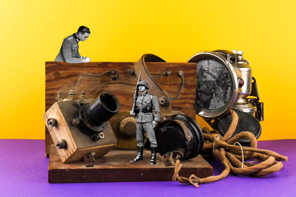
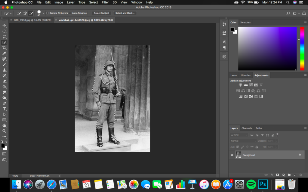
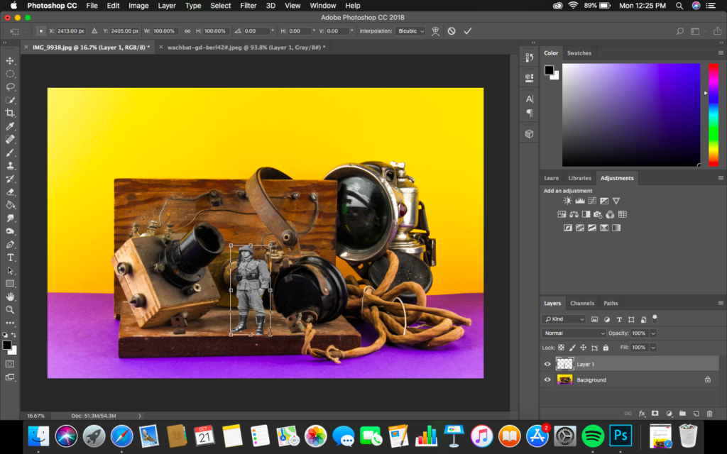
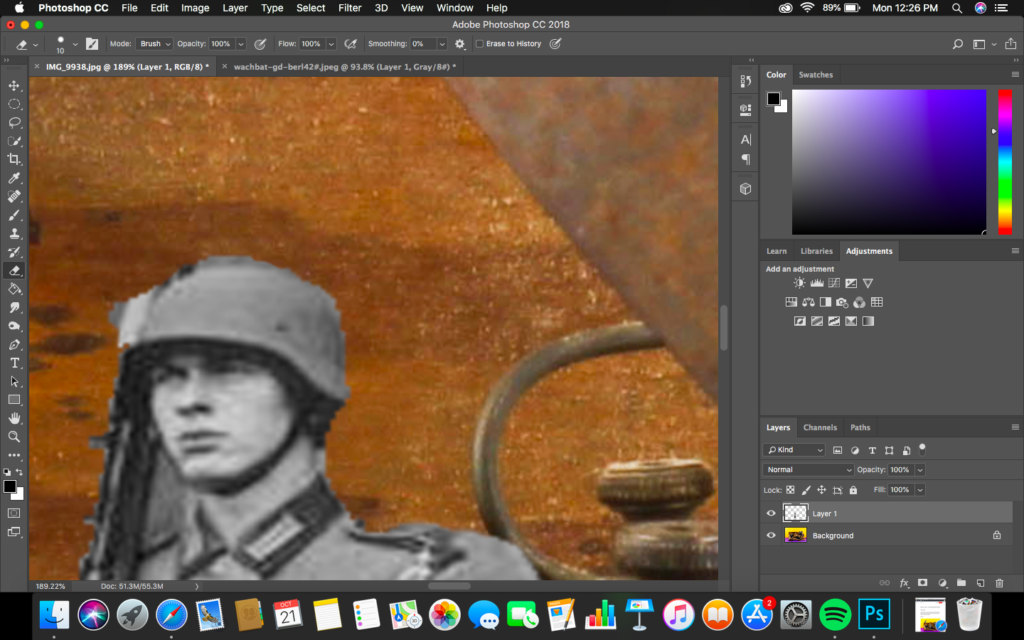
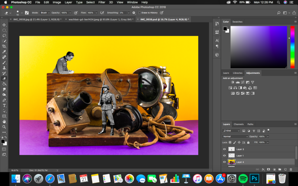
To create this design I opened up archival images of German soldiers, using the quick selection tool I cut out the sliders and placed them onto the still life photograph. Using the transformation tool I adjusted the size and positioning of the soldiers. I then used the rubber tool and went around the cutting making the outline smooth and more naturalistic. I then added a whole solider image in the light, which was done by cutting out the centre of the light and using the blending mode tools to combine and create this overlay of the two layers. I believe that this outcomes is the most successful from my further experimentation with my still life imagery.
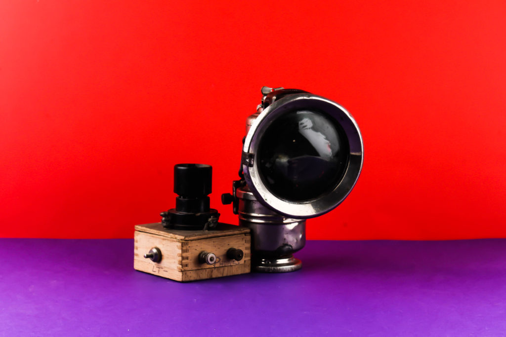
Conceptually I wanted to convey the restrictions the German’s bought in on islanders when Jersey was occupied over the 5 years. The objects in the frame are minimalistic and basic suggesting how restricted Islanders where, as well as the ideology of lack of communication on the island which is shown by the radio set in the centre, contextually Islander where not allowed radio sets or contact with the main land which influenced the restrictions of objects the islanders where allowed. The soldiers represent the restriction and how the German’s were always around making it hard to have the contraband without being caught, creating a sense of authority and entrapment. On top of this, the soldiers in the light represent the unknown, when the war was occurring islanders did not know where they stood and who was winning due to the lack of communication
Visually, the image is busy creating a sense of chaos and lack of space, showcasing the conceptual meaning on how Islanders where restricted. The colours contrast the archival photographs, creating clear juxtaposition which reinforces the conceptual and contextual meanings outlined above. Everything is central in the frame, making it the main focal point. The lack of shadows and simplistic background supports this being the main focus point. On top of this, the main formal elements presented are colour, space and texture which is presented through the positioning of the composition.
Technically, the camera settings are simplistic and similar to Milach’s photography. The ISO was kept on 100 as well as the shutter speed being quick. The aperture was F16, allowing no depth of field to be showcased, but still allowed enough light in. The lighting was two artificial flash heads, reducing shadows in the background, which worked with the colour accuracy of my white balance used. Overall, I believe I have managed to produce successful imagery with strong conceptual and contextual representations.
Design 2:
For my second design I followed similar steps as to my first photomontage. When creating this image I selected an archival image of a solider and used the quick selection tool to cut it out. I then placed and positioned the the solider to look at the light, creating a minimalistic and simplistic documentary photomontage. Although this imagery is still successful and rich with conceptual land contextual representation, I do not believe it is as strong as the imagery created above.
Exploration Edit:
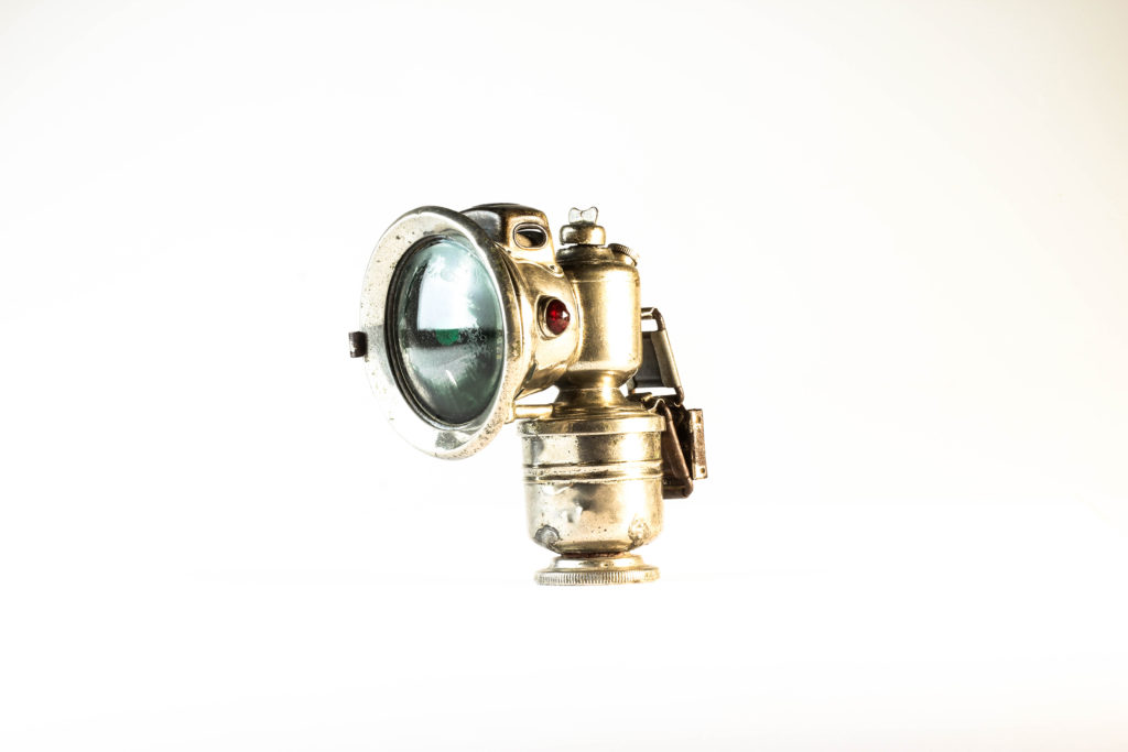
For my next edit I decided to select my top photograph which captured a singular object at a straight on angle on the white background. For my first design I created a colour version of this. I achieved the look by adjusting the contrast, structure, white, blacks and shadows allowing the colouring to be emphasise, making it the main formal element being presented in the outcome. There is clear highlighted areas which create a contrast in tonal regions, which compliments the rustic feel towards the imagery. A vignetting has been used to draw attention to the centre of the frame, almost creating an artificial depth of field. I find the colour edit visually pleasing to look at due texture and colour of the object to clearly be illuminated.
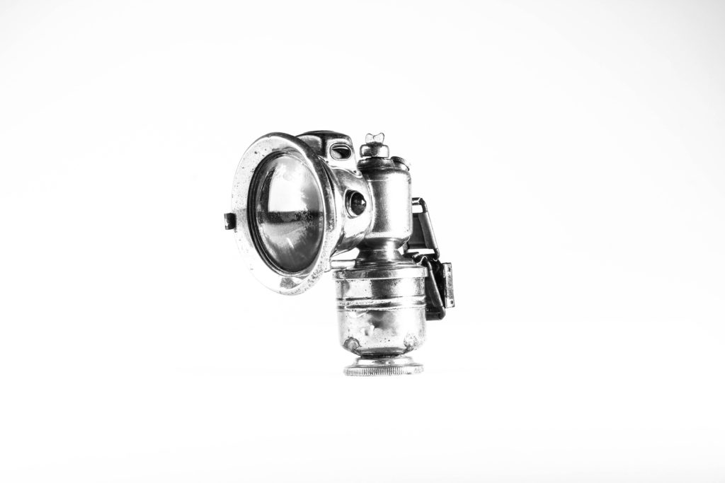
For my next design I wanted to create a black and white variation of the same image. To achieve this I started by making the image monochrome, and similarly adjusted the sliders of contrast, blacks, whites and shadows like the colour edit above. Doing this allowed a clear comparison as to if the image presents itself better black and white or in colour. Personally, I prefer the black and white outcome due to a ore metallic feel and the texture of the object to be showcase more, which helps to emphasise the contextual representations of the object more clearly.
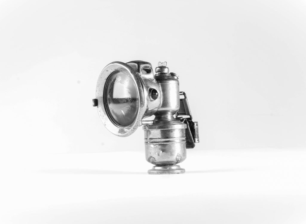
I then decided to make a third edit, which really emphasised the texture and tonal contrast of the object. Utilising the image above I then went on to moving the sliders to the extreme, at the bipolar ends, allowing the metal to be clearer and showcase more tonal contrast. Doing this also allowed the shadow of the object to be presented, which I think compliments the object and outcome. In addition, it has allowed the backgrounds to be multiple tones of white and grey, which does not distract viewers from the background, making a more intriguing representation of the object. I believe that this outcome is the most successful from this photograph due to the overall atheistic it brings and the strong conceptual and contextual representations it holds.
Most Successful Outcomes:
Evaluation:
To evaluate I believe I have been able to show clear further exploration to my still life imagery, through using inspiration from artists and experimenting on Lightroom to produce different outcomes of the same image. Doing this has allowed me to develop my project and understanding of still life, as well as produce outcomes which I would not have initially created. I have shown my creativity through my photomontages and ability to use photoshop to create such design. The two successful images, are definitely images which I will be using in my new zine which explores objects and people. To conclude, I have successful produced further exploration to still life which showcase my ability to think about conceptual and contextual meaning when creating the imagery.
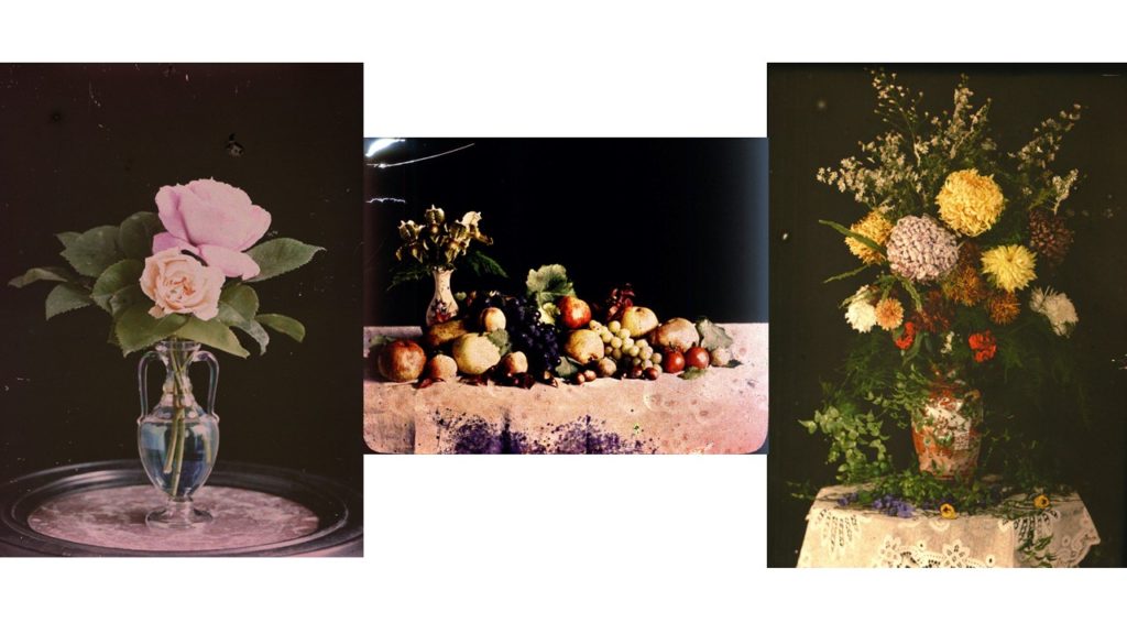
Autochromes were the first practicable method of colour photography and was invented in France by Auguste and Louis Lumiere. The autochrome process was also known as the autochrome Lumiere- named after the creators themselves was originally a research project into colour photography to the Academie des Sciences in 1904 and the commercial manufacture of autochrome plates began in 1907, which led to the first public demonstration of the invention occurred on the 10th June 1907 in the offices of the French newspaper company ‘L’illustration. Autochromes plates are surrounded in microscopic red, blue and green coloured potato starch grains- approximately four million per square inch. When a photograph is taken, light passes through these colour filters to the photographic emulsion the plate is the process to lead and develop a positive transparency, therefore light passes through the coloured starch grains and leads to a combination to recreate a full colour image of the original subject, producing a coloured image. For autochromes to be taken there was specific apparatus which was required and photographer could also use their own existing cameras; on the other hand it was essential for the photographer to remember to place he autochrome plate in the camera with the plain glass side nearest the lens so the light passed thorough the filter screen before reaching the sensitive emulsion.
EMILE GUITON:
Emile Guiton was beyond influential and was aid to be the most prolific photographer in Jersey at the time who chronicled island life during half of the 20th century. a large percentage of he photography is kept and preserved at the photographic archive of La Societe Jersiaise, in total 781 images of Emile Guiton’s can be viewed. Guiton was born in 1879 in Jersey and from a young age had an interest in history and was a member of La Societe Jeriasise, whom served on its executive committee as joint honorary secretary and was curator of the Museum and editor of the annual Bulletin. Emile Guiton was an amateur photographer and began to develop great skills throughout his life and career. Guiton also experimented with the early stages of colour photography known as ‘autochrome’. His main subject which he used was the recording of archaeological excavations, as he was one of the few members in Jersey who were permitted to take photographs during the occupation in 1940-1945. His research and photography really helped him develop a true understanding of the significance of taking photographs and the historical and social resources they hold. Tragically Emile Guiton died in 1972 and donated many of his imaged to the Societe Jersiaise.
In preparation for my second photo shoot I reflected back on my previous shoot, looking at lighting techniques which worked and looked over the camera settings in order to capture effective imagery. For this shoot I decided to take a more contemporary approach by adding colour backgrounds to my straight on angle photographs, allowing an inspiration link to Rafal Milach’s work, developing my response to still life photography. I also wanted to explore more using singular objects of the complete white background, working on my manual focusing skills. I will again be using two set ups, the first for more flat objects (Birds Eye View) and one for 3-Dimensional objects (Straight on Angle). These two set ups required different lighting rigs, which is explained below. With my camera settings I put the mode to Manual, the ISO to 100 and the aperture to F16, allowing a wide depth of field to be utilised. The shutter speed for the Birds Eye View was between 1/250 – 1/200 and the straight on angle’s shutter speed was 0.5 – 0.8. The white balance for both was set onto daylight, with manual focus being used.
I used two flash head lights, set on a 2.0 power output. The lights where paced either side of the table, slightly facing downwards towards the object. On my camera I used a transmitter which triggered the flash heads to operate as I captured my imagery. In addition, I also used a pilot light in order to position a and frame my composition, this was located at the back of the table (on right) and did not affect the colouring or the outcomes of my image. The camera itself was placed on a tripod facing straight on at the table, with adjustments allowing me to have control over the composition of my imagery.
Edits:
First Edit: Flagged
Second Edit – Star Rating
Third Edit – Colour Rating
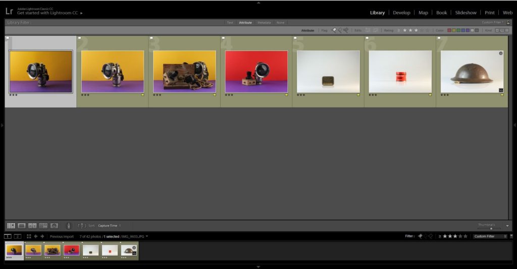
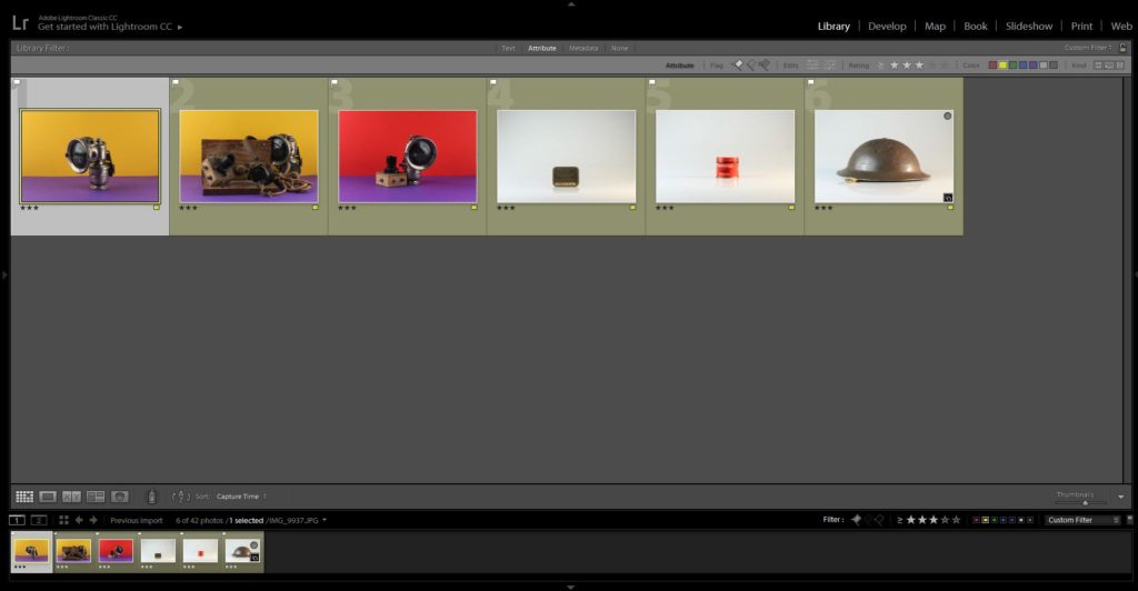
Outcomes:
The three outcomes below are my top photographs from the shoot, which clearly showcase my inspiration and application of Milach’s work into my own. I explored with coloured background, which complemented one another, allowing a more ameliorative tone towards my final outcomes. I felt that it was important the the colours were vibrant and bright, almost welcoming, in order to draw the eyes into the objects located in the centre of the frame, I really emphasised this when editing. I started off by adjusting the whites, darks, shadows and contrast, allowing the objects to show clarity and tonal contrast, on top of accurately making the background vibrant. I then used the spot removal tool, to ensure a consistent coloured background, so that the viewers attention is not drawn away from the objects presenting the concept, a lack of simple supplies that citizens had to live off when the German’s occupied the island, of the imagery. I also selected another photograph which used the plain white background and experimented with attempting to get the text clear and bold, making it the main focal point, which was done by adjusting the clarity, structure, blacks and whites.
Evaluation:
To evaluate I believe I have been able to produce strong imagery, which clearly convey my understanding of Milach’s work and ability to apply his techniques and designs into my photographs. In addition, I have been able to explore a new way of capturing still life, furthering my exploration with this style of photography allowing more conceptual and contextual outcomes to be presented. To further my exploration even further I now intend to create photomontages with the coloured outcomes to make stronger links with Milach’s work, as well as creating different edits of the same photograph to showcase my exploration.
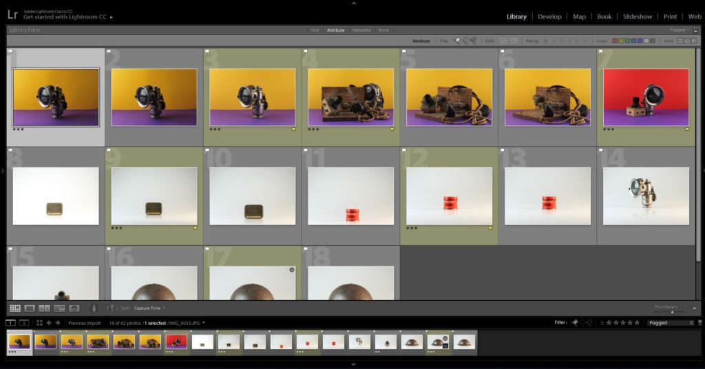
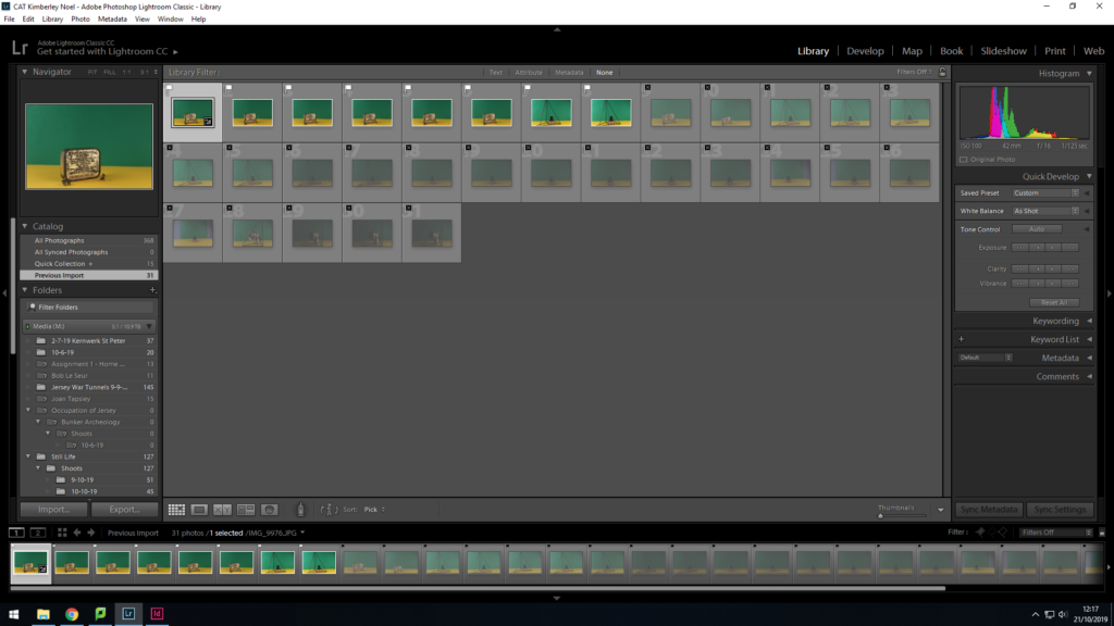
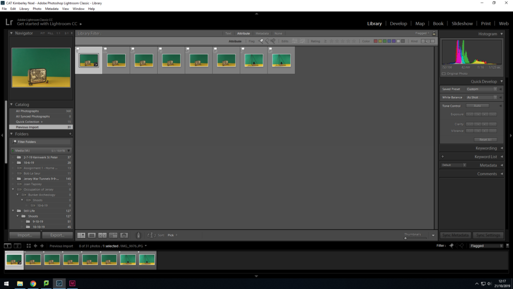
Here I have selected out of the images I took, the best ones and the ones which I dont want to further use as they were blurry, or they didn’t have the effect I wanted.Final selection of photos I am going to Edit
First Edit:
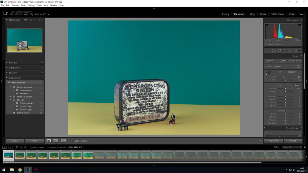
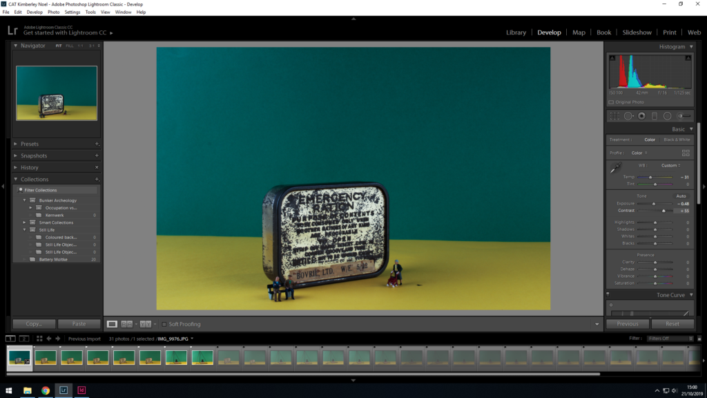
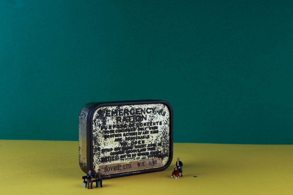
Firstly I have used the spot removal tool, to get rid of dirt which was left on the picture from the camera lens.I have decided to edit the temperature of the image, to make it feel as if it has a colder feel, relating to the severity of war.I have also changed the contrast and exposure to increase the feeling of how the war effected the islanders during the war.Final Image 1 – Emergency Rations box, with Small people figures.
Edit 2:
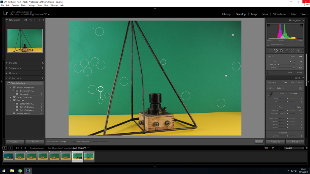
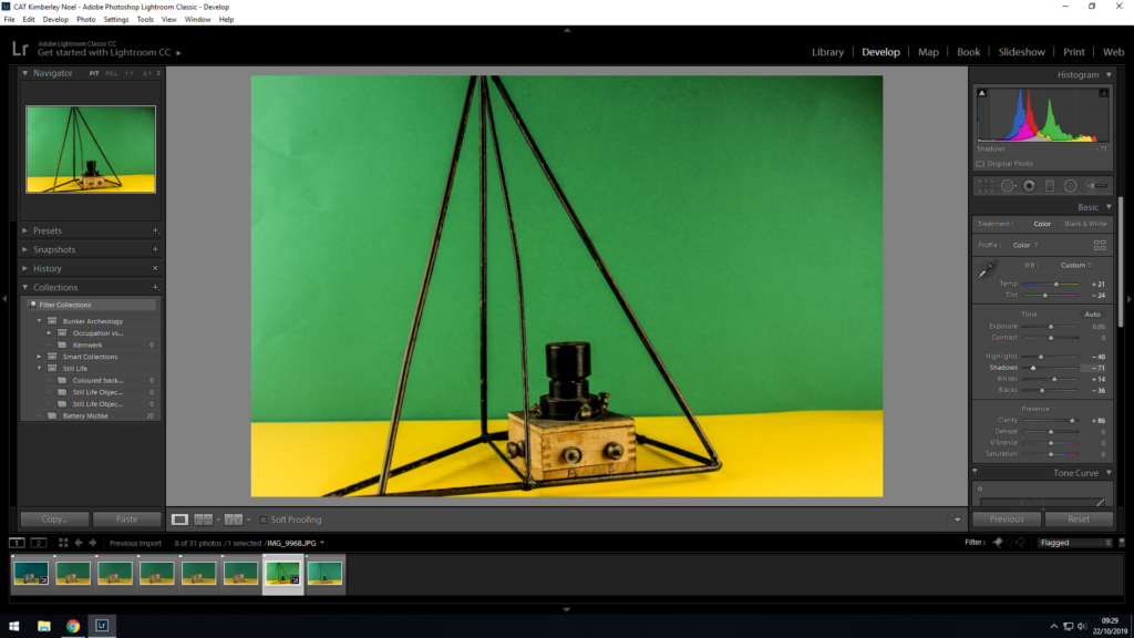
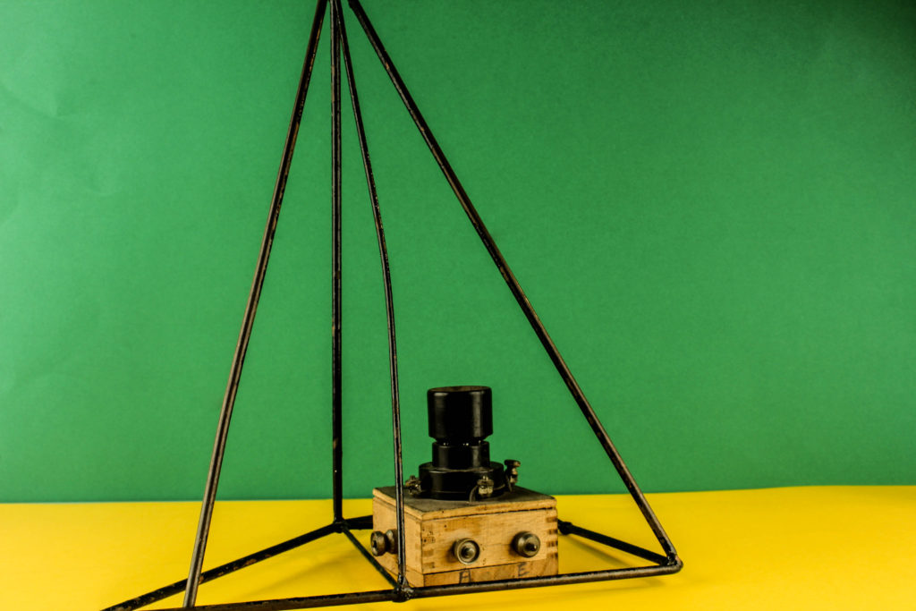
Here I have used the spot removal tool to remove the dust and dirt particles which were on the lens of the camera.I have decided to make this image brighter than the previous image I edited because I wanted this to have a different feel to the other one. I have done this by editing the exposure and contrast.I have edited the highlights and shadows to crease the colour vibrancy throughout the image.Final Image 2 – Bit radio set and metal frame.
Edit 3:
I have Cropped the image so that you cant see the unwanted background. I also increased the amount of sharpening so that it get rids of the blurriness in the image