Sanddunes shoot

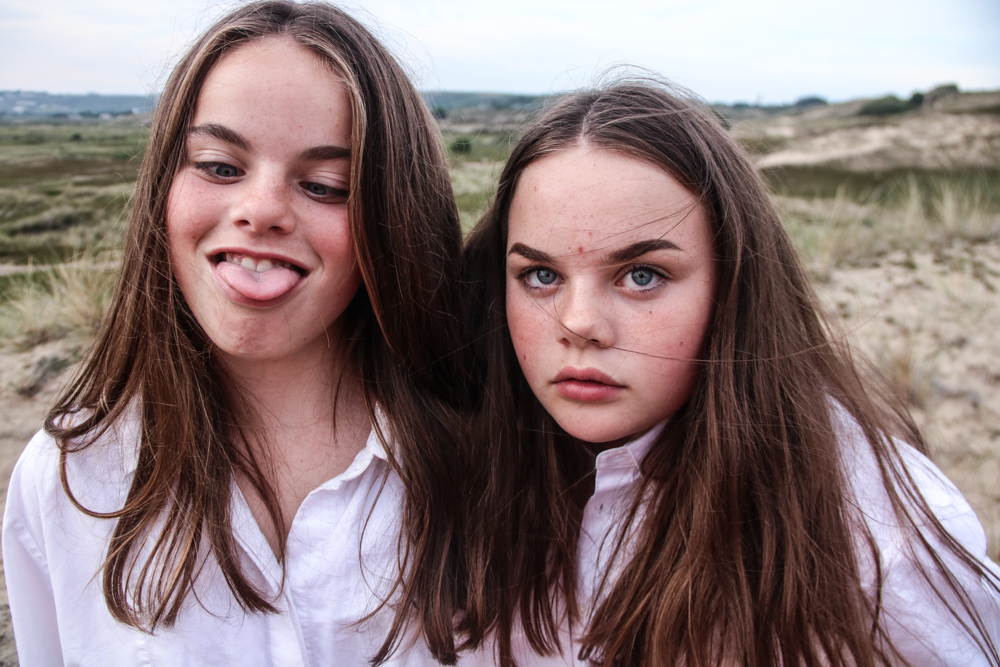
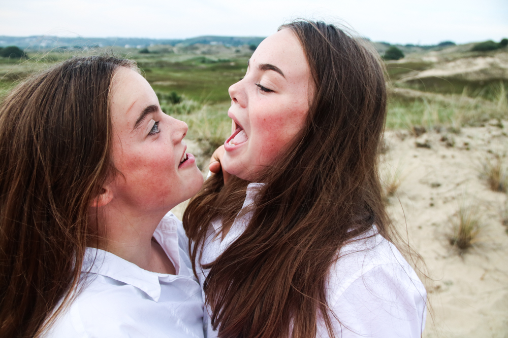
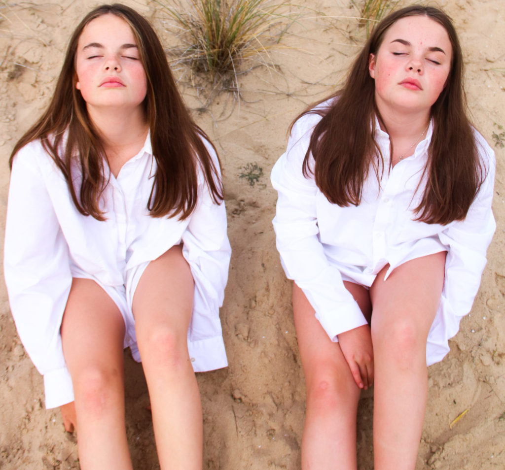
For my shoot I went to St Ouens to the sand dunes. I used the daylight as my natural light. I dressed my sisters in the same outfit as I wanted to make them look as similar as possible. The aim of this shoot was to reflect the similarity between my twin sisters and how people view them as a collective rather than individuals. 

Manipulated Images

I manipulated my images using Adobe Lightroom. I adjusted the brightness, contrast, white balance and clarity. I liked how these photos turned out and I think that the natural lighting and lightness of the surroundings helped make the images very beautiful and natural looking.

family archive images

The Shoot

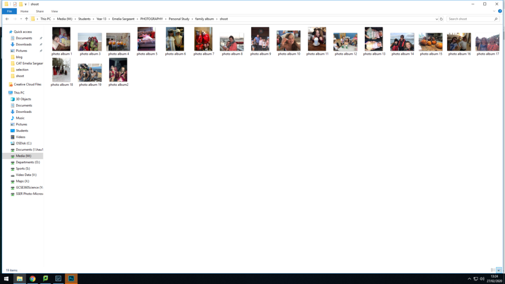
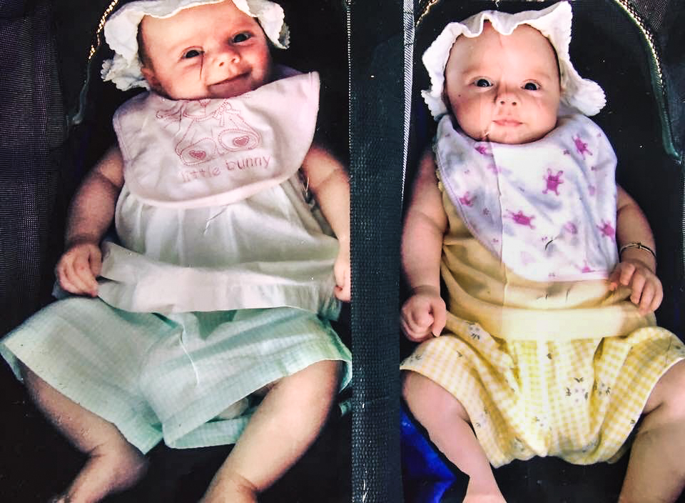
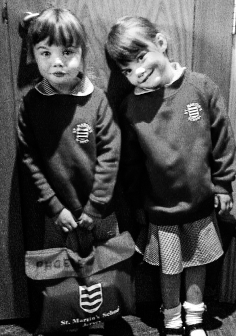
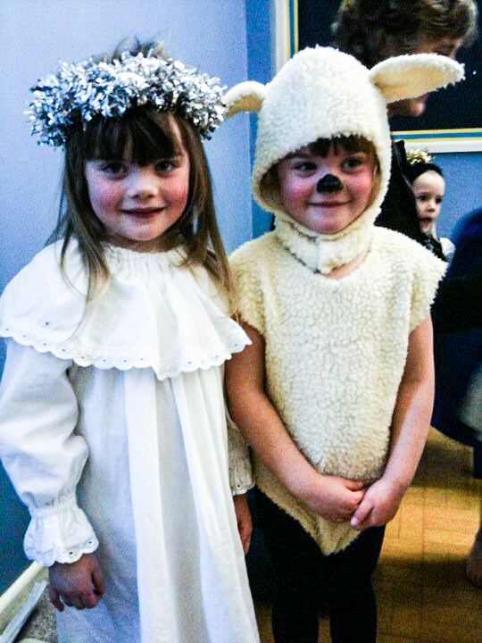
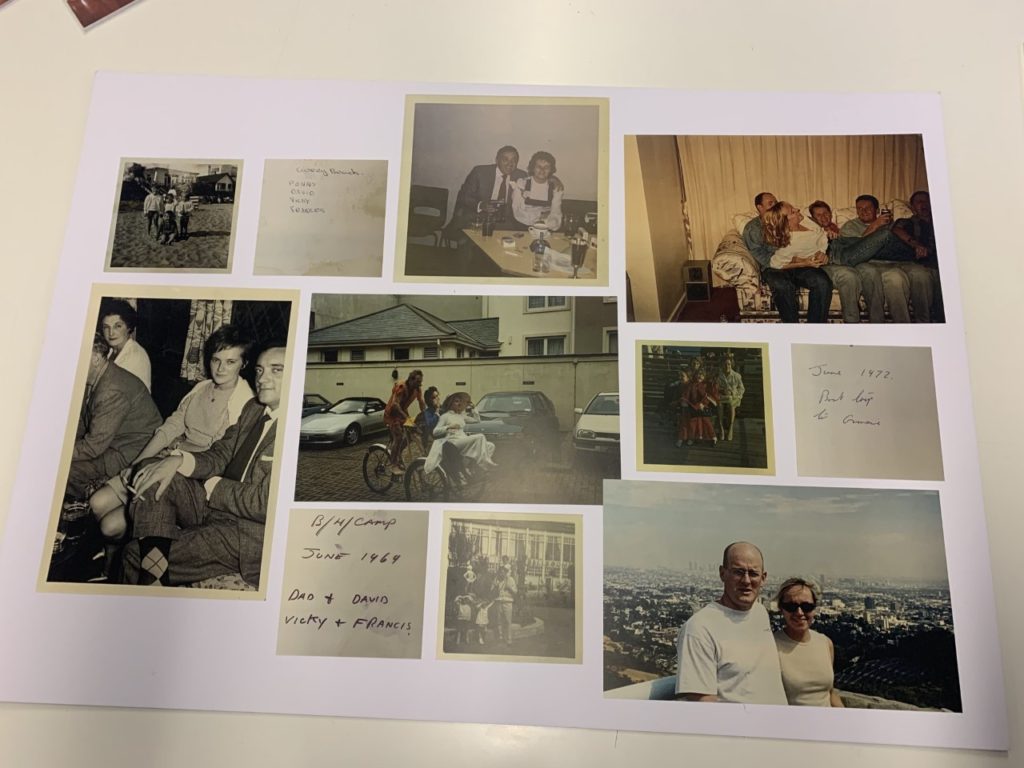
I wanted to delve into my own family archive of images of Phoebe and Scarlett from when they were younger. I wanted to display how much they have changed over the years and how even at a young age they were both very similar but different.

The Editing

I manipulated these images on Adobe lightroom. I adjusted the exposure, contrast, vibrance, clarity and cropped some of the images. These are my three favourite images. As babies, the girls looked incredibly similar however my mum always made sure to dress them differently to ensure they have seperate identities. The second image is the girls on their first day of school. In matching uniform and identical haircuts, people found it difficult to distinguish the girls apart. In the last image, it was a photo of their girls at their first nativity. My mum liked how the school ensured they played different characters to ensure they have seperate identities and are not classed as a collective.

First photo shoot-planner

Introduction:

I decided that i want to start with simple photo shoot ideas and work my way up towards the more complicated shoots. So i decided to start of with photographing a rotting fruit over time as to represent the idea of young vs old in expression to the topic of change vs stability.

How?

I started by looking at artists that did the similar idea to what i have in mind to help me generate even more ideas. In order to expand my project on an even higher level.

Image result for rotting fruit

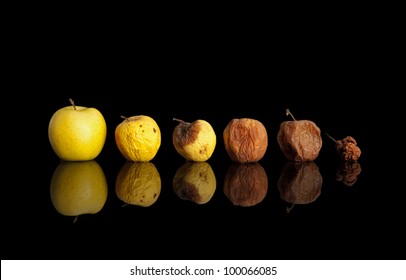
I found this photograph on google images which i believe is 6 different similar apples that are at different stages off the rotting process, then they were set next to each other with a black back ground and photographed as a still life.

So what i will do is instead of photographing different apples i will just photograph the same apple once everyday, i will place the apple in a place were it will be fine to rot (ie. garage) and then i will place it against a white or black background and photograph it from the same position every night at 9pm using the same camera settings and light set up, then i will combine my photographs in Photoshop cc and present my final image.

bali photoshoot

The Photoshoot

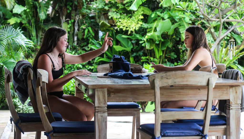
For my photoshoots in Bali I wanted to capture the twins doing things without me realising, but with some staged photos aswell. I had to work with the natural light and learn to adjust the camera to the different lighting, shutterspeeds etc. As we were all on holiday we had to spend a lot more time with eachother, and Phoebe and Scarlett tended to spend a lot more time with eachother than anyone else. They played a lot ith eachother in the pool and enjoyed playing card games. 

Editing

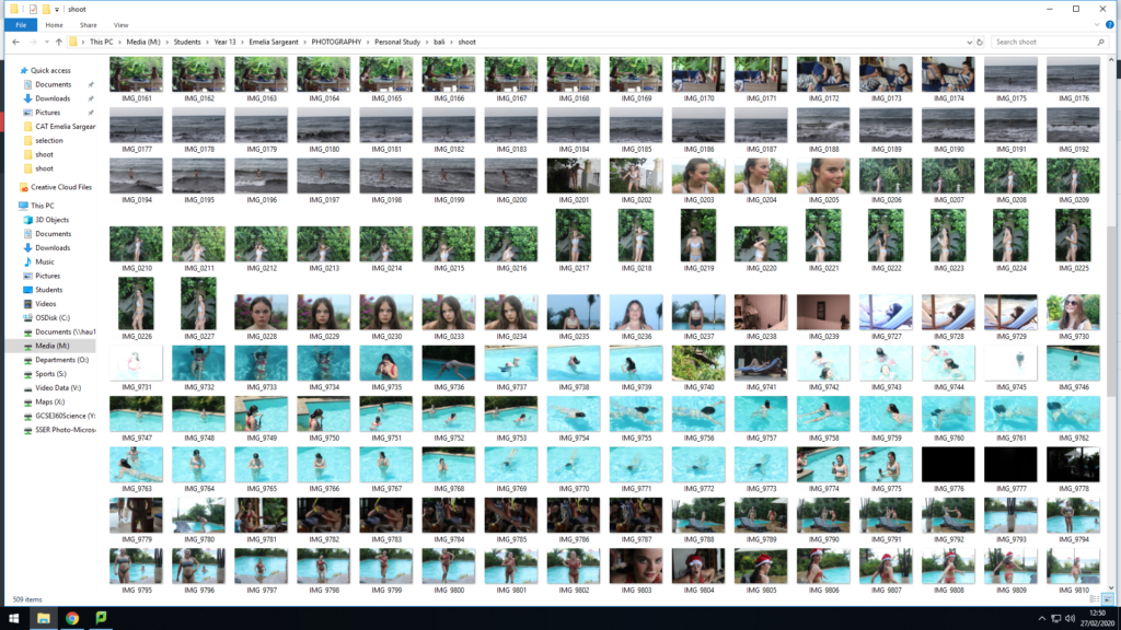
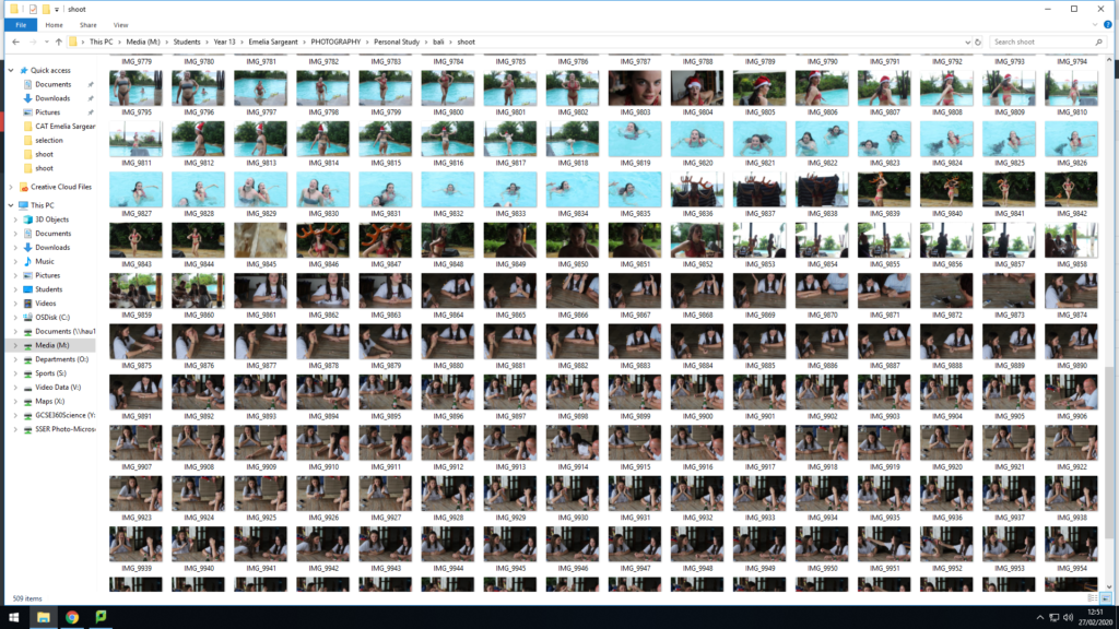
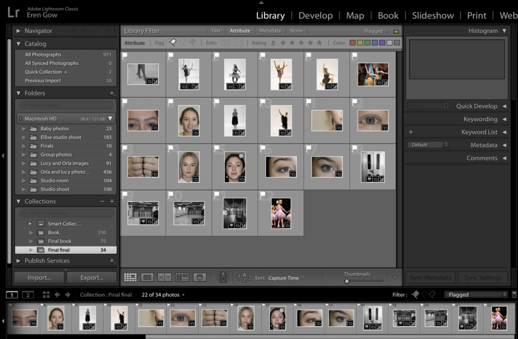
After going through all of my images on Lightroom, I used the colour rating system to single out images I liked and then manipulated them. I used many applications to manipulate the images such as make some black and white, adjust the contrast, vibrance, saturation, clarity, highlights, shadows, blacks, whites and cropping. The green represents the images that I like the most and the yellow images are ones that I sort of like but am unsure of.

My Favourite Images

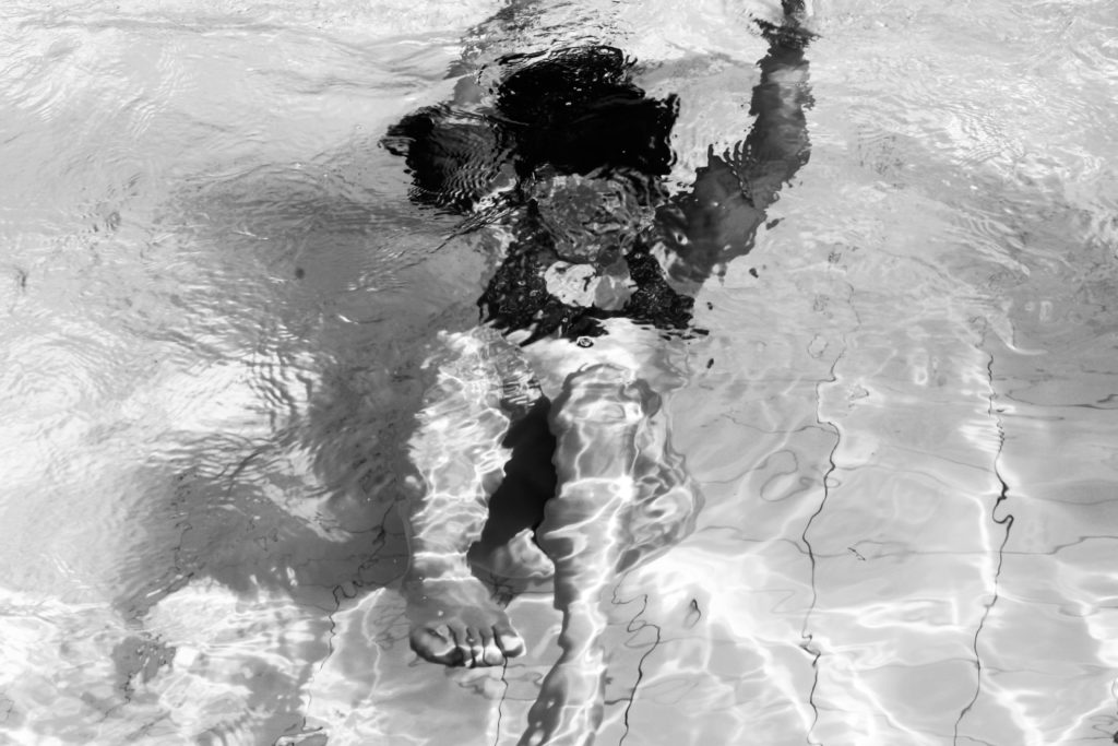
I chose these images because I thought that they were the most aesthetically pleasing. I chose the black and white underwater one because you cannot tell which twin it is, their identity is hidden and can represent how a lot of people view my sisters, as one and as a collective rather than having their own individual identities. 
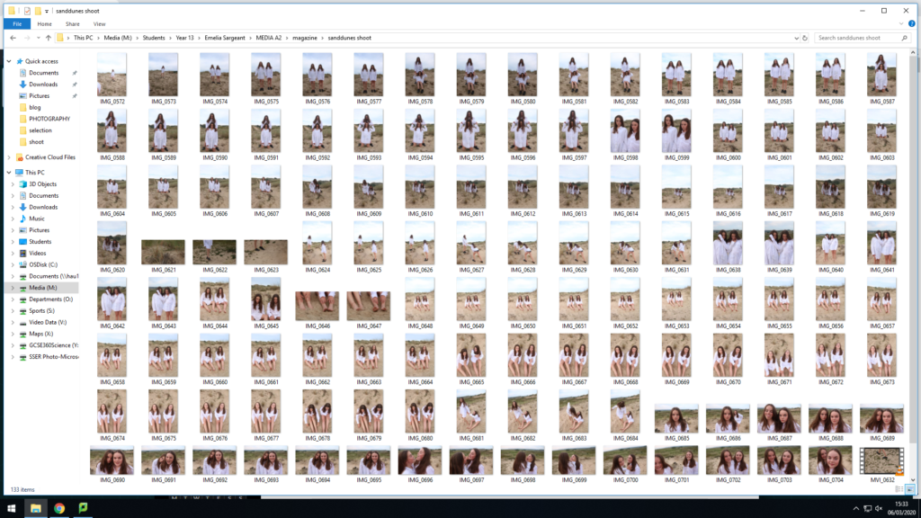
PHOTO PRINT LAYOUT

As well as creating my phonebook I printed out a variety of my best images to begin displaying in a creative way that will be different to my photo book essentially offering a different narrative and type of forum overall. Firstly I am going to explore the different techniques that can be used to display my images. I have inserted below a demonstration of different forms of layout that are possible to display my images, when doing this it is essential to consider which types of images go with what and what photos do not go together. I began by investigating what different types of layouts of photos create different types of meanings and different types of overall narratives. Furthermore I am going to trials laying out my photos using foam board, window mounts, as some of my photos may be more appropriate by themselves opposed to all together.

I began by placing the images on top of the board in order to help me decide on my final display.

Final display 1:

For this dimply I cut down the original black board and created a long and thin display with the images going down and the colour image in the middle to help contrast with the two outer images all relating to parts of the body which I believe to go well together, hopefully reflecting a subjective emotion for each viewer and therefore creating a narrative which is evidently the main goals; as well as this producing a clear display of my ‘best’ work.

Final display 2:

For my final display I used my three images of the dancer inspired by Gjon Mili as they fit well together and each image is slightly different and therefore gives of a slightly different emotion therefore creating a slight narrative as well as reflecting the different types of emotions and feelings that go into being a dancer; some might always be apparent and is subjective to each viewer creating individual narrative and overall different perspectives

FINAL BOOK LAYOUT

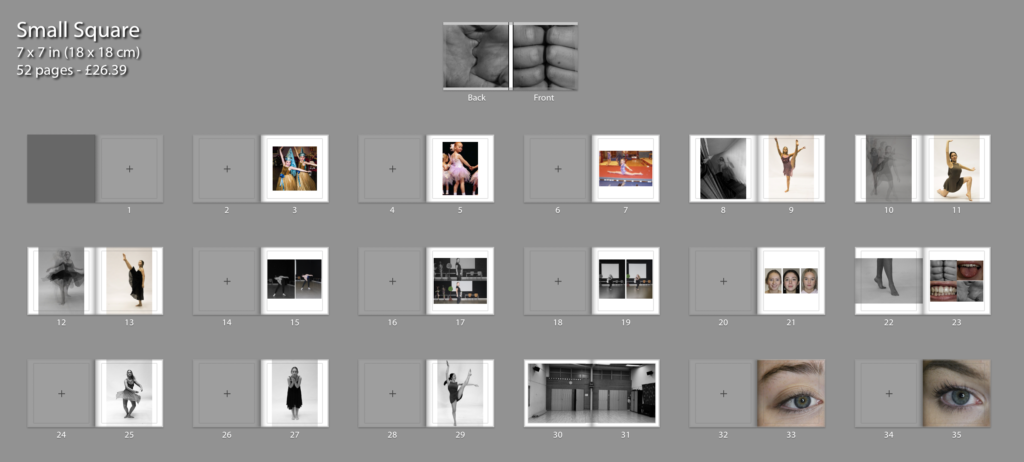
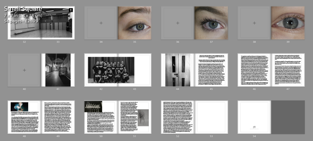
Below is the final layout of book called ‘le grande jete’ which in translation to English means ‘the big throw’ which highlights the deeper meaning of the book and highlight the emphasis of what an individual goes through as a dancing the idea of throwing yourself in the deep end with the representation of the struggles of dancing contrasting with the overall positive outcomes and the final results that come of this. The photograph on the dust sheets is a fist and on the back a palm which creates the Beijing of the narrative; the fist representing a more tense and struggle some feeling compared to the back on the dust sheet which is the palm of the hand in a stretched out format which helps aid the end of the booking being the opening and release of the fence beginning aiding the overall narrative of the book.

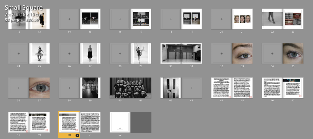
The name of book is called ‘La Grande Jete’ which as previously mentioned translates as ‘the big throw’ which adds deeper meaning of the experiences of being a dancer. Through out my book I have a variety of images that a presented through the book for example, I have images from childhood, to portraits of the three models, as well as close ups of the models. To me these initials images help being the narrative of the book going on to images of the models dancing using different filters to show the different types of emotions that I am trying to project through the sport of dancing. This to me was an essential part of book as it was important to me to highlight the realism of the book. When talking about the movement images I created these through the inspiration of images produced by Gjon Mili who use specific camera skills to create the feeling of movement in an image. Furthermore I have used images of the environment where the model dance as I feel that to be an essential part of their life as it is a place they spend a lot of their time and therefore will help demonstrate my narrative of book and aid the overall feeling of the book. On the last page I used a black and white image of studio doors closed to reflect the idea of the end of the book/ narrative- which to me help creates a nice crisp ending to the story then followed by my essay reflecting artists of interest. For the actual layout of my book I have used both a mixture of one sided pages with double sided images, mostly using one image per page with a few differences such as having more than one, these to me went well as they almost came as a pair. I have also used two full pages to add emphasis of those particular images for example; there is a full page of the dance studio in a black and white filter, to me this was an important feature and idea to consider as it really supports the significance of the studio reflecting the idea of almost the studio being the dancer second home as they spend so much time there- leading to the idea of the time and dedication it takes to commit to being a dancer. The photo book itself is a small square with side lengths of 18cm by 18cm which is the smallest option. I wanted to keep the book of small idea to represent the deeper meaning of the idea that I am trying to reflect the realism of a dancer compared to what is being represented in the media; the small truth that is being shown, therefore using a small book to represent that idea and point. As previously mention I will being using a dust sheet therefore the true design of the book will be covered, I did this as I wanted to use images I had taken to begin and end my narrative and create a more interesting front and overall appearance to the book. Finally at the end of the book is my essay which is exploring artist Gjon Mili and exploration into whether movement can be captures and truly represented through dancer movement as well as also reflecting the emotions being portrayed. For this final result of my book I have gone through multiple experimentations and developments that would overall aid my final outcome of my phonebook.

photobook experimentation

Initial development:

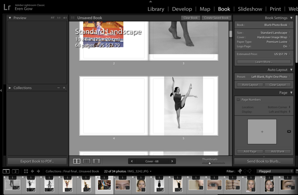
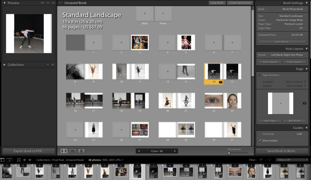
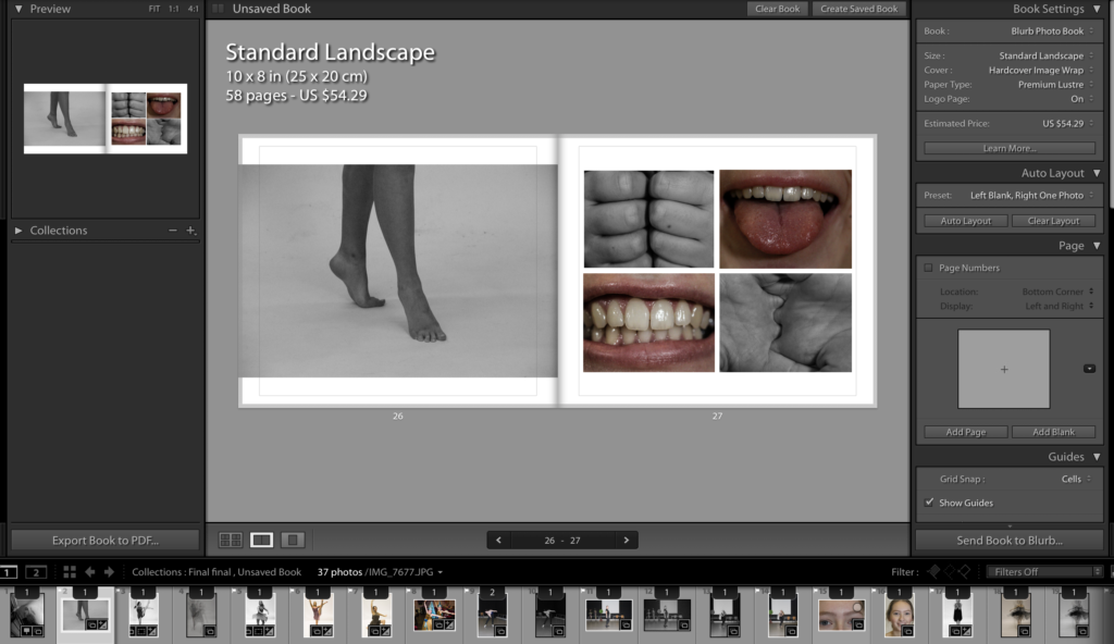
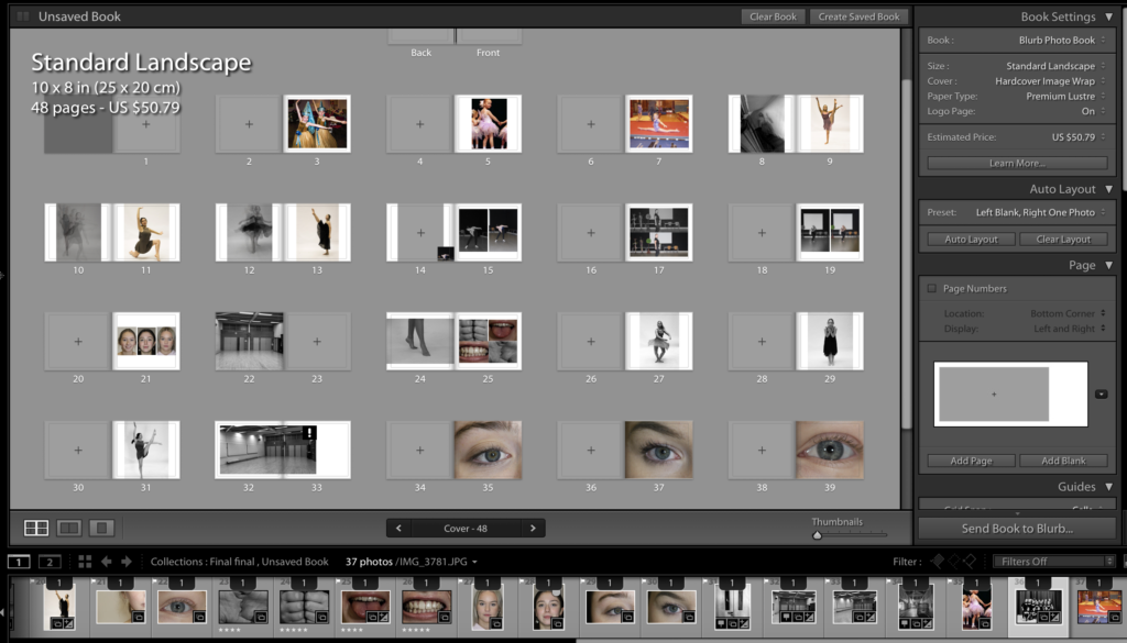
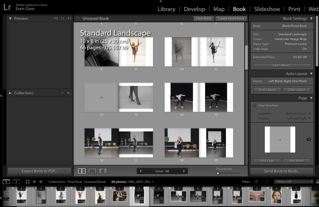
After completing my five photoshoots (baby photos, school studio, photography studio, detail shot, studio room) I have now cut down my images to a minimal amount that have all be edited and cropped to create the best outcome in terms of coming together in my photo book therefore benefiting the overall narrative. I opened up light room and selected the selection of images from my collection that were for my phonebook and began editing the photo book; keeping in the mind the over narrative that I am trying to represent. I started to experiment with all the images and pages with different sized images, colour and layouts. I then began adjusting and moving around the image to create the best order possible that would help provide the best story an narrative possible.

Overall when experimenting I tried:

  • different types of layouts
  • different formats
  • different book sizes
  • different order of images
  • different narrative approaches
  • the construction
  • book title
  • layout of essay

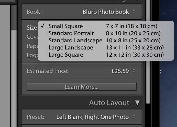
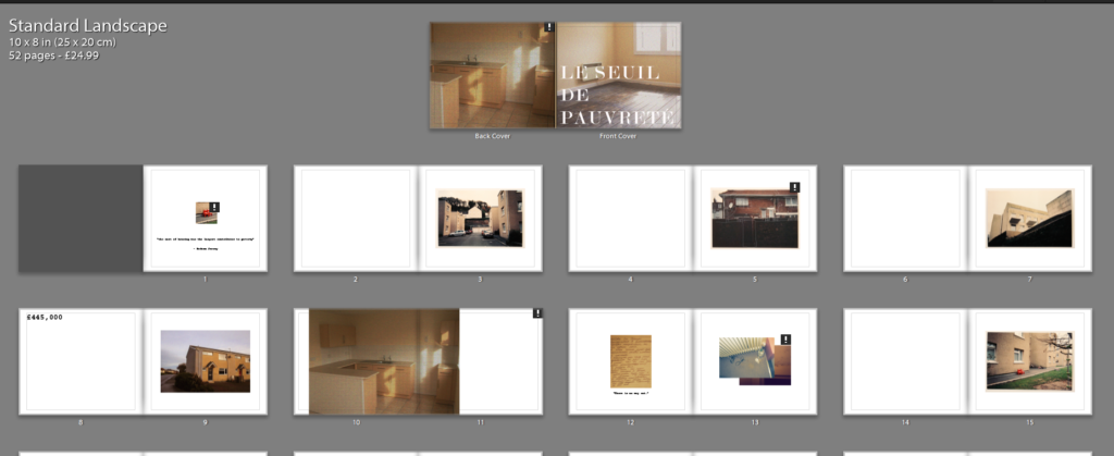
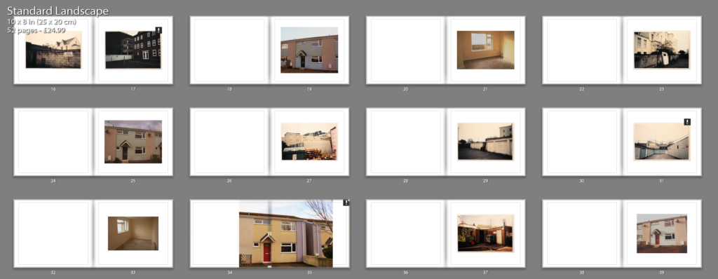
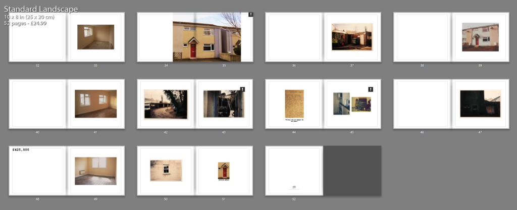
I experimented with all these different types of layouts and formats at would allow be to produce and create rah best possible layout of my book which would aid the overall narrative of the book at the end. bellow are screenshots of my work in Lightroom and the type of experimental process I went through in order to decide on the final appearance of my book.

FINISHED BOOK DESIGN AND LAYOUT

EXAMPLES OF EFFECTIVE LAYOUT:

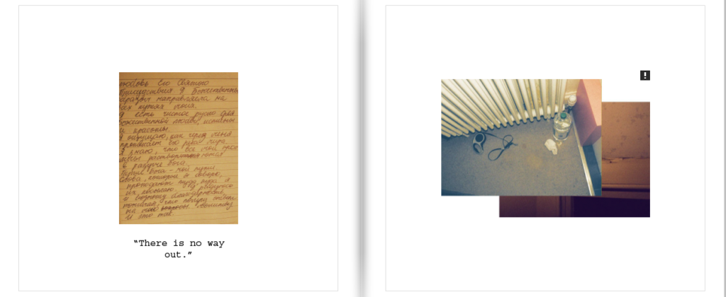
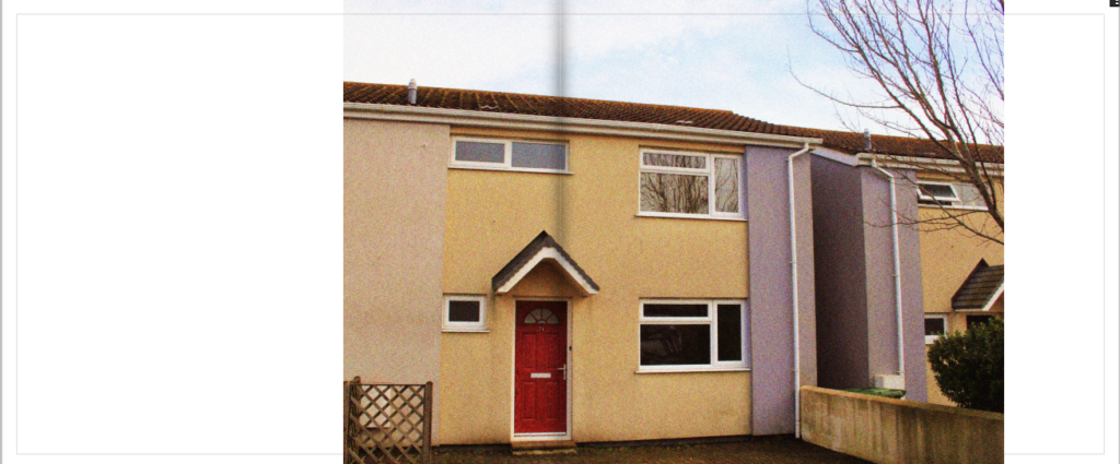
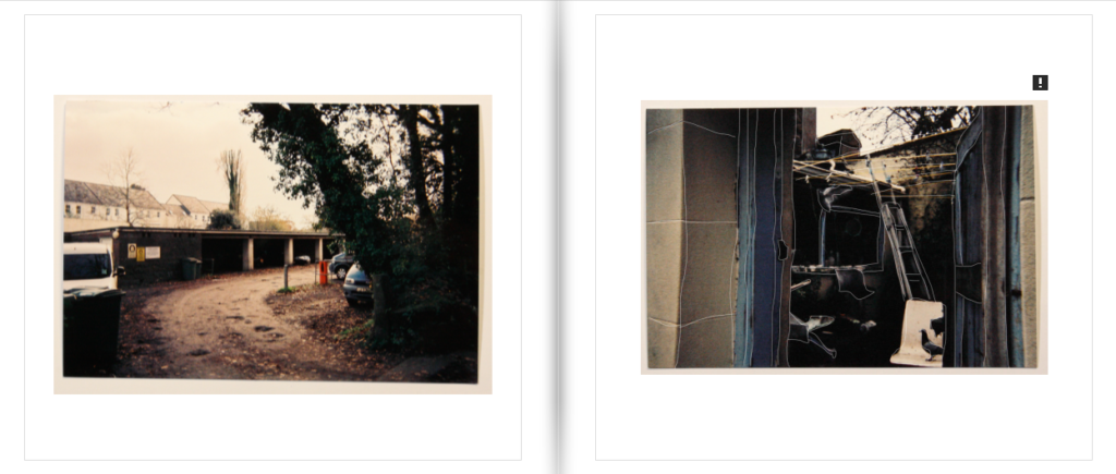
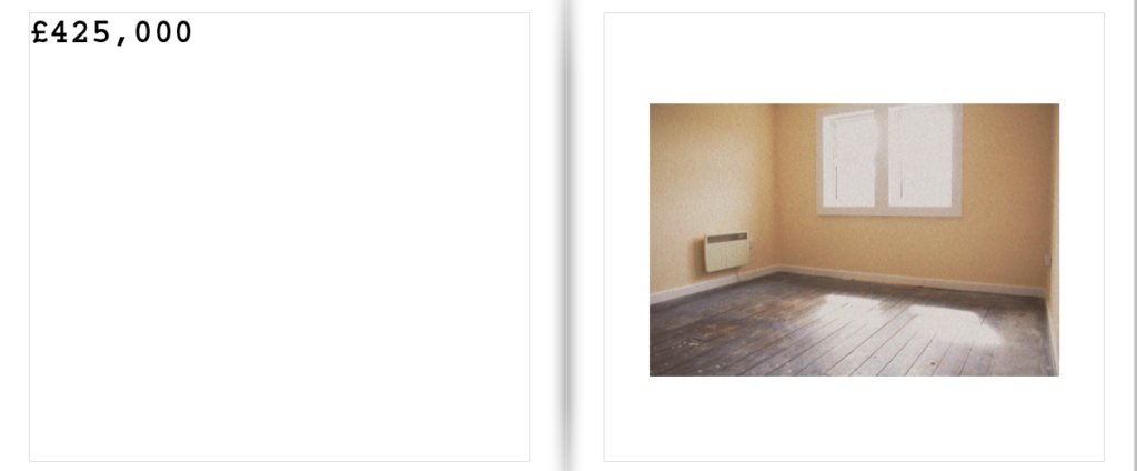
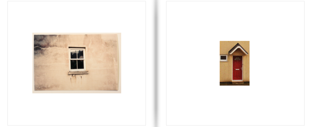
Below I have included examples of effective layout which showcases a wide variety of different layouts within my book. Within one of my spreads I have included a hand written letter from one of my family friends’ which describes their reality of living in Jersey. It is written in Russian therefore I decided to include a small translated quote on the bottom from this text, reading “There is no way out.” I felt as though this was a very poignant quote which fit in well with the personal narrative which I was trying to include within my book. With my image making, I am much less focused on the pictorial aesthetics but rather just a documentation which clearly reflects the inequity between housing prices and the property conditions. Further, this investigation led me to posit as a prospect buyer, yet my intent was purely image taking, which lead to my work being rather up front and raw, simply taking an image as it first appears. It was also unsuitable for me to take images which appeared as close ups of possessions as I had to take in mind the privacy aspect of the people who live here, and their lives being all on display for people to see as they enter. I felt this property was a good representation of my statement as in an image we can see one of the allocated bedrooms being used as a storage room, demonstrating how small and cramped conditions “low-priced” properties such as these can have. Much like Andium Homes, the exterior of this building is much more reminiscent of 1990’s Russian cubism with the minimal architectural features. Not only taking into account the housing conditions, this property is located near Springfield Stadiums which is socially considered as a rather dingy and hopeless area to live in due to the concentration of social housing and migrant communities.
OVERALL LAYOUT:

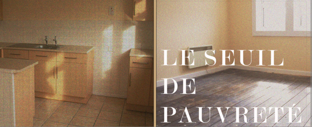
As a final layout I fell as though it is very effective and clearly conveys all the different aspects of the housing market well. Through my own image taking I was able to see see the ways in which not even government subsidised agencies are able to provide housing which is truly low cost and appropriate for a low-income family. Taking a documentary style approach to my image making, I was able to produce images which in many ways appear sterile and routine, appearing like that of an estate agent. My work I feel has effectively captured the same underlying message as Nick Hedges in the sense that neither or are able to provide citizens with appropriate living standards, weather that be of a lack of government support or over-privatisation of the housing market, both situations put ordinary civilians at a risk for homelessness. These complicated themes were captured within the images which I took in a simplistic and subtle manner.