During my second photographic Zine, I plan to show the relation between the different photographic projects i had completed throughout the last couple of weeks. There will be a relationship shown between both portrait images as well as objects which will mostly be shown through page layouts where i will showcase aspects of the occupation, as well as liberation. I also plan to use one or two images from my ‘Home Sweet Home’ project from the Interior and Exterior shoot to pair with quotes which speaker Joan spoke about as I feel that having a homely background will help relate a quote and make it more personal. I would like the conceptual representation to be underlying in some cases, as well as being explicit which will help create both a clear and experimental narrative for viewers.
Sequencing
During this photo book, I have a desire to keep the layout/ sequencing of the book very simplistic in order for there to be no confusion when looking at the images. I plan to make one photo book with images from different shoots, ie. Joan shoot, Jersey War Tunnels, Interior Home Sweet Home, Still Life Images, and Occupation Objects. I will closely focus on showing a relationship between the different types of images, and ensuring that they all match the same concept as each other is placed on a page together. I will also focus on where the images will sit, either on a full double page, a single page, 3/4 of the page etc. This will also help for different concepts and help for my work to be creative. I have no plan for what i would like to have as my front and back cover, but i do know that i would like a very simplistic introduction to my photo book which will be aesthetically pleasing to look at.
Zine’s are self-published booklets which can made physically or using the app InDesign. Both ways are helpful in the sense that doing a zine physically allows you to cut, stick and glue the images you want in a specific or creative way. However, InDesign also helps to plan out what you layout will look like before printing the images and the booklet. Thoman Paine was one of the first individuals to first introduce the zine where he used it as a way of promoting ideas that contributed to the UK War for Independance.
Zine Artists
Lorenzo Vitturi
Vitturi’s work is known to have a large use of bright and vibrant colors with unusual styled images. He does this in order to create unique images and present his style by using shapes and colours to create a certin narrative/feel to his images.
Mood Board of his work
Sam Ivin
Ivin’s work is seen to include portraits of people with edits of white blurs over their faces to strip them of their identity, helping to create a deep meaning of individualism.
From your Personal Investigation based on OCCUPATION vs LIBERATION write an overview of what you learned and how you intend to develop your Personal Study.
During our occupation vs. liberation theme I learned a variety of different skills and also built upon previously known skills. At the beginning, I explored the use of archives. I learned how they can be used to research in order to discover more about a certain topic area, which in my case was the occupation of Jersey. This was extremely useful as it allowed me to incorporate further depth of knowledge into my project.
Another practical skill that was built upon were technical camera skills. Shooting at locations such as bunkers improved my ability to photograph in low lighting, by controlling the ISO and aperture. When I moved on to researching the occupation further by meeting an individual who lived throughout the occupation, my portraiture skills also improved. I learnt how to build up a relationship with a stranger, and how to learn more about them in order to photograph them appropriately which is something I had not previously done before. In regards to editing and developing my images, I learnt how to use lightroom and Indesign in order to improve my images and create my zine, which is something I had very minimal experience with previously. I will be taking these research, practical and developing skills forwards in order to begin my own personal study.
Describe which themes, approaches, artists, skills and photographic processes/ techniques inspired you the most and why.
I think the thing that initially inspired me the most during this specific theme was the research and the images I saw at the archives. I think this set the foundation for my project because it allowed to me gain a fundamental understanding and insight into what the occupation was like and how my project could reflect this. After this I was inspired by artists such as Klaus Pichler for the specific way he photographed still life, as this helped me better photograph occupation objects. Further into the project Rafal Milach inspired me to interpret my images of the occupation in a more creative way using colours and other props in order to express a sense of being trapped.
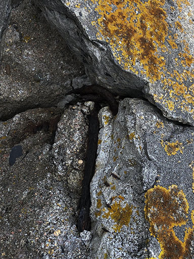
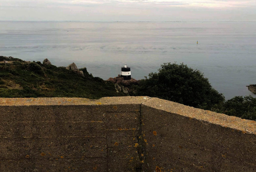
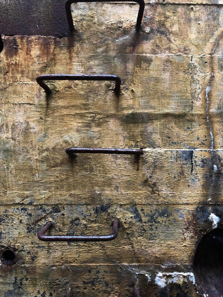
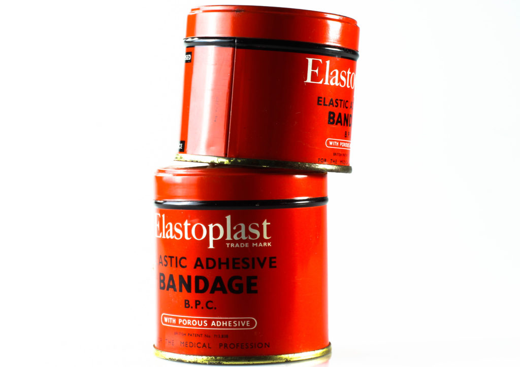
Landscapes, People and objects also played a very important role on influencing my project, as those 3 things are very personally related to the occupation and that gave my outcomes throughout this project a sense of authenticity that otherwise wouldn’t be possible. Landscapes that inspired me were in ares where certain important events in the occupation had occurred, such as the bunker sights. Namely, occupation survivors such as Joan Tapley and Bob le Seur also played an important part of my project as learning more about them and their personal stories allowed me to incorporate real life first hand events into my research and discovery. Lastly, the occupation objects I photographed were important because I they gave my project a more metaphorical connection to the occupation.
For my second zine, I will be using manly the images I have taken of the occupation objects and people, and also some archive images. I think this will be very interesting as I have already shown the story of the occupation in my previous zine through the physical aspects in Jersey, but now I will be able to tell it in a more personal way, through the objects and portraits.
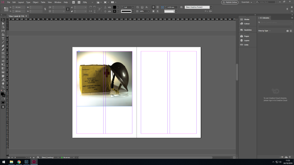
I want my zine to have a structure to it, or to have some sort of pattern to it. I first started of by using the initial images I had taken of the objects and placed them on every other double page spread since they were landscape images. I had to edit one other image in order to have enough.
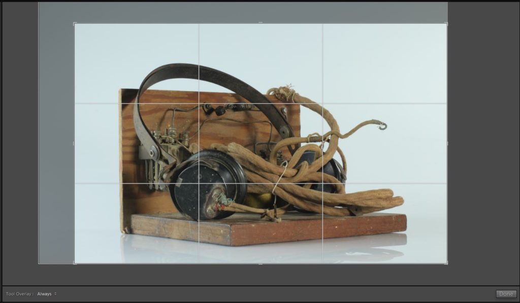
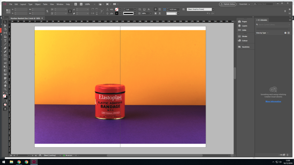
To begin, I cropped the image so that the empty space was more even the whole way around the image, as there was a lot more on the top left hand side compared to around the rest of the image.
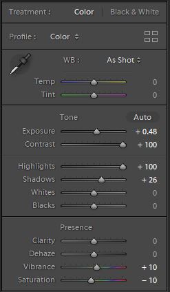
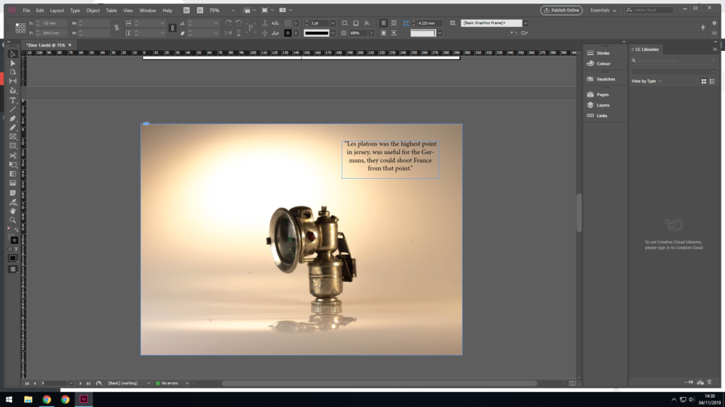
Here you can see how I developed my original image. Increasing the exposure and the contrast helped to make the image stand out vividly, while also making the background a plain white colour. I increased the shadows and highlights as this helped get rid of the darker tint the background had. I increased the vibrancy to add an extra pop of colour to the object, and I decreased the saturation since increasing the vibrancy added a yellowish tint to the background.
Initial image vs. edited image
Here you can see what my layout looked like after adding these initial images to my zine design:
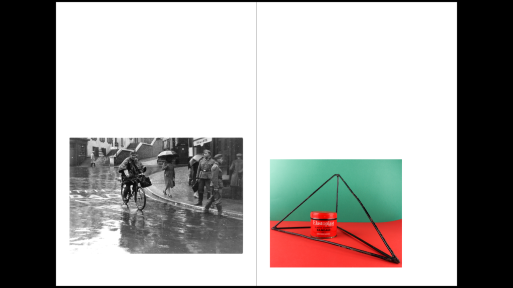
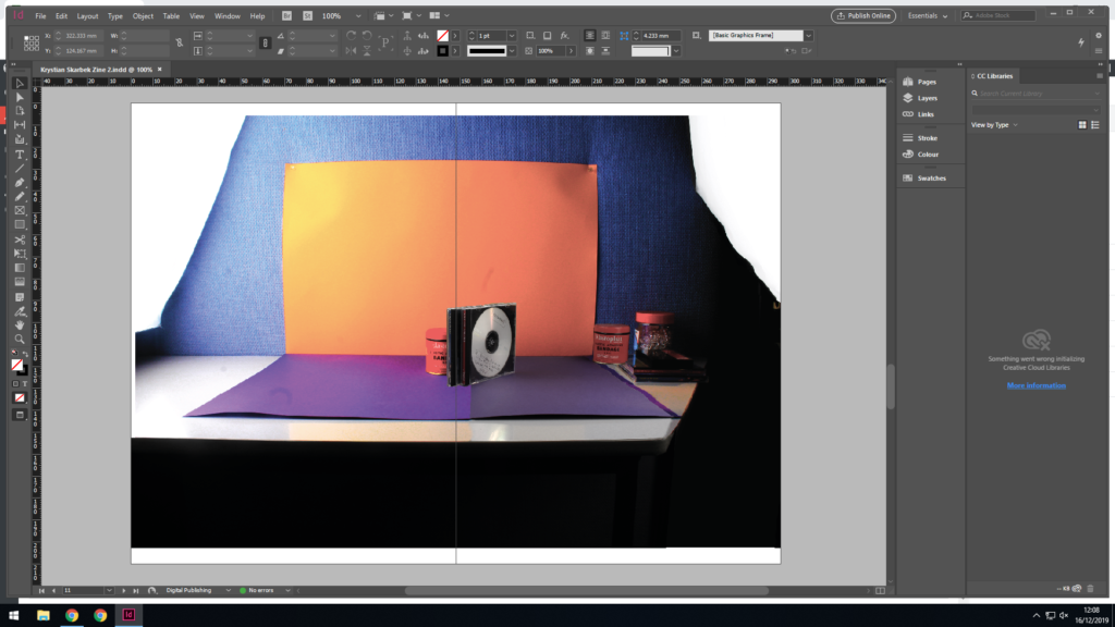
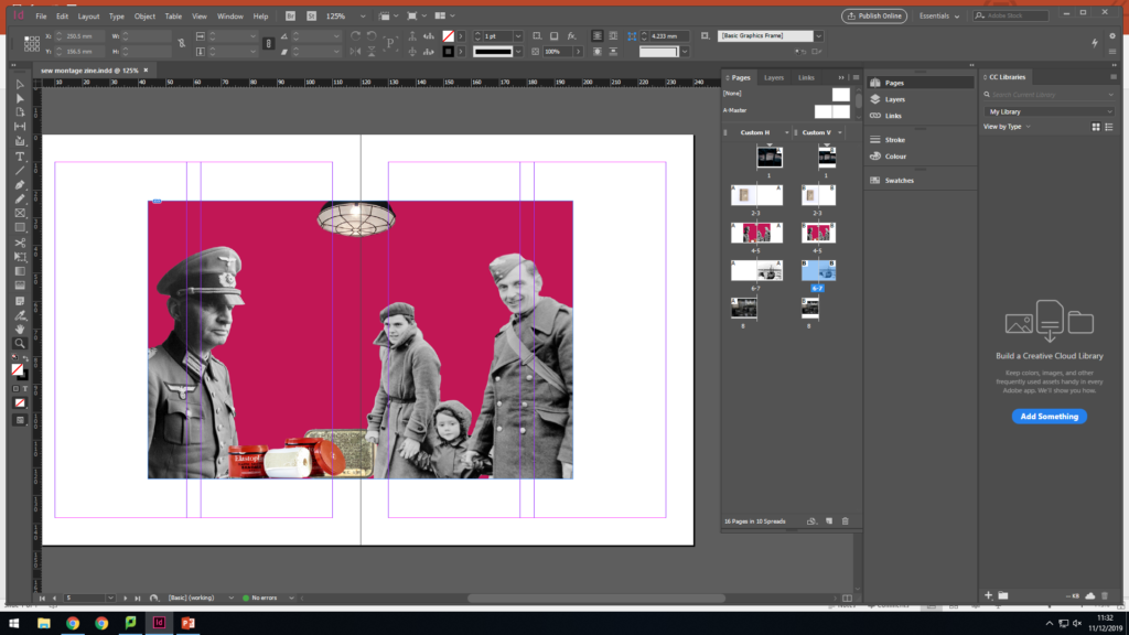
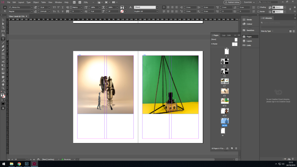
I then chose to place this picture as a double page spread right in the center of the zine, on pages 8-9. I chose to place this here as I only wanted to display 1 montage in the book, and I thought it would look best placed here in the middle to show the connection between people and objects. I chose to display this particular montage because It contained an object that I hadn’t already featured in the book. I think this is placed well, as when you get to the middle of a book, you see something very bright and colorful.
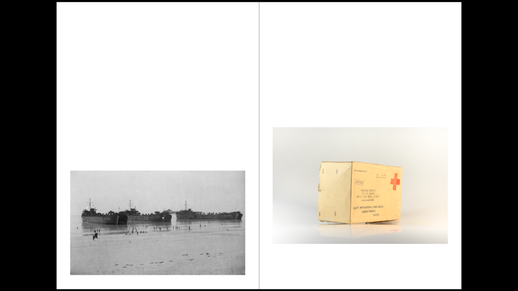
I then added in 2 archive images which you can see below:
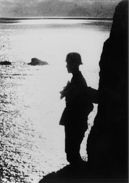
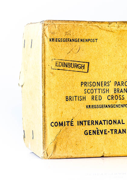
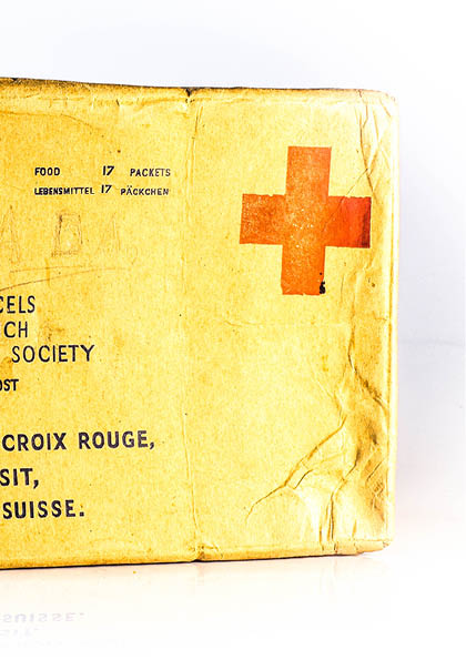
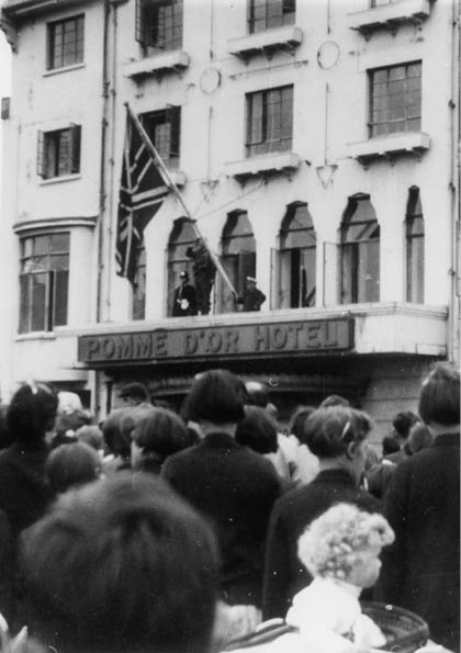
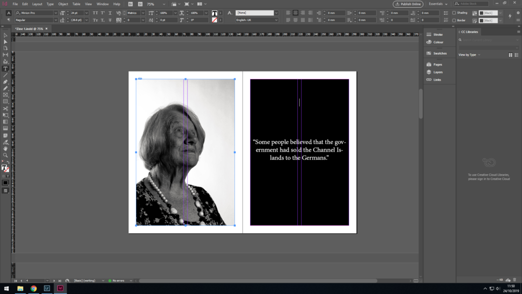
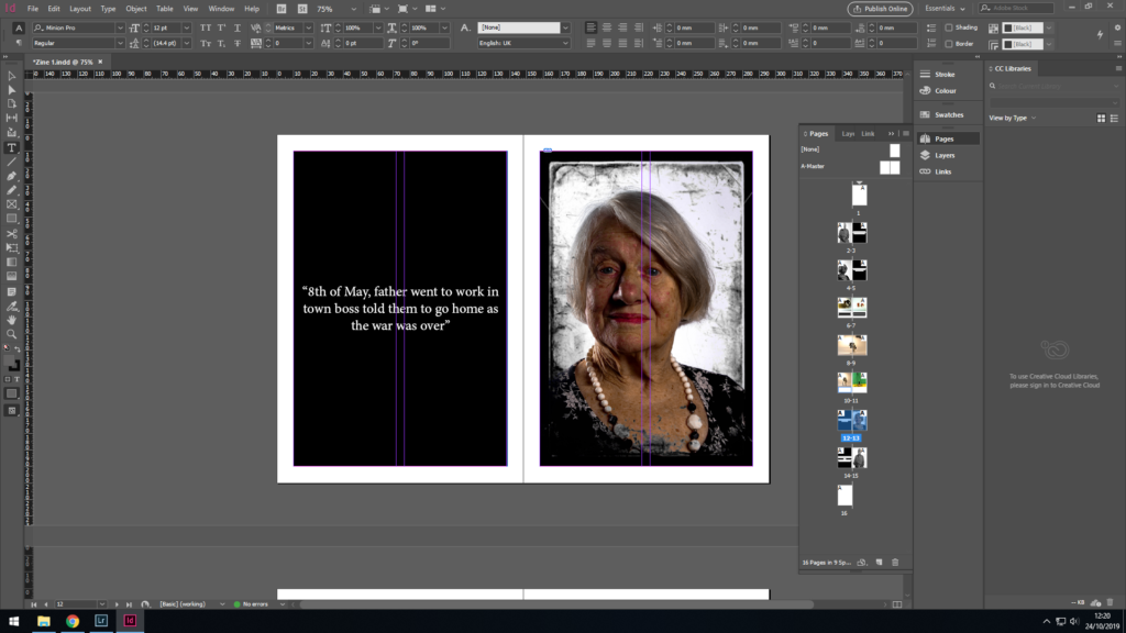
I decided I wanted to include these 2 archive images because they both show people during opposite stages of the occupation. The first archive image shows the silhouette of a soldier, which I placed at the beginning of my zine as I wanted to show the images in chronological order, and this picture shows a soldier standing in full combat uniform showing the intensity of the beginning of the war. My last archive image shows the end of the occupation, as you reach the end of the zine.
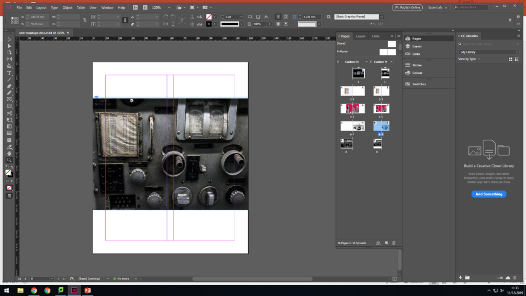
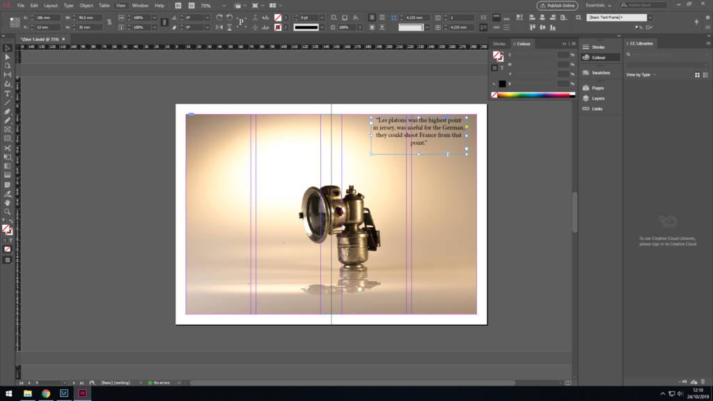
I also added the image below into my zine, instead of the image of the 3 objects together. I did this because I thought it would look best to have all my full bleed pages displaying an image with only 1 object in them as it makes the narrative flow better.
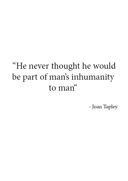
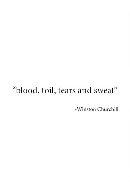
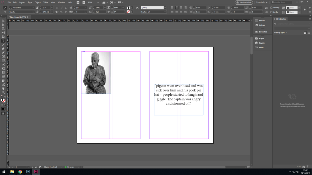
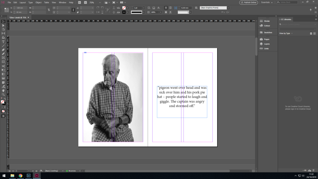
You can also see that I added 2 different quotes onto the pages opposite my archive images as I thought this would help make them impact the viewers emotion more if there was some text to add context. The first quote I placed in the zine was from Joan Tapley who’s a Jersey occupation survivor. I chose this specific quote because it was very hard hitting, and I think it fit perfectly with the silhouette of the soldier as the quote was originally about how Joan’s father had acted in a slightly inhumane way towards an unknown soldier. My second quote was by from a speech given by Winston Churchill, “blood, sweat and toil”. I thought this quote was fitting to display next to an image of liberation day because those three very powerful words are almost a reflection of the 5 years of hardship faced by Jersey people.
Lastly, I thought about the front and back cover and the title of my zine. I decided on the title “objects of the occupation”. The word “objects” refers to both the physical objects, and also the people, since I also view the people as being objects of the occupation. I wanted this title to stand out by itself in order for the metaphorical meaning of it to be clearer and more easily absorbed by the audience.
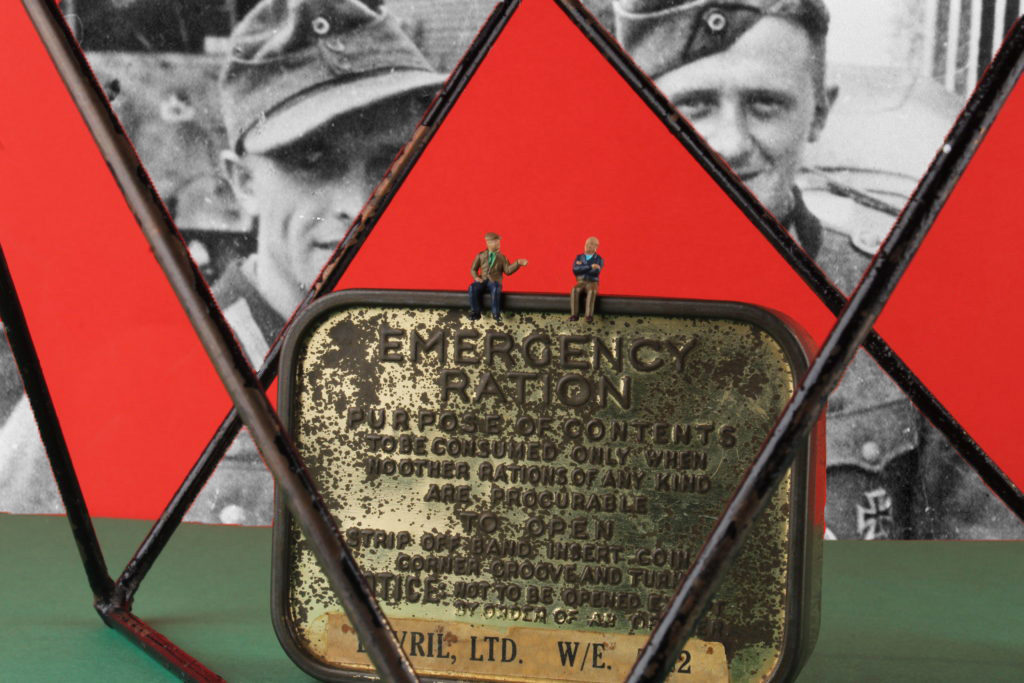
In this zine I want to show objects and people of the occupation as one. I will be doing this through the use of my own images, through the use of archive images and potentially some text. I decided to focus on both people and objects as I believe they go hand in hand, and displaying them together can help explain the occupation through a more personal way. Because I think both objects and people go together, I will make sure to include a photomontage in my zine as my montages show images of people and objects merging together and this perfectly demonstrates how there is correlation between the two.
Sequencing:
Since my zine is going to contain a mixture of archive images, text, and my own images I want to make sure there is a specific order to make sure my zine doesn’t end up looking unorganized. I plan on using a mixture of full bleed, and single pages in order to display my images in a successful way. I may also experiment with different way of placing my images on the page, such as trying different types of borders in order to make my images stand out.
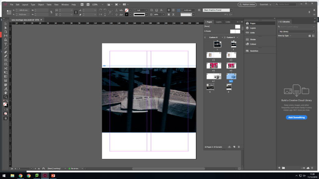
I will be printing this on A5 paper then trim down the images to their intended size. I had to leave two pages blank because I will be sewing into the photomontage so the pages behind can't have images as they would have string all over them.
For my zine I decided to experiment with images and text, which I have gone with, I wanted to use text because it would give the images a clear understanding of the message I am trying to get across.
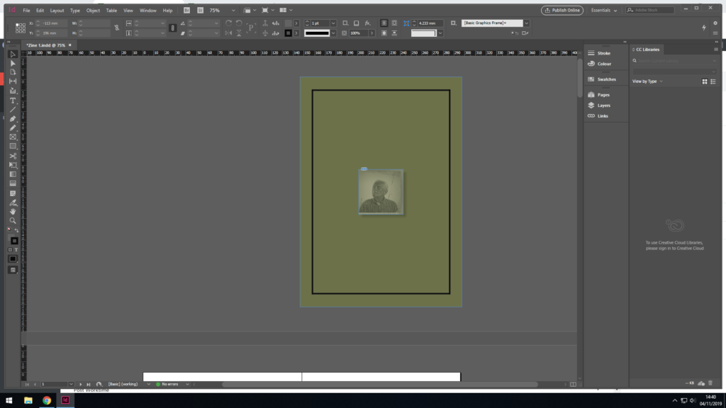
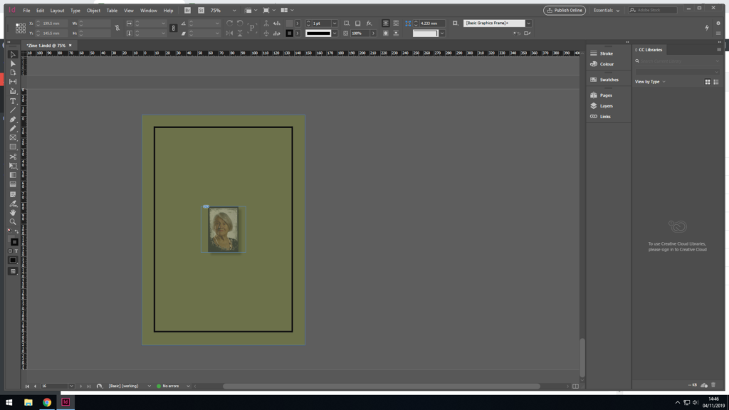
For the front page I decided to go for an army green colour to represent the time of when jersey was under control. I also added a small image in the centre of the page, by doing this I have made it look like a small picture stamp, I wanted it like this. I have also added a black border surrounding the image in the centre. I also decided to have the person on the image looking up and sideways as if he was reflecting on something.Firstly I tried out this layout however, it didn’t have the feel I wanted with the image.Then I increased the size of the image to see if it had the effect I wantedI have then decided to change the background behind the text as I felt that it would attract the reader to look at the text.I decided to have the same layout on this page, again to attract the reader.For this I placed the image, as i was going to place text underneath this image.I have placed the text underneath, I like the way its positioned on the page as if it was a story book.I have copied the layout to the next page.I have decided to put this image in the centre pages of the zine, as i think it’s a quite important image.I decided to add text to the right top corner to try and explain the context of the image.After printing out my zine, I decided to change the size of the image so its fits the page rather than having a border. I also added more text to what I have already written, as i found that the original sentence didn’t make proper sense.This is the same layout that I did previously before the middle pageI have added the text however I have edited the image size of the images as it looked squashedI have then added the text beside the image which will relate to the imageI also decided to change the image as I decided to use the image somewhere else.I have applied the same layout to this page.I have applied the same layout to this page, like the front cover, however, for the image have used an image which she is slightly facing forward but also a little sideways.
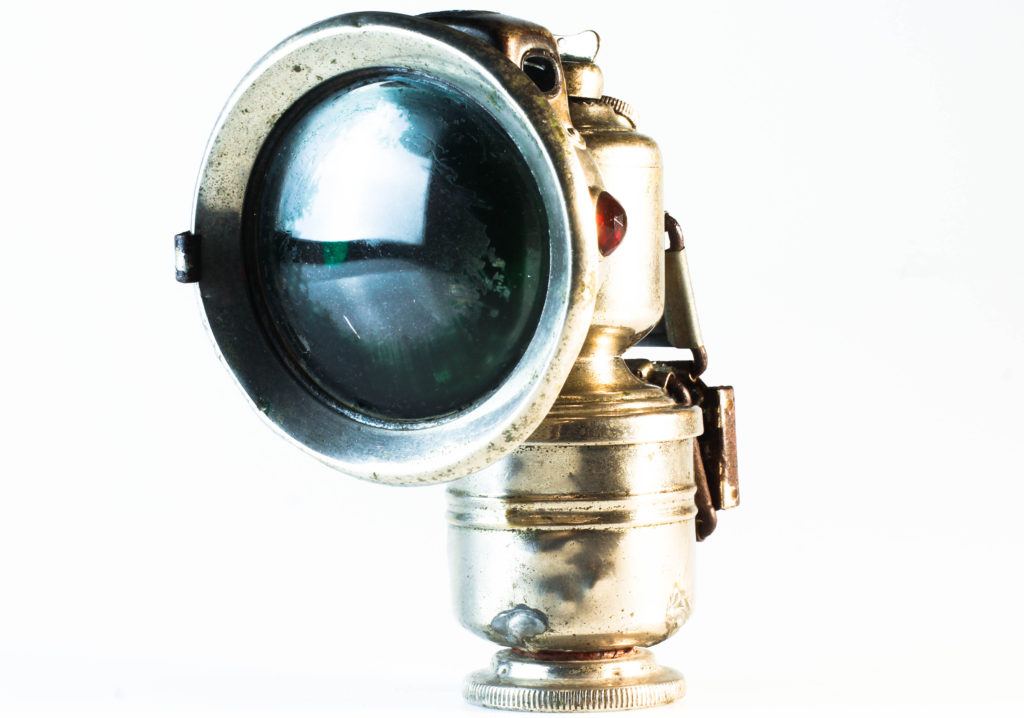
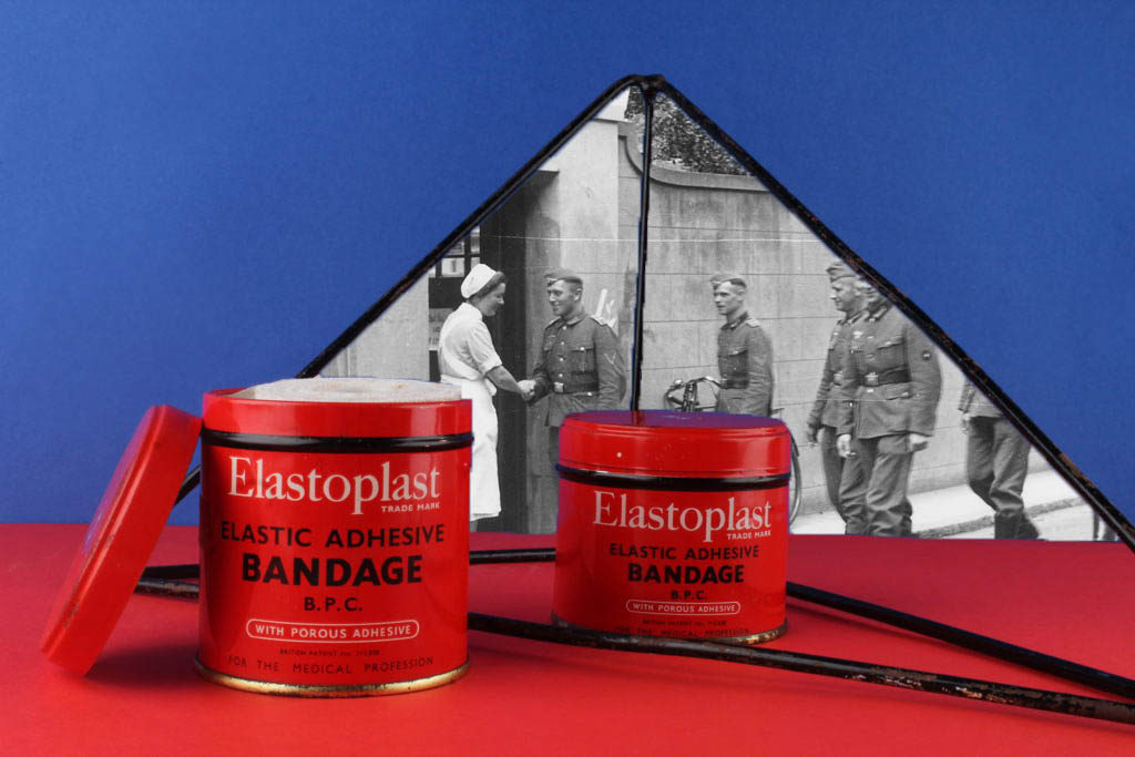
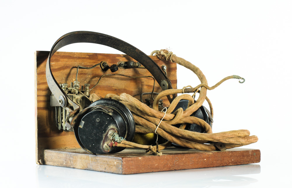
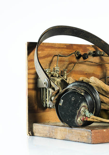
in this experiment i am going to photograph objects and i decided in this photo shoot to take still photos of objects from the German Occupation, these objects where brought from the Jersey Archive to give us an opportunity to photograph them, and this is how i planned to do that:
Setups
i decided to use two different setups to photograph my objects as some different objects need to be photographed at different angles and these are the two setups i used:
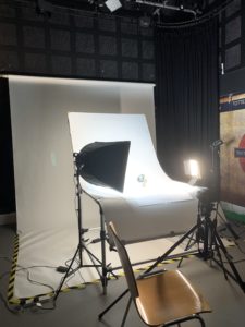
Straight on Angle Lighting Setup
For the straight on angle set up I used a continuous light set up. I used a fill light illuminating the object, with a secondary (tungsten light) light source to reduce the shadows and clearly showcase the object. I also experimented with back lights, but felt that it was not successful and did not justify the objects, thus I stopped using the back light. The camera was on a tripod with a 50 mm lens.
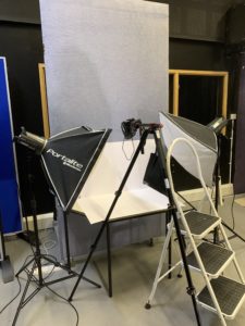
Birds Eye View Lighting Setup
For this set up, I used two flash head lights, set on a 2.0 power output. The lights where paced either side of the table, slightly facing downwards towards the object. On my camera I used a transmitter which triggered the flash heads to operate as I captured my imagery. In addition, I also used a pilot light in order to position a and frame my composition, this was located at the back of the table (on right) and did not affect the coloring or the outcomes of my image. The camera itself was placed on a tripod looking down at the table.
My plan is to work on this project with my friend who also takes photography so we can exchange skills and get the best results. we are going to go to the studio for three hours divided into three school days and use one camera between us and take photographs on different personalized settings then comparing the results to come out with an even better setting for the camera. We are going to start photographic the most suitable eye catching 3D objects using the straight on angle lighting setup, and afterwere done with that were going to photography the flatter objects on the birds eye view lighting setup.