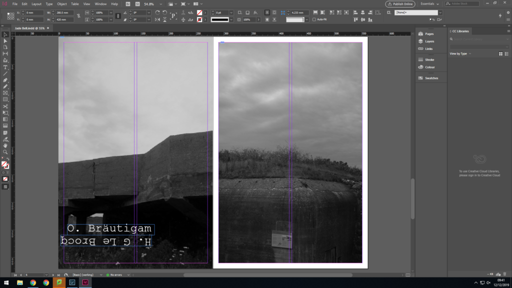
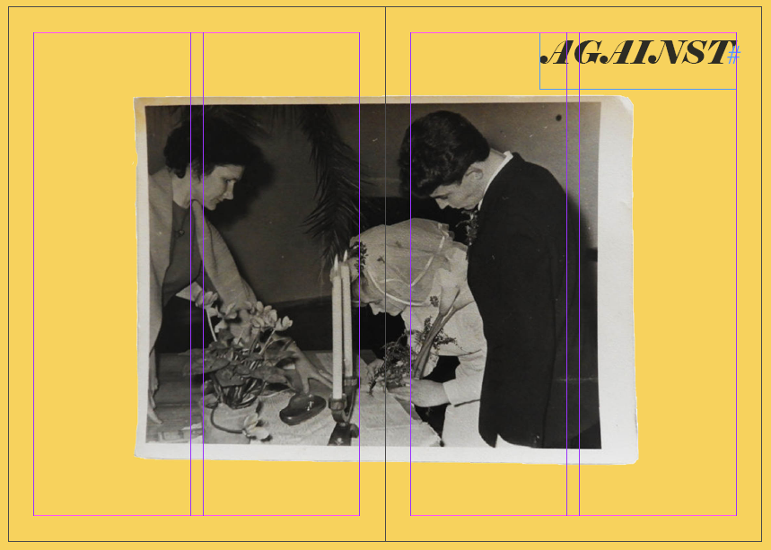
NEWSPAPER SPREAD

FRONTCOVER:

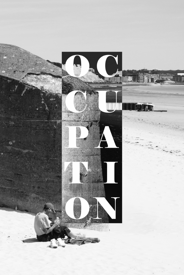
To gain inspiration for a from cover I used a previous idea from my bunkers zine. The front cover consists of a base image and a square which has been inverses in order to contrast the original image. Then on top of this I have written the word occupation in order to symbol the theme of the newspaper. I think this s a very effective layout in general as the contrast between the inverse and normal image is symbolic of the topic at hand, opposing sides, which fight against each other with opposing ideas. The image came from a photo shoot I did of the bunkers located ear Coronation park, which now sit dormant on the edge of the sea wall.

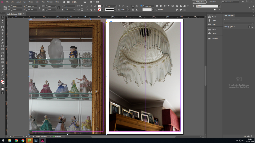
DOUBLE PAGE SPREAD 1:

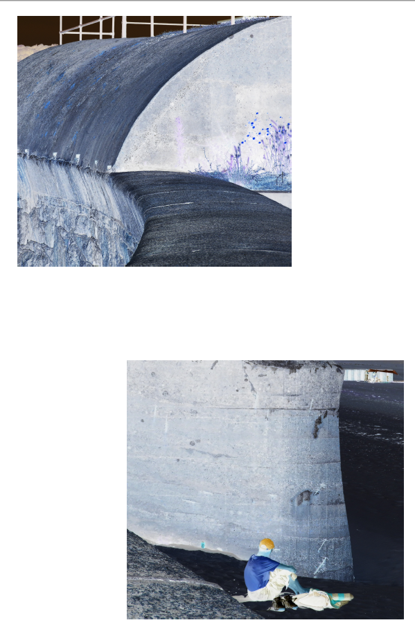
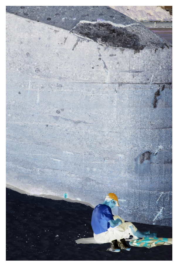
Coming from the same photo shoot as the image from the front cover, I employed a similar concept, using inverse imagery to represent the fight of two opposing powers. Instead of using black and white imagery, here I used the inverse of the original image. This spread is slightly different as I used two images which have been slightly spread out over the page in order to give some varying features to my newspaper spreads, this was an effective method of doing so without losing the value of the images.

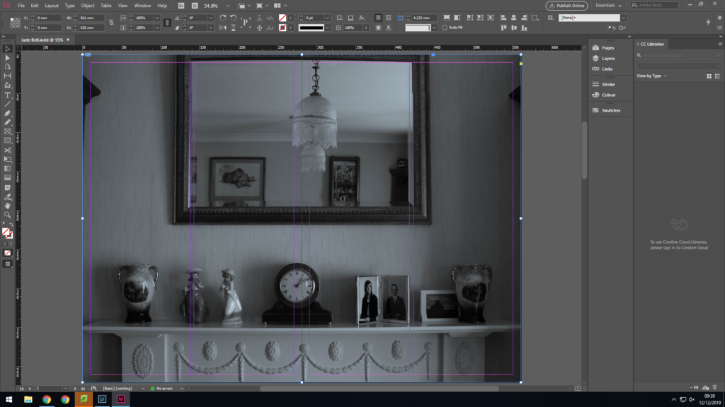
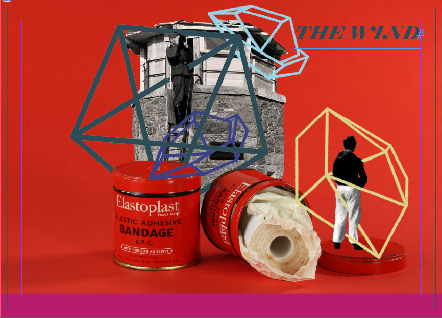
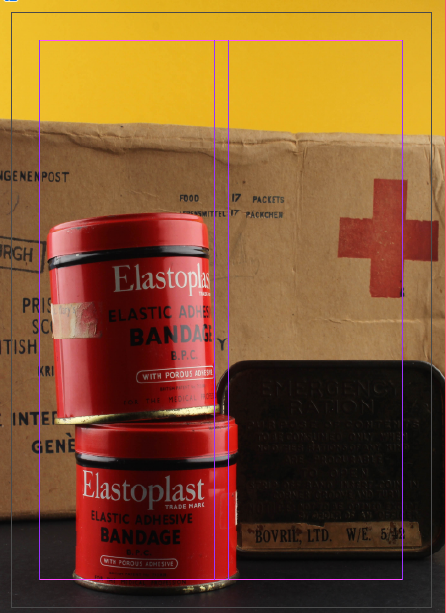
DOUBLE PAGE SPREAD 2:

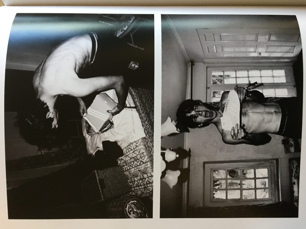
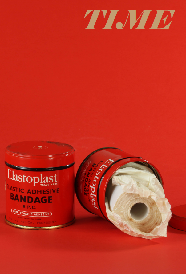
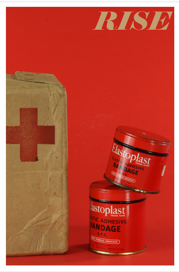
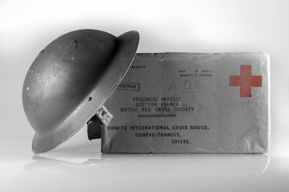
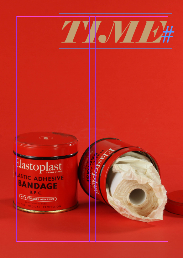
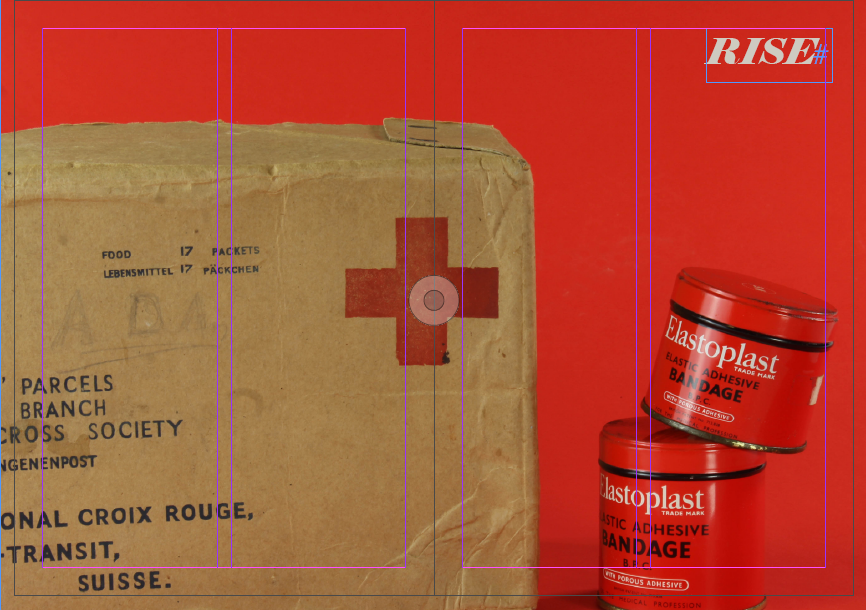
The second double page spread of my newspaper uses the images which I took during the making of the still life series. These were a good fit overall for the spread as they use items and objects specific to the time period of WW2, perfectly fitting with the theme of occupation vs liberation. I also retained the writing on the top left hand side of the image, just like in my zine, as I thought this added one interesting aspects to the image which otherwise would have not been there, adding a point of contrast and a second focal point. The bright red backdrop and tins of bandages in a way merge together in terms of there colour palette so therefore it was essential for the writing to act as a point of interest. The second page of my spread is also not full bleed as again it adds difference and variation to the overall design of the spreads.

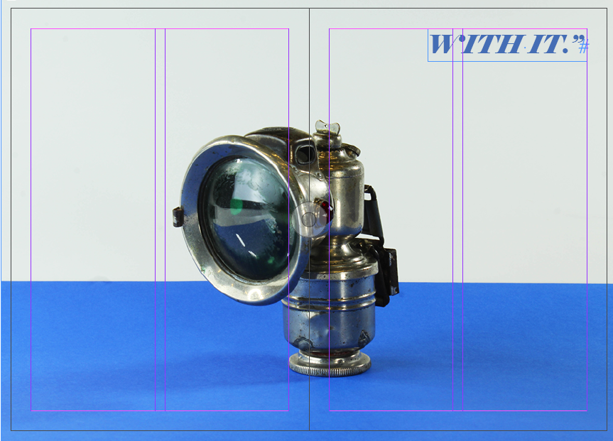
DOUBLE PAGE SPREAD 3:

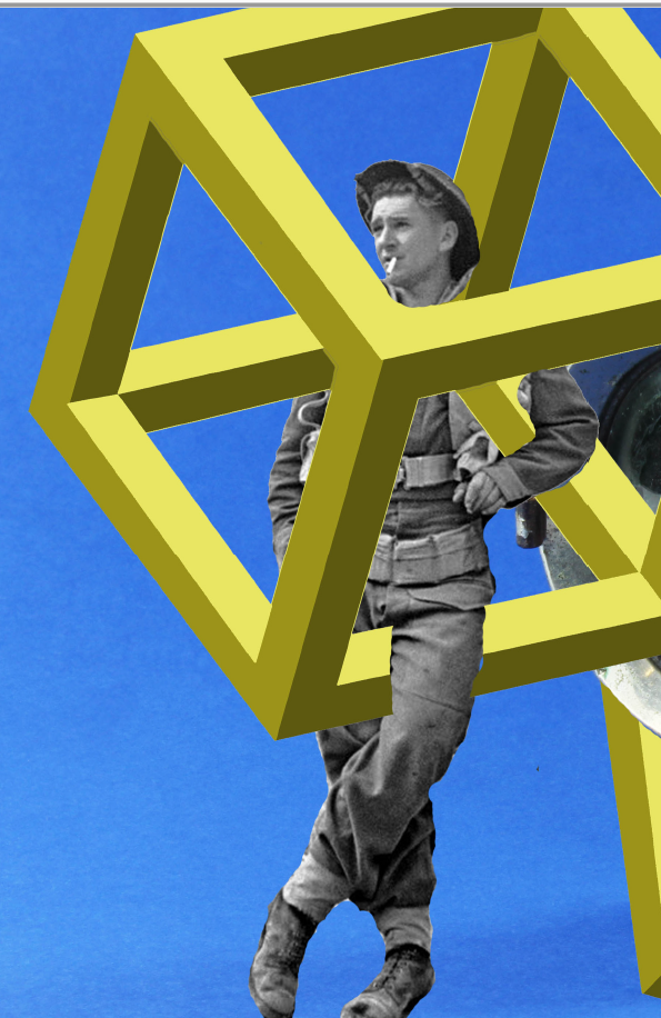
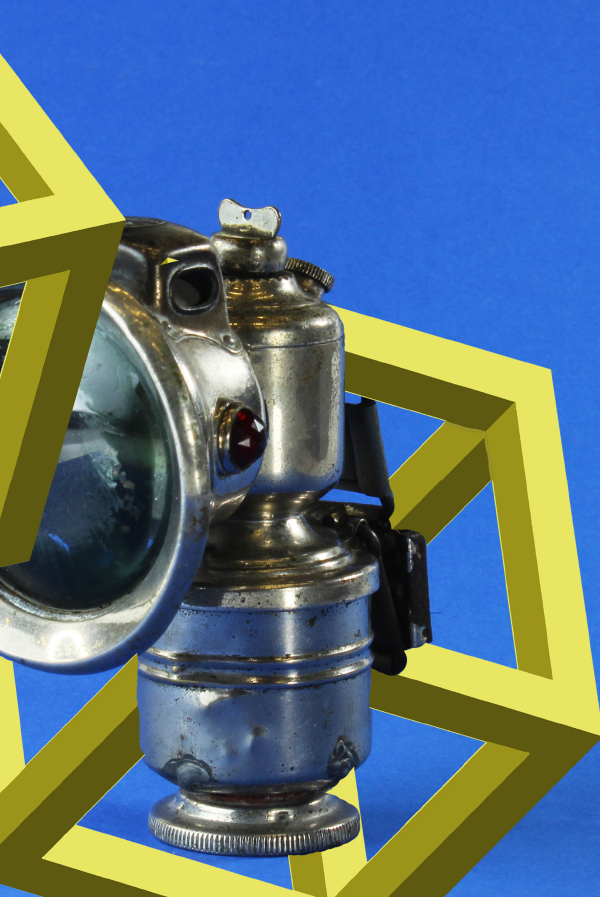
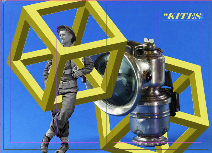
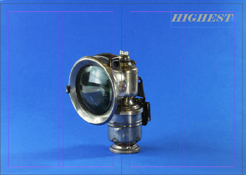
For my final layout, I employed the use of my previously made photo montage. I felt as though this was a suitable image to use for my spreads as it again fits with the theme of occupation vs liberation era well. The base image came from the photo shoot using war memorabilia to create still life images. I then went onto the editing process of the images, using another archival image of the soldier leaning on the side of the bike light and creating the geometric square laying on top. This is a nice contrast to the other spreads as it is in many ways both archival in nature but also modern with the inclusion of the geometric square, having a contemporary take on the topic as a whole.

Reviewing and Reflecting:

  1. From your Personal Investigation based on OCCUPATION vs LIBERATION write an overview of what you learned and how you intend to develop your Personal Study.
  2. Describe which themes, approaches (LANDSCAPE, PEOPLE, OBJECTS), artists, skills and photographic processes/ techniques inspired you the most and why.
  3. Include examples of current experiments to illustrate your thinking.
  4. Produce a new mind-map and mood-board based around how you interpret the theme of OCCUPATION vs LIBERATION now.

Overview:

In June, we began our personal investigation based on ‘Occupation Vs Liberation.’ To begin with, due to the nice weather, we focused on the bunker fortifications left behind by the Nazi occupying forces. This would be the focus of our first zine. This was followed by looking at the people involved in the Occupation, including those who are still alive today, and how objects and still life could be used to tell the Occupation story. This would be our second zine. Where as I had looked at still life and portraiture during AS, landscape was an area of photography I had yet to explore in detail or try out for myself. I thoroughly enjoyed the project as a whole, I found myself continuously lost in the landscape shoots while also discovering a new interest for portraits. This is what I hope to use in my personal study to show a new take of the idea of ‘Occupation Vs Liberation.’

New skills and inspiration learnt:

From day one, I had already been introduced to a way to improve and research my photography in a way I had never considered before. This was the use of archive images. We are incredibly lucky in Jersey to have access to our very own photo archive at the Societe Jersiaise. It was incredibly interesting to see some of the old photos from 1940-45 because I realized that maybe I didn’t know as much as I thought I did about the Occupation. However, the use of these images never really crossed my mind after that until much later. If I’m being completely honest, I had no intention of ever incorporating archive images with my own, at least not during the landscape part of the project. With archive out of my mind, we began our first shoot for landscapes. A permanent reminder of Nazi occupation are the remains of the concrete bunkers they built to fortify the Island. This was of course the perfect thing to photograph for this project. While visiting Battery Lothringen at Noirmont, we were given the opportunity to go inside one of the bunkers and take photos of the displays inside. This meant that we had to adjust the settings on our cameras to accommodate for the lack of light. I was reluctant to rise the ISO above 1600 as I didn’t want my image being grainy. To compensate for this I had to use a low aperture to allow for as much light as possible to enter the camera lens. I then went on to use this when taking photos at Jersey War Tunnels.

A second major skill that I was introduced to was zine making. I had never used InDesign before, but quickly caught on with how to layout my images in a way that created a narrative that told showed the relationship between Islanders and their occupiers.

Examples of current experimentation:

Occupation Vs. Liberation:

Personal Study- Initial Research/ Ideas

Interpretation of Occupation

Interpretation of Liberation

Exploring for Personal Study

In order to begin researching for my personal study I looked at last years photo books for inspiration as it was the easiest source of examples. I gathered three photo-books from the previous A-Level students and went through the book in detail while picking out elements i liked from the photo book/ parts which inspired me. I also looked at the composition of the books, all of white included a mixture of full bleed images, double page spreads as well as a range of sized images.

“Jersey Was The Land Of Fairies”- Jade Dingle

The first book i looked at was ‘Jersey Was The Land Of Fairies’ by Jade Dingle. I found that this book had an unusual concept to it as it is seen to be about four different fairies, all of which she has dressed up the same girl in different costumes and created a story for the ‘fairy’. The book purely contains her own images with a page of her own writing which is about the subject of the following images. I liked how she included text in the book as it isn’t overpowering however it does also allow the audience to gain a sense as to what the photographer was trying to portray. For example, as seen below there is a page for a specific fairy called ‘William And The Water Sprite’ this title followed by the text allows us to understand why the model is in water, why she has blue face paint on etc..

“All My Love”- Jude Luce

This second photo- book i looked into had a theme of family ad relationships with parents and friends. When looking through this book I found that there were a few images which didn’t necessarily link to the theme of the book which I felt as if didn’t need to be there. However there were also aspects I liked such as the physical photos which have been stuck in, comparison in old and new images, including sentimental elements ie tattoos and archival images from there parents.

“Inside Out”- Anna

When looking through this photo book, i quickly gained a personal concept in my head. The book includes a lot of images with the model wearing barely any clothing and also being placed in different locations such as the beach, studio, in the bath etc. I feel as if this adds a purity to the book and the lack of clothing showing her femininity, these elements work well together as they both help to empower a women which i feel as if this book is trying to do. When being able to see the models face we can see a straight face suggesting shes effected by this subject and is showing her own body to people who don’t feel conformable in their own, to empower them. This can be seen in the image below.

“Those Who Dream Only By Night”- Cole Courval

In this photo book I can see that there is a mixture of images included, most of which don’t add up to create a narrative. However, there are sectioned images which all represent a typical subject which I feel is a good aspect to this book. There is also a theme of black in the book which creates an aesthetic. Different locations are shown in the book, ie. town, beach, skate park etc. all suggesting that the overall theme could be teens.

Evaluation:

I found that looking at previous students work has been very inspirational and given me an insight as to the standards some photo books are as well as help to allow me to understand different compositions which people used for certain effects. This has allowed for me to create a few subjects which I would like to explore in my own photo-book.

I will also research well known photographers and look into their work in order to look at more technical elements to a photo book and photographic techniques used to create effect.

Review & Reflect

From working on this project, investigating the German Occupation and Liberation I have learnt new camera skills and have worked with new pieces of equipment. Within this project there were many different styles of photography, the first one starting myself off was portraits. In this section I photographed an individual who was alive during the Occupation and this allowed me to work more on my communication skills with the subject, it allowed me to take control of how I wanted my image to look and what story to tell. Along with taking individual portraits, I took images of the couple that came to talk to us, however photographing the couple was proven more difficult than I thought, I had to communicate with both subjects and try to get them to compliment each other in the image. I also had to think more about my lighting, as the male subject was stood slightly to the side and back of the other subject which cast a shadow over the women, which darkened and hide her features which I didn’t want, this lead to me adjusting the lighting so that the shadows would be cast behind them and their features would be bold enough for viewers to see at the glimpse of the image. After the portiere I then moved on to photographic objects from the Occupation and I learnt about two different set ups I could use to photograph different images.

Image
Image

Using the different set ups, allowed me to focus and work on camera skills and director skills. As I had to take charge of what objects I wanted in an image and how they would complement each other, along with working with the lighting, making sure shadows were cast in the right direction and space to give off the feeling I wanted it to. With the set up with the camera facing downwards I had to constantly experiment where my image was placed as I could see through the lens, this set up took a lot more patience as I had to change the objects positioning multiple times. The different skills I learnt will be able to help me with my personal study as I have the skill to direct my own images and put across my different ideas.

Throughout this project I have photographed landscapes, people and objects which meant I had to use different techniques in order for my to portray the meaning of occupation and liberation through an image. When photographing the different landscapes, I had to work with the natural lighting I had around me and I couldn’t change the surroundings to how I wanted them I had to photograph them as they were. However, when photographing people and objects, I was able to direct my images, I could place them in certain positions or tell the people to have different facial expressions or body stance. I much preferred photographing people and objects, as I had more control over how I wanted my image to look, as I was able to home in on features and complexions that were visible on my subject. I will continue to work with people and objects for my personal study.

Phootshoot outcomes – leo Harris

Notes taken from his memories of the Occupation:

  • At the start of the occupation – Leo Harris and his brother Francis was walking to school, and was stopped by a German officer, who then spoke English to the boys to a show off to the other soldiers. The German asks the boys to put there hands out, which they were very reluctant to do, however they did and the German gave them some sweets, Leo and Francis got told top eat them straight away, they did but walked on and spat them down a drain.
  • Opposite the hotel where Leo Harris was staying, on the promenade, the tide was up , load of Germans were sitting on a raised platform, where a Alsatian dog jumped over the promenade walk and went on the platform and sniffed the Germans, and this dog ended up piddling on a German spine.
  • There was also street fight between the Germans, they would throw Grenades ‘Potato Mashers’ as the Jersey people referenced them. These Grenades were made up of either a wooden handle and a brass bullet with wooden, tip, these would splinter if they hit a object, this was quite dangerous activity.
  • If a German officer wasn’t standing to attention as the Sargent wanted, they would be made to, some sergeant would make the Germans fall flat, and they were made to do it over and over if not done properly.
  • As a lot of Germans couldn’t swim, they taught them by having a rod with some rope and they would hold them up on the water, to teach them, some officer would take advantage and try to lower the rope so the Germans would go fully under.
  • There was also a Jersey version of a gestapo.
  • Leo, Francis, and a couple of there friends stole 3 German rifles and lots of anumition, The gestapo visited the hotel Where the Harris family lived, they had kept the rifles in a window pane, Leos dad also kept his English rifle at this place.
  • His dad ordered Francis to hide the rifles in there store in the town, they did this by strapping the rifles to his bike and hiding them with tape and the anumition in a green bag on the handlebars.
  • The German Officers ‘Wolf’, ‘Eric’, ‘Carl’, ‘Bernard’ – these officers visited the hotel in order to find the rifles, these also dressed up a civilians, for example Carl dressed up in Austrian clothes, which was Austrian hunting gear, which was the colour green, whereas the others were in waistcoats and medallion to show they were part of the gestapo.
  • At this time, Leo was aged 14,
  • Francis was then questioned about making crystal radio sets, this was done by Carl.
  • However the Germans didn’t realize that underneath the kitchen was a little cellar, where there was stolen German bicycles.
  • One of the Germans when searching found a khaki green bag, this was stolen from a German bunker this contained cigarettes, Chocolate, tins of meat.
  • In the kitchen on the stove there was one of the tins of meat that was stolen, as the family wasn’t allowed to do anything, this got burnt, the mothered ended up putting on the kitchen taps and pouring it down the sink.
  • The Gestapo ended up Taking Leo’s dad and his brother Francis to the German prison, 5 days later they accused his father of being the leader of a French resistance. However with Francis they let him out of prison for a day to go and collect the rifle however on the way back to the prison he stopped at the rifle barrack at green street, he opened and looked at the positioning of guns. then he goes back to prison.
  • Hitler ordered that any english born citizen which was born in Jersey to be deported, however this never happened.
  • Liberation:
  • There was lots of cheering at various squares around the island.
  • The public demanded that liberation was actually the 8th of May, instead the government said it was the 9th of May.
  • Leo Harris’s family liberation was very different to others, firstly they went to a garage where they had a car, they drove to the Gestapo court, his dad got out and a German called Spurnard, who lived Kings cliff Queens Rd, here he got back his wireless and two automatic pistols. After they went home.
  • In the morning after, his father had not got back his son Francis, as the war was over, he went to the prison, where he demanded to have his son, they accepted.
Here I have selected the images I wan to edit and discard.
I have then colour coded the images I selected. The green represent the ones I liked and are going to edit, the yellow represents the images I like but I am not going to edit as the are either duplicates or slightly blurry. this selection has left me with 9 images to work work with.

First Edit:

I have used the Before and After view to see what version I like, and want to use, I have decided to go with black and white.
I have edited the Exposure to -0.83, and the contrast to -29, by doing this I have lowered the brightness, but slightly increased it.
Here I have edited the highlights to increase the white in the background so its not dark, but I also edited the shadows to decrease the amount that you couldn’t see, i used it so u could see the pattern in his jacket.

ZINE FINAL LAYOUT

FINAL ZINE EVALUATION:

In terms of the visual layout of my final zine, I feel as though the outcome is very successful. I tried to go for a continuous theme in my work with the colorful backdrop which can be seen in all the images. All of the photos except from one, which is an image of my grandmothers wedding, I used photo shop in order to add the bright yellow backdrop in order to retain continuity in my work. I also attempted to keep my work in an order which would show an extent of repetition, spacing the reds and blues in a continuous fashion. The subjects and objects within the images also are very closely linked to the subject at hand, being a variety of war memorabilia and archival images which have been turned into montages. Another point of continuity is the fact that almost all the images have been produced in a studio setting, this allowed for high quality imagery and consistent results throughout the shoot. In order to add another point of interest I decided to add a quote from Winston Churchill onto the right hand corner of the image. I matched the color of the words to tones which are overwhelmingly seen in the images and contrast well within the image. Overall I think that my final zine layout was very successful as it follows a continuous narrative throughout and is visually very harmonious and cohesive.

ZINE NARRATIVE AND SEQUENCING

NARRATIVE:

In terms of the narrative of my zine, I will be focusing on the various aspects and ways in which war is captured through 3 main ways. Firstly using the photographic archives of Societe Jersaise and using the photos which I personally selected, making them into montages. This gives the images a modern and contemporary twist with the use of geometric patterns and shapes, representing the relevancy of war in today’s society. Within the narrative, I will also be representing the still life images which I took within the studio. The objects which can be seen in the images are all war memorabilia, important as they represent a physical object which dates back to that time, showing us that the occupation will forever be remembered through the items which remain in archives and society. Lastly I will be including photos from my own personal family archive which will be modified in order to fir the colorful narrative of the rest of the images, especially the still life which will be featuring colorful backgrounds. I think this is very important as my family did not have a direct link with the Jersey occupation yet faced the war in ways which was very similar, making the zine personal to my own experience.

SEQUENCING:

The overall sequencing and layout of my zine will be fairly simplistic in terms of layout. I will keep my images full bleed, expanding to the very edges of the zine, therefore making each image a double spread. I think this is extremely important as the viewer is able to focus in on details of each image which may be missed if a multitude of photos are displayed on a spread.For example, within my second montage there are small details such as the soldier in the right hand corner saluting to the air, if this image were to be made smaller and and used in conjunction with other images, it is likely to be missed therefore making small details like that irrelevant and a waste of time when creating them. I will also be including a quote on the right hand side of the image in order to add more meaning to the zine and another point of interest.

MOOD BOARD:

In order to give me inspiration and a deeper understanding about the various different layouts which can be used within a zine, I have looked at other examples of zines which display a variety of different layouts.

Image result for zine mood board ]

Personal Study Concepts

-Amition, the idea that Jersey is restricing for young people these days, like how in the occupation you had to deal with what you had on the island, there was no way you could leave to go to the mainland.

-Identity, jersey again is a small place, views on the island can be very outdated people are stuck in their old ways, especially the older generation those who experience much more hardship than us.

-Voice, exploring how much of a voice the younger generation have, do they vote, do the older generation feel like we should have a say, do they think we are mature enough to know what the island needs.

-Security, during the war houses were where people felt most secure. Myself, I feel most safe at my mums house rather than my dads its more familiar and homely to me. Recent things such as the Grouville rape have made me more inclined to stay at home especially now that is gets so dark so early.

-Choice, there is any option in Jersey now i’m writing my personal statement for university because there is nothing I want to do that involves staying in Jersey, compared to the UK there are very little apprenticeships, the majority of work is within the finance industry, there are no universities on island and there is only one non fee-paying school that offers A-levels.

-Wealth, in my option Jersey is extremely money orientated. The ever growing finance sector, the tax heaven it offers for the ultra-rich, the constant supply of new accommodation. All these fail Jersey’s natural environment, for instance the new development at West Quay has caused pollution to the marina. More and more housing, offices, mansions are being built on our island yet the government are taking years to decide where to build the new hospital.

-Democracy, our government/states formation is complex and confusing, when I voted for the first time I was confused by the amount of people I was voting for, in St Brelades there are several people running for constable but in some parishes there is only one person who runs and they are automatically given the place this isn’t democratic in any way it seems corrupt to me.

-Separation, my parents have been divorced ever since I was little and I would be lying if I said it wasn’t a struggle, the main reason for this is my step-mum we never really got on. having two everything is now normal to me but it forced me to make decisions other kids didn’t have to make. My mum took the divorce the worst and I noticed as a young kid she was going through emotional distress.

-Sleep, as a kid I used to dread going to bed, i would have endless nightmares. Now I can’t wait to sleep it’s what I look forward to the most. I want to explore how different people have different experiences of sleep and how it can be a struggle for one personal but a joy for others, this can come with age or life events.

-Water, I have this phobia of deep sea and the unknown of whats beneath me. I don’t like fish coming close to me, in fact I just don’t like fish at all. I think the thing that scares me the most about the sea is the fact their is so much of it, many areas that haven’t even been discovered yet, the possibility of unknown animals is dawning. Even in a closed off swimming pool I get panicked about a potential shark. The biggest problem I have with this is that I love swimming it’s always been my best sport but only when its in a pool full of other people.

Personal Investigation – Research

To begin researching for my personal investigation I started looking at what was around me. For me, the easiest way to start creating your own ideas and plans it to first look at what other people have done before you. Therefore, I gathered some of the photo-books from previous year 13 students and went through them picking out bits I liked and inspirations I could take from them. In terms of composition, all 4 of the book have included a mix of full bleed, double page spreads, smaller images and sets in their books which is the first thing I want to recreate.

1. ‘Is that my blue butterfly’- Mattie Knapman

The first book that I looked at was named ‘Is that my blue butterfly?’ by Mattie Knapman. I really enjoyed looking at this despite it being very emotional containing sad and violent photos/collages. The theme of the book is centered around his mother, who at the time of making was passing away in hospital. The book contains a mix of archival and recent photos of him and his mother, as well as collaged photos and which was have been painted/drawn over. Another aspect of this book that I think adds another aspect of understanding is the inclusion of photos of objects. For example, Mattie chose to include a double page spread of a photo of his mother’s hospital band. He has also included a note at the beginning in which he explains the reasoning of the book which in turn gives a more personal touch, especially as it is in his own handwriting.

‘Choose Life’-Oscar Vibert

The second book I looked at was ‘Choose Life’ by Oscar Vibert. This photo-book has a much more relaxed atmosphere than the previous but still has it’s meaning. The theme of this book in my opinion is mostly about skating and living everyday life. Here are some aspects of the book which I would like to draw inspiration from:

  1. The entirety of the photo-book being black and white.
  2. Title with a reference to something else but still fits own project.
  3. Head on up close portraits.
  4. The subject’s possessions included. E.g- skateboard.
  5. Shots in everyday life/all look like similar shoots or same day shoots.
  6. Photos with direct eye contact.
  7. Carefree/laid-back atmosphere that demonstrates everyday life as a young person.

The above photos with the white striping also look like they may have been taken on film which is another aspect I want to use in my own personal investigation/photo-book.

Above is the main type of portraiture I want to include; which shows a person’s full face, everyday habits and seems natural.

3. ‘All My Love’- Jude Luce

This photo-book is similar to Mattie Knapman’s as it focuses on the themes of family and relationships with parents etc. I don’t particularly like most of the book as it contains some images which I think don’t necessarily need to be in there or don’t relate to the theme or title. Some aspects I do like are:

  1. Actual physical photos which has been printed from film and later stuck in.
  2. The comparison to old and new.
  3. Archival imagery of his parents lives, e.g old photo booth photos of the two together.
  4. The inclusion of sentimental things and objects such as the addition of a photo of a tattoo on someone’s leg and the original bracelet charm it was taken from.
  5. Included some images of himself and his life and his girlfriend which replicated his parents relationship.

4. ‘The Getaway’

I’m not sure who the creator of this photo-book is as I couldn’t find a name anywhere on the book or blog. However, what attracted to me to this photo-book is that it just perfectly illustrates teenagers lives and the things they do. Most of the images seem like they haven’t been purposely taken for this reason even though they easily could have been. Most of the images don’t really make a lot of sense and are a bit weird which I really like as that is just the same as everyday life. They are all also all black and white images of people which I want to also do.