David Kirscher: Artist reference

Mood Board:

ALL IMAGES BY DAVID KIRSCHER

David Kirscher is a photographer based out of Paris and Madrid. His work is very diverse ranging from fashion and editorial work with models to even just photographing his friends in different situations. His passion for photography started when he was 15. Whether he is shooting with professional models and artificial light or with friends and natural light, he says the bottom line is always the same: how to tell a story with pictures. He says he likes to play with the boundary between fiction and reality, He likes to photograph travels, parties, love scenes, black and white or colour photography, mostly analog, but also digital.

Kirscher works on the assumption that if a picture doesn’t make him feel any emotion, it won’t to anybody. It is certainly not true, but knowing that he has a liking for extreme feelings, it is quite a challenge.

Kirscher says that Cinema is definitely what inspires him the most. He can spend hours analysing frame by frame the light work in a movie, the color of a carpet matching with a lipstick, an outfit, the shape of a lamp reflecting in an eyeball. His portfolio is rather diverse because this is the way he is. He loves soul, jazz, techno, opera, metal, pop, piano, rock ‘n’ roll. There is no overall message. He just tries to be true to himself. And don’t cheat.

Usually for editing, he tries to make the editing process not too visible. And natural. Natural is intimate. He says even in 2019, with all the editing tools and filters we have, natural doesn’t mean anything anymore. So he tries to make it not too visible. No vignette, over-saturation or HDR look. He likes to work with analogue cameras because depending on the film roll, it naturally defines the look you will get.

Kirscher says to create a safe space for his models, communication is the key. He always explain what he’s doing, and try to go step by step, and never force anybody to do anything. He also likes to put some music on. Music is important, it goes through walls. Information from https://beloved-stories.com/david-kirscher-exploring-intimacy-through-photography/?fbclid=IwAR2LoYfRQmJJskTWK5AG_JS9A_-aqKixJt6TT_489jcDEoPHv1FTK45zUhA and https://www.arismoskov.com/index.php/event-experience/310-david-kirscher

Image Analysis:

Image: David Kirscher

Technical:

This image looks like it was taken with a red light to capture the raw moment and to create a romantic and sensual aesthetic. The exposure of this photo is neatural which gives the photo detail and sharpness. The aperture for this photo is very quite high and the depth of field is quite sharp. Also, the ISO will be around 400 and the white balance looks to be either daylight or shade.

Visual:

The colour of this photo is very saturated and is quite dark to give it a ominous and mysterious look to it. Also the cropping of this photo leads the eye to the people lying and hugging on the bed. Also, the people being the main focus in the photo makes it stand out a lot.

Contextual:

David’s work is very intimate and shows raw emotions and feelings. The context of intimacy is prevalent in his work and gives the viewer a feeling of intimacy and closeness.

Conceptual:

Natural is intimate. He works on the assumption that if a picture doesn’t make him feel any emotion, it won’t to anybody. No matter who he is working with, he says the bottom line is always the same: how to tell a story with pictures.



Reflecting

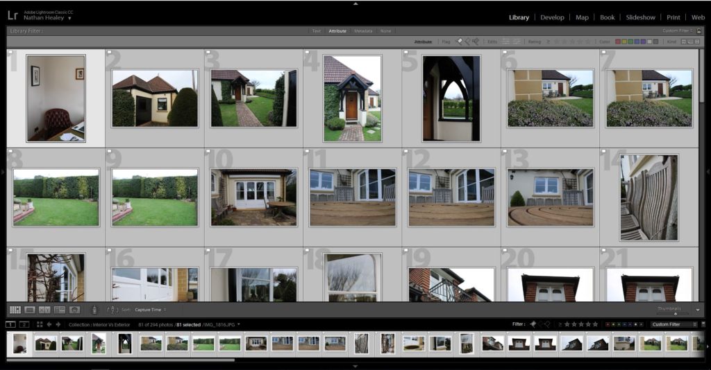
After uploading and editing photos, I went back and looked at both swell and red string again and decided that I liked the physical aspect of both the projects, so decided to get some physical photos that I would be able to use. I also decided it would do two more shoots to gain even more images.
IMG_3894.jpeg
IMG_3895.jpeg

Photo shoot 3 – Laura Blight Inspired

Planning:

After researching Laura Blight, and the way in which she conveyed interior of houses to tell the narrative of the previous owner he has recently died, I wanted to conduct a photo shoot in a similar style which showcases my Grandparents house in order to tell the narrative of their lifestyle. I will be looking at interior, as well as capturing exterior, furthering from what Blight captured. When deciding what to capture I will be looking at different areas of the house which I believe help to capture their lifestyle, from macro images to using the formal elements of space, texture and colour to help convey this. My camera settings are going to be kept standard, with my ISO being around 400-800, shutter speed being quick and the aperture being round f/5.6, with the use of manual focus and natural light source.

Edits:

Edit 1 – Flagged
Edit 2 – Star Rating
Edit 3 – Colour Rating

Outcomes:

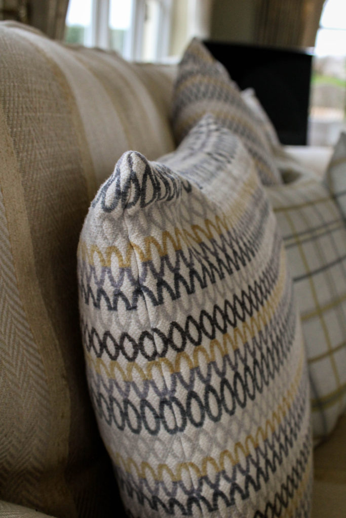
When editing my outcomes, I wanted to adjust the images to look like the work of Blight, by allowing the colours to slightly be desaturated, and noise to be presented, and having a natural darkness and somewhat eerie feel to them. I experimented with mainly the contrast, blacks, whites and shadows as well as the structure on lightroom to produce these outcomes. I tended to stick to black and white outcomes for exterior, as I felt the texture and tonal contrast allows for the house to hold more personality and tell it’s story, and the interior to mainly be in colour so that my work had a similar feel to Blight’s imagery. My experimentation can be viewed below:

Analysis:

Below is my recreation of Blight’s image of the chair in her photographic series ‘House Clearance’. The two images hold a lot of similarities, due to my clear understanding of the technique Blight used. For example, the composition of the framing is similar, with a chair in the foreground and windows in the background. Both photographs clearly represent the formal element of space, texture and colour, and represent the personality and characteristics of the room, as well as showcasing traces of human life, a key conceptual factor of Blight’s work. Due to similar outcomes, it is likely that we used the same shutter speed, quick, and a low aperture, alongside a natural daylight white balance.

In my image, the photograph presents the chair at more of a worms eye view/straight on angle, and is darker than Blight’s imagery. In addition, the surrounding of the chair in my image is a lot busier, which creates the representation of life still living in the house, which allows my conceptual representation of lifestyle to be clearly presented in my work. In addition, my image has more ‘noise’ in the sense that I used a high ISO, due to the natural lighting not being bright enough to illuminate the whole chair. On top of this, my image hold more of a modern day feel, due to my subject being more modern and up to date furniture. A final difference between to two images is that my photograph uses more of a wide depth of field, as we can clearly see the background of the image, which showcases my grandparents garden, but still does not distract viewers from the conceptual representation of my imagery.

I believe that my attempt of recreating this photograph is strong, I have been able to apply the techniques of Blight into my work, and have been able to introduce the ideology into traces of human activity and apply it to represent my grandparents ‘luxury’ lifestyle they live.

Conclusion:

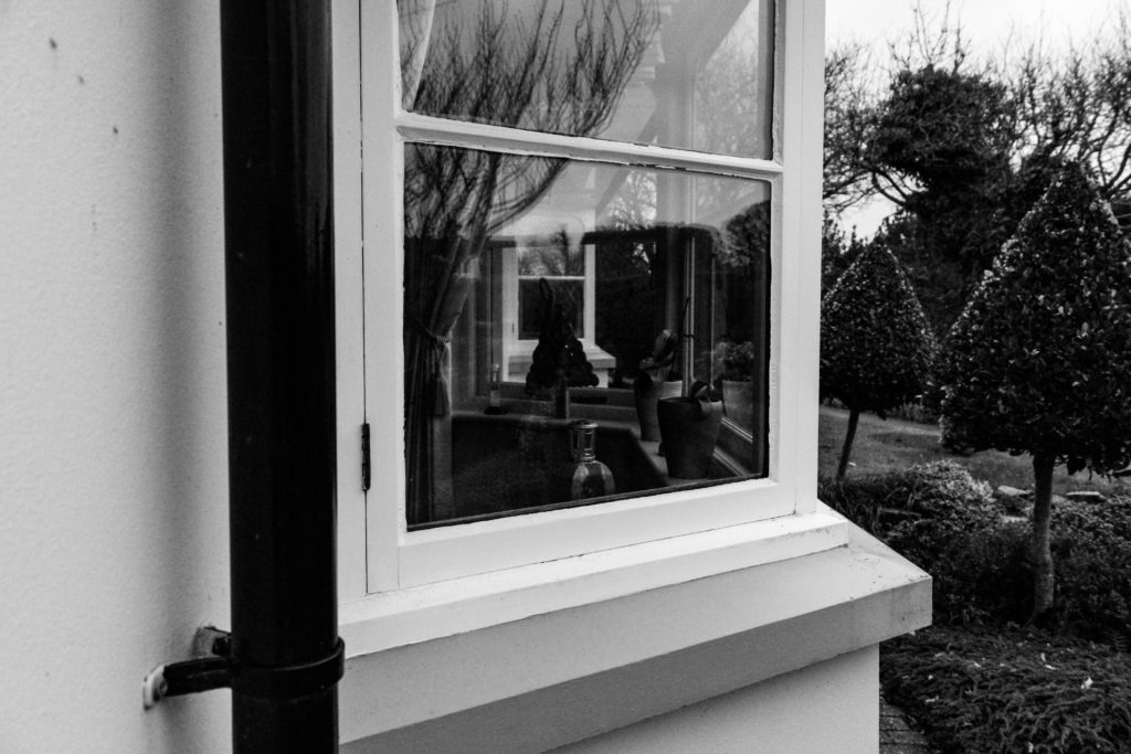
To conclude, I believe I have been able to produce strong imagery, which clearly depict the luxury and wealthy lifestyle my grandparents have, trough capturing the interior and exterior of their homes. Alongside this, I have been able to employ the composition techniques of Blight when capturing my images, in order to hint at her conceptual representation of human trace. I have been able to further explore this by applying these techniques to capturing the exterior of my Grandparents house, in order to showcase the size and ‘traditional’ values that the house holds, emphasising the luxury lifestyle they live, based on their upbringing and contextual elements of their past.

Artist Reference – Laura Blight

Laura Blight

Contextual and Conceptual analysis:

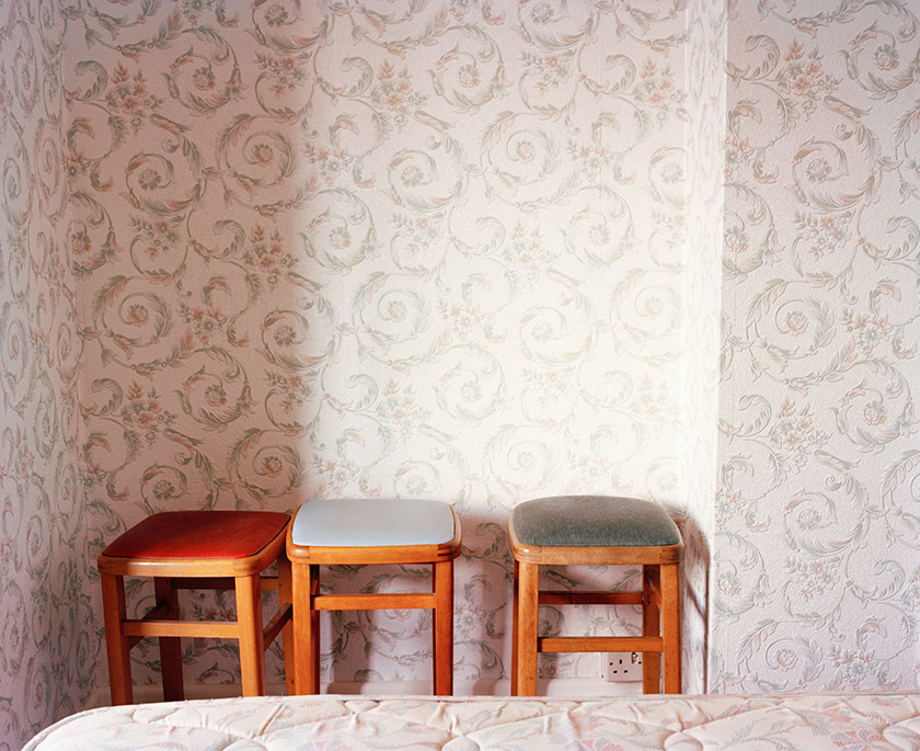
Laura Blight is a British photographer who, who’s interest lies within capturing traces of human activity, exploring the ideology of strange and familiarity. “Traces left by human activity are recurring themes throughout her work” (Laura Blight, 2019). In her 2010 series ‘House Clearances’, Blight captures the interior of British houses, which in most part have had the owner or tenant pass away, leading to her reoccurring theme of traces of human occupation behind. She focuses on the emptiness, objects and furniture which illustrates themselves as the only thing left behind, creating a desolation within the imagery. All these factors leads to mystery towards pass events and the previous owners, which helps to convey the conceptual representation of traces left by human activity through eerie furniture and interior design. This embodiment of work was apart of her degree project, and upon in-depth research of this photographic series, there is little to no reviews or critiques about her work.

Contextually, in 2010 London a standard house costs increased by 437% over to previous 6 years, due to the capacity and business focused area London is, but the interior suggests differently. With costs being so high, it meant residents in 2010 struggled to maintain and modernise properties. This factor may have influenced Blight to capture this series in London due to the character and vintage elements of the house, which creates a more interning to the conceptual ideology stated in the previous paragraph.

Mood Board Showcasing Laure Blight photographic Series ‘House Clearance’:

Technical and Visual:

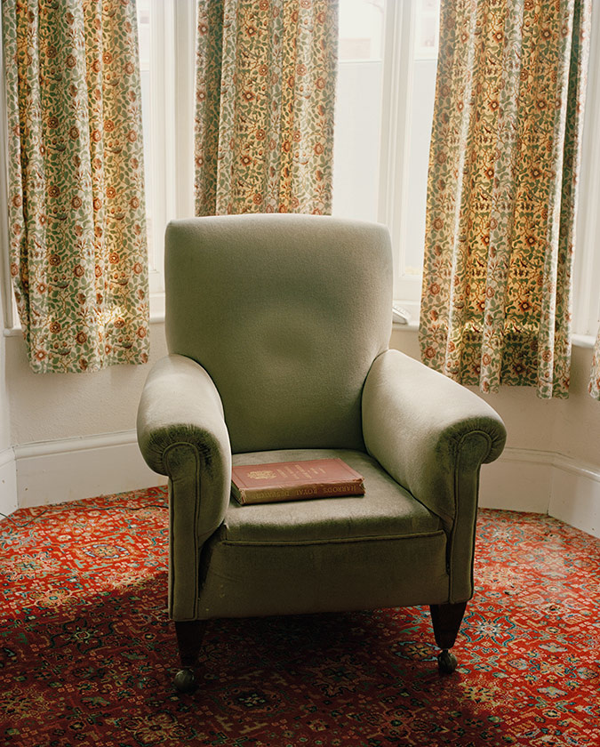
Laura Blight (2010) – House Clearance

The image above is my favourite image in Blight’s photographic series House Clearance. This is due to how the image accurately portray the conceptual representation of showing traces of human activity through interior of houses were the previous owner has passed away, and contextually showcases the rise in houses in central London. In addition, the composition allows for an interesting photograph to be viewed. The portrait image is presented in colour, which allows the character of the design to clearly be illustrated in the imagery. The chair is located in the centre of the frame, with the background being kept plain, allowing the chair to be the main focus point. In the chair you can see an indent on the back with a red book sat on the chair, which creates an eerie atmosphere and depicts the ideology of traces of human life. The formal elements presented in the image, is space, colour, tone and texture which are presented through the composition and subject found within the frame. Technically, the photograph utilises daylight, which comes from the windows in the background, suggesting natural lighting. In the image a sense of noise and texture is shown suggesting a high ISO, which also allows for the character of the interior design to be illustrated. The subject is focused and sharp which suggests a narrow depth of field and a low aperture being used when capturing the imagery, as well as the shutter speed being quick. A final clear observation to make is that the colour seems to be desaturated slightly which allows for this unique retro vibe to be showcased, and makes the conceptual representation clearer. Personally, I really like this embodiment of work, due to framing of the image and how it encapsulates you into this idea of traces of human life during an economic increase in housing prices.

Action Plan:

Understanding the way in which Blight captures imagery of the interior of housing, in order to convey conceptual representation, I intend to conduct a photoshoot were I capture the interior as well as exterior in order to convey the lifestyle of my grandparents, using the same techniques, visually and technically, as Blight.

Bibliography:

Blight, L.(2019), Laura Blight. Bio: https://www.laurablight.co.uk/about

Photoshoot 4

Plan

I intend on carrying out a photoshoot to take images of an overgrown bunker overlooking the St Ounes beach. As a response to Andreas Gursky, I will be editing and splicing the images together to form an artificial landscape.

Photoshoot

Selection & Edits

Evaluation

I believe the edited outcome of the photoshoot was a success as I was able to create an improved artificial landscape compared to that of my second photoshoot at Fort Henry. I will be including the panoramic manipulated landscape in my photobook. However, due to the length and detail of the image, I will print it out separately as a foldout for the photobook.

Photo Shoot 2 – Editing Images – Continued

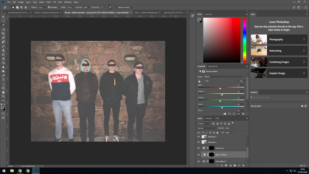
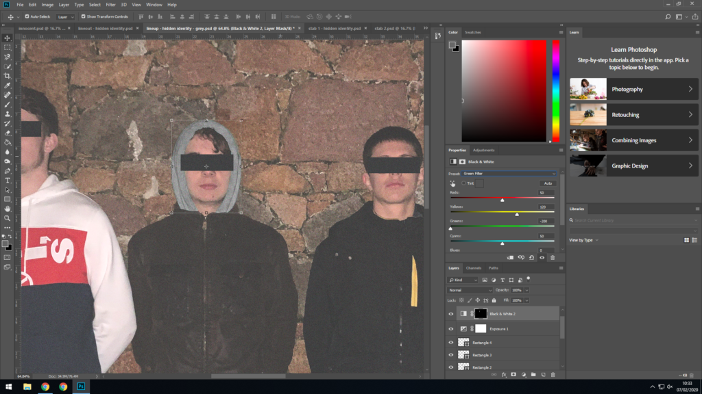
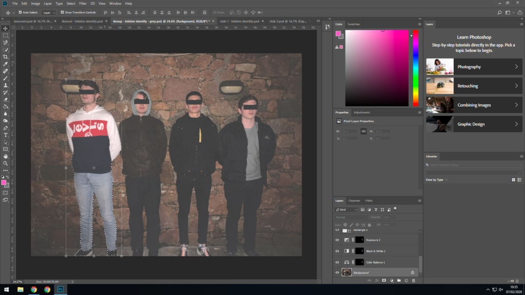
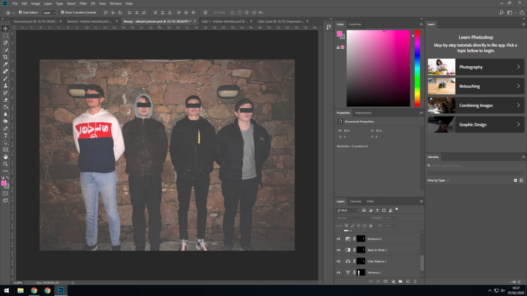
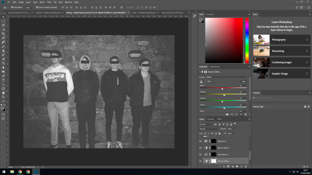
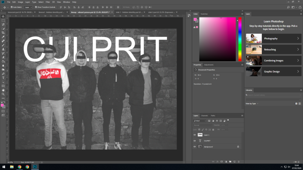
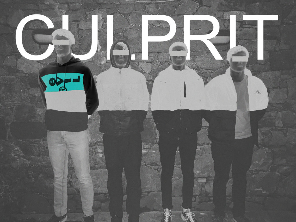
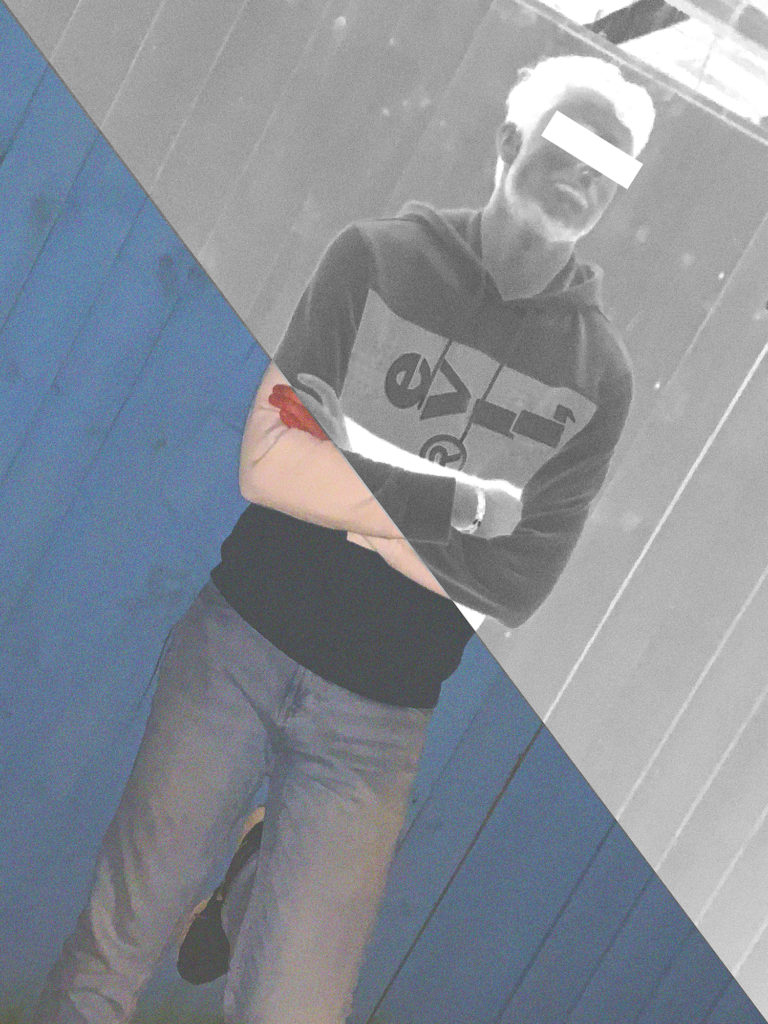
This is the editing process of one of the images from the second photo shoot; it involved a lot of experimenting and therefore the image change aesthetic multiple times.

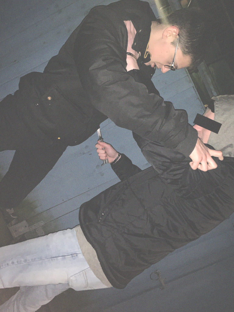
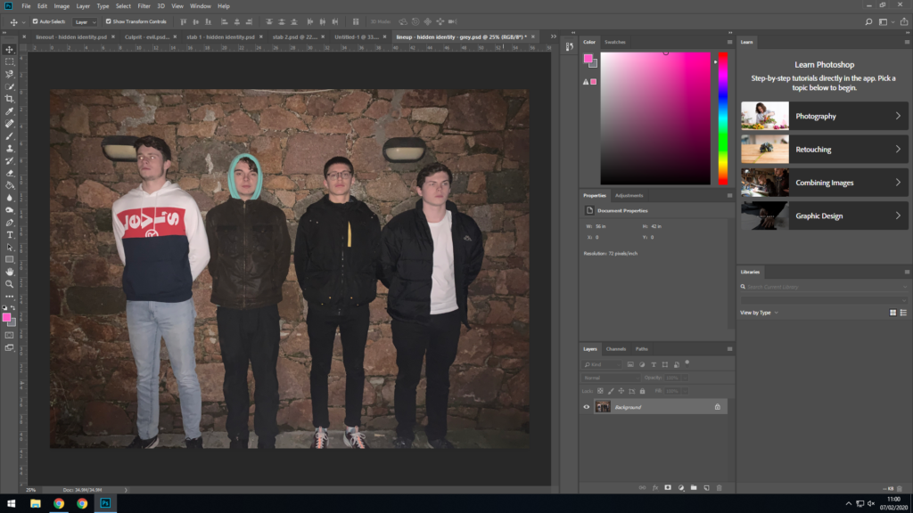
This is the original image
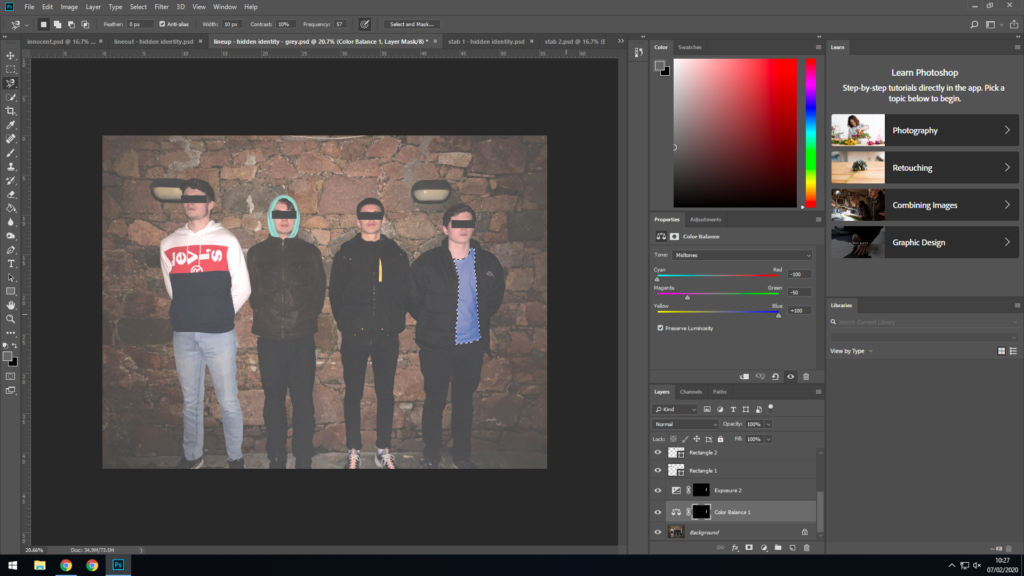
I Applied visual noise, exposure adjustments, and added black bars to cover everyone’s identities.
I then changed the t-shirt colour to blue so that the person on the left is the only person in the image with white clothing.
I then went a step further and changed it to grey so that the person on the left is the only person in the image with colourful clothes.
Next I changed the hood colour from green to grey for the same purpose.
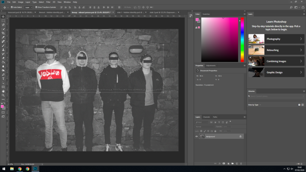
Then I selected an outline of the left person.
I made him more vibrant and increased contrast to make him stand out more.
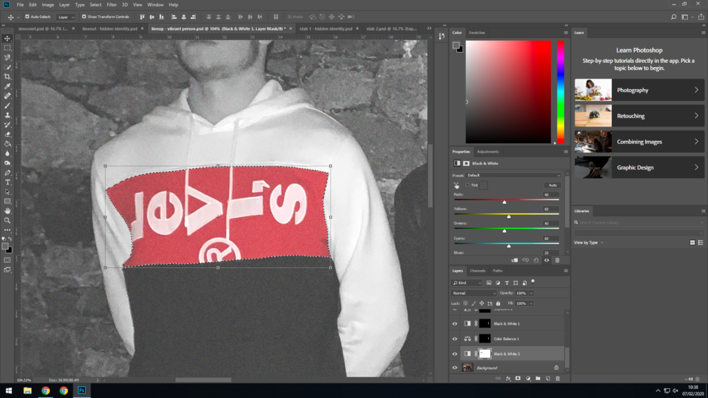
At this point in the editing process, I realised that the image didn’t stand out enough, so I completely changed direction with the editing process. So firstly I applied a black & white filter onto the image.
Next I selected an area around the Levi’s logo to remove the B&W filter from
I merged all layers, then selected an area and used Ctrl+J to create new layer from it.
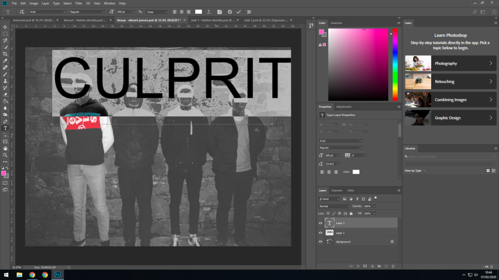
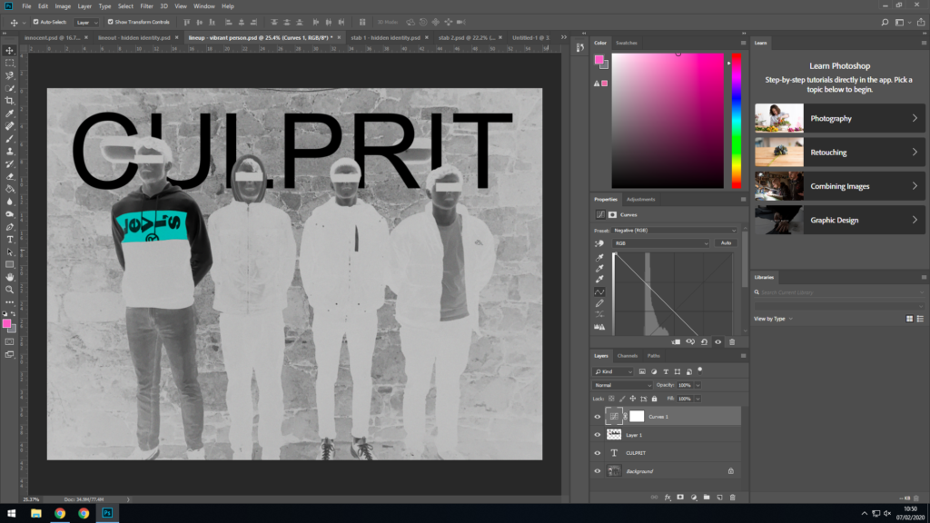
Next I added text, I liked the colour negative it creates when text is selected so I decided I will implement it into image.
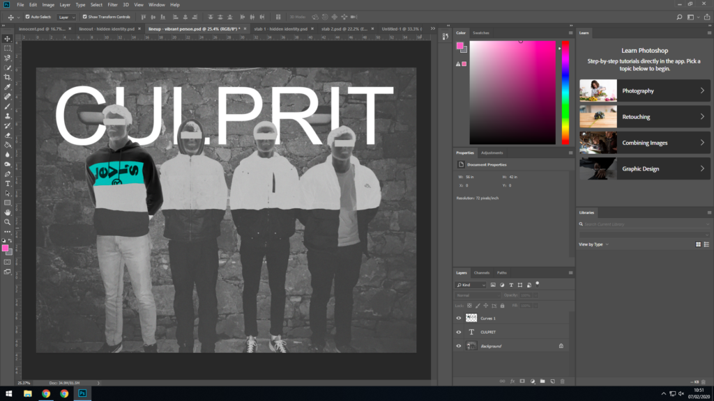
Then I placed the text behind the new layer to make the image look cleaner.
Then I applied the previously mentioned negative filter.
Then applied the filter to only the front layer.
I also edited the text on the hoodie, from saying LEVIS to EVIL, it helps carry a theme throughout the project.
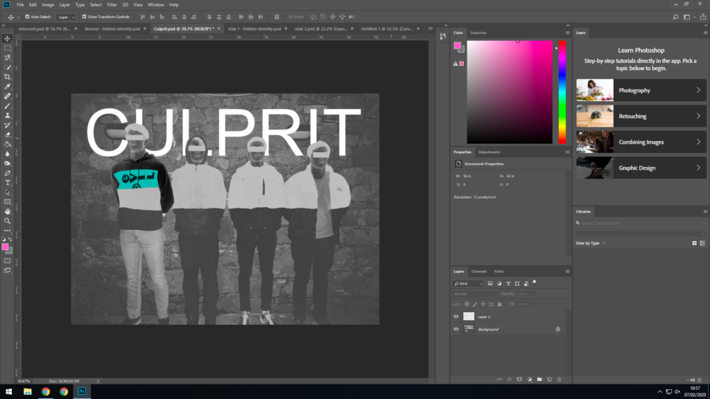
Here it is completed.
Finished image

Shoot 5 and edits

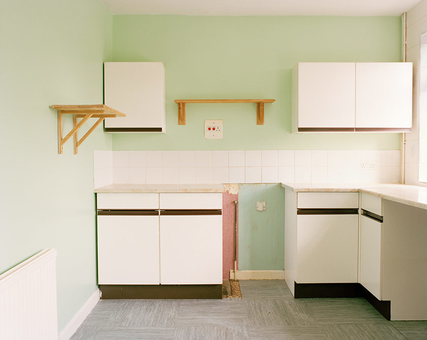
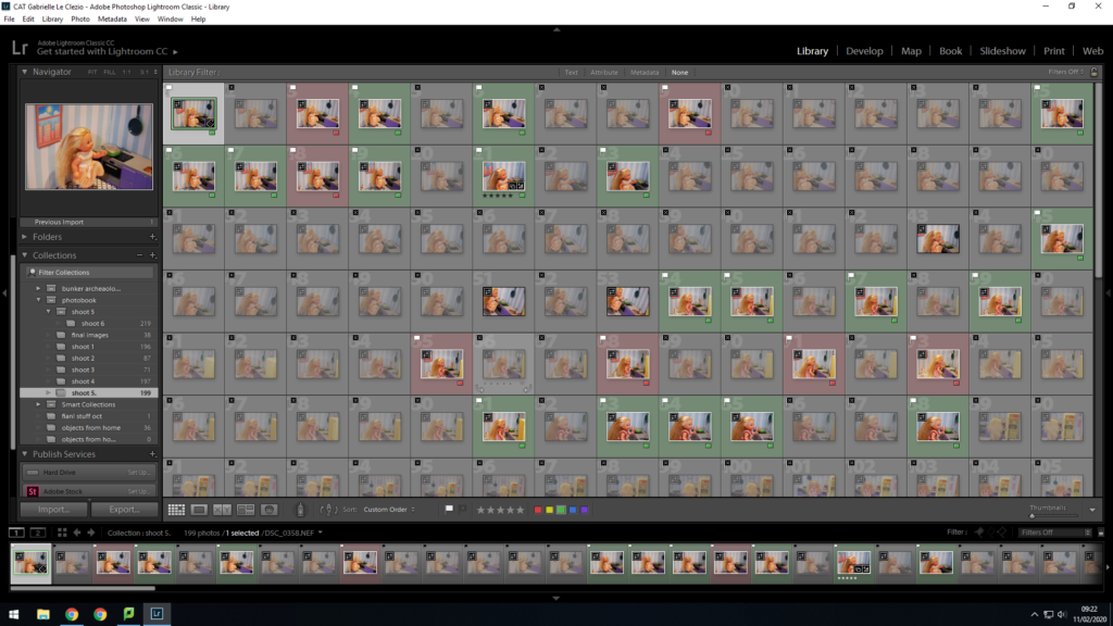
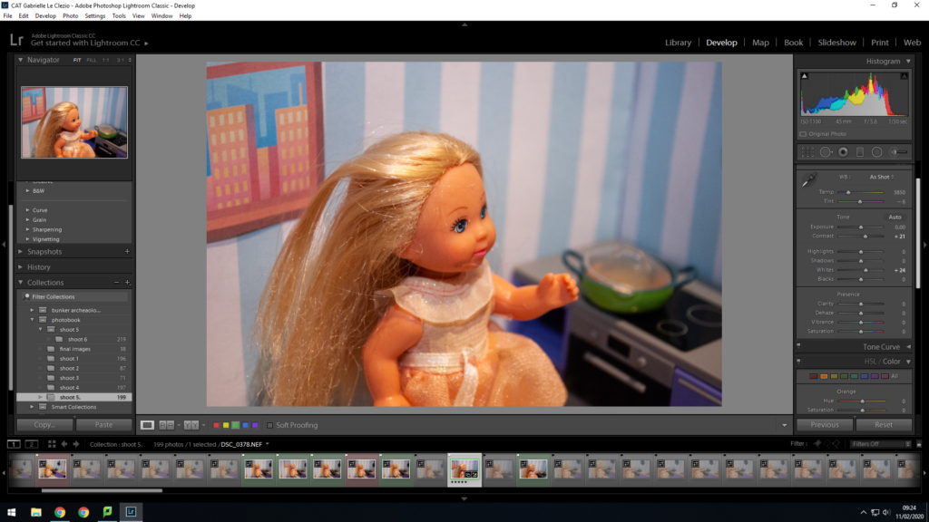
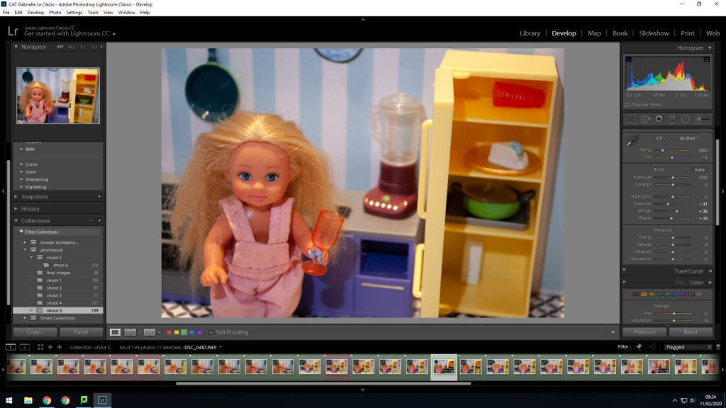
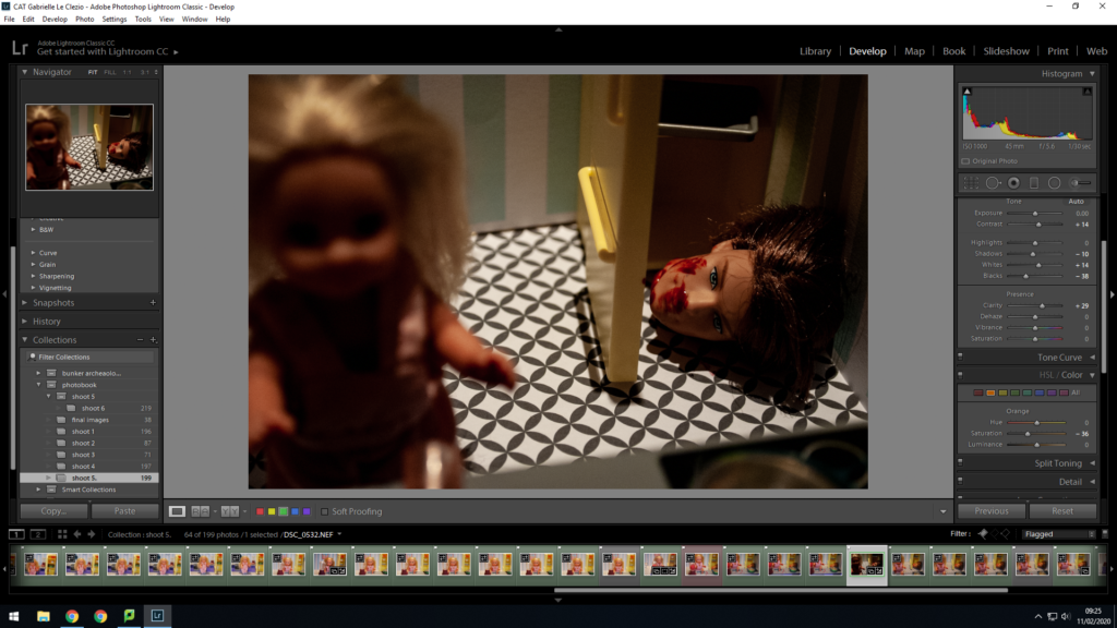
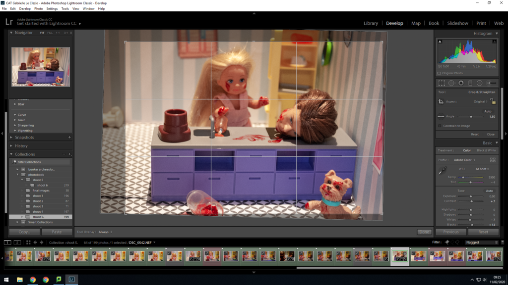
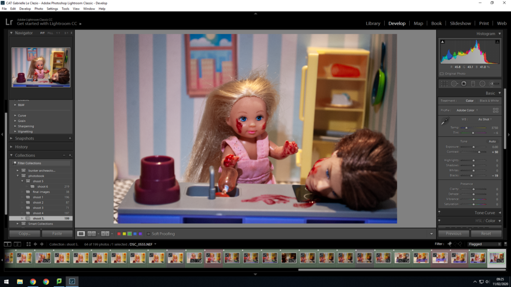
This shoot went really well. I set up a fake doll’s kitchen with a stereotypical kitchen set. I then printed out patterns for the wallpaper and floor along with things to stick onto the walls just to enhance the appearance. I used blue tack to keep the doll in place and took images of it using the kitchen. I then used some Halloween fake blood and make up to make the more gory images.

Photo shoot 2 – LaToya Ruby frazier

Planning:

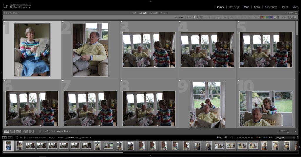
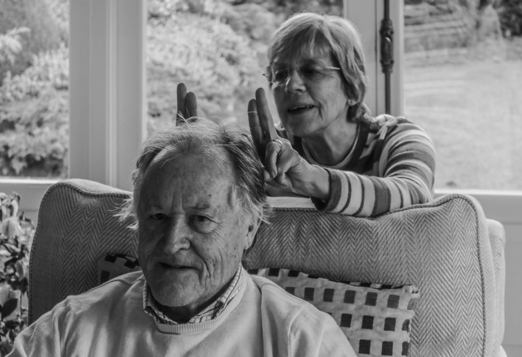
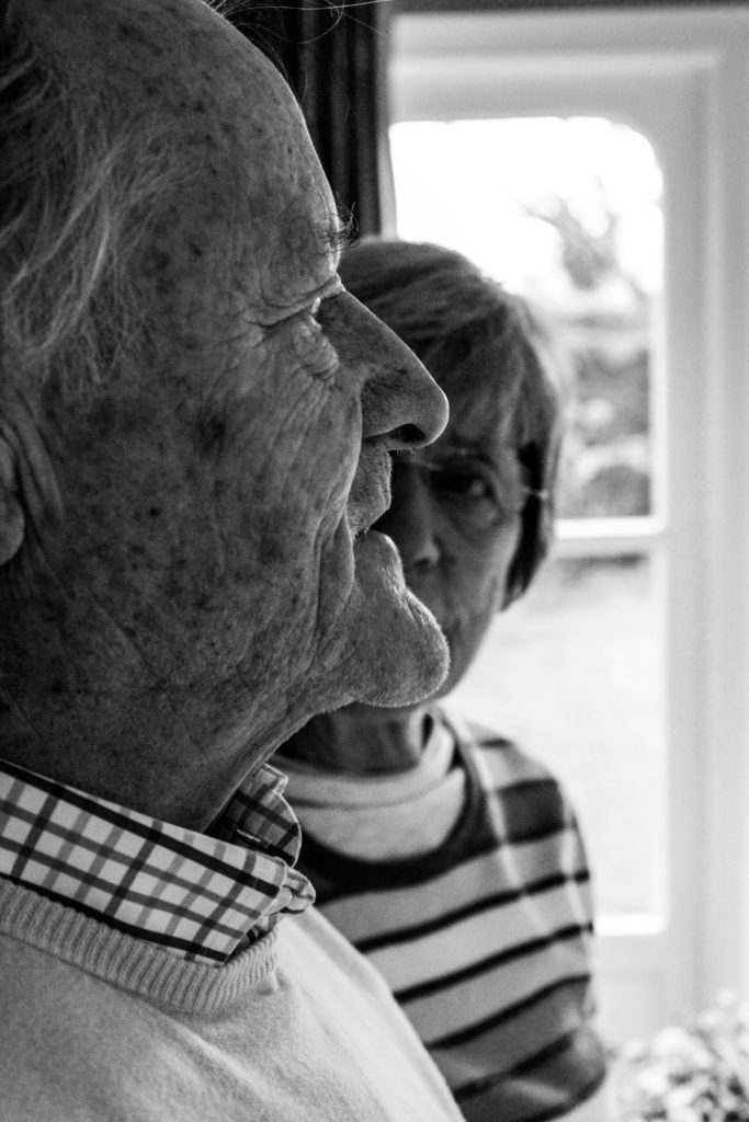
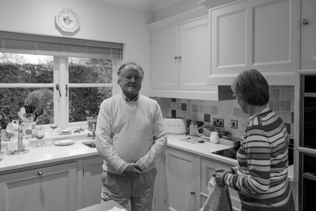
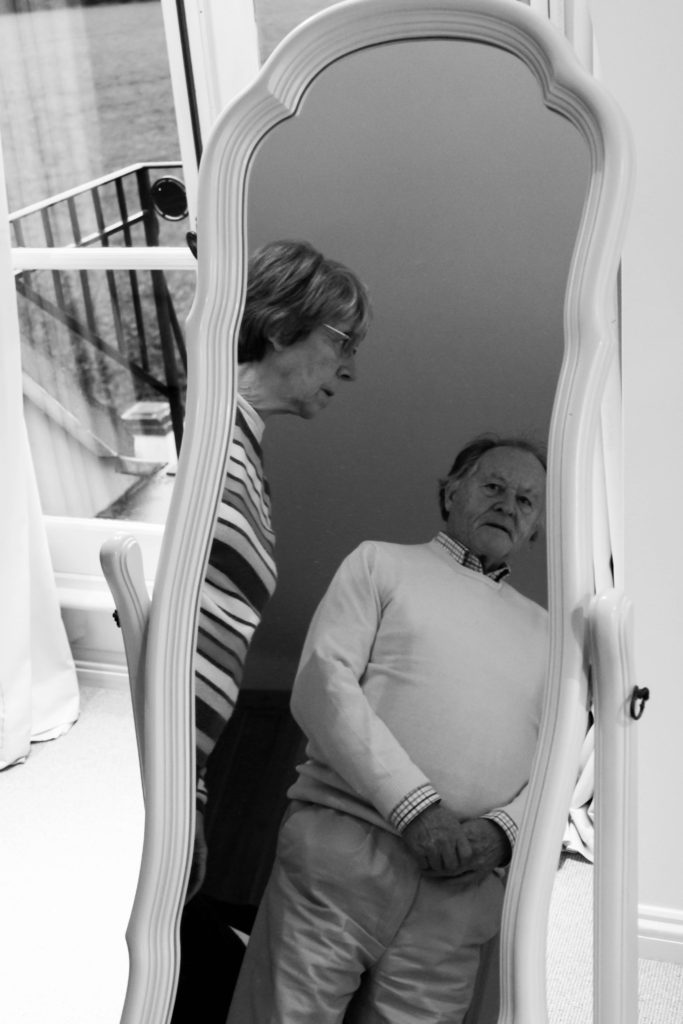
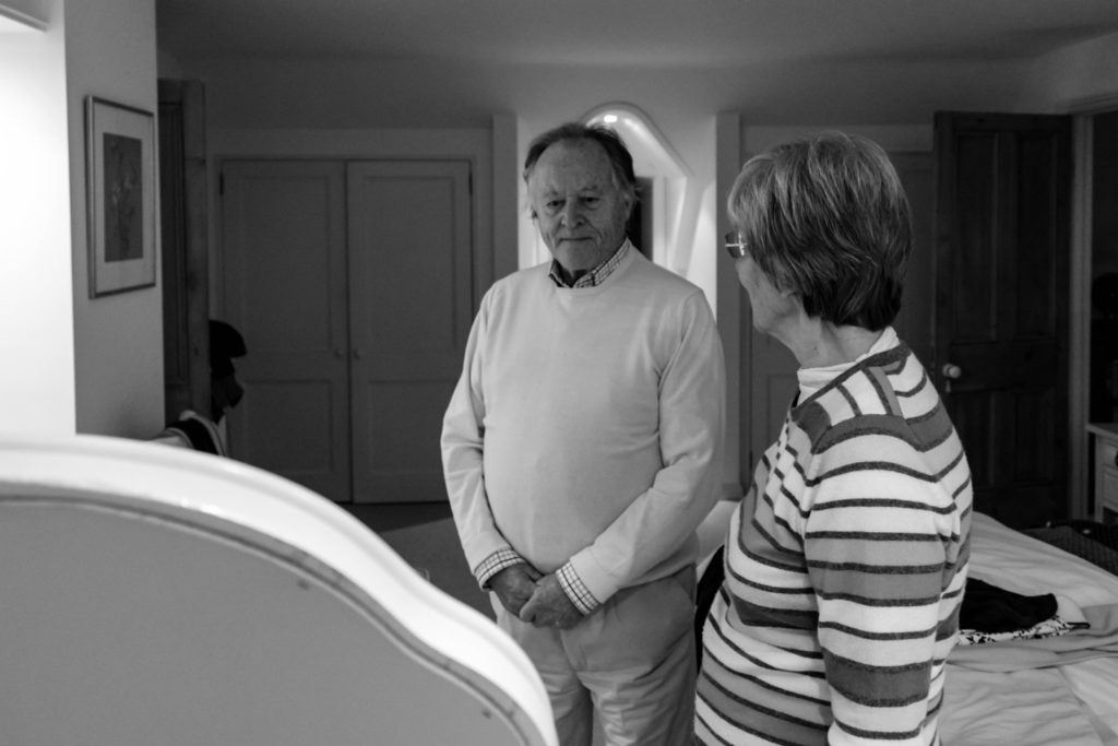
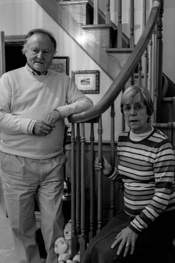
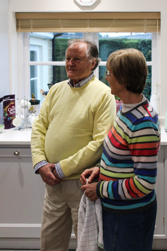
After researching LaToya Ruby Frazier, I was able to understand the way in which her conceptual representations were presented within her imagery. Using this techniques of capturing naturalistic portraits in order to portray lifestyle, I conducted a photoshoot with my grandparents. At the beginning of the session I explained the purpose of the shoot and informed them that I would be following them around as they live out their everyday lives, emphasising the importance of them sticking to their true personality to accurately representing their lifestyle as I followed them around. The shoot was conducted during the middle of the afternoon which meant daylight was beginning to become darker, which forced me to increase my aperture in order to let enough light into, for the frame to clearly illustrate their lifestyle. The camera settings were kept basic, quick shutter speed, middle – high ISO and aperture of around f/5.6 in order to capture the imagery.

Conceptually, I wanted to convey my grandparents lifestyle and how their upbringing and past has influenced their life. For example, I focused on capturing the idea of my grandma being a house wife, while my grandad provided and worked for the family. I also wanted to represent the ideology of economic status and the way in which their financial situation has influenced their lifestyle which they thought were large influencing factors during my interview with them. Due to them being financially stable, it has allowed for them to have luxury habits, such as owning a large house, being able to afford expensive furniture and being able to retire early. These factors I tried to portray through my imagery, as well as recreate and produce imagery which follows the same stylistic features of Frazier.

Edits:

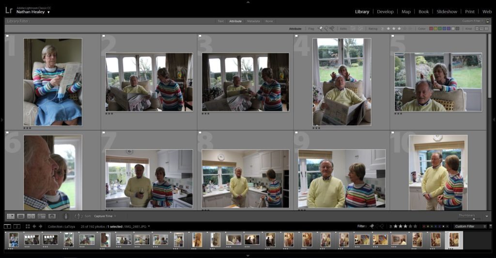
Edit 1 – Flagged
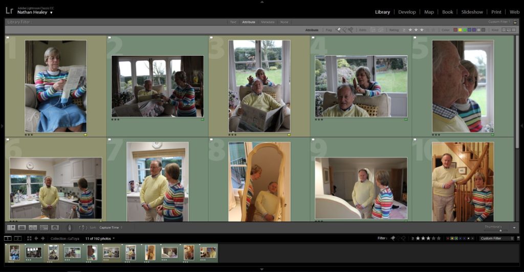
Edit 2 – Star Rating
Edit 3- Colour Edit

Outcomes:

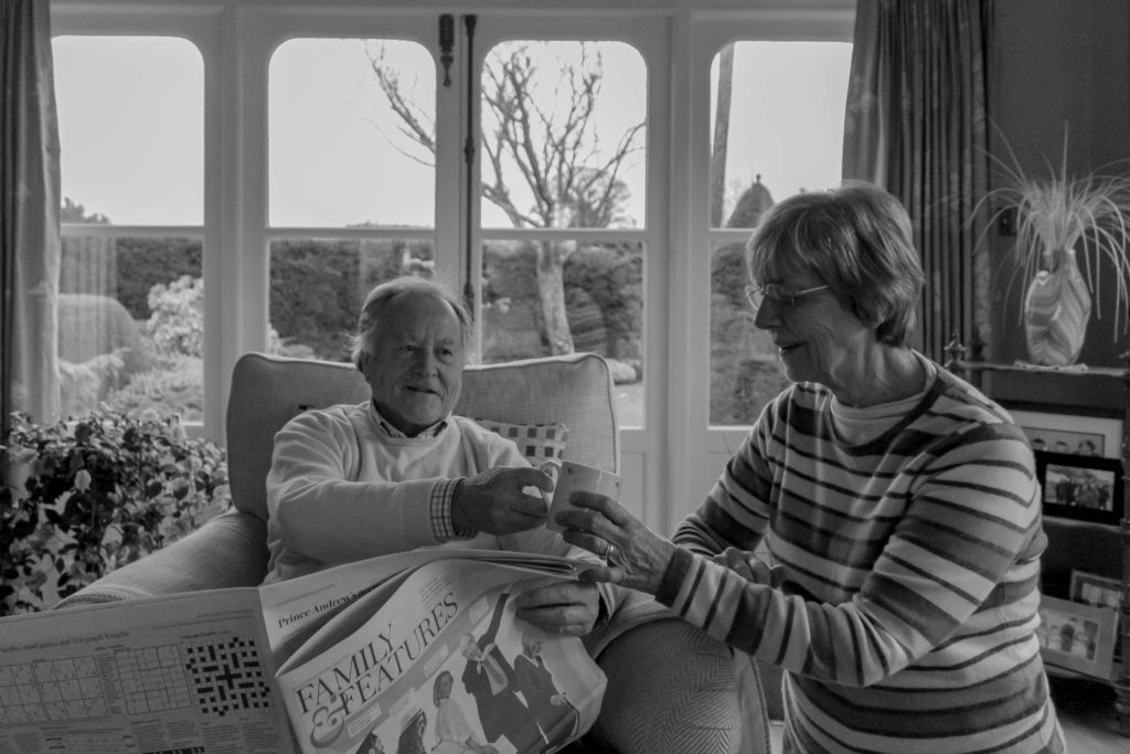
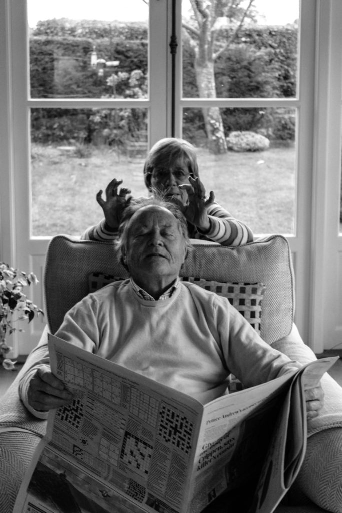
When producing the outcomes from this photo shoot, I wanted to keep them simplistic and authentic, in order to clearly and accurately illustrate the lifestyle they live. Due to Frazier’s work mainly being in black and white, lead most of my outcomes to be showcased in black and white, in order to create close connections between mine and my artists work. However, with two of the images I decided to leave them in colour, as they best suited being presented in colour, due to them having a more authentic persona towards them which meant that the colour allowed for reality to accurately be portrayed within the imagery.

Analysis / Comparison:

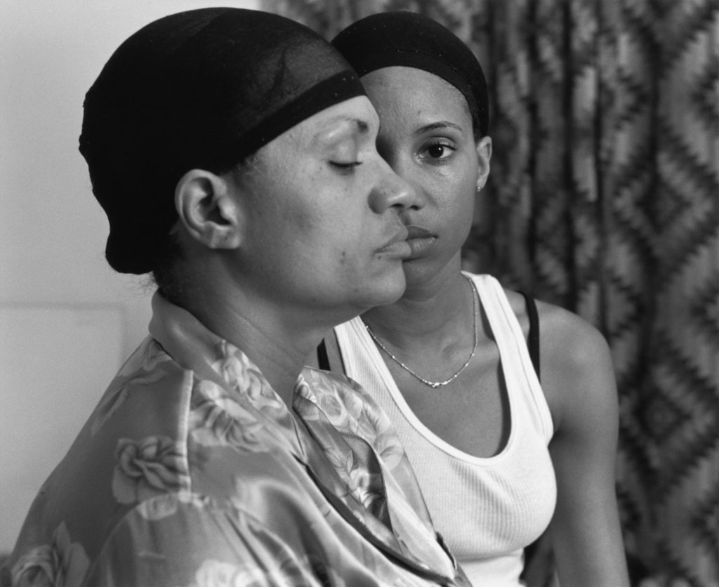
The image below (Frazier’s) is the photograph which I felt held strong conceptual representation, and wanted to recreate within my work to present different concepts in relation to the subjects I was capturing. The two images follow similar composition, by having a subject present in the foreground and background looking in different directions, with a narrow depth of field being utilised. Both photographs are being presented in black and white, with the detail and structure being high, but the smoothness of the imagery and noise being low, likely done through camera settings with editing complimenting these values. Both photographs show clear focus to the formal elements of space, tone and texture which is clearly presented from the proxemics, clothes and basic background. Another similarity between the two is through the camera settings used in order to capture these images, due to them being alike, it suggests that I used similar settings The lighting used would have been artificial through studio lighting and lighting readily found in that room. The light source is soft and can be considered cold, which illustrates the brutality of this reality and how it has negatively impacted the families life. This works well with the low ISO which is used as no intended noise is being presented within the imagery. As well as the white balance being accurately set to an in door setting allowing for clear colour correction, illuminating the tonal contrast within the frame. In addition to this, the shutter speed is kept to a quick capture as there is no movement or intended blur within the frame of the photograph, which helps to compliment the ISO setting used. 

The main difference between the two images are the conceptual representation. Frazier wanted to showcase how herself and her family are being treated as invisible due to their race, presenting political power and situation in their suburb in Braddock. It also illustrates their lifestyle and poverty through the perspective of herself, mum and grandmother, this concept is further explained in my artist research on a previous blog post. Personally, I wanted to convey the social situation which was common in the 1940’s and still present in my grandparents lifestyle today, gender roles. Having my grandad being in the front of the frame well dressed up shows he is the authoritative figure who provides for the household, having my grandmother in the back suggests her submissiveness and willingness to follow instructions from her husband, although this may be considered a bad thing, to them it is normality which they both enjoy.

Conclusion:

In conclusion, I believe that the imagery produced shows close relationships with Fraziers imagery, through the sense of composition and the ideology that we have both conveyed lifestyle in a similar way. With close regards to the final imagery produced, I believe that the photographs shows my ability to capture detailed portraits, which have clear focus and show my ability to produce a strong composition, which compliments the simplistic edits. In addition, I have been able to provide evidence my reinforces my ability to use Lightroom effectively to produce strong imagery.

HISTORICAL Contents PARAGRAPH Draft

The images that I construct in my personal study is borrowing elements from tableaux-vivant. This is because I’m constructing scenes or realities in which to take my photos using objects. Tableux vivants originated in the medieval era. Actors would re-enact famous bible scenes during mass, this then evolved into actors creating live versions of famous paintings during the Renaissance era. These actors reacted paintings of Greuze, David and Isabey. Tableux viviant acting was also popular at weddings and other events. Tableux viviants became less popular in the early 19th century due to the realism movement. However, in the 20th century, actresses re-enacted nude classic paintings but then tableaux started to die out because of the invention of film, however, became popular within photography. In terms of photography, Jean-Francois Chevrier as the first to use tableaux in association which was during the 1970’s and 80’s. Photographer’s then began replicating famous paintings in constructing new meanings. Previously in my coursework, I studied Tableux viviants and reconstructed fairy tales with modern day twists. The difference with this project is that I won’t be doing it with real people but with dolls and doll house sets. 

My work also has roots in Surrealism which is all about unleashing the unconscious mind and I believe my work does this but also has socio-political connotations because they also comment on politics and society. Surrealism grew out of the World Wars in the early 20th century and Dadaism. According to Breton’s Surrealism Manifesto (1924) the new art form is a means on linking the conscious to the unconscious so everyday life will be joined up with the subconscious in ‘ an absolute reality, a surreality.’  Some of my previous work has involved quite scary looking images and I’ve planned on doing the same with this project but by taking it another step with editing. My project is surreal in the way that the realities I plan on constructing will appear dreamlike and there is a socio-political message behind them. My Socio-political message is that society and social media has developed an unattainable and unrealistic beauty expectation for women.