Book Specification

Narrative:

  • 3 words – Commando, Bunkers, intel.
  • A sentence – Documenting a commando raid to gain intel on the German defenses.
  • A paragraph – A story about a group of commandos who land at the Wolf’s lair in Jersey through the use of a boat, in order to record and gain intel on the German defences of Jersey.

Design:

  • How you want your book to look and feel & Cover – I want the cover of the book to have a hard, rough and textured feel to imitate the texture of a bunker wall.
  • Paper and ink – I would like the images to be printed on cartridge paper as it is thick and has a slight texture.
  • Format, size and orientation – My book will be portrait and will be 25 x 20 cm.
  • Binding – my book will have a perfect stitch.
  • Title – My photobook will be called Incursion.
  • Structure and architecture – My book will start off at the point of contact that the commandos had with the island during operation Hardtack 28, and the images will visually get darker near the end.
  • Design and layout – I will feature a mix of page layouts, including one image per page spread, double page spread images, multiple images per page spread, and a foldout image.
  • Editing and sequencing – My images will be in colour and black and white.
  • Images and text – I will feature a brief paragraph or two at the beginning of the photobook to inform the reader of what operation Hardtack 28 was.

conclusion- Para 5

To what extent does Surrealism create an unconscious representation of ones inner conflicts of identity and belonging?

To conclude, I believe that to some extent Surrealism creates an unconscious representation of one’s inner conflicts with identity and belonging. Throughout the work of Claude Cahun, it is evident that imagery of belonging is present; for instance, the concepts around her sexual identity and how that “works” in society. However, in terms of the unconscious mind I feel Cahun’s work is limited as the issues proposed are part of her reality and conscious, which is also shown through her ambiguous name and open sexuality in her daily life. Claude’s work is at the heart of surrealism when it comes to ‘avant-garde’, nowadays people aren’t scared or ashamed to be gay but back in the 1920s it was a taboo topic that she wasn’t afraid to discuss. Ray’s work doesn’t focus on topics such as identity and belonging, he keeps his concepts deliberately enigmatic. As one of the pioneers of the movement proves that surrealism isn’t just about feelings but about breaking the chain of repetition in photography. Linking to the idea of unconscious, Ray’s images involve dream-like visions of black and white. His Rayographs specifically act as works of the imagination and leave the audience in a state of confusion. Overall surrealism does create unconscious representation but not always following issues of identity and belonging, the whole idea of surrealism is going against the current and creating photos that are unique. Therefore, not all surrealists explore the same concepts, some don’t even have a reason for their images. The messages Cahun and Ray wanted to convey was that photography can be whatever you make it, whilst challenging pre-conceived notions, readings and conventional approaches. 

Comparison- Para 4

Both artists are extremely influential surrealists, but they use different elements of the movement in their work. In comparison to Cahun, Ray is more of a creator of surrealism whereas Cahun is developing and extending the idea. Ray doesn’t involve issues such as belonging in his Rayographs, it’s more about abstraction and exploration, he takes household object and makes them into dreamlike visions, rather than dream like concepts. Although some of his images did include silhouettes of his head and his partners head, this image connected to the idea of an autobiography running through his rayographs. His images didn’t so much involve conflicts of identity but rather a narrative of his life and the people in it. ‘We need to insist that we read a photograph, not as an image but as a text.’ This quote is taken from Graham Clarke and I feel it is the basis of surrealism. Both photographers don’t just take a picture in the moment, they set up a narrative, not necessarily a clear one but there is a reason for their work. The idea that we need to treat a photo as text, is seen throughout their work, especially with Claude where she uses her images to create a story around her sexual identity. 

 Looking back at the question it’s clear that surrealism involves topics of identity, but it doesn’t just stop there, the subject matter is endless. For instance, Man Ray doesn’t use his work to explore self-conflict but rather to explore photography as a medium. The camera-less images are groundbreaking in the way that we don’t even need high tech equipment to make an image. With the Rayographs he makes a statement rather than text, surrealism is about breaking regulations that were once in place surrounding photography. Cahun’s work focuses on portraits, almost all her images feature a person, whereas Ray uses objects as his focal points. “In any image, however, the primary frame of reference remains the subject of the photograph,” is said by Graham Clarke. This relates to how the people and objects featured in the artist’s work become the backbone of their narratives.  Roland Barthes came up with the theory of connotation and denotation which represent the difference between straight photography and surrealism. In Cahun’s work she uses people and their clothing as connotations to create an idea behind literal subjects. In straight photography everything captured has a denotation, it has no depth to its meaning, for instance a portrait of some men farming has no narrative, it is what you see. Whereas Ray uses a combination of objects to collectively create connotations, this allows the audience to decode the underlying message of the image. 

APPROACH FOR PROJECT:

For my personal study and the narrative I am going to be exploring the photographical approach I will be using is Documentary photography.

The definition of Google for documentary photography is : “Documentary photography usually refers to a popular form of photography used to chronicle events or environments both significant and relevant to history and historical events as well as everyday life.”

I watched a couple videos on the history of Documentary photography and who’s work contributed to this approach.

The video above is a from a Ted Talks from a man called Billy Weeks. In his video he explained that his voice was going to be used through photographing things, people, objects and that’s exactly what he done. The video being titled “two views” is a high indicator that in every image there is always 2 people, the subject and the person behind the lens. We doesn’t see one person but we as the viewers know that they’re there. Without documentary photography many great social issues would not be publicised and would be censored into the unknown, therefore by having practices like this its opening views and doors for people that they might not even know existed.

Later on in the video Weeks also talks about several photographers associated with this practice like Robert Capa a famous war photographer who once said that ‘If your photos aren’t good enough its because you’re not close enough…’ Unfortunately for Capa, he was later killed in the battle field but, what made him so different from other documentary photographers is that he knew that in order to tell the narrative you needed to live in that narrative.

RobertCapabyGerdaTaro.jpg
Image of Robert Capa.

Robert Capa was born on October 22nd 1913 to a Hungarian family and was later discovered through his journalism skills and his photography skills. Capa fled political repression when he was younger, moving too Berlin. He also watched the rise of Hitler which then lead him to moving to Paris where he met and began to work with Greta Phoroylle. During his time as photographer he conquered 5 wars . The Spanish Civil war, the second Sino- Japanese War, World War 2 across Europe, the 1948 Arab- Israeli War, and the first Inodchina War, with his photos published in major magazines and newspapers.

What I learned from this video and Weeks’ practice that in order to capture that documentary style image a piece of the photographers background has to be captured. For this project I will be trying to incorporate importance in the setting of each image and the subject or the object I will be photographing.

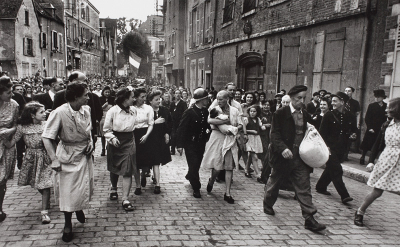
Image result for robert capa d day
Image result for robert capa images

Understanding photo book design:

Image result for matthew finn mother front cover
Front cover of the phonebook “Mother”

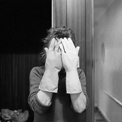
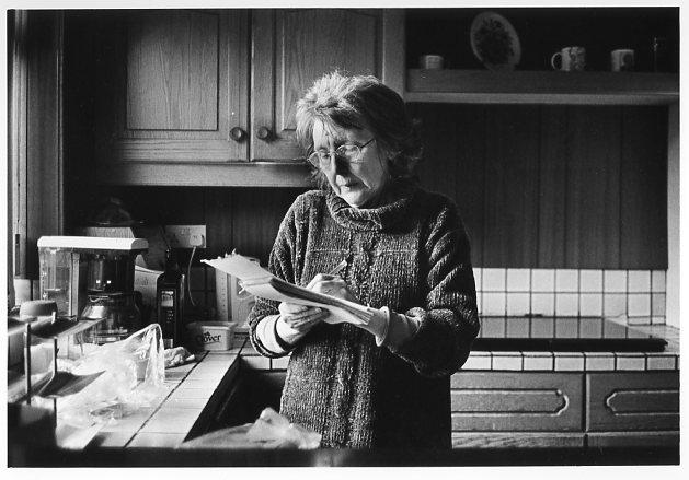
The book I have chosen to look at is called “Mother” published by Mathew Finn. His book contains a series of images of his mother. He explains that over a 30 year period he took images of his mother and reveals that they weren’t set out orderly and that it wasn’t something he put a huge amount of thought into until later on in his life. None of his images include his dad which is significant to him as his dad wasn’t present during his childhood or even adulthood. He had half brothers and sisters he wasn’t even aware they existed until the day after his dad’s funeral. He explains in his biography ” the more I knew about my father, the more I felt the need to protect my mum…”

There wasn’t a particular reason to him beginning to photograph his mum, apart from the fact they lived together and they were a lot closer due to his dad not remaining in this life. Mathew Finn was the photographer however he explains his mum was more of the director. She was aware of what angles she looked best and became more aware of how much lighting would be need in order to produce the best image. He explains that for his mother and him the roles switched when she was diagnosed with dementia. She fell silent and started to lose herself therefore their collaboration began to crumble. He explained that he no longer existed to her and what remained were those pictures to show her. On Christmas Day he shown her the images and asked her if the images described her to which she replied “I don’t know… maybe they do..”

Image result for matthew finn photography

The book he made is a hardback book A4 with most pictures being a4 but a couple of the images he has overplayed across both pages creating an A3 image. All the images in his book are black and white with a few images taking up the whole page and some images quite central to the paper. There are a couple examples he has put a very minimal and empty image next to a blank page which then leads the viewers to question why he has done this? There isn’t a set layout for the images in his book some are full page others are A5 with a white border around it. There isn’t any text on the images

Understanding Photobook Design

War Sand – Donald Weber

Image result for war sand book
  • Book in hand: how does it feel? Smell, sniff the paper. – The texture of the paperboard cover feels rough, and the book is slightly heavy.
  • Paper and ink: use of different paper/ textures/ colour or B&W or both. – The majority of the images are in colour. However, a few images are black and white. A range of paper is used in the book including smooth, glossy paper, coloured paper (Colours specific to the book include: Green, yellow, pink, and black). Different quality paper is also used, including standard office/printing 80-100 gsm, Quite thick 160-170 gsm
  • Format, size and orientation: portraiture/ landscape/ square/ A5, A4, A3 / number of pages. – The majority of the book features large landscape images with white borders. Occasionally, full bleed images are included. The book is A4 and has 371 Pages.
  • Binding, soft/hard cover. image wrap/dust jacket. saddle stitch/swiss binding/ Japanese stab-binding/ leperello – Paperborad soft cover. “Perfect bound” book.
  • Cover: linen/ card. graphic/ printed image. embossed/ debossed. letterpress/ silkscreen/hot-stamping. – The paperboard cover is debossed with little pictures
  • Title: literal or poetic / relevant or intriguing. the title is literal as the book focuses on D-day and the remnants left behind either on a large scale, or mocroscopic level.
  • Narrative: what is the story/ subject-matter. How is it told? The book has many sections.
  • Structure and architecture: how design/ repeating motifs/ or specific features develops a concept or construct a narrative.
  • Design and layout: image size on pages/ single page, double-spread/ images/ grid, fold- outs/ inserts. Many of the images are double page spreads.
  • Editing and sequencing: selection of images/ juxtaposition of photographs/ editing process. The book is separated into different sections. These include: the images of the beaches in Normandy, the microscopic images of the sand collected from the beaches, still life images containing figurines in second world war settings, and also a section containing movie stills from war films.
  • Images and text: are they linked? Introduction/ essay/ statement by artists or others.  Use of captions (if any.) the images and text are linked as they both focus around the D-Day landings.

Man Ray-Paragraph 3

Man Ray was one of the most earliest surrealist photographers, he was born in 1890 in Philadelphia, Pennsylvania as a Jewish immigrant from Russia. Much like Cahun he also changed his name from Emmanuel Radnitzky to Man Ray. In 1912 this family changed their last name in order to fit into American society. The famous quote from surrealist Francis Picabia ‘only useless things are indispensable’ links to how both photographers changed their names. Names are pointless, they are simply a way of others identifying you through association of your face with your name. In the world of surrealism, a name is essential to who you are, names tell stories about your heritage and they put you a bracket. This emphasis of ‘useless’ items being ‘indispensable’ is seen throughout Man Ray’s collection of Rayographs. These were known as camera-less photographs, he placed objects such as thumbtacks and coils of wire on a sheet of photosensitized paper and exposed it to light. These images were the binary opposites of the trends in photography at the time. Movements like pictorialism involved no manipulation, believing that adaptations and uniqueness would be a disruption to the artistic integrity of the medium. 

Untitled Rayograph- Man Ray, 1922. 

This image is part of his 1922 ‘Spiral Series’, composed of a spiral object and other shapes, from cubes to glass goblets. They mimicked dream-like landscapes, inspired by Giorgio De Chirico, the intent was to create a nonsensical concept, so that it was up to the readers imagination to take meaning from it or not. It was the whole idea that photography didn’t need to be literal, it could be metaphorical and creative. The coils of wire represent the lengths of your unconscious mind and how there is endless visions and emotions, some we don’t know about yet and ones we will never know about. The possibilities are endless in the unconscious which also can be translated into the world of photography, there aren’t patterns or trends to follow, you make your work your own. In the background there are clouds, giving the impression of different levels of space and slow movement. “You can never step in the same river twice” is the famous saying from philosopher Heraclitus. A river is constantly moving, as soon as you step into a river it will have changed within milliseconds, like surrealism, there is no consistency, artists are all different, there are no two photos the same. It is a fluid concept. Similarly, clouds are constantly changing shape, yet in this image the cloud is frozen in time. 

Photo-shoot 3: Final Images

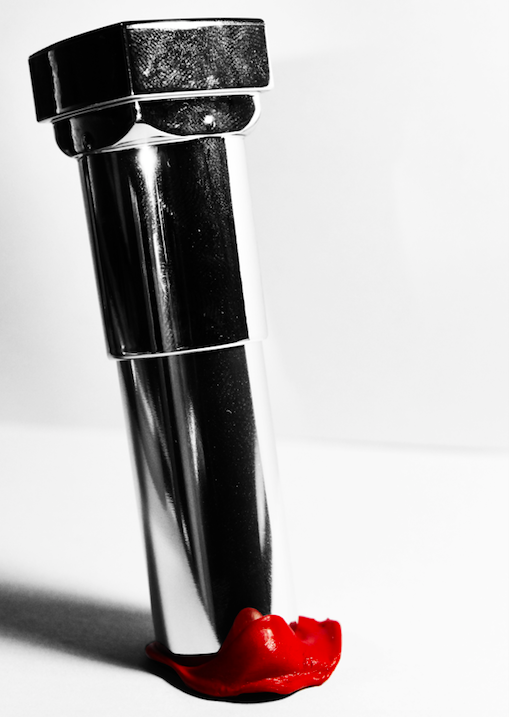
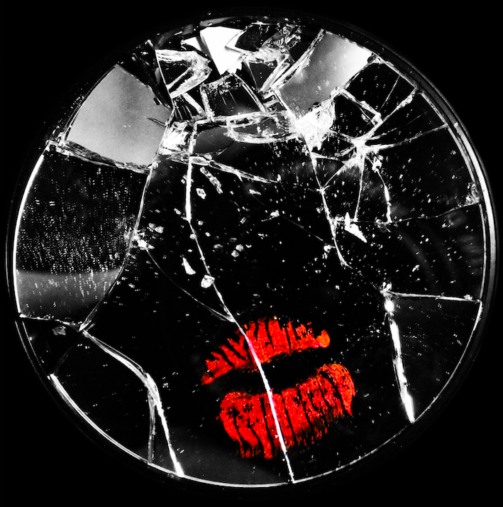
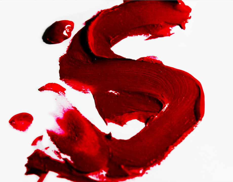
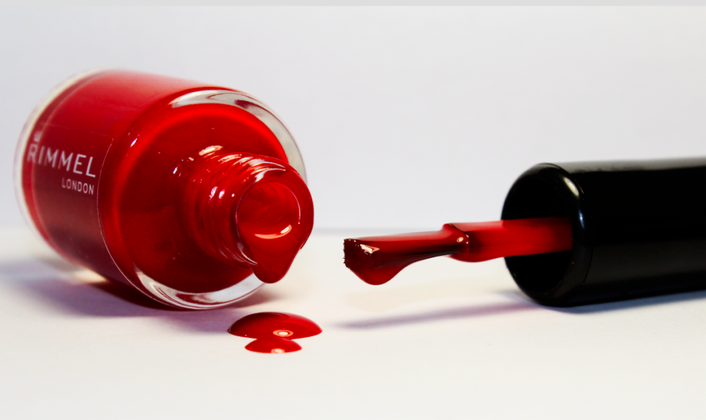
This image (along with the 2 below), is meant to represent a liberation from the tight restriction of female gender stereotypes. Here, makeup and feminine products are seen to be destroyed, broken and smashed, showing a rebellion against the norm, and presenting examples of freeing individual expression, and breaking stereotypical gender roles in order to express ones self freely.
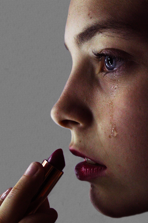
This image is a more overt example of the issues and problems caused by adhering to gender expression that doesn’t fit the needs and desires of the individual. Here, the subject is distressed by their need to adhere to the beauty standards of society, and therefore can be seen crying while applying makeup.
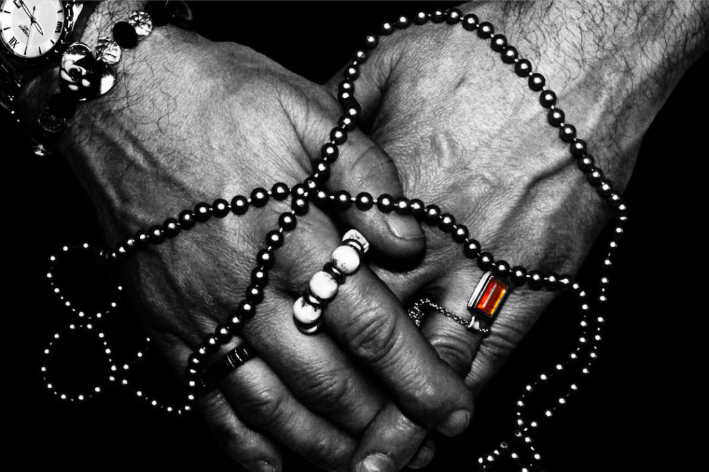
Here, I have made use of monotone in order to emphasize the contrast of te colours and shapes of the jewelry and hands. I kept a single colour in order to draw attention to the jewelry on the hand, and overall I feel like this image is the strongest from the photo-shoot, with it having a double meaning of identity liberation, and also feeling trapped and restrained by society’s standards and judgement.

The above images focus on the struggles and issues with trying to navigate gender identity in a society that doesn’t accept you. I have used both positive and negative examples, with some images reflecting the breaking, smashing and ruining of items that represent female beauty standards, therefore allowing the individual to be liberated from the pressures and strains of beauty standards. Alternatively, I have also made reference to more negative consequences of beauty standards, with one of the images depicting a female subject applying lipstick while crying, representing the affects of the pressure on women to adhere to society’s standards of beauty. The final image depicts male hands covered in jewelry, and although this can be used to represent the liberation of gender identity and expression (with the subject able to express their like of jewelry regardless of their gender), the way in which the jewelry is placed can also represent a chain/ties, used to restrict the hands.

Overall, I feel like this photo-shoot has been a success. I have developed one of my favorite images from the project (black and white hands), and will be using these images in my final book, as I feel like they successfully represent the struggles and triumphs of adhering to (and rebelling against) beauty standards and stereotypes.

Photobook specification

3 Words: Generations, Legacy, Family

Sentence: A book about the relationship between myself and my grandfather, inspired by the physical resemblance between myself and my Grandfather

Paragraph: Throughout my life, Whenever my family have looked at personal family photographs of my Grandfather as a young man, My family have constantly remarked upon the strong resemblance between myself and my grandfather and this is the inspiration behind this photo book, exploring my grandfathers young life and recreating original images myself whilst depicting this resemblance.

Book Design

I would like to produce a hardback saddle stitch bound book on semi gloss paper. Ideally I would like my book to be a square, roughly 30x30cm with a portrait orientation of images set as squares in the centre of the page with a white border. I would like to incorporate written text by my grandfather and myself and include these alongside the photographs and photographed objects throughout my project. I would have an image of my grandfather on the front cover and the same image replicated by myself on the rear cover of the book. I would like a simple title which I am still considering in terms of what to name the book. I would incorporate a full bleed image on the middle page of a landscape and I will either have one half of the book as photographs of my grandfather, and the other half will consist of images of myself recreating the photographs myself.