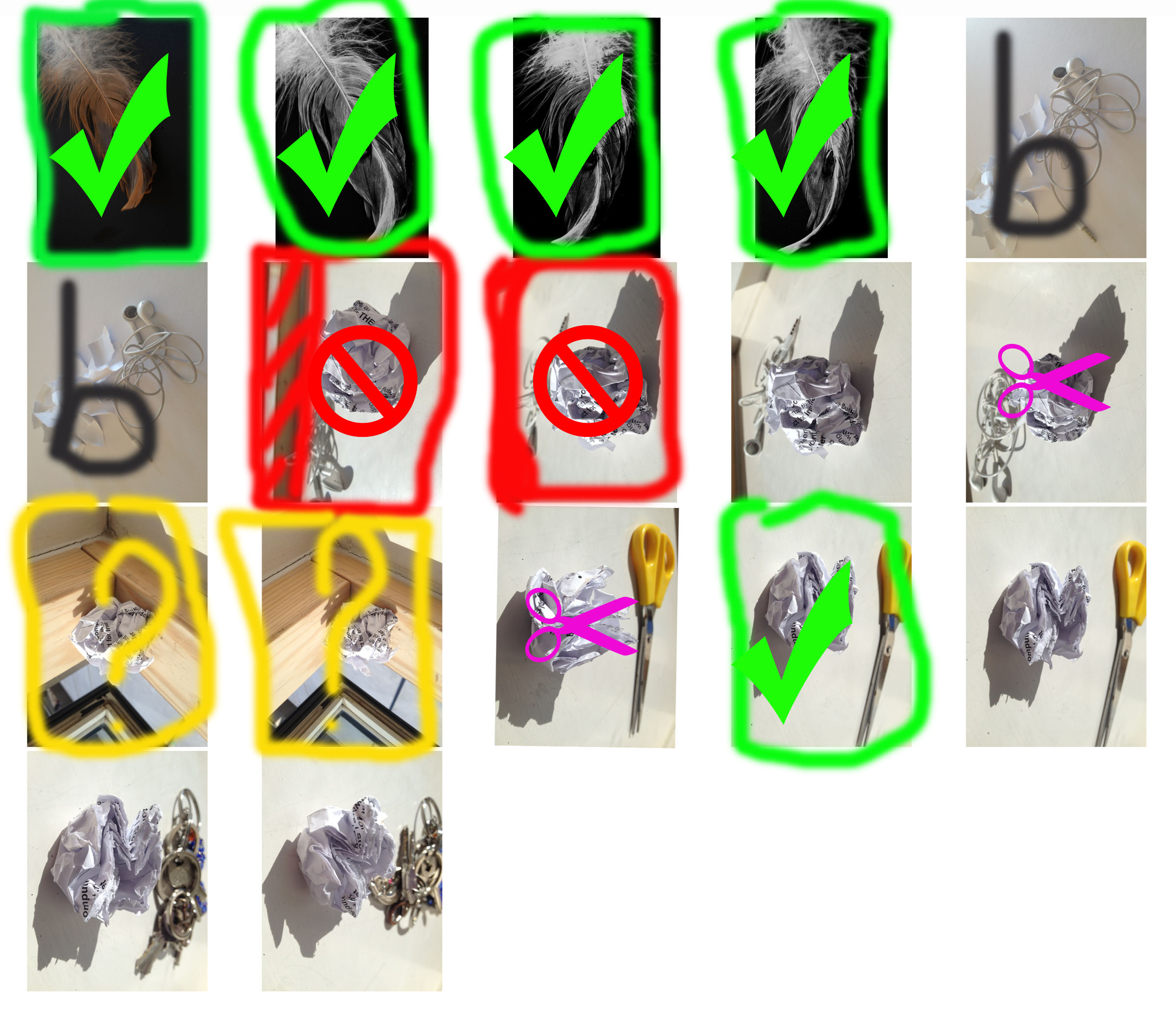
Green check- Good maybe edit
Red- Bad
Yellow- Maybe, try editing
Pink scissors- Try cropping it
grey ‘b’- Boring

Green check- Good maybe edit
Red- Bad
Yellow- Maybe, try editing
Pink scissors- Try cropping it
grey ‘b’- Boring
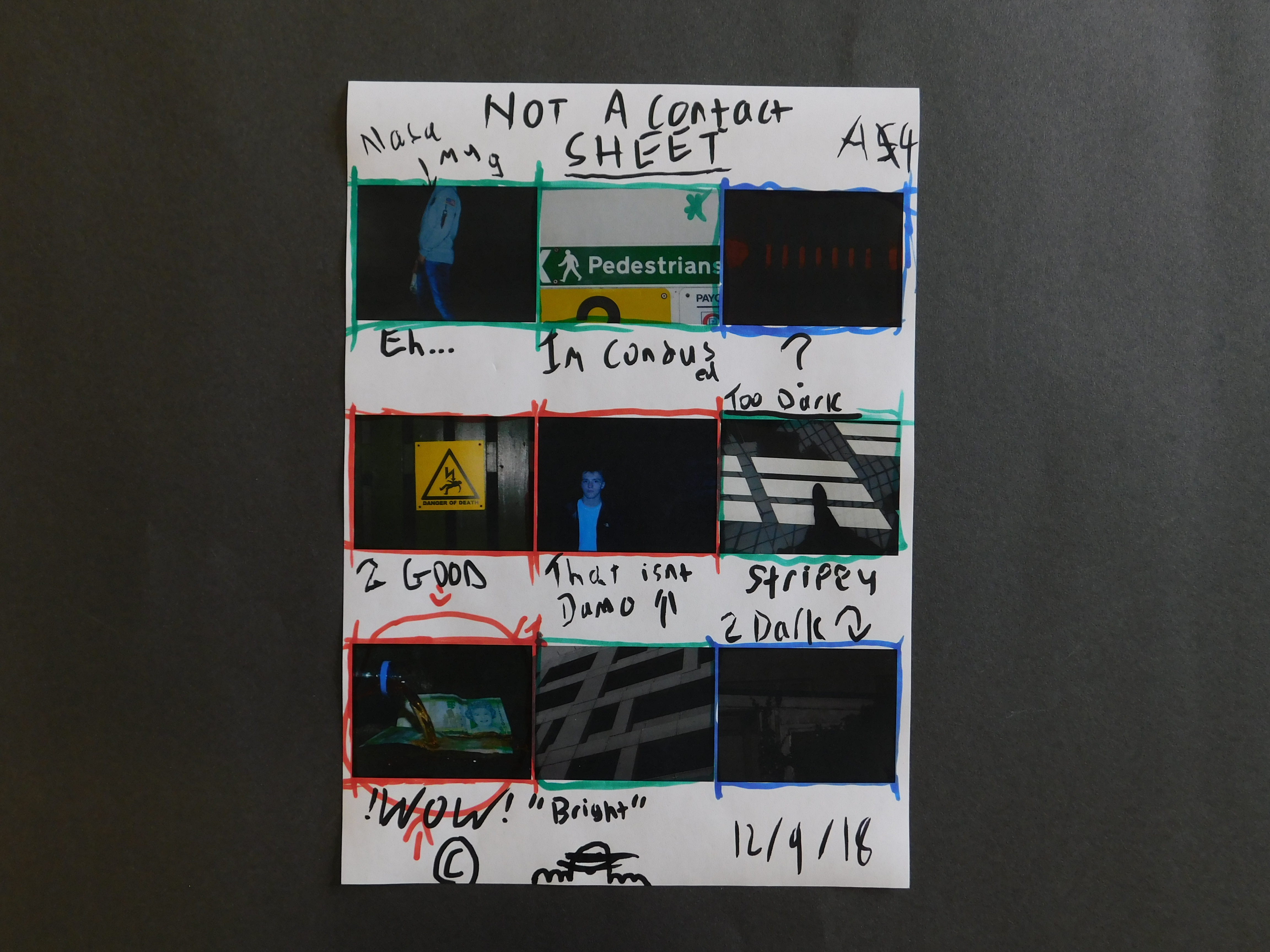
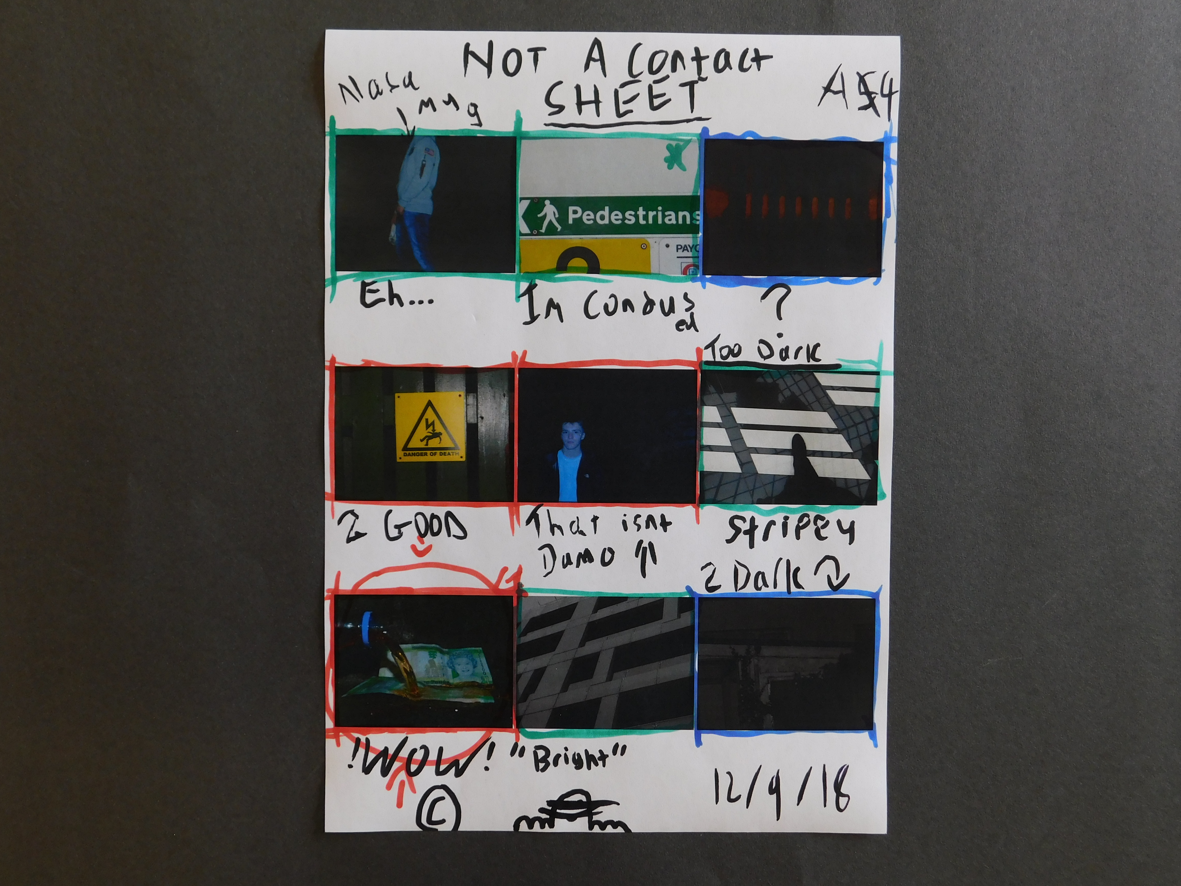
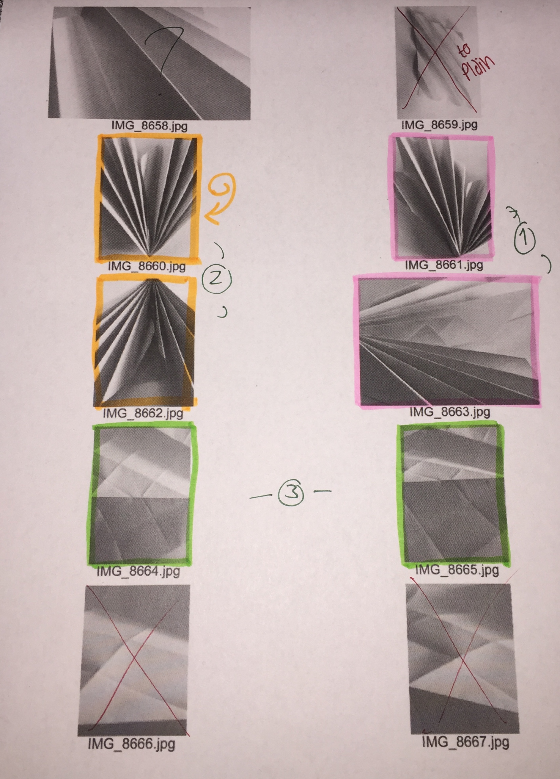
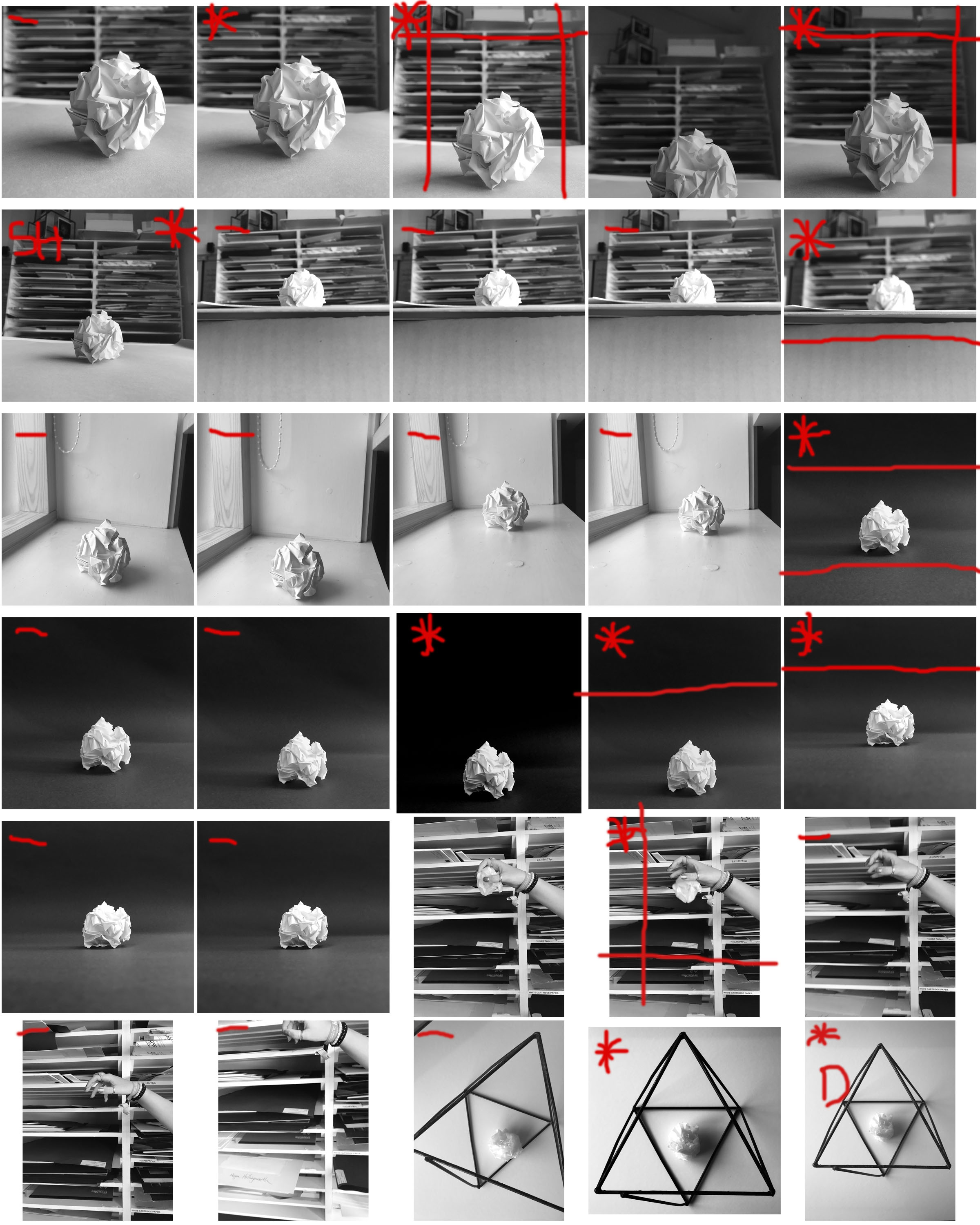
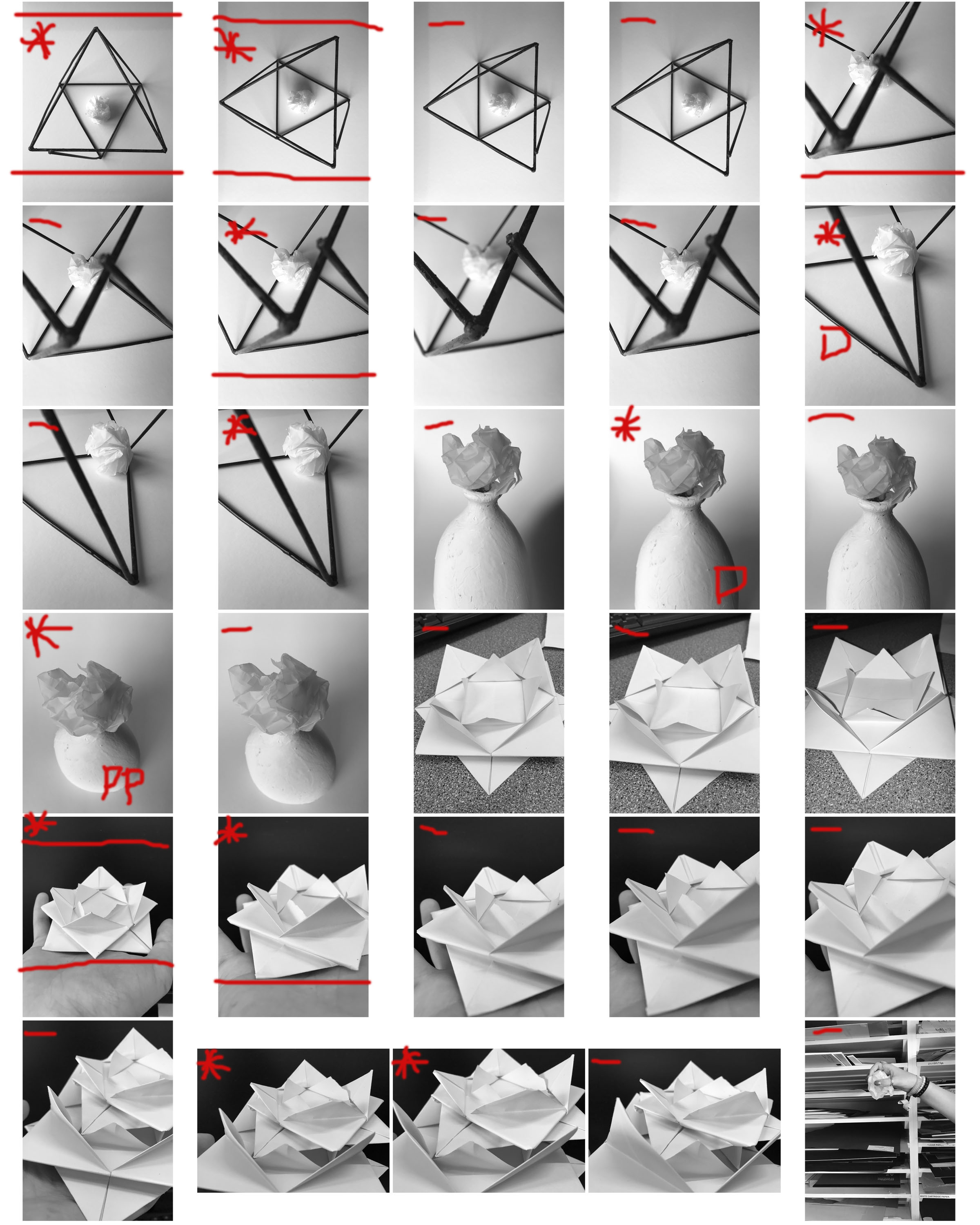
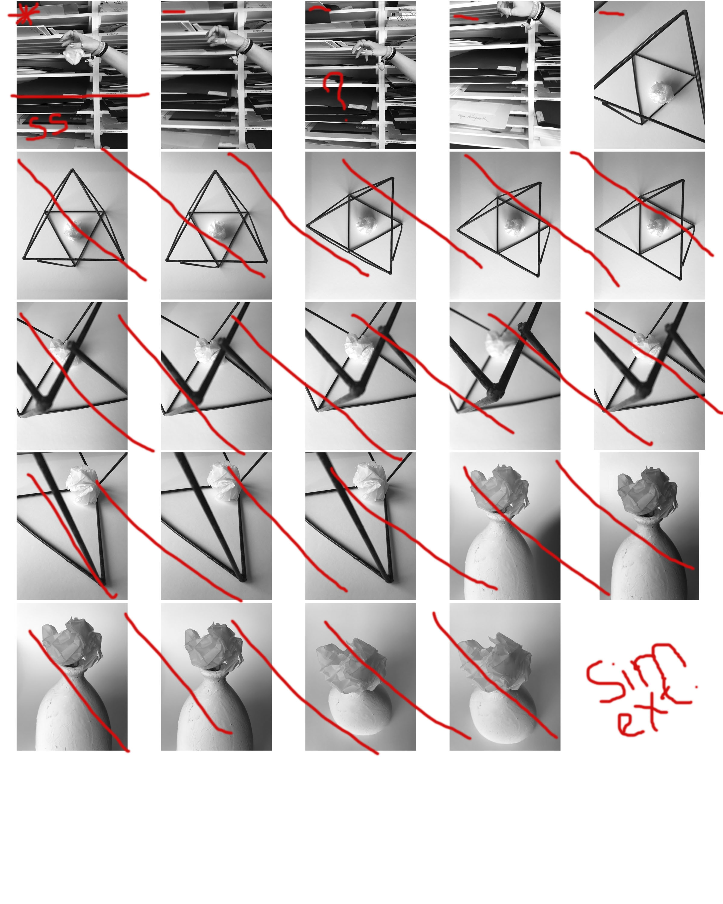
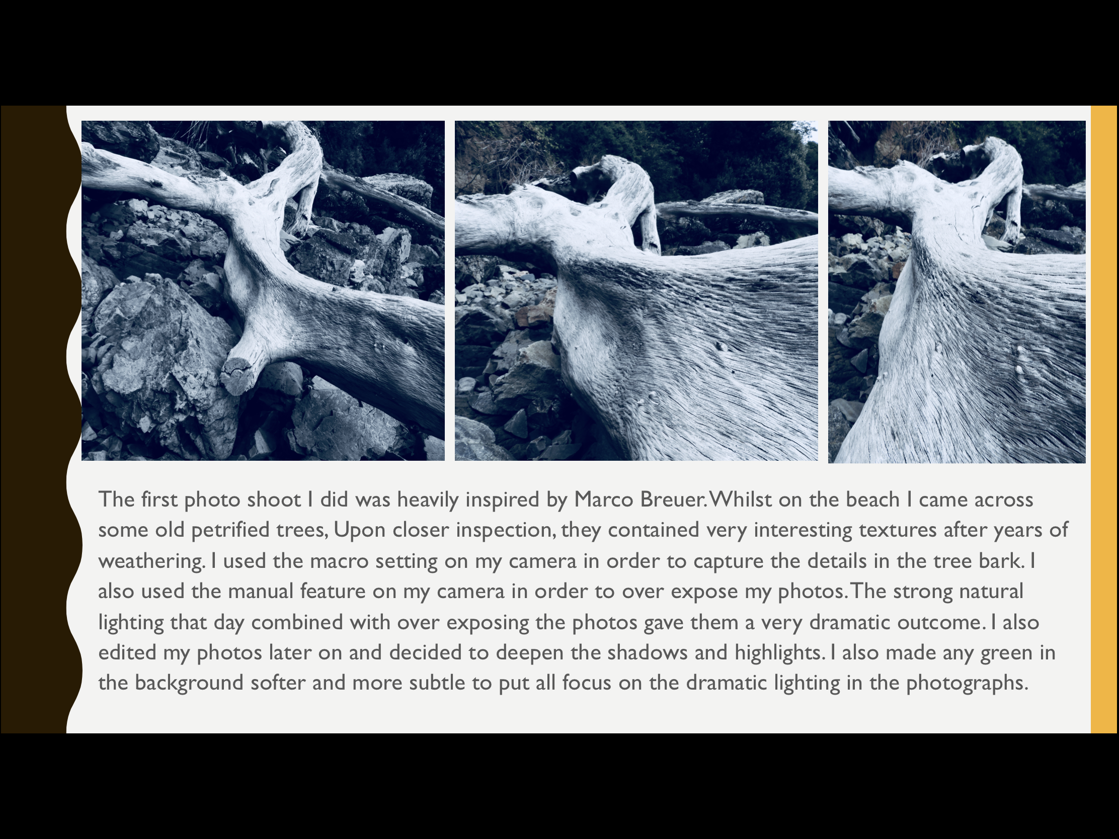
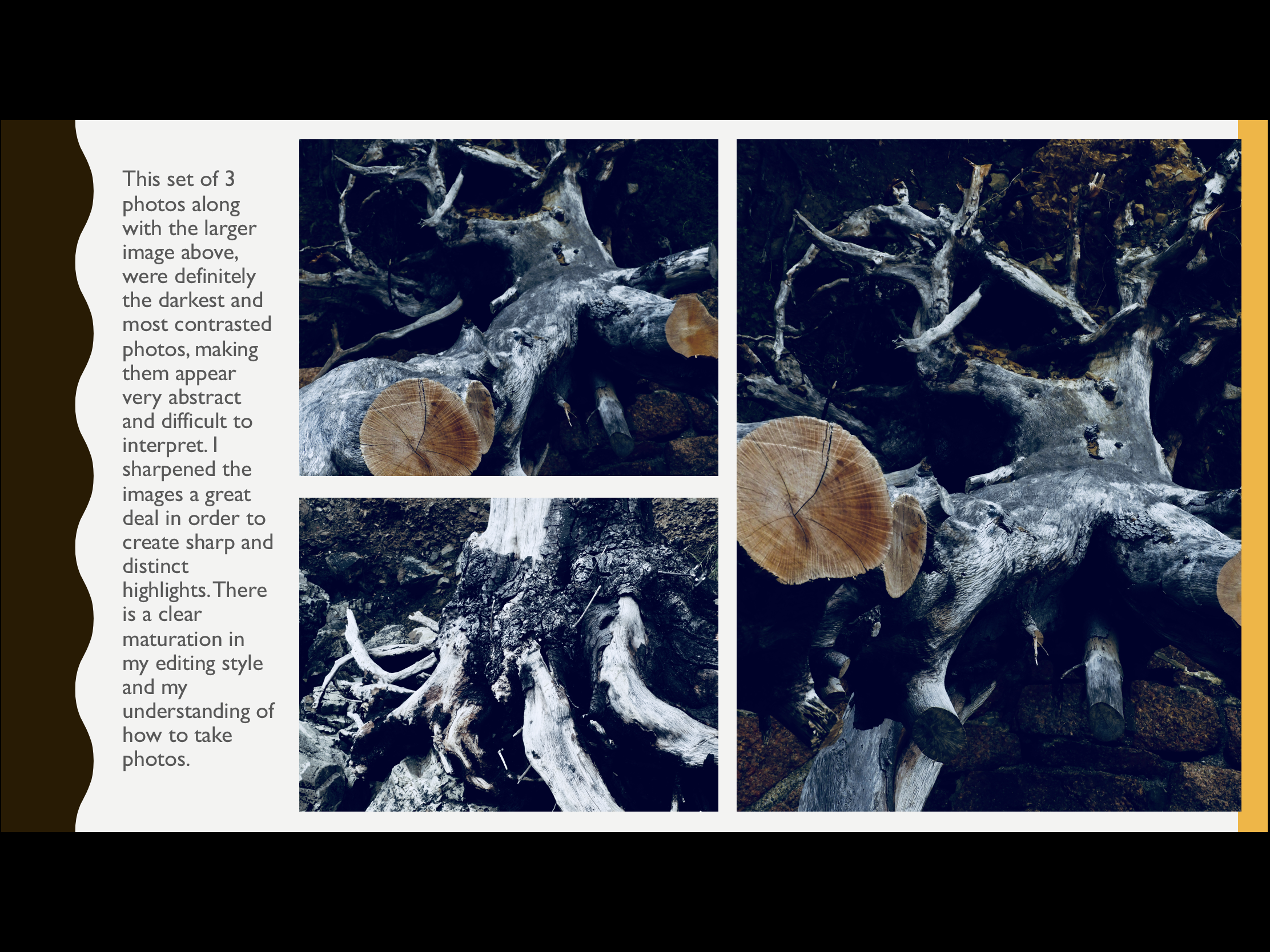
Photographers use contact sheets to allow them to carefully select their top images. It also allows them to annotate the photographs on where they may want to crop the photograph, issues with photographs and photographs that they may want to further develop or use. Contact sheets are also used to present all the photographs captured on the shoot, which shows how the photographer went about the photo shoot. This way of displaying images is very useful for a photographer.
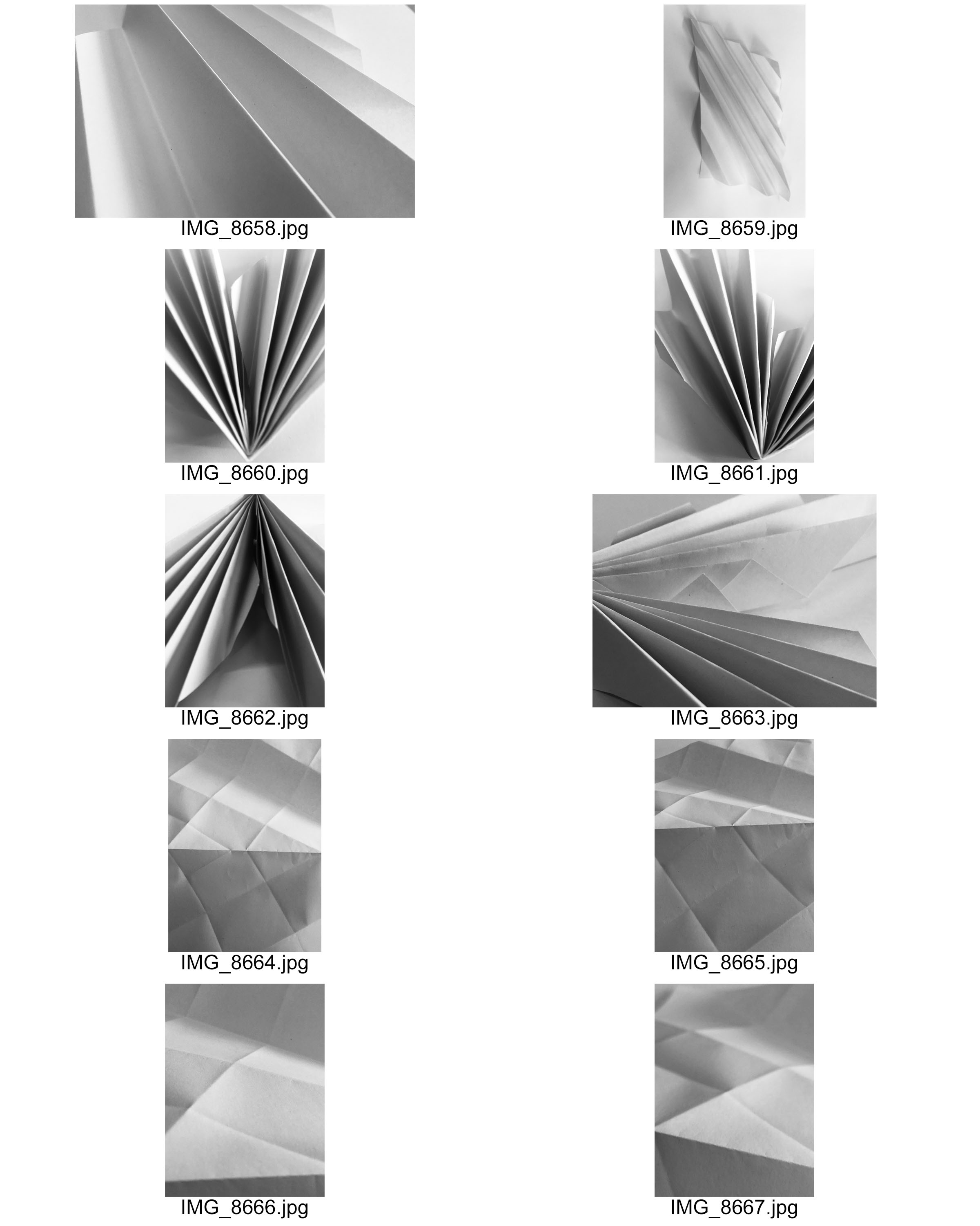
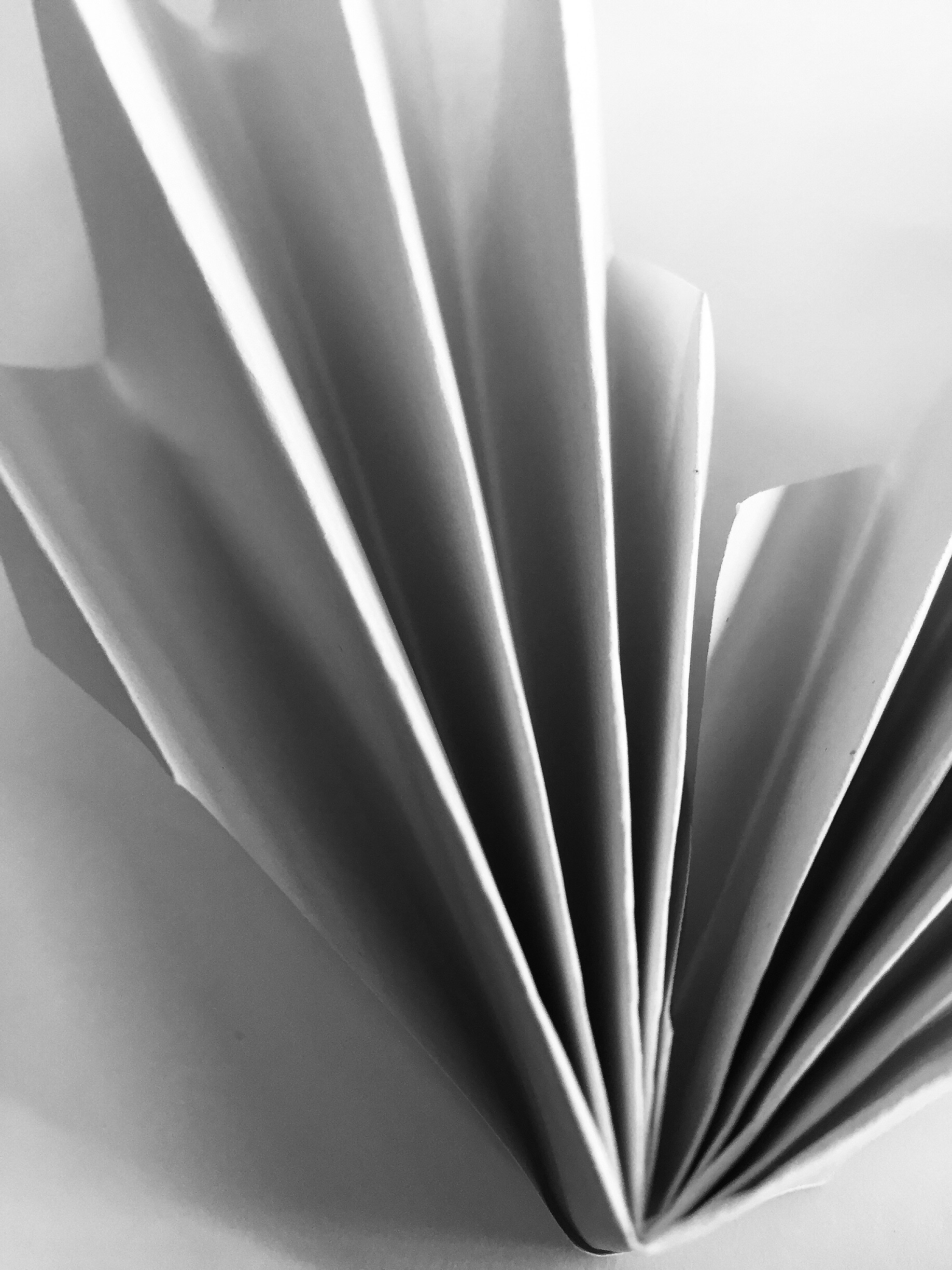
Overall, in my opinion this is my best image from the response I did. I like this image due to the use of light and tone, with a good contrast. The contrast in my opinion shows the form and line of the paper than if the frame was all highlights and all bright.
The way I achieved my wanted contrast and brightness, I utilized the natural light in the room so that I didn’t have to use the flash or heavily edit the picture. The only editing I did do was add a soft black filter to the image: I didn’t want a normal black and white filter that pix-elates the shadows and lines.
Alongside the use of contrast, I wanted to incorporate line and shape into my image so that it created less of a silhouette and more of a strong shape within strong shadows.
An example of a contact sheet
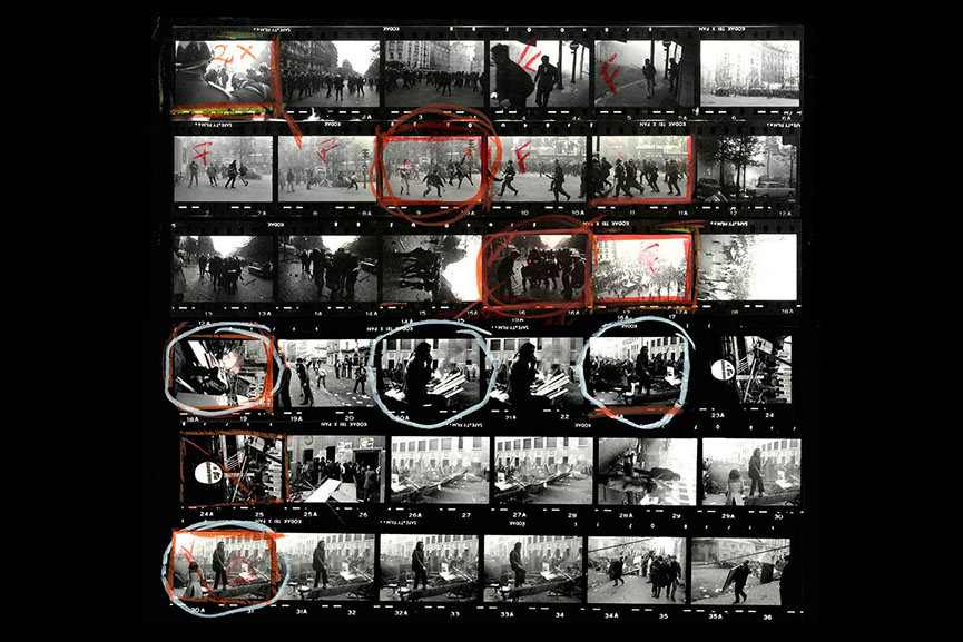
To create a contact sheet, open all your jpgs onto your device and save them to your files.
Make sure your photos are in a thumbnail format before screenshotting.
screenshot your photo thumbnails and open the image onto photoshop.
select the brush tool and use colours and lines to show what photos you are going to use, which ones you are going to discard etc…
You should end up with something like this…
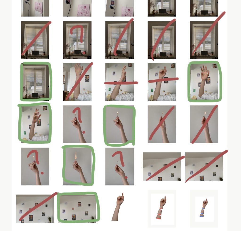
Green box – using
red stroke – not using
green question mark – not sure to use as final
red question mark – not sure wether to use at all
horizontal lines – cropping
Why We Use Contact Sheets
Photographers use contact sheets to allow them to carefully select their top images. It also allows them to annotate the photographs on where they may want to crop the photograph, issues with photographs and photographs that they may want to further develop or use. Contact sheets are also used to present all the photographs captured on the shoot, which shows how the photographer went about the photo shoot. This way of displaying images is very useful for a photographer.
Coding System:
Contact Sheet
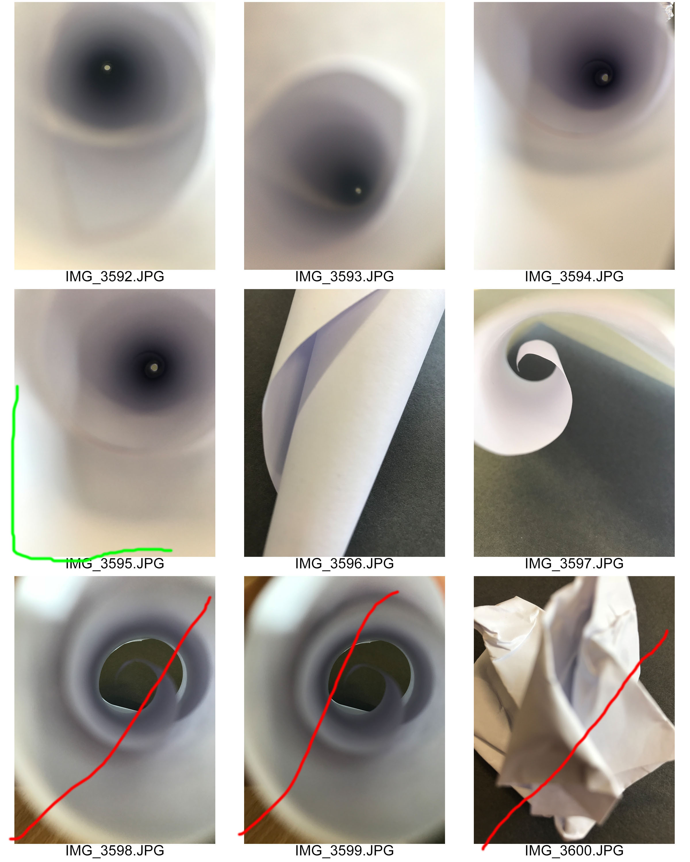

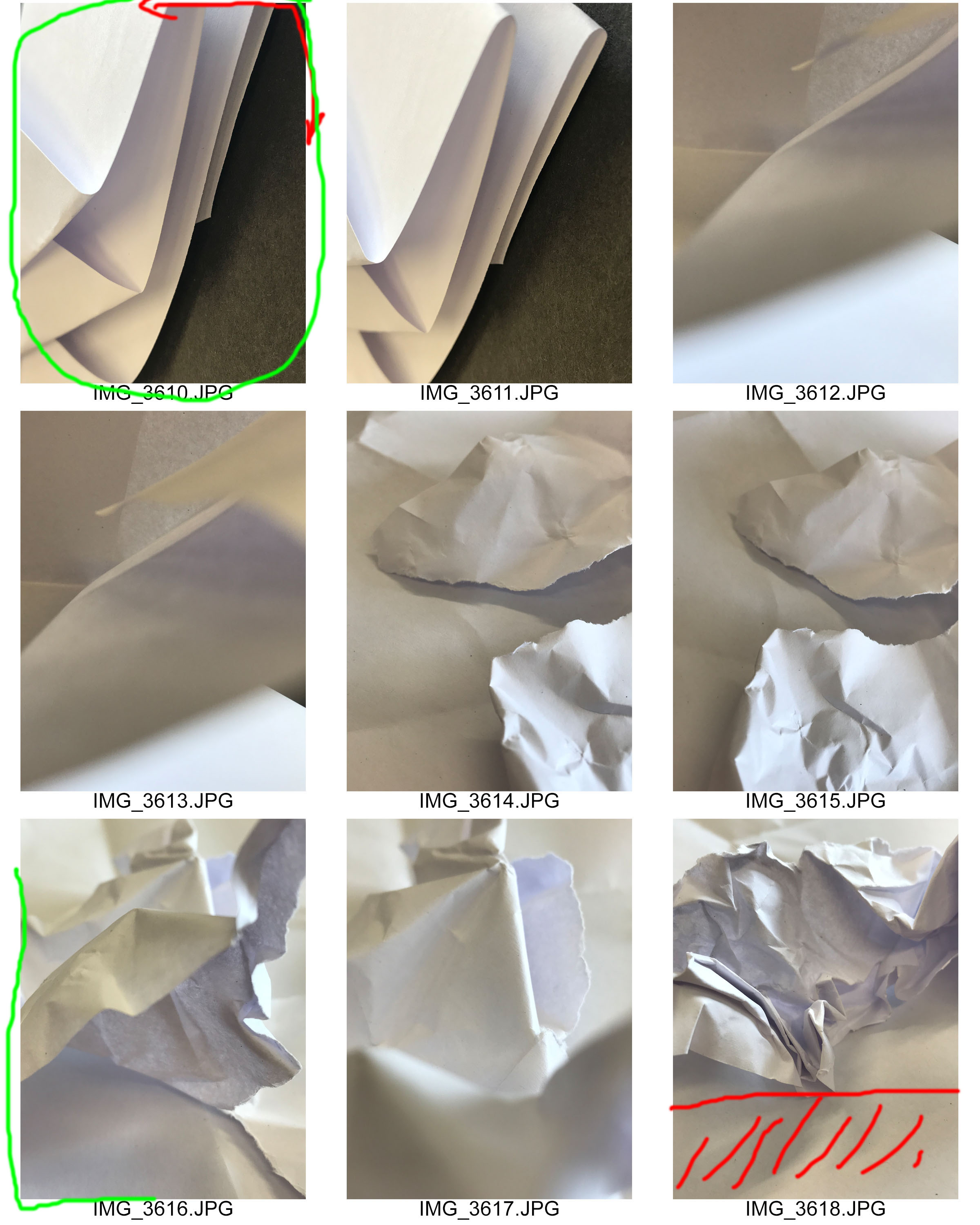

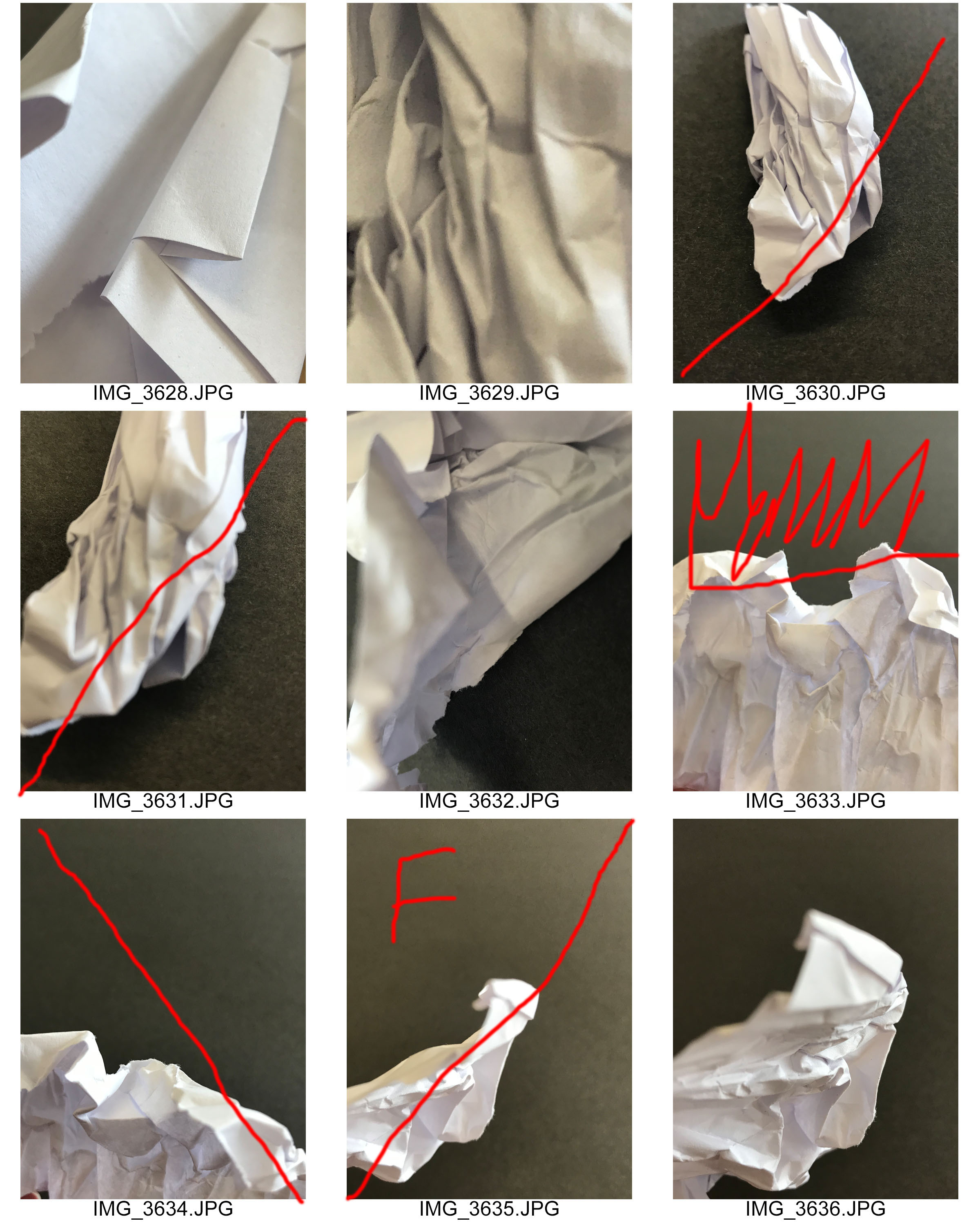
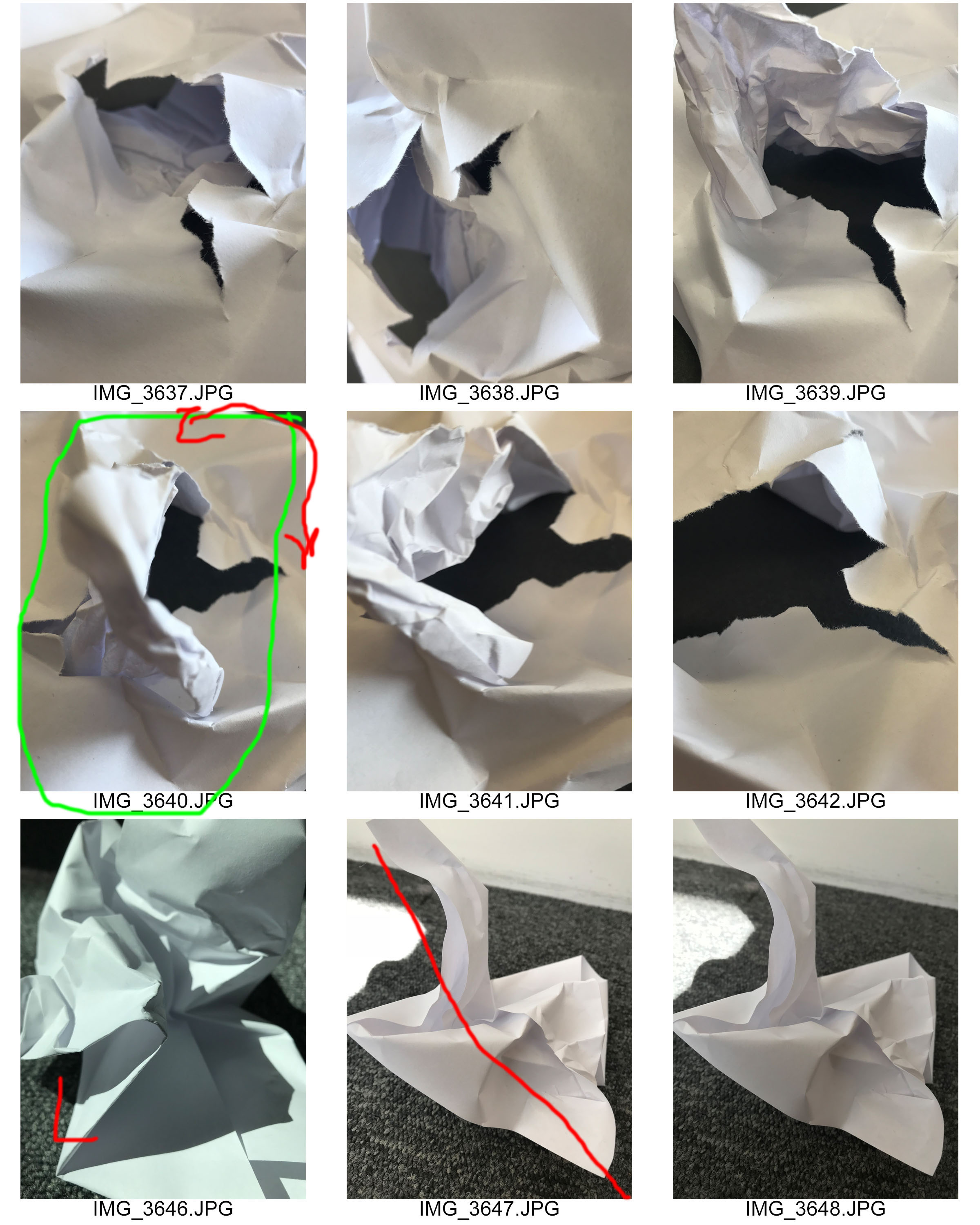


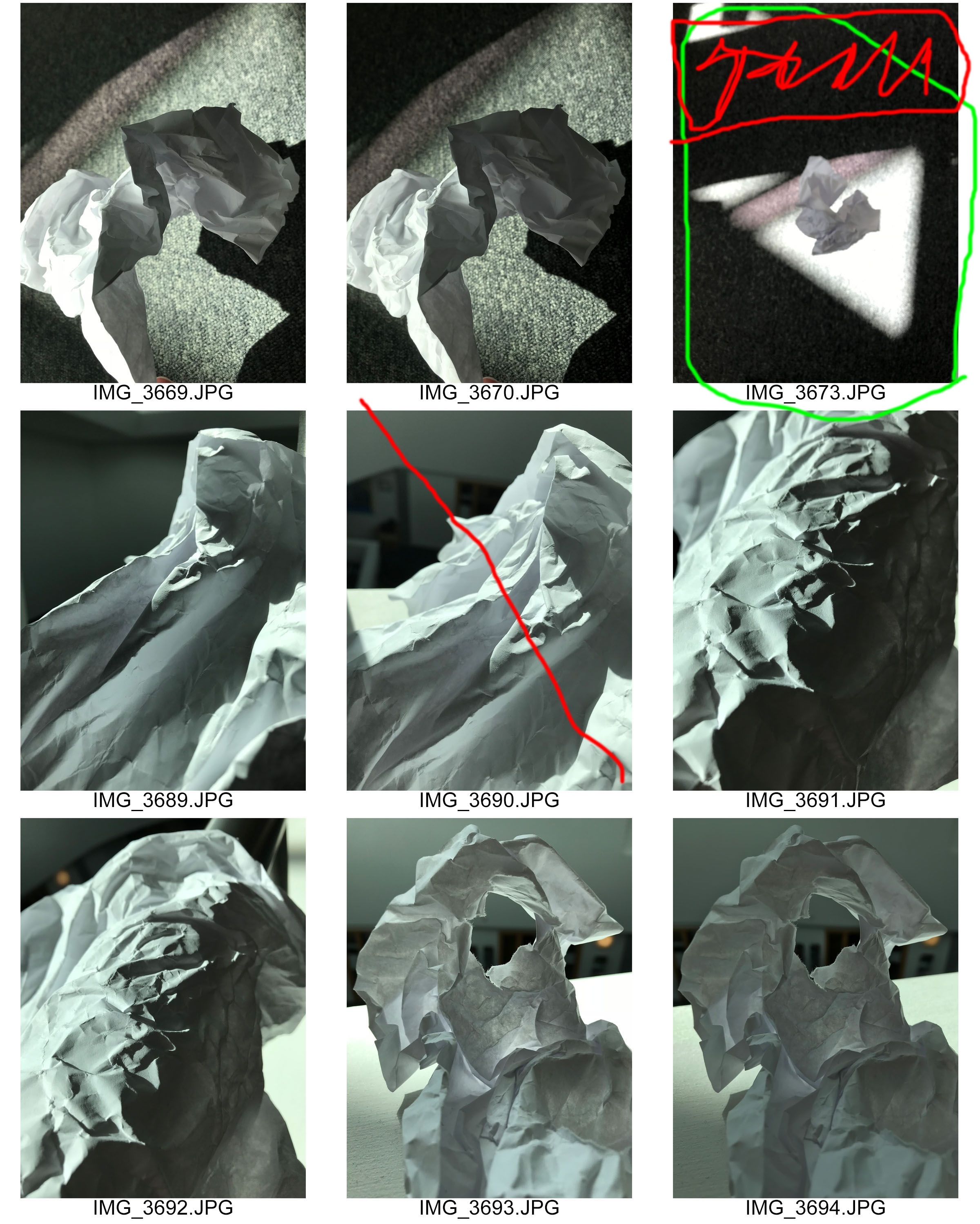

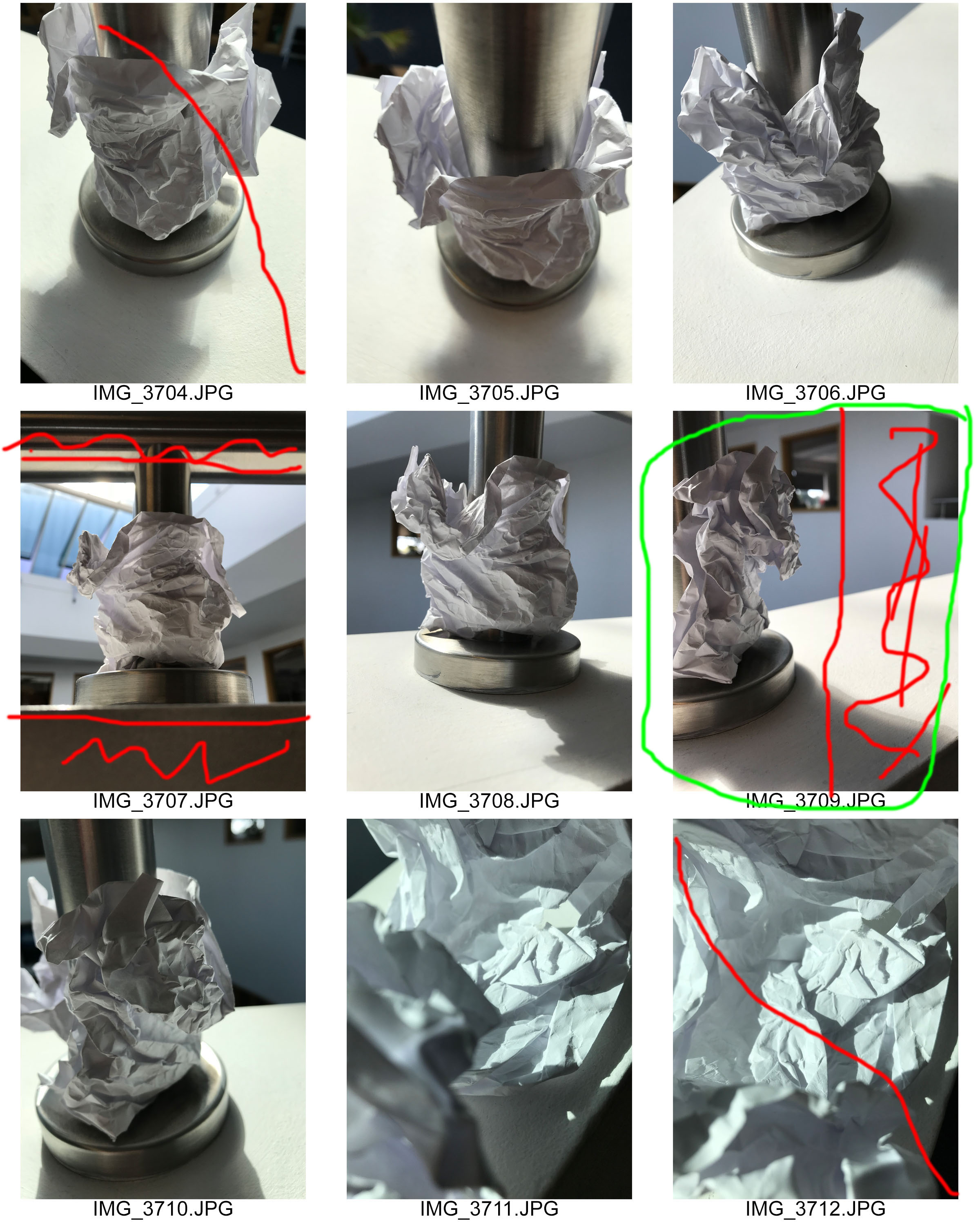


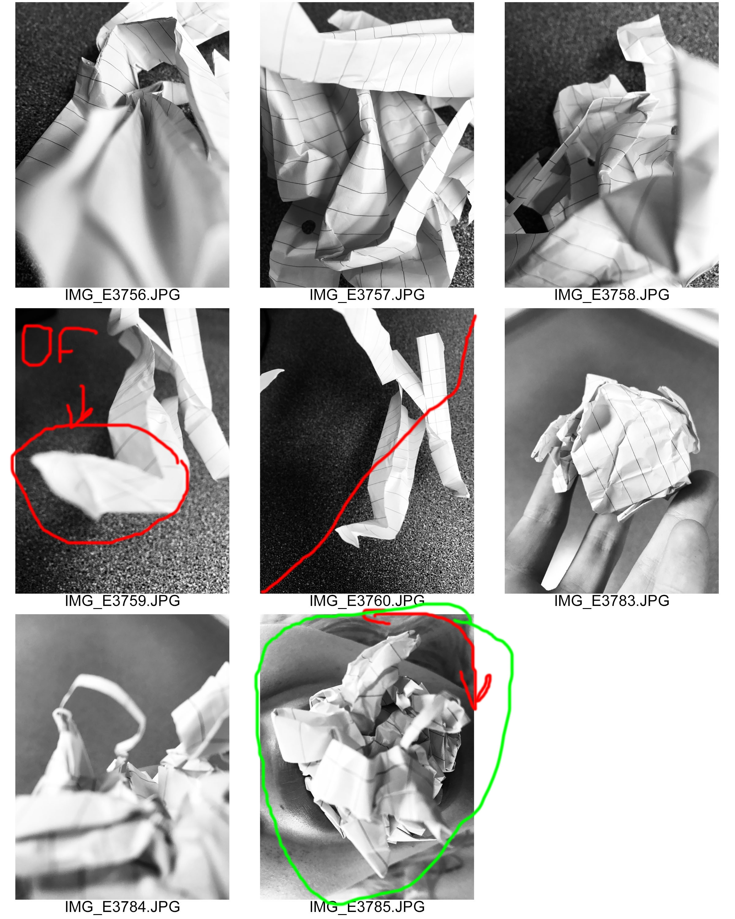
Contact Sheet
Red cross means no, orange question mark means maybe and green tick means yes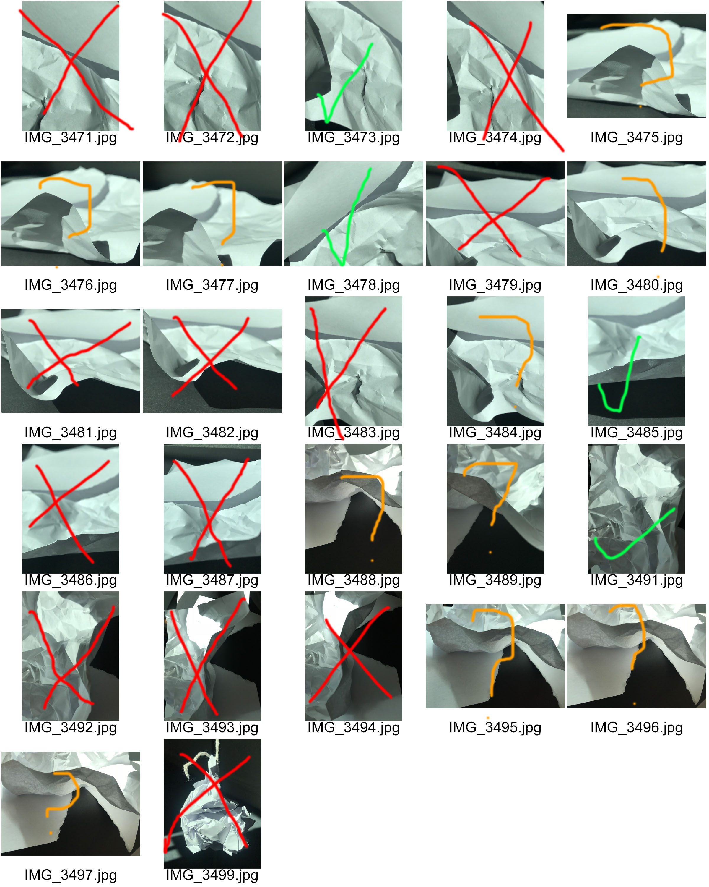
What is a contact sheet?
A contact sheet is a piece of photographic paper on to which several or all of the negatives on a film or camera have been contact-printed. They are also useful for the photographer to see their best or worst shoots and helps them cut down on the amount of photos they have.


CONNCEPT AND IMAGE TAKING
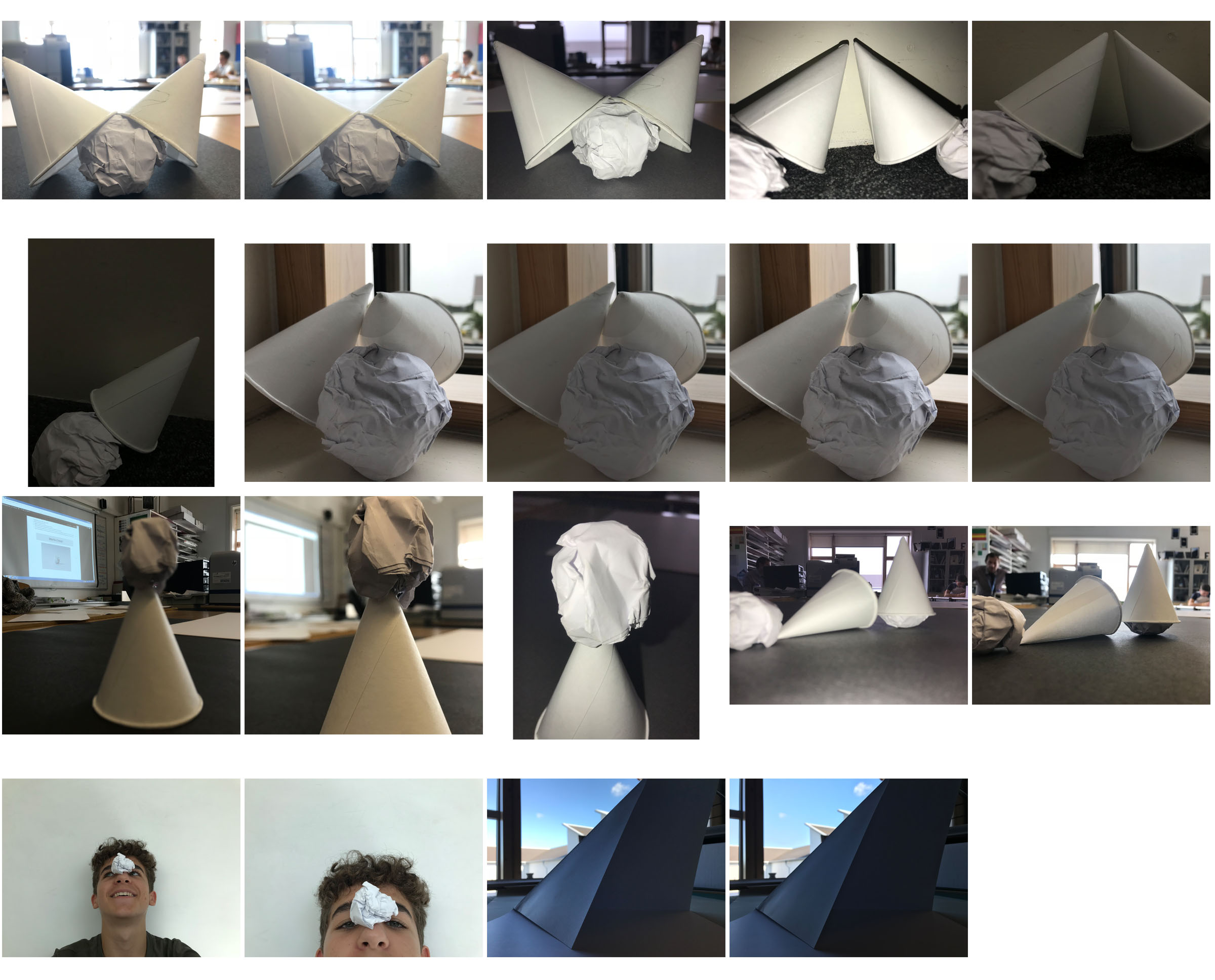
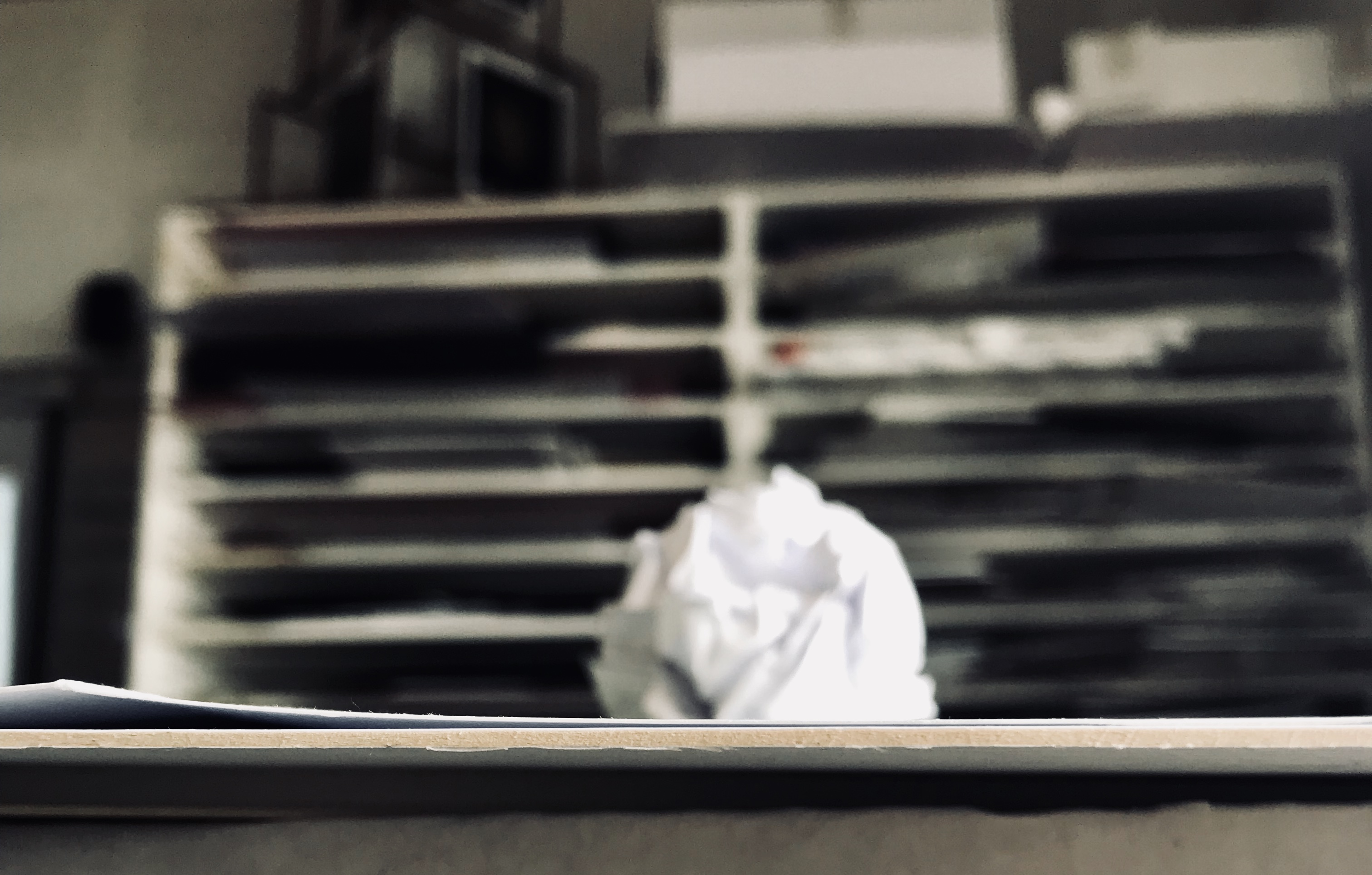
The concept of this mini project was to capture an ordinary scrunched up piece of paper, in as many ways as possible, placing it in different environments and photographing it. I captured these photos on my iPhone therefore the exposure, shutter speed etc. options were very limited when working on taking these images; paying particular attention to composition to make up for what was lost in image resolution. I started this task first by capturing some very simple photographs near a window, the light hit from the right side of the room creating a small shadow. The blurred, yet very busy backdrop for the photo really made the crisp and sharp lines in the scrunched up paper stand out.
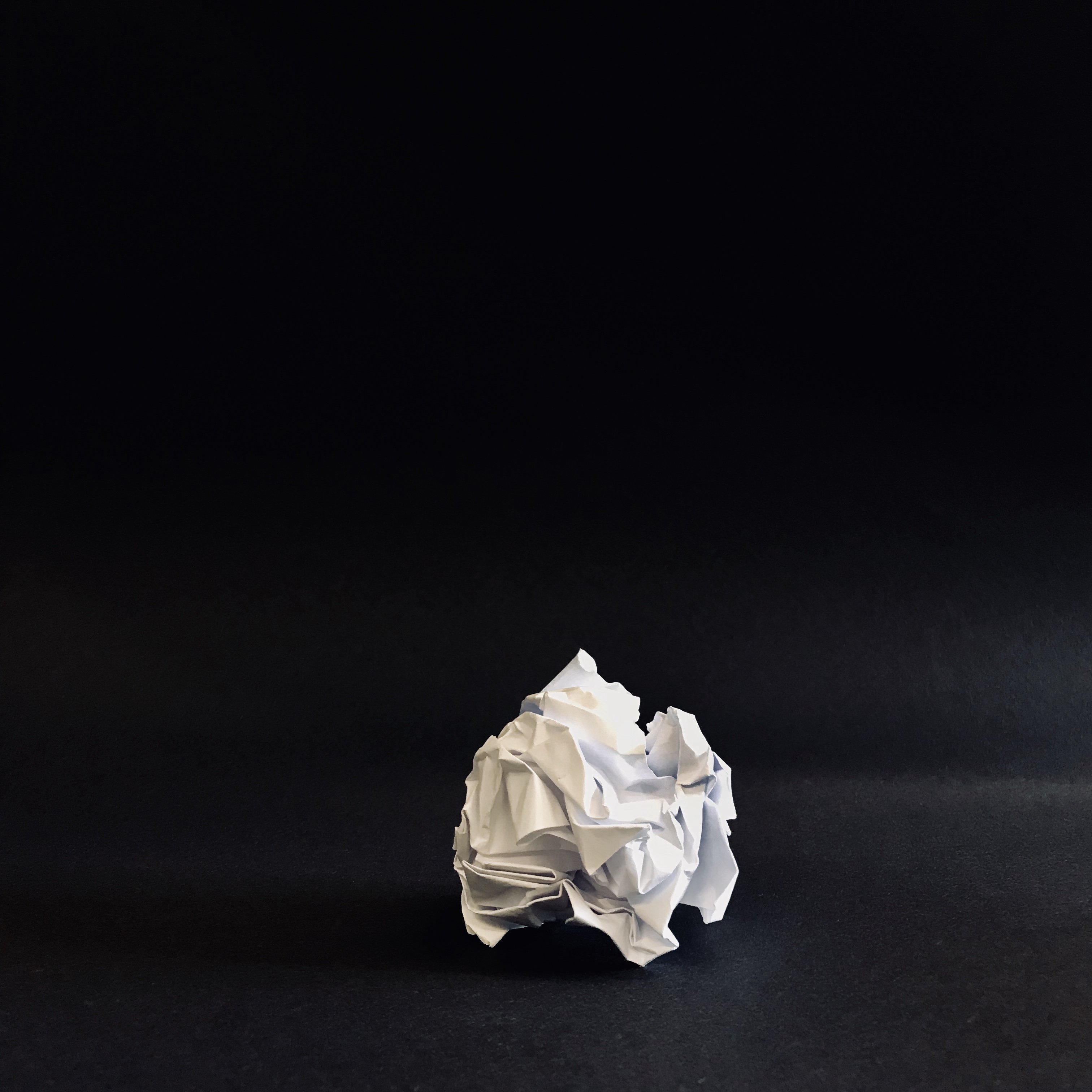
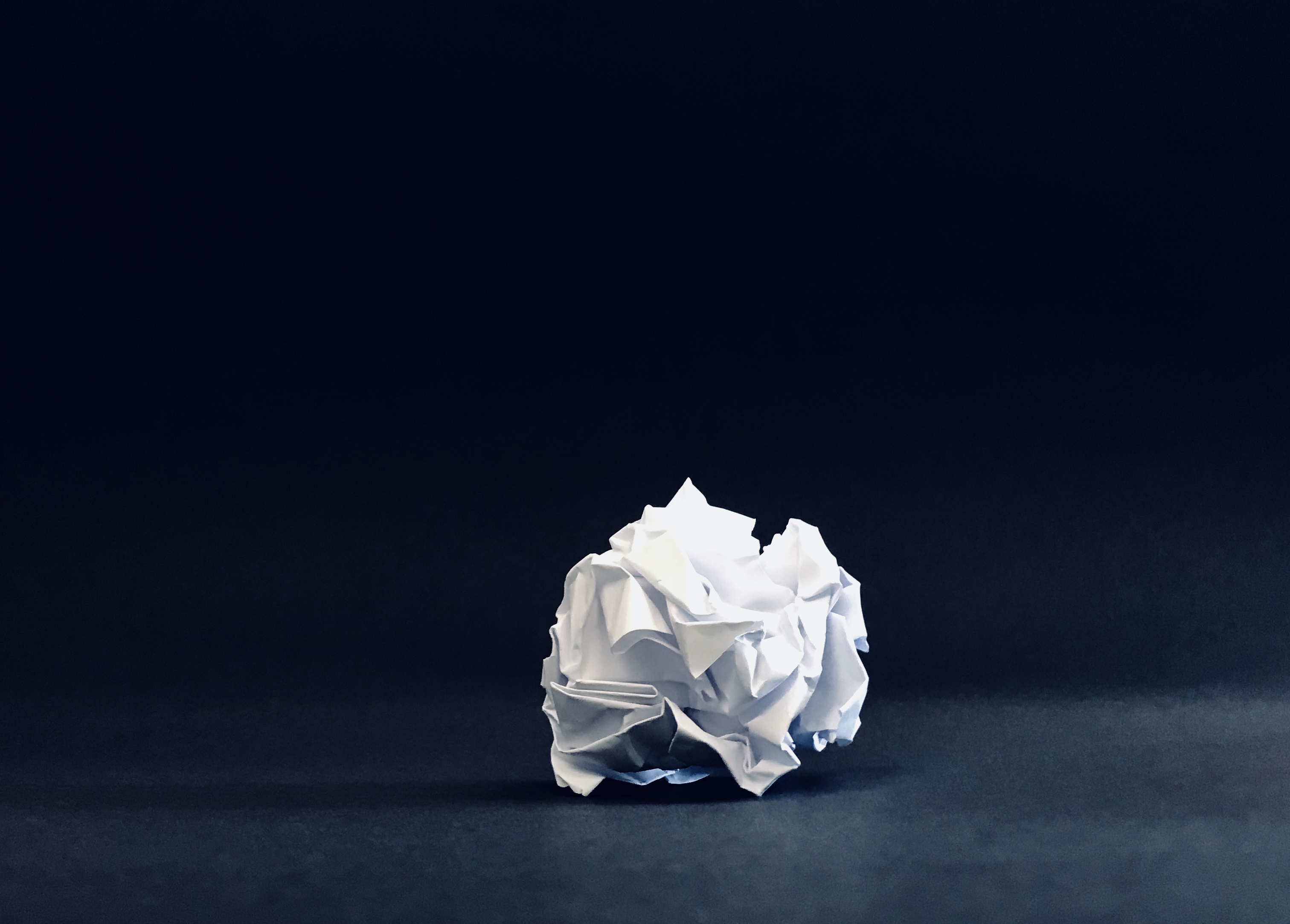
I then moved on to making a black infinity screen on which I would capture my next set of photos. The stark contrast between the bright white paper and pitch dark background, again make the ball stand out. There is some differentiation created on the infinity screen by the light shining in from the right hand side, giving it tonal differences that can be clearly seen and make the balls shadow be seen more easily.
I then thought about incorporating movement into my photos, therefore I asked a classmate to drop the ball from a height. Although difficult to capture, I was able to get a few shots which illustrate the dropping motion of the ball. These photos though are compromised in quality with the ball having motion streaks.
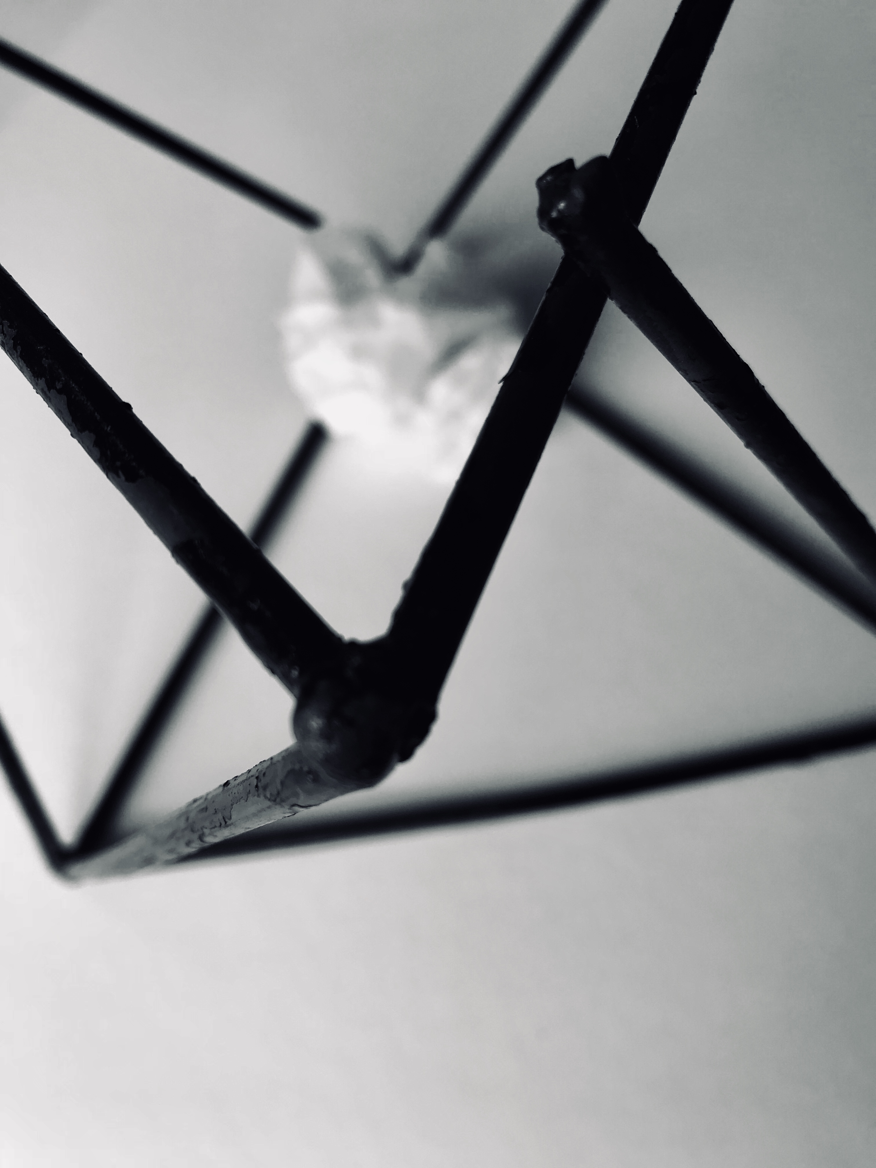
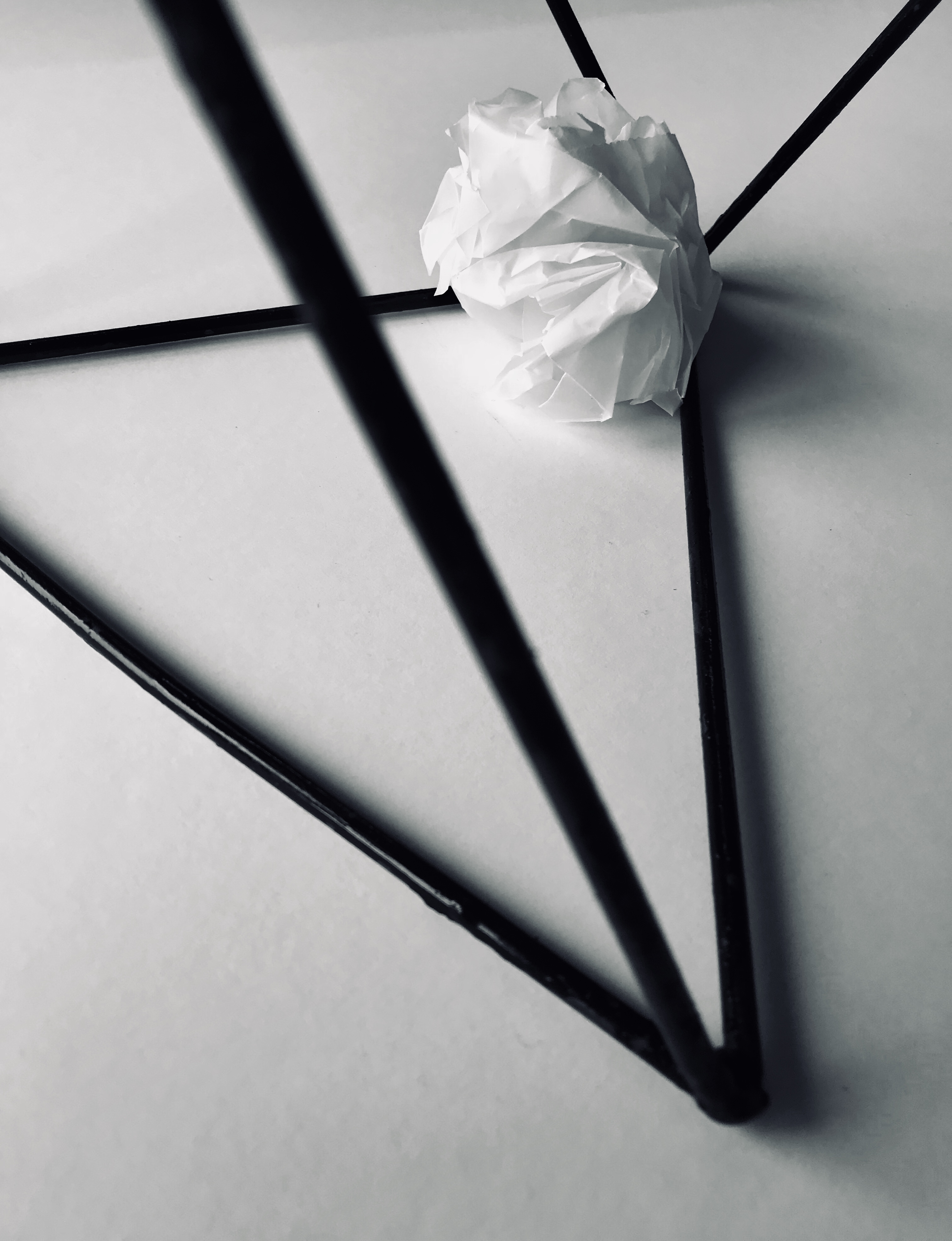
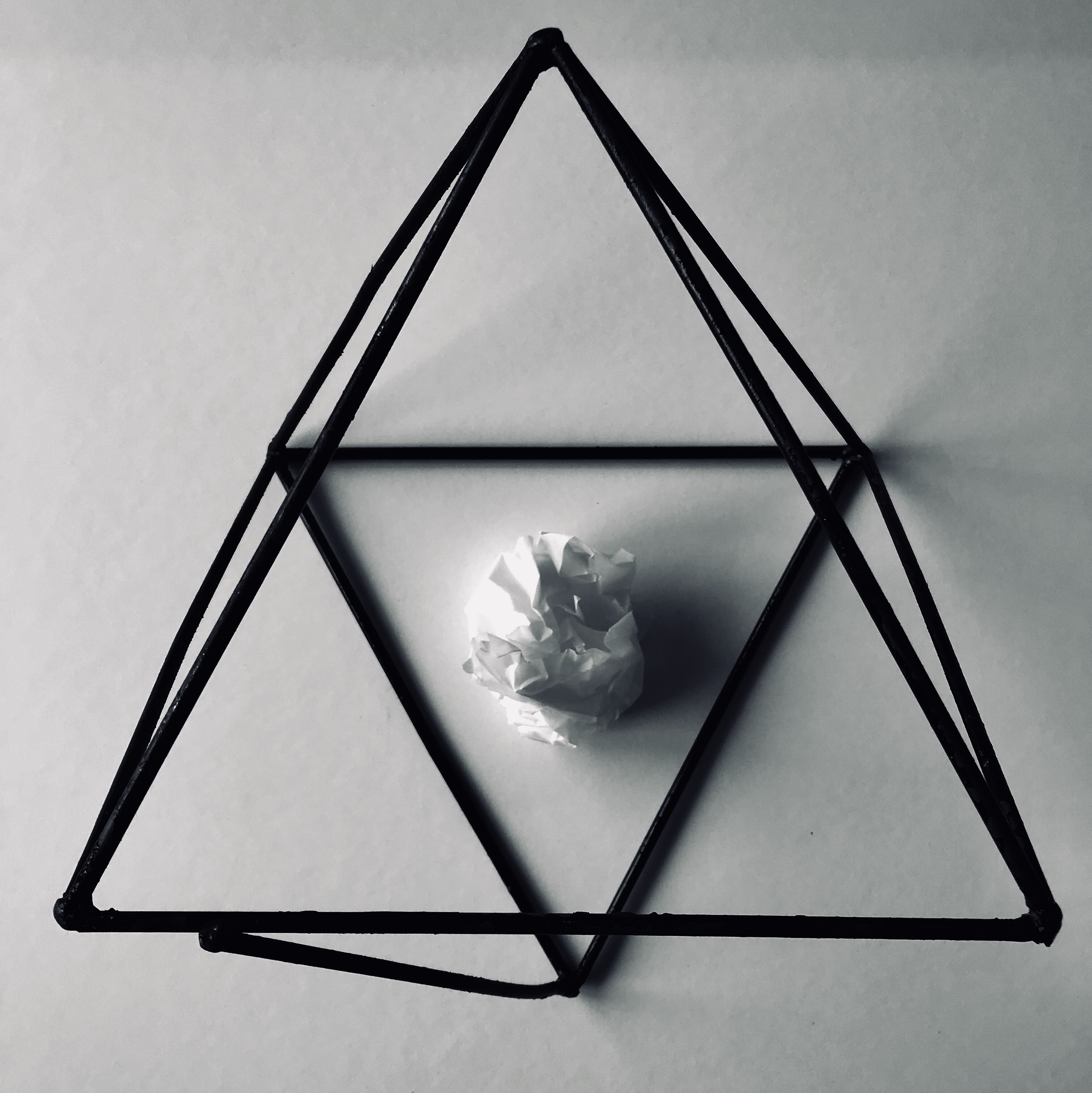
I then again thought about different items I could incorporate into the images, therefore I placed the paper ball in a geometric sculpture. The wire sculpture is again very dark giving good contrast between the ball and paper. Also the contrast in shape from the randomly scrunched paper and the sharp, geometric lines of the sculpture give it a point of interest.
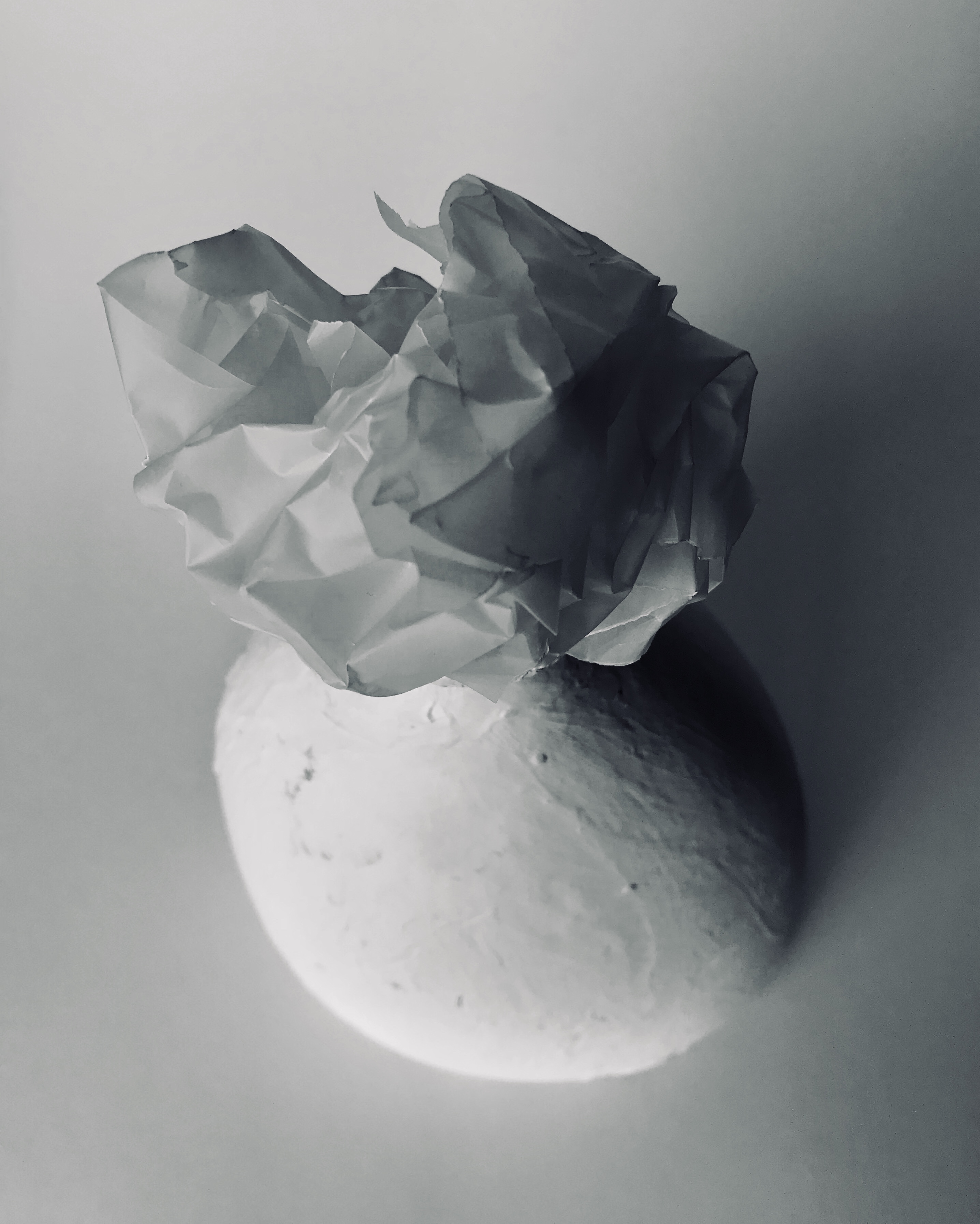
I then moved into placing the ball on top of a bright white vase. The incoming shadow from the left hand side of the picture give both the vase and the paper very dramatic and deep shadows which cut through the sea of whiteness giving the illusion of tonal differences. Lastly, I played around with the concept of geometry again, creating some origami which I then captured on a black backdrop, I think this gave a similar effect as using the geometric sculpture in my photos.
This overall mini project was very interesting to do. The challenge of creating many different photos with just a single piece of paper was very challenging yet this made me think about photography in ways that i have never done before. The simplicity of paper can be adapted and changed to become beautiful images that are very captivating and interesting.
MOST SUCCESFUL PHOTOS
In my opinion the most successful photo was indeed the paper ball atop of the white vase. I feel that this photo was really able to capture multiple interesting aspects of the vase and the paper ball. Firstly the light hitting from the left side of the picture creating the dramatic shadows, highlight the irregular creases and folds within the paper which are an important and interesting aspect of the paper ball. Furthermore, the shadows are able to distinguish both the white background and the foreground. The vase in these photos is also an aspect which further illustrates the interesting nature of the paper ball by again creating contrast in shape. It is very smooth, with regular curves all around, the ball on the opposite, possesses sharp and linear edges. A noteworthy aspect of the paper ball is that it was made from transparent paper, the thicker texture allowing it to create stronger geometric shapes. There are slight tonal differences with the vase, backdrop and ball. It is slightly more yellow toned whilst the ball and the backdrop are a lot more blue based.
Another very successful photo was the paper ball inside the black wire sculpture. This photo again captures the contrast between geometry and the random edges and curves of the paper ball. The dark metal is the center of attention, bringing it into the foreground of the photo whilst the white paper ball sits in the back ground. The light shining in from the left hand side of the photo creates a slight shadow from the paper ball and the wire sculpture, which fades into a darker shadow into the right hand side. i cropped the image and increased the contrast in order to make the photo more dramatic and dark.
The last photo which i thought was very successful was the paper ball on the black infinity screen. the paper which the ball sit atop of was very blue based in co lour therefore when i saturated the image, you are able to see different tones of black and blue. The contrast between the black screen and the white ball is also very striking in this photo. by increasing the contrast, I was able to create a pitch black backdrop. The light incoming from the left hand side of the photo creates a very slight yet noticeable shadow from the ball onto the screen.
CONTACT SHEETS
i made my final selection of images from the 86 I took by using contact sheets. I uploaded these onto Photoshop which I was able to manually draw onto with the brush tool. This was a very useful step i took when choosing the most successful photos from my selection. The red marks on top of the sheets made artwork in itself. The marks seem random yet to me they were a very useful prompt that reminded me of the steps i should take when editing and selecting the correct photos. I chose to make the photos monochrome as my final images are mostly black and white, therefore this helped me to visualize my final photos better.















Jerry Reed is an English photographer who focuses on contrast through shadows and highlights on a piece of paper. Jerry Reed’s three year project called paper work has twenty-six image. In his studio he has shaped paper creating edges and volume with them. He lights the images dramatically using Fresnel lighting to emphasize the three dimensional forms. With this lighting he can manipulate the shadow transition making it shorter to emphasize form and line or longer to show surface texture. His inspirations for this paper project are Francis Bruguiere, Juroslav Rossler and Abelardo Morell.
Tamara Lorenz is a German artist who creates artwork by hand and then takes pictures of them to emphasize certain aspects of the piece. Her photographs focuses on the abstract properties. Tamara Lorenz focuses more on the constructions she makes with the paper rather than light and shadow which Jerry Reed uses to enhance his paper work. She uses vivid, bold and strong complementary coloursto create contrast with the lines and shapes of her work. Every photograph is difficult to distinguish and makes it hard for the viewer to recognize what the subject really is. This makes her photographs visually interesting and abstract.

By looking at the two artists I will combine elements from both their work to create my response. I will use manipulate the light to create highlights and shadows on my paper like Jerry Reed’s paper work series. However, instead of having black and white pictures I will incorporate colour card to some of my images like Tamara Lorenz to create bold and vivid abstract photos. To experiment I will fold, tear and roll the paper to create different effects and compositions.
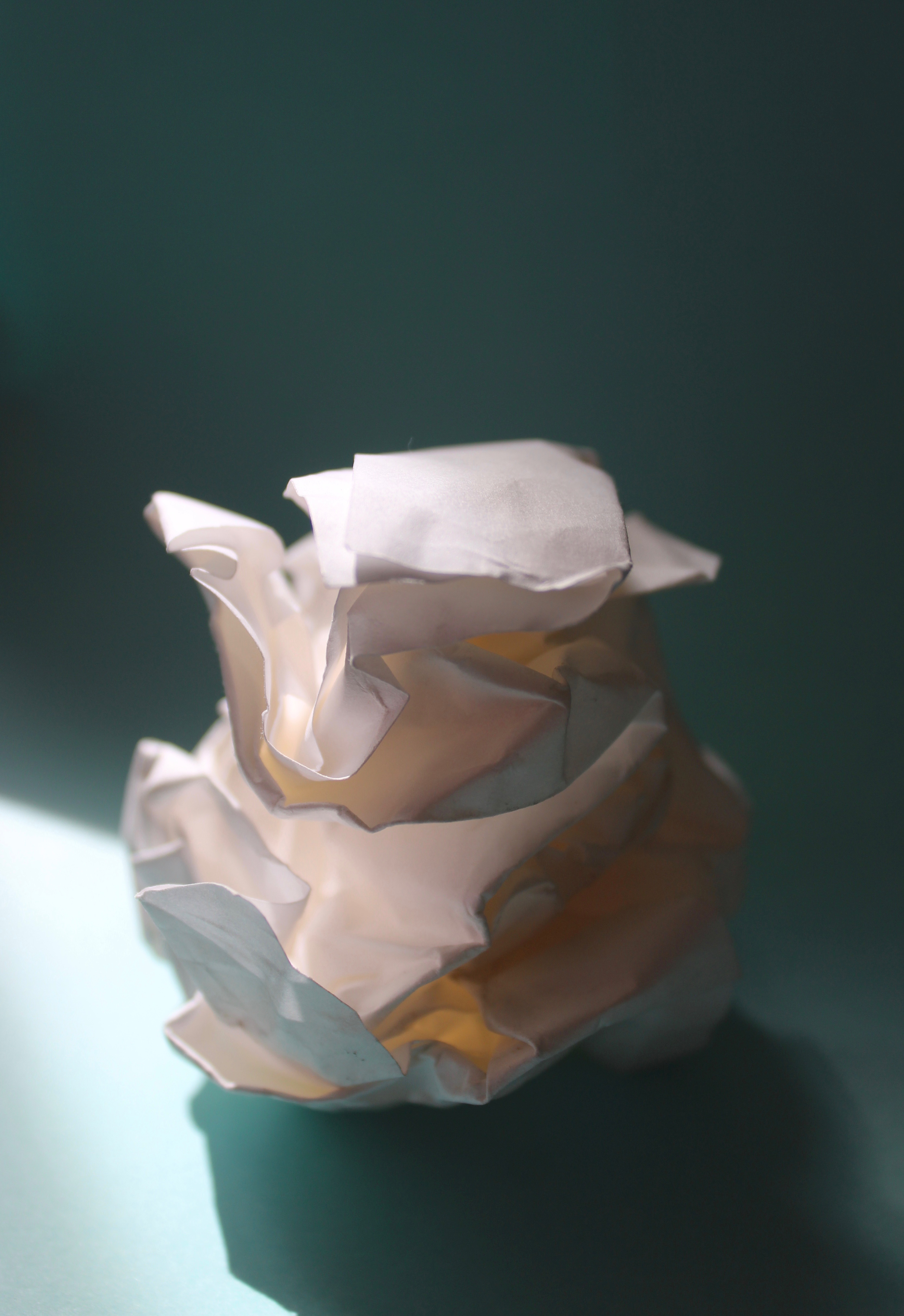
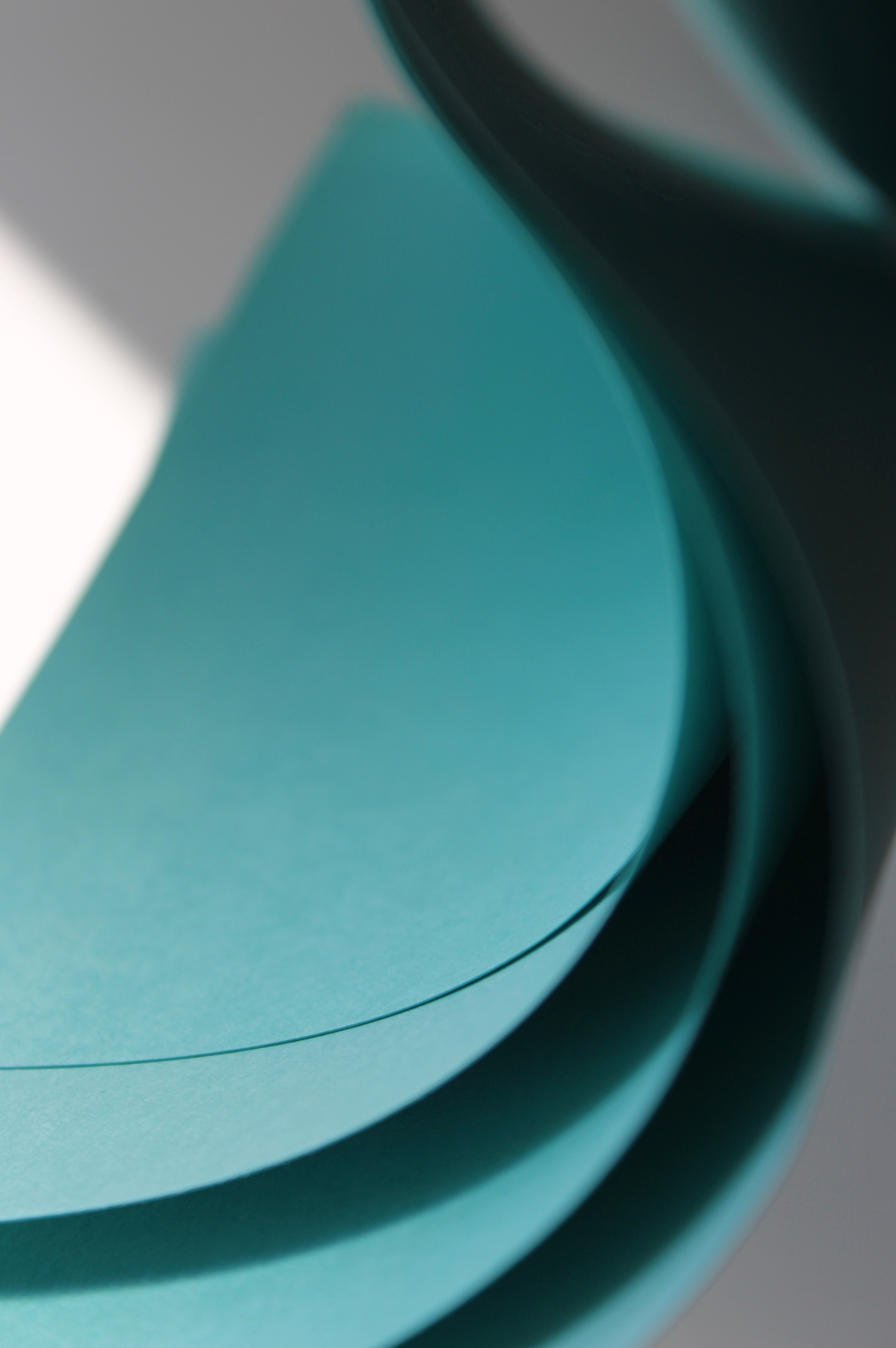
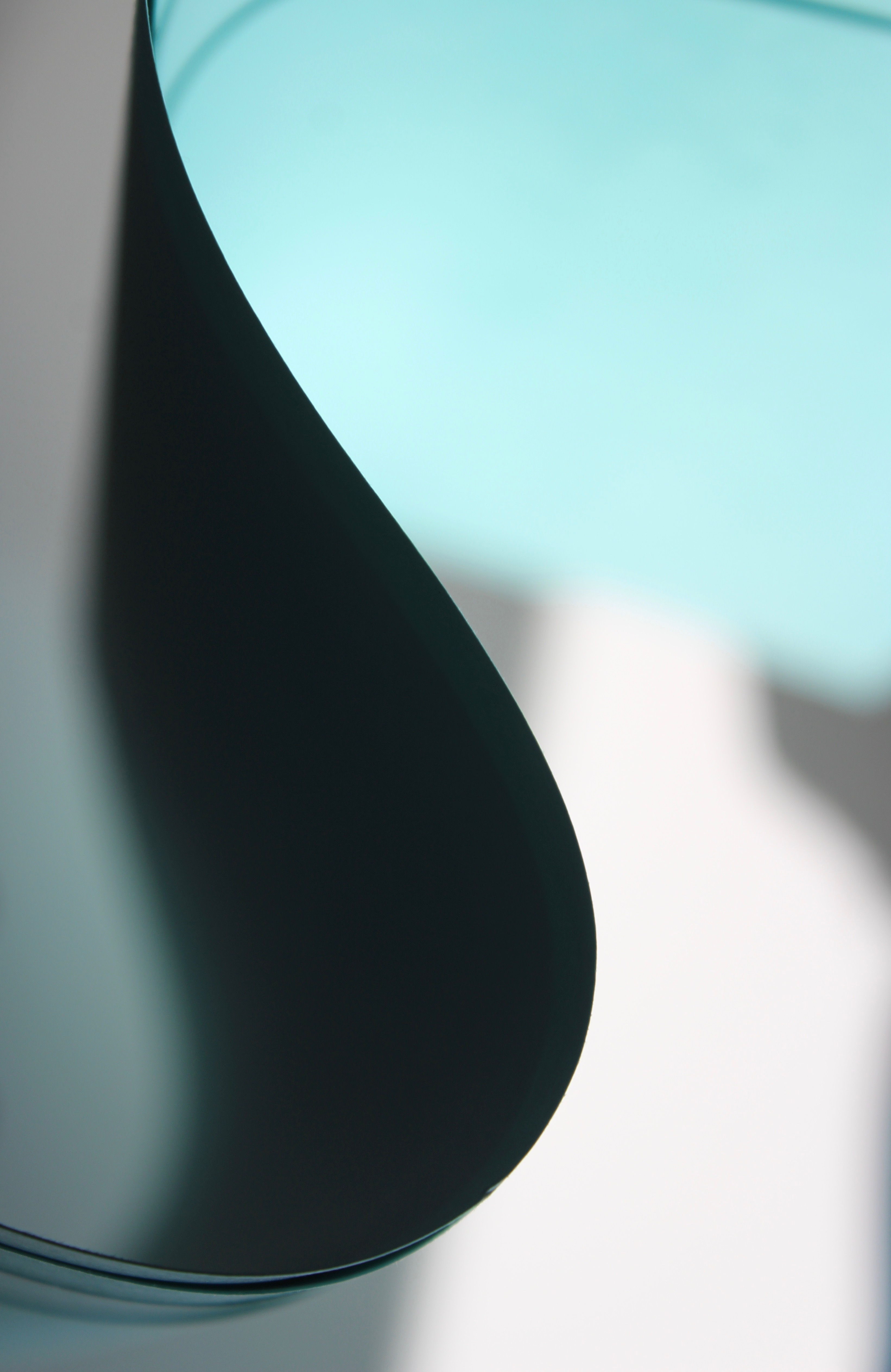


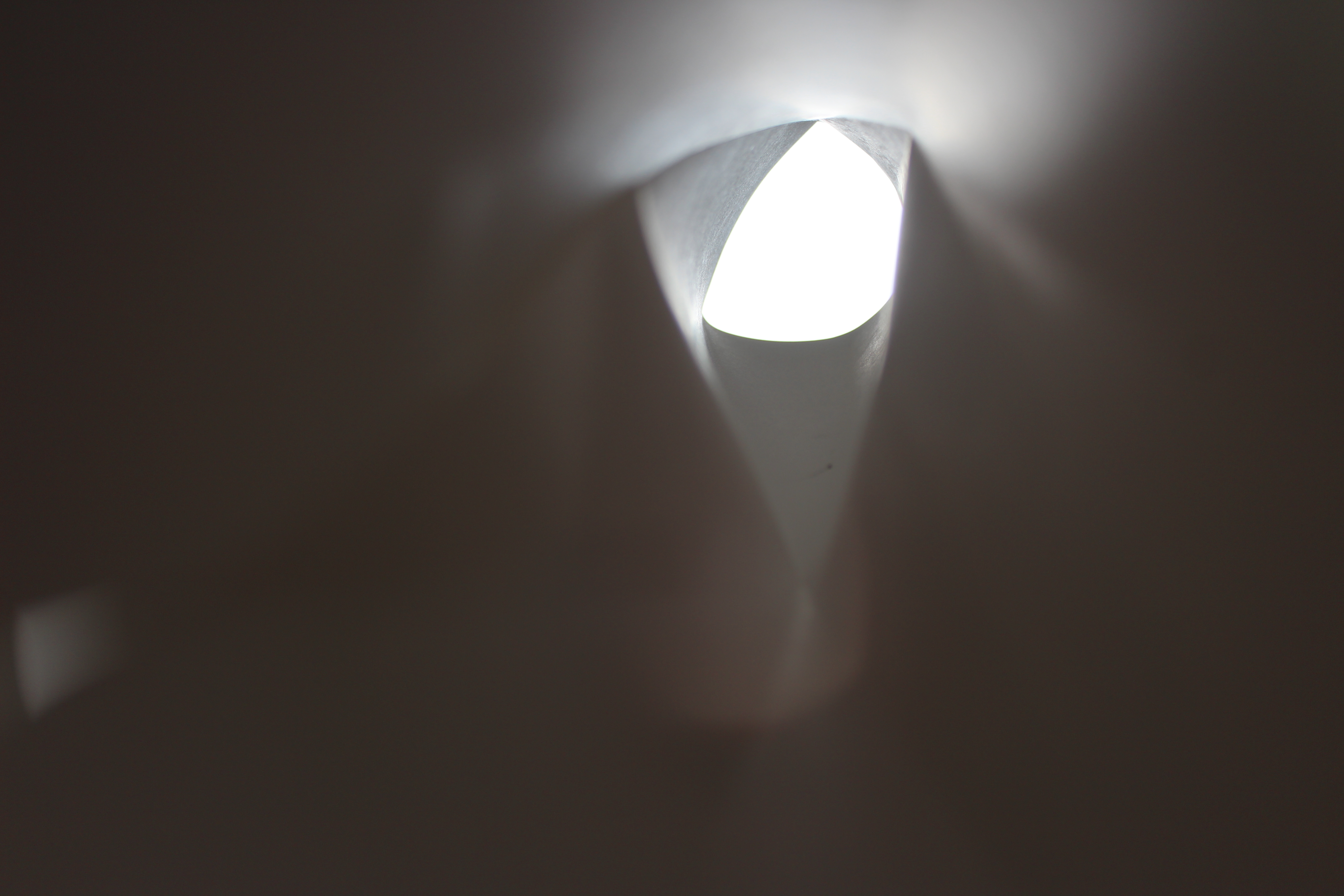
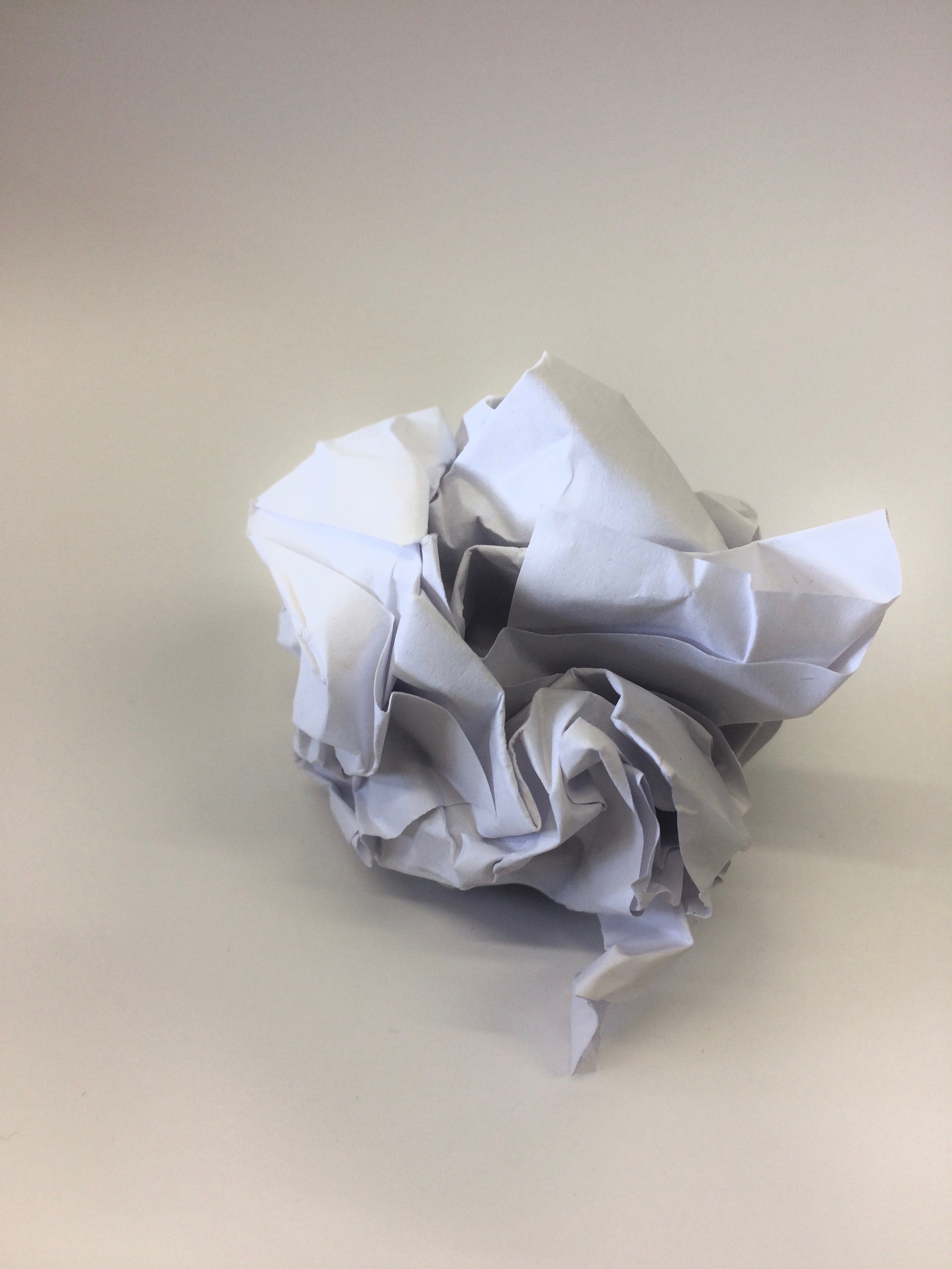
With an A4 piece of paper I scrunched it up into a ball. By doing this I created form and depth with the shadows and highlights casted from the natural lighting. The background was taken with another sheet of A4 paper. I slightly curved the paper while taking the photo so it would appear like a never ending white background. I like the composition of the photo and how your eyes focus on the scrunched paper since it’s the only object in the frame that has shape. This idea was inspired by the photographer Martin Creed.
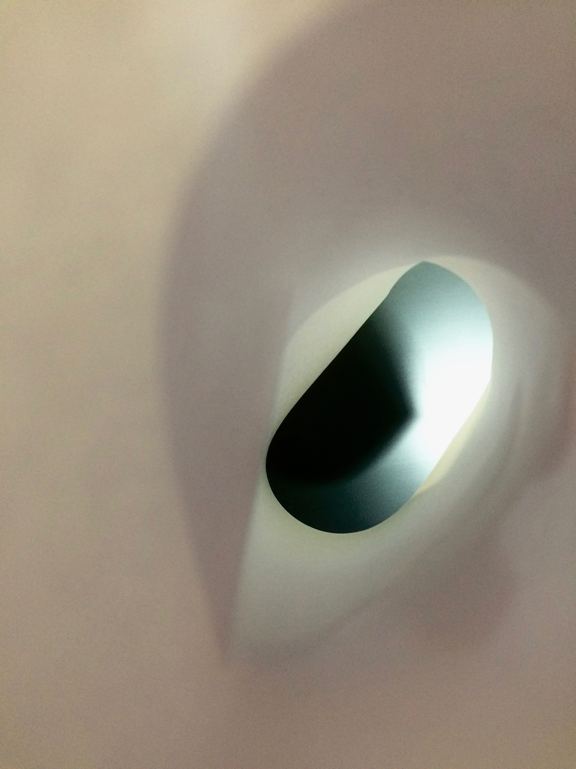
I captured this photo by rolling a piece of paper into a tube and putting my phone lens through it to create a different perspective. I really like the blurred effect around the edge and how the main element in the picture is the focused black screen on the other side. The slight beam on the other side was created from the flash while taking the picture.

The most dominant aspect of this photo is the form created from the scrunched paper. The photo is taken up close and captures the detail of the creases. This photo is abstract as it appears to look like a mountain landscape. Highlights are created at the peaks from the light above and shadows are casted down below. The form of the paper covers the whole image making it visually interesting.

To create this image I curved a singular piece of paper twice to create an unusual form. For the background I placed a yellow piece of card so colour would shine through and make it visually appealing. While taking the picture I slightly moved the camera to create a motion blur which came out with an interesting effect. This is one of my favourite abstract images of paper since its very difficult to distinguish what it is since it appears to look like its part of a sculpture.
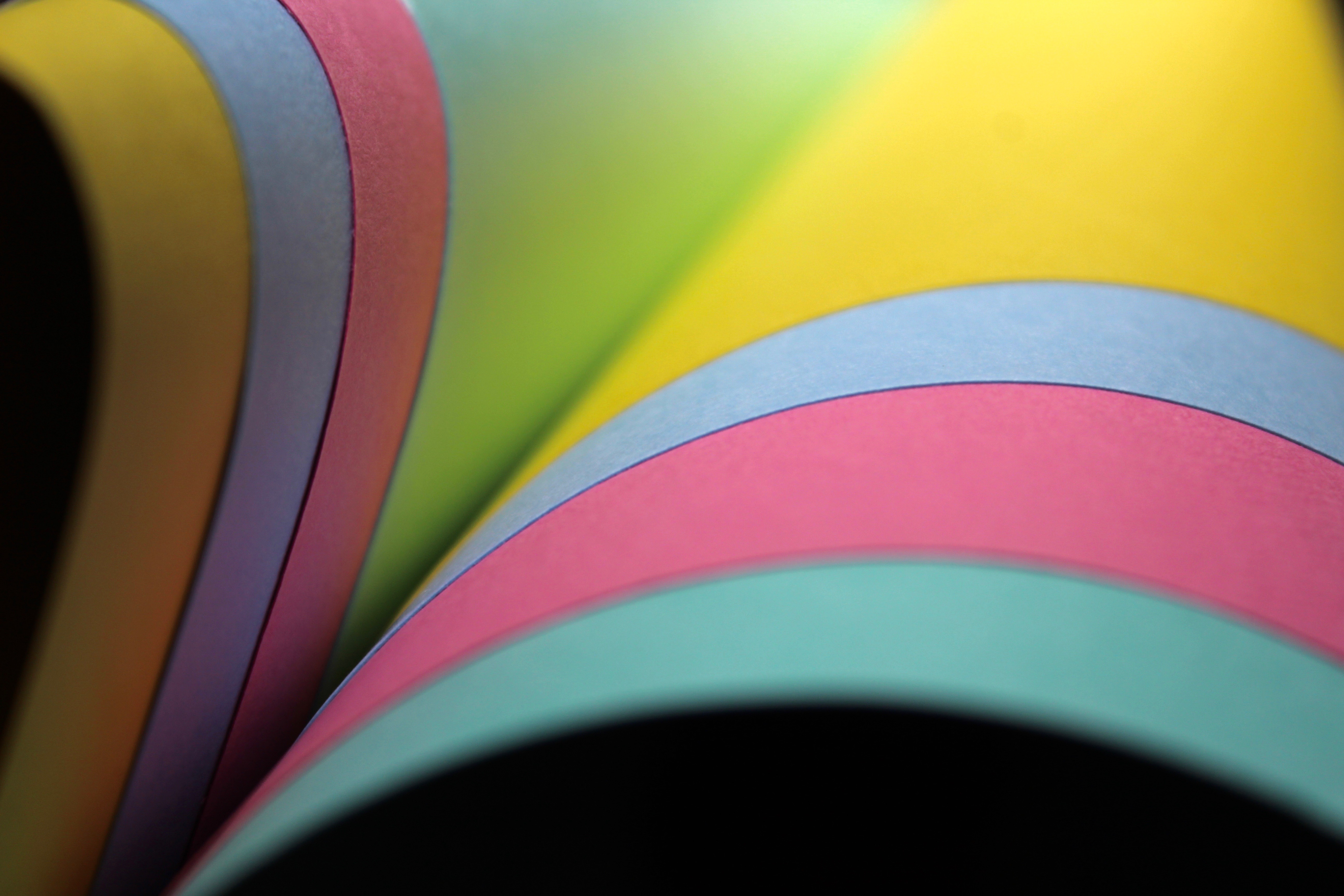
I used several pieces of coloured card for this image to make it vibrant. Thecurved lines are very effective in this photo as they create a more graceful composition. The composition also makes it appear like it’s a book since they are all coming out from one corner. The black background ,that can be seen below the card, contrasts greatly with the colour and makes it visually interesting since they both stand out from each other.

This abstract photo makes the card appear like a curve of a building. The shadow areas are dark and contrast greatly with the blue making it stand out. The right hand side area is focused making you pay attention to the lines created from the curve.
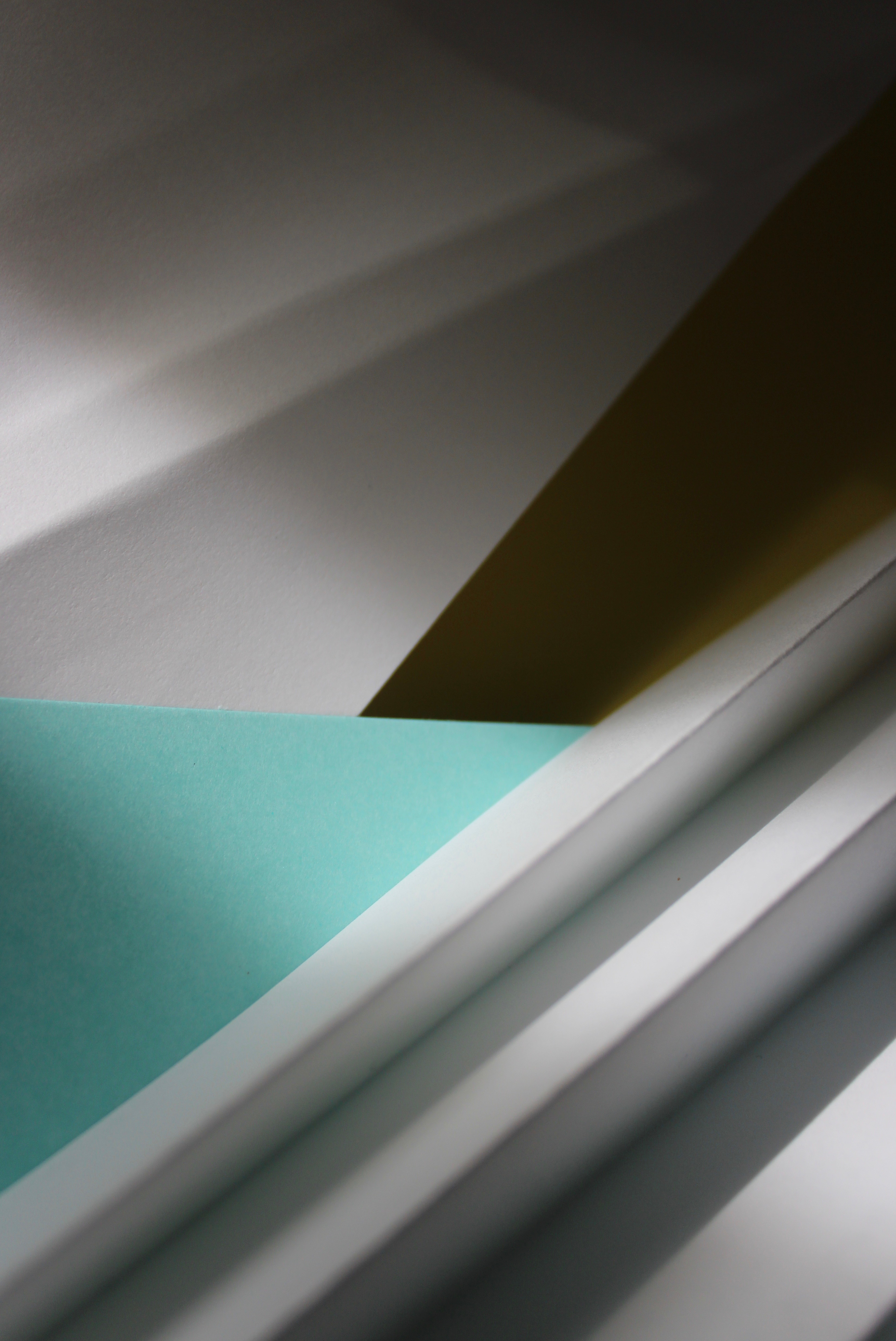
This is the best outcome out of all the abstract pictures I captured on my Canon camera. The composition consists of layers which has been created with two different coloured card and two A4 pieces of paper. The layering creates an interesting composition because paper has been laid out in different directions. The four layers create a sense of depth to the image as it progressively gets darker further back. The folded paper that I used on one of my previous images was incorporated into this image because it creates texture which a flat piece of paper doesn’t. The folded areas cast shadows in the direction the light is shining; this creates dark lines and contrasts with the highlights that are seen at the peaks of the folds. I used Jerry Reed’s technique of using light to dramatically emphasizes the dimensional forms of the paper. While editing the image I increased the highlights and shadows so the dramatic light that comes from the side becomes more defined. My favourite element of this image is the blue triangle because the colour pops and catches your attention since it’s vibrant and bold compared to the rest of the photo. The colour aspect of the photo was inspired by Tamara Lorenz who uses vivid colours in her crafted paper works.