New Objectivity – Research and moodboard

The new objectivity was a movement in German art that arose during the 1920’s as a reaction against expressionism. The term was invented by Gustav Friedrich Hartlaub, the director of the Kunsthalle in Mannheim, who used it as the title of an art exhibition staged in 1925 to showcase artists who were working in a post-expressionist spirit. These artists included; Max Beckmann, Otto Dix, George Grosz, Christian Schad and Jeanne Mammen.

Although principally describing a tendency in German painting, the term took a life of its own and came to characterize the attitude of public life in Weimar, Germany as well as the art, literature, music and architecture created to adapt to it.

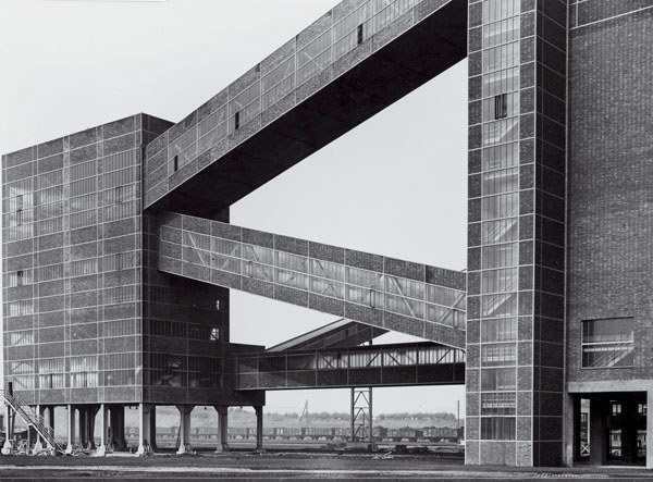
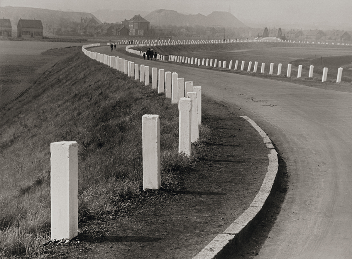
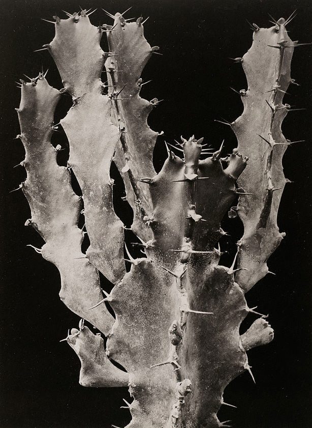
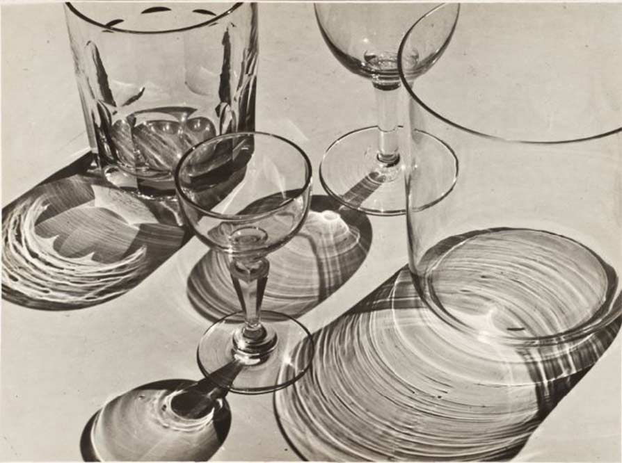
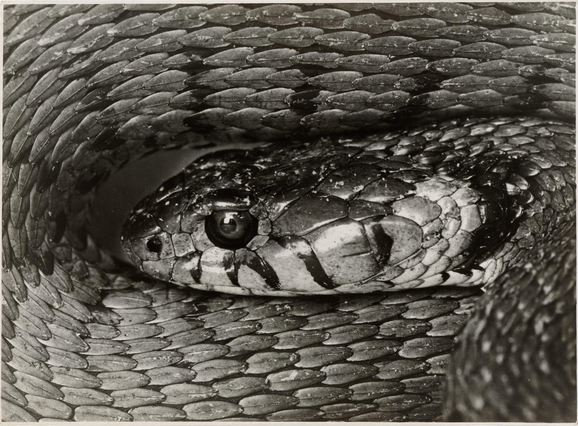
Albert Renger-Patzsch was a German photographer associated with the New Objectivity. Renger-Patzsch was born in Würzburg, Germany and began making photographs by the age of 12.                        In it’s sharply focused an matter of fact style of his work exemplifies the aesthetic of the New Objectivity movement that flourished in the arts of Germany.

In this topic of New objectivity I started focussing on Albert Renger-Patzsch, this is because of his take on New objectivity. He mainly takes photos of inanimate objects such as; Plants, Buildings, roads and glasses, but has also taken photos of snakes. He then uses the expulsion of colour from his work to give the atmosphere an eerie and spooky feeling, this creates a dramatic feeling within the person looking at the photo.

I also like his work as it rejects the sentimentality and idealism of a previous generation emerged as a tendency in German art. Renger-Patzsch’s work demonstrates a his sustained interest in the camera’s relationship to the beauty and complexity of the modern world.

Here are some of my favourite photos of examples of New Objectivity.
New Objectivity – Research

The new objectivity was a movement in German art that arose during the 1920’s as a reaction against expressionism. The term was invented by Gustav Friedrich Hartlaub, the director of the Kunsthalle in Mannheim, who used it as the title of an art exhibition staged in 1925 to showcase artists who were working in a post-expressionist spirit. These artists included; Max Beckmann, Otto Dix, George Grosz, Christian Schad and Jeanne Mammen.

Although prinicpally describing a tendency in German painting, the term took a life of its own and came to characterize the attitude of public life in Weimar, Germany as well as the art, literature, music and architecture created to adapt to it.

Albert Renger-Patzsch was a German photographer associated with the New Objectivity. Renger-Patzsch was born in Würzburg, Germany and began making photographs by the age of 12.                        In it’s sharply focused an matter of fact style of his work exemplifies the aesthetic of the New Objectivity movement that flourished in the arts of Germany.
I like this work of Albert Renger-Patzsch as it creates a feeling of loneliness or spookiness with the use of Black and White. I really like the building photo as it is a modern architectural structure but the black and white makes it seem a lot older, this is the amazing thing with photography.

I also like his work as it rejects the sentimentality and idealism of a previous generation emerged as a tendency in German art. Renger-Patzsch’s work demonstrates a his sustained interest in the camera’s relationship to the beauty and complexity of the modern world.

Using Photoshop to edit photos

For my first edited photo on Photoshop, I carefully selected an image which I took as part of my abstract photography piece,  in this instance it was a thin pipe on a gravel like textured cycle track.

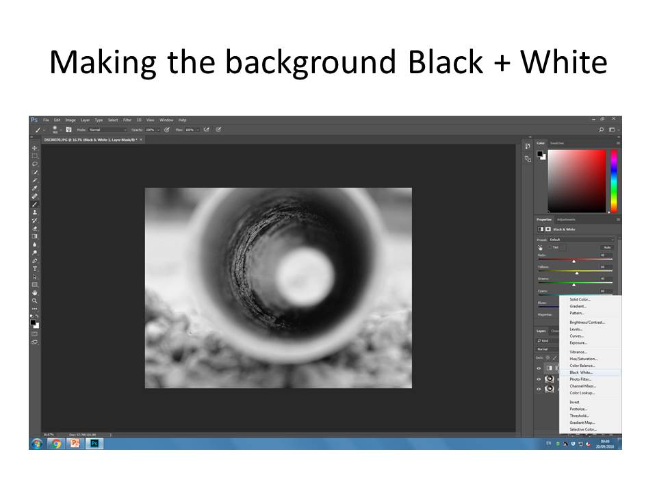
Then I made the background into Black and white, which didn’t , make too much of a difference as the colours weren’t extravagant in the first place, but I did this in order to bring out the colour in the center pipe.

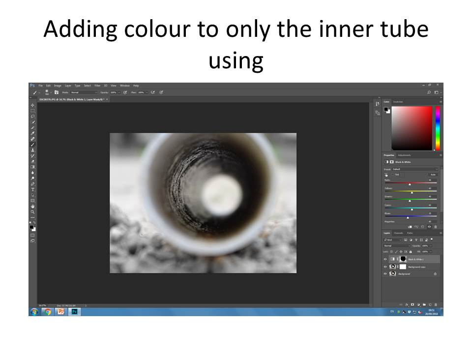
Then using a mask layer I then coloured inside the tube being very careful not to bring out colours from the background. I personally find this went well for my first attempt as the black and white, compared to the subtle and gentle colours contrasts really well.

And that is my final product !

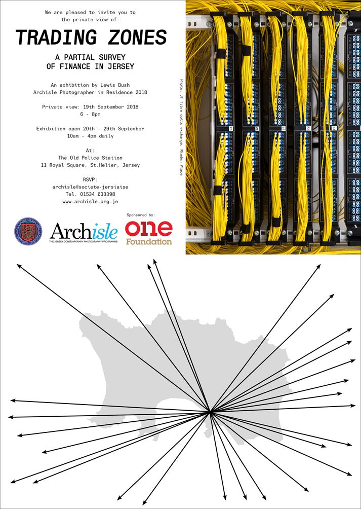
Go see !!! Exhibition : Lewis Bush “Trading Zones” !!!

Lewis Bush (Archisle Artist in Residence 2018) is now exhibiting his recent work in response to Jersey’s financial past, present and future…

Please make the effort to go and visit a unique and well-researched show by a young, up and coming photographer and photo-book maker…

LINK TO LEWIS BUSH WEBSITE

MORE HERE

Photoshop Experimentation

EXPERIMENTING

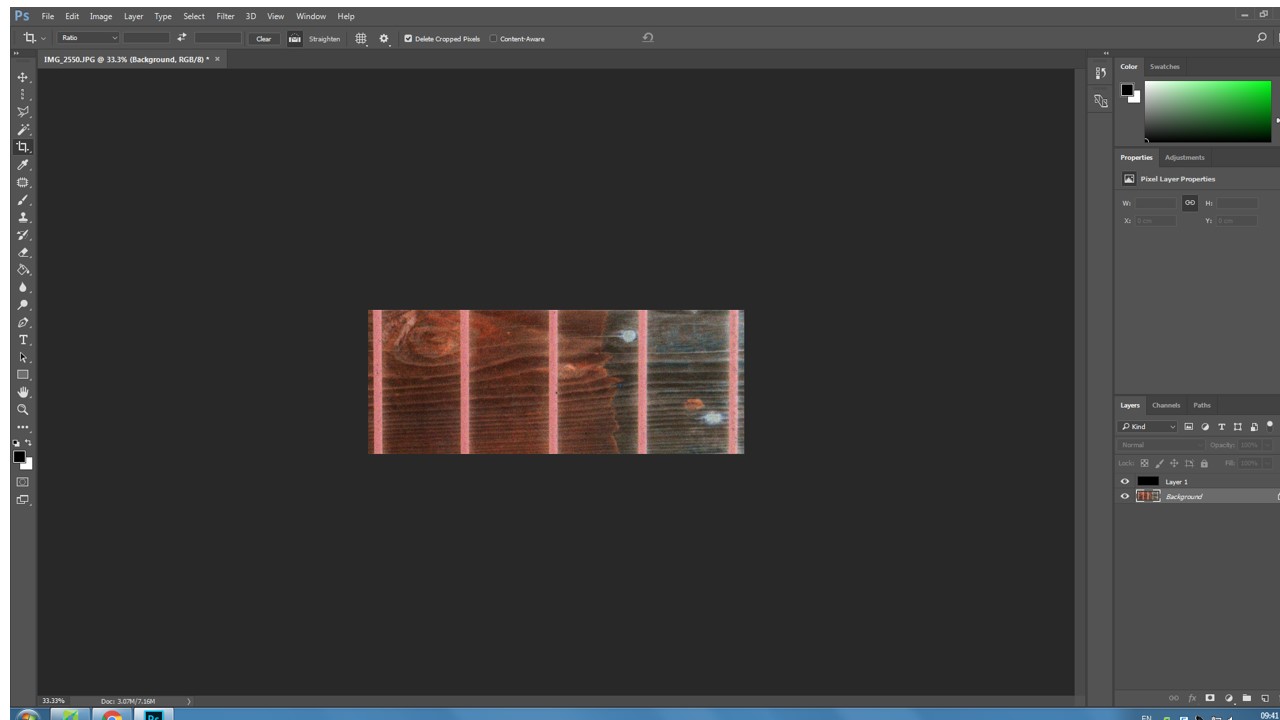
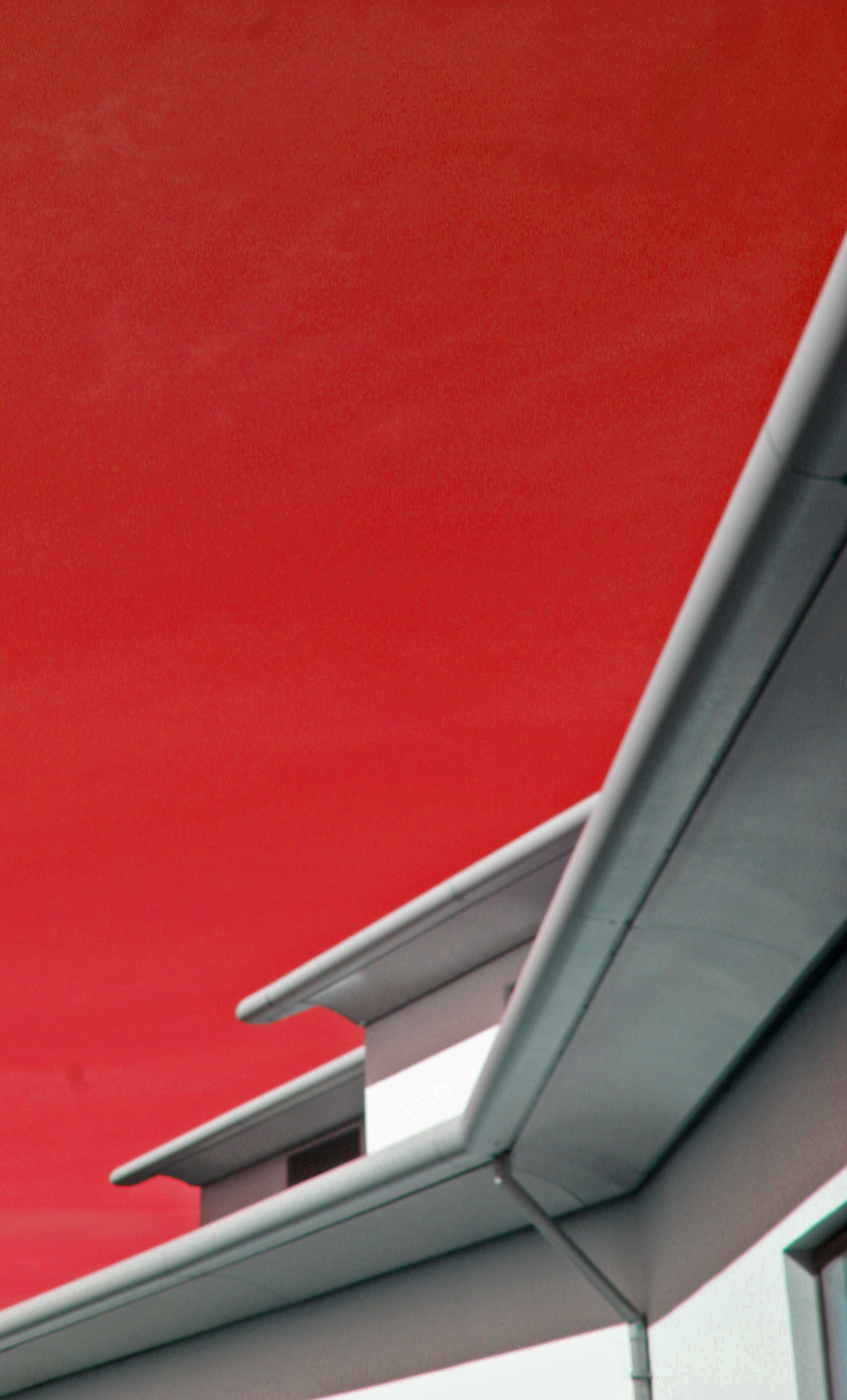
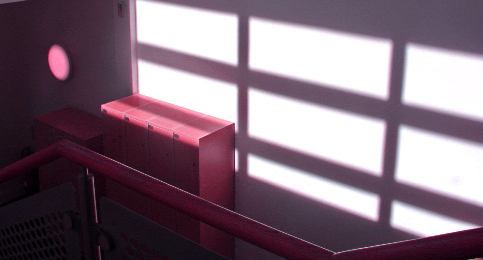
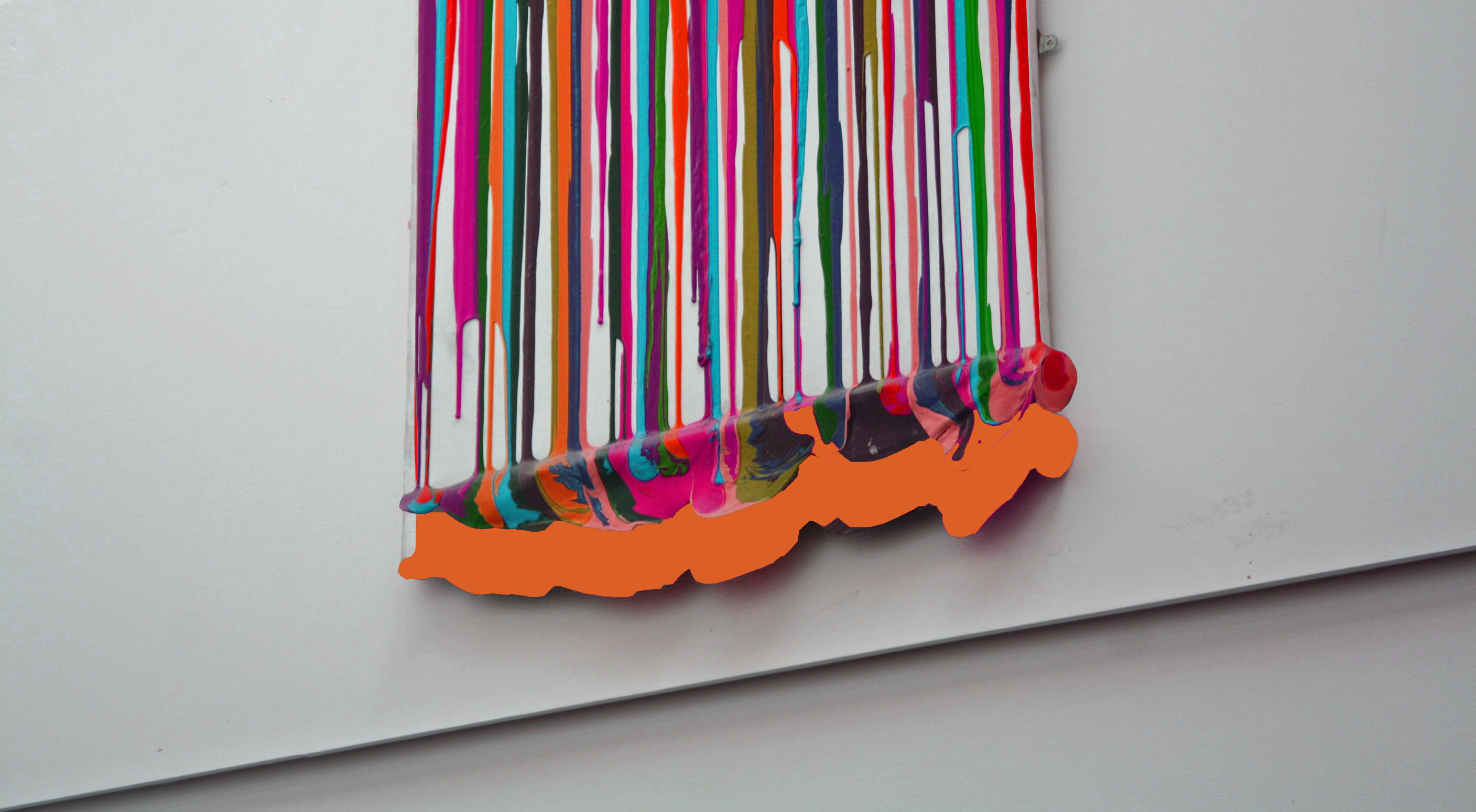
This lesson I experimented with using Photoshop and a variety of different tools which altered the already abstract images to make them even more abstract. In each image I played around with changing the color balance and changing the hues of photos. I also explored using the magnetic lasso tool and what its capabilities it has in Photoshop. I used the crop tool in order to give interesting perspectives and cropping away unnecessary parts that did not add to the photo or disturbed it.

The end result of experimenting with Photoshop was a variety of very abstract and interesting photos which have become more unique and distinctive. They took the photos from being average to something that is more worth while looking at.

my first experimental photo, i only played around with the concept of changing the color hue and saturation, highlights and shadows, and exposure.
in this photo i changed the hue of the photo to a very warm pink and I also shifted the color balance to magenta.
This was my final photo I edited and changed. Here i experimented more with layers and adding extra abstract features to the photo.
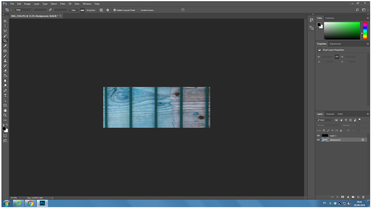
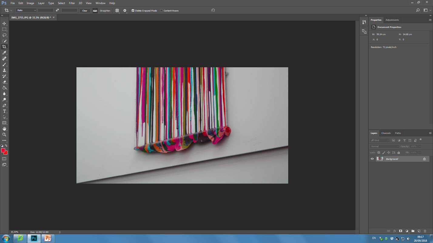
Stage 1, cropping and adjusting tilt
Stage 2, shifting the color balance to pink on the photo and also increasing the exposure in order to brighten the colors.
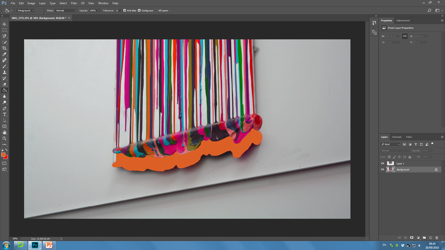
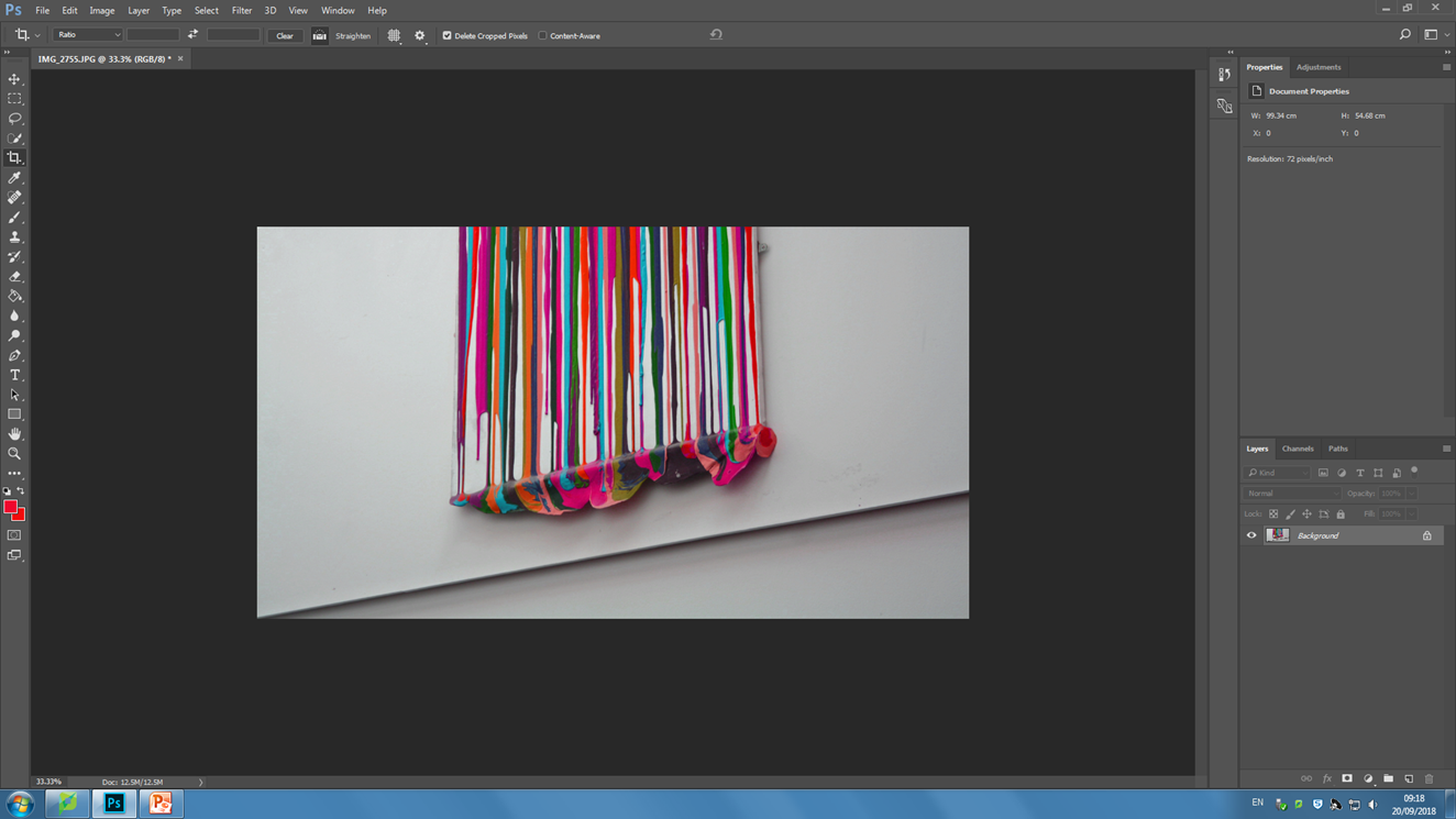
Stage 3, using the magnetic lasso tool in order to trace around the painting and move it upwards. I added a bright orange into the backdrop which appears as I selected and moved the painting layer.

Contact sheets


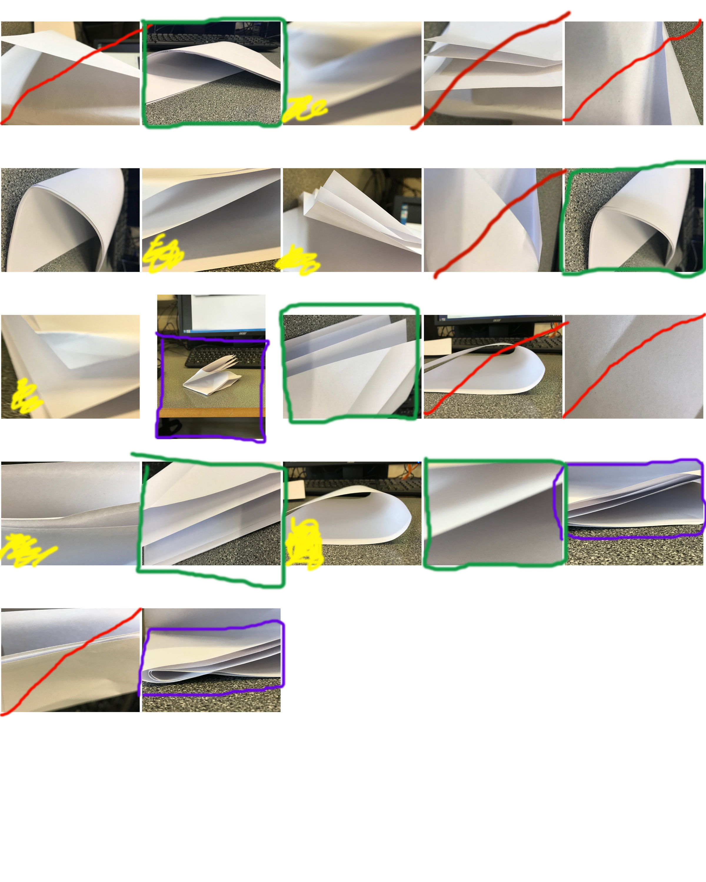
Contact sheets consist of several thumbnail photos printed on a single sheet of paper, so you can view them all at once; this can be useful as it allows you to help chose which of your photographs you want to keep/discard/edit

The RED represents the images I want to discard and I am not happy with.

The GREEN images are the photograph I am most happy with and that I believe do not need changing/editing

The YELLOW images are the photos I am not sure and possibly need editing.

  • The YELLOW boxes are representing photos that I need to crop
  • The YELLOW questions marks are the ones that I haven’t decided whether to keep
  • The YELLOW circles are the images that need editing

Why do people produces contact sheets?

People create many contact sheets after a photo shoot in order to layout and see all images that they have created. this will help the photographer be organised with their images and help then figure out their best images from their worst images. Contact sheets make editing much easier. Editing is the process of the selection  of images that will compose a photographic body, which will respond to the specific purpose of the works compete. By using contact sheets its giving editing a whole new experience of the photography workflow. Contact sheets are pages that contain thumb nails of your photo shoots all displayed so its much easier to see all your photos at once.  This process is made image comparison much easier.

Paper Task

IMG_3892.JPG:

Lighting: for this image I used natural lighting from a nearby window in order to achieve the color temperature that I wanted, since natural light is often cooler then the halogen lights in the school giving a nice balance between the cool blue lighting and the pink paper.

Aperture: I used a Rather low F stop in order to produce the depth of field look i wanted.

Shutter Speed: I experimented with various shutter speeds for this project, in this image I settled on a Fast shutter speed as there was plenty of light and I still wanted some deep shadows.

ISO: for the entirety of the project I stuck with an ISO of 100 in order to avoid grain and simply controlled the lighting with the shutter speed.

White Balance: for this image I wanted the color temperature to be rather dominant towards the cooler tones.

I was influenced by the work of Martin Creed with the latter half of the photo-shoot taking a lot of inspiration from his work with a scrunched up paper ball.

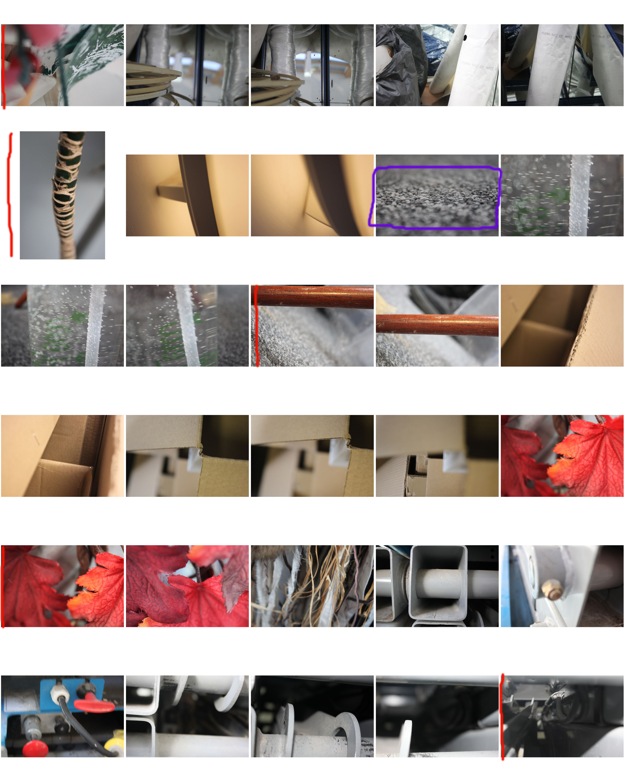
1st shoot contact sheet

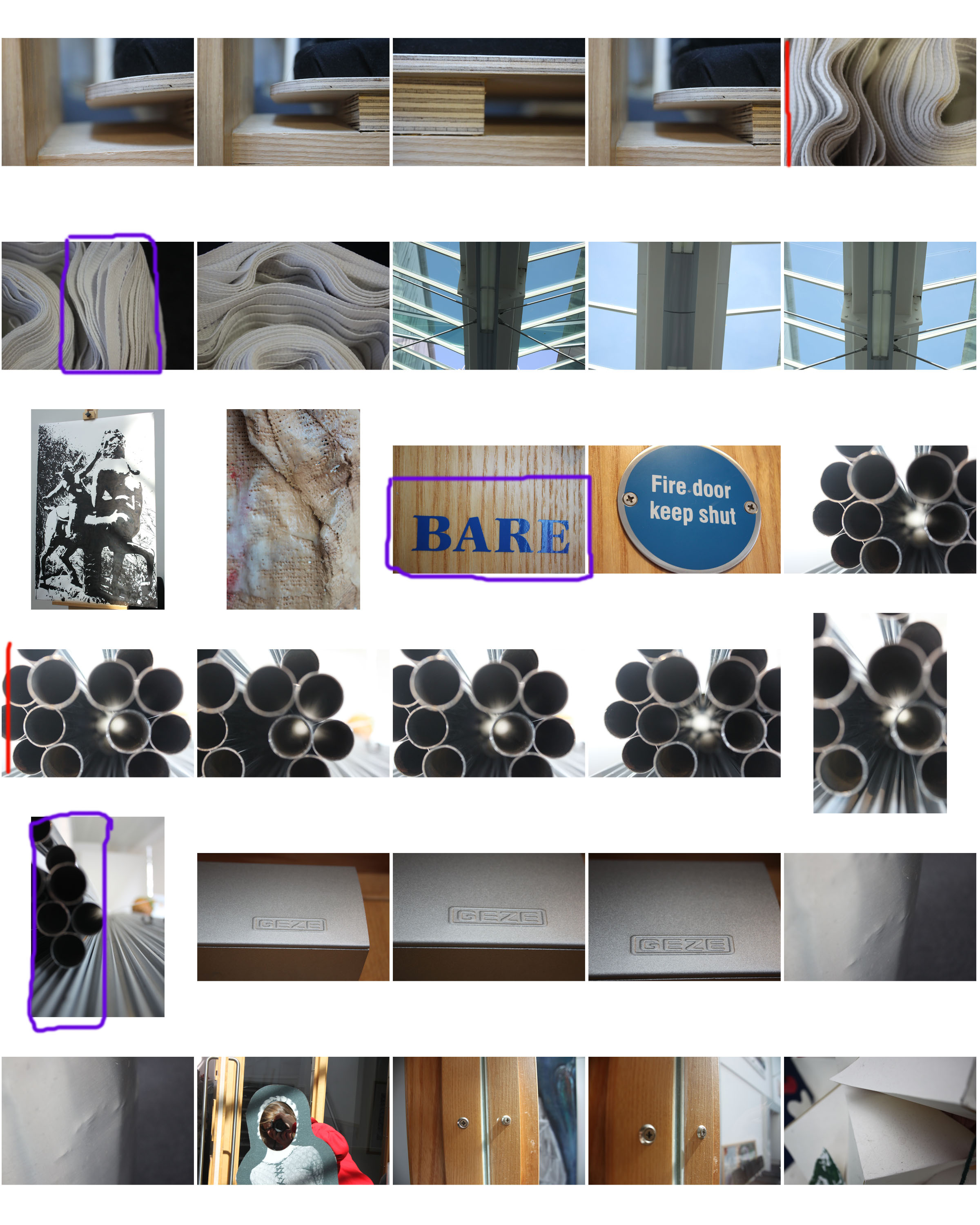
For this photo shoot I focused on close up photography, using a contrast between a focused foreground and a blurred background and vice versa. Although there are exceptions, the majority of photos in this shoot are of man-made objects which are either very textured or stretch from the foreground to the background (e.g. pipes, mdf planks).

I will edit some of the photos by cropping, enhancing, gray scaling, etc. The contact sheet is just a guide for which photos I’m going to use and edit, and which ones I’m going to leave out.

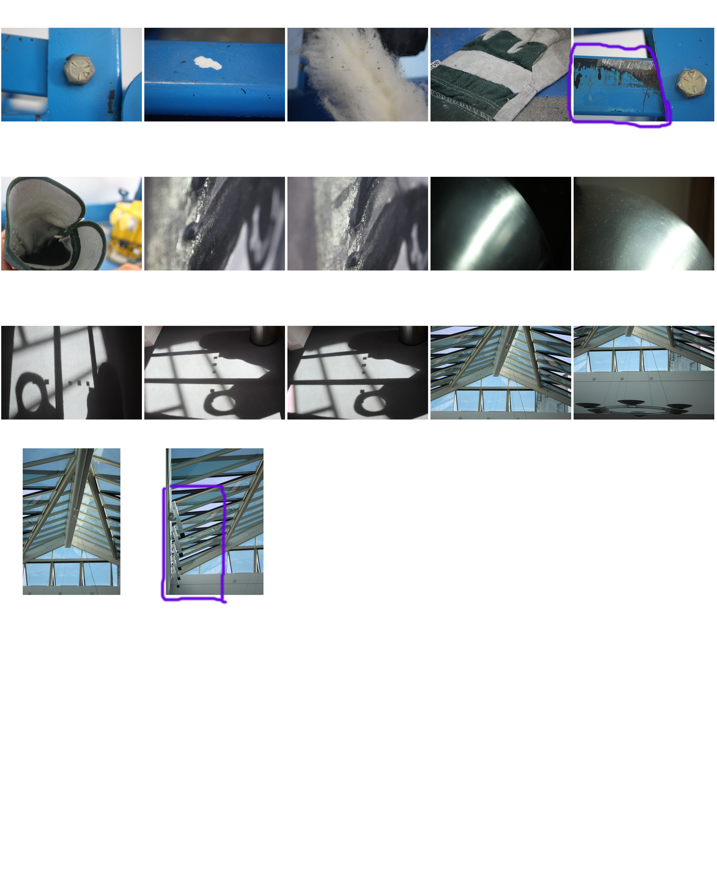
I have annotated this contact sheet less than my previous one as this has a lot more photos, so going through every one would be tedious. So instead I have marked my favourite photos with a red line next to them, and marked photos which I need to crop with a purple box (indicating what area i need to crop).

Homework 1 – Paper photo shoot

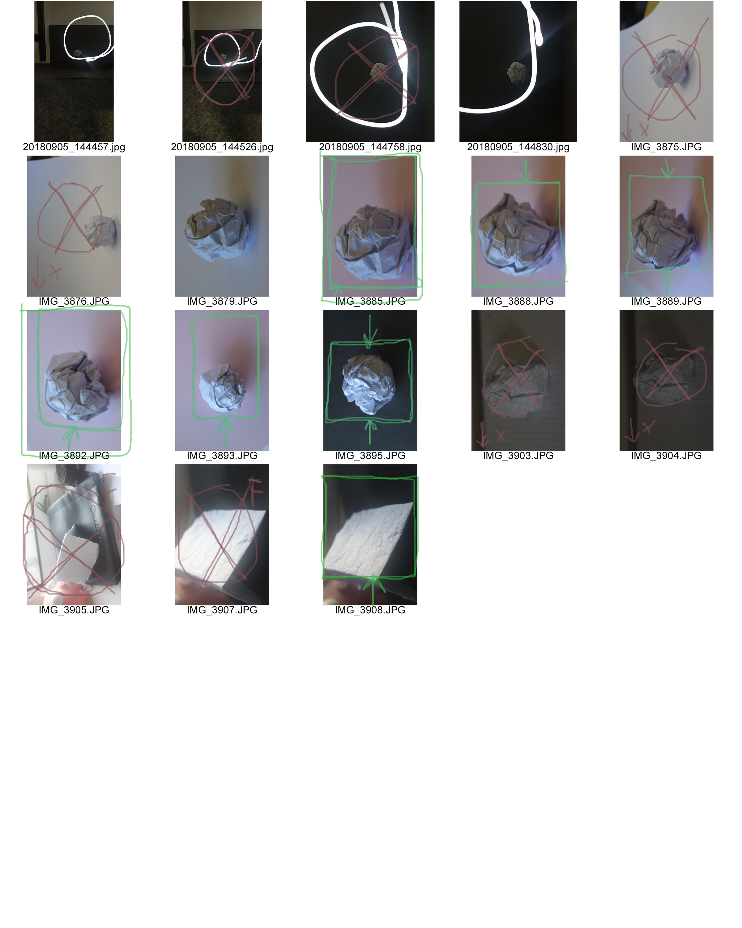
A contact sheet can both be used for distinguishing between your good/bad photos and choosing which ones to use/ edit, or be used as a finished photo. This is because of the image selecting process being used.

Here I have used green to mark photos which I am going to use, red to mark photos which I am going to discard, purple for the area of a photo I will crop, and yellow for pictures which I am unsure about using.

For future projects I will crop and edit the images which I have chosen from the contact sheet, and potentially crop the contact sheet to show only a few photos, which I will annotate with a thick marker and use as a finished photo.