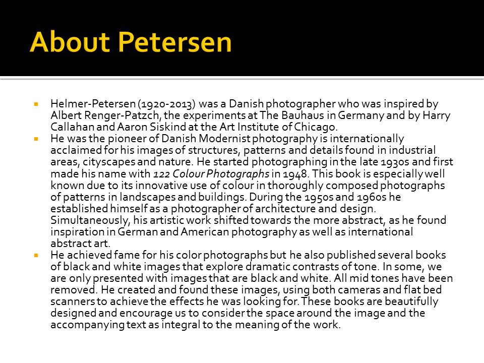
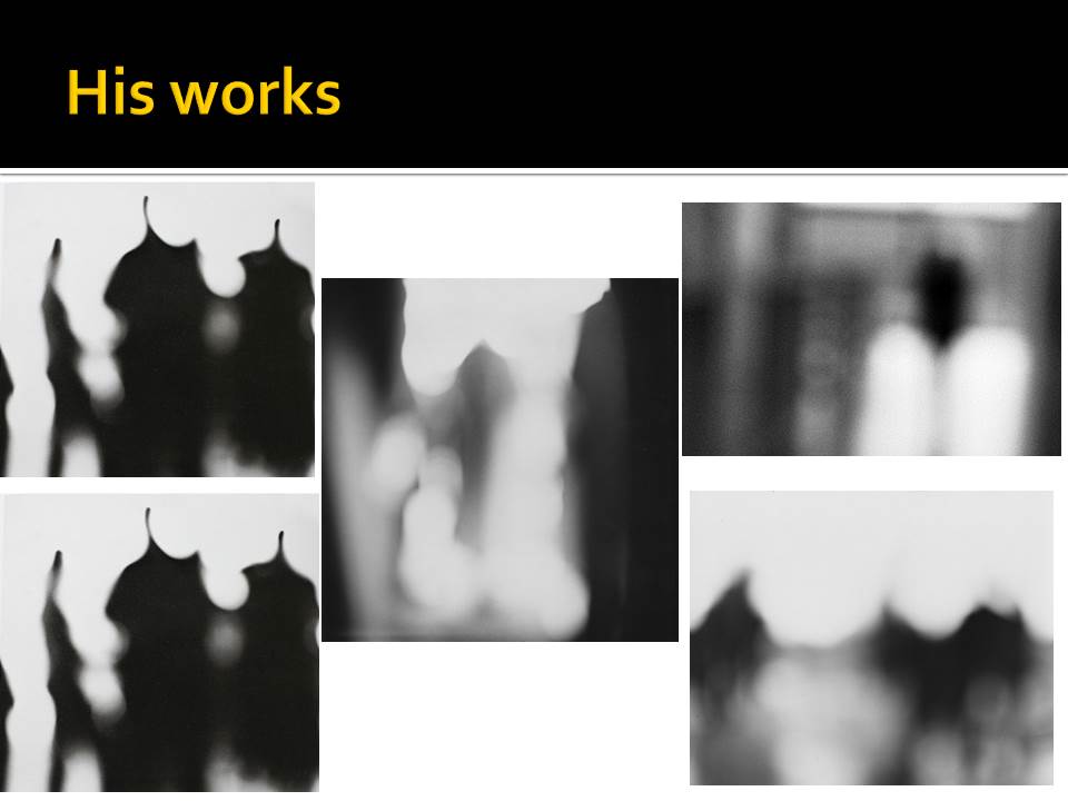
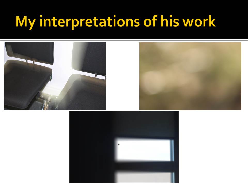
Conceal / Reveal

With one of my abstract images I will open up photoshop and add another layer on top (solid colour) so I can create holes with the brush tool. These holes will reveal the image beneath and the covered areas will have the solid colour which will be blocking the image. I will create holes in areas of the photo that I think need to be revealed if they are an important feature in the frame. Using this editing technique is another way of creating an abstract image and will help me improve on my photoshop skills.

Adding a new layer
Reducing the opacity to reveal image
Using the brush tool to create circular holes
Final outcome

The final image came out well since I have chosen certain parts of the photo to be displayed. This makes the image visually interesting as it’s only highlighting the important aspects.

Homework 5: Abstract Colour and Texture

Julian Schulze

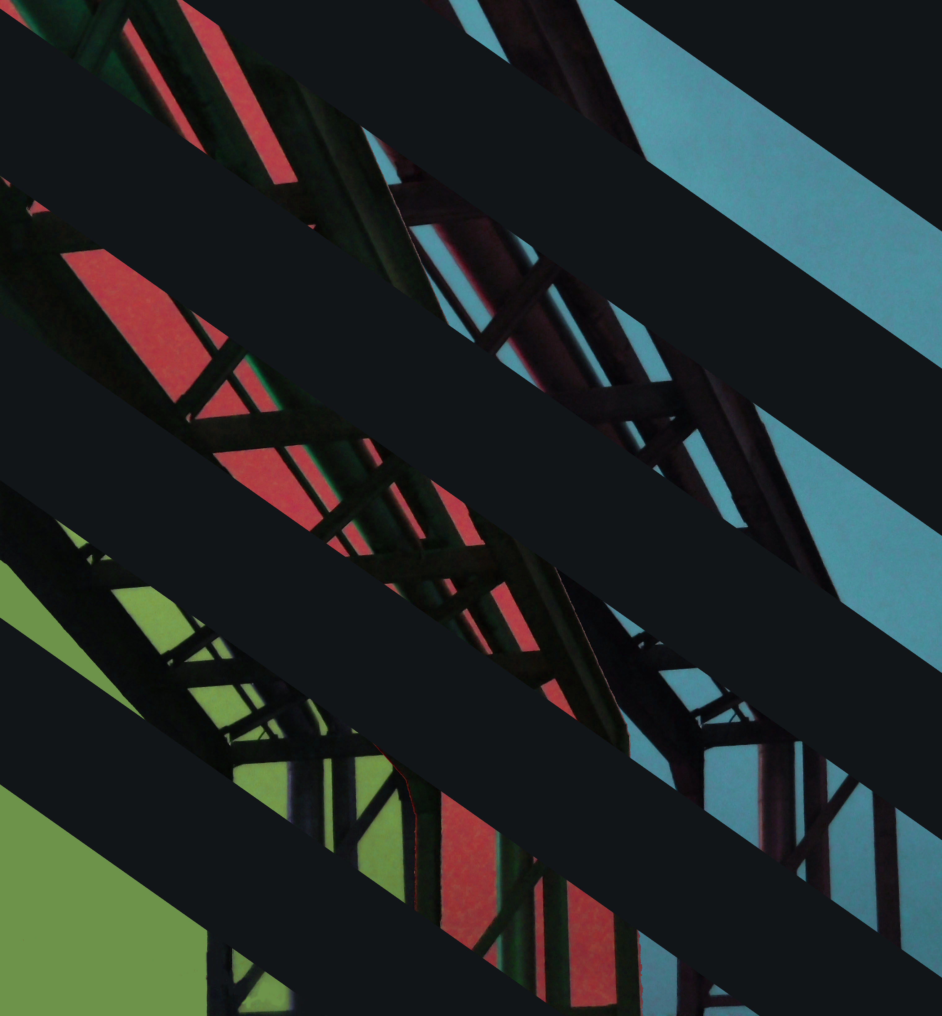
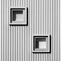
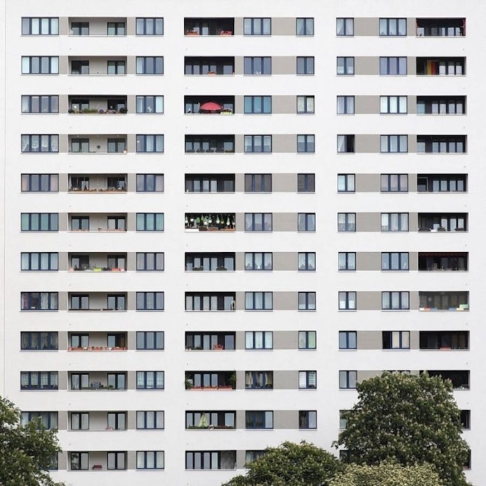
Julian Schulze is a Berlin born and based minimalist Photographer who chooses to focus on geometric abstractions and minimalist compositions with high contrast and wide ranges of colour. His work is very expansive and eye catching ,consisting of architectural features of cityscape environments

His work ranges from everyday scenes taken from different perspectives to mind blowing pieces that play with your perception and that can really make you question what it is you are looking at.

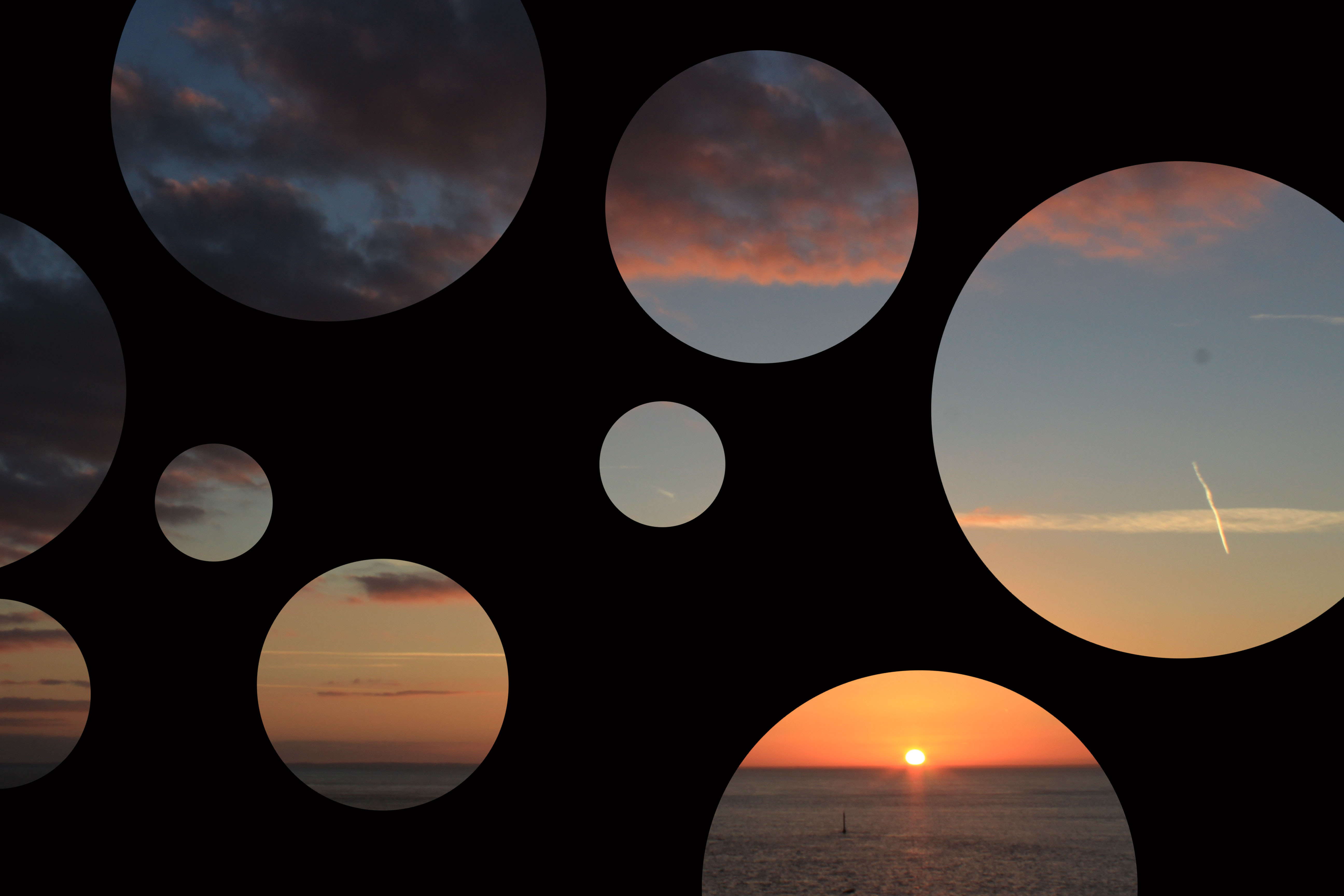
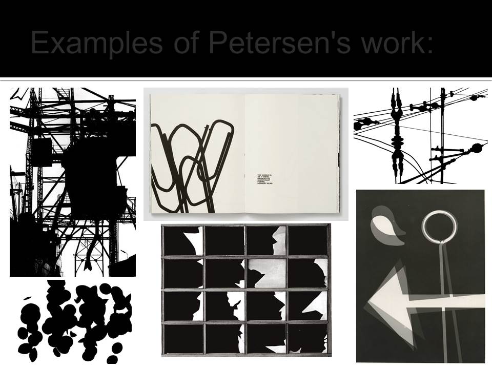
Below are some examples of his work

Image result for julian schulze

Image result for julian schulze

Image result for julian schulze

Image result for julian schulze

I have decided to use Schulze as my inspiration due to his portrayal  of colour and shape in his works, as well as his ability to truly capture the imagination of his Audience.
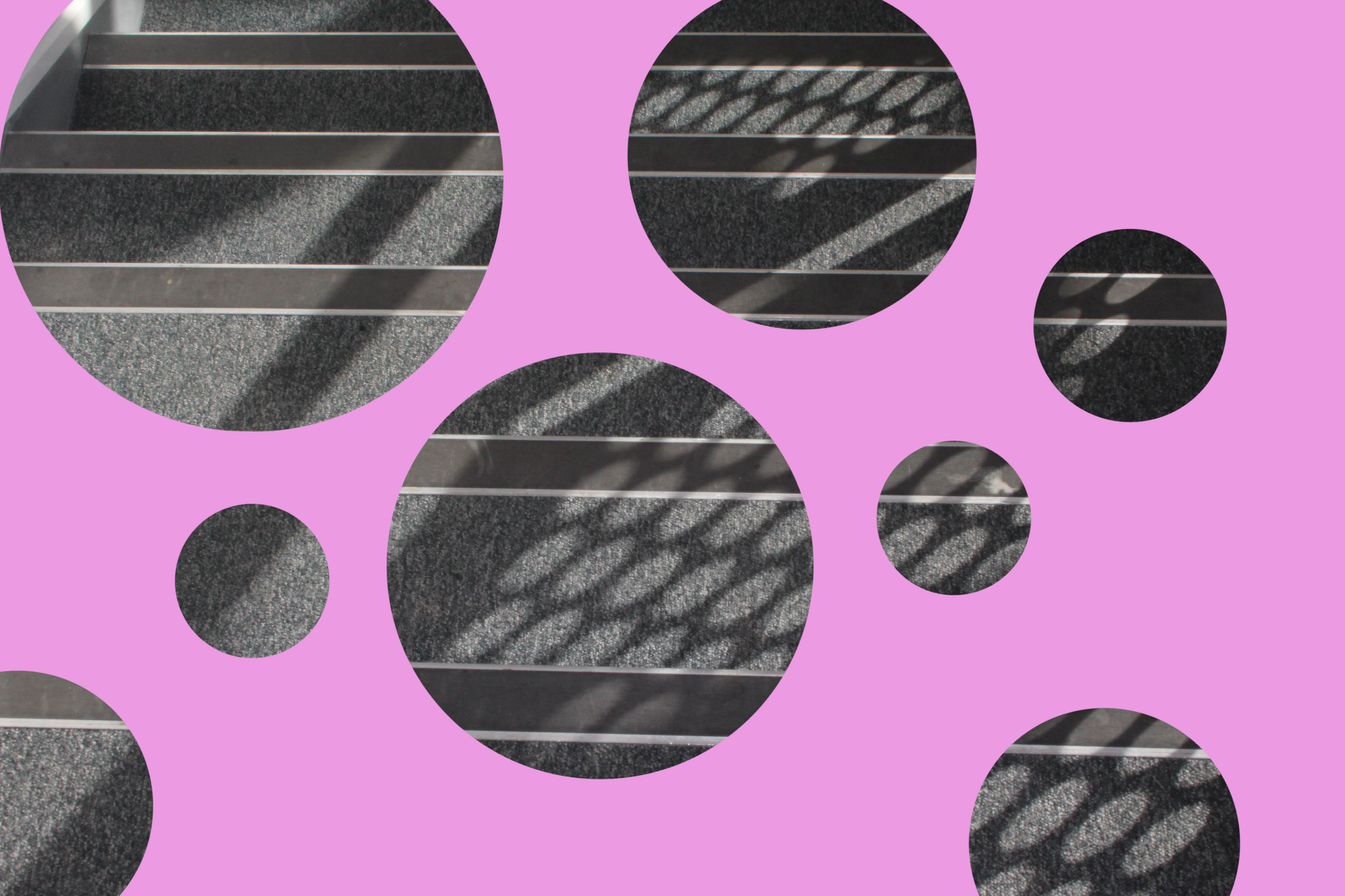
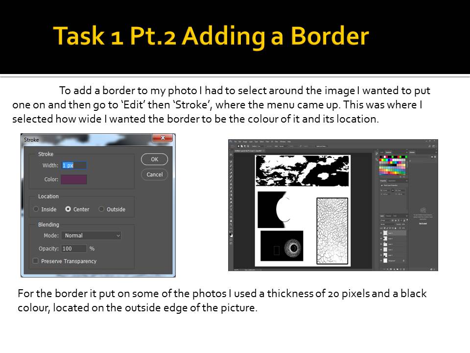
Shooting

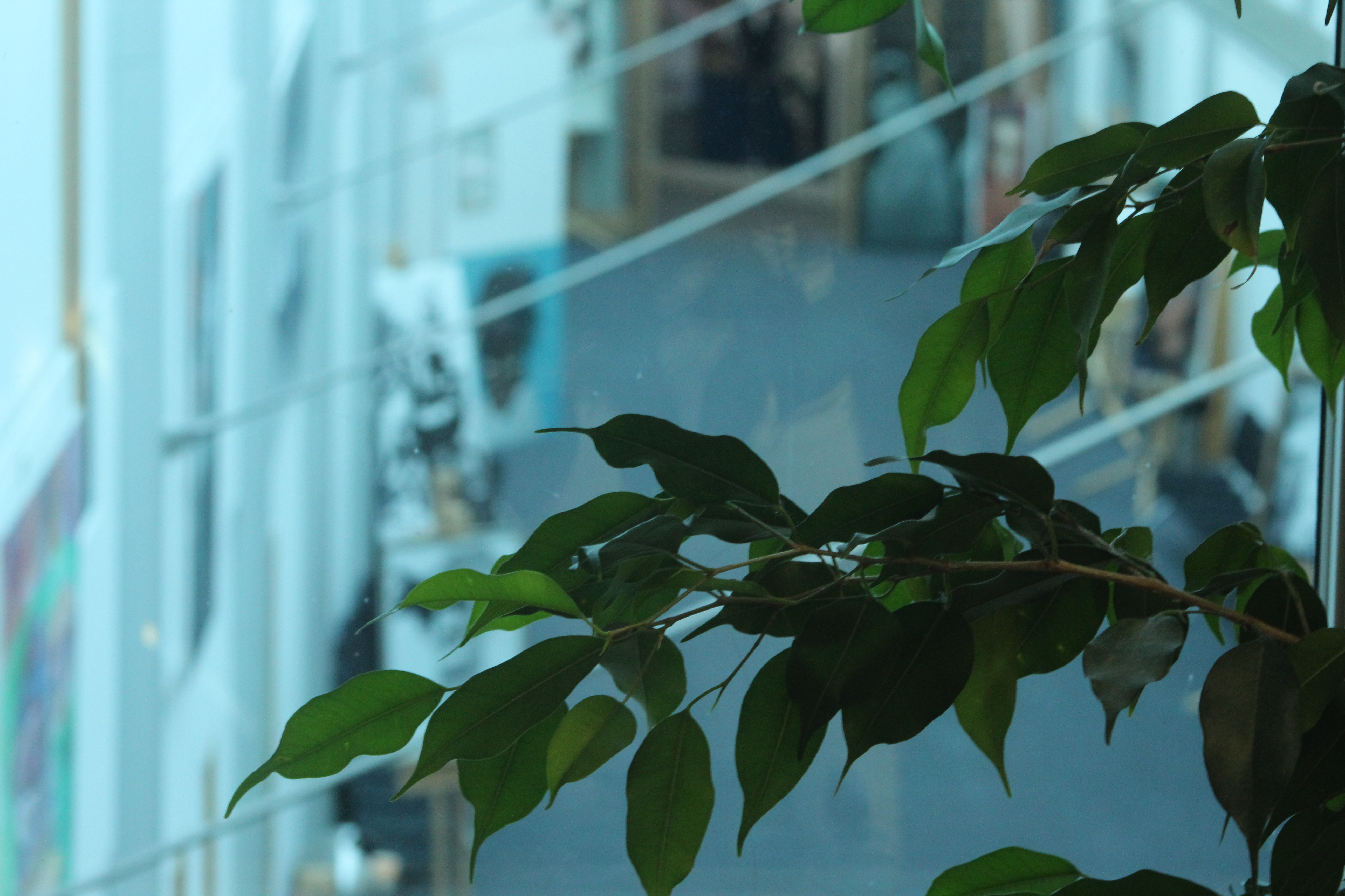
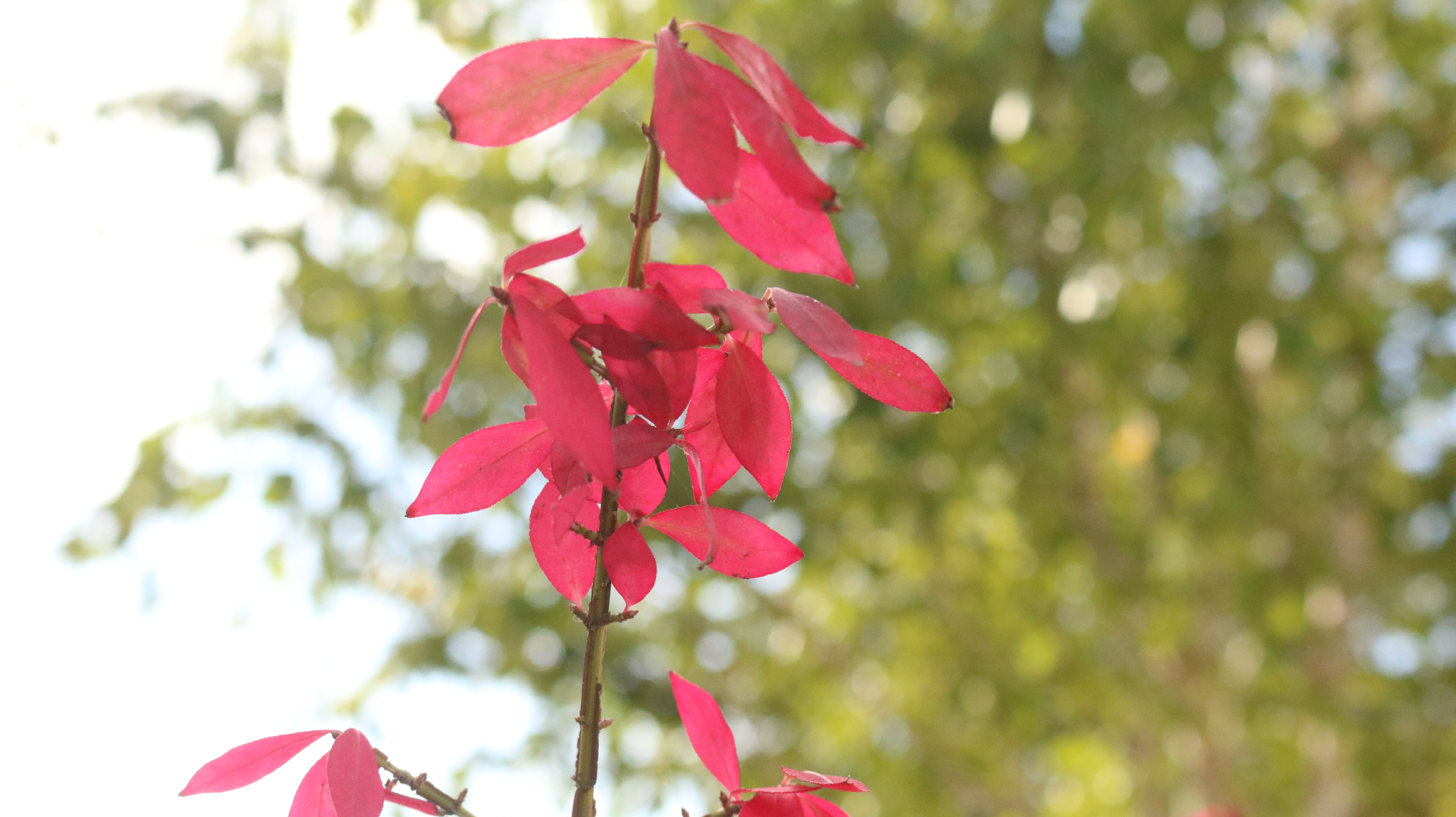
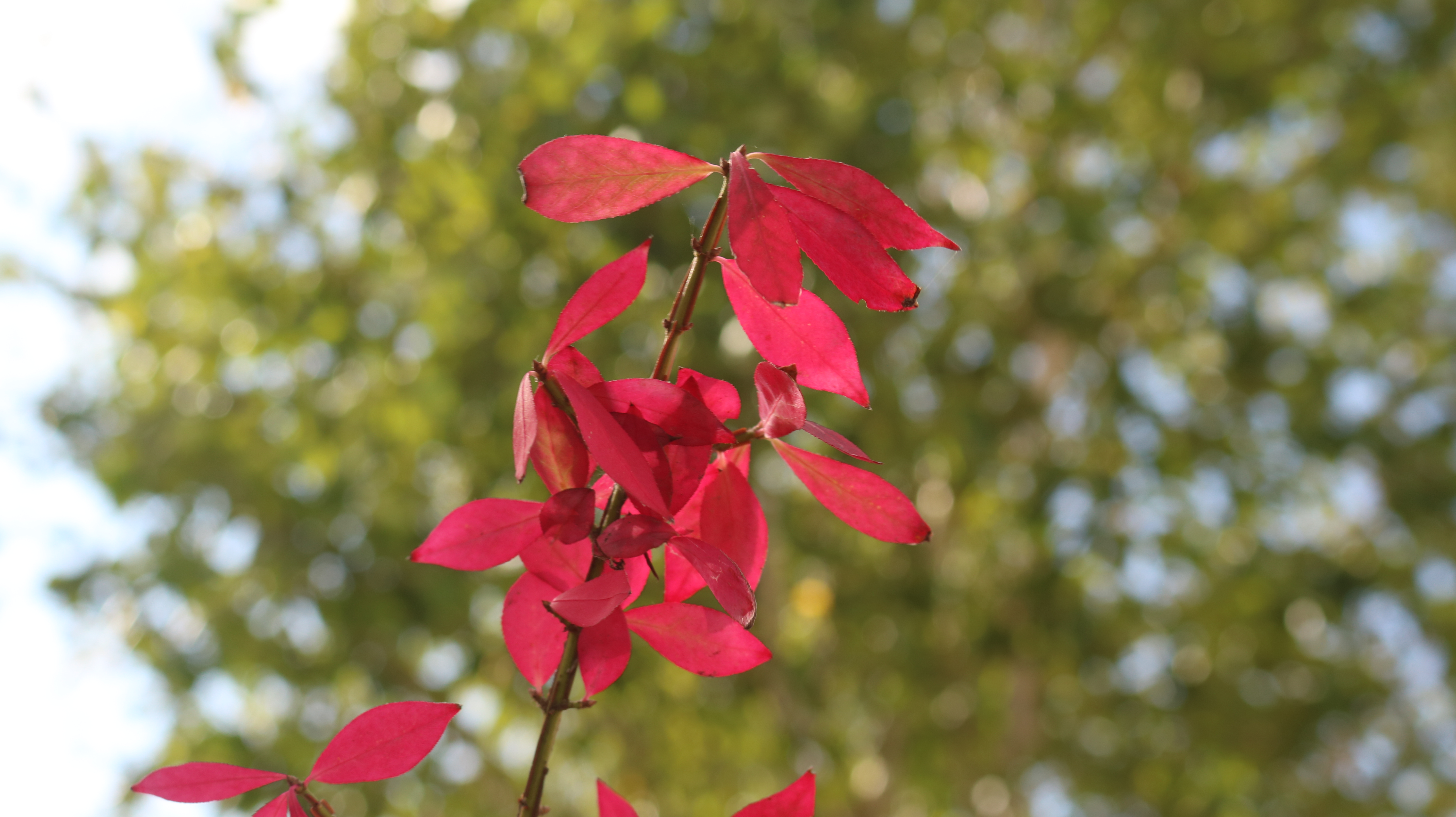
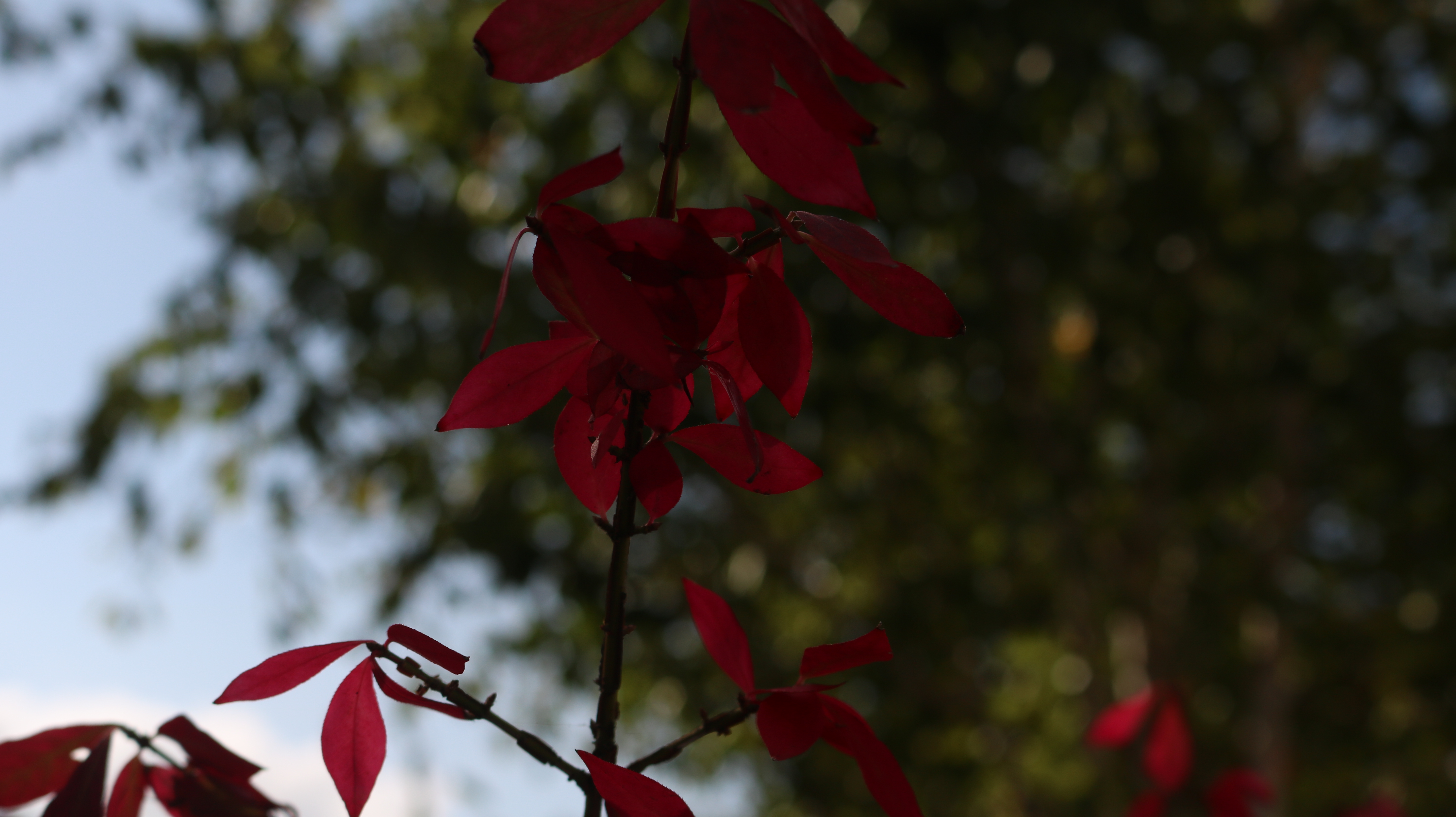
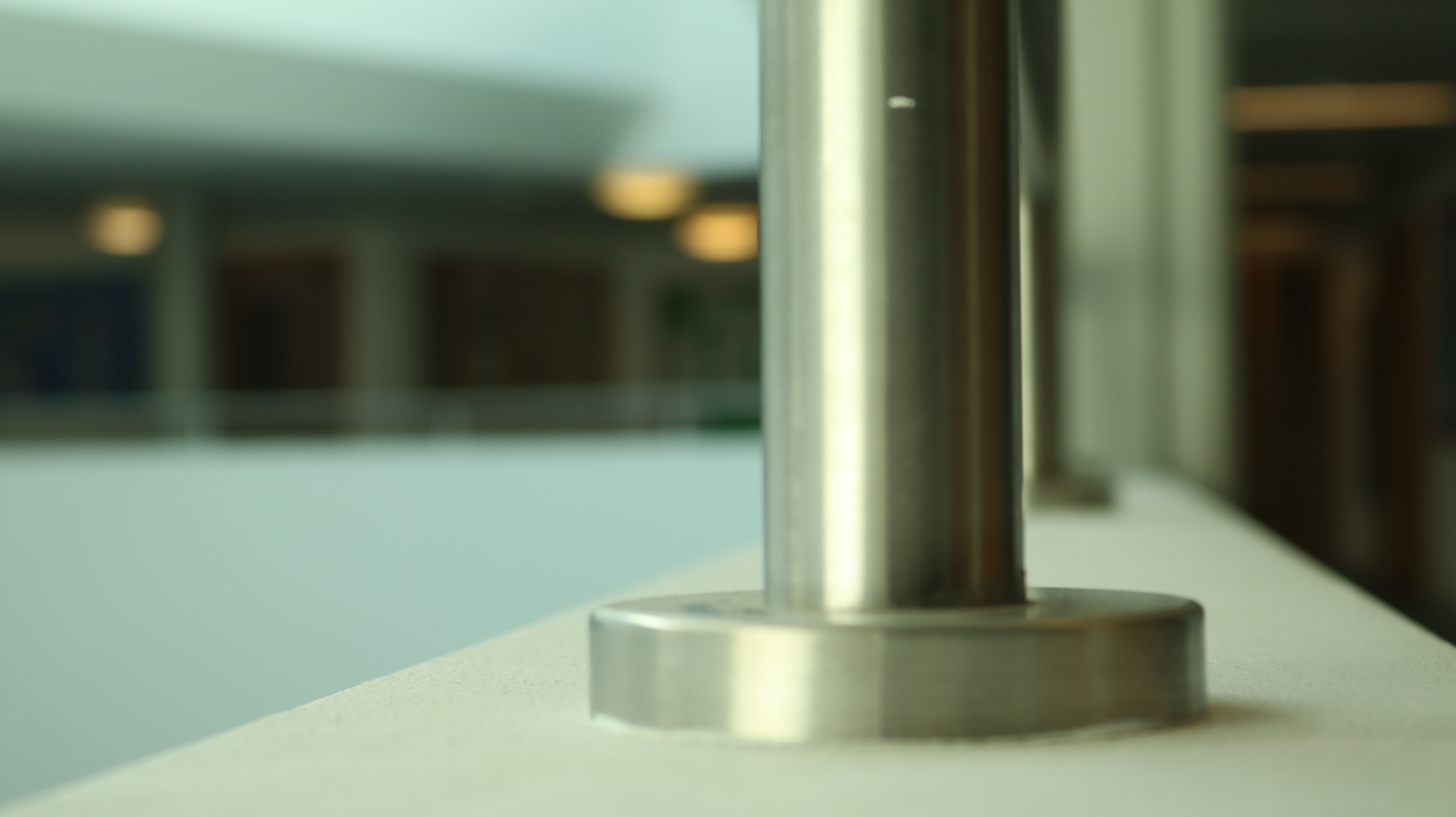
For my Julian Schulze inspired shoot, I decided to go to my local town area and identify buildings and scenes that I thought matched this criteria in terms of colour shape and texture. I photographed high rise office blocks and items in the street to try and truly emulate this style
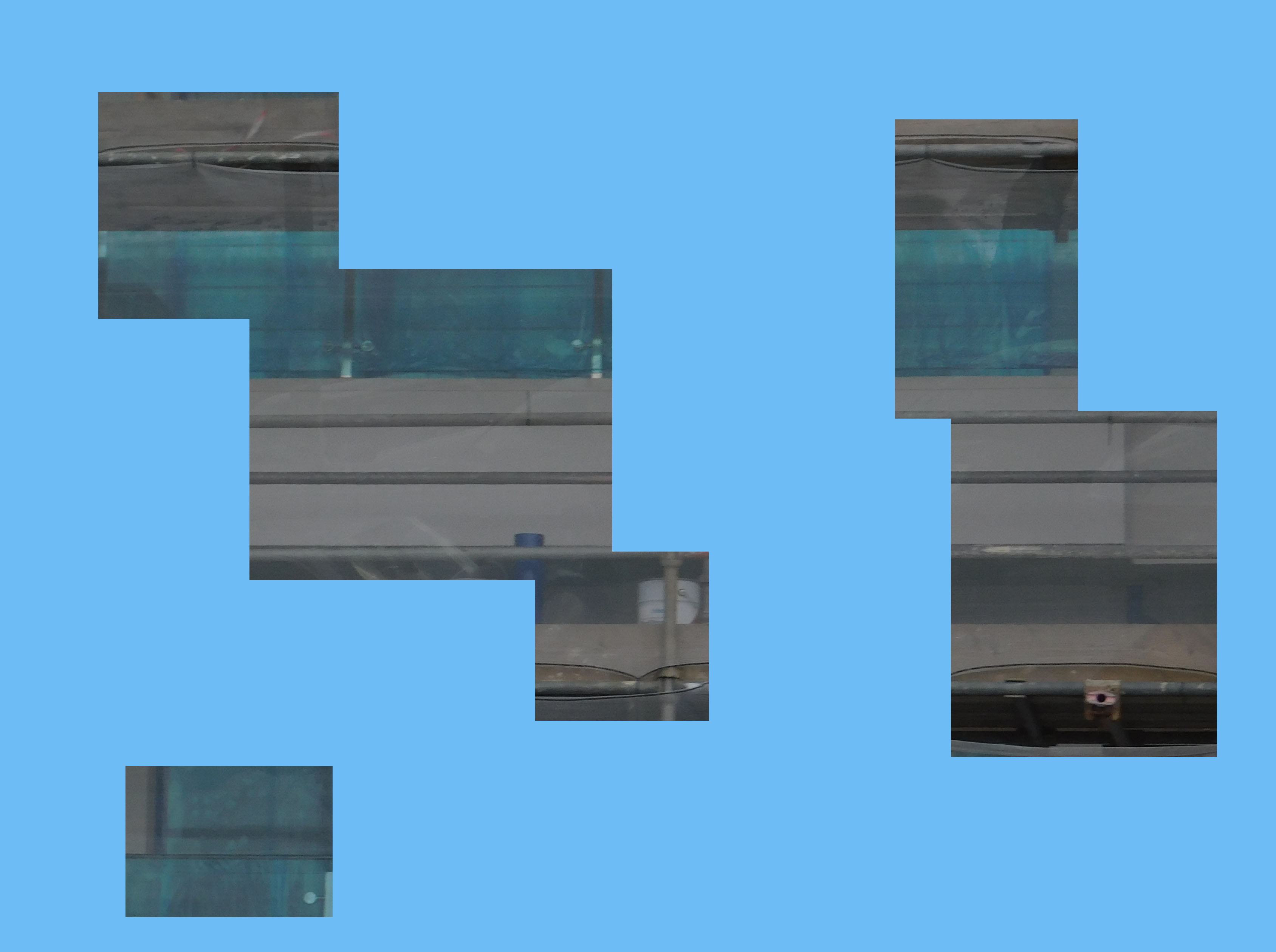
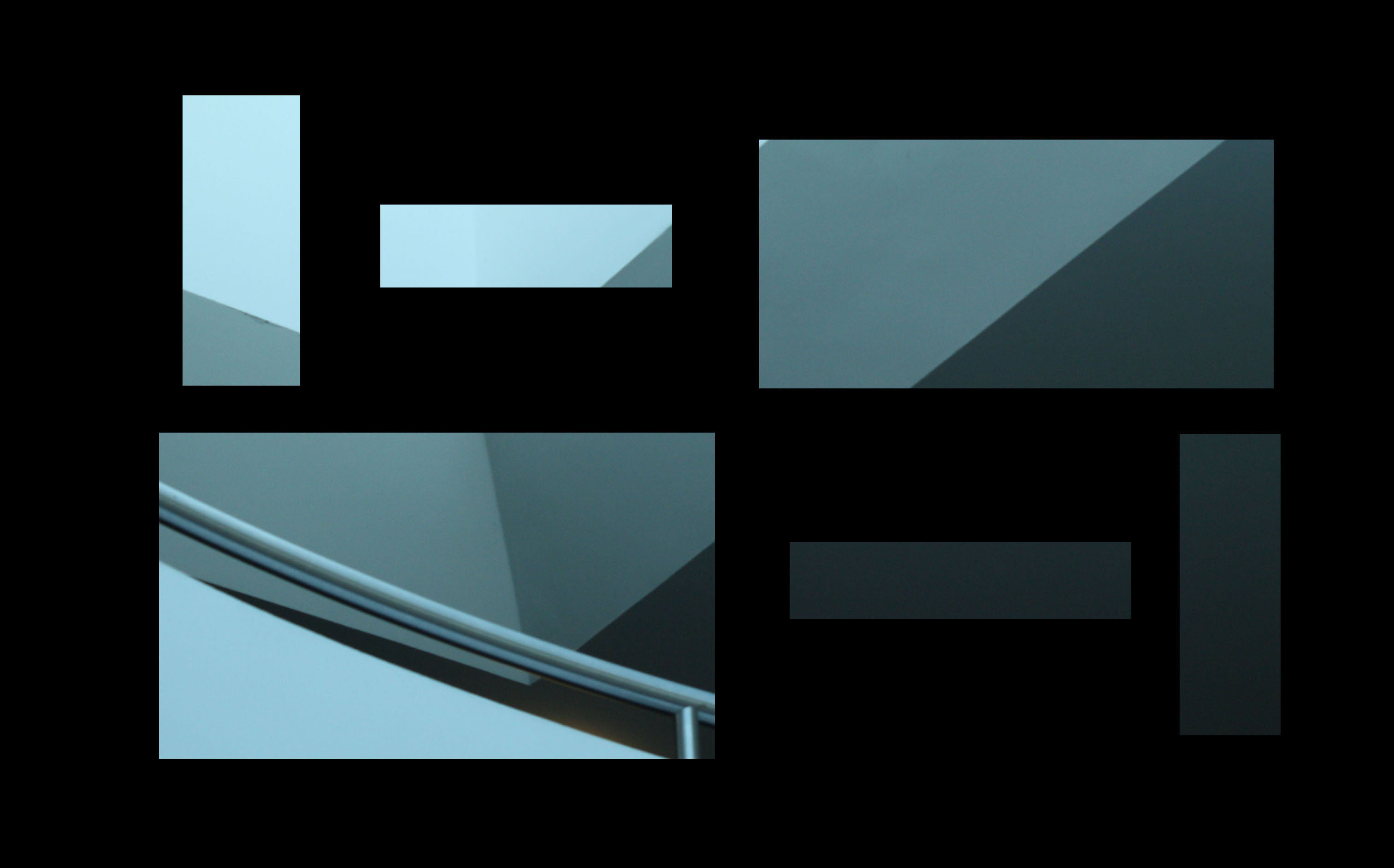
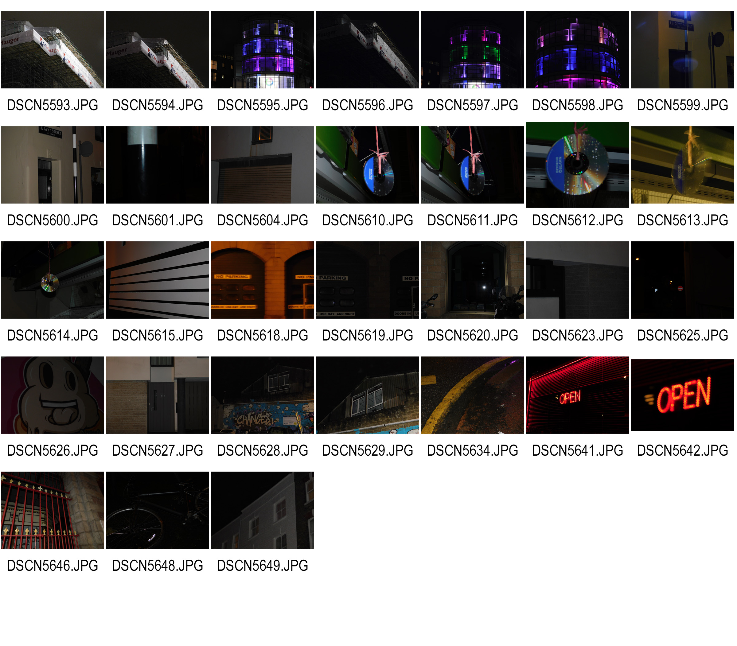
Contact Sheets

Here are my contact sheets for this project

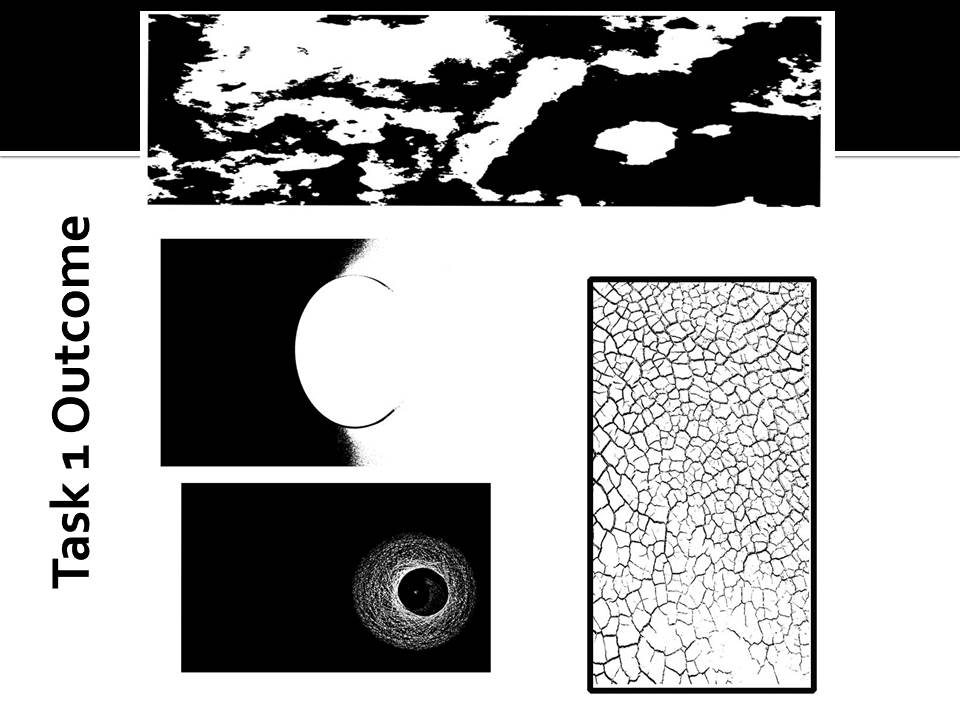
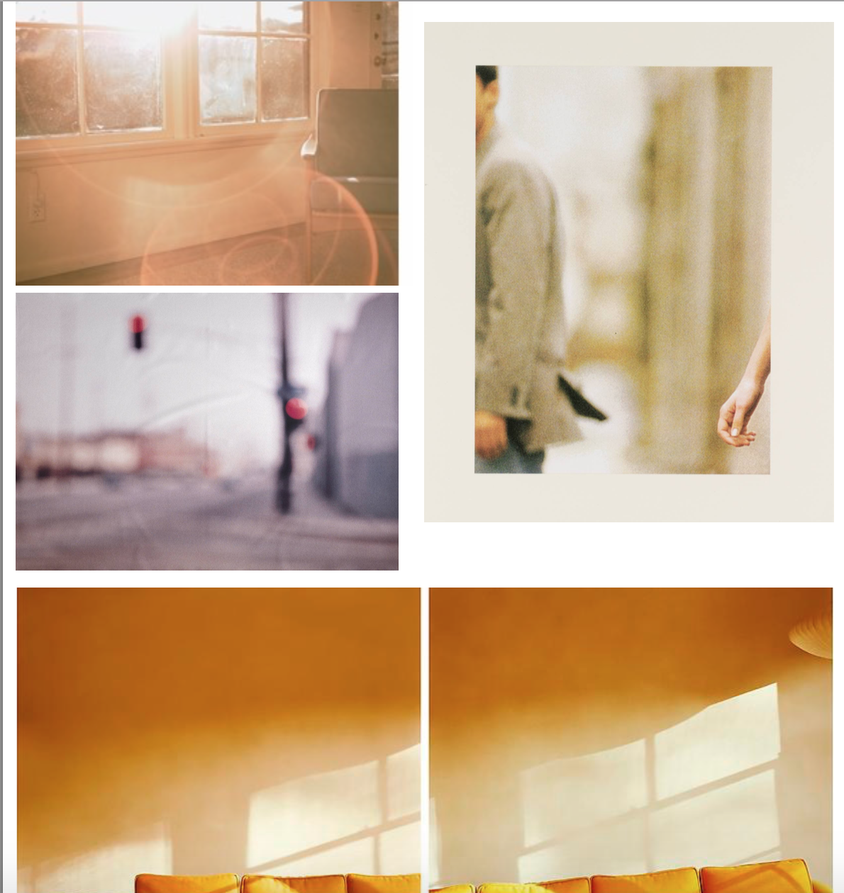
Final Image Selection

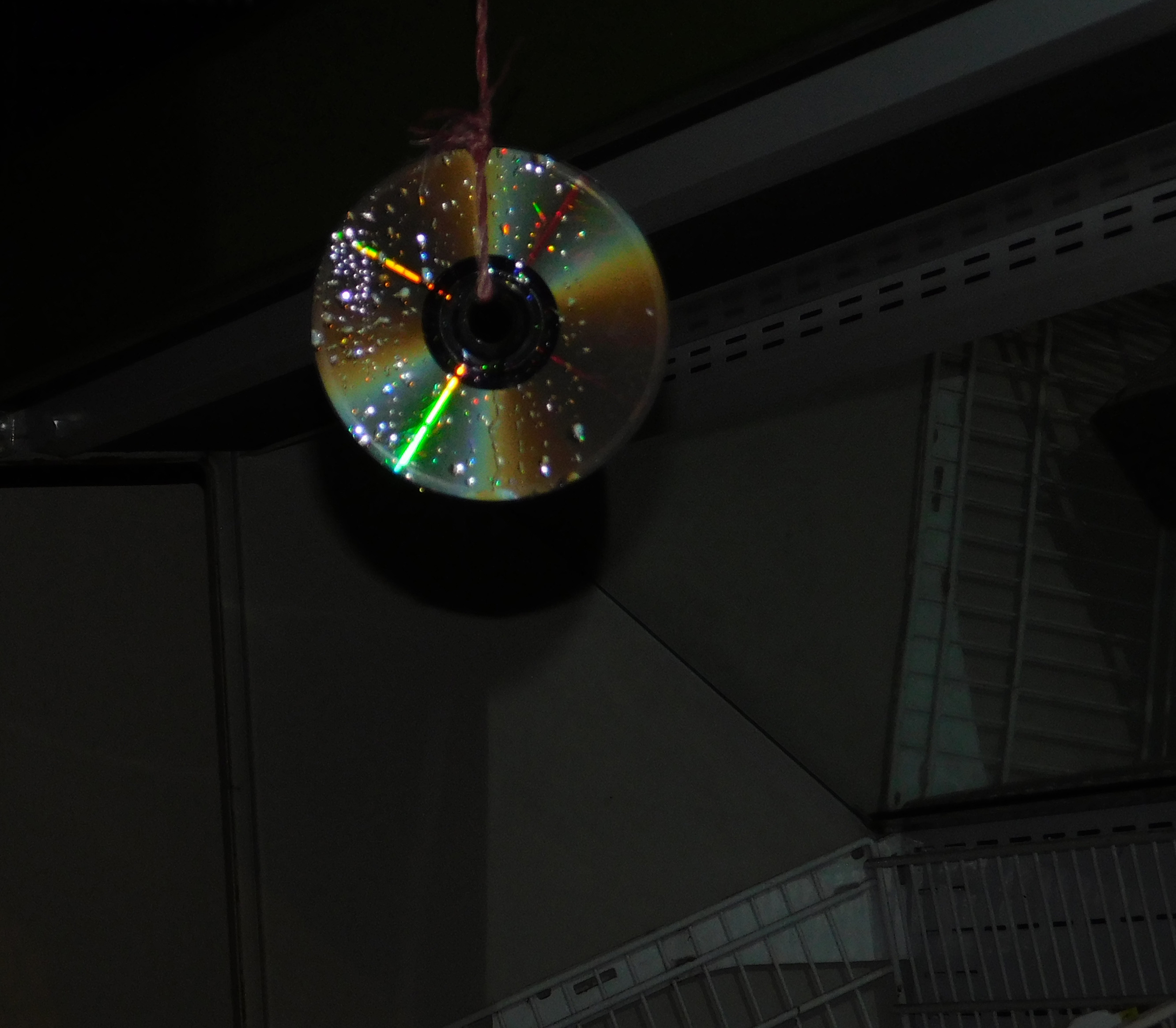
An old CD Hung up outside a shop to scare birds off of the fresh fruit. whole background has been lowered in vibrance and the CD isolated and adjusted

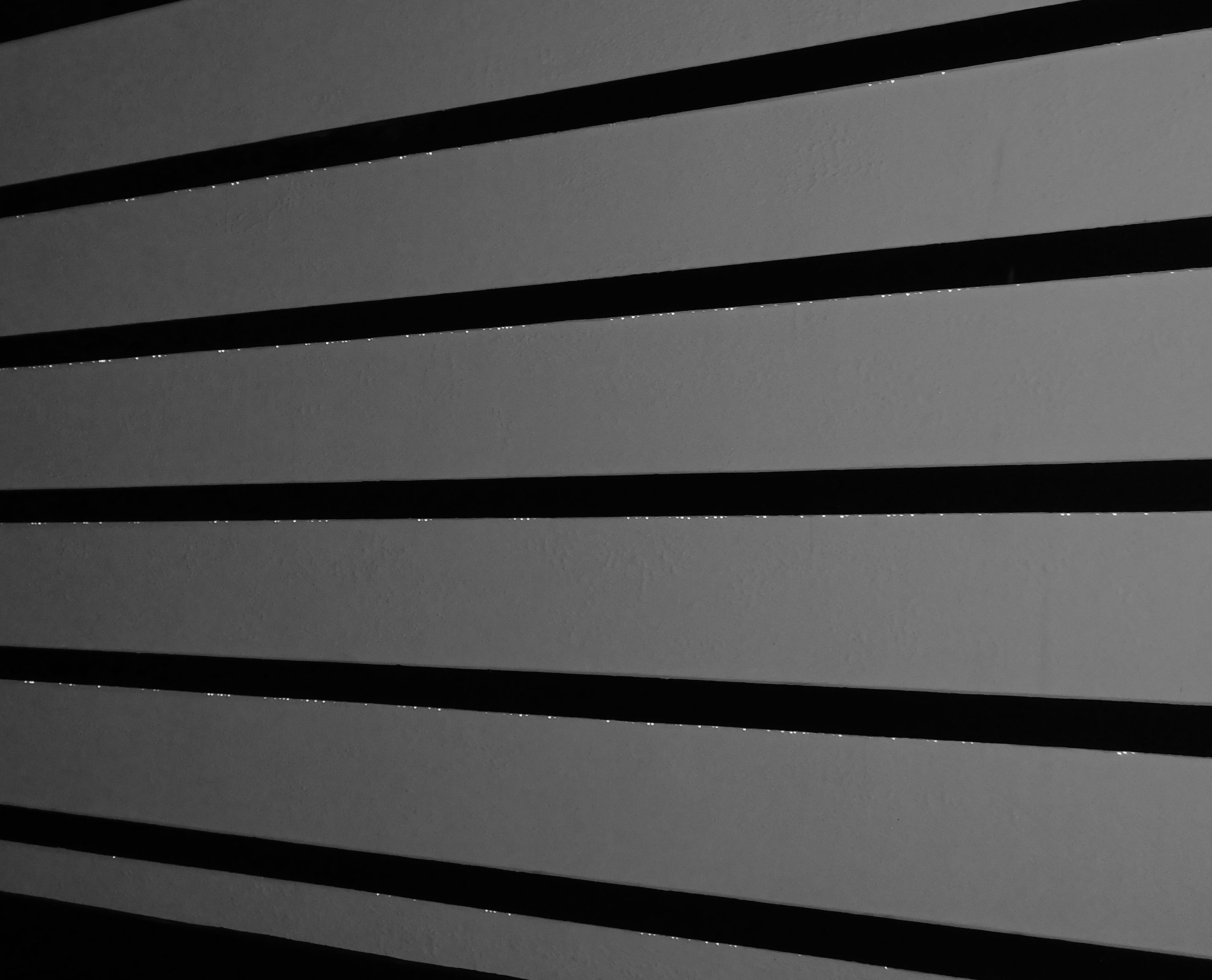
Black and white garage doors, no alerting needed

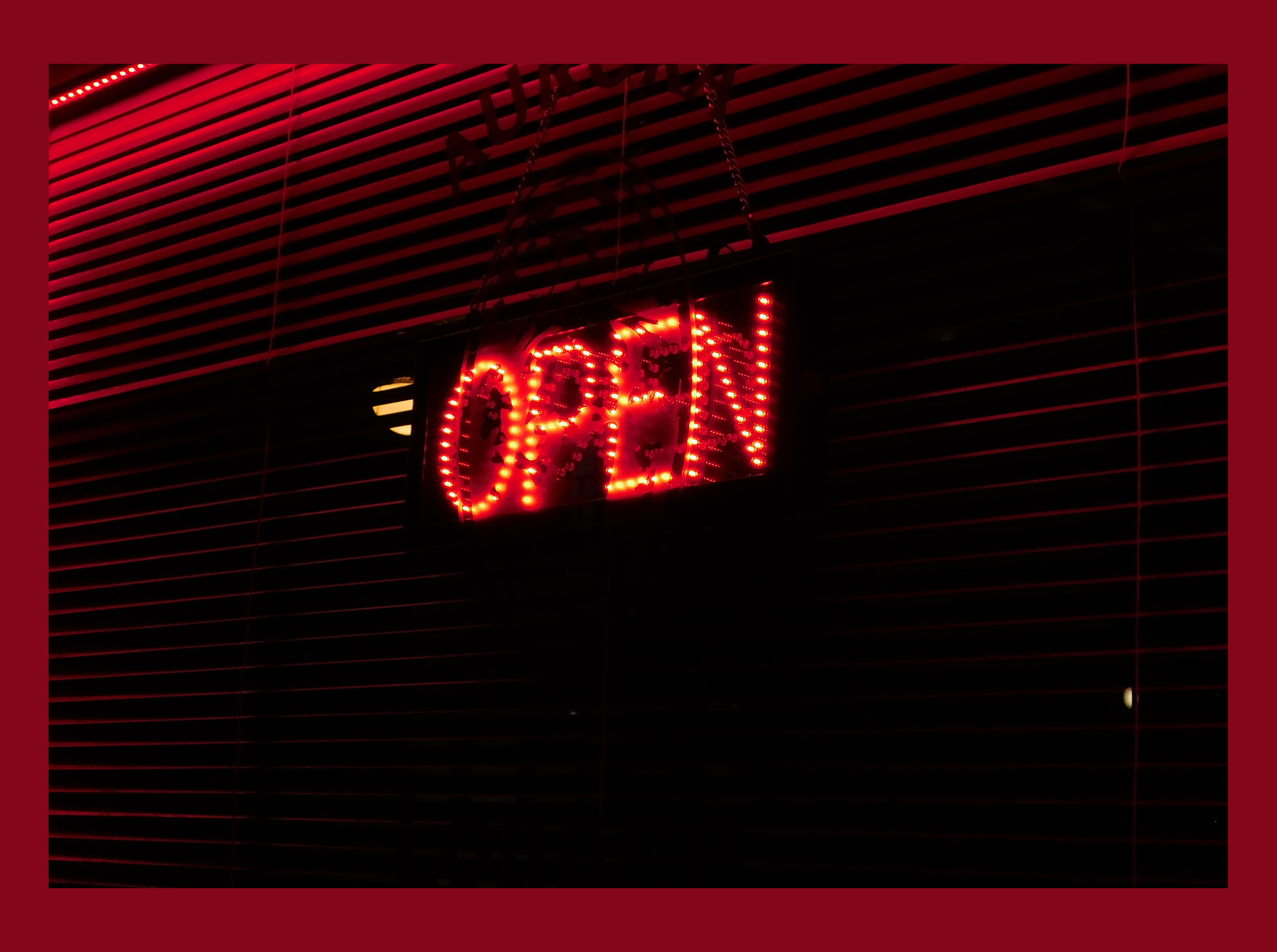
Open sign outside a restaurant with red LED’s. Red border around the outside to supplement the colour

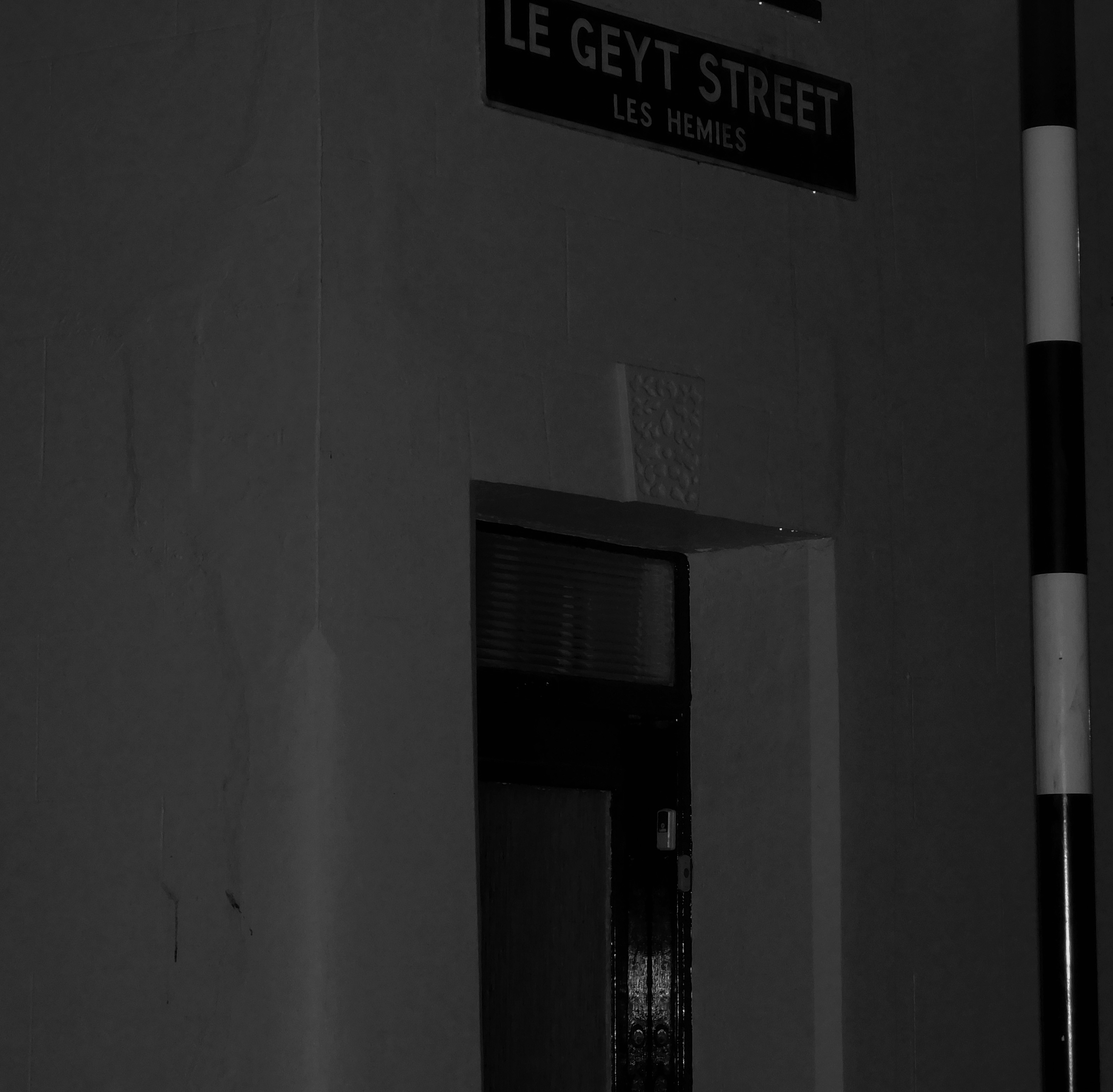
Black and white desaturated street corner

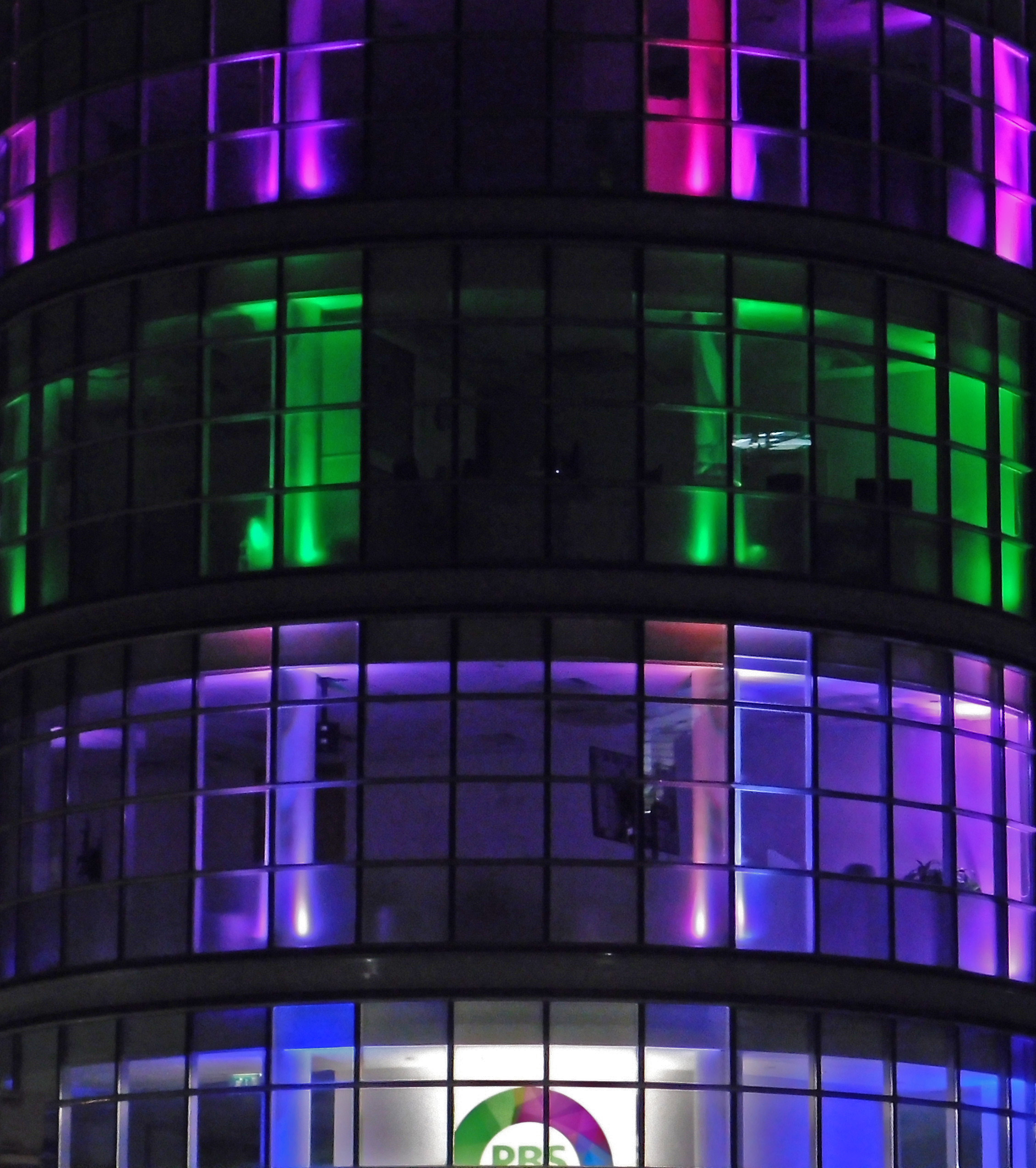
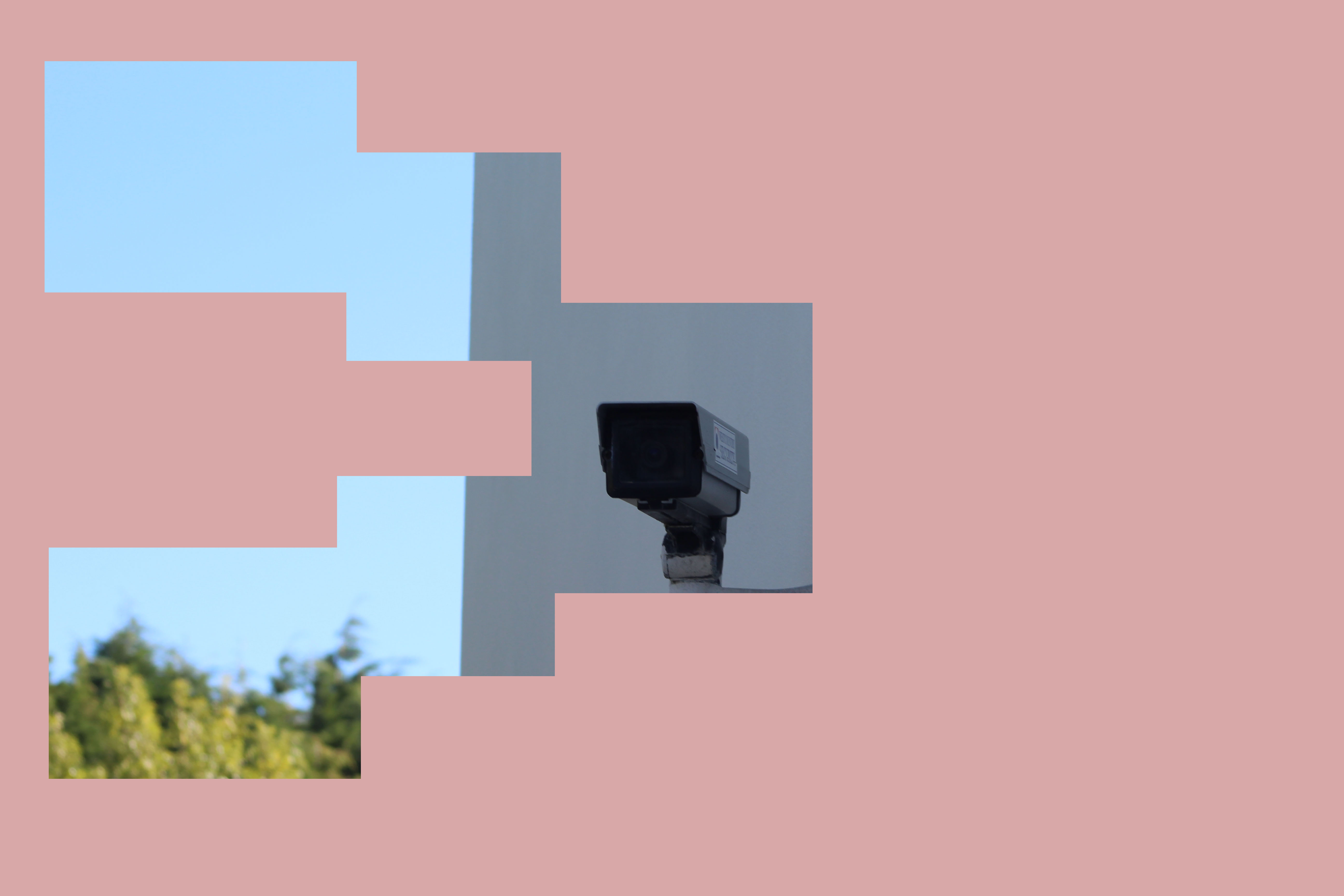
Illuminated office blocks

ISO

What is ISO?

ISO controls the brightness of your photos and controls the cameras sensitivity to light. Put simply, it will lighten or darken your photos. As you increase your ISO, your cameras sensitivity will increase and therefore photos brightness will increase.

Advantages

It means you could have more flexibility in your aperture and shutter speed settings. For example, if you’re indoors with poor lighting and you’re photographing a sports even where people are moving fast, then you would be able to use a fast shutter speed without the photo being under exposed.

Disadvantages

When using high ISO you can start to get more grain/noise.


High contrast images with Keld Helmer-Petersen

Keld Helmer-Peterson was a Danish photographer who took abstract photographs. He was heavily inspired by Albert Renger-Patzsch and Aaron Siskind. This photographer took images of things like buildings, and edited his photos until the contrasts were very high. He published many books that contained heavily contrasted images, like the one below. He took the images in the books using cameras, and also bed scanners. All the images in the book are surrounded by a lot of space and sometimes even text.


My images

For my following experimentation, I have chosen 4 abstract images I have previously taken to edit on Photoshop. To edit all the images I have adjusted the threshold, by going to image then selecting ‘adjustments’. For each image I have then adjusted the threshold until i has satisfied that I had a heavily contrasted image that i was happy with. Below i have included screenshots of my process for each image.

My final image.


My second image

My final image.


My 3rd image

My final image.


My 4th original image

My final image.

My final piece

For my final pieces, I have attempted to create images like the ones Helmer- Petersen presented in his books. I think my images turned out very successful as they are very heavily contrasted and all the mid tones have also been removed. Because the paper I took pictures of was very scrumped, there were many different points on the paper that were illuminated by light, and other parts that were more shadowed. I think that has helped my images look very interesting after I had photo shopped them as there is a nice blend of both black and white on my final images.


Layer Mask Experiment

Intro

Layer Masking is a process that involves creating a layer of color over an existing image and removing parts of the new layer to have certain parts of the photo visible.

Method

I loaded up Photoshop and selected my Image I wished to edit

I then went to Layer-New Fill layer-Solid color and selected a colour from the image that would accent the image and layer and applied it and removed sections of the layer

Here are a few final edits

Instead of using circles, I chose to focus mainly on squares and rectangles in order to isolate different parts of an image to highlight them or to create a nice visual effect.


Uta Barth

Throughout the past two decades, Uta Barth has made visual perception the subject of her work. Regarded for her “empty” images that border on painterly abstraction, the artist carefully renders blurred backgrounds, cropped frames and the natural qualities of light to capture incidental and fleeting moments, those which exist almost exclusively within our periphery. With a deliberate disregard for both the conventional photographic subject and point-and-shoot role of the camera, Barth’s work delicately deconstructs conventions of visual representation by calling our attention to the limits of the human eye.

A 2012 McArthur Fellow, Barth was born in Berlin in 1958 and currently resides in Los Angeles. She received a B.A. from the University of California, Davis in 1982 and an M.F.A from the University of California, Los Angeles in 1985.

Since then, Barth’s work has been the subject of major exhibitions worldwide. Notable solo presentations include to draw with light at SCAD Museum of Art in Savannah, GA (2013), … and to draw a bright, white line with light at The Art Institute of Chicago (2011), Henry Art