Week 7 | Completing the Abstract Unit | Assessment Week

Monday 15th October

By now you should have submitted your FINAL IMAGES for printing.

They will be ready to frame, mount, and display by the end of the week. We will show you how to make your final selection and display your work.

Now that you have made your decisions, you are in a good position to…

  • describe your process
  • explain your process
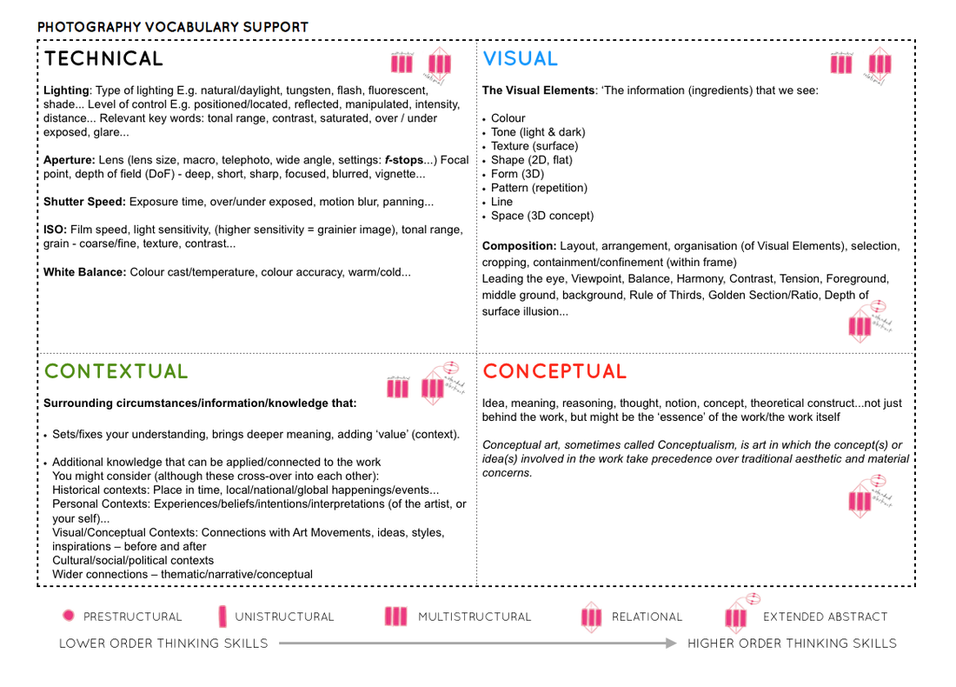
  • analyse key images (TECHNICAL – VISUAL -CONCEPTUAL-CONTEXTUAL)
  • expand your ideas and show your understanding and creativity

We always get asked how many blog posts are required (as a minimum) to complete the unit…so here goes :

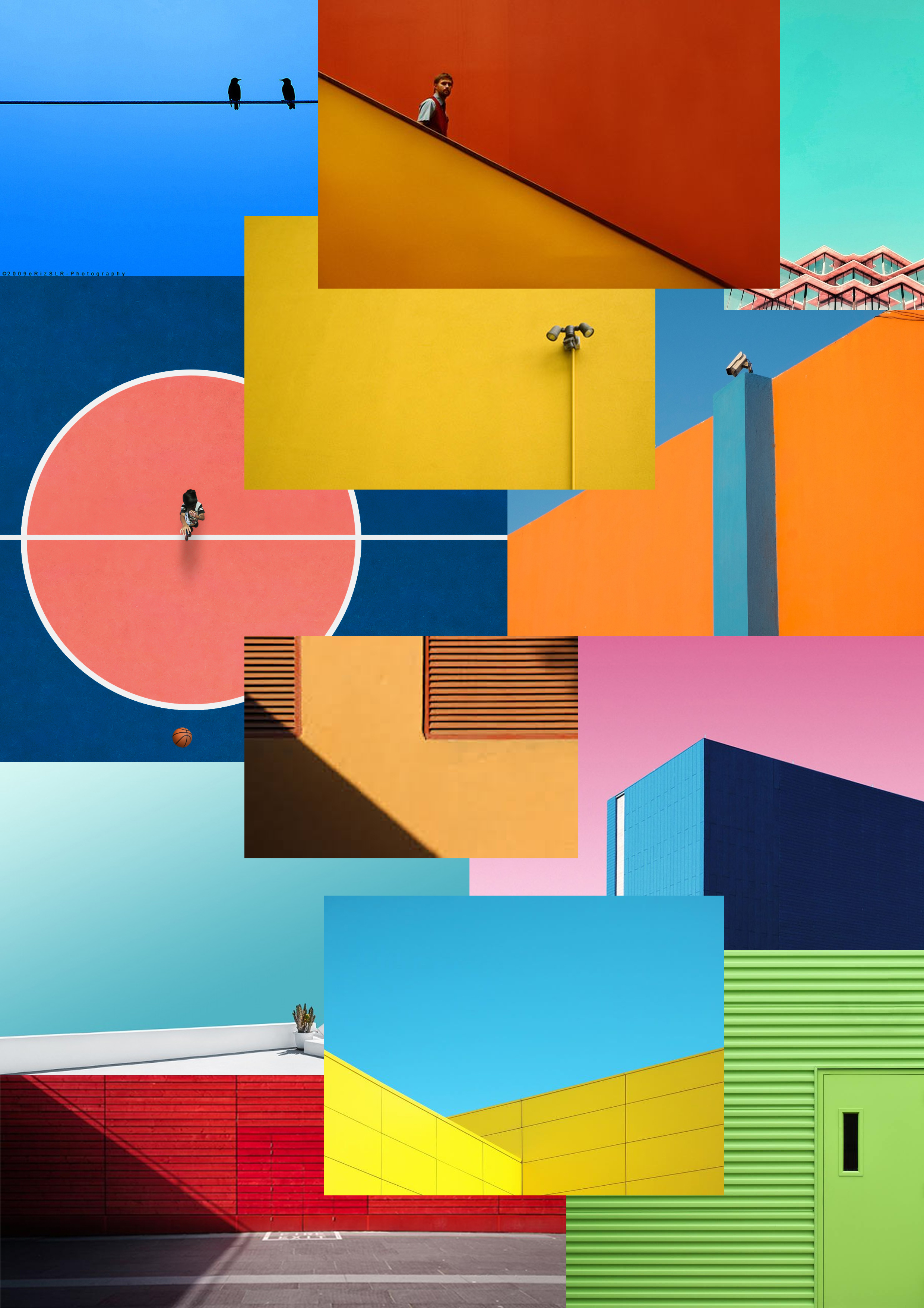
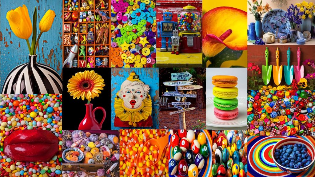
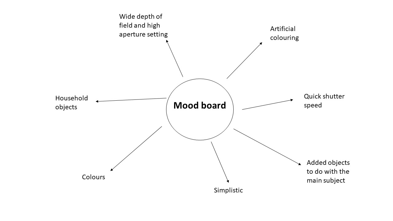
  1. Moodboard (AO1) x 1 blog post
  2. Mindmap of ideas (AO1) x blog post
  3. Artist Reference / Case Study with IMAGE ANALYSIS (AO1) x 1 blog post
  4. Action Plan (AO3) x 1 blog post
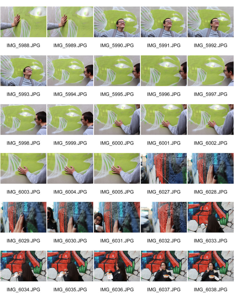
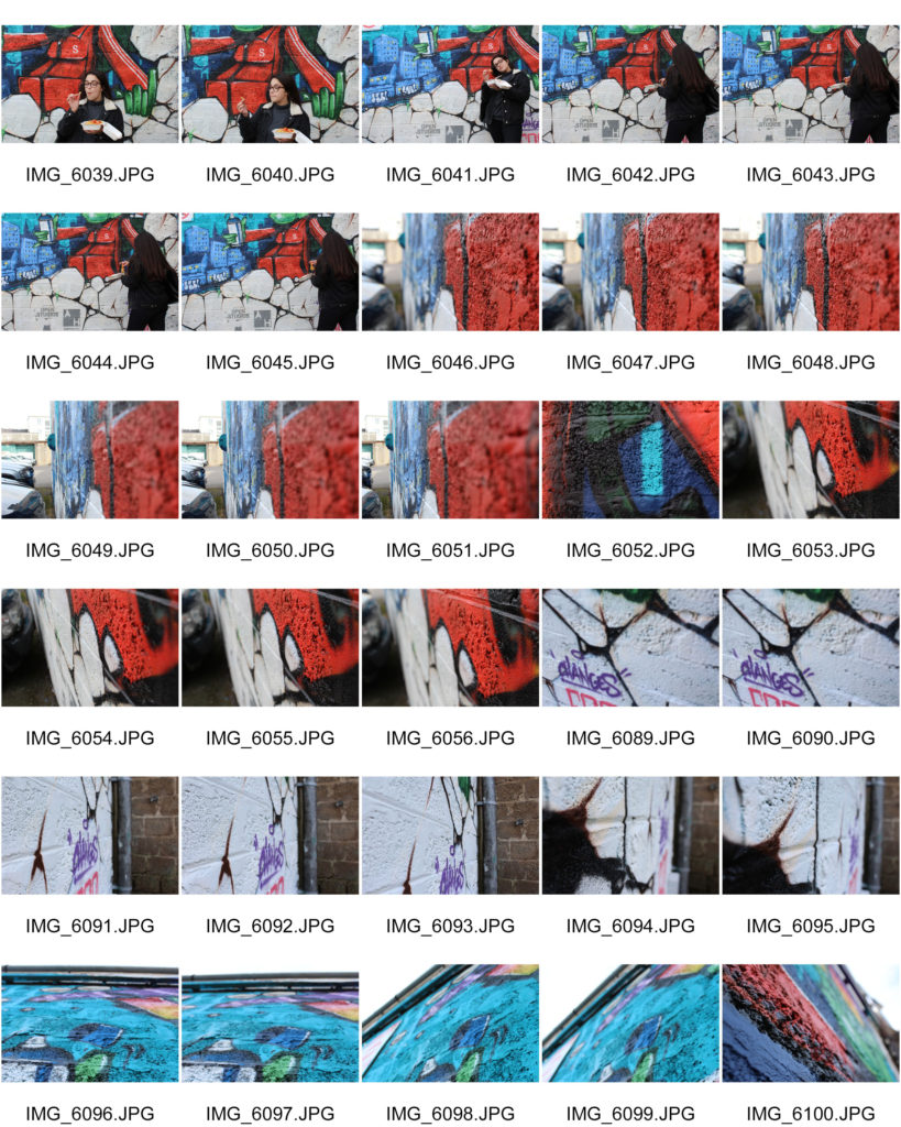
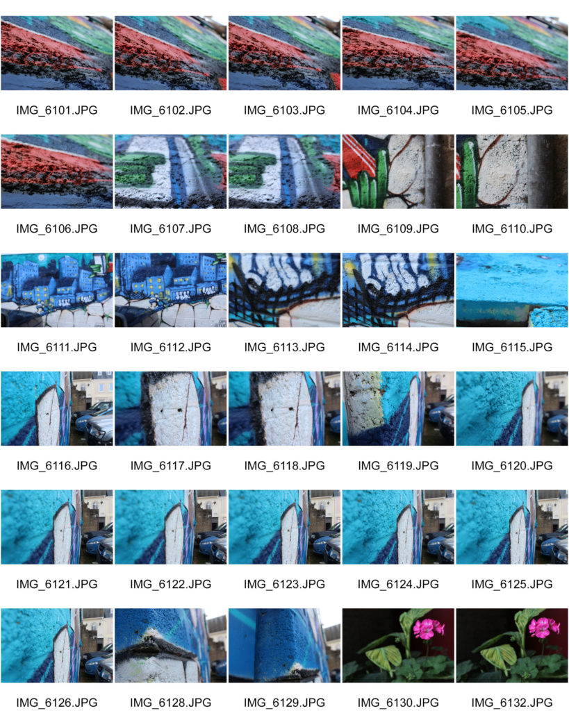
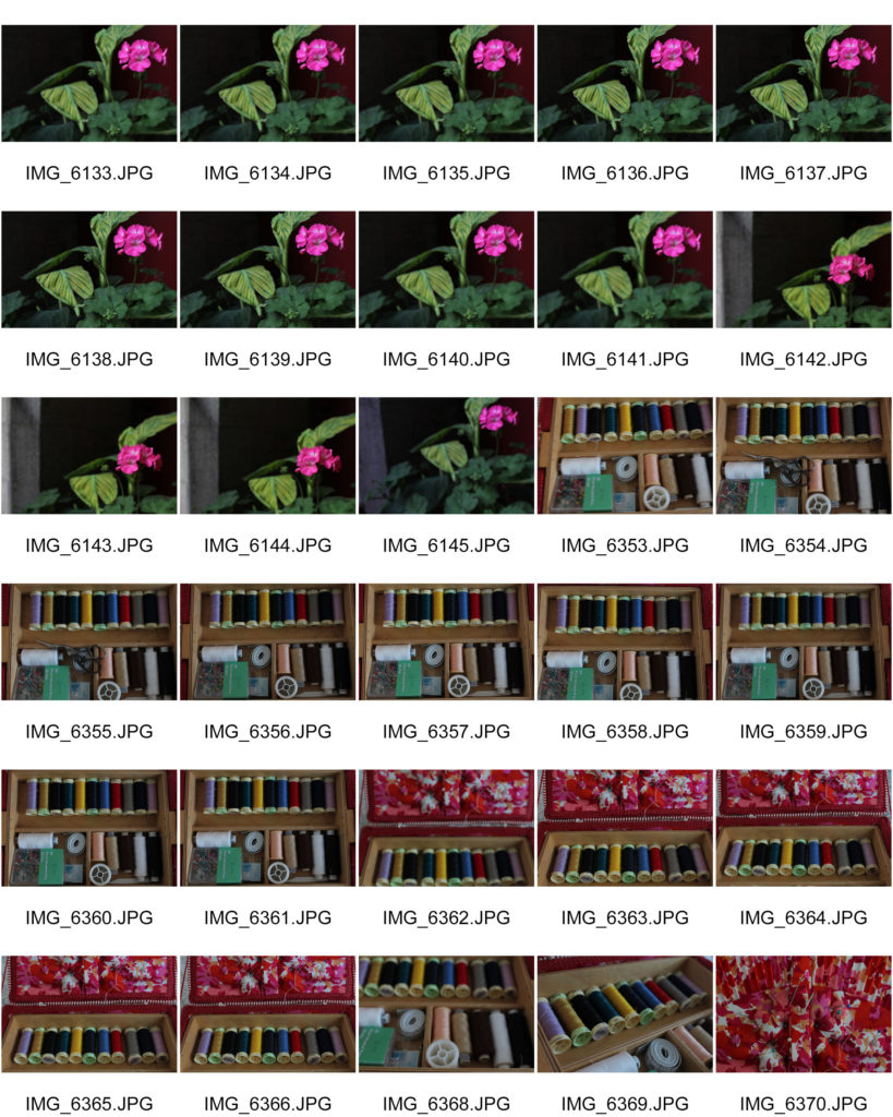
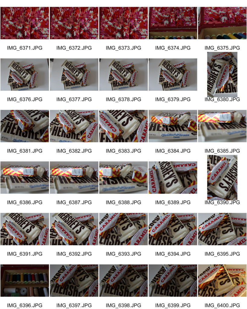
  5. Photo-shoots + contact sheets (AO3) x 1 blog post
  6. Image Selection (AO2) x 1 blog post
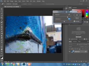
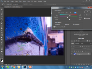
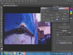
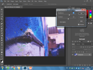
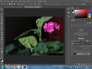
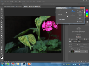
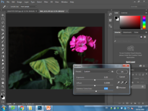
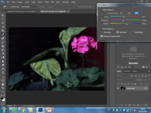
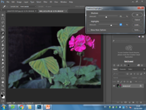
  7. Image Editing/ manipulation (AO2) x 1 blog post
  8. Presentation of final outcomes (AO4) x 1 blog post
  9. Compare and contrast to your artist reference (AO1) x 1 blog post
  10. Evaluate and Critique your final outcomes (AO1+AO4) x 1 blog post

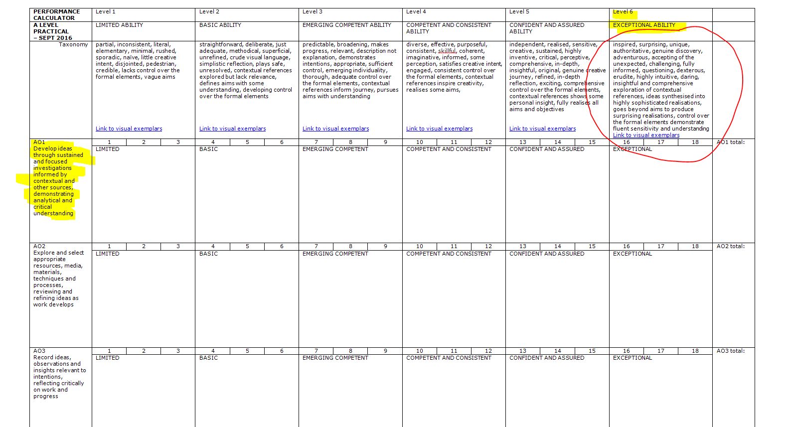
Have a close look at the marking criteria below…and compare to your work / blog posts.


PERFORMANCE CALCULATOR


Cross – Referencing your ideas with contemporary / influential photographers

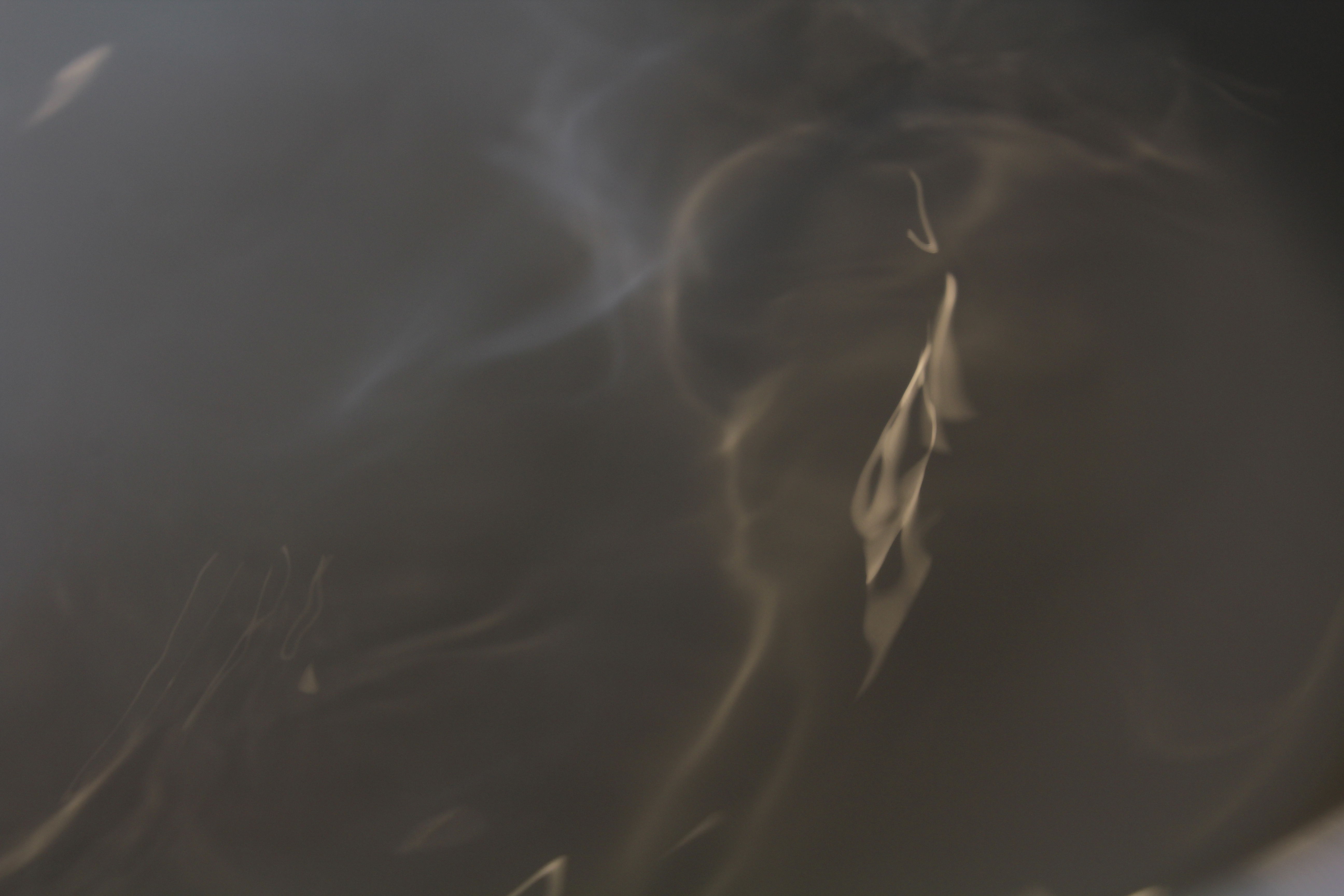
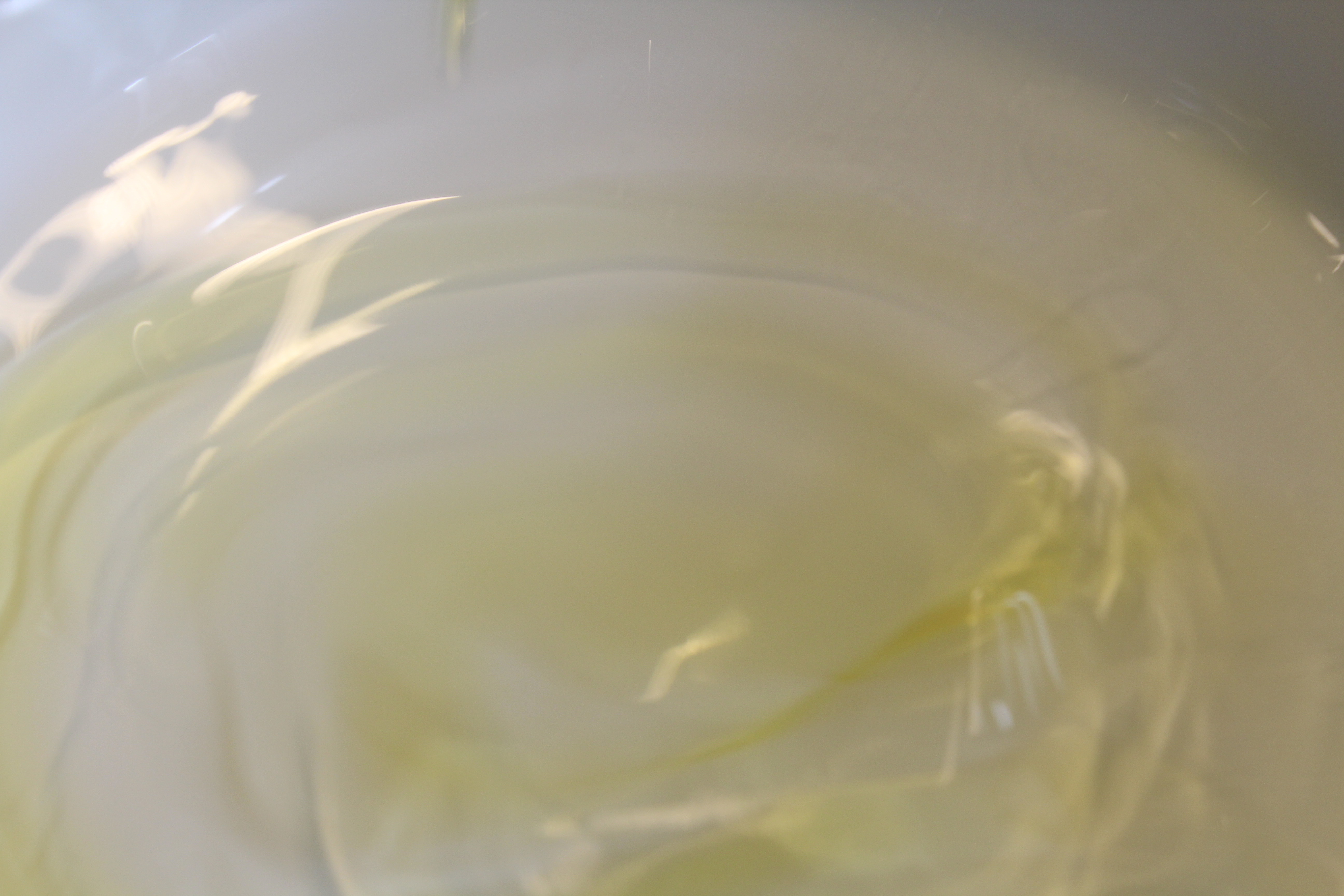
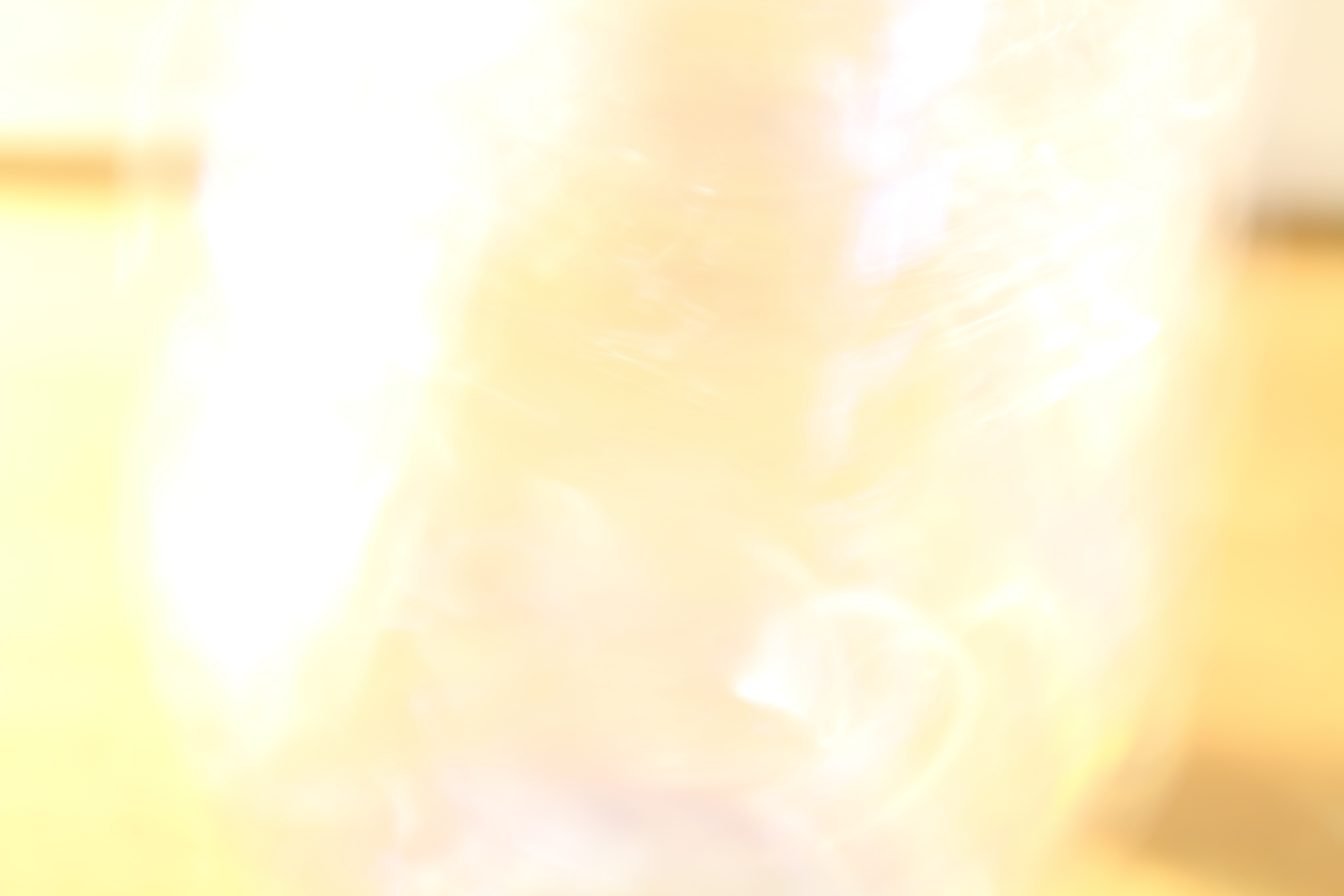
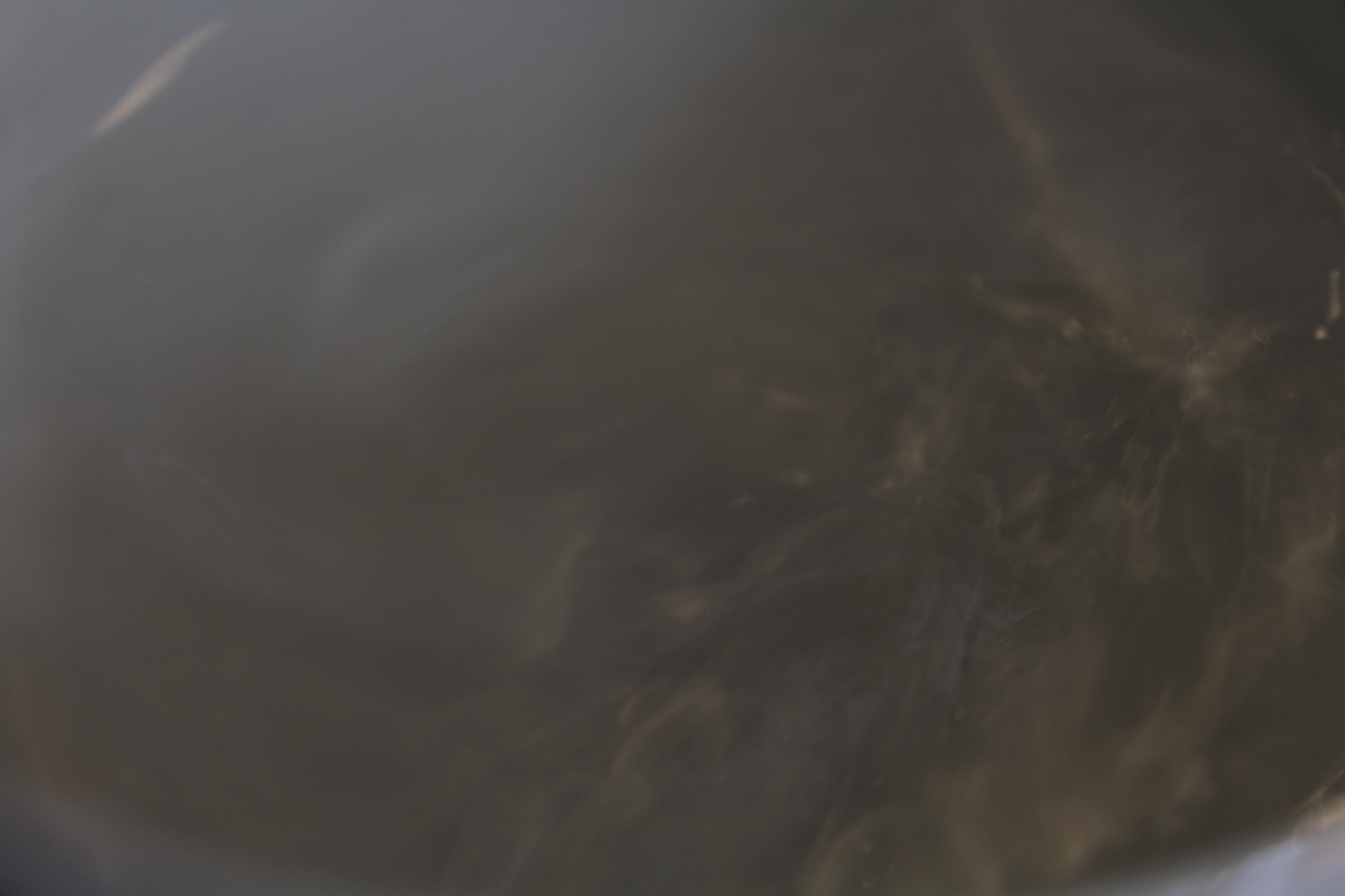
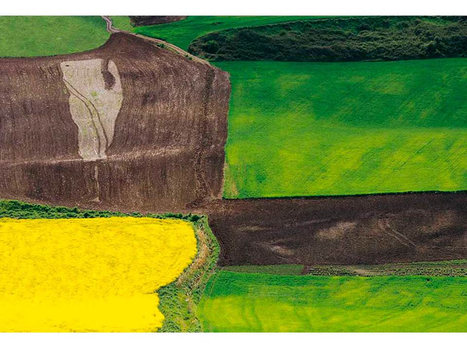
Compare and Contrast : Edgar Martins

Image result for edgar martins photographer destinerrance

Image result for edgar martins photographer destinerrance

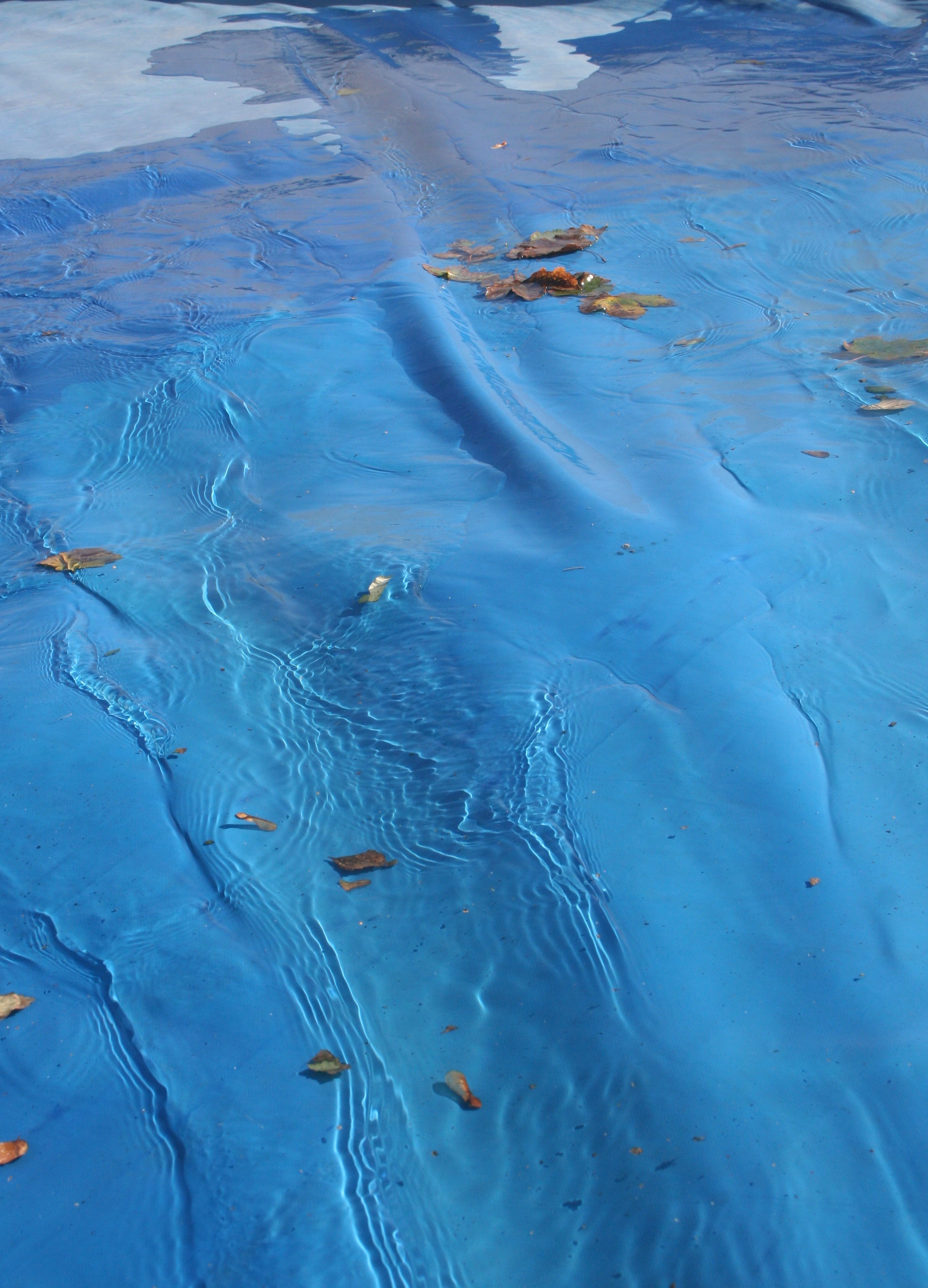
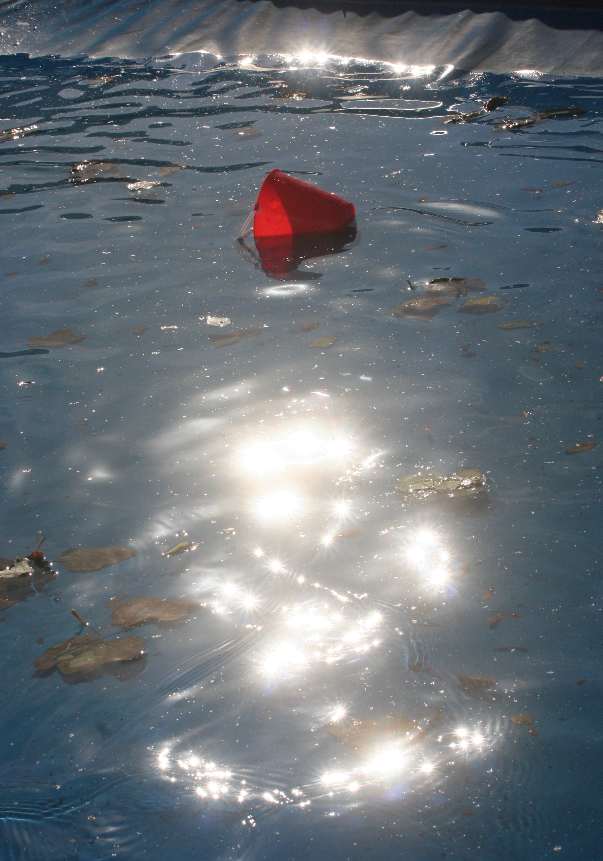
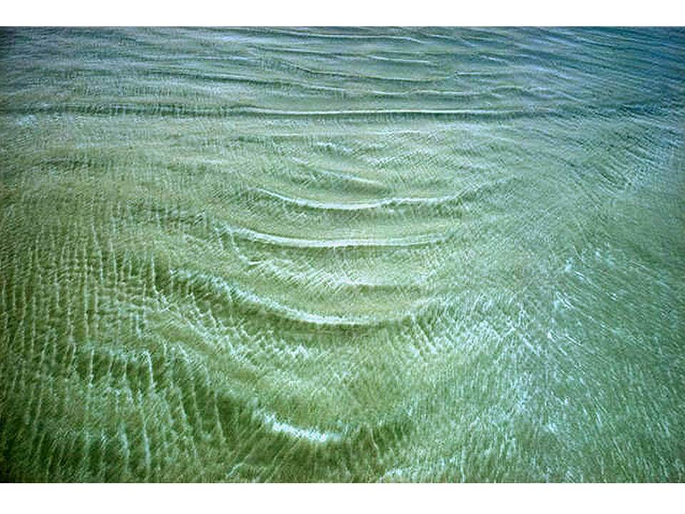
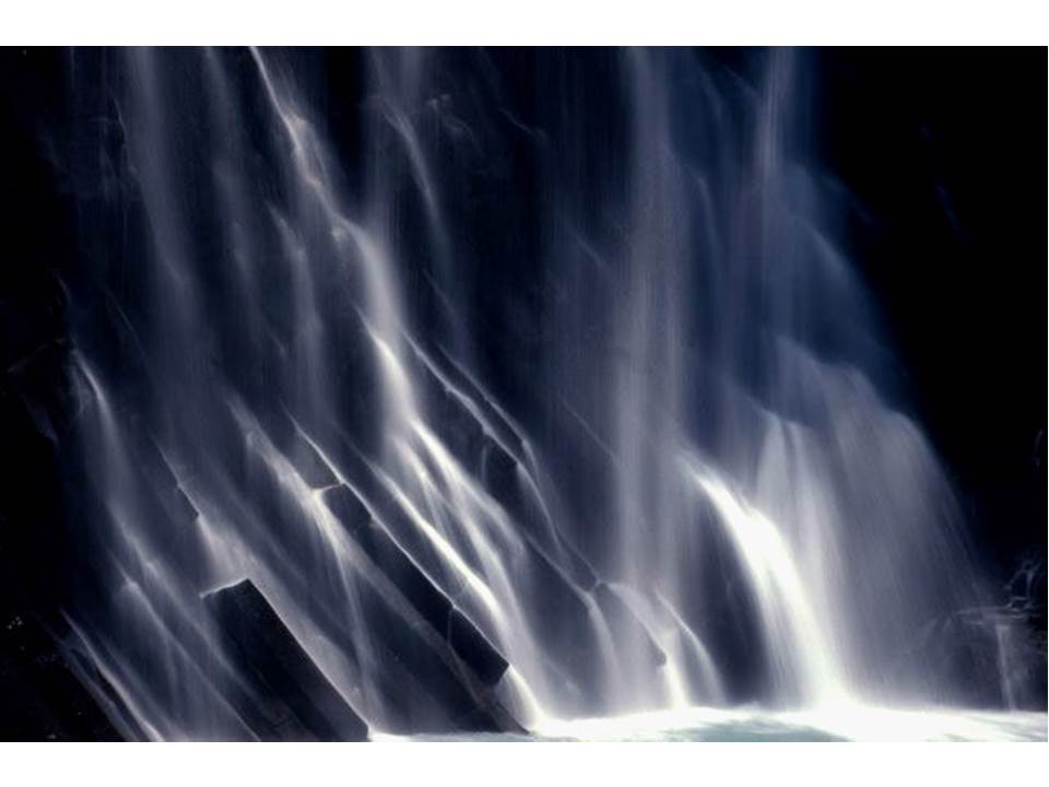
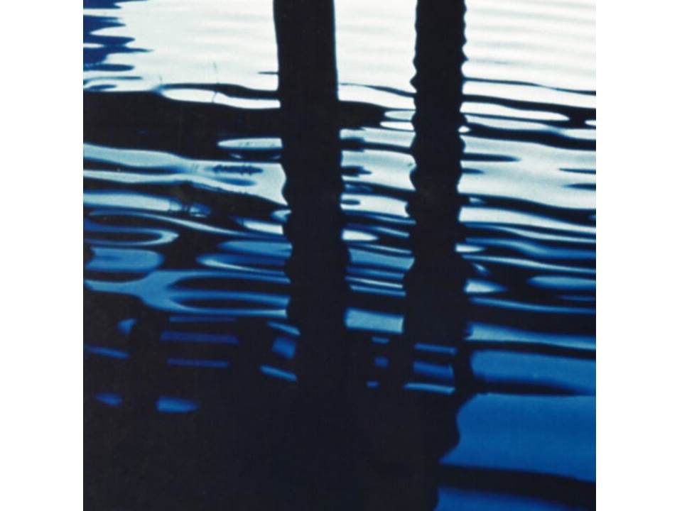
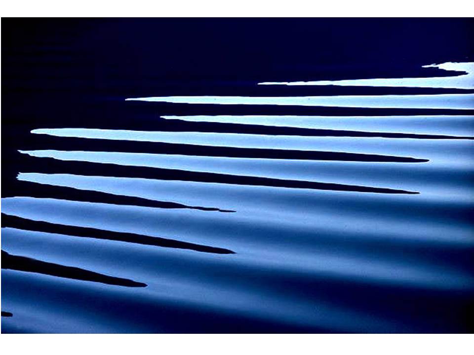
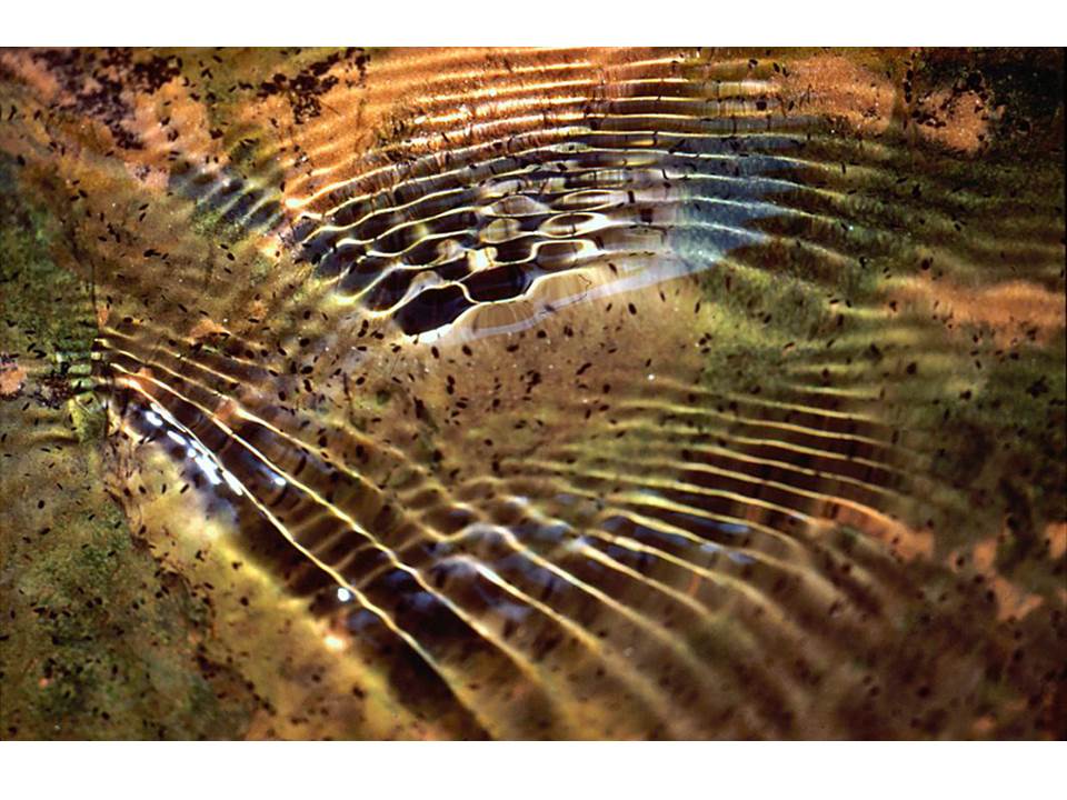
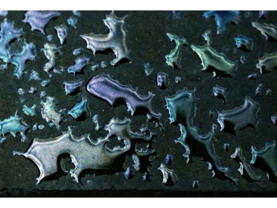
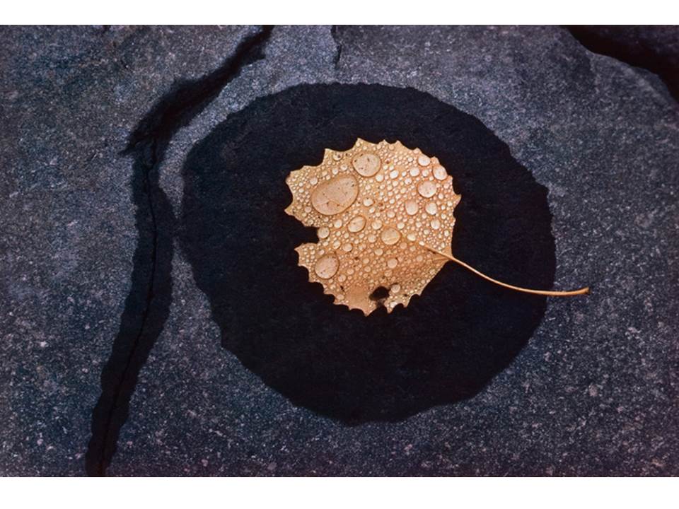
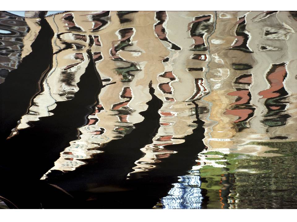
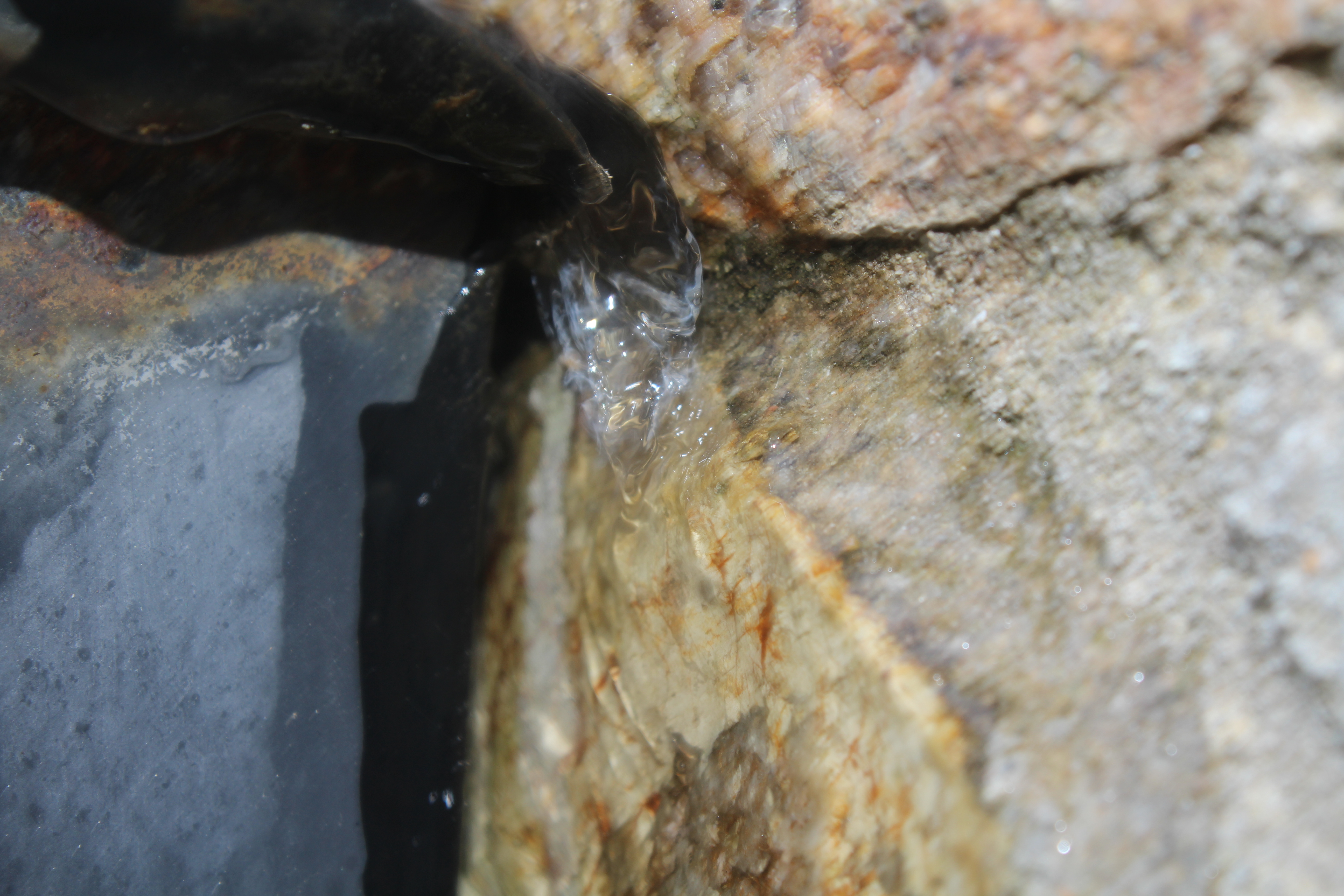
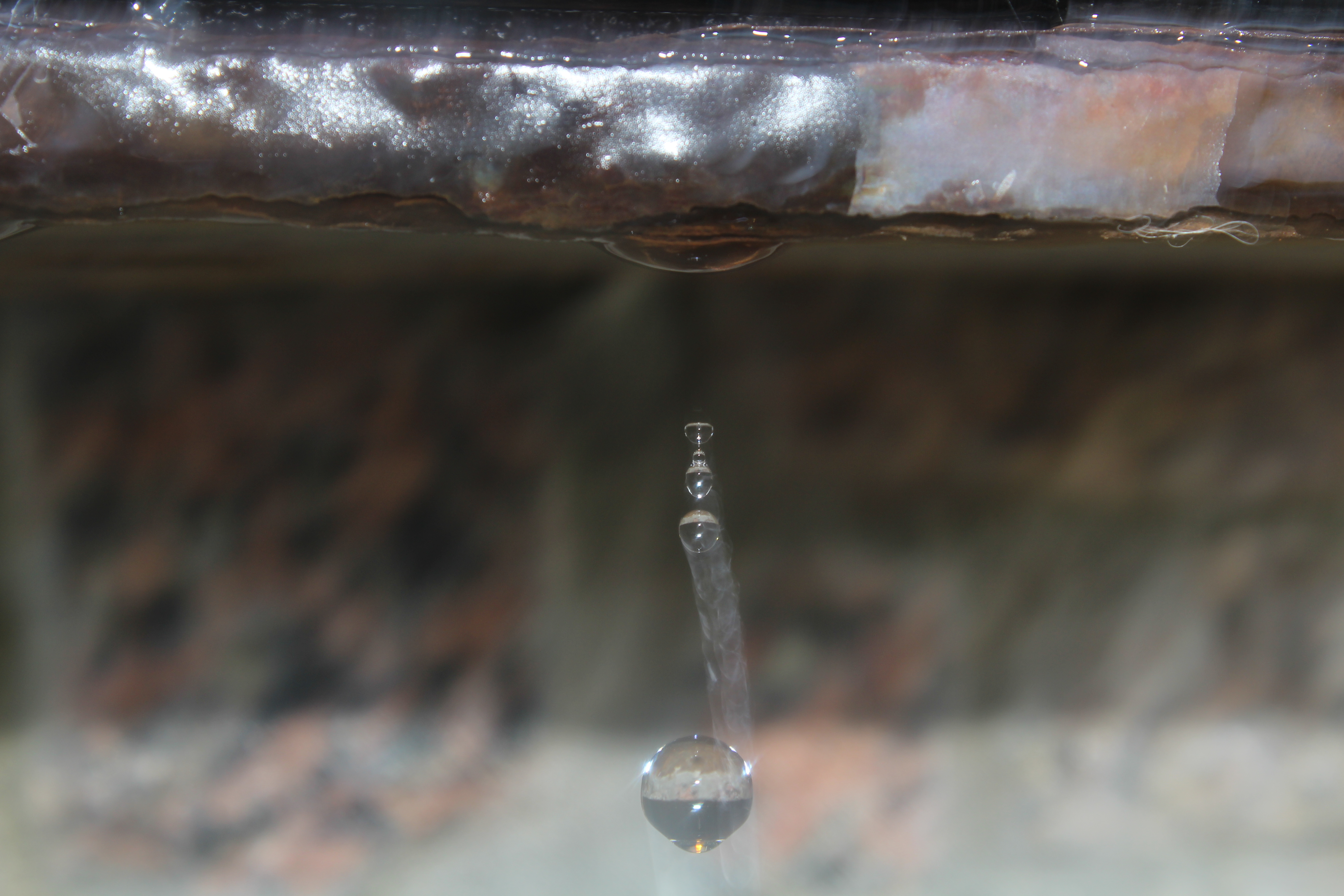
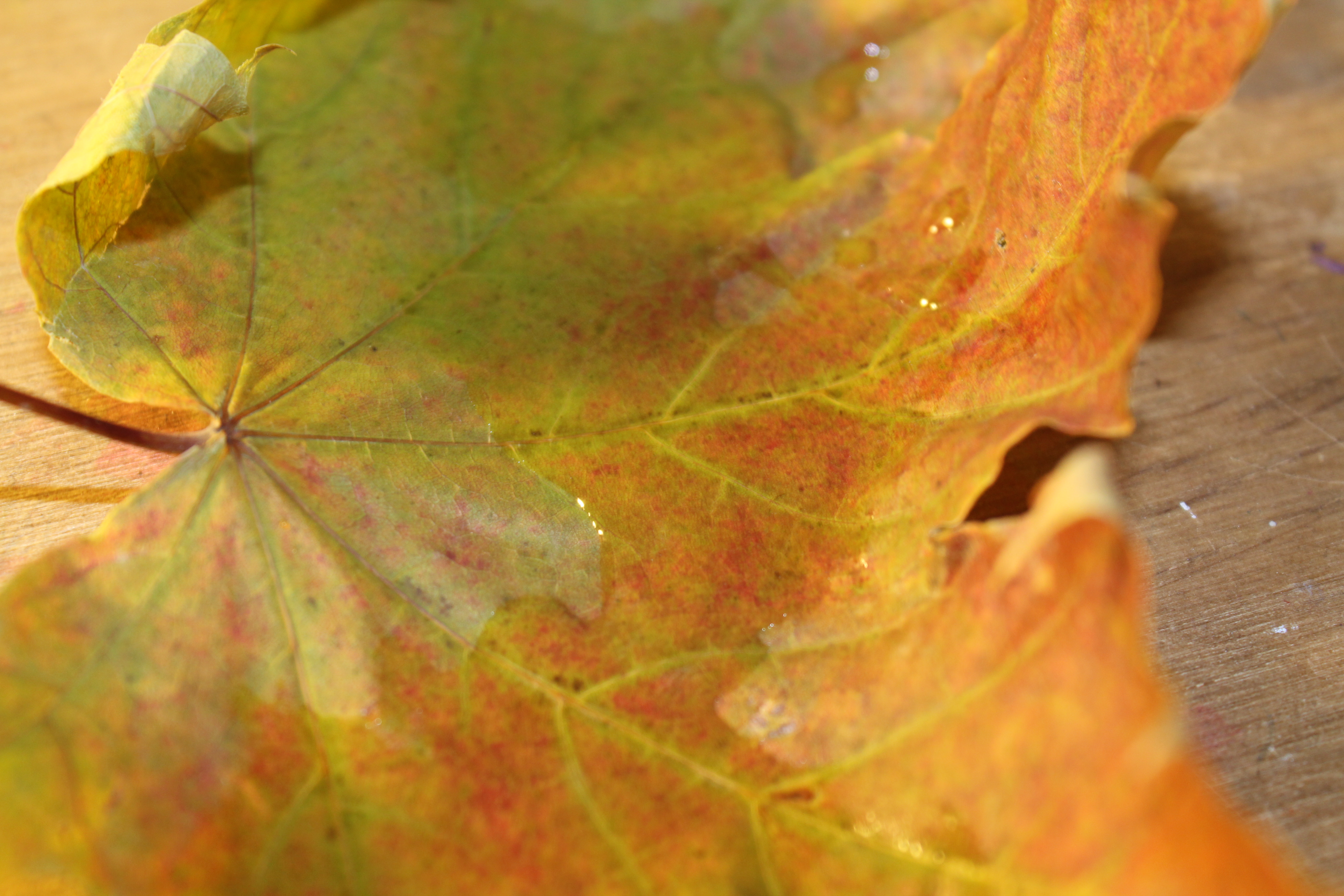
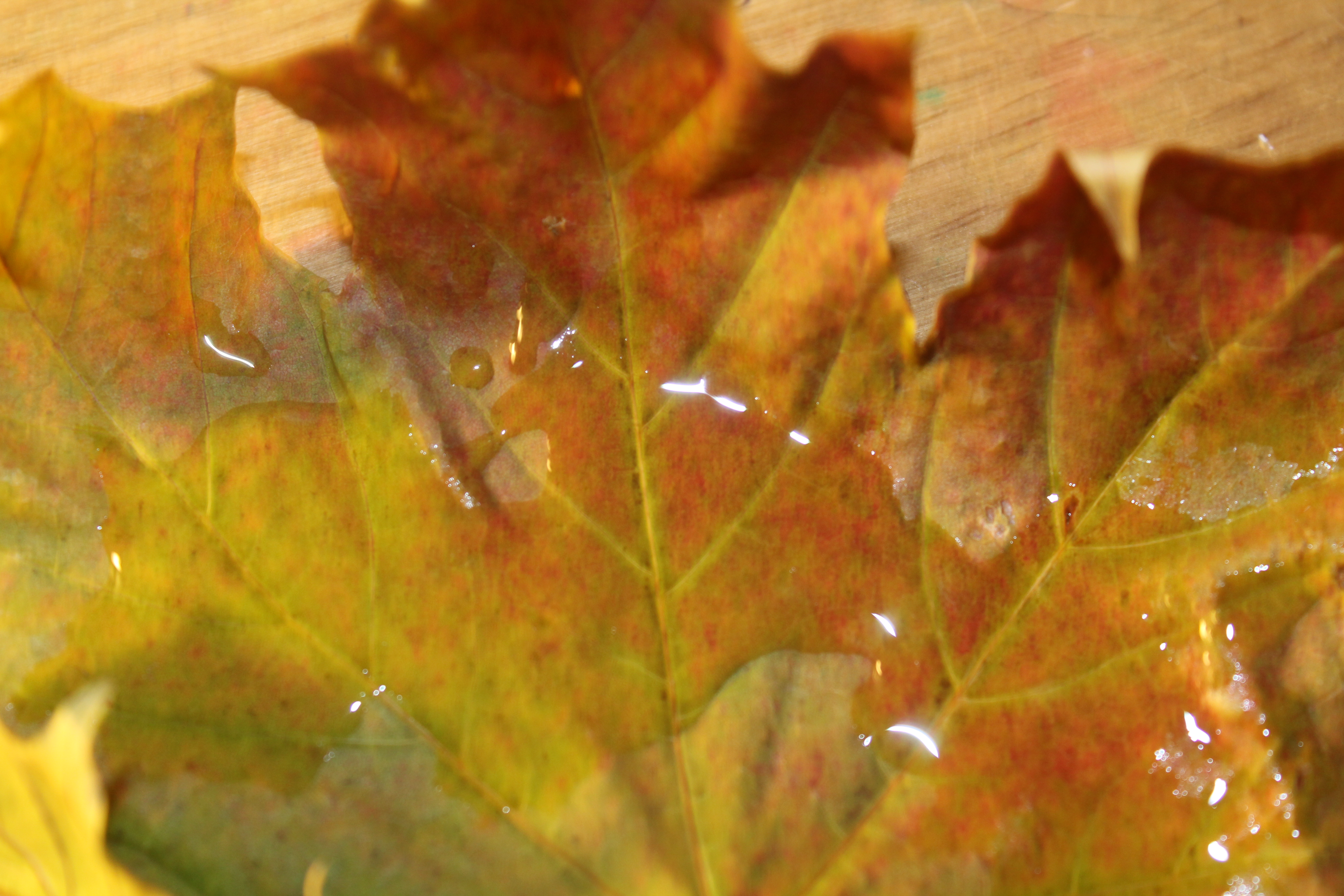
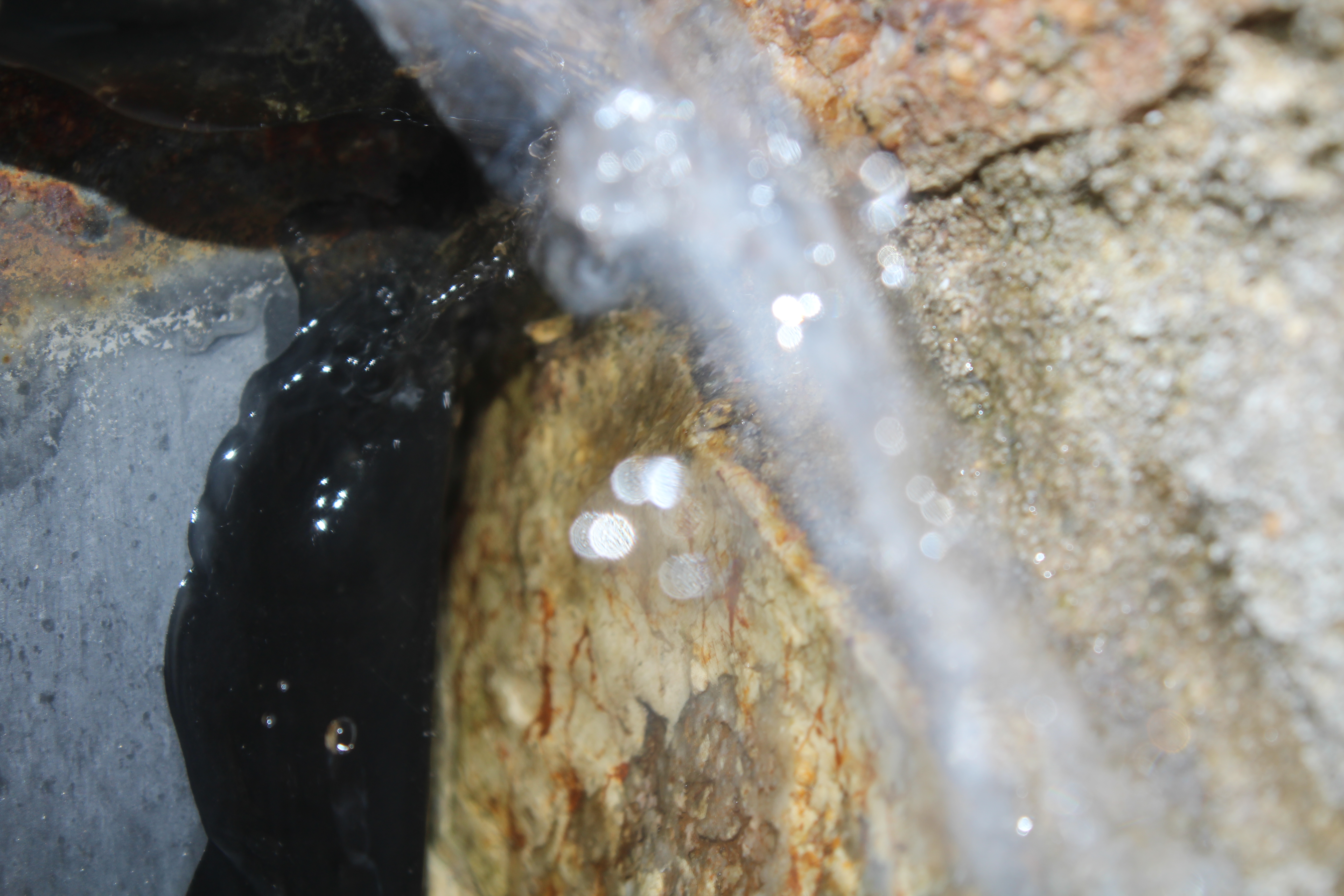
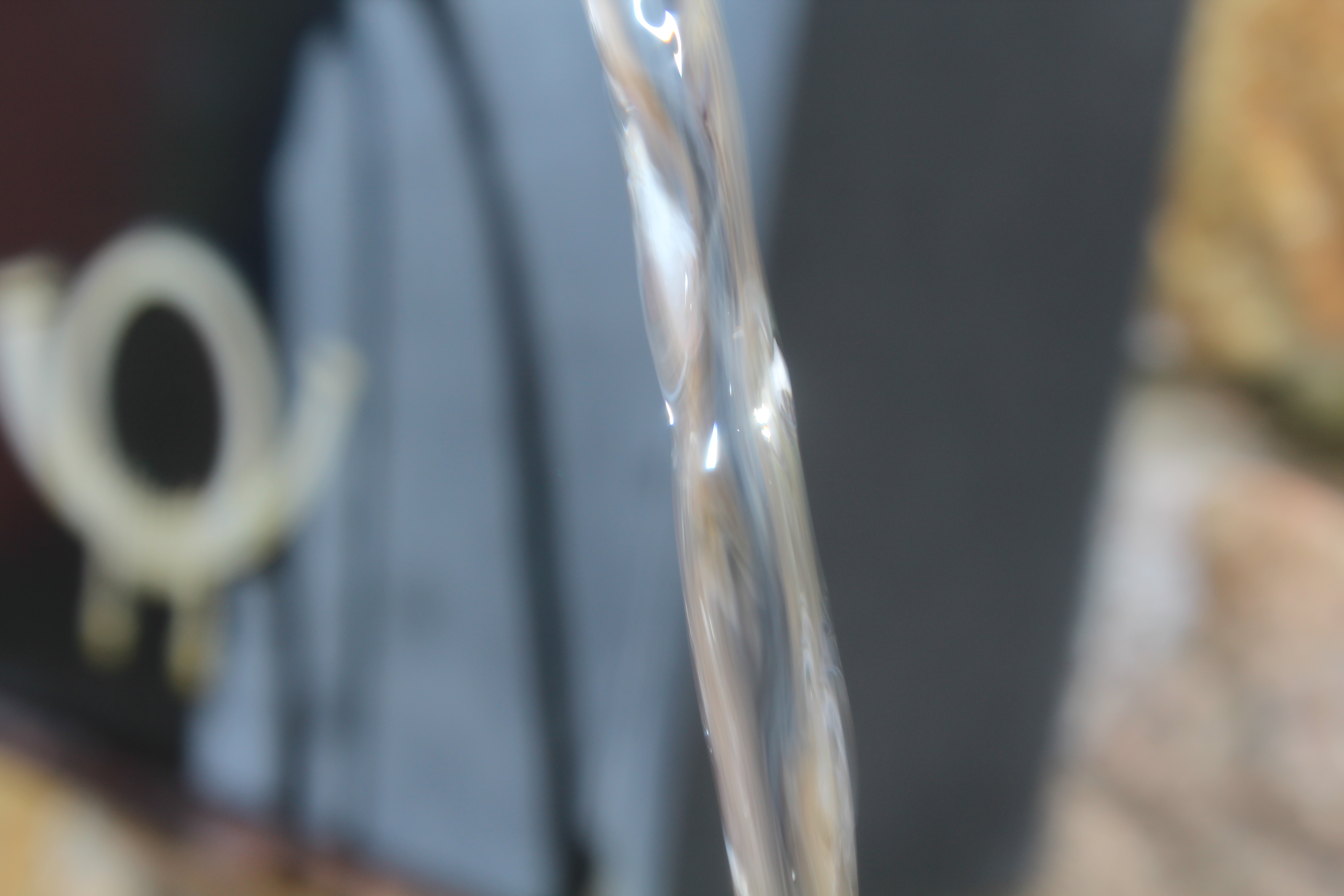
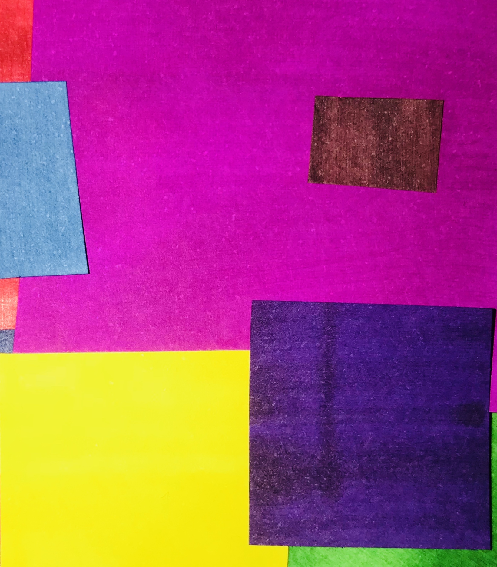
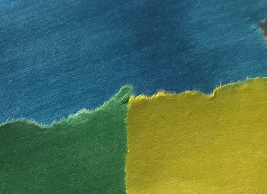
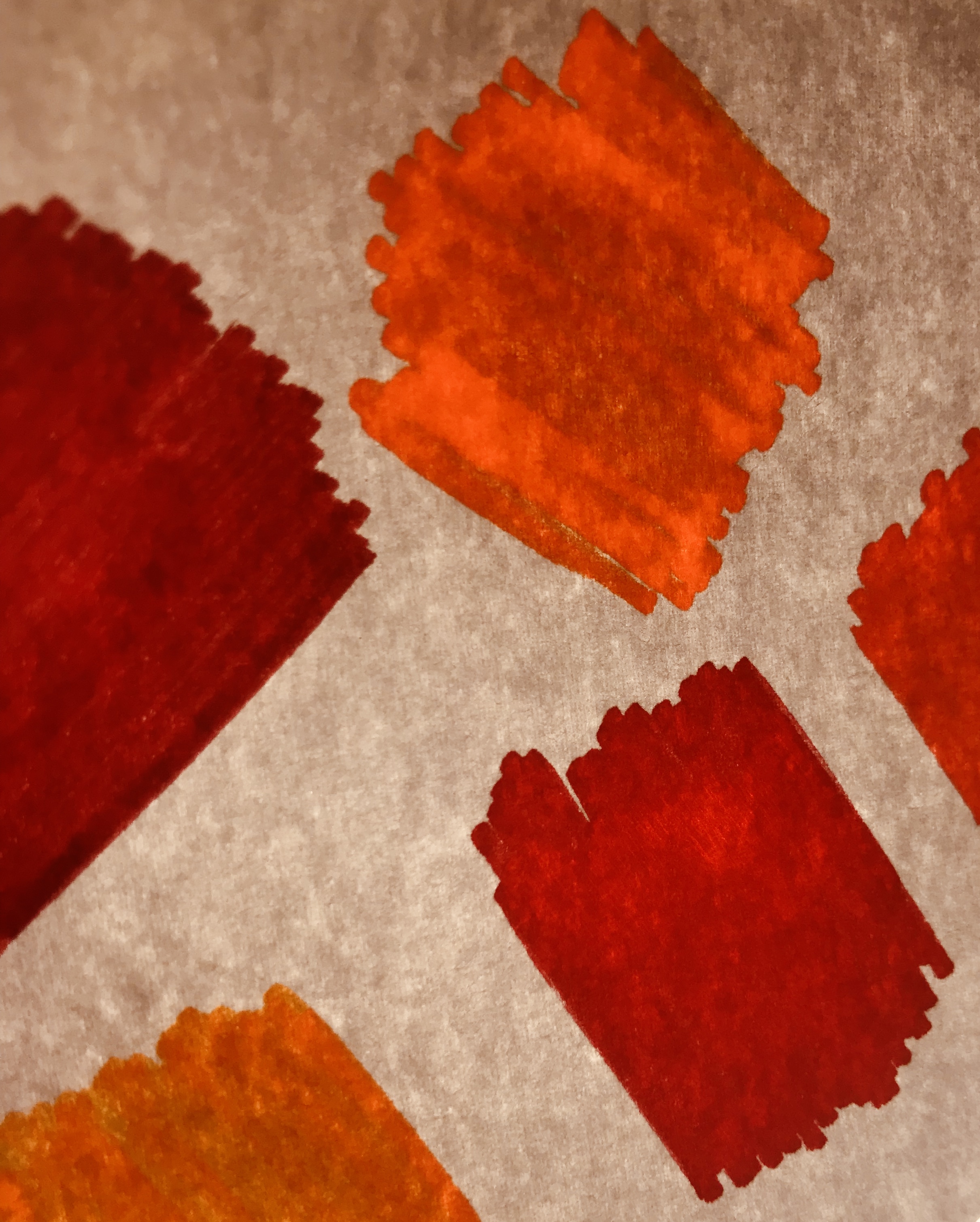
The images above are by a Portuguese photographer, Edgar Martins.

They are part of a series of work inspired by the writing and sending of letters, the power and intimacy of a letter. Martins has recently won various awards for his minimal, direct and stylish approach.

For this mini-series he photographed paper, carefully lit and isolated from any other context. There is a stillness to them that belies the fact they may have been written as suicide notes, contact between prison inmates and loved ones and more. Martins spent time working with court, prison and parole officials and indeed, prisoners in Portugal exploring this theme, that often ended in death for many of his subjects.Now refer back to your experiments with paper, and add your own research and analysis of Edgar Martins’ work.

TASK 1

  • Compare and contrast Edgar Martins work to your own images
  • Ensure you have discussed TECHNICAL and VISUAL aspects of the images
  • Think about the CONCEPT of the work and annotate your own accordingly
  • Can you add some CONTEXT to your work?

TASK 2

Compare and contrast : Lewis Bush “Metropole”

Image result for lewis bush photography

Image result for lewis bush metropole

Lewis Bush

employs a range of editing techniques to his images of London City, it’s constantly changing built environment and the industries held within it.

Have a closer look at his work and compare the way he blurs, overlaps and distorts our vision of the city to techniques that you may have employed to your images.

Why do you think he does this?

Describe and explain how your ideas have evolved.


Remember to use this model when discussing and analysing photographs :

TECHNICAL -VISUAL-CONCEPTUAL-CONTEXTUAL

Picture

ALWAYS choose 1 x key image of your own to discuss in detail

ALWAYS choose 1 x key image of an influential photographer to discuss in detail

HOMEWORK METHOD

Follow the 10 Step Process for each unit to ensure you tackle all Assessment Objectives thoroughly :

  1. Moodboard (AO1)
  2. Mindmap of ideas (AO1)
  3. Artist Reference / Case Study (AO1)
  4. Action Plan (AO3)
  5. Photoshoots + contact sheets (AO3)
  6. Image Selection (AO2)
  7. Image Editing/ manipulation (AO2)
  8. Presentation of final outcomes (AO4)
  9. Compare and contrast (AO1)
  10. Evaluate and Critique (AO1+AO4

Copy and use this plan to help you organise / evaluate your photo-assignments…

Double Exposure

I firstly layered two images over one another, as shown above.

After I layered them I tried out changing the opacity of the layer on top to see if I liked how the image looked by just using opacity. I decided against using it for these two images.

I then went through the different blend options to see how the image would look using different blends. The option I liked the most was the “multiply” option.

I then added a new layer with a new image and used both the opacity and the blend options together to make the new image appear almost invisible but still noticeable in the image.

This is the final outcome.

Double Exposures

To create a double exposure I used two similar photos of the same bridge. First, I duplicated the layer I wanted to go on top and placed it on top of my base image.
Then I made the top image more transparent using the opacity slider. In this image, it creates an effect of there being two layers of bridges across the bridge, as well as raising the skyline in the background.

The next two pictures are finished double exposures.

WEEK 5- GARY GAY ( COLOUR + TEXTURE)

 Garry Gay

Garry Gay was born in 1951 and was a color photographer from Glendale, California. He tad taken digital photos since 1993 and had a successful career due to being the president of multiple photography clubs. Garry Gay tended to take images which were very colorful as seen below where he had been taking colorful household object pictures.  

The main focus of Garry Gay’s work is the use of colourful objects he takes photos of. Garry uses the formal elements of shape and texture in his work, shape is shown in his work through the different sized objects while the texture is shown through the bright colours in his work and the materialistic objects which helps the bright colours to stand out. Most of Garry’s images are taken from a straight angle which allows different parts of the objects to be the focus piece. After analysing Garry’s images i think he uses artificial lighting in his photography which helps the colours to really pop out, as well as him using a quick shutter speed as there is no blur in any of his images. Most of his images do not include any type of background and only other objects which are to do with the main focus of the image which means that his images are very layered and his main focus doesn’t tend to stand out as much as it would with a plain background. However, this is a very effective technique and by using a wide depth of field this allows for the whole image to be in focus as well as the use of a high aperture.

I like Garry’s work as it is very simplistic however very effective and is very different from any other photographers i have previously researched about.

Plan

After researching and analysing Garry Gay’s images i have decided i want to use a quick shutter speed when capturing brightly colored pencils. For my background i will use pencil sharpening which i have chose to do after being inspired by the idea that Garry always included other objects to do with the main subject. I think bot the pencil shavings and the colored pencils will look very effective when together and this is an idea which i can up with myself.

When taking my image i am going to have my camera on a Manual setting so i can change the shutter speed and aperture to whatever i desire and will therefore be able to achieve my goals for this task. These images will be taken inside under artificial lighting.


Contact Sheets 


I found that during taking my images for this photo shoot, it was very hard due to having to use a slow shutter speed as i was under artificial lighting which make the images very hard to focus and therefore they have turned out quite bad.

Best outcomes

Editing the image..

The end picture..

When originally taking this image, it was taken with no flash on Manual Focus as i wanted to capture the range of overall very blue colour in the image, as well as being able to edit the depth of field when taking the picture. When planning my editing stage i planned to use Adobe Photoshop to edit the brightness, contrast, saturation, the colour balance and the exposure of this image in order to get my ideal end photograph.

When taking my images i used Canon EOS 1300 D and took all my images in Manual focus which helped me to create a picture with lots of depth.  When taking the image i also used a high shutter speed ( 1/250).

The visual aspects are shown through the colour of the image which are emphasized by the brightness of the image as the light brightness helps to brighten up the blue paint on the wall. There is a lot of texture in this image due to the  main subject of this 3D image being the wall which has a lot of dents in as well as different colours which act differently to the brightness used in the picture. There is an obvious use of a strong depth of field in this image which has been tone to add more texture and depth into the image.

Editing the second image.. 

The end picture..

When originally taking this image, it was taken with no flash on Manual Focus as i wanted to be able to change the camera settings for the focus of the image. While planning my editing stage i planned to use Adobe Photoshop in order to change the brightness, contrast, exposure, offset, viberance, saturation, the color balance, the shadows and the highlights of the image in order to create my ideal final image.

When taking my images i used Canon EOS 1300 D and took all my images in Manual focus which helped me to create a picture with lots of depth.  When taking the image i also used a high shutter speed ( 1/250). Using the fast shutter speed helped to under expose the image due to the darkness in the background in the image. Using the fast shutter speed helped me to achieve my end goal of having colour and the darkness in the image contrast with each other as there was not much light let into the image. I also used an ISO of 6400 which again helped the contrast between light and dark.

The visual aspects of the image are shown through the colours in the image which is emphasised  by the tone of the overall light. There is not much texture in this 3D image however there is viable texture on the leaves of the plant which makes the image very unique, as well as using an ISO of 6400 which is helping to add more contrast between light and dark. There is no pattern arrangement in this image. However, the Rule of Three method is clearly shown on the right hand side of the image.


Mirroring images

Mirroring images and Double Exposures

Steps to creating a reverse image copy (mirror of your image)

  • Select you chosen image and open in Adobe Photoshop
  • The go to IMAGE > CANVAS SIZE
  • Next you need to decide which way you want to reflect your chosen image and select that on the ANCHOR
  • Then depending on whether you want you image to be reflect to the side or up effects whether you DOUBLE the width or the length
  • Draw a box around you image that you want to mirror
  • Ctrl + j
  • Ctrl + t
  • The drag the furthest side of you image over to the other side and the image should be mirrored
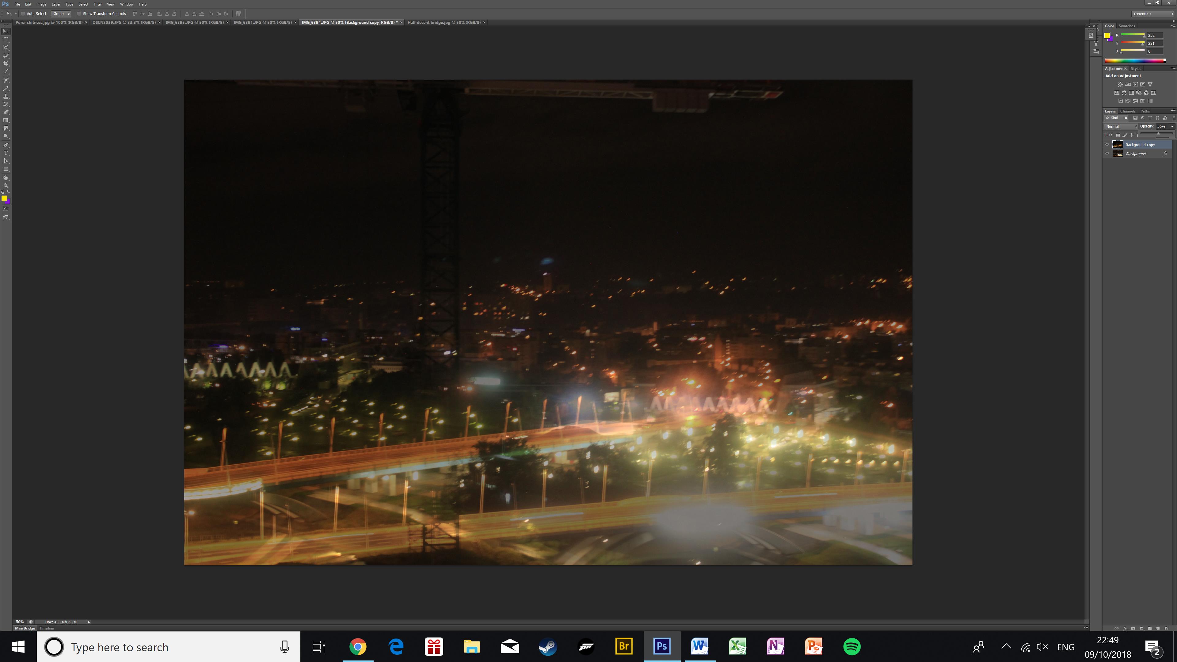
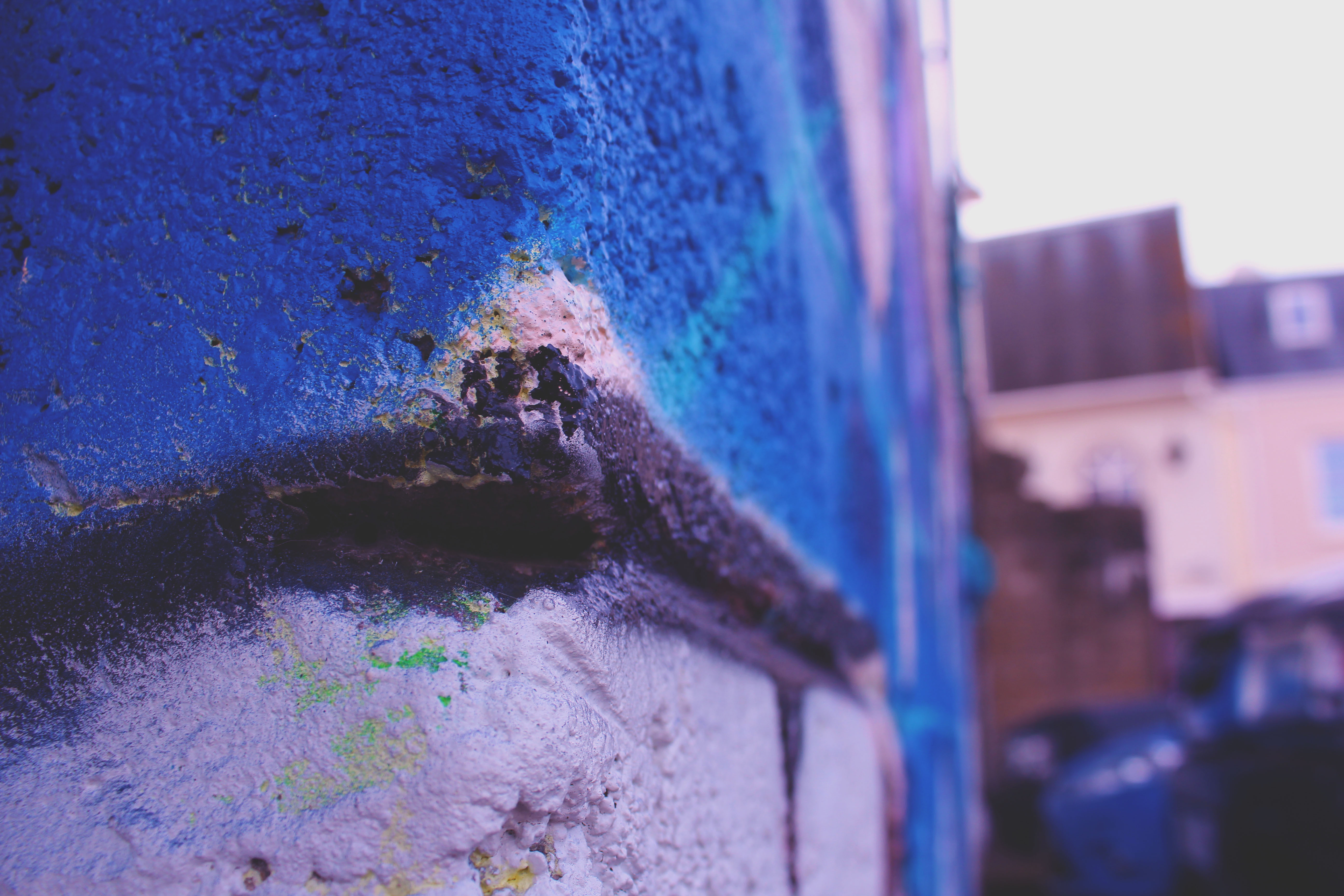
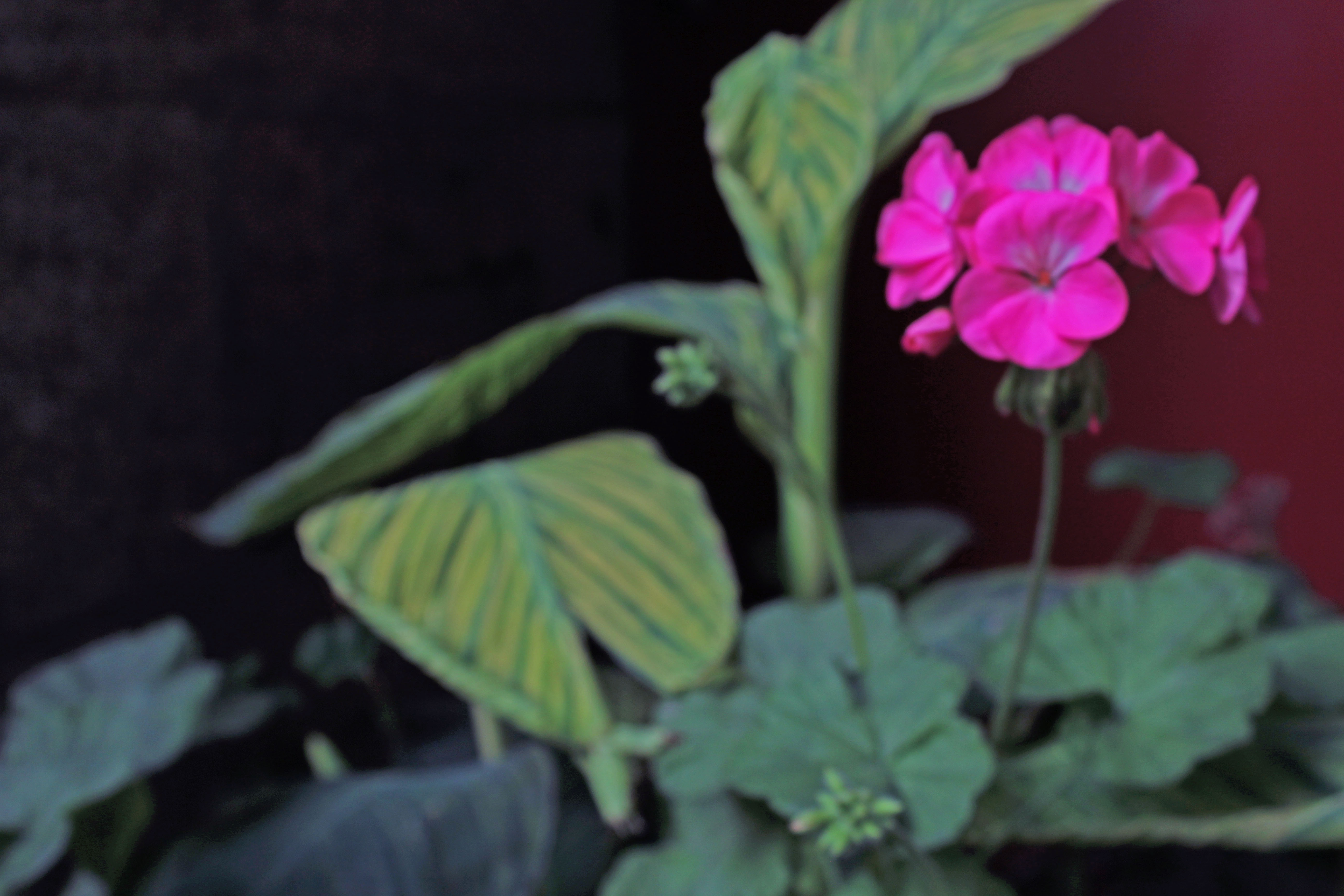
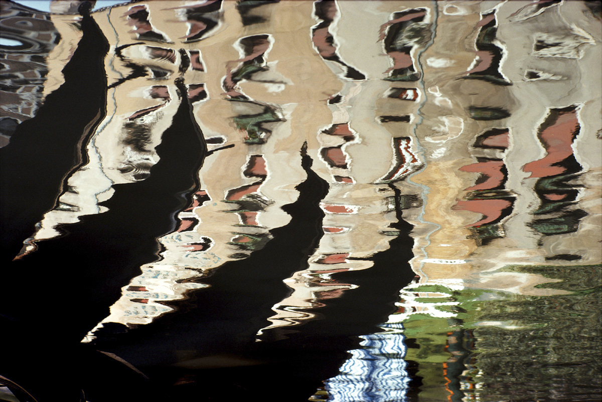
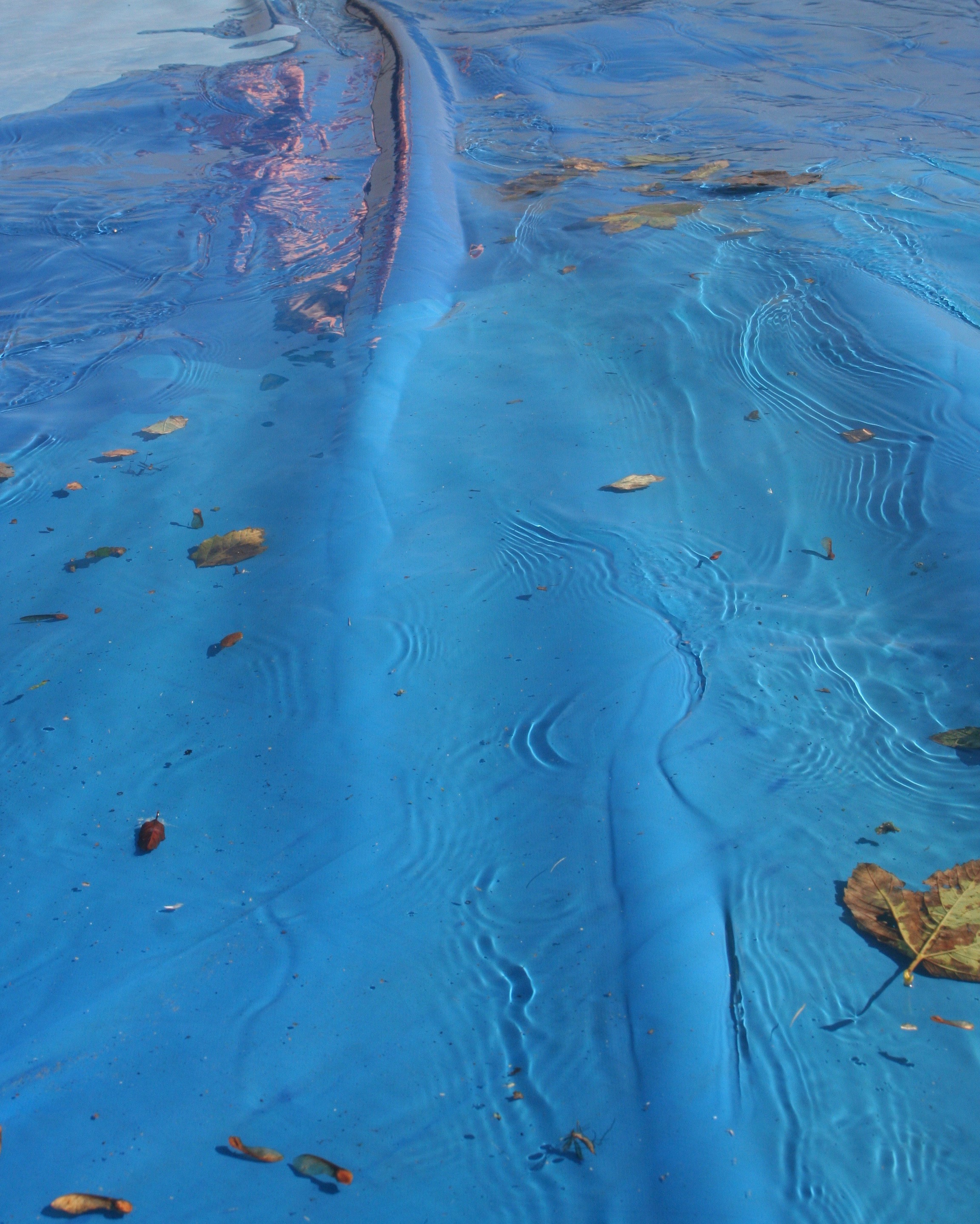
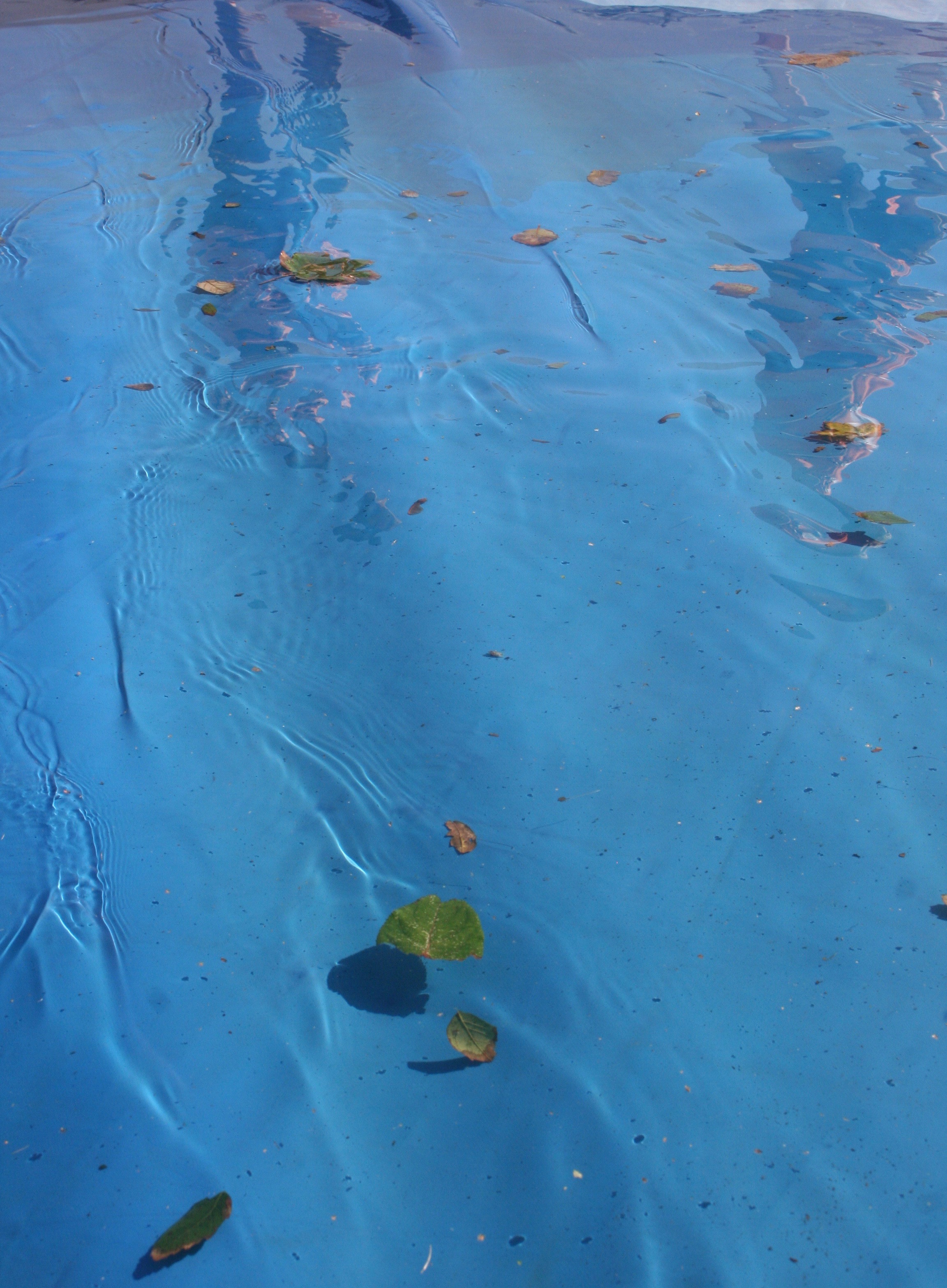
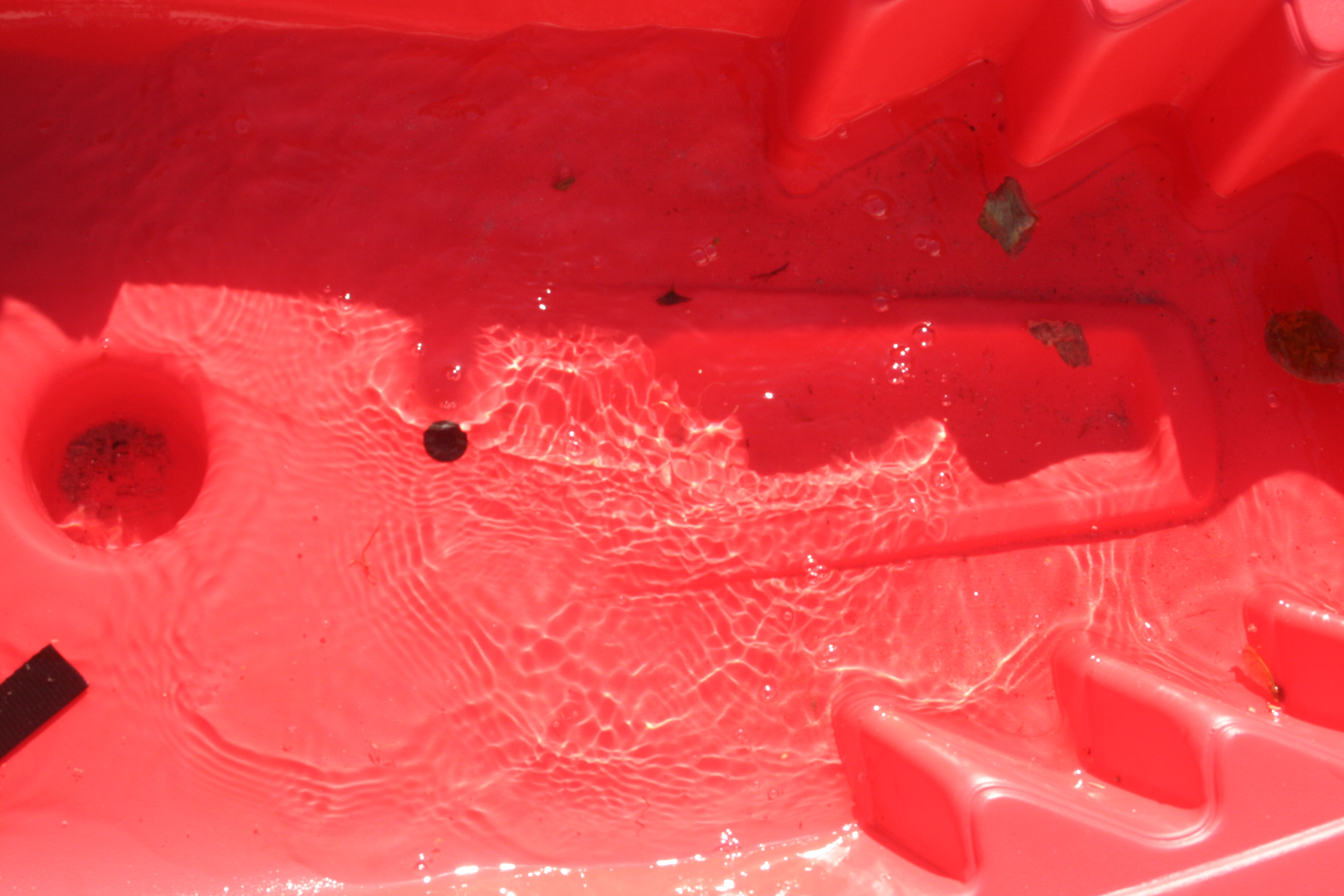
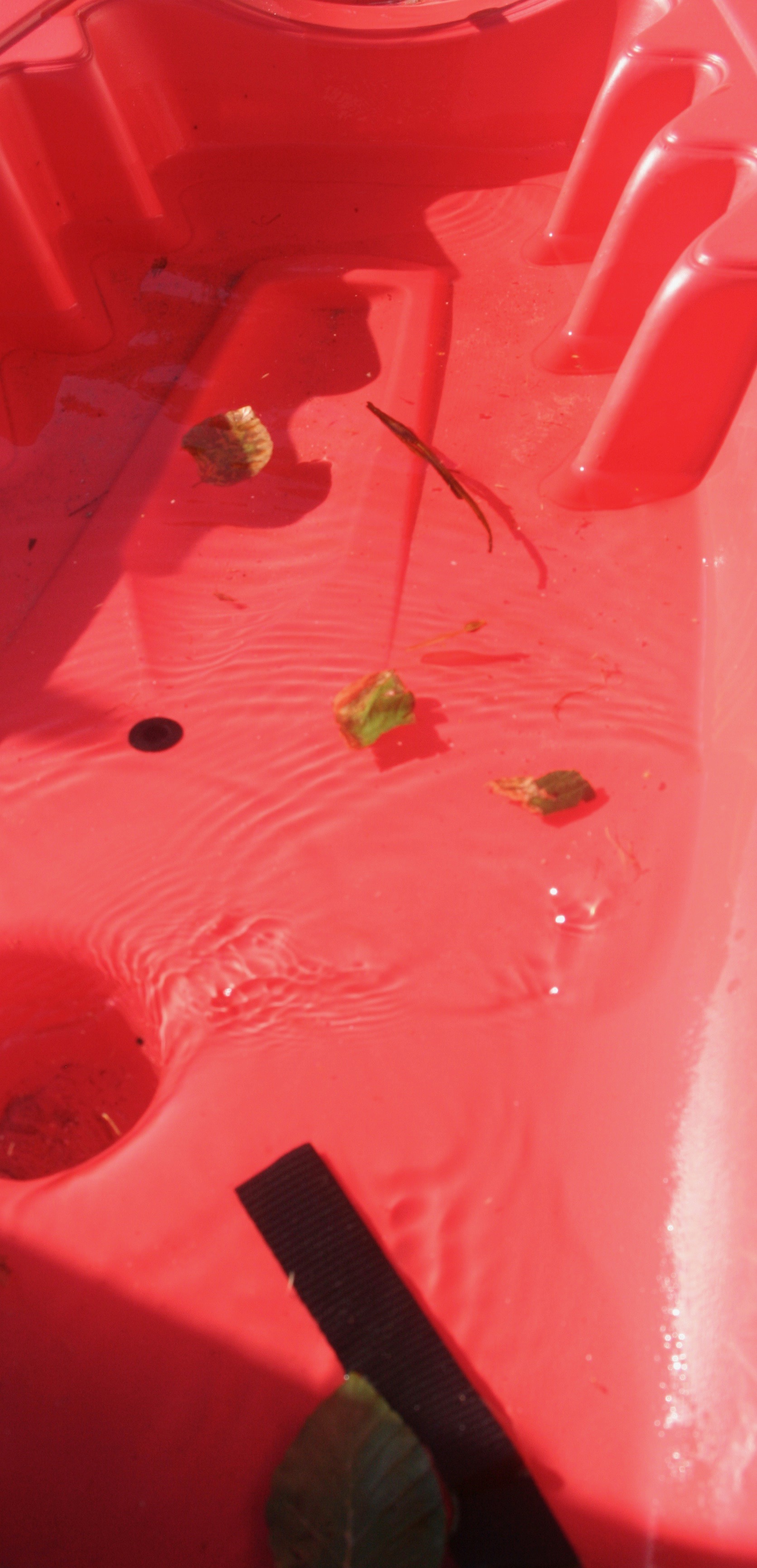
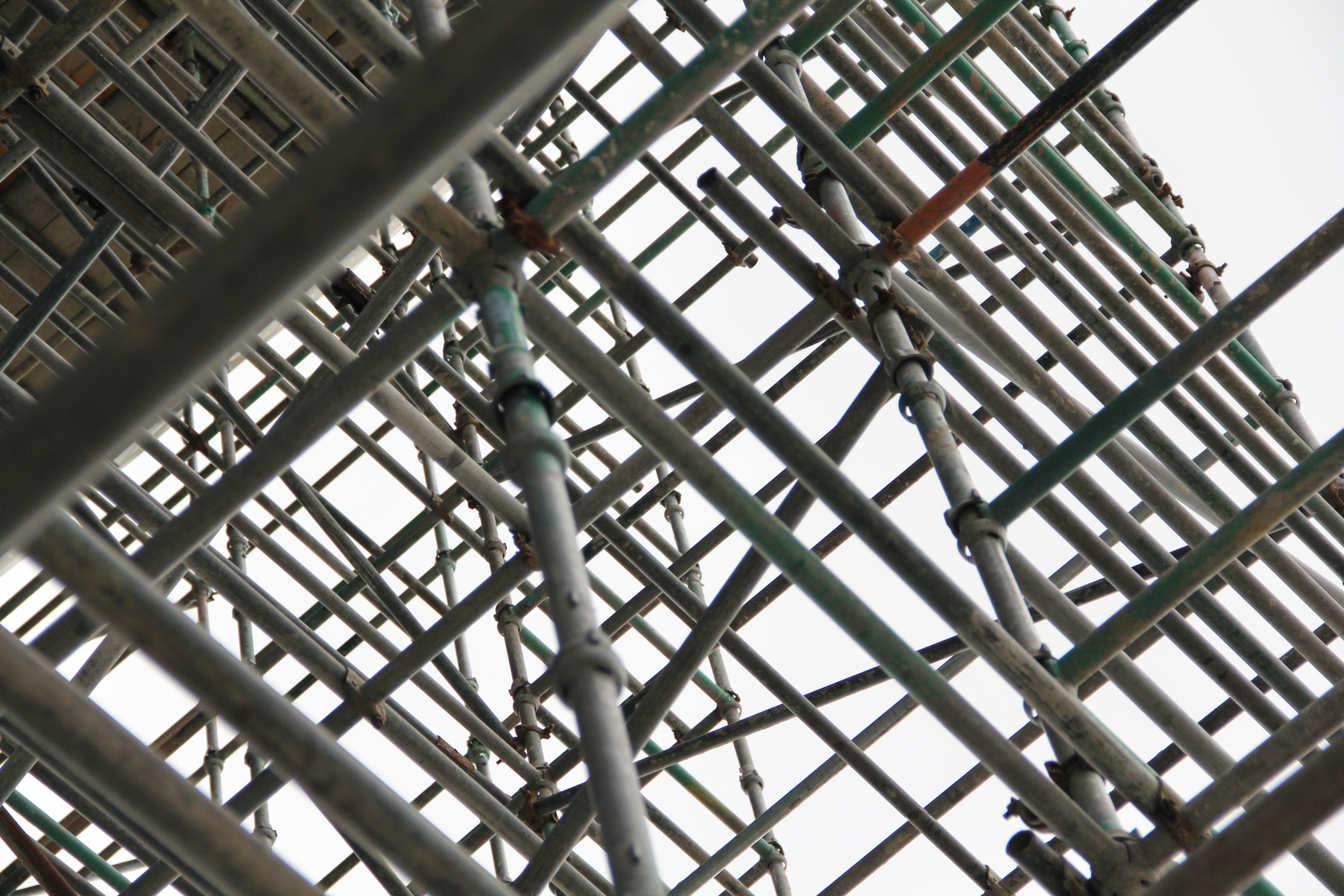
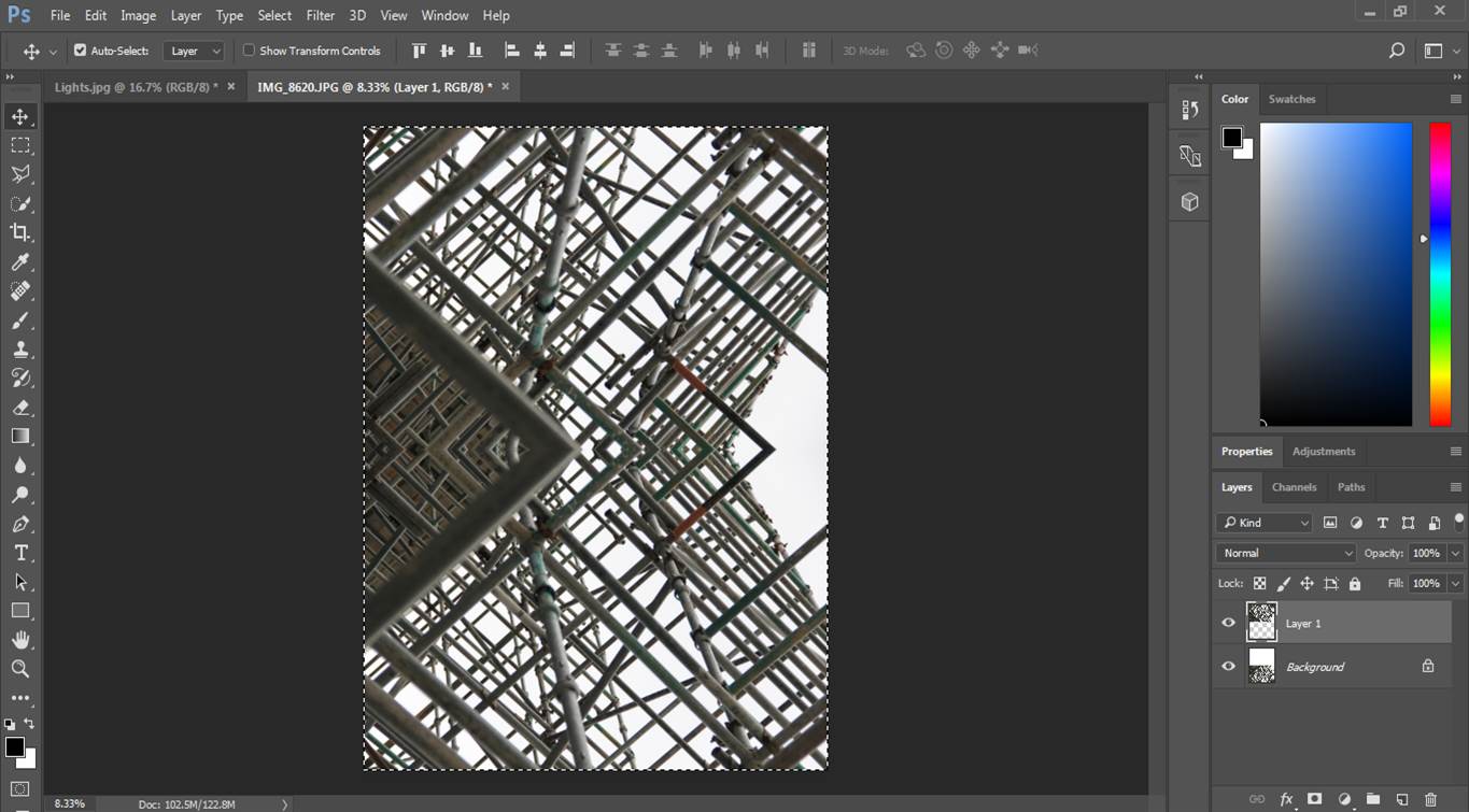
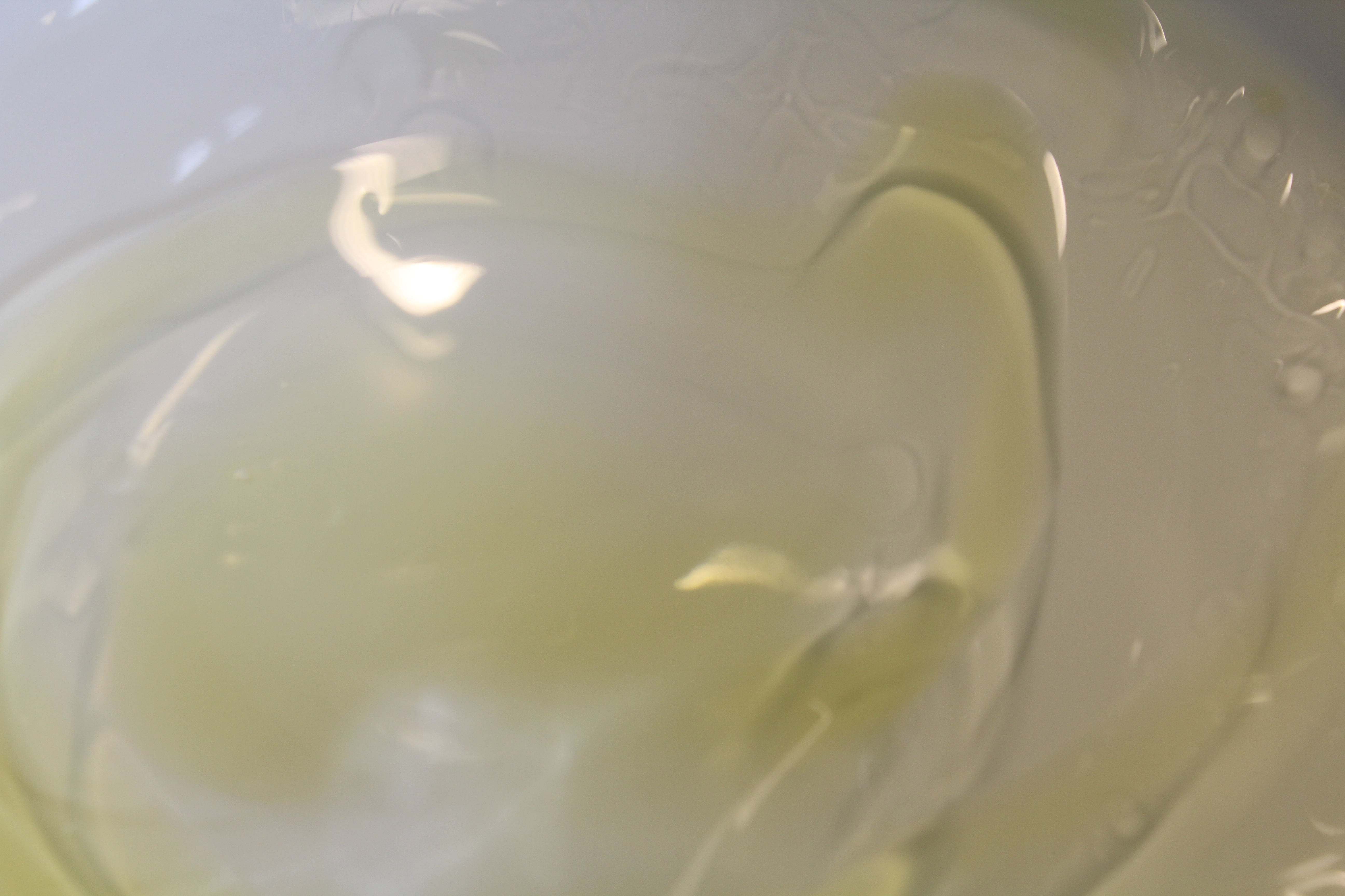
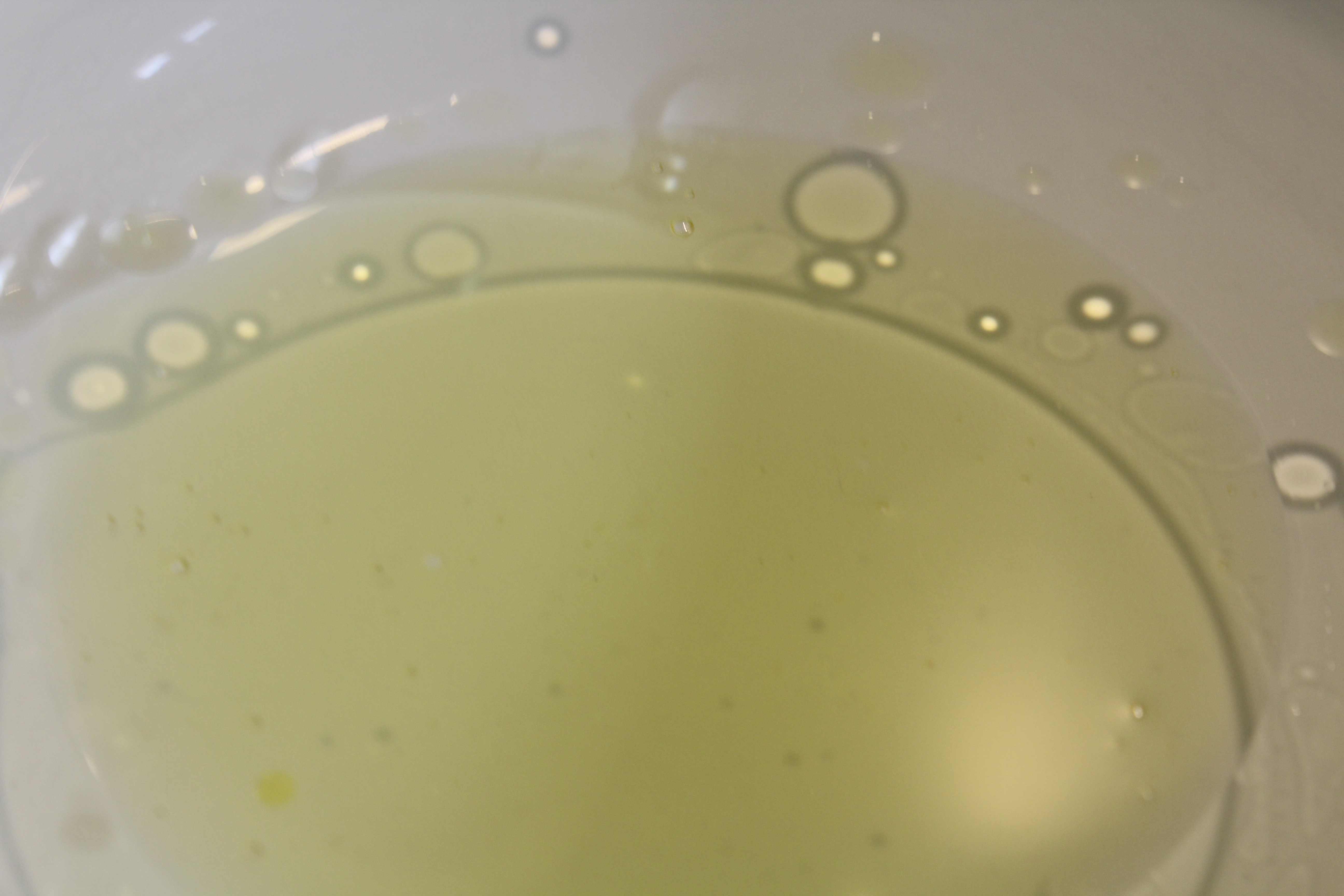
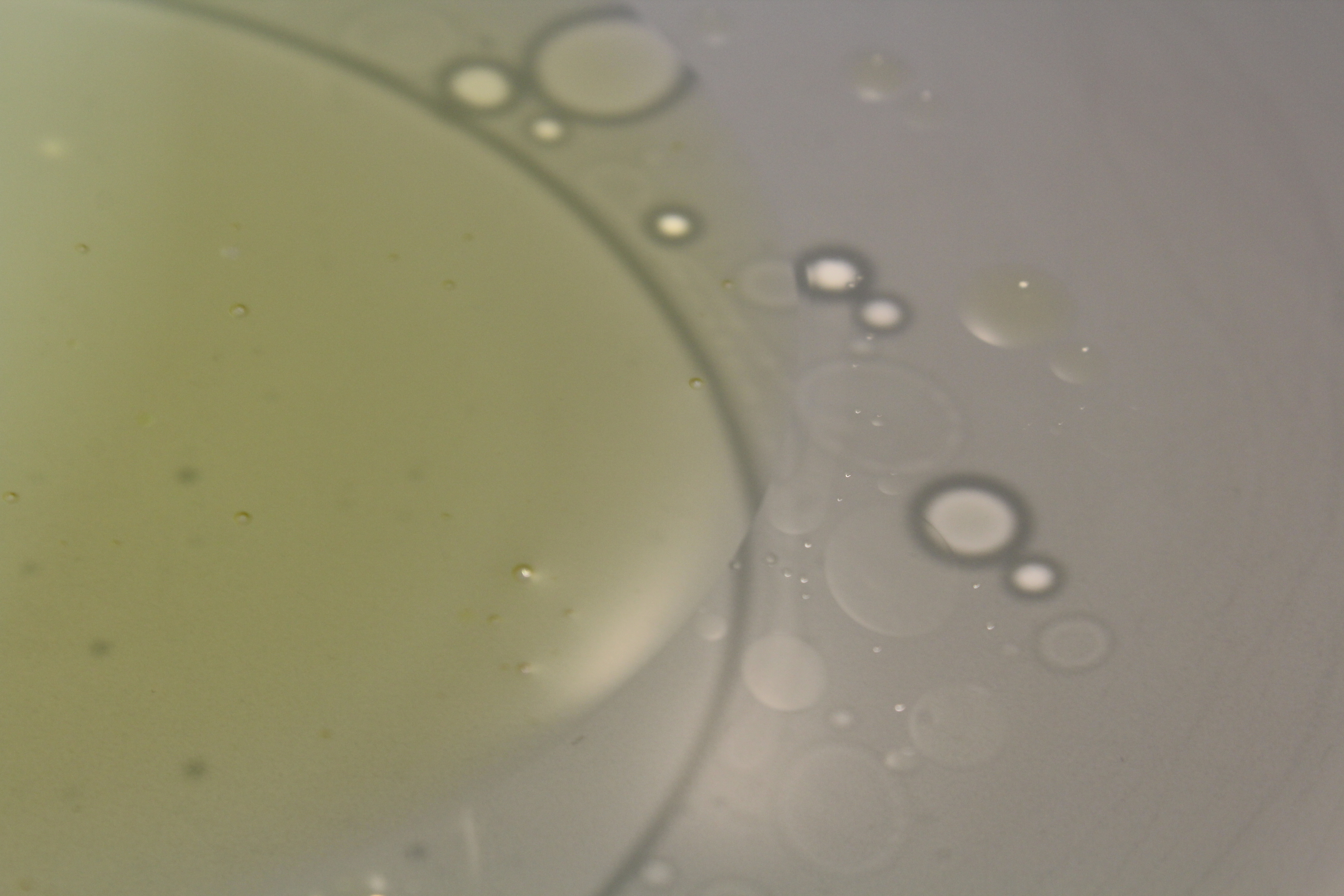
  • By using this effect and the idea of copying the image across as if there was a mirror in place, it give the image more feeling and gives the viewer more chose to interpret their own thought of the image and allows more textures and surface to the image.

Minimalist Mood board

MY INSPIRATION:

This is a mood board of a set of minimalist images which i am including into my research to get me started with my homework task and give me inspiration for my photo shoot. I particularly enjoy this homework task as minimalism often involves a lot of color and simplicity of shapes and forms.

Colour&Texture

Ernst Haas-Water

Haas  was an Austrian-American photojournalist and colour photographer. He incorporated his photojournalism and photography as a medium of expression and creativity.His father was photographer and encouraged Ernst, but it was only by his fathers death in which he became intrigued by photography when seeing his fathers darkroom. Haas used black and white  film for much of his career, color film and visual experimentalism became integral to his photography. He would make his own photographs, translating his passion for poetry, music, painting, and adventure into colour imagery. Once he began working in color, he most often used kodachrome, known for its rich, saturated colors. To print his color work, Haas used the dye transfer process whenever possible. An expensive, complex process most frequently used at the time for advertising, dye transfer allowed for great control over color hue and saturation. As the technology of color photography evolved and improved during this period, audience interest in color imagery increased. Many of the magazines that published Haas’ work, such as Life, improved the quality of their color reproduction, and increasingly sought to include his work in the medium. Despite this progress, many photographers, curators, and historians were initially reluctant to consider color photography as art, given the technology’s commercial origins. His images don’t have a focal point, the picture as a whole speaks, not just one area of the photo. He uses natural lighting to create the clear reflection, he has relatively low level of control due to the fact he can’t position the whereabouts of the sun, so his pictures may have been planned. His photos have contrasting tones, some areas are warm some are cold, his work clearly empathizes the beauty in colour.  When I think of colour in photography I picture a vibrant, detailed flower, but Haas, creates colour from objects such as transparent water.

Image result for Ernst Haas water

I decided to use Ernst’s water photos as inspiration for my final shoot. I used the puddles of water on a swimming pool cover and on a kayak as a focal point for my reflections and ripples. My texture came from the leaves and water, my colour from the blue and red. In my first and second photos I was influenced by Ernst’s water reflection photos, I got my brothers to stand in the same direction in which the sun was shining in order to achieve the distorted reflections. Natural lighting was the easiest way for me to achieve the reflection, I found I had relatively low levels of control as the positioning of the sun determined the angles at which I could take the photos. I also found it hard to take pictures without them being  over-exposed due to the high intensity of the sun, the ripples however were easy to create and added a sense of structure and pattern. I had to crop all of my final outcomes in order to get rid unwanted negative space which interfered with the overall colour combination.

Final Outcomes:

ISO 400-39mm-f/14-1/320
ISO 400-39mm-f/13-1/320
ISO 200-39mm-f/20-1/500
ISO 400-28mm-f/13-1/250
ISO 400-23mm-f/11-1/320

Photoshop Mirroring

Original Image

Editing Process 

Firstly I doubled the canvas height so I would have room for a copy.

I then Duplicated the image and selected it using the marquee tool, then I proceeded to transform the image.

Once I had transformed the image, the layers must be flattened to that the image will stay as one singular layer for when i next transform it.

Finally i decided to repeat the process to end up with this final Image.

Final Image

Colour and Texture In Photography ( in progress)

For this project, I attempted to show contrast between colours and textures through the medium of photography. Colours and textures allow for photographs to become more interactive, as a viewer can be drawn in by bright and contrasting colours, and texture allows for the photograph to feel more genuine and real. Because of this, the use of texture and colour in photography is important, and for this project I have attempted to portray these factors in a more obvious way, allowing viewers to see how colour and texture can really effect an image.

For my inspiration for researching texture in photography, I decided to take influence from the work of Ernst Haas, specifically his water photography.

Haas was fascinated by the concept of water,  the way it reflected light and the dynamics of its movement. Haas’ water photography maintains an abstract feel, yet displays clearly the unpredictable way that water moves and interacts with its surroundings. Haas often edited and cropped his photographs in order to abstract the context of his images, and used colour and grey-scale to experiment with different ways of further abstracting his images. Below are examples of Haas’ work with photographing water:

As displayed, Haas makes use of contrasting tones and colours in order to draw more attention to his images. Bold colours draw the viewers eye, while the use of texture in the images (often due to the movement of the water) allows for the viewer to stay intrigued, as it gives the image an sense of realism, and enables the viewer to relate to the image.

After analyzing the work of Haas, I produced a photo shoot focusing on emphasizing the colours and textures naturally found together. I tried to focus on colours that contrasted one another, and textures that really draw attention to the image. Below is the contact sheet as a  result of my photo-shoot:

I took inspiration from Haas, and in doing so produced a photo-shoot which heavily took into account the texture of the image subjects. For my images, I focused on zooming into details, which in turn produced photographs displaying texture, such as the image pictures below:

This image makes use of both colour (contrasting the darker background with the lighter toned water droplet) and the rough texture of the rust at the top of the image, and the way that this contrasts the smoother texture of the water droplet. Haas often used darker tones in his image backgrounds, to emphasize the water that would typically reflect the light, and present as a brighter, lighter tone. I have taken inspiration from this method, and I believe it is an effective way to show contrasting textures through the use of light and shade.

The above 2 images were taking using a slow shutter-speed, and I feel like these images focus more on showing contrasting colours. The image was taken with an ISO of 1600, and so the photograph is very bright, which I feel exaggerates the colours, and helps to show the contrast between the yellow and white portions of the image. This image is still using the subject of water, but I feel that the combination of a high ISO and slow shutter-speed has helped to distort and abstract the image, so that the main focus of the viewer becomes the colour and texture, rather than the subject itself.On top of the bright colours used, I feel that the texture also draws the attention of the viewer, as the movement of the water captured by the slow shutter-speed has caused the texture of moving water to be captures, especially towards the middle of the images. This gives the images a rippled effect, and helps to present them as more 3D, rather than a flat image, which in turn draws the attention of the viewer.

In addition to taking inspiration from Haas, I also further explored the use of, specifically, colour in photography, by taking inspiration from the photographer Franco Fontana.

In order to explore colour using Fontana as inspiration, I first analysed his work in order to understand how he used colour to best emphasis how the different colours contrasted each other. The following image is a collection of his work that I used for inspiration:

Fontana uses very vibrant and bold colours in his photography, which helps to emphasis the contrast of colour, which draws a lot of attention to his work. Fontana typically uses naturally occurring bold colours, usually focusing on buildings and field landscapes, in order to draw attention to the bold and bright colours that can be found in everyday life.

After analyzing Fontana’s work, I produced a photo-shoot of my own, using the same mindset and bold colours that occur in Fontana’s work. The below image is the result of my colour-focused photo-shoot:

This colour focused photo-shoot


EXPERIMENTING WITH SHUTTER SPEED

Experimenting with shutter speed

Having a slow shutter speed means that the image you’re taking will have a high exposure and will most likely be bright. When taking pictures in badly lit image using a slow shutter speed is ideal as it will make the image less dark. A slow shutter speed is good for taking pictures which are moving which helps to create a very unique effect which has purposely been done.

However, having a fast shutter speed makes the image have a very low exposure which means the image will be underexposed and the image will come out a lot darker than intended. A fast shutter speed is appropriate when you are wanting to light a scene. This shutter speed is used to capture moving objects as the image is taken a lot quicker.

Example


Planning my photo shoots 

For these shoots i will firstly take slow shutter speed images. These images will be taken of moving cars to see if i can capture the  ‘ stillness’ of the moving car which will contrast to the background which will show the car is moving due to the blurring, I think this will be hard to capture due to the car being constantly moving.

For the second photo shoot of high shutter speed images i plan to take jumping pictures of my friends. This will be done in front of a plain white wall so that nothing distracts from the main subject which will be my friends in the air.

Experimenting with a slow shutter speed 

My most successful images 

Experimenting with high shutter speed