Abstract Images – Presentation of Final Images

I chose to present the images in this manner as i liked the triadic structure however still wanted to add a mild chaotic element by removing any symmetry while still allowing the viewer to easily follow along the piece horizontally. I believe this positioning also allows the viewer to appreciate the whole piece as in order to reach the photograph in the top right corner they must reach the top of the centerpiece, which i believe is the best photograph out of my collection.

Focus and Depth of field

Focus

Focus is defined as having or producing clear visual definition. The lens on a camera aids focus by directing the light into the desired position. Here are some diagrams below that better explain this feature

Image result for focus camera diagram

Depth of Field

Depth of field in the distance between the furthest object to the lens and the closest object. This technique is used to create high definition images that either focus on the foreground subject or the background subject as seen in the example images

Image result for depth of field

Image result for depth of field


Gina Socrate: CCA Gallery

“As a photographer, I draw inspiration from the island of Jersey on which I live: its sometime soft and delicate, sometime harsh and rugged coastline,
its traditional and contemporary architecture, its abundant flora and the individual characters of the locals.

Often, I interpret my subjects in a way that renders them almost abstract by focusing on details and minutiae which may otherwise pass unnoticed.
The results are images that become visual riddles which entice the viewer to explore and interpret them, while at the same time maintaining an aesthetic
quality which can be appreciated in its own right.

Conversely, many of my photographs pull back to capture the wider picture: from expansive seascapes to distant portraits and character observations, these
images seek to offer an overall view. Minimalist and sometimes stark, these photographs are often more Spartan than my abstract work through their focusing on detail contextualised within a vast setting. “

Initial Choices of Final Outcomes

These are my initial choices for the final images. I have taken these abstract images in different ways, some I have taken close up or some from quite far away. I have used skills I learned in class cameras for most of them. I have used different focuses and have changed apertures and ISOs depending on the areas I was in when taking the images. A lot of the images I have created clearly show texture and contrast. This can be seen especially well on the image of the rope and can be seen well on the metal.

The World is Beautiful – Albert Renger-Patzsch

Albert Renger-Patzsch and the New Objectivity:

Albert Renger-Patzsch  was a German photographer heavily associated with the New Objectivity.

Renger-Patzsch began taking photos at the age of twelve and after serving in the military during the First World War he studied chemistry. His style was very matter-of-fact and exemplified the aesthetic of the New Objectivity which flourished in Germany at this time during the period of the Weimar Republic.

Renger-Patzsch believed  that the value of photography was in its ability to reproduce the texture of reality, and to represent the essence of an object. It meant that his images didn’t necessarily need to have a meaning, or reason behind their creation. They were purely snap shots of visually appealing things he encountered or set up. This brought a whole new era of photography on, paving the way for people to start taking photos informally, of simple things they found pleasing to the eye. This aided in the introduction of endorsement photography, especially in fashion and beauty industries where the subjects are supposed to attract the buyer’s attention whether that is through the presentation of a physical product or the appeal behind models presenting certain products or ideals.

My response:

Best Images:

WEEK 6- INITIAL IMAGES

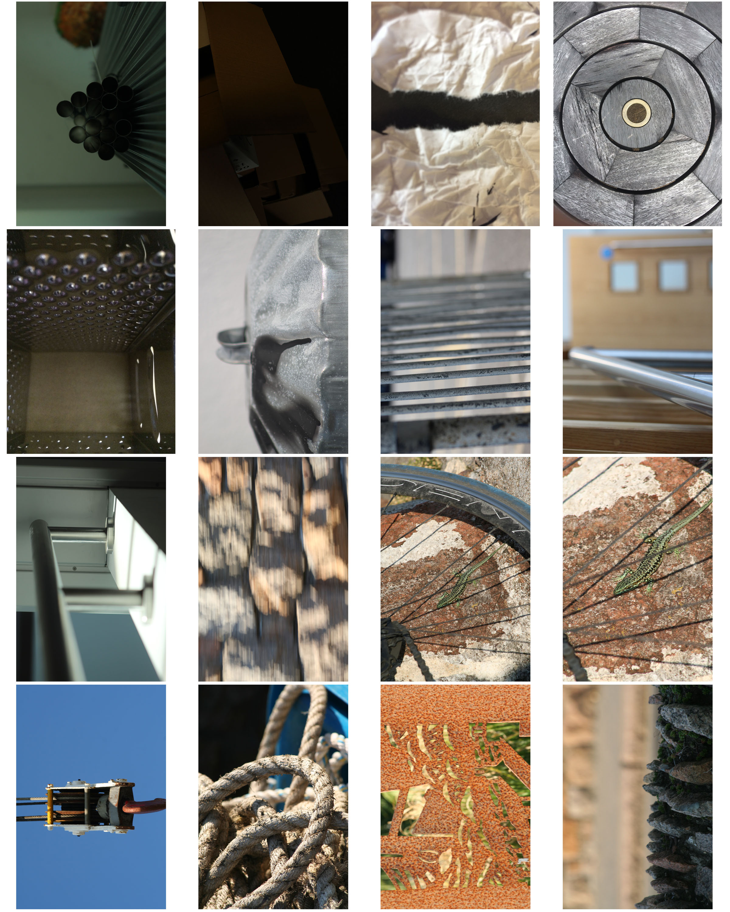
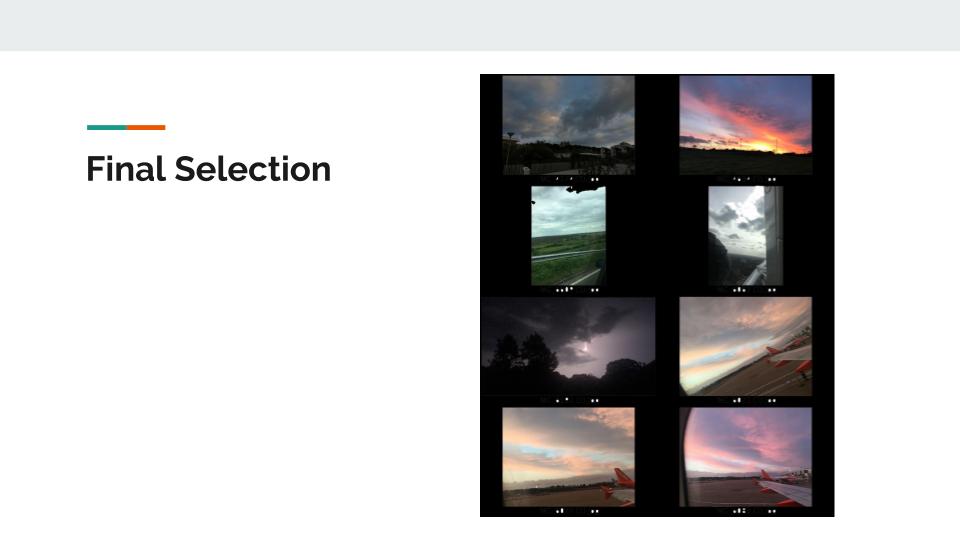
Initial Choices for final images

After looking through my whole ‘ Abstract’ project, i have used Adobe Photoshop to play around with 5 possible images which i can choose from to be a final image of mine. 

Reasoning for my choices 

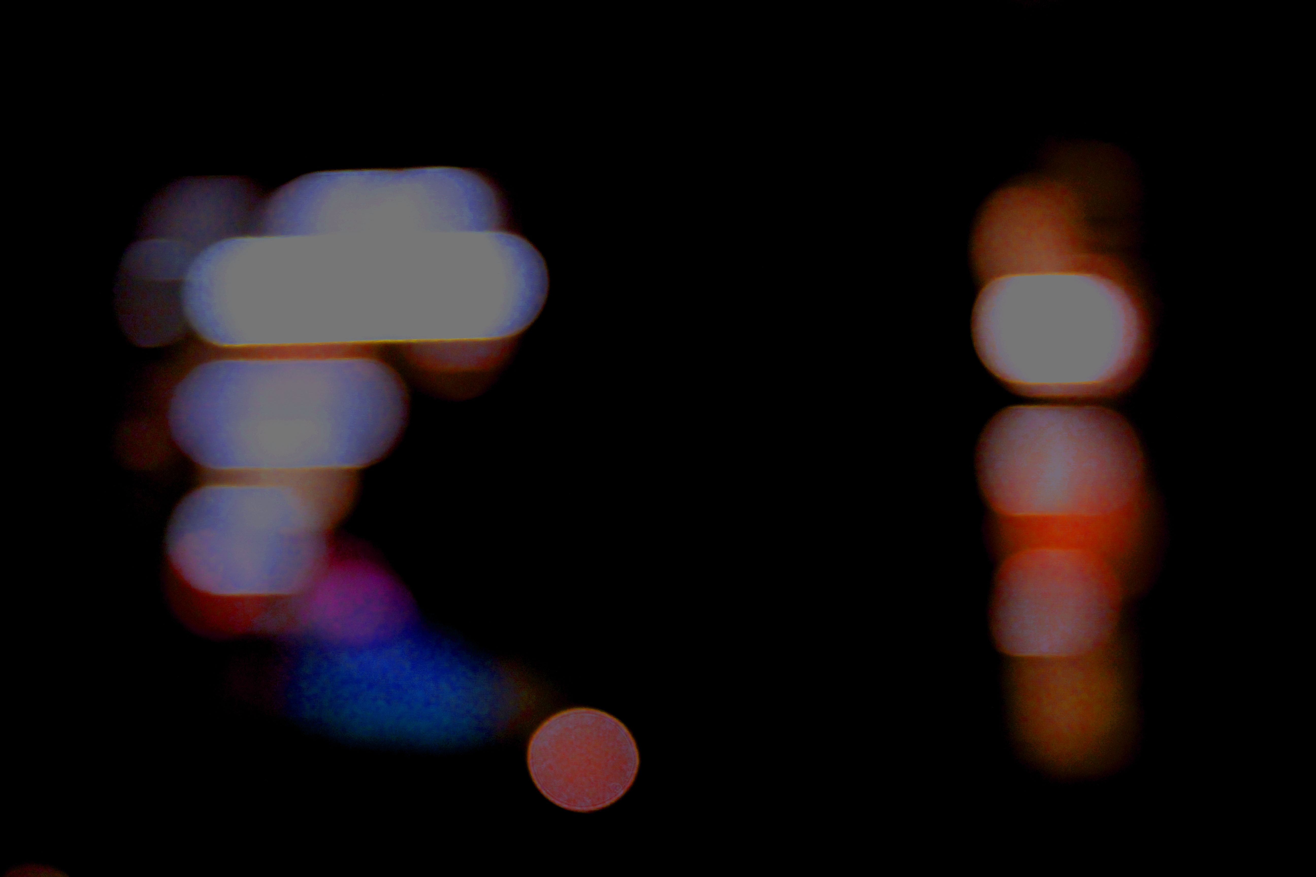
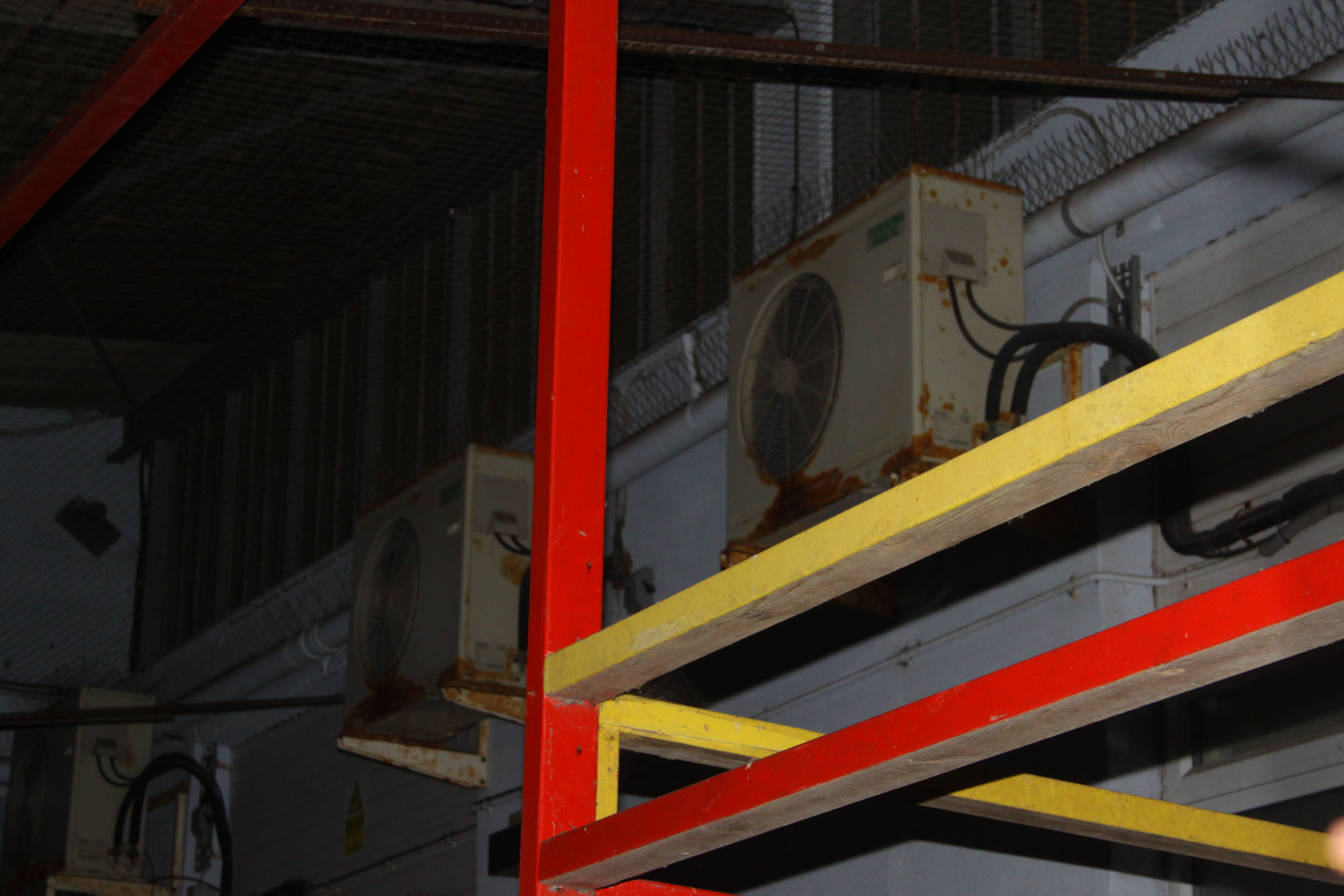
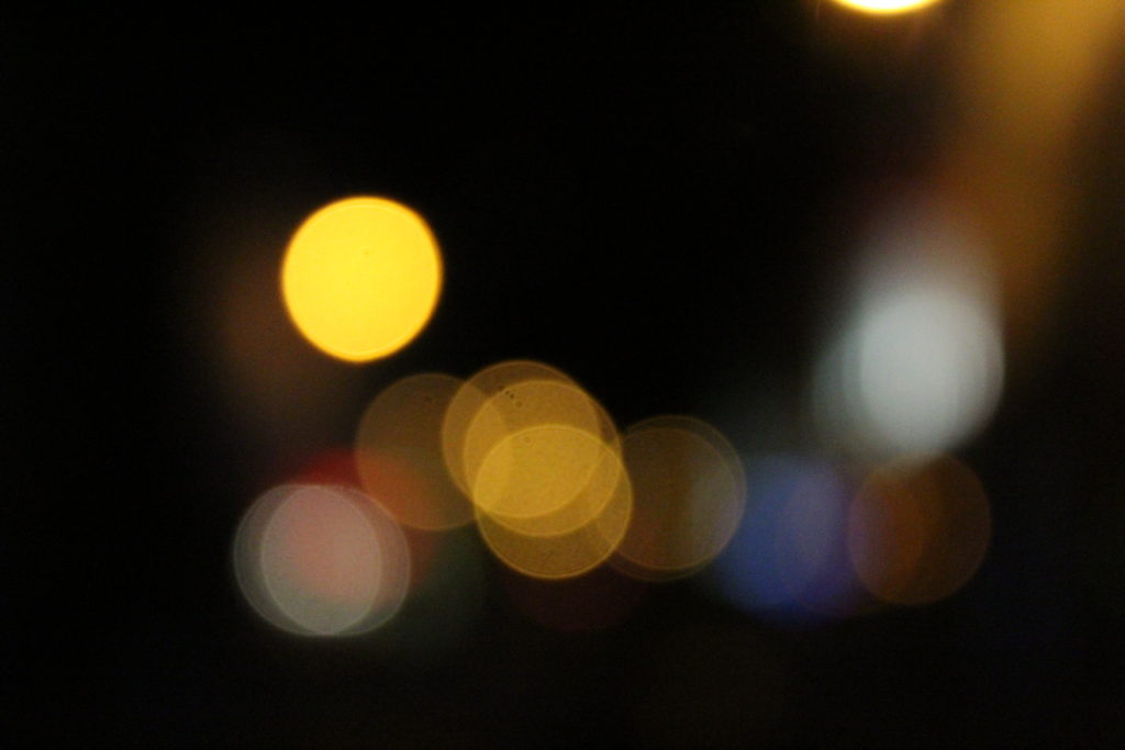
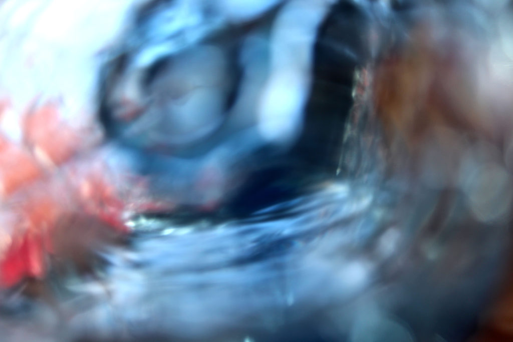
I think using my ‘ Bokha’ inspired image for A4 print out is a good choice. This is because this was my most successful image from a previous Bokha project when studying the photographer Saul Leiter. I think this was one of my most successful pictures from that project as it includes a lot of contrast in the picture due to the high saturated colours, the bright white and the overall darkness.

This image also shows a range of techniques that was used to get this end picture. I took this picture in Manual Focus as which helped to purposely make the scenery blurred while as using a quick shutter speed to take pictures of the lights not in focus as well as it helping to under expose the image and contrast the colours with the overall darkness a lot more which was one of my main goals.

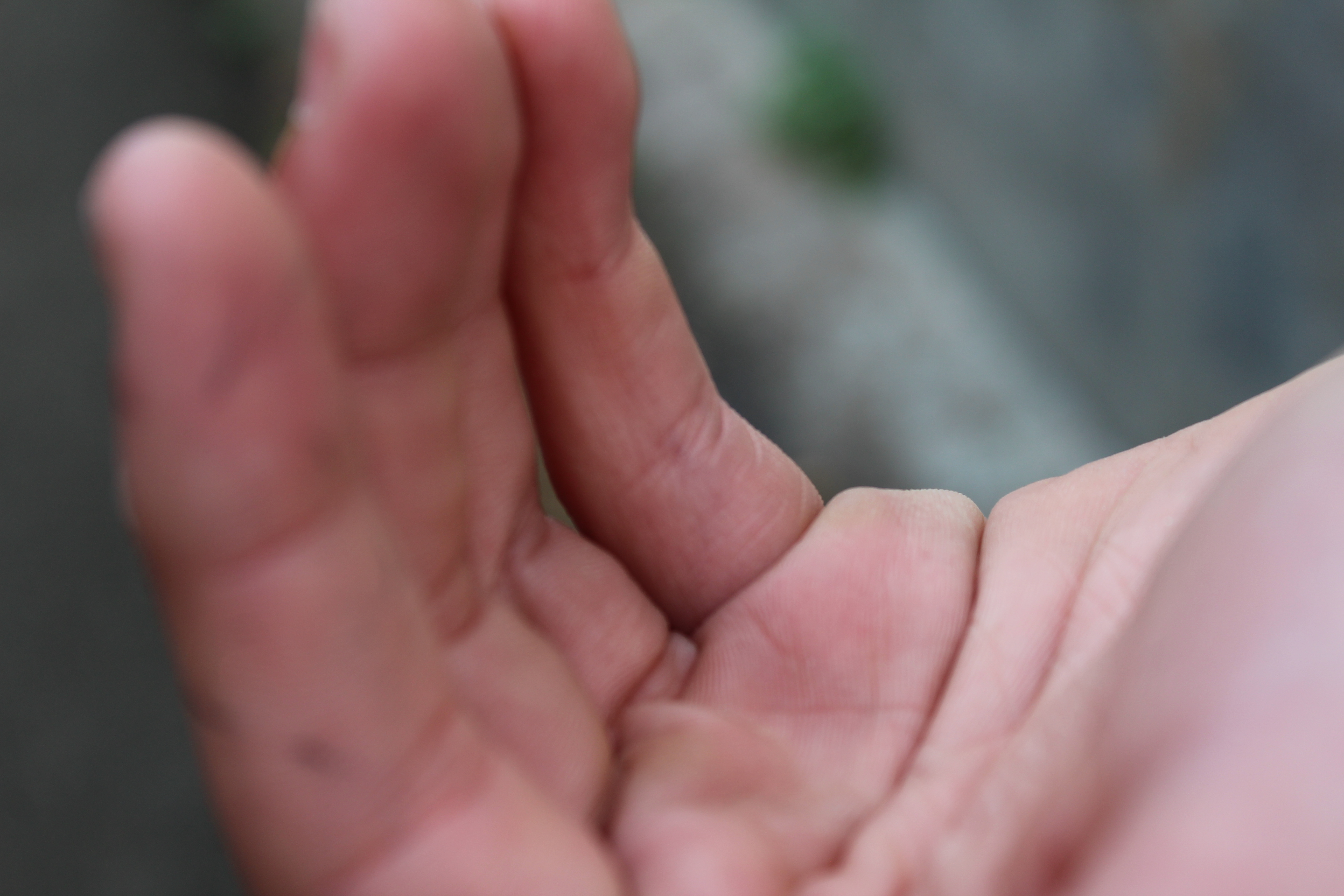
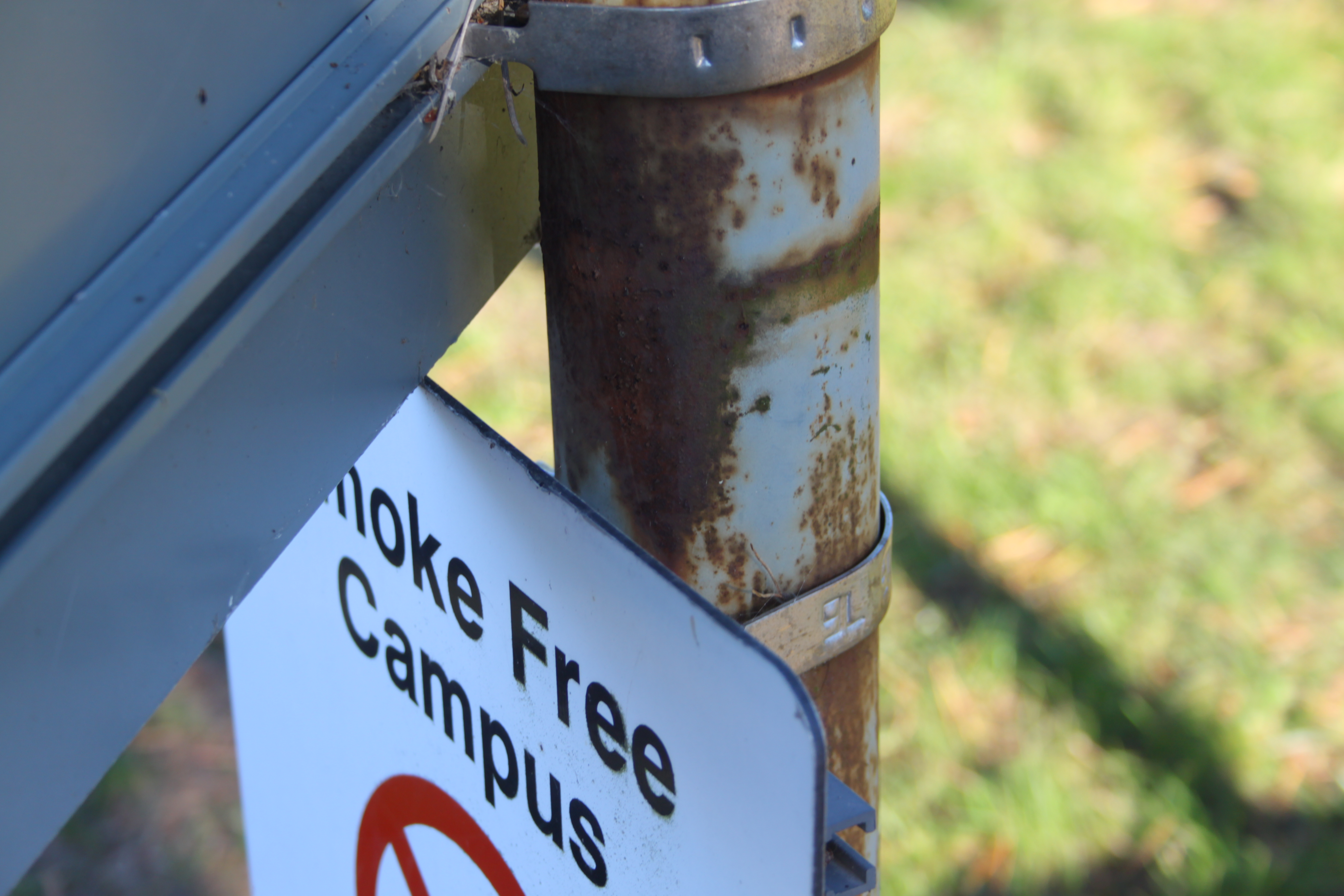
I think using this very toned picture of a hand for my A5 print out is a good decision as this image includes a range of technical elements and taking this picture on this photo shoot taught me a range of things.

This image was taken in Manual Focus so that my ‘ F stop’ was low which made a narrow depth of field which was an affect that i was aiming for. This image was also taken under natural lighting and therefore when using the quick shutter speed on my camera, this allowed for every detail of the hand to be emphasized which added a lot of tone for when edit the into black and white. Using the quick shutter speed taught me that i can use it to help under expose the image to create a darker effect for the non- subject parts of the image which helps to contrast between the light and dark in the picture.

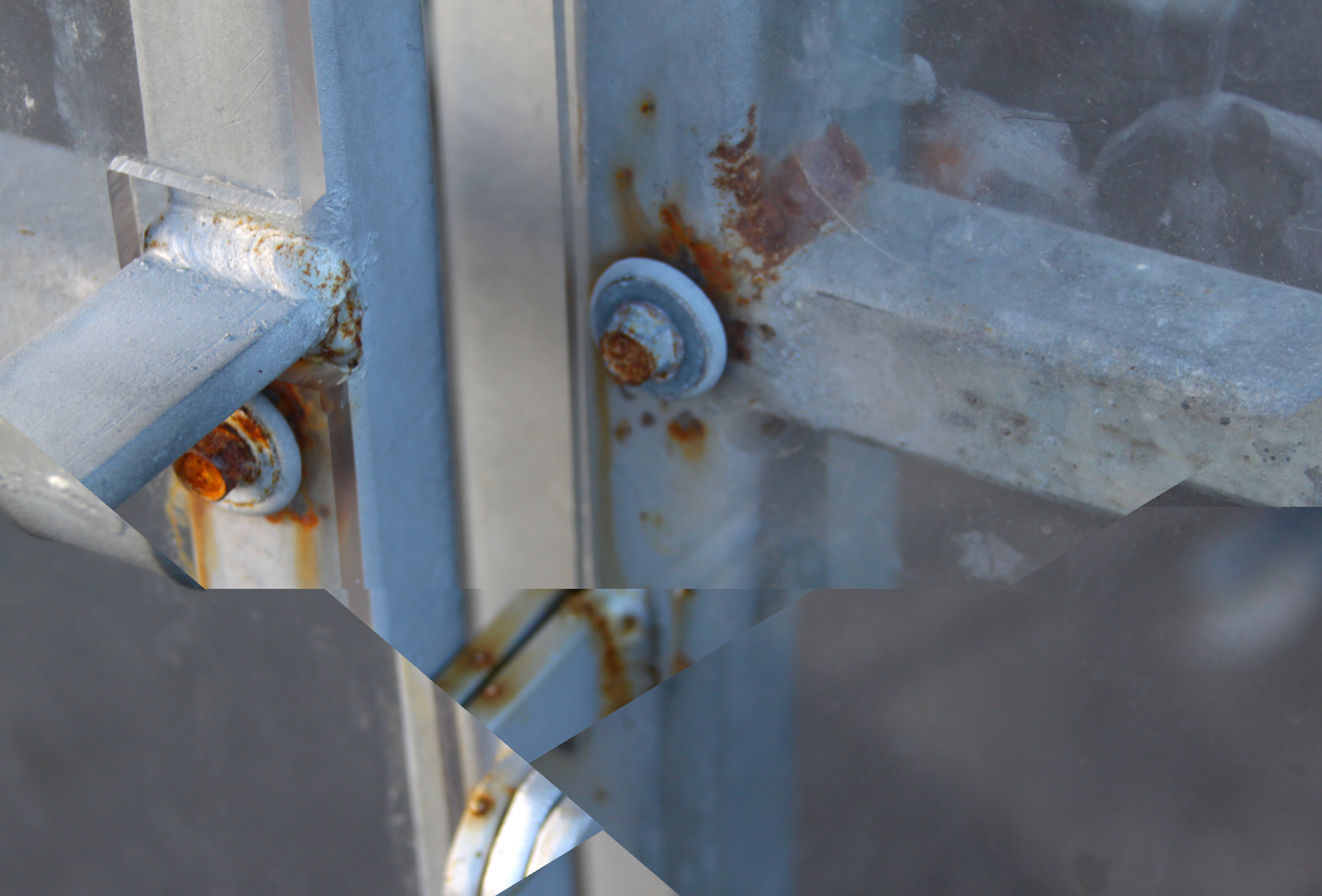
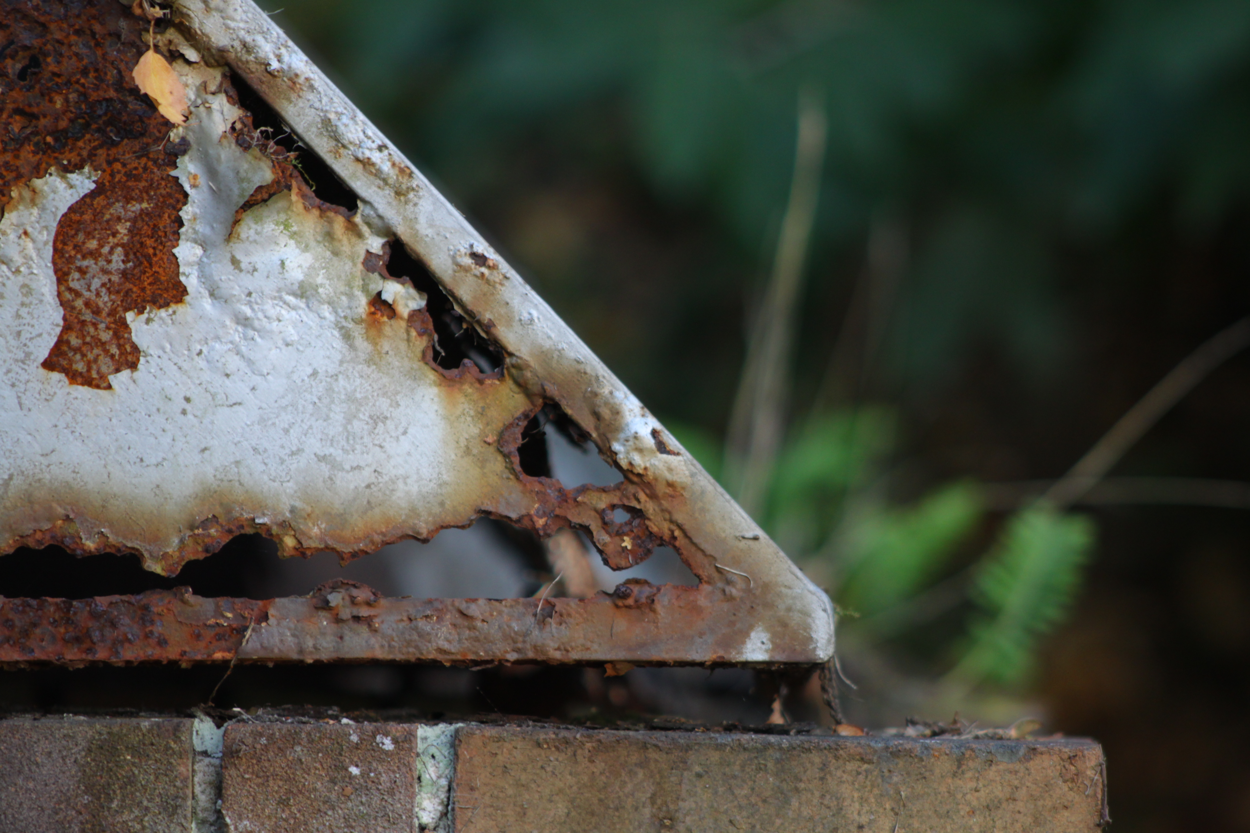
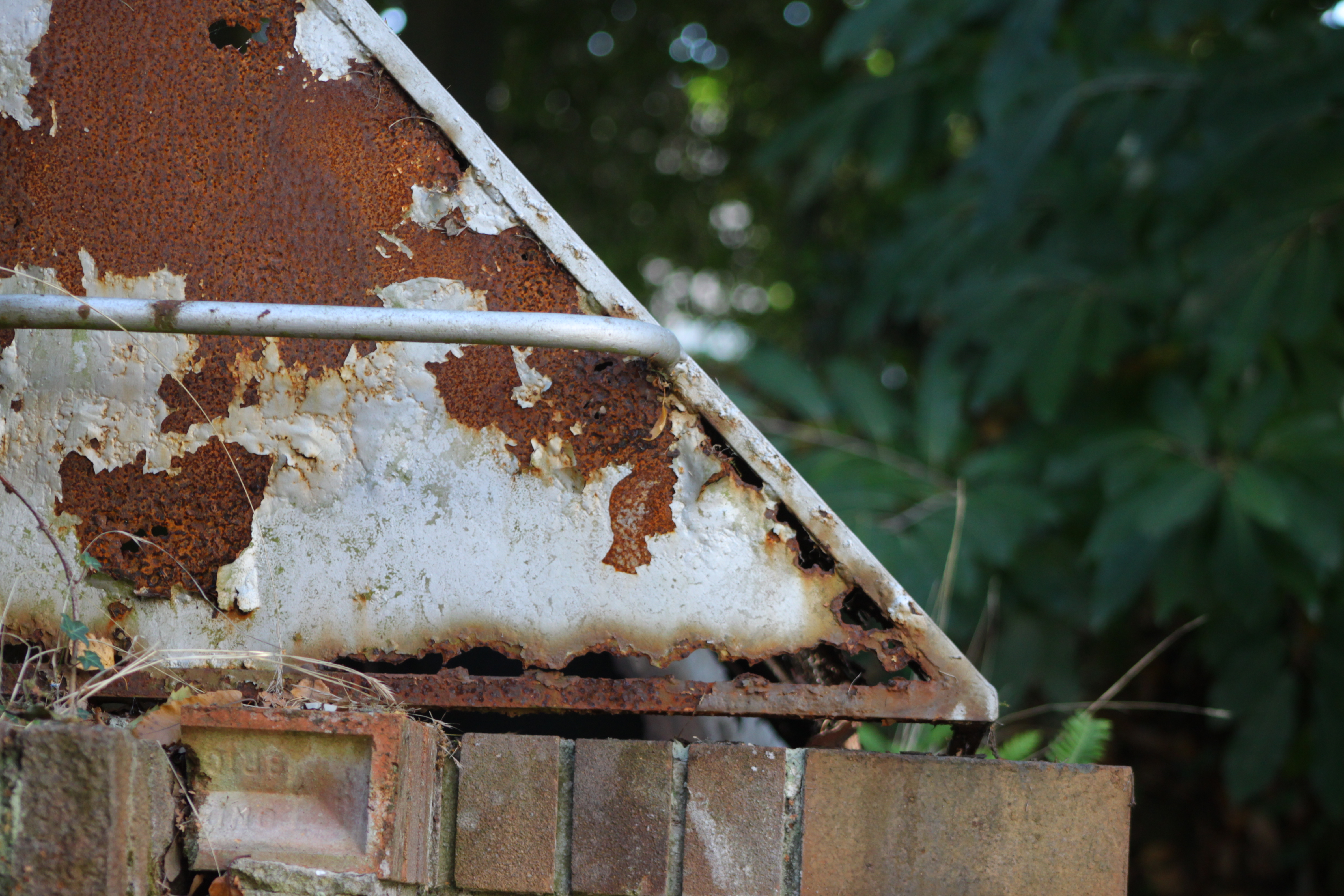
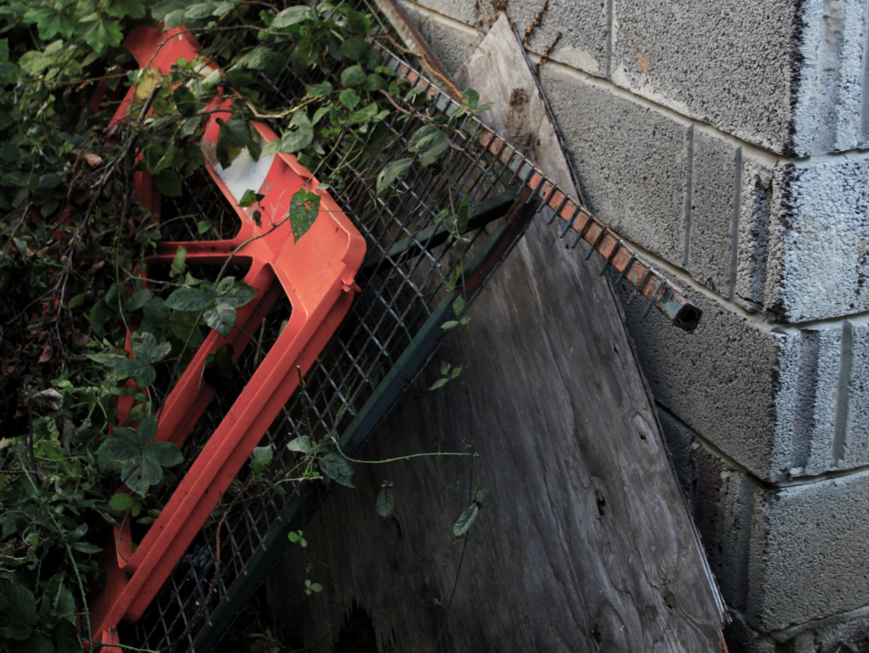
Using this very natural abstract image as my A3 print out is a good choice as the image contains a lot of interesting textures which are very pleasing to the eye. As well as my editing being used to contrast more between the light and dark in the picture and i overall really like the picture and this it will be a great choice for an A3 print out.

This image was taken in Manual Focus which helped me learn what an ‘ F Stop’ is as i had used a low F stop in order to create a shallow depth of field. This image was also taken on a very cloudy day which created a lot of shadowing on the tree bark adding a lot of texture to the image.


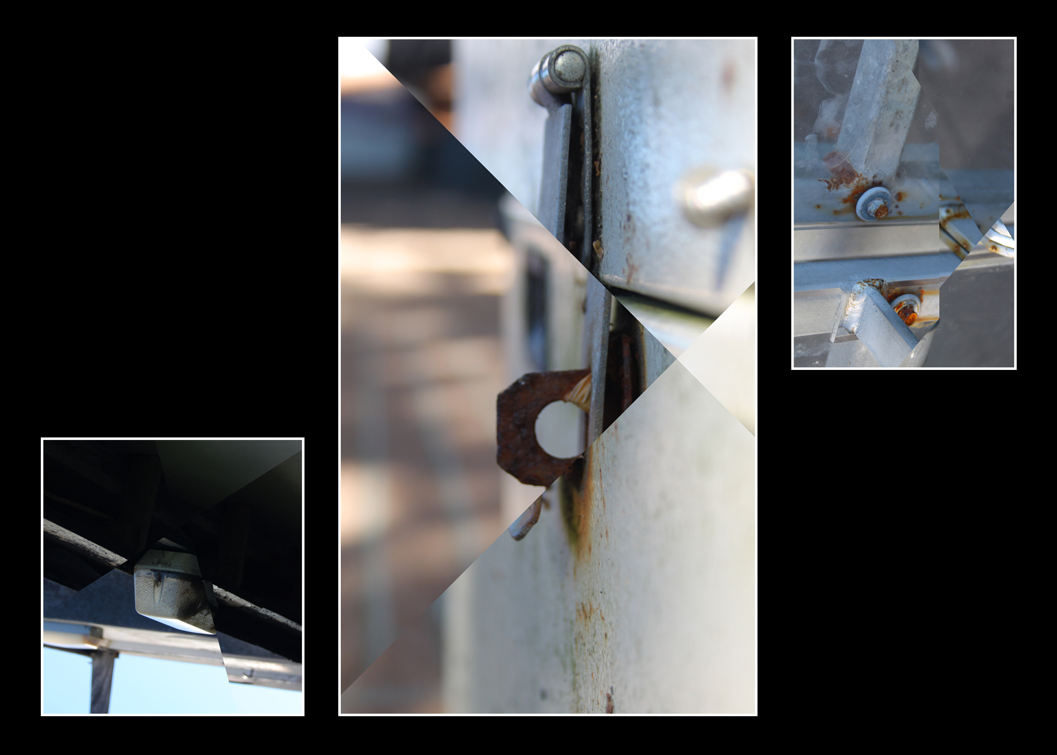
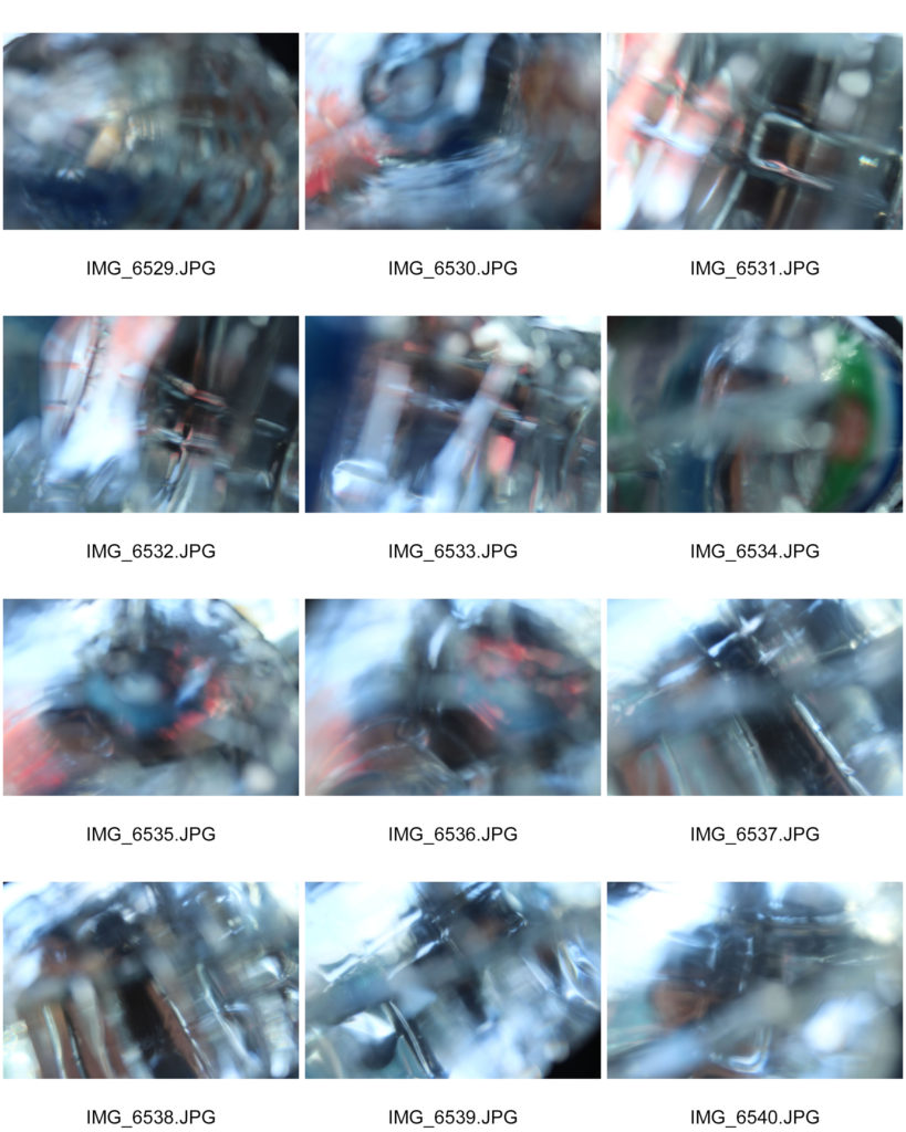
Using these three images for a final piece is a good idea as the images will look nice displayed as a three piece of art. I like the range of different colors in the images and think that i can creatively display these images.

These images also shows a range of techniques that was used to get this end picture. I took these images in Manual Focus as which helped to purposely make the scenery blurred while as using a quick shutter speed to take pictures of the lights not in focus as well as it helping to under expose the images and contrast the colors with the overall darkness a lot more which was one of my main goals.

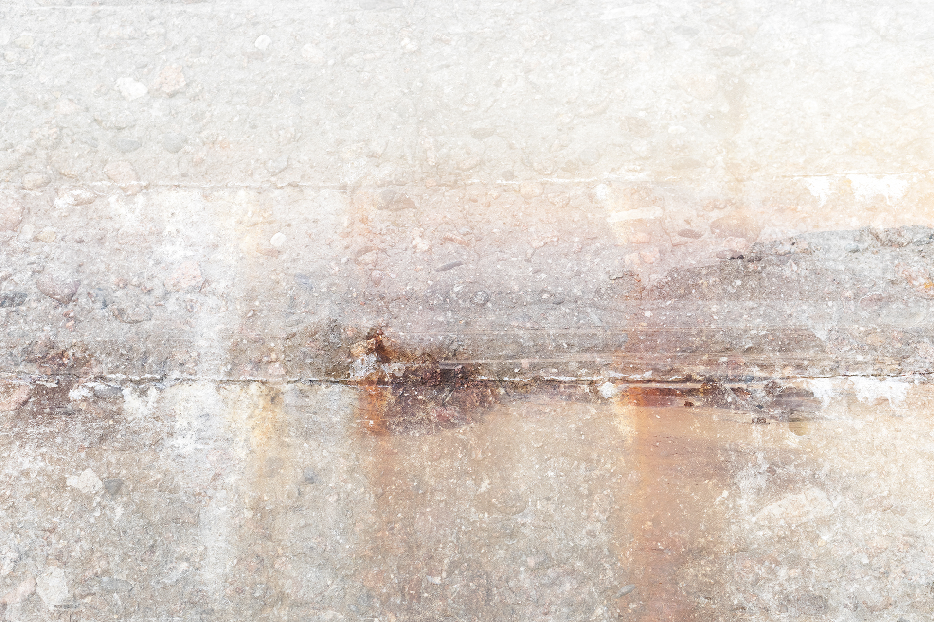
This is a great image as it is showing a clear use of depth of field. This image has not been edited at all and therefore shows the quality of the camera skills used.

The image was taken in Manual Focus with a shutter speed of 1/250 which helped to let in light to the lens of the camera. I also had a  ‘daylight’ white balance.