Smith originally studied Fine Art, between 1991 and 1995 at Coventry University and as part of his course he undertook a research project into contemporary art which included living on an Aboriginal reserve for four months. After completing his degree at Coventry he completed a master’s degree in Photography at the Royal College of Art. During this time he examined the meaning and construction of masculinity, concentrating on the cultural and visual creation of various alpha male identities. He has subjected various forms of heroic behaviour to incredible scrutiny. Smith has travelled from ‘Soldier’ via ‘Action Hero’ to arrive in his current body of work, the forensic vision of death presented as a new series called ‘Impact’. -Wikipedia
Final Photography: Studio Portraiture
As the final 3 choices for my studio portraiture experimentation, I have decided on the following 3 images:
For the above image, I experimented more with contrasting color and camera angles. I feel like the contrast between the bold blue of the flower and the bold red of the subjects clothing helps to draw more attention to the image, and allows for the viewer to have their eye drawn around the image, rather than focusing on just one section. The contrast between the bold colors of the subject and the background also helps to separate the background and the subject in the foreground, which in turn adds more depth to the image. In addition to the colors, I feel that this image makes use of the contrast between the shaded and light areas of the subjects face, which mimics the chiaroscuro effect often found in grey-scale photographs. I feel that this contrast also adds depth to the image, and allows the viewer to see the image as more 3D rather than 2D.
The above image makes use of more abstract shadows, created by holding torn paper in front of the key light in the studio. I feel like the effect that this caused created an interesting pattern of shadows, which in turn will draw the attention of the viewer. With this image, I attempted to experiment more with shadows, and so i neglected to use the filler light to soften the shadows, which allowed for the shadows of the subjects to remain prominent in the image. I feel like this adds to the contrasting tones and colors within the image, and overall I feel like it draws the attention of the viewer to the different contrasting areas of the image.
I feel like the above image is the best example I produced of creating a chiaroscuro effect using lighting and camera angles. A key light was used on one side of the subjects face to create this effect, and I feel like the contrast in tones between the left and right side of the face helps to show more depth in the subject. I feel that this image is the best example of me attempting to create a contrast between the light and dark portion of a subjects face. In addition, I feel like the positioning of the camera in this particular image, allows for the viewer eyes to be led directly to the face of the subject, as it is positioned straight ahead of them. I feel that this allows for the viewer to feel more personally involved with the image, and allows them to relate more to the subject and in turn, the photograph itself.
Tableaux Mood-board
Portraiture: Natural Lighting
Natural lighting is often used in photography, as it often gives the environment and the subject a more natural look, and can be much more cost effective than using artificial lighting, as this requires specialist lights. Natural lighting can provide light to places where light would naturally occur anyway, and the same with shade, and so by using natural lighting, a photographer does not have to manipulate artificial lights to make the lighting match the effect they are attempting to show.
The products of my experience with using natural lighting with head shots (close ups). The lighting used in my experimentation came through a glass door, which the subject was positioned next to:
A negative of using natural lighting is that it can not be manipulated by the photographer to produce the best outcome. This means that when natural lighting is not available (it is overcast or there are no windows) the photograph will not have the right lighting.
The above 2 images are examples of what happens to the lighting when the sun is obstructed from coming straight through the window. These images appear more flat, and are too dark to allow the viewer to make out certain details. This damages the overall eye-catching effect of the images, and is something that cant be controlled when dealing wit natural lighting.
Natural lighting, in some cases, allowed for the subjects face to appear brighter and softer, which is an effect that may have been missed if harsher studio lights had been used. Using natural lighting with close-ups of subjects can, however, mean that some of the detail within the facial features of the subject is lost, and the positioning of the lighting and its intensity cannot be manipulated.
Chiarascuro Techniques
Definition of Chiaroscuro:
The treatment of light and shade in drawing and painting. is the use of strong contrasts between light and dark, usually bold contrasts affecting a whole composition. It is also a technical term used by artists and art historians for the use of contrasts of light to achieve a sense of volume in modelling three-dimensional objects and figures.
My Examples of this Technique:
Studio photography
Lately we’ve been experimenting with lights and shadows and how we can transform a portrait into something interesting and unique. For this we’ve been using the studio and have been playing around with the different types of lights in there. We use studios in photography to control the amount of light we expose in a picture, and to guarantee an outcome that we want.
Pictures taken:
For most of these photos, I used the large soft light to create soft shadows. For others i used the spot light to clearly highlight the model, and used coloured sheets of plastic to cast a certain colour onto her.
Chosen pictures:


I took these pictures with the intention of casting half of her face in shadow, or making the surroundings dark enough to illuminate her face. I had her faced sideways of the light, or faces towards it. I played around with angles, ISO, shutter speed, aperture, and lighting, and came out with three final images that I am pleased with.
Studio Practice
My best studio portrait photography edited
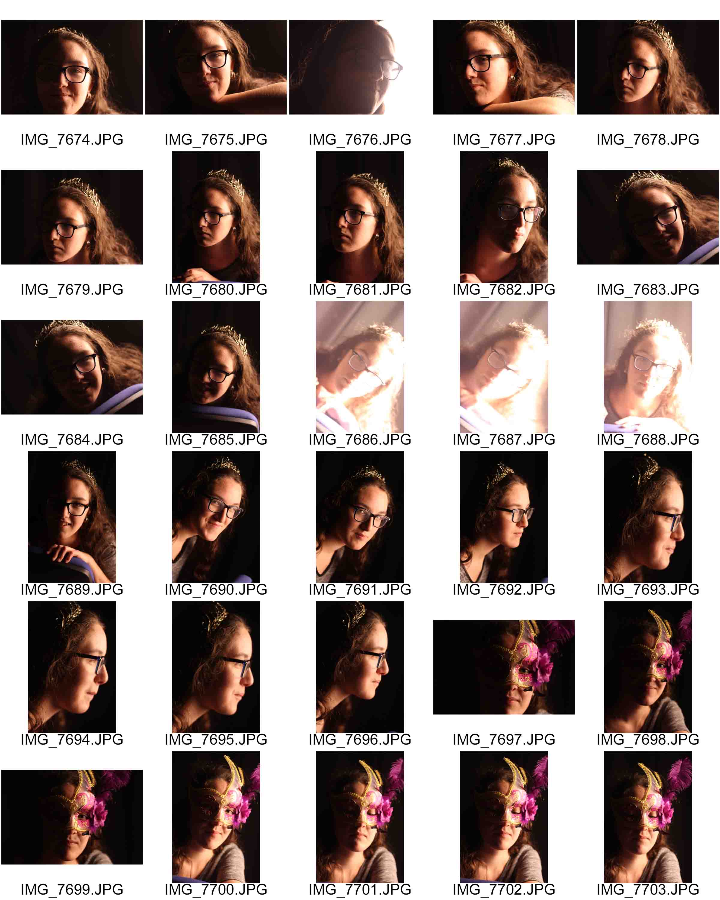
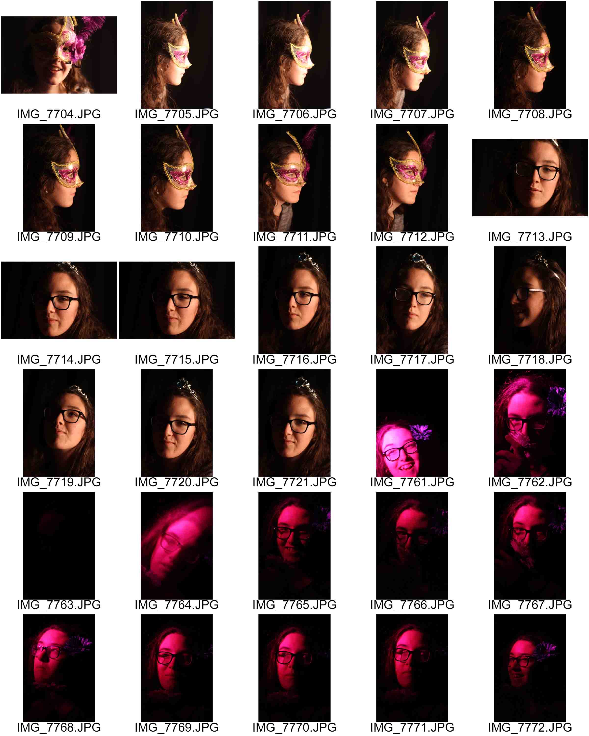
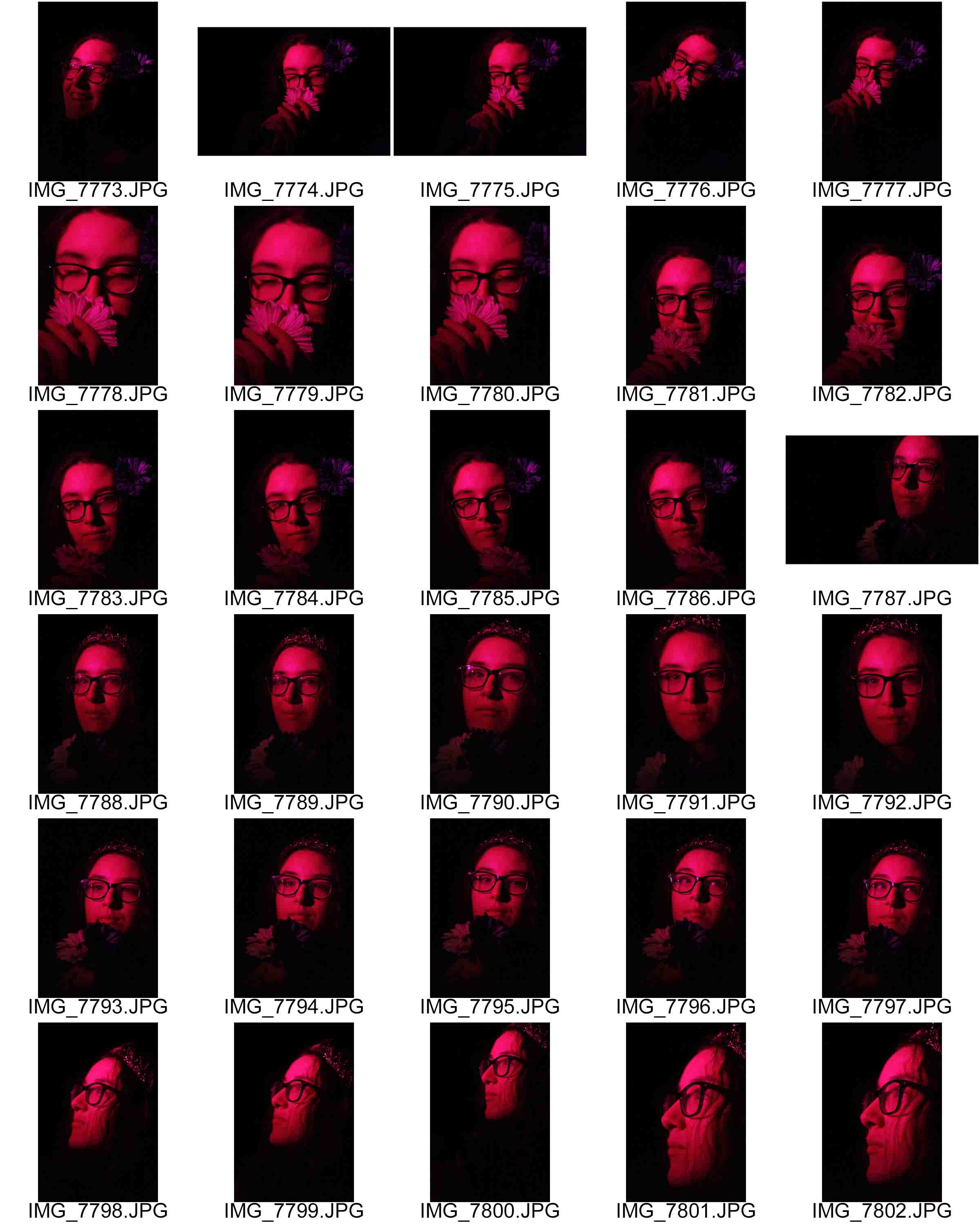
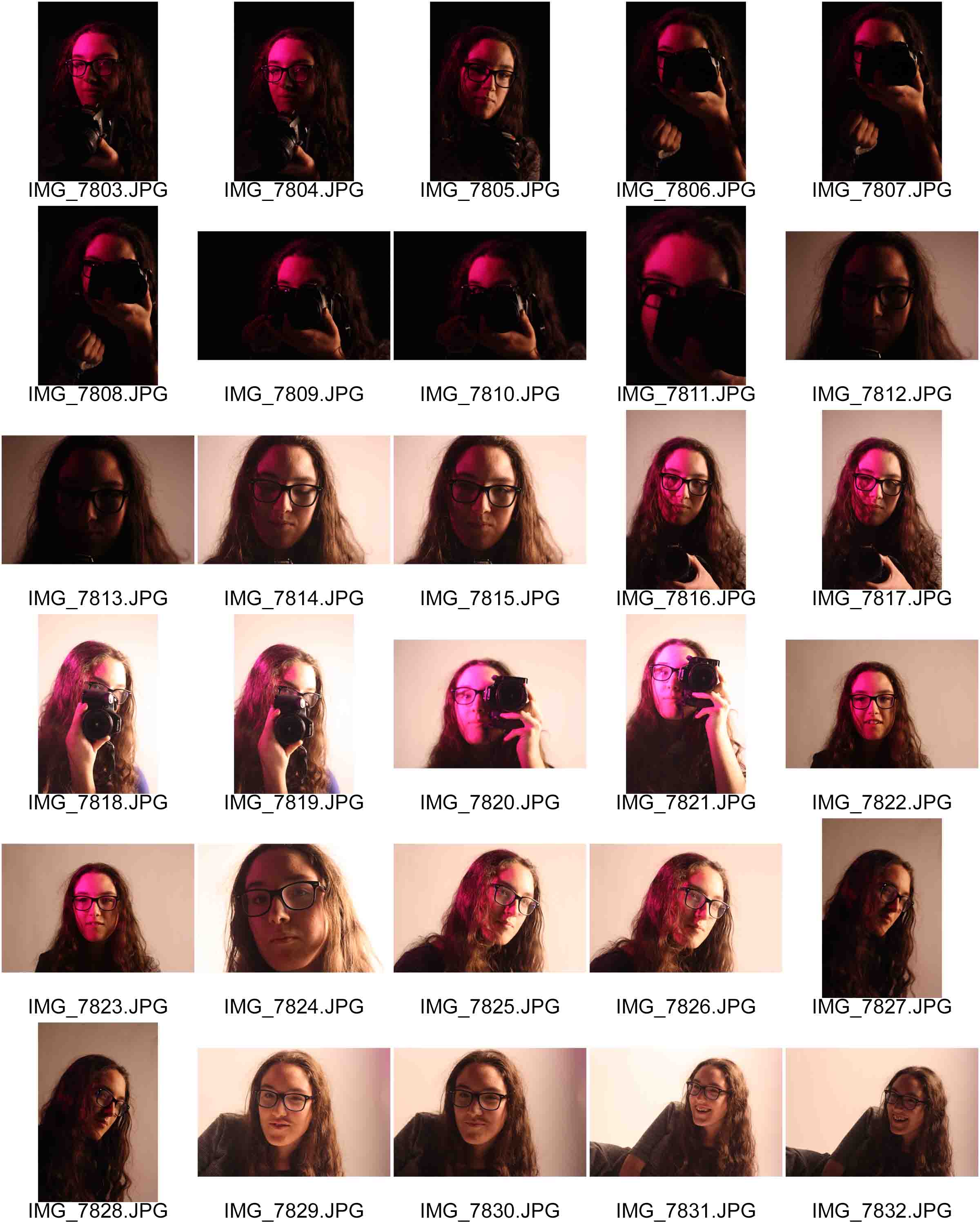
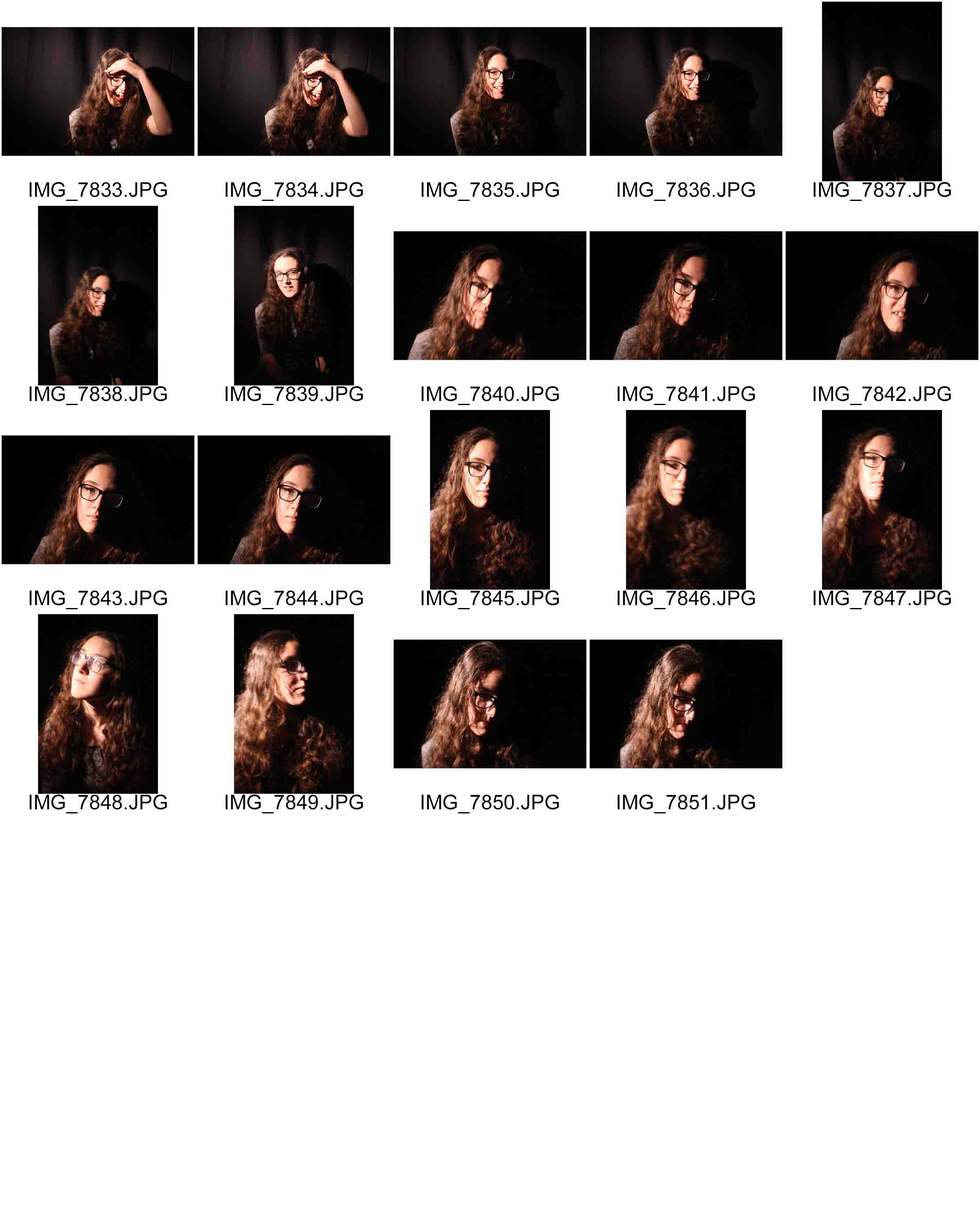
After my first couple of times in the studio doing portraiture I have a small selection of photos that really stand out for me, but to make them better I put them through Photoshop and the editing software that comes through windows.
I will be showing the before and after photos, just to show a contrast between an original and an edited version of a photo, although the difference may be very subtle I think that they really change the photos looks.
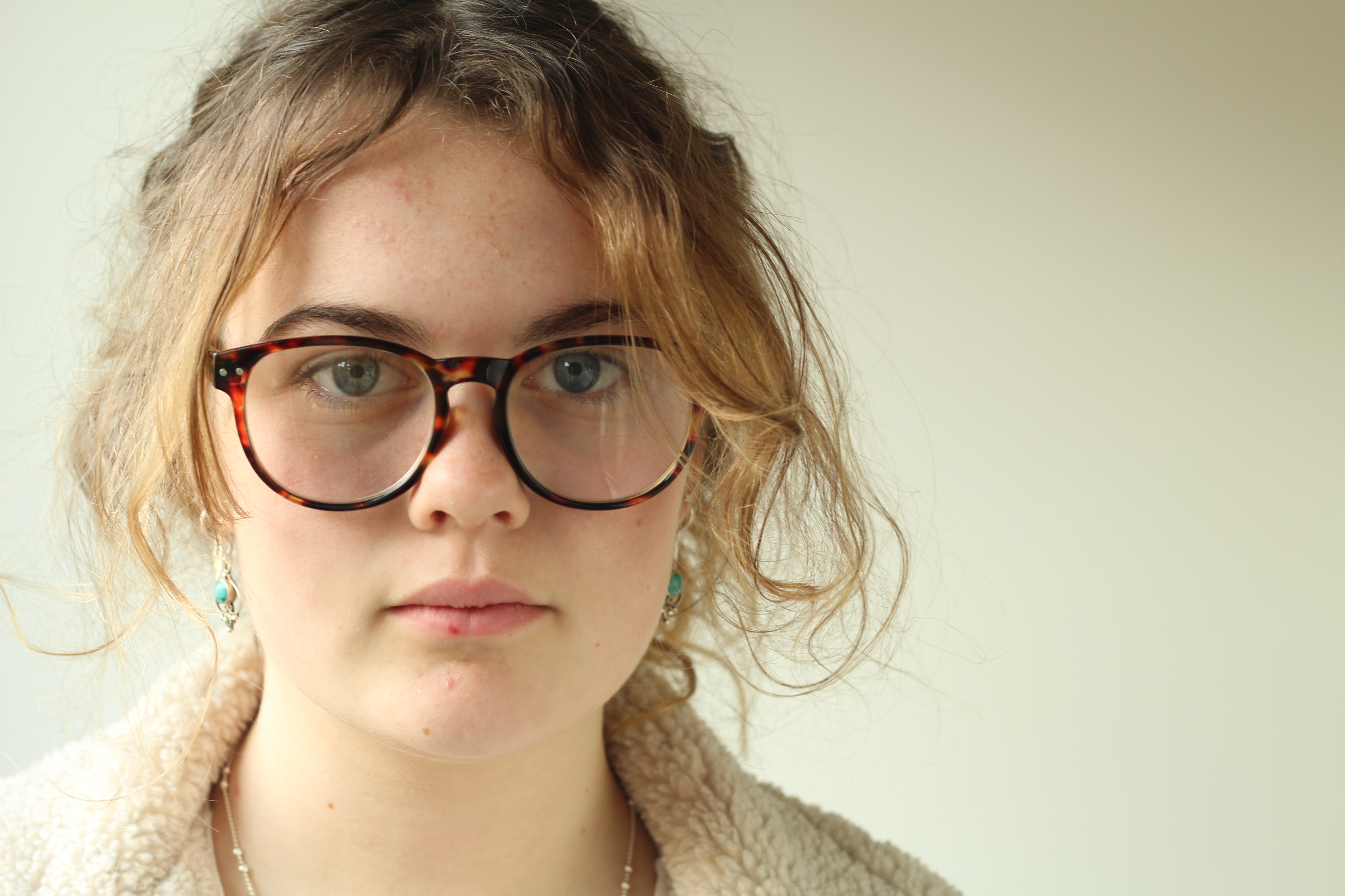
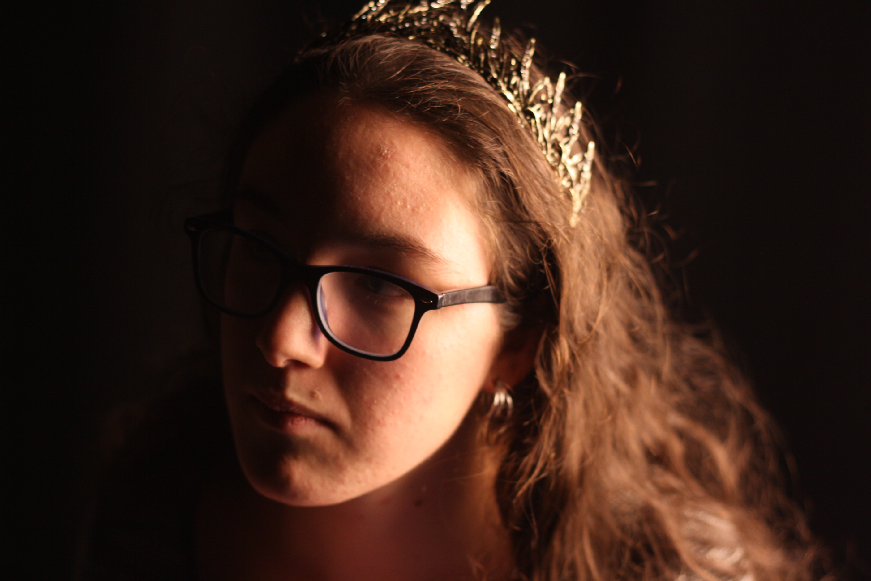
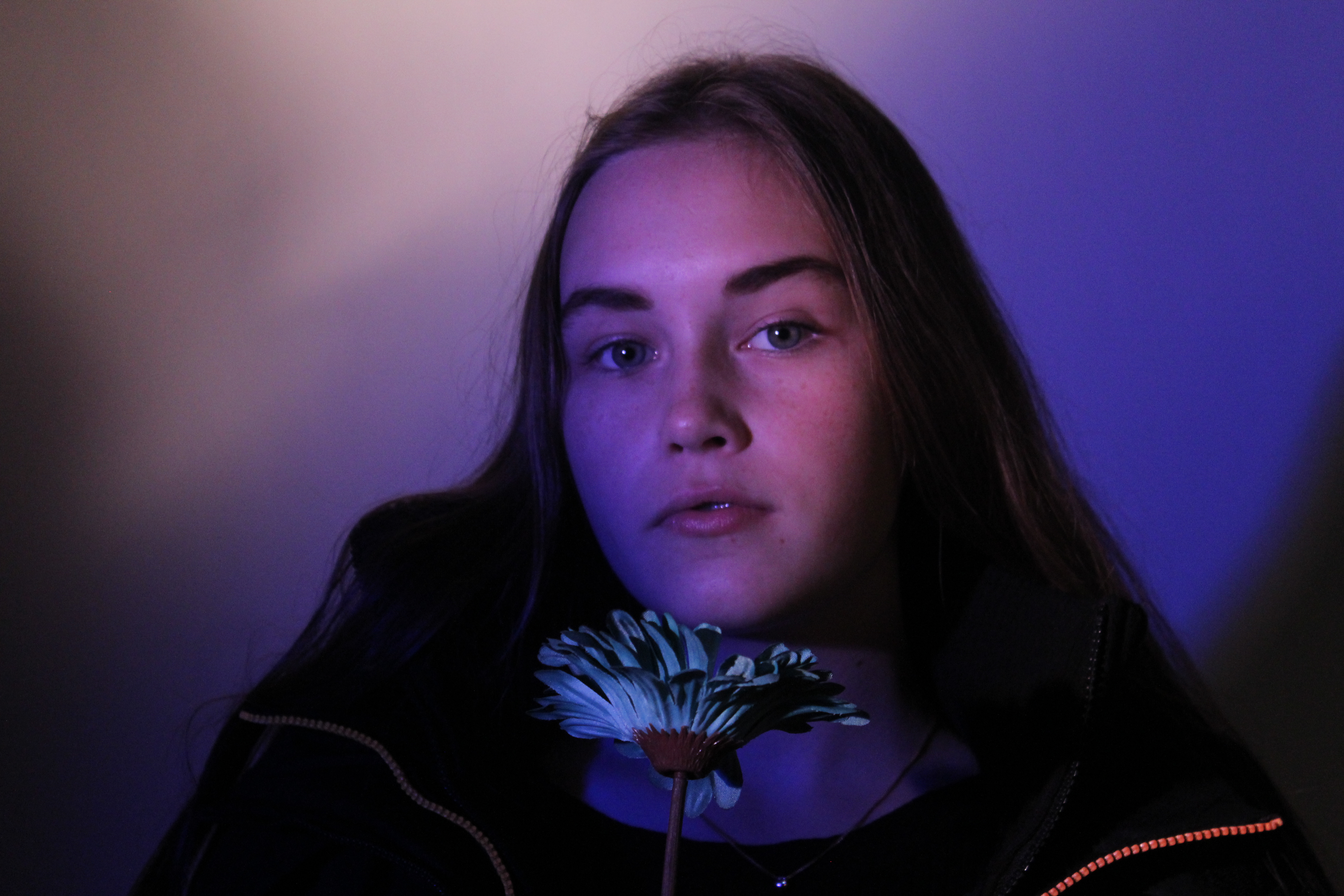
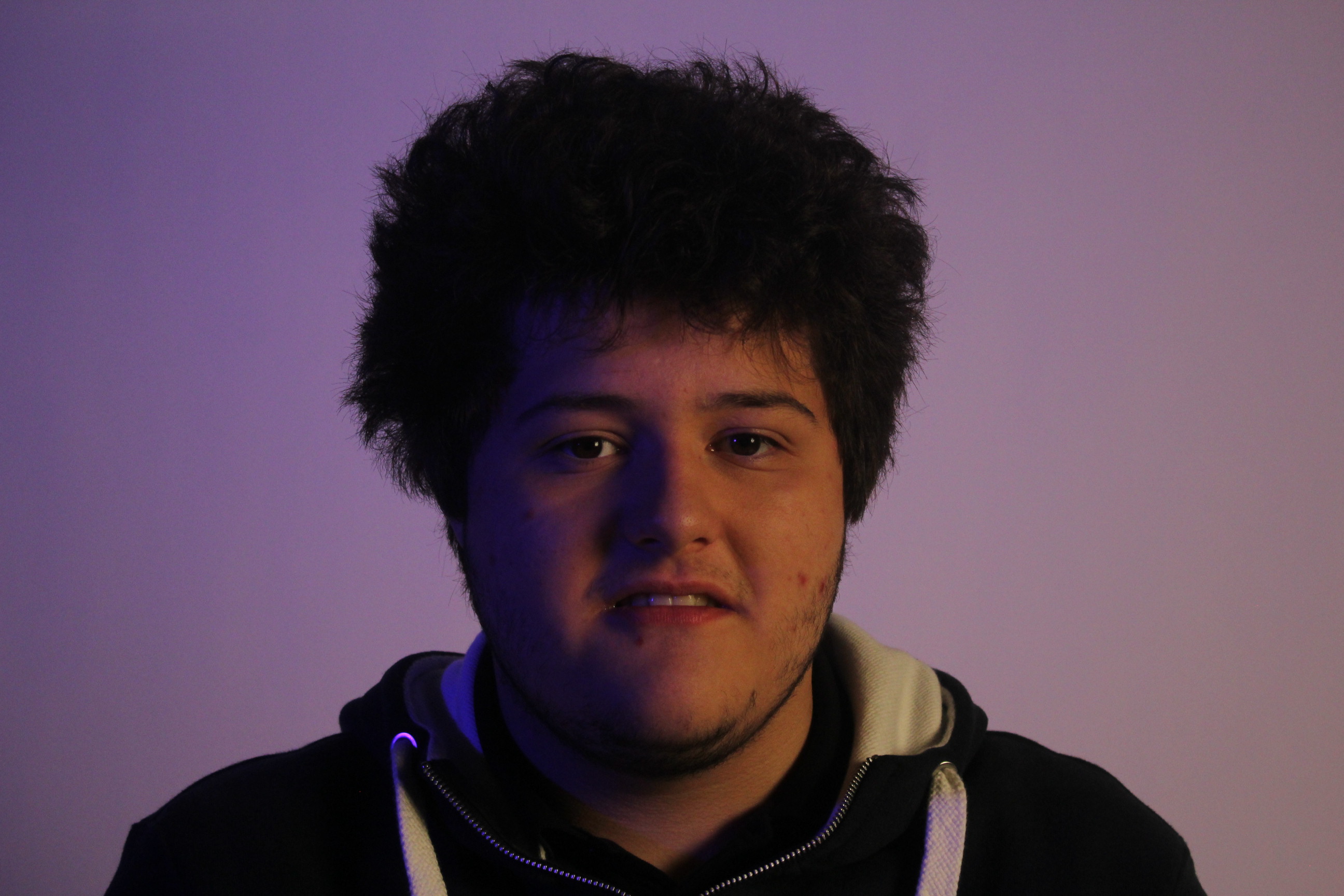
This is the first photo that I will be editing, it is one of the best photos I took from my second visit to the studio.
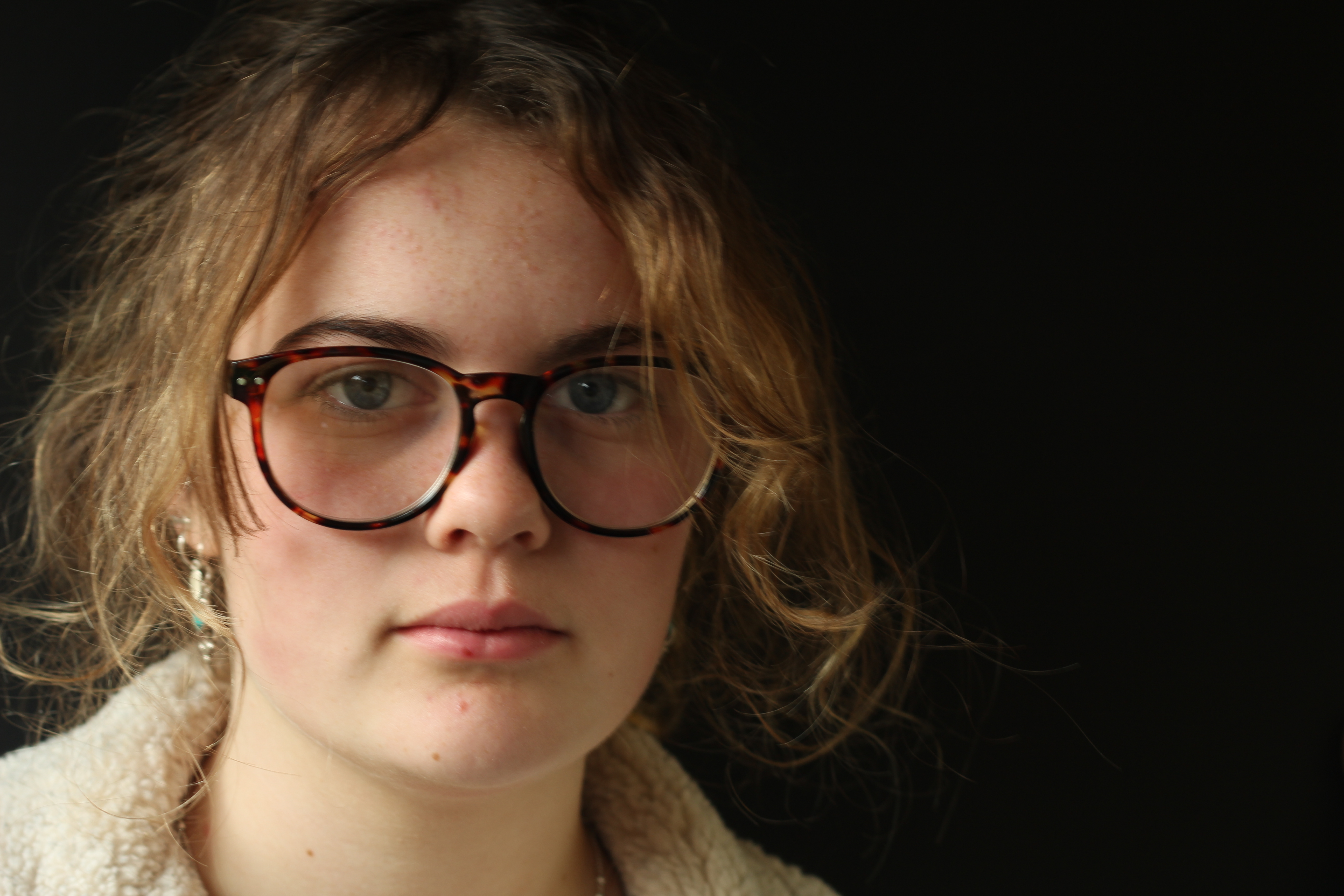
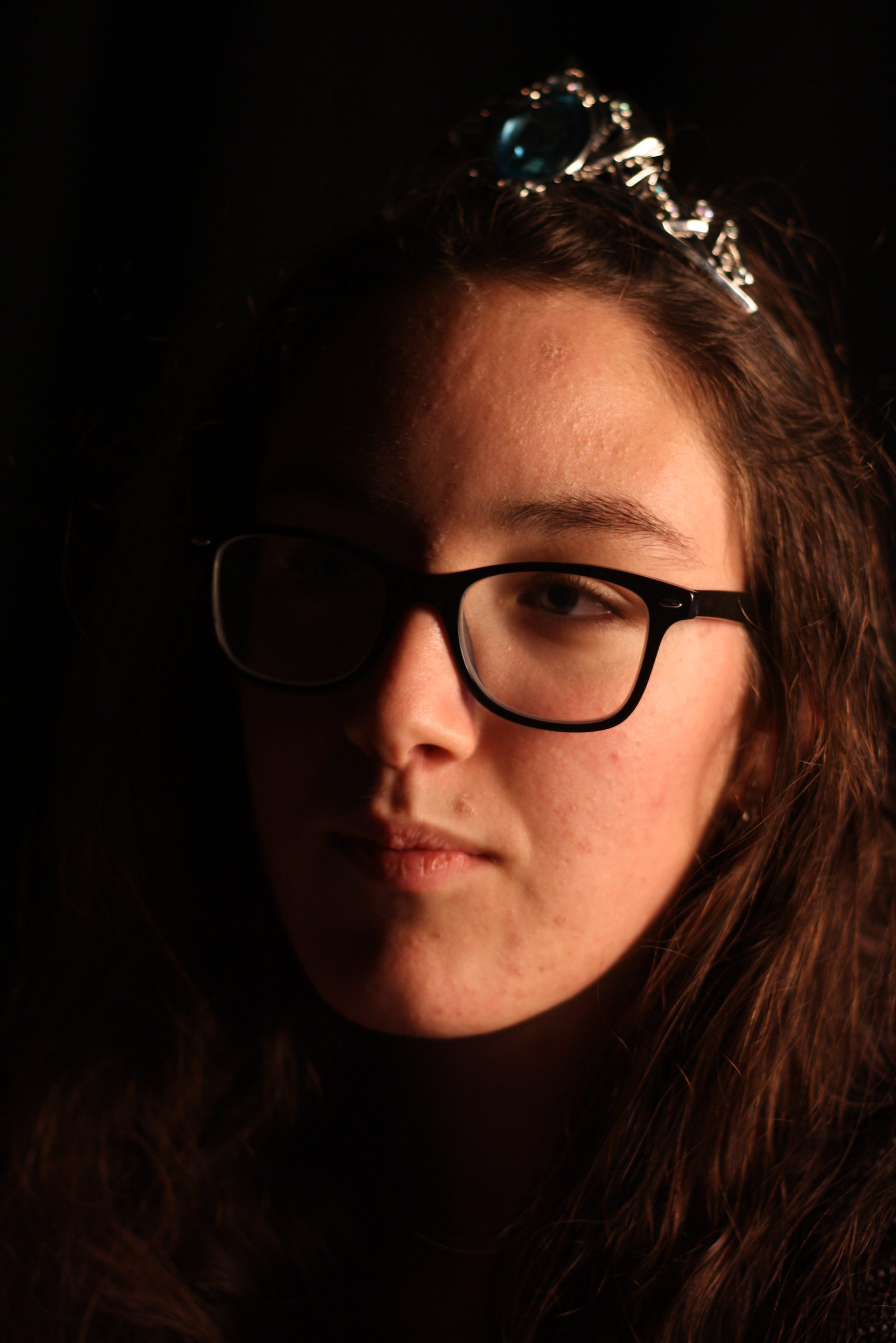
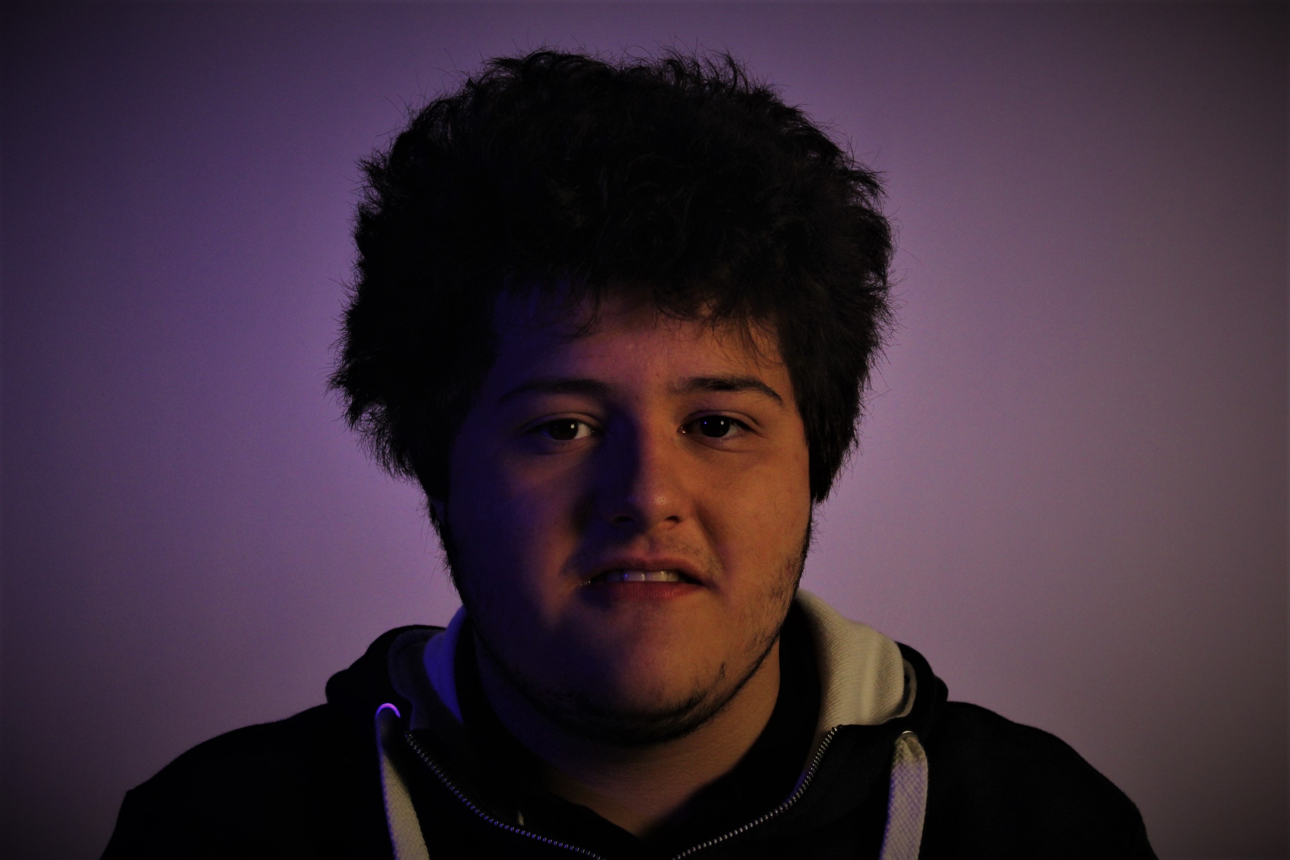
In this edited version of my photo all I have done is used spot fix to make the skin seem smoother and clearer I also turned up the color making the blue/purple look bolder. I also brought up the clarity on the photo to make it seem bolder and for some features to stand out. Again I increased the vignette to darken round the edges and corners but so that the model is the main piece of the photo.
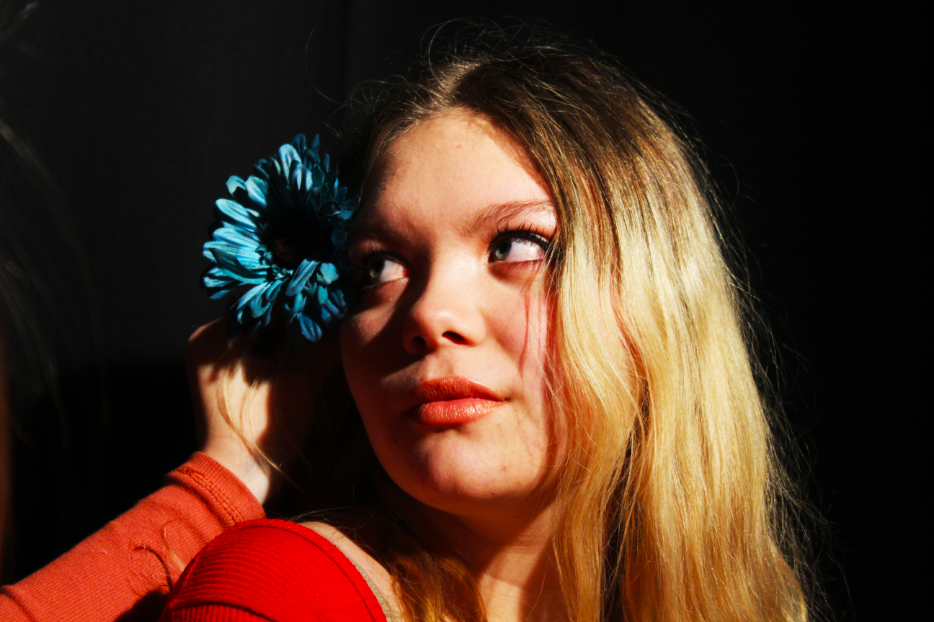
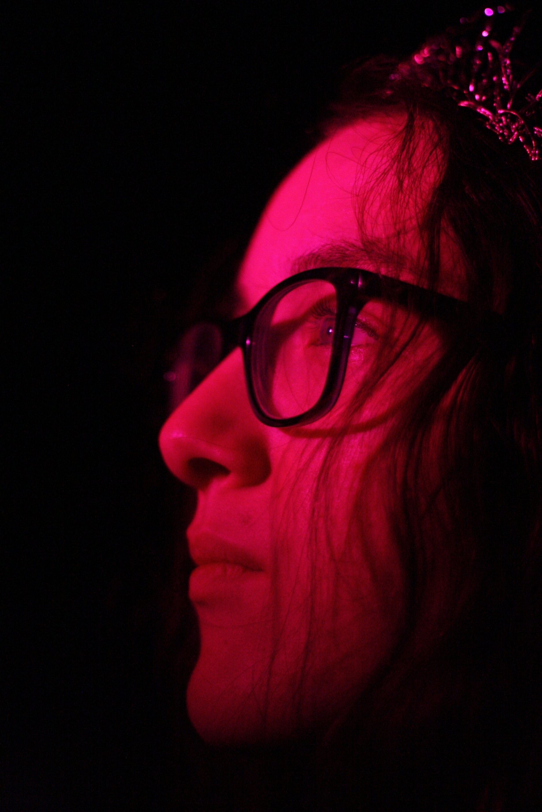
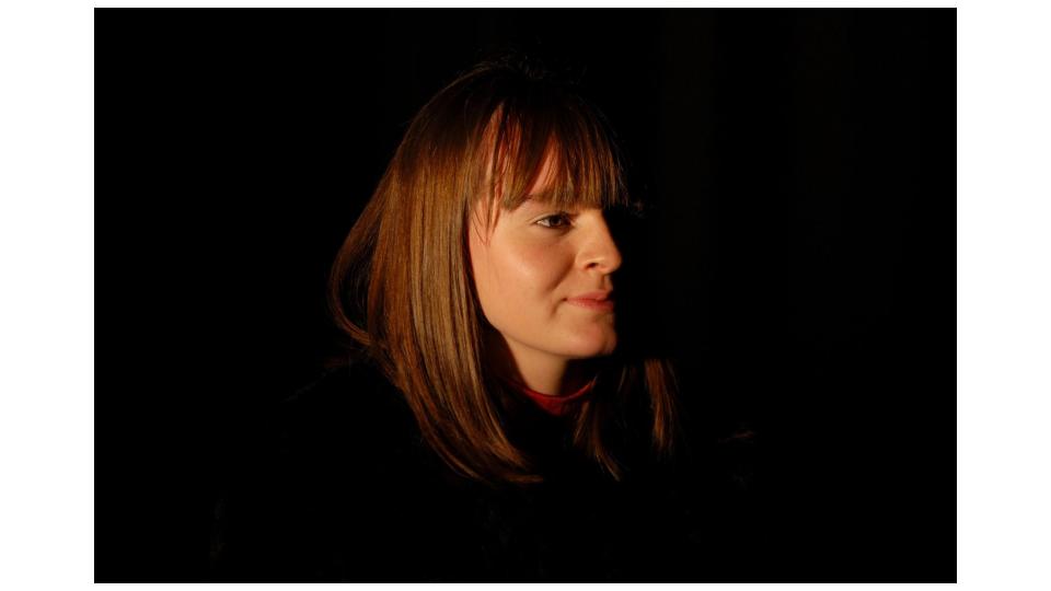
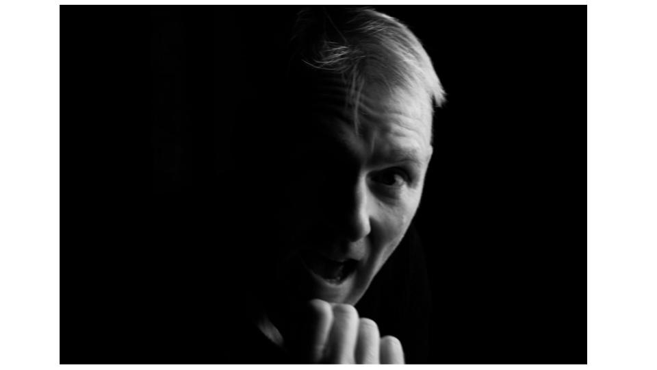
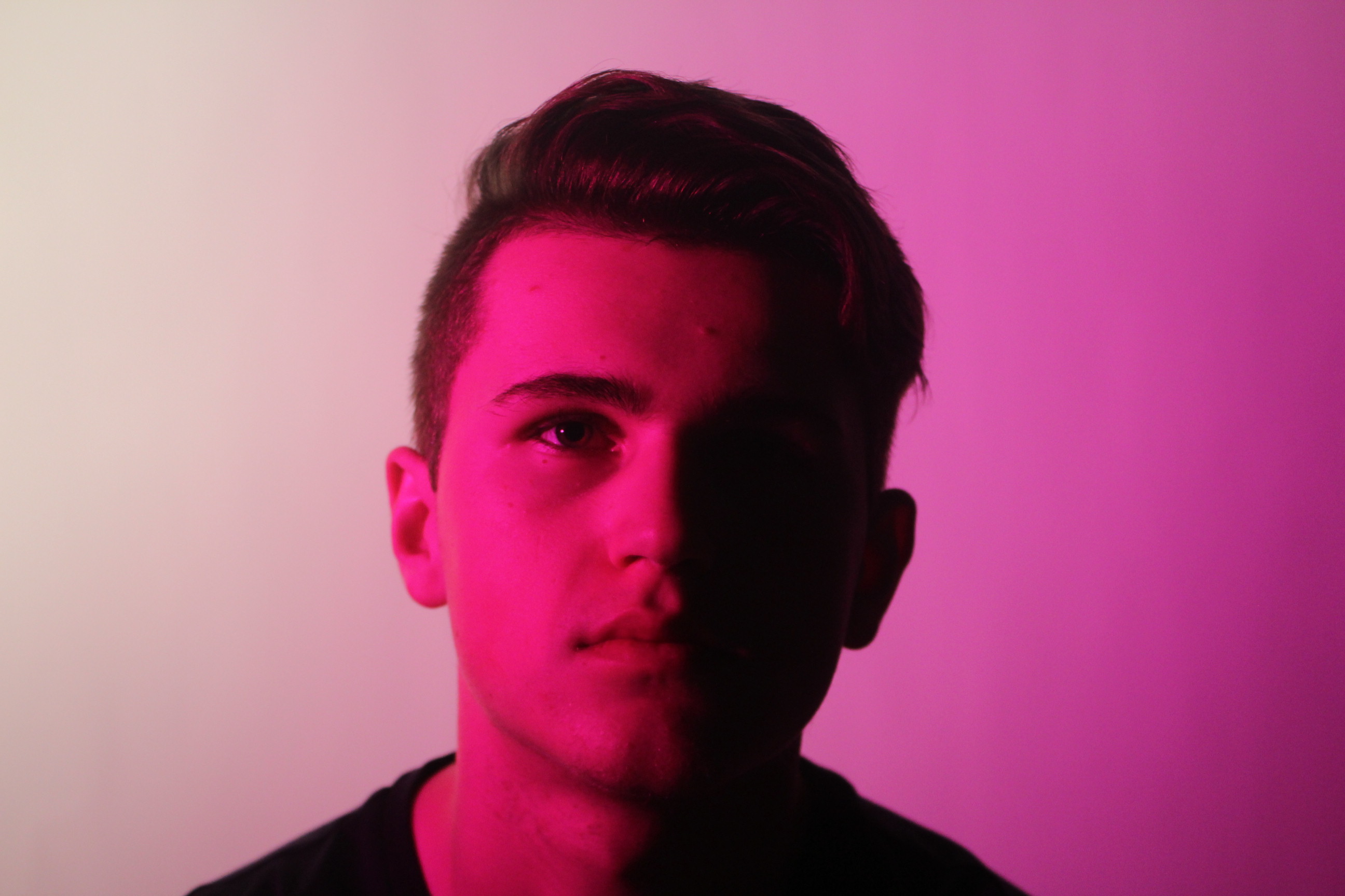
I really like this photo as it brings in the style of one point lighting to only show one side of the face but has the added feature of the color making it seem more vivid.
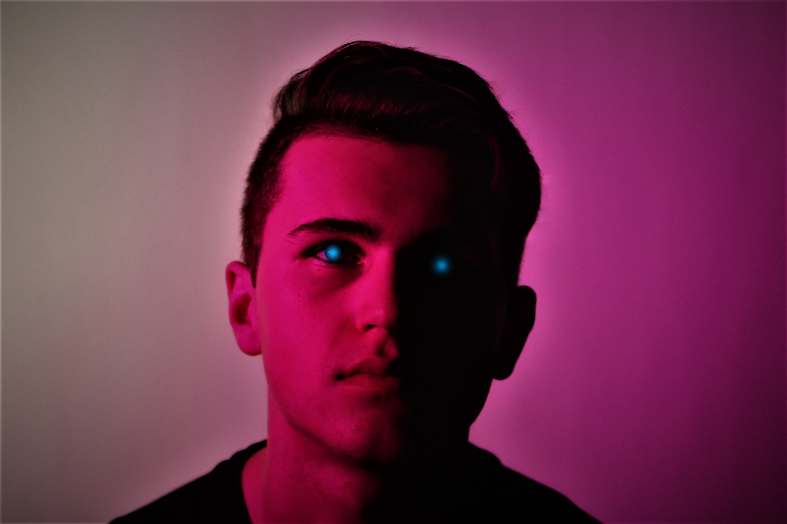
In this photo you can see an immediate change in the look of the photo. The first major change you can see is the blue specks of color where his eyes are. On the left side of his face (As you look at it) you can see where his eye is, but due to the one point light, you can’t see where the other eye is, I think that the blue dots of color help make the picture stand out. Also with this photo I put the clarity all the way to maximum just so that his key features stood out. I also raised the vignette just a bit to create the same effect as before. Again with this photo I used spot fix, but this time not to make his skin to appear smoother but to fix any hairs on the photo which looked out of place, this makes the outline of his head to shoulders seem more in place and smoother looking.
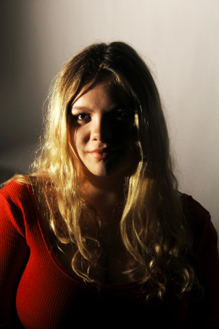
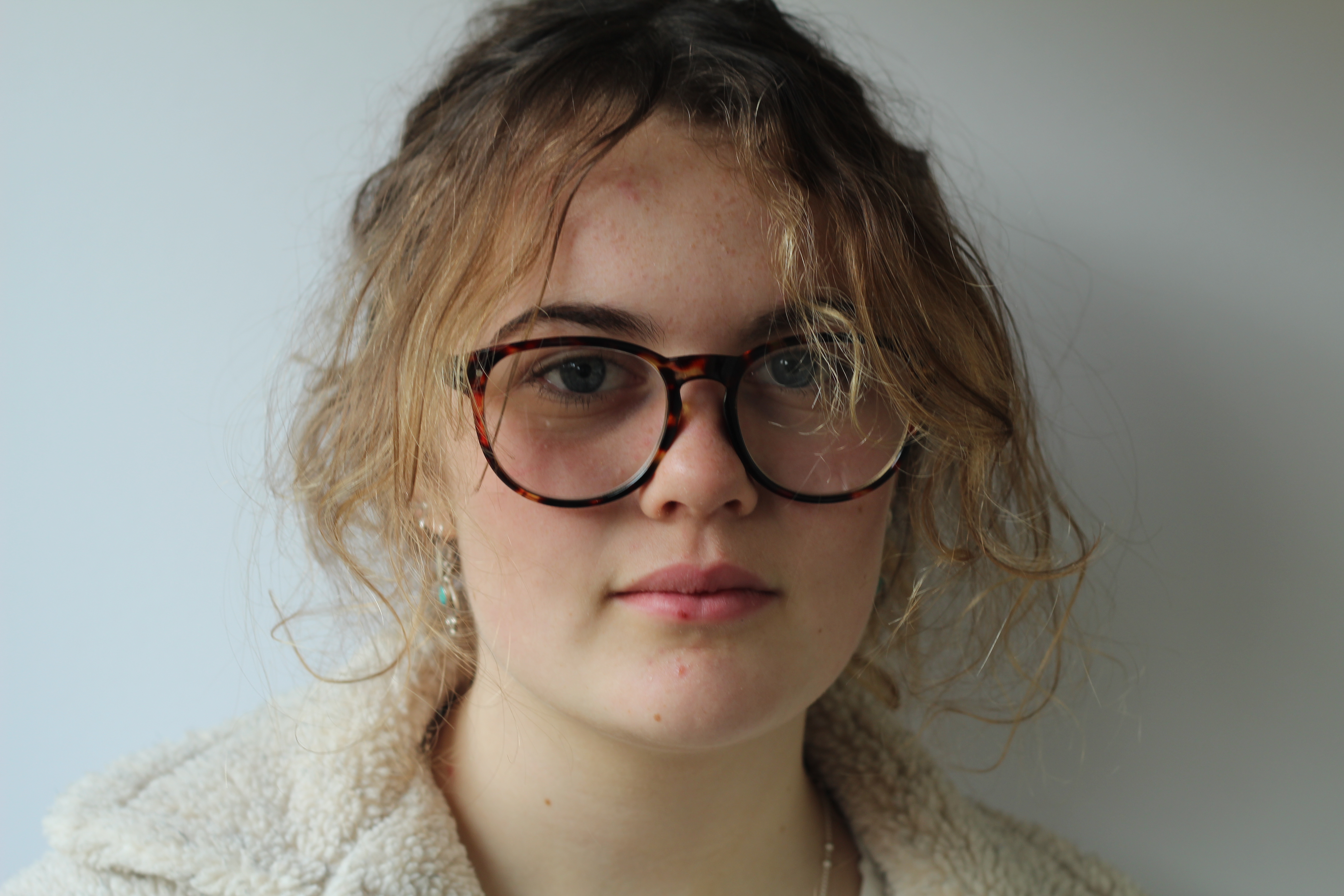
I have done nothing to edit this photo as I think that it is really good. What I really like about this photo is that the use of the color blue really makes the much paler blue stand out. I also like the use of propping with the coat as it does just make the color and atmosphere of the picture stand out.
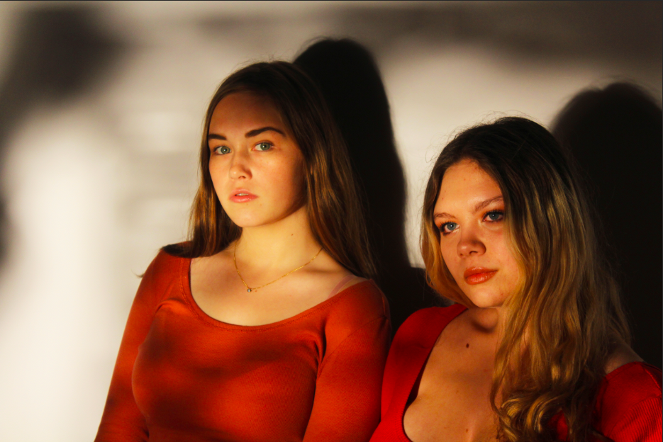
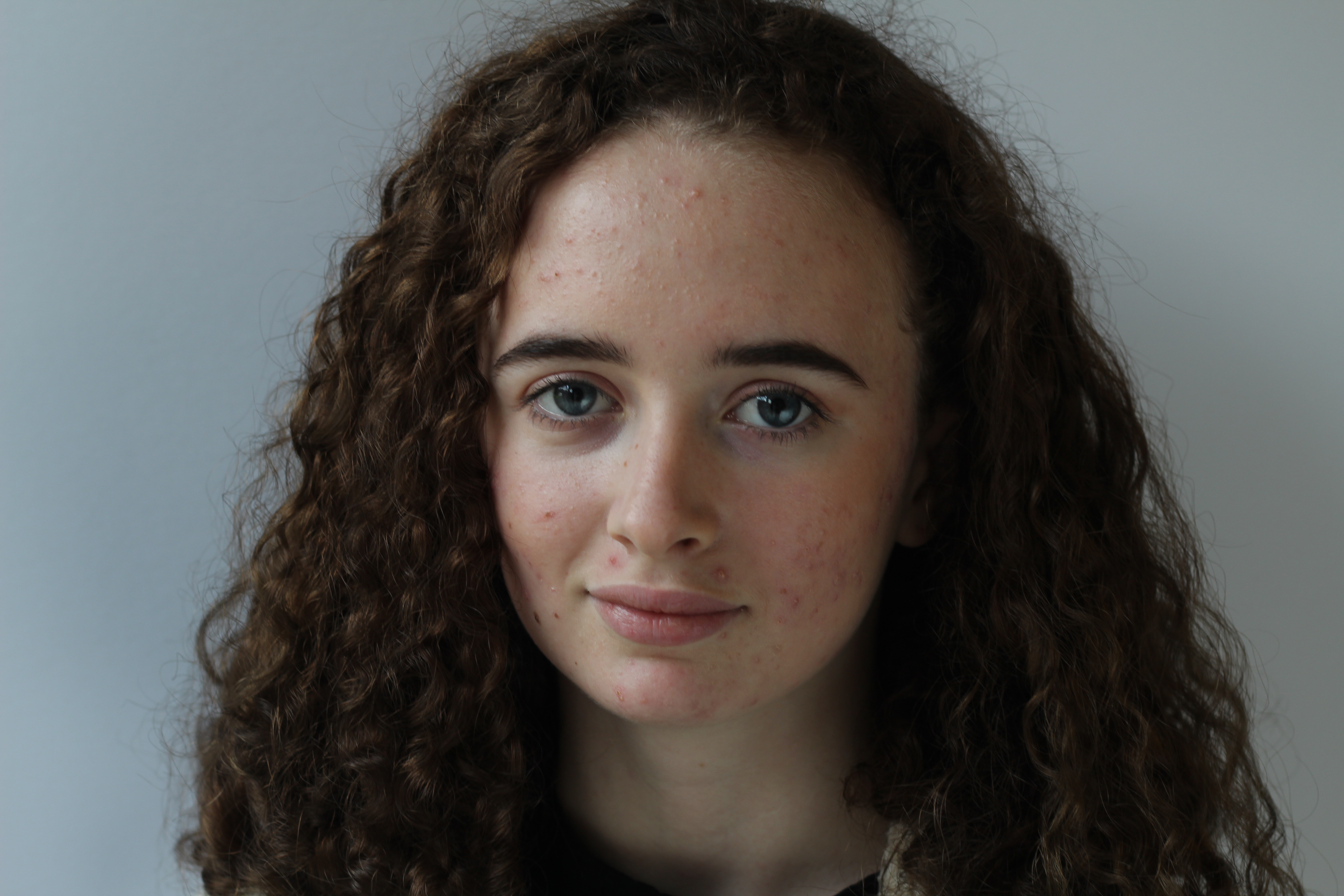
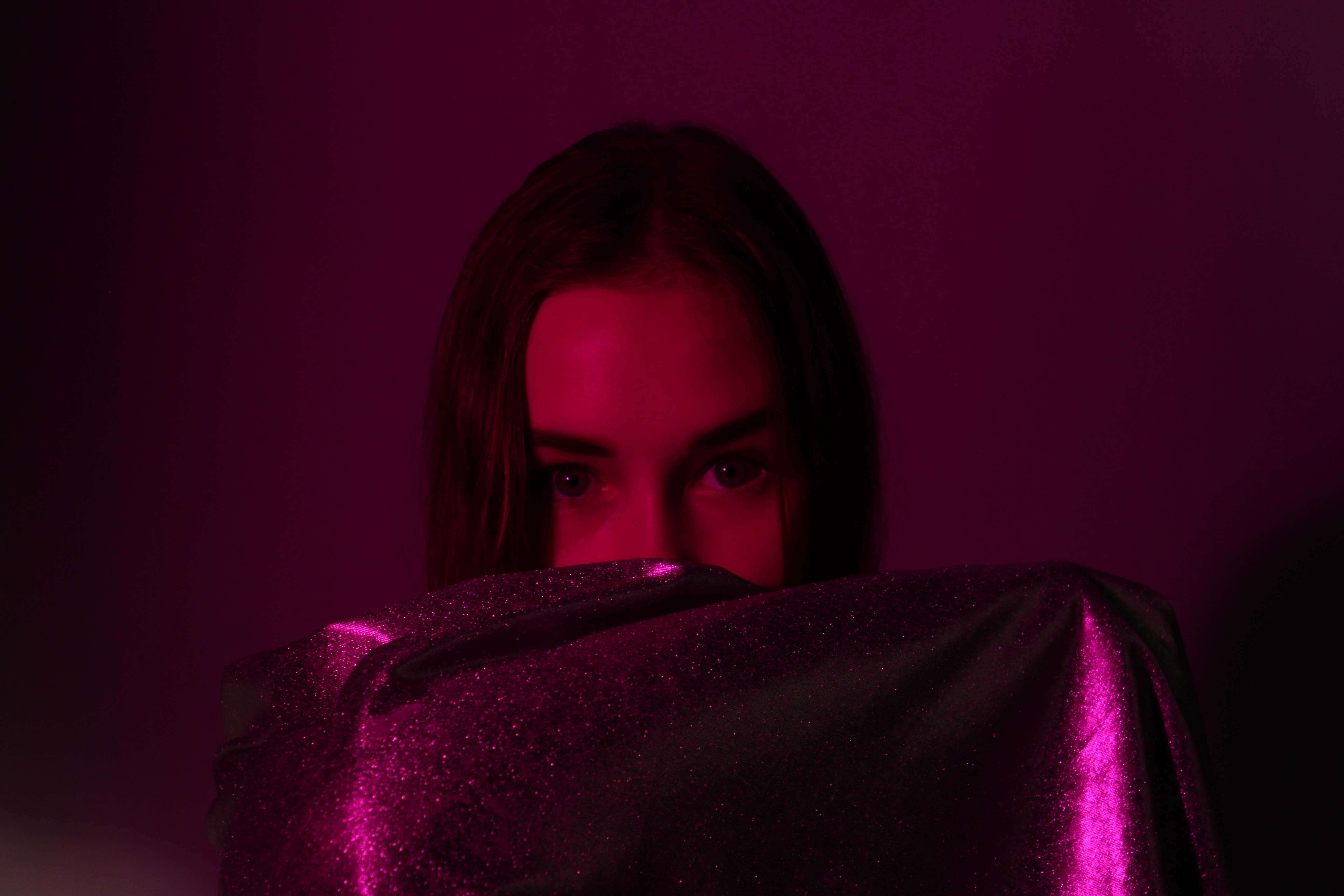
I also really like this photo, as the use of the red and purple mix of the film to create a mix of colors on the model really makes her eyes stand out among the rest of the photo. I like the use of the silver and glittery sheet as it stops you from becoming too focused on the rest of her face. The use of the sheet also works well with the light as it has its dark and light tones which makes it sparkle and stand out.
Studio Photography II
So this was my second time doing photography in the studio, so at first I had the same struggles of under and over exposing the photos, so I was adjusting the ISO after every photo just to get the perfect image which really paid off in IMG_0621.JPG.
During most of the photos I had the ISO set at around 400-800 but eventually changed it to auto, so it would instantly adjust to what ISO was needed on the spot.
I did however always use manual focus, just so I could change where I wanted the focal point to be or whether I wanted my models to be in or out of focus, which I like to differ depending on the lighting and my mood or where the models are standing.
I was very lucky in this instance to be able to have 2 models which enabled me to change my style of photography for each, due to their differences in look and style I was able to use these to my advantage and let them express themselves for the camera.
You will notice in this contact sheet that there is a new color which only surrounds myself. This is because of us working in one group we all used the same camera, I isolated my pictures from the rest so I could not be biased towards them. But due to the light, focal points and camera work they are nice photos.
My favorite photos are the green bordered photos, this is because in these ones I really feel like I helped express the models movement and personality into the photo, making it seem naturalistic and just great.
Questions about Studio Portraits Techniques.
Why do we use studio lighting?
we use studio lighting for several reasons, for example we use it to control and manipulate how the light is being used also it helps to create a successful image. Also we use light so that if an image is too dark then we can use the light to brighten the image.
What is the difference between 1-2-3 point lighting and what does each technique provide/solve?
One point lighting is where you use only use one light source in the image, this would mean that only one part of the image is illuminated, it provides shadows. This is the set up of the one point lighting.
Two point lighting uses two light sources – fill and key, They are usually next to each other on opposite ends They both illuminate the object, this is good because if you don’t want any shadows they both eliminate them, here is the set up for two point lighting:
Three point light uses 3 light sources just like two point lighting however they use a back light this is usually positioned behind the object in the corner this is to illuminate the back of the object, this technique can also solve the issue of shadows as they all work together to eliminate them. Here is the setup for three point lighting:
What is fill lighting?
Fill light is form of supplementary light mainly used to lighten shadows in an image. Fill light is often used in portrait photography to create a contrast between the image subject and image background.
What is spill lighting?
They use a reflector to spill the light from one of the light source on to the object this way they have more control over the lighting. The term “spill fill” refers to fill light which results from the footprint of light sources bouncing off surfaces in the shooting environment.
What is Chiarascuro ?
The treatment of light and shade in drawing and painting. is the use of strong contrasts between light and dark, usually bold contrasts affecting a whole composition. It is also a technical term used by artists and art historians for the use of contrasts of light to achieve a sense of volume in modelling three-dimensional objects and figures. Here is an example of this: