Photo-Book: Preview and Link
In order to view what my book would look like when it is printed, I used the Preview option on Blurb to flick through my book as if it was a real printed book. I also used this option to check for any errors in the final pages of the book before ordering. The link for the Preview is below:
Photo montges
In this blog post I will be exploring the use of montages to express mental illness. I think montages may be the best way to convey this event because it’s something that is difficult to picture with a camera, but easier to show by manipulating and combining images. Below is a mood board with images I used as inspiration when creating my photo montages. In the images, most of the subjects are obscured from the images.

Images are not my own.
The image below I also used as a prime example, by my case study Diana Markosian.

Editing images:


first montage 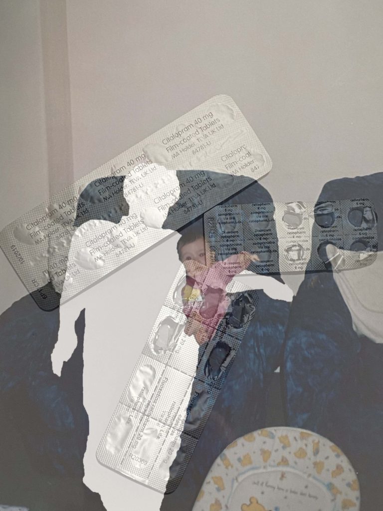
second montage
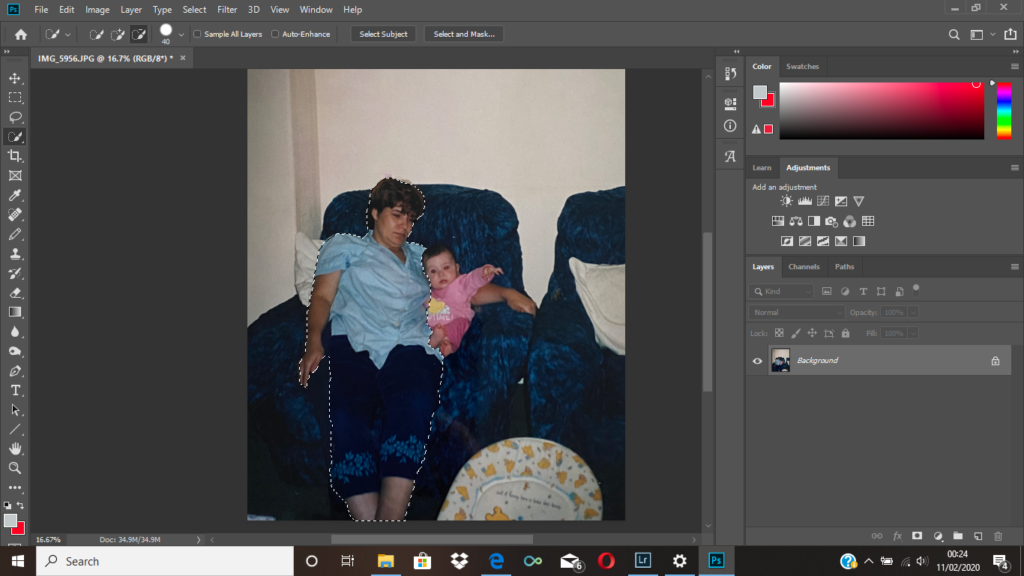
I began with an image of my mother, and me as a baby. I used the quick selection tool to select her, then right clicked pressing layer via cut, I then removed the layer, leaving a blank space in the image where my mother originally was. You can see the final output above. Although I thought it was a successful image I wanted to experiment with some variations. Because of this I added an image of her medication, and layered it over the top, and changed the opacity to around 50% so the original layer was visible. This is the 4th image you see above. I think overall both images are effective in conveying mental illness, however I think the second image gives more context to the situation. Ultimately, the image I will end up using will be the one that fits in more with the photo selection from my book, which I think will be the initial montage.

Similar to the process above I used the quick selection tool to obscure my mother from the image 
first montage 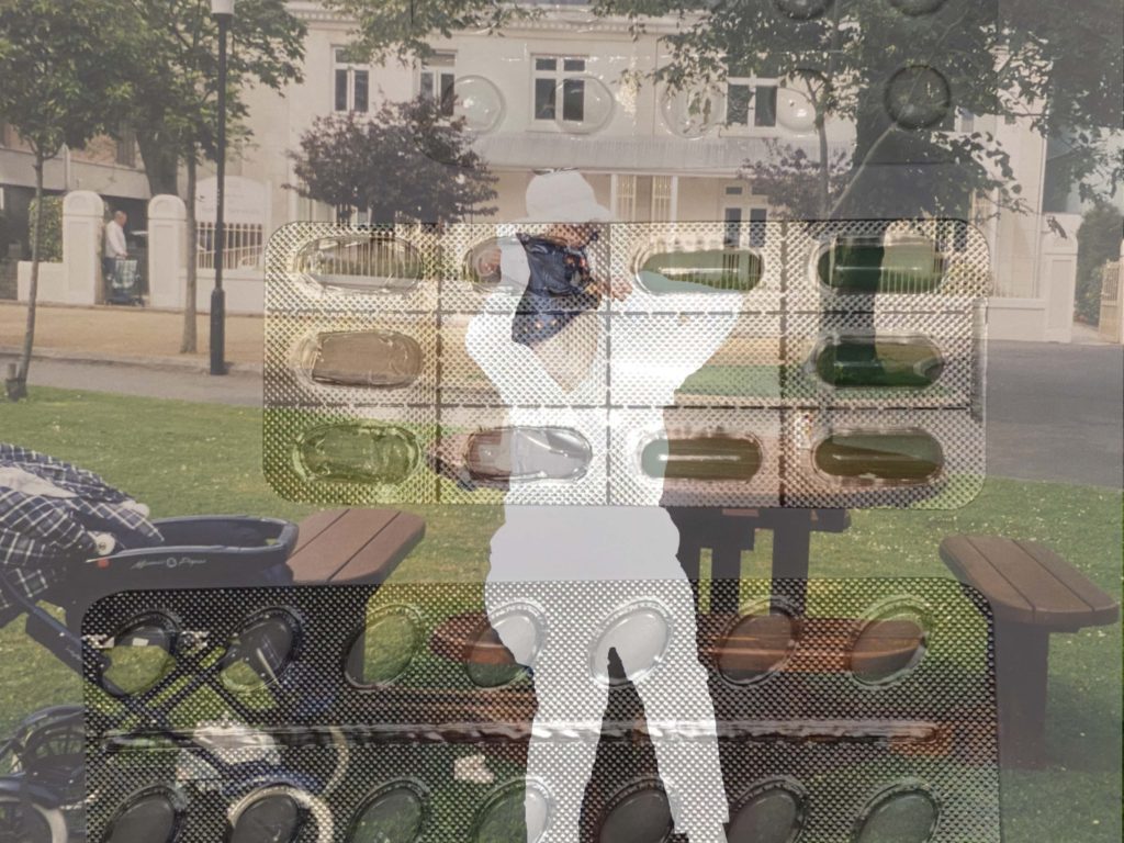
second montage
To complete the montages above I followed the same process stated at the beginning, the only difference being the image I layered on top of my archival image.
Project final outcome plan
For my personal study final pieces I aim to create 3 separate handmaid books; one named ‘Erasure’, a hand bound poetic narrative book that explores my want of not wanting my own identity, another named ‘Uncomfortable Skin’ another hand bound book with images that reflect myself and how I’m not currently settled into my vessel I was given, and finally another hand bound book with my final essay discussing ‘Can a personality and identity be reflected through a portrait?’. This trilogy will be encased in a handmade small cardboard box tailored to fit my smaller than A5 books. The idea of the box is to reflect how mental health is still a taboo subject within society so I’m physically hiding the problems away until someone goes and physically discovers them. Everything within my project is supposed to have a rough-and-ready feel due to it being handmade and personal, and could also be connotated as nothing and no one is perfect and usually their imperfections are the admired. My box is neutral toned so that it appears normal on the outside, then my two photographic anthologies are a soft grey colour with red thread which binds the book. This contrast was done mainly for aesthetic purposes. Then my essay zine has a crimson cover and is white thread bound so that it’s obvious that it’s different, this is due to it being a heavily weighted essay reliant upon knowledge and context that benefit my personal identity.
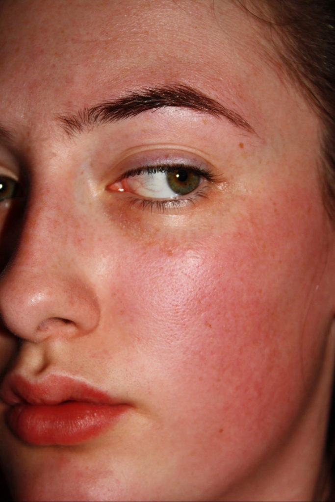
Uncomfortable Skin 
Erasure
Essay
Question : How do the photographers Walker Evans and Latoya Ruby Frazier portray the importance of family within their work?
Once used only to document information, photography has now flourished into a huge industry, being used for multiple different reasons – for self-expression, for awareness of current events, for political grounds. As once said, “From Daguerre’s age to ours, photography has undergone a transformation, not only technologically but conceptually.”(Bright and Van Erp. 2019:18) The ways to take and portray photos are endless, with each person having an independent reason as to why and how they could utilise photography. Many use this form of expression to focus it on the ones they value the most – family. Family has a significant impact in an individual’s life. They are the first people they are familiarised with in early childhood, they are the ones who make them feel comfortable and safe, and are usually the ones who help them get through when they find themselves stuck in a tough situation.
For my personal study, I will be focusing on the importance of family, specifically my own, and hope to portray them in a way which can express their importance to me. Family has always been important in my life. As mentioned before, they are the first people who we know in our lives, and this creates a special bond from early childhood which cannot be replicated with anyone else or destroyed. Most of my family, including my parents and younger brothers, currently live in London whereas I moved to live in Jersey with my aunt and uncle over a year ago. This evidently means that I don’t see and talk to them as much as I used to, but although we may not end up talking for a week or may not see each other for a few months, we still have that strong connection. This theme relates to the previous work I have been doing on Occupation and Liberation as families were affected during the war, especially those who had family members outside of Jersey and had trouble communicating with them while the island was occupied. We were able to take a look at the Red Cross letters which were sent between people trying to communicate with their loved ones, and were able to see the limited words exchanged between family which were separated.
The two photographers I am looking at are Walker Evans and Latoya Ruby Fraizer, two individuals who both documented family life. I decided that I would be investigating these artists as their works link to the theme which I am looking at. Although Walker Evans didn’t photograph his own family, he did take a look at others and the effect that the Great Depression had on these families. Latoya Ruby is a photographer who looked at her own family and effects that the state of the community had on them. These two photographers also relate to the work I have been doing previous to this, about the Occupation in Jersey, as their photographs revolve around the oppressed and struggling people in a place which wasn’t economically or socially strong at the time, with Walker Evans looking at families who were being effected by the Great Depression and Latoya Ruby looking at her own family within a community which was struggling with racism and economic downfall. To respond to these photographers’ works and my question I will be taking images of my own family from both London and Jersey and plan to edit them in the same black and white way which both Evans and Fraizer used for their images, so there won’t be much experimentation with colour but I will be focusing on factors such as contrast, cropping and under/over exposure. I will be aiming to take these images in a documentary style within the homes of my family members as this is when they are most themselves and the most authentic, which is an important factor of my photoshoot.
Since I am looking at family and hope to portray them and my relationship to them as they would be in their daily lives without any intentional manipulation, my work can be related to the movement of Realism. Realism was a creative movement which originated in France during the 1850s. Individuals who identified as realists rejected the ideas of Romanticism and revolted against the subject matter and overemphasized emotionalism of the movement. Realism in photography portrays things as they are without any abstract or idealised factors put into to change the image. People usually think of Realism within photography as the ‘truth’, since the images haven’t been edited or manipulated to change what is going on within it. However, this may not always be the case, as an image doesn’t need editing to be untruthful. As Giles Duley said, ‘ There is no truth in photography, only honesty’, which could mean that you never really know what the truth is when it comes to images that you haven’t taken yourself, since factors such as angles and camera lenses can change the real situation, so the only thing a photographer can do is be honest about their work.
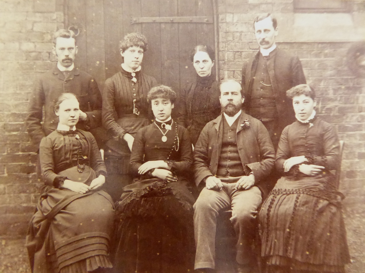
Family pictures have been around for hundreds of years, with family photos becoming common around the time the camera was invented. Before the invention of the camera, middle to high class families were able to pay for expensive family portraits to be painted for them. Family has always been a main art subject, with individuals wanting to treasure their loved ones and their family legacy by having either a painting or a photo made of them. As cameras evolved and became more popular, photographers were able to find another way of documenting their families, by taking candid images of them within their lives. The subject of family is generally a topic which is related to Realism as many photographers prefer to capture their family relations as they are within their daily lives, with as little changes as possible. My work is the same, as I am planning to document my family from both London and Jersey and portray my relationship with them as they are normally, making my work related to Realism. I am looking at two photographers who both look at family, Walker Evans and Latoya Ruby Frazier, and both their work can link to Realism as they both document the lives of families and the effects of the economic downfalls that their families are facing.
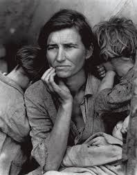
One photographer whose work is related to Realism is Dorothea Lange, a photographer who took images of farmers and migrant workers during the Great Depression and how this economic downfall affected these individuals. This image of the migrant mother and her children is one of Lange’s most famous images, and this is because it conveys a large amount emotions and stories just by looking at the mother’s facial expression. As a realist photographer, this image has not been altered or manipulated and is a clear idea of what was happening during the time of the Great Depression. Dorothea Lange is quite similar to the photographers I have chosen for my question, Latoya Ruby Frazier and Walker Evans. She looks at the oppression and suffering of people during an economic downfall, such as the Great Depression that both she and Walker Evans were looking at, and her work is documentary-like, showcasing the effects of these events.
When it comes to Realism, another photographer who fits into this movement is Walker Evans, a photographer who documented families during the Great Depression in America. Evans is one of the photographers who I am looking at for the theme of family, as he focused on families for most of his images. Walker Evans was a photographer who was best known for his work during the Great Depression, and how his documentary images brought light to the struggles of family life within small towns in America. Most of his images appear to be candid, although there are a few portraits here and there within his work. One of his prime influences was August Sander, a German portrait and documentary photographer, and has been described as the most important German portrait photographer of the early twentieth century.
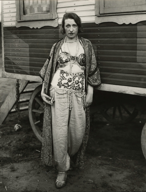

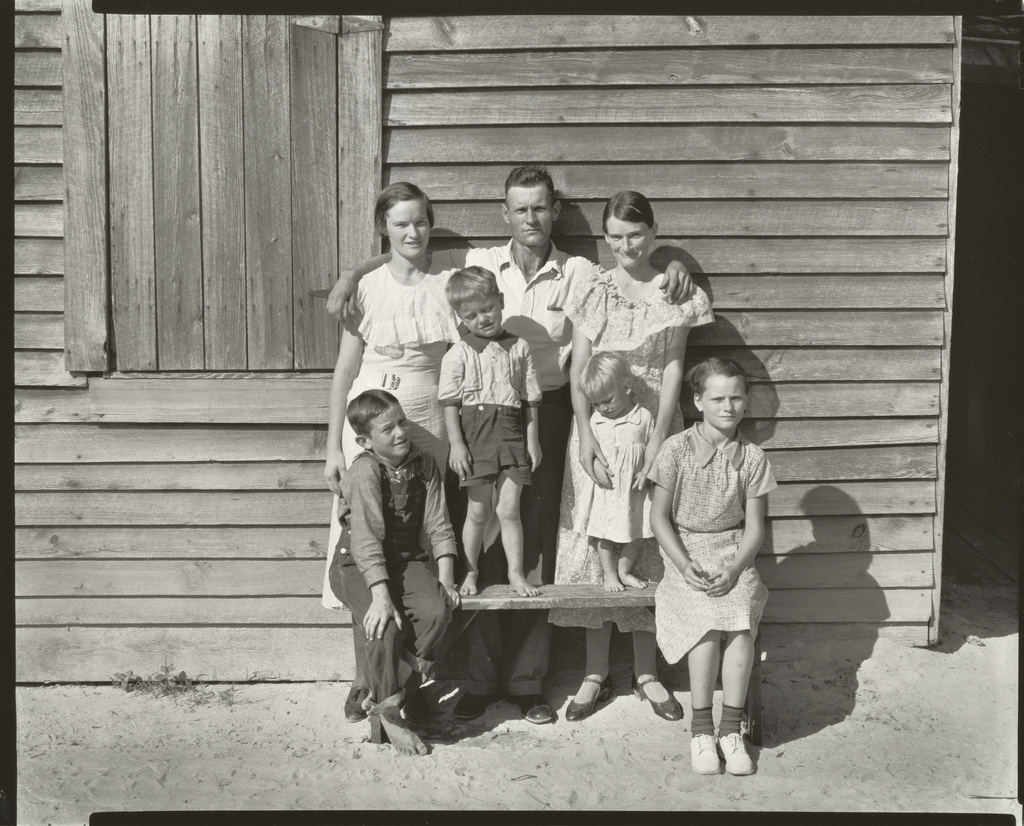
The image above is from his series Cotton Tenants, where he photographed three families in Hale County, Alabama, America. In this black and white image you can see a family of five and a dog standing on what looks likes a front porch. By the worn down clothes they are wearing and the poor state of the building they stand by, you can assume that they are a working class family and are struggling with poverty. You are immediately drawn to the man standing in the middle of the image, in front of the rest of his family. This may have been done on purpose to represent his importance to the family as the typical ‘bread-winner’, as during this era it was the husband who worked while the wife and children stayed at home.
The Great Depression was the worst economic downfall that has happened in American history. The stock market crash in October 1929 was the beginning of the Great Depression, and due to this by 1933 unemployment was at 25% and more than 5000 banks had gone out of business. The average family income during this time was $1,500, 40% less than what families usually earned before the start of the economic downfall, in turn leaving families stressed with just under half of their usual income gone. For his series ‘Cotton Tenants : Three Families’, Walker Evans photographed three families who were struggling with poverty to capture the effects of the Great Depression in Hale County, Alabama, and to expose the effects of this to the world. The people in the image above was one of the many families in that area who were facing destitution due to the economical decline during that era. At the time Evans photographed these three families, it was the height of the Great Depression and this was the time where people were finding it the hardest to cope. You can clearly see the effects it had on this family – they wouldn’t have been able to afford clean clothes, as portrayed by the rags they wore, nutritious food or the right equipment to fix and clean their house. However, I believe by having family during that time it made it easier for them to survive the depression, as although they were struggling with money and their basic needs, they’re still together on that porch.
The other photographer I am looking at for my question based on the importance of family is Latoya Ruby Frazier, a photographer who documented her own family during an economic downfall and a struggle of racism within her home down of Braddock, Pennsylvania. For her series ‘ The Notion of Family’, she looks at how these events within her town have effected her family within their home. There are two photographers who were large influences for her work – Carrie Mae Weems and Dawoud Bey. Carrie Mae Weems is considered to be “one of the most influential contemporary American artists”, and has investigated many factors through her works such as family, sexism, class, cultural identity, political systems and the consequences of power. When it comes to her influence on Frazier’s work, the topics which they both explore are quite similar, with Weems looking at cultural identity as one of her topics she has explored and Frazier looking at racism within her community. Frazier has also seemed to have taken on the same type of images which Weems has, such as candid images of others, and gone with the same use of black and white images which Weems has. Dawoud Bey is an American photographer who uses documentary style techniques to ” challenge stereotypical images of African Americans and other historically marginalized groups. “ Bey would have been an influence for Frazier as the topics which they both explore are similar to each other, with Bey looking at racism and stereotypes of African Americans and Fraizer looking at the racism within her community.
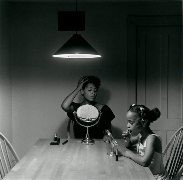

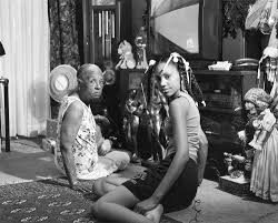
In this image you can see two women sat on the floor in the middle of the black and white image. They both look at the camera with two different expressions, the older woman having a slight frown on her face while the younger woman looks a bit happier with a hint of a smile on her lips. They look like they’ve been interrupted from the middle of a conversation that they were having. They seem comfortable in each other’s presence, which indicated that they’ve known each other for a while and have a bond. The older woman looks to be the younger woman’s grandmother, as they both look similar to each other. The room they’re sitting in seems to be the living room, with the television and numerous other decorations, including the grandfather clock in the background. By the look of the room they don’t look like they’re struggling with money, but they don’t look like they are a middle or high class family either.
In Latoya Ruby’s series ‘ The Notion of Family’, she looks at the legacy of racism and economic decline in America’s small towns, through the use of her home town of Braddock, Pennsylvania which became financially depressed after the fall of the steel industry in the 1970s-1980’s. To look at these issues she focuses on three generations of her family – her grandmother, her mother and herself – and photographs them in their home. She follows the social documentary style of Walker Evans and Dorothea Lange to create images which were inspired by Gordon Parks, who promoted the camera as a weapon for social justice. Her images, including the one above, are raw photographs of her family and captures the authenticity of the moment. With the use of black and white images, she is able to highlight the beauty of her home town and how this place has affected her family’s life along with the other people who lived in the area. By taking images of her family still together and well within this difficult time, she is demonstrating the importance of having family through her work.
Both photographers include family – in Walker Evans’ image you can clearly see the family of five standing together on the porch, and in Latoya Ruby’s image you can see a grandmother and her granddaughter. When it comes to the contexts of their images, they are similar in the way in which they both look at the effect of economic downfall on families. Evans was exploring the effect of the Great Depression on families within small communities, while Ruby was looking at her own family in the time of racism and economic downfall in her home town of Braddock, Pennsylvania. They also show the importance of family in dire situations, with each of them photographing families which seem to have strong relationships in times which were socially and financially difficult for them. However it is different in the way which while Evans was looking at multiple families and how they were effected by a country-wide event, Ruby was only looking at the effects of economic downfall in her small hometown, and her own family. As Latoya Ruby was looking at her own family, she had more of a connection with those who she was photographing and knew them well, so she could shape her photographs to suit their personalities, lives, ect, whereas Walker Evans didn’t know the families personally and did not have that connection, so he may not have been able to take images which truly reflect who these people are. When it comes to each of them as individuals, there are differences between the two which could effect the way they take their images and look at the events which they are documenting, such as the fact that Frazier is a woman and Evans is a man, so they would each look at the events in different ways – through a man’s point of view and a woman’s point of view. By investigating these two artists they have inspired and influenced my work greatly by showing me ways of approaching my chosen theme of family, such as taking candid images of them within their own homes or out socialising. Latoya Ruby Frazier was able to portray the importance of family through the use of exploring her own family members and taking images of them during a time of financial downfall and racism within her community, and Walker Evans was able to show this by taking images of three families who were just pulling through during the Great Depression.
Bibliography:
- Bright, S. and Van Erp, H.(2019), Photography Decoded. London: Octopus Publishing House
- Parkin(2018), Realism and Honesty in Photography, www.onlandscape.co.uk (https://www.onlandscape.co.uk/2018/07/realism-and-honesty-in-photography/)
- Carrie Mae Weems Biography, carriemaeweems.net( http://carriemaeweems.net/bio.html)
- Dawoud Bey’s Briography, thehistorymakers.org( https://www.thehistorymakers.org/biography/dawoud-bey-40)
Final Essay: 2230 words
Compare Francesca Woodman and Mary Ellen Mark’s representation/documentation of mental illness.
Introduction: 346
For me, photography is a way to express perhaps more negative emotions in a non-judgmental medium. Perhaps people interpret the meaning in the wrong way, but the act of capturing the image gives a sense of control over the emotion behind it. That’s part of the reason that I wanted to explore mental illness via photography. After struggling with depression and anxiety in the past and at the time not really having a way to express how I was feeling, I wanted to explore and remember past emotions to educate others on mental illness, while additionally finding a new way for me to cope in the future. I am particularly fascinated by the work of Francesca Woodman. The young photographer was herself suffering from depression and her images are often seen to reflect this as a result of her suicide. The images are surreal at times and often have a dream-like quality to them. While now related to her suicide, Woodman’s images were an exploration of her own identity and gender, often showing a lack of the former by obscuring the subject’s face. Individuality is important when it comes to mental illness; no one experiences it in quite the same way. Woodman expresses her illness in a way that is very personal to her and it’s interesting to gather an understanding of someone else’s experiences. However, I also wanted to see how people, who have never experienced severe mental illness, view mental illness. In contrast, Mary Ellen Mark spent 36 days inside Oregon State Hospital on Ward 81 and created a documentary book of work that captured the essence of such an institution and its patients. Mark was tasked with photographing the ward’s occupants along with journalist, Karen Jacobs who wrote a piece on their experience. Mark was primarily a photo journalist, however her Ward 81 project was a follow up to meeting the patients while photographing for 1975’s ‘One Flew Over the Cuckoo’s Nest.’ In contrast to Woodman’s images, Mark gives a more realistic view of mental illness by photographing what she observed of others.
Historical Context: 383
Documentary photography was a way to capture event often related to history. These can be personal in the form of family albums or more large scale. Larger scale documentations often appear in news outlets as an aid for written information. However, it can be used to tell a solely visual story. For example, Mary Ellen Mark’s documentation of Ward 81. While this doesn’t show an obvious narrative with a clear beginning, middle and end, it does well at showing the main aspects of life on the ward. A criticism of some documentary photography, including ‘Ward 81’ would be whether the images are socially sensitive. This means that the images may cause unjust discrimination or social unrest. An example of this would be propaganda. Propaganda is designed to sway opinions in a certain direction, perhaps leaving people to believe something which is untrue or exaggeration in order to prompt an unjust response. However, Mark’s work may cause an unintentional negative response. During the 1970’s in America, misdiagnosis caused by the outdated DSM-II and sexist doctors resulted in the institutionalisation of many, especially women. Mark’s work may have been socially sensitive at this time due to the representation of only female patients. This may have reinforced the stereotype that women were often more prone to mental illness as a result of their apparent increased emotional responses. As result this may have increased discrimination against women who were more emotional and may have even caused them to become institutionalised. A second important ethical consideration for documentary photography is integrity. In modern society it is very easy to manipulate images with the use of editing software such as Photoshop. However, is it ethical to deceive audiences when presenting documentary style images? An article for photographylife states that, ‘…it is only ethical when such imagery is provided without ANY manipulation whatsoever.’ I have to agree with this. Since documentary image are often used as part of news features they can help shape people’s opinions and influence their actions. This comes back to social sensitivity. In addition, the constant manipulation of image without the knowledge of the desired audience may damage the reputation of the photographer or the co-operation they work for. The audience may lose trust in them or in series cases the individual responsible can be prosecuted.
Francesca Woodman: 605

Famous for her self portraits, Francesca Woodman preferred to work alone, but there’s more to her images than a representation of herself. At only age 22, Woodman threw herself out of a window in New York. This leaves her images forever tainted, in the sense it’s difficult to view them without wondering whether they’re a prediction of Woodman’s fate. In 1977, Woodman worked on ‘On Being An Angel’ while staying in Rome. The title in itself suggests a surreal approach to self portrait as the word ‘angel’ suggests the presence of a higher celestial being. While it is possible that the title could indicate that Woodman believes herself to be this celestial being, it is more likely that this refers to the faith, love, hope, strength and intelligence that angels often symbolize. However, this is a clear juxtaposition to certain extent. The images are in the black and white, mirroring the aesthetic of Woodman’s other works while also showing a darker undertone that suggests that Woodman sees herself as more of a misunderstood angel. It was not secret that Woodman was struggling with the lack of success and recognition her images were receiving. It had been clear to those close to her that her images were some of the best, so why didn’t others see that? One such image from ‘On Being An Angel,’ shows Woodman in a derelict building, her preferred location to shoot in, with two white sheets behind her as she leaps up in front of them as if flying. It is obvious that the sheet represents her angel wings and the image as whole suggests that Woodman wishes to take flight, to escape perhaps. Another striking feature present in this series is Woodman’s often completely bare chest. She has her breast thrust out, however, this is not by any means sexual. She had previously explored her body in several of her other works and had grown comfortable with it. Woodman wanted to show a certain rawness and maybe even innocence to the images one would find when thinking about angels. As for the idea of flying, Woodman has also previously referenced the theme of weightlessness in some of her other works taken in Rome. It seems perhaps that Woodman was toying with the idea of angels taking flight while also thinking about how she might like to do the same. The reasoning behind this, some would suggest, comes down to her death. In 1981, Woodman threw herself out of a window in New York. The similarity between her chosen method to end her life and the images of flying is astounding. An article in The Telegraph suggests that Woodman’s images are ‘…coloured by her suicide.’ However, I find myself disagreeing with this to an extent. Is it really plausible that Woodman had been predicting her end since age thirteen? Of course not. She was simply just a girl that was doing what she loved while exploring and learning more about herself and where she fitted in the world. On the other hand, I think that some of her work during the last few years of her life may have had some kind of warning to it. Some of the images Woodman took in Rhode Island between 1975 and 1978 are captioned with almost foreboding messages. For example, one image is captioned, ‘I stopped playing the piano.’ Assuming Woodman stopping playing through lack of interest could suggest the beginning of her depression as the early signs of such mental illness often includes a sudden lack of interest or enjoyment of activities that may have even been a person’s favourite thing to do.

Mary Ellen Mark: 378
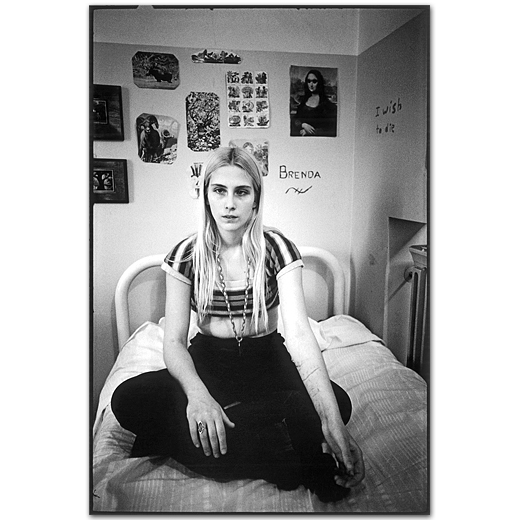
In 1975, while photographing on the set of ‘One Flew Over the Cuckoo’s Nest’, Mary Ellen Mark was given the opportunity to talk with the patients of Oregon State Hospital’s Ward 81. She returned a year later with writer, Karen Folger Jacobs. The pair spent 36 days on the ward. While known for her documentary style projects that have a clear narrative, Mark took a slightly different approach to how she presented her images from the ward. In an interview with American Photographer about her time on Ward 81, Mark said, “Instead of the 1-2-3-4 of a picture story, I was interested in doing pictures that would stand alone.” This is to perhaps represent the isolation of each patient, while also giving them a sense of individuality that they may not get on the ward. Ward 81 consists of a series of images that give an insight into the side of mental illness that people had never seen before in the 1970s. Jacobs wrote ‘At first glance, they could be almost any group of women in any institutional lounge or day room,’ (Folger Jacobs 1979:) and for the most part that was probably true. The lock ’em mentality of 70’s America was the main reason many of the women of Ward 81 were where they were and once they were institutionalized it was hard to introduce them back into society without seeing them return to the ward not long after. This is perhaps one of the reasons why Mark wanted to spend so much time with the patients while photographing them. She had always thought it vital to build a relationship with the people in her images so she could understand them. The image titled ‘300B-011-005’, perfectly captures the idea behind the project. It shows a girl sat on her bed. At first glance she could be considered a normal teenage girl with clothes that show more skin than her parents would like and posters and pictures above her bed that show the things she likes. That’s what you’re supposed to see first. However, you soon notice the cuts on her arms and the phrase ‘I wish to die,’ written on the wall. While on the ward, Mark recorded in total 4,800 images on 200 rolls of film.
My response: 329

I was heavily inspired by Woodman’s images, more so than by Mark’s work. I liked how Woodman made her images very personal by photographing herself and wanted to demonstrate the same thing for my images. Her surrealist take on mental illness was especially interesting for me because I thought it would be a good way to communicate the thoughts and emotions I felt when I was suffering. I was fascinated by Woodman’s portrayal of angels and the idea of weightlessness. I had always struggled with finding some sort of freedom from my feelings and could recall instances when, usually with my friends, I didn’t even think about how sad I had been or how I might that way again, it was as if nothing else mattered except that small moment of enjoyment and weightlessness. With this image I thought I showed this idea pretty well. While responding to Woodman, I decided that I would mimic some of her techniques including her use of long exposure. I used a shutter speed of two seconds and made small movements to create a blurred look. For this image I explored weightlessness by creating what could be considered wings by wearing a skirt around my shoulders and moving my arms gently up and down underneath it. Again, similarly to Woodman, I wanted to create a ghostly look to the image. To do this I not only implemented the blur created by the long exposure but also exposed the image further and increased the blacks to make the image appear more striking. My choice to blur the image had multiple purposes. The main purpose was to mimic Woodman’s exploration of lack of identity. I thought that this would work well with my images as it represents the invisibility often felt by people suffering from depression as well as the isolation I had felt. I think that I have responded well to Woodman’s ideas and it’s clear that I have taken inspiration from her work.
Conclusion: 183
To conclude, both Francesca Woodman and Mary Ellen Mark show a deep understanding of mental illness as demonstrated by their image. Woodman, while originally exploring identity has come to draw people to her work with her tragic story, but has continued to keep people interested whether that be by instigating theories on how her images relate to her death, her clear exploration of gender, identity and feminism or simply the darker, gothic surrealism displayed in every image. She demonstrates, for me, the thoughts and feeling behind depression and clearly used her creativity to give herself a release while giving the impression that she knew what was happening to her was not her fault. In comparison, Mark gives a meaningful insight into the women of Ward 81 by allowing herself to really get to know them and understand them on a personal level without tainting her opinion with their mental illness. Her book tells the story of those 36 days by showing all aspects of daily life without censorship and maintaining her integrity. This results in Mark presenting the women as just that, women.
Bibliography:
Bailey, R 1978, Mary Ellen Mark’s poignant scrapbook, American Photographer, viewed 11 February 2020, <http://www.maryellenmark.com/text/magazines/american%20photographer/911T-000-001.html>
Folger Jacobs, K. (1979), Ward 81. New York: Simon and Schuster
Mansurov, M 2019, The Importance of Ethics in Photography, photographylife, viewed 11 February 2020, <https://photographylife.com/the-importance-of-ethics-in-photography>
Salter,K 2012, Blurred genius: The photographs of Francesca Woodman, The Telegraph, viewed 11 February 2020, <https://www.telegraph.co.uk/culture/art/art-news/9279676/Blurred-genius-the-photographs-of-Francesca-Woodman.html>
between now and then – photobook structure
change is inevitable
The physical dynamics of my photobook
I will be handmaking my own photobook, including the printing, editing, binding, text, and the overall assembly of the book.
For the book cover, I am using the shell of an old diary I kept a few years ago, which is sentimental and relevant to the topic of my book. Its roughly the size of an A6 sheet of paper, maybe slightly bigger as it has to house the A6 contents. Its also a hardback, with a textured red covering similar to a snakes skin.
Im planning to use my old dymo label maker, which used to be my moms when she was young, to create the title on the front of the book. I’m also planning to incorporate a simple photograph right in the middle aswell, creating a minimalistic but bold demeanour.


Both the front page and the back pages of the book will be thin, lightweight tracing paper to give the book an unclear, surreal opening and closing. Between each signet, which will only be 1 folded a5 page, I’ll bind in the smaller sheets of paper with the handwriting. I’m hoping that using a variety of differences sizes and types of paper will give the book less fluidity and structure, as I’m not showing my photographs in a linear order.
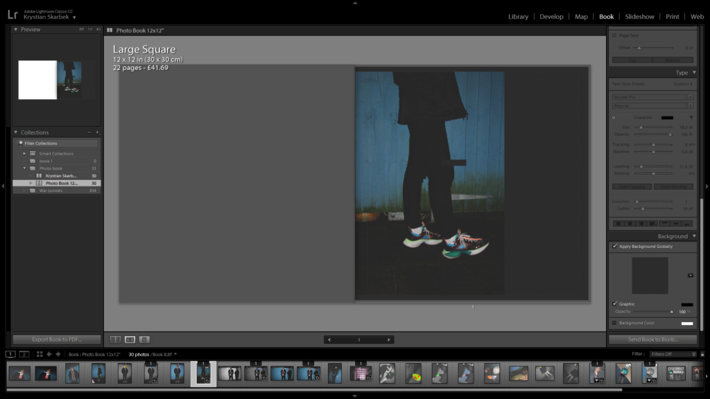
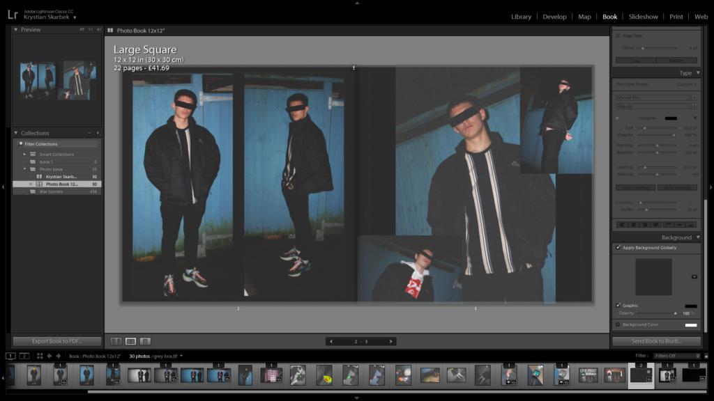
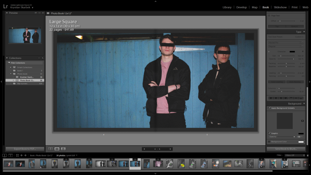
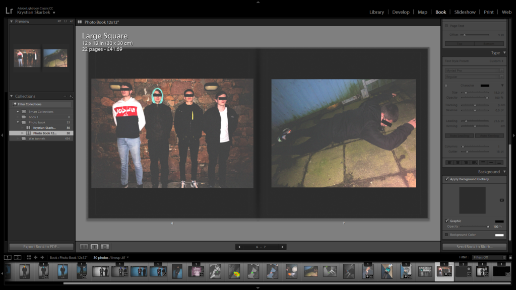
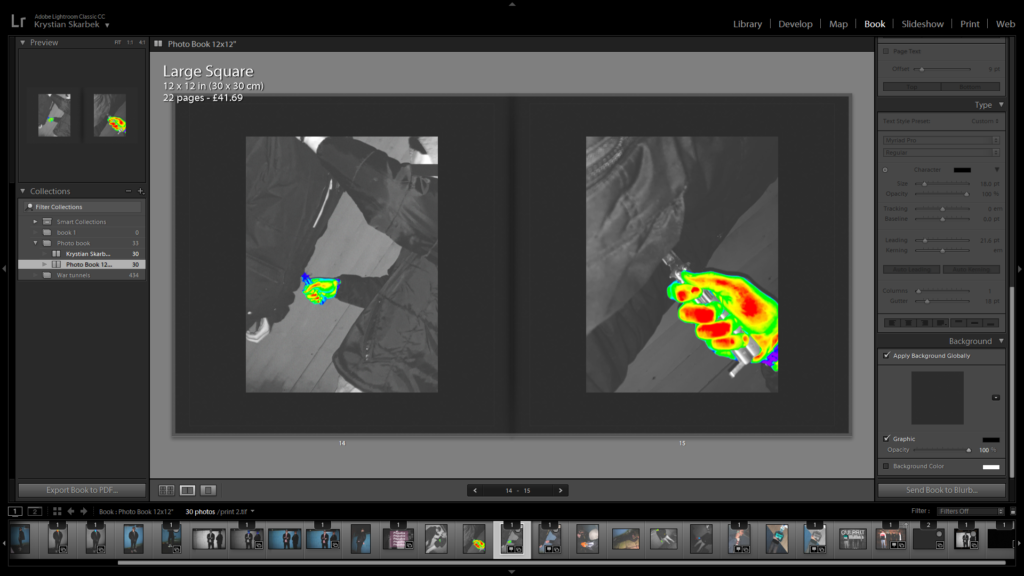
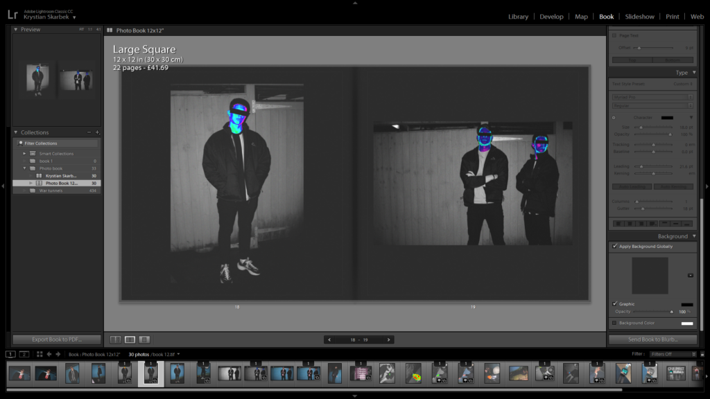
Book composition (Images only)
This is the layout of my photo book without any text (with the exception of the front cover and spine)






My final works

I guess this is the place where it all started, in Youghal, Ireland. This is where my mum grew up and spent most of her young life, and its still the family home today which houses my auntie and her two dogs.
I’ve been my most creative here.
I’ve been my most vulnerable here.
I’ve been my most happy here.


A wall in my bedroom. my bedroom. One of the few places where I feel creative and able to see things clearly.

This photograph was taken the evening my dad left the house, sometime in January of last year. It was a monumental occurrence that effected all lives involved in his movement, but mostly for the better rather than the worst. It relived the stress from all of us.
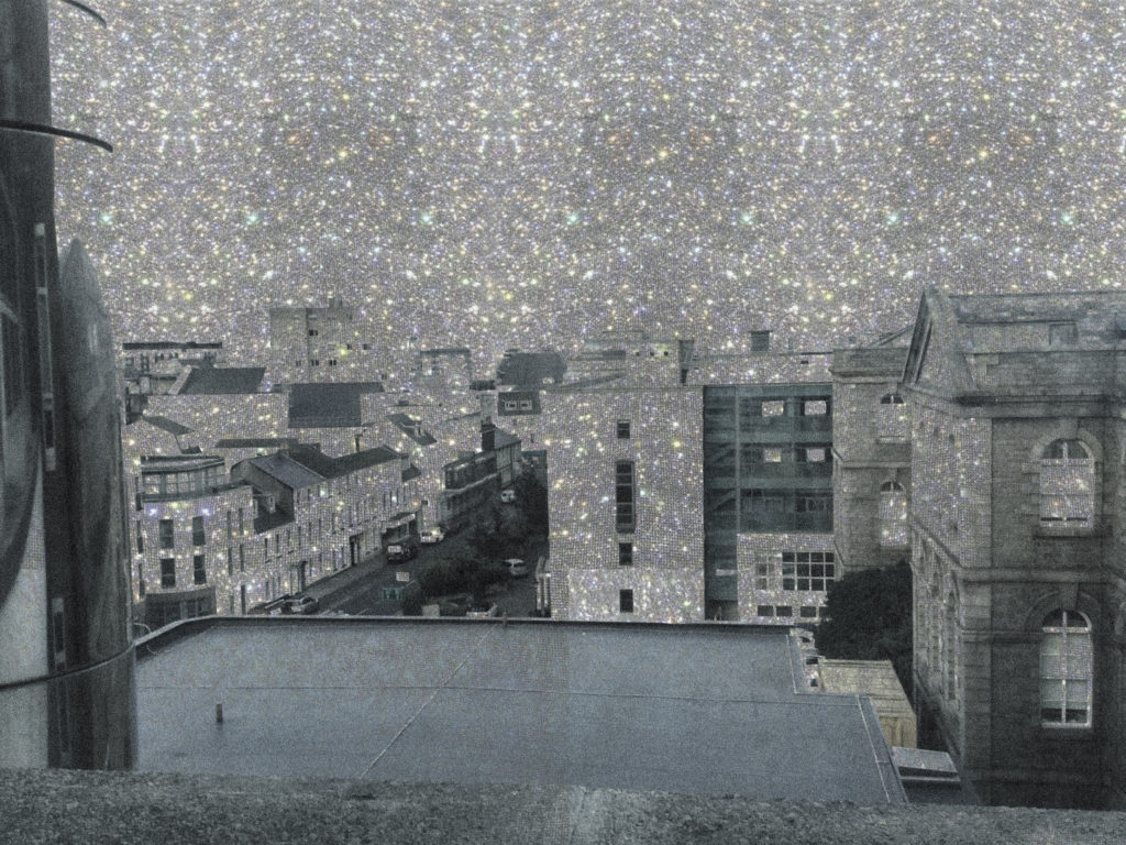
This Photograph was taken during one of my stays at the Jersey General Hospital in 2016, when I was the sickest I’d ever been. For this particular stay, I spent 2 months on bed rest, with the only view I had being out of one single window, overlooking the outskirts of town and out to the sea. During the start of my illness, I was convinced that there was nothing wrong with me, and because I thought there was nothing wrong, I didn’t see any point in getting better and committing to recovery. But deep down I knew there was a serious issue I had to face and acknowledge in order to keep living.
It was hard being cooped up in a hospital where real life was only occurring everywhere besides in the hospital. So I tried to find comfort and happiness in the little things I had access to; like the view out my window. It was the only thing that was close to real life that I could lose myself in.


my family had eyes but could not see the sickness which was controlling me. at the end of the day I knew I needed help but I was too deep in my own shit to be able to catch a breath and acknowledge how sick I was.

rolling my eyes because sometimes things change too quickly for my head to keep up with. Why can’t things slow down a bit. I know time is just a concept, but we are ruled by it with such vengeance.

I always seem to feel little fireflies buzzing round in my head. one evening it got too much and they started to emerge out of my eyes in an orderly fashion.

Hospital x2. same meaning different angle. featuring Stanley the rabbit who’s been with me since 24th September 2001.
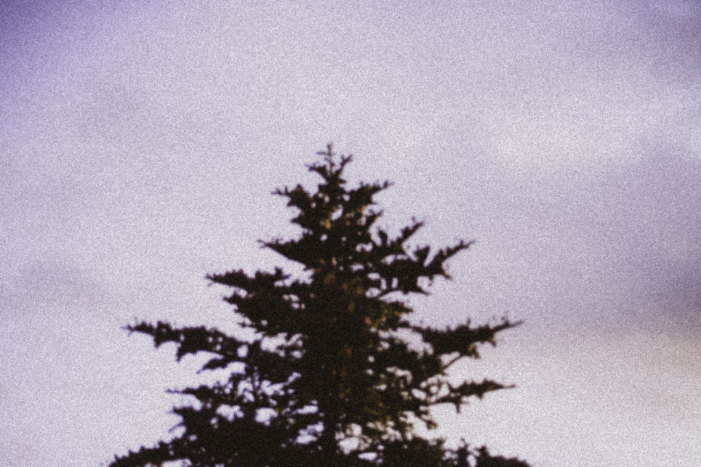
A tree in the back yard in my family home in Ireland. Has always been there ever since I was a baby, but probably not for much longer as things tend to change.

A more practical approach to letting negative things go… try breathing them out. It doesn’t really work but its worth a go.
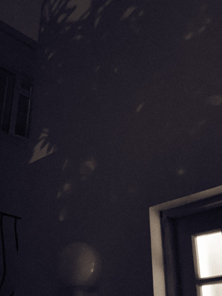
A second photograph taken on the night my dad left, except at a different angle.

A self portrait in my room. where everything that I need is there right in front of me.
Artist References: Laurie Simmons; Early Colour Interiors
Biography
Simmons is an American filmmaker, photographer and artist born 1949. She is part of The Pictures Generation which includes Cindy Sherman, Barbara Kruger and Louise Lawler. She received a BFA from Tyler’s school of art in 1971. Her work tends to be feminist inspired and a social commentary on society’s view on women.
Analysis
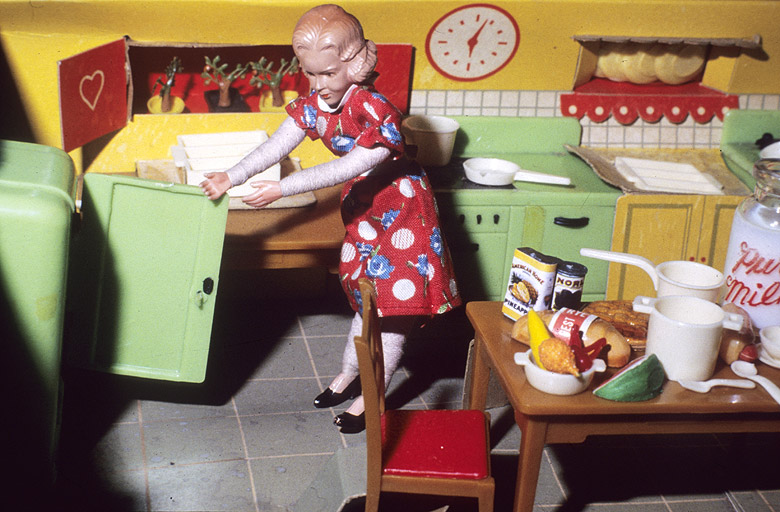
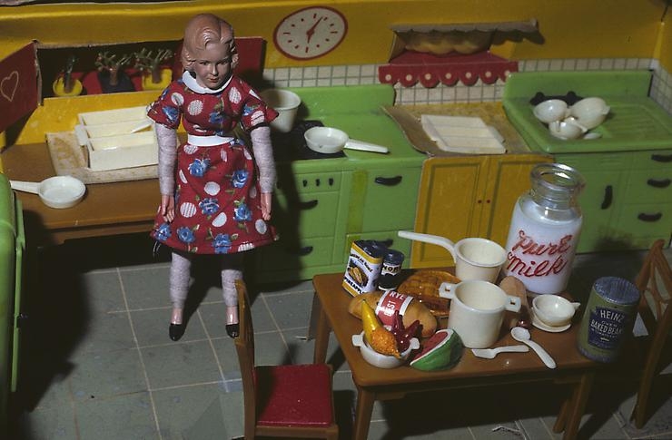
This image is called ‘Woman Opening Refrigerator/ Milk to the Right,’ it’s from Simmon’s series Early Colour Interiors taken from 1978-79. This was during the second wave of feminist such as the take back the night campaign in 1976. Conceptually the doll is meant to represent the classic housewife which is given away by her outfit and hairstyle. She photographs this doll in multiple constructed scenes of her doing stereo-typically household chores. The concept was to demonstrate the daily life of a housewife but also to illustrate the loneliness and isolation felt by some housewives. I think this is shown by the fact that in most of the images she is the only doll and using lighting and shadows. I think she intentionally kept those shadows in order to symbolise the darkness, isolation and emptiness some housewives feel. The focal point of the image is the doll in the center. She’s a walking stereotype. With the haircut, flowery dress and the whole kitchen mise-en-scene around her she’s a stereotypical housewife that Simmons grew up surrounded by.

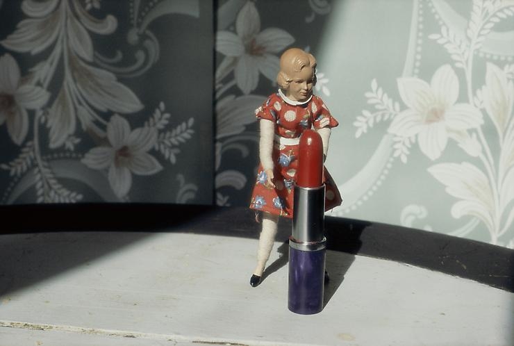
Compared to Bright’s work, Simmons work doesn’t just focus on the subject, the doll, herself. She uses a wider aperture to capture the housewife doll’s ‘natural environment’ in order to get her message across. Whereas, Bright solely focus on the doll’s appearance. Their difference of subject makes sense. Simmon’s who is 70 would have grown up with vintage doll houses so it makes sense she’d focus on that. Bright is 53 so would have grown up with Barbie’s.


