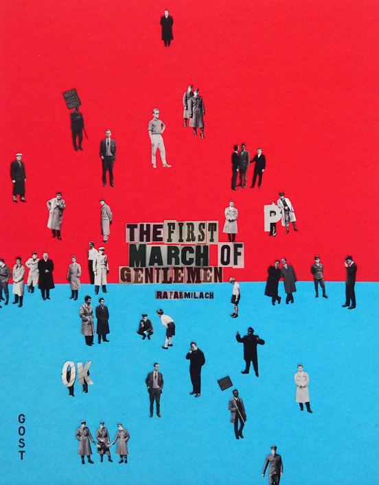
Polish photographer Rafal Milach set out to develop a project that would combine the individuals who lived through the communist era post WW2 (in which Poland was a part of Soviet rule), and the children’s strikes of 1902, in which Catholic school students objected to the Germinization of their education. Milach incorporated objects found in education (specifically maths equipment) with archival images of when Poland was invaded by the Germans, and in doing so emphasized the stark contrast between the childish innocence of simply wanting an education, with the reality that the education system and children were severely affected by the German invasion.
“The initial idea of working with the archive was sustained, but the topic changed as I began looking for material that could occupy two spheres – discipline and pacification, and the sphere of freedom – and to bring these elements together in a series of collages.”
In the above quote, Milach discusses how he was able to bring the 2 contrasting themes of peace (children) and war (occupation).
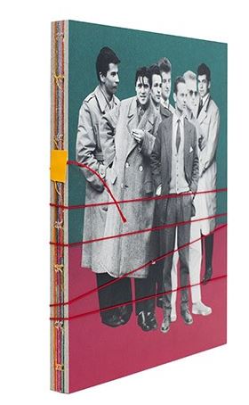
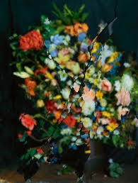
Milach published his photo-book, The First March of Gentleman, and used bold eye-catching colours (associated with children and children’s artwork) in order to show the contrast between the reality of the archival images, and the concept of the book itself. Milach added a string to the book that had to be physically unwound in order to open it; this added a sense of interactivity to the book, and the string (when wound) can be used to represent bars, caging in the subjects:
The book is bound by string, presenting a metaphor for how the inhabitants of Poland were trapped by the invading forces of the Germans
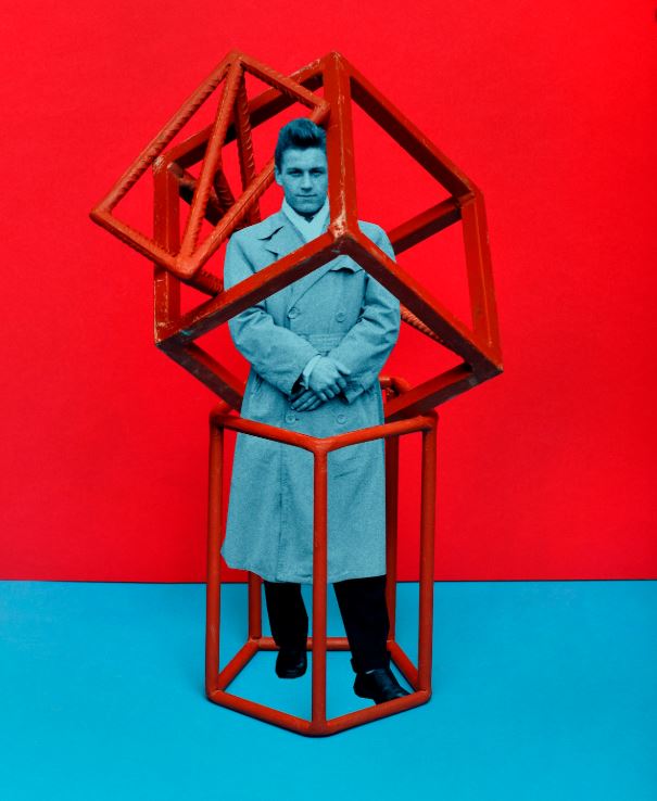
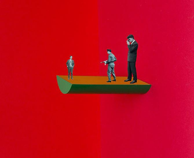
Milach makes use of space to draw maximum attention to the subjects and concepts in the foreground.
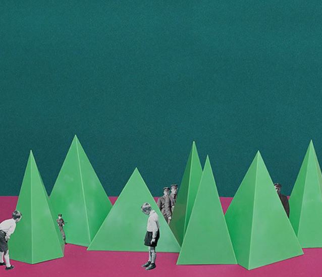
Here, Milach makes a statement by placing children in the foreground, curious towards the boldly coloured pyramids, and German soldiers stand watching over them in the background.
Milach makes use of space in his images, as the bold colours in the background still act as part of the image, drawing attention of the viewer, and the use of space draws maximum attention to the archival images laced between the objects.
I will be taking inspiration from Milach, and will be designing my own photo-montages that will reflect the feelings of confinement and hopelessness that covered Jersey during the occupation, and in general, Europe during WWII.
The autochrome process was invented in France by brothers Auguste and Louis Lumière. The Lumières began a commercial manufacture of autochrome plates in the early 20th century.
Autochrome plates are covered in microscopic red, green an blue coloured potato starch grains. When the photograph is taken, light passes through these colour filters to the photographic emulsion. The plate is processed to produce a positive transparency. Light, passing through the coloured starch grains, combines to recreate a full colour image of the original subject.
Autochrome plates were manufactured at the Lumière factory in Lyon and was a complex industrial process. The transparent starch grains were passed through many sieves to isolate grains. These gains were separated into batches, dyed red, green and violet, mixed together and spread over a glass plate. Next charcoal powder was spread over the plate to fill any gaps between the coloured starch grains. A roller spread the grains and flattened them out. Finally, the plate was coated with a panchromatic photographic emulsion.
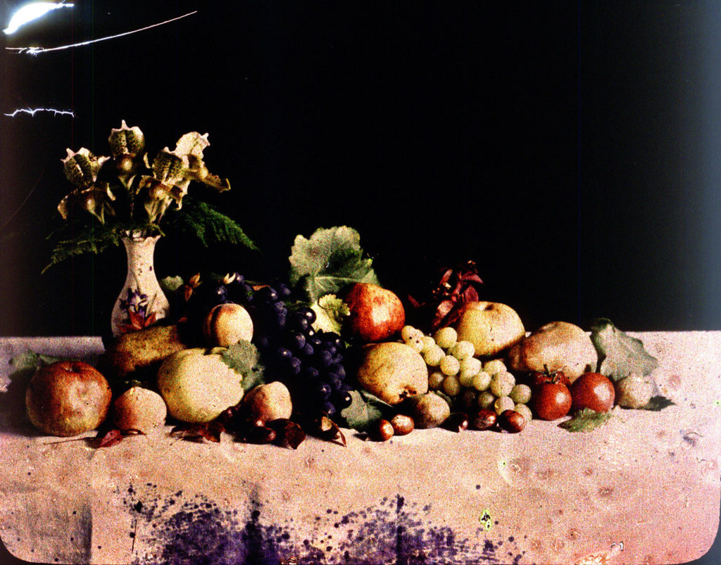
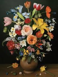
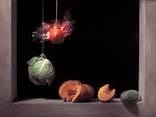
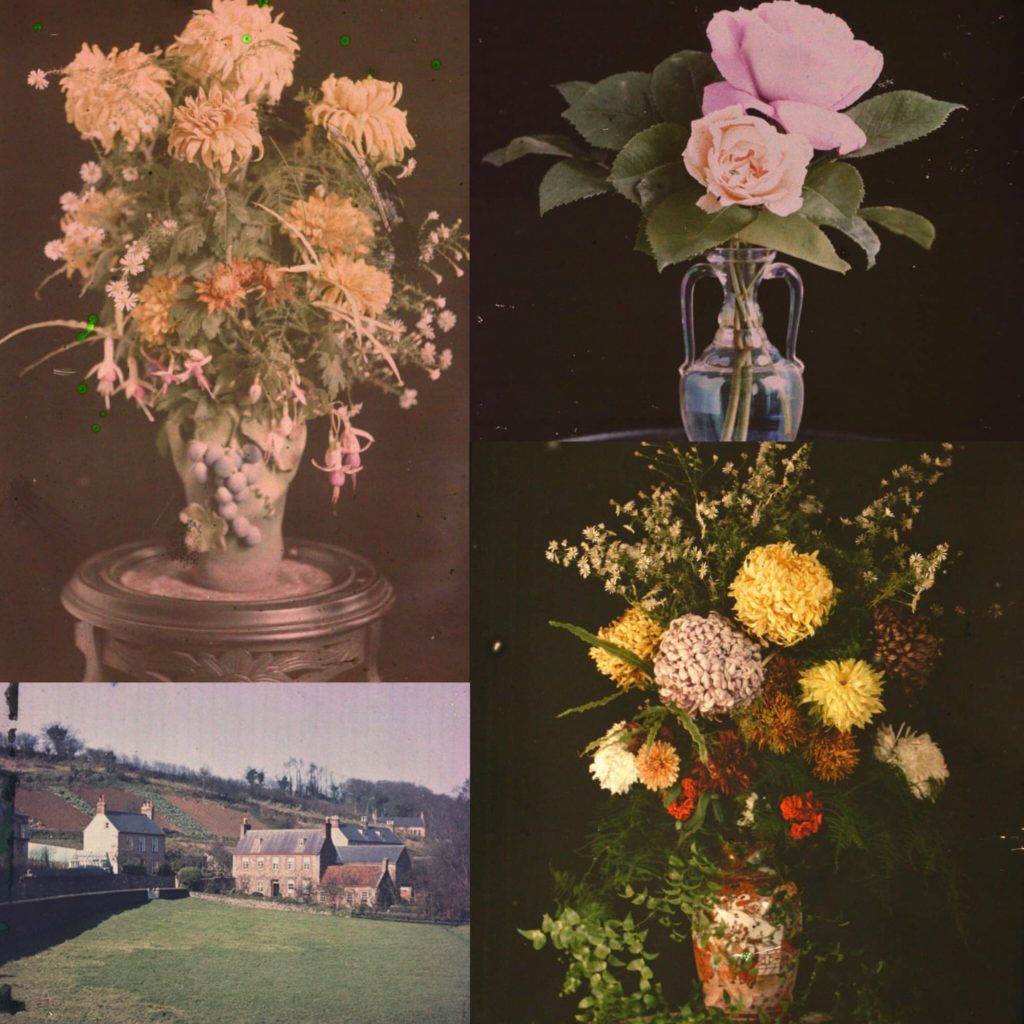
Lumière Autochrome is the first colour photograph taken in Jersey in 1904 G. Guiton & E. Guiton. This photograph of a vase containing roughly assembled garden flowers was the starting point for photographers to explore the possibilities of colour.
Emile’s autochromes fall into two categories. The first category are still life photographs such as flowers, stained glass windows, fruit. The second category can be described as domestic photographs such as children playing, a garden, local country scenes.
The still life photographs are an attempt to experiment with the autochrome process, to improve his technical understanding and the quality of his images. Guiton was also making attempts at classical arrangements and compositions.
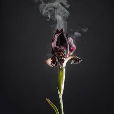
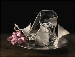
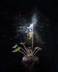
Ori Gersht goes beyond the thought of Still Life its self, he takes it further by videoing live explosions of plants and fruits. his most famous work was a pomegranate exploding by a bullet, therefore symbolizes the brutality, which has happened throughout history. Ori said “One cannot exist without the other. This circle of existence is comprised of the two. Consider the bloody history of Europe: there was a great aspiration for high culture, yet this very same culture was shaped by brutality and barbarism.” Meaning that his images are showing reality against the unknown in society.
History of Ori Gersht:
Ori was born in Tel Aviv, Israel, in 1967.
In 1992 Ori received a BFA at the University of Westminster, London for his works in film, photography and video.
In 1995, Ori got his MFA in Photography at the Royal College of Arts, London.
Ori explores how technology mediates and transform our perception of nature and history.
Gersht’s work often probes the ways in which landscape can stand witness to tragedy.
Ori Gersht has photographed traumatic events such as Auschwitz, Bosnia, Hiroshima, and Ukraine, and his images present haunting and subdued transformations of these sites of human atrocity.
In the White Noise(1999) he photographed a series of photographs when he was travelling on a train from Krakow to Auschwitz, a process echoing the forced migration of Jews by train during World War II. This therefore alludes to the “blinding’ process of historical amnesia.”
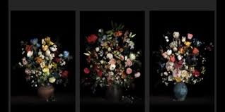
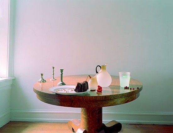
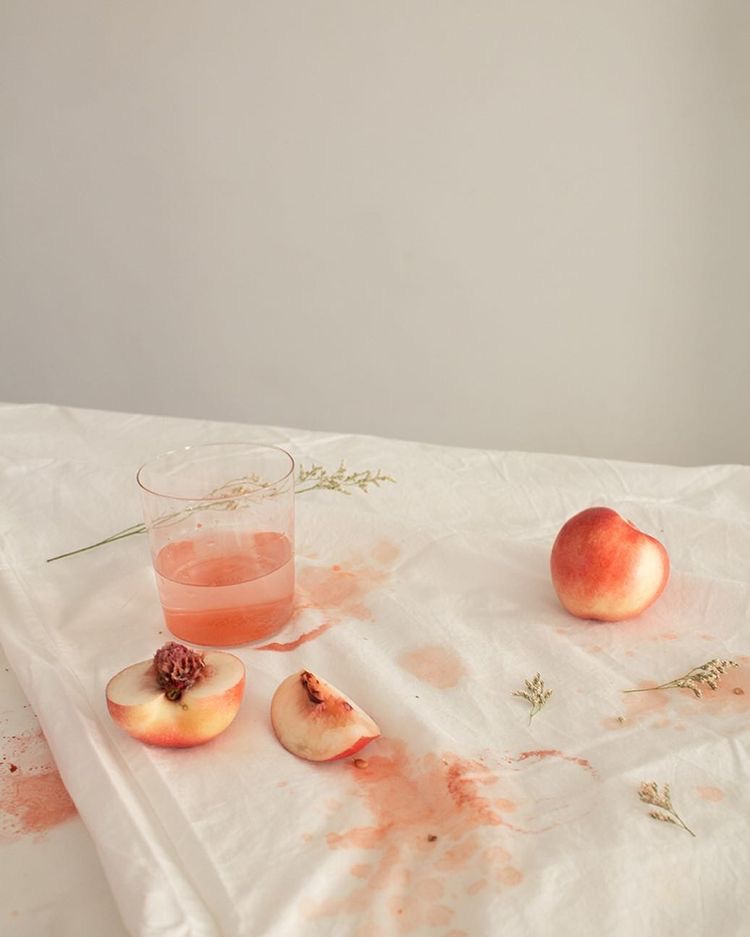
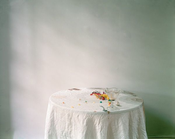
Laura L. Letinsky (born 1962) is a Canadian contemporary photographer, born in Winnipeg, best known for her still life photographs.
From her early photography of people, she shifted to still life photography for which she is now known. Her 1990’s series, Venus Inferred, of couples were informed by representations, visual and other media, about love and how photography is used to convey our ideas about romantic relationships. Her photographs chip away at normative expectations as depicted in mainstream culture. Impetus for her investigation of the still life was its associations with femininity, the minor arts, and its imbrication within the home as the space of intimacy. Letinsky says that still lifes provides her with the potential to explore the false dichotomy between the personal and the political. Vital to this is the selection/orchestration of objects depicted in her images as well as her photograph’s presence as object. Hence scale and surface is important to understanding these photographs. Rather than their being seen on a digital screen, she is invested in the experience of viewing her actual prints. She says that her work “is in part about the relationship between looking at something and other bodily experiences.”
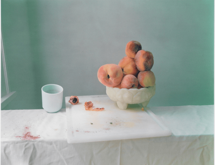
Letinsky’s still lives are described as “Elegant, subdued and gently but relentlessly off-putting, her large-format photographs have an arresting presence that seems out of step with time. At the same time, though, art history suffuses her meticulously constructed scenes as fully as the softened daylight does the sparse interiors she photographs.” Letinsky’s still lives are reminiscent of Dutch still lives, they bring together “freshness, ripeness and decay.”[4] Although they nod to Dutch still lives, they are more modernized, using “Crumbled Coke cups, styrofoam to-go cartons” instead of the upper-class, lush food of the Dutch still lives.
Letinsky’s large scale work becomes purposeful and melancholy, not about the food itself but more of the photography. “Peaches aren’t metaphors for anything; they are simply peaches, peach-shaped, peach-colored.” Her work is all about the line, shapes, and light interacting and how the view is experiencing the work. These fabricated scenes remind viewers of the ability to be real or fake within a photograph. Just as the 17th century northern European painters were not simply painting lemons and goblets, Letinsky’s work speaks to the value of objects, but more, the valuing of their representation with photography conveying much about what and how to see and look.
Guiton was the founder of the Jersey photo archive, and he was also a prominent figure in establishing colour photography in Jersey, through using autochrome plates.
The autochrome process my created by the Lumiere brothers; Auguste and Louis in France. Autochrome plates allowed colour photography to be created. These plates were cover in microscopically small pieces of potato starch. When the light passes through, it mixes with the emulsion to create a full colour copy of the photographed scene. The grains of starch were separated into different groups to be dyed red, green and violet. All the different colored grains were then mixed together and put over a glass plate to finally be coated with varnish. Charcoal powder was then added onto the plate to fill in any gaps left by the colored grains. These plates could be used on regular cameras, no extra equipment was necessary.
When placing the plates in the camera, the plain glass side of the plate had to be facing the lens so that the light could pass through before reaching the emulsion. When using these plates, exposure time had to be slight higher, about thirty times longer than black and white plates. The complex manufacturing process of these plates meant that they were more expensive, which limited it to only certain people.
Autochrome plates were also harder to be able to display, for personal viewing it was possible to just hold them up to the light, however when it came to displaying them for others a stand was used in combination with a mirror, or they could also be projected using a magic lantern.
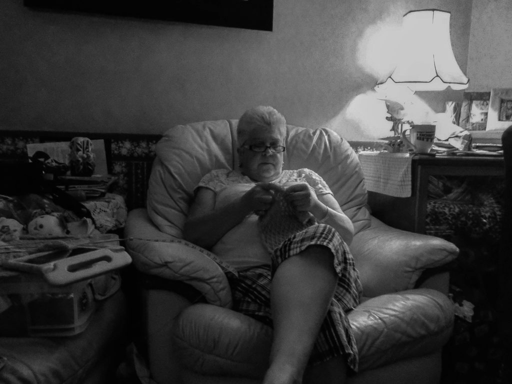
An environmental portrait is a portrait executed in the subject’s usual environment, such as in their home or workplace, and typically illuminates the subject’s life and surroundings. The term is most frequently used of a genre of photography.
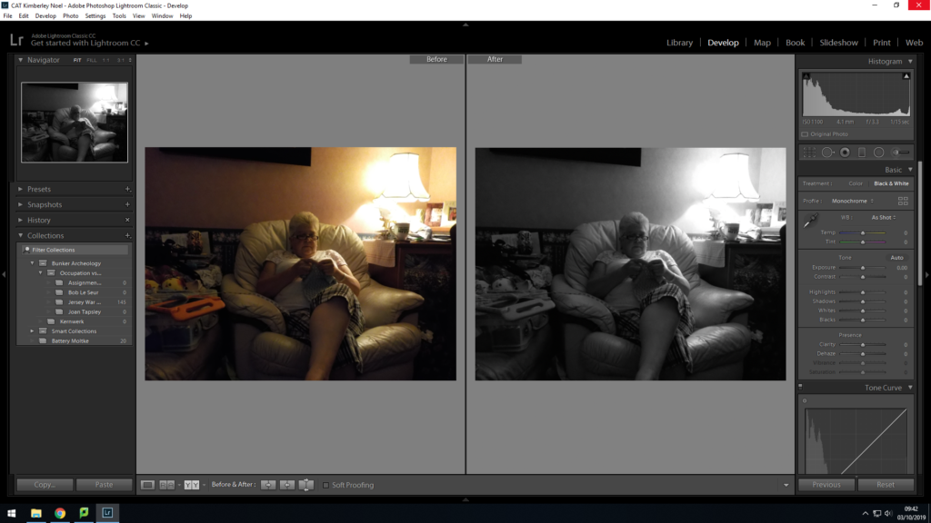
For the Photo shoot I decided to capture my mum and my dog in their natural environment
Information about People im Photographing:
Mum:
Is 65, who does work however at the moment is looking after my dad.
She also has several hobbies which includes knitting, watching movies, reading, watching the TV.
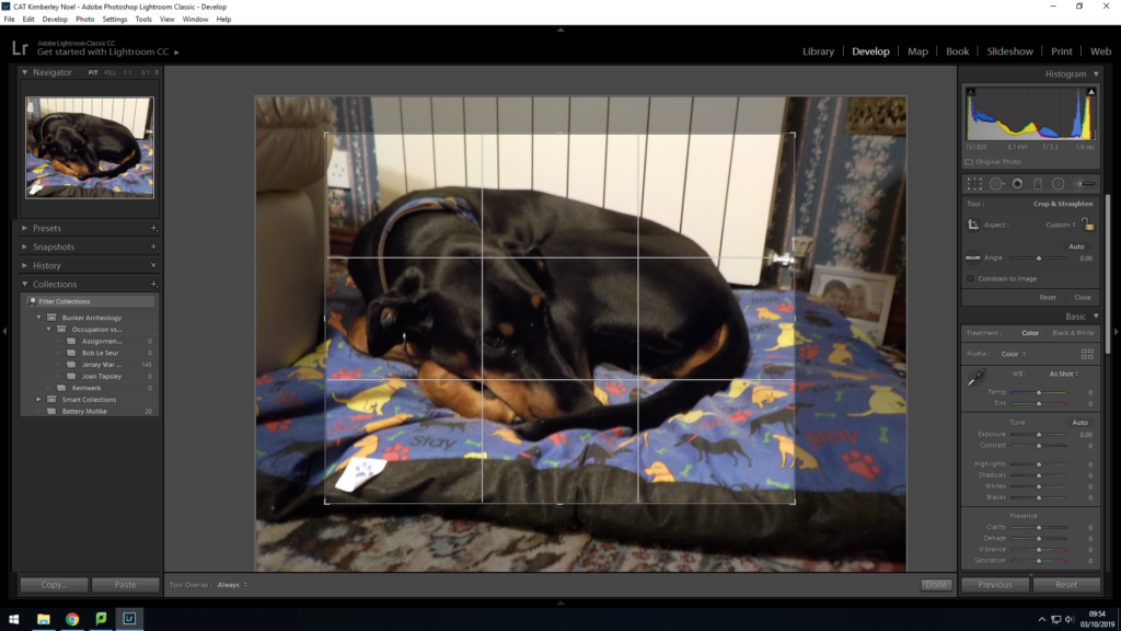
Dog: My dog is a 1 year old doberman
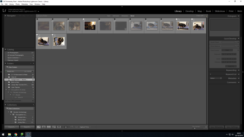
Images:
The images I have selected and discarded
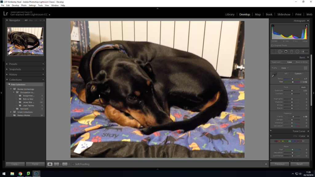
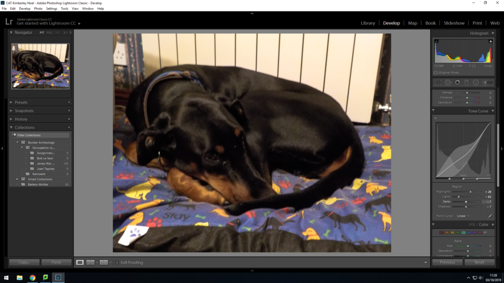
Images I have edited from Photo-shoot:
I have used the before and after view to see if the image looks better in black and white or clour, I have decided to go for black and white. I have edited the highlights, exposure, clarity of the image, so it makes the image clearer. I have edited the black and white tones within the image to create a effect for the surroundings. Final Image 1 – My Mum
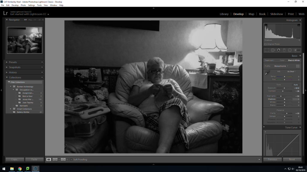
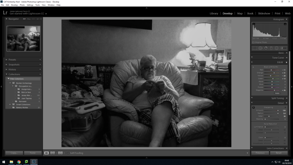
Edit 2:
I decided to crop this image so the audience dont get distracted by the other things in the background.I have edited the temperature and tint and the clarity within the image. I have edited the tone curve to increase the highlights, and decrease the shadows, and the light and dark tones.
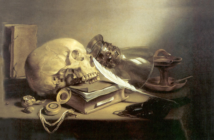
Pieter Claesz lived through the 1600’s when still-life paintings began to take off, during this time he was soon titled a ‘Dutch Golden Age Painter of Still-Life’. He was born in 1597 in Belgium. His art work was painted with subdued, virtually monochrome colours, with a subtle handling of light and texture allowing the symbolic meanings and expressions within the outcome to clearly be showcased. It is common to see motifs such as skulls for allegorical purposes. His work avoided a crowded composition and stuck to simplicity in order for the prime symbolism to be shown. It is said the Claesz artistic aim was to render the materials and catch the reflected light as accurately as possible, which was considered his speciality with still life pieces. He was the first artist to portray everyday objects, such as a rummer, a tin plate and a herring, in such a way to showcase the beauty of the objects.
Still Life with a Skull and a Writing Quill,1628 – Pieter Claesz
The image above is ‘Still Life with a Skull and a Writing Quill’ painted in 1628 by Pieter Claesz. The artist used a median of wood and painted the image using oil paint. The sizing of the painting is 24.1 cm by 35.9 cm and can be found in the Metropolitan Museum of Art in New York. The painting falls into the subcategory of Vanitas
Visually, the art piece creates a sense of business through the proximity of all the objects, which contrasts the small amount of objects there actually is. The first item my eyes are drawn to is the skull, which presents the formal elements of texture and scape. In addition, it informs viewers that the work falls into the still life subcategory of vanitas. The skull itself symbolises the death and mortality, which is also emphasised by the pocket watch, located in the foreground of the skull, which is symbolic for a lack of time, creating the overall ideology that life is short. The skull is leaning on a book which has a quill placed next to it, (contextually, and expensive item during the time period the work was painted in, creating a stronger meaning towards the symbolism it holds.), which is a common feature in a vanitas painting, which is used to warn viewers of the futility of worldly pursuit. Moreover, in the background there is an old school candle holder, with the glass covering laying beside it. You can faintly see an amber in the holder, suggesting the candle has just been blown out, which symbolises a passage of time and reinforce the sense of death.
After deciphering the symbolic representation of each item within the frame, it clearly demonstrates the intended conceptual representation in the work. The painting is suggesting, that time is short and that we do not have long left till we die, bringing in the concept of death (which many feared the thought of death in 1628). Contextually, the concept of death is major due to the two outbreaks of the bubonic plague during this time. Suggesting the idea of death and lack of time, emphasises the ideology that people thought the plague would kill everyone off and that when people gain the illness they do not have long before it kills them off.
The main formal elements presented within this painting are texture, space and shape, which are all presented through the positing of the different objects. Overall, the painting has a morbid tone which is emphasises by the monochrome colours. Claesz, focused on accurately representing the light, which I think he was successful in doing within the still life painting. This is due to an accurate reflection on the glass and the artificial light source being shone and above, and has a clear radius. This lighting also mainly illuminates the skull, making it the main focal point of the painting, which clearly emphasises the conceptual representation within the piece.
In fine art, the term ‘still life’ denotes a specific genre of painting, typically comprising an arrangement of objects (traditionally flowers or kitchen utensils, but almost any household object may be included) laid out on a table in a natural and relaxed fashion, typically looking as if the set up has been used and left there.
The term is a direct translation of the Dutch word ‘Stilleven’, which was used from 1656 to describe paintings previously called simply ‘Fruit’ or ‘Flower Pieces’, or ‘Ontbijt’ (Breakfast Piece), Bancket (banquet) or Pronkstilleven pieces (from the Dutch word ‘pronk’ meaning ostentation), or if with religious overtones, in line with the new aesthetics of Protestant Reformation art – Vanitas painting.
Vanitas in art, a genre of still-life painting that flourished in the Netherlands in the early 17th century. A vanitas painting contains collections of objects symbolic of the inevitability of death and the transience and vanity of earthly achievements and pleasures; it exhorts the viewer to consider mortality and to repent. It is often also classified as still life therefore falling underneath the art style as a sub-genre.
EXAMPLES OF STILL LIFE:
At the beginning of the 17th century, still life paintings featuring flowers became immensely popular. Flemish-painter Karel van Mander focused on floral motifs, as did Northern Mannerist artists such as Cornelia van Haarlem, whose floral works did not survive. However, floral paintings by Jan Brueghel the Elder and Ambrosius Bosschaert did survive.
CRITICAL ANALYSIS:
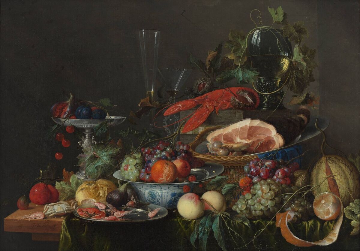
WEALTH:
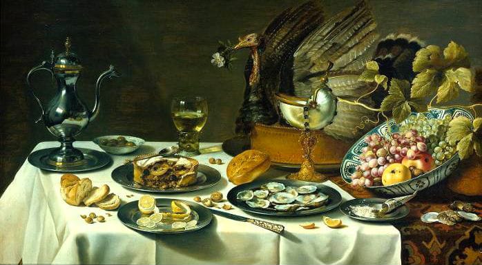
In the context of when this painting was created, the various items seen depicted in the image are all indicators of wealth status and power through the sheer expense and difficult attainability of them. For example, the silverware and pots with the intricate patterns painted on them would have very likely been made for the wealthy as silver and other precious metals would have been very difficult and expensive for the lower class to attain and buy. The lobster seen in the top half of the image is another clear sign of wealth, even in our modern society, lobster is an expensive, luxury food which is typically priced very high, being even more lavish in the 17th and 18th century. Various depictions of fruits and vegetables can also be seen in the image such as oranges, melon and peaches, once again these are very clear indicators of wealth as they would have typically been very hard to source due to the fact that they could only be grown in more tropical, warm climates meaning they would have to be imported from elsewhere.
STATUS:
What, how and where people ate in Tudor times depended greatly on who they were: the rich nobility enjoyed lavish feasts of meat, seafood and sugary treats, while yeomen and laborers were restricted to a diet of bread, pottages and vegetables. Everything from the number of dishes eaten to the ways in which food was served was dictated by status. In Tudor England, maintaining the difference between ranks was so important to the concept of a well-ordered society that efforts were made to enshrine the distinctions between the classes in ‘sumptuary’ laws. These laws tried to control what you ate and wore, according to your position in the God-given hierarchy, which stretched from the king at the top, down through the numerous grades of nobility and clergy, to the gentry, yeomen and finally the laborers at the bottom of the heap.
POWER:
Much of the symbolism used in still life art represents status, especially when we look back in time; of course, some more modern still life paintings are used more as a social commentary. Symbolism is a powerful part of art and a tool that both artists and viewers can use; subconsciously and consciously. One painting could have many different meanings to many different people – that is the beauty of art, it is never rigid.
WHAT DIFFERENT ITEMS SYMBOLIZE:
Skulls – The depiction of a skull could represent several things,perhaps the most obvious option and universal is death. This positioning of the skull can alter how the painting is read; for example if the skull is displayed in the foreground of the painting it could be read as warning.
Musical Instruments – these items were considered to be extremely luxurious, therefore if an instrument in excellent condition (such as a flute) was depicted, it would be read a symbol of wealth – this would certainly be more prevalent in more historical 18th century still life art. On the other hand, a damaged or old musical instrument could represent loss of wealth or be representative of a family heirloom.
Purple Silk/Material – in many paintings you will see purple silk or material; this will often soften the imagery however, it can also be representative of royalty and luxurious living – especially if the material is purple. Other material such as white cotton, especially when displayed with wine and bread can hold spiritual and religious connotations.
Books – Books are a universal representation of knowledge and learning often referring to power and educated status.
Lilies – Flowers often represent life in paintings; however, the lily often refers to death as it is the traditional flower used at funerals.
Objects from Overseas – Paintings with oriental vases and sculptures refer to travel – again this refers to status and creates an exotic connotation.
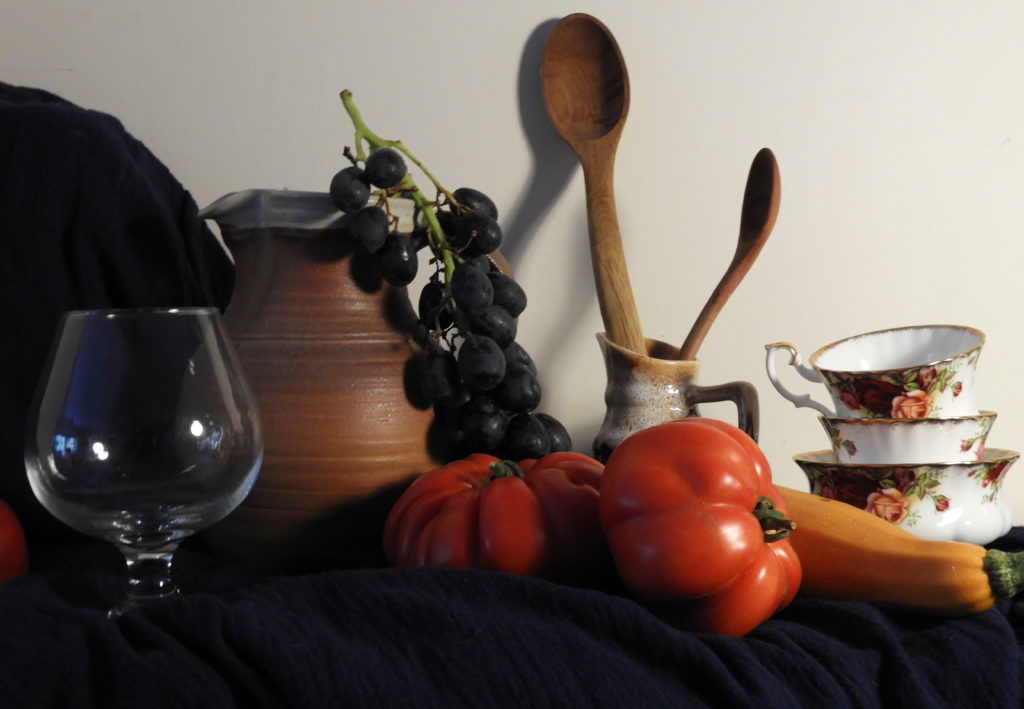
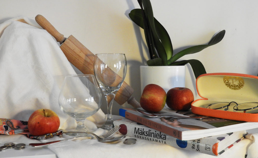
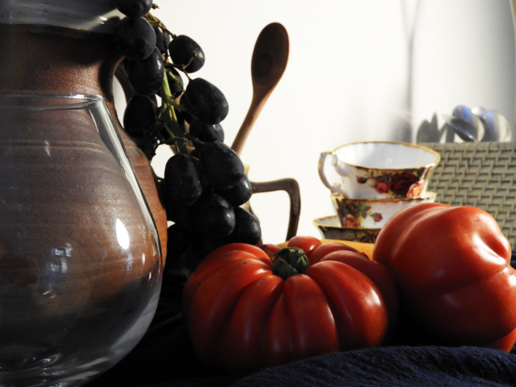
MY OWN PREVIOUS WORK:
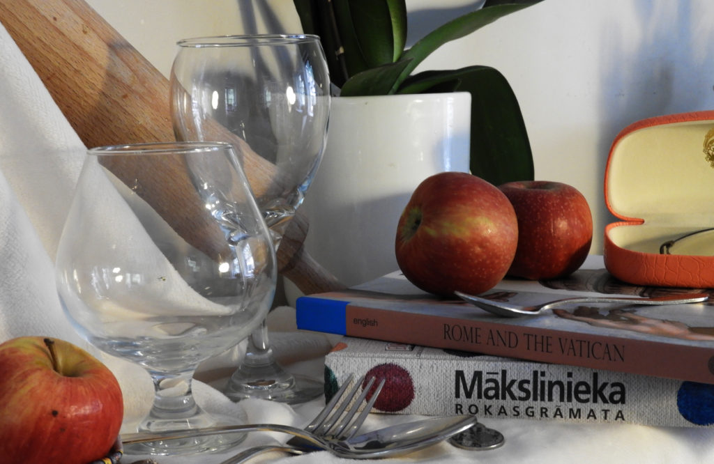
In my previous work, I also explored the theme of still life ad using various symbolisms to create the images. I used items which I thought would be fitting for the images such as fruit, glassware and pottery. I also added some cutlery in order to add other symbolisms of wealth. In one of the shoots I added a dark base using cloth and created chiaroscuro lighting in order to give it that authentic still life feel. Overall I think I succeeded to create the right composition, but in order to make it truly authentic, the images should have a dark or black backdrop with more visual representation of fruits and or plants, as that is what is most common in still life imagery.
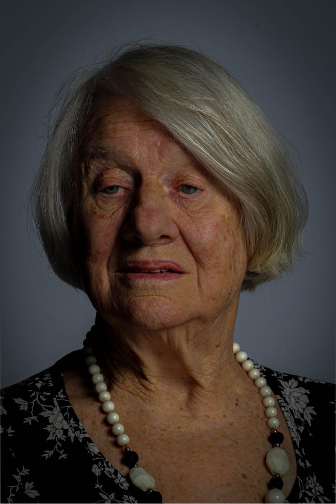
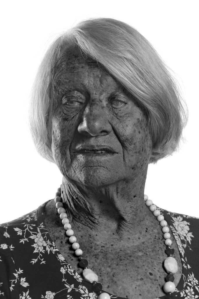
After spending some time with Joan Taply and hearing all about her stories during the occupation, it was essential to me to create and edit her portraits to represent a certain effect. I did this my experimenting in Photoshop with the different images I collected from the photo shoot, and carefully selecting the most appropriate photograph in order for me to achieve the highest level of quality and the most effective final image. With all this in mind I wanted to demonstrate how easily the conceptual aspect of the photograph can change by just editing each image in a certain way giving it a new feeling and depiction
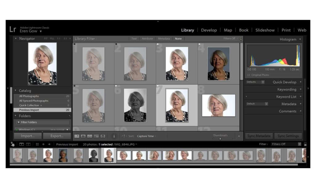
Firstly, after spending time with Joan Taply in the studio I moved all my images into Light room which enabled me to closely look at and concentrate on the best quality images.
Next, selecting the main images that I wanted to attempt to edit, I started to clear up the lighting errors from the image for example, the shine on Joan’s nose from the studio lighting. this helped improve the photograph a lot already before the editing had even begun. Additionally, I went on to begin editing for my first attempt I wanted to keep it simple and affective so, I increased the contrast levels in order to give a sharper deception of the image to add even more significance to the image to help highlight Joan as the main subject, in Light room I went on DEVELOP then EFFECTS and altered the AMOUNT button that created a shadow around the corners of the image. This particular edit helped to provide a contrast of the lighter for illuminated face of Joan compared to darker shadows around the corner. This was the result:
Although, my initial idea I was pleased the end result of the image came out much darker than intended so I further experimented, keeping in mind my previous edit issue that would help me develop and improve the next image
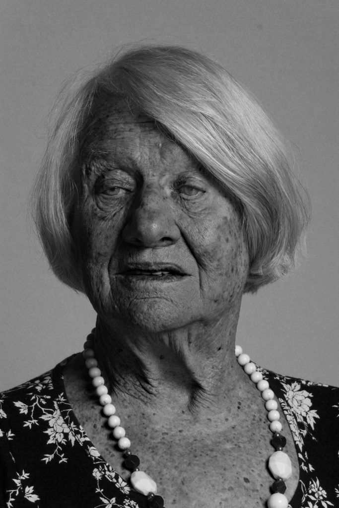
This was my second edit after evaluating the faults and issues with my first image I made sure that I didn’t repeat the issue. I was much happier with this image especially at the darker edges of the corner which helped highlight Joan’s face even more. To me this feature really provides a significant overall improvement to the photograph and adds a more dramatic feel.
Finally for my third photograph I decided to take a more abstract approach using Photoshop which enabled me to control the intensity of each shade produced after changing the image to black and white, giving a more drastic and sizeable transformation. These photographs give a more disturbing feel due to the contrasting intensities of the different black and white shades.
For my last edited image, I used a different approach, by using a completely different angle and a side view which meant a lack of eye contact providing an original feeling compared to the more basic front faced portraits, to me it gives a more personal feeling and therefore suggest a more ‘soft’ notion. Furthermore, the idea of adding a personal feeling was a necessity to me as after spending time with Joan and hearing about all her experiences and her life during the war and as a child, the sense of providing a personal touch has connotations of personal experiences and a journey that a particular individual has taken.
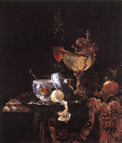
Lighting: The lighting in this painting is minimal and most likely natural from a window.
Visual
There an abundance of different colours in this painting. There’s lots of rich orange which shows wealth because at the time bright fabrics were expensive so were only bought by the rich. There’s also a lot of gold which also symbolises wealth.
Contextual
This painting was painted by Willem Kalf a Dutch still-life painter. His style of still life was called ‘pronkstilleven’ which translates as the life that is luxurious with items that represent wealth. This specific painting is called ‘Still Life with a Nautilus Cup’, 1662. A Nautilus cup was seen as the item of kings in the 17th century.
Conceptual
In the foreground, you can see the items resting on a marble that symbolizes wealth. Many items in the image symbolize wealth as well. The china pot, the shell chalice, and even the orange and lemon are all symbols of wealth because the orange and the lemon were originally grown in Asia and are symbolic of trade. The peeled lemon is supposed to represent the passing of time but also Lemons were very expensive so they were popular because they showed wealth in the 16th century because only the rich traded with the east. Lemons are very sour and bitter so they were considered to symbolize deceptive allure/attraction of earthly beauty. The focal point of the image is the lemon because the light has illuminated the lemon the most, whereas everything else is slightly submerged in darkness.
Famous Still life artists: Van Gogh. Wilhelm Kalf, Pieter Claesz,