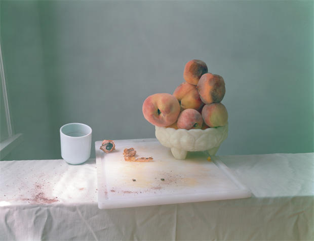
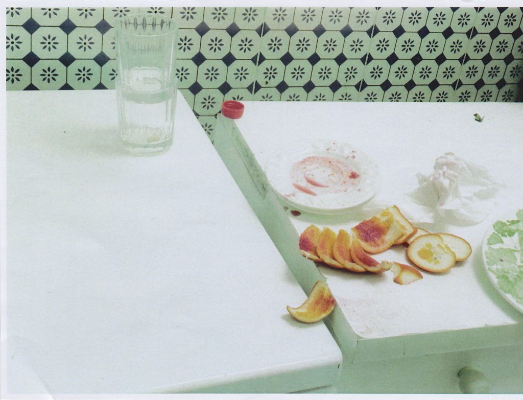
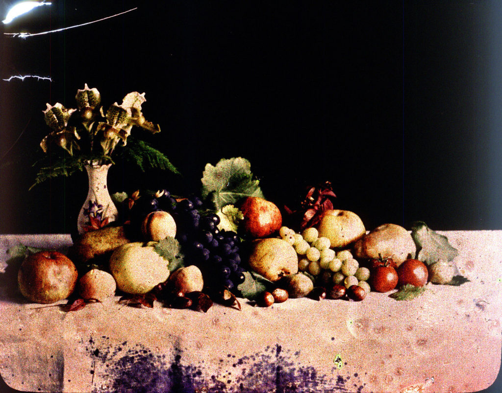
Laura Letinsky is best known for her elegant composed still life photographs. Inspired by the 17th century European still life paintings, Letinksy offers her 21st century perspective of the genre. She is aware of the rich narrative possibilities that still life presents. Although her photographs are similar to Dutch still life, they are more modernised.
The scenery usually has a dirty table cloth, as if someone just got up and left their meal after a huge argument with someone. Although as thoughtfully composed as the arrangements of those historic painters, her images embrace the messiness of real life where peaches rot, and table cloths are stained with spilled red wine and covered with crumbs from meals consumed.
Early in her career, she photographed couples in their own homes creating visual narratives about love and relationships. By the late 1990s she stopped photographing people and replaced them with objects. She began using objects that hinted at human presence.
My grandfathers Story of how he got evacuated at the start of World War 2:
In 1940, My granddad was evacuated to Bolton at the age of just 5 years old, along with his sister, mother, father, and other family members.
His was exported to the South of England on a coal boat, from here they went on various trains to Bolton.
When they arrived they were bulleted in a warehouse with other families which had also been evacuated, a couple months later my grandfather family were put in a mansion with again other families – the other families included people from Guernsey, and Jersey.
Later on, Other family members (relations) joined them, these included his grandmother, Auntie, Uncle and Cousins. However In 1941, Jeans my Granddads sister died of pneumonia and was buried in Bolton
My Grandfathers Father worked as a fireman in Manchester, Whereas his mother worked in an aircraft factory. This meant my grandad was looked after by his grandmother.
He went to school in Horwitch, where he stayed until 1945, however when he returned he went to New Street school (St Pauls)
At the end of the war in 1945, Mr granddad and his family returned to jersey minus his father, who remained in England.
My Granddad also served in the army from 1951-75.
My Uncle Cyril was award the MC Which stood for the Military Cross for clearing a pathway through a minefield, he was a Captain in the Army.
Evacuation Meaning:
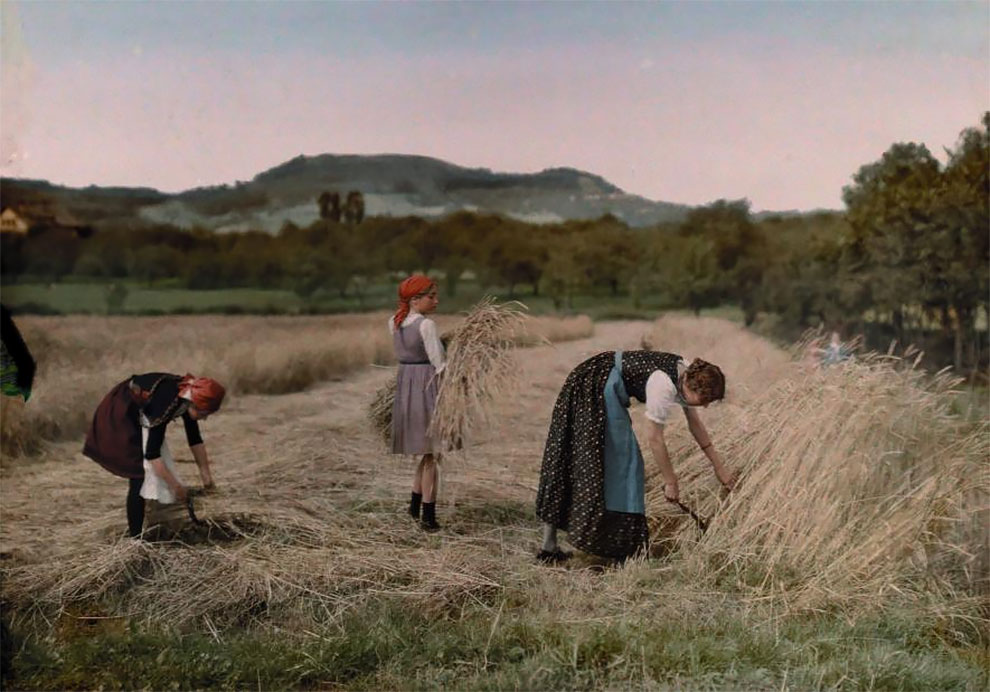
Evacuation means leaving a place. During the Second World War, many children living in big cities and towns were moved temporarily from their homes to places considered safer, usually out in the countryside. The British evacuation began on Friday 1 September 1939. It was called ‘Operation Pied Piper’.
History of Evacuation:
The first official evacuation was at the start of the Second World War, this was deemed to be necessary and the experience has lived through the people were the centre of the evacuation.
The people only packed what they need for example in the Second World War this is what they could take: Gas Mask in case, a change of Underclothes, Night Clothes, Plimsolls, spare Stockings or Socks, Toothbrush, Comb, Towel, Soap, Face Cloth, Handkerchiefs and a Warm Coat.
Most Successful Evacuations in the world are:
14 million – 1998 Yangtze River floods, China. …
3 million – 1940s evacuation of children during WWII, Germany. …
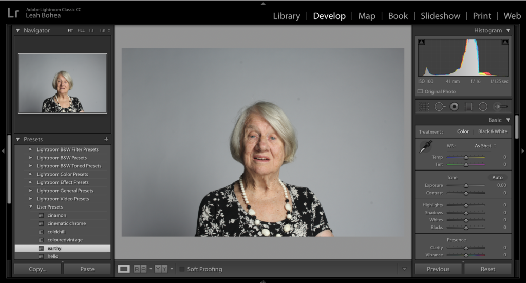
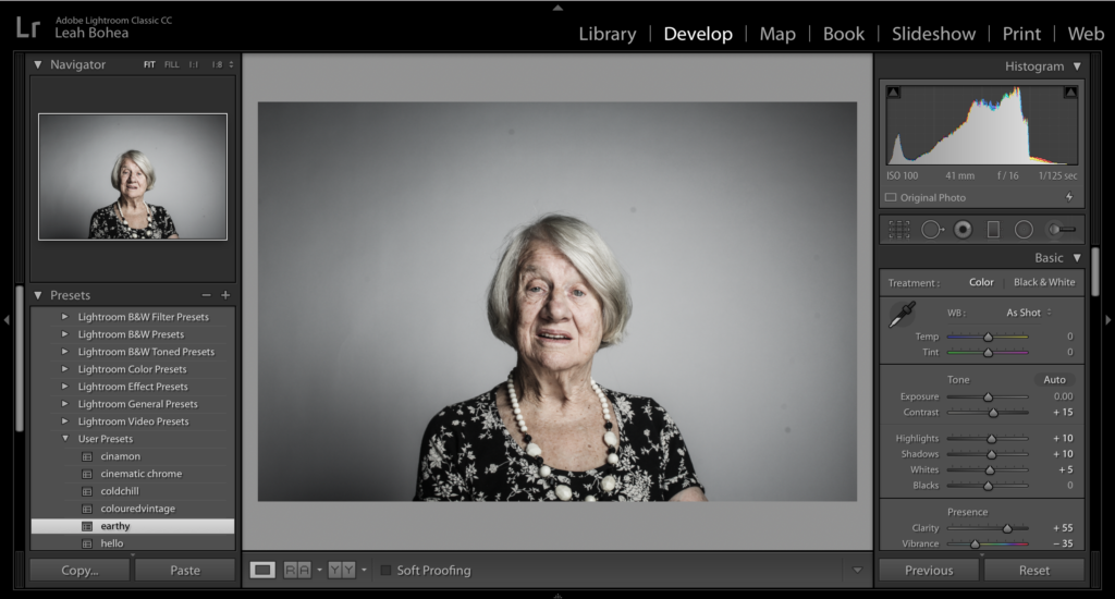
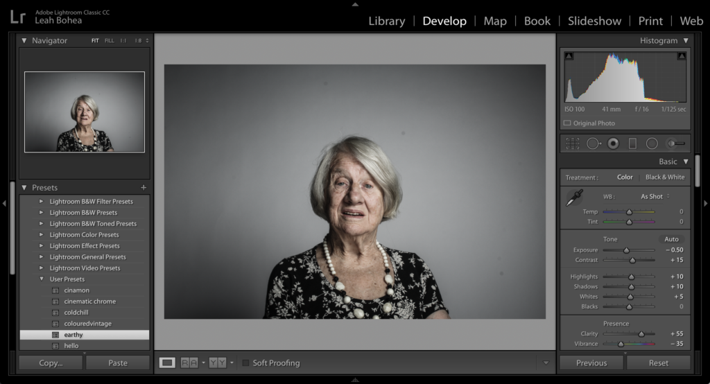
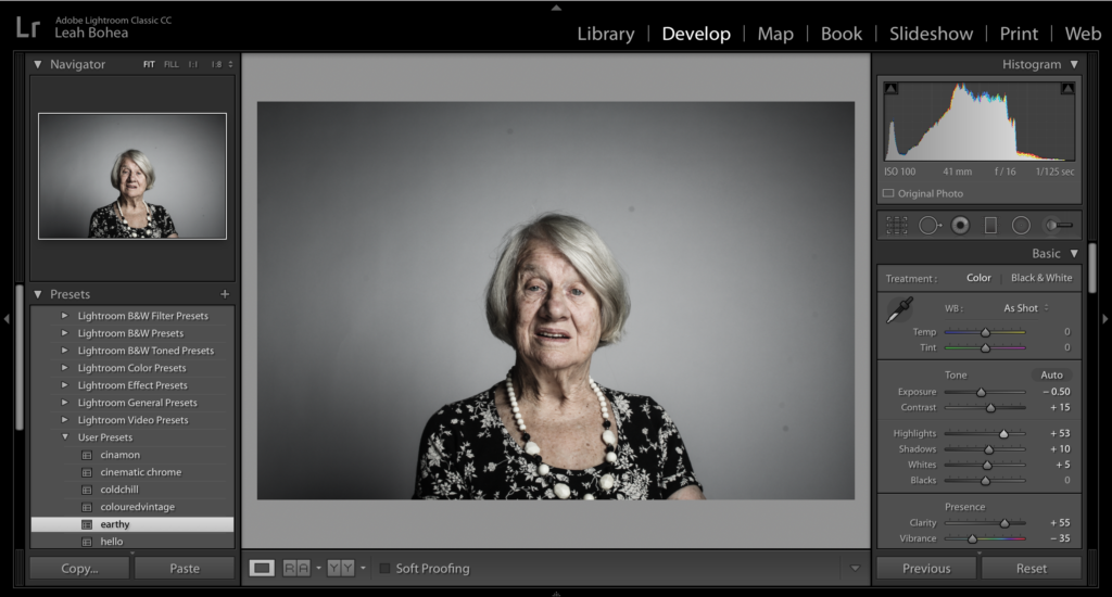
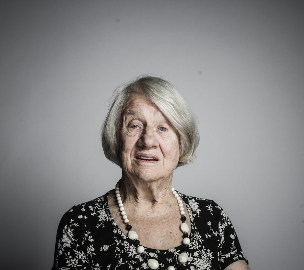
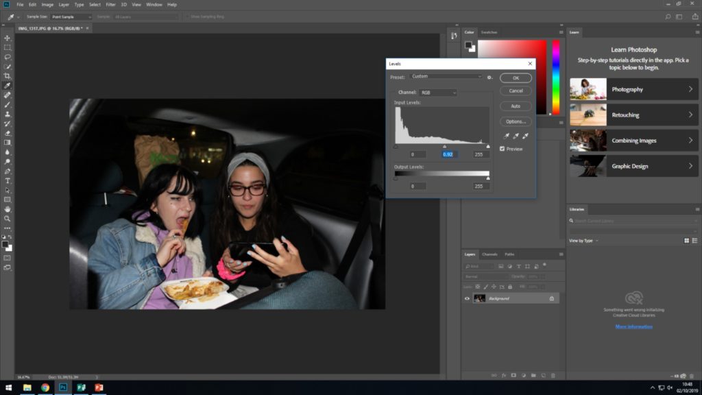
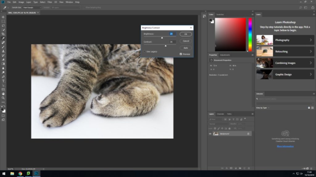
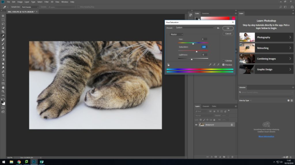
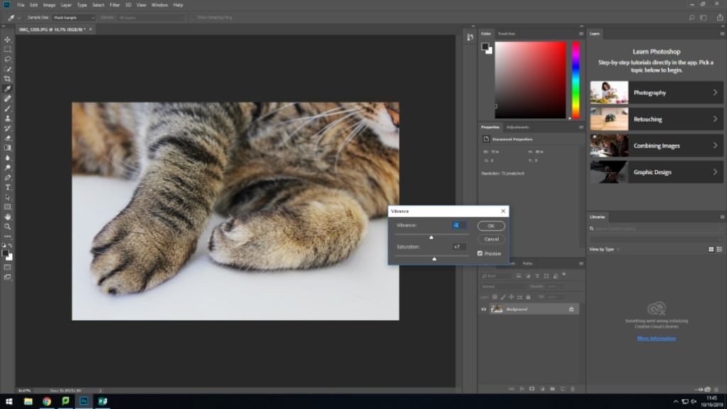
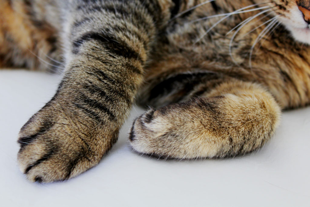
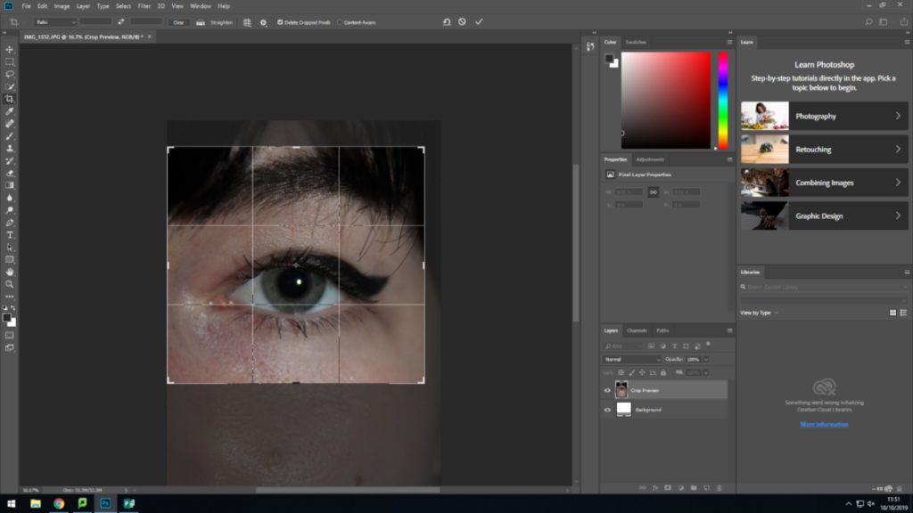
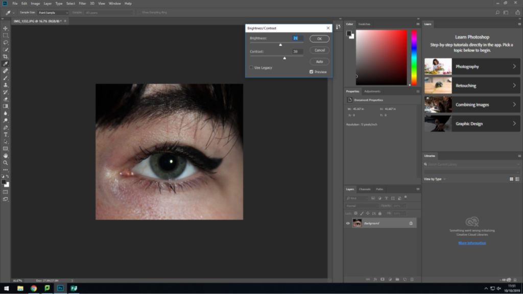
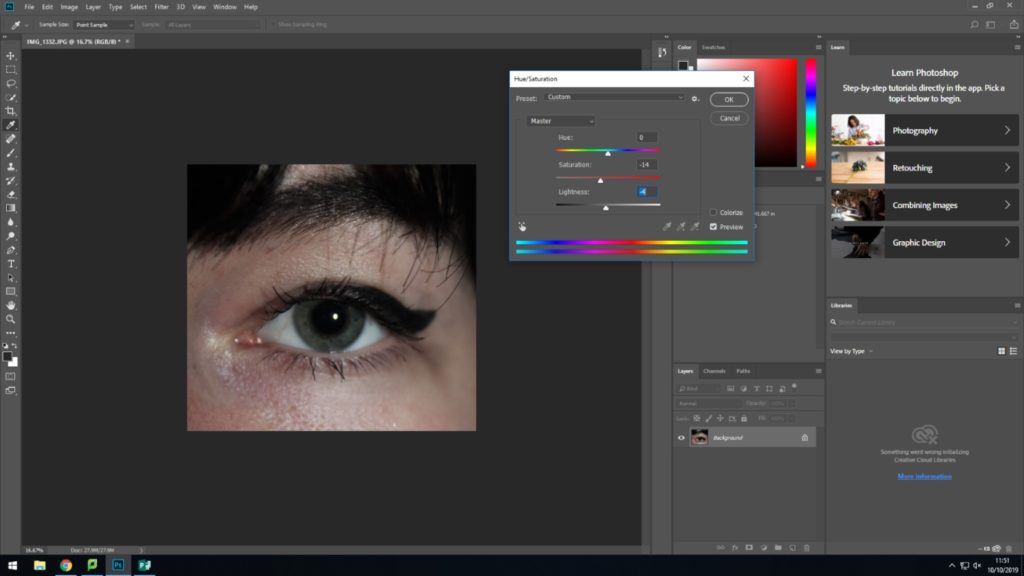
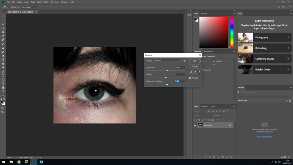
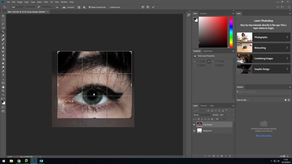
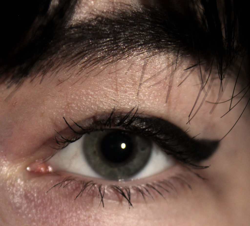
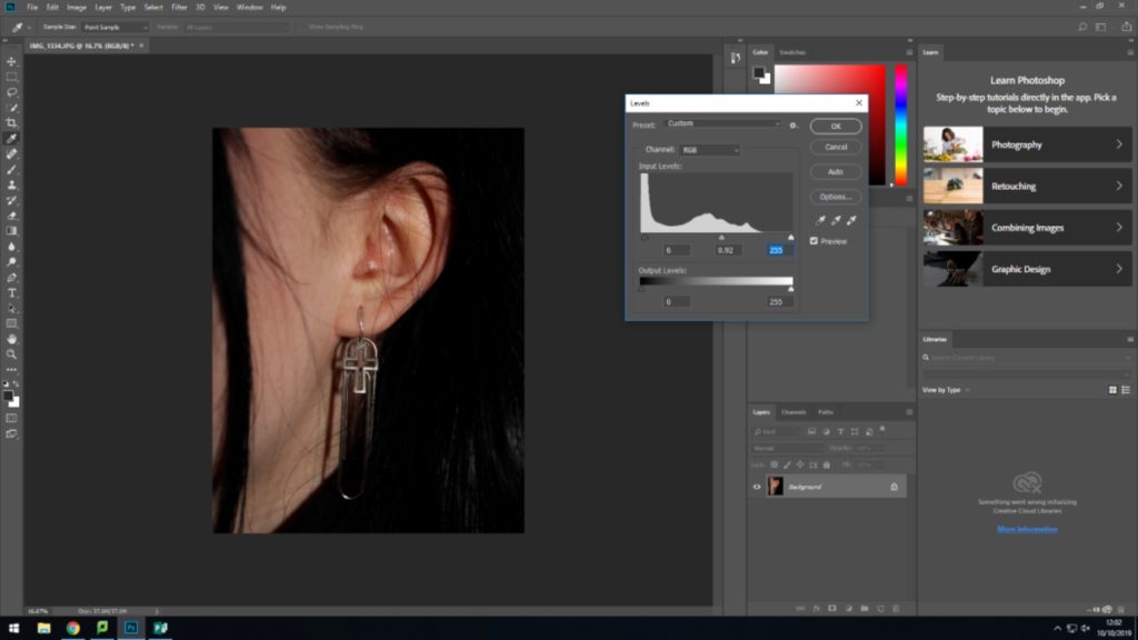
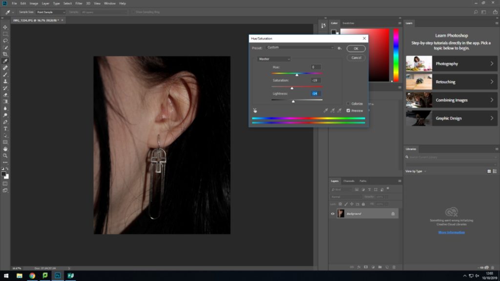
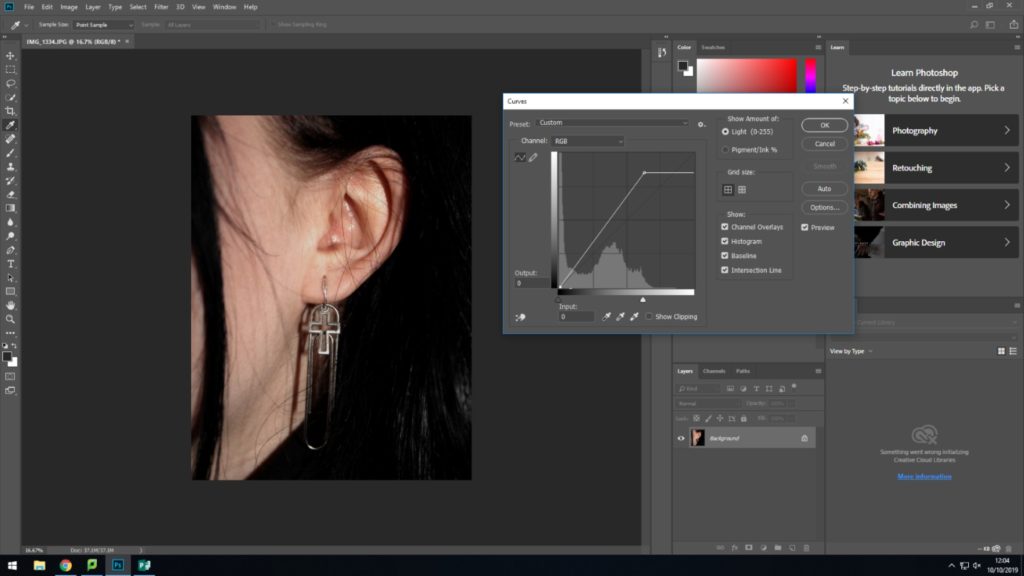
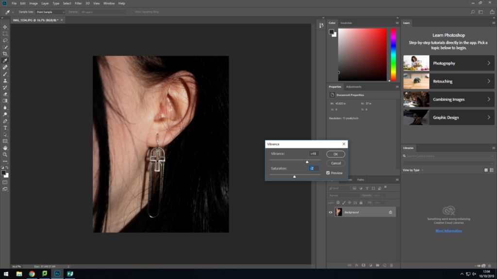
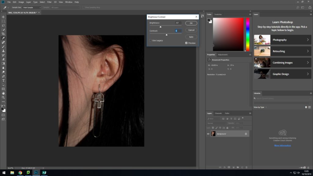
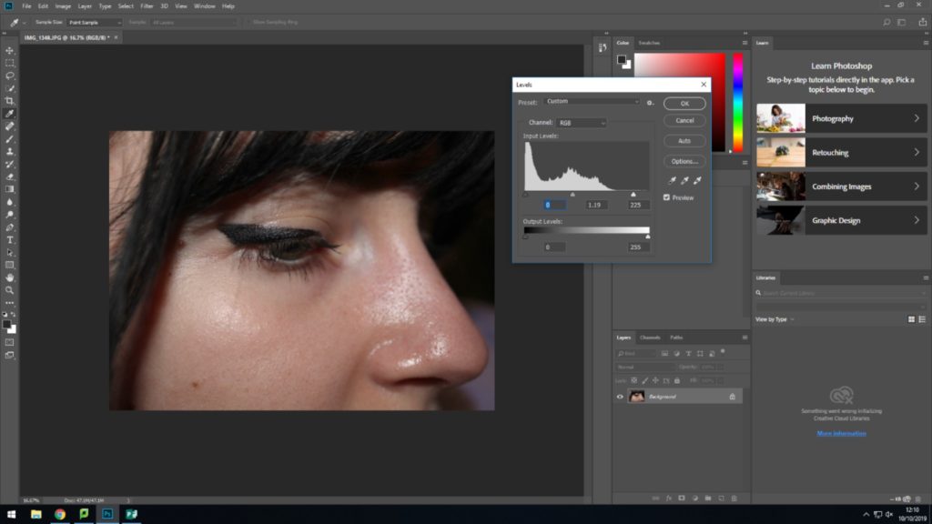
This is the original, unedited photograph that I opened up in photoshop to edit.I chose the preset ‘earthy’ which I constructed myself. The earthy preset has low saturation and almost borderlines on black and white. It adds contrast and enhances the shadows and highlights in the piece which can accentuate certain desired elements and features.After I applied the preset, I adjusted the exposure and contrast slightly as it didn’t produce as much definition as I wanted. The figure in the picture is an elderly lady and because of this I wanted to make sure the texture of her skin was dramatised and accentuated.
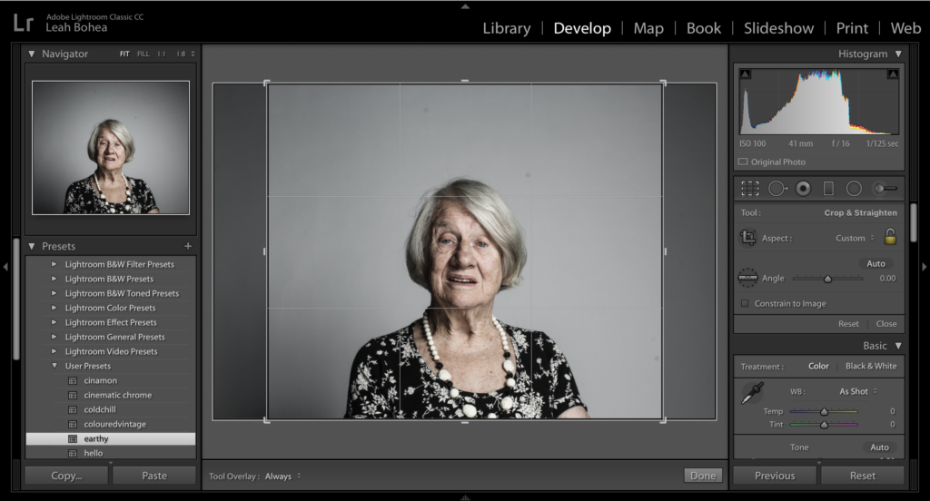
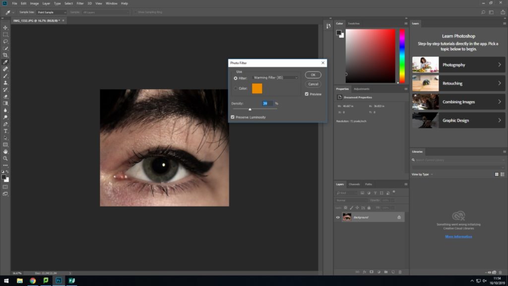
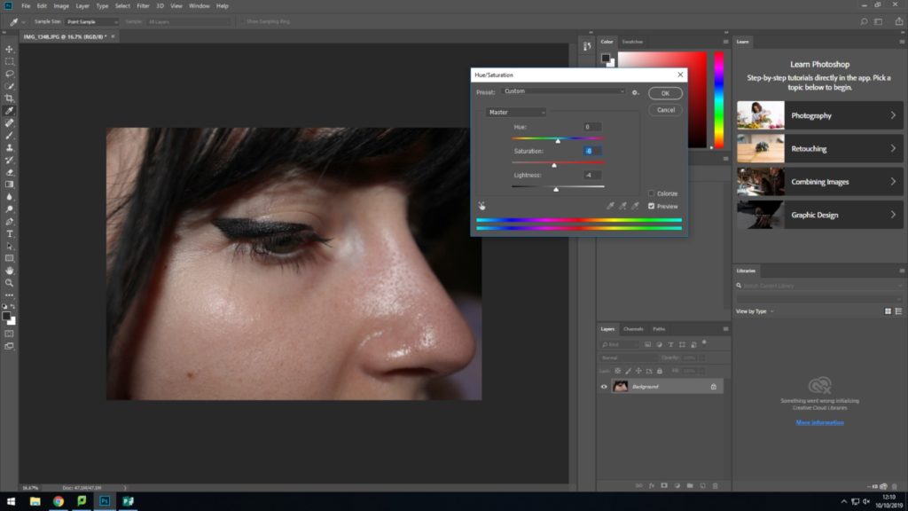
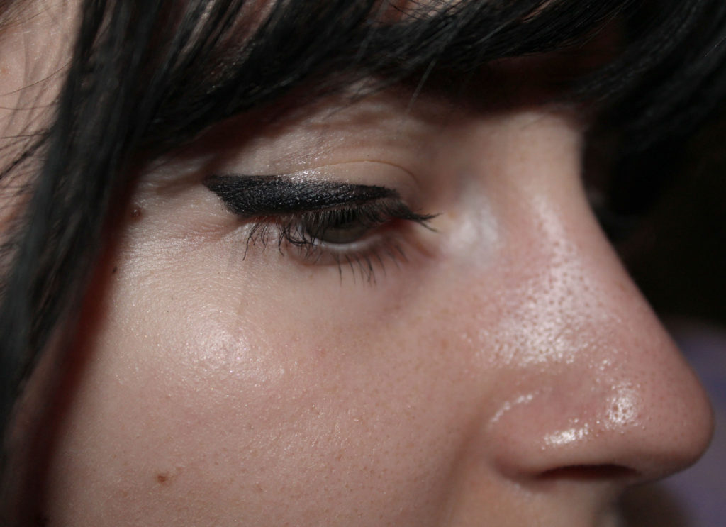
Because of increasing the contrast, It reduced the sparkle in her eyes and skin, so to undo this I increased the highlights and used the brush tool to be more specific to certain areas. I felt that a square format for this piece was ideal, as it gave the picture The final piece, and the best outcome of my shoot
Establishing a shot project is group portraiture of two or more family members where you are constructing an image which tells a story. The images can be staged of observed and the main focus is conveying a sense of narrative.
Group Photographer- Sian Davey
Sian Davey is a British photographer who focuses on photographing her family, community and self and takes a lot of group photography with her friends. She was born in Brighton 1964 and studied painting and social policy at the University Of Brighton where she got her two degrees. She took up her photography properly in 2014 after being a psychotherapist for 15 years.
Her photography practice mostly focuses on her community (friends) and her family which had been influenced by her background in psychology.
Sian Davey’s Image Moodboard
Her style
Uses different depth of fields
Photographs both of family and friends
Coloured images
High shutter speed for fully focused images
High ISO
Analysation Image
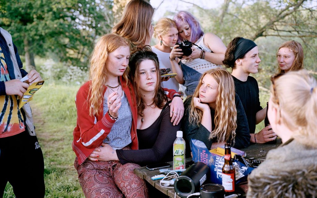
Technical analysis- We can see a good quality camera has been taken to take this image and it has a depth of field to it which we can see from the fully focused people in the picture, compared to the blurred background with has been intended. I guess a medium shutter speed of around 1/250 has been used for this image due to their being no unintended blur, the ISO also must of been quite low as their is no grain on the picture. The overall exposure also could of been high because of the amount of light in the image, making it a well lit image. The white balance also would have been a natural lighting use as the image is outside.
Visual analysis- Visually we can see that this is a colour image with 10 teenagers in the image. They are all dressed in different ways, showing their unique styles which they express through clothing. Smoking, alcohol and snacks can also be seen in the image which is showing the typical life of a teenager as most experiment with smoking/ alcohol. Two speakers can also be seen in this image, suggesting their listening to music while socialising. All teens are seen sitting close to one another, also creating the idea that their all very close friends etc.
Conceptual analysis- Conceptually this image suggests experimentation as a teenager which is done through the rallies, cigarettes, beers and factors which aren’t easily seen in the image.
Planning my photoshot
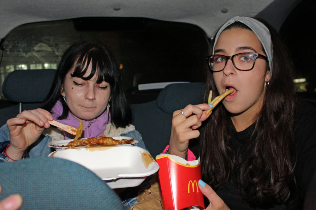
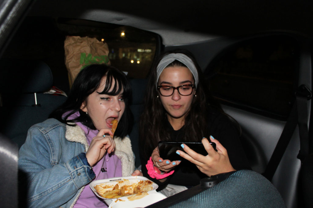
For my photo shoot, i plan to take images of two female friends in a group photo, and will use a Canon Camera and plan to use flash photography to take these images. They will be representing typical teenage life, however, seeing as im not allowed to included smoking/ alcohol in my photography, the models with show the typical teenage life, including telephones, food etc.
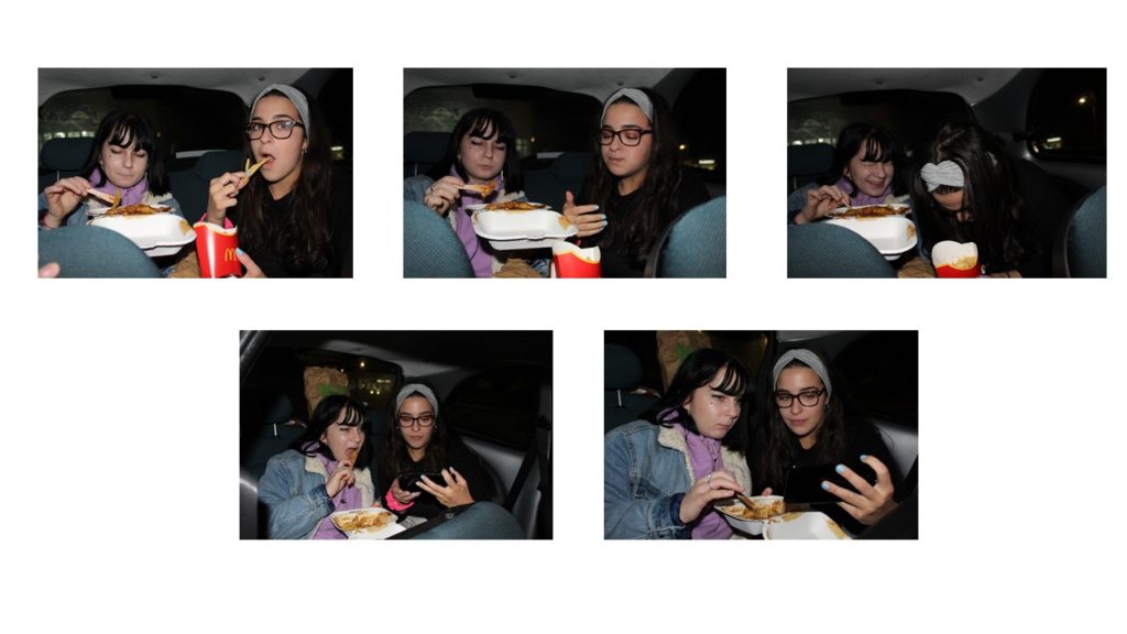
Unedited Best Images
Editing my images plan
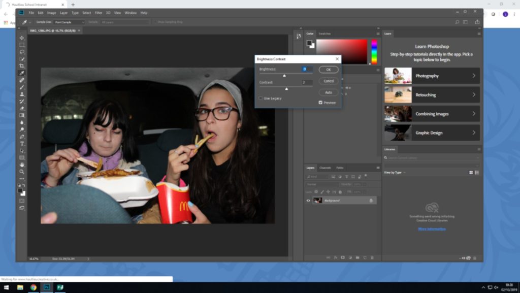
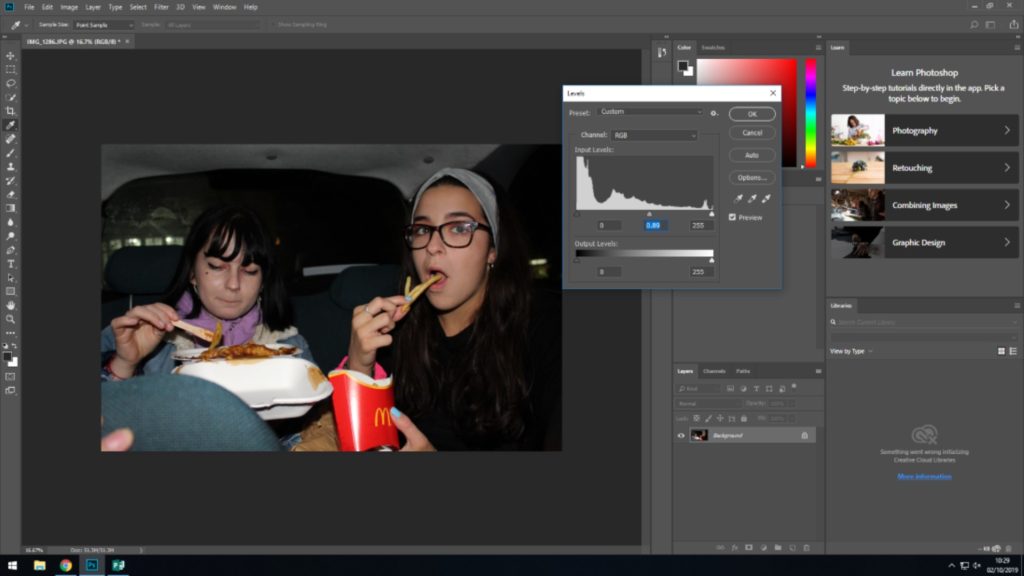
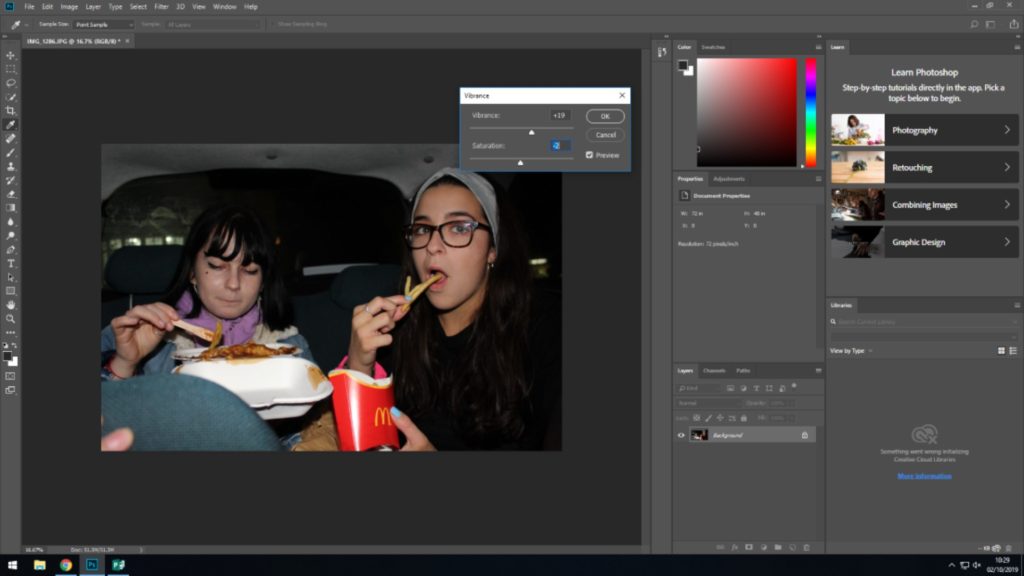
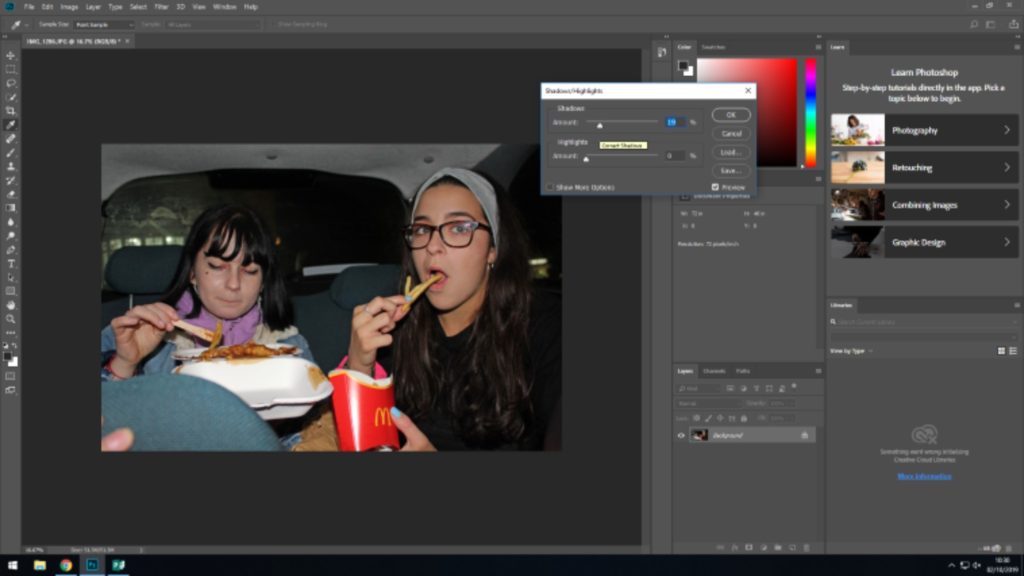
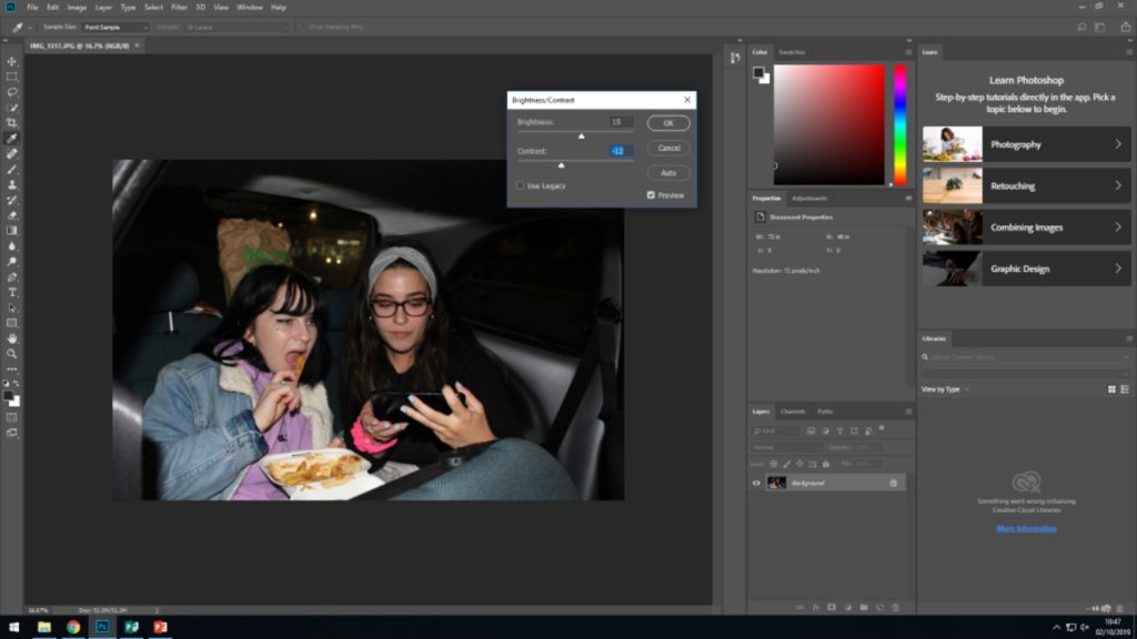
For editing my images, i don’t plan to do a whole lot of editing. Just editing the simple brightness, contrast, saturation etc.. This being as i already like the images the way they are.
Editing my images
Final Best Edited Images
What is a detail shot?
Detail shots usually tell a story of a situation by focusing on a certain detail/ small detail of a large picture.
Detail Photography- Martin Parr
Parr was born 1952 on May 23rd and is a British documentary photographer and photojournalist who is known for his photographic projects which have certain looks on modern life and document particular social classes all over England. He constantly flows images which are released by the media and the photographs allow us to see the world from a unique perspective.
His images are regularly described as exaggerated from the heavy edits and posed images, some even describe a few of them as grotesque due to the motif’s he chooses are strange, along with the color choices being unusual. His images are that overwhelming that they can also be seen as ‘propaganda’.
Mood Board of his Detail Shot Images
His Style
Takes images in colour
Different Depth of Fields used
Images of both people and objects
Images usually by the seaside/ outdoors
High shutter speed usually used
Image Analysis
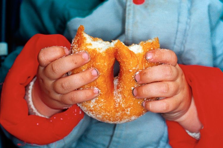
Technical analysis- A simple camera setting has been used in this piece which has allowed for the detailed shot to be done properly and make it successful. It seems as if a flash lighting has been used on this image due to the colours being very bright while having small shadows on the background. The flash is creating a a warm tone due to the low ISO being used. They’re also seems to be a hight shutter speed used as their is no intended blur. The doughnut is also the main focus of this image which is placed in the hands with a small depth of field to make the doughnut pop.
Visual Analysis- Their is a image of a child holding a sugared doughnut which has been bitted into at the top. The doughnut is placed in the middle of the image, however the image is fully in the frame which is helping to draw us into the photograph. The main focus is clearly the doughnut which is suggested because of its central positining of the food in the frame. The frame of the photo also tells us about the image, as the small hands are representing a child, as well as the dirty fingernails which a grown adult would. to normally have. The vibrate coloured coat also suggested childless and the grip the child has on the doughnut which is vert tight, suggests he/she is excited.
Conceptual analysis- In my personal opinion, Parr wanted to capture modern life which is clearly shown in the photograph.
Planning my Photoshoots
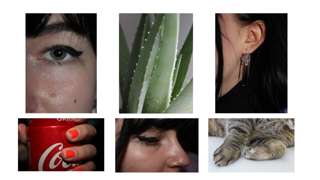
I plan to use Martin Parr as a heavy influence in my images, a plan to take detailed pictures of elements which I find interest me.
Unedited Best Images
Edting images plan
gggg
Editing my images
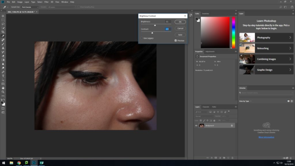
I have done small edits to my images as I want them to look as raw and non edited as possible. I have mostly cropped the images to be able to focus of the detail of the pictures more, I have also changed the brightness, exposure, off all the images in order to give them the same feel. These elements allowed me to create darkness in the small amount of backgrounds in the image, as well as the highlights being able to be seen more clearly.
In 1907, the Lumière brothers, Auguste and Louis, introduced the first viable method of color photography. Although color photographs had existed, the process was clumsy and complicated. The key ingredient, the Lumières discovered, was potato starch.
The process, called auto chrome, involved covering a glass plate with a thin wash of tiny potato starch grains dyed red, green, and blue, thus creating a filter. A thin layer of emulsion was added over that. When the plate was flipped and exposed to light, the resulting image could be developed into a transparency.
One of the most delicate, in all aspects of the word, photographical techniques is the Autochrome. These early 20th. Century colour photographs, invented by the Lumière brothers, (Auguste and Louis) show images with a ‘pointillistic’ effect. The Lumière’s contribution to colour photography is perhaps of more importance in comparison to their contribution in film history, since in the period (1895) they “invented” cinema, projected moving images where since long in existence!
Autochromes were not the first photographs in colour since the search for colour started at the dawn of photography and is seen in most early techniques true colouring by hand. E.g. Daguerreotypes, Ambrotypes, Chrystoleums, etc. However, the autochrome was the first practical technique that produced colour without the artificial aid of an artist.
Henry Mullins wasa portrait photographer in the mid 1800’s who was based in Jersey, most of his work was doing family or solo portraits of the wealthy people who were in Jersey at the time.
Mullins started working at 230 Regent Street in London in the 1840s and moved to Jersey in July 1848, setting up a studio known as the Royal Saloon, at 7 Royal Square. Initially he was in partnership with a Mr Millward, about whom very little is known. By the following year he was working alone and he continued to work out of the same studio for another 26 years. After his death in 1883 20,000 images were collected and given to SJ.
Mr de Quetteville
This above image is a standard example of the style of images that Mullins would take with the subject in the front and a blank background, there is also heavy vignetting due to the technology he had and the equipment he was forced to use for the time. The subject is framed in the center of the image with the subject filling the frame and their head at the top. There is no context that I can find for this image but it is probably just a portrait that he had taken of him.
Contemporary approach – Archisle
About
Michelle Sank was born in Cape Town, South Africa. She left there in 1978 and has been living in England since 1987. Her images reflect a preoccupation with the human condition and to this end can be viewed as social documentary. Her work encompasses issues around social and cultural diversity.
Michelle’s project that was based on life in Jersey was called ‘insula’ which is latin for island, she wanted to photograph a range of things, including the economy, politics, community, work, leisure and environment.
The above image was taken at the Jersey premiere for a superman movie in 2013, there was large amounts of excitement within Jersey as the main actor was Jersey born. The image is set to have a full range of people within it ranging from old people to school children (joe) there is even another photographer within it.
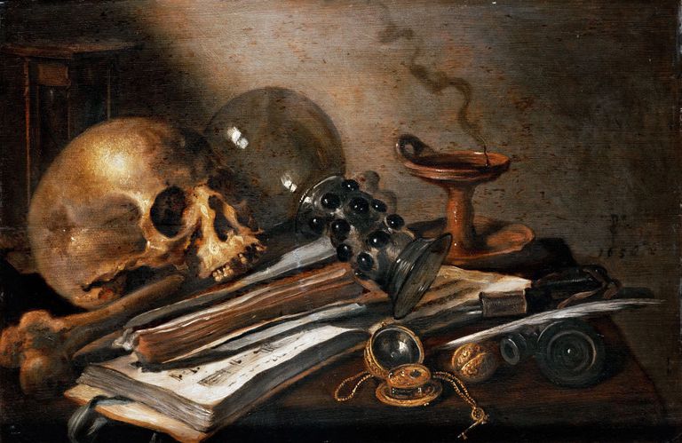
This is a painting by a 17th Century Dutch painter named Willem Claeszoon Heda. This painting features a lot of symbolism in the objects used within the painting and is a clear representation of a ‘Vanitas’ still life painting whihc was incredibly popular in the mid 17th century wiht ‘vanitas’ being Latin for ‘vanity’. It was the only religious art approved in the netherlands.
Willem Claeszoon Heda, has put the white paper in the middle of the painting as our eye is immediately drawn to the brightest part of the painting/photograph. From there, the pipe leads out eye towards the rotten fruit, whereas the glass takes our attention to the skull. What I assume to be an empty candle holder is placed the highest in the painting, therefore it must carry the most amount of meaning. The light is painted as coming from the side, directly shining onto the skull and creating many eerie shadows, reflecting the many death motifs.
Heda incorporates a lot of skulls, which was a key component of a vanitas painting. The skulls were meant to serve as a reminder of ones mortality and came about around 1620 in The Netherlands after 2 outbreaks of bubonic plague. They were meant to serve as a remider of the inevitability of death. The overturned glass in this painting is a symbol of the emptiness of life and the candle holder reminds the viewer that life is eventually snuffed out and we dont live forever. The pipes represent earthly pleaures and the rotting fruit symbolises the futility of trying to live without God and was also another reminder of mortality.
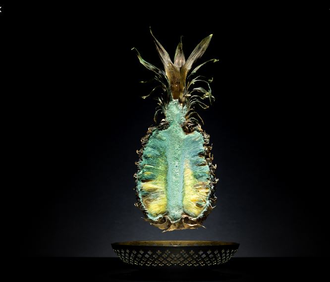
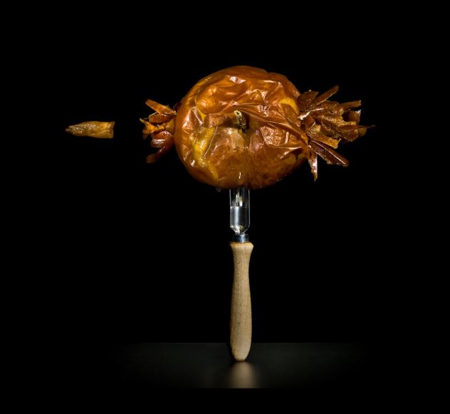
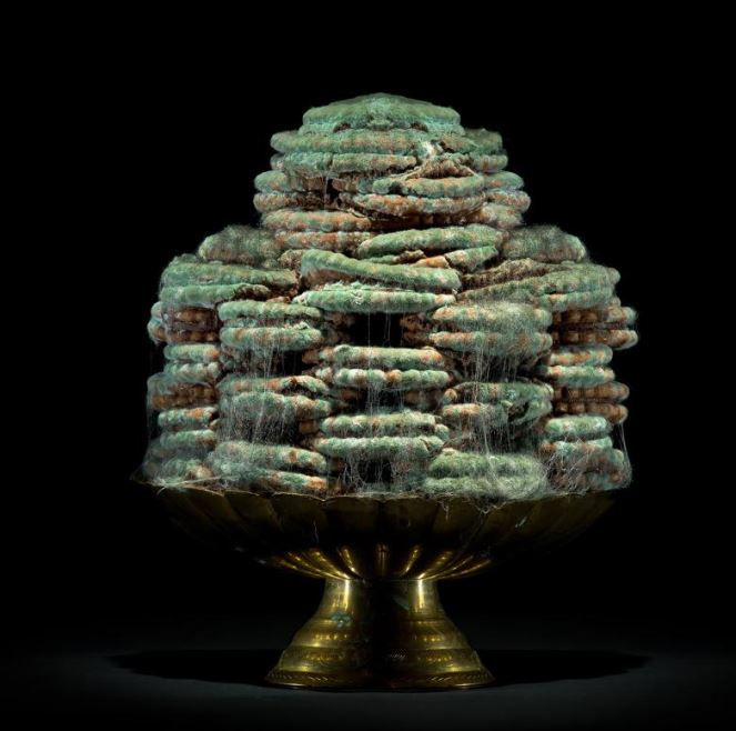
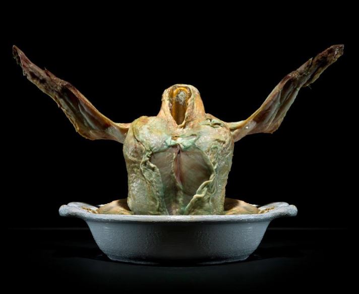
Contemporary still life photography is still a popular genre of art, and advancement in technology has allowed photography to contribute massively to the amount of still-life artwork circulating. More modern takes on still life artwork often raises awareness of current affairs, such as climate change, issues within society, waste and technology, while much of the work still often links back to the original themes of exploring mortality and social structures. With the introduction of a wider range of subjects to chose from, still life artwork has blossomed
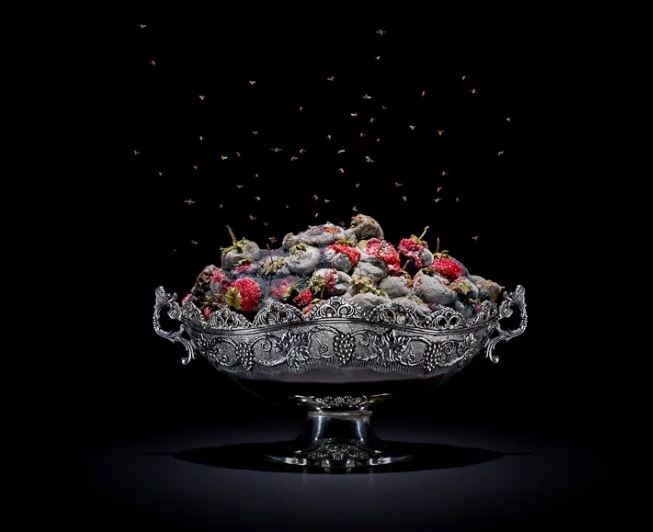
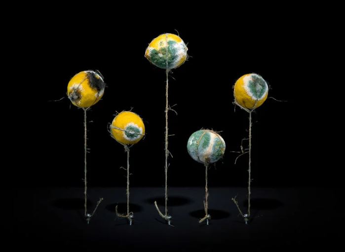
Above is a piece created by Pichler. The strawberries rotted in a week and a half, providing a layer of mold over the top of them. The contrast between the colour of the subjects and the black background, coupled with the detail found in the dish, draws maximum attention to the details within the image.
Austrian photographer Klaus Pichler wanted to raise awareness of the issue of food waste around the globe, and the effect we have on the climate, caused by the carbon footprint we leave through shipping goods around the world. His still-life photography project, titled “One Third”, involved rotting food in his bathroom over a period of 9 months, and photographing the decaying items in a way that very closely reflects classic still life artwork.
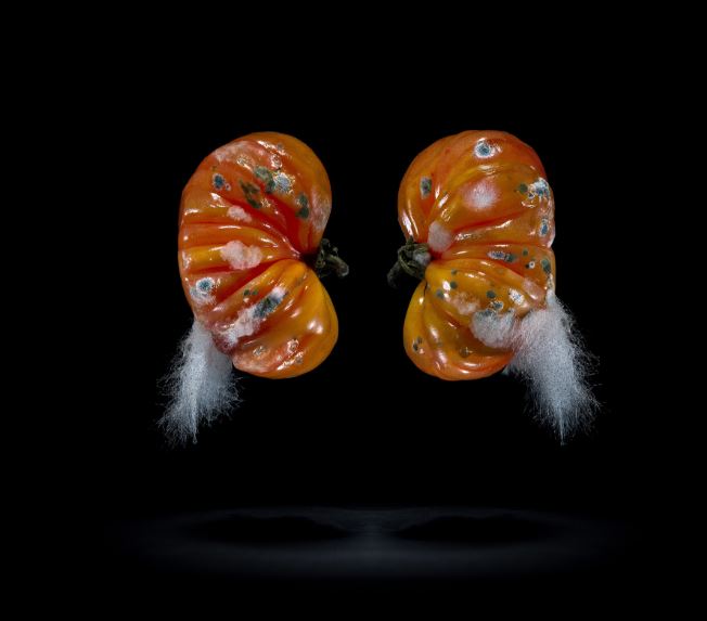
Pictured is Klaus’ photography TOMATOES. The contrast between the red of the tomato and the black background draws full attention to the subject in the foreground. The addition of the mold of the tomato, and the positioning of the tomatoes in what could be described as a human kidney shape (perhaps signifying the influence of humans on the waste crisis), gives the image a more abstract, interesting look to it, while also allowing the viewer to look more closely at the shape of the subjects.
Pichler’s project was centered around raising awareness about the global issue, that is, wasting food. Klaus became aware of the fact that 1/3 of all of the worlds food, produced for human consumption, goes to waste, while in other areas of the world over 900 million people are starving. Pichler felt personally connected to this project, as he grew up in an area that required him to raise and eat his own meat/produce. In order to reflect this personal attachment to the project, Klaus decided against renting a studio to complete his work, and instead developed the project in his own apartment. Klaus can be quoted as saying, during an interview with National Geographic:
“I was definitely not the first one who was making photographs of rotting food but to make myself credible, I decided not to rent a studio but to make it in my apartment. This was quite a conscious decision. When I am working on a project, I want to really be in the middle of it.”
This quote clearly reflects Pichler’s personal connection to his project, and shows that the meaning behind his work is something that he feels very passionately about. This passion is clearly reflected in the dedication he had to his work, allowing food to rot in his own bathroom for months on end, with the smell of decaying chicken leaving him unable to sleep for nights at a time (according to National Geographic).
Pictured above is the image EGGS, which can be found with the following description accompanying it: Place of production: Kolontar, Hungary Production method: Factory production * Time of production: All- season Transporting distance: 196 km * Means of transportation: Truck Carbon footprint (total) per kg: 5,82kg * Water requirement (total) per kg: 3061 l Price: 1,39 € / kg this caption draws attention to the requirements needed in order to package and transport these eggs, only for them to be wasted.
Klaus also put thought into the caption of his images, using a description of the transportation, place of production and carbon footprint of each of the foods he photographs. This took a large amount of research on Pichler’s part, yet his enthusiasm to raise awareness of the massive waste of resources (and effects on the climate) produced by the production of foods, and then the way these foods are wasted, allowed him to collect the records of all of the foods that he photographed, using the captions to further reflect the food waste crisis of the world.
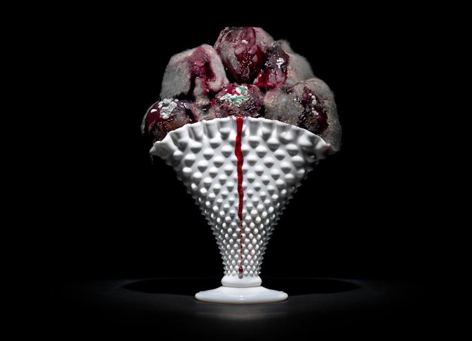
Pichler’s project falls within the category of still life, as it makes use of arrangements of rotting foods (often including the classic still life food; fruit). Pichler also makes use of silverware and intricate dishes, cups and cutlery, which contrasts the grotesque reality of the decaying food that it holds. This is perhaps a remark towards another aspect of food waste, as first world countries enjoy wealth and the ability to choose to waste food (reflected by the detailed cultery/dishes) whereas third world countries are left to starve. The simplicity in the final image, yet detail within the process and meaning of Klaus’ work, runs parallel with the more classic works of still life, which include elaborate meanings and metaphors, and would have involved the collection and arrangement of many objects and foods.
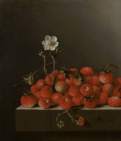
Klaus Pichler, STRAWBERRIES from the project “One Third”, 2013
Adriaen Coorte, Still Life with Wild Strawberries, 1705
Many similarities can be found between the 2 works found above. The dark background used to contrast and draw attention to the colours in the subject, the use of food (strawberries) as a subject, and the arrangement of the strawberries themselves are all similar, yet the meanings behind the two pieces are vastly different.
Thomas Young (1842) theorised that physiological perception of light was trichromatic, that all perceived colour was produced optically, by the eye's sensitivity to just three wavelengths of light: red, green, and violet. Thomas Young's theories provided the theoretical foundations for the autochrome, which was the first commercially viable method of colour photography.

Autochrome was invented in France by brothers Auguste and Louis Lumière.Autochrome works by autochrome plates being covered in microscopic red, green and blue coloured potato starch grains (about four million per square inch). When the photograph is taken, light passes through these colour filters to the photographic emulsion. The plate is processed to produce a positive transparency. Light, passing through the coloured starch grains, combines to recreate a full colour image of the original subject.

The first autochrome photograph taken in Jersey was called Lumière Autochrome. The photograph contained a vase filled with garden flowers. This presumed to be to enable the camera to explore the variety of colours of the flowers.
Emile Guitons autochrome photos can be viewed as being part of the earlier colour collection. They also fall into two caterogies: still life (flowers, fruit, a colour chart etc) and domestic (country scenes, people, a gerden etc). The still lifes provide an insight into Guiton's experimentation into the autochrome process which would enable him to work and fix his quality and technical skills. The photograph of Mrs Guiton can be viewed as fitting into the pictorialist aesthetic.

Potato starch grains were used for the colour screen of autochrome. The grains were extremely fine, measuring to around 12-15 microns and were dyed green, blueviolet and orange-red. This was to give the plates a more naturalistic look.
During the 17th century Dutch artwork was primarily Vanitas still life. The paintings were to serve as reminder of mortality and the consequence of giving in to vanity. The artwork become popular just after the Dutch Republic had suffered two waves of Plague in the 1620s, this meant that people were now more aware of their own mortality. At this time there was also a strong rivalry between the Catholic and Protestant branches of Christianity, both of which were promoting having a connection to God. This was also something that Vanitas aimed to symbolize by making people realize that their material possessions would not follow them to Heaven and they should not be something to value above religion.
Visual:
In this painting Willem Claesz Heda presents a perfect example of a Vanitas still life. The image shows the skull and possessions of a now dead man arranged out on a table in a clearly disorganized way. Heda would have arranged the items this way intentionally to show the chaos vanity can bring to a man’s life. During the 17th century it would not have been uncommon for people to strive for riches to better themselves and show off their wealth, however consequentially, they would become reckless and consumed by greed and power. Heda also shows off the gold compass by placing it at the head of the table in the light to represent how man can easily be temped by the promise of wealth.
Perhaps the most striking and unusual object in the painting is the skull and bones. This is obviously supposed to represent death, however, it could also be used to create shock factor for the painting’s observer. This would make this image stay with its observer allowing them to really consider the message of the painting and think about their mortality.
A third key symbol in this painting is the snuffed out candle at the back of the table. This, not only shows the age of painting as it clearly indicates that it was sometime before the invention of electricity (1800s), but also symbolizes that life can also been stuffed out.
One of Heda’s other obvious symbols is the empty goblet in the center of the image. The cup represents two things. The first being riches. A goblet would have been an item found at the dinner table of the wealthy to enjoy wine with their food as they were the only people who would have been able to afford such a well crafted item as well as the wine that would have filled it. Wine again represents wealth as the the grapes used to make it would have likely been imported from Spain or France as part of an expensive trade deal. The second important detail about the goblet is that it it empty. This is to show the reality behind the emptiness of life and to represent how our material goods have no value in the after life.
In the background of the painting a hourglass can been seen. This is to represent time running out. It suggests that our time among the living has a time limit that is constantly drawing closer to its end.
Finally, Heda has placed two books under the skull in this painting, one closed book and one open with sheet music written on it. The presence of the book is to represent pride in knowledge. It was common that wealthy men would become scholars and dedicate their time to learning. Being educated would have been sign of status and wealth as only the wealthy would have been able to afford to send their children to school. The sheet music may also represent this, however it more common for music to be used as a symbol for enjoyment, entertainment or perhaps to resemble to life coming to an end and fading away in the same way a song would.