Contemporary still life – laura letinsky

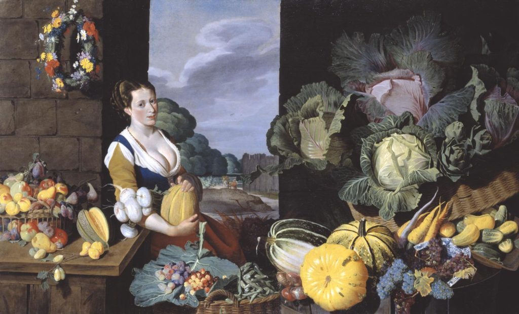
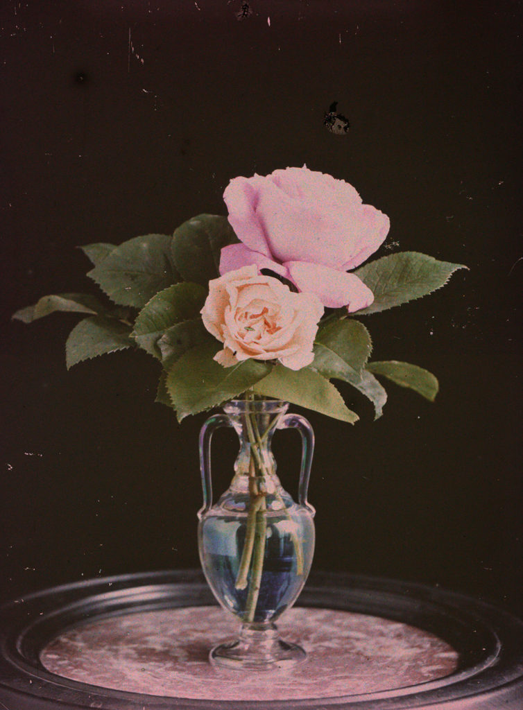
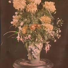
Laura Letinsky is a Canadian photographer, who graduated from Yale School of Art in 1991. At present she is teaching her expertise and the Visual Art University in Chicago. Her initial interest was in portrait photography, but soon moved to still life where she focuses on capturing food, and the symbolism for the food. It is said that she uses photography to convey our understanding of relationships and love. Her investigation of still life is in associations with femininity, the minor arts, and its imbrication within the home as the space of intimacy.

“Still lifes provides her with the potential to explore the false dichotomy between the personal and the political.”

The Quote above is suggesting that this style of photography is allowing Letinsky to explore the contrast of people and political viewpoints through objects, in this case leftover food and crockery. Letinsky’s carefully crafted scenes often focus on the remnants of a meal or party, as she plays with ideas about perception and the transformative qualities of a photograph. Her close photographs on this subject enables us to understand the beauty of the objects that we take for granted.

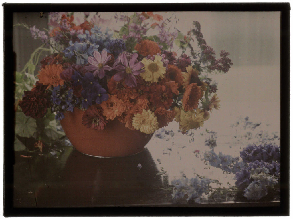
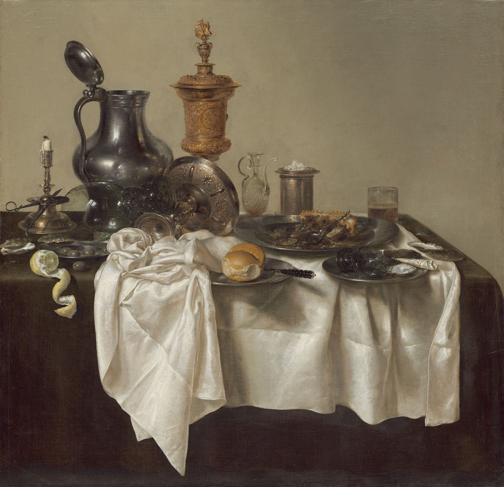
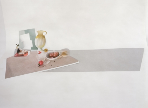
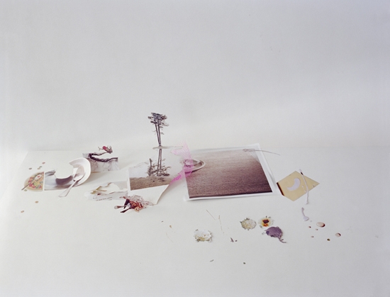
Mood Board Showcasing Imagery From ‘Hardly More Than Ever Series

 UNTITLED #54 FROM HARDLY MORE THAN EVER SERIES 2002.

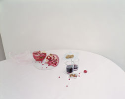
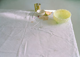
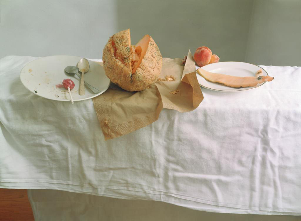
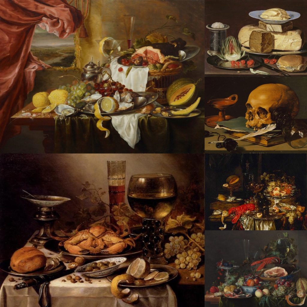
The photograph above is my favourite photograph from her ‘Hardly More Than Ever’ photographic series. The work showcases the transformation of still life painting from the 16th century into the 21st, with the main difference being the photograph being presented in colour and is a high resolution photograph. The photograph is taken as a landscape with the main focus point being in the centre of the frame, the half eaten melon. The colours are very dull and monotone, whites blacks and greys, which is similar to the classical outlook on still life imagery. This contrast the yellow/orange/green melon located in the centre reinforcing this as the main focal point. In addition, the background is kept simplistic, in order for attention to remain on the symbolic representation of the fruit. In Letinsky’s work the left over food is symbolic for inner beauty. Contextually, melons where considered a way of expressing a males fantasies of the female figure, having this melon broken showcases feminism in the present and the ideology that woman are not objects. The table cloth is creased, which creates a sense of mess and uncleanliness which adds to the overall tone and mood of the Letinsky’s work. The main formal elements which are being presented within the composition is shape, texture and space through the artificial positing of the food.

Conceptually, Letinsky wanted to capture the inner beauty of woman, through breaking the historical stereotypes and objectifying of woman through the half eaten melons and the uncleanliness of the table. This also helps to showcase the contextual transformation that still life imagery has undergone in today’s society, with new meanings and symbolism being presented through the objects.

Technically, the photograph uses simplistic camera settings, allowing the symbolism and the conceptual factors to be the importance of the photograph. The shutter speed used to capture the photograph is quick due to there being no intended blur within the frame. The ISO is low due to soft artificial lighting, created through studio lights which have a cold tone, due to there being no noise or texture through the light source. The white balance shows colour accuracy of the environment to which the photograph is set in, and allows the monotone colour scheme to really be emphasised. The aperture used to capture this still life image seems to be low due to the large depth of field it has, although the background begins to slightly to blur showing that there a small use of this technique within the work.

Action Plan:

After reviewing a contextual and contemporary version of still life I have been able to develop and understanding of the importance of this type of imagery. I have learnt that the positing of items is important as it allows the clarity of the symbolic representations to be clearly shown, thus making it something I need to consider when I capture my still life imagery. Photographic wise I have learnt that I should implement simple camera settings such as quick shutter speed, low ISO and some what low aperture, with soft cold artificial lighting to be used. when I capture my still life I will be copying the stylistic features of Letinsky, however showing experimentation through depth of field and positing of the items within the table. I intended to produce a strong set of still life photograph which showcase a symbolic representation of the Occupation through the technique and outlook stated above.

HISTORICAL CONTEXT – Still Life

Still life is a form of art depicting any arrangement of inanimate objects, often using various commodities such as food. The style has its roots in Greco-roman art however was truly pioneered by a group of Dutch artists during the 16th century. Their artwork served as a form of rebellion against the conservative themes of art (most of the art of the renaissance featured strong religious undertones) by displaying themes of opulence and debauchery. Despite this history, still life currently occupies the lowest rung on the ‘hierarchy of genres’ however its success with consumers has allowed it to stay relevant in modern art.

Still life is an umbrella category covering several sub-genres; The earliest form of true still life painting is the early renaissance paintings, these typically depicting harvests or flowers as a symbol of wealth.

Vanitas was a form of still life created to display the futile struggle of mankind against time. The work often feature numerous symbols showing the effects of time as well as death and decay. These symbols range from more obvious symbols such as the use of clocks and various animal skulls to more subtle symbolism such as the use of lilies to represent death. Where traditional works of still life aimed to display the opulence and achievement of man, vanitas undermined this by displaying that this possessions are meaningless as time would inevitably claim them in the end.

Still Life History and analysis

The phrase “Still Life” comes from a dutch word “Stilleven”. This phrase became popular in the 16th century because during this time, it started to become recognised as a genre of painting. Though, the actual painting style was being used by artists for much longer before. Still Life is a genre that consists of using non-living objects, such as flowers and fruits to show meaning within the image. These meanings can be things such as showing power or wealth, by doing things such as changing the types of flowers or fruits being used. Vanita is another style of Still Life. Vanitas typically show something to do with mortality or death, usually through the use of objects like skulls to achieve this.

Cookmaid with Still Life of Vegetables and Fruit c.1620-5 Sir Nathaniel Bacon 1585-1627

The image above is a painting by Sir Nathaniel Bacon. He was a British painter. He created this painting toward the end of his life during the 1620s, when this kind of genre was just really gaining popularity. The image above shows lots of different fruits and vegetables. These were all grown in England at the time, but were not all within season at the time of the image. This creates an idea of wealth because it means they are able to get these items imported during times of the year when they don’t grow in England. The idea of wealth can lead an idea of power due to them having access to lots of different expensive and non-seasonal fruits and vegetables, with the image showing off what they have, while others, especially at the time will not be as fortunate and may not really have anything.

Emile F. Guiton and Autochromes:

History of colour photography and the Autochrome:

In 1839, when photographs were seen by the public for the first time, people were disappointed that colour had not been recorded. As an alternative to this artists began to hand colour monochrome prints.

T.R.Williams, Portrait of a soldier, 1855, hand-coloured stereo daguerreotype.

Hand colouring monochromes continued to be popular as it cheap, however it did require a steady hand and it was often difficult to mimic the exact colour and shades of real life.

Before colour could be recorded in prints it had to be understood how colour actually worked. In 1861, Scottish physicist, James Clerk Maxwell conducted an experiment that proved that all colours could be made up of a combination of red, green and blue light. Unfortunately, Maxwell’s idea only worked for the first time practically out of sheer luck, but he had planted the seed for future ideas for successful colour photography.

In the years leading up to the invention of the autochrome, there were several attempted to create colour prints. Dr. John Joly came the closest to commercial success, however the plates used had a very limited sensitivity to colour.

At the beginning of the 20th century, after experimenting with colour prints since the 1890s, the Lumière brothers gave their first presentation of the autochrome to the French Academy of Science in 1904. By 1907, the autochrome was being produced commercially and the best part about them was that photographers could use their existing cameras.

So, how did it all work? During the manufacturing process of the autochrome plate, tiny grains of potato starch were dyed red, green or blue then spread out evenly on a glass plate. Next the plate was coated in a sticky varnish. Charcoal powder was used to fill in the gaps between the starch grains.The starch and charcoal was then flattened used a small roller. Finally, three coloured filter screens were placed on top of the glass plate and was coated with a panchromatic emulsion.

Coloured starch grains on a glass autochrome plate.

In use, autochrome plate required between 1 and 30 seconds exposure time. When taken light would pass through the colour filters of the plate to create an accurate display of the real life colours.

Baron de Meyer, Flower study, 1908

Emile F. Guiton:

Emile Guiton was a Jersey photographer who was particularly active during the German Occupation. However, his interest in photographs began long before this. Guiton was keen to experiment with colour after the creation of the autochrome in 1904. Stored at La Société Jersiaise, many of Guiton’s autochromes show assortments of flowers.

Contextual Study Still Life

What is Still Life?

‘Still Life’ are real life objects which are painted with no coordination as to each object. It is a type of art which is seen from the earliest of ancient times and is known as “still even” in the Netherlands.

History of Still Life

In the early 1960s, the genre of Still-Life became popular in Northern Europe and it Dutch and is known to be an independent photography style. The style is originally formed in Dutch and started to become renowned for being concerned with Khar (observation with the natural world). The objects photographed are usually positioned within a frame and create the objects showcased are usually considered to symbolise religion and mortality, reflecting the artists culture. The symbolism is shown through different objects (mirrors, candles, glasses, vases, watches, crowns etc..) all of which can represent aspects such as death, power, human life, as well as wealth and beauty and were all discovered in the ancient burial sights. Therefore, still-life being the composed portray of objects was considered broad and later on they were condensed into sub categories because of the different objects being photographed being different and having a different symbolic representation.

The Romans and Greeks also made a similar form of art which was known as Frescoes which is where they painted on plaster. This art type was modified to include more religious elements, meaning that floral designs become more popular because of them representing areas around the world which are all blooming in the same vase. Moving onto becoming closer to the modern day, this overall technique was adopted by well known artist Van Gough who painted images which included sunflowers, water jugs, as well as wine bottles.

Dutch Still Life Paintings

Dutch still life paintings are famous all over the world due to their depicting objects which have underlying metaphors from the fruits, meats and flowers being pictured. The era these images were taken were known for its wealth, due to exotic luxuries being brought to the country. These luxuries being tobacco, tea, salt, sugar, spices as well as silk. Due to these elements being very celebratory, the Dutches included them into their paintings to celebrate.

Dutch Still Life Examples

Analysing Still Life Paintings

Visual analysis- In this image I can see that their is wealthiness shown in the image from the silver platter/ gold stands which is shown, symbolising richness as it is an exclusive item. The silver/ silk tablecloth has an underlying symbol of power as it seems be quite expensive if silk. Their are lots of food elements on the table, most from exotic countries (lobster, lemon, jackfruit peaches) showing a high social status.

Still life research

A still life is a painting of a range of inanimate objects. This became very popular in the 16th century in the Netherlands where it was called “stilleven”, however this form of art can be seen all the way back in ancient times.

History

Still life paintings were seen in as early as the 15 century during the Egyptian times where paintings of different foods such as meat, fish and crops were discovered in ancient burial sights. The Romans and the Greeks also made similar forms of art using a technique called Frescoes which is where they painted on plaster. In the middle ages this form of art was modified to include more religious elements. In the Renascence era, floral designs became more popular. Paintings from this time usually show a vast amount of flowers from different areas around the world all blooming in the same vase. During the Dutch golden era, this was adapted slightly to create painting known as Vanitas which are floral painting that were paired together with objects like human skulls and hour glasses to convey the concept of the nature of life. Closer to the modern day era, this technique was adopted by artists such as Van Gough who painted lots of images of objects such as sunflowers, water jugs and wine bottles.

Dutch still life

Dutch still life painting are known for depicting objects such as fruit, flowers and meat. When looking deeply into these painting we are able to focus on underlying metaphors. This era was known for its wealth. This was a time where overseas trading was prominent in the Netherlands and exotic luxuries from all over the world were imported into the country. Luxuries included things such as tobacco, spices, salt, gems, tea, silk and sugar. Dutch citizens wanted to celebrate their new found imports by incorporating them into their art. From this point on, these paintings became more elaborate and affluent.

Cherries and strawberries were used to represent men’s souls and dragonflies were used to show evil since it was seen as a subspecies to butterflies which represent salvation. Skulls and hourglasses were also very common in dutch still life paintings as a warning, and were often seen next to luxury goods as a reminder that such things would not be important in the after life.

Analysing Still life paintings


Banquet Piece with Mince Pie, 1635

by Willem Claesz Heda

In this painting we can see an abundance of goods and luxuries. The gold and silver jugs on the table shows a high status and symbolises riches, it also pops against the background. The tablecloth also reflects power as it seems to be a type of quite expensive cloth, perhaps silk. On the table we can see all sorts of foods from lemon imported from Mediterranean countries, to mince pie that was seasoned with spices from eastern countries. These imported goods show a high social status and an abundance of wealth.


An Allegory of the Vanities of Human Life, c. 1640
by Harmen Steenwyck

In contrast to the image above this painting is slightly different as it is more religious in symbolism. Firstly, it is clear to see that it is a lot more monotone, and a lack of light shining which shows that the concept is darker or more serious. All the objects on the table are displayed in a chaotic order which could represent sadness or anger, and implies that someone may have been present at the scene and then left. We can also see that although the image contains some objects, there is quite a lot of bare space. This represents a feeling of emptiness that comes with having luxuries. The painting also refers to death as there is a very prominent skull on the table, that the steak of light is shining on to to highlight it further. The presence of books and instruments is used to indicate knowledge. Having the skull in front of the objects shows that when death comes luxuries will not mean anything.

https://www.artsy.net/article/artsy-editorial-dutch-lifes-dark-secrets-hide-exotic-delicacies

Classic Vs Contemporary photographers

Classic Photographer Study: Francis Foot

Francis Foot was born in 1855. In his early years he was a gas fitter, but he later developed an interest in photography and so much so that his family purchased a shop in pitt street, where they represented UK record retailer HMV. The logo is still painted on the exterior of the shop today. He then went on to have 4 children, George, Stanley, Dora and Reg.

Francis’ photography was published as postcards and many of his images and films have been curated by the Societe Jersaie Archive for historical purposes. His video portfolio provides video of aircraft landing on the beach in St Aubins bay, St Helier Harbour and Shipwrecks around the island

Below are some examples of Francis’ work

The Smith family, Taken around 1909. A traditional family portrait which features themes of hierarchy due to the arrangement of the family. The assumed father of the smith family sits central, With his son next to him and daughter in front of him sat on the floor. His wife sits aside his son whilst the members standing in the backdrop could either be extended family such as aunties cousins etc, Or could be maids and servants that are essentially considered part of the family


The weighbridge taken from pier road, Much different from the waterfront known by all today. The row of buildings opposite the sea wall are today a major financial hub as seen in Lewis bush’s work below. This image is particularly important in terms of historical change as this image was taken just a few years before the idea of land reclamation came into play and started to be developed upon.

Contemporary Artist Study: Lewis Bush

Lewis Bush is a British photographer whom recently did an arch isle photographic residency In Jersey. he is 31 years of age. However he started life on a very different route to photography, Working as a consultant researcher for the United Nations AIDS/HIV Task force, Tasked with researching potential cures and solutions to the AIDS/HIV Crisis. In 2012, Bush decided to focus on his own photo graphical works and projects, and one of his main focuses was to draw attention to various invisible powers throughout the world and photograph them and what they entail.

Lewis was recently in Jersey as part of the Archisle International Photographer in Residencey project, Where artists from all over the world spend a 6 month period in Jersey curating projects with an insight into island life whether that be past or present or even future. Bush created a project named “Trading Zones” which focused upon the finance industry in Jersey and the power within it. Bush found that the power of the finance industry could either positively ro negatively affect the lives of many millions of people and therefore set out to photograph this unapparent power at work.

Bush takes quite an interesting approach to the project, By using architectural drawings and building plans throughout the project, Highlighting various Sectors within the finance industry and many metaphorical features of it

Bush’s Work

In this image, Bush has curated aerial photographs of offices opposite liberation bus station. He includes the companys and corporations occupying the buildings as well as the branches and divisions of such companies. I personally like this image as it gives off a sense of dominance in terms of the amount of financial office space and it also has a military observational aesthetic to it, with the listings of the buildings and the aerial imagery
This image depicts many corner structures of various financial offices/ Buildings, Such as the RBC building and Nat-west International bank. Bush is good at highlighting that some of the offices, Such as the one in the top right, are actually historical buildings that have been modernized and brought into present day by the inclusion of Glass and steel girders to give the building a modern and professional look
Another interesting piece of work from Bush is this Image of a public telescope on ST Catherines Breakwater. The image is titled “Hong Kong, 9896km”. This image is powerful in representation of the international influence of Jerseys finance sector as the Island has ties with many banks and industries within Hong Kong, itself a major finance capital. What is more interesting is the telescope looking out to see, Almost as if it is making contact with and directing the viewer towards Hong Kong as this image was taken on Jerseys east coast

Emile F. Guiton and Autochromes

Emile Guiton was born in Jersey in 1879. He was part of La Société Jersiaise and was part of the executive committee there as he had a keen interest in History. Guiton had a fascination with the past and he had a particular interest in the design of Jersey houses over the centuries, in particular, the different styles of arches to be found in the island. Guiton was a keen amateur photographer and practised throughout his life. He experimented with colour at the beginning of the twentieth century in “Autochromes”. He would photograph archaeological excavations and he was one of the few people in Jersey permitted to take photographs during the German Occupation of 1940 – 1945. He recognised very early on the importance of collecting photographs and donated many images to the Société Jersiaise when he died in 1972.

Emilie’s work:

Autochromes

Autochromes ( or Autochrome Lumière) is an early color photography process patented in 1903 by the Lumière brothers in France and first marketed in 1907. The process consists of a glass plate coated on one side with a random pattern of microscopic grains of potato starch dyed red/orange, green, and blue/violet with the grains of starch acting as colour filters and a black-and-white panchromatic silver halide emulsion is put on top. The autochrome was put into the camera with the glass side that wasn’t covered in the potato starch and emulsion was facing the lens so that the light passed through the filter layer before reaching the emulsion. Because of the light loss due to all the filtering, autochrome photographs required a much longer exposure. This mean the photographer had to use a tripod and that photographing moving subjects wasn’t practical.

Critical Analysis

Image result for early vanitas paintings

Concept and Context:

Vanitas paining were especially popular in the 16th/17th century and started in the Netherlands and the term originally came from the opening lines of the Book of Ecclesiastes in the Bible: ‘Vanity of vanities, saith the Preacher, vanity of vanities, all is vanity’. Vanitas paintings would usually feature skulls, glasses, and candles to show the certainty and inevitability of death, and the transience of life.

Visual Analysis:

This painting by Pieter Claesz shows the our own mortality in several different ways, using different objects to reference elements regarding death. Firstly and most obviously is the human skull which is the main subject of this painting. It represents not only death, but how everyone is the same when they die, and it does not matter your beliefs, appearance or actions because underneath that we are all the same. Also notably is the glass resting against the skull. This once again references death, and given that it is next to the skull, it can be used to represent the life of person who died and is now just a skull, as the glass has tipped over, and there is no more liquid left, this shows how the person has run out of life, and judging from how it looks like it has been knocked over, it would be possible to assume that Claesz may have done this to show that the person died a quick death.

Another object commonly featured in Vanitas paintings is an hourglass to show the unchangeable nature of time, and how there is no stopping it. Whilst this painting features no hourglass, it features a cigarette to create the same effect, showing that we all eventually get burnt out into nothing. The use of the quill has a similar effect as well, and because as there is no inkwell, the ink on the quill represents our lives, and how every day it is used up bit by bit until we eventually run out and can no longer function and then die, which is represented by the quill running out of ink.

The Books under the skull also have a very significant meaning. They represent all of the knowledge that this person had learned in their lifetime. This helps us connect with the person, as it gives them a backstory of sorts. Schooling was obviously much harder to come by in the 16th century, and was mainly reserved for the rich and powerful. This therefore means that the skull belonged to a wealthy scholar, perhaps a writer due to the quill, giving the object a double meaning

Autochromes

Autochromes is a material which was once used for colour photography, consisting of a photographic emulsion applied over a multicolored screen of minute starch grains dyed red, green, and blue-violet. This effect was achieved by getting a glass plate and coating it with a latex-based varnish and covered with a thin, regular layer of grains of potato starch dyed green, blue, and red-orange. In order to achieve the negative element of this type of photograph, one side of the glass would be covered with a thin layer of collodion (a flammable syrup) containing ammonium or potassium halides (iodide or iodide and bromide). The collodion is richer than the other substances which creates the negative, producing the whitish image. allowing it show up better against the dark background used when viewing the final outcome.

 Emile F. Guiton:

The founder of the Societe Jersiaise Photographic Archive had a passion for capturing colour photographs, during the begining of colour photography in the early 20th century. Emile captured two categories when using the autochrome technique: still life, fruit and flowers showcasing symbolism and domestic photographs, taking a more portraiture approach. He used still life photography in order for him to develop his skills, when using the chemicals to create the autochrome effect. In addition, the subject was still allowing for a controlled environment making the colour experimentation to be clearer. Emile would sell the autochromes in packs of four, which showed his experimentation with the chemicals. It is said that he created his work to capture the heritage of the island.

One of Emile’s most famous photographs was Valley de Vaux, which showcased two of Jersey’s landscapes in colour. One was a country environment and one was showcasing the urban life of Jersey, creating a clear juxtaposition. This photograph I could not find online, but from the description read on https://hautlieucreative.co.uk/photo20al/wp-content/uploads/sites/33/2019/09/The-Autochromes-of-Emile-Guiton.pdf it is clear that the work is trying to showcase the cultural change during this time period.