Category Archives: Unit 2 Portrait

Filters

Author:
Category:

Portrait Analysis – Arnold Newman

Portraits can be used to convey the personalities and emotions of the subject being used. In many instances, photographers use both the context of the image, and the subjects pose, to convey a message.

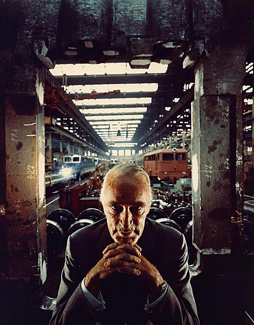
The below photograph was taken of industrialist Alfred Krupp, and became a very well known image, due to the message that it conveyed and presented.
Emotional Response:

My first reaction to the image, is that it seems to portray a sinister, dark theme. The way the subject is positioned makes it seem like he is mimicking an evil character, and his facial expression is unnerving and  lacks emotion. This image is also very full, and the attention of the viewer is moved from the subject in the foreground to the different activities occurring in the background. this makes it difficult to concentrate on a certain part of the image, and so I dislike this aspect of the photograph.

Visual:

The photograph makes use of dark, contrasting colors to present a more sinister and unnerving tone. The setting of the railway station gives the image an industrial, strict feeling, while the graffiti on the walls of the cement pillars makes the setting seem more run-down and decrepit, allowing the photograph to present a more eerie feel to it. The fact that the subject, an elderly man wearing a suit, is positioned in the very foreground of the image, startles the viewer, and makes it seem like the subject is the dominant figure in this scenario, possibly that the subject owns the station, but doesn’t participate in any manual labor due to the presentation of him wearing a suit.

Technical:

This photograph was taken with a camera, at eye-level with the subject. The image has good symmetry, as the subject is centered in the image, and the industrial setting behind him shows a relatively symmetrical layout. The image also has a strong perspective, as the setting behind the subject seems to carry on towards the center of the image, in the distance, showing the length of the railway line. These techniques used allow for the photograph to show the setting as a large industrial area, and allows for the viewer to focus on the subject and his position, as he is directly in the center at the front of the photograph.

Conceptual:

Newman idea behind this image was to present the subject as sinister as possible. The main focus of the image is to draw attention to the subjects personality, as Newman has attempted to portray how bad of a person Krupp was, through positioning him to look like a villain. Newman used both subtle and unsubtle techniques to present this effect, and overall, the concept of the image can be deduced relatively easily by analyzing the setting, the position of the subject, and the context behind the photograph.

Context:

In 1963, photographer Arnold Newman was contacted by industrialist Alfred Krupp to photograph a portrait image for him. Krupp was discovered to have produced transport and materials to assist the Nazis during the second world war, and after learning Newman was Jewish, Krupp refused to see him. After being persuaded through viewing Newman’s impressive portfolio, Krupp agreed to allow Newman to photograph him. Newman took advantage of this, and portrayed Krupp in the most sinister and eerie way possible in an act of revenge for Krupp’s influence in the prosecution of the Jews.

Portrait Project Introduction

General Definition:

Portrait photography or portraiture in photography is a photograph of a person or group of people that captures the personality of the subject by using effective lighting, backdrops, and poses. A portrait picture might be artistic, or it might be clinical, as part of a medical study.
Aim: To explore the different kinds and ways of acquiring portrait photos and what methods photographers use for different styles.

Types – 

TRADITIONAL PORTRAIT

“Face is the focus”

In this type of portrait photography, the object is supposed to look directly at the camera and the focus is on the face.

CANDID PORTRAIT

“Take as it is”

Candid portraits are generally the real and spontaneous images. Here the photographer has not much control on the surroundings and cannot alter the emotions.

POSED PORTRAIT

“Intentions have been conveyed”

Posed portrait means that the photographer has conveyed the intentions to the subject, by words or by action, and there needs to be a change of body position or expression.

ENVIRONMENTAL PORTRAIT

“At objects own environment”

Environmental portrait means that you are photographing the object in its own environment, where it is comfortable most. Like an Engineer at his construction site,  farmer in the field etc.

FORMAL PORTRAIT

“Object with a formal pose”

This is a posed portrait, but with a formal touch, prepared for business and other formal occasions.

COUPLE PORTRAIT

“Highlighting the relation”

In this type of portrait the emphasis of the photographer is to show the intensity of the relation between the people in the photograph. For ex: The relation of child with his parents.

GLAMOUR PORTRAIT

“Highlight the appeal”

Taking portrait of the model is the best example of this, where you want to enhance the appeal of the object.

CLOSE UP PORTRAIT

“Get it close”

These are the images that are taken from very close, using zoom or macro lens.

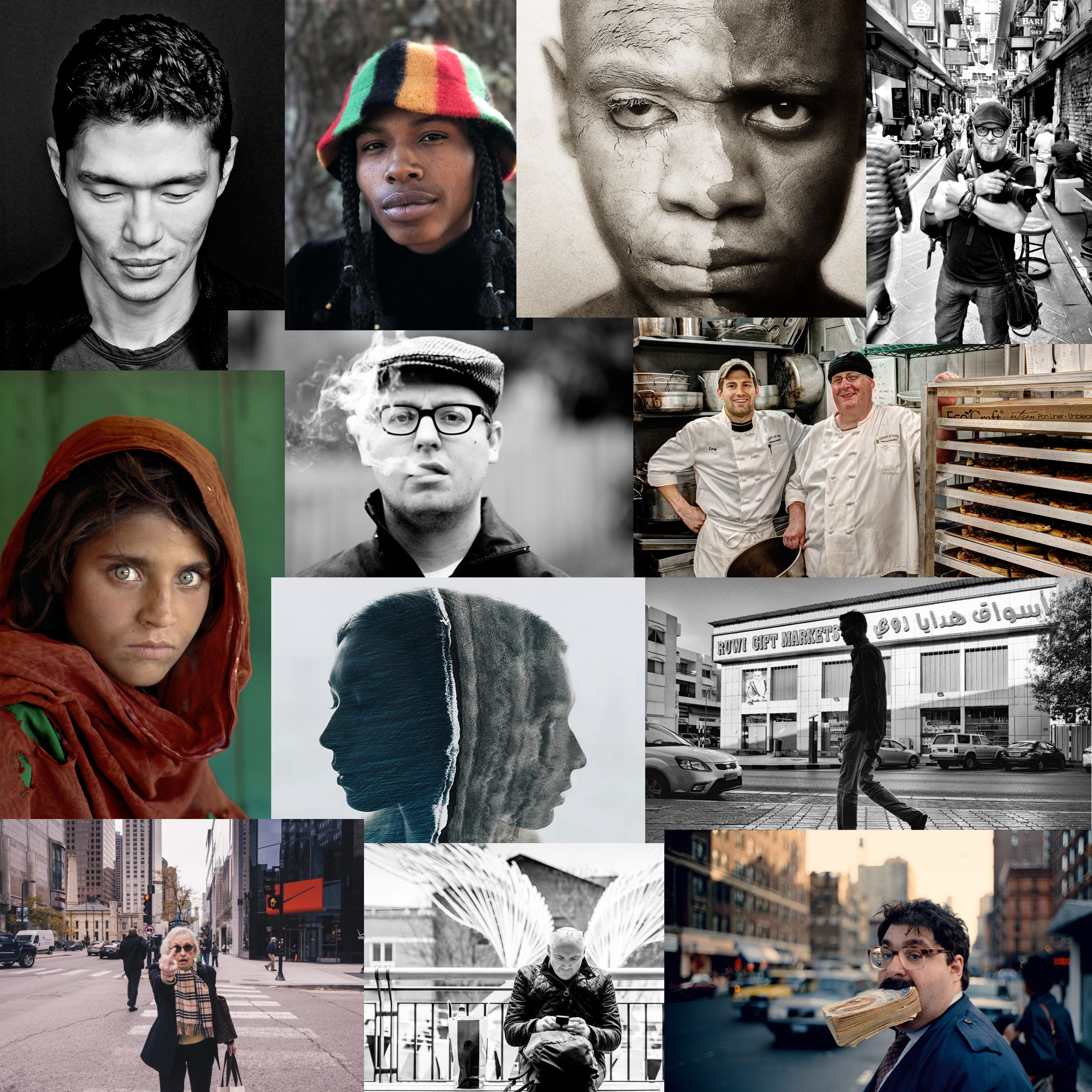
Examples of some good portrait photographs/Mood Board –

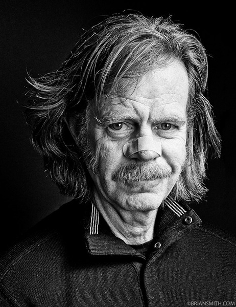
William H. Macy photographed at Sundance Film Festival for Be A Star Anti-Bullying Campaign in partnership with WWE and The Creative Coalition

Image result for examples of portrait photography

Portraiture: Mood-board

1. TRADITIONAL PORTRAIT.

Traditional or Classical portraiture would refer to an image where face is the predominant element. The purpose of the photograph is to depict visual representation of that person. Subject is expected to be looking directly at the camera. With what is described as a head-shot, two thirds or full body framing can be used

2. ENVIRONMENTAL PORTRAIT.

The term Environmental Portrait refers to an image where the subject is photographed in person’s natural environment. For example, a worker photographed at the construction zone, teacher in the classroom, sculptor in a sculpture studio and so on. Surroundings are used to compliment the subject and to emphasize his character. Subject and setting are chosen by the photographer.

4. CANDID PORTRAIT.

A candid portrait is taken without a subject expecting or acknowledging the photographer. This style used in photo journalism, travel photographystreet photography and event photography. As opposed to an environmental portrait this image is captured at the moment rather than set up.

5. GLAMOR PORTRAIT.

The term Glamor Portrait refers to portraits where emphasis is given to highlight the sexy romantic appeal of the subject. see : 5 ELEGANT LIGHTING SETUPS FOR MODEL PHOTOGRAPHY

6. LIFESTYLE PORTRAIT

The term Lifestyle Portrait refers to portraits where emphasis is given to suggest the “style of living” of the individuals depicted. Technically it is a combination of environmental portrait and candid portrait. More weight is given to communicate the feeling of life experience of the subject. Style has numerous implications in commercial and fine art photography. Editorial, fashion, pharmaceutical, and food industries often use lifestyle images to evoke emotions in viewers by depiction of desired life styles. It is common to see this style used in wedding and family portrait photography as well.

7. SURREAL PORTRAIT.

Surreal Portraits are created to emphasize the other reality. A depiction of a person’s interpreted subconscious mind. Surrealism is an art movement started in the early 1920‘s and still alive and well. In photography tricks and special effects are used to achieve a surreal look. 

8. CONCEPTUAL PORTRAIT.

Conceptual Portrait refers to images where concept adds a fourth dimension. The hidden meaning of the concept will leave the viewer guessing as it is often open for interpretation. Conceptual artists generally get offended when asked what did they mean in their photograph. It is the job of the viewer to decide. Conceptual Portraits are often used in advertising photography but concepts are much easier to understand.

9. ABSTRACT PORTRAIT.

Abstract portraits are created with a purpose of creating art and not based on realistic representation of a person. Collage or digital manipulation is often used.

Portraits in Photography

Portraits in photography are often used to capture the personality of the subject, and to present a thought or feeling through the use of a human subject, making the photograph as a whole, more relatable.

Different camera techniques and editing skills can be used, depending on what the photographer is trying to portray in their image. The following are professional examples of different techniques that a photographer could use when taking a portrait image of a subject:

Posed portraits:

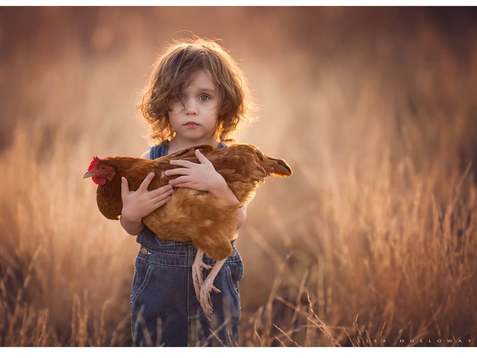
Photograph by Lisa Holloway

Photographers may decide to pose their subjects in order to convey a specific image, or to present an action or scene that would be difficult to capture in a candid photograph in everyday life.

Candid Portraits:

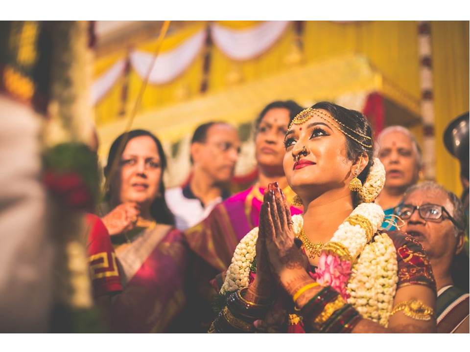
Photography from: https://www.glassdoor.co.uk/Photos/Studio-31-Office-Photos-IMG1973125.htm

Candid photographs are images taken while the subject is not posing, and is instead completing a natural task in their natural environment. Candid photos are often used to show the personality of the subject, and makes use of the setting how it naturally is in everyday life.

Half-body Portraits:

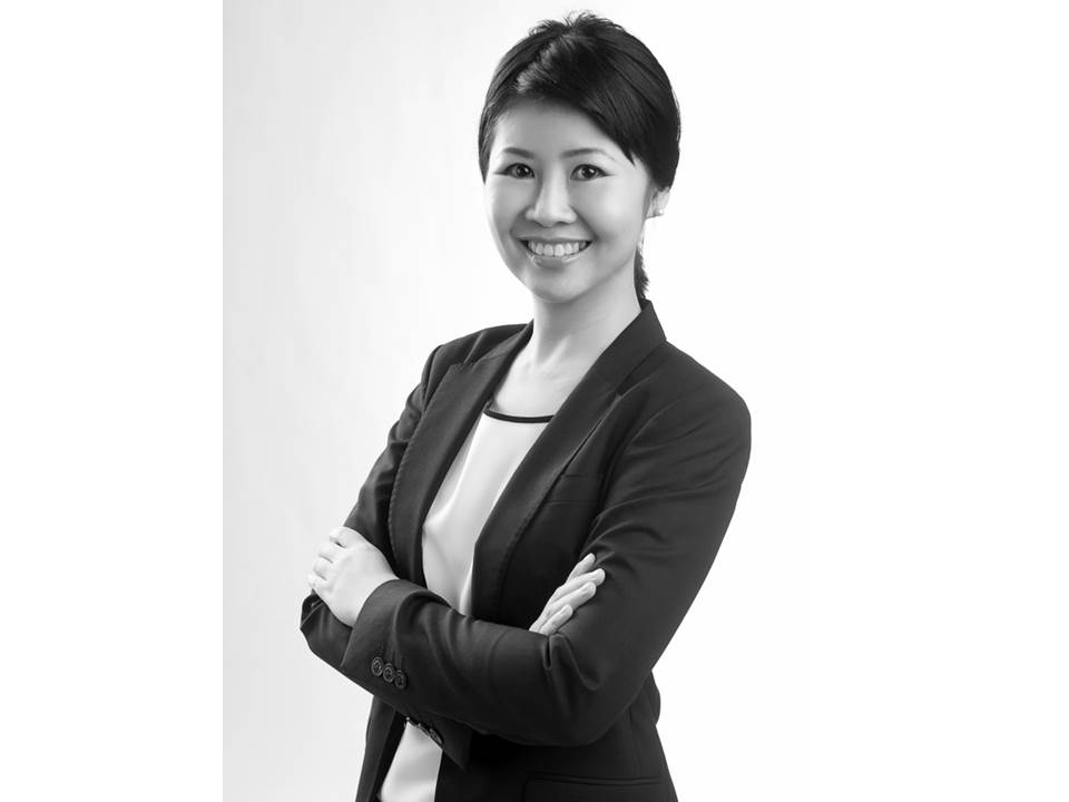
Photography by Yew Kwang

Half body portraits are often used in professional photographs. They allow for the personality of the subject to show through in the photograph, but in a more professional manner, as the focus is still on the face and upper body posture.

3/4 length portraits:

Photograph by Alan Fisher

3/4 length portraits typically focus on the top 3/4 of an individuals body, leaving out the bottom of the legs. this can be used to present the whole appearance of the subject (including clothes and posture) without minimizing any details that may be left out in, for example, a full body portrait.

Full body portrait:

Photography from: https://www.dpreview.com/forums/post/56358184

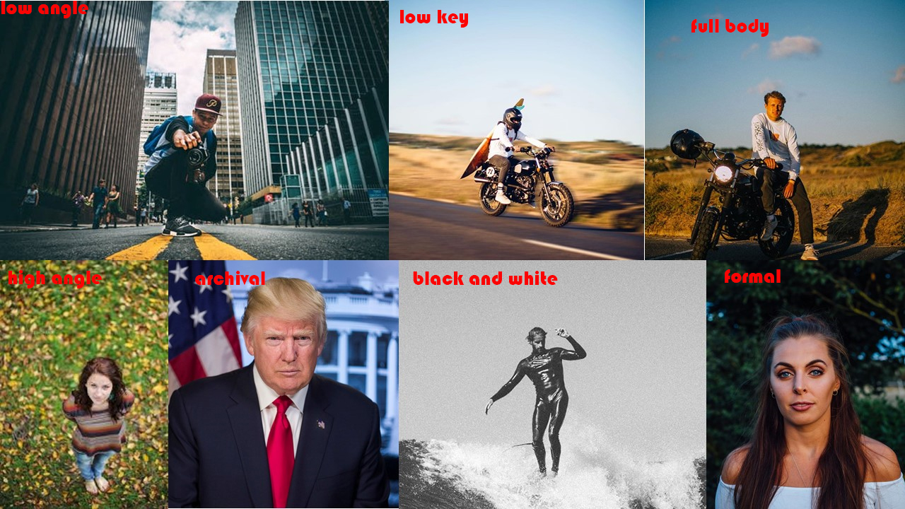
Full body portraits are meant to show the viewer the entire posture of the subject, as their whole body is in the image. they are commonly used in fashion magazines, where the purpose of the image is to show a full outfit of clothing on a subject.

High angle portrait:

Photography from: https://storyboardclass.wordpress.com/cinema-language/high-angle-shot/

High angle portraits are often used to emphasis the small size of the subject. they place the camera in a position of dominance, and thus the subject is presented as smaller.

Canted angle portrait:

Photograph from: https://sckimadam.wordpress.com/2015/02/12/21/

The canted angle is produced by tilting the camera at an angle, so that the horizontal lines within the image are no longer parallel with the frame of the image, and any vertical lines lie at an angle to the side of the frame of the image. This technique emphasizes the diagonal lines of an image, and can be used to emphasis drama and interest in an image.

photograph from: https://www.thephotoargus.com/beautiful-black-and-white-portraits/

Black and white portraits:

Black and white portraits are created during the editing process of an image.  Using black and white can help to emphasis the shape, texture and contrasting tones of an image, and can make an image more effective if it uses different shapes and angles.

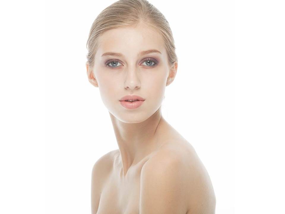
High-key portraits:

Photography from: https://profoto.com/in/profoto-stories/how-to-do-a-high-key-portrait

High key portraits make use of light colors, and images are often taking using lots of artificial light, using neutral colors in the image. High key images help to draw attention directly to the subject, as attention is not diverted by any bold colors or shapes.

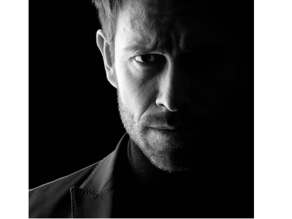
Low-Key portraits:

Photograph from: https://www.portraitprofessional.com/blog/lowkeyportraits.php

Low-key portraits are the opposite of high key, making use of dark tones and a lack of light to create a shadowed effect on subjects. The images typically portray themselves as more serious and harsh, and add  mystery to the subject due to a portion of them usually being shadowed in darkness.

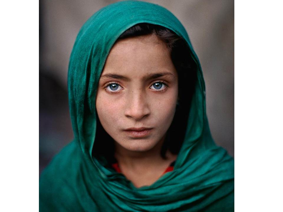
Color Portrait:

Photograph from: https://unit22portraitphotographyjosh.wordpress.com/task-1-colour-photographers-part-2/

Color is often used in portraits to draw maximum attention to the subject. Bold vibrant colors are often used to allow the subject to stand out, and the viewers attention is drawn to the colors and shapes that are emphasized.

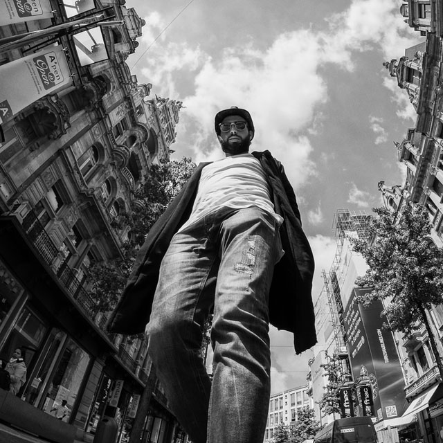
low-angle portraits:

By Pixioo Photography

Low angles are often used to present the opposite features to high angles. A low angle image places the subject in a position of dominance, making the subject seem larger, and more threatening to the viewer.

Head-shot Portrait:

Photograph from: https://improvephotography.com/47624/headshot-photography-pricing-guide/

Head shots are often used to place maximum emphasis on the facial expression of the subject. The identities of the subject are often clear, and the image would be used to focus on the subjects reaction to something, or to help identify them easily (e.g head shots are used in passports to identify people) without the addition of any unnecessary features that may draw attention away from the face (e.g bright clothing).

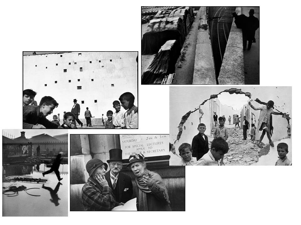
Henri Cartier-Bresson

Henri Cartier-Bresson was a french, human photographer, who was born on the 22nd of August 1908. He died on the 3rd of August 2004. He started working on photography in 1930. He was credited with pioneering the genre of street photography. He viewed street photography as capturing a decisive moment. The phrase “decisive moment” is now used often in street photography and refers to when the image represents the essence of the event happening within the image. During Henri-Cartier Bresson’s life he created a few different books, mostly full of images he had taken from different areas in photography, one of these was called “The Decisive Moment”.

Images by Henri Cartier – Bresson

This is a moodboard of some of my favourite images that Bressen took to do with street photography.

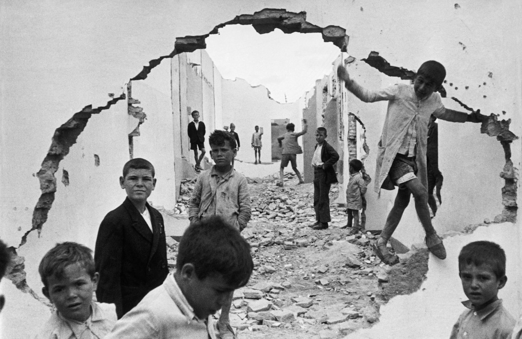
Henri Cartier-Bresson

Technical: This image uses light very consistently throughout. This can be seen due to the background sky and wall being almost the same colour with the foreground also being a very similar shade of white. This could have been created using natural lighting and a high ISO.

Visual: This image varies the tone throughout, with the majority being very brightly coloured and some coloured areas being grey or black. This image displays form and depth really well. This could be due to the darker colours creating a path of rubble down between the buildings.

Contextual: This image seems to have been taken after some kind of bombing or war. We know this due to the rubble covering the street between the buildings and the big hole that the image is being taken through that is in a weird shape. This image also gives a war-torn impression due to the children all having confused and sad faces throughout the image.

Conceptual: The image clearly displays a place that was destroyed during some kind of war. The photographer may have decided to take this image due to show some of the impacts that war can have on towns. The use of children looking sad makes it seem like these were places they lived, along with the rubble along the ground.

Photograph Analysis – Arnold Newman (Alfred Krupp)

Alfred Krupp by Arnold Newman


Emotional Response:

  • This image is sinister and uncomfortable.
  • Alfred looks intimidating and scary through his facial expressions and is shown to be a man of some power or authority through wearing a suit which creates a rather threatening character.

Technical:

  • Symmetry.
  • Contrast (top/bottom).
  • Wide angle lens.
  • Strong sense of perspective.

Visual:

  • Man in the middle of the image (displays dominance).
  • Alfred Krupp looks menacing and intimidating, represented also by the darkness and shadow surrounding his figure in the image.
  • Relatively dull image with dirty colours, no vibrance .
  • Strong eye-contact with camera (audience).

Concept:

  • Arnold Newman was a Jewish photographer who took this image as a way of “revenge” on Alfred Krupp.
  • The photograph was set up to make Alfred Krupp look evil.

Context:

  • Arnold Newman wanted a sort of revenge on the Nazis, as the train station shown in the background of this image was used transport vast numbers of Jews to concentration camps across the country were many would meet their ends.

Environmental Portrait Experimentation

ENVIRONMENTAL PORTRAITS

It is a portrait where the subject is photographed within an environment that they are usually in, it could be a profession or a hobby. This type of portrait allows the photographer to show what type of person the subject it depending on their environment and it illuminates the their character. By the subject looking directly into the camera, it allows the viewer to feel a connection between the two sources. The environment is always used as a background and it can range from large and busy to small and simple, the background isn’t the main part of the image, its the subject themselves as they draw most of the attention towards themselves as they are telling the story behind the image.

EXPERIMENTATION

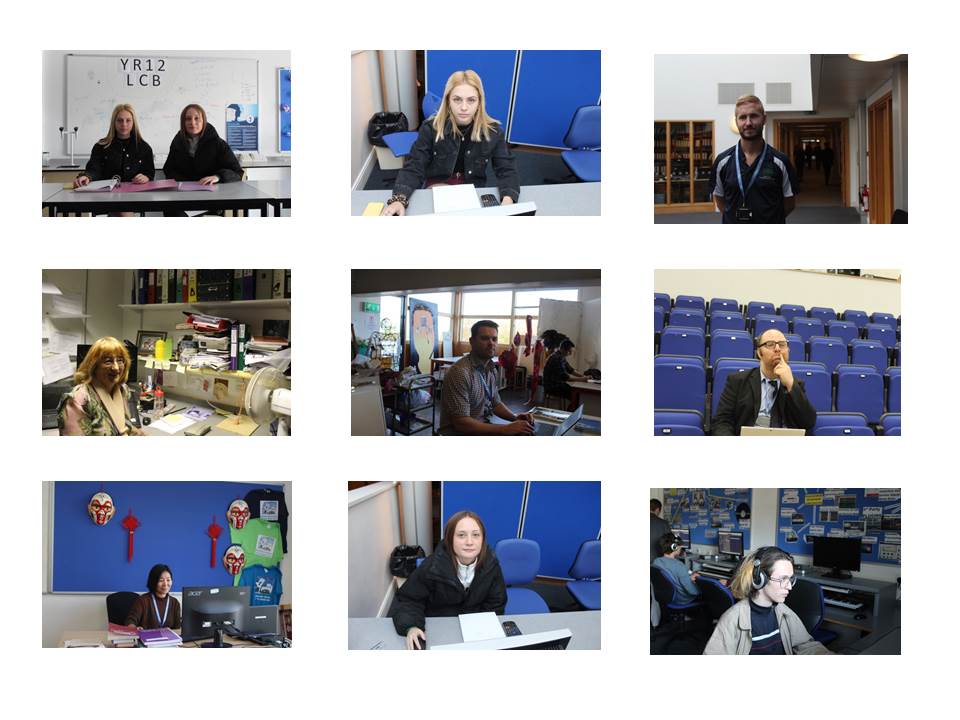
These are images I took when experimenting with environmental portraits. In some of these images I used flash to create a dramatic lighting effect. I also regularly  changed the shutter speed which was dependent on how dark or light the background was. Some of my images where too exposed this is because my shutter speed was too slow and ISO was to high, which meant the camera was sensitive to the amount of light I was letting into the image, with the image being over exposed it made the image become more white than it was. My images have a wider range of variety, as I went to different environments in a school so this helped with me adjusting the manual settings on the camera. The meaning behind these images it to show the students and teachers in their everyday environment doing their work and where they are mostly seen. With these subject being put in their everyday environment it is easier for the viewer to make a connection and an understanding as the environment it relatable especially for sutdents.


3. A Closer look at Environmental Portraits | Formal Portraits

>>Find resources here<<

M:\Departments\Photography\Students\Resources\Portraiture\TO DO

An environmental portrait is a portrait executed in the subject’s usual environment, such as in their home or workplace, and typically illuminates the subject’s life and surroundings.  

Group Activity | Image Analysis

Image result for arnold newman alfred krupp
Arnold Newman | Portrait of Alfred Krupp | 1963
  • Emotional Response (how it makes you feel / initial reactions):
  • Technical:
  • Visual:
  • Conceptual:
  • Contextual :

You have 5 minutes to research this image and present your findings as a group…

Blog Post 1 :

  • define, describe and explain what an environmental portrait is
  • add a mood board grid  of suitable images
  • include hyperlinks to suitable URLs to help you
  • add at least one video to create inter-activity on your blog

Blog Post 2 :

Choose either Arnold Newman or August Sander to write a CASE STUDY and create a blog post that includes….

  • a brief biography of the artist and their aims / intentions
  • Mood-board of key images
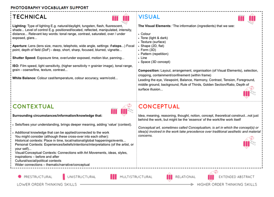
  • Select one key image and apply Technical | Visual | Contextual | Conceptual analysis
  • Add any other relevant research / insights
Image result for august sander typologies
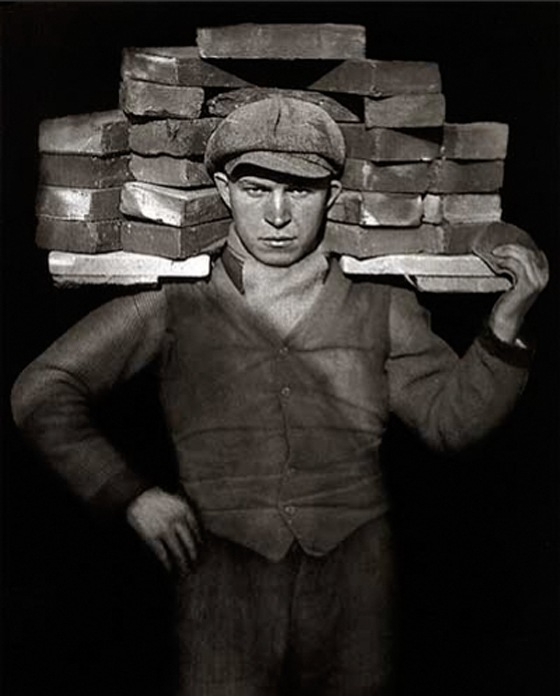
August Sander The Face of Our Time 1926
Image result for august sander typologies
August Sander The Face of Our Time 1926
Image result for august sander typologies
August Sander The Face of Our Time 1926
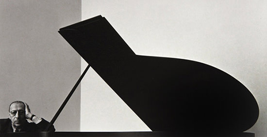
Arnold Newman Igor Stravinsky (composer) 1946

Other environmental portraits to consider

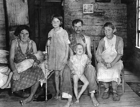
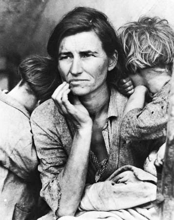
Walker Evans Sharecropper Family 1936

Dorothea Lange Migrant Mother 1936
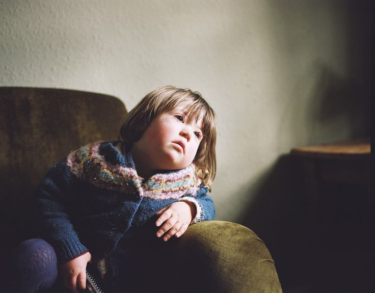
Sian Davey “Looking for Alice” 2012
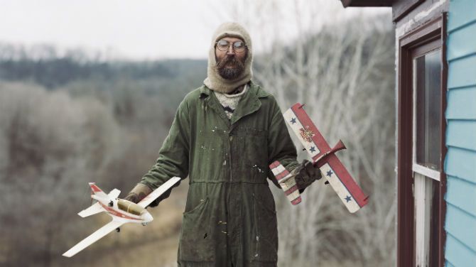
Alec Soth Sleeping by the Mississippi 2004
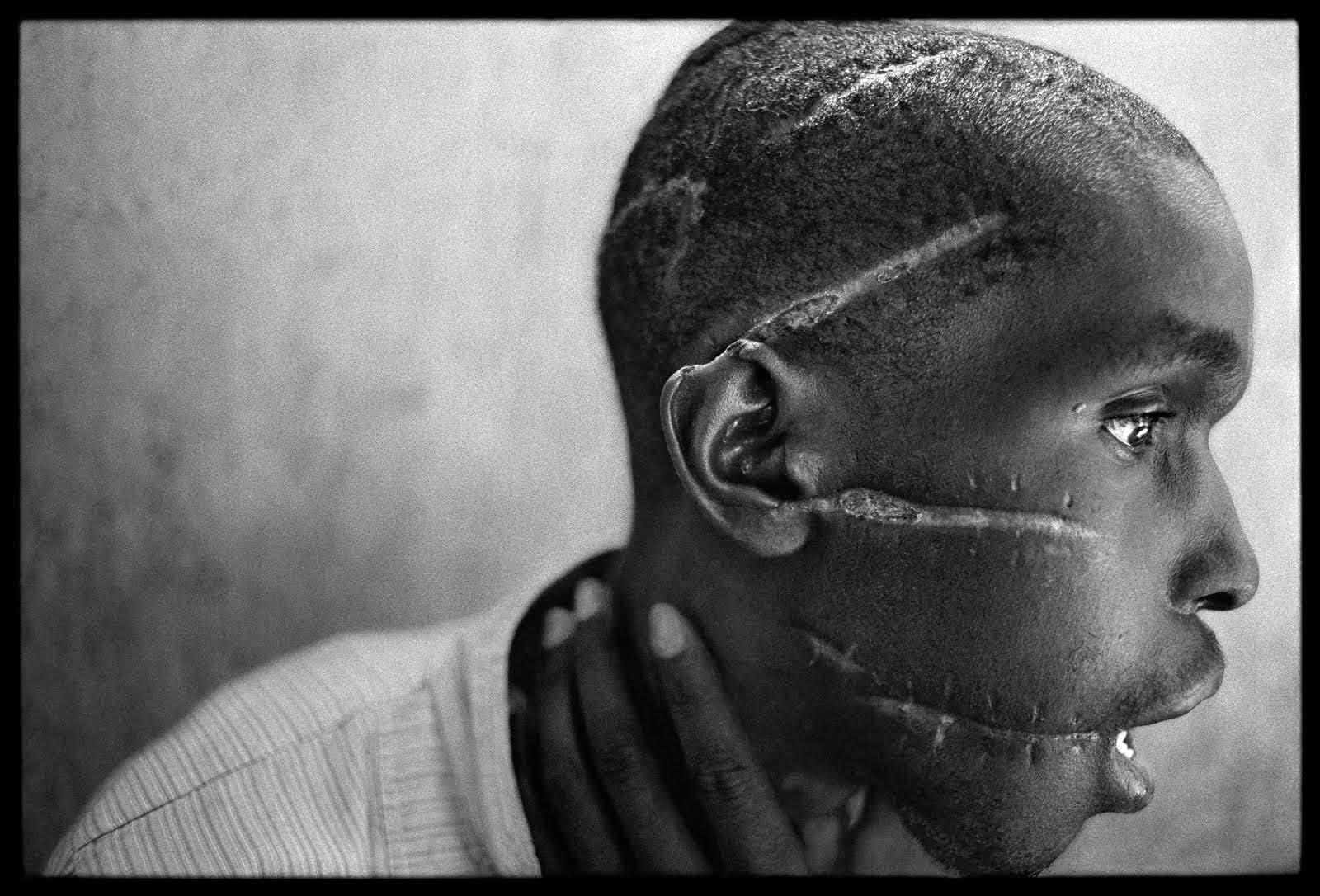
James Nachtwey Rwanda 1995
Michelle Sank
David GoldBlatt
Anthony Kurtz No Man’s Job series 2010

Resources to help you analyse and interpret the images…

Picture

Image result for rule of thirds
Rule of thirds grid…useful for balance, symmetry and strong compositions
Image result for golden ratio photography
Apply the Golden ratio, Fibonacci Sequence to an image (overlay / blend a template)
00YobA-364389584.jpg
Henri Cartier-Bresson and the use of “The Golden Triangle”

Remember to show your Photo-Shoot Planning and clearly explain :

  • who you are photographing
  • what you are photographing
  • when you are conducting the shoot
  • where you are working/ location
  • why you are designing the shoot in this way
  • how you are going to produce the images (lighting / equipment etc)

Or use this one…