Category Archives: Unit 2 Portrait

Filters

Author:
Category:

Gender/loss of identity- 4th Photo shoot

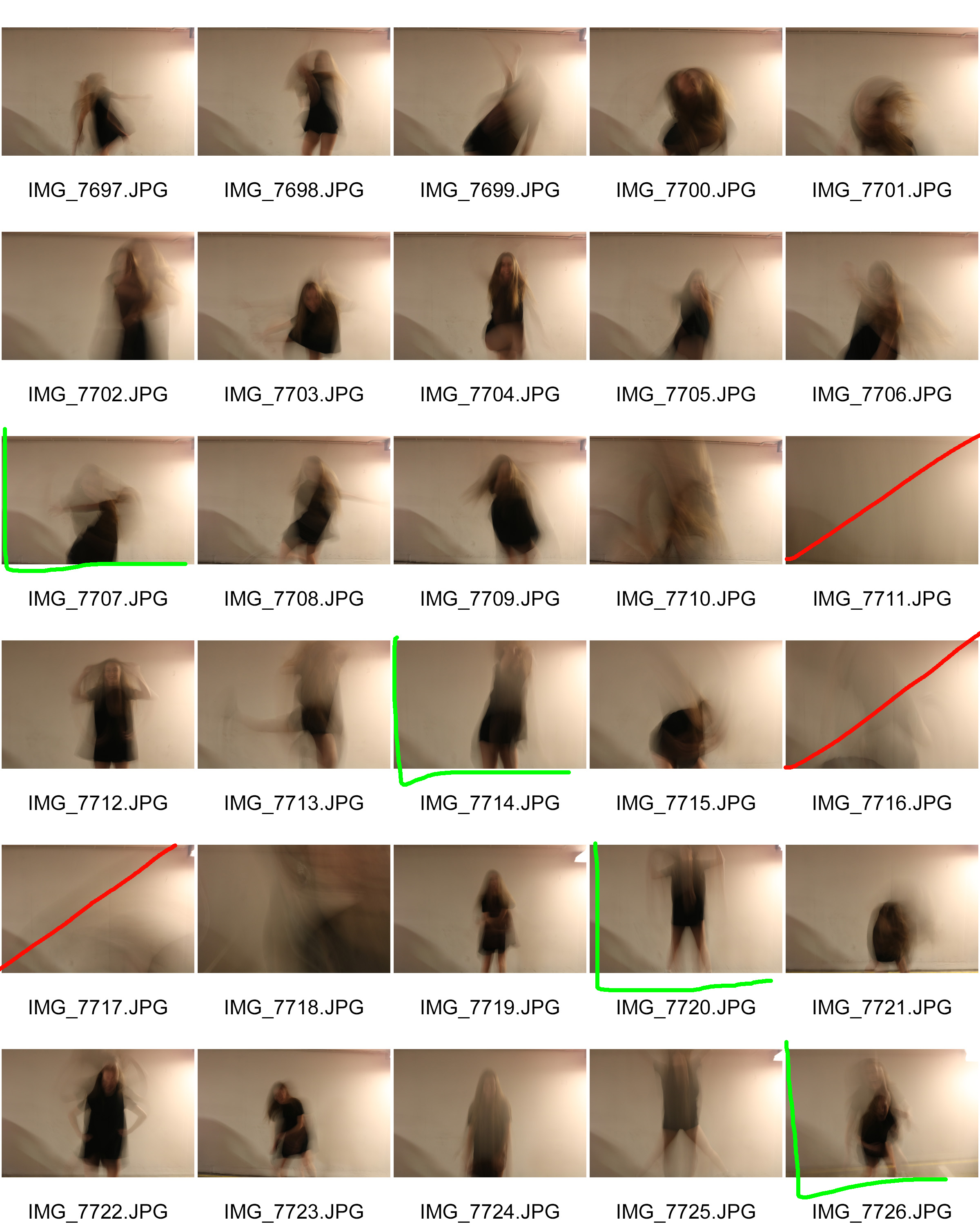
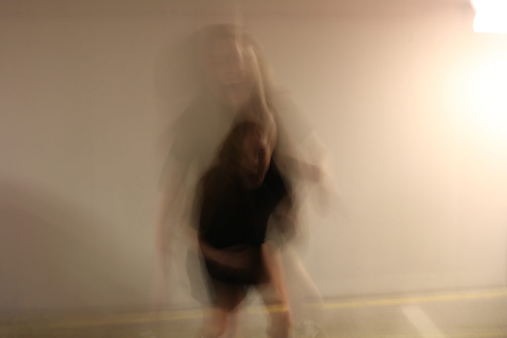
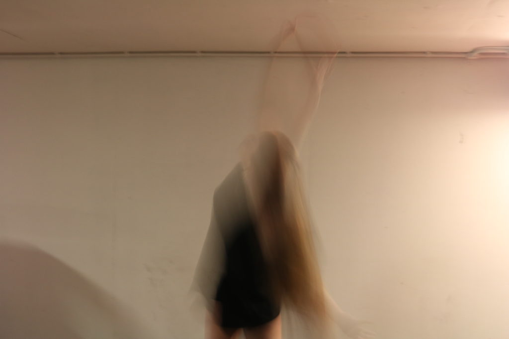
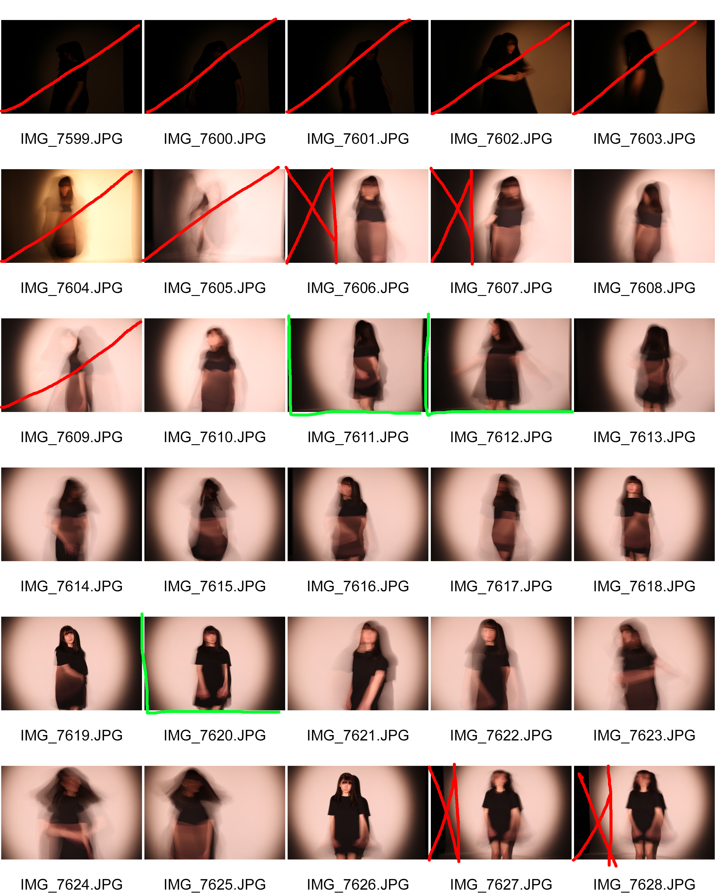
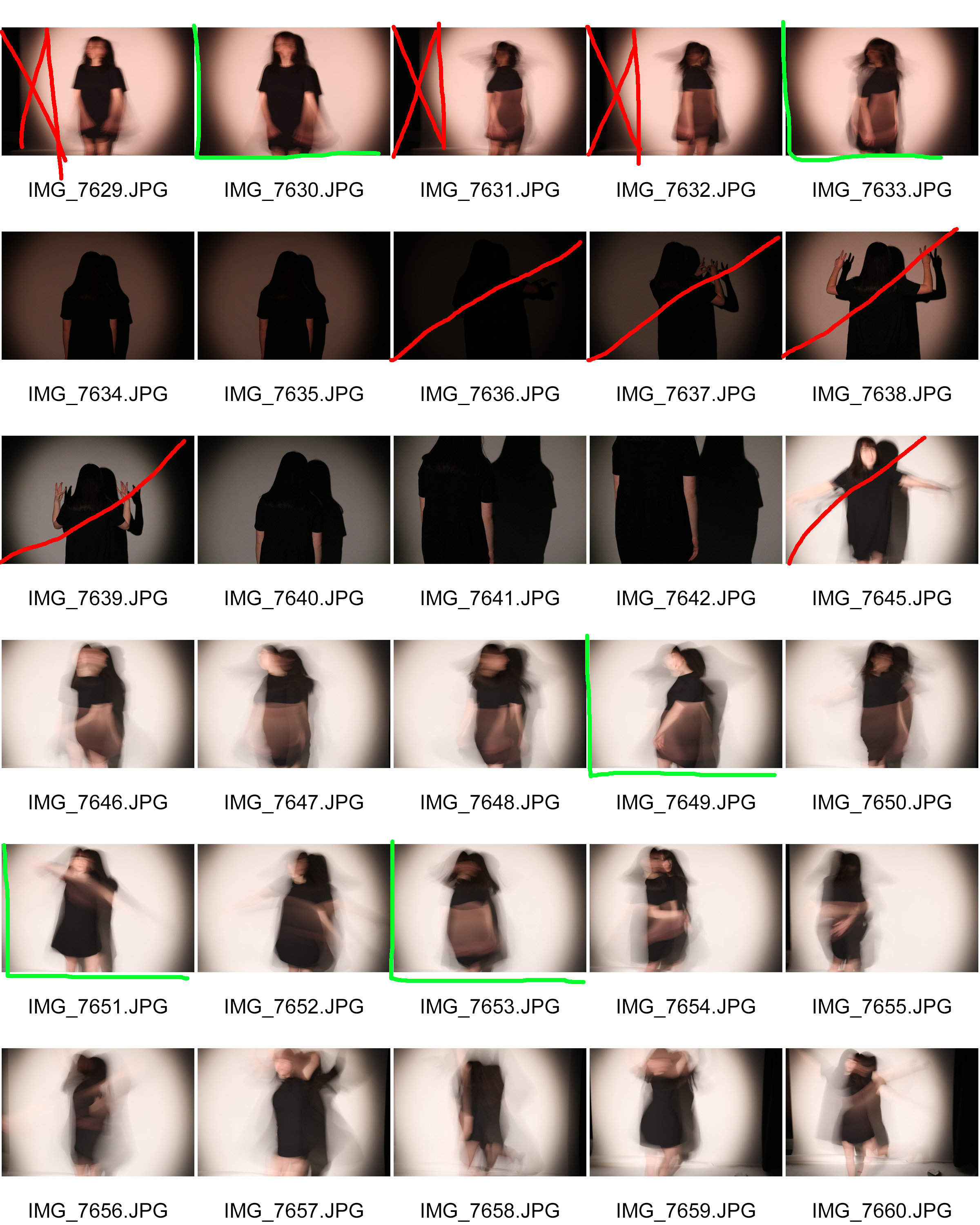
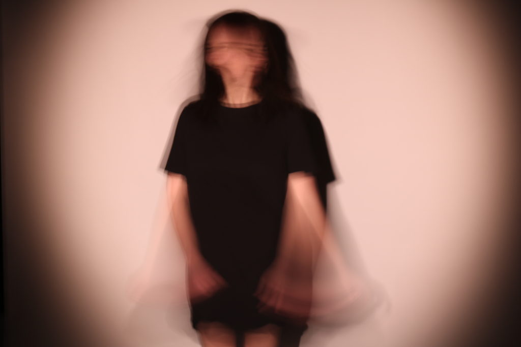
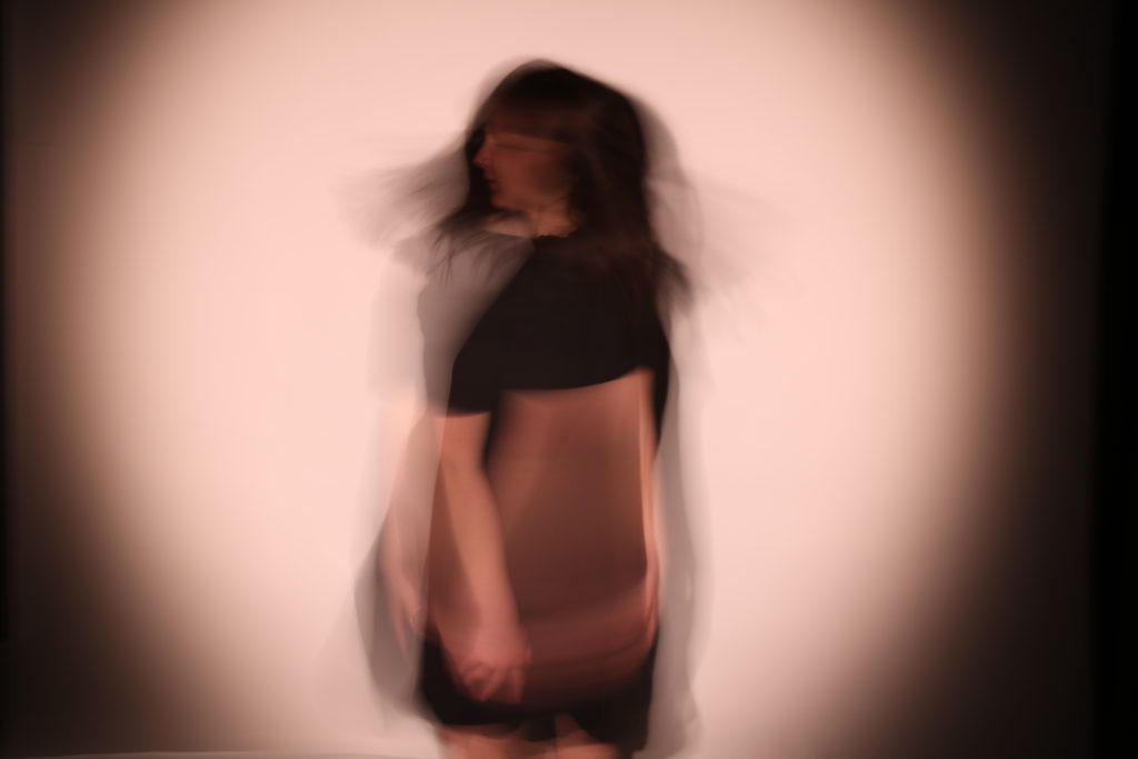
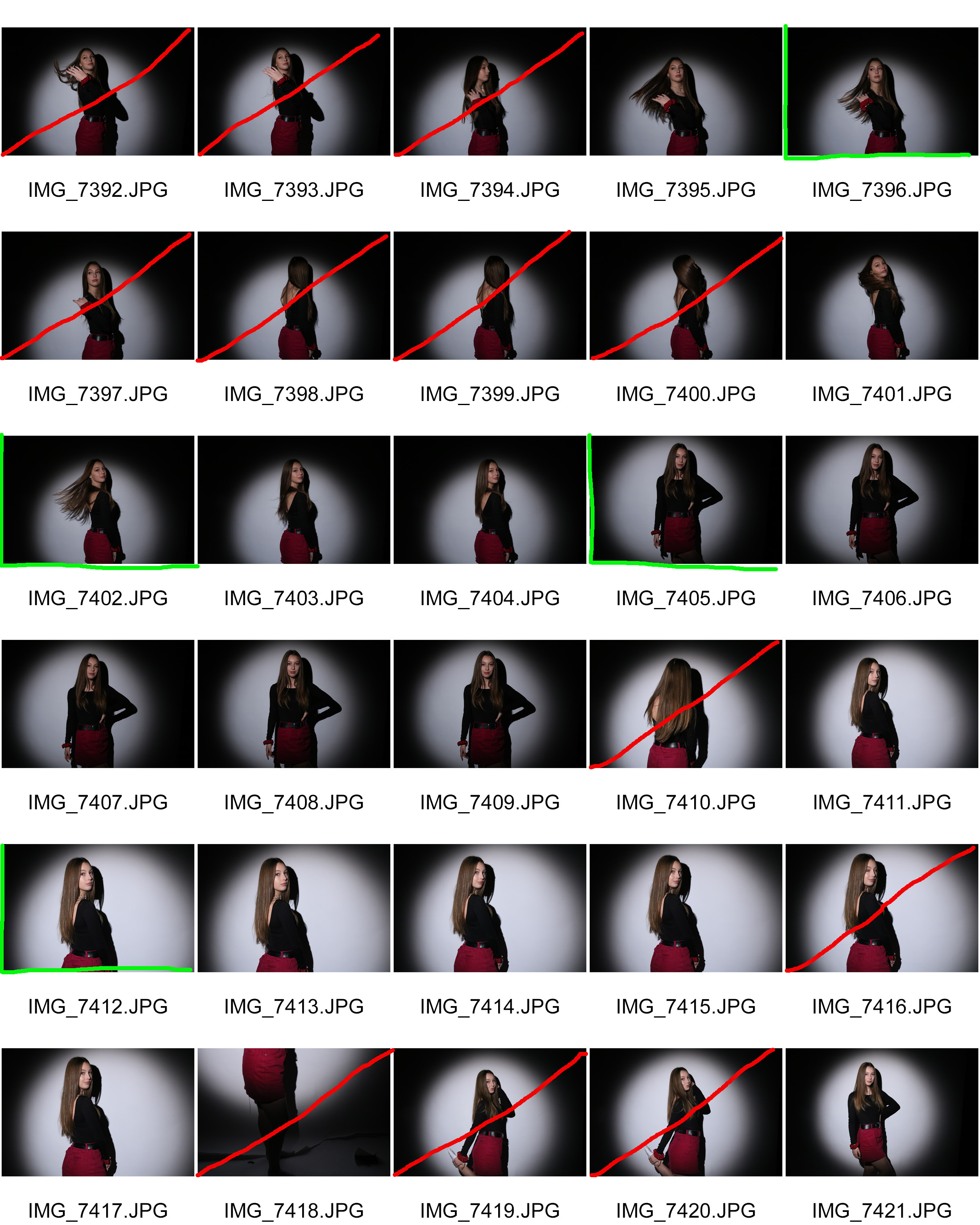
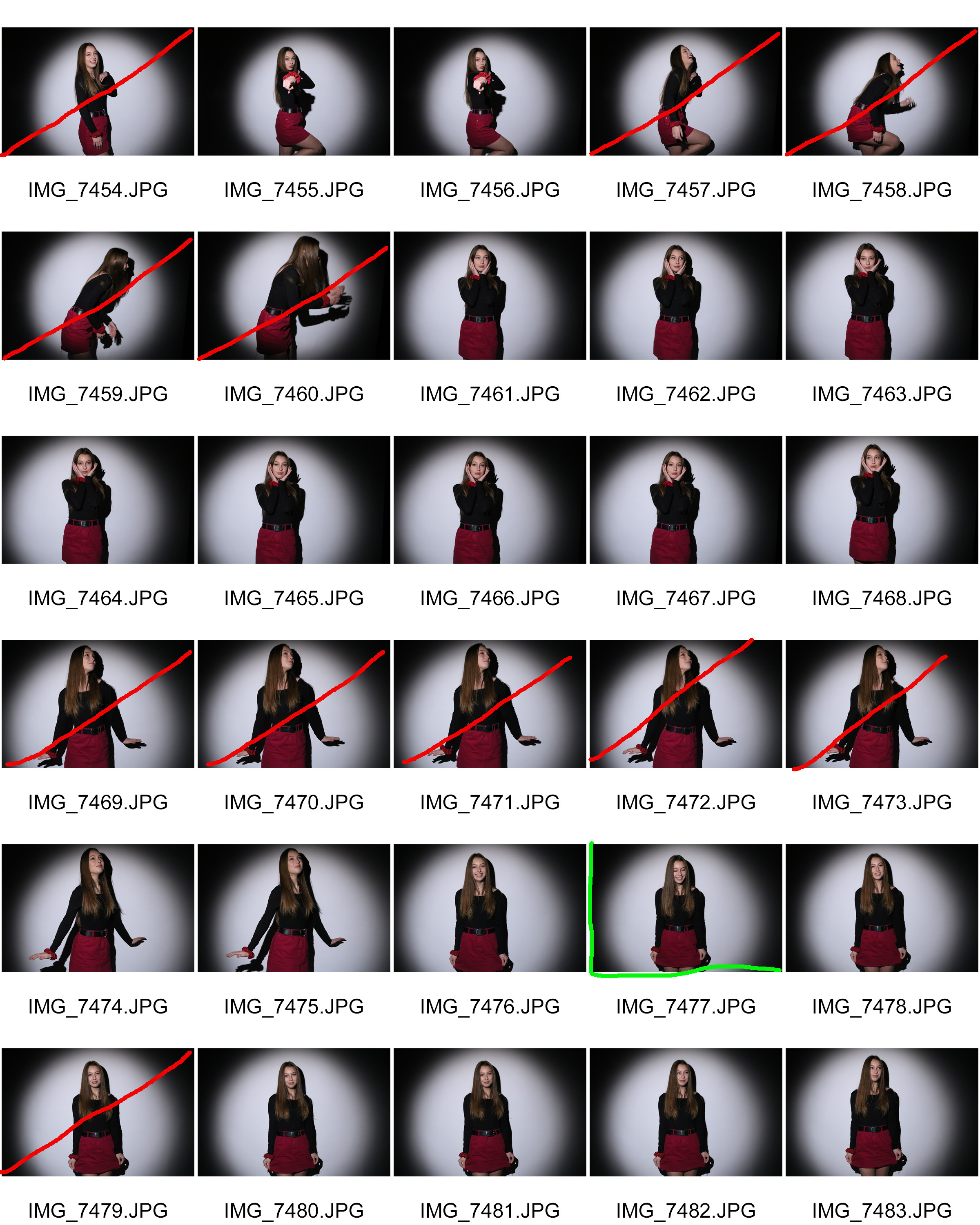
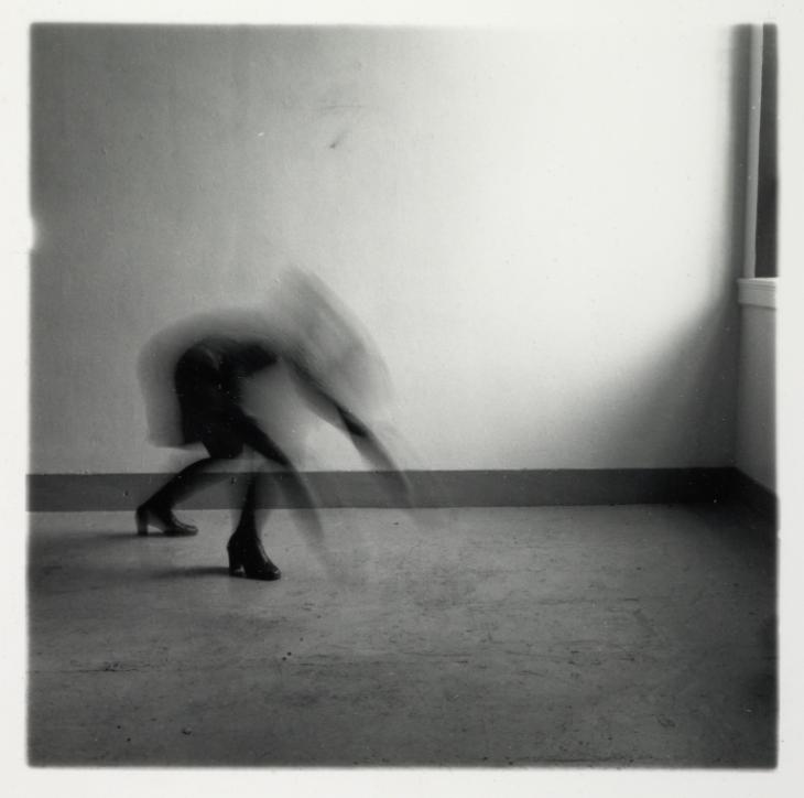
For my next photo  shoot, I’m developing my previous idea further. Still using the same concepts and photographer as inspiration I decided to photograph a model in a different setting. I wanted to go somewhere where I could have an open space, like Woodman did in her work- and also somewhere that had quite a gloomy old feeling so I chose to conduct my photo shoot in a car park, using a wall as my background.  I took the same approach to this photo shoot as I did with my previous one. I made sure to utilise the same type of clothing on my model, and I also wanted the model to use body language in order to express certain concepts and feelings that i felt could be associated with a loss or lack of identity. I also used long exposure combined with a lower ISO in order to achieve the blurry effects in the images you can see below.

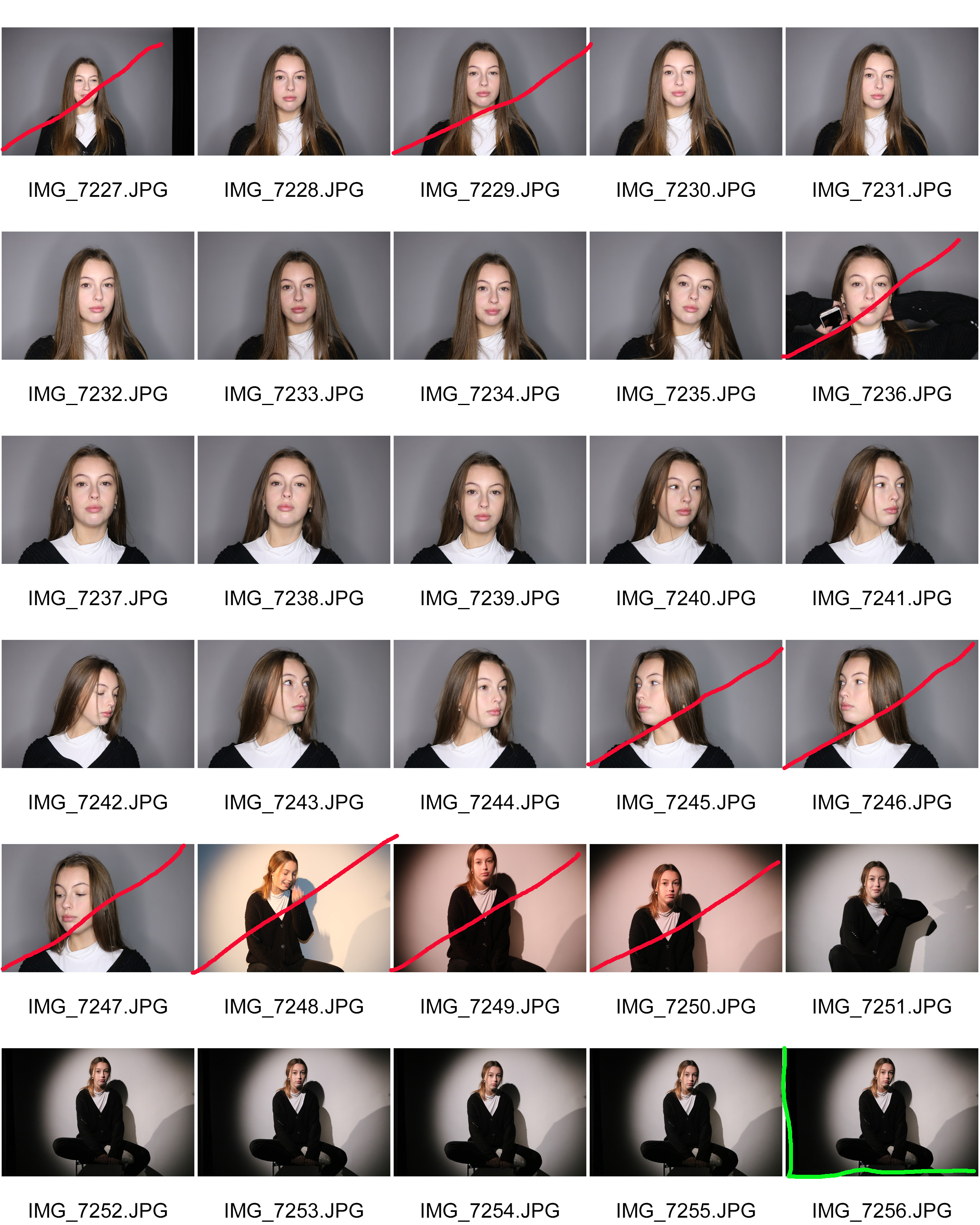
Contact sheets
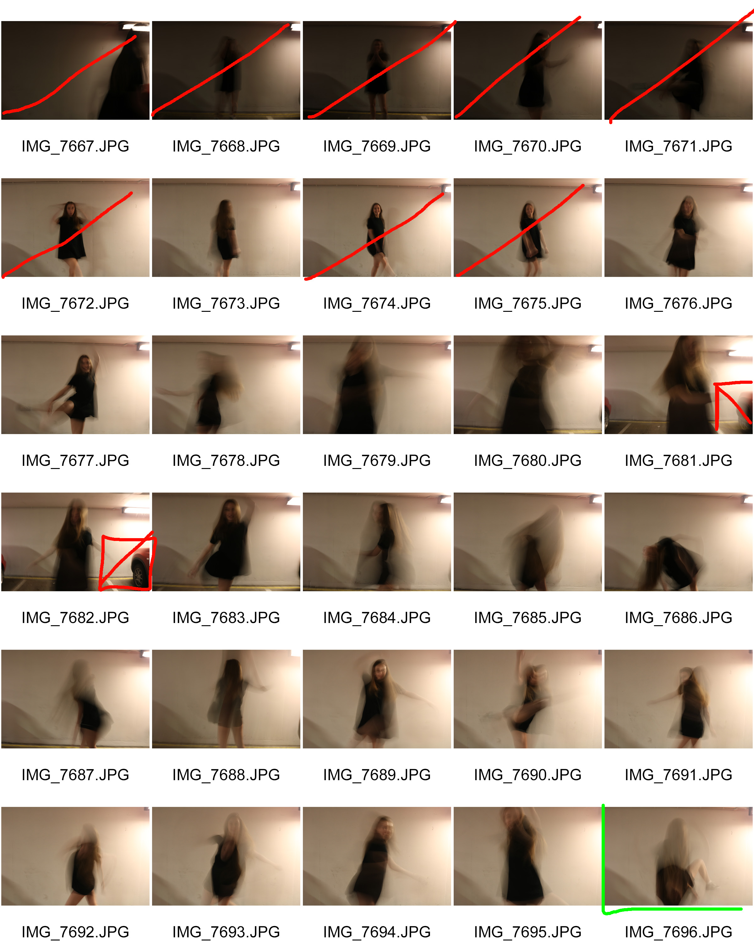
(add 3rd contact sheet)

Best Outcomes
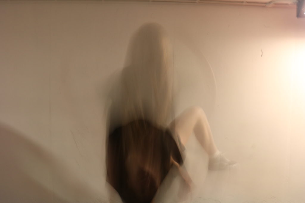
 

Analysing

Technical

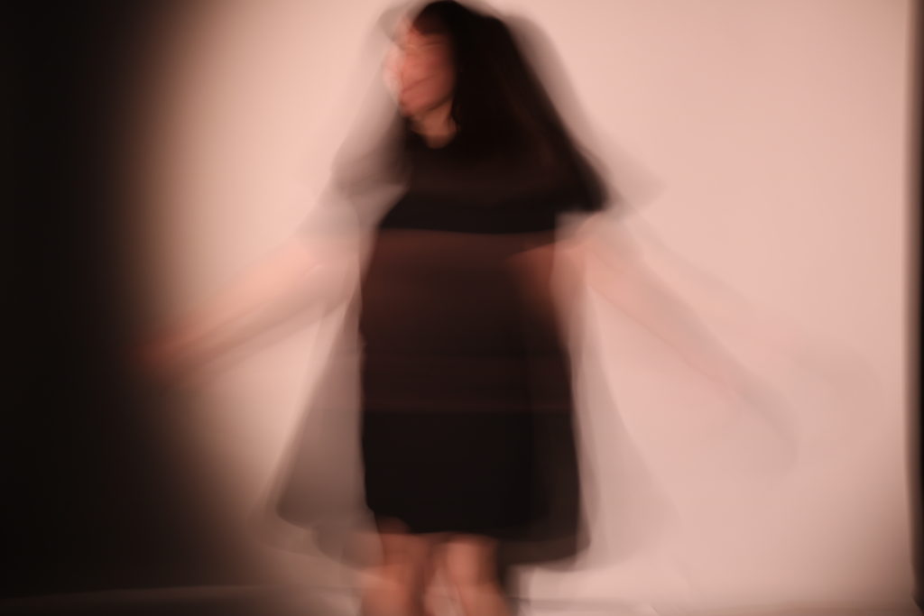
This image was taken using quite a slow shutter speed and a low ISO.

visual

In the photo we see a female figure were black clothing blurrily holding he arms up to hold her face. She appears to be quite sad/mad/distressed as her pose looks like an emotional outburst. The model is surrounded by a large,open, plain space.

conceptual

This image is supposed to portray the feelings that may be associated with loosing or lacking an identity. The female in the image clearly feeling quite distressed. This emotional outburst is something I would consider to be associated with not being sure who you were. The fact that she’s also dressed very plainly and that the image is taken in an open space is also representative of not having an identity, as her clothing and the space that she’s in is very plain and not individualised.

 

Gender/loss of identity- 3rd Photo shoot

For my third photo shoot I wanted to convey the feeling and theme of lack of identity while also exploring gender identity. I will be using Francesca’s work as inspiration for this photo shoot.  For this particular shoot I was inspired by the images below.

Image by Francesca Woodman.

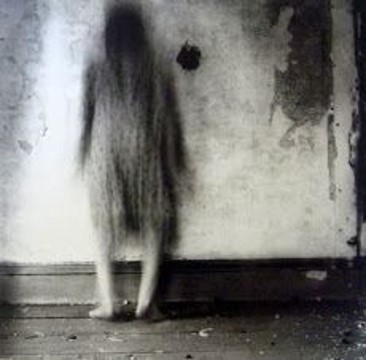
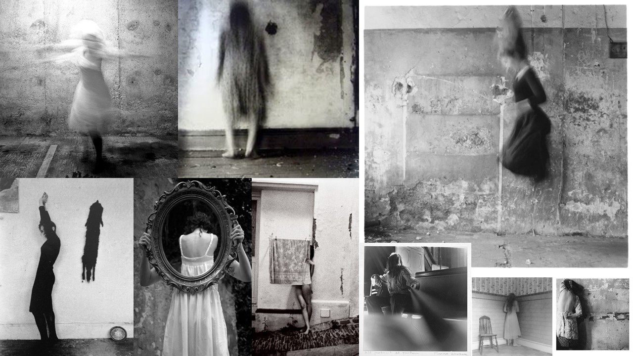
The 3 images above show female figures moving around, while Woodman photographed them using a slow shutter speed. I will be doing the same, as I think its very interesting the way she represents these women questioning their identity by making them appear almost ghost like, and making them almost disappear into the image as they look blurry. I also think its interesting how all their features are blurred as that also symbolises that the women don’t have identities since we cant see anything that makes them look individual. For my photo shoot I will make sure my models are wearing simple dresses, just as the women in the image are wearing, as I think it’s a very successful piece of clothing when using long exposure as it’s loose and will flow meaning that it will help me achieve the effect where it almost looks like the models are blending into their surroundings. I will also be photographing my model in a studio to begin with so that I have a more controlled environment to perfect the long exposure technique. Later I plan on using more interesting settings when I further develop my set of images inspired by Woodman.

Contact sheets

Best Outcomes


Analysing

Technical

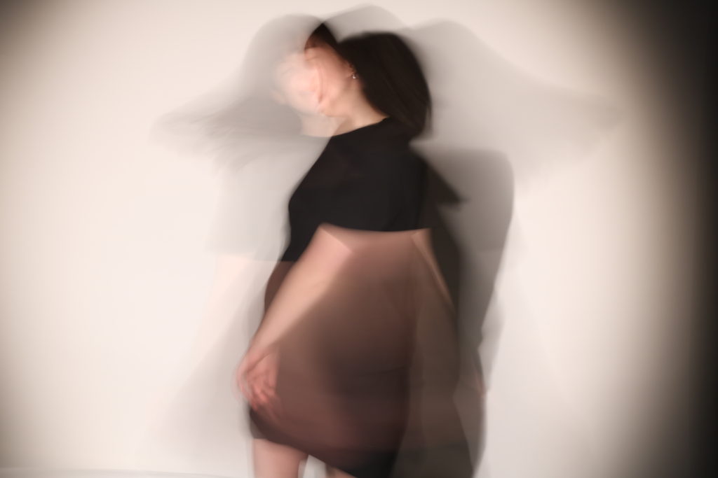
While taking this image I set my camera settings at a slow shutter speed along with a low ISO. I did this because the slow shutter speed meant the exposure time would be very long, so by lowering the ISO the image didn’t turn out overexposed.

Visual

In this image we can see a female figure dressed in a black dress. Due to long exposure it seems as though there are 2 people standing in the same space, but in different positions as she was moving while the image was being taken. In the photo we can see one of the faces smiling, and another face like figure with their face hidden so only the side is visible.

Conceptual

This image is meant to convey a feeling of a lack of identity. I feel as though this has been done quite well. One reason for this is because it looks like the model in the image is there twice, showing a lack of individuality as they both the figures look the same. It also conveys 2 different feelings. As the model was moving and making different facial expressions, we see one version of her face smiling like she’s happy and we see another version where she concealed her face by turning her head, which meant that we could only see her jaw. This could symbolise the emotions that come with feeling like you have a lack of identity as she appears happy but there’s also part of her who may feel as though she was self-conscious to show her face.

Gender identity/loss of identity- Case study

My 2 previous photo shoots showed different portrayals of women being merged together in order to challenge the stereotypical view ingrained into society of what a woman should look like. It became clear that gender identity and the loss of identity were 2 themes that began to overlap while I was exploring gender identity. This is because there is such a typical outlook on genders, that it almost feels like since everyone is viewed the same there is no individuality, which I think would be interesting to explore through lack of identity.For this reason I have decided that I would also try to incorporate the theme of loss of identity into my project, and link it in with gender identity.. An example of a photographer that I though related to both of these themes is Francesca Woodman.

Francesca Woodman

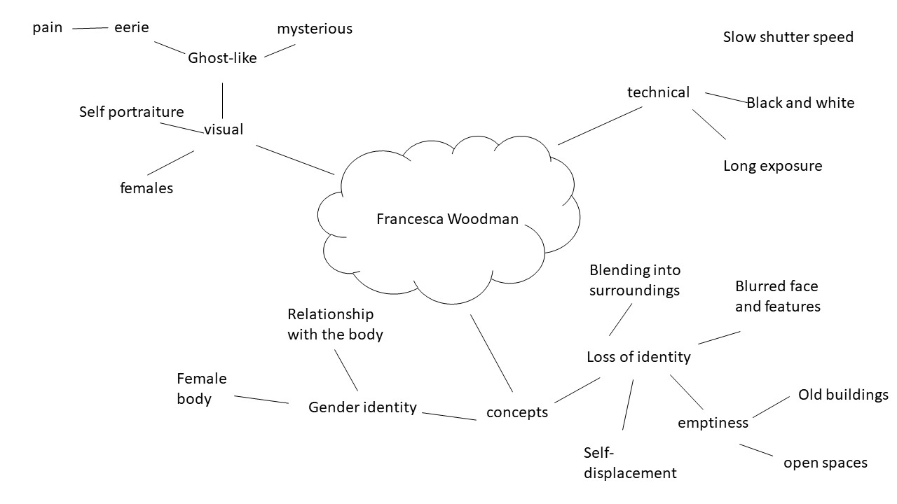
Woodman was a female photographer who produced many  photographs that showed either herself or other female models. A majority of her images show the models all blurred, in almost a ghost-like way, due to her use of long exposure. The models in her images appear to almost be dissolving into their surroundings. Woodman questioned concepts of the self, identity and body image through her-mostly- black and white images that were taken between 1972 and 1981.

Mood Board

All images by Francesca Woodman.

Mind Map

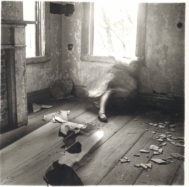
Analysing

Technical

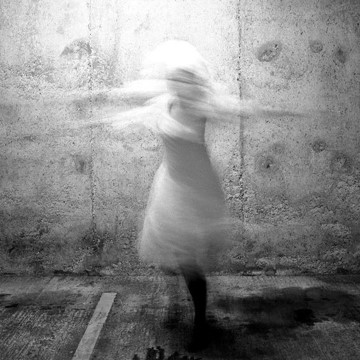
This image is in black and white and seems to have been taken using a slow shutter speed, as the image is blurry as there is quite a high level of brightness in certain parts of the image.

Visual

In this image we see a blurred female figure, wearing a white dress who appears to have been twirling round due to the ghost-like outcome. The surroundings look quite old and unperfect as there are several cracks in the wall.

Conceptual

I think that this is a very powerful image. The fact that the woman is wearing minimal clothing and is lacking accessories conveys the concept of loss of identity. Because she is portrayed very simplistically, it could suggest the lack of the female’s identity. There is also a lot of empty space around the model, which could symbolise emptiness within, and it could also suggest that she feels as if she doesn’t belong since as the slow shutter speed almost makes it look like she’s disappearing from the scene. This could be a way of conveying the model of photographers feelings.


Technical

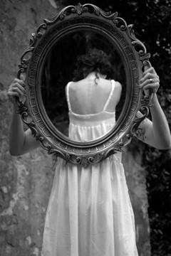
This image is displayed in black and white, and appears to be taken outdoors.

visual

In this image we see a mirror with a women’s back being reflected on it. The mirror seems to be being held by the same figure or another figure who’s dressed the same. The background of the image suggests that it was taken outdoors due to the tree in the background.

conceptual

When I see this image, I think that it conveys a theme of self-displacement. I like how Woodman has utilised a mirror within the image as a mirror is an item usually associated with personality and confidence. However, in this image Woodman has used it to portray the exact opposite as it shows lack of confidence and self-consciousness as we cannot see a face in the mirror. The photographer has also used very minimal and simplistic clothing on the model which also shows self-displacement as it’s simple and conveys no identity.

Gender Identity- editing

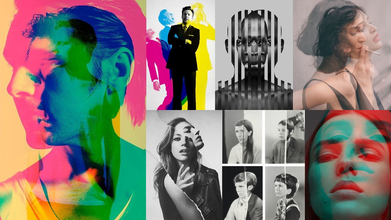
In this post I will be referring back to this mood board:

Not my images.

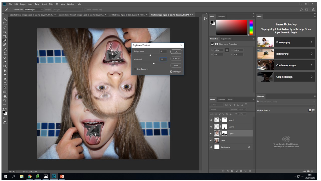
Now that I have my 2 contrasting set of images completed I’m now going on to editing them using the mood board above as inspiration. The reasoning behind editing my images like this is so that it is clear to viewers that that one image will be a stereotypical representation, and the other will be a different version challenging the view. Conceptually, I’m hoping to show that there is more than one possible way for someone to look, as people feel differently and represent themselves in different ways, giving them different variations of identity.

Editing

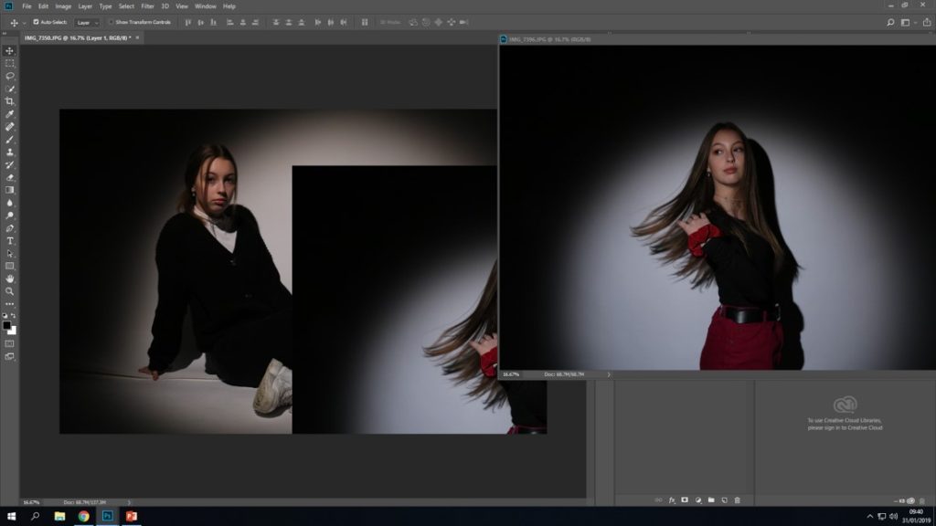
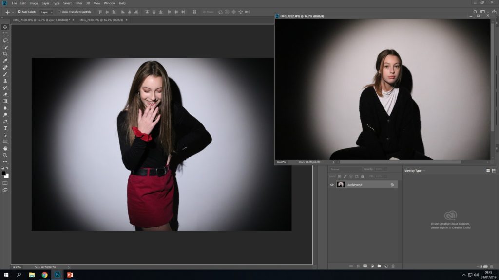
Firstly, I opened up an image from each photo shoot and I dragged one on top of the other.
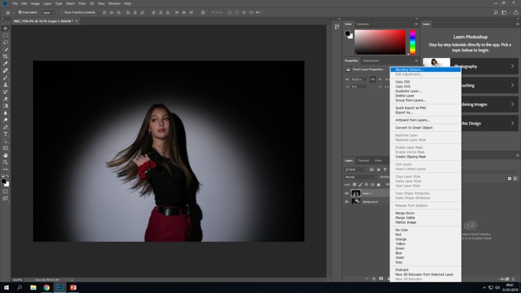
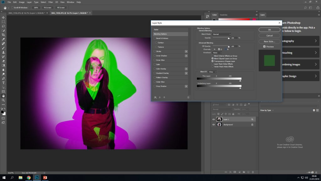
Next, I made sure that I positioned the image correctly over the original background. I then pressed on the newest layer, and clicked FX at the bottom of layer box and pressed “blending options”
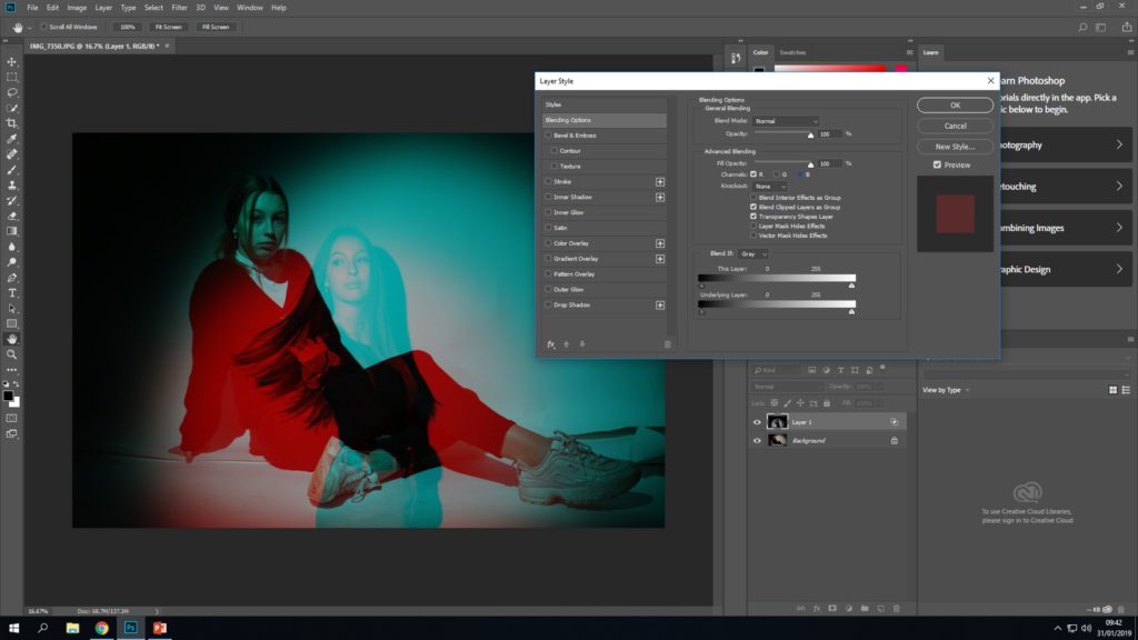
After that a box comes up allowing you to edit the layer style. I went to the “advanced blending” section in the middle and I un-clicked the “G” and “B” box in order to achieve this blending effect.

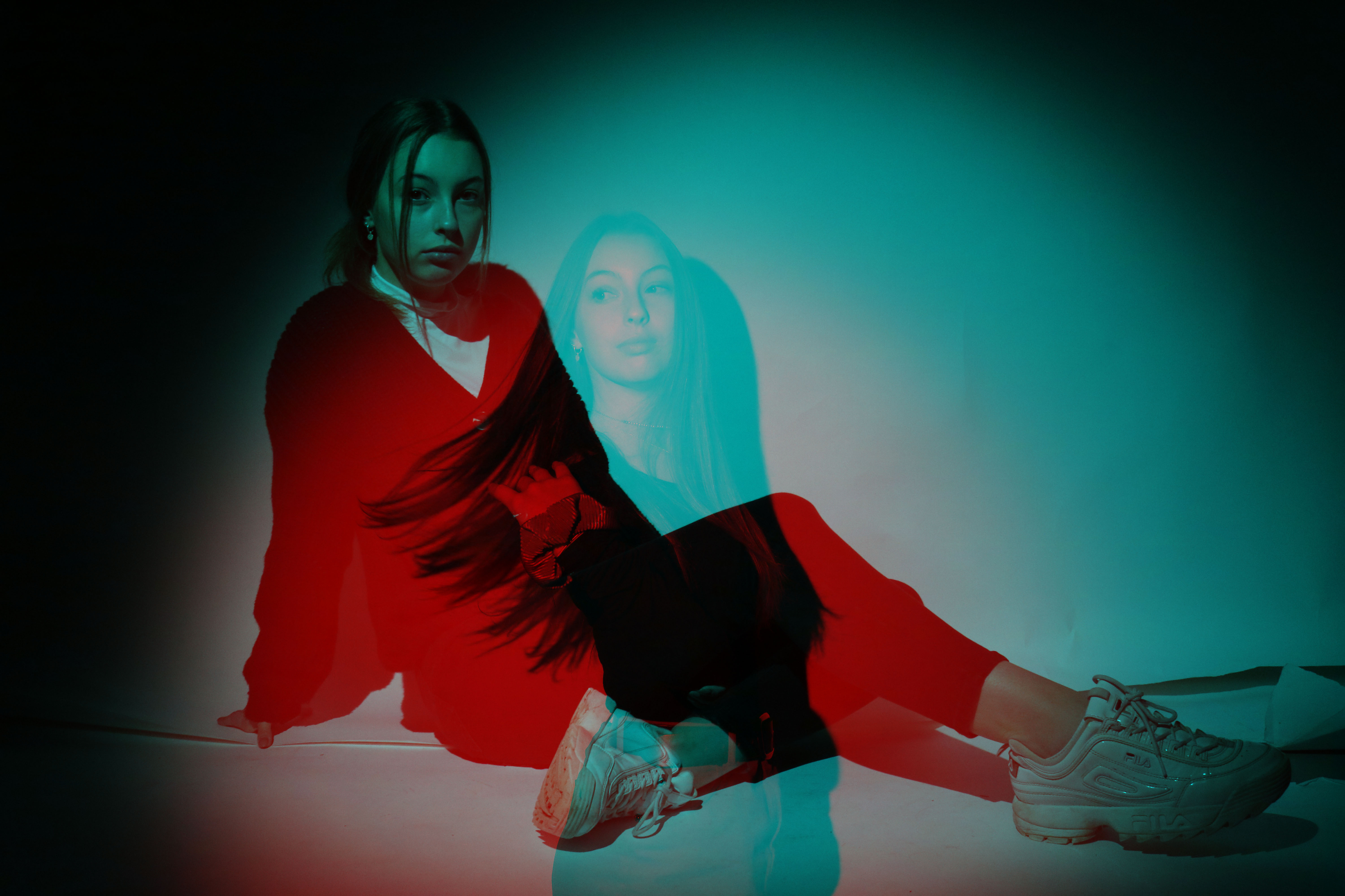
Initial final outcome

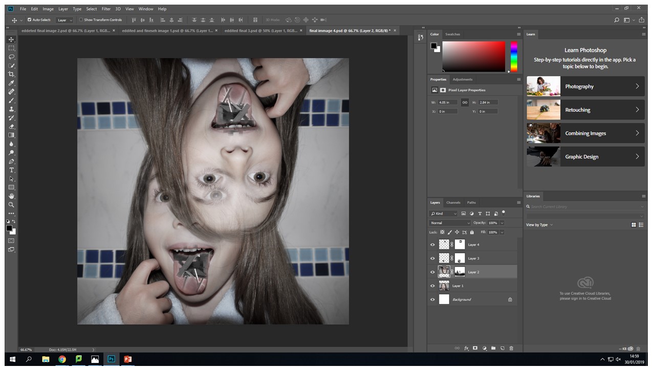
This is the outcome that I got from the above process. I think that this outcome was quite successful because we’re able to see both of the contrasting images through each other, and its clearly noticeable that one image symbolises a more feminine identity and the other shows an opposite variation. By having both images displayed directly on top of each other its a lot easier to be able to notice all of the contrasts in the model’s appearance, meaning that the image is more successful at getting its meaning across


I then went to on to take the same approach as I did above but instead I used 2 different images from both the photo shoots. In the screenshot you can see both of the images that I chose to edit together
After I had layered the image on top of the original background I then clicked the “FX” button at the bottom of the layers box, but instead I un-clicked the “R” and “B” to see how it would compare with my previous edit.

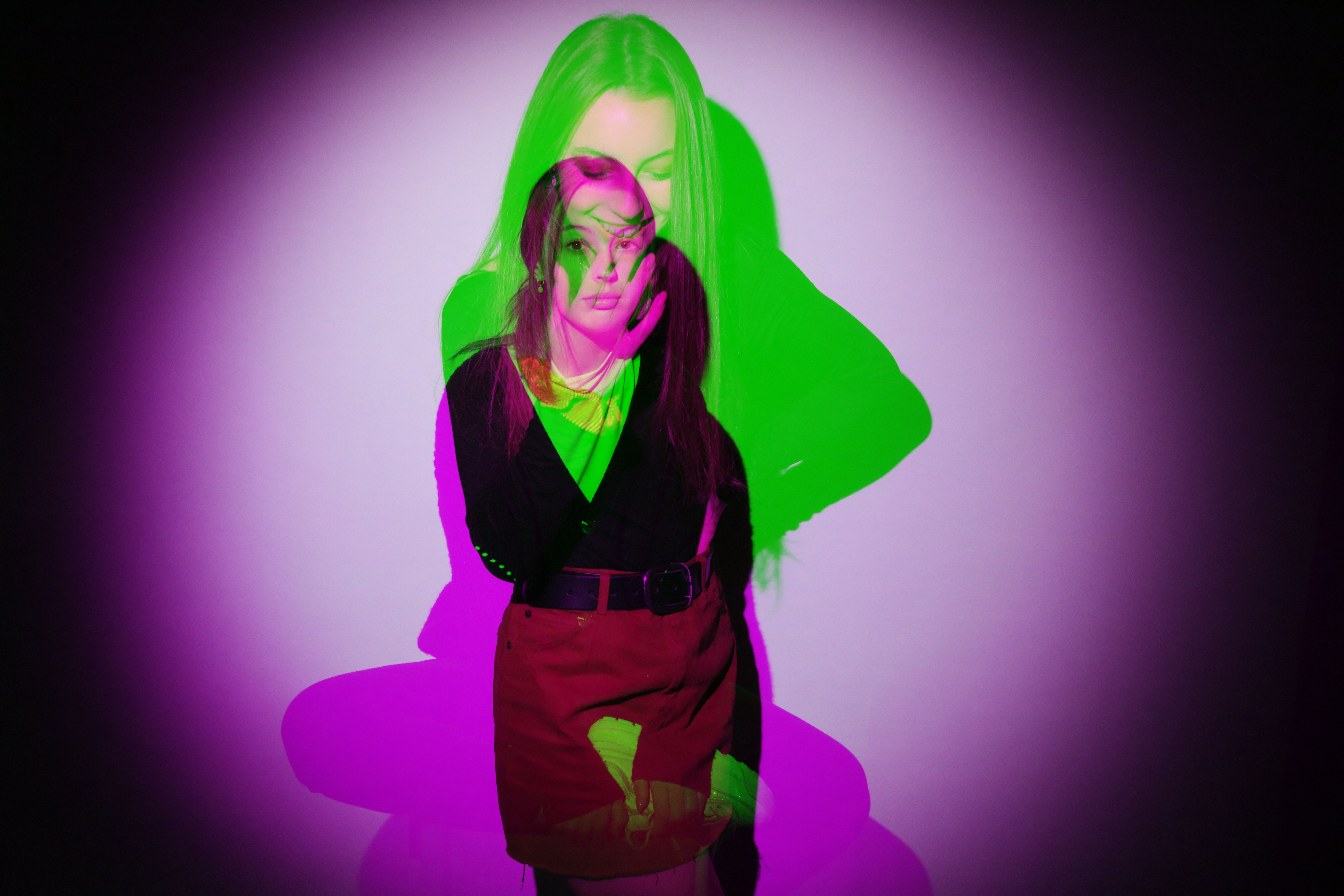
Initial final outcome

This is the final outcome from editing my 2 images together the second time. Like the last outcome, we are able to see the model on both of the images. I think that this outcome is also able to get the concept of differing identities within the same gender, because we see the same model presenting herself in two different way directly over each other which makes it a lot easier to be able to spot all the contrasts.


Comparing my outcomes

I think that both of my outcomes using layering, both show the differing appearance of the model quite effectively. However, I think that my 1st outcome (image right above this text) is the most successful one. I think this because with the other outcome we’re not clearly able to see the model’s whole body due to them being directly over each other. I think that being able to see how the model has positioned her body is very important in showing her identity as the way someone uses body langue says a lot about how they see themselves, meaning its their identity.


Final outcome overall


Editing

Next I will be using a technique where I create a pattern on Photoshop and use it as an overlay for another image.

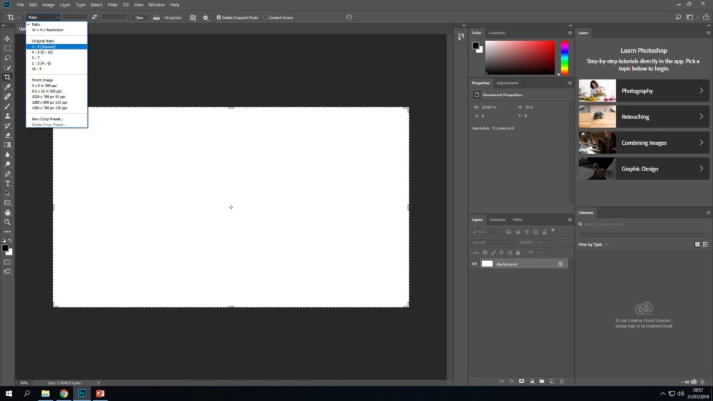
Firstly, I opened up a new document and cropped it to the ratio 1:1 which is square.


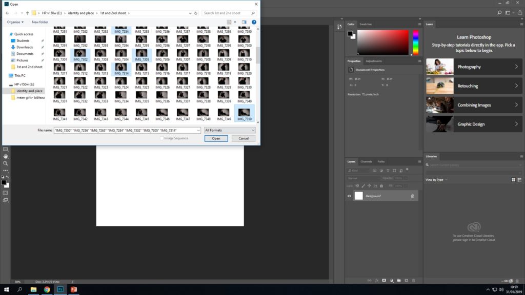
I then opened up some of my best potential images so I could choose the best 4.


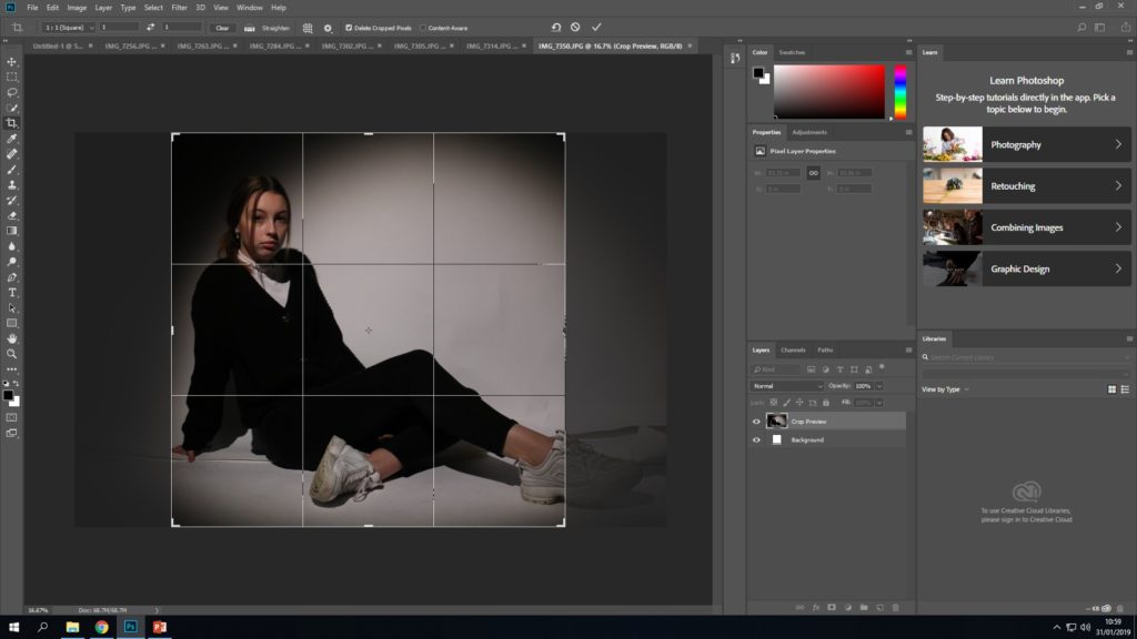
I then cropped the best 4 images in a 1:1 ratio (square)


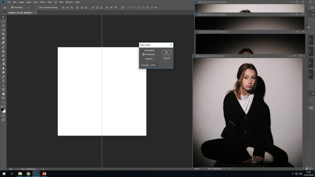
I then put a guide line at 50% in a vertical and a horizontal direction to split the blank document into quarters that could fit the 4 images in.


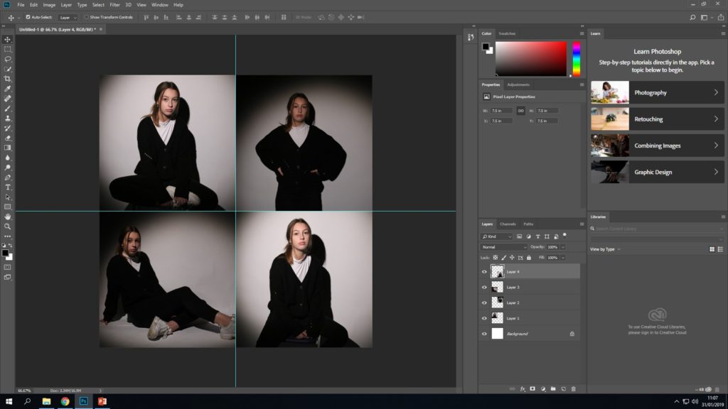
Next, I dragged all the images one by one and made them fir in to their individual segments using the guides.


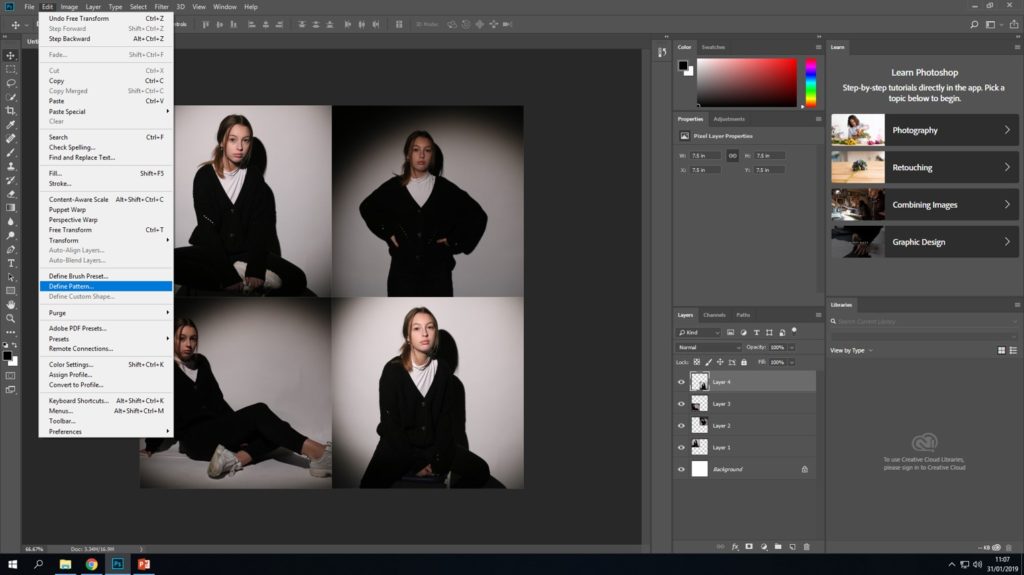
After, I pressed “edit” and “define pattern”


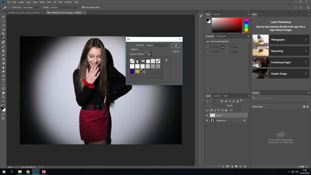
I then opened up another image from the other photo shoot and went to “edit” then “fill” and filled the new layer with the pattern.


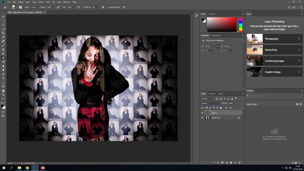
Lastly, I made the layer containing the pattern an overlay so the background was also visible.


Final outcome

Overall I’m very happy with my final outcome. In the image we can see the “feminine female” image being made up of lots of smaller versions of the same model from the contrasting shoot. This outcome is another way of showing how the way a gender represents themselves can vary.


Final 2 images


Gender identity- 2nd photoshoot

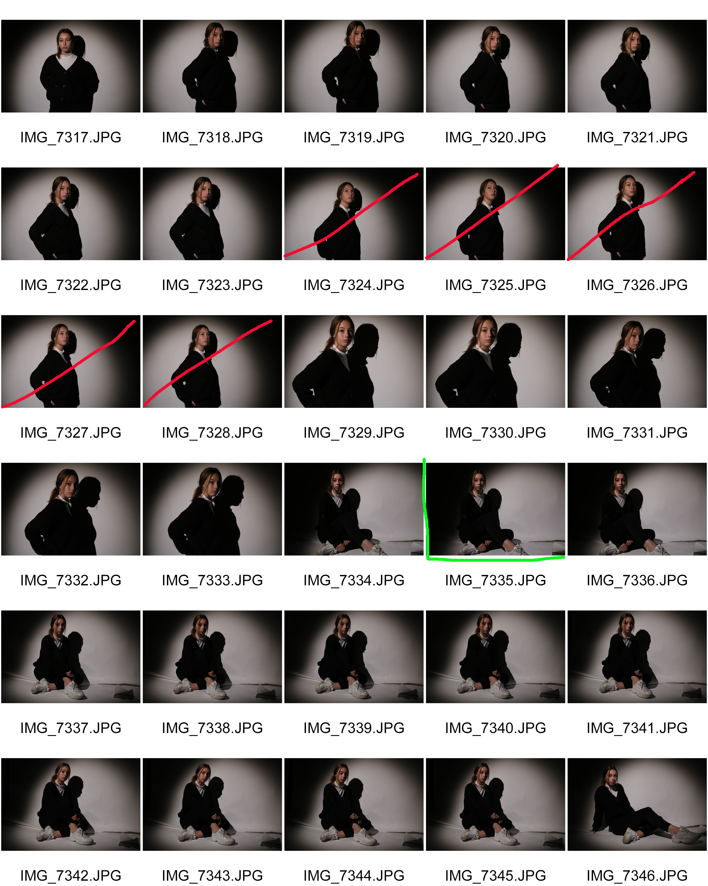
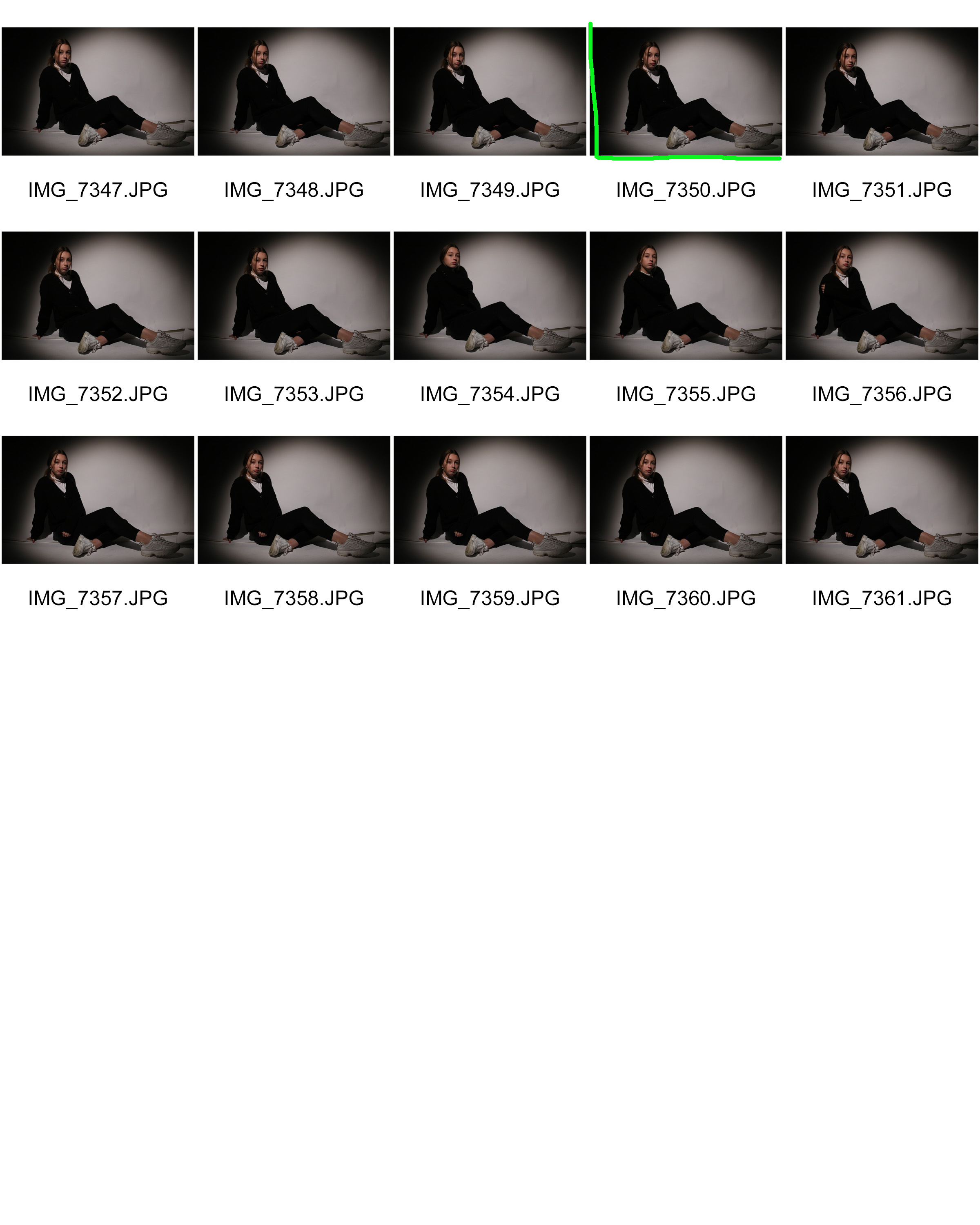
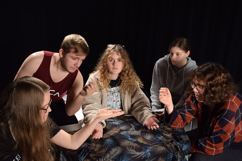
For my 2nd photo shoot I wanted to something that contrasted with the 1st. I wanted this to represent a more masculine female identity. So for this I will have my model pose in a less feminine way. In contrast to the 1st I will not have my model wearing any sort of feminine clothing (skirt), or makeup. Instead I will have her wear trousers and  baggy cardigan as it’s plain clothing that isn’t usually associated with typical females in the media.


Contact sheets

Best outcomes


Analysing

 Technical

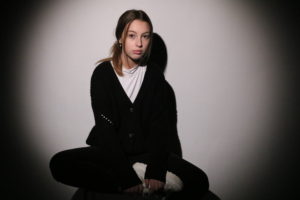
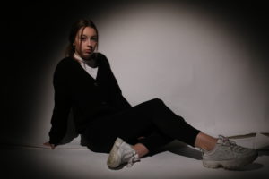
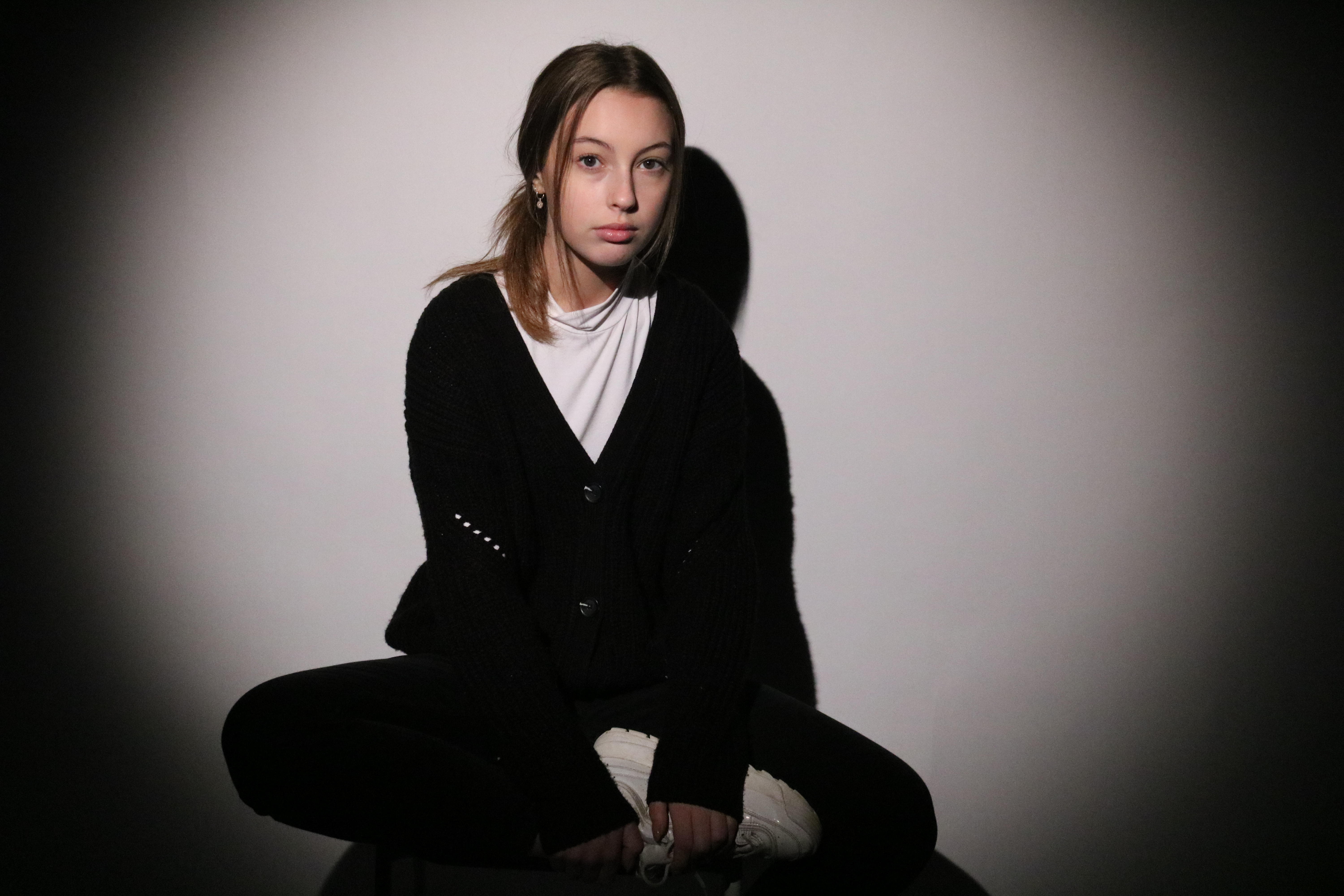
In this image the model is positioned in the centre of the spotlight in front of a white back drop.

Visual

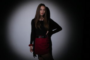
In this image we see the same model from the previous photo shoot. This time she is dressed in black jeans, a black cardigan and white trainers. She’s sat on a stool with her left leg hanging off, and her left leg folded inwards. Her back is also slightly slouched so her arms can support her leg.

Conceptual

I think that this photo is quite effective in showing that there are variations of what people see as the “typical women”. In this image the model is wearing a lot of black, which typically isn’t a colour associated with femininity. The model is also posed in way that could be typically associated with “masculinity” as she is slightly slouching. Her long hair is also tied back  to make it less obvious, as long hair can often be associated with femininity.


Technical

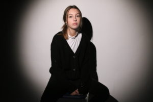
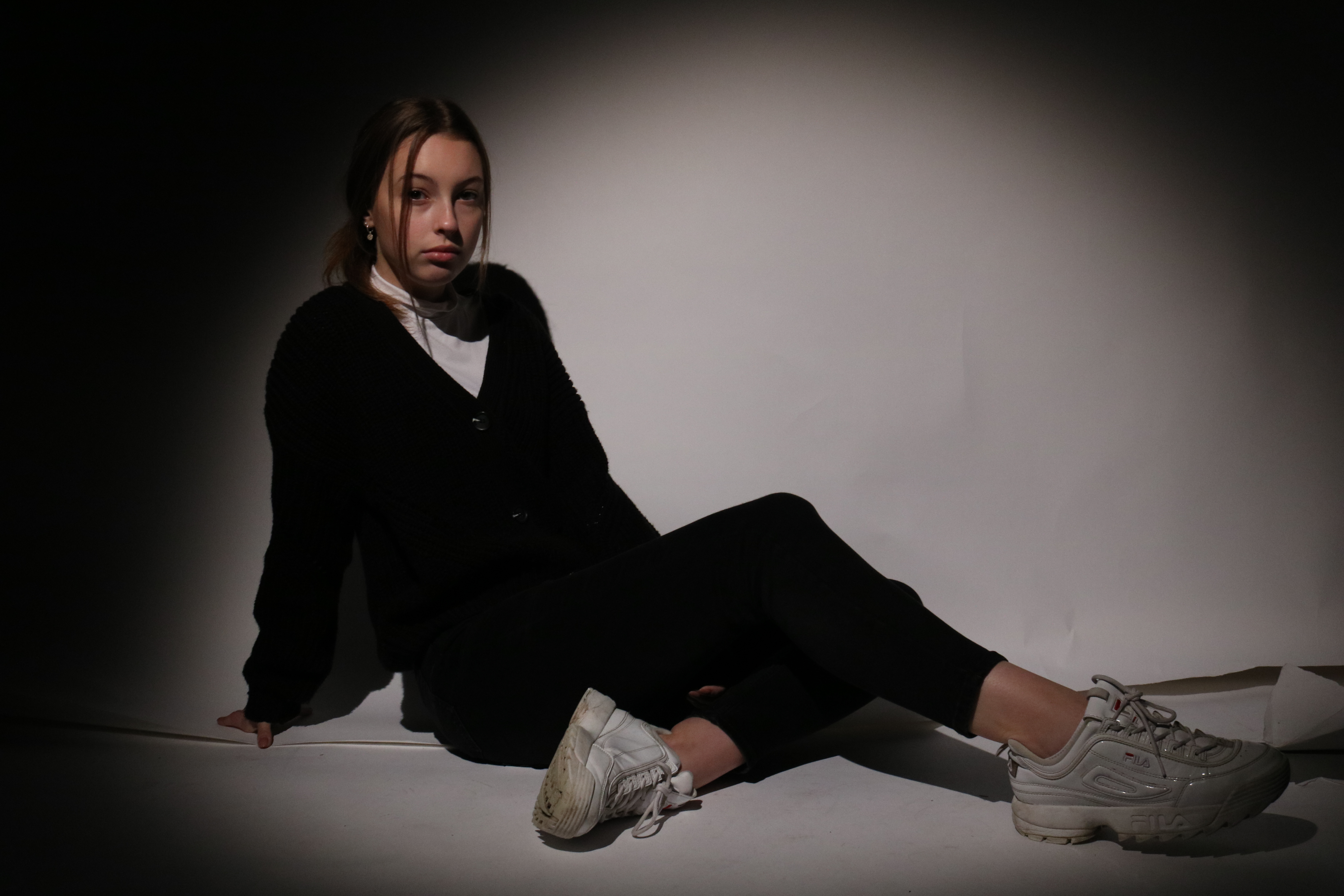
In this image, the model is situated in the studio with a spot light positioned in front of her.

Visual

In the photo, we can see a female model wearing an over sized black cardigan, black jeans, a white top and white trainers. She is posed sitting on the ground with both her hands outstretched behind her.

Conceptual

This image, similar to the one above is effective in showing an opposite view to stereotypical dressed up females in the media. Here, the model is wearing dark and less feminine clothing. I especially like how in this image her posing is quite relaxed, as this is not normally seen in the media, such as magazine covers.


Gender identity- 1st photo shoot

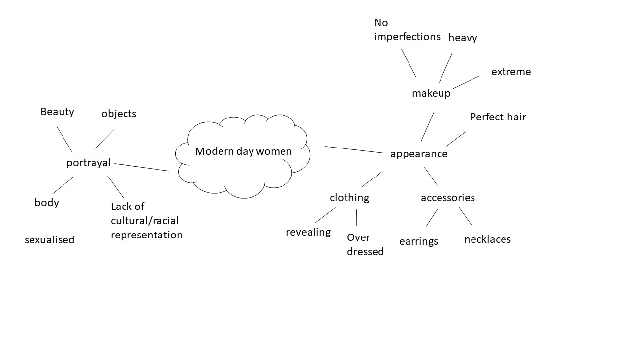
For my first photo shoot I will be photographing the individual as how the “modern day women”. I will be using how women are portrayed in the modern day media as inspiration. Below is my mood board and mind map and planning, in order for me to achieve the stereotypical vision in my images.I plan to have my model dressed up in typical “feminine clothing”, something like a dress or a skirt.

Mood board

Not my images.

Mind Map

Contact sheet

Successful outcomes


Editing

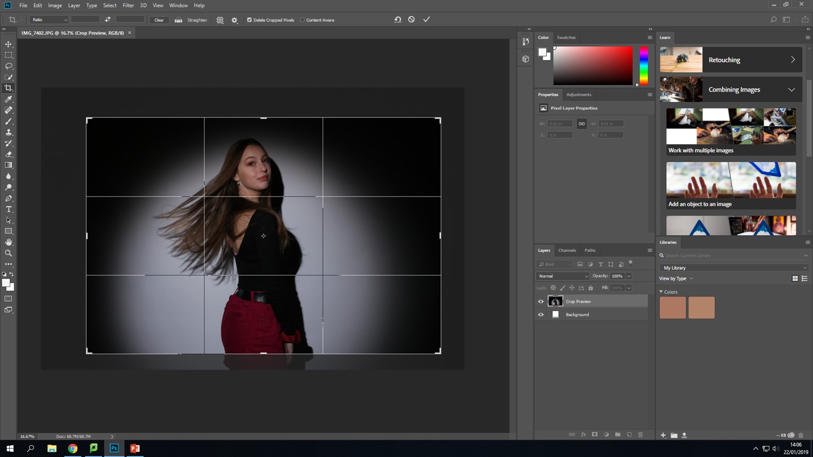
Firstly, I simply cropped the picture to get rid of some of the background
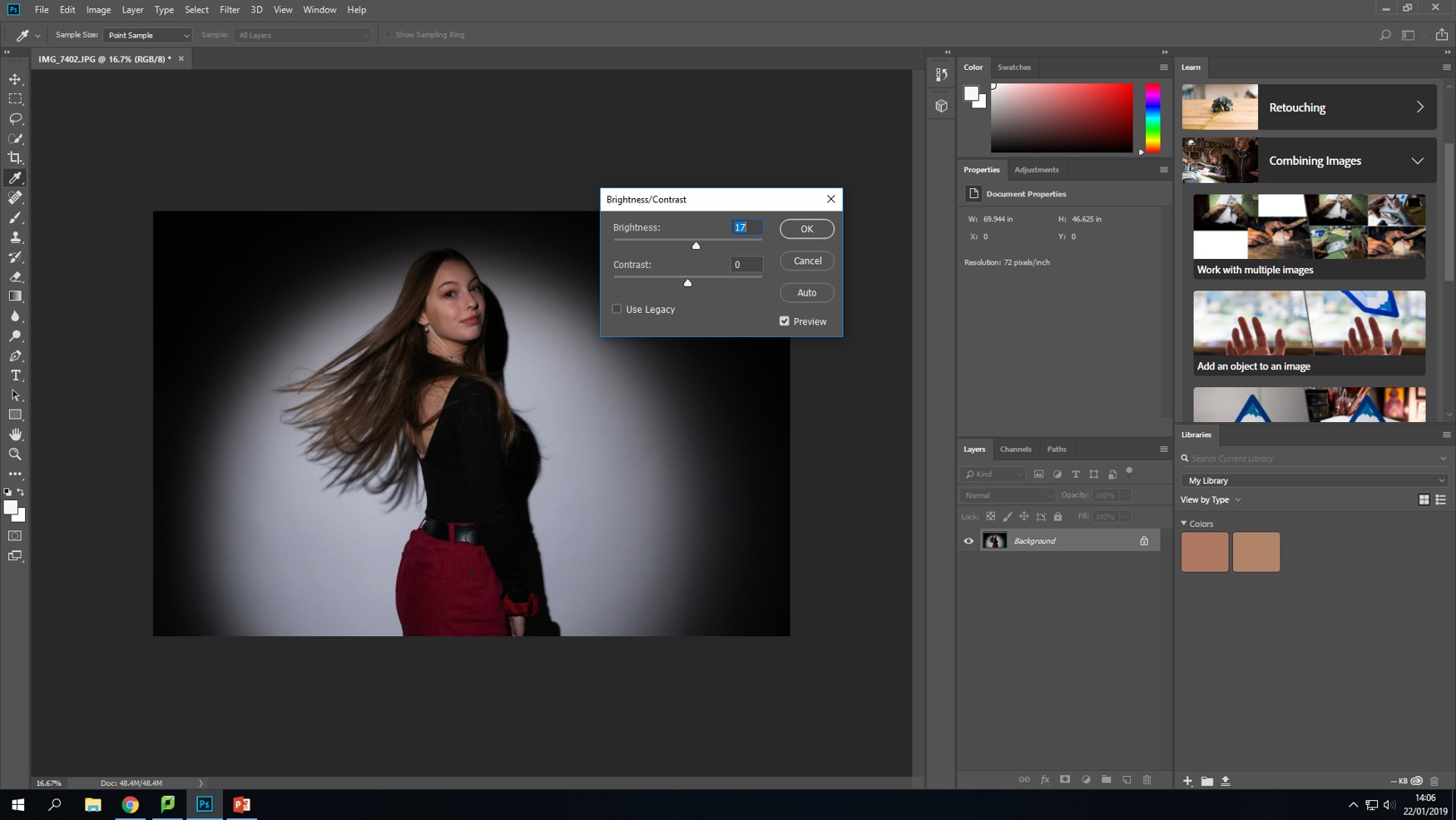
Next, I turned up the brightness as I thought that the image was a bit too dark.
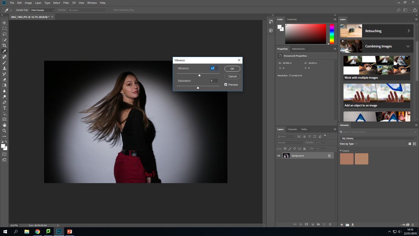
Lastly, I turned up the vibrance as I wanted the colors to stand out more-especially the pink.

Final edited photo.

Analysing

Technical

This image was taken in a studio with a white background and a spotlight placed in front of my model.

Visual

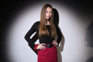
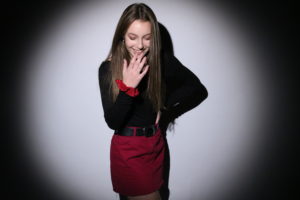
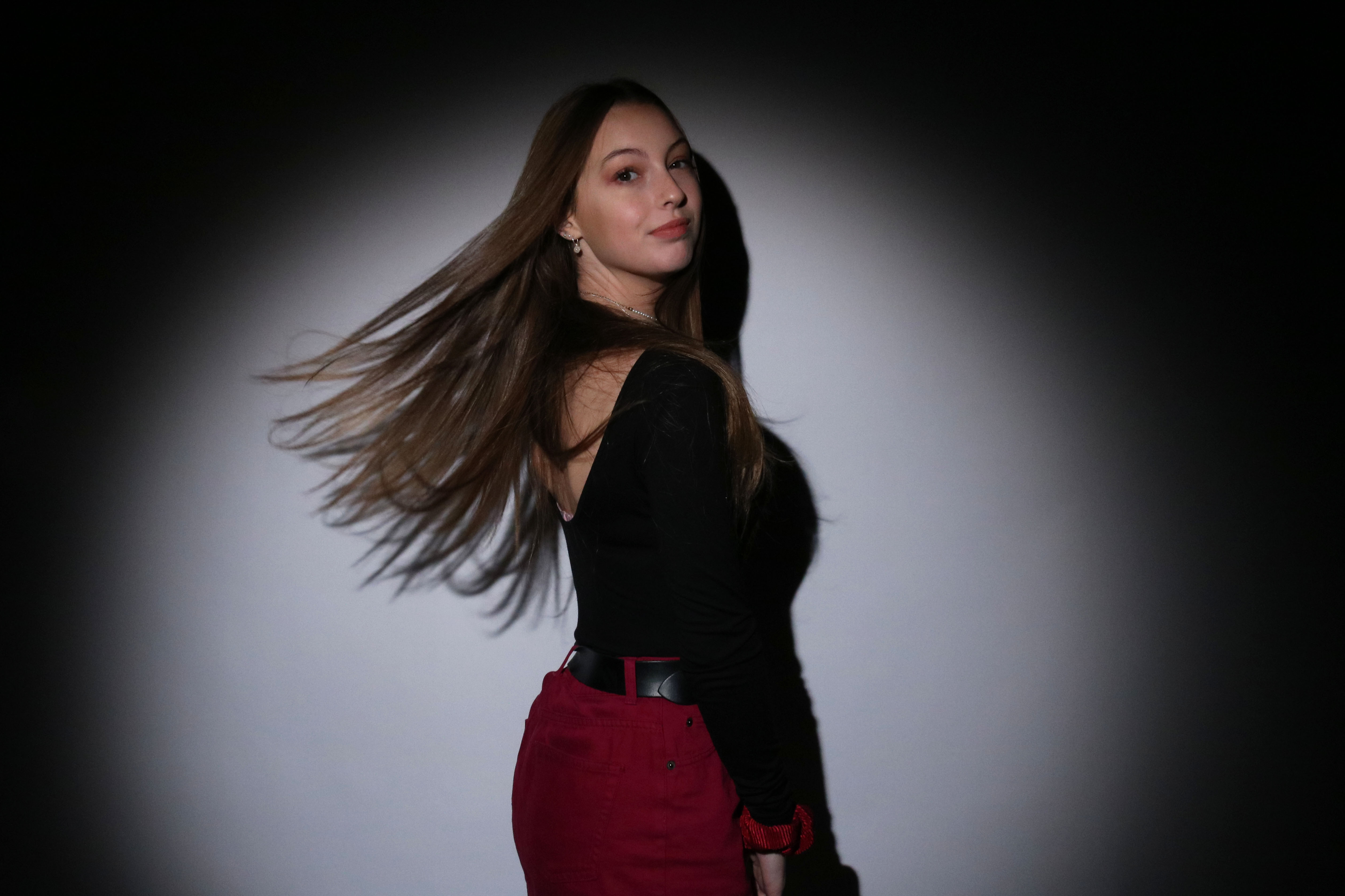
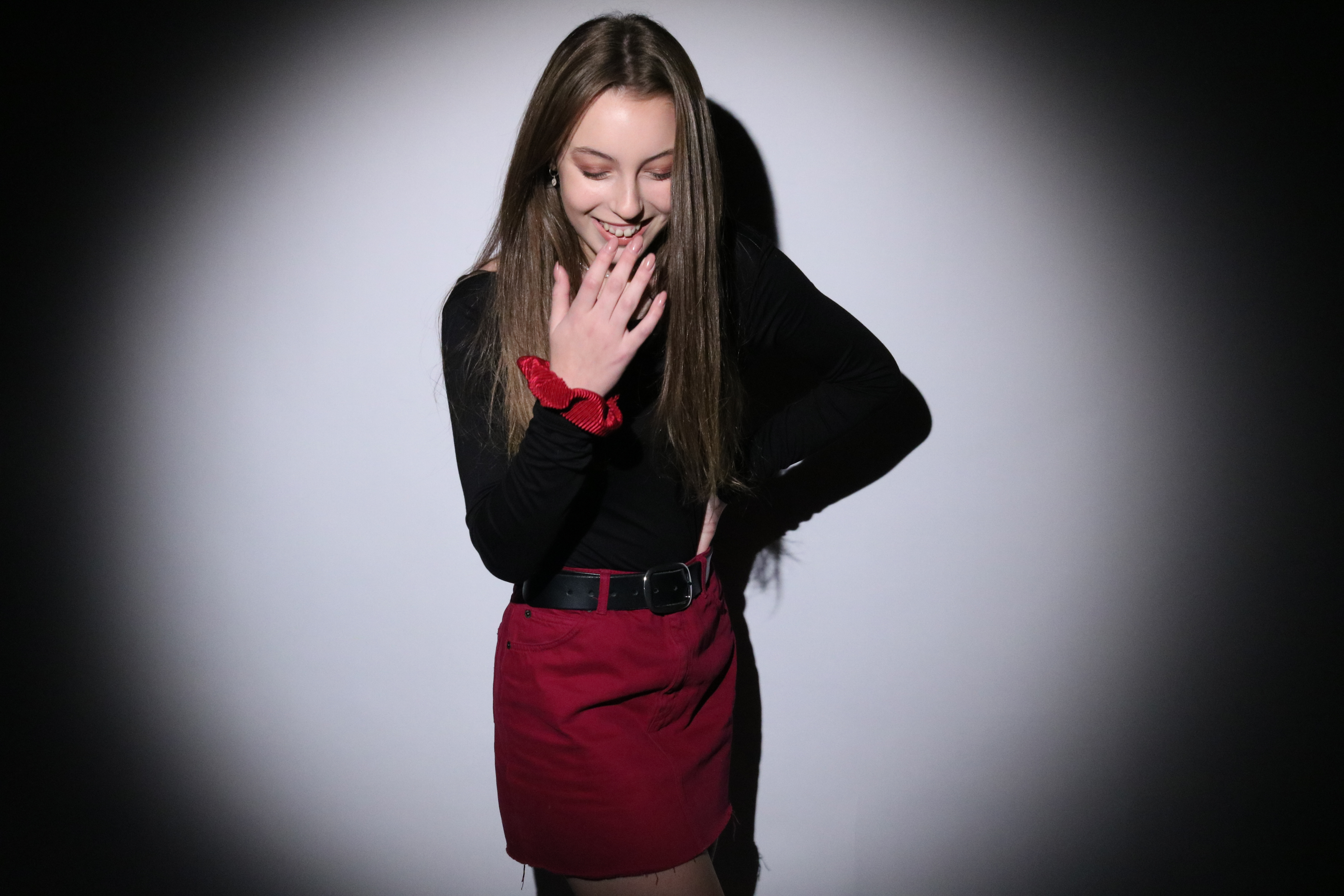
In this image we see a female posed in the centre of a spotlight. She is wearing a black top and also a pink skirt. She is posing with her left hand rested on her hip, and her right hand is held up to her face as she laughs.

Concept

I wanted this photo shoot to represent a very typical type of feminine woman. By having the model wear a pink skirt- and matching scrunchie on her wrist- I think this is conveyed as pink could be considered a stereotypical colour associated with women. The choice of a skirt was also intentional as it is a clothing item traditionally worn by females. The pose is also helpful in conveying a “feminine” vibe as the hand on the hip can be seen as a typical female pose, and the hand near the mouth while she’s laughing can make the model seem quite delicate, which is also a stereotypical feminine trait.


Technical

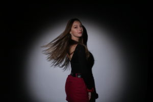
This photo was taken in the studio with a spotlight.

Visual

This image shows a female with her body sideways to the camera, and with her face looking directly into the lens. Her hands are neatly by her side and her hair has been flipped back, and the photo shows it moving in mid air as its pushed backwards.

Concept

Similar to the last image, this photo conveys stereotypical feminine traits. As I’ve mentioned previously, I used the colour pink, to represent femininity, as it is typically a colour associated with females. However, whats different with this image is that the model is posing with another “feminine pose”, as it is one where her long hair attracts a lot of attention. I think this pose is effective in showing typical femininity as long hair is a stereotypical image that can be associated with girls.

Gender identity- 1st and 2nd photo shoot plan

For this photo shoot, I was inspired by Sarah Maple’s work to create outcome challenging society’s view of modern day women, as they’re portrayed in the media. In order to do this I wanted to do 2 separate photo shoots, one where I photograph a female who I would consider to represent the “stereotypical women”, and another photo shoot with the same individual where their appearance has been altered in different ways so that they would now represent a different variation of the gender. After the two photo shoots are completed, I will experiment with different ways of displaying the images in such a way, where they conceptually contrast each other. Below is a mood board of inspiration, on how I could display my images.

Mood board

Not my images.


Displaying Final Outcomes

Displaying Final Outcomes

Order

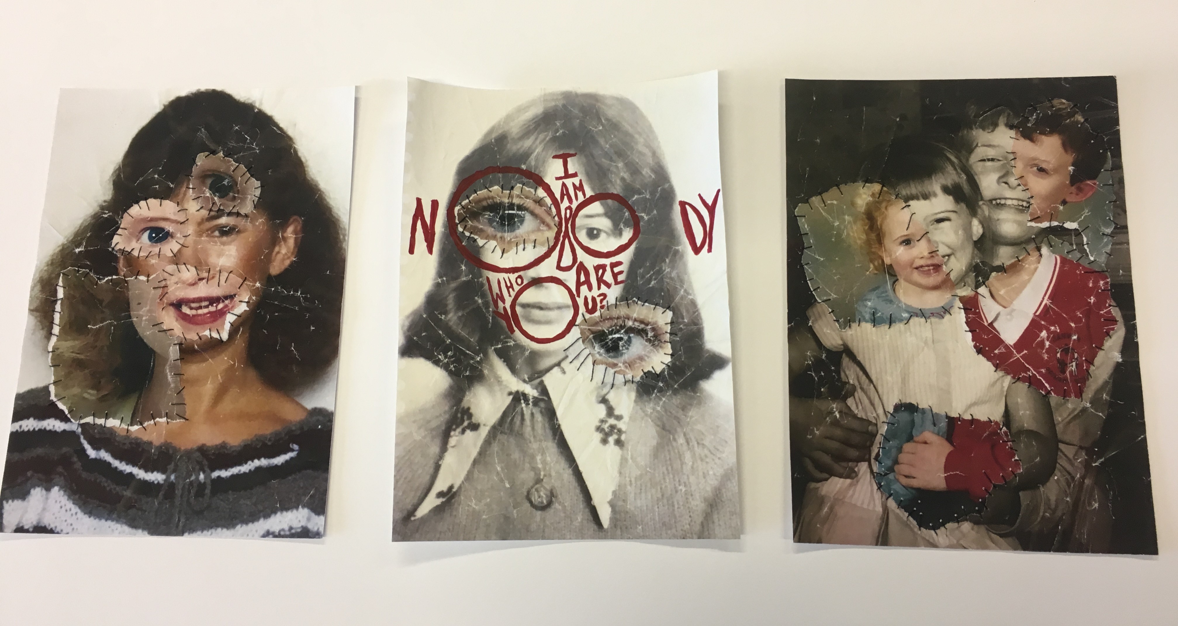
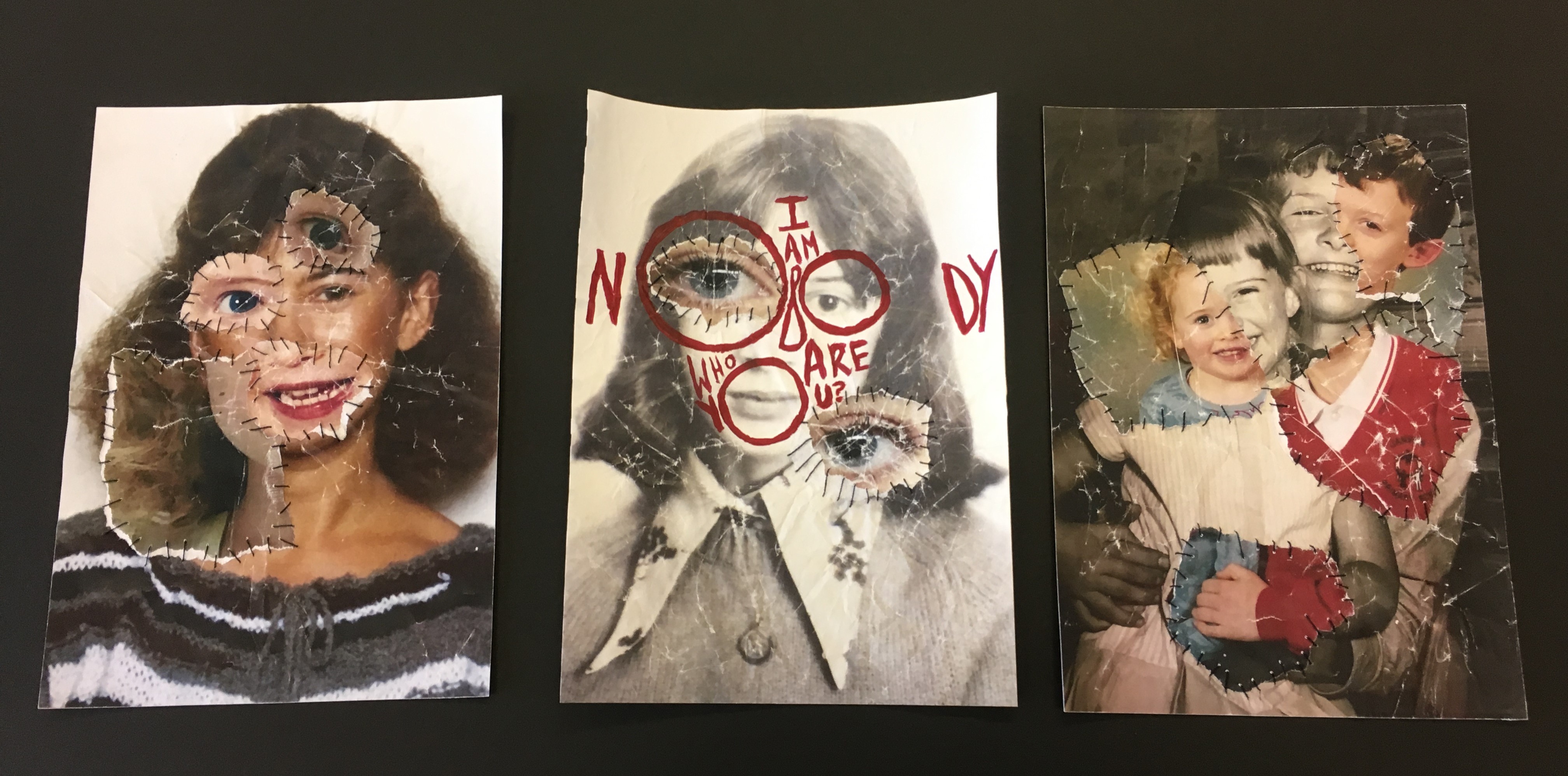
To display the photo-montages which I have made for my final outcome for the Identity and Place stimulus, I have decided to display them in a trio. Starting with the middle photo-montage, I placed this one there because it has bright red text on it which made it stand out more and it was the only one with text on it, I also wanted peoples eyes to be drawn to the center so they can read the text and see what it’s all about. I was originally going to put the two portraits at each end of the display because they were similar, however I changed my mind.

The Finished Display

Background 

I was also originally going to have a window mount in either black or white, however some things went wrong and then I decided to go without one and just mount them on a thin piece black card, which solely went around the edges, and then place them on white mount card afterwards. Below you can see that I was trying to figure out to use either black or white as the background colour, eventually I went with white because I thought black would be too dark and a bit distracting from the photo-montages.

Final Images Colour Experimentation

Image Colour Changes and Experimentation 

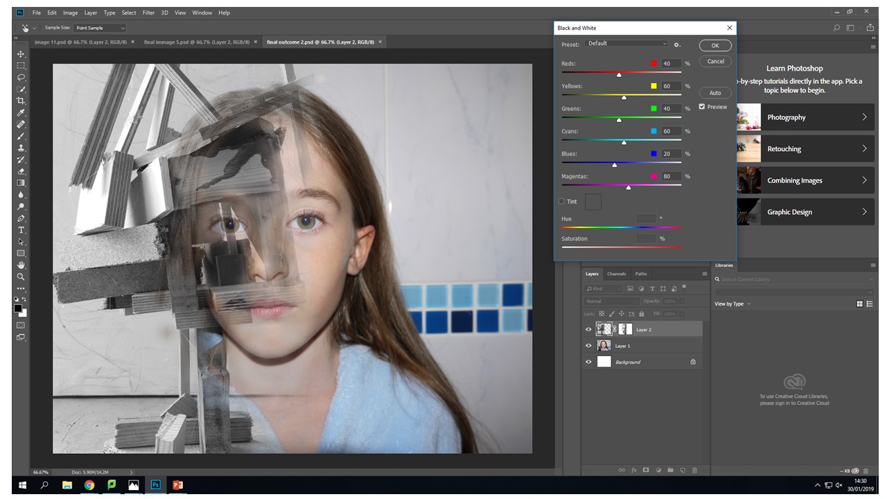
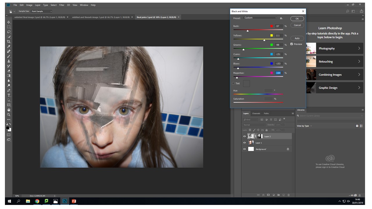
I wanted to initially change all of the images to black and white . Then I realised i could change individual layers to black and white, I thought this gave the images a new range of depth and visual interest.  I selected the individual layer that I wanted to edit - Then I went to image - adjustments - black and white- then moved the colour sliders up and down until I got my desired outcome, which was a light grey back ground with the wood being darker and being lighter in the lighter parts to create more of a contrast.


I also tried doing it the other way around with the same image. The exact same process on a different layer. I decided that i didn't like this image as much as the other one it just didn't look right to me. The contrast of the brown wood on stark grey background looks underwhelming. They look like two purposefully different images when they are actually meant to blend and flow together. These images together in this colour pallet just creative unwanted visual noise which confuses the audience because they are just drawn to the contrast of the colours not the actual image itself. 
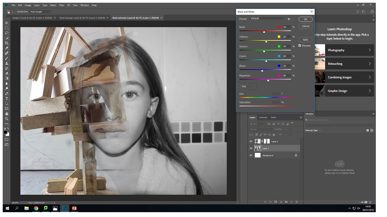


In this image i am moving around the colour settings so that there is more contrast between the light and dark of the wood in this image. In the first image they were just set to the factory black and white settings so i changes them to have my desired out come. I fell like it makes the image look more interesting and the left eye blends effortlessly into the wood because the pupil of the eye is the same tonal colour pallet range. 
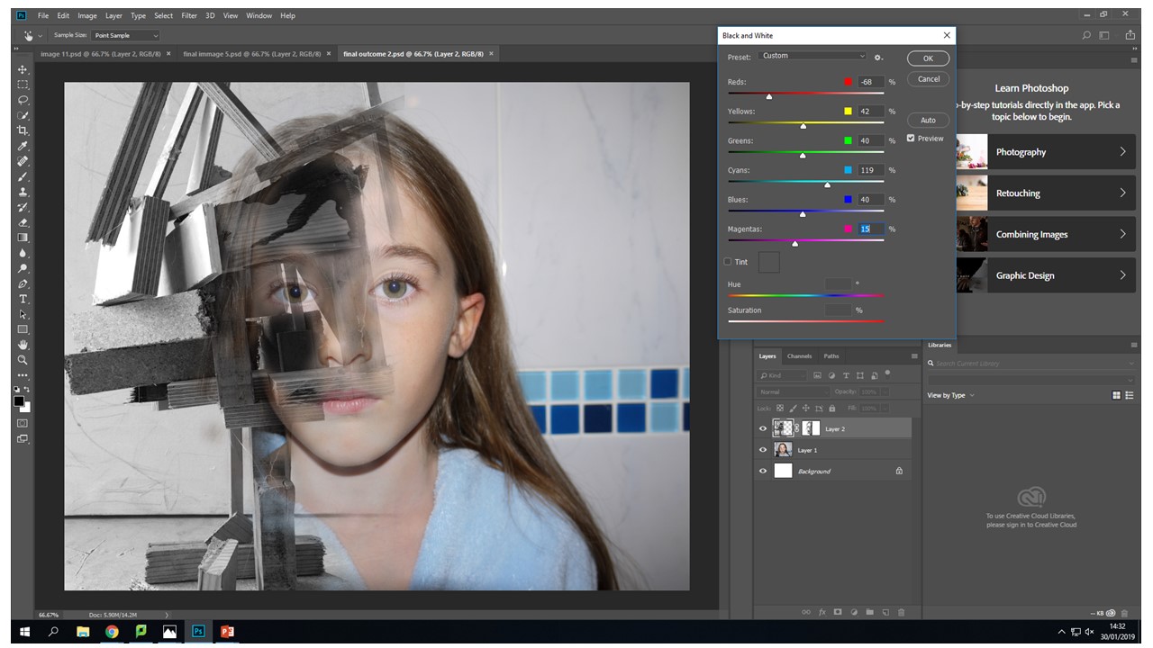
 

I have decide that for this image the face is to colour full it created imbalance in my photo the face shouldn't be as vibrant and it should be a cooler colour pallet to complement the b&w wood structure.


This image in balanced nether of the images over throw the other there is no direct focal point in ether it is just left to the viewers interpretation. The main tool i used was the vibrance slider moving the sider down to -56 gave my desired image composition. This again was through using the image - adjustments tool . There is still the cool blue tones coming through to give that image the need colour but they are muted.

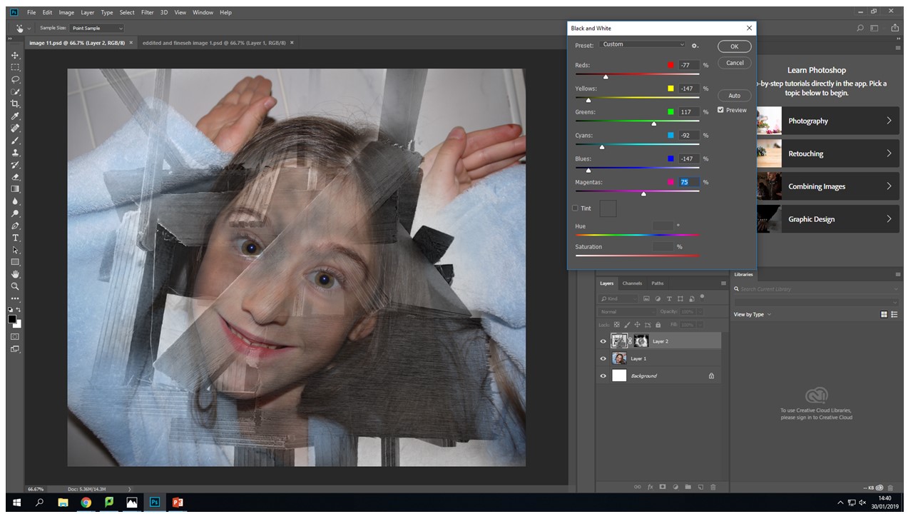
  

Another tool that i used quite frequently on the original face images was the levels tool to create  more depth with in the eyes so that they stood out and didn't get lots within the images different layers.


Again using the same black and white process with the wood from the images adjustments black and white tool and then sliding it to create the desired b&w tonal look.
 

Again the vibrance tool to decrease the vibrance of the image to put a real focus on what the image is trying to portray rather that the initial combination of broken wood and a face. This vibrance decreases mean the image is seamless and creates a dimensional feel that you can look into the image in different layers but then you zoom back out it still looks like all one image.


For me when editing my photos that I had created the vibrance slider created the most desired outcomes then it came to editing the actual face images i used this tool on all of them. It created the colour pallet that i wanted to complement the black and white wood without becoming a black and white image in its self.