
Category Archives: Unit 2 Portrait
Filters
My Own Response to Tableaux


Tableaux Vivants Post 2 Case Study
Tableaux Vivants Post 2 Case Study
Tableaux Vivants Post 1

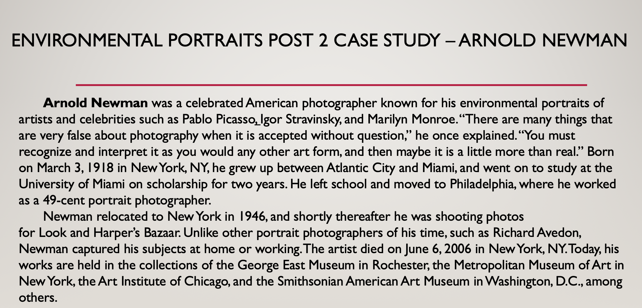
Environmental Portraits Post 2
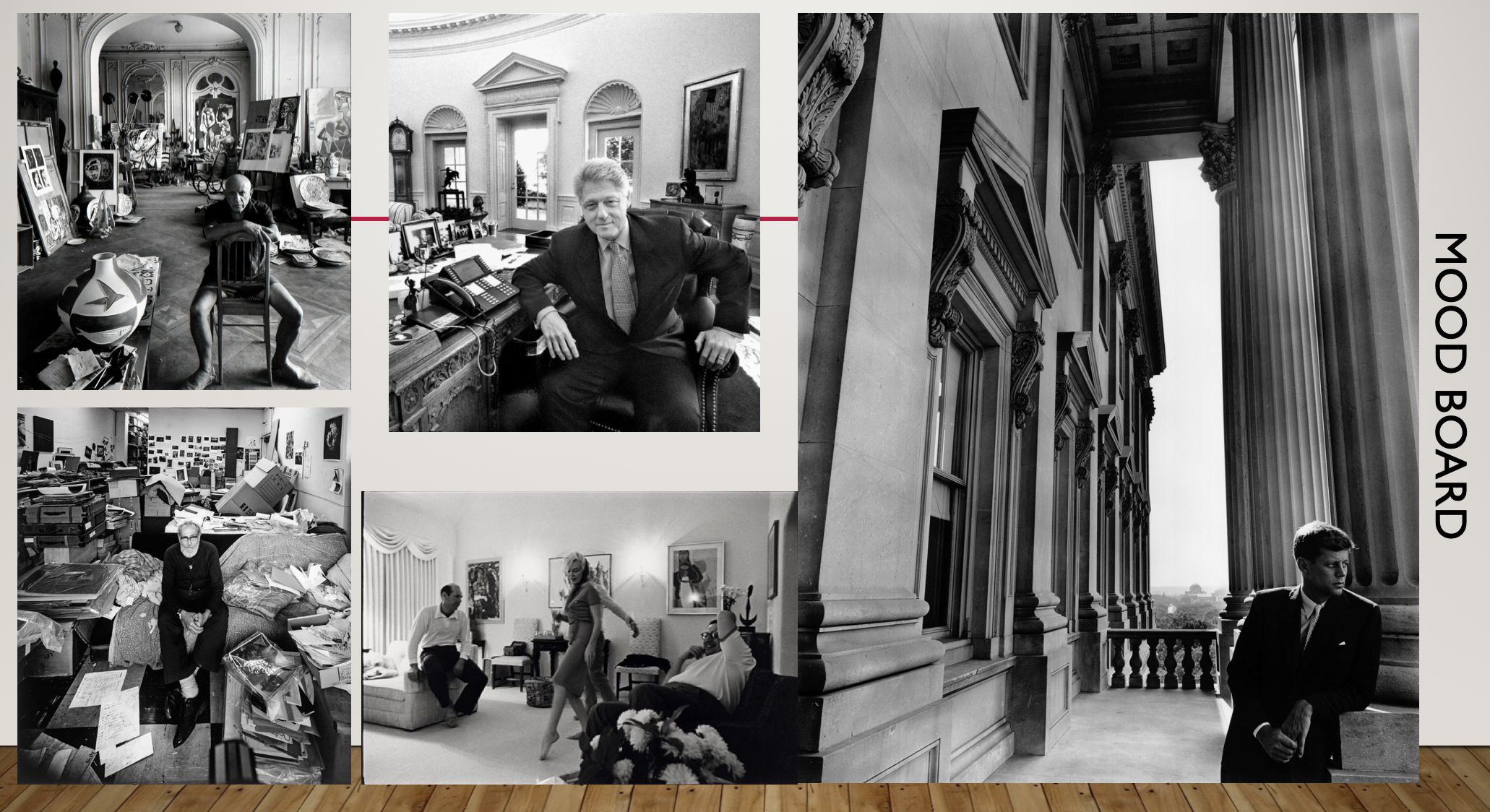
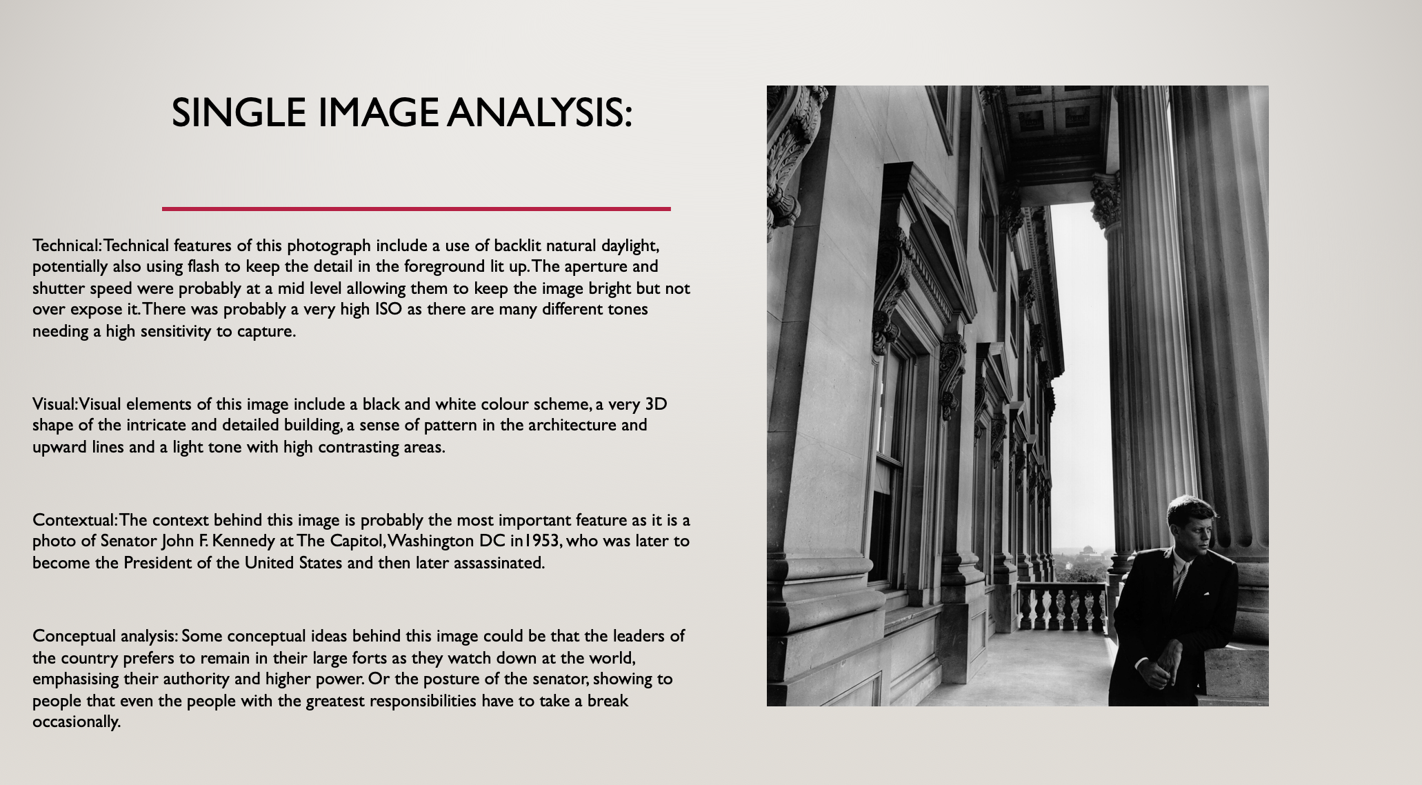
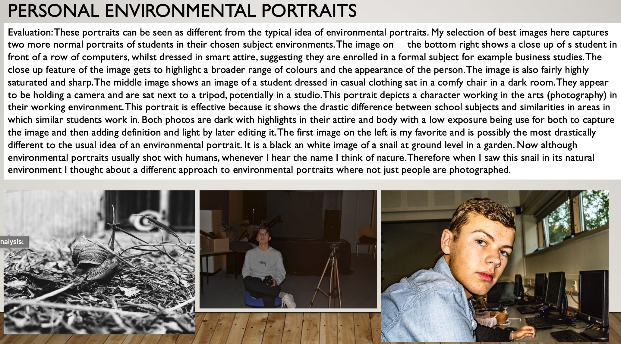
Environmental Portraits post 1


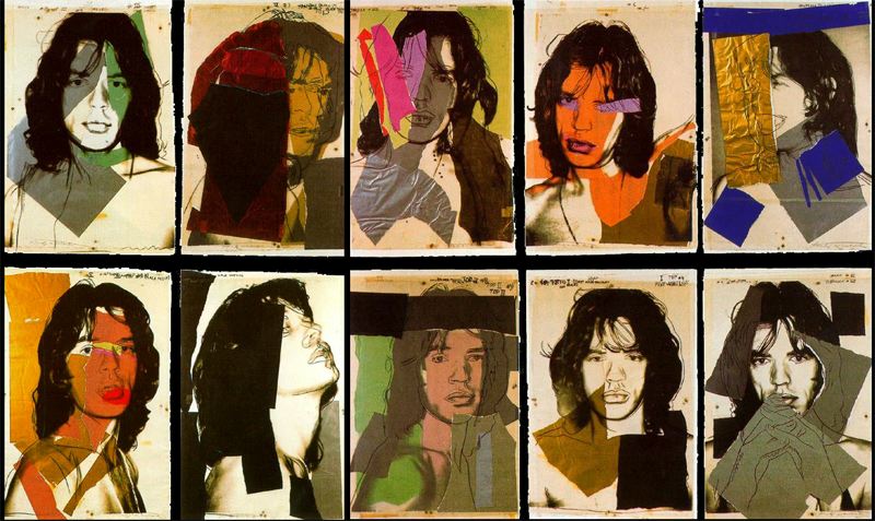
Andy Warhole photo montage case study
About Andy Warhol and his work
Andy Warhol was the most successful and highly paid commercial illustrator in New York even before he began to make art destined for galleries. Nevertheless, his screen printed images of Marilyn Monroe, soup cans, and sensational newspaper stories, quickly became synonymous with Pop art. He emerged from the poverty and obscurity of an Eastern European immigrant family in Pittsburgh, to become a charismatic magnet for bohemian New York, and to ultimately find a place in the circles of High Society. For many his ascent echoes one of Pop art's ambitions, to bring popular styles and subjects into the exclusive salons of high art. His crowning achievement was the elevation of his own persona to the level of a popular icon, representing a new kind of fame and celebrity for a fine artist.
Warhol's early commercial illustration has recently been acclaimed as the arena in which he first learned to manipulate popular tastes. His drawings were often comic, decorative, and whimsical, and their tone is entirely different from the cold and impersonal mood of his Pop art.

 Much debate still surrounds the iconic screen printed images with which Warhol established his reputation as a Pop artist in the early 1960s. Some view his Death and Disaster series, and his Marilyn pictures, as frank expressions of his sorrow at public events. Others view them as some of the first expressions of 'compassion fatigue' - the way the public loses the ability to sympathize with events from which they feel removed. Still others think of his pictures as screens - placed between us and horrifying events - which attempt to register and process shock.

Although artists had drawn on popular culture throughout the 20th century, Pop art marked an important new stage in the breakdown between high and low art forms. Warhol's paintings from the early 1960s were important in pioneering these developments, but it is arguable that the diverse activities of his later years were just as influential in expanding the implications of Pop art into other spheres, and further eroding the borders between the worlds of high art and popular culture.

Although Warhol would continue to create paintings intermittently throughout his career, in 1965 he "retired" from the medium to concentrate on making experimental films. Despite years of neglect, these films have recently attracted widespread interest, and Warhol is now seen as one of the most important filmmakers of the period, a forefather of independent film.

Critics have traditionally seen Warhol's career as going into decline in 1968, after he was shot by Valerie Solanas. Valuing his early paintings above all, they have ignored the activities that absorbed his attention in later years - parties, collecting, publishing, and painting commissioned portraits. Yet some have begun to think that all these ventures make up Warhol's most important legacy because they prefigure the diverse interests, activities, and interventions that occupy artists today.

His Photo montage images:
Identity & Place Project Evaluation (mock)
concept
Throughout my mock exam finals I aimed to keep all of my images together whilst also making sense as individual edits. I wanted to take inspiration from Steve Rosenfield in terms of concept, as in his 'What I Be' project, people opened up about their 'secrets' and insecurities, and through my finals i told a part of my story, which was also a 'secret'.
I wanted to tackle stigmatised issues such as emotional abuse and mental health because these are both topics that I feel extremely strongly about, and they're not usually spoken about openly, this only increases the stigma attached. I personally believe that if someone is experiencing either of these they are automatically labelled an 'attention seeker' or 'liar' and ultimately stop talking, they feel alone and this leads to the loss of identity, the feeling of not being able to get better from it, not knowing who you are, or what your purpose is.
Through my finals I wanted to get across the message that you WILL get better, and it won't last forever.

I personally feel like I was successful with my thoughts and ideas for what I aimed to do with this concept. I think I did this because I had 5 finals, the first was the beginning of my story, the second related to the emotional abuse and the feelings of loss of identity that came with it, the third was the 'invisible wounds' or affects that ARE suffered as a consequence, and the fourth and fifth represented the support available and recovery and moving on. This showed that although there may be a very negative beginning, there can always be a positive ending.
visual
For the editing and visuals of my finals I took inspiration and was influenced by Barbara Krugers work. Kruger is known for her heavily cropped and contrasted black and white images, below a thick red border, with red text boxes for her bold, white writing to lay on top of. I edited my text this way, however had a few differences.
In Krugers work she used the same font for all of her text, I did not do this, I changed my font to emphasise words, I also used fonts that I thought were more appropriate, for example, in my first image, for the word 'eight' I used the font Comic Sans, I did this because this is a font that I've always associated with primary school.
Also, Kruger does not incorporate any colour into her images, and in my final, final piece, I used the history tool in Photoshop to bring Katie back into her original, unedited state, back into colour. I did this because this was one of the images representing getting better, and black and white photos are often associated with sadness, and this was not a sad edit.

Overall, I'm happy with how my edits presented as finals once edited. I think that they were so eye catching whilst also getting across an important message.
Gender/Loss of identity- editing
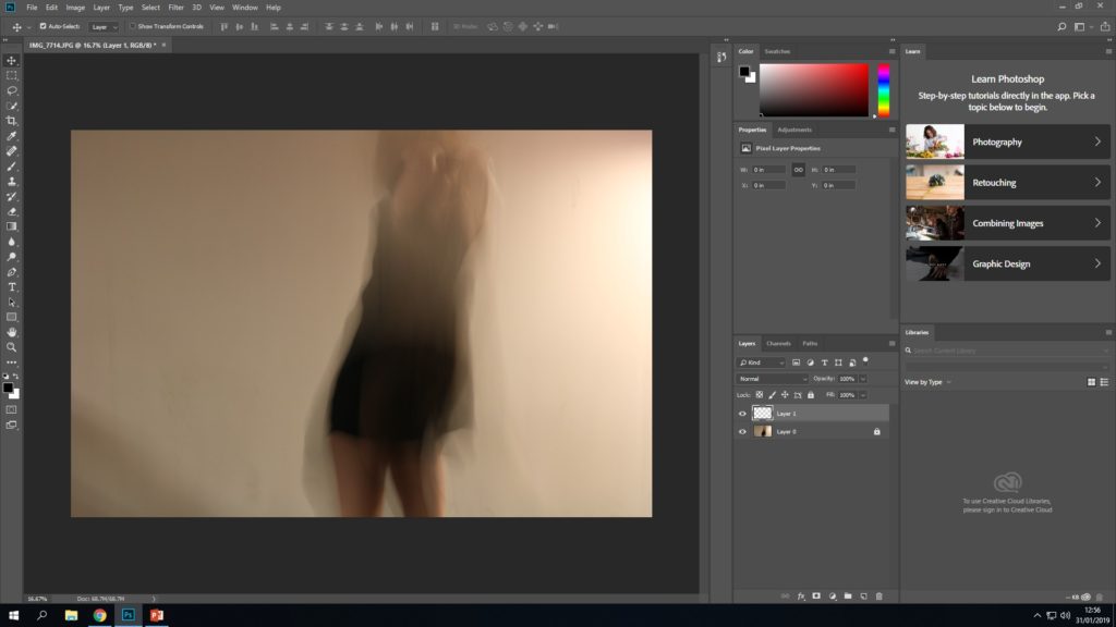
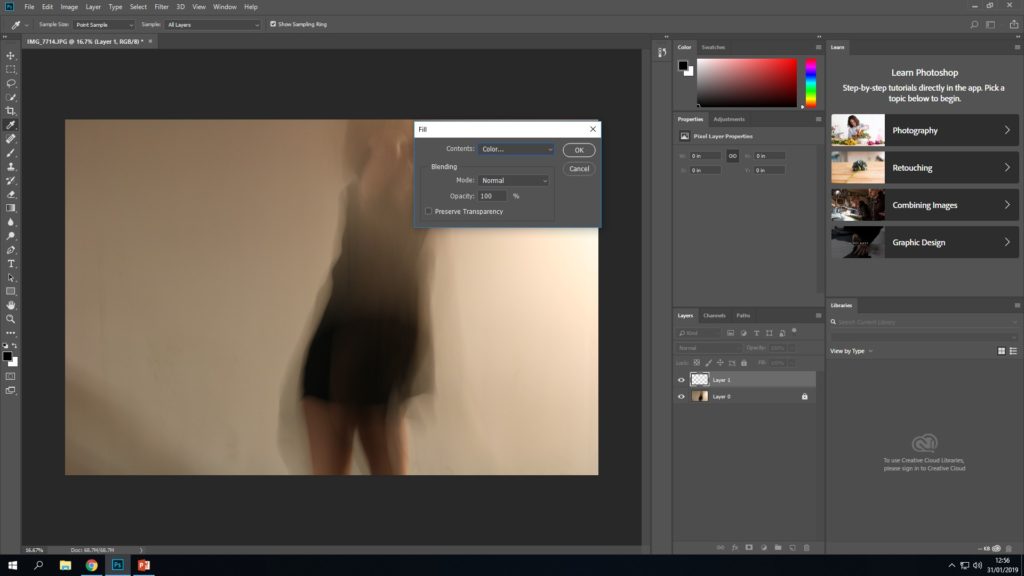
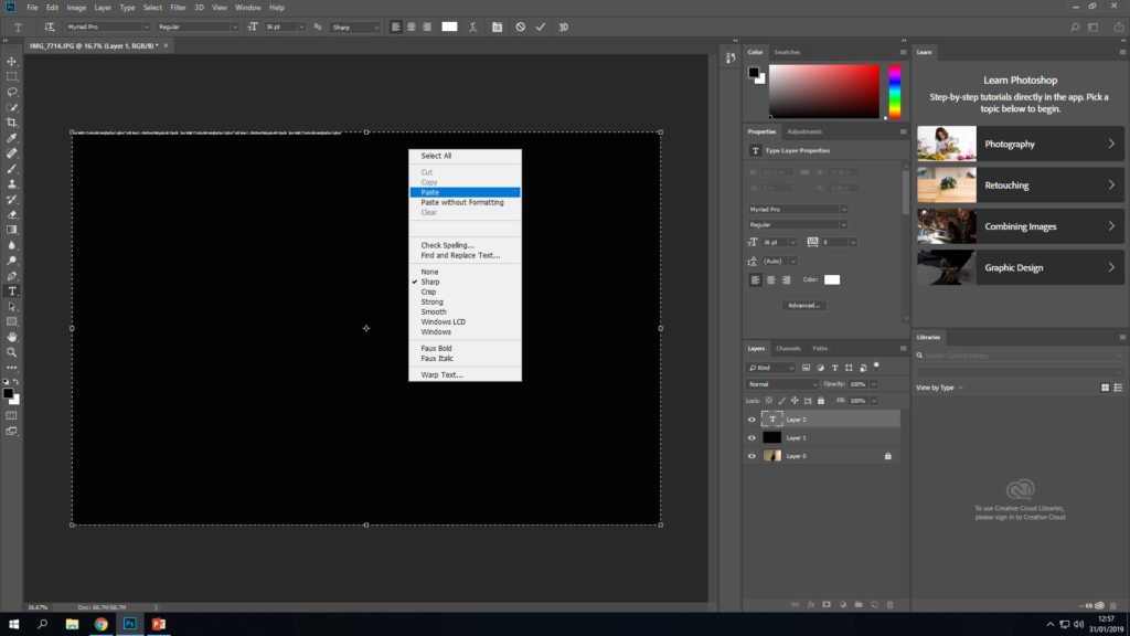
Now I will be editing the images from my 3rd and 4th photo shoots inspired by Francesca Woodman. I will be editing the images in different ways in order to represent feelings that someone can feel when experiencing a lack of identity.
Final Outcome

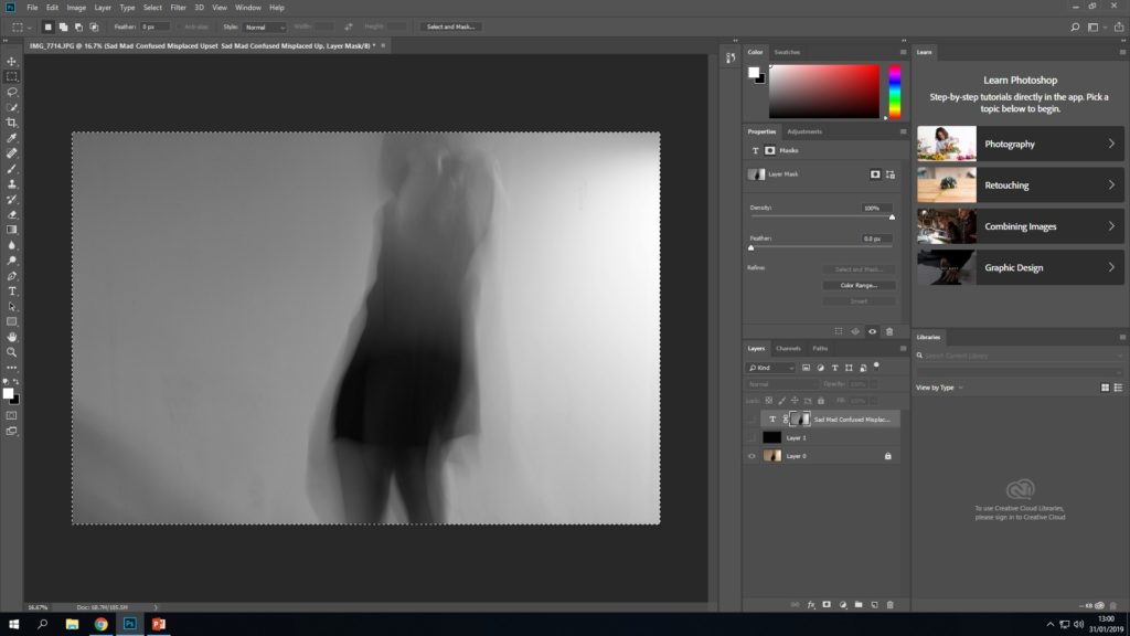
This is my final outcome. On one hand I really like this as you can faintly tell that its a human figure by the legs, and I think having the text obscuring the model further shows a lack of identity as you cant make out anything about the person. Furthermore, since the text is different types of emotions the model could be feeling, it is now clear to views how the model feels emotionally. On the other hand, I think that by having the image obscured so much by the text, the audience will not be able to get the full effect of the long exposure effect, or the models expression, which takes away part of the photo’s concept.
Final outcome
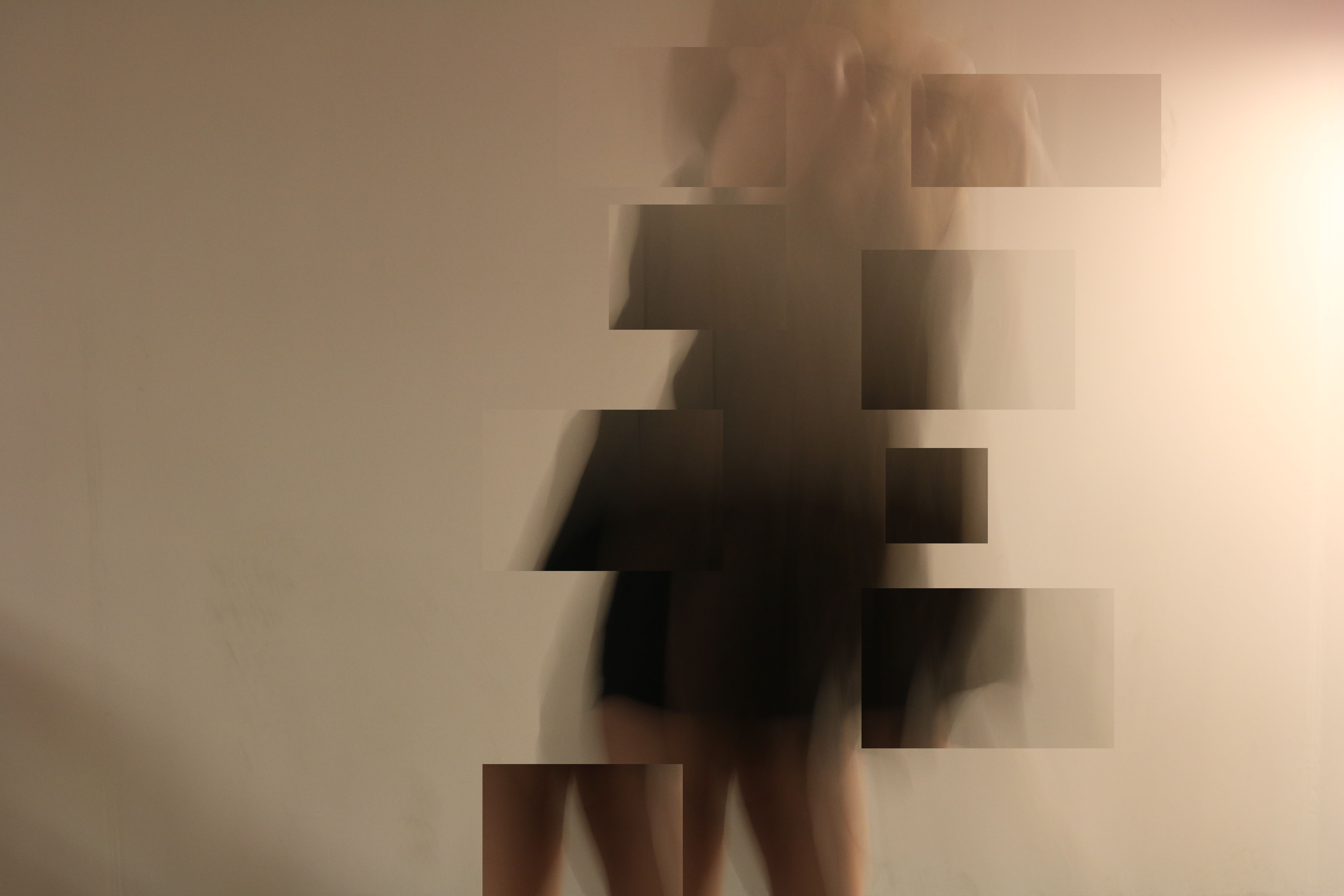
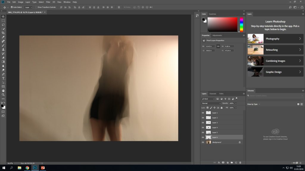
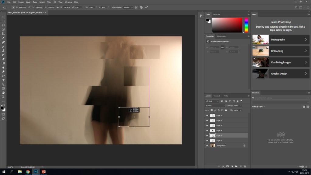
This is my final image after the editing process. I decided to use this technique of manipulation in order to express feelings associated with having a lack of identity, such as feeling displaced and no feeling whole. The sections that I have selected and placed in different areas shows the figure displaced and falling apart which is a literal way of expressing the metaphorical concept.
