Category Archives: Unit 2 Portrait

Filters

Author:
Category:

Photo-montage

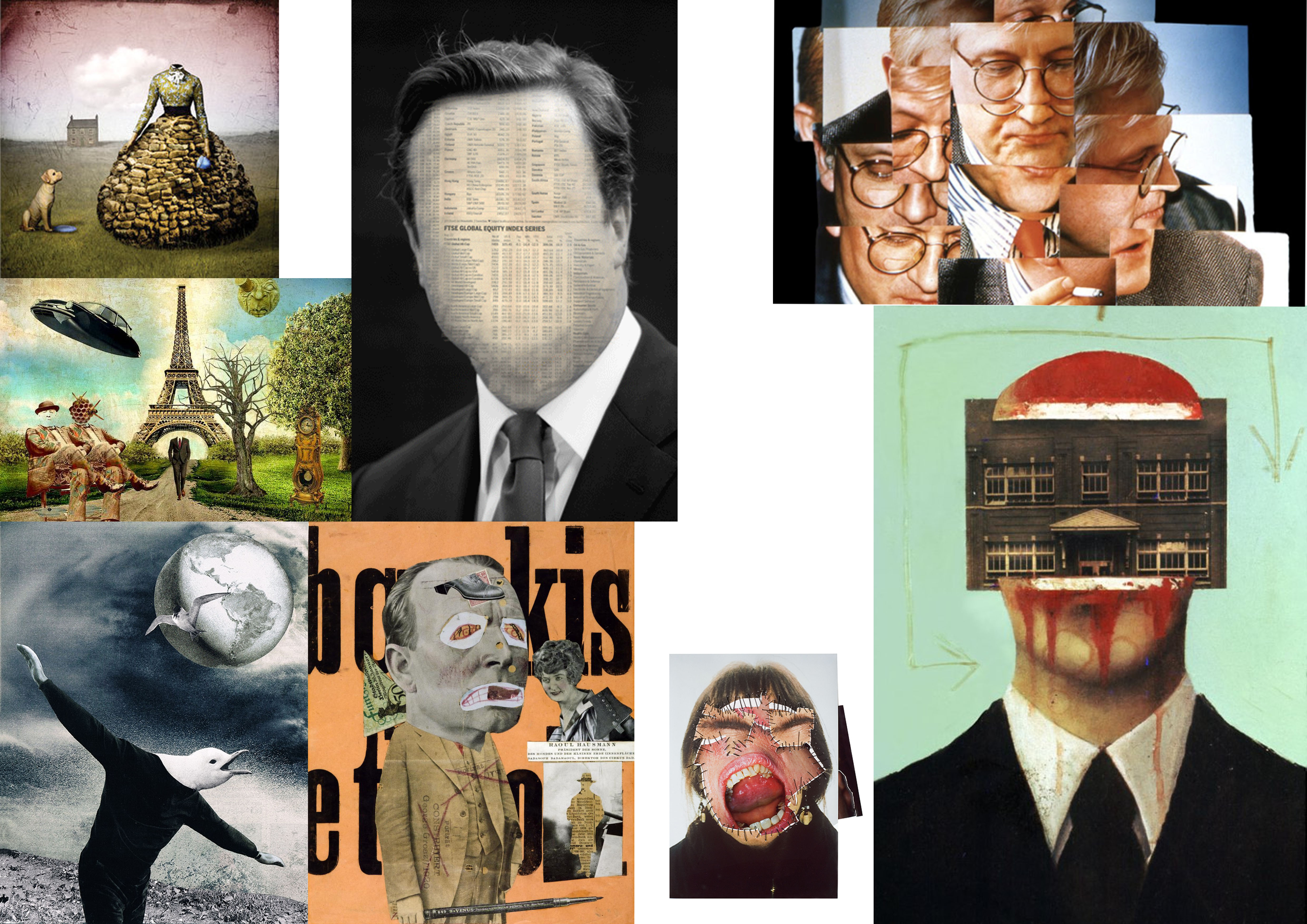
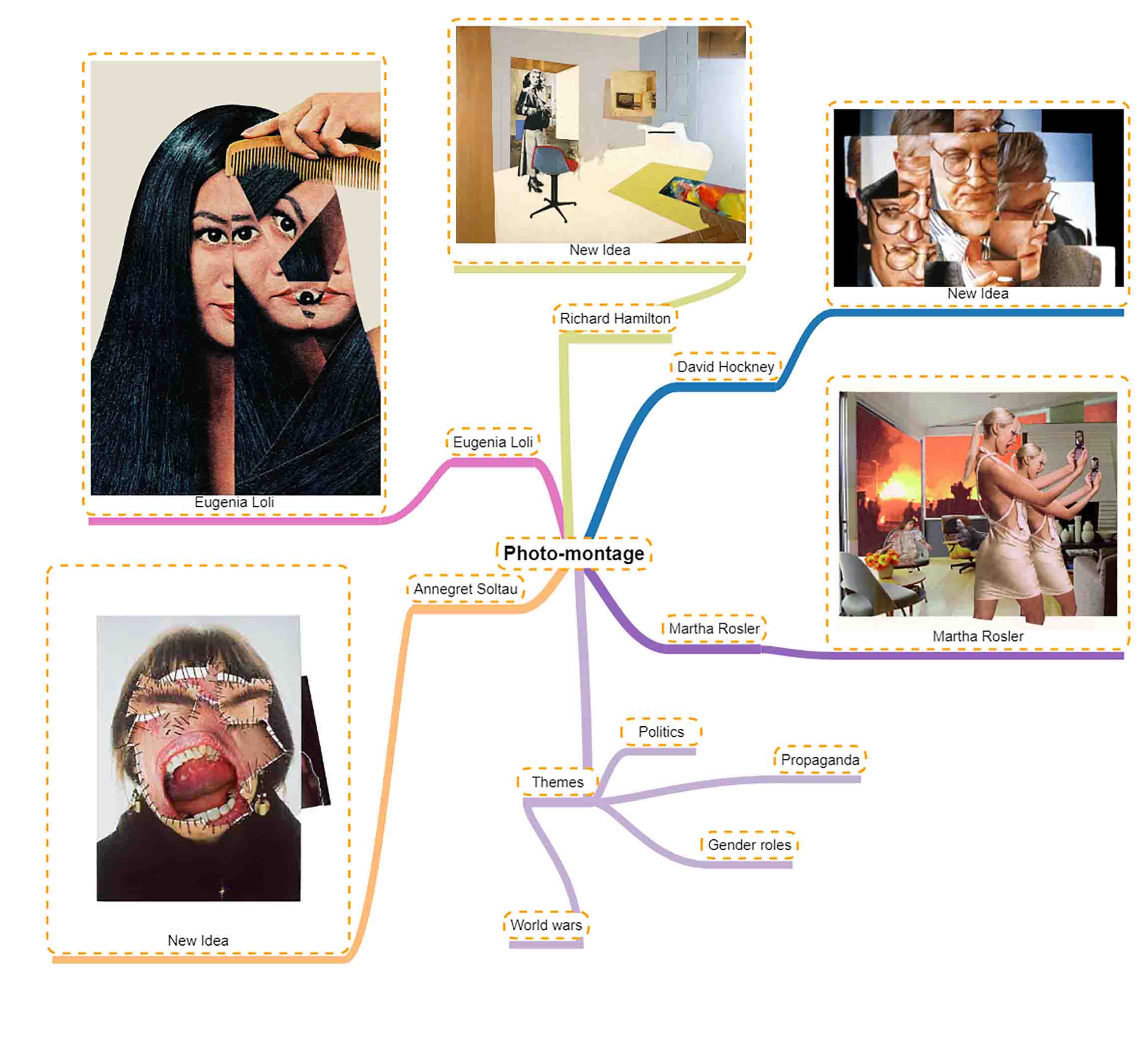
Photo-montage moodboard

Photo montage, composite photographic image made either by pasting together individual prints or parts of prints, by successively exposing individual images onto a single sheet of paper, or by exposing the component images simultaneously through superimposed negatives. In the 1880s the juxtaposition of separate images through successive exposures became fashionable in the “combination print,” especially in the form of the contrived group portrait. The subjective, fragmented, potentially absurd qualities of this juxtaposition were exploited by Dadaist and Futurist artists of the early 20th century.

The photo montages of George Grosz, Hannah Höch, and John Heartfield from this period are among the major examples of the form. Photo montage was also used extensively in the Pop art movement of the 1960s and 1970s. A technically sophisticated form of photo montage was developed by the U.S. photographer Jerry Uelsmann, and artist David Hockney is also noted for his photo montages.

Photo-montage mind map

7. Constructed Portraits | Photo-montage | Composite | Collage | Creative

This week’s tasks are designed to encourage you to explore  your creativity by looking responding to Constructed Portraits.

  1. Photo-montage
  2. Composite portraits
  3. Collage

History of Photo-montage (Europe 1910 onwards)

  • A photomontage is a collage constructed from photographs.
  • Historically, the technique has been used to make political statements and gained popularity in the early 20th century (World War 1-World War 2)
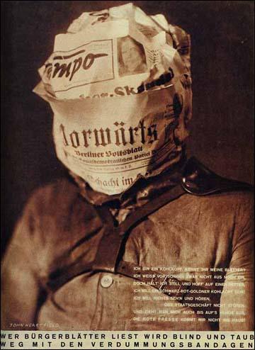
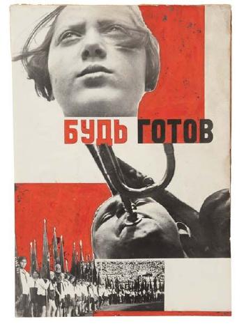
  • Artists such as Raoul Haussman , Hannah Hoch, John Heartfield employed cut-n-paste techniques as a form of propaganda…as did Soviet artists like Aleksander Rodchenko and El Lissitsky
  • Photomontage has its roots in Dadaism…which is closely related to Surrrealism
Raoul Hausmann, ‘The Art Critic’ 1919–20
Raoul Haussman
Image result for hannah hoch
Hannah Hoch
Adolf Hitler addresses the German people on radio on 31st January, 1933
John Heartfield
Image result for man ray photomontage
Man Ray
Image result for grete stern photomontage
Grete Stern
Image result for el lissitzky
El Lissitsky
Image result for rodchenko photomontage
Aleksander Rodchenko

Pop Art developments (USA and UK 1950s-)

  • Photomontage was also used to great effect by various Pop Artists in the mid 20th Century
  • Pop art was a reaction to abstract expressionism and was similar to DADA in some ways
  • Many Pop Art images and constructions tackled popular consumerism, advertising, branding and marketing techniques
  • Pop art also explored political concerns such as war, and gender roles too
Image result for richard hamilton
Richard Hamilton
Image result for peter blake
Peter Blake
Image result for robert rauschenberg
Robert Rauschenburg
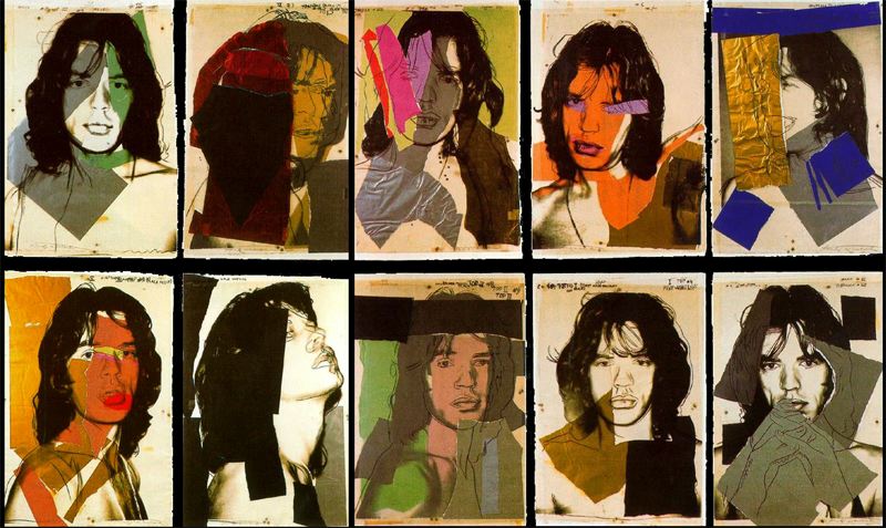
Image result for andy warhol photomontage
Andy Warhol

Examples and Inspiration

  • richard hamilton / kurt schwitters / peter blake /
  • soviet art
  • sammy slabinck
  • john stezaker
  • jesse treece
  • jonny briggs
  • david hockney
  • hannah hoch
  • Annegret Soltau
  • Brno de Szou
  • Joachim Schmid
  • Jesse Draxler
  • Peter Kennard
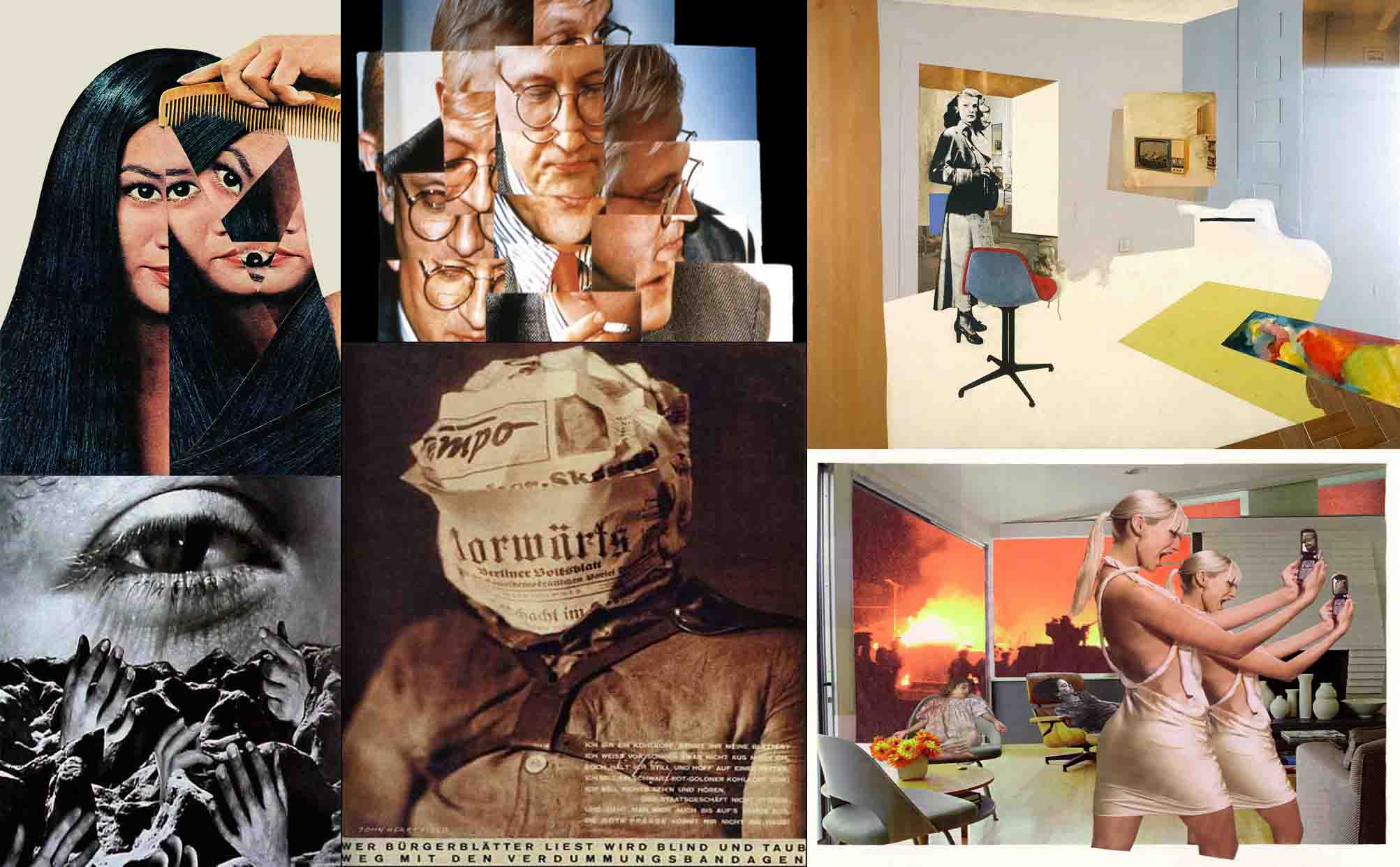
  • Eugenia Loli
  • Sarah Eisenlohr 
  • Grete Stern
  • Jerry UELSMANN
  • Duane Michals
  • Edmund Teske
  • Man Ray
  • El Lissitsky
  • Martha Rosler
Image result for john stezaker
John Stezaker
Image result for peter kennard
Peter Kennard
Image result for annegret soltau
Annegret Soltau
Image result for leland bobbe posters
Street Poster—Jacques Villegle
Image result for david hockney
David Hockney – joiner photographs
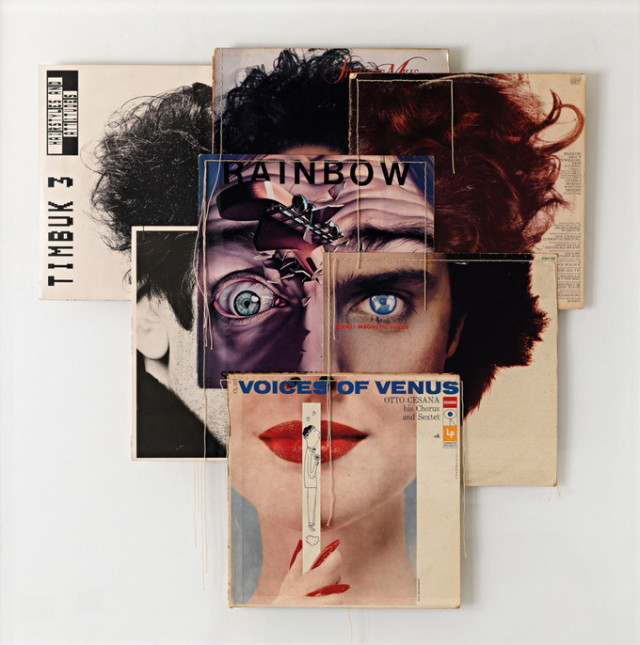
Image result for christian marclay album covers
Christian Marclay-Album Covers
Image result for soviet photomontage
Soviet war art and propaganda
Image result for joachim schmid
Joachim Schmid
Image result for jesse draxler
Jesse Draxler
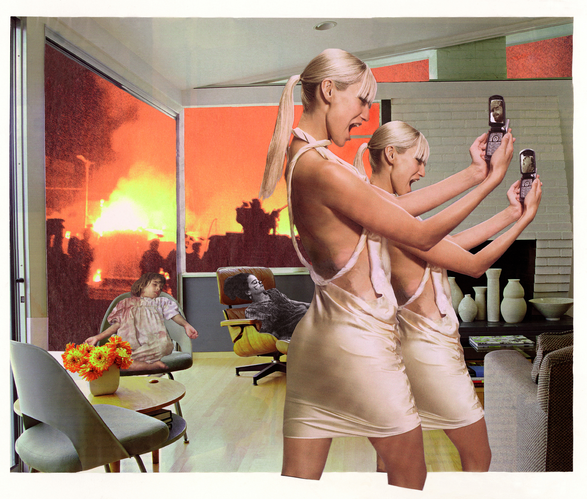
Image result for martha rosler
Martha Rosler
Image result for jerry uelsmann photomontage
Jerry Uelsmann
Image result for sarah eisenlohr
Sarah Eisenlohr

In her artist statement Montana based artist Sarah Eisenlohr explains that her collages use places of existence to create fictional ones in an effort to demonstrate the ways in which humans have transformed the earth. These scenes often carry undertones of spirituality and faith. “I consider the figures’ desire for shelter, warmth, and something stronger than themselves as symbols of serenity that I seek through spirituality, while the use of sublime in my work points to a relationship with the divine,”

Image result for eugenia loli
Eugenia Loli
California based artist Eugenia Loli draws inspiration for her surreal art collages from vintage magazine images. Loli intends for her images to serve as a snap shot from a surreal movie from which the viewer can create his or her own narrative.

Task 1

  1. Create a blog post that includes a clear understanding of the history and background of photo-montage.
  2. Include a moodboard / mindmap
  3. Add examples of Early – late 20th Century Photomontage eh Hannah Hoch

Task 2

  1. Choose a specific photo-montage artist and write/create a CASE STUDY
  2. Include a detailed analysis of 1 x key image by the artist
  3. Add TECHNICAL -VISUAL-CONCEPTUAL-CONTEXTUAL understanding

Task 3

  1. Create a set of 3-5 photomontage using a mixture of your own imagery (portrait) and “found” imagery….(this could be archival imagery)
  2. Ensure you  include a sense of identity and place
  3. Show your process clearly…remember to add screen shots etc
  4. Evaluate your process…describe and explain

HUCKMAG LINK HERE

Complete over the Christmas Break…and see you all on Tuesday 8th January 2019


KEY COMPONENTS AND DISTINGUISHING FEATURES of PHOTO-MONTAGE

  • A NARRATIVE, CONCEPT OR THEME (A MESSAGE OR A COMMENT)
  • ARCHIVAL / VINTAGE IMAGERY COMBINED WITH OWN IMAGERY
  • SUBVERSION OF MEANING—-POSTMODERNISM

SOURCE MATERIAL YOU CAN USE

  • NEWSPAPERS
  • MAGAZINES
  • ORIGINAL IMAGERY (from studio, tableau, other portraits etc)
  • INTERNET-SOURCED IMAGERY
  • BOOKS

TECHNIQUES

  • MANUAL CUT-N-PASTE (SCISSORS, SCALPEL AND GLUE)
  • PHOTOSHOP –
  • selection tools (to cut and move elements of images)
  • free transform (CTRL T)– to move, re-size and shape elements
  • layers and layer masks
  • opacity tool
  • blending options
  • distortion
  • proportion
  • scale

Ensure you have enough evidence of…

  1. moodboards
  2. mindmaps
  3. case studies (artist references)
  4. action plans
  5. photoshoots + contact sheets (annotated)
  6. appropriate selection and editing techniques
  7. presentation of final ideas and personal responses
  8. analysis and evaluation of process
  9. compare and contrast to a key photographer
  10. critique / review / reflection of your work

Ensure you discuss / describe / explain your images using key words and vocab…

Picture

studio1 finals


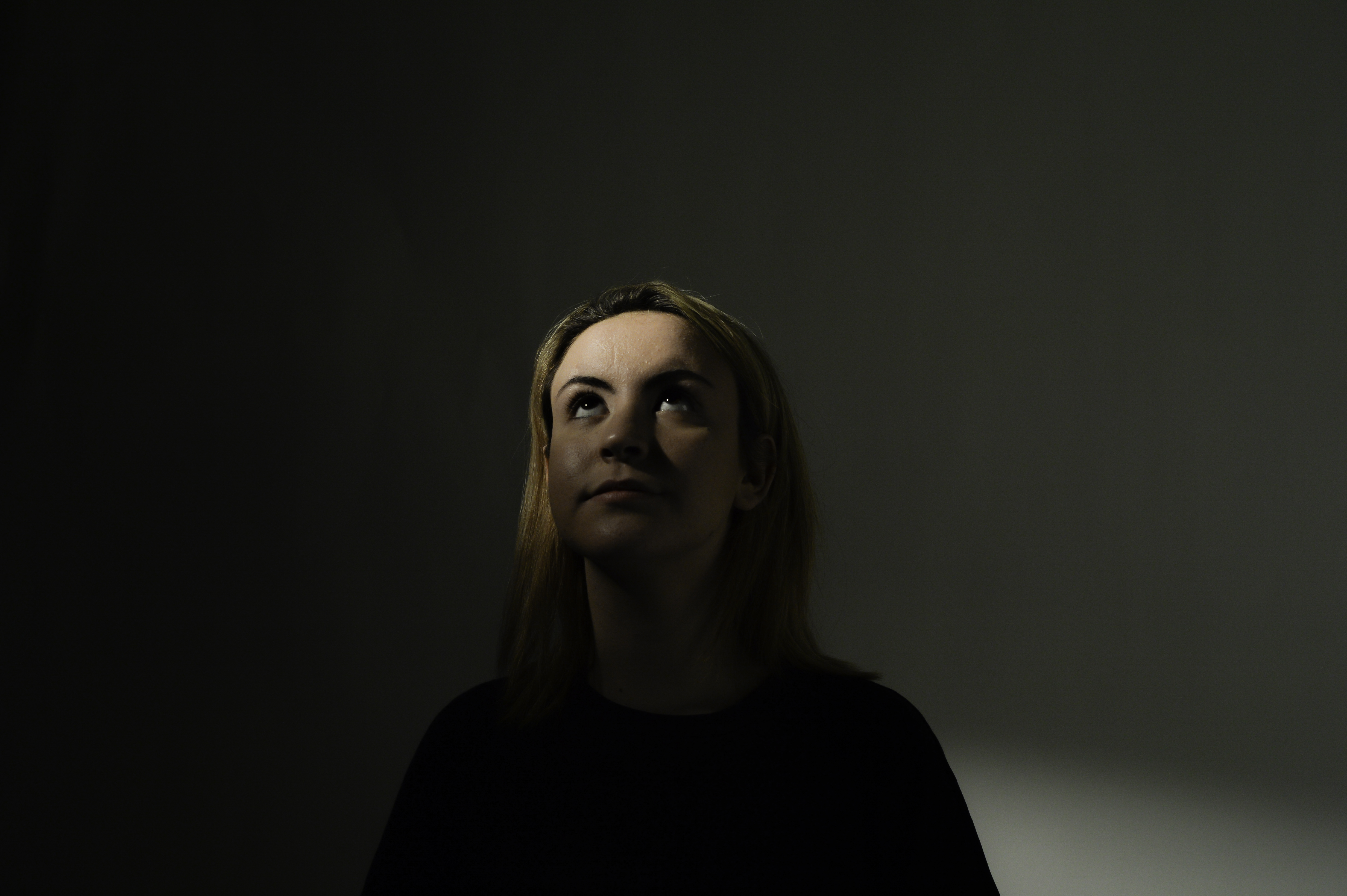
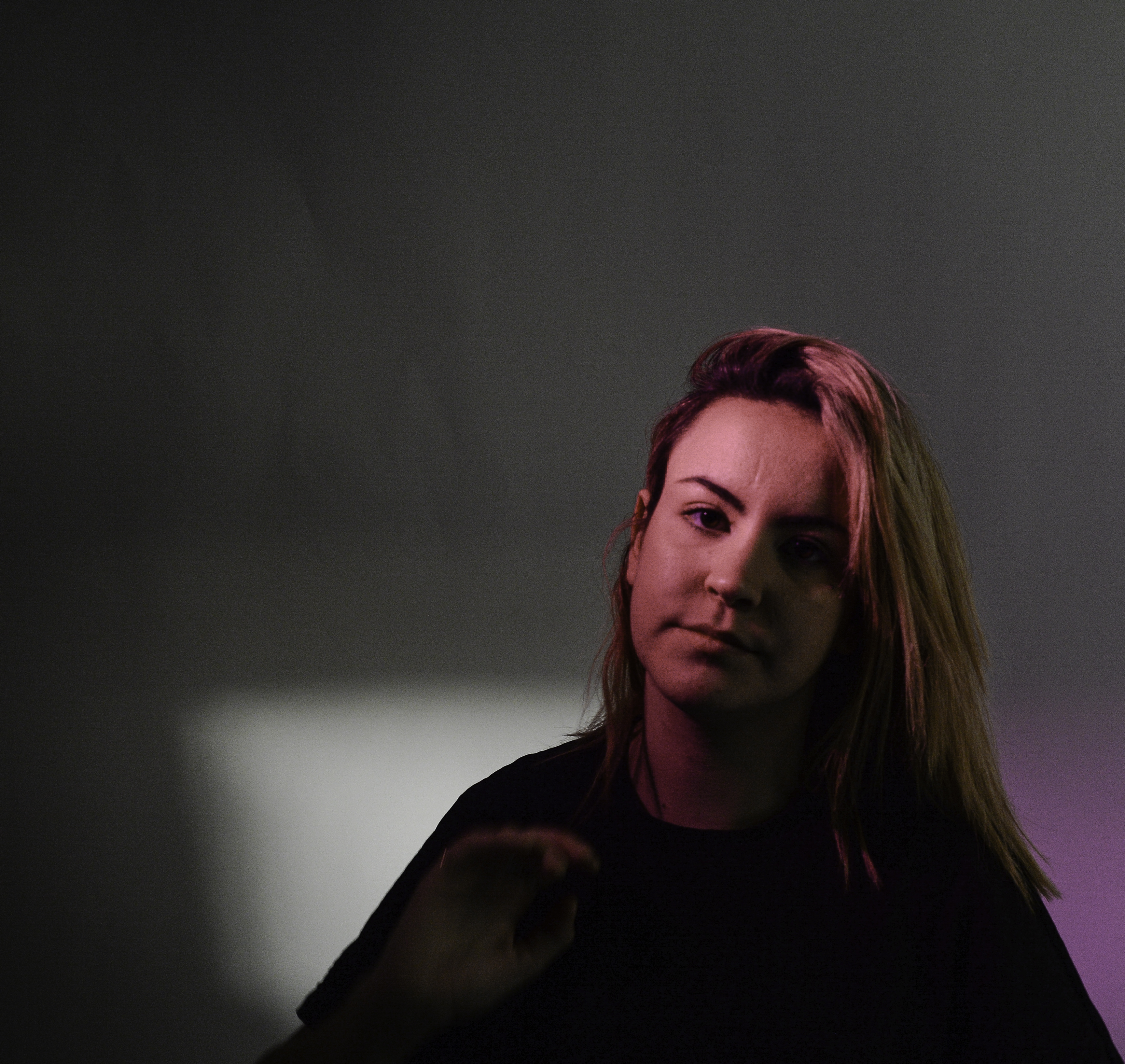
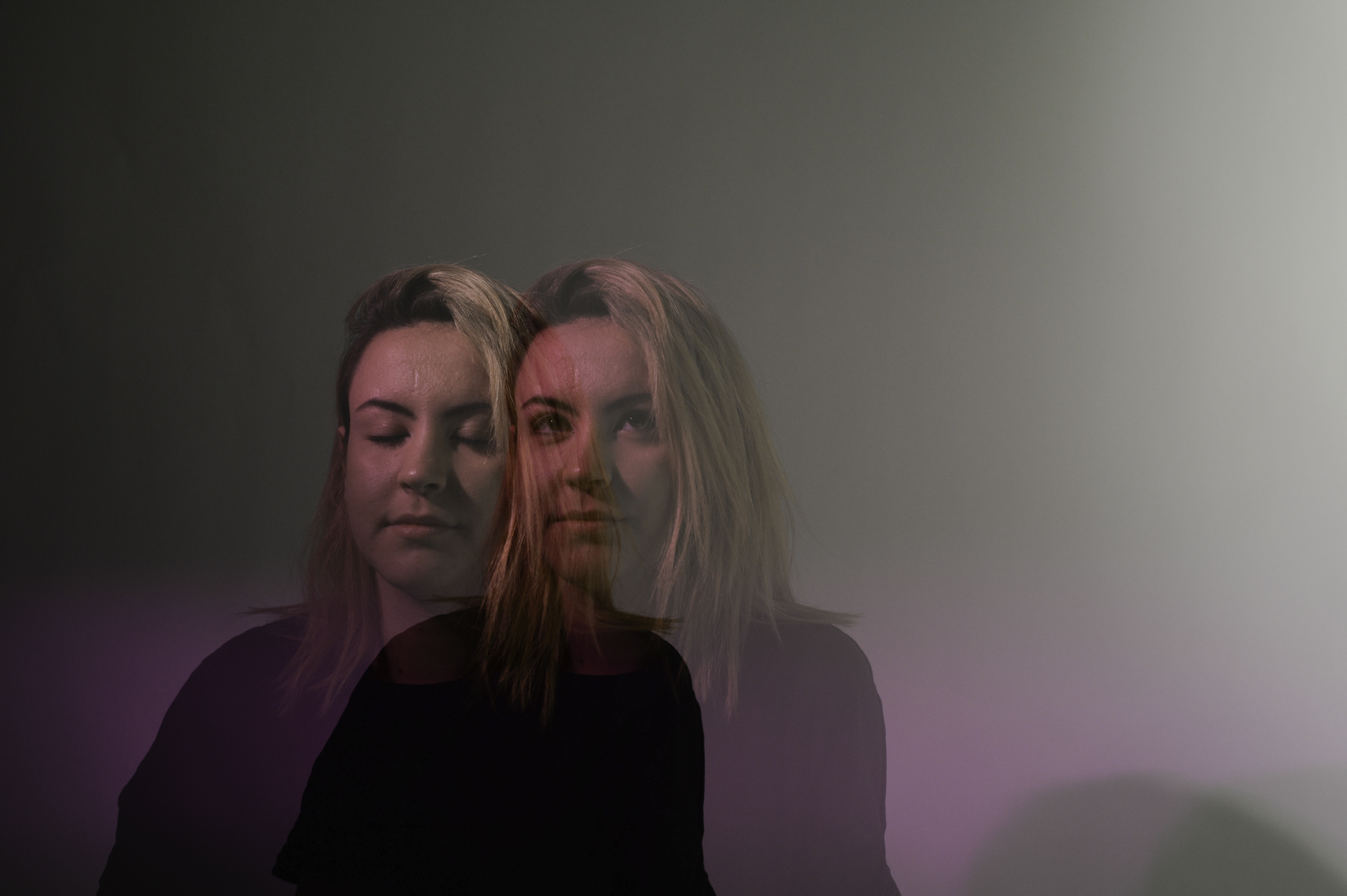
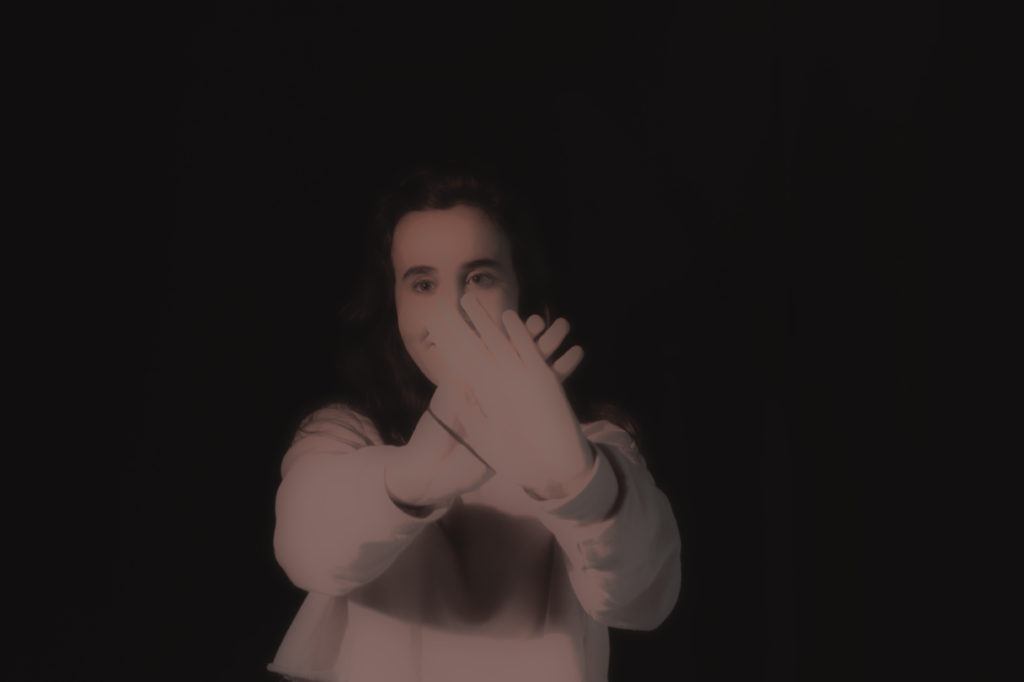
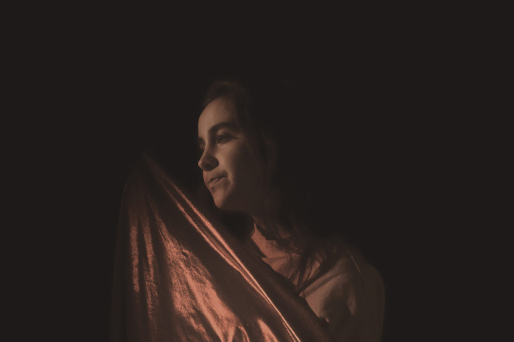
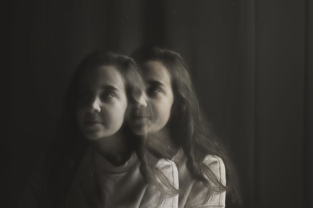
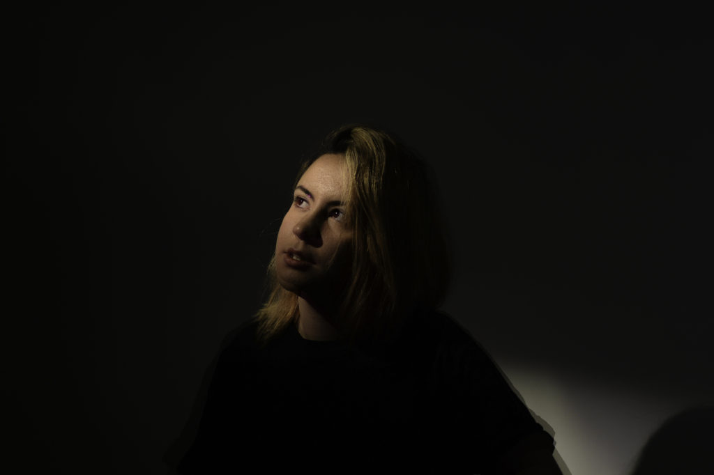
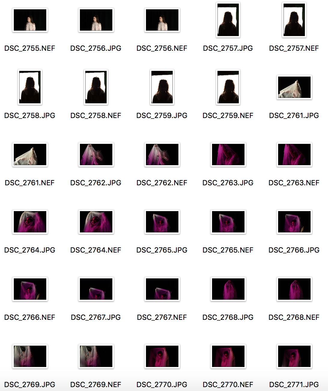
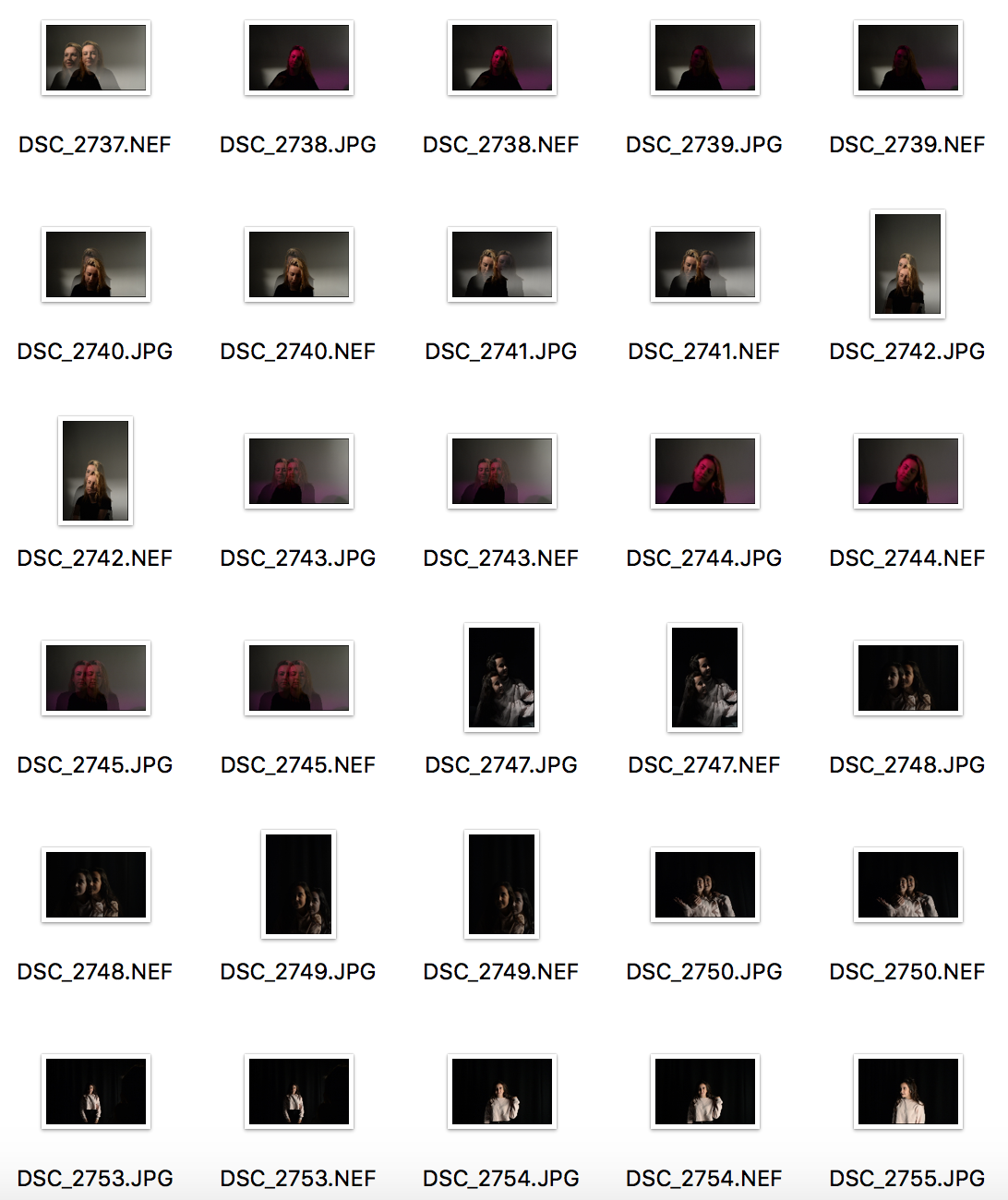
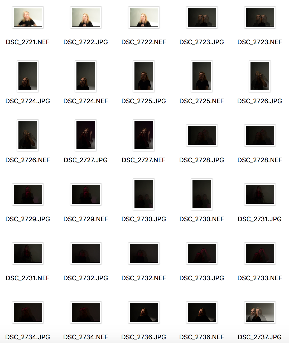
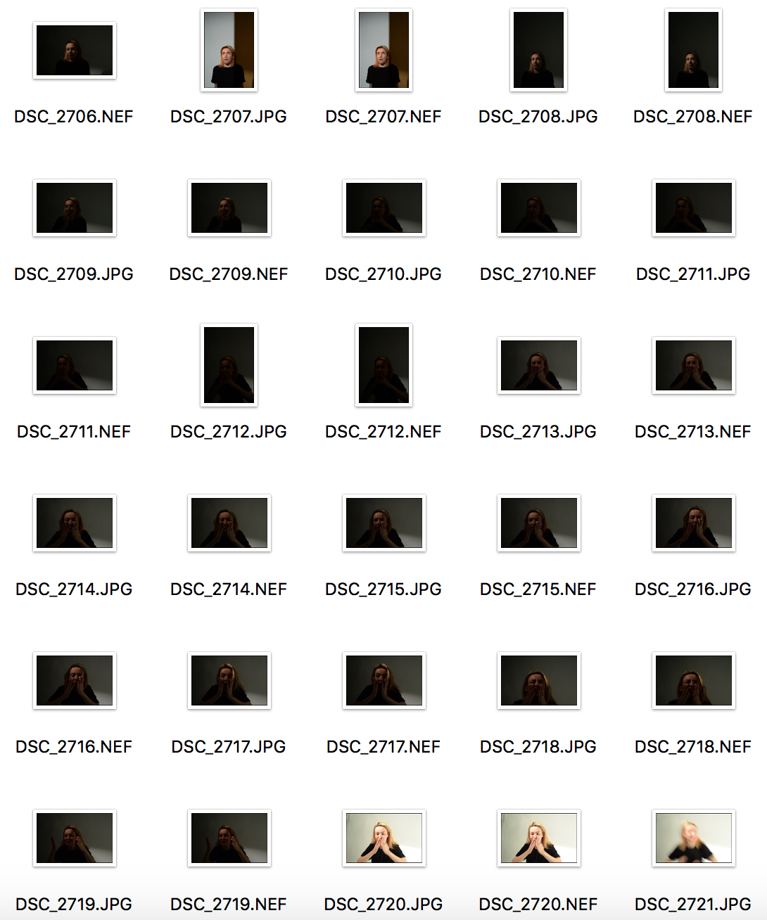
In the studio, I initially took about 300 photos. I narrowed them down to about 9 and edited each of them so I would have a bigger choice of photos to choose from for my finals.

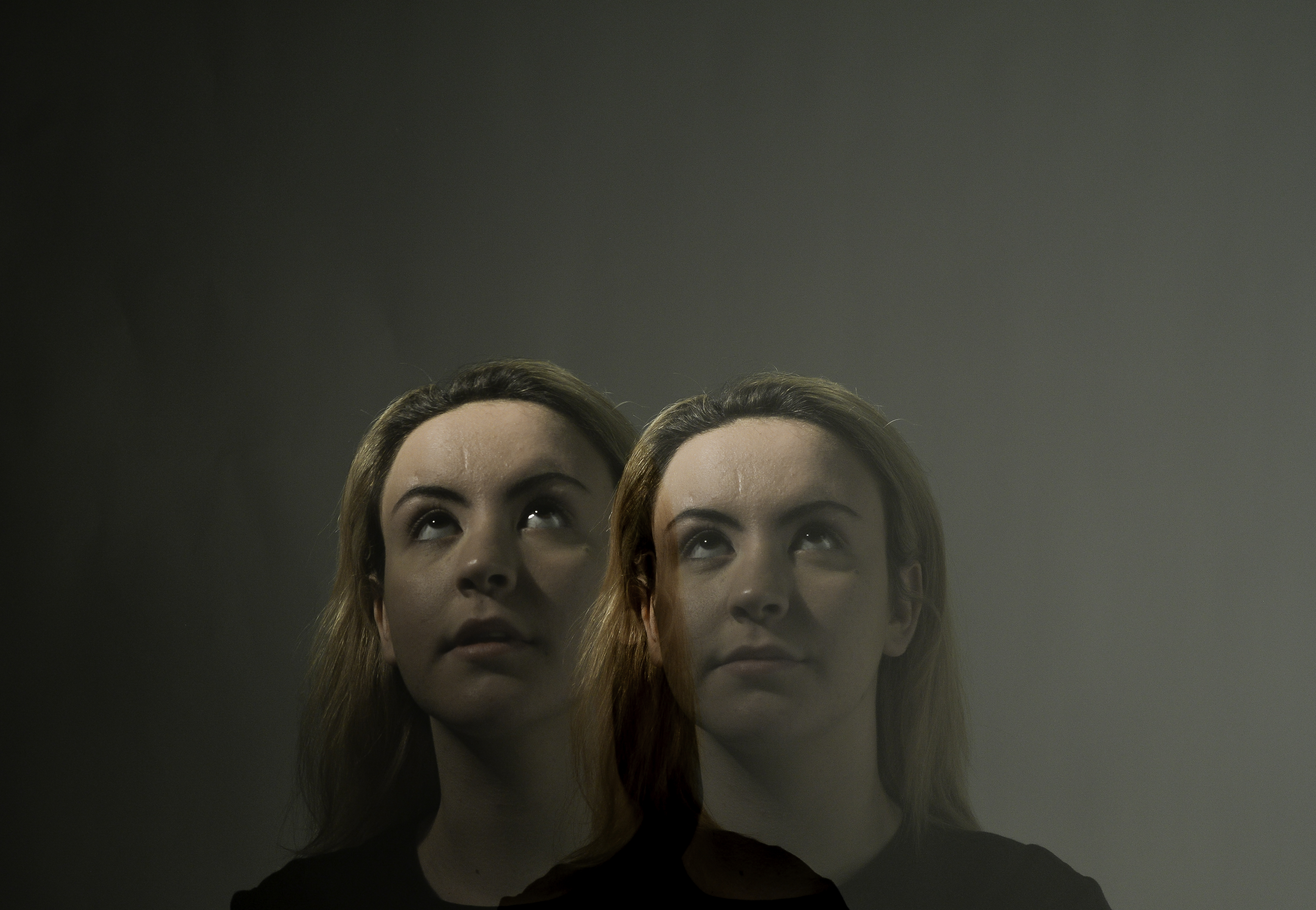
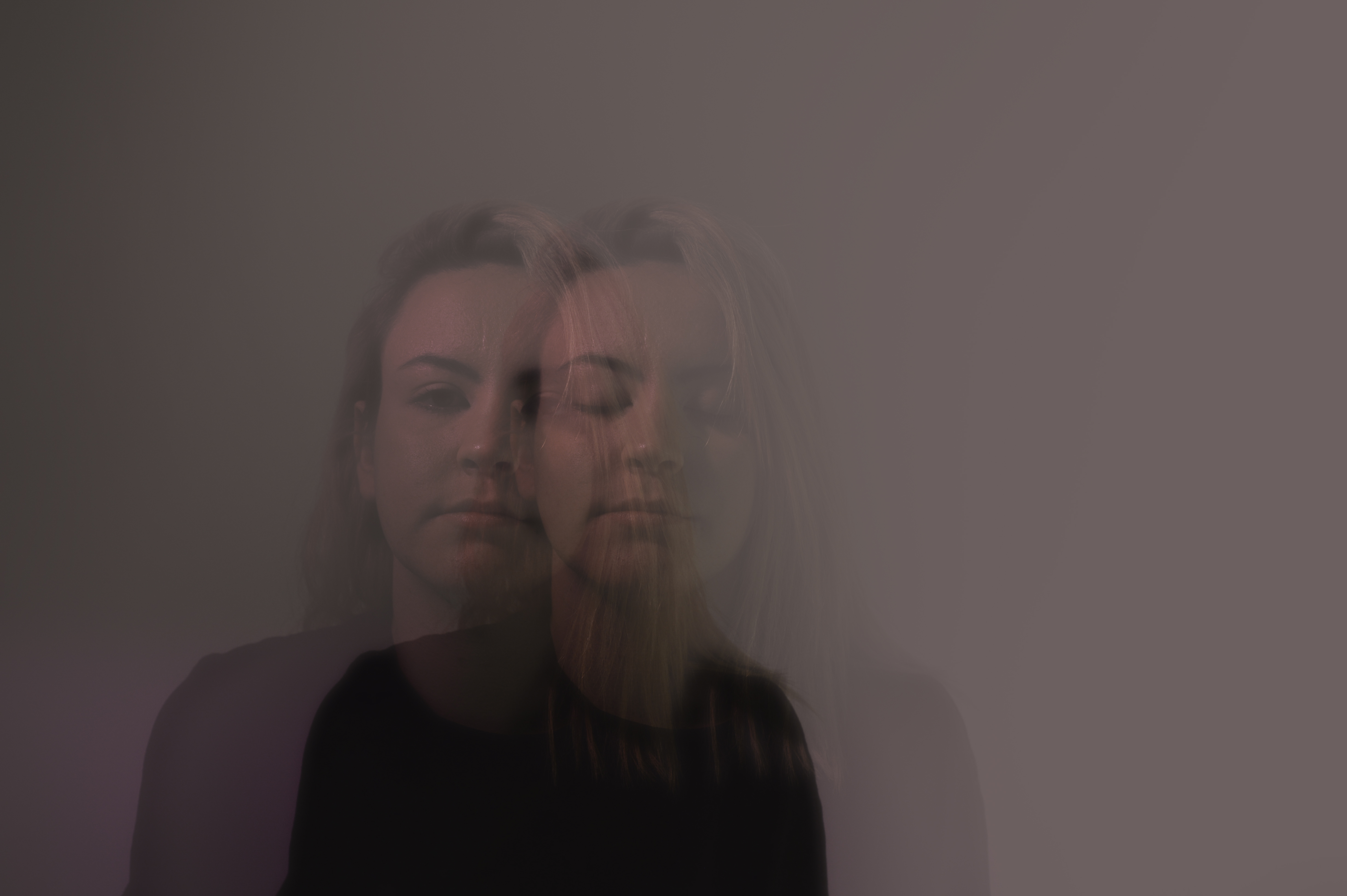
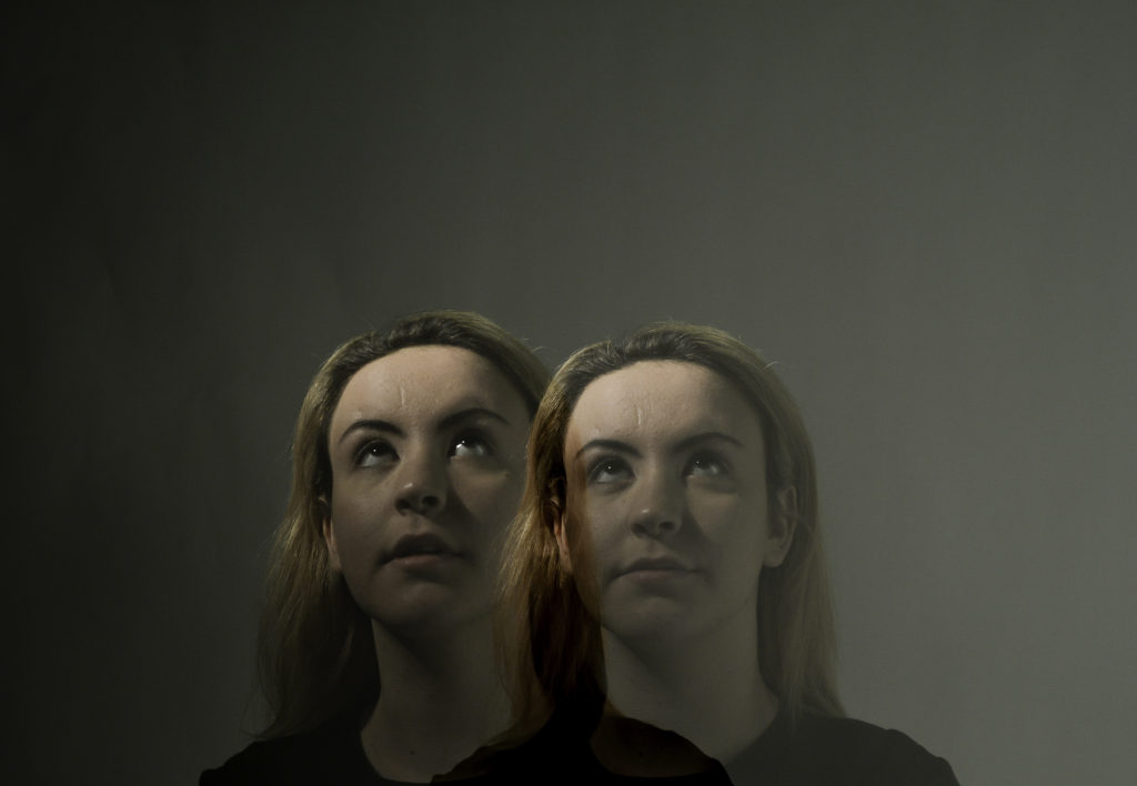
using double exposure, I created the effect of two people being present.

Here, I used a pink filter of the one point light.

For the next three photos I increased the haze so that they would look somewhat surreal, almost dreamy.

~ tableaux and staged reality ~


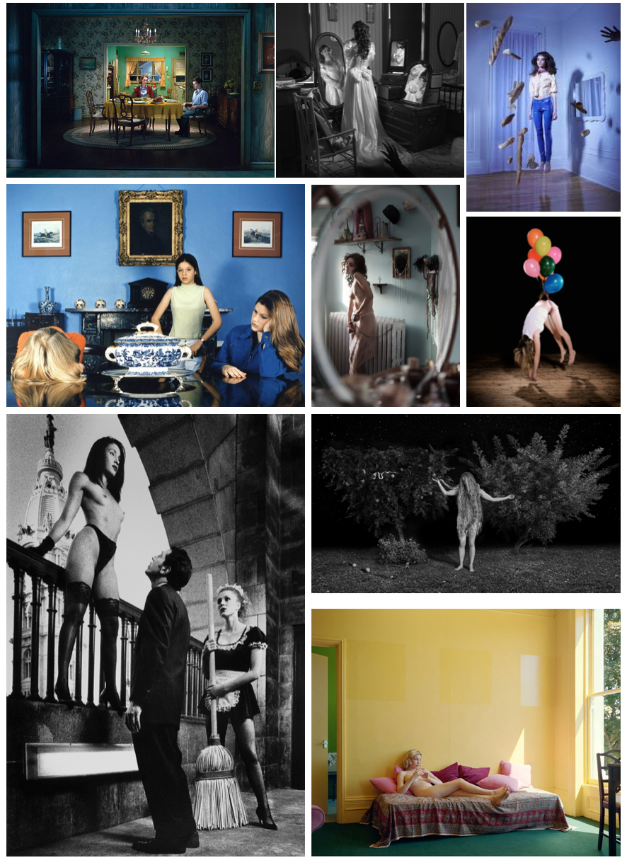
Tableaux is used to describe a painting or photograph in which characters are arranged for picturesque or dramatic effect and appear absorbed and completely unaware of the existence of the viewer.

The term was first used in the eighteenth century by French philosopher Denis Diderot to describe paintings with this type of composition. Tableau paintings were natural and true to life, and had the effect of walling off the observer from the drama taking place, transfixing the viewer like never before.

It can be used to create surreal landscapes and visions, expressing or pursuing existing ideas, thoughts and situations,

Tableaux photography is staged, and the final outcome was made purposefully with an idea in mind.


Tableaux&Staged Reality 2

EXPLORING TABLEAUX/STAGED REALITY PART 2

In this part of the project I focused mainly on staged reality, as I was re creating these paintings

These 3 images are the ones we chose as a class to explore as they were some of our favorites. We chose these images due to the different angles of lighting within the images and the angle the photo has been taken from. The meaning behind these images is strong.

Image result for Eugene Delacroix ‘Leading the PeopleEugene Delacroix ‘Leading the People’

Image result for Caravaggio ‘Deposition’Carravagio ‘Deposition’

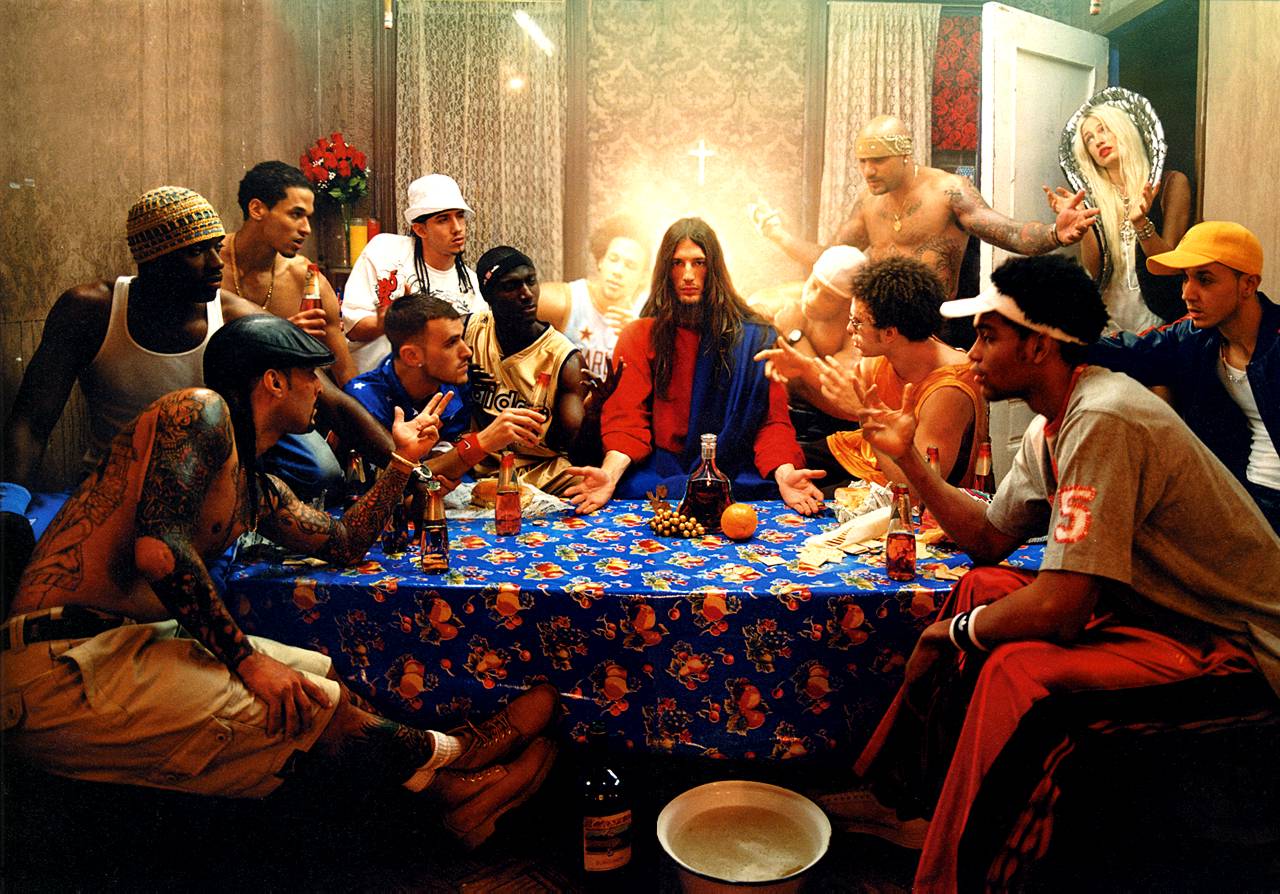
David La Chapelle ‘The Last Supper’

MY RESPONSE; 

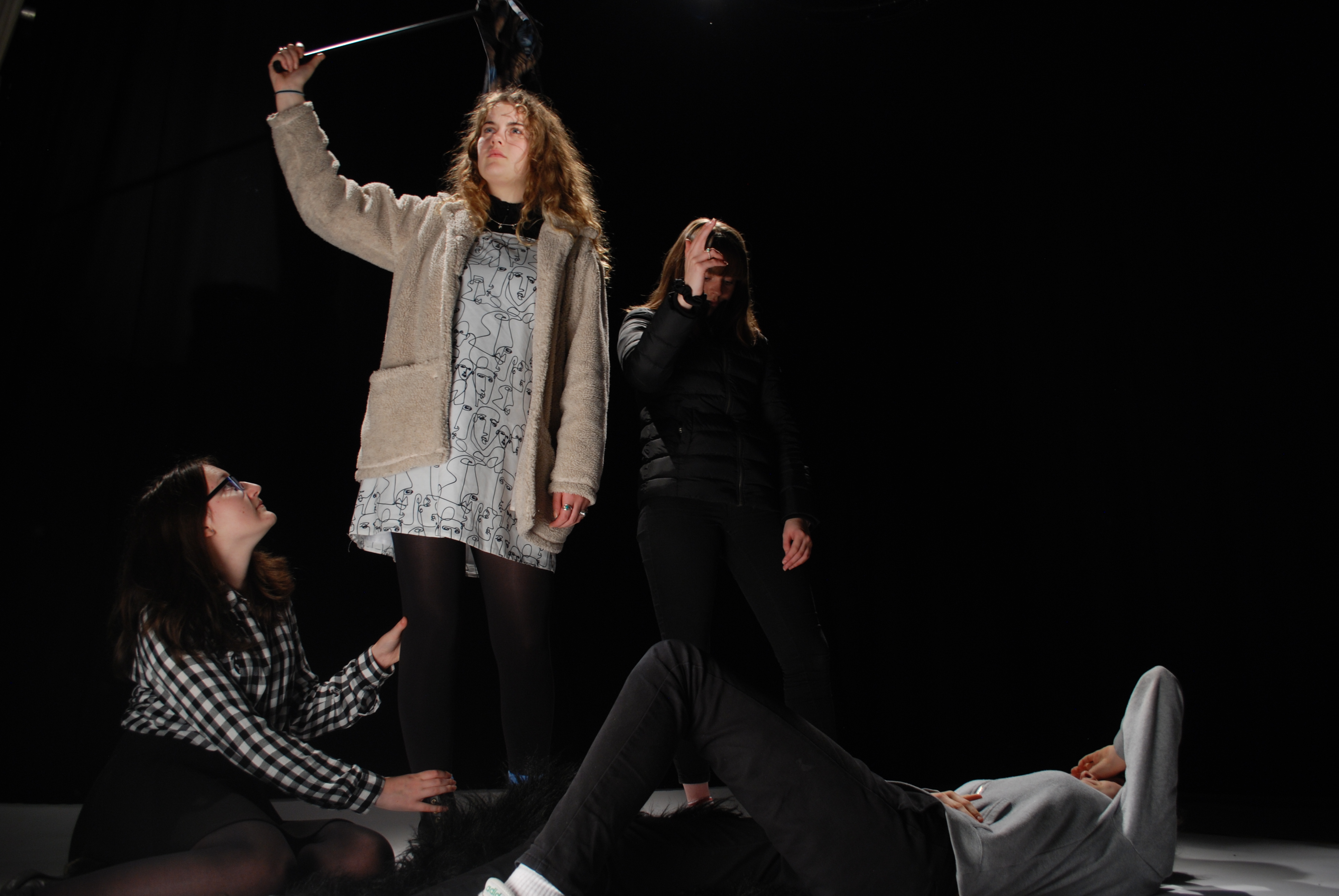
When taking these photos, we had an allocated director, photographer and lighting person, along with the cast of the image. The director was there to order the photo, in order to get out image as close to the one we were copying. It took many tries to get a good image because there was many people to order and the lighting had to be perfect, along with the photographer getting their settings correct to make sure the photo looked sharp and clean.

This photo is my favorite response from experimenting with Caravaggio’s photo ‘Deposition’. As I feel that the characters are in the right place and the image is sharp. We added our own twist on this image, by dressing the person being held in a gorilla suit, just to make it more creative and give it our own feel. 

When photographing the ‘Leading the People’ by Eugene Delacriox, we struggled getting the lighting in the right places to highlight the right parts of the image. I chose to show these two images from this shoot, because the first one has the lighting in the right place, but the whole frame wasn’t shot. Whereas in the second photo you can see the whole frame with acceptance of the flooring slighting in the photo, but that could easily be edited out. 
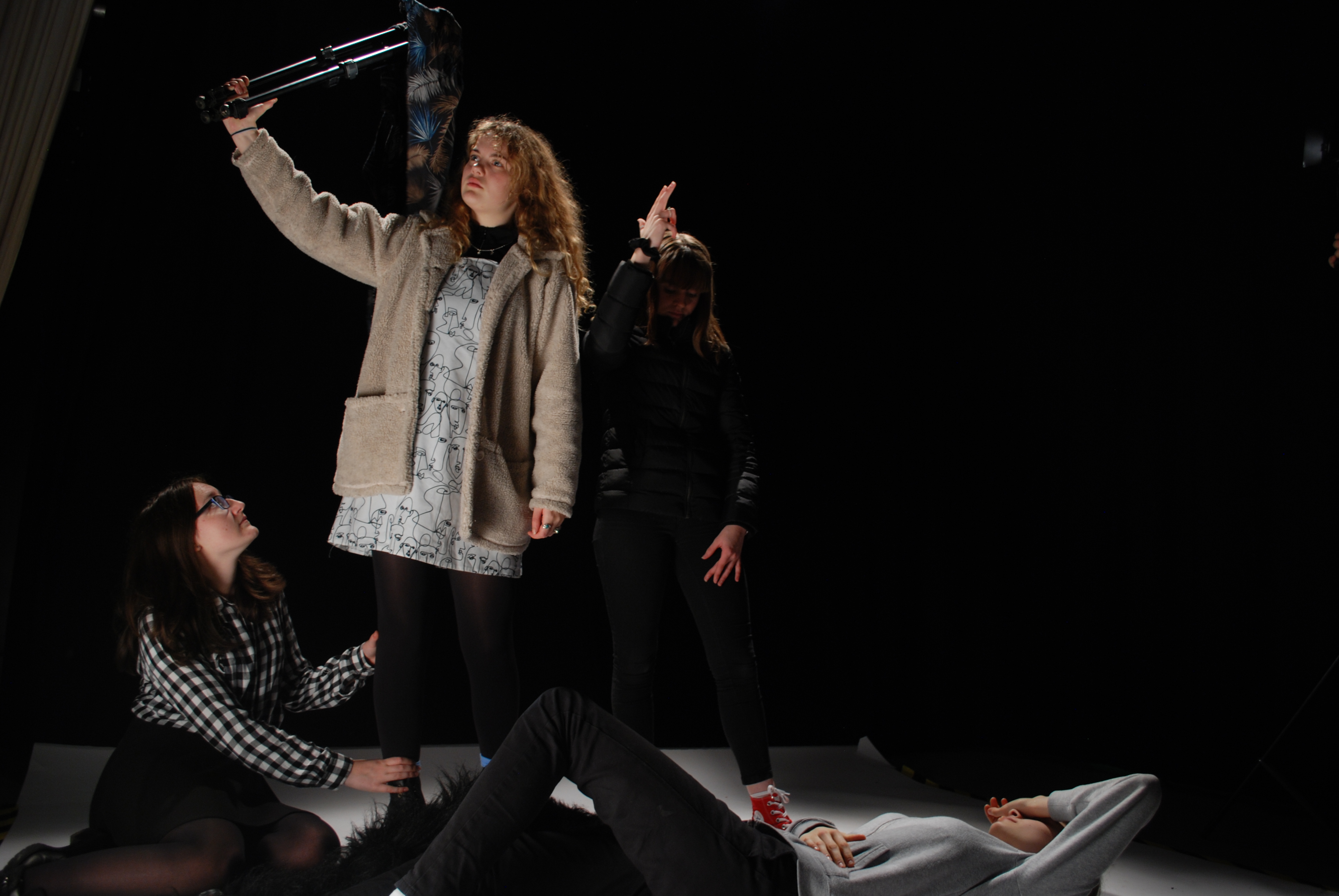
The final shoot we did was to reenact the image by David La Chapelle, ‘The Last Supper’. When photographing this image I was in charge of the lighting, I had to have a light in front of the set up and also one from behind to create the type of lighting that was created in the original.
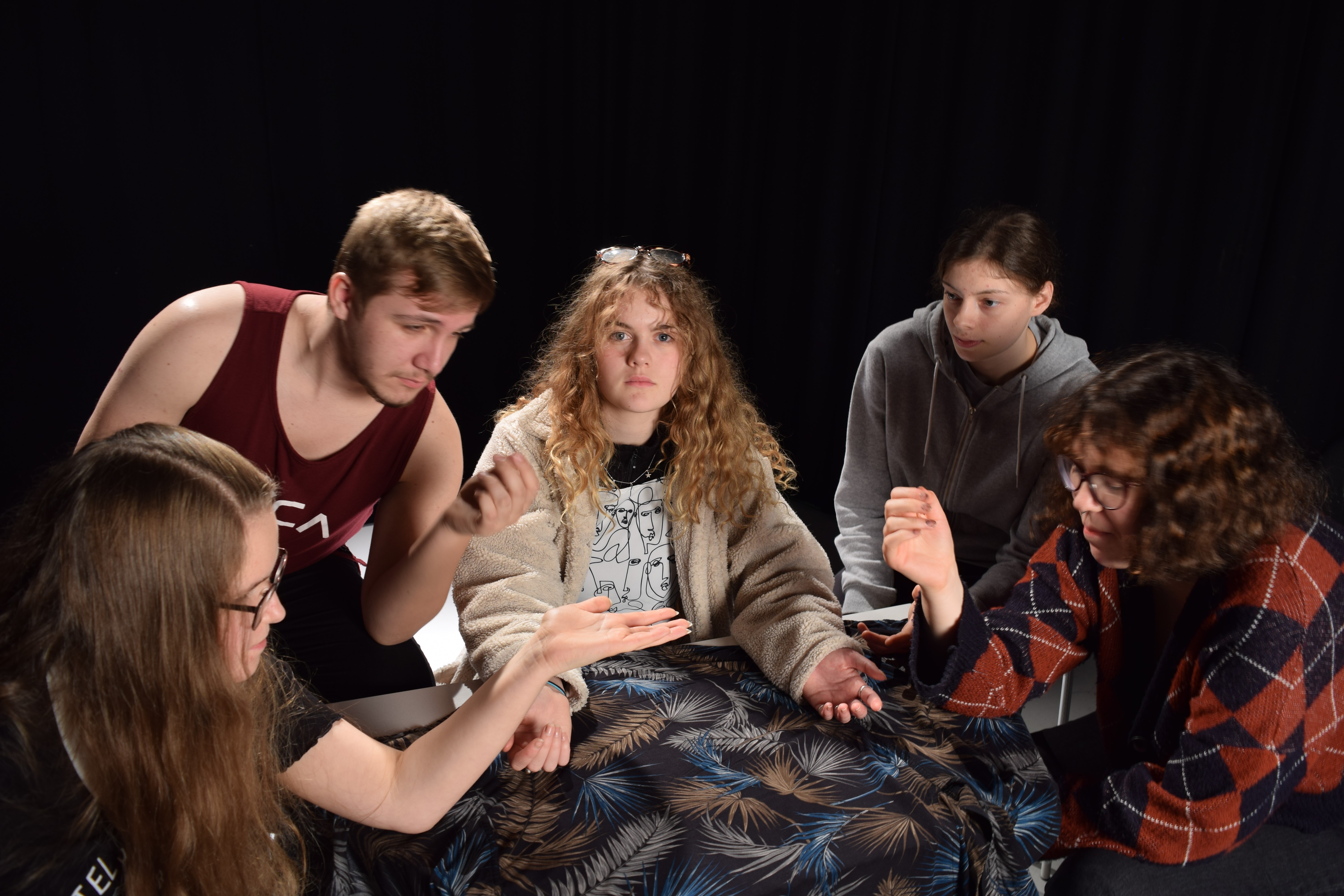
EVALUATION

During this second part of investigating tableaux/staged reality we had to set up the people as they photo had theirs set up, we also had to get the correct lighting to make the photo look something like the original. I found staged reality very difficult because, I like being able to have freedom to change things and set things how I want, whereas in this part we had to follow an image. In staged reality and tableaux there isn’t room for you to do what you like and have the ability to be creative. It was frustrating as it took a while to get characters in the right place and then along with the lighting, it was too boring.
studio1 edits

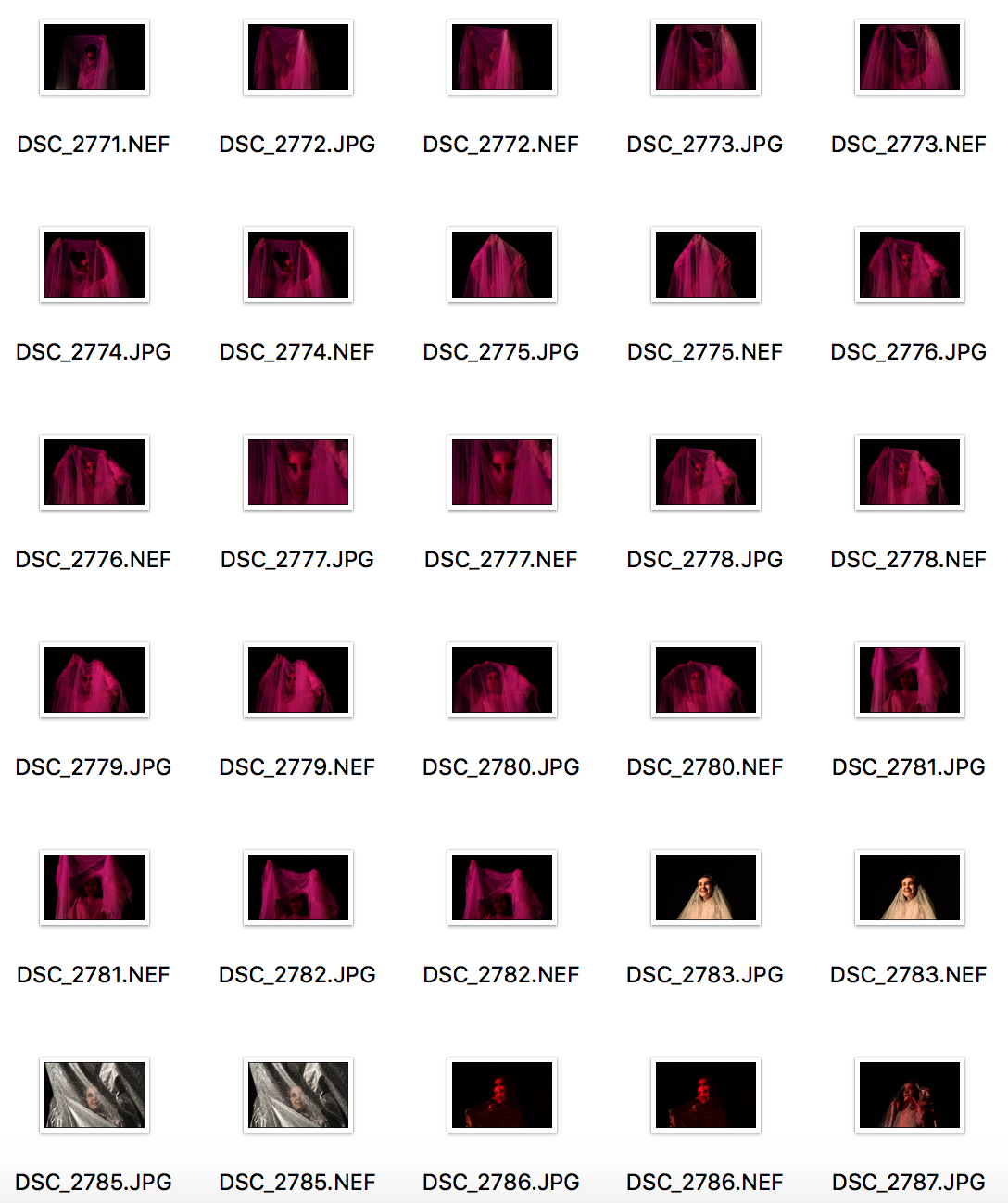
For the four previous photos I took them  using a box light and a magenta filter. I didn’t do much in terms of editing in photoshop: all I altered was the saturation to tone down the vivd, harsh pink colours and to give it a ‘cloudy’ sort of look.
In this piece I wanted to keep the vivid colours, so all I did in terms of editing was change the exposure so the figures were more dominant.

All my other photographs had been rectangle, so I decided to change it up and have this in the format of a square. I added some noise to this photo as it gave the pink filter more of a texture on the models face. I also decreased the exposure as it made everything slightly darker except for the models face which, in turn, made it stand out.


In this photo I had the model sit down so the light would catch the top of her head.  I decreased the exposure and selected the history brush and brushed over her face to gain the light back. This created an effect like just her face was glowing.


I used the double exposure setting on my camera to take this picture. My goal was to have a slight difference between the two figures, but not t

I had the model sit on the ground so I would be able to catch the light on her forehead. I wanted to enhance it a little more so I used Lightroom to edit this piece. Using a brush and selecting exposure, I brushed over the highlights on her head and eyes to strengthen the light.


Philip-Lorca DiCorcia – My Own Responses and Development

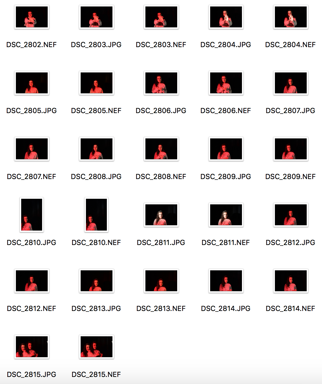
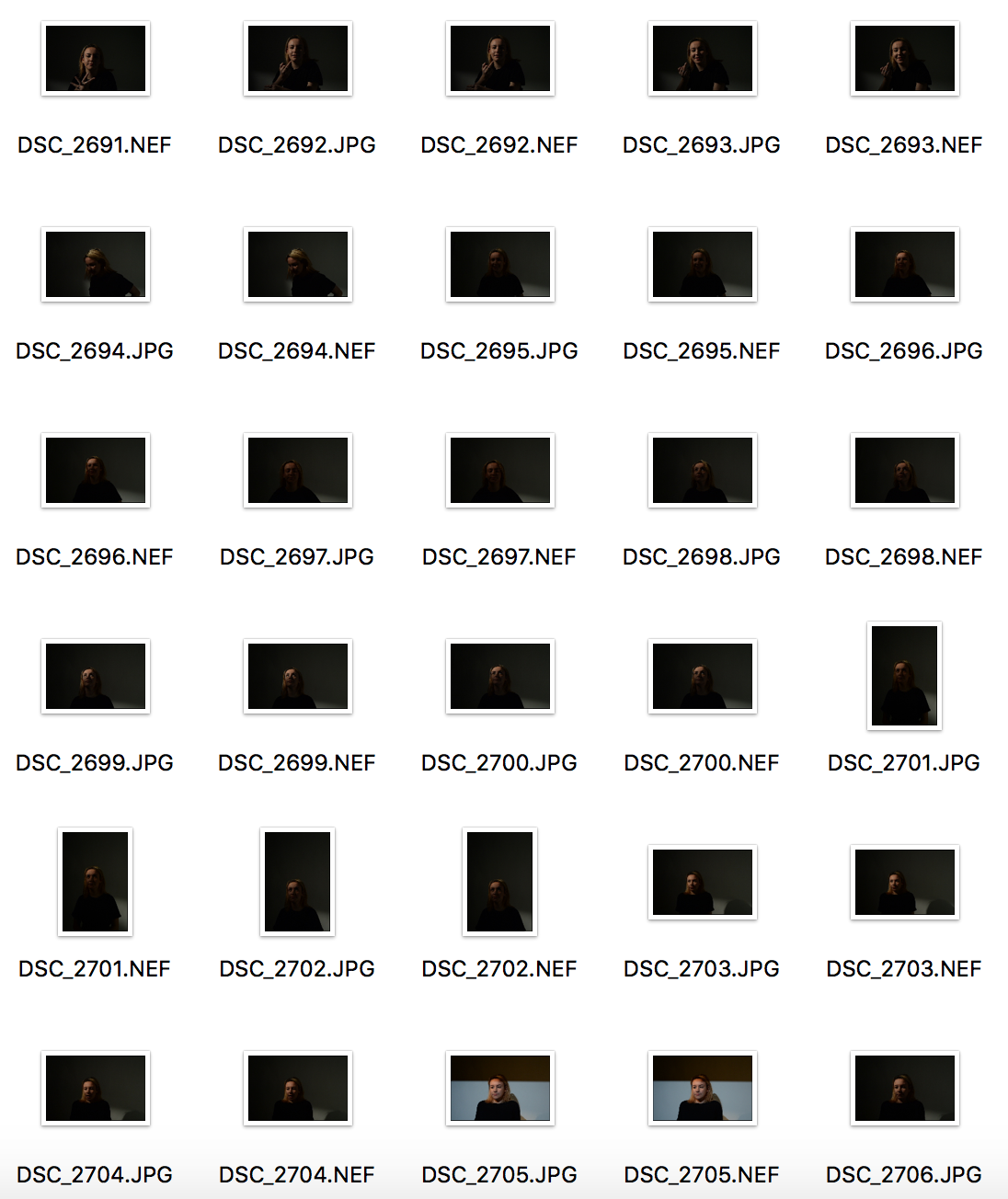
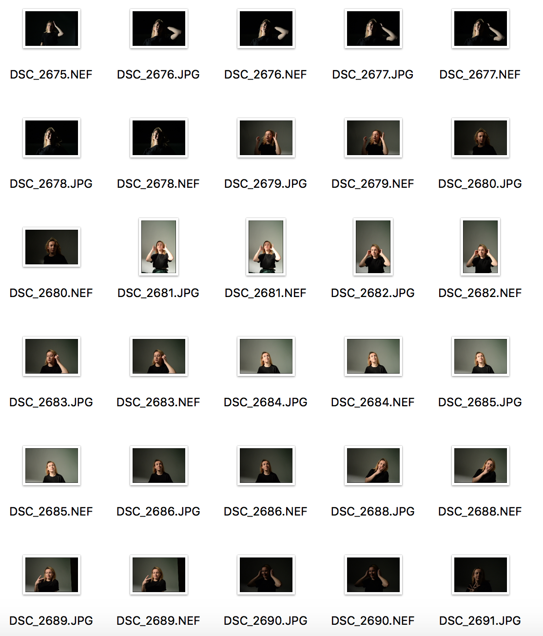
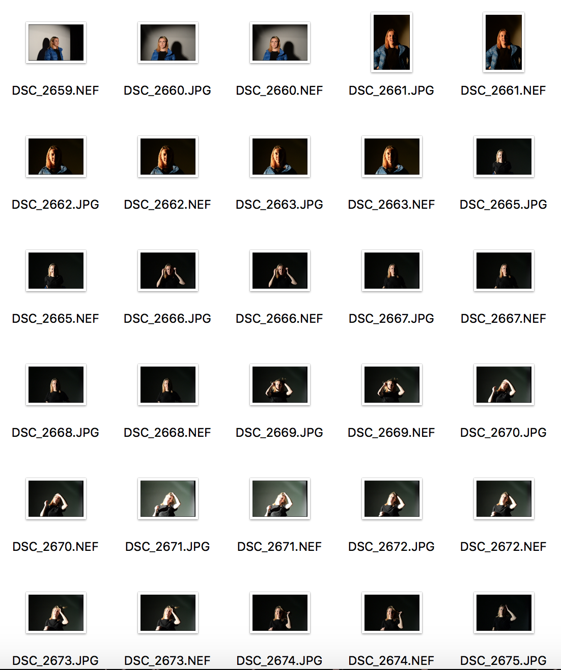
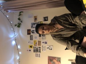
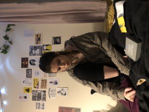
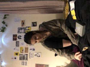
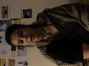
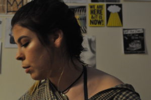
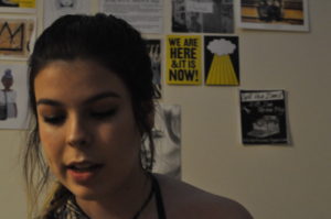
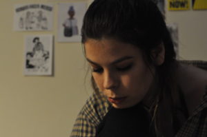
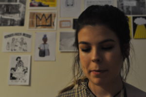
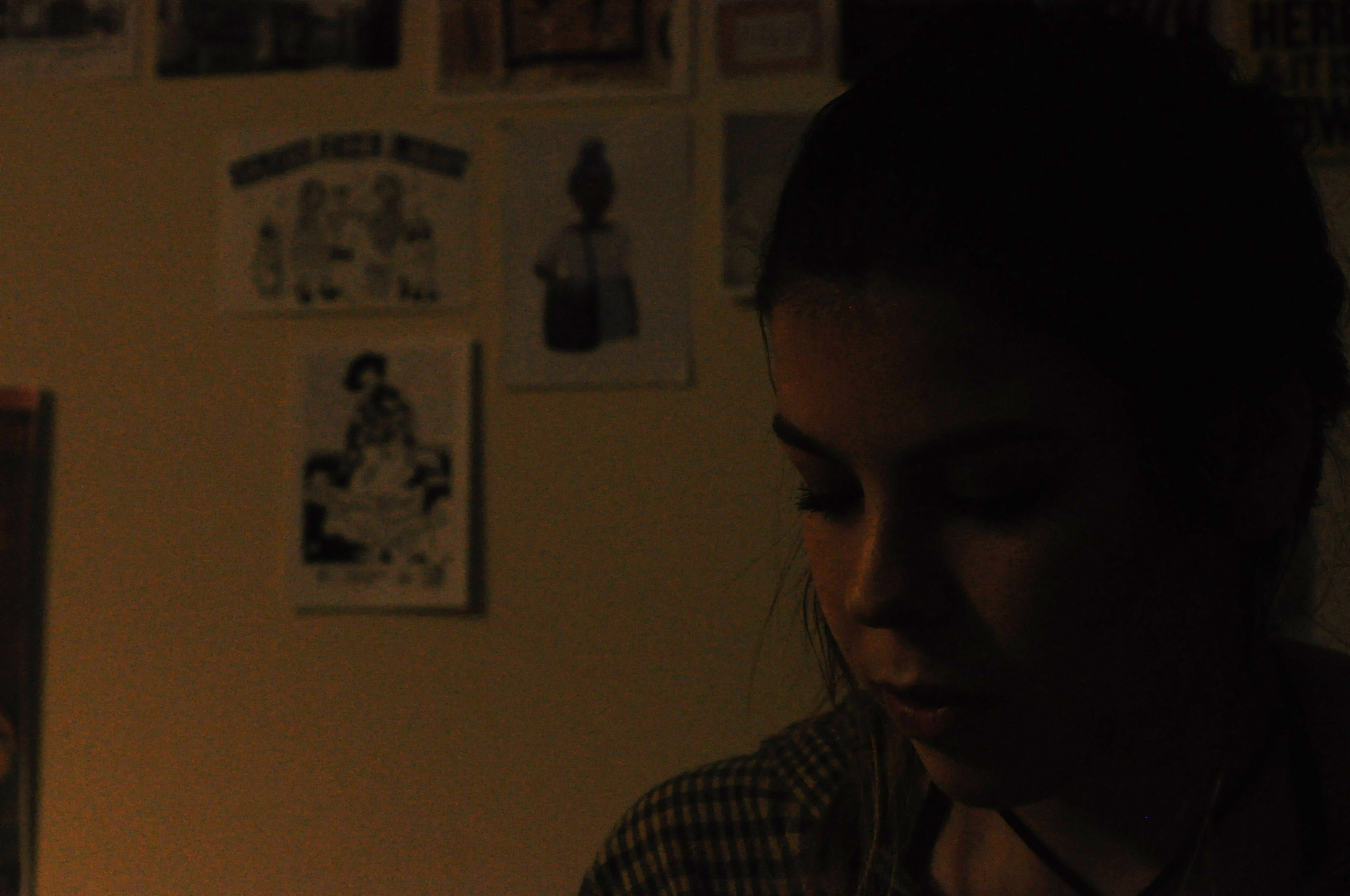
This is what I produced for my own personal photo-shoot in response to Hustlers.  I have produced some images with a subject sat in their own bedroom.  It is a little different to what Philip-Lorca diCorcia produced.  With some okay outcomes I feel this has been a useful experiment for the process and could maybe be used later on in the project.

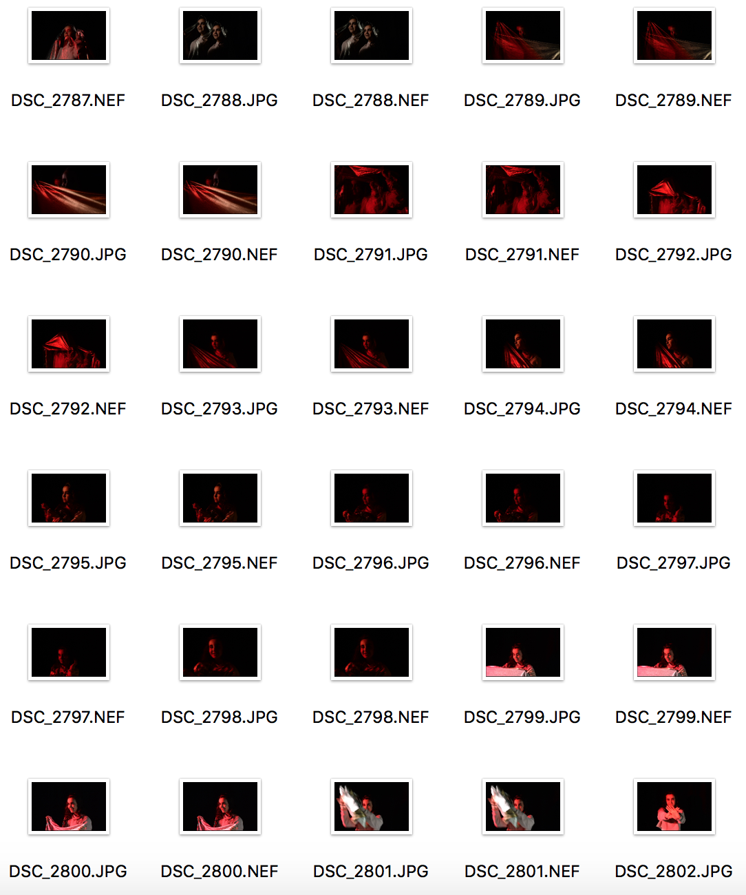
Contact Sheet of Outcomes

Below shows two of my better outcomes from the shoot, I feel that they have the more filmic qualities that I was trying to capture in response to Philip-Lorca diCorcia,  although the images have not turned out completely clear I feel they could be something that I could work with and edit into if I came to use them in the future.

My Own Response
My Own Response