Category Archives: Unit 2 Portrait

Filters

Author:
Category:

Identity 1; Research&Facts (Jan 2019 Mock)

RESEARCH

Femininity is a set or attributes, behaviours and roles associated with girls and women. Femininity is socially constructed, made up of socially defined and biologically created factors. Traits of a women traditionally include, gentleness and sensitivity. The appearance of women are traditionally long flowing hair, perfect skin and a narrow waist. Hyperfemininty is the exaggeration of stereotyped behaviour of women. This is where the qualities that are believed to be feminine are exaggerated. Gender roles play a huge part in how women are ‘meant to be’ as society expects women to act and dress in certain ways, this leads to women changing who they are, so they can fit in to the social ‘norms’. Even in different ethnic groups, they have certain role expectations, but for women they aren’t that different.

In the 21st century it is critical that you are physically attractive, this can be achieved by make up or procedures. This results in women spending more time, effort and money on their appearance, this is because it has been socially learned from the female image. A thought experiment is that if children were introduced into a world where physical appearance was unimportant, they wouldn’t care about how they looked or how anyone else looked. As children are now introduced into a society where looks and appearance is everything, they are pressured to make themselves look like everyone else. Females spend an average of $700 a year on clothes before entering their older age. As women increase in earning power and social status their interest in physical appearance will increase even more. A study shows that half of girls feel stifled by gender stereotyping, as they are to believe that they are valued more for their appearance.

There are four types of gender stereotyping affecting women, which include; personality traits, domestic behaviour, occupations and physical appearance. Personality traits for females include in them being emotional and accommodating. Domestic behaviours such as taking care of children, to cook and clean are expected by women. Occupations such as a teacher or a nurse are assumed to be done by females. Finally, physical appearance is the main stereotyping that females are affected by, as they are expected to be thin, graceful and pretty looking, even if this involves in them changing who they are to feel like they fit in. If society didn’t have these brutal expectations for women, women wouldn’t feel the need to change who they are as they would feel comfortable and accepted in their own skin.

LEIGH BOWERY 

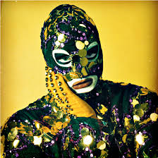
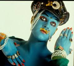
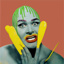
Bowery was born 26 March 1961, he was an Australian performance artist, club promoter and fashion designer. He was mainly known for his bold and interesting looking costumes and makeup in his images. He was mainly based in London during his adult life and inspired many artists, such as Lucian Freud who was a British painter. Bowery states that ‘fashion, where all girls have clear skin, blue eyes, blonde-brown wavy hair and a size 10 figure…STINKS’. He really exaggerated and almost took the mick out of models, applying all the makeup to himself to make himself ‘look like’ the typical model was a big statement in itself, as you can understand what Bowery’s concept of his images are, that girls are expected to have perfect features and alter themselves but it just makes them look stupid and that they should learn to love themselves.

Leigh Bowery over exaggerates the appearance of genders and how they are meant to look to look due to the ‘norms’ made by society. The reasons behind his exaggerations, is to present how ridiculous it is to apply so much ‘cover’ to yourself to hide the real you.

Leigh Bowery, Dazed Digital

I’m choosing Leigh Bowery as my lead artist as I love the way that he exaggerates his makeup and costumes to show hoe ridiculous it is to change yourself to fit the ‘norms’, also his facial expressions show his emotions and it is a contrast between look and emotions. My favorite images by Bowery are;Image result for leigh bowerythe boldness of the lips and the outfit choices and props used makes this image stand out to me as it is so unique. I feel like Bowery’s concept of this image is to show the boldness and extremes that people will go to, to make themselves look a certain way

 

Plan (MOCK EXAM)

Plan

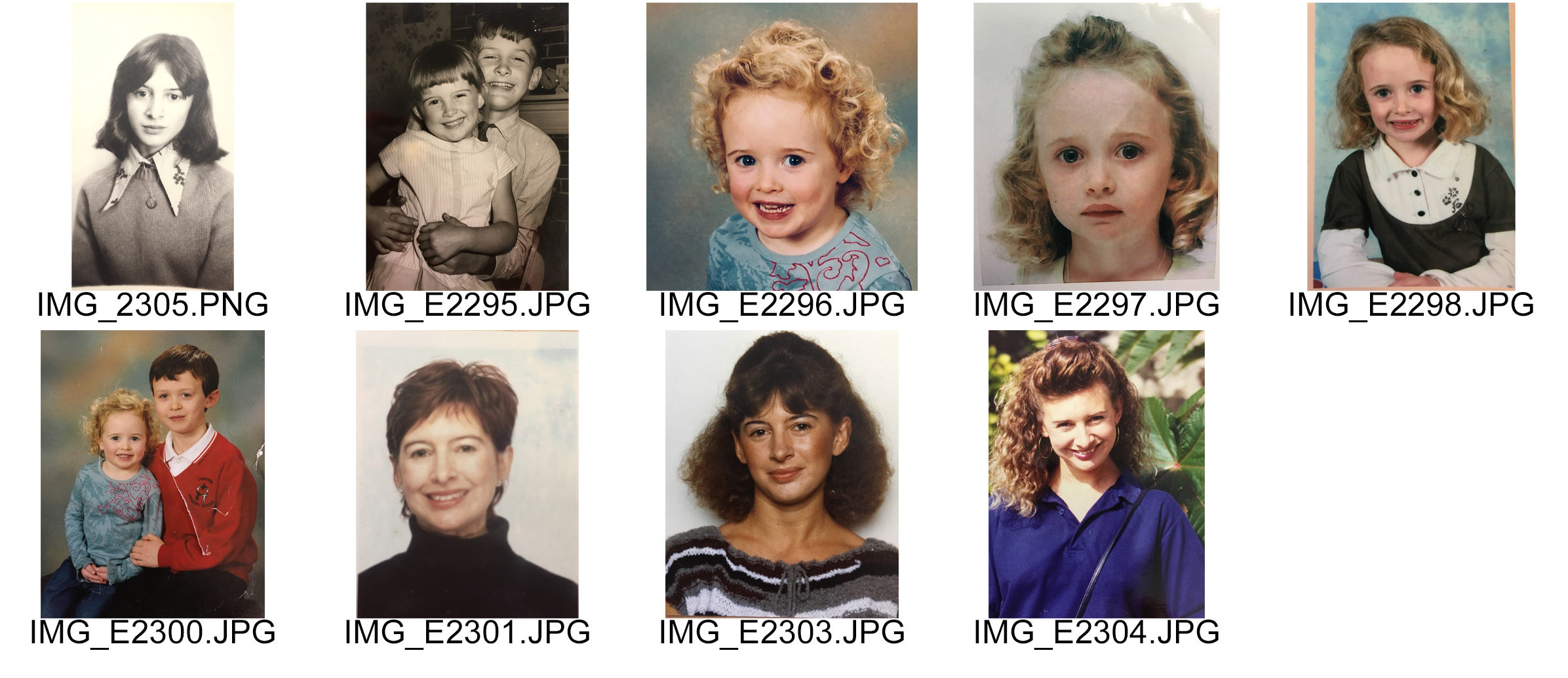
My plan is to create pieces of work based on how a person’s identity is shaped through their upbringing, genes and their parents & family.  I have planned to use archival imagery of my family, in particular my Mum and I, and create a series of photo-montages based on different features and genes which I have inherited from my Mum and also incorporate things that are different between us, such as: different features on the face or hair when we were both growing up. I am interested in physically taking old & new photos, cutting/ripping them apart and putting back together, taking out parts, sewing things in order to create something new out of it. This demonstrates the way in which old traits and genes from parents are passed onto the child and although they become influenced by many different things, their physical and personality traits are mostly  handed down from their parents.
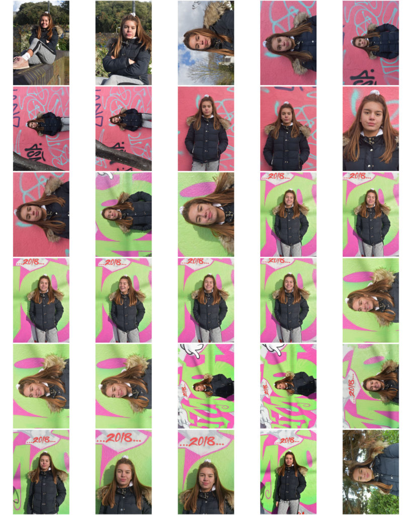
I have found various photos of the two of us when we were aging and growing up. I also found some photos that are eerily similar, despite having been taken 30-40-50 years apart. These are the photos I have used to make my photo-montages from. There is a variety of photos of me, my mum, my uncle & my mum and me & my brother. There are also a variety of black and white, and color photos. Some are passport, school and Polaroid photos, and others  are just simply photos which have been randomly taken. I think this is a good mix to have in order to create more diversity in the photo-montages.

Case Studies

I have done case studies on Annegret Soltau & Joachim Schmidt and I am influenced by their work and the methods they have used in order to create it. Annegret’s timeline of her daughter & grandmothers bodies was thought provoking to me, and I have decided to develop my work along same lines as her. My photos reflect that my mum and I  have done similar things, taken the same photos but just in a different time and with different people, and I want that to be able to be seen through my work.

My Own response to Xavier Ribas

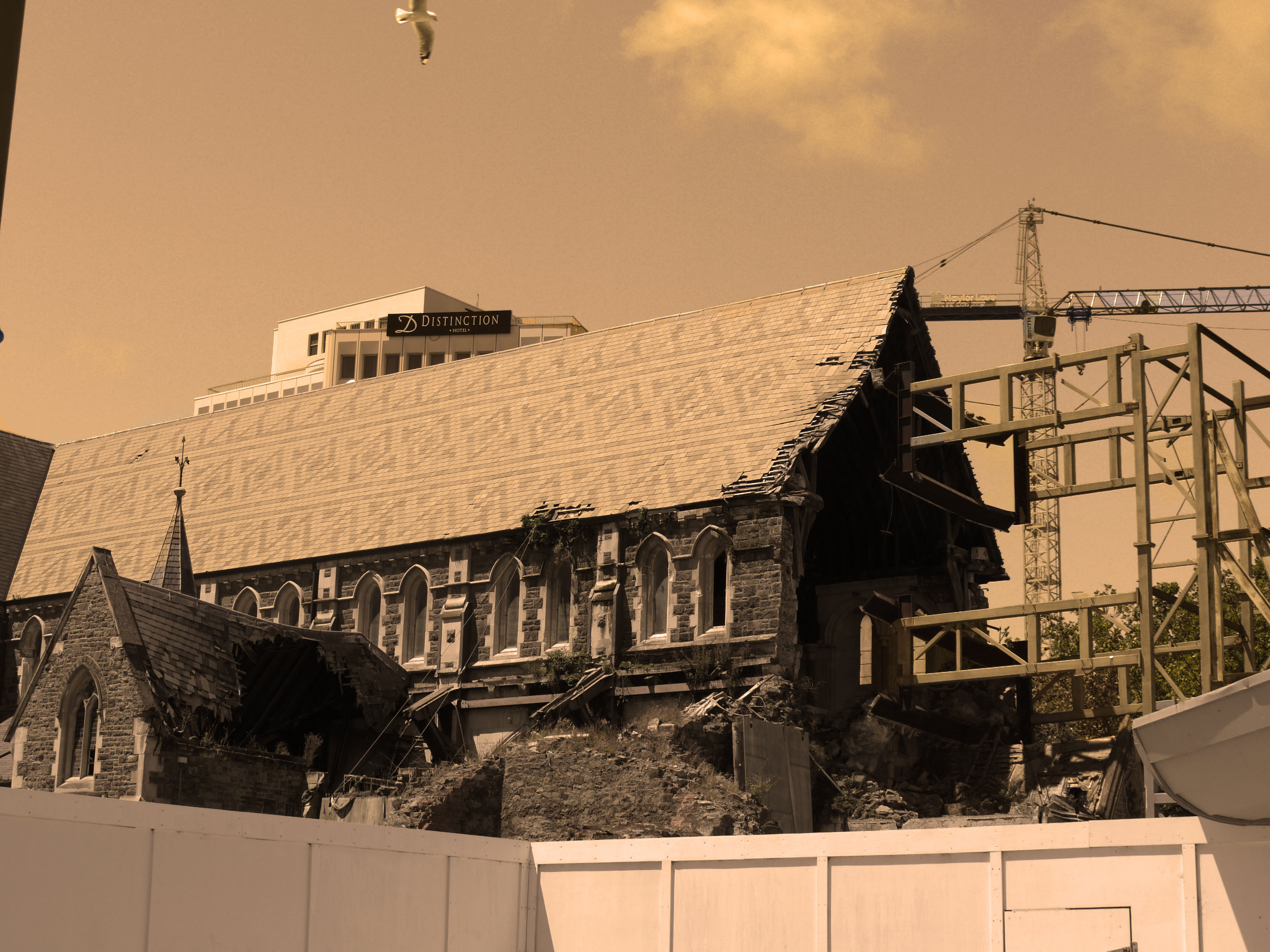
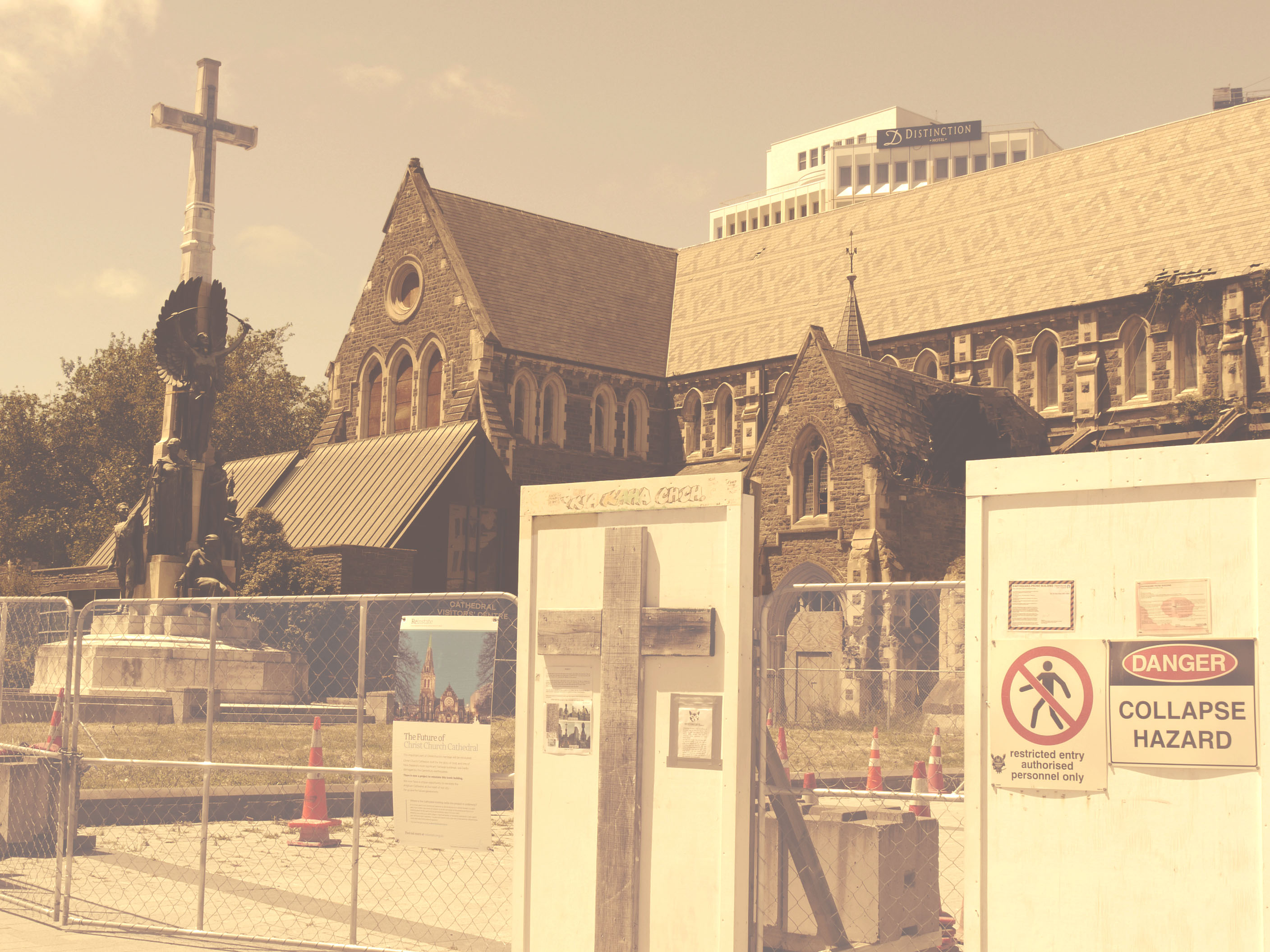
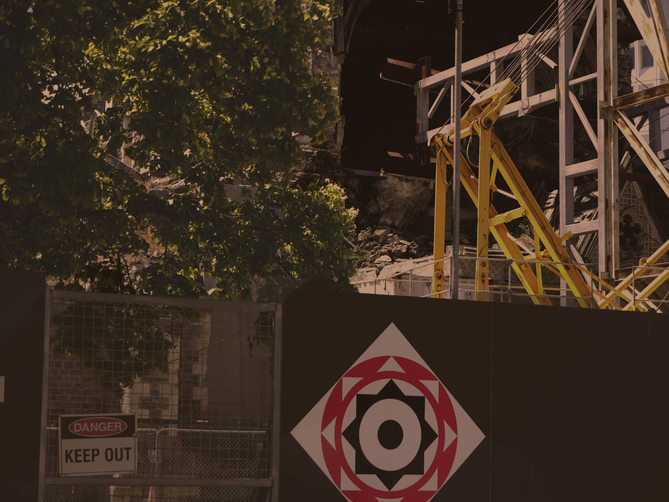
Xavier uses muted yellow tones in his photos which i have tried to replicate on photo shop. Using the image -adjustments tool and then using a different process on each photo.  I looked at the main cathedral in new Zealand when i went there in Christ church and the destruction that the earthquake caused and how the city and nature moves around it with out taking much notice because it has just become normality. This links in well with Xavier's work because its all about how society just molds and grows round destruction and damage

Response to Barbara Kruger

Barbara Kruger generally uses black and white photographs with heavy contrast as her background layer underneath bold red text boxes usually stating strong, somewhat controversial lines.

As I knew beforehand that I was going to be editing these images more than I usually would, I wanted to use natural lighting portraits as my background to even that out.

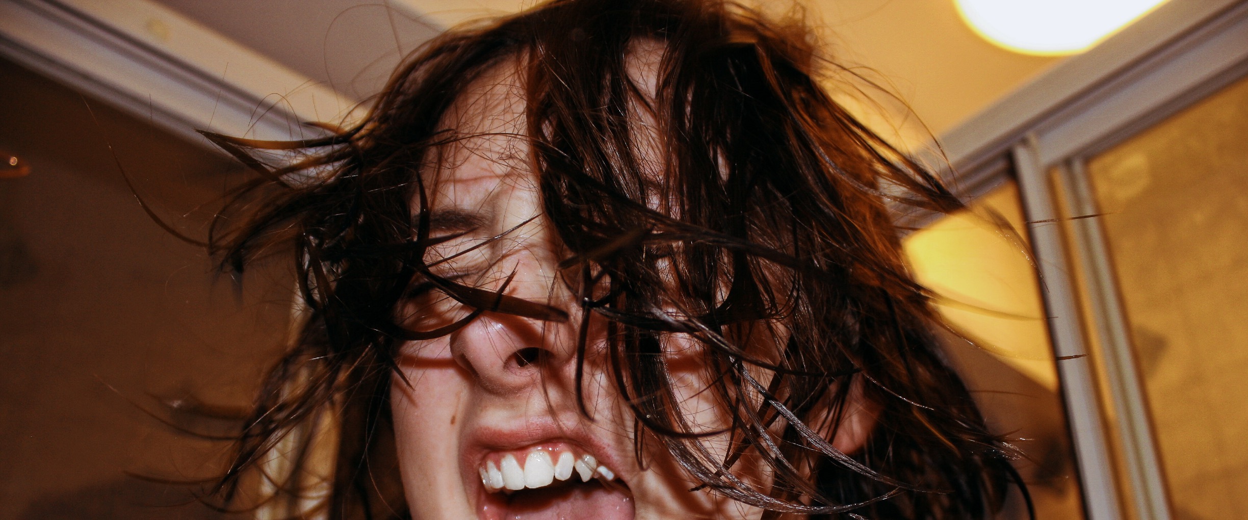
Although Kruger doesn’t use her photos as a ‘series’ I did want to use mine this way, whilst also addressing some topics that I’m extremely passionate about – the effects of mental illness, abuse, and the stigma that inevitably follows. 

Editing

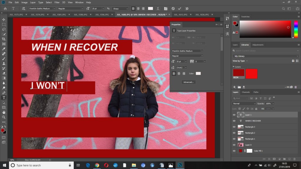
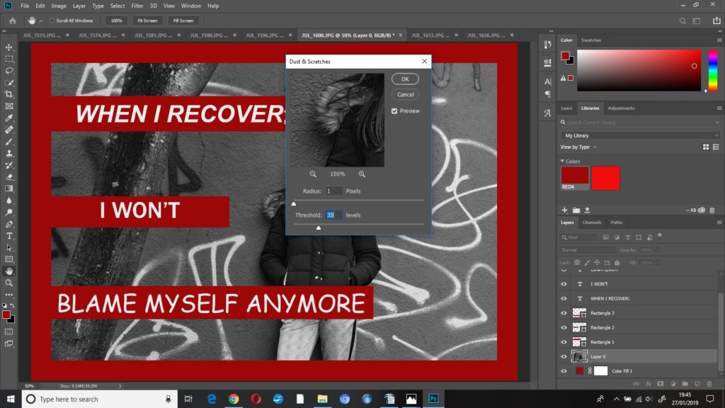
first edit: when i recover; i won’t blame myself anymore

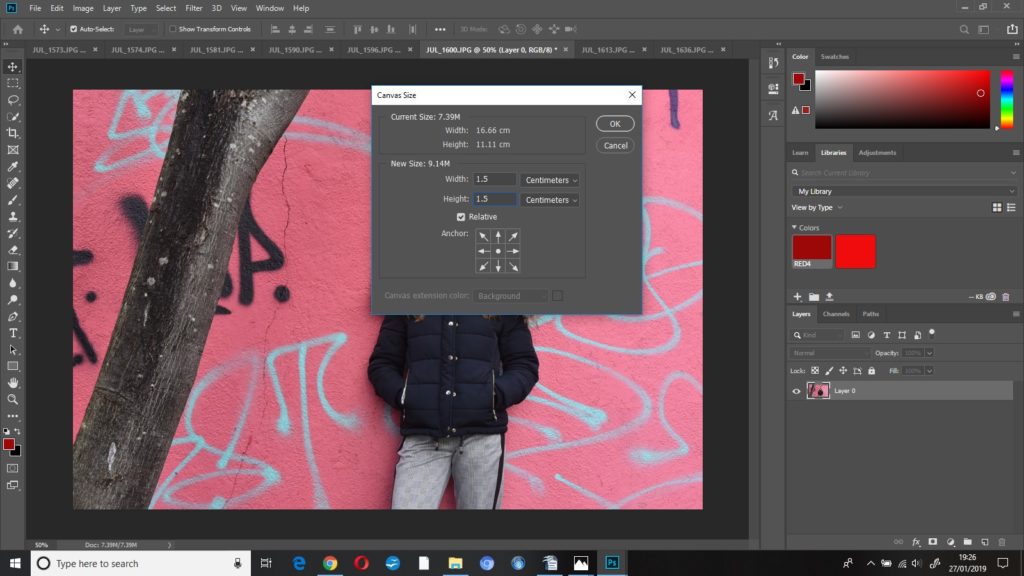
The first thing I did to this image was increase the canvas size so that I could then create the thick red border around the image – I increased the height and width to 1.5cm after a bit of trial and error to see which thickness I thought appeared best.

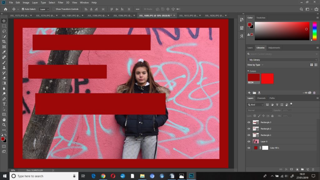
I created a ‘colour fill’ layer and dragged that underneath ‘layer 0’ in the layers column. I used the rectangle tool to create some rectangles, filled with the same shade red as the border, where I wanted the text to go.

I used the horizontal text tool to then place the text where I wanted it – I opened the ‘properties’ panel to adjust the font, size and colour of the text.

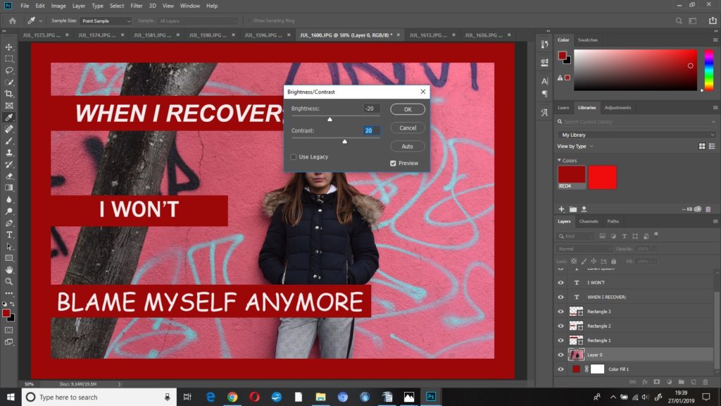
I then started to edit my photograph. I decreased the brightness to -20 and increased the contrast to +20. This made the whole image a bit darker but the colours a bit brighter – I did this so that when I put the image into black and white, I’d know which parts of the image were going to be darker and which were going to be lighter.

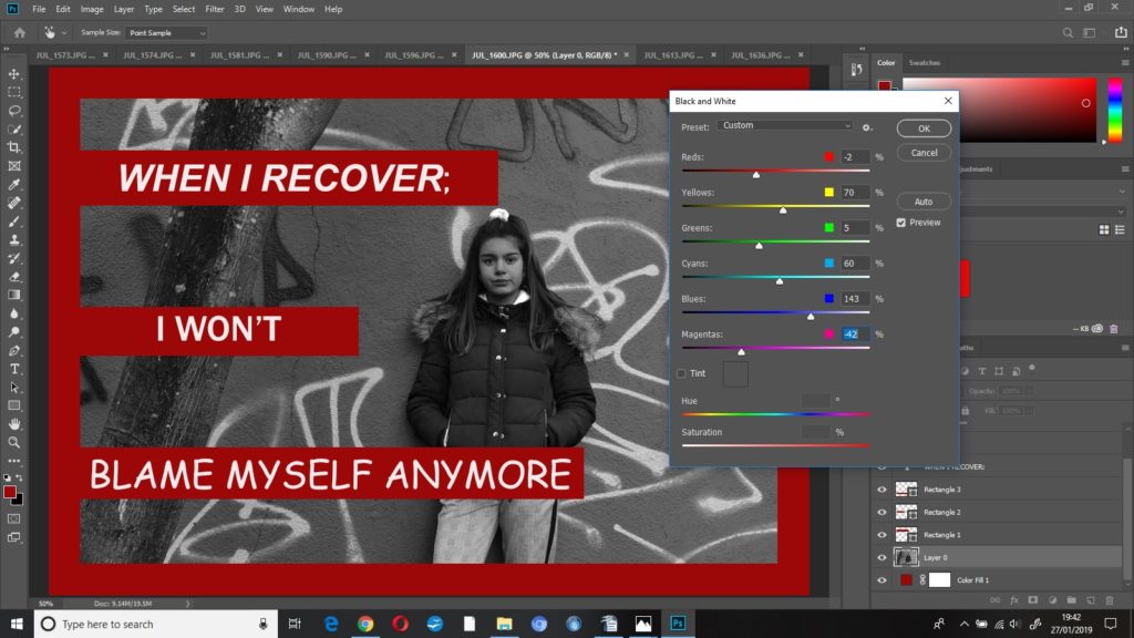
I put the photo into black and white, but I played around with some of the colour settings until the photo looked how I wanted it to look, this resulted in;

reds -2%

blues 143%

magentas -42%

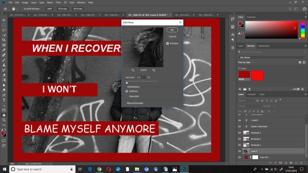
I added some grain ((noise)) to this image to make it look more dramatic and give it some harsher editing, I increased the noise to 5.5% .

To finish this edit I added some dust and scratches, I left radius at 1 pixel and increased threshold to 35 levels.

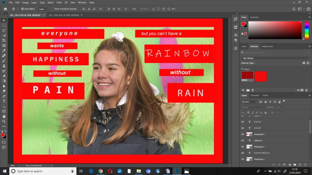
second edit; you can’t have a rainbow, without a little pain

I started this edit by doing the same as the previous with the red border and text, however I used a brighter, more vibrant red as this was a more positive photo.

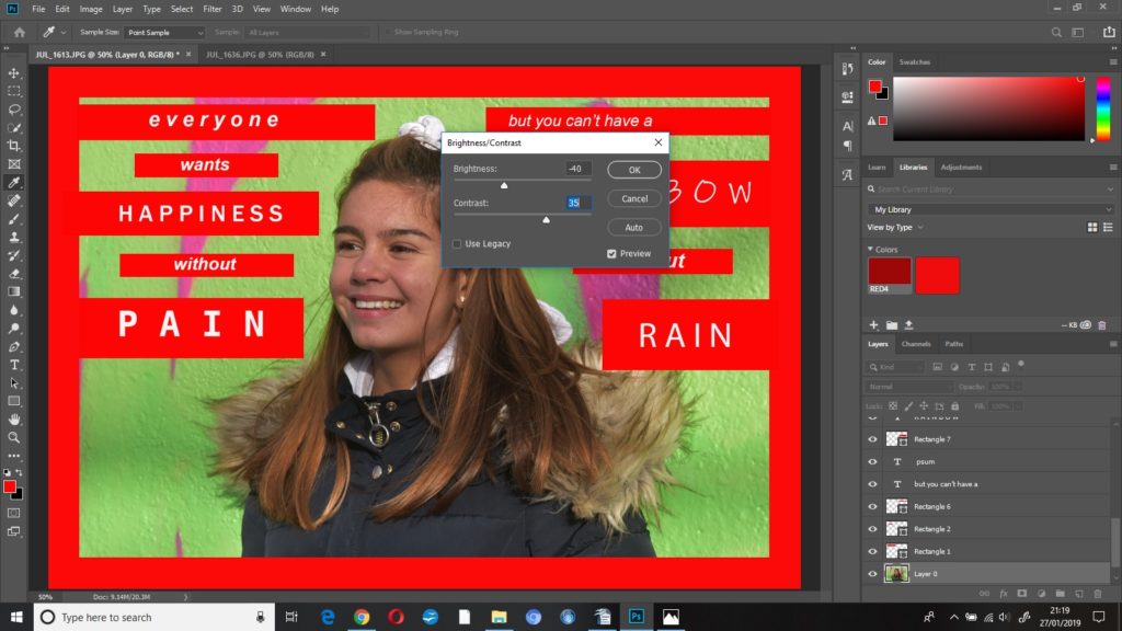
I started editing this image by decreasing the brightness to -40 and increasing the contrast to +40, I wanted the background to appear brighter, and as the subjects skin tone was slightly washed out, I decreased the brightness.

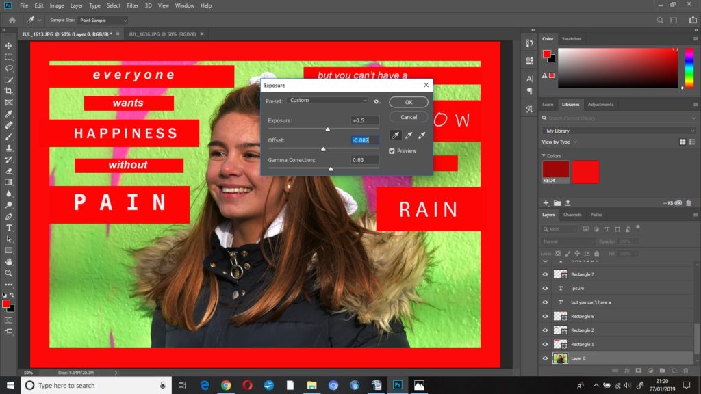
I kept adjusting the exposure settings until I was happy with how the photo was looking, the final settings were:

exposure +0.5

offset -0.002

gamma correction 0.83

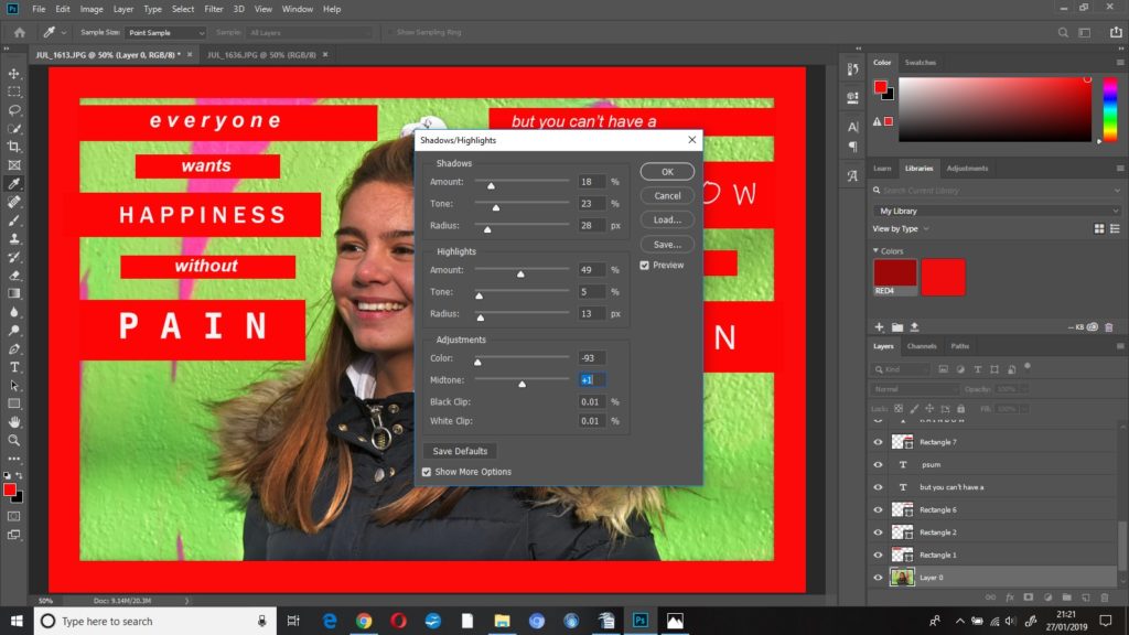
I changed some of the settings in shadows/highlights:

shadows

amount 18%

tone 23%

radius 28

highlights

amount 49%

radius 13

adjustments 

colour -93%

midtones +1

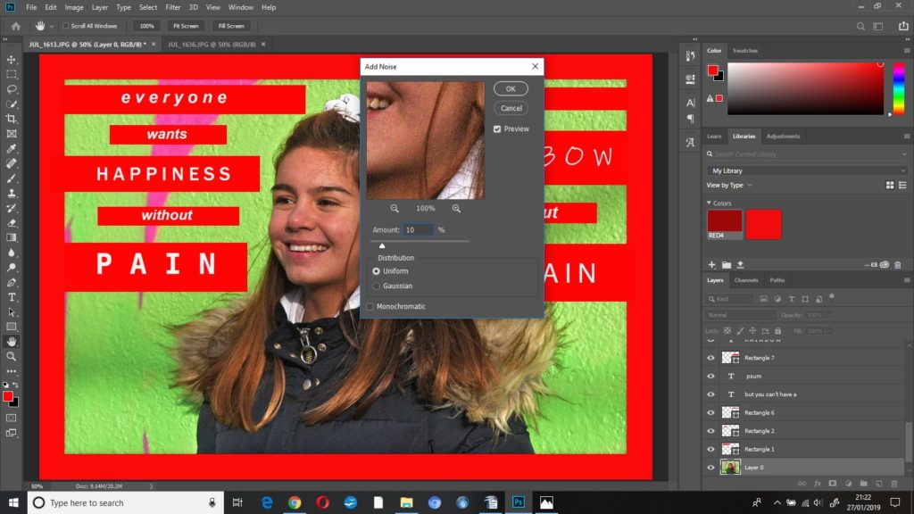
To finish this edit I added noise at 10%, uniform.

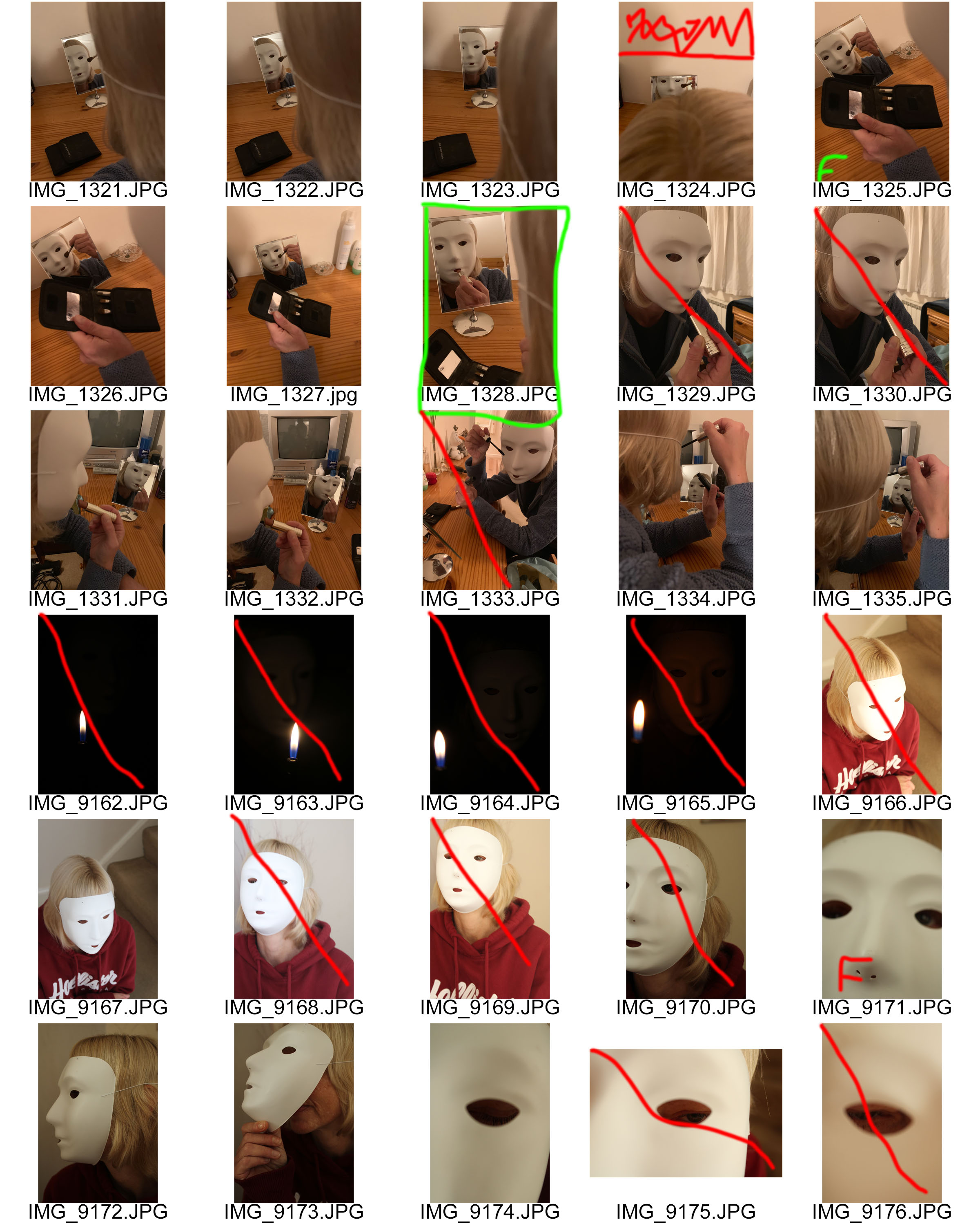
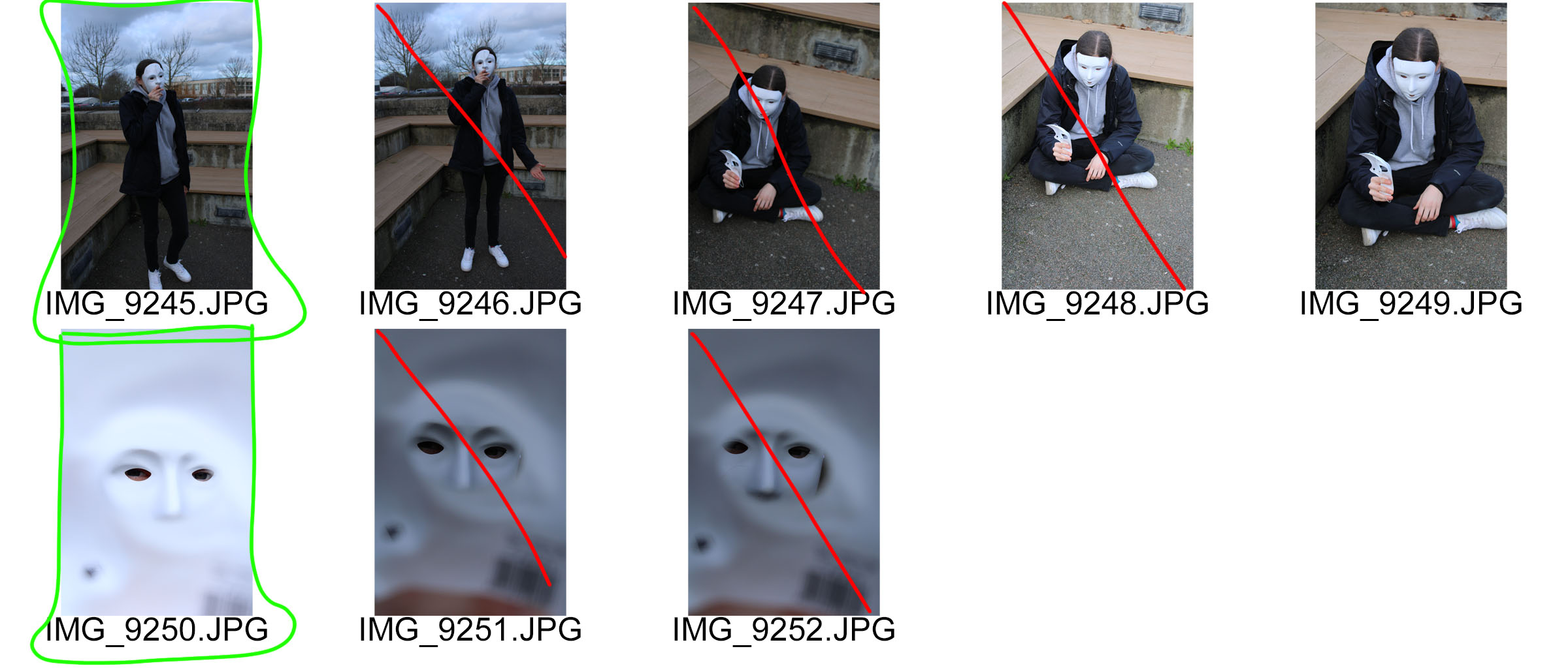
Photo shoot 2 – Masks

Planning

The aim of this photo shoot is to clearly show my response to Saul Seinberg and mask photography. As mentioned before I felt that Seinberg’s work presented too much of an identity and therefore conducted research into mask photography.  In this photo shoot I will be using two types of masks, a whole face mask and a half face mask, in order to present the theme of loss of identity. The location of this photo shoot will be both indoors and outdoors, to gain a mixture of environments. I want to be able to use natural lighting throughout this shoot, in order to make the images seem more natural. Doing this will present the theme of loss of identity as a more natural and realistic occurrence, making viewers more aware of the idea that someone can loose their identity. I will be keep the camera settings pretty standard, with the shutter speed being quick, the ISO on 400-800 and the white balance being on daylight. On Occasion I will alter the shutter speed and ISO in order to make the images seem lighter and darker depending of the location of the image and how I envision the final image to look like. I will direct my model to sit in different positions, do different actions and to look in certain places which will ensure that the images taken are how I want them to look.

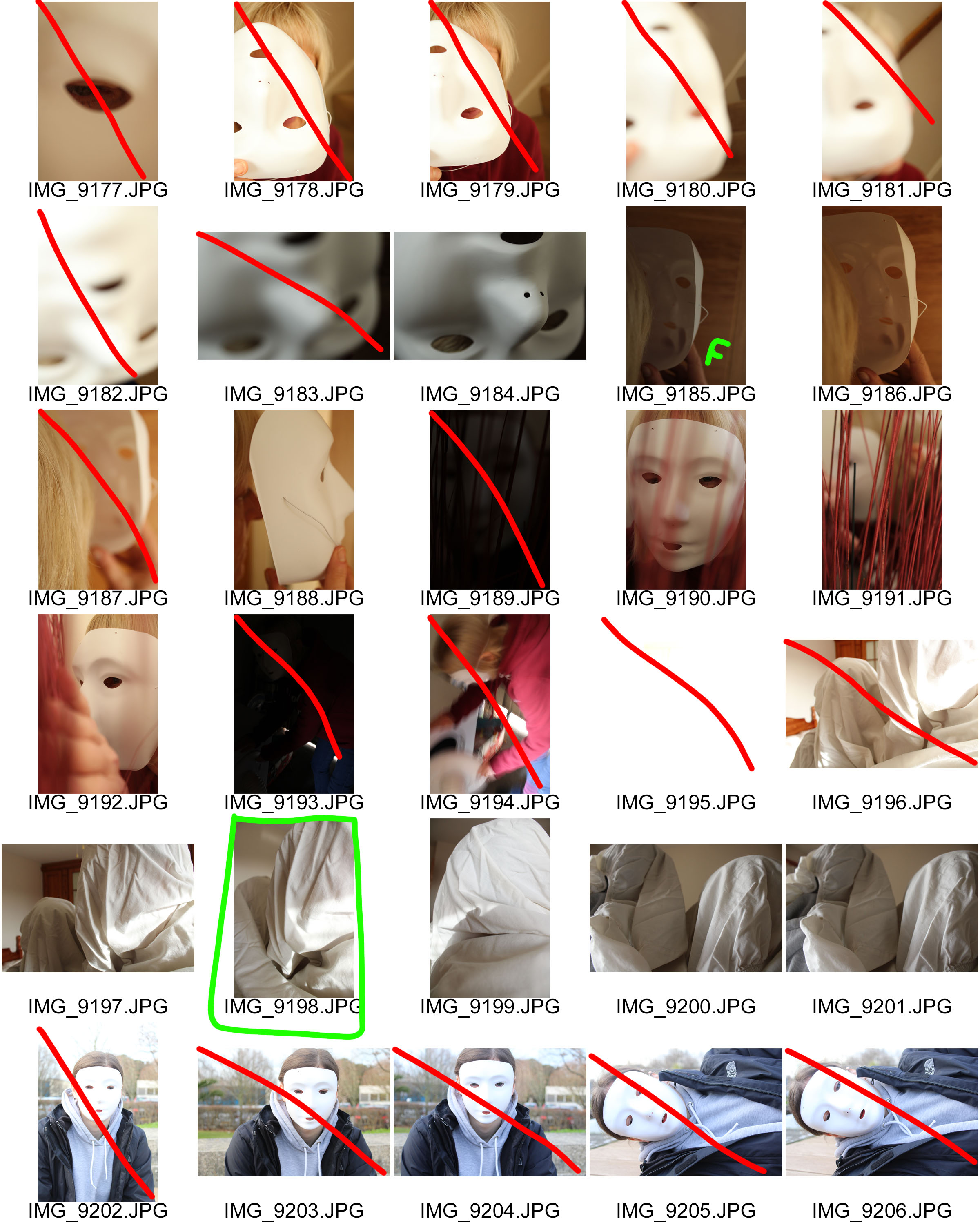
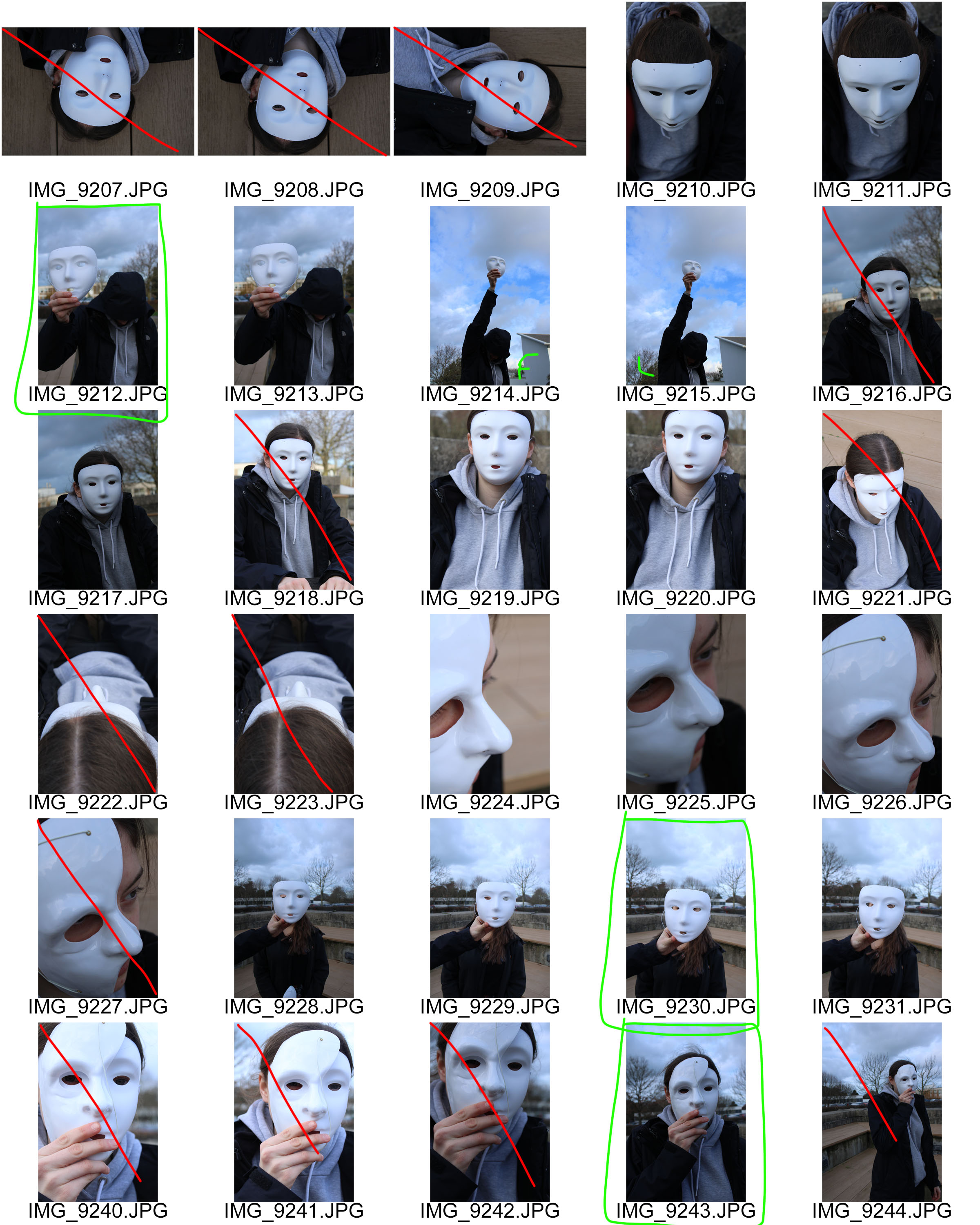
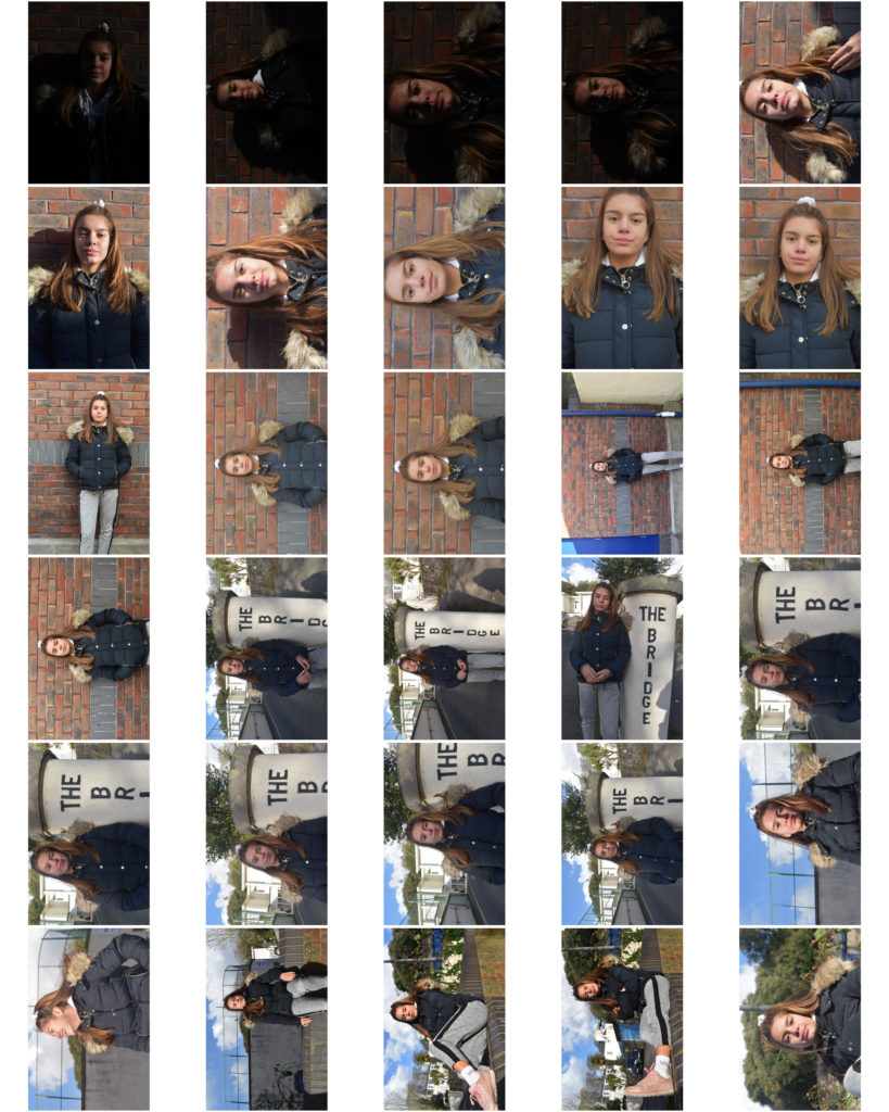
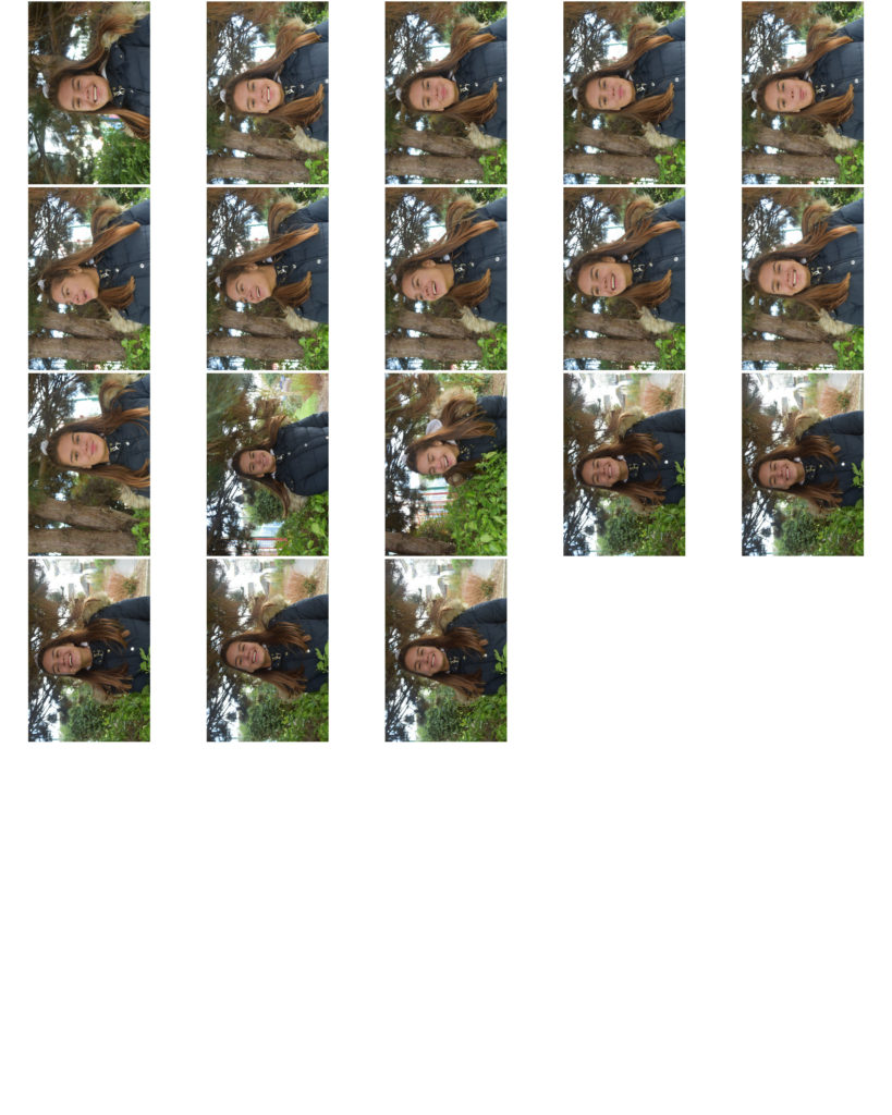
Contact Sheets

To evaluate this photo shoot I felt that I have been able to produce some strong outcomes towards mask photography. I looked at surrealism within mask photography, bed cover over head, and a more naturalistic look with a plain white mask. I felt that I was able to successfully meet the aim of this photo shoot. In the editing process I want to ensure that all personality and identity is extracted from these images, so I will look at adjusting the levels, curves, hue and saturation. I want to be able to create a eerie and sinister tone to the final outcomes, to represent the eerie and sinister feelings people gain when they loose their identity.

Final images photoshoot – Identity

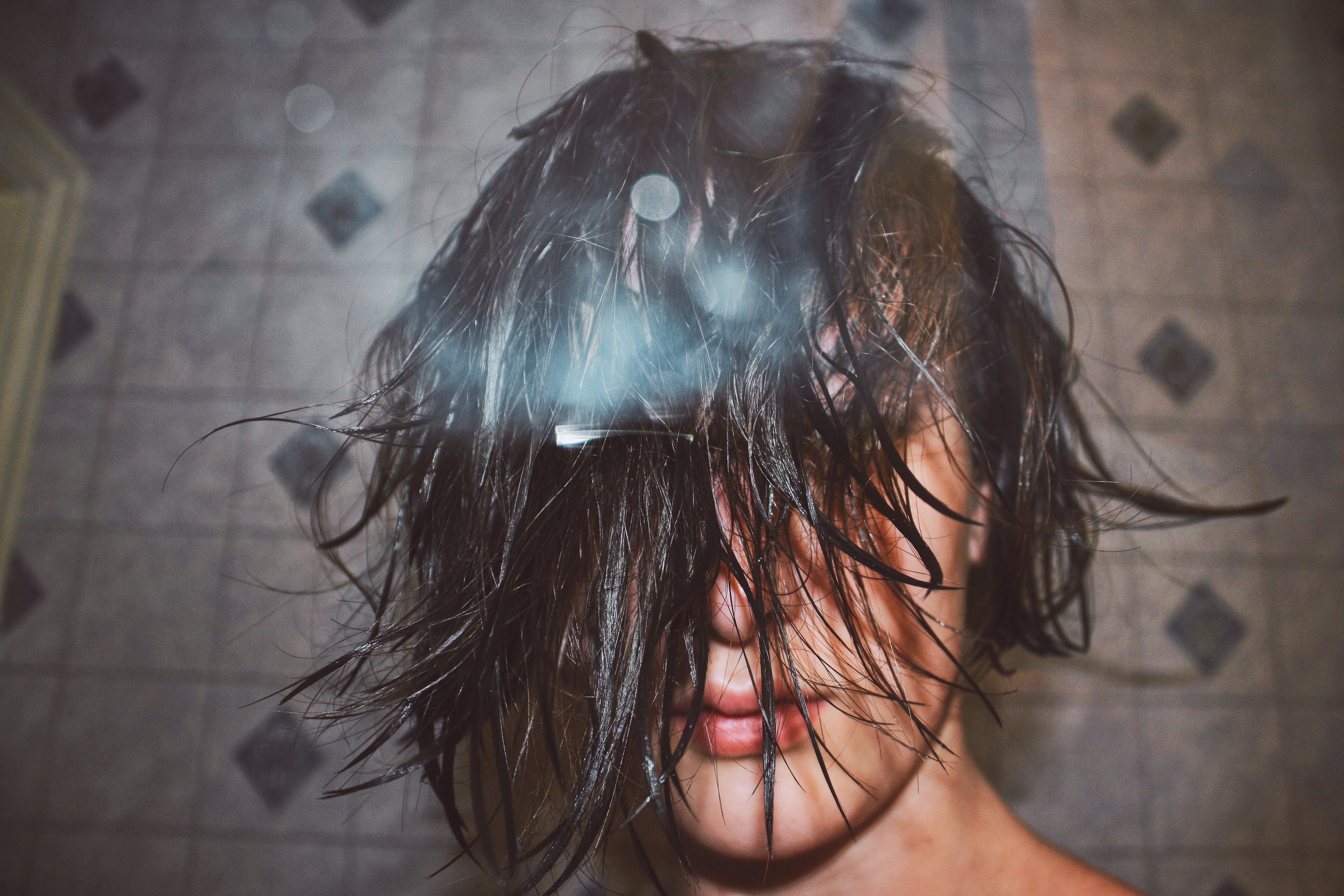
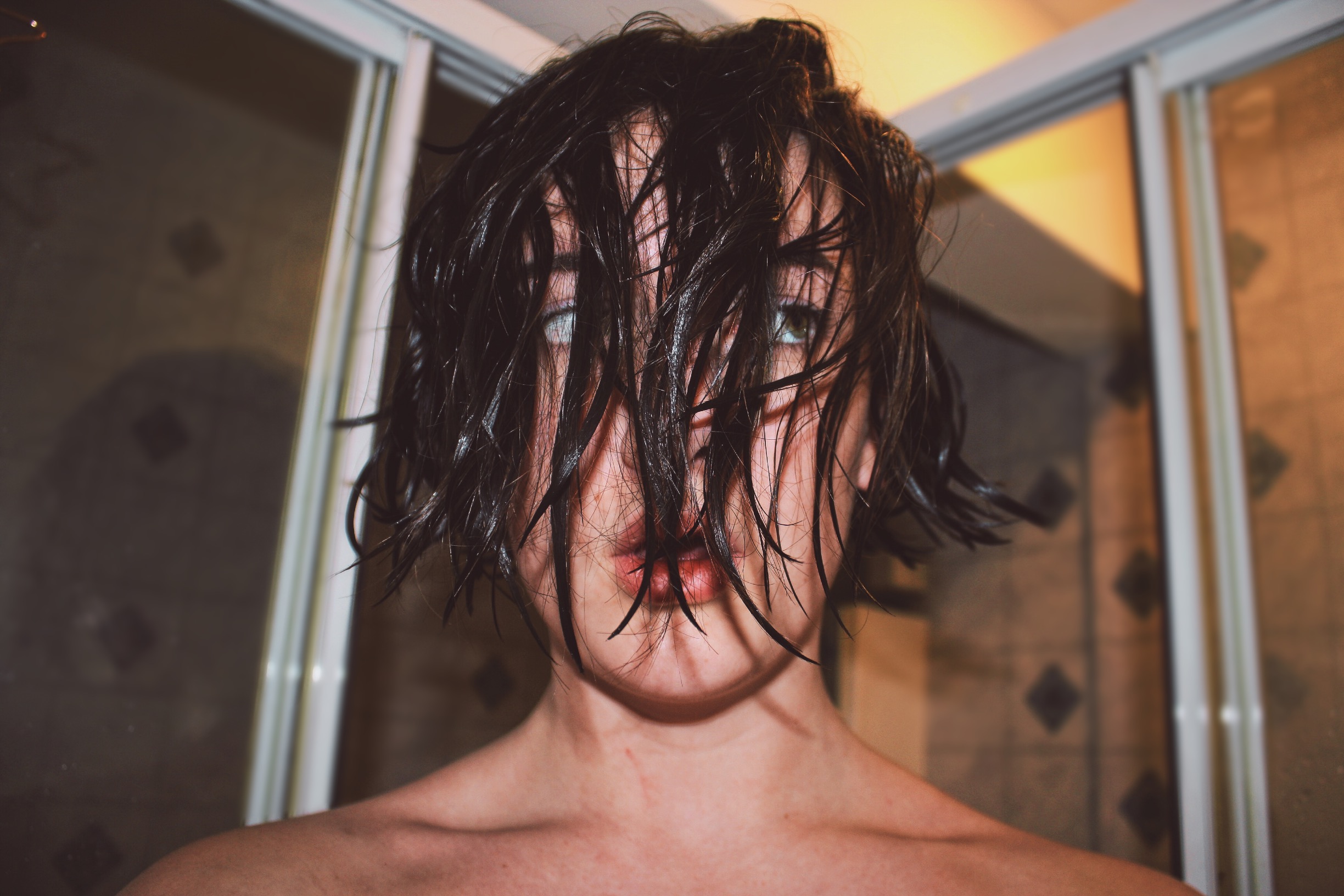
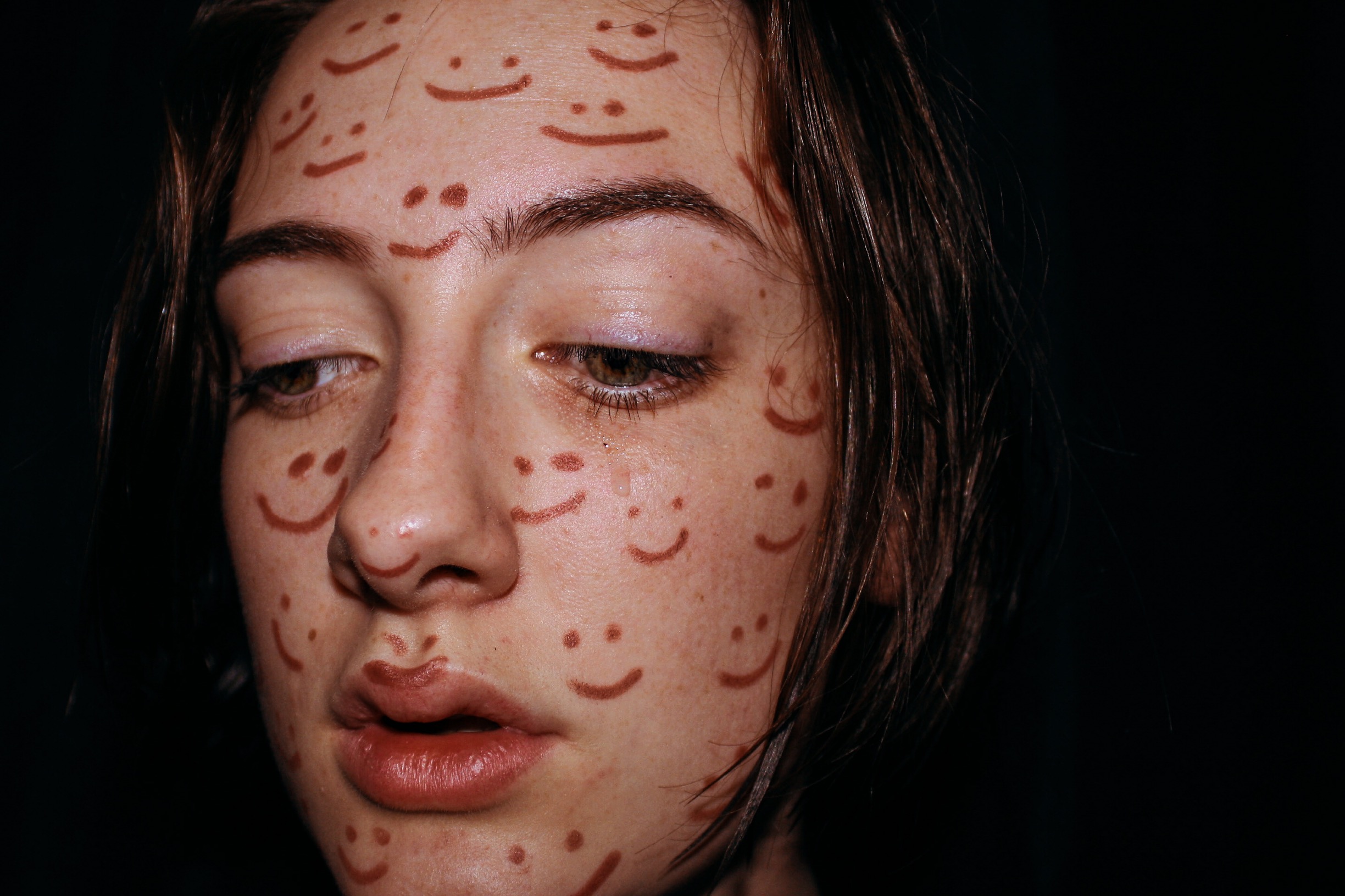
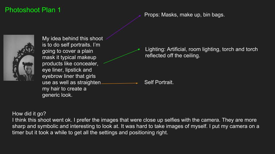
For my ‘final ideas’ photo shoot, I wanted to piece together all of my ideas together i did this by deciding to do self portraits because it meant I could portray the ideas I wanted to get across from personal experience. I also did this so that the wrong message wasn’t put across. 

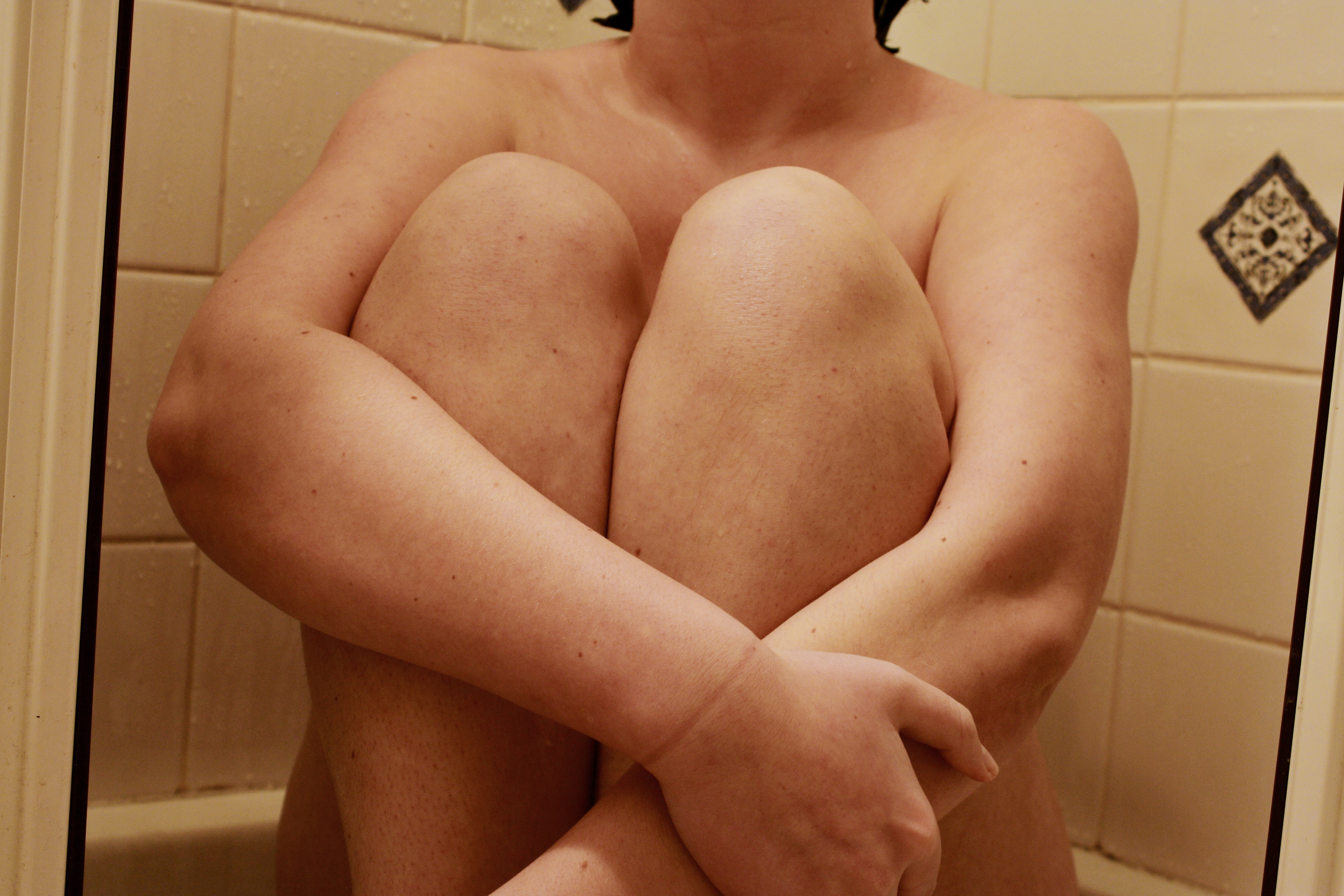
As my setting I used a shower (which represents being isolated from the outside world – a safe place) and for my more basic portraits I used a basic set up of a black cloth, a tripod and a 10 second camera timer. This all together reflected my idea of inner emotions escaping my mind.


Final ideas – Artist Researches

For my final piece, I am focusing on  ‘Mental Identity’:  inner state of identity. I will focus more on how behind closed doors, no one knows how they truly impact someone else and the effect on their emotions. 

Artist References

Gabriella Mendez

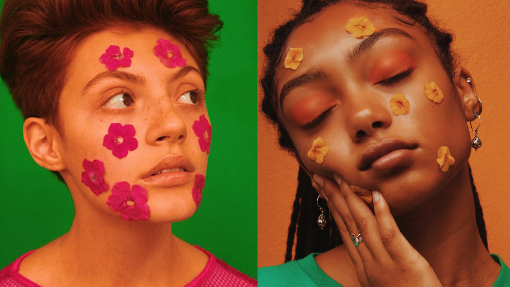
I admire Mendez’  work due to her perspective and imagination shrouding colours complimenting skin tones. She also uses stickers, projections and objects to portray her ideas of fashion and culture. I  really admired her idea of using appliques and drawings on faces to reflect a certain idea. 

Analysis

VISUAL

Mendez’ work often displays a colourful background with one/two people as the centre focus. In these images she has used bold solid coloured back drops, she then correlates the costume and make up with this colour scheme. With the photo on the left Mendez has correlated the eye and foliage make up to the off-mustard background, then has a contrasting top on the model to vary where the eye’s attention else where. Within the picture on the left however Mendez has made it so that the models foliage and top to contrast the background. This collectively draws the direct attention to the models neutral face in contrast to the boldly coloured extras.

TECHNICAL

In order to create this image Mendez has used a warm toned soft box light so that light isn’t direct, its even dispersed within the studio. During the editing process she has increased the images saturation and contrast to make the image soft and not harsh with lots of colours happening.


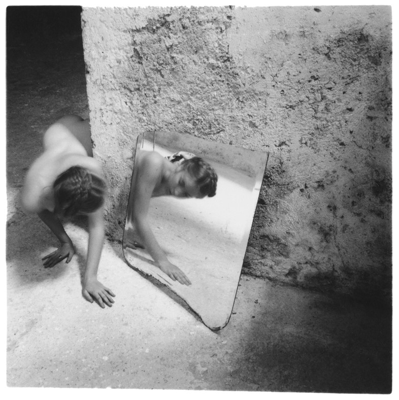
Francesca Woodman

Francesca Stern Woodman was an American photographer best known for her black and white pictures featuring either herself or female models. Many of her photographs show women, naked or clothed, blurred, merging with their surroundings, or whose faces are obscured.

What I admire about Woodman’s work is how she uses her self as the centre focus: she uses her self to reflect her feelings towards her belonging and how she felt about not feeling like the standard person. I originally used this idea to project my emotions and thoughts about myself not fitting into the mold everyone around me has created for me. 

Analysis

VISUAL

Within this composition, Woodman has used her body to curve around the wall, she is peaking around the corner at her reflection (given off by a mirror on the floor). This in my opinion gives the feeling of searching, and in Woodman’s case searching for herself. This self portrait is set within a decaying empty room with once painted white walls and hard concrete floors. This contrast between her body and the harsh man made structures reflects her innocent self against the harsh world.

TECHNICAL

In order to create lighting in this image, Woodman has used the natural lighting from an unseen window. This light then hits the concrete floor and potentially bounces off the mirror this creates a ‘spotlight’ feel to where Woodman is placed, this is due to the foreground and background corners are unlit. This draws attention to woodman and her reflection.


By utilizing both these artists’ views and my own, I wish to create compositions that reflect my sense of not fitting into the world I was brought into. I aim to show how our inner thoughts cannot be contained once alone. Either through feelings or none at all, the pain of not knowing where to go is the closest rival to death. This all relates down to the epicentre of all of our problems: wanting perfection. In the ideal world, perfection doesn’t exist, we would aim to reach our own maximum capacity, not to correlate with numbers and code. 

“Warning: If you are reading this then this warning is for you. Every word you read of this useless fine print is another second off your life. Don’t you have other things to do? Is your life so empty that you honestly can’t think of a better way to spend these moments? Or are you so impressed with authority that you give respect and credence to all that claim it? Do you read everything you’re supposed to read? Do you think every thing you’re supposed to think? Buy what you’re told to want? Get out of your apartment. Meet a member of the opposite sex. Stop the excessive shopping and masturbation. Quit your job. Start a fight. Prove you’re alive. If you don’t claim your humanity you will become a statistic. You have been warned.” 
― Chuck Palahniuk, Fight Club


Identity and Place – Photo Shoot 1 & 2

My Response:

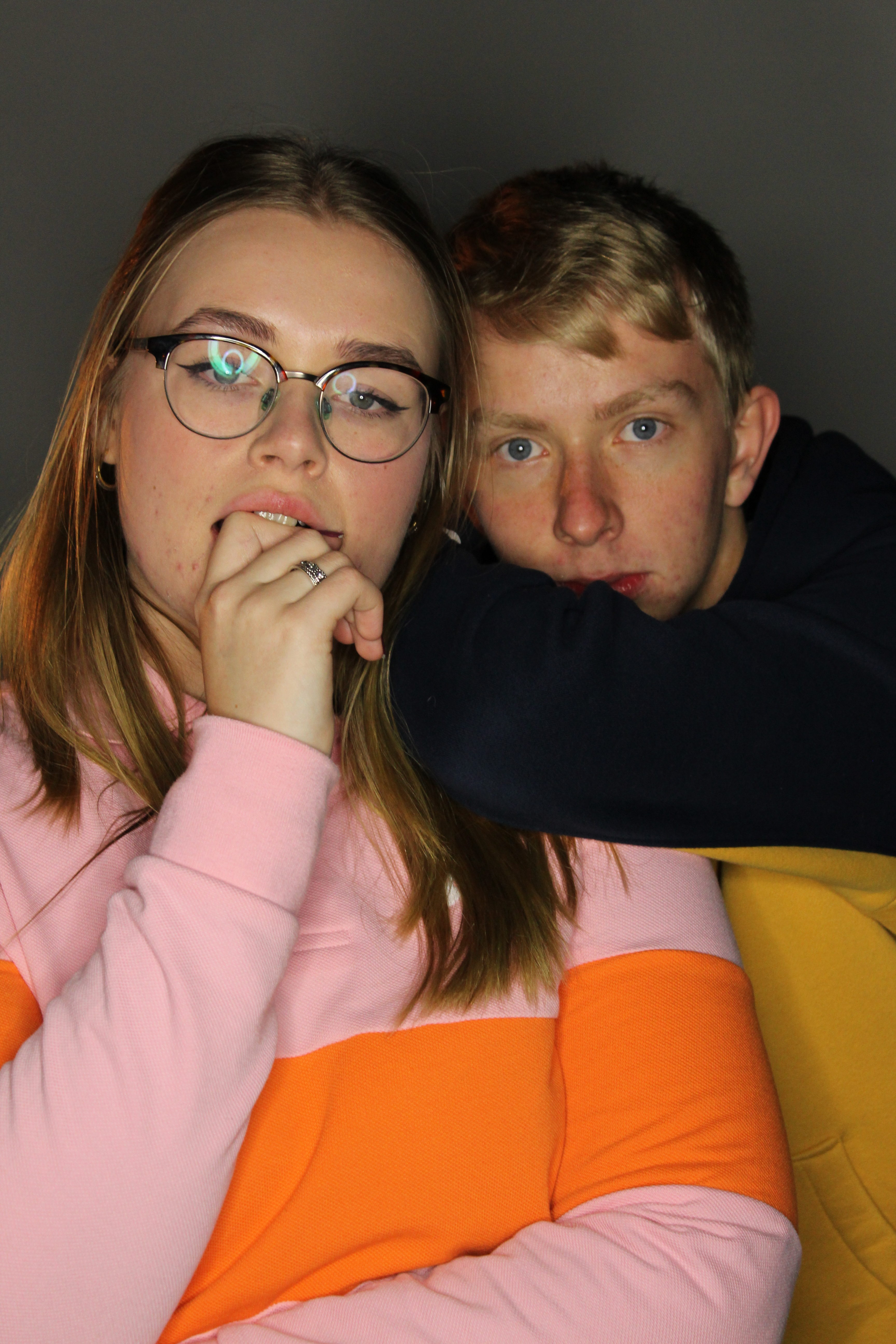
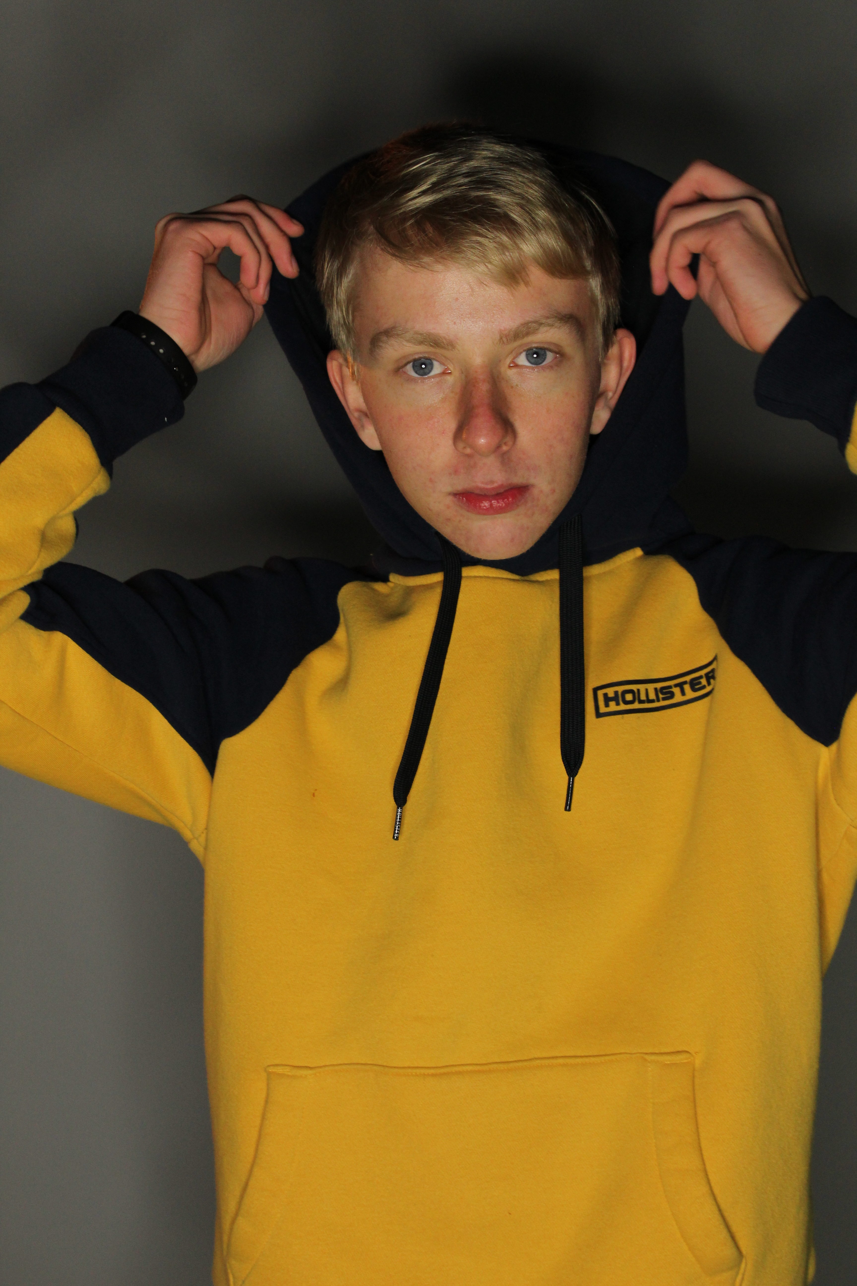
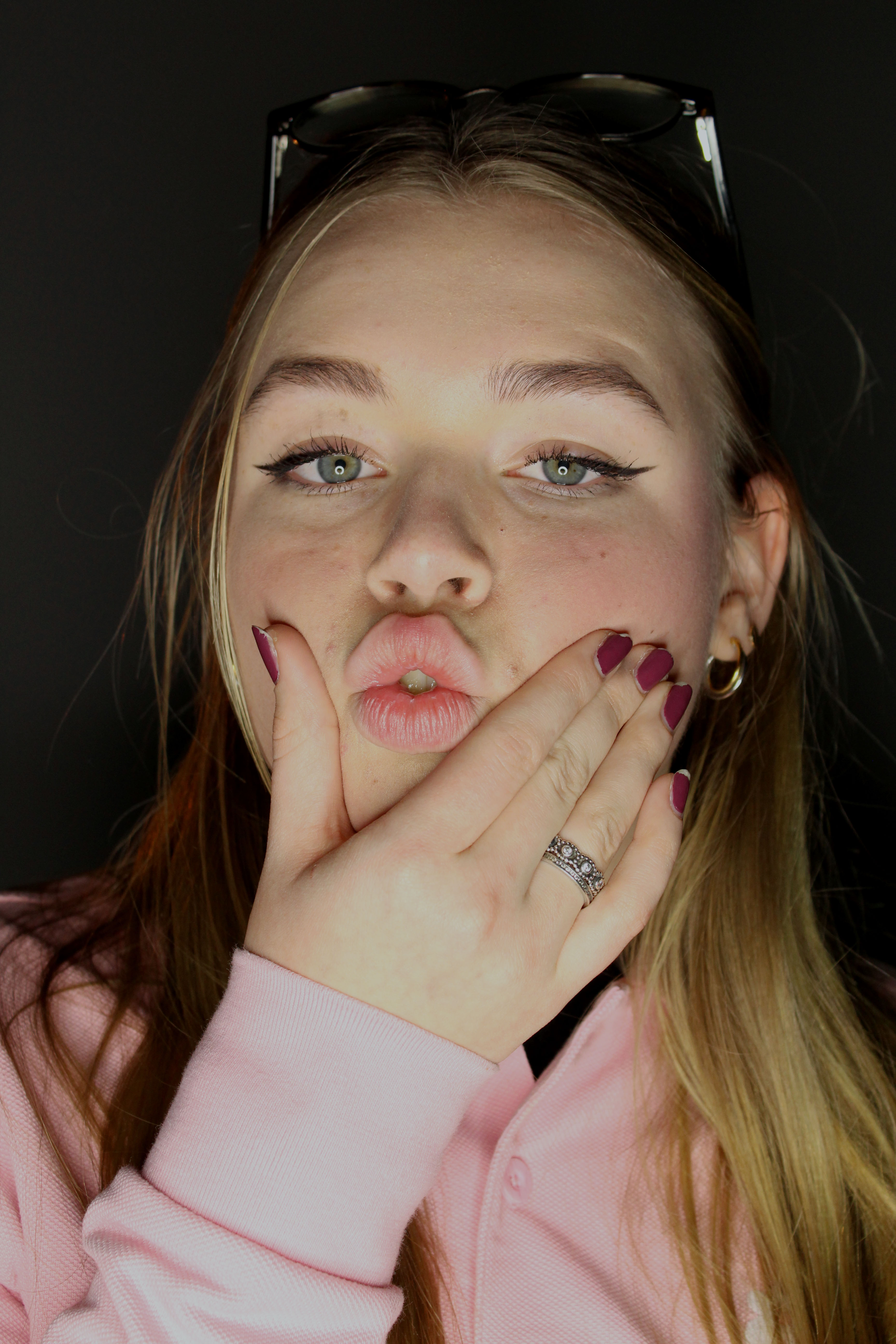
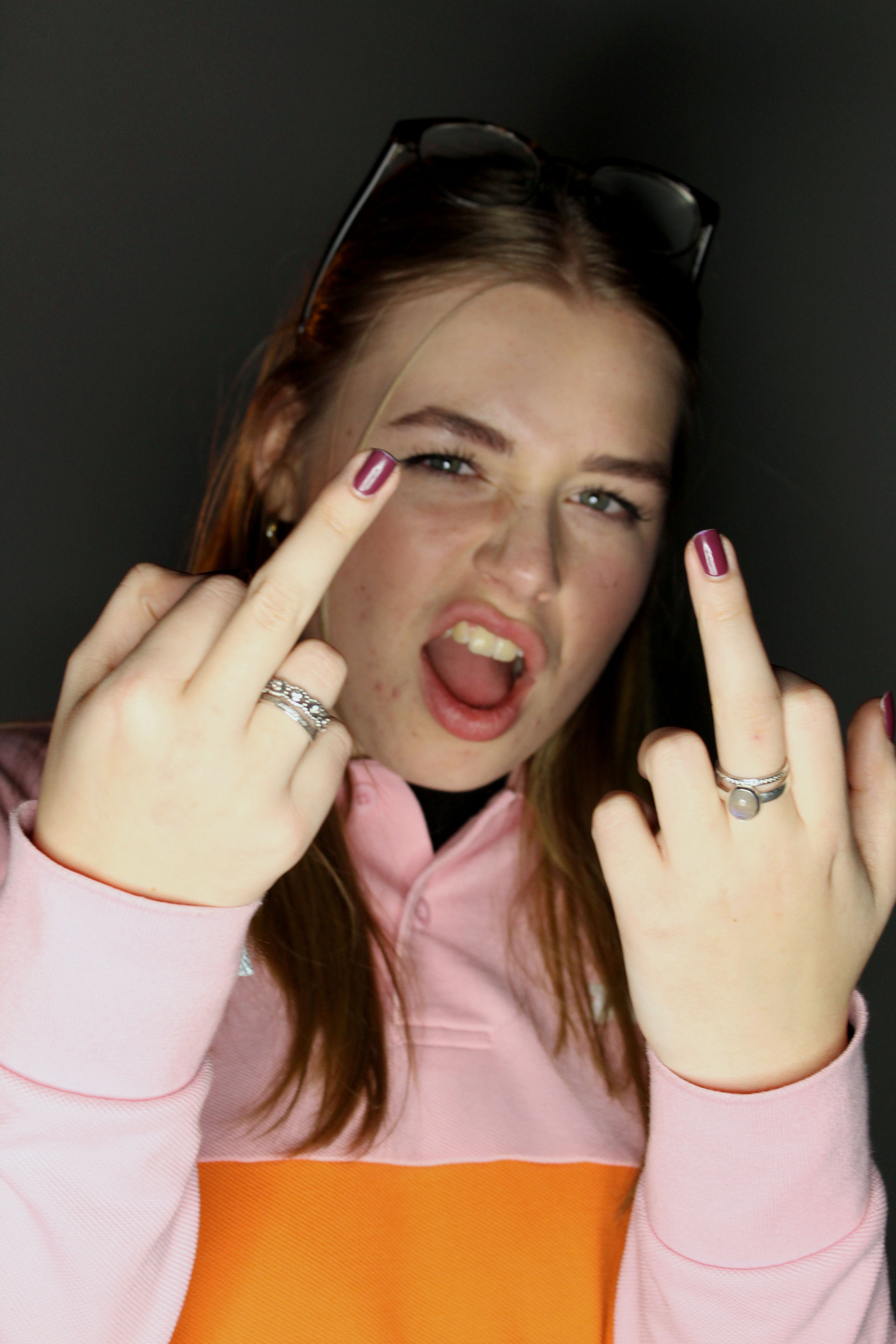
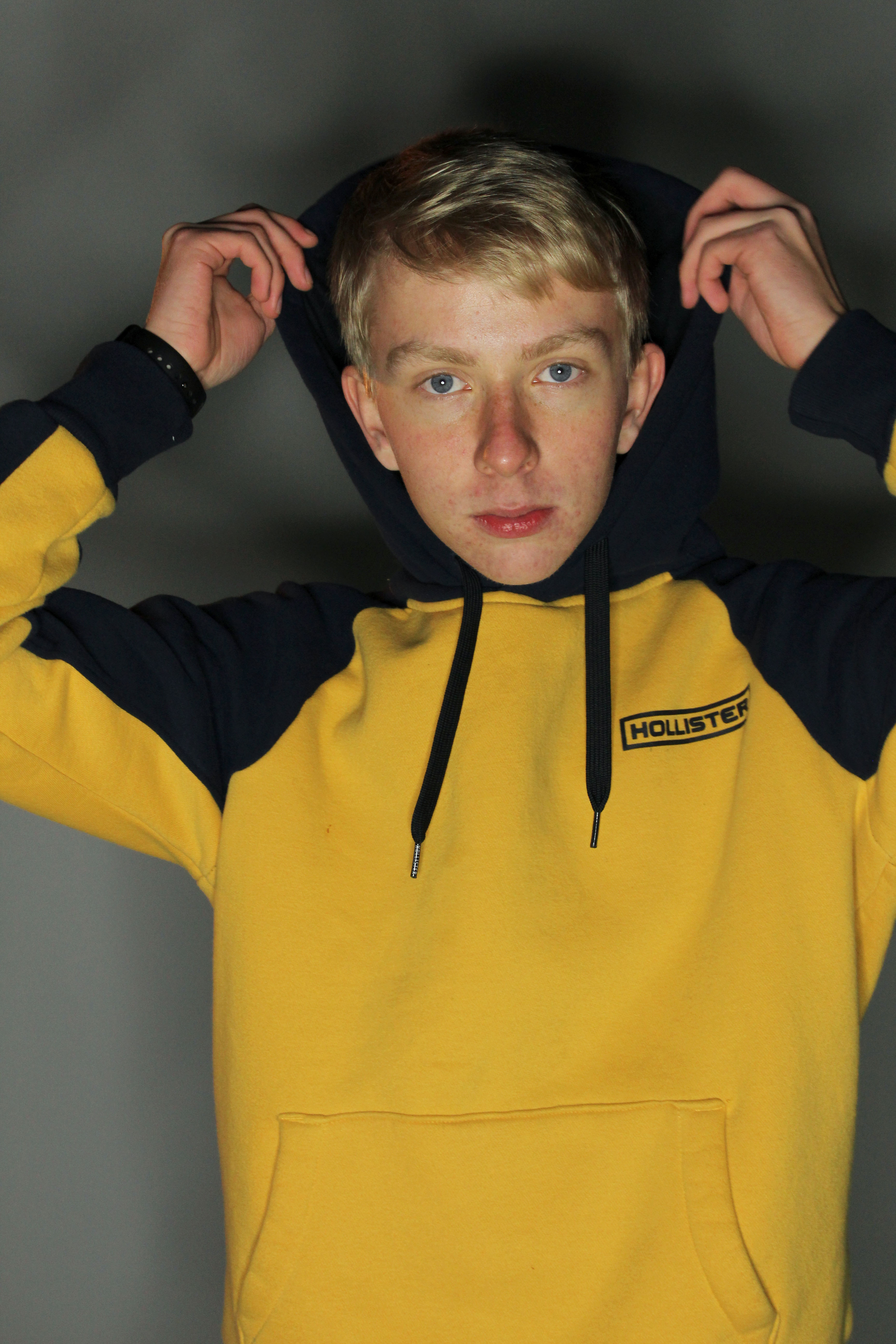
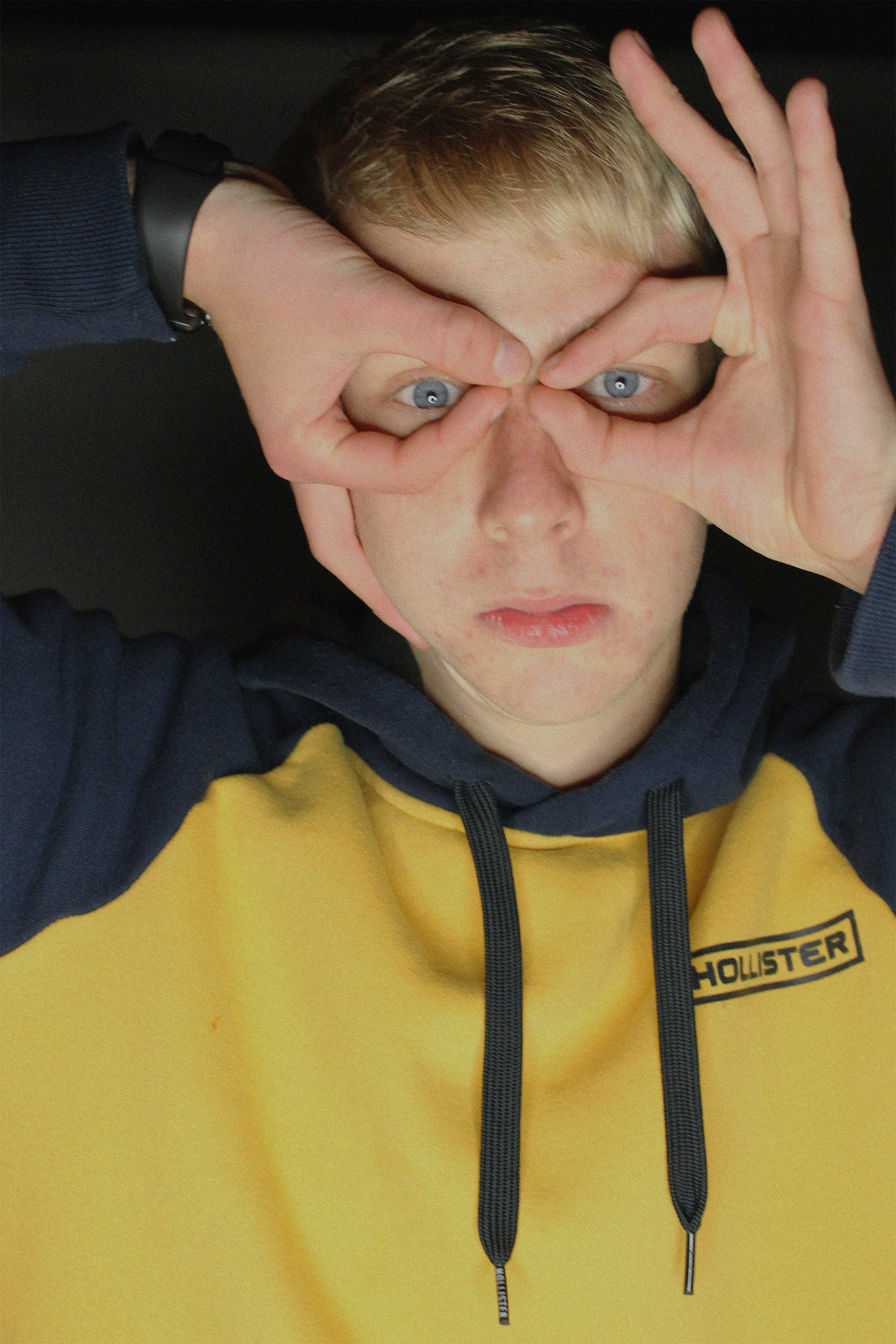
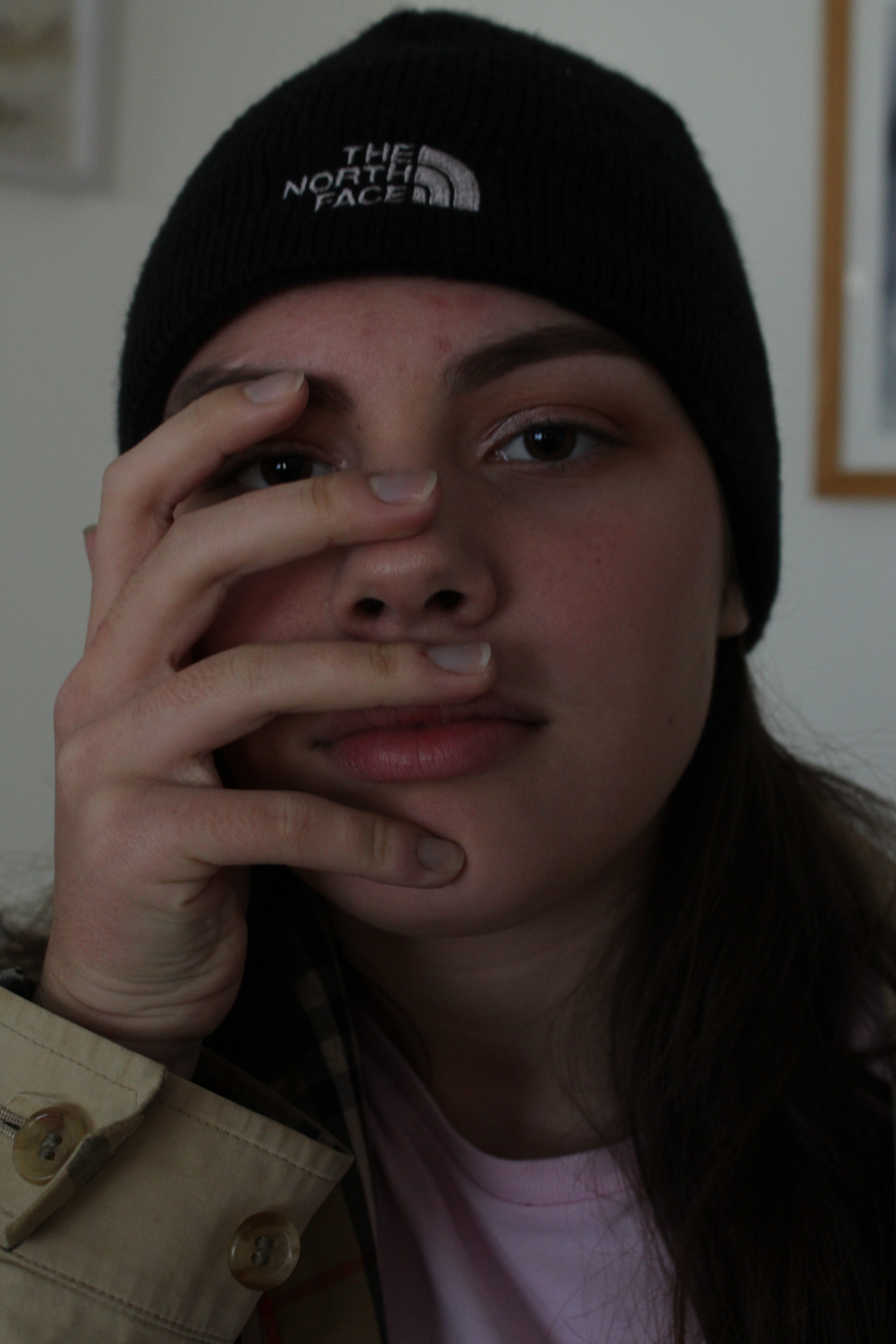
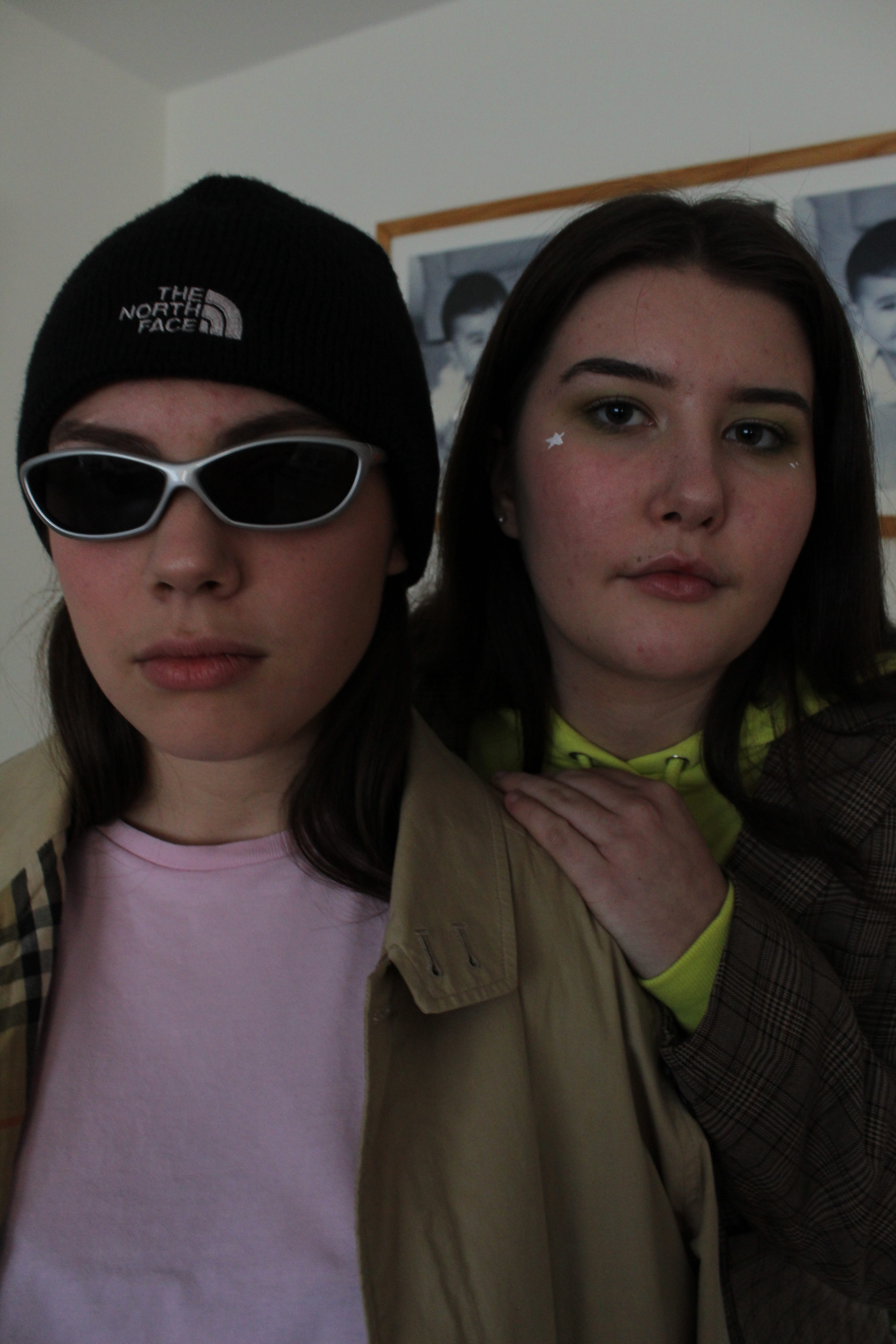
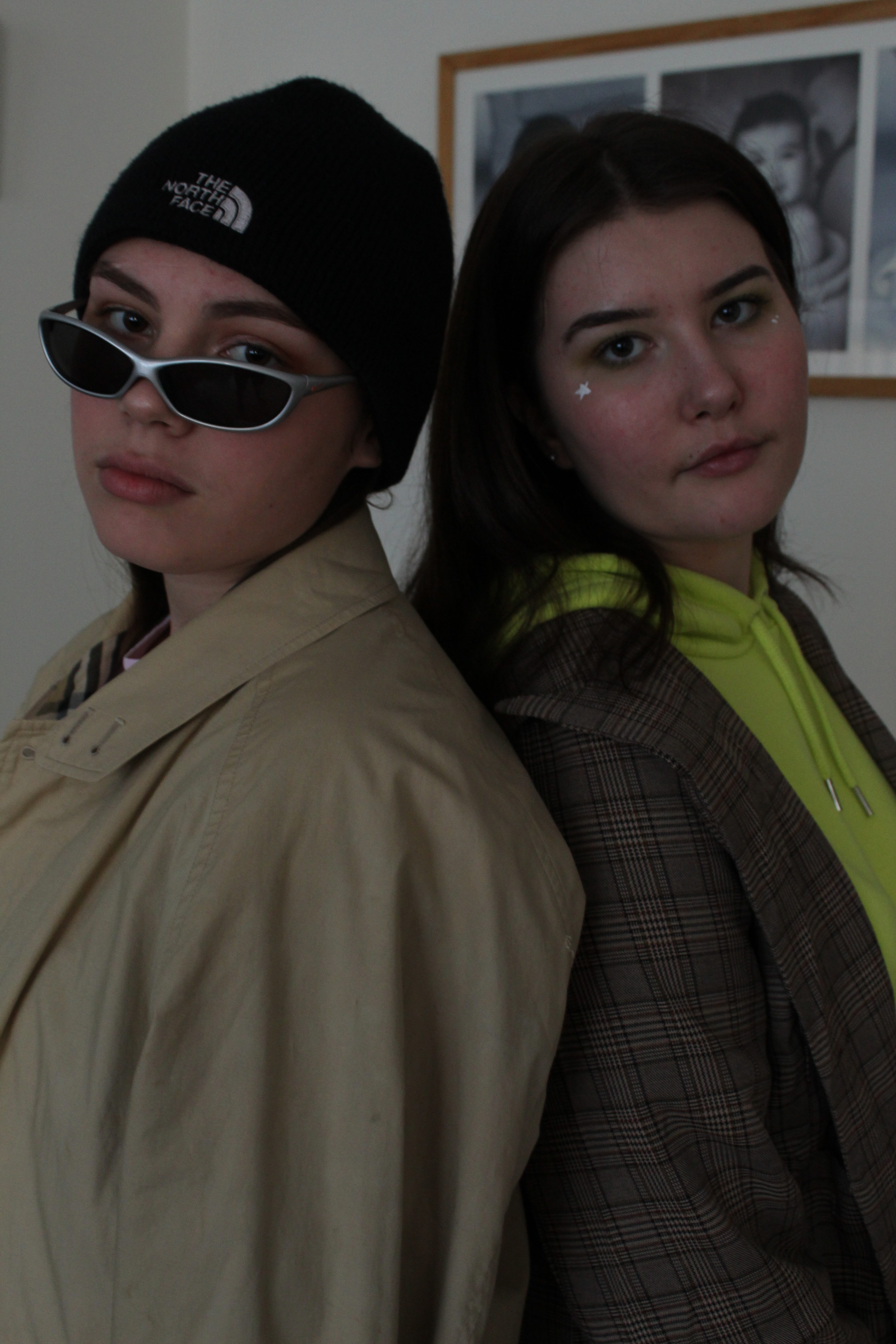
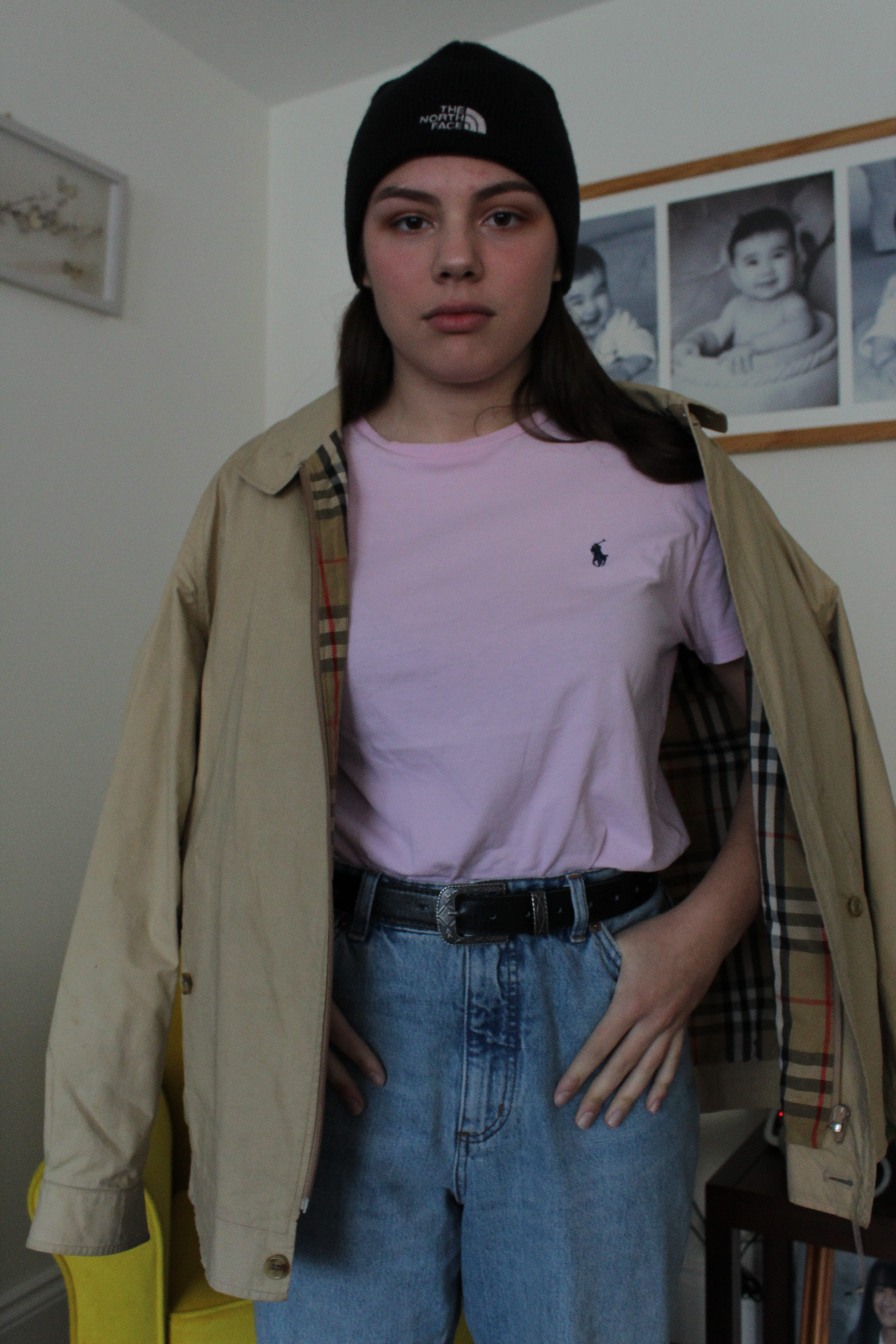
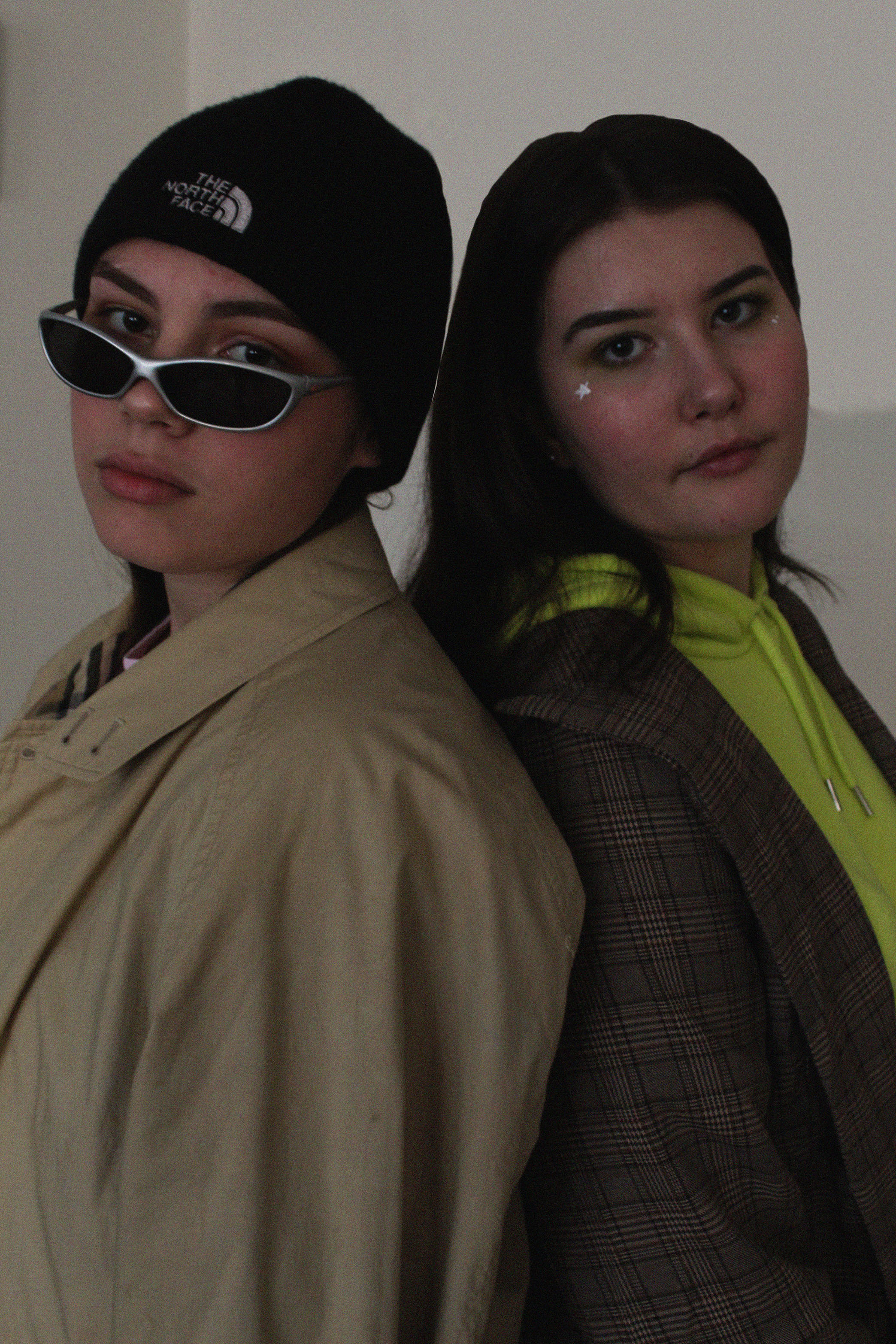
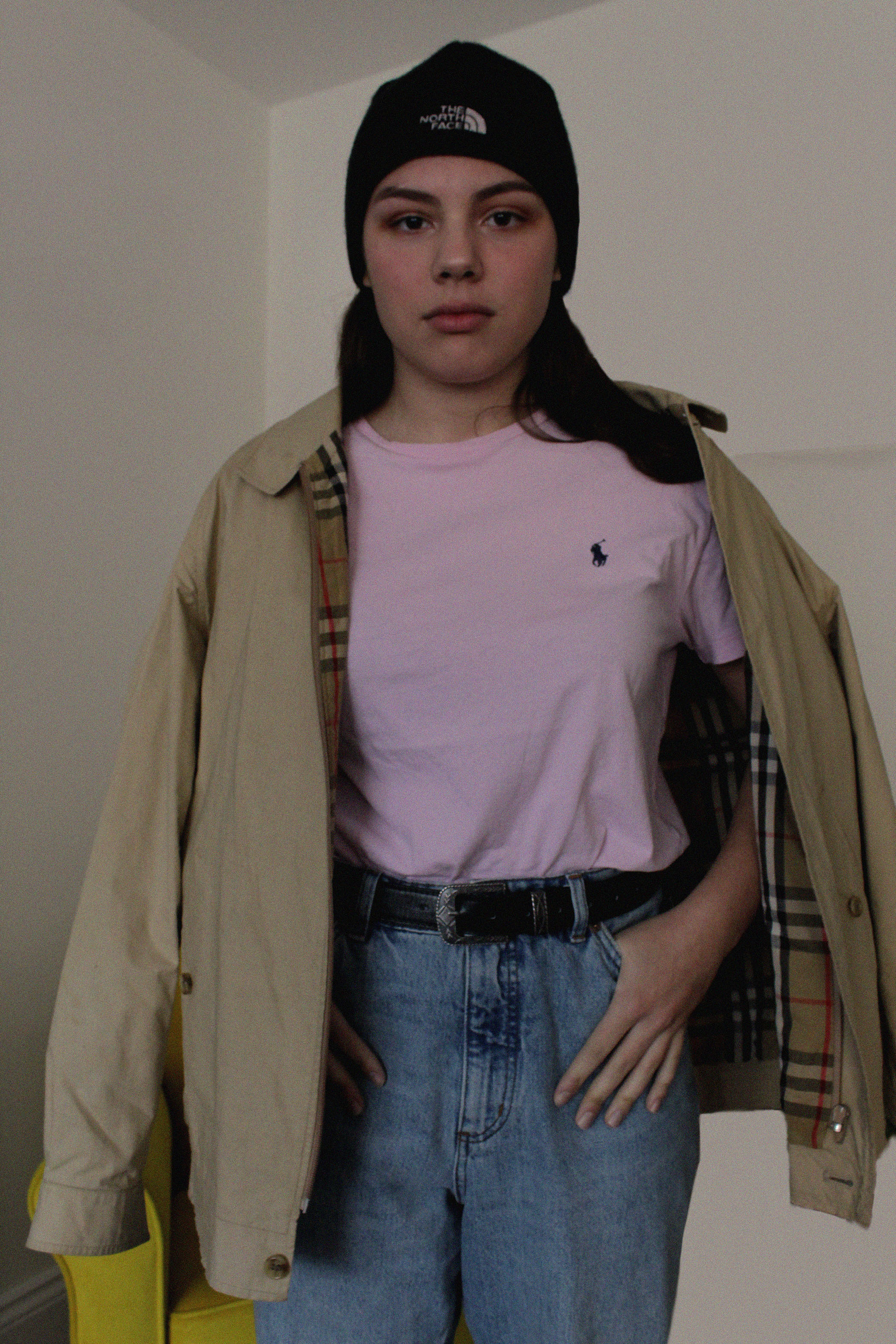
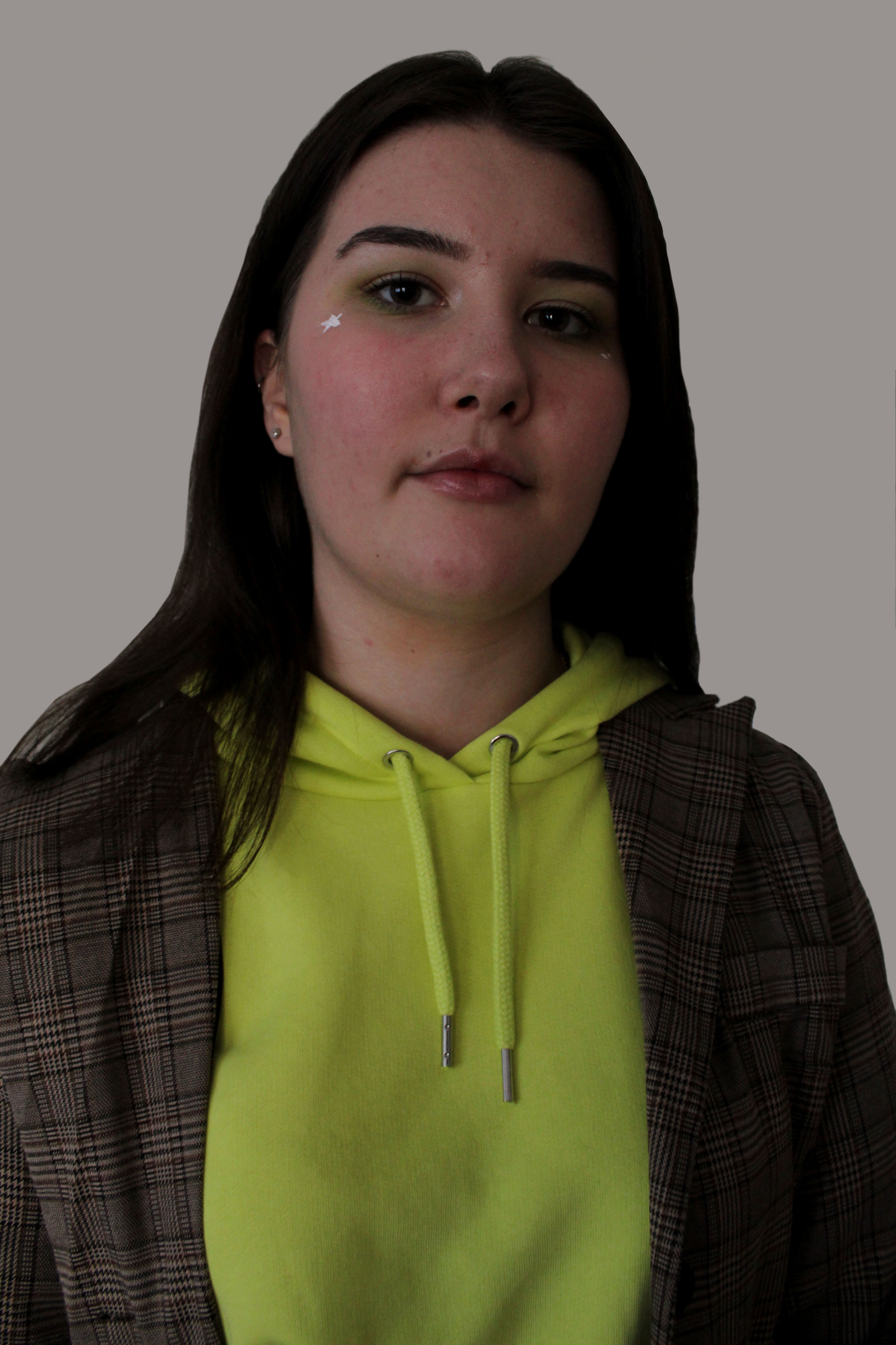
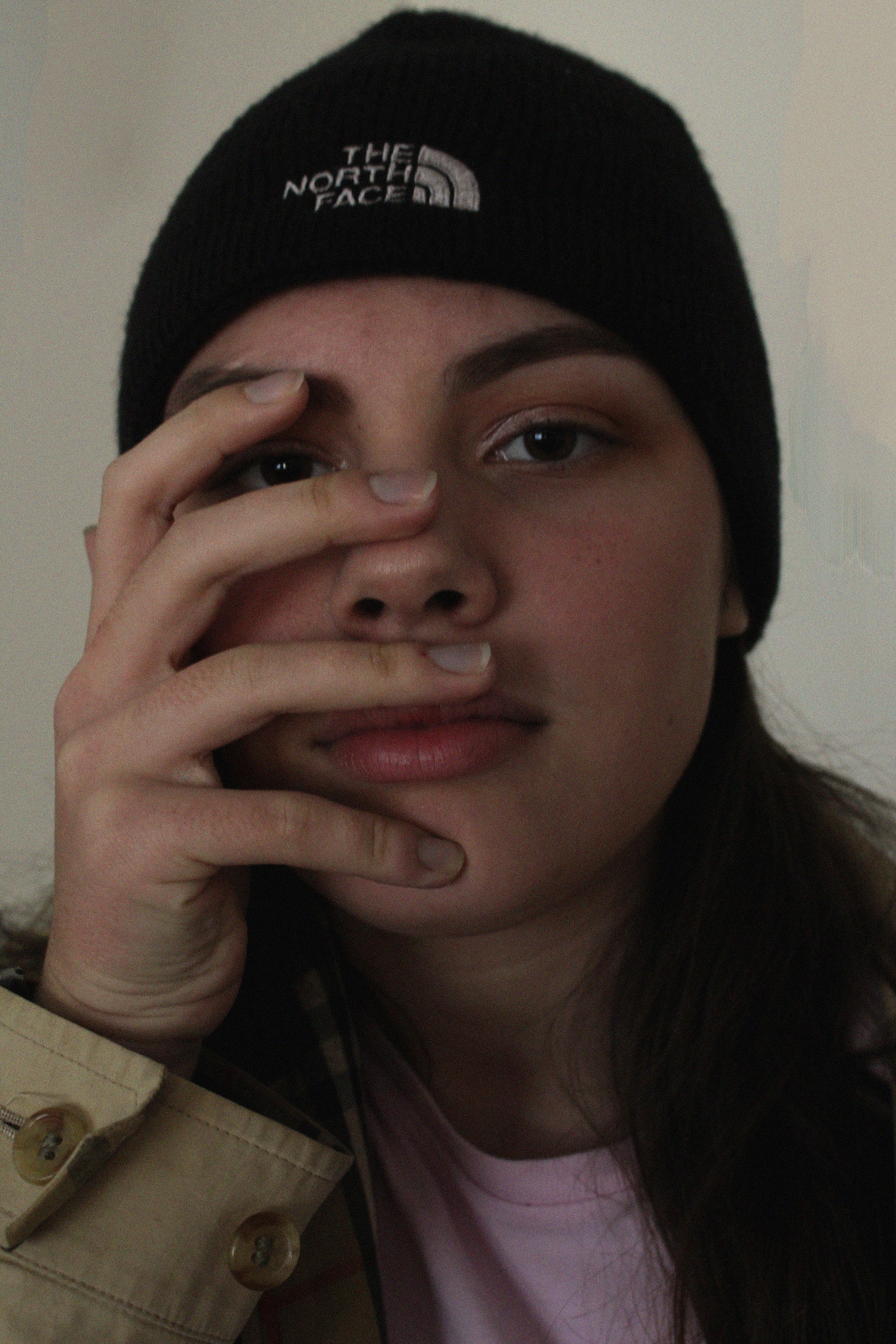
For my response I wanted to explore with fashion and culture. I wanted to show how people express their identities through  clothes. I also wanted to explore the fashion trends at the moment, especially over-sized and “unflattering” clothing pieces.

For my first photo shoot I am going to be looking more at casual everyday clothing (in a sense). I will be pairing everyday conventional pieces of clothing and making them more high fashion and runway worthy. I will also be doing the models makeup and hair.
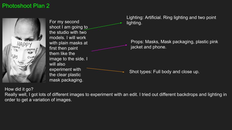
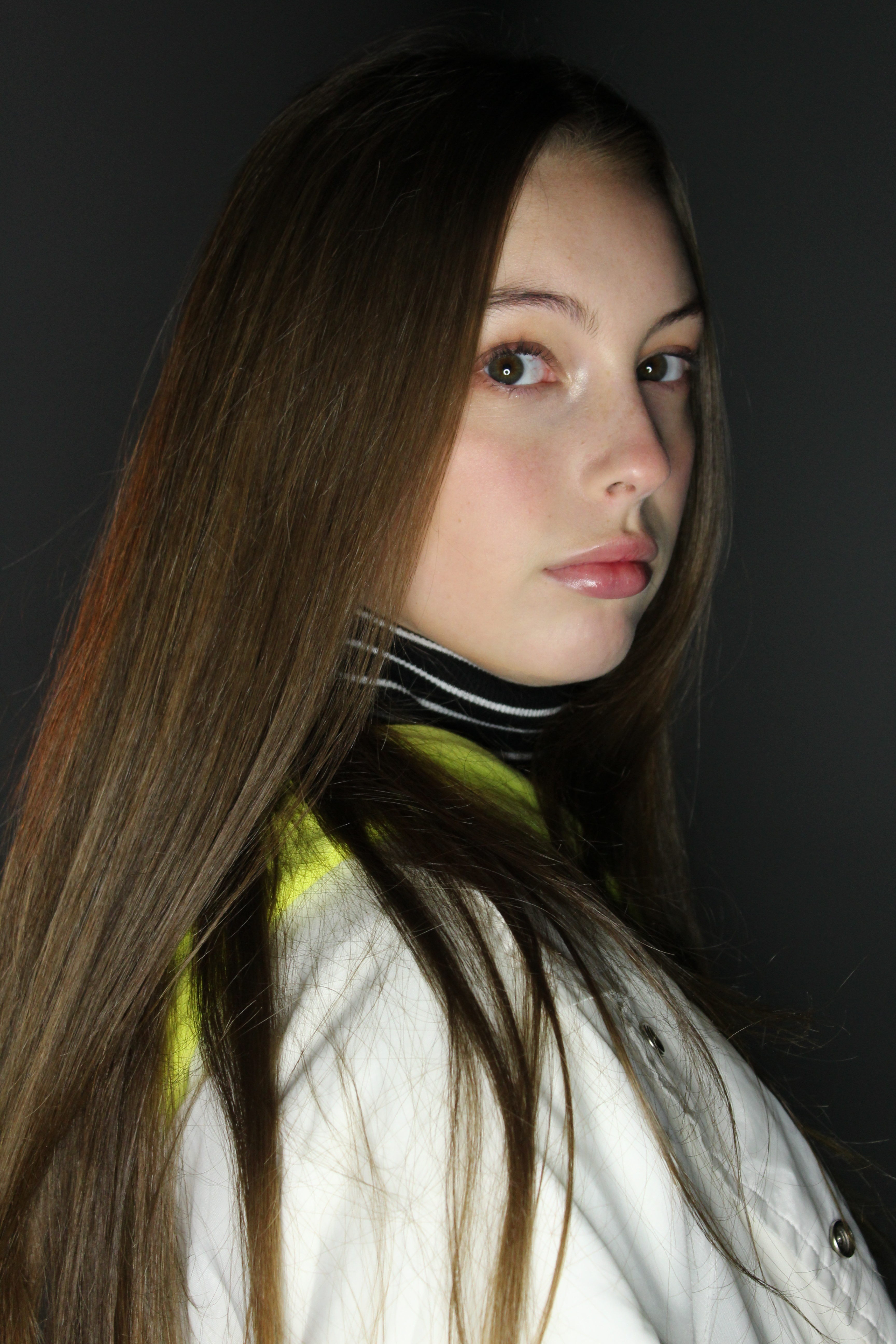
For my second photo shoot I am going to be looking into more sophisticated, elegant and chic pieces of clothing.

1st Photo Shoot

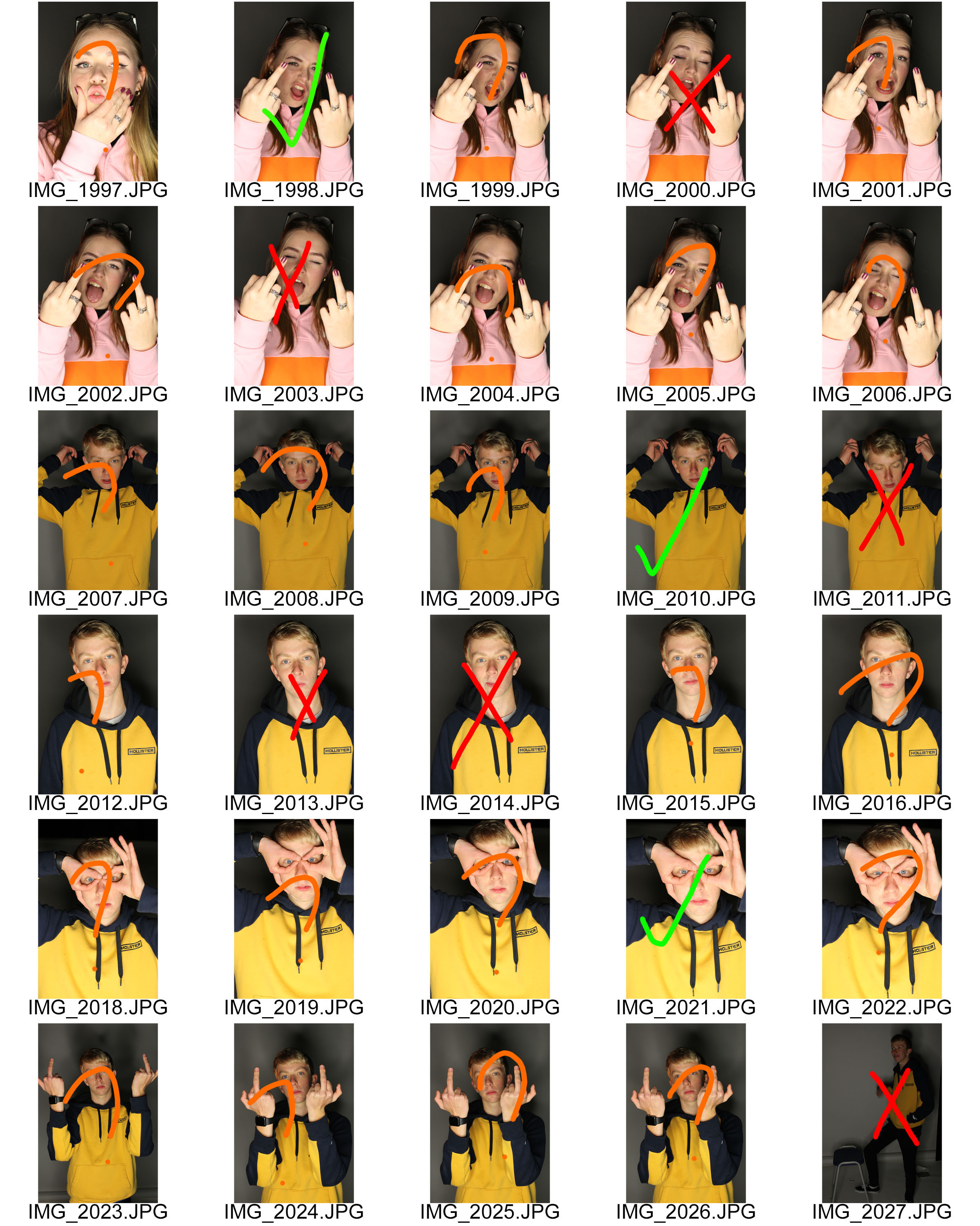
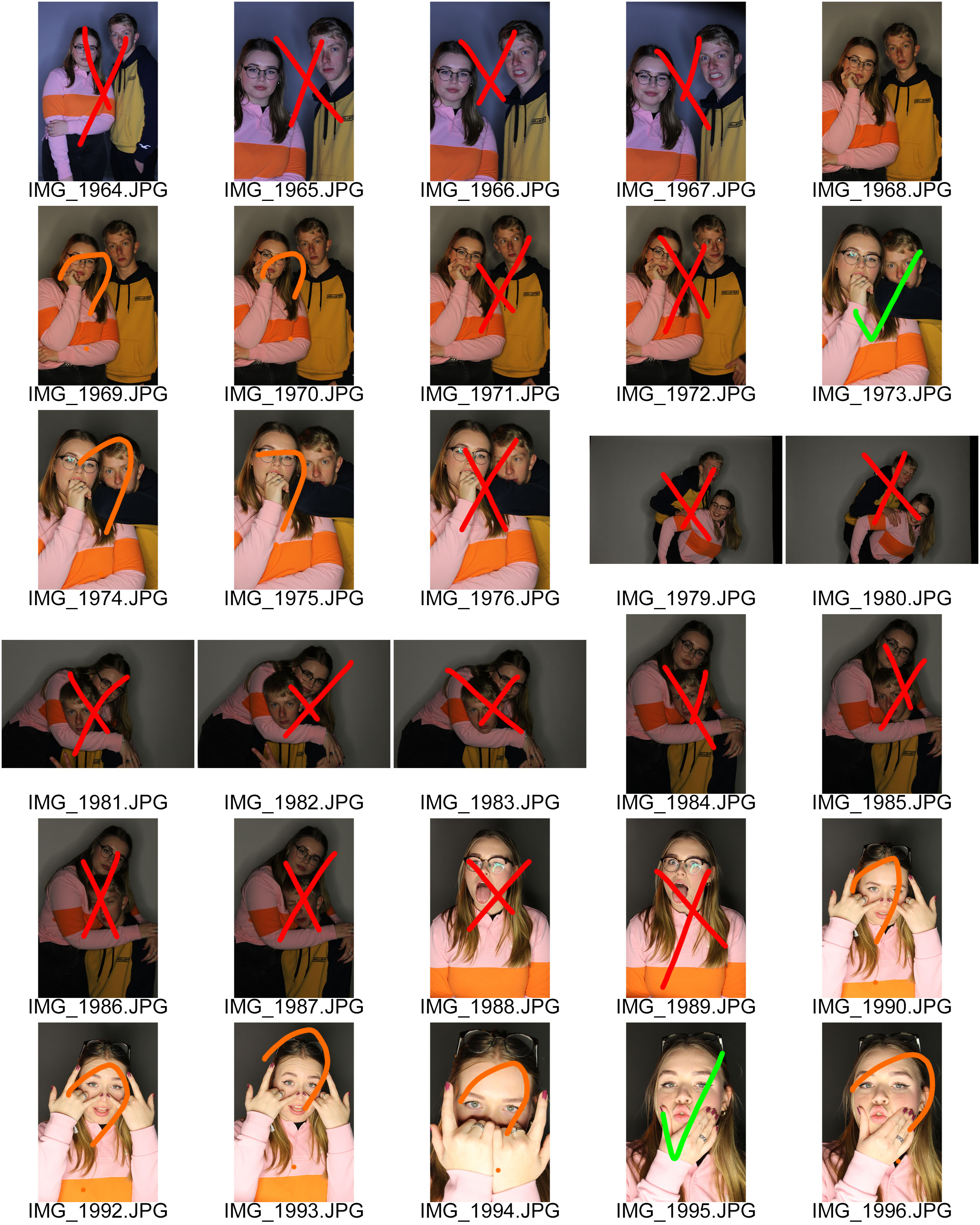
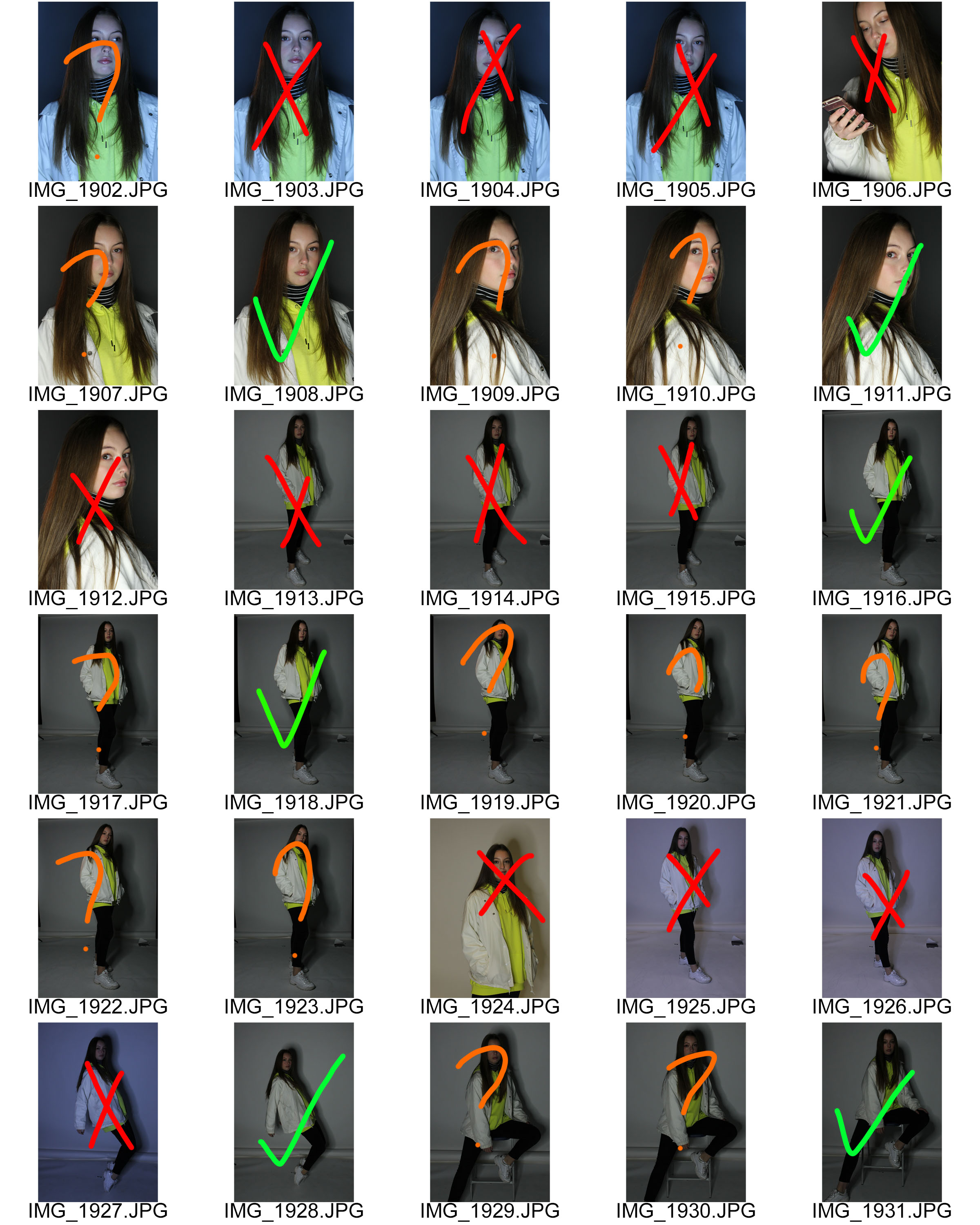
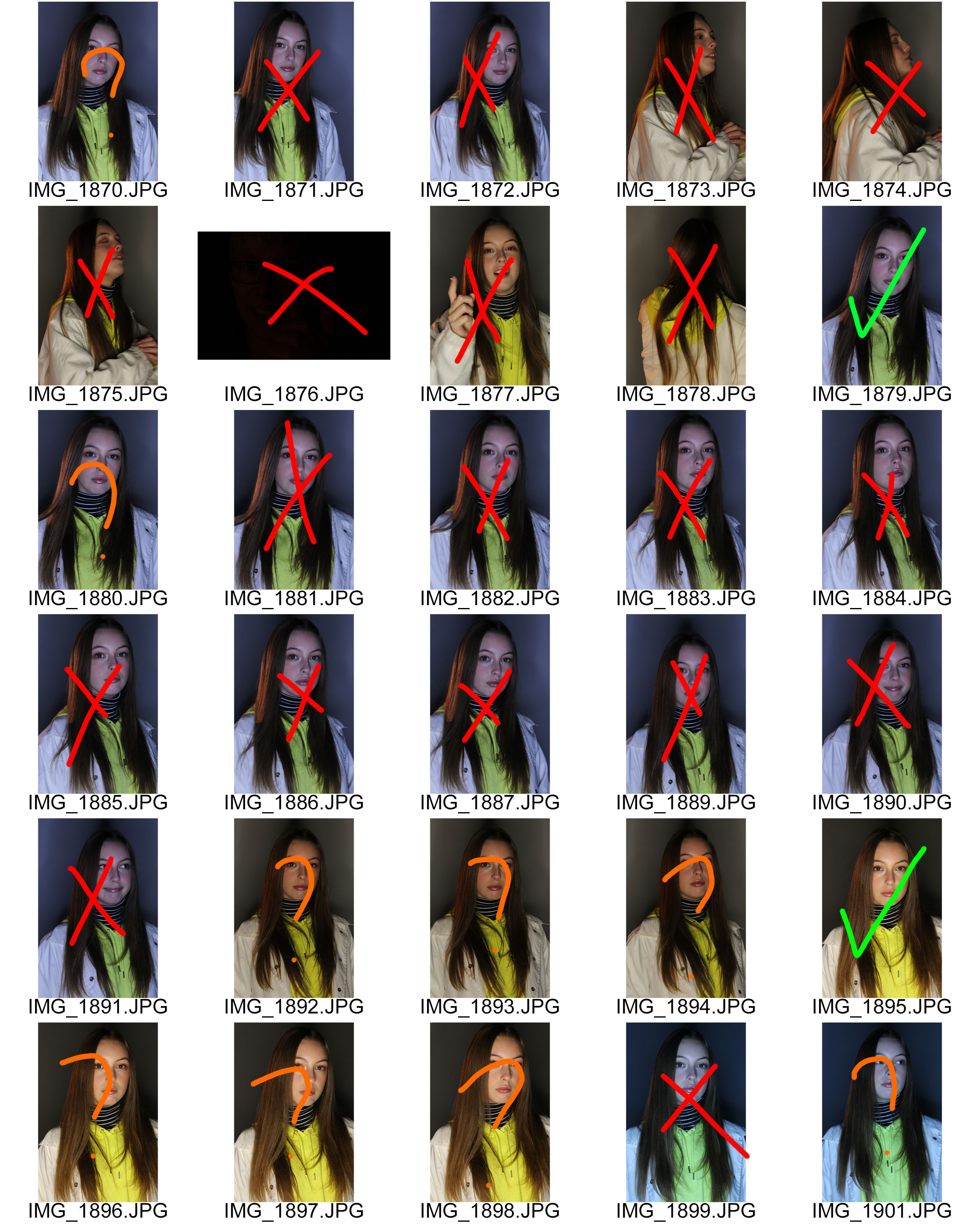
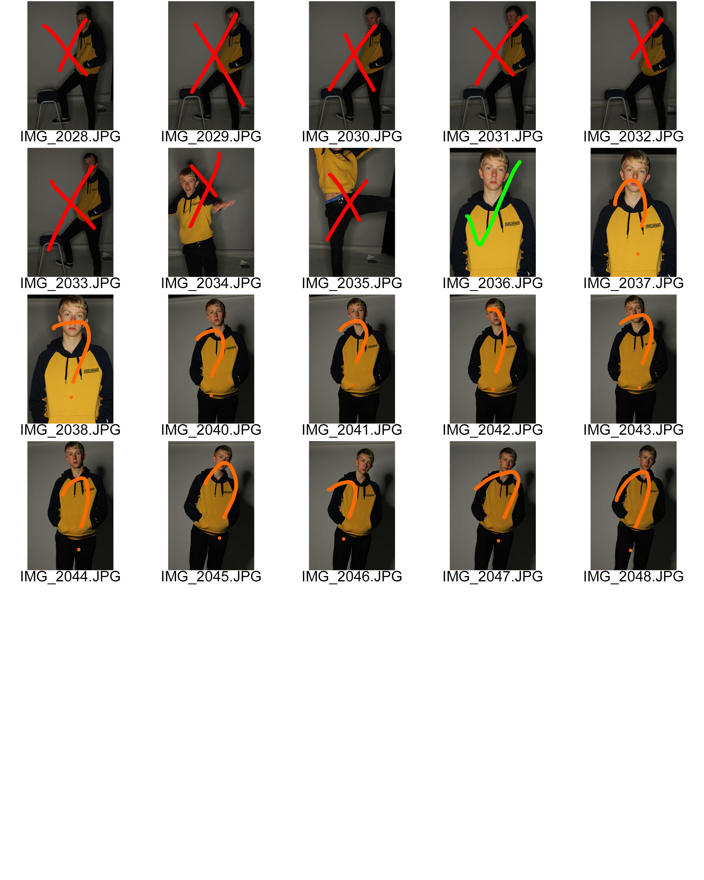
Contact Sheet:

Final Photos:

Needed to edit exposure in Photoshop.

Needed to edit exposure in Photoshop as it is too under exposed.

Needed to sharpen this photo in Photoshop.

This was too over exposed so I knew I needed to edit the exposure in Photoshop.

Final Photos (Edited):

I am really happy with how these edited photos came out. I think I captured the essence of Kiki’s photos really well and I think it shows off my camera skills very well. Overall I’m satisfied as it shows the message I was trying to portray.

Second Photo Shoot:

Contact Sheet:

Final Images (Unedited):

Final Images (Edited):

For these edited photos, I decided to get ride of most of the background and just make it plain so the focus is more on the models than the background.

Overall, I am very happy with the outcome of this photo shoot as I feel I was able to capture the images that I wanted to, but, I think I will need to edit better next time as it is a little plain.