


Background Info:
Ralph Eugene Meatyard was born in Normal, Illinois and raised in the nearby town of Bloomington, Illinois. Meatyard purchased his first camera in 1950 to photograph his newborn first child, and worked primarily with a Rolleiflex medium-format camera ever afterwards. He eventually found his way to the Lexington Camera club in 1954, and at the same time joined the Photographic Society of America. It was at the Lexington Camera Club that Meatyard met Van Daren Coke, an early influence behind much of his work. During the mid-1950s, Meatyard attended a series of summer workshops run by Henry Holmes Smith at Indiana University and also with Minor White. White, in particular, fostered Meatyard’s interest in Zen Philosophy.
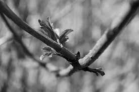
here is one of the Zen twig series. Meatyard has only focused on the twig and has blurred out the background and has only picked up the detail from the twig and leaf. He has properly used manual focus to creative the blur and also he has done the picture in black and white I think that this enhances this as he has got the balance of contrast and brightness.
here is an example of my response to his work:
White balance (WB) is the process of removing unrealistic color casts, so that objects which appear white in person are rendered white in your photo. Proper camera white balance has to take into account the “color temperature” of a light source, which refers to the relative warmth or coolness of white light.
My Examples:
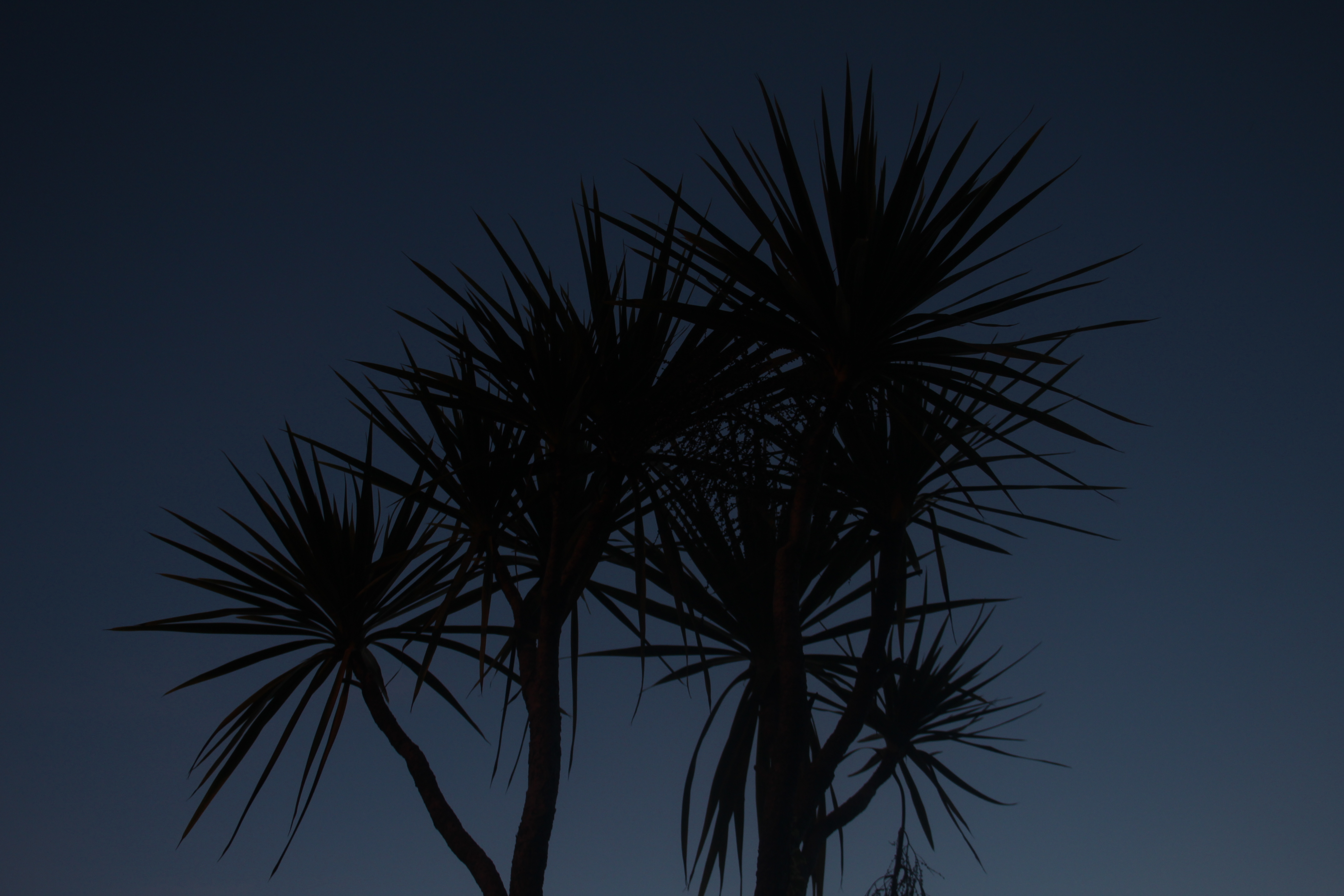
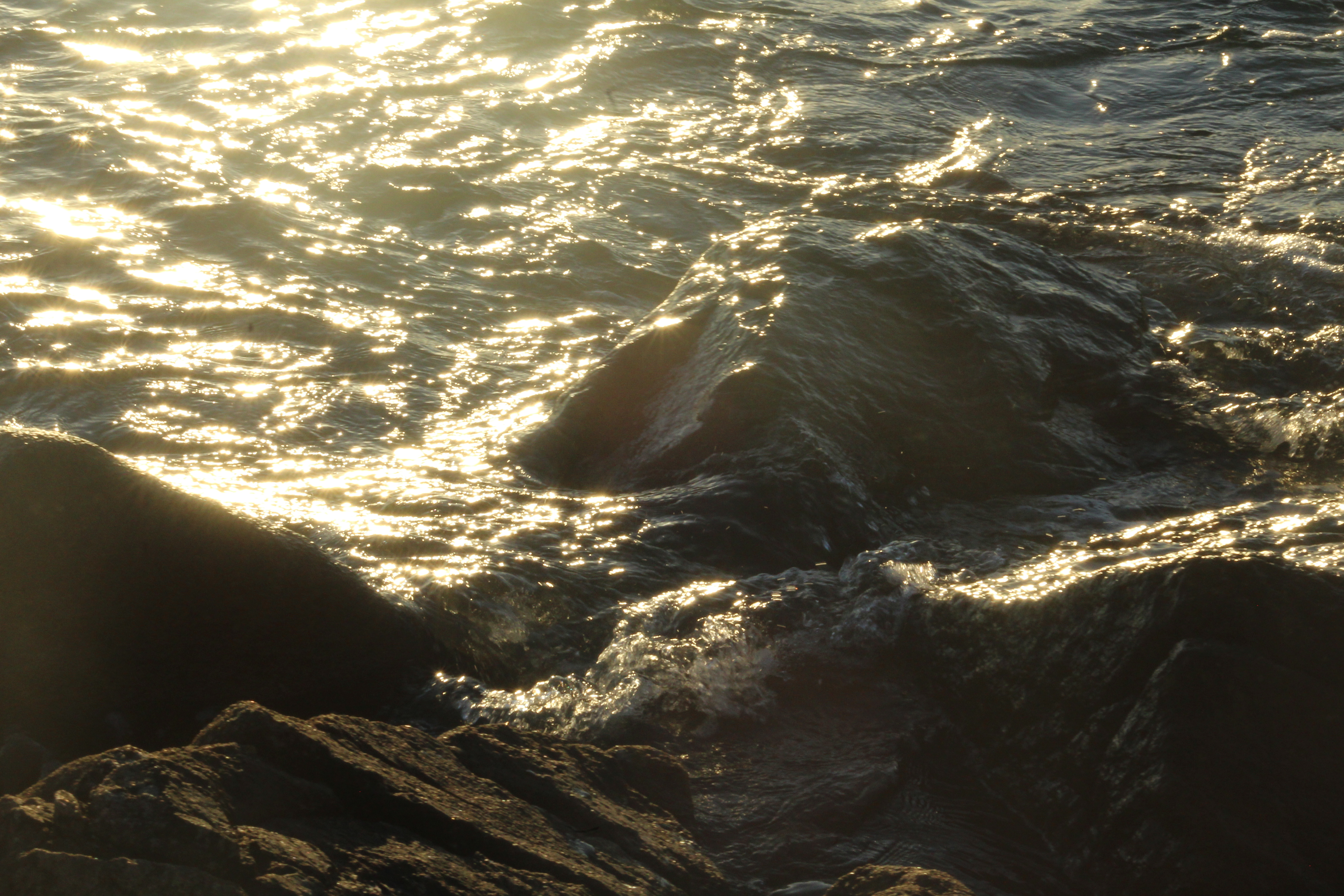
Here I have produced several example of white balance and changing settings on the camera, I have Included different items that I changed the white balance, for example the trees and the close ups to the plants. My favorite out of these photos are the plant ones as they had more detail than the others also they were in better focus than all others.
Here is a video explaining more about white balance:
In order to further explore and improve on the manual camera skills I have learnt in the past week, I have decided to take inspiration from photographer Ralph Eugene Meatyard, and his projects “No Focus” and “Zen Twigs”, in which Meatyard explores the use of manual focus, and produces work to show both unfocused images that have a show a lack of context, as well as images that focus on nature with a shallow depth of field, that both help to draw the attention of the viewer, with effective use of contrasting, grey-scale colors.
The following images were taken by Meatyard during his “No Focus” project, and are the images that I took inspiration from:
Both of Meatyards projects hold some similarities as well as differences. “No Focus” is a project that focused on removing the context of the image, and presenting images as more flat and without depth, while still presenting enough contrast and shape to draw the attention of the viewer, allowing them to question the context, as the can’t see it.
In similarity, “Zen Twigs” focuses on the naturally twisted and unpredictable shapes of branches and twigs, while throwing the background completely out of focus. This draws the attention to the subject matter (the twigs), while separating the subject from it’s naturally surrounding, therefore creating a very abstract and out-of-context effect.
As a response to Meatyards work, I produced the following photo shoot, focusing mainly on the use of depth of field and manual focus:
The above photoshoot I took inspiration specifically from Meatyard’s “No Focus” project. In order to present images as having high contrast, I purposefully chose images that were naturally black or white, and placed them together to create contrast. I also used a variety of wires, boxes and stationary as subjects to show different shapes, which will help with drawing the attention of the viewer to the different shapes.
After taking the photo-shoot, I edited my images to enhance the colour contrast. I edited the images so that the colours became grayscale, which is a tactic used by Meatyard in his images to emphasise the shape and contrast of his images.
I also produced another photo-shoot, taking inspiration from Meatyard’s “Zen Twigs”. The images from this photo-shoot are seen below:


SARAH LAMB:
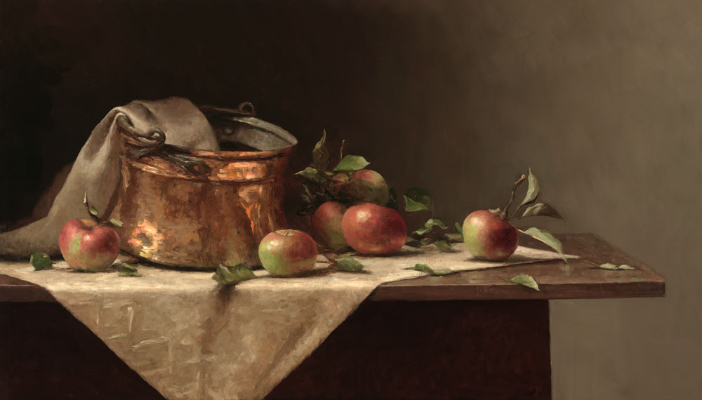
Sarah Lamb is a talented and dynamic realist painter. With classical skill—and through transparency, depth and texture—she captures the minute details of everyday objects in her dramatic still lifes and luscious landscapes. She makes us love the familiar and see beauty in the mundane.
Born in Petersburg, VA, with a passion for art and an appreciation for the past, Sarah spent a semester at the Studio Art Center International in Florence, Italy before graduating from Brenau Women’s College with a BS degree in Studio Art in 1993. Following a summer workshop in Santa Fe, NM with renowned classical painter Jacob Collins, she spent two years painting at The Ecole Albert Defois in the Loire Valley with classical realist artist Ted Seth Jacobs.
In 1997 she moved to New York and spent the next 6 years studying and painting under Jacob Collins at the Water Street Atelier. During this time, she had successful one-woman shows in major galleries in Atlanta, Houston, and San Francisco and was represented in art galleries in Alexandria, VA, St. Simon’s Island and Gainesville, GA, Sag Harbor, NY and Madison, CT.
More recently, she has had sell-out, one-woman shows at the Spanierman Gallery in NY, the Meredith Long Gallery in Houston, TX and the John Pence Gallery in San Francisco. She has been featured in magazines such as American Artists, American Art Collector and Southwest Art as one of America’s most talented young painters.
British-born art critic, John A. Parks, wrote that “Sarah Lamb brings to her work a robustly sensual grasp of the world. Her keenness of eye and joyful brush make the whole enterprise feel freshly alive as she reminds us what the really wonderful things in life are.”
Sarah, her husband, artist, David Larned, and their daughter, Sadie, divide their time between Pennsylvania’s Brandywine Valley and Houston, Texas.

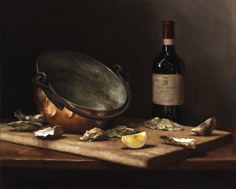

MY PROCESS AND RESPONSE:
For this photo shoot I set up a still life composition to photograph, including many different types of object that you would find classically such as pottery, glassware and fruit. In order to create the dark and atmospheric setting that most still life possess, I laid down a dark floor which would accommodate the objects. This floor flowing all the way into the left top hand corner of the image. Furthermore, I added a fairly soft light source in order to retain the dark atmosphere. I did not use natural light, but instead an artificial white bulb which kept the images very neutral in color.
For my second photo shoot, I also followed a similar pattern of work, selecting objects that would be fir to include in still life, yet this time I experimented with laying down a white sheet to see the effects this would have on the overall outcome of the image. I kept the light source at top right hand corner of the image. I included less richly color objects and decided to stick to a more neutral color palette which in turn made the images feel more light and breezy.


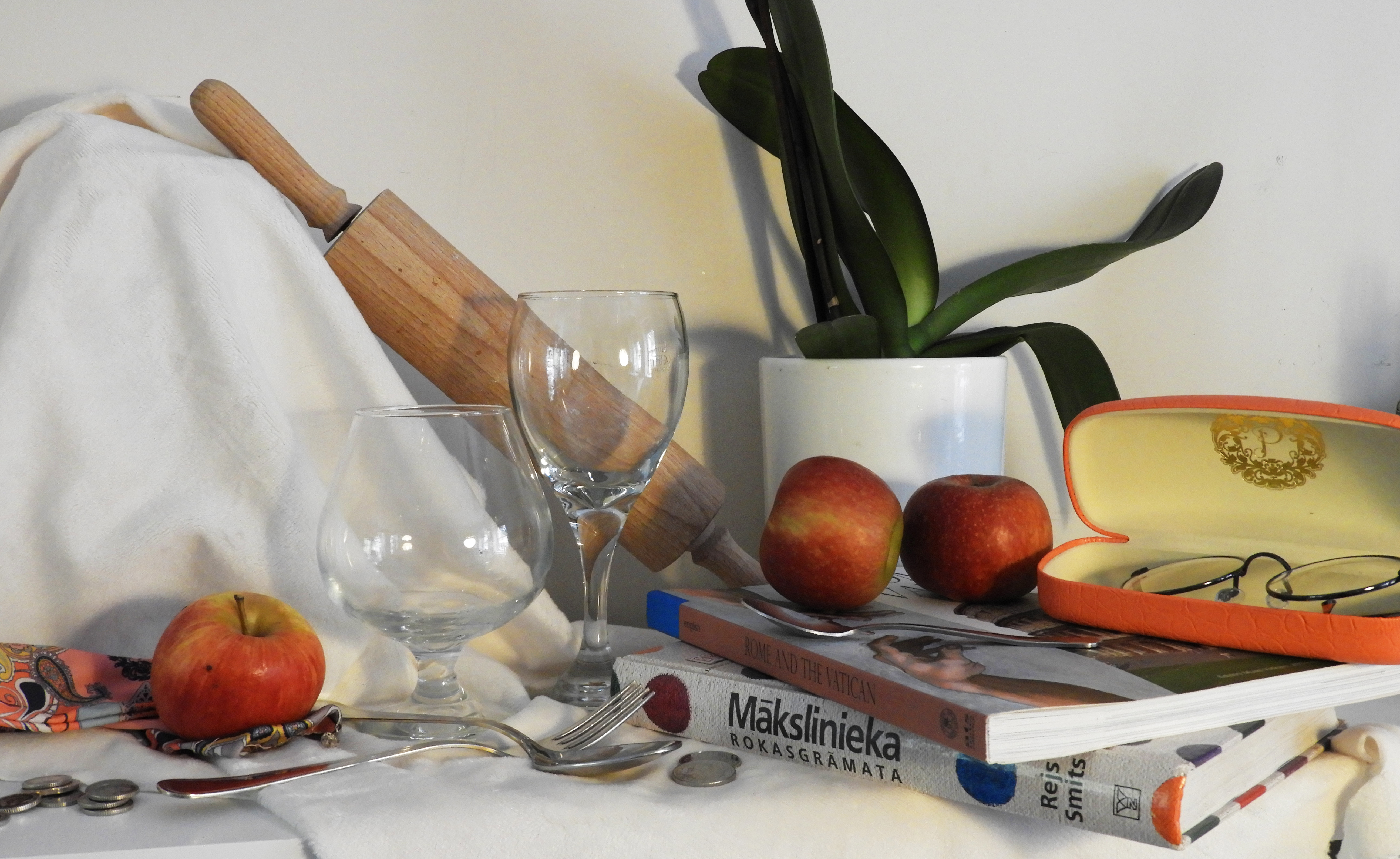
CRITICAL ANALYSIS OF MY FAVORITE IMAGE:
TECHNICAL: In order to retain the darkness in the first photo shoot, the room which I was in was fairly dark therefore i set my ISO setting quite high, to 1600, which allowed me to have a good balance between the dark and light in the images. Again, due to the darkness in the room, I had to use a slow shutter speed to allow as much light as possible into the camera, setting it to 1/15. To avoid the inevitable motion blur, i used a tripod to keep my camera still whilst taking the photos and to have a very central, head on view of the still life. I kept my aperture high in order to allow my camera to capture a large field of view as the still life set up was quite large itself.
VISUAL: The first thing that the image conveys is the darkness and depth of color, the rich, juicy red of the tomatoes and the dark purple of the grapes that hand from the pottery. The light source, coming directly from the top right hand corner of the image casts a strong highlight onto the tomatoes, giving very powerful light reflections. The light also bounces of the walls of the glass, giving it dimension. The darkness of the shadows also creates a depth of space in the image, the glass and tomatoes being right in the foreground of the image, whilst the delicate tea cups are in the background, There is a harsh contrast between the bright white walls and the darkness of the shadows which further add to the mood of the image. The image overall is very busy and crowded, yet the composition of the objects mean that they are harmoniously linked to one another. There is a wide variety of texture, shape and color in the image. The tomatoes: smooth and glossy, the glass: transparent and delicate, the pottery: rough and uneven. A lot of the objects in the image have smoothness of line and roundness which allows the image to flow and intertwine.
CONTEXTUAL: Historically, still life paintings were deeply imbued with religious and mythological meaning. This was a reflection of the times; the Church was the center of everyday life. Class hierarchy was deeply embedded – everyone knew their place and stayed within it. By the 16th century, society was changing. As science gained more of a stronghold, religious themes fell by the wayside. The natural world was now interesting to observe and record in its own right, not for religious or mythological purposes. As history rattled towards the mid-19th century, depicting the natural world was starting to go out of fashion. Now the art world was more interested in exploring our inner world of moods and emotions. As we sped through the 20th century, still life dissolved into geometry as objects were abstracted more and more on the canvas. By the end of the millennium, the object depicted in paintings were exhaled as commodity and recognized for their commercialism, as in the Pop Art and Photo realism movements.
CONCEPTUAL: The main objective which I tried to capture in these images is the complexity of simple objects. Appearing plain and boring but when placed together and put into a composition, they can create impact and surreal.

CONTACT SHEETS:
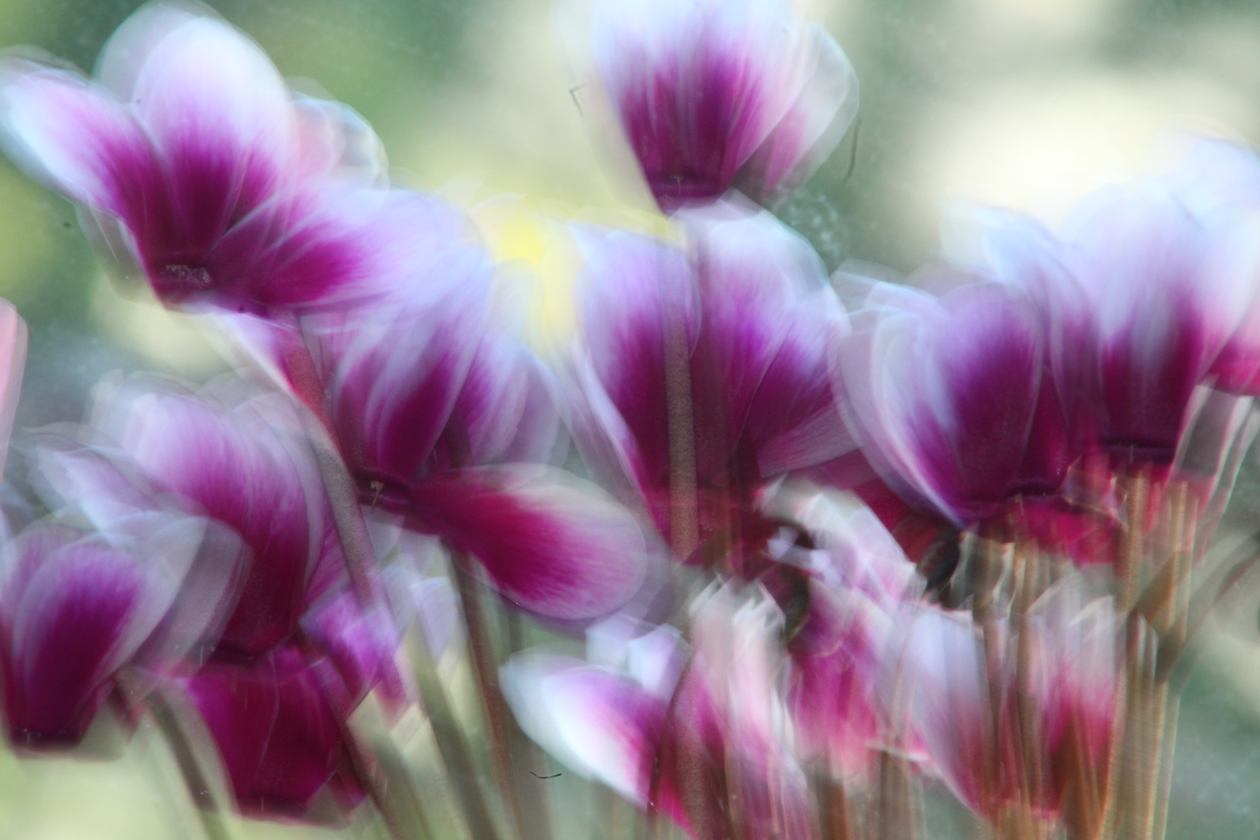
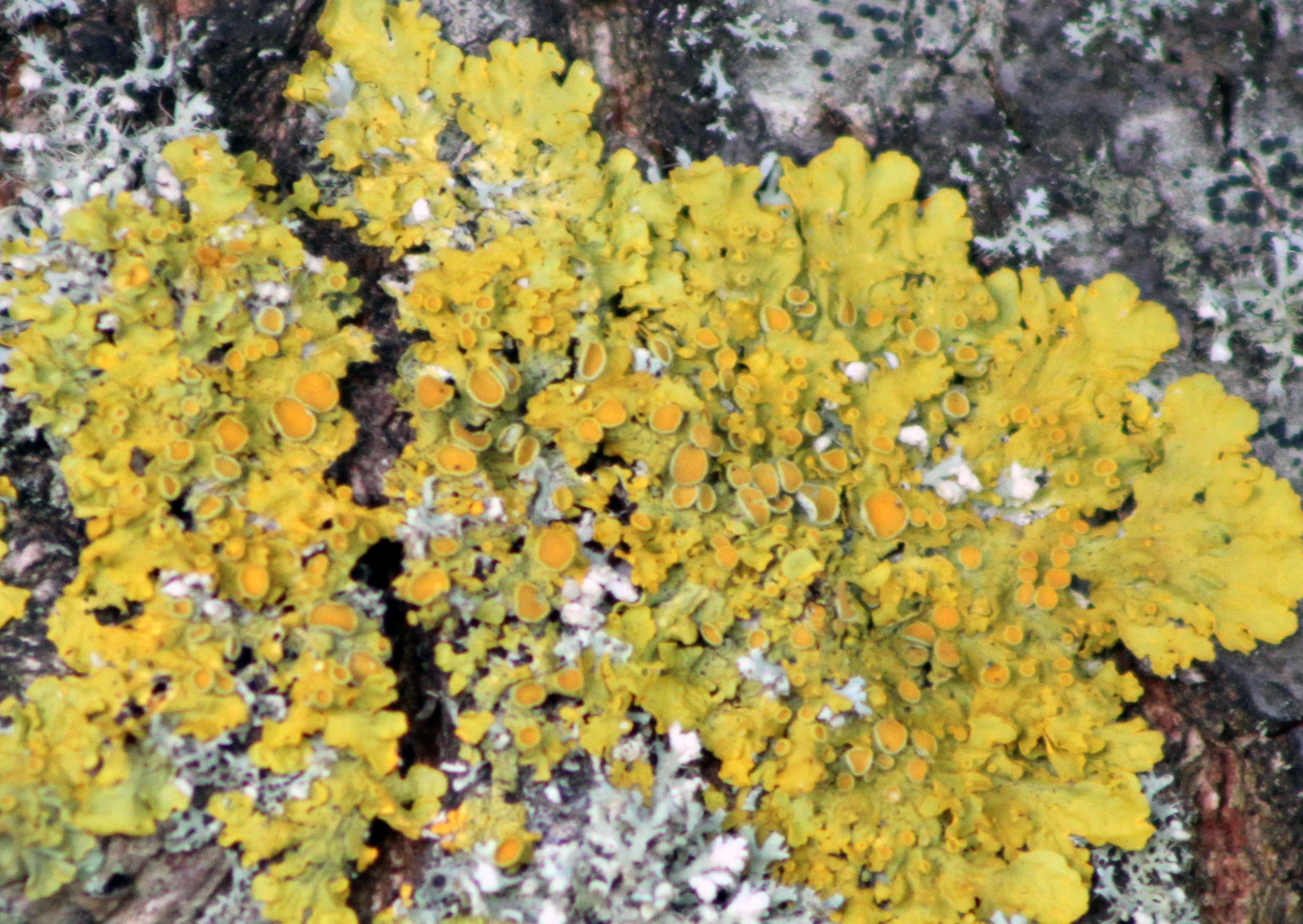
The set ups which i created for this project were fairly simple, yet i found that new effects were created when pointing my camera in different directions. When I really got up close to the objects, I was able to capture detail withing all the objects, and their texture which created complex and intricate images.


Info/Background:
Raised on the Channel Island of Jersey, London-based artist Alexander Mourant (b. 1994, UK) is
drawn to the friction between interior and exterior worlds, as well as photography’s power to
represent existential ideas. For his recent Aomori series, Mourant captured the blue depths of Japan’s
ancestral forests with a lens filter developed specifically for the project.
An Example of his work, Blue Photography:

This is my example responding to Alexander Mourant work, Instead of using glass over the lens, I changed the white balance setting in the camera, I liked this setting as the photo was green however When I changed the white balance It went to this light blue. The light Is coming from the Left top right corner catching the branch in the middle,
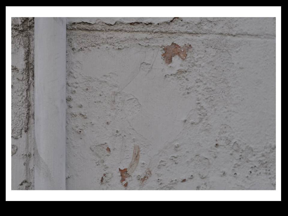
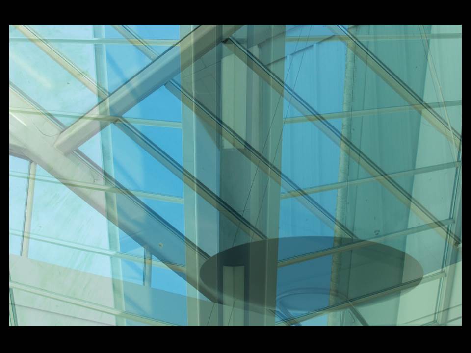
To start my over-exposure piece, I first chose the two images I wanted to use. I looked for two images which might go well together, and at least one that had texture and was considered abstract. I had to make them the same size, so since one was smaller than the other I had to make the smaller one bigger so it covered the entire picture.
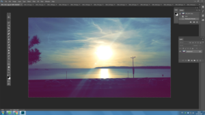
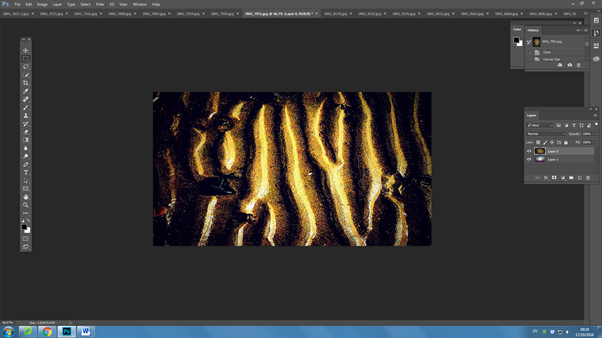
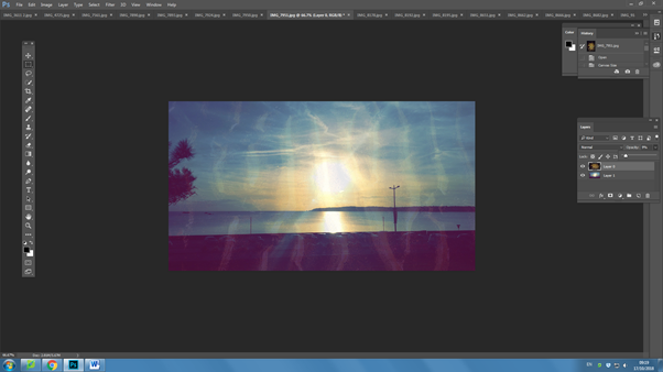
I then went and copied my textured one onto my other photo, and lowered the opacity so the bottom layer was visible through the top layer. I adjusted it until I was satisfied with my outcome.
Final works: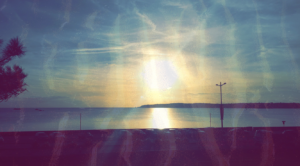
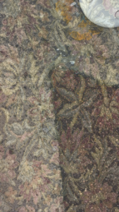
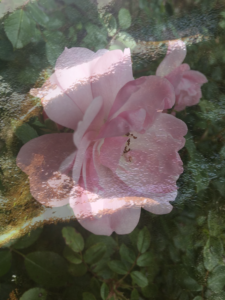
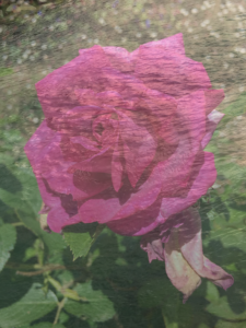
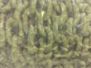
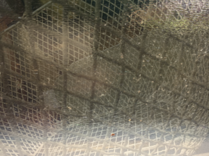
Here I am going to be trialing and experimenting with ways to display my final images on the A3, A4 and A5 paper prints. This will include arrangements of multiple images on one page and also just some single images to see what will work well together and if I can create a series of images that work well along one print.
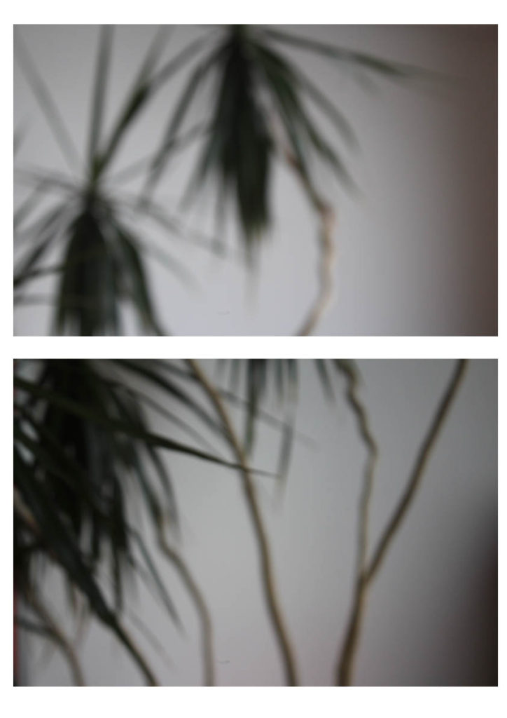
This is my first experiment with a way to display my final images. This display has two photographs from the same shoot one on top of the other. I would either place this image as A3 or A4, this would be so that you could clearly see the images and I feel would have a bigger impact on a larger scale. I feel the two images together have a large impact as they compliment each other and work well together creating a better effect together rather than if I had one of the singular photographs on its own. I feel this would work well displayed as a final piece as it shows off some of my camera skills and having them both on here emphasizes this.

This display I would use for A5 this would enable for the photograph to fill the whole page and I think this would have a larger impact having this particular photograph on its own and isolated. I would use a small boarder of white around the edge as to frame the photograph as I feel this would have a good effect.
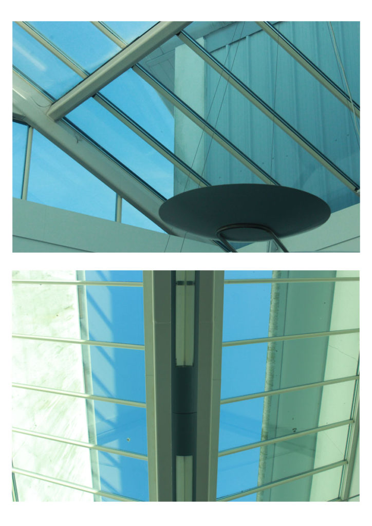
This display combines another of my two chosen images side by side as they work well together in the same style with the geometric abstract lines. I would have it either A4 or A3 as to show off the photographs and to be able to see the detail as I don’t feel this display would work well on a scale of A5. I feel the two images have a larger impact side by side rather than if I displayed the two photographs by themselves.
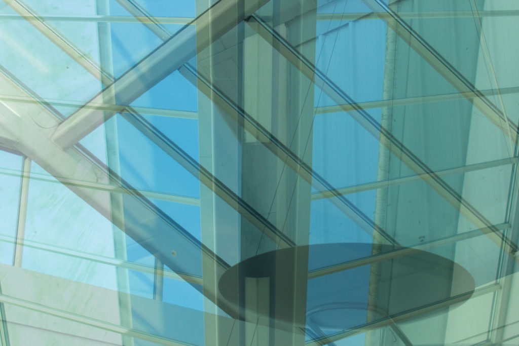
This is a display option for how I would display this edited image. I would make it my large A3 photograph as to show the full effect of the image and I feel it would work well on a larger scale to be able to see all the detail and the contrasting double exposure of the two photographs.

This is another way I may display my out of focus image however this has one just on it’s own like my textured wall photograph I would have this so that you could see the full effect of the photograph on A4 to be able to see my camera skills clearly with the out of focus shot.