Category Archives: Unit 1 Abstract

Filters

Author:
Category:

White Paper Challenge

Intro

The idea of abstract photography revolves around perception. The eyes perception of a given object. In this exercise, I have explored the idea of manipulating the appearance of a plain white piece of A4 paper and creating many different looks to it and ways of viewing it. I have utilised studio lighting to create shadows and I have either folded, Scrunched up or torn the paper in order to create images that show a wide range of shape, texture and contrast.

I have decided to desaturate every image in Photoshop and alter the brightness, contrast and exposure separately on each image to really highlight the shape, texture and shadows given off by this effect

Here are my outcomes from the Project below presented in a contact sheet

Contact sheet

I used an off-white coloured table with a black wall as the background. I utilised a box light and altered the white and yellow lighting from shot to shot to give off the effect of natural and artificial lighting.

Outcomes and analysis

I like the minimalistic values of this image, Mainly due to the shadow cast by the piece of paper and it generally creating a nice aesthetic.
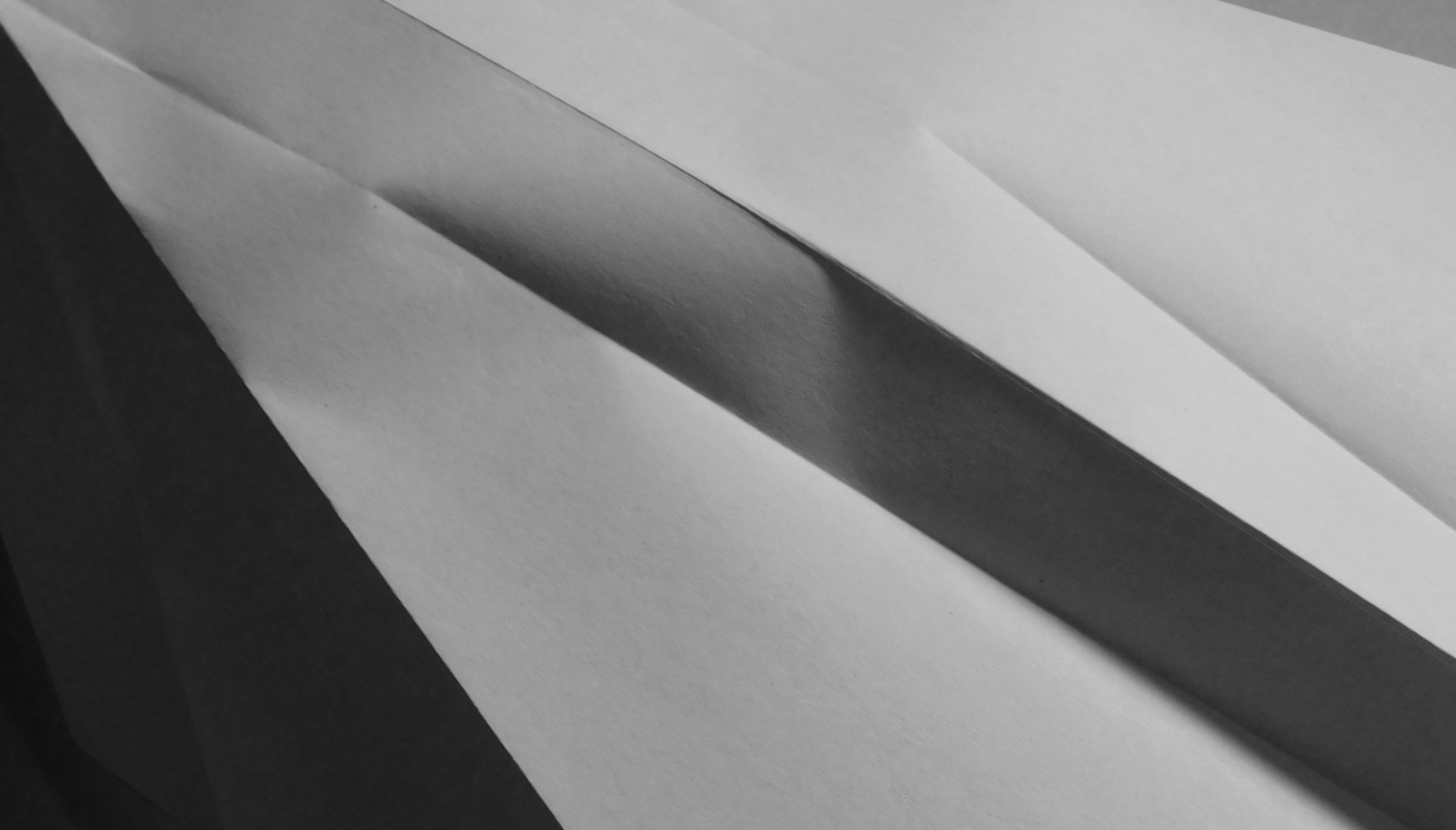
With this image, I am particularly drawn into the neat folds in the paper and the sharpness of the image. The folds are almost there to separate darker parts of the paper from the light and creates a very nice contrast and rich tone.


For this image, I decided to pinch the piece of paper and twist it around, Which has created an interesting blend of contrast within the paper itself as well as provided an interesting shape and shadows.
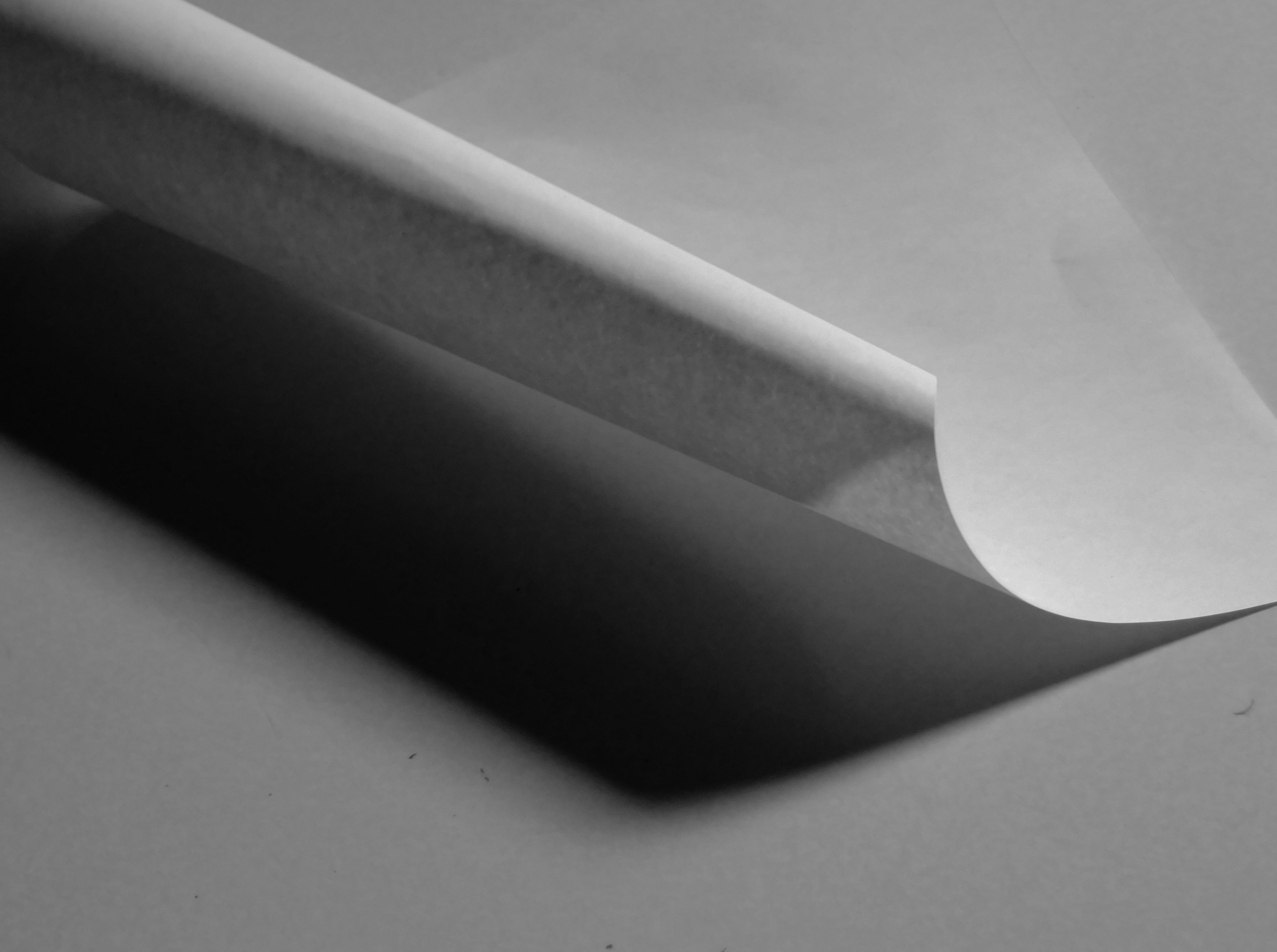
The paper has been rolled adn let to unroll and the resulting curl provides quite a dramatic image with a very good blend of shadows and light levels.

 

Claude Cahun and Clare Rae Exhibition

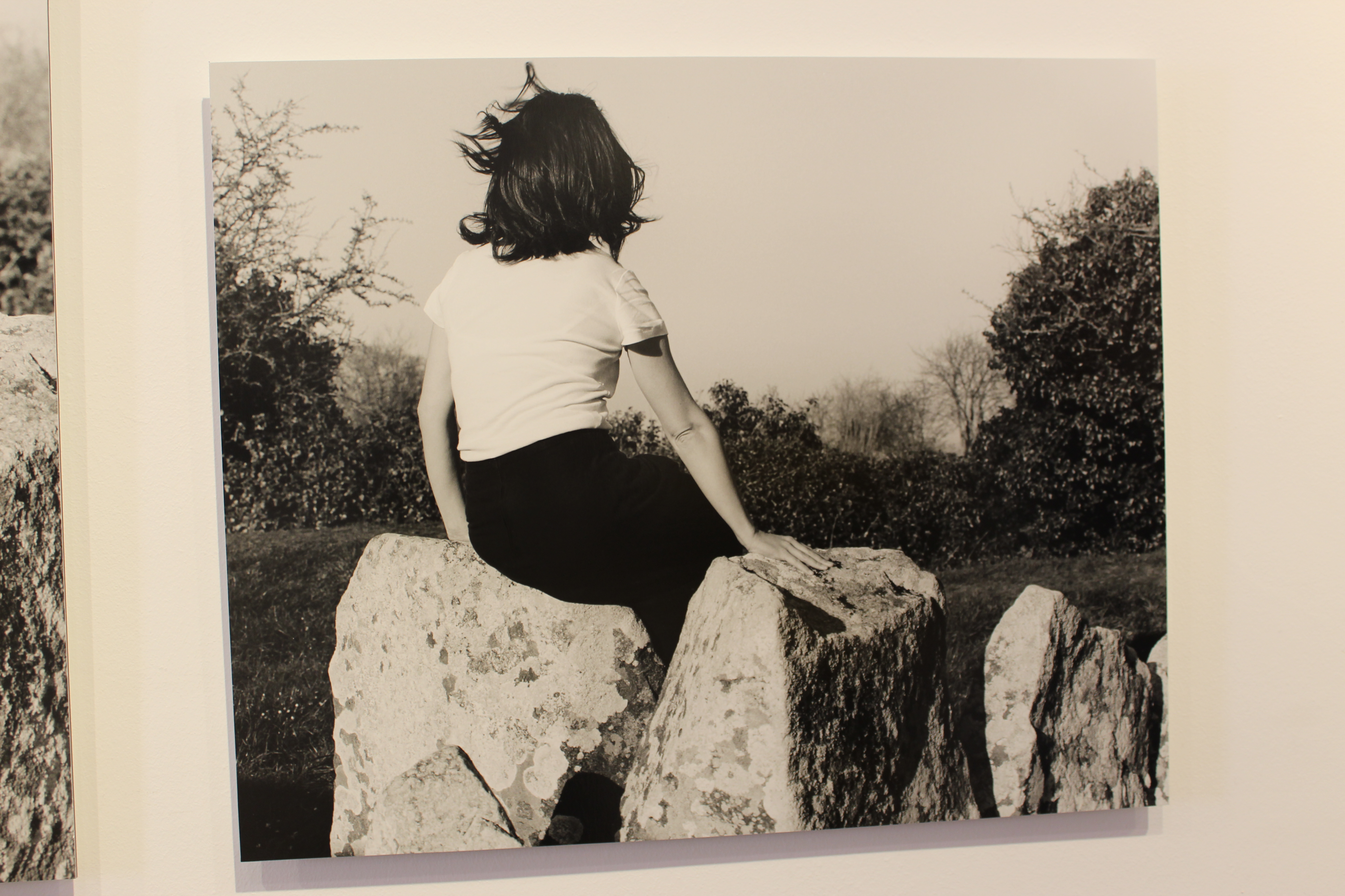
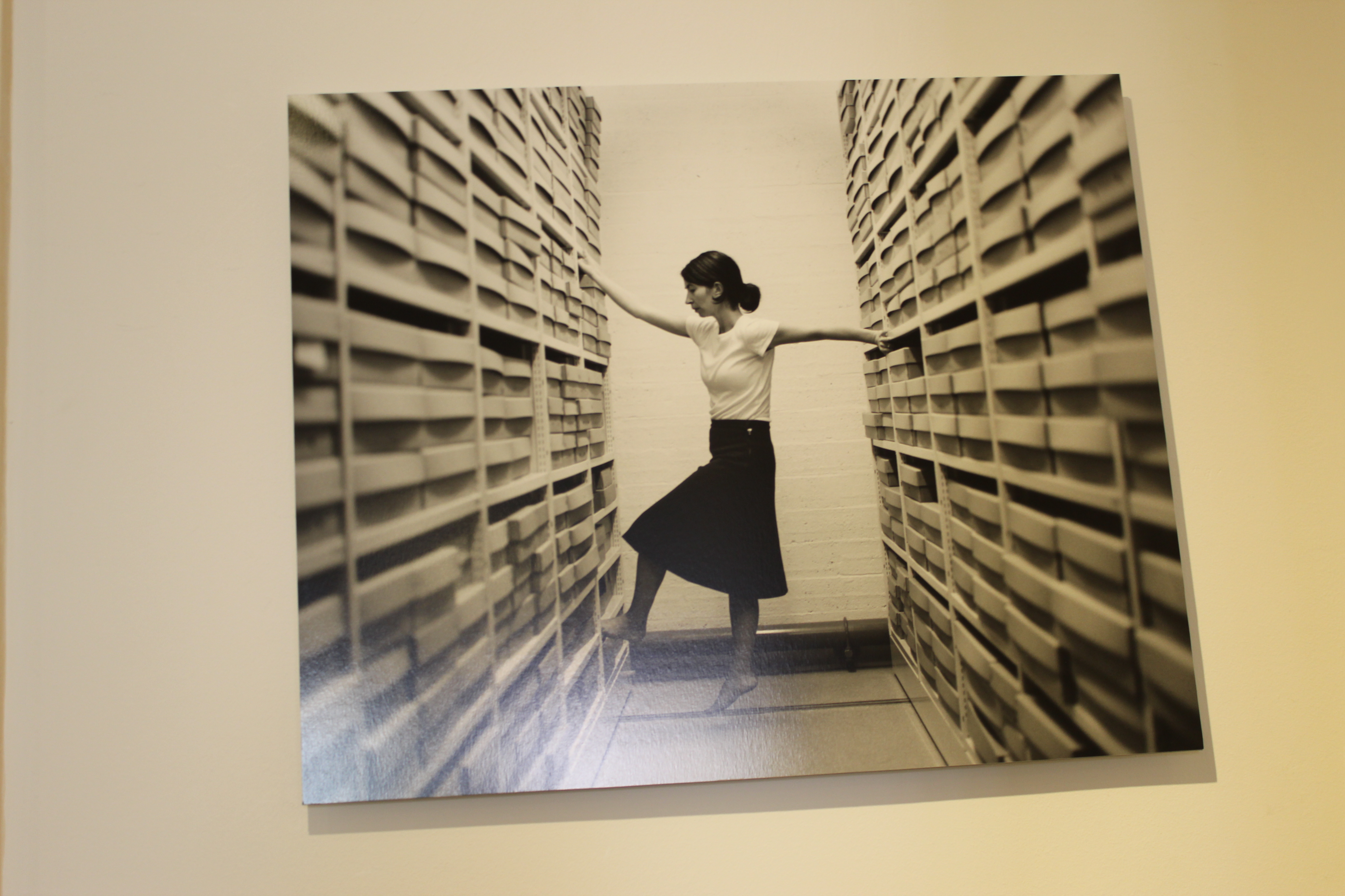
Clare Rae is a photographer based in Melbourne, Australia. Her work is inspired by feminist theory, and presents an alternate and often awkward experience of subjectivity and the female body, usually the artists’ own.

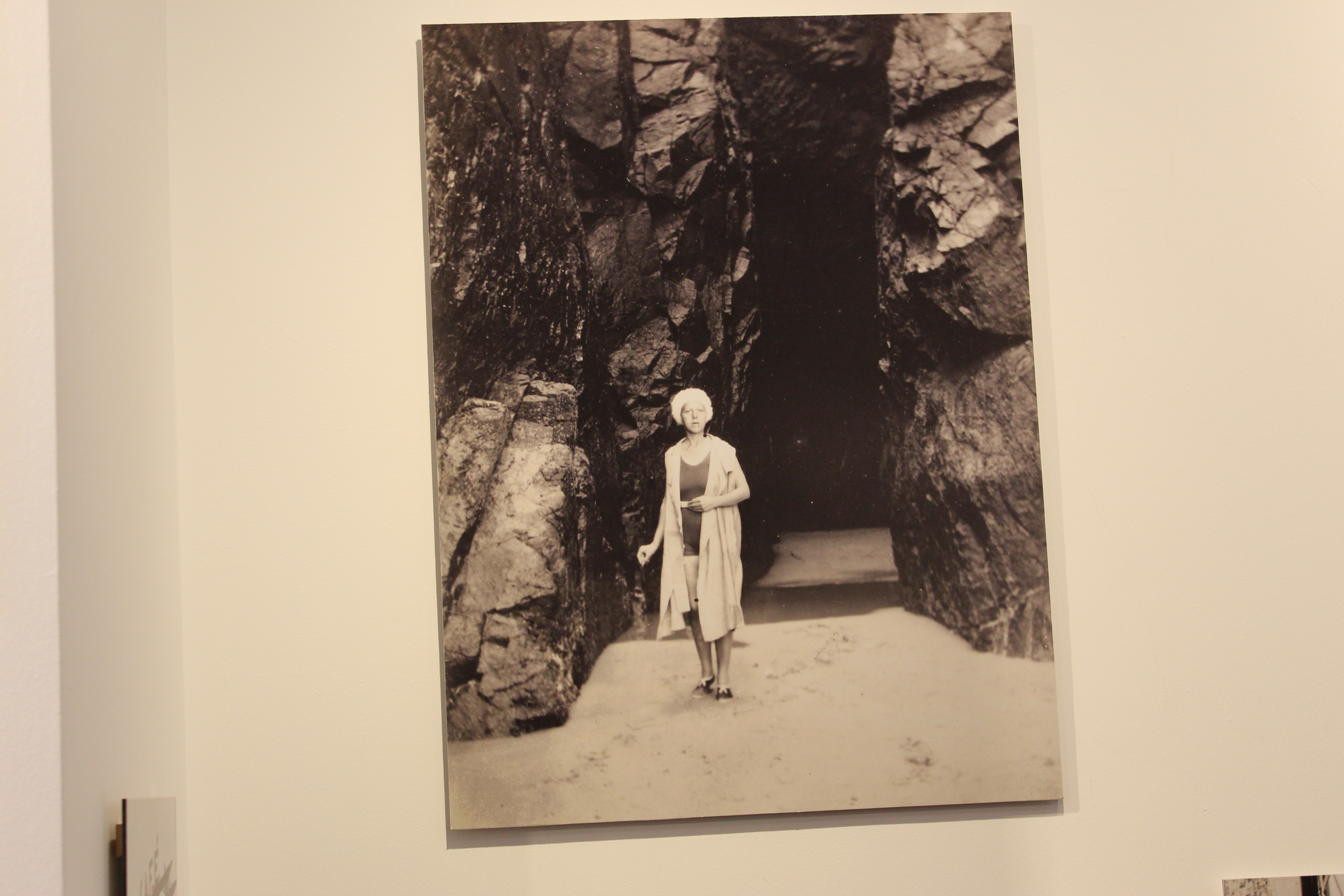
Claude Cahun was an avant-garde queer artist and writer based in Jersey CI. She was a self-portrait photographer and writer, and these photos and texts heavily influenced artists dealing with questions of gender identity.

Our photography group went to the CCA Gallery to look at both artists photos, and I was very impressed. I really loved both artists interpretations in abstract photography.

Top 4 Favourite Claude Cahun photos

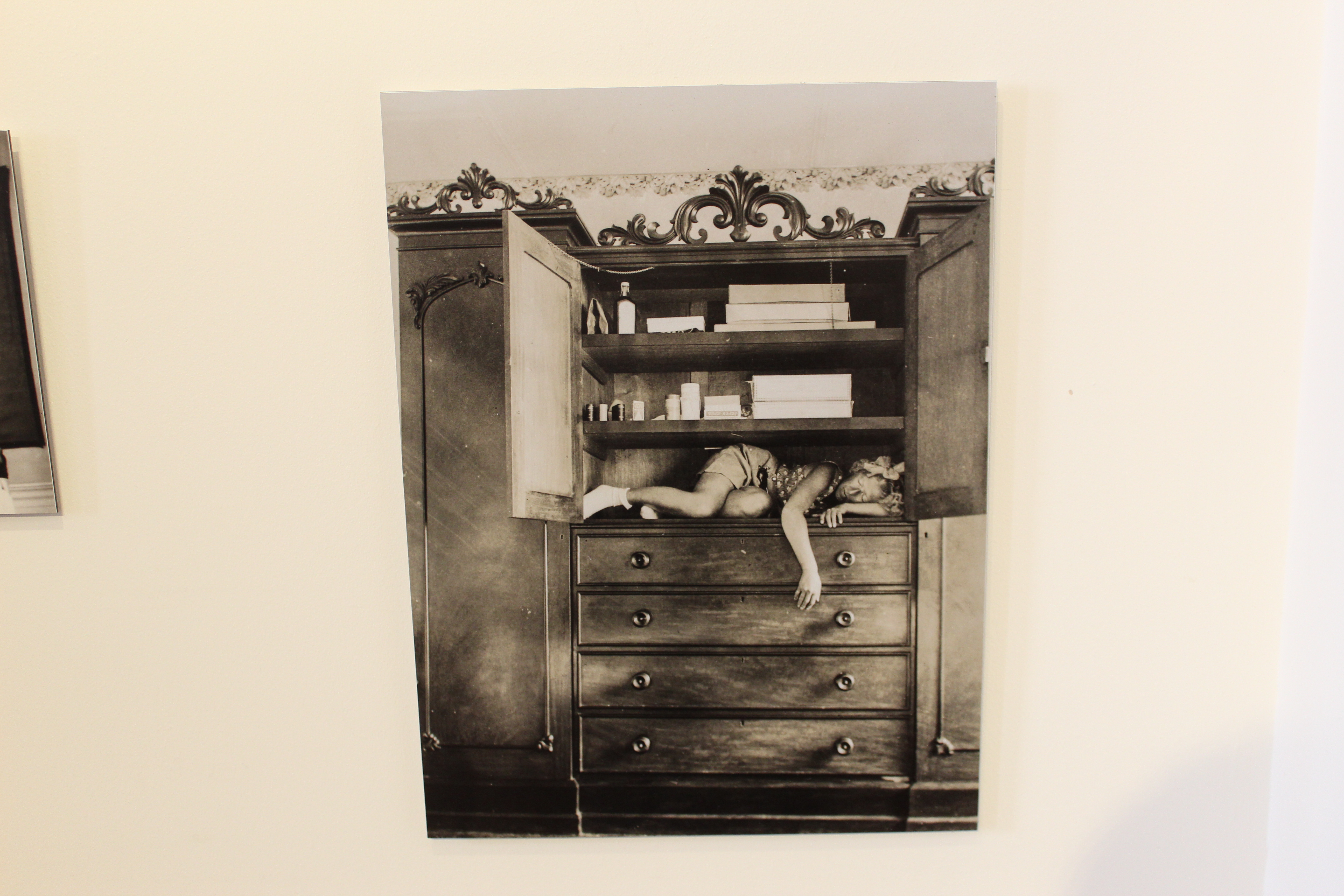
Claude Cahun – ‘Self portrait (in cupboard)’

This first photo really stood out to me because of how the girl is placed in the cupboard. She seems to be very squished and uncomfortable, which gives it a eerie and sad look to the photo. I think this photo was taken and executed very well.


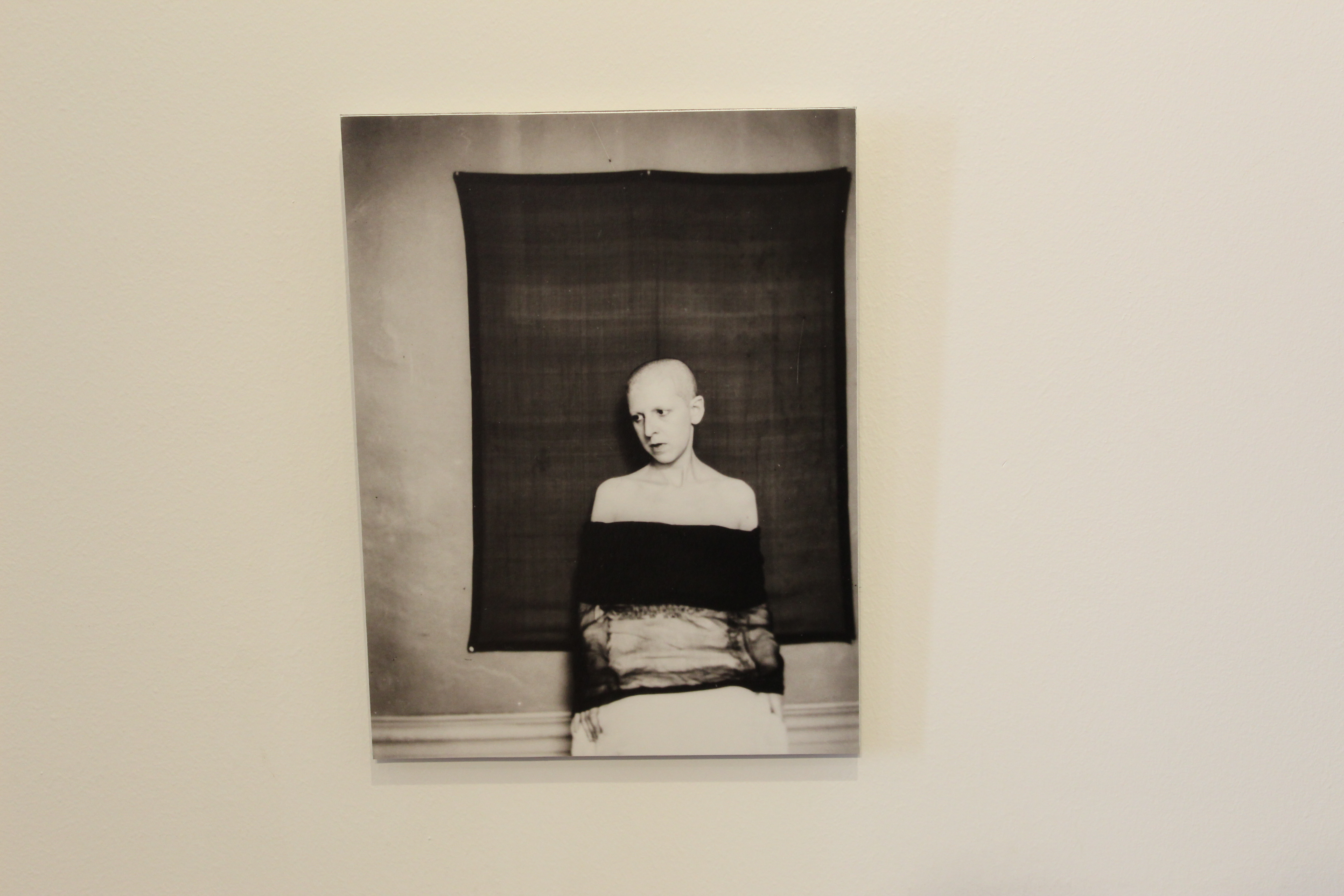
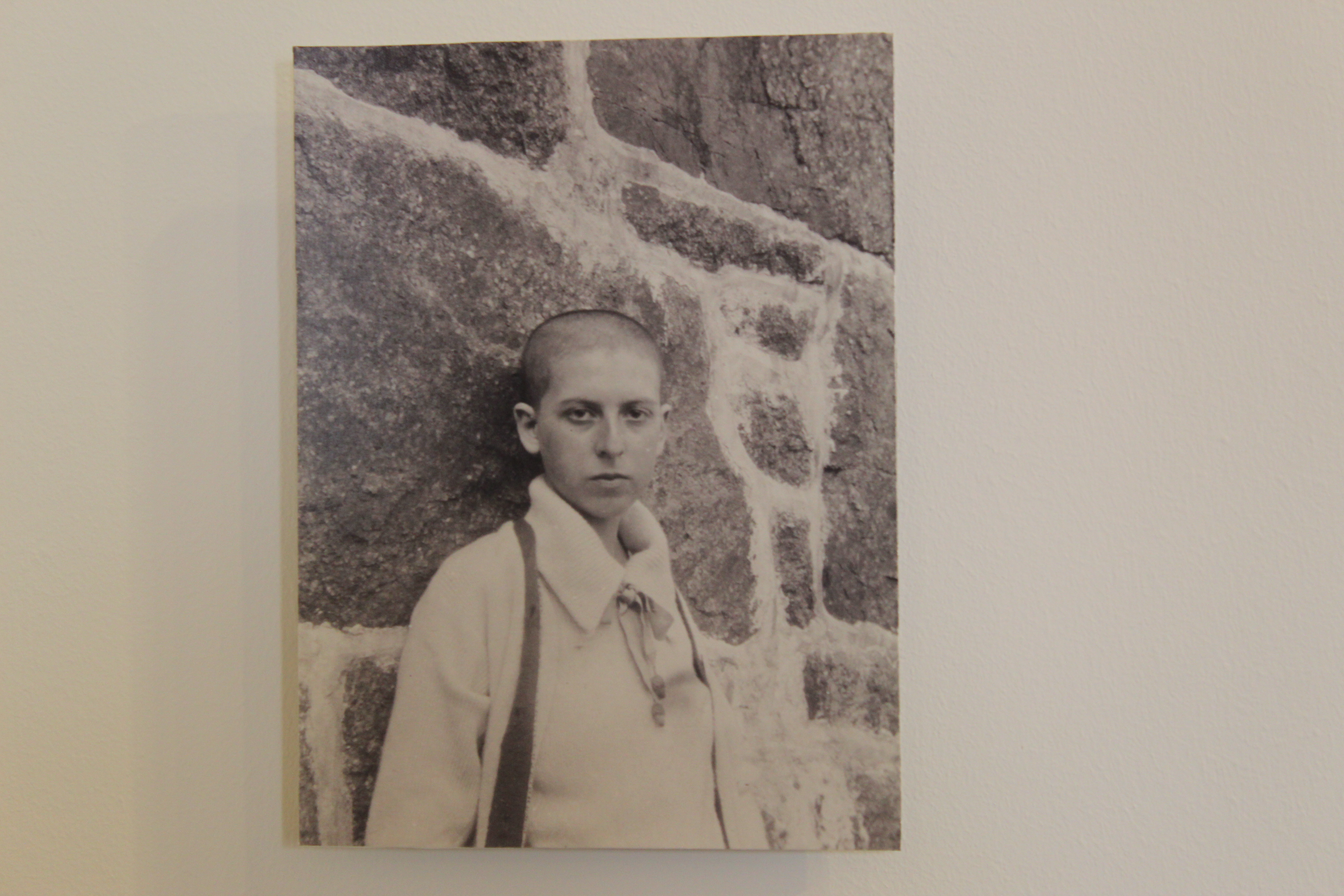
Claude Cahun – ‘Self portrait (shaved head, material draped over body)’

This next photo is very different and unique and I really like it.  I really like the contrast of the white wall and the black sheet behind her. Her expression also works well because it is very neutral and black, so it compliments the feel of her clothes and the background.

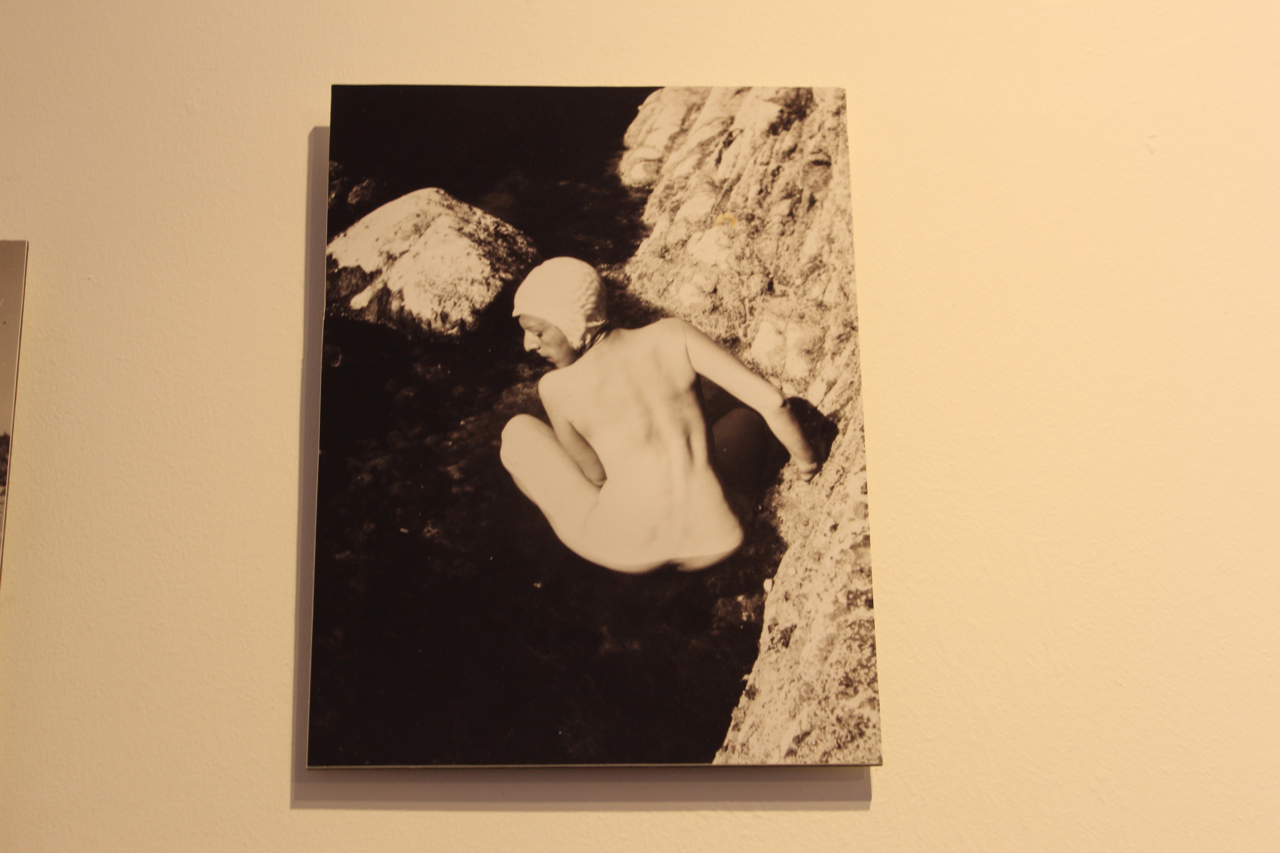
Claude Cahun – ‘Self portrait – crouched naked in rock pool)’

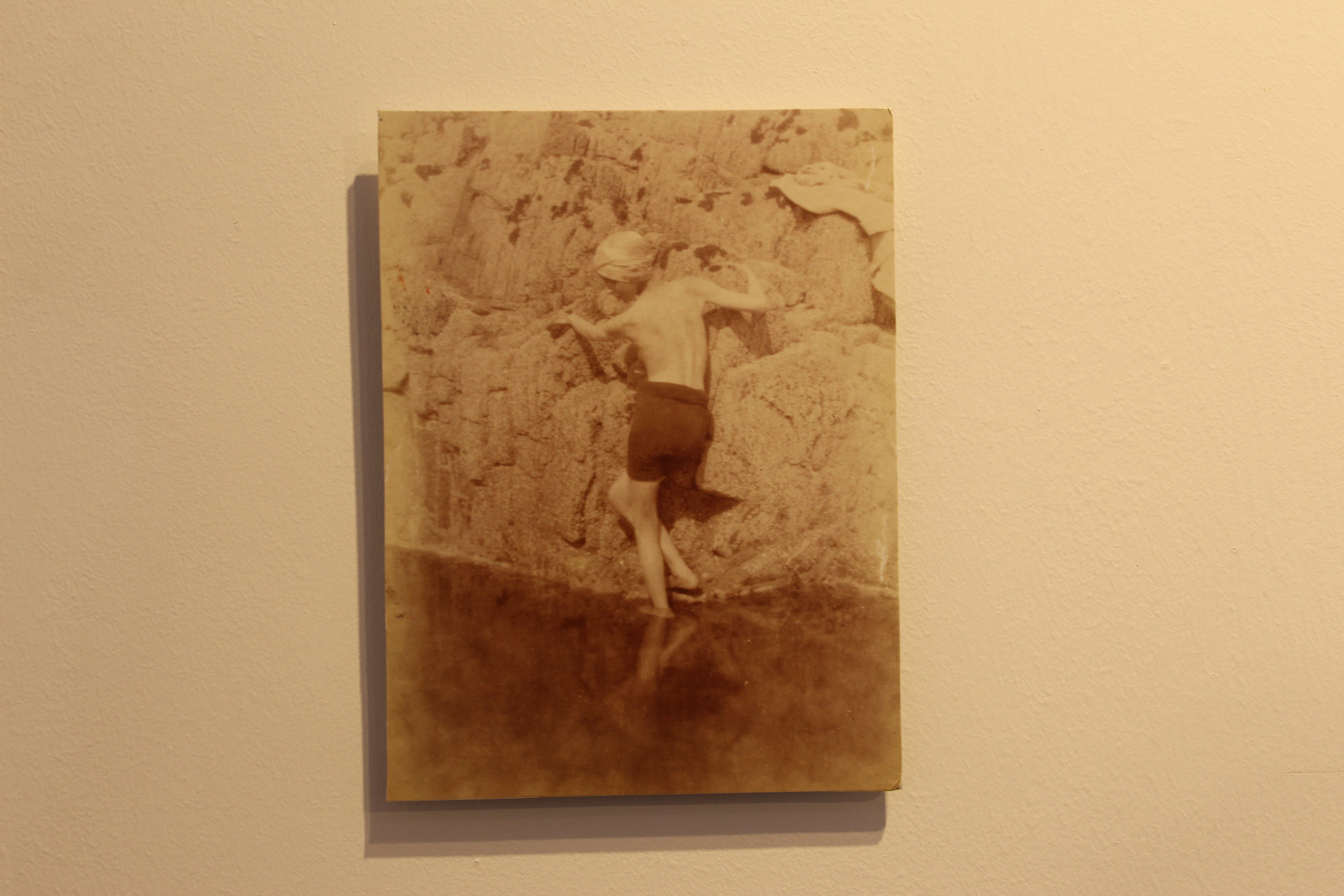
This photo really stands out to me because she is not afraid to be naked and express herself, which I really like because in those times expressing yourself wasn’t really “normal”. This photo works really well because her expression and stance is very soft compared to the rigid and sharp rocks, it gives a very good contrast.

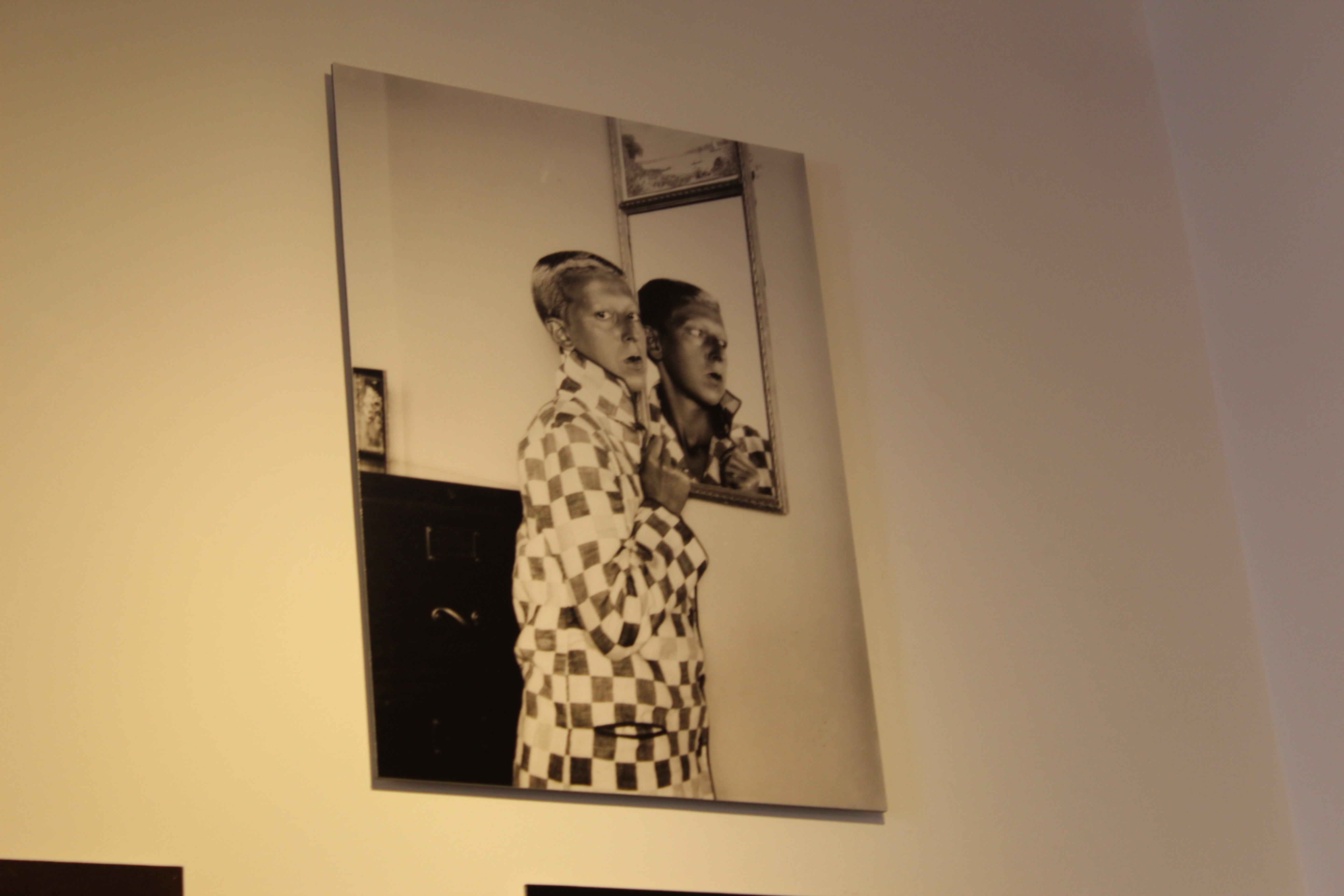
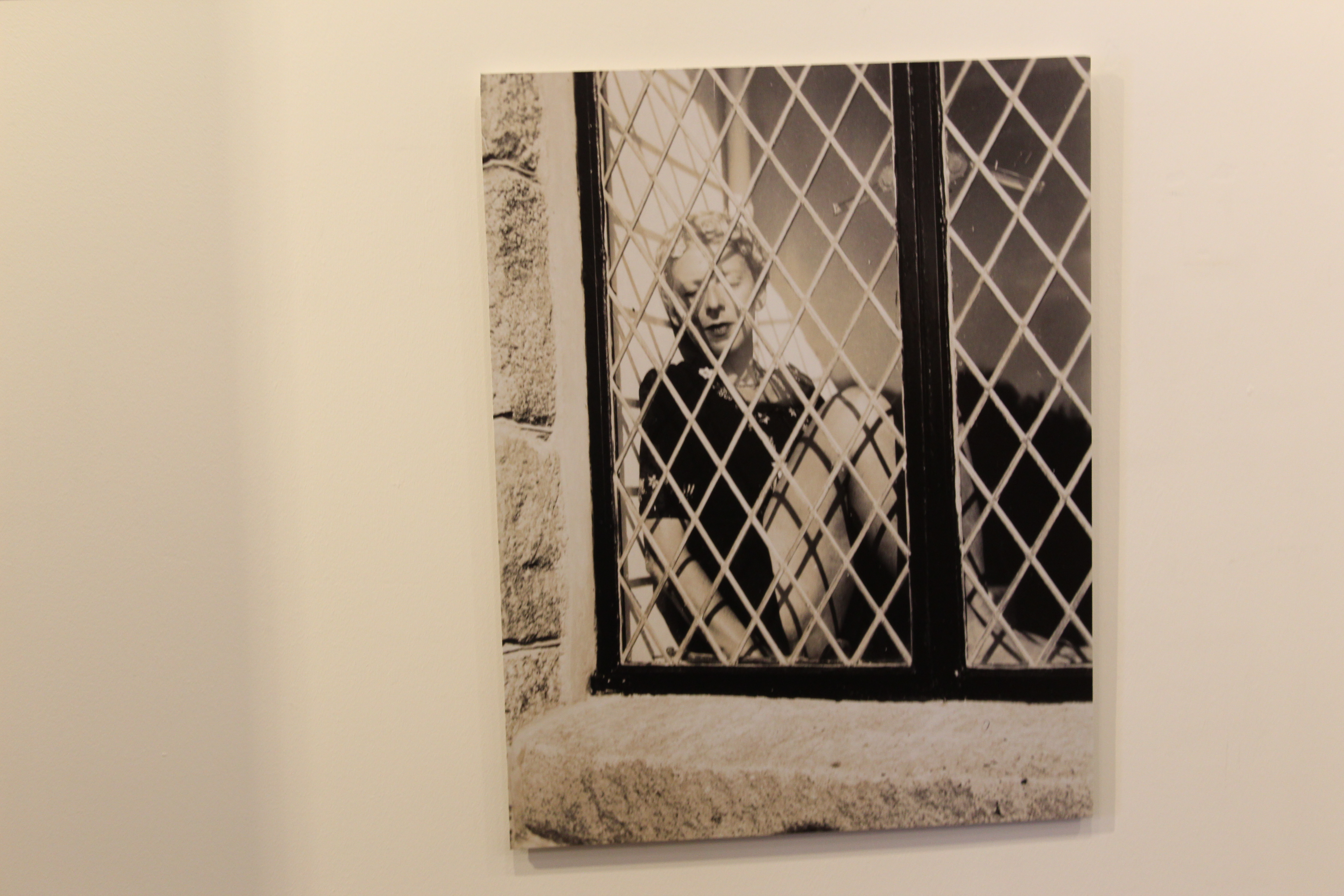
This last photo was very well executed and captured very well. I really like how she looks at the camera with a blank expression (which she does in most of her photos). I also really love the use of the mirror in this photo.

Top 4 Favourite Clare Rae Photos

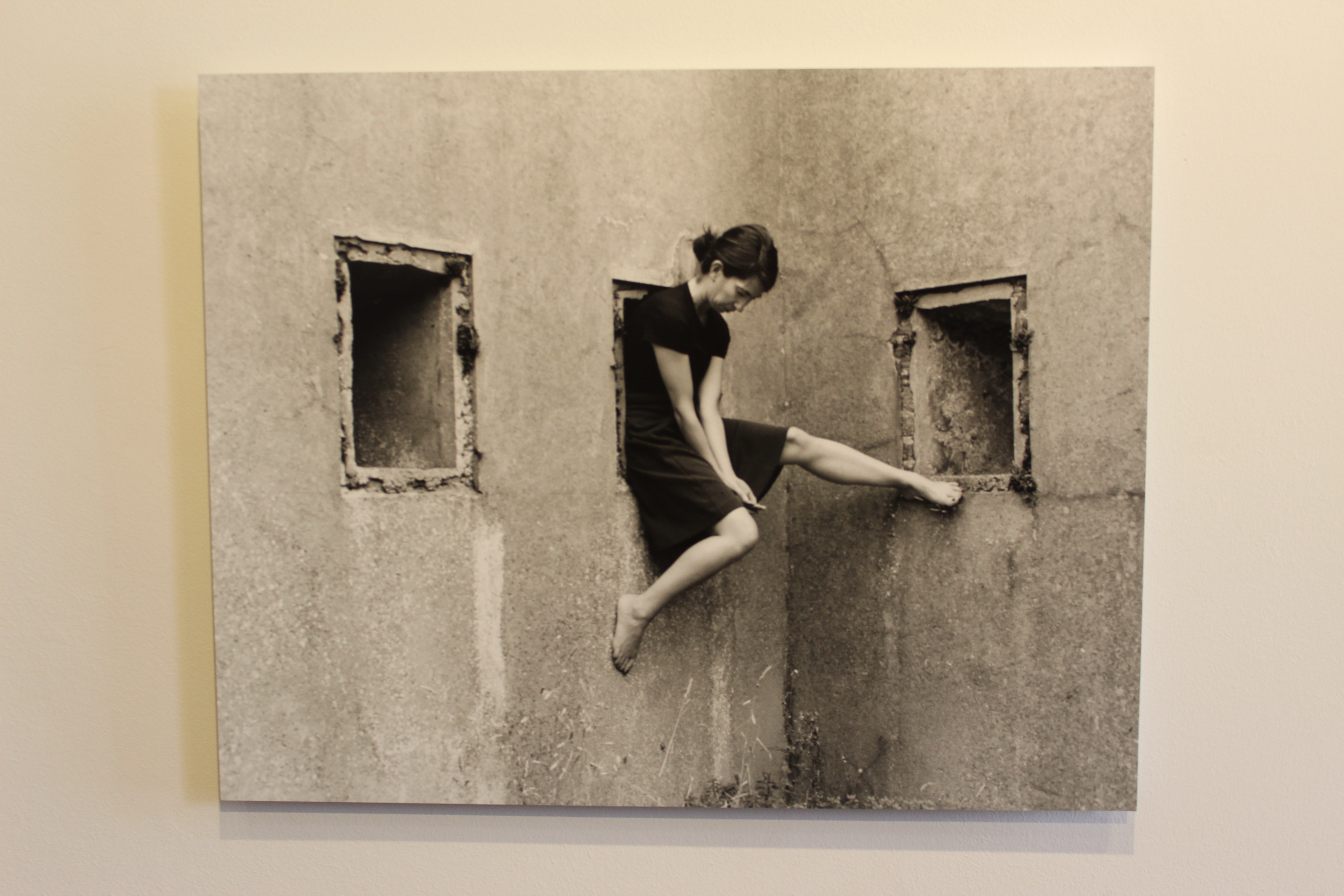
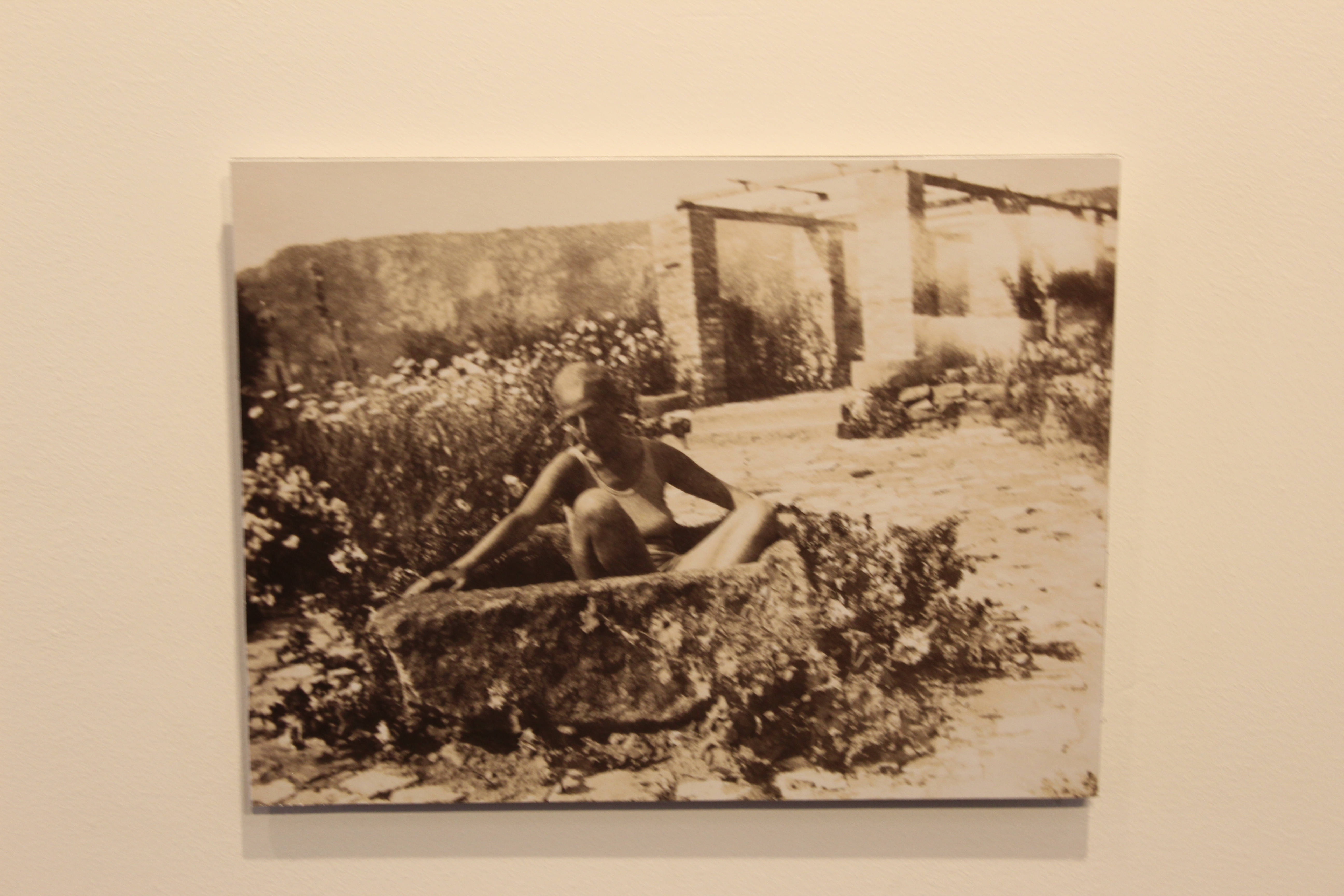
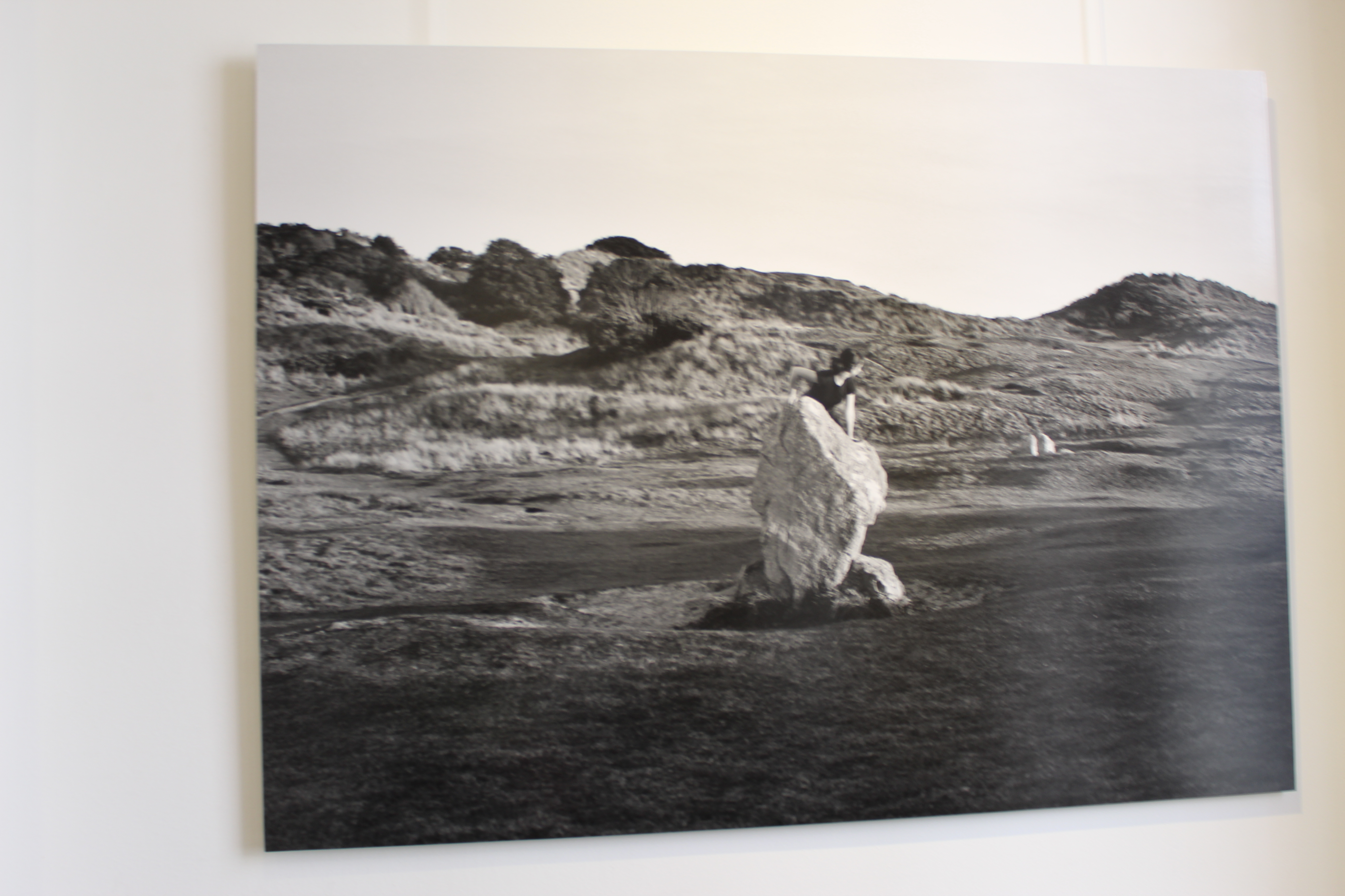
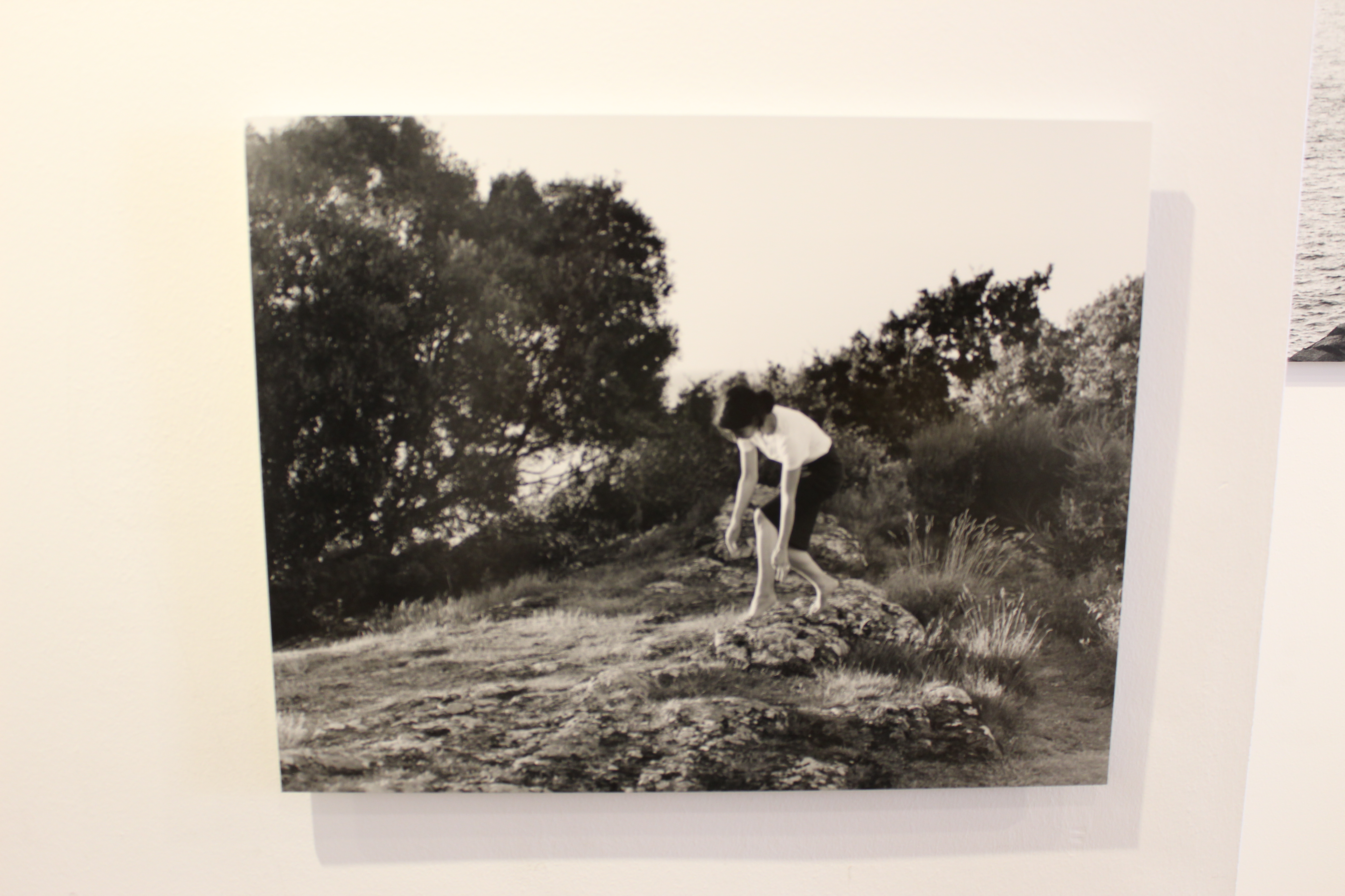
This photo works very well because the way she sits in the hole makes her look uncomfortable, but her body seems to maintain a very graceful and soft posture. I really like this photo.

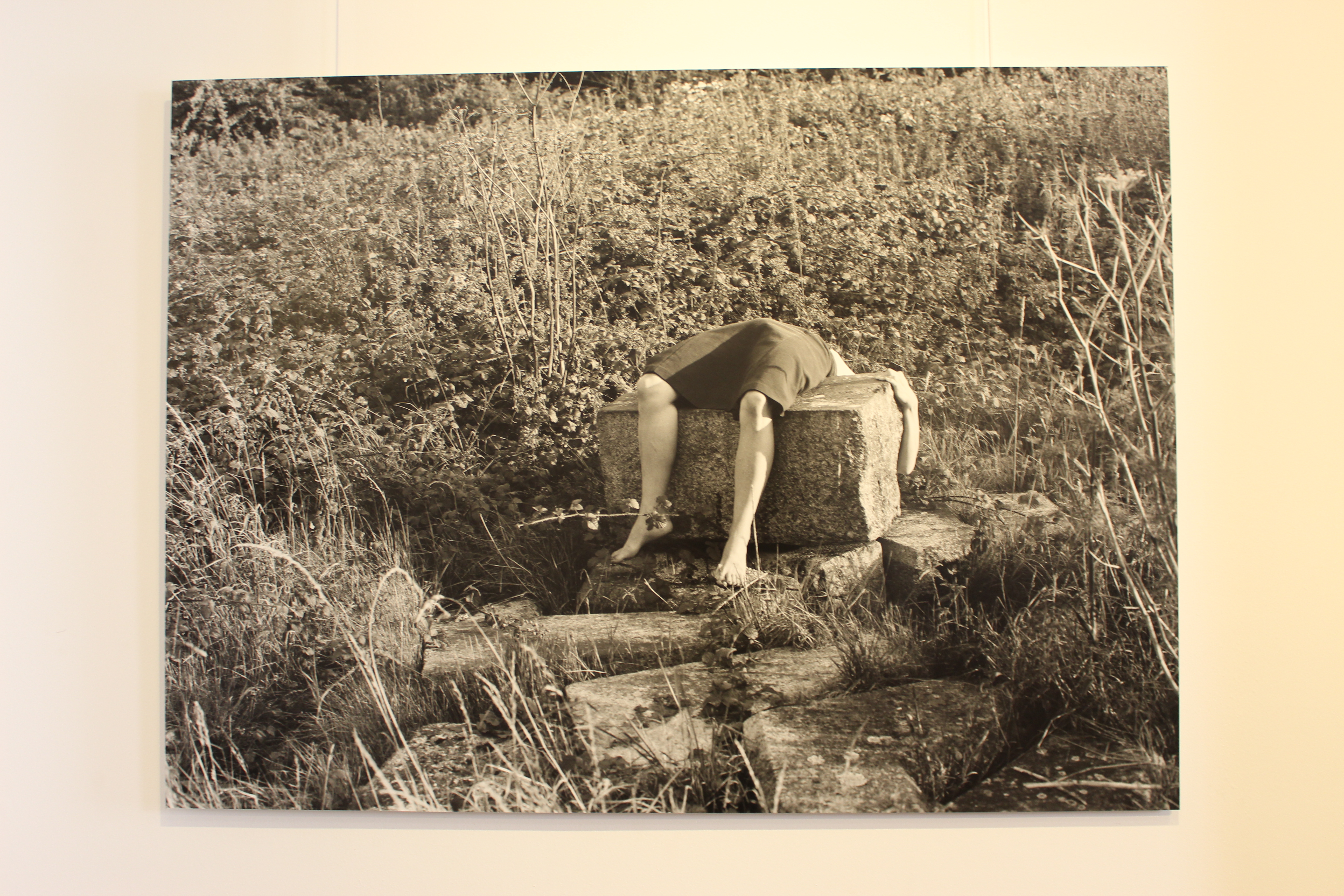
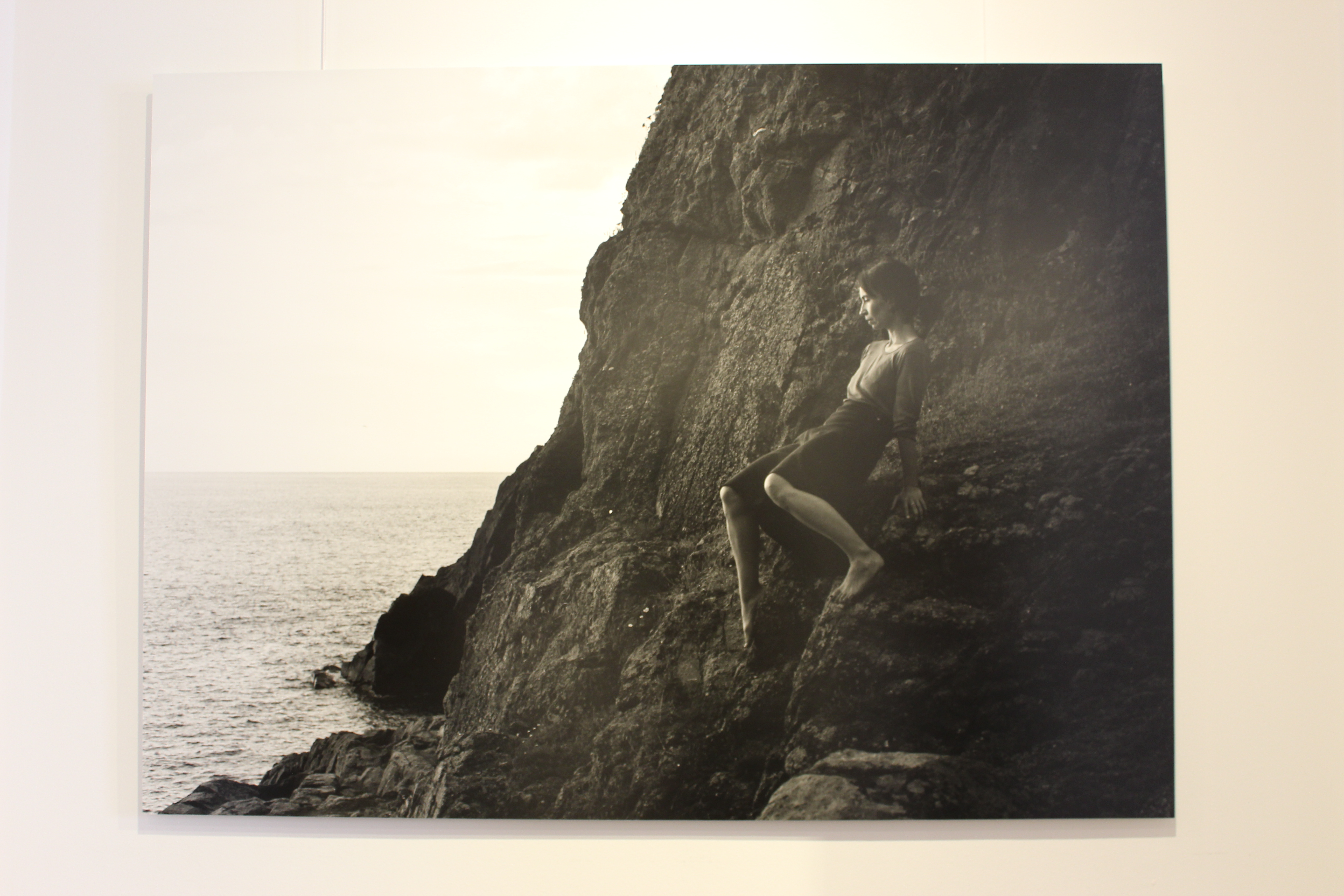
This photo is one of my favourites from Rae. I really like the way she is almost draped across the rocks. The position of her body again looks uncomfortable which works really well.
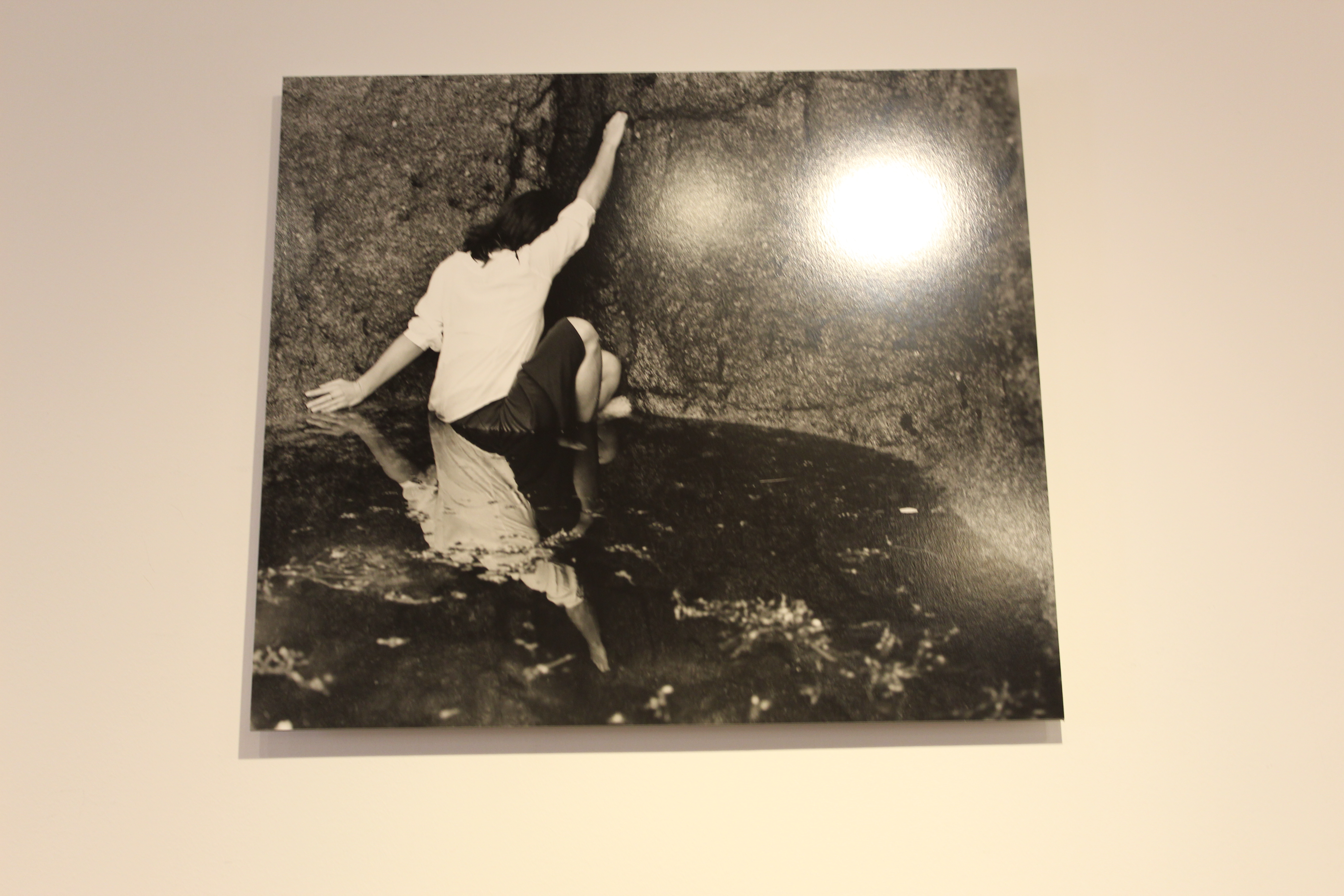
This photo is a very good interpretation of Cahun’s photo of her in the rock pool. I like this photo better than Cahun’s because she looks like shes in danger or that she’s struggling to get out. This photo was taken very well.

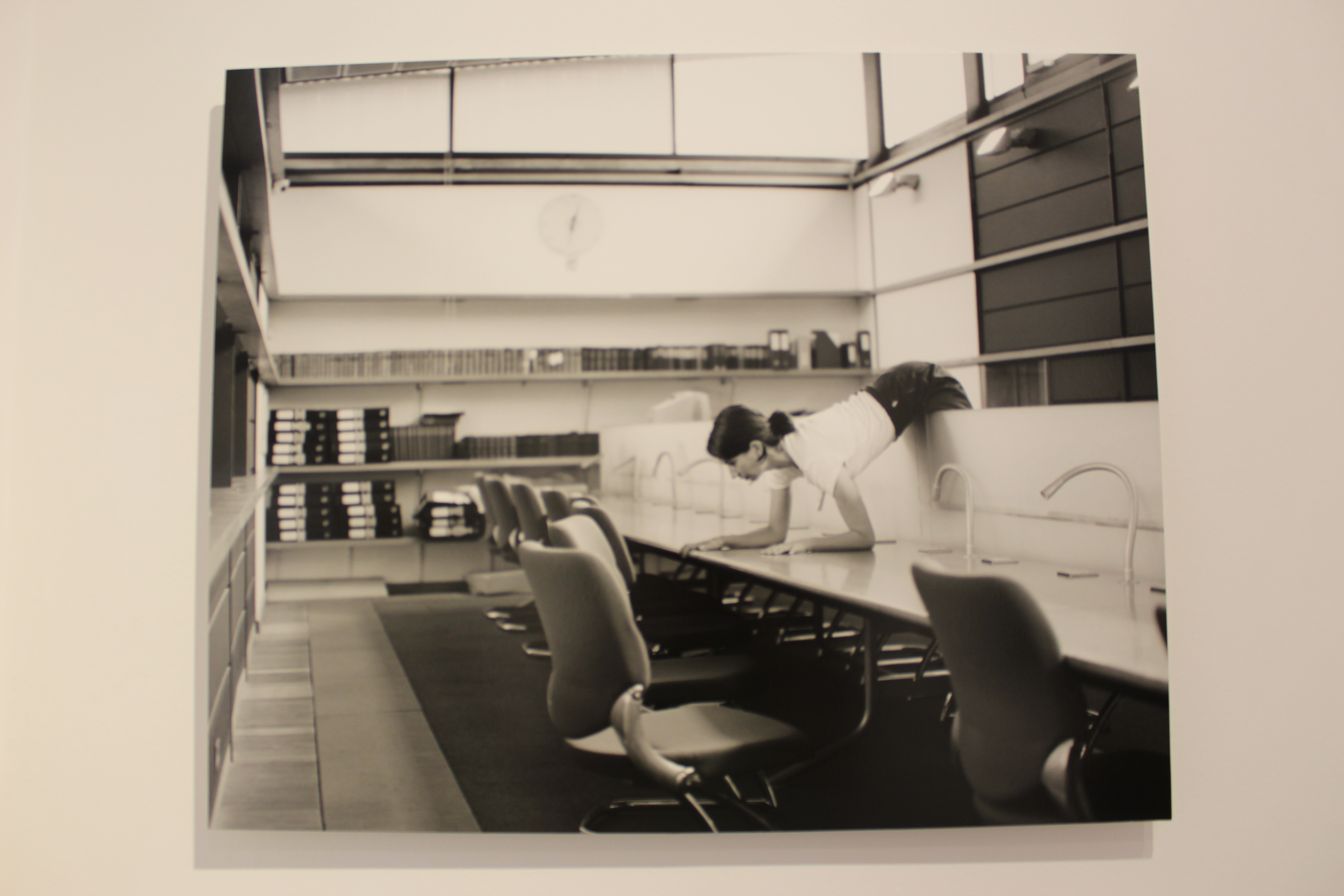
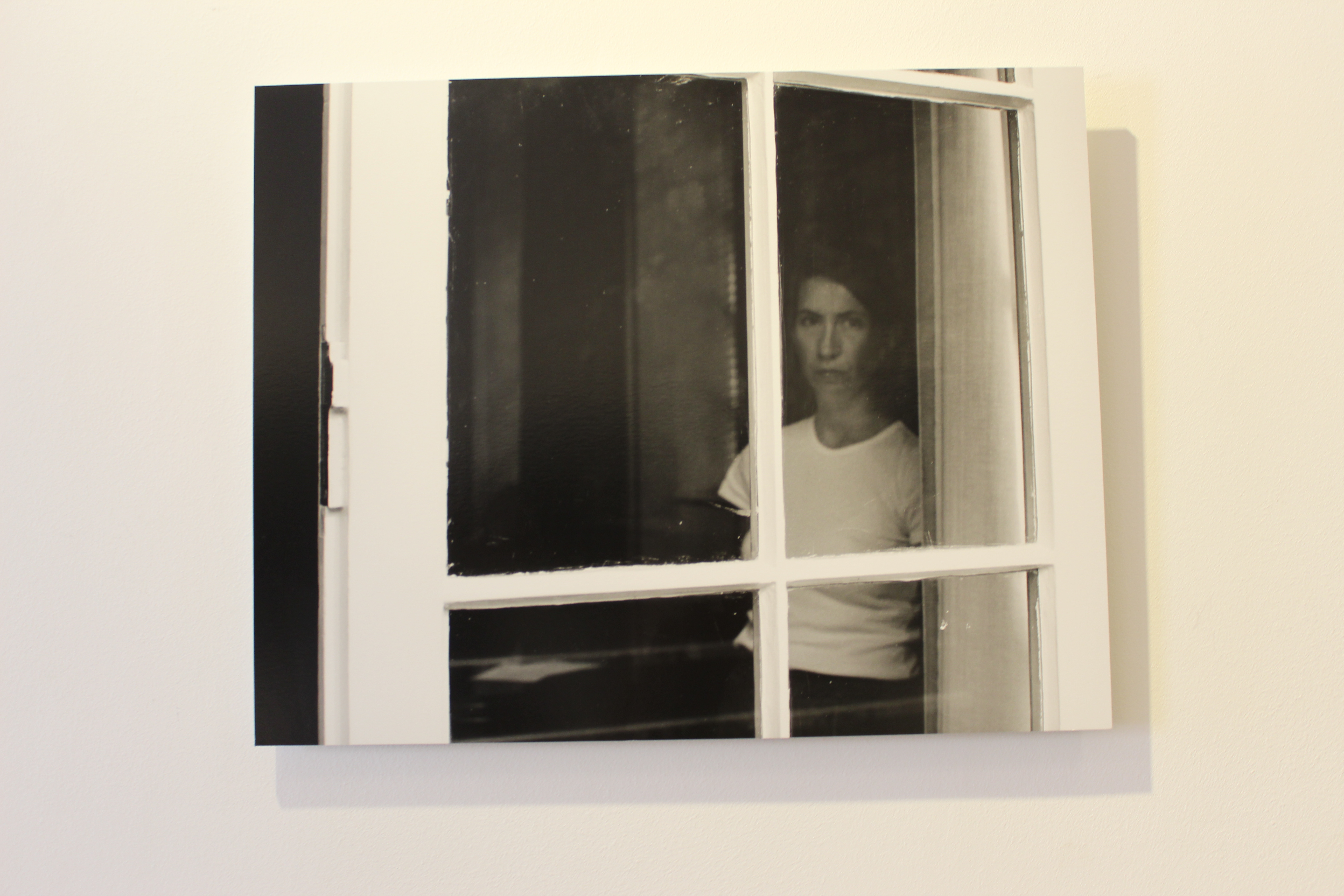
This last photo really stands out to me as it appears that she is in an office. I think this photo is implying the struggles of working in offices that are always busy and packed. The position her body is in is very abstract and contorted, it kind of looks like she is pain. I really like this photo.

Other Photos

I really enjoy both artists photos and how they both interpret this style of taking photos. I think they both take very amazing and unique photos, I hope to try this style and get a similar vibe when I take my own photos.


Photoshop Task


I edited all these photos on Photoshop and used multiple functions to edit them.

For this photo I lowered the saturation and vibrancy, I also heightened the contrast and and exposure.

With this photo I made the contrast more saturated and used the colour sliders to alter the colour of the photo.

For this photo I added high contrast because the original photo was very dull and boring.  I also put the vibrancy up and I think it made the tree more appealing and makes it stand out.

For this photo I experimented with contrast and exposure. I also used the colour sliders to alter the colours of the photo.

For the last photo I played around with contrast and exposure again. I also changed the vibrancy to be more dull.

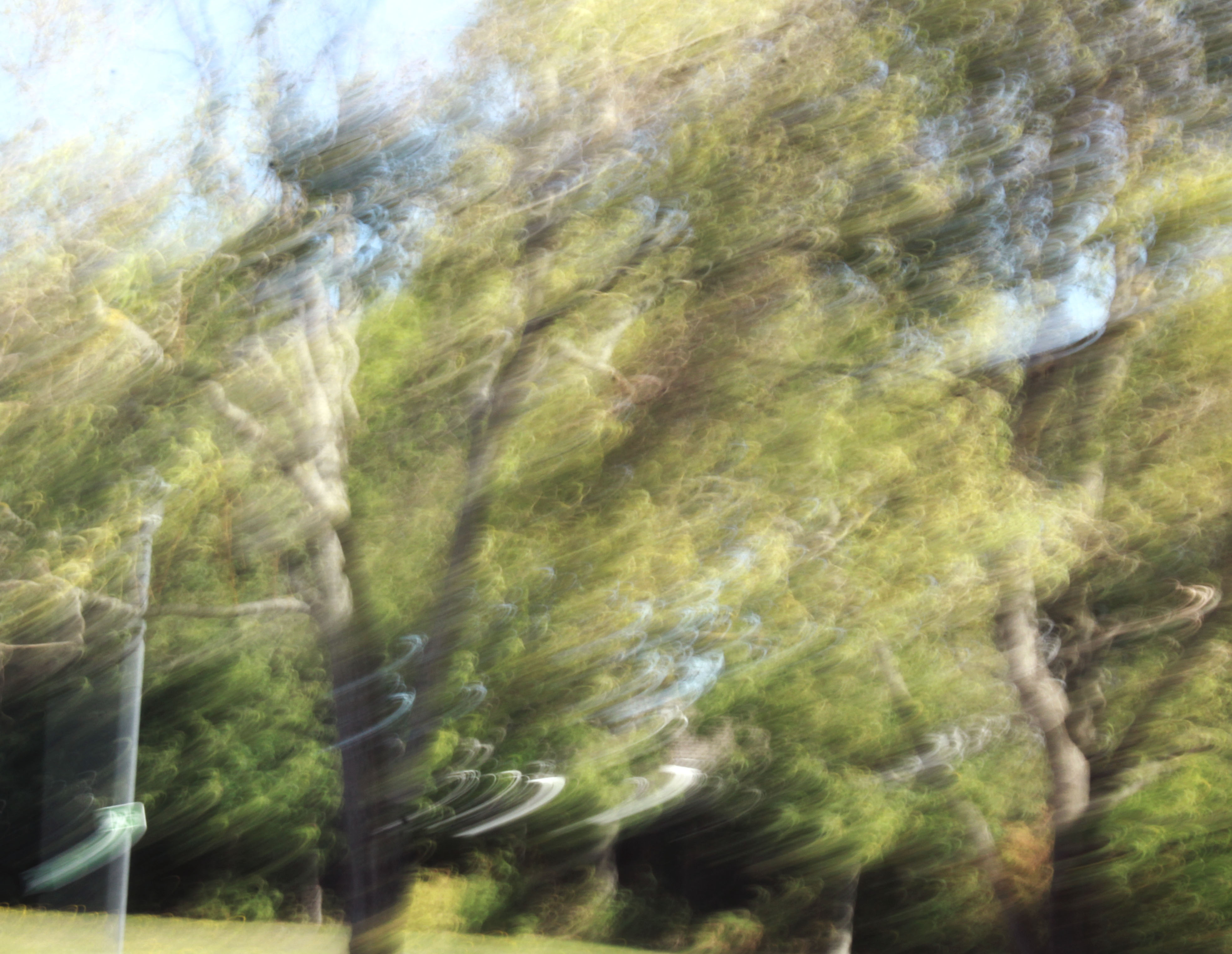
I’m also really happy with how these photos turned out. I think I edited them really well, and they came out really well. I really liked how I edited them and also how I took them. I think taking photos with ICM turn out really unique and abstract and I really enjoy taking photos like this. I will try and use this style of taking photos again as I think it gives a good look to the final pictures.


Photoshop Task

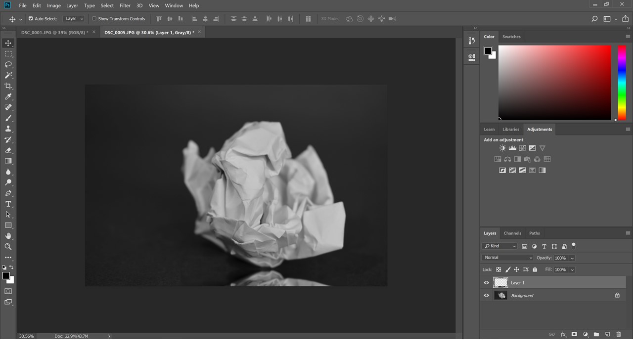
The first photo was taken with a very low aperture and so that only the closest point of the paper was in focus and I used a large piece of back paper to make it look like there is no background and it is infinite.

Then I have made the picture black and white and cropped it slightly.

Then I highlighted the ball with the marquee tool then with ctrl-j I duplicated the layer and then using ctrl-t I transformed the layer and then dragged the second layer down so tat it looks like a reflection.

Photoshop experiments

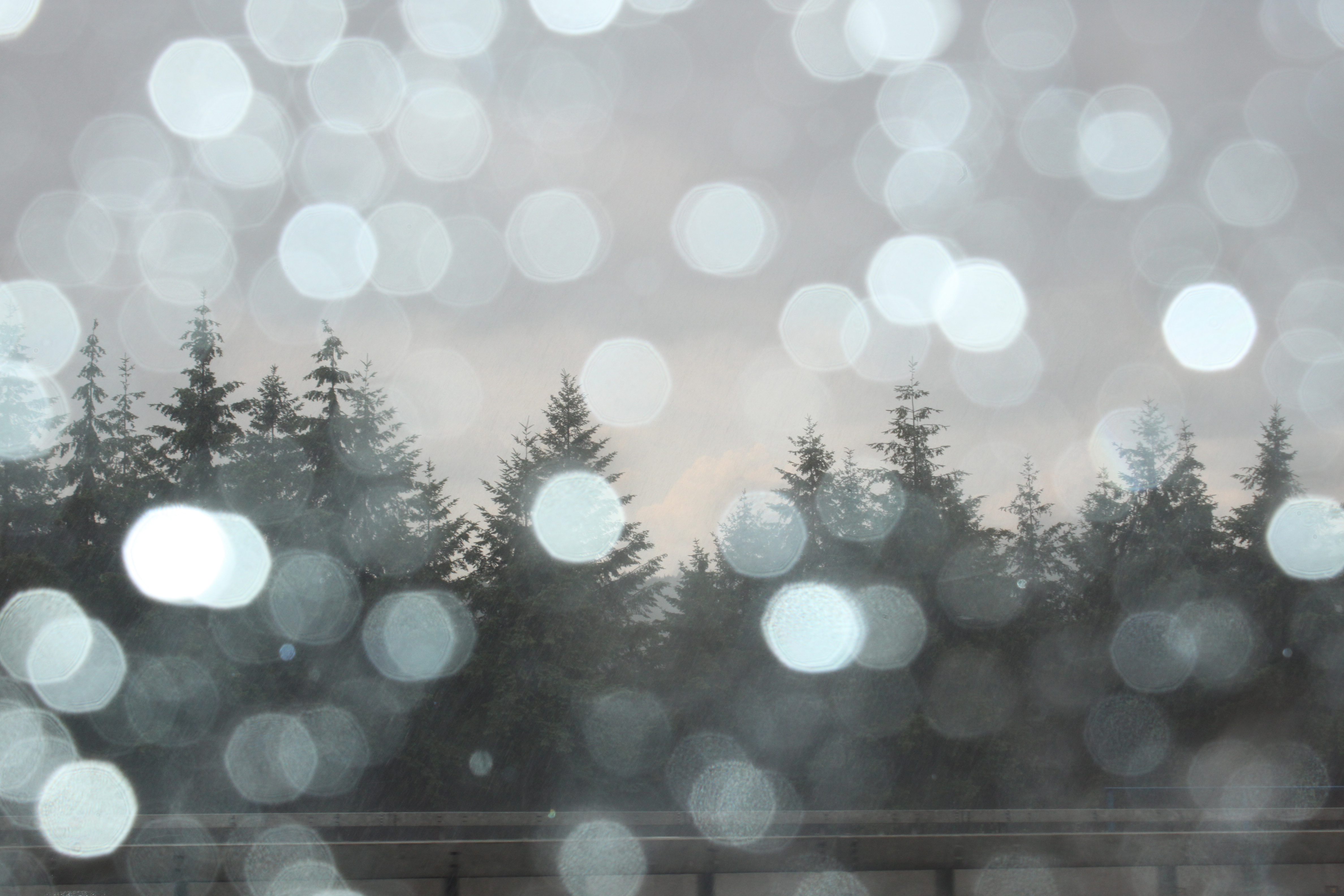
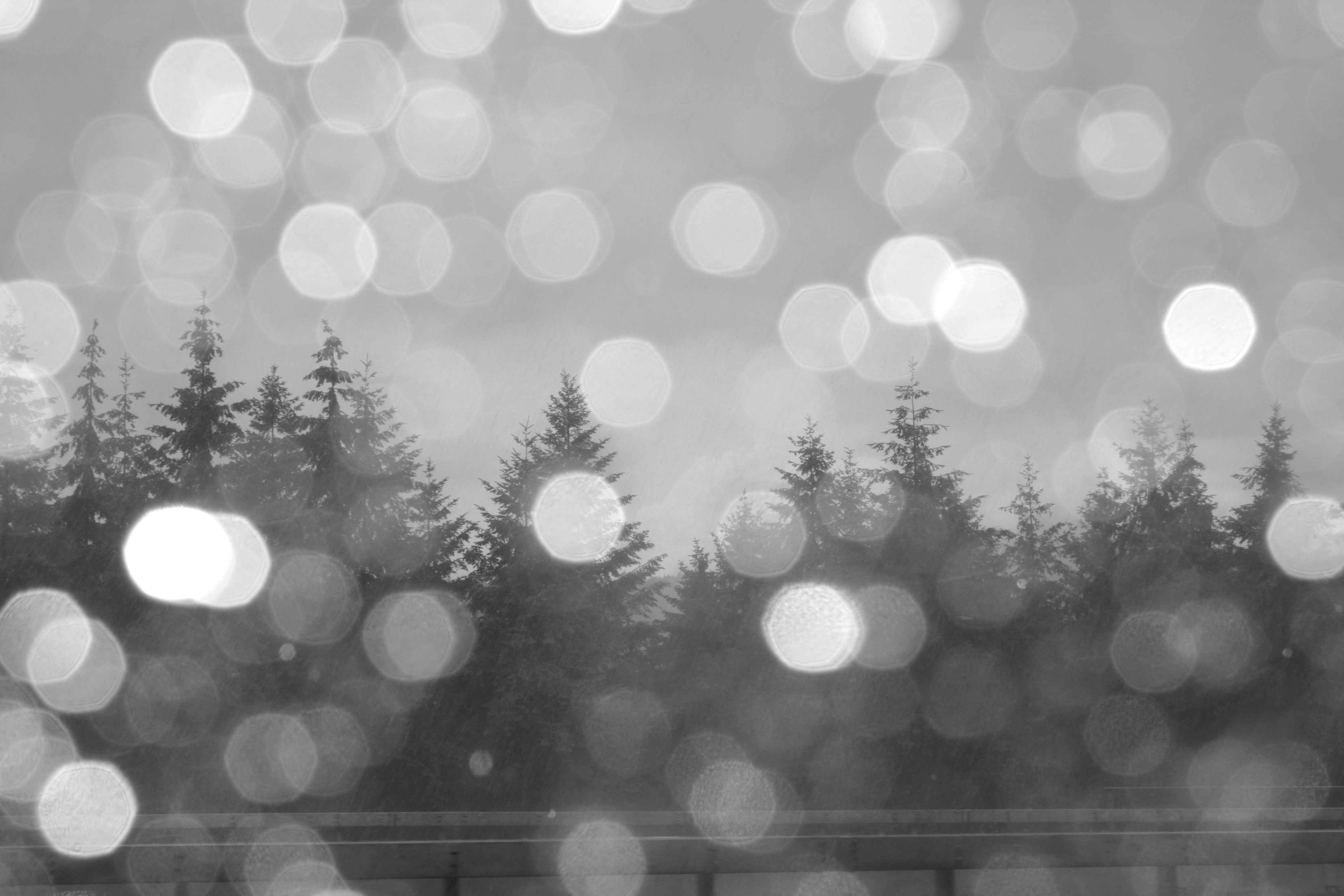
This is the original photo which I took a few weeks ago in Germany. The photo consists of blurred rain drops on the car window in the foreground, and trees in the background which are in-focus.
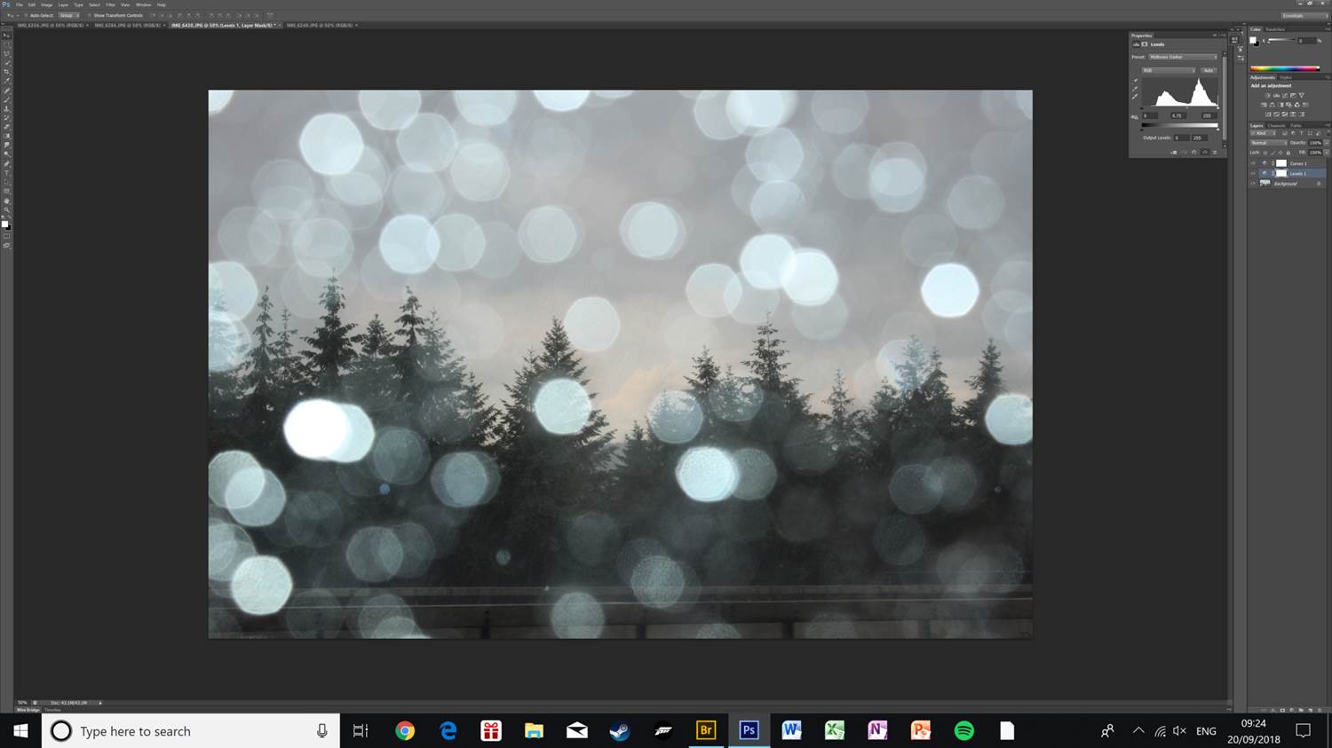
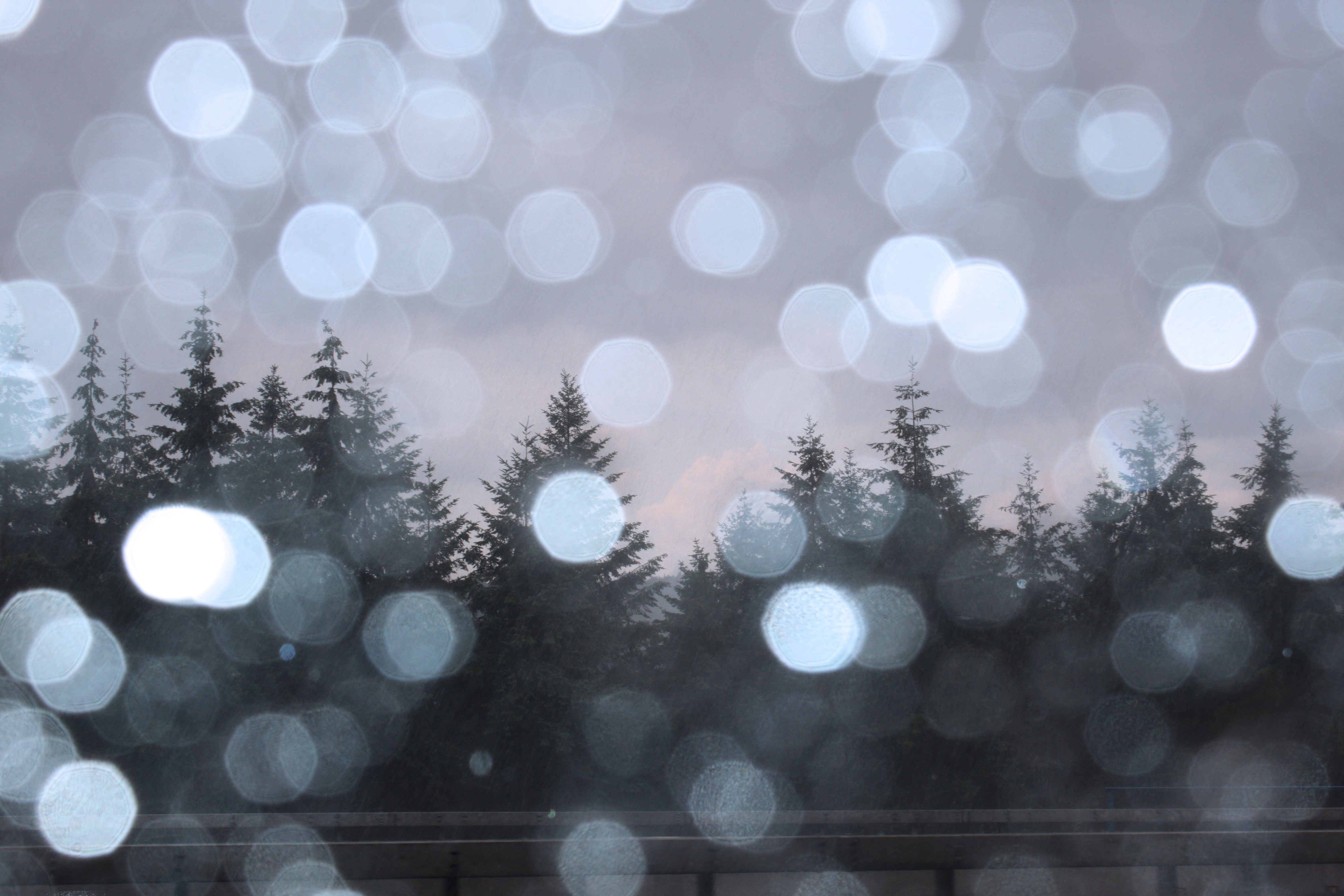
I edited the light levels, slightly increased the contrast, and applied a blue colour filter to the photo. This helps bring out the detail in the trees, as well as making the clouds in the background visible due to more contrast.
This is the first final image. I have kept it looking as natural as possible to keep the cool tone of the photo.
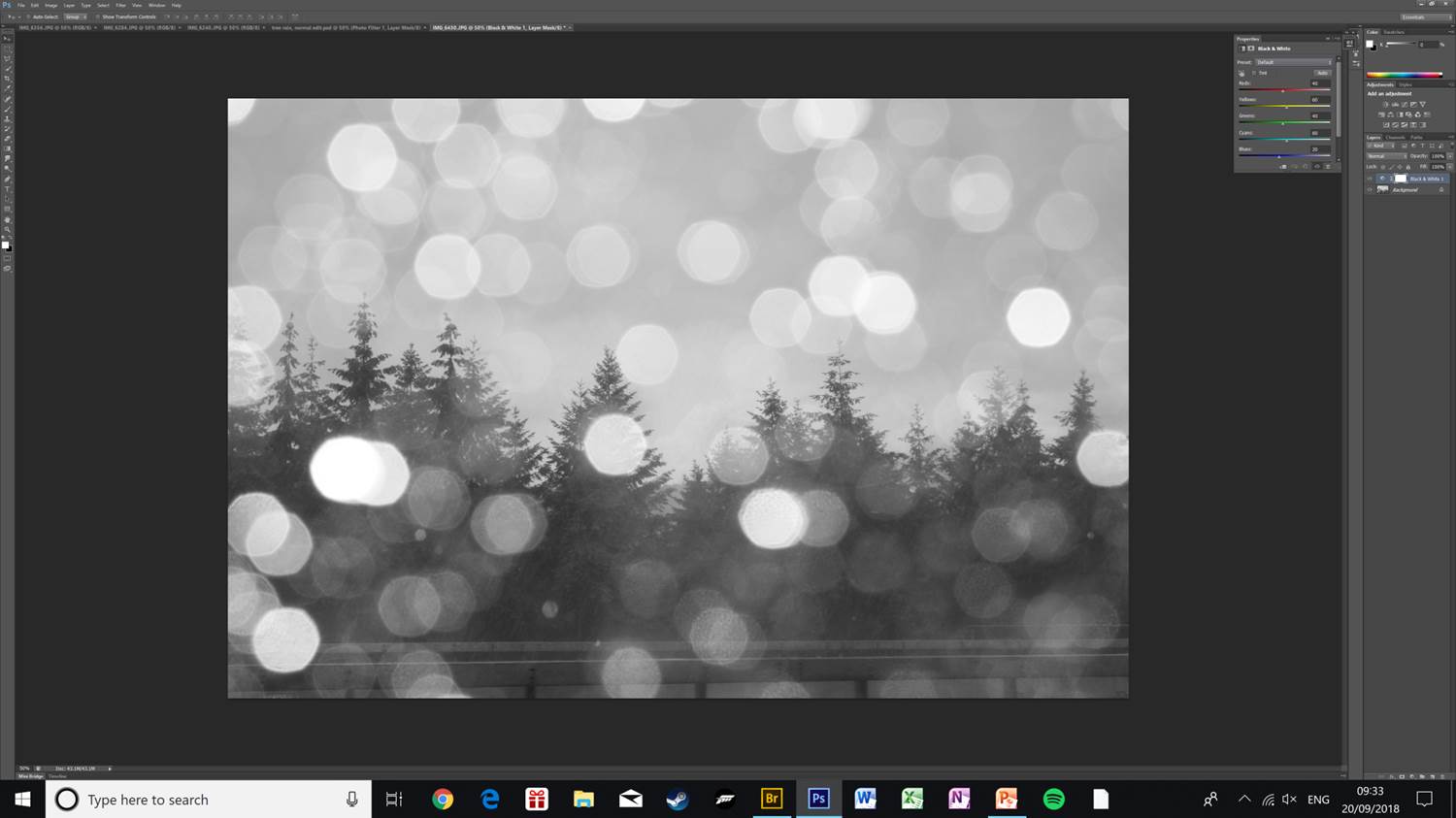
This is an alternative version of the photo, I have applied a black & white filter, and increased the brightness and contrast slightly as applying the filter made the photo dark and hard to see.
To get the final photo I have further increased the brightness and exposure, this helps make all the details in the photo visible, as well as making the rain drops in the foreground less prominent, which makes the angled rain in the middle-ground visible and diverts attention to the pine trees.
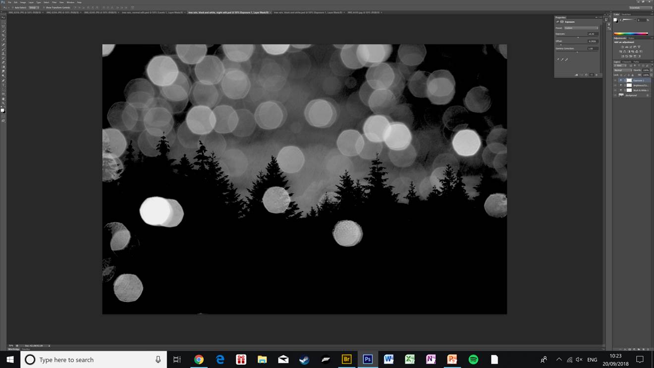
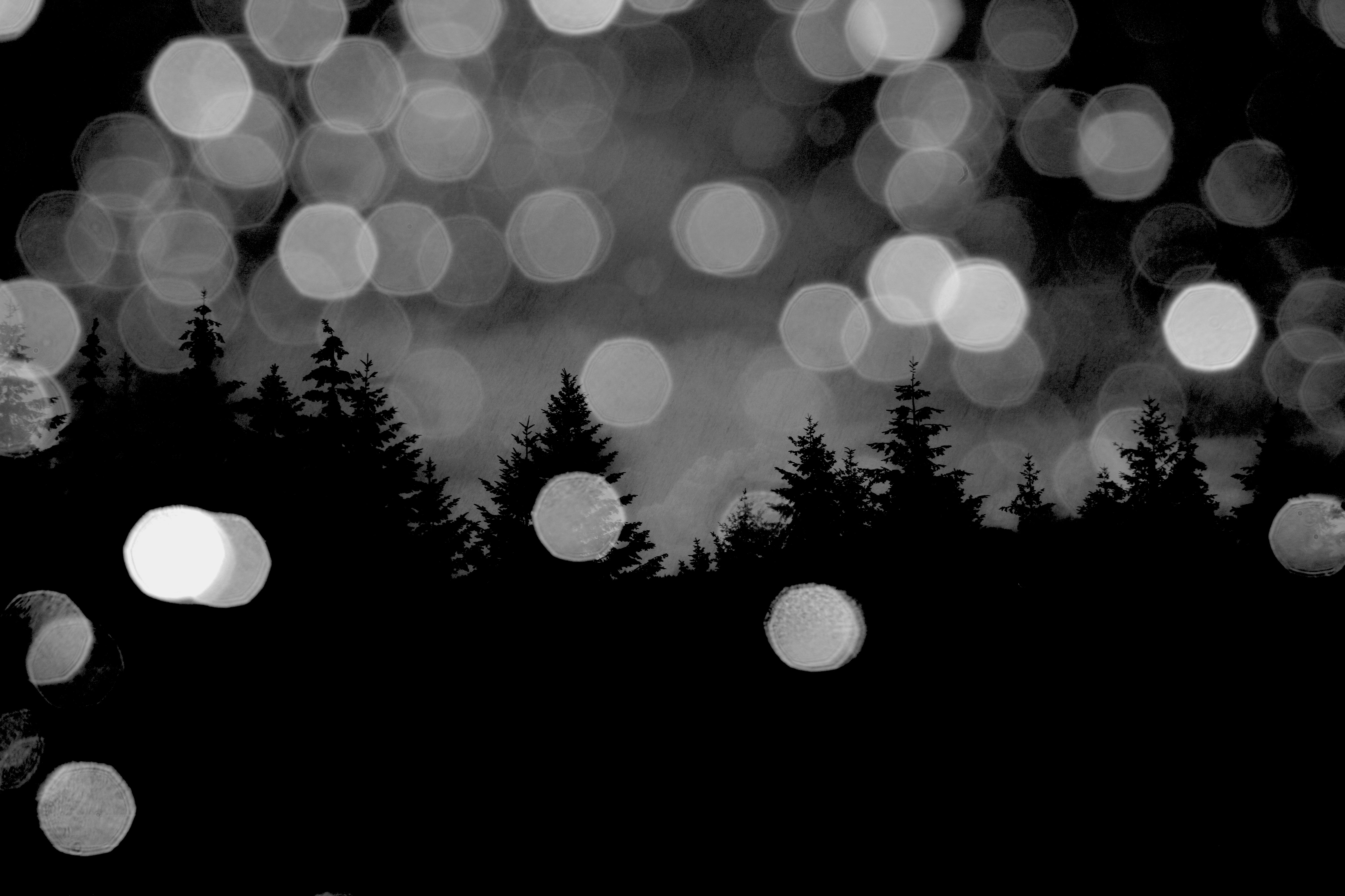
This is a variation of the black & white edit of the same pine tree photo. Here I have lowered the offset which makes the photo really dark and creates the effect of the photo being taken at night. I have also increased the exposure slightly and raised the gamma correction.
This is my favourite edit of the lot that I have done of this photo. The clouds in the background are really clear and only the outline of the trees is visible. The rest of the trees being solid black makes the whole photo stand out more as there are less distractions around the edges. The rain drops still being visible and bright help give the photo depth as the light brings contrast to the mostly dark photo.

Photoshop Experimentation

EXPERIMENTING

This lesson I experimented with using Photoshop and a variety of different tools which altered the already abstract images to make them even more abstract. In each image I played around with changing the color balance and changing the hues of photos. I also explored using the magnetic lasso tool and what its capabilities it has in Photoshop. I used the crop tool in order to give interesting perspectives and cropping away unnecessary parts that did not add to the photo or disturbed it.

The end result of experimenting with Photoshop was a variety of very abstract and interesting photos which have become more unique and distinctive. They took the photos from being average to something that is more worth while looking at.

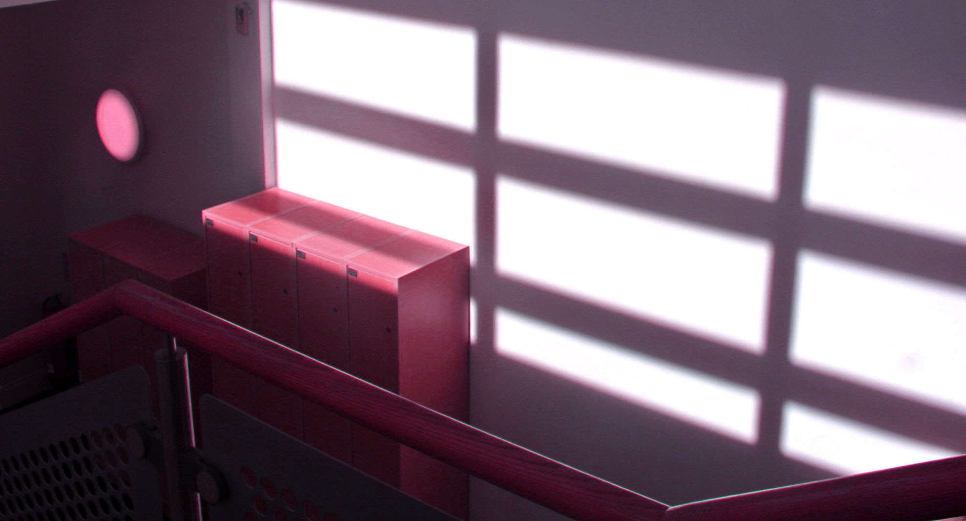
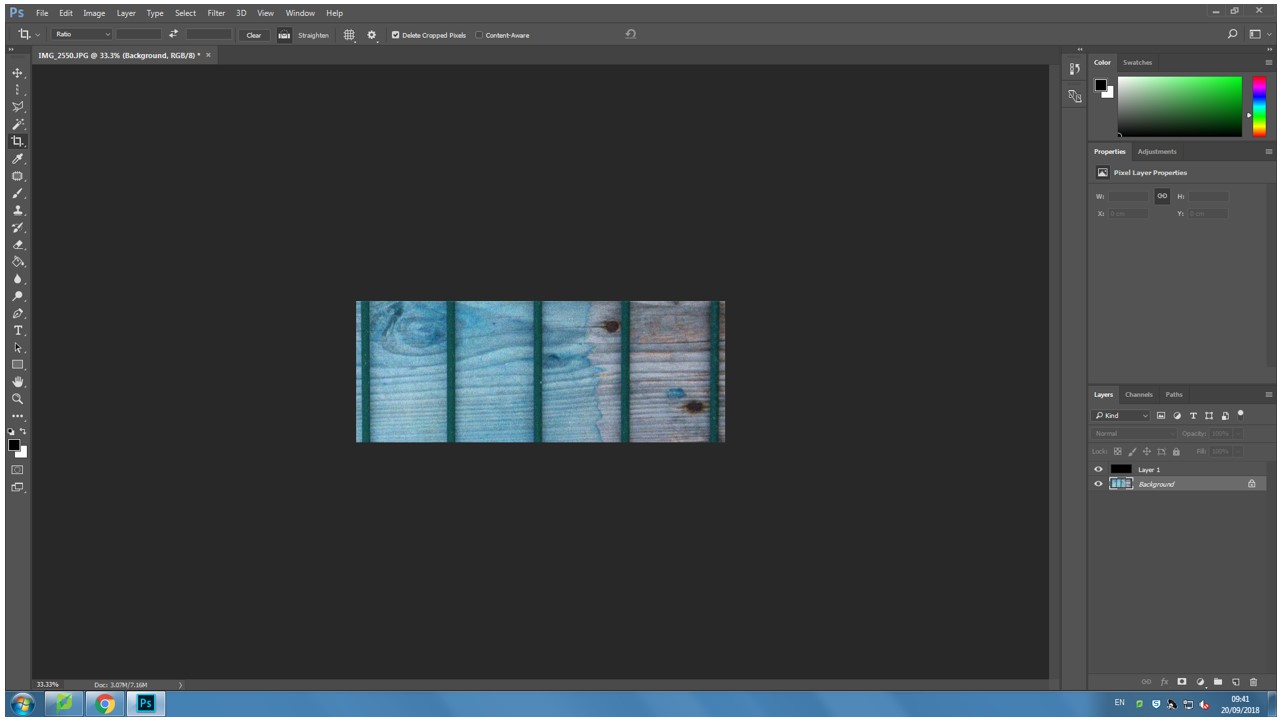
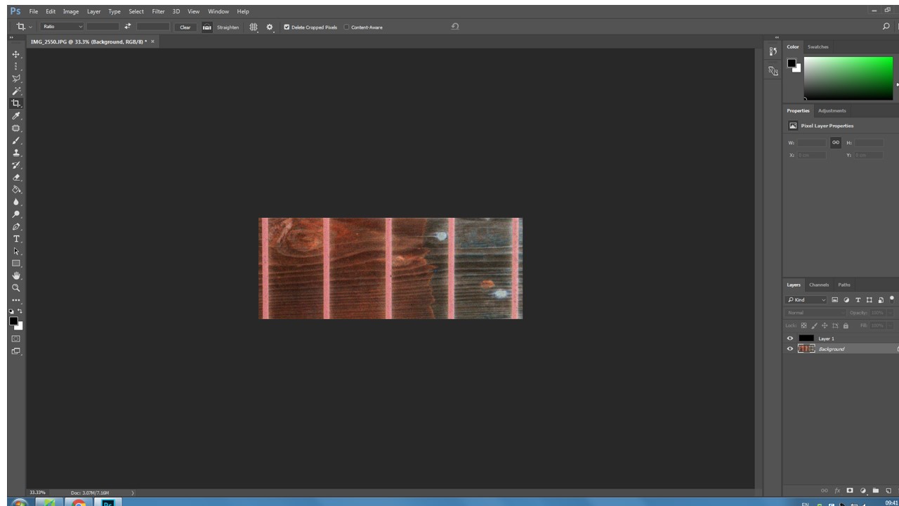
my first experimental photo, i only played around with the concept of changing the color hue and saturation, highlights and shadows, and exposure.
in this photo i changed the hue of the photo to a very warm pink and I also shifted the color balance to magenta.
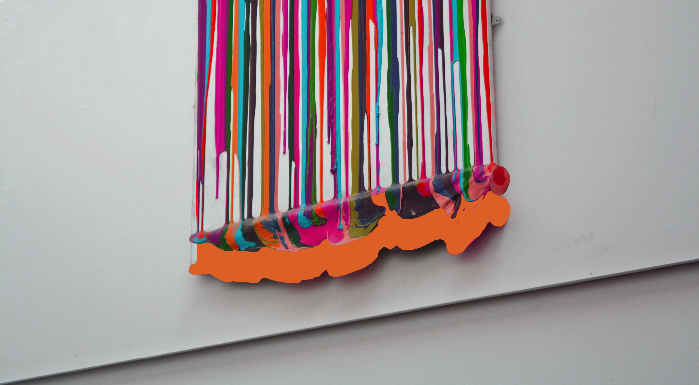
This was my final photo I edited and changed. Here i experimented more with layers and adding extra abstract features to the photo.
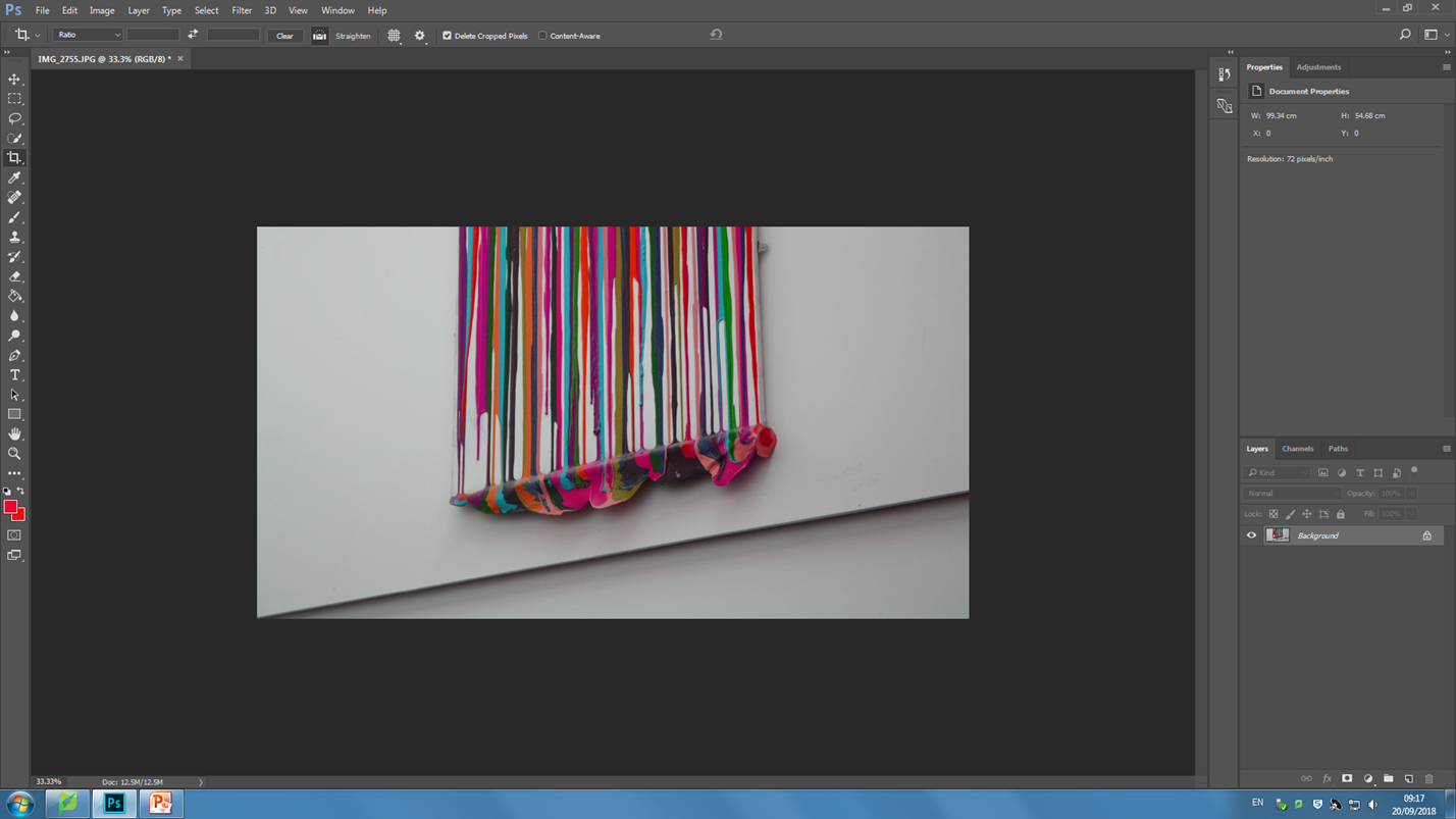
Stage 1, cropping and adjusting tilt
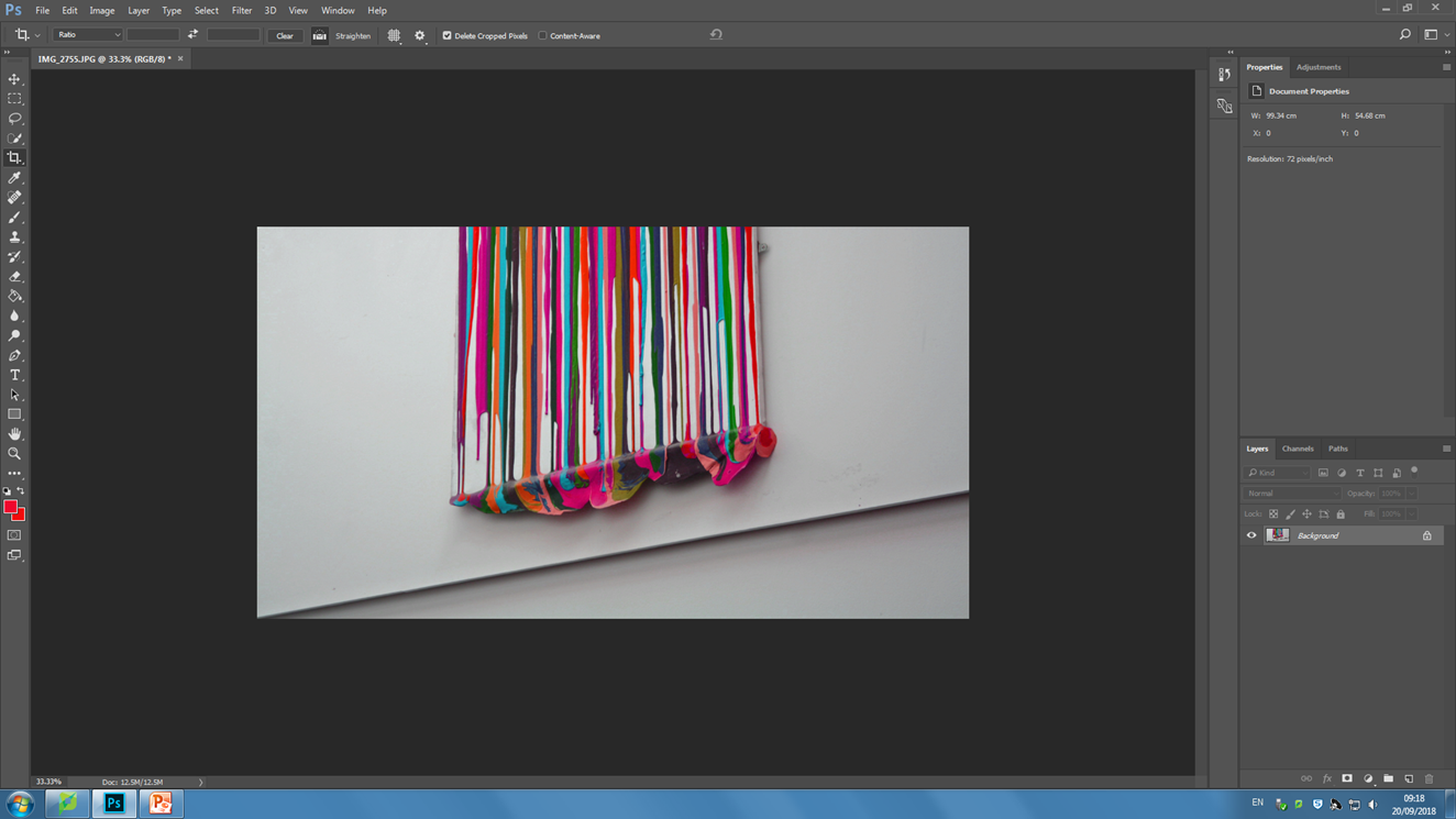
Stage 2, shifting the color balance to pink on the photo and also increasing the exposure in order to brighten the colors.
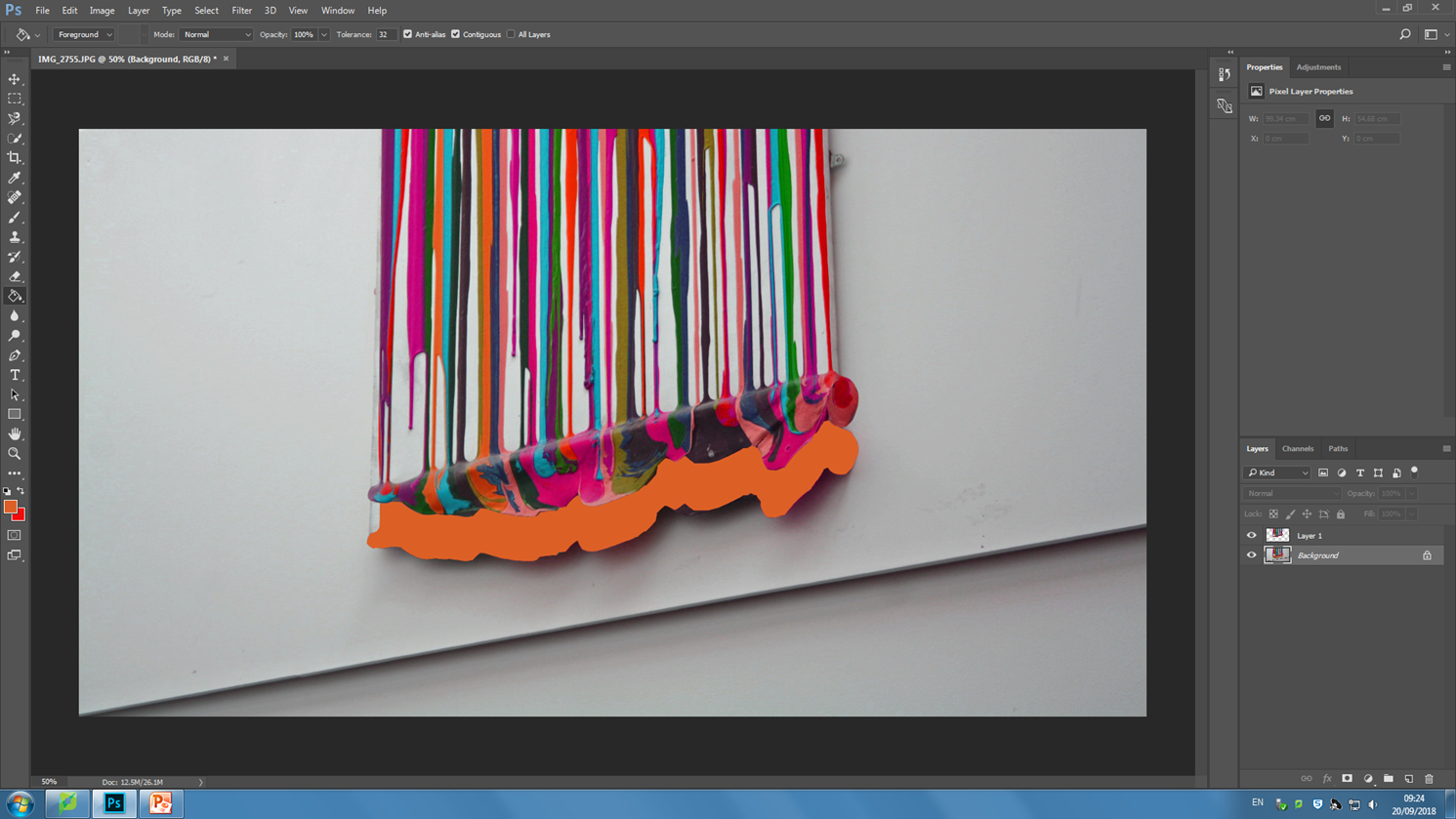
Stage 3, using the magnetic lasso tool in order to trace around the painting and move it upwards. I added a bright orange into the backdrop which appears as I selected and moved the painting layer.

Contact sheets


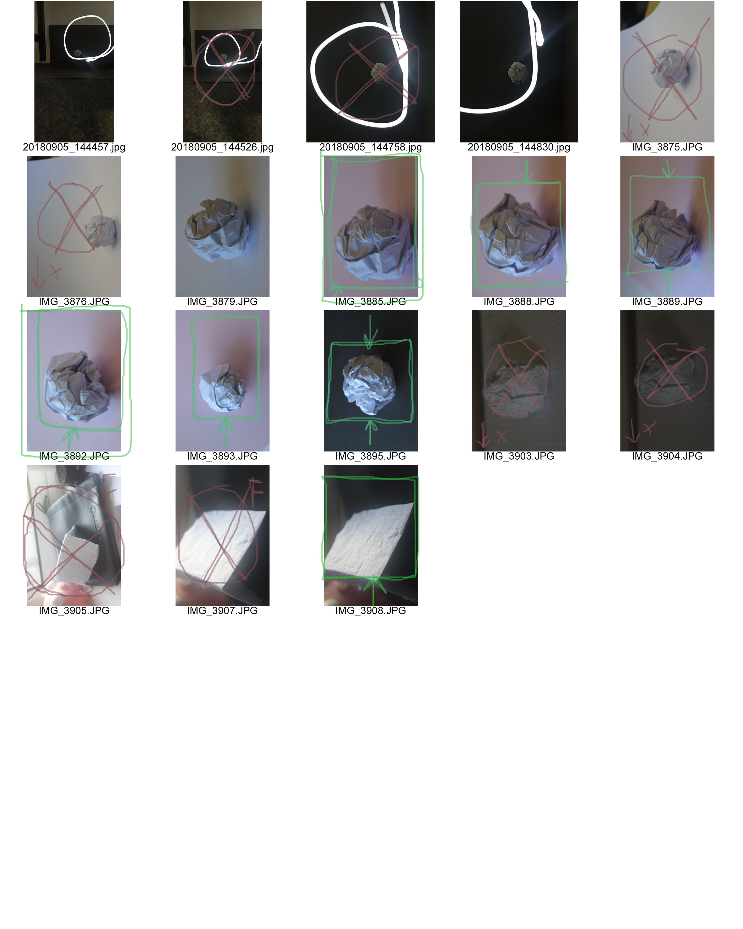
Contact sheets consist of several thumbnail photos printed on a single sheet of paper, so you can view them all at once; this can be useful as it allows you to help chose which of your photographs you want to keep/discard/edit

The RED represents the images I want to discard and I am not happy with.

The GREEN images are the photograph I am most happy with and that I believe do not need changing/editing

The YELLOW images are the photos I am not sure and possibly need editing.

  • The YELLOW boxes are representing photos that I need to crop
  • The YELLOW questions marks are the ones that I haven’t decided whether to keep
  • The YELLOW circles are the images that need editing

Why do people produces contact sheets?

People create many contact sheets after a photo shoot in order to layout and see all images that they have created. this will help the photographer be organised with their images and help then figure out their best images from their worst images. Contact sheets make editing much easier. Editing is the process of the selection  of images that will compose a photographic body, which will respond to the specific purpose of the works compete. By using contact sheets its giving editing a whole new experience of the photography workflow. Contact sheets are pages that contain thumb nails of your photo shoots all displayed so its much easier to see all your photos at once.  This process is made image comparison much easier.

Paper Task

IMG_3892.JPG:

Lighting: for this image I used natural lighting from a nearby window in order to achieve the color temperature that I wanted, since natural light is often cooler then the halogen lights in the school giving a nice balance between the cool blue lighting and the pink paper.

Aperture: I used a Rather low F stop in order to produce the depth of field look i wanted.

Shutter Speed: I experimented with various shutter speeds for this project, in this image I settled on a Fast shutter speed as there was plenty of light and I still wanted some deep shadows.

ISO: for the entirety of the project I stuck with an ISO of 100 in order to avoid grain and simply controlled the lighting with the shutter speed.

White Balance: for this image I wanted the color temperature to be rather dominant towards the cooler tones.

I was influenced by the work of Martin Creed with the latter half of the photo-shoot taking a lot of inspiration from his work with a scrunched up paper ball.

1st shoot contact sheet

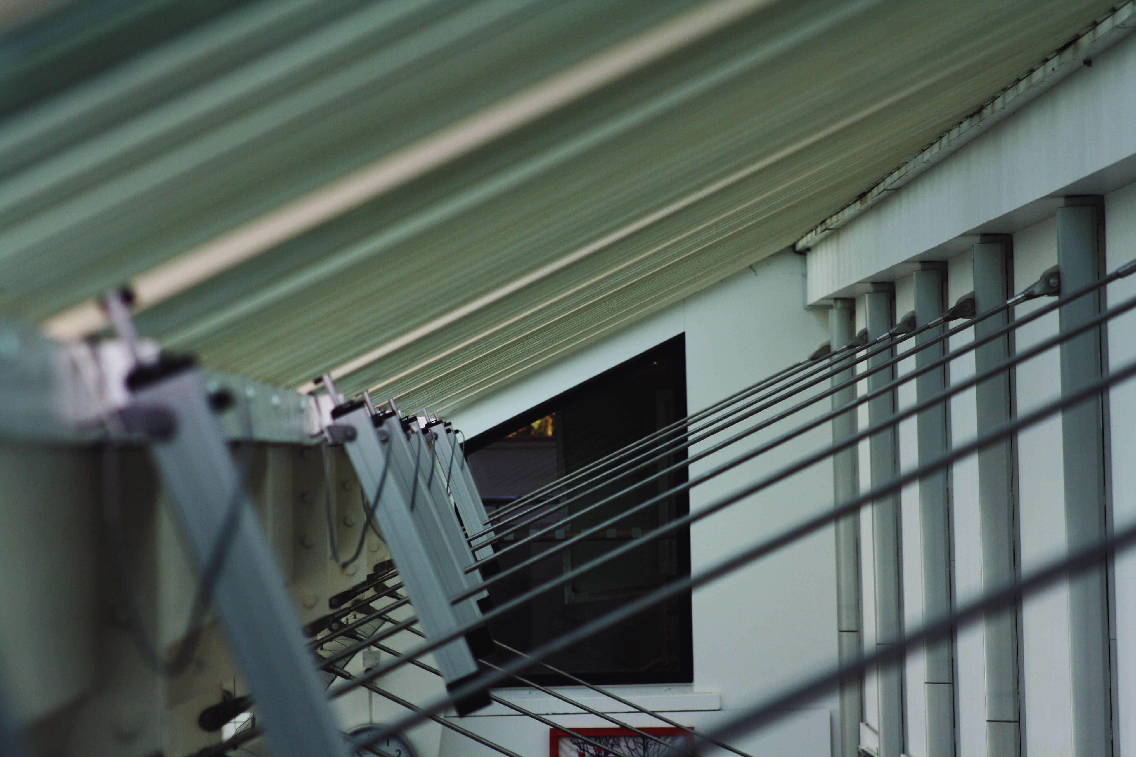
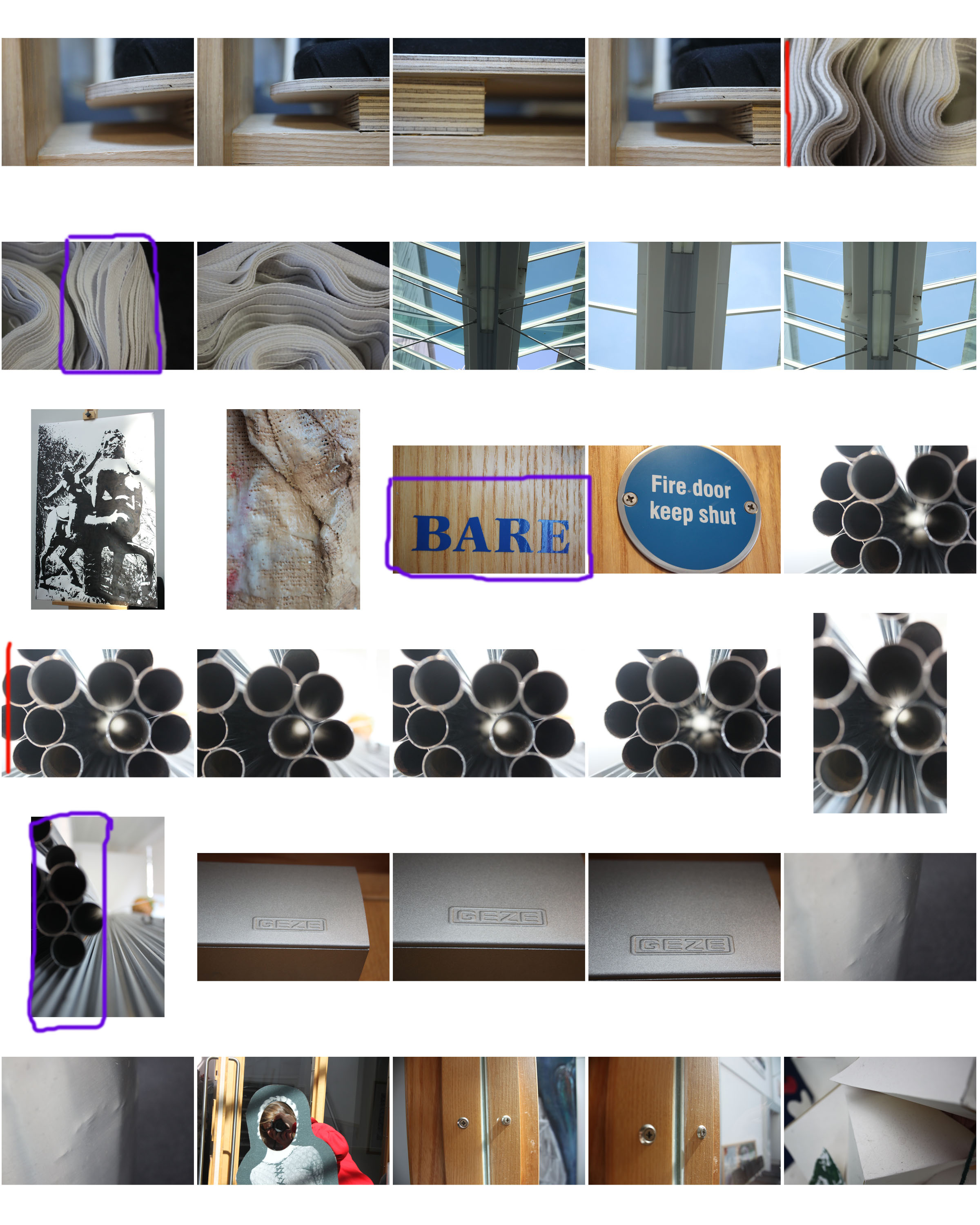
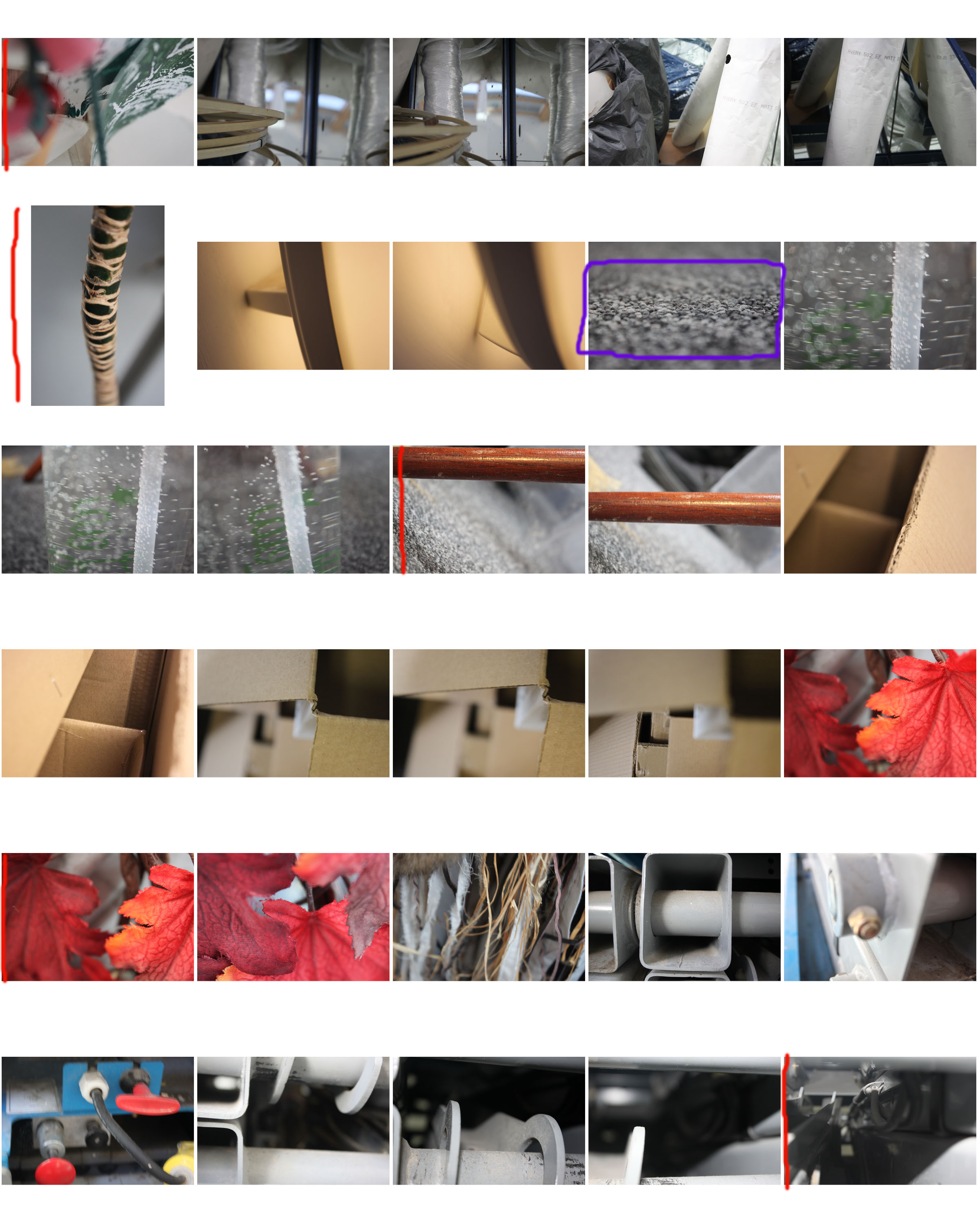
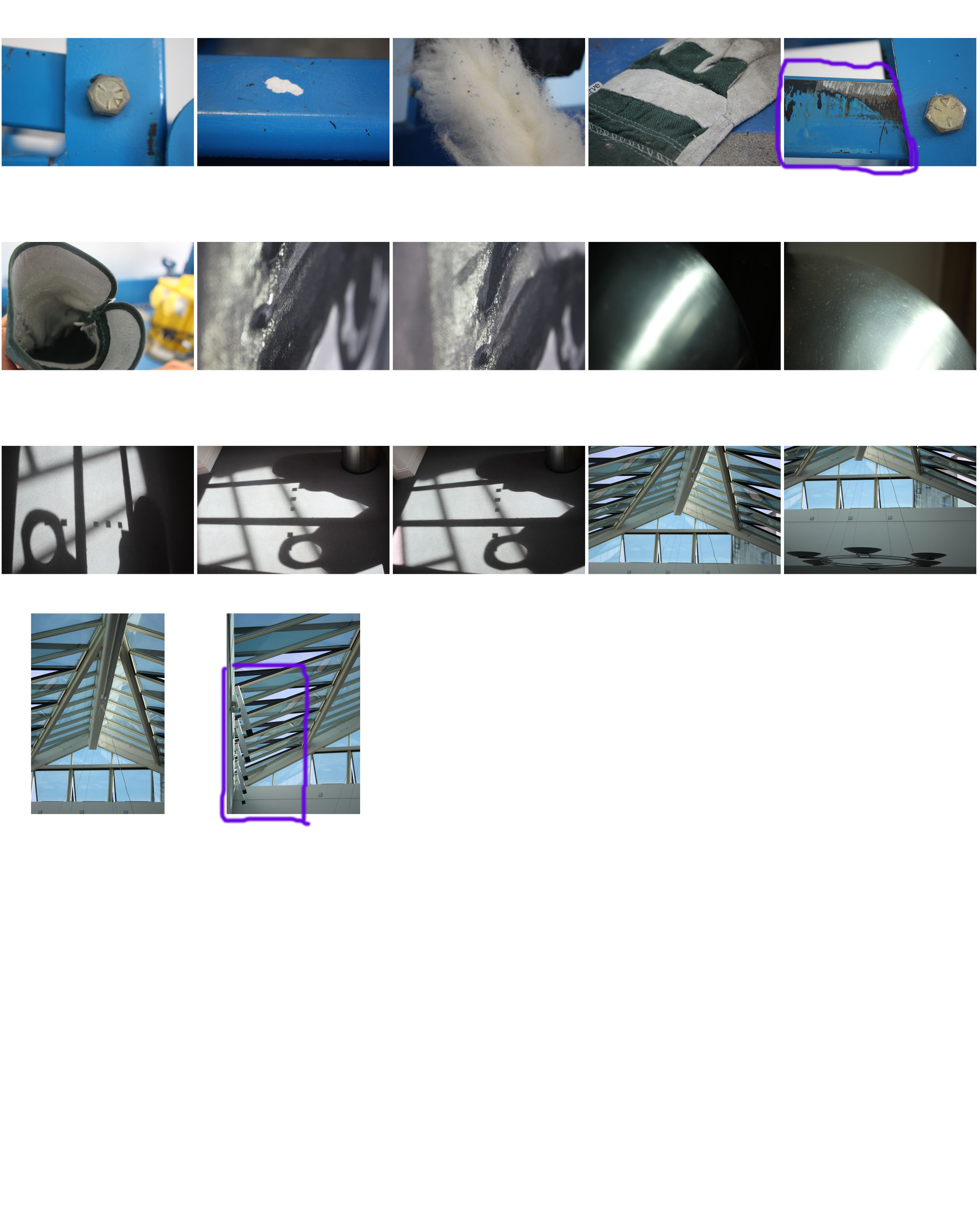
For this photo shoot I focused on close up photography, using a contrast between a focused foreground and a blurred background and vice versa. Although there are exceptions, the majority of photos in this shoot are of man-made objects which are either very textured or stretch from the foreground to the background (e.g. pipes, mdf planks).

I will edit some of the photos by cropping, enhancing, gray scaling, etc. The contact sheet is just a guide for which photos I’m going to use and edit, and which ones I’m going to leave out.

I have annotated this contact sheet less than my previous one as this has a lot more photos, so going through every one would be tedious. So instead I have marked my favourite photos with a red line next to them, and marked photos which I need to crop with a purple box (indicating what area i need to crop).