Category Archives: Unit 1 Abstract

Filters

Author:
Category:

Albert Renger-Patzsch – Research & Response

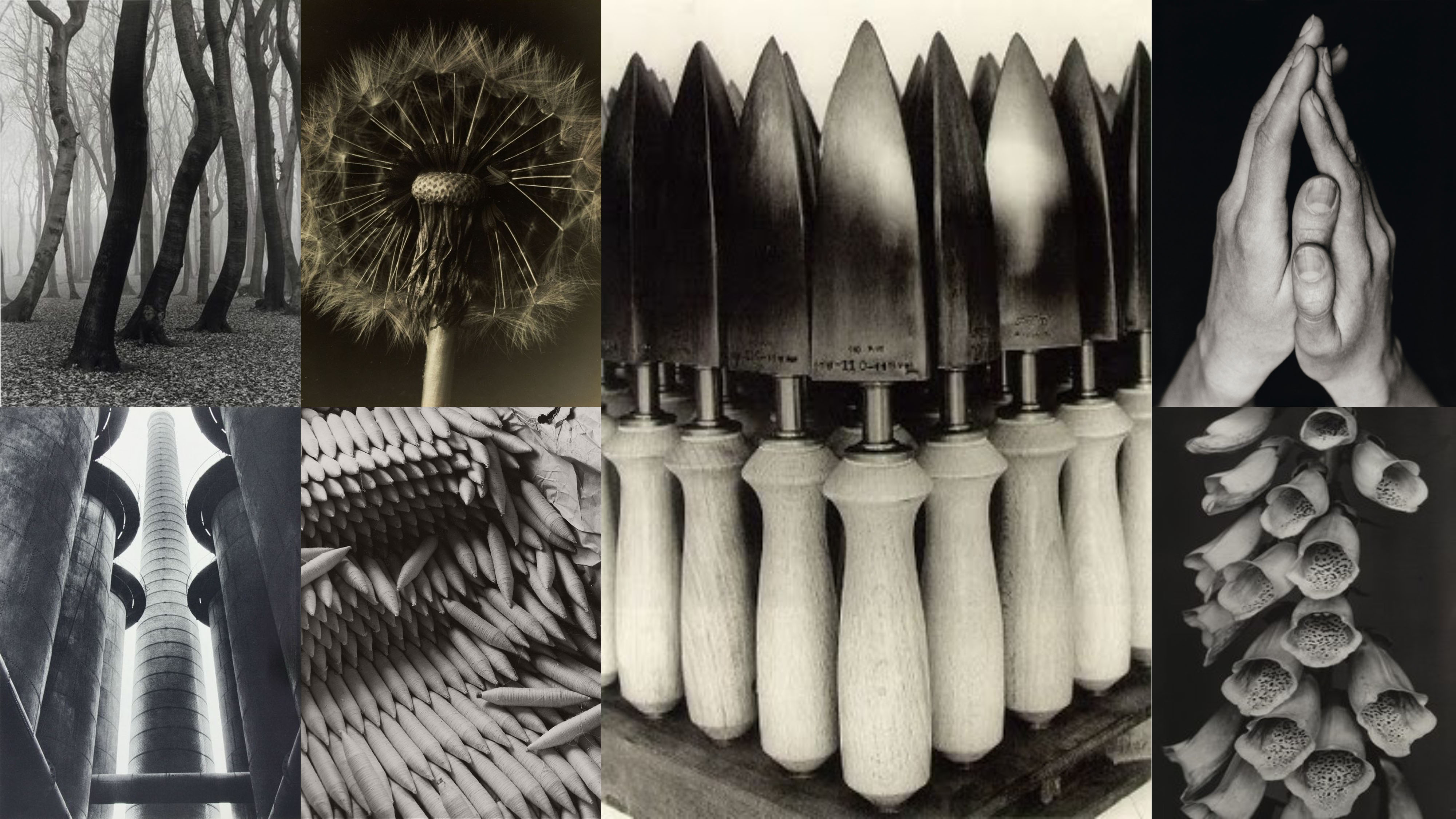
Mood Board

Albert Renger-Patzsch was born on June 22nd, 1897 in Germany. He began taking photographs at age 12, after his military service in the First World War. In the early 1920 he worked as a press photographer, but soon after he became a freelancer and published his own book. Albert Renger-Patzsch has created a photographic gallery called ‘The World is Beautiful’. He developed this series into a catalogue of objects, which soon became one of the most influential books ever published. His clinical like images clearly showed technical apparatus, industrial products and natural organisms in great detail.

Neue Sachlichkeit created a term called new objectivity, where he attempted to capture and embrace realism instead of abstraction. He combined realism with a ‘hint’ of Dada Movement, which was an art movement of the European Avant-grade in the early 20th Century. The realism captured was not the stereotypical realism, but a more disguised and dark realism which is aimed to show the moral shame which happened in the German Society. These photographs tended to have a more static composition (The majority of lines used are either horizontal or vertical, which can be seen as smooth and calming on the eye.) which helped render the clarity of the photograph. The aim of these images that Sachlichkeit captured was to show the truth and reality of current affairs, however, he wanted to avoid social and political commentary.

Within Patzsch’s series ‘The World is Beautiful’ we are able to see his attempt of new objectivity. He presents the subject of the photographs exactly how they are, which also presents the rejection of sentimentality. He has used a static composition within his images which shows the subject in great detail. Contextually, he used new objectivity to show the chaos which the First World War had provoked, Response to industrialising Europe and America and response to qualities of a camera and the

movement away from techniques like a soft focus. Patzsch was said to have mainly captured:

  • Wildlife
  • Landscape
  • Mechanical Equipment
  • Flowers
  • Architecture

In Patzsch’s photographic response to these events in time, he explored formal elements, which has made his work more powerful. The main elements which are presented in his work are: Light, Line, Texture. Repetition and Shape. These are all presented through the realism of the subject being photographed. Most of the images seem to be macro, which fills the frame of the photograph. However, in some photographs there is a sense of space, which can be used to create a powerful impact towards the events which have occurred. Tone is seen to be one of the key features of Patzsch work as it allows the subject of the photograph be in focus, and detailed.

At this time there where many other photographs who used new objectivity to help capture their photographs. This meant that there was some competition for Patzsch, which would have likely motivated him to be thinking about what he is capturing and what he wants to capture. These photographers include:

  • Edward Weston
  • Karl Blossfeldt
  • Helmar Lerski
  • And Many More

Not only where other photographs interested and influenced by Neue’s photograph, but also photographers from now a day. There are many photographers out there who are using new objectivity to influence their work. These include:

  • Martin Parr
  • Peter Fraser
  • William Eggleston
  • And Many More.

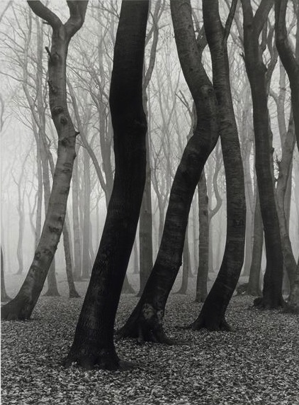
These two photographs share a lot of similarities and differences, which are used to help show the uniqueness of Patzsch’s work. The first photograph is of trees with in what seems to be a woodland, which suggests that this image is man-made. The second photograph is of a trowel which seems to be on display for potentially a shop, which implies that it is displayed naturally. Both photographs show the formal element of line through the subject of the photograph. However, the second image uses static composition which makes it pleasant for the viewer to look at and the first photograph uses dynamic composition as the trees are going in different directions. Moreover, this formal element helps to guide the viewers eye around the frame, this is also known as leading lines. Other formal elements which are presented in both images are shape, repetition and texture. Both images are presented in black and white which allows the different tones to clearly be presented, which also allows the subjects to be highly detailed. In the first photograph there is mist/fog which makes an eerie feel towards the image, whereas the second image does not. In the second photograph a large depth of field is used, allowing us to view all the trowels clearly. On the other hand, the first photograph has a narrow depth of field, leaving only the trees in the foreground to be in focus. The lighting which is used in the first photograph seems to be natural lighting which plays on the eerie mood, and also helps to present the idea of new objectivity. Whereas the second photograph seems to use artificial lighting as only some and the tops of the trowels are the bright areas. In the first photograph there is a sense of space which is used to create a sense of 3D. However, the second photograph uses form to present 3D within its image. Both photographs consist of a normal/quick shutter speed as the photographs do not have a motion blur. The ISO of both photographs is low as no noise is presented within the images making them clearer and cleaner. Overall, I really like Patzsch’s photographs as they are ecstatically pleasing and interesting to look at, uses new objectivity to show the context of when the photographs were taken and uses formal elements to make his work more interesting. Conceptually, the two images uses repetition to allow us to look at the common objects in a different way, which helps to add meaning to the overall photographs.

 My Response

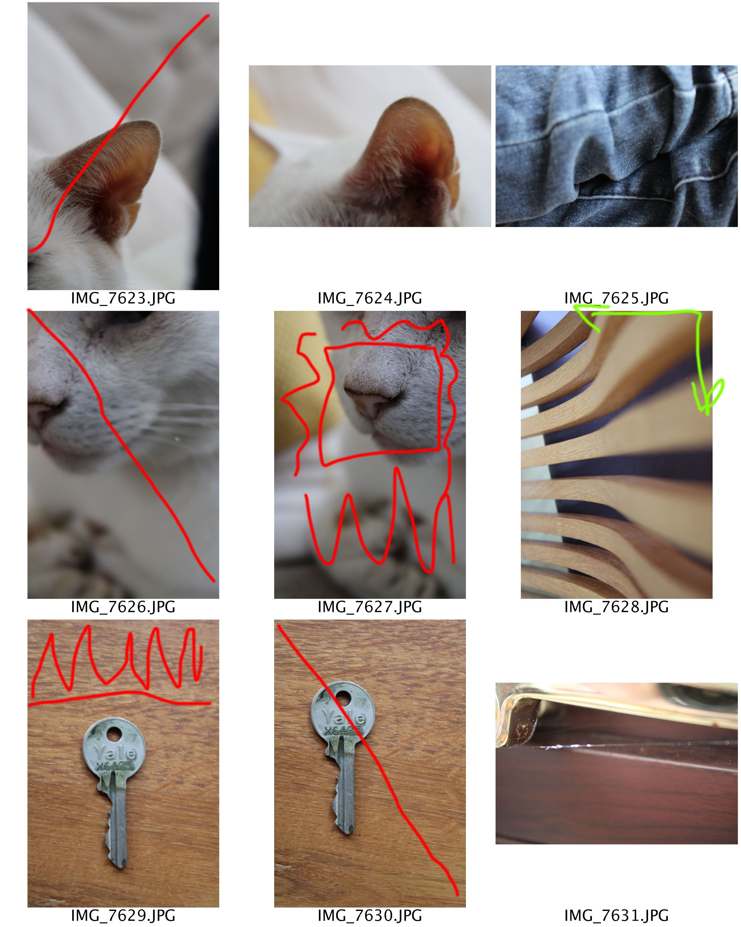
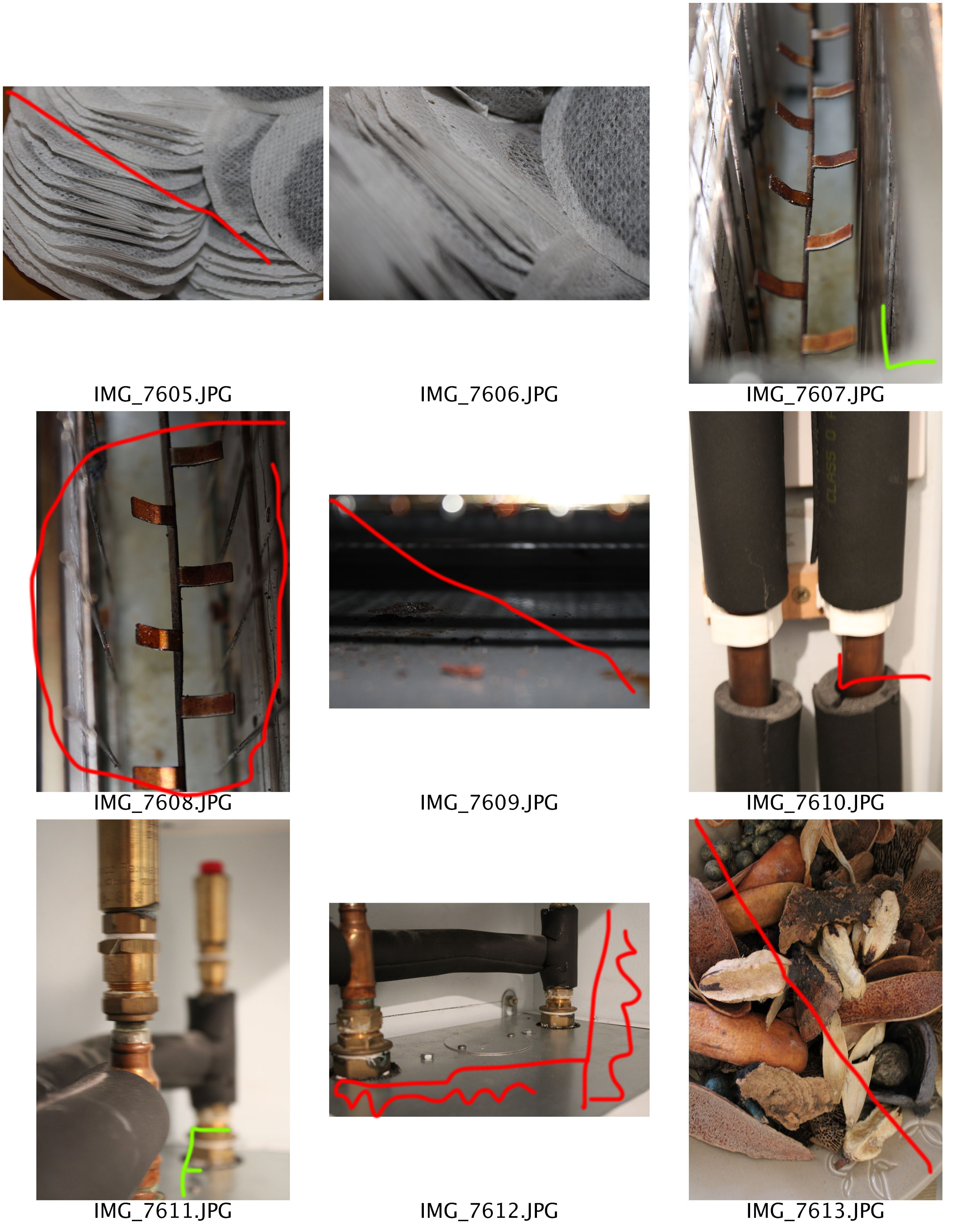
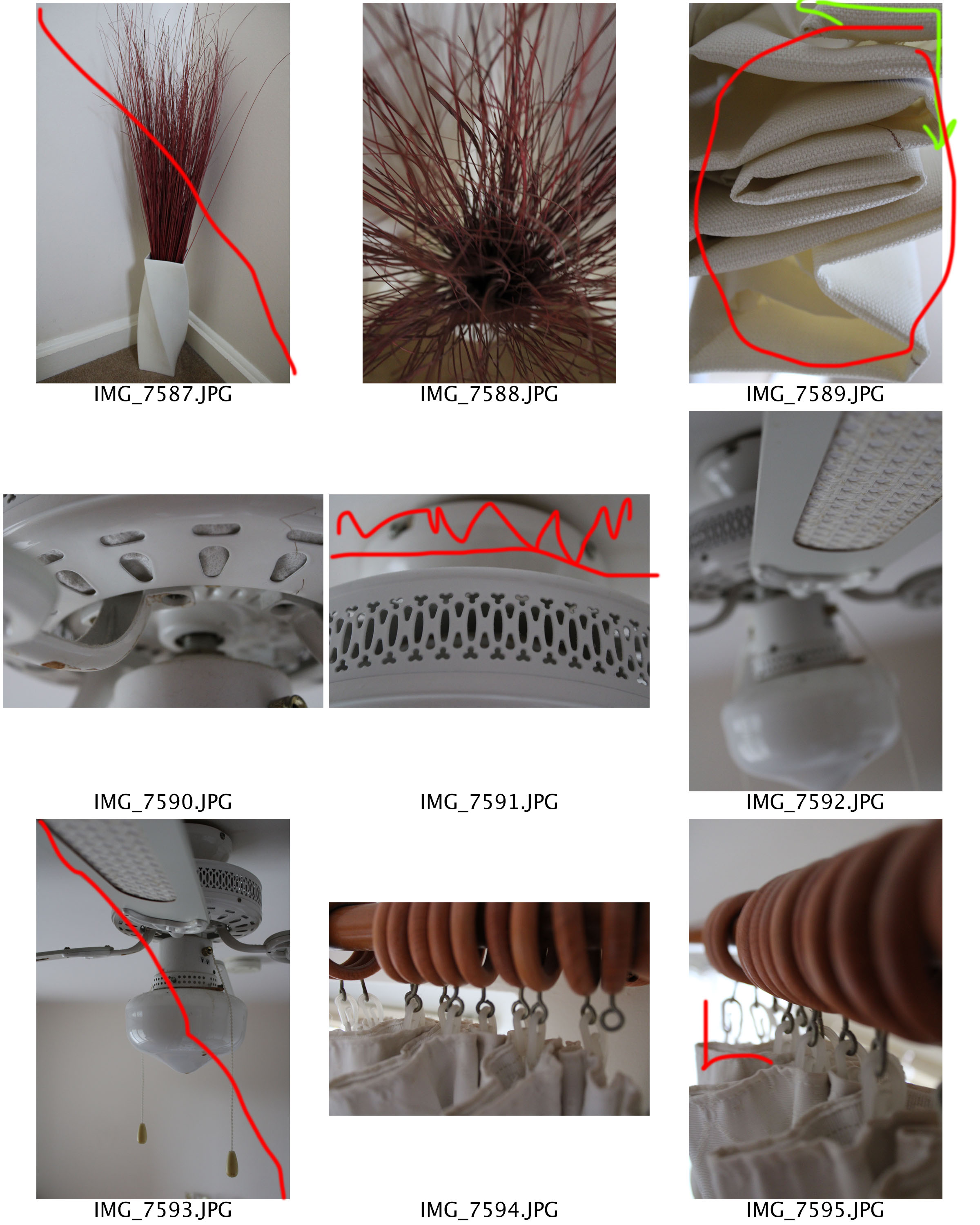
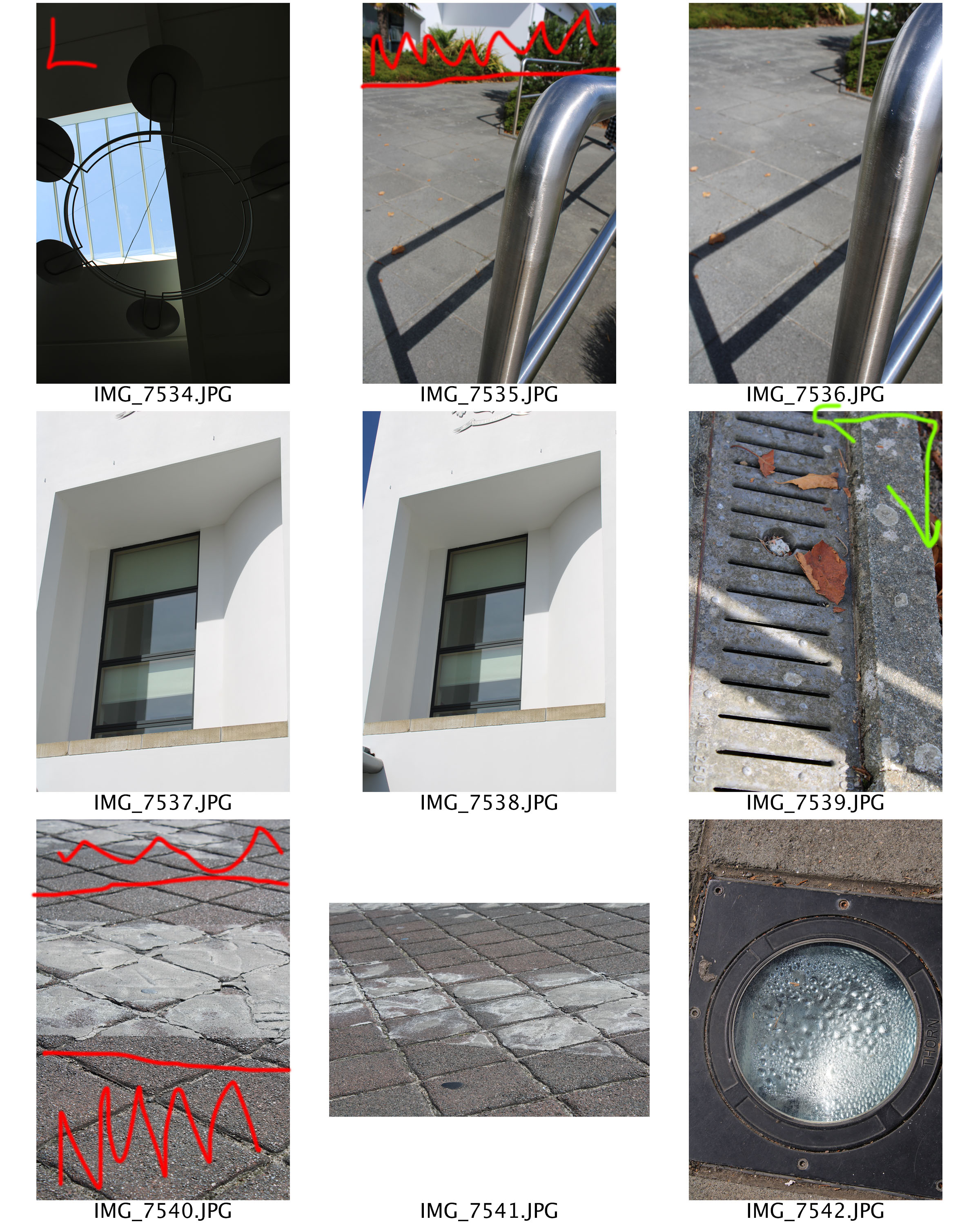
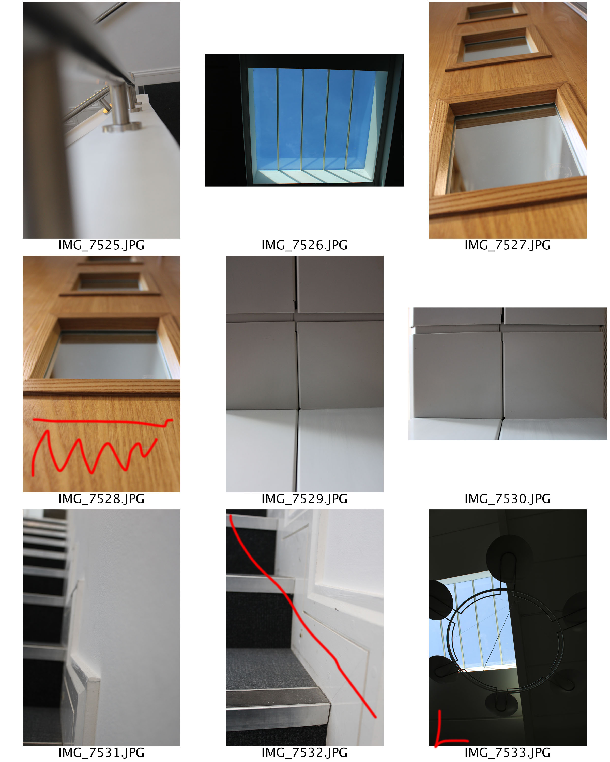
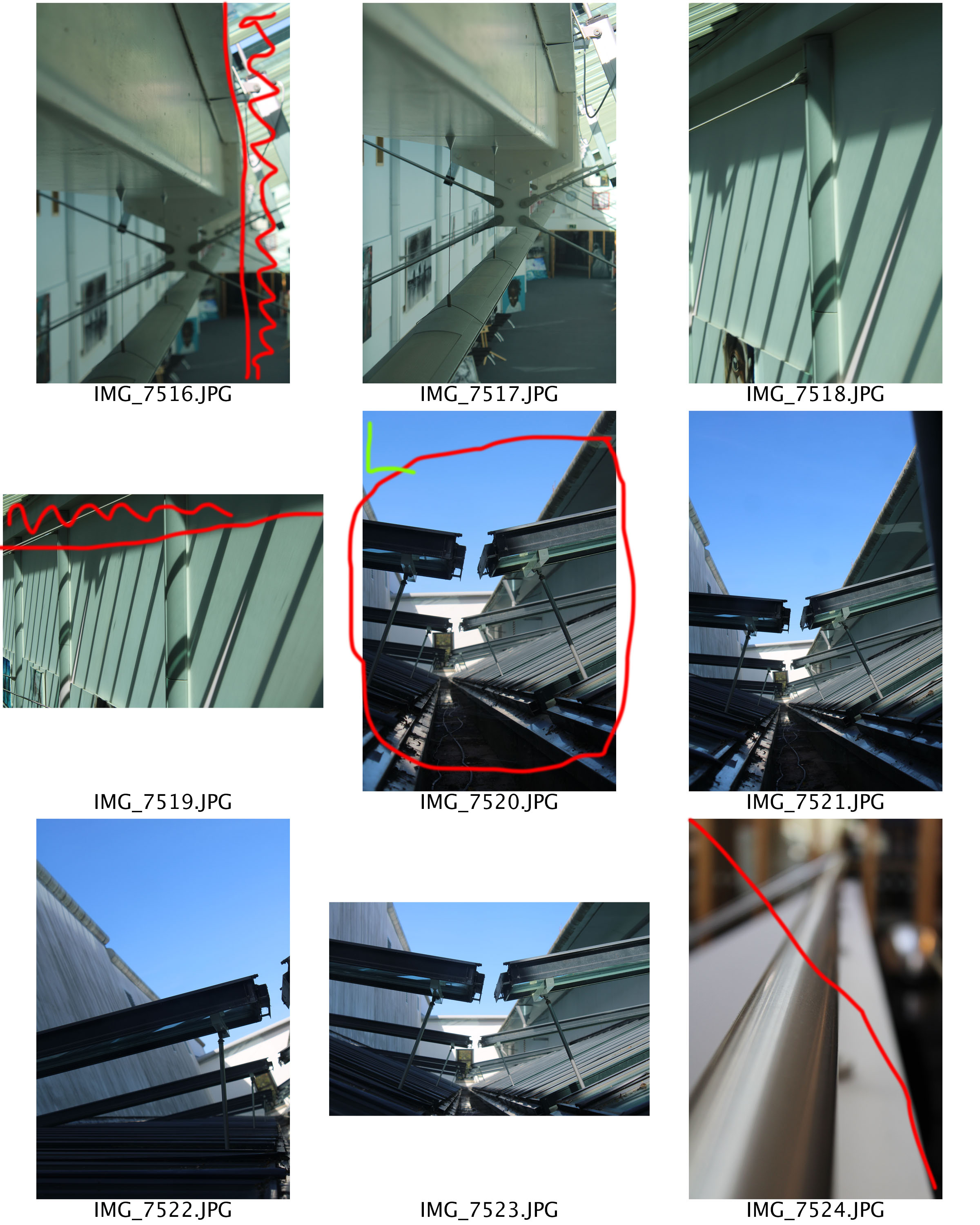
When capturing my photographs, I attempted to use the idea of the new objectivity. This is were I tried to capture my subject in their naturalist form, however, ensuring it has a distorted effect. I used my DSLR camera to produce these photographs, and ensured I thought about the formal elements which could be shown within the image. I also explored with light a bit more, attempting to get light hitting the right point on the frame.

Moreover, I looked at focusing the camera, choosing the main focus point when capturing the photograph. For these sets of photograph I used a manual focus, allowing to have more control of the depth of field. I also looked at using the rule of thirds in order to make my photographs more interesting to look at.

Overall I feel that this photo shoot was very successful as I managed to achieve many things. The first thing I managed to achieve is using a manual focus allowing me to have control of what is in focus and the depth of field within the image. After having this opportunity of experimenting with manual focus, I am more confident and I am likely to use this technique in future photo shoots. I also have discovered that I enjoy taking macro photographs, as I like showing the detail of my subject.
Claude Cahun x Clare Rae

Exhibition Critique

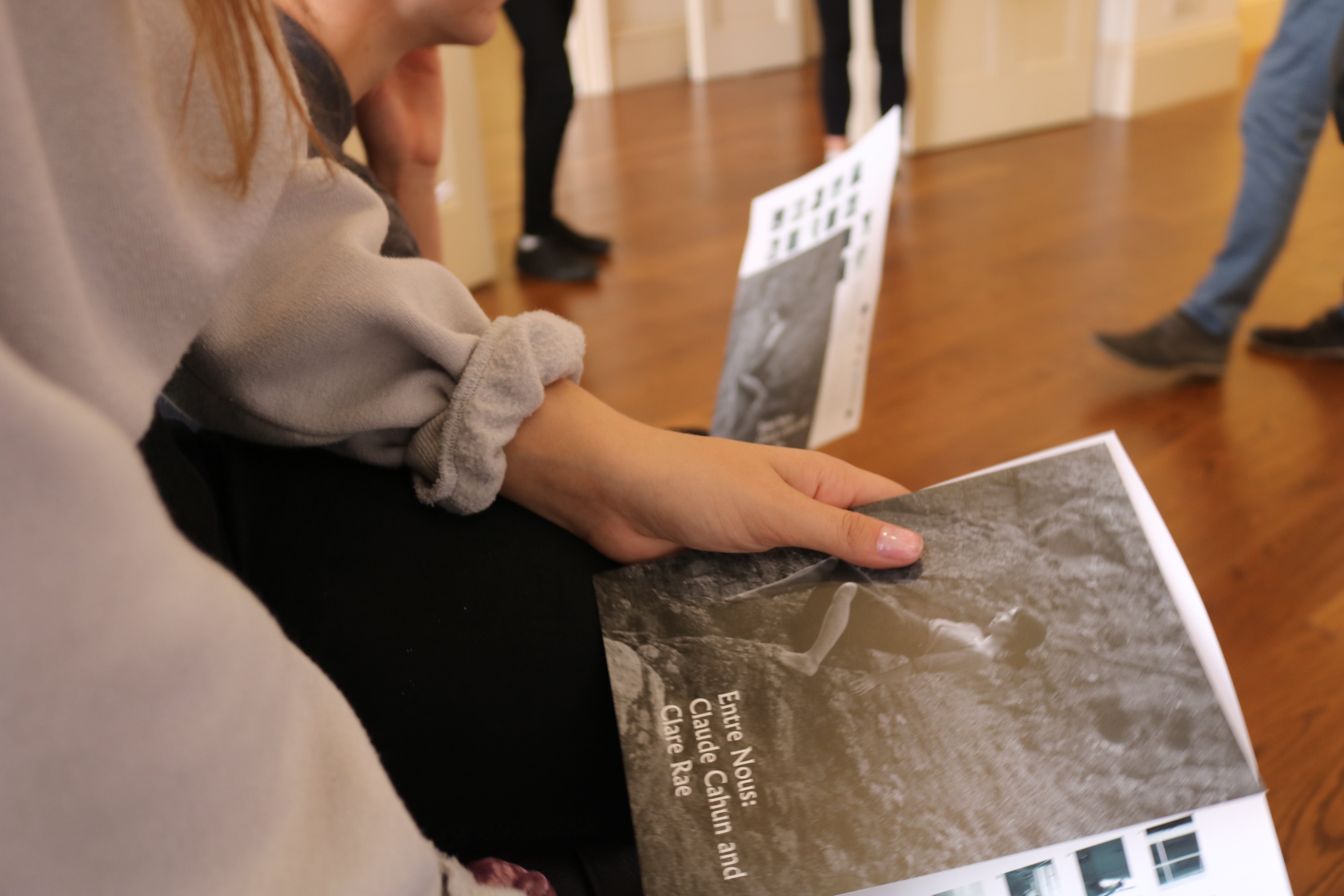
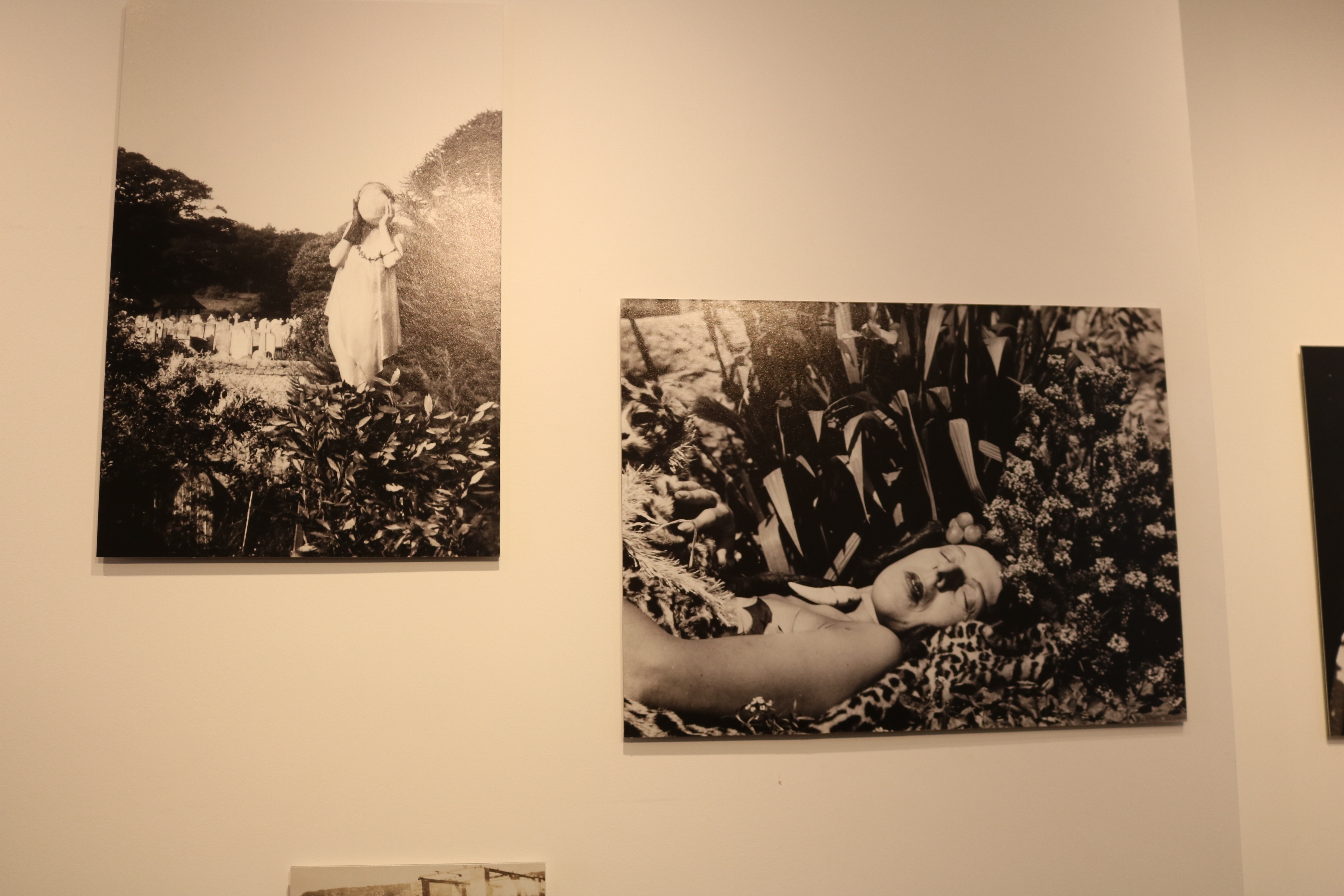
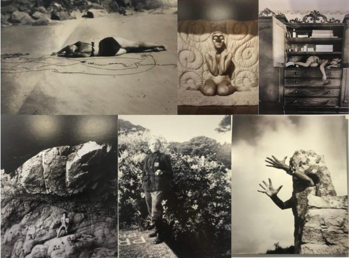
The Claude Cahun and Clare Rae exhibition was very inspiring and interesting to visit. There were two rooms that made up this exhibition, one containing each photographers work. I think that was a very good way of displaying the images as it meant that each photographers work was separated and couldn’t be confused. By displaying the images in separate rooms, it also allows visitors to clearly see in influence of Cahun in Rae’s work.
images by Claude Cahun

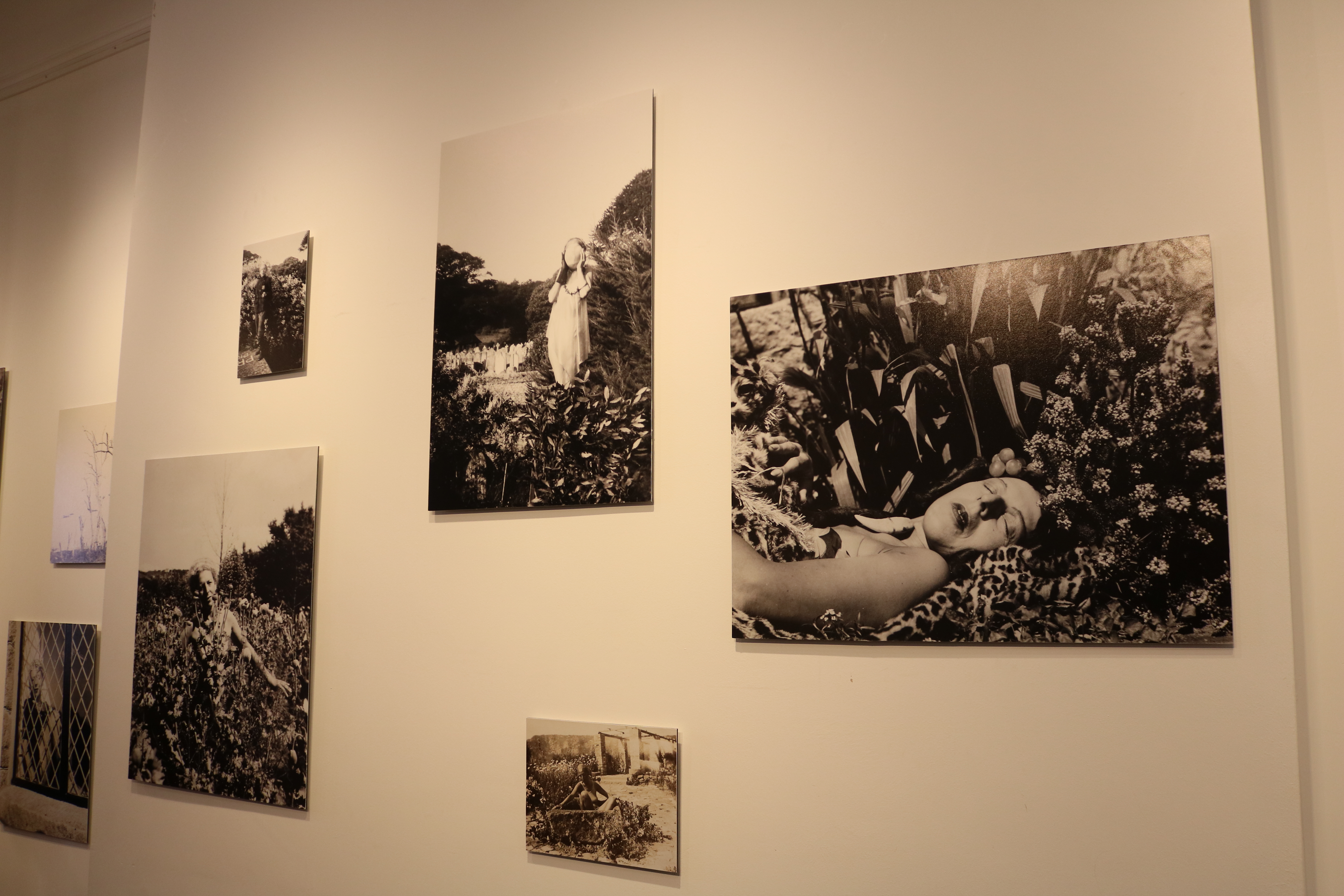
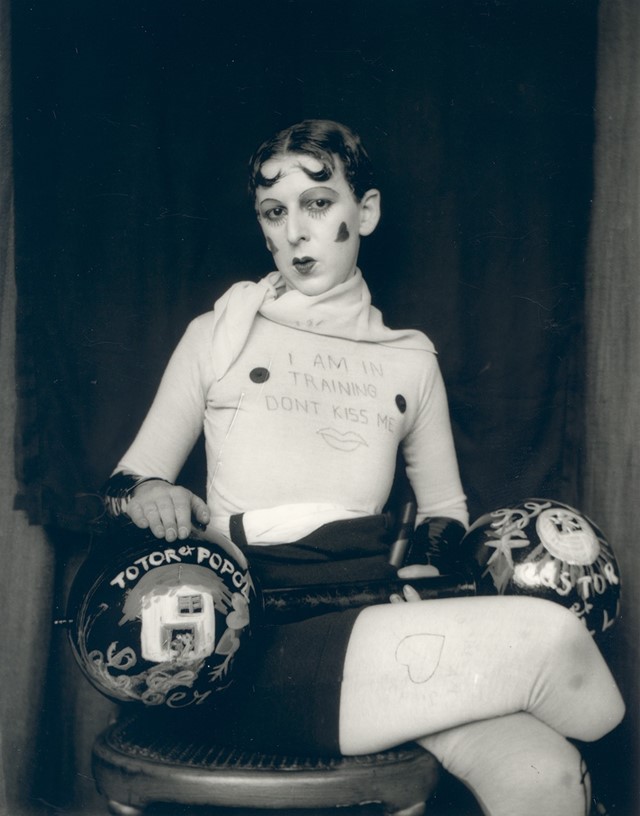
Cahun took many self portraits that are considered very advanced for her time. Her images show her challenging gender stereotypes by sometimes presenting herself as a “typical” male, or by wearing so much makeup that it was difficult to tell which gender she was. She also explored her body and sexuality in many of her self portraits by posing herself in different manors. I thought that her work was very inspiring because it must have taken a lot of bravery and confidence to be able to take those types of images during very conservative times, when people weren’t accepting of things that weren’t considered “normal”.

Image by Clare Rae

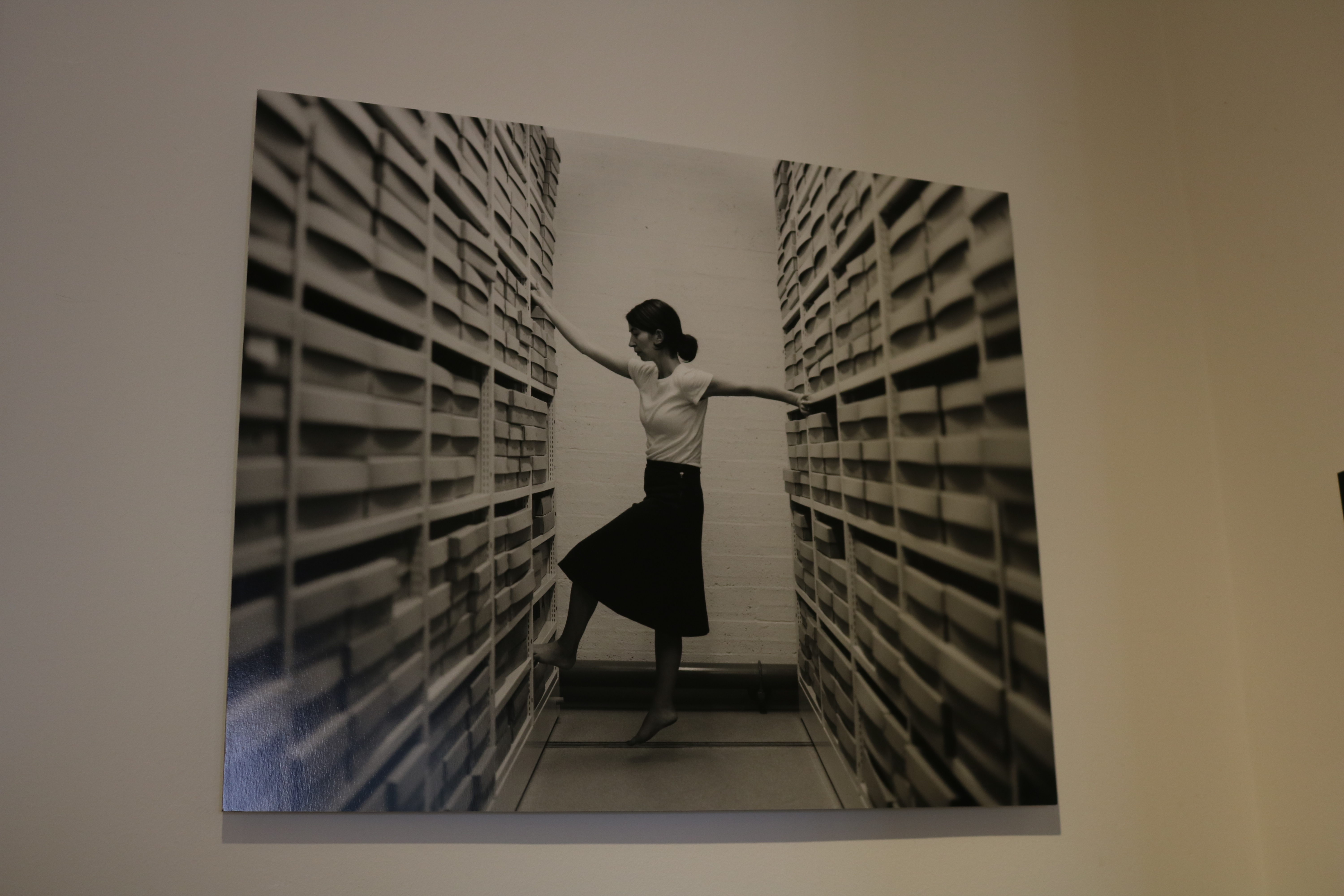
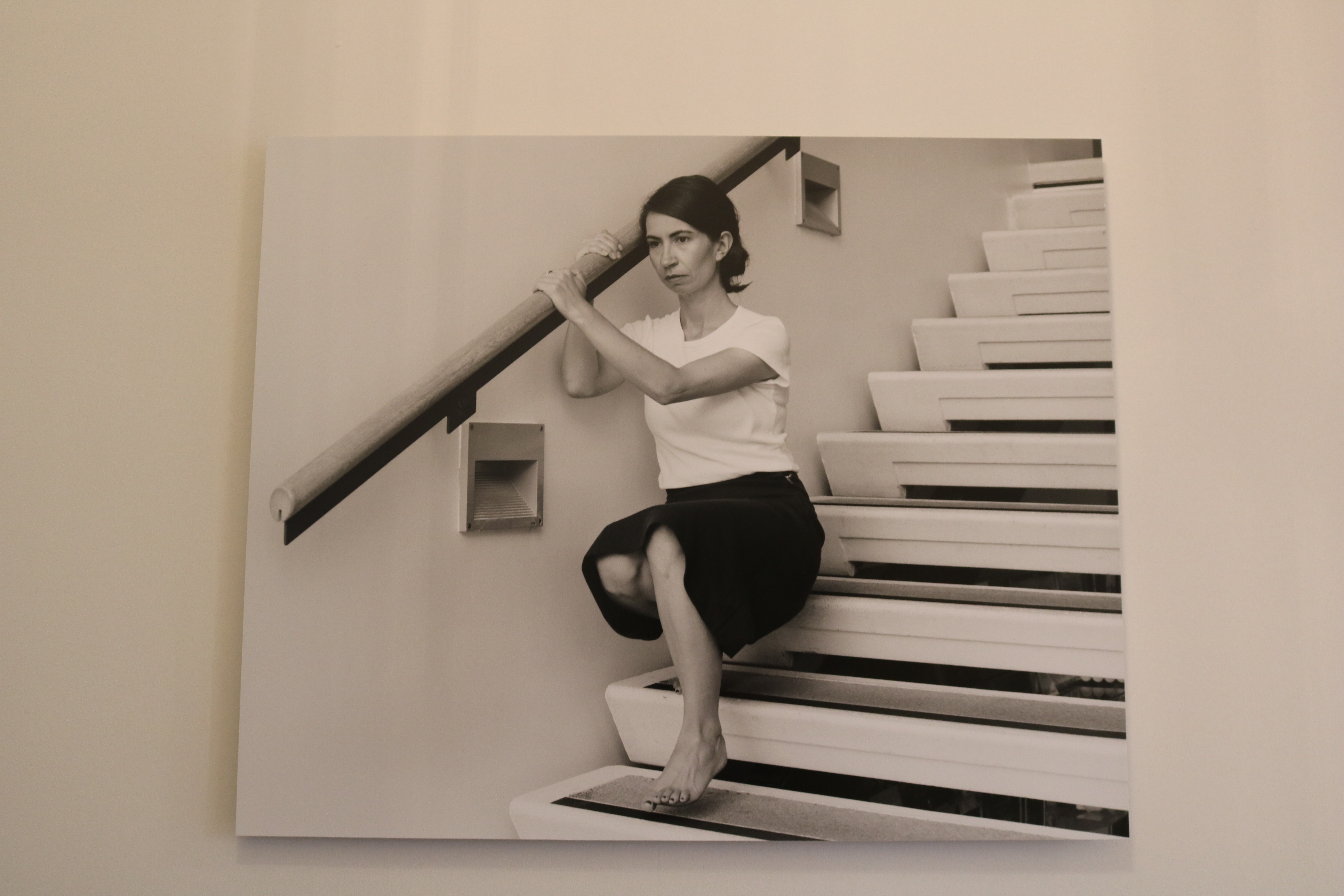
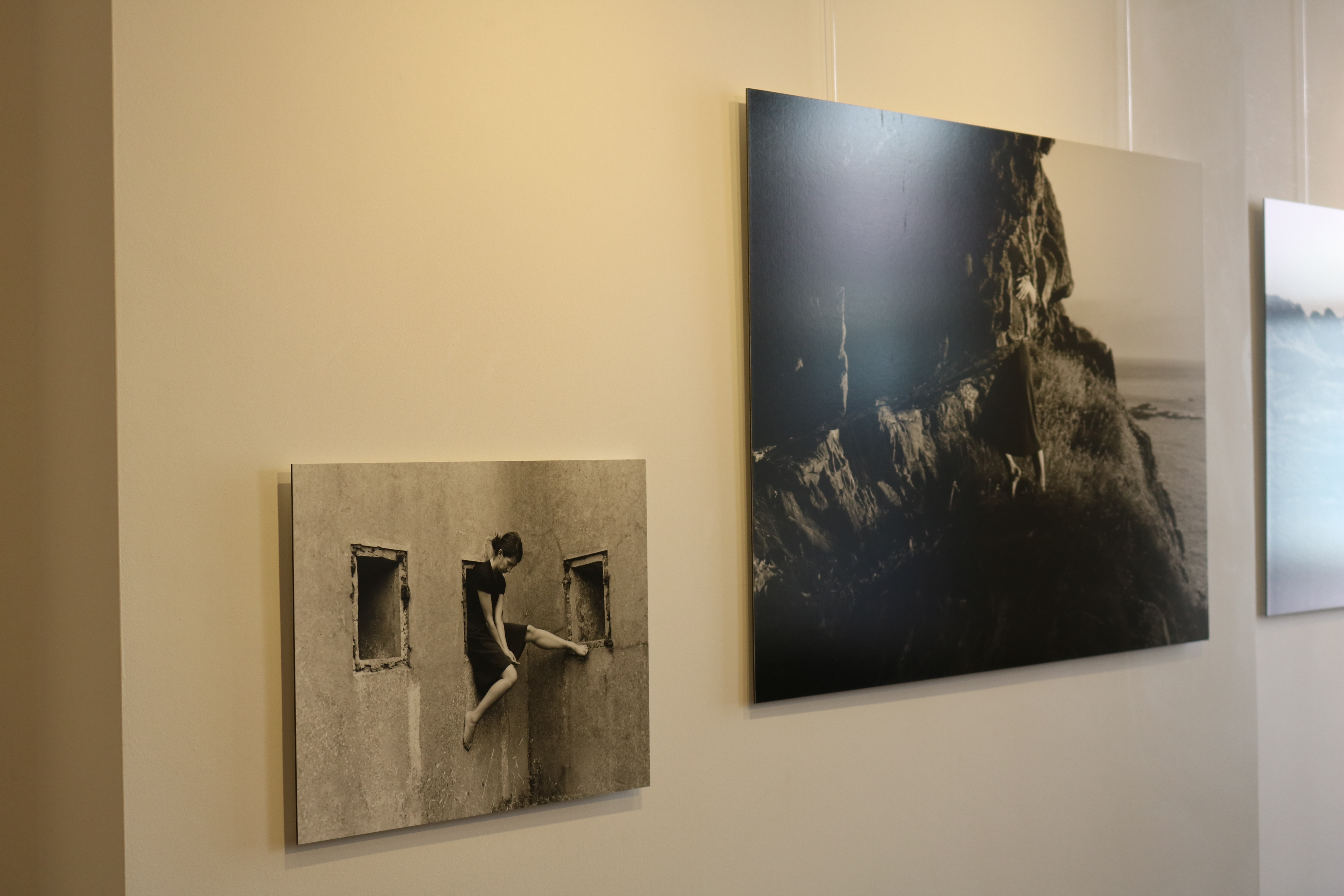
I also really liked Rae’s work in the exhibit. I could clearly see elements of Cahun’s work included in Rae’s images. For example, the use of black and white filters on all her images to make them look old and vintage like the self portraits Claude took. Rae also took self portraits in which she used her body to interact with Jersey’s local environment. I loved how Rae’s work shows some similarities from Cahun’s, but instead she uses more modern day, sterile environments like offices and archives. I think this is really successful as the change of environments reflects the change of times from each era the artist worked during.

Claude Cahun’s images

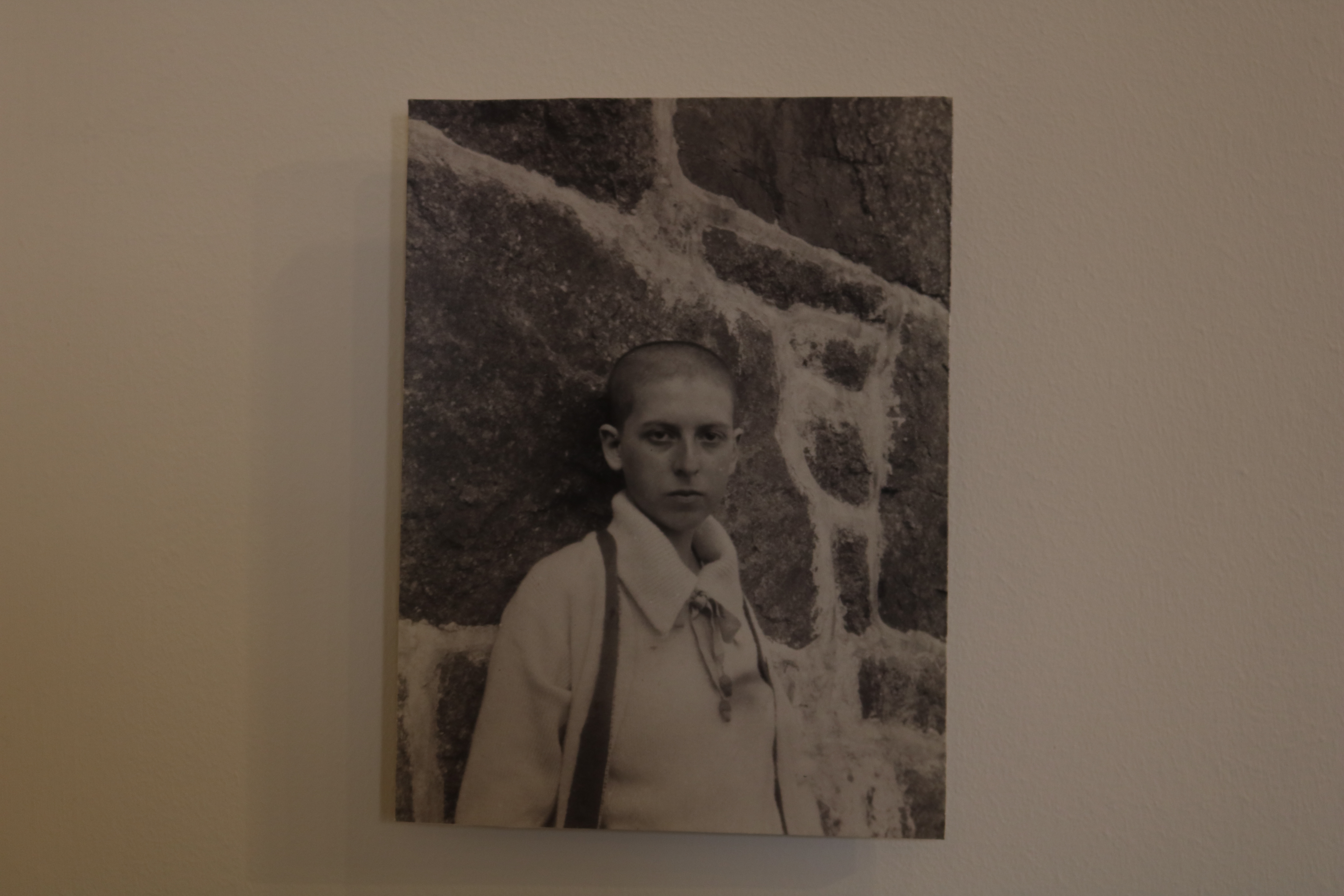
This is one of my favorite images seen in the exhibit. It was taken in 1916, and in this image we an see a self portrait of Cahun herself leaning against a granite background, while staring into the camera with a monotone facial expression.

I really like the concept of this image a lot.  This is because in the image she has her head shaved, which was very unusual for women during this era. I think this image is very powerful because it shows Cahun attempting to break gender stereotypes. This shows how far ahead of her time Cahun actually was.

The technical elements of this image are also very interesting. I like the lighting in it a lot as it means that everything in the image is clear view, and it is also in focus.


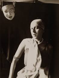
This is another on of Claude’s images. similar to the last one, it shows herself exploring her body and her identity. This image shows Cahun posed naked, with her arms also posed in a particular way while also wearing a mask.

A reason I really like this image is because again, like the last photo, it is really ahead of its time and not typical of the time it was taken in. I also really like all the tones and shading in the Picture, caused by the natural lighting.

Clare Rae’s work

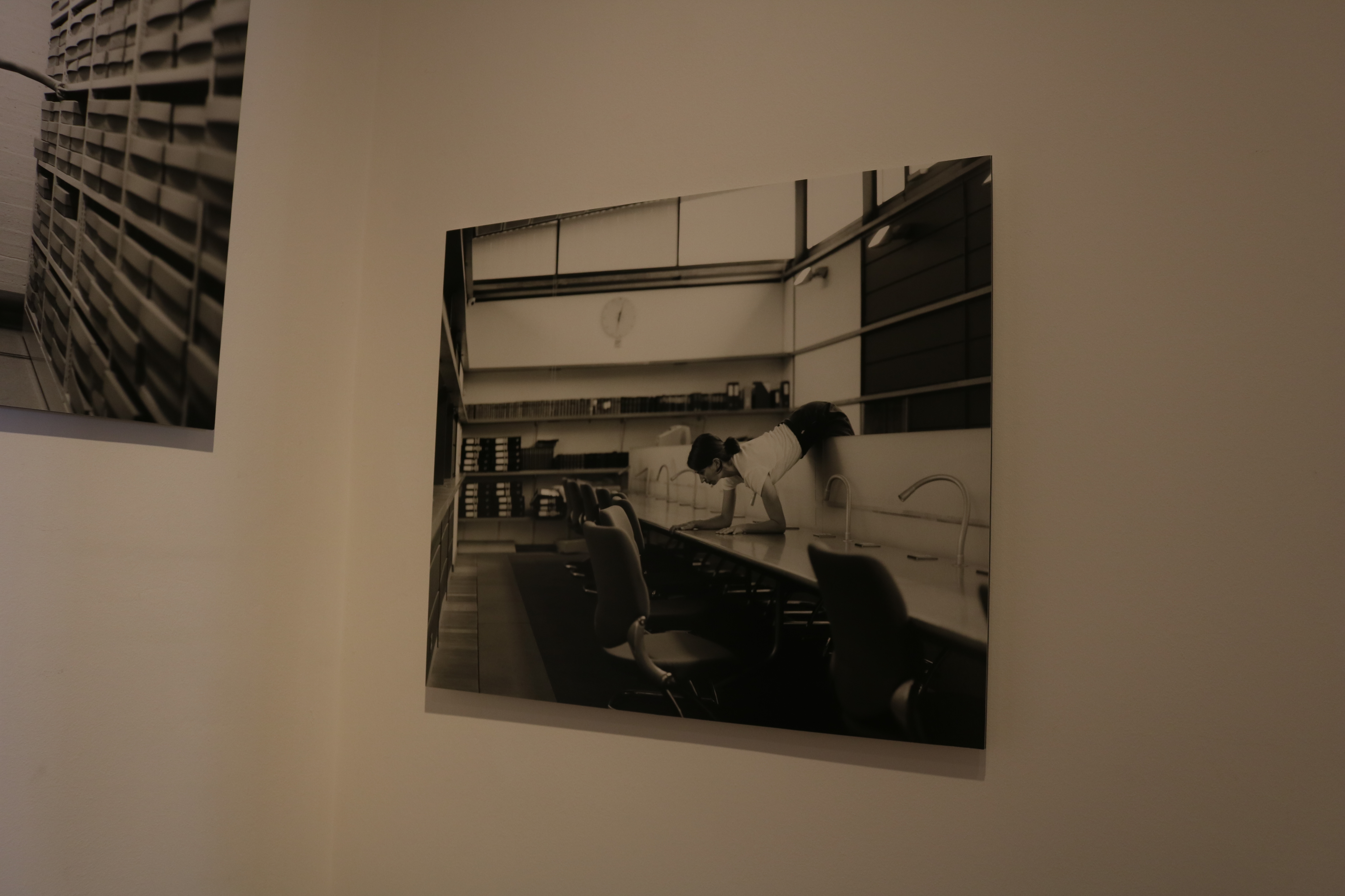
This is a an image of Rae’s that stood out to me. I like this image because you can clearly see where she has been influenced by Cahun, in the filter and in the way she poses herself in the image also. But I also like the way she has made this image fit into 21st century life. The way she has modernized the image while still taken inspiration from a past photographer makes the image very appealing to a modern day audience. The way she has done this is by posing her body of a busy office table. I also like the way the background is purposefully messy as I think this could represent how busy and complicated modern day life can be.

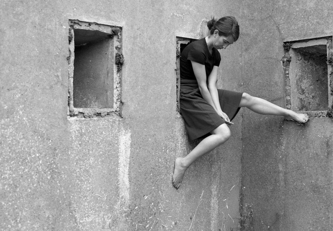
This image taken by Rae is slightly more simple. I contains no extremely posed body language compared to the previous image, as instead of being lent over a table she is comfortable sitting on a window frame with her legs together, and her had supporting her body behind her. This image is very interesting to due to many aspects.  The lighting of this image is very interesting and complements the vibe of the photo. I like the way the light is only coming in from behind her as it means the part of her body facing the camera is slightly darker and less visible. I think this helps add a sense of mystery to the photo. I also like how the lack of light in the image means that the photograph contains a  lot of darker tones, which highly contrast the light tones coming from where we do see the light by the window.

More images of the exhibition


Photographing Paper

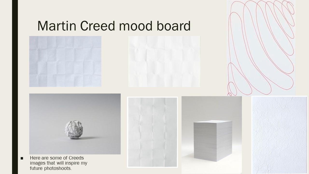
Martin Creed

Martin creed was born in 1968 in Wakefield, England. He went to The Slade School of Art in London for 4 years in the late 80s. He has done a lot of work, and many exhibitions all over the world. Along with being an artist, Creed is also a musician and has a band.
He mostly photographs simple, everyday items in very effective manors so that all his images look aesthetically pleasing. The specific pictures of his that I will be focusing on are the images of paper he has previously taken.
Creed currently lives, and works in London.


Claude Cahun x Clare Rae

a mixture of Cahun and Rae’s work


Claude Cahun

Claude Cahun’s photographic self-portraits present a dizzying kaleidoscopic mix of mystery, exuberance, and sobriety. Born in France, she lived most of her life on the island of Jersey with her stepsister and long-term love, Marcel Moore. Also known as Lucy Schwob and Suzanne Malherbe, both women adopted their preferred gender-neutral pseudonyms during early adulthood. Moore, although often invisible, was always present – typically taking the photographs and also authoring collages – and in this sense was as much artist collaborator as she was Cahun’s personal support. Described in her own words as a “hunt”, through a combination of text and imagery, Cahun’s exploration of self is relentless and at times unsettling. From circus performer, clothed in layers of artifice, to a stripped-down Buddhist monk grounded by integrity, Cahun is engaged in an ongoing dialogue with multiplicity. Tragically in line with the fragmentary nature of her outlook, much of the artist’s work was destroyed following her arrest and subsequent imprisonment for resistance against the Nazis. What remains bares interesting parallel to the title of Cahun’s diaristic publication Aveux Non Avenus, translated as Disavowels, which enigmatically suggests that for all that is revealed and given, much is still hidden or has been lost.

Themes of melancholy, futility, and uncertainty run deep through Cahun’s career. She does not make ‘complete’ artworks but rather all of her photographs and writings combine to become part of a bigger and yet still unfinished whole. She says herself that she does not have the answers to her questions, and as such unusually makes visible the rawness, torment, and distress of not knowing.

There is an obscurity surrounding Cahun that has made her an isolated figure. In character she was an obsessive loner, and yet she was also inextricable from Moore. From 1937 onwards, moving away from the artistic circles of Paris to the remote island of Jersey, the couple became somewhat awkward, ostracized, and inaccessible. Furthermore, with much of Cahun’s work destroyed in 1944, the overall body of her production became relatively small further heightening her mystery. The original works that survive are very small, as though they have been left as clues for a much bigger treasure hunt.


Clare Rae

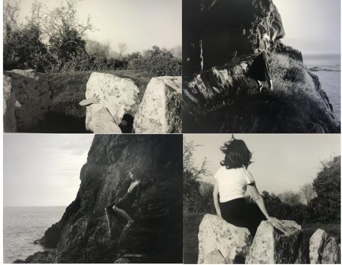
In her photographic practice Clare explores ideas of performance and gesture to interrogate and subvert dominant modes of representation. Her work is informed by feminist theory, and presents an alternate and often awkward experience of subjectivity and the female body, usually the artists’ own.

Recent projects have engaged with site specificity, involving works that are captured and displayed within the same environment. A central interest within her practice is the exploration of performance documentation, specifically how the camera can act as a collaborator, rather than mute witness, to the performer.


Both collections of work were displayed along side each other, as Rae took inspiration from the works of Cahun. She hoped to pursue the idea of individuality and self expression like Cahun did.


WEEK ONE- PHOTOGRAPHING PAPER

Martin Creed

Martin creed was born in 1968 in Wakefield, England. He went to The Slade School of Art in London for 4 years in the late 80s. He has done a lot of work, and many exhibitions all over the world.
He mostly photographs simple, everyday items in very effective manors so that all his images look aesthetically pleasing. The specific pictures of his that I will be focusing on are the images of paper he has previously taken.

MOOD BOARD

  • Shadowing- used to enhance contrast
  • Simple elements
  • Different ways of folding paper
  • Lighting used in different ways
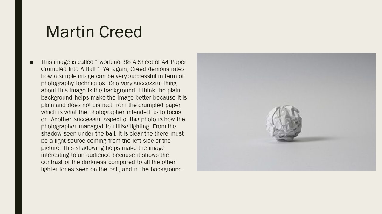
Analysation 

This image is named image No.88, this image shows how simple elements in a photograph can be very successful. One very successful element in this image is the background of the image as it is again very simple and also plain which doesn’t distract from the very detailed crumpled paper. I also really like the use of the lighting used to photograph the paper ball as it creates a small shadow of the right hand side which is clear to the audience that there is a light source coming from the left hand side. This shadowing adds contrast to the image because of the darker coloring.

This image is also part of the no.88 collection and is very similar to the other picture i had analysed from the collection. However, Creed has used a darker background which helps to emphasise the detail on the crumpled paper. A right hand side light has also been used to create a shadowing on the left hand side which again adds contrast to the image due to the different brightness’s in the image.

Planning my photo shoot 

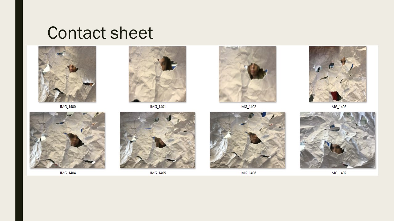
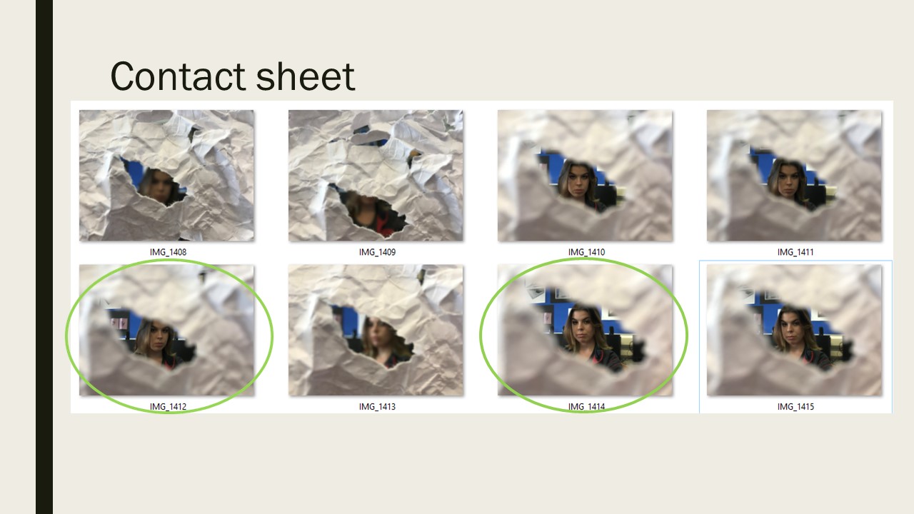
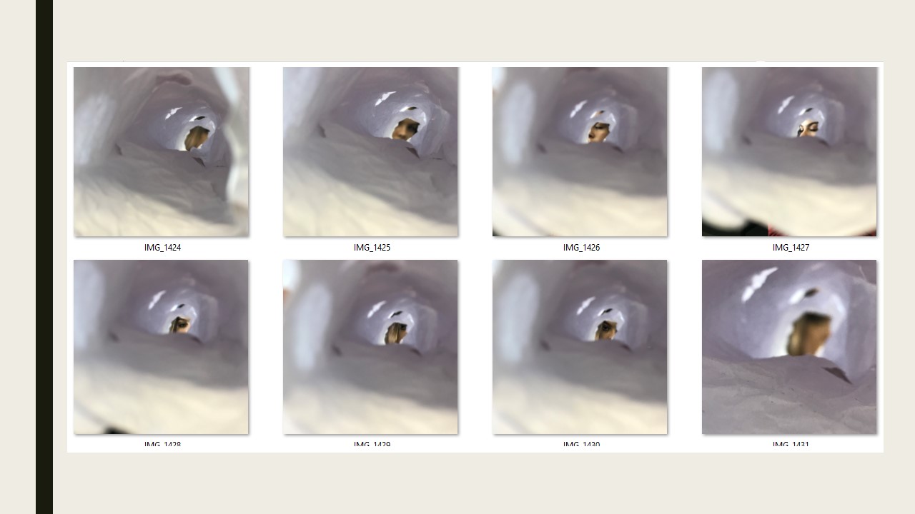
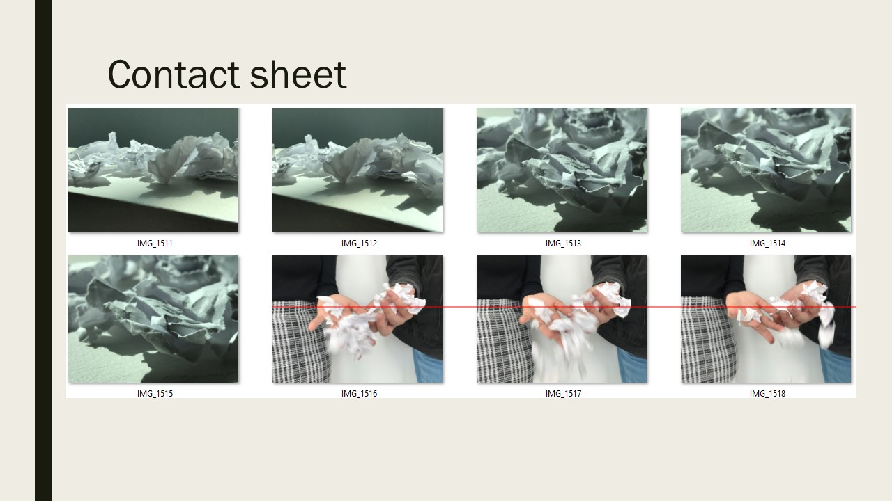
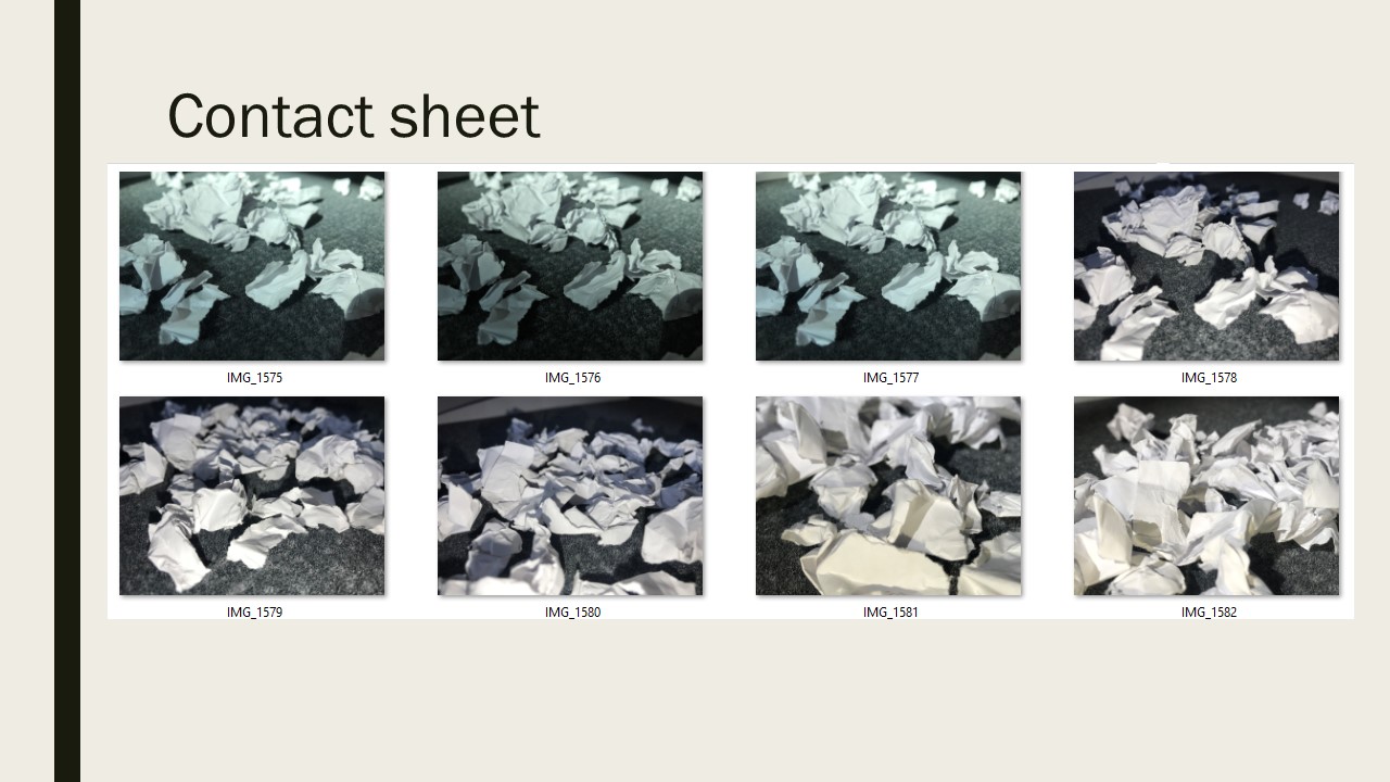
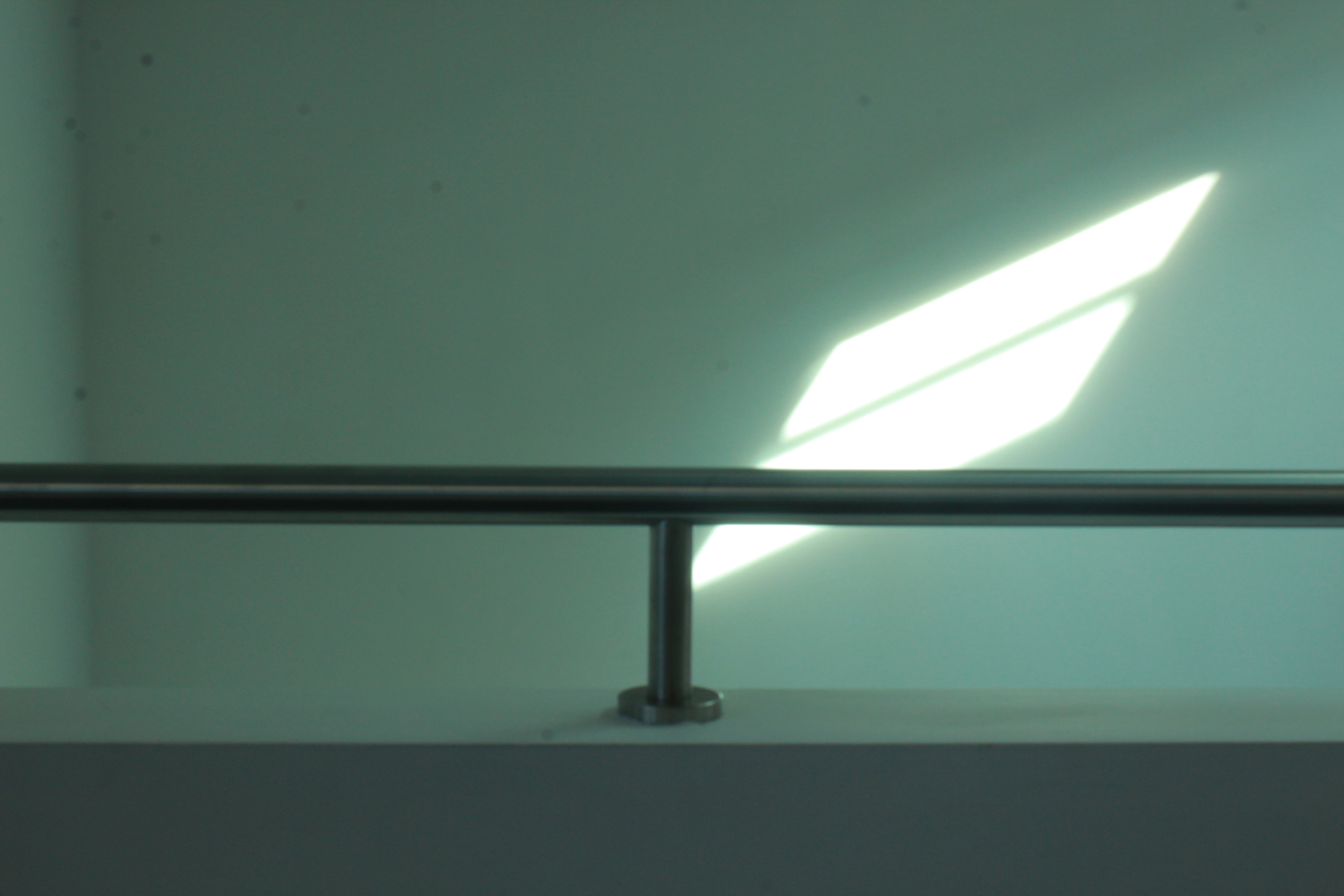
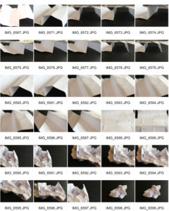
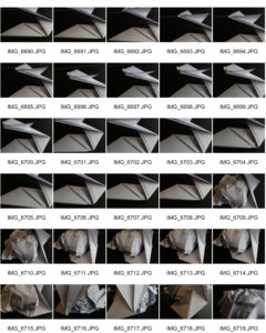
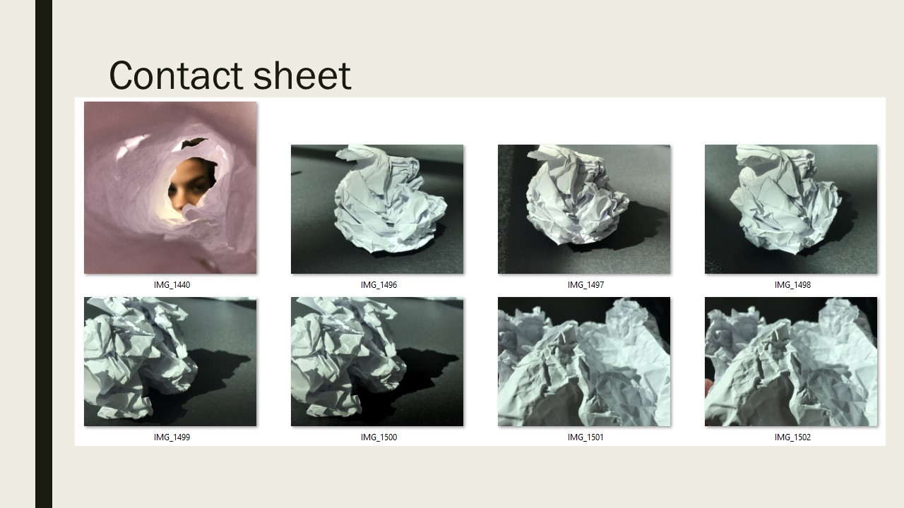
After taking inspiration from Creed i have decided to take pictures of paper. I personally really like the way that he used paper balls as well as crumpled paper and therefore my images will be based on those. I plan to use different lighting in order to create textures and contrasts.

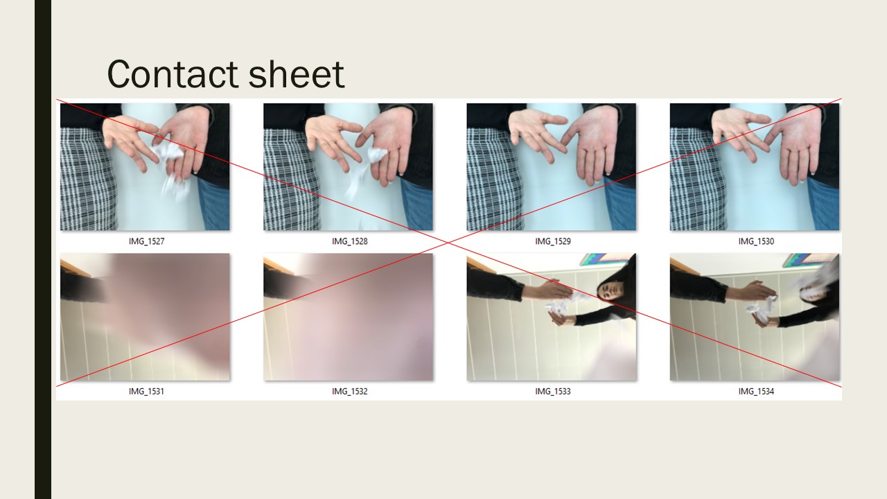
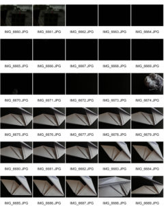
Contact sheets

Best images 

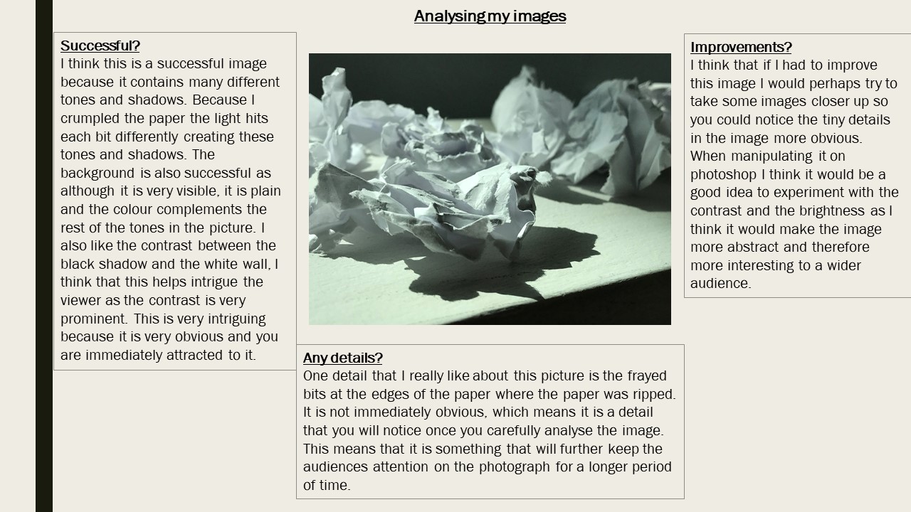
I think this image is very successful because of the contrast between the light and dark in the picture. I think the black background helps the white paper ball to stand out which was an aim of mine when starting this photo shoot.

Even thought i really like the contrast of the white and dark, in order to improve the image I would use a white background and use  light from a right hand side which would create shadows which was another aim of mine.

A detail i really like about this image is the freshly scrumped paper as this relates a lot to Creed’s no.88 work as he used the same technique.

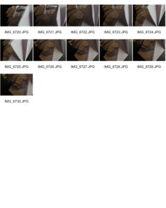
I really like this image as i like the small shadowing shown on the right hand side from the natural light from the window. This helps to add tone into the image due to the contrast in the shadowing, white paper and black background.

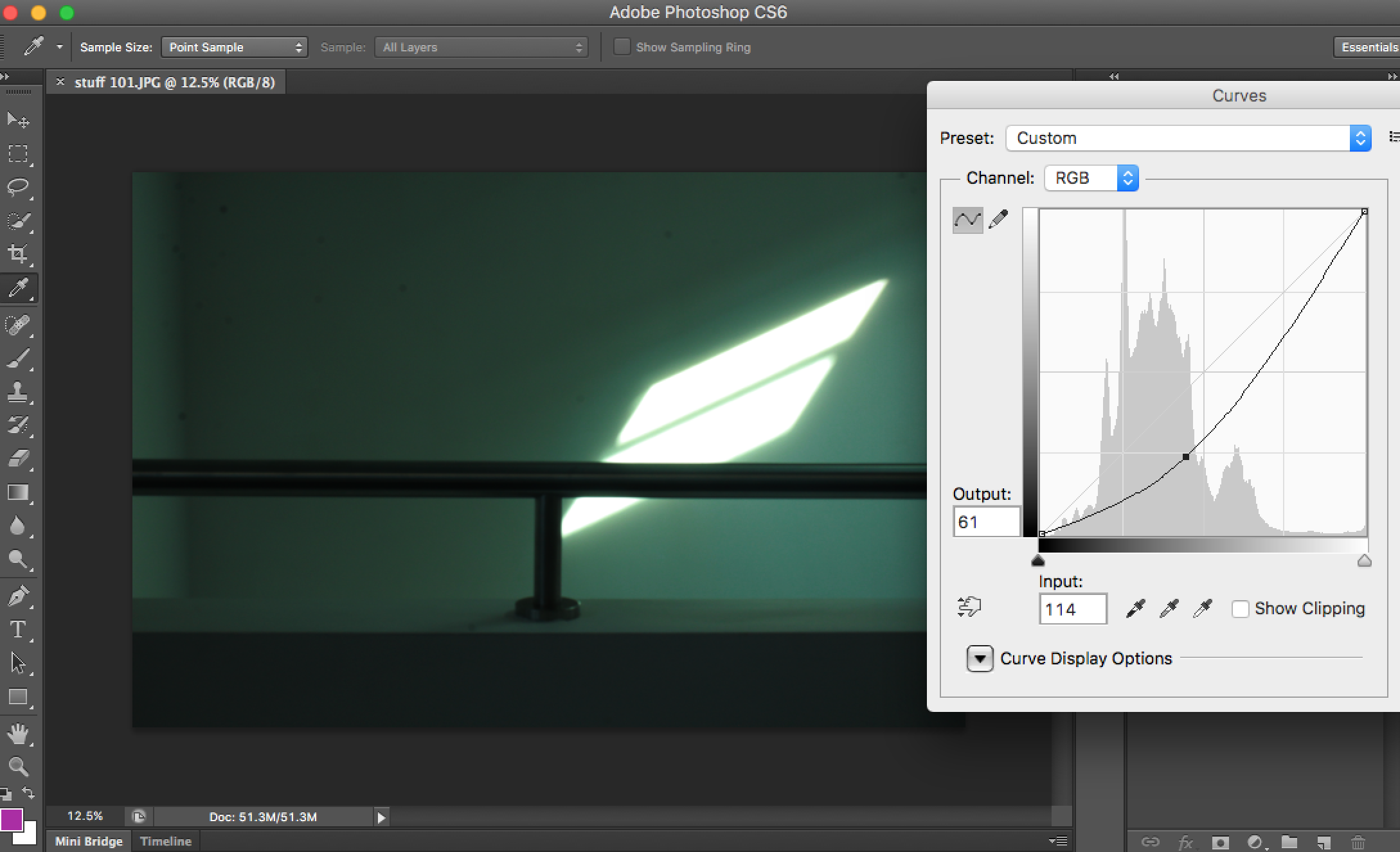
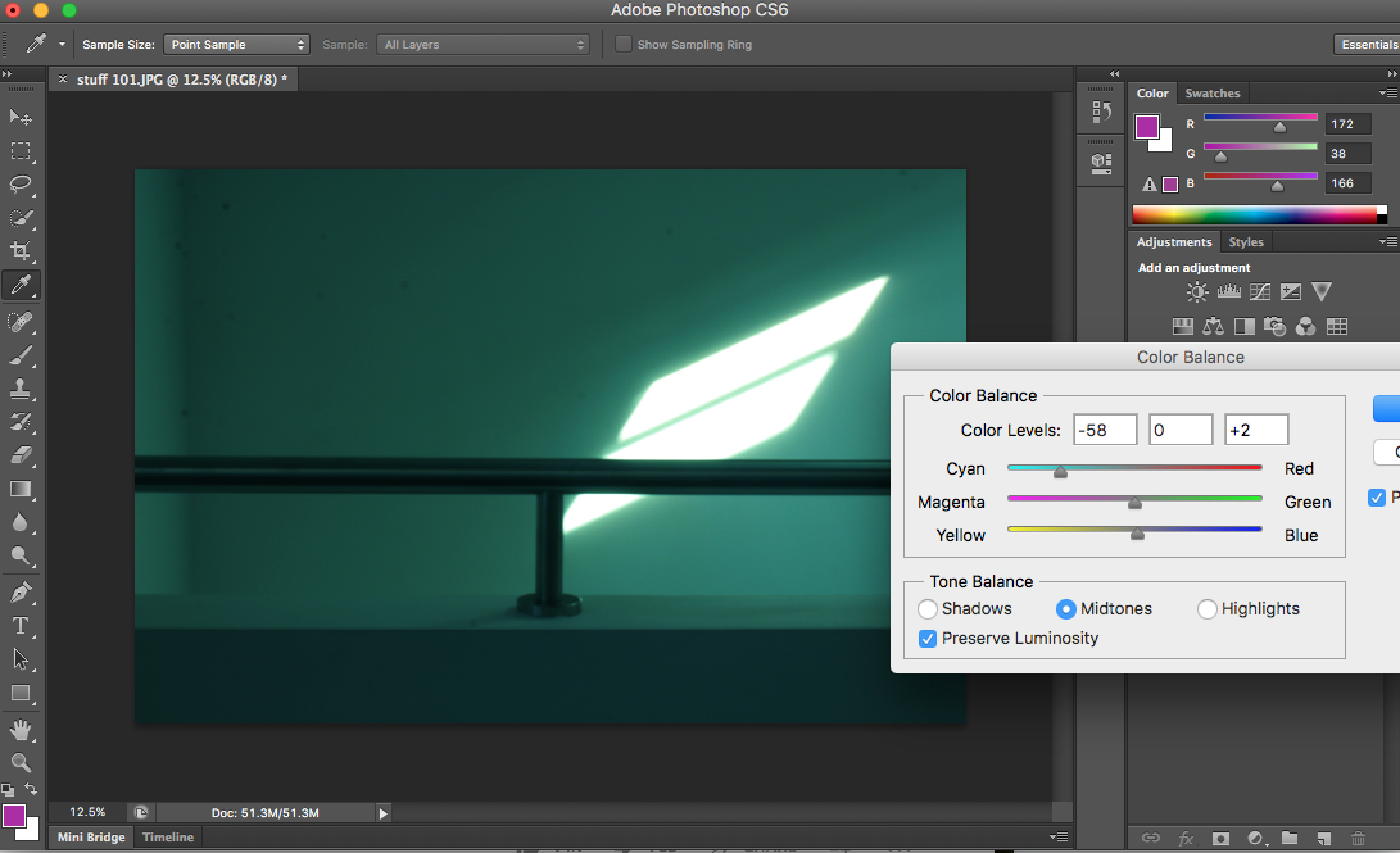
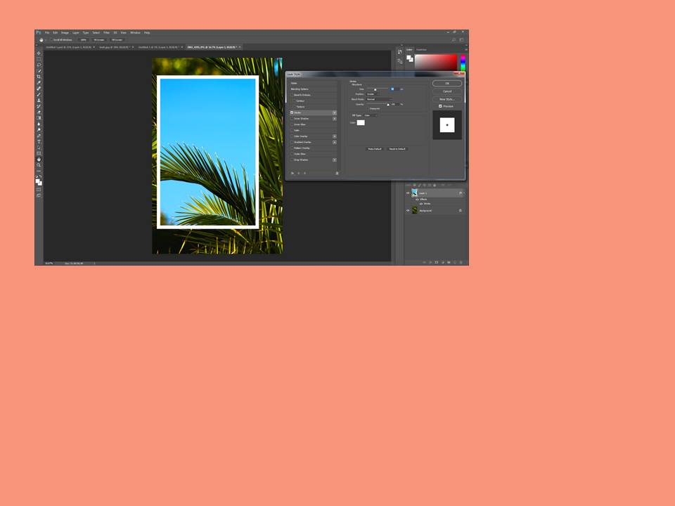
In order to improve this image I would use Adobe Photoshop to enhance subject of the image ( the paper) and make it lighter which would then help contrast between the shadowing and darkness of the image.


CCA Galleries: Claude Cahun and Clare Rae Exhibition

Claude Cahun:

Claude Cahun is a French-Jewish photographer that grew up in Nates (western France) with her mother but ended up living with her grandmother after at a young age, Cahun’s mother, Mary-Antoinette Courbebaisse, was institutionalised. Cahun faced anti-semitism at her high school in Nates, therefor she joined a private school during her time in Surrey.

Her work reflects her sexuality and ideas of gender-ambiguity. Much of her work involves self-portraits in which she usually looked directly at the viewer, showing her shaved head and shoulders, blurring an indicators of her gender.


Clare Rae:

Clare Rae is an artist based in Melbourne (Australia). In her photos she explores ideas of performance and gesture. A lot of her work is informed by feminist theory and usually presents an alternate experience of subjectivity and the female body.

Her work, a response to the earlier work of Claude Cahun, is defined by the main aspect of all the frames being of the artists body. Clare Rae understood that Cahun produced many intimate photographs in Jersey. Rae followed in this aspect by depicting her body in many of the photos, utilising gesture and the performing body to contrast traditional representations of the female figure and attract the male eye to the landscape rather than the body.

Clare Rae X Claude Cahun

Hw- task 2 -CCA Galleries International

Claude Cahun X Clare Rae Exhibition 

Clare Rae- Exhibition

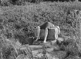
I chose this image by Clare rae due to how it stood out compared to the rest of her images, although her images all stick to a theme of portraits clare seems to try and adapt to the environment around her. She does this by positioning herself inside holes in buildings or by climbing onto rocks at the beaches or the sand dunes. This image she has physically lied across a rock this i found particularly weird as i had never seen an artist do that before. I particularly like her images because she works with black and white. For me i think the images that have quite a lot going on in the photo as in the surrounding that she has chosen, it creates more shading which also brings out certain detail that maybe if she hadn’t done it in black and white we would not have been able to spot due to sunlight or if the image was too bright.


Clare Rae Block


Claude Cahun

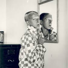
This is an example of Claude Cahun work. This was my favorite image due to the elements of weirdness in the picture.  I think this picture is unique due to the fact its not simply sticking to the idea of just normal portraiture photography. Cahun works with black and white so therefore she relies on the heavy shades and contrasts between colours to adapt to the type of image she wants as an outcome. Every photo that Claude takes has a story she tends to explore out of the box ideas which in her age would have been seen as a brave but challenging thing to do. Cahun works around the theme of identity. This is shown not only in this photo but many others. She was looked up on as she was known for her exploration of sexuality and she shows that in her photographs.

Overall both artists create ideas of expression of identity and allowing and not being ashamed of showing off the female body. Both artists are expressive and work well in what there trying to create when someone is looking at their images as all images have a story so once understanding the context I realised why their images might have been seen as strange.