Category Archives: Unit 1 Abstract
Filters
High contrast images with Keld Helmer-Petersen
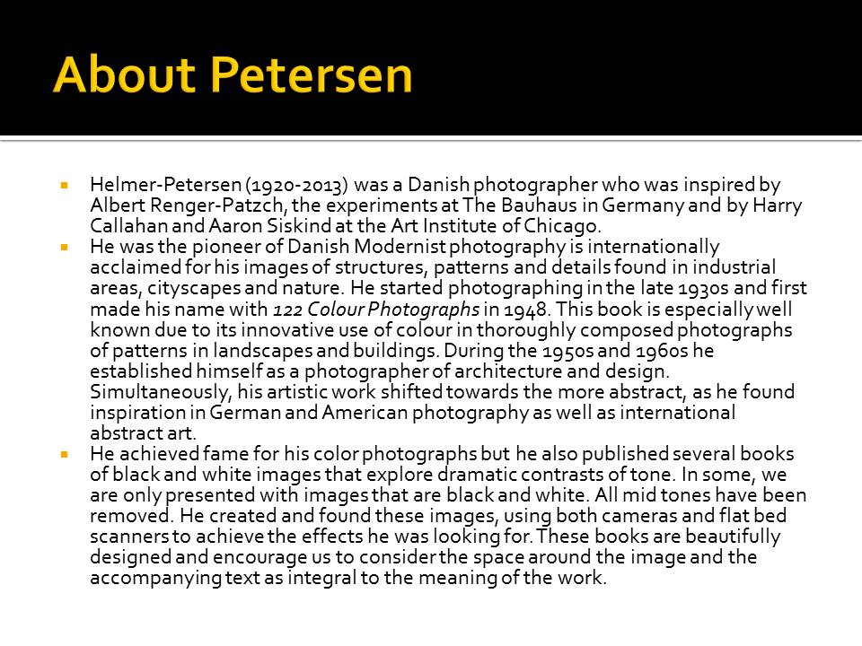
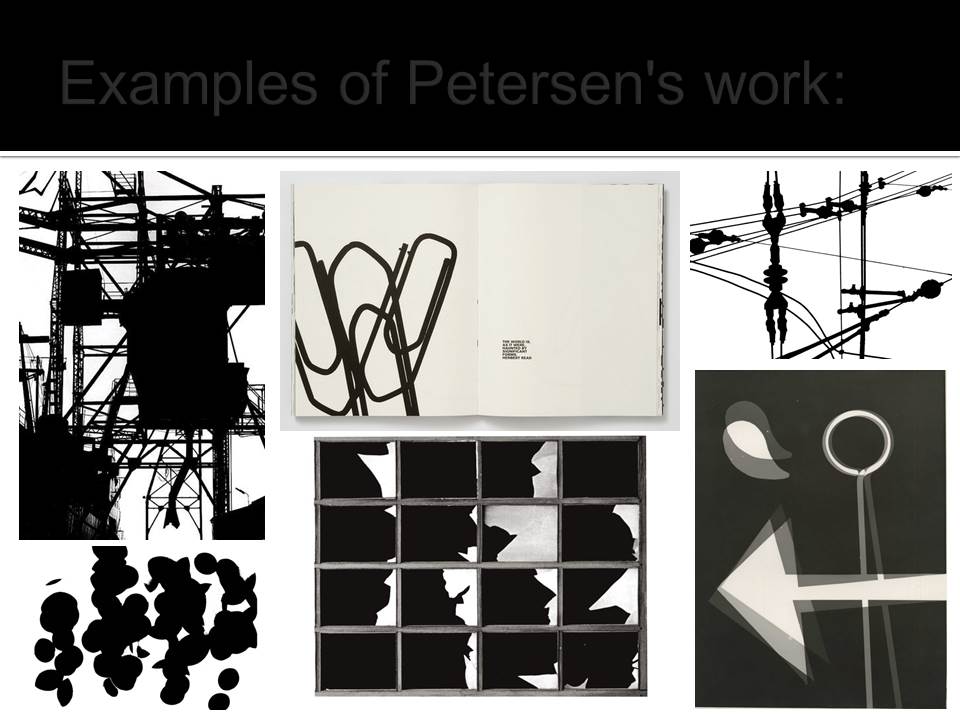
Keld Helmer-Peterson was a Danish photographer who took abstract photographs. He was heavily inspired by Albert Renger-Patzsch and Aaron Siskind. This photographer took images of things like buildings, and edited his photos until the contrasts were very high. He published many books that contained heavily contrasted images, like the one below. He took the images in the books using cameras, and also bed scanners. All the images in the book are surrounded by a lot of space and sometimes even text.
My images
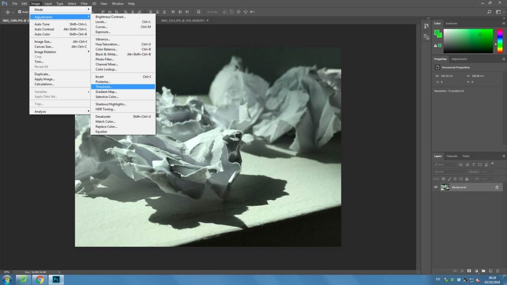
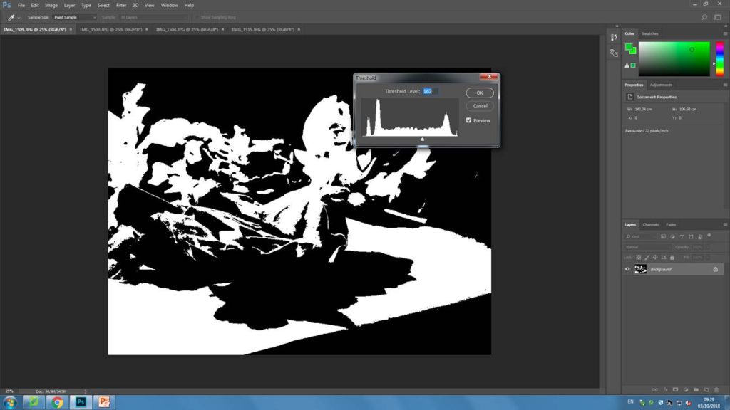
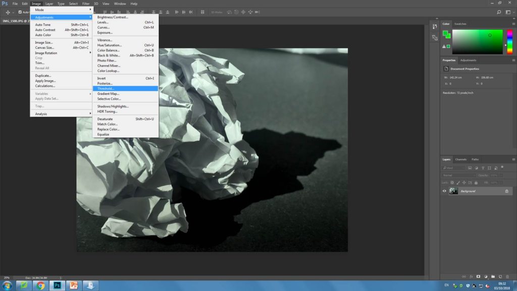
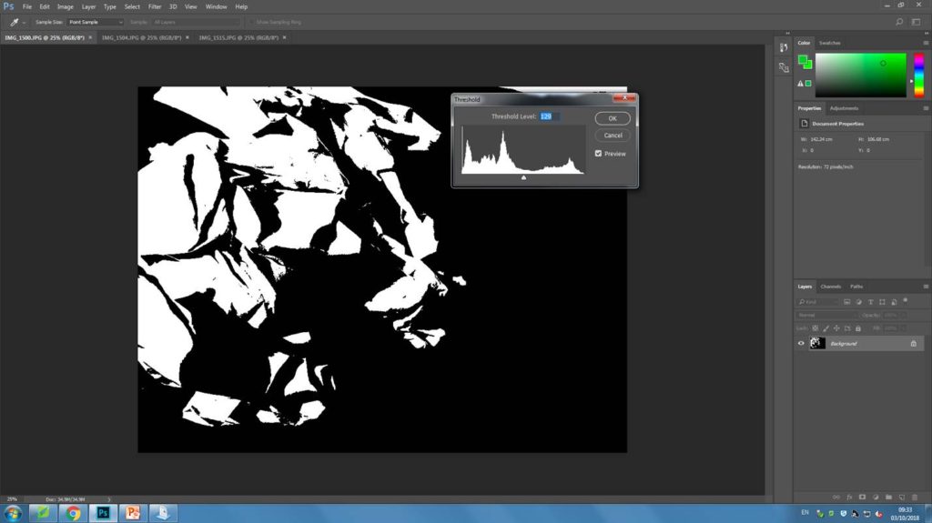
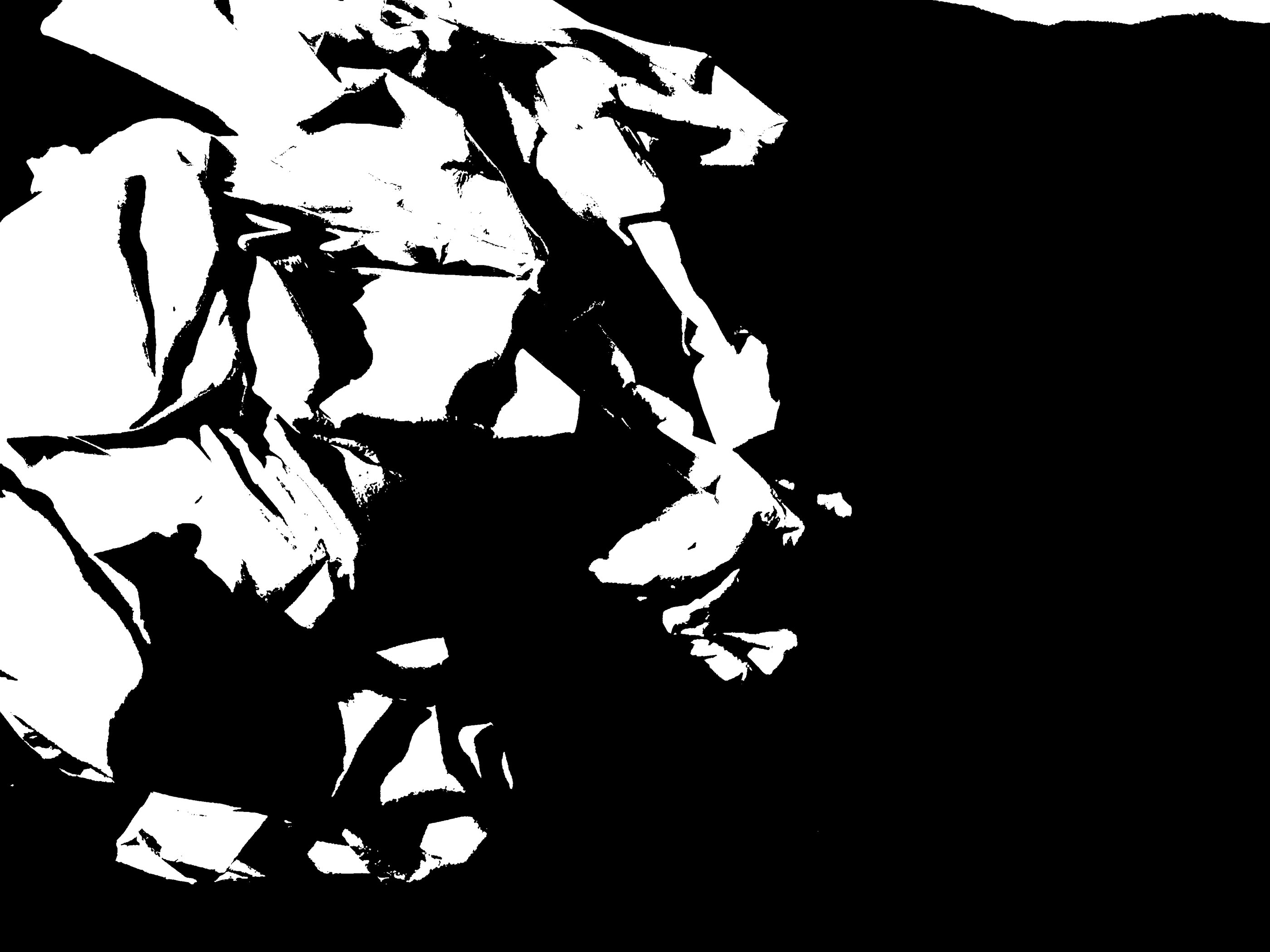
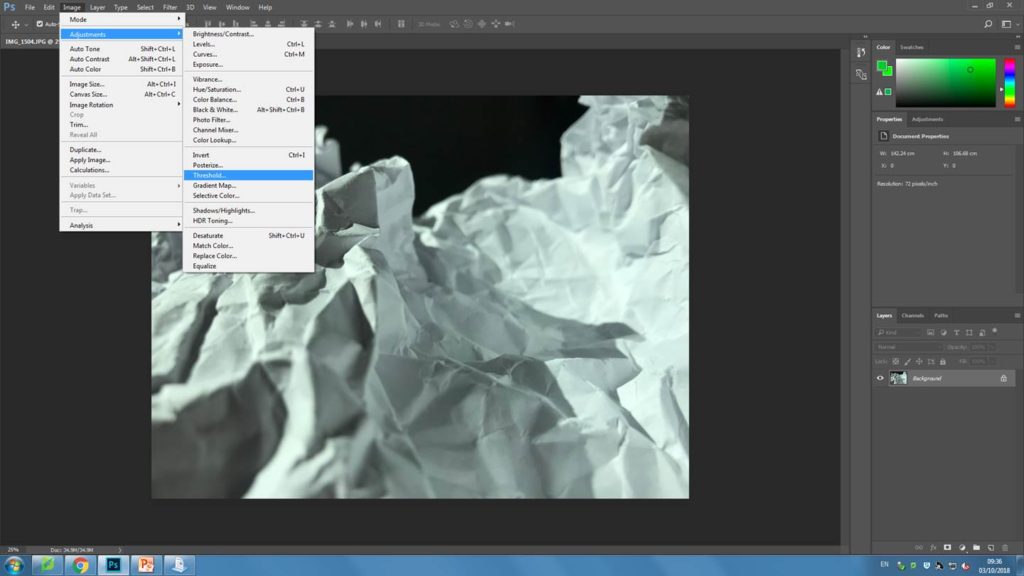
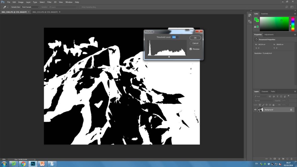
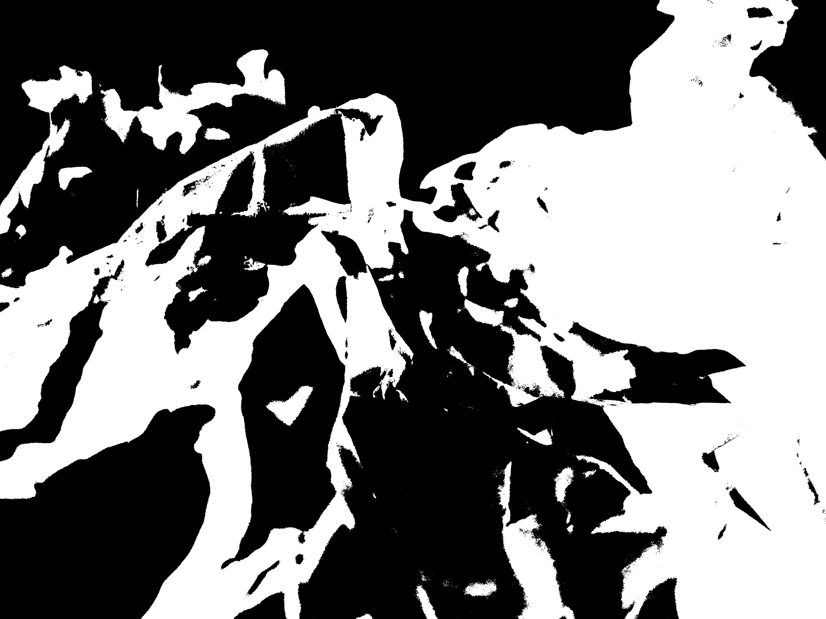
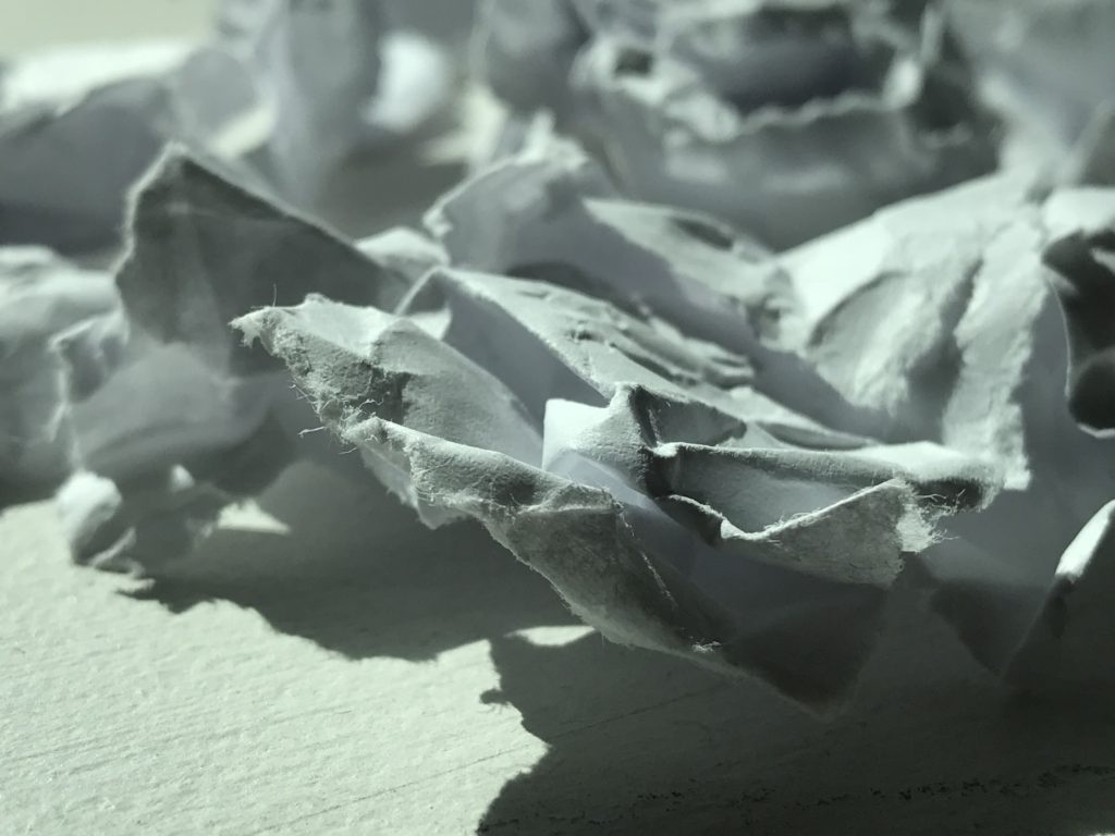
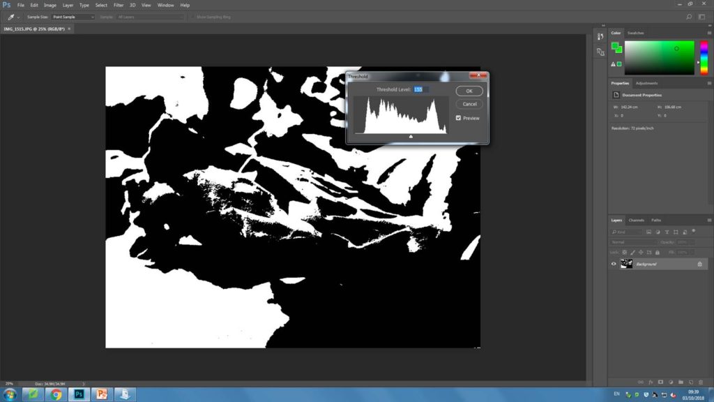
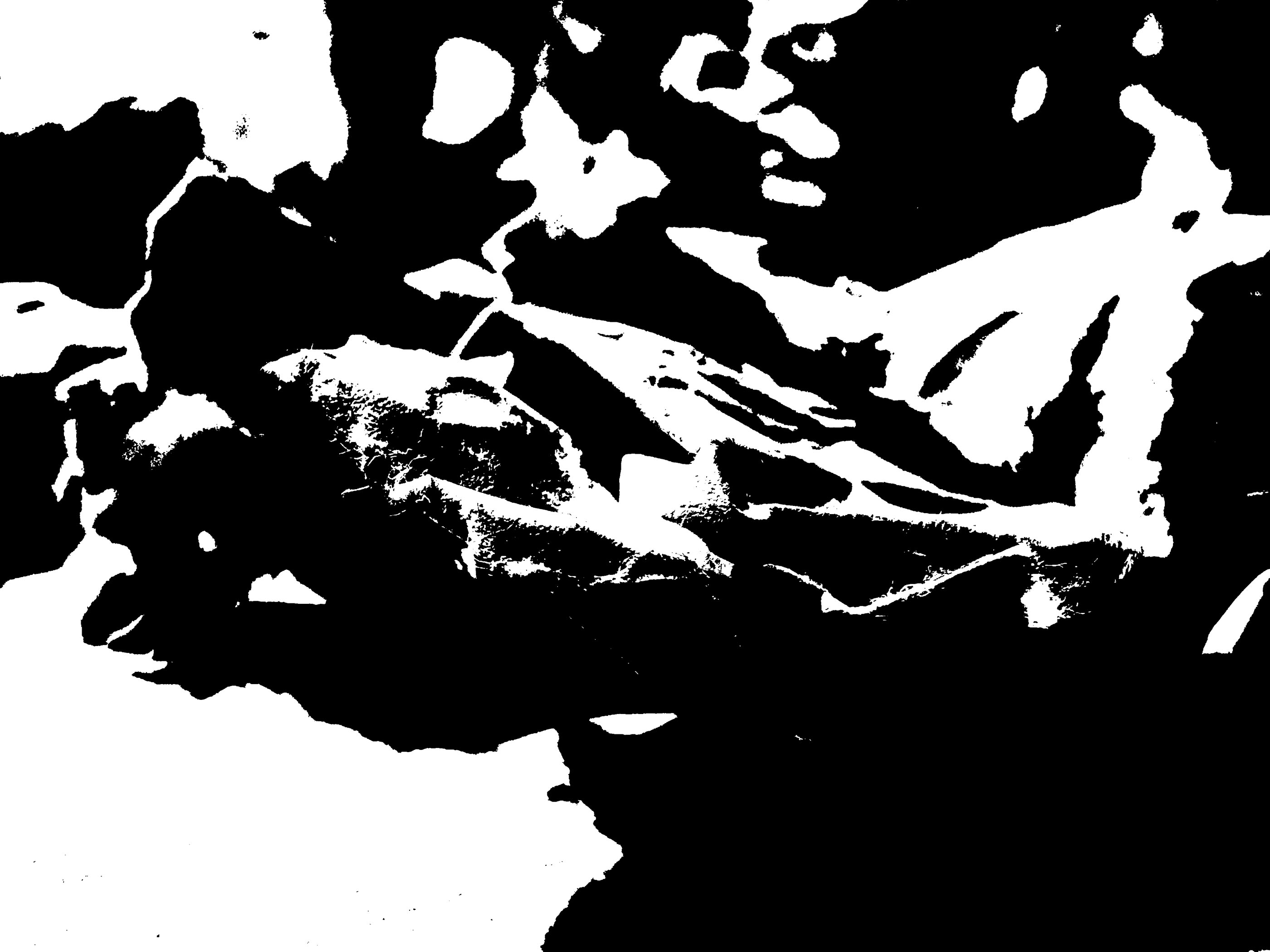
For my following experimentation, I have chosen 4 abstract images I have previously taken to edit on Photoshop. To edit all the images I have adjusted the threshold, by going to image then selecting ‘adjustments’. For each image I have then adjusted the threshold until i has satisfied that I had a heavily contrasted image that i was happy with. Below i have included screenshots of my process for each image.


My final piece
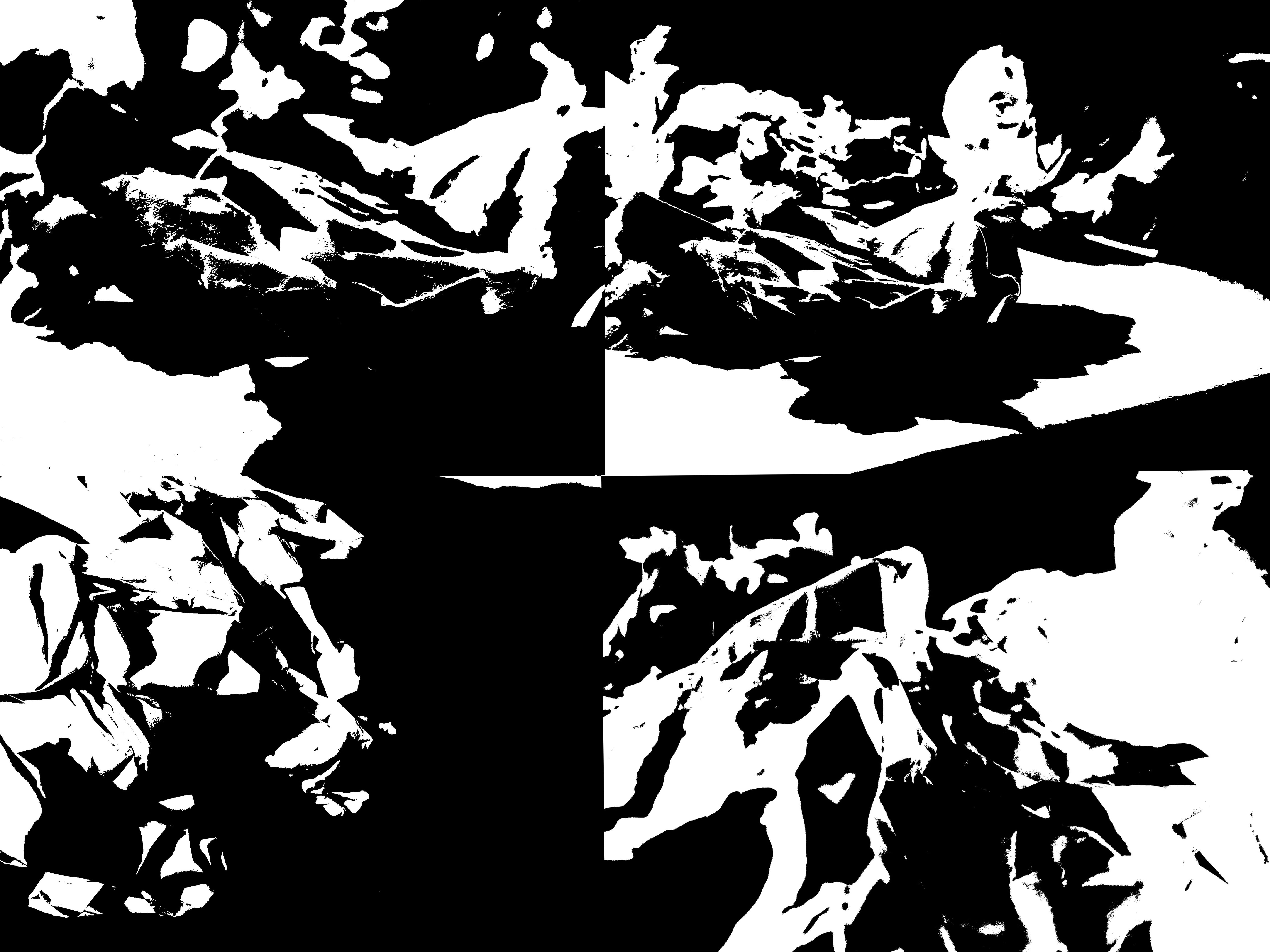
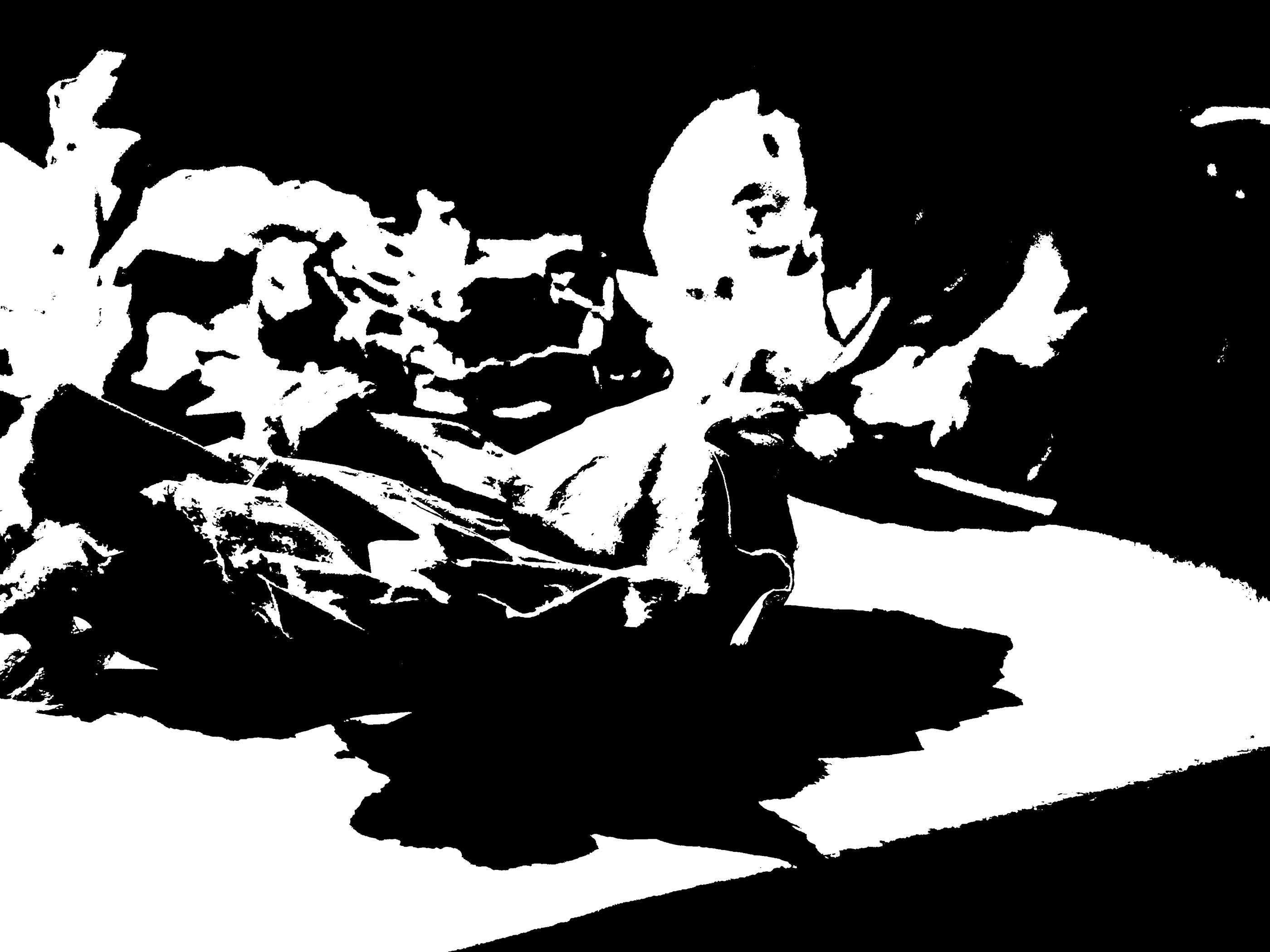
For my final pieces, I have attempted to create images like the ones Helmer- Petersen presented in his books. I think my images turned out very successful as they are very heavily contrasted and all the mid tones have also been removed. Because the paper I took pictures of was very scrumped, there were many different points on the paper that were illuminated by light, and other parts that were more shadowed. I think that has helped my images look very interesting after I had photo shopped them as there is a nice blend of both black and white on my final images.
Ralph Eugene Meatyard

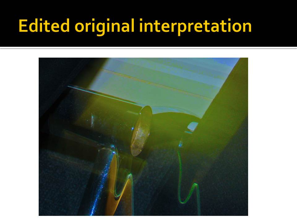
Layer Mask Experiment
Intro
Layer Masking is a process that involves creating a layer of color over an existing image and removing parts of the new layer to have certain parts of the photo visible.
Method
I loaded up Photoshop and selected my Image I wished to edit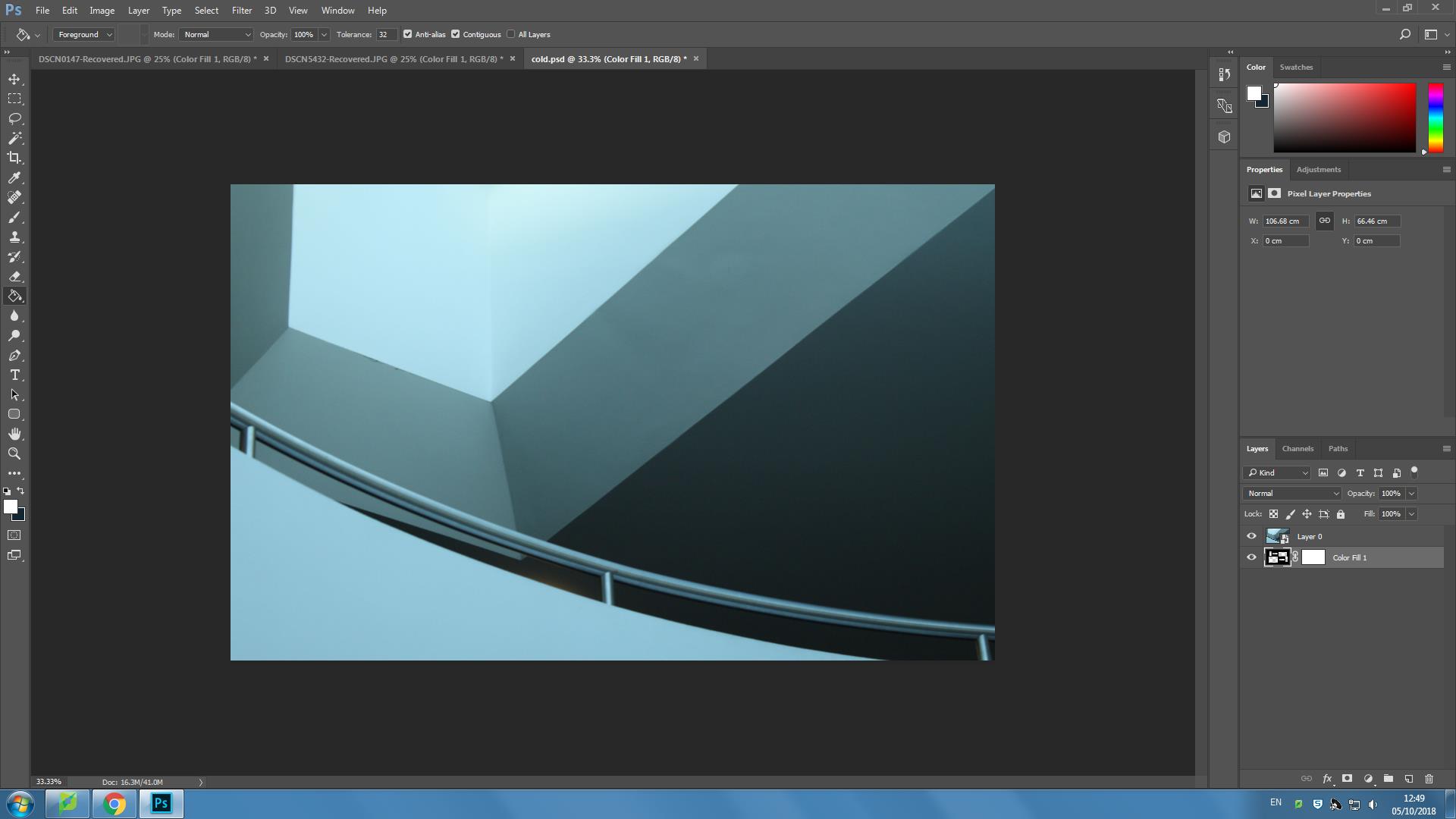
I then went to Layer-New Fill layer-Solid color and selected a colour from the image that would accent the image and layer and applied it and removed sections of the layer
Here are a few final edits
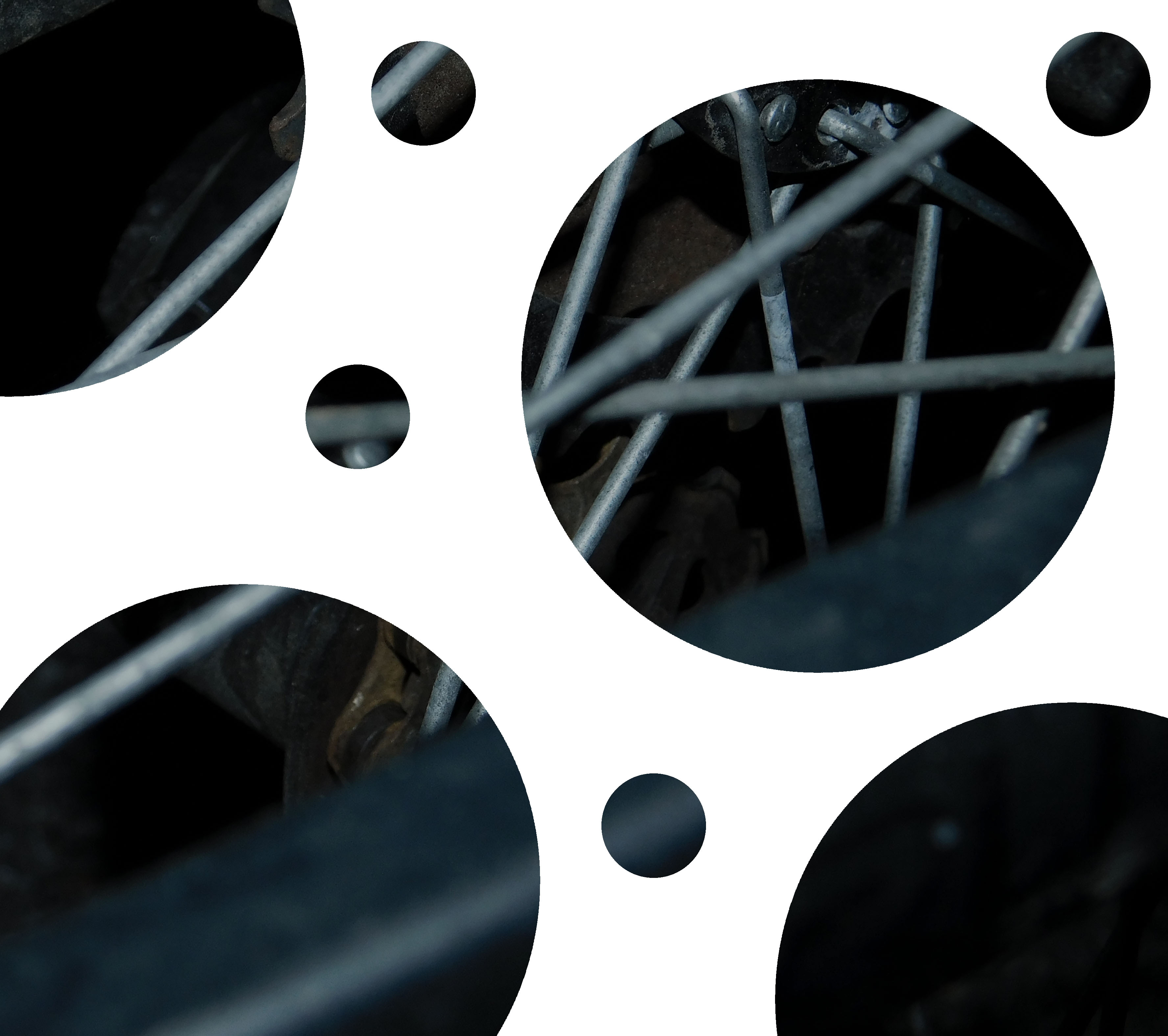
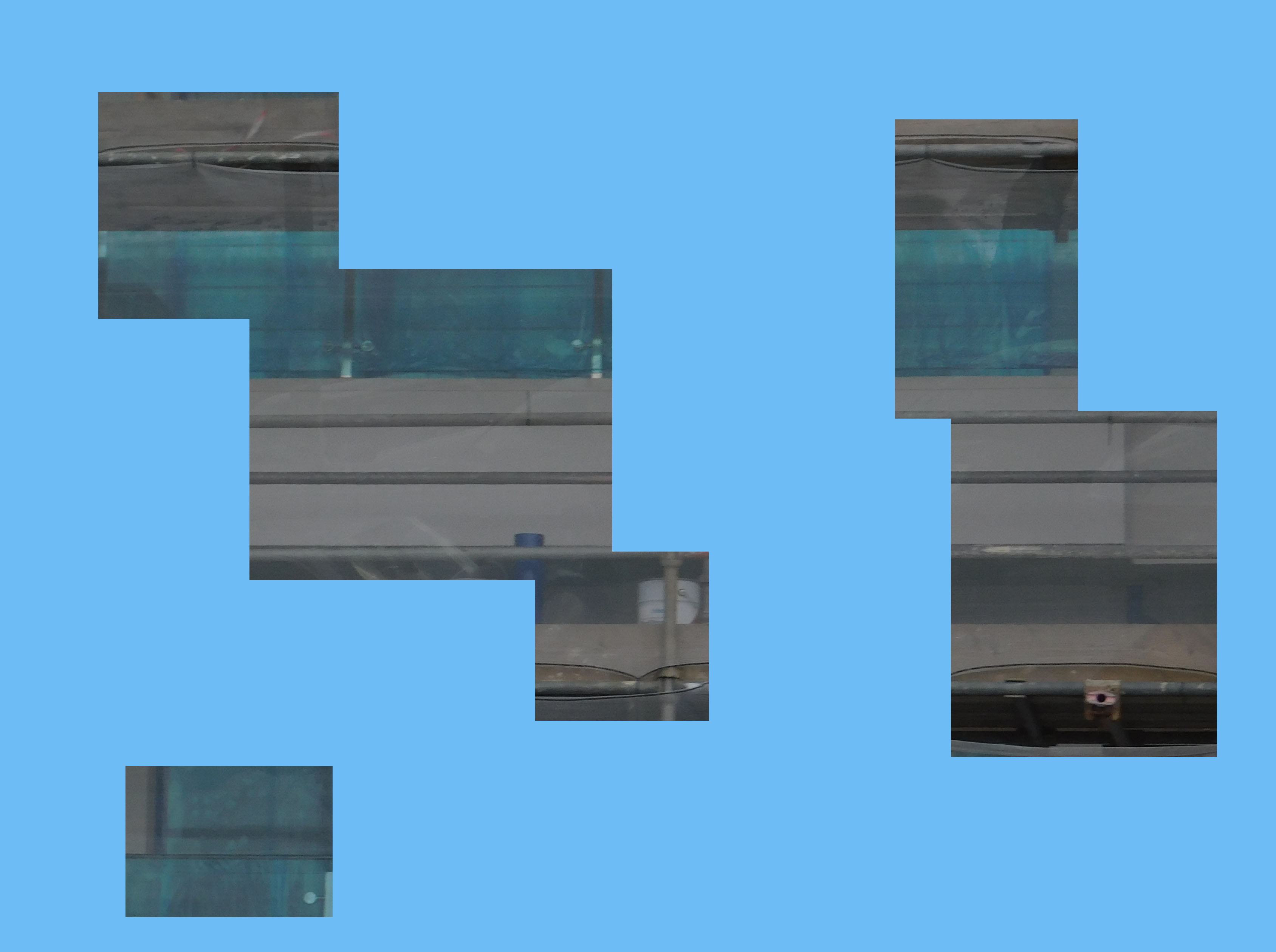
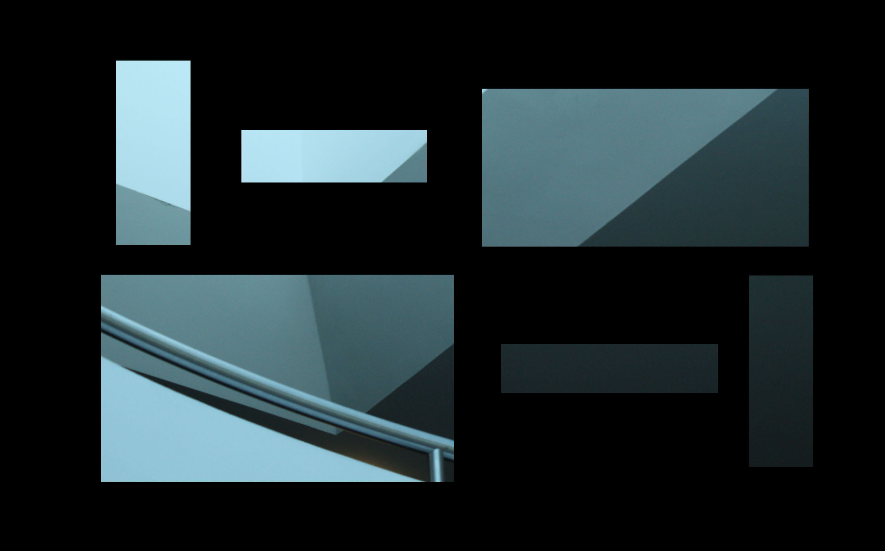
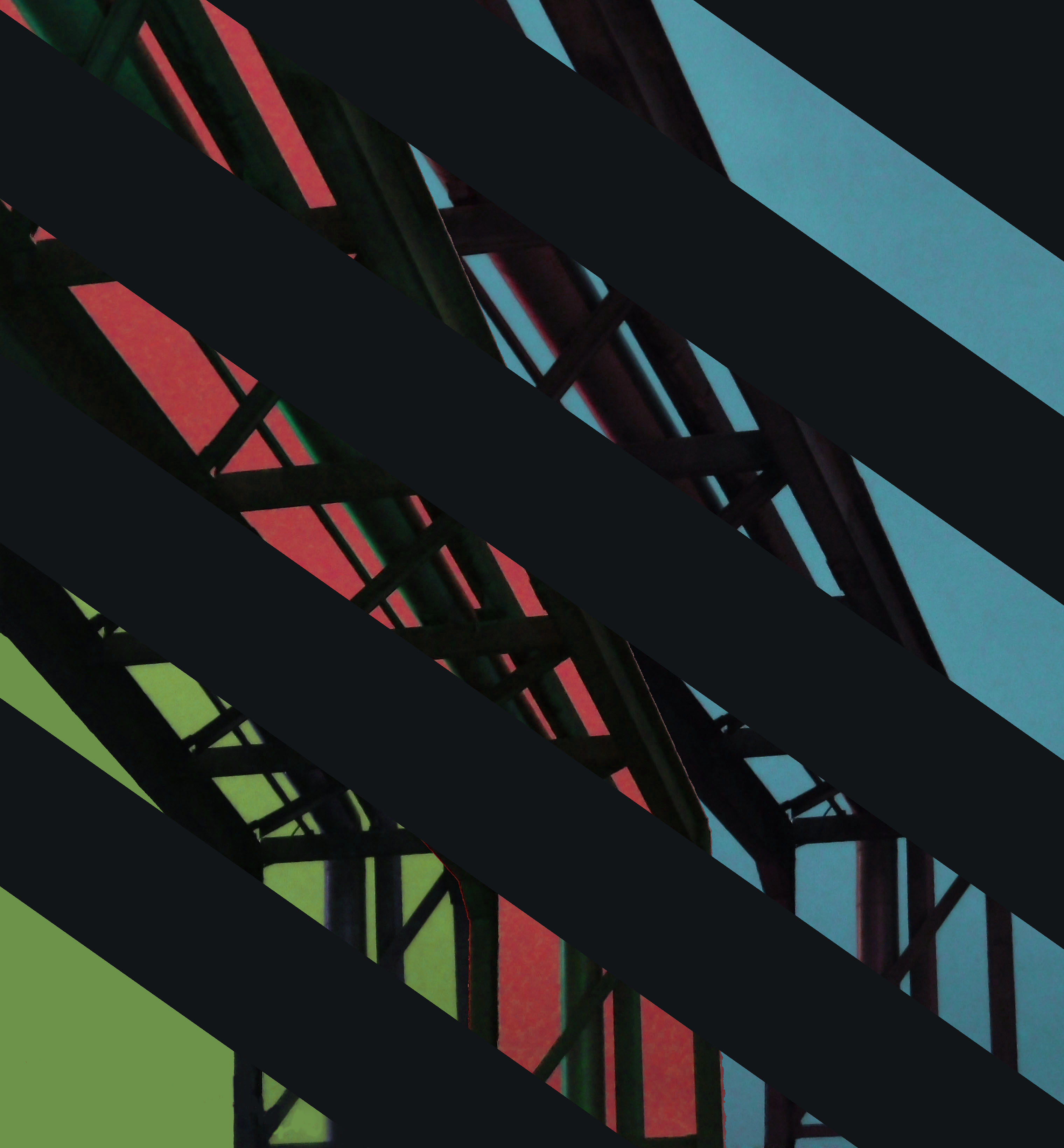
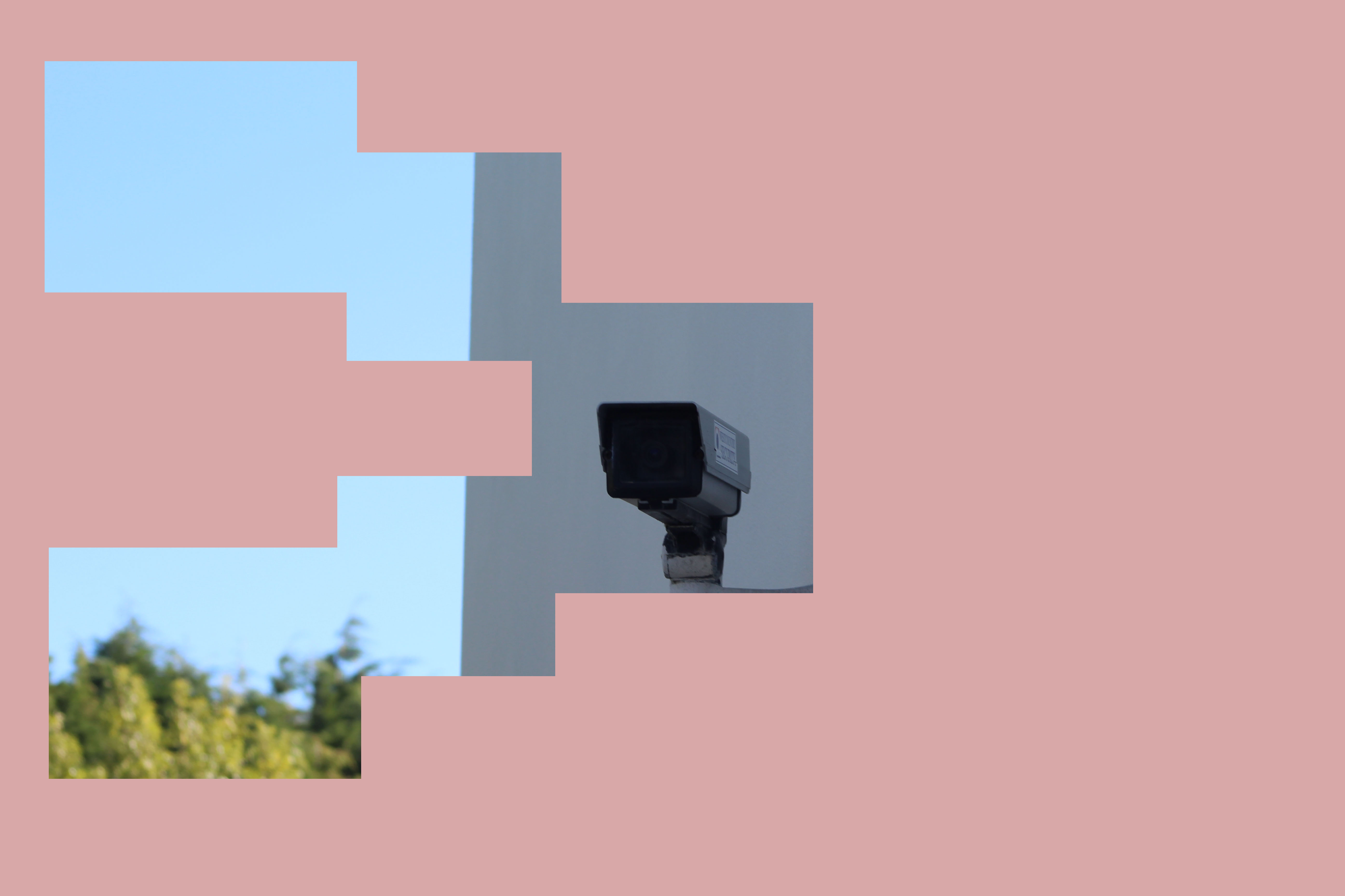
Instead of using circles, I chose to focus mainly on squares and rectangles in order to isolate different parts of an image to highlight them or to create a nice visual effect.
White Balance
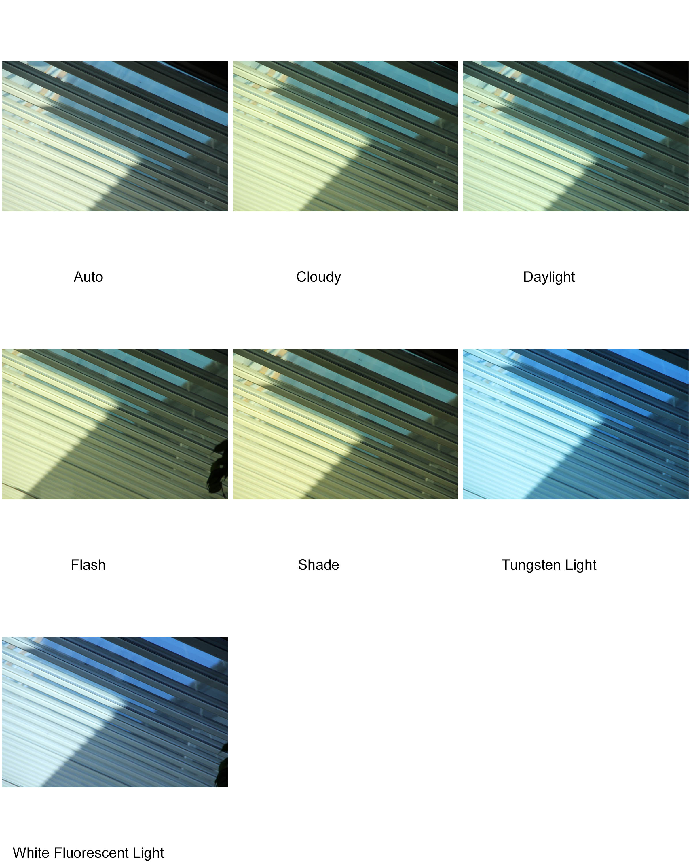
White Balance is when you adjust the colours on your camera to help make an image look more natural. You can change the white balance to make the camera take warmer or cooler images. The impact of this is the image looking more like how our eyes perceive colours and light.
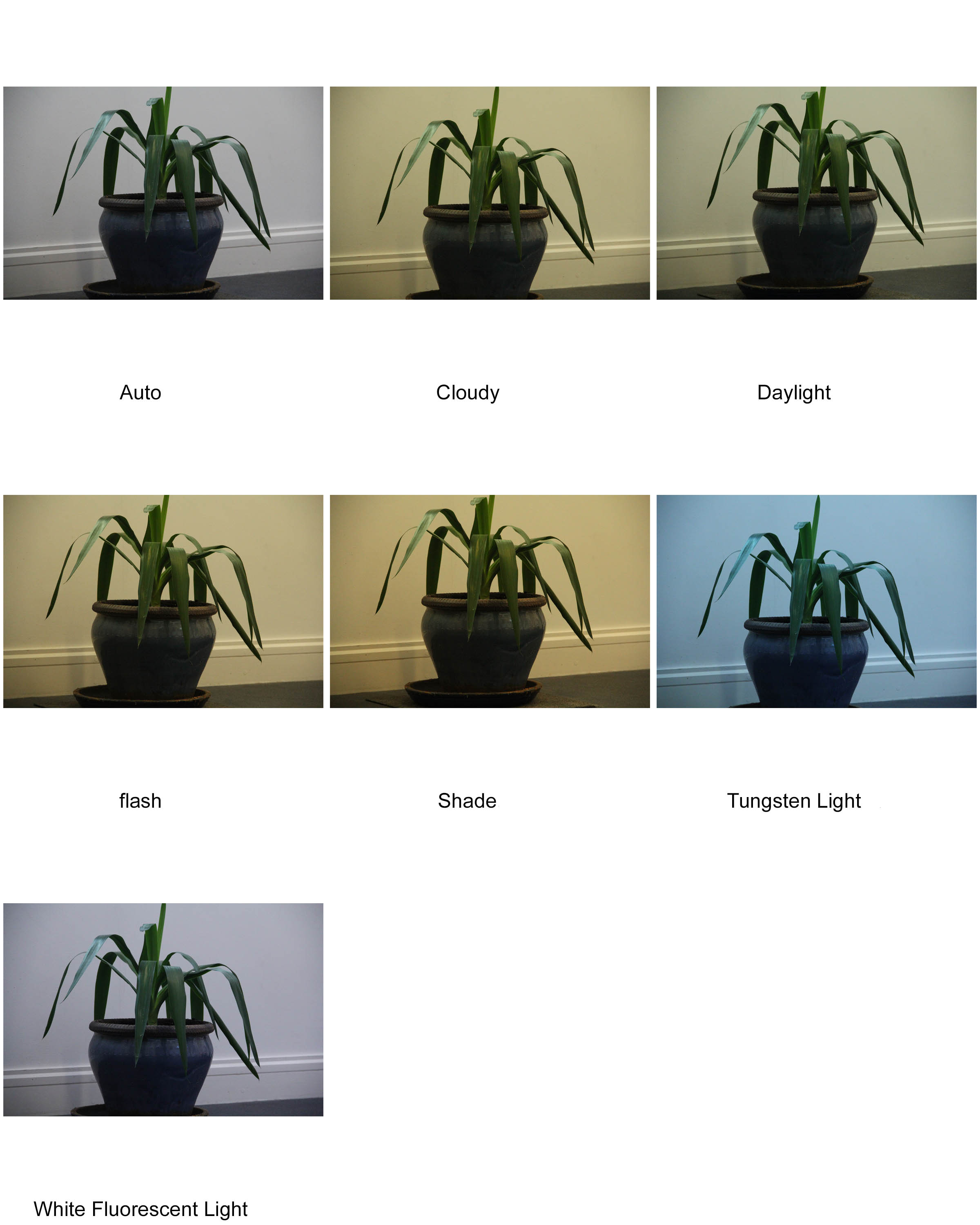
As you can see, first set of images (inside using mostly artificial light) have much more of a distinction between each picture, where as the second set of pictures (using mostly natural light) are much more similar to one another.
KELD HELMER PETERSEN
Keld Helmer Petersen was a Danish photographer who gained widespread recognition for his color abstract work in the 1940s and 1950s. He was the pioneer of Danish modernist photography and published his first book 122 color photographs in 1948. He Established a himself as a photographer of architecture and design and while also being known for his color images, he later transitioned into more abstract photography, taking influences from German and American photography as well as international abstract art.
Keld Helmer Petersen’s Abstract photography:
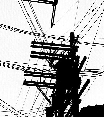

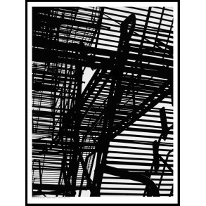
I wanted to recreate Petersen’s work involving cranes and scaffolding using the threshold tool on Photoshop with my most recent photo-shoot. I wanted to emulate the same sense of atmosphere created by Petersen’s photographs. many of the images that I have Chosen had Petersen’s Photos in mind while editing.
My Final Images:
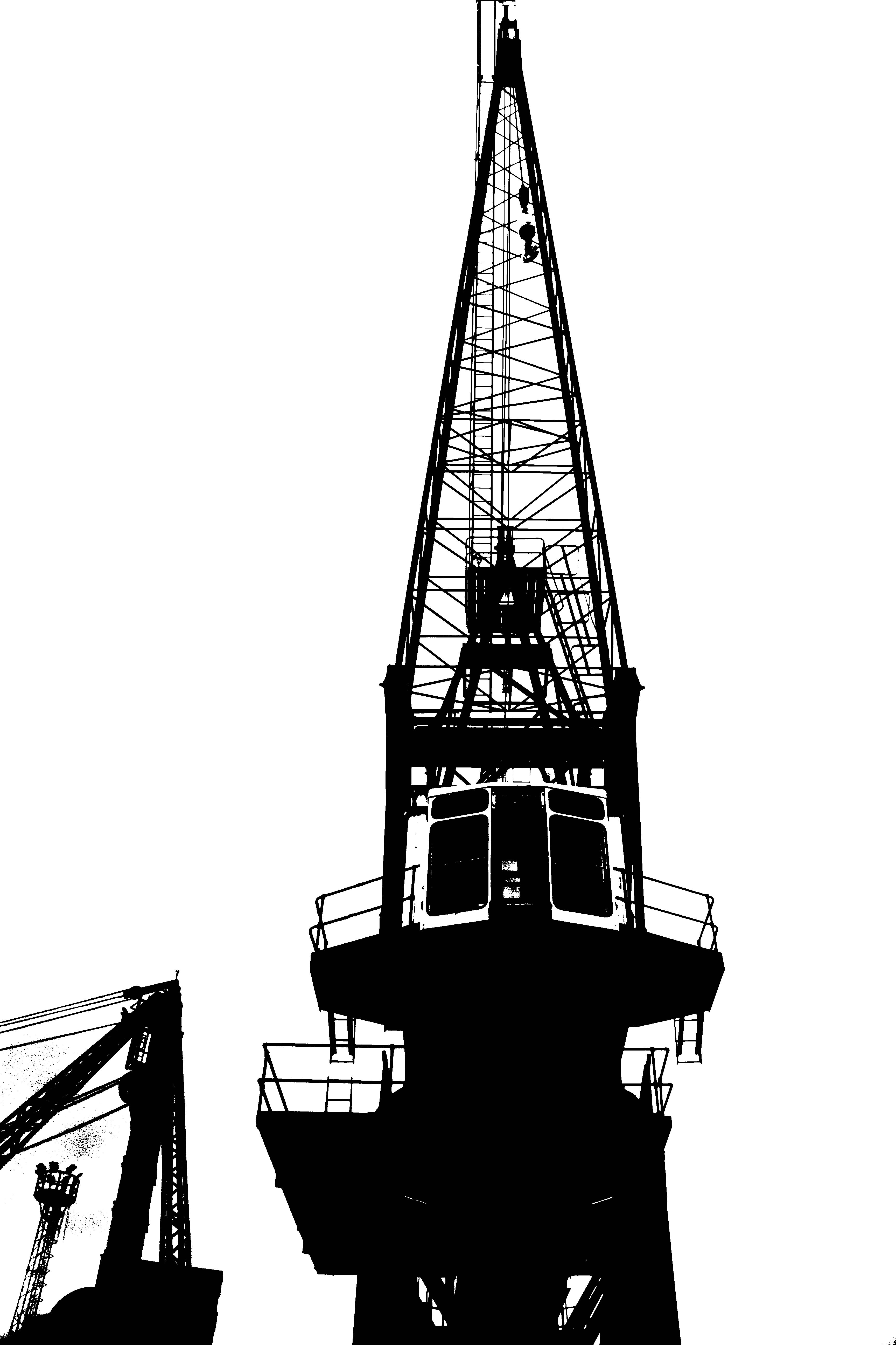
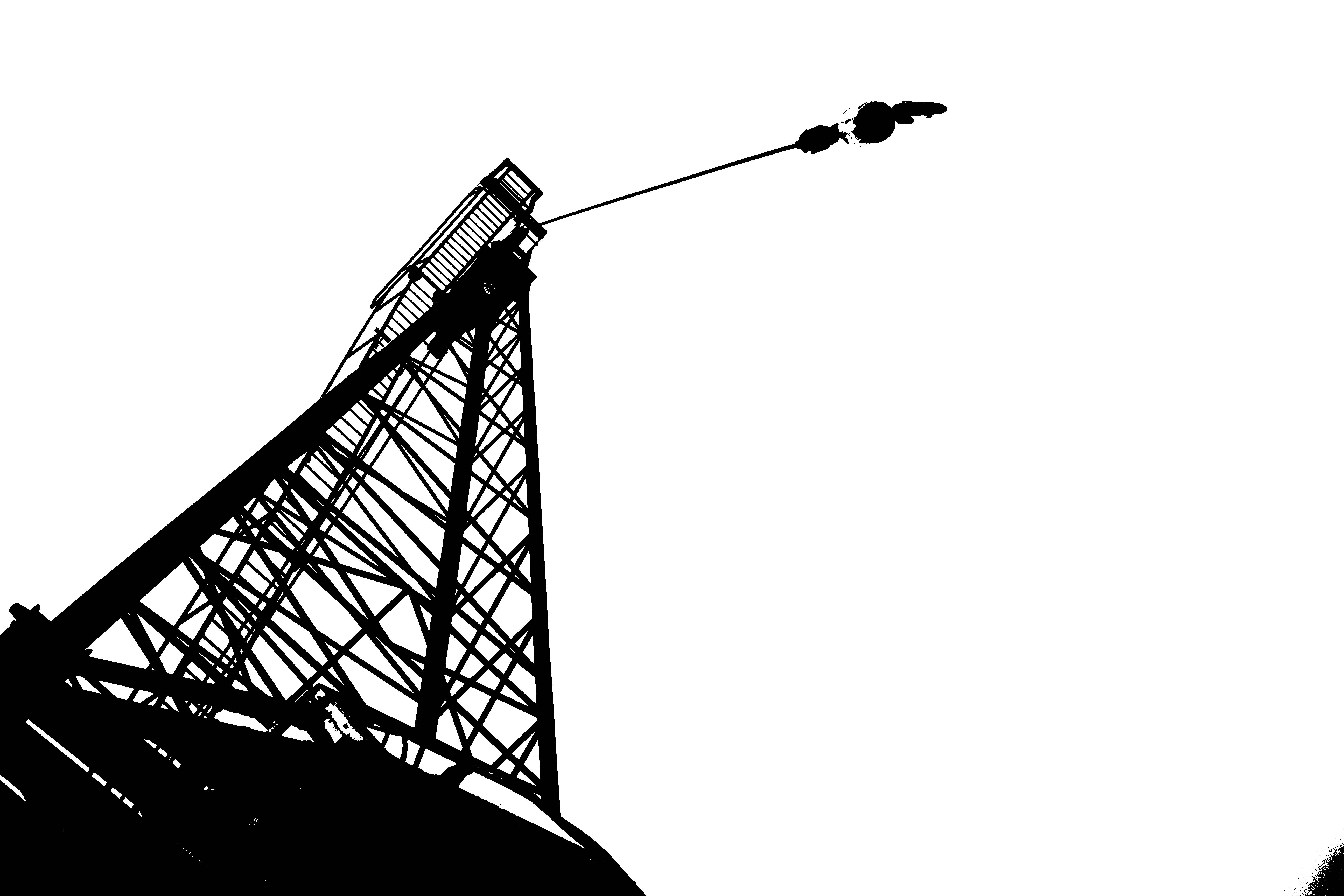
I wanted these Images to replicate that of Petersen’s Black Noise photograph and evoke the same feelings that his work does. I wanted to create the a similar image, while also using my own style combined with that of Petersen’s. This image, while it mainly takes inspiration from Black Noise, it also takes inspiration from many other pieces of his work.
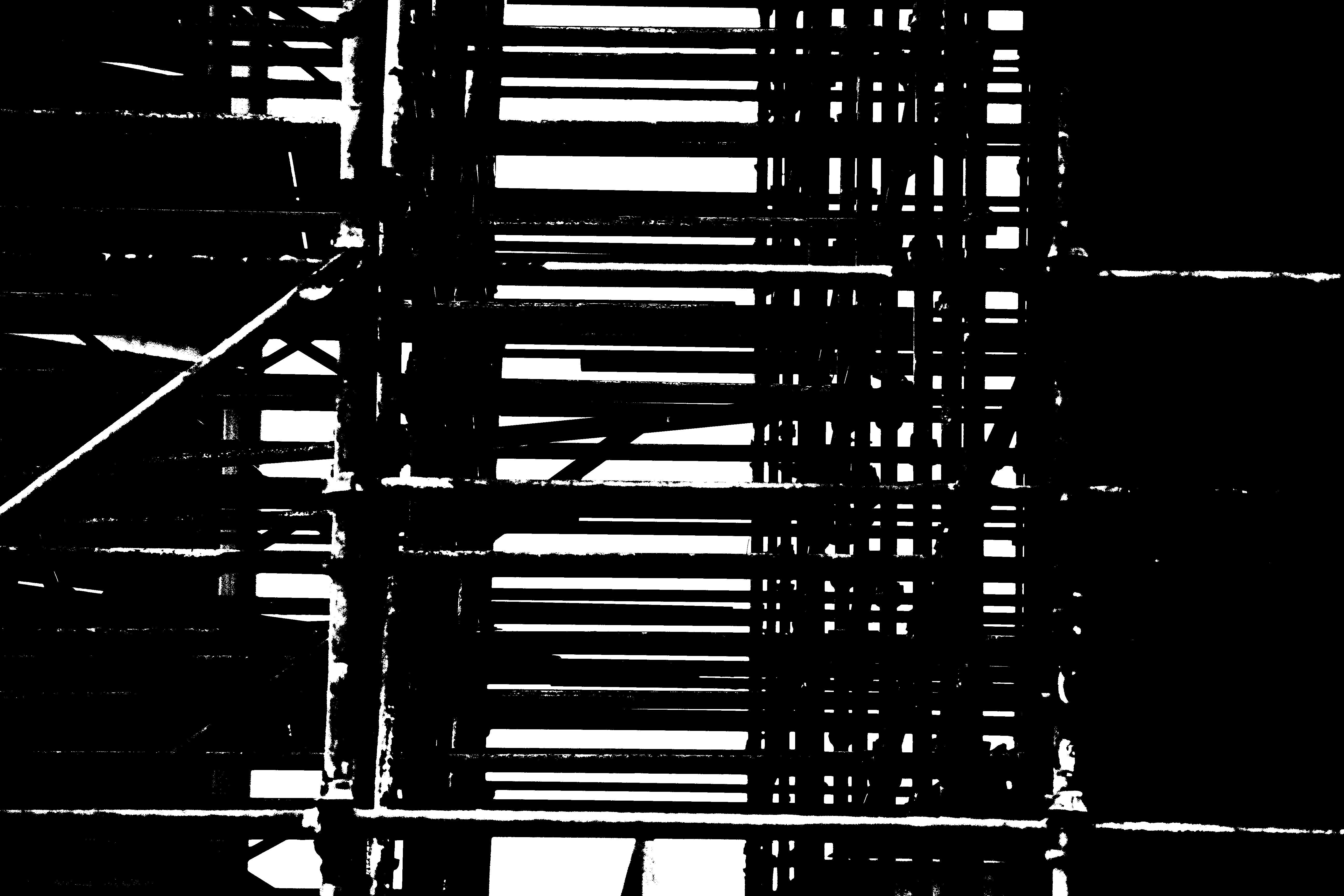
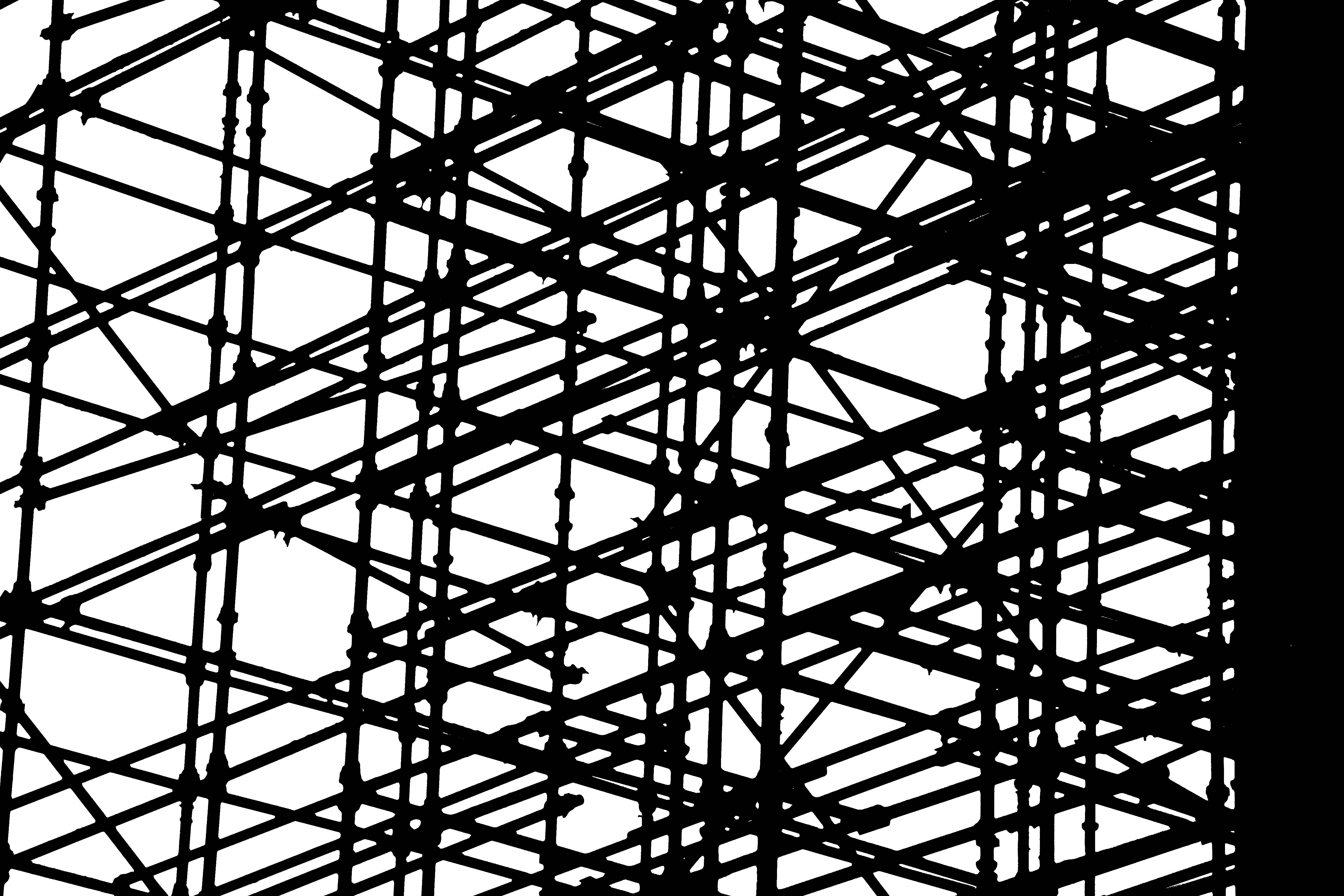
I decided that the Harbor was not the only place to get pictures of industrial buildings and materials. These photographs were taken in town on a building site that was under construction. I wanted to create a high contrast, B&W picture using the threshold tool, and decided that scaffolding with the backdrop of a white sky would work to my advantage.
Keld Helmer-Petersen – Threshold
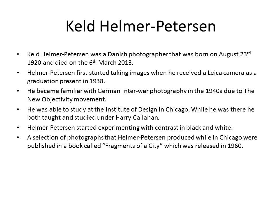
Keld Helmer-Petersen (August 23, 1920 – March 6, 2013), was a Danish photographer who became renowned for his abstract colour photography in the 1940s and 1950s. Petersen worked with photographer Erik Hansen, after which he established his own studio specializing in architecture and design photography, in 1956.
Over his career, Petersen’s focus shifted onto architecture and design, not only in his photographs but also as an artistic field of interest. In the following decades he worked as a photographer for his generation of architects and designers.
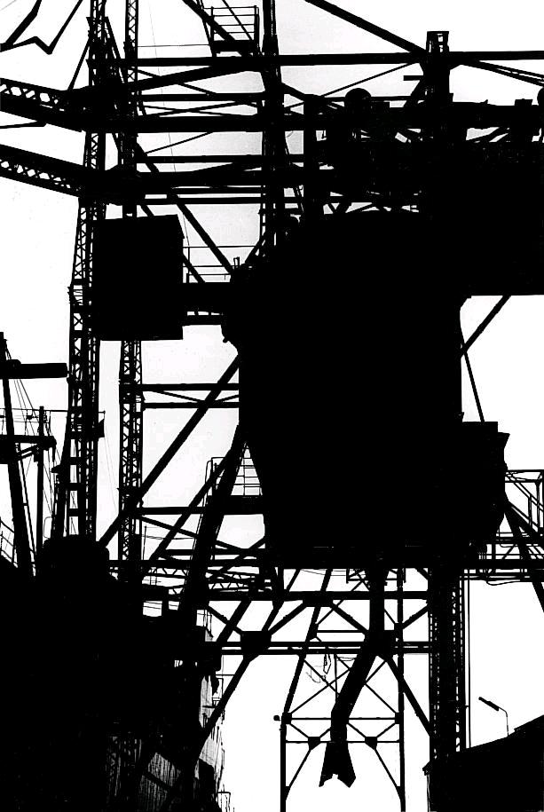
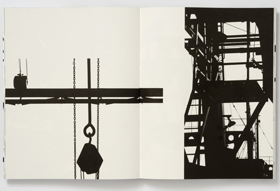
This is an example of Petersen’s architectural work. In this photo you can clearly see the great amount of white negative space which contrasts the heavy and solid black shapes.
Response
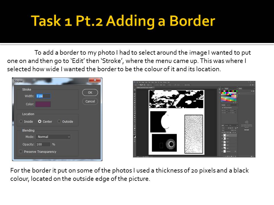
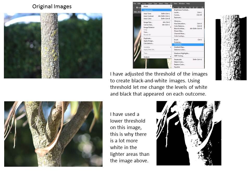
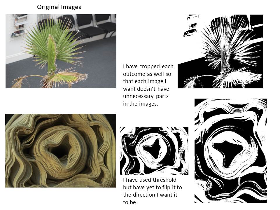
To create a response to Petersen’s work I used photographs I already had from my summer task. Then I edited them in Photoshop using the threshold adjustment, I just slid through the bar and selected how I wanted it. Image > Adjustments > Threshold.
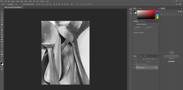
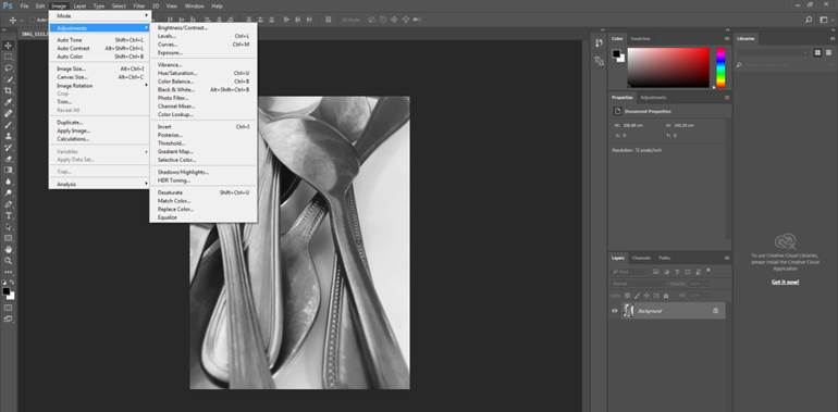
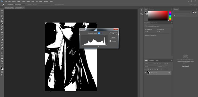
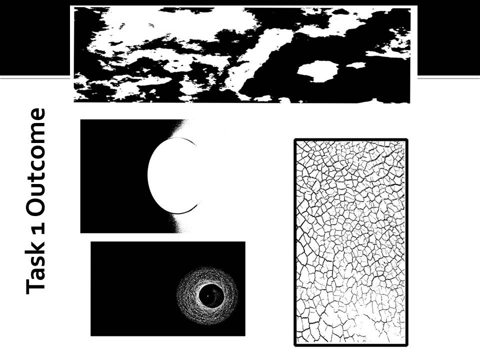
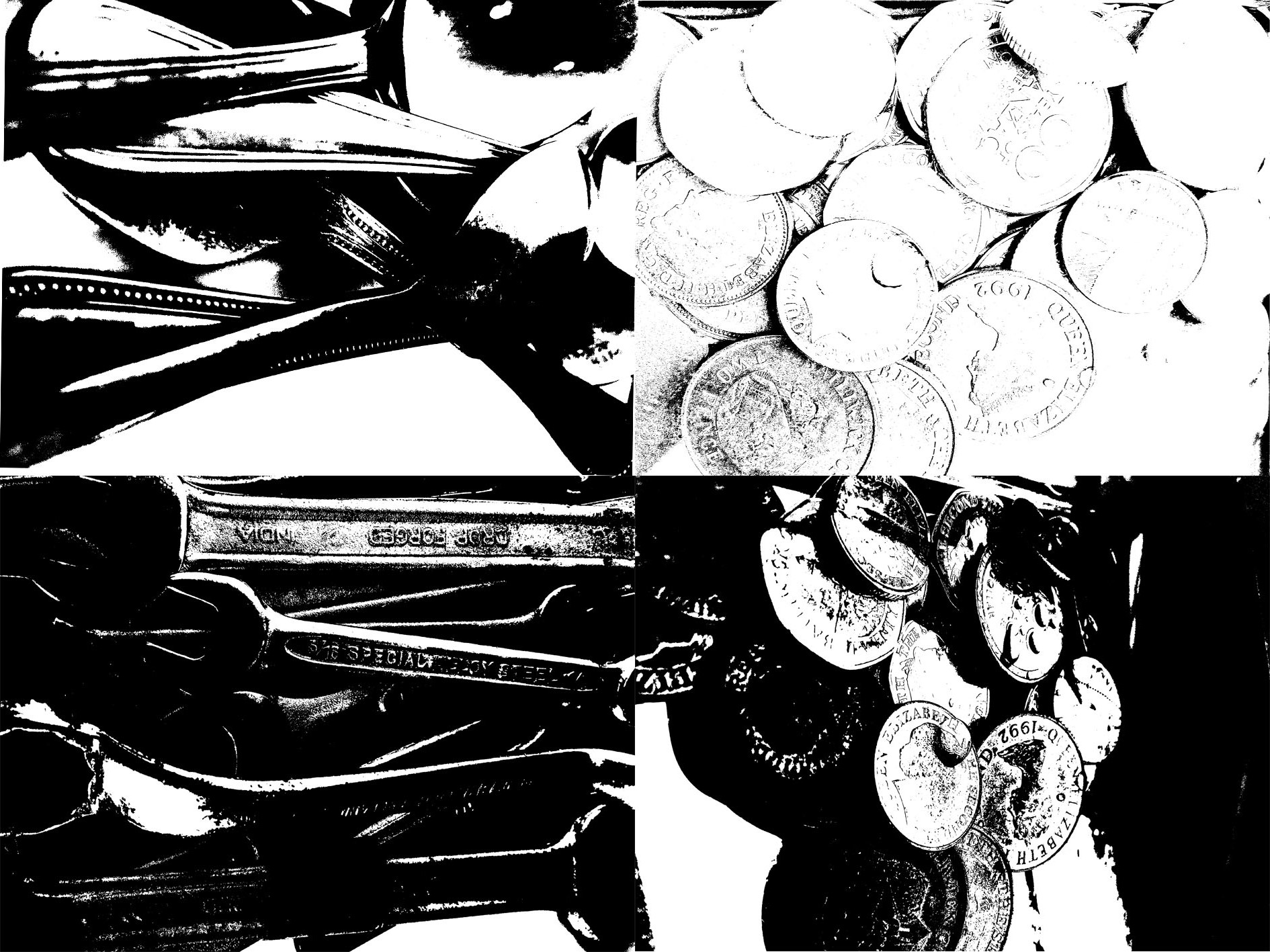
After I had edited all 4 photos with different layers of Photoshop, I arranged them together on a blank page to create a collection.
Final Outcome
Below is my final outcome.
Black and White images
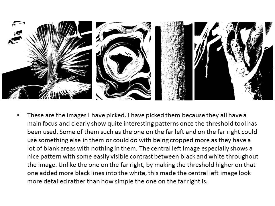
Keld Helmer-Peterson- My Final Pieces
Steps on how to use Threshold on Adobe Photoshop
- Open your chosen photo of Adobe Photoshop
- Go IMAGE-> ADJUSTMENT -> THRESHOLD
- Slide the curser up and down to get different depths of black and white contrast intensities
- Create a new separate A4 page
- Ctrl + A and drag image into page
- Ctrl+ T to change the shape of the image

 My Own Idea with Threshold
After experimenting with several different images, and trying different levels of threshold to help represent the contracts of black and white I chose these four photos as my final pieces. In these four photos I have used fairly high levels of threshold meaning the images are more strongly black compared to white.


For my final four photographs, I wanted to try closely link the textures and theme together to ensure the final piece looked well put together. To complete this idea I used a theme of nature, due the fact all my images were well linked as they included, a flowers and leaves in each photograph. This gave the final image a well grouped together appearance. For the texture of the image I wanted to go with ‘block’ like colour to give the feel that the image has been filled in with white and black pens. To do this the threshold on each image was slightly higher than the middle level on the scale, I did this because as previously mentioned I wanted the piece to be darker using black to reflect that rather than white, so each image contained more black shades than white shades. This made it a lot simpler when I put the four pieces together as they all merged into each other well together. For the presentation of my four images which had now been transformed i wanted to keep it simple, therefore i just placed evenly all four images on an A4 piece of paper and this was my final outcome.

On the other hand I wanted to complexly contrast with my original idea of solid colours and little texture. Therefore I began to experiment using different images and different levels of threshold which soon presented me with many different textures. I yet again put another four different images together but this time tried to portray texture and threshold in a different light and this is what I came up with:

Abstract Depth of Field Photoshoot
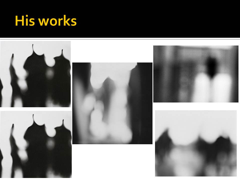
Ralph Eugene Meatyard was born in 1925 in Illinois. He studied pre-dentistry but later changed his studies into become an optician. He bought his first camera in 1950 to photograph his first new born child. In 1954 he joined the Lexington camera club.
Though Meatyard experimented with lots of different ways to take images such as using multiple exposures and blur. He often worked with very heavy depth of field effects in his images and normally worked in black and white. He may have worked with heavy depth of field effects to reflect his job as an optician. These can be seen especially well in his “Zen Twigs” project.
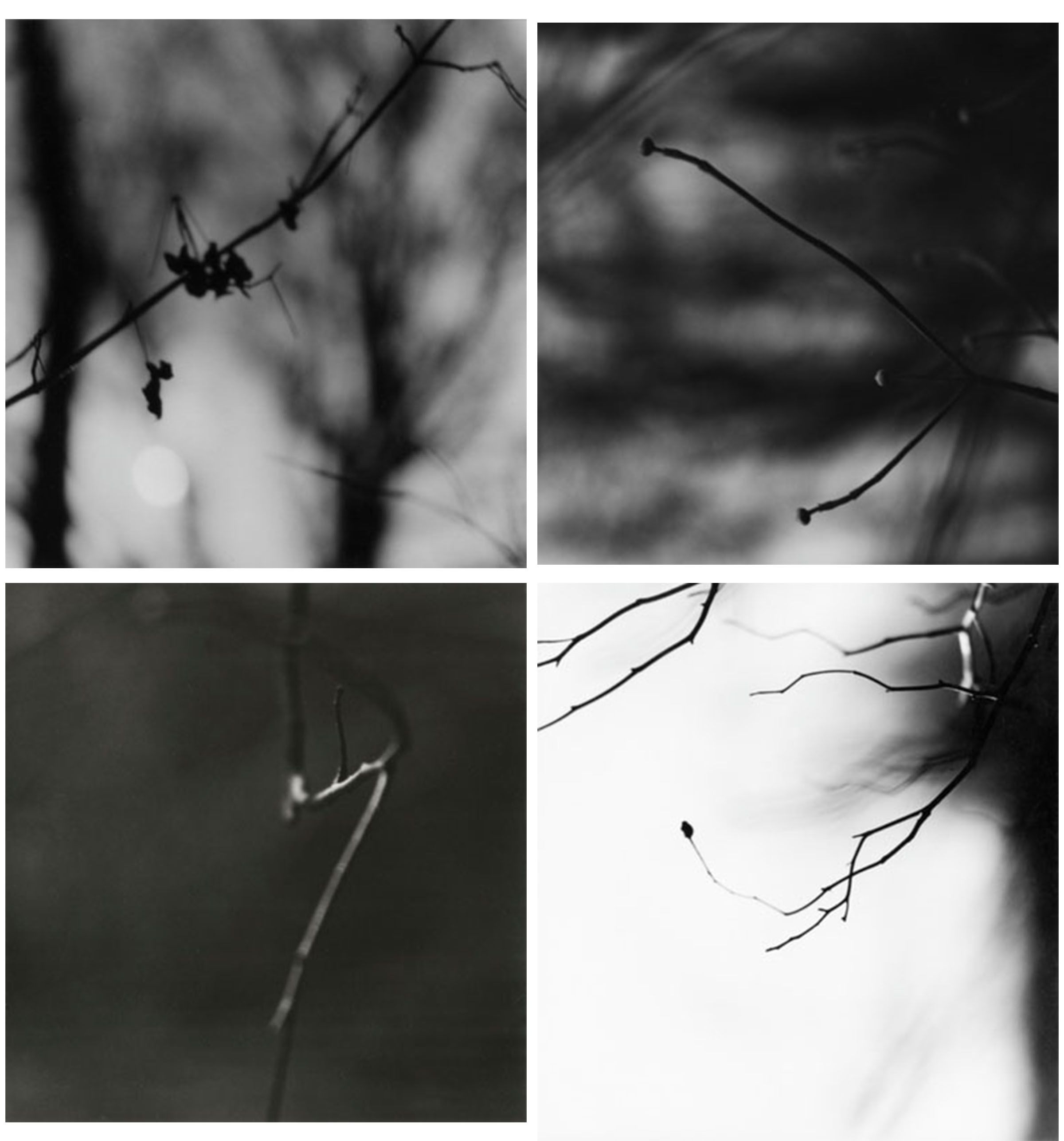
This is a selection of my favourite work by Meatyard. These are all images from his “Zen Twigs” project. In this project he focused mostly on depth of field to make the images look simple.
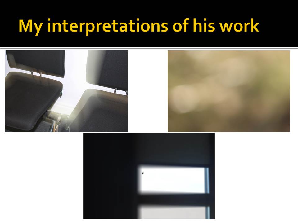
After researching about Meatyard, I went out and took some images like the ones from his “Zen Twig” project. After I went out and took some photographs I went into photoshop and edited the best ones. I have done this to crop them down to the parts I wanted, to make them black and white so they’re more similar to Meatyards project and to change the exposure levels to make some of the images a lot darker than the others. I have changed the exposure to make them darker so that the blacks in the images stand out a lot more over the whites. These are the best images I took on this photoshoot:

The image shown above is my favourite image that I took. In this image specifically I have added a lot of exposure to make the dark areas stand out a lot over the white. I think this image mimics Meatyard’s work the best out of the images I took as it shows a very heavy amount of depth of field around the focus point. While the image below don’t show nearly as much.
The images above and below show branches in focus in the foreground with a lot of depth of field in the background. These images follows closely with Meatyard’s work due to the main focus point and the huge amount of depth of field in the background. If I were to take the above image again I’d focus further in on one part of the branch rather than the whole thing. While the below image I am happy with how it turned out. 
