


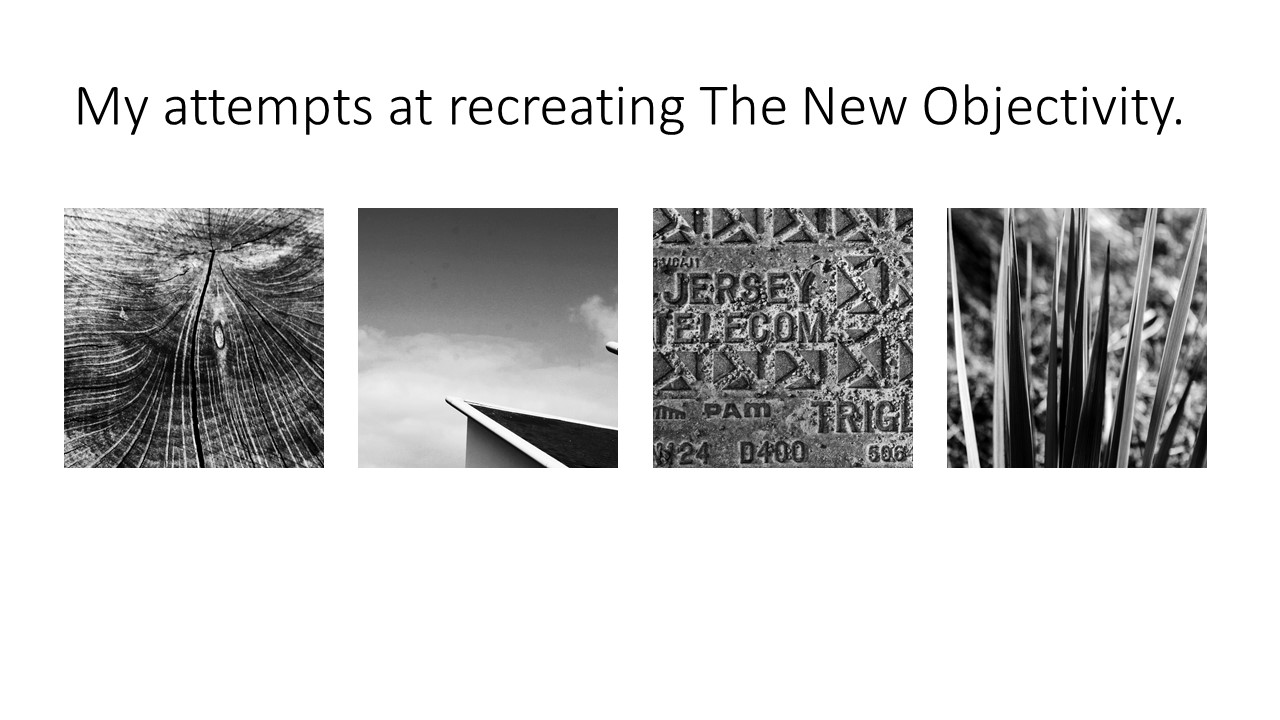
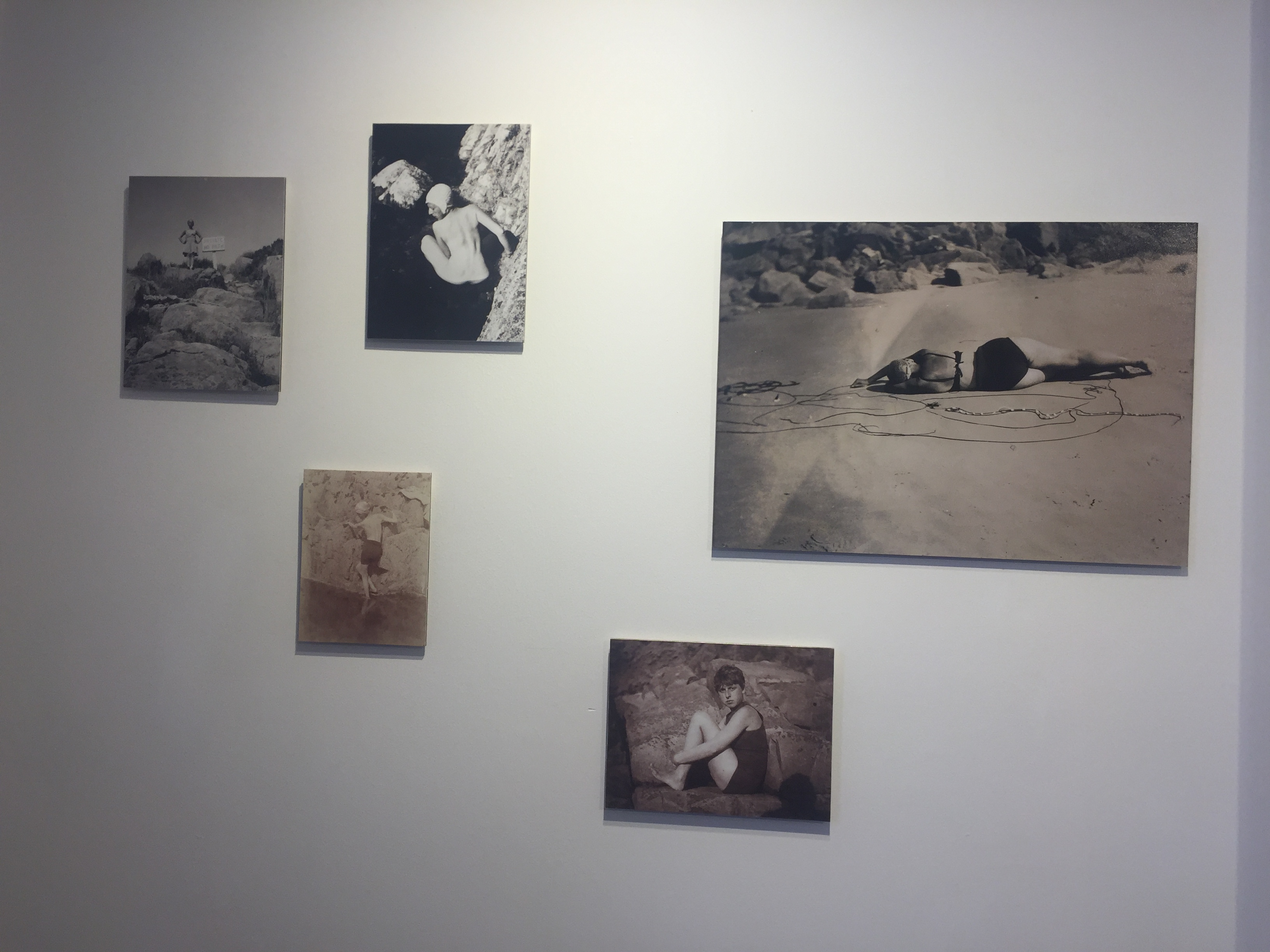
I found the work in the exhibition we went to amazing. The work by Clare Rae, being inspired by Claude Cahun, looks almost as if they were taken by the same person. The fact that they both focus on female empowerment and take their photos in the same sort of white, grey and black tones makes it obvious that Clare Rae was aiming to make her work similar to those by Claude Cahun. However, Rae didn’t copy her completely, she added her own twist to it by taking portraits of herself, whereas Cahun used multiple different women within her pieces.
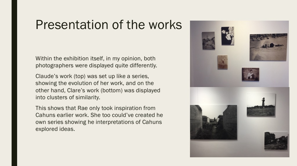
The way the exhibition was presented helped us compare the two artists in a way which we could easily see the differences and similarities. By being placed in two rooms right next to each other, we could easily switch between the two, and the neatness of it allowed us to see the work clearly and without confusion as to which was who’s.

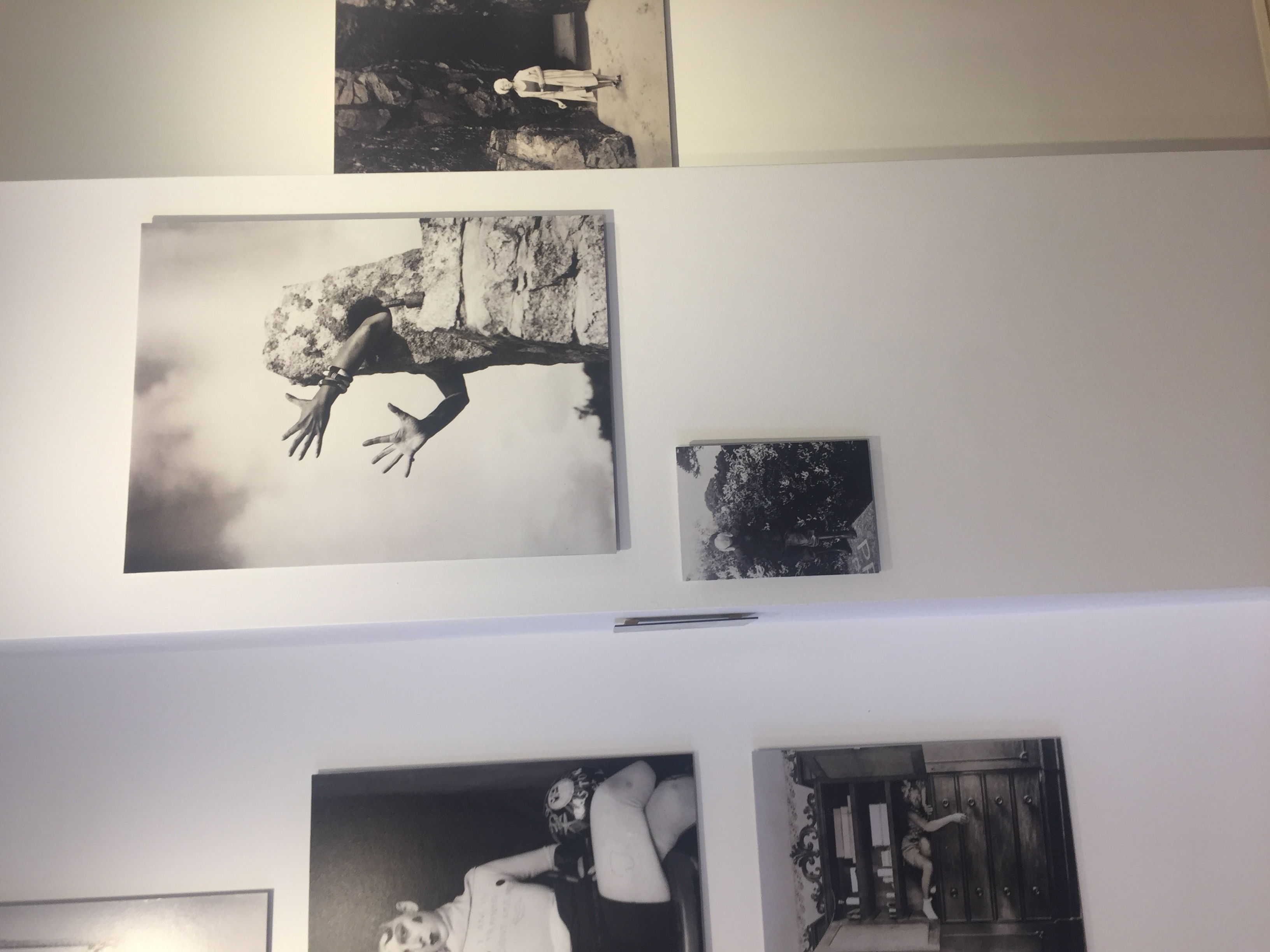
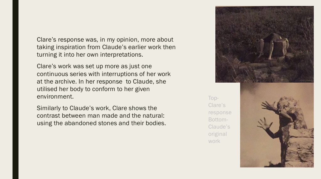
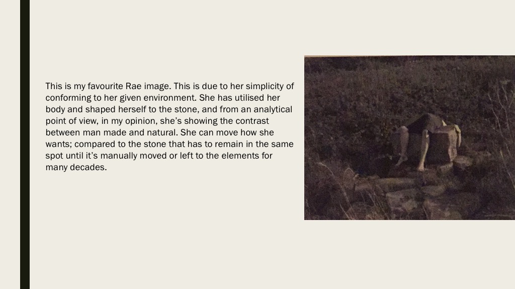
This is one of my favourite pictures by Clare Rae. It shows Rae hiding behind a part of a cliff that’s sticking out with her legs and one of her hands in clear view. What I especially like is the tone, it’s mysterious. You only see half of her, you can’t see her face at all. You can’t see her emotions and you can’t tell what she’s thinking while taking this picture. Some also might say that it’s her way of saying that she feels like she needs to hide, possibly due to her gender as Cahun got across in her work multiple times.

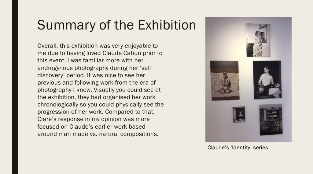
This is one of my favourite pictures by Claude Cahun. It shows a woman posing with a top which on it says “I am in training. Don’t kiss me”. This could suggest that, as with Clare Rae, that due to her gender she feels restricted with what she can and cannot do. It could also come across as she has certain expectations to live up to as a woman, and the writing on her top may refer to a woman’s role within marriage at the time this was taken, as to be considered the ‘perfect’ wife you’d have to pretty much be trained in what was considered as ‘feminine’ jobs, such as cooking, cleaning and looking after the household.
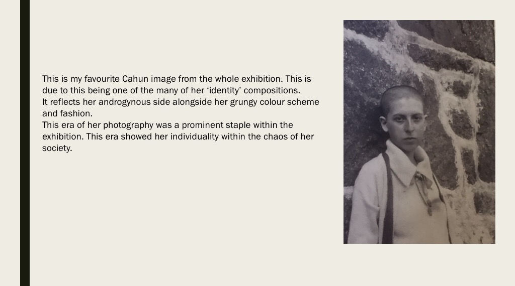
The majority of both Claire Rae and Claude Cahun’s work consist primarily of self portraiture, the main difference between their work is the way in which they incorporate their bodies into the environment. Whereas the composition of Claude Cahun’s work is rather standard for the most part, what makes here unique is the experimentation with gender roles and societal standards by adopting an androgynous appearance and by shaving all her hair including eyebrows and wearing clothes typically worn by men. Claire Rae on the other hand works to explore how her body interacts with her surrounding environments, her work will often have her contorted to fit her surroundings. she is very careful with her choice of clothes in order to insure that She stands out with the environment while maintaining a rather muted appearance. Both artists images are rather similar in terms of general aesthetics, with both artists adopting a rather similar style of photography. It is clear that Claire took inspiration from Claude as seen by the use of rather muted tones throughout the images, often even similarly composing her images.


My personal favorite image of Claire Rae’s work is the image inserted below. I like the composition primarily due to the triadic structure of the image as a whole, including the 3 holes in the wall and the triangular shape formed by Claire Rae. I also like the strong use of contrast in the image. This and the wide range of focus (as well as the lack of grain) suggests the image was taken using a low ISO, paired with a long shutter speed and small aperture.
My favorite image from Claude Cahun’s collection on the other hand cleverly utilizes a double exposure almost creating a feel of a split personality. This image more strongly uses contrast. The grain and time period of the image suggests that it was taken using film. I believe it was taken using high ISO film and a low shutter speed to create strong tonal contrast. I like How the gallery is organised and presented as the spacing between the images allows the pictures to breathe, not overcrowding any walls with images. I believe this was done also to only allow the very best of their work to be displayed to portray the photographers best work better. I do however believe that it would be better to not separate the photographers’ between 2 different rooms as this doesn’t allow viewers to compare and contrast their work under more scrutiny.
The exhibition focused on the different ways that the Australian photographer Clare Rae, who now lives in jersey, has responded to the works of the french photographer Claude Cahun who takes picture to explore the different views of identity and gender through self portraits. Through the the comparison of both artists you could see the the influence that Claude Cahun had on Clare Rae, this was evident at the exhibition, they both did there photos in black and white and and contrasting colors, you could see the similarities of both photographers.
Clare Rae:
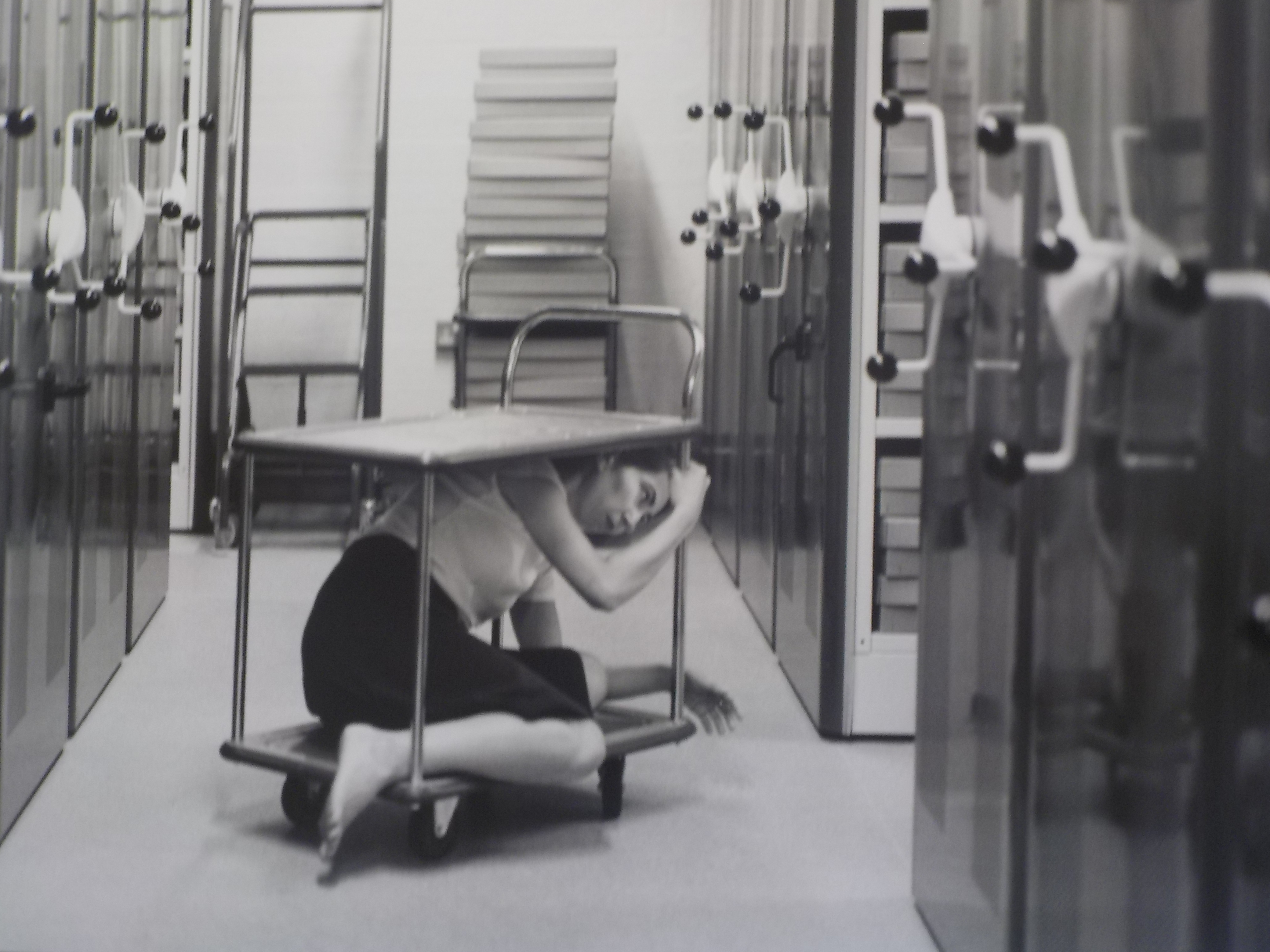
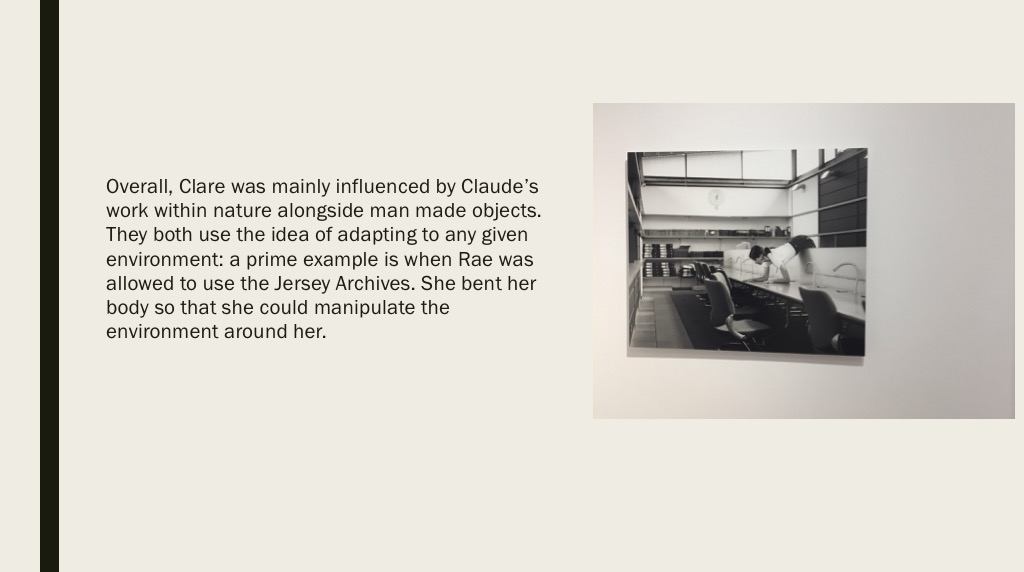
In this picture you can see the artist Clare Rae is under this trolley, this could symbolize that she is feeling trapped and scared this tells us that she was trying to explore feminine and how woman feel about them selves. In the picture it looks like she is in an office basement where they keep all the files from years ago, also suggested by her body language it can tell you that she is feeling distressed about where she is. The picture has been done in Black and white which could mean that she is trying to erase the thought or is trying to tell us something.
Claude Cahun:

In this photo you can see Claude Cahun is in the center with a mask which is black and white with a white background. I feel that she is trying to express her feeling on feminine and how other woman or men feel about this photo. I also think it explores the different ideology of how men perceive woman in to day world. In the photo Claude has a straight face this could symbolize the fact she is doesn’t agree that men should treat woman disrespectfully. This photo could also symbolize they way she feels about her body and how she copes with her feelings.
Personally I think that the expedition showed the contrast between the two different photographers and how they response to each others work, and how similar their objectives are, the expedition also showed the different views about being a feminism and how different people have different viewpoints about these artists. I can also express the need to encourage talking about feminine people and not letting themselves down.
EXAMINING THE ARTISTS’ WORK
For this comparative essay I have chosen to examine these two pieces of photography due to the contrasting nature of the composition and the surroundings.
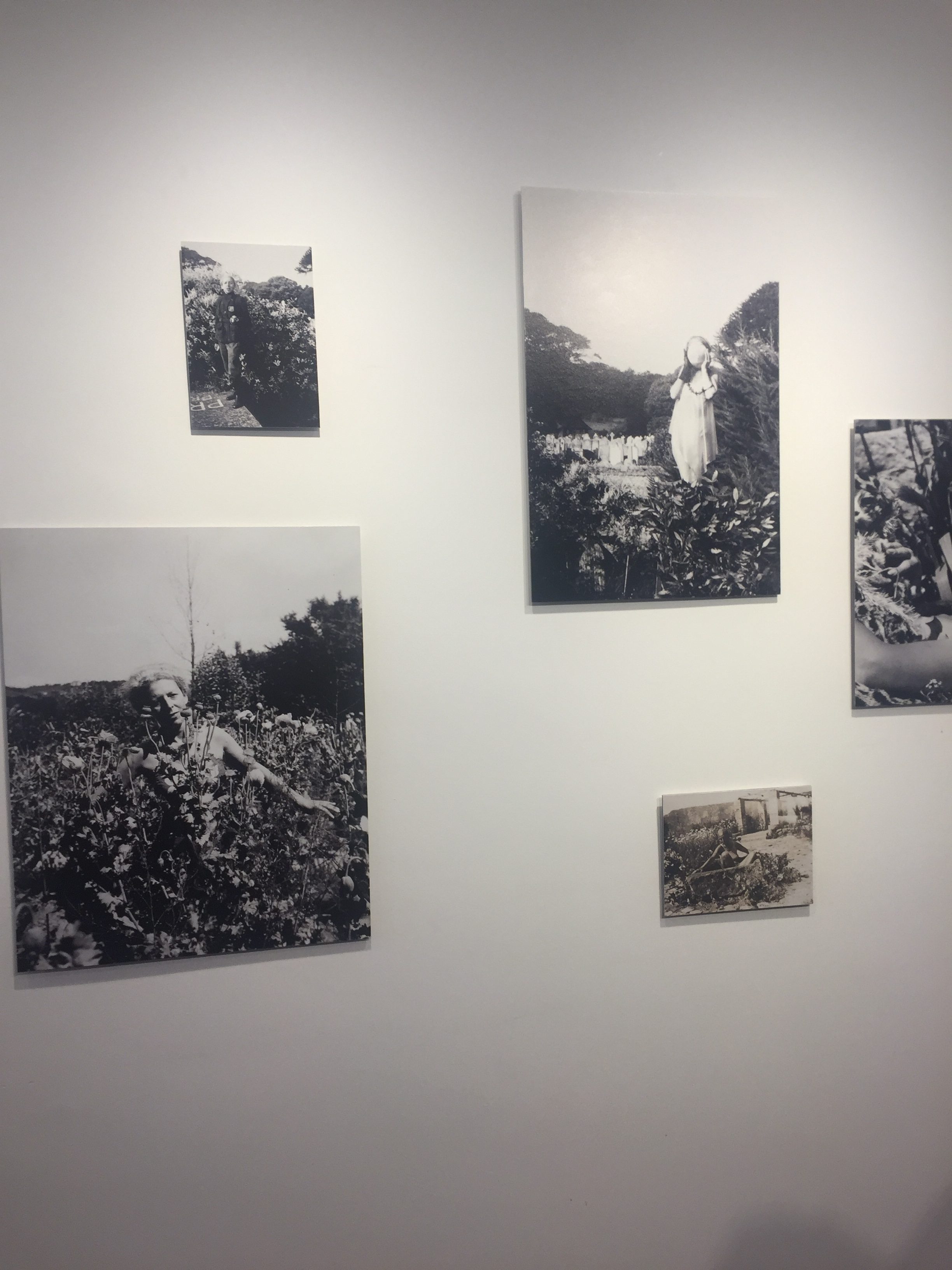
Firstly, I thoroughly enjoy the work of both Cahun and Rae, Rae following a similar style to Cahun in which she is part of, or the main subject of the photo. Rae tends to incorporate herself into the landscape more as opposed to being the focal point of the image. The strange contortions that she sometimes does during photoshoot is an attempt to flow into and become one with her surrounding. The soft and subtle clothing that she chooses to wear during these photo shoots, illustrates a delicate and fragile side of her that allows her to blend in. I have also noticed that in the majority of her photos she is facing away from the camera , or she is at a disctance where it cannot be seen clearly. This once again suggests that she doesn’t want her identity to shine through as our face is one of our most distinctive features, rather allowing her environment to be the biggest contributor of the image. In this photo, her attempt at fitting into the cart makes her seem small and insignificant in the maze of archives surrounding her. Rea, like Cahun, works in black and white imagery which again allows her to blend well into her surrounding with the monotone shades that her photography produces.
The work of Rae, although similar to Cahun’s, has some distinctive differences. Cahun also tends to set a lot of her photos outdoors, yet the main target that Cahun has is to explore and capture her out of the ordinary identity. Her strong facial features are clearly captured in the image. The smooth curves of her arms and face are the main center of the photo, contrasting the busy flowers that are in the foreground. Due to the technology of the time, Cahun worked only in black and white imagery but I feel this is was also an advantage as she allows all the character to come from the interesting compositions and themes as opposed to color and tone. Cahun is often discussed in relation to Butler’s idea of the performativity of
gender because of the role that gender performance plays in Cahun’s photographic self- transformations. While Cahun and Moore’s photographs of Cahun are certainly relevant to Butler’s theories of gender it was the ideas such as androgyny and the “third sex,” raised in the 1920s and ‘30s, which truly influenced their work. This image was prior to Cahun shaving her head and completing her androgynous look, portraying more as female. Preharps even the flowers in which she has chosen to stand in is a sort of irony of the traditional views of society and how women are viewed as “innocent flowers”.


Clare Rae is a photographer based in Melbourne, Australia. Her work has recently been placed in the CCA Gallery in Jersey, the work that has been put up is the work she has done that has taken inspiration from Claude Cahun. Some of Claude Cahuns work has also been put up to show the viewers of the gallery how Clare has taken inspiration and what she has changed from how Claude Cahun worked. Claude Cahun normally used her body in her images. In response to this Clare Rae has used her body in her images. She describes this as a private performance for herself. Her work shows her body as a piece of art. She is trying to present an alternate view of the female body.
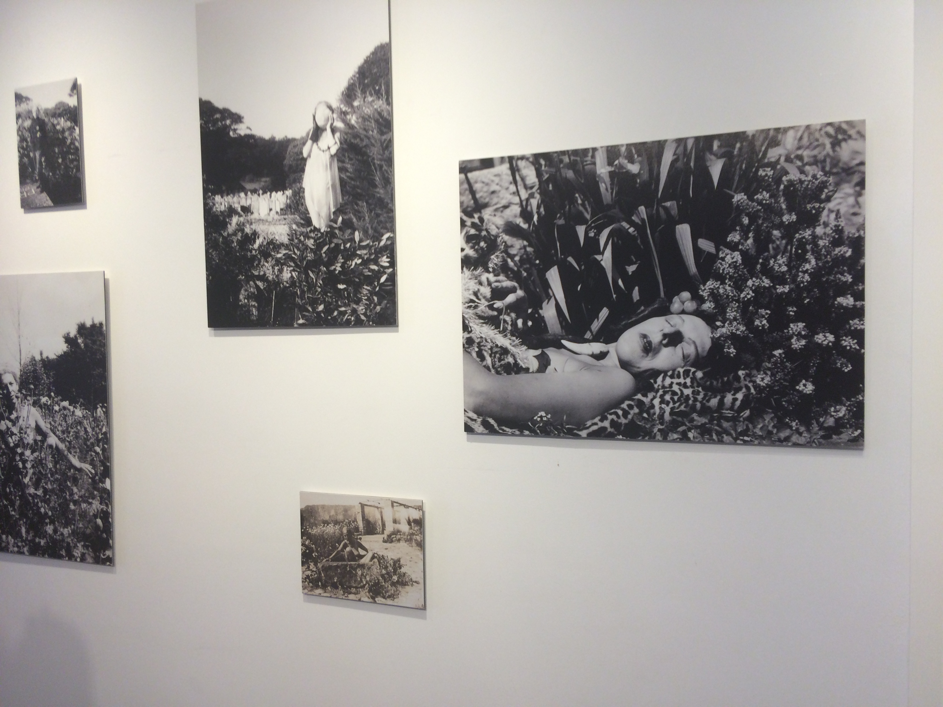
Clare Rae like Claude Cahun worked mostly in black and white while taking images for this project. Though she used the same colour scheme to get contrast between lights and dark’s, Clare Rae normally used lighter background colours, so that in black and white it would become a lot brighter with the darker colours over the top. This is different from how Claude Cahun worked as she normally used backgrounds that were a lot darker and overlapped lighter colours on top.
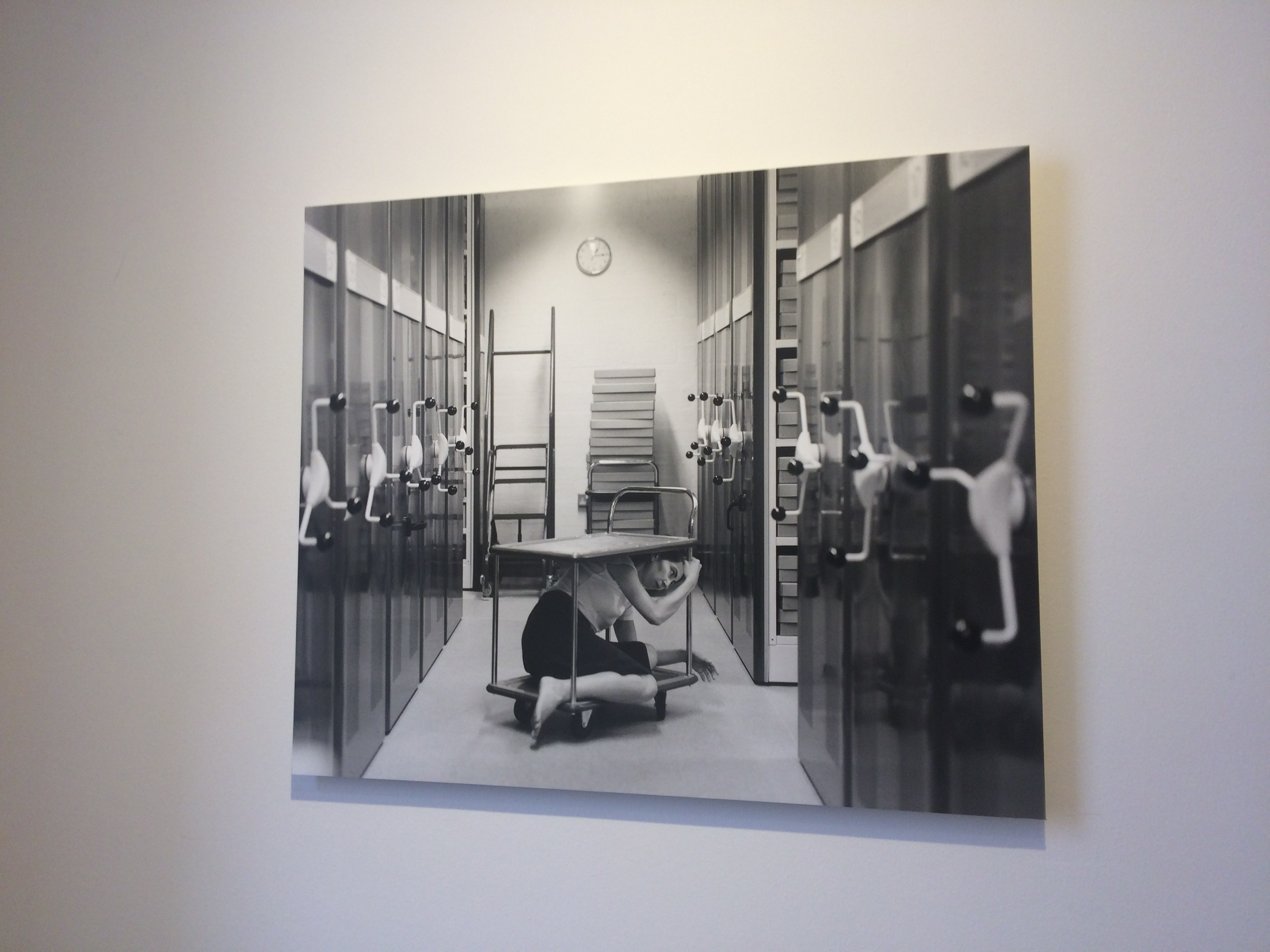
This is my favourite image in the CCA Gallery. It shows Clare Rae interacting in the environment in a way that makes her seem trapped.
Due to using their bodies as an art piece, both would have had to think about what they were wearing a lot in their images, to get what the wanted displayed in each image they took. They had to interact with the environment around them, this means that a lot of thought would have had to go into how they were going to pose themselves in their images.
In conclusion, the images produced by both people could be taken in multiple ways and have a different meaning for every person.
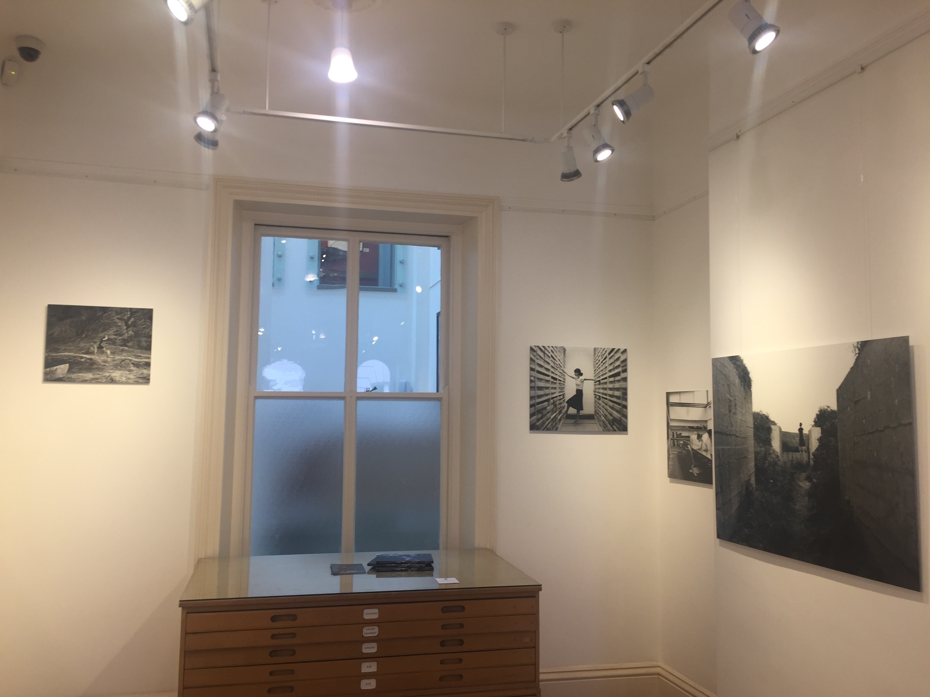 On Monday the 10th of September as a class we walked down to go see an exhibition of Clare Rae and Claude Cahuns work at the prestigious CCA gallery.
In her photographic practice Clare explores ideas of performance and gesture to interrogate and subvert dominant modes of representation. Her work is
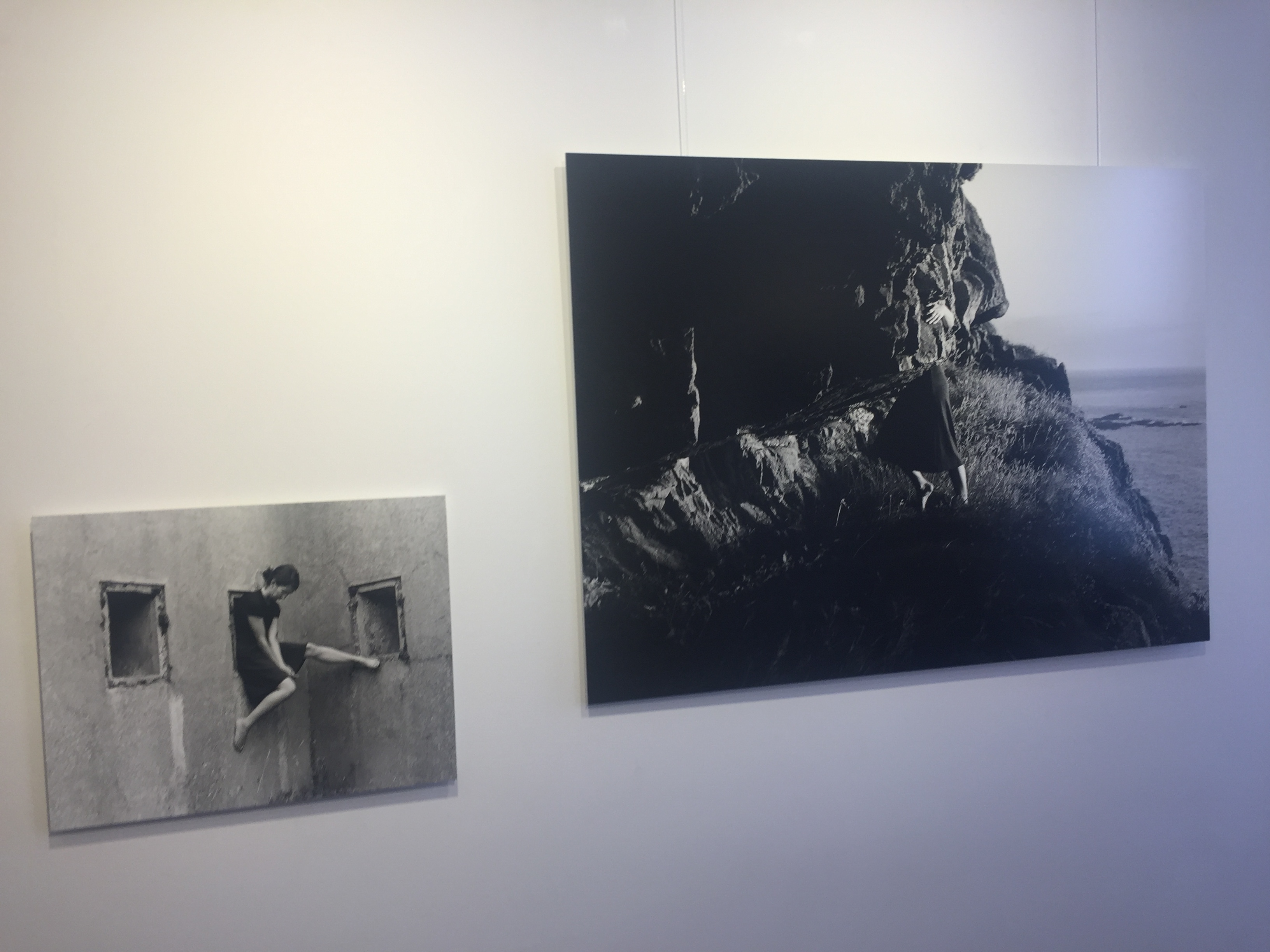
informed by feminist theory, and presents an alternate and often awkward experience of subjectivity and the female body
Recent projects have engaged with site specificity, involving works
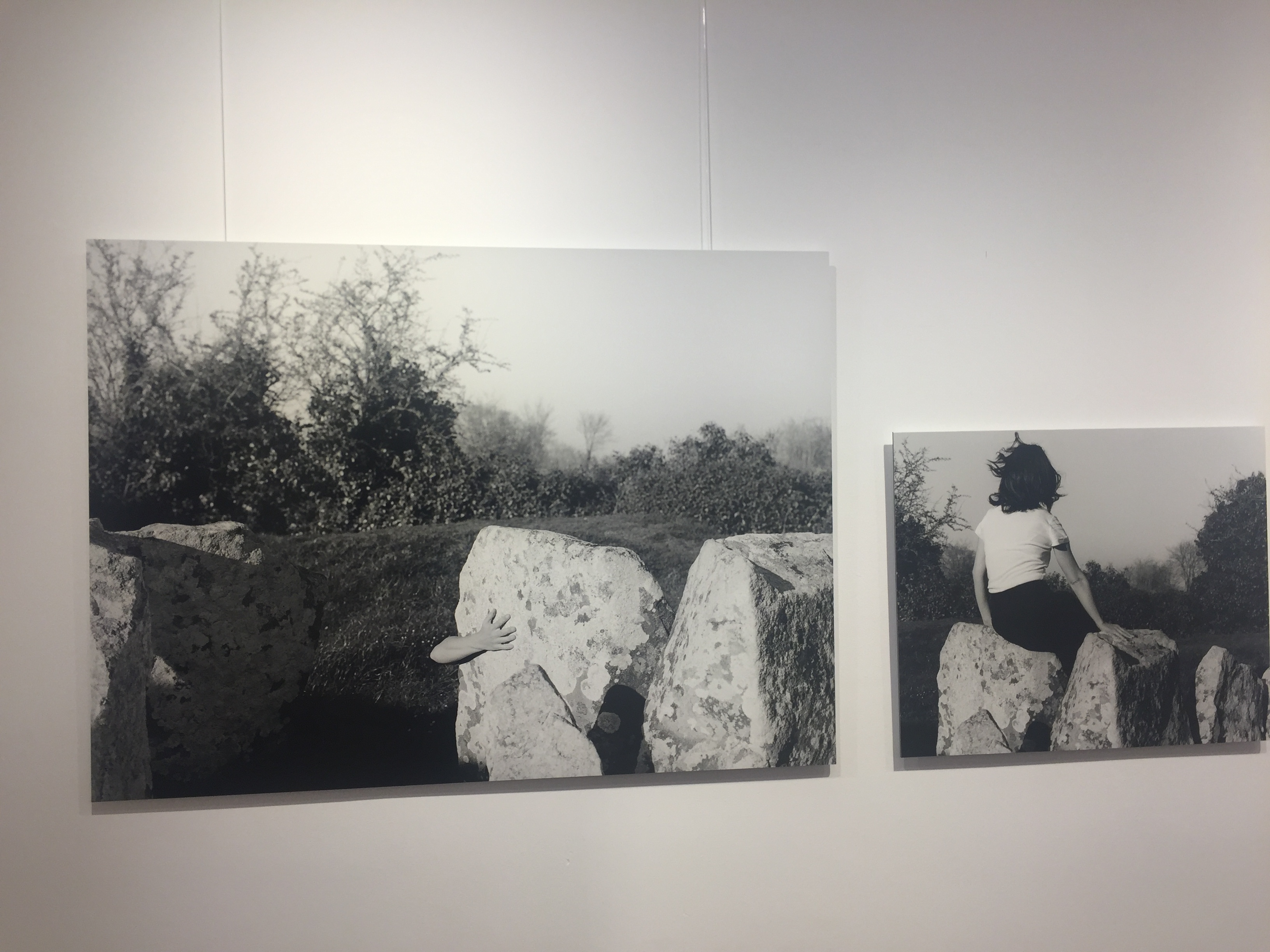
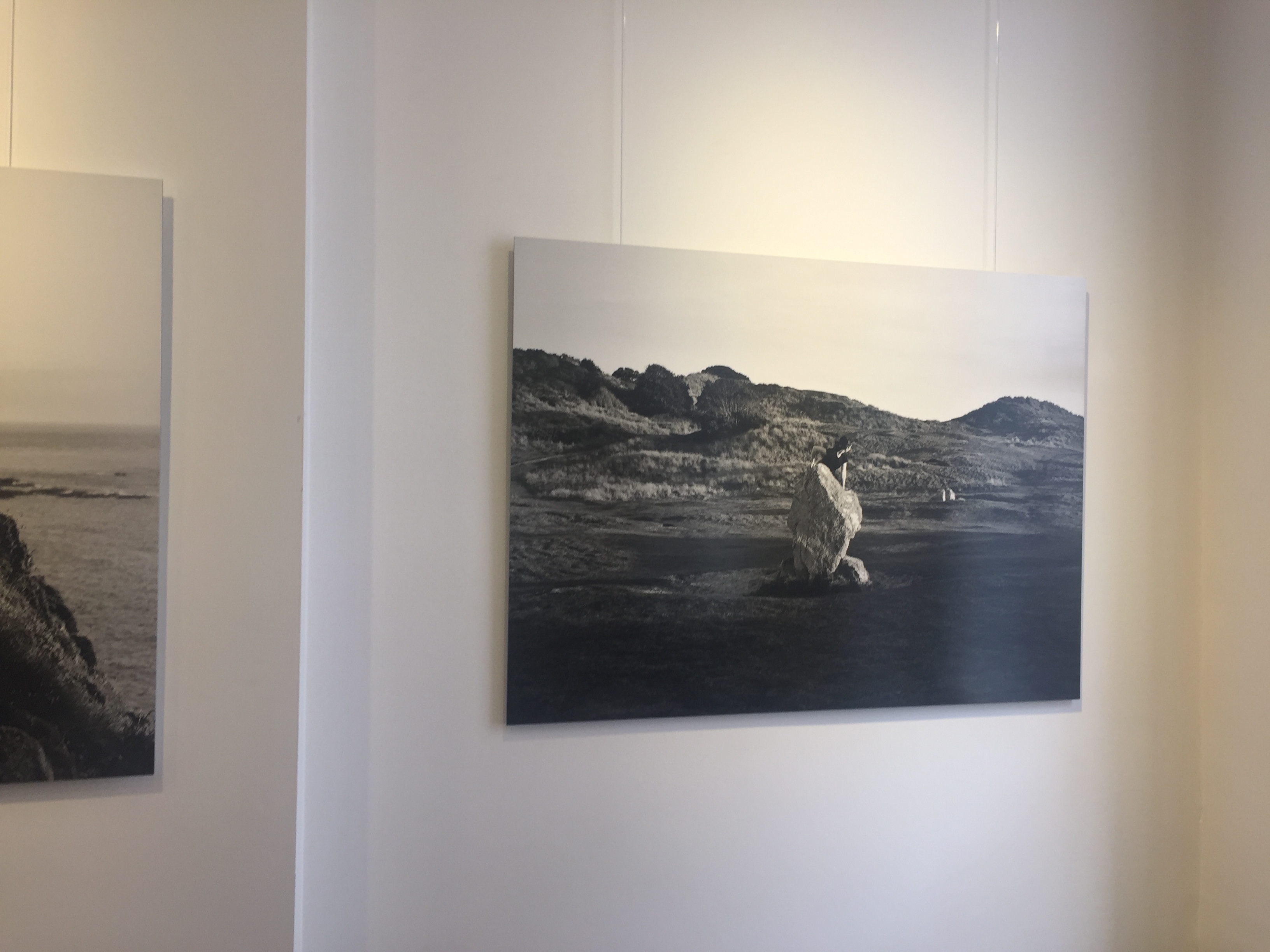
rks that are captured and displayed within the same environment. A central interest within her practice is the exploration of performance document
ation, specifically how the camera can act as a collaborator, rather than mute witness, to the performer.
Claude Cahun’s photographic self-portraits present a mirroring mix of mystery and exuberance. Born in France, she lived most of her life on the island of Jersey with her stepsister and long-term love, Marcel Moore.
Also known as Lucy Schwob and Suzanne Malherbe, both women adopted their preferred gender-neutral pseudonyms during early adulthood. Moore, although often invisible, was always present – typically taking the photographs and also authoring collages – and in this sense was as much artist collaborator as she was Cahun’s personal support. Described in her own words as a “hunt”, through a combination of text and imagery, Cahun’s exploration of self is touching and at tim
es unsettling. From circus performer, clothed in layers of artifice, to a stripped-down Buddhist monk grounded by integrity, Cahun is engaged in an ongoing dialogue with multiple maenings. Tragically in line with the fragmentary nature of her outlook, much of the artist’s work was destroyed following her arrest and subsequent imprisonment for resistance against the Nazis. What remains bares interesting parallel to the title of Cahun’s diaristic publication Aveux Non Avenus, translated as Disavowels, which enigmatically suggests that for all that is revealed and given, much is still hidden or has been lost.
In my opinion Claude Cahuns work was hung really badly was not pleasing to the eye. All of her work was hung to close together and had no chronological order from date time or even grouped into
categories. The work was not done justice by the lighting ether the light was to yellow therefor completely washed out many of her images causing them to be discoloured to the human eye, it would have been alot better to have white lights. Also the work was not framed my guess was that this was intentional so it did not ditract from the images them selfs, which i do agree does work and it makes the exibition look very modern and clean cut. Futhermore the images had no numbers they only had a sheet on the other side of the room that told you everything but i feel it is better to have the names under the images because it straight away makes you think in depth about the title and how it realtes to the picture also the title can make you completely
About Arnold Newman and his photography
Arnold Newman who lived from 1918 to 2006 growing up through the war where some of his most famous pieces were produced. His career really began to develop when he began to focus his photography on to a particular type of photography called environmental photography in which he primarily worked for magazines. He would walk around carrying his camera and light to his subjects, capturing his participants in their surroundings. Newman was a renowned for photographing the distinguished famous faces at the time. Newman’s images often left plenty of room for interpretation from the viewer, allowing all types of opinions to flow in.
In 1963 after the war was over, Arnold Newman was commissioned by Newsweek magazine to take some photos of a German industrialist – Alfred Krupp. Which is now one of his most famous pieces at its said to capture an array of emotions and feelings to each individual looking at the image.
![]()
Emotional Response
When firstly looking at this image I was initially drawn to the strange man in the center, who was the German industrialist – Alfred Krupp. The photograph presents the man in the center of the image, with his hands clasps resting- fingers intertwined- resting his head on them. With his eye view looking straight into the camera, giving strong eye contact to the viewer, almost giving the impression of a threatening face. The way the shadows are formed demonstrations the mysteriousness radiating off Krupp face. The image helps represent the age of the man with his thin grey hair, brushed to one side and wrinkles speed across his forehead. Krupp is dressed in a smart suit grey suit and looking very presentable, giving the idea of high power and class at the time. He is sat at the front of what looks like a train station which is no longer in action. This is showed through the low maintenance and quality of the back ground functions. The contrasting in light shining through from the back emphasizes even more Krupp sat in the front of the trains, and helps darken Krupp’s even more, adding to the idea of curiosity of why Krupp is in the train station.
Technical Response
For this image it is color based which helps show the key details, for example textures and strongly emphasizes the differences between the foreground and background. There is a clear contracts between the foreground and back ground. With the background showing high exposure and there is an excess of natural sun light flushing in through the windows on to the old run down train station. This presents a more clear view of the train station and all its details, like the copper rust. These high quality leading lights seeping in assist the textures and colors used demonstrate rusting and really presents the idea of the station being extremely run down. This could lead our thought trail to why Krupp was photographed there. Due to the over exposure in the back ground somewhat draw or attention to the fore ground where Krupp is sat in much darker conditions. Thanks to the over exposure in the background and under exposure in the foreground help present the image with a range of shadows, which I believe aids the feeling of the image. The lens was most likely to be a wide lens to the varse amount of item and things in the image, the wide lens also shows the camera was facing pretty much straight on however the position of Krupp could suggest that it was a slightly higher up view.
Contextual Response
Knowing full well that Krupp was a strong Nazi follower and had preciously used his factory for slave labor in the Second World War in order to supply the army with Nazi war machines. Later on Krupp then got convicted of a numerous about of crimes and was due to serve twelve years in prison in which he was released after the third year. Newman initially turned down the offer from Newsweek commission however after a long debate with the editor Newman finally agreed to participate. On the side Newman had promised himself to portray Krupp for who he truly was ‘the devil’. On first appearance with a group of men associated with Krupp and his factories the portrait was canceled. Newman beloved this to of happened due to his appearance, this was an issue for Krupp as Newman was a Jewish. But after a long time convincing Newman finally persuaded the Krupp company to go on with the portrait. Newman’s ‘revenge’ was satisfied when the image was published and fully represented the evil behind the man.
Conceptual response
The concept of this piece was simply Arnold Newman’s revenge on Krupp for what he believed to be a ‘monster’ causing immense pain and chaos throughout the period he was upcoming. Newman intended to create this portrait in order to fully represent Newman’s true colour to the editors of the magazine and the public by producing an intense piece centred around Krupp himself being shined in a dark light.
Photographer Arnold Newman,
