Category Archives: Uncategorized

Filters

Author:
Category:

Independant Study Essay

Essay Question: How and why does Lauren Greenfield explore class, status, wealth and extravagance?

Introduction and context:

My area of study is an exploration of class, status, wealth and extravagance. I am exposed to varying levels of wealth accumulation living in a small island that is a tax haven, is neither part of the EU or of the United Kingdom and where there are both obvious signs of poverty and more commonly, wealth here in obvious abundance. Jersey attracts High Net Worth individuals from around the globe, and the banks here hold enormous reserves. We are influenced by this in our daily lives and both capitalism and consumerism are over-powering aspects of life in Jersey. There is often a clash between “old money” with class, education, status and influence…and “new money” with brashness, ambition and aspiration.

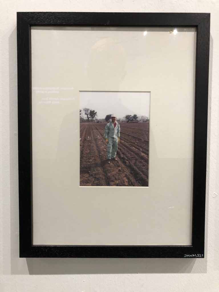
Jersey employs many polish, migrant workers some whom are highly skilled in other areas but are in fact working in unskilled jobs with limited rights, housing and care packages. In an island that was once occupied by Nazi forces that employed slave imported labour during World War 2 these present-day workers may feel oppressed by their employers. But Poland has a resurgent economy itself, one built largely on agriculture and so it seems ironic that Polish migrant workers are still drawn to this place. 

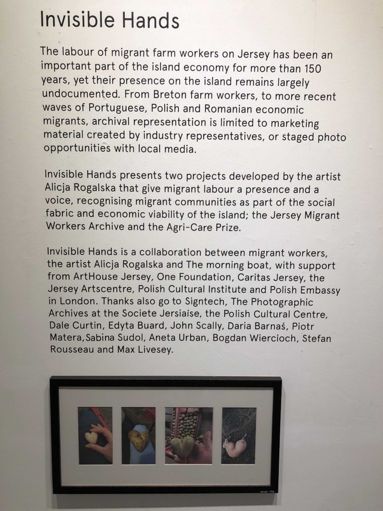
Artist credit below to: Alicja Rogalska              Written text credit to: The morning boat
An exception to this is my friend Max. He is from an affluent Polish background and feels very much “liberated”.  He has grown up in very comfortable surroundings, and will no doubt become a part of his family’s growing business empire. There may be power struggles looking, and expectations, pressures and demands on his time, ambitions and way of life .I wanted to capture how Max behaves and be able compare his life to mine, but also to how this is in contrast to many migrant workers from the same part of the world. 

Documentary photography, that stems from realism, can reveal and exploit stereotypes quite easily. It can be difficult to have a neutral gaze and observe without prejudice…and for this assignment I sometimes feel that I am an insider looking inwards, but at other times an outsider looking in too.

Lauren Greenfield is a renowned photographer who works in the field of photographing those of privileged backgrounds and who hold high amounts of wealth and/or fame. She is a strong benchmark of which I will be using to explore and aim to produce similar work to, following her grand theme of exploring ideas of wealth and affluence. I will respond to her work by aiming to photograph my friend Max who is of similar background to those Lauren photographs, looking to capture him in moments that demonstrate a lavish/luxury lifestyle in comparison to the average person and compare my images to Lauren’s work and to work created in a local exhibition around the below average lifestyle of migrant workers at the other end of the spectrum who have come to the island to work and are in essence still under a feeling of occupation.

Historical/ theoretical context within art, photography and visual culture relevant to your area of study:

The context of which my work operates in comes along the lines of documentary, realism photography. The term ‘Realism’ can mean to depict things as they are without idealising or making abstract. It is a 19th century art movement, particularly strong in France, which rebelled against traditional historical, mythological and religious subjects and instead depicted scenes from life. Photography grew up with claims of having such a special relationship to reality, and its premise, that the camera’s ability to record objectively the actual world as it appears in front of the lens was unquestioned.

This supposed veracity of the photographic image has been challenged by critics as the photographer’s subjectivity (how he or she sees the world and chooses to photograph it) and the implosion of digital technology challenges this notion opening up many new possibilities for both interpretation and manipulation. A belief in the trustworthiness of the photograph is also fostered by the news media who rely on photographs to show the truth of what took place. 

However, for the most part it can be said that in photography, realism is not so much as style, but rather one of its fundamental qualities. From its beginnings in the 1830s and 40s, photographers and viewers of photography marvelled at photography’s ability to capture an imprint of nature. The fathers of photography, Louis-Jacques Mandé Daguerre (1787-1851) and William Henry Fox Talbot (1800-1877), both described it as a medium that allows nature to represent itself, seemingly without the intervention of the artist. Photography’s capacity to depict people, objects and places realistically made it suitable for trying to record and document individual likenesses, scientific discoveries and foreign places – concerns that were of particular interest for 19th-century Europeans. From the early 20th century, photographs were regularly published in newspapers as part of the representation of local and national events. 

Realism in photography can be seen as a pre-cursor to documentary approaches to photography and can have many subcategories that come under its general umbrella, one of which relates to my project very well which is Social Reform Photography. The rural poor or the urban environment were not subjects for Pictorial photographers. But when a Danish immigrant, Jacob Riis published his book, How the Other Half Lives’ about the slums of Manhattan a new kind of realism was born with a socialist dimension. A number of photographers such as Lewis W Hine and Dorothea Lange began to document the effects of industrialization and urbanization on working-class Americans. Their work brought the need for housing and labour reform to the attention of legislators and the public and became the origins of what we now call photojournalism. This shows direct ties between my work and this category of realism photography due to the nature of capturing people from a certain background (albeit the other end of the spectrum to the subjects described above), and the day to day encounters these people come across which give insight into the events happening in their life and how their differ from one’s self.

Key Realism Images:

Tish Murtha,Youth Unemploymentseries, 1981
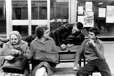
Sirkka-Liisa Konttinen and Tish Murtha are both celebrated photographers known for their individual documentation of the lives of communities within the North East of England.Konttinen, who originated from Finland, studied photography in London in the 1960s, moving to Newcastle Upon Tyne in 1969.  There she co-founded Amber Films, a film and photography collective with an aim to reflect local lives with both respect and gritty realism. Konttinen herself spent seven years photographing her neighbours in the working-class East End of the city in which she lived, which culminated in her book Byker. The series captured a community on the brink of dispersal and drastic change, as many of the houses were about to be demolished making way for new housing developments. Her work is a window into a 1970’s life which was shared by many communities across the land during an era of great social change. 
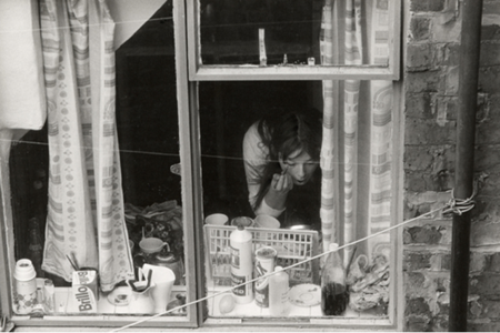
Sirkka-Liisa Konttinen, Byker, Young woman in Mason Street, 1971

Unlike Konttinen, Murtha was raised in a Newcastle council house and aimed to reflect the community on her own doorstep. Born into a large family of Irish descent, in the impoverished West End of the city, her 1980s work captured an era incorporating the bleak effects of Thatcher’s Britain on northern communities. One of the photographer’s first exhibitions was called Youth Unemployment (1981)a series which was even used as a source of debate in the House of Commons. While often preserving a sense of both warmth and humanity, Murtha continued to use her photography to raise many social and political concerns for her hometown, as well as for the country as a whole.

Artist Study: 

Lauren Greenfield Is an American artist, documentary photographer, and documentary filmmaker. She has published four photographic monographs, directed four documentary features, produced four traveling exhibitions, and published in magazines throughout the world.

She is extremely well renowned predominantly for exploring class, status, wealth and extravagance within her own work, primarily through documentary photography. 

Generation Wealth:
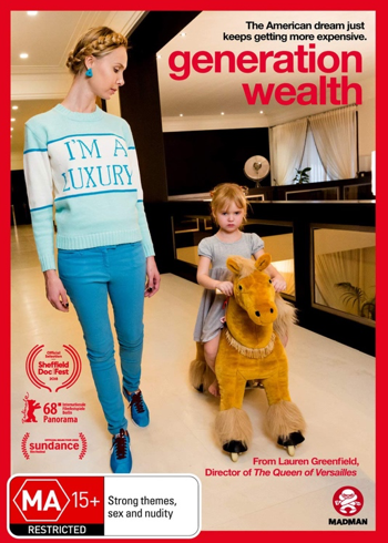
Her main body of work surrounding this field is named “generation wealth”. This project is multi-platform and had been worked on from 2007 to 2017 through first-person interviews, with Greenfield starting in Los Angeles and spreading across America and beyond. It was based around the visual history of our growing obsession with wealth and it demonstrates a revelatory cultural documentation of wealth for viewers to explore, looking into depth at and documenting how we export the values of materialism, celebrity culture, and social status to every corner of the globe. Greenfield also uses this project to put across this modernised attitude people have acquired of wanting to get rich at all costs which has boomed in recent years. Such as the stories within this project like those of some of the students, single parents and families interviewed, who are overwhelmed with debt, yet determined to purchase luxury houses, cars, clothing and holidays. Some of Lauren’s most popular and influential work that relate very well to the area that I am studying within documentary photography are as seen below in her projects named, “Fast Forward” and the more popular of the two, “Generation Wealth.” This visual history of the growing obsession with wealth uses first-person interviews in Los Angeles, Moscow, Dubai, China and around the world to bear witness to the global boom-and-bust economy, and to document its complicated consequences including materialism and the desire to be wealthy at any cost.
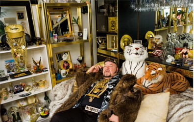
The Los Angeles children encountered early in the book have become defined by the search for status through material acquisition. They buy multi-thousand-dollar handbags to take to class. Other kids in their grade are given BMWs when they turn sixteen. They compete over whose family can afford the best designer clothes, the most elaborate bar mitzvahs, the biggest houses. A 12-year-old whose working-class mother is bankrupting herself to finance the girl’s love of Ed Hardy designer tank tops is interviewed at one point.  She explains how she knows she is putting great financial strain on her mom, and says she sort of feels bad about it, but explains: “I want the world; I want designer clothes, I want eternal happiness, the fountain of youth. I want to be able to afford ritzy private schools. I want the best of everything. Money is most definitely important for everything on my list of what I want.” 

Fast Forward (Growing up in the shadow of Hollywood):

“Fast Forward” is a powerful look at Los Angeles youth culture and its influence on the rest of our society. From the affluent children of the Westside to the graffiti gangs and party crews of East LA, young Angelenos reckon with an overwhelming barrage of advertising and entertainment images emphasizing money, possessions, and eternal youth. This collection of 79 colour photographs, accompanied by interviews with the children and their parents, reveals the realities of growing up fast in a culture that is at once irresistible and unforgiving. A compelling precursor to Greenfield’s widely praised “Girl Culture,” “Fast Forward” is a telling document of the direction in which today’s ultra-image-conscious culture is pointed. It also documents the experience of growing up in Los Angeles, and the ways children are influenced by the values of Hollywood. The quest for “fame,” the preoccupation with trends, the culture of materialism, and the obsession with image that characterizes Hollywood is reflected in the everyday lives and rituals of L.A. youth. A recurring theme in the project is the fleeting quality of youth. As one teenager says, “You grow up really fast when you grow up here. L.A. is so fast-moving, and kids really mature at a young age. Everyone is in a rush to be old, to be going to the clubs, going out… It’s not cool to be a kid.”
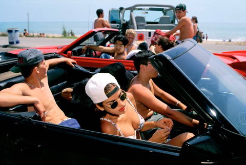
Image: Mijanou and friends from Beverly Hills High School spending their Senior Beach Day at Will Rogers State Beach in Los Angles. Mijanou won the title of “best physique” at Beverly Hills High.

The photo that really launched Lauren’s career was called Mijanou and friends from Beverly Hills High School on Senior Beach Day. A picture taken in 1993 in Santa Monica, California, as part of this project. Greenfield came to make this picture circuitously through an internship at National Geographic, which was the professional experience to which Lauren’s career is also indebted. In the process of making this photograph and the project for which it became the iconic image, Greenfield explains how she found her voice as a photographer. The photograph of Mijanou ended up being the cover of the book and was published and exhibited internationally. Mijanou wasn’t rich, but she lived in a world where her friends were. She explained to Greenfield about the pressures of her world and how it was hard when you could not keep up, but she also recognized that her beauty allowed her entrée into the popular clique. 

Conclusion:
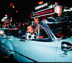
Comparison to Invisible Hands:

Having compared my work to the Invisible Hands exhibition project and the resulting effect (that exposed an insight into living conditions for many Polish immigrants) a number of things can clearly be seen. However, one main idea jumps out for me which is that Max, the subject in all of the photographs can be seen in a sense as a successful migrant who is very much ‘liberated’. He is a product and an extension of a well-educated and newly successful Polish economy but stands out as an exception in Jersey amongst his fellow countrymen. 

With this imagery of nice cars, expensive clothing and luxury holidays travelling to exotic locations Max fits in more naturally with the expectation of the stereotypical wealthy Jersey banker / investor / businessman.

This therefore creates a strong juxtaposition to how the migrant workers are living and means that because they are tied down to this life of manual, hard, outdoor labour. They can be seen as people who are still ‘occupied’ and are not free due to their living and working lives/conditions, which for the most part is not due to their choice and would be very hard for them to leave and/or change.

My strongest image analysis: Max and his father. Bali, December 2019. ​

This image could be called in some ways a fluke. It was not anticipated and by no means planned, which also adds to a rather natural, deeper, underlying context people may like to think about when viewing this image. It was captured after Max had asked me to compare the height of him and his father back to back in a photo to show who was taller. ​

Although it being a seemingly innocent and mundane request, it got me thinking about this idea of Max wanting to know who is taller for a reason. ​It gave an impression of this desire of his to, in a way, fill his father’s shoes and/or follow in his father’s footsteps. As if he was trying to size up how far he had to go before he would be able to become this man he’s looked up to and been in the wake of his whole life, following in his footsteps until one day, filling them.

Overall throughout this project, having followed the theme of documentary photography, it can leave questions challenging the truth or reality of what is being observed and sometime even the honesty behind it. For example, when a piece of documentary photography is carried out, it is following guidelines of what the photographer “sees” and how they have interpreted what they are studying over a prolonged length of time. 

Representation becomes an issue at this point, and the integrity of the photographer can come into question. Both Lauren Greenfield and I have garnered the trust of our subjects and built up a level of trust. This means that there is a responsibility to show the subject in a fair way, without prejudice and hopefully with neutrality. In a sense, we have both acted as insiders looking in, but we could argue that we are outsiders looking in too. A connection, emotional or otherwise, with the subject will often open opportunities…but in turn create a new set of challenges. A sympathetic and sensitive view is always required.

This, without doubt varies between any different person due to human nature and can allow for people to come up with different approaches to the same task and give different perspectives that may shed a particular person, place or ‘thing’ in a different light. This means that due to the variation in and amongst documentary photography, it could be a possibility that biases can be introduced into documentary photography, just the same as they could be implemented into other photography genres such as for example, portraiture. 

Therefore, allowing for documentary photographers to be able to create imagery or manipulate imagery in ways that create opinions by viewers in favour of what it is the photographer wants them to see. This can also mean that documentary photographer can tell you a lot about the photographer themselves due to their work being a reflection of what they choose to read or pick out as important from a person, place or situation.

Bibliography:

Analysing images

Image result for Walker evans family work
A photo by Walker Evans, from “Cotton Tenants: Three Families.”

In this black and white image you can see a family of five and a dog standing on what looks likes a front porch. By the worn down clothes they are wearing and the poor state of the building they stand by, you can assume that they are a working class family and are struggling with poverty. You are immediately drawn to the man standing in the middle of the image, in front of the rest of his family. This may have been done on purpose to represent his importance to the family as the typical ‘bread-winner’, as during this era it was the husband who worked while the wife and children stayed at home.

The Great Depression was the worst economic downfall that has happened in American history. The stock market crash in October 1929 was the beginning of the Great Depression, and due to this by 1933 unemployment was at 25% and more than 5000 banks had gone out of business. The average family income during this time was $1,500, 40% less than what families usually earned before the start of the economic downfall, in turn leaving families stressed with just under half of their usual income gone. For his series ‘Cotton Tenants : Three Families’, Walker Evans photographed three families who were struggling with poverty to capture the effects of the Great Depression in Hale County, Alabama, and to expose the effects of this to the world. The people in the image above was one of the many families in that area who were facing destitution due to the economical decline during that era. At the time Evans photographed these three families, it was the height of the Great Depression and this was the time where people were finding it the hardest to cope. You can clearly see the effects it had on this family – they wouldn’t have been able to afford clean clothes, as portrayed by the rags they wore, nutritious food or the right equipment to fix and clean their house.

'Grandma Ruby and Me', 2005 by LaToya Ruby Frazier
Latoya Ruby – The Notion of Family

In this image you can see two women sat on the floor in the middle of the black and white image. They both look at the camera with two different expressions, the older woman having a slight frown on her face while the younger woman looks a bit happier with a hint of a smile on her lips. They look like they’ve been interrupted from the middle of a conversation that they were having. They seem comfortable in each other’s presence, which indicated that they’ve known each other for a while and have a bond. The older woman looks to be the younger woman’s grandmother, as they both look similar to each other. The room they’re sitting in seems to be the living room, with the television and numerous other decorations, including the grandfather clock in the background. By the look of the room they don’t look like they’re struggling with money, but they don’t look like they are a middle or high class family either.

In Latoya Ruby’s series ‘ The Notion of Family’, she looks at the legacy of racism and economic decline in America’s small towns, through the use of her home town of Braddock, Pennsylvania which became financially depressed after the fall of the steel industry in the 1970s-1980’s. To look at these issues she focuses on three generations of her family – her grandmother, her mother and herself – and photographs them in their home. She follows the social documentary style of Walker Evans and Dorothea Lange to create images which were inspired by Gordon Parks, who promoted the camera as a weapon for social justice. Her images, including the one above, are raw photographs of her family and captures the authenticity of the moment. With the use of black and white images, she is able to highlight the beauty of her home town and how this place has affected her family’s life along with the other people who lived in the area.

Comparison :

Both images include family – in Walker Evans’ image you can clearly see the family of five standing together on the porch, and in Latoya Ruby’s image you can see a grandmother and her granddaughter. When it comes to the contexts of their images, they are similar in the way in which they both look at the effect of economic downfall on families. Evans was exploring the effect of the Great Depression on families within small communities, while Ruby was looking at her own family in the time of racism and economic downfall in her home town of Braddock, Pennsylvania. However it is different in the way which while Evans was looking at multiple different families and how they were effected by a country-wide event, Ruby was only looking at the effects of economic downfall on her small hometown, and her own family. As Latoya Ruby was looking at her own family, she had more of a connection with those who she was photographing and knew them well, so she could shape her photographs to suit their personalities, lives, ect, whereas Walker Evans didn’t know the families personally and did not have that connection, so he may not have been able to take images which truly reflect who these people are. – unfinished

Photobook research: Fast forward

Title: FAST FORWARD

Subtitle: Growing up in the shadow of Hollywood

About the book:

“Fast Forward” is a powerful look at Los Angeles youth culture and its influence on the rest of our society. From the affluent children of the Westside to the graffiti gangs and party crews of East LA, young Angelenos reckon with an overwhelming barrage of advertising and entertainment images emphasizing money, possessions, and eternal youth. This collection of 79 color photographs, accompanied by interviews with the children and their parents, reveals the realities of growing up fast in a culture that is at once irresistible and unforgiving. A compelling precursor to Greenfield’s widely praised “Girl Culture,” “Fast Forward” is a telling document of the direction in which today’s ultra image-conscious culture is pointed.

It also documents the experience of growing up in Los Angeles, and the ways children are influenced by the values of Hollywood. The quest for “fame,” the preoccupation with trends, the culture of materialism, and the obsession with image that characterizes Hollywood is reflected in the everyday lives and rituals of L.A. youth. A recurring theme in the project is the fleeting quality of youth. As one teenager says, “You grow up really fast when you grow up here. L.A. is so fast-moving, and kids really mature at a young age. Everyone is in a rush to be old, to be going to the clubs, going out… It’s not cool to be a kid.”

Who?

The photographer who created this book is Lauren Greenfield, an american artist, documentary photographer and documentary film maker, who has published four photographic monographs, directed four documentary features, produced four travelling exhibitions, and published in magazines throughout the world.

Lauren made this book as a result of her being interested into how kids in Los Angles seem to grow up quicker under the influence of Hollywood, and how they are affected by the culture of materialism and the cult of image.

Single Image Analysis:

Mijanou and friends from Beverly Hills High School spending their Senior Beach Day at Will Rogers State Beach in Los Angles. Mijanou won the title of “best phisique” at Beverly Hills High.

The photo that really launched Lauren’s career was called Mijanou and friends from Beverly Hills High School on Senior Beach Day. A picture taken in 1993 in Santa Monica, California, as part of her project Fast Forward: Growing Up in the Shadow of Hollywood.

Greenfield came to make this picture circuitously through an internship at National Geographic, which was the professional experience to which Lauren’s career is also indebted. In the process of making this photograph and the project for which it became the iconic image, Greenfield explains how she found her voice as a photographer.

The photograph of Mijanou ended up being the cover of the book and was published and exhibited internationally. Mijanou wasn’t rich, but she lived in a world where her friends were. She explained to Greenfield about the pressures of her world and how it was hard when you could not keep up, but she also recognized that her beauty allowed her entrée into the popular clique.

3. Deconstruct the narrative, concept and design of the book such as:

Book in hand: how does it feel? Smell, sniff the paper.

In hand the book feel rigid, it smells like plain plastic with no real scent to it other than that other than plastic and plain card/paper.

Paper and ink: use of different paper/ textures/ colour or B&W or both.

The books opens with a card page and then is followed by glossy plastic pages with the images and text on until the final page. which is again, card.

Format, size and orientation: portraiture/ landscape/ square/ A5, A4, A3 / number of pages.

The book is landscape and is around an A4 size however is not exactly A4 and is probably a custom size. There area 127 pages.

Binding, soft/hard cover. image wrap/dust jacket. saddle stitch/swiss binding/ Japanese stab-binding/ leperello

The book is a hard cover with a dust jacket and uses saddle stitching.

Title: literal or poetic / relevant or intriguing.

The title is very direct about what the project Is focusing on, it dictates exactly what the projects main theme Is without giving too much away. The choice to have ‘Fast Forward’ in large text is a smart idea because it makes the book seem more youthful and erratic, similar to life lives of the teenagers she isn’t photographing which is one of the main themes Greenfield is exploring in the book.

Narrative: what is the story/ subject-matter. How is it told?

The story is as described above about how Greenfield documents the life of teenagers growing up in Hollywood and how its faster and more full-on than other areas of the world. Therefore Lauren presents quite a fast paced approach to looking into all of the youths she is studying, quickly moving from one to another in order to keep up this fast paced theme.

Design and layout: image size on pages/ single page, double-spread/ images/ grid, fold- outs/ inserts.

Most of the images follow the theme of 1 page, 1 image, however throughout the book there are interludes where text is positioned on the side of a page and an image will take up about 2/3 of a double page spread. The normal image size would take up most of the page, leaving a small border around the edges which is usually white. There are no grids, fold outs or inserts.

Editing and sequencing: selection of images/ juxtaposition of photographs/ editing process.

The sequencing of images follows quite a logical pattern of putting images created in the same shoots or trying to present the same principles together on single pages one after another with slight variations here and there.

Images and text: are they linked? Introduction/ essay/ statement by artists or others.  Use of captions (if any.)

The book has a preface written by the photographer Lauren Greenfield and a quote next to an image on the 11th page before the main part of the book begins. Then throughout the book for the majority of images there are small bits of text either dictating the event, situation, people and ages. Then as she pics out singular images to talk about she uses 1/3 of a double page spread to write text and the other 2/3 for the image.

Book Specification

Narrative: What is your story?
Describe in:

  • 3 words – Divorce, Separation, childhood
  • A sentence – Witnessing my parents lives after their divorce and comparing it to when I was a child.
  • A paragraph – This book is about my parents and their lives after their divorce. My mum has re-married and lives in the UK now, whereas my dad still lives in Jersey with me. For me, I found the divorce and my mum moving away very hard, so I decided for this project to capture my parents lives and tell and honest truth about what a separated family is like. I also want to include own images of my childhood to show the juxtaposing lives of both my parents and the past and present.

Design: Consider the following

  • How you want your book to look and feel – I want my book to feel like a photo album. I want it to be plain black and simple.
  • Paper and ink – Id like the paper to be matte so the glossy images i take out of the photo albums will contrast it.
  • Format, size and orientation – Just a standard portrait sized book.
  • Binding and cover – hard cover, plain black.
  • Title – 7916 – parents marriage and divorce dates
  • Structure and architecture – just like a normal photobook but I want to insert images out of family photo albums as I feel like this will give the book an interesting tactile feel.
  • Design and layout – images of my mum will be on the left and the right way up, but then images of my dad will be upside down. This is a way to show their split and also made the reader engage with the book as to view the images of my dad they’ll have to turn the book upside down.
  • Editing and sequencing – I’m going to put any images I take into black and white but leave the archive images untouched.
  • Images and text – I want the images to be candid and of my parents daily lives, almost as a documentary. I feel that if my images are staged it would take the meaning away. no text.

Second Set of Final Photos

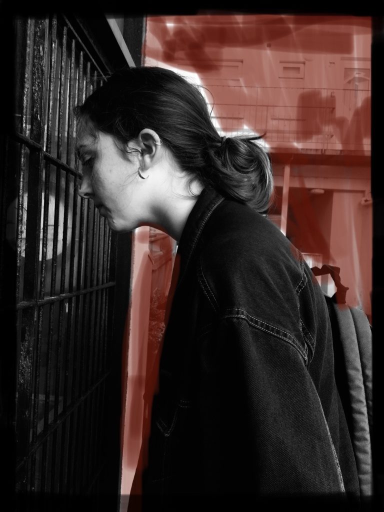
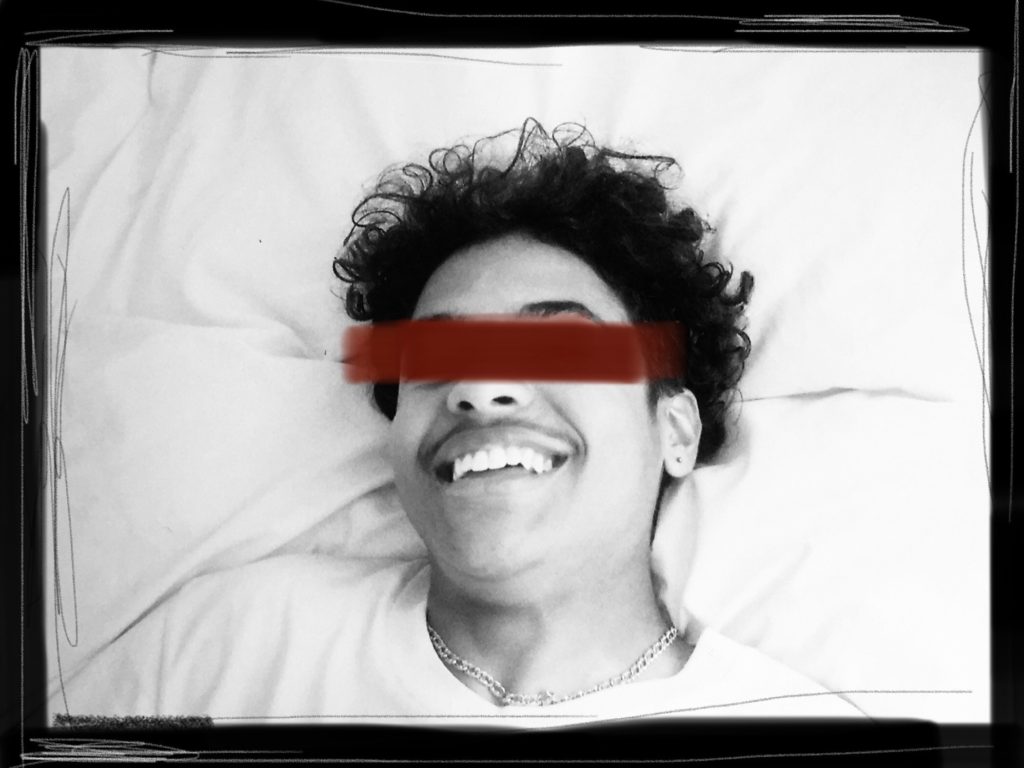
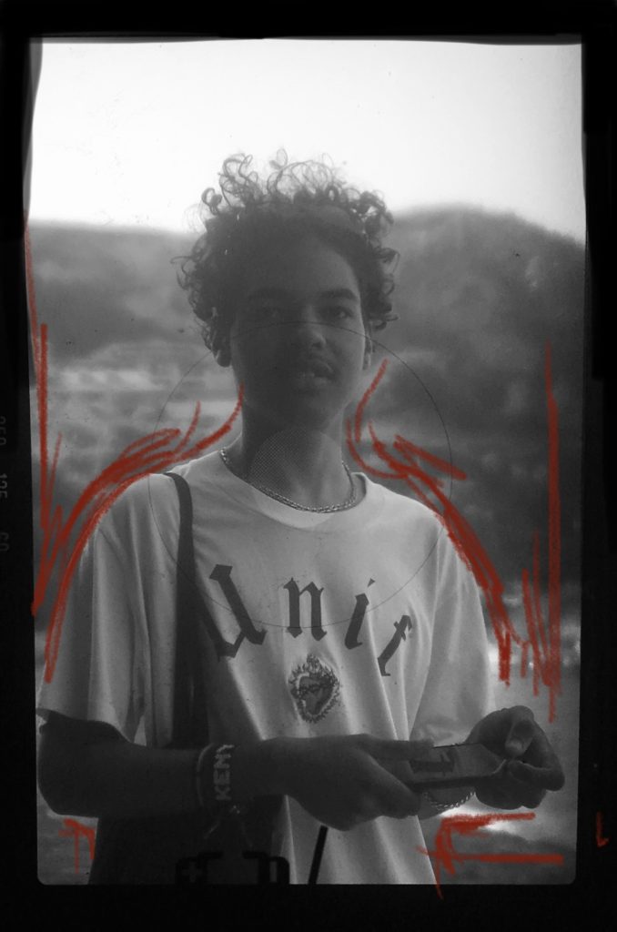
These are my second set of finished images for my photo-book. They follow the same process of capturing and editing as my first set of photos, this can be read on my blog post of the same title. The only difference from this time is that I have chosen to use red as an accent colour in my editing as it contrasts against the black and white and when the book is actually created I plan on including it in other areas also, such as book title or page cover etc, therefore in the end it will match as a complementary colour. I have also taken an image from my last set and re-edited again as I wasn’t sure if it fitted or not. Again I am very satisfied with these images and will be using them all.

Book Specification

Narrative: What is your story?
Describe in:

  • 3 words – Occupation, Remembrance, Change
  • A sentence – I am going to explore bunkers created during the occupation and try and show how they have changed since the occupation.
  • A paragraphs – With this project, I am going to explore the bunkers around Jersey. With the images I collect from doing this, I am going to show how they have changed since World War 2 and the German occupation of Jersey. Through this I am going to try and show the memory of those involved within the war, whether it be through forced labour during the creation of the bunkers, or soldiers used within the war.

Design: Consider the following

  • How you want your book to look and feel – I want the book to seem fairly obvious as to what it is.
  • Paper and ink – Standard ink, will likely use paper that will not reflect a lot of light back.
  • Format, size and orientation – It will likely be in a landscape format and I may have it quite small
  • Binding and cover – Hardback book, one of the images I take I will probably use as a double page spread over the front and back cover.
  • Title – “no personal memories” – may change later in the project
  • Structure and architecture – Will likely structure the photobook very simply. Using similar images together and sequencing the book in a layout that works best.
  • Design and layout – Going to design it in a uniformed fashion, so that it has similar images together or format them in a sequence. I will likely lay it out so images of different bunkers are separated.
  • Editing and sequencing – will experiment with both black and white and colour, if I decide to use black and white, I will likely try adding high contrast to the images.
  • Images and text – Images will be taken of bunkers and show erosion and what has happened to them since The Occupation. I may add text to the photobook, perhaps something to do with the equipment at some bunkers around the island.

Book Specification – Design

I want my book to have a more grunge aesthetic, but not to the point of being messy. I am thinking of using matte rather than glossy pages to help achieve this feel, using paper with a matte finish will also work well with the images within the book; as they are all very textured with added visual noise.

I am currently thinking of using a 10×8 in (25x20cm) size book, which is a standard landscape size. although I will include vertically orientated images in the book as well. I will most likely crop some images to make them square. I am also thinking of using an image wrap hardcover for the book.

As the book is about how fashion changes how a person can be viewed or treated, I am thinking of titling the book ‘prejudice’. However I am also considering other options, one of which is a less serious title: “Inside I’m crying, but outside I’m playing the Kazoo”.

The structure of the book will be a story told in pictures, but in reverse. A story which when simplified is about a man who gets attacked on the street, but he ends up being persecuted and punished due to wearing the more ‘thug’ looking clothes. It is not intended to be a realistic story, but more to send a message. So the book will start with him being persecuted, and end with him moments before being attacked.

The layout of the book will consist of two configurations; either each double-page spread will contain two full size images, or an image on one page and text on the other.

I will end the book with a conclusion of the story at the end, along with my essay.

book specification

Narrative:What is your story?
Describe in:

  • 3 words: A family story
  • A sentence: A personal family narrative.
  • A paragraph: Through the use of archival imagery and objects, along with a few landscapes, I intend on telling my family’s story, beginning with the fact that both my parents migrated to Jersey, to eventually marrying, having children, and separating.

Design: Consider the following

  • How you want your book to look and feel: since my book with be a personal story told through images I’d like mt book to have “photo album” feel and look as much as possible. Maybe through something such as a textured front and back cover, and through the look of the front and back.
  • Paper and ink:
  • Format, size and orientation: My book will have a mixture of landscape and portrait images, and for this reason I think the book would look best in a square format (12″x12″ / 7″x7″)
  • Binding and cover: Ideally I think a textured Cover would be best to fit in with my concept, or maybe a dust jacket so that I could include come contextual information on the inside of the book without compromising the design of the actual book.
  • Title: I am exactly sure on my title yet, however I want it to reflect the theme of family and relationships. I think it would be more effective if I made the title link in with something that directly related to my personal family story like Costa did with her metaphorical link to Mimosa in her title, “where mimosa bloom”.
  • Editing and sequencing: At the moment, the sequencing of my book and images will be in chronological order, however I may include some parallels with archival images and current day images in order to give the book a more emotional sentiment.
  • Images and text: I want to include minimal text in my book, As I want the sequencing of the images to tell the story. I may include things such as a small title, and perhaps the date under images if I feel they need to be explained, as seen in some photo albums, however it will be quite small in order to not distract from the images.

Personal study: Madeiran landscapes

Plan:

In order to add more context to my personal study I wanted to make sure to capture landscapes on the island my parents are originally from. While on holiday, I will be taking images in both villages that my parents are from as I think my photobook would benefit from having a few landscapes, to separate the portraiture, and archival images. I want to take images at different points of the day, and the weather will most likely vary slightly meaning I will be using different camera settings depending on what the scene is like.

Lightroom selection:

Here I have colour coded the selection of my best images, with green representing my best ones, and red showing my least favourites.

Editing my best images:

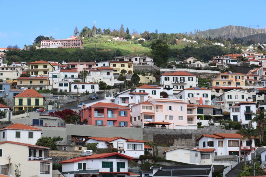
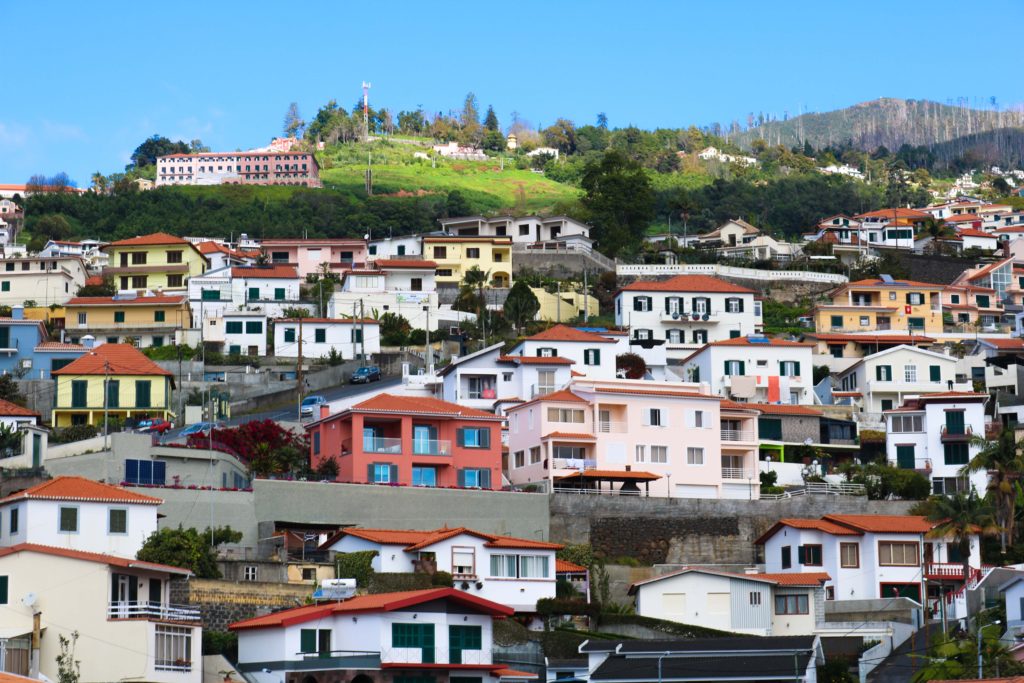
As you’ll see below, my original image is already quite bright and colourful. My aim was to further accentuate this, to make the picture look very aesthetically pleasing. I increased the contrast so that each individual house, and colour stood out. I increased the vibrancy so that the colours would become more vivid.

This image was taken just as I was driving out of the airport into the main city, and has no particular symbolic role. I chose this image as one of my best, because I like how to looks messy, yet very aesthetically pleasing at the same time. On one hand, there is nothing particular organised about the photo, however I think that all the bright colours help the image look quite appealing, and helps draw in attention.

These next few images were taken while I was visiting my dad’s hometown, Porto da Cruz. It is a fairly small municipality with a population of around 2,000 people located at the north-eastern part of the island.

I thought that my initial image had all the right aspects I the frame, but I wanted it to look less dull and slightly more colourful so I increased the contrast and slightly decreased the exposure, and increased the vibrancy. I like how the blueness of the sky and green from the mountainous regions complement each other in the images.
I like the framing of this image because on the first third, we see a glimpse of the mountainous regions, to the right we see the sea which acts as a sleek backdrop for the street scene seen in the foreground. With the changes made above, I was able to bring out the colour of the sea further, which helps bring out the beauty of the landscape. I think the electricity cables in the image are quite distracting, however I think it depicts a truthful portrayal of the village.
The image below shows the coast of the village. An area which holds many memories of my father’s younger years. Initially, I thought that the different mountain ranges struggled to stand out against each other, and my increasing the contrast I think they are more easily distinguishable as they stand out more, especially as ore colour was brought out by increasing the vibrancy.

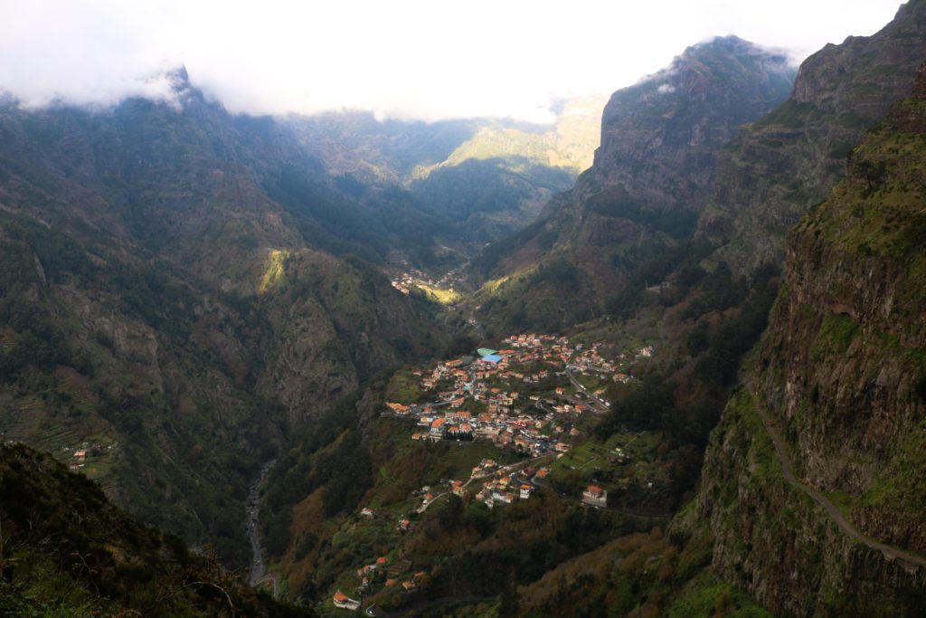
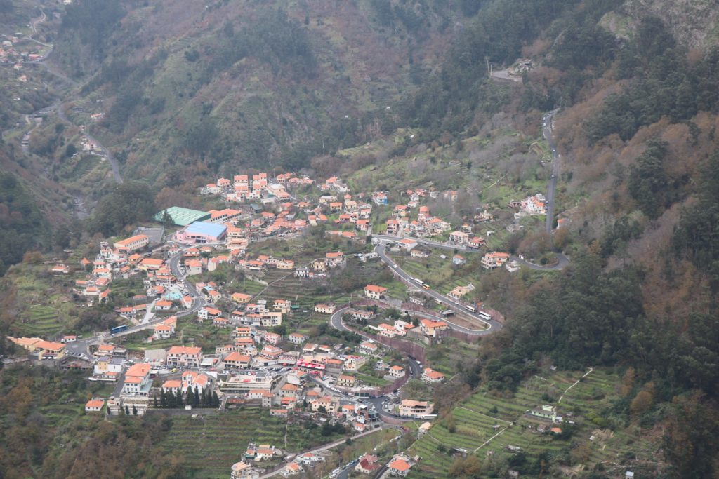
These last images show Curral Das Freiras, where my mother and her family is from. This is a little secluded village in the heart of the island with a population of around 2,000 people. named Valley of the nuns as it was a refuge to 16th century nuns during times where pirates frequently attacked the island. As you’ll be able to see from the images below, the village is surrounded by cliffs and peaks making it quite secluded from other areas of the island. These images were all taken from a particular viewpoint, Eira Do Serrado, which stands at an elevation of 1.096m allowing the entire village to be seen.


This image is perhaps my favourite from my outcomes as were able to see the skyline, mountains and village all in one making a successful landscape. Due to the fog at the top of the mountains, My image was slightly overexposed leading my image to have a whiteish tint to it. After adapting the contrast and exposure, I believe I found the right balance and by changing the vibrancy I was able to restore some colour to the scene making it appear more inviting, and less dull.
The image below is a slight close up of the image above, showing the village with some aspects of the mountains still being visible. Similar to the other pictures, I made sure the exposure was appropriate and added some extra colour by adjusting the vibrancy.
The image below shows a close up of the many houses. I think that by itself, the image is not as successful compared to the previous ones, however I included it as it could be useful in a series along with some of the other images. The original image appeared too exposed, leading me to decrease the exposure.

Evaluation:

I think overall I was able to capture a few successful images depicting both important parts of the island. However, I think I should have experimented more by photographing a few more different areas as most of my images are taken from the same places.

Designing my PHOTO BOOKs

3 words: identity, image, thoughts

A sentence: I want to reflect how a personal identity is often conflicted with standards set by myself.

A paragraph: Body image and self worth is an ever growing problem throughout our generation with a collective obsessiveness as to the way we look and how we should be presented. This creates a comparison anxiety between ourselves and others, however it’s not all doom and gloom. I want to use this project as a self growth tool to reflect upon how far I’ve come and celebrate my personal small achievements.

How you want your book to look and feel: I want my books to all have a very handmade and personal feel so that the reader can understand my thoughts and emotions.

Format, size and orientation: My three small books will all be different sizes, my main book ‘Erasure’ is just off being A5, then ‘uncomfortable Skin’ and my essay are 0.5 cm smaller than each other. This cascading series offers the reader a structure to follow and show hoe problems are slowly getting smaller.

Binding and cover: The covers will be card with linen spines and all Japanese stab bound.

Titles: ‘Erasure’ is my main book of the trilogy that shows a narrative of contrasting childhood archival imagery vs. current images however all images are disturbed by my current thoughts. ‘Uncomfortable Skin’ is a book filled with close up and detailed self portraits that are raw and exposing of myself. Some have also been hand edited to again show disruption within the structure.

Design and layout: For every image in the book there will be a poem on the opposite page. Each image will be stuck onto parchment paper then stuck into the book, this gives the images a border and a purpose.