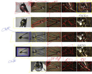
The individual cover sheet for my Pre AS task and the red photos weren’t good enough, the blue boxes need to be cropped and the yellow boxes with f’s are “final”

The individual cover sheet for my Pre AS task and the red photos weren’t good enough, the blue boxes need to be cropped and the yellow boxes with f’s are “final”
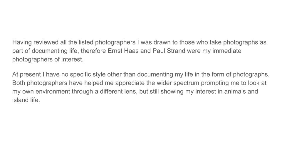
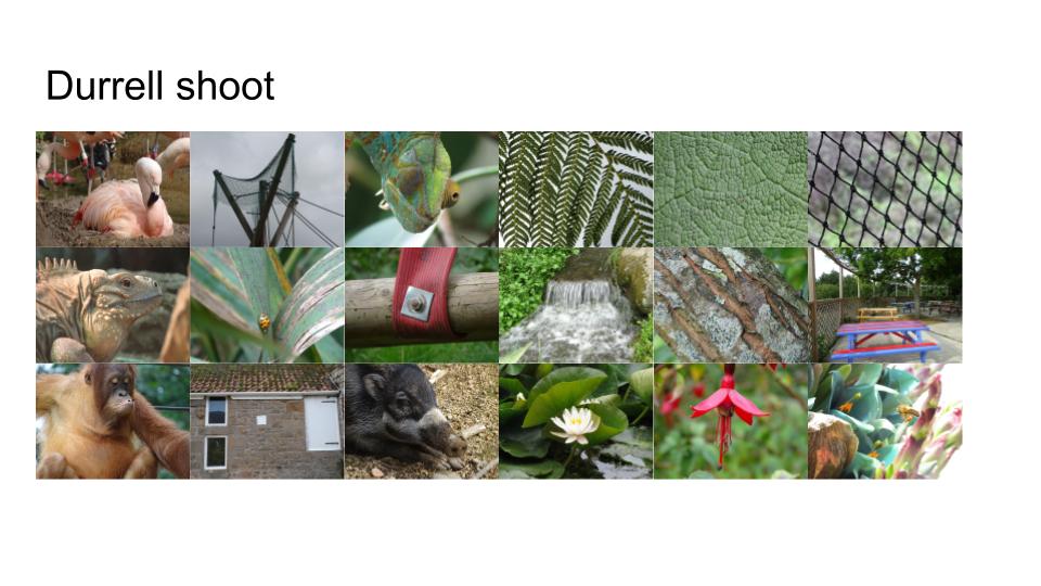
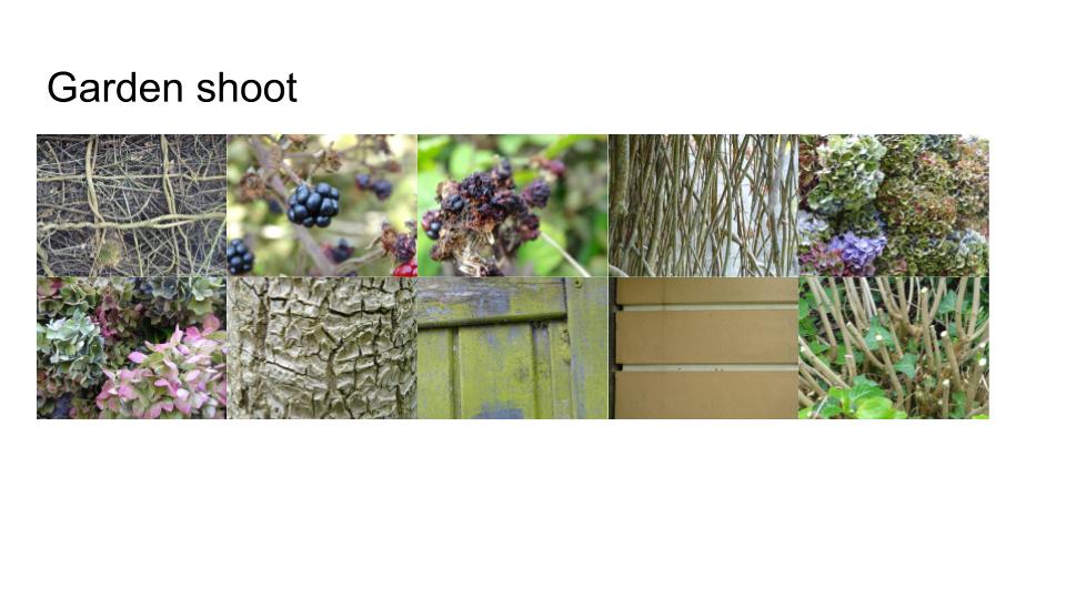
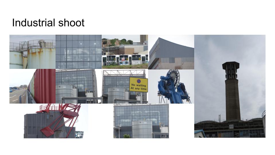
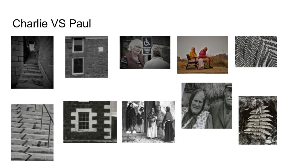
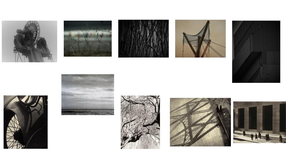
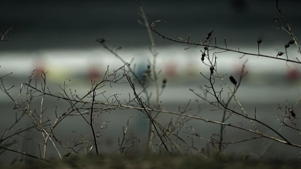
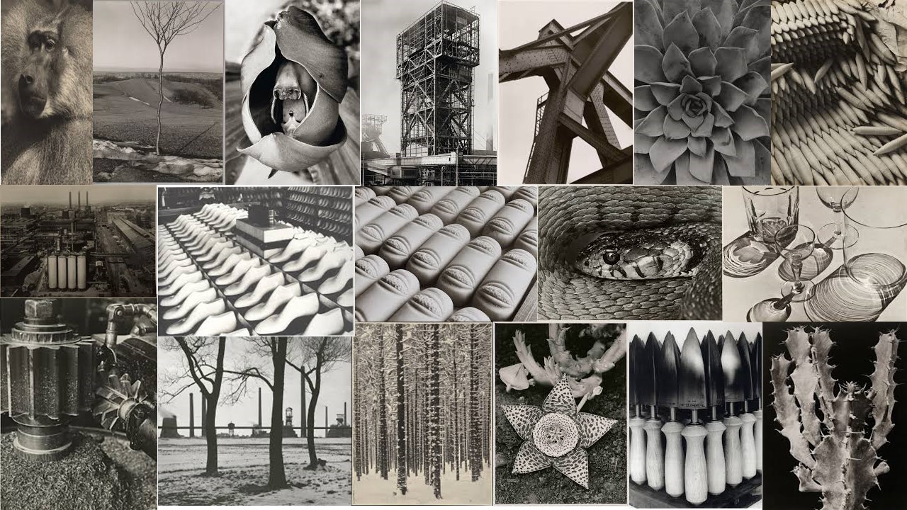
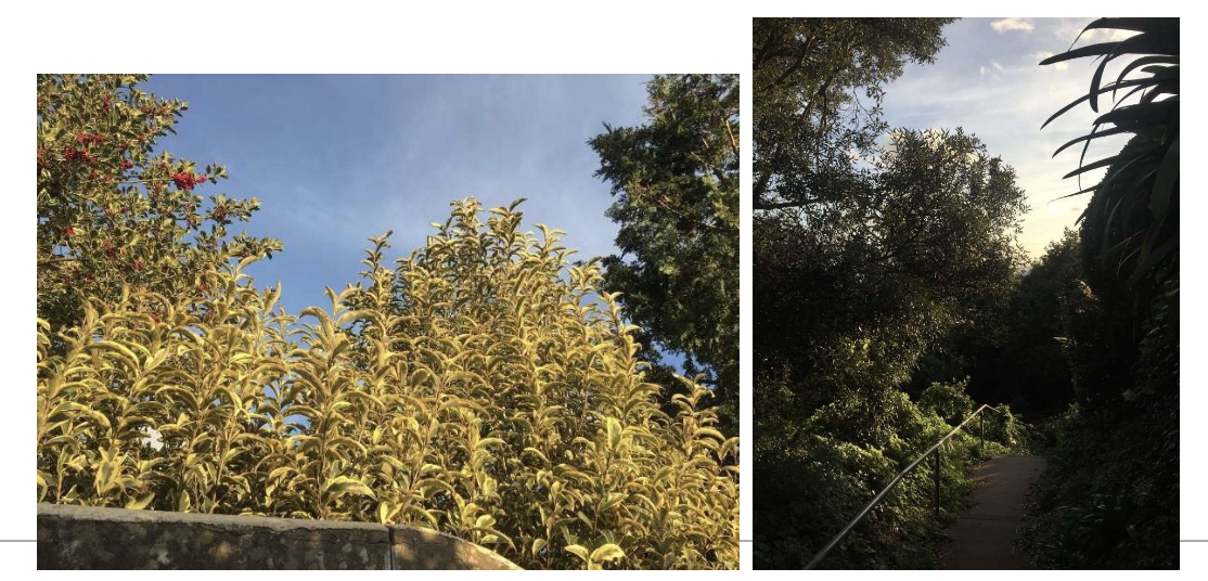
I really like my image, this is because I think it fits really well into the work of Paul Strand, although his work is predominantly in black and white mine is black and white with added colour just so it stands out much more than it would, if it had been in all black and white. This image is one of my favorites as although you immediately look at the boldness and the more focused plants in the foreground, your eyes can’t help but get dragged to the blobs of colour in the background. This image makes you think about the picture and instantly makes yourself asks itself questions such as, where was the photo taken, and what is the photo about. As I said this photo leaves it in your imagination. To some people they will instantly know where this moment was captured, to others you will be left questioning yourself. Although I really like my final edited version with the black and white and dark colours with the colours drawing your attention, I did this to follow the work of Strand, but I like my original version even more, this is because I feel like it didn’t need to be edited to show its true beauty of the scenery.I really like my photo, because it reminds me of when I was taking it as I was enjoying some family time which is sacred to me. It also reminds me on what I used to do when I was a young child down at this location, so personally this photo has a meaningful background to me.
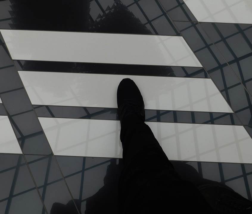
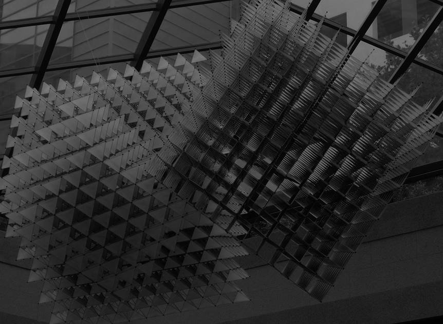

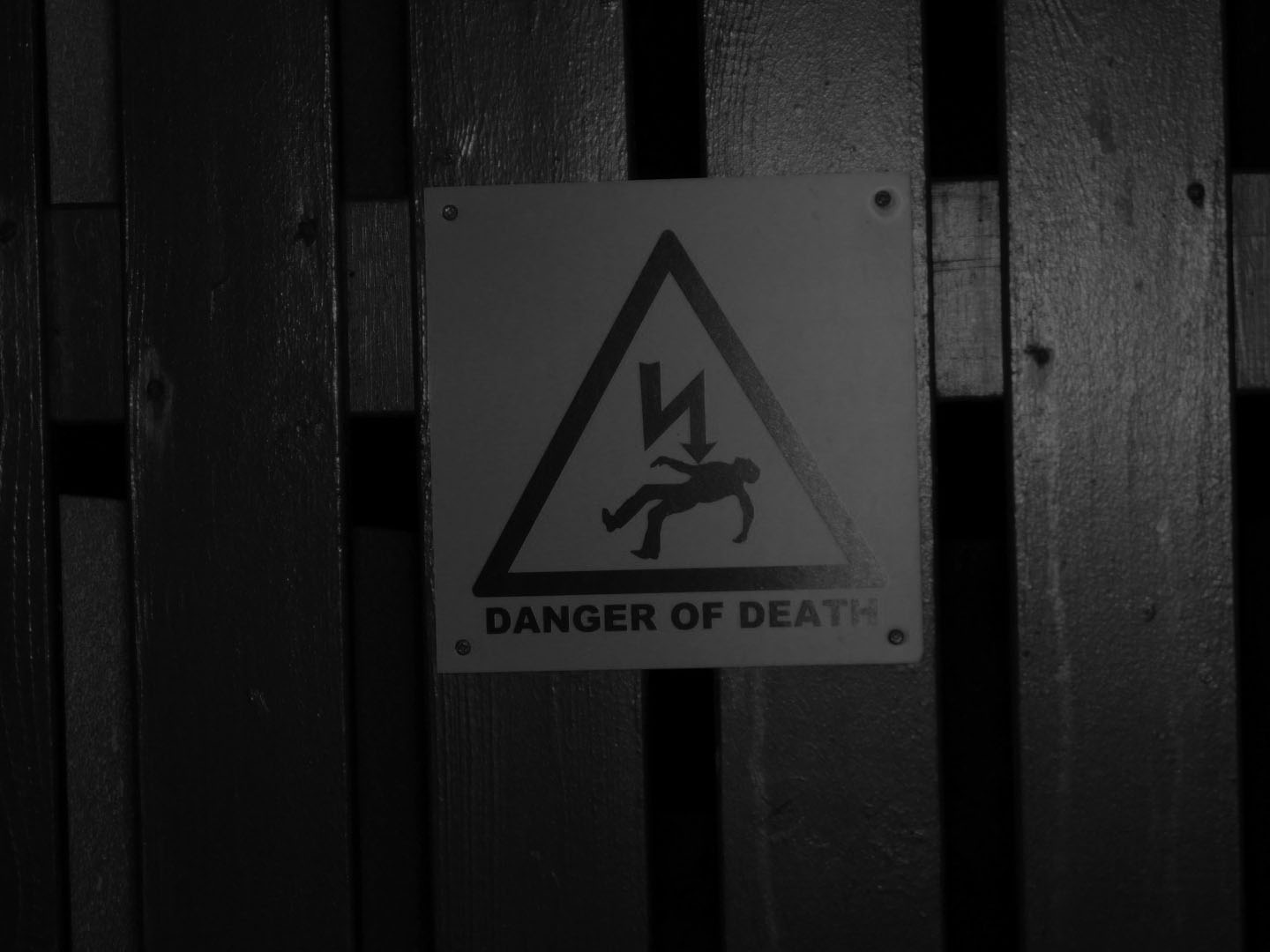
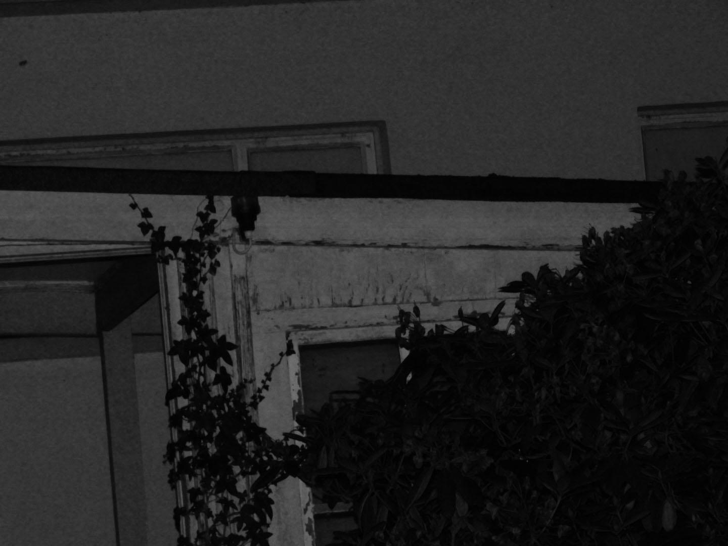


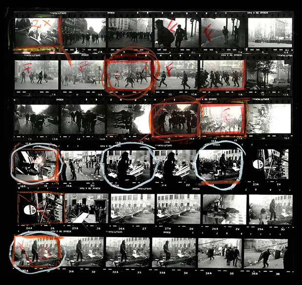
Contact sheets are sheets that display all of the photos you have taken. It is used to display the process and selection of images that you want to manipulate/publish. Naturally there are going to be photographs that are faulty/unappealing and contact sheets are a way of displaying the thought process behind which images are better and preffered over the others. Contact sheets are easy to produce and make the photographer much more professional. Contact sheets are also a way of pre showing what you want to do to the image and how you want to manipulate. You can perform certain symbols and use certain colours which will symbolise particular methods of manipulation. Here are some examples of some other photographers contact sheets:

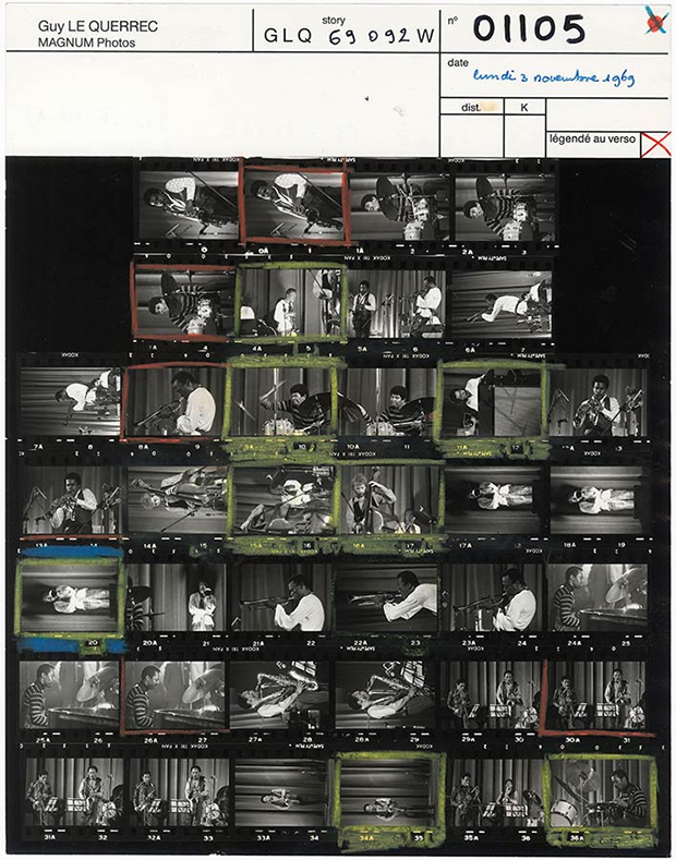
Here is an example of one of my contact sheets:

Green circle - An image I would like to further use.

Red cross - An image I would not like to use.

Red F - The image is out of focus.

Red shading - The part of the image I would like to crop out.

Yellow question mark: An image I am unsure whether to edit or not.
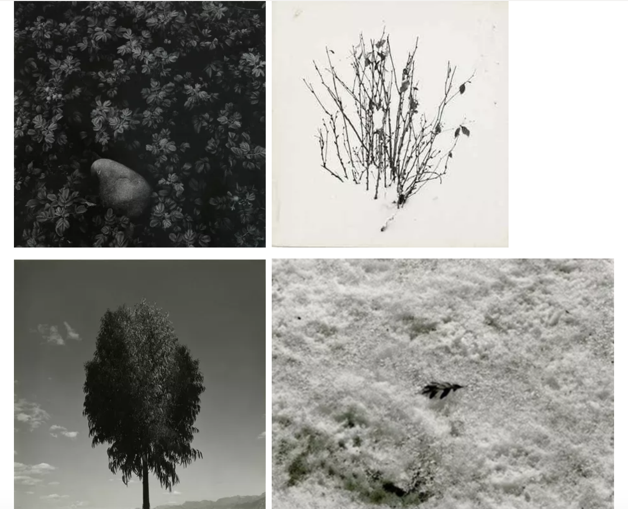
Harry Morey Callahan was a twentieth century American photographer, he was born on the 22nd of October 1912. Callahan grew up in Detroit, Michigan and briefly studied chemical engineering at Michigan State College. Callahan became interested in photography in 1938 and was influenced by the work of Ansel Adams after attending a lecture in 1941. He taught photography at the Chicago institute of Design in 1946, and in 1940 he took over as head of the department for photography. In the other half of the 1970’s, Callahan had developed a liking to colour photography and his colour images became the reason to his fame. He wanted to explore the possibilities of this creativity and kept on doing so. Sadly, on the 15th of March 1999 Harry had passed away leaving over 10,000 prints for the next generation to take inspiration from.

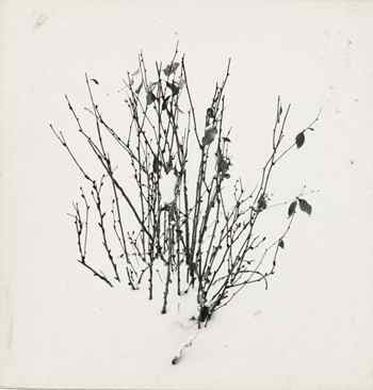
Although Harry is famous for his colour work and his portraits of people, I personally love his work on nature, especially in black and white. Although you are unable to view the usual vibrant and beautiful colours of leaves, in the black and white photos the dark tones create a moody and dark mood. Harrys style can be viewed as very minimalist and I like how he uses natural forms to create his abstract photography. Harry tends to use natural lighting in his photos which accentuates the fact that he is taking photo of nature. The fact that he took so many black and white photos could conceptually mean that he believes nature doesn’t need colour to look beautiful.
Inspiration:
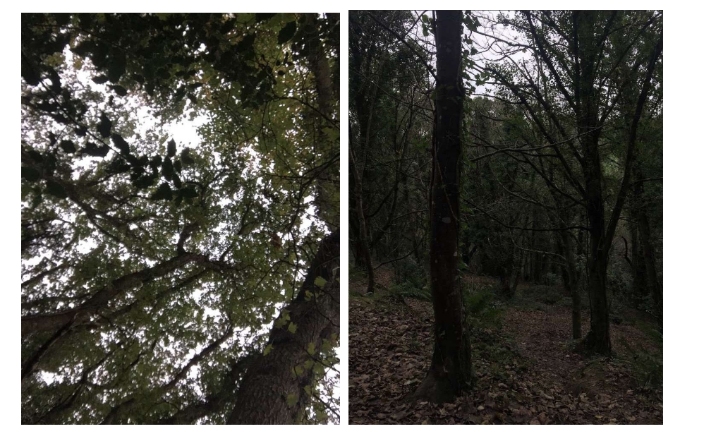
My Recreation:
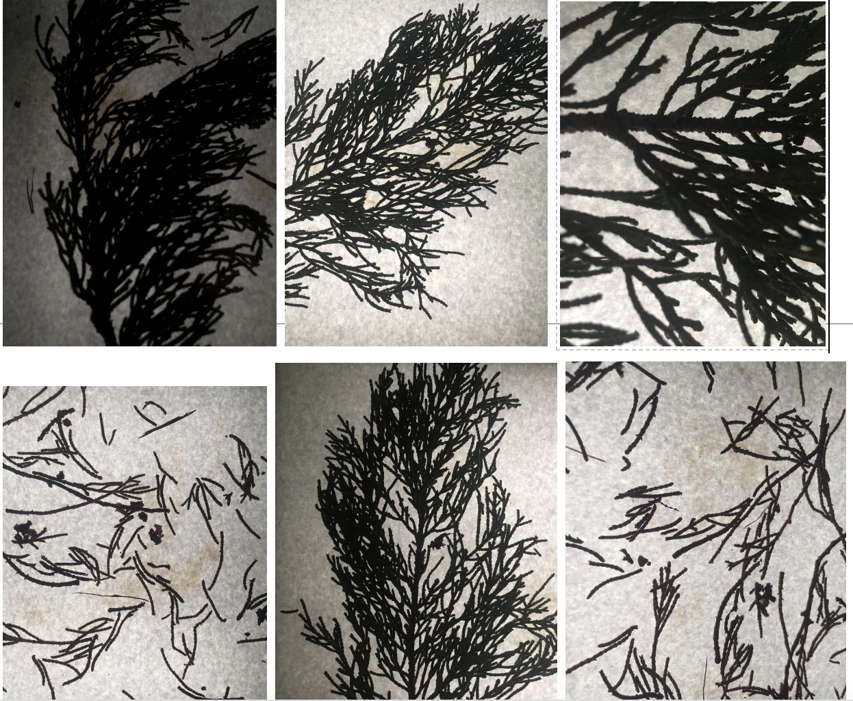
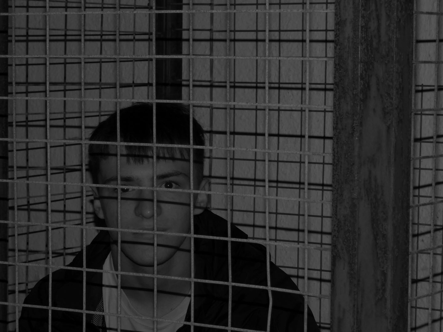
These are some of the edited photos from the shoot. I send these photos from my camera to my phone and I used an app called VSCO to edit them. I applied different black and white filters, mainly B1 and B5, however I also adjusted the exposure and contrast until I got the result I wanted. I liked reducing the exposure to create a dark atmospheric look.
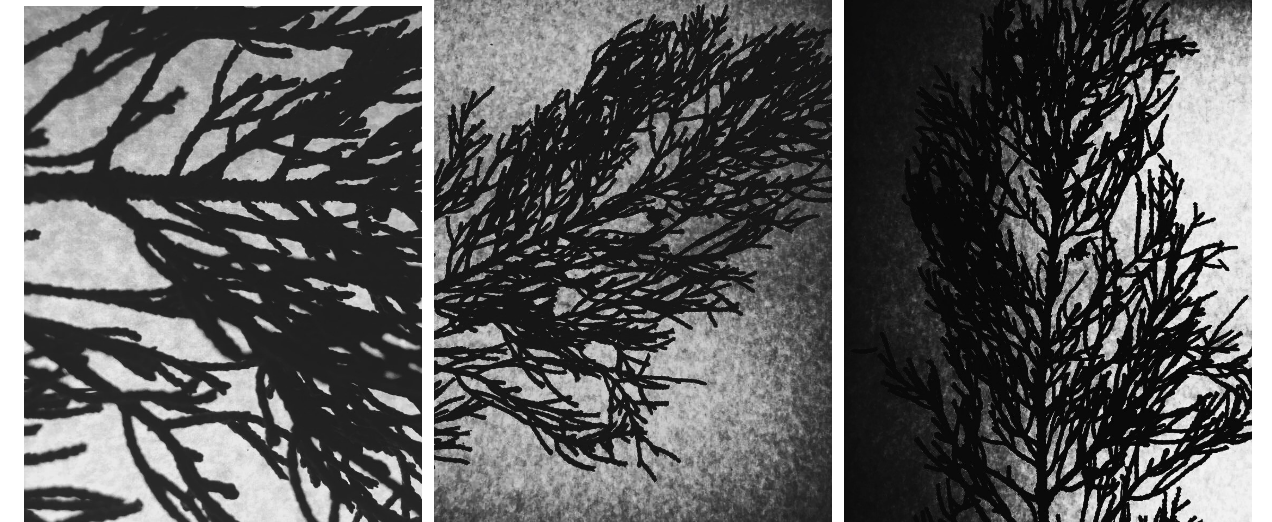
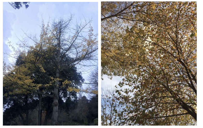
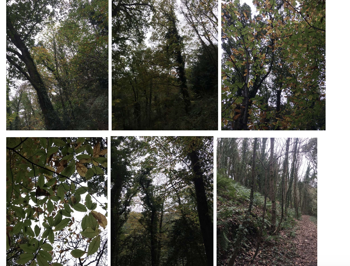
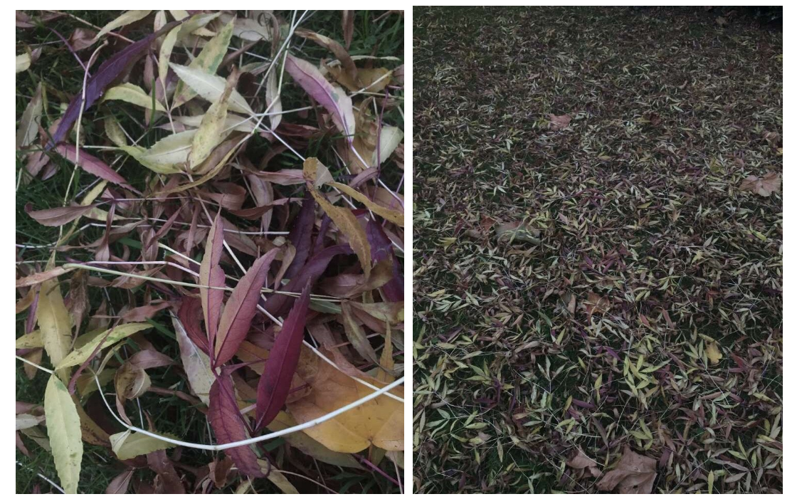
Once again, I applied filters from VSCO and adjusted the exposure and contrast until I got a result I wanted:
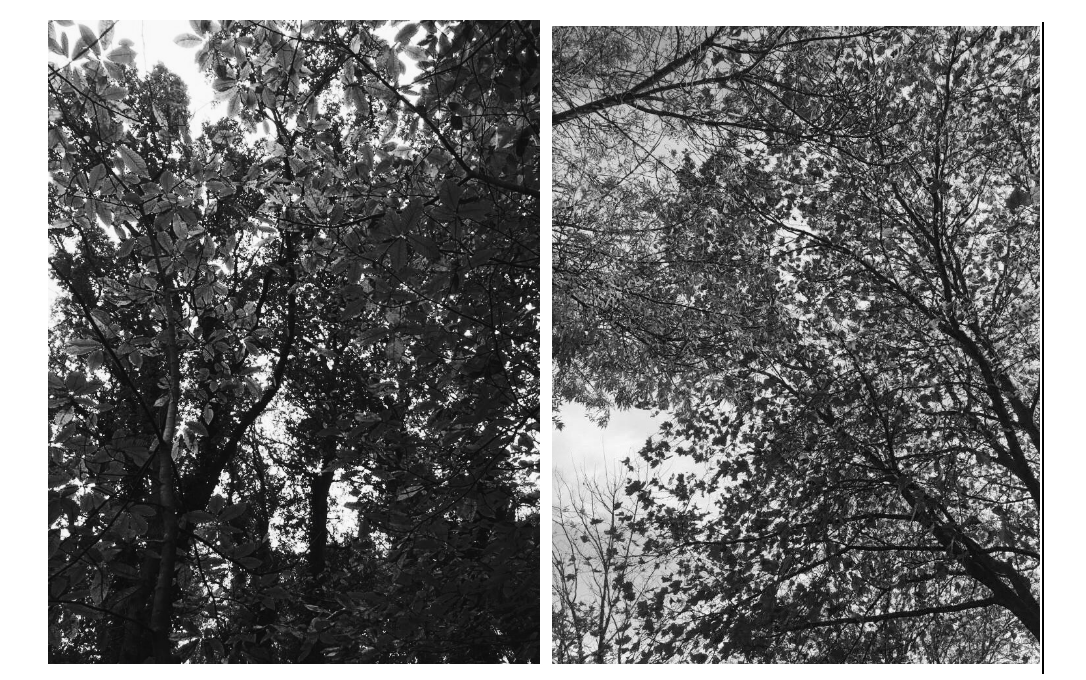
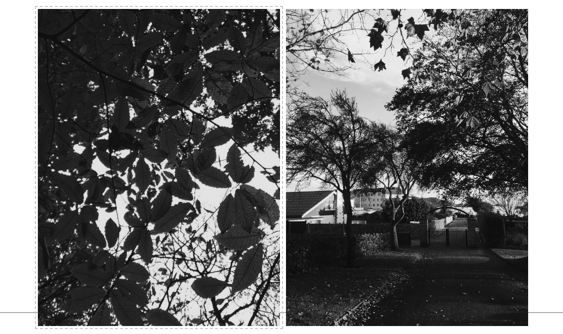
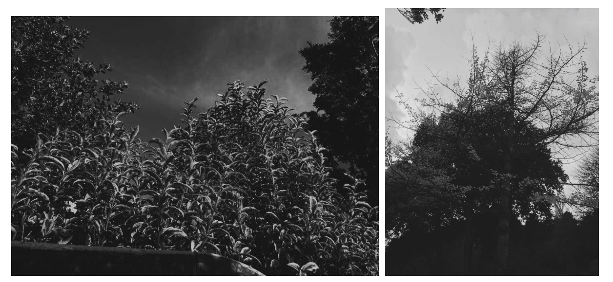
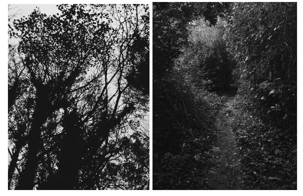
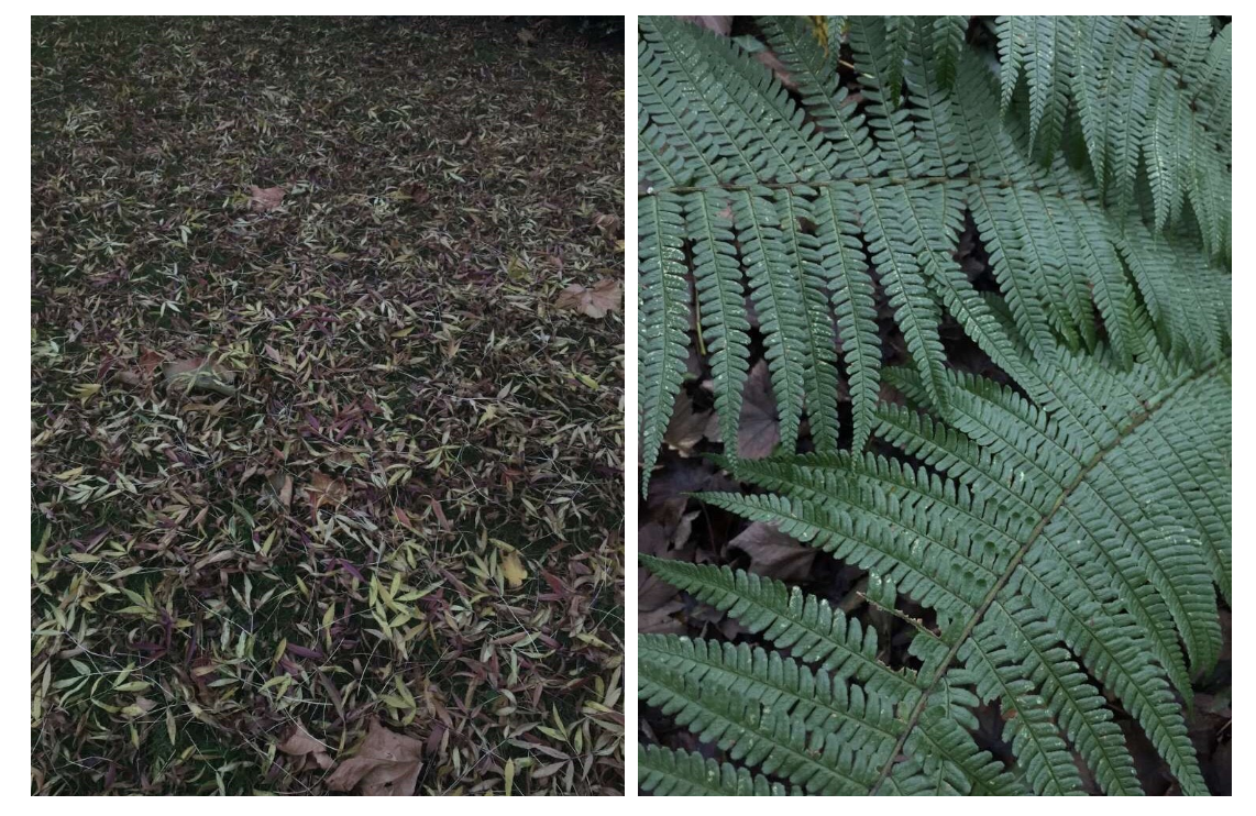
These are the edited photos:
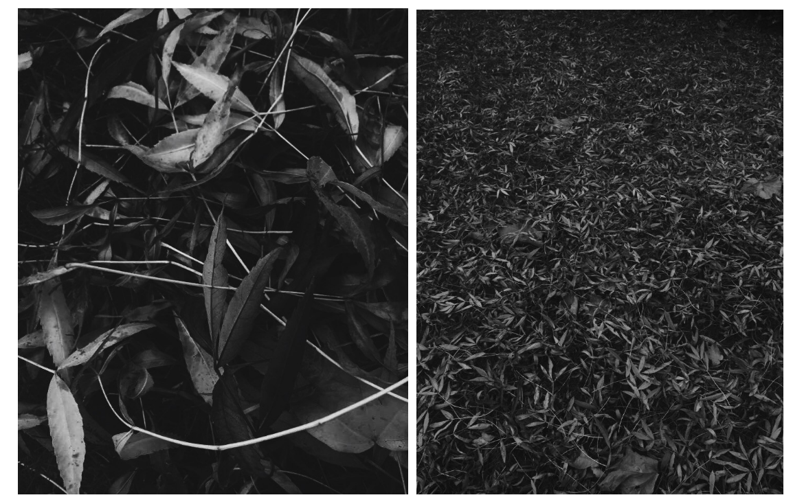
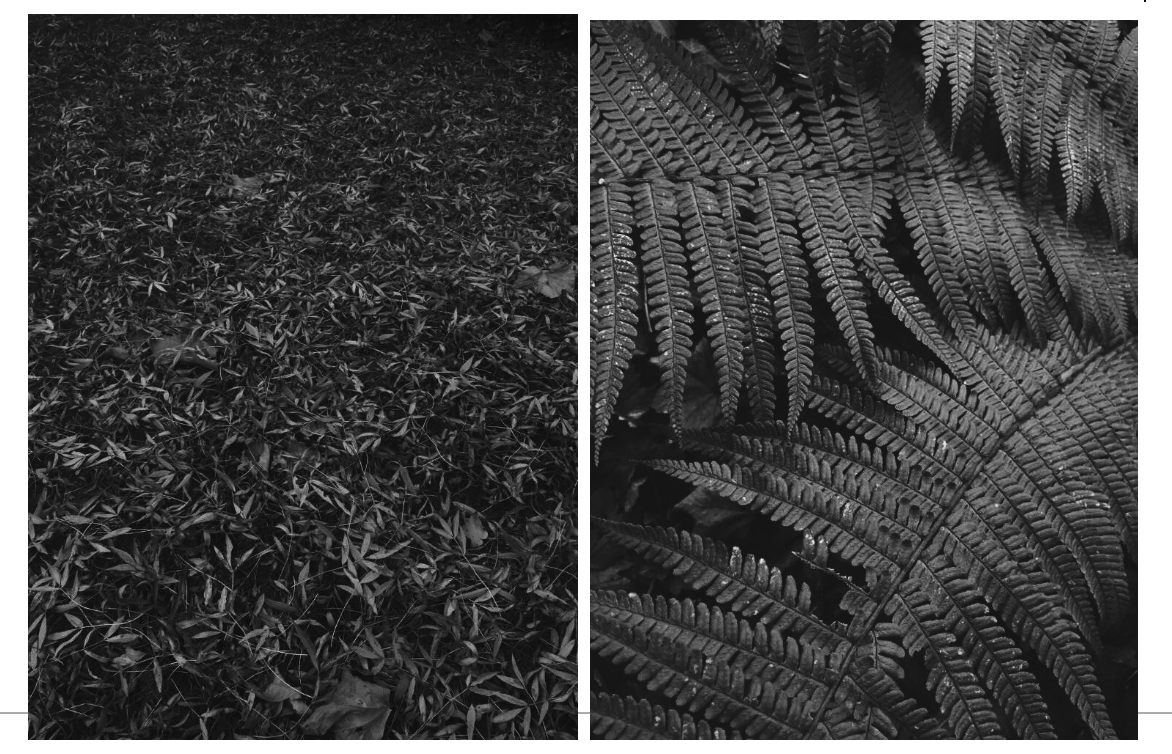
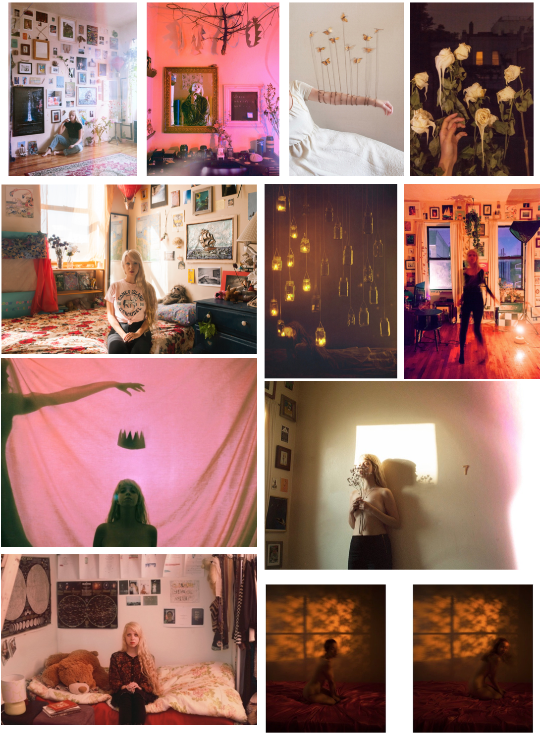
About Lissy
Lissy grew up in a small town in Canada between a cornfield and a tall forest, and frequently played pretend in between them. Her interest in photography began at the age of 12, spurred by the obsessive fear she would one day forget her entire life were she not to document it.
As a teenager she became far less fascinated with documenting life, and far more intrigued with escaping it. By creating surreal landscapes and building elaborate blanket forts, she hid from the trials and tribulations of teenage life until, at the age of 18, she moved to New York City to pursue a career in photography.
Now her work focuses on the combination of her two loves; documentary and surrealism. Combining forces to create whimsical imagery that still centres around every day life. Her work is often inspired by the vivid colours of early childhood, reoccurring dreams, the blurry way we see things when we are either too happy or too sad, and the soft hands of the high renaissance.
Her work has been exhibited in New York, London, Toronto, Boston, Munich, Detroit and Guatemala City.
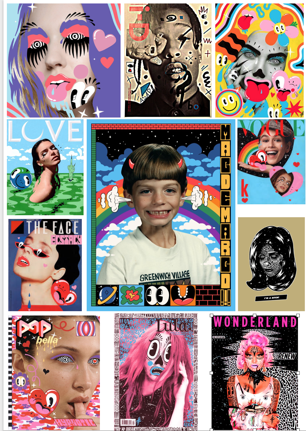
Hattie Stewart is an Artist and Illustrator based in London, UK. Although she is best known for ‘doodlebombing’ over influential Magazines, her tongue-in-cheek artwork moves fluidly between many creative fields including Fashion, Music and Contemporary Art, including working
Stewarts work, even though it is not directly photographic, has given me incentive to incorporate forms of art to manipulate my works. Breaking the boundary between photography and art can be quite a sensitive subject, but I’m hoping to banish that and bring the two together.
