Category Archives: Uncategorized

Filters

Author:
Category:

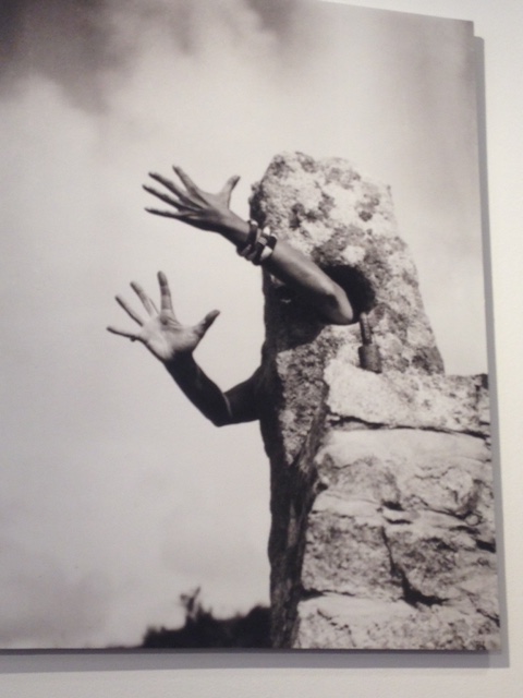
Clare Rae and Claude Cahaun

Both images share this same concept of the subject standing behind the rock with only a hand or hands pointing out which may represent a loss of identity because everything about them that could be identified is being covered by this un-moving slab of rock.  Both images are black and white giving them a vintage look however Clare Rae’s has more contrast between the black and white. In both images the images the subject inst dead center which breaks the rule of thirds. This may have been intentional because it makes it seem like the subject has even lost their identity as the subject. Rae’s is more of a landscape whereas Cahaun’s is more of a portrait. In Rae’s, because it’s a landscape, she blends more into the background which may have been her intention to make herself appear like every other rock which shows she lack identity.There’s a lot more light in Cahaun’s work which you can see shining on her arm and the rock and there is more in the background. There is a lot more darkness and shadows in Rae’s work. The background in Cahaun’s work is more blurry that Rae’s which brings more attention to the subject, however in both the sun hits the rock the subject is behind.  The composition of each piece is different. In Rae’s she’s behind the rock with her hand touching he rock passively, however in Cahaun’s the camera looks up at the subject and their have are bent out like stick man’s in an emotional way like anger of shock. In a lot of their pieces you question if they are truly the photographers if they are in the image. In these ones that identity of the subject is hidden so it leaves the question if they are the subject again or the photographer. In Cahaun’s image you can see bracelets on the arm closest to us but not in Rae’s. Maybe Cahaun wanted to add a little bit of identity like gender to the subject behind the rock.

Paper Photography

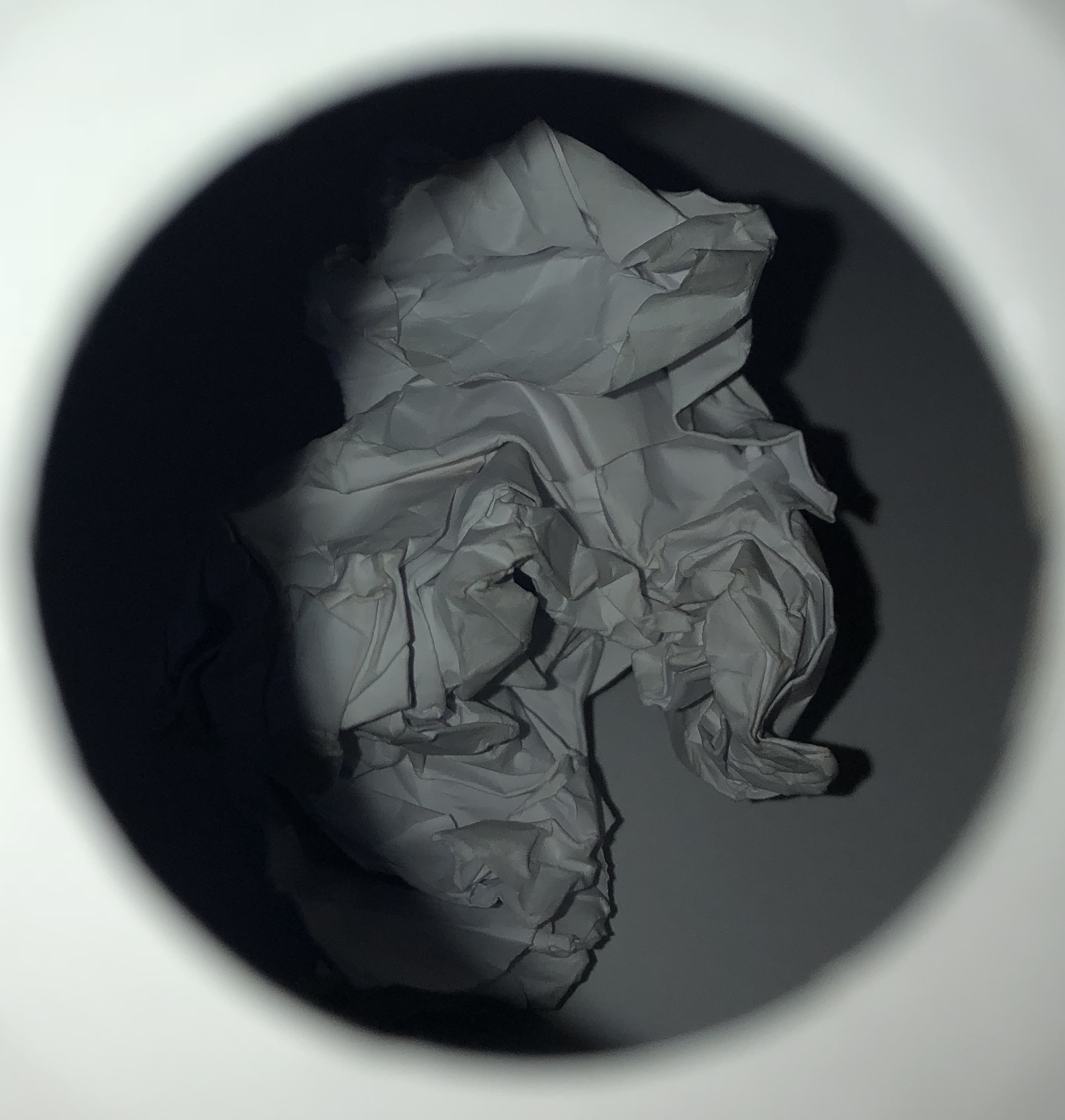
Photo 1

Photo 2

Photo 3

Photo 4

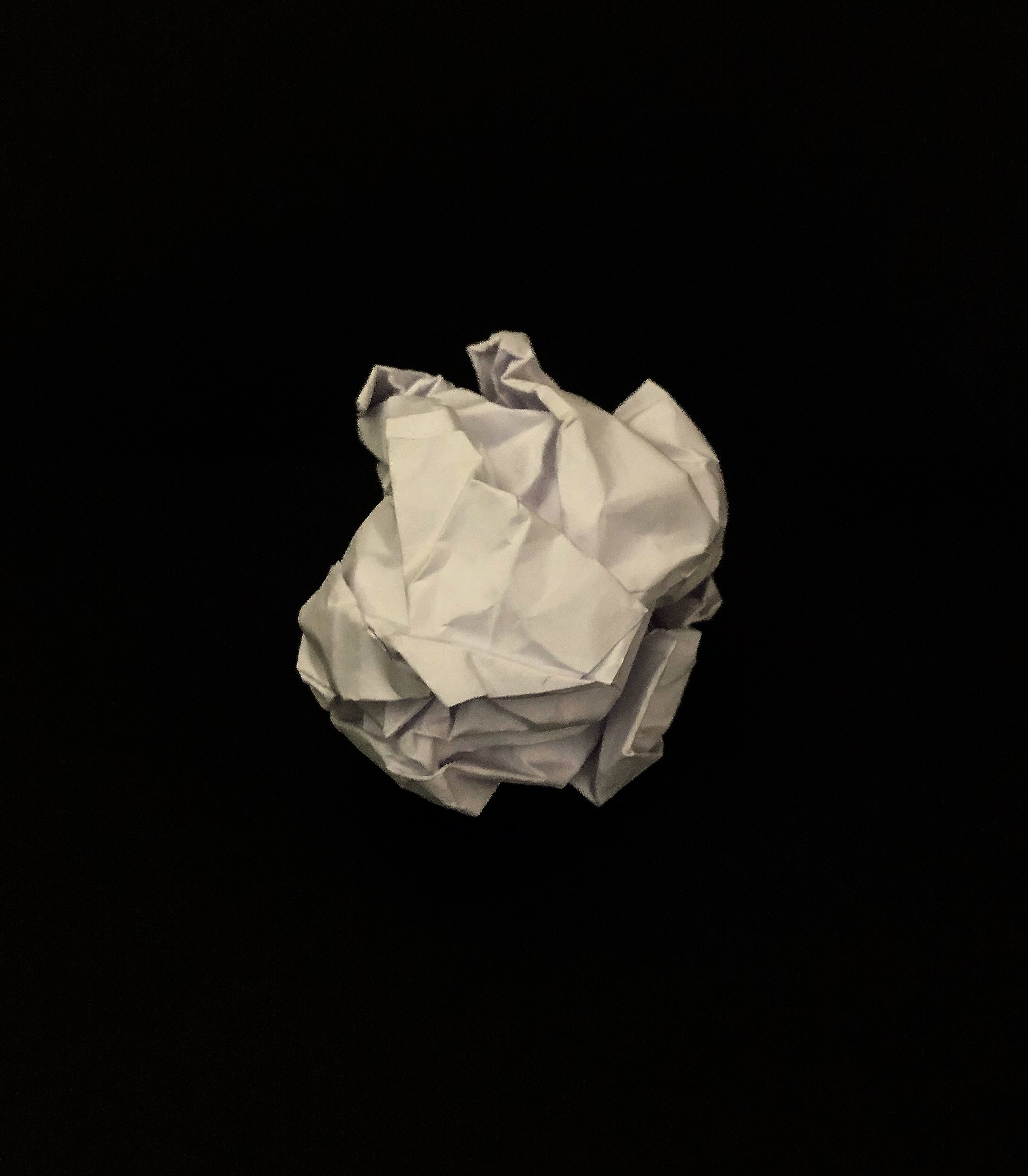
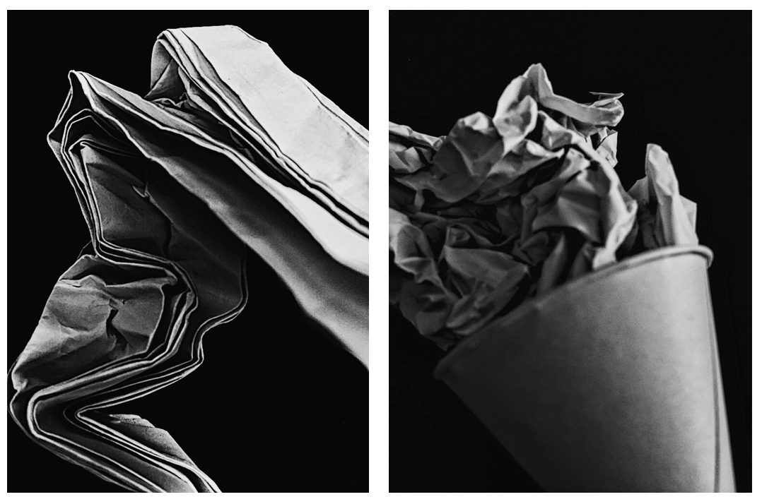
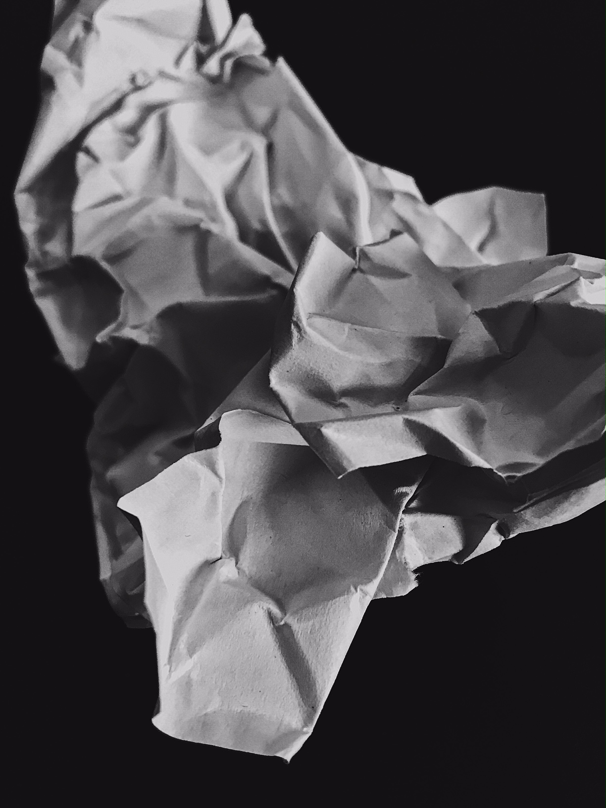
This is my favorite image from the shoot with the paper.

Technical:

Lighting – The photo was taken with flash the try and highlight the contrast between the white paper and black card.

Aperture – The aperture was F3 so a medium amount of light was being let into the camera.

Shutter Speed – Was around 1/15 of a second which gave the top photo in particular a slight blur. An improvement would be to maybe use a faster speed of 1/250 or use manual focus.

ISO – The ISO was around 800.

White Balance – The temperature and warmth was turned up when editing to give the paper a worn effect as if it had been left for some time and been used. The white balance was also turned up to help the paper stand out.

Visual: 

The texture of this image has been greatly heightened to over exaggerate the crumples in the paper. I used the warmth tool to increase the worn look on the paper to make it look like it had been used or is old.

Conceptual:

The idea behind this work and image was to capture a raw and simplistic picture that can still be powerful and emphasize how such common items such as a crumpled piece of paper can be captured in unique and diverse ways, showing how photography can create a virtual presence of something so plain.


Contact Sheets

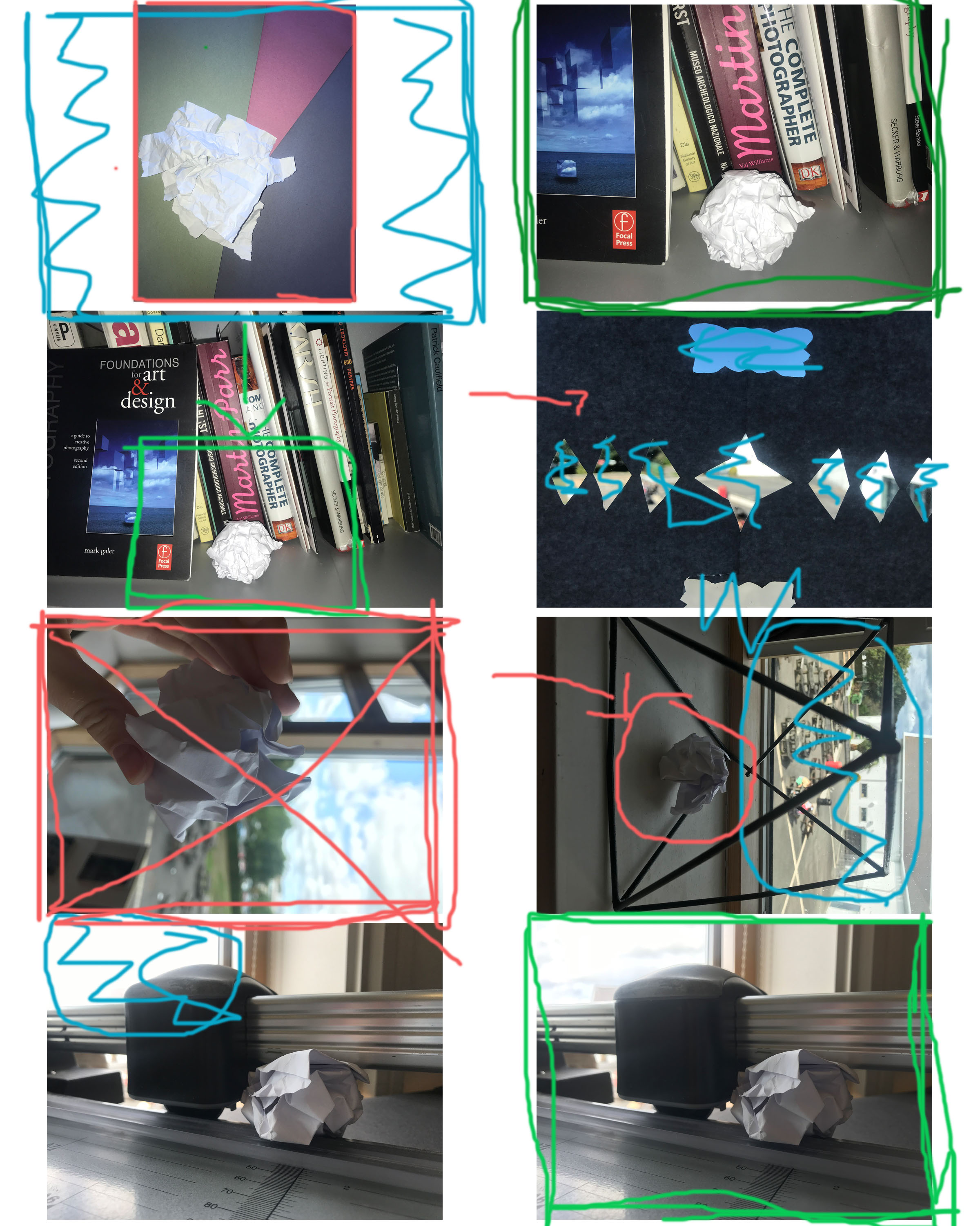
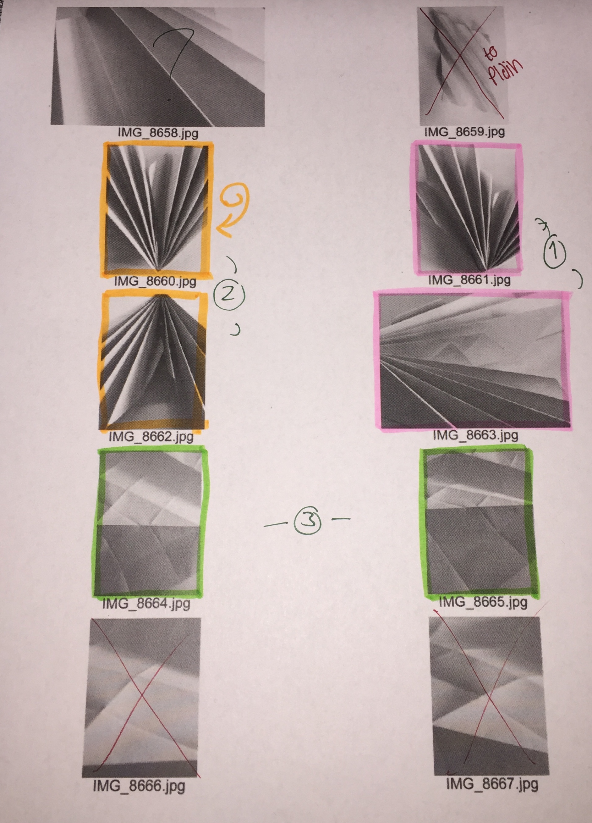
Why did I reject the ones I did?

I didn’t like the lighting in the one with me holding the paper and the one in the geometric shape. I also didn’t like how the light was coming in from the window in one of the photos. I didn’t like the background being featured in the one with the shapes cut out of the paper.

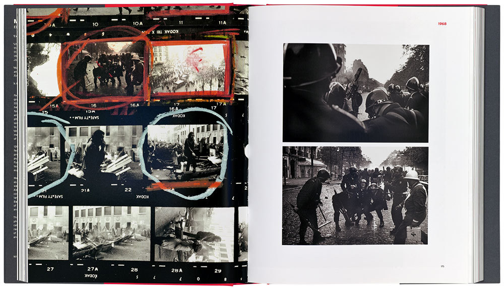
Examples of Contact Sheets


KEY:

Red X – Unwanted Photograph

Red Circle – Lighting Issue

Blue Scribbles – Unwanted things in the background (mise en scene issue)

Large Green Box – Wanted image

Small Green Box – Want everything within square

Paper Shoot – The Edits: VSCO App

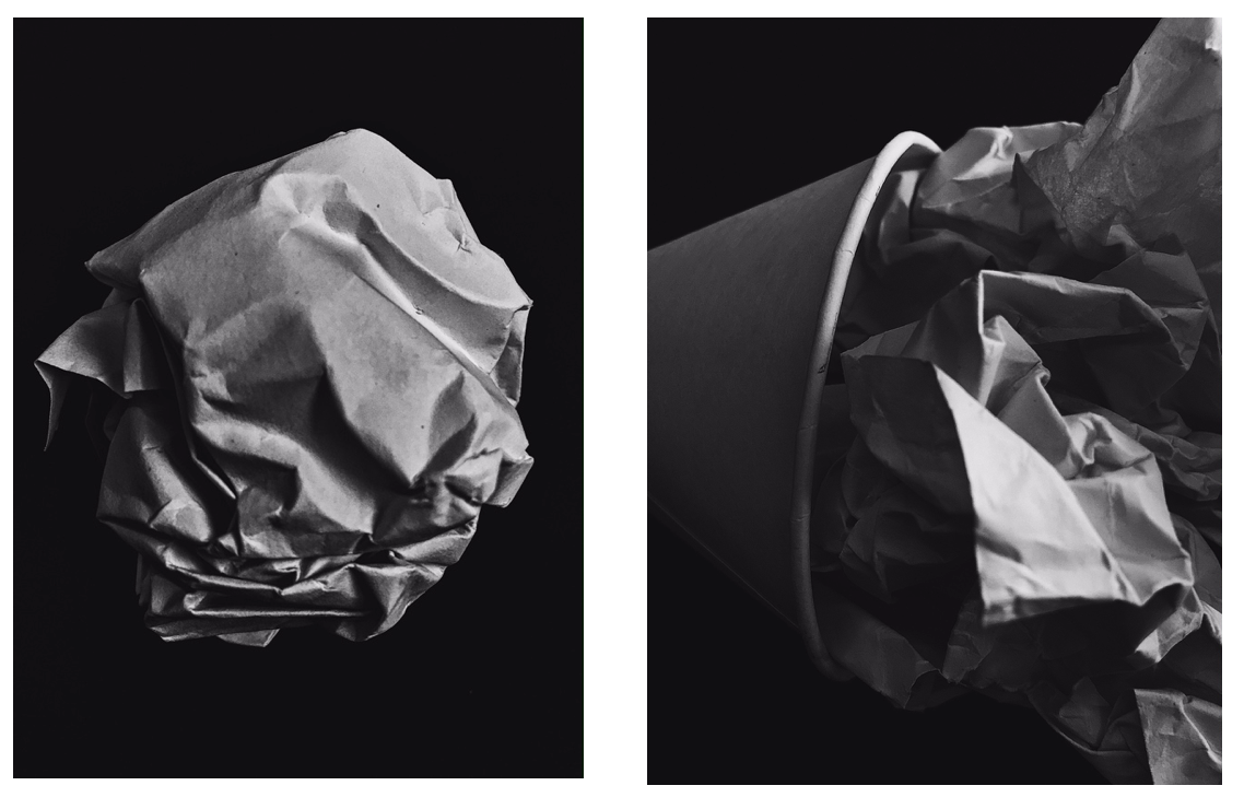
Here are some of the edits of my paper shoot. My nest photoshoot I need to concentrate on the focus a lot more. Taking into consideration that I was using an iPhone camera which isn't amazing quality, I need to continually focus on the quality of the image and ensure the focus is correct.

To manipulate these images, I used the app VSCO.  I heightened the contrast and clarity, then lowered the exposure and applied a black and white filter.

Paper Photography:Contact Sheet

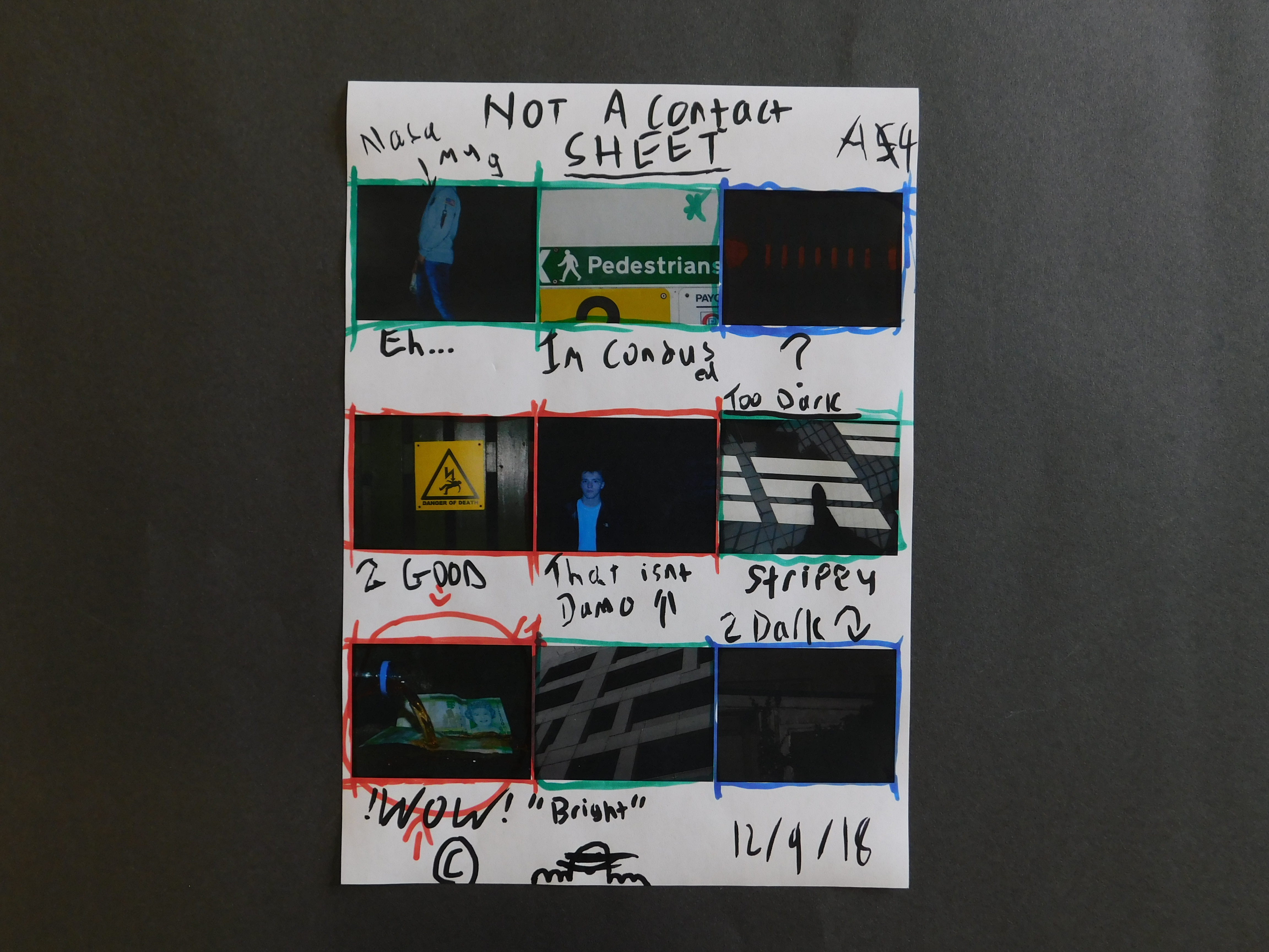
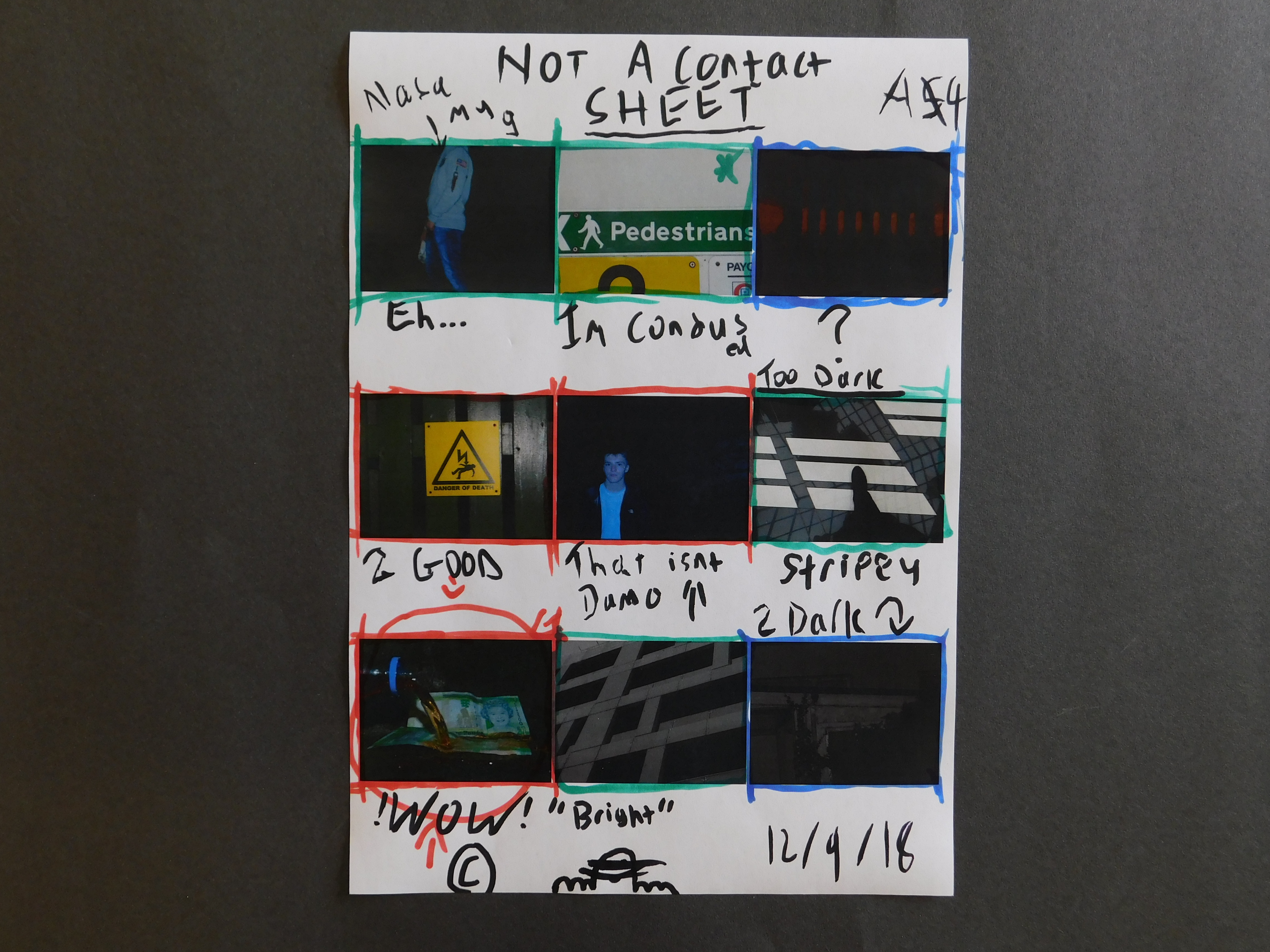
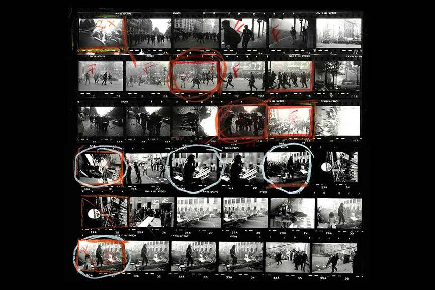
Photographers use contact sheets to allow them to carefully select their top images. It also allows them to annotate the photographs on where they may want to crop the photograph, issues with photographs and photographs that they may want to further develop or use. Contact sheets are also used to present all the photographs captured on the shoot, which shows how the photographer went about the photo shoot. This way of displaying images is very useful for a photographer.

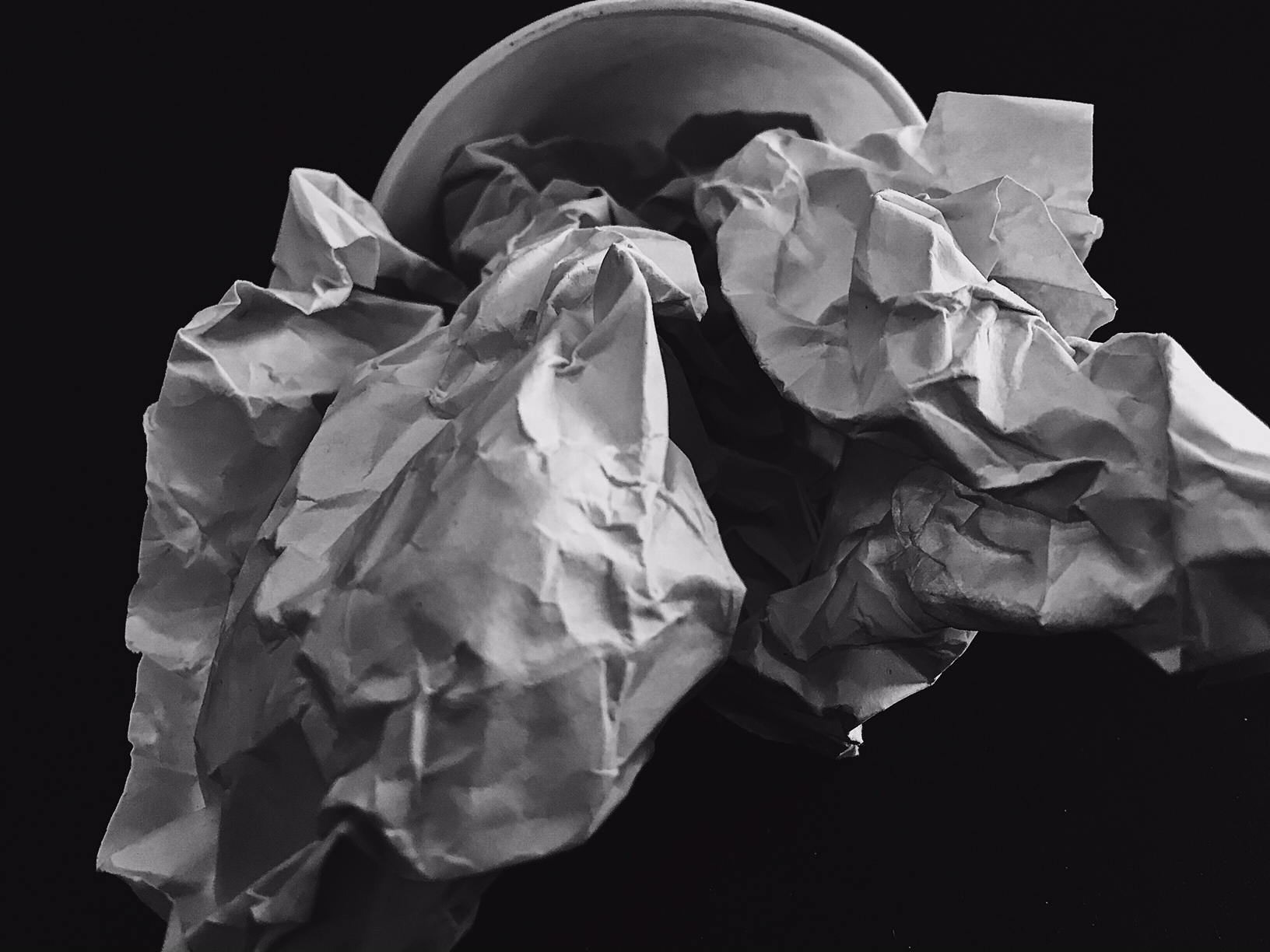
Overall, in my opinion this is my best image  from the response I did. I like this image due to the use of light and tone, with a good contrast. The contrast in my opinion shows the form and line of the paper than if the frame was all highlights and all bright. 

The way I achieved my wanted contrast and brightness, I utilized the natural light in the room so that I didn’t have to  use the flash or heavily edit the picture. The only editing I did do was add a soft black filter to the image: I didn’t want a normal black and white filter that pix-elates the shadows and lines.

Alongside the use of contrast, I wanted to incorporate line and shape into my image so that it created less of a silhouette and more of a strong shape within strong shadows.

contact sheets

contact sheet
noun
plural noun: contact sheets
  1. a piece of photographic paper on to which several or all of the negatives on a film have been contact-printed.

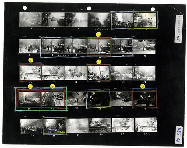
    An example of a contact sheet

Image result for contact sheets


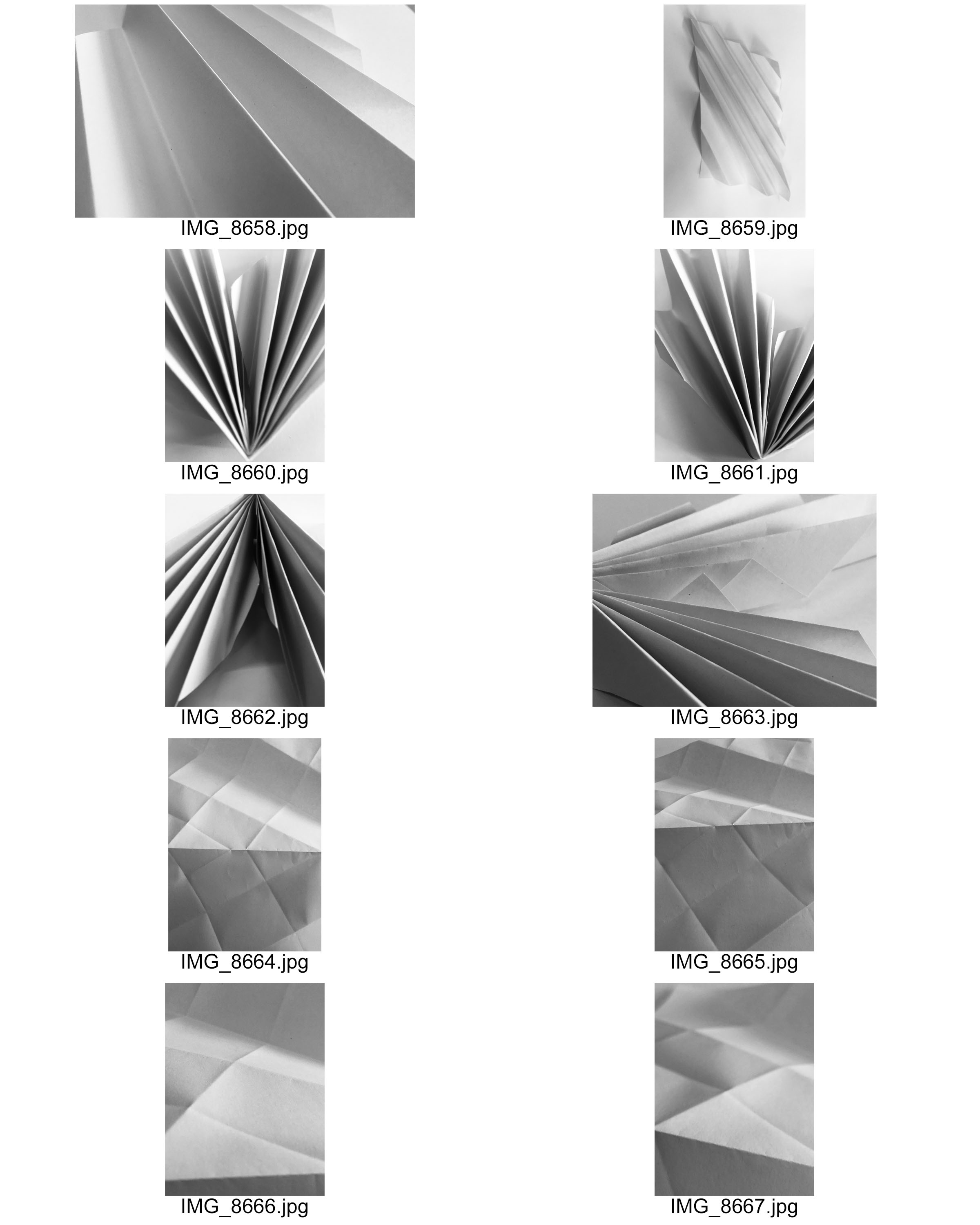
To create a contact sheet, open all your jpgs onto your device and save them to your files.

Make sure your photos are in a thumbnail format before screenshotting.

screenshot your photo thumbnails and open the image onto photoshop.

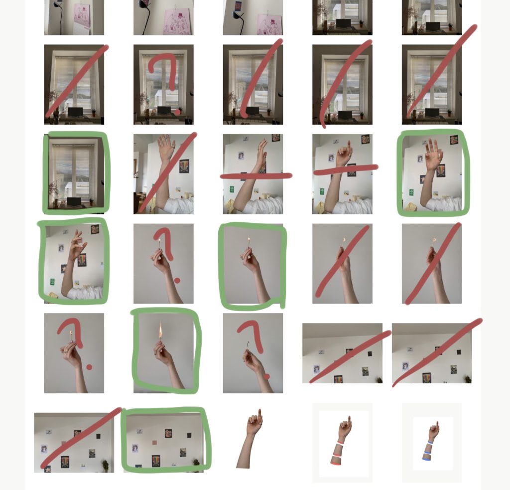
select the brush tool and use colours and lines to show what photos you are going to use, which ones you are going to discard etc…

You should end up with something like this…


Green box – using

red stroke – not using

green question mark – not sure to use as final

red question mark – not sure wether to use at all

horizontal lines – cropping


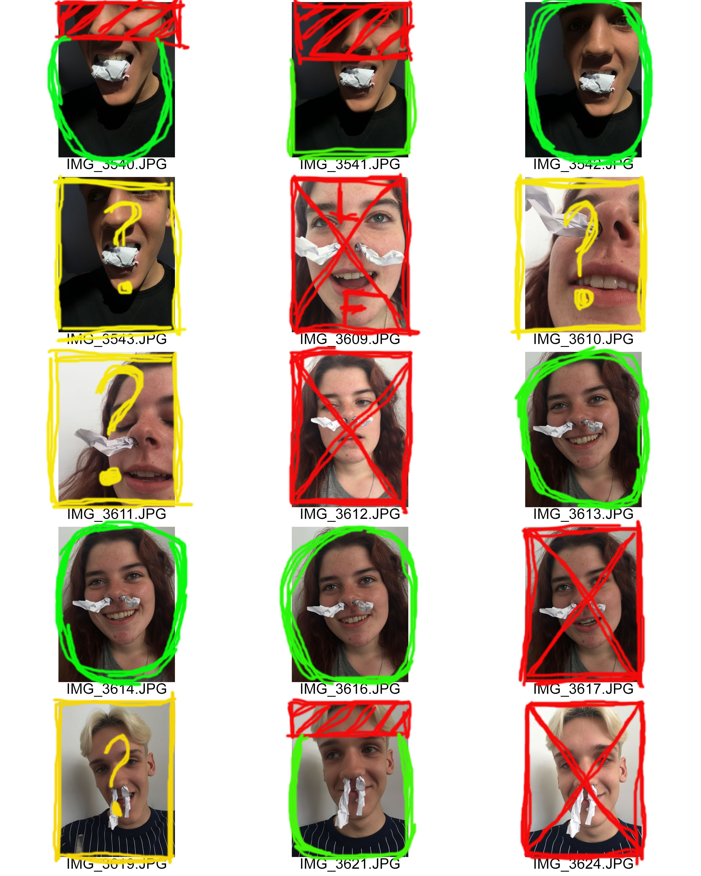
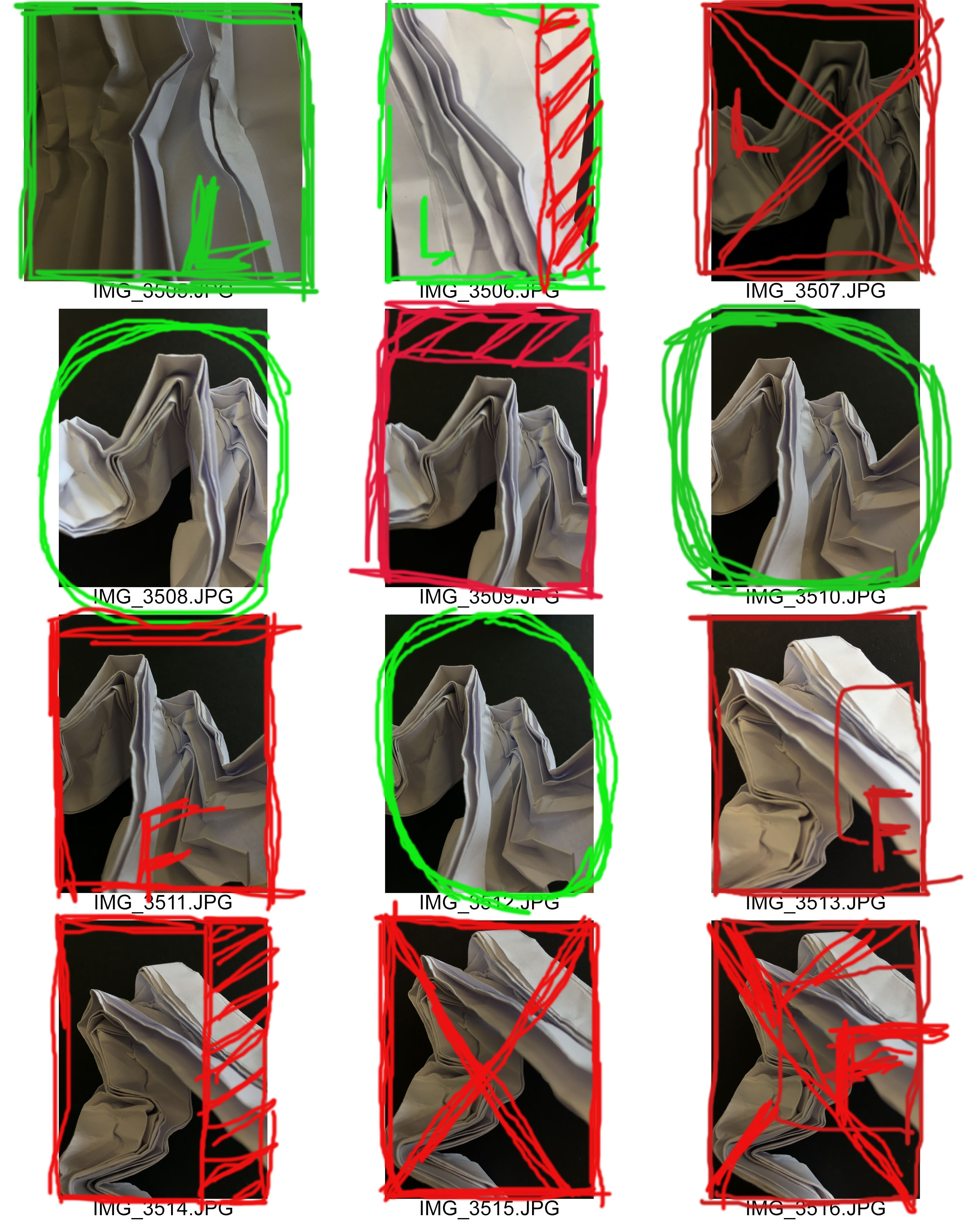
CONTACT SHEET: PAPER SHOOT 2

The Meanings of my Editing:
Red X: This means that I do not want to use this image at all.

Red F:  This means that there is a focus issue in the image

Red Shading: The shaded area is the area that I wish to crop out of the image.

Green L: This means that there is a lighting issue in the image, but I wish to edit the image and fix the problem.

Green Circle: This means that I am happy with the image and wish to begin editing and manipulating the image.

Yellow Question Mark: This means I am unsure on whether to use continue to use this image and whether to edit and manipulate it or not.

Contact Sheet: Paper Shoot 1

The Meanings of my Editing:
Red X: This means that I do not want to use this image at all.

Red F:  This means that there is a focus issue in the image

Red Shading: The shaded area is the area that I wish to crop out of the image.

Green L: This means that there is a lighting issue in the image, but I wish to edit the image and fix the problem.

Green Circle: This means that I am happy with the image and wish to begin editing and manipulating the image.

Red L and Red F with Box: The red L means that there is a lighting issue and I do not wish to use the image. The Red F with a box shows that there is a focus issue with the image and the box highlights specifically where there is an issue.