Category Archives: Uncategorized

Filters

Author:
Category:

Paper Task

IMG_3892.JPG:

Lighting: for this image I used natural lighting from a nearby window in order to achieve the color temperature that I wanted, since natural light is often cooler then the halogen lights in the school giving a nice balance between the cool blue lighting and the pink paper.

Aperture: I used a Rather low F stop in order to produce the depth of field look i wanted.

Shutter Speed: I experimented with various shutter speeds for this project, in this image I settled on a Fast shutter speed as there was plenty of light and I still wanted some deep shadows.

ISO: for the entirety of the project I stuck with an ISO of 100 in order to avoid grain and simply controlled the lighting with the shutter speed.

White Balance: for this image I wanted the color temperature to be rather dominant towards the cooler tones.

I was influenced by the work of Martin Creed with the latter half of the photo-shoot taking a lot of inspiration from his work with a scrunched up paper ball.
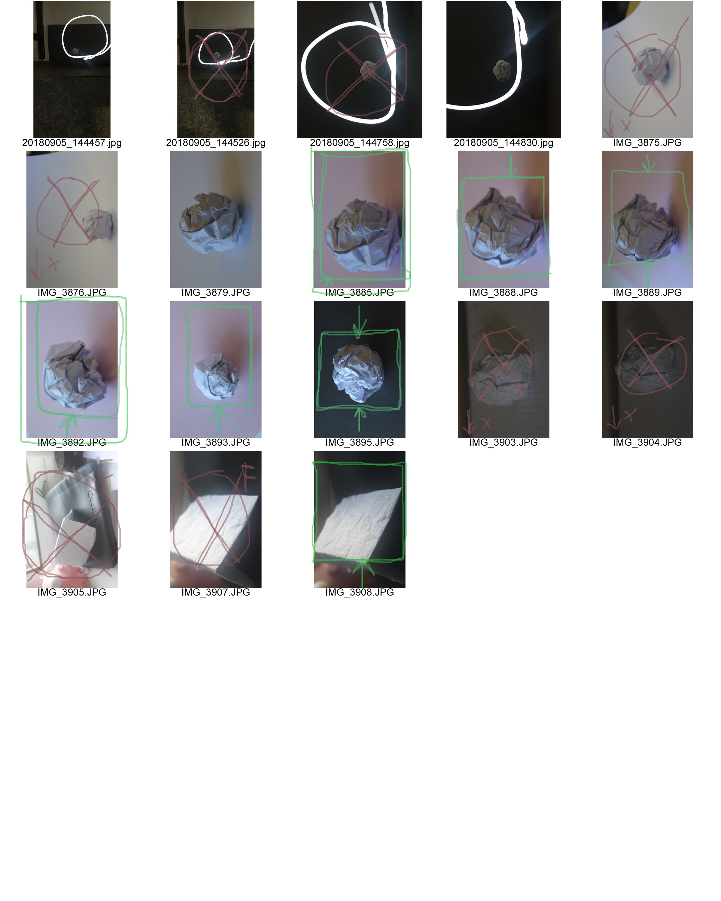
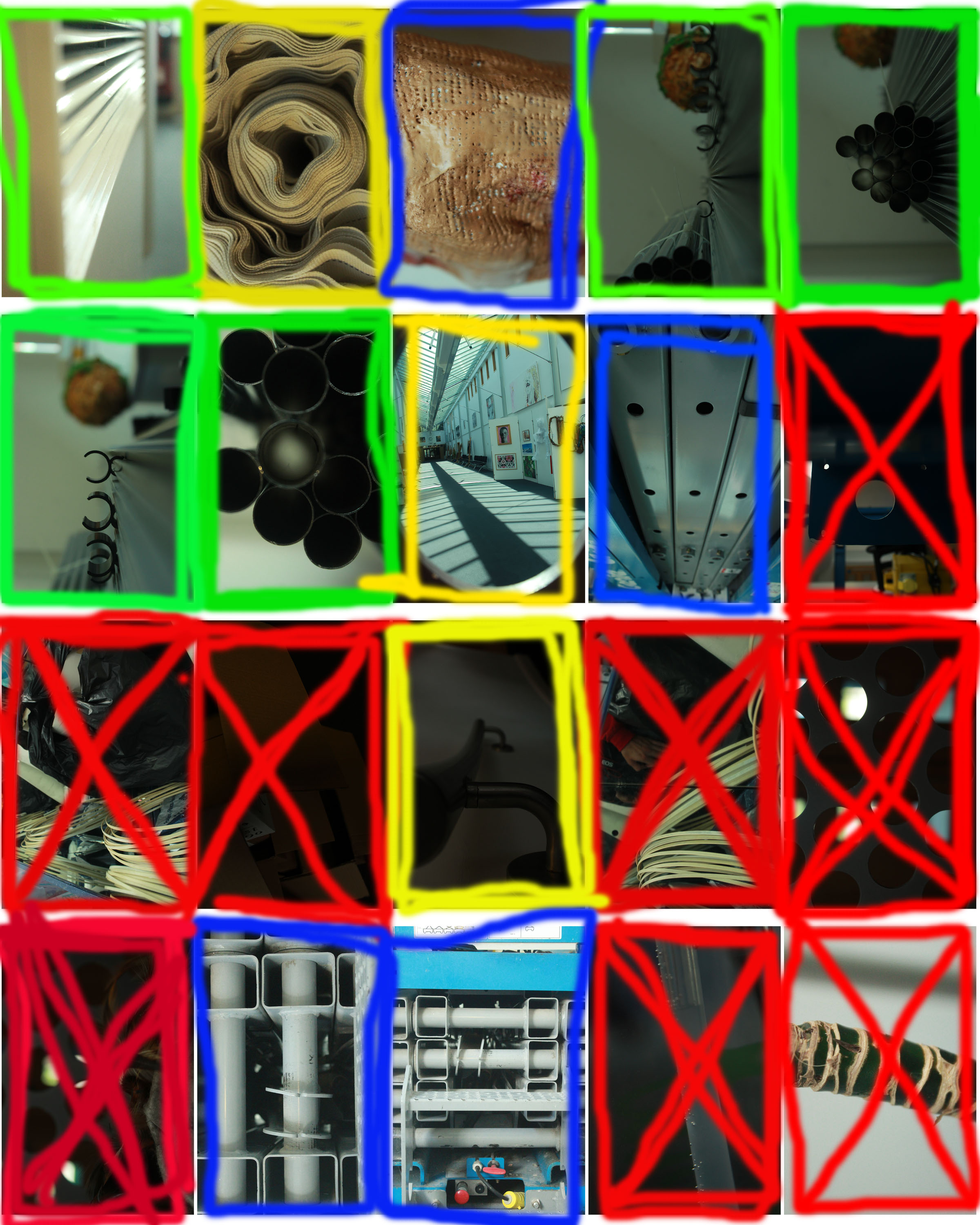
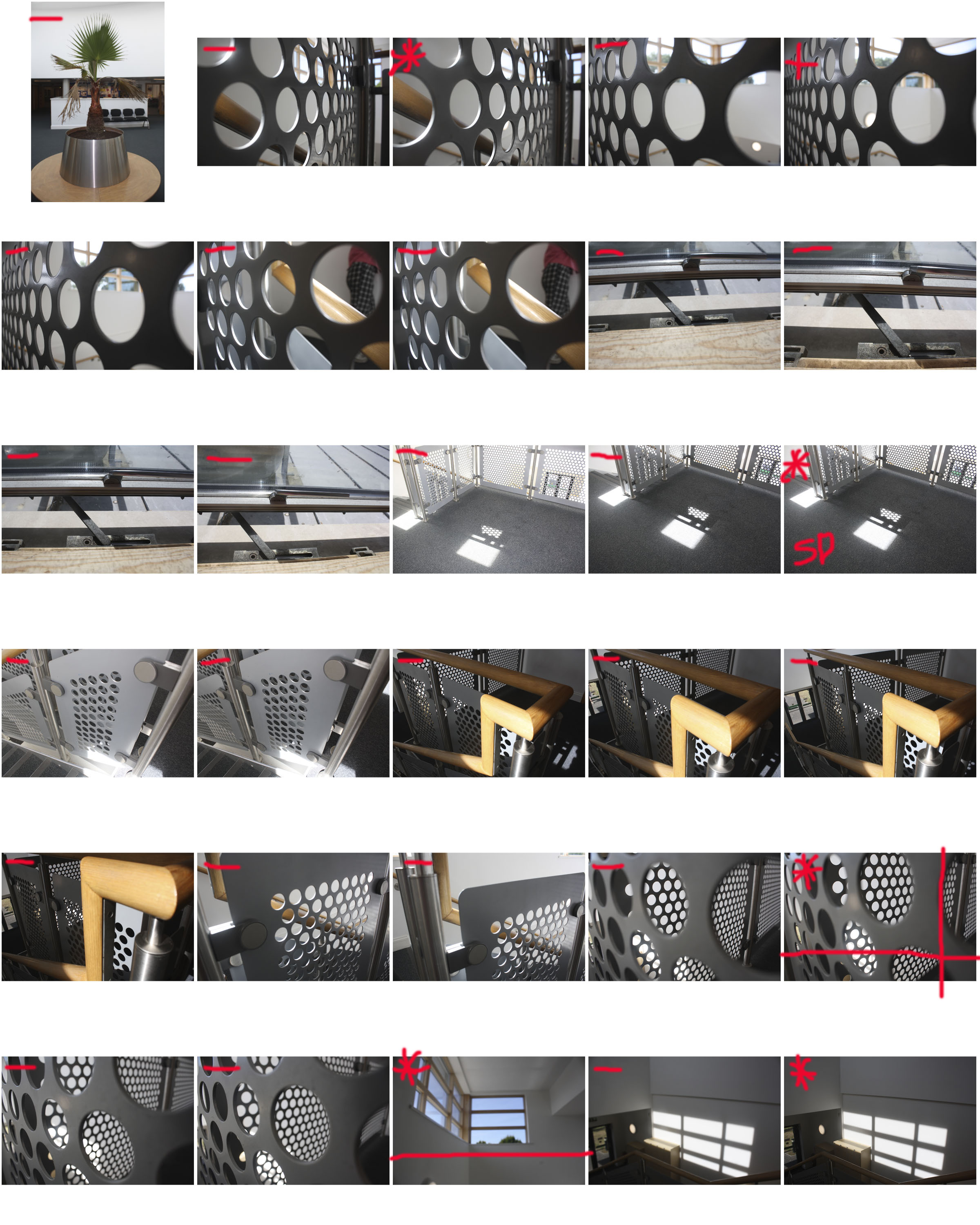
My Hautlieu Abstract contact sheet

 I took a wide variety of pictures around the site of Hautlieu school and managed to select these 20 photos. From the 20 final photos I used the help of this contact sheet to go further in my simplifying.

The key for my contact sheet is this:

-The green box means I am happy with the final product and don’t want to edit it anymore

-The yellow box means that whilst I am happy with it I know that I could edit them and make them up to my own standards.

-The blue box means that I am unsure whether I should edit them to try make them better or I should discard of them.

-Finally the red box means I am unhappy with the photos and don’t want to take them further.

CCA Galleries – Clare Rae & and Claude Cahun Exhibition

Clare Rae is a contemporary photographer who is based in Melbourne, Australia. Her work is based around the feminist theory, the female body and the awkward experience of subjectivity. Her current exhibition at the CCA Galleries: "Entre Nous" is her work that is inspired by Claude Cahun. 
Claude Cahun, a member of the Parisian surrealist movement, was a queer and jewish photographer who moved to Jersey with her stepsister/lover. Her photos are self portraits that pushed the boundaries of self identity, gender and sexuality. Claude is often described as ahead of her time as she pushed so many boundaries that were deemed highly unnaceptable at the time. 

Claude Cahun and Clare Rae have 70 years between them, and their exhibition brings the conversation between their two performative practices.
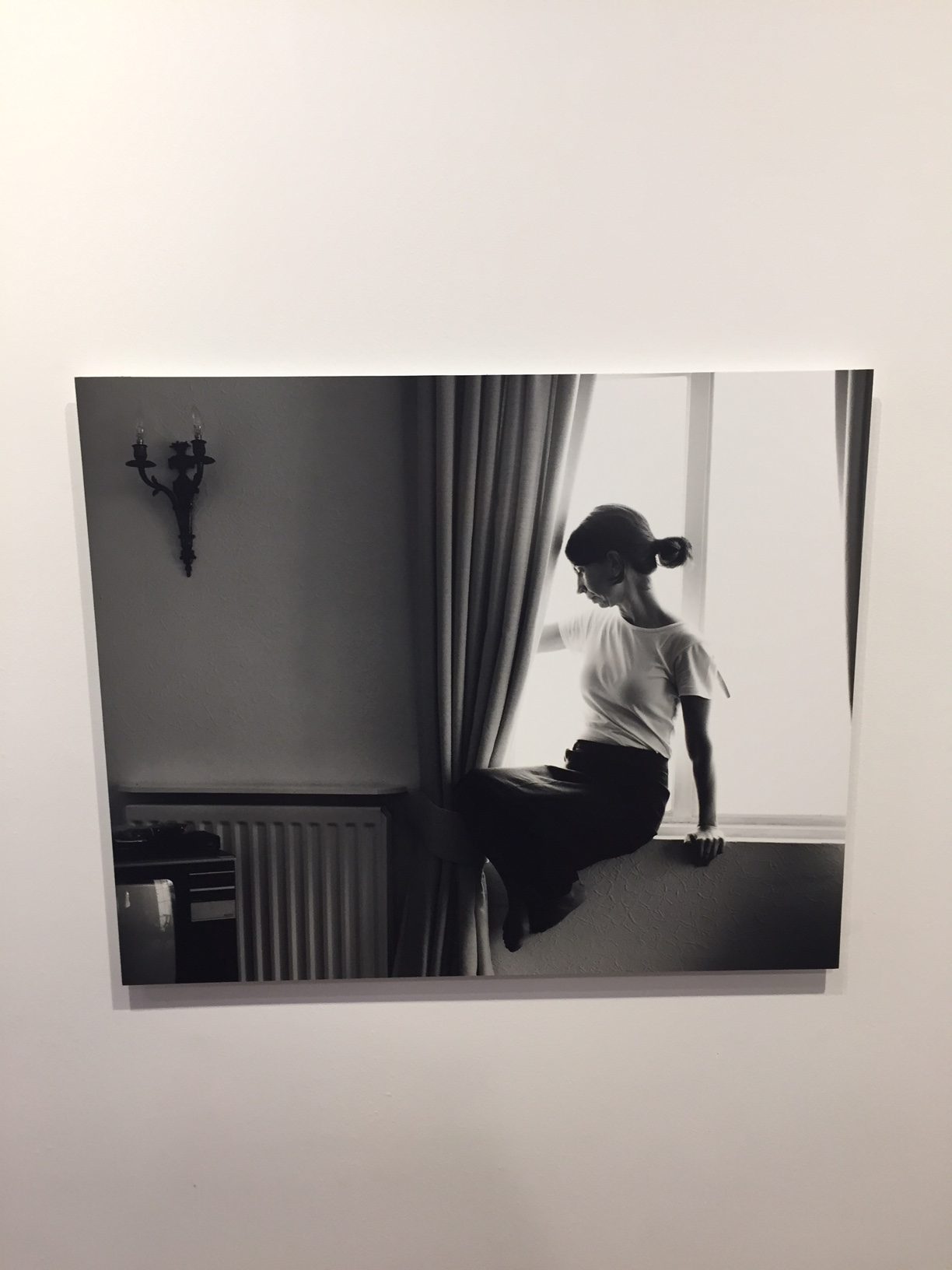
Example of Clares Work:


The lighting from behind the subject (Clare) creates a slight silloute of herself. Her simple outfit and concept in this image contrasts Claude Cahuns photo of "I am in training don't kiss me".
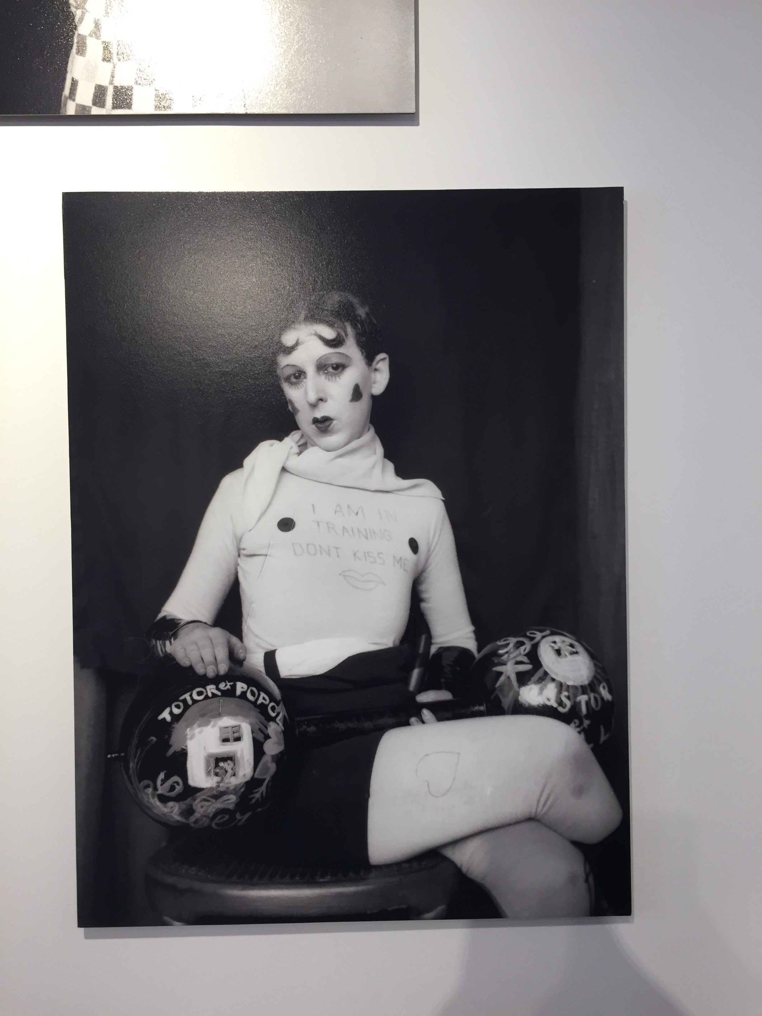
Claudes dark background contrasts Clares light background, also the fact that Claude is staring towards the camera reveals her daring and devilish attitude. On the other hand, both photographers are sitting in a similar position and they both have white tops on with black bottoms. Claudes masculine activity (weightlifting) contrasts her extreme feminine looks - the lipstick, the love hearts. These contrasting ideas display Cahuns defiant attitude towards gender roles.
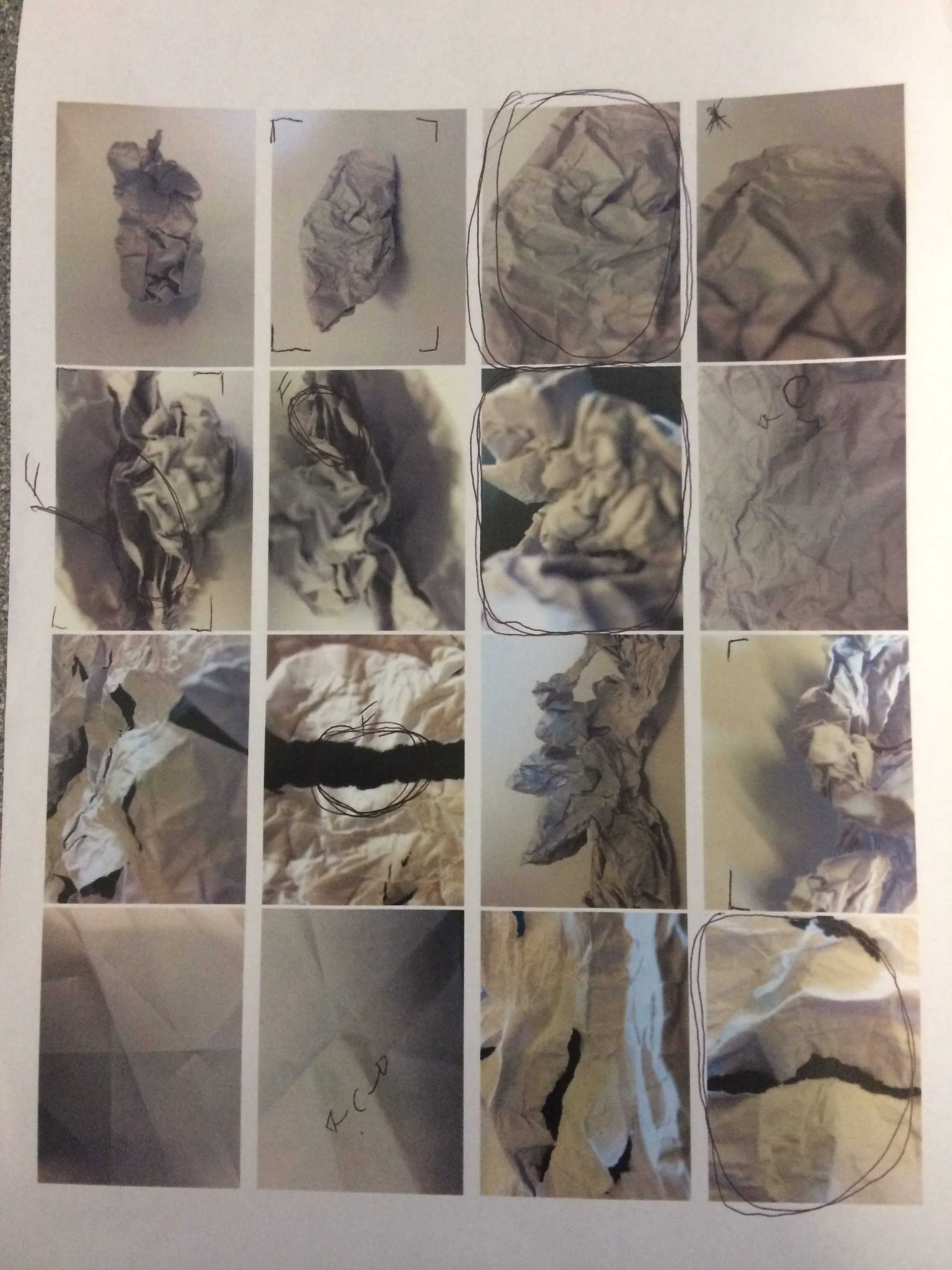
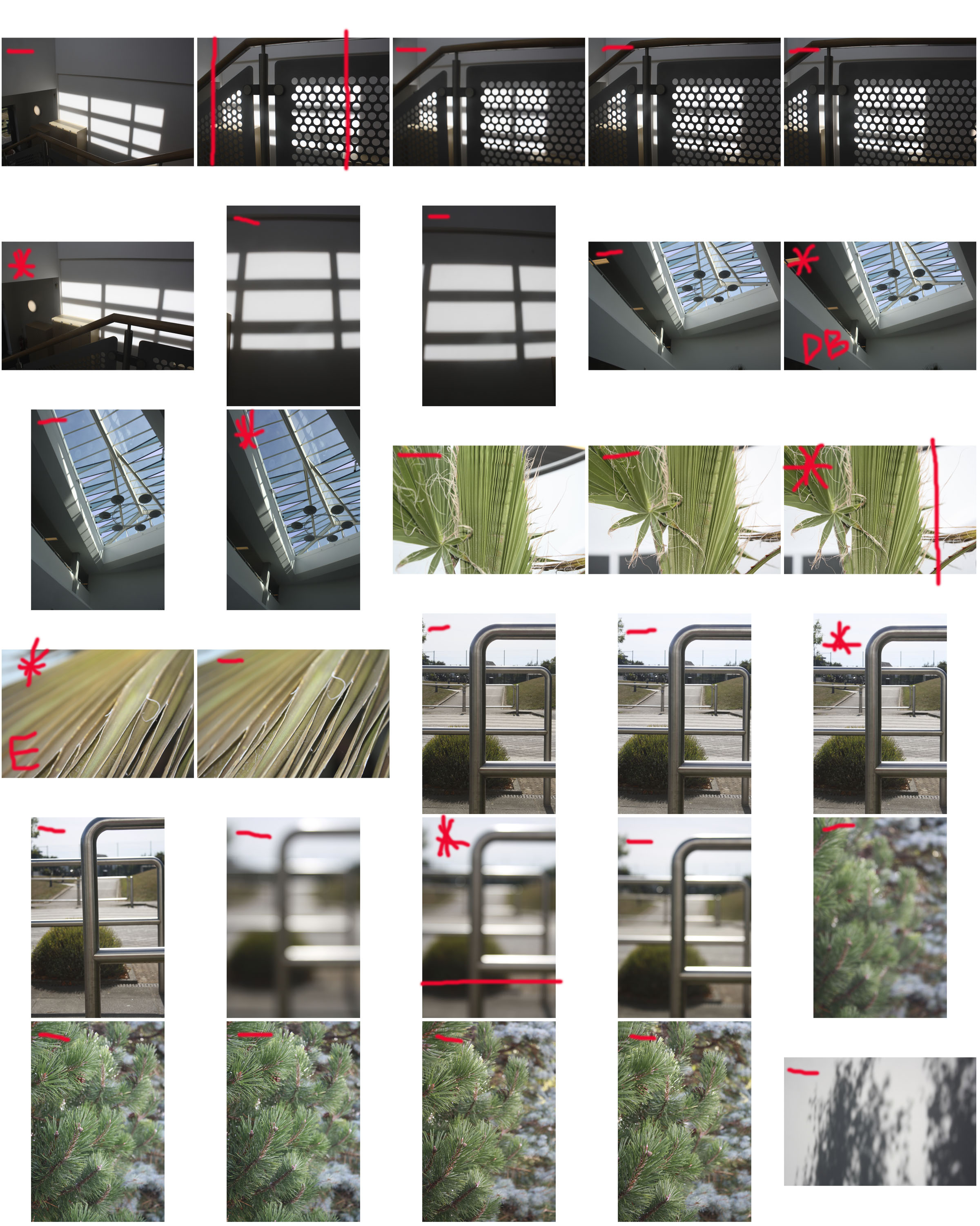
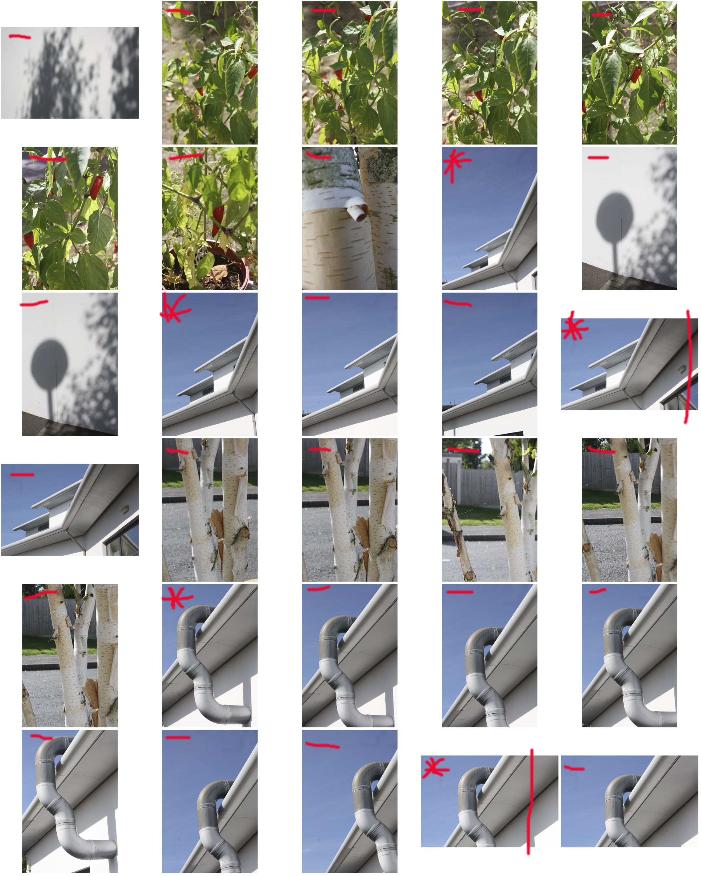
Abstract Paper Contact Sheet


I have selected a handful of images to see a comparison between the photographs I have taken. This lets me see which ones I think are good and which styles worked in the images. I have drawn something over some of the images to remind myself of what is happening, if I liked the image and if I would want to edit in the image in various ways such as cropping or by making some of the colours stand out more.

Line, Shape and Form

Uses In Photography

Shape: A shape is two-dimensional. Yes, a photograph itself is two-dimensional, but a shape in a photograph doesn’t have any appearance of depth. Often, to make a 3D object appear to have no depth, front or back lighting is used. An object that appears to have depth either through lighting or perspective, is not a shape, but a form.

Form: Objects that appear to have depth, despite being part of a two-dimensional image, are part of the design elements of form. Forms usually appear to have depth through lighting that creates shadows, or by looking at the object from an angle, rather than straight onto one of the edges.

Line: Lines form the edges of shapes, but they also form shapes of their own. Lines can lead the eye in a photograph and serve as a powerful compositional tool.

Types Of Shape

Geometric: Geometric shapes have straight, defined edges. In photography, these types of shapes are most common in man-made structures, such as architectural photography.

Organic: Organic structures are full of curves and may not be geometrically perfect. These types of shapes are often most found in nature, the curve of a flower petal, for example.

Abstract photography contact sheets

WHY WE DID THIS – 

The aim of this photo shoot was to capture the abstract shapes and forms which can be found all around us.Even when going through school, in mundane things, beauty can be found. I captured images which suit best the theme of “abstract”, incorporating simple shapes and forms in order to do so.

Claude Cahun X Clare Rae

Claude Cahun X Clare Rae

I enjoyed the work of Clare Rae and Claude Cahun very much as I enjoyed seeing the surrealist nature of Claude Cahun’s work And how Clare Rae managed to interpret her work and gain inspiration to carry out her response. Clare Rae focused more on Claude Cahun’s earlier work about Man with nature and man with man made objects.  Clare Rae and Claude Cahun both have put their pictures in black and white and are both the main subjects of the photograph, whilst maybe someone else is taking the photographs. Both their work likes to feature contrasting tones of light and dark.

Claude Cahun in this photo is far away from the camera itself and facing away from it also. She here I believe is trying not to draw too much attention away from the surroundings and the structures in the photos. The walls at the edges in the photos creates a claustrophobic feeling which could be Claude Cahun’s way of expressing her feelings towards those who were at the time maybe being shunned for their sexuality.


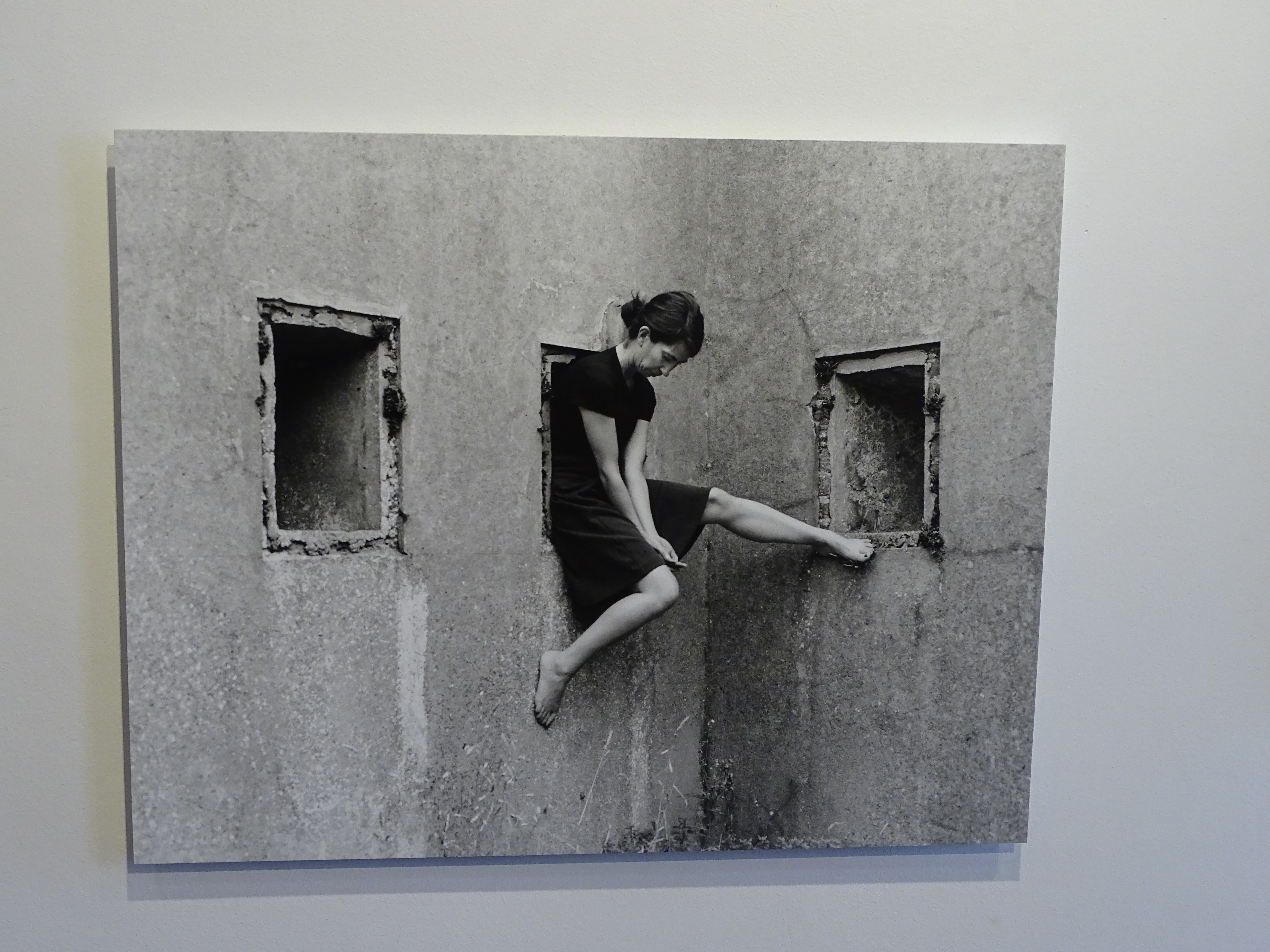
Similarly, here, Clare Rae keeps her head down and not looking at the camera. She also focuses on the architecture around her and the  texture and shapes of the walls. Rather than this feeling claustrophobic, it’s feels comforting as she’s almost cocooned by the walls. However the ways she sits is awkward which could be a take on the ways Claude Cahun also used her body.
 

CCA Gallery visit. Cahun Vs Rae

During our first visit to the CCA Gallery in St. Helier I saw how the australian photographer Clare Rae uses herself as the main focus of her photographs to represent gestures and performance in reaction to an older French-Jewish photographer Claude Cahun.

This photo of Rae shows her in an uncomfortable and unnatural position. I think that this was a hard photo to do as she is her own model so she had to set up her camera and set a timer or have a clicker, of her in this unusual position.

This photo shows her trying to manoeuvre  herself to try fit into her surroundings. I believe that this photo is almost representing how people change to adapt to their surroundings but to also fit  into society more.

This photo of Claude Cahun, just proves to us that she was exploring body image by shaving of her own hair to prove herself. I really like this photo not just because she has done this to herself, but because she has shown many textures within the photo, from the smoothness of her clothes and hair to the rough textures of the granite wall behind.

I also quite like this photo of Clare Rae in the ruins of an old German bunker. I like this because of the dullness of the sky above it really brings out the rest of the photo. I also like the use of depth in this as you can tell she is far away, although there is depth there is no specific focal point.


Overall I really enjoyed the trip to the CCA Gallery as I learned a lot about both of these fantastic photographers, I also got to compare their similarities and differences upclose.