Category Archives: Uncategorized

Filters

Author:
Category:

WEEK 2- CLARE RAY AND CLAUDE CAHUN- EXHIBITION CRITIQUE

Clare Ray and Claude Cahun Exhibition critique

When visiting the CCA gallery to analyse Clare Ray and Claude Cahuns abstract photography i had noticed that both exhibitions very simple and unique in their own ways. The Claude Cahun and Clare Rae exhibition was very inspiring and interesting to visit. There were two rooms that made up this exhibition, one containing each photographers work. I think that the layout for this exhibition was very well thought out as there was no way the audience could get the who photographers work mixed up.

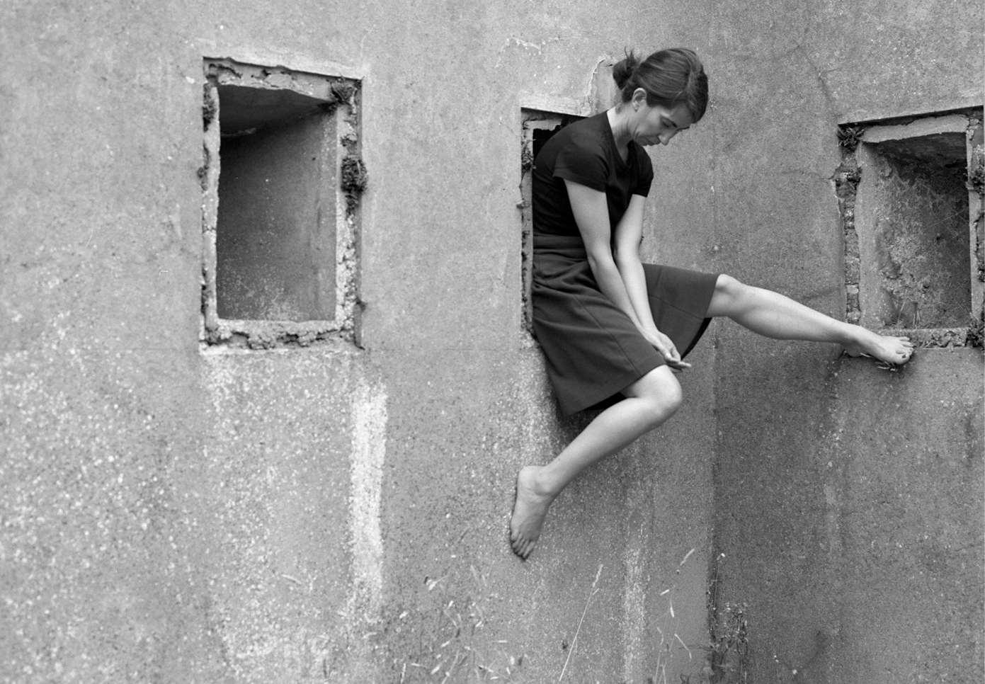
Clare Ray is a self- portrait photographer which i found very inspiring as her images were very unique however you could clearly see the elements of Cahun’s work included in Rae’s images . All of Ray’s images proved to be in only black and white which intensified the light and dark colouring in the images which added a lot of tone to the photographs, which made the images look old like the self portraits Claude took. Clare tends to bend her body in many different positions for her self portraits which has been used to help her interact with the Jersey environment. I think Ry using modern day sterile environments reflects the change of era in contrast to Cahun’s exhibition. 

Claude Cahuns exhibition was very unique in the way that the photographs all had different patterns, coloring and different sceery. However, somehow they all complimented each other when placed together. During the time the self portrait pictures at the exhibition were taken when Claude was a lesbian and an activist against the WW2 war. I think this is portrayed in Claude’s work as she posed naked in a lot of her work which implies that she’s trying to let her sexuality free as it wasn’t proper to be a lesbian in WW2 times. The fact that she was posing naked also was not allowed during WW2. All of this shows that Claude was a bit of a rebel and just wanted to be herself. All her pictures proved to be very advanced from her time as she was very unique.

I think that Claude’s background adds a lot of story to her pictures which i really like as it helps us to seek what she was thinking/ feeling in her abstract photos.

Clare Ray

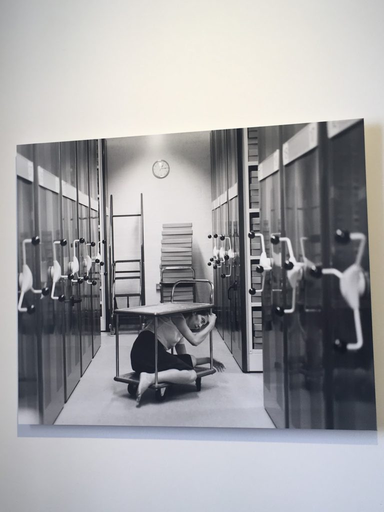
I think this self- portrait of Clare Ray is my favourite piece from the exhibition, this being because i love how abstract the piece is. The image stood out to me as you can see that Ray has been clearly influenced my Cahun due to the black and white filter. However the range of brightness used throughout the image adds tone to the image and shows the reflections on the side doors which are included in the picture. The brightness also adds contrast to the image due to it adding a sterile feel to the image. You can tell Ray’s intentions was to add a sterile feel to the image due to the plain location shes in, the lighting she is using, the prop she is using in the image and the way in which she has shaped her body to the prop and the facial expression she is using. The overall image is very simple but someone gives off a very complicated effect. 
Claude Cahun

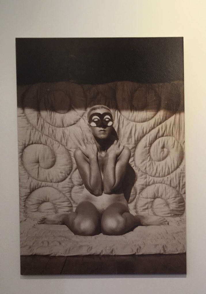
I think this self- portrait of Claude Cahun is one of the most interesting from the exhibition as the picture is ahead of time with the shaved head and the nudity of the  image.

Claude being naked while posing in the picture adds a lost of abstract feel to the very simple picture as her nudity and the flowers in the open space is showing freedom. This freedom is also shown by tones in the image instead of usual colour. Not using colour in the images also adds maturity as the black and white adds tone through brightness.  I really like the concept of this image in the image she has her head shaved, which was very unusual for women during this era (1916) . I think this image is very powerful because it shows Cahun attempting to break gender stereotypes. This shows how far ahead of her time Cahun actually was. Using black and white also helps to contrast the different brightness’s adding more depth to the picture.

I think that Claude’s plan was to show her thoughts through the picture as the nudity and open field could be her wanting to be free of the Nazis punishments of being lesbian and transgender which i think is a great concept to convey.
Influensation

I think Clare has been heavily influenced by Claude’s work as both the photographers images are extremely similar.

Both are self- portrait photographers which means that they share that in common. However, i think that Clare has been influenced by Claude’s unique editing in the black and white theme as well as the brightness of the photos. Clares images have a lot of tone and texture in them due to the similar editing s Claude’s pictures also have a lot of texture in them.

I think that Clare has also extended Claude’s unique way of taking her photographs, as Clare has used her body in many different ways in her photos which add a more abstract feel. Where as Claude has a lot of photos which have the same feel to them as she is naked in most of them.

I overall think that it was good for Clare to be inspired by Claude as it has made her better at editing self portrait while still using her own ideas of the positions she chooses to pose for.

Exhibition overall

I think that the overall layout of the exhibition was really good as it was very simple and the photos were presented on plain white walls which means there was no distraction from the images. The layout of the different photos was also aesthetically pleasing to the eye due to the alignment of the images in the frames against some of the random other images which were a smaller or larger size image.
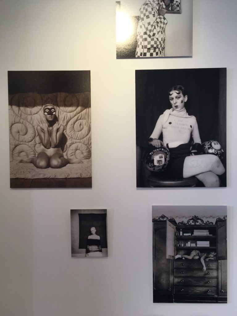
Claude Cahun x Clare Rae

a mixture of Cahun and Rae’s work


Claude Cahun

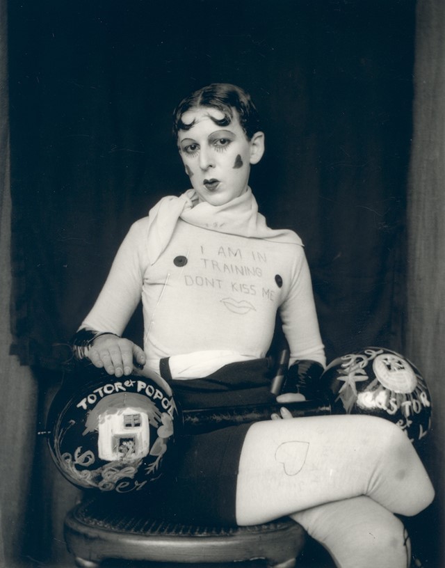
Claude Cahun’s photographic self-portraits present a dizzying kaleidoscopic mix of mystery, exuberance, and sobriety. Born in France, she lived most of her life on the island of Jersey with her stepsister and long-term love, Marcel Moore. Also known as Lucy Schwob and Suzanne Malherbe, both women adopted their preferred gender-neutral pseudonyms during early adulthood. Moore, although often invisible, was always present – typically taking the photographs and also authoring collages – and in this sense was as much artist collaborator as she was Cahun’s personal support. Described in her own words as a “hunt”, through a combination of text and imagery, Cahun’s exploration of self is relentless and at times unsettling. From circus performer, clothed in layers of artifice, to a stripped-down Buddhist monk grounded by integrity, Cahun is engaged in an ongoing dialogue with multiplicity. Tragically in line with the fragmentary nature of her outlook, much of the artist’s work was destroyed following her arrest and subsequent imprisonment for resistance against the Nazis. What remains bares interesting parallel to the title of Cahun’s diaristic publication Aveux Non Avenus, translated as Disavowels, which enigmatically suggests that for all that is revealed and given, much is still hidden or has been lost.

Themes of melancholy, futility, and uncertainty run deep through Cahun’s career. She does not make ‘complete’ artworks but rather all of her photographs and writings combine to become part of a bigger and yet still unfinished whole. She says herself that she does not have the answers to her questions, and as such unusually makes visible the rawness, torment, and distress of not knowing.

There is an obscurity surrounding Cahun that has made her an isolated figure. In character she was an obsessive loner, and yet she was also inextricable from Moore. From 1937 onwards, moving away from the artistic circles of Paris to the remote island of Jersey, the couple became somewhat awkward, ostracized, and inaccessible. Furthermore, with much of Cahun’s work destroyed in 1944, the overall body of her production became relatively small further heightening her mystery. The original works that survive are very small, as though they have been left as clues for a much bigger treasure hunt.


Clare Rae

In her photographic practice Clare explores ideas of performance and gesture to interrogate and subvert dominant modes of representation. Her work is informed by feminist theory, and presents an alternate and often awkward experience of subjectivity and the female body, usually the artists’ own.

Recent projects have engaged with site specificity, involving works that are captured and displayed within the same environment. A central interest within her practice is the exploration of performance documentation, specifically how the camera can act as a collaborator, rather than mute witness, to the performer.


Both collections of work were displayed along side each other, as Rae took inspiration from the works of Cahun. She hoped to pursue the idea of individuality and self expression like Cahun did.


WEEK ONE- PHOTOGRAPHING PAPER

Martin Creed

Martin creed was born in 1968 in Wakefield, England. He went to The Slade School of Art in London for 4 years in the late 80s. He has done a lot of work, and many exhibitions all over the world.
He mostly photographs simple, everyday items in very effective manors so that all his images look aesthetically pleasing. The specific pictures of his that I will be focusing on are the images of paper he has previously taken.

MOOD BOARD

  • Shadowing- used to enhance contrast
  • Simple elements
  • Different ways of folding paper
  • Lighting used in different ways
Analysation 

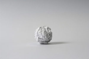
This image is named image No.88, this image shows how simple elements in a photograph can be very successful. One very successful element in this image is the background of the image as it is again very simple and also plain which doesn’t distract from the very detailed crumpled paper. I also really like the use of the lighting used to photograph the paper ball as it creates a small shadow of the right hand side which is clear to the audience that there is a light source coming from the left hand side. This shadowing adds contrast to the image because of the darker coloring.

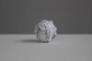
This image is also part of the no.88 collection and is very similar to the other picture i had analysed from the collection. However, Creed has used a darker background which helps to emphasise the detail on the crumpled paper. A right hand side light has also been used to create a shadowing on the left hand side which again adds contrast to the image due to the different brightness’s in the image.
Planning my photo shoot 

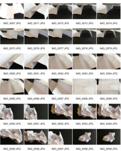
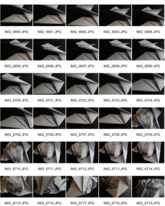
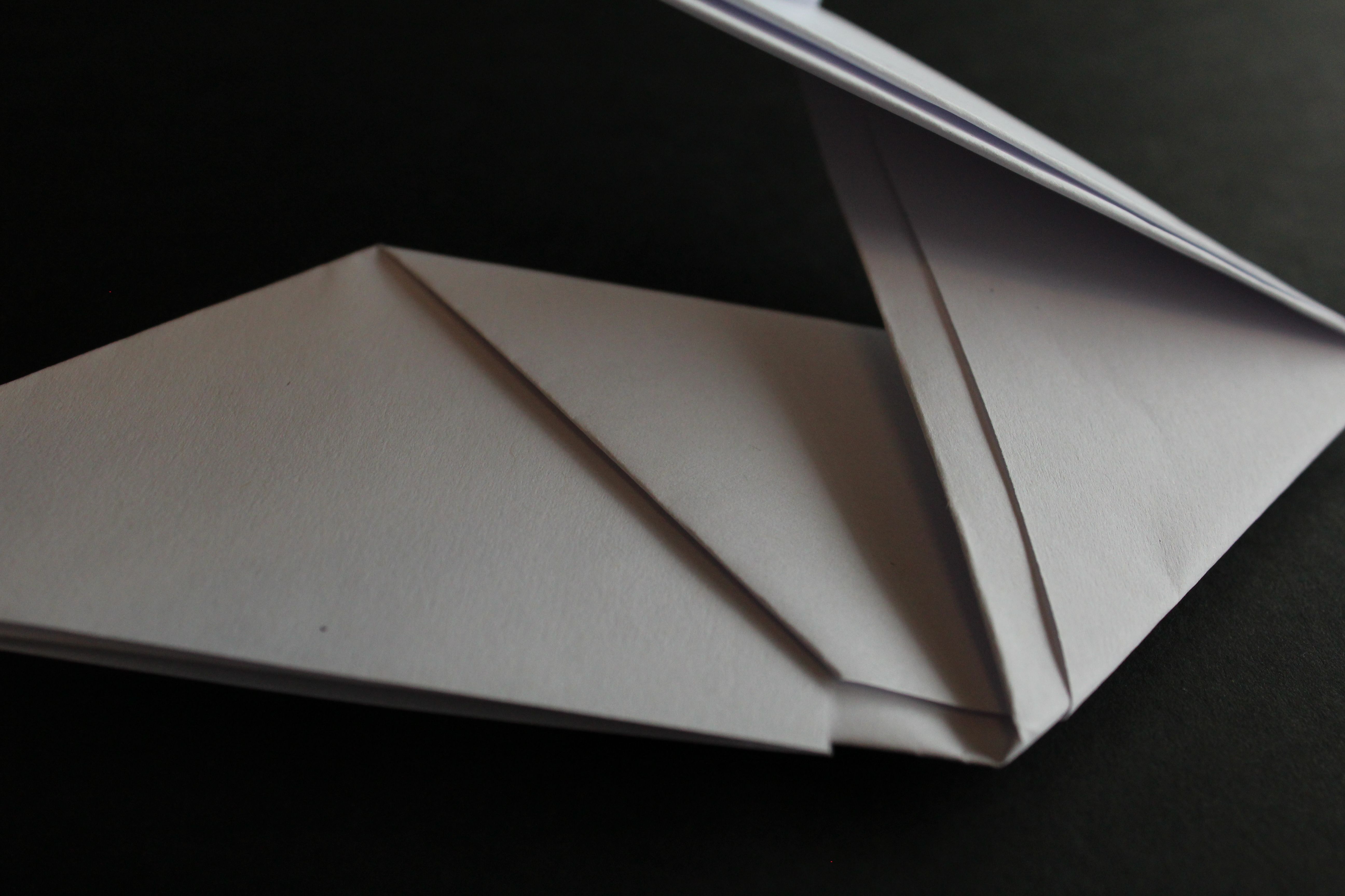
After taking inspiration from Creed i have decided to take pictures of paper. I personally really like the way that he used paper balls as well as crumpled paper and therefore my images will be based on those. I plan to use different lighting in order to create textures and contrasts.

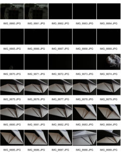
Contact sheets

Best images 

I think this image is very successful because of the contrast between the light and dark in the picture. I think the black background helps the white paper ball to stand out which was an aim of mine when starting this photo shoot.

Even thought i really like the contrast of the white and dark, in order to improve the image I would use a white background and use  light from a right hand side which would create shadows which was another aim of mine.

A detail i really like about this image is the freshly scrumped paper as this relates a lot to Creed’s no.88 work as he used the same technique.

I really like this image as i like the small shadowing shown on the right hand side from the natural light from the window. This helps to add tone into the image due to the contrast in the shadowing, white paper and black background.

In order to improve this image I would use Adobe Photoshop to enhance subject of the image ( the paper) and make it lighter which would then help contrast between the shadowing and darkness of the image.
 

Clare Rae X Claude Cahun

Hw- task 2 -CCA Galleries International

Claude Cahun X Clare Rae Exhibition 

Clare Rae- Exhibition

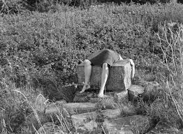
I chose this image by Clare rae due to how it stood out compared to the rest of her images, although her images all stick to a theme of portraits clare seems to try and adapt to the environment around her. She does this by positioning herself inside holes in buildings or by climbing onto rocks at the beaches or the sand dunes. This image she has physically lied across a rock this i found particularly weird as i had never seen an artist do that before. I particularly like her images because she works with black and white. For me i think the images that have quite a lot going on in the photo as in the surrounding that she has chosen, it creates more shading which also brings out certain detail that maybe if she hadn’t done it in black and white we would not have been able to spot due to sunlight or if the image was too bright.


Clare Rae Block


Claude Cahun

This is an example of Claude Cahun work. This was my favorite image due to the elements of weirdness in the picture.  I think this picture is unique due to the fact its not simply sticking to the idea of just normal portraiture photography. Cahun works with black and white so therefore she relies on the heavy shades and contrasts between colours to adapt to the type of image she wants as an outcome. Every photo that Claude takes has a story she tends to explore out of the box ideas which in her age would have been seen as a brave but challenging thing to do. Cahun works around the theme of identity. This is shown not only in this photo but many others. She was looked up on as she was known for her exploration of sexuality and she shows that in her photographs.

Overall both artists create ideas of expression of identity and allowing and not being ashamed of showing off the female body. Both artists are expressive and work well in what there trying to create when someone is looking at their images as all images have a story so once understanding the context I realised why their images might have been seen as strange.


Focus on Focus – Mini Hand Shoot 3

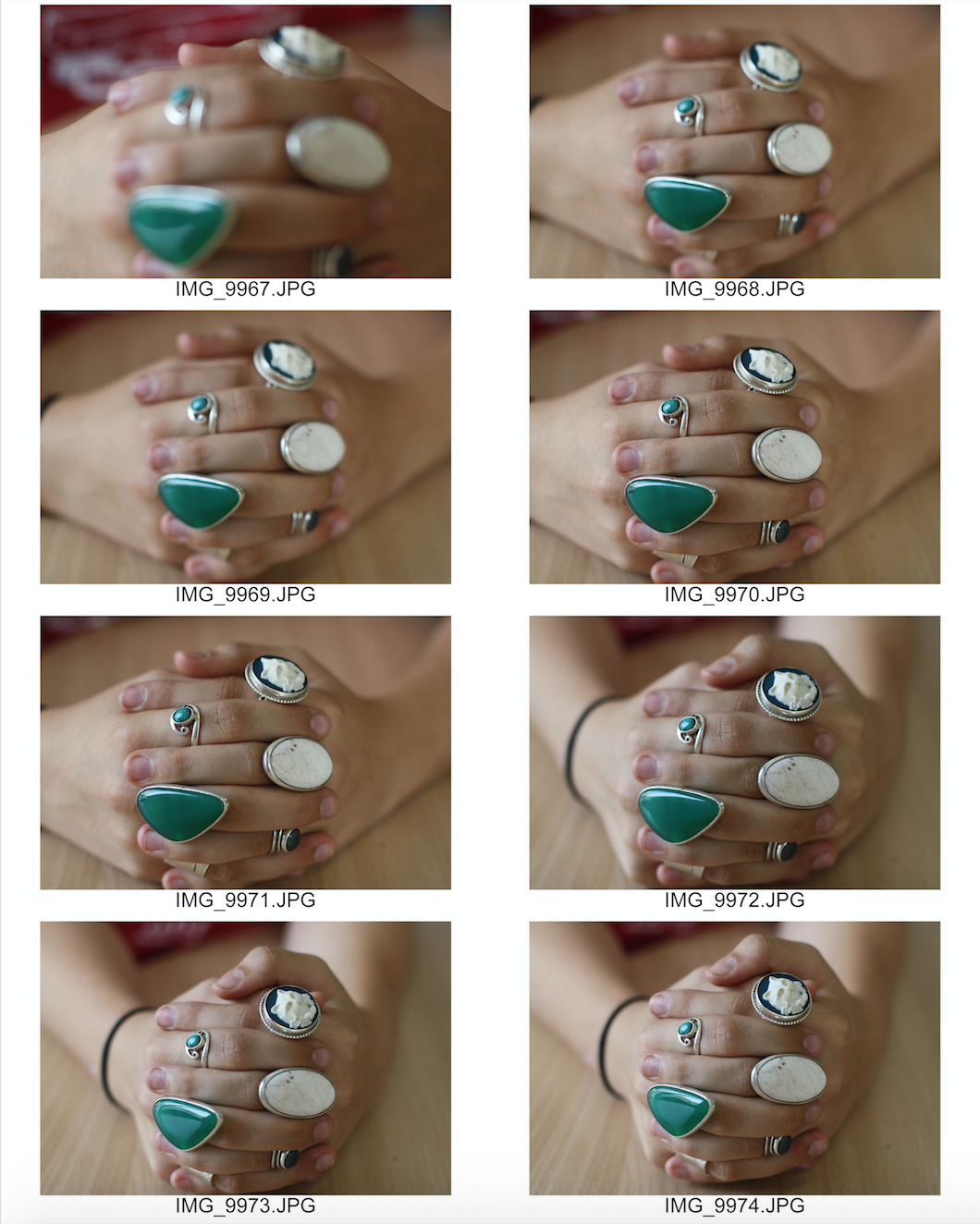
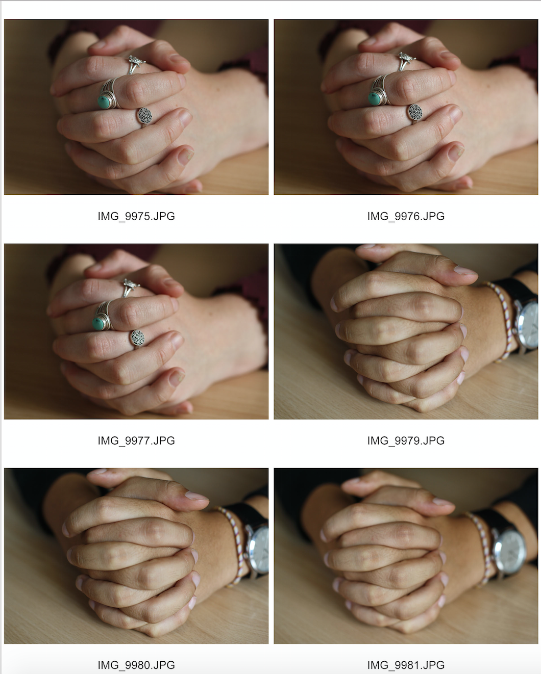
Here is another example of one of the hands that I photographed. I used a portrait lens and because I haven't used a portrait lens before I have just had to experiment with it. The autofocus was a bit strange on this camera so I had to shift between auto and manual focus throughout this shoot. I really liked the focused photos in this photo and like the depth given by the unfocused background.

Here is my contact sheet on the images:

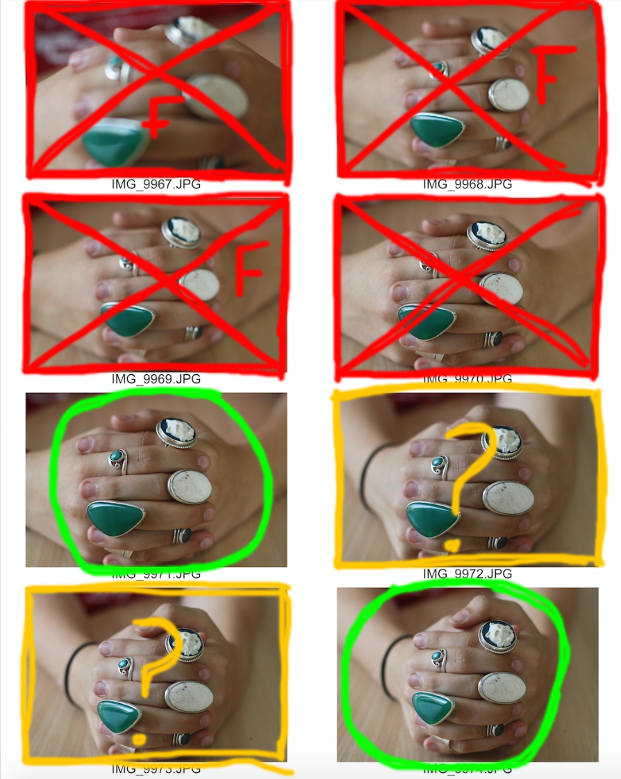
This is my contact sheet with the few images I have selected to edit. 

Green circle - An image I would like to further use. 

Red cross - An image I would not like to use. 

Red F - The image is out of focus. 

Red shading - The part of the image I would like to crop out. 

Yellow question mark: An image I am unsure whether to edit or not. 

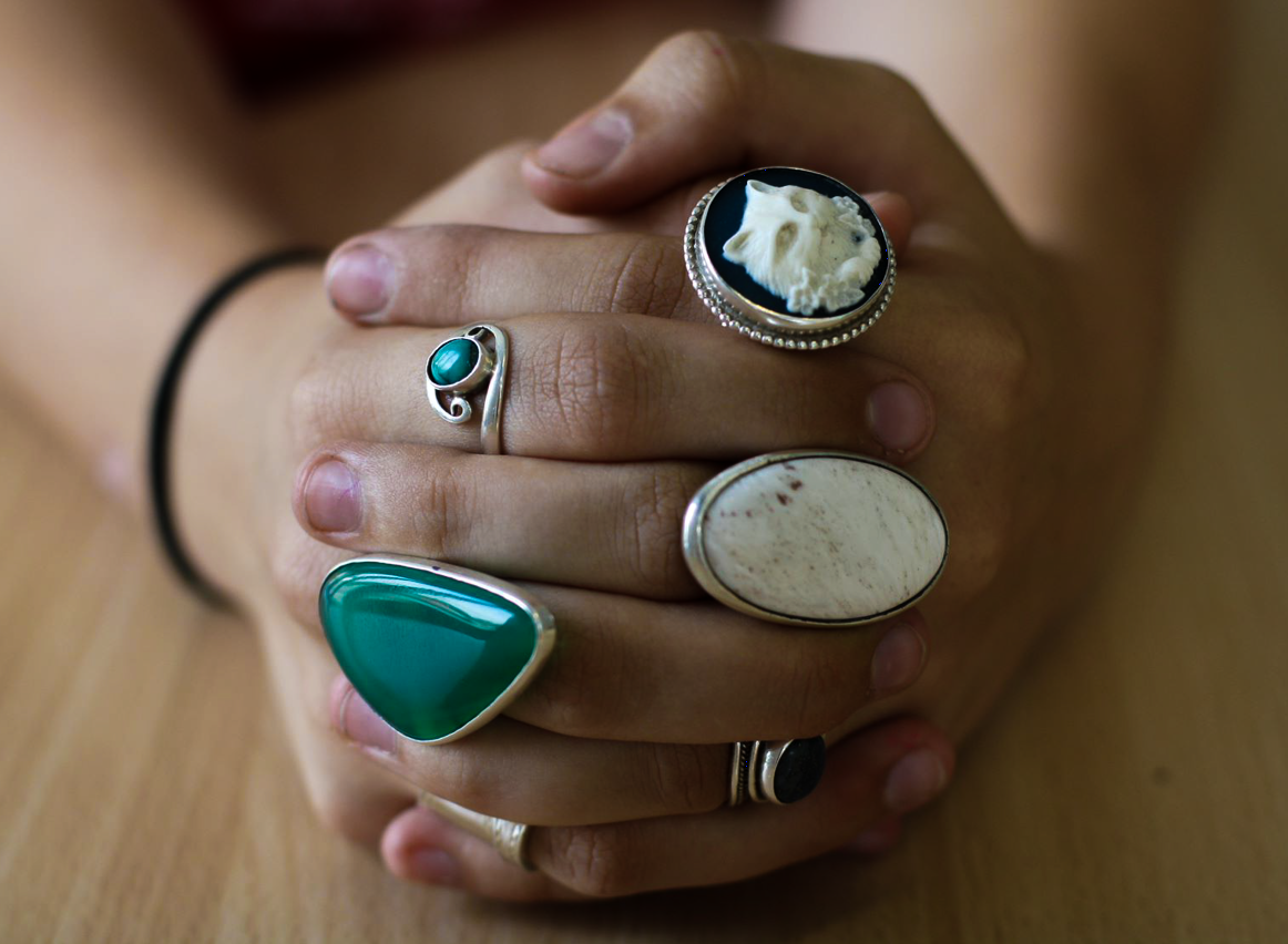
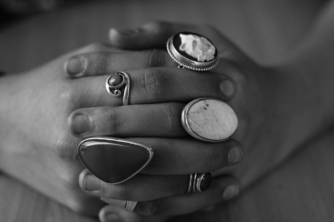
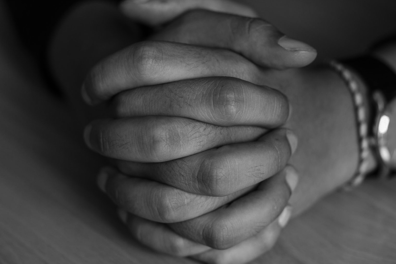
Here are my final images:

I manipulated these images using adobe lightroom. 

For the first image, I slightly increased the clarity and shadows of the image, then I lowered the exposure and highlights until I thought that the image was aesthetically pleasing I think the reduction in background highlights brought more attention to the focused hands and rings.

For the second image, I applied a black and white preset, reduced the exposure and highlights. I then slightly increased the clarity and shadows of the image.

Focus on Focus – Mini Hand Shoot 2

Here is another example of one of the hands that I photographed. I used a portrait lens and because I haven't used a portrait lens before I have just had to experiment with it. The autofocus was a bit strange on this camera so I had to shift between auto and manual focus throughout this shoot. I really liked the focused photos in this photo and like the depth given by the unfocused background.

This is my contact sheet with the few images I have selected to edit.

Green circle - An image I would like to further use.

Red cross - An image I would not like to use.

Red F - The image is out of focus.

Red shading - The part of the image I would like to crop out.

Yellow question mark: An image I am unsure whether to edit or not.

Here are my final images:

I manipulated these images using adobe lightroom. For the first image, I applied a black and white preset, reduced the exposure and highlights. I then slightly increased the clarity and shadows of the image.

For the second image, I slightly increased the clarity and shadows of the image, then I lowered the exposure and highlights until I thought that the image was aesthetically pleasing I think the reduction in background highlights brought more attention to the focused hands.

Focus on Focus Mini Hand Shoot 1

Here is one example of one of the hands that I photographed. I used a portrait lens and because I haven't used a portrait lens before I have just had to experiment with it. The autofocus was a bit strange on this camera so I had to shift between auto and manual focus throughout this shoot. I really liked the focused photos in this photo and like the depth given by the unfocused background.

This is my contact sheet with the few images I have selected to edit.

Green circle - An image I would like to further use.

Red cross - An image I would not like to use.

Red F - The image is out of focus.

Red shading - The part of the image I would like to crop out.

Here is my final edited image:

I used adobe lightroom to manipulate this image. I heightened the contrast and clarity of this photo, slightly reduced the exposure and applied a black and white preset. I chose to apply a black and white preset because I believe it draws more attention to the hands' characteristics like the wrinkles and nails.


New Objectivity – Research and moodboard

The new objectivity was a movement in German art that arose during the 1920’s as a reaction against expressionism. The term was invented by Gustav Friedrich Hartlaub, the director of the Kunsthalle in Mannheim, who used it as the title of an art exhibition staged in 1925 to showcase artists who were working in a post-expressionist spirit. These artists included; Max Beckmann, Otto Dix, George Grosz, Christian Schad and Jeanne Mammen.

Although principally describing a tendency in German painting, the term took a life of its own and came to characterize the attitude of public life in Weimar, Germany as well as the art, literature, music and architecture created to adapt to it.

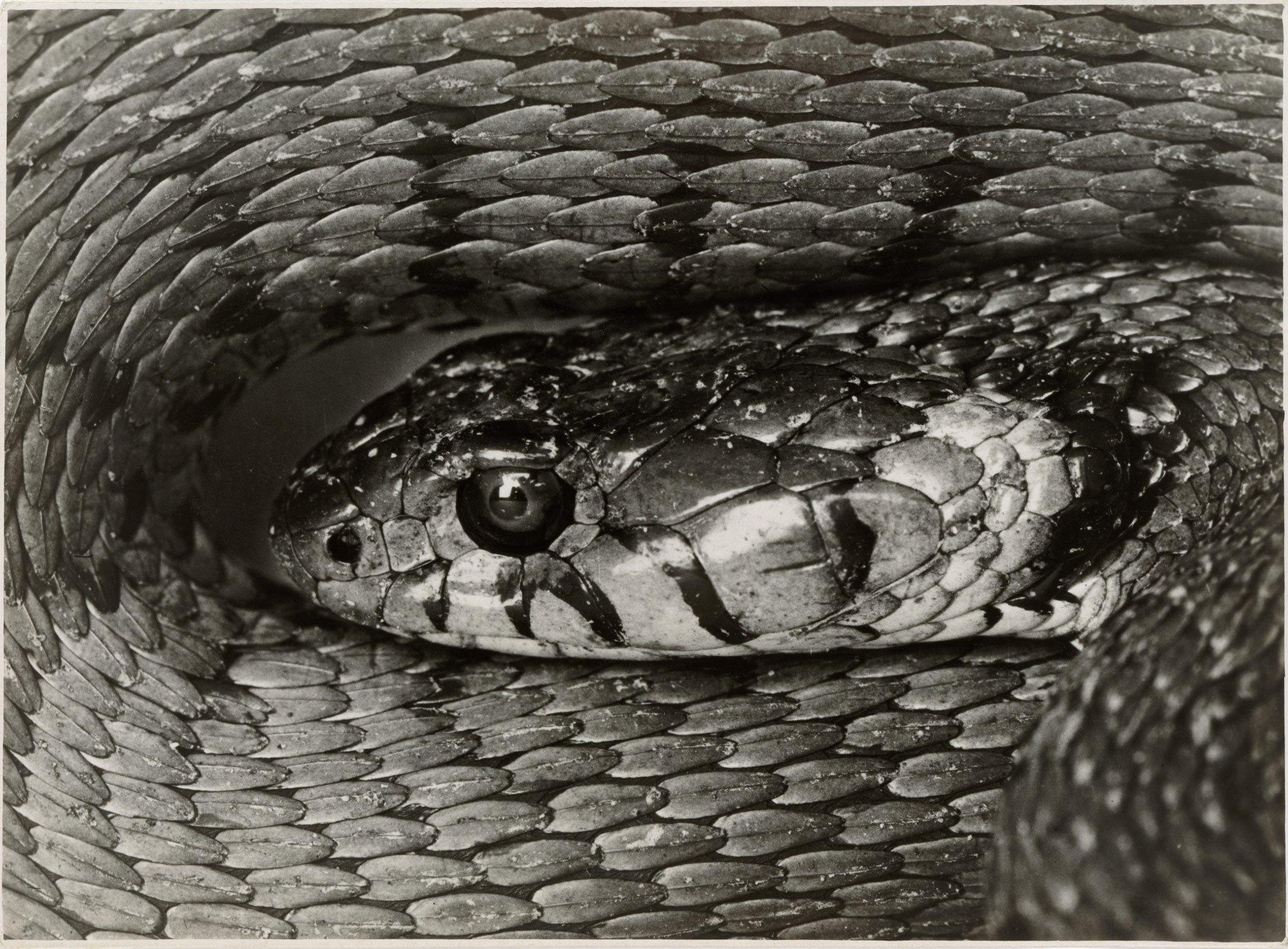
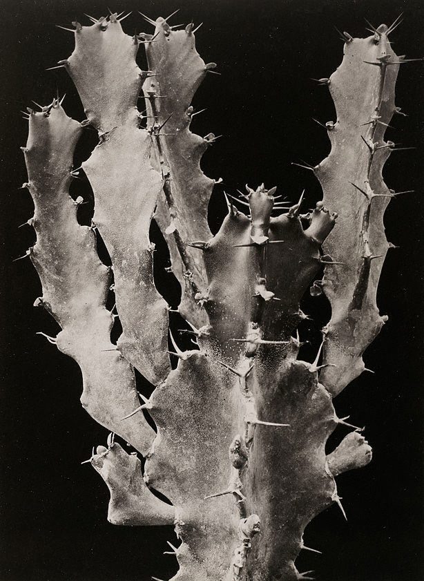
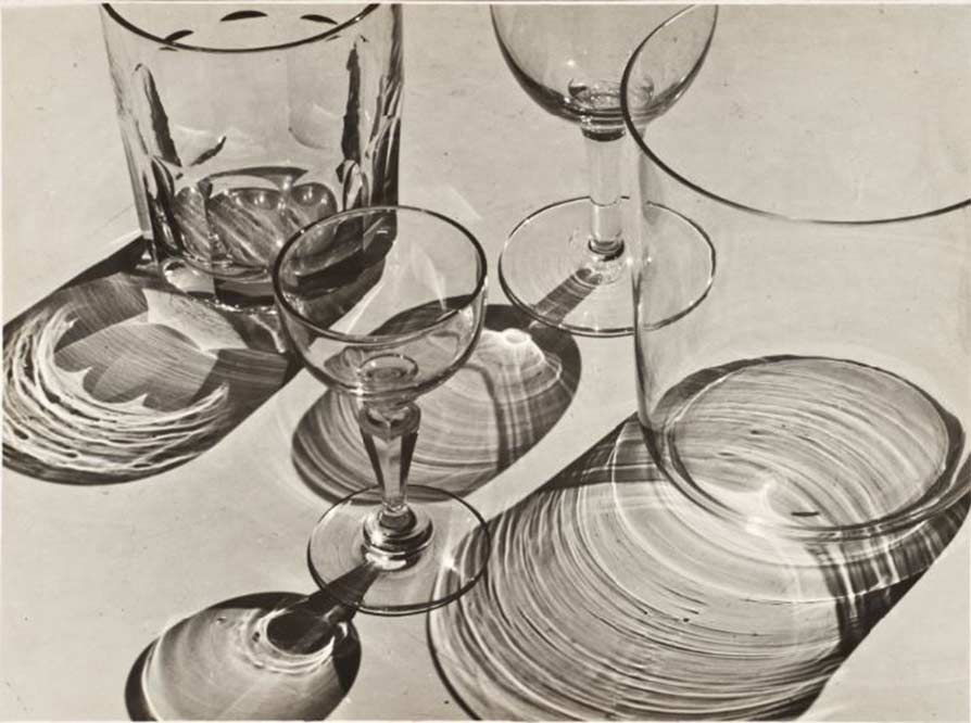
Albert Renger-Patzsch was a German photographer associated with the New Objectivity. Renger-Patzsch was born in Würzburg, Germany and began making photographs by the age of 12.                        In it’s sharply focused an matter of fact style of his work exemplifies the aesthetic of the New Objectivity movement that flourished in the arts of Germany.

In this topic of New objectivity I started focussing on Albert Renger-Patzsch, this is because of his take on New objectivity. He mainly takes photos of inanimate objects such as; Plants, Buildings, roads and glasses, but has also taken photos of snakes. He then uses the expulsion of colour from his work to give the atmosphere an eerie and spooky feeling, this creates a dramatic feeling within the person looking at the photo.

I also like his work as it rejects the sentimentality and idealism of a previous generation emerged as a tendency in German art. Renger-Patzsch’s work demonstrates a his sustained interest in the camera’s relationship to the beauty and complexity of the modern world.

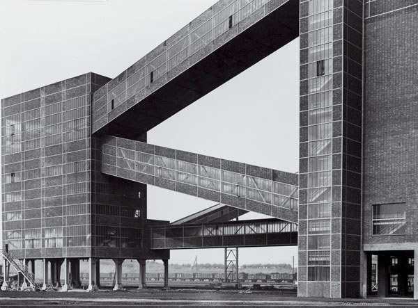
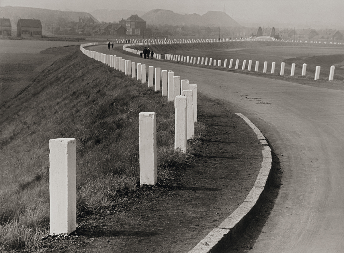
Here are some of my favourite photos of examples of New Objectivity.

New Objectivity – Research

The new objectivity was a movement in German art that arose during the 1920’s as a reaction against expressionism. The term was invented by Gustav Friedrich Hartlaub, the director of the Kunsthalle in Mannheim, who used it as the title of an art exhibition staged in 1925 to showcase artists who were working in a post-expressionist spirit. These artists included; Max Beckmann, Otto Dix, George Grosz, Christian Schad and Jeanne Mammen.

Although prinicpally describing a tendency in German painting, the term took a life of its own and came to characterize the attitude of public life in Weimar, Germany as well as the art, literature, music and architecture created to adapt to it.

Albert Renger-Patzsch was a German photographer associated with the New Objectivity. Renger-Patzsch was born in Würzburg, Germany and began making photographs by the age of 12.                        In it’s sharply focused an matter of fact style of his work exemplifies the aesthetic of the New Objectivity movement that flourished in the arts of Germany.

I like this work of Albert Renger-Patzsch as it creates a feeling of loneliness or spookiness with the use of Black and White. I really like the building photo as it is a modern architectural structure but the black and white makes it seem a lot older, this is the amazing thing with photography.
I also like his work as it rejects the sentimentality and idealism of a previous generation emerged as a tendency in German art. Renger-Patzsch’s work demonstrates a his sustained interest in the camera’s relationship to the beauty and complexity of the modern world.

Using Photoshop to edit photos

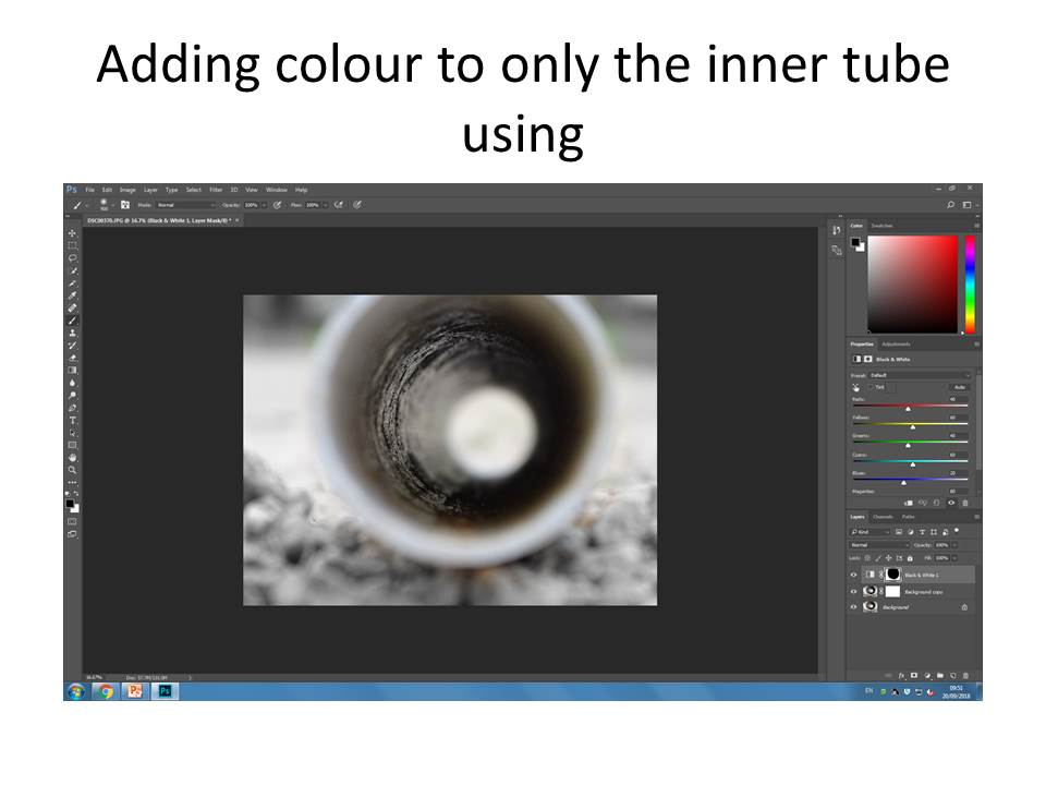
For my first edited photo on Photoshop, I carefully selected an image which I took as part of my abstract photography piece,  in this instance it was a thin pipe on a gravel like textured cycle track.

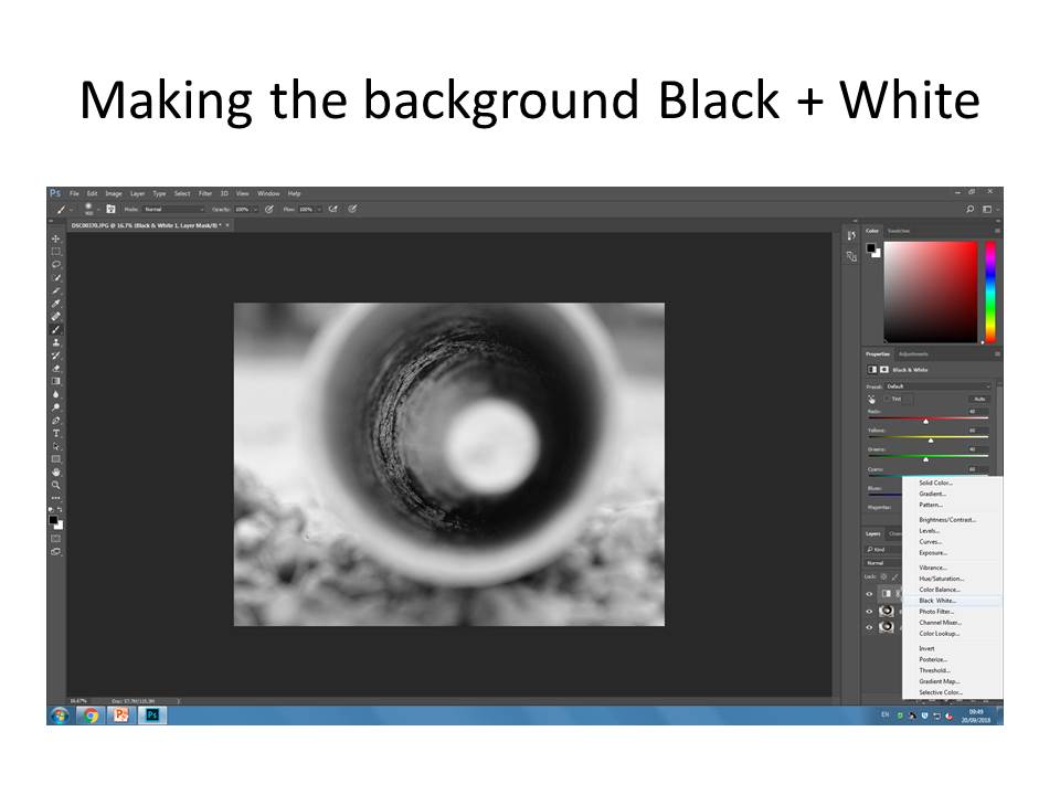
Then I made the background into Black and white, which didn’t , make too much of a difference as the colours weren’t extravagant in the first place, but I did this in order to bring out the colour in the center pipe.

Then using a mask layer I then coloured inside the tube being very careful not to bring out colours from the background. I personally find this went well for my first attempt as the black and white, compared to the subtle and gentle colours contrasts really well.

And that is my final product !