Final Outcome:
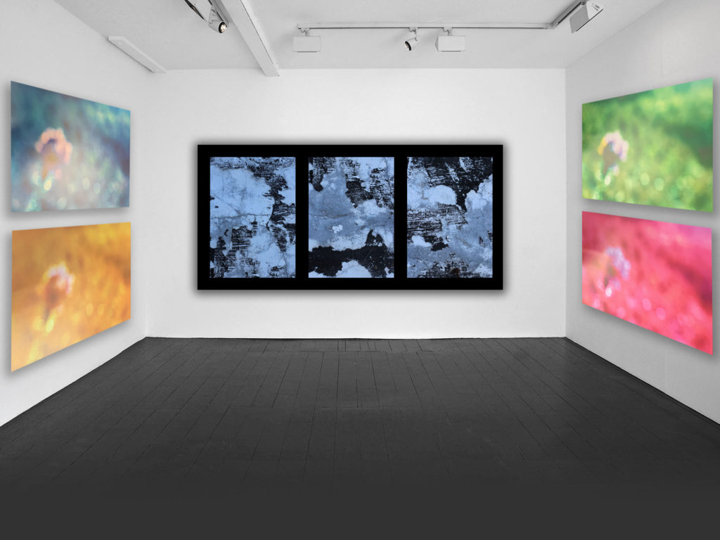
Final Outcome:

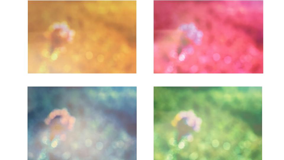
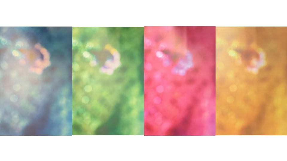
Photoshoot 1:
Photoshoot 2:
For this task I decided to try the kaleidoscope effect on Photoshop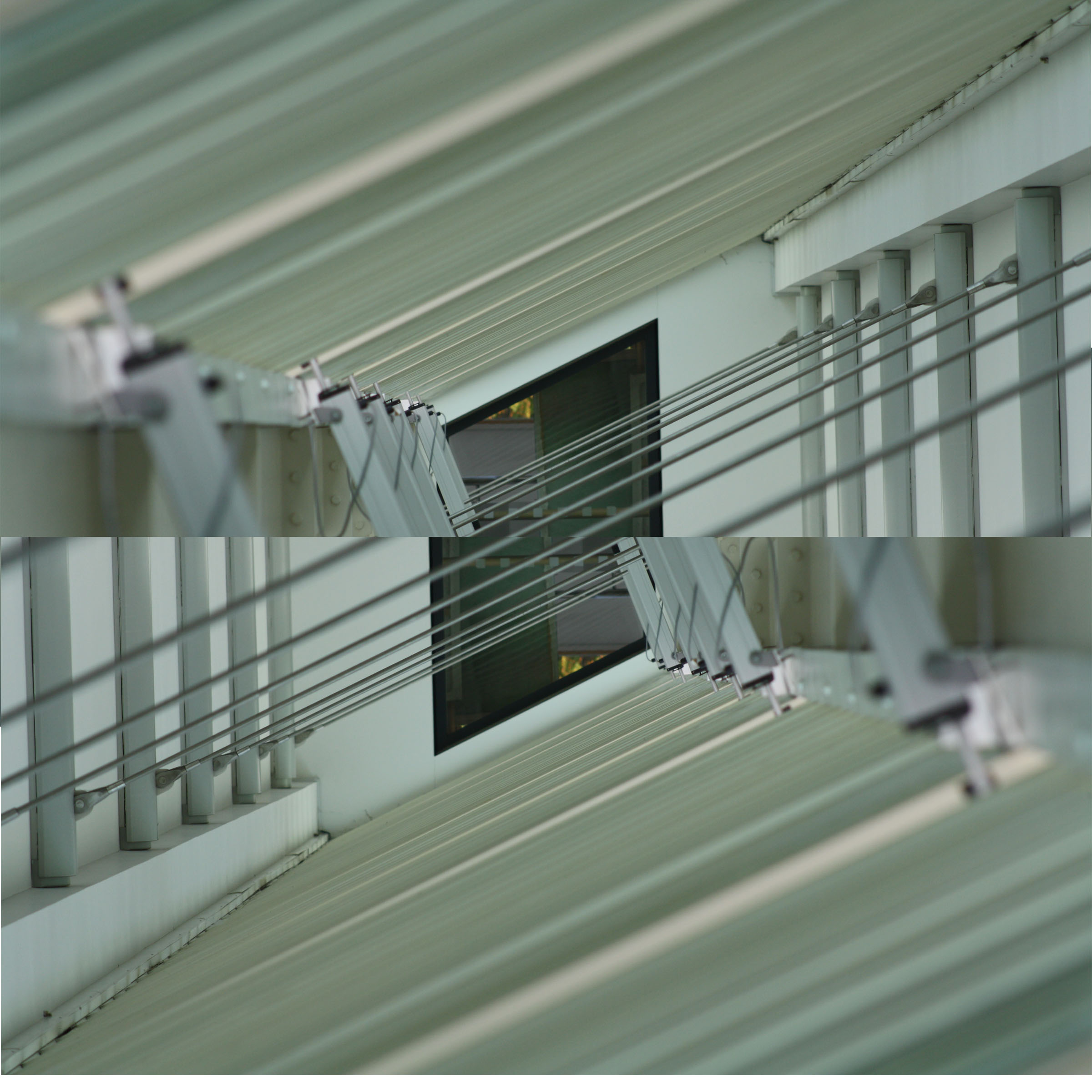
This is how I did it in steps:
I really like how this turned out and I would like to use this technique in upcoming projects.
Contact sheets:
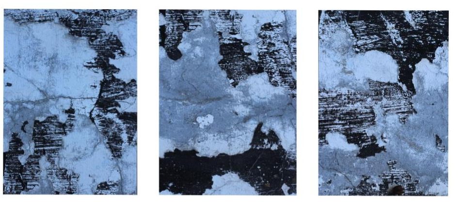
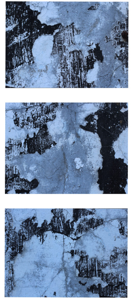
These are my other final 3 images suit the topic of abstract photography. I was inspired to look at rock works and the way they form and overlap one another. This also links to texture and surface which in these images although all the detail is there the image tone and colour is quite neutral and the lighting is quite dim despite being on a medium brightness setting. I’m using these as my A5 images and I’m having them set like a story board as a set of 3.


I decided to change the setting on my images to make them black and white. I also edited the image by changing the brightness, exposure, black point, highlights, brilliance and the amount of shadow that is coming through the image.
The repeated exposure of a photographic plate or film to light, often producing ghost image.
Here are some examples of my first attempts with just some random images I had found on my phone. For this image as I was at home and my laptop makes me pay for Photoshop I downloaded this app called PicShop. on this app all the settings were similar to those of photoshop so having tried it in the lesson and failed miserably I decided to try working on double exposure again as I wish to use this editing technique for my portrait edits when we move to that project.
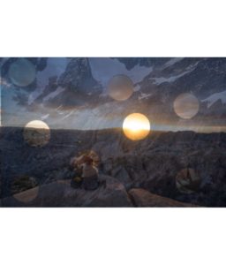
These images I thought worked well over layered because theres quite a high contrast of darkness from the background and then a light just peaking through immediately drawing all attention to it.
There are many artists that use or have used double exposure when developing their images as sometimes they use it to create a story or an idea behind it that some people might not understand. over layering like this can also be called double exposure which some artist take an form an image with a double meaning.
I have decided to chose an artist and try out different examples of their work but with my images.
Here we have some examples of Luke Gram’s Abstract photography work.
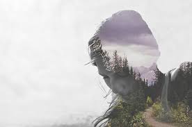
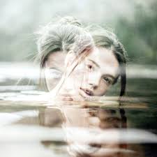
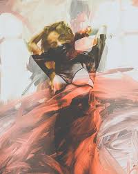
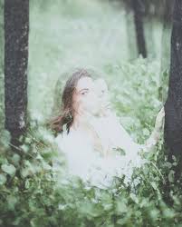 these are just a few out of hundreds of images that Grams has taken. These are the ones that I thought suited abstract photography more as here we can tell he has mixed abstract photography with portrait to create doubling meanings of humans being connected to nature through elements of water, fire,sun and wind. These images stood out to me as I interpret these as images he has focused on creating a story when a person is looking at them closely. He has not only bought in different patterns and texture he has managed to fade objects around the image but still being able to visualise the woman face. I think this is significant because without the portrait side of it the images may have began to look a bit disorientated as there would have been to much going on around those images.
Luke Gram Bio-He is not only a abstract photographer but he photographs people aswell. His images are taken according to him to capture the “serenity and power of life. He does this by placing humans in natural habits like i.e. the forest in the image above. His over lays are also natural places like the ocean, beaches and tree’s .He was about 18 years old when began taking photography seriously. He earned degrees in psychology and history from the University of British Columbia. He previously worked in the Canadian Oil Sands
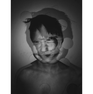
I was inspired by Luke grams work but decided to only have two layers of the same image overlapping one another. However instead of me creating both images to be very visable I made them both quite dark and heavy on shading which then allows the small circles to show elements of the image from underneath.
I tried also at doing another attempt using the images I’ve chosen as my final prints.
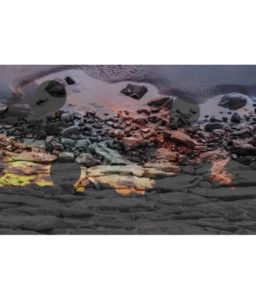
For the image above I used the same app called PicShop which allowed me to use my final image of the rocks and one of my landscape works that I used for art and used one of the effects called Hue on number 59 to be able to get the colors as bright as I wanted.
Having worked on these images, I have gained a wider understanding on different ways and ideas on developing my images to make them stand out and not just sit with my basic black and white edits which I chose to do for my abstract final images. Additionally I think that all these ideas and images have been successful at presenting the theme of abstraction. Each image I have created has different shapes which order out in a unique way, in which I have used to reveal certain aspects of the image. By doing this it has allowed the public to look at certain parts of the image which they may not have originally noticed because the image would have been on such a larger scale. It also allows the main focus point of each edit to be more visible and easier to identify.
Due to the edits being the way they are there’s a bit of negative space that I could have cropped out, however I like the negative space because it gives a sense of space and doesn’t make the image look all cramped together. I am very happy with the way these edits have come out as they clearly show development of my understanding of abstraction.
Final Prints – Abstract Photography
Set (1) of 3 Images
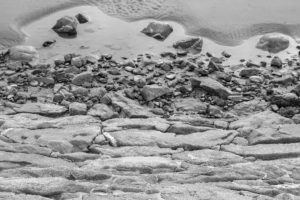
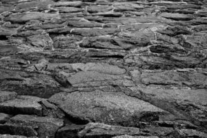
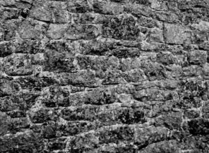
These images were inspired by the works of Aaron siskind’s work although I have kept some elements and ideas from his work I have tried to adapt and create a set of 3 images to all resemble the similar sort of idea to Aarons street photography. For example I liked the fact that Siskind used black and white to enhance features that may not have been captured through colour photography. for editing these images the first one to me contrasts the most as its an image with a bit of empty space which to me was quite necessary as it captures the depth of the image. Whilst I photographed this image I stood on the edge by the rocks to capture an element of fall which by changing my setting to black and white is focused on how the shade on the rocks and the water fall seem quite far away yet was taken quite closely. The second image I also changed the settings as it was originally photographed in colour. I did this through adobe photoshop and simply using an app on my phone called VSCO to change tones and the exposure and shadow settings. Additionally I repeated this process for image 3 although after having looked at it for long enough the image itself looks busy as theres so many lines and patterns and quite rough surfaces lots of different elements of texture but for me the image fits in perfectly with the theme of Abstract photography.
I am using these images as my set of A4 images as I can see they all fit into the element of abstract and all have the same theme throughout each image with extreme elements of sharpness yet some elements of blurriness. For my final presentation I will add these images to a big sheet of black paper and have them present as a line of three almost like a story but with images that are just exploring different ideas within the same theme through different editing and cropping.
In this blog post I will be showing you my favorite and final abstract photos. I had to chose a few photos of my favorite abstract photography that I had taken and place them in a file to be sent off to print. We had to choose photos to be printed in A5, A4 and A3. I didn’t chose an A3 picture as none of my photos showed enough colour, boldness, enough abstract, or textures/shapes.
But I feel like the 2 photos for A4 and the single photo for A5 are good enough for their size.
These photos were chosen for my A4 printing.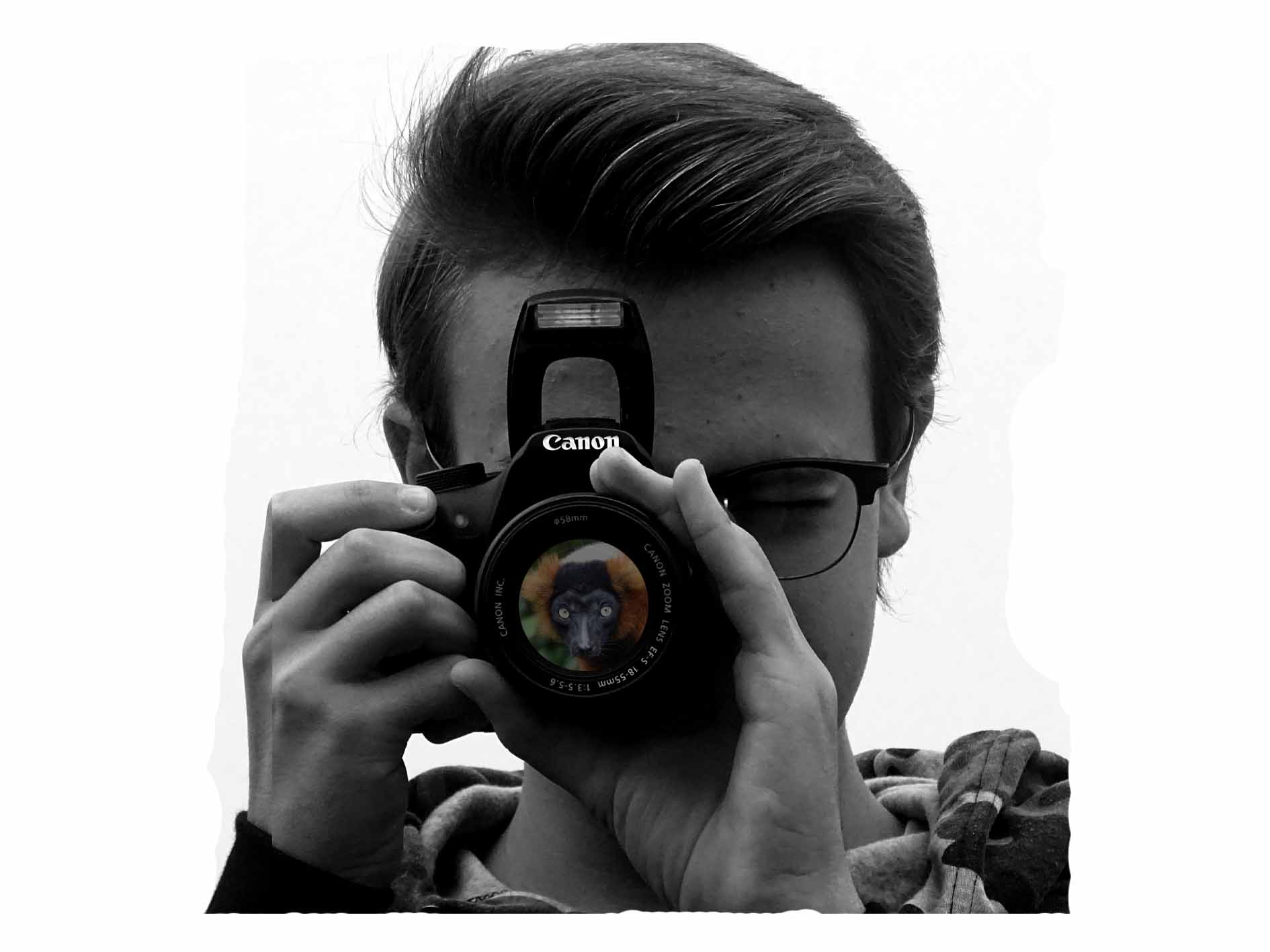
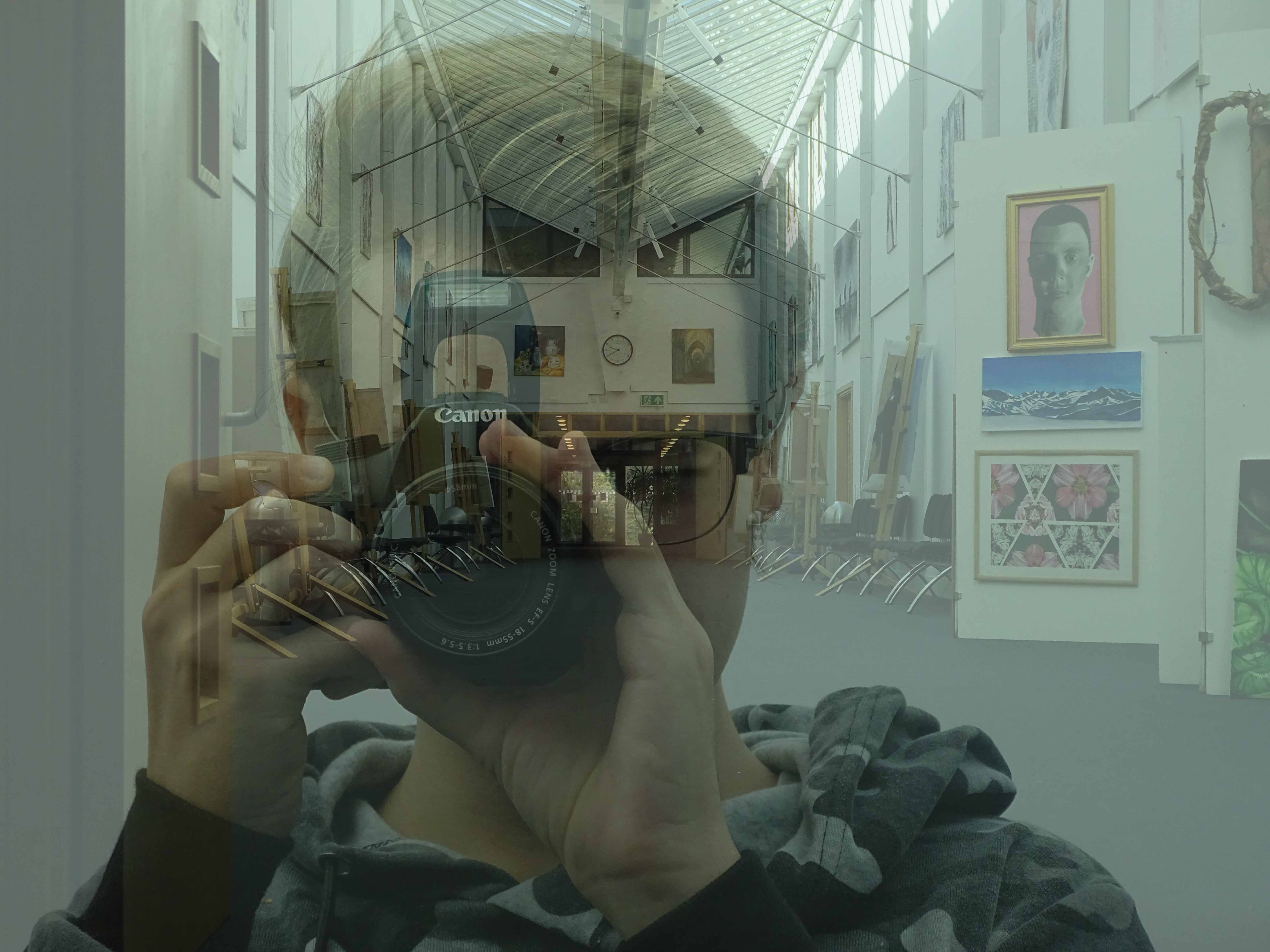
I really like these photos, because it shows good camera skills of portrait but also shows my ability of using Photoshop to create a double exposure effect. On the first photo I used a double layering effect to create the black and white but also to create a more deeper black and to show off the white a bit more.
On the second photo I kept the photos original without changing them, but I created the double exposure in a way which made it look like the person taking a photo of a school hallway with a reflection of glass. I created this effect by changing the opacity levels so that the portrait photo was slightly higher than the background photo of the school hall.
This next photo was one which I put forward to be printed in A5
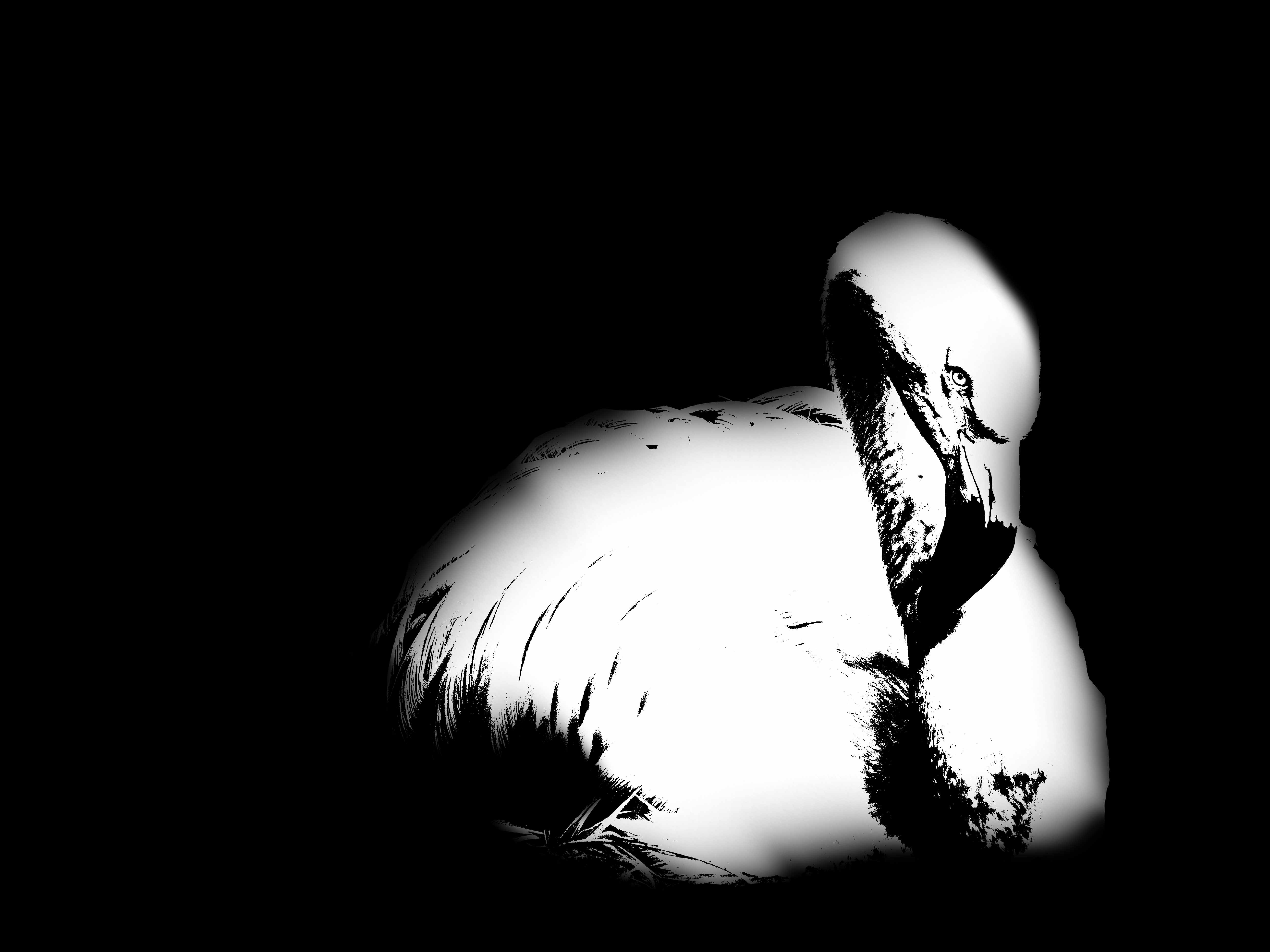
I like this photo as it again shows my ability level on Photoshop. With this photo I have used the different thresholds, and adjusted them to what I thought looked good. I have also used the paint brush tool to create an effect of the photo blurring into the black background.
I thought this photo was suitable for an A5 as it isn’t a big photo worthy as it doesn’t show that much abstractness with colour, texture and shape. But due to the use of the threshold adjustment I thought it would still be suitable as a final printed abstract photo.
These next photos were photos which I never really took to, but after having a closer look at the photos I realized that without editing they looked like nice final abstract photos.
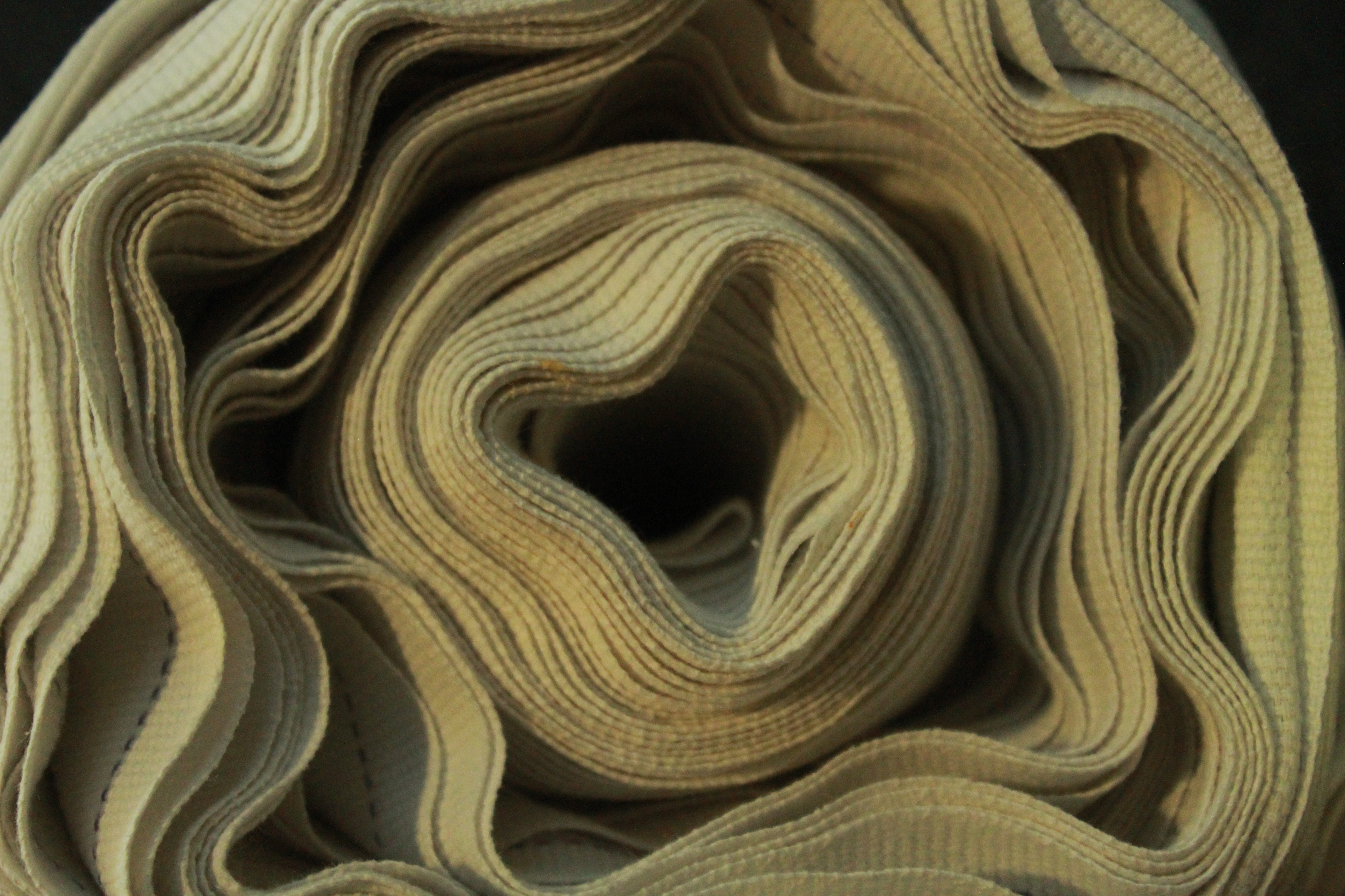
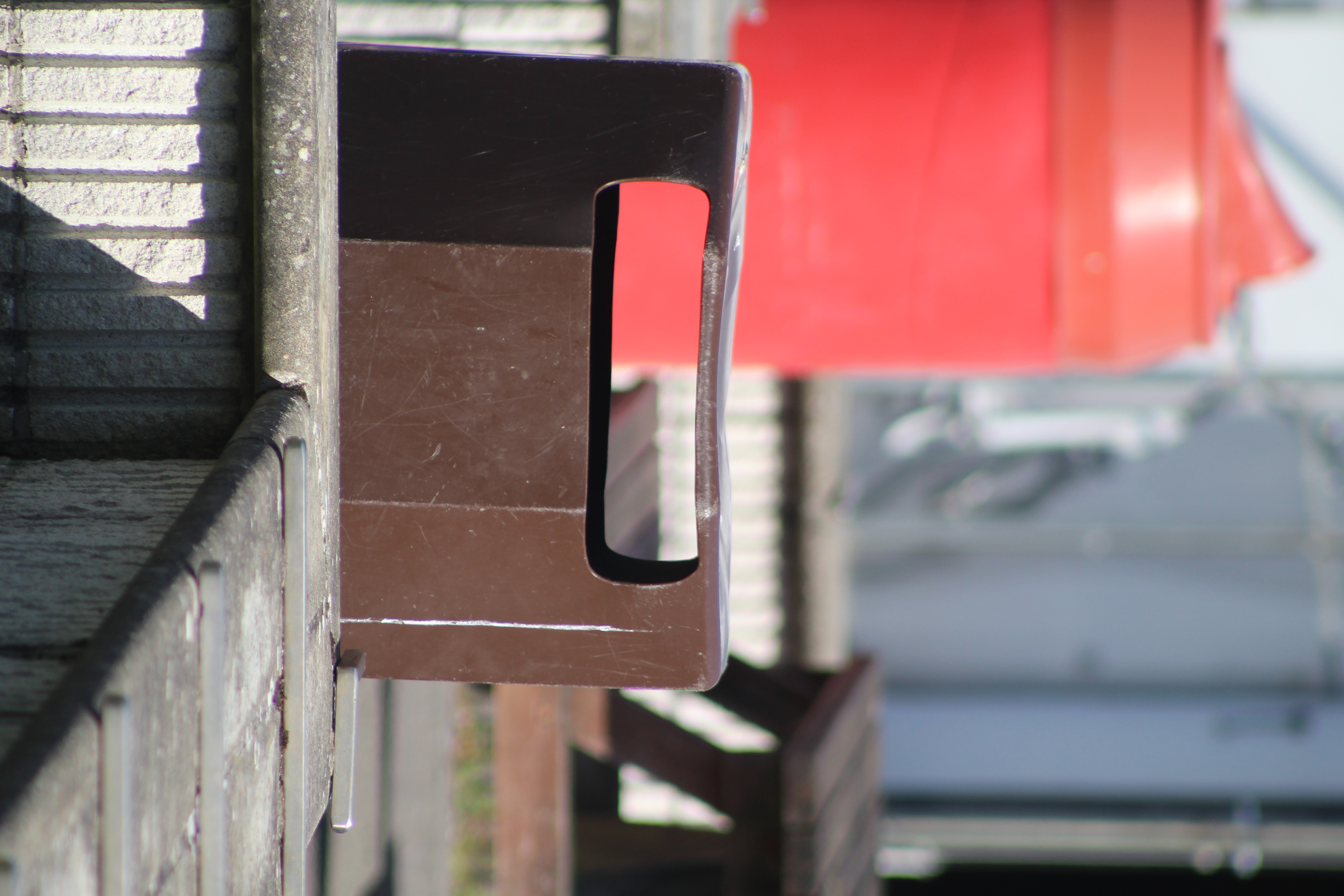
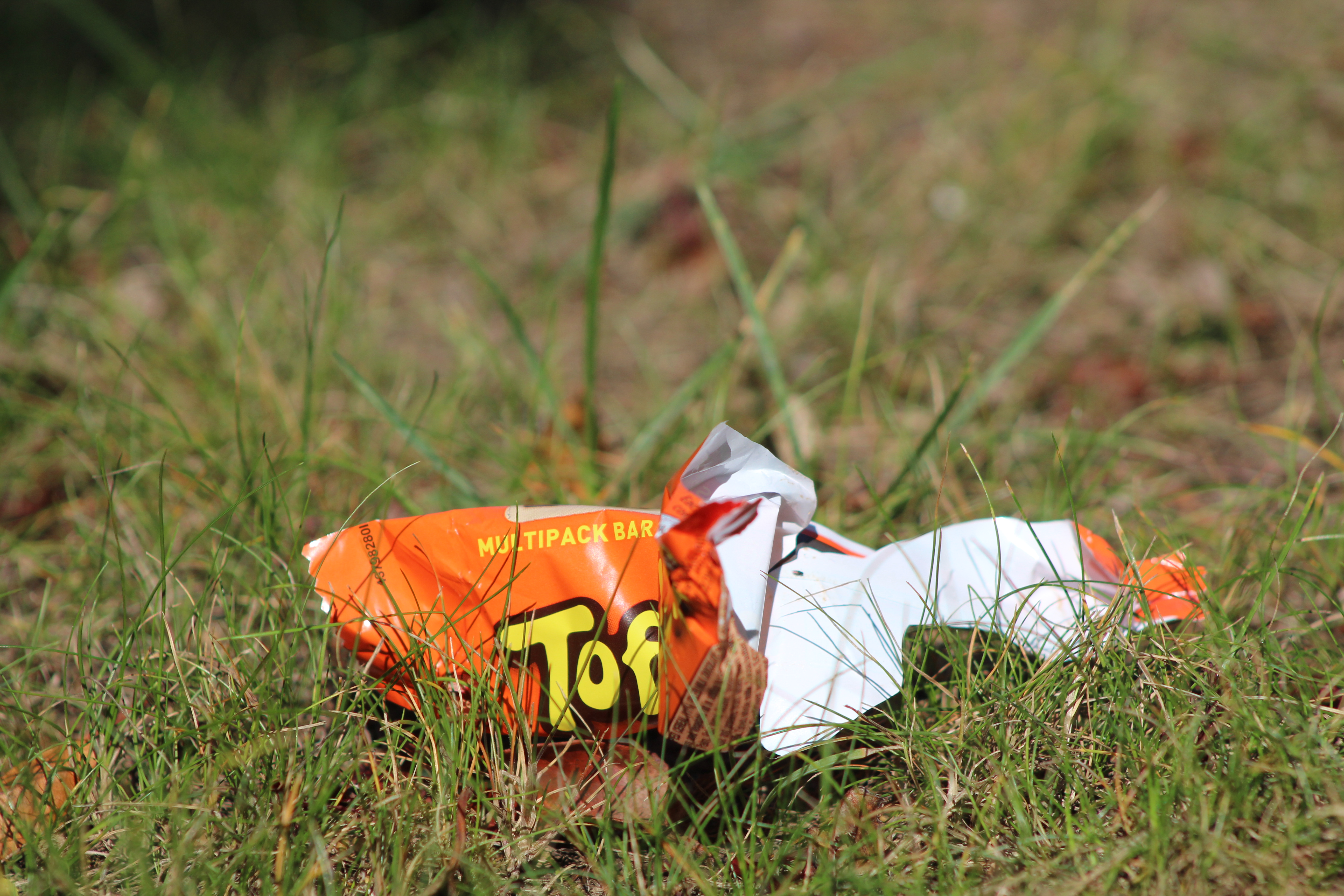
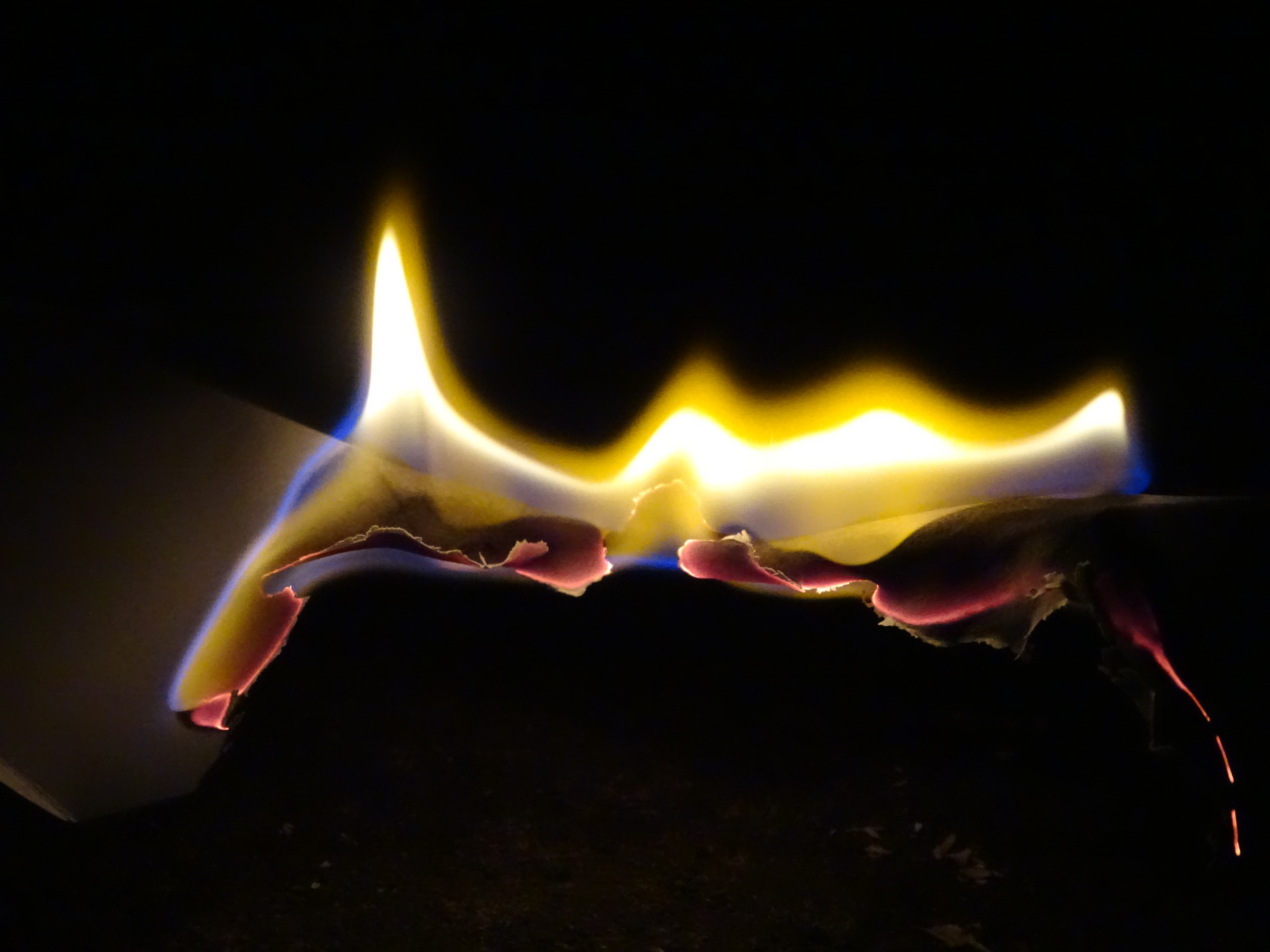
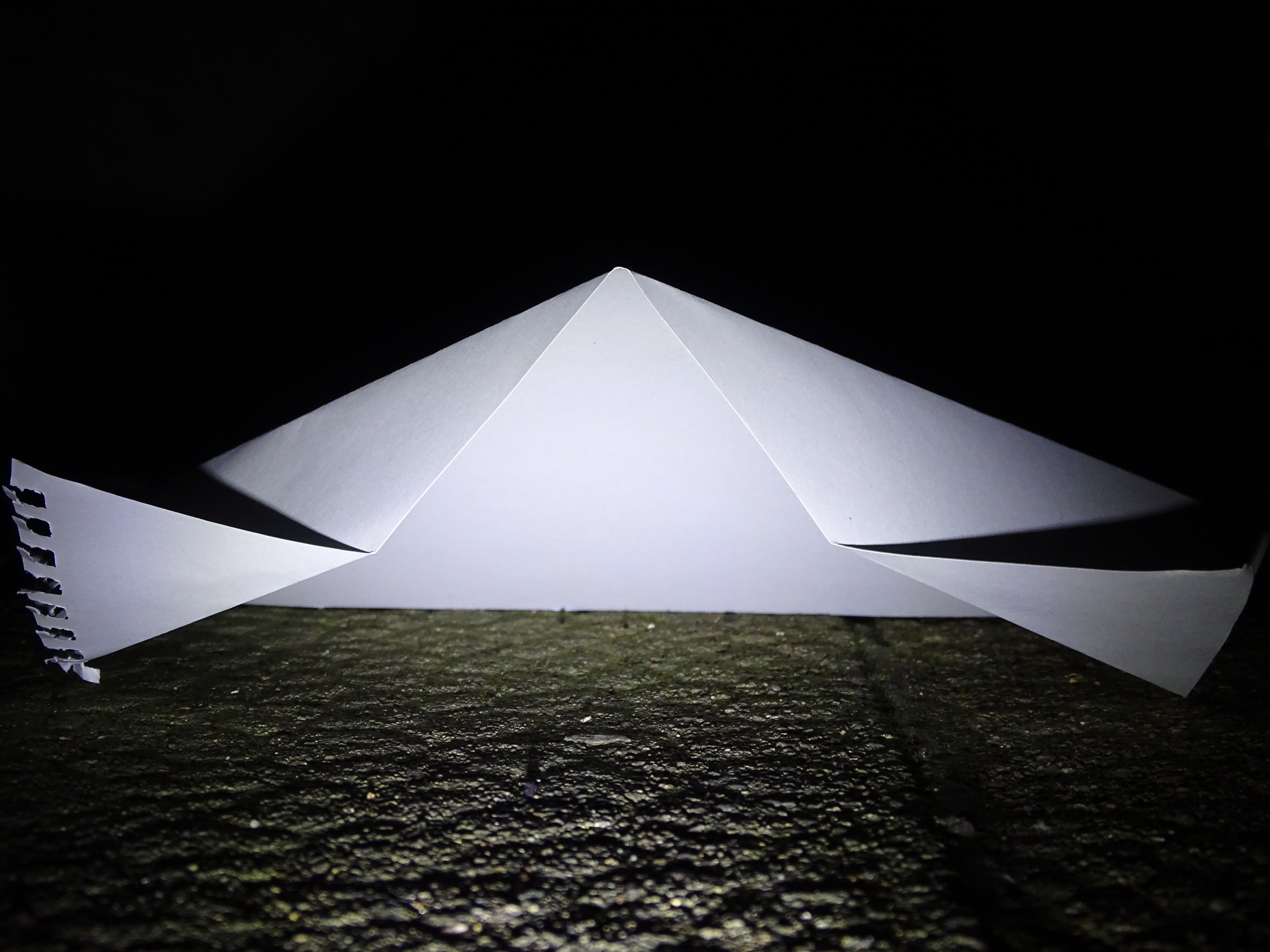
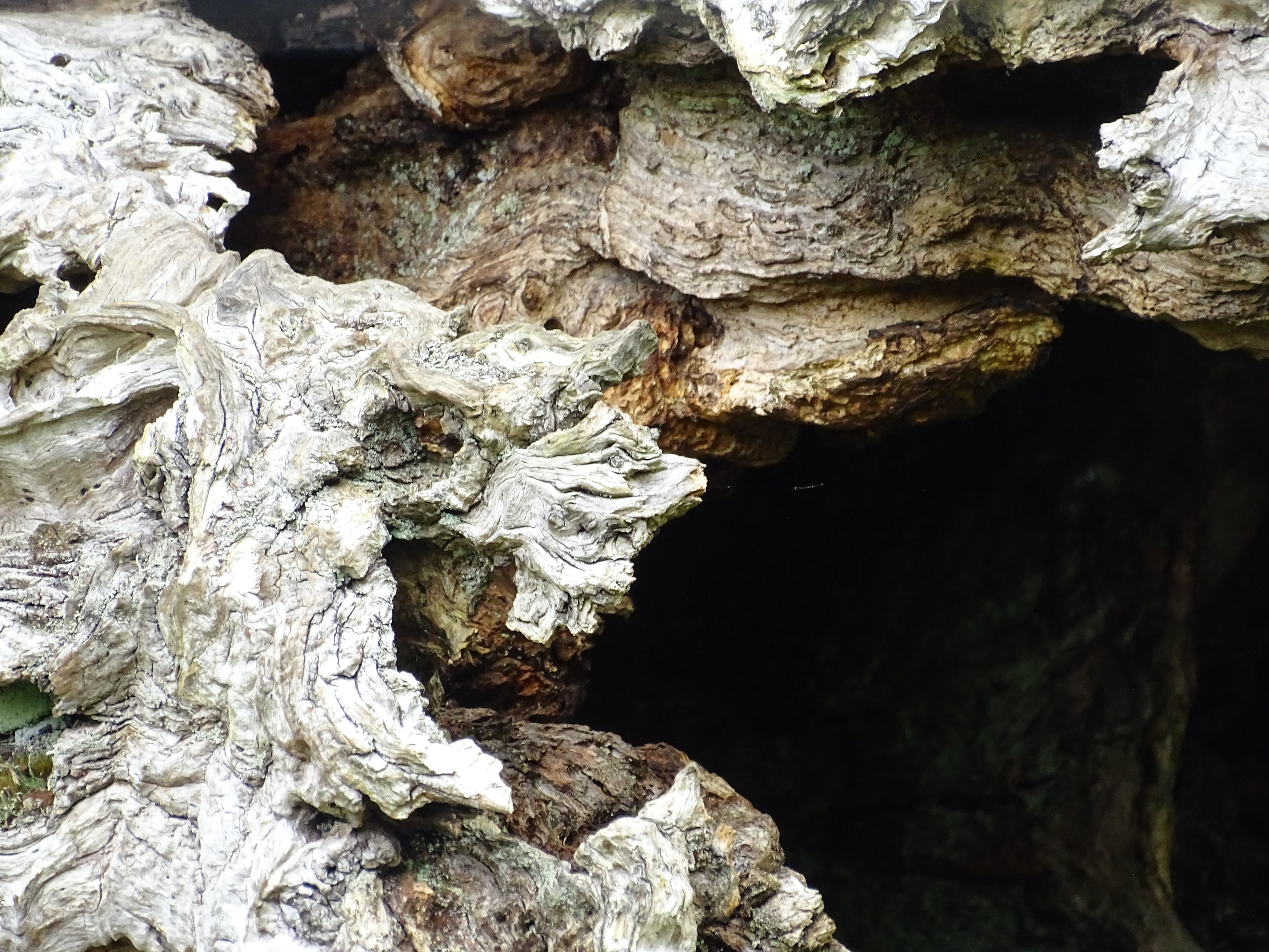
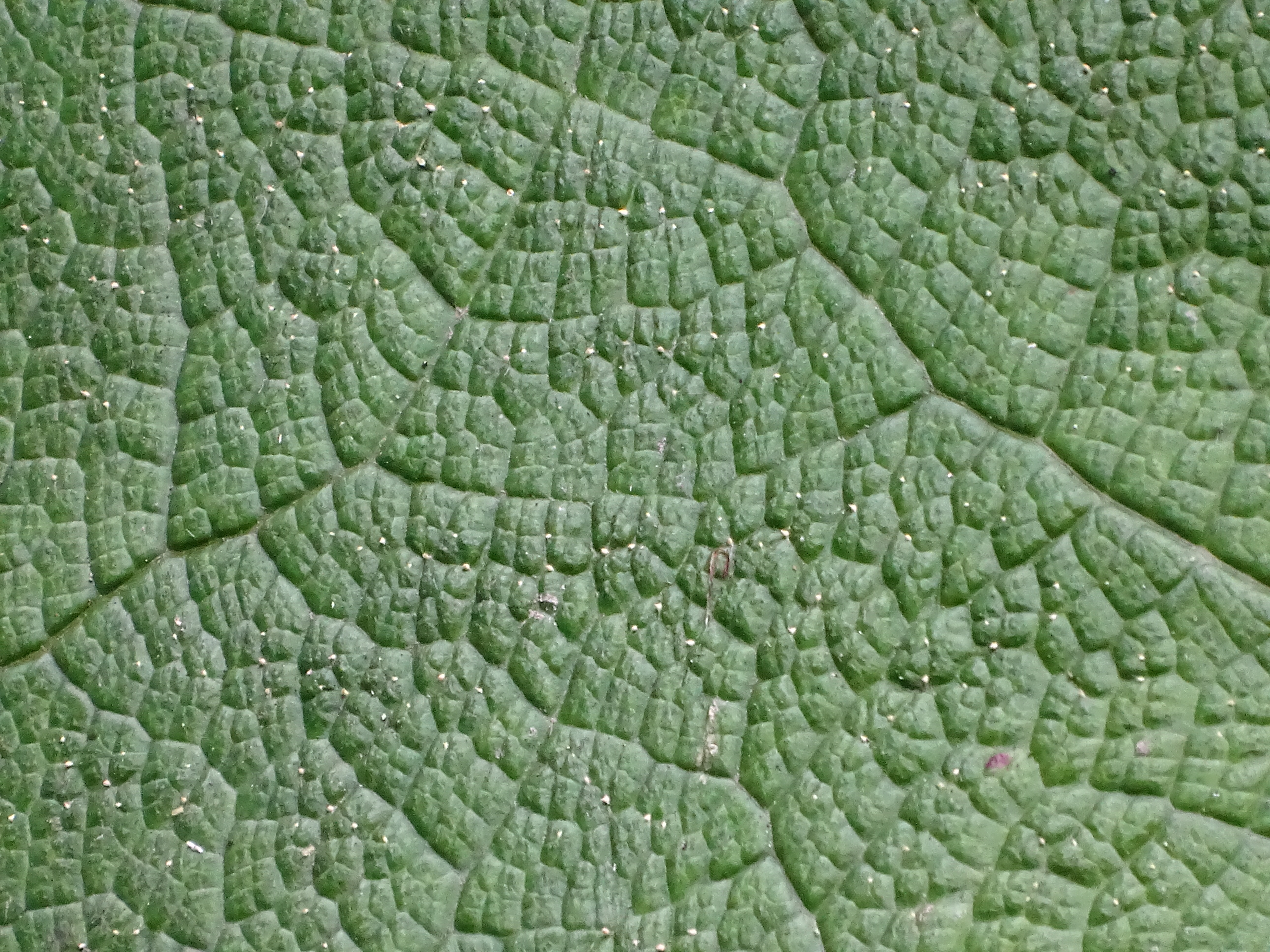
I really like these photos as they show different versions of abstract. With zooming in really close to pick out minute detail, using a variation of depth of field to focus in the fore-ground and blurring out the background, to experimenting with light and dark, by staying up till the early hours of the morning and using a bike light to shine against paper, causing the sharp dark lines of the paper.
Albert Renger-Patzsch (June 22, 1897 – September 27, 1966) was a German photographer associated with the New Objectivity.
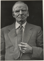
Renger-Patzsch was born in Wurzburgand began making photographs by age twelve.[1] After military service in the First World War he studied chemistry at Dresden Technical College. In the early 1920s he worked as a press photographer for the Chicago Tribune before becoming a freelancer and, in 1925, publishing a book, The choir stalls of Cappenberg. He had his first museum exhibition in 1927.
In 1928 Renger-Patzsch published The World is Beautiful, a collection of one hundred photographs whose rigorous sensitivity to form revealed patterns of beauty and order in the natural and man-made alike. Embodying a new, distinctly modern way of looking at the world, the book established Renger-Patzsch as one of the most influential photographers of the twentieth century.
in 1925 Renger-Patzsch began to pursue photography as a full-time career as a freelance documentary and press photographer. He rejected both Pictorialism, which was in imitation of painting, and the experimentation of photographers who relied on startling techniques. In his photographs, he recorded the exact, detailed appearance of objects, reflecting his early pursuit of science. He felt that the underlying structure of his subjects did not require any enhancement by the photographer. In his book Die Welt ist schön (1928; “The World Is Beautiful”), he showed images from both nature and industry, all treated in his clear, transparent style. Such images were closely related to the paintings of the Neue Sachlichkeit movement of painters, who created detached and literal renderings of reality that were so extreme that they produced an eerie effect.
one of my favourite work hes done:

this is a black and white photo of what seems to be some kind of flora.