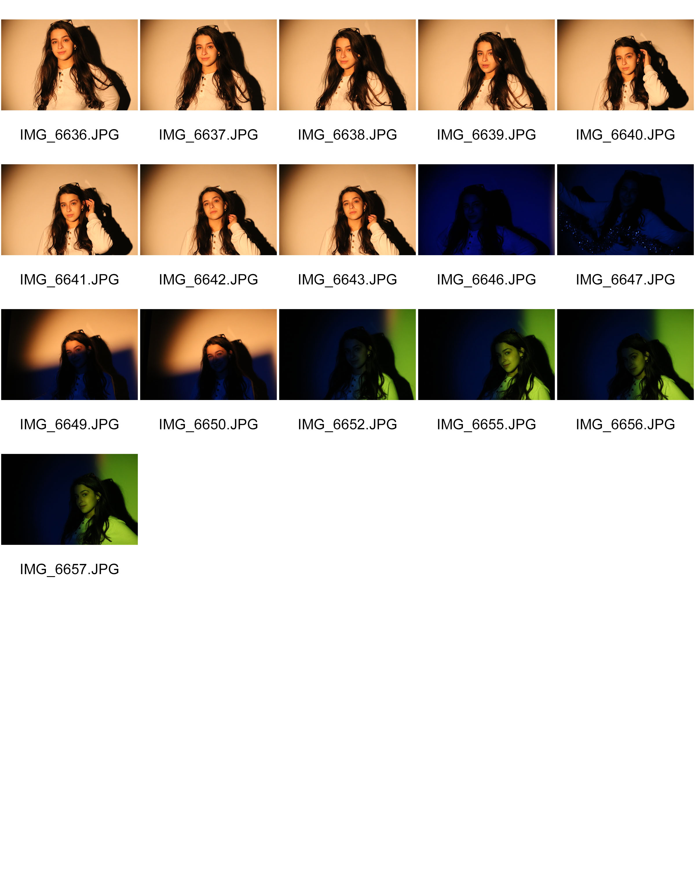
My plan is to go to the main high street and then find someone interesting looking and then get the style of photo that Winogrand would take. By that I mean have a subject in the shot and have it clear that they are the main subject but still have a large portion of the frame being the street. I will also be using my film camera either shooting on black and white or colour because that is what he used (not colour) and I am trying to create a response to his work.
Category Archives: Uncategorized
Filters
Street photography — Artist study Garry Winogrand
Garry Winogrand (14 January 1928 – 19 March 1984) was an American street photographer from the Bronx, New York, known for his portrayal of U.S. life and its social issues, in the mid-20th century. Though he photographed in Los Angeles and elsewhere, Winogrand was essentially a New York photographer.
Photography curator, historian, and critic John Szarkowski called Winogrand the central photographer of his generation.Critic Sean O’Hagan, writing in The Guardian in 2014, said “In the 1960’s and 70’s, he defined street photography as an attitude as well as a style – and it has laboured in his shadow ever since, so definitive are his photographs of New York.” Phil Coomes, writing for BBC News in 2013, said “For those of us interested in street photography there are a few names that stand out and one of those is Garry Winogrand, whose pictures of New York in the 1960’s are a photographic lesson in every frame.”
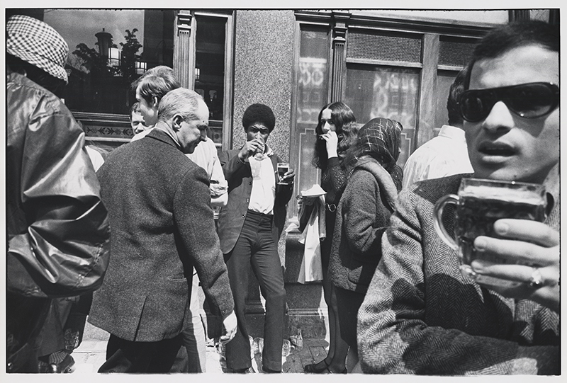
The reason that I like Garry’s work is because what he does is take photos of unsuspecting people who are in some way interesting, here are some examples of his work:


WEEK 4- EXPERIMENTING WITH STUDIO LIGHTING
Experimenting with different lighting
I carried out a photo shoot, dedicated to different lighting techniques which were explained in my previous blog post.
The lighting techniques i carried out in this photo shoot were..
- One point lighting
- Two point lighting
- Three point lighting
- Ring lighting
Plan
When carrying out this shoot, i decided that i wanted to explore different angles with all the lighting techniques i was going to explore.
One point lighting- When exploring one point lighting i wanted to angle the one light used correctly on the models face so that there was a slight chiaroscuro effect created. I aim to have the model use different head angles during this shoot.
Two point lighting- When carrying out the two point lighting shoot, i plan to have one of each light slighting in front/ to the side of the model in order for the image to have an even lighting on the skin. I will have the model looking directly to the camera.
Three point lighting- When conducting the three point lighting shoot, i will have a light directly in front of the model, and one either side of the model being slighting in front of her. This will provide enough lighting so that the model is fully lighten.
Ring light- When using the ring light for a shoot i plan to have it directly in front of the model in order to create a slight shadowing behind her on the plain white background.
Contact sheets
One point lighting
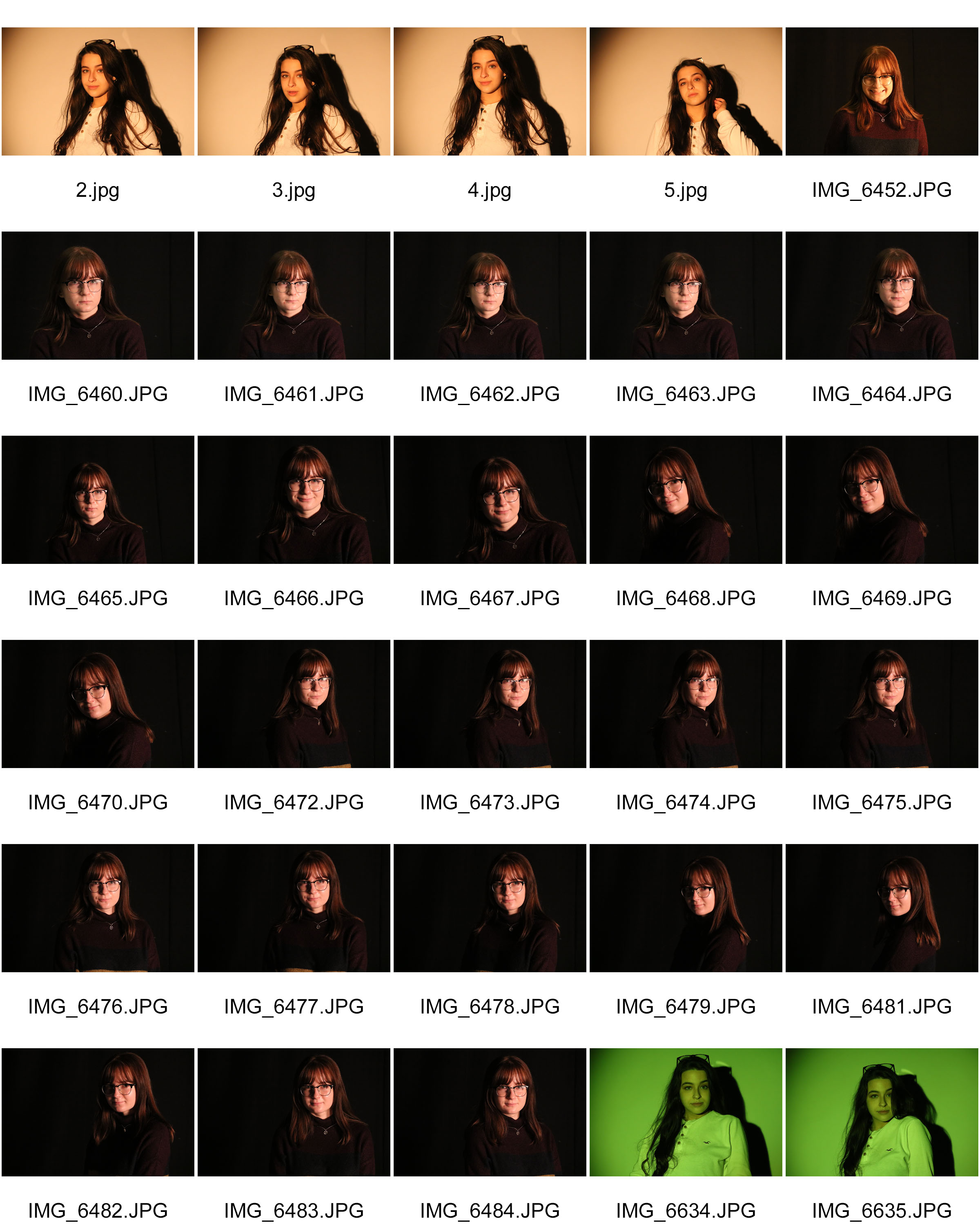
Two point lighting
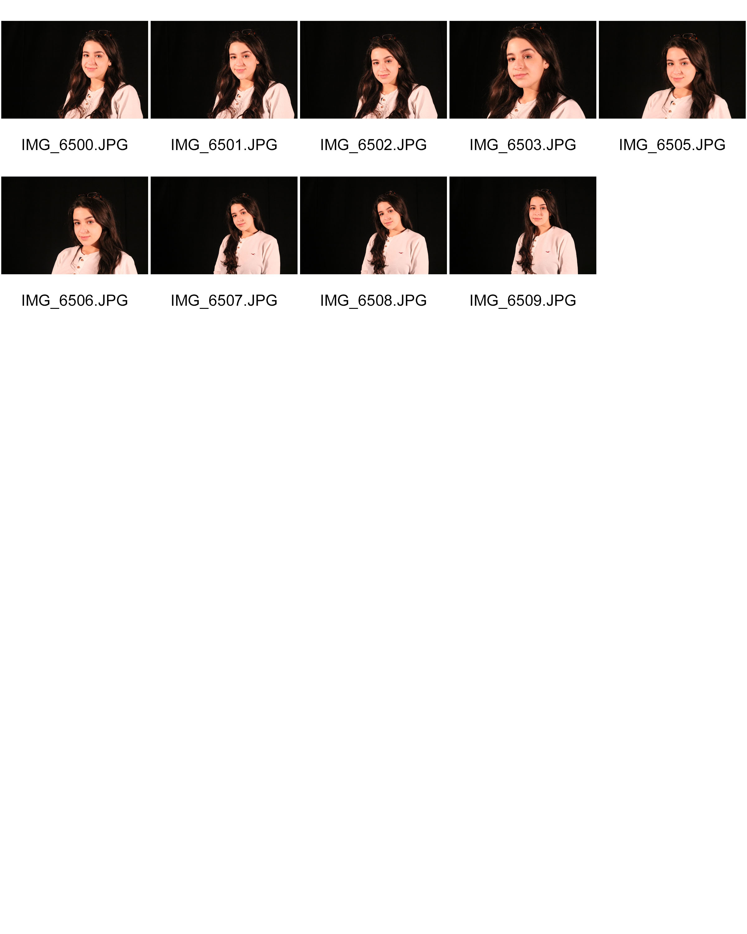
Three point lighting
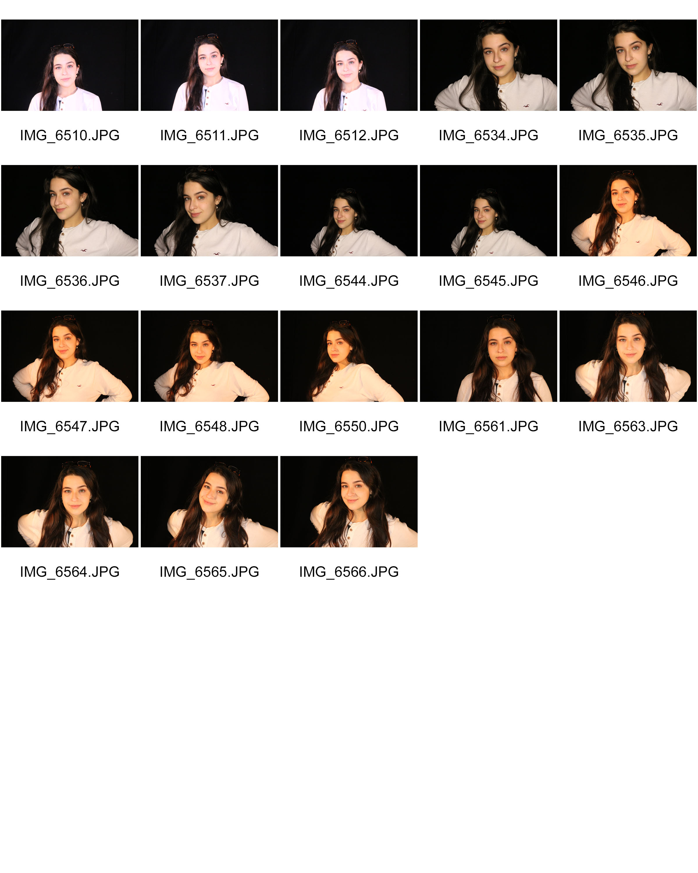
Ring light
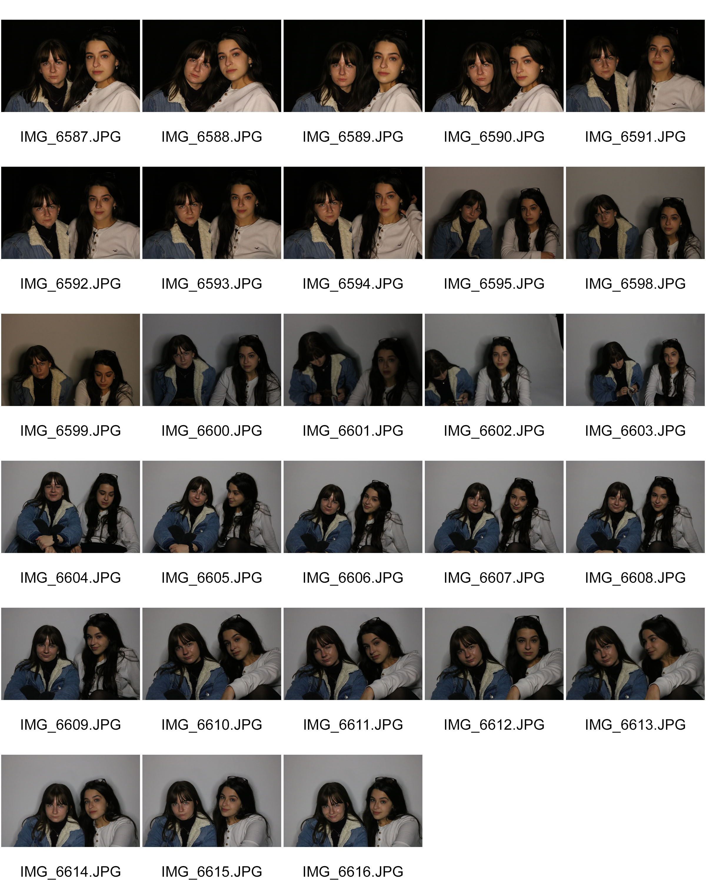
Best outcomes
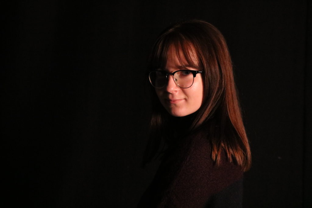
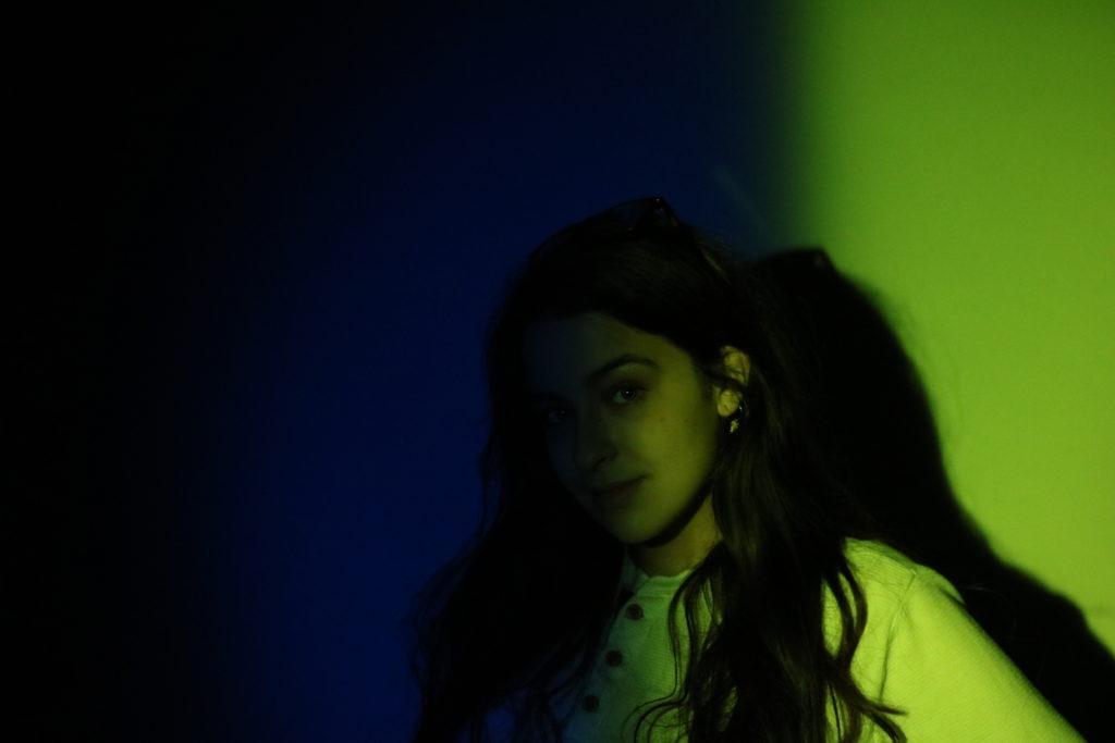

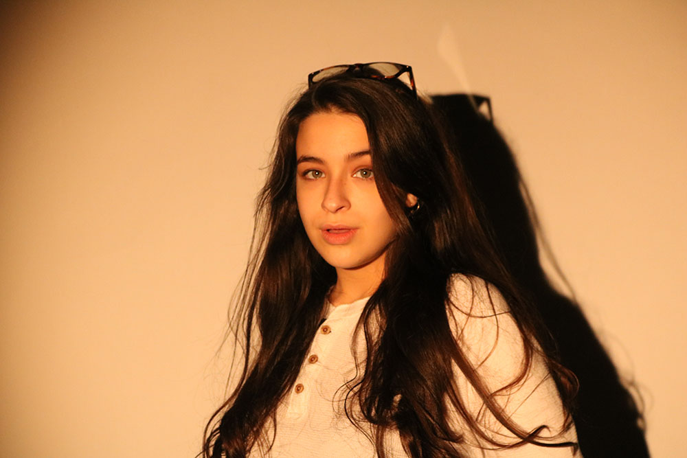
Analyzing and editing

Technical
For this image i used a shutter speed of 1/60 seconds and the ISO was at 6400. These two setting helped me get the perfectly exposed image. In this image i used one lighting source which was a soft box and this was places on the left hand side of the model in order to create a soft shadowing on one side on the face.
Visual
I think this image is a visually good image. I like the way that the model is a little of center and that there are no unnecessary background props. Due to my aim being to capture the shadowing on one side of the models face, i used a plain black backdrop so that the shadowing blended in with the background.

Technical
For this image i used a shutter speed of 1/60 seconds and the ISO was at 6400. Using these setting helped to get the picture perfectly exposed. In this image i used one lighting source which was a ring light which was placed directly in front of the models face. I also used a plain white background in order to create a shadowing from the model behind.
Visual
I think this image is visually good as i really like the position that the model is in, as well as her being directly in the middle of the image. Due to my aim being to create a slight shadowing behind the model, i used a plain white background in order to create this.
Arnold Newman | Portrait of Alfred Krupp | 1963
Arnold Newman | Portrait of Alfred Krupp | 1963
-
Emotional Response (how it makes you feel): This image makes me think, i cant quite understand what is going on in this image and what the main focus or ideology behind the photo. The facial expression of the male figure draws you in, creating mystery. It looks as if he is in deep thought which makes me feel confused also makes me wonder what he is intently thinking about.
-
Technical: The image is internally framed creating a inter structure. This use of perspective looking into the image is created by the use of different dimensional layers to create a tunneling effect. This created depth withing the image making it easy to follow with your eyes starting from the bottom at working your way up and through with your eyes. The geometric lines give the image a rigid structural form creating a visual rectangle picture. When looking at the image you feel as I have you are inside a cuboid shape looking outwards. The image makes you feel like you are inside of it encapsulating your visual senses.
-
Visual: The main color pallet with in the image is one of dark tonal greens and blues. Also there are splashes of color are to off set the viewers focus , create intrigue and secondary focal points through color in the image. The main focal point of the image is the man and his facial expression and postural positioning. This is the largest object within the image and the furthest forward in relation to all other objects this creates a main focal point, drawing the viewer in and making them ask questions about the image in there heads.
-
Conceptual: I feel like the background is meant to mirror what he is actually thinking/ what is going on in his head. I feel like it is meant to mirror mental confusion or chaos. His brain trying to cope with the ever changing environment which is portrayed behind him. His facial expression is stark and ghost like perhaps compensating for what is going on inside, his mind is busy and always occupied by individual thoughts flying by. These individual thoughts migrating through his brain could be represented by the trains coming in and out of the station on there different arrival and departure times.
-
Contextual : It seams to be that this old man has something to do with the train station ether he used to be a diver or travel and commute every day. I feel that he may have been a train driver when he was younger and has retired now. He is wearing a suit which means he has to be going something rather formal. My ideal is that he is saying goodbye to every one and that in the photo he is reflecting on the time he had as driver and how overwhelming all of this is now that he doesn't have that job anymore
Studio Portrait Photography
RANKIN CASE STUDY:
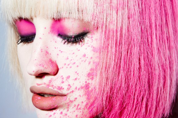
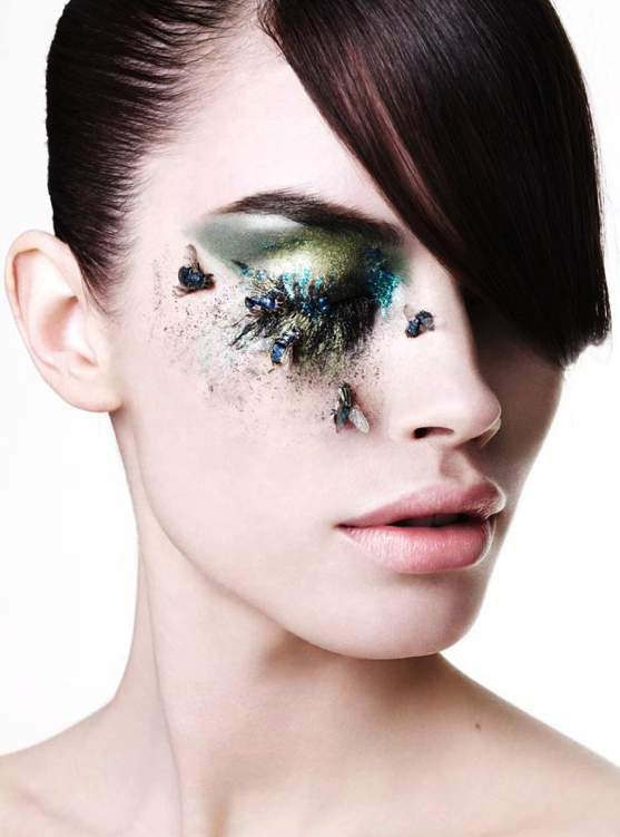
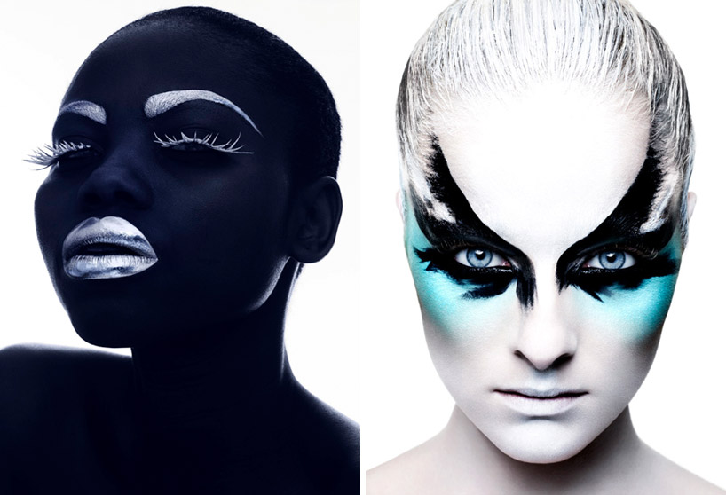
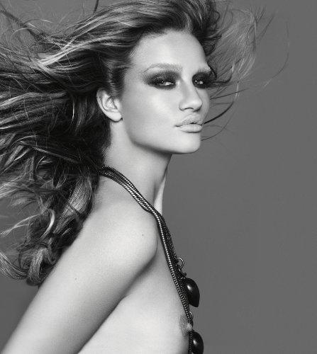
CASE STUDY OF WORK:
LIFE AND WORK:
Rankin is the working name of John Rankin Waddell. Born in Glasgowin 1966, Rankin is an English fashion and portrait photographer. He grew up in Hertfordshire and while studying at Brighton Polytechnic, he quickly realized that his main interest is photography rather than accounting . So, he joined the Barnfield College, Luton, United Kingdom and later went to London College of Printing. Meanwhile, Rankin met Jefferson Hack and once they graduated, together they started a magazine titled Dazed & Confuse.
In 1999, the two became the founder of a production company known as, Dazed Film & TV. It was the first to broadcast a mast-head television special, Renegade TV Gets Dazed. Rankin then in 2000 launched RANK, a quarterly fashion magazine. The Dazed Group also publishes Another Man, HUNGER and Another Magazine.
By the Royal Photographic Society, Rankin was awarded an Honorary Fellowship. He has photographed many celebrities such as Kate Moss, Spice Girls, Lily Allen, Britney Spears, Kevin Spacey, Cate Blanchett, Queen Elizabeth II, The Rolling Stones, Madonna,
WORK ANALYSIS:
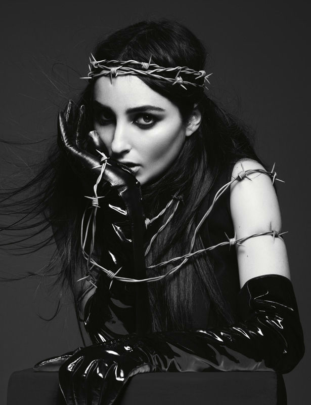
VISUAL:
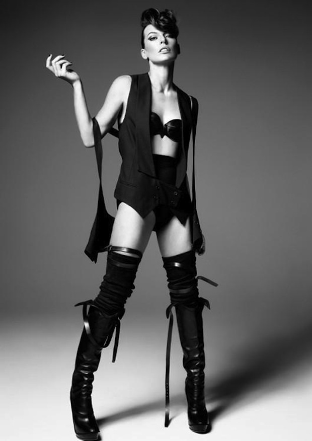
The image above contains a variety of different textures and forms, from the shiny latex gloves which reflect strong highlights, to the smooth and flawless skin of the model. The barbed wire which coils around the body and the head of the model gives the image a flow and leads the viewers eyes to the top of the image, being central around the model’s head.
There is very strong eye contact being made with the camera which draws in the reader and gives the image an aura of mystery and the unknown. This feeling is further emphasized through the strong connotations that the latex gloves and barbed wire have to violence. Being in black and white, the image is dark and dramatic. The models facial features are very prominent due to the strong lighting used. The focal point of the image is the models face, which is highly contrasted with the black clothing and grey backdrop.
TECHNICAL:
The exposure in this image is very well exposed, with the highlights and shadows complementing and harmonizing with each other. The image is also very crisp and sharp suggesting that a fast shutter speed has been used, in addition to that, a tripod is likely to have been set up as well in order to keep the camera still and get a very horizontal shot of the model. There is soft and diffused light hitting the model directly in front which suggests that a reflector has been used in order to achieve this effect.
The positioning and the eye contact the model makes also suggests that this is a setup, where she has been told what to do and how to pose. The flawless and airbrushed skin of the model suggests that some Photoshop manipulation was used in order to make the image grey scale and to erase any minor imperfections to give a uniform and clean look to the image.
CONCEPTUAL/CONTEXTUAL:
He tries not to prejudge anyone. “I try to think about people in human terms. That’s something my parents taught me – never put anyone on a pedestal, but never talk down to them either, which has been very instructive in my job. I see the person, not the celebrity. I’m a portrait photographer – I shouldn’t bring in my opinion. My job is to capture them in a moment.”
Fashion and celebrity photography can be criticized for being shallow and throwaway. Rankin is often the subject of such criticism and this project was one way for him to respond to his critics with characteristic wit, allowing his images to be destroyed and the sale of the art works benefiting a music charity for young people. There is a great deal of skill and craft in creating seductive images that stand out from the crowd.
Studio Photography Lighting (Double)
What is dual point lighting:
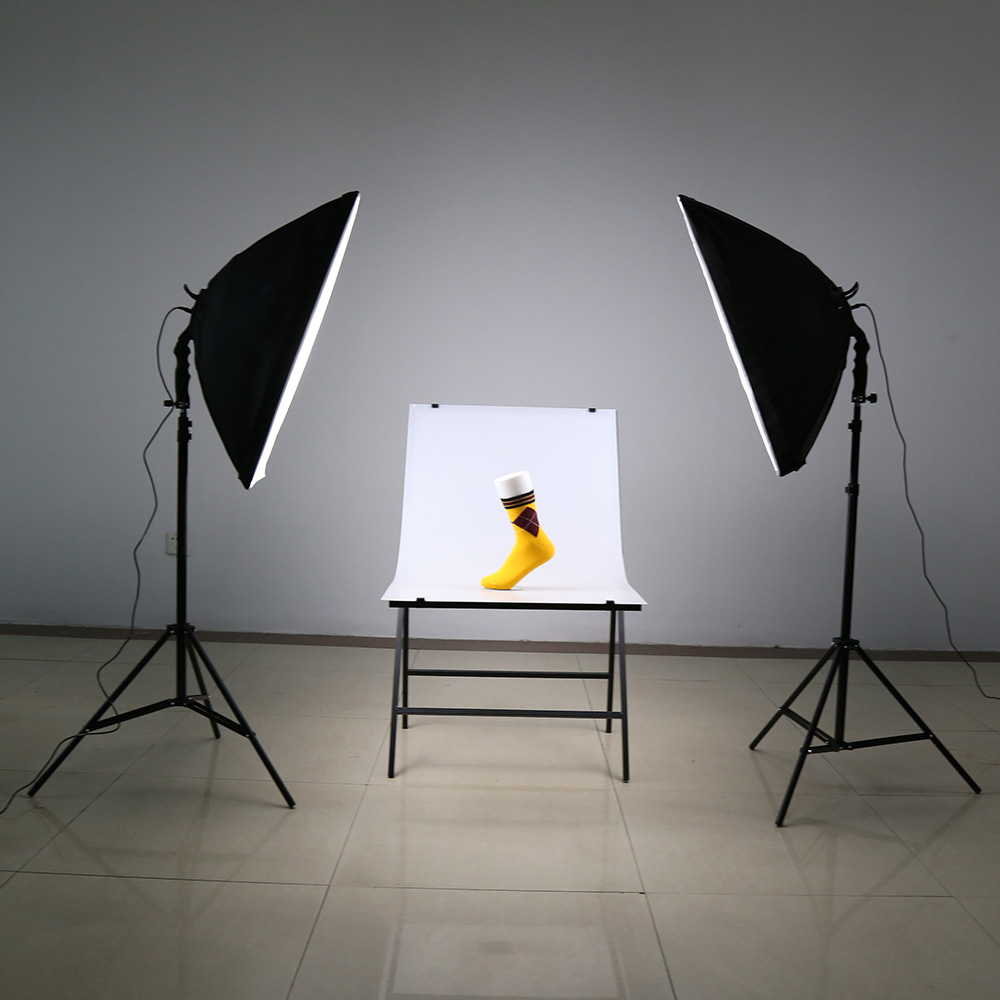
Two point lighting setups can be very beneficial. By adopting two separate positions, the photographer can illuminate the key subject (such as a person) however desired, while also controlling (or eliminating entirely) the shading and shadows produced by direct lighting.
The key light, targets the key subject of the photo and serves as the primary illuminator source. The Photographer can experiment with the strength of the video lighting, colour and angle. The key light will determine the shot’s overall lighting design.
Then a fill light can be used to balance out the shadows appearing on your subject. The fill light will typically not be as strong as the key light. If your lights are all the same strength you can look into using diffusers to help soften a light source along with colour gels. A colour of lighting gel is a transparent coloured material placed over a light source for colour correction and video lighting effects.
Diagram:

Examples:

My own aim, action plan and technical features:
Use two separate lights in different angles facing the model to capture a series of images that highlight/concentrate on key features of the photograph.
Therefore is se up two lights one facing towards the model from the left and one light facing towards the from the front. This helped to keep the focal point in the part of the photo where those lights cross over, which illuminates the key areas I want to show. I then set my camera to a high ISO so the colour differences were distinct in the harsh light, whilst using a shutter speed of around 1/8 second and a slightly lower aperture so not as much of the light could enter the camera.
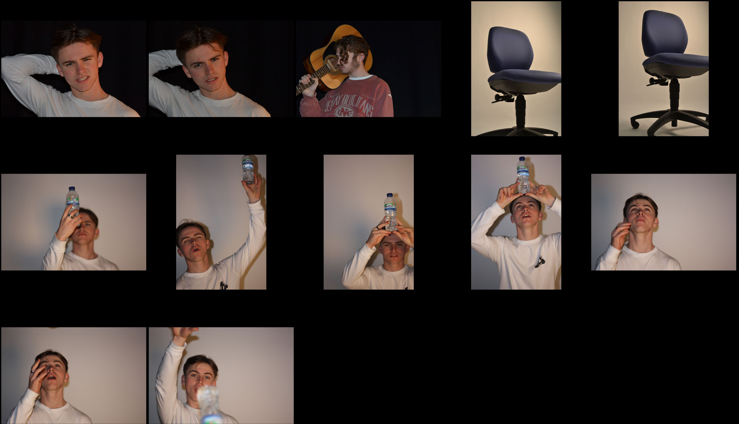
Contact sheet:
Final image outcome:
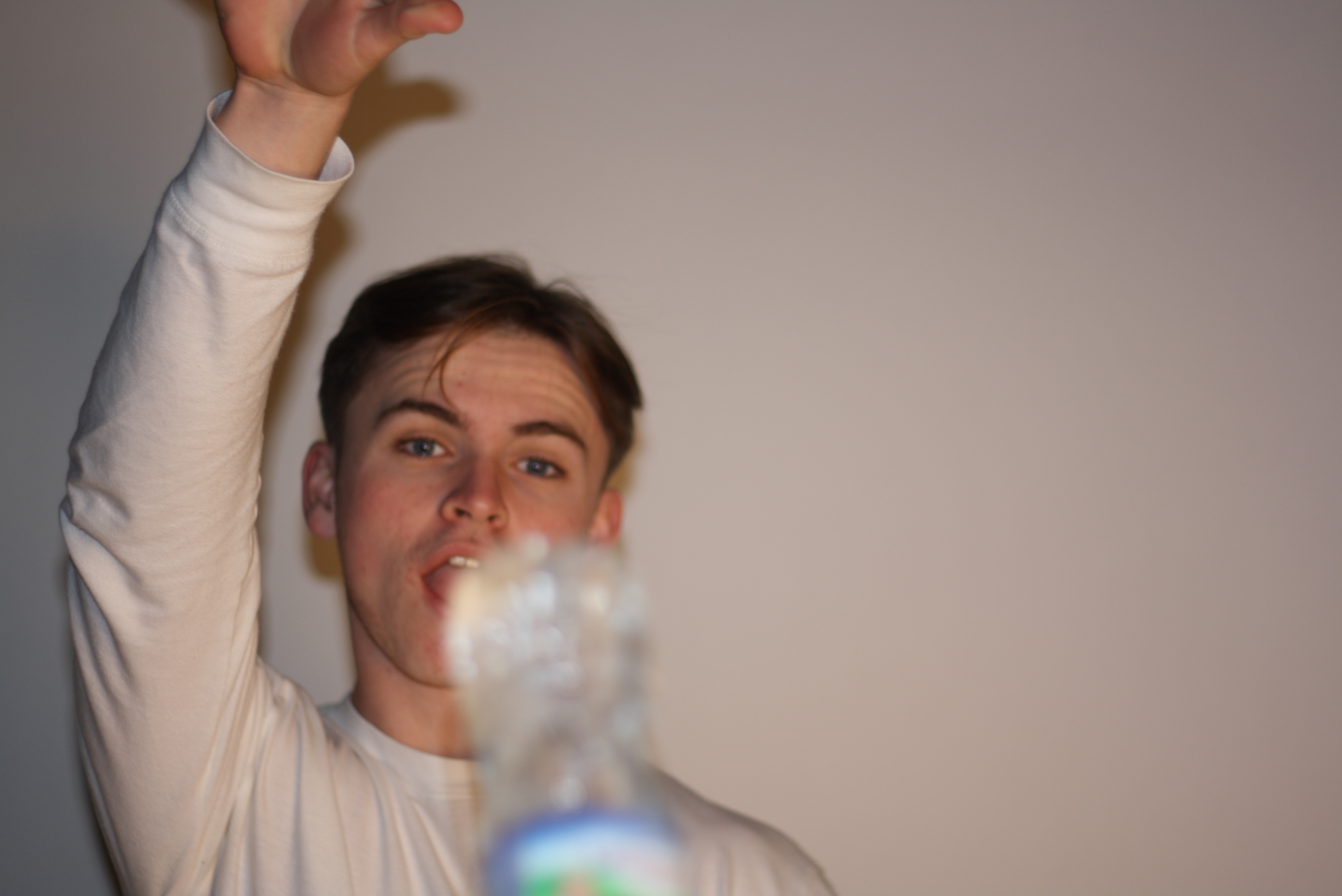
Visual elements of this image include:
The lighting in this was in two locations with one light at the front of the model and there was another lamp to the right side. A fairly plain colour range of primarily whites, greys, browns and black can be seen with a range of light and dark tones across the photography which contact each other. The depth of field and 3D-ness of the photograph is created by where the bottle in the foreground is not in focus, but the model is. The texture is quite smooth and there is a slight lead in line using the sides of the bottom.
Many portraits have contextual and conceptual meanings but this one does not and is designed to showcase a camera technique.
Studio Photography Lighting (Singular)
STUDIO PHOTOGRAPHY ONE POINT LIGHTING
This post is focussed on our studio lighting photoshoot using a single light to capture images.
Single point lighting or “one point lighting”, is the technique of carrying out a photoshoot within a studio with only a single source of light, for example large lamps, spotlights or torches.
It enables reflective lighting techniques, and it sometimes, can be used to focus a viewers attention to a particular aspect of a photograph or subject in the photograph, or it can be used to create shadows when used correctly that add additional depth of field and conceptual features to an image.
Contact sheet of images:
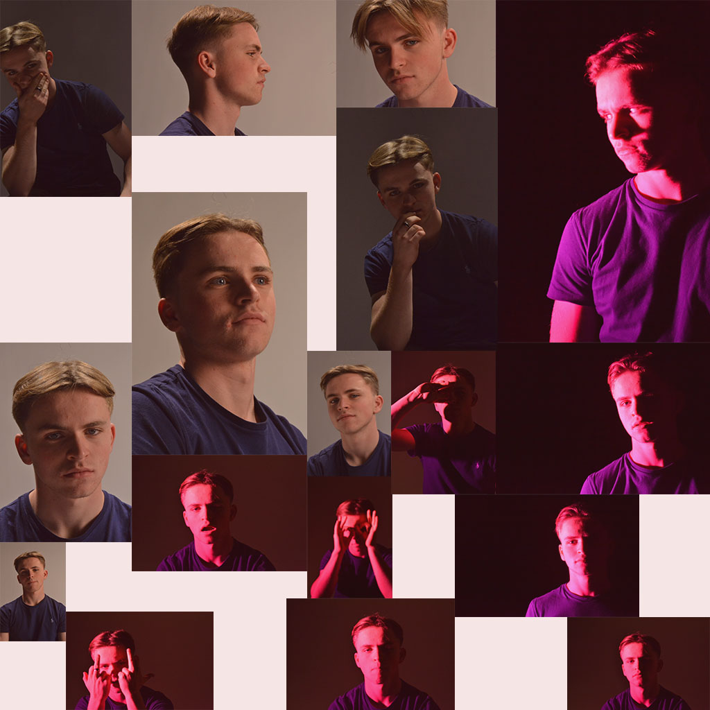
From this contact sheet I picked out my favourite two images from the shoot and edited them in Adobe Photoshop.
My final edited images from the single point lighting shoot:
I chose to edit both of these images because of the sharpness, diversity in model actions, contrast differences, brightness differences and the similarity in the position of the single light and the shadows on the models’ face.
The camera was using a high ISO of around 800 and an above average aperture on the first photo, and using a lower ISO of around 600 and a smaller aperture on the second.
The shutter speed for the first photo was slightly faster than the second creating the darkened effect with only the single light from the side creating the shiny parts that give the image its ‘definition’.
The depth of field in both images is shown through the shadows created by the side-lighting however, this only shows depth of field on the model themselves.
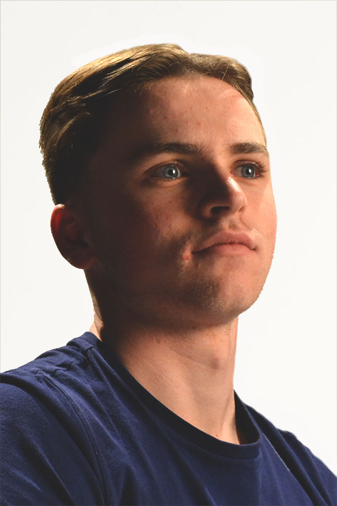
Alex looking “into the light”
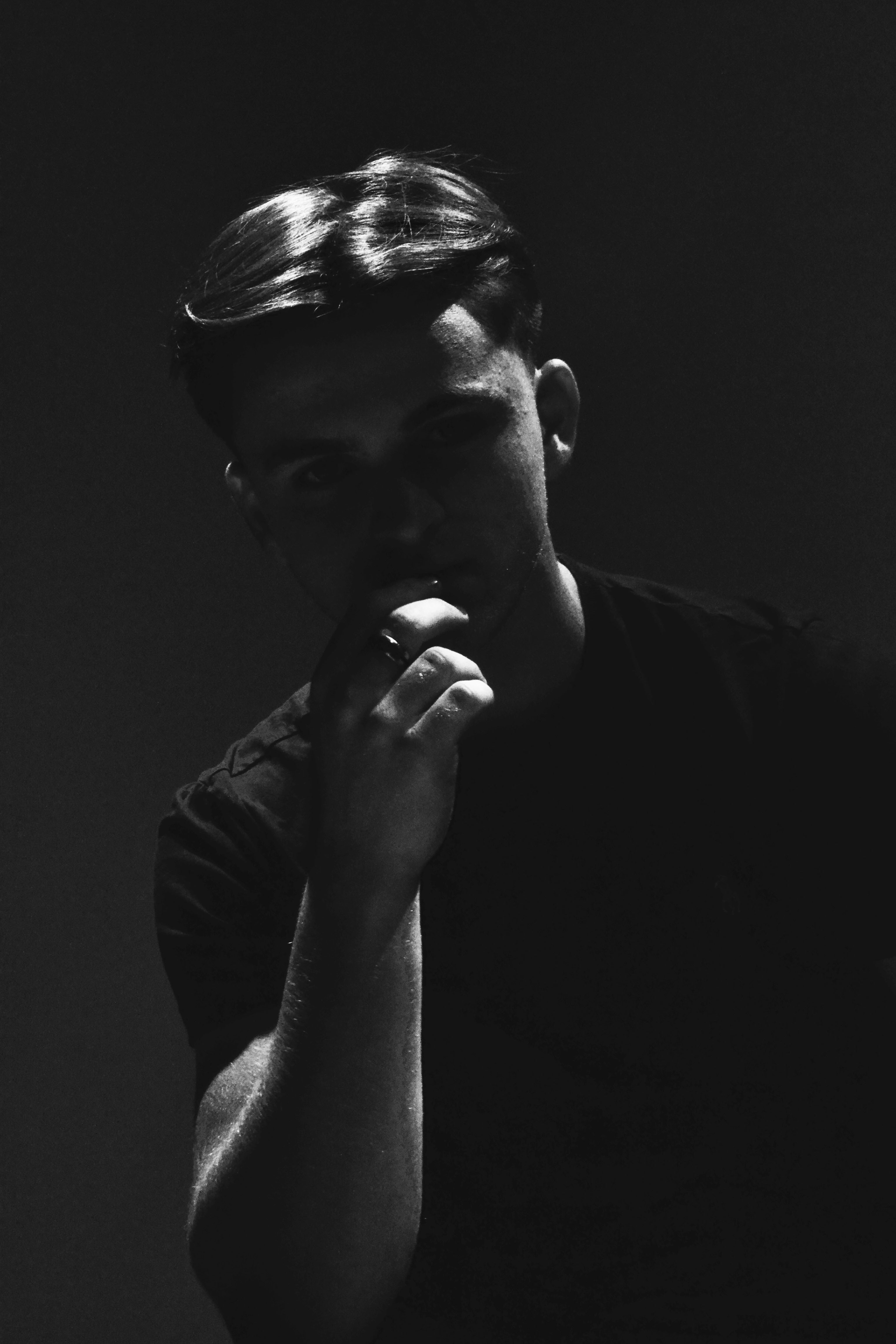
“Seriously Serious”
Studio Photography
Now we have moved into portraiture in photography we have started to use the studio, this is brilliant and fun in the moment on creating better portrait photos, this is because we can take photos in an controlled environment with no factors of extraneous variables.
In the studio we are able to dim and brighten lights, have lights shining in specific areas to light up part of a face, or we can use a color filter to give the photo a different feeling, like a warm or cold feeling, by using a warm or cold color to affect the light.
In my very first studio photo shoot I asked the person visible to act in whatever manor she liked, this way the movements and facial features would seem more natural and relaxed. I like this way as it doesn’t make the photo seemed forced in anyway, but also this way I can capture the real facial features and emotions of a relaxed person.
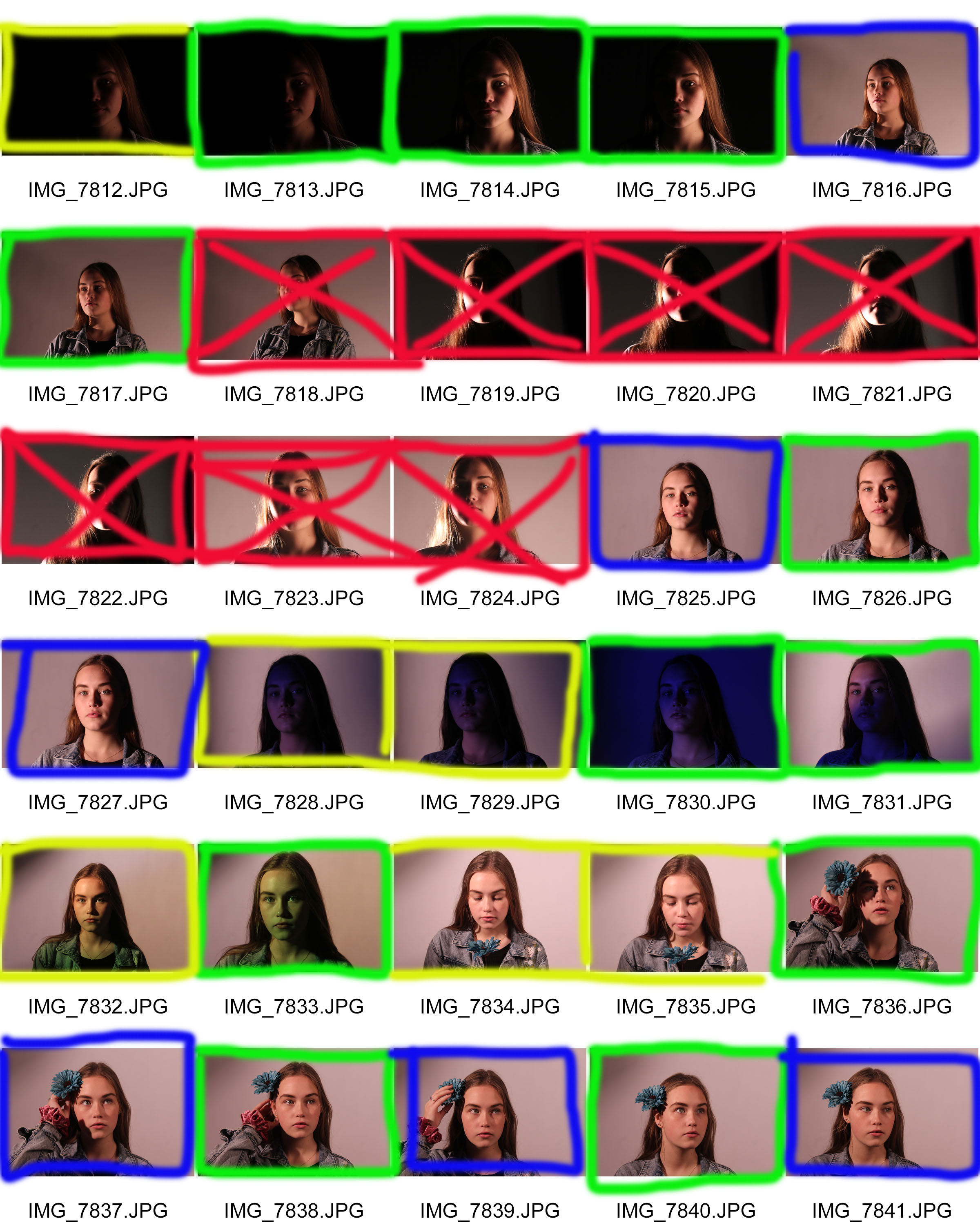
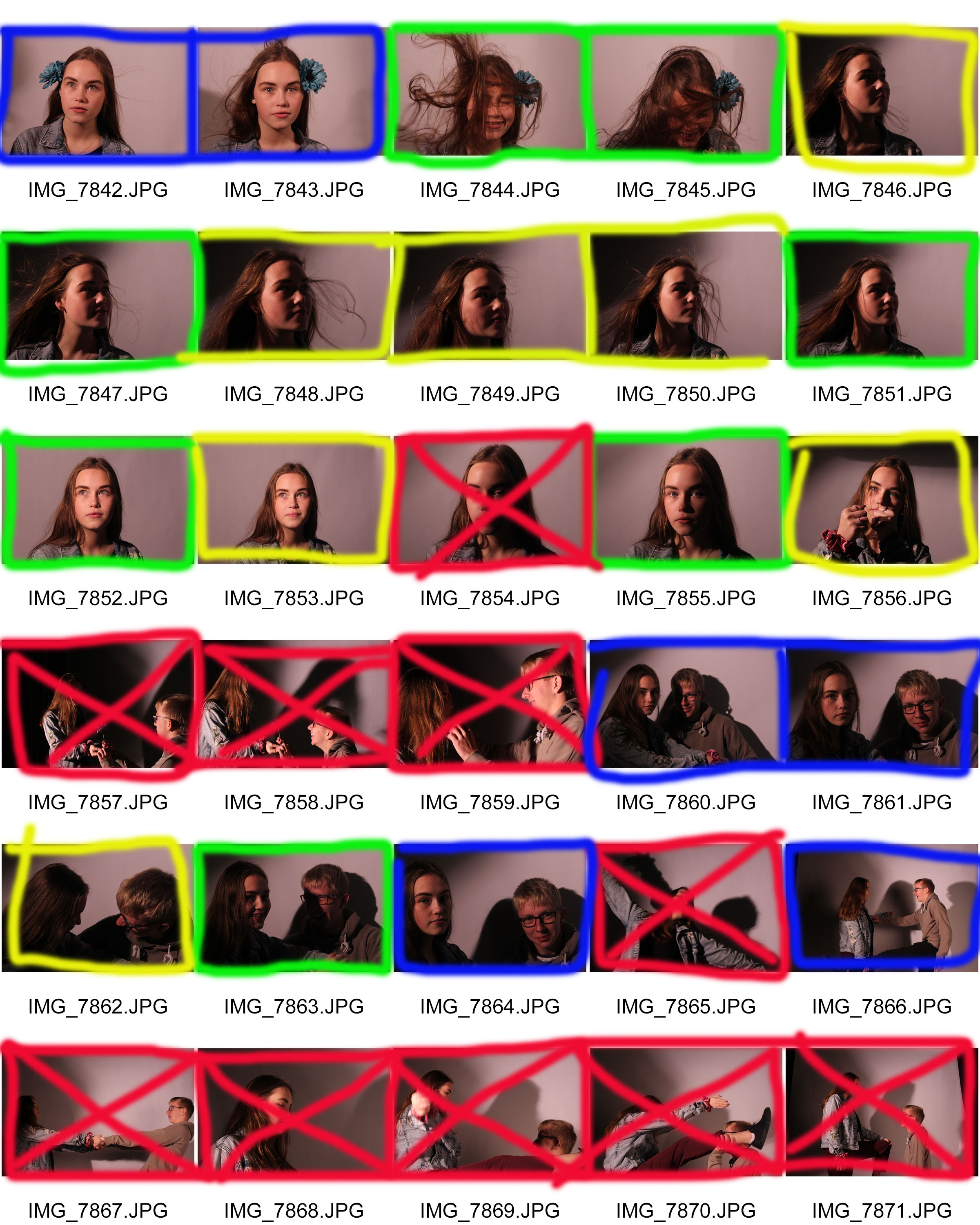
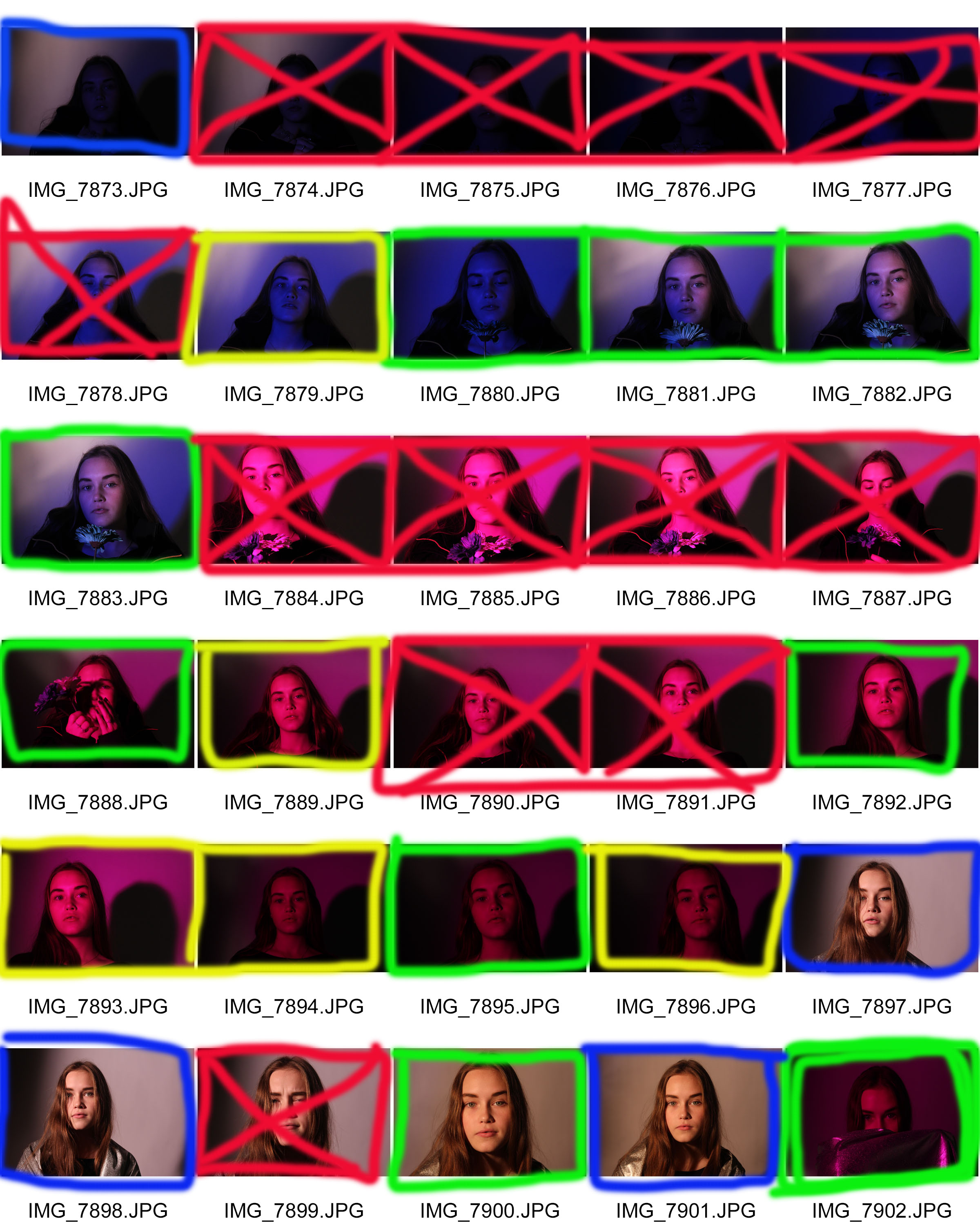 In the contact sheet you will notice I have used the same key as I always do.
One thing which is visible is that I have loads of photos which I am unhappy with, this is due to the fact that it was my first time using the studio therefore I was getting used to the different settings with ISO and aperture to make it really work with my models face.
Most of the crossed out pictures are because I had made the photos either under or over exposed making it too light or too dark, others which may seemed great did work with the light, but I had realized that my models face looked bored or just uninterested, but there are others where my model is showing emotions such as laughing which really helps me capture the human persona and features.
Case Study Street Photography – Bruce Gilden
Bruce Gilden
Who and what:
Bruce Gilden (born 1946) is an American street photographer. He is best known for his candid close-up photographs of people on the streets of New York City, using a flashgun. He has had various books of his work published, has received the European Publishers Award for Photography and is a Guggenheim Fellow. Gilden has been a member of Magnum Photos since 1998. He was born in Brooklyn, New York.
About his style and technique:
Photographer Title Theme – Candid Black and White Photographer
Bruce’s style is defined by the dynamic accent of his pictures, his special graphic qualities, and his original and direct manner of shooting the faces of passers-by with a flash. Gilden is also very prone to shooting in extremely close proximity to his “models”, so close in in-fact that a lot of the people he photographs think he’s photographing someone being them which makes them feel more part of the image and gives them a more natural and interesting facial and bodily expression. Gilden’s powerful images in black and white and now in colour have brought the Magnum photographer worldwide fame. Bruce has been known to walk on certain sides of streets and locate himself in certain places he believes give the most diverse and interesting range of people and actions to capture in his portraits.
Bruces inspiration stems from a large fascination of his to do with capturing the energy, the stress and the anxiety of busy city life. He uses flash in a large proportion of his photos and is very selective on the characters he shoots. In one video he quotes, “I look for characters, things that make an impression on me. Someone who’s not the average looking person.”
One of his famous quotes is “If you can smell the street by looking at the photo, its a street photograph”. This quote captures his ethos of trying to take photos that fully represent the non pictorial qualities like emotions and moods of people in the city and those that come with city life.
Video Links:
Images:


Favourite image and analysis:

This is my favourite image because of the anger it carries through the texture of the photography.
Technical features of this photo include;
- An artificial flash gun light along with dull daylight.
- A macro lens used to distinguish the smallest of facial features.
- A greater exposure and shutter speed to capture the minute changes in colour and the variety and true form of the main colours.
- A higher saturation to give the photo some more warmth and colour.
Visual features of this photo include;
- A very intricate texture with little noise in the photo but a lot of texture.
- An extremely high sharpness and high levels of colour saturaion
- A kind of 2D shape, made 3D by the small patched shadow areas and of out of focus scenery behind the model
- There is also a high contrast to other colours in the photo and shadows are very prominant to enhance the facial features.
Contextual and Conceptual features of this photograph;
- This photograph is part of a project carried out by Bruce Gilden called ‘Portraits’ which aimed to capture very different and diverse looking people who captured Bruce’s attention. There may be a personal context that Bruce applies with these photos as-well due to his rough up bringing he maybe feels like these people are those he was destined to end up among if he hadn’t have found photography.
- The conceptual essence behind these portraits and portraits in general is to capture the whole environmental feeling from the place the photo was taken. For example emotions like anger and stress can come across from this photo due to unknown reasons. Or street photography portraits can capture the chaos that occurs in a city.
Why Bruce Gilden?
Out of all of the case studies I have completed so far on photographers, Bruce has come across to me as the most genuine, realistic and diverse photographers around. I love his confident style in shooting up close with a flash gun and not caring what other people think of him or his work for example he once quoted “nobody can tell me a picture isn’t good if think its good “. I also love his approach to finding who he’s going to shoot by looking for people who are “different” and not fitting into society because it makes them interesting. I also finally like the way he tries to capture emotions and feelings of city life in his portraits because I personally think street photography is all about not capturing an image necessarily but capturing a mood, emotion or vibe from a person or place.
Studio portrait lighting
The use of lighting is a studio is important because it is an environment that the photographer can control, this means that the photographer can get the desired effect.

This is broad lighting and is when the photographer wants to illuminate only one side of the subjects face and sometimes they will use a reflector panel to give some light to the other side but the main focus is on the side with the most light hitting it.
Here is an example:

In this photo the photographer has placed the light source to the left of the subject and then has no reflector to his right.
My Response:

I put my subject into the centre of the frame and then put a light with a diffuser to my right and then had no reflector.

