Category Archives: Uncategorized

Filters

Author:
Category:

Natural Light Experimentation

Definition:
Photographic lighting: is the illumination of scenes to be photographed. A photograph simply records patterns of light, colour, and shade; lighting is all-important in controlling the image. In many cases even illumination is desired to give an accurate rendition of the scene.

https://en.wikipedia.org/wiki/Photographic_lighting
The Shoot:

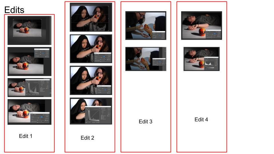
Manipulated Images:

Analysis:
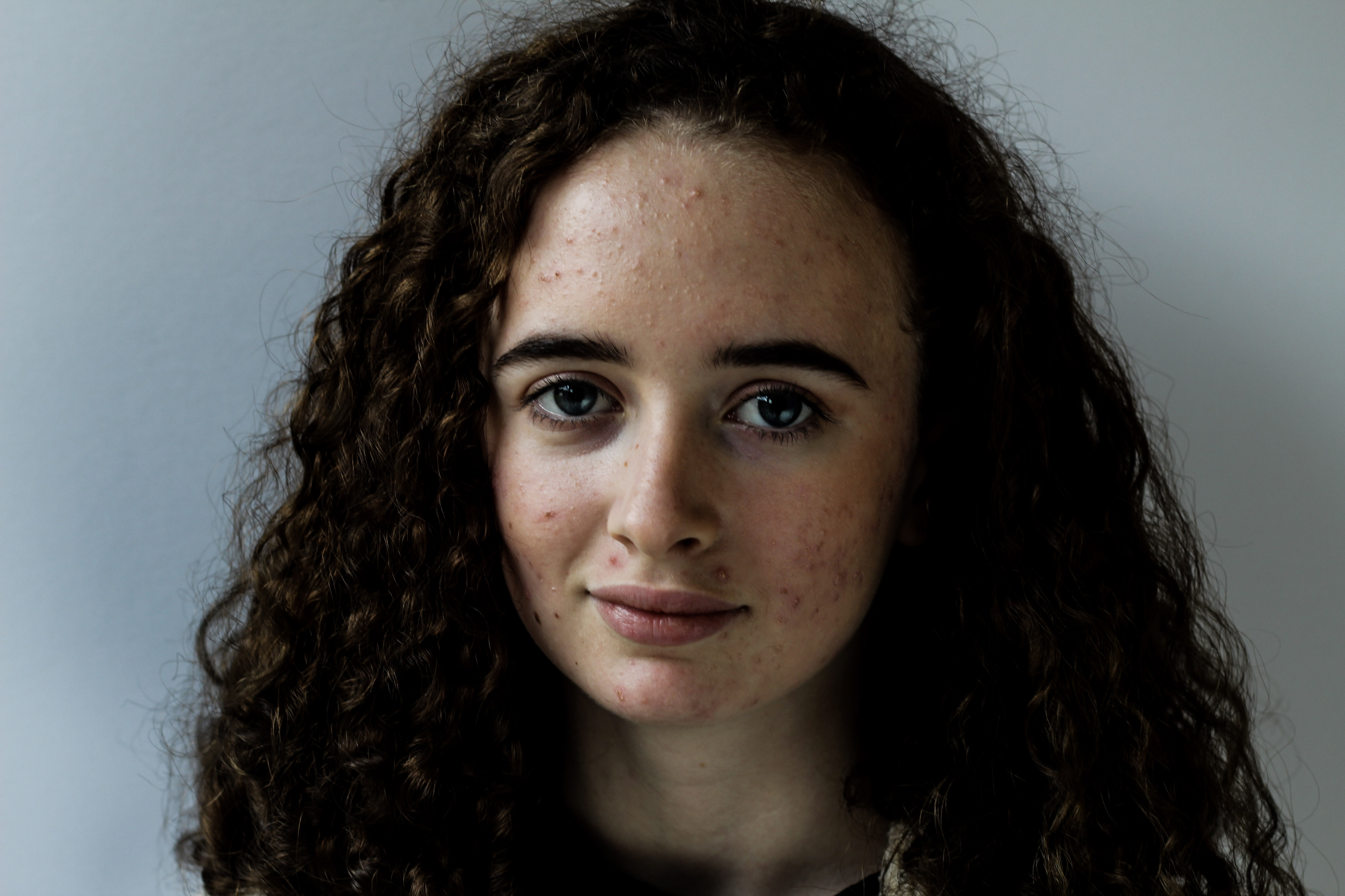
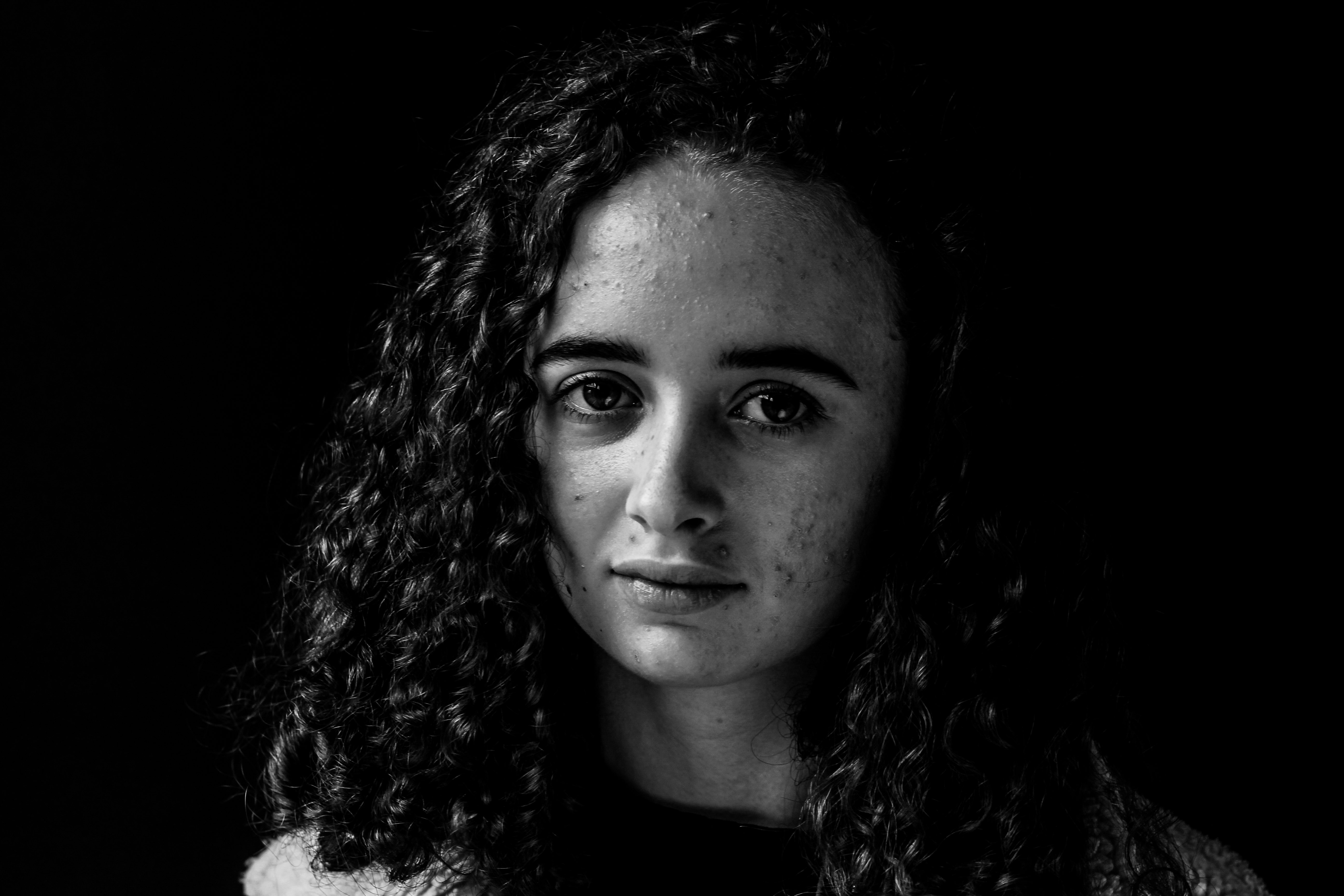
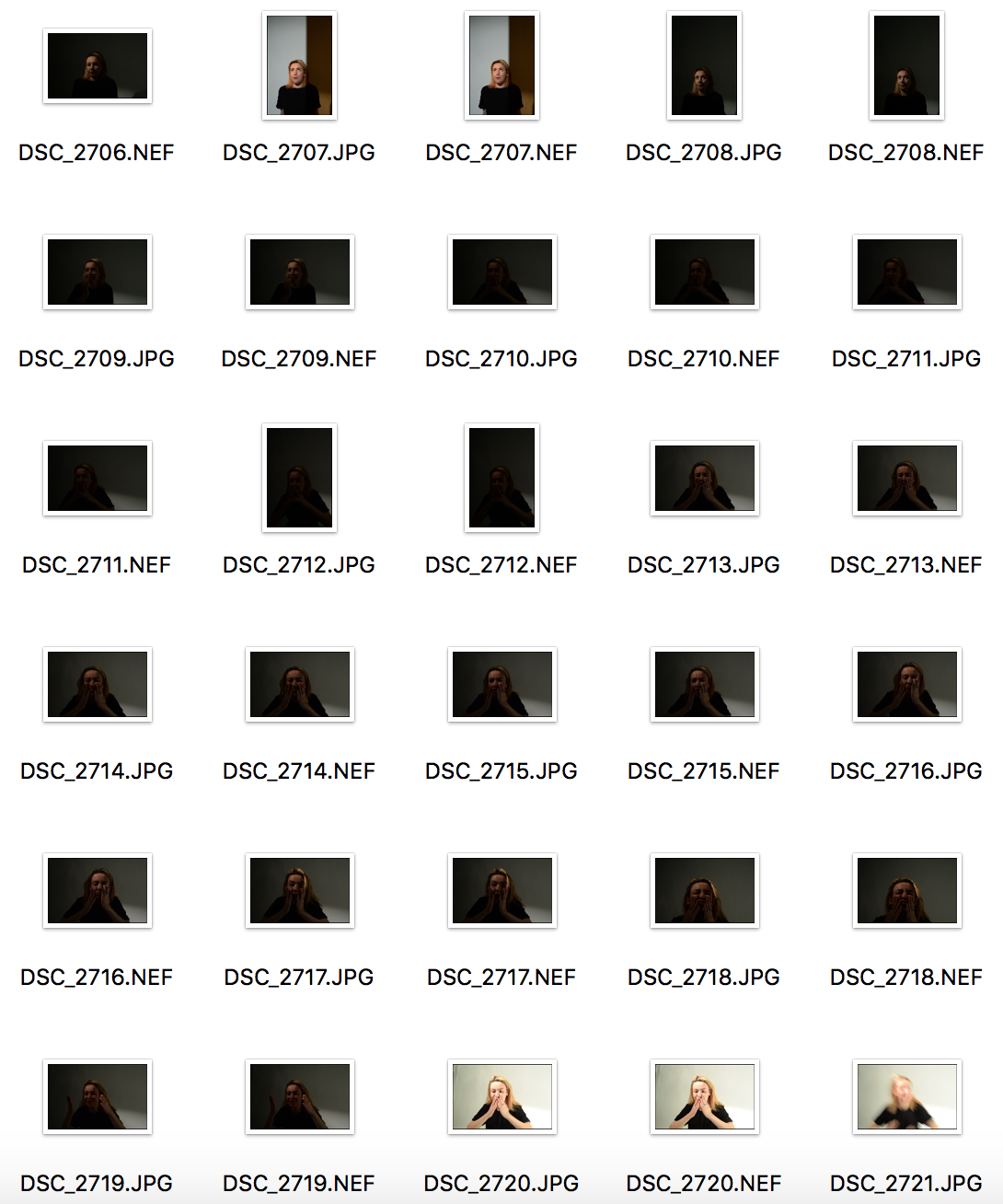
For this photoshoot, I got my model to stand next to a window to use the natural light to create a soft chiaroscuro. I also used a reflector to reflect some of the light lost from reaching the face. I then used adobe lightroom to manipulate my images, adding from presets and then adjusting contrast, highlights, shadows.


studio1 edits

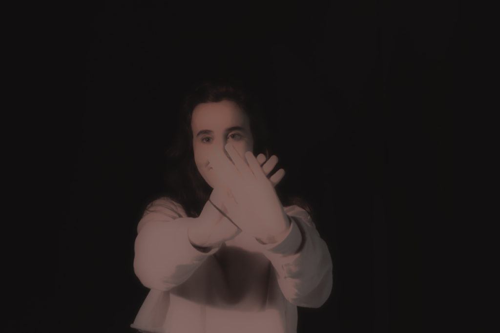
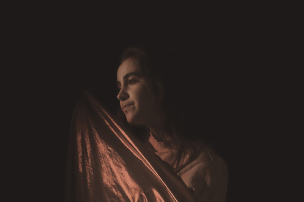
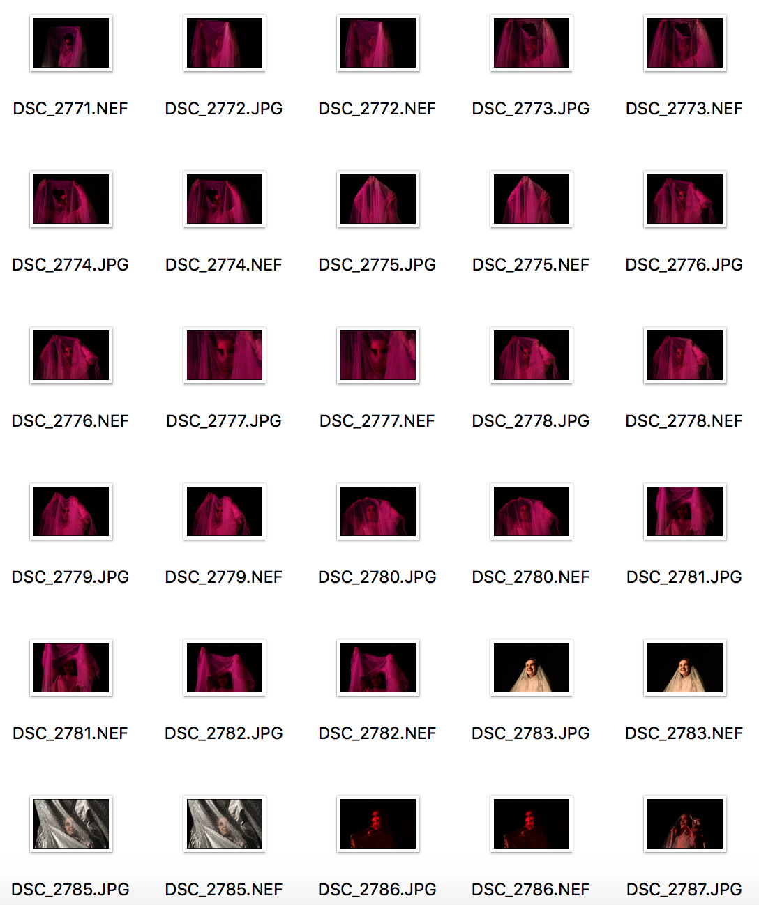
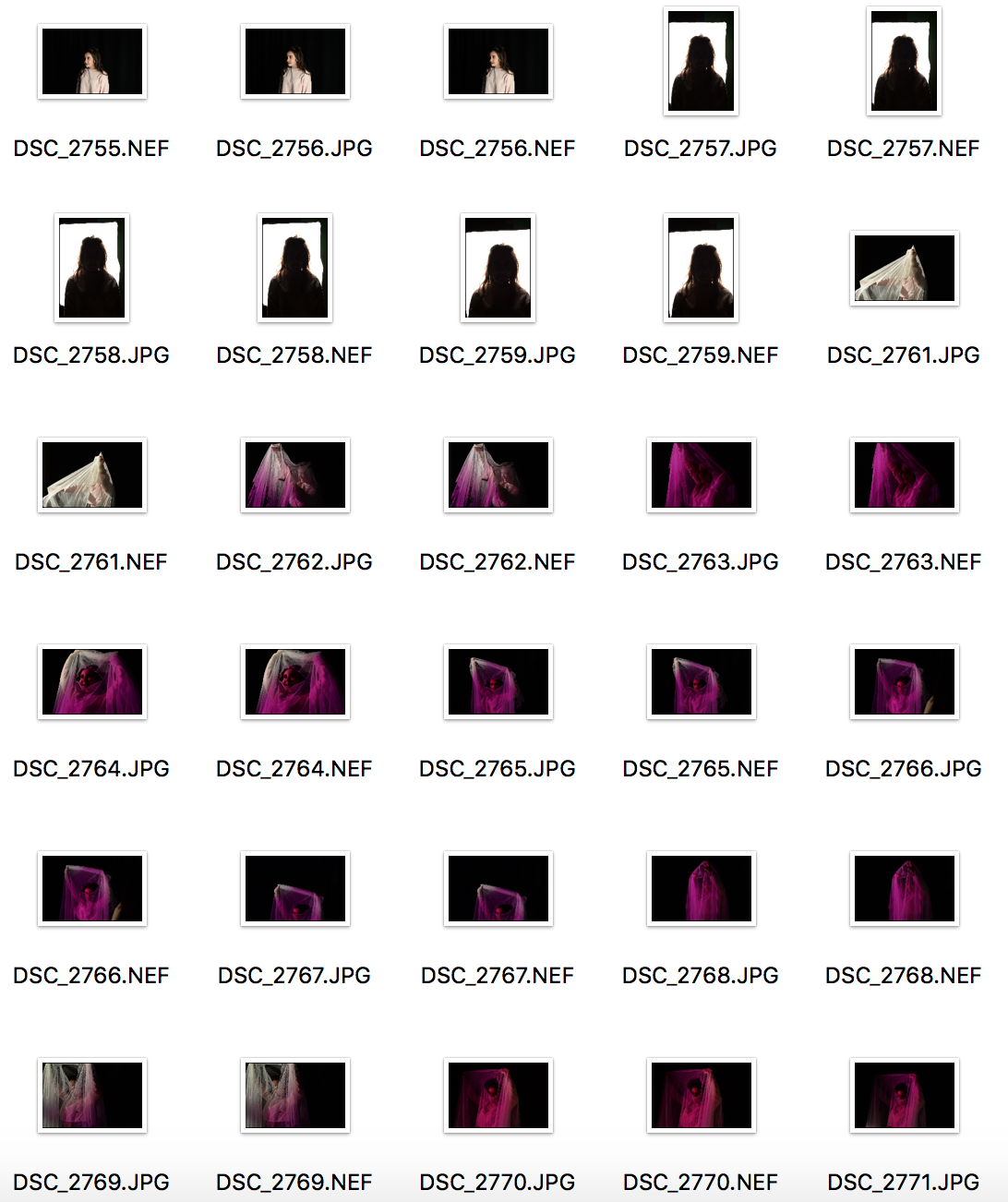
For the four previous photos I took them  using a box light and a magenta filter. I didn’t do much in terms of editing in photoshop: all I altered was the saturation to tone down the vivd, harsh pink colours and to give it a ‘cloudy’ sort of look.

In this piece I wanted to keep the vivid colours, so all I did in terms of editing was change the exposure so the figures were more dominant.

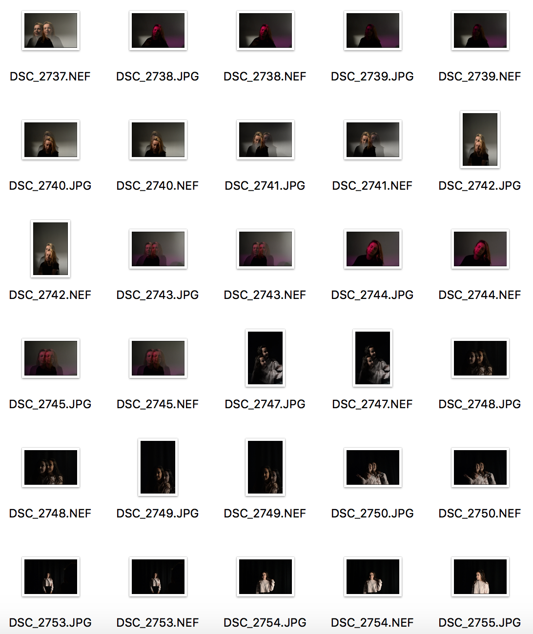
All my other photographs had been rectangle, so I decided to change it up and have this in the format of a square. I added some noise to this photo as it gave the pink filter more of a texture on the models face. I also decreased the exposure as it made everything slightly darker except for the models face which, in turn, made it stand out.


In this photo I had the model sit down so the light would catch the top of her head.  I decreased the exposure and selected the history brush and brushed over her face to gain the light back. This created an effect like just her face was glowing.


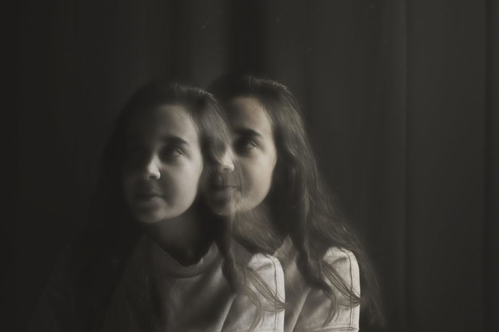
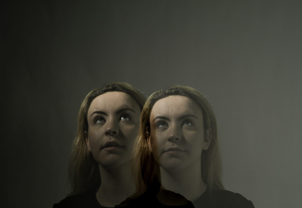
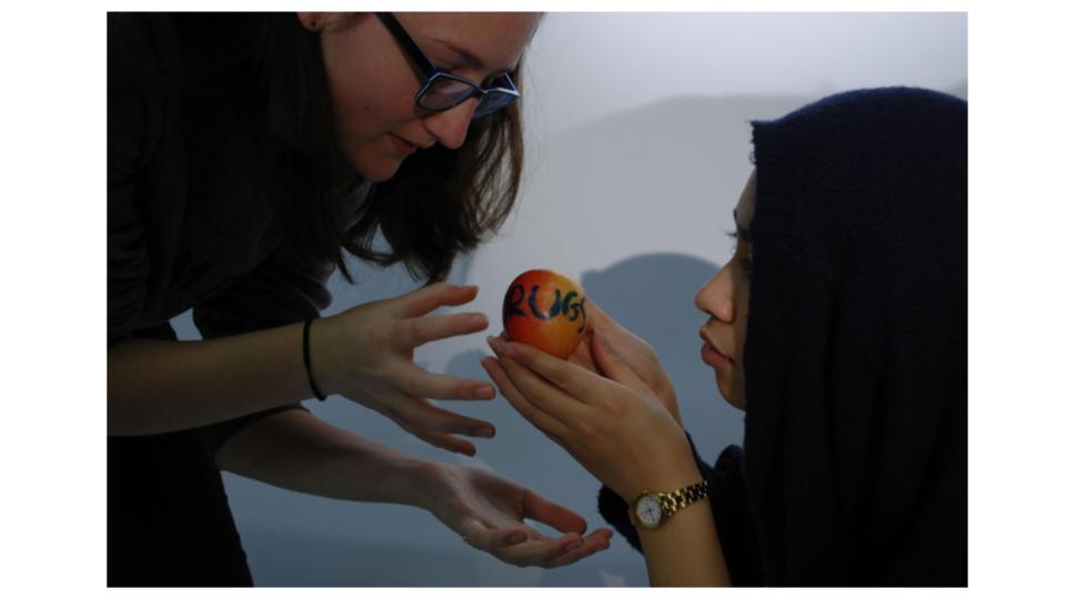
I used the double exposure setting on my camera to take this picture. My goal was to have a slight difference between the two figures, but not t

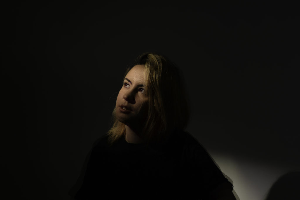
I had the model sit on the ground so I would be able to catch the light on her forehead. I wanted to enhance it a little more so I used Lightroom to edit this piece. Using a brush and selecting exposure, I brushed over the highlights on her head and eyes to strengthen the light.


Response to Street Photography

The Action Plan:

Originally I wasn’t to ken on the idea of Street photography, as this wasn’t normally my cup of tea. My initial plan was to go out into town (Jersey) and just walk around and see what happens. I had planned to start at the top of town and slowly work my way down. i want to take photographs on different days including different weather conditions. I wanted to do this as I hoped there would be a contrast in the public’s behaviors and emotions expressed through their body language and facial expressions. Amusing to have capture more stressed and unpleasant facial expression and body language on a wet, windy day compared to a warm sunny day which would most likely present the opposite emotions.  Fortunately  I was lucky enough to have gone traveling around Europe with my family, and after looking closely back at my photographs that I took on the holiday it was clear that street photography can come a lot more naturally than most people would believe. So i had a new action plan, as well as my local photographs I used most from my travels as they proved to be a lot more of extravagant out come.

Contact Sheet:

My favorite images:

Original to edited

This image was particularly one of my favorite images as it if originally such a busy image with so much going. Including different types of people, a famous statue on the right in Barcelona, and the trees providing the image with a feel f symmetry. For the edited version i turned it in to an older looking image using the specific filter however emphasized brighter colors in the original image as white so the image still has the contrast of colors. From a darker gloomier feel to the image with the sharp white shades seeping through.

I took this image whilst walking through France, Marseilles, this particular shop really stood out to me whilst passing by due the vibrant colors emphasized by the products in the shop. The is some what formality to the image, this is seen through the layout of the shop with the man tidying up, giving an extremely natural feel to the image. When editing and manipulating this particular image I wanted to try come thing completely different to my previous image. So therefore to completely contrast i emphasized all the brighter colors so they poop out of the image. However to make the images brighter the natural light needed to be dimmer so I manipulated the exposure to a much lower setting. This image to me now has a completely different feel and story to its original image.

Chiaroscuro Part 2/ Studio Lighting

Studio Lighting Attempts:
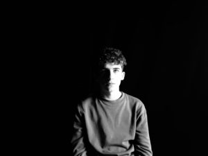
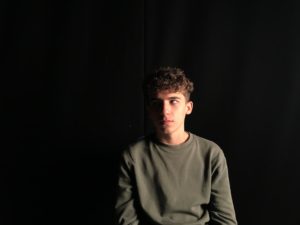
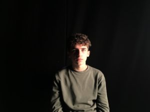


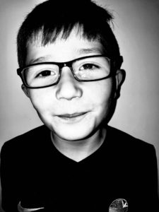
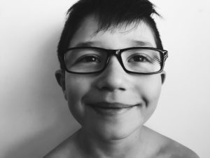
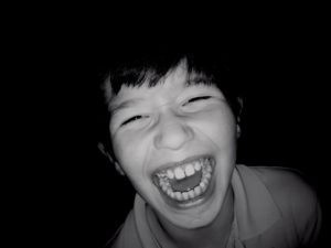
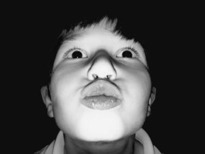
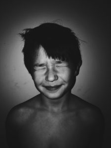
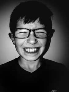
The reason i have chosen to put these images in black and white is because I like the colour contrast it creates highlighting features that should normally be highlighted but with an extra touch of softness. Chiascuro doesn’t have to limit itself to black and white images as back around the time of the renaissance they wouldn’t have limited everything to shades but added colours like darker shades of brown.

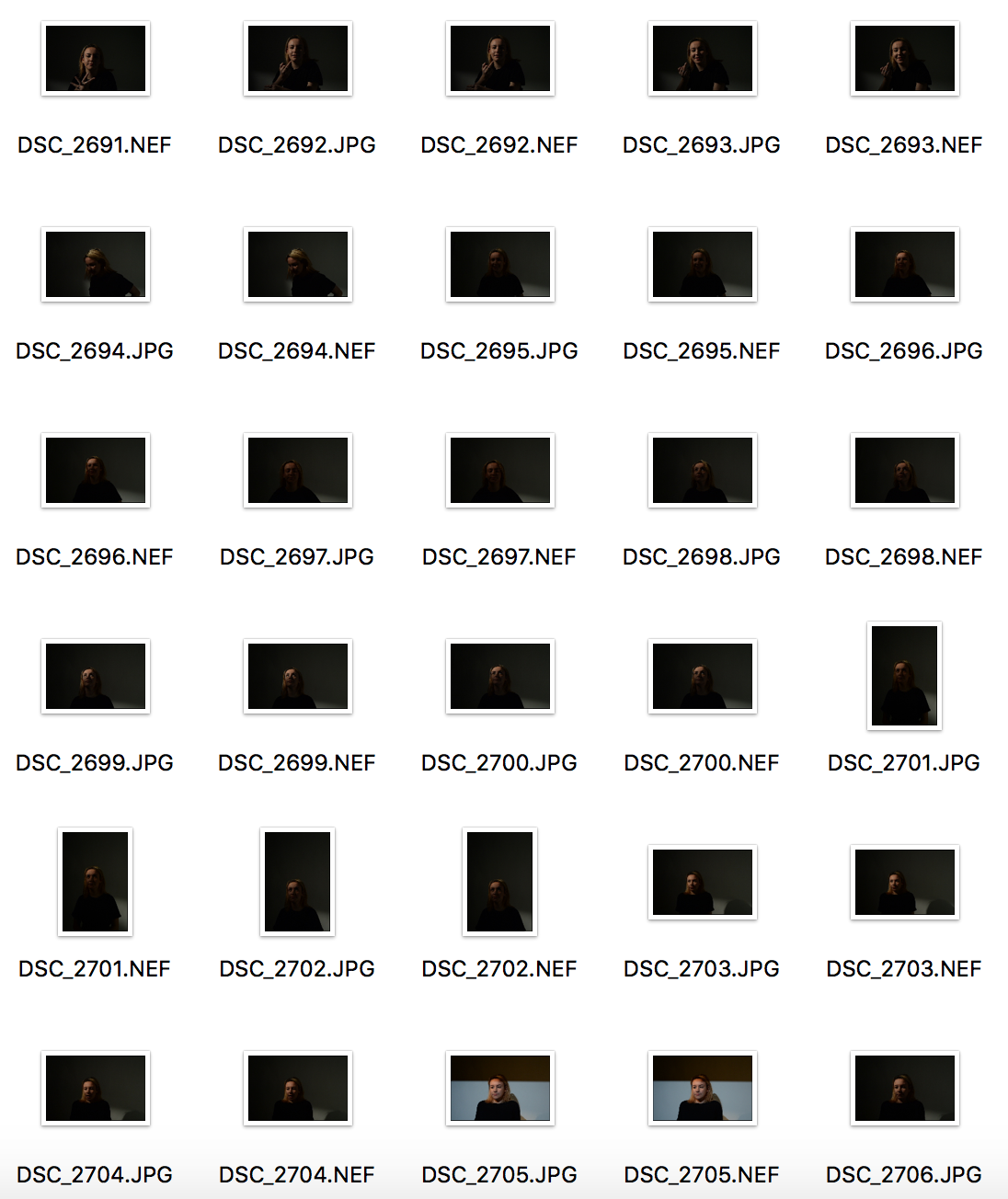
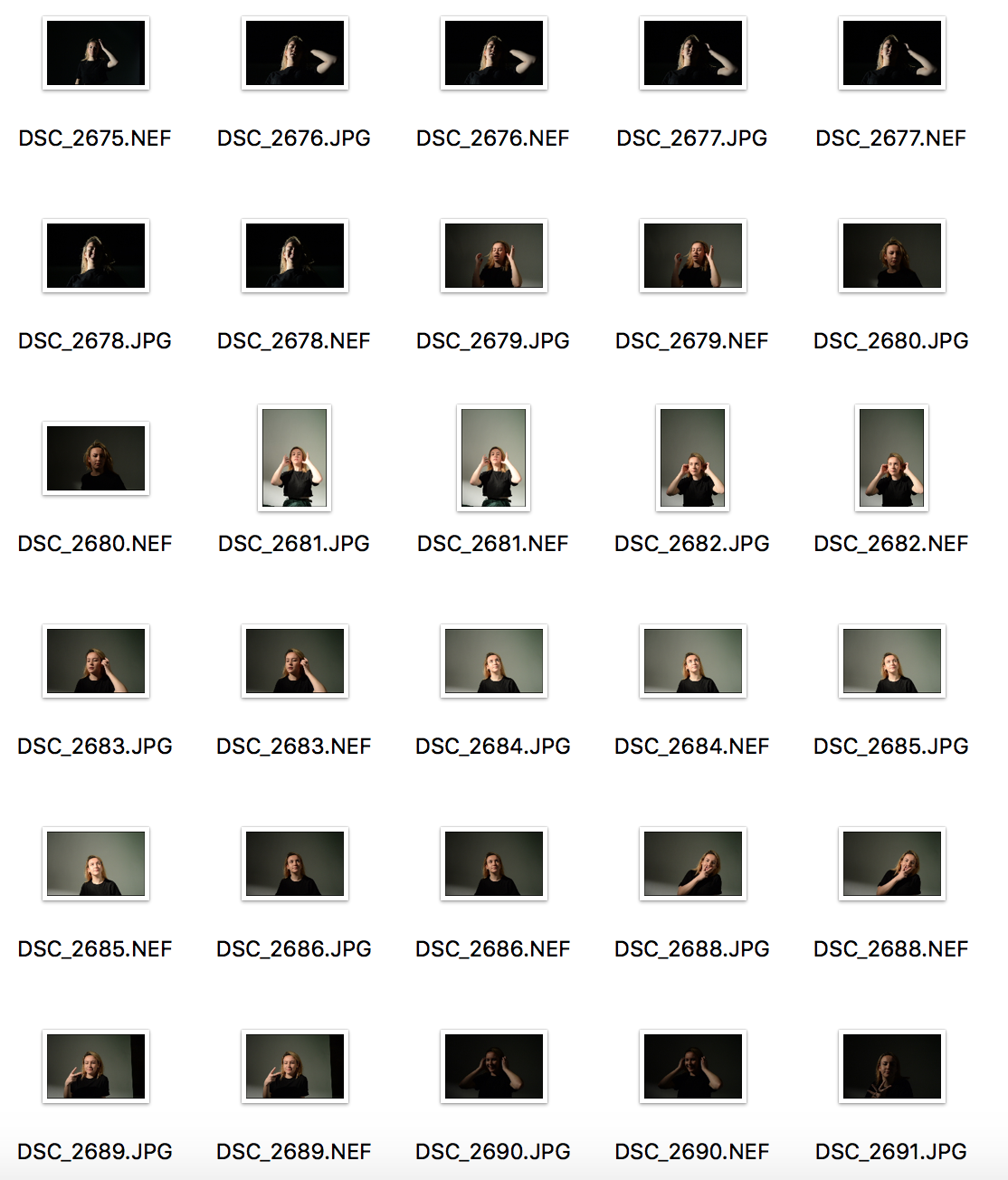
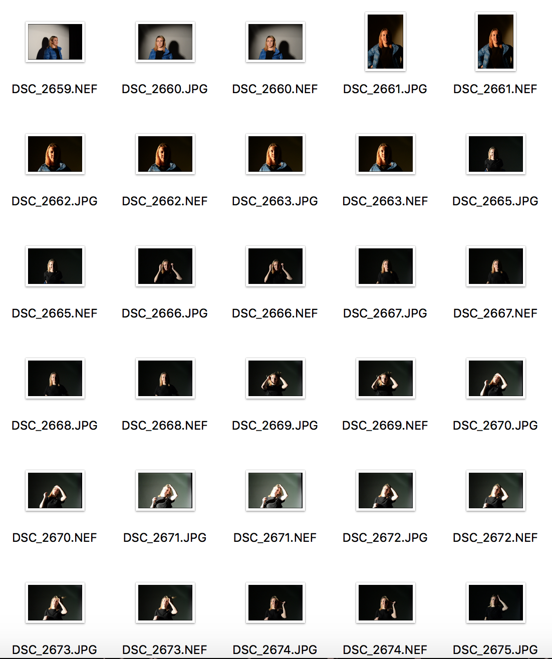
Chiascuro photography cannot work without lighting special effects. Having tried this in many different places light rooms, dark rooms, average to darker lighting then having played with the shades that appear in the images I have managed to touch on areas that perhaps wouldn’t have appeared so dark on just the camera image.
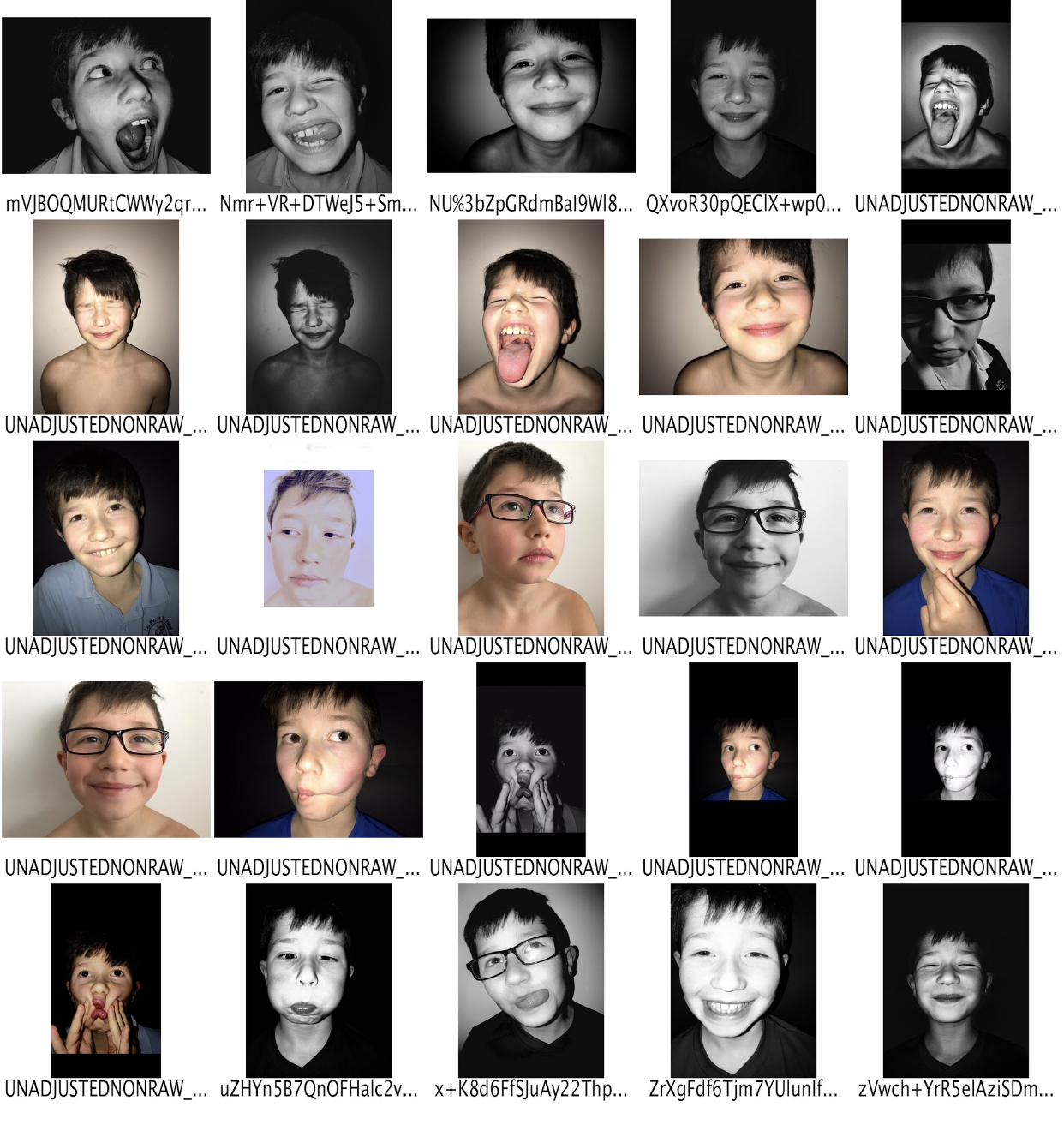
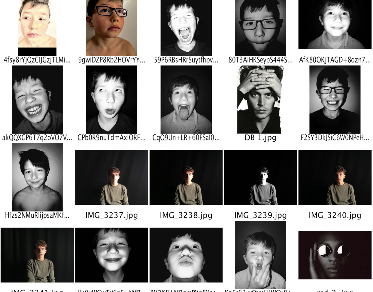
Some of these images were easier to capture than others. In terms of lighting and working to achieve Chiaroscuro the main part of the image should be extremely dark.  I have worked with achieving chiaroscuro not only in taking pictures but drawing it as well some of the images i decided to leave in color because even though there isn’t a big element of darkness there are features that you normally would not be able to see. it highlights areas and features of the face that make the image 10 times more interesting to look at due to the high level of detail.

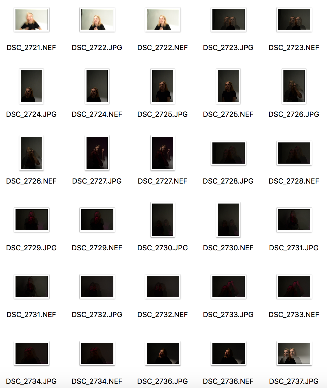
My thought process for these images, due to them being taken at home was harder for me as i find my brother quite a good model as he usually pulls expressions that i couldn’t make my friends do because of it being too ’embarrassing.’ These images (most of them) were actually taken in my room either using natural lighting and flash or a low exposure with a low brightness setting. I also decided to change the background because having a white background when trying to create a chiaroscuro effect might not work in my favor, therefore i used a black sheet of A5 paper and blue tacked it to my wall and simply made my brother stand in front of it. I think this worked well in my favor for some of my images.

The images themselves don’t have a lot of texture apart from some areas of high detail on the faces. The lens focus perfectly on the area that i was aiming for which was more a less the center of the face.  The white balance of the image is focused on the right setting for most, obviously there will be the odd that’s either to over exposed or too under exposed but most of them came out the right temperature.

The Lighting Technique
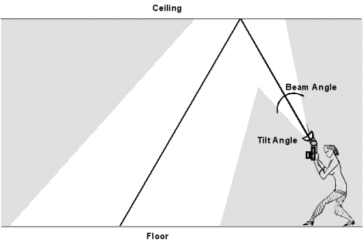

Image result for bouncing the flash

An example of bouncing the flash to soften the effects and create a larger fill area this can be used when there is white ceilings\ wallsImage result for 1 2 3 point lighting
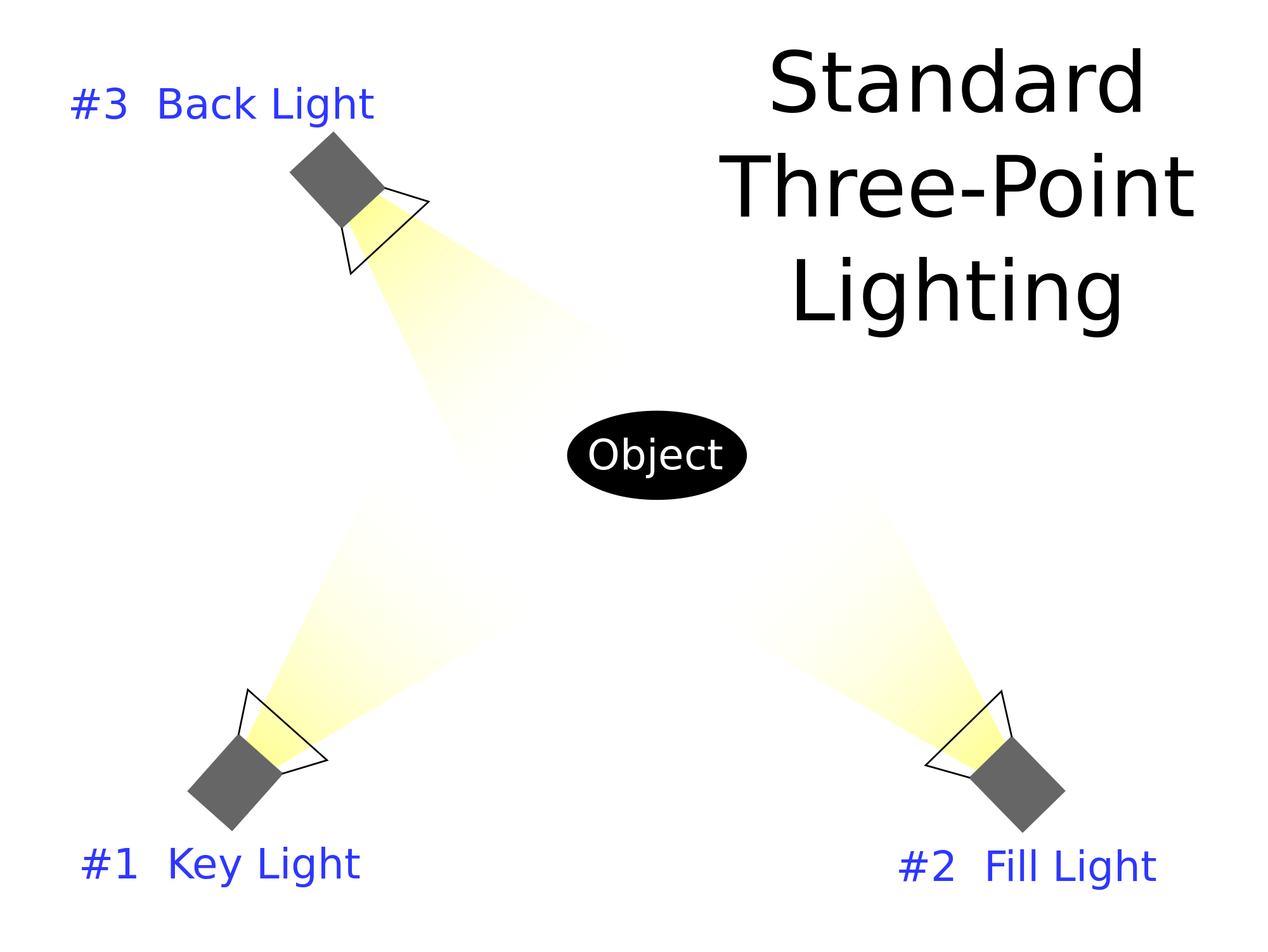
In the video below it shows a way to set up 1,2,3 point lighting and what its job purpose is and what it solves.

https://www.youtube.com/watch?v=w3xYPOiPtE4
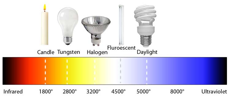
Image result for temperature of photography light

Temperatures used to gain any specific lighting.

However if not having access to studio lights which is the case for most unless in a school studio. lighting techniques can be improvised like using natural lighting or using natural lighting that contains patterns, using the flash, holding multiple phone torches to the aimed area being photographed, using led lights or even fire lighting.

Tableau and Staged Reality

Definitions:
Tableau: Tableau is used to describe a painting or photograph in which characters are arranged for picturesque or dramatic effect and appear absorbed and completely unaware of the existence of the viewerhttps://www.tate.org.uk/art/art-terms/t/tableau
Staged Reality:  a celebration of images that were made consciously.
http://staged-photography.tumblr.com/
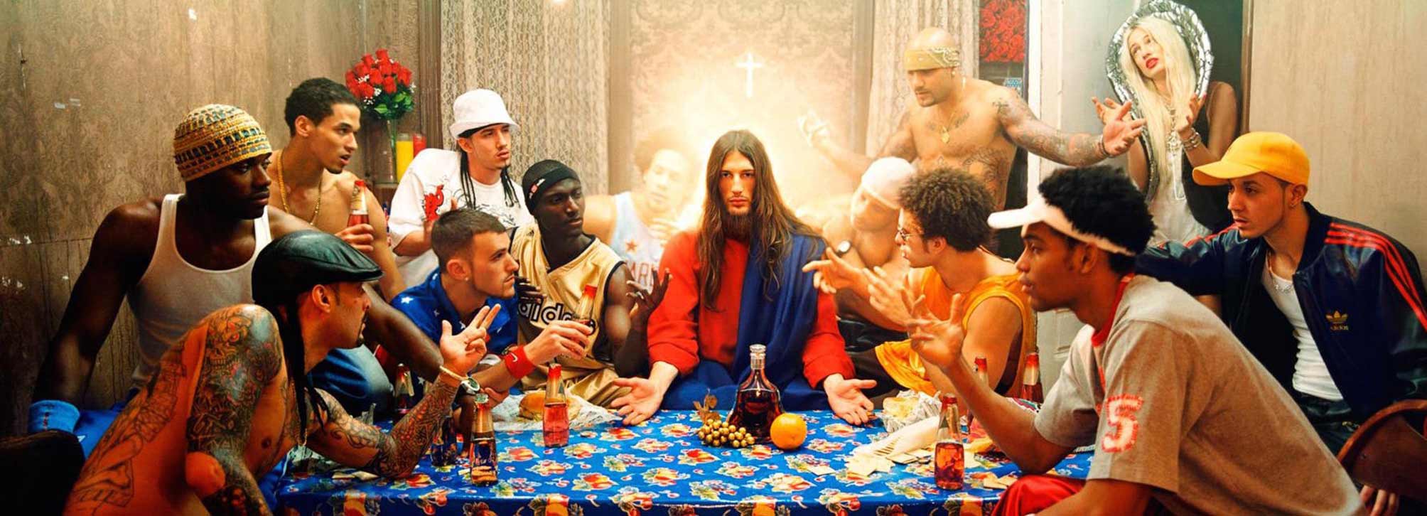
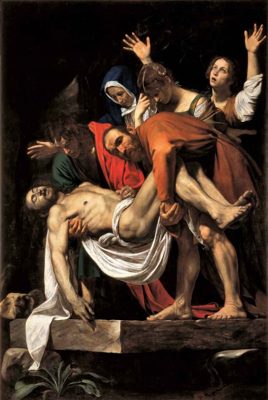
Three Images I’m Inspired by:
David La Chapelle's 'Jesus is my homeboy'.

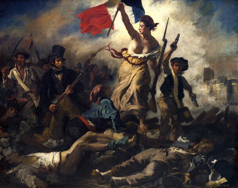
Eugene Delacroix's 'Liberty Leading the People'.
Caravaggio's 'Deposition'.
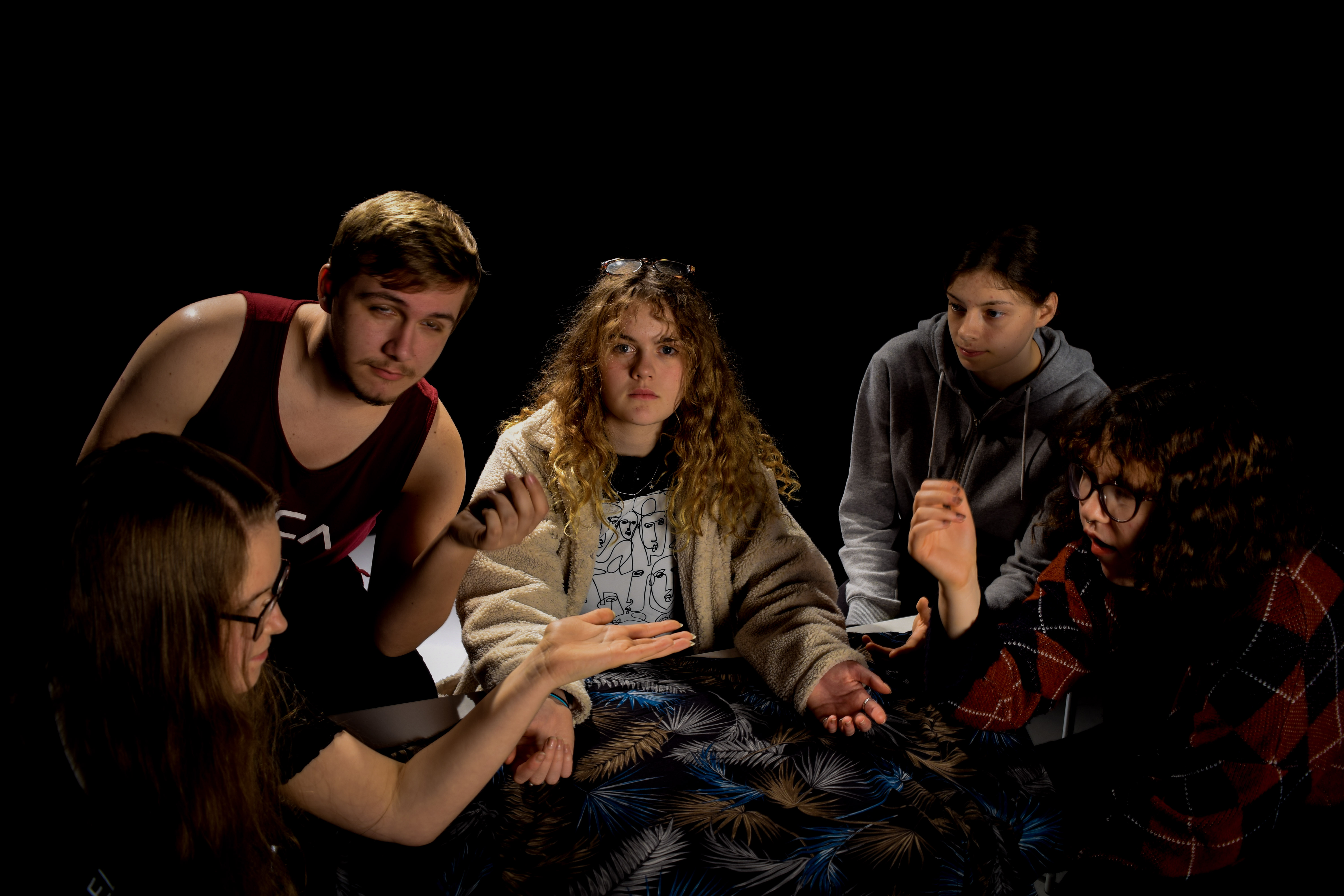
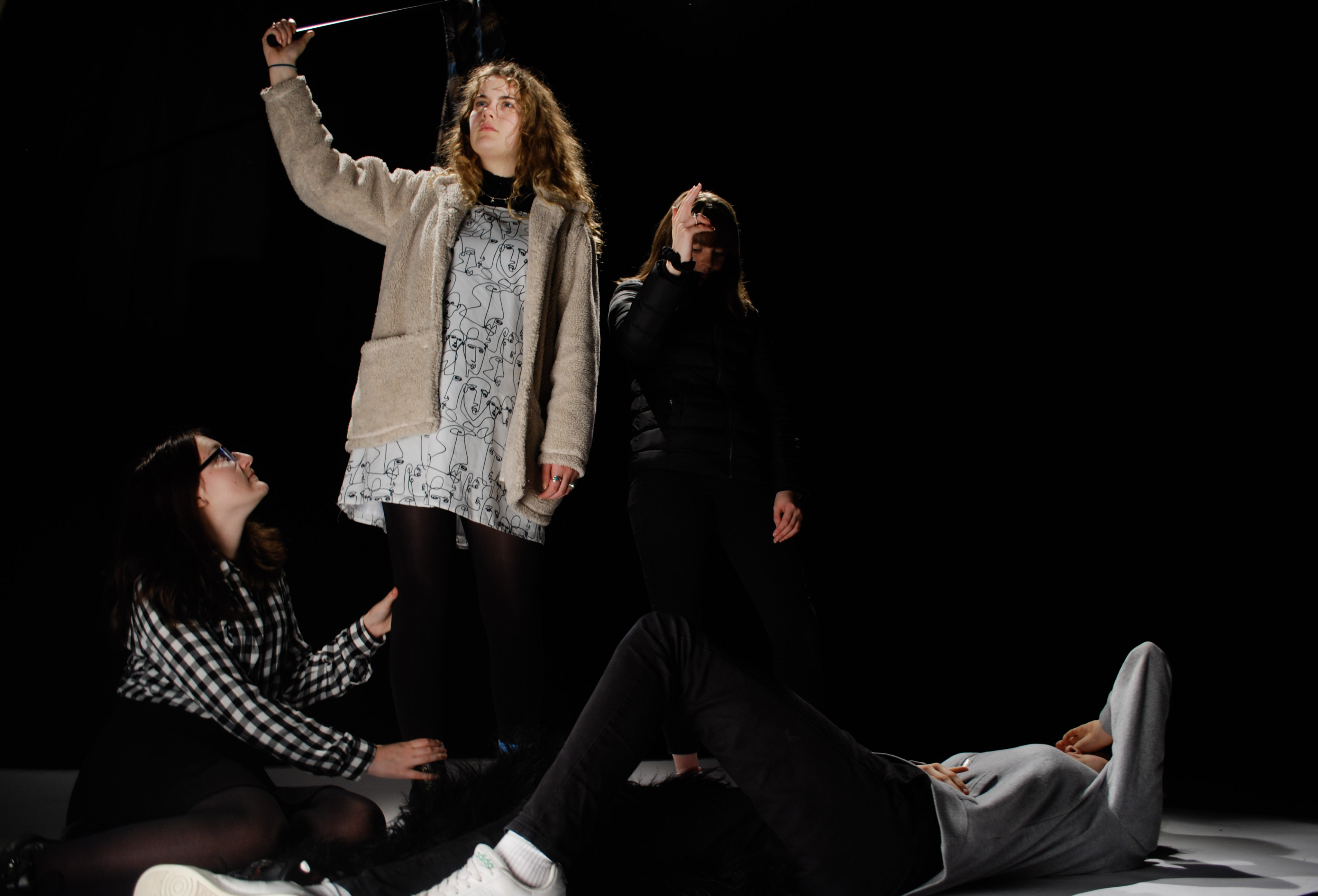
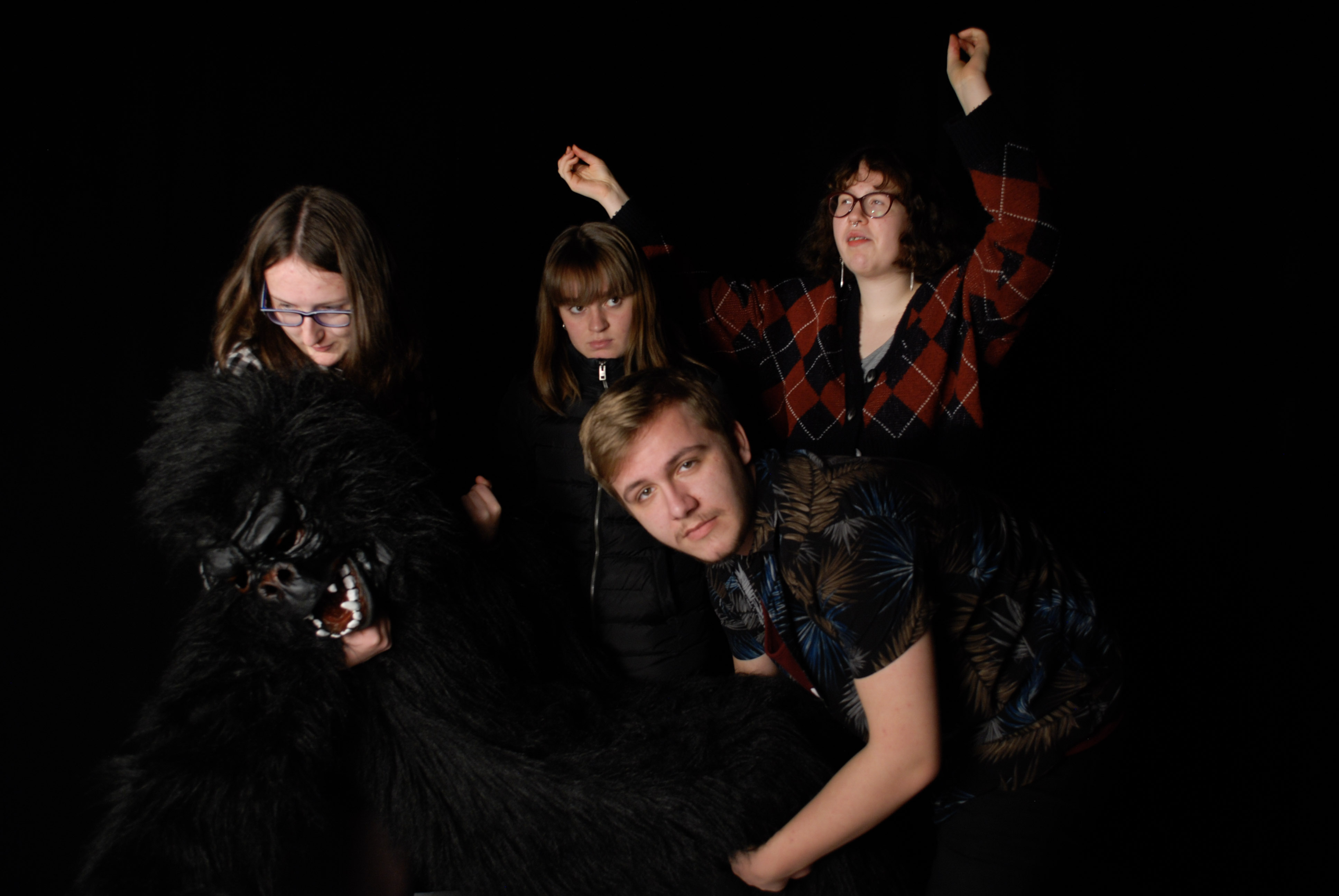
Class Tableau Inspired Shoot:

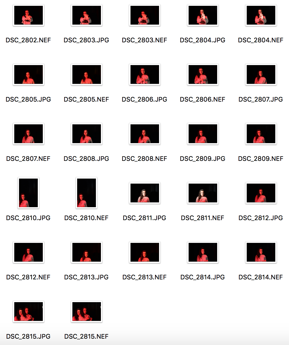
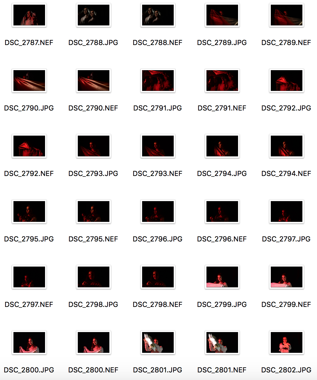
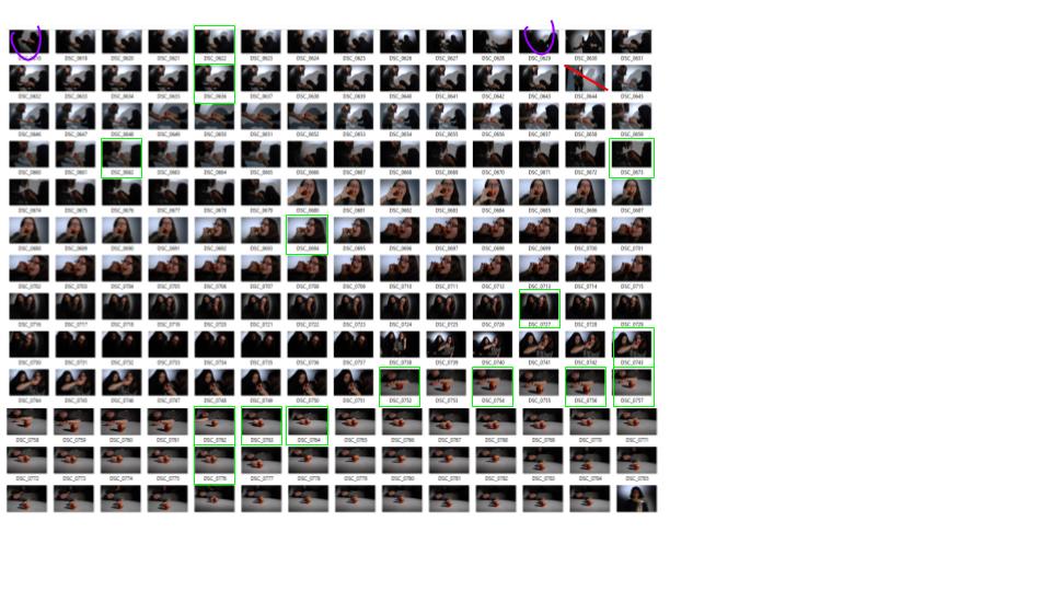
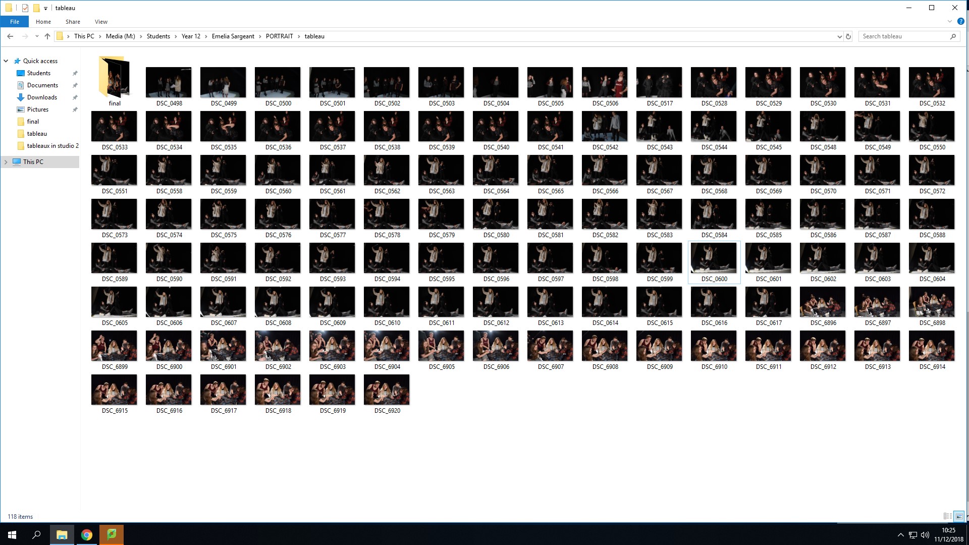
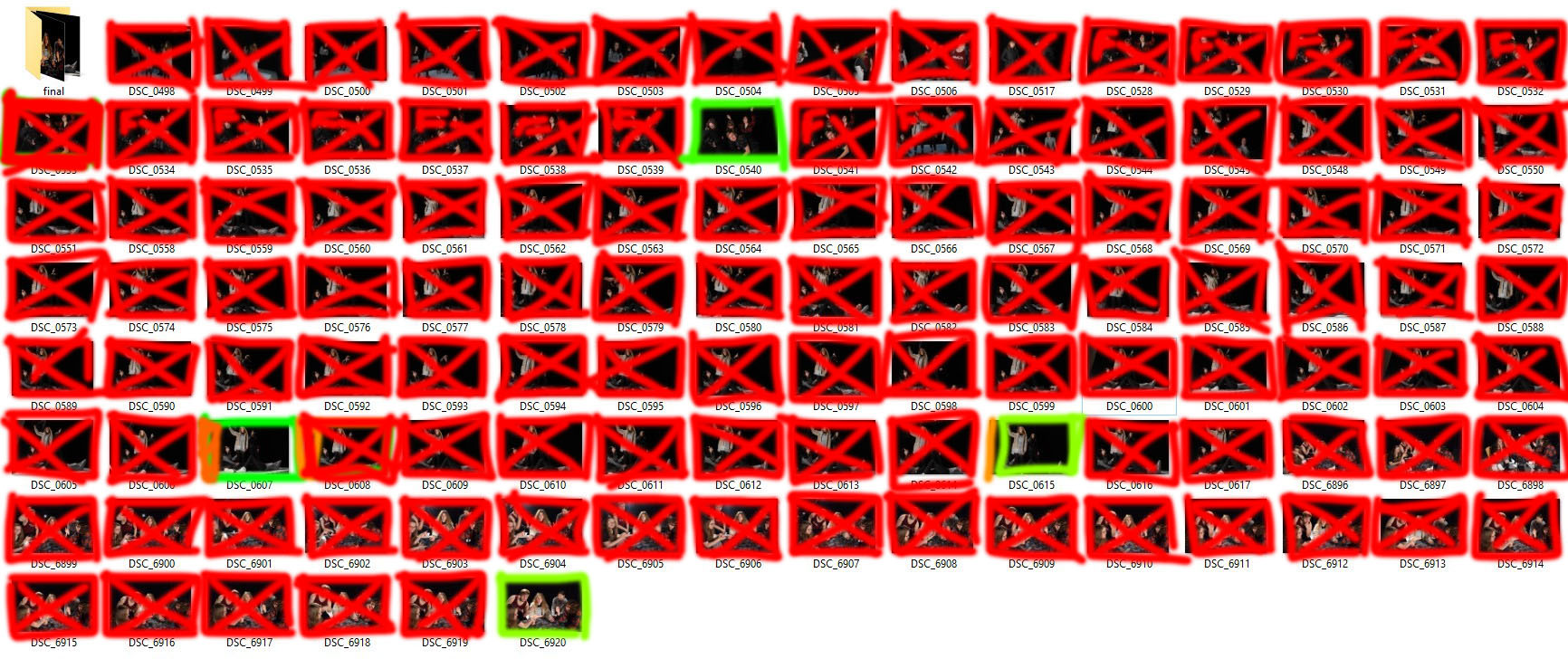
Contact Sheet:

Manipulated Images:

Response to TOM HUNTER

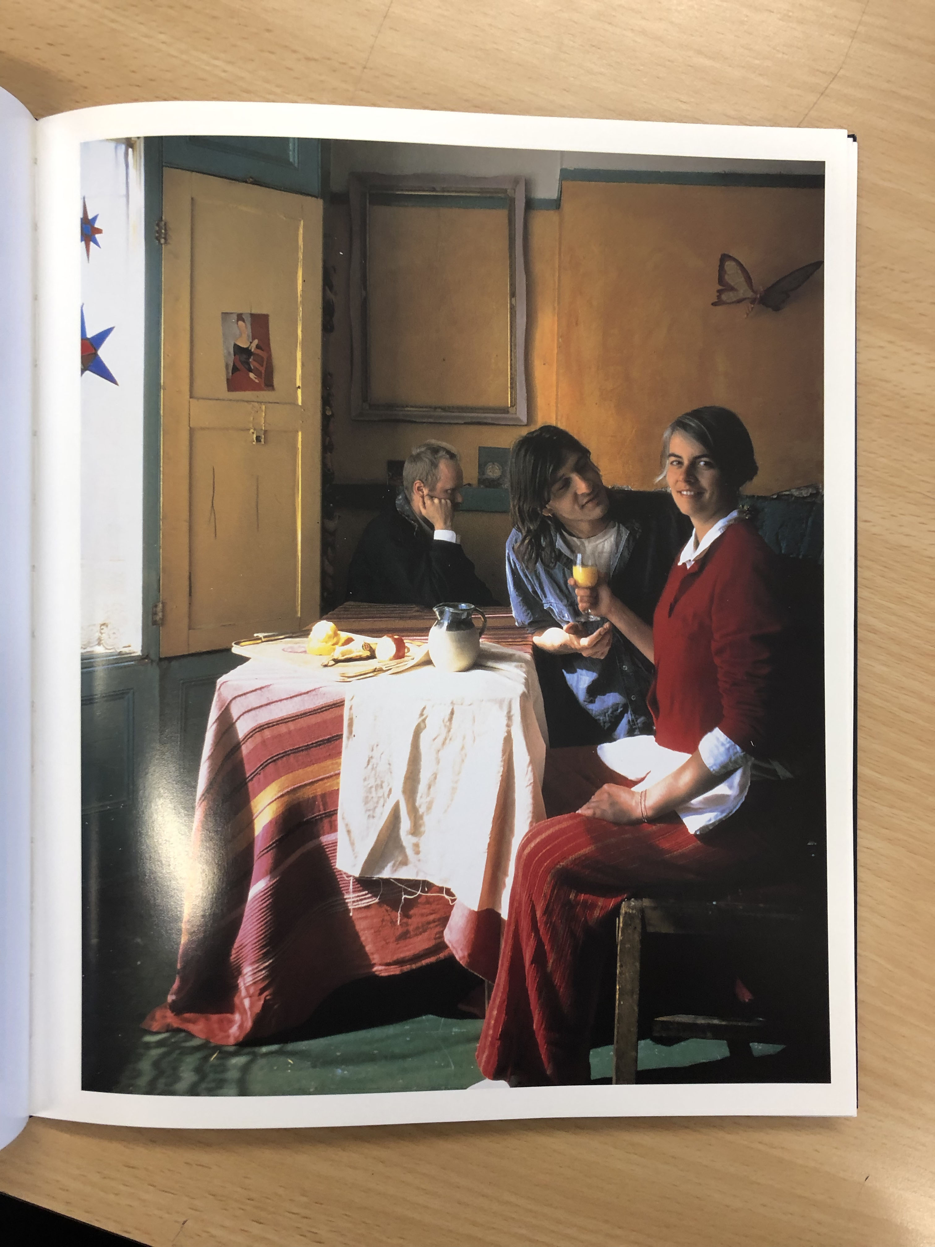
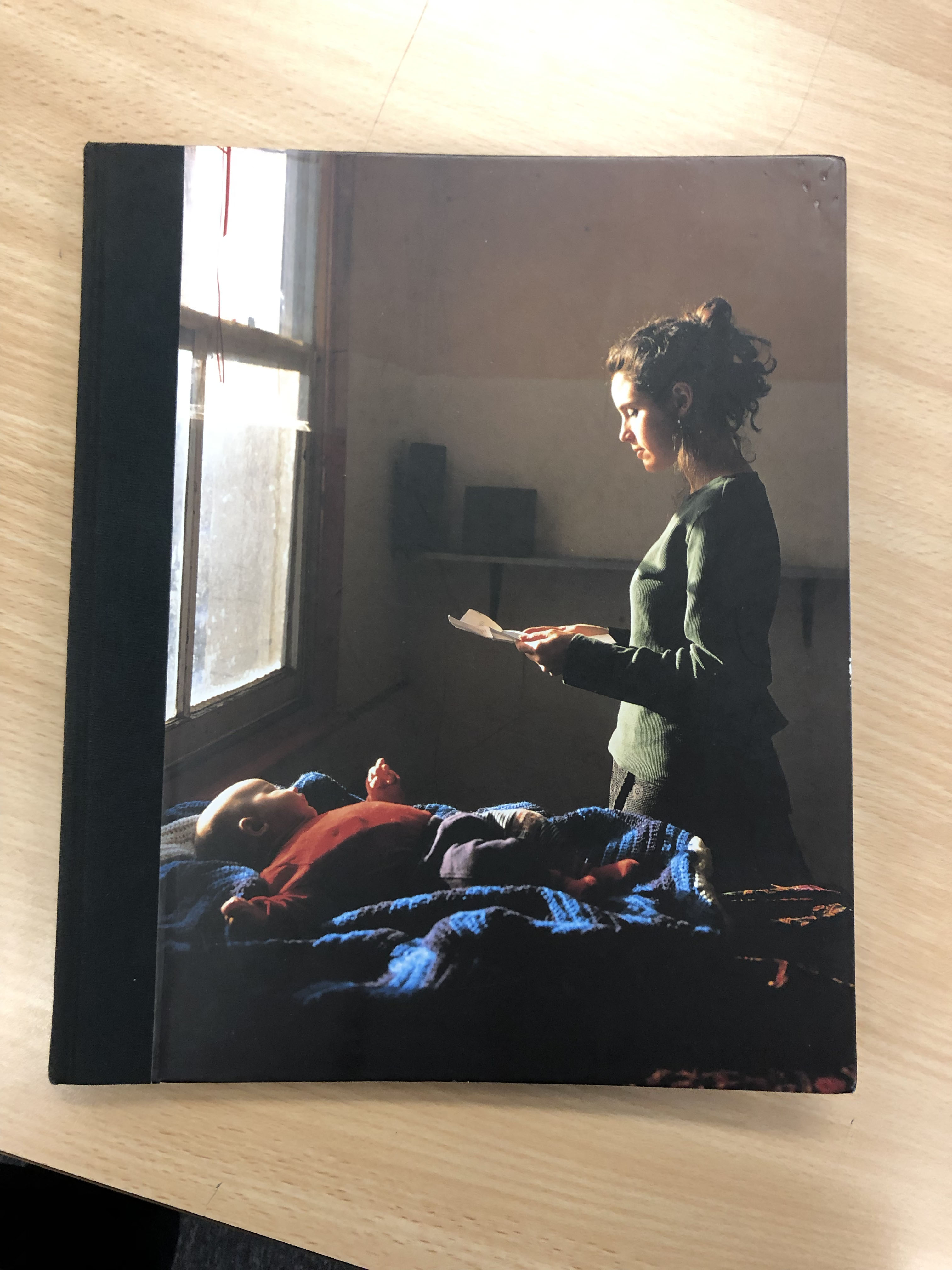
The Image we were Imitating

Contextual Reasons: Tom and his neighbours were receiving letters addressed to “Persons Unknown” saying they are non longer welcome to live in semi-derelict squats from the local council. Tom therefore wanted to capture “the dignity of squatter life” in order to show the council that these were real people they were putting in danger and that they would be greatly impacting their lives.

In the end his famous image ” Woman Reading a Possession Order,”  got a dialogue going with the council – and they infact managed to save the houses.

References:

The book we found the image we were studying and re-enacting is called “Tom Hunter”. It is a collection of images from different projects of his which includes work from, Tom Hunter and the modern world, Persons Unknown, Traveller Series and Life and Death in Hackney.

Here is a link to an article written about Tom and his Persons Unknown project which gives deeper contextual reasons and some background behind the photos.

https://www.theguardian.com/artanddesign/2009/nov/04/photography-tom-hunter-best-shot

Action Plan

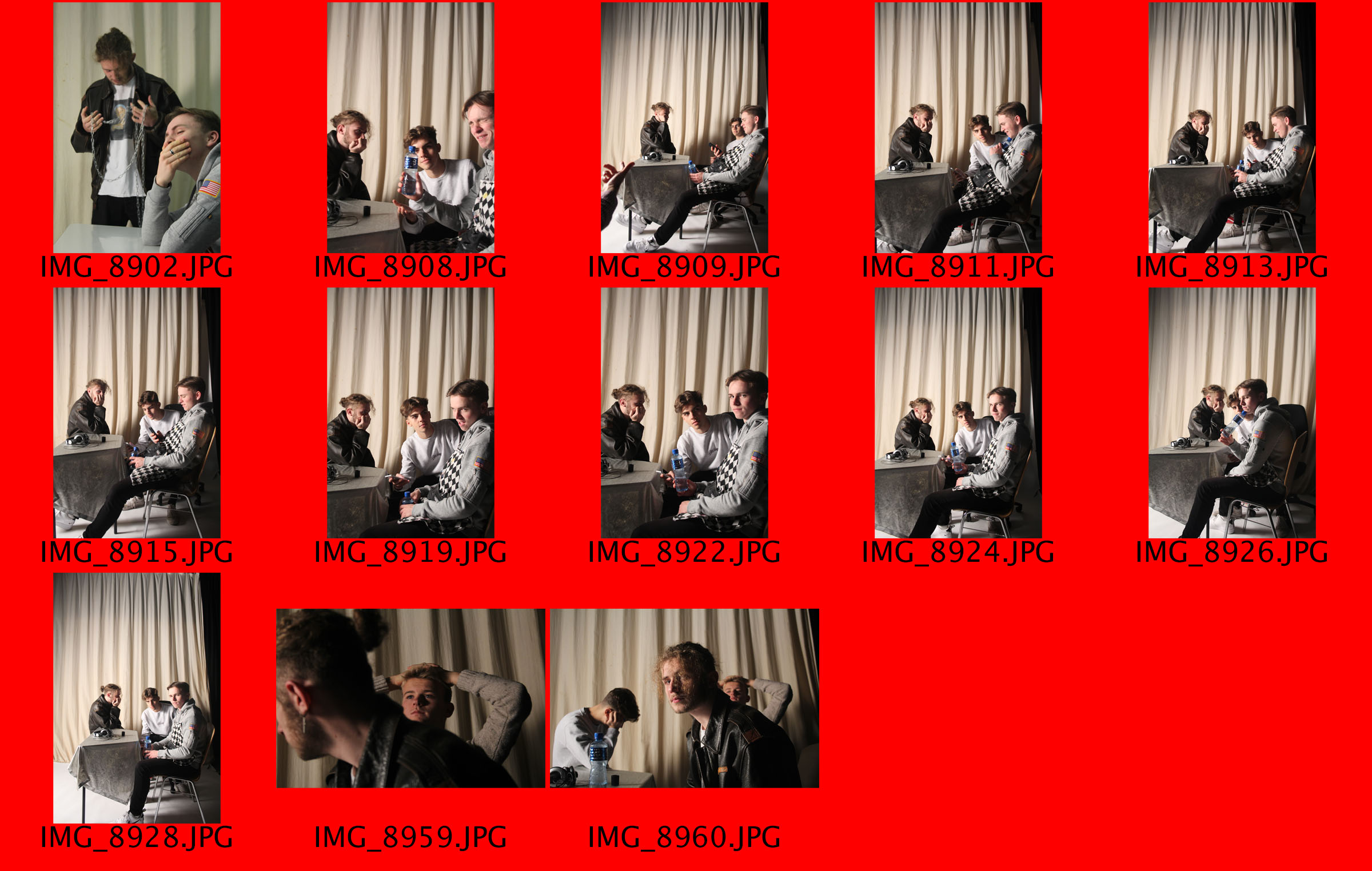
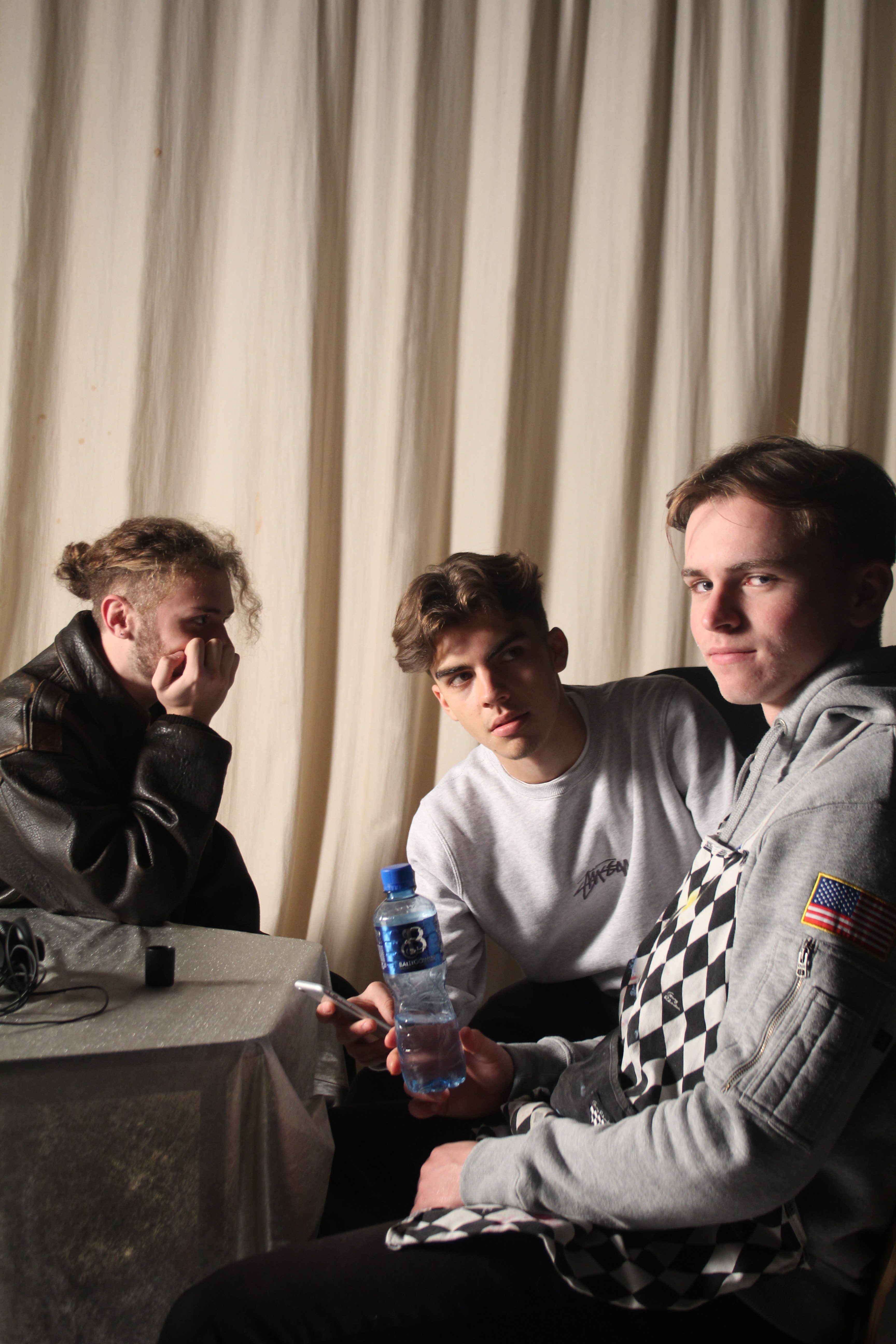
We first gathered props such as the headphones, water bottle, chairs, table and cloth and bottle cap. These props were all intended to give our image the likened look to the real picture captured by Hunter.

We then sat each other in the correct positions in order to have each of the three people sat in exactly the same position as the models in the photograph and they posed with similar facial expressions.

Technical Features – We then set the camera to an ISO of 800 and made the shutter speed faster to 1/10 second. There was a slightly higher shutter speed so the image was sharp incase any of the models moved slightly.

Contact Sheet

Final Image Response:


Visual Features – These include a fairly plain range of colours being mostly greys, whites and creams with a lighter tone due to the side lighting and a strong contrast between the shaded and non-shaded areas . There is quite a large depth of field and 3D effect created due to the fact that the 3 models in the photo are all sat at different distances from the camera, meaning that their shadows create a visual element of distance when the shadows are overlapped.

Planning For Tableau And Staged Reality Photography

I have decided to look at Tom Hunter and his styles of Tableau Photography.


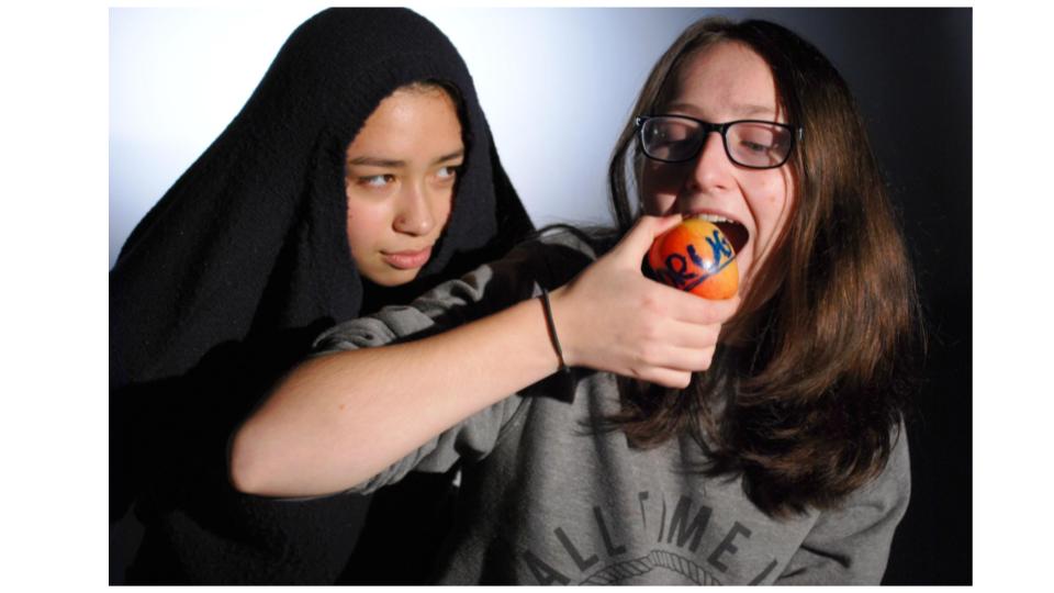
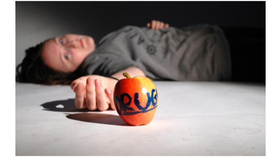
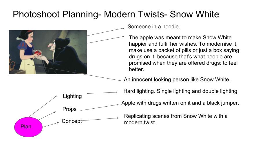
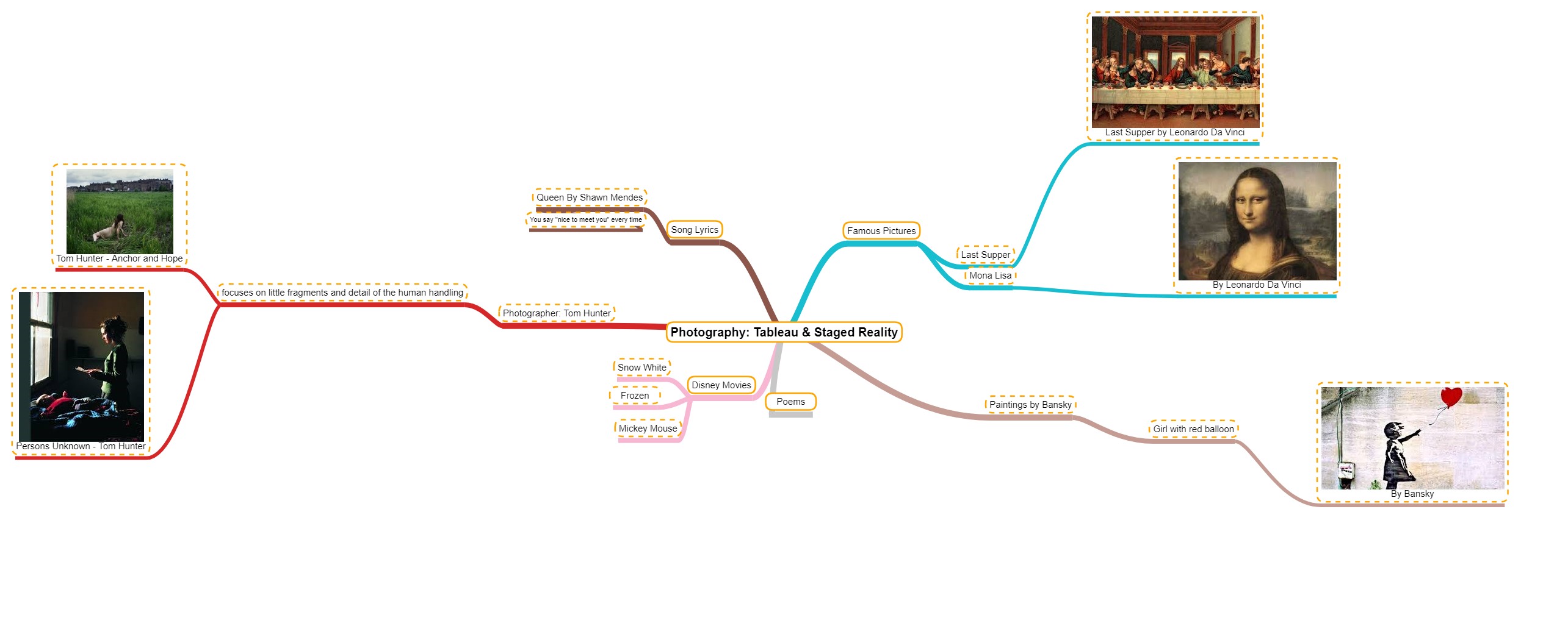
In this mind map I have explored different ideas for my tableau portraits. I have explored Tom Hunter, Disney Movies and famous paintings including Bansky. I have decided to explore Tom Hunter and Disney movies in deeper depth to help me decide what I am going to do for My Tableau.

For Disney I would look at scenes in different Iconic Movies:

Snow White:

Image result for iconic snow white scene disney

Frozen:

Image result for iconic Frozen scene disney