Category Archives: Uncategorized

Filters

Author:
Category:

environmental portraits-half term homework

what is an environmental portrait?

An environmental portrait is a portrait executed in the subject’s usual environment, such as in their home or workplace, and typically illuminates the subject’s life and surroundings. The term is most frequently used of a genre of photography.

Image result for environmental portrait

how to take good environmental portraits?

1.Spend time getting to know your subject

Before you select a location and start shooting, spend some time getting to know your subject. Find out where they spend their time, what the rhythm of their life is like and observing their personality. Out of this you’ll not only find appropriate locations but will begin to get a feel for the style of shots that might be appropriate and you’ll begin the process of helping your subject relax into the photo shoot. If possible it might even be helpful to accompany your subject to some possible locations to see both how they look but also how your subject behaves and interacts there.

2.Choosing a Location

Sometimes a location chooses you (it’s easy) but on other occasions you need to be quite deliberate and purposeful in making your choice (and it can take a lot of searching). When choosing your environment you ideally want to get one that:

  • says something about your subject – after all that’s what this style of photography is all about
  • adds interest to the shot – as I’ve written in previous tutorials – every element in an image can add or detract from your shots. The environment that you place your subject in needs to provide context and be interest without overwhelming the shot
  • doesn’t dominate the shot – sometimes the location can dominate the image so much that it distracts your viewer away from your main focal point (the subject). Try to avoid cluttered backgrounds (and foregrounds), colors that are too bright etc. Keep in mind that you might be able to decrease the distractions with clever use of cropping, depth of field and subject placement.


3.Posing

What sets the environmental portrait apart from candid portraits is that you post your subject (it’s a fine line and you might end up doing a bit of both in any given shoot). Don’t be afraid to direct your subject to sit, stand or act in a certain way that fits with the environment that you’re shooting in. Some of the poses might seem slightly unnatural and dramatic but it’s often these more purposely posed shots that are more dramatic and give a sense of style to your shot.

The expression on the face of your subject is also very important in environmental photography and you should consider how it fits with the overall scene. For example if you’re shooting in a formal environment it may not be appropriate to have your subject with a big cheesy smile and you might like a more somber or serious look. Again – mix it up to see what does and doesn’t work.


4.Camera Settings

There is no right or wrong way to set your camera up for an environmental portrait as it will depend completely upon the effect you’re after and the situation you’re shooting in. You might find that shooting at a smaller aperture (larger numbers) will be appropriate as it will help keep the foreground and background in focus. I generally shoot with a wider focal length in these situations also to give the environment prominence in the shot. Of course this doesn’t mean you can’t shoot more tightly cropped or with a large aperture and shallow depth of field – ultimately anything goes and you’ll probably want to mix up your shots a little.

experimenting with environmental photography:

in school we were asked to take environmental portraits in the streets of St. Helier but as i didn’t attend that class i was asked to take the portraits inside the school, so my best bet was to go to the canteen in the staff’s working time. And this is what i came up with:
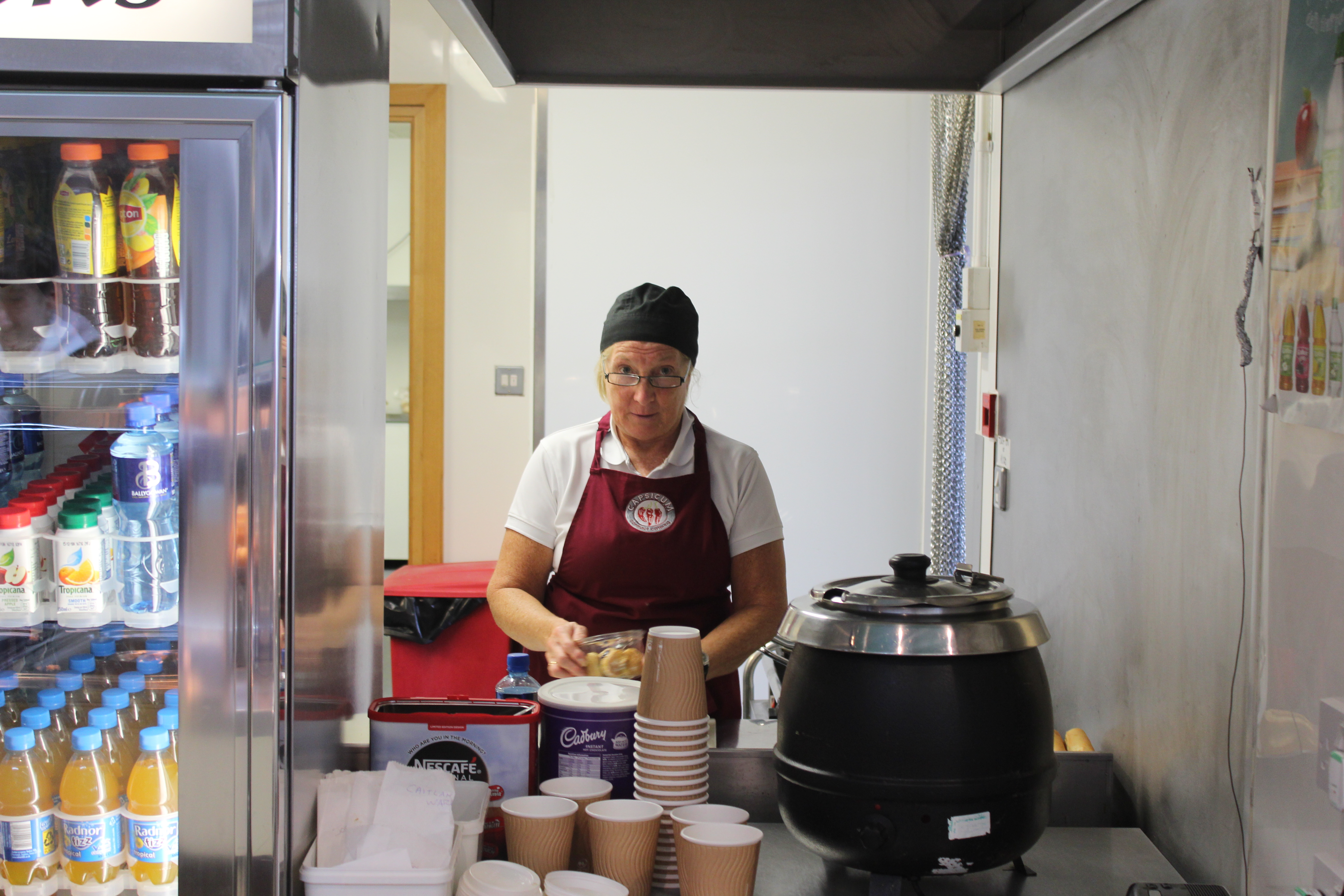
 

Before i took the portrait i asked the canteen lady to have direct contact with the camera  and she kindly accepted. as you can see she is working as she naturally would.
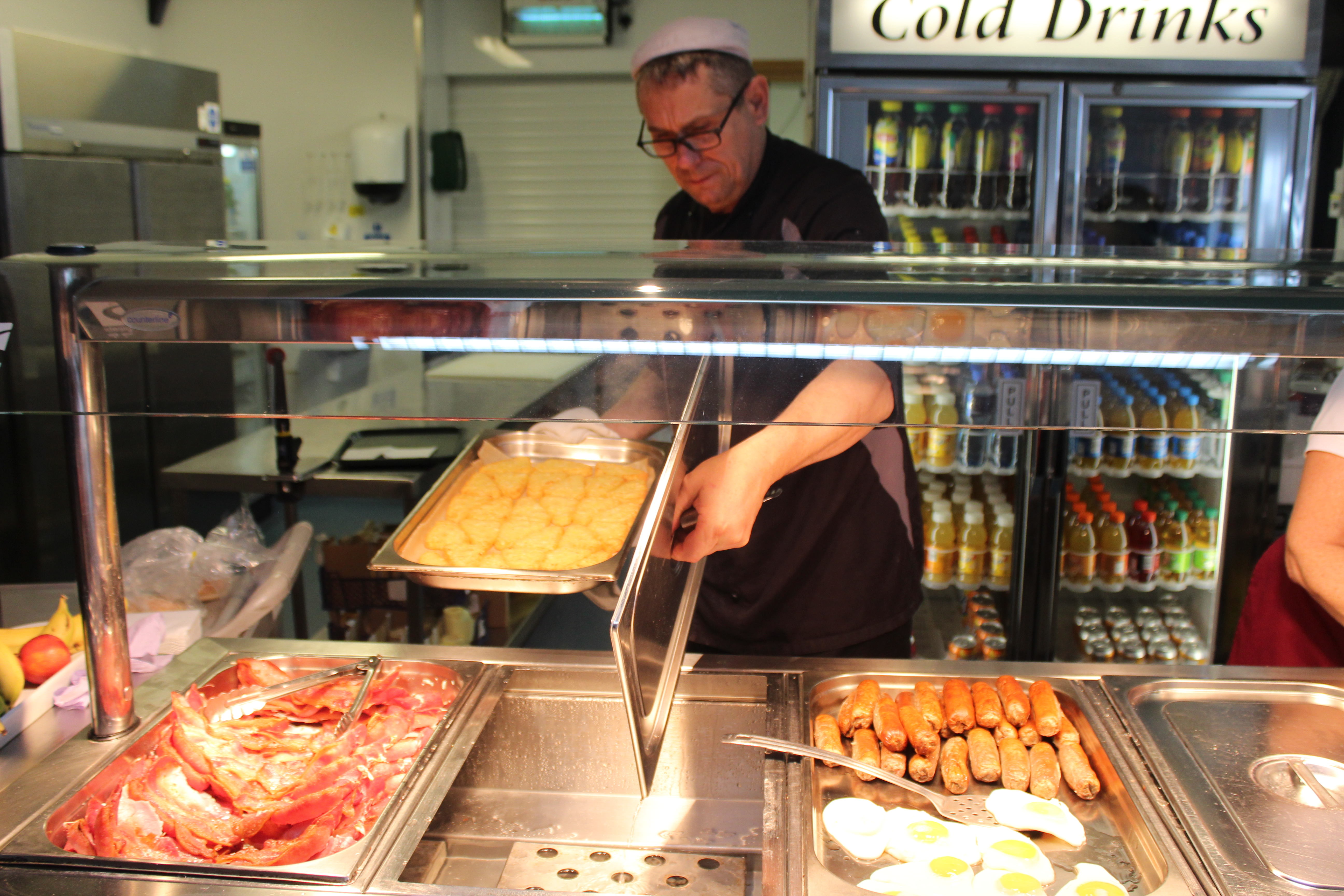
And over here i didn’t ask the chef i i could photograph him i did it without his notice to get a fully natural portrait. but of course i asked if i could use the photograph later on.

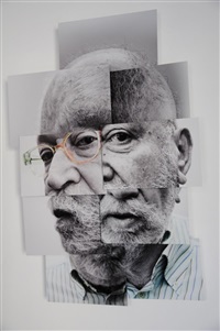
Brno Del Zou-Artist

Brno Del Zou


Brno Del Zou is a French artist born in 1963. In his “photosculptures” series, Brno Del Zou uses the fragmentation of the body in order to better understand it. The body and the faces are revisited and their volumes are highlighted in order to create installations of multiple scales. In Brno’s work he is trying to explore the human body but by doing this his style, rather unusual but unique really goes with what he was trying to explore. By him being different it makes his work one of a kind and interesting to look at he’s expressing parts of his identity which is what should always be done when creating “your own work”. I like his work due to the layered fragments of the face creating a bizarre outcome, the use of black and white helps with distinguishing the mood that hes trying to share however some of his images have tiny elements of colour which makes the models features easier to spot and draws automatic attention. His work itself is leaning to the more unrealistic side of photography which gives him the ability to work with what he has an extend it for something meaningful which has been fulfilled in his case.


For every great image is a story or an idea. For Brno’s work its evident that the idea of identity and expression is clearly shown, ashore the story behind it could  be that Brno is trying to explain that our mind can be our biggest challenge we face daily. Some images show various expressions, this can be used to symbolise the feelings we might feel In day to day life. This clearly highlighted the importance of what our minds can do which lead to a powerful message being shown through art and creativity instead of chunks of writing.


 The set of photographs are all take as portrait at a straight on angle, which allows the models face to be the main focus point which is what Brno was aiming for .The tone of the photograph is quite light as there tends to be no shadow given off the body parts nor the face itself. The lighting used seems to be artificial lighting, which creates  a soft tone allowing the models body to easily be recognised. The background of these photographs are plain which allows the viewer to focus primarily on the distorted models face.
Here are some examples of his work
Image result for brno del zou
Action Plan:
  • who? Leandro
  • Where? Sports field
  • When? During the day- after schools- weekends
  • How?  Get pictures of my brother whis

Photo-Montage Post One

What Is Photo-montage?

Photo montage is the process and the result of making a composite photograph by cutting, gluing, rearranging and overlapping two or more photographs into a new image. Sometimes the resulting composite image is photographed so that a final image may appear as a seamless photographic print

Mood Board: Examples


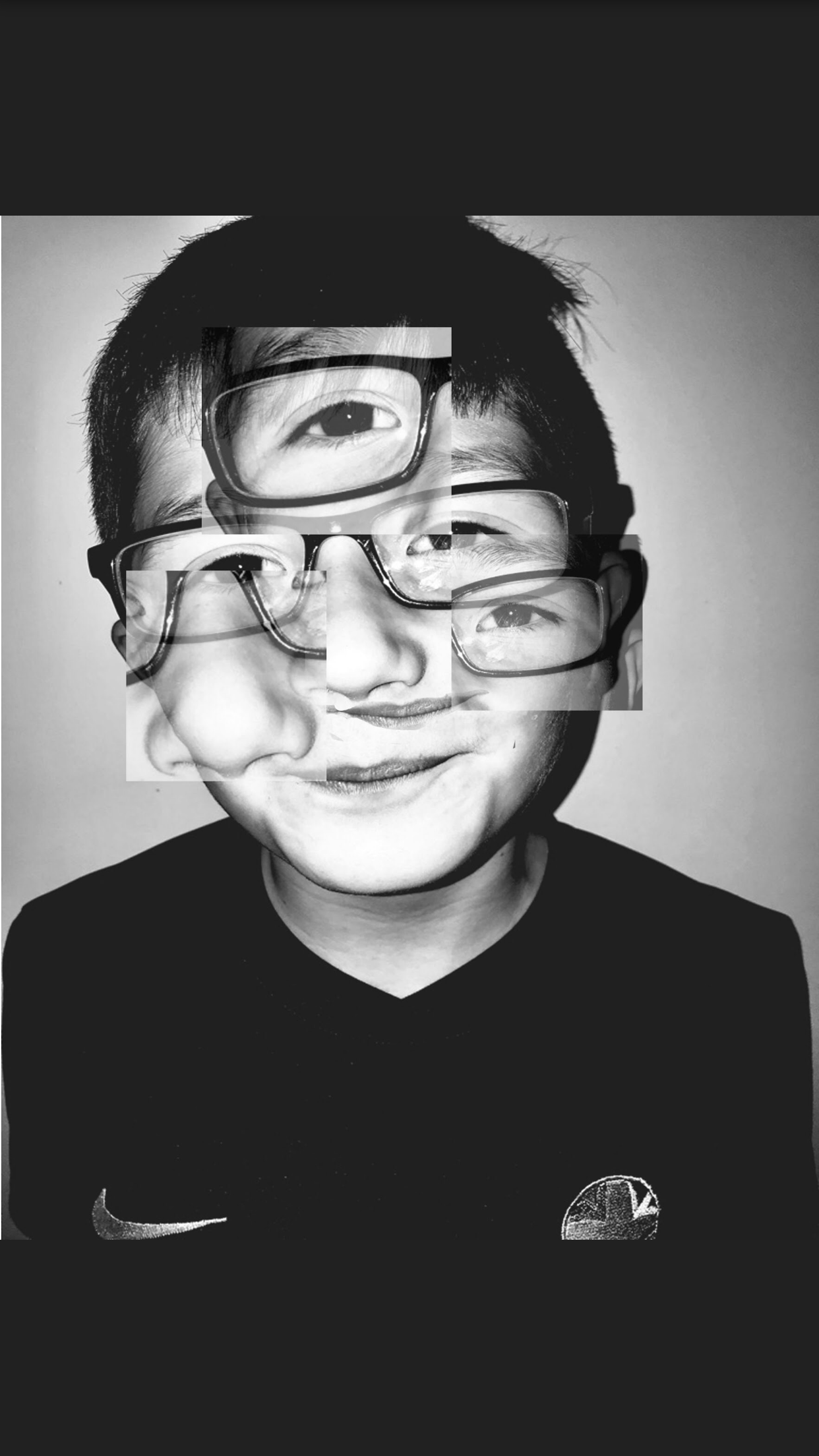
My first Attempt at Photo- Montage using Photoshop:

My Process:

As I mainly forgot to screenshot a long the way I decided to write out the process which I followed to achieve this image. Firstly although this took me over 45 minutes to figure out how to over lay layers and fade them out. Firstly i selected which image i wanted to use as the montage examples. Secondly i had to decide whether i would be using the same image or a different one when adding it over one another. I chose to stay with them same image as i was inspired by the artist Brno Del Zou and in most of his outcomes he sticks to the same image but just creates multiple layers. As this was my first attempt as a beginner i found it quite hard but In not too disappointed by the result. After having copied the image a couple times i decided to crop into certain areas of the face making another face but above another one. Therefore here i chose to crop parts of the eyes,mouth and nose to create a weird, distorted image. Then finally i edited the cropped areas by changing the opacity of each section by making it lighter giving it a transparent look.

The technical aspect of this image, when looking at lighting its quite dark, however there are some elements in this image that are put there to draw attention. For example the big eye in the middle of the forehead, giving it this aspect of abnormality and weirdness draws attention if you look closely you can see harsher tones of blacks and grey and then lighter mixes of white tones. This attracts the eye to look at areas that sometimes aren’t highlighted in normal room lighting. This image was also taken using flash hence why theirs a circle almost shape going around the face which just supports my point that the attention is drawn immediately to the face.
Visually, other than light, if i was to complete this image again, i would try to fade out the corners of the boxes or at least learn a way to blend them in a bit better as it makes a slight contrast with the additional background due to them being different tones of white and one slightly more faded.

The context behind the picture was that it was actually taken for the studio lighting section but as my chosen artist worked with portraits i decided to pinch one picture from here.

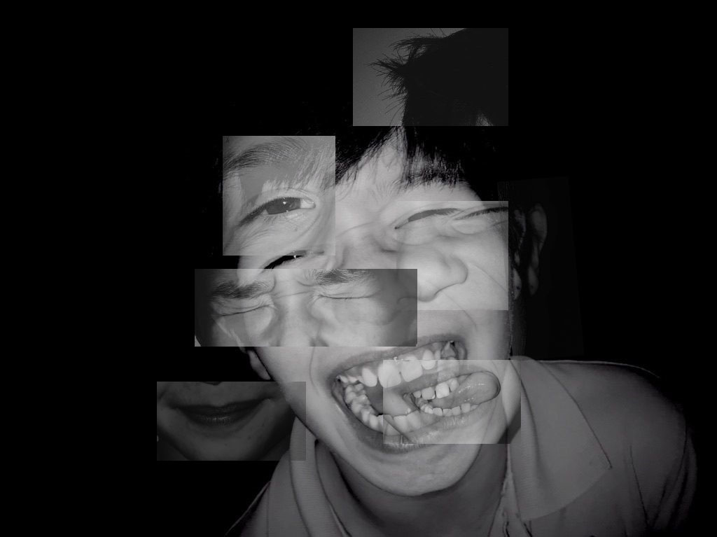
Here are some of my other attempts and experiments  at Photo Montage using more than one image:

Tableaux Outcomes

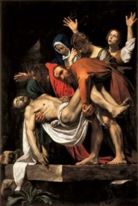
Caravaggio- Deposition 


Caravaggio was born as Michelangelo Merisi in Italy around 1571. He was orphaned at age 11 and apprenticed with a painter in Milan. He moved to Rome, where his work became popular for the tenebrism technique he used, which used shadow to emphasize lighter areas.  Using this technique is what led Caravaggio into success as it added realism to his images. Caravaggio the colorful, sometimes violent street fighter but ultimately brilliant painter, applied an extreme form of chiaroscuro (light and dark) to his work and  was directly influenced by Rubens, Hals, Rembrandt, Vermeer, Velazquez and Bernini.

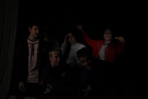
Our class process to imitate the image:

lighting in the image above isn’t quite the tone we needed
as evident this image was out of focus
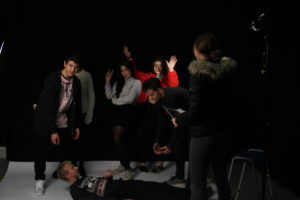
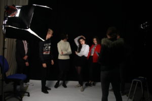
This image was taken as we were trying to stage everyone into the positions that we needed to be in
preparing p2

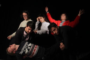
Here are some of the best outcomes:

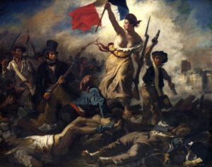
Liberty Leading the way- Eugene Delacroix 

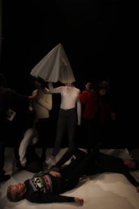
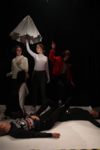
We had a second attempt at tableaux photography with this image

Liberty leading the people by Eugene Delacroix

The second image in my opinion was harder to re- create and copy as firstly we needed more people but in terms of lighting it was hard to pin point where we trying to focus. However these image have been focused on the center of the image which therefore has made the images come out darker than excepted. This image also took longer as we were trying to angle the light in the same direction as the image but having looked at the image now the light seems to be coming from behind the woman in the middle. overall the process of figuring out where to put lights and where to stage people was a better outcome than the image itself but our first attempt was a best outcomes.

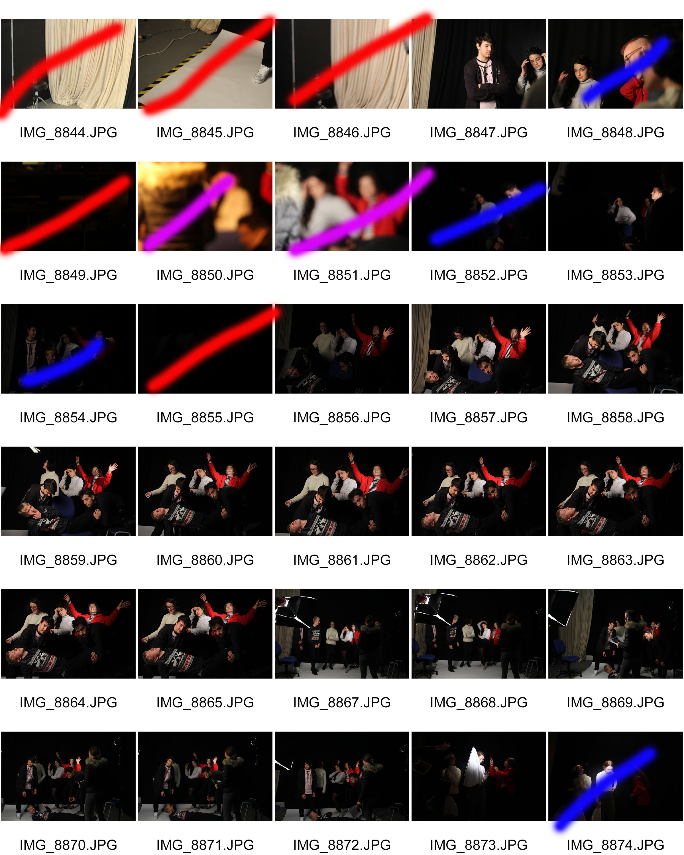
These are the contact sheets i made from our class attempts:

In the examples below you can see I have drawn over the images.  have done this because some of them are under exposed therefore to dark so I am unable to edit it I have done that in (red) . Additionally if the image is too over exposed or under exposed i have decided to cross it off In (blue) .If the image is out of focus I have chosen to cross it out in (pink) Finally if the image I think has too much negative space behind it which makes the images look quite bland and boring I have crossed out the space in (white)

MOCK- FRANCESCA WOODMAN

Francesca Woodman

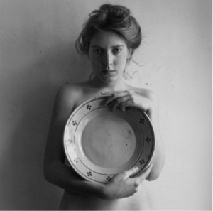
Francesca Woodman was an American photographer who was born in Denver, Colorado. Her mother was Jewish and her father from a Protestant background. She took her first self-portrait at age thirteen and continued with photographed until her death. She went to a public school and then a private school from 1972 where she developed her photographic skills and became fully interested in the art form. She moved to New York City in 1979 ” to make a career in photography”. She sent out many portfolios of her work to fashion photographers but they did not lead her anywhere. Due to her failure, she became depressed and attempted suicide in 1980.

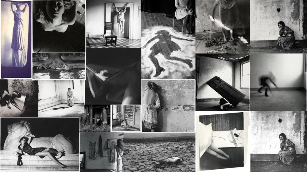
During the time of 1972- 1980 was when she made most of her photos most of which were black and white images including either naked women or clothes merging with their surroundings. She took all her images with medium format. She created over 10,000 failure images which her parents keep, otherwise the 120 images which have been produced are found by location and date.

After producing all these images and most of them being a failure, she ended up dying from another suicide attempt age twenty two by jumping out of a loft window in New York City. After her suicide, her father suggested that her suicide was related to an unsuccessful application for funding from the National Endowment for the Arts.

In a exhibition in 1998, many people were very interested in her work and they had “strong reactions” to her ” interesting” photographs. Many people found her pictures inspirational.

Her work 

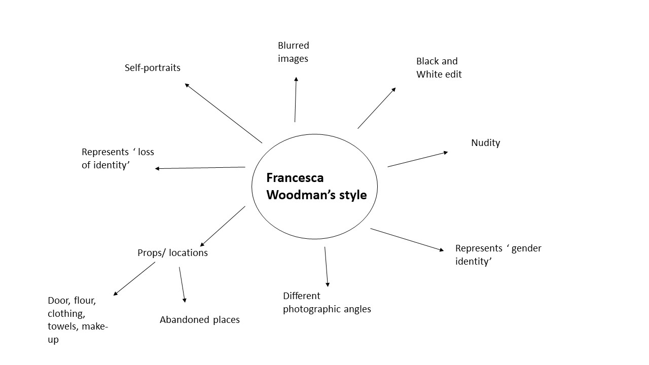
When looking into her work i noticed that a lot of her work was very blurred to hide the identity of people in the pictures. Otherwise, the models were placed in very peculiar positions, acting as if they weren’t in their normal bodies, almost acting as an escape. The fact that most of the models weren’t clothed also suggests that Woodman was trying to show the real them and not who they pretend to be behind their clothes and makeup.

Her creations…

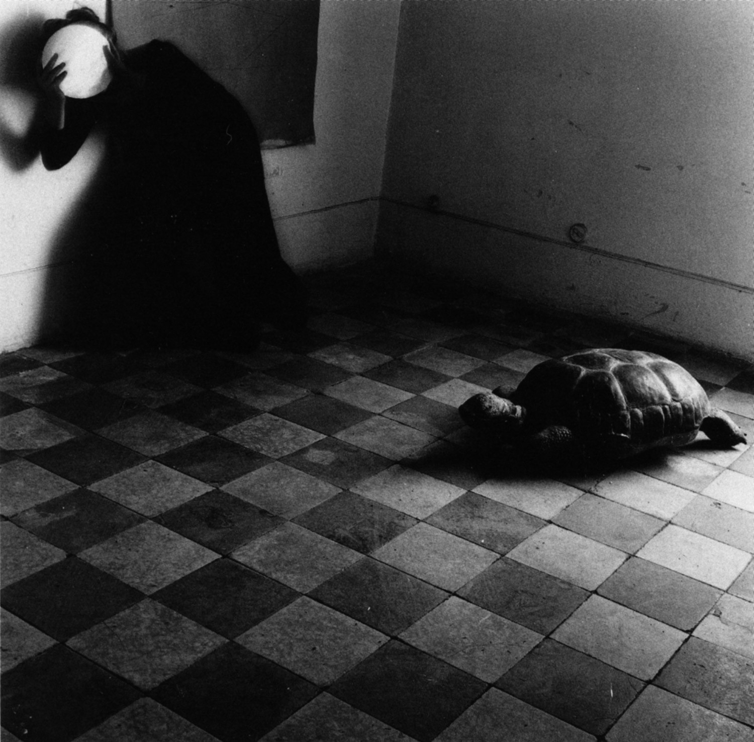
Analysation image..

Technical analysis 

In this image we can tell the image has been taken with a wide depth of field as the image is fully focused in a natural light. We can tell that this is in a natural light due to the one source of light on the right hand side of the image from a high angle. Due to the natural lighting, i assume that the white balance was set to a daylight mode or shade mode. We can also tell the this picture has been taken with a quick shutter speed to allow the image to be fully focused.

Visual analysis 

This black and white edited image can be seen as helping to bring out different tones in the picture. The edit also provides more of a dark concept. We can see by the floor tiles that the image has a great deal of texture due to the dirty floor. We can also see that this image is in 2D, that there is no pattern in the image and can overall tell that it is very unique.

Conceptual analysis

When looking at this image i have drawn to the crouched lady at the back left of the image. Her choice of wearing all black adds a dark feel to the already darkly lit image. In the image she is covering her face with a white circle, this could have multiple meanings but to me it suggests that she doesn’t know her identity, who she is. The white circle is acting like a blank canvas and she is suggesting that someone comes and draws the ideal look on her face. This image has shown to be heavily related to ‘loss of identity’.

Contextual analysis 

Woodman didn’t release any of the images which are online today and therefore all the audience know is the location the picture was taken and the date it was taken. There is no back story to this image.

Street Photography

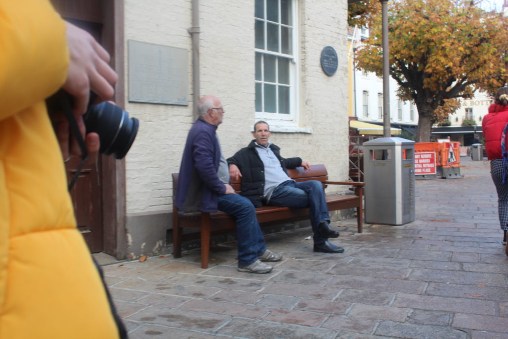
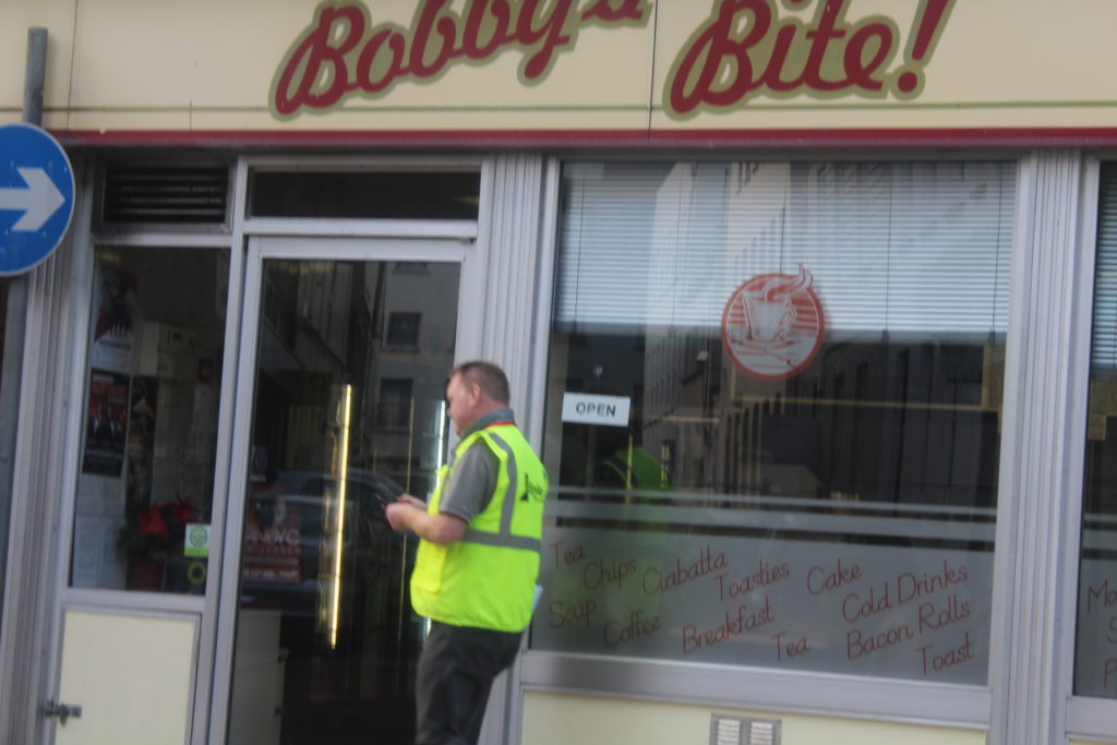
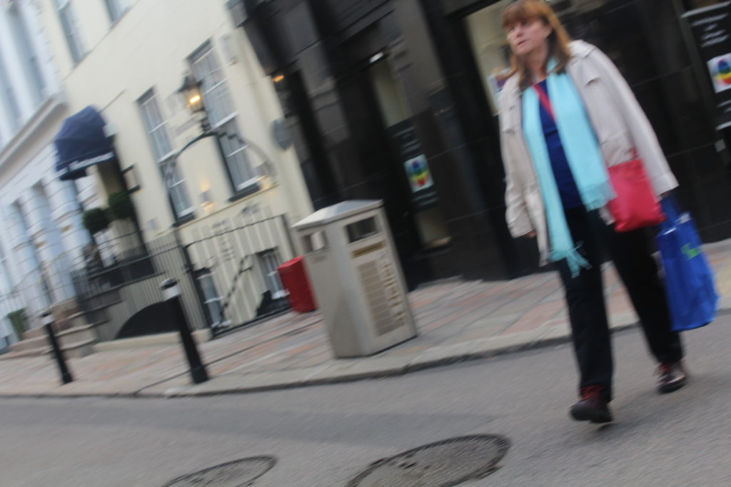
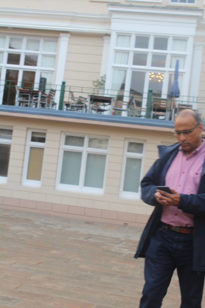
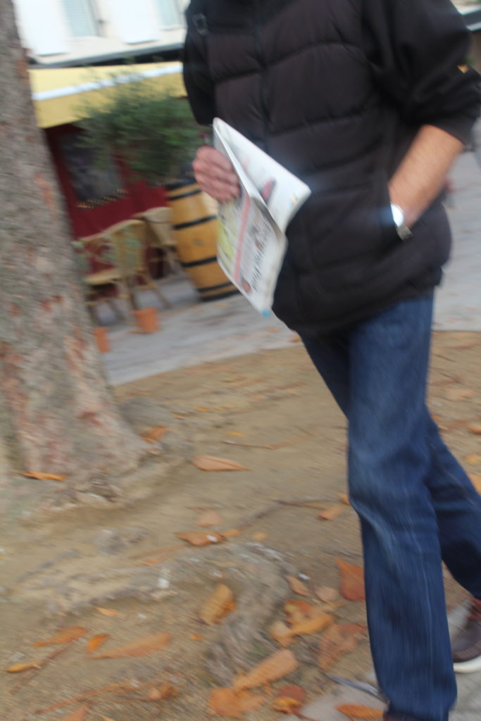
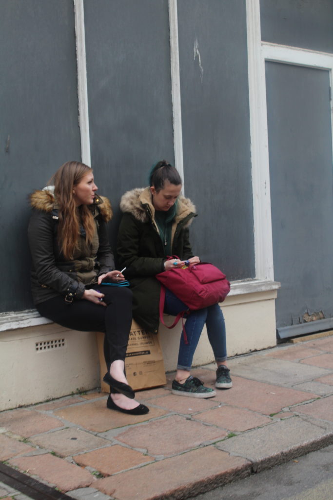
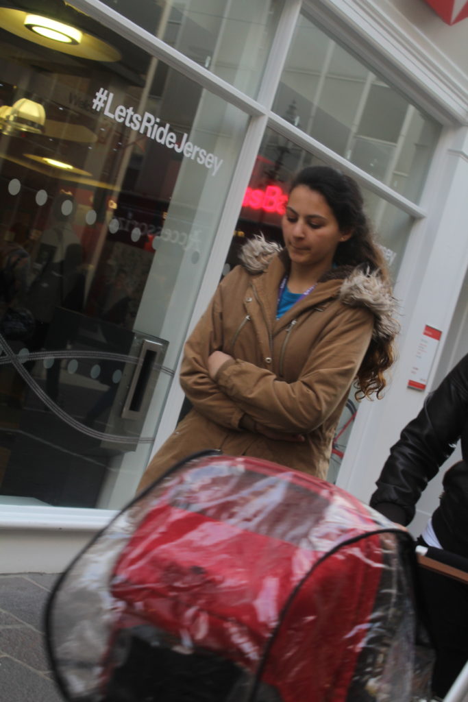
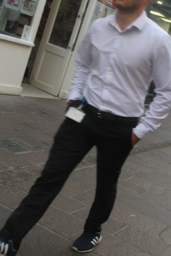
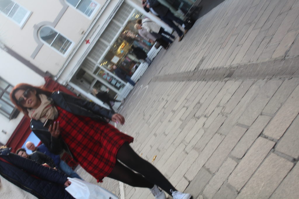
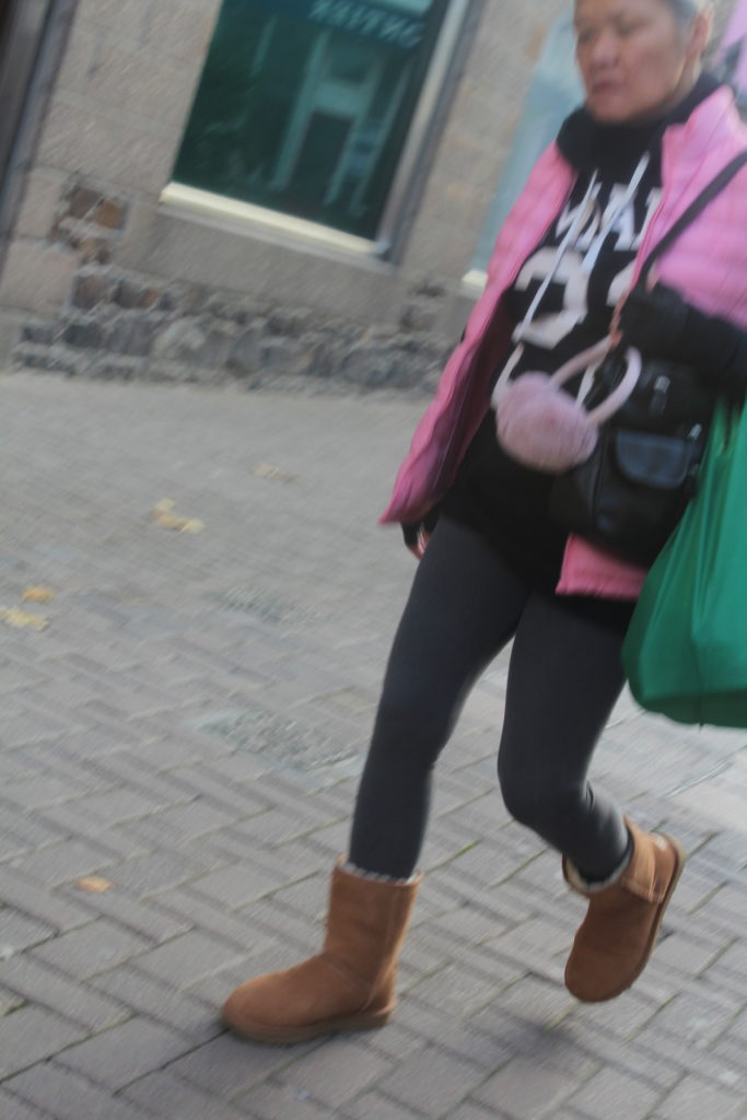
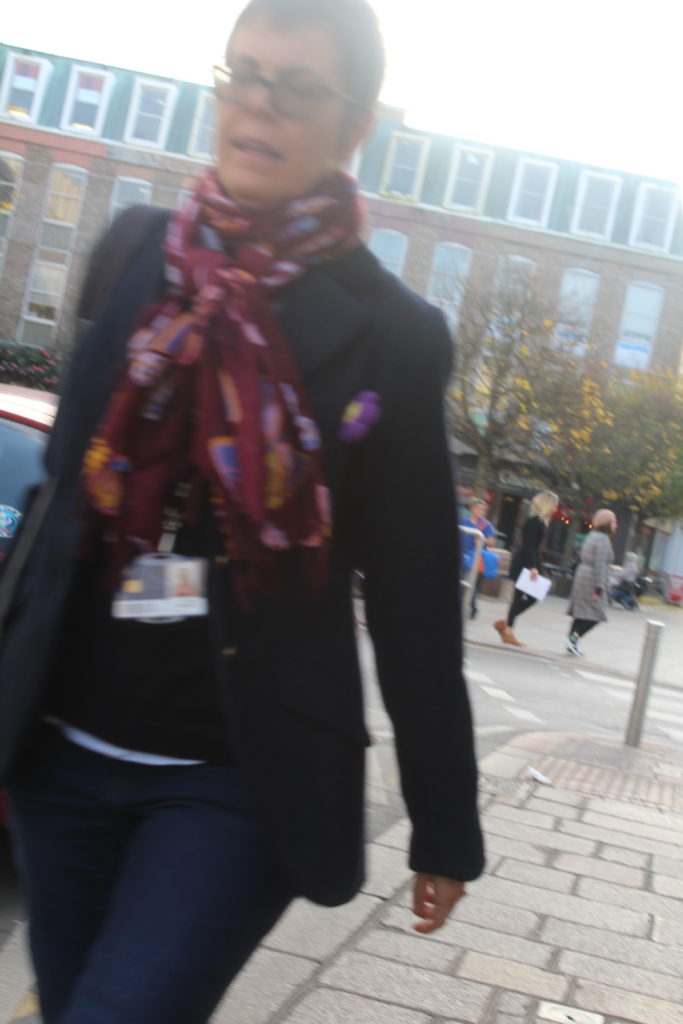
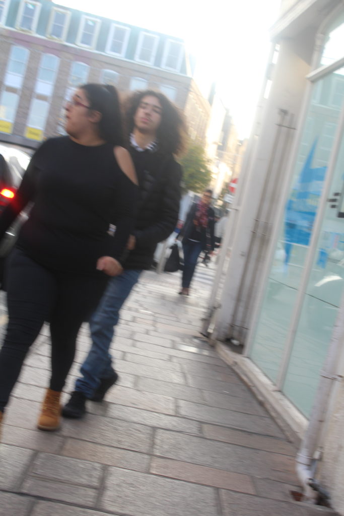
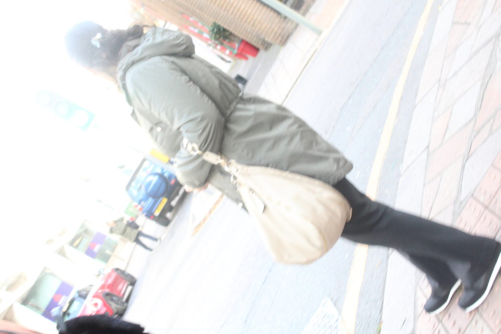
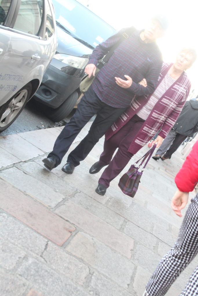
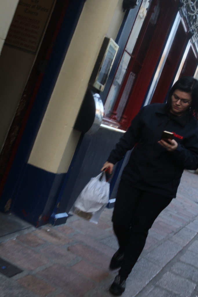
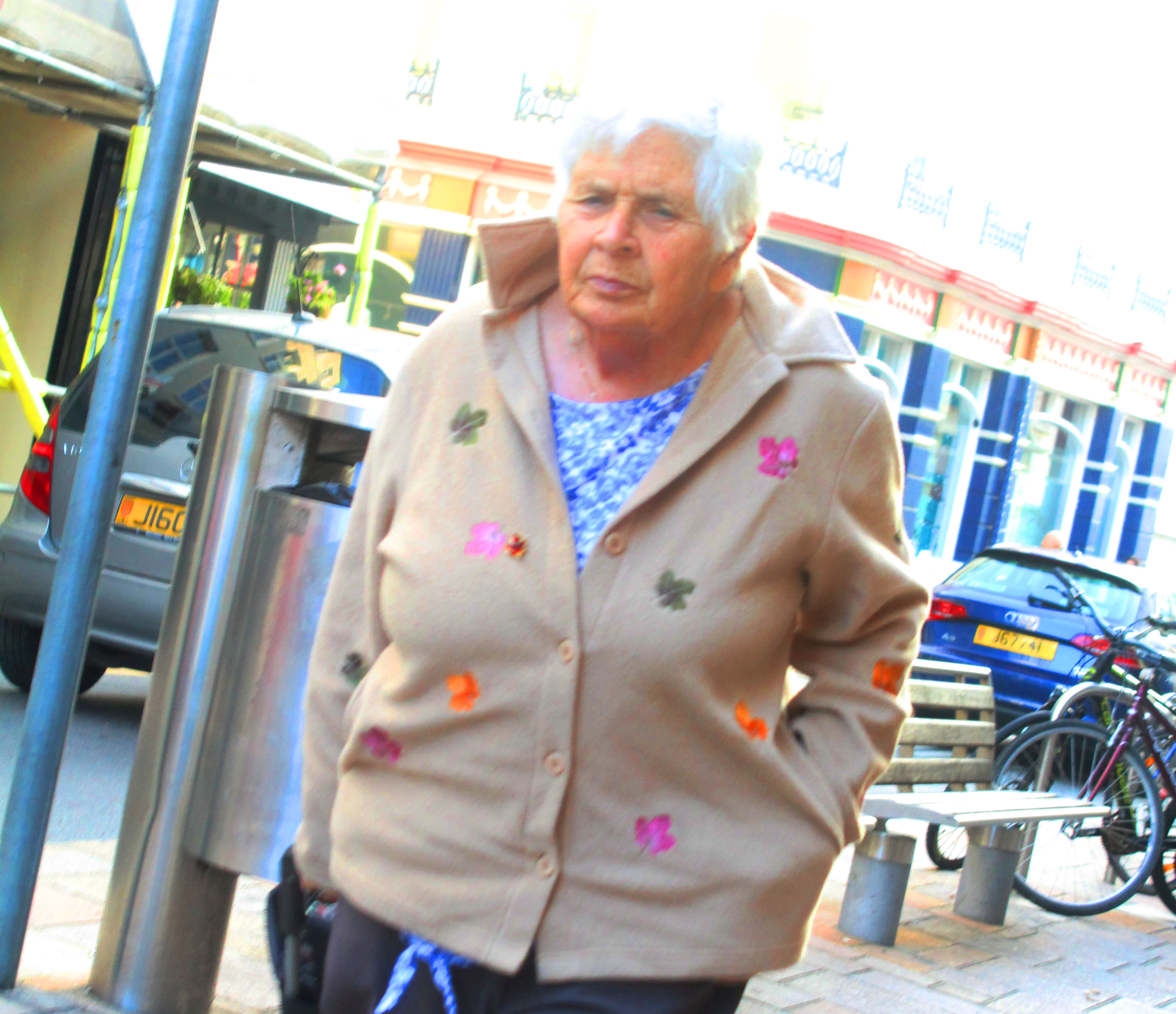
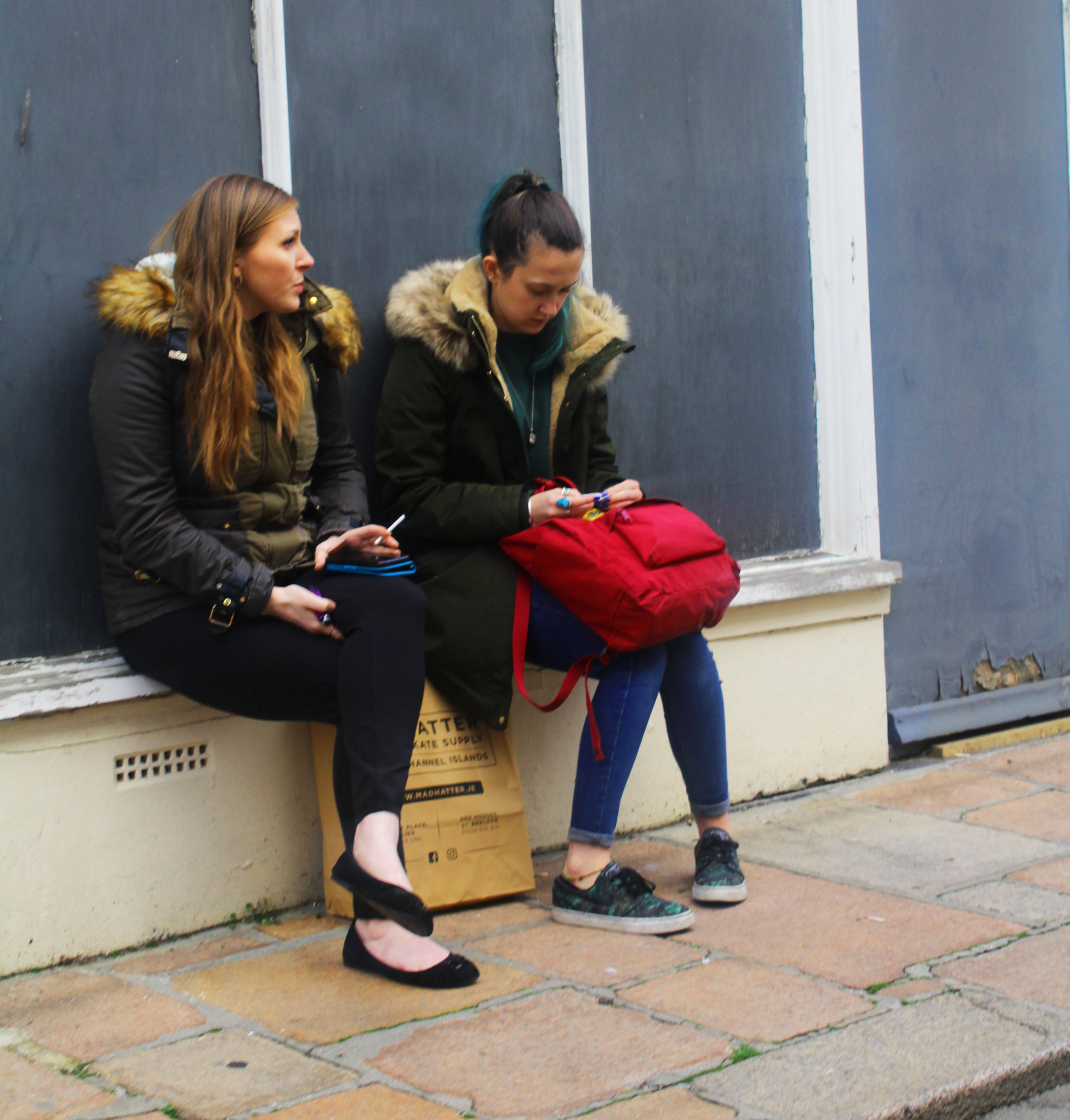
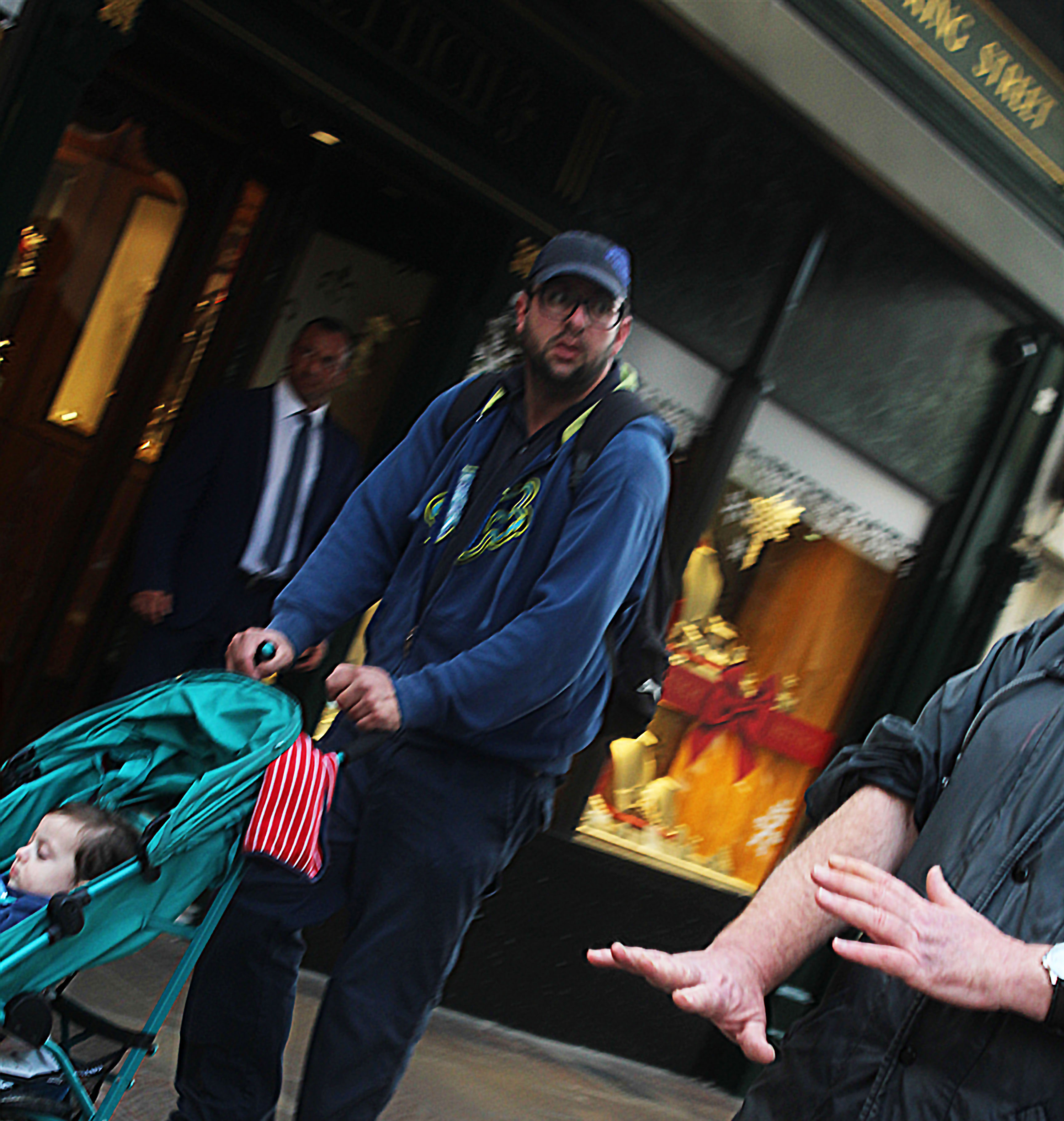
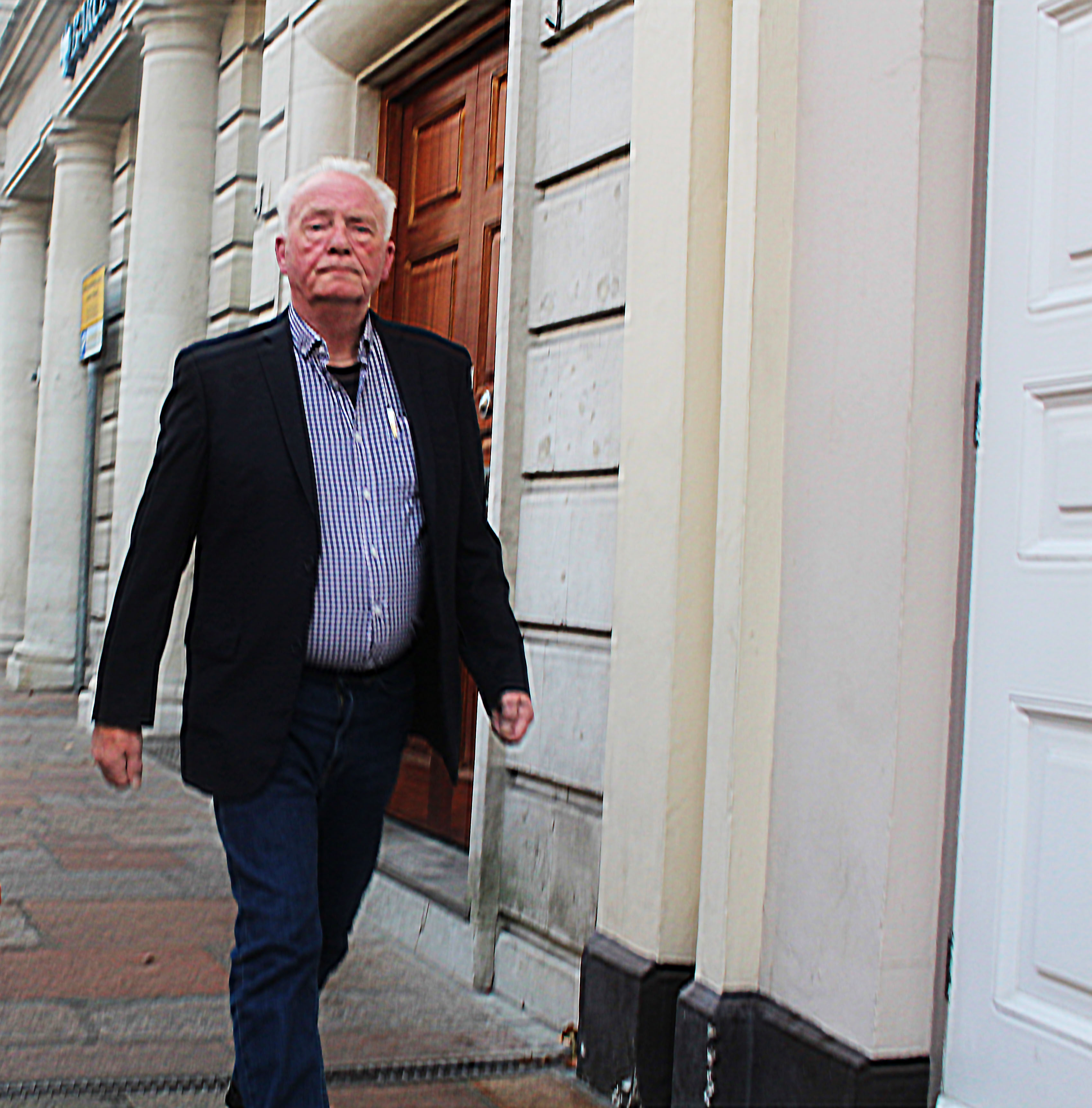
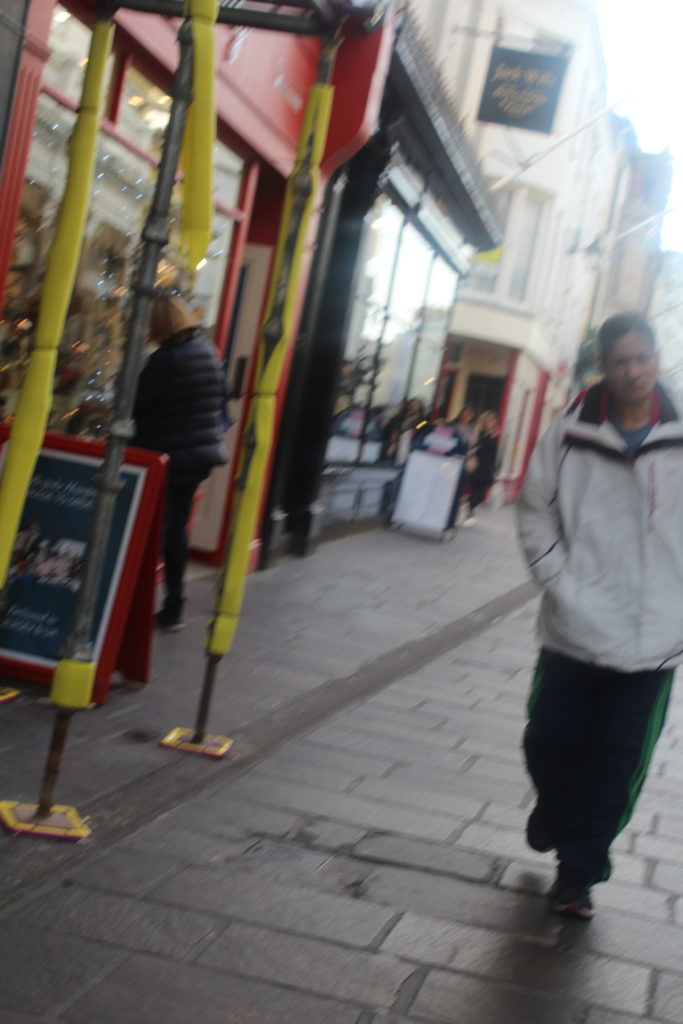
Street photography involves taking candid photographs of individuals on the street, without interacting with them or asking them to pose beforehand in any way. This results in photographs which display the subjects in in the moment, showing their natural poses and stances, and the genuine emotions they are feeling at the time of the photograph.

In order to experiment with street photography, I used participants that were available to me in town on an afternoon. I set my camera settings to a faster shutter-speed

The following are my final choices for the street photography images I have taken, after I have attempted to edit them in order to make the colors bolder and in some cases, lower the exposure.


case study-Kurt Schwitters

Kurt Hermann Eduard Karl Julius Schwitters (20 June 1887 – 8 January 1948) was a German artist who was born in Hanover, Germany.

Schwitters worked in several genres and media,

Kurt Schwitters Photo

including dadaism, constructivism, surrealism, poetry, sound, painting, sculpture, graphic design, typography, and what came to be known as installation art. He is most famous for his collages, called Merz Pictures.

After studying art at the Dresden Academy alongside Otto Dix and George Grosz, (although Schwitters seems to have been unaware of their work, or indeed of contemporary Dresden artists Die Brücke[4]), 1909–1915, Schwitters returned to Hanover and started his artistic career as a post-impressionist. In 1911 he took part in his first exhibition, in Hanover. As the First World War progressed his work became darker, gradually developing a distinctive expressionist tone

Directly affected by the depressed state of Germany following World War I, and the modernist ethos of the Dada movement, Kurt Schwitters began to collect garbage from the streets and incorporate it directly into his art work. The resulting collages were characterized by their especially harmonious, sentimental arrangements and their incorporation of printed media. He actively produced artistic journals, illustrated works, and advertisements, as well as founding his own Merz journal. He wrote poems and musical works that played with letters, lacing them together in unusual combinations, as he’d done in the collages, in the hope of encouraging his audience to find their own meanings. His multiple avant-garde efforts culminated in his large merzbau creations. These works, collaborations with other avant-garde artists, would start with one object to which others were added, causing the whole piece to change and evolve over time, growing to great proportions that forced the viewer to actually experience, rather than simply view, the art.

Important Art by Kurt Schwitters

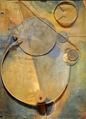
1-Revolving (1919)

Revolving (1919)

Artwork description & Analysis: This work demonstrates a significant shift in Schwitters’ early artistic practice from primarily conservative figurative painting to abstract collage. After World War I, Schwitters began to collect broken and discarded materials he found on the streets and arrange them into works of art. Born from the rubble left by the war, these works emphasize the fact that art can be made from destruction; that urban detritus could be made into something beautiful. In Revolving, found items are organized to form lines and shapes to which he adds bits of yellow and blue paint for shading.

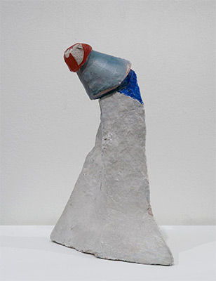
2-(The Clown) (c. 1945-7)

Untitled (The Clown) (c. 1945-7)

Artwork description & Analysis: Fashioned from plaster and found objects, this diminutive assemblage is characteristic of the mixed media sculptures Schwitters produced toward the end of his life, while exiled in England. Despite its unassuming stature and materials, this sculpture embodies the enduring tenderness and whimsy unique to the artist’s oeuvre.

my favorite art pieces of his:

Image result for Kurt Schwitters

Image result for Kurt Schwitters       Image result for Kurt Schwitters    Image result for Kurt Schwitters


I really enjoy looking at Kurt’s art as it has a lot of texture, color, and meaning to it. I also like the fact that he uses anything like garbage scraps and scraps left from the after war to create his master pieces.

photo montage task

what is it?


 Photomontage is the process and the result of making a composite photograph by cutting, gluing, rearranging and overlapping two or more photographs into a new image. Sometimes the resulting composite image is photographed so that a final image may appear as a seamless photographic print. A similar method, although one that does not use film, is realized today through image-editing software. This latter technique is referred to by professionals as “compositing”, and in casual usage is often called “photoshopping” (from the name of the popular software system). A composite of related photographs to extend a view of a single scene or subject would not be labeled as a montage.

history of photomontage:


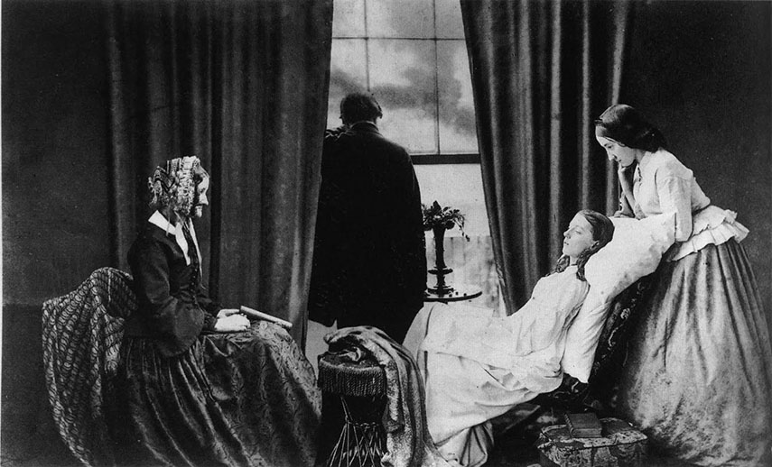
The first and most famous mid-Victorian photomontage (then called combination printing) was “The Two Ways of Life” (1857) by Oscar Rejlander, followed shortly thereafter by the images of photographer Henry Peach Robinsonsuch as “Fading Away” (1858). These works actively set out to challenge the then-dominant painting and theatrical tableau vivants.

In 1916, John Heartfield and George Grosz experimented with pasting pictures together, a form of art later named “Photomontage.”

The pioneering techniques of early photomontage artists were co-opted by the advertising industry from the late 1920s onward. The American photographer Alfred Gescheidt, while working primarily in advertising and commercial art in the 1960s and 1970s, used photomontage techniques to create satirical posters and postcards.

Image result for first photomontage

this is probably the first photomontage ever came out

late 20th century photomontage eh Hannah Hosh

Hannah Höch ; 1 November 1889 – 31 May 1978) was a German Dada artist. She is best known for her work of the Weimar period, when she was one of the originators of photomontage.[1] Photomontage is a type of collage in which the pasted items are actual photographs, or photographic reproductions pulled from the press and other widely produced media.

Höch was not only a rare female practicing prominently in the arts in the early part of the 20thcentury – near unique as a female active in the Dada movement that coalesced in her time – she also consciously promoted the idea of women working creatively more generally in society. She explicitly addressed in her pioneering artwork in the form of photomontage the issue of gender and the figure of woman in modern society. Her transformation of the visual elements of others by integrating them into her own larger creative projects evidenced a well-developed early example of “appropriation” as an artistic technique.

Image result for late 20th century photomontage eh hannah hoch
Höch also helped expand the notion of what could be considered art by incorporating found elements of popular culture into “higher” art. She was one of many Dadaists to take advantage of such means, but she was both among the first, and one of the most self-consciously explicit in describing the goals and effects of doing so.

Tableaux Part1:

Tableaux Photography:

what is it?

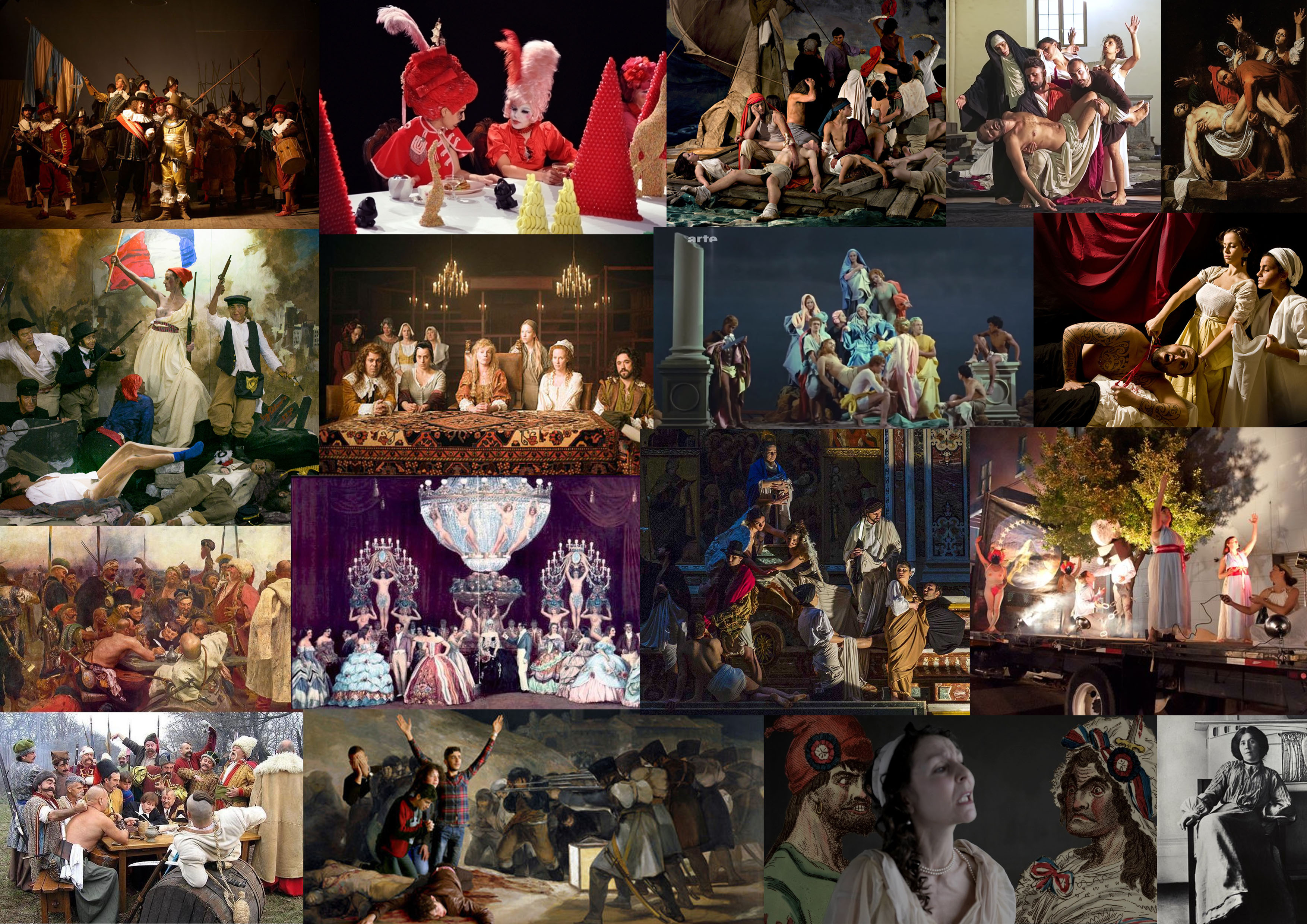
A tableau vivant, French for ‘living picture’, is a static scene containing one or more actors or models. They are stationary and silent, usually in costume, carefully posed, with props and/or scenery, and may be theatrically lit. It thus combines aspects of theatre and the visual arts.

The idea of tableaux photography is so that we can re create famous images by finding similar props and outfits. The setting and lighting also have an imapct on the outcomes for tableaux. The whole point is to make the image as close to the original as possible. Therefore the setting and all the models expressions have to be near enough the same.

Above this post are all of our class attempts for tableaux photography. We found it quite challenging to keep the same facial expressions because we were stationed in all sorts of positions so at the end of the day most of the outcomes are either fairly blured or fairly dark, however re- creating the images from Caravaggio was quite fun.


Mood Board:


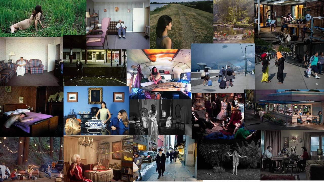
These are just examples taken off google images when searching in ‘ Tableaux Vivant’ some examples in the mood board above are actually examples from Tom Hunter, who’s worked is based on tableaux photography.