Category Archives: Uncategorized

Filters

Author:
Category:

IDENTITY AND PLACE

WHAT IS…

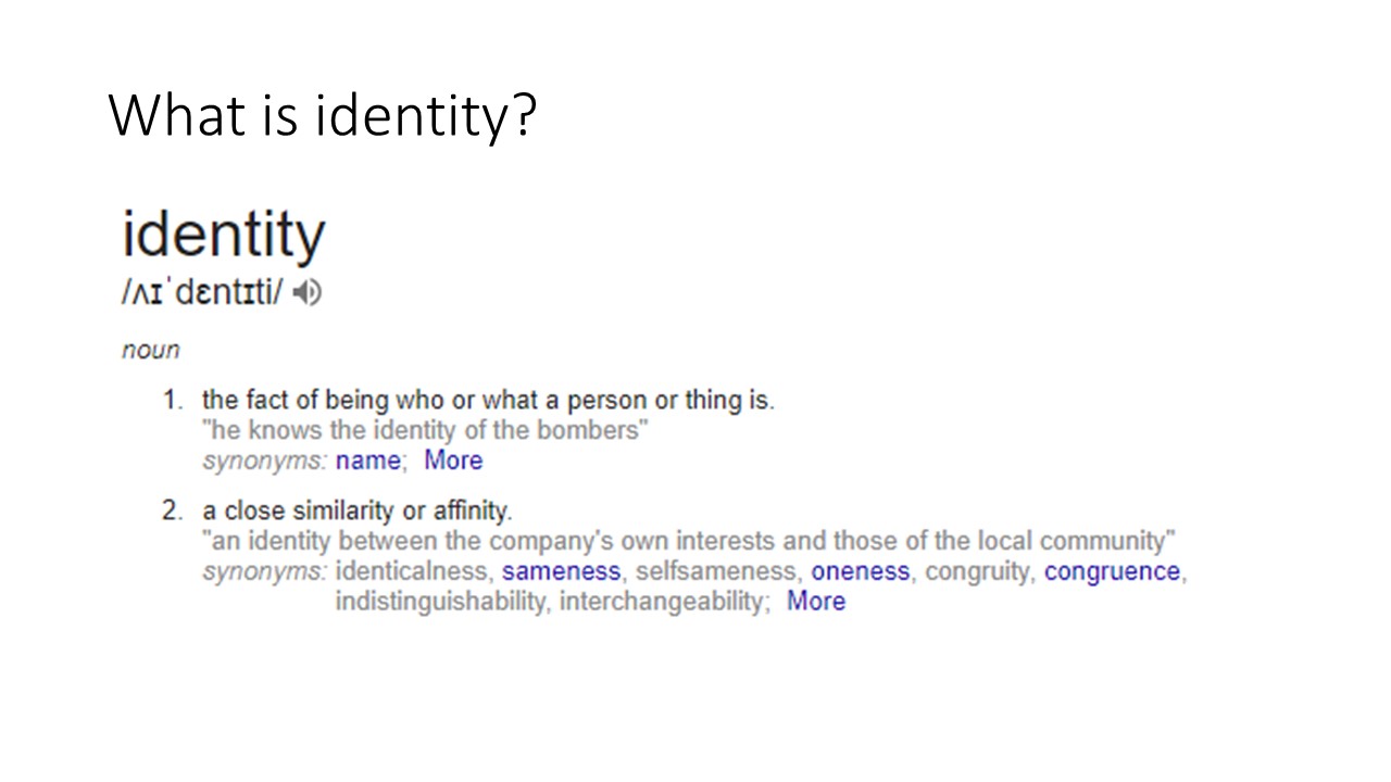
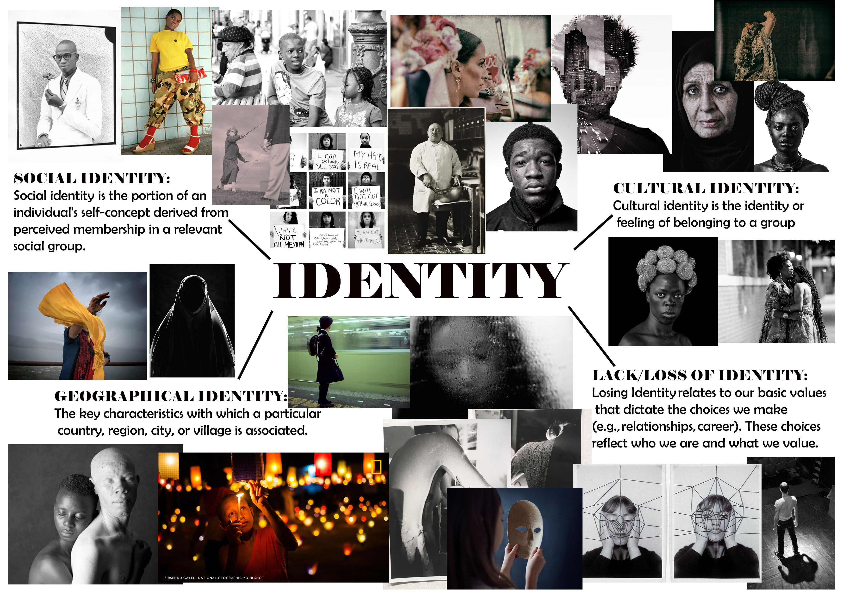
IDENTITY – Identity relates to our basic values that dictate the choices we make (e.g., relationships, career). These choices reflect who we are and what we value.

CULTURAL IDENTITY – Cultural identity is the identity or feeling of belonging to a group. It is part of a person’s self-conception and self-perception and is related to nationality, ethnicity, religion, social class, generation, locality or any kind of social group that has its own distinct culture

SOCIAL IDENTITY – Social identity is the portion of an individual’s self-concept derived from perceived membership in a relevant social group.

GEOGRAPHICAL IDENTITY – 1. An individual or group’s sense of attachment to the country, region, city, or village in which they live. 2. The key characteristics with which a particular country, region, city, or village is associated.

LACK/LOSS OF IDENTITY – Loss of identity may follow all sorts of change; changes in the workplace, loss of a job or profession, loss of a role that once defined us, as a child, as a parent, as a spouse. … When we lose our identity and sense of self, we are likely to seek our sense of self-worth from others.
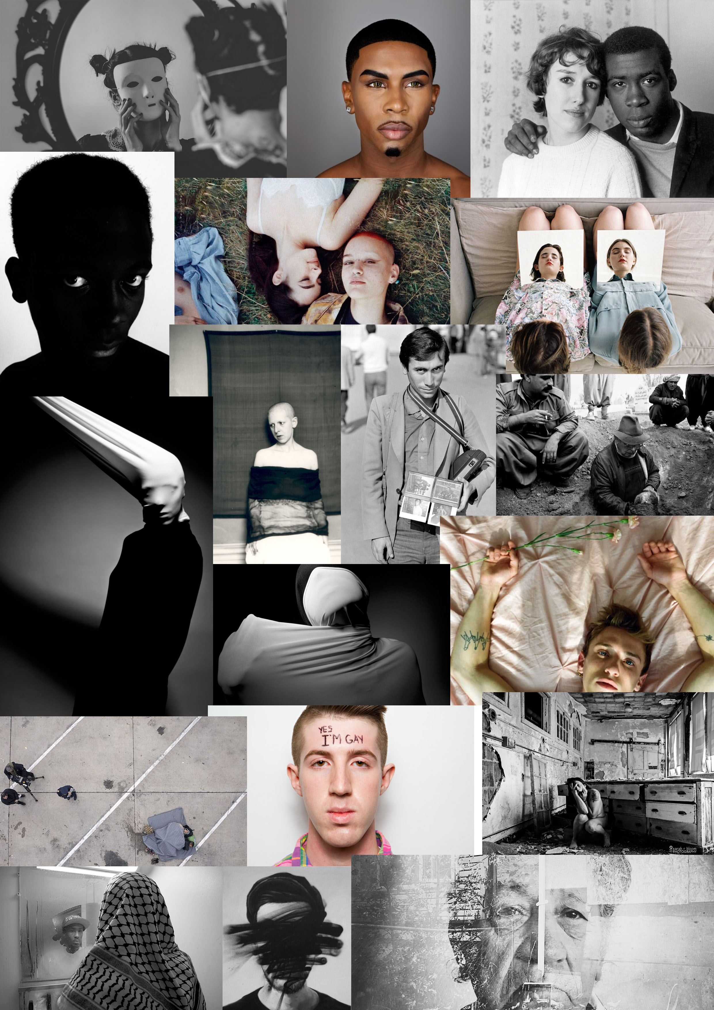
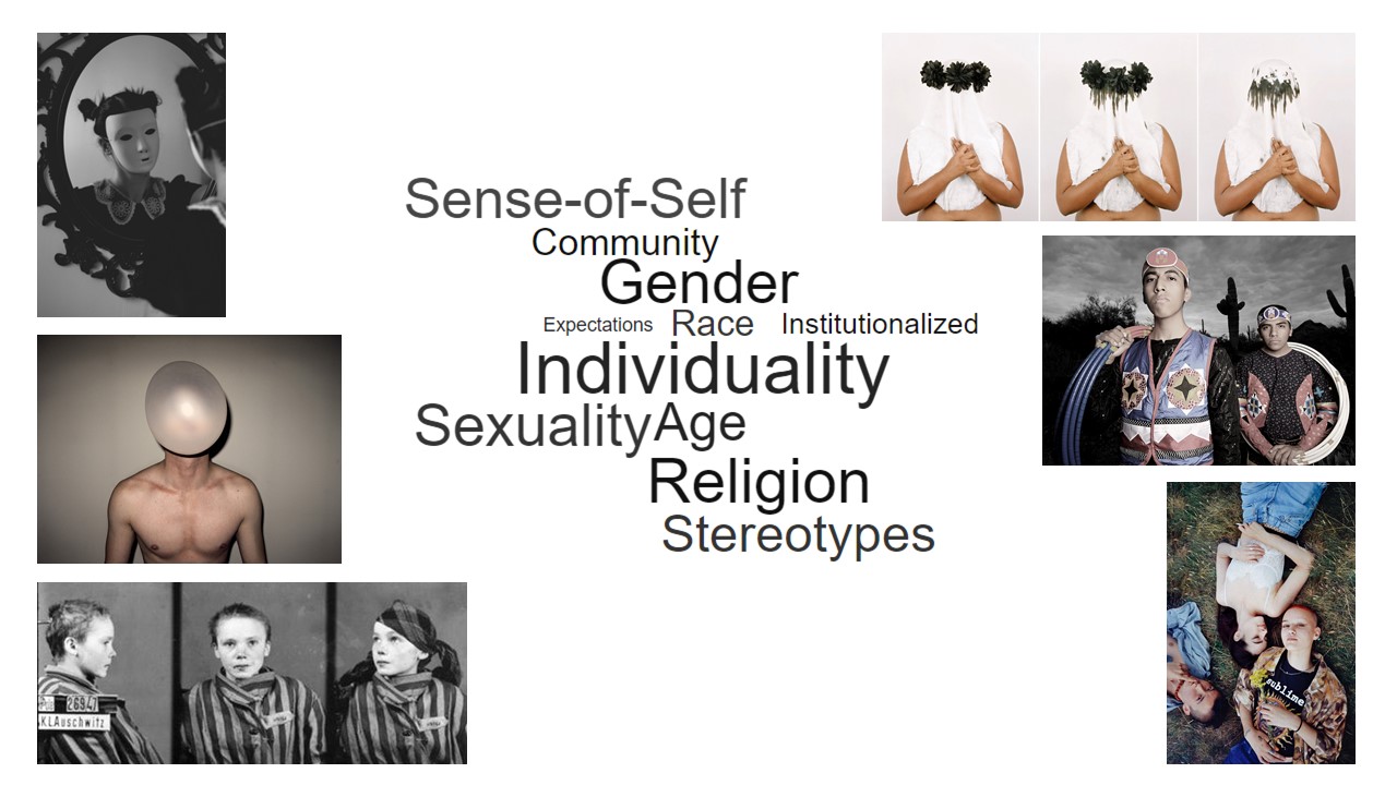
IDENTITY MIND MAP: 
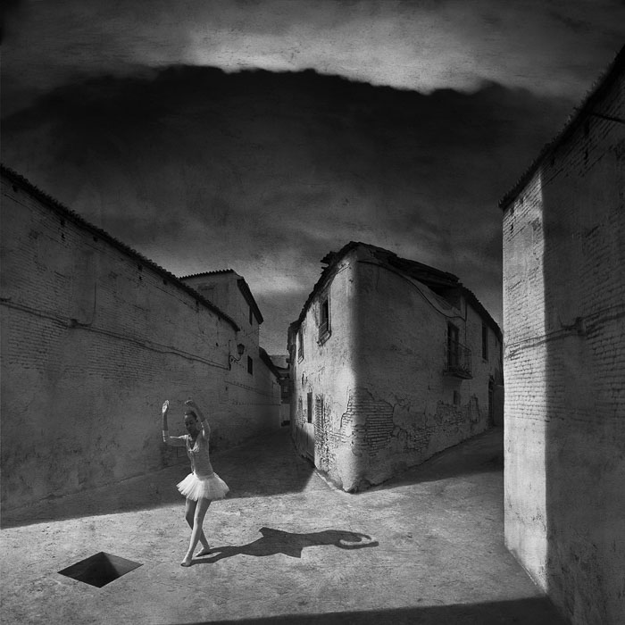
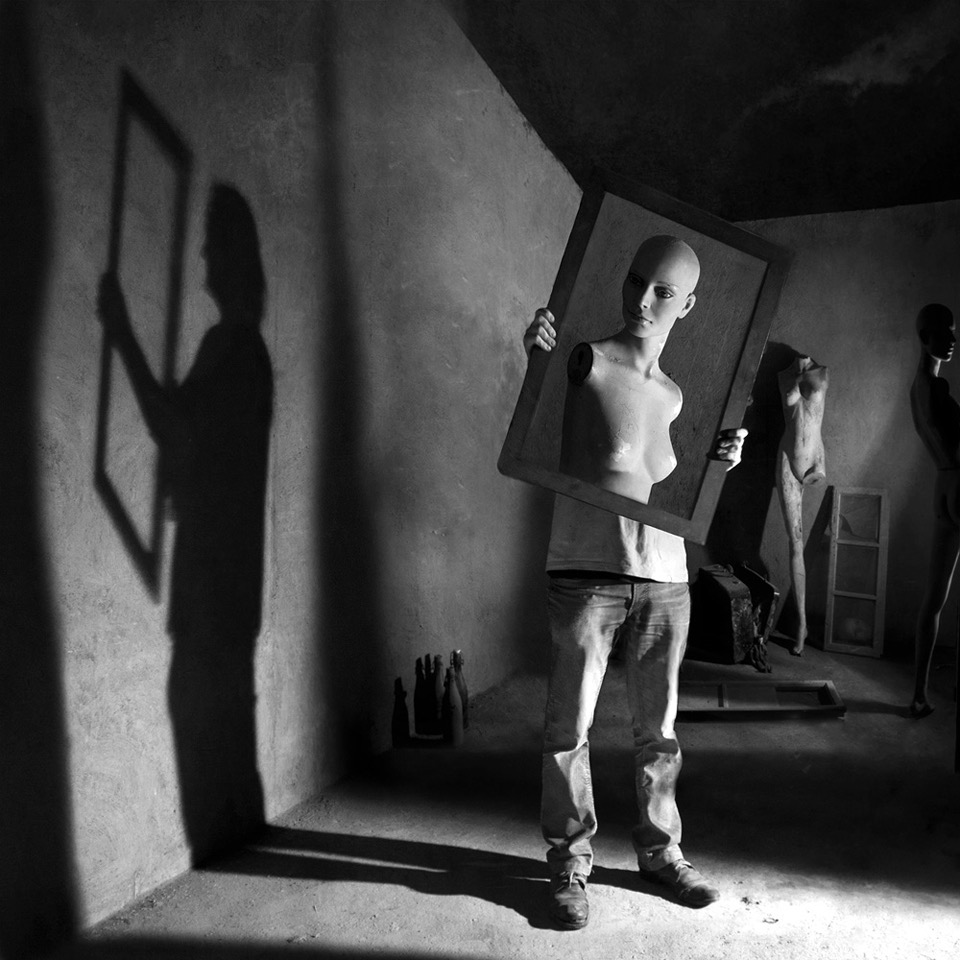
MARCIN SACHA 

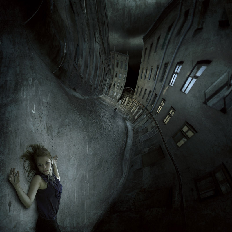
CRITICAL ANALYSIS OF WORK:
VISUAL:  The image has very obviously been heavily edited, creating a spiral like warp on the image which twists and contorts the image and buildings in the backdrop. It shifts the model from a horizontal position to a vertical position. The overall image is composed of extremely dark, blue based tones. The focus of the image is mostly on the model, who is in the very foreground of the image. The clarity of the image is lost and it becomes more blurry as you move up the image and into the backdrop of the image. the buildings on either side of the street create a sort of guide for the eye, leading it down the street and making you focus on the darkness of the sky in the backdrop. The spotlight which has been incorporated onto the model, highlights her and makes her the focal point of the image. It illuminates the body and the ground which she lays upon. There is also observable light reflection in the windows of the building which draws more attention to them. The darkness of the walls accentuating this illumination. The position of the model, the dark and eerie mood of the image suggests themes of death, evil and depression. Upon a closer look, another human figure can be seen on the street in the distance, possibly suggesting that the woman in the foreground was in some way hurt by the figure.

TECHNICAL: I believe that in order to create this image, multiple images and heavy editing was used in order to achieve the final outcome. This is also extremely staged therefore models and extra equipment such as lighting was used in order to create the image. Photoshop was later used in order to warp the image and create the dream like fluidity of the image which guides the eye to the center. The model has also been staged in order to face the camera with the dead-like facial expression. The colors have also been highly saturated in order to give the dark and grungy look. The sky is extremely dark, grim and highly contrasted to the pavement, this I also believe has been edited in to give extra darkness.

CONCEPTUAL/CONTEXTUAL: “I live in Tarnow, in the south of Poland. Photography became my passion in 2005. I began with nature photography and later, landscapes. I recently became also interested in pictures on the boundary of photography and graphics. My achievements to date include nine solo exhibitions and over forty collective exhibitions in Poland and abroad, I have a title Artiste FIAP La Fédération Internationale de l’Art Photographique In my photo montage I often use paper, clay, bricks and ceramic forms prepared by myself. I create from them the scenery and by playing with the light I try to get an interesting abstracts, which imbue a specific mood of composition of light and shadow in the plane of the frame. My worlds even if habited by people are dominated by shapes, shadows and lights. These worlds are alien to them.”

source: https://www.behance.net/salimaf754
Identity + Place

Mock January – Identity and Place

Identity –

The fact of being who or what a person or thing is.

Identity can be based on multiple factors. The person someone is today might not be what that person is tomorrow, we adapt and portray ourselves as how we want to be seen and it usually demonstrates aspects of who we are. For examples Identity can reflect on your upbringing, being religious, non religious, being foreign to being born within Europe, culture, family, hobbies, friends and life style choices, even your own appearance can reflect or be used to make you stick out from a crowd weather this being someones features or not its still there.  Regarding to the other theme of place. this can be seen as, what makes this place relatable to you as a person. The environment and colors also come into consideration, the questions asked when having a scenario places within the lines of identity means it has to voice what the model cannot speak in a photograph.

The model I have chosen is my brother, it links well with identity as its someone who I am close with and interact with on day to day basis. After having thought of quite a few different places to set my images out on I presumed that doing something related to sports would be quite a good idea. This to me struck like a good idea as part of his identity i.e. personality is the fact he is good at sports so I have based some of my experiments on places where you’d usually find an activity being performed .

Different types of Identity:

  • Social identity – The portion of an individual’s self concept derived from perceived membership in a relevant social group.
  • Cultural identity-  The feeling of belonging to a group, and culture is all the aspects that represents this individual for who they are and their background.
  • Geographical Identity – an individual’s sense of attachment to a region/country which they live in that also presents part of their personality and nationality
  • lack/Loss Identity- personal psychological conflict that involves confusion about ones role in society or the sense of loss in community.
  • Gender Identity-  a person’s perception of their own or other people’s roles based on their gender

Mood Board –

Action Plan:
  • who? Leandro
  • Where? Sports field
  • When? During the day- after schools- weekends
  • How?  Get pictures of my brother whilst he’s a at training or get him to go and kick a ball in a filed and get the images then

My idea is that ill capture my images, before, during and after the game and in general capture home life and how he dreams and thinks about football all the time .This being said i want the images to be presented as a story of the day in the life of someone who plays football.  However my images aren’t just going to be portrait based, i will include images like the football, the equipment, water bottle. For this idea i have chosen to look at a sports photography which also links into environmental portraits.


Identity and Place : John Stezaker Case Study

Born 1949 (age 69–70)

Worcester, England
Nationality British
Education Slade School of Art (London)
Known for Conceptual art

John Stezaker

Stezaker attended the Slade School of Art in London, artists to react against what was then the predominance of Pop art.

Solo exhibitions for Stezaker have been rare, however, in the mid-2000s, his work was rediscovered by the art market;he is now collected by several international collectors and museums.

His work is surreal in tone and is often made using collage and the appropriation of pre-existing images such as postcards, film stills, and publicity photographs. Art historian Julian Stallabrass said, “The contrast at the heart of these works [by Stezaker] is not between represented and real, but between the unknowing primitives of popular culture, and the conscious, ironic artist and viewer of post-modern images.”One work included in an exhibition at Salama-Caro Gallery, London, in 1991, depicted an image of a punch clock together with the caption “Why Spend Time on an Exhibition Like This?” Colin Gleadell wrote in The Daily Telegraph in 2007 that Stezaker “is now being hailed as a major influence on the Young British Art movement,” in reference to Young British Artists.

Until 2006, Stezaker was Senior Tutor in Critical and Historical Studies at the Royal College of Art in London.

photomontage

Photomontage is the process and the result of making a composite photograph by cutting, gluing, rearranging and overlapping two or more photographs into a new image.
his work:
Image result for john stezaker photomontage
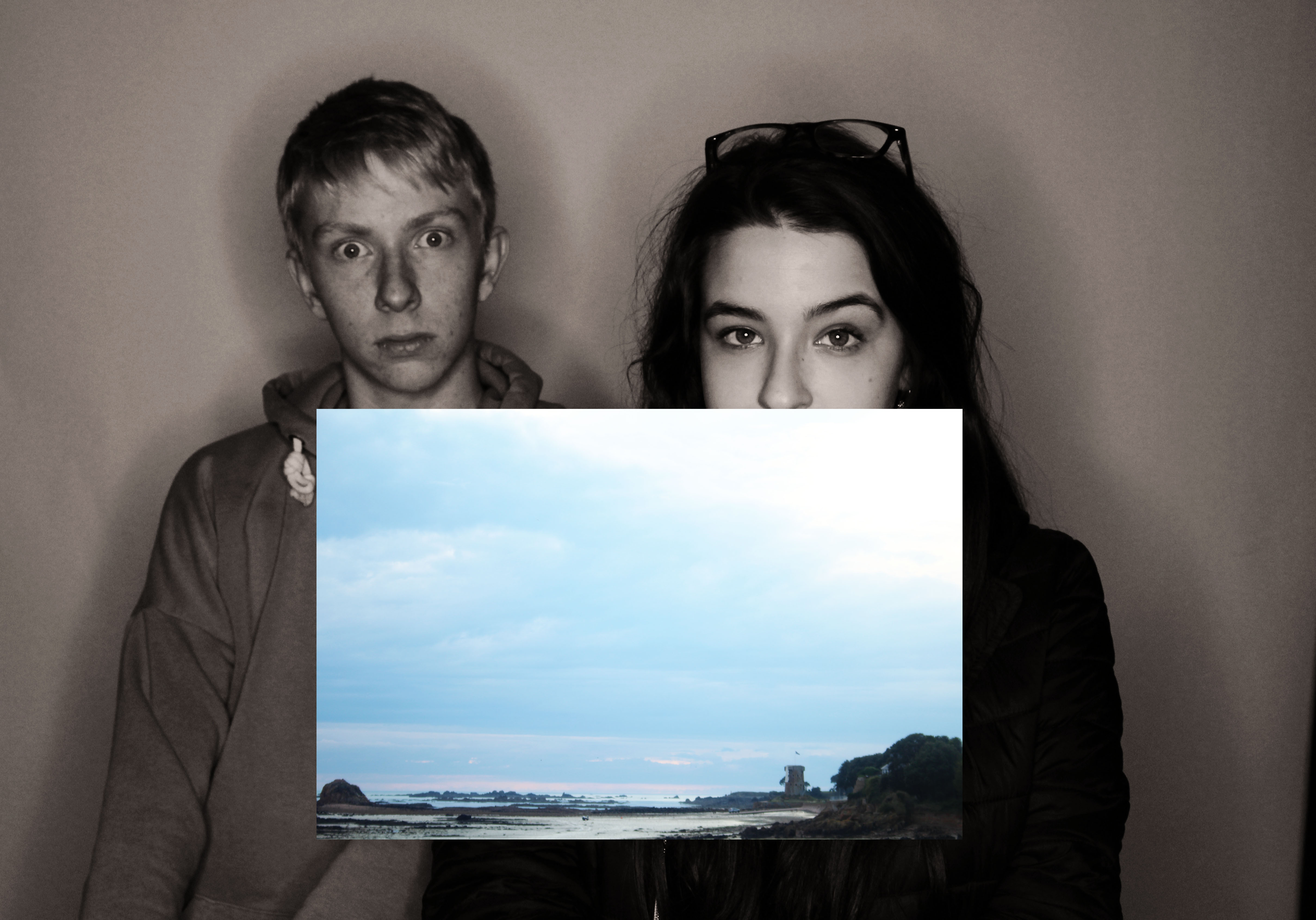
This photograph is so interesting, i like the idea how the background is black and white while the front photo is colored. and in the back are a man in the women as if they are dreaming about the place in the front photograph and they’re living in a dark pale place while the place they’re dreaming about is so colorful.
experimenting result:
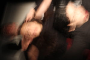
this is my photo i made by taking a photograph i took of my two class colleagues in the schools studio with ring lights and adding another layer on top of it which presents the place they live in. the background is black and white while the front layer is colored to give meaning to the photograph. also the student’s diffrent face expressions give more meaning and makes the viewer wonder whats their exact reaction to the place they’re living in.

MOCK- MY SECOND PHOTO SHOOT

Planning my second shoot

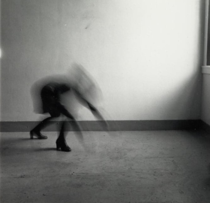
For my second photo shoot, i am going to do an inspired Francesca Woodman photo shoot.

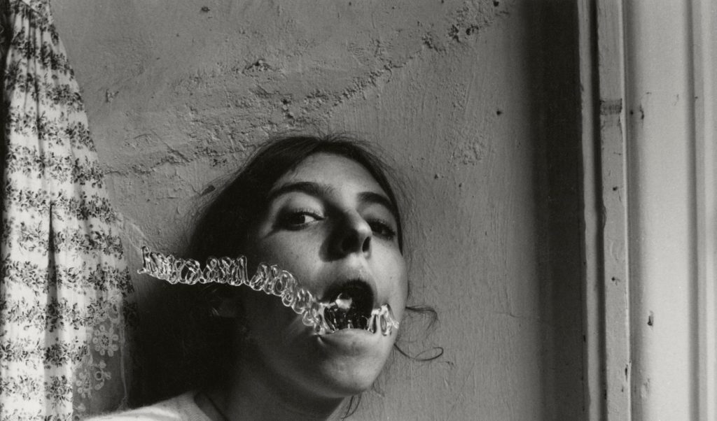
Image i was inspired by.. 

I have taken large inspiration from this image by Woodman. I really like the concept of this image, From my point of view, the model is showing to not know her self which is why she is purposely making her self blurred. She doesn’t want to be seen. The position she is in looks as if she is aiming for the floor implying that she is very relaxed.

This image shows factors of ‘loss of identity’ which is the subject i have decided to follow.

Plan

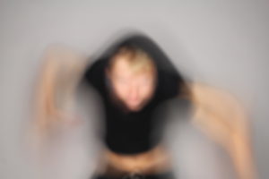
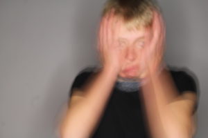
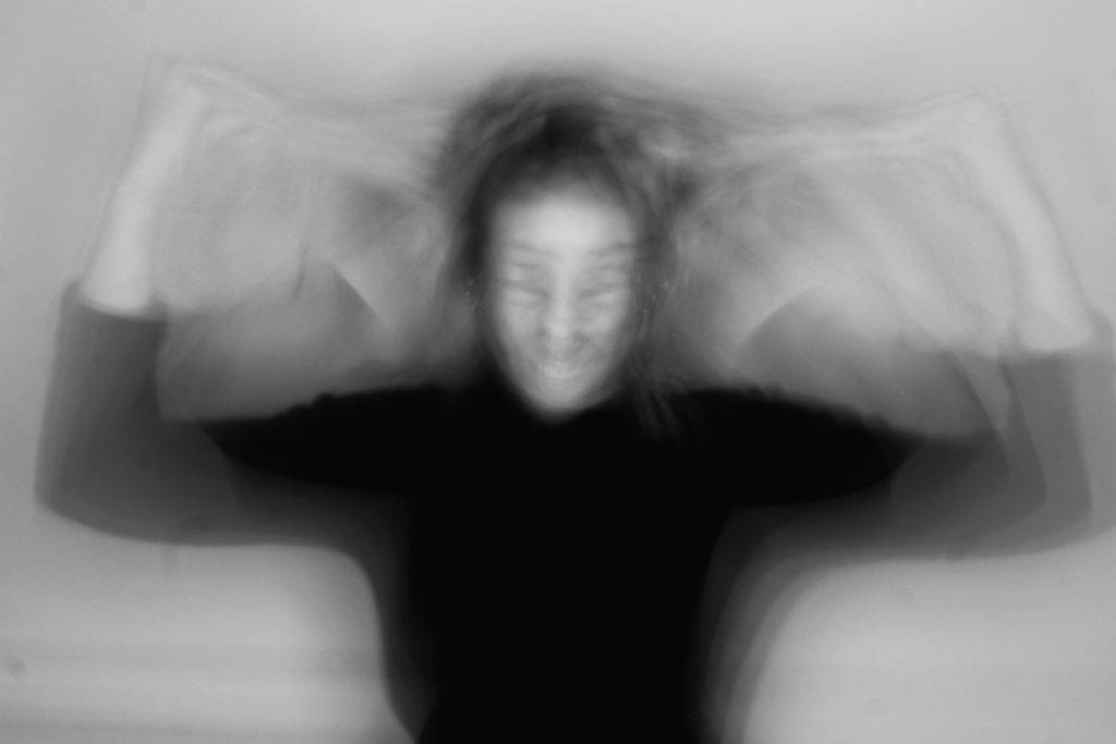
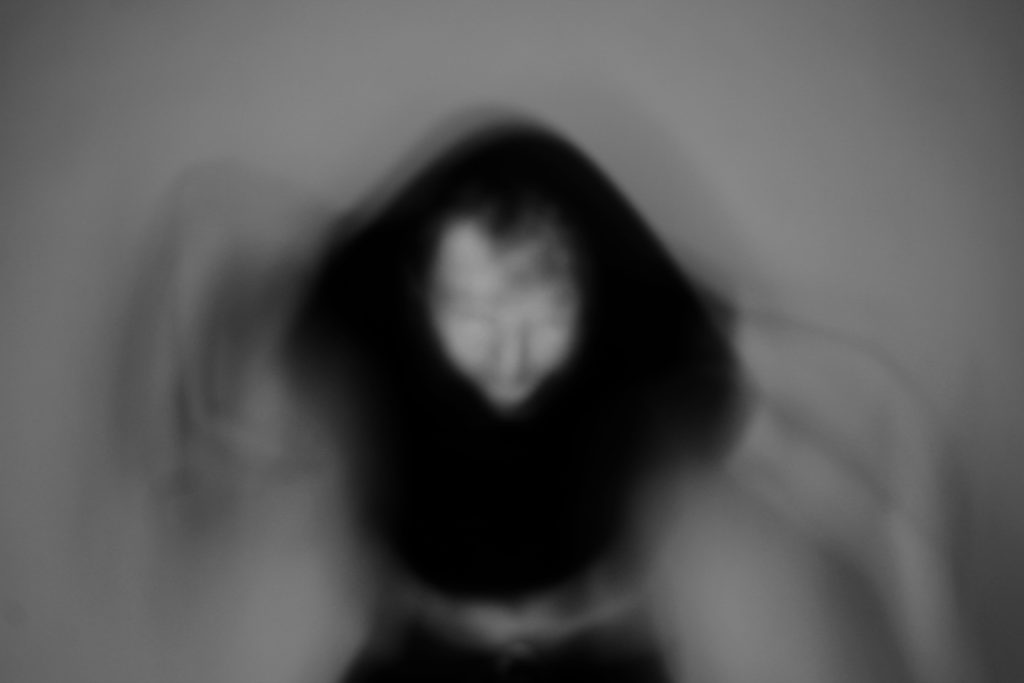
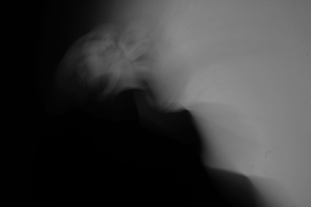
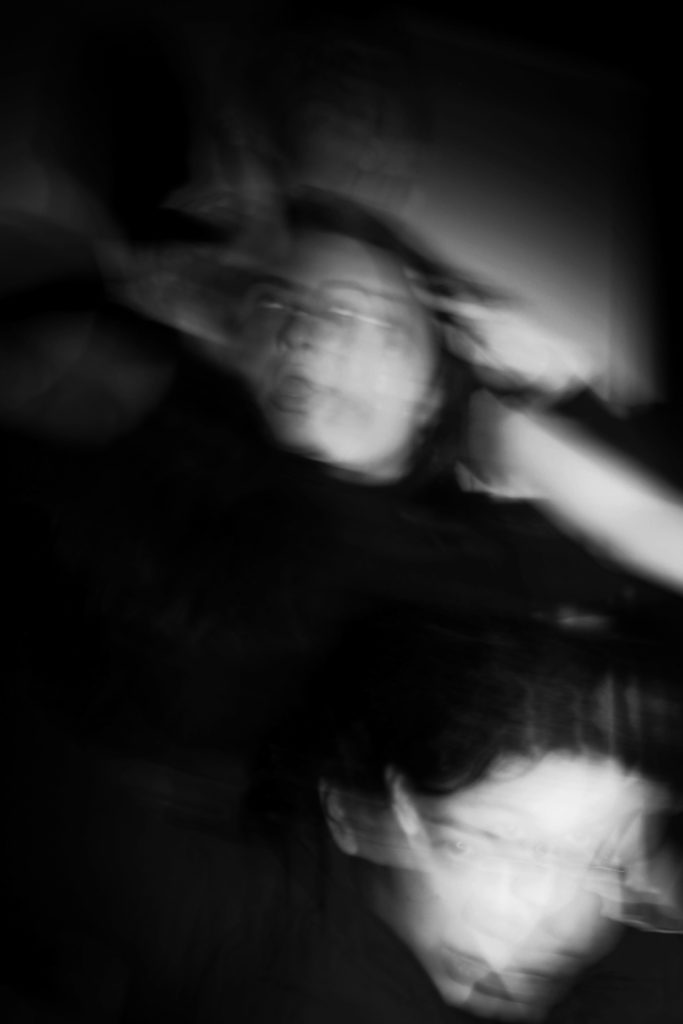
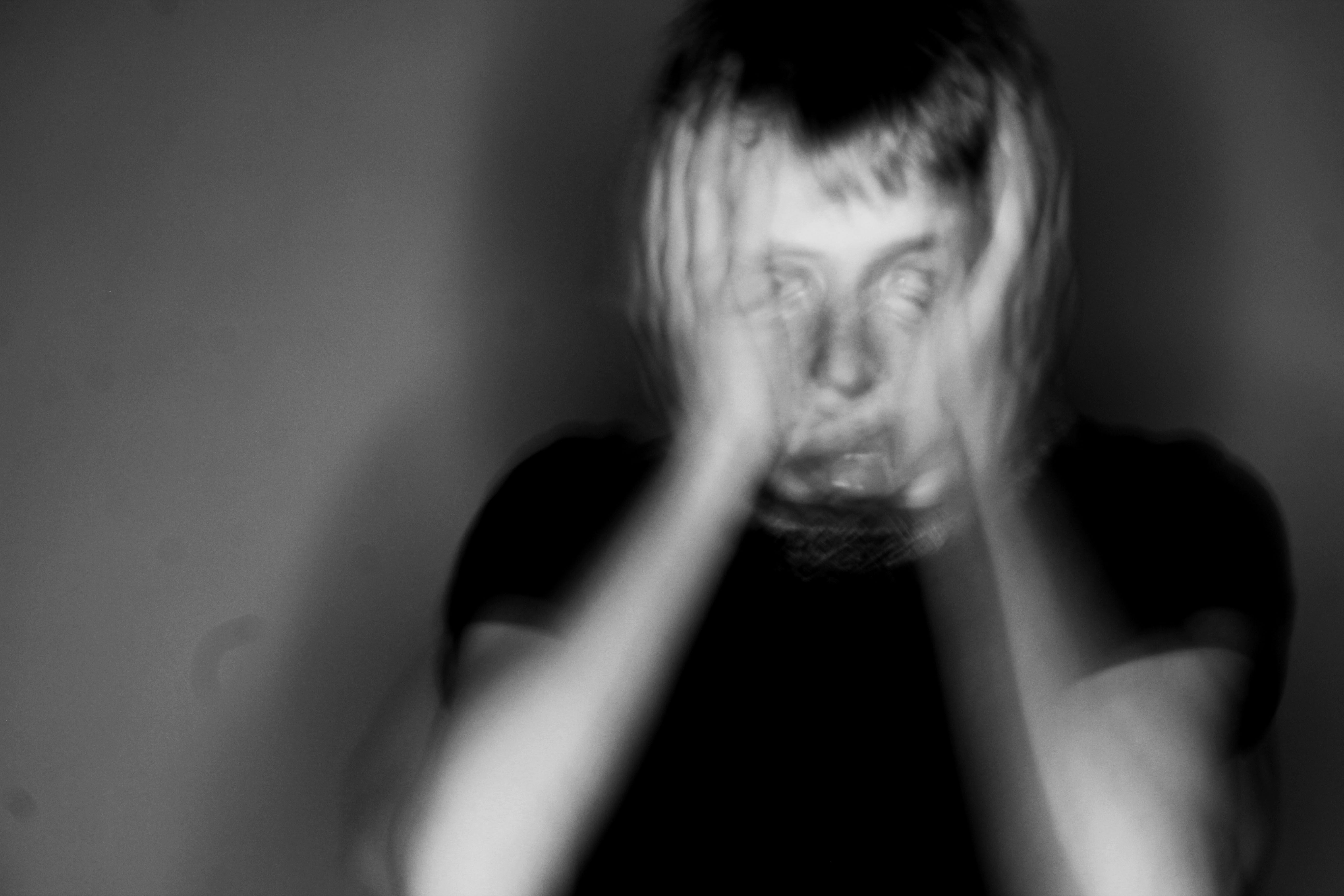
My overall plan for my shoot is to have one model, dressed in simple clothing ( black leggings and a black top) and for the model to experiment with hiding her identity while moving. Her face will act as her ‘identity’ and she will be playing with her hair/ using it to cover her face, jumping/moving, as well as covering different parts of her ‘identity’. I will allow the model to have freedom in what they are doing so that it adds a personal touch to the image and what she classes as ‘identity’. These images will be taken in a studio with a black white background to show simplicity and so that the model is the main focus of the image.  After taking the images i will edit them with a black and white edit so that there is a contrast between the model and background. I will use a manual camera setting for these pictures so that i can experiment with different white balances, depth of fields and shutter speeds.

The overall purpose of this shoot is to show the personal ‘ loss of identity’ in the model.

Aspects to include.. 

  • Studio lighting ( one point lighting)
  • Plain white background
  • Dressed simply ( all in black)
  • Model to have hair down
  • No props to be used
  • Manual setting
  • Experiment with slow and fast shutter speed
  • Edit to black and white
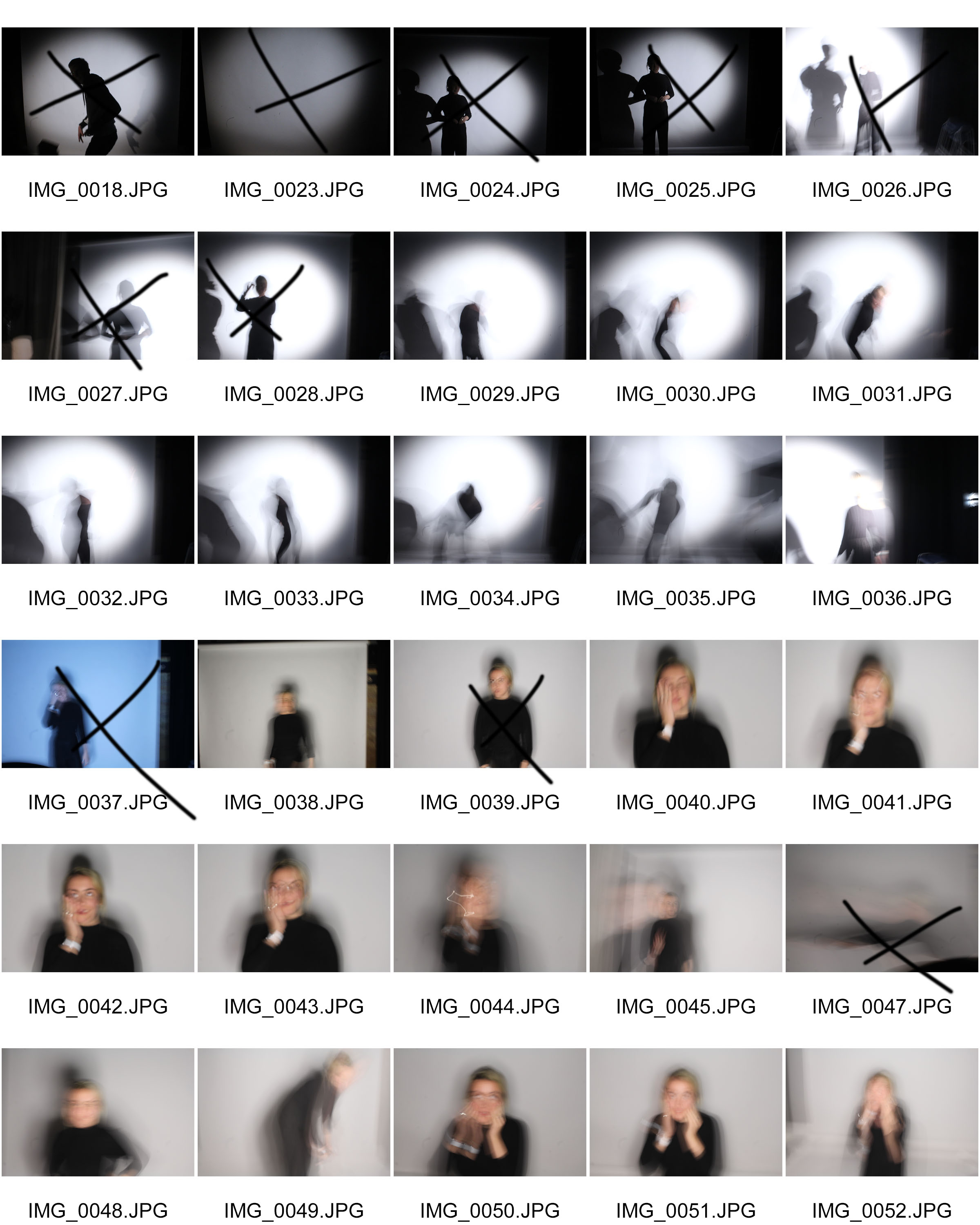
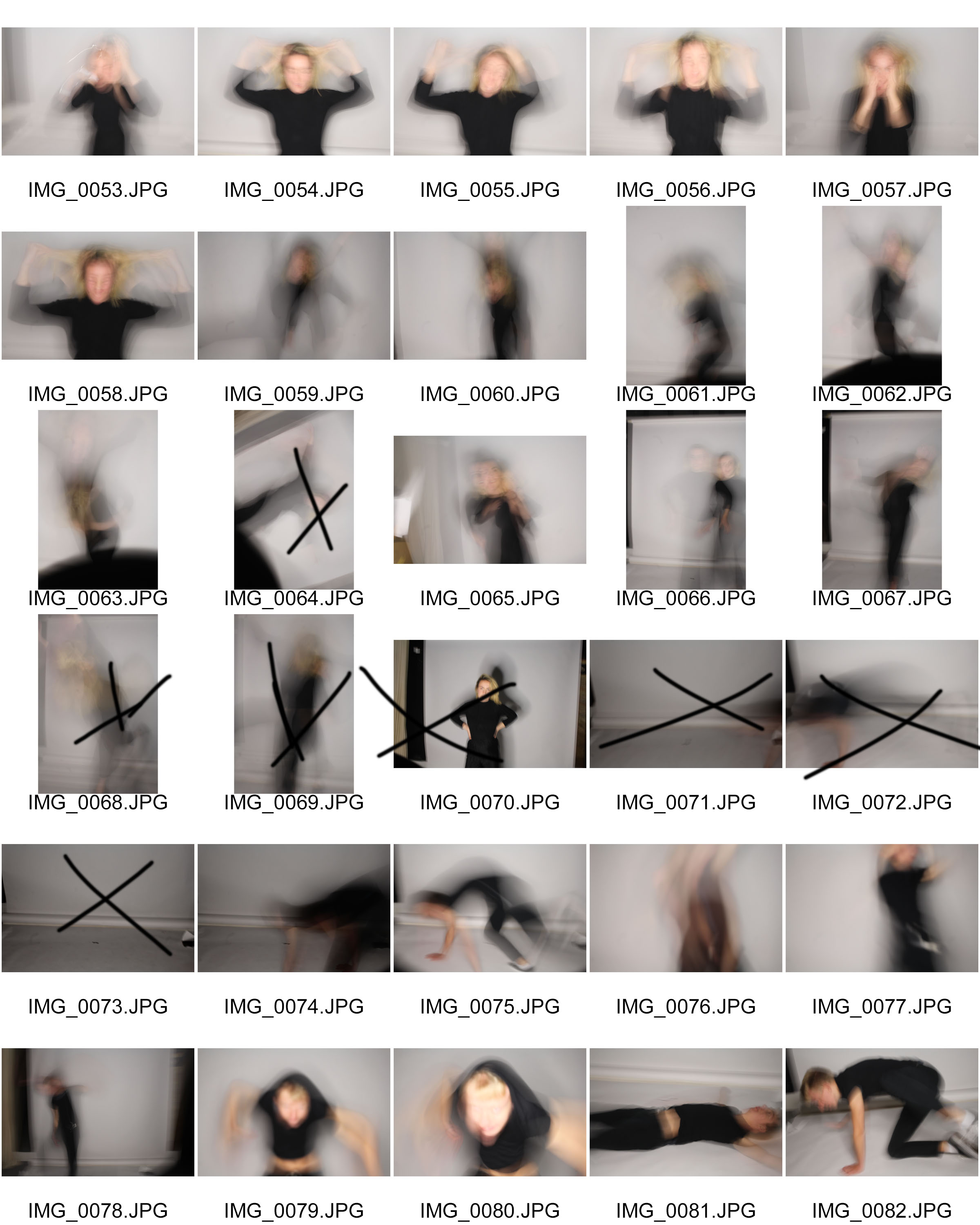
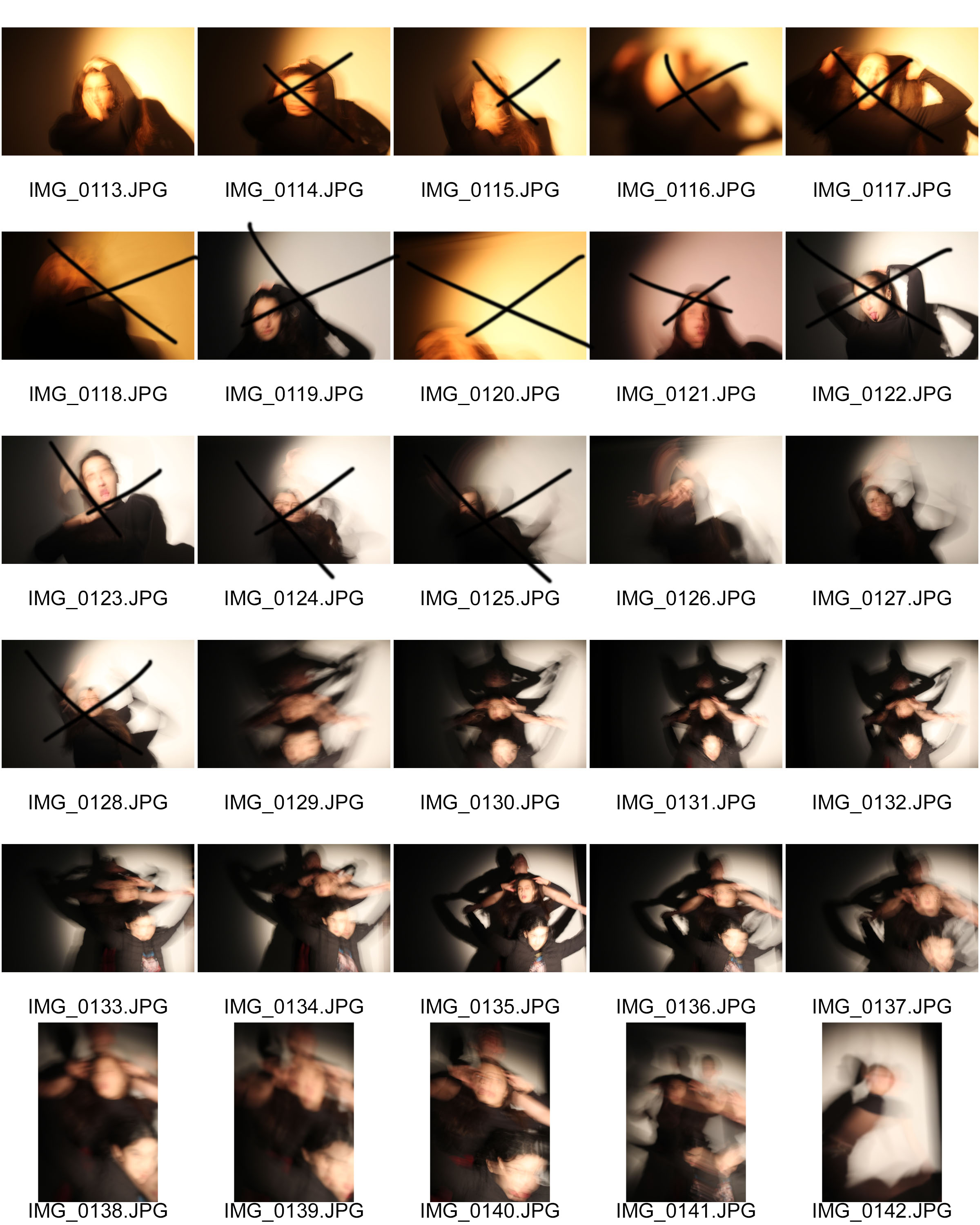
Contact sheets

Possible final outcomes


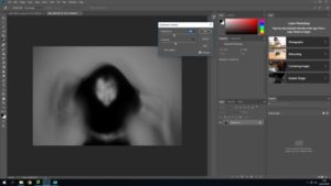
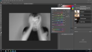
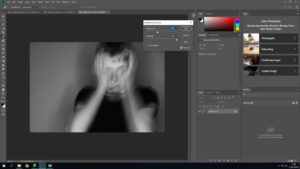
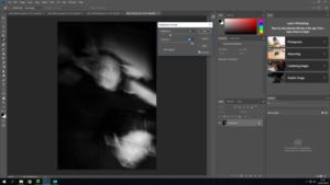
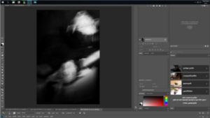
Editing final images

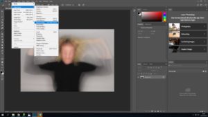
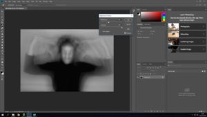
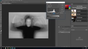
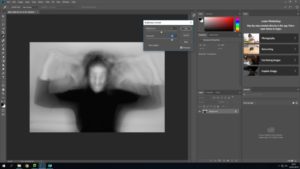
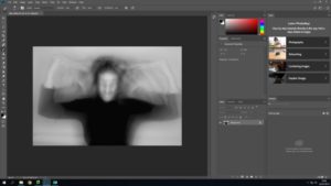
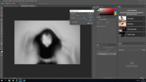
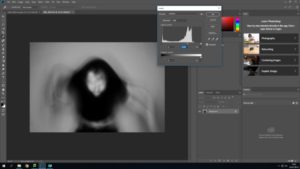
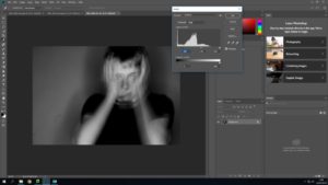
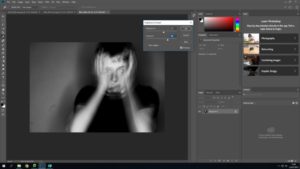
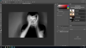
All photos below have been edited using Adobe Photoshop. I took inspiration of Woodman for my editing, i firstly edited all the images in black and white as well as editing the contrast, brightness and the levels of the image. Images below have been chosen due to them meeting the criteria of ‘ loss of identity’.


Overall final images from this photo shoot


MOCK- MY FIRST PHOTO SHOOT

Planning my photo shoots

For my first photo shoot i am going to be doing a tableaux vivants inspired shoot.

Image in recreating..

Technical analysis 

This image has been taken in natural lighting with a daylight white balance. It seems as if the ISO setting is very low in this image, however the shutter speed would be very high.

Visual analysis 

When looking at this image i can bee the model is in the middle of the image. It has been edited in black and white to show contrasting shadows and light, adding tone to the picture. The image is in 2D and doesn’t have much texture in the image. We can see that there has been a a slight use of photo shop when editing the water coming out of the mouth.

Conceptual analysis 

In this image i think that the edited water coming out of the models mouth is representing her as drowning. Her mouth being open when looking directly into the camera also gives a sense of vulnerability.

Contextual analysis 

Her images were published after her death and therfore are only known by date and location. There is no back story


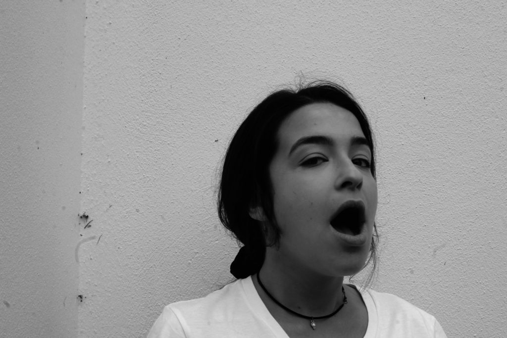
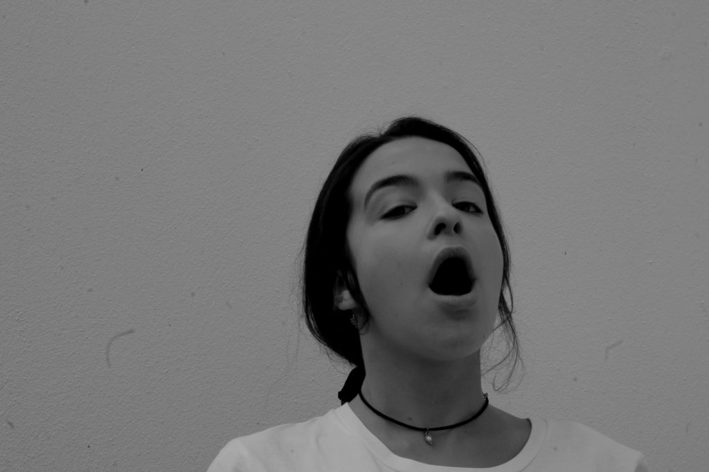
This image is one of Francesca Woodman’s. In order to do this tableaux vivants image successfully i will use a similar location to Woodman’s and will therefore use my cracked garden wall. For the shoot, i plan to only use natural light as the original image was taken in natural light. Therefore i will take the image mid day so that their is a fair bit of natural light. I will use a daylight/ cloudy White Balance in order to ensure that the photo is very similar and i will find which ISO and shutter speed to use when im in the conditions. To make the image identical i will also hand a flower printed top on the left hand side of the image as this is included.

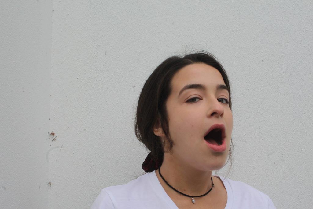
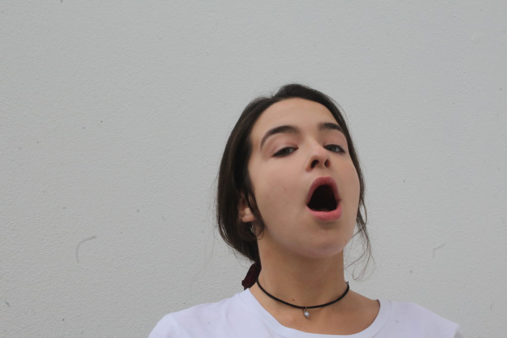
There will be one model involved in the shoot which will be dressed in the appropriate clothing ( a white t-shirt, black string necklace and have hair tied back).

Aspects to include 

  • Natural lighting- daylight/ cloudy WB, high shutter speed.
  • Image to be taken outside for the cracked wall
  • Wide depth of field- Make image look 2D
  • High ISO
  • Facial expressions- Showing with eyes
  • Props- Flower shirt hanging
  • Model to wear a white t-shirt, black string necklace and have her hair in a loose low pony
  • Lightly lit image
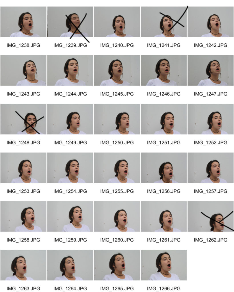
Contact sheets


Possible final outcomes

Editing my final images 

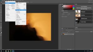
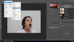
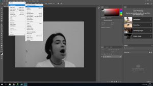
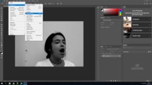
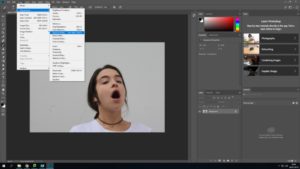
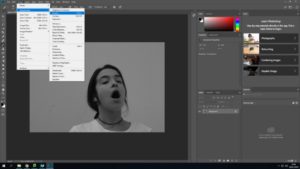
All photos below have been edited using Adobe Photoshop. These are the first edits for these images and more editing will be added further into this project. All images below are my own and are being used to create a tableaux vivants.


The image i have chosen to use out of the two possible chosen is picture one. This being because it has more of the details that the original image has.. ie the small cracking/ dirty wall and my models face is at a more similar angle than the other image.

Next stage of editing

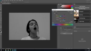
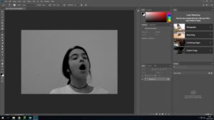
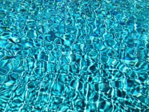
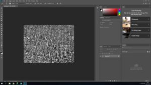
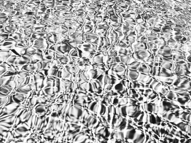
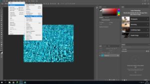
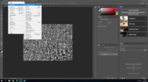
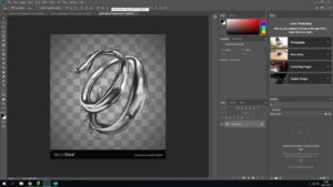
In my next stage of editing i will need to edit the water coming out of the models mouth in a ripple effect. In order to get the first image of the water i have chosen on off the internet…

– image taken from internet. NOT MY IMAGE-

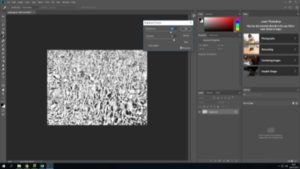
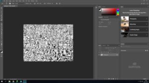
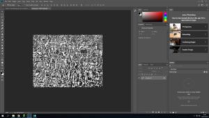
 Editing the water

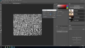
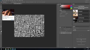
When looking at the water included in the original image, i saw that it was very light and had a ripple/ swirly effect. It was edited into black and white and had contrast included.

Taking all these analysations in mind a created the water which i would cut out and use.

Adding both images together


In order to ensure that the stuff coming out of the mouth looks like water i used the image below and layered in on top of the other water image.

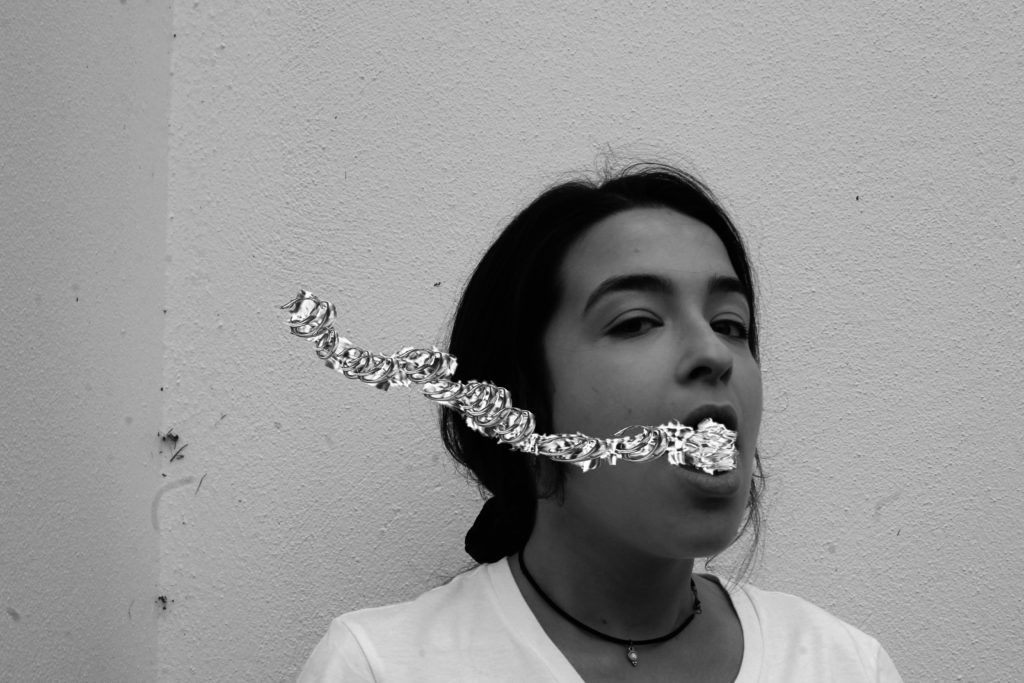
Final image

Technical analysis 

This image was taken on a Canon Camera with a standard lens. It was also taken in natural day light and i therefore used the ‘cloudy’ white balance. When taking this i had my ISO setting on 6400 and my shutter speed on 1/24. However, i mistake i made was forgetting that the original image used a fast shutter speed instead of a low one like i did. This made my images not fully focused.

Visual analysis 

When looking at this image i can see that the model is in the middle of the image. The image has been edited in black and white, showing contrast and tone in the picture. The image is in 2D and doesn’t have much texture in the image. We can see that there has been a a slight use of photo shop when editing the water coming out of the mouth.

Conceptual analysis 

This image has been edited as same as the original image and water has been edited coming out of the models mouth is representing her as drowning. Her mouth being open when looking directly into the camera also gives a sense of vulnerability.

Comparison between original and final outcome