Category Archives: Uncategorized

Filters

Author:
Category:

My Response Identity and Place

My response- Identity And Place


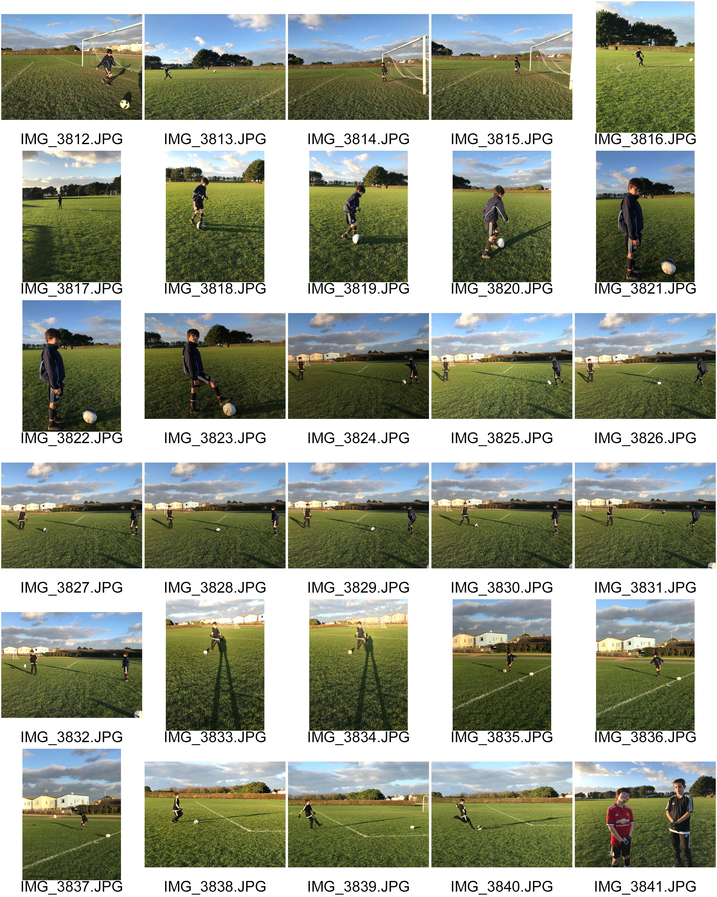
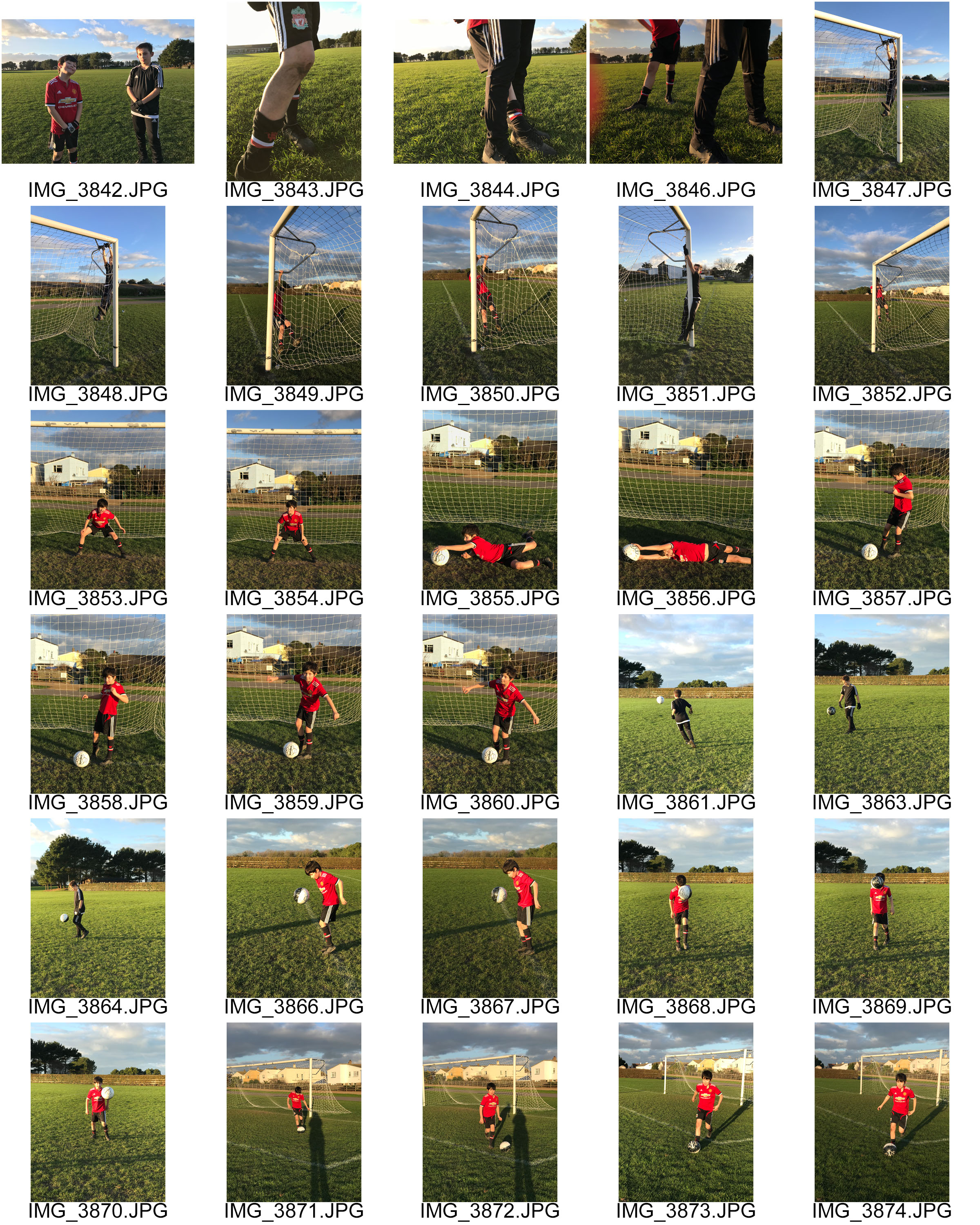
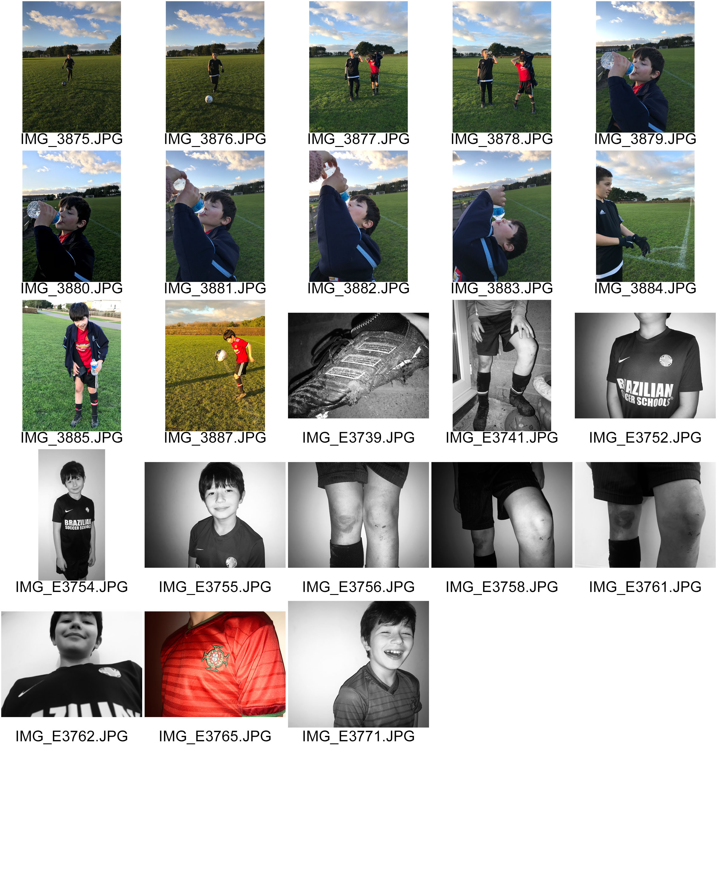
The images below are my respone to both the theme ‘ Identity and place’ and the response to my artists one being Eamonn Mccabe and Brad Mangin. As my action plan consisted of my brother playing foot ball and the process which a young footballer has to take due to play as best as he can. Some of these images are what id like to call action shots. This is my interpretation of identity being the child and place being in his element which is football fields and some images are captured indoors to show the process of him getting ready for training.

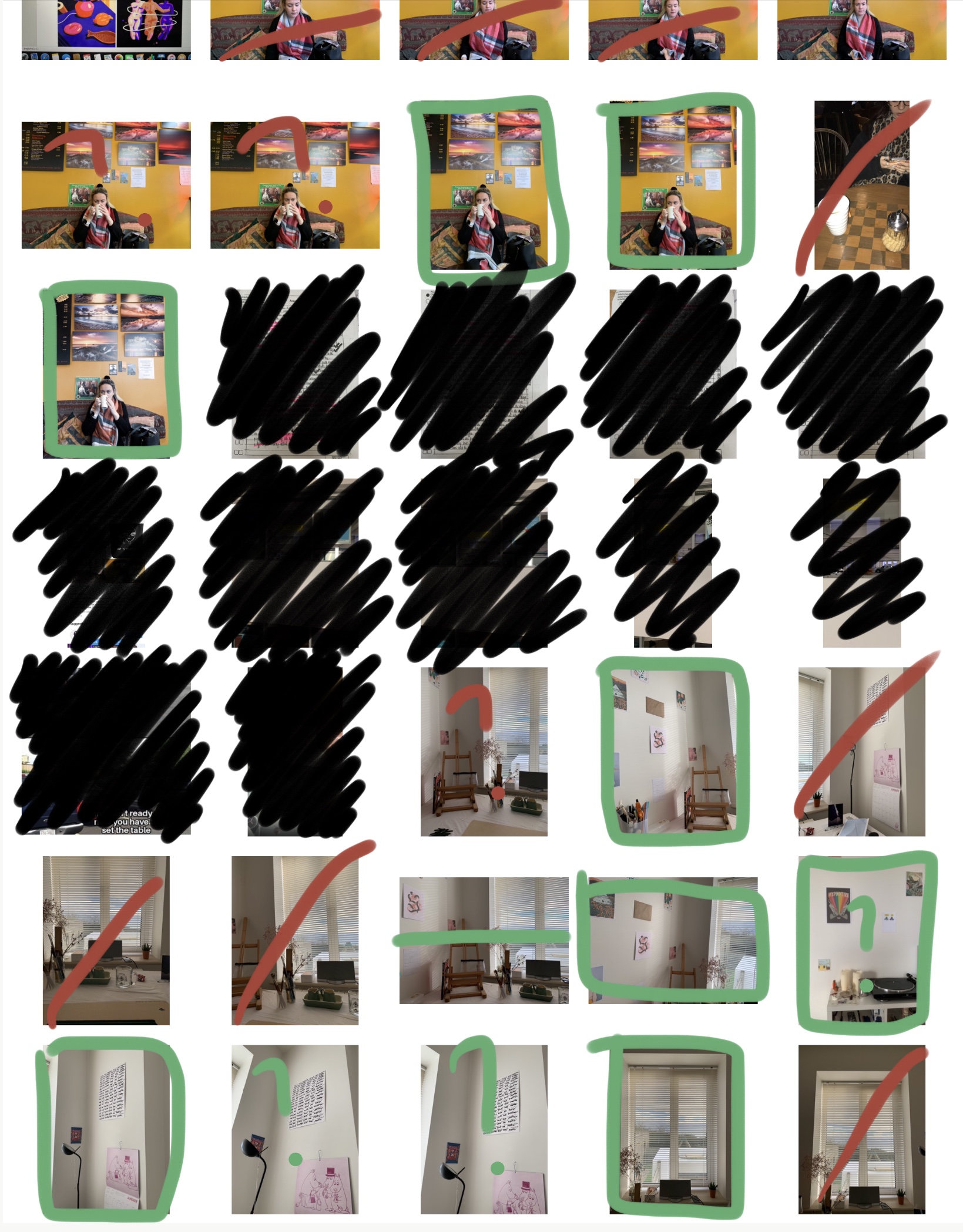
Here are my images in a form of a contact sheet.
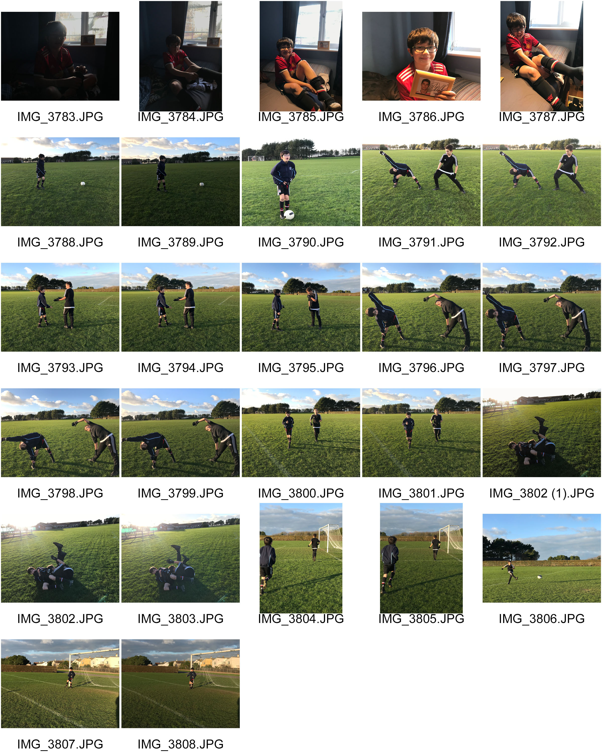
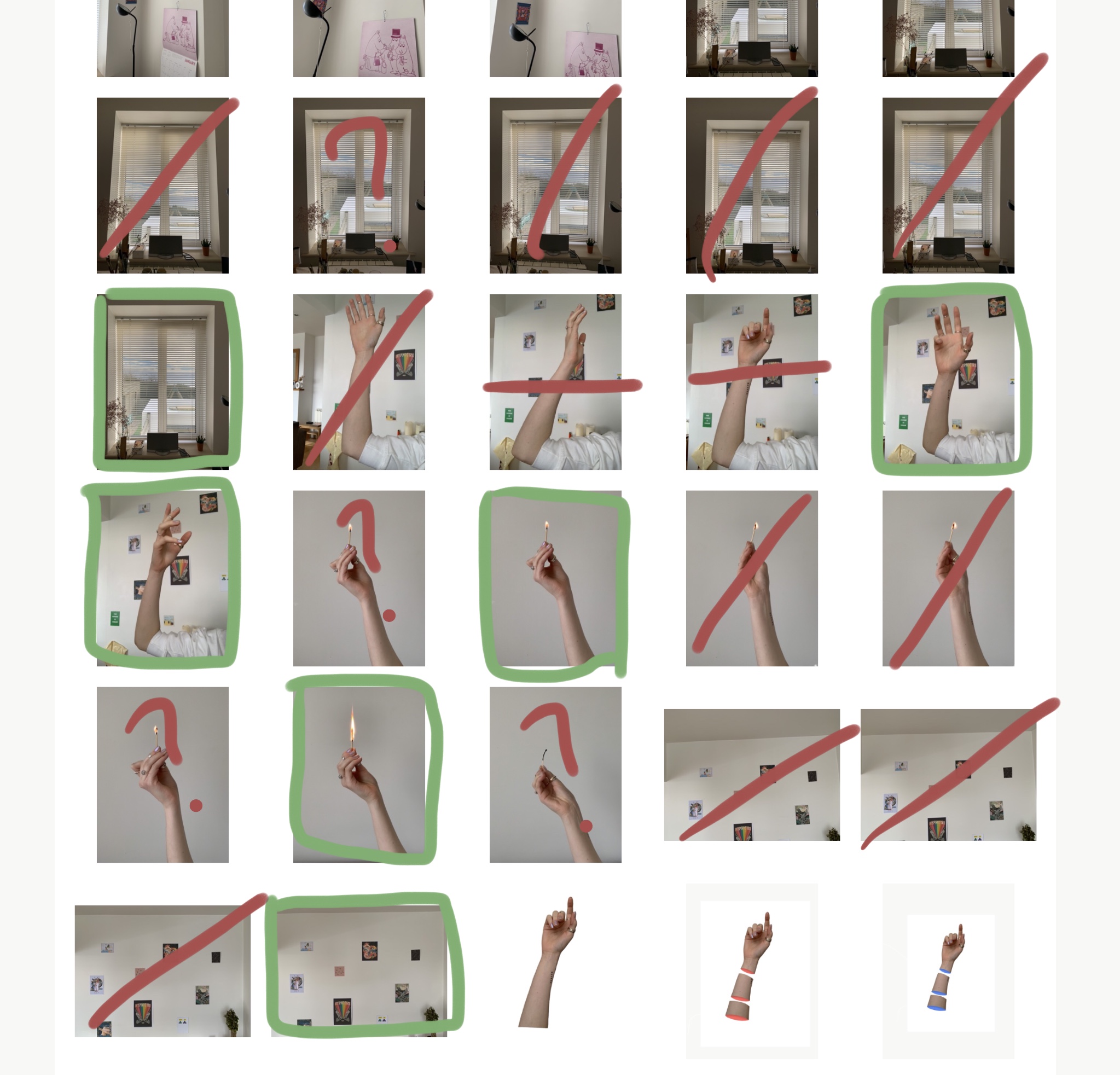
In the examples below you can see I have drawn over the images.  have done this because some of them are under exposed therefore to dark so I am unable to edit it I have done that in (red) . Additionally if the image is too over exposed or under exposed i have decided to cross it off In (blue) .If the image is out of focus I have chosen to cross it out in (pink) Finally if the image I think has too much negative space behind it which makes the images look quite bland and boring I have crossed out the space in (white)

Now having looked closer to these images, its evident that some are better than others in terms of the lighting quality the picture just how its presented visually and the context behind it.

Visually, when i was planning this photo shoot i could not have picked a better day in terms natural lighting, the glow in some of the images really make the image more welcoming to look at giving it quite a warm temperature as well, unless i’ve chosen to add them images into black and white. However if it wasn’t for the light of the sun the 3D effect i was after would not have been achievable.  I also like how some images have the shadows in the background because it fills the image more which is something i had a problem doing when i did the photo shoot. On the other hand some could say the space helps the image as it slightly draws attention to the small people in the image.

In terms of detail due to the drastic, golden effect of the sun i have been able to capture quite heavy amounts of detail like the individual lines and patterns from the grass and the goal even the close up details of the football and background. I captured these images on the quennevais football fields which actually adds a bit of value to the images as its where my brother began to play football. We would usually take him there in the afternoons and just have a kick about which now has lead him to having a passion for this area of sport,which now is involving as he’s just practiced for the island trials. Now he uses this time in the afternoons when he gets home from school to go out and practice with one or two friends which day by day is improving his skill and technique.


Eamonn McCabe

Eamonn Mcabe 

BIOGRAPHY:  he was born in 1948 currently 71 years of age. He is a British professional photographer who began his carrier as a sports photographer and who has won four times sports photographer of the year between 1978-1984. He then changed his attention to The Guardian and The observer for more general editorial portraiture. Not only that but McCabe managed to cover 3 of the Olympics.
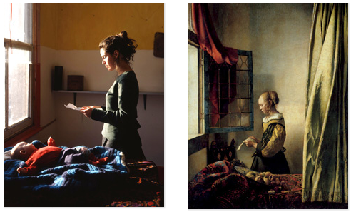
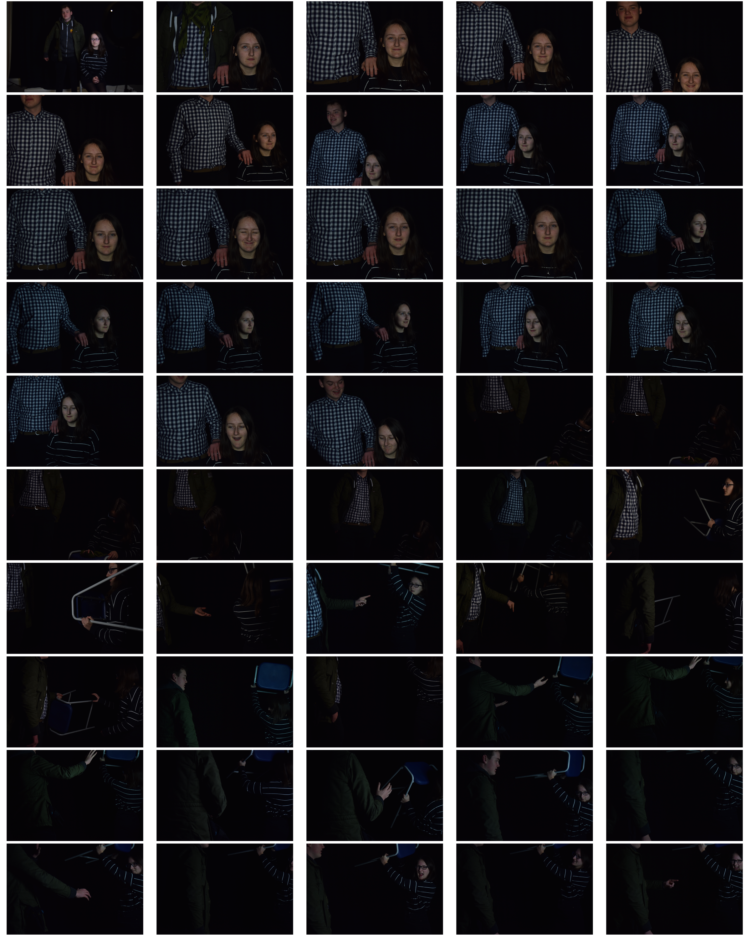
Image result for eamonn mccabe sports photographer

Image result for eamonn mccabe sports photographer

Image result for eamonn mccabe sports photographer

Visually, the images above all have a story behind them.The purpose of photography is to capture moments which make you reflect on the day, the event, the moment. Here, the first image i have interpreted it as a celebratory moment. By looking at this image its quite evident just by the body language of the man that he had clearly scored a goal and this was his celebration moment.  The shutter speed in the image would have had to on a fast setting to be able to capture the moment he started running towards the camera and we can see that by the way his hair is being breezed backwards. The image itself is focused well and the contrast between the man and the people in the background that almost look gutted that they didn’t manage to black the goal.  Additionally , the image is quite happy to look at and gives a sense of almost achievement as if we were there to cheer with them. The iconic 1970s English soccer player, Kevin Keegan was the first sports personality to actively enter into what was then known as a “face contract” for what were essentially his image rights.

The last image from the ones above i chose to insert into the blog as  it caught my eye as its like an action shot. This drew to my attention due to the posture of the footballers.

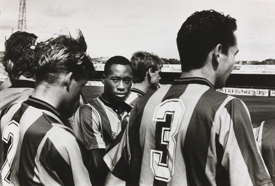
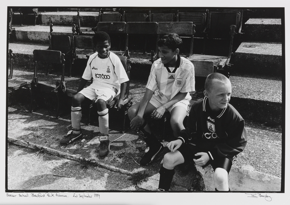
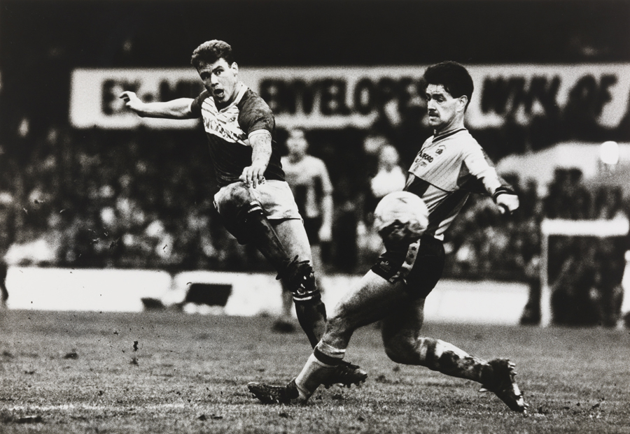
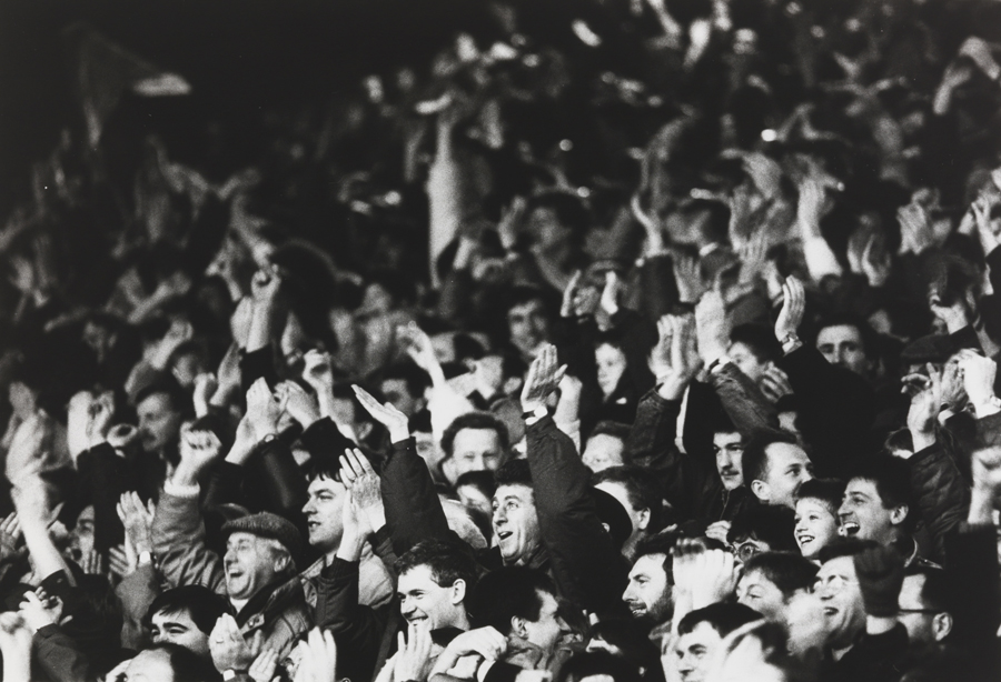
Furthermore, Eamonn McCabe was the Bradford Fellow in Photography for 1998, and photographed City both on and off the pitch. Bradford-born Ian Beesley captured City’s first season in the Premiership. His photographs reflect the emotions of not just a professional photographer, but also of a Bradford City fan. Hence the story of the images below. Examples :

Team photo time, waiting around for the photographer to say smile © Eamonn McCabe National Science and Media Museum Collection

Middlesborough v Bradford © Eamonn McCabe National Science and Media Museum Collection

Crowd with man clapping © Eamonn McCabe National Science and Media Museum Collection

Brad Mangin – Sports Photography

Brad Mangin 

Brad is actually a sports photographer but as my theme is identity and place and that my model is my brother playing football to symbolise his idea of valued place to portray his hobby I thought that looking at a bit of sports photography would be great.

Bio:

Brad Mangin is a Bay Area freelance sports photographer. Mangin has done eight cover shots for Sports Illustrated. Mangin graduated from San Jose State in a degree in photojournalism. He was born in 1965 and is now age 54.  Mangin is known for his  photographing of Major League Baseball for clients like Sports Illustrated and Major League Baseball Photos since 1987.

The reason i have chosen Brad Mangin to study is because it links well with the idea of identity and place. He chose to place himself in areas of the game to capture action shots like some of the examples before. This links well with my idea as im doing sports as part of the identity of my model. I’ve also decided to use the times before and after the games as almost like a before and after to capture the tiredness and the determined facial expressions of the individuals.

Image result for brad mangin

Image result for brad mangin

Image result for brad mangin

Image result for brad mangin

Image result for brad mangin

Having looked at Brad’s work, I have chosen to go down the lines of social identity and enviromental portraits.  To be able to achieve sports photography,

However having reviewed over more photographers that base around the area of Sports photography i have decided that i do not just want to  stick to the idea of just photographing my brother playing sports in a field but to capture his passion for football. I am going to portray a series of images that rather than just being seen as a simple images with no context there will be a story of a boy who aspires to be a famous footballer and play for teams like Manchester United and Portugal, not to mention his slight obsession with Ronaldo, whom  he sees as a role model.

PhotoMontage Case Study:

David Hockney:

Was born in Bradford, England on  9 July 1937.

Is an English painter, draftsman, print maker, stage designer, and photographer. He is considered one of the most influential British artists of the 20th century.  Hockney’s of of   Portrait of an Artist (Pool with Two Figures), sold at auction for £70 million, where it became the most expensive work for a living artist.  Hockney has experimented with painting, drawing, printmaking, watercolors, photography, and many other media including fax machine, paper pulp, and computer and iPad drawing programs to create his pieces of works.

Examples of his works:

David Hockney


David Hockney


My response to David Hockney’s:

By Kimberley N

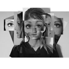
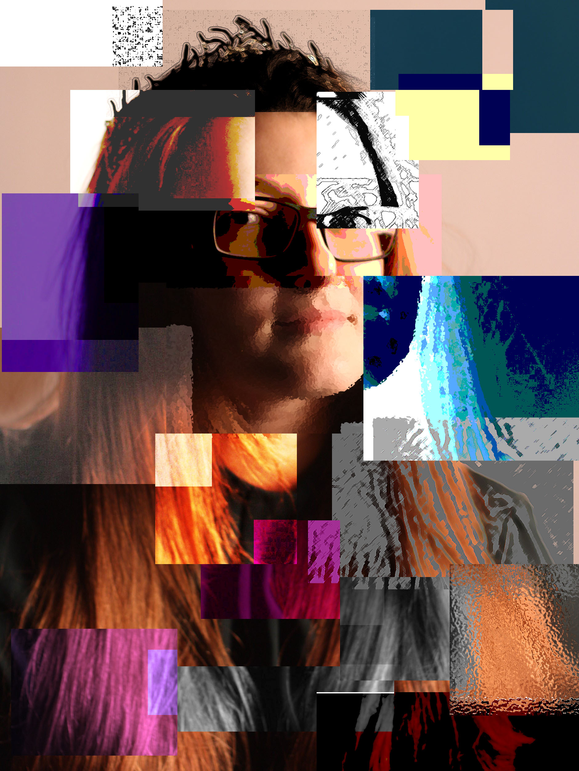
For this I experimented with With using different Adjustments for example I used as filter called ocean ripple where I could select the piece of the picture I wanted then, then I applied the effect making it look like it is under water. The other effects that I have included is Inverted, the colours. Then I placed the different layers on the original photo to create a effect of loss of identity as everything as been cut to change the identity of the person.

FINALIZING MY IMAGES

Final images 

My response to Environmental portraits

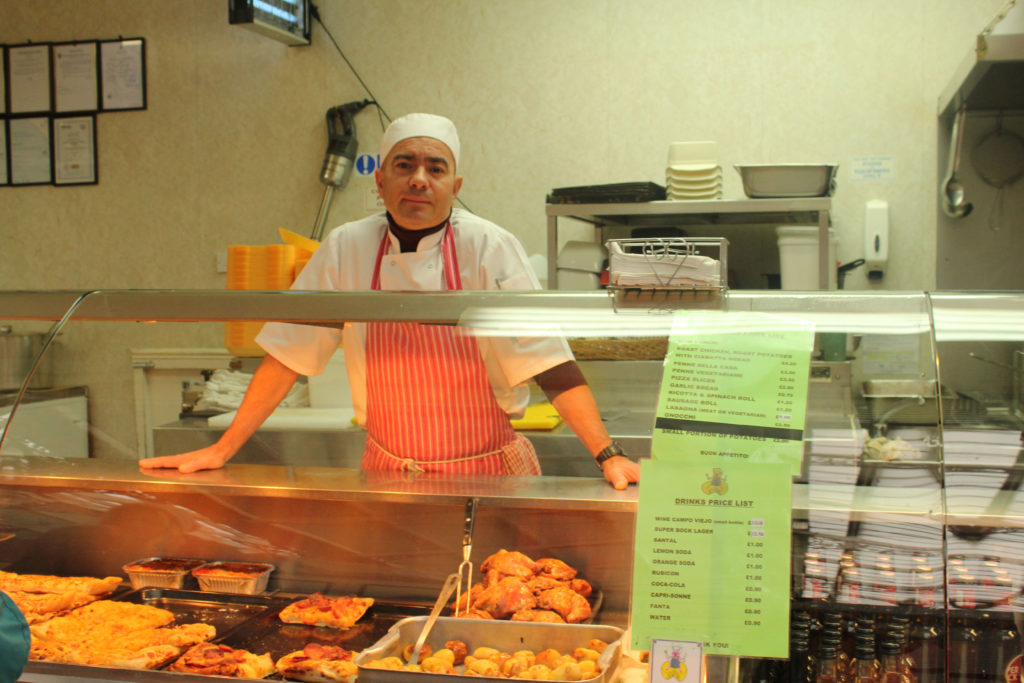
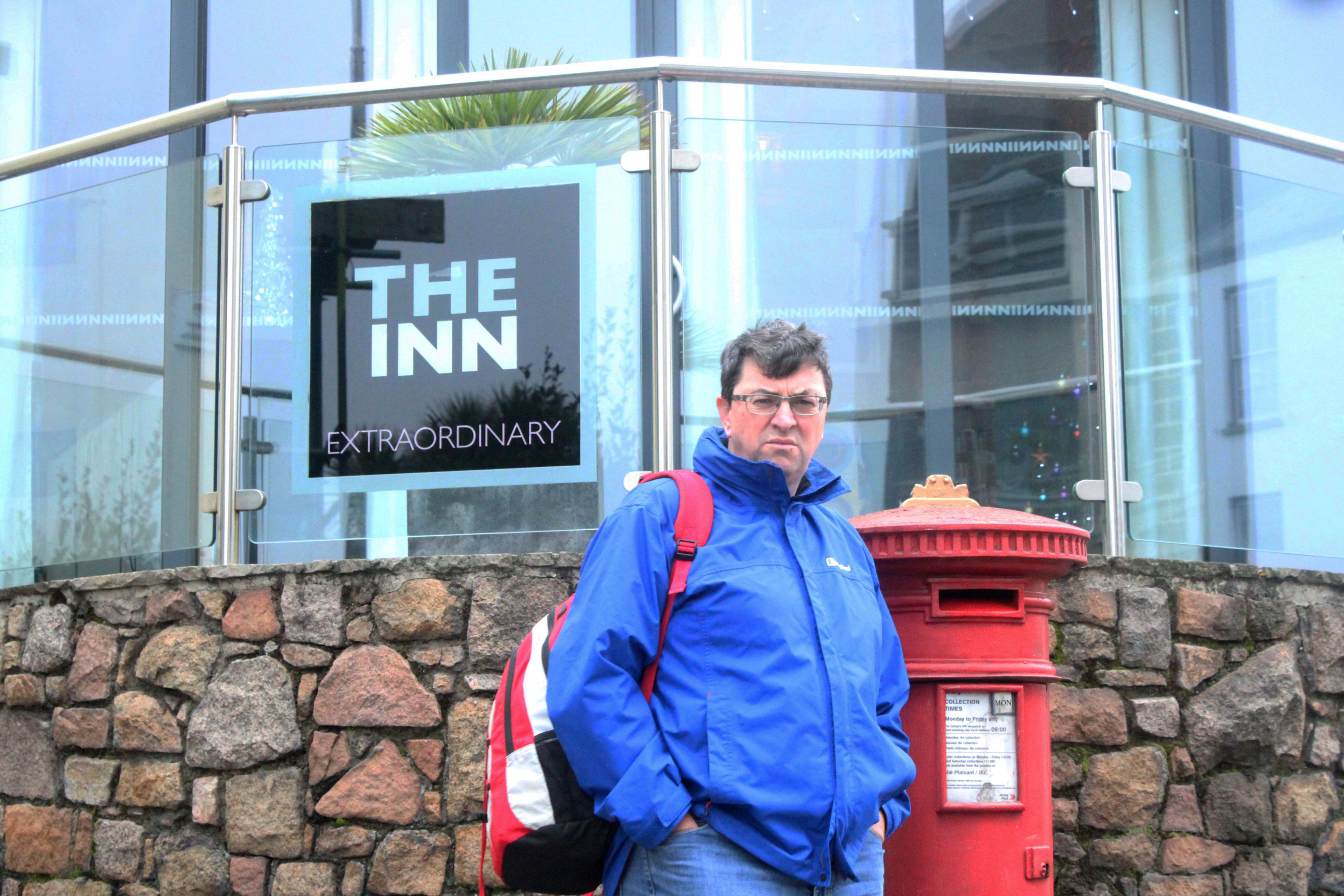
In this environmental shoot i used a Canon EOS 1300 D on manual focus. The image was taken under natural lighting and therefore i had my white balance on the ‘cloudy’ setting, as well as having a shutter speed of 1/250.

The image shows a butcher in his working environment.


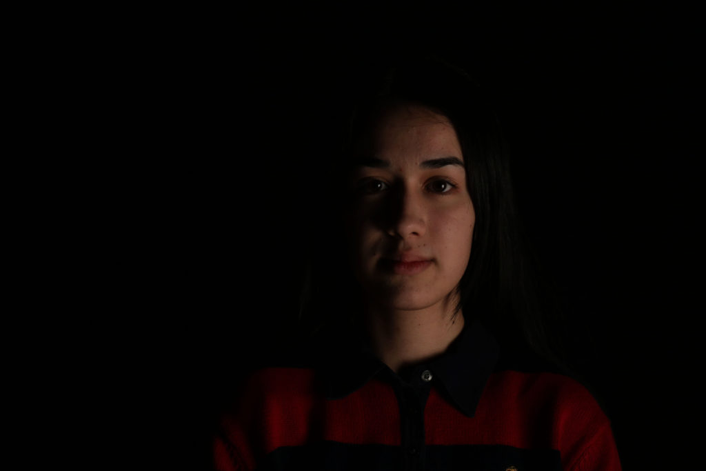
My response to natural lighting 

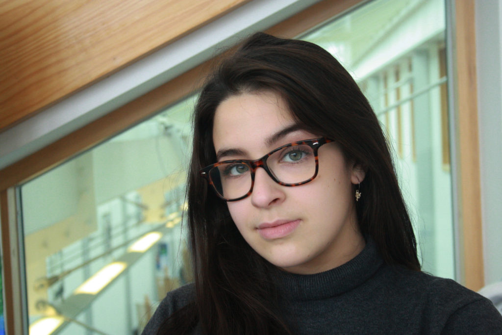
When taking this portrait image I used the manual focus setting on my camera so that I could adjust the ISO setting to 400 and the shutter speed to 1/250 to ensure that the images weren’t too under or over exposed. I also used the ‘daylight’ white balance setting so that the color balance was correct. The image was also taken inside however directly in front of a very large window which let in a lot of daylight, i also used a reflector so that the models face was evenly lit up.


My response to street photography 

In this street photography experiment, i used a  Canon EOS 1300 D and the image was taken in Manual Focus. Using Manual focus allowed me to change the white balance to cloudy as this image was taken in natural light, as well as being able to change the shutter speed to 1/250 and experiment with the zoom lens.

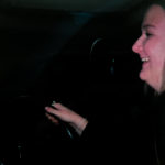
We don’t know what the man was originally doing before this photo as i took the image in a moving car.


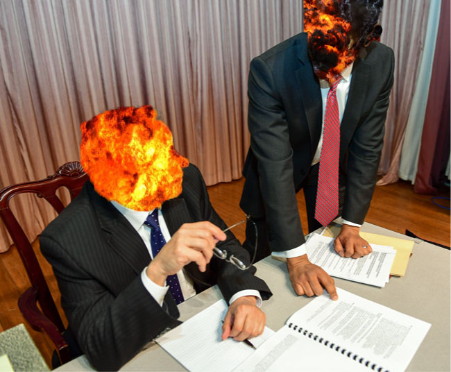
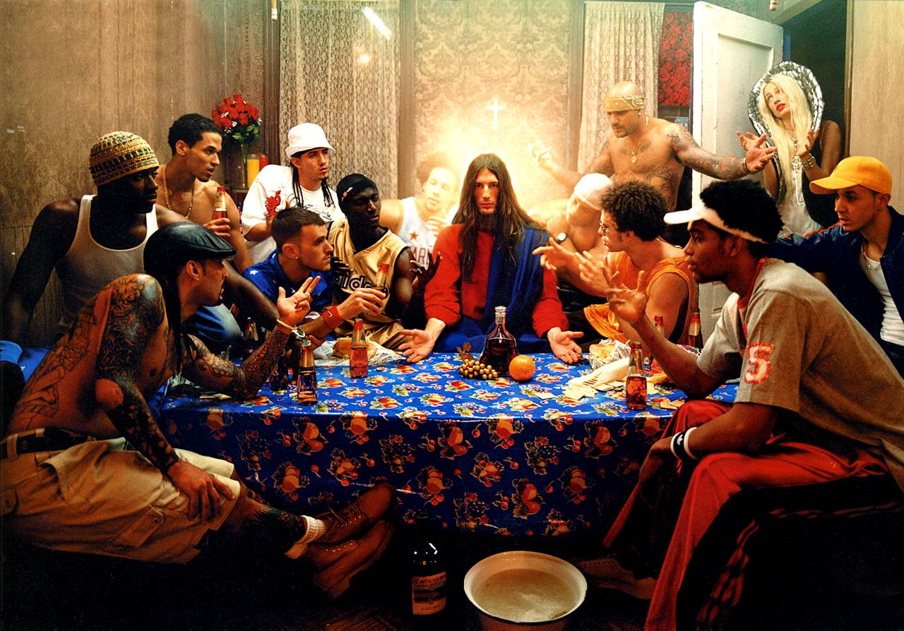
My response to photo montage 

This image was edited using Adobe Photoshop.


My response to studio lighting 

In this studio photography experiment i used a Canon EOS 1300 D with a manual focus setting. The use of this setting allowed for me to change the white balance of this image to auto as well as being able to change the shutter speed to 1/250.


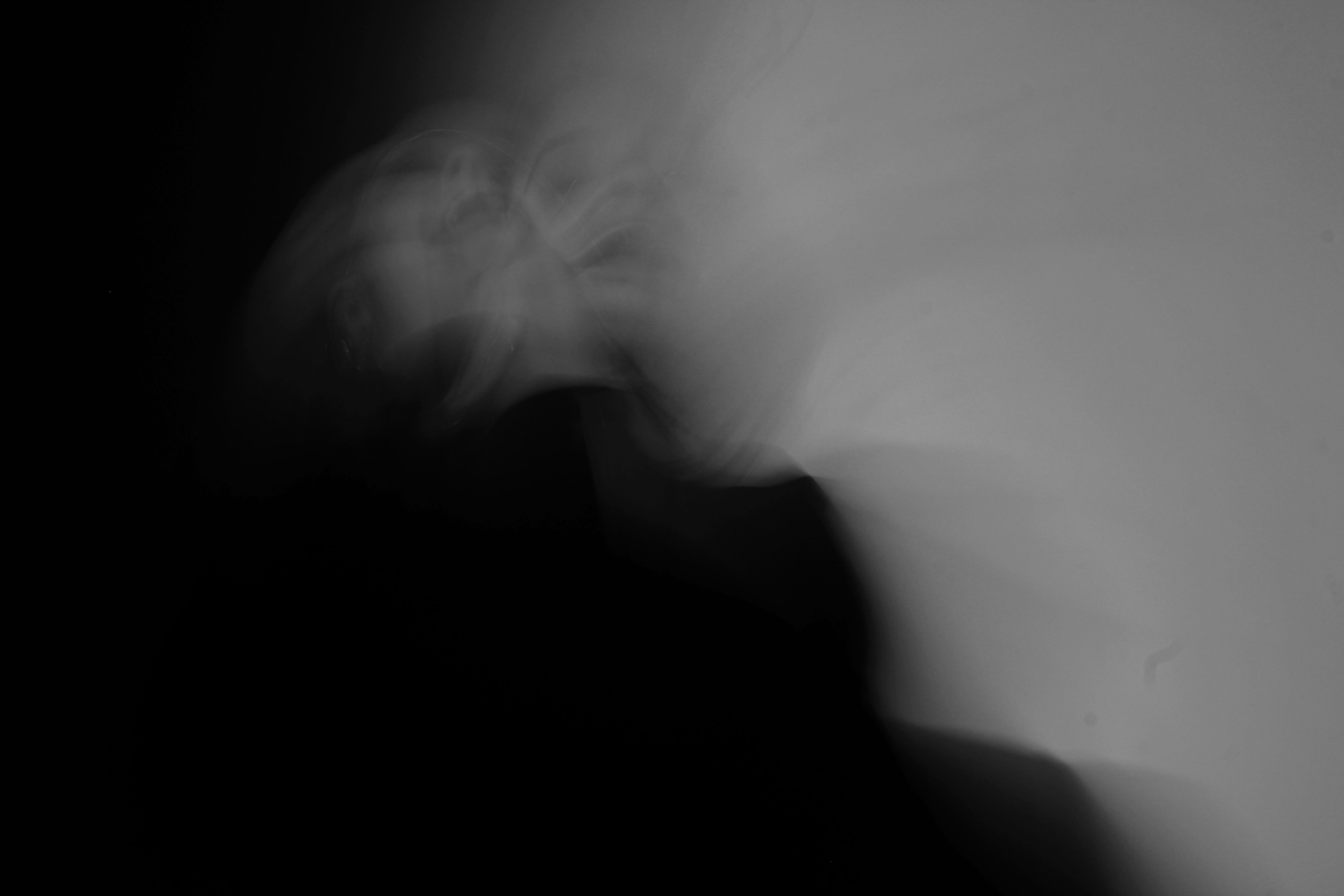
My response to identity and place 

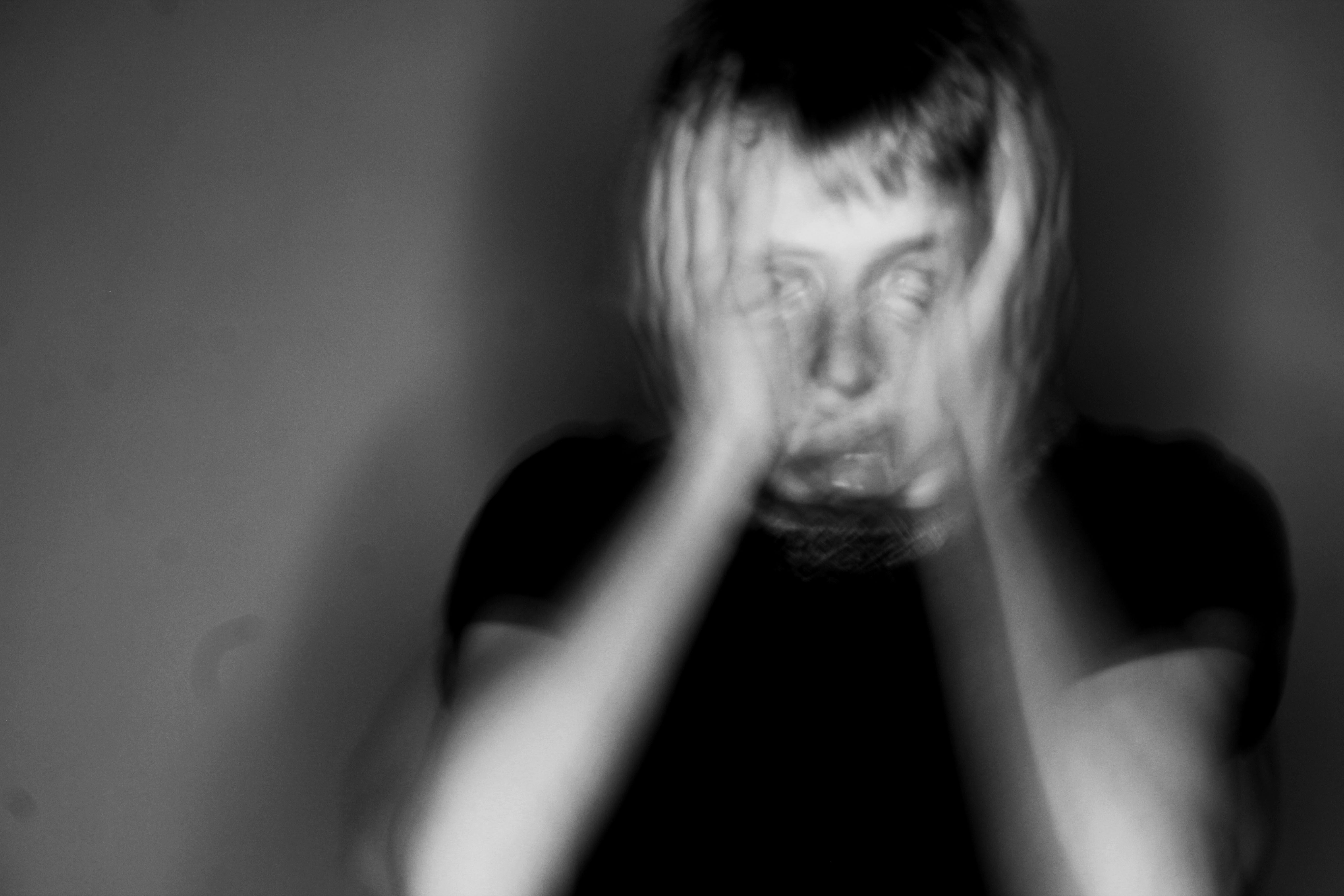
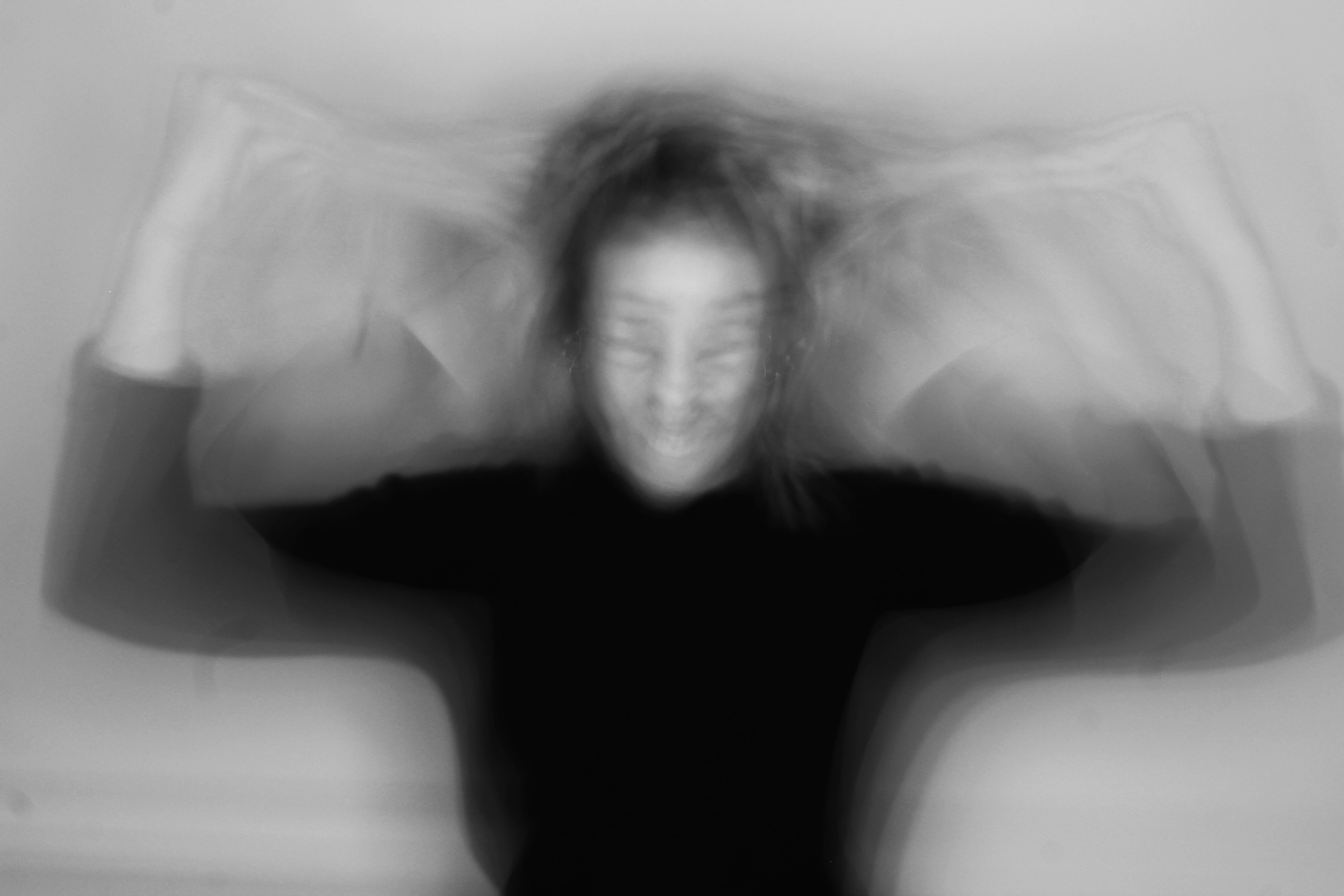
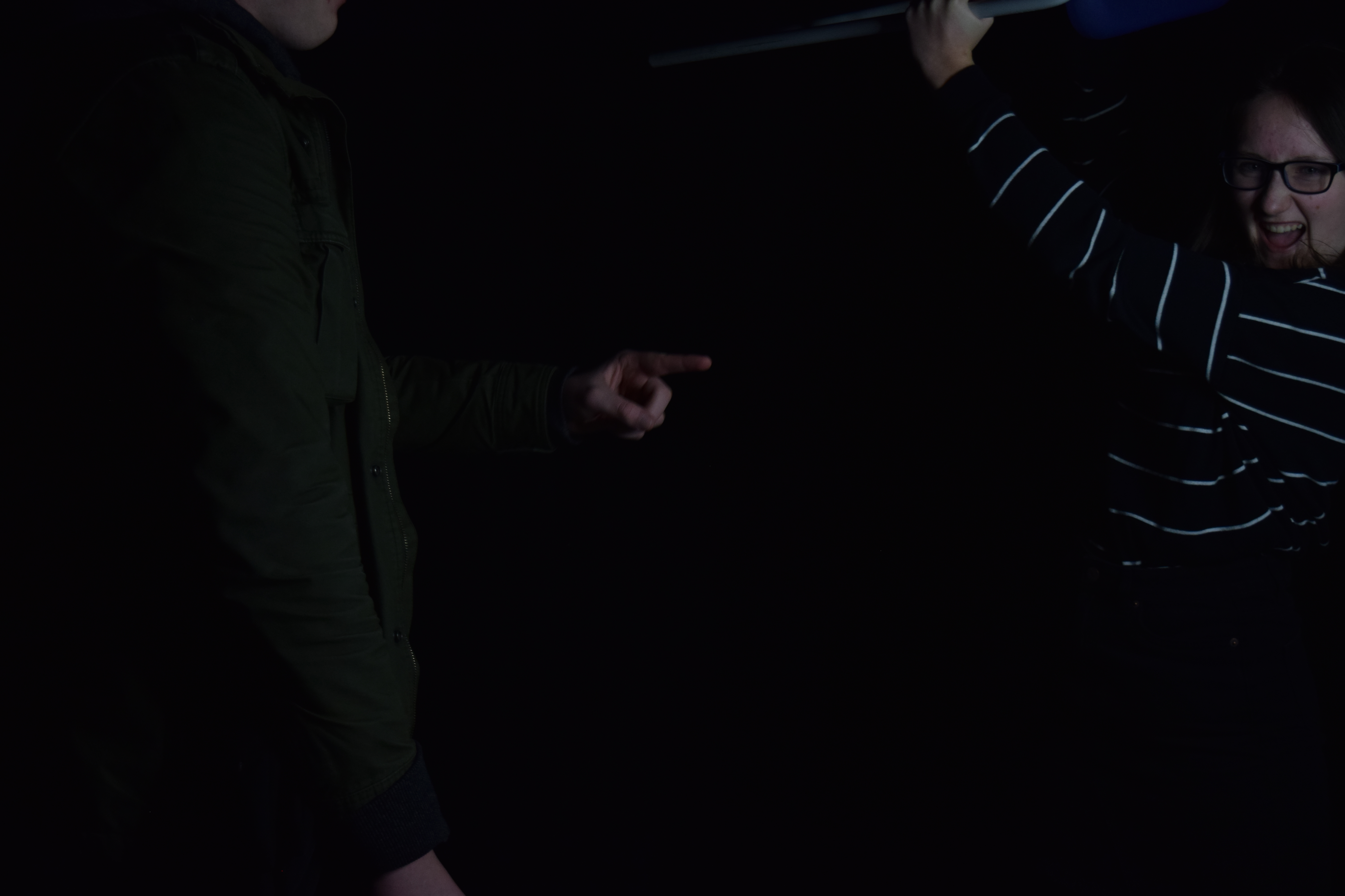
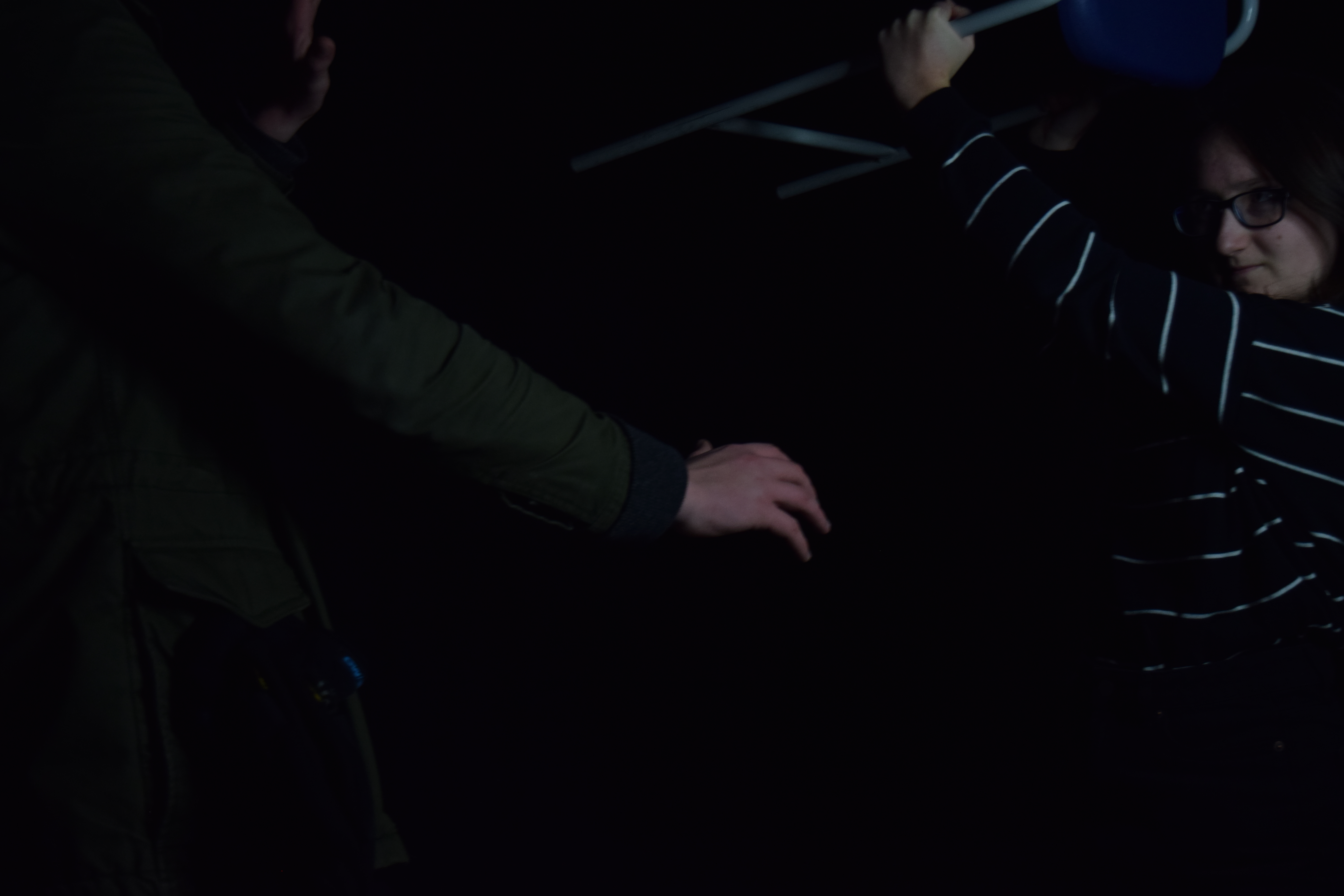
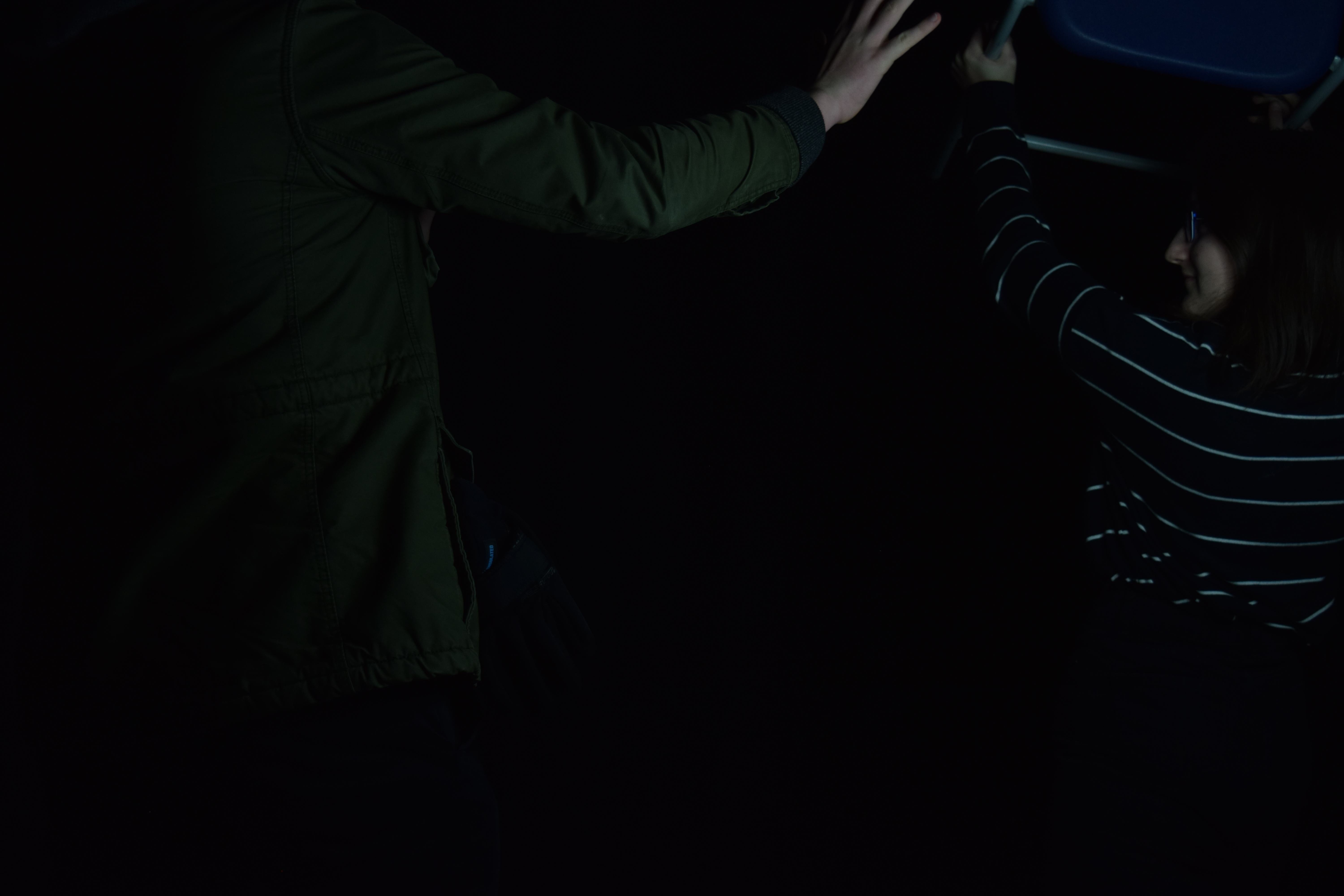
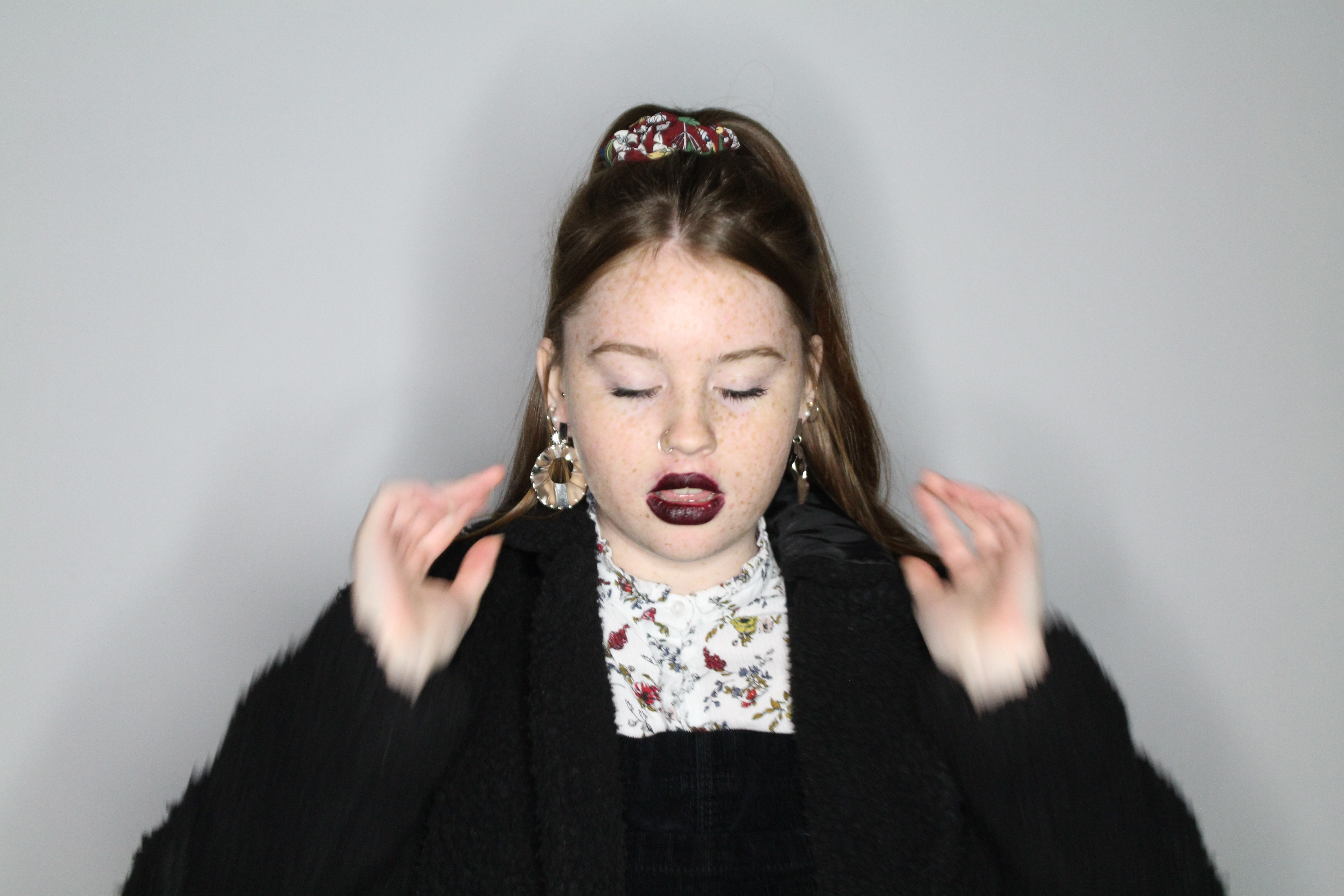
These images were taken on a Canon EOS 1300 D on manual focus. My camera being on manual allowed me to be also to zoom in on the models to create a disorientated effect, as well as being able to change the white balance to fluorescent. No flash was used when taking these pictures.

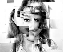
In the images we can see that there is a loss of identity due to the movement of the models. The positioning they create gives a sense of confusion, loss and craziness. The black and white edit adds a darker feel to the image, as well as the darkness on the left hand side of the picture.


Bibliography

Bright, S. and Van Erp, H. (2019): 18 Photography Decoded. London: octopus Publishing House 

Bright, S. and Van Erp, H. (2019): 18 Photography Decoded. London: octopus Publishing House 

History.com editors. (2017):1. Surrealism History  

https://www.history.com/topics/art-history/surrealism-history

Souter, A and Baillie, R. (2017):1 The Art Story:Claude Cahun-Biography and Legacy  

https://www.theartstory.org/artist/cahun-claude/life-and-legacy/

 Souter, A and Baillie, R. (2017):1 The Art Story: Claude Cahun-Biography and Legacy 

https://www.theartstory.org/artist/cahun-claude/life-and-legacy/

Jung. J.(2012):1 The Art Story: Man Ray 

https://www.theartstory.org/artist/ray-man/

The Art Story. (2012) Francis Picabia- Biography and Legacy 

https://www.theartstory.org/artist/picabia-francis/life-and-legacy/

The Encyclopaedia Britannica. (1998) Heraclitus 

https://www.britannica.com/biography/Heraclitus

Jung. J.(2012):1 The Art Story: Man Ray 

https://www.theartstory.org/artist/ray-man/

 Clarke, G. (1997) How do we read a photograph?. The Photograph 

https://www.photopedagogy.com/graham-clarke.html

 Clarke, G. (1997) How do we read a photograph? The Photograph 

https://www.photopedagogy.com/graham-clarke.html

Souter, A and Baillie, R. (2017):1 The Art Story: Claude Cahun-Biography and Legacy 

https://www.theartstory.org/artist/cahun-claude/life-and-legacy/

IDENTITY AND PLACE MOCK EXAM FINAL IMAGES AND PRESENTATION:

MY FINAL IMAGES:
After manipulating my images, these are the images that I want to send off to be printed. I will then rework them when they're printed off. I will rework the images by writing text on them, my idea is to ask the subjects what they think about that moment of time an write it on the image. I was inspired by Jim Goldberg's work, so I thought I would also re-work my images by adding both text and drawings into my work.

THE PRESENTATION:
To present my images I will be placing them on foam board because the crop of the images makes them different sizes, which wouldn't look very aesthetically pleasing on a mount. I will also be reworking into the images by hand-writing text onto them. I will also be hand-drawing outlines that i think will also make the images look more interesting. 
Another reason why I think having my photographs on foam board is a good idea is that I will have flexibility on how and which order I can arrange my images in. I can have them up as individual images in multiple locations or I can have them set out as a series. As the originals are printed out photographs, in real life photos are arranged in various orders, such as photo albums or in photo frames around the house/premises. Therefore, by having the flexibility of having the images on foam board replicates the flexibility you have when you have your photos printed out.


Tableaux Vivants

What are they?

tableau vivant (often shortened to tableau, plural: tableaux vivants), French for ‘living picture’, is a static scene containing one or more actors or models. They are stationary and silent, usually in costume, carefully posed, with props and/or scenery, and may be theatrically lit. Tableau Photography is dependent on a defined NARRATIVE, theme or storyline.

Examples

Yinka_Shonibare_Diary_of_a_Victorian_Dandy__Yinka_Shonibare_Victoria_and_Albert_London-int-hero.jpgImage result for tom hunter photographer

Plan

  • take photos conveying gender roles or gender differences
  • have a male standing over a female just to suggest stereotypical/common ideology
  • maybe have a woman cleaning and a man in the background?
  • low lighting to suggest a dark and ominous setting
  • mans head out of shot
  • hard lighting from ring light
  • woman in focus
  • head height

Contact Sheet

Final Images


Identity 1; Final images, Editing&Evaluation (Jan 2019 Mock)

SELECTING FINAL IMAGES 

Image 1;

Image 2;

Image 3;

Image 4;

Image 5;

Image 6;

Image 7;

Image 8;

Image 9;

EDITING

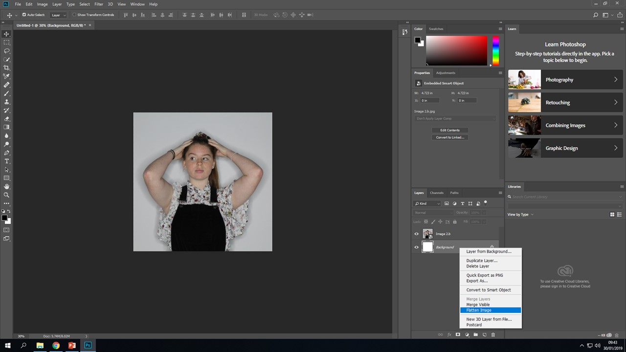
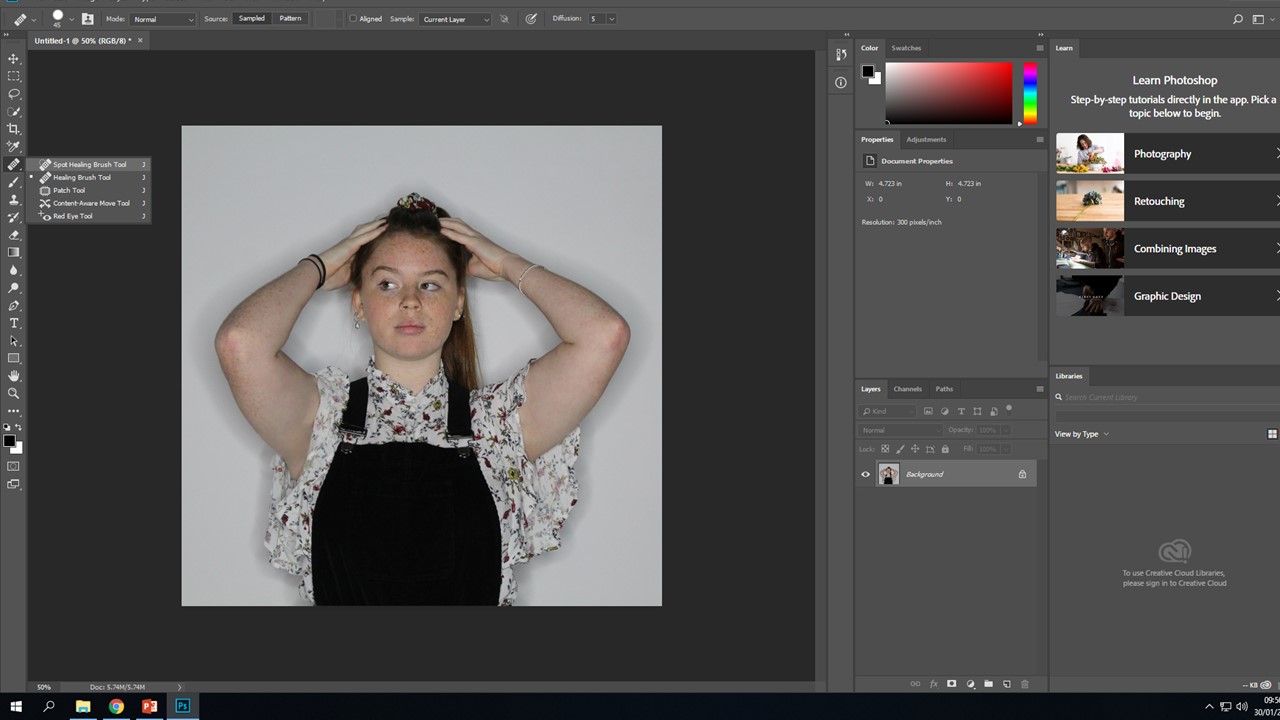
 I will repeat this process for every photo, using the healing brush will allow me to even out her skin tone and remove any blemishes within the photo. Certain photos may require me to use more tools, I will show how I used them and what the effect it had on my image;

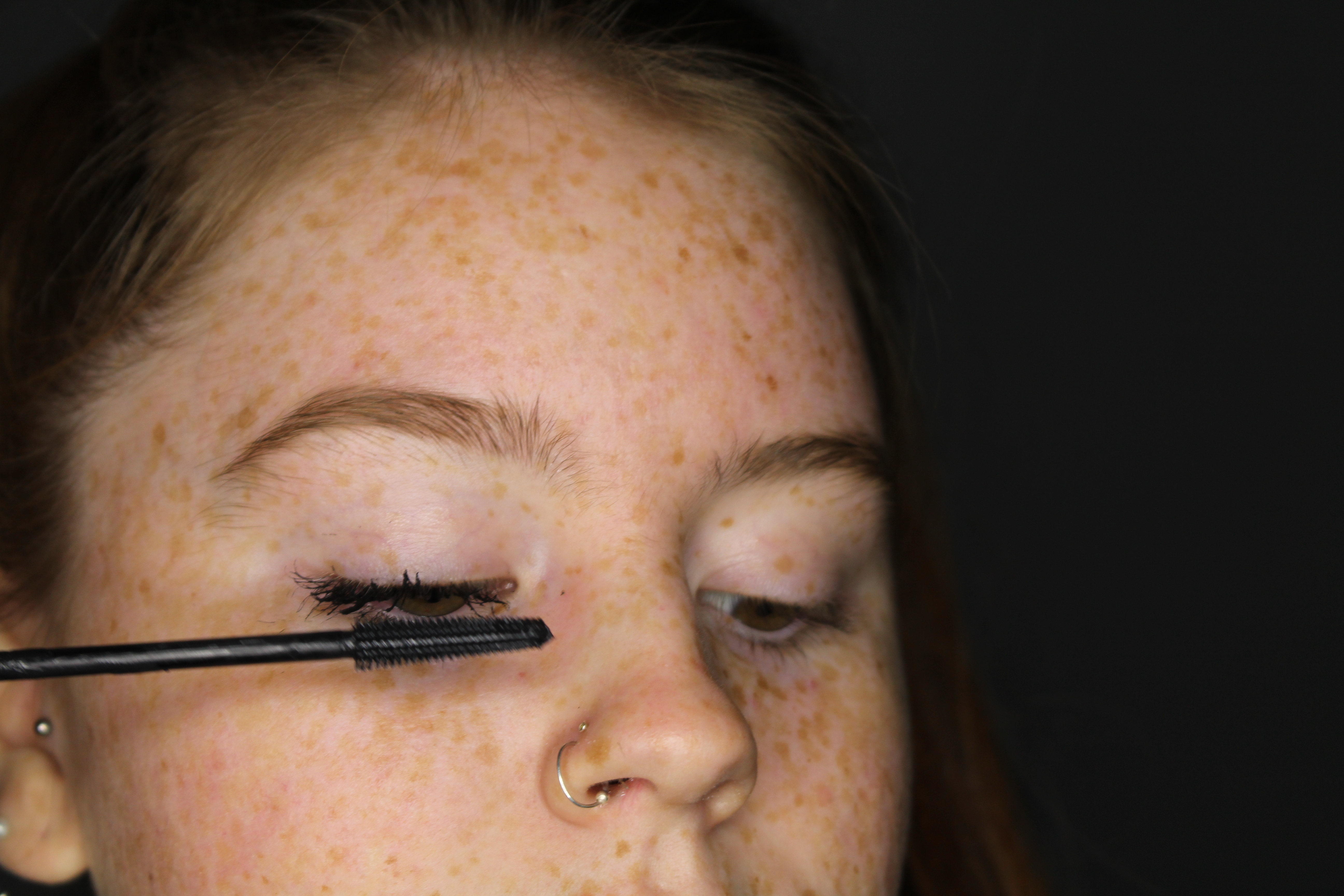
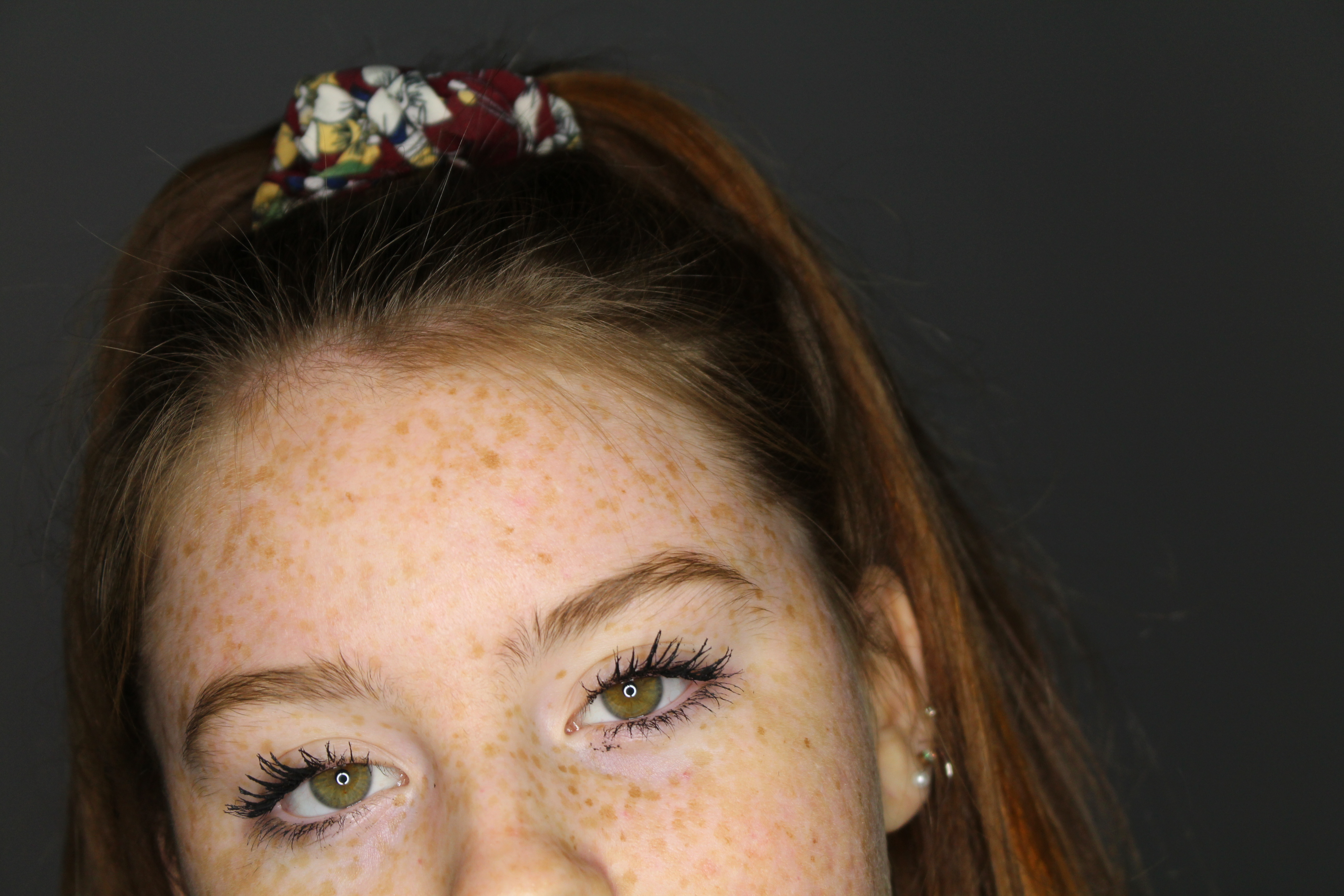
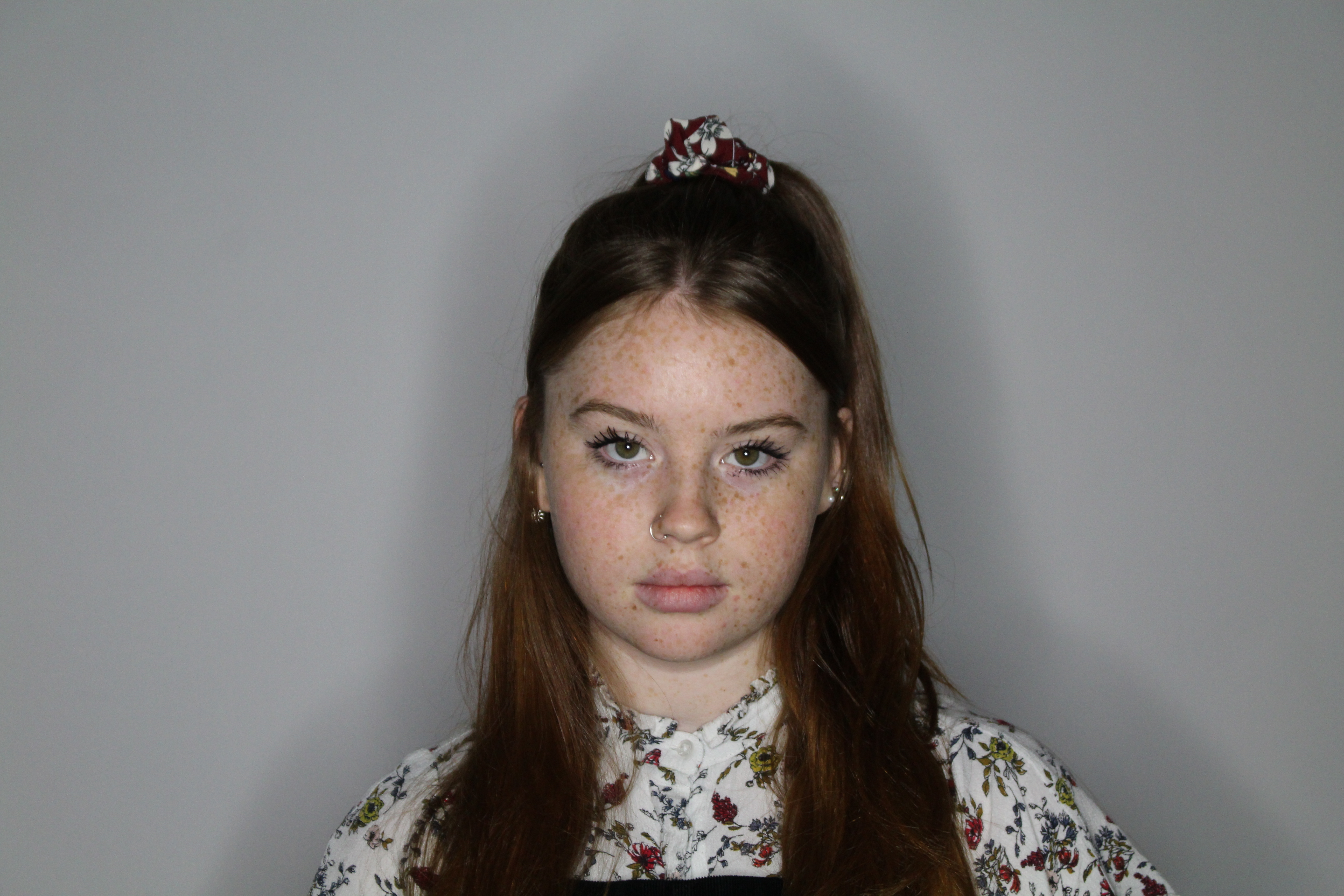
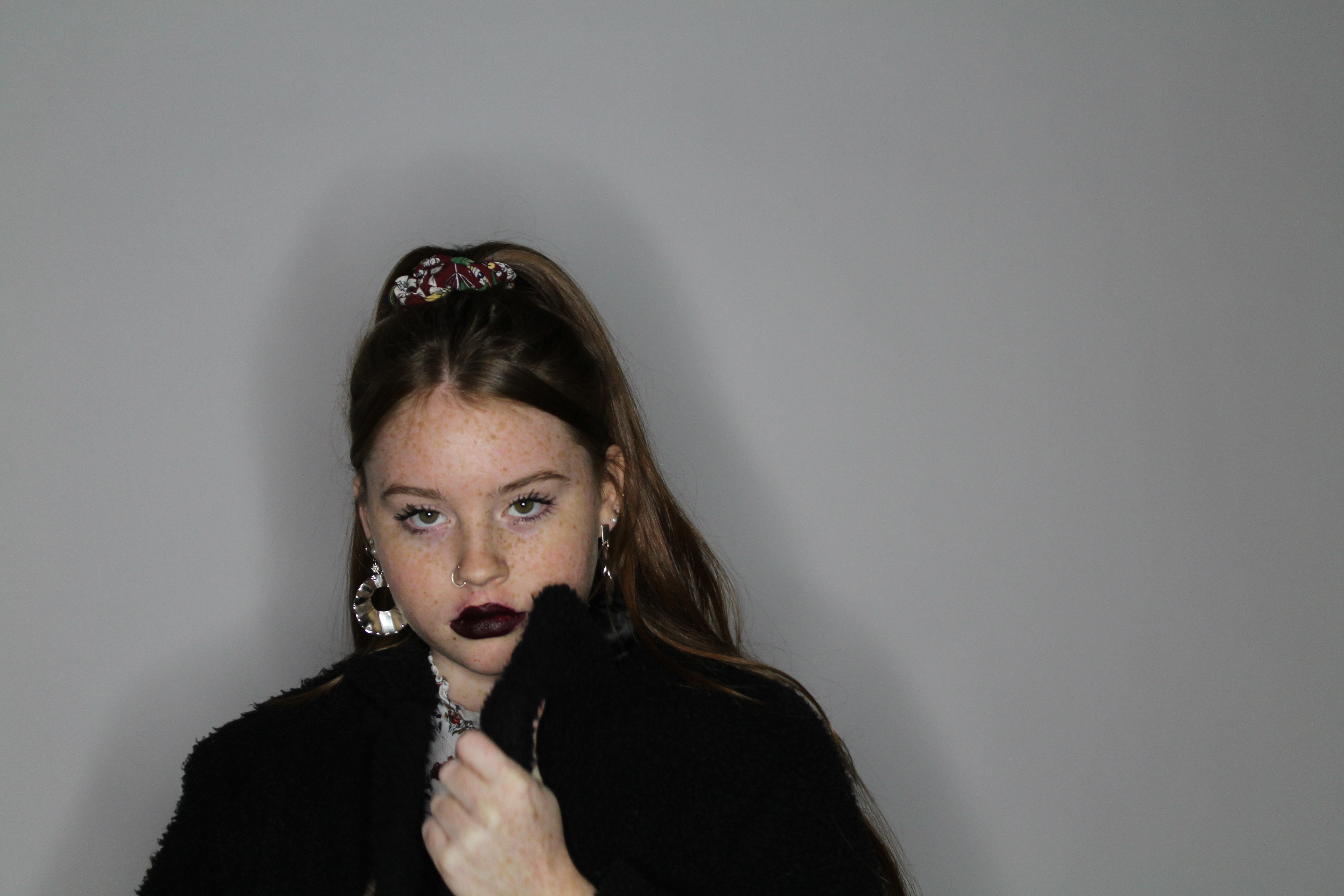
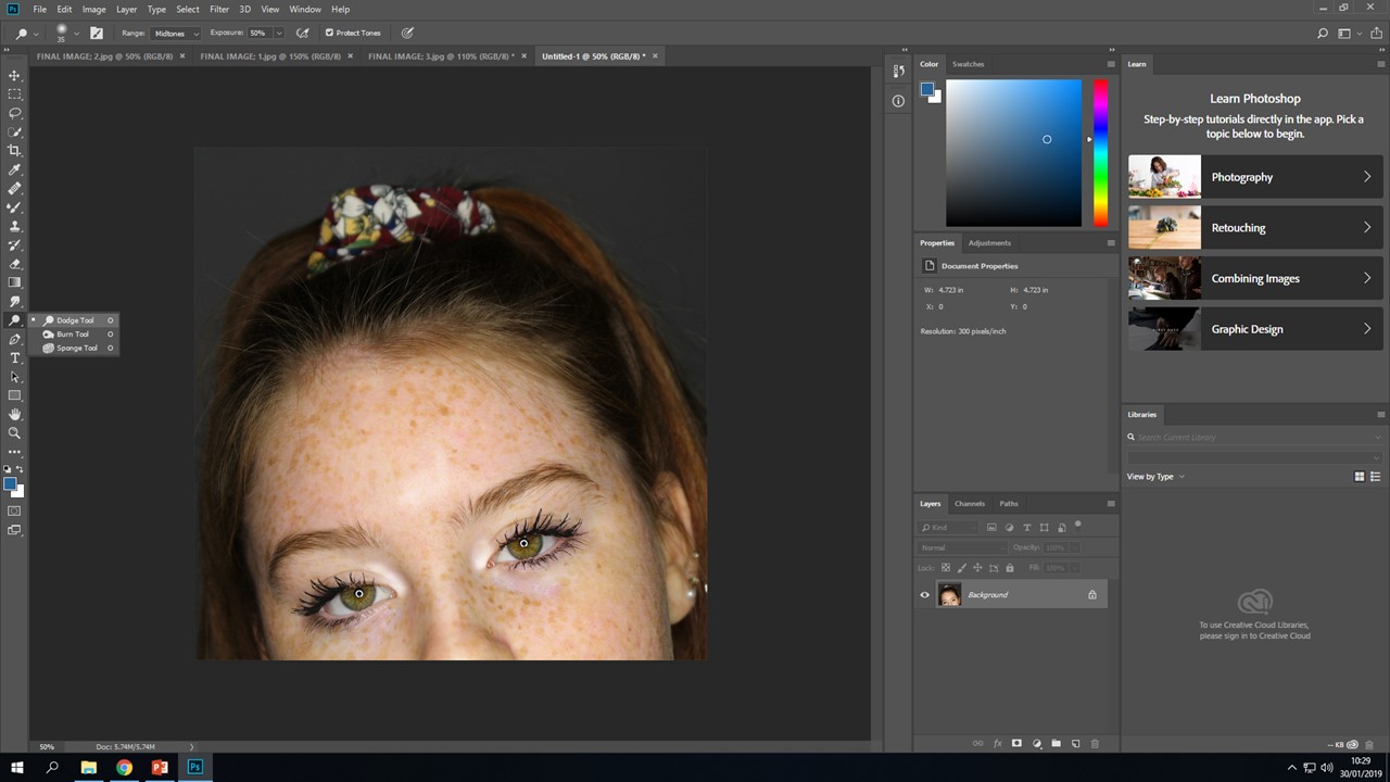
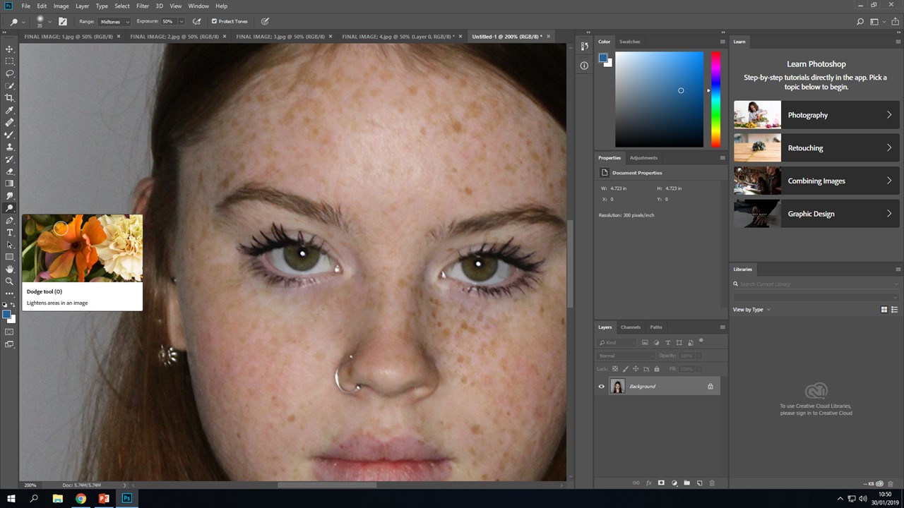
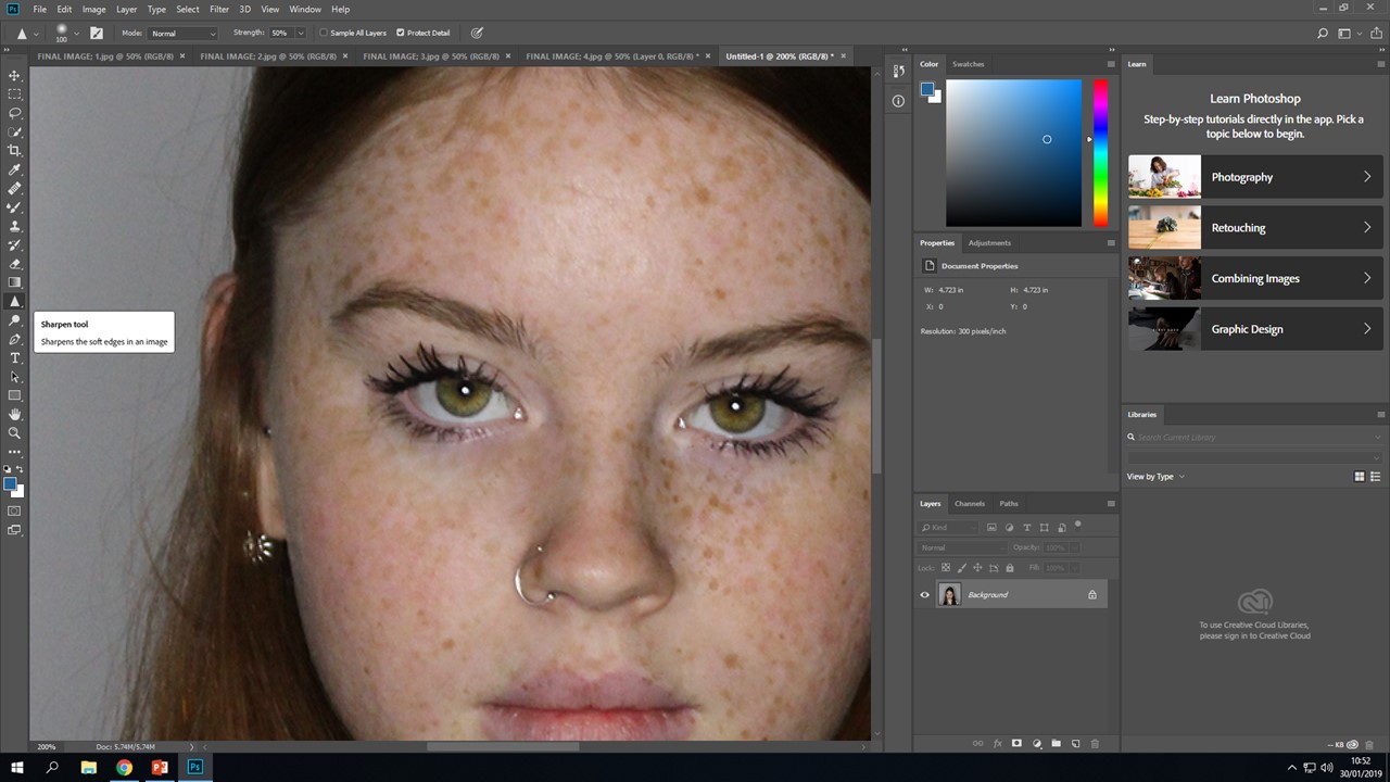
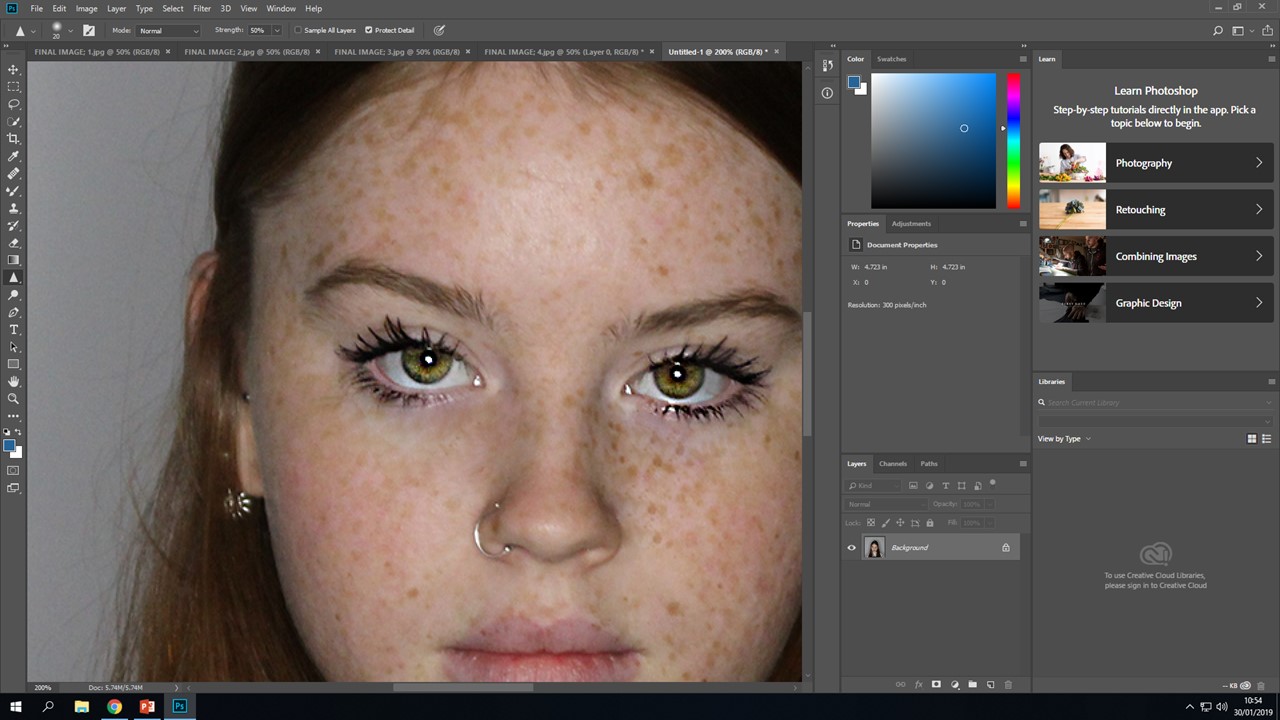
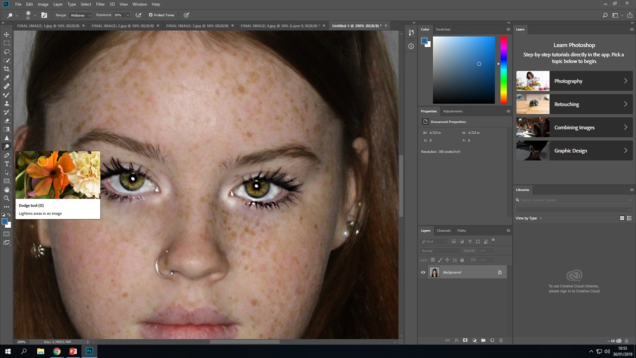
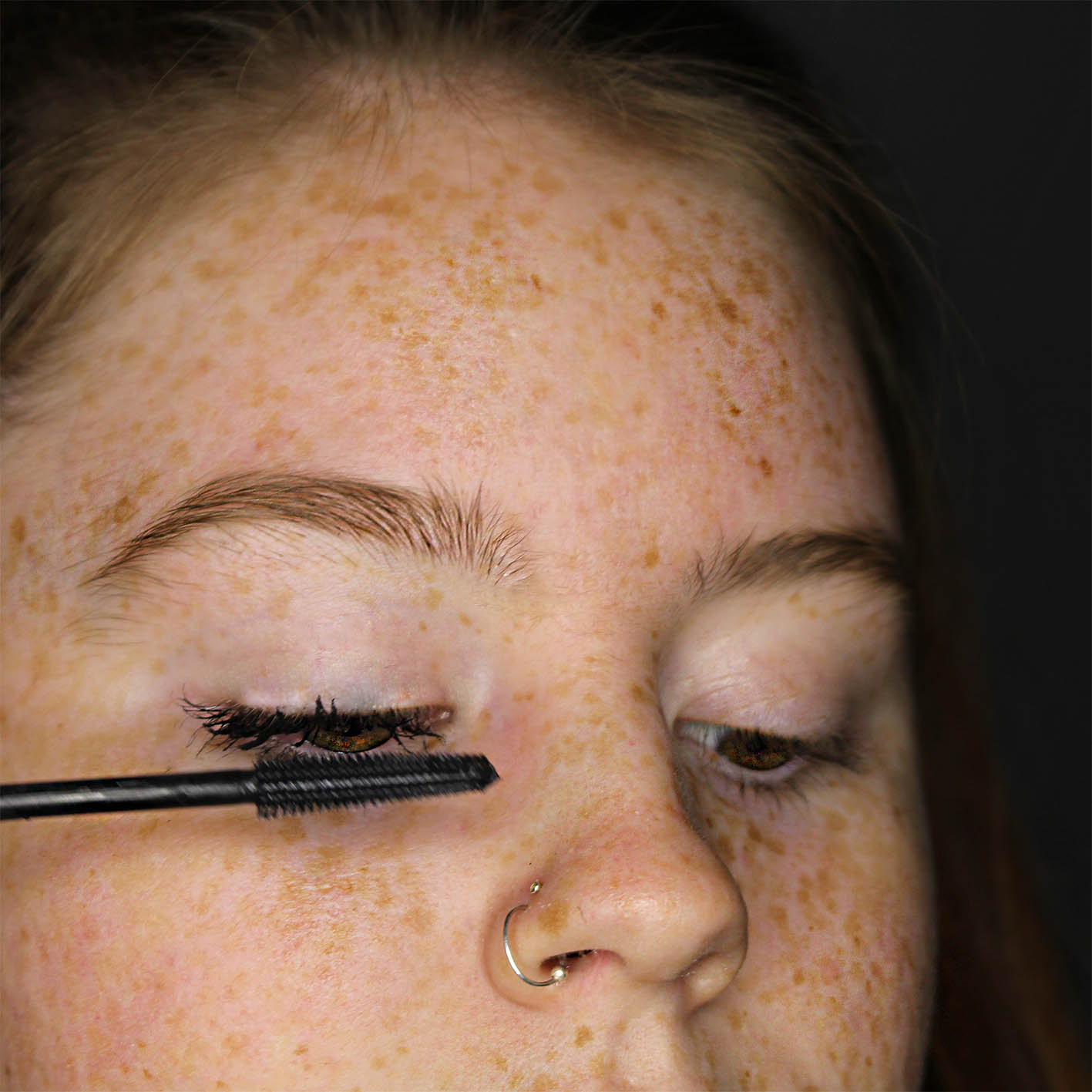
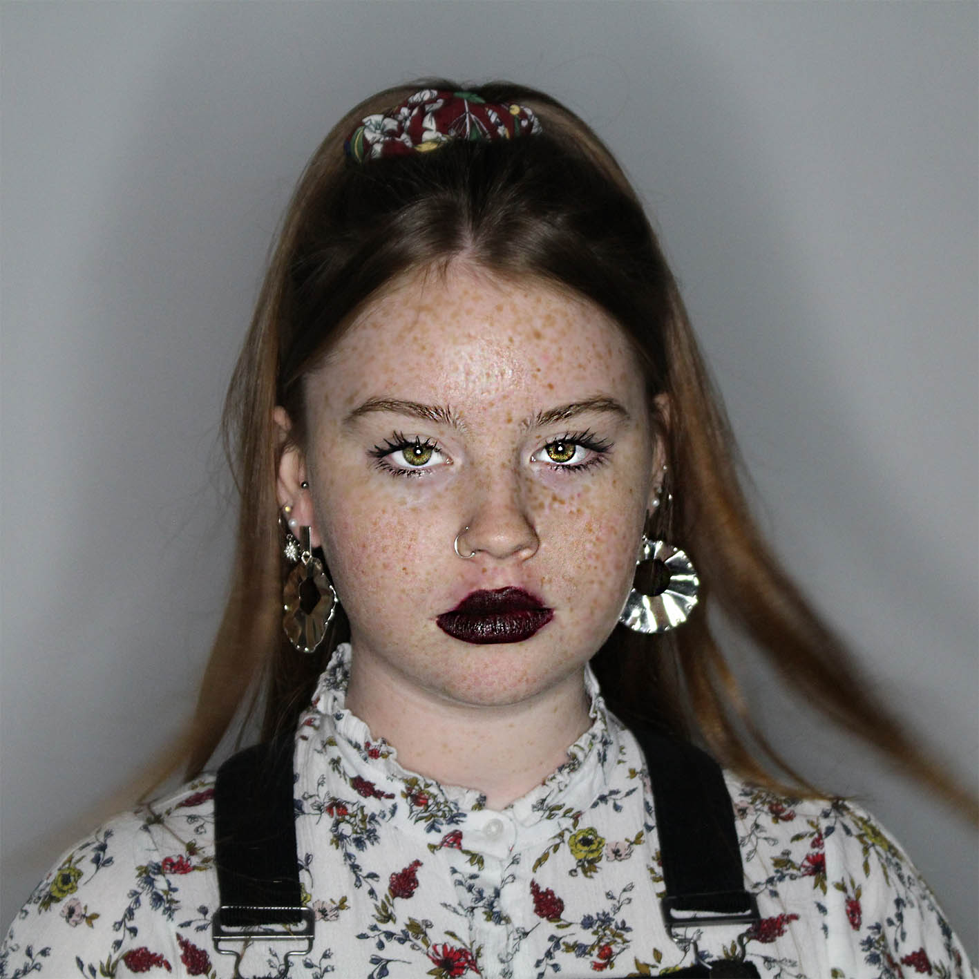
This sequence of photos bellow, show me editing this specific image as I wanted this one to stand out more and be more dramatic, this is because it was a close up of her face, so features needed to pop more and be brighter. I firstly used the sharpen tool, this allowed me to make her features more dramatic, I then used the healing brush to hide the mascara that she got on her face and cover up some redness, I then went in with the dodge tool, this allowed me to make parts of her face brighter, I highlighted the features that needed to be brighter, such as under the eyes and straight down the nose, I then when back in with the sharpen tool to go back over the eyes to make sure they stand out and are capturing. These three images show the changes and what they did to her face;

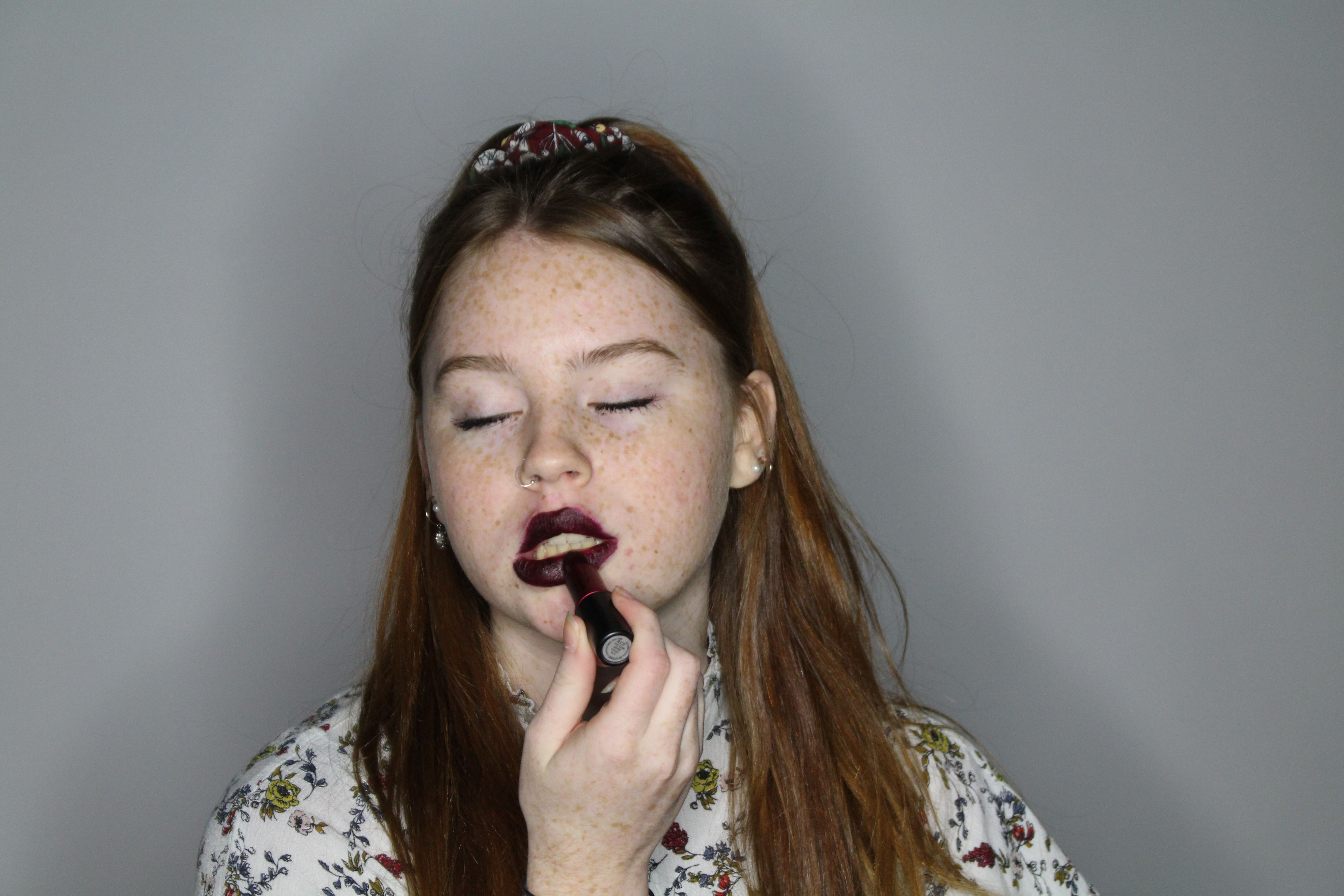
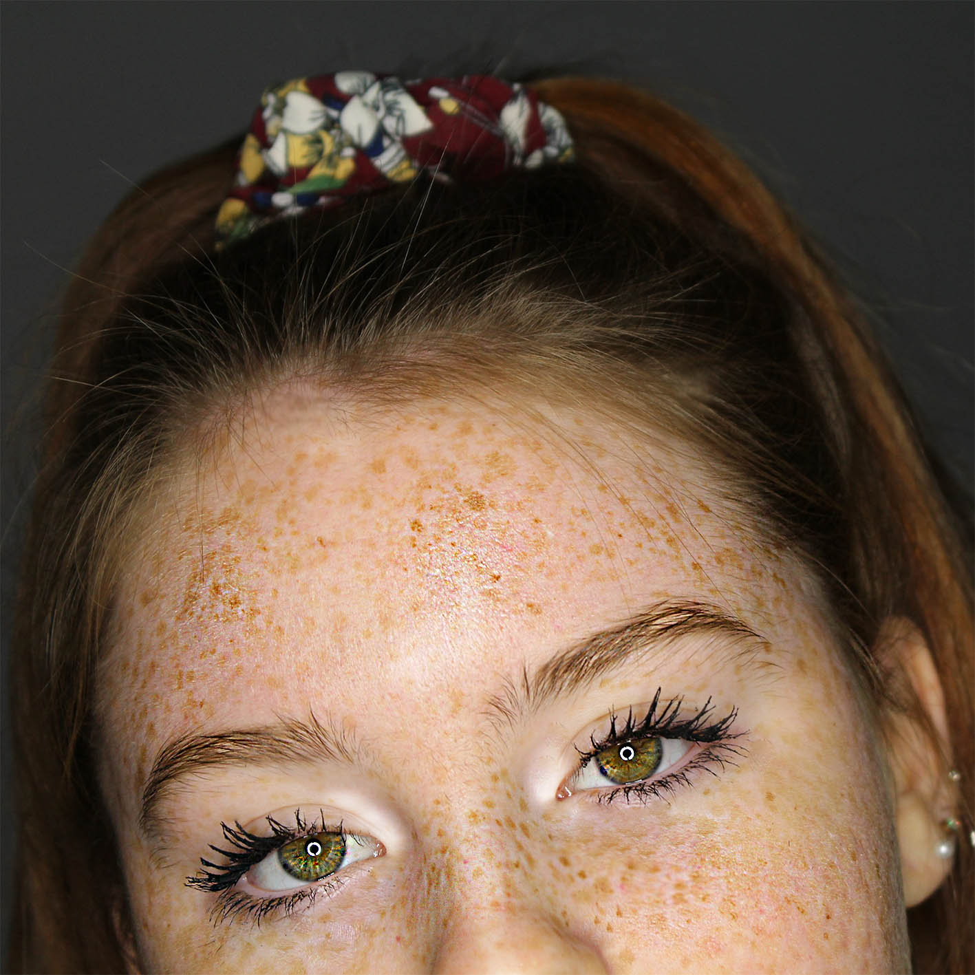
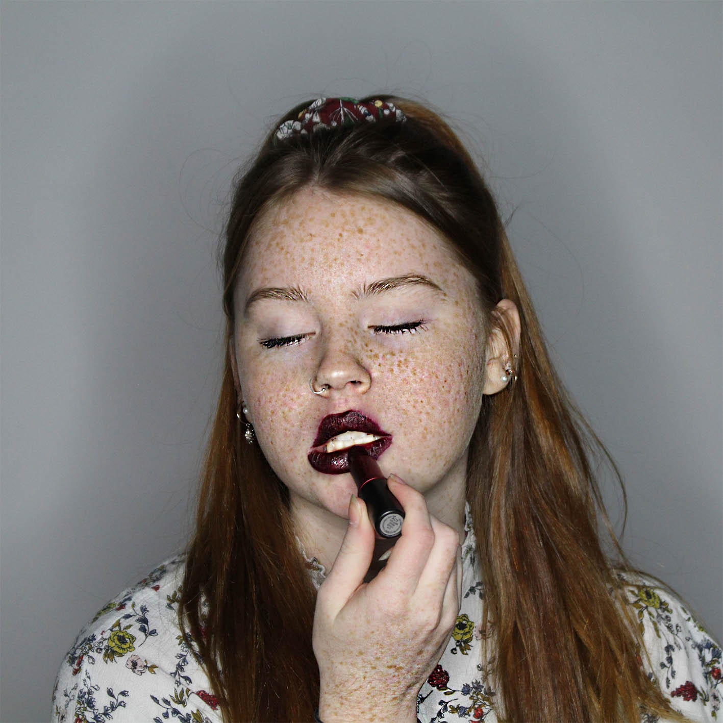
These screenshots show how I made her eyes brighter and more dramatic, it shows the steps and results of me using certain types of tools. I decided to brighten up the eyes and make them the most dramatic part of this image, as I want to show the change from going from having no make up to then applying it,. This is to make the ‘transformation’ from going from her self to society norms more dramatic, as did Leigh Bowery, he made the makeup on his models so dramatic, so I have decided to dramatize certain features to really show the change. This is what I have done;

MY FINAL EDITS

1;

2;

3;

4;

5;

6;

7;

8;

9;

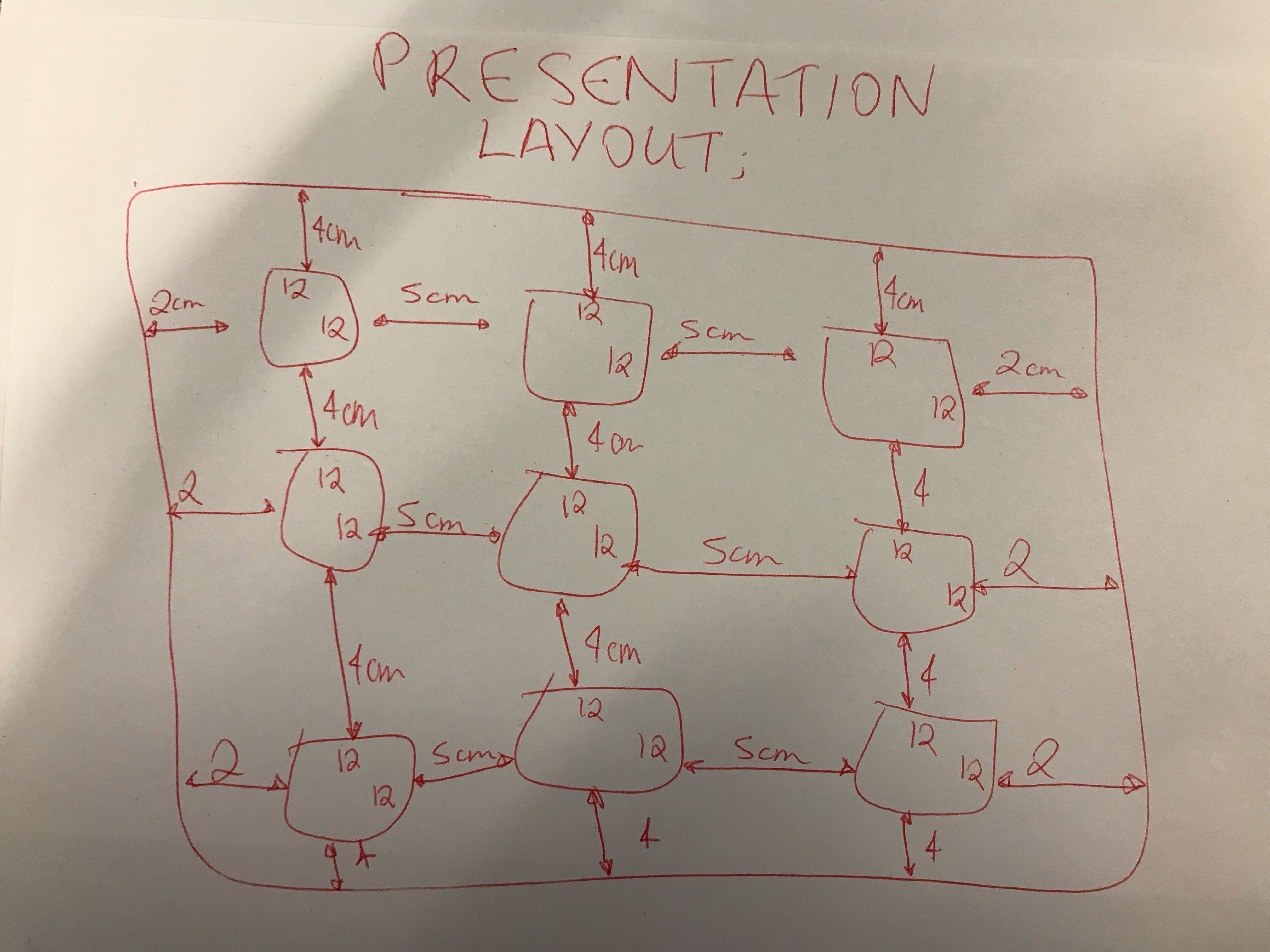
PRESENTATION

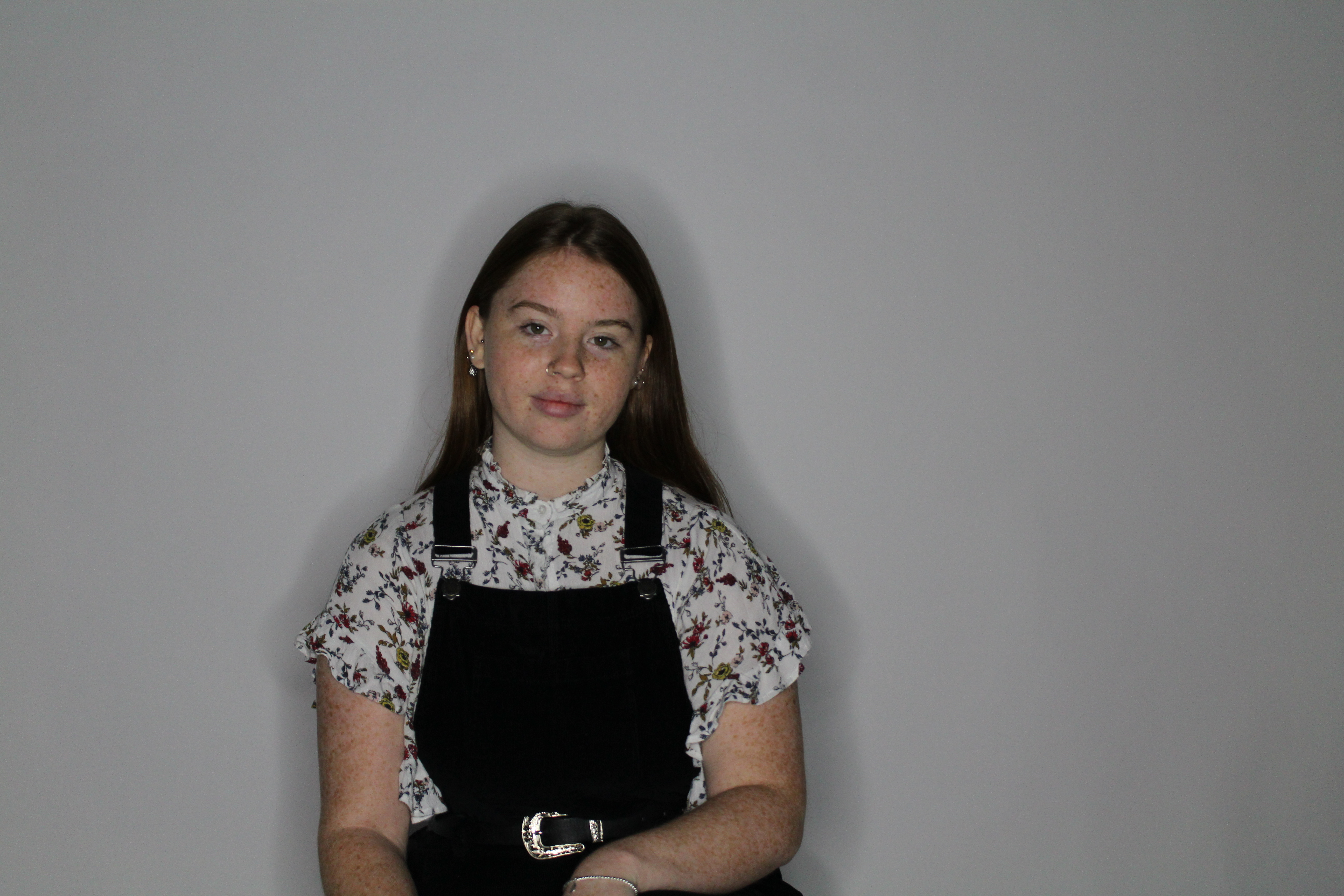
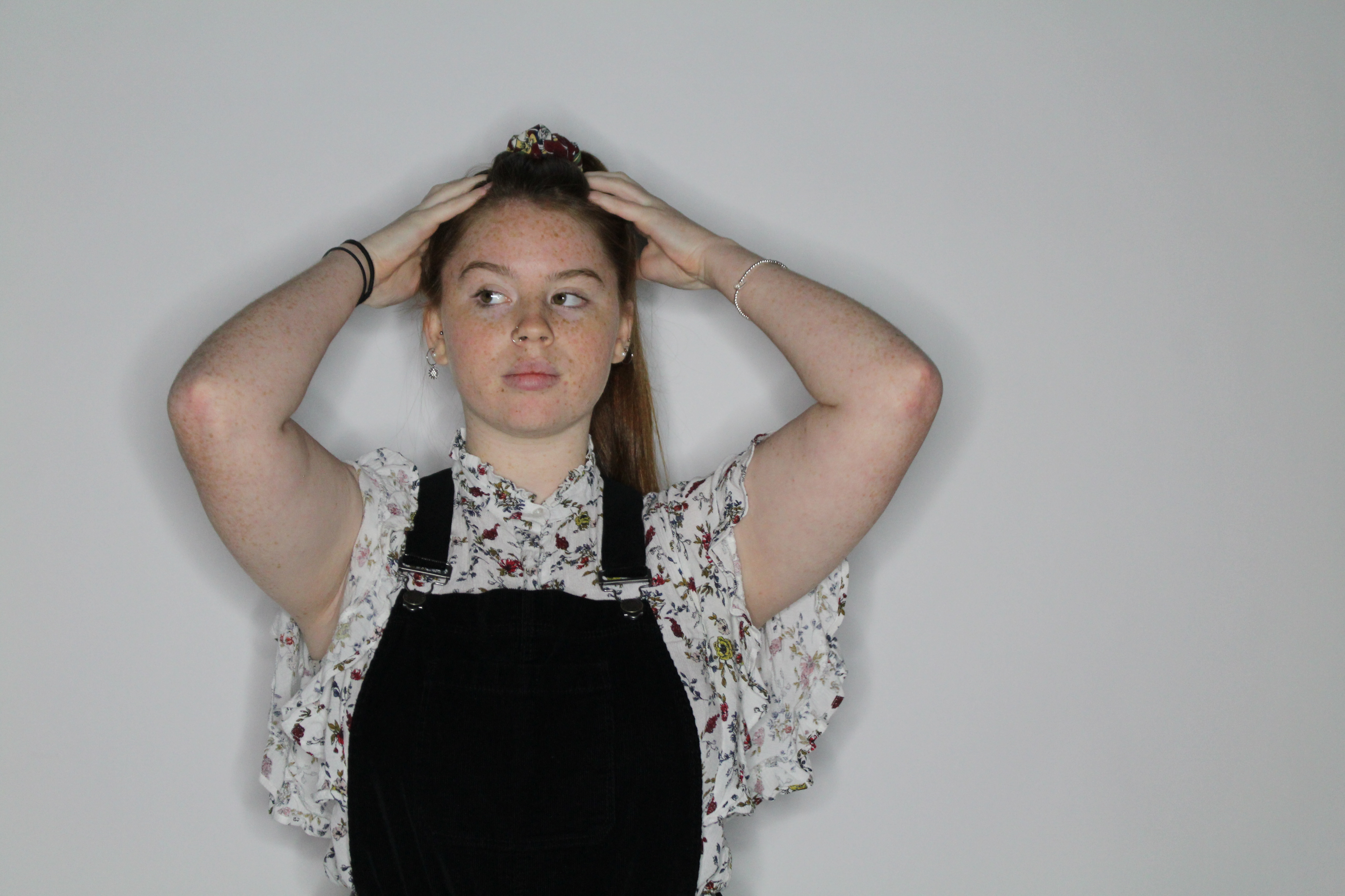
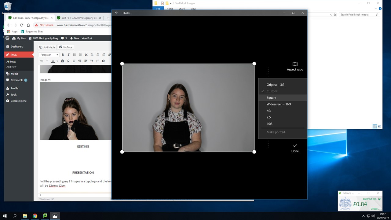
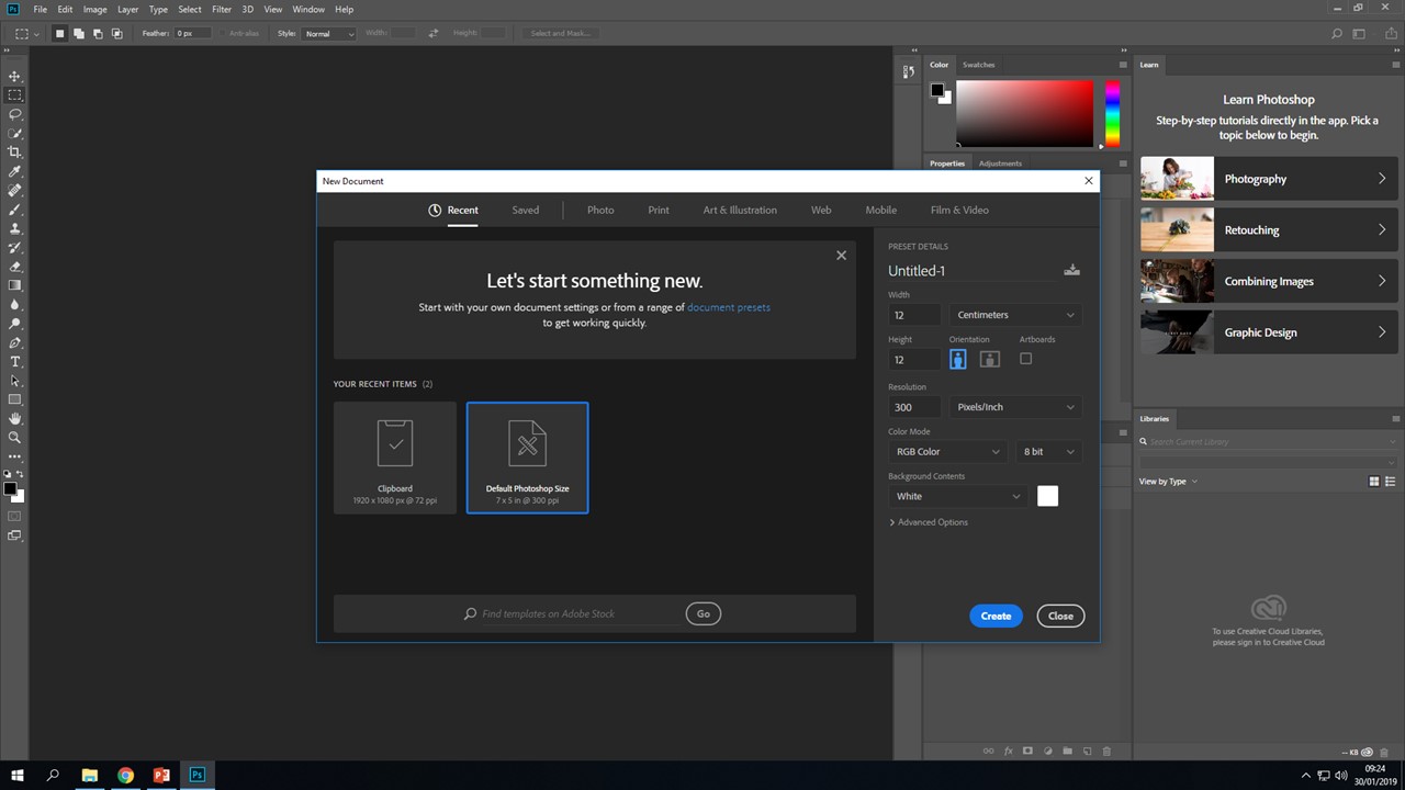
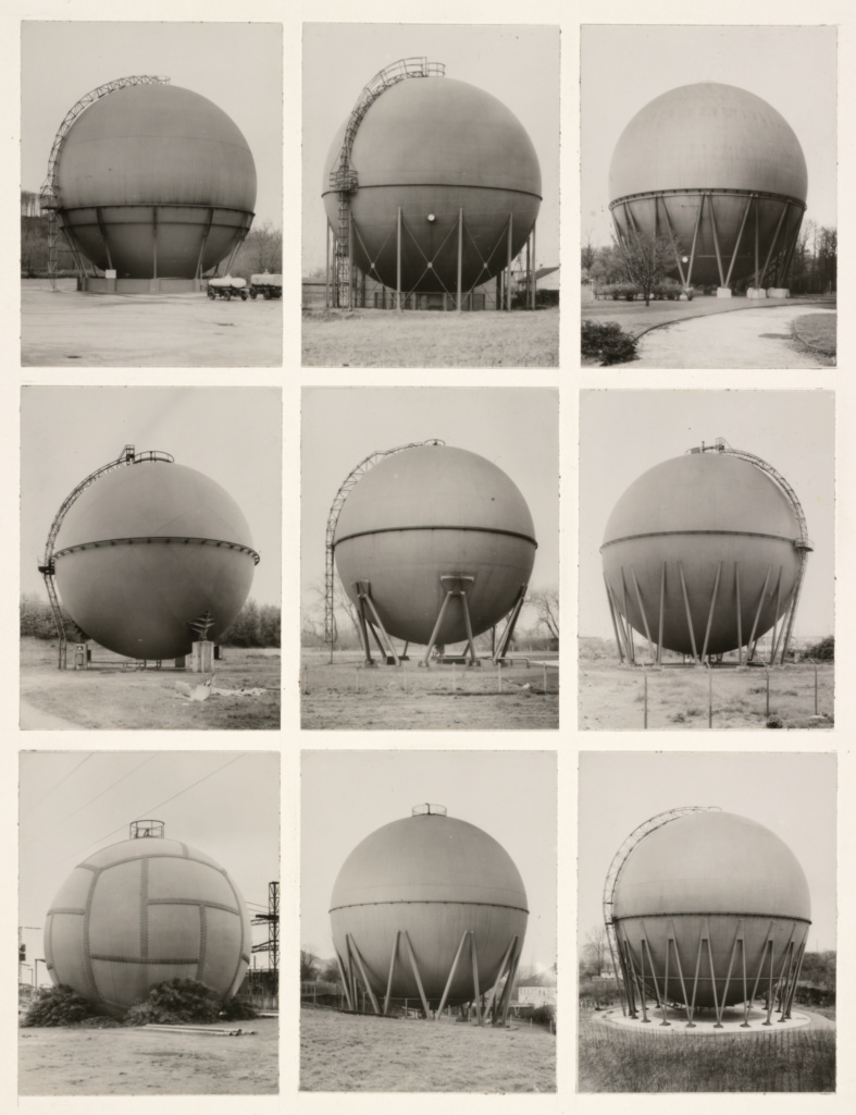
I will be presenting my 9 images in a typology and the images size will be 14cm x 14cm;

This is a smart way to present my work and it will be easy to show the images in order from start to finish. I am going to mount my images onto individual squares of foam board, and then mount the individual squares onto another piece of foam board, this will make the presentation of my images more interesting.

EVALUATION

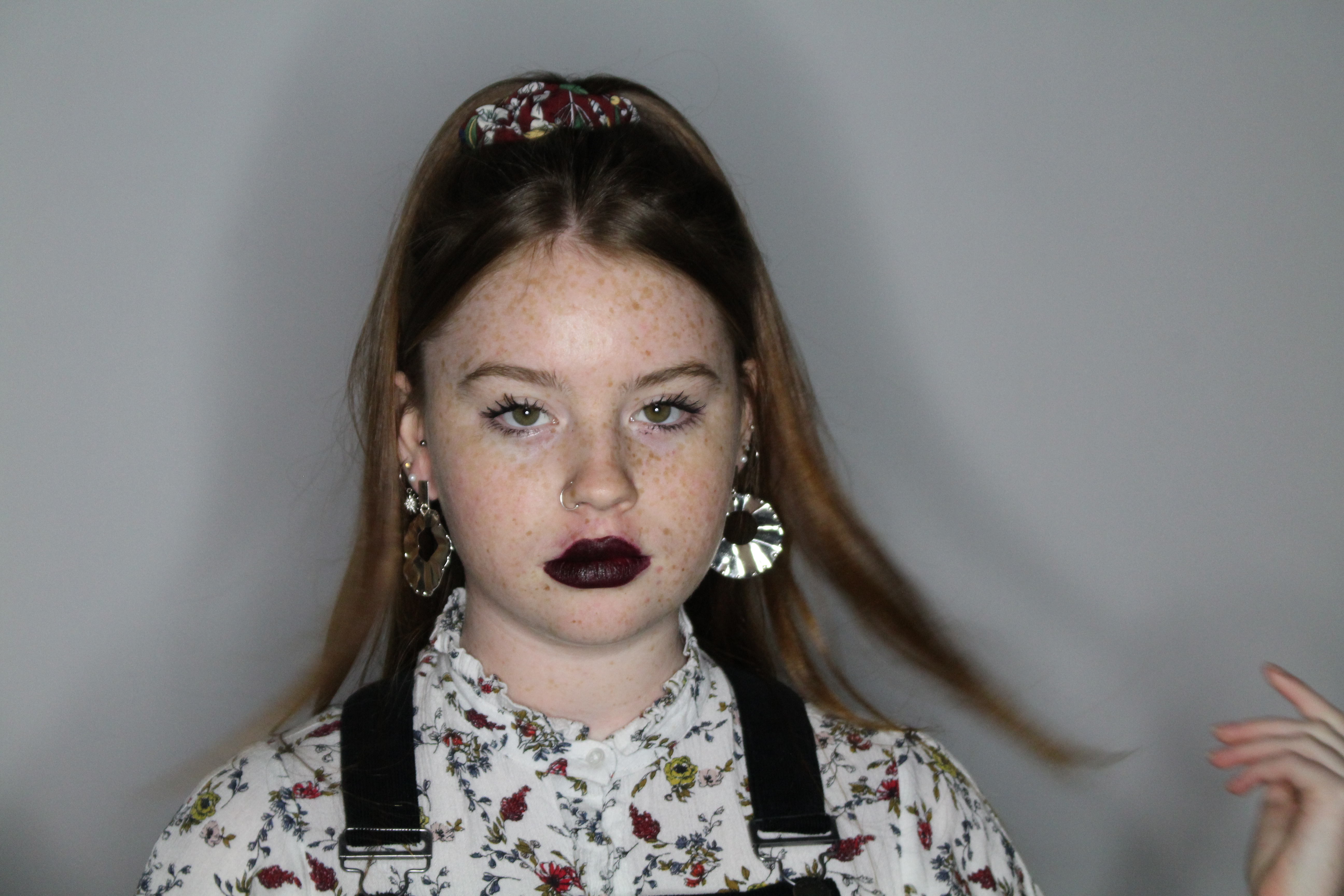
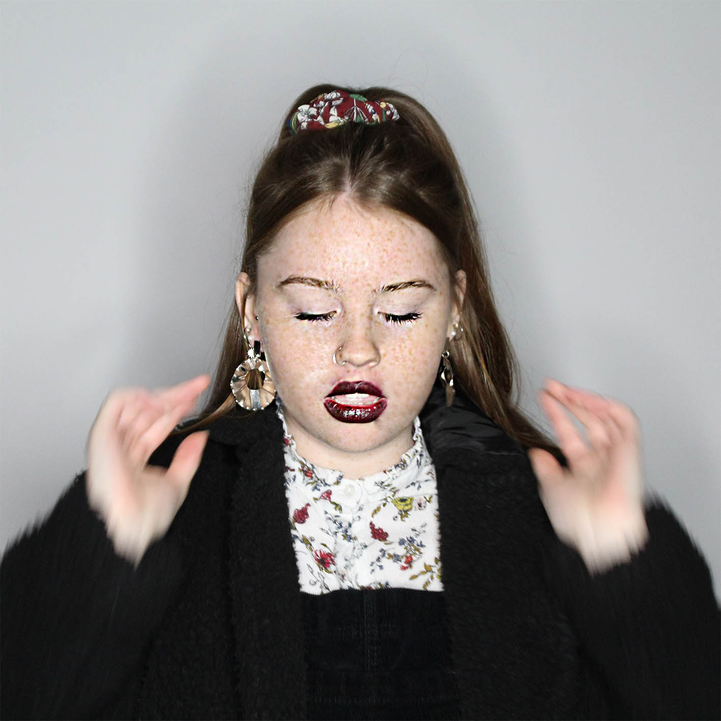
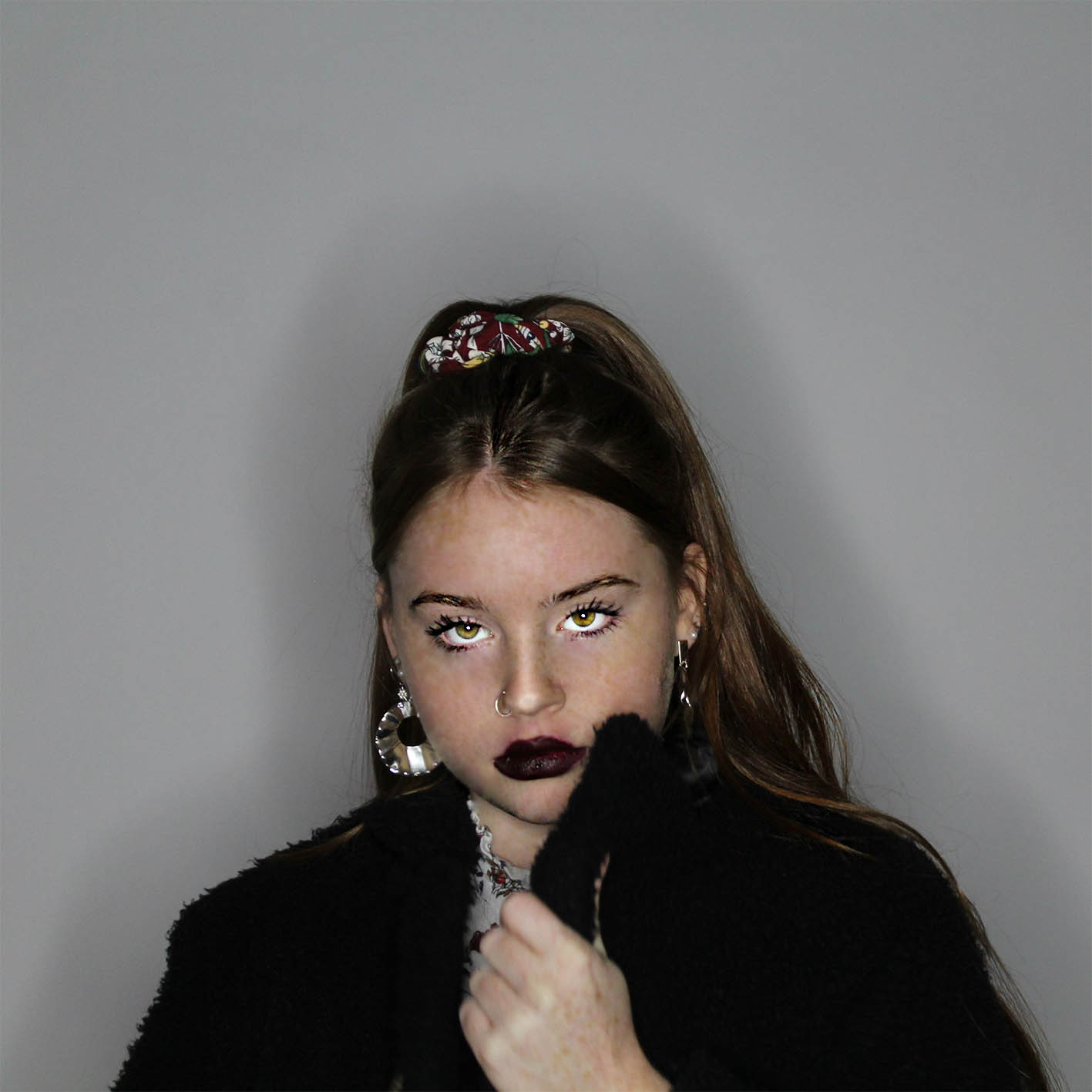
Overall during this project I have researched about identity. I chose Leigh Bowery as the artist I would take inspiration from. Bowery’s images where exaggerated to mock the changes people make to themselves to fit into the ‘norms’. I mainly focused on how women change themselves, by showing some of the steps but also wanted to show the drastic changes they make to themselves and how it makes them look like a completely different person.

This project allowed me to go back into the studio to take  images for this section, along with using my knew skills learnt to put towards this project, such as changing settings on the camera to fit the type of image I wanted, along with figuring out what type of lighting would be best, such as the angle it is coming from so I would highlight specific facial features and finally cop-orating with my model, by encouraging them and giving them feedback on what they should do next and what was good during the shoot. As I had more knowledge, my shoot in the studio went a lot smoother than previous experiences. It helps that I had already planned ideas (on previous blog) as that allowed me to focus in on what I needed to be doing instead of taking longer, it meant I could get more photos on certain things I needed instead of having a couple of random photos, instead I had catches of images for specific reasons.

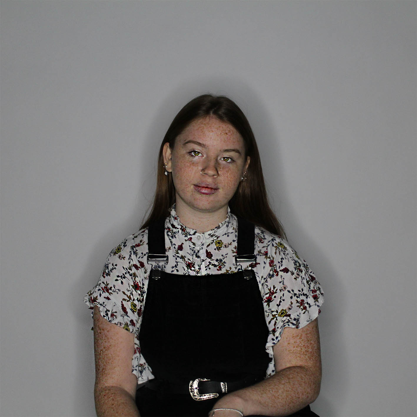
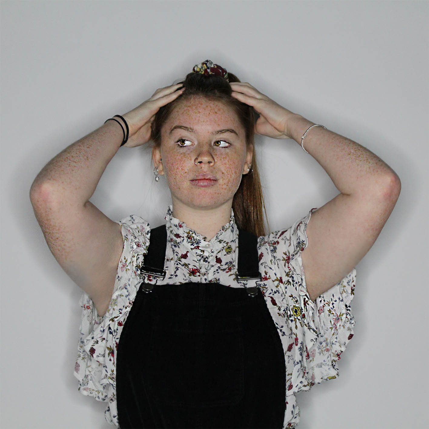
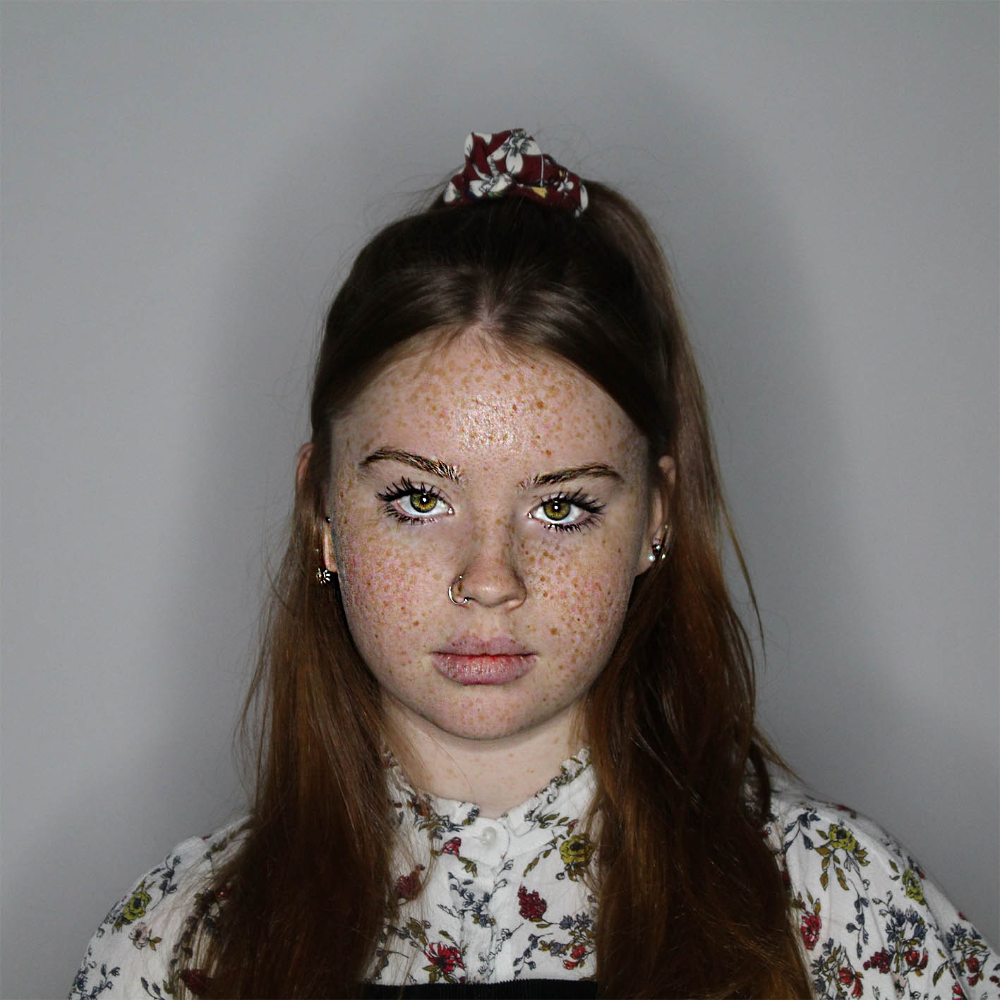
When editing my photos to get my final images, in the first few photos I really focused in on exaggerating her natural skin, so I sharpened up her freckles to make the bolder and stand out more, also making her eyes more green, this presents a more natural look. As the images go on I edit them more and more, such as the last image I have edited her skin to make to look flawless and her eyes big and bold as this is representing what women feel like they need to look like and what other people think women should look like, with the flawless skin and perfect features.

Some of the images I took needed to be improved by adjusting the focus, to make sure the image was sharp. My first image before it was edited wasn’t that clear, it almost looked hazy, but by adjusting it on Photoshop I was able to make the image look stronger. The silhouette around my images add an extra part of interest to my image and I did this by using a white background so shadows could be projected onto them as I was shinning a light directly towards my model, the middle of the the ring light was in line with her eyes, this made her eyes pop as you could really see the color that was spread throughout her eyes.