CONTEXTUAL INFORMATION:
As in many European countries, research and documentation of dances started late. The oldest Latvian dance examples are fragmentary and difficult to interpret. They are the 17th-18th century travel stories and church visitation protocols, where dancing is described as “shameless agility”.
Folk dance research and gathering started in the beginning of the 20th century. The first Latvian folk music composer and teacher Andrew Jurjans issued 2 singing and dancing books. These books are still a very important source. However, many dance descriptions are shown only schematically and thus are practically impossible to recreate.
In 1924 the Archive of Latvian Folklore is created. There is a significant amount of dance material, but mainly songs and texts. A specialist dance archive has never been created.
In 1920s, few years after the formation of Latvian Republic the first folk ensembles are formed and there is a growing public interest in folk dancing. Educated dance teachers get involved in the research of dance; in the 1930s books for practical use are issued. Important figures are Johanna Rinka and Janis Ošs, Jekabs Stuburs and Elza Silina. E.Silina is also the first theoretical dance essay author. However, the collection of dance material at the time is still selective and only those dances are published which the researchers find to be suitable. In addition, part of the material is published with the improvements from the researchers and without source references.
In the 70s the dance teacher Harry Suna seriously addressed the Latvian traditional dances. From the archive materials he collected and published a major Latvian couple-dance and song books, as well as wrote several theoretical works. He created interest in traditional dance and a number of his students continued his work.
THE IMPORTANCE OF FOLK DANCING:
Dance is one of the components of national culture, which itself reflects the history, traditions and national / regional mentality. At the same time it gives people a wide range of self-expression – receive and pass on skills, gain emotional satisfaction, meaningful leisure and relax time, become aware of ones national / regional identity, as well as present it in an attractive form. Recently the public interest in traditional music and dance has increased. In addition there is a growing desire and need to build and maintain self-identity in the increasingly homogeneous global mass culture.
PHOTO SHOOT PLAN:
WHY: Whilst visiting my home country of Latvia, I was able to capture images of various traditional dances which are an important part of my own identity and which link well with the theme of “place and identity”
WHERE: The images were captured during a Christmas concert in my old school, where various traditional Latvian folk dances were performed.
WHEN: The performance was done during a Christmas concert, an important and widely celebrated holiday in Latvia which holds many significant cultural aspects with it.
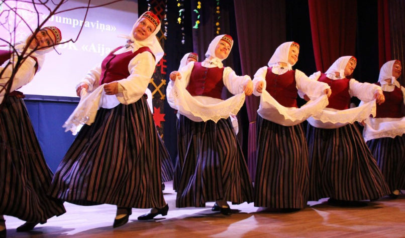
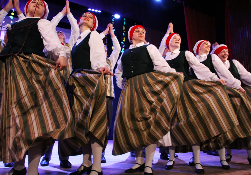
WHO: The images were captured of professional folk dancers of various ages and abilities that were based in my hometown.
HOW: I used my regular DSLR camera in order to capture the images.
SUCCESSFUL OUTCOMES:

MOST SUCCESSFUL IMAGE;

CRITICAL ANALYSIS:
VISUAL:
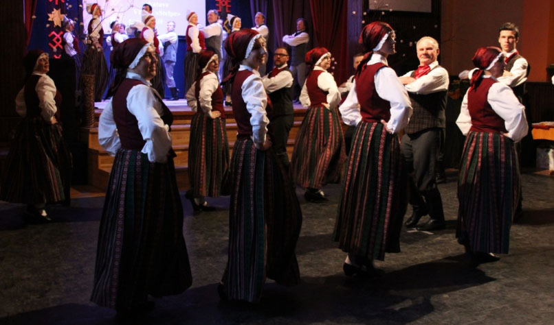
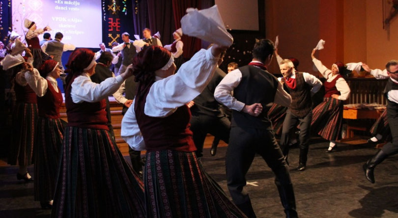
This image I feel was the most powerful after viewing my selection of work by the amount of action, drama, and fun which is conveyed through it. The dancers in the image are swinging a white cloth which creates some motion blur, yet I think this is a key aspect of the image as it portrays the movement of the dancers. The overall tonal range of the image is quite dark and subdued. The dancers are wearing dark and rich colors which signify the regional colors of the county. The image has an overall warm hue to it with the orange lighting which hits from the right side of the image. This light again hits the back of the dancers and casts a faint shadow on the ground in front of them. The image gets darker as we move into the left hand corner of the image, bringing variation of lighting into the image. The arrangement of dancers creates a repeating pattern through the image. This is further supported by the costumes of the dancers which are all identical according to their gender. the line of dancers which starts from the left hand side of the image, which then moves to the right hand side of the image, allows the eye to focus in on the dancers which are most illuminated on the right hand side of the image. each side of the line of dancers are in a way mirrored in the image, which again further creates a sense of repeating patterns. During the editing process, I decided to elongate the image by cropping out most of the top and bottom of the image. This really focuses in on the dancers and removes any distractions from the image.
TECHNICAL:
The high energy movement of the dancers during this photo shoot meant that the shutter speed of my camera had to be quite high, being at 1/250 during the entirety of the shoot. The lighting inside the hall in which I was in also created its own complication as there were places with more blue based lighting and others with warmer lighting. There was also a change in the direction of the lighting. By the stage there was direct spotlights which hit the fronts of the dancers, yet in the middle of the hall, the lighting came directly above and hit the tops of the dancers heads. I had to change my white balance settings in order to suit the mood of the entire concert which was very upbeat and joyful, setting my white balance to 2500k-3000k as this the warmer side of the spectrum. I set the aperture of my camera to f1.4 as I did not use the zoom on my camera and wanted to capture the entirety of the dance team, as opposed to focusing in on one single dancer. I did not use a tripod during this photo shoot as I was constantly moving around in order to capture the images. I think some of the motion blur in the images is a welcome addition as it further illustrates the fast dance moves and actions which were happening in the room during the event.I kept the ISO of all the images at 400, which proved to be effective for most of the photos, being nor under or overexposed.
CONCEPTUAL:
The main objective during this photo shoot was to capture the different elements of Latvian folk dance. It was something which is close to my heart as this was an activity I participated in as a child, therefore being part of my identity. It is a tradition which runs deeply in my and my family’s culture and something which is important to distinguish myself from others. Whilst watching the show, it brought back many memories of my childhood and my life whilst I lived in Latvia. I wanted to capture the excitement and vibrant nature of Latvian folk dance which is a major part of many Latvians lives. It is an activity which brings together the whole country and distinguishes us from any other country or nation.
CONTEXTUAL:
The singing and dancing traditions and newly forged elements of these ancient arts are not only a tribute to the magnitude of the cultural heritage of Latvia, but also serve as foundation for the identity of the modern Latvian. Traditional crafts and heritage is part of modern creation, interior design, cuisine, life-style as a whole.
The core of the culture heritage is the daina, a versified four-line piece of wisdom, which has been preserved and handed down from generation to generation until recorded at the turn of the 19-20th centuries, now inscribed in the UNESCO Intangible heritage list.
It bears the Latvian code of ethics. One can find everything there – from attitude models to descriptions of cosmic systems and deities. Some of longer folk poetry pieces have melodies, thus making them singable. And old and young know and practice singing them, sometimes all night long.
During the time of lost statehood, the dainas or singing, private or public, often helped to express a hidden, but shared message of freedom, pride, longing for independence or protest.

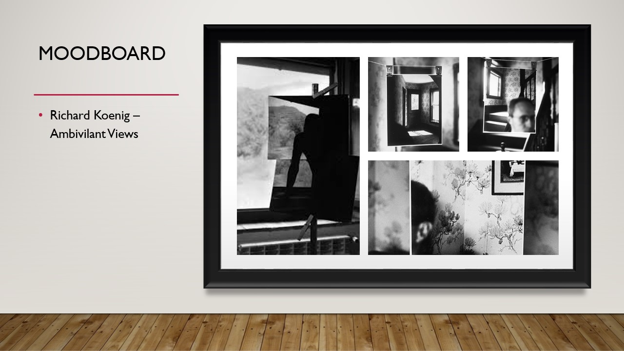


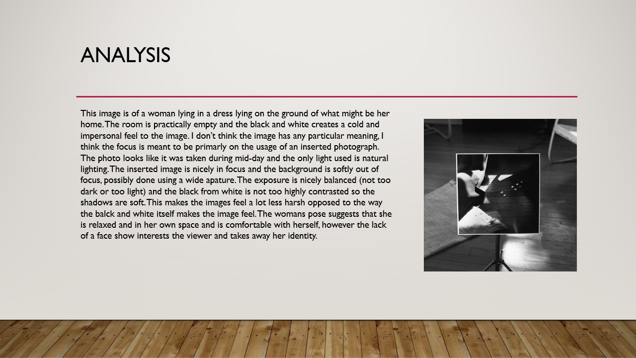

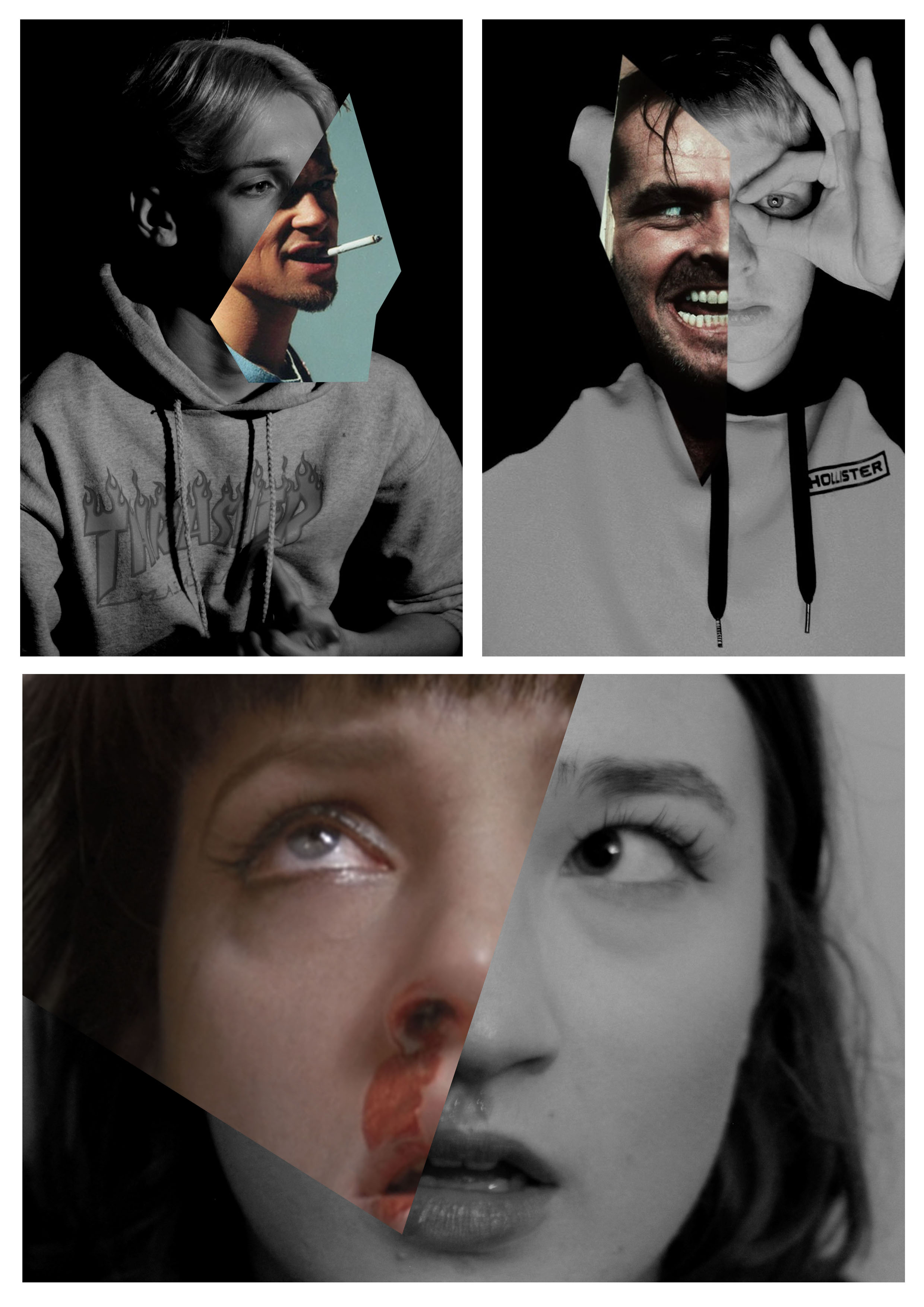


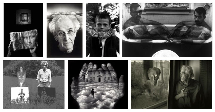
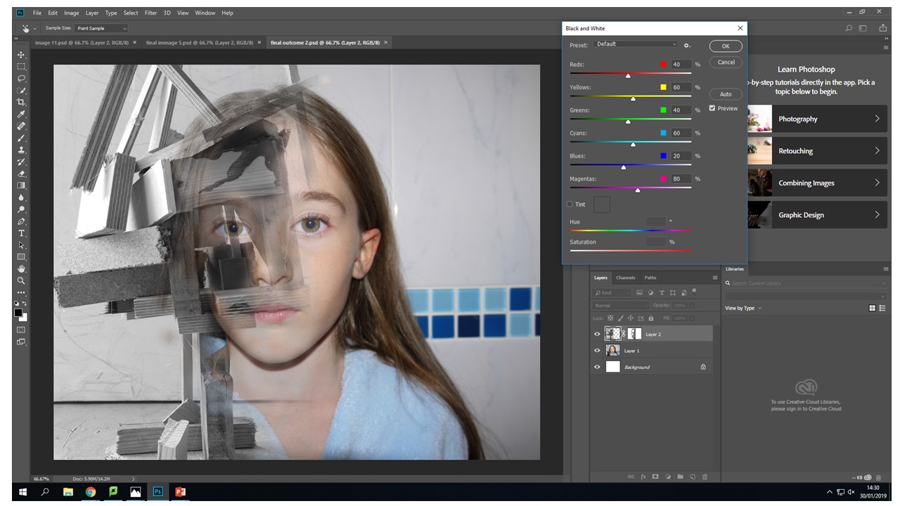 I also tried doing it the other way around with the same image. The exact same process on a different layer. I decided that i didn't like this image as much as the other one it just didn't look right to me. The contrast of the brown wood on stark grey background looks underwhelming. They look like two purposefully different images when they are actually meant to blend and flow together. These images together in this colour pallet just creative unwanted visual noise which confuses the audience because they are just drawn to the contrast of the colours not the actual image itself.
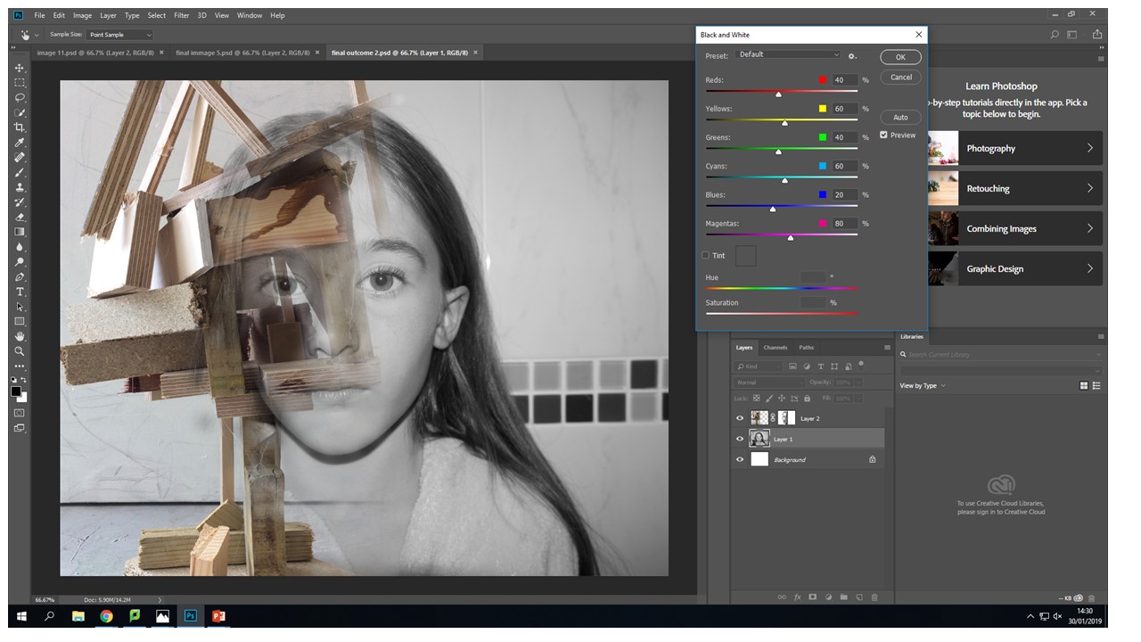 In this image i am moving around the colour settings so that there is more contrast between the light and dark of the wood in this image. In the first image they were just set to the factory black and white settings so i changes them to have my desired out come. I fell like it makes the image look more interesting and the left eye blends effortlessly into the wood because the pupil of the eye is the same tonal colour pallet range.
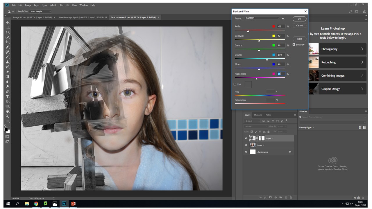 I have decide that for this image the face is to colour full it created imbalance in my photo the face shouldn't be as vibrant and it should be a cooler colour pallet to complement the b&w wood structure.
 This image in balanced nether of the images over throw the other there is no direct focal point in ether it is just left to the viewers interpretation. The main tool i used was the vibrance slider moving the sider down to -56 gave my desired image composition. This again was through using the image - adjustments tool . There is still the cool blue tones coming through to give that image the need colour but they are muted.

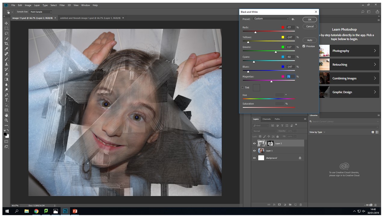 Another tool that i used quite frequently on the original face images was the levels tool to create more depth with in the eyes so that they stood out and didn't get lots within the images different layers.

 Again using the same black and white process with the wood from the images adjustments black and white tool and then sliding it to create the desired b&w tonal look.
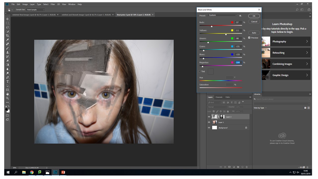 Again the vibrance tool to decrease the vibrance of the image to put a real focus on what the image is trying to portray rather that the initial combination of broken wood and a face. This vibrance decreases mean the image is seamless and creates a dimensional feel that you can look into the image in different layers but then you zoom back out it still looks like all one image.
 For me when editing my photos that I had created the vibrance slider created the most desired outcomes then it came to editing the actual face images i used this tool on all of them. It created the colour pallet that i wanted to complement the black and white wood without becoming a black and white image in its self.
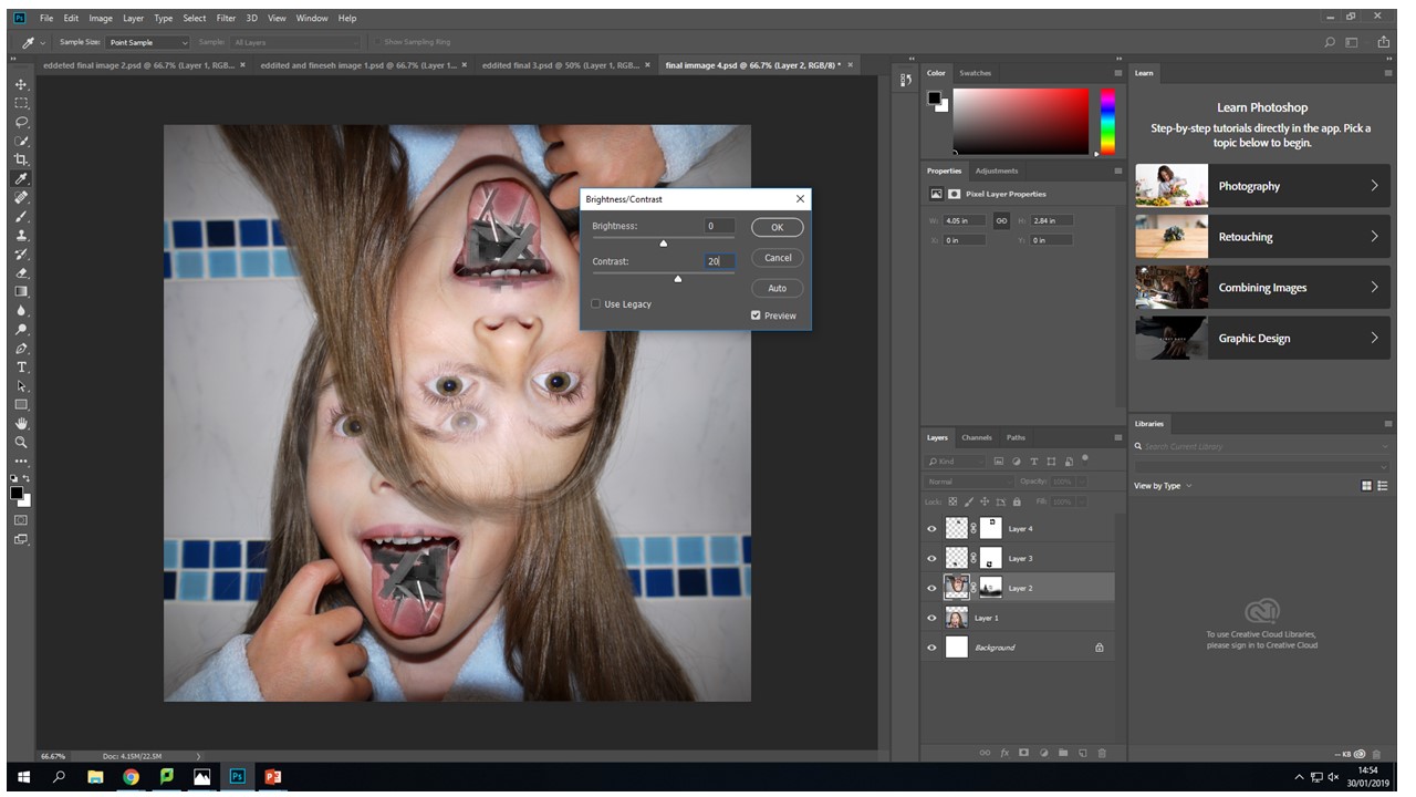
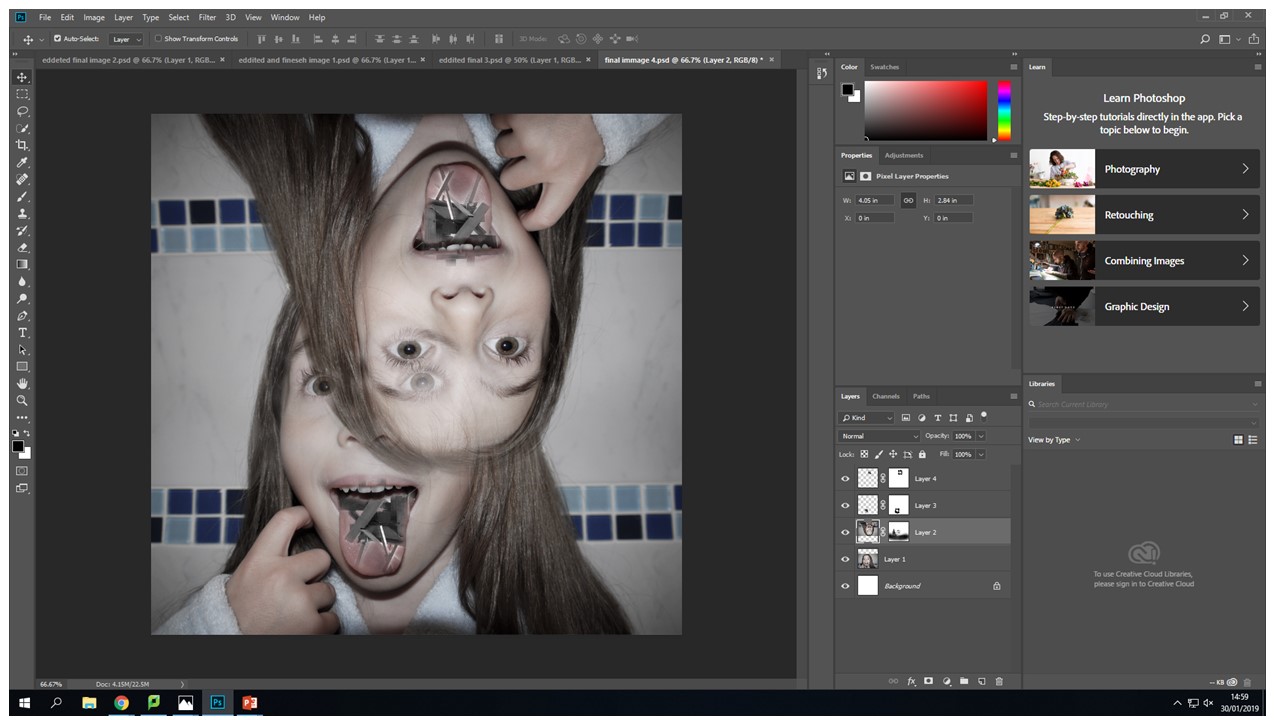




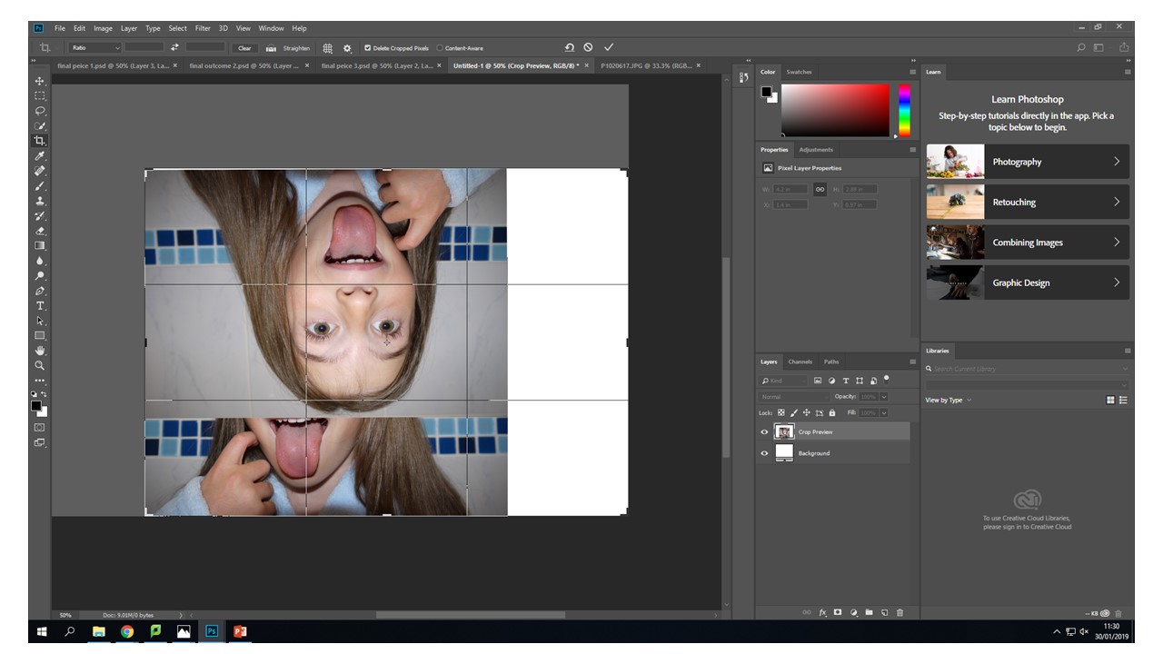 With this image I created two layer masks over the wooden images and one original layer mask over the upside down head. Then blending the tongue and the wood images, I found that control-+ was really helpful zooming in and being able to work using a really small brush size of 17 gave the best effect.


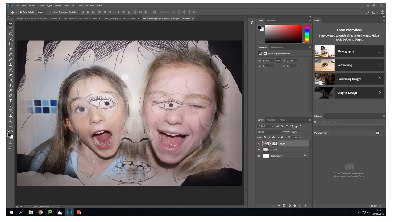
 I decided to do some experimentation and try to combine one of the images I had chosen to work from in my final peaces and one of the images i had draw to be printed on asetae for the original collage. I feel like the composition of this image works well, the drawn hands frame the two blending heads that are creating an interesting view point for the observer because they can make there own judgement on what they feel in portrayed with in the image. For me what i want to be portrayed in the encapuslement of identity and how it shrouds our initial view point. This is what is happening towards the evey changing place we live in we are engulfed by industrialisation and this can become a-lot for people and this is what this image represents to me. The inner identity thoughts and feelings that only escape us when overcrowded with thoughts.
