
Category Archives: Homework
Filters
Photo Montage
WHAT IS A PHOTO MONTAGE:
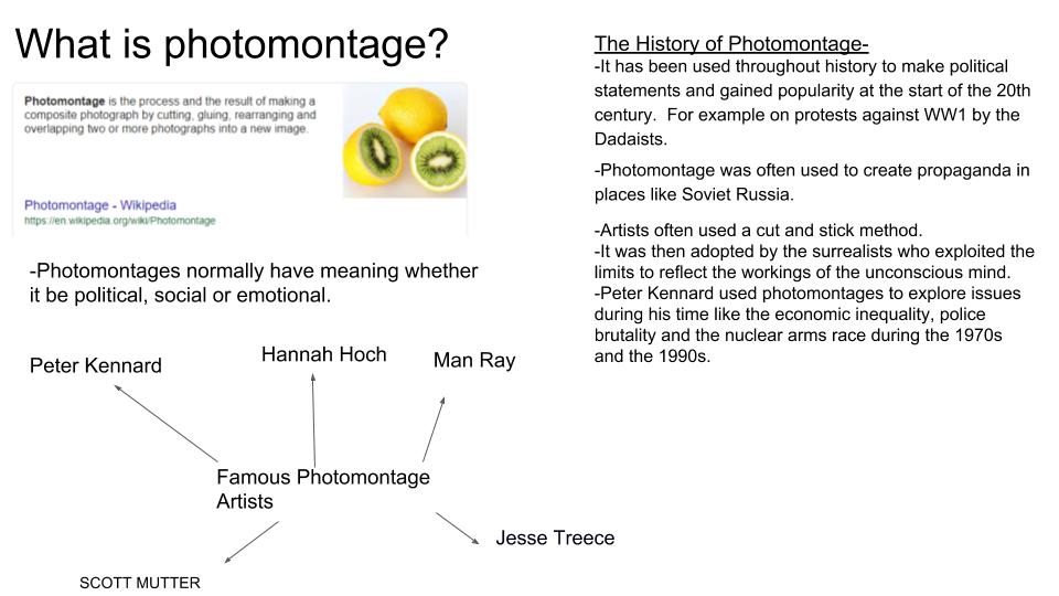
Photomontage is a combination of several shots joined together for artistic effect or to show more of the subject than can be shown in a single artwork. Images were composed by cutting, gluing, arranging and overlapping two or more photos or reproductions of photos together, sometimes in combination with other non-photographic material such as text or other abstract shapes.
source: https://www.widewalls.ch/photomontage-art/
MOODBOARD:
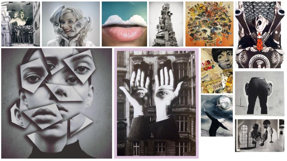
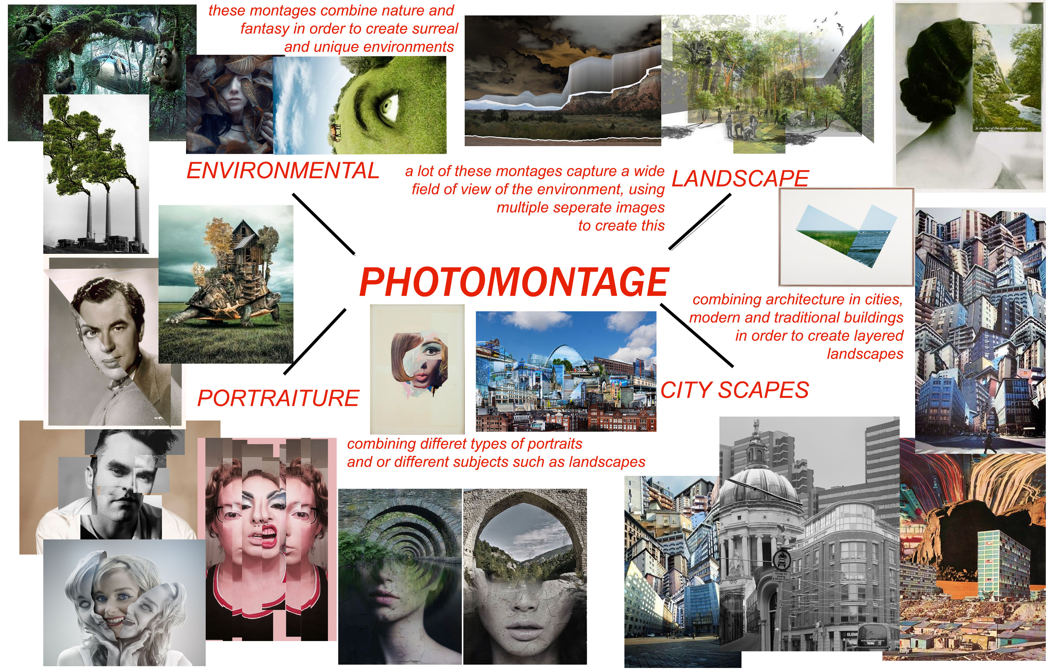
Photomontages vary a lot in style and design. Artists choose to use a multitude of subjects such as portraits, natural environments, natural landscapes, city landscapes and different objects which are combined together for artistic effect.

MIND MAP:
When looking at the search results which come from searching “photomontage”, there are 4 main themes which typically come up. Therefore I separated my mind map into 4 sections, environmental, landscape, city-scapes, and portraiture.
JESSE DAXLER:
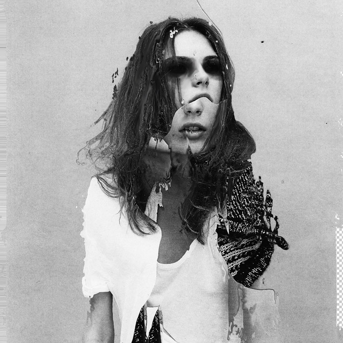
The artists work which intrigued me most when researching the topic of photo montages was Jesse Daxler, a photographer which uses portraiture in order to create her art work.
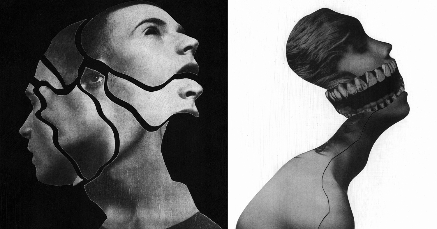
Jesse Draxler is an American artist, born in 1981 in Wisconsin. He lives and works in Los Angeles. He obtained his Bachelor of Fine Arts from the College of Visual Arts in St. Paul, Minnesota. The artist has a mixed approach: he does collages, but also texts or animated portraits in GIF. The central theme of his work is to transform and twist the original image, and turn it into something else. Mainly known for his collages, they often have sexual connotations, a visual impact and an attractive aesthetic, willing to shake up, or even disturb the spectator. Jesse Draxler likes deconstructing the classic idea of beauty and therefore paint Greek statues with spray paint, spilling ink on a fashion photo or cutting parts of human bodies. The artist makes hand-made collages, with the desire to make the spectator wonder if something is hidden under the surface. Jesse Draxler’s work was recently exhibited during solo exhibitions at Booth Gallery in New York (2016) and during collective exhibitions at The Unit in London(2015). Jesse Draxler also works with magazines, brands and designers. Among his clients are New York Times, Alexander McQueen, The Black Queen, or even Prince.
JESSE DRAXLER: “It’s a scientific exploration of what our knowledge of mortality does to our psyche. Basically, it says that everything we do in life, on every level, is at the core influenced by the idea that we’re going to die someday. It’s something that I’ve researched a lot, but I had never found a scientific exploration of it. It’s always an emotive or philosophical way of writing, so a scientific exploration was really refreshing—straight facts and research. I first came across it midsummer last year. My friend Greg Puciato, from Dillinger Escape Plan, we have a lot in common, so we were exchanging books and he told me to check it out.”

CRITICAL ANALYSIS OF WORK:
TECHNICAL –
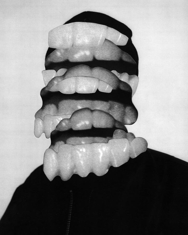
In terms of the technical aspects of this photo, extremely heavy editing has been used in order to create a very surreal, almost abstract image. Various editing techniques have been used from simple color adjustments, geometric cutting, using the brush tool and smudge tool. The overall image has also been made back and white which remain consistent throughout Draxlers work. It is also very bright and slightly overexposed. He has also chosen to remove a little slice of the background in order to reveal the checkered blank Photoshop document. I believe this image was likely taken in a studio environment judging from the even lighting which hits the face of the model.
VISUAL –
The initial feeling which hits the viewer upon seeing this image is unease. The dark, colored in, black eyes make this image quite unsettling, making us question why this has been done. The tone of black which has been used for the eyes is very dark, making them the focal point of the image, drawing in the viewer. There is a certain sense of juxtaposition in this image with the use of the youthful model, editing the images to become jagged old and unsettling. The correlating themes of this image which come to mind are delusion, possession and evil. I come to this conclusion through the collective visual effect of all the different elements in this image, the edges, juxtaposition, use of grey scale and strong editing. The black and white filter which has been applied to the image dulls out any life in the image, and makes it monochromatic.
The edges of the different layers of the image are quite jagged and uneven, which gives the image a weathered and old feel. The messy hair and black eyes of the model could potentially signify mental illness or other forms of hallucination. The backdrop is white and clean, making the main subject of the image stand out in the foreground. There is no real sense of pattern or symmetry in this image, everything is chaotic and uneven. Draxler has also used negative space in this image to give another layer of depth to the image. The jagged nature of the edges, gives the image a lot of texture. Although being monochromatic, the image is fairly light and bright as Draxler has used white negative space and the clothing of the model is also light in color.
CONCEPTUAL –
All of Draxlers work is composed of a black and white color pallete, commenting, “When I began working exclusively in grey scale is when everything seemed to start to make sense,” says artist and illustrator Jesse Draxler of his dark, brooding style that combines collaged photography and painting, manifesting in large-scale paintings or commissioned illustrations. “It’s as if by freeing my mind from having to think about color I had gained a greater clarity for everything else, like when someone loses a sense their other senses heighten to compensate.” Jesse suspects that his preference for a black and white palette is informed by the fact he’s color blind, or “color deficient” as he calls it. “Though I don’t put too much weight behind just that.”
source: https://www.itsnicethat.com/articles/jesse-draxler-alexander-mcqueen-art-190318
CONTEXTUAL –
Jesse Draxler’s pieces are enigmatic explorations of existentialism. The artist tackles ideas of beauty, nihilism, sexuality, and absurdity through deconstructed images that incorporate found photos, abstract painting, and design, and the resulting pieces are dark, monochromatic, and visually challenging.
ACTION PLAN:
WHO – I took very causal images of just one model.In order to retain consistency and have a clearer canvas to work with when editing, the model is not wearing a shirt.
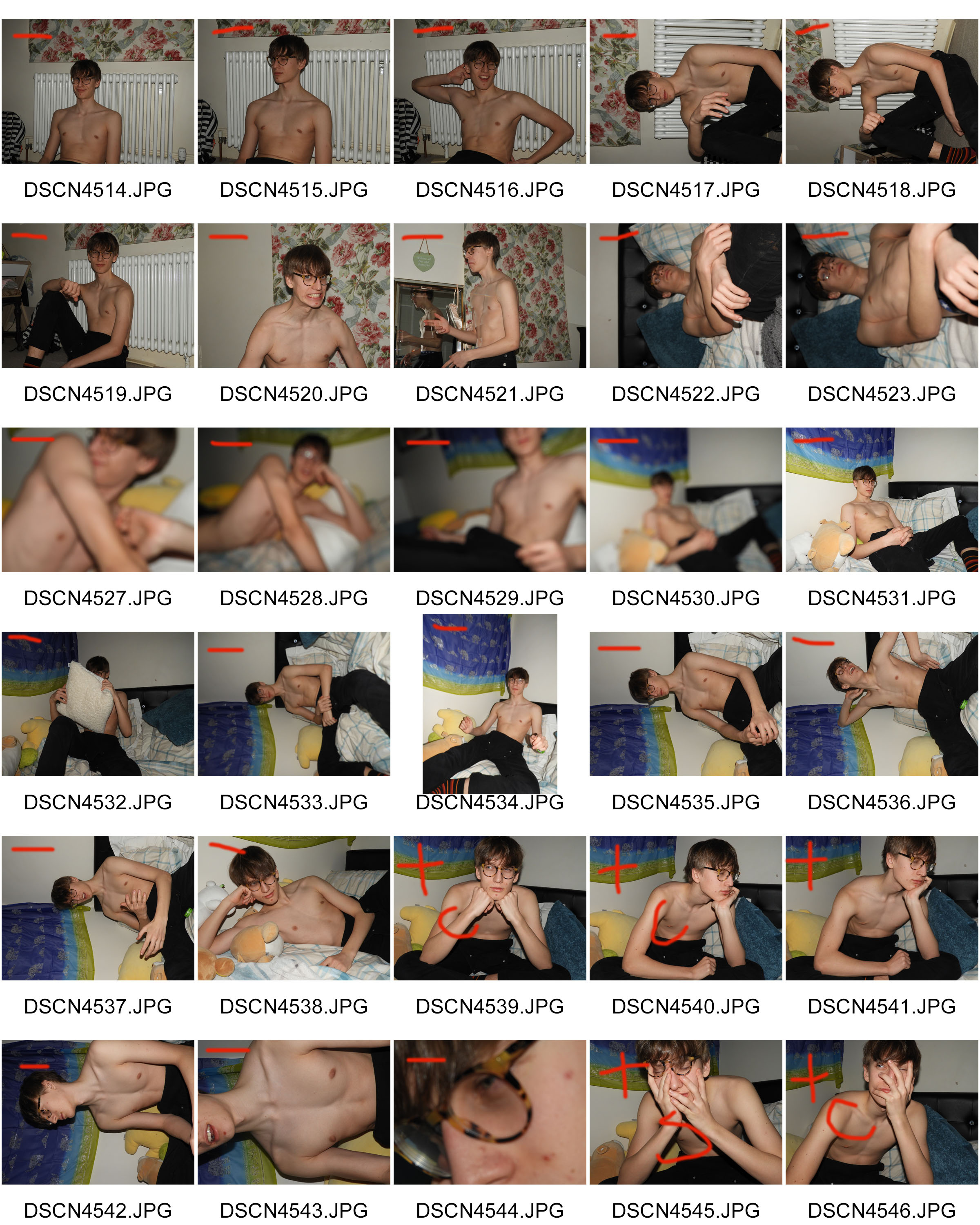
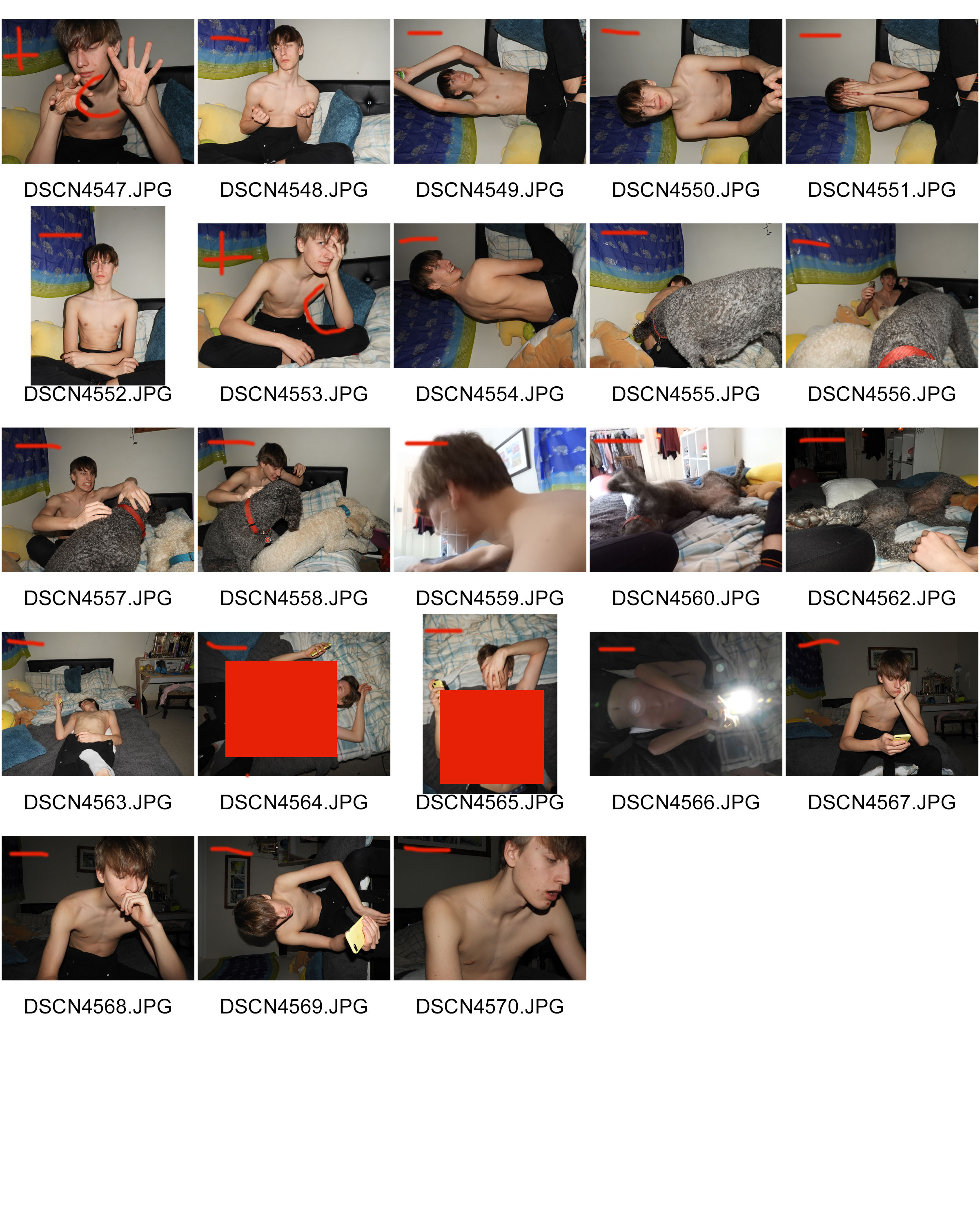
WHAT – I wanted to take as many images as possible in different positions in order to have different layers which I can later add to my photo montage.
WHEN – This was taken during the evening as I used lash photography and wanted there to be a striking contrast between the backdrop and the model.
WHERE – The images were taken indoors.
WHY – The images were taken as the starting material to use for my photo montage later, using different editing techniques in Photoshop in order to create a final product which incorporates artistic intentions and photography.
HOW – I used a dark room and flash photography in order to create the images.
CONTACT SHEETS:
EDITING TECHNIQUES:


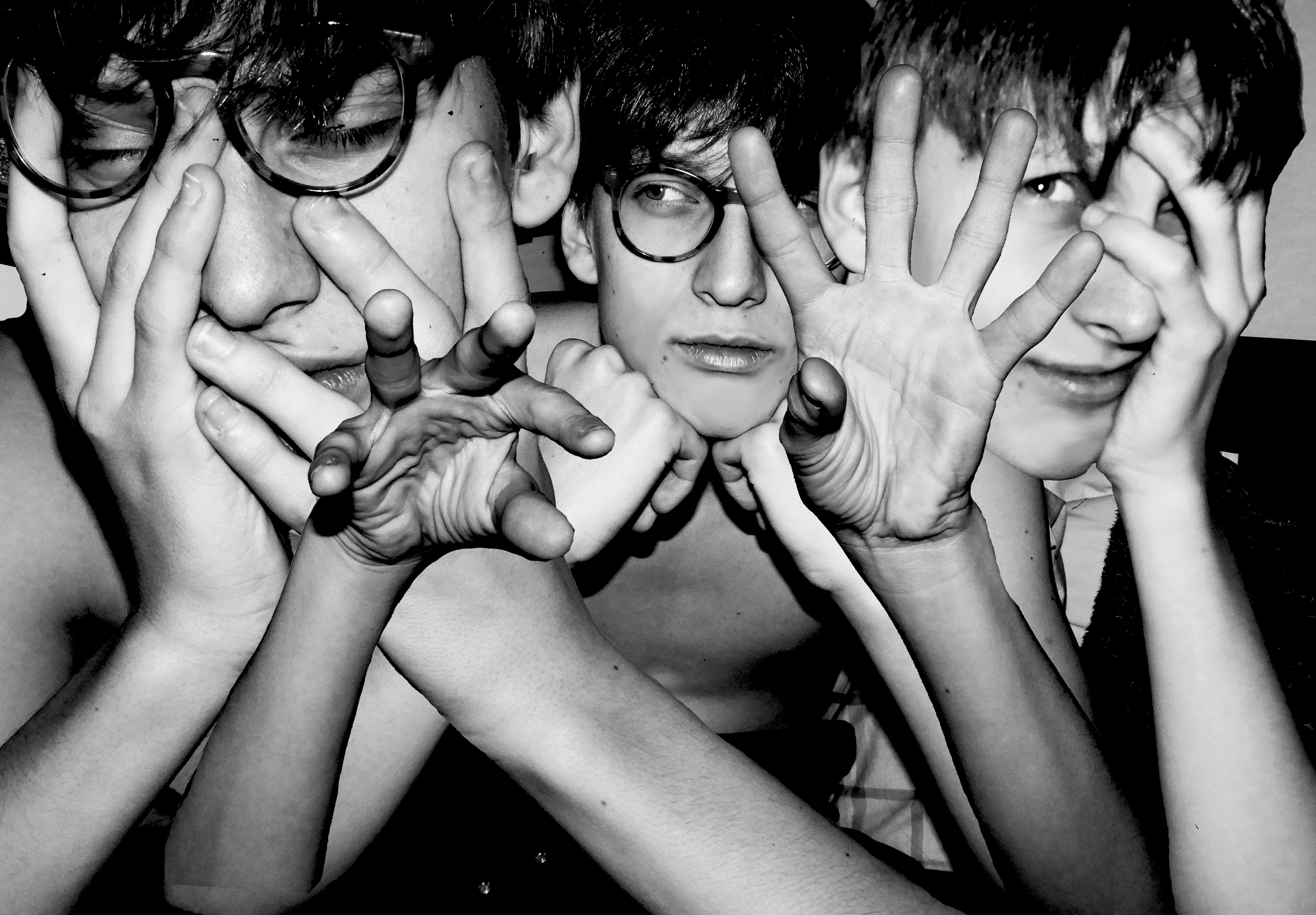
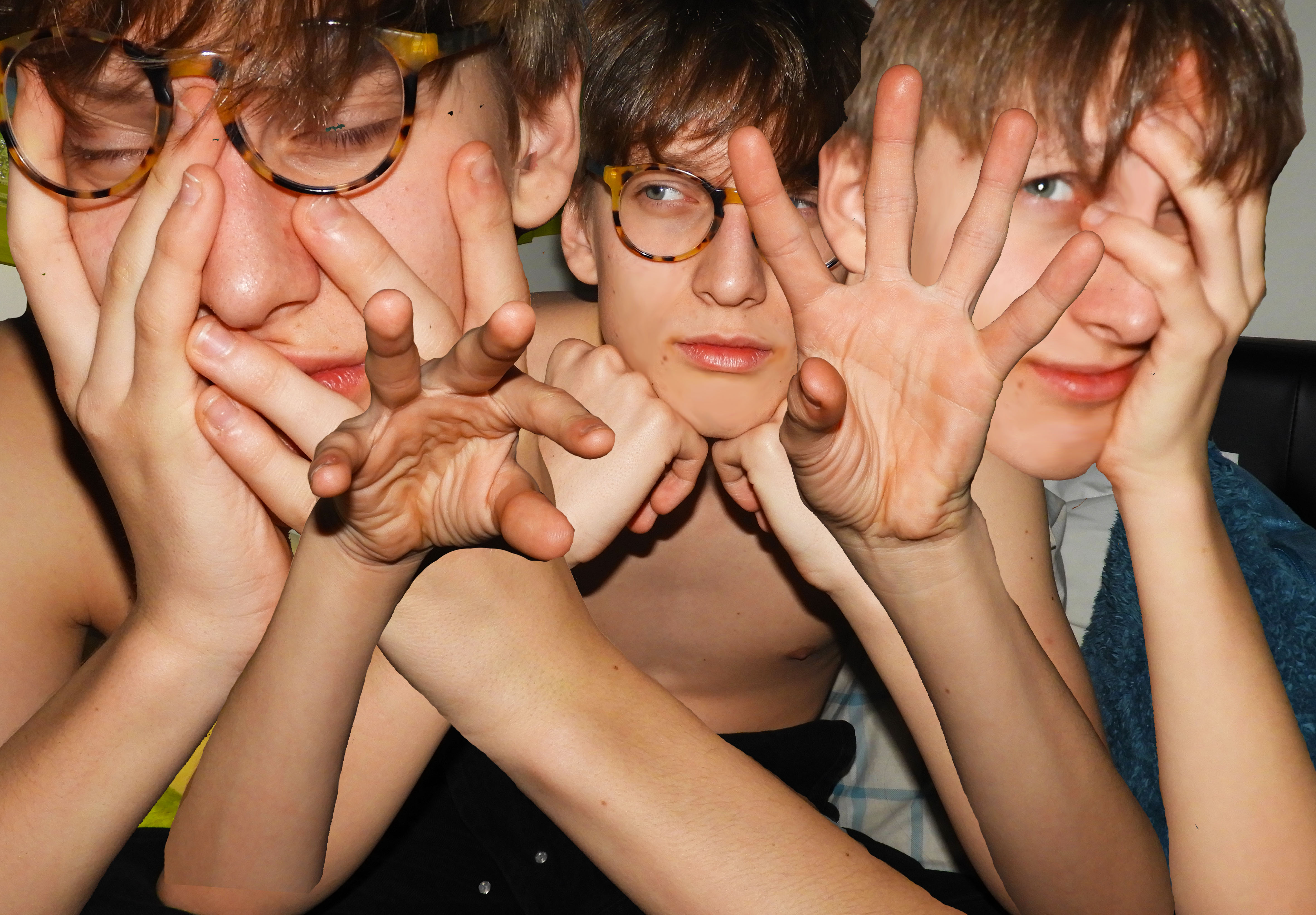
When editing this photo montage, I used multiple editing techniques in order to achieve the final product. I started with my base image, cropping it and perfecting the skin of the model in order to have a clean canvas to work with. I used the blur and smudge tool in order to smooth out the skin of the model. I imported another 3 additional images for the layering of the montage. The main tools which I used to cut out the hands and torso of the model was the magic wand, quick selection tool and magnetic lasso. I found the magic wand tool to be very useful as it allowed me to get rid of large areas of background quickly and efficiently. I only used the magnetic lasso tool when the area I was selecting had a clear backdrop, as the tool is very sensitive and catches onto other unnecessary parts easily.
I later on also used the eraser tool to smooth out any rough edges around the arms which were left behind. When arranging the arms, I used a transparent gradient so that they blend well into the skin around it, preventing harsh edges. I adjusted the size and positioning of the different layers so that they fill the surrounding space effectively and blend together seamlessly. I moved different layers around so that the central hands were in the very foreground of the image.
Once this was done, I again used the blur tool to soften the edges of the hair and make them a little less harsh. In the final stages of editing, I added a black and white filter onto the image and increased the contrast. I decreased the ofset in order to deepen the black and create a stronger gradient of black and white.
MY RESPONSE:
EVALUATION:
The overall process of creating this photo montage was fairly easy yet time consuming. The most difficult aspect was finding appropriate images which conveyed some feeling and variation in the facial expression of the model. I also wanted variation in the hand position of the model, as this is what makes the image unique and different. A key aspect of Draxler’s work is the consistent use of grey scale therefore I experimented with the different depths of black and white in the image.
COMPARISON TO KEY PHOTOGRAPHER:
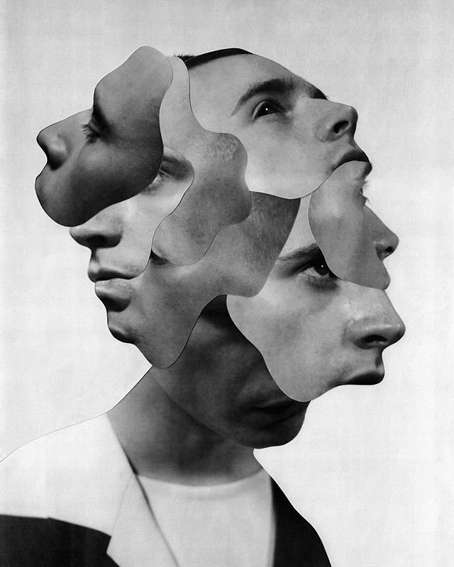
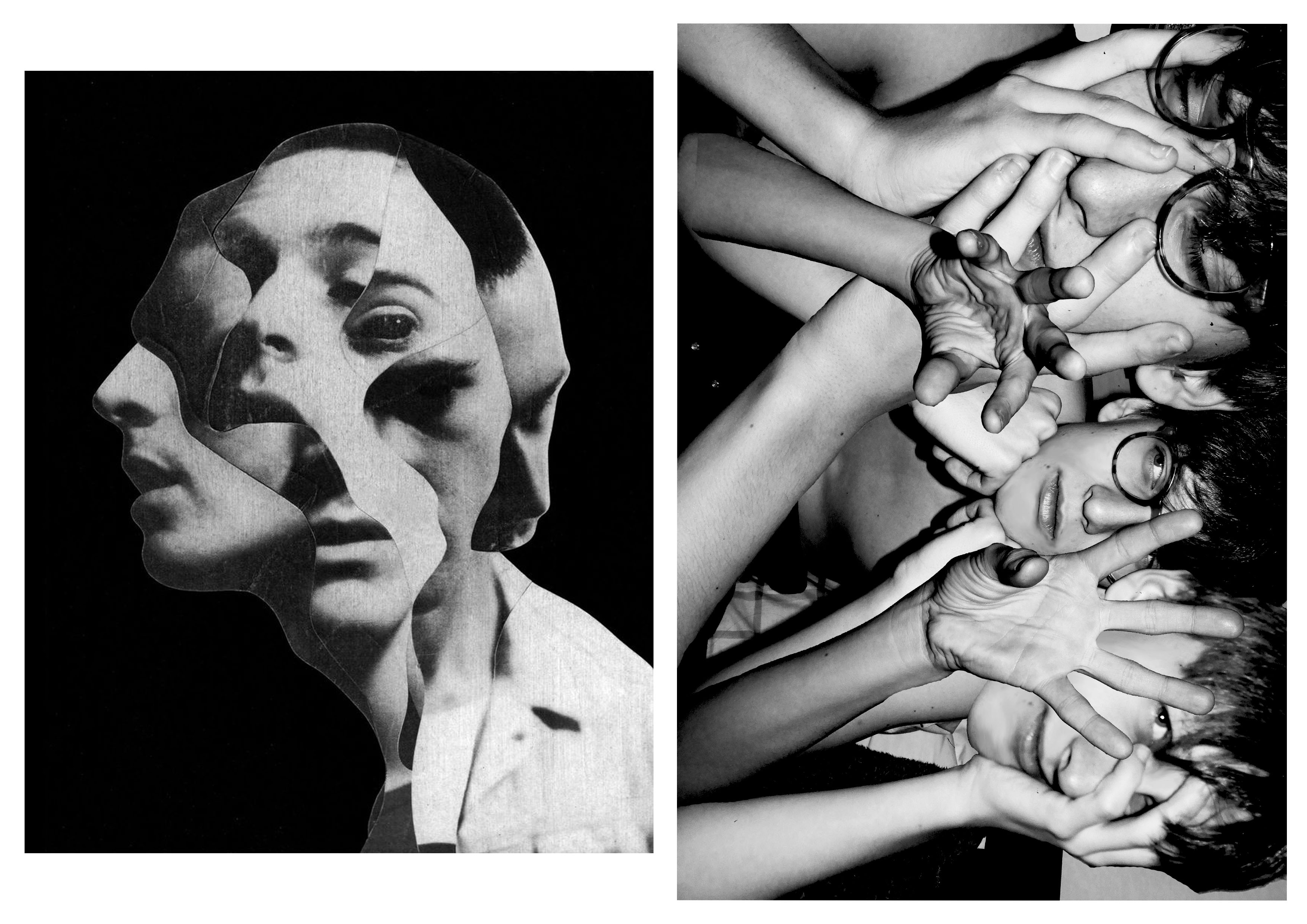
When making my photo collage, this specific photo from Draxler (misophonia) was my main inspiration. The main concept which I was trying to replicate was the duplication of the face of the model in the image. In order to add my own artistic elements and to differentiate my work, I decided not to use the irregular cut out pattern of Draxler. Another element which I used was the strong grey scale filter. I previewed my work without the filter and came to the conclusion that in order to create impact, the filter was needed.
CRITICAL ANALYSIS:
TECHNICAL –
During this photo shoot, the main objective was to create strong contrast between the backdrop and model using flash photography. It proved to be very effective as during the editing process, I could easily use the magic wand tool, lasso, and quick select tool to get rid of the backdrop. Whilst adjusting the light, I increased the exposure and contrast of the image to create dramatic lighting. I did not use any additional equipment such as tripod as I wanted the images to be less staged and more relaxed and casual, making the facial expressions of the model more genuine.
VISUAL –
I think when you first look at the image it is very striking and bold with the highly contrasting black and white, creating a monotone state. The themes which come to mind when looking at this image is worry and stress as expressed by the models face and hand positioning, touching the face and hair. There are many elements and layers involved in the image which create confusion. The hands central in the image have a gesture which pulls the viewer in, a sort of hypnotizing movement that makes them focus in. The straight lines of the edges of the arms, guides the eyes from the bottom of the image to the top where the hands and face are located. The central and right hand face are both looking into different directions which make the viewer question the circumstances of when the image was taken and what exactly the model is looking at. There is a sense of repetition and pattern with the use of the same face with different facial expressions and hand position. The hands of the model take position in the foreground of the image and the face in the mid-ground as they are covered by the hands and are shifted further back.
CONCEPTUAL –
The concept of this whole photo shoot was to be as authentic and relaxed as possible. Prior to the photo shoot, I asked the model what emotion they felt most significantly, tho which the answer was “worry”, therefore this was the theme which I tried to sustain throughout and make it clear in the final product. I chose images which clearly reflect this emotion and could be recognized by the viewer.
CONTEXTUAL –
The purpose of creating photo montages is to create hyper reality. Something which is pasted together to create an art piece which is surreal and fantasy like.
The process of creating a collage photo can be traced back to the first darkroom printing attempts, when photographers experimented with direct contact printing of objects placed on photographic plates, or techniques such as double exposure and masking. Of course, the art of “mounting the photos together” doesn’t have to involve the creation of new pictures at all – it can employ found and existing prints only as well, depending on the artist’s intentions and goals. Finally, with the advent of computers, the need of having physical imagery disappeared altogether, as today’s examples of photomontage art are being assembled within editing softwares and often never end up in a printed form.
Perhaps the most famous photomontage came during the mid-Victorian era. Then called “combination printing”, it was created by Oscar Rejlander, a pioneering photographer who was one of the experts in the field. His 1857 collage photo The Two Ways of Life was followed by the 1858 Fading Away by another artist, Henry Peach Robinson. By the end of the century, many other artworks came to life, specifically in forms of funny-looking postcards which often featured the wrong head stuck on a different body, or the creation of strange, impossible creatures. By the beginning of World War I, the method gained its first momentum, with photographers all over Europe producing postcards showing soldiers departing for battle with their loved ones seeing them off. More specifically, it was the Berlin Dada group that developed it as a tool of protest against the war and other political issues of the period, turning it into a proper modern art form.
source: https://www.widewalls.ch/photomontage-art/
Frida Kahlo – Tableau photography
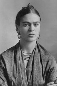
Frida Kahlo de Rivera born Magdalena Carmen Frida Kahlo y Calderon; 6 July 1907 – 13 July ) was a Mexican artist who painted many portraits, self-portraits and works inspired by the nature and artefacts of Mexico. Inspired by the country’s popular culture, she employed a naïve folk art style to explore questions of identity, post colonialism, gender, class and race in Mexican society. Her paintings often had strong autobiographical elements and mixed realism with fantasy. In addition to belonging to the post-revolutionary Mexicayotl movement, which sought to define a Mexican identity, Kahlo has been described as a surrealist or magical realist.
My Response
Within my response I wanted to incorporate her idea of portraying the taboo topics within society and beauty standards. People expect to look like models and Instagram posers so they go to extreme lengths to achieve this programmed look.
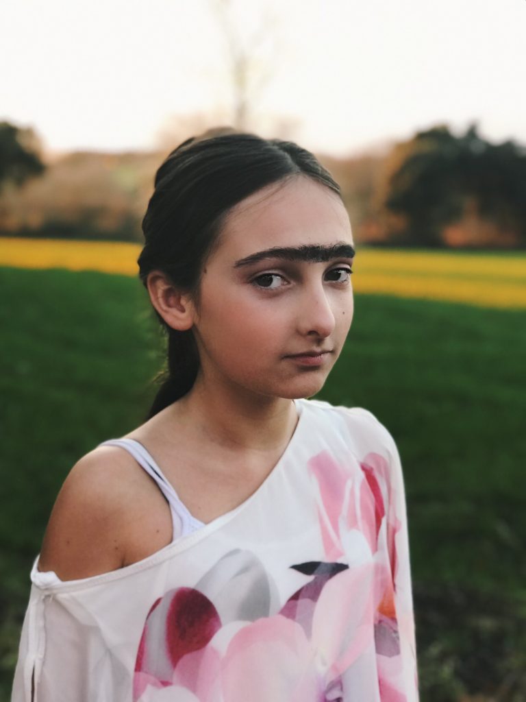
In my shoot I used a younger model due to the standards being passed down to even younger generations than before. I then incorporated Frida’ natural look he had. Through some research I found that during the Roman Empire Era, facial hair on women was a sign of intelligence and nobility. In a way, Frida reflected these traits whilst going against her modern day standards.
Final Images

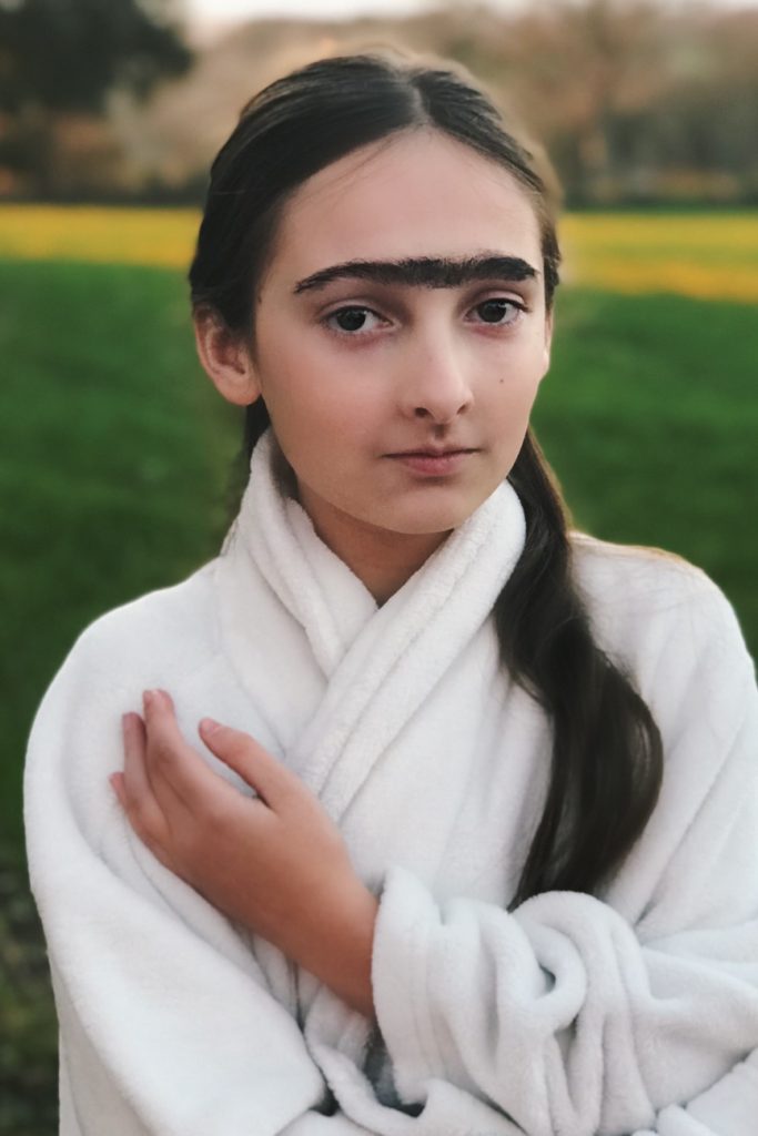

Analysis
VISUAL
Within these images I wanted my main focus to be my model but not have a plain background. Within Kahlo’s paintings shes depicted infront of either shrubbery or a earthy coloured background. So, i put my model in front of a field to capture the nature as well as the model.
TECHNICAL
In order to create my blurred background, I firstly set my cameras depth of field so that it only focused on my model, then once i began processing the image my background wasn’t blurred enough so I used the Photoshop blurring tool so that only my model was in focus. As far as lighting goes, I only used natural light.
Tableau photography
Background:
The idea behind Tableau Photography comes from the term ‘Tableaux Vivants’, which translates from French to Living Picture. These are made to show a static scene showcasing actions between 1 or more characters in a scene. They are usually in costume and carefully posed with props. The term was mainly used for artwork/Paintings in the early 20th century, where artists would paint stills of large detailed events. Tableau Photography and painting is linked to theater in terms of lighting, poses and style. The main point of Tableau Photography is to create emotion and introduce symbolism and meaning to your photographs.
Examples:


Clare Rae X Claude Cahun
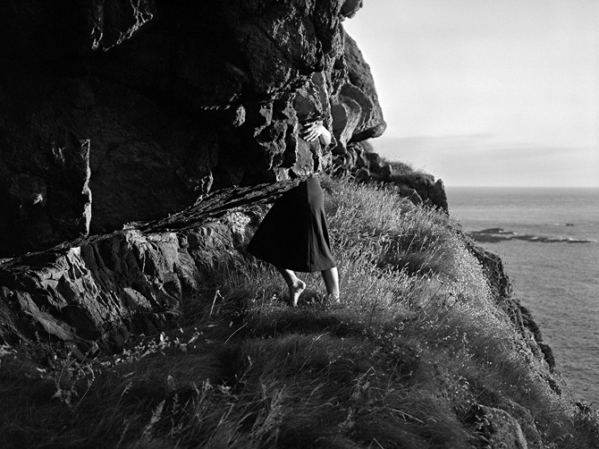
The exhibition at the CCA gallery has a purpose to show the response Clare Rae has made to the photographer Claude Cahun through her work. The exhibition does this successfully by separating the two artists work into adjacent rooms, even though kept apart both artists work are hung in the same way, both display the work without boarders to the photographs and each piece of work spaced differently and this was effective for the type of exhibition. The exhibition was successful in that Clare Rae had successfully responded to the work of Claude Cahun in matters of her style of work and the final finish of the work
The exhibition was successful in that Clare Rae had successfully responded to the work of Claude Cahun in matters of her style of work and the final finish of the works.
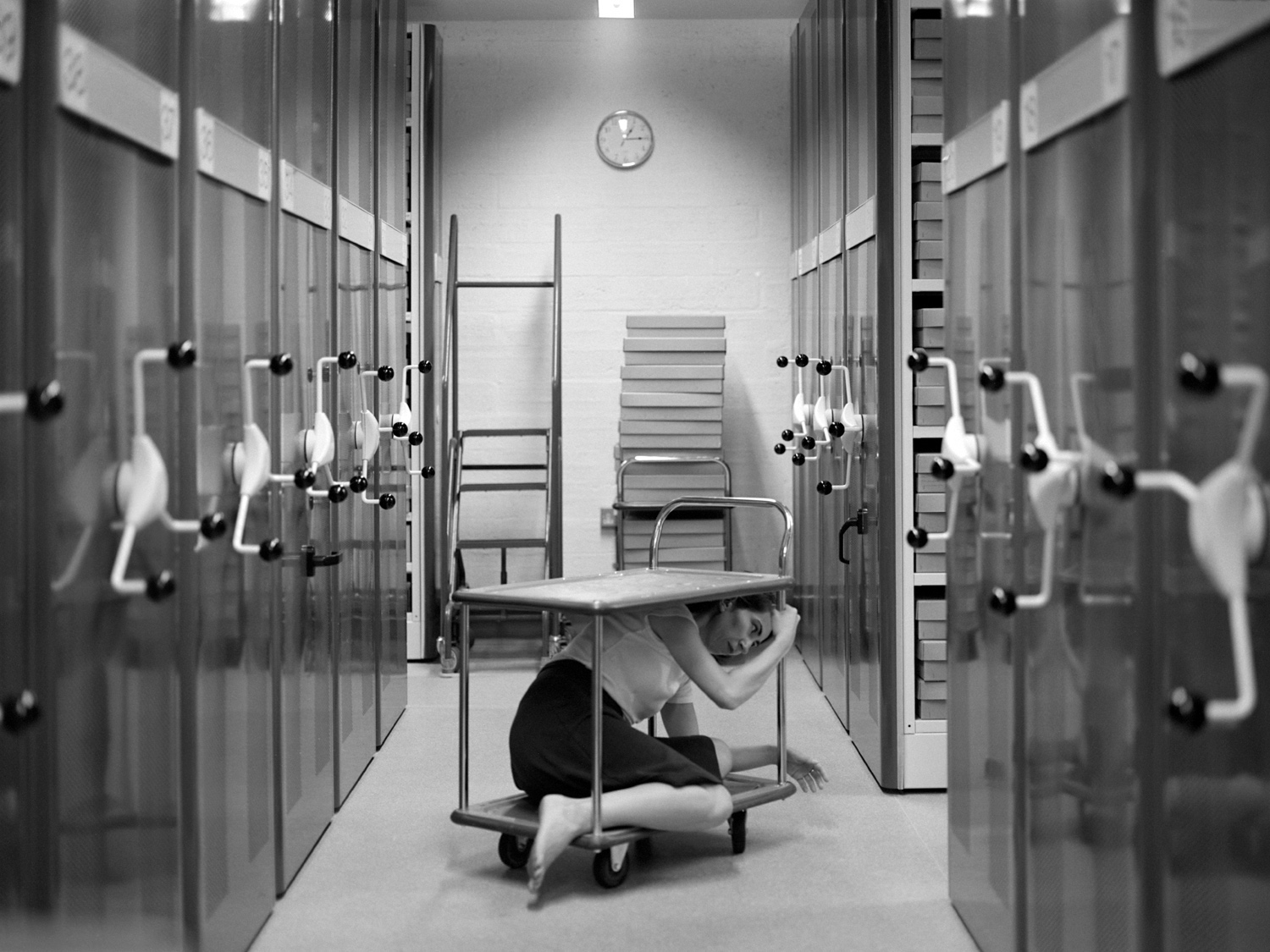
This is one of the photographs produced by Clare Rae in response to Claude Cahun. From looking at the photograph I can understand and visually see where her influence has derived from. Her use of space shows a direct link towards one of Claude Cahuns own photographs. The photograph creates and effect and impression of the depth and use of the space around her as she crams herself under the top of the trolley. This is a similar idea that Cahun previously looked into as she placed herself into the self of a cupboard.

Above shows the photograph first created by Claude Cahun and it is the photograph that I believe has been the one to influence Clare Rae to produce the photograph she created above. I feel Clare Rae successfully responded to Cahun through her work as she has looked into the different elements Cahun used in her work and for this particular response it was her use of space and how she places her body into the unusual spaces.
I believe Clare Rae has been heavily influenced specifically in this project of her work by Claude Cahun and I also believe that she has successfully reproduced her own work in response by experimenting with how she places her body into the landscapes and into the spaces.
Final Tableau Vivant Image
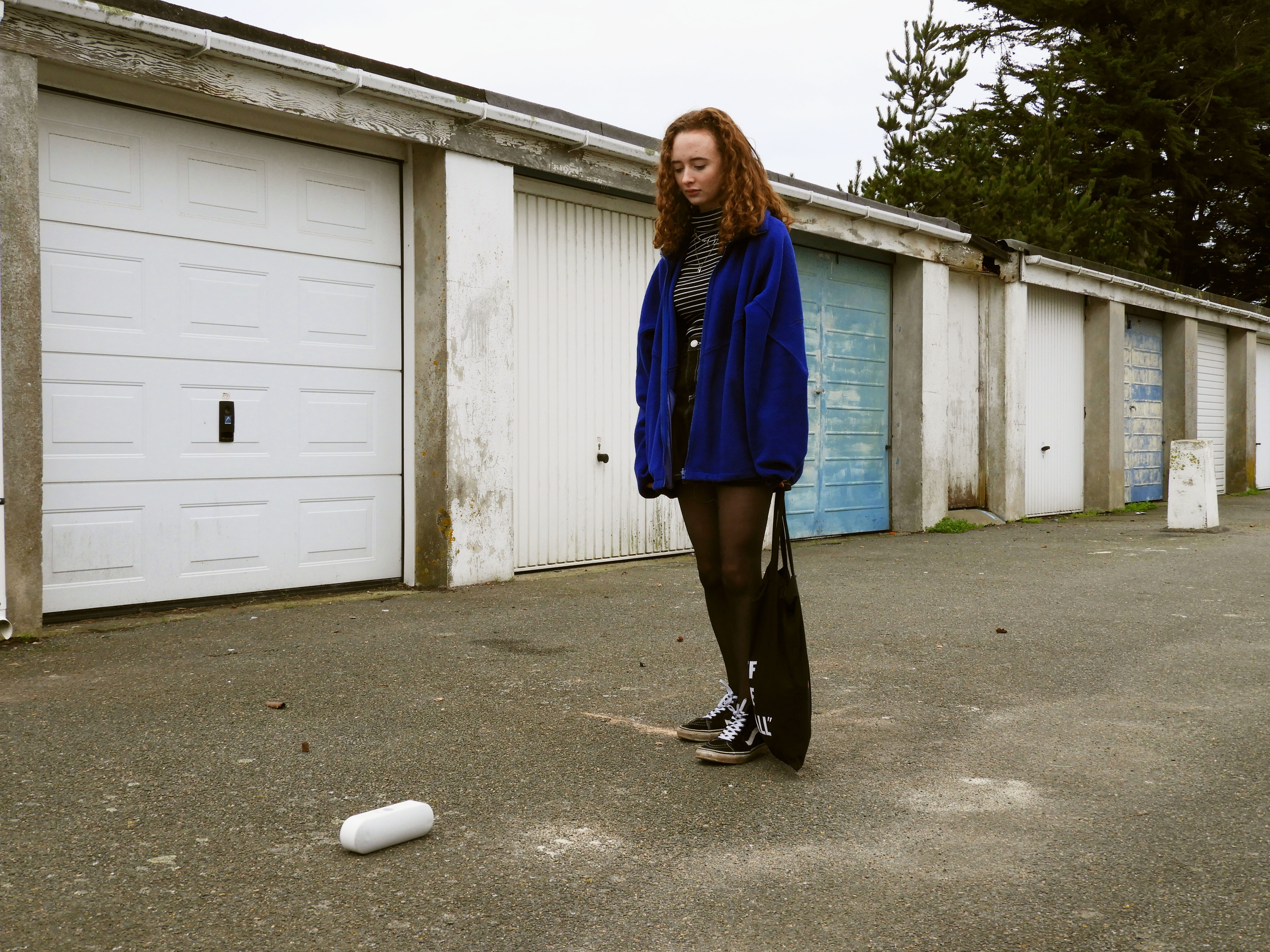
WHO – this is a recreation of Arnis Balčus’ work, using my own model in order to take form of the little boy
WHAT – the main objective of this photo shoot is to recreate and understand how Balčus creates his work and the symbolism which he chooses to include and adapting the environment and resources I have in order to recreate the photo in a similar way.
WHEN – the image was taken during mid day as I figured this would be a similar time of day judging by the original image and the direct sunlight in it
WHERE -the image was taken in an old communal garage space which resembles the location a lot in the image I am trying to recreate.
WHY – to understand the most suitable ways in which to photograph people, organize photo-shoots and comprehend the symbolism which has been used by the original artist
HOW – I used my regular DSLR camera for this photo shoot, all natural lighting.
FINAL IMAGE –
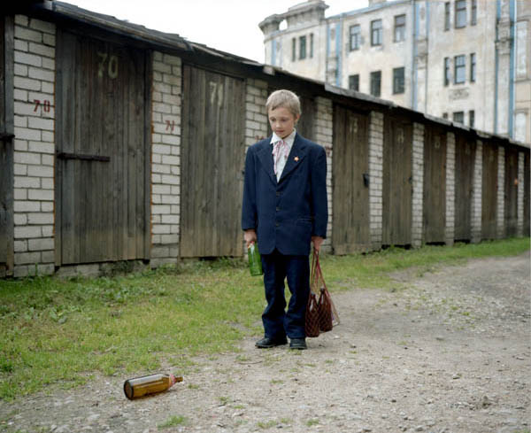
VISUAL ANALYSIS OF IMAGES –
VISUAL –
The image overall has a very gloomy and depressing mood around it. The depiction of a small child (recreated by a model which is also quite child like), looking at the empty beer bottle is synonymous with the prevailing alcohol abuse problem in Eastern Europe. The environment, which is worn and old, also suggests poverty and shortage of necessities for the child, almost using the beer bottles as toys. The child portrays sadness and loneliness. To put a modern twist on my own imagery, the glass bottle has been replaced with a speaker, as this is representative of the technology reliant youth of today. The weathered and old garages in the back of the image nicely contrast the main subject in the foreground by disturbing the repeating pattern. In order to have some similarities with the original image, the model is wearing a bright blue jacket, which immediately draws in the viewers eye to the center of the image. Both images can be split up with the rule of thirds, where the subject is situated in the middle of the image. The upwards facing power play between the camera and the model makes her seem a lot taller than reality, giving some power to the subject. The neutral expression of the model also creates a theme of confusion and mystery in the image as the viewer is not clear on what the subject is feeling. The direction in which the subject is looking at, leads also the viewers eyes down to the ground where the speaker is (situated in the bottom left third of the image). The overall color scheme of the image is dull and neutral, being mostly made up of subtle blues and grays.
TECHNICAL –
This photo was taken during late morning, on a cloudy overcast day. I especially chose this day due to the fact that this is what resembled most in the photo I was trying to recreate. I set the white balance of my camera to the “cloudy” setting in order to achieve well balanced images. As it was a cloudy, yet still bright day, I turned down the ISO of my camera down to 200 to avoid the image being overexposed. As this was a very staged image, and the subject was standing still, I chose to use a tripod to make sure the image is crisp without any motion blur, due to this I kept my aperture mid way at 1/125 as I wasn’t concerned with the camera moving. I had a very clear idea of the positioning of the model and the prop therefore I first angled my camera and refereed to the original image for guidance. After a couple of shots, I was confident in the final image therefore contact sheets for this photo shoot weren’t necessary.
CONCEPTUAL –
The main objective of this photo shoot was to make sure that what I was recreating conveyed similar visual elements as the original image, using a model of a small stature and an environment which is very similar as the original. Of course as I am not the original photographer, not in the same environment, I have had to adapt and make do with the resources I have resulting in the differences seen in the image. I wanted to convey a different social issue which affects us here in Jersey, relating to our environment and society, with the presence of the speaker on the ground. Representing how technology dependent the youth is, looking to it for guidance, happiness and companionship. This effecting social skills and the way in which children grow up and interact with one another.
CONTEXTUAL –
At the end of the 1980s all the countries of eastern Europe and the former Soviet Union enjoyed relatively high levels of human development and social welfare. Extensive social investments during the period of communist rule meant that literacy was almost universal, and well above other countries with comparable levels of per capita income, and life expectancy averaged 68 years. Unemployment was unheard of and – at least officially –poverty did not exist. Few commentators could have foreseen that the process of transition towards market economies and democratic governments would have been so tumultuous and accompanied by such high costs in terms of individual well-being, particularly among the countries of the new Commonwealth of Independent States (CIS). The collapse of economic output in many of these countries following independence, along with hyperinflation that wiped out individual savings, resulted in a dramatic drop in living standards for the majority of people and the emergence of poverty as a major issue within the region. Increasing poverty leading people to alcoholism and the use of it in daily life.
Nearly all the top 15 biggest drinking nations are in Central or Eastern Europe. Poverty and the harsh climate, particularly in Russia, play a part, as does the tradition of drinking. “Where it’s extremely cold it’s not uncommon for people to drink all day long,” said Val Smith, president of International Wine and Spirits, which provided the data on per-capita alcohol consumption.
And particularly in agrarian regions; farmers often produce their own home brews from anything ranging from potatoes to sugar beets, making alcohol very accessible and very cheap, said Smith. This also makes per capita consumption hard to measure, with official figures sometimes well below actual consumption rates.
source: https://www.unece.org/fileadmin/DAM/ead/pub/041/041c7.pdf
Remember to complete any outstanding tasks over the Christmas Break…coursework deadline is January 31st 2019!!!
“To make a good portrait, you need to reveal a private moment, which can feel like an act of theft.”
Susan Meseilas
Staged reality shoot 1


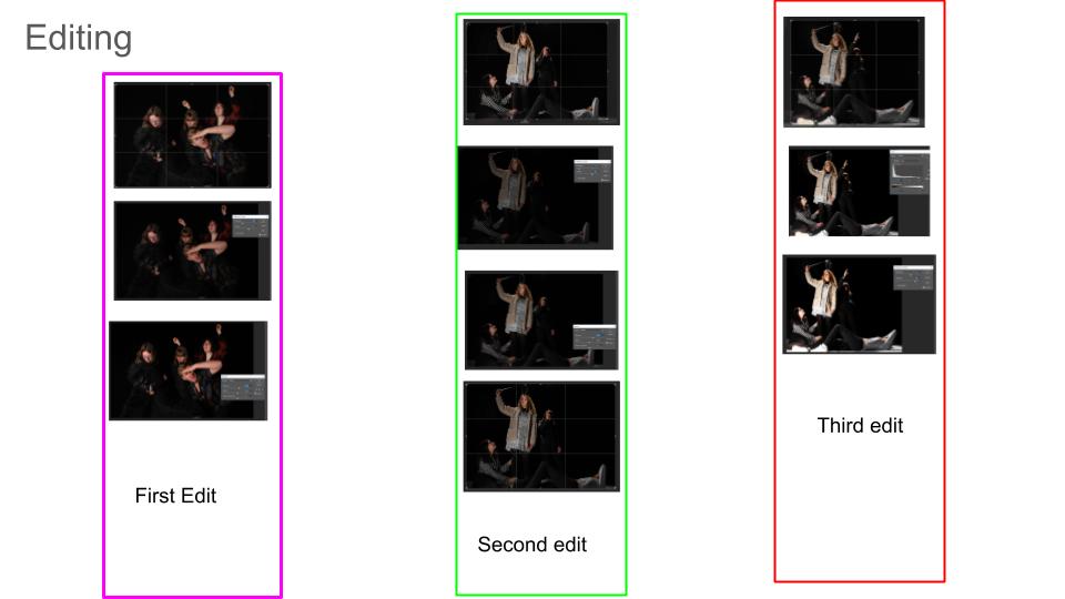
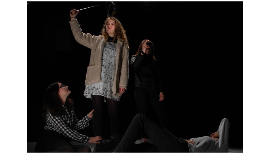


Tableau and staged reality photography – Cindy Sherman
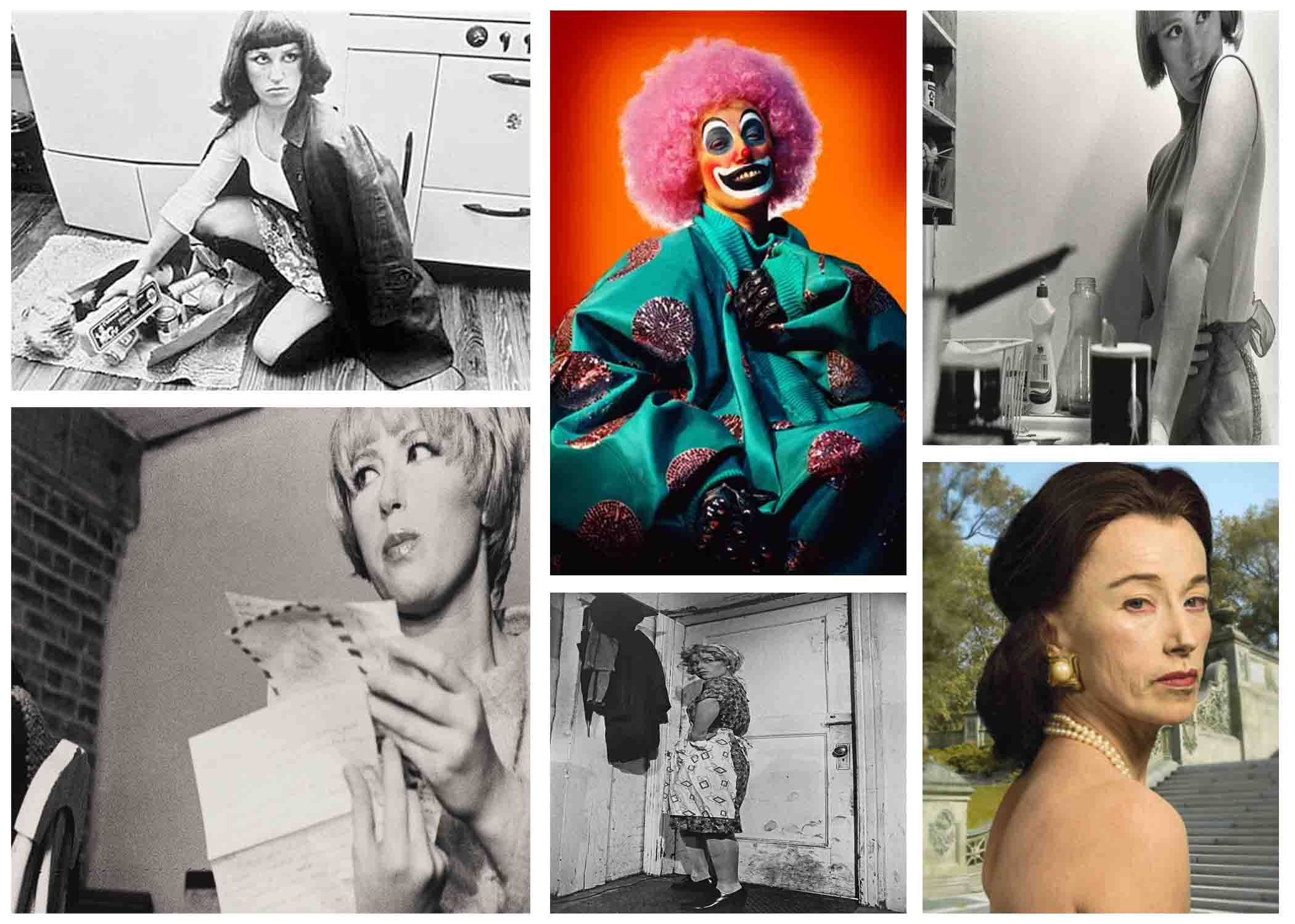
Tableau photography is a static scene containing one or more models or actors. They are usually in costume and are planned out carefully to create a certain scene.
Cindy Sherman is a postmodern photographer who started work in the 1970s and is still working today. She’s been important in the areas of “studies of the de-centered self, the mass media’s reconstruction of reality, the inescapably of the male gaze, the seductions of abjection, and any number of related philosophical issues.” She uses herself as the subject in almost all of her photographs except only a few. These are staged photographs that she takes in her studio. It’s important that they’re staged because we know that this is some sort of message embedded in them that she is trying to get across to us.
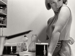
In this image, Sherman is shown to pose in the kitchen, in front of the sink with an apron on. This is clearly making a statement on the gender stereotype of women’s place in the house, which was typically in the kitchen. This looks more of like a 1950-60’s setting, where the role of women were pretty fixed within society, and they were berated for being anything else otherwise. Sherman may have been fighting against these stereotypes and making the voices of women louder when it came to their rights and how society saw them, and going against the tainted norms to make a change.
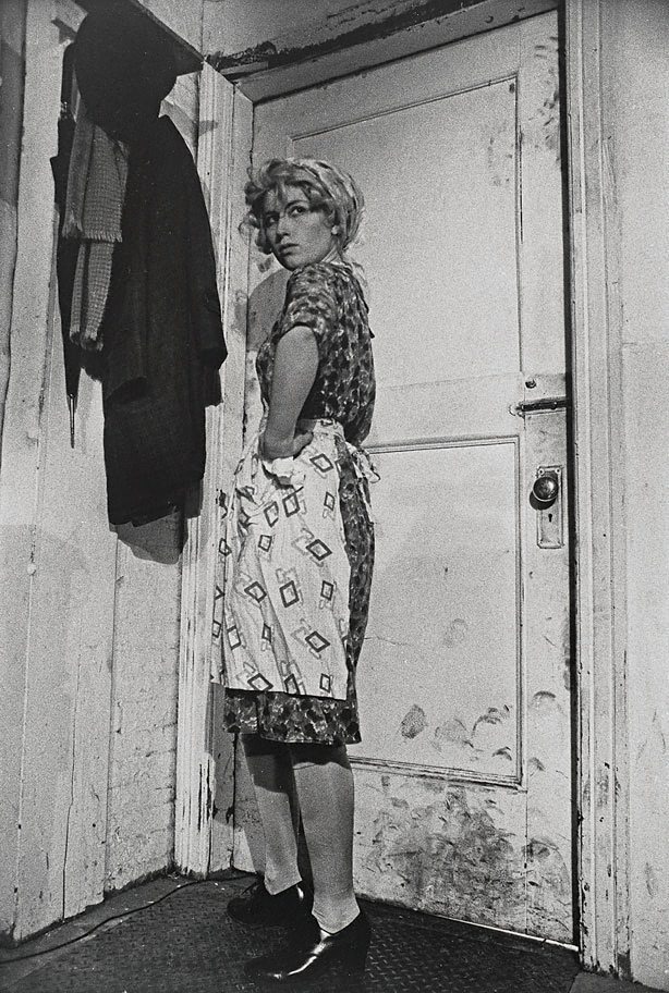
In this image, a woman is shown standing by a dirty door, in typical house wife clothes of the 1970’s. Like many of her works, and the one I mentioned above, this portrays the stereotypical view of women and their duty to the house hold.
Tableau Vivant
A tableau vivant, French for ‘living picture’, is a static scene containing one or more actors or models. They are stationary and silent, usually in costume, carefully posed, with props and/or scenery, and may be theatrically lit. It thus combines aspects of theatre and the visual arts; a group of models or motionless figures representing a scene from a story or from history.
Paul M Smith, uses MULTIPLE EXPOSURE TECHNIQUE
Tableau In Class
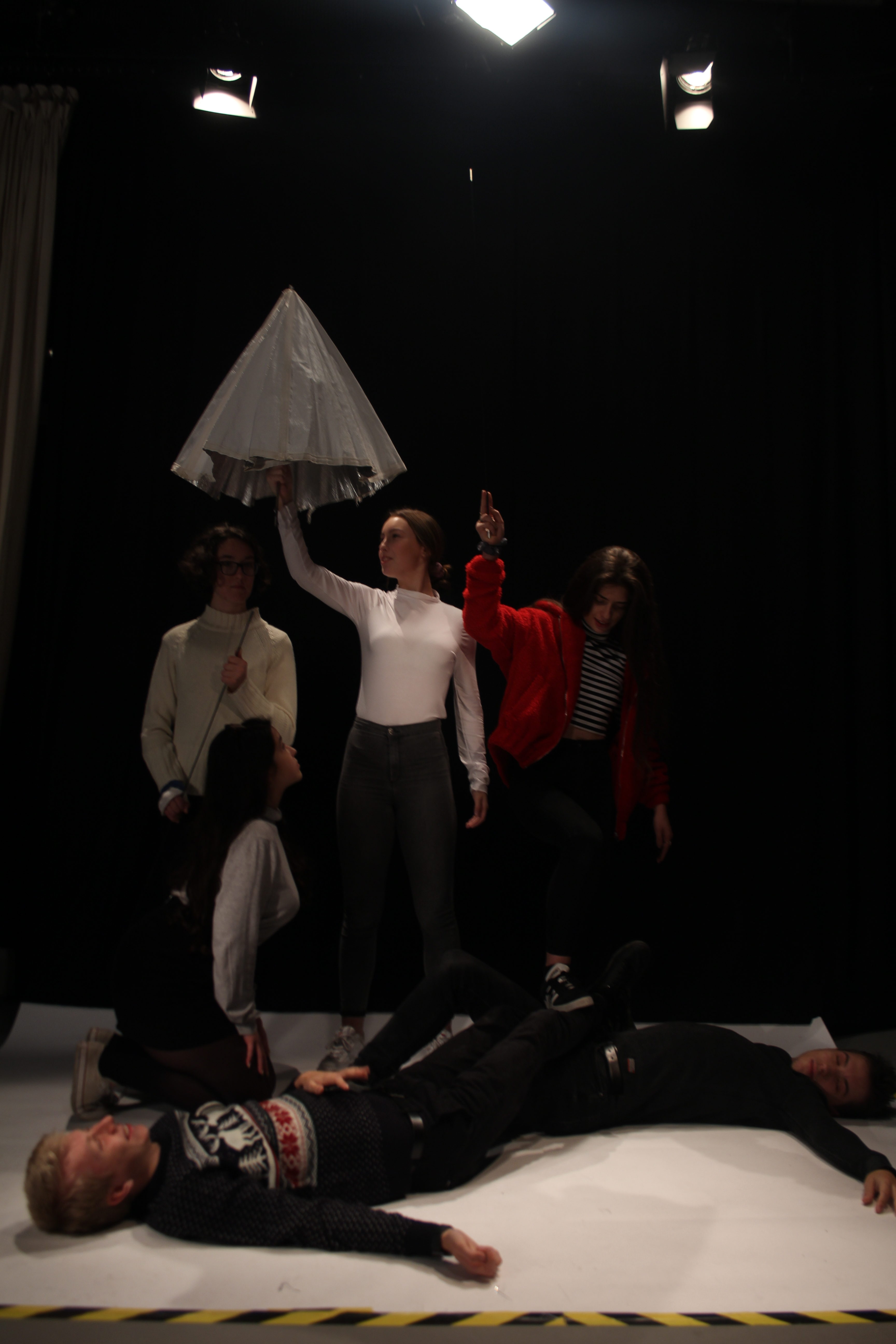
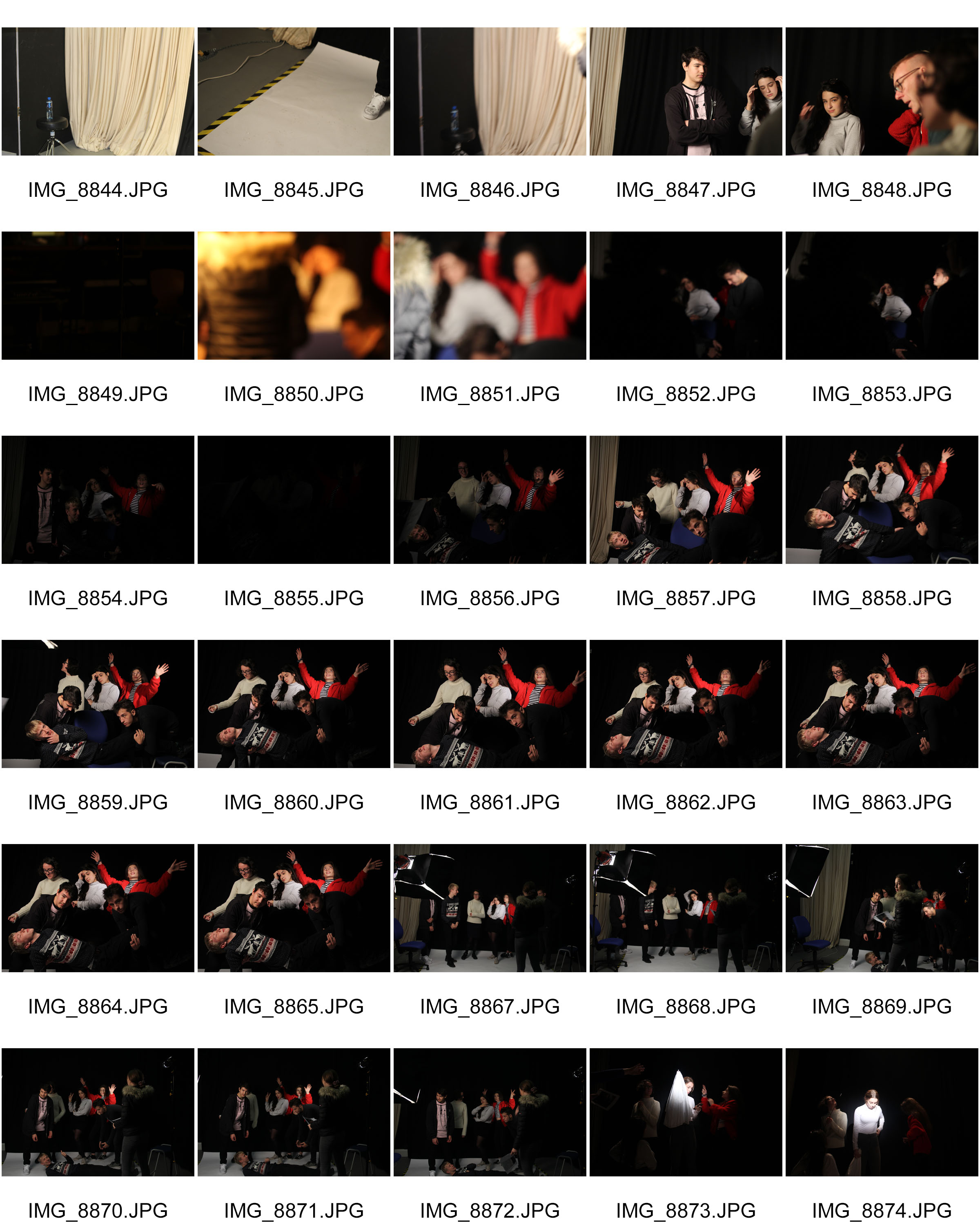
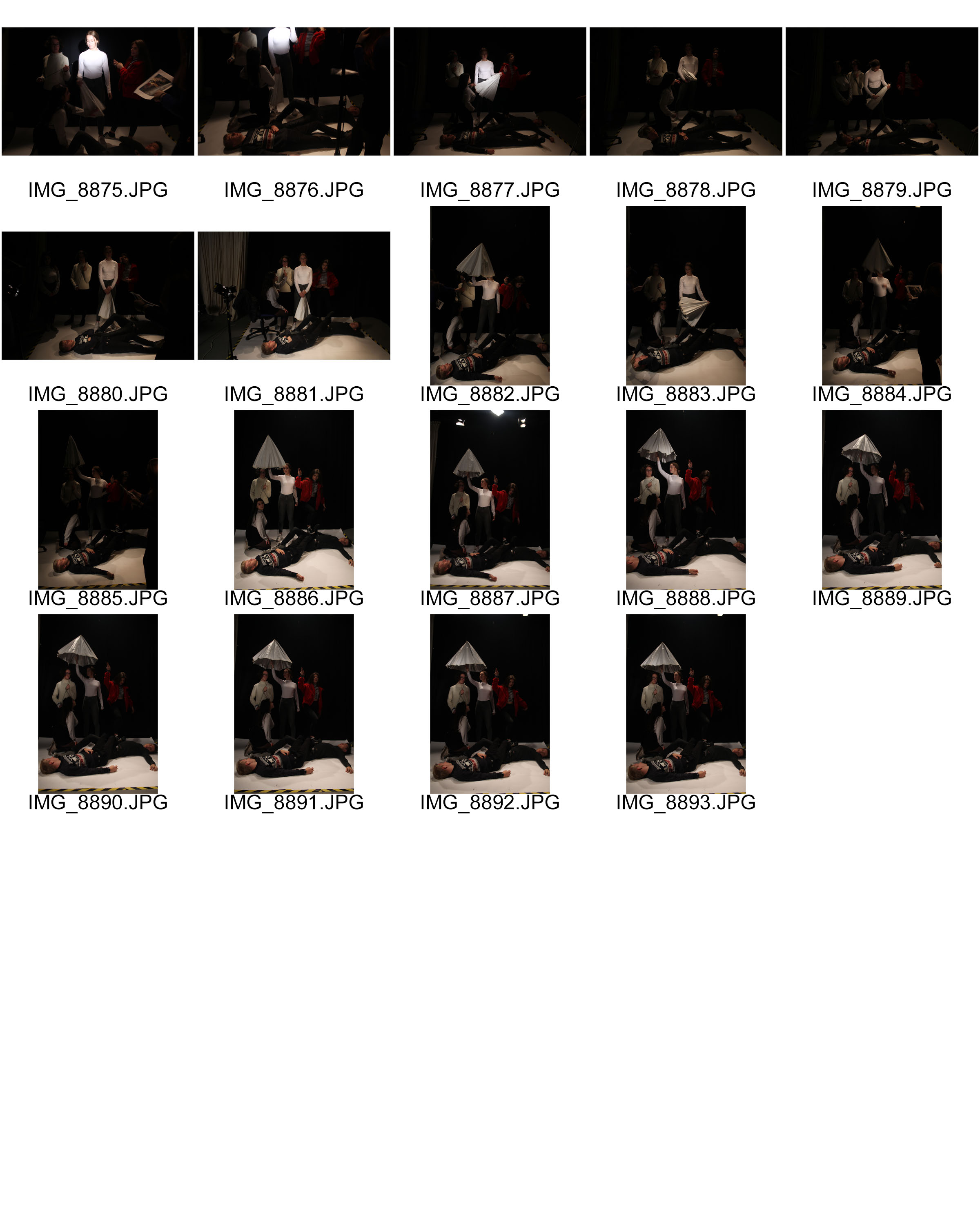
The two paintings which the class recreated were “Deposition / The Entombment of Christ” by Caravaggio, and “Liberty Leading the People” by Eugène Delacroix.
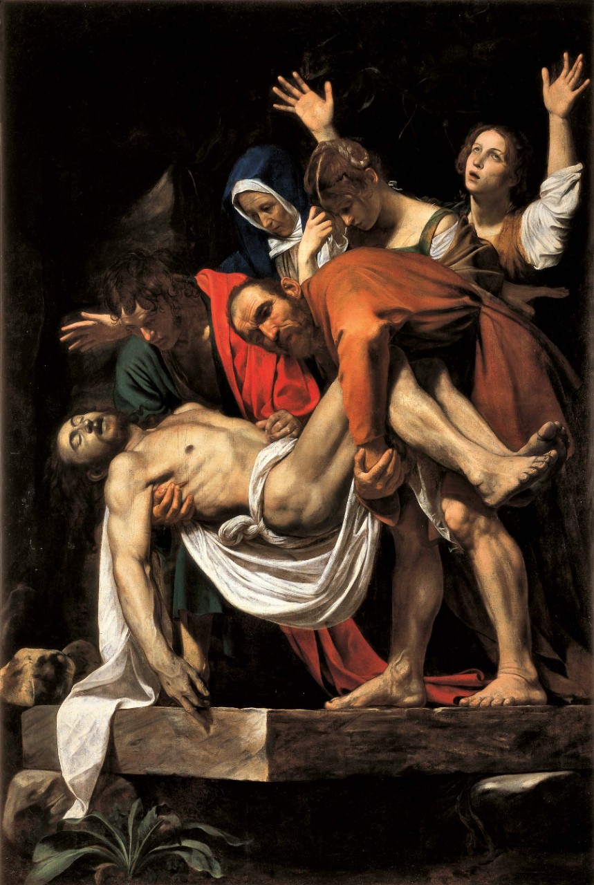
The Entombment of Christ – Caravaggio

Class Responses
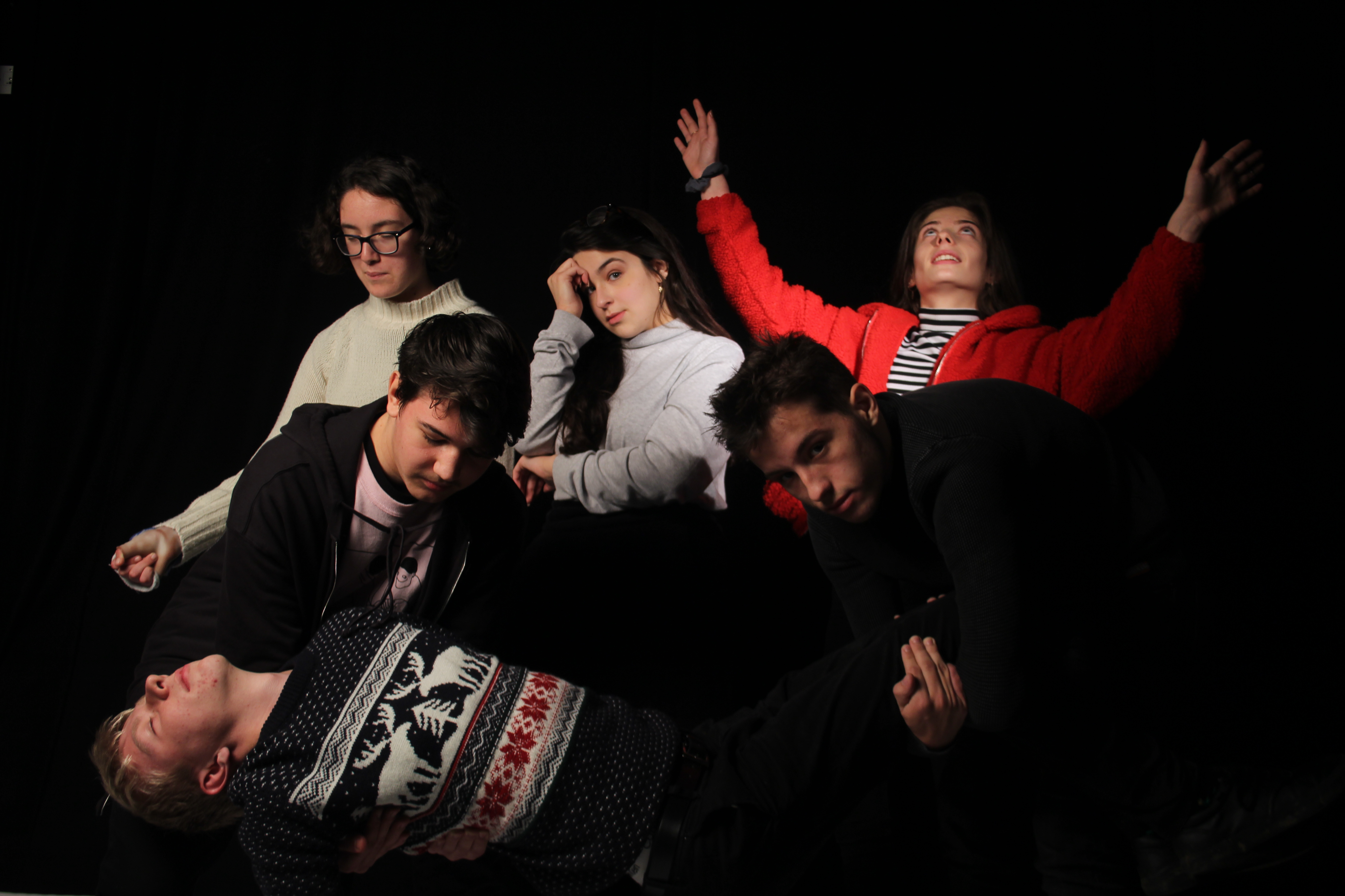
Editing Of Class Response

![]()
Own Tableaux Response
Using Paul M Smith’s work as inspiration


Images by Paul M. Smith, from the collection: “Make My Night” http://www.paulmsmith.co.uk/
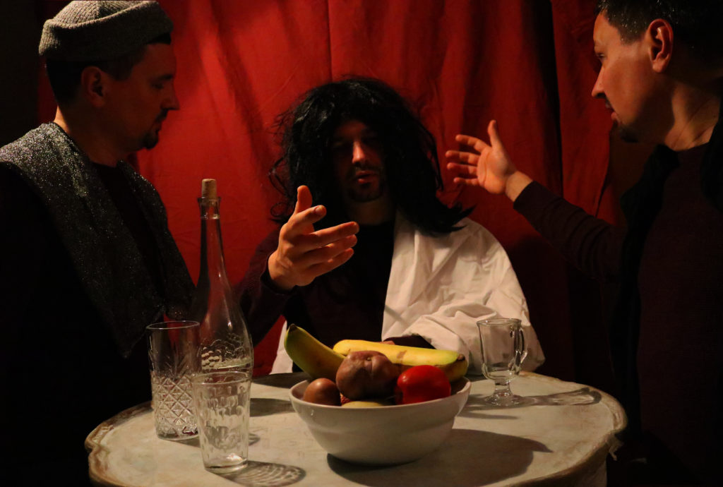
For my Tableaux Vivant and Paul M. Smith response, I would like to merge together and edit three separate images of the same subject; wearing different outfits, in different poses, and the in the same frame.
I will be responding to the renaissance work “Supper At Emmaus” – by Caravaggio; featured below.
Images
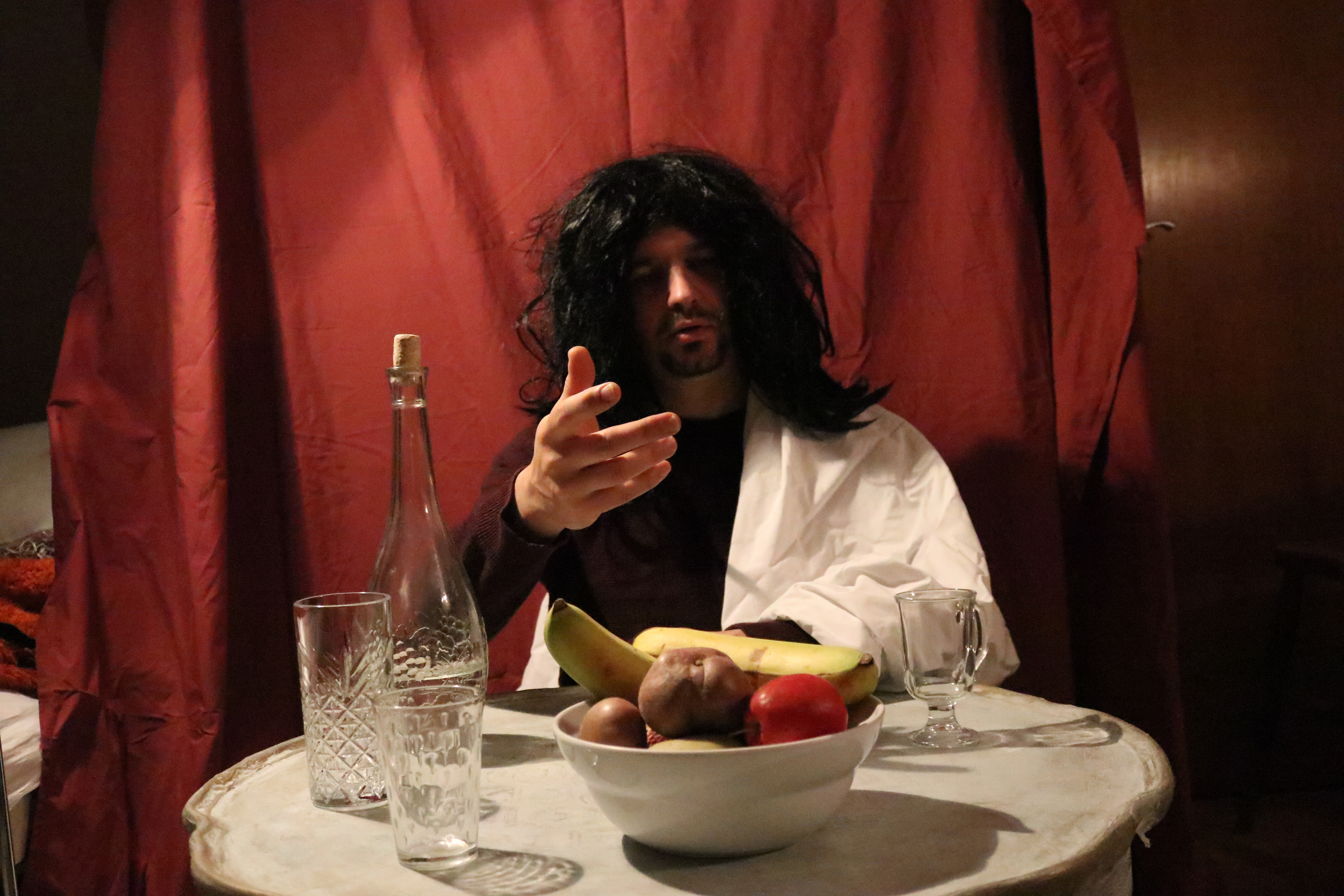
Image 1; used as base image for the final edit.
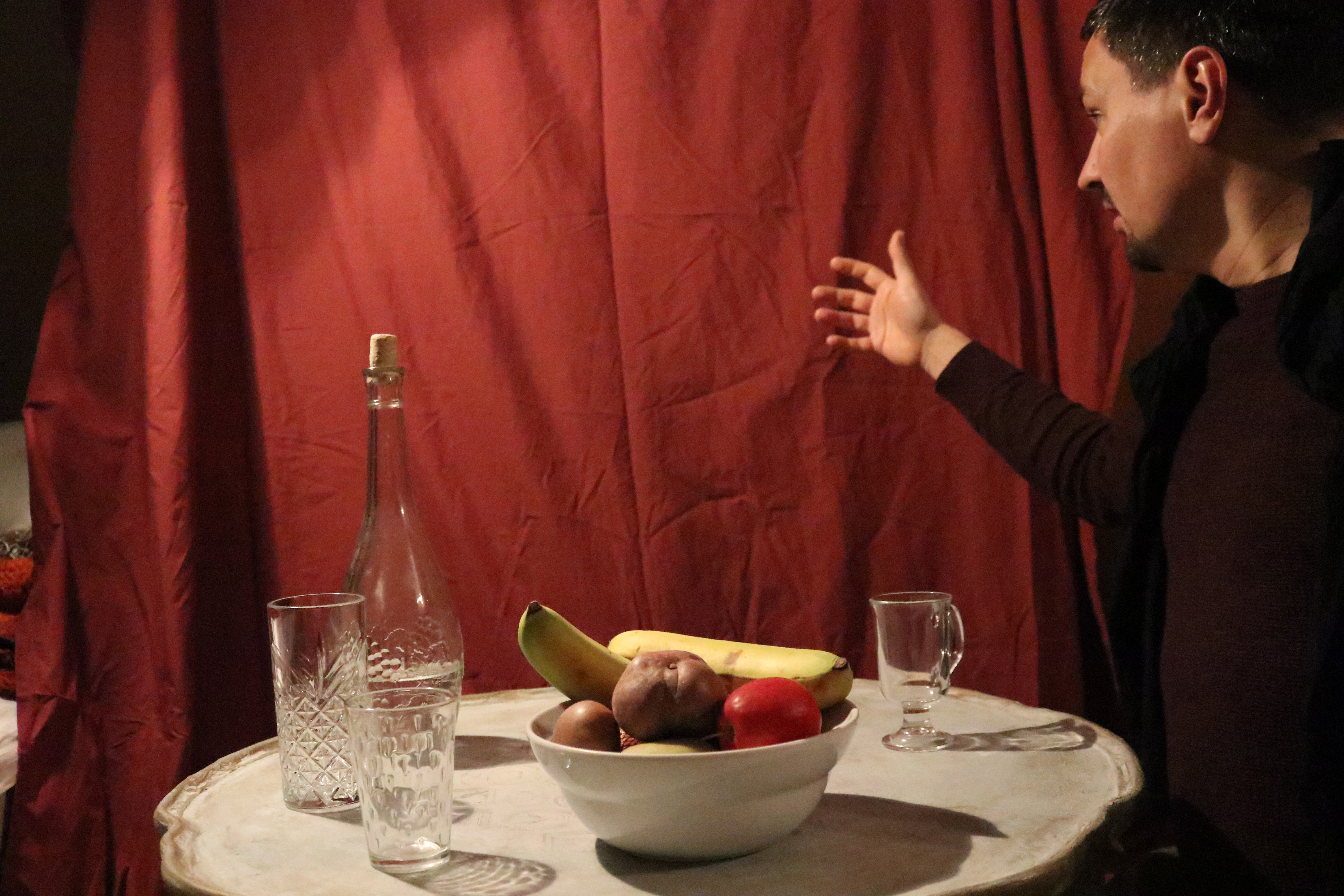

Edit
I have edited this image by using a base image as an anchor-point to synchronize the other images and the props, to do this I have also set the opacity of the other images to 50%.

After wards I cut out and set new layers for the crucial parts of the layering images e.g: Shadows, subjects. And then used the eraser tool with low hardness to ensure a smooth transition between the anchor image and the layer images.

Final Edited Image
