Category Archives: Homework

Filters

Author:
Category:

Home-Sweet-Home – Post 3 (Final Images)

Final Images:

Shoot 1:

Shoot 2:

Best Image:

Technical:

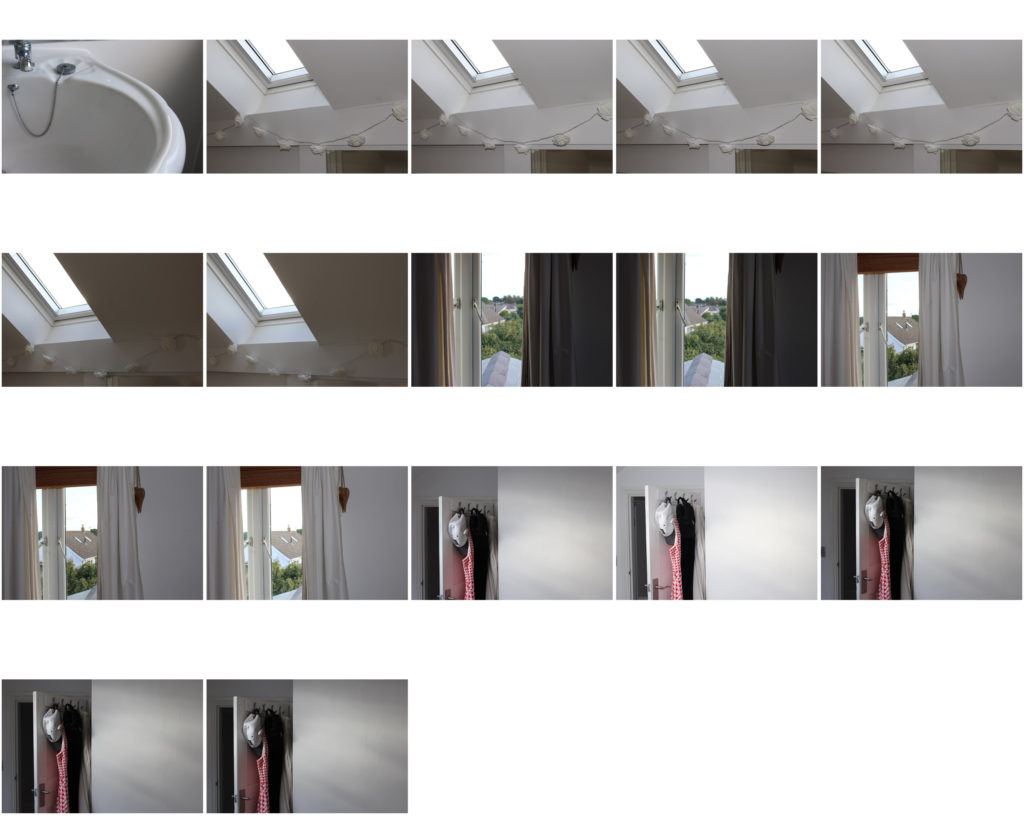
I manipulated this image in editing so that the door frame is completely vertical, despite this making the wall in the centre of the image slightly slanted. The image was taken with the idea of having two halves of the image; One plain and one full of tones and textures that are lacking in the opposite side.

Visual:

This photograph has two clear halves; the plain white wall and the door, frame and hanging items of clothing. The white wall however, isn’t completely white. Due to the reflection of the light passing through a sky light window there are warm tone and cool tone patches, creating an interesting beaming effect on the wall. The other half consists mainly of black, white and grey items of clothing, which break up the image. The multi-tone dress in the centre of the door is the focal point of the entire image, helping to add texture and an interesting pattern.

Conceptual/Contextual:

The concept behind this image and the entire ‘Home-Sweet-Home’ photoshoot was to shoot my house in quite a simple, cool tone yet visually (aesthetically) appealing way. For this reason I decided to photograph an array of dull clothes and a slightly colourful reflection of sunlight to create a balanced yet contrasting image.

Home Sweet Home #1.

Image Selection:

Final selection

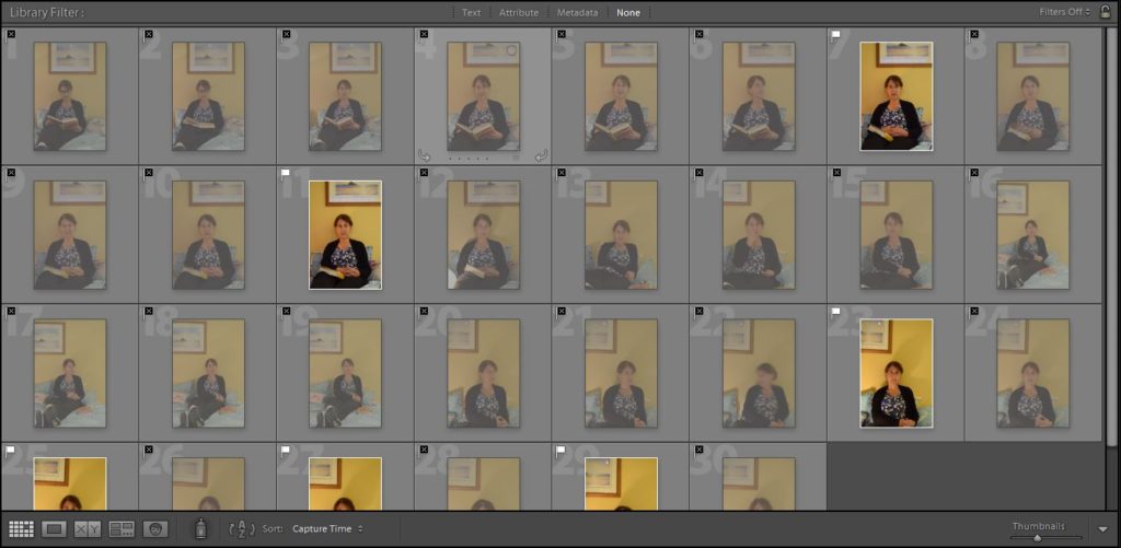
A large amount of the images I took had to be labelled as ‘Unusable’. This is because my brother kept distracting my mum when I was trying to capture the photograph.

Image One:

Before -> After

Concept/Context:

The idea behind this image was to capture my on her favourite place in the house which happened to be where she likes to read. This lead me to make the decision to have her hold up ‘The Casual Vacancy’ by J.K.Rowling, the book she is currently reading. I also wanted my mum to wear the clothes she wore to work that day. This gives a look at what kind of job she might do based on the level of formality in the outfit. It also shows that she may have not had time to get changed since arriving home.

Technical:

I took this image using an aperture of f/5.6, an ISO of 400 and a shutter speed of 1/3 seconds.

Image Two:

Essay: Whose archive is it anyway?

How do archives function?

Archives are a collection of historical documents (ie. Photographs, letters, etc.) that are kept as a documentation of the people and events that have taken place throughout history.

What are their purpose?

Public archives are available for use by general public. Many archives require a small fee if an individual requires a copy of an archive document. Archive materials may be used for a number of different reasons. For example, research into one’s family history or inspiration and research into a photography or history related project.

Private archives such as, personal photo albums, the camera roll on a mobile phone or private documents such as, birth certificates, can be used as a way to preserve memories of personal events with family and friends and for future use for job applications or setting up bank accounts.

How do archives act as repositories of cultural memories of the past?

Documents in an archive are typically stored in order of their date, in alphabetical order and type of document. Each document has a reference number which makes them easy to organise and locate of needed. Physical documents such as, letters and photographs are often stored in acid proof boxes and can only be handled with the use of gloves. This is to help preserve the documents and prevent them from becoming damaged. It is important to preserve archive documents as they are a vital part of the history of a culture and its society.

In what way does photography perform a double role within archives?

In terms of photography, archiving is incredibly important as it holds two roles for photographers. Foremost, it is a generally a good idea for a photographer to keep an archive of all of their images. This is so that they can organise their images based on different projects. However, archiving can be particularly helpful in showing how they have progressed as a photographer. They can look back at old projects and look at what they did well with and where they can improve for the next project.

Archives are also vital when to do research for an upcoming project. Looking at archive images can provide inspiration and context to the new project. This allows for a more thought out creative process and may even take the project in a new direction that had previously been disregarded as un-useful.  

How will looking at archival material enrich your personal study?

I believe that the use of archive materials will be really beneficial in regards to creating an informative personal study. The personal study is going to be about my own personal and family archives. This is something that I am looking forward to beginning research on as I hope to discover something about my family history that I was perhaps previously unaware of or did not know much about. Looking at old images will give me an insight into the things that my parents and grandparents used to do when they were my age and will give me the opportunity to compare them to what I do during my spare time.

In what way has looking at archives been a resourceful exercise?

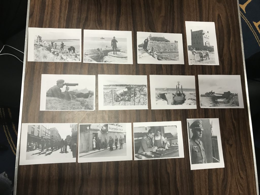
During the visit to the Société Jersiaise, the photography classes were given the opportunity to look at archives images from the German Occupation of the Channel Islands from 1940 to 1945 and discover more about how archives work.  Many of the archive images that I looked at showed the Nazis integrating themselves into island life. For example, there were several images that showed the German soldiers interacting with the Islanders and even an image that showed a soldier purchasing a ‘German to English’ dictionary. We were also given the chance to look at some the ‘Green Books’ which contained information and detailed drawings and maps of all of the Nazi fortifications, sea and air defences and landmines.

Personally, I found the trip very useful as it allowed me to gather a greater understanding into how an archive functions, begin thinking about how I would like my ‘Bunker Archaeology’ project to look like and finally understand a little bit better how life was for Islanders under the Nazi rule.

What have you learned?

From this experience I have learned a considerable amount more about archives and the role they play in preserving the history of a culture and its people. I have also learnt how beneficial the use of archive materials could potentially be for my ‘Bunker Archaeology’ project and my personal investigation.
Visit to Societe Jersiaise:

Tuesday 4th June 2019:

The visit to Societe Jersiaise archive served as a introduction to the A2 project, ‘Bunker Archaeololgy’ and the German Occupation of Jersey. The aim of the visit was begin research on and start to develop ideas for the forthcoming project.

To begin the day we were given a brief introduction into what the SJPA is for and what it is used for, before being allowed to rummage through the many boxes of photographs that documented life under Nazi occupation. For this task we had to select at least 10 images that interested us and write down the reference number so we could later use the high resolutions.

Our second task was to create a narrative using a selection of archive images. To do this, my group arranged the images into three categories; Construction, weapons and living. We then further selected four images from each of the categories before arranging them into a order that showed the Nazi’s integrating themselves into island life.

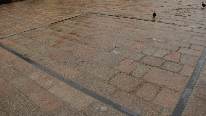
During lunch we were tasked with waling around town and photographing landscapes, people and objects that related to the Occupation. Many of us, including me, went to the obvious places for this. In the Royal Square there’s a ‘V’ paved into the floor and was to represent ‘V’ for ‘victory’.

Photo-montage – Response to Annegret Soltau

Annegret Soltau is a German visual artist. Her work marks a fundamental reference point in the art of the 1970s and 1980s. Photomontages of her own body and face sewn over or collaged with black thread are the most well-known works done by her.

Contact sheets:

Contact sheet

Contact sheet

Contact sheet

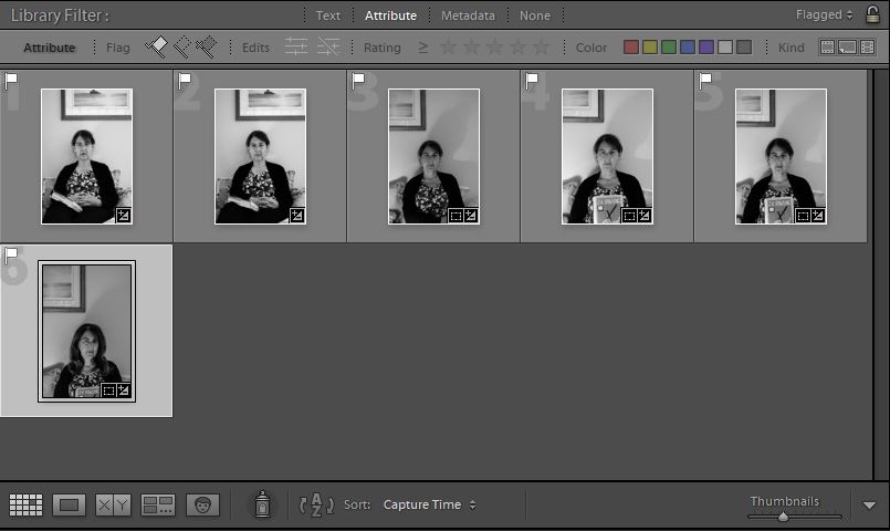
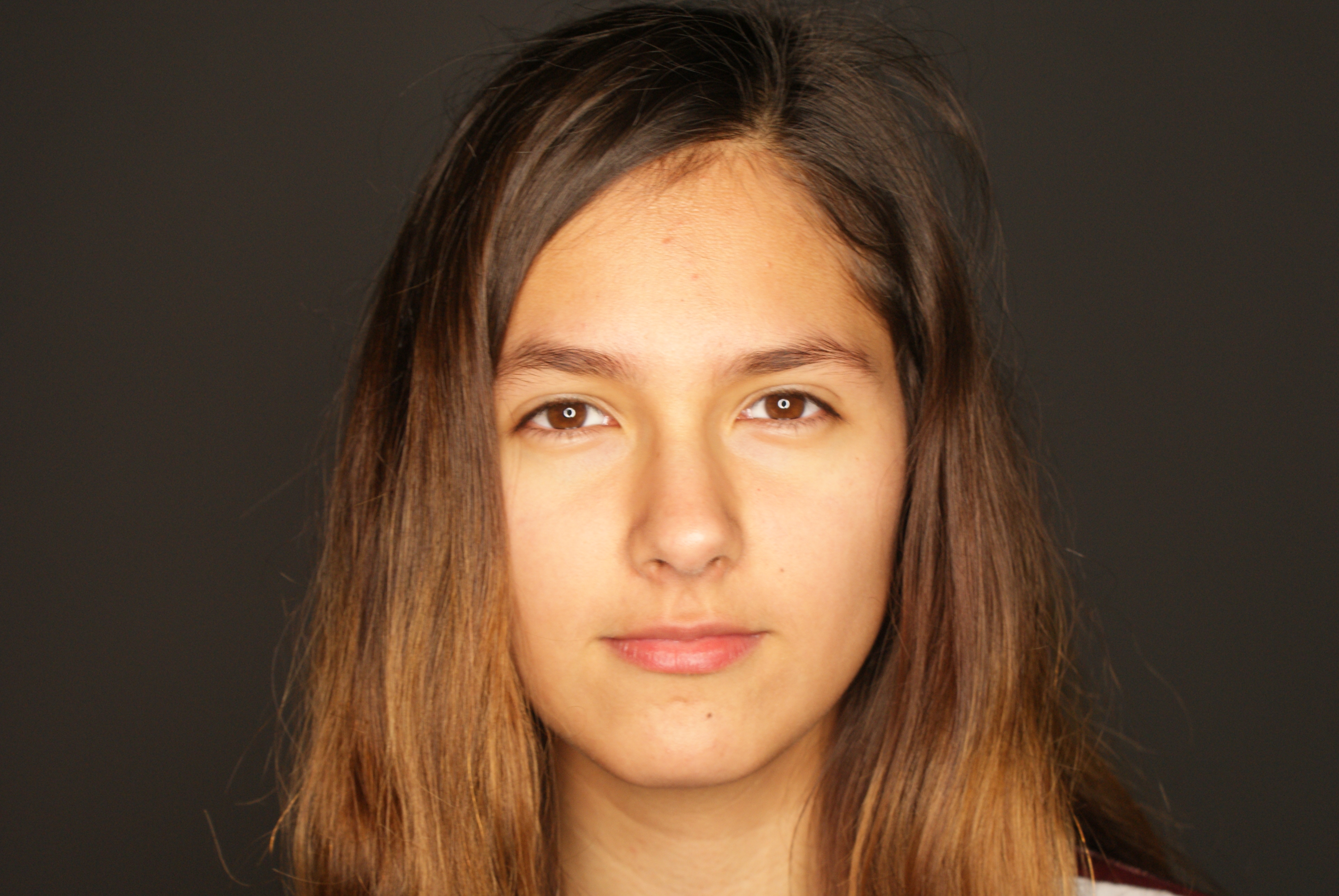
For the images I took, I was looking for a more portrait like pictures. I had the subjects look directly into the camera at some points, look away at others, do different facial expressions to give me some sort of variety when it came to choosing the images I was going to use for the photo-montage. I didn’t get too many images but I defiantly got enough to be able to use for my final piece for the response to Annegret Soltau, however many of them were either too over-exposed or blurry.

Chosen images to create photo-montage:


Base picture

I chose this for the base image because it has a calm tone to it compared to the other pictures – here the subject is just staring into the camera, a picture which is perfect for my response to the photographer as she uses a normal base image too.

Second picture- the mouth was taken

I chose this image because I wanted to use the subject’s mouth, as in one of Soltau’s work, she has an image of someone’s open mouth covering someone’s face, so I wanted to replicate that aspect.

Third picture – I used the mouth and eye

And for the final image, I chose this one because I was interested in using the mouth and the eyes. Unlike Soltau’s work that i’m getting inspiration from, I’m using two mouths to add a bit of a quirk to it.

How I did it:

To change my work into a response to Annergret Soltau, I first went and printed out my chosen final images which I would be using for the photo-montage piece. I then went and ripped each image of the subjects up into calculated pieces,  and then arranged them into weird and quirky ways which still resembles a person, and then took black thread and sewed them together to create the unique look of Soltau’s work.

This is a picture of the final piece of the photo-montage in repsonse to Annegret Soltau . I got to this point and was thinking about stopping here as I liked the arrangement of the eye and mouths, and was deciding whether or not adding hands would be too much or would complete the final piece. Originally, I wanted to add both of the eyes instead of just one but it would have looked like too much and too messy if I had done that, and in the end I decided not to add the hands for that exact same reason.

I like my final outcome as I believe it portrays Soltau’s work perfectly. I used the same black thread to sew the pieces together, I took images of different body parts of a person and stuck them in ways which makes them unrecognizable but still obvious that it’s a human. I also believe that the images I chose for this project were appropriate for my aim and I put together the pieces well. I like the placement of the eye and mouths as I believe it gives it a bit of a unique and interesting look. However, I’m not too keen on the messiness of the threads, I believe I could have made it look more neater and made each thread look more even. I also dislike the fact that I didn’t edit the images before hand. I believe that I should have made one or two of the images into a black and white version to give a bit of an edge to the final piece, or I should have at least adjusted the brightness and exposure on all the of the images before hand.

I quite enjoyed making this piece, it was practical but it didn’t demand too much hard work, time and materials. However, choosing the right images and pieces from those images was a bit tricky, as I had to choose which ones would suit the original image without making that part the center of attention.

Gallery visit

I found the work in the exhibition we went to amazing. The work by Clare Rae, being inspired by Claude Cahun, looks almost as if they were taken by the same person. The fact that they both focus on female empowerment and take their photos in the same sort of white, grey and black tones makes it obvious that Clare Rae was aiming to make her work similar to those by Claude Cahun. However, Rae didn’t copy her completely, she added her own twist to it by taking portraits of herself, whereas Cahun used multiple different women within her pieces.
The way the exhibition was presented helped us compare the two artists in a way which we could easily see the differences and similarities. By being placed in two rooms right next to each other, we could easily switch between the two, and the neatness of it allowed us to see the work clearly and without confusion as to which was who’s.

Clare Rae

This is one of my favourite pictures by Clare Rae. It shows Rae hiding behind a part of a cliff that’s sticking out with her legs and one of her hands in clear view. What I especially like is the tone, it’s mysterious. You only see half of her, you can’t see her face at all. You can’t see her emotions and you can’t tell what she’s thinking while taking this picture. Some also might say that it’s her way of saying that she feels like she needs to hide, possibly due to her gender as Cahun got across in her work multiple times.

Image result for claude cahun
Claude Cahun

This is one of my favourite pictures by Claude Cahun. It shows a woman posing with a top which on it says “I am in training. Don’t kiss me”. This could suggest that, as with Clare Rae, that due to her gender she feels restricted with what she can and cannot do. It could also come across as she has certain expectations to live up to as a woman, and the writing on her top may refer to a woman’s role within marriage at the time this was taken, as to be considered the ‘perfect’ wife you’d have to pretty much be trained in what was considered as ‘feminine’ jobs, such as cooking, cleaning and looking after the household.

Homework-Portraits

Portrait photography or portraiture in photography is a photograph of a person or group of people that captures the personality of the subject by using effective lighting, backdrops, and poses. A portrait picture might be artistic, or it might be clinical, as part of a medical study. Frequently, portraits are commissioned for special occasions, such as weddings or school events.Portraits can serve many purposes, from usage on a personal Web site to display in the lobby of a business.

Image result for portraits as photography

History

The relatively low cost of the daguerreotype in the middle of the 19th century and the reduced sitting time for the subject, though still much longer than now, led to a general rise in the popularity of portrait photography over painted portraiture.  The style of these early works reflected the technical challenges associated with long exposure times and the painterly aesthetic of the time. Hidden mother photography, in which portrait photographs featured young children’s mothers hidden in the frame to calm them and keep them still, arose from this difficulty. Subjects were generally seated against plain backgrounds and lit with the soft light of an overhead window and whatever else could be reflected with mirrors. Advances in photographic equipment and techniques developed, and gave photographers the ability to capture images with shorter exposure times and the making of portraits outside the studio.

Experimenting with portraits:

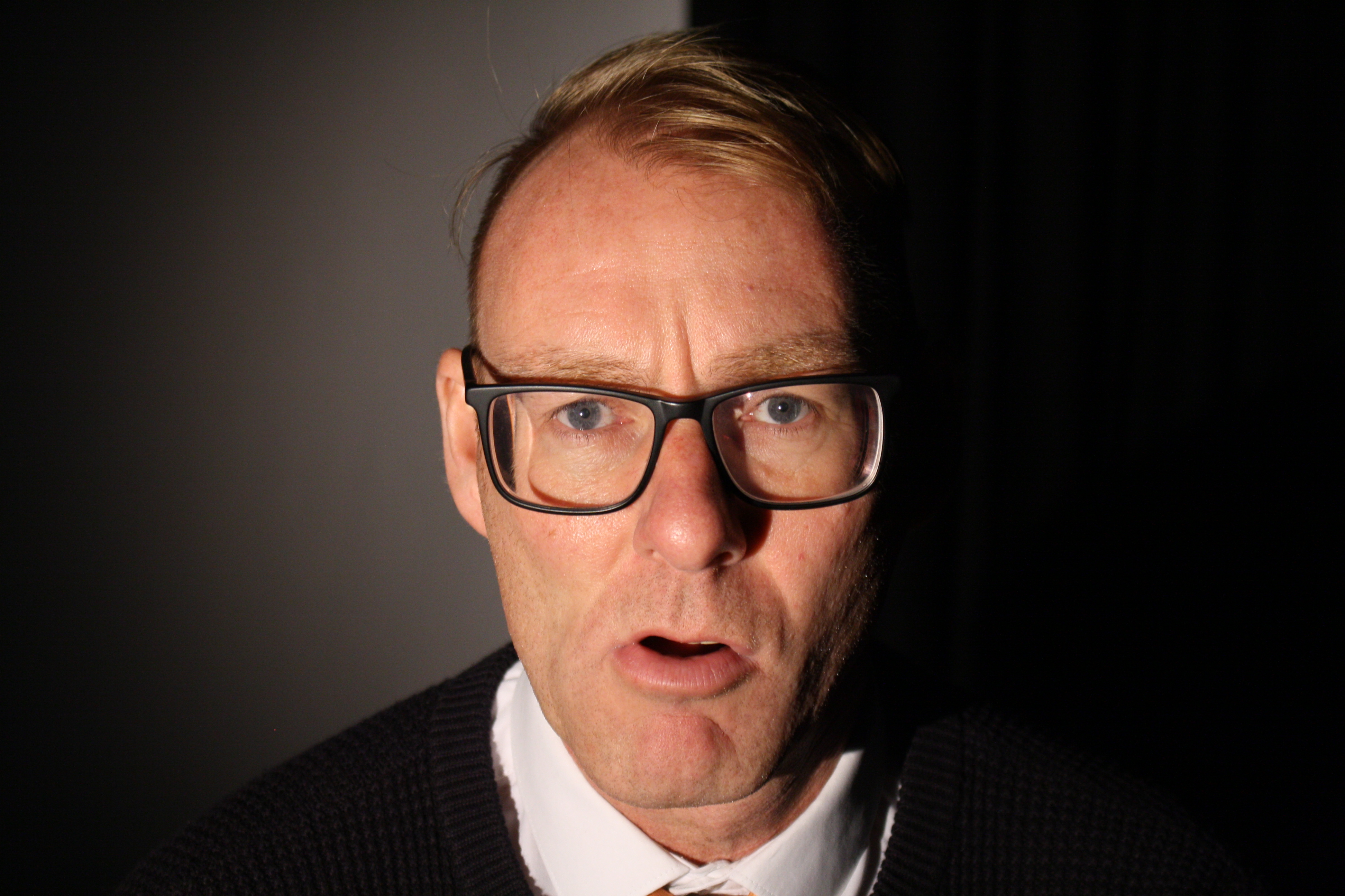
I experimented to take portrait photographs at school so i grabbed a camera from my class and went to the schools studio and my photography teacher was happy to help by being my model and this is what i came up with:

As you can see i crossed some pictures that are not worthy, the ones crossed with  blue color were too dark, the red ones were wrong timing and the green ones were out of focus.

Final outcomes:

This is my favorite one because the face expression of the model gave a lot of meaning to the photograph. in this photograph it was taken inside the schools studio using a trigger flash, in which a Bluetooth device is connected on the camera and as soon as the photograph is taken it triggers the flash light its connected to.  And as you can see only the front of his face is lighten meanwhile his sides are dark and that’s because the studio room was dark and the only light was the one pointed on his face.


This is also a good photograph with a good face expression and as you can see unlike the other photo only one side of his face is dark here and that’s because an extra studio light was added pointed to the side of his face.


ENTRE NOUS by CLARE RAE x CLAUDE CAHUN

The majority of both Claire Rae and Claude Cahun’s work consist primarily of self portraiture, the main difference between their work is the way in which they incorporate their bodies into the environment. Whereas the composition of Claude Cahun’s work is rather standard for the most part, what makes here unique is the experimentation with gender roles and societal standards by adopting an androgynous appearance and by shaving all her hair including eyebrows and wearing clothes typically worn by men. Claire Rae on the other hand works to explore how her body interacts with her surrounding environments, her work will often have her contorted to fit her surroundings. she is very careful with her choice of clothes in order to insure that She stands out with the environment while maintaining a rather muted appearance. Both artists images are rather similar in terms of general aesthetics, with both artists adopting a rather similar style of photography. It is clear that Claire took inspiration from Claude as seen by the use of rather muted tones throughout the images, often even similarly composing her images.

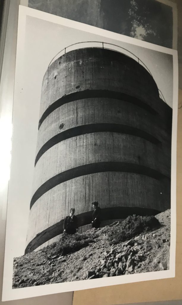
My personal favorite image of Claire Rae’s work is the image inserted below. I like the composition primarily due to the triadic structure of the image as a whole, including the 3 holes in the wall and the triangular shape formed by Claire Rae. I also like the strong use of contrast in the image. This and the wide range of focus (as well as the lack of grain) suggests the image was taken using a low ISO, paired with a long shutter speed and small aperture.Bunker.jpg

My favorite image from Claude Cahun’s collection on the other hand cleverly utilizes a double exposure almost creating a feel of a split personality. This image more strongly uses contrast. The grain and time period of the image suggests that it was taken using film. I believe it was taken using high ISO film and a low shutter speed to create strong tonal contrast.Image result for Claude CahunI like How the gallery is organised and presented as the spacing between the images allows the pictures to breathe, not overcrowding any walls with images. I believe this was done also to only allow the very best of their work to be displayed to portray the photographers best work better. I do however believe that it would be better to not separate the photographers’ between 2 different rooms as this doesn’t allow viewers to compare and contrast their work under more scrutiny.