Category Archives: Component 2 ESA

Filters

Author:
Category:

Camera Skills: Focal Length

MACRO/CLOSE UP:

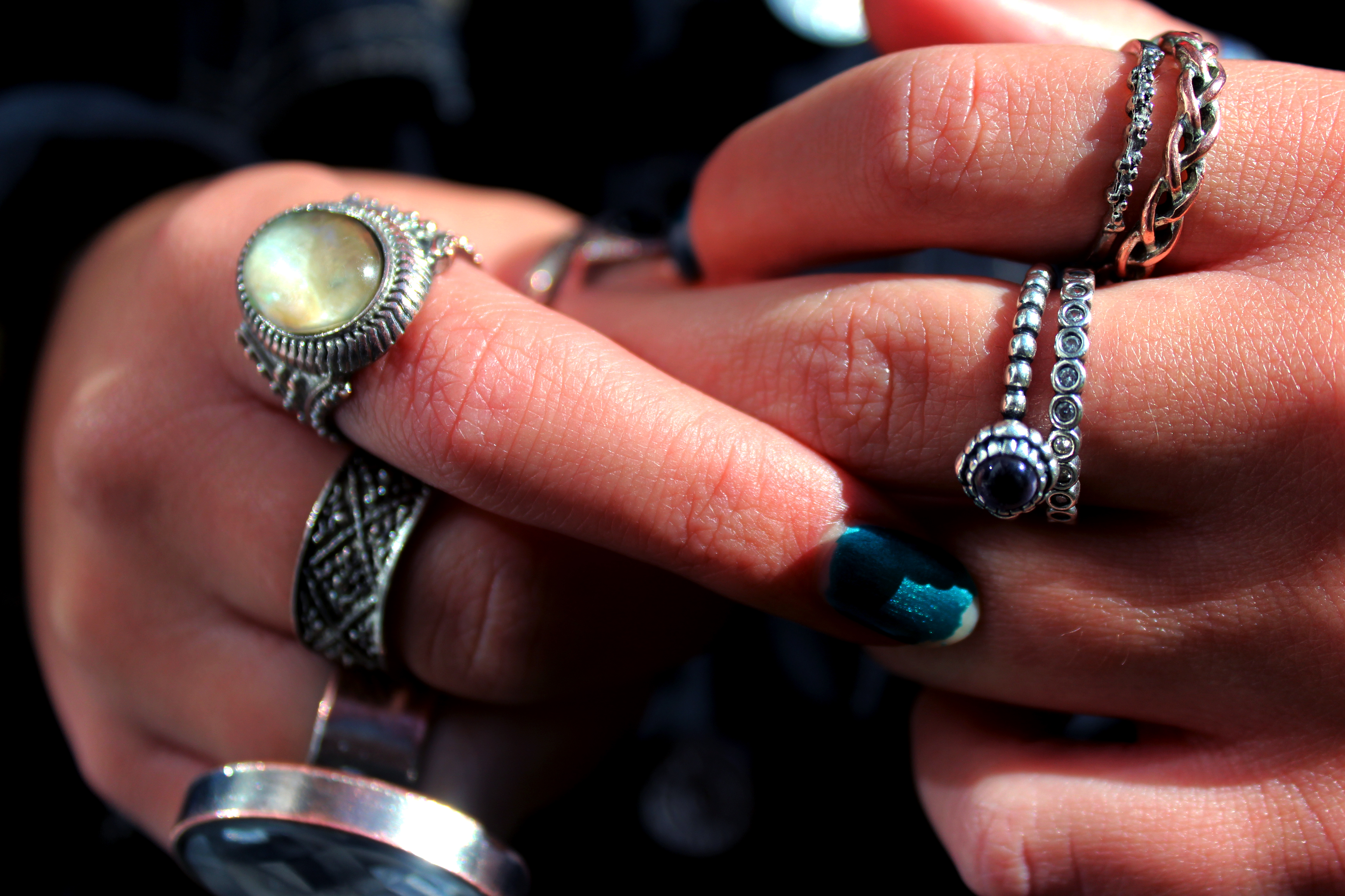
In this image I experimented with using the macro setting on my camera in order to capture the great deal of detail within the hands. Whilst on this setting, I continued to use auto focus as it allowed me to take many photos at once without the hassle of adjusting the focus every time the hands moved or shifted in position.

DEPTH OF FIELD:

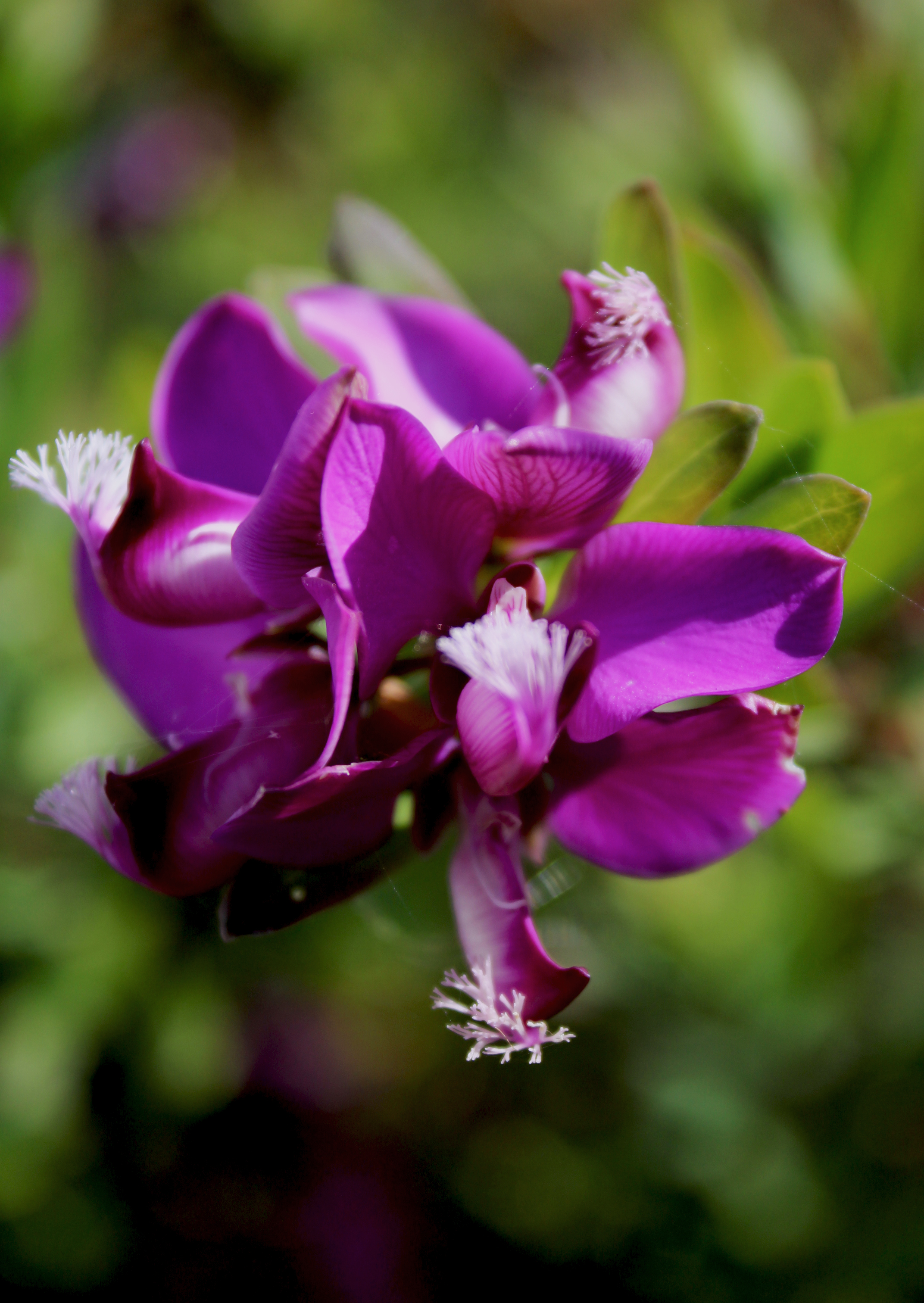
In this photo I experimented with depth of field by using manual focus on my camera. Instead of focusing on the leafs closest to the camera, it is focused on  a different part of the photo. I found that this technique allowed me to create images that were quite different and unique.

FOCAL LENGTH:

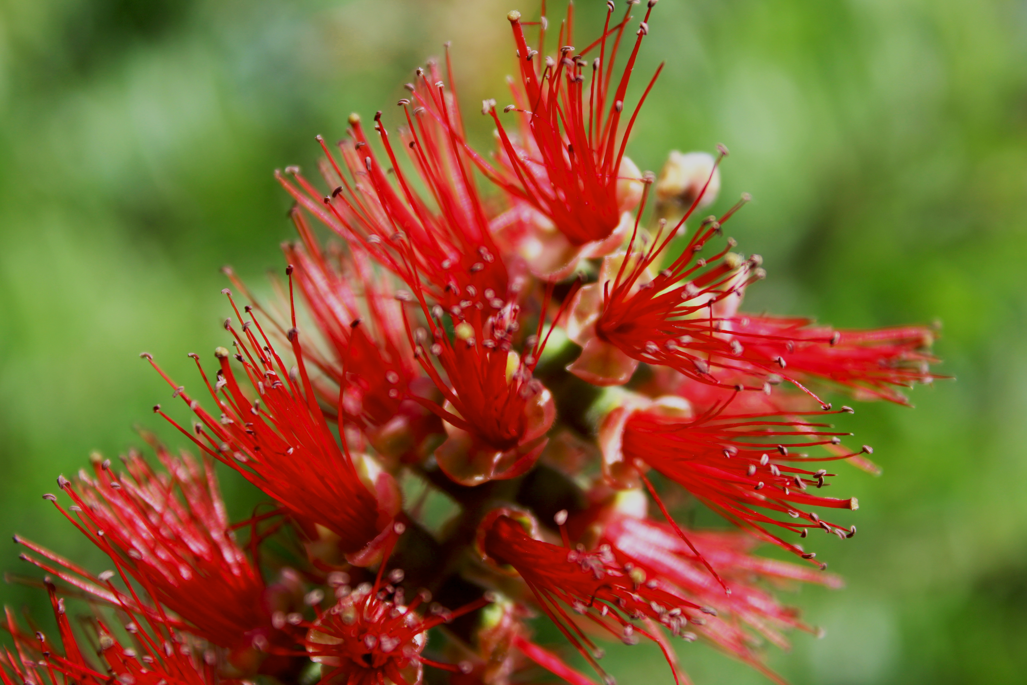
In this image, I tried to play around with the focal point and what effects I can achieve with this. The flower, as seen in the photo, was quite far away from me and the camera. I zoomed in and used the macro setting in order to capture the delicate details of the flower and the plant. It was quite difficult to capture this photo as zooming in meant having a very steady hand and using auto focus that the macro setting provided for me.

MF/AF FOCUS:

In this photo I used a conjunction of manual focus and the macro setting on my camera. It was very difficult to get the correct focus on my camera whilst using the macro setting with auto focus therefore i switched over to manual focus to help me correct this issue.

CONTACT SHEETS:

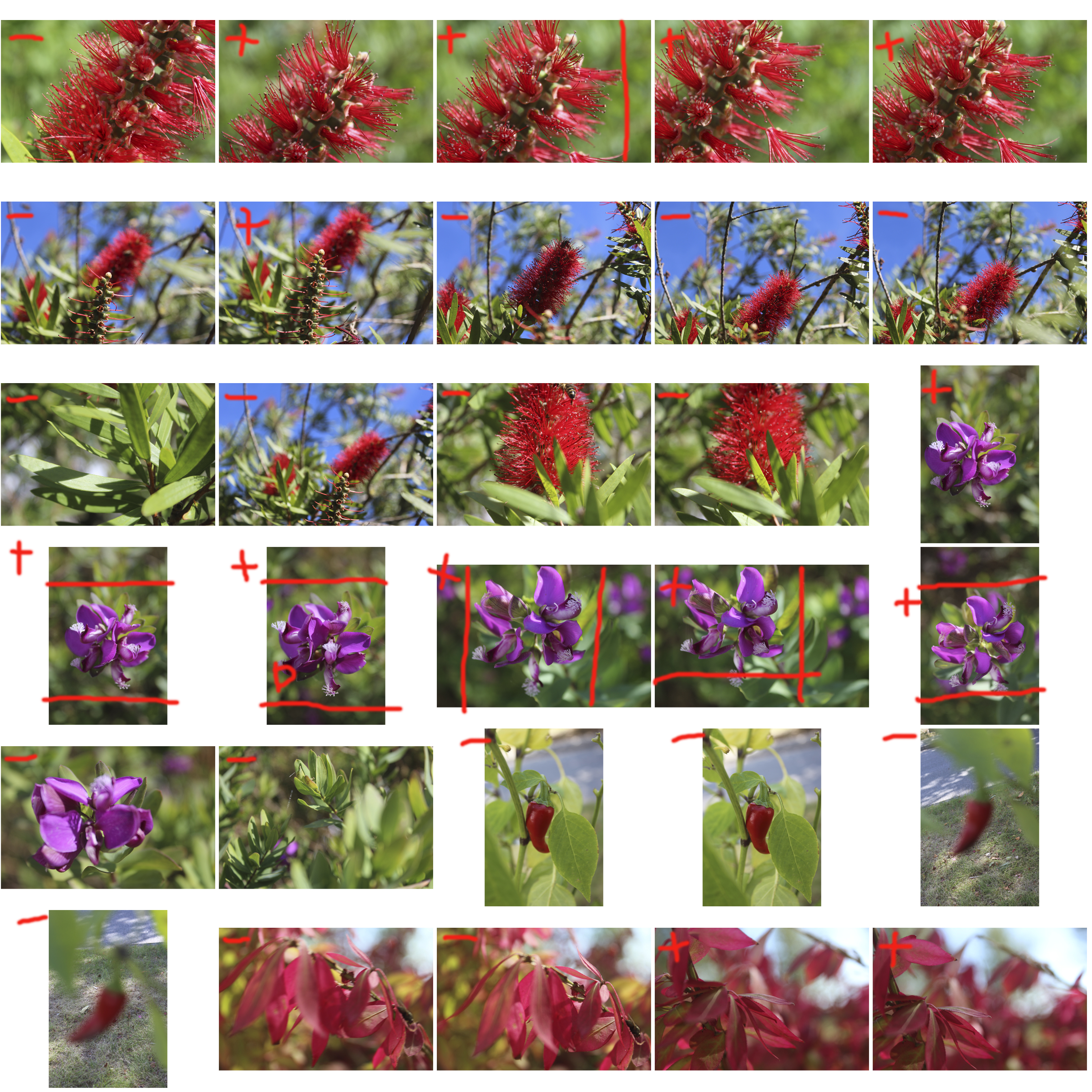
In this photo shoot, I focused a lot on plants and flowers in order to experiment with different settings such as macro and AF and MF focus, resulting in very vibrant, and colourful contact sheets.

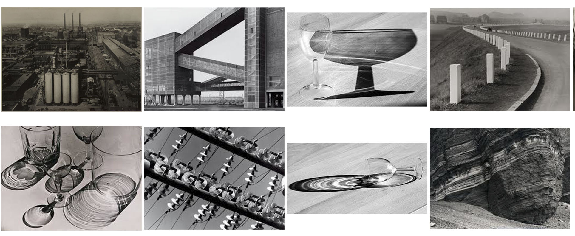
Albert Renger-Patzsch

Albert Renger-Patzsch

Albert Renger-Patzsch, born on June 22, 1897 was a German photographer who was heavily associated with the New Objectivity. Renger-Patzsch was born in Würzburg, Germany, and began taking photographs by the age of twelve. After military service in the First World War he studied chemistry at Dresden Technical College. In the early 1920s he worked as a press photographer for the Chicago Tribune before becoming a freelancer. In 1925, publishing a book, the choir stalls of Cappenberg. He had his first museum exhibition in 1927.
A second book followed in 1928, Die Welt ist schön (The World is Beautiful). This, his best-known book, is a collection of one hundred of his photographs in which natural forms, industrial subjects and mass-produced objects are presented with the clarity of scientific illustrations, the intent being to create beautiful photographs out of everyday items. The book’s title was chosen by his publisher; Renger-Patzsch’s preferred title for the collection was Die Dinge.

In its sharply focused on the newly emerging style of the time, The New Objectivity that flourished in the arts in Germany during the Weimar Republic. Like Edward Weston in the United States, Renger-Patzsch believed that the value of photography was in being able to capture the world in a way which displays all the textures and feelings that come along with it, and to represent the essence of an object. He wrote: “The secret of a good photograph—which, like a work of art, can have aesthetic qualities—is its realism … Let us therefore leave art to artists and endeavour to create, with the means peculiar to photography and without borrowing from art, photographs which will last because of their photographic qualities.”

Patzsch preferred to photograph items over people, focusing mainly on very ordinary everyday items but captured in a way which makes them extraordinary. A lot of his work also focuses on pattern and rhythm. The plants he photographs are often geometric and contain a lot regular pattern.

Among his works of the 1920s are Echeoeria (1922) and Viper’s Head. During the 1930s Renger-Patzsch made photographs for industry and advertising. His archives were destroyed during the Second World War. In 1944 he moved to Wamel, Möhnesee, where he lived the rest of his life.
ANALYSIS OF HIS WORK:

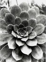
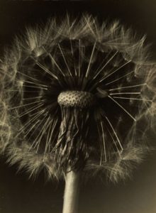
I have chosen and compare and analyse these two photos from Albert Renger-Patzsch’s work. Both of these photos include the presence of organic items, plants in this instance. Both have very clear and geometric shapes, with repeating patterns of forms. The focal point of the dandelion flower is the round and even tip of the stem, from which a repeating pattern of seeds come from. On the other hand, the image on the right lacks any noticeable focal point. Both images are very dramatic in nature, with deep and dark shadows being cast from the shapes of the two plants. The image on the right is very exposed, and the highlights are very strong, whereas the image on the left has more subtle highlights having an overall dark tone all-round.  The image on the left has a deeper field of view through the use of the dark backdrop, whereas the image of the right lacks this as the light and over exposed backdrop shirks the depth of view. The overall undertone of the image on the left is warm and yellow, and the image on the right is a lot cooler with blue based undertones. Both images have been captured in portrait, unusual yet different and effective for this type of imagery.

RIGHT IMAGE
LEFT IMAGE

MY FAVORITE IMAGES:

This is a collection of my favorite Albert RengerPatzsch work.

RESPONSE AND CONTACT SHEETS OF MY OWN WORK:

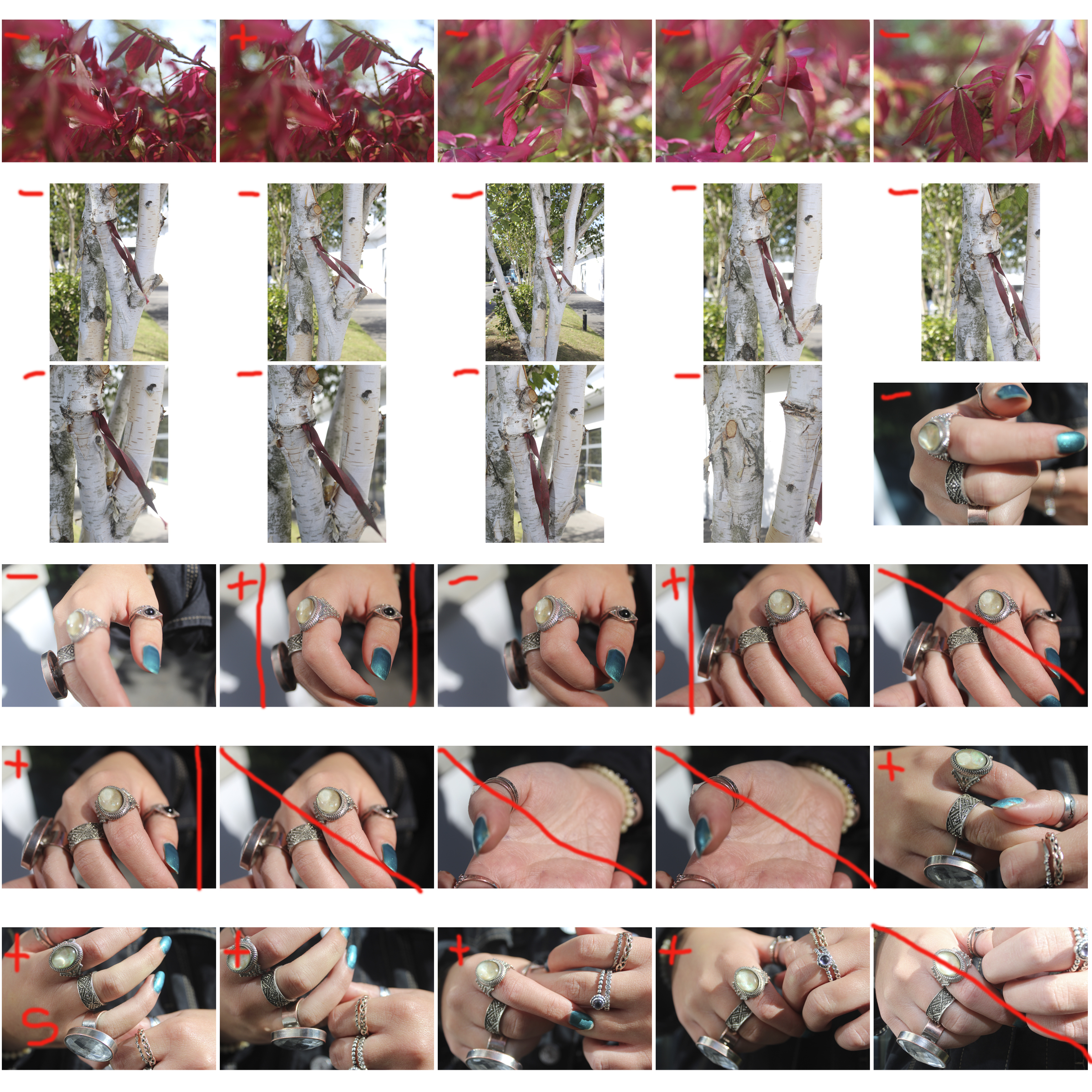
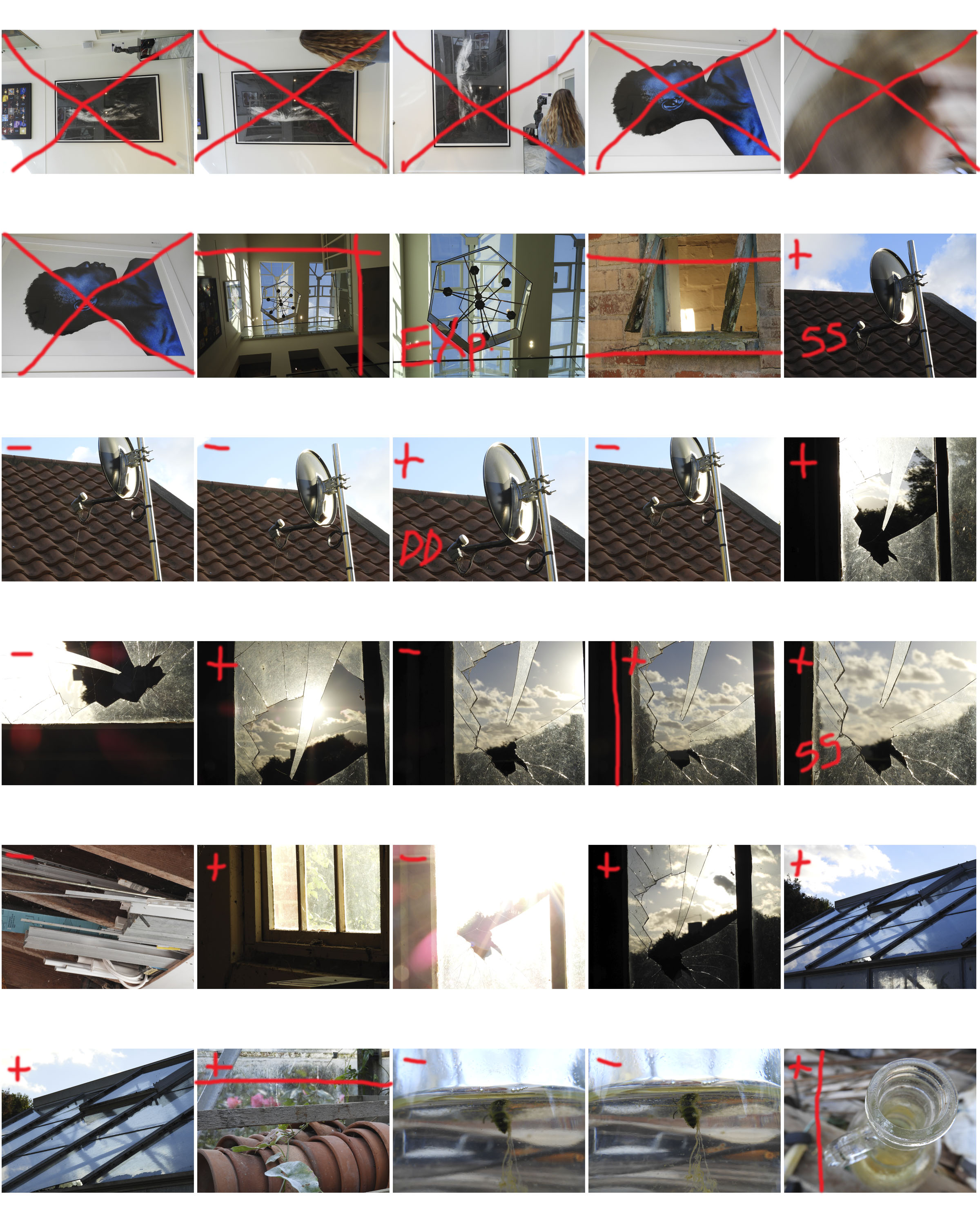
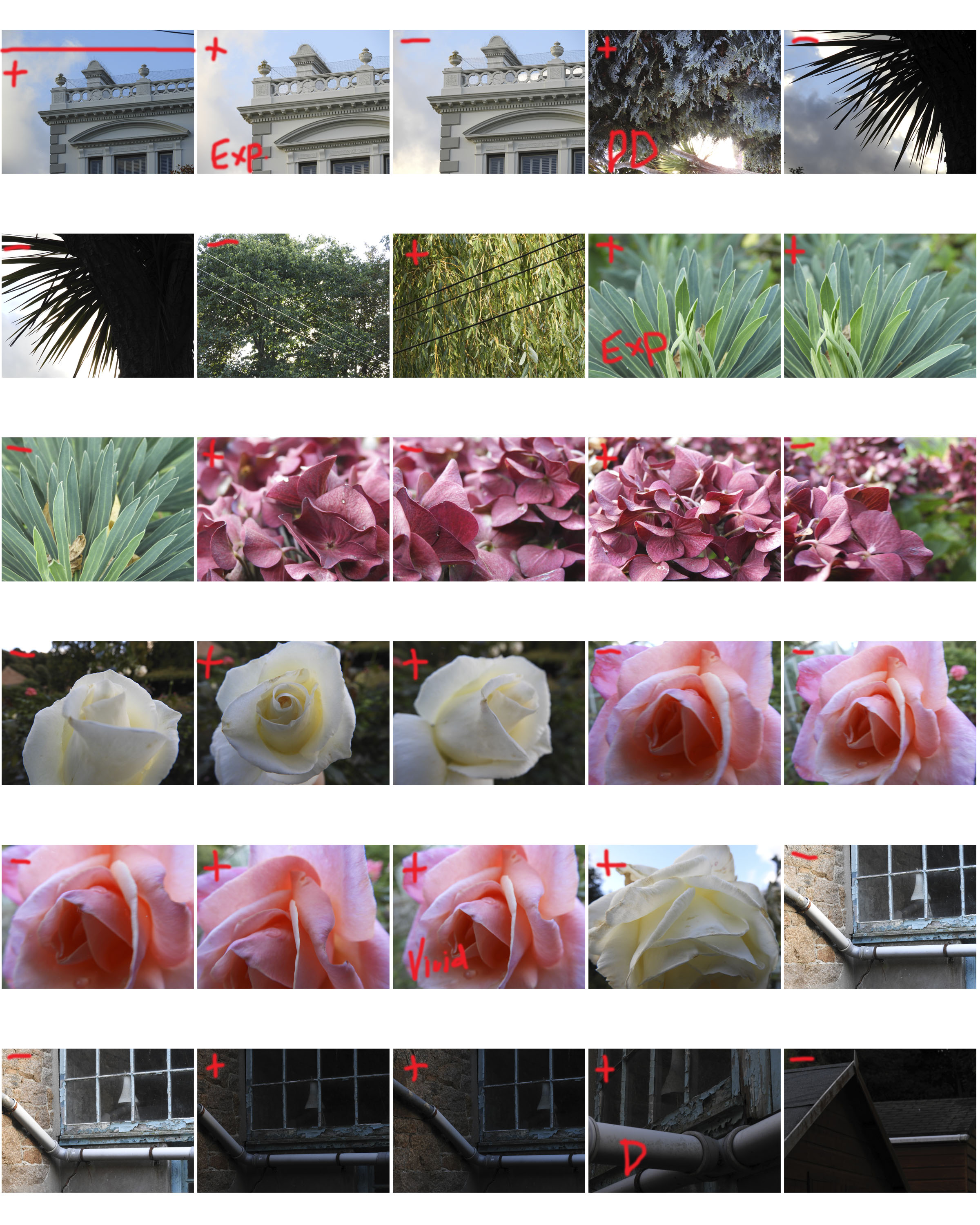
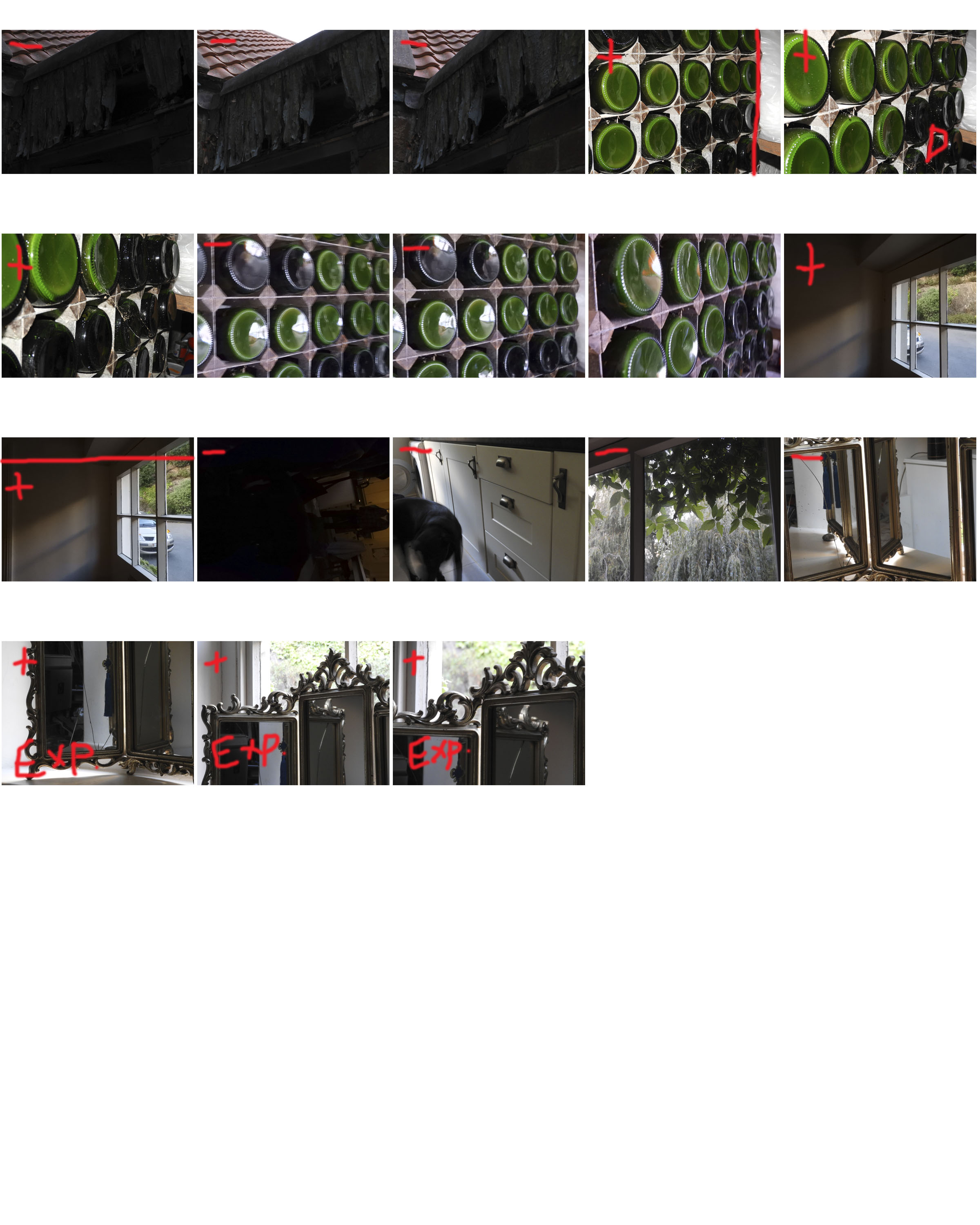
This is my response of Patzsch’s work in the form of contact sheets. like Patzsch, I focused on capturing very simple, everyday objects in a way that is beautiful and impressive. I experimented with light, changing the ISO settings on my camera and shutter speed, in order to capture images that are interesting and detailed. I found myself to often be using the macro setting on my camera when capturing up close photographs of plants, this allowed me to have clear and crisp photos that illustrated the detailed line work in the plants.

Photoshop Experimentation

EXPERIMENTING

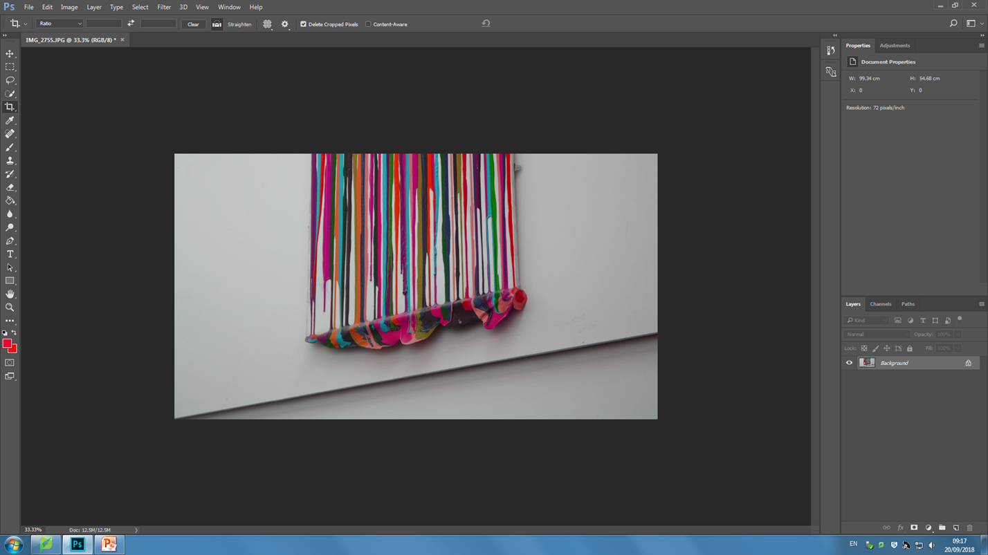
This lesson I experimented with using Photoshop and a variety of different tools which altered the already abstract images to make them even more abstract. In each image I played around with changing the color balance and changing the hues of photos. I also explored using the magnetic lasso tool and what its capabilities it has in Photoshop. I used the crop tool in order to give interesting perspectives and cropping away unnecessary parts that did not add to the photo or disturbed it.

The end result of experimenting with Photoshop was a variety of very abstract and interesting photos which have become more unique and distinctive. They took the photos from being average to something that is more worth while looking at.

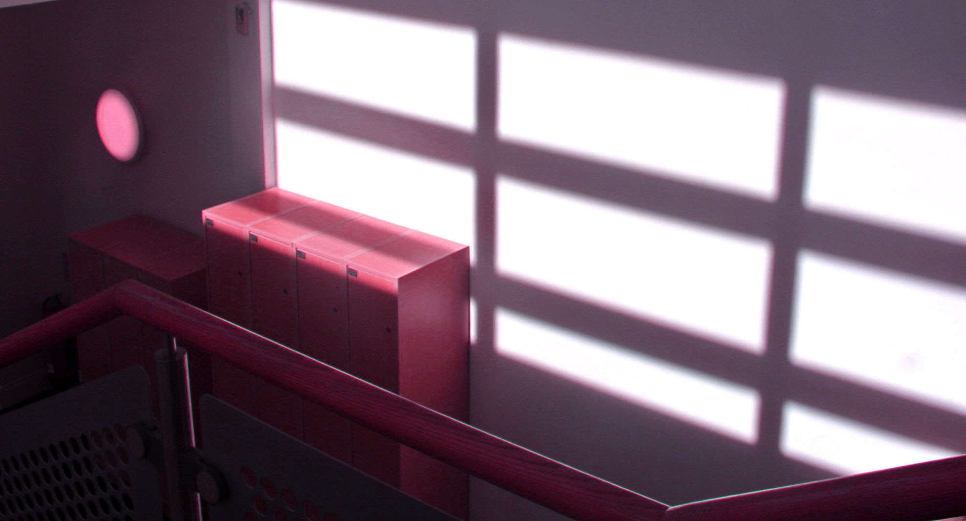
my first experimental photo, i only played around with the concept of changing the color hue and saturation, highlights and shadows, and exposure.
in this photo i changed the hue of the photo to a very warm pink and I also shifted the color balance to magenta.
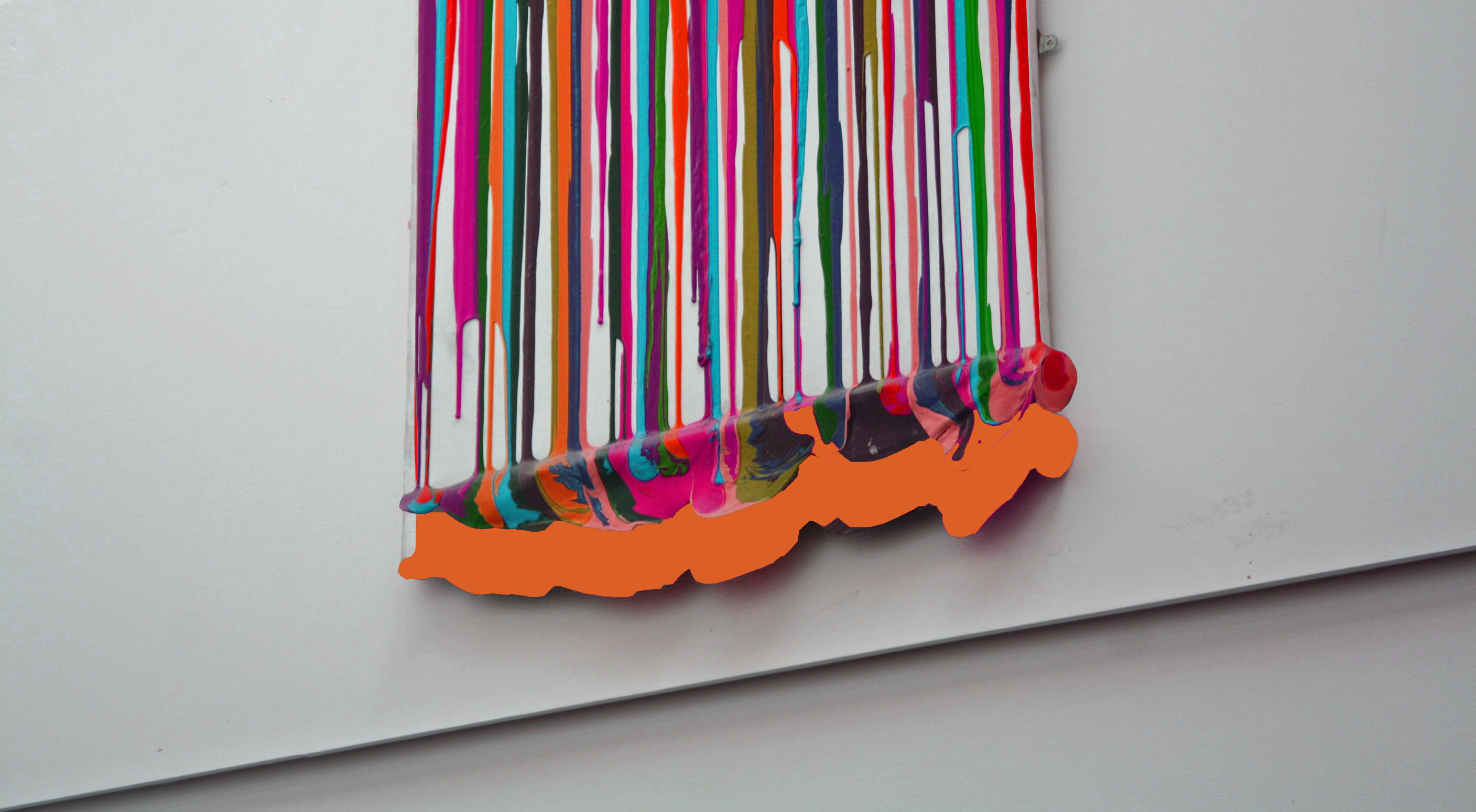
This was my final photo I edited and changed. Here i experimented more with layers and adding extra abstract features to the photo.
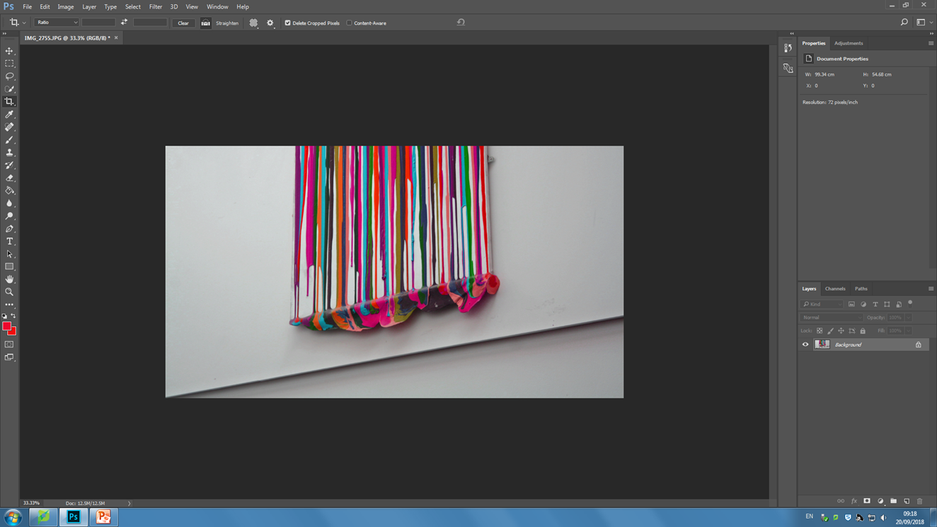
Stage 1, cropping and adjusting tilt
Stage 2, shifting the color balance to pink on the photo and also increasing the exposure in order to brighten the colors.
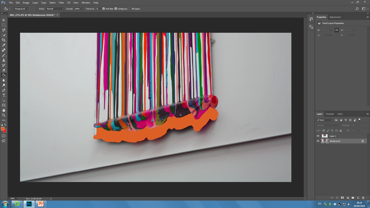
Stage 3, using the magnetic lasso tool in order to trace around the painting and move it upwards. I added a bright orange into the backdrop which appears as I selected and moved the painting layer.

Abstract photography contact sheets

WHY WE DID THIS – 

The aim of this photo shoot was to capture the abstract shapes and forms which can be found all around us.Even when going through school, in mundane things, beauty can be found. I captured images which suit best the theme of “abstract”, incorporating simple shapes and forms in order to do so.

Paper photography

CONNCEPT AND IMAGE TAKING

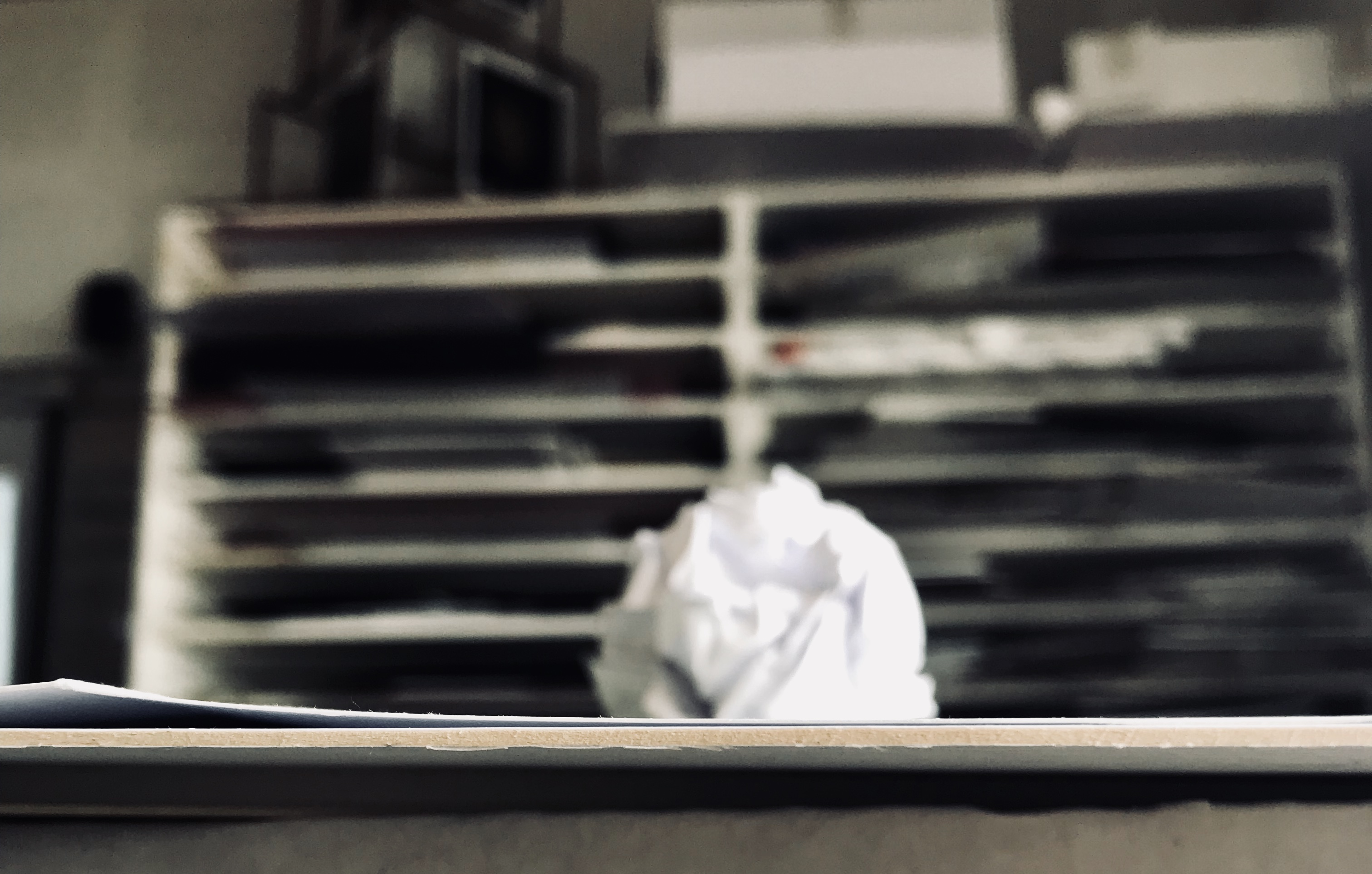
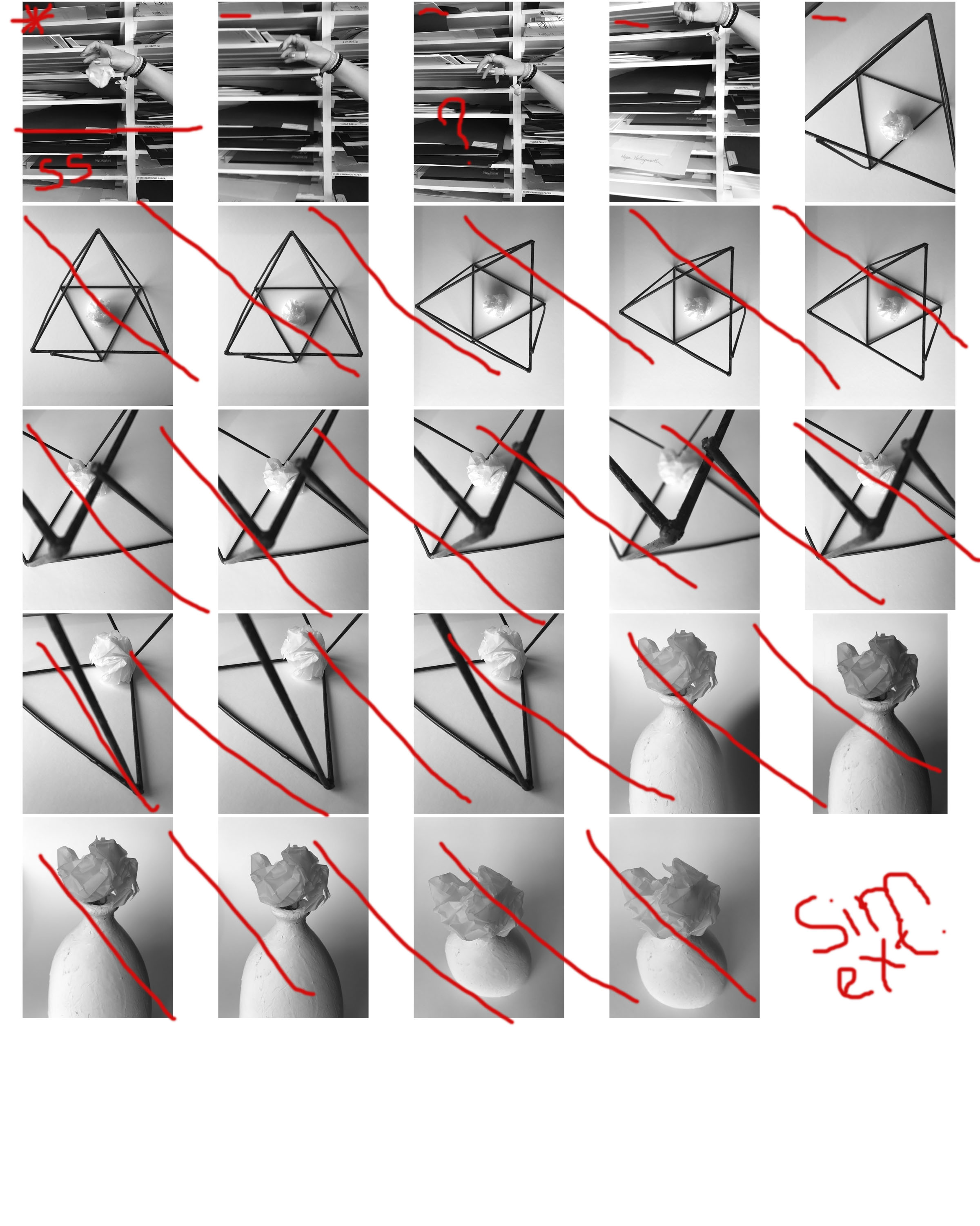
The concept of this mini project was to capture an ordinary scrunched up piece of paper, in as many ways as possible, placing it in different environments and photographing it. I captured these photos on my iPhone therefore the exposure, shutter speed etc. options were very limited when working on taking these images; paying particular attention to composition to make up for what was lost in image resolution. I started this task first by capturing some very simple photographs near a window, the light hit from the right side of the room creating a small shadow. The blurred, yet very busy backdrop for the photo really made the crisp and sharp lines in the scrunched up paper stand out.

I then moved on to making a black infinity screen on which I would capture my next set of photos. The stark contrast between the bright white paper and pitch dark background, again make the ball stand out. There is some differentiation created on the infinity screen by the light shining in from the right hand side, giving it tonal differences that can be clearly seen and make the balls shadow be seen more easily.

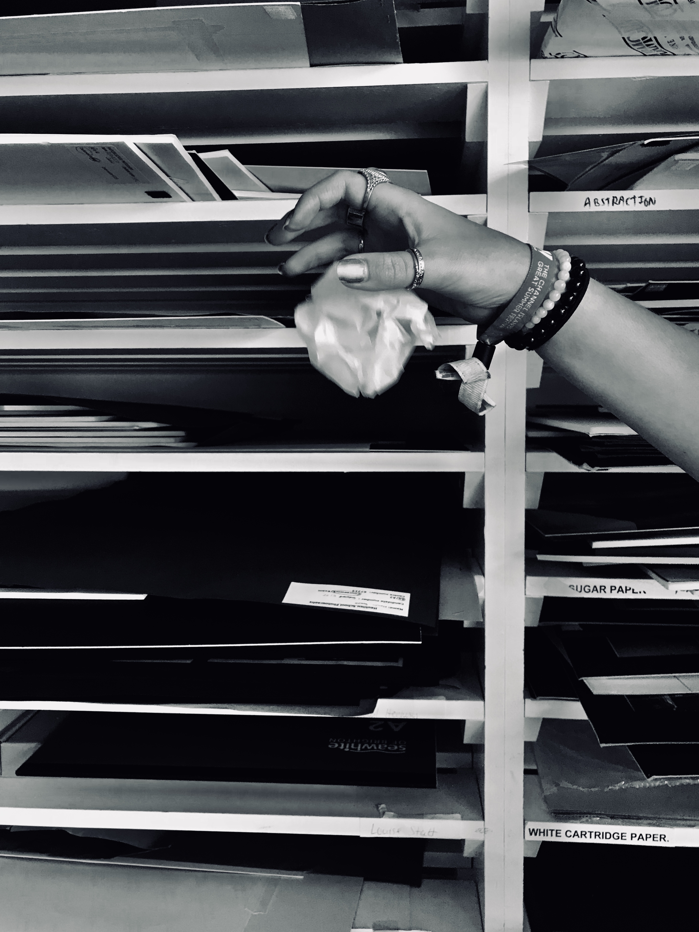
I then thought about incorporating movement into my photos, therefore I asked a classmate to drop the ball from a height. Although difficult to capture, I was able to get a few shots which illustrate the dropping motion of the ball. These photos though are compromised in quality with the ball having motion streaks.

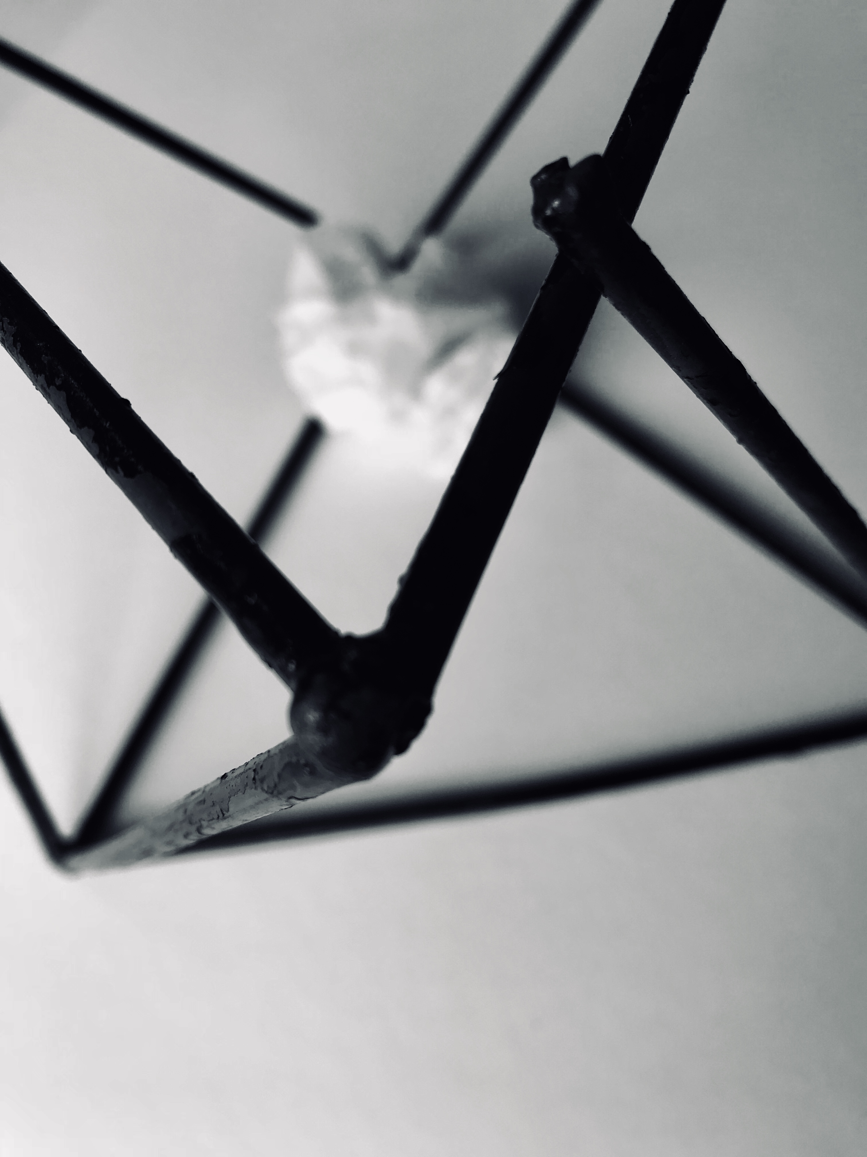
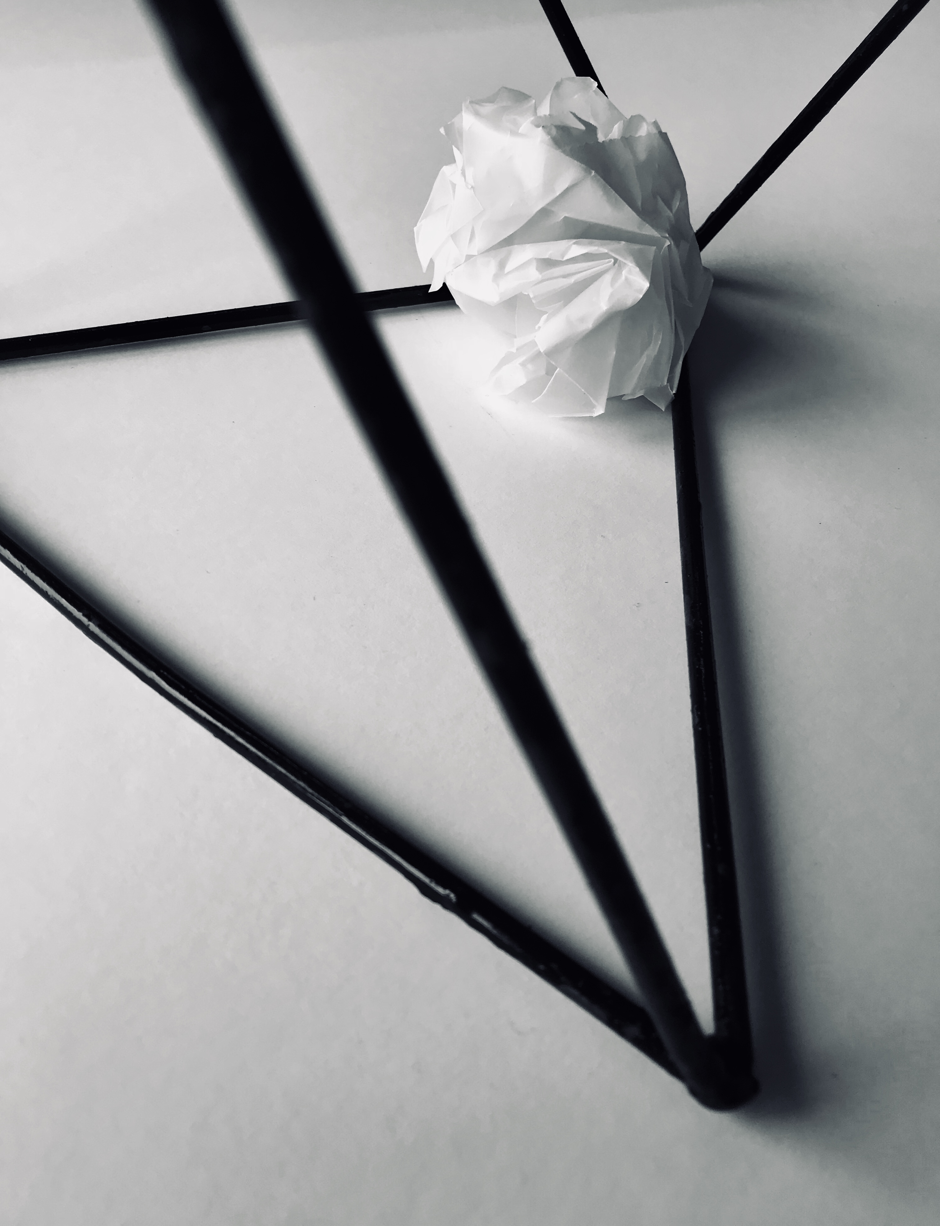
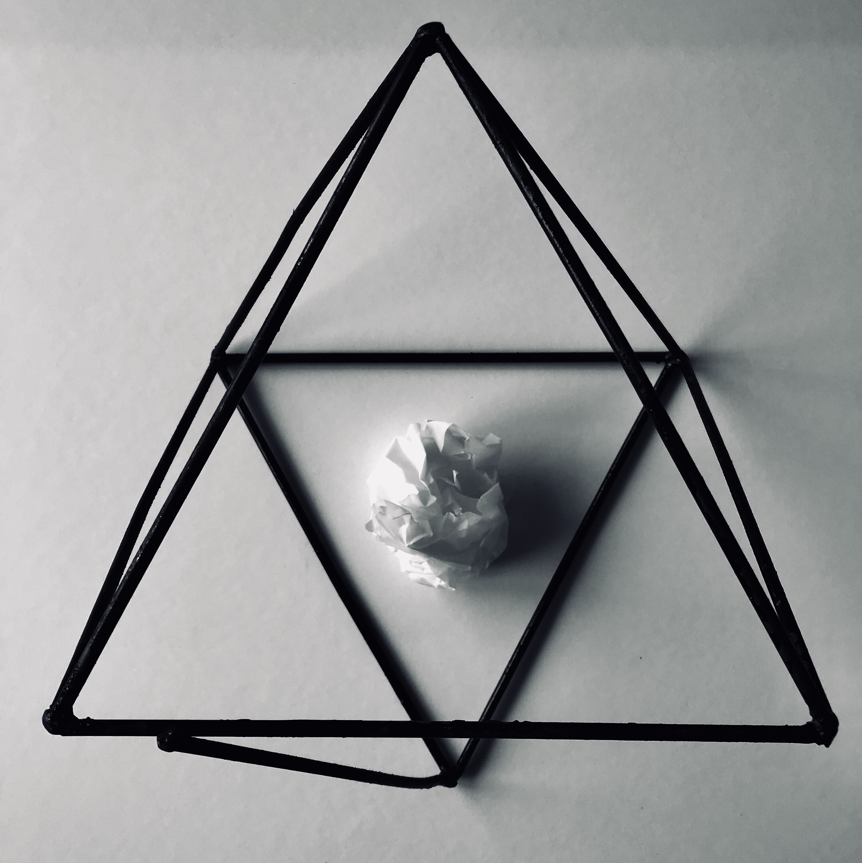
I then again thought about different items I could incorporate into the images, therefore I placed the paper ball in a geometric sculpture. The wire sculpture is again very dark giving good contrast between the ball and paper. Also the contrast in shape from the randomly scrunched paper and the sharp, geometric lines of the sculpture give it a point of interest.

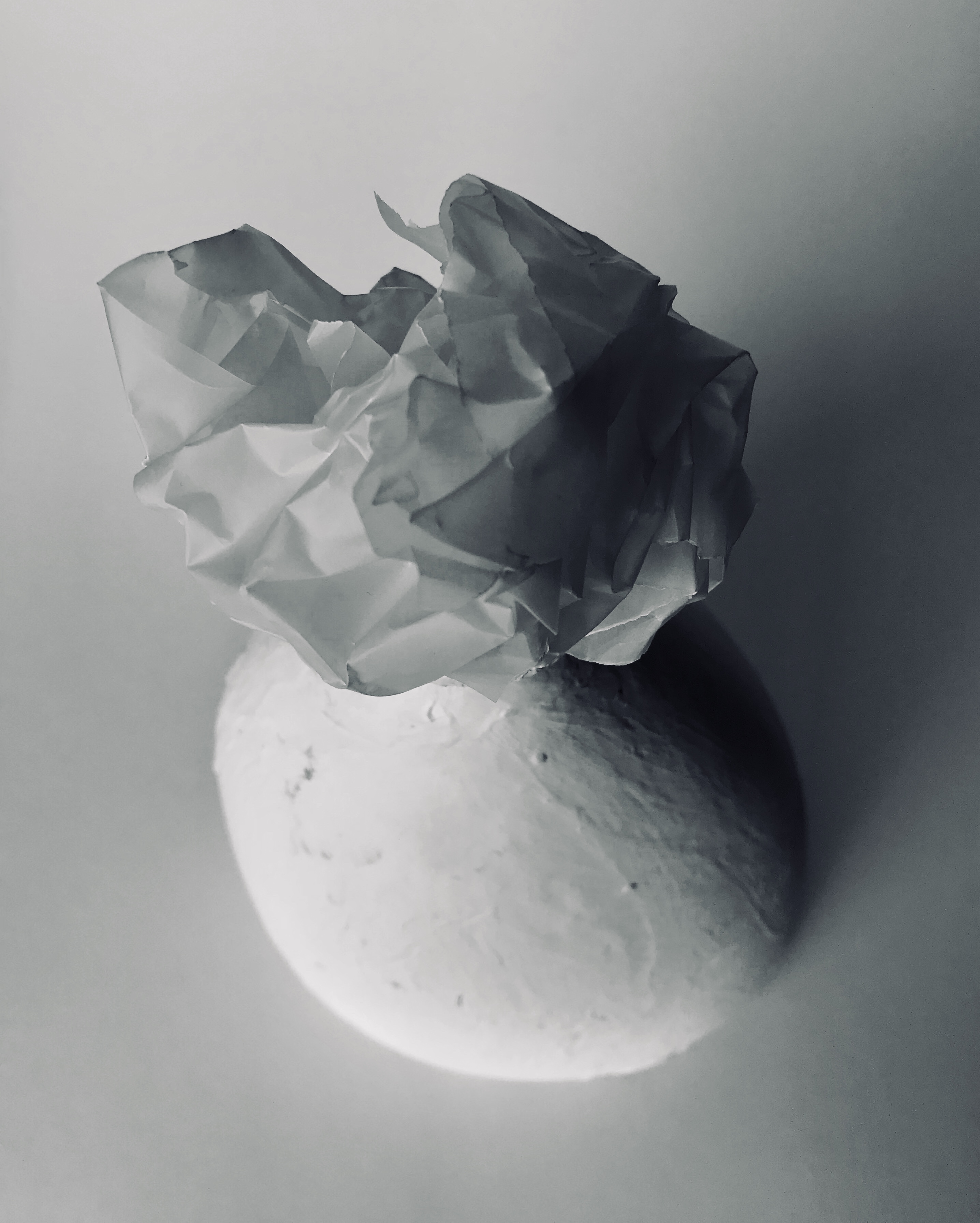
I then moved into placing the ball on top of a bright white vase. The incoming shadow from the left hand side of the picture give both the vase and the paper very dramatic and deep shadows which cut through the sea of whiteness giving the illusion of tonal differences. Lastly, I played around with the concept of geometry again, creating some origami which I then captured on a black backdrop, I think this gave a similar effect as using the geometric sculpture in my photos.

This overall mini project was very interesting to do. The challenge of creating many different photos with just a single piece of paper was very challenging yet this made me think about photography in ways that i have never done before. The simplicity of paper can be adapted and changed to become beautiful images that are very captivating and interesting.

MOST SUCCESFUL PHOTOS

In my opinion the most successful photo was indeed the paper ball atop of the white vase. I feel that this photo was really able to capture multiple interesting aspects of the vase and the paper ball. Firstly the light hitting from the left side of the picture creating the dramatic shadows, highlight the irregular creases and folds within the paper which are an important and interesting aspect of the paper ball. Furthermore, the shadows are able to distinguish both the white background and the foreground. The vase in these photos is also an aspect which further illustrates the interesting nature of the paper ball by again creating contrast in shape. It is very smooth, with regular curves all around, the ball on the opposite, possesses sharp and linear edges. A noteworthy aspect of the paper ball is that it was made from transparent paper, the thicker texture allowing it to create stronger geometric shapes. There are slight tonal differences with the vase, backdrop and ball. It is slightly more yellow toned whilst the ball and the backdrop are a lot more blue based.

Another very successful photo was the paper ball inside the black wire sculpture. This photo again captures the contrast between geometry and the random edges and curves of the paper ball. The dark metal is the center of attention, bringing it into the foreground of the photo whilst the white paper ball sits in the back ground. The light shining in from the left hand side of the photo creates a slight shadow from the paper ball and the wire sculpture, which fades into a darker shadow into the right hand side. i cropped the image and increased the contrast in order to make the photo more dramatic and dark.

The last photo which i thought was very successful was the paper ball on the black infinity screen. the paper which the ball sit atop of was very blue based in co lour therefore when i saturated the image, you are able to see different tones of black and blue. The contrast between the black screen and the white ball is also very striking in this photo. by increasing the contrast, I was able to create a pitch black backdrop. The light incoming from the left hand side of the photo creates a very slight yet noticeable shadow from the ball onto the screen.

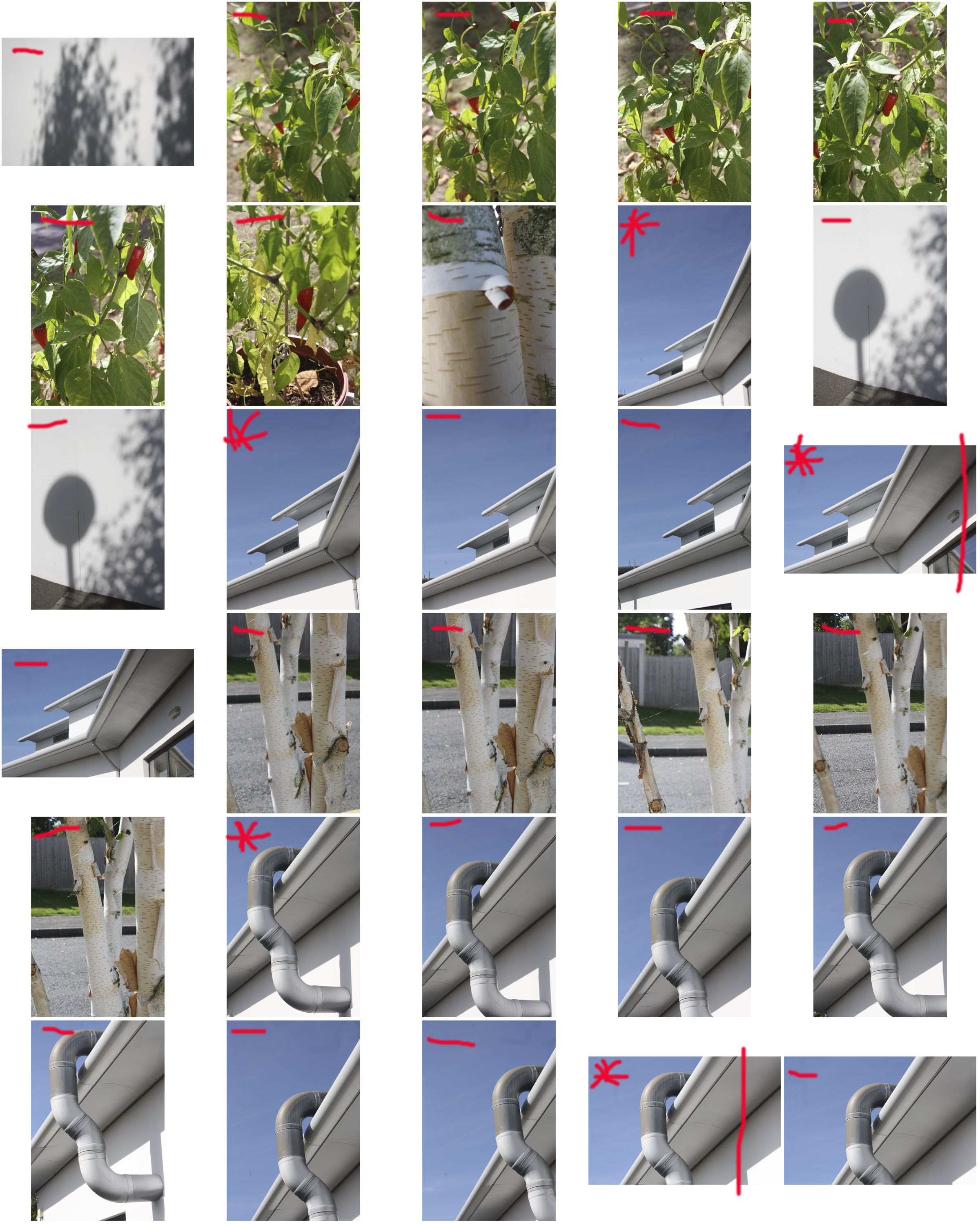
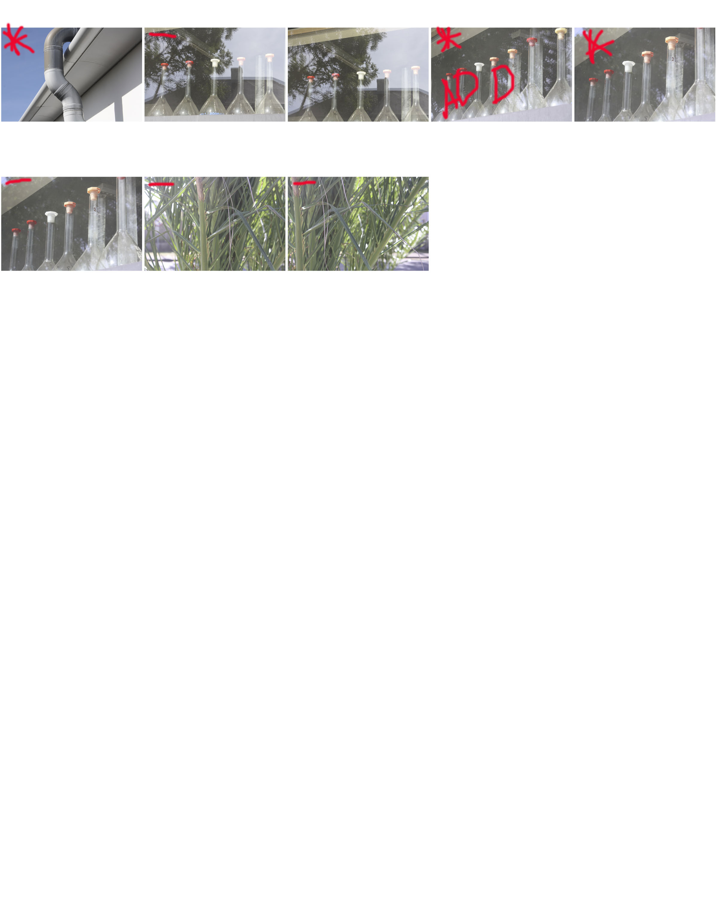
CONTACT SHEETS

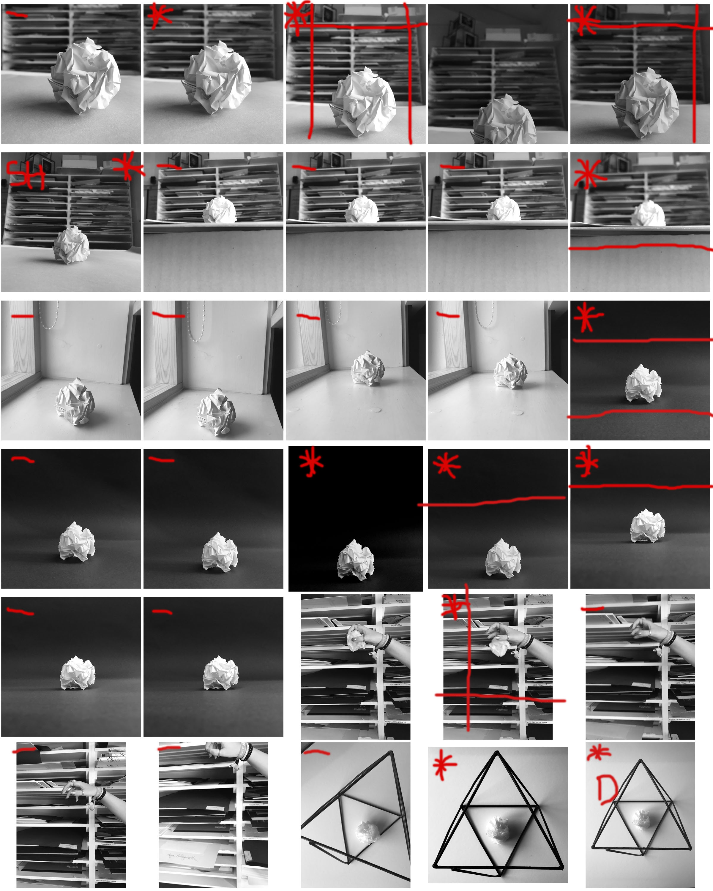
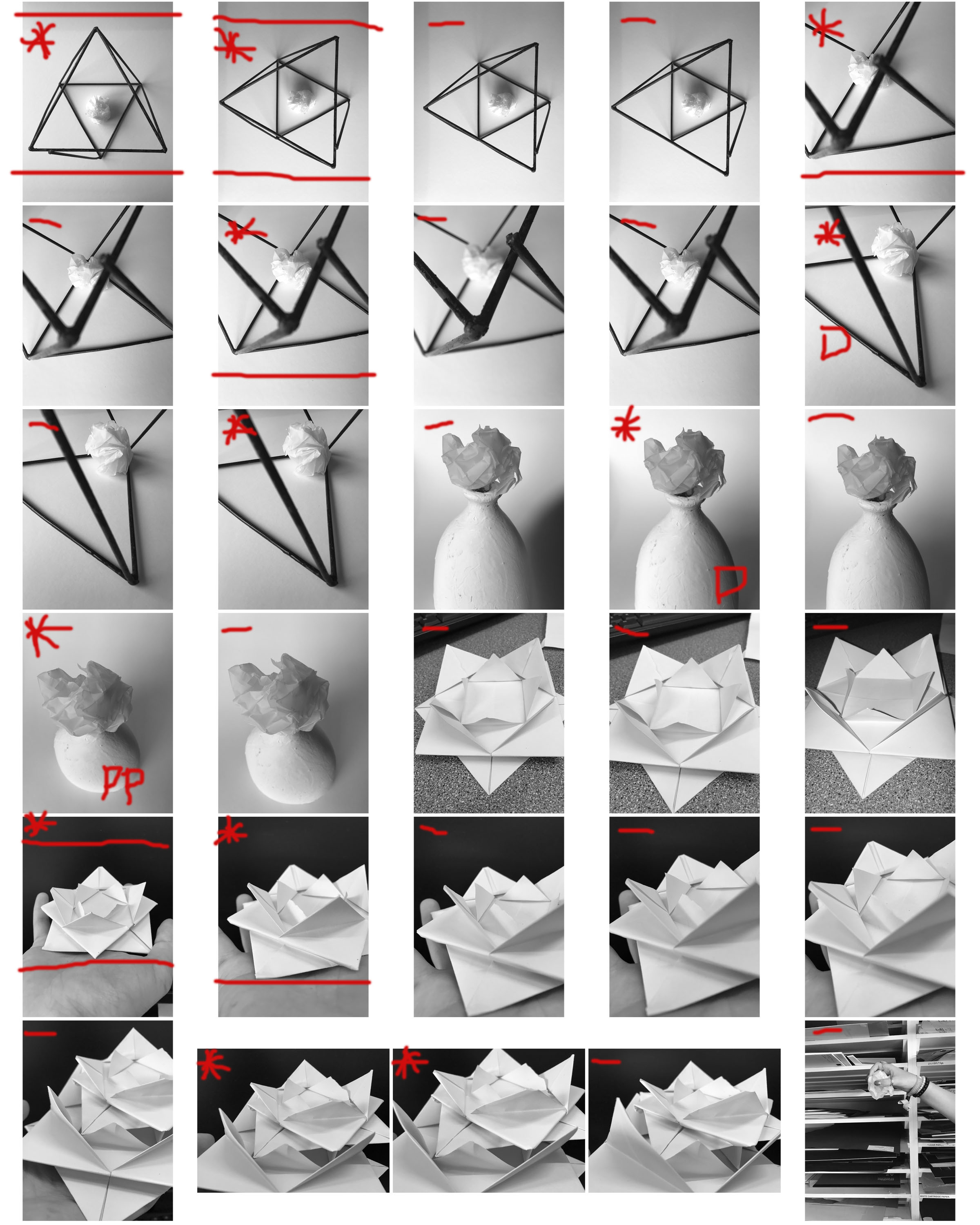
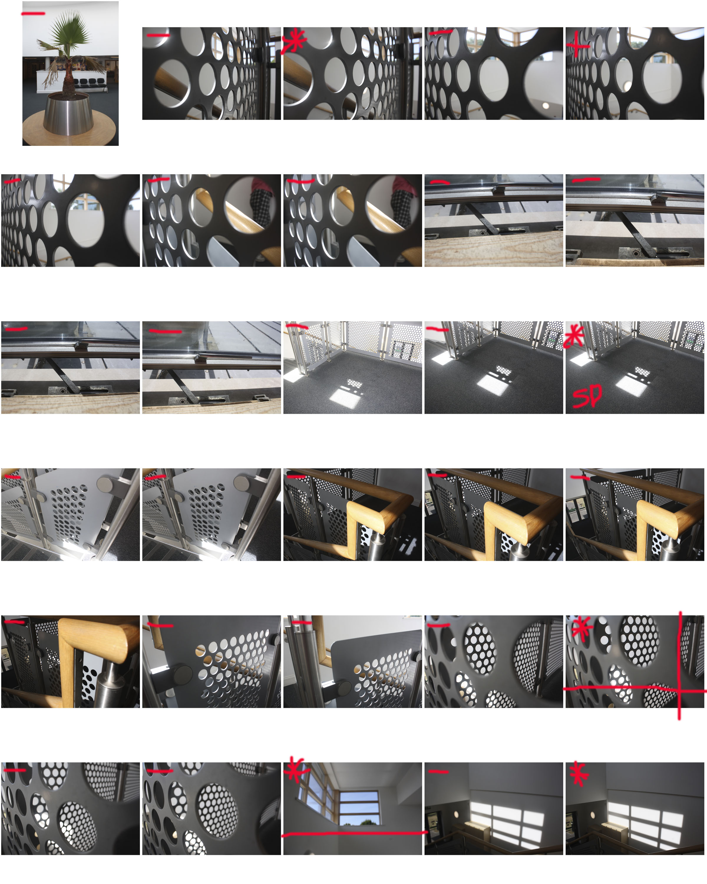
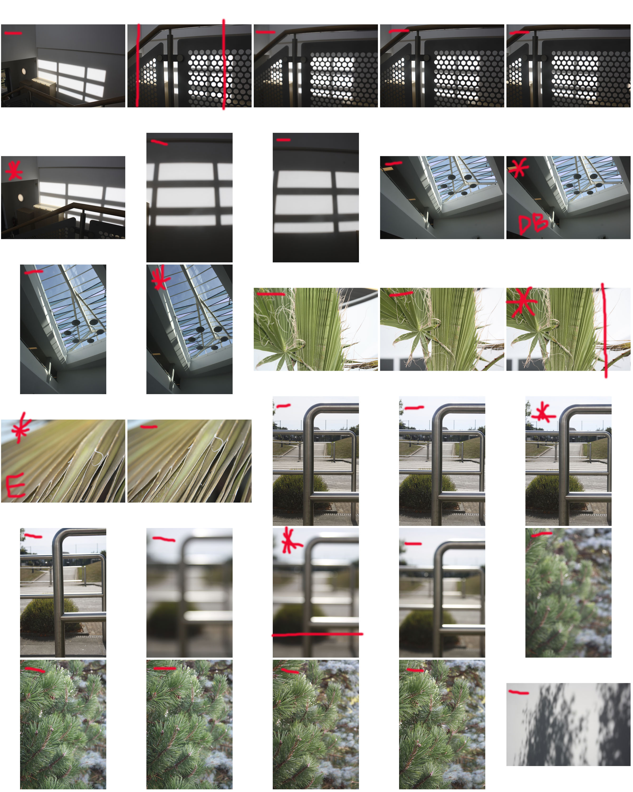
i made my final selection of images from the 86 I took by using contact sheets. I uploaded these onto Photoshop which I was able to manually draw onto with the brush tool. This was a very useful step i took when choosing the most successful photos from my selection. The red marks on top of the sheets made artwork in itself. The marks seem random yet to me they were a very useful prompt that reminded me of the steps i should take when editing and selecting the correct photos. I chose to make the photos monochrome as my final images are mostly black and white, therefore this helped me to visualize my final photos better.