Category Archives: Component 2 ESA

Filters

Author:
Category:

Environmental Portraits

PHOTOSHOOT PLAN OF ACTION:

WHO am I photographing?

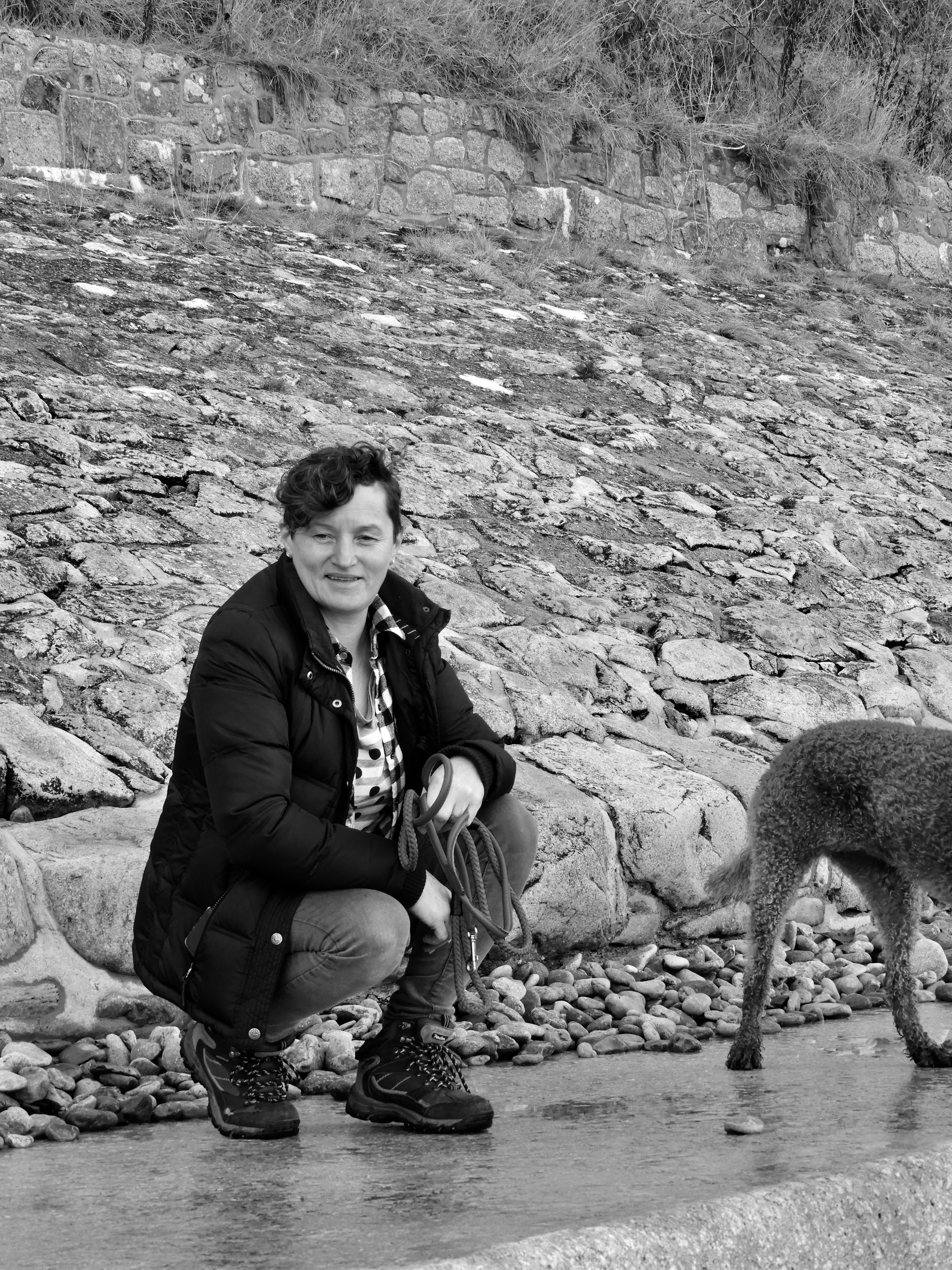
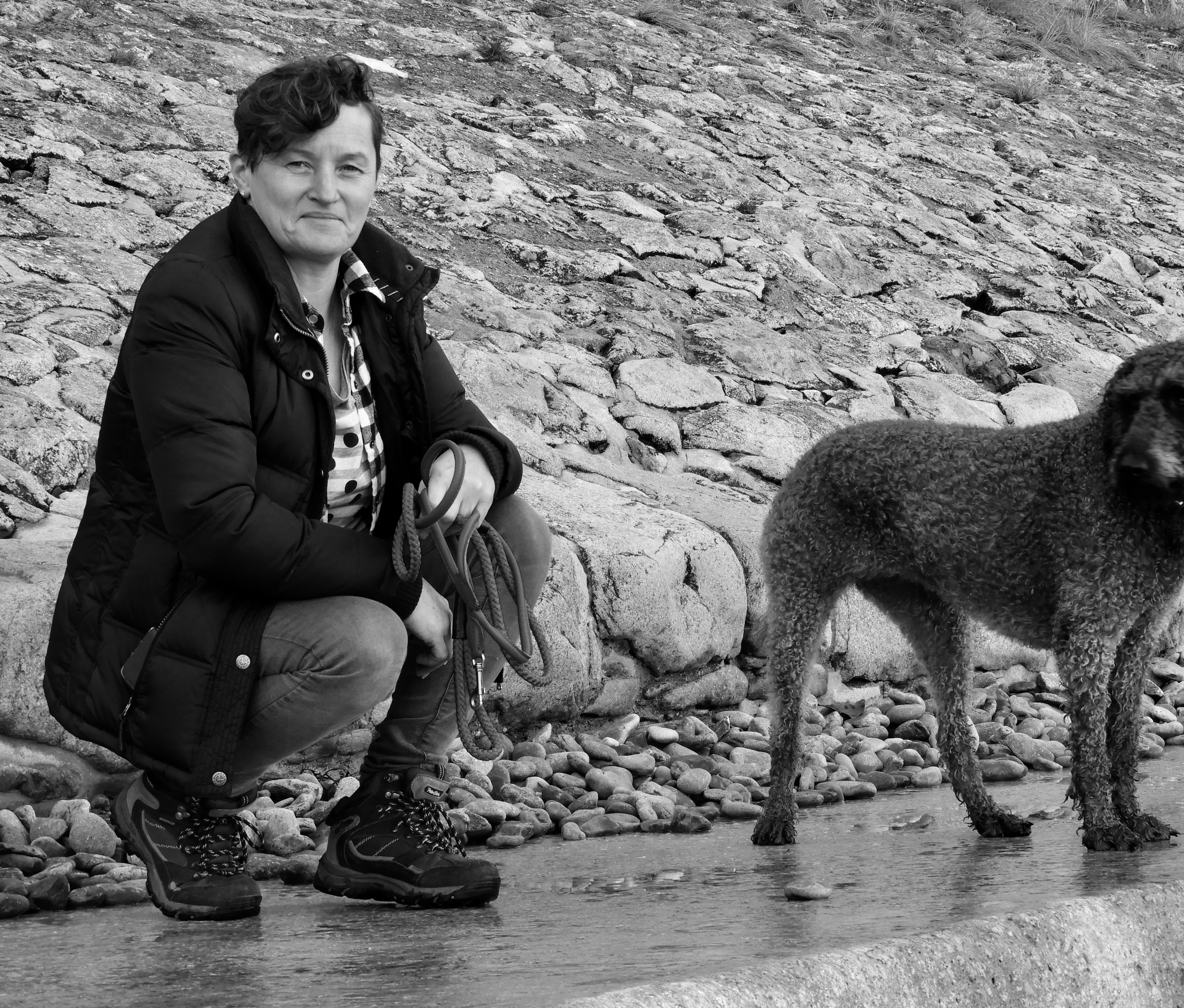
After contacting multiple people to see who was willing to be involved in a photoshoot, I was finally able to get hold of a dog walker.

WHAT am I photographing?

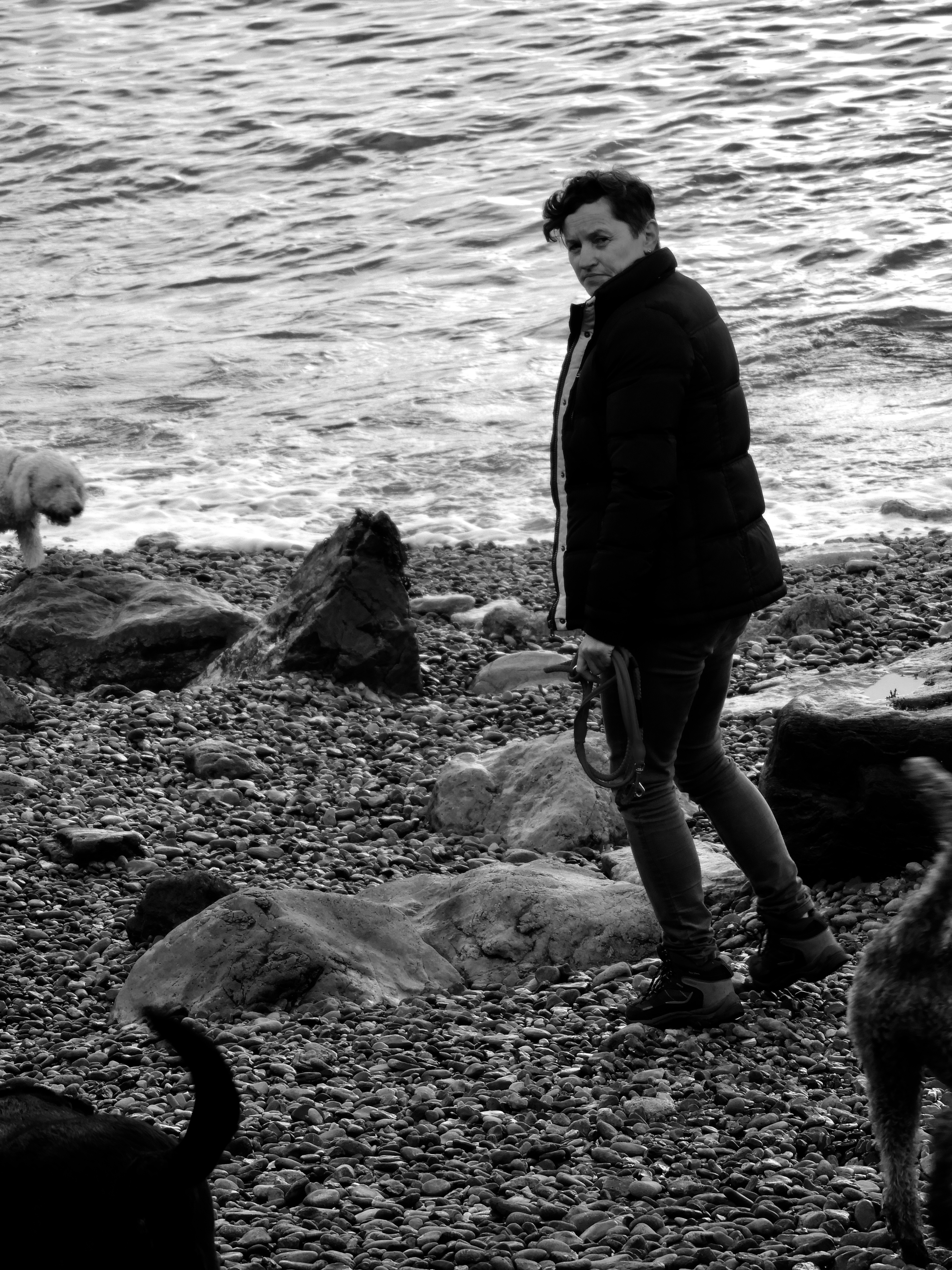
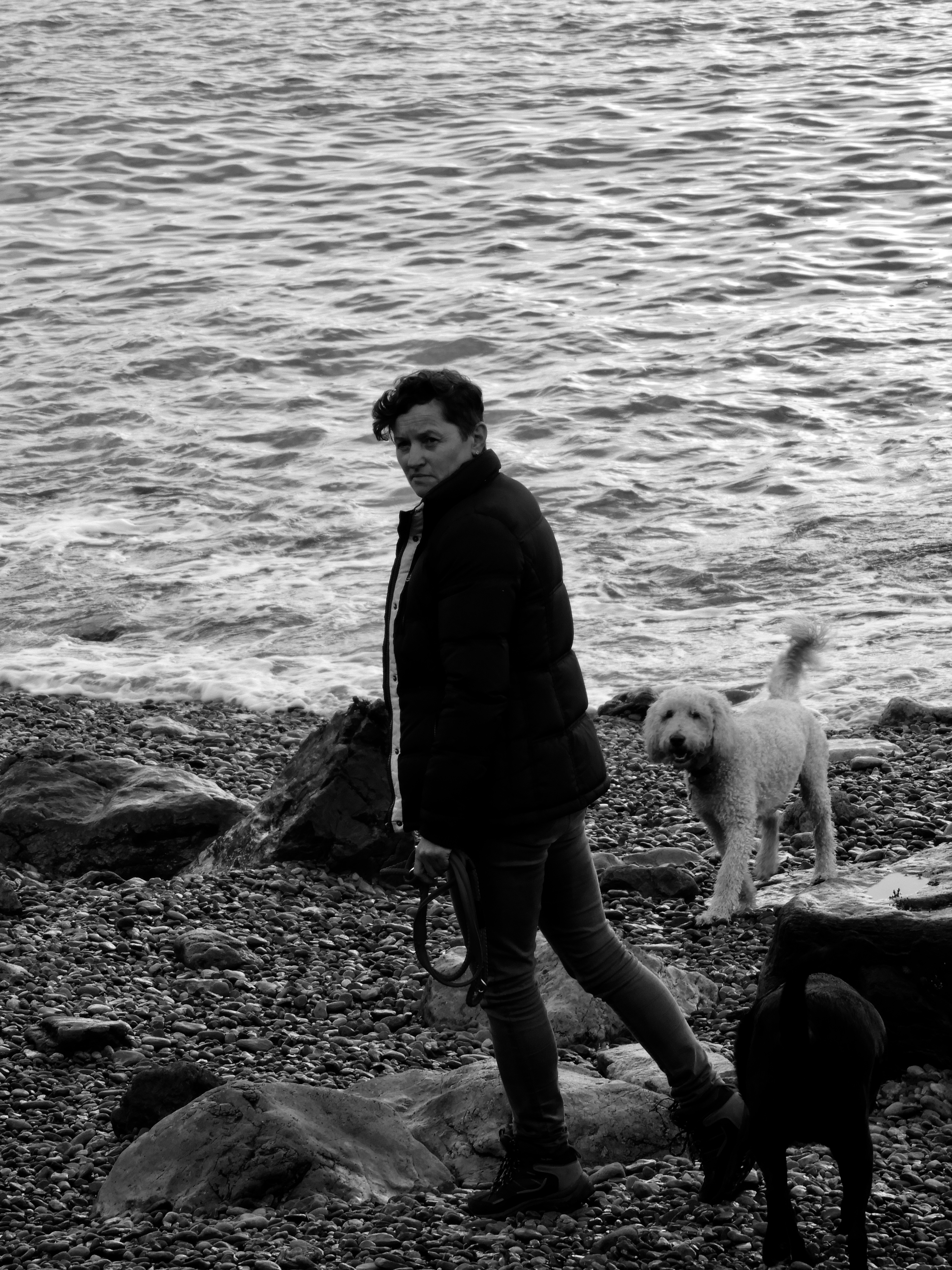
During this photoshoot I was planning to capture a very regular walk , the everyday typical working day of the subject.

WHEN am I doing the photoshoot?

I chose to do this photoshoot during early/ late morning as I felt that I could get the best, most bright images during this time of day.

WHERE did I conduct this photoshoot?

In order to get the most interesting images, I visited two locations, a wooded area in Trinity and also Bouley Bay.

WHY did I conduct this photoshoot in this way?

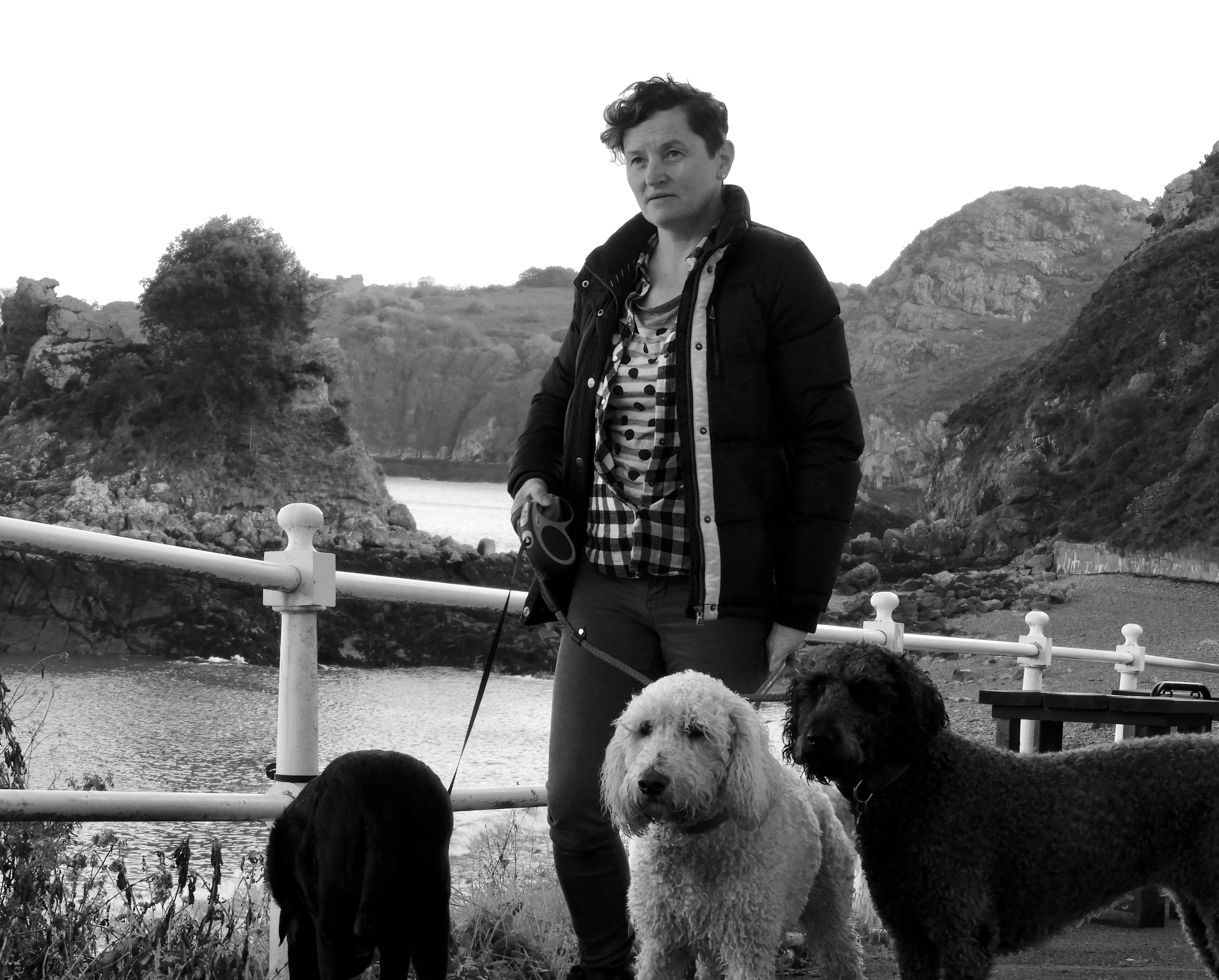
I thought that the images I’d take during this photoshoot would be a lot more interesting as there are more than one subject in the image.  There are dogs which would add an element of action to all the images.

HOW did I produce the images?

For this photoshoot, due to the bright weather conditions of the day, I used a sun hood on my camera to avoid over exposure of the images. I introduced a power complex to the images, taking the images from a low angle.

CRITICAL ANALYSIS OF IMAGES;

TECHNICAL:

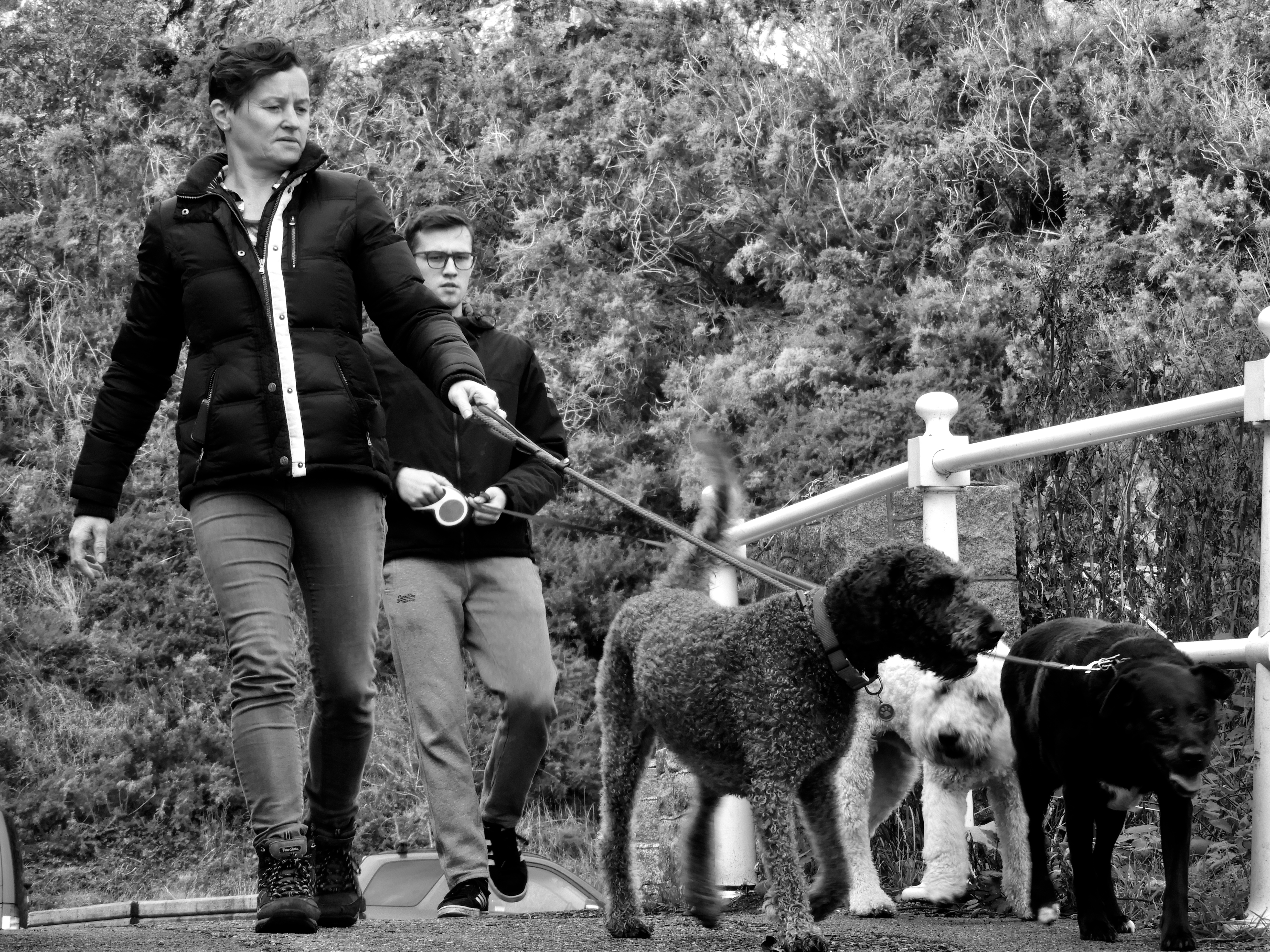
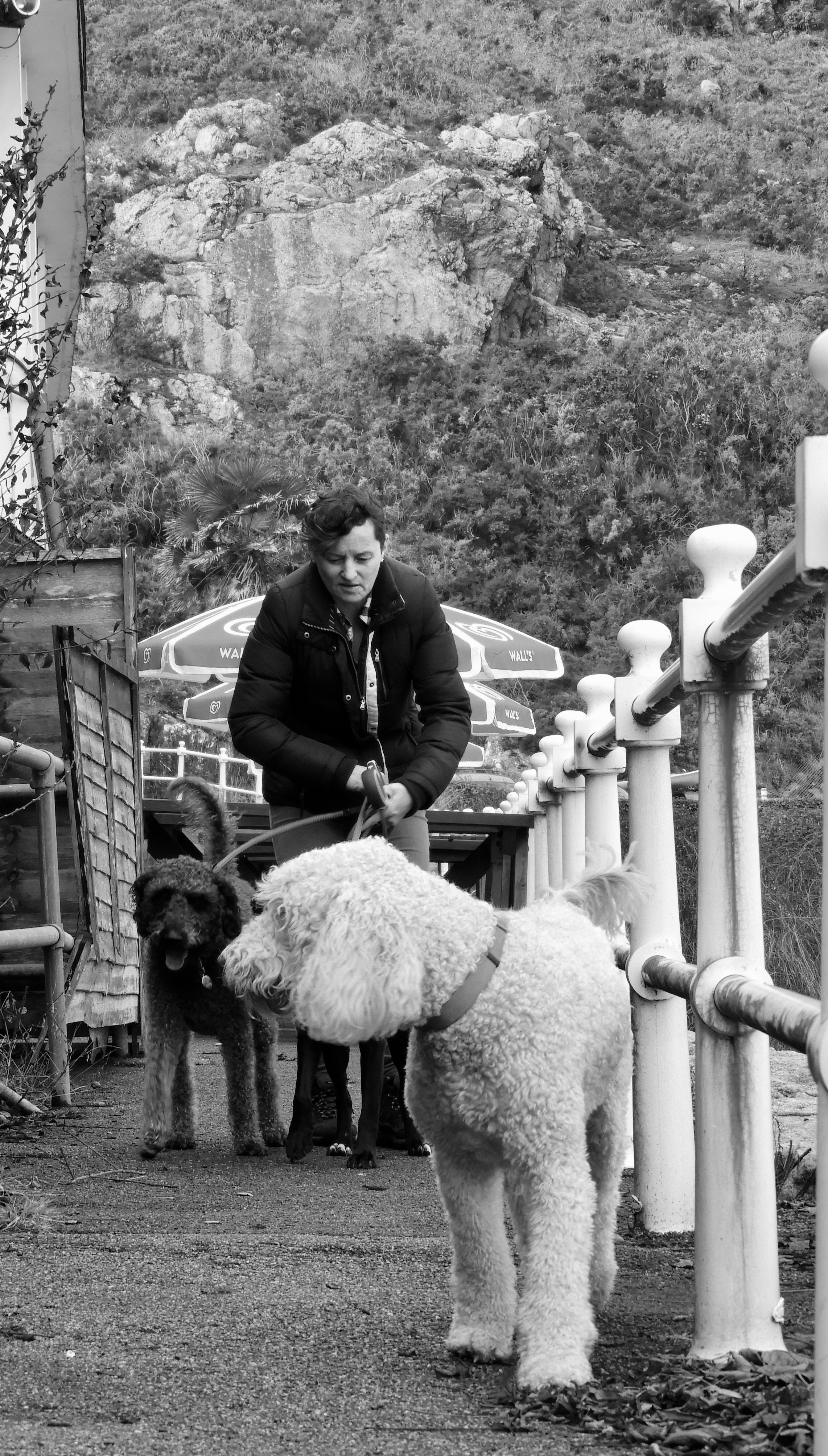
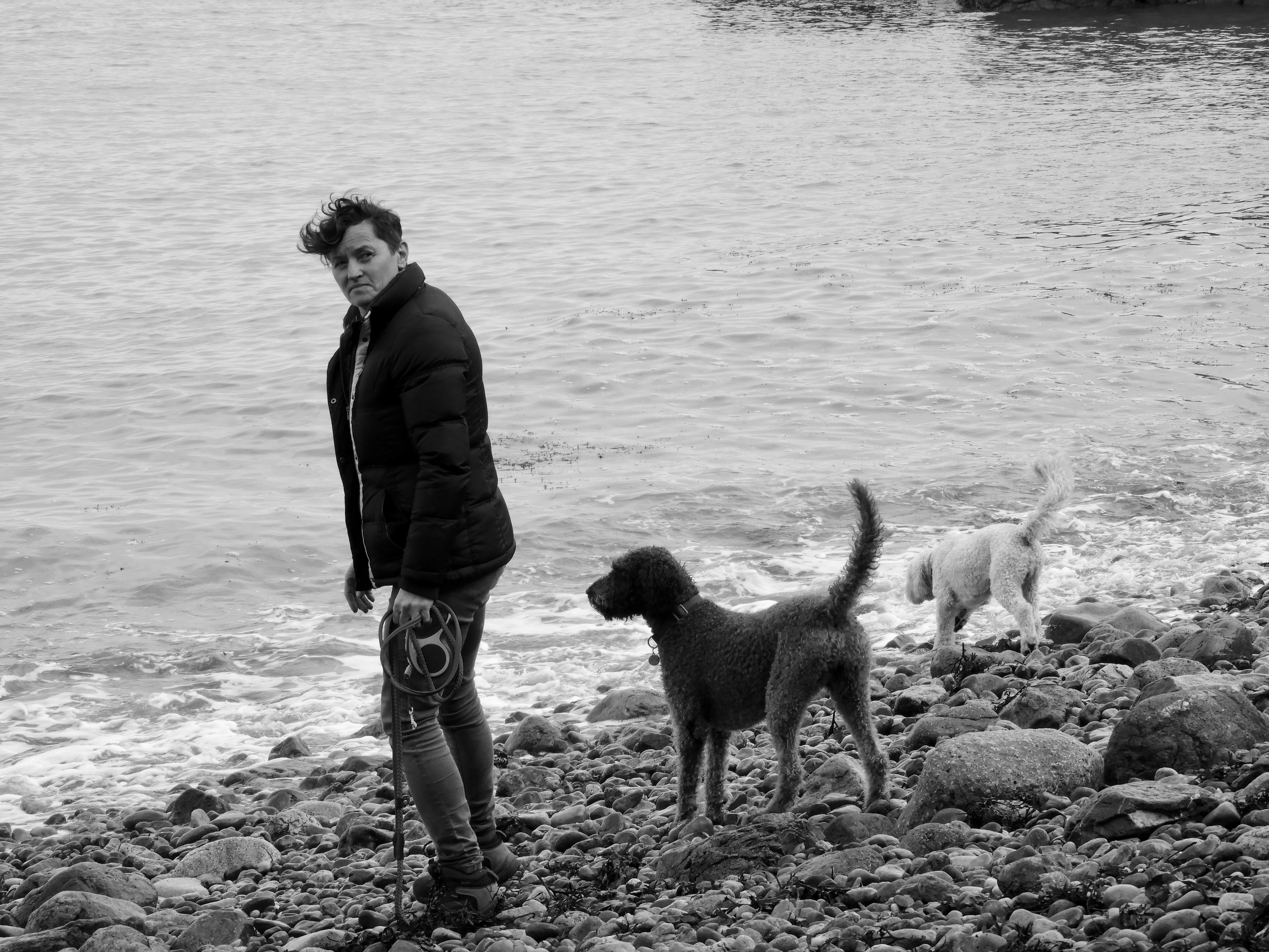
This photoshoot was quite tough in terms of exposure to capture properly. It was early morning when I went out to capture these images. I was expecting cloudy weather, with very diffused, soft natural light, yet the day was only partially cloudy therefore there would be moments when the sun was very strong and I would be forced to manually change my exposure and shutter speed settings. This in turn made a lot of the images have motion blur due to the moving of the dogs and walking to capture the images. I therefore used a sun hood in order to stop this from happening, making a lot of the images very dramatic in lighting. During this photoshoot I also had keep in front of the subjects in order to allow them to look into the camera and make eye contact. There is no real composition to any of the photos as they were captured in the middle of an action, sometimes stopping to again make eye contact with the camera. Also due to the fact that I constantly had to keep in front of the subjects, I had to walk quite a distance in front of them meaning I used a long-focus lense, this allowed me to retain the quiality of the images even when I zoomed in on the subjects. It was also useful as it  was a better lense for capturing action shots. As for camera settings, I mostly used the M (manual) setting, due to the constant changing of light in the environment, being dark in the wooded area and very bright on the beach. I used a shutter speed of 1/800 as this allowed we to capture, crisp and clear images even when the dogs and the subject was moving around. I used exposures of f8 during cloudier periods of time and f16 when it was sunnier as this meant that the images weren’t over or underexposed during specific weather conditions. As for white balance, I kept it on the daylight setting as I thought this was the most effective and allowed me to capture images that are balanced.

VISUAL:

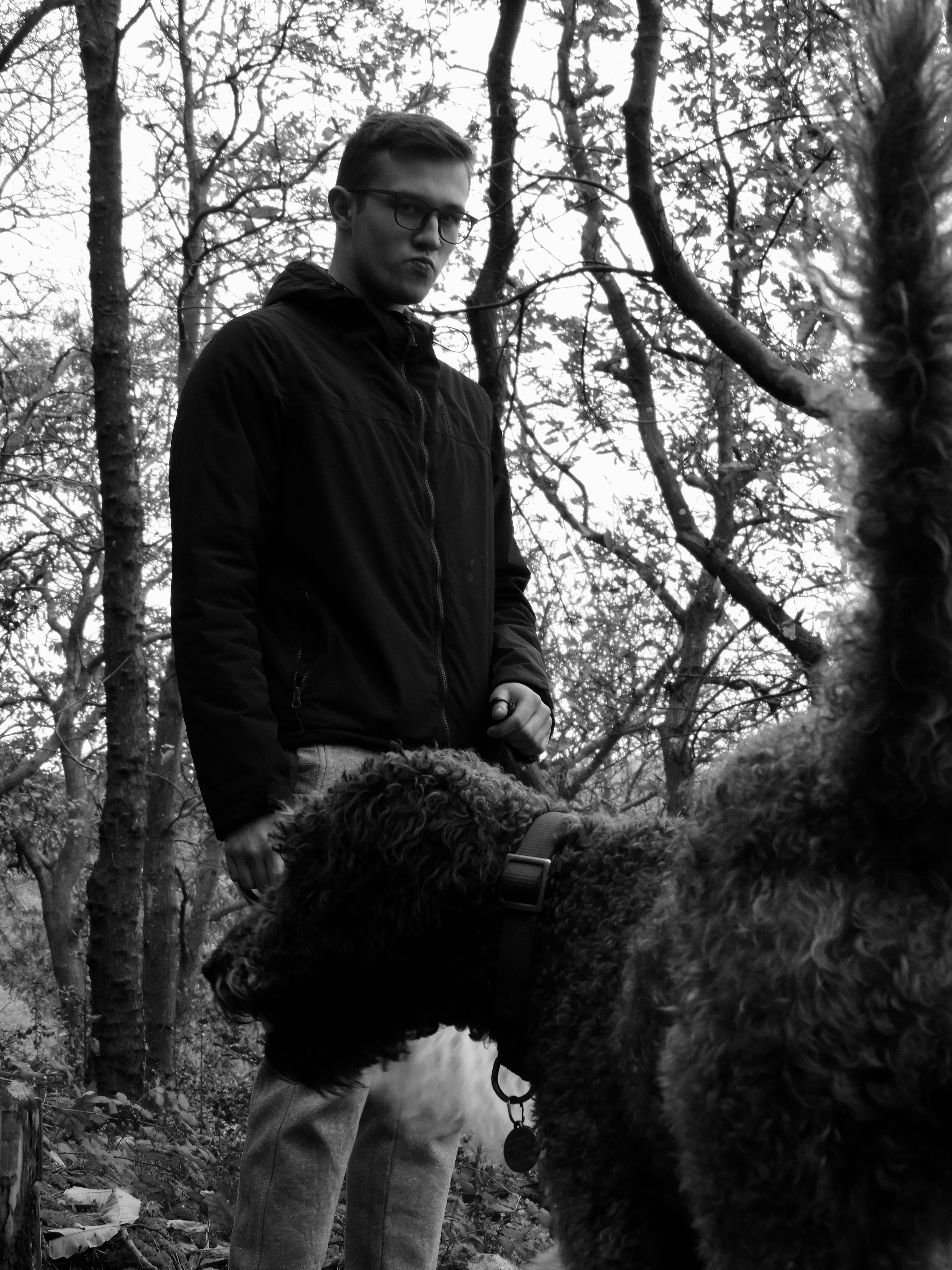
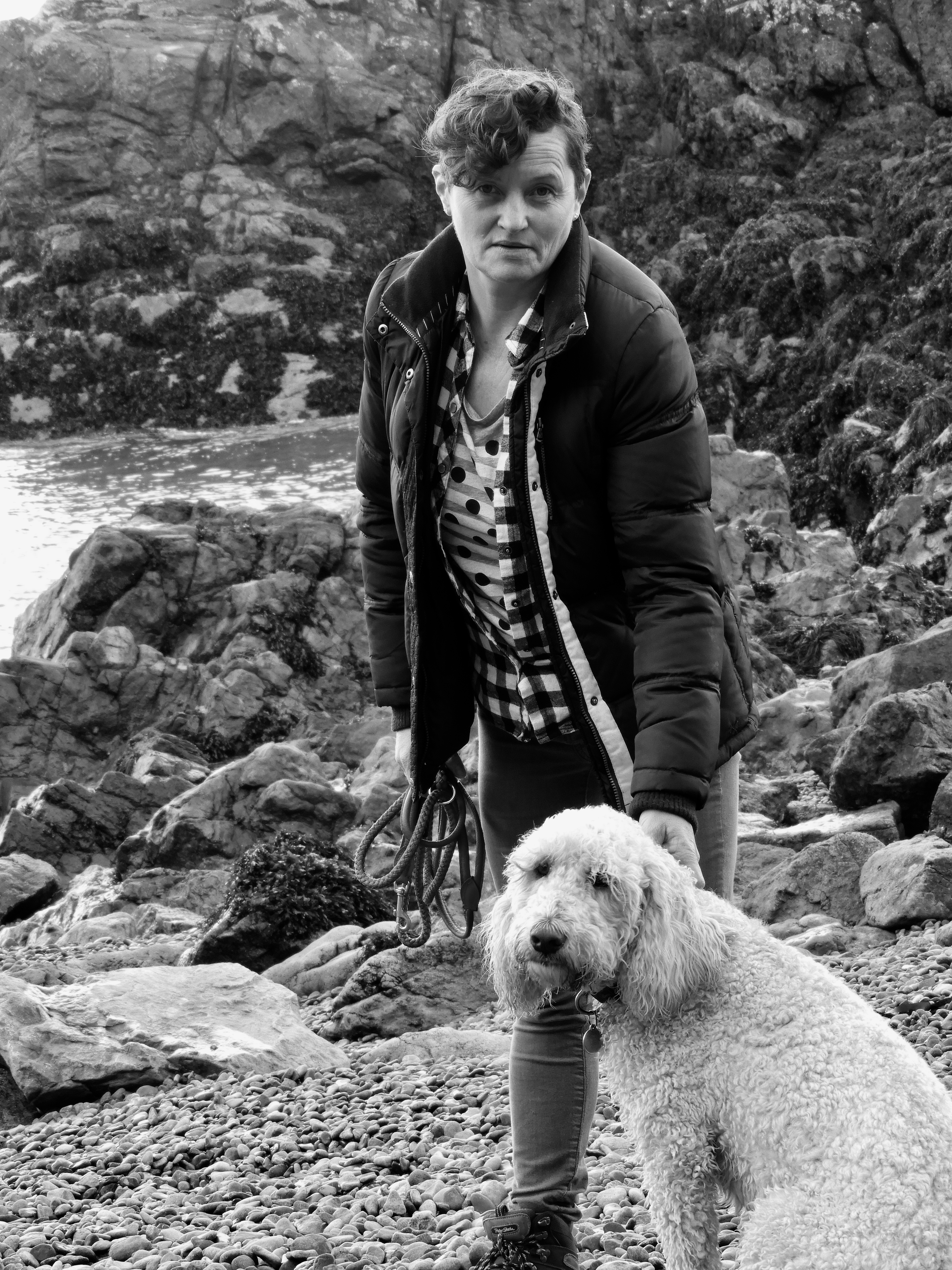
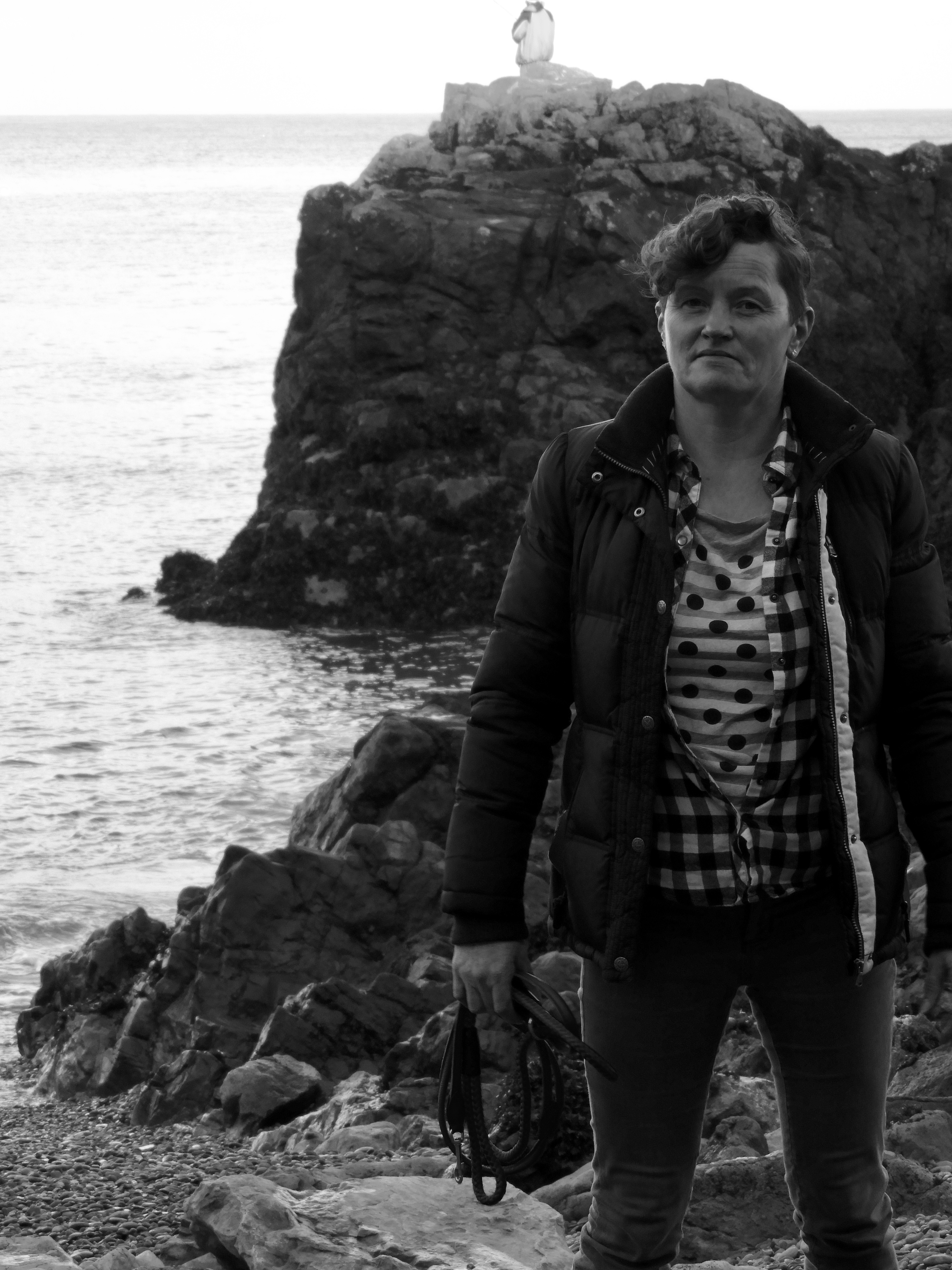
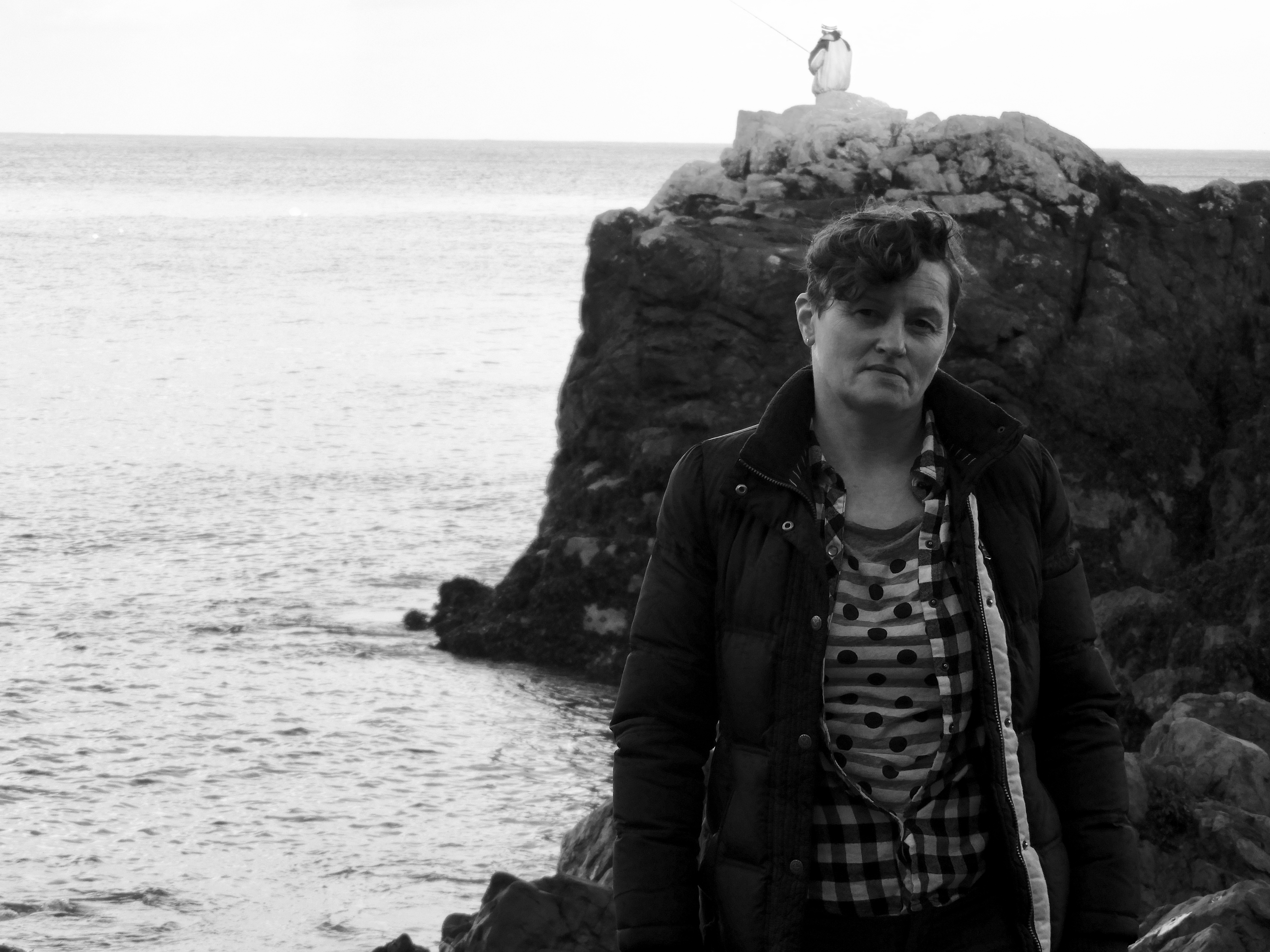
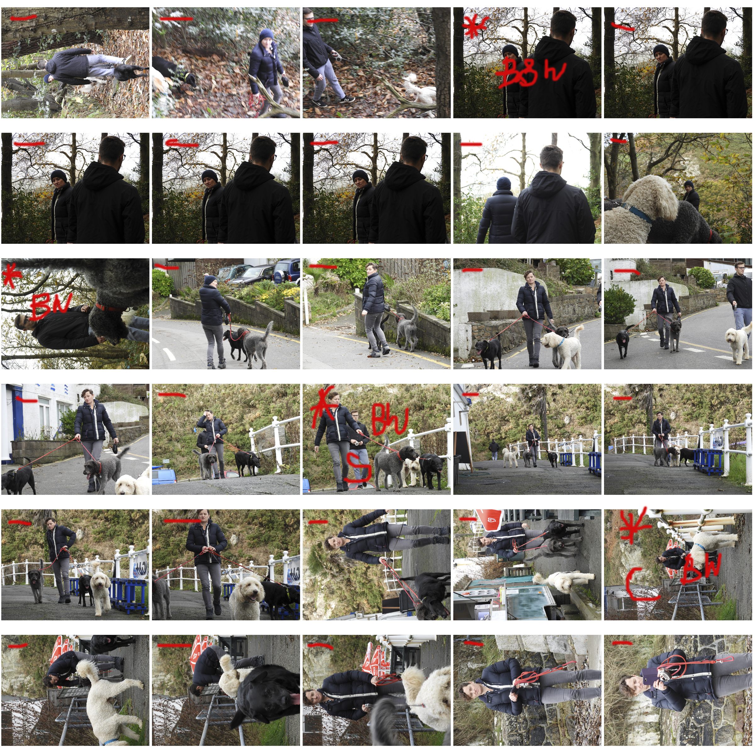
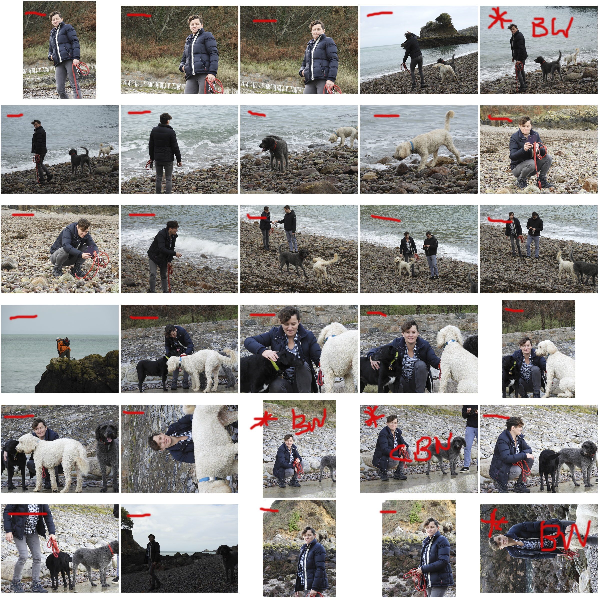
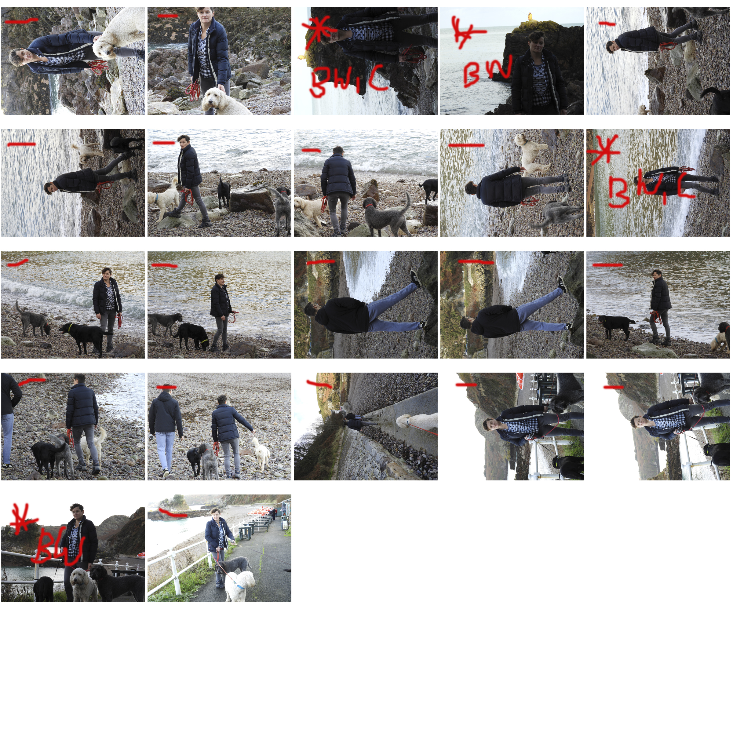
During this photoshoot, the hardest aspect was definitely having reoccurring eye contact with the subjects. Due to the chaotic nature of this photoshoot, and having to run in front of the subject to capture them, it was hard to remind the subject to look at the camera. For the image below, I asked the subjects to stay still and look at me, I felt that this was a very successful image due to the ominous and dark atmosphere it has. There is a real sense of depth in this image, as the first subject is in the foreground of the image, the second being in the miground and the trees in the background. It is in a way a parallel image is it seems like the subject in the foreground is duplicated in the midground but flipped around to make eye contact with the camera. I edited the image and made it black and white as I felt this was the most suitable for this photo and the atmosphere it has. To remain consistent I did this for all my images. This image is extremely dramatic in nature, not only coming from the dim surroundings but also the facial expression of the subject. It is quite blank, with no noticeable feeling being captured, fitting well with the overall theme of this photoshoot. The angle of the image is quite central, slightly upwards facing. This further adds to the powerful presence of the subjects in the image. Both the subjects have a neutral stance, simply standing straight, yet the combined stance of them adds to an overall alluring image. The trees  situated in the background of the image, break up the even surface of the coats of the subjects, adding additional captivating elements to the portrait. The light is hitting from the top left hand corner of the image, illuminating the face of the first subject yet keeping it dark for the second subject.

CONCEPTUAL:

During this photoshoot, the main concept I was wanting to capture was lifestyle and class in Jersey. This is island is filled with natural beauty, with beaches and natural landscapes all around. The subject who makes a living, spending their days in the outdoors to me is very admirable, as it is a job unlike most in jersey. Having a notably large financial sector, most people work in jobs which forces them to be stationary, not seeing the real jersey. This ties in to a much larger issue of people becoming disconnected from nature and the outdoors. This having many adverse effects, such as poor mental and physical health. Jobs like this are often seen as low class, yet it is on the simple tasks that often play an essential role in society. Very class, poor and rich have a place in society, being the mechanism which makes it run like it does. I feel as though this photoshoot also has links to gender, and gender roles. It is often expected that women hold lower level, less roles in authority, which this photoshoot enforces slightly. Should we really be enforcing traditional gender roles? It is not always something that I am against for. Different jobs express the true nature of the genders, males being naturally more dominant and lead better, and women generally being nurturing and caring. However it may enforce this, I feel this job is admirable in the sense that it lets the subject maintain good mental and physical health through the constant exposure to nature.

CONTEXTUAL:

Both subjects in this photoshoot are my own personal family members. The woman (my mother) has a big love for animals, especially dogs. She holds a job as a nursery school teacher during the weekdays and choosing to take dogs out for walks on the weekend. She was born in Latvia, in a small town near the border of Russia in the 1970s. Her farther being a forest ranger, she grew up inside a forest, contributing to her love of nature and all things outdoors. She grew up in communist soviet state of Russia, therefore being very limited to any outside knowledge before the 1990s when the state finally collapsed and she was able to travel for the very first time to other European countries. Latvia, after being in financial collapse throughout the 2000s, made it very tough for my family to remain living it Latvia, legally moving to jersey in 2012. The other subject in the photo is my brother. Being a few years older than me, he has started his own professional career in mechanics. Growing up in a rural town, he also from a very young agr acquired love for nature, often saying that he can’t “function before having a walk”.
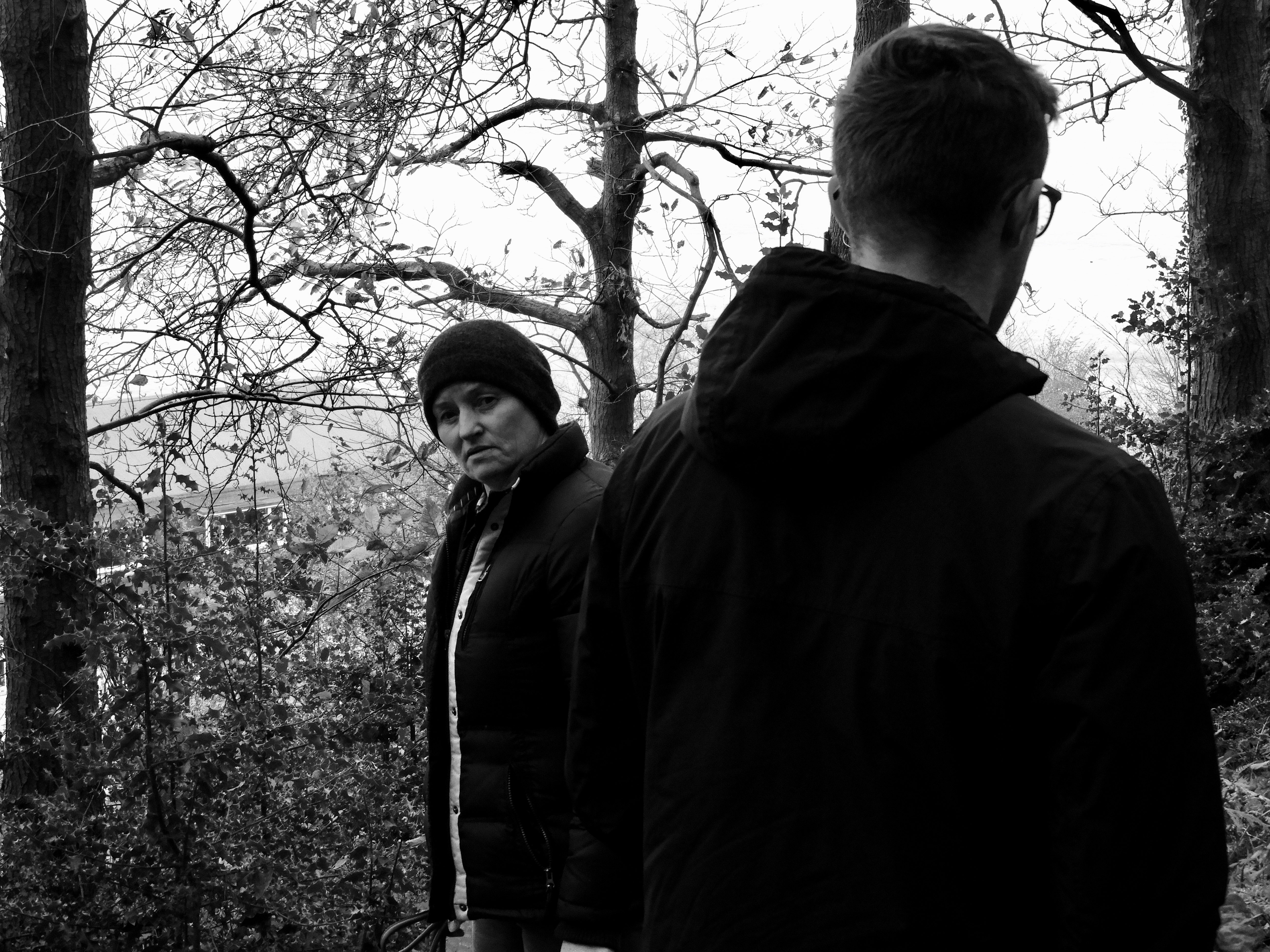
Most successful image

OTHER SUCCESSFUL IMAGES:

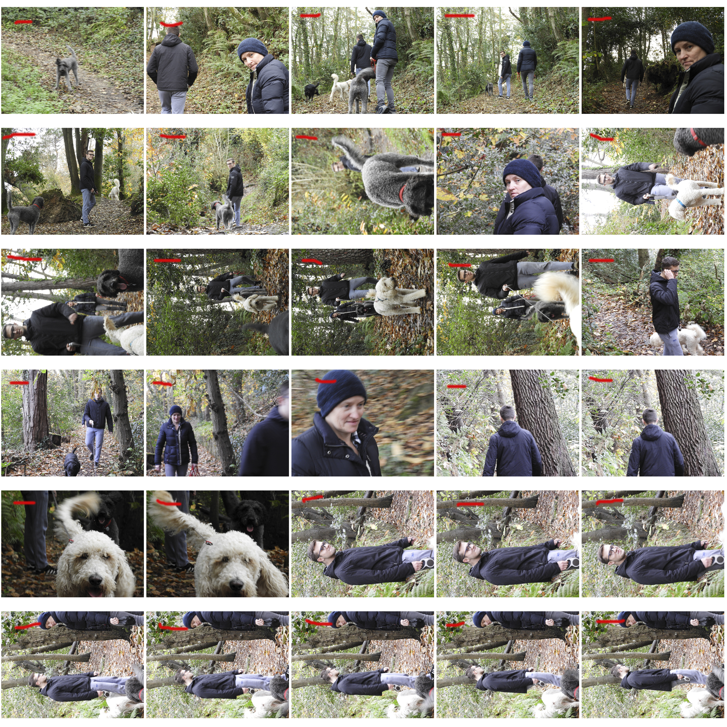
CONTACT SHEETS:
Street Photography – Practical

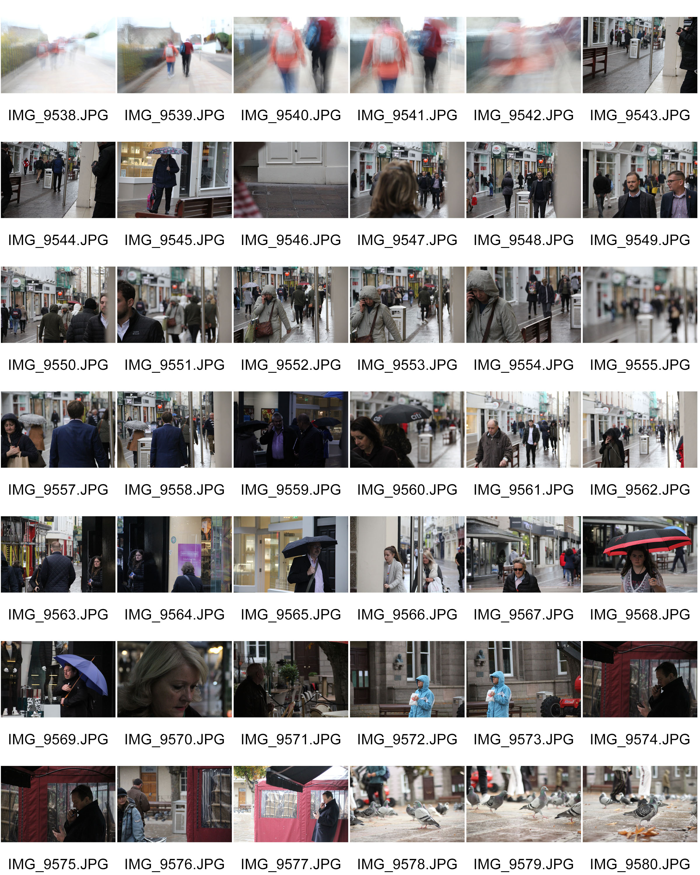
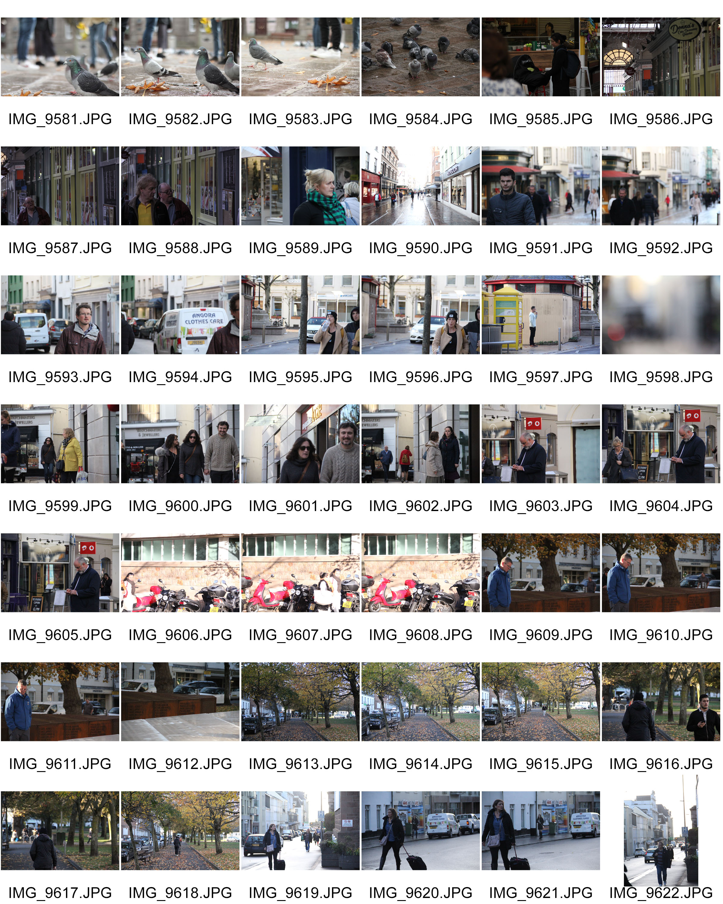
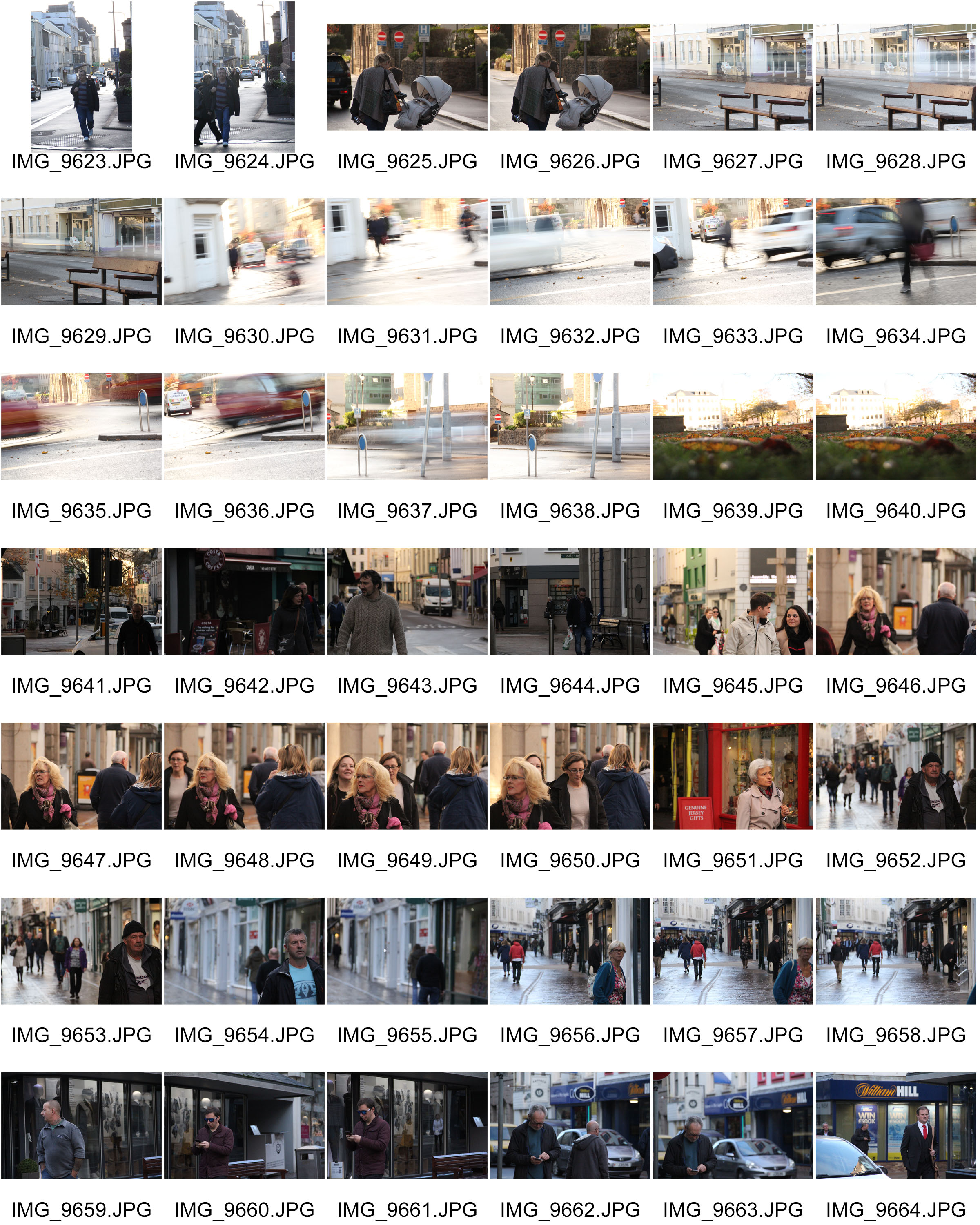
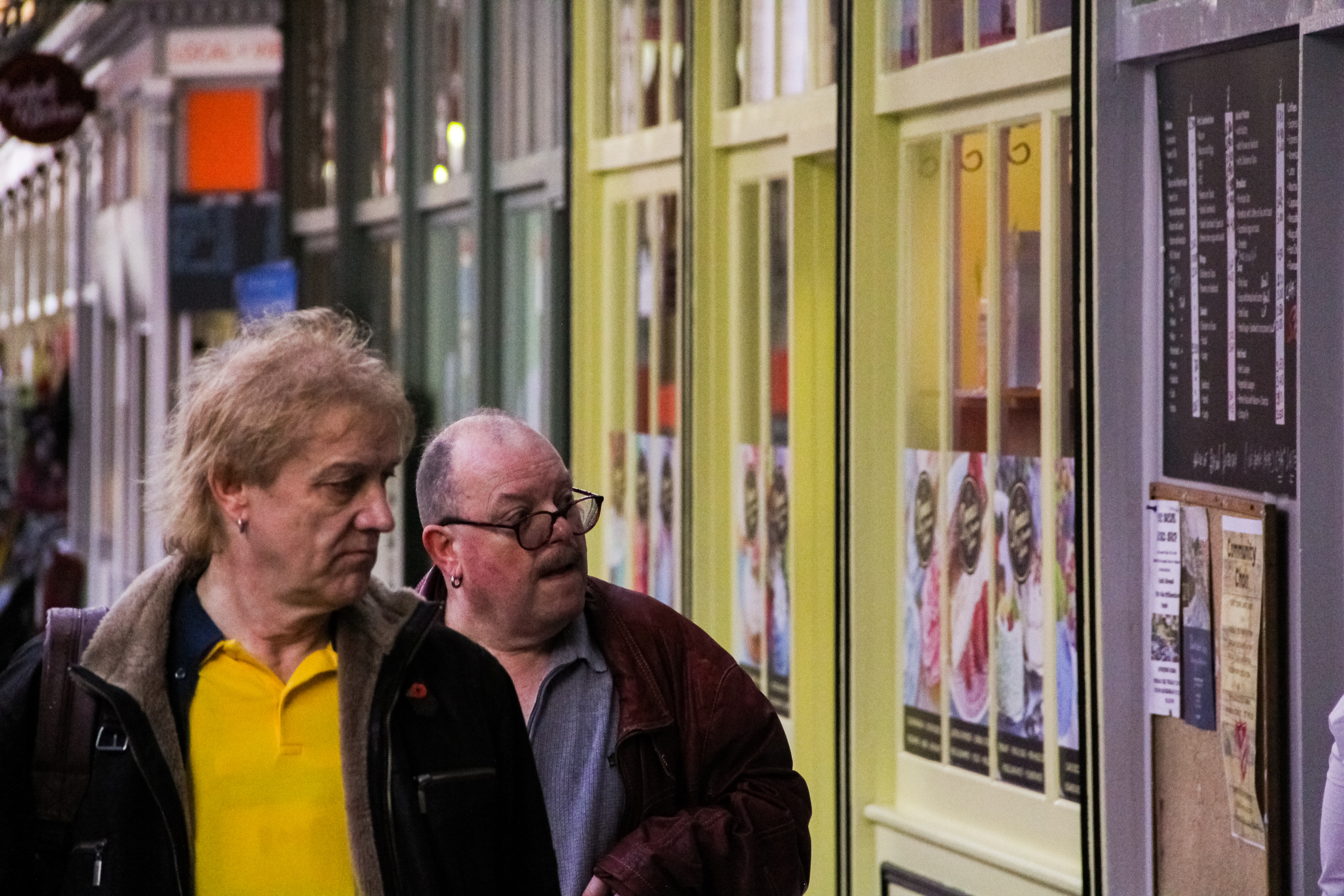
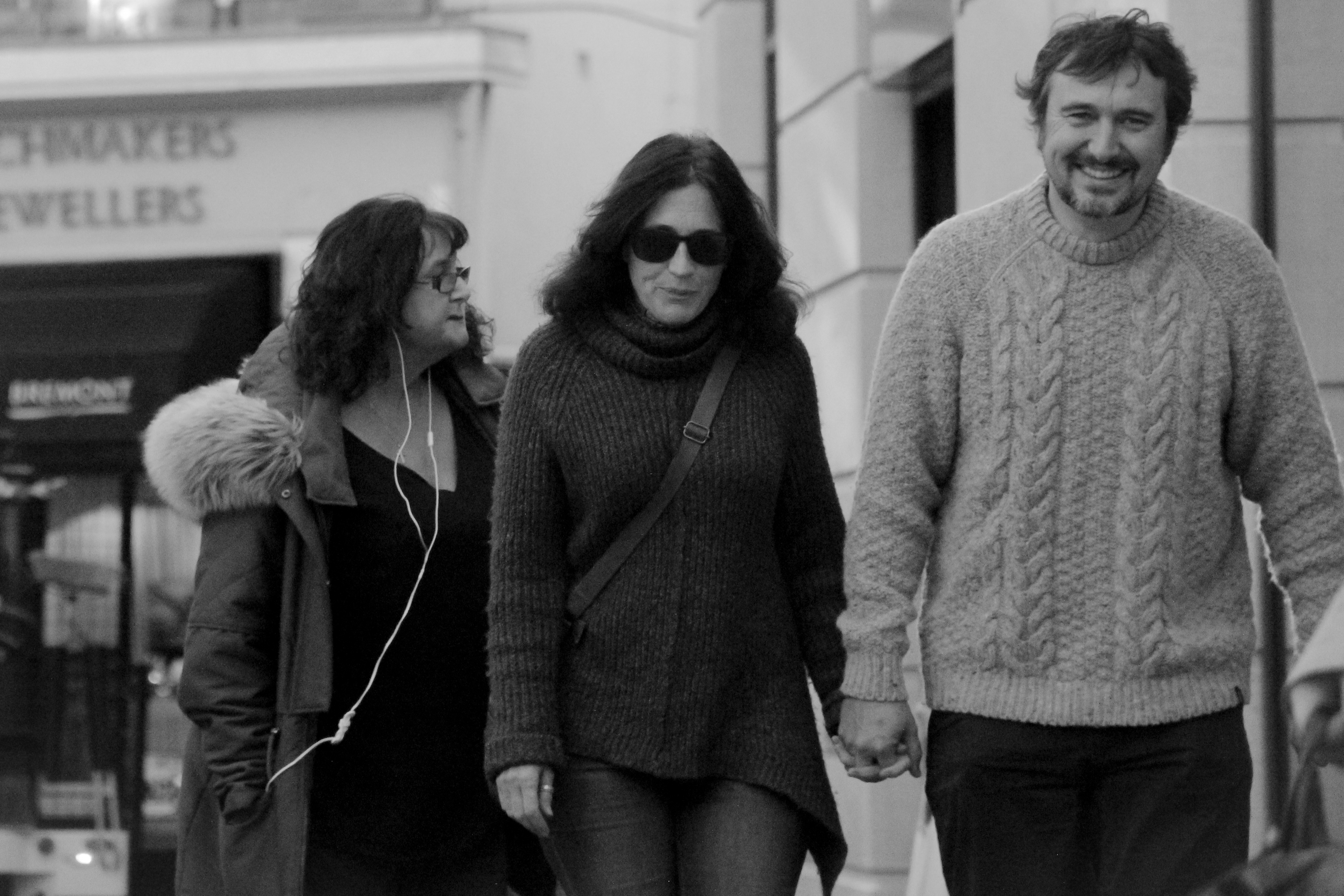
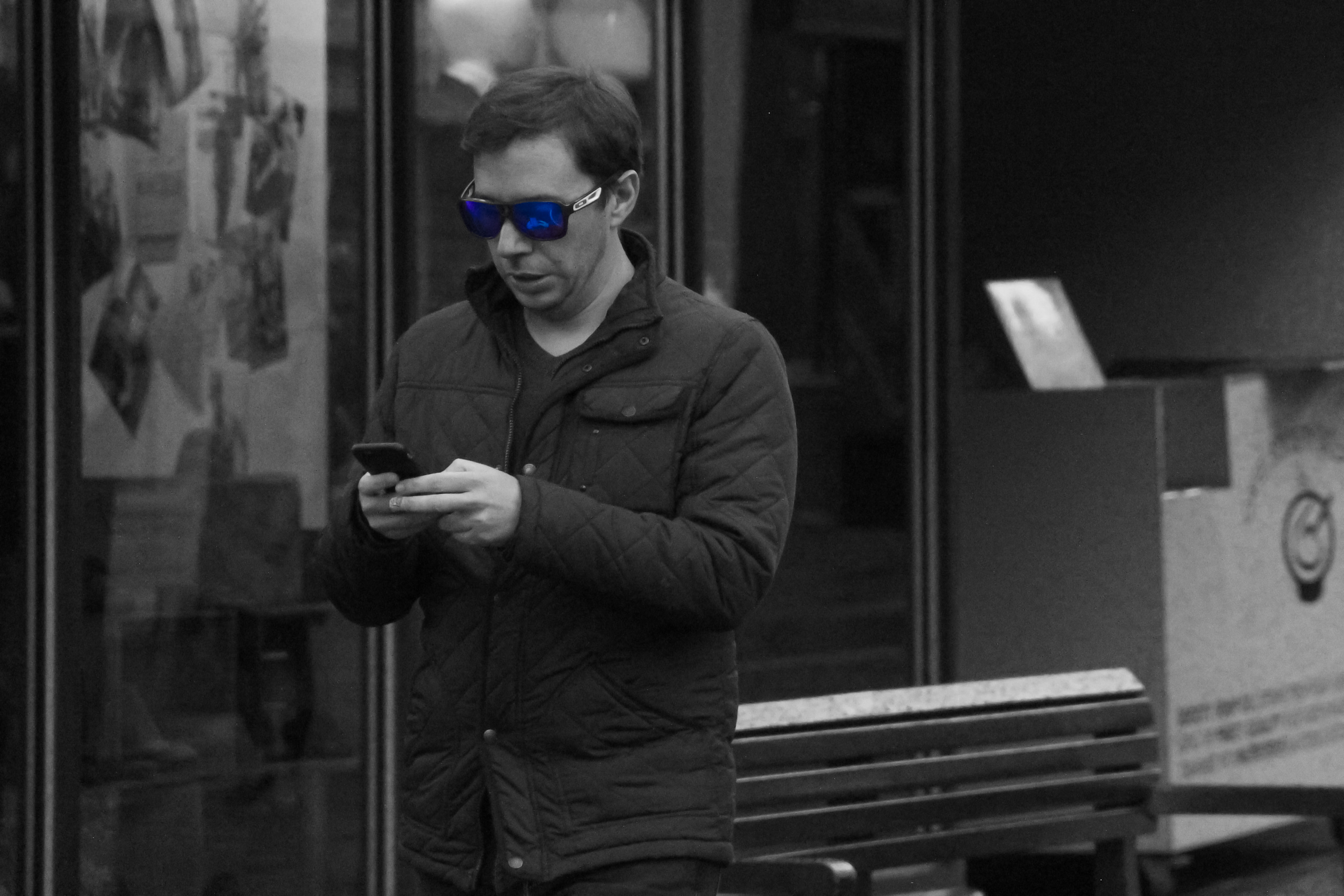
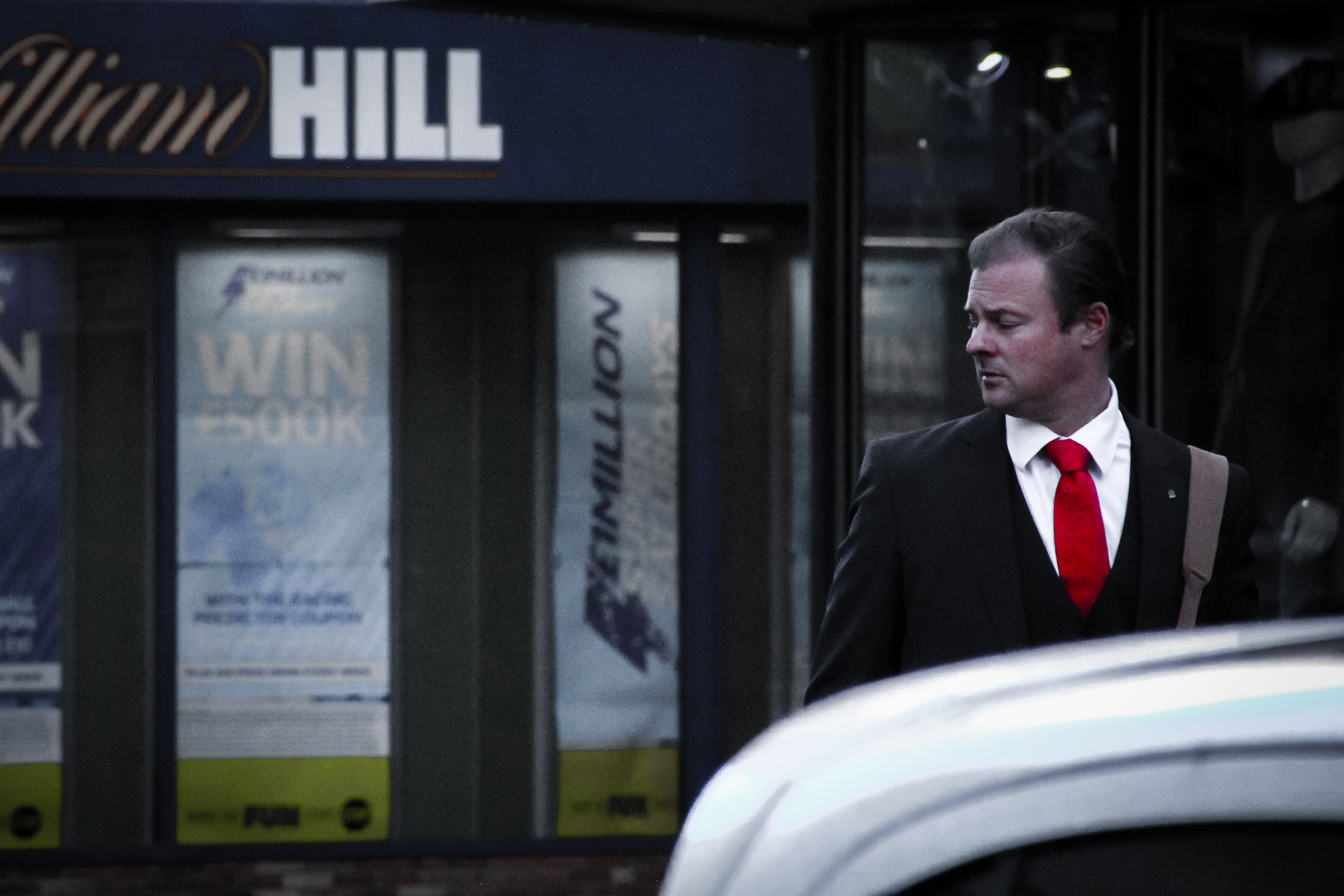
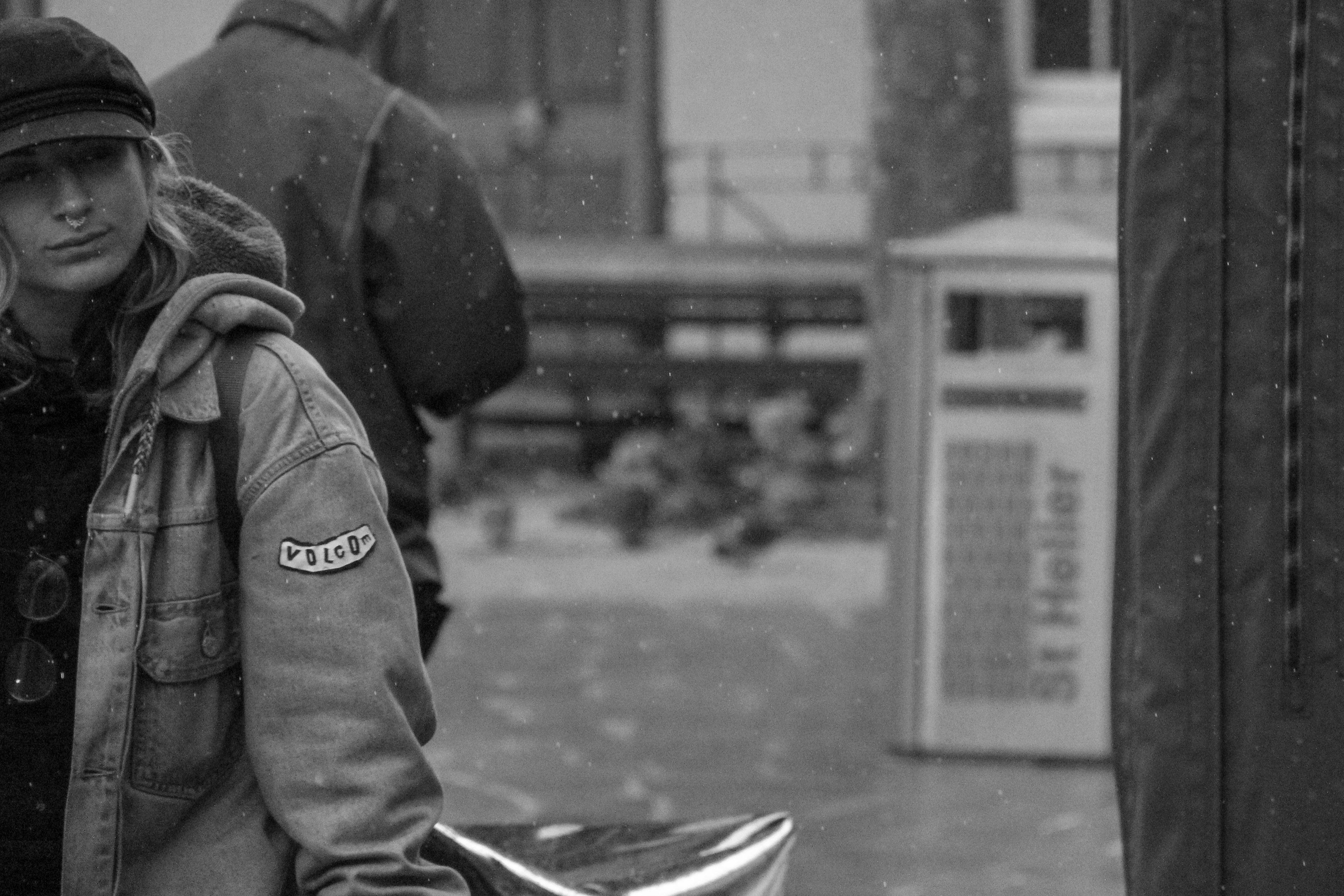
For this practical I wanted to capture people doing ordinary things and having interactions between each other, but add a more dramatic or stylized edge to the pictures. this was my first attempt at street photography and found it to be very interesting seeing people go about their day. After selecting my final images, I decided that I waned to assign each picture an emotion. Some of the images clearly showed some emotion to begin with, but I wanted to edit them to see if i could achieve this while still making each picture look realistic and not over-edited. Below I have put together a contact sheet an some final images that I have edited.


Final Images

Edited in: Lightroom

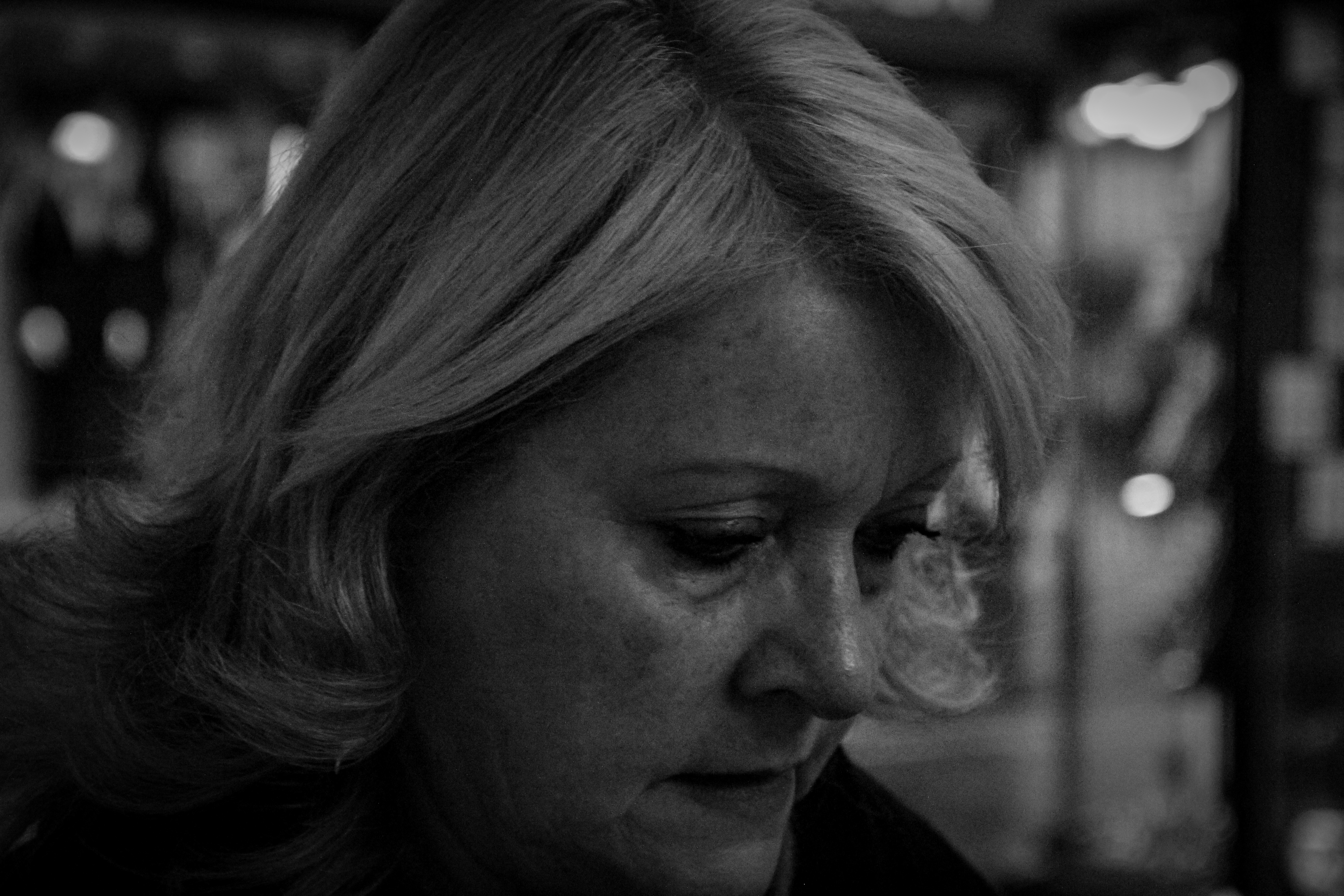
I started with the emotion of sadness, trying to capture the somber atmosphere by getting very close to the subject so it seems as though nothing is going on in the world around them. I then desaturated the image and lowered the exposure so that it would seem darker.

Edited in: Lightroom

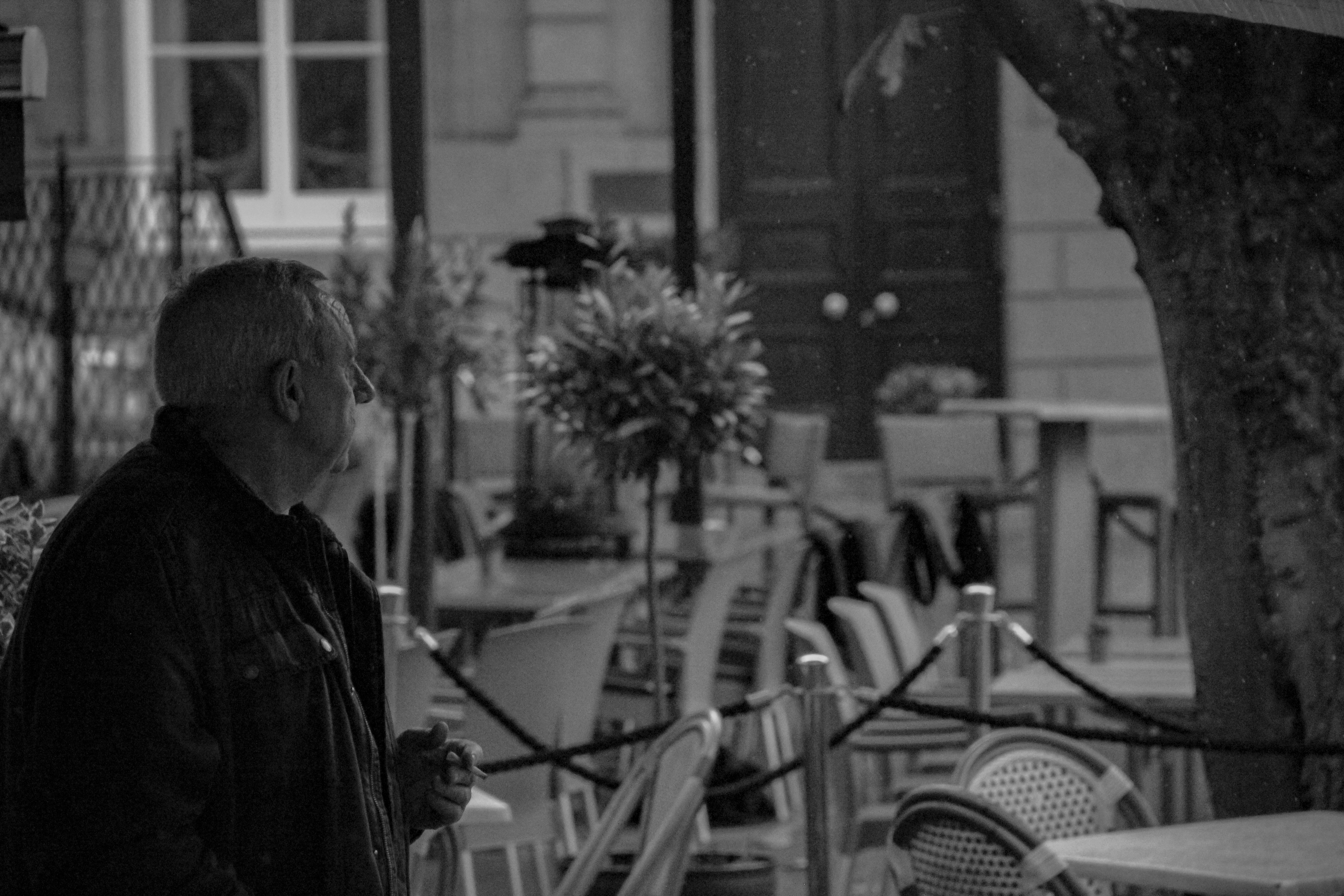
I had a similar approach with this photo as i did with the last. I wanted to capture a somber atmosphere and as you cannot see the subjects face, through the use of some small adjustments and editing, the picture is perceived to be sad as the man is looking into the distance, and because the viewer does not know what he is looking at, it seems as though he is staring at nothing.

Edited in: Lightroom

For this image I used a high shutter speed to capture raindrops frozen in midair. I try to utilize the rule of thirds in many of my pictures however i think that it is especially noticeable in this image. The frozen rain, adds a sense of temperature, making the image look cold and dark.

Edited in: Lightroom

I liked the use of colour in this image and i decided that desaturating it would make it lose some of its most interesting characteristics. For instance, something I noticed while editing the picture is that the man on the left’s shirt is almost a perfect match to the yellow reflection in the glass, and the man on the right’s shirt is matching the grey-painted board on the right side of the image. This helps create a sense of symmetry, as the picture is almost split in to two, at least regarding colour, and gives it a subliminally symmetrical look.

Edited in: Lightroom

Many of my images were focused one person at a time, however this is one of the few which focuses on relationships and interactions between different people in the same frame. Although this is quite a dark image with not many bright highlights, the smiles on the subject’s faces show a clear juxtaposition to the exposure.

Edited in: Lightroom + Photoshop

This picture is slightly more stylized than I originally intended however i like the idea that the subject is so engrossed in their phone that the rest of the world isn’t being taken in, hence why i saturated the polarized lenses  of his sunglasses and made the rest of the picture B&W.

Edited in: Lightroom

In this image it seemed as though the man was very important, at least compared to his surroundings. for this reason i decided to bring down the colour saturation in his surroundings and emphasize the red of his tie to draw the eye to the right of the picture.

Possible Final Image Layout

IDEAS AND INSPIRATION:

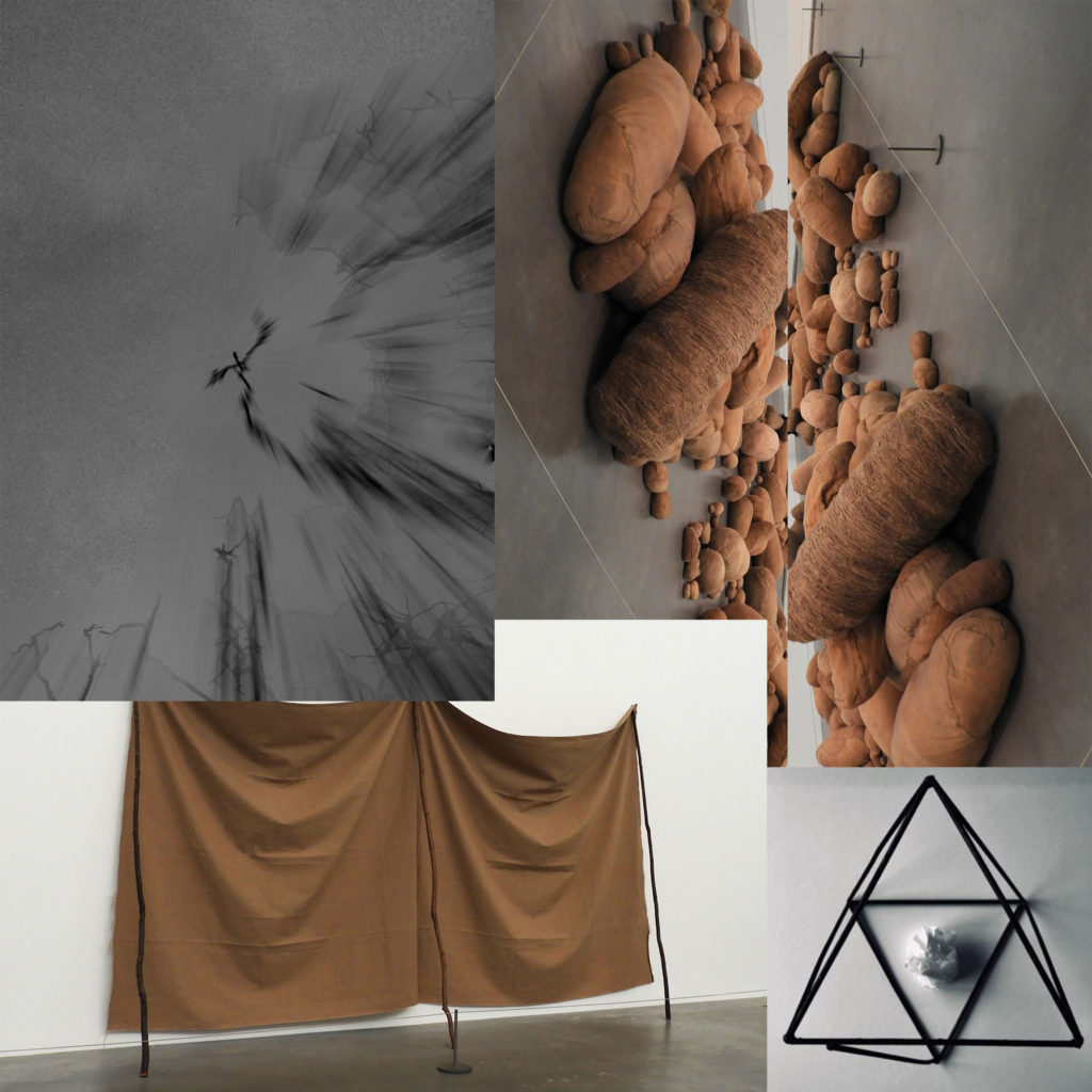
These are possible layout ideas for my final images which I selected previously. They range from full image layout, to cropping it parallel and arranging them with additional photos. I have a total of 6 images that I am able to combine and put into a layout. It will be a difficult arrangement as each image comes in a different format, some being more panoramic, some rectangular and some in a regular A4 or A5 format.


This is another possible layout idea which could work for my final piece, but it is difficult to determine whether this will be the right way to do it as the sizes of the photos are not relative to their actual sizes (A3, A4, A5). I like the overlapping of the images as they harmoniously blend into each other. The simple color pallet of all the images means that they can be easily grouped together without clashing or looking out of place, it also allows me to group the images without having to crop any of them which makes the whole process a lot simpler and easier.


Final Images For Abstract Unit

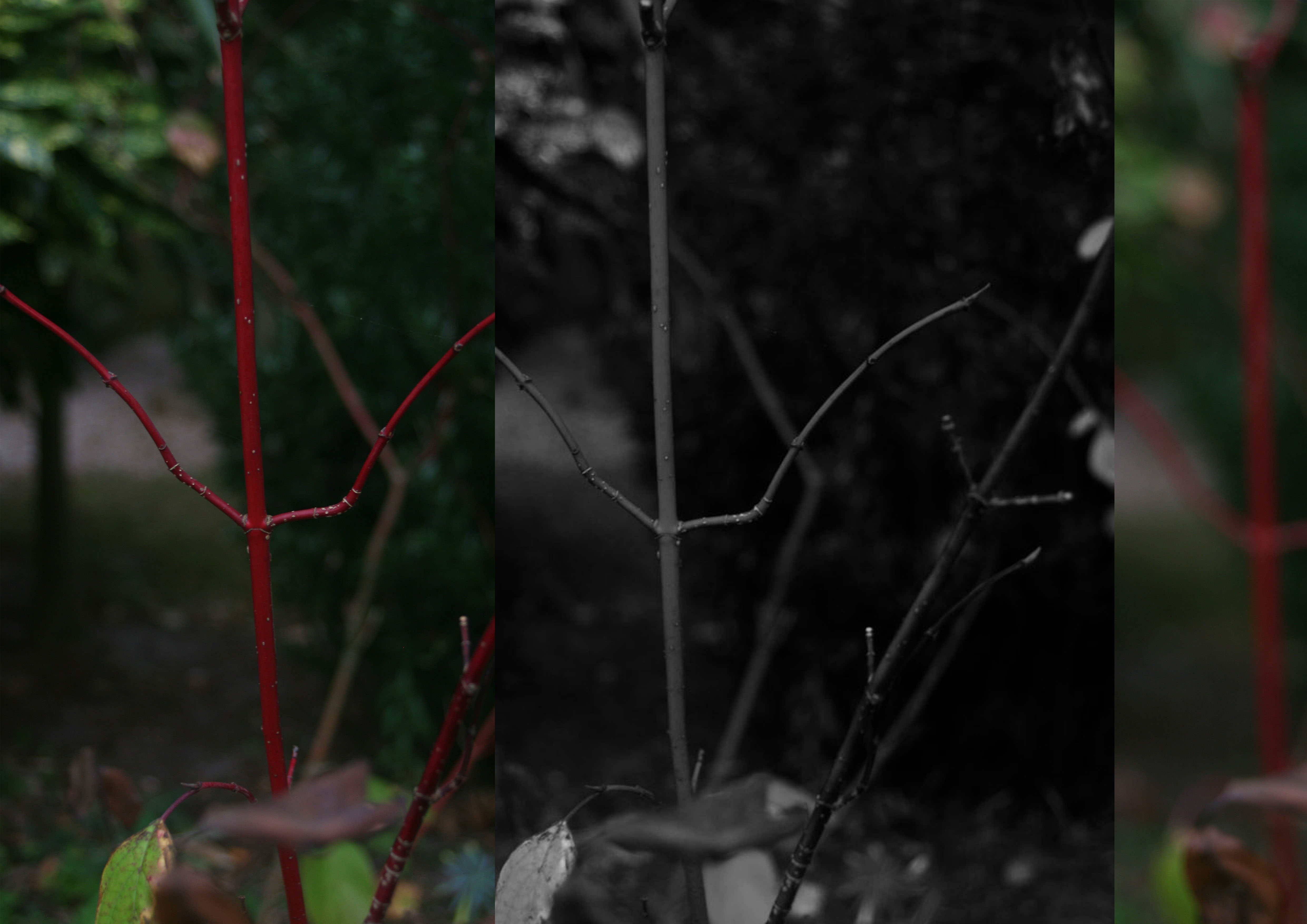
These three images I have chosen to print are my favorite and most successful photos over the abstract project. My A3 print is a combination of three separate photos taken from the same shoot which was about exploring blur motion, focal points and negative space. The first photo situated on the left hand side was taken in the intention of having the plant  in focus and the background as blurred negative space as i wanted emphasis on the vibrant red and detailed stalk, as i felt the contrast between the dull murky background and the bright plant would fit well together. The second photo in the middle is similar to the first but I made it black and white, to match with Ralph Eugene Meatyard’s Zen Twigs work. ISO 200-39mm-1/50-ƒ/5.6, these were the setting I had my camera set to to take this photo, I ensured my camera has a middle focus, in order the capture as much detail as possible from the plant as well as being able to display that I can use negative space effectively within my photos. The third image on the left is completely blurred the background and the plant, this is also inspired my Meatyard’s work. I chose to place them in a repetitive structure to extenuate the similarities of the three pictures. I felt that the black and white worked well as a contrast in the middle between the colourful pictures.

A3

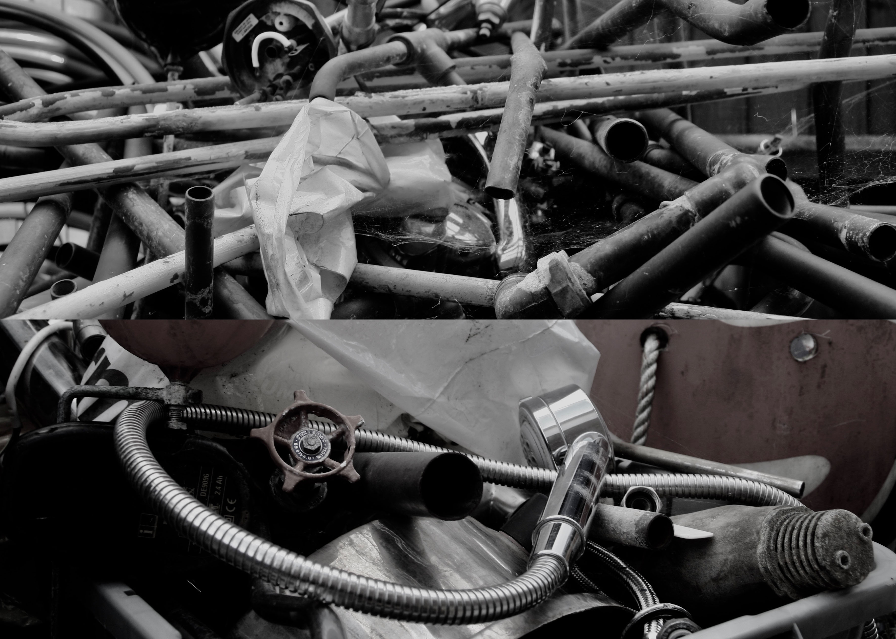
My second print is a combination for two photos from my pre AS summer task. The shoot was inspired by Jan Groover an American photographer who was among the very best still life photographers since the medium’s invention. Her Kitchen Still Life photographs were first exhibited at Sonnabend Gallery. She received a John Simon Guggenheim Foundation Fellowship in 1979. In 1987, Groover had a major retrospective at the Museum of Modern Art which subsequently toured the United States. Her work has been exhibited and included in the collections of most major museums worldwide, and continues to influence a new generation of artists. Groover moved to France in 1991, with her husband, the painter Bruce Boice, who still lives there. I cropped both photos in order to focus on the detail in the pipes, the reflections from the natural light and the cobwebs. The layout of the photos are overall messy, which to me made sense as i was trying to recreate the work of Groover in which she focuses on catching things in the moment. In the two photos there isn’t a clear focal point, I want the viewer to be able to work there way around the photo as their are several different elements to them.

A4

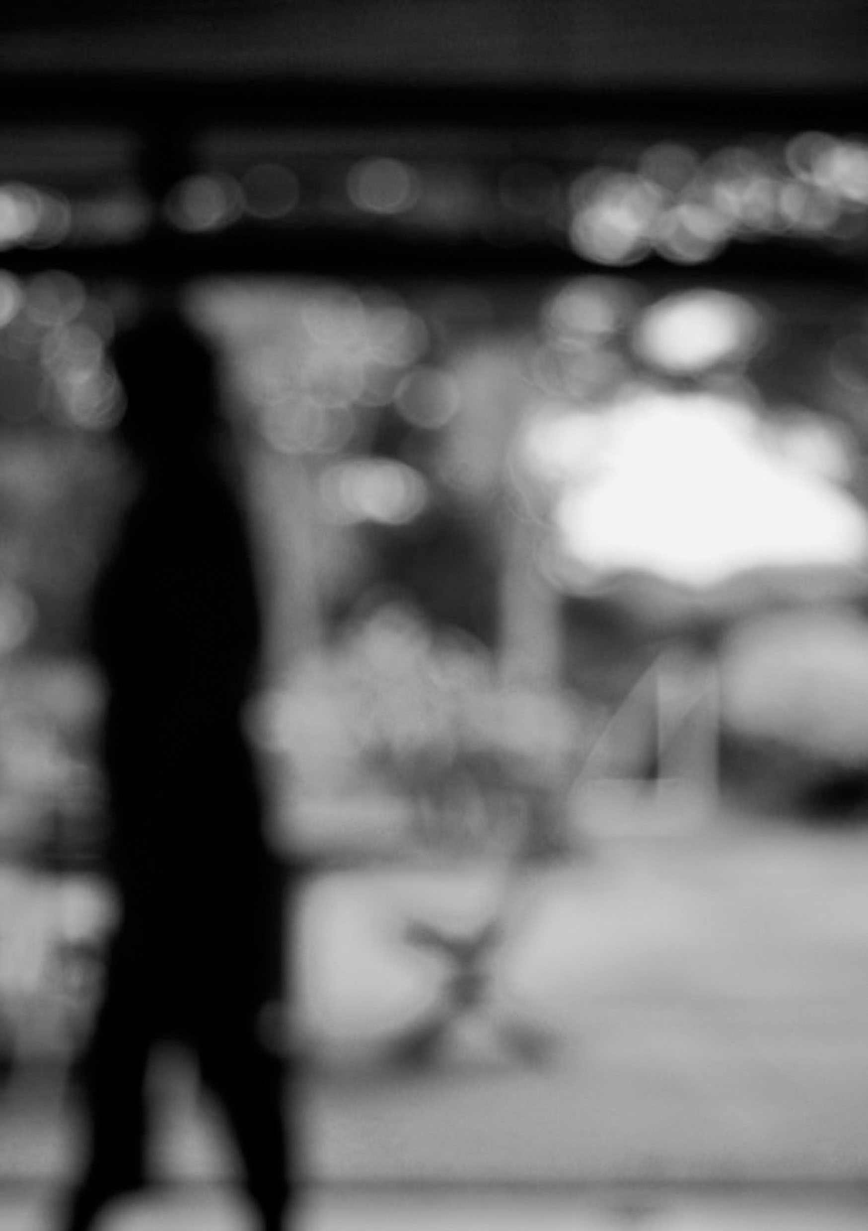
My final print is my favourite photo from my shoot which was inspired also by Ralph Eugene Meatyard but a different collection of his with is called ‘No focus’. Meatyard made his living as an optician. He was a member of the Lexington Camera Club and pursued his passion for photography outside the mainstream. He experimented with various strategies including multiple exposures, motion blur, and other methods of photographic abstraction. Two of his series are particularly concerned with focus and depth of field, both stretching the expressive potential of photography, film and cameras when looking within the ordinary world. My camera was set ISO 200-34mm-1/40-ƒ/5.6.  In order for this blur affect to be achieved the aperture must be wide (smallest f-value) so that the blurred area is harsher. A long focal length and a reasonably far distance from the subject would have also been techniques that Meatyard would have used. In all this photos of this particular collection he used a colour balance of black and white, which creates cold tone. The black and white goes well with the motion blur as it creates a mirroring effect for instance the people are walking, everything is fast pace and blurry, you can see no expression from anyone, this is similar to how there is no colour expressing the atmosphere, everything is gloomy and dull. I wanted this photo to be isolated as its own as I feel it was my successful over the abstract unit.

A5

Classical Still Life

SARAH LAMB:

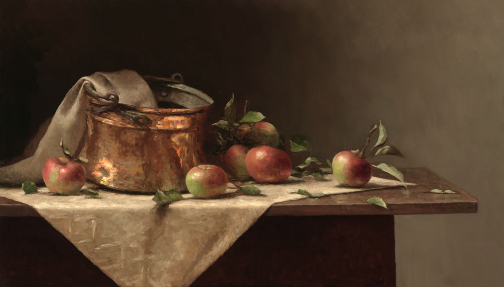
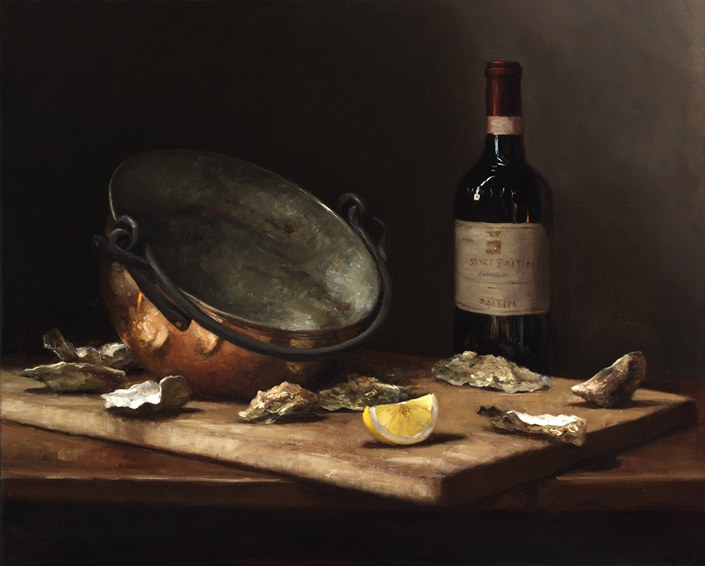
Sarah Lamb is a talented and dynamic realist painter. With classical skill—and through transparency, depth and texture—she captures the minute details of everyday objects in her dramatic still lifes and luscious landscapes. She makes us love the familiar and see beauty in the mundane.

Born in Petersburg, VA, with a passion for art and an appreciation for the past, Sarah spent a semester at the Studio Art Center International in Florence, Italy before graduating from Brenau Women’s College with a BS degree in Studio Art in 1993. Following a summer workshop in Santa Fe, NM with renowned classical painter Jacob Collins, she spent two years painting at The Ecole Albert Defois in the Loire Valley with classical realist artist Ted Seth Jacobs.

In 1997 she moved to New York and spent the next 6 years studying and painting under Jacob Collins at the Water Street Atelier. During this time, she had successful one-woman shows in major galleries in Atlanta, Houston, and San Francisco and was represented in art galleries in Alexandria, VA, St. Simon’s Island and Gainesville, GA, Sag Harbor, NY and Madison, CT.

More recently, she has had sell-out, one-woman shows at the Spanierman Gallery in NY, the Meredith Long Gallery in Houston, TX and the John Pence Gallery in San Francisco. She has been featured in magazines such as American Artists, American Art Collector and Southwest Art as one of America’s most talented young painters.

British-born art critic, John A. Parks, wrote that “Sarah Lamb brings to her work a robustly sensual grasp of the world. Her keenness of eye and joyful brush make the whole enterprise feel freshly alive as she reminds us what the really wonderful things in life are.”

Sarah, her husband, artist, David Larned, and their daughter, Sadie, divide their time between Pennsylvania’s Brandywine Valley and Houston, Texas.

Classical Still Life Painting Classical Still Life Painting Sarah Lamb

MY PROCESS AND RESPONSE:

For this photo shoot I set up a still life composition to photograph, including many different types of object that you would find classically such as pottery, glassware and fruit. In order to create the dark and atmospheric setting that most still life possess, I laid down a dark floor which would accommodate the objects. This floor flowing all the way into the left top hand corner of the image. Furthermore, I added a fairly soft light source in order to retain the dark atmosphere. I did not use natural light, but instead an artificial white bulb which kept the images very neutral in color.

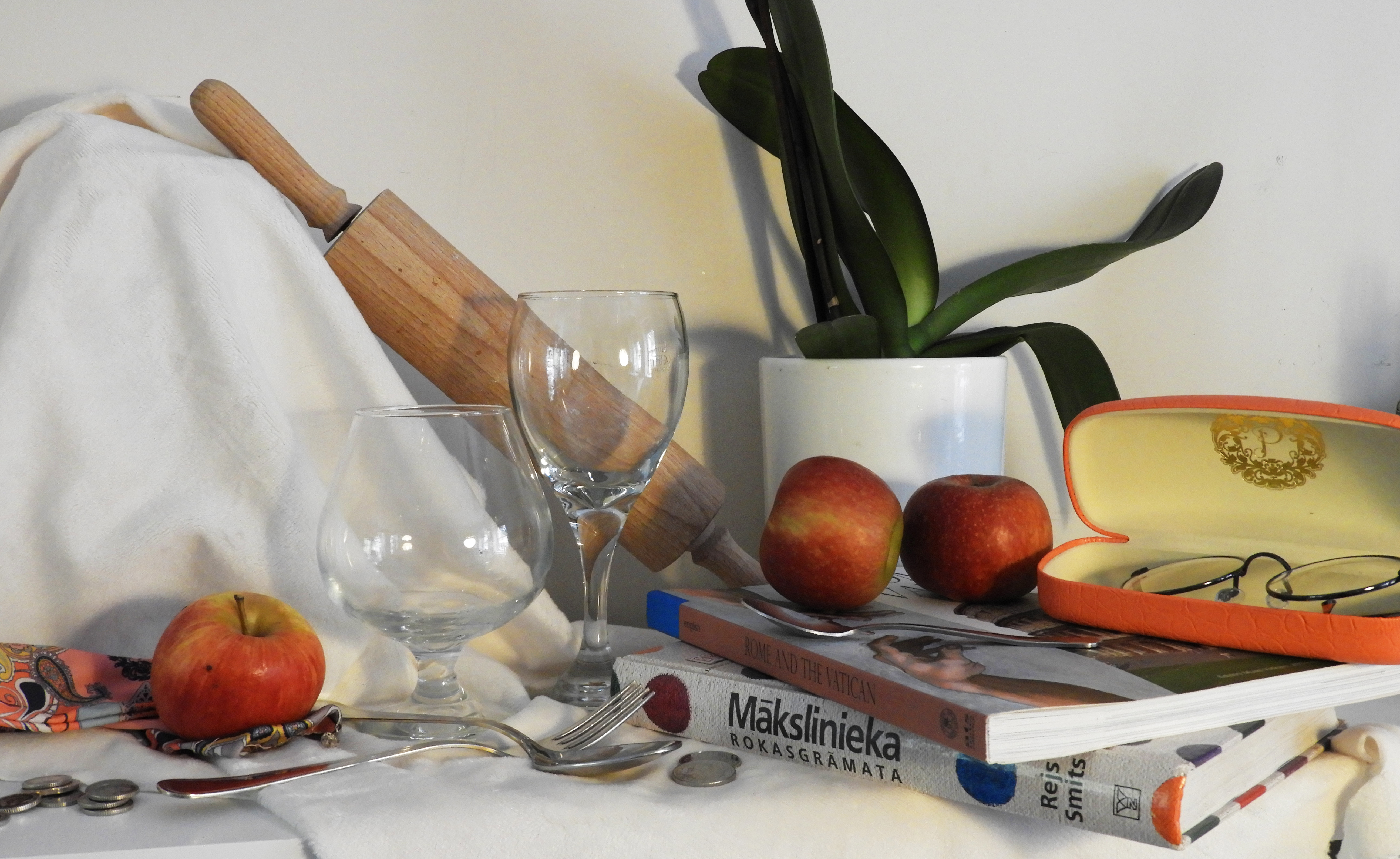
For my second photo shoot, I also followed a similar pattern of work, selecting objects that would be fir to include in still life, yet this time I experimented with laying down  a white sheet to see the effects this would have on the overall outcome of the image. I kept the light source at top right hand corner of the image. I included less richly color objects and decided to stick to a more neutral color palette which in turn made the images feel more light and breezy.

CRITICAL ANALYSIS OF MY FAVORITE IMAGE:

TECHNICAL: In order to retain the darkness in the first photo shoot, the room which I was in was fairly dark therefore i set my ISO  setting quite high, to 1600, which allowed me to have a good balance between the dark and light in the images. Again, due to the darkness in the room, I had to use a slow shutter speed to allow as much light as possible into the camera, setting it to 1/15. To avoid the inevitable motion blur, i used a tripod to keep my camera still whilst taking the photos and to have a very central, head on view of the still life. I kept my aperture high in order to allow my camera to capture a large field of view as the still life set up was quite large itself.

VISUAL: The first thing that the image conveys is the darkness and depth of color, the rich, juicy red of the tomatoes and the dark purple of the grapes that hand from the pottery. The light source, coming directly from the top right hand corner of the image casts a strong highlight onto the tomatoes, giving very powerful light reflections. The light also bounces of the walls of the glass, giving it dimension. The darkness of the shadows also creates a depth of space in the image, the glass and tomatoes being right in the foreground of the image, whilst the delicate tea cups are in the background, There is a harsh contrast between the bright white walls and the darkness of the shadows which further add to the mood of the image. The image overall is very busy and crowded, yet the composition of the objects mean that they are harmoniously linked to one another.  There is a wide variety of texture, shape and color in the image. The tomatoes: smooth and glossy, the glass: transparent and delicate, the pottery: rough and uneven. A lot of the objects in the image have smoothness of line and roundness which allows the image to flow and intertwine.

CONTEXTUAL: Historically, still life paintings were deeply imbued with religious and mythological meaning. This was a reflection of the times; the Church was the center of everyday life. Class hierarchy was deeply embedded – everyone knew their place and stayed within it. By the 16th century, society was changing. As science gained more of a stronghold, religious themes fell by the wayside. The natural world was now interesting to observe and record in its own right, not for religious or mythological purposes. As history rattled towards the mid-19th century, depicting the natural world was starting to go out of fashion. Now the art world was more interested in exploring our inner world of moods and emotions. As we sped through the 20th century, still life dissolved into geometry as objects were abstracted more and more on the canvas. By the end of the millennium, the object depicted in paintings were exhaled as commodity and recognized for their commercialism, as in the Pop Art and Photo realism movements.

CONCEPTUAL: The main objective which I tried to capture in these images is the complexity of simple objects. Appearing plain and boring but when placed together and  put into a composition, they can create impact and surreal.

CONTACT SHEETS:
The set ups which i created for this project were fairly simple, yet i found that new effects were created when pointing my camera in different directions. When I really got up close to the objects, I was able to capture detail withing all the objects, and their texture which created complex and intricate images.

FInal Image selection

THE PROCESS IMAGE 1:

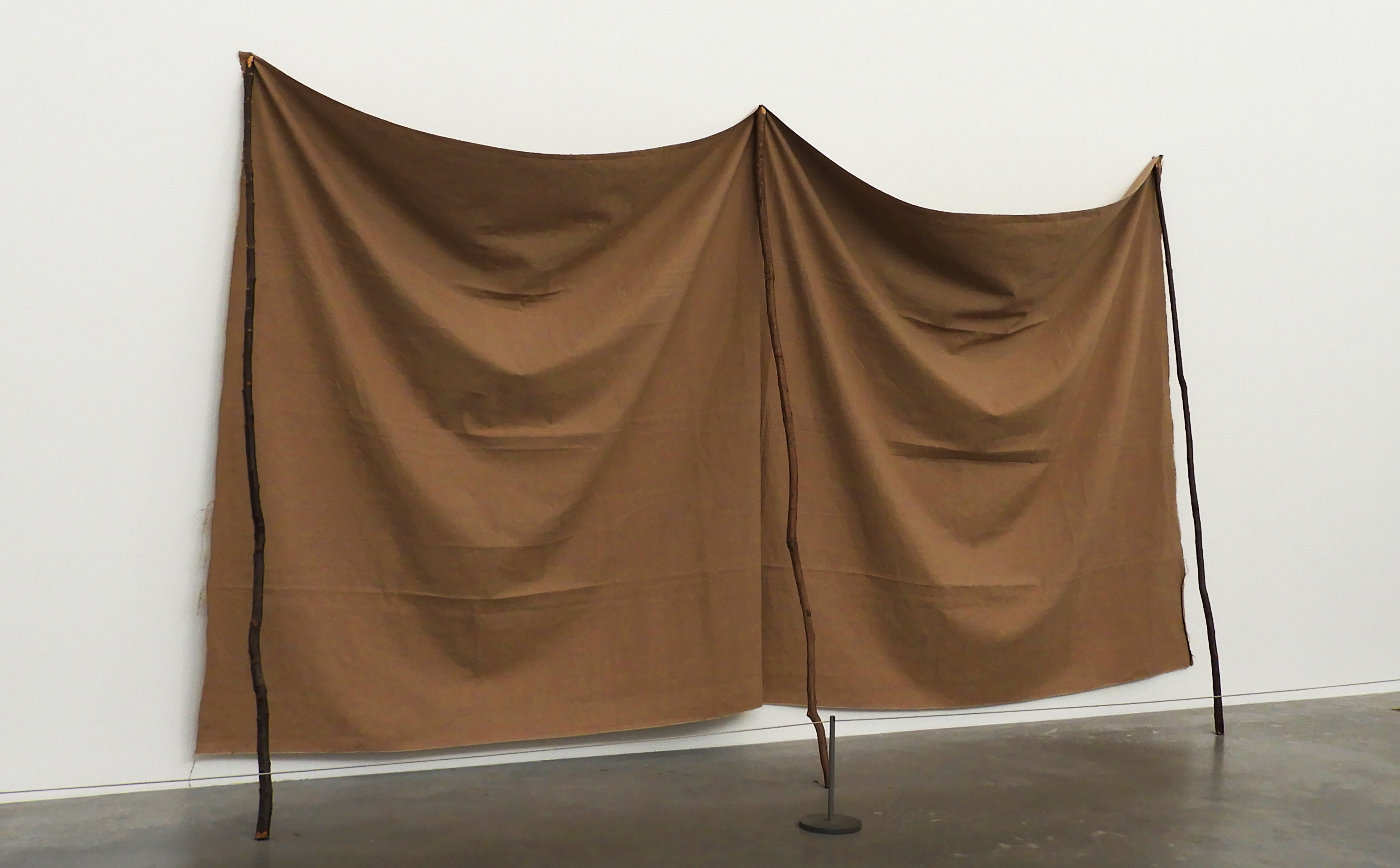
This image was taken at TATE modern in London, a space filled with abstract and modern day art. I particularly loved this exhibition as the space where the art was exhibited in was flooded with natural light. Combining this with the crisp and clean white backdrop allowed me to capture some truly beautiful images that showed of the subtleties in each image. The space was also very large and open which allowed me to maneuver my camera without the disturbance of other people or pieces of art.

This was in my opinion one of the most successful images from this photo shoot, therefore making it into my final selection. I reflected up on many different photo shoots from the last couple of months in order to make my selection, even going through images which i have previously discarded as i have learned throughout the past couple of months that almost any image can be transformed through simple editing and cropping, Image 1 i thought initially was too simplistic and quite frankly boring, yet i have discovered that minimalism is a very real and valid form of photography therefore i reconsidered the image. After reviewing the image, i found that it actually holds many different aspects and qualities, like the interesting creasing of the fabric and the contrasting textures of the wall and the floor.

CRITICAL ANALYSIS OF IMAGE 1:

TECHNICAL: For this photo shoot I approached each image in the same way, setting my focus to auto as each piece of art work was fairly big and i did not focus in on small details therefore setting it to manual would be totally useless. I kept my exposure throughout the photo shoot at 400 as each large, white hall was filled with natural light, the bright white walls added to extra light bouncing into the camera. I kept it at a stable level as i wanted to prevent the images becoming overexposed. I switched on my white auto balance setting as again the white walls created problems with the colors of the art work becoming washed out and dull. I set the shutter speed 1/60 as i wanted to create very clean and crisp images that show all aspects of the art work.

VISUAL: One of the most notable aspects of this image i find are the shadows created by the large creases in the draping fabric, the intensity of the shadow increasing the further down the fabric that the eye travels. All aspects of this image are crisp and clean, the high shutter speed to which i set my camera meant that the image is sharp. There is contrast in texture all around in the image, from the rough surface of the fabric, the smooth and matte white wall, to the glossy grey-black floor. The rule of 1/4 applies to this image as most of the subject is contains in the first 1/2 and 1/3 of the image. There is also a sense of repetition in the image through the even creases that go down the fabric sheets and the 3 sticks that mirror each other. Although the image is already bright, a lot of the light is hitting it from the top right hand corner, creating a slightly deeper shadow on the left side of the sheet. The colors in this image are very simple, consisting of a slightly blue toned white, a grey-black and caramel beige. There are many sharp lines which cut through the image such as the separation between the wall and floor, but also the 3 sticks which prop up the fabric which gives the image some geometry and symmetry.

IMAGE 1

CRITICAL ANALYSIS OF IMAGE 2:

TECHNICAL: For this photo shoot I approached each image in the same way, setting my focus to auto as each piece of art work was fairly big and i did not focus in on small details therefore setting it to manual would be totally useless. I kept my exposure throughout the photo shoot at 400 as each large, white hall was filled with natural light, the bright white walls added to extra light bouncing into the camera. I kept it at a stable level as i wanted to prevent the images becoming overexposed. I switched on my white auto balance setting as again the white walls created problems with the colors of the art work becoming washed out and dull. I set the shutter speed 1/60 as i wanted to create very clean and crisp images that show all aspects of the art work.

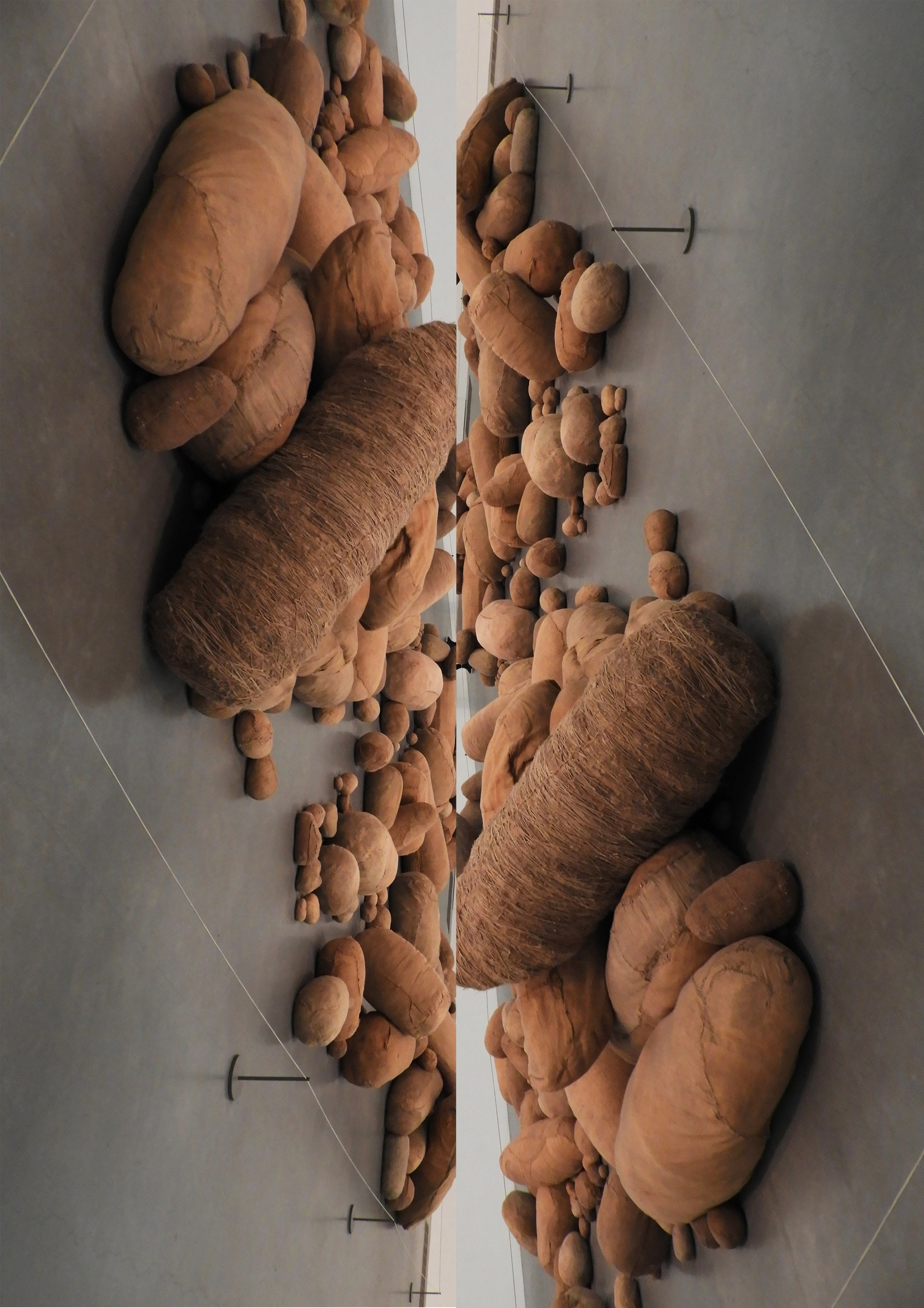
VISUAL: This image overall is very busy and overwhelming with the density and contrast in shape, texture and color. Firstly there is a sharp contrast with the texture in the image, with  the white, glossy floor and the ragged and varying fabric of the sculptures. Although being very different, create harmony as an image. The light hitting directly above from the image creates depth and shadow which is cast onto the floor, creating a sort of subtle reflection. The larger the shape, the more dramatic and deep the shadows become. There is a lot of repetition in this image, not only through the editing and mirroring the image, but also the varying round shapes of the sculptures that fill up the image. The small white line creating a border around the sculpture in a way breaks the harmony and separates the image from the chaos of the sculpture and the smoothness of the floor.

CONCEPTUAL:  Magdalena Abakanowicz began sewing three-dimensional objects with sacking, stockings, rags and rope in the 1970s.

These cocoon-like objects reflect Abakanowicz’s interest in biological systems, organic matter and regeneration, topics she discussed with scientists in her native Poland. In response to a commission to represent Poland at the Venice Biennale in 1979, she made hundreds of soft sculptures of varying shapes and sizes, ‘rounded like bellies, or elongated like mummies,’ as she described them. Abakanowicz collected old mattresses, clothing and sacks to create this ‘invented anatomy’ of forms and installed eight hundred in Venice under the title Embryology.

CONTEXTUAL:  Made at a time of political tension between the Soviet Union and Poland, Abakanowicz has said the work ‘could be understood as a cry from behind the Iron Curtain’. She had come to prominence in the 1960s with a series of large woven sculptures called Abakans. At the time, the Polish state would not allow her to buy or rent a studio, so she made them on a loom in a friend’s basement, using sisal from discarded ropes. Without a large space in which to work she would often see her pieces in their entirety for the first time only when they were installed in exhibitions.

IMAGE 2

CRITICAL ANALYSIS IMAGE 3:

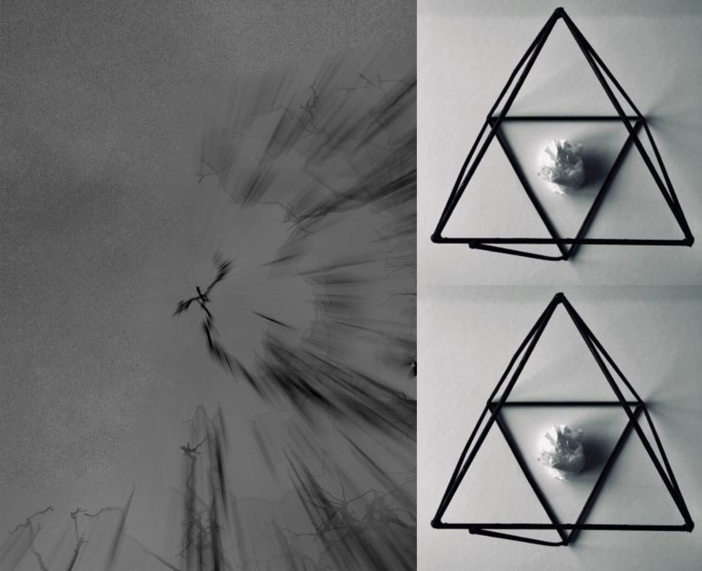
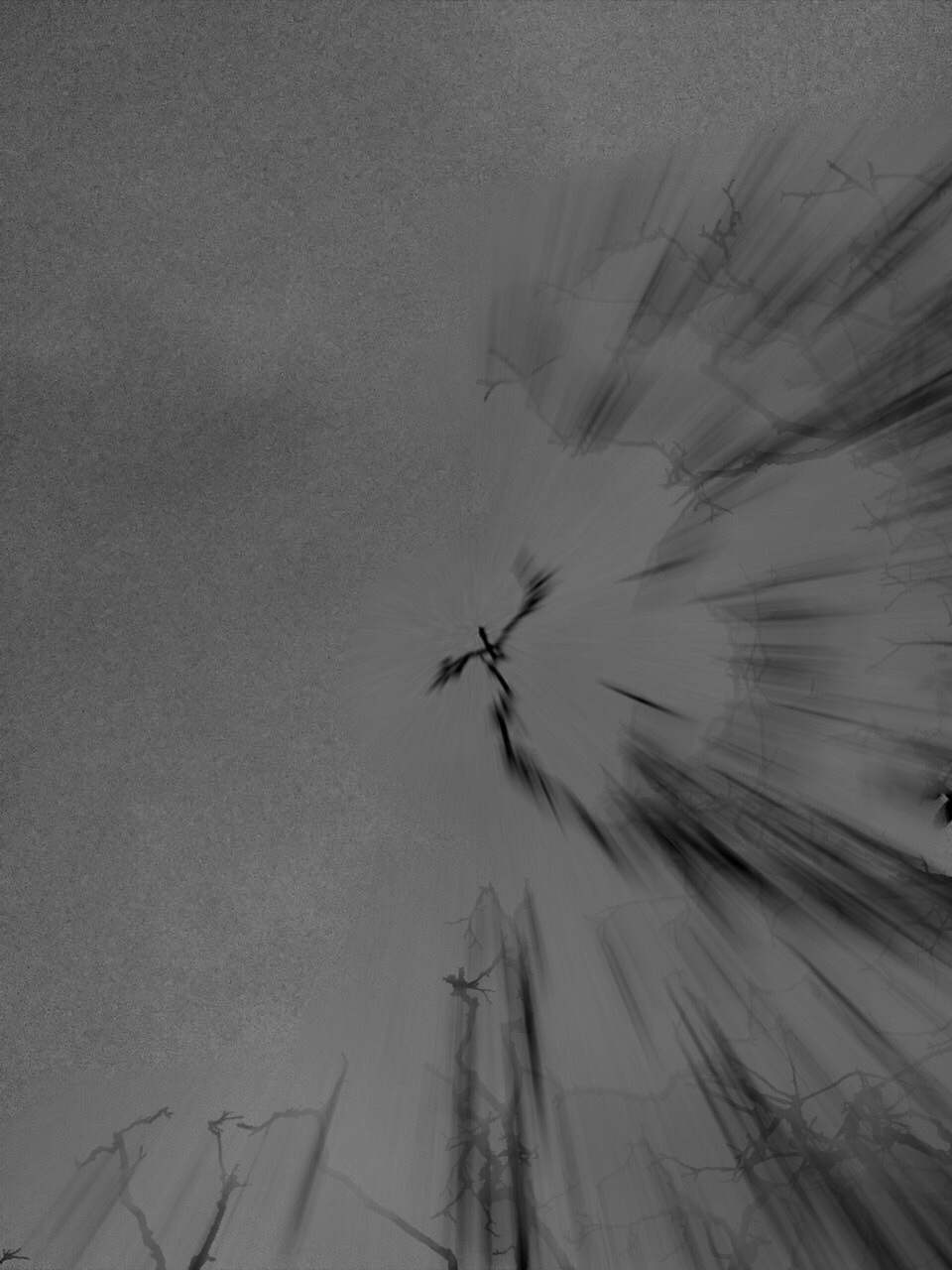
TECHNICAL: For this photo shoot I attempted as much as possible to recreate Meatyard’s “zen sticks” series. I particularly focused on exposure settings, focus control, and depth of field. The photograph below was taken of a dead tree, of the branches facing upwards towards the sky. Meatyard’s images are all very dark and dramatic therefore I chose to do my photo shoot during the evening, on a stormy, grey day. I increased the exposure to 800 in order to capture the branches in a dark setting yet still have some highlights and shadows. The dark night, and mid-range ISO setting meant that the image contracted a lot of motion blur, the effect which i was aiming to get.

VISUAL: It resembles the work of Meatyard in many ways. The dark evening also meant that the resolution of the images decreased and became more grainy. The branches of the tree were also quite far up meaning i had to decrease the depth of field and zoom in, again compromising the quality of the image. The grainy texture of the image I feel adds to the overall aesthetic of Meatyard’s work: old and worn. The differences in motion blur also create a focal point in the image, with the central branch being less blurred than the outermost parts of the image. The image is also quite underexposed which further adds to the dramatic and intense tone, giving it almost a Gothic aura. There is a very apparent sense of space in the photo as the lack of branches in the top left hand corner of the image freeing up space. There is also a lack of light in this image due to both the time of day the image was taken and the lack of exposure adjustments made on the image during editing as i wanted to retain the dark theme.

CONTEXTUAL: Ralph Eugene Meatyard (1925–1972) lived in Lexington, Kentucky, where he made his living as an optician while creating an impressive and enigmatic body of photographs. Meatyard’s creative circle included mystics and poets, such as Thomas Merton and Guy Davenport, as well as the photographers Cranston Ritchie and Van Deren Coke, who were mentors and fellow members of the Lexington Camera Club. Meatyard’s work spanned many genres and experimented with new means of expression, from dreamlike portraits—often set in abandoned places—to multiple exposures, motion-blur, and other methods of photographic abstraction. He also collaborated with his friend Wendell Berry on the 1971 book The Unforeseen Wilderness, for which Meatyard contributed photographs of Kentucky’s Red River Gorge. Meatyard’s final series, The Family Album of Lucybelle Crater, are cryptic double portraits of friends and family members wearing masks and enacting symbolic dramas.

CONCEPTUAL: Meatyard stated in a lecture to the Louisville Photographic Society, he was involved in working on no fewer than 12 “methods, series, subjects.” Among them were what he called “photographs made under the influence of Zen,” shown here with the title “Zen Twigs.” While the images are very minimalist, they deal with growth and decay, is impressive, they are familiar enough to be looked over lightly. A particularly beautiful one (untitled, like much of Meatyard’s work) shows a young trunk sprouting — or seeming to sprout — a branch that curls around it in a wiry loop, the whole almost a visual haiku. The simplistic tonal range of the image is effective in portraying the theme of deterioration and degeneration. Meatyard has clearly used a very narrow field o view, with a singular branch being in focus and the rest of the backdrop is extremely blurry. The images are in a mid-range of exposure, not too overexposed or underexposed. The light grey tones from the backdrop of the photo, highlight they unsophisticated, dead branch. The upwards growth of the branches, have strong and dark lines which cut through the sea of blurriness. The image also contains various shades of white, black, and grey, all working together to create a harmonious image. The contrast between the blurry backdrop and the foreground give the image a real sense of depth and space.

IMAGE 3

Franco Fontana Response

FRANCO FONTANA’S LIFE AND WORK:

Franco Fontana was born in 1933 in Modena. He took up photography in 1961 and joined an amateur club. He held his earliest solo shows in 1968 in Modena, his native city, which marked a turning point in his career. He has published over seventy books with Italian, French, German, Swiss, Spanish, American and Japanese publishers. His photographs have appeared worldwide in over 400 exhibitions, solo and collective. His images are in collections in over fifty public and private, Italian and international galleries, including: the Bibliothèque Nationale, and the Maison Européenne de la Photographie, Paris; the George Eastman House International Museum of Photography, Rochester, the Musée de la Photographie, Arles, New York, the National Museum, Beijing, the Stedelijk Museum, Amsterdam, the Metropolitan Museum of Photography, Tokyo, the Galleria Civica d’Arte Moderna e Contemporanea, Turin, and the Victoria and Albert Museum, London. Many companies have asked him to collaborate on advertising campaigns, he has published photographs in Time-Life, The New York Times, Vogue Usa, Vogue France, Il Venerdì di Repubblica, Sette del Corriere della Sera, Panorama, Frankfurter Allgemeine Zeitung, Class, Epoca and others. Fontana has been invited to hold photography workshops in various schools, universities and institutes such as the Guggenheim Museum in New York, the Tokyo Institute of Technology, the Académie Royale des Beaux Arts, Brussels, the Toronto University, and so on in Rome, Paris, Arles, Rockpot, Barcelona, Taipei,  Politecnico di Torino, and the LUISS University, Rome.  He has collaborated with the Centre Georges Pompidou, the Japanese Ministry of Culture, the French Ministry of Culture.

CRITICAL ANALYSIS:

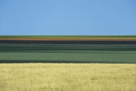
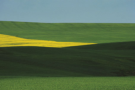
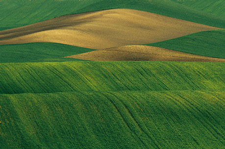
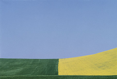
This piece by Franco is very simple in composition, only consisting of simple line work, going along the rolling hills of the grasslands. There are large blocks of color which separate the photo into 3 sections, blocking each color into a section. Even through the photo contains a very simplistic color pallets, the colors merge and harmonize together to create an overalll “tied together”look. There is no real foreground, mid ground or background, therefore the landscape appears 2D and flat. The length and width of each block of color is fairly relative to one another therefore there is a slight sense of pattern and repetition. I believe that during editing, the colors have been over saturated in order to create impact and boldness. The natural lighting coming directly above from the sun, gives the image brightness yet lacks any sort of shadows or tone differentiation. Even though this is a photograph of fields, the image does not feel organic or natural in any sense due to the symmetry and geometry seen within it.

His reasoning for creating these images are “my goal is to interpret reality. Anyone can see the landscapes I photograph, but with my camera I try to capture the details and features that the eye cannot see. Some tell me, “I went to Provence and I saw ‘your’ landscapes”; sometimes they will have seen those places before coming to an exhibition, but only after looking at my work they see that part of reality pinpointing something they had not noticed before.”

CONTACT SHEETS AND SELECTION:
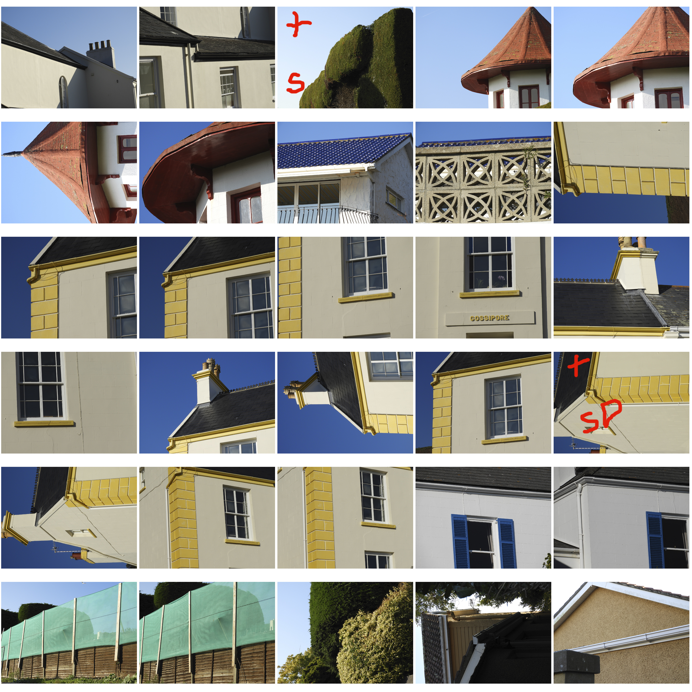
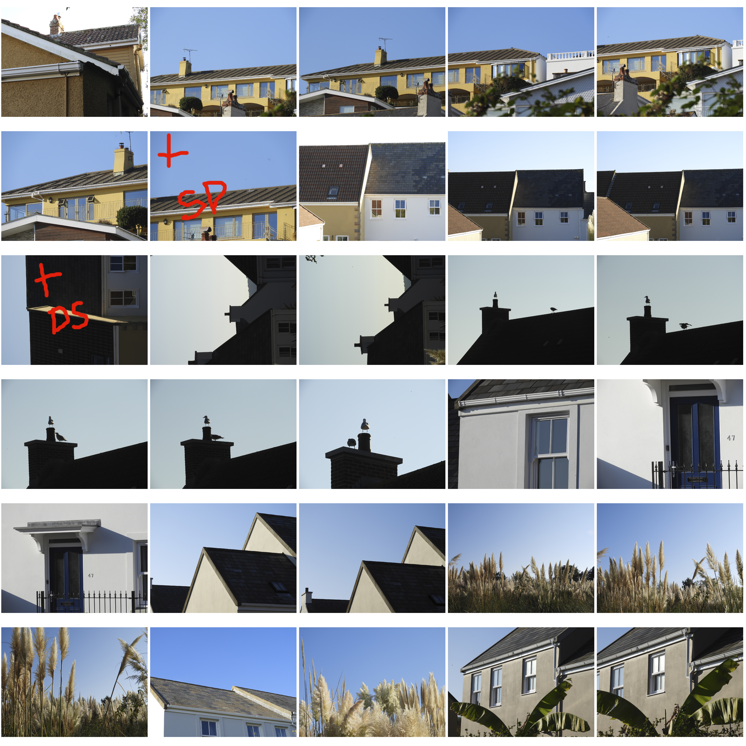
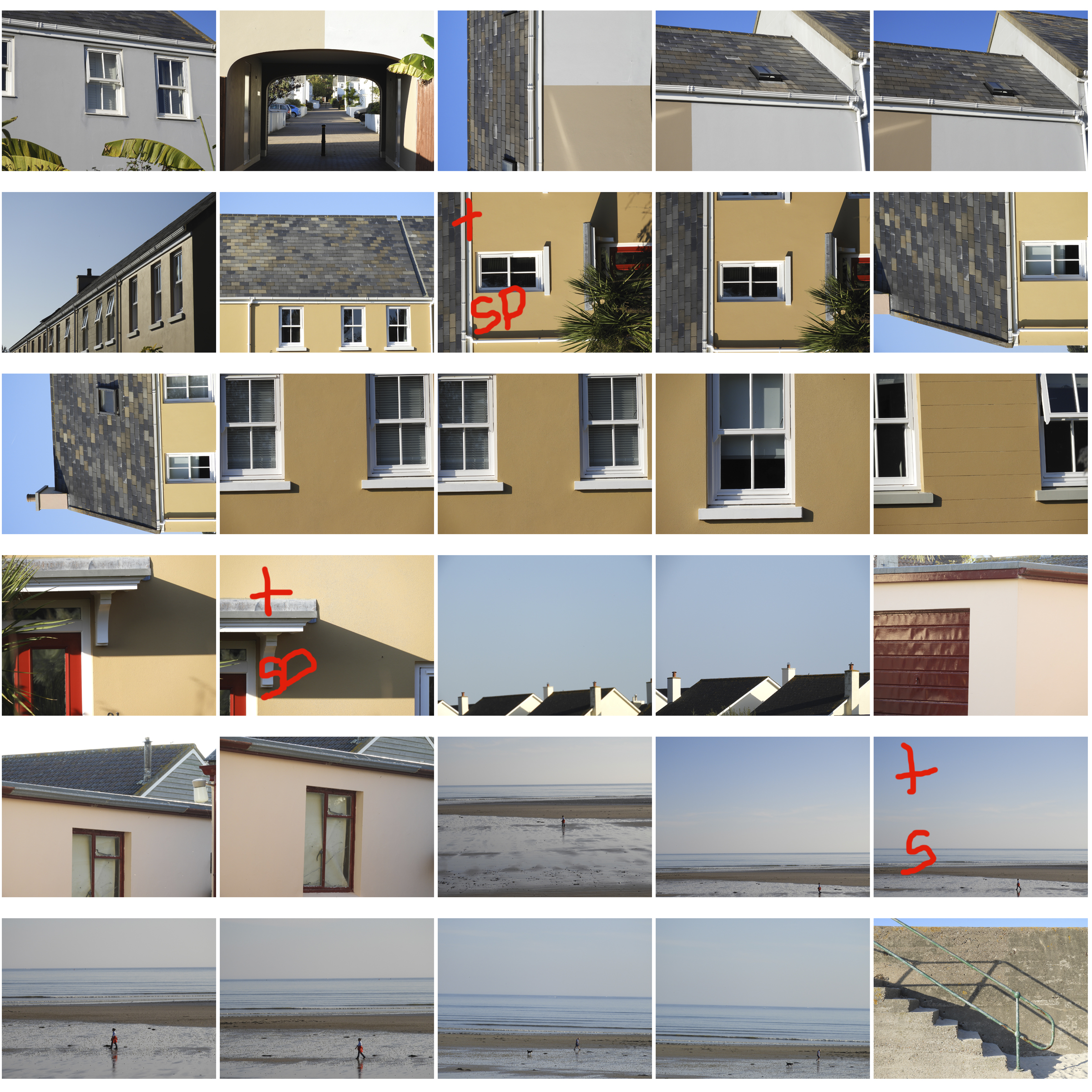
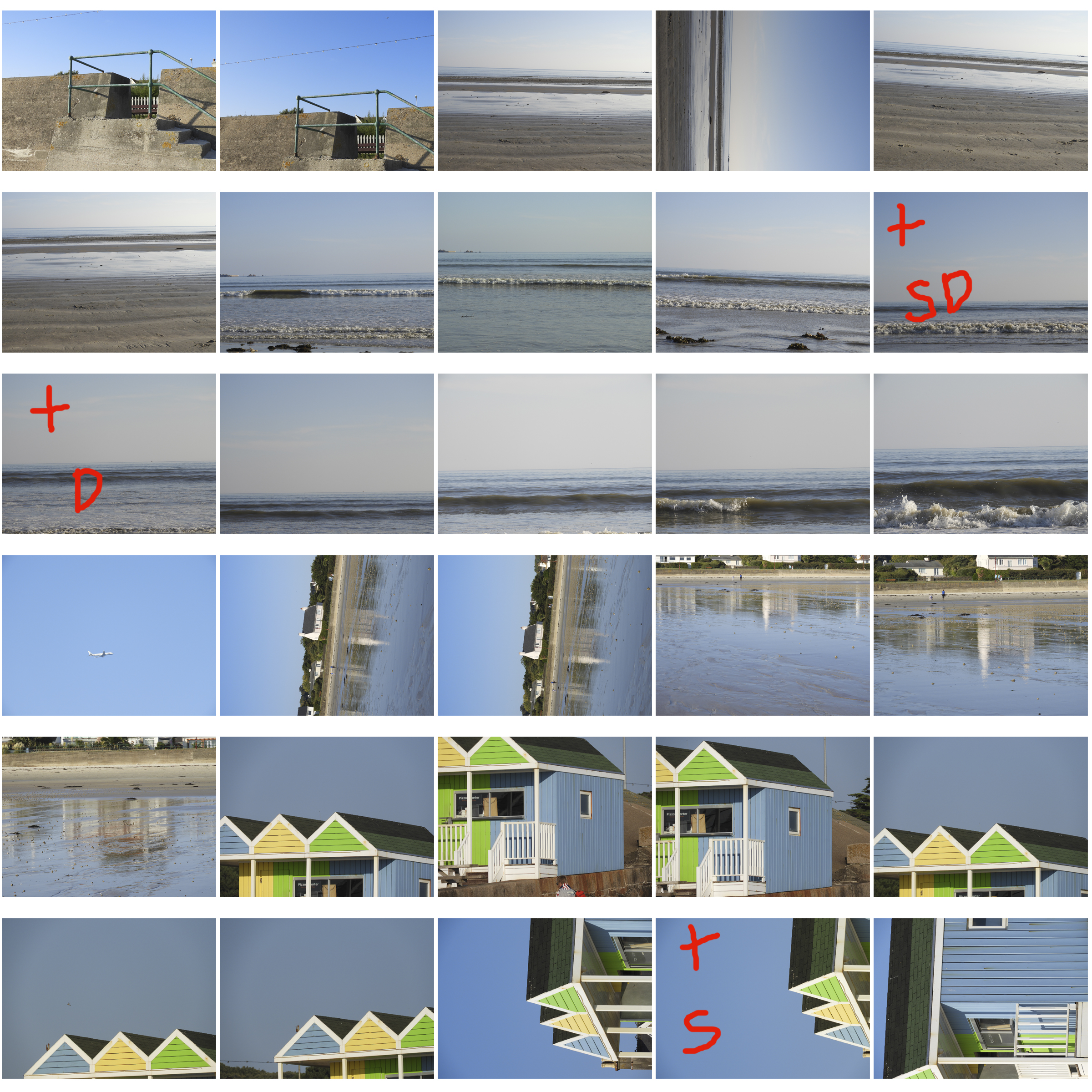
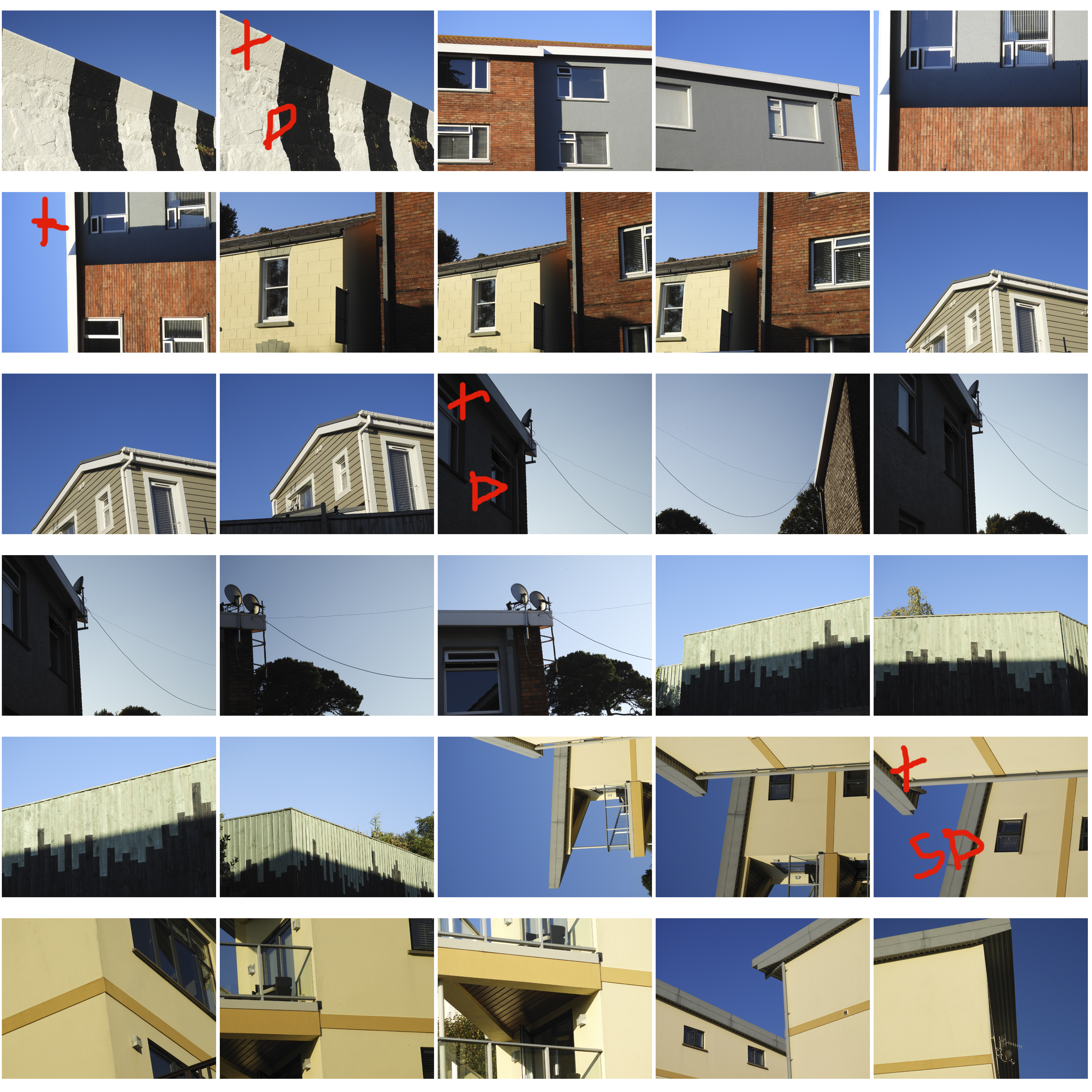
This was a very extensive and thorough photo shoot therefore i ended up with over 200 photos which i eventually cut down to 9 with the help of contact sheets. The plus indicates that the image is successful. The S indicates the need to further saturate the image, and the D indicates the need to lighten the image.

ANALYSIS OF MY MOST SUCCESSFUL PHOTO:

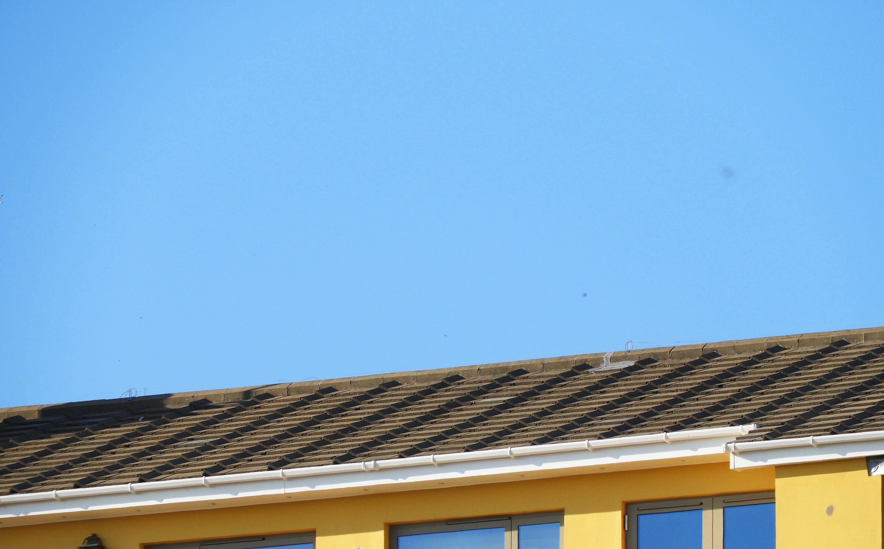
i felt that this photo encapsulated the formal elements that Franco explores best. Firstly, the main focus of the image is the bright and saturated colors of the sky and the yellow building below, which perfectly harmonize to create an impactful image. The light grey and brown roof tones down the image slightly, yet works well together with the blue and yellow. Like Franco, I captured these images on days with few clouds and strong natural lighting which allowed the bright blue sky to pop and provide a clean backdrop for the image. The light was hitting the building from the top left hand of the sky therefore no real shadows are cast onto the building. The image follows the  rule of 3, with the sky filling up the top 2/3 of the image and the building filling up only 1/3 of the image.  Like with Franco’s work, There is a slight sense of repetition in this image through the evenly spaced roof tiles and windows in the bottom third of the image. The repetition of pattern also makes this image feel industrial and man-made, far from anything organic. This image is also very flat and does not have a clear foreground or background giving it a 2D quality.

Whilst capturing these images, I set my exposure to 600, as it was quite a bright day yet i wanted it high enough to allow color to be bright. As there was plenty of natural light, I maintained my shutter speed at 1/60 which was enough to produce clear and crisp images. I set my white balance to direct sunlight as these were the conditions i was experiencing that day. The field of view in this image is very small, meaning that i zoomed in quite far into the building to capture this image.