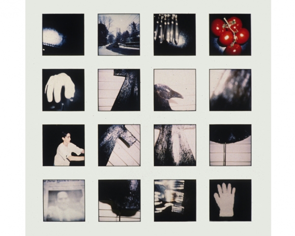





My final photos were heavily influenced my Barbara Peacocks-American Bedroom. I wanted to create a series of photos of people in their bedrooms in order to link to the mock exams theme of identity (the person) and place (their bedroom). I wanted to empathizes how people use their bedroom as a place to express their self, but I also wanted to tie in the theme of lack of identity by blurring out facial features. I wanted the bedrooms not the peoples faces to be able to describe the person, as I believe that we dress to impress, but our bedrooms are where we show our real self. I want the viewer of my photos to be able to construct an idea of the person through the materialistic items that are in their room or on them. Nowadays we hold such value to materialistic goods, I feel that our personalities are created round the things we own, e.g our clothes and houses. For instance people with a room with very little furniture in it, shows signs of poverty or show signs of a minimalist life. Or someone with very little to no portraits in their room shows signs of loneliness or lack of family, rooms tell a lot about a person.
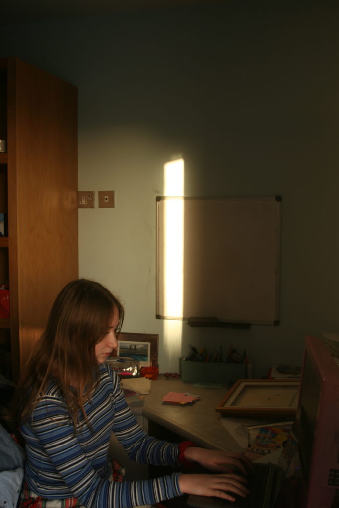
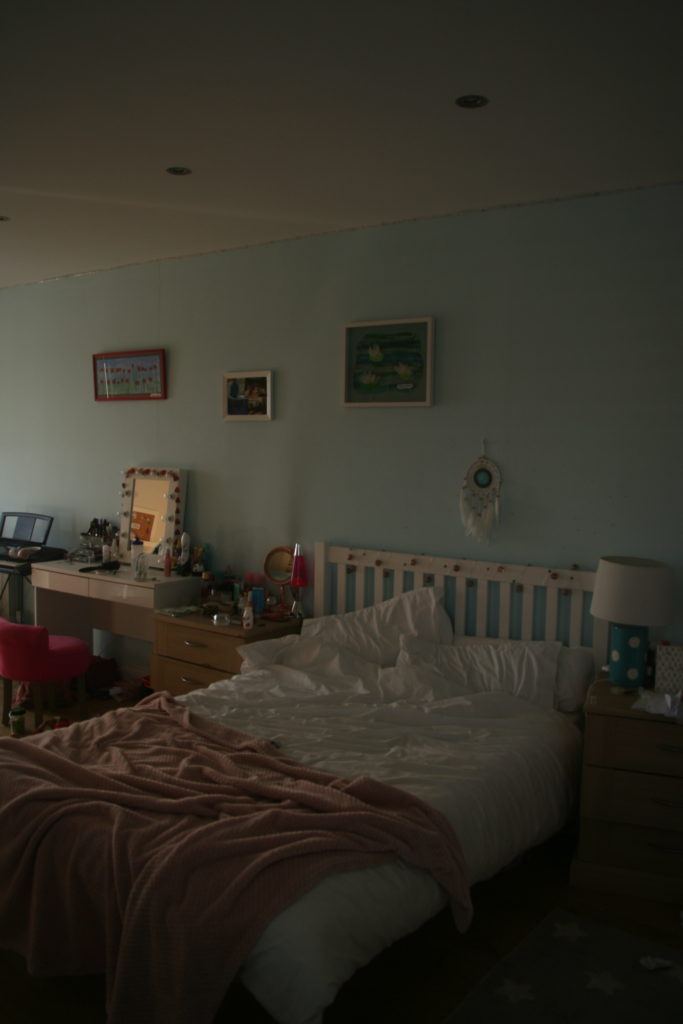
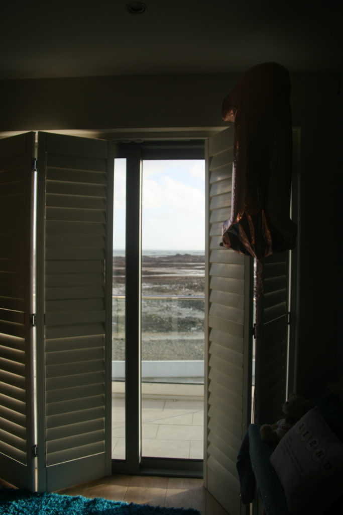
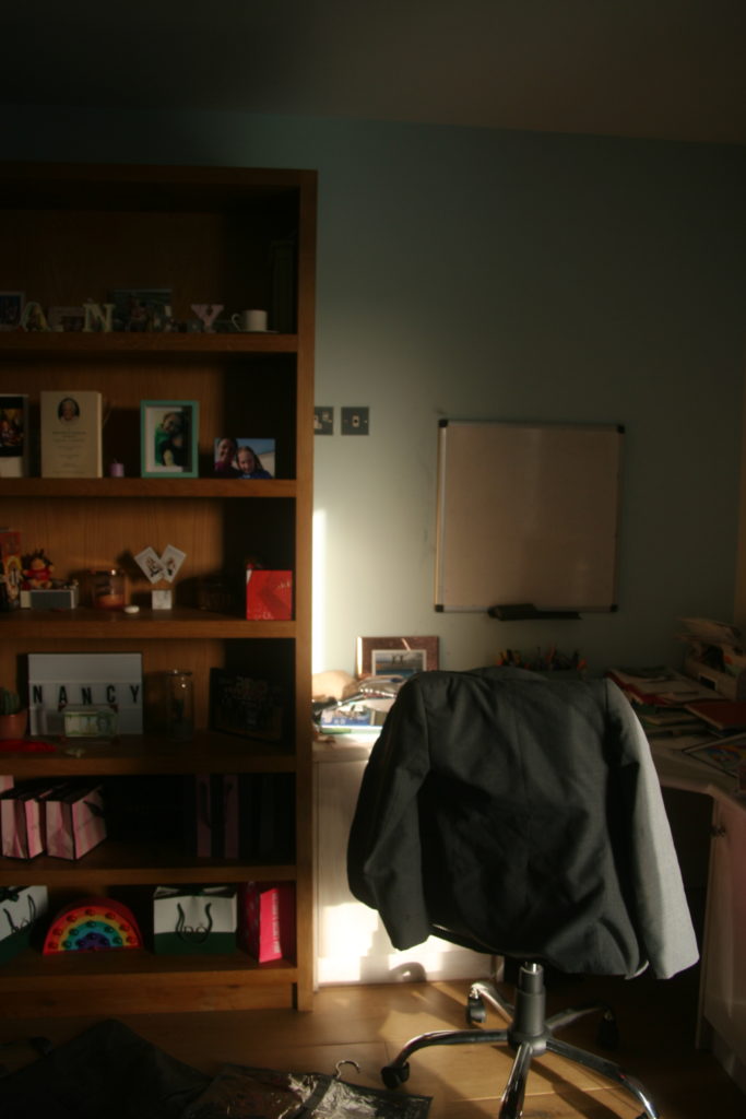
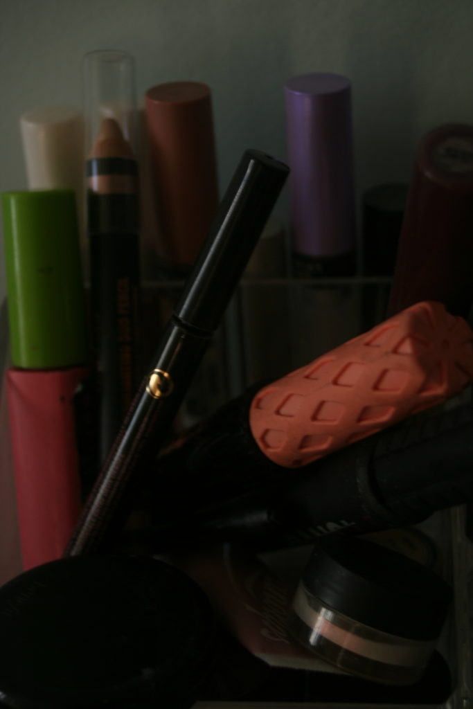
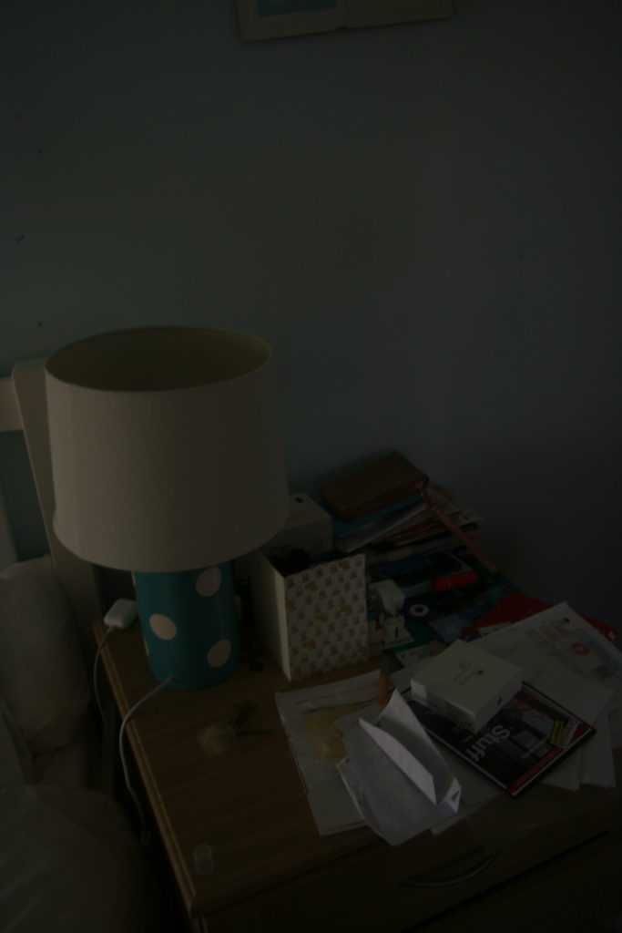
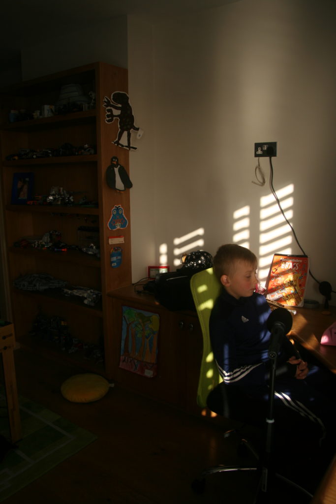
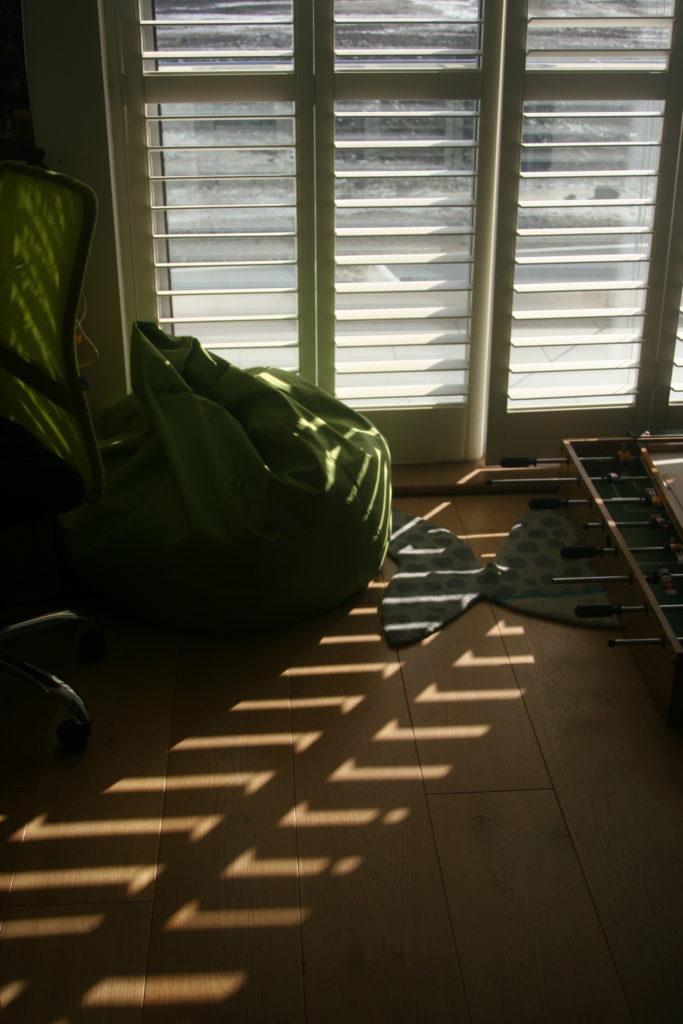
I took pictures of 3 different peoples rooms over the build up to the exam and these are the images that turned out the best and I chose to use them in my final pieces. I created a porfolio for each persons room, including a picture of them in their room and several items in their room. I wanted to home in on personal touches that people put in their rooms such as the art work, family photos, toys, laptops, lego, all these create an idea of the person thats room it is. I kept my pictures in colour as I wanted to show the raw and natural beauty of peoples bedrooms and how they reflect our inner and true self, in our room we are free from judgement, we don’t have be afraid of being laughed at or social rejection. When in public most people experience social desirablilty bias and they live to only be accepted by others and not by themselves, their rooms are a place to escape this feeling to fit in and to be black and white, they can be as colourful and as different as they want. In my concept plan I talked about Goffman’s concept of ‘The Representation of The Self in Everyday Life’ and how he believes we have a ‘front’ and a ‘back’ self. From these final pieces I represent both of these self’s as I have a picture of the person, which is the ‘front’ self the one that the public sees and their room acts as their ‘back’ self, the one they conceal from the public eye.
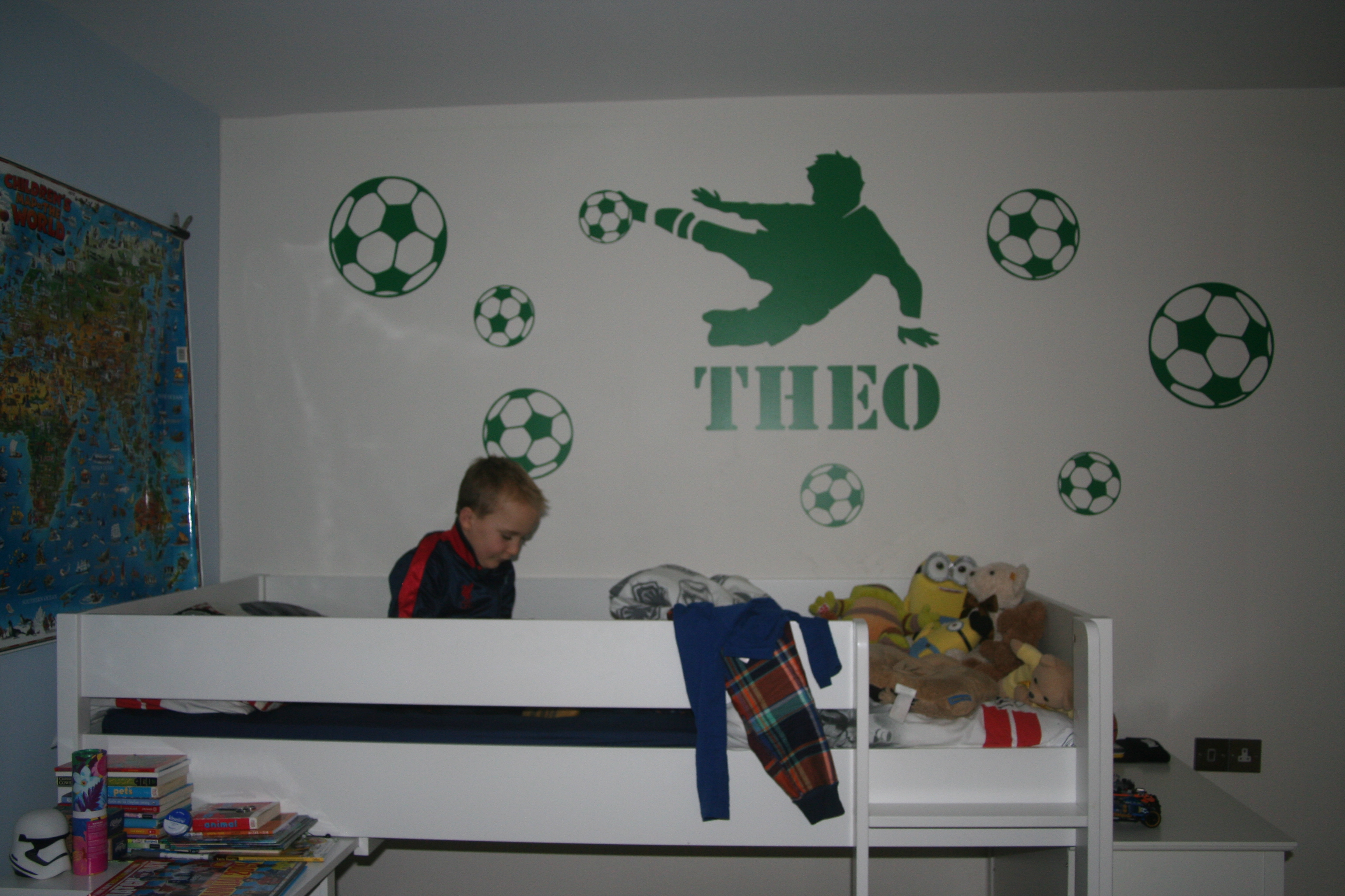
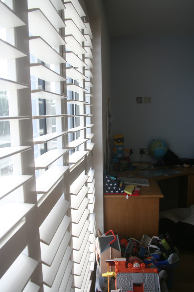
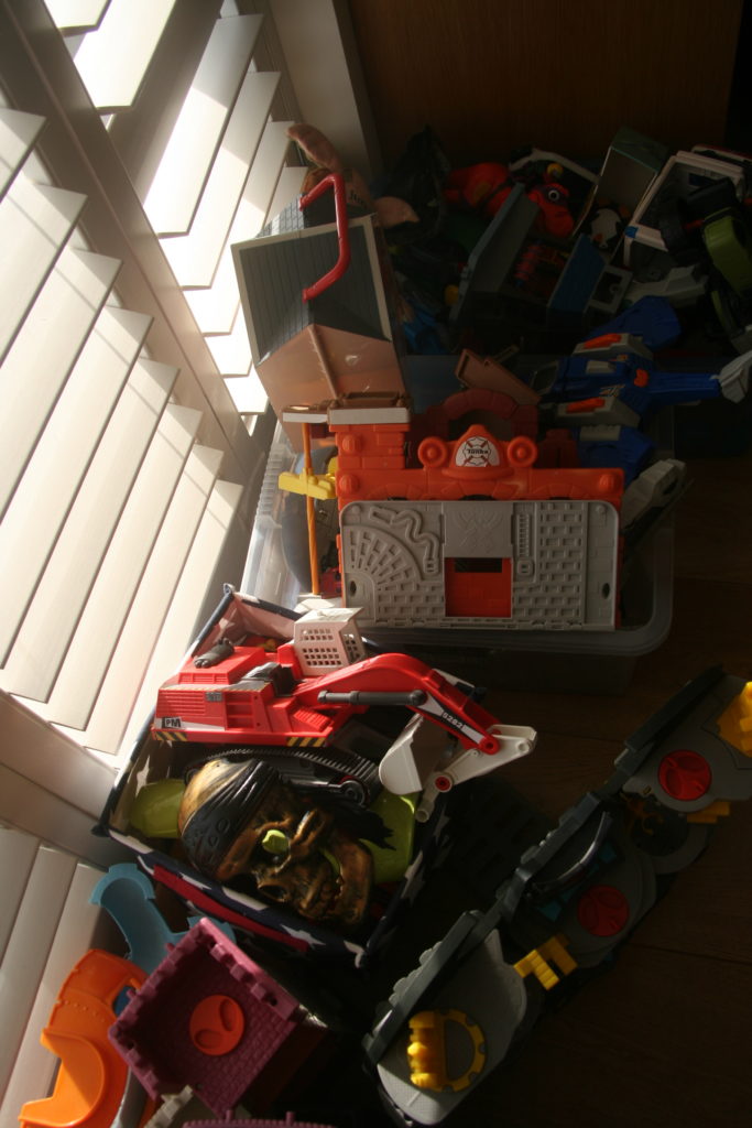
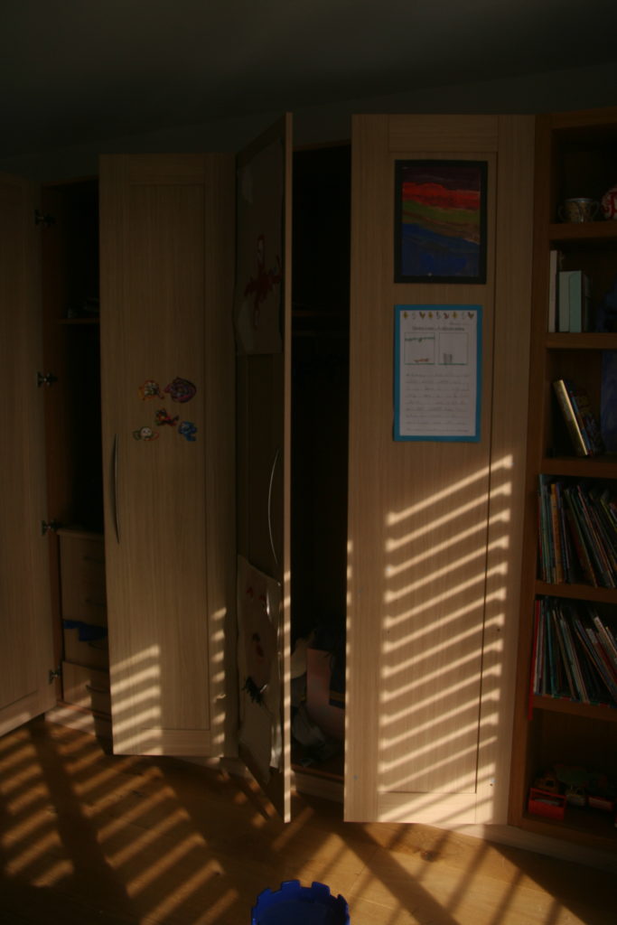
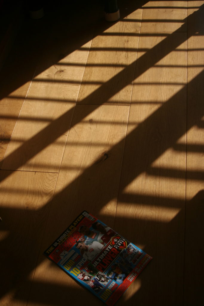
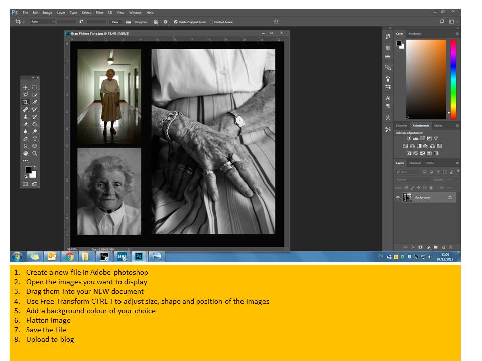
Once my picture have been printed I am going to mount and frame them on black card. In between each image there will be a border of black card this represents the strcuture of a house and how we hide behind these four walls, it’s where we feel safe. I wanted to express how walls (the black lines between each photo) are the only thing in a house that separate us from each other and empathizes how close we all are from each others true self, just a wall away. Similarly to Peacock’s work, mine has focus on colour and identity, we both focus on the vibrant colours of peoples room and the things they put in them to make them personal to their own identity, whether it’s in America or Jersey we still are all human and all have a private place that is special to us. As well as that I focused on creating a narrative for the person but without speech, simply through images of their rooms. For instance the Peacock photo I analysed created a story of a lonely alcoholic who is addicted to nicotine and works in construction. Similarly my pictures tell a story, for example in my first set of photos their are items such as make up, electronics, a mirror, a dressing room table. From this information, without seeing the picture of the person, you can gather that they are a young women as they are interested in making themselves look pretty and they have the latest techonology.

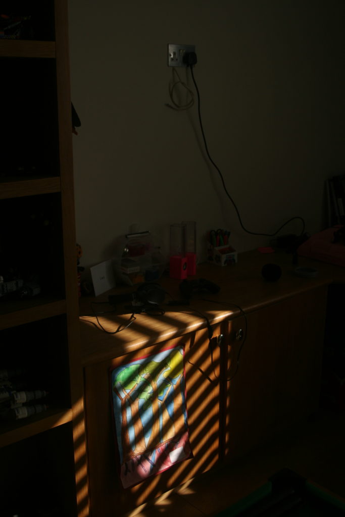
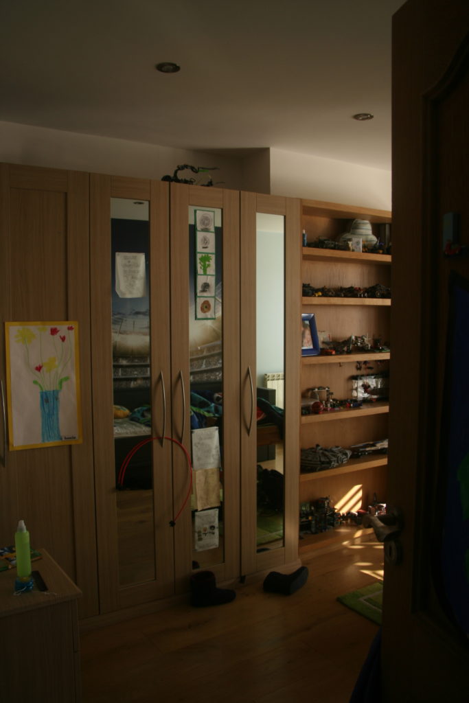
Barbara is an American photographer/photojournalist. She is one of five recipients of the Getty Images annual Grants for Editorial Photography programme, which gives photojournalists an award of $10,000 as well as the agency’s support in pursuing projects of their choosing. American Bedroom is an ongoing series of portraits in which she explores the complexities of contemporary American life. American Bedroom is a cultural and anthropological study of Americans in their private dwelling; their bedroom. The nature of the project will be portraits of individuals, couples and families that reveal the depth of their character and spirit.


Barbara’s project on American Bedrooms has influenced me to do a similar idea for the ‘Place and Identity’ mock, in which I am going to take photos of people in Jersey in their bedrooms. I want to be able to explore the inside private space of the people on this island and how their bedrooms reflect their self.
I was also influenced by the media theorist, Goffman who came up with the concept of ‘The Representation of The Self in Everyday Life’ which is the idea that we all have a ‘back and a ‘front’ self, the front is the one we let everyone see and we want everyone to see and the back is the one that is private to us that we conceal from others. I see a bedroom as a persons ‘back’ self a place or privacy and self expression, the actual person is the ‘front’ self, they leave their bedroom everyday to face the public world they dress themselves up to make an impression on others. I also want to explore how bedrooms change as people age, my impression is that the older you get the less expressive your bedroom becomes and it becomes more neutral and simple. Also it will be interesting to see how the dynamics of marriage and sharing rooms changes a persons private space.
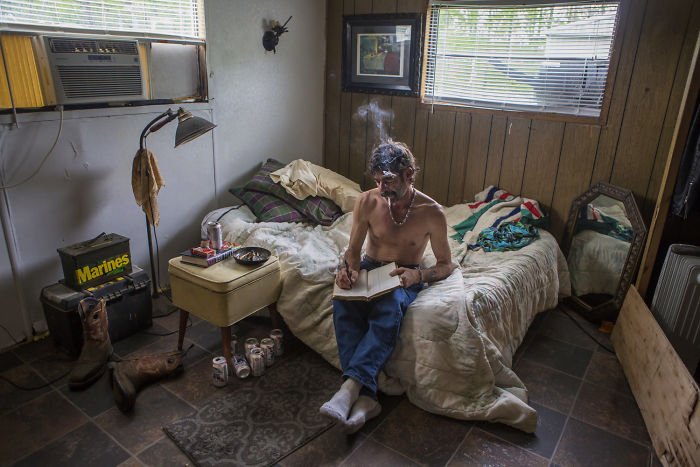
Barbara’s concept is simple yet complex because the idea of taking a picture of someones bedroom seems easy but it’s the people she chose to take pictures of it intriguing. For instance in the image above there is a middle aged looking man with a cigarette, no clothes on and a reasonably bare room. At first glance it’s just a picture of a man in this room but it tells a story, such as the fact that he smokes inside might mean he lives alone and this bare chest also suggests this. Also the lack of feminine touch indicates that he doesn’t have a women in his life, as well as that the bed being up against the wall makes me think that he doesn’t have a partner because most couples have their beds in the middle of the room so that it is accessible for both of them. The number of beer cans suggest he is a heavy drinker and the ash tray full of cigarette buts indicates he is most likely addicted to nicotine. The lack of portraits on the wall suggest he is a lonely man, possibly no kids and his parents maybe have pasted away. The boots and tool box suggest he could be some sort of builder or construction worker, this links to the number of beer cans and how working on construction sites means you are around males mostly and going out for a drink it a key aspect of workmen culture.
Barbara uses natural lighting to capture the true lighting of the room as this can indicate to a persons identity for instance some people much prefer having the blinds up or being in rooms with less light, which could suggest they are shy or constantly tired or are more of an evening person. The colours are neutral which creates a warm tone which is contrasted with the dingy feel of the room and how some light coming through is blocked by a yellow object which creates a dirty looking light, this mirrors the old cans lying on the floor and ash scattered on the bedside table. Although the room feels dirty it isn’t messy, the lack or furniture creates a repetitive structure which ties in with the idea that the mans life is very structured, work, smoke, drink, sleep and how it lacks the excitement of family and love. On the other hand the thing that sticks out the most visually in this photo is the notebook and how it seems out of place and you would think that he is not the type of man to write, this empathises how we judge people to quickly on their looks (front self) and it’s when they go home that they become their real self.
Identity is the fact of being who or what a person or thing is. Place is linked to identity as it shapes a persons characteristics, for instance living in a slum with no money can make a person more appreciative towards the little things in life and have more empathy towards others. Whereas people who live in places like Beverley Hills in huge mansions don’t value money as much they spend it likes there is an unlimited supply and generally look down on others with less money. Also places like Russia have extremely high levels of domestic violence and alcoholics, which has been a consistently high rate for centuries now, which says something about the culture in Russia.
Gender Identity is the personal sense of one’s own gender. Gender identity can correlate with assigned sex at birth, or can differ from it. All societies have a set of gender categories that can serve as the basis of the formation of a person’s social identity in relation to other members of society.
Cultural Identity is the identity or feeling of belonging to a group. It is part of a person’s self-conception and self-perception and is related to nationality, ethnicity, religion, social class, generation, locality or any kind of social group that has its own distinct culture.
Social Identity is the portion of an individual’s self-concept derived from perceived membership in a relevant social group.
Geographical Identity is an individual or group’s sense of attachment to the country, region, city, or village in which they live.
Political Identity– refers to political positions based on the interests and perspectives of social groups with which people identify. Identity politics includes the ways in which people’s politics are shaped by aspects of their identity through loosely correlated social organizations.
Lack of / Loss of Identity-An illness, injury, and even aging can take a serious toll on the physical self, leading people a physical loss of identity that can sometimes be accompanied by a loss of self-worth.

Contact Sheet:


Final images:

Edited in: Photoshop + Lightroom
For this image I wanted to show a confusion and inevitable lack of identity, I did this by using multiple exposures in Photoshop and then using a large eraser (2500 px or so) with around a 20-35% brush hardness. Along with this, I used different opacity levels for many of the different layers, to make the image seem almost dream-like or as if it was happening inside the head of the subject, with the intention of the face furthest to the left to have different personalities or emotions. I wanted the image to have a different look than most other portraits in plain white/yellow light, and the pink hue added by the neon sign only adds to the image as it helps it look slightly unnatural/artificial. There were a total of 9 different images used to add depth into the many faces, along with most of them using layer masks and using gradients to eliminate the edges, and then if an image was moved up or down, I used the eraser to eliminate any hard lines from either the top or bottom of the image.

Edited in: Photoshop
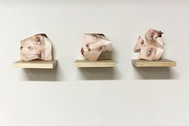
While I originally played around with the idea of digitally erasing parts of a subject like the mouth and eyes, however I found that this didn’t work in the way that I wanted it to, so I decided to use the lasso tool instead. For this image I used the Polygonal Lasso tool in Photoshop to select areas of the subjects face, then copied these areas and pasted them back into the image as a new layer, I did this several times on many different areas of the face as you can see above. I wanted to make the subject seem like a broken mirror, hence all of the layers are triangular and, for the most part, facing inwards like a smashed mirror. I did this to show the feeling of not knowing who you really are, similar to the first image, but this one is more about all of the ways we represent ourselves depending on who we are around, and how at a certain point you lose yourself when trying to put on these different faces for other people. To me, this image represents being lost and not really knowing who you, because you are trying to act differently around different people in your life, where as the first image represents a more internal struggle, and lack of identity because of focusing on too many things inside your own head.
Unsuccessful Images

Edited in: Photoshop
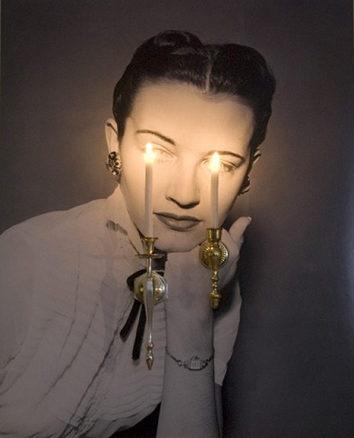
I also experimented with the idea of using mirrors but personally don’t really like how it turned out. I think that this idea could have worked better if I had found a larger, more open space, so you could see the depth of the image. I also think a different mirror would have enhanced the image as from this angle the mirror used doesn’t have and large edges; meaning it doesn’t look as much like a mirror compared to Laura Williams’ work, on which this image is based.

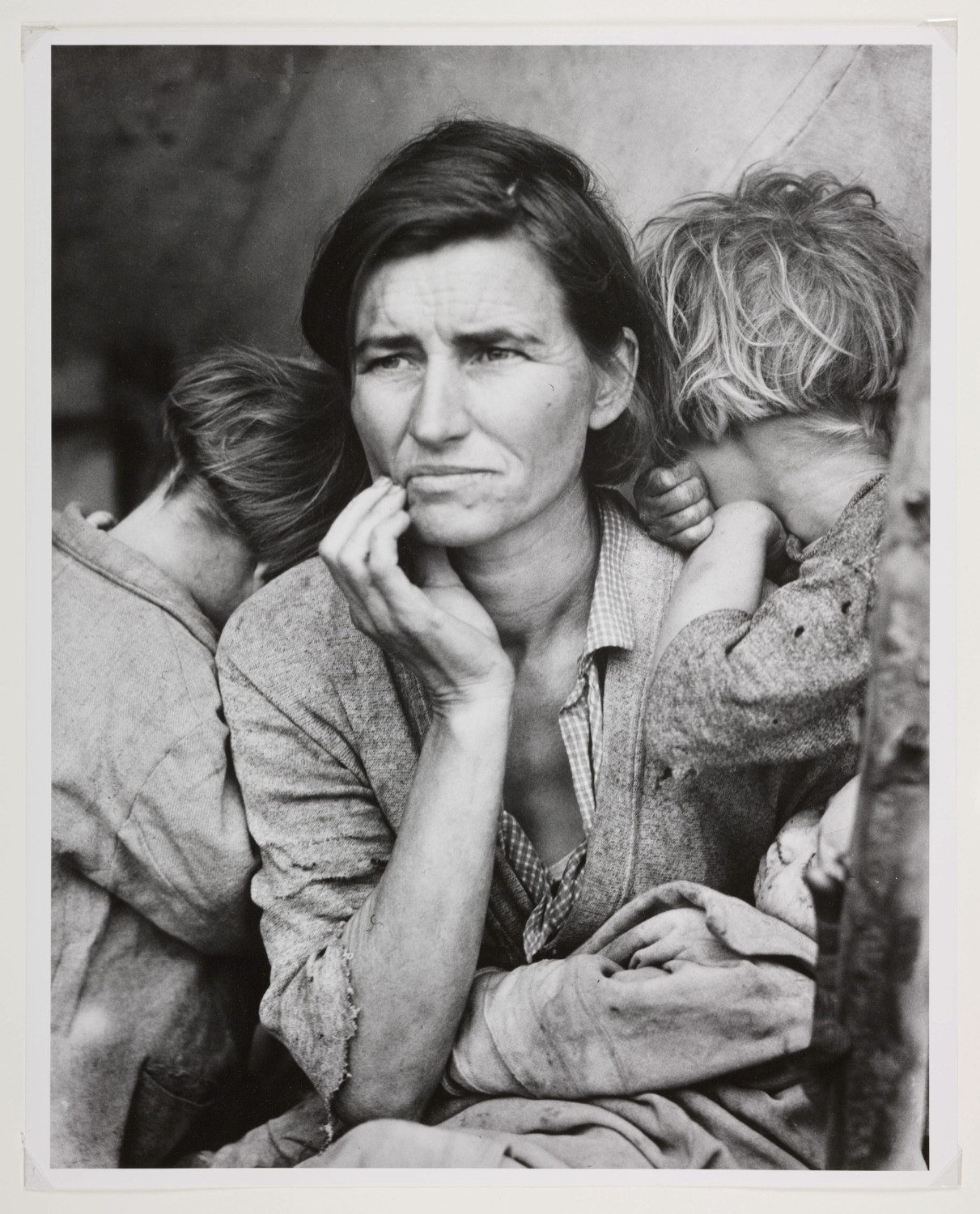
Example : Political instability can often cause mass migration of populations and considerable human distress, which provoke artists to respond with powerful visual statements. Mona Hatoum’s displacement from Palestine to Britain influenced many of her pieces that comment on her personal experiences of such a traumatic event. Ai Weiwei and Sebastião Salgado recorded compelling accounts of refugees and their plight, whilst Dorothea Lange documented the devastating effects of the Great American Depression.
You should provide evidence that fulfils the four Assessment Objectives:
AO1 Develop ideas through sustained and focused investigations informed
by contextual and other sources, demonstrating analytical and critical
understanding
AO2 Explore and select appropriate resources, media, materials, techniques and
processes, reviewing and refining ideas as work develops
AO3 Record ideas, observations and insights relevant to intentions, reflecting critically
on work and progress
AO4 Present a personal and meaningful response that realises intentions and, where
appropriate, makes connections between visual and other elements.
Your preparatory studies should show evidence of:
• your development and control of visual literacy and the formal elements (tone,
texture, colour, line, form and structure)
• an exploration of techniques and media
• investigations showing engagement with appropriate primary and secondary sources
• the development of your thoughts, decisions and ideas based on the theme
• critical review and reflection.
Period of sustained focus
During the 10-hour period of sustained focus you will produce your final outcome(s)
responding to the Externally Set Assignment theme, based on your preparatory studies. The period of sustained focus may take place over more than one session. You will not be able to access your work outside of these sessions. Once the 10-hour supervised period
has ended you will not be able to add to or alter your work
In his installation Nantes Triptych Bill Viola simultaneously shows three videos of people at different stages on the journey through life.

Other photographers and film makers are also interested in recording changes brought by the passing of time. Richard Linklater’s film Boyhood was filmed over 12 years to show the actual development of a boy into a young man.
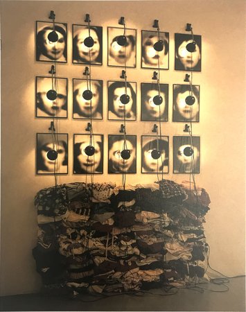
Christian Boltanski shone lights on fading images of people killed in the Holocaust.These suggest an interest in the journey that the photographs themselves make on a path to obscurity.
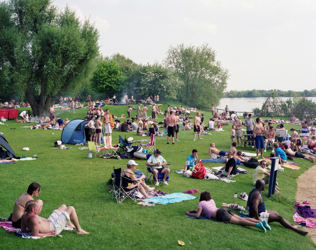
In the book We English Simon Roberts records a two year journey in a motorhome around England. The resulting images are lyrical and calm, as he often found beauty in mundane situations and in the exploration of the relationship between people and place. He
purposely avoided the tendency to satirise the English class system in ways that have almost come to be expected by photographers such as Martin Parr.


Walker Evans, David Meadows, Guy Bourdin, John Davies, Dorothea Lange and many other photographers have gone on extended journeys to record their view of the country or their immediate surroundings.

Creative journeys can derive from ideas that link diverse objects in unexpected ways. These reflect the individual preoccupations of the photographer. Edward Weston’s obsession with abstract form led him to transform vegetables, chimneys and toilets into
objects of great formal beauty. Rinko Kawauchi’s image of a dead wasp on a windowsill and a drop of milk on a baby’s chin are both connected by her interest in the poetry of ordinary moments.
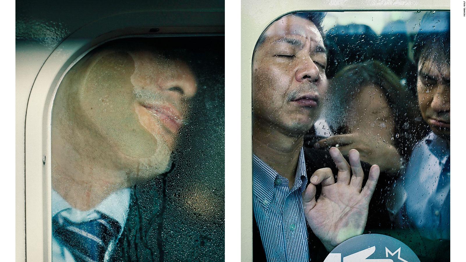
The daily grind can be a test of endurance. In Tokyo Compression, Michael Wolf recorded the extreme discomfort of Japanese commuters pressed up against windows dripping with condensation on their journeys to and from work.

In Harlem Trolley Bus, Robert Frank showed the divisions within American society in the mid-20th century. Dryden Goodwin
took pictures of exhausted travellers on London night buses and wove a protective cocoon of blood capillaries around them.

Matt Crabtree transformed commuters on the
London underground into 16th century portraits of praying saints.

Richard Long walks through landscapes, making subtle changes along the way.

Theo Gosselin documents friends / models / muses on various journeys in urban and rural areas

J.Grant Brittain, Warren Bolster and Craig Stecyk documented skate culture throughout the 1980’s and beyond…


Ansel Adams explored vast areas of America’s National Parks, preserving the notion of their grace, beauty and purity despite changes to their condition and use…

Miklos Gaal employs tilt shift techniques to create toy-town-esque scenes of everyday hustle and bustle life in urban areas, distorting our sense of space, proportion and time.
• trains, cycles, boats, planes, coaches and cars • hiking, camping, caravanning, hotels • obsessions, desires, pursuits • adventure trails, treks, mazes, maps, tunnels, caves • oceans, rivers, canals, motorways, bridges, corridors, staircases, packed lunches, service stations, mobile cafes, drive-thrus, airport lounges, bus stations, train stations • escapism, fantasy, science fiction, books, comics, quests • tracks, footprints, jet trails, bow waves, oil slicks • detectives, clues, pursuits, bloodhounds, foxhunting, treasure hunts, geocaching, orienteering • Pied Piper of Hamelin, Hansel and Gretel, Jack and the Beanstalk, The Hero’s Journey • internet, optic fibres, cables, communications, text messages, emails • letters, shipping containers, parcels, presents, trade routes • protest marches, processions, pilgrimages, hustle and bustle, street life (street photography)
23rd April – 3 May inclusive
(dates / days to be published soon)
My chosen theme for this shoot is self expression; how people express themselves through what they wear and how they communicate (facial expressions and body language).
The purpose of this photo shoot is to explore diversity within the community, how people within the same community differentiate themselves from one another, as well as how they react differently to being placed in the same environment and treat identically.
The shoot will take place in the photography studio where I will take photos of my friends in the exact same way; the camera angle and where they are standing will be identical every time, but it will be up to them how they pose and express themselves in the photos. I will also let them decide what they want to wear for the shoot.
They won’t be doing the same leaning pose as here but the shoot will work in a very similar way. The angle and basic setup will be identical but it’s up to the people being photographed to express themselves. The only difference is that in my shoot I won’t make everyone pose in the same way, that will be up to them.
EXAMINING THE ARTISTS’ WORK
For this comparative essay I have chosen to examine these two pieces of photography due to the contrasting nature of the composition and the surroundings.
Firstly, I thoroughly enjoy the work of both Cahun and Rae, Rae following a similar style to Cahun in which she is part of, or the main subject of the photo. Rae tends to incorporate herself into the landscape more as opposed to being the focal point of the image. The strange contortions that she sometimes does during photoshoot is an attempt to flow into and become one with her surrounding. The soft and subtle clothing that she chooses to wear during these photo shoots, illustrates a delicate and fragile side of her that allows her to blend in. I have also noticed that in the majority of her photos she is facing away from the camera , or she is at a disctance where it cannot be seen clearly. This once again suggests that she doesn’t want her identity to shine through as our face is one of our most distinctive features, rather allowing her environment to be the biggest contributor of the image. In this photo, her attempt at fitting into the cart makes her seem small and insignificant in the maze of archives surrounding her. Rea, like Cahun, works in black and white imagery which again allows her to blend well into her surrounding with the monotone shades that her photography produces.
The work of Rae, although similar to Cahun’s, has some distinctive differences. Cahun also tends to set a lot of her photos outdoors, yet the main target that Cahun has is to explore and capture her out of the ordinary identity. Her strong facial features are clearly captured in the image. The smooth curves of her arms and face are the main center of the photo, contrasting the busy flowers that are in the foreground. Due to the technology of the time, Cahun worked only in black and white imagery but I feel this is was also an advantage as she allows all the character to come from the interesting compositions and themes as opposed to color and tone. Cahun is often discussed in relation to Butler’s idea of the performativity of
gender because of the role that gender performance plays in Cahun’s photographic self- transformations. While Cahun and Moore’s photographs of Cahun are certainly relevant to Butler’s theories of gender it was the ideas such as androgyny and the “third sex,” raised in the 1920s and ‘30s, which truly influenced their work. This image was prior to Cahun shaving her head and completing her androgynous look, portraying more as female. Preharps even the flowers in which she has chosen to stand in is a sort of irony of the traditional views of society and how women are viewed as “innocent flowers”.


YOUR FINAL BLOG POST SHOULD CLEARLY SHOW 3-5 POSSIBLE FINAL OUTCOMES for IDENTITY AND PLACE, INCLUDING YOUR PRESENTATION METHOD
FROM THIS YOU CAN CHOOSE YOUR IMAGES FOR PRINTING
Research and explore alternative approaches to presenting your final images. This should be an integral part of your concept…not a gimmick…ultimately, the quality of your photography will be the primary focus and your mark will reflect this…
