Category Archives: Component 1 Personal Investigation
Filters
Week 4 | Camera Skills | Editing | Analysing images
Lesson 1
- Check homework # 3 is complete and uploaded.
- Complete Case Study on Albert Renger-Patszch / New Objectivity
Lesson 2 :
- Camera Skills (focus control, depth of field, focal length)
- Photoshop skills
Lesson 3:
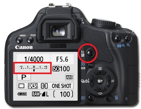
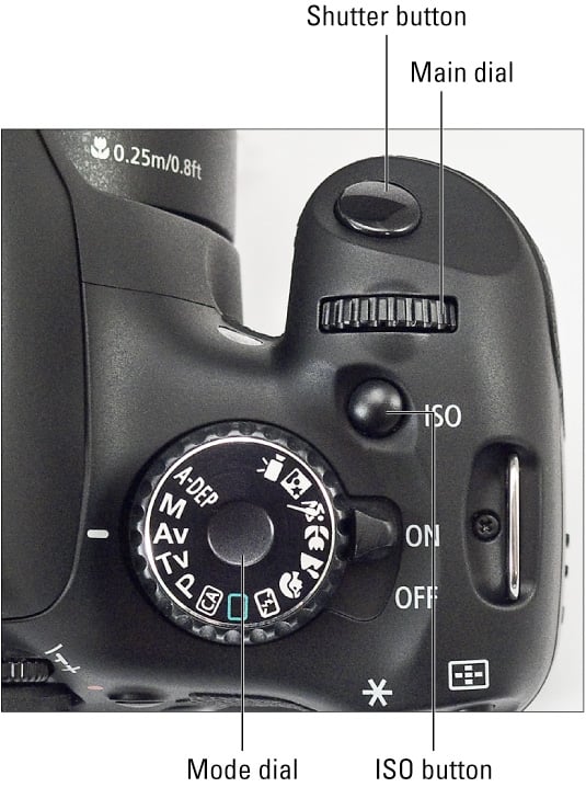
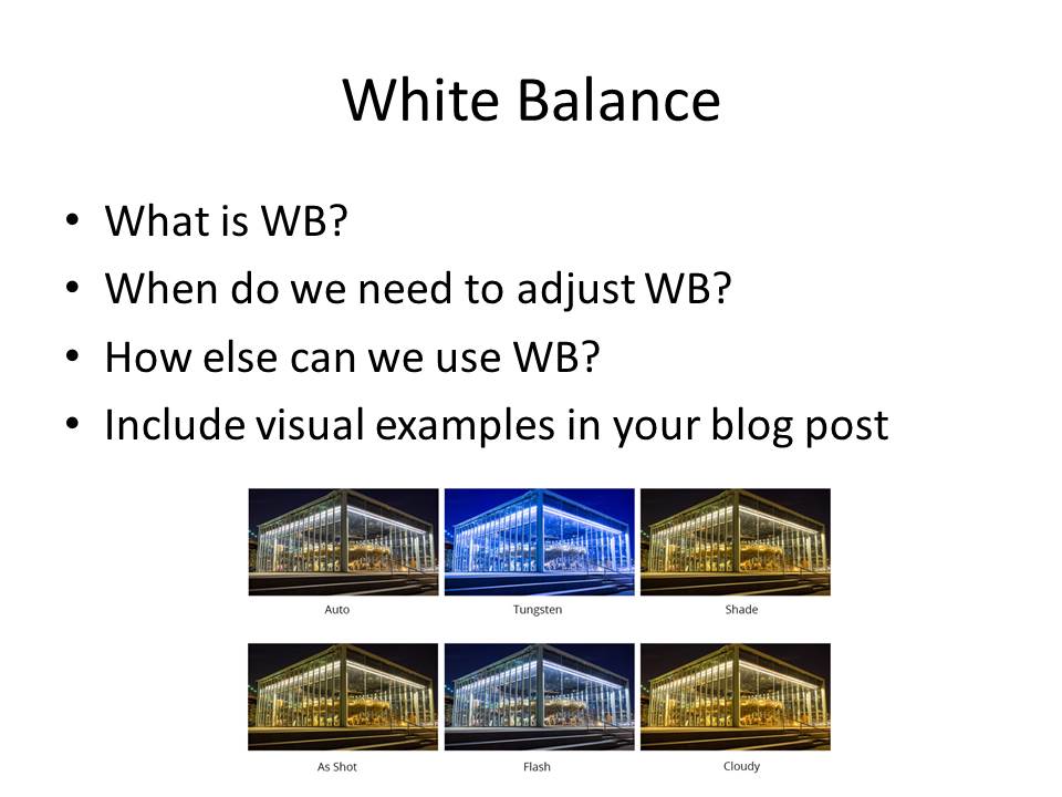
- Camera Skills (ISO / WB / Exposure settings)
- Photoshop skills
Lesson 4:
- Complete blog posts on camera skills / photoshop skills
- Analysis skills (look at key example)

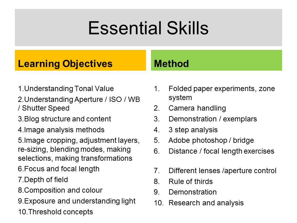
Click this PDF link for a range of resources and that we will be exploring to help you generate new and different ideas whilst learning what ABSTRACT PHOTOGRAPHY can be and how to use your camera and adapt your photographs…
AS Photography UNIT 1 resources
Camera Skills
You must experiment with ease of these skill areas and produce a blog post on each that includes evidence of your experiments and successes…
The images should be of an abstract nature, and show an appreciation of abstract qualities such as line, shape, colour, form, texture, pattern, repetition, symmetry
- Using Auto-Focus
- Using Manual Focus
- Using focus points
- White Balance
- ISO
- Aperture
- Focal Length
- Depth of Field
- Fast / Slow Shutter Speed
Photoshop Skills
- Cropping
- Selections
- Adjustments and corrections
- Transforming an image
- Layer control
- Image size / canvas size
- Double exposures
- Opacity control
- Blending layer / options
Working towards a vision…
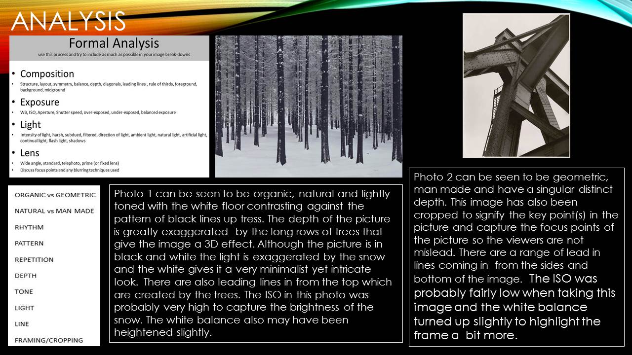
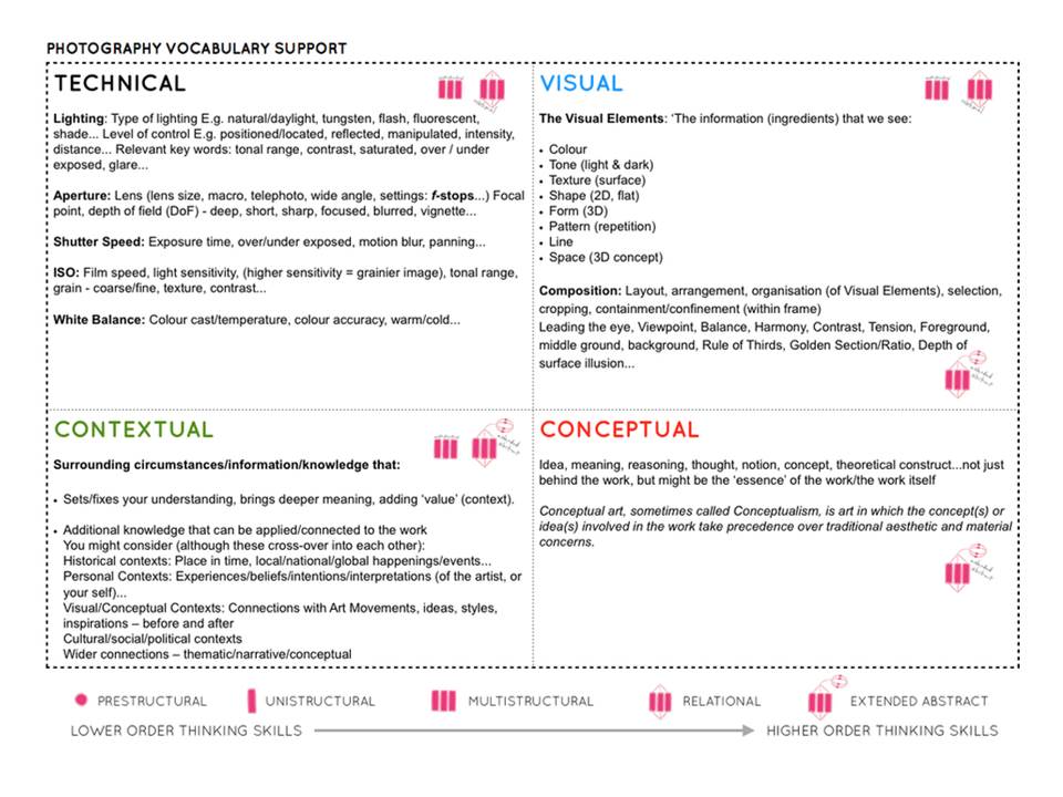
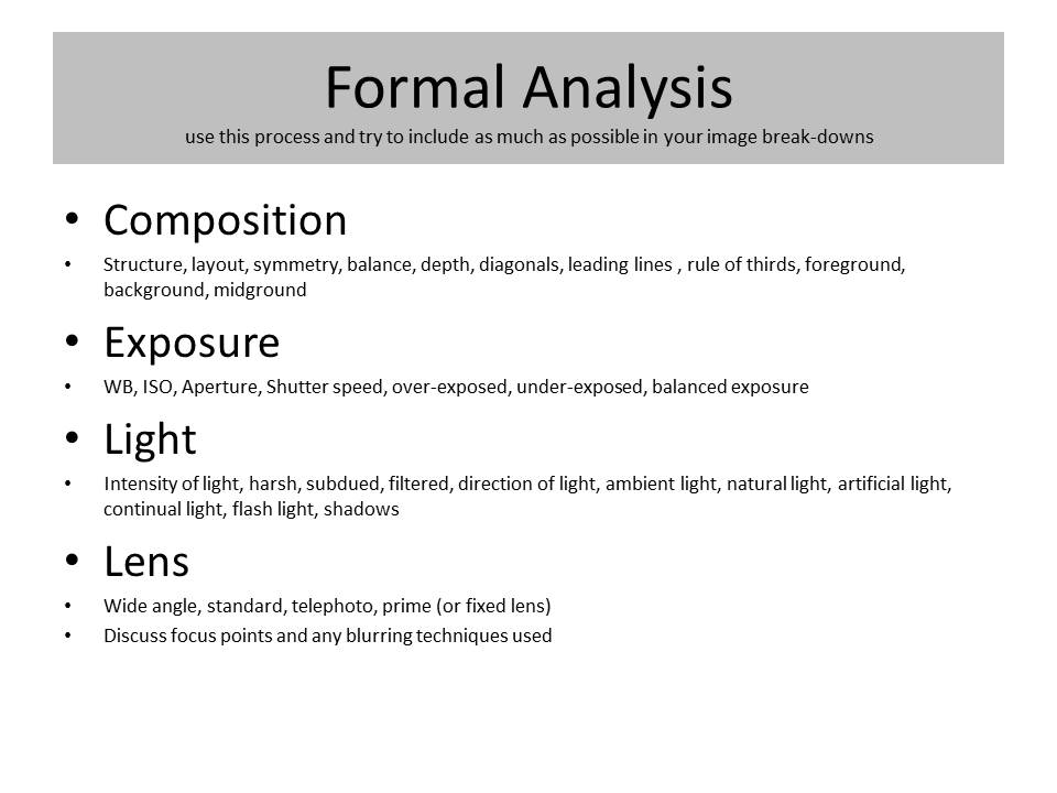
Use this method to analyse key images
Rule of Thirds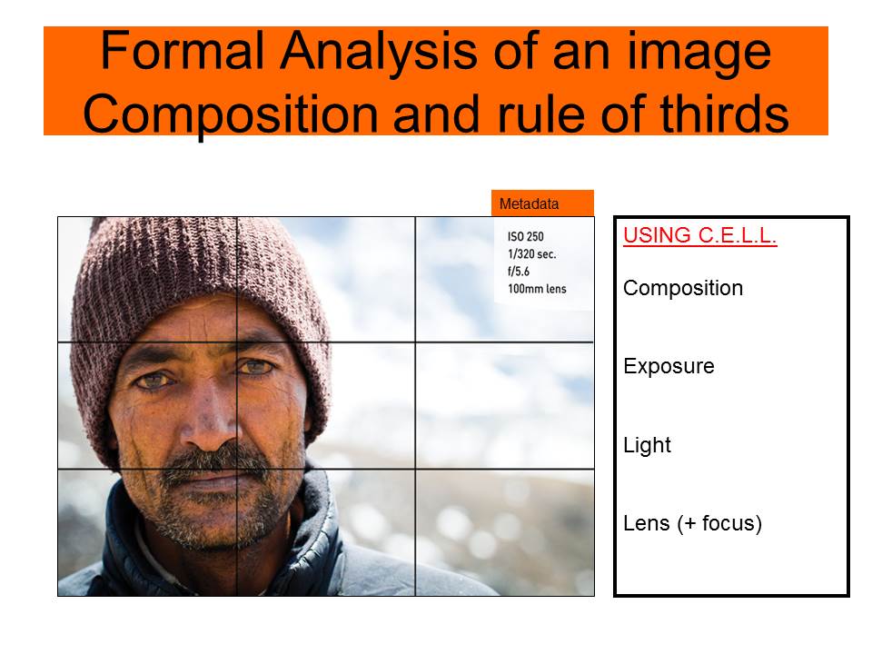
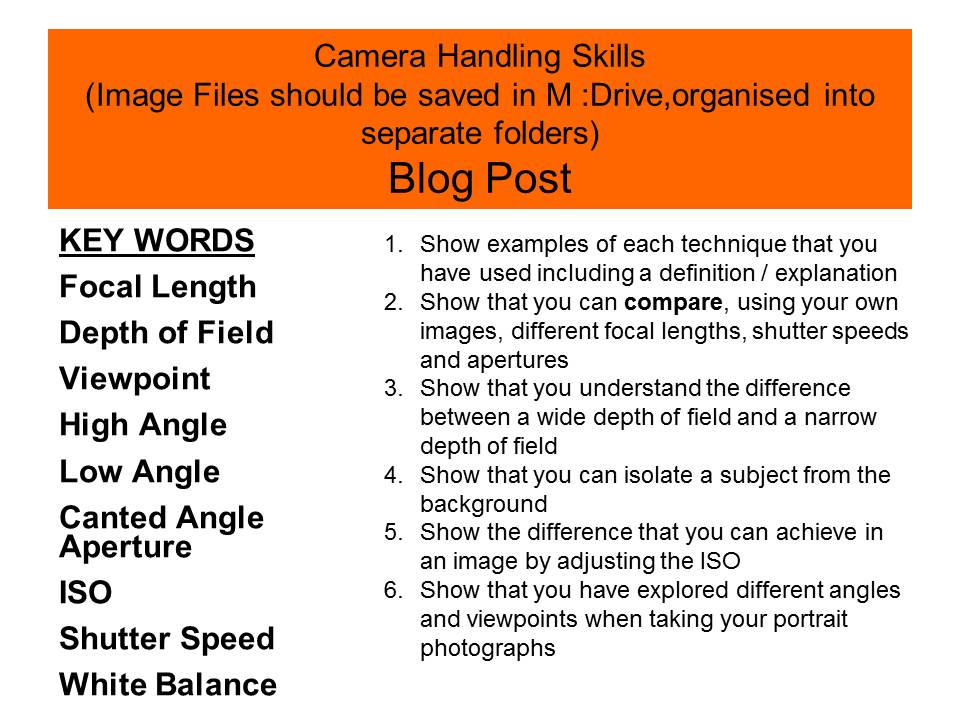
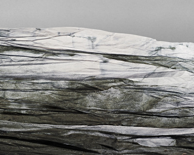
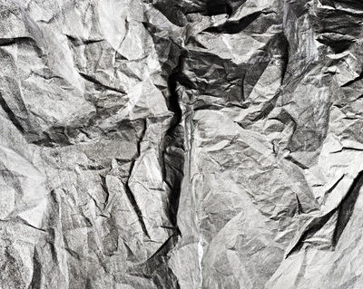
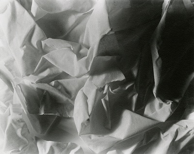
James WellingAlthough these images, entitled ‘Abstract Photographs‘ resemble sheets of paper they are, in fact, made from filo (phyllo) pastry dough. The artist explains: “A lot of my work is intuitive and comes from just trying different things. With the money from the sale of my first aluminum foil photograph, I bought a wooden 8-by-10 camera and started photographing draped cloth. At the same time I was also photographing crumpled shards of dry phyllo dough. Without much premeditation, I combined the two, and sprinkled dough on the draped cloth. Against the dark fabric, the dough suggested, perhaps, torn book pages from the diary I’d photographed, or geological debris fallen from above.” Welling has also experimented with other unlikely materials such as tinfoil, gelatin and ceramic tiles.
|
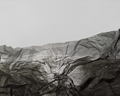
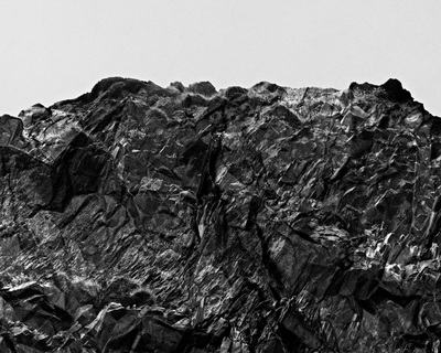
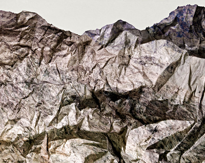
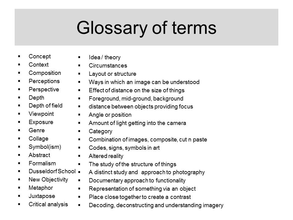
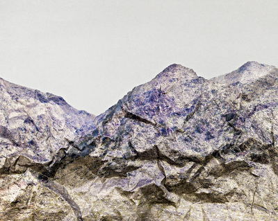
Brendan AustinBrendan Austin creates imaginary landscapes out of crumpled pieces of paper. He calls them ‘Paper Mountains‘. Austin examines what we mean by nature and the way humans have impacted upon it. “The isolated desert city running on oil generators, the mars like landscapes of a volcanic environment and the mountains made from paper all attempt to start a conversation concerning the loss of meaning and reality.” The resulting images appear both recognisable as landscapes but also suggest a sense of artifice. Humble materials are made to carry an important message.
|
Example instructions
You could:
- Research the history of abstraction in photography. Check out the images on this Pinterest board. Watch this video discussion about the history of abstraction in photography. Watch this vodcast which explores some famous and not so famous examples of photographic abstraction.
- Write a short introduction explaining your understanding of abstraction in photography.
- Choose a quotation that helps you to think about the meaning of abstraction in art and photography.
- Find your own resources and document them on your web page or in your book with a description of what you have learned from them.
- Create a series of Galleries featuring the work of Francis Bruguière, Jaroslav Rössler, Vjeko Sager, Jerry Reed, Tamara Lorenz and James Welling including your understanding of their work in the context of abstraction.
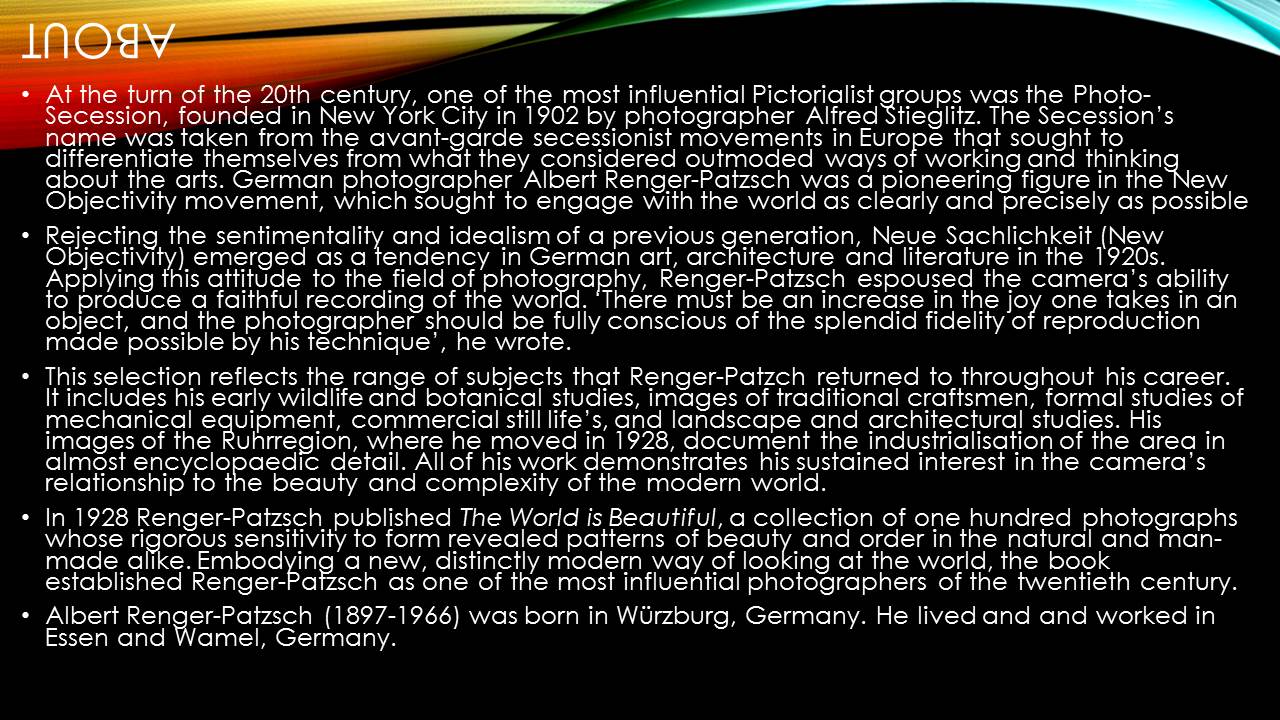
Albert Renger-Patzsch
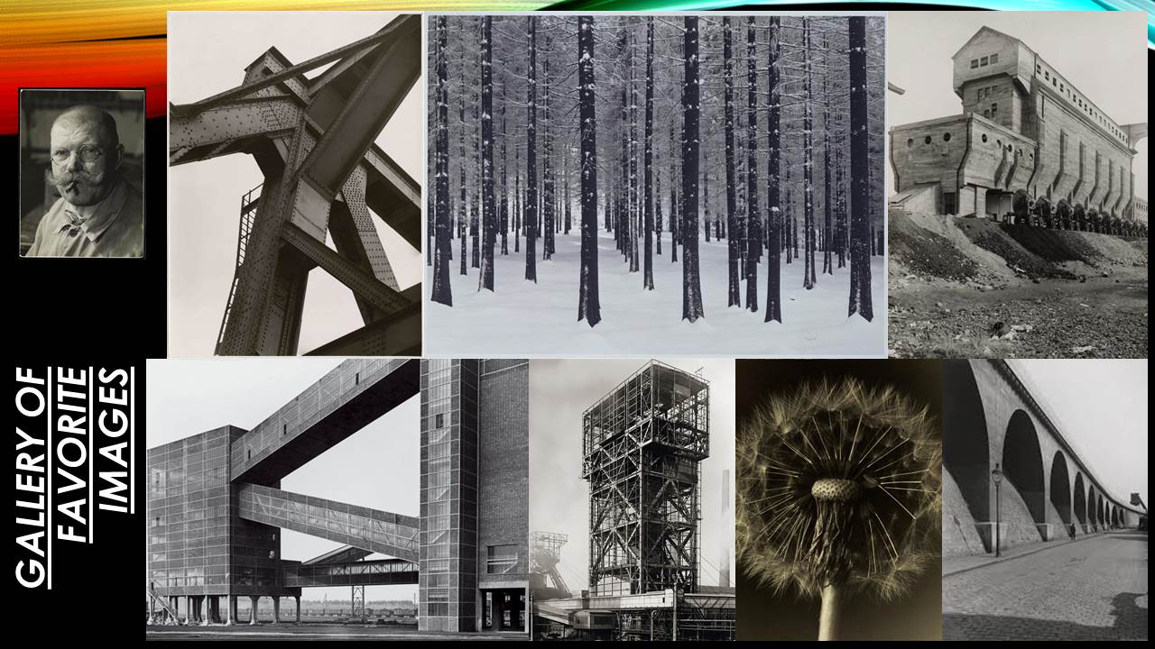
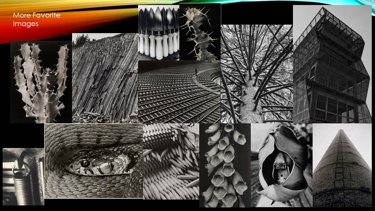
He was a German photographer, born June 22nd, 1897 in Wurzburg. He was largely associated with the new objectivity, he began taking photographs at the age of 12. Albert fought in World War One and after studied chemistry at Dresden Technical College, later he worked for Chicago Tribune as a press photographer. After this he began to publish books, his most well-known is ‘The World Is Beautiful’, it includes a collection of 100 of his photos. His photos in this book showed structure but also bought up the beauty of patterns and order amongst nature and man-made materials. He took pictures early on in his career of wildlife and botanical plants, then he progressed to images of traditional craftsmen, mechanical equipment, still life’s, landscapes and architecture.
The New objectivity is the rejection of idealism and sentimentality and is about seeing things for what they are. Photos are of a certain object which is the only focal point, filters and manipulations other than black and white are avoided. This type of photography depicts reality, it speaks truth, rationality and accuracy, what you see is what you get. This objective movement is also known as the ‘sober eye’ as it doesn’t have hidden concepts or imagery, it just speaks for its self without need for meaning. Photographers around the time of Albert (1920) used it as an act against expressionism which was modern art movement at the time in which through poetry and painting an artist would present the world solely from a subjective perspective, which is the complete opposite to new objectivity. Expressionism was created to provoke individual ideas and thoughts, whereas new objectivity was made to provoke political agendas and rational thoughts. The camera was used in a way to embrace the camera’s mechanical ability to capture the real world in a clear and objective manner.
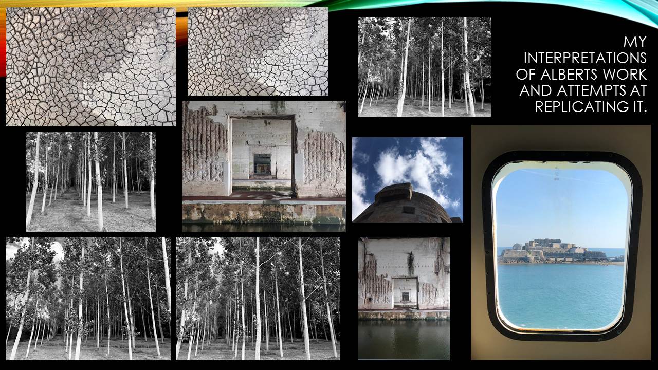
Decades later in Germany photographers Bernd and Hilla Becher resonated the new objectivity approach, the duo’s work was structured like Albert’s as it was held together in a grid structure of black and white. They had similar focal points to their pictures like Albert, for instance some of very industrial looking buildings and others of buildings with character, this links back to Renger’s nature vs. man-made objects.


Claude Cahun x Clare Rae
Exhibition Critique
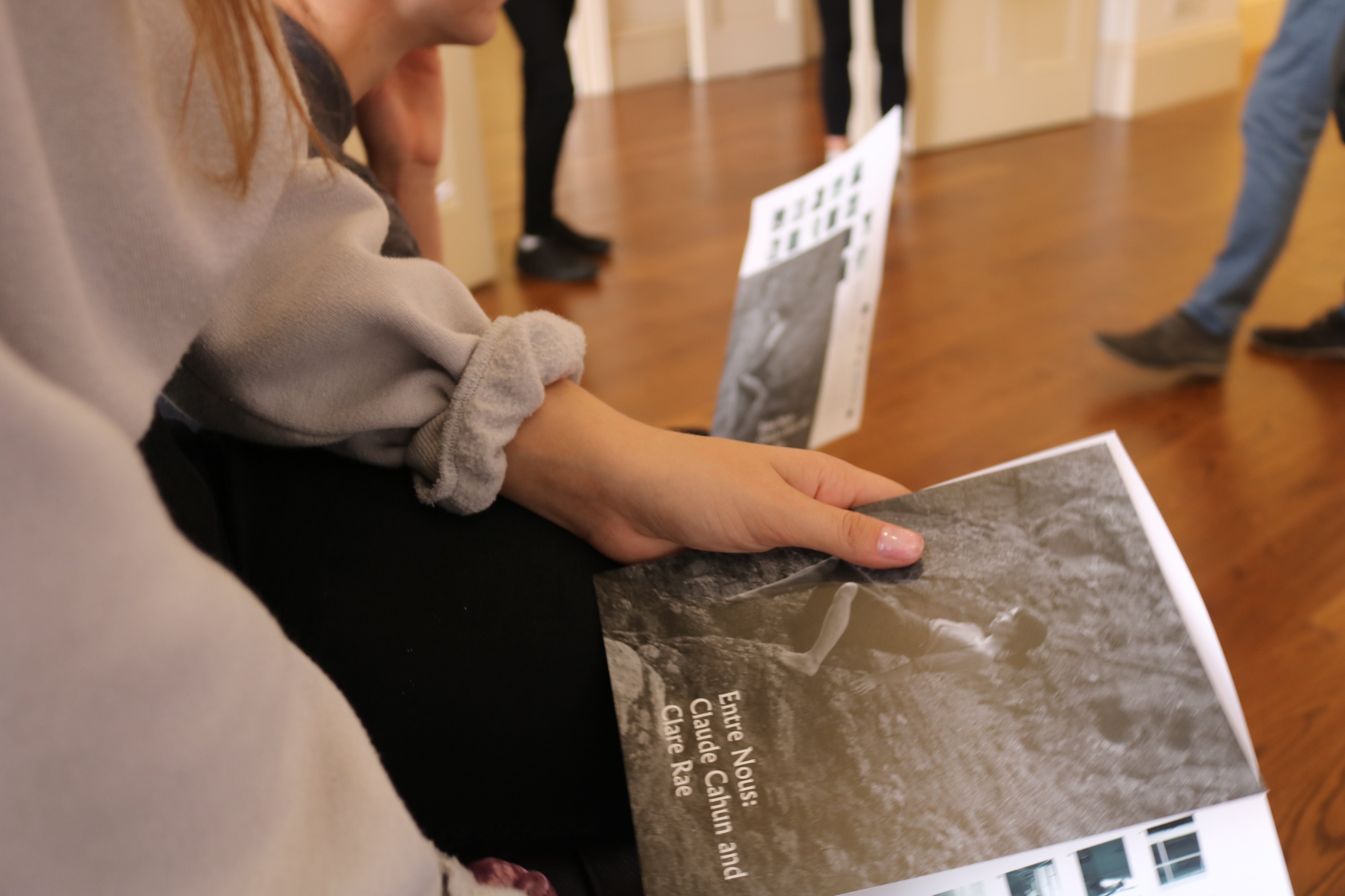
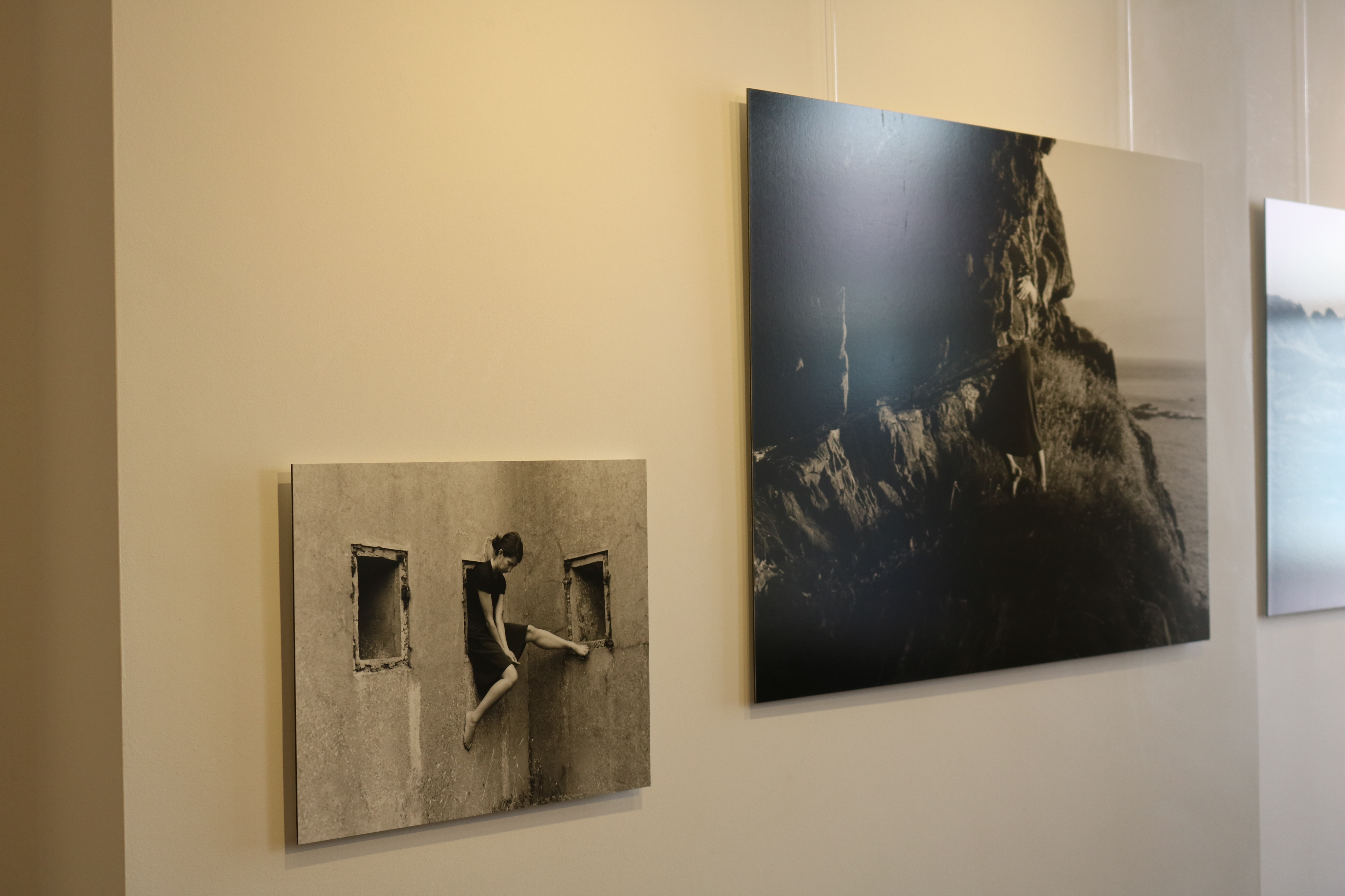
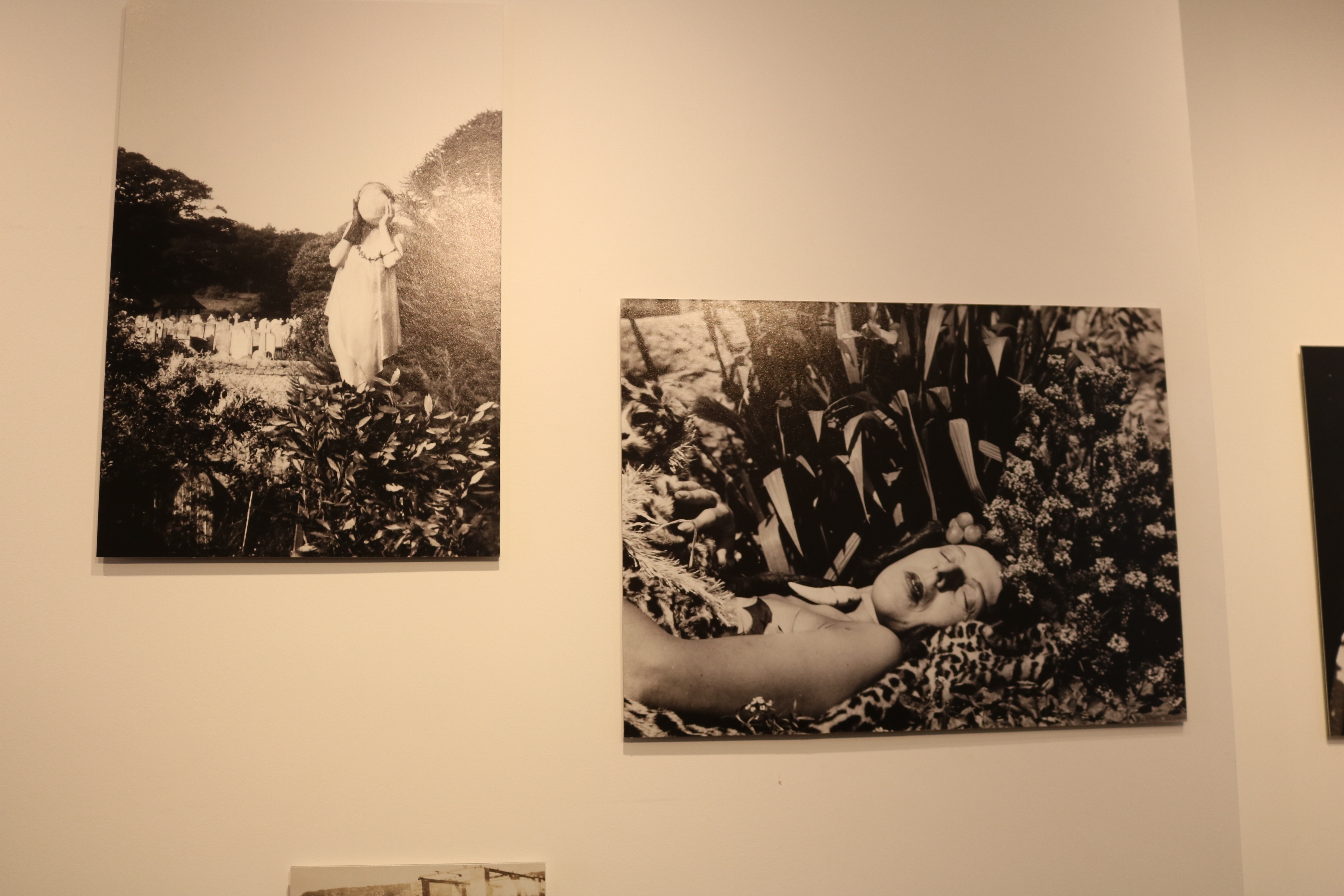
The Claude Cahun and Clare Rae exhibition was very inspiring and interesting to visit. There were two rooms that made up this exhibition, one containing each photographers work. I think that was a very good way of displaying the images as it meant that each photographers work was separated and couldn’t be confused. By displaying the images in separate rooms, it also allows visitors to clearly see in influence of Cahun in Rae’s work.
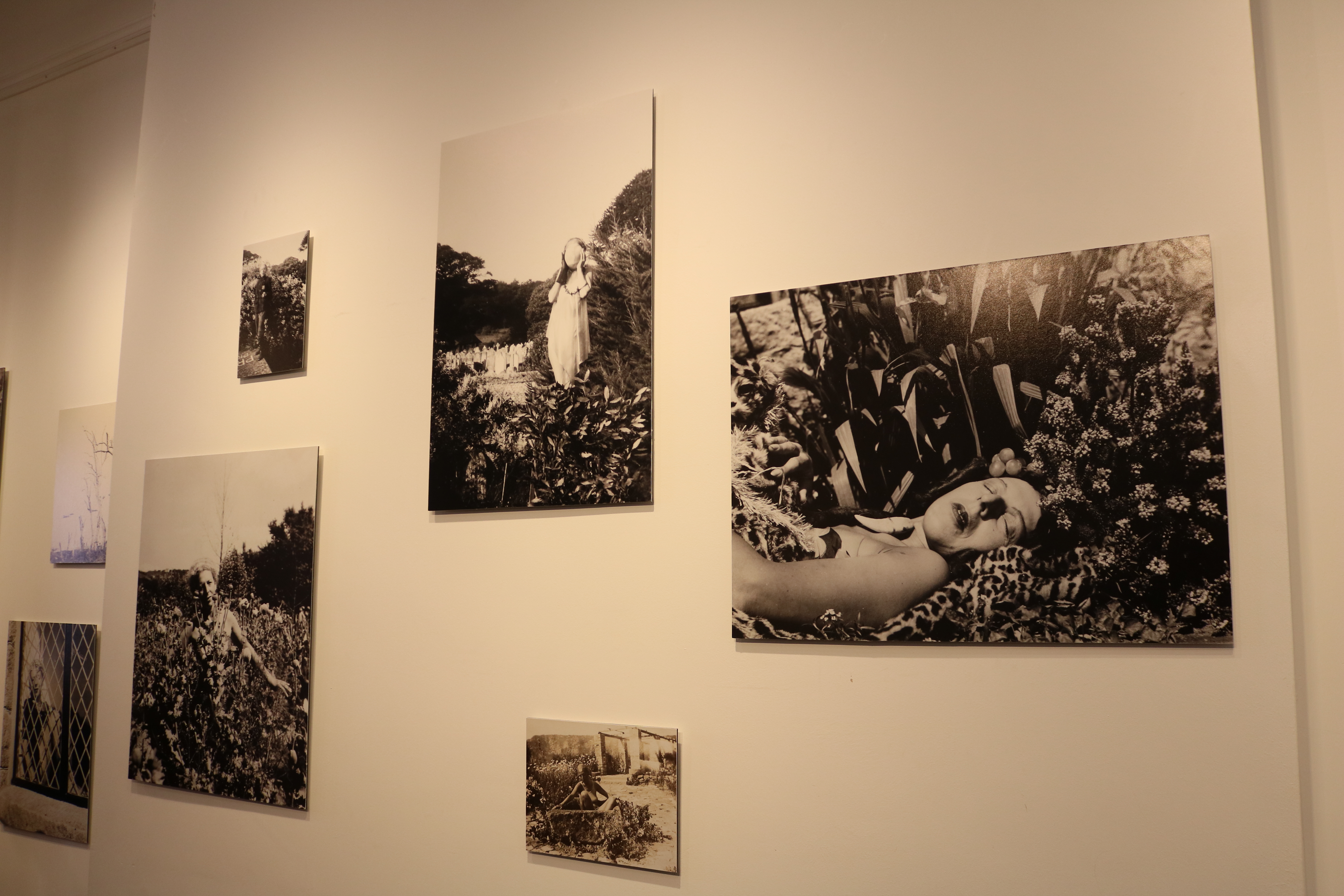
Cahun took many self portraits that are considered very advanced for her time. Her images show her challenging gender stereotypes by sometimes presenting herself as a “typical” male, or by wearing so much makeup that it was difficult to tell which gender she was. She also explored her body and sexuality in many of her self portraits by posing herself in different manors. I thought that her work was very inspiring because it must have taken a lot of bravery and confidence to be able to take those types of images during very conservative times, when people weren’t accepting of things that weren’t considered “normal”.
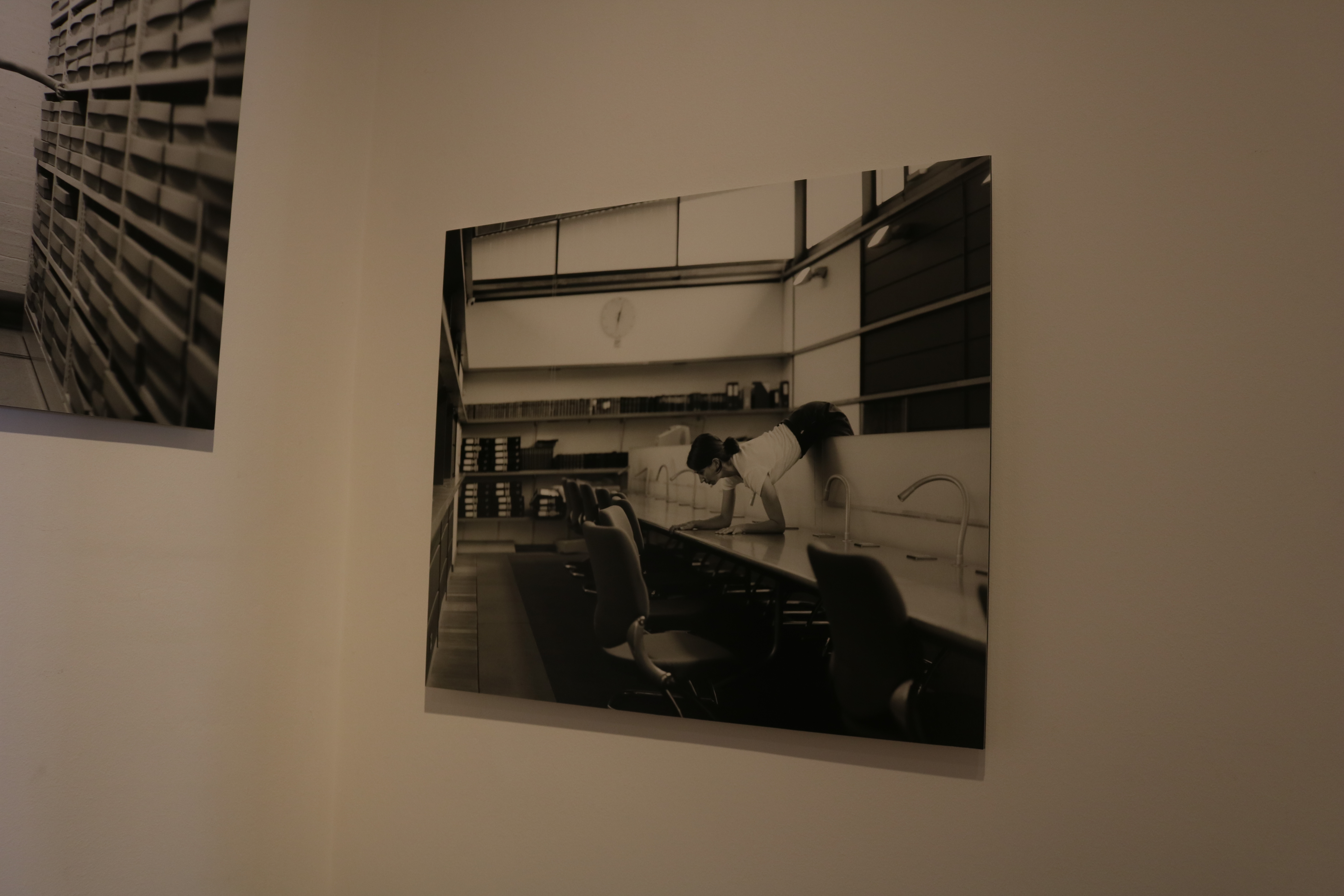
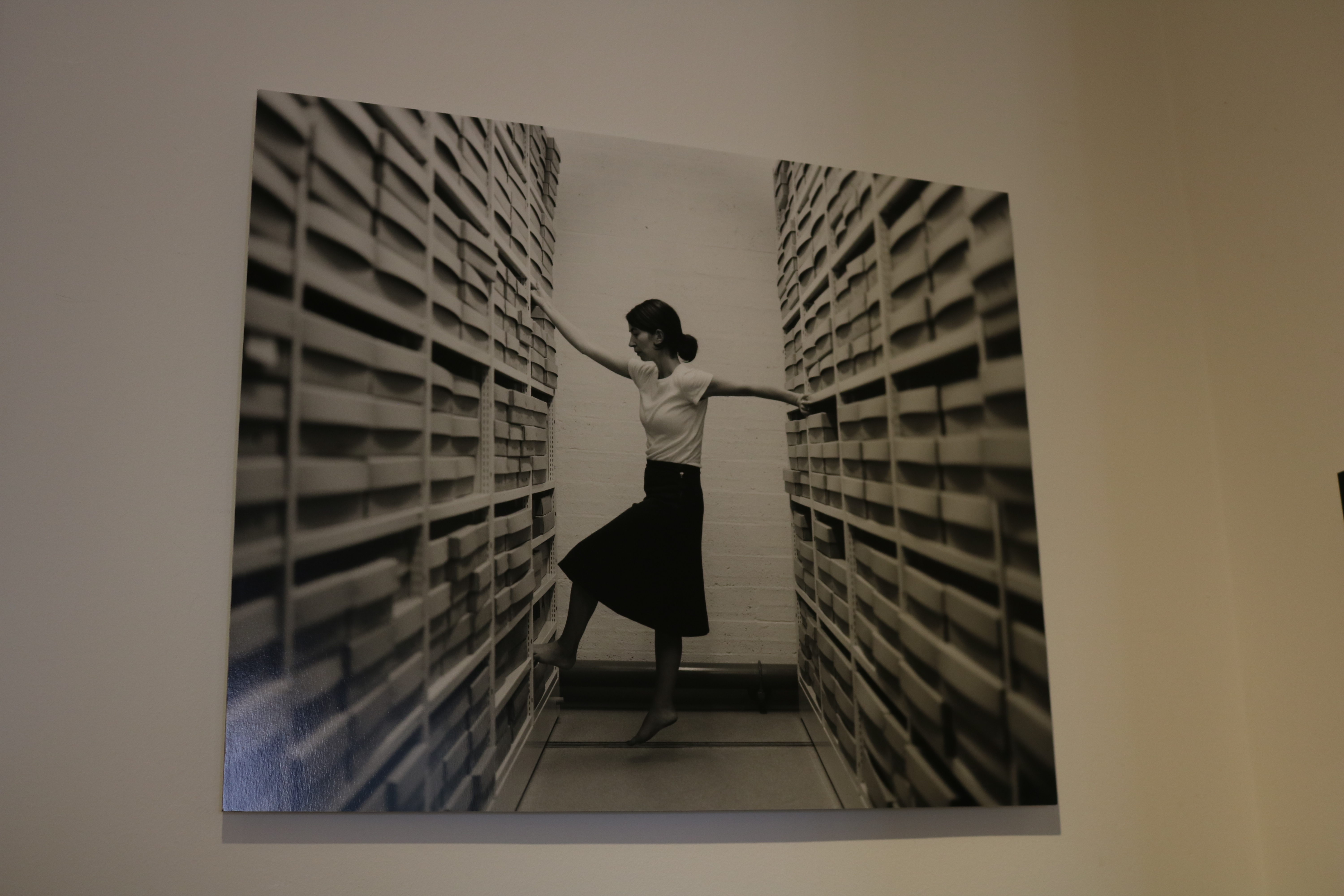
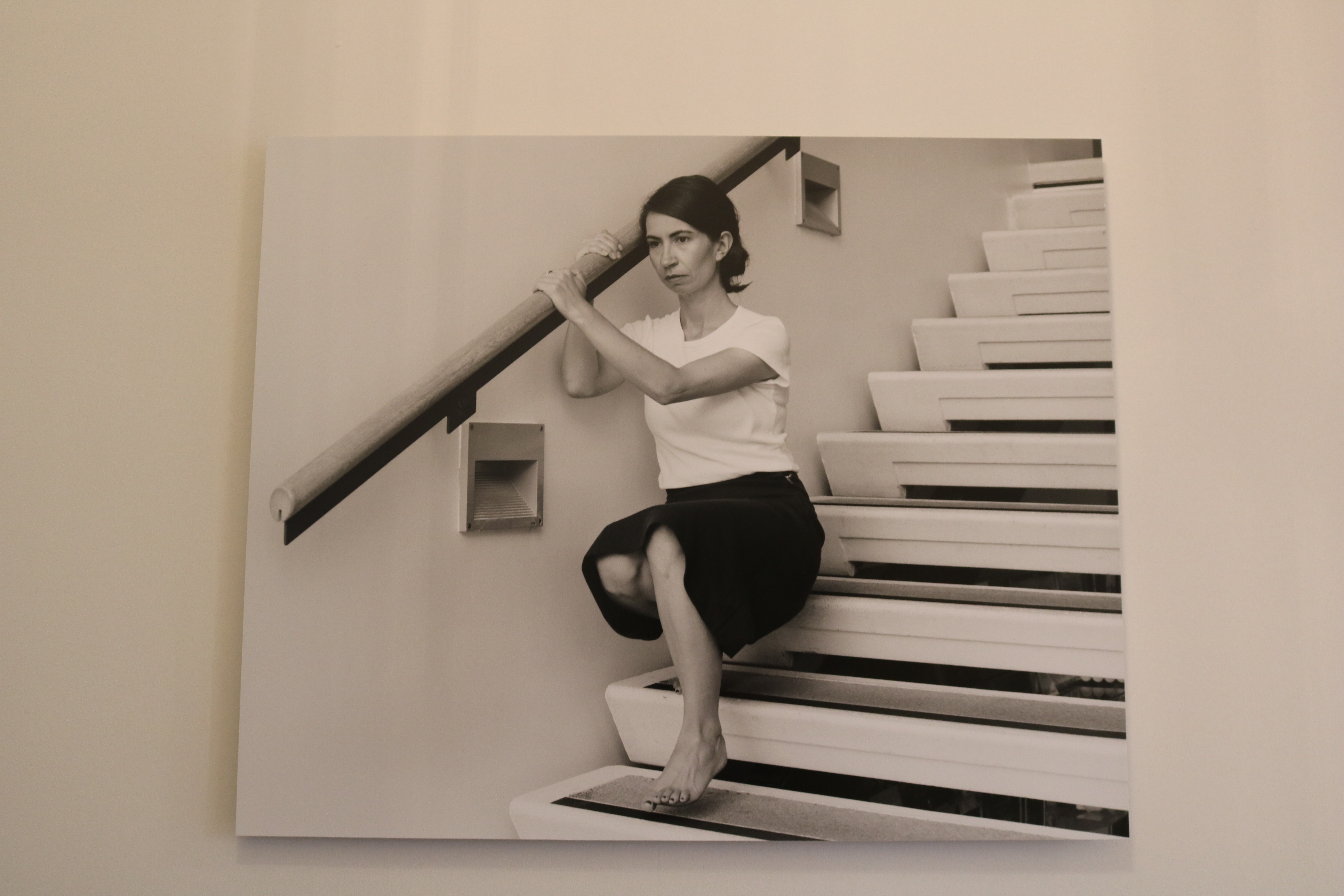
I also really liked Rae’s work in the exhibit. I could clearly see elements of Cahun’s work included in Rae’s images. For example, the use of black and white filters on all her images to make them look old and vintage like the self portraits Claude took. Rae also took self portraits in which she used her body to interact with Jersey’s local environment. I loved how Rae’s work shows some similarities from Cahun’s, but instead she uses more modern day, sterile environments like offices and archives. I think this is really successful as the change of environments reflects the change of times from each era the artist worked during.
Claude Cahun’s images
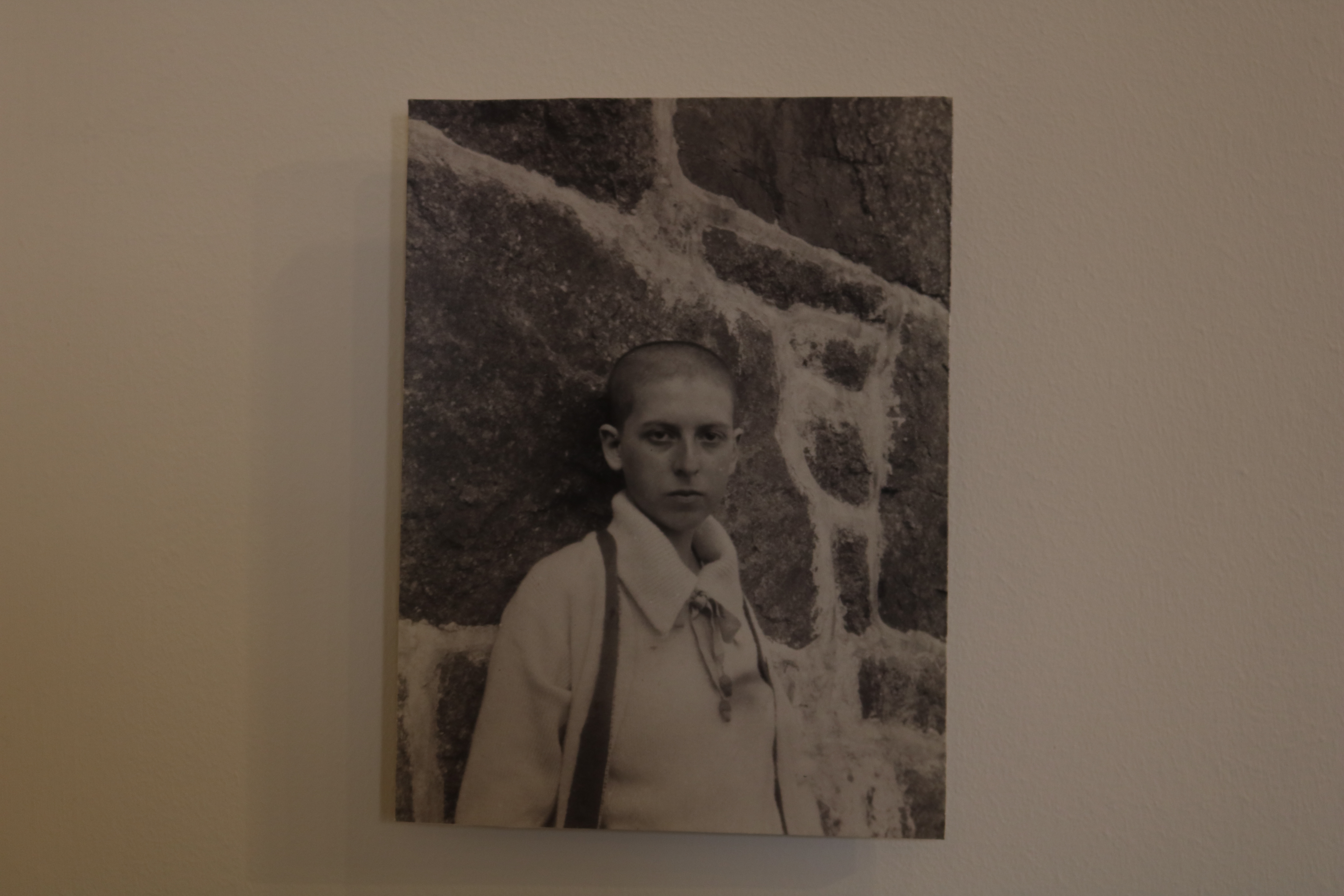
This is one of my favorite images seen in the exhibit. It was taken in 1916, and in this image we an see a self portrait of Cahun herself leaning against a granite background, while staring into the camera with a monotone facial expression.
I really like the concept of this image a lot. This is because in the image she has her head shaved, which was very unusual for women during this era. I think this image is very powerful because it shows Cahun attempting to break gender stereotypes. This shows how far ahead of her time Cahun actually was.
The technical elements of this image are also very interesting. I like the lighting in it a lot as it means that everything in the image is clear view, and it is also in focus.

This is another on of Claude’s images. similar to the last one, it shows herself exploring her body and her identity. This image shows Cahun posed naked, with her arms also posed in a particular way while also wearing a mask.
A reason I really like this image is because again, like the last photo, it is really ahead of its time and not typical of the time it was taken in. I also really like all the tones and shading in the Picture, caused by the natural lighting.
Clare Rae’s work

This is a an image of Rae’s that stood out to me. I like this image because you can clearly see where she has been influenced by Cahun, in the filter and in the way she poses herself in the image also. But I also like the way she has made this image fit into 21st century life. The way she has modernized the image while still taken inspiration from a past photographer makes the image very appealing to a modern day audience. The way she has done this is by posing her body of a busy office table. I also like the way the background is purposefully messy as I think this could represent how busy and complicated modern day life can be.

This image taken by Rae is slightly more simple. I contains no extremely posed body language compared to the previous image, as instead of being lent over a table she is comfortable sitting on a window frame with her legs together, and her had supporting her body behind her. This image is very interesting to due to many aspects. The lighting of this image is very interesting and complements the vibe of the photo. I like the way the light is only coming in from behind her as it means the part of her body facing the camera is slightly darker and less visible. I think this helps add a sense of mystery to the photo. I also like how the lack of light in the image means that the photograph contains a lot of darker tones, which highly contrast the light tones coming from where we do see the light by the window.
More images of the exhibition
Photoshop Experimentation
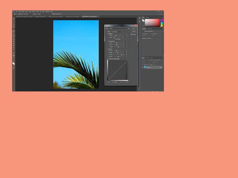
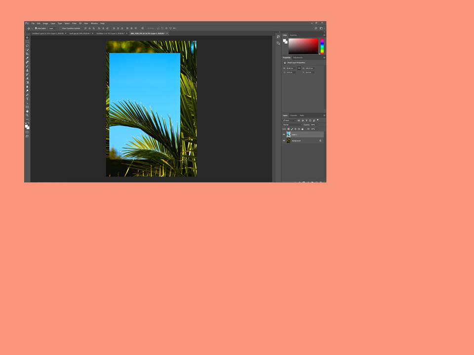
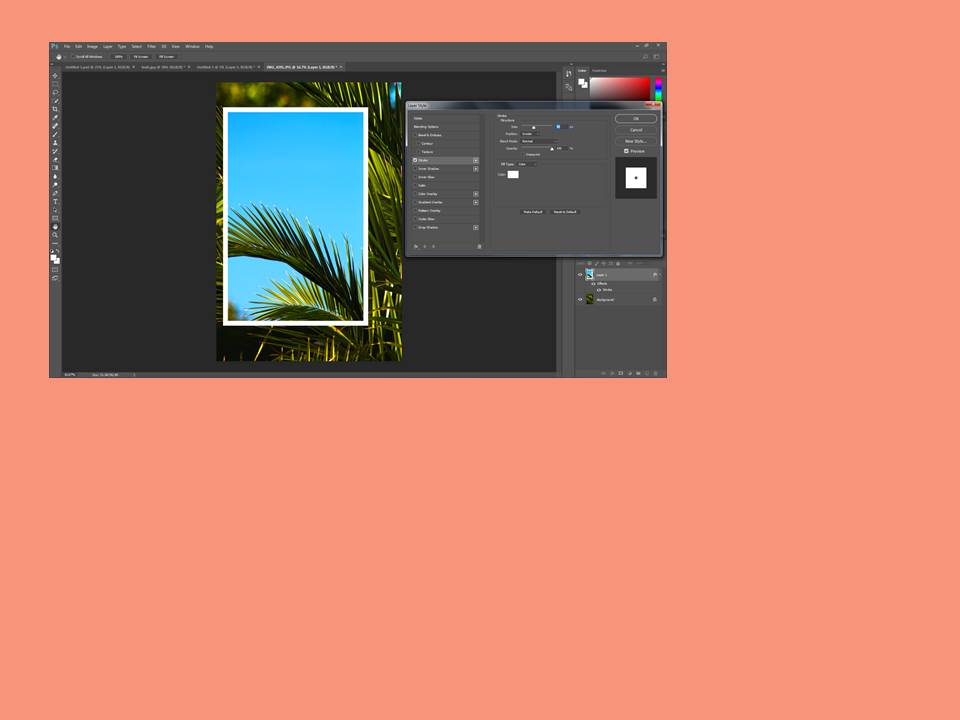
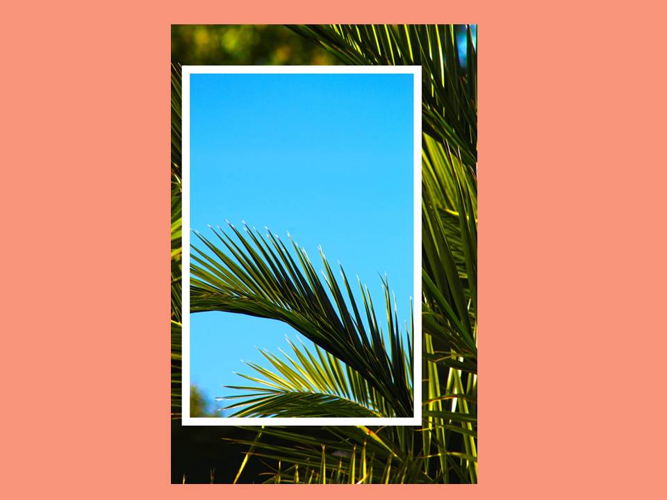
First time using photoshop
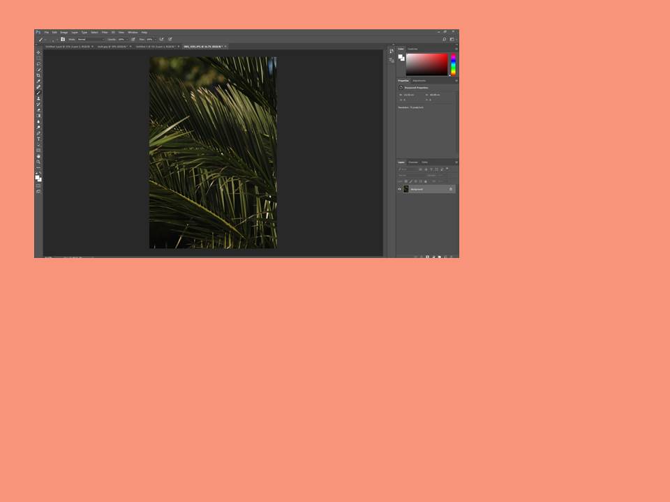
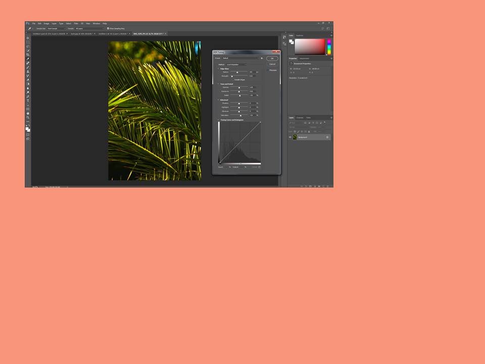
Here is a small demonstration of how i first used Photoshop and edited one of my own photos.
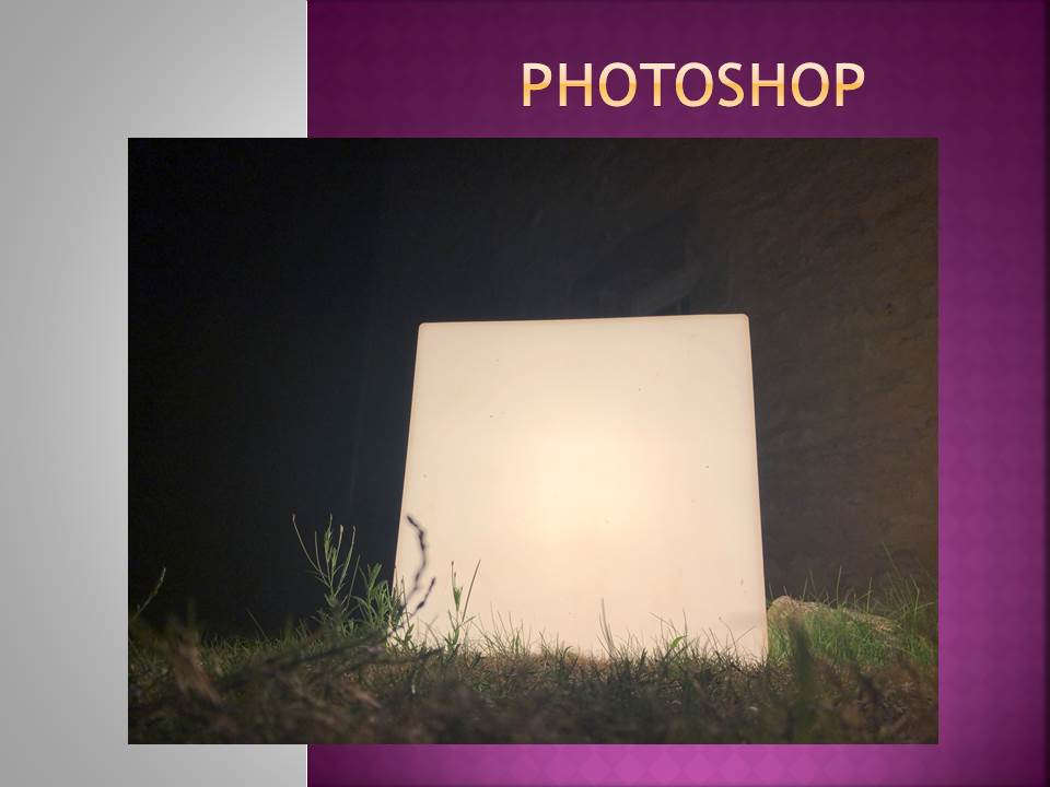
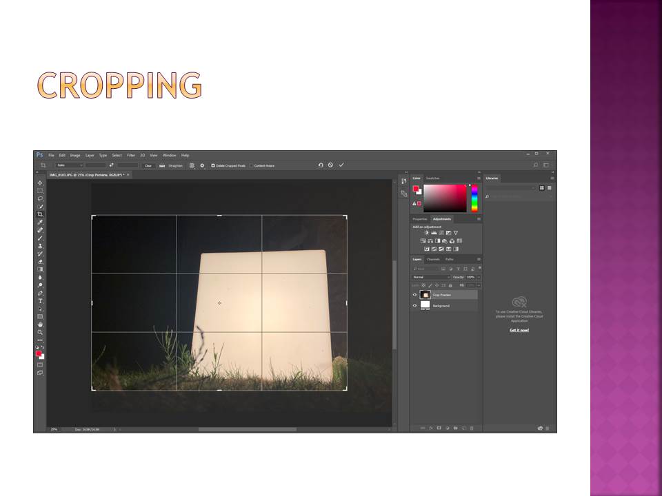
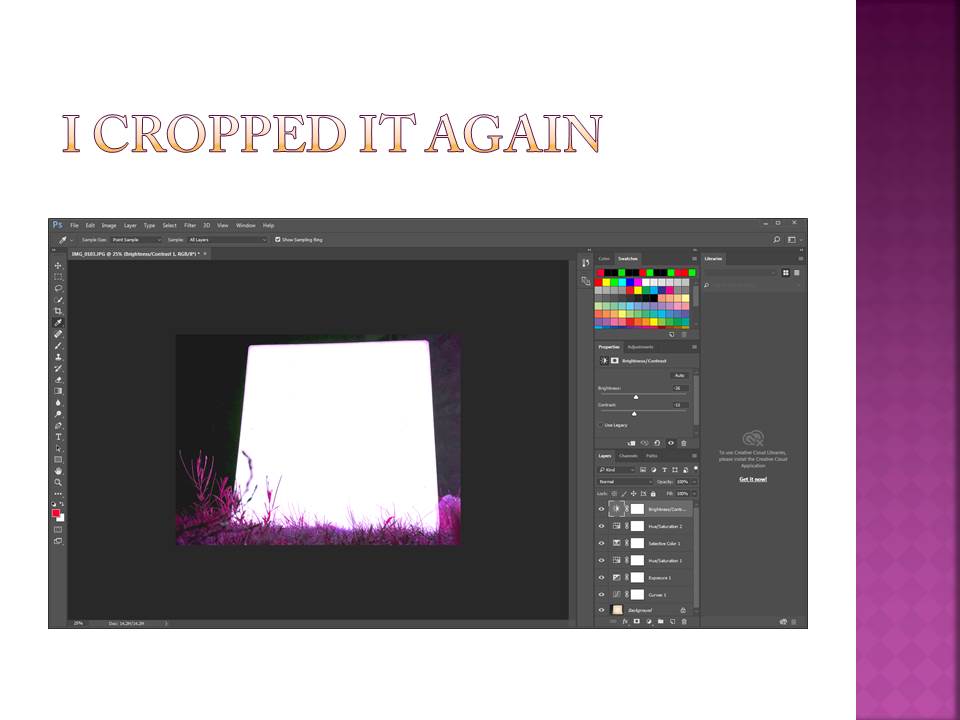 With this picture i was really trying to over exaggerate the effect of the light block, therefore i cropped the image to make the block more central and in the focus of the image.
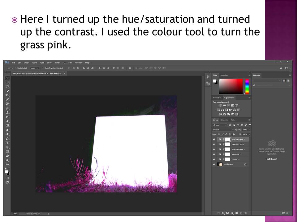
I also increased the brightness of the block and the contrast against the background to give the image a greater depth and again to highlight the block.
I then turned the pink/purple hue up to change the color of the grass giving it the luminous effect it has now. This increases the contrast between the colour of the grass and the cube which makes the image more powerful.
Go see !!! Exhibition : Lewis Bush “Trading Zones” !!!
Lewis Bush (Archisle Artist in Residence 2018) is now exhibiting his recent work in response to Jersey’s financial past, present and future…
Please make the effort to go and visit a unique and well-researched show by a young, up and coming photographer and photo-book maker…
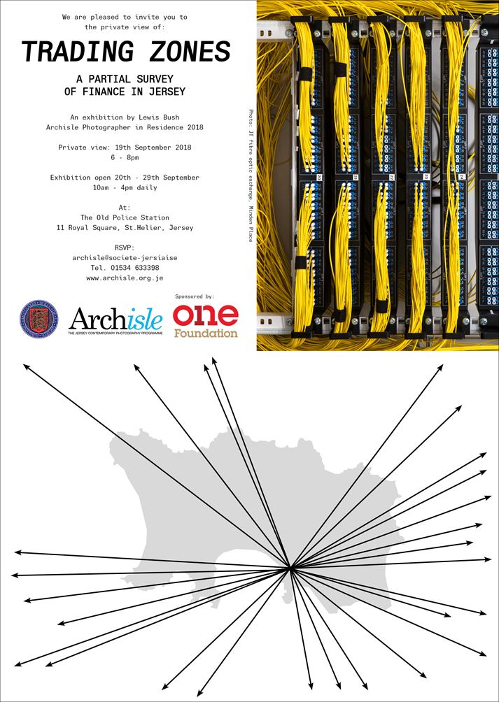
LINK TO LEWIS BUSH WEBSITE
Photoshop Experimentation
EXPERIMENTING
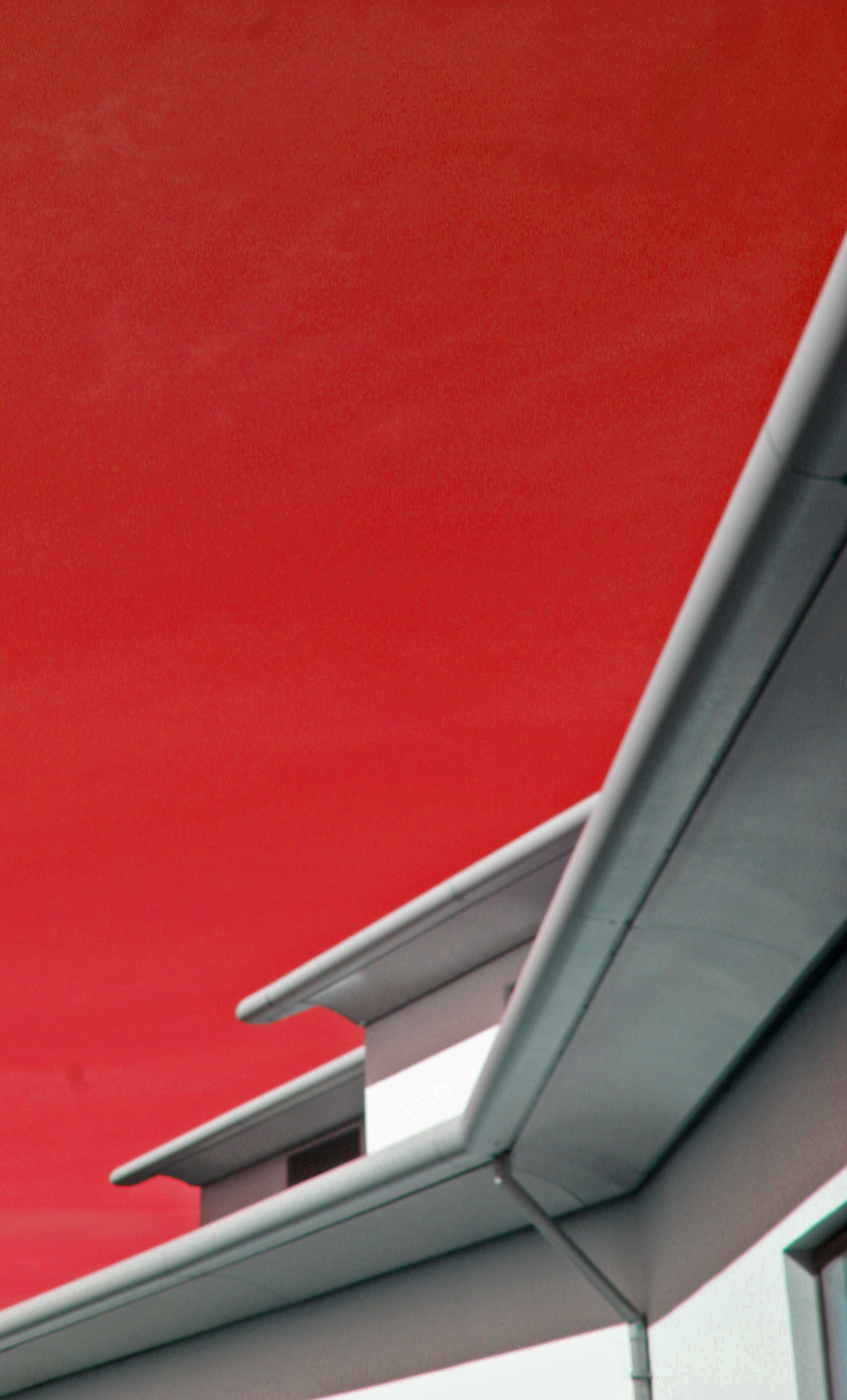
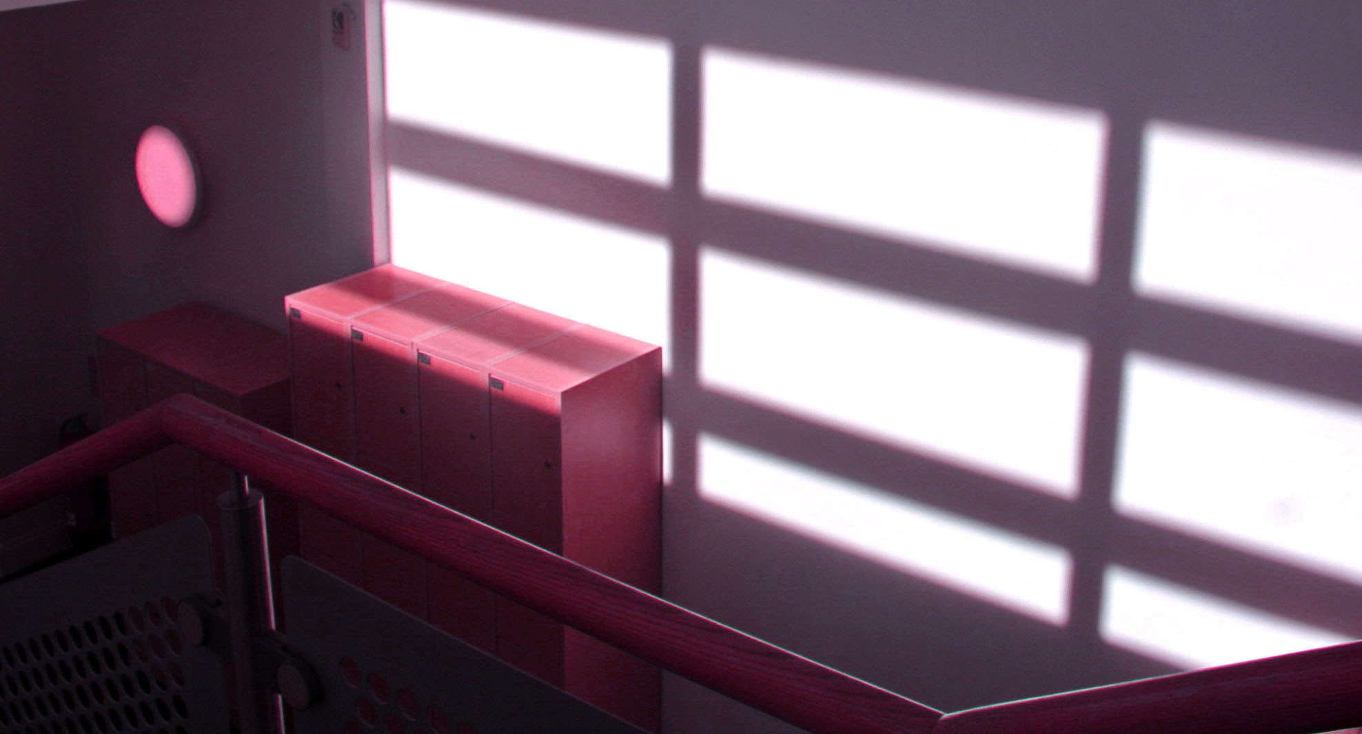
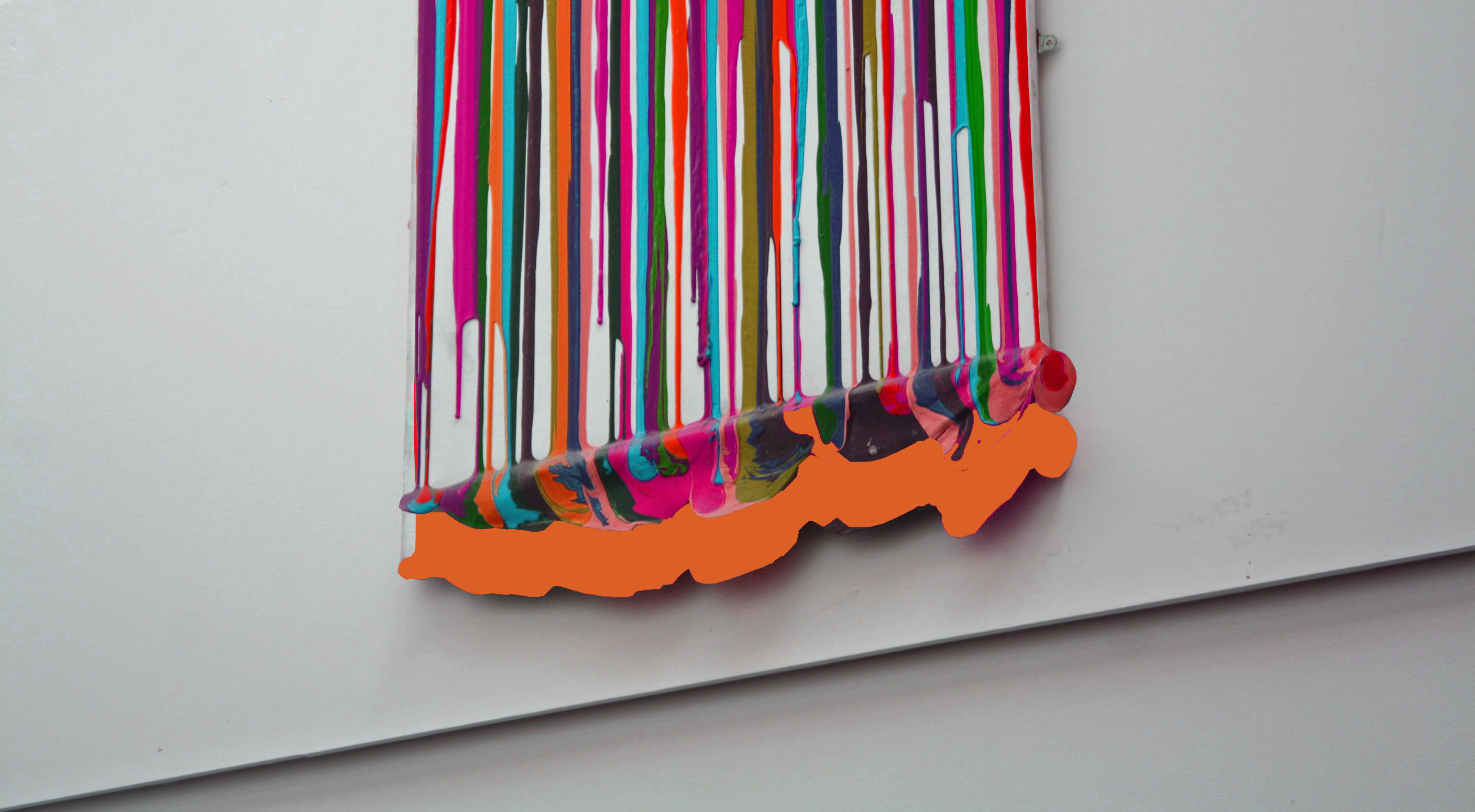
This lesson I experimented with using Photoshop and a variety of different tools which altered the already abstract images to make them even more abstract. In each image I played around with changing the color balance and changing the hues of photos. I also explored using the magnetic lasso tool and what its capabilities it has in Photoshop. I used the crop tool in order to give interesting perspectives and cropping away unnecessary parts that did not add to the photo or disturbed it.
The end result of experimenting with Photoshop was a variety of very abstract and interesting photos which have become more unique and distinctive. They took the photos from being average to something that is more worth while looking at.
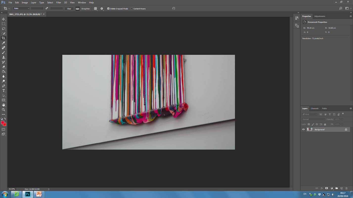
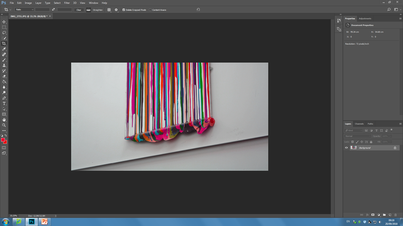
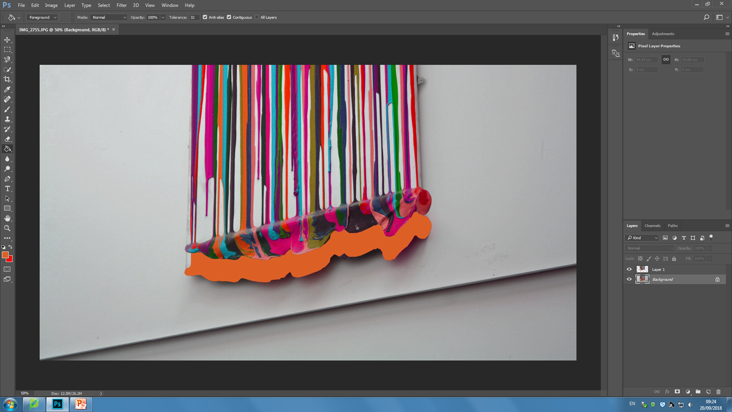
Paper Task
IMG_3892.JPG:
Lighting: for this image I used natural lighting from a nearby window in order to achieve the color temperature that I wanted, since natural light is often cooler then the halogen lights in the school giving a nice balance between the cool blue lighting and the pink paper.
Aperture: I used a Rather low F stop in order to produce the depth of field look i wanted.
Shutter Speed: I experimented with various shutter speeds for this project, in this image I settled on a Fast shutter speed as there was plenty of light and I still wanted some deep shadows.
ISO: for the entirety of the project I stuck with an ISO of 100 in order to avoid grain and simply controlled the lighting with the shutter speed.
White Balance: for this image I wanted the color temperature to be rather dominant towards the cooler tones.
I was influenced by the work of Martin Creed with the latter half of the photo-shoot taking a lot of inspiration from his work with a scrunched up paper ball.
Homework 1 – Paper photo shoot
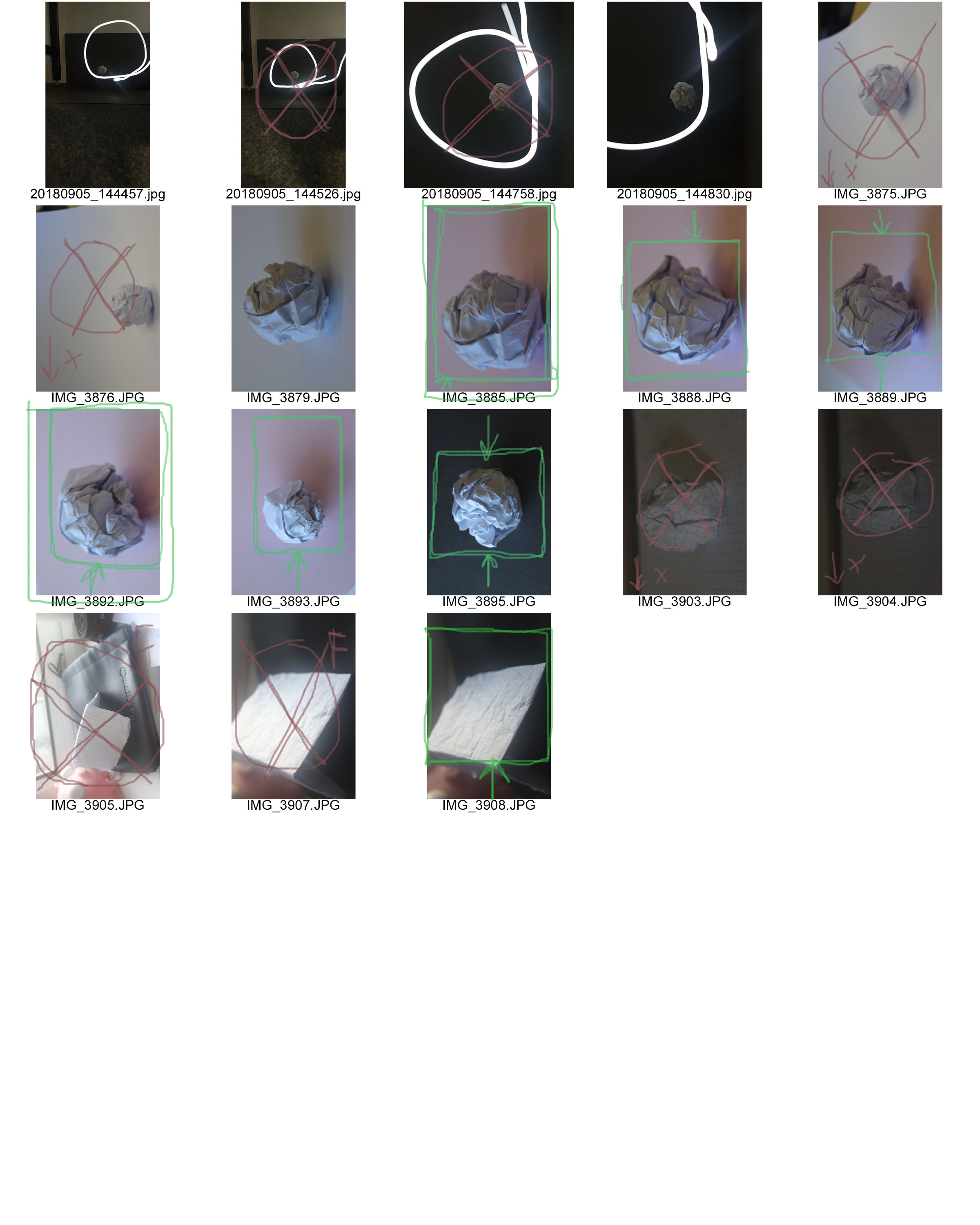
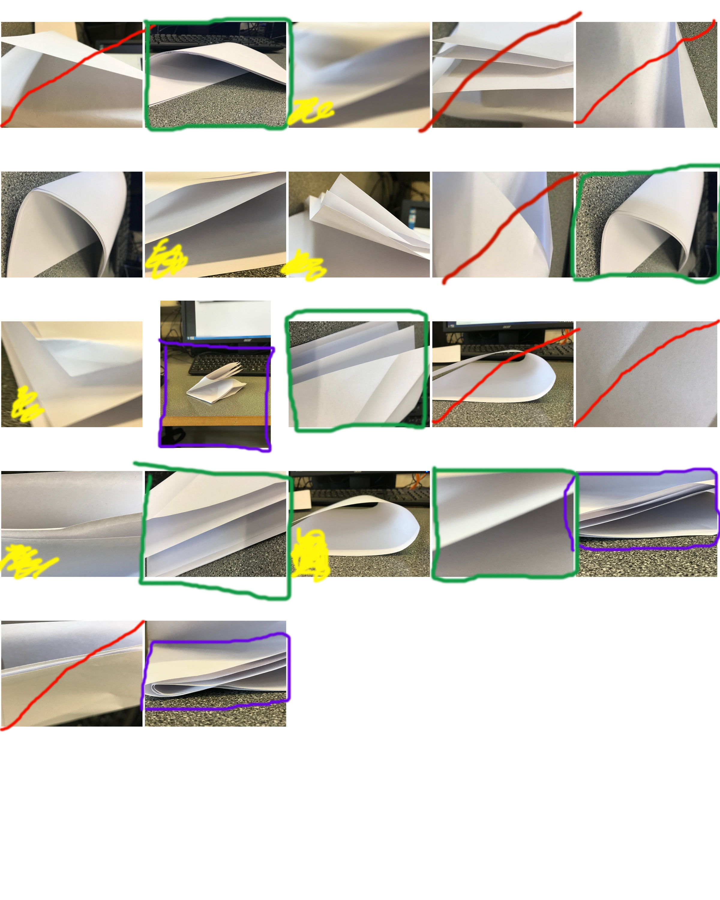 A contact sheet can both be used for distinguishing between your good/bad photos and choosing which ones to use/ edit, or be used as a finished photo. This is because of the image selecting process being used.
Here I have used green to mark photos which I am going to use, red to mark photos which I am going to discard, purple for the area of a photo I will crop, and yellow for pictures which I am unsure about using.
For future projects I will crop and edit the images which I have chosen from the contact sheet, and potentially crop the contact sheet to show only a few photos, which I will annotate with a thick marker and use as a finished photo.

