Category Archives: Component 1 Personal Investigation

Filters

Author:
Category:

Successful Photos From Photo shoot

ANALYSIS AND APPROACH: 

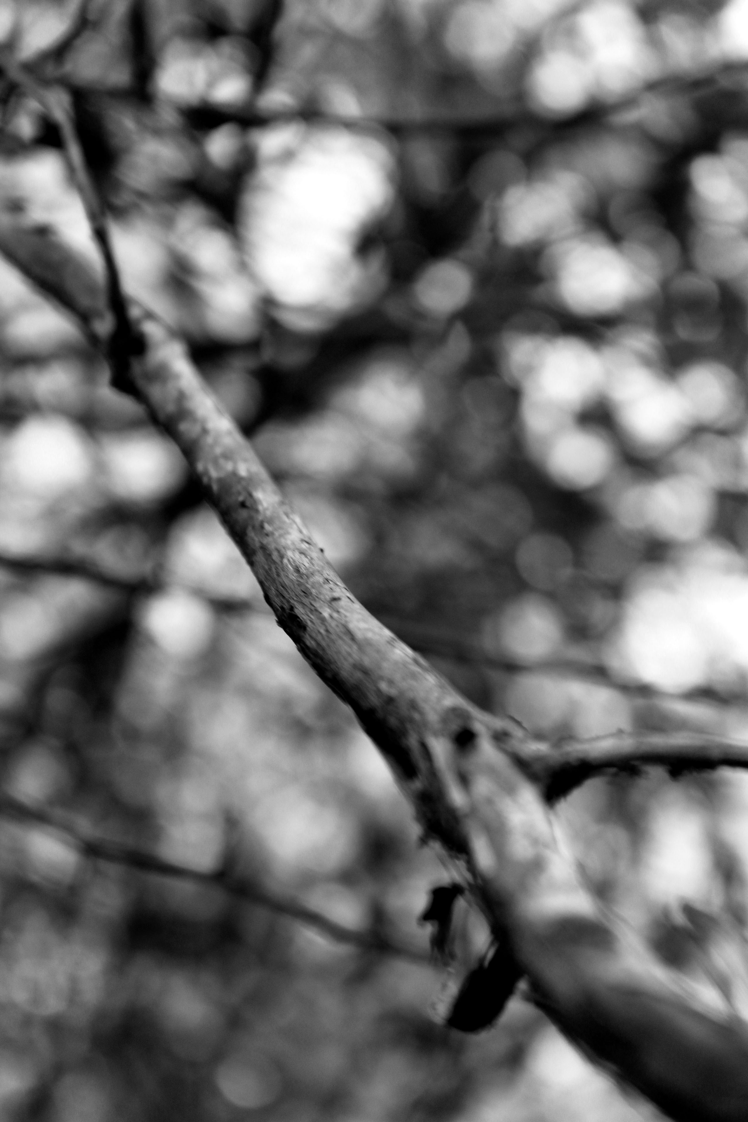
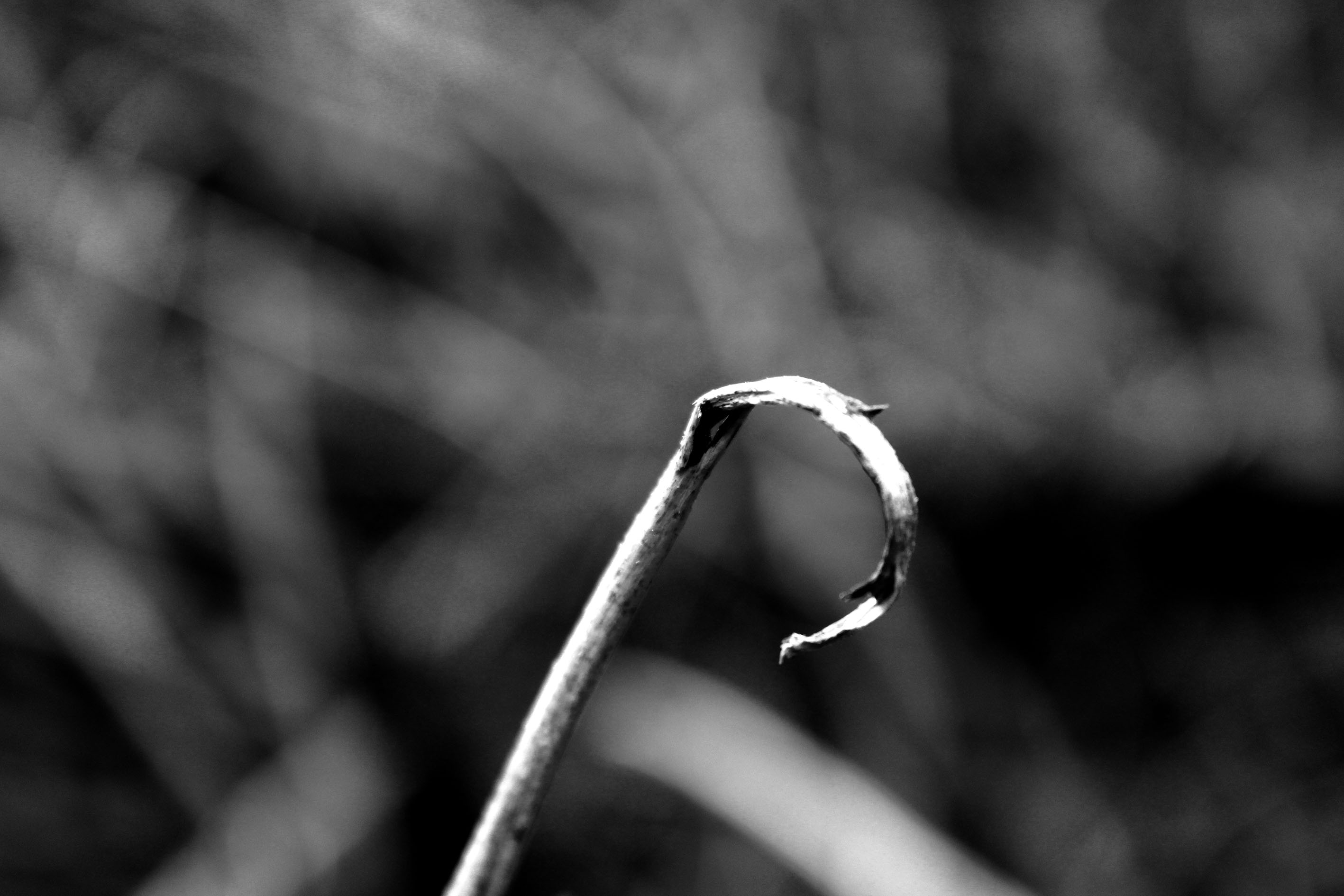
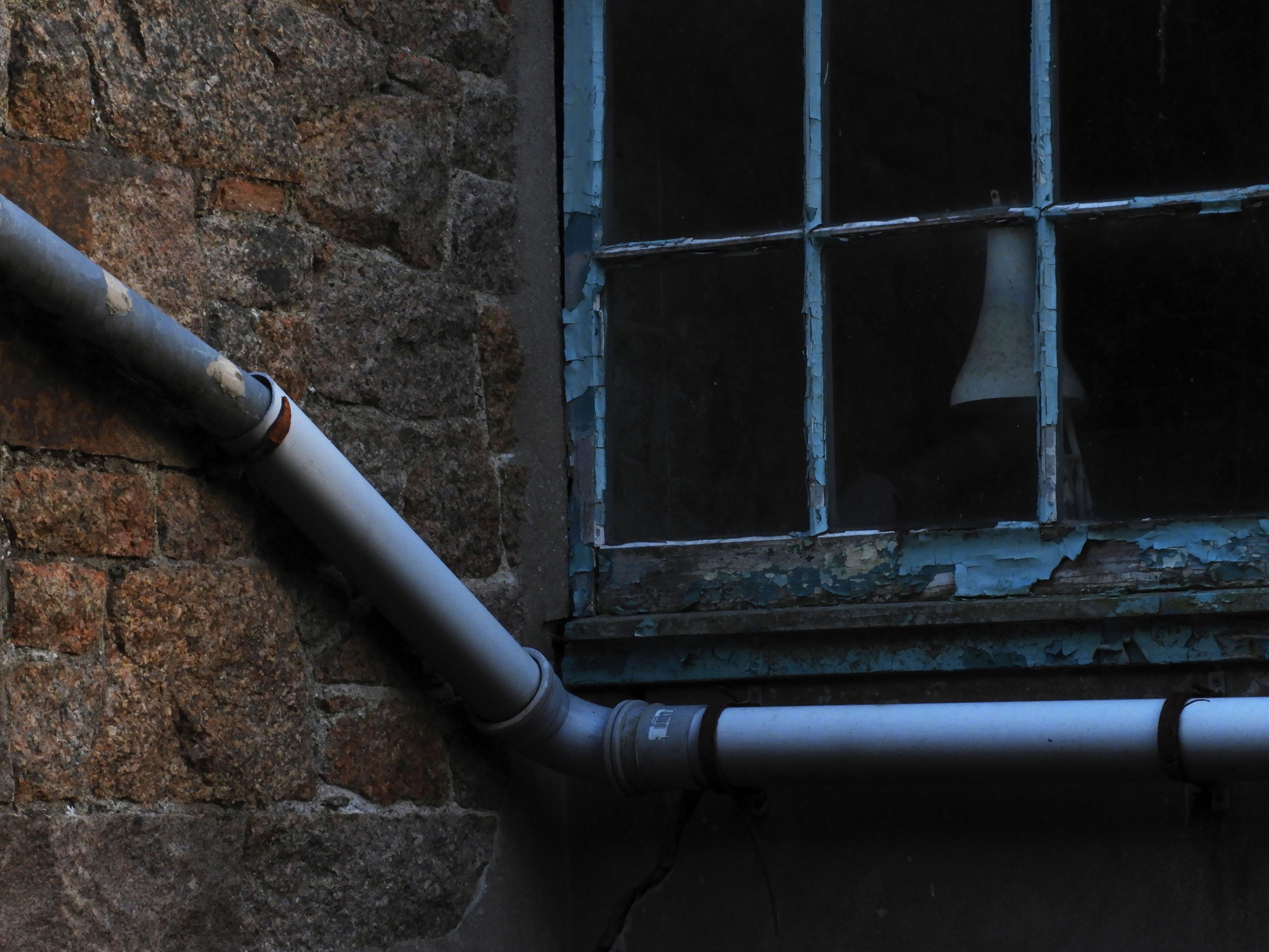
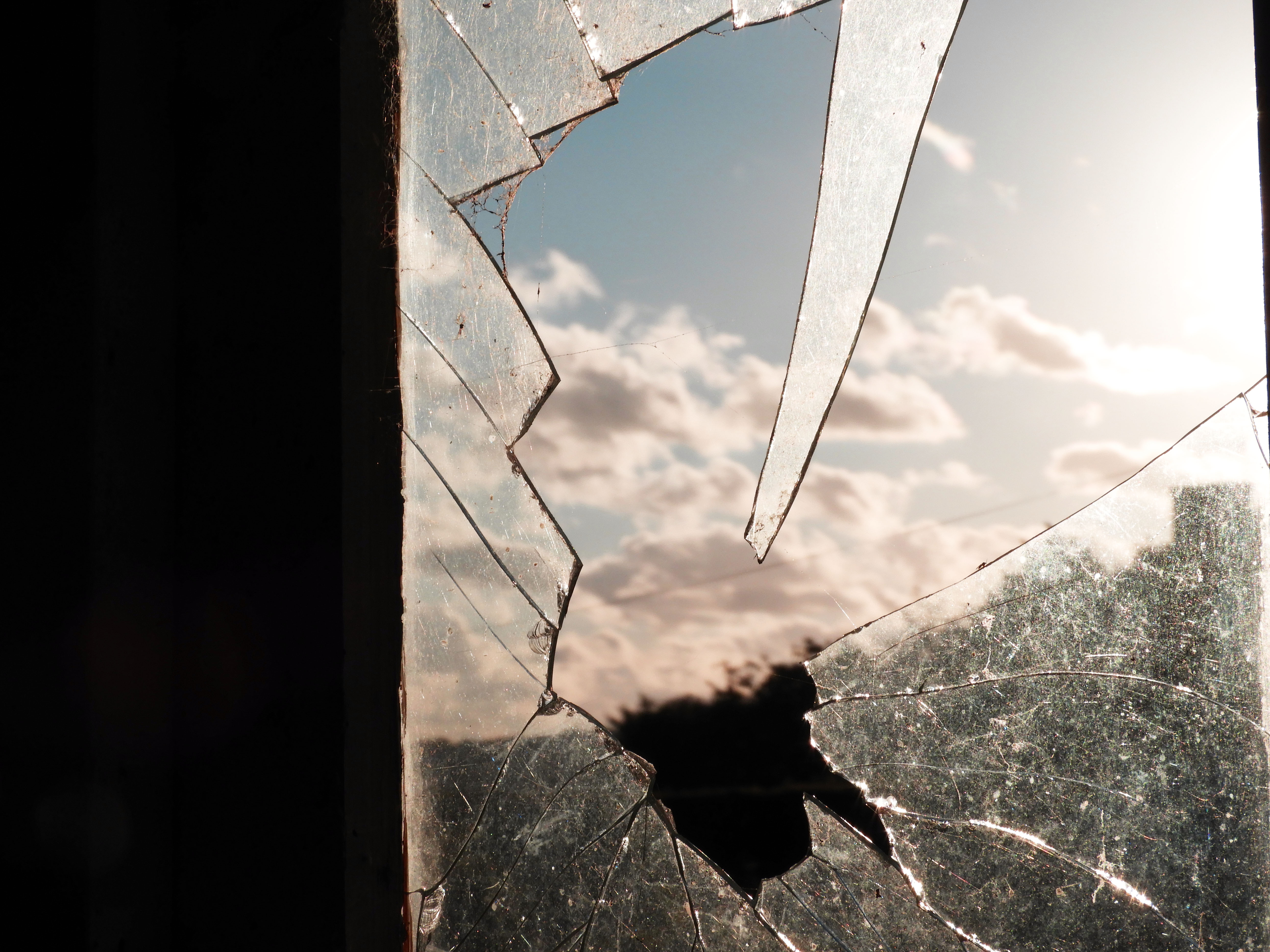
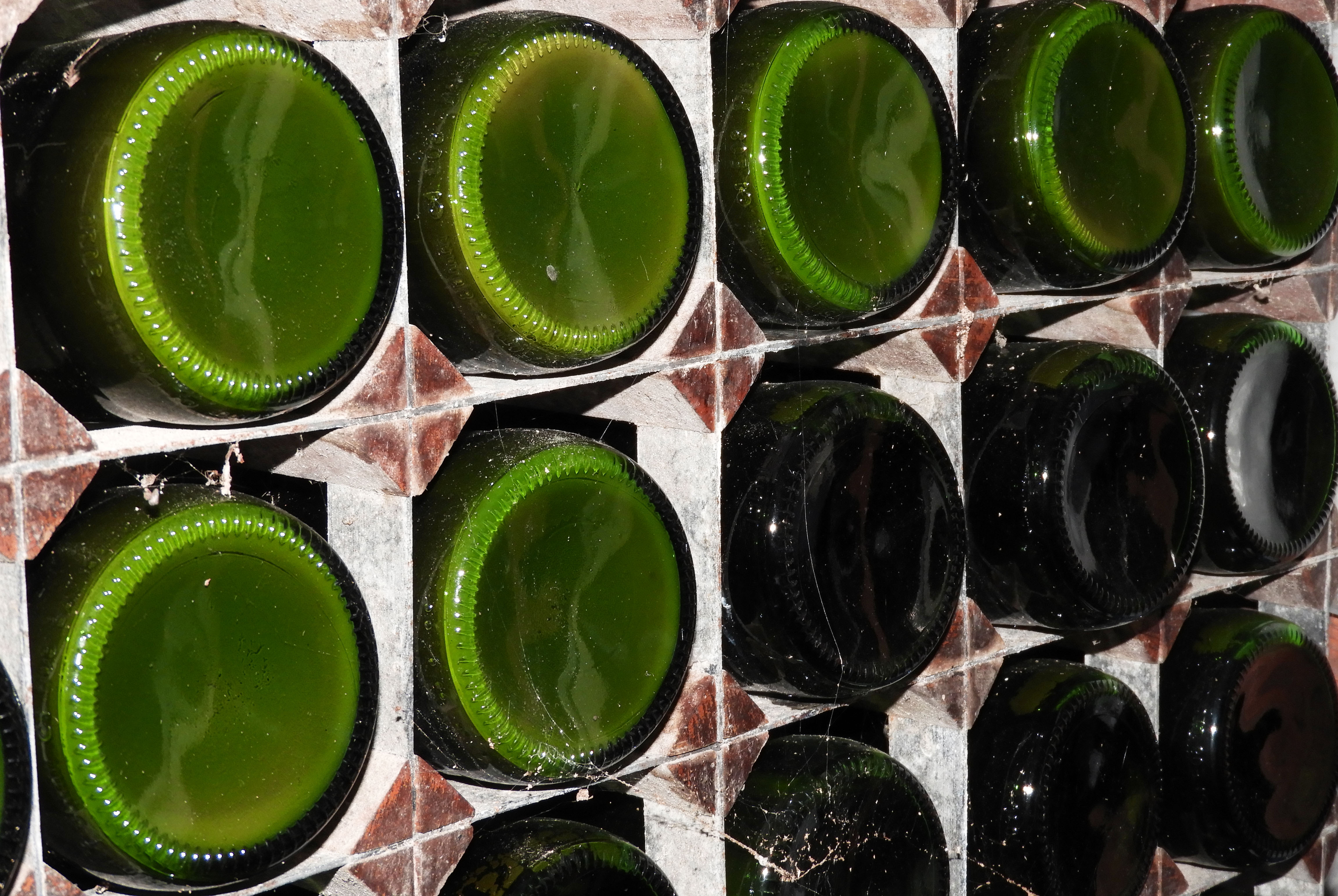
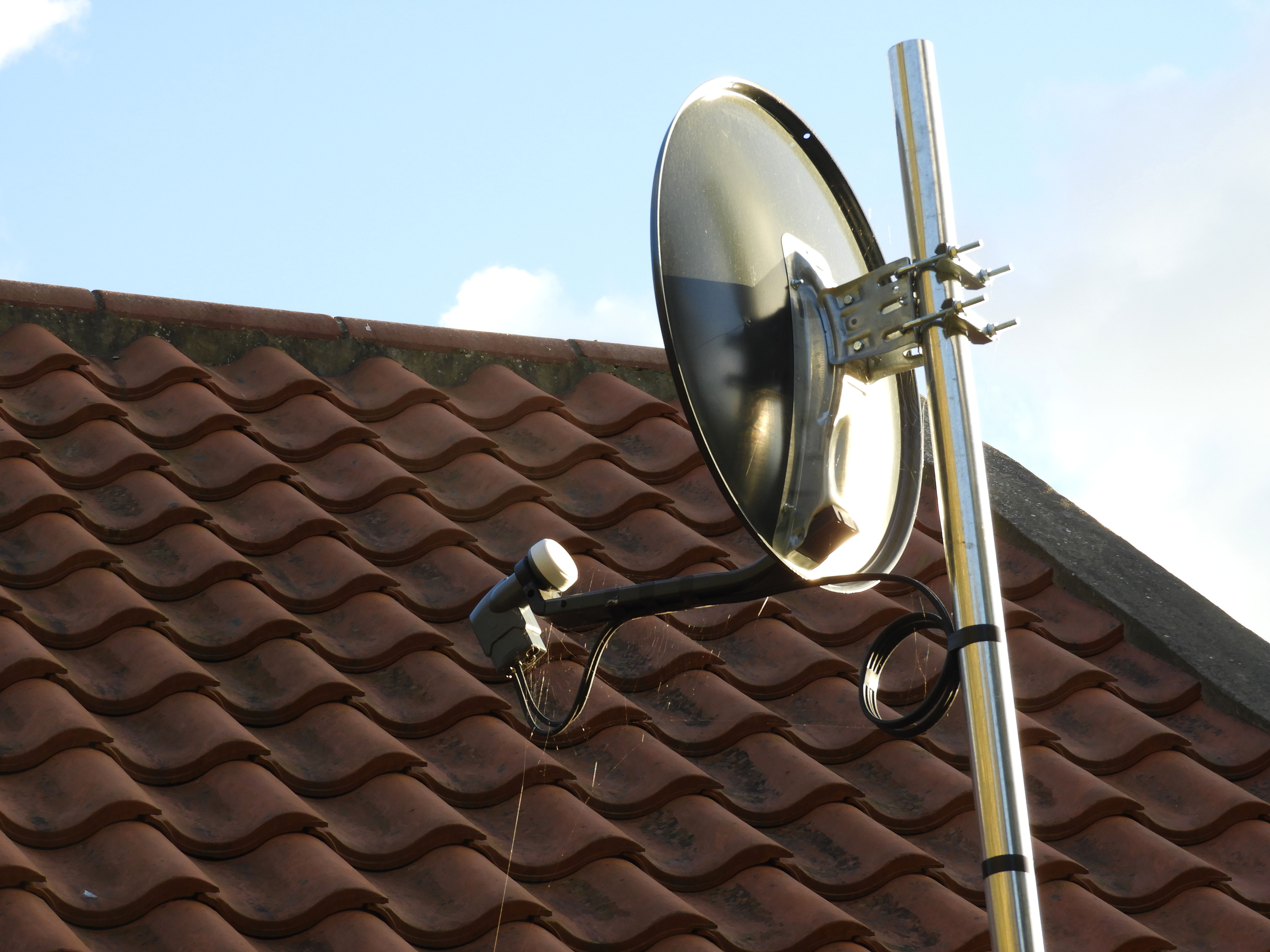
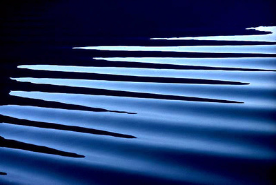
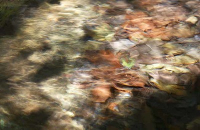
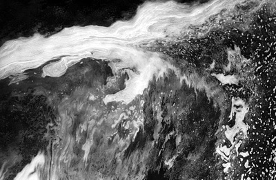
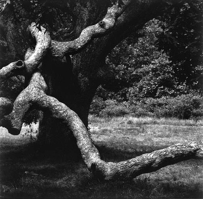
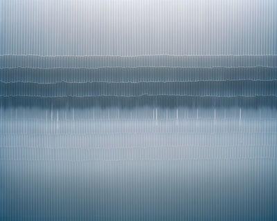
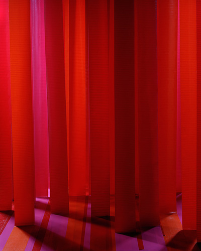
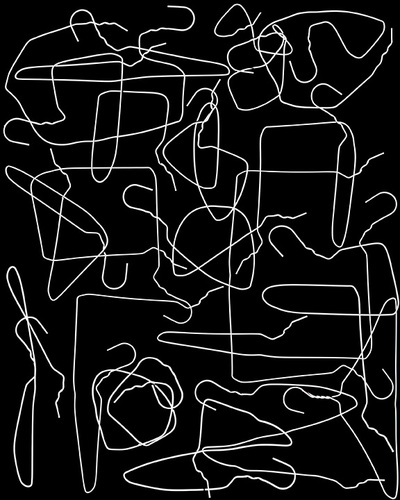
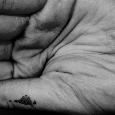
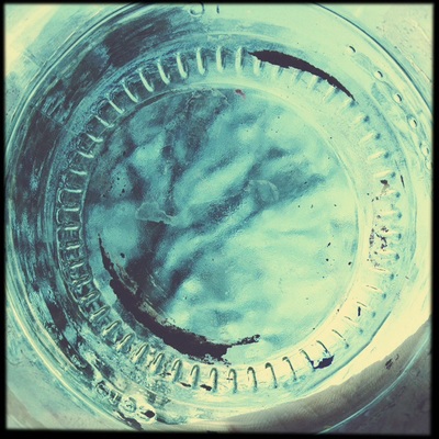
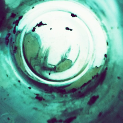
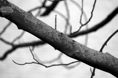
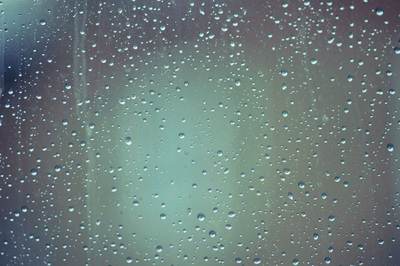
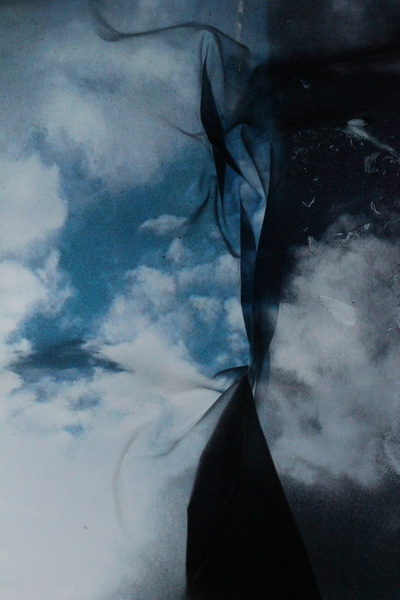
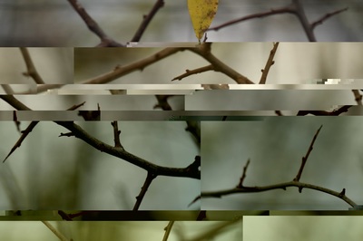
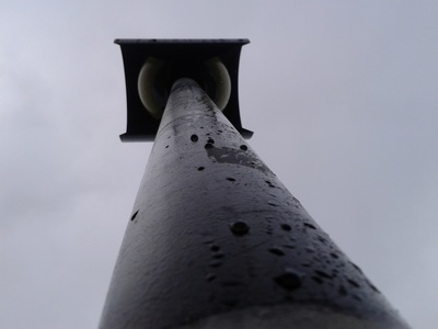
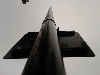
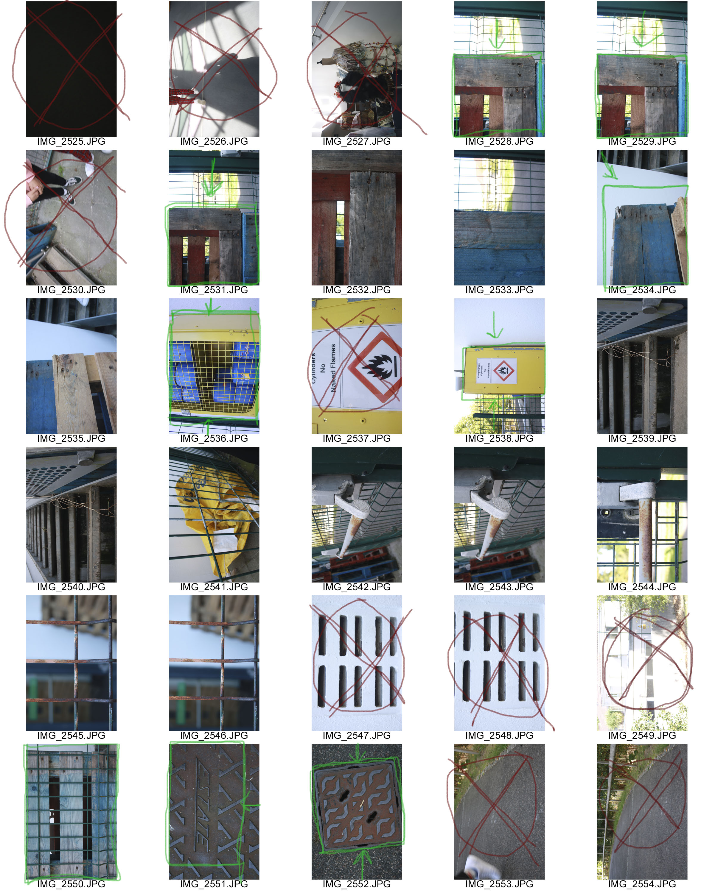
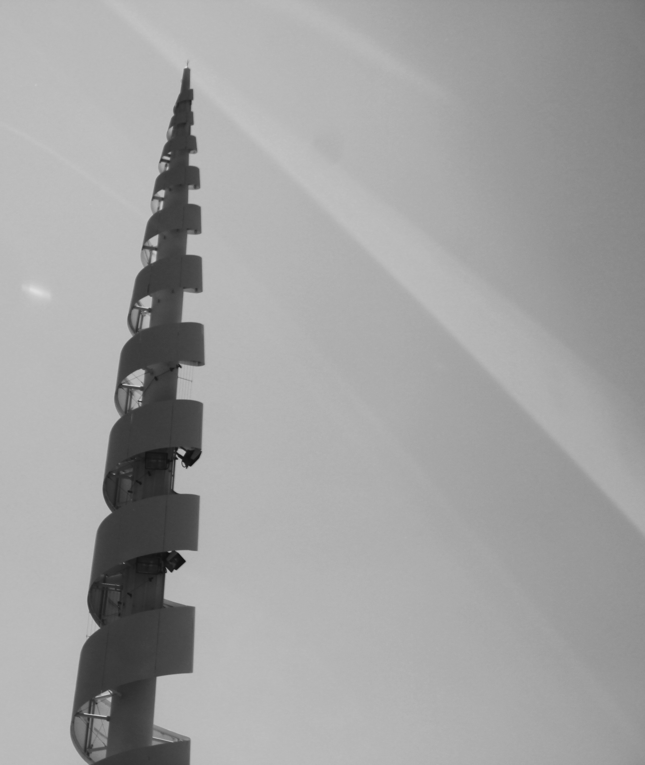
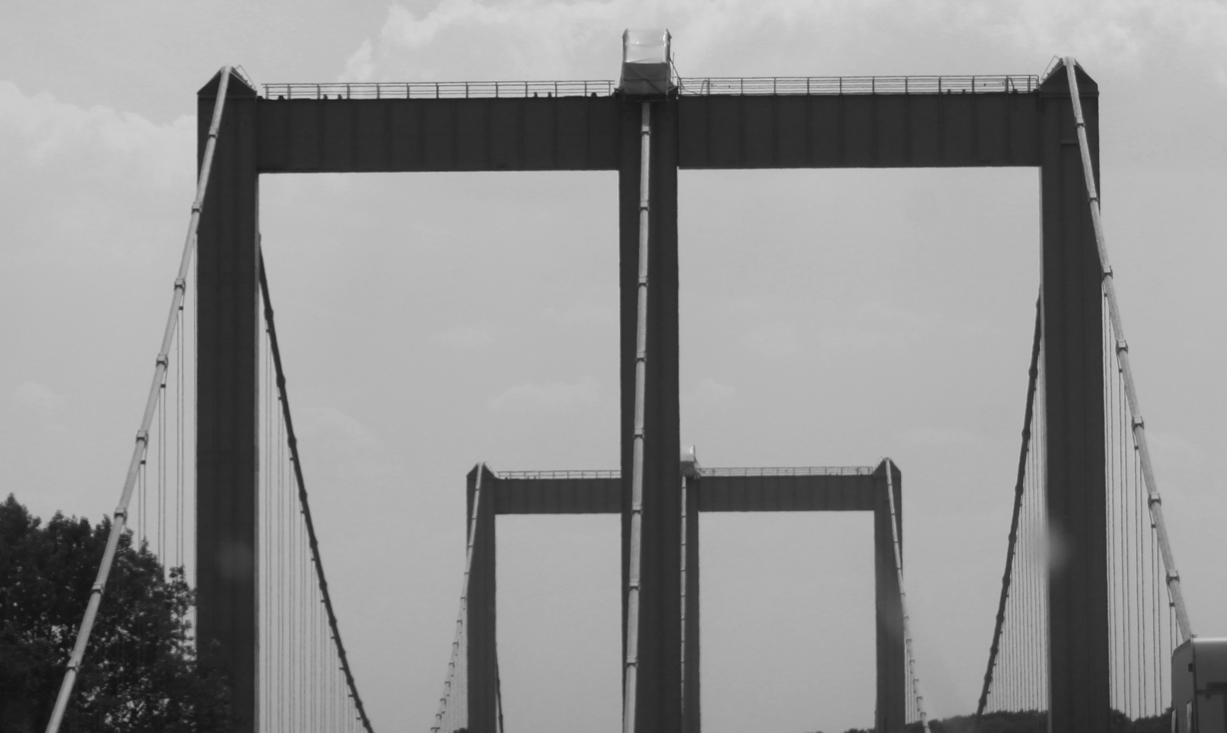
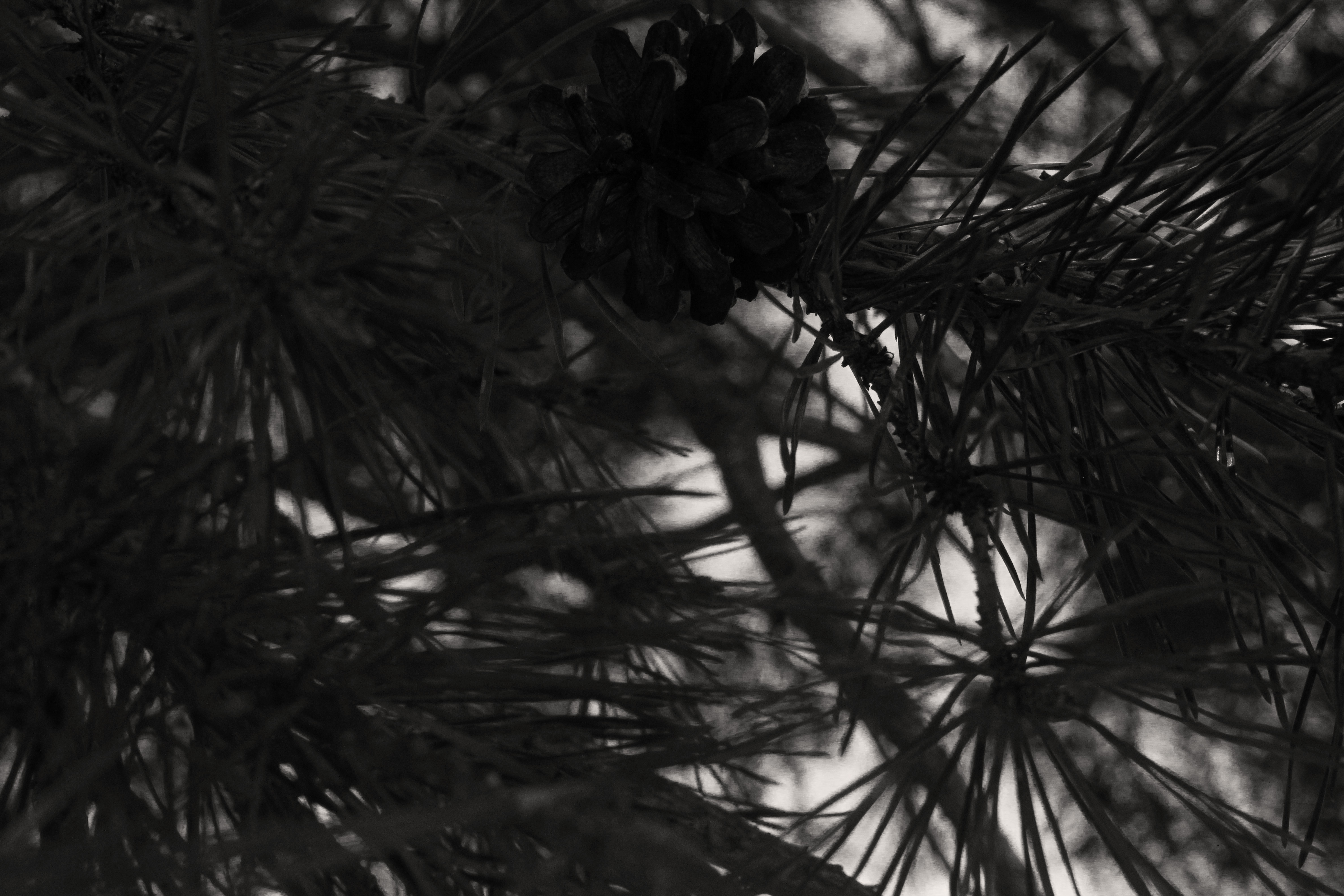
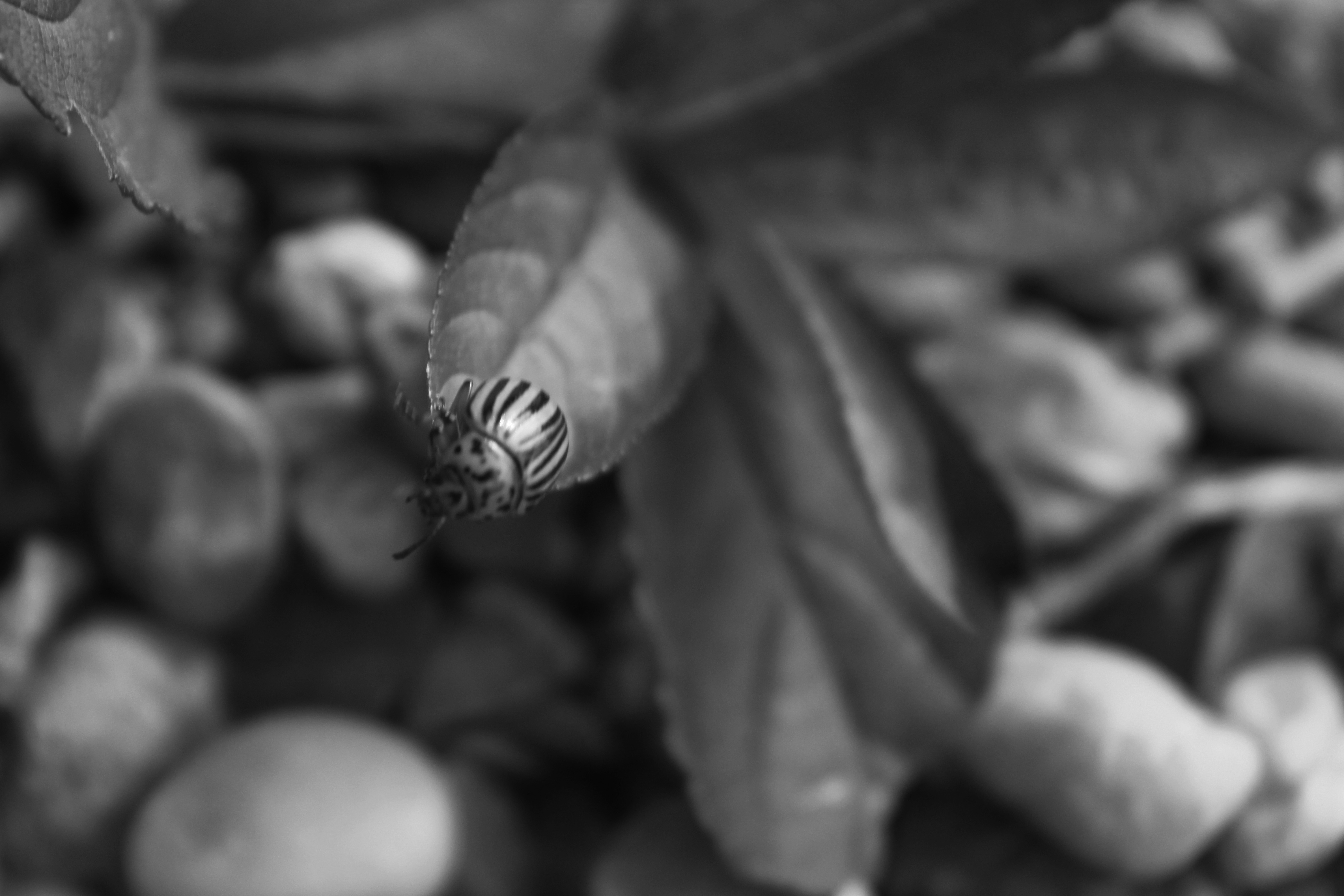
These four photos were the ones which i felt were the most successful out of the Photo shoot I personally did. I really focused on the formal elements which I had to cover such as exposure, shutter speed and focal length. In the first and fourth photo I mainly focused on exploring exposure, changing the ISO speed to 200, resulting in a very dramatic and dark photo. I captured these photos with the aid of a tripod as I found that lowering the ISO speed resulted in shaky photos that distracted away from the main formal elements which I attempted to capture. In the fourth photo, the glass bottles were in  a very dimly lit room therefore i changed the ISO setting all the way to 16000, which allowed the colors to pop and stand out.

In the second photo, I experimented with changing the focal length. I zoomed into the piece of broken glass and used manual focus in order to focus on it, this resulted in  a very blurry backdrop which was the main aim of this shoot. I had the same approach with the fourth photo, the radio post was quite far away from me which forced me to zoom in. The backdrop is not as blurry as compared to the first photo as I used the infinity focus setting on my camera to see the type of effect it would have on the focus.

Ralph Eugene Meatyard

Ralph Eugene Meatyard  was born May 15, 1925. He was an american photographer who initially in the navy during world war 2, after the world war he began to study to become on optician. After he married he continued his trade as an optician with a company that also sold photography equipment. Meatyard purchased his first camera in 1950 and joined the ‘Lexington Camera Club’. He tended to make work in bursts and left his film for long times before developing it in his darkroom at his home. He approaches photography with a heavily influenced jazz music background, he used his children as the prime subject in his photos. He addressed the ‘masks of identity’ and the nature of the surface matter. By the time he dies his work was just being recognized.

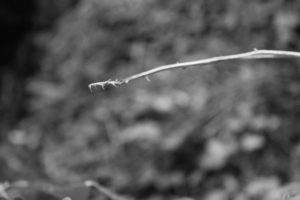
Image result for Ralph Eugene Meatyard twigs

This photo by Ralph Eugene Meatyard has a main focus which is the twigs, this then gives the photo depth, because of the blurred background it shoes the distance in the photo and it isn’t just a shallow photo where everything is focused in the image. Meatyard has used a natural light because of the nature of his photo, this gives the photo a mysterious feel to it because of the shadows in the background created by trees behind it, even tho is is blurred out it is  still apart of the photo and gives it that mysterious feel.

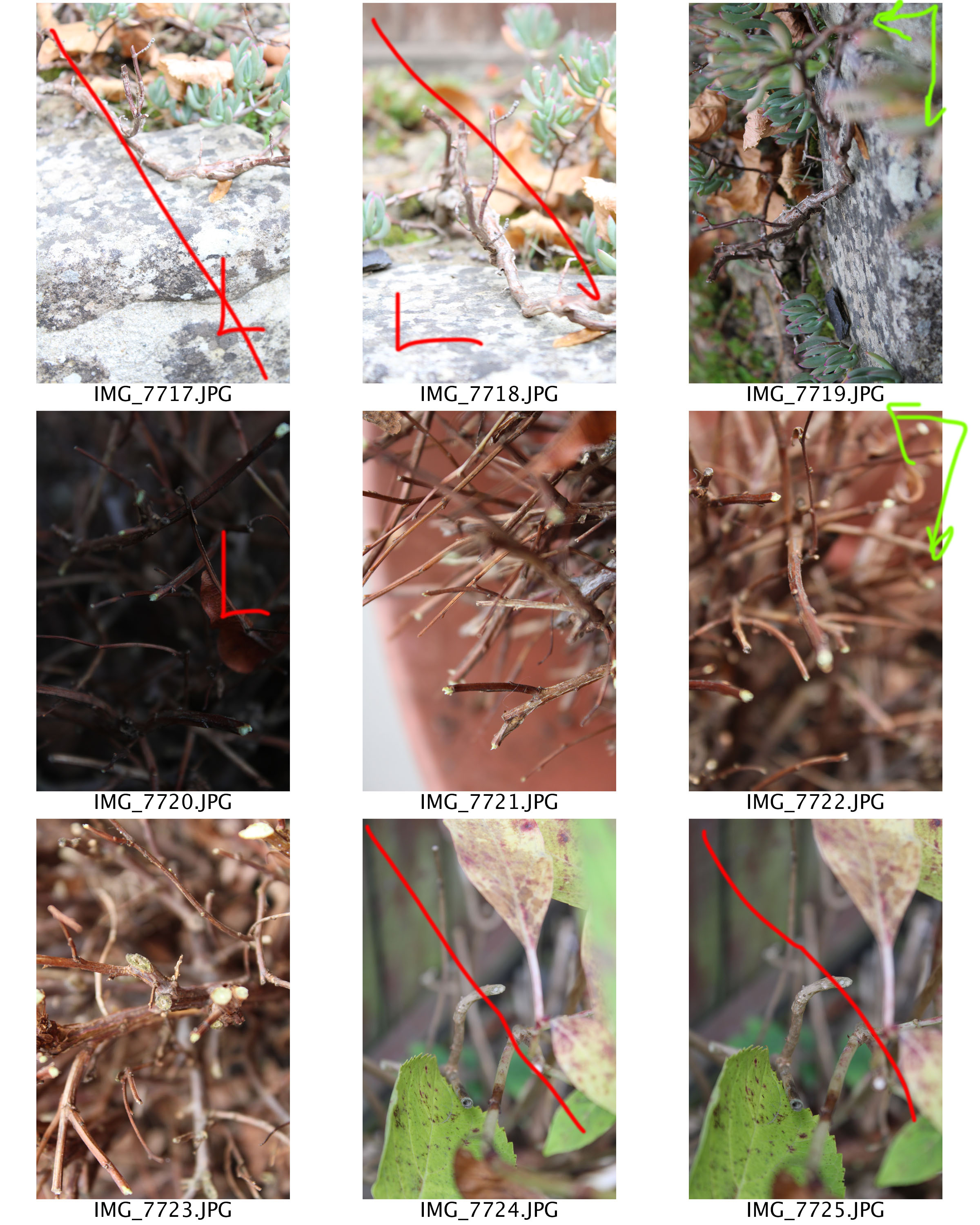
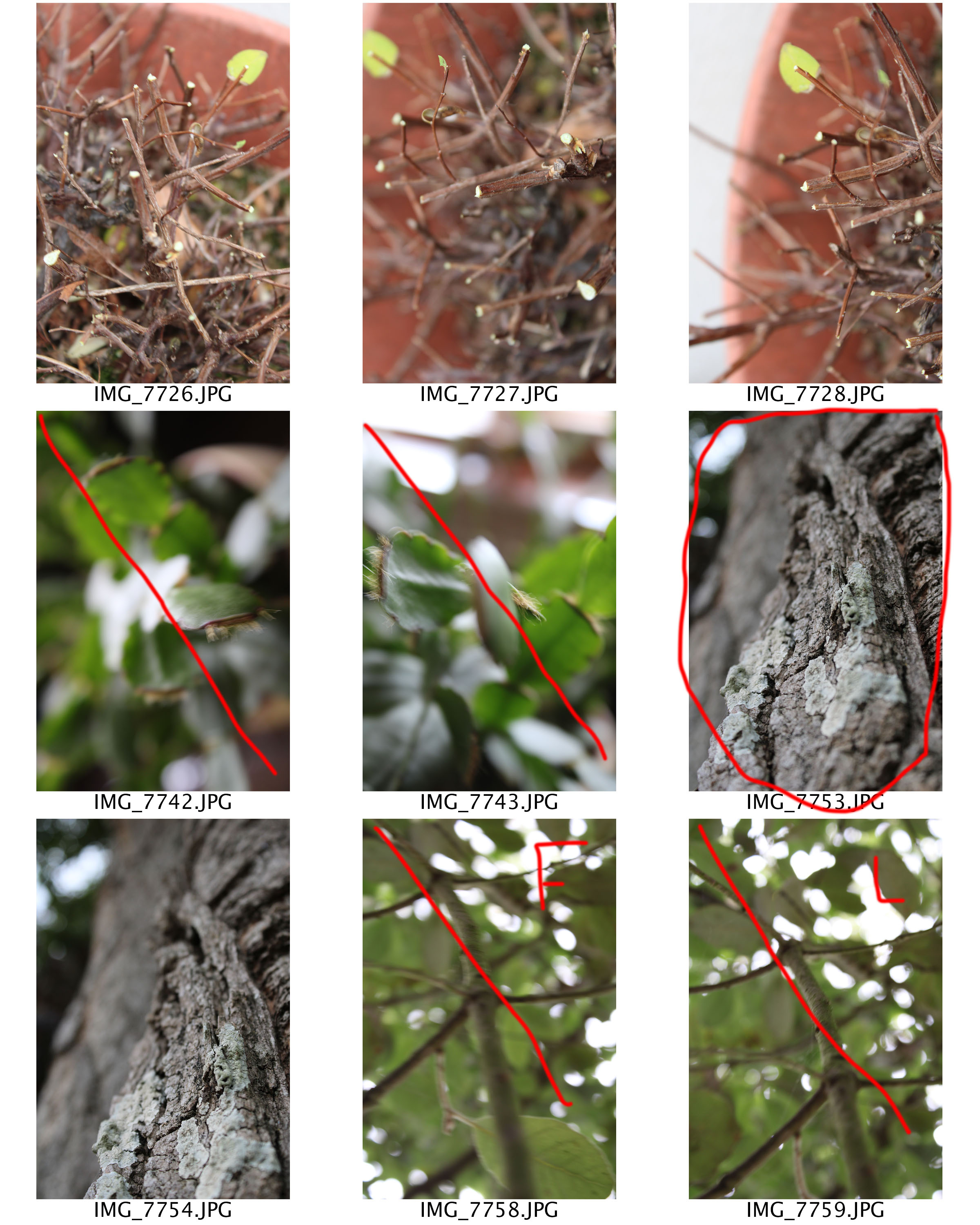
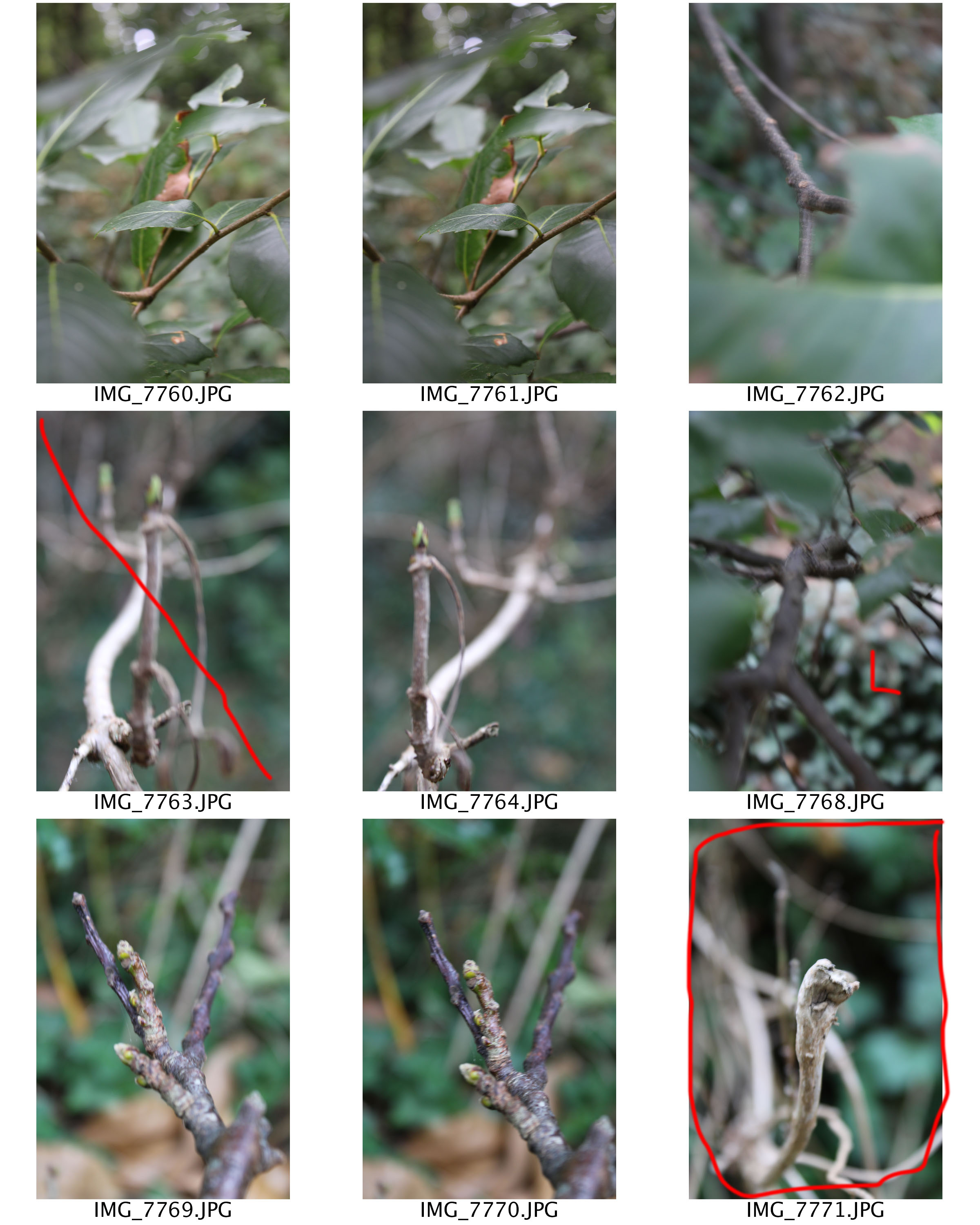
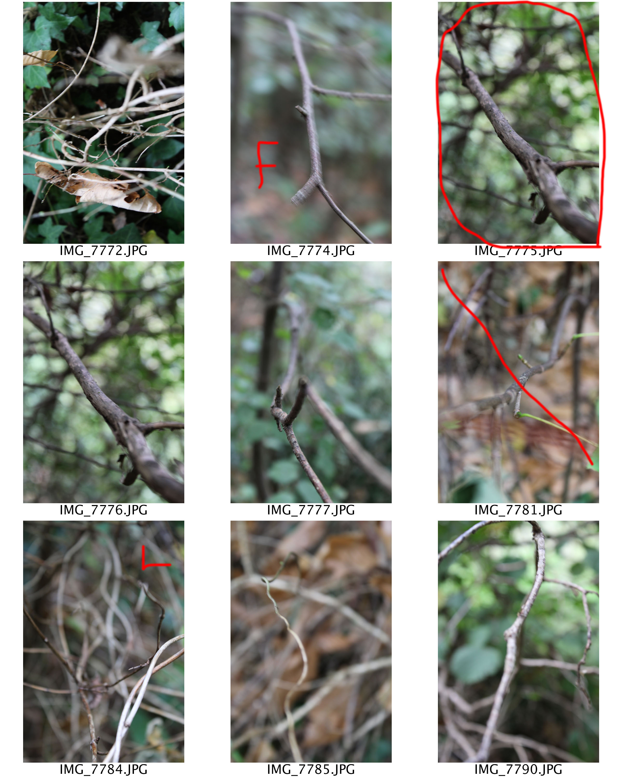
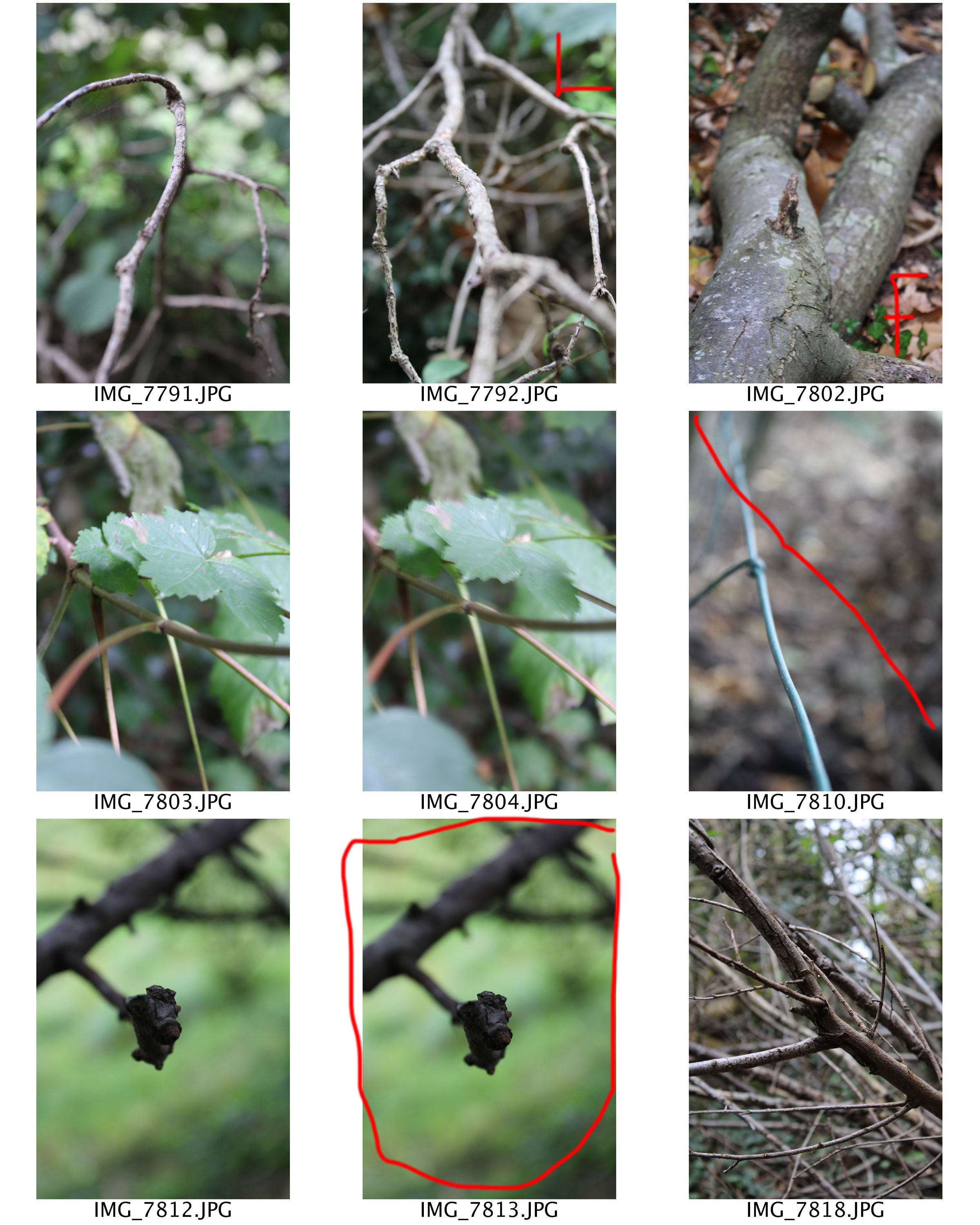
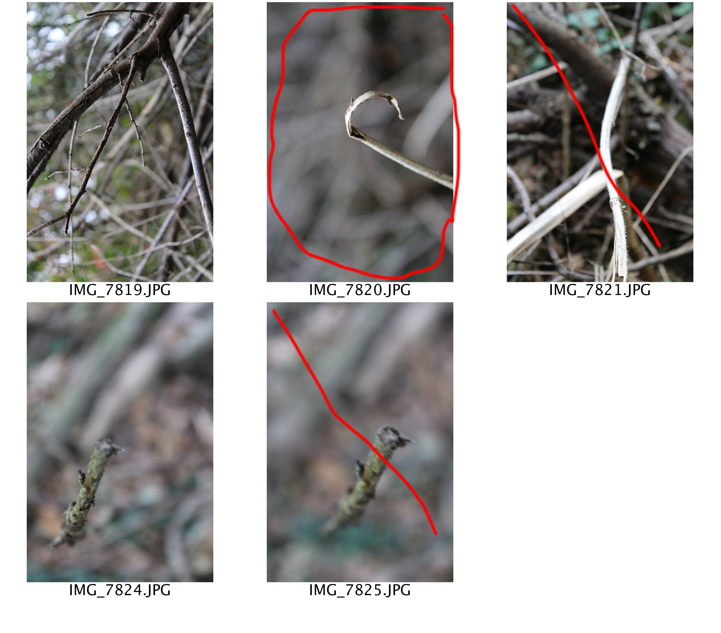
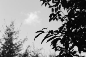
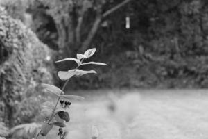
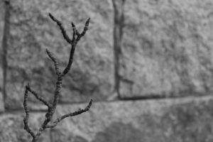
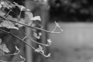
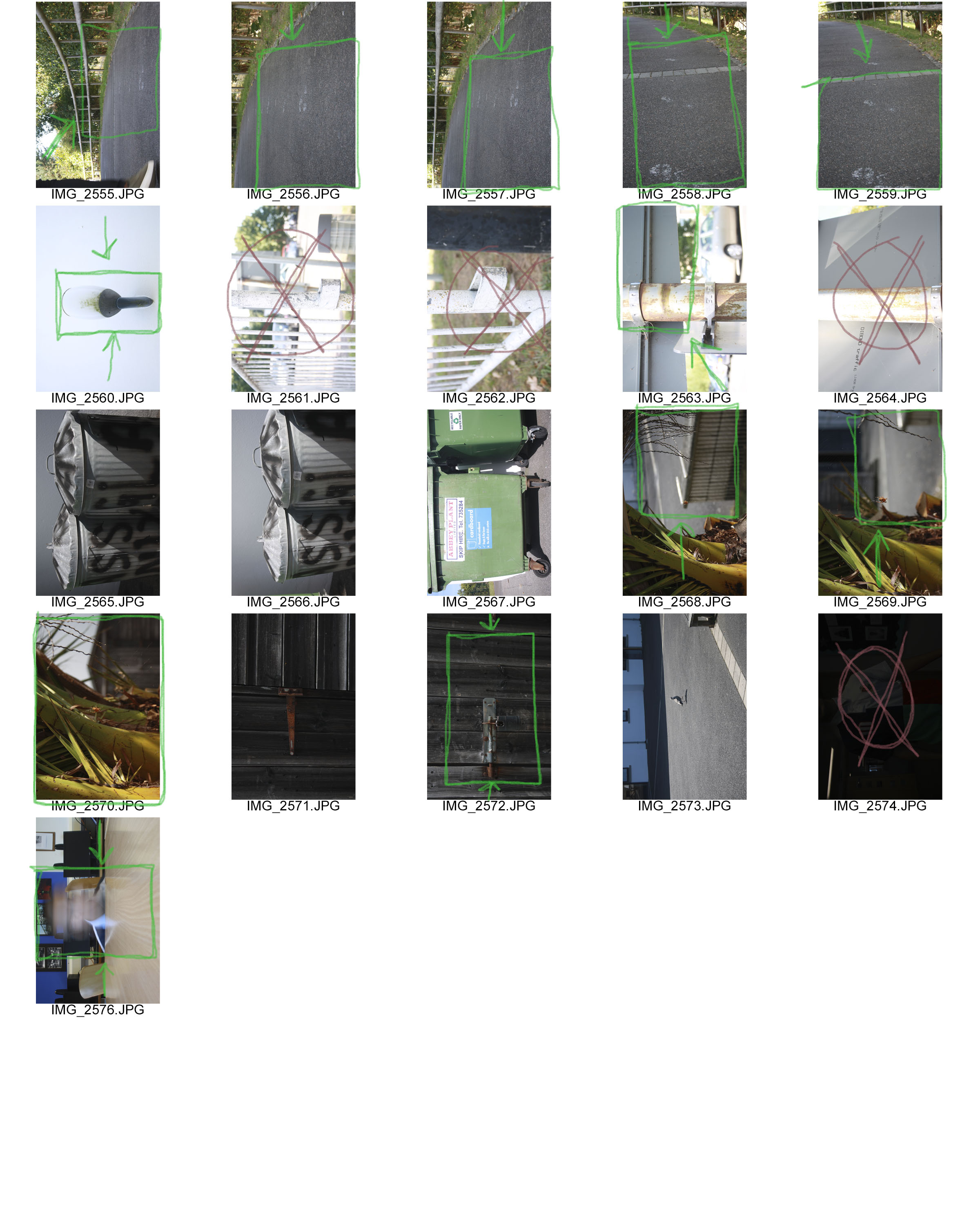
I aimed to take photos like Ralph Eugene Meatyard, with little focus in the pictures. Here are a few of my outcomes;

This small selection of photos show the way I try to copy the way Ralph took his photos. I used manual focus to get these photos and zoom, this is so I could really focus on one thing in the photo. I got inspiration for these photos by his selection of photos known as ‘Zen Twigs’.  The depth in these images vary, this is because depending on the background of the photo, how blurred out it was, some of the images had a slightly blurred out background whereas others had one main focus in the photo.


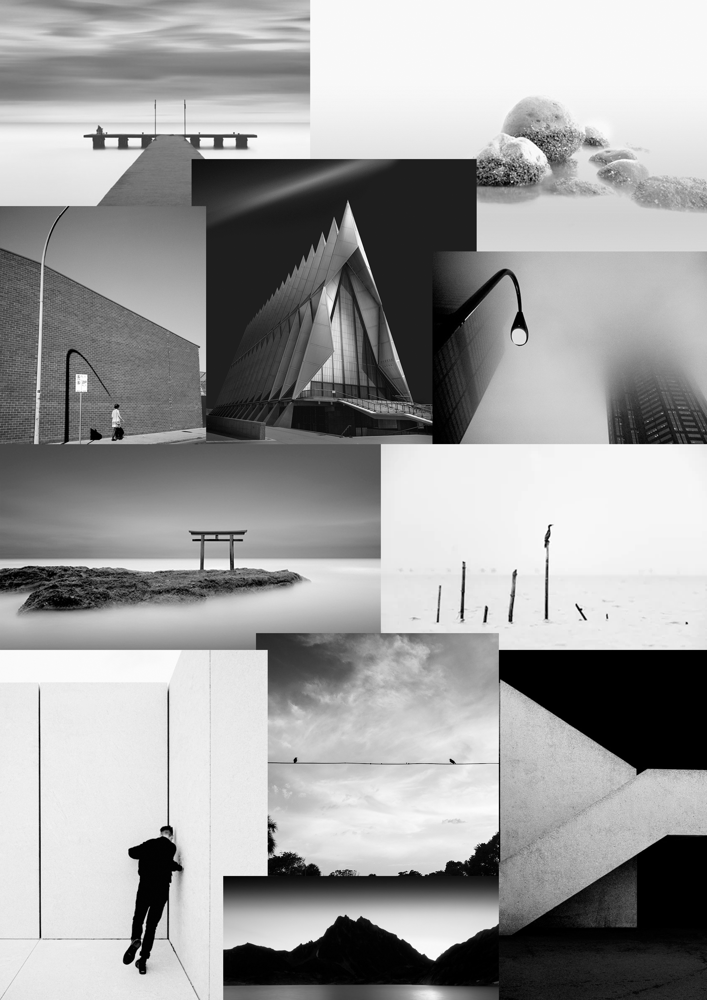
Ralph Meatyard Mood board/Inspiration

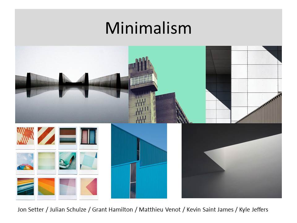
I will be using this mood board in order to inspire and give me ideas for the upcoming homework, responding to Ralph Meatyard’s work. His work, is highly dramatic and produces only black and white imagery. It is simplistic and often up to the audiences interpretation, therefore when I do my own photo shoot, i will be focusing on capturing very minimalist photos that also show drama and mystery.

Week 5 | Homework | Final Photoshoot | Abstract | Colour and Texture

Start Date : Wednesday 3rd October
Completion Date : Wednesday 10th October

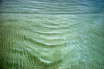
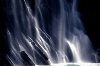
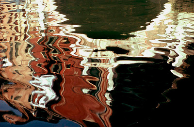
Ernst Haas – water and reflections

Haas pioneered colour photography and is also famous for his images of movement using long shutter speeds. He photographed water throughout his career, fascinated by its ability to reflect light and its dynamic movement. He crops the subject to increase the sense of abstraction.

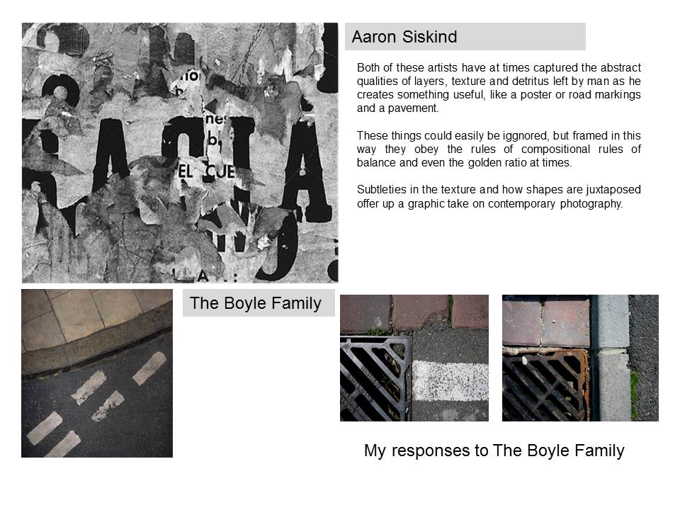
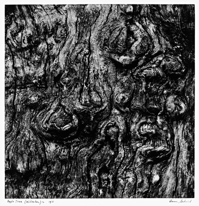
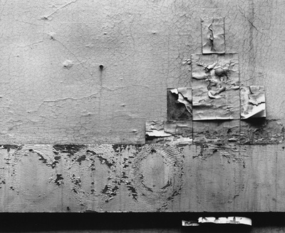
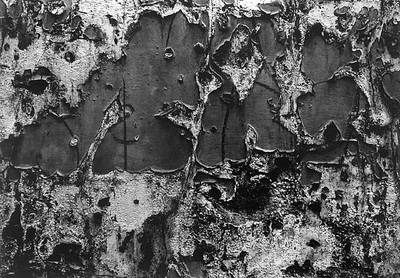
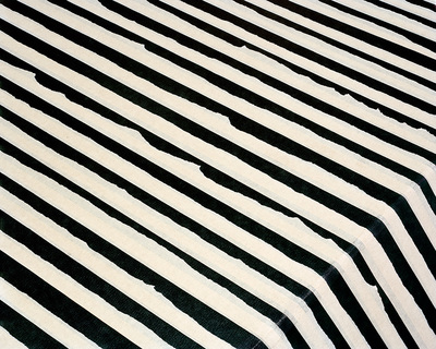
Aaron Siskind – natural and urban surfaces

Siskind was interested in surfaces and textures, both from the natural world but also the urban environment. He gets in close to his subjects and fills the frame with detail. There is always a strong sense of design and all over interest for the viewer.

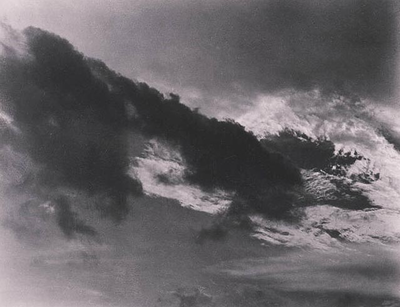
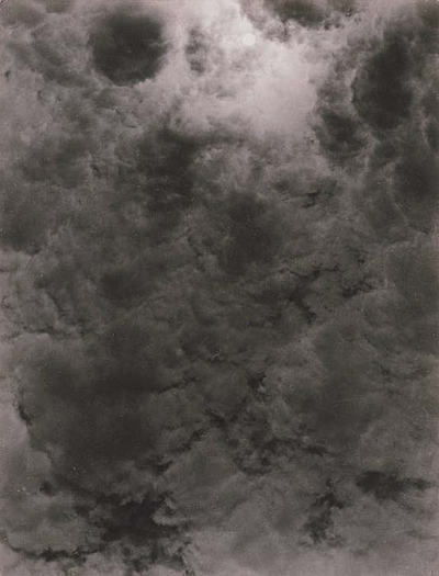
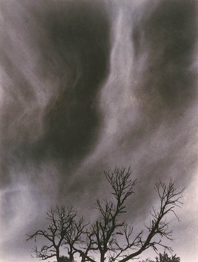
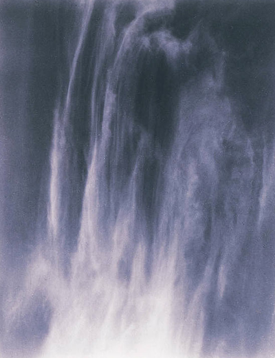
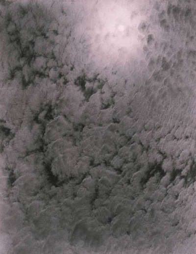
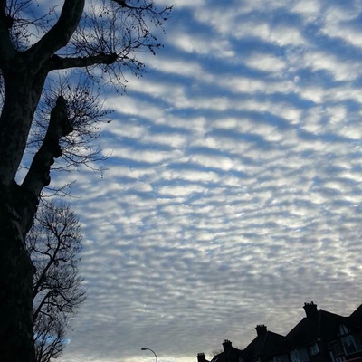
Alfred Stieglitz – patterns in the sky

These pictures were an attempt to demonstrate how “to hold a moment, how to record something so completely, that all who see [the picture of it] will relive an equivalent of what has been expressed.” The ‘Equivalents’, as they are known, aim to create a sensation in the viewer similar to that experienced by the photographer. Is this possible, do you think?

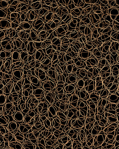
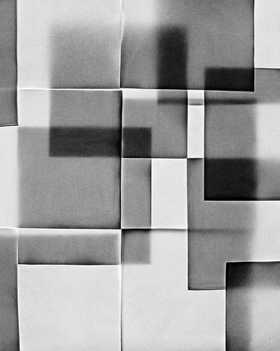
Nick Albertson – repeated forms

These images explore the idea of repetition, rhythm, line, shape, texture and pattern. They are all created with everyday objects which are transformed through careful arrangement and photography. The edge to edge compositions help concentrate our eyes on the formal properties of the objects. Contrast is important. Sometimes we need to consult the title before we’re sure about exactly what we are looking at.
Some examples of student work:

Week 5 | Class Challenges | Selecting, editing and presenting abstract ideas

By now you should have generated plenty of images in response to abstract and formalist themes…

Man Ray Lampshade 1938


The Formal Elements

  • Line (horizontal, vertical, diagonal, thick, thin etc)
  • Shape
  • Form
  • Texture
  • Pattern
  • Colour

Ensure that you are incorporating the formal elements in your decision making process at all stages of the process…

Task 1

Exploring high contrast images with Keld Helmer-Petersen


Helmer-Petersen was a Danish photographer who was inspired by Albert Renger-Patzsch, the experiments at The Bauhaus in Germany and by Harry Callahan and Aaron Siskind at the Art Institute of Chicago. He achieved fame for his colour photographs but he also published several books of black and white images that explore dramatic contrasts of tone. In some, we are only presented with images that are black and white. All mid tones have been removed. He created and found these images, using both cameras and flat bed scanners to achieve the effects he was looking for. These books are beautifully designed and encourage us to consider the space around the image and the accompanying text as integral to the meaning of the work.

Click on the images for more…


  • Choose 4 x images of your own to work with
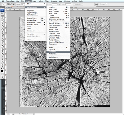
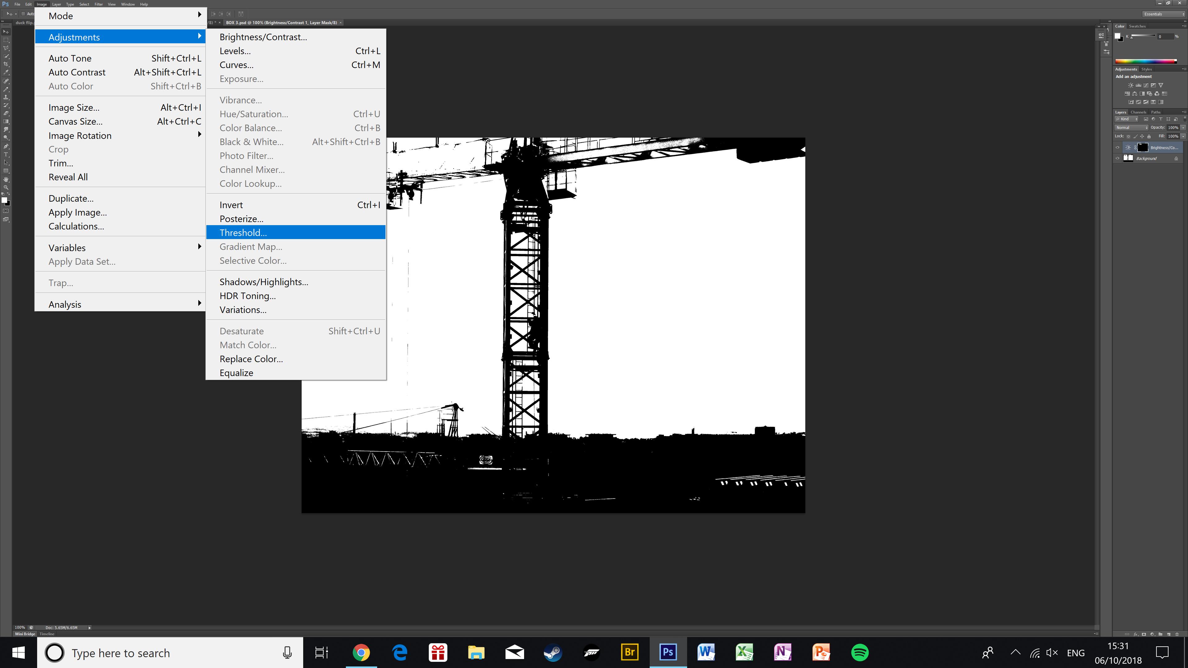
  • Edit the images using the THRESHOLD ADJUSTMENT in Adobe Photoshop
  • Add a “stroke” to the final image
  • Present your final images in a grid of 4 x square format


Original Image
Threshold Adjustment in Photoshop
Adjusting the threshold level slider
Cropping the image
Rotate the image if necessary
Finished image

  • Create a blog post that includes your experiments, including original images, edits and final outcomes
  • Include key information about Keld Helmer-Petersen
  • Add annotations to describe and explain your process
  • Critically evaluate your outcomes
  • Print your final design A4 to Photography Printer

Task 2

  • this task is designed to encourage you to explore Adobe Photoshop further and select areas of an image to reveal / conceal
  • You will begin to use LAYERS and LAYER MASKS
  • You will also use the 2 x OPACITY sliders

METHOD

  1. Open an image in Adobe Photoshop
  2. Add a new layer from the LAYER PANEL > SOLID COLOUR
  3. Reduce the opacity in the LAYER PANEL to reveal your image
  4. Click on the LAYER MASK (white box) in your LAYER PANEL
  5. Choose the brush tool from the TOOLBOX
  6. Adjust the size of the brush using the {} keys
  7. Check / adjust  the opacity level of your brush (top bar)
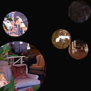
  8. Click on various areas of the image to create circular “holes”
  9. Using the opacity slider in the LAYER PANEL, bring the level up to 100%
  10. You have a completed image. Flatten the layers, save and upload.
  • Explore ways you can extend this basic idea
  • Create a blog post entitled “Conceal / Reveal”
  • Describe and explain your process and include visual evidence
  • Critically evaluate your process

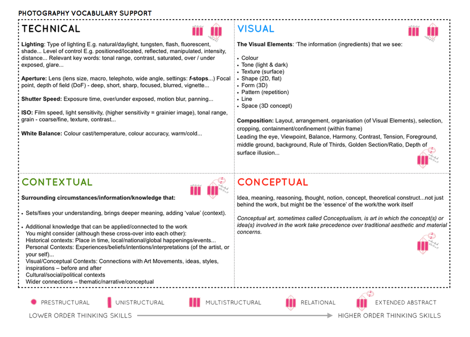
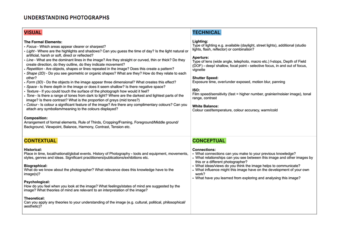
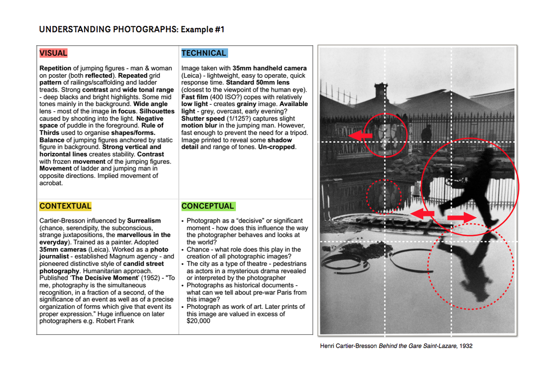
Remember to use the model :

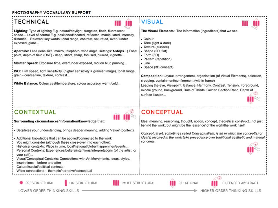
TECHNICAL -VISUAL-CONCEPTUAL-CONTEXTUAL

here are some helpful examples for you to work from…

Picture

Extension

Now you must carefully select from your images, including homework photo assignments to decide what you will present as a Final Outcome (AO4). You must look at a range of presentation methods, and show in a range of blog posts that you can…

  • sequence images
  • create diptychs (pairs) and triptychs (sets of 3 images)
  • design a grid of 9 x images (square format)
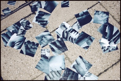
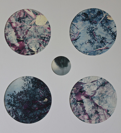
  • explore circular shaped images
  • juxtapose contrasting images

Deadline for final selection of printed images = Monday 15th October

Follow the 10 Step Process for each unit to ensure you tackle all Assessment Objectives thoroughly :

  1. Moodboard (AO1)
  2. Mindmap of ideas (AO1)
  3. Artist Reference / Case Study (AO1)
  4. Action Plan (AO3)
  5. Photoshoots + contact sheets (AO3)
  6. Image Selection (AO2)
  7. Image Editing/ manipulation (AO2)
  8. Presentation of final outcomes (AO4)
  9. Compare and contrast (AO1)
  10. Evaluate and Critique (AO1+AO4)

Keld Helmer-Petersen

Keld Helmer-Petersen was a Danish Photographer who passed away on March 6, 2013.

He was born on August 23, 1920 in Copenhagen (the capital of Denmark) which is also where he grew up. He started taking photographs in 1938 when he received a Leica camera as a graduation present. The international prospect and an interest in contemporary art and architecture contributed to the fact that at the age of 23 Helmer-Petersen began to work with an abstract formal language. Inspired by the Bauhaus and Albert Renger-Patzsch, he published in 1948, the bilingual book ‘122 Farvefotografier/122 Colour Photographs’. Today, the book is considered to be a pioneering work in the area of colour photography.

Helmer-Petersen’s ‘122 Colour Photographs’ gave him a grant from the Denmark–America Foundation to study at the Institute of design in Chicago. During his stay at the school, he both taught and studied under the American photographer Harry Callahan. Helmer-Petersen began to experiment with the contrast in graphic black and white expression influenced by constructivist artists and their fascination with industry’s machines and architecture’s constructions.

Helmer-Petersen’s approach to photography was by and large experimental and explorative. He worked on the borders of what we normally consider to be photography. Among other things, throughout his career he worked with “cameraless” photography, the photogram (which is a darkroom technique in which objects are put directly on light-sensitive photograph paper). His curiosity about pushing the limits of the media was expressed in several experimental short films, including Copenhagen Boogie from 1949.

In his last works, Helmer-Petersen experimented with digital technology. In so doing, he returned to the black and white graphic expression. From 2008 up until his death, he placed a variety of old negatives and found objects such as insects, wires, etc. on a flatbed scanner in order to treat them digitally. This process resulted in the experimental trilogy: Black Noise (2010), Back to Black (2011) and Black Light (2014) which was published after his death.

My response:

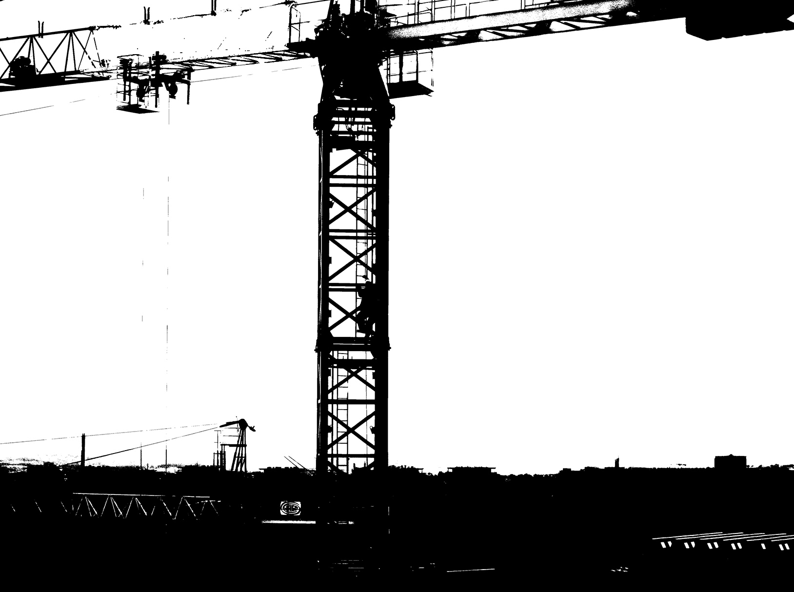
This is the original photo, a photo of the crane operator leaving after finishing work.
I edited the image so that it was in a similar style to Petersen’s work. I did this by adjusting the threshold of the image and adjusting the brightness and contrast slightly to make the shapes stand out more.
This is the final image. I have applied the previously mentioned filters/adjustments and cropped the image slightly so that the crane is more central.

I have repeated this process for the following images to achieve the same style.


Ralph Eugene Meatyard – Response

Ralph Eugene Meatyard was born on the 15th May 1925, in Illinois. At the age of eighteen he was forced to join the Navy, at the time of the Second World War. Lucky the war had ended before he was sent on an overseas assignment. Soon after the war he dedicated his studies into becoming an optician, but still continued with his passion for photography.

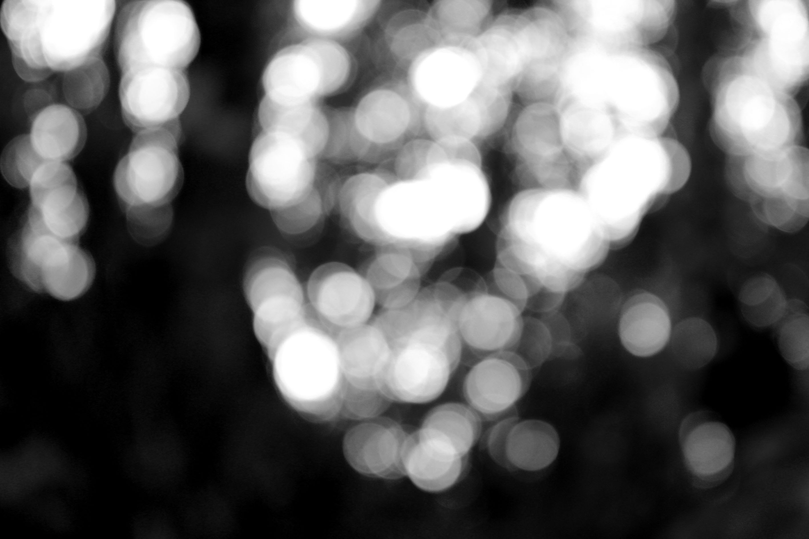
His photographic series ‘No Focus’ has combined his occupation with his hobby, showcasing what he was really passionate about. In this series the photographs are completely out of focus, reveling what it is like for blind people seeing the world. This powerful photographic series changed the way people captured photographs, as it went against the stereotypical techniques we would use to capture an image. His work within this series is very inspiring to photographers as it shows that experimentation with the camera is vital part of photography, and that breaking the stereotypes can actually result in effective images.
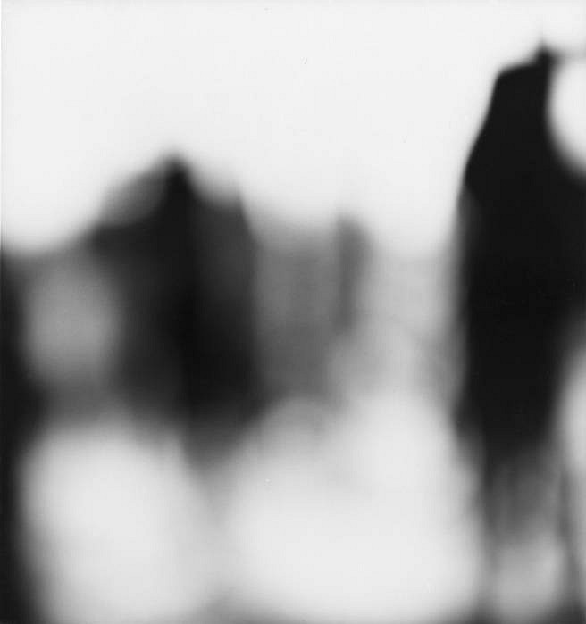
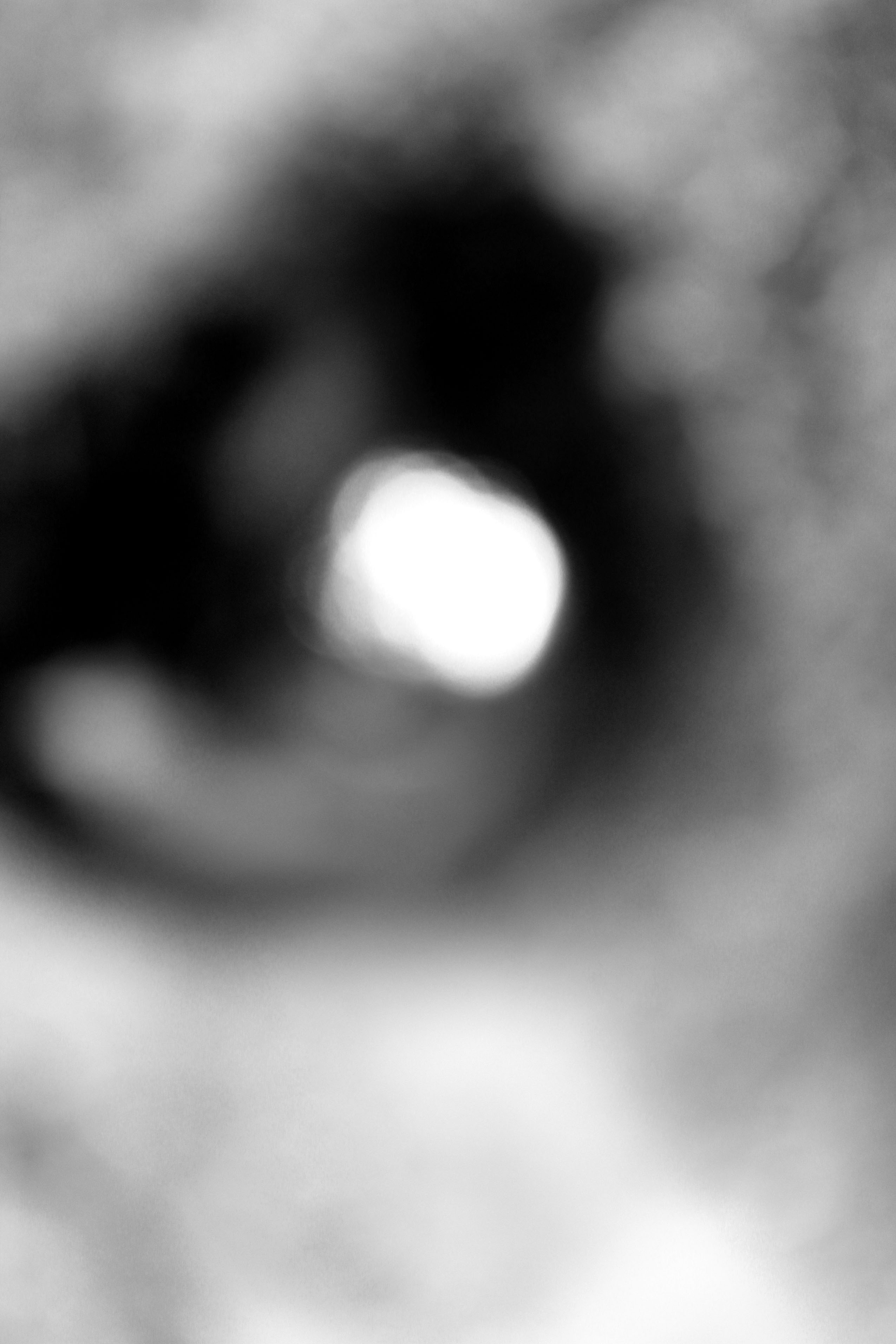
This photograph has been taken to be apart of Meatyard’s ‘No Focus’ series. As mentioned before the whole frame is out of focus, reveling what it is like to be blind. The first thing my eyes are drawn to is the silhouettes, which seem to be of people or a building. Due to us not being able to tell what the silhouettes are, makes this image more effective as we are left questioning what it is. Therefore it is a more memorable photograph. Moreover, it shows the reality of people’s lives, making an emotional attachment between the image and the viewer. My eyes are then drawn to the light source, which is located at the bottom of the photograph. The main formal elements which are being presented in this photograph is shape, tone and texture, which are all being presented through the silhouettes. All the images within this series are presented as black and white, which contextually shows the period of time when the photograph was taken. It suggests that this image was captured when coloured images could not be captured. Due to the images being in black and white it allows the different tonal regions to be much clearer, and allows the silhouettes to be seen much easier. The overall image is quite dark which suggests that the white balance of ‘cloudy’ could have been used in order to make it darker. Furthermore, the dark images creates a cold temperature to the images, due to this the overall image is seen as much more dramatic and hard hitting. The aperture used to capture this image is also likely to be quite small, in order to not allow much light into the lense resulting in the overall image to be much darker. In contrast the ISO could be high as there is a lot of noise in the image. However, the noise could be created from the focus, resulting in the ISO to be low. The shutter speed used could be a slow shutter speed, which would create a blur, adding to the overall out of focus effect. Conceptually, the photograph is trying to distort the viewers eye sight, outlining the life styles for those who struggle to see, presenting the reality of others within one image. Overall, Meatyard’s photography within this series are well thought out and portray a very powerful meaning.

Planning

For this photoshoot I am hoping to capture my images during the day, in order to use the sun as my natural lighting. However, I would like to capture some of the images at night which will add to the dark and gloomy effect. Possible locations that could work for this photoshoot are forest, office, building and street. I am quite looking forward to capturing these sorts of images, where the frame is out of focus, as I believe I will be able to be creative with what should be turned into silhouettes and what should actually be in the frame. Looking ahead of time I would like to keep the edits simple, I am thinking about just turning the images black and white and levelling them.

Contact Sheets
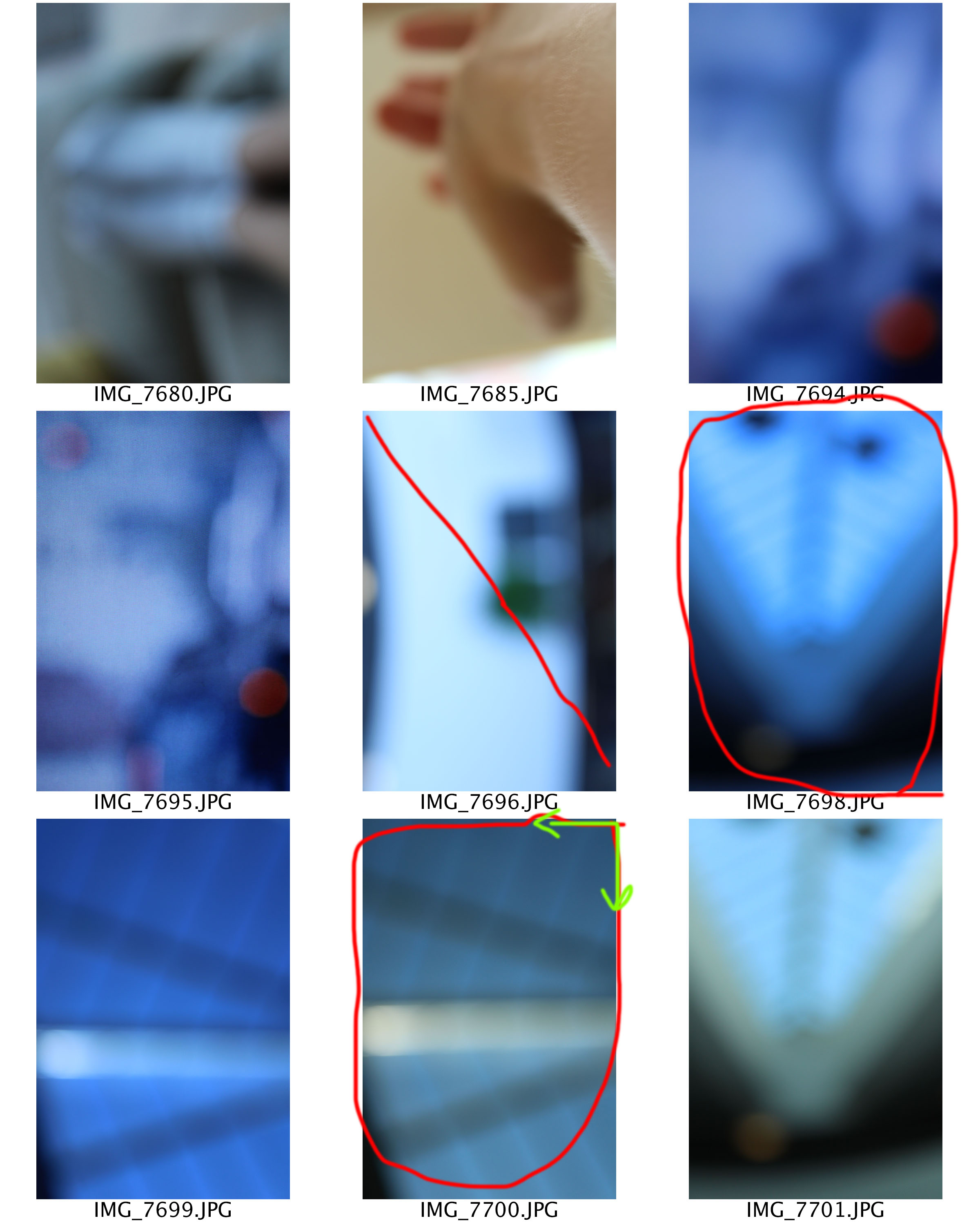
Edits

As mentioned in the planning the aim of these edits where to keep things simple. To start of with I levelled the images slightly darker than usual, to allow different tones to be shown and the light patches to be brighter. I then turned the photographs in to black and white by lowering the saturation.  I am really happy with the way these three edits have come out as they create the similar blur/distorted effect that Meatyard’s photographs did. I also believe that these three images successfully meat the aim of Meatyard’s series ‘No Focus’, thus resulting in this photoshoot being successful.
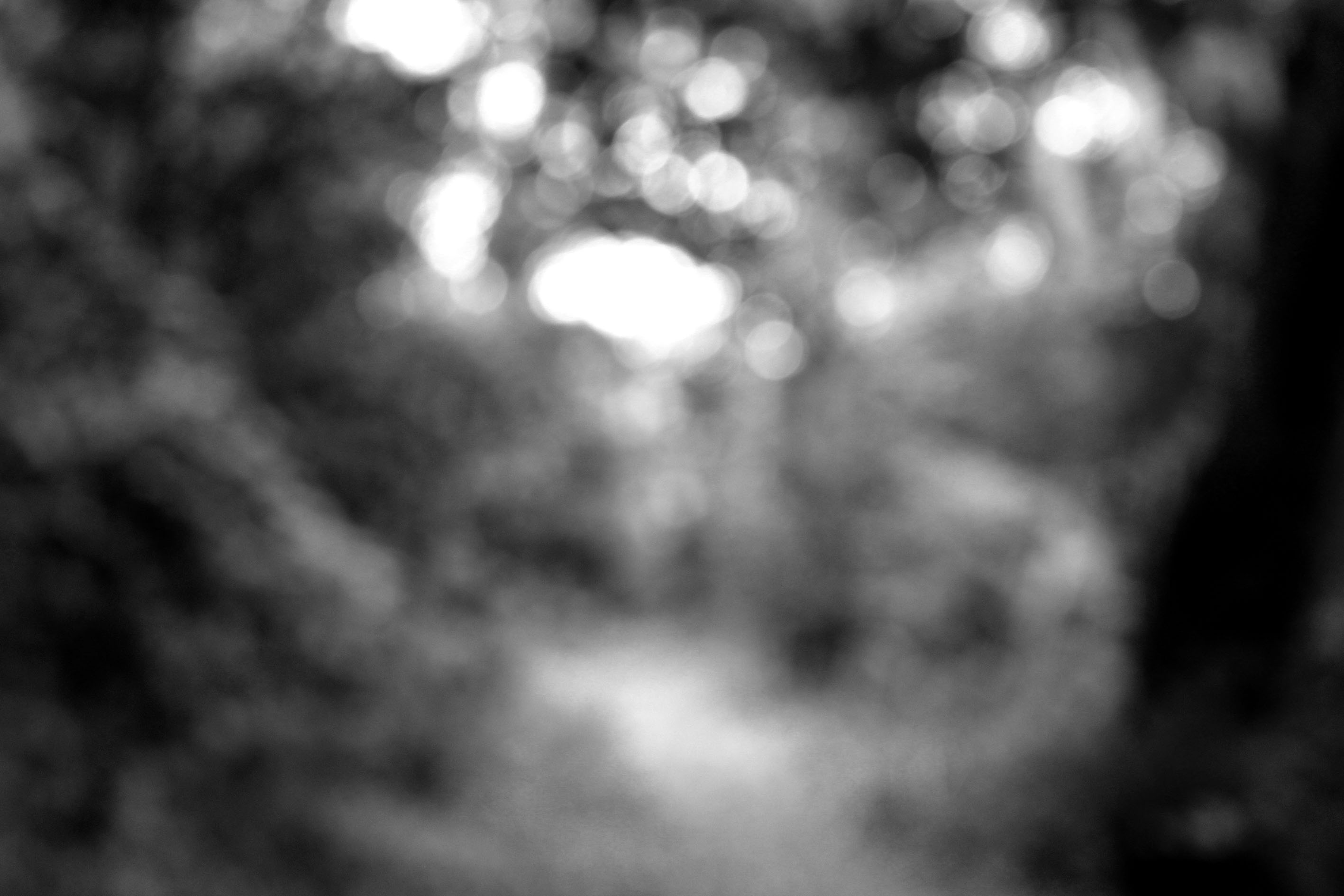
Another photographic series that Ralph Eugene Meatyard has produced is called ‘Zen Twigs’. Within this series, we are able to see Meatyard experimentation with depth of field and focus. The title of the series is ‘Zen Twigs’ which is a unique name. It suggests to us that the twigs are in a peaceful state, as Zen means a state of peace and meditation. Before looking at the images in this series viewers are able to predict that the main focus point will be of twigs, due to the name of the title.
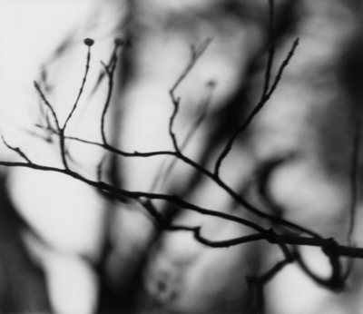
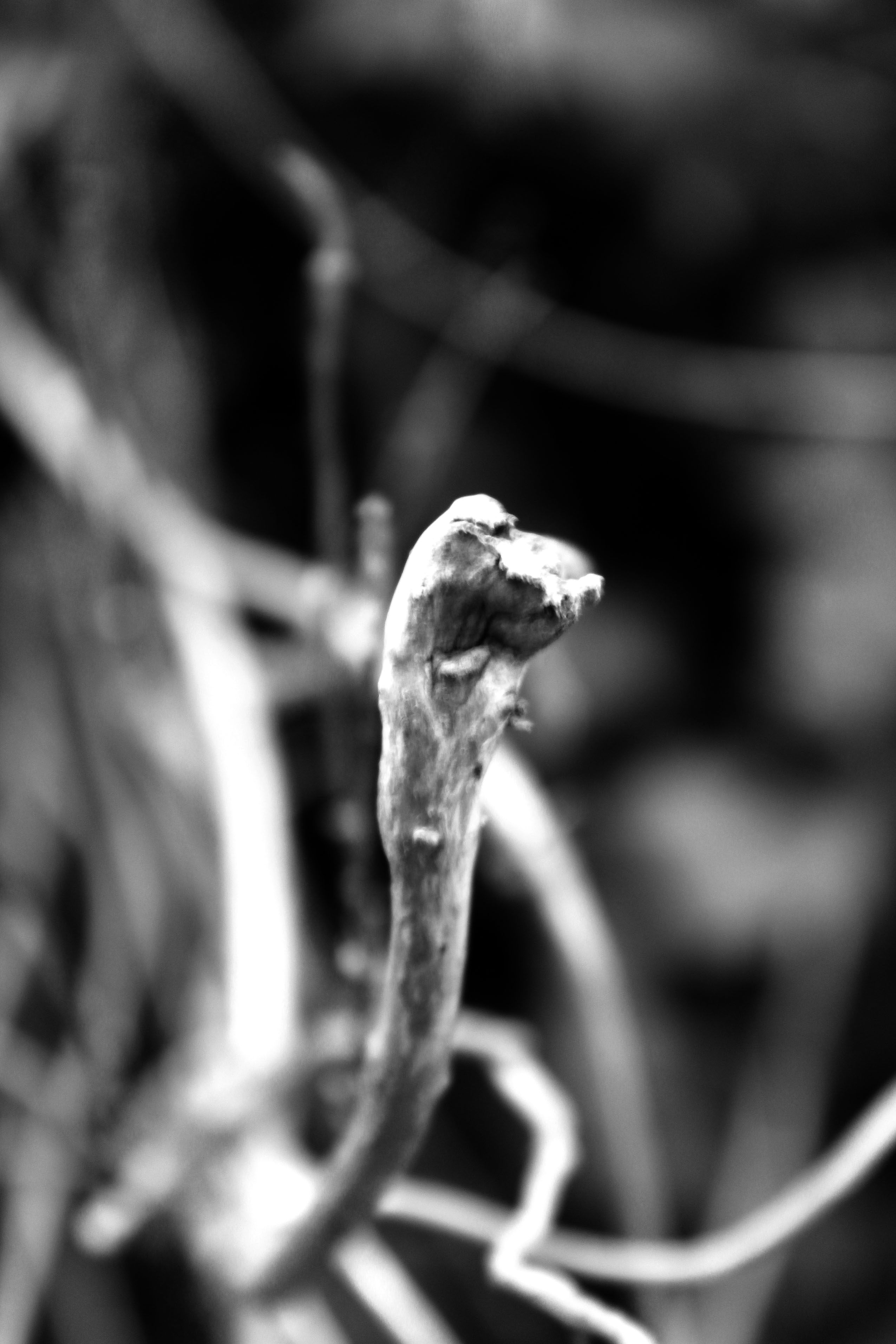
Looking at this image, we are able to confirm that the main focus point (subject) is the twigs which are located in the centre of the frame. Due to this being the main focus point it us where the viewers eyes are first drawn to. They then follow the twigs line, which moves their eyes out into the blurred background. Due to this it implies that the image has a narrow depth of field. This also means that the aperture of the lense is likely to be low in order to help capture the blurred background. This image is also presented in black and white, which outlines the different tonal regions within the image, making the depth of field more noticeable to viewers. The image being in black and white contextually shows the period of time when the photograph was taken. It suggests that this image was captured when coloured images could not be captured. Moreover, the formal elements which are being presented in this in this photograph are line, tone and texture. These are all shown through the twig which is gradually becoming out of focus. Due to the foreground of the image being in focus, it implies that a quick shutter speed has been used. We are able to see a clear link between the title of the series and the images, this is because the twig is seen very still and in focus (alone) which shows a sense of Zen. Conceptually, the twigs are used to create peace and a sense of relaxation between the viewers and the image, creating an emotional connection. I really like the images within this photographic series, due to the simplistic techniques used making the subject detailed. I also like the peaceful mood which is presented through the image, as it is easy to look at.

Planning

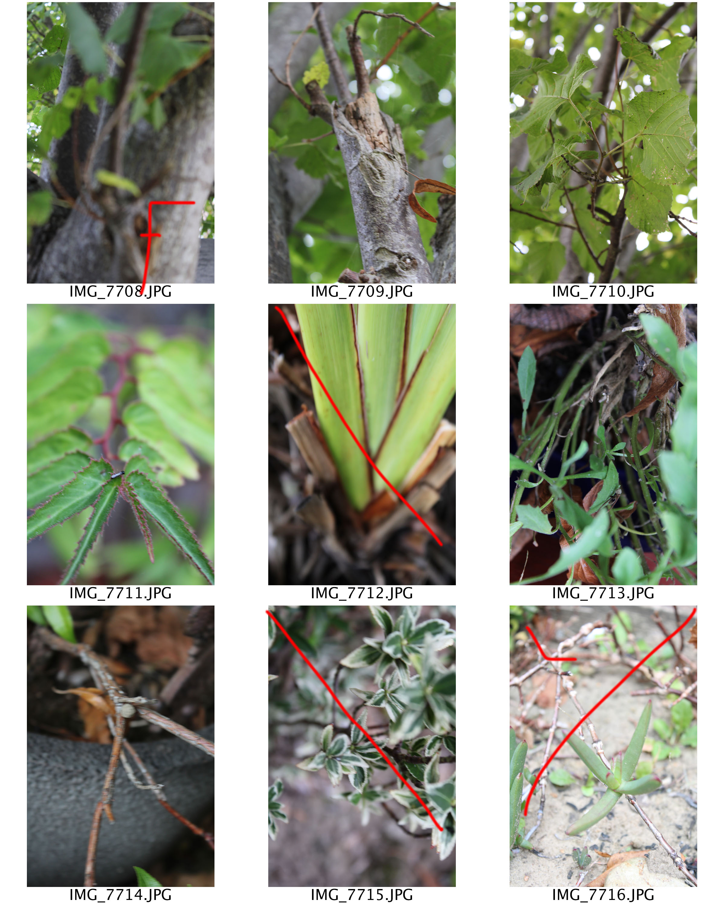
For this photoshoot I would like to use natural lighting, in order to allow the twigs to seem more natural and it will provide context to the images. To capture the photographs I am going to go into the woods and aim to capture as many interesting twigs I can see. I am going to attempt to use depth of field, focus control and leading lines within this photoshoot in order to make the images interesting and like Meatyard. Moreover, I will keep the edits simple, like the first photoshoot, in order to make my work look more like the artist.

Contact Sheets
Edits

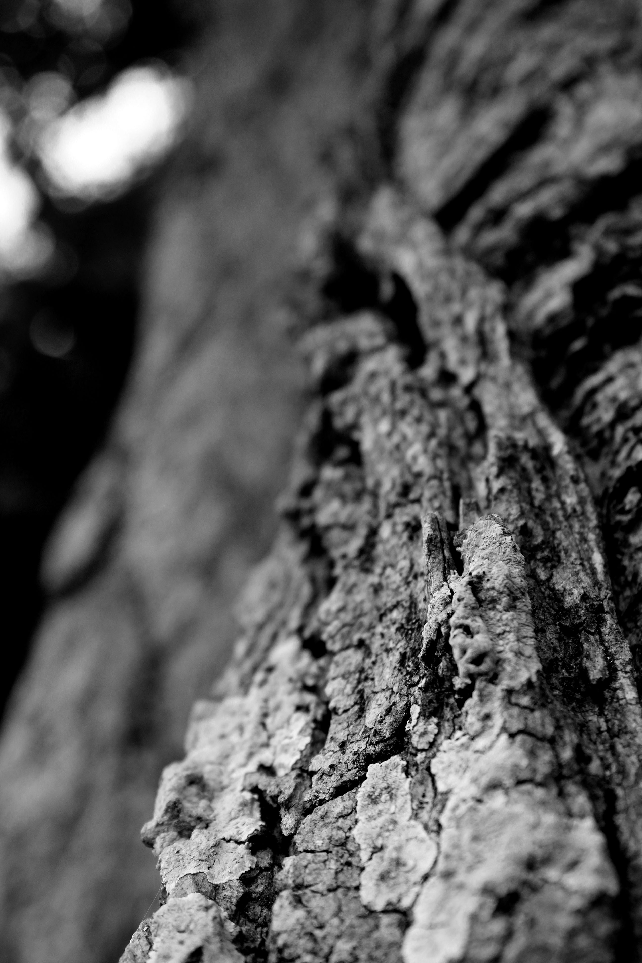
For all of these edits I decided to level the images, allowing the different tones to stand out more and make the images seem sharper. I then adjusted the curves, in order to support the effect I mentioned above. I then turned the images into black and white, like Meatyard did. I am very happy with the way the edits have come out as I believe that I have produced some strong responses to Meatyard’s work. I have been able to use the skill of manual focus, depth of field and leading lines, which has definitely improved these images.
The World Is Beautiful

A contact sheet is a method used by photographers to easily display the work from a photo-shoot and scrutinize the images, making a fine selection of final images from the entirety of the photo-shoot.

They are useful as they allow a photographer to see all of the images at once on a single sheet and notate any changes that they may want to make to the images as well as entirely disregarding images if they are beyond editing or are simply not composed to their standards. Displaying any errors also allows the photographer to progress their work and learn from the mistakes more easily.

White balance

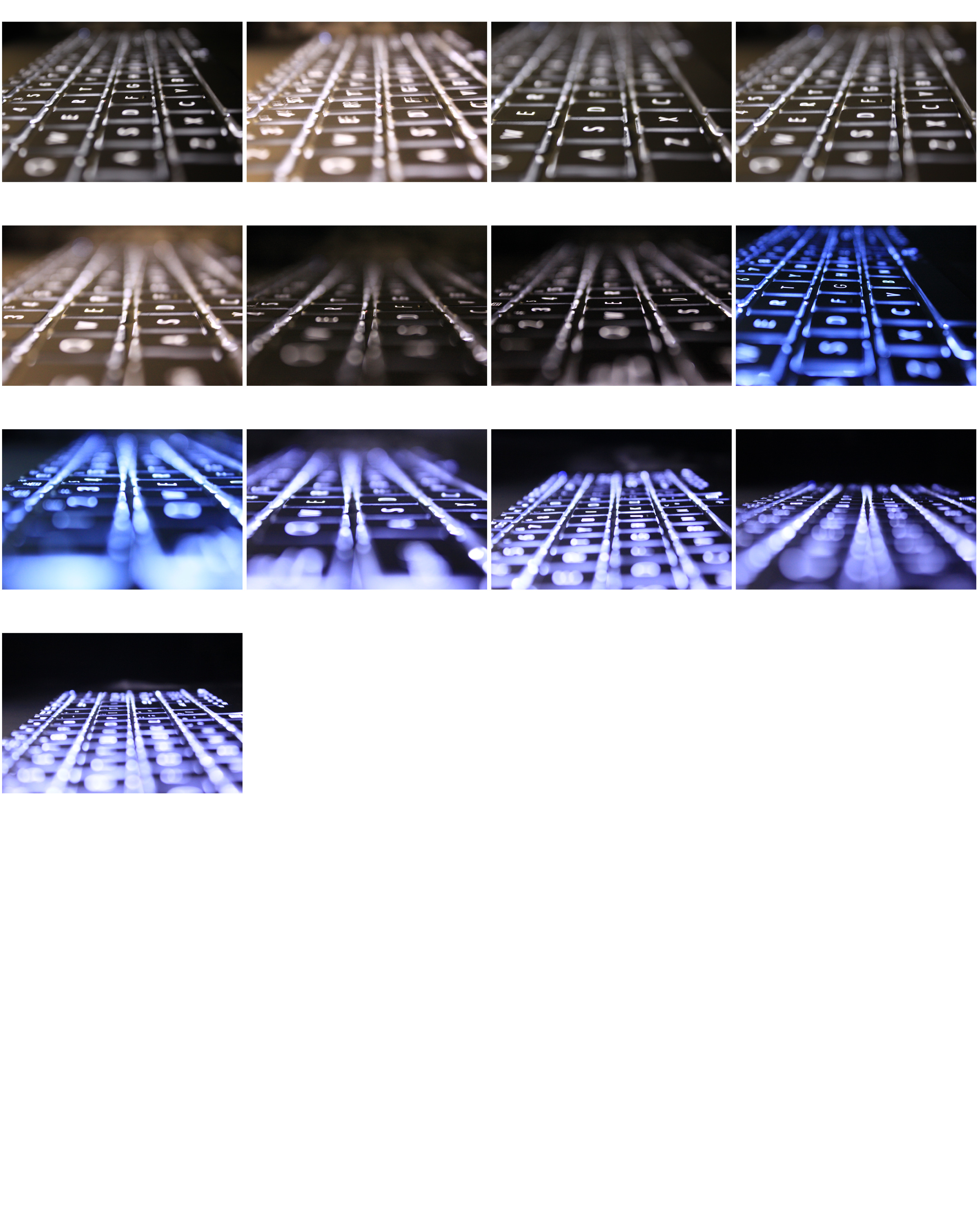
White balance is a camera setting that automatically adjusts the color balance of light the you’re shooting in so that it appears a neutral white. This setting can also be set to manual which lets you create your desired colour balance for a photo. For example, if you are taking a photo of a white neon sign you might want to set the white balance to tungsten which will give the white a blue/purple shade.

This is just a quick photo shoot experimenting with white balance, so there aren’t many photos. There next 3 photos are my favourite out of the shoot as they have very different colour balances, also because of the in and out of focus areas and the straight line ‘pattern’ running through all of the pictures.
Homework 3 – Albert Renger Patzsch research and response

Renger-Patzsch was born in Wurzburg on June 22, 1897 and passed away on September 27, 1966. He began making photographs by the age of twelve.  After military service in WW1 he studied chemistry at Dresden Technical College. In the 1920’s he started working for the Chicago Tribune as a press photographer. He  then left, and in 1925 he published his first book ‘The choir stalls of Cappenberg’. He had his first museum exhibition in 1927.
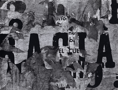
He released a second book in 1928 called ‘Die Welt ist Schon’. This is his best-known book, its a collection of one hundred of his photographs in which natural forms, industrial subjects and mass-produced objects are presented with the clarity of scientific illustrations (a visual approach to a scientific concept in a precise, clear and objective way).  He believed that the value of photography was in its ability to reproduce the texture of reality. His archives were destroyed during WW2, and in 1944 he moved to Wamel, Mohnesee, where he lived the rest of his life.

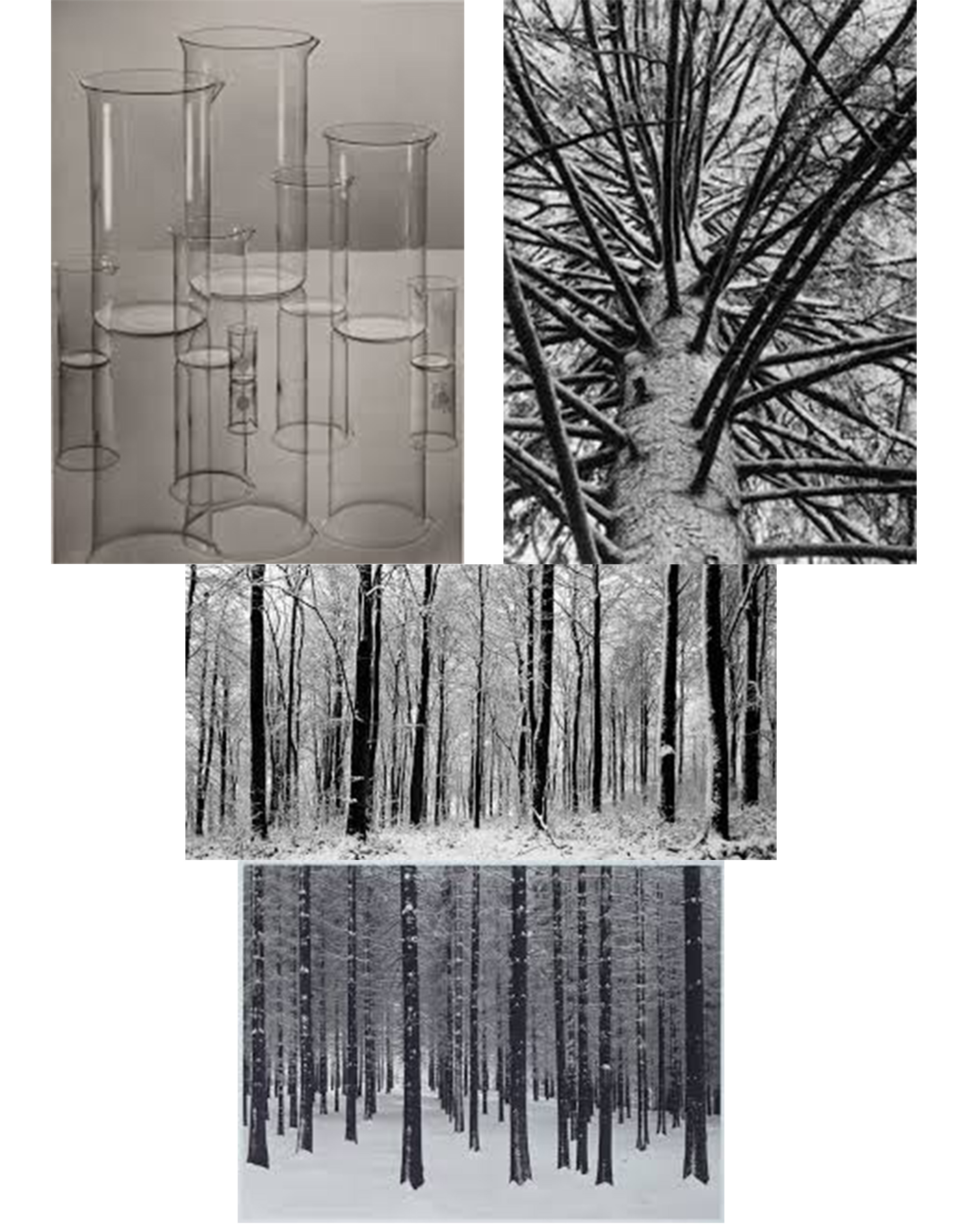
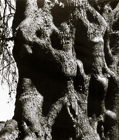
These are my favourite photos by Albert Renger-Patzsch. I like the photos in particular because they all have strong shapes within them. They’re also not overpowered by objects other than the subject of the photo (e.g. the flasks in the photo don’t have anything inside of them, there also aren’t any other items on the table).

My response:

In these photos I tried to to capture bold shapes like Albert Renger-Patzsch. I made all of them black them black and white to match the style, I also increased the contrast and decreased the brightness on some of the photos to bring out the shadows more which makes the shapes bolder. I also cropped the 1st and 3rd photos a lot as I wasn’t interested in the majority of the frame (e.g. I removed all of the empty sky from the drill photo).