Category Archives: Component 1 Personal Investigation

Filters

Author:
Category:

Studio Lighting

Different Types of Studio lighting 

Flat Light

When you have your light source facing directly at the front of your subject, this is flat lighting. Flat lighting on a face will mean that your subject is well lit and you are unable to see any shadows along their face.
Broad Light

With broad light (a type of side lighting), the face of your subject is at an angle and the most well-lit side of the face is closest to the camera and the shadow falls on the back side of the face. This type of light can make a face look fuller so it’s ideal for those with very narrow faces.
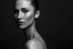
Short Light

Another type of side lighting, short light is the opposite of broad light in that the face is at an angle and the shadow falls on the side of the face closest to the camera. This type of light works well to thin a face and is flattering on most people.

One thing to keep in mind is that shadows draw out textures and imperfections. While broad light is a wonderful way to emphasize freckles, it will also draw out imperfections like acne and scars.
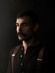
Split Light

Split lighting is another type of side lighting but it is defined as light that hits your subject from the side at a 90 degree angle.

You can easily recognize split lighting in an image by half of the subject being lit and the other half in the shadows. With a face specifically, you’ll see the shadow line straight down the middle of the forehead, nose, and chin.
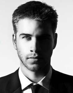
Backlight

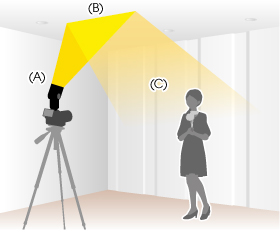
Back light is just that, light that comes from behind your subject. This is commonly seen in photos from the beloved golden hour, when the sun is low in the horizon and starting to set, but can be done at all hours of the day.
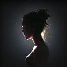
Rim Light

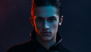
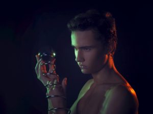
Rim light falls under the backlight category but deserves a spot of its own. With backlight you often see the hazy or airiness from the light in the background resulting in highlights but you don’t have that with rim light.

With rim light, you’ll see the light from behind only highlight the edges of your subject (there’s a little haze falling into the top right of the frame below but you can see how the rim light separates the subject from the background). This is great to use when you need to separate your subject from the background.
 

Butterfly Light

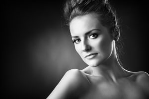
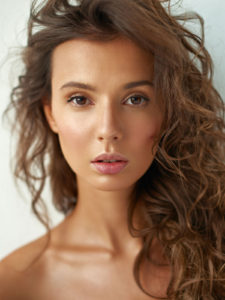
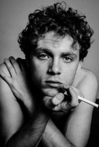
With butterfly light, the light is placed above and in front of your subject to create a small shadow under the nose resembling a butterfly (hence the name). This type of light beautifully highlights prominent cheekbones which is why you most often see it used on women.

However, it emphasizes the shadows from deep set eyes. Again, know your subject’s face and how the light will affect their features. Butterfly light is also commonly referenced as paramount light.
Loop Light

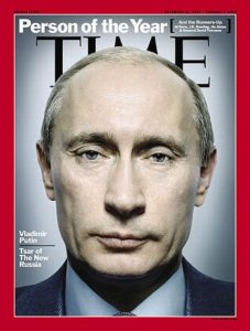
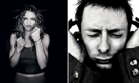
Loop lighting is pretty much my go-to when creating light. With loop lighting, the light is about 45 degrees to the side and slightly above eye level. This position of the light creates a shadow just under and to the side of one nostril and the nose. This is a flattering type of light on most everyone.
 

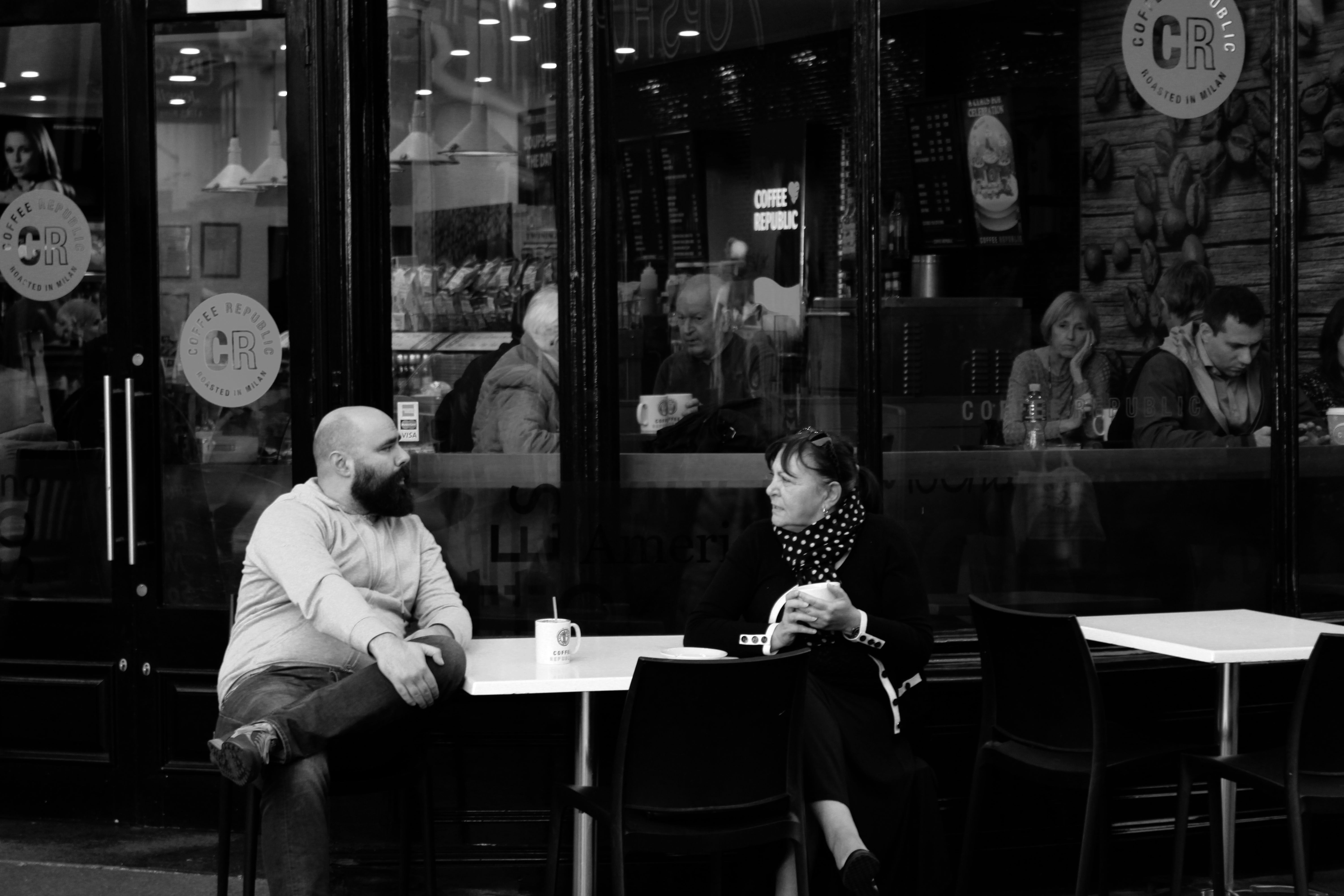
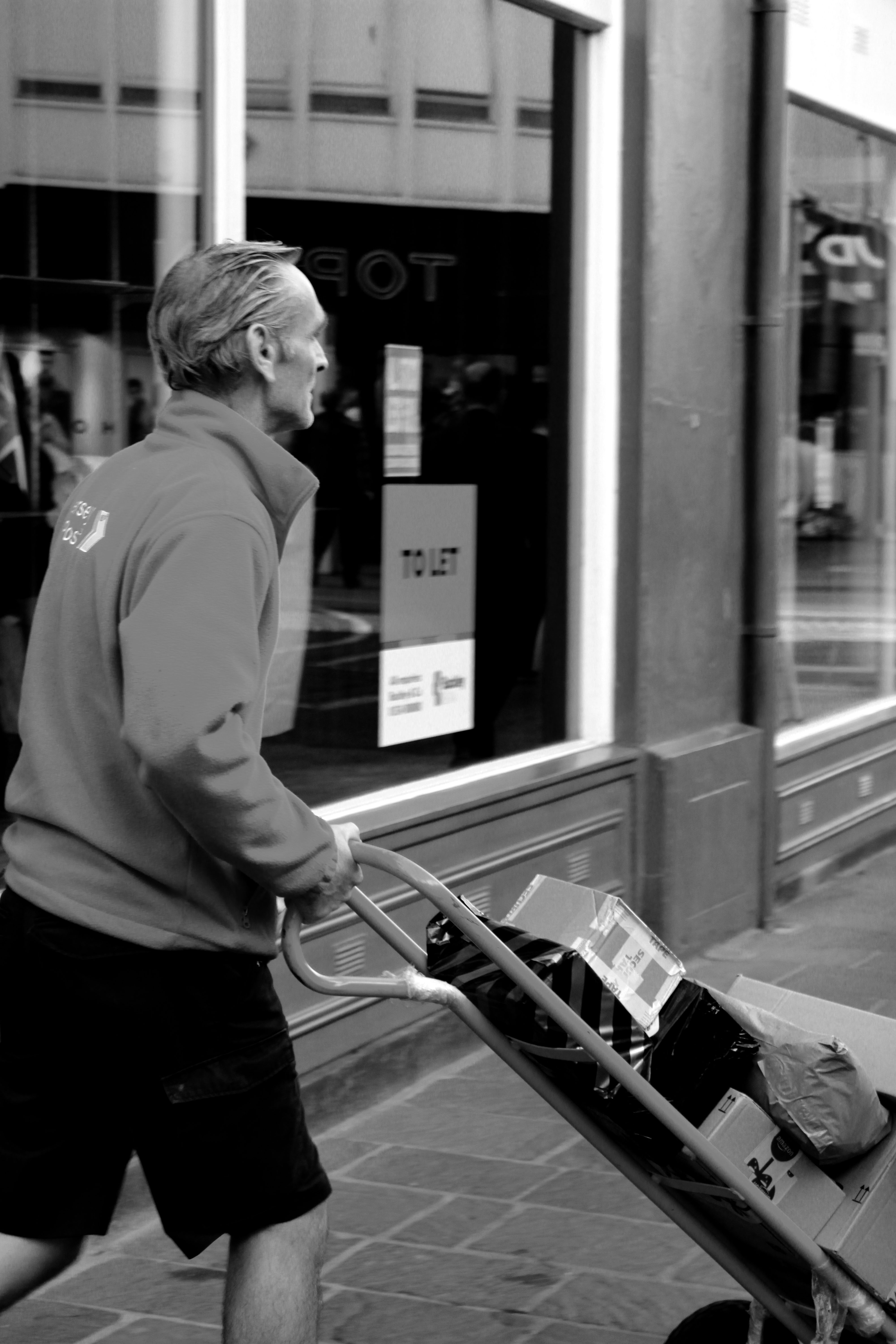
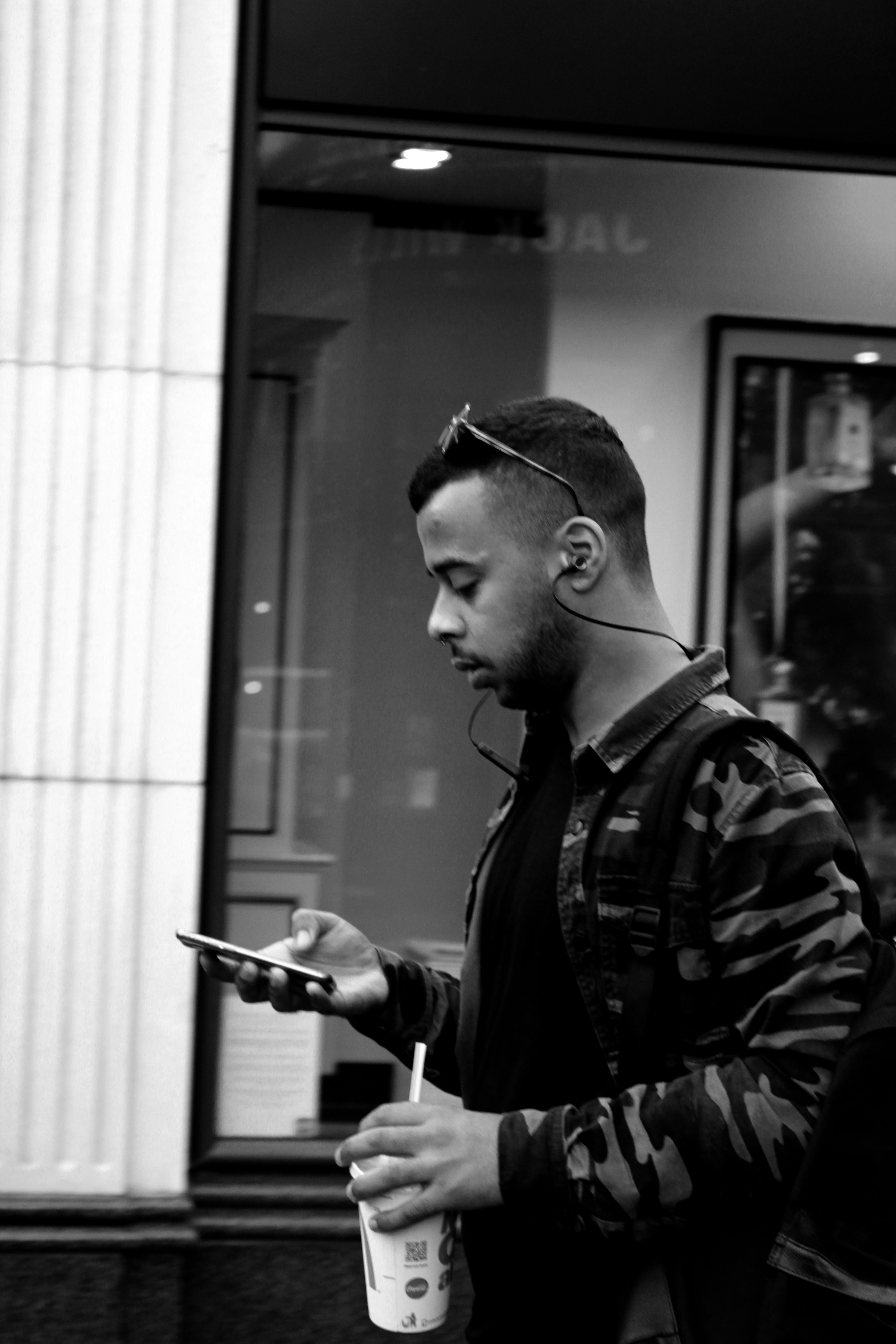
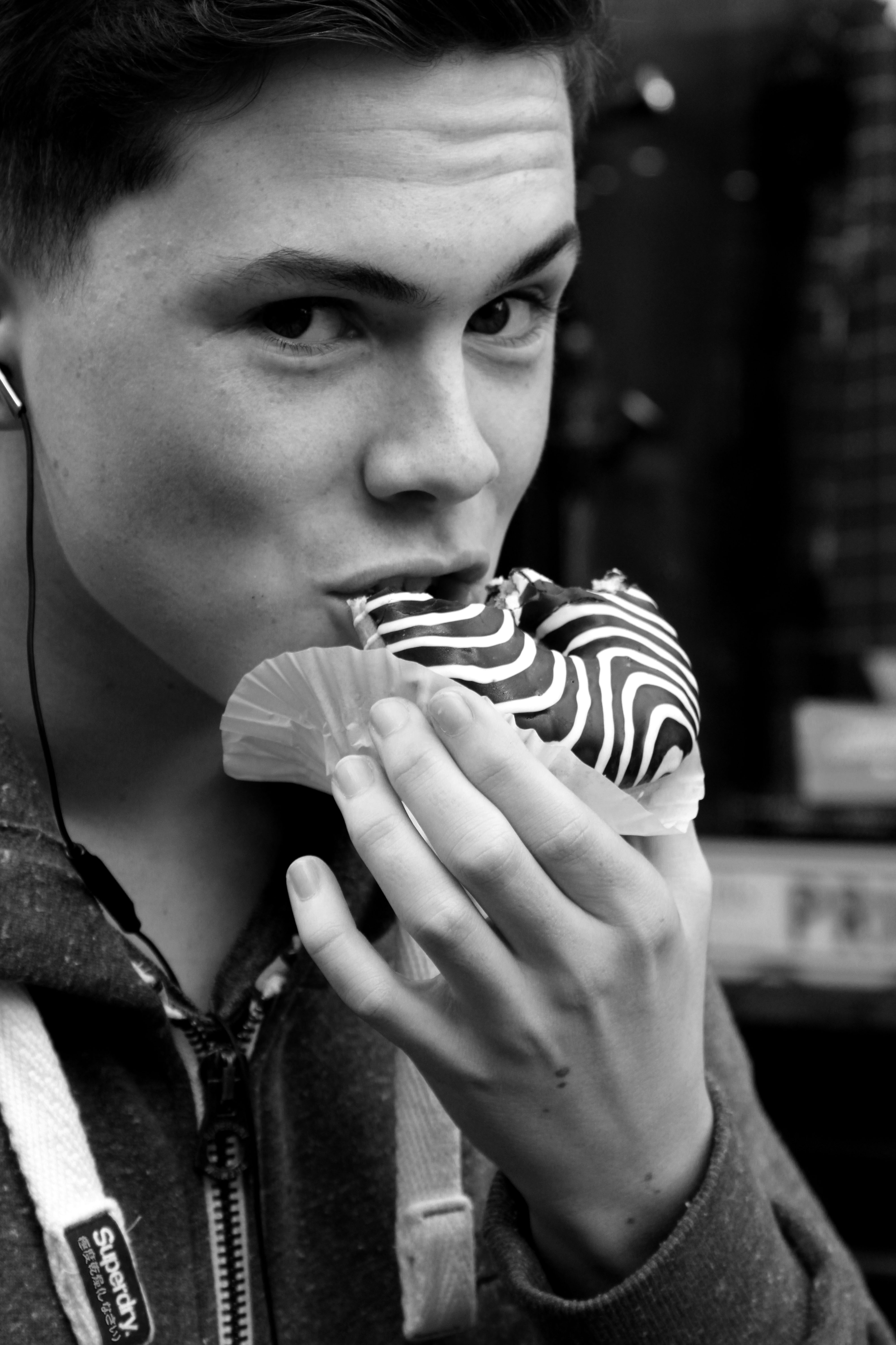
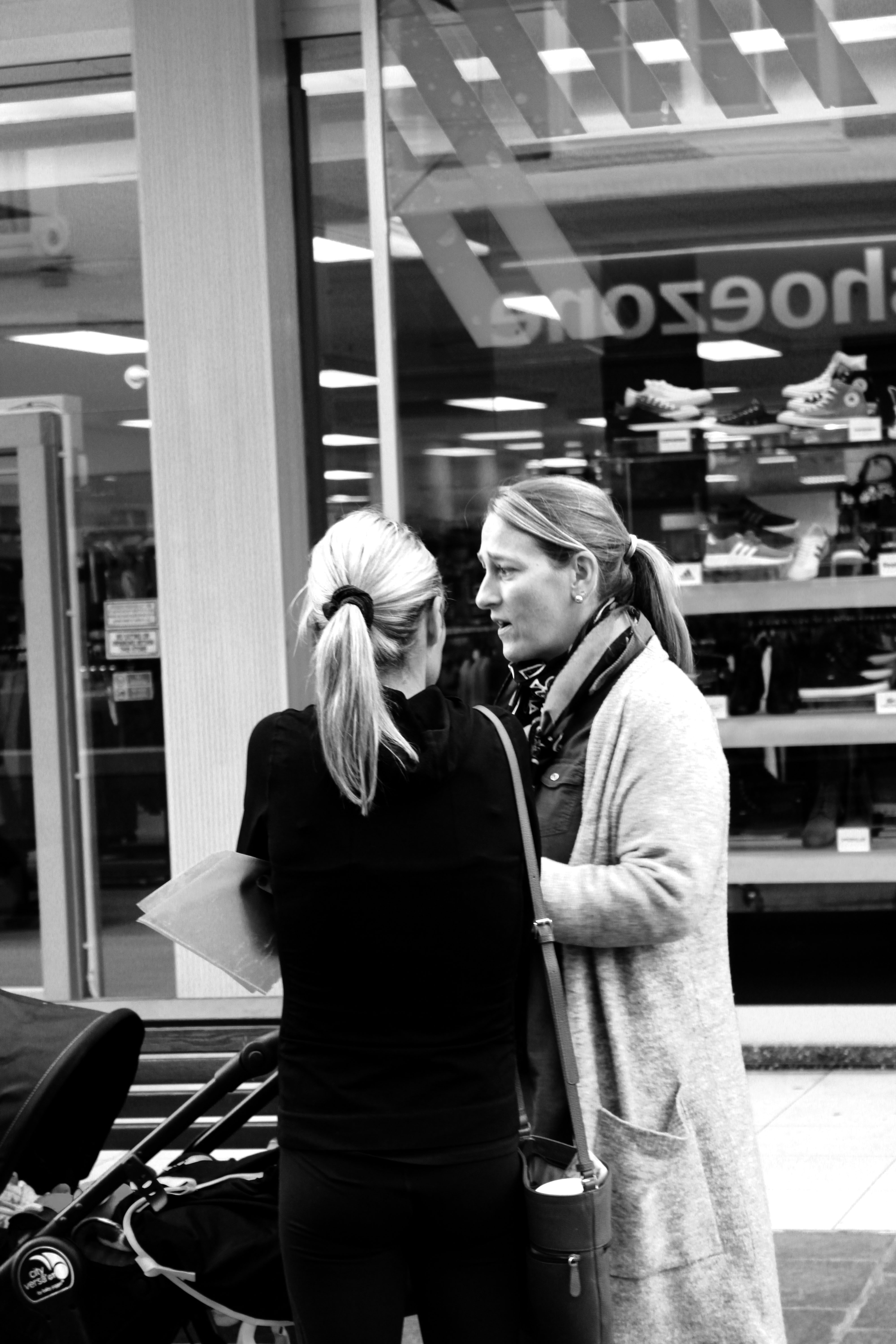
Street Photography-St Helier

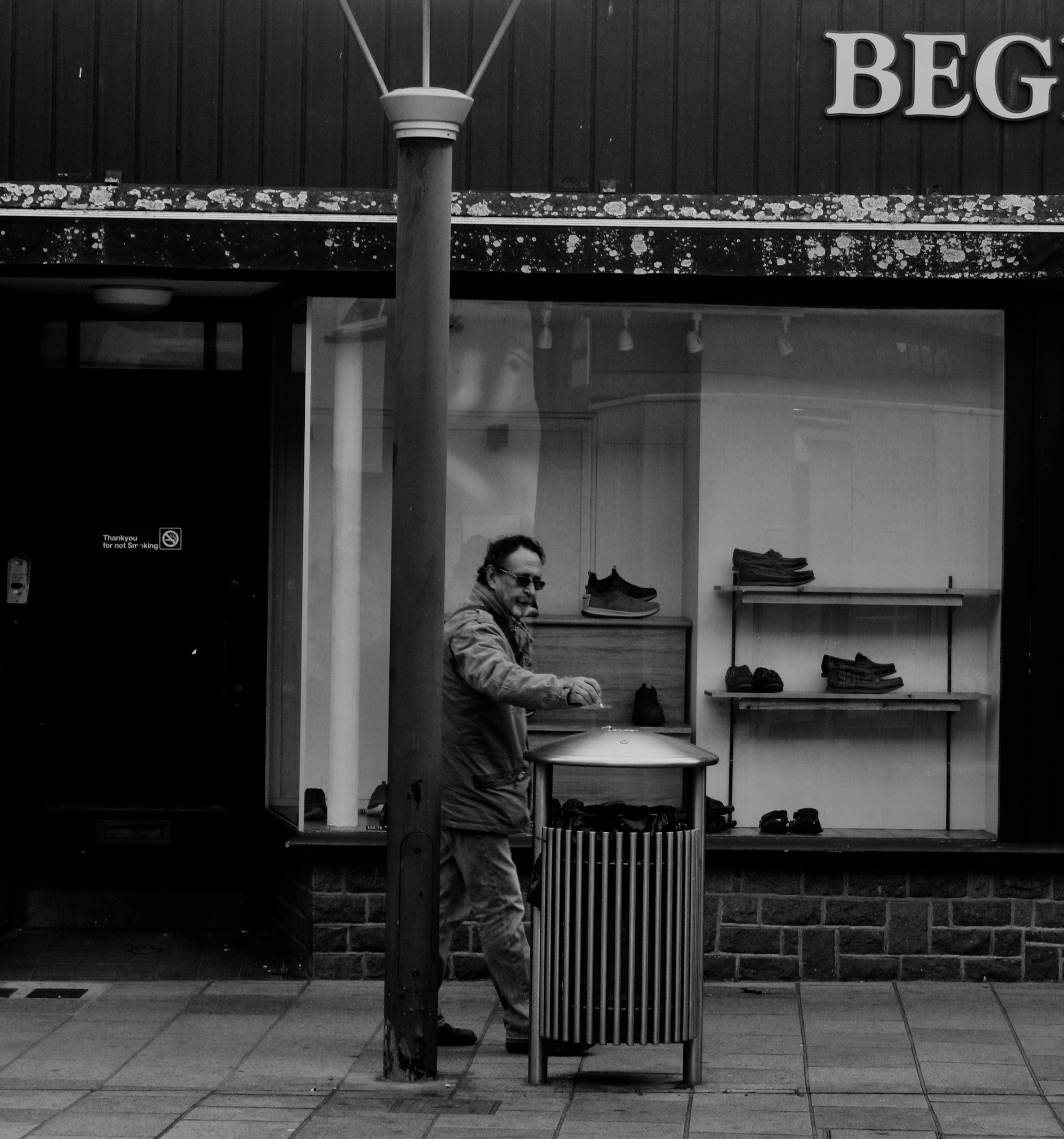
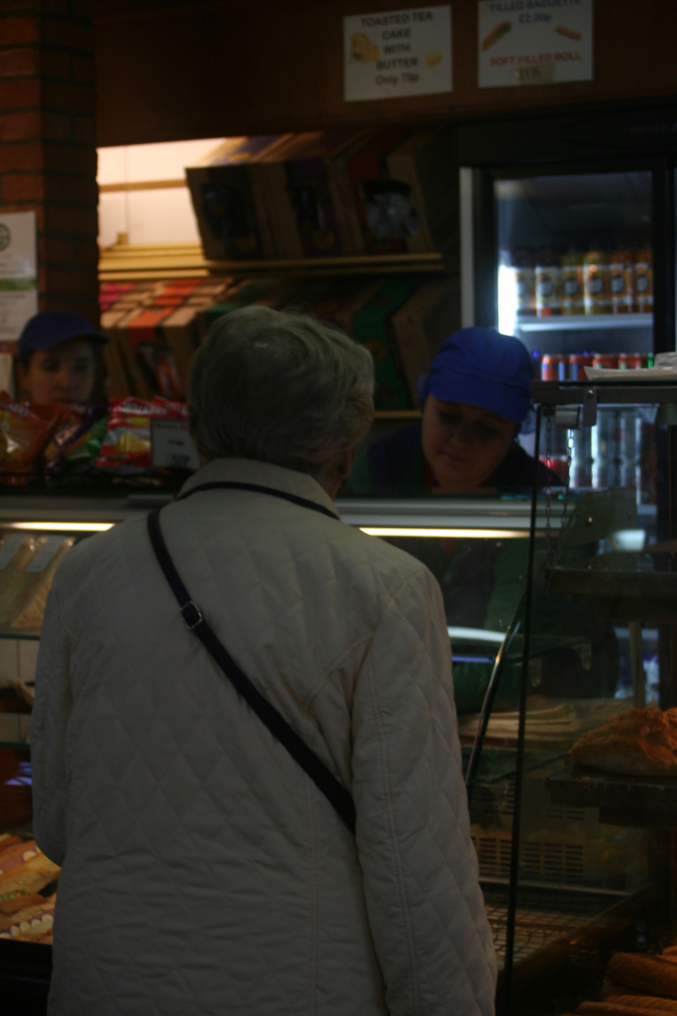
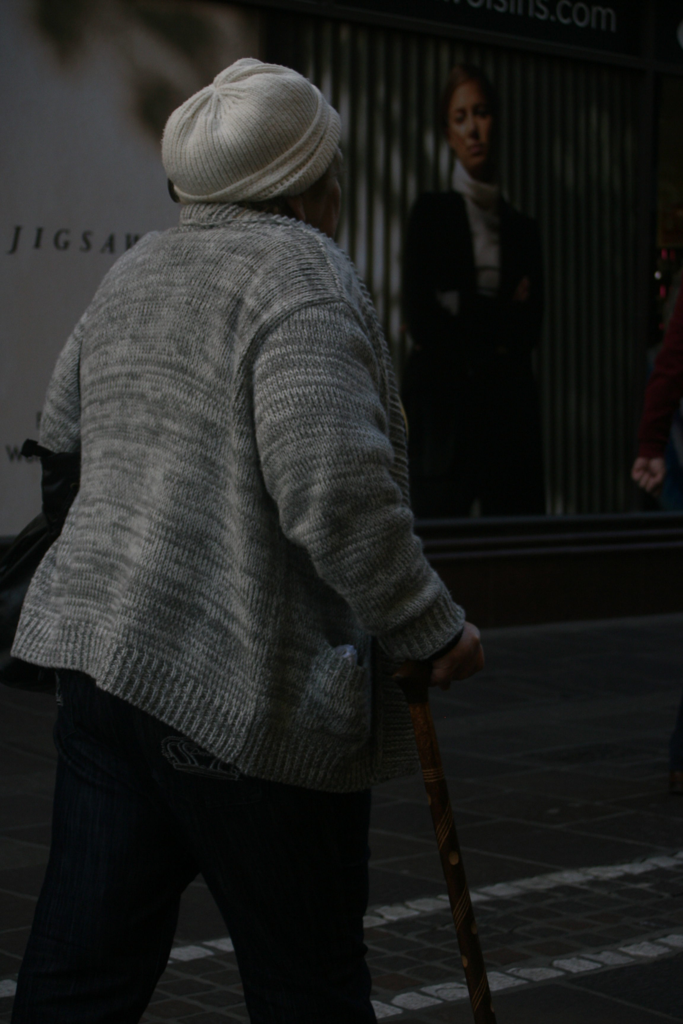
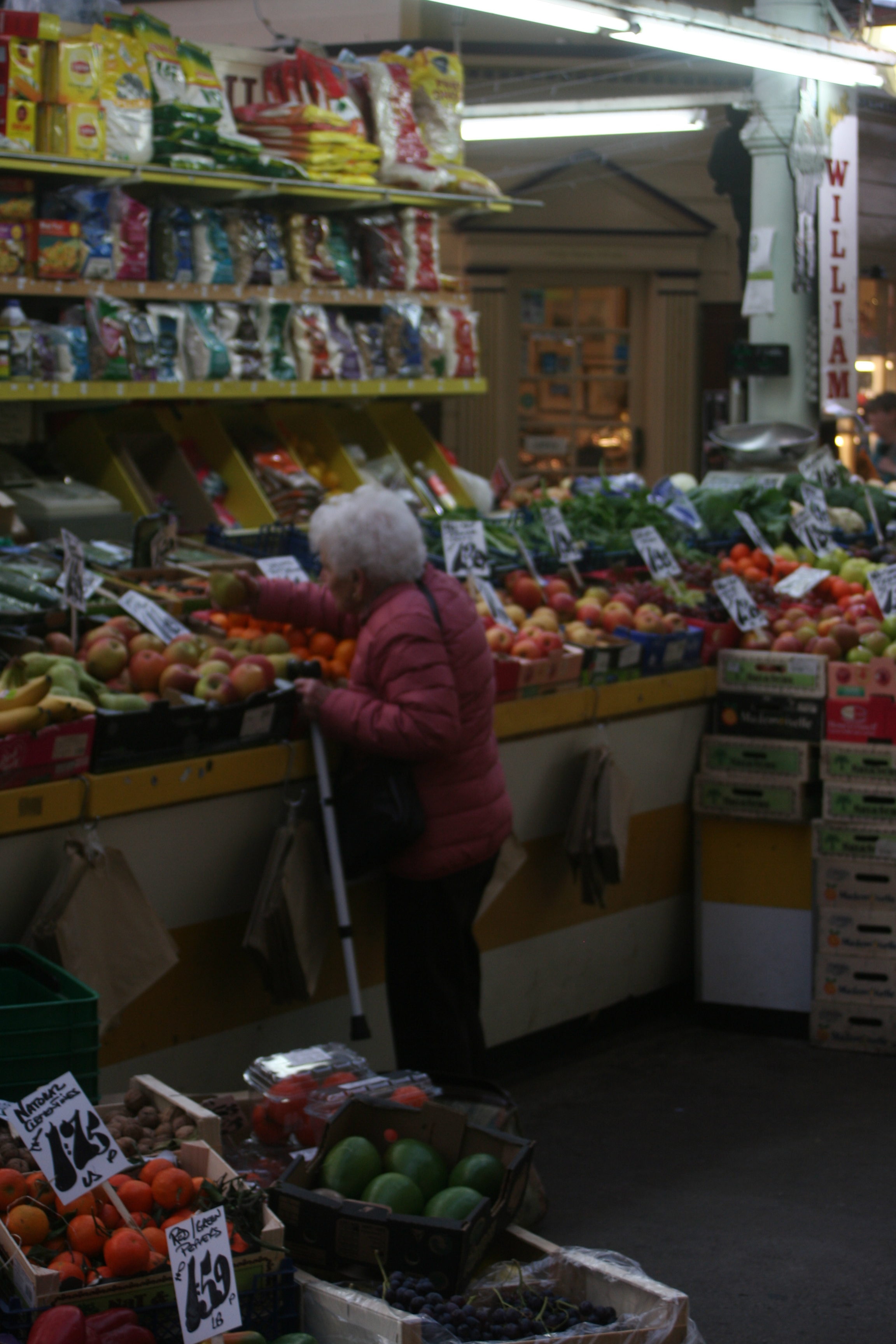
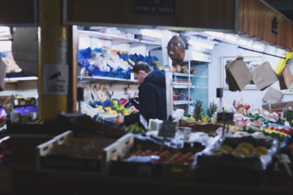
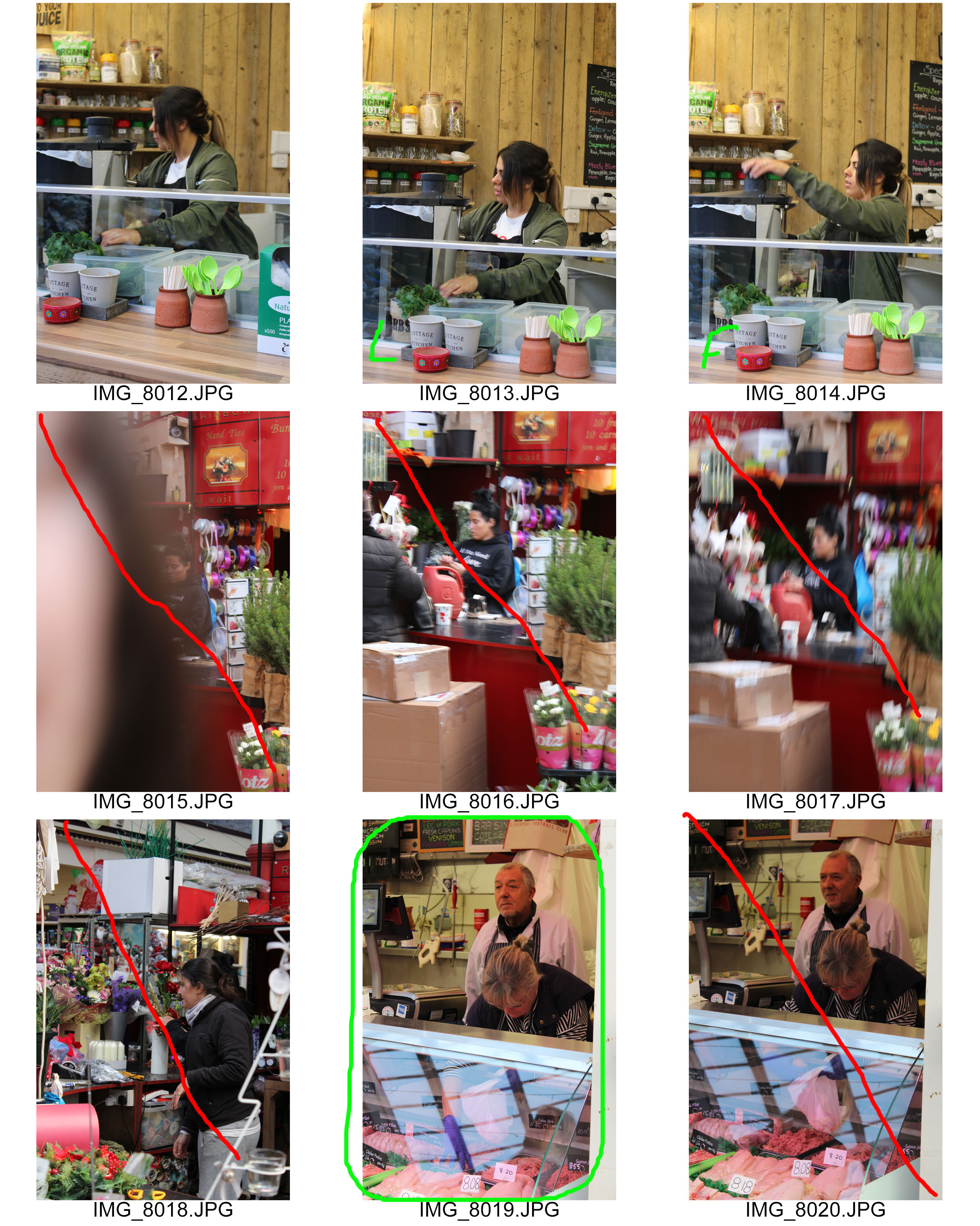
Overall the experience was good for my confidence and it put me out of my comfort zone. The anticipation of this shoot was fairly scary as I don’t feel comfortable taking pictures of people that I don’t personally know. I can know say I have huge amounts of respect for street photographers, you need to be confident in your personality and camera skills, because everything is happening so fast and to be able to take a sharp photo which is in focus takes skill. Although I did get some good final outcomes from this shoot there are many photos which were a large part of trial and error. Due to the changing of location from the bright sunny street to the dark dingy market, it made it hard for me to adjust the camera to get the right exposure, so in some of my photos it’s either too dark you can’t see detail on people faces or the light in the background is over exposed and the background becomes too bright. 
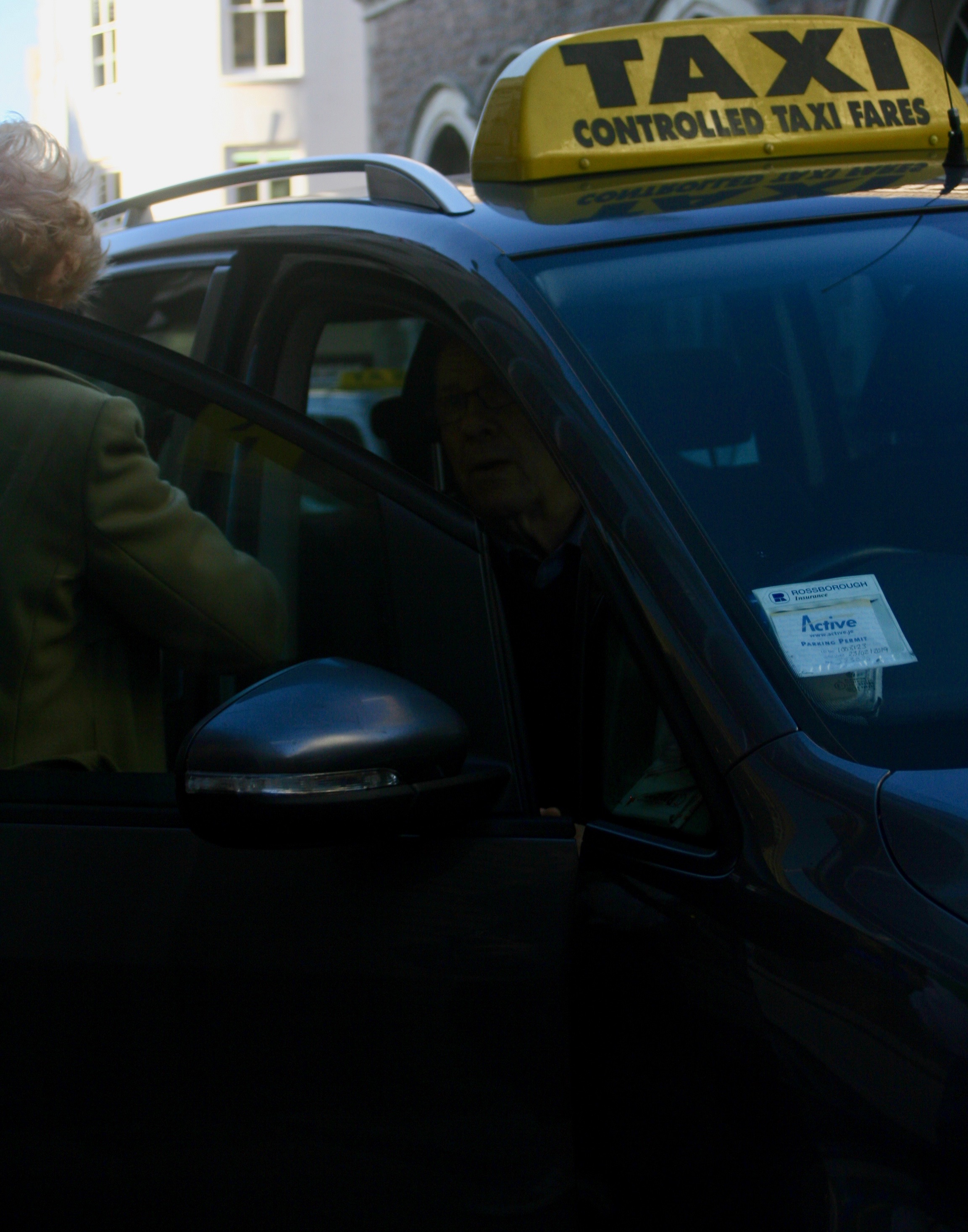
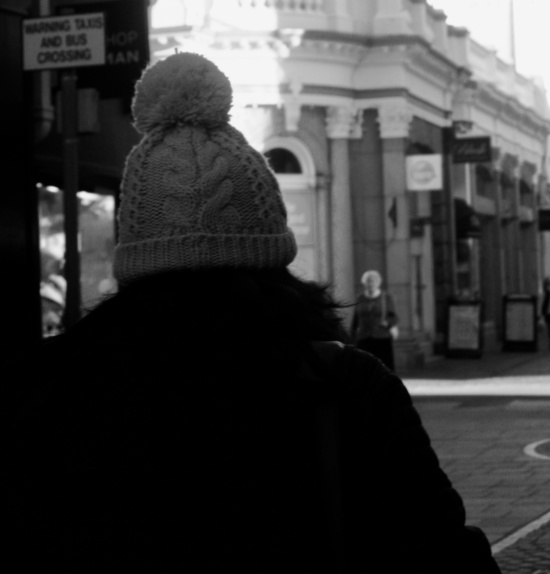
In this particular photo it was under-exposed, so i had to lighten the picture in Photoshop in order for the taxi-drivers face to become clear.

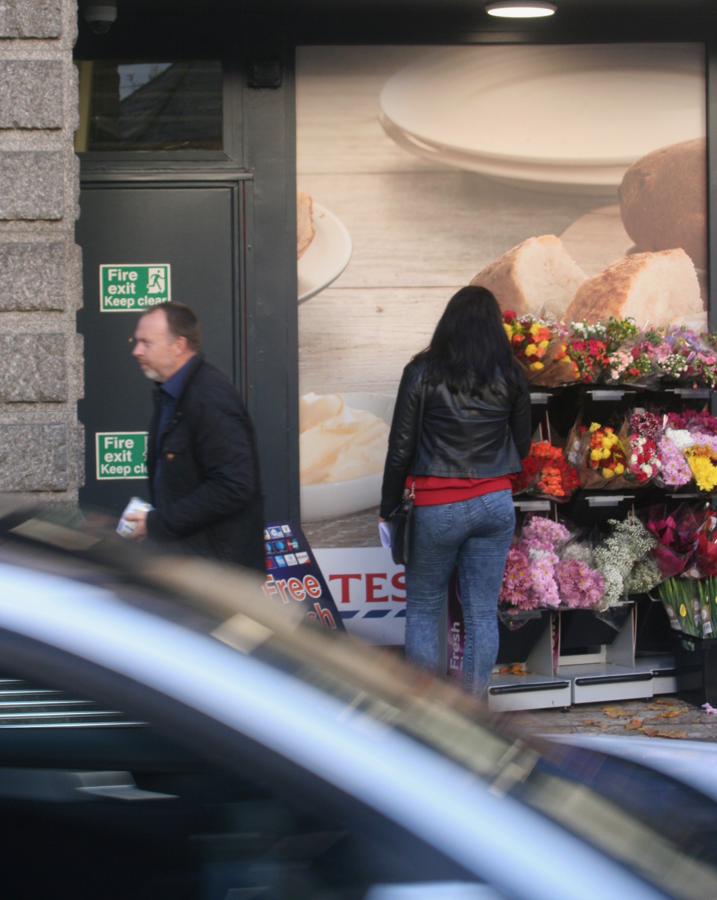
This was one of my favourite photos from from the shoot because of the sharpness of the women, but yet again my exposure was faulty and the sky was over-exposed, lucky cropping easily solved the problem.

Final Piece

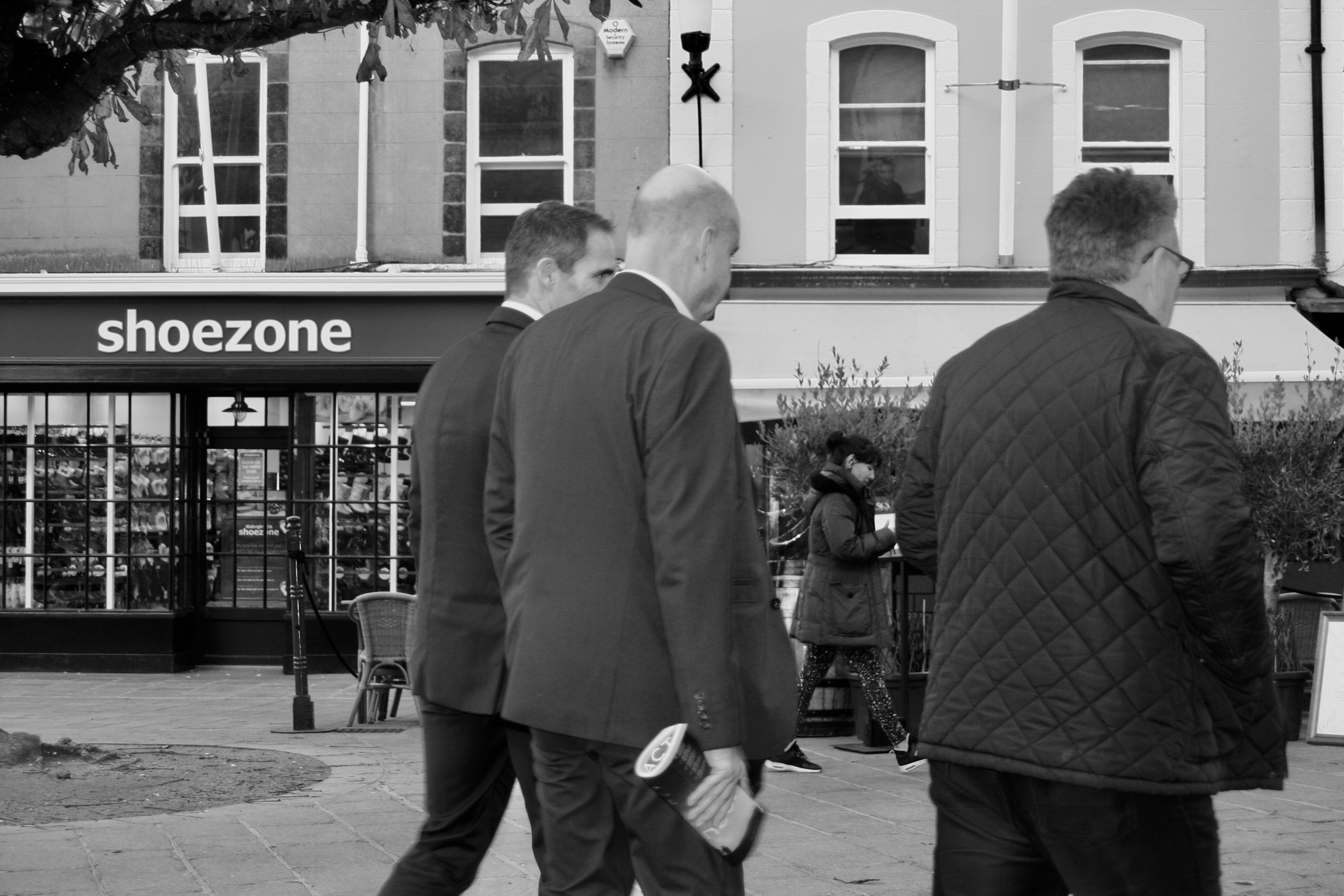
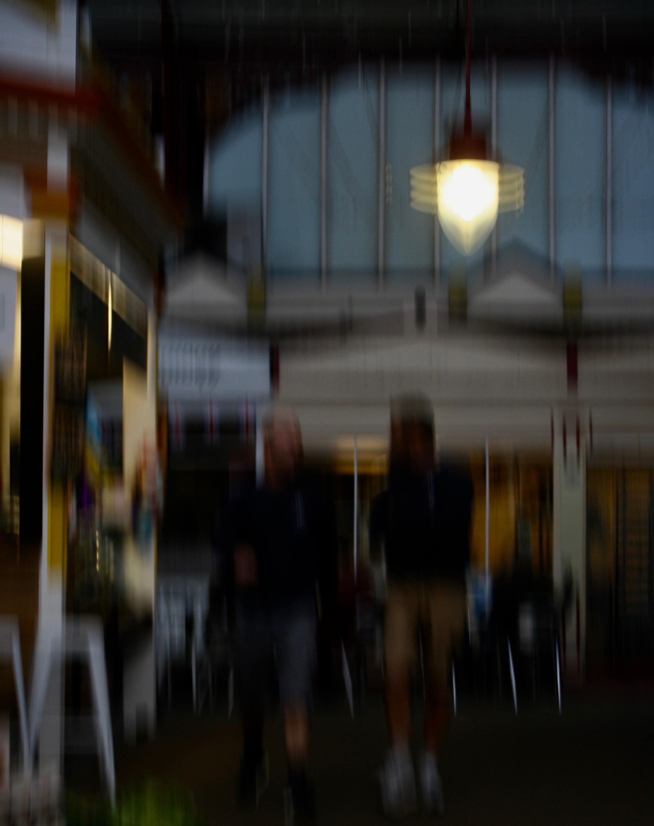
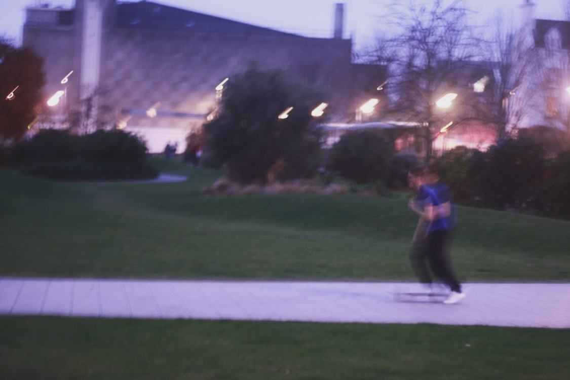
Although this picture was blurred, unfocused and lacked sharpness, i still liked it. I cropped it to get rid of the negative space on the floor and provide more focus towards the light and men. I liked how the blurriness of the photo represents the constant movement in the street and how everything moves like clockwork in town on the week days with everyone as work.

Final Outcome

Studio lighting techniques

There are many possible techniques that can be used in a studio setup, these can be used to achieve various effects, such as minimising shadows, exaggerating shapes or highlighting certain areas of the frame.

One-point lighting:

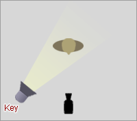
We are used to seeing this type of lighting every day in nature, in the form of sunshine. A single source of light creates a very natural, sometimes dramatic look that will draw people’s attention to the single lighted person or surface. And if it’s good enough for nature, there will be times is will easily bee good enough for taking photos. As anyone can see with a walk around the park, a single source looks two dimensional or flat, and rarely hits people straight on, so it creates shadows.
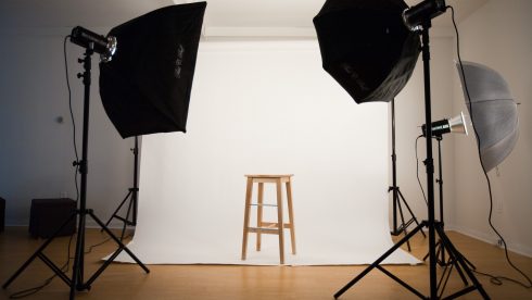
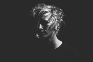
This is an example of an image taken using one-point lighting.

Two-point lighting:

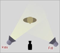
This lighting method is used when you want the subtleness of a single light source but you want the person/object to stand out, and appear more 3D. Its a great way to add depth to photos without going overboard. There is still quite a potential for shadowing if a person turns their head either direction, but where a little shadowing is okay, this can be an effective way to bring focus.

This is an example of an image taken using two-point lighting.

Three-point lighting:

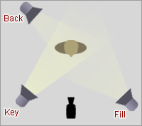
Not everyone is happy with the shadows that two-point lighting can produce, so the obvious solution is to have two lighting points at the front with a back light to try get rid of the shadow.

This is an example of an image taken using three-point lighting.

Environmental Portraits – Blurred Identity

For this experimentation I purposely wanted all of my compositions to be blurry. I wanted to do this because we are all keeping a hold of the idea of not necessarily beauty but self identification. By making my portraits blurry I’m exposing the viewer to assume and suggest a lifestyle, age, occupation and confidence. This is exposing the viewer on their opinions on others around them and how quick everyone is to assume everything.  We all think we have it all figured out from looking at a person but there is more to a person than meets the eye.

Examples

Justin Lincoln – self portrait ‘by the pain of fleeting joy’
Ilkka Uimone for Newsweek

Blurred street photography

Final images

Edits

5. Studio Portraits and Lighting Techniques (Mon 19th-Friday 30th Nov)

Concept : Rankin on “beautiful portraits”


Image result for selection of rankin portraits


Studio Lighting

Exploring Technique

1. Natural Light

Remember >>>Photography is completely dependent on the availability of  light.

In most cases we can make use of natural or available / ambient light…but we must be aware of different kinds of natural light and learn how to exploit it thoughtfully and creatively

  • intensity of the light
  • direction of the light
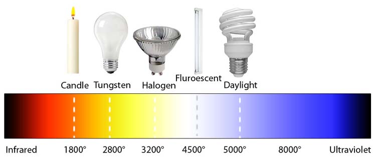
  • temperature of the light and white balance
  • Using reflectors (silver / gold)

Image result for temperature of photography light

Image result for temperature of photography light

  • Using diffusers , tissue paper, coloured gels, tracing paper etc
  • Front / side / back lighting
  • High Key / low key lighting
  • Shadows / silhouettes

2. Studio Lighting

Using artificial lighting can offer many creative possibilities…so we will explore

  • size and shape of light
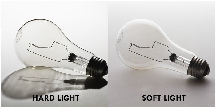
  • distance from subject to create hard / soft light
  • angles and direction…high, low, side lighting
  • filtered light
  • camera settings : WB / ISO / shutter speed etc
  • reflectors and diffusers
  • key lighting, fill lighting, back lighting, 3 point lighting
  • soft-boxes, umbrella lights, spot lights and floodlights
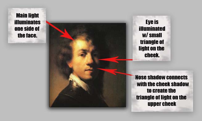
  • chiarascuro and Rembrandt lighting
  • high key and low key lighting techniques
  • backdrops and infinity curves
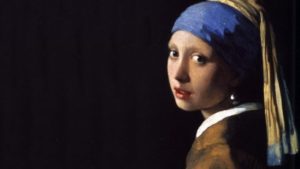
Johannes Vermeer, The Girl with the Pearl Earring, 1665—-chiarusco as employed by the Dutch Masters

Image result for chiaroscuro

Image result for bouncing the flash

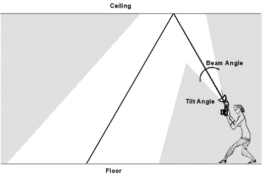
Above : An example of “bouncing” the flash to soften the effects and create a larger “fill” area…try this wherever there are white walls/ ceilings

Using Flash

Flash units offer a range of possibilities in both low and high lighting scenarios…we will explore

  • flash “bouncing”
  • fill-in flash
  • TTL / speedlight flash
  • remote / infra-red flash (studio lighting)
  • fast + slow synch flash
  • light painting c/w slow shutter speeds

Evidence of Your Learning

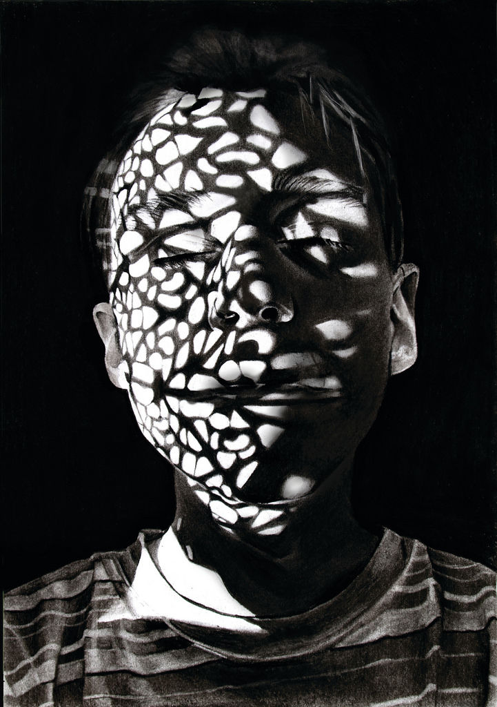
During this weeks we would expect all students to complete 2-3 blog posts  detailing how you are experimenting with various lighting techniques eg CHIARASCURO / REMBRANDT LIGHTING

Add information / links showing how Chiarascuro has been used since the Renaissance in painting…but also how it used now in photography and film

You must describe and explain your process with each technique…add your images to your blog as you progress, print off your successful images and evaluate your process using technical vocab and analysis skills. Think carefully about the presentation of your ideas and outcomes…compare your work to relevant portrait photographers as you go eg

Annie Leibovitz, Irving Penn, Rankin, Richard Avedon, Yousef Karsh, David Bailey, Mario Testino, Steve McCurry, Jill Greenberg, Nick Knight, Tim Walker, Corrine Day, Jane Bown etc

Expected Final Outcomes this Week

  • Case Study and Practical Responses to Rankin or another studio photographer
  • 1 x Final Portrait using natural light + analysis and evaluation
  • 1 x Final Portrait using artificial light (1, 2 + 3 point lighting) + analysis and evaluation
  • 1 x Final Portrait using flash + analysis and evaluation

Think about how you can show evidence of head shots, cropped head shots, half body, three-quarter length and full length portraits.

Show that you can employ interesting angles and viewpoints…

Make sure you ANSWER THESE QUESTIONS IN YOUR BLOG

  • Why do we use studio lighting?
  • What is the difference between 1-2-3 point lighting and what does each technique provide / solve
  • What is fill lighting?
  • What is spill lighting?
  • What is Chiarascuro ? Show examples + your own experiments
Bouncing the flash to soften its effects


Or use light painting techniques…

  • Slow Shutter speeds (1/30th sec or BULB setting)
  • Illuminate an area / person with a torch , study lamp, glowstick, car headlights etc…

HOMEWORK

(Refer to your tracking sheet)

  1. You must complete a range of studio lighting experiments and present your strongest ideas on a separate blog post
  2. Remember to select only the most successful images
  3. You should be aiming to produce portraits that show clarity, focus and a clear understanding of a range of lighting techniques
  4. Editing should be minimal at this point…we are looking for your camera skills here
  5. But…be creative and experimental with your approach “in camera”…extremes, uniqueness and possibly thought provoking imagery will improve your ideas and outcomes.

Image result for inventive portraits

Image result for contemporary portrait photography
Hendrik Kerstens
Image result for contemporary portrait photography rankin
Rankin
Image result for self portrait contemporary photography
Paola Sanchez

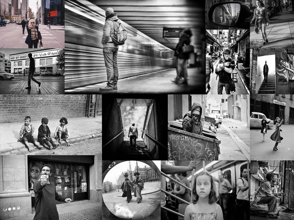
Street Photography


Mood Board

Definition: ‘Street photography, also sometimes called candid photography, is photography conducted for art or inquiry that features unmediated chance encounters and random incidents within a public place. Although there is a difference between street and candid photography, it is usually subtle with most street photography being candid in nature and some candid photography being classifiable as street photography. Street photography does not necessitate the presence of a street or even the urban environment. Though people usually feature directly, street photography might be absent of people and can be of an object or environment where the image projects a decidedly human character in facsimile or aesthetic.’

“Don’t wait. The time will never be just right.”
-Napoleon Hill

“Just go out and shoot! It’s great to get inspired by reading books and watching tutorials and so forth, but you need to actually go out and take pictures. Don’t be afraid to get out there.”                                     -Valerie Jardin

Henri Cartier-Bresson

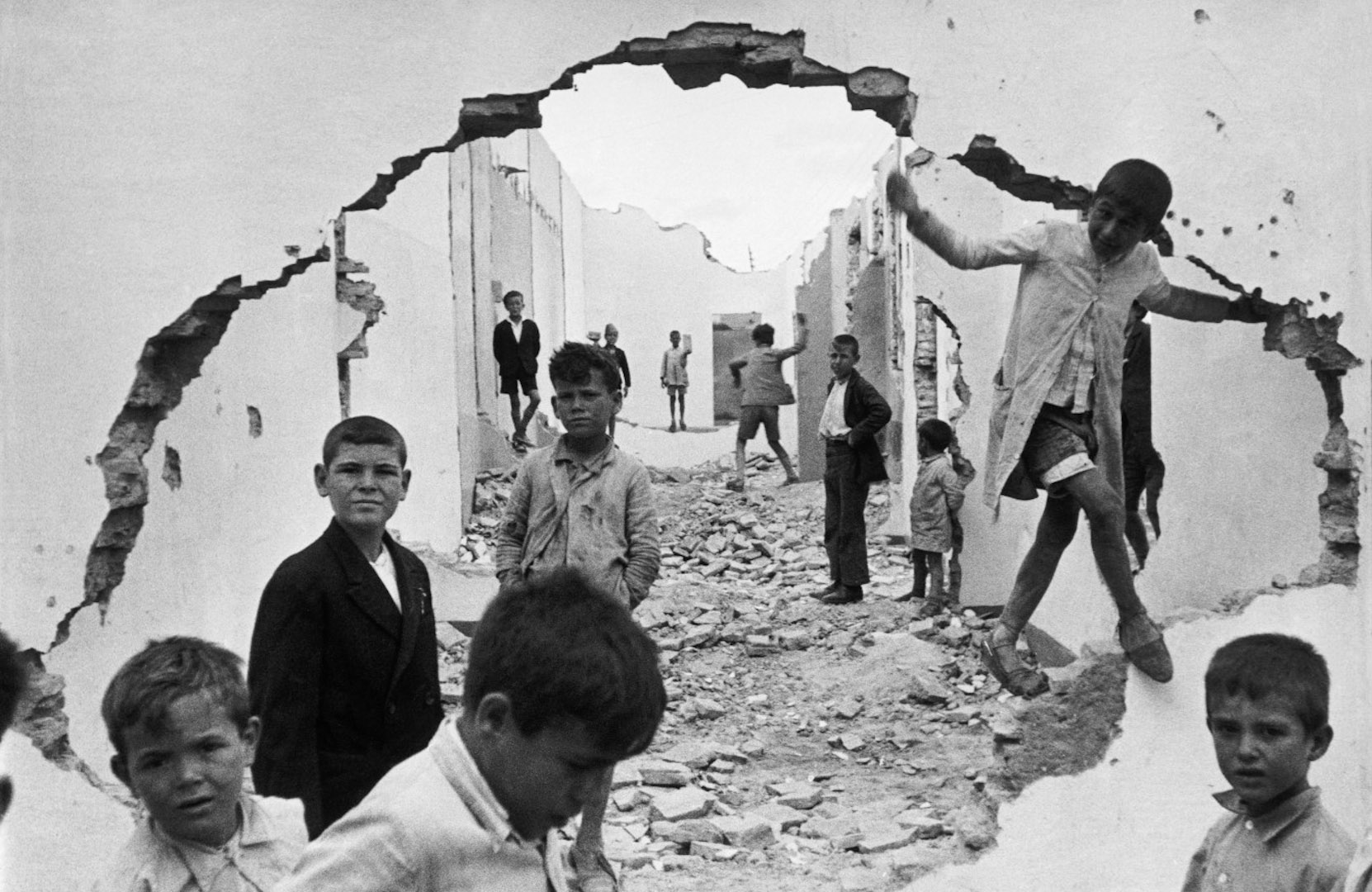
Bresson was a French photographer, who was said to have pioneered the genre of street photography. He thought of photography as a way of capturing a decisive moment. Bresson’s passion of photography came at an early age where he used to capture moments of his family holidays. This small hobbit then turned into his career, where he made a massive contribution towards photography.

Henri Cartier-Bresson

Emotional Response

When first viewing the photograph, we begin to grow an emotional attachment to the child located around the image. This is because it seems like their homes have been destroyed, leaving them with the remains of the homes to play with. The morbid photograph is interesting as the facial expressions on the children are not happy making us realise that something is not right, making us more emotionally attached to the image. Moreover, the children’s faces look soiled meaning that the setting is not hygienic and potentially very unsafe for them.

Technical Response

This photograph is presented in black and white, which allows the solied faces of the children to be clearly visible, it also allows the broken walls and dirty floor, to present the formal element of texture. The fact that the image is black and white also plays on the idea that the children have nothing, like we had nothing back in the day. The wall with a hole in it has been used as a frame, which is framing the background allowing the viewers eyes to clearly be guided around the photograph. The location of the children also helps to guide the eyes, as there are more kids in the foreground and less in the background, (creating a large proximity) making our eyes look at the front of the image and make there way towards the background. The formal elements of shape and space are also presented through this image, through the use of the children and the collapsed walls, trapping them. The whole frame of the photograph is in focus, however, the background is slightly less out of focus, which means there is a large depth of field. Moreover,  the aperture is likely to be around F11 – F8. The shutter speed used to capture this image is likely to be quick, as there is no intended blur. Additionally to the ISO is also likely to be low as there is no noise created by the light. The lighting used in this photograph is likely to be natural, as it has been taken outside, in what could be the children’s natural environment. This image consists of some negative space, which is found at the background of the frame, this creates a sense of that these children live with nothing and are trapped with nothing, which also helps to create an emotional attachment.

Contextual Responce

This image was taken in 1933, which was a couple of years before the Spanish civil war. The children are said to be playing in a ruins, a destruction from a previous war. 1933, was one of the worst years during the Great Depression, which was a time when the economy collapsed, which also helps to provide contact towards the photograph.

Conceptual Response

Now knowing the context, I believe the concept of this image was to show the effect of wars and the Great Depression for those in poverty, the use of children makes the image more hard hitting towards viewers. The hole in the wall is trying to show the children trying to break away from there reality. It also shows how it has effected the children, leaving them with only ruins to play in.

Photoshoot Plan

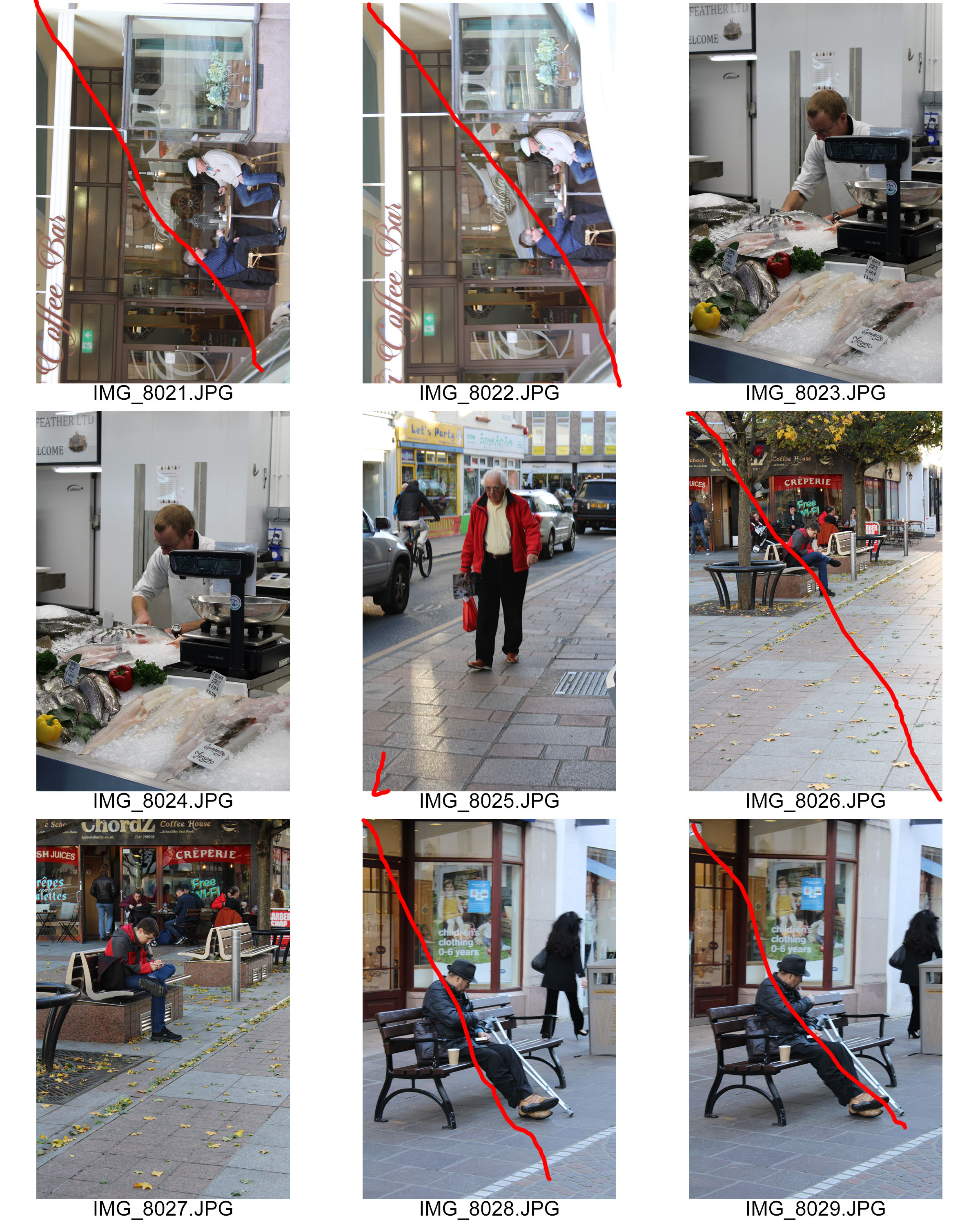
I will be capturing my street photography images in town, during the early afternoon, a time which can sometimes be busy. I will be walking around the streets, looking for interesting characters. The aim is to remain a discrete as possible, so the citizens are unaware of me capturing the images. The lighting will be natural and my camera settings will also be kept simple, however, I do want a quick shutter speed as it will allow me to capture many images.

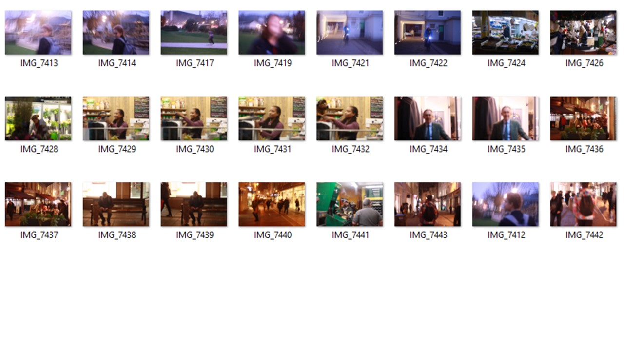
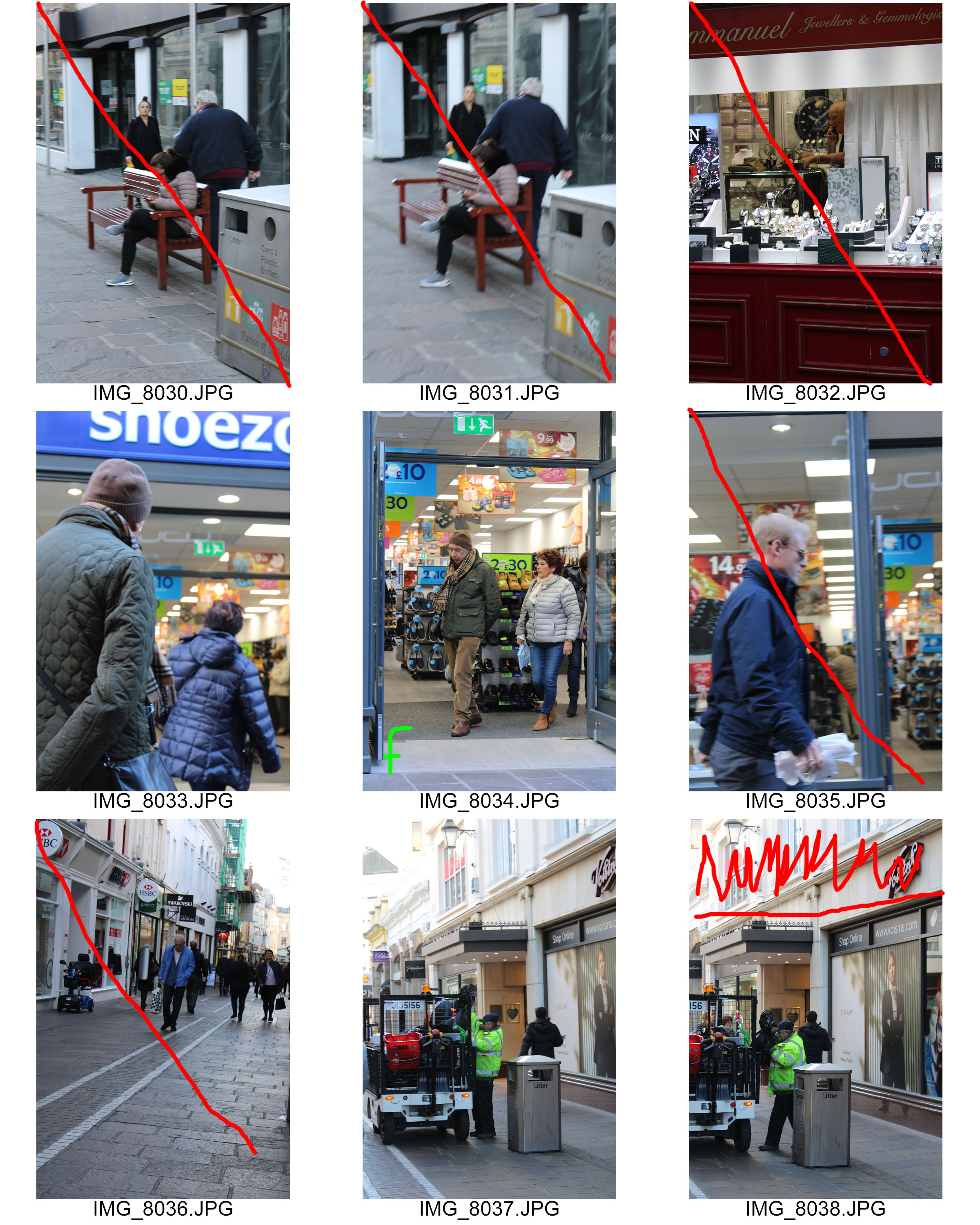
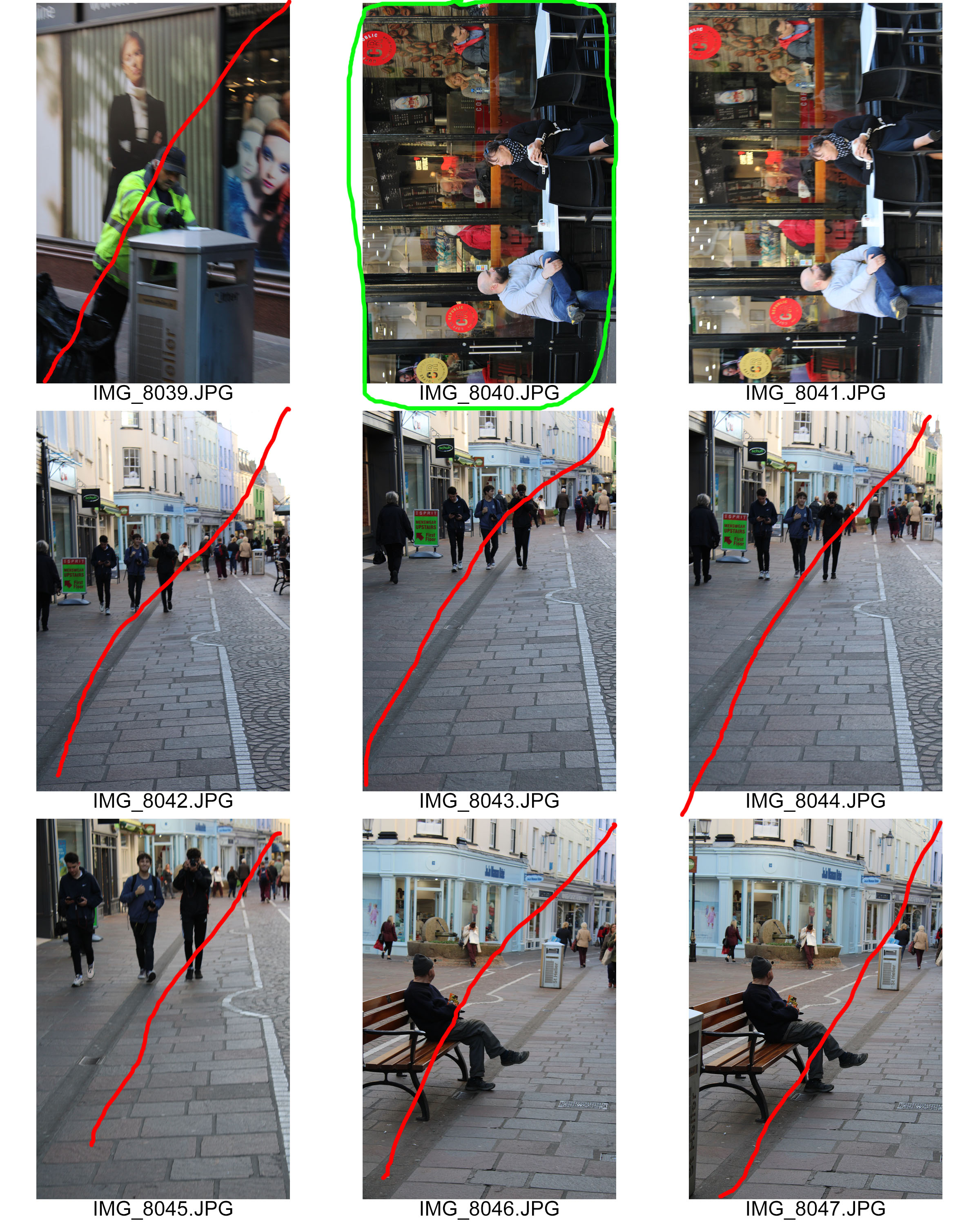
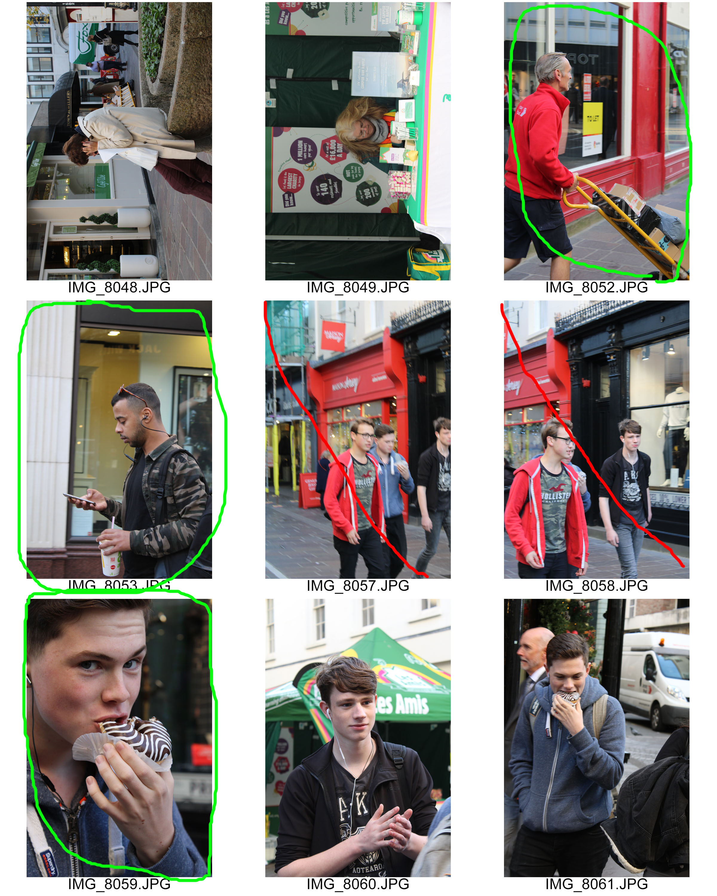
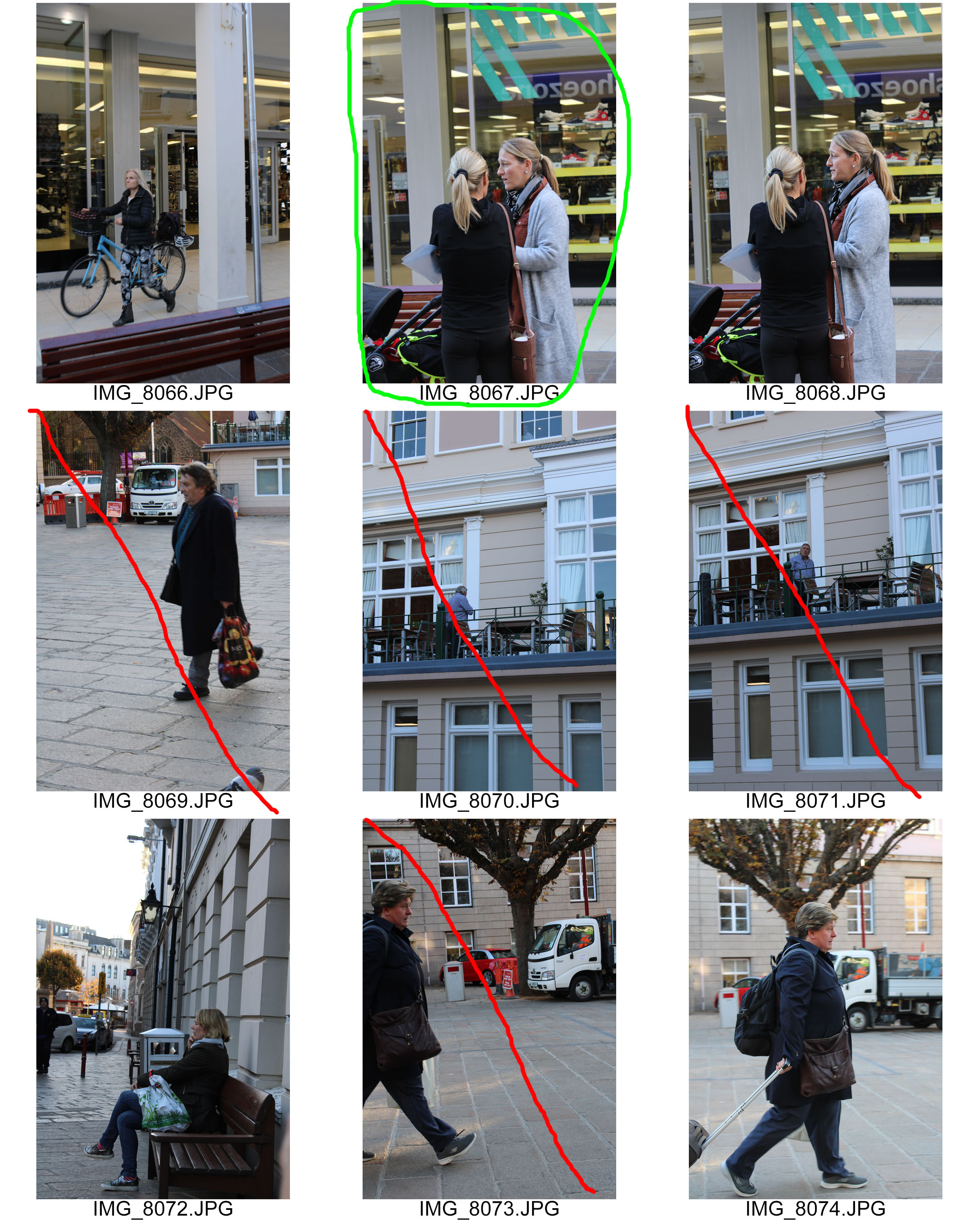
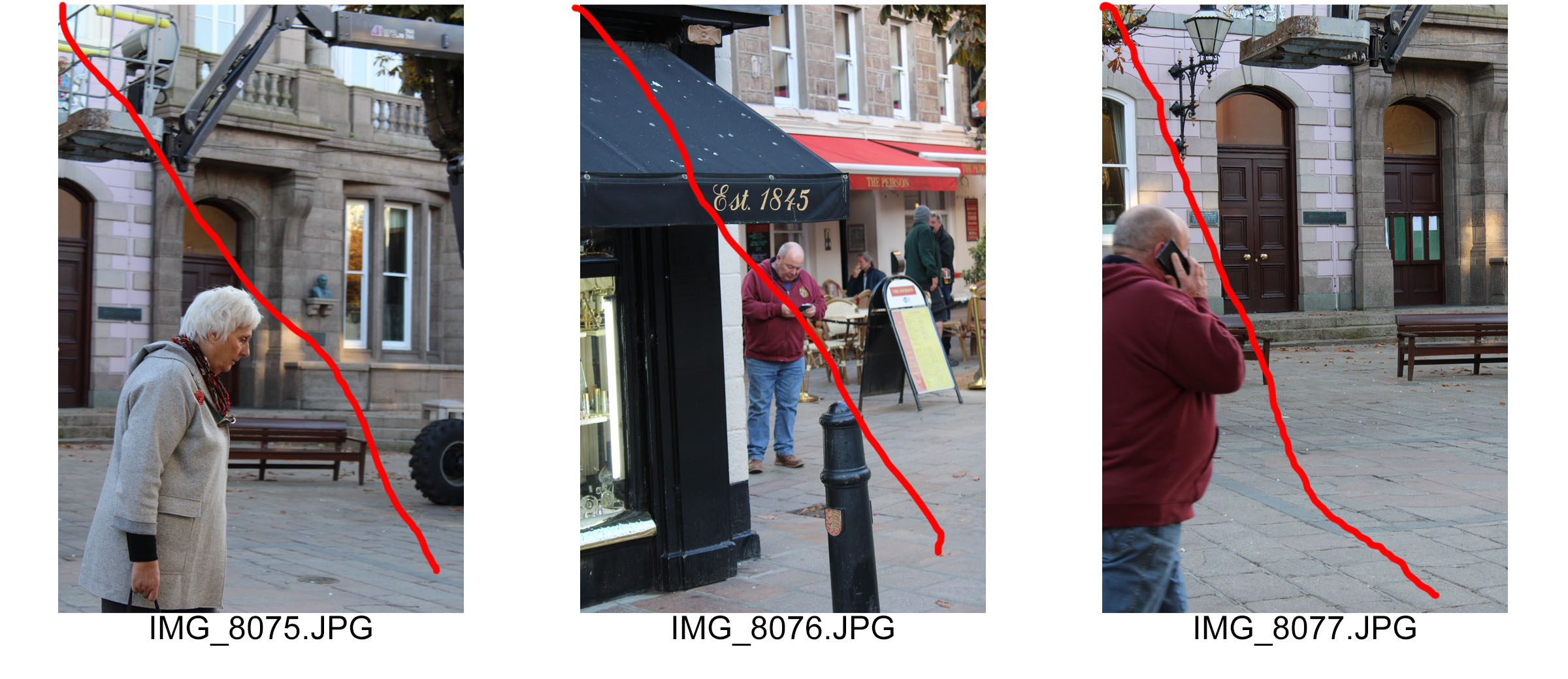
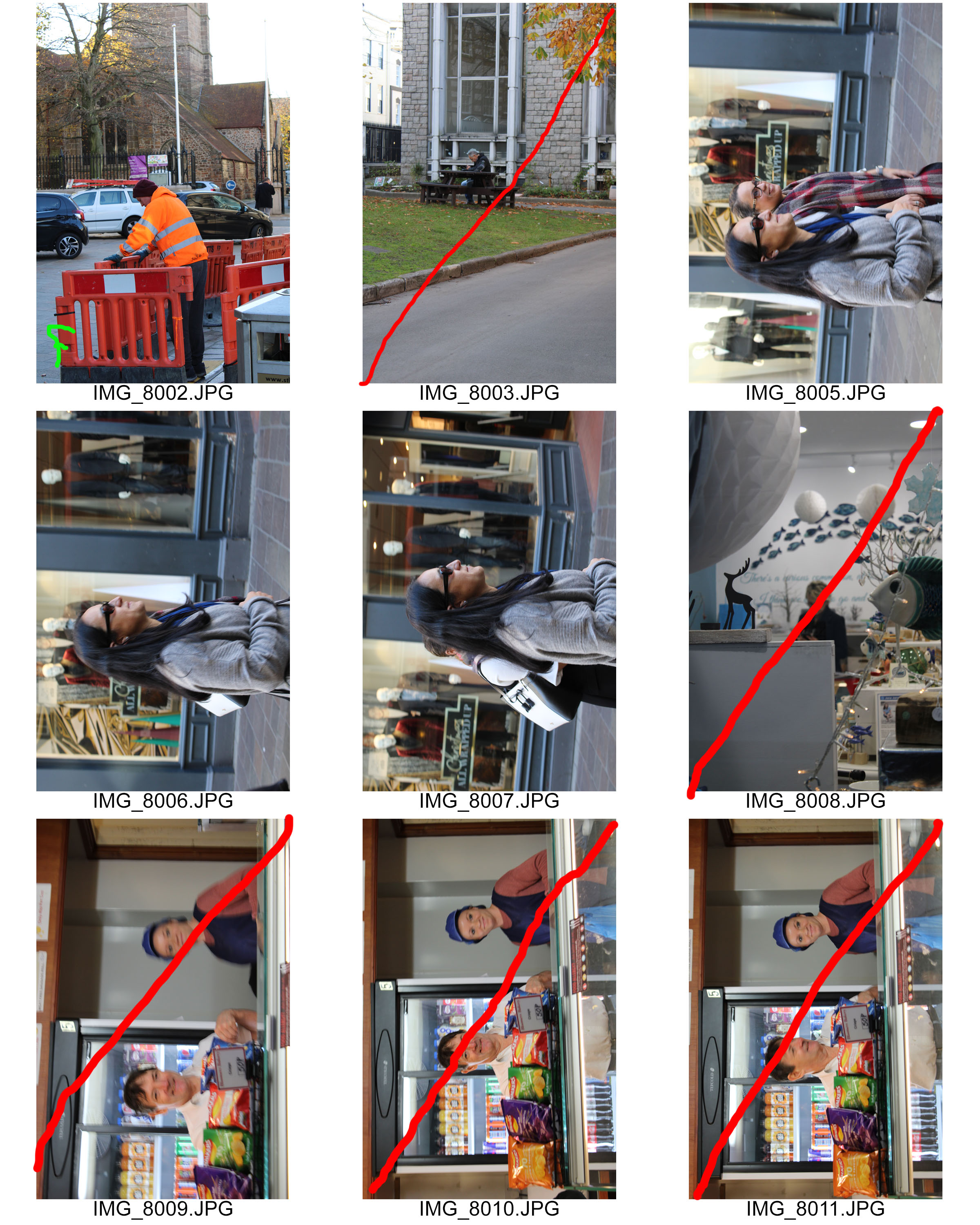
Contact Sheets

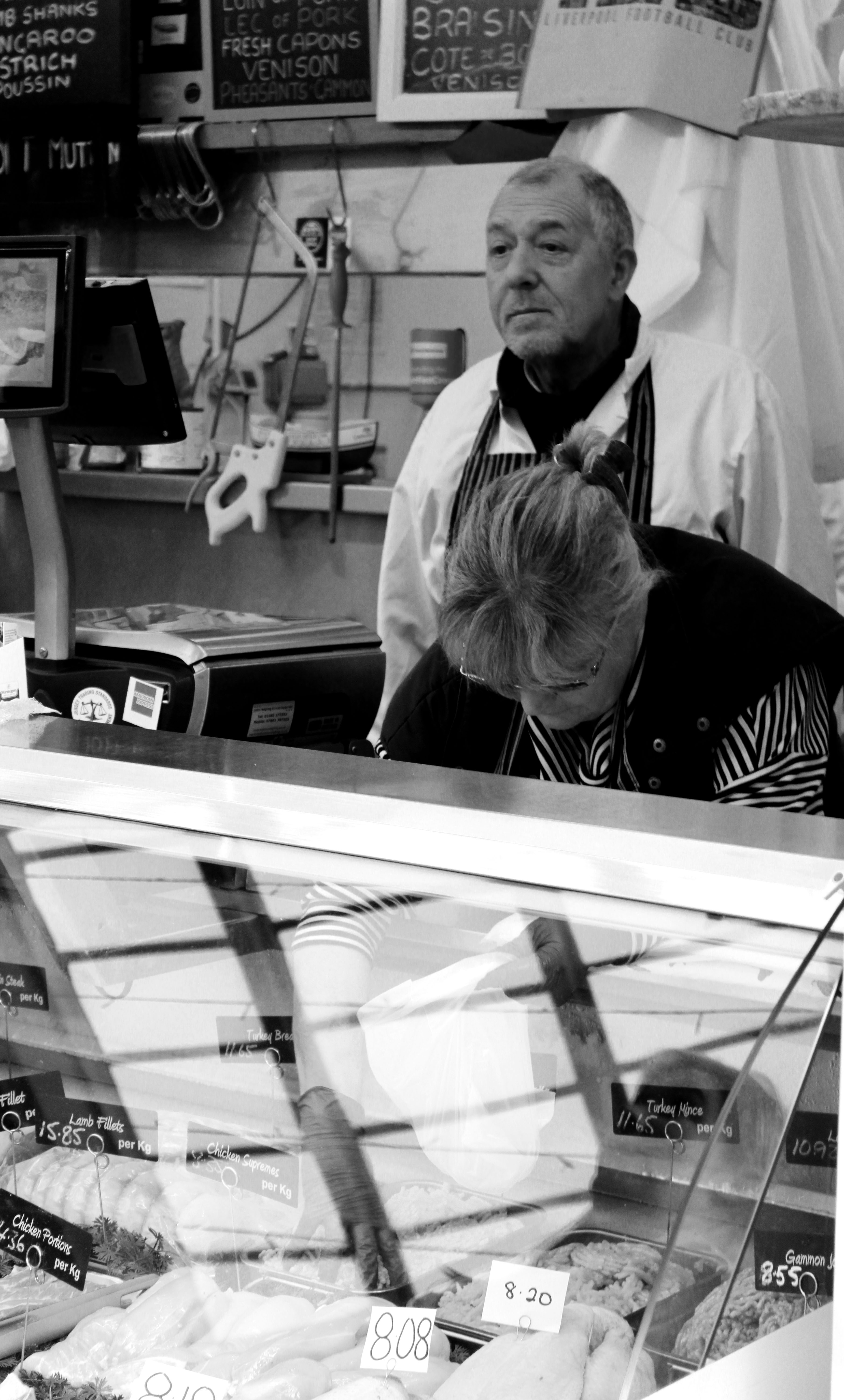
Final Outcomes

Comparison

In technical terms I feel that my work and Bresson’s work is similar, we both presented our images in black and white, I attempted to have the formal elements of shape, texture and space in my images as those a key elements to Bresson’s photograph. Moreover, I tried to create a depth of field, where the people are mostly in focus, but still having the background in focus, but not as clear at the foreground. Bresson’s photograph is very different in conceptual terms as he is trying to show the effect of war to children in poverty. My photographs concept was to show the different kinds of people found in town during a busy period.

Tableaux – Image Selection/ Editing

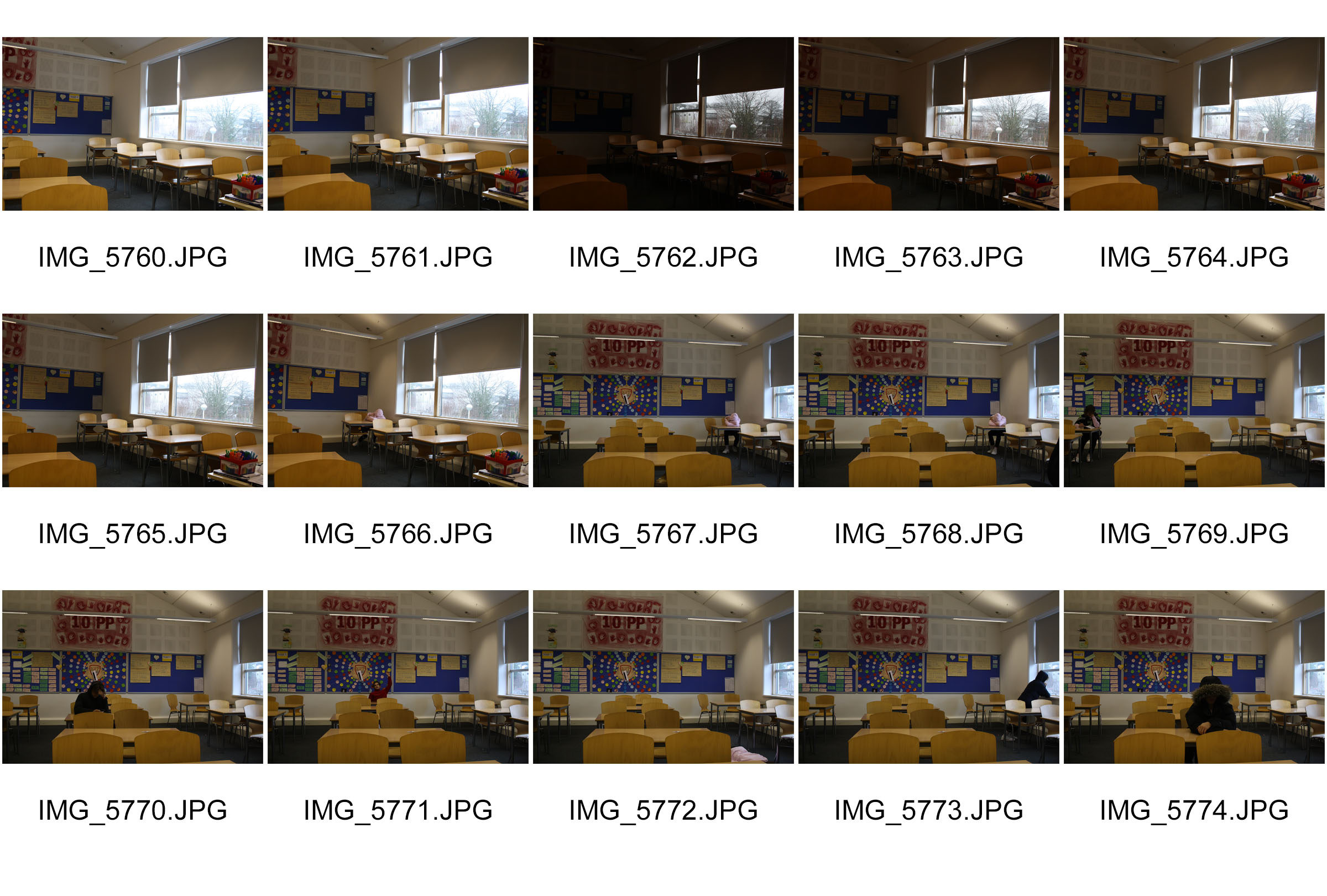
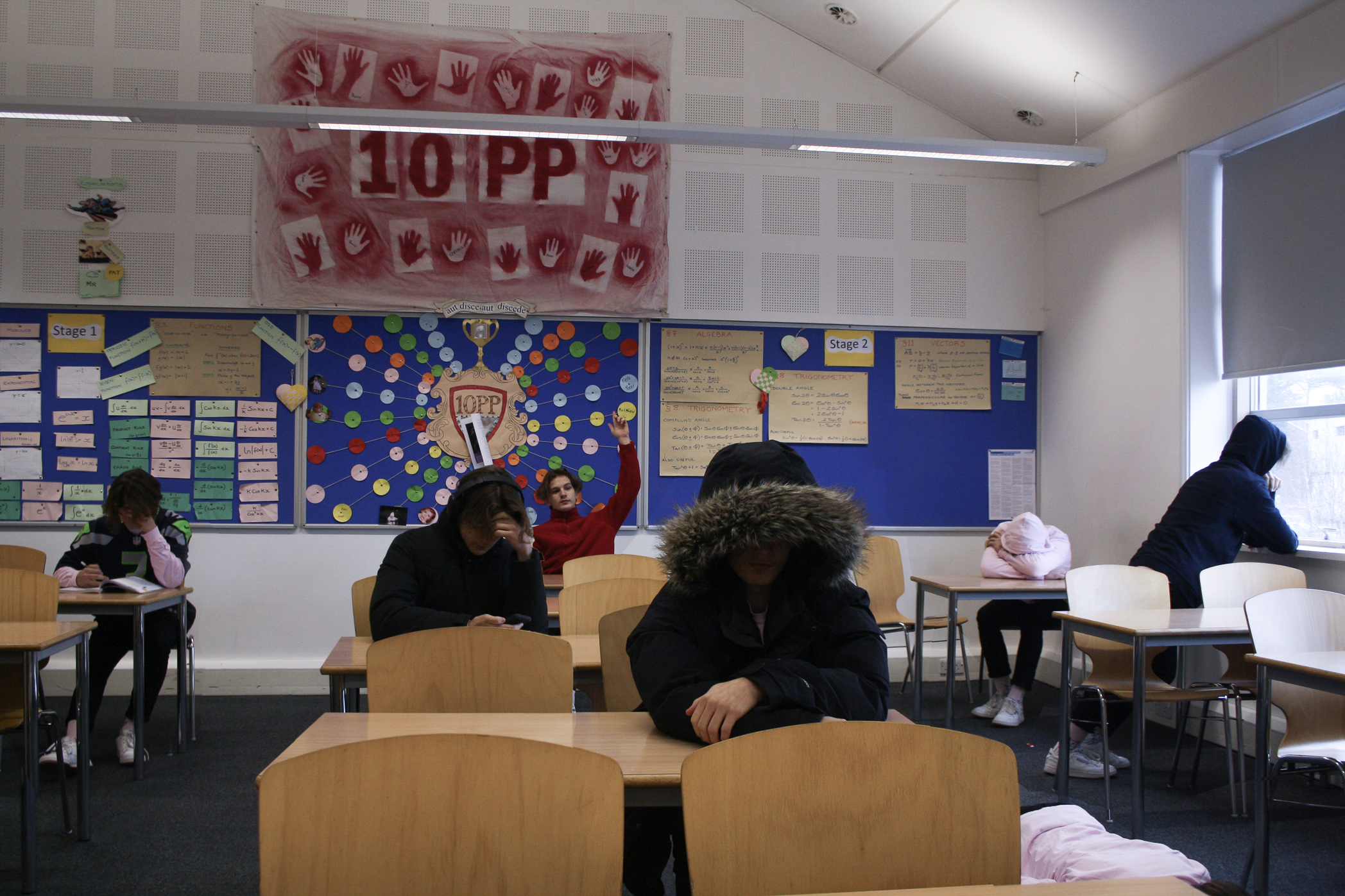
For my tableaux I decided to respond to the work of Paul M. Smith, and so I set up a tripod and used a remote for the camera in order to avoid any movement in the camera in order to allow the merging of the images to be done a lot more easily and convincingly. I decided to avoid my subjects overlapping in the images in order to prevent any unnatural lines around the edges of the subjects. I did allow the subjects to overlap in one area however in order to create a more convincing product. It was important that the lighting remained the same throughout the images which was difficult to do since I was using some natural lighting in parts of the image, in order to avoid issues further down the line, I took the images using natural light first and close together in time in order to prevent interference from cloudy weather.

I placed all of the photos taken into a single Photoshop file and separated them into layers, I then rubbed out everything expect for the subject and some of the background in order to allow for easier blending and interaction with shadows/ reflections. I used rather flat lighting for most of the image in order to allow for ease of hiding any color/ lighting mismatching. Any color differences were adjusted in Photoshop and then hidden using a feathered eraser. The image was slightly color corrected as I found areas such as the chairs to be over-saturated.


Tableux Vivants – Action Plan

Who: I will be photographing myself.

What: I will recreate a typical classroom scene featuring myself as the various subjects throughout the photo.

Where: I will be using any available classroom preferably with available natural lighting somewhere in the image.

Why: Since I am only photographing myself, I am able to more accurately create the image I want since I wont have to direct any other subjects, and also if I don’t like how I look in any particular position I only have to retake one image and don’ t have to reset everyone in the image. I also believe that the lighting in the scene will create some interesting challenges such as blending various types of lighting as well as blending shadows from various sources of light and subjects.

Paul M. Smith Case Study – Tableaux

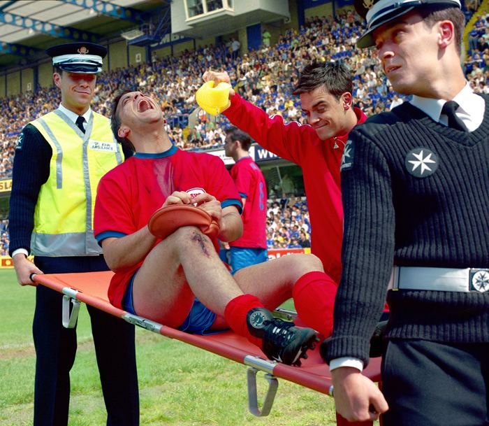
Paul M. Smith is a photographer who’s photography mostly consists of an unconventional interpretation of tableaux vivants as his images depict modern scenes with Paul Playing the part of every subject in the photo. A lot of his photography explores the idea of ‘lad culture’. His images feature several frames merged together carefully so it appears that Paul is in several places in the image at once, This is likely done using a tripod and remote in order to avoid any movement to camera, this creates a seamless transition between the images which in some cases, one of his photos will contain as many as 8 frames in a single image. He often pushes the boundaries of what is possible with this type of photography, often featuring interaction between the subjects in the photos, which will often look awkward and it is difficult to be spacially aware of subjects that of course, aren’t actually there however if done correctly can make the images much more convincing. The image below is an example of this, you can see 6 subjects very close together overlapping in different areas, with some of the subjects even touching in areas.

Image result for Paul M smith

There isn’t much technically special with these images as they are made to look like a typical photo to document a memory etc. This helps to make the image look even more convincing. It is taken using very flat lighting (likely using a flash) to help hide any seems between the images and there are visible drop shadows interacting with the various subjects in the photo likely added in post processing in a program such as photo-shop.

Image result for Paul M smithImage result for Paul M smith