Category Archives: Component 1 Personal Investigation

Filters

Author:
Category:

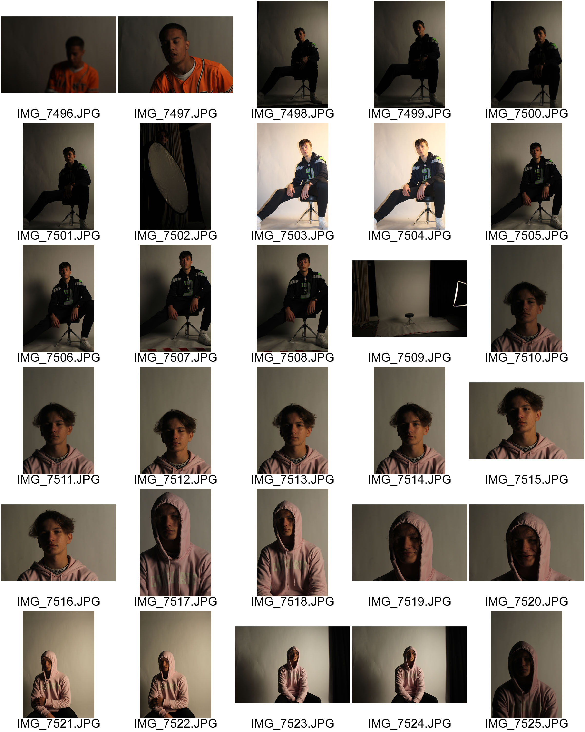
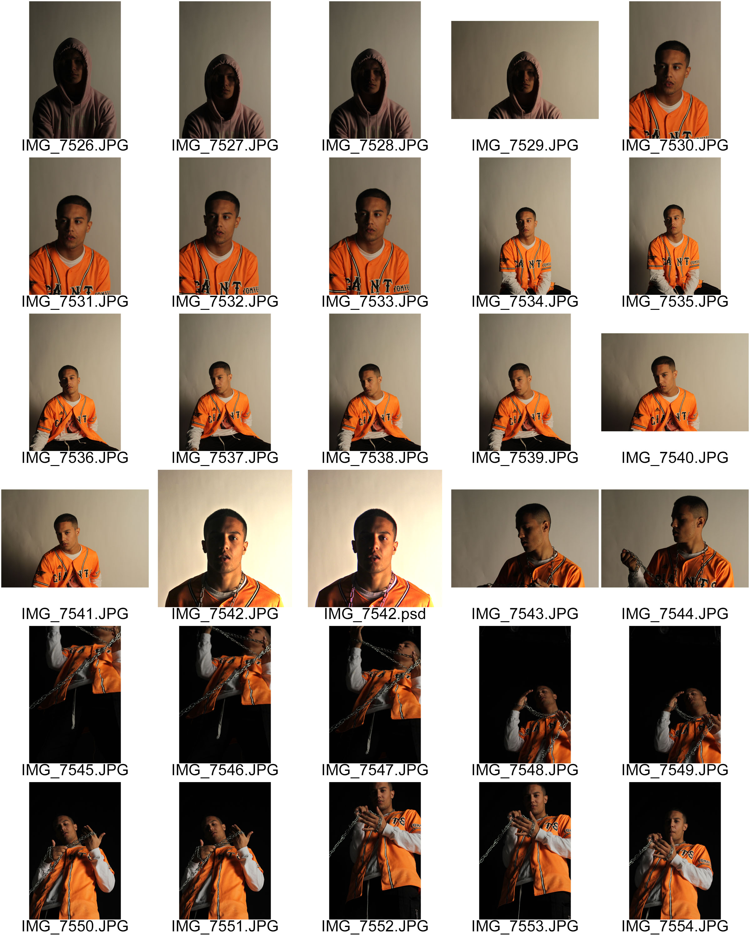
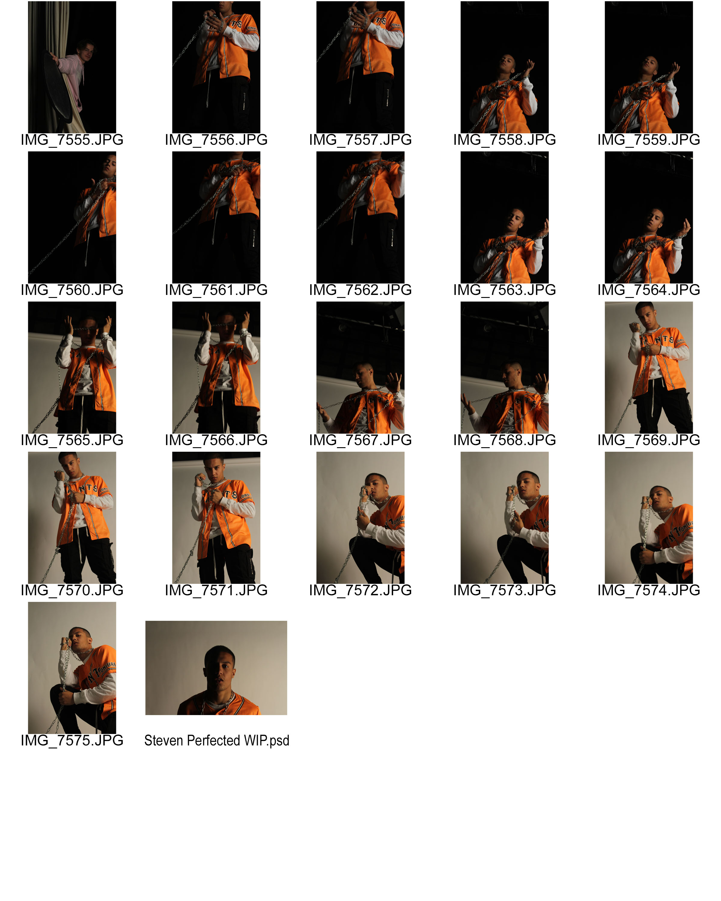
Studio Lighting Experimentation – 1 Point Lighting

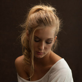
For this photo-shoot I primarily experimented using one point lighting in order to create a subtle chiaroscuro effect, I decided to be subtle about this effect as I wanted to have as many options available for editing as possible. With some of the later photos in the shoot i decided to make the effect more evident as i had a set idea for the look of the photos and thus wanted to minimize the amount of unnecessary editing I would have to do afterwards.

My personal favorites of the shoot are:

7564

7571

7544

These are mainly because i like the composition of the images and i like how the lighting complimented the colors in frame. The lighting created a good amount of vibrancy while not leaving the image over saturated. I also like the photo 7542 however i found that the lighting in that image required too much retouching and the edits became very evident.

Tableaux Vivants

What is tableaux vivants?

The phrase itself is a French phrase which translates to ‘living picture’. A tableaux vivant is a static scene where there is a singular or multiple models telling some sort of story. These paintings and images are usually well thought out, not only in terms of lighting and camera settings but also in terms of costume, positioning, background as all these factors contribute to the message being sent across to the receiver of the image. This type of imagery combines aspects of theatre and photography to create a staged reality.

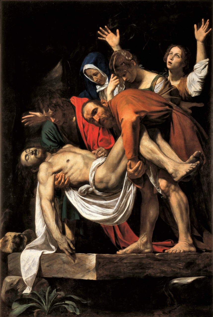
The Entombment of Christ (Deposizione) (1601-3)

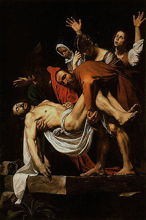
In this Tableaux we can see these two men lifting up another man, who seems to be dead. You then have two woman who are in the background, almost caring for the man. The woman in the top right corner seems like she is praying or calling for god in order to make sure the dead man is safe. The other woman seems as if she is taking in the fact the man is dead and is morning over his death. The clothes worn by the models tell us that the scene is set in the olden day. The background is completely black which allows the viewers attention to be solely focused on the scene being portrayed in the foreground. It also portrays the idea that the dead man is in an empty void, as that is the general consent with death now a days. The most lit up area of the tableaux is the dead man who is located in the center of the frame, the other people then get less lit the further away they are from the man. This lighting technique implies that the man is the main focus point, and that he was someone who may have been considered important at that time. The lighting also seems to be creating a chiaroscuro effect on some of the models allowing a contrast of tonal regions to be presented in the image. The prominent formal elements found in this image is tone, shape and texture which is shown throughout the bodies found in the foreground in the image. Due to this being a painting no photography techniques have been applied. However, analysis it as if it was a photograph the ISO is low as there is no intended  noise within the image. Moreover, the shutter speed is likely to be quick and the aperture is small as not much light is being let into the image. Finally, the depth of field is large as it is all in focus. Contextually, the image was painted for a church not long after the death of Saint Peter. Saint Peter was said to be cruicified Moreover, the people surrounding him are religious people who are lowering him into his tomb.

The traditional feast days of Saint Peter are:

  • January 18, Feast of the Chair of St. Peter at Rome
  • March 19, Feast of the Chair of St. Peter at Antioch
  • June 29, Feast of Saints Peter and Paul
  • August 1, St. Peter in Chains
  • November 18, Feast of the Dedication of the Basilicas of Saints Peter and Paul

Taken from: http://www.newworldencyclopedia.org/entry/Saint_Peter

I can now see an emotional attachment and story which is being presented within this oil painting. Viewers who are more religious may find this image more meaningful and empowering than I do. However, after researching this image I understand that a successful Tableaux needs to tell a story and create an emotional attachment with the receiver of the image

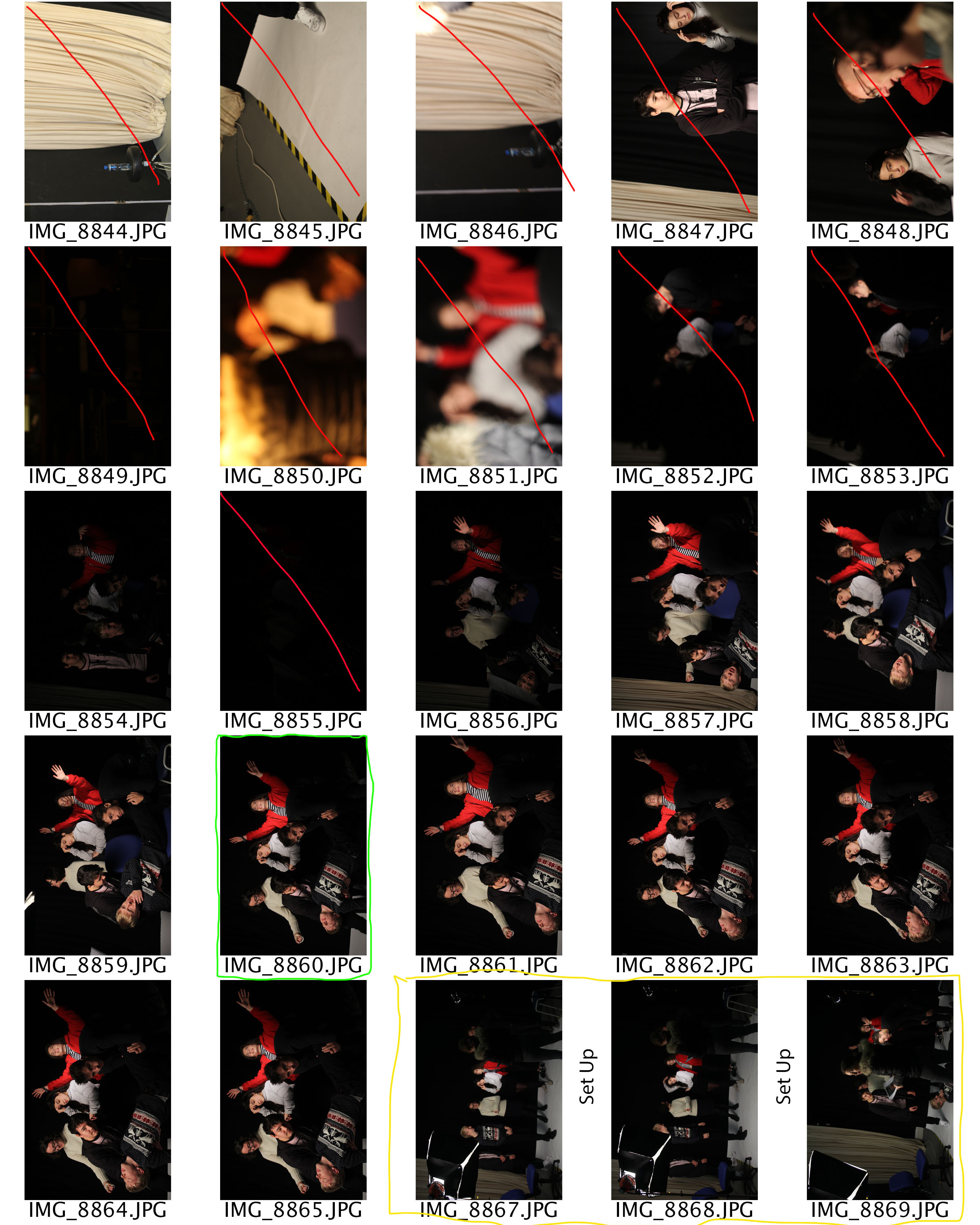
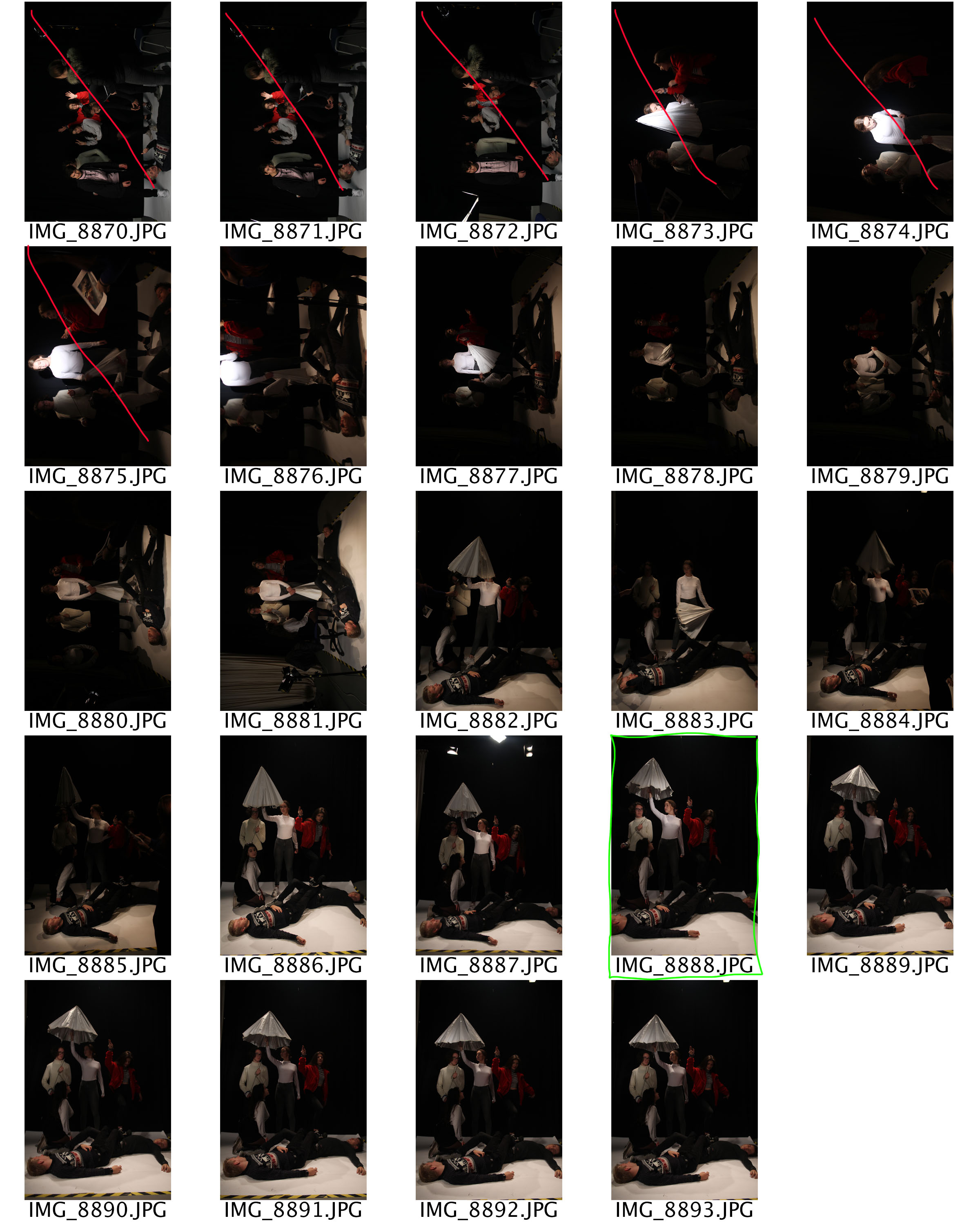
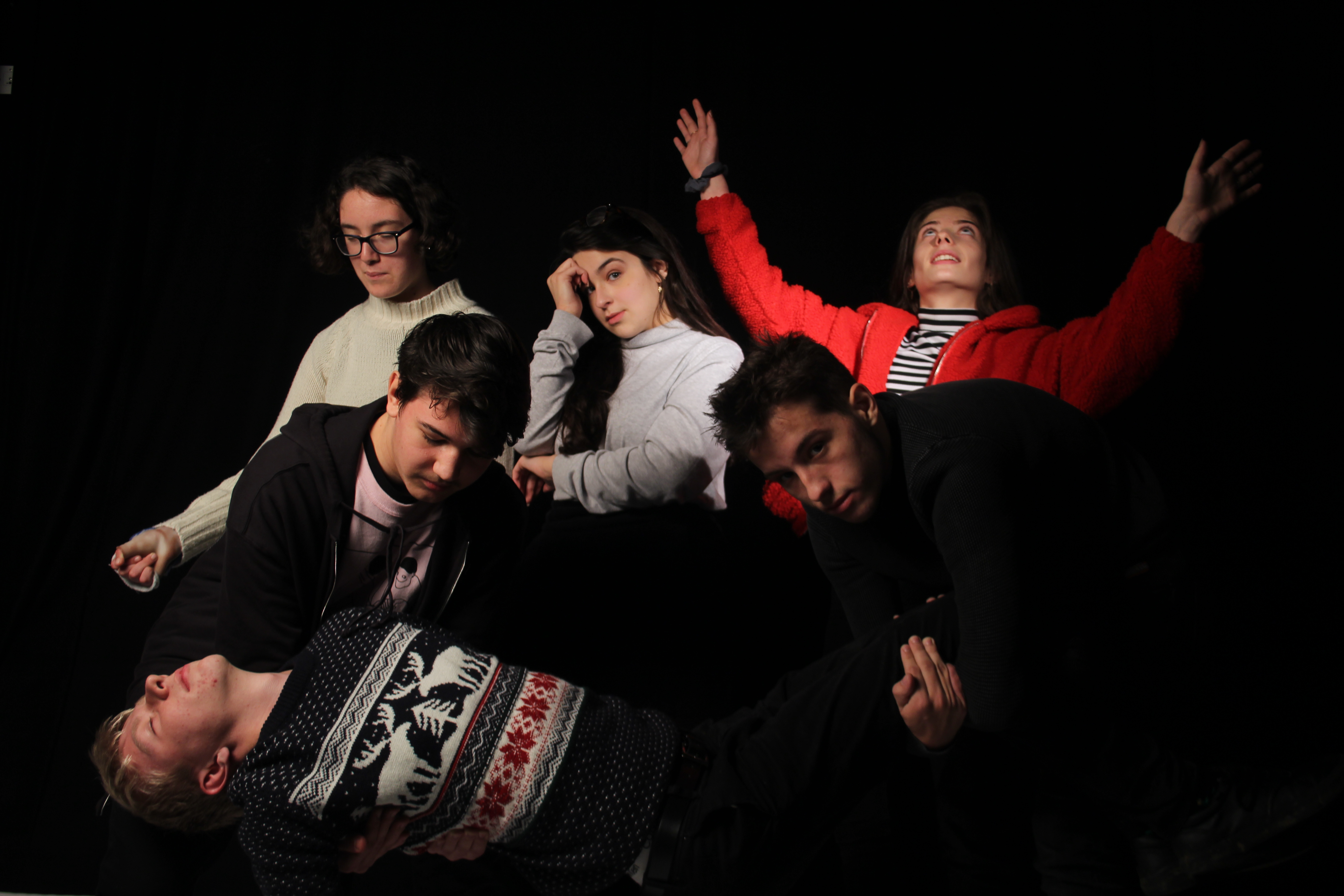
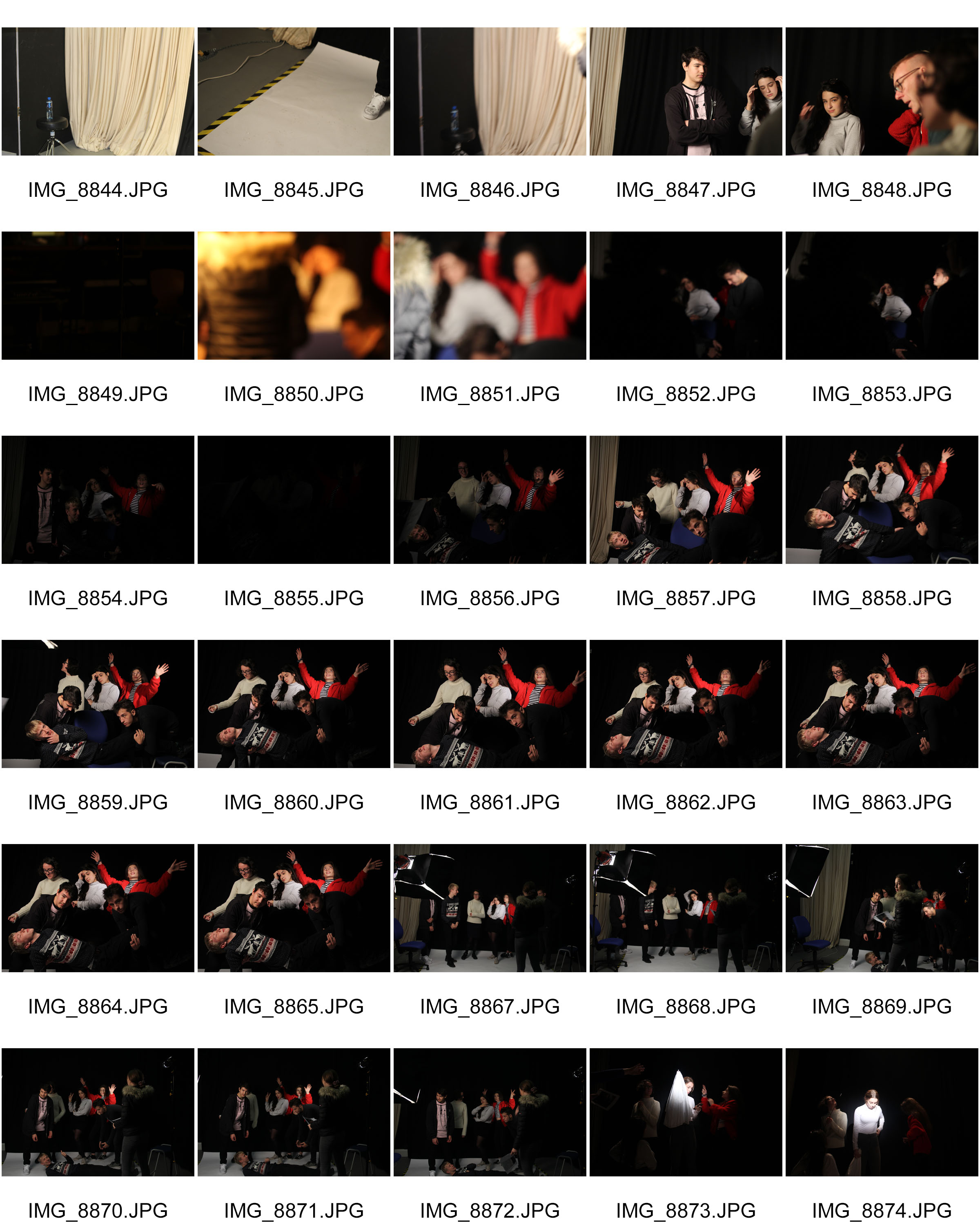
As a class we decided to do a group photo shoot based on ‘Entombment of Christ (Deposizione) (1601-3) ‘. This allowed me to understand the thought process that I need to use when going on to create my Tableaux image. I learnt that all aspects play a massive role within making the image. The photographs where taken in the studio with artificial lighting.

Contact Sheets

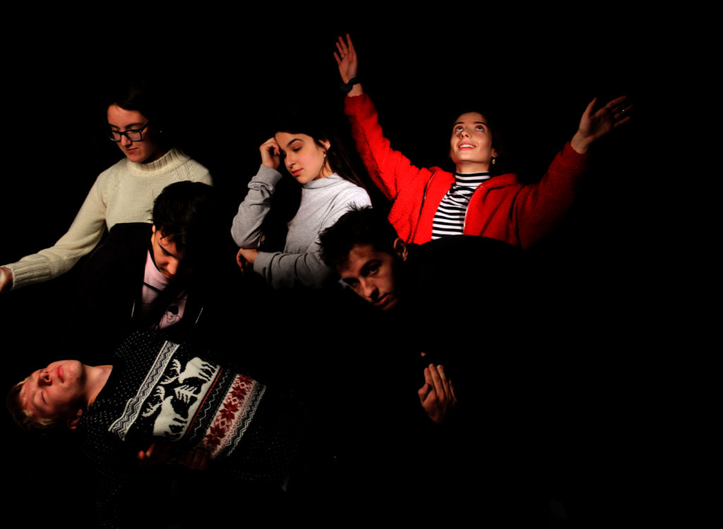
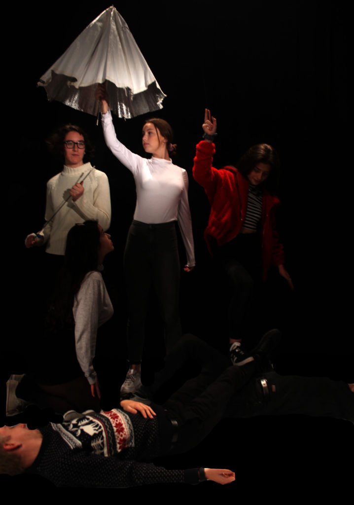
Final Outcome

This final outcome was successful as it looks very similar to the original painting. The lighting is similar as well as the poses and postures. However, the costumes used are not the same which sort of ruins the old day effect. To edit these images I decided the level the images and adjust to make the image darker allowing the background of this image like the painting


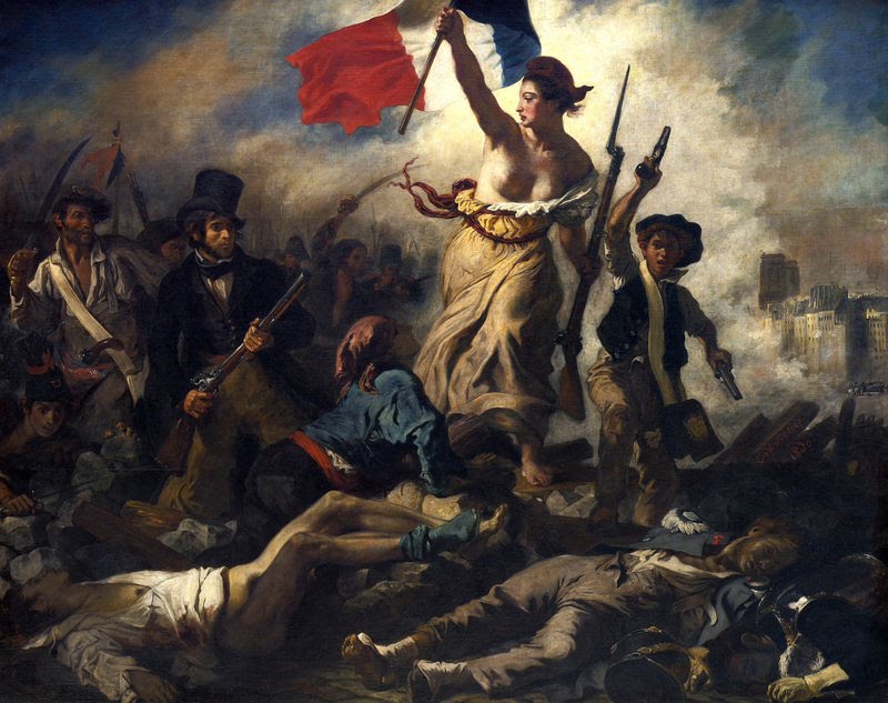
Eugene Delecroix ‘Leading the people’

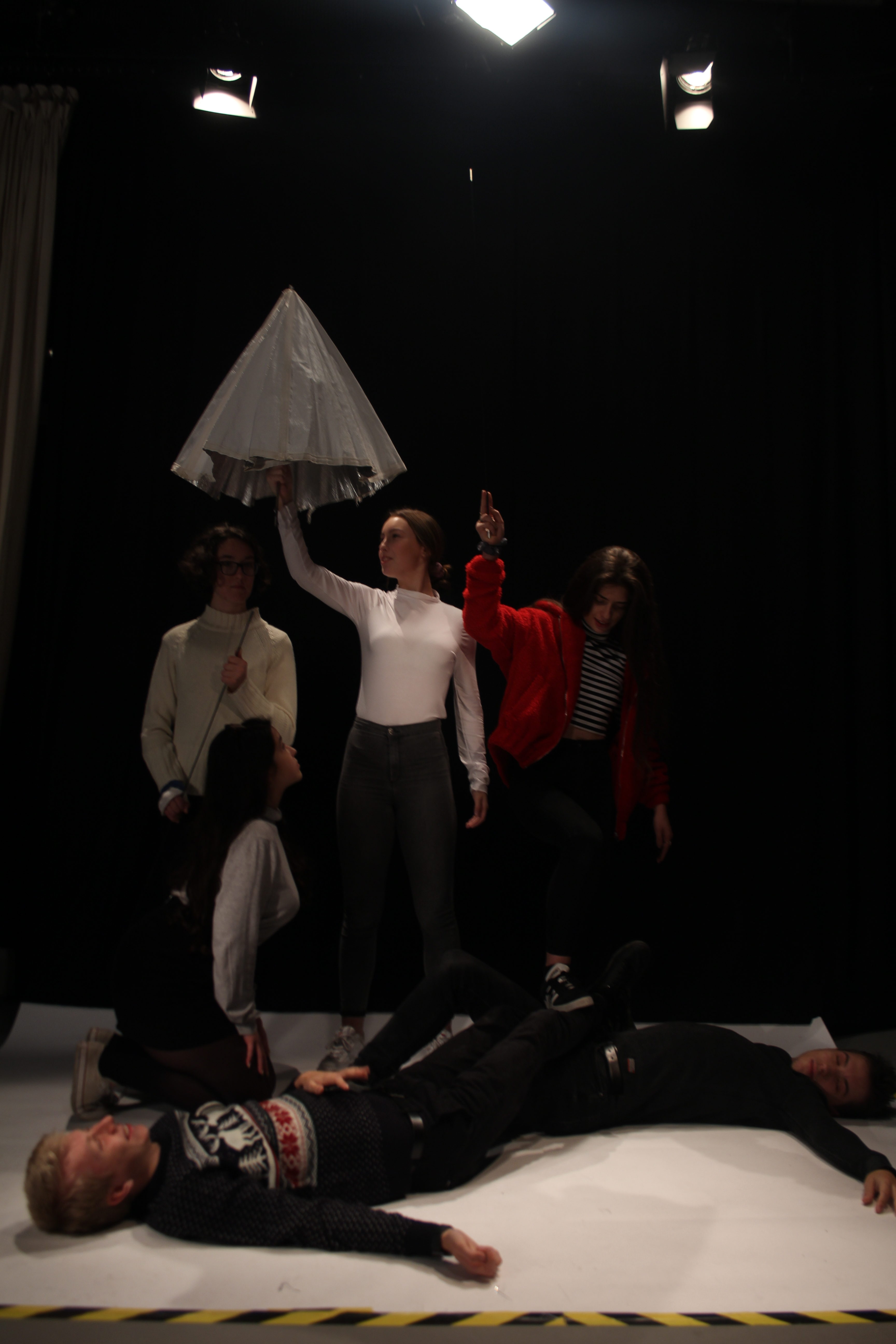
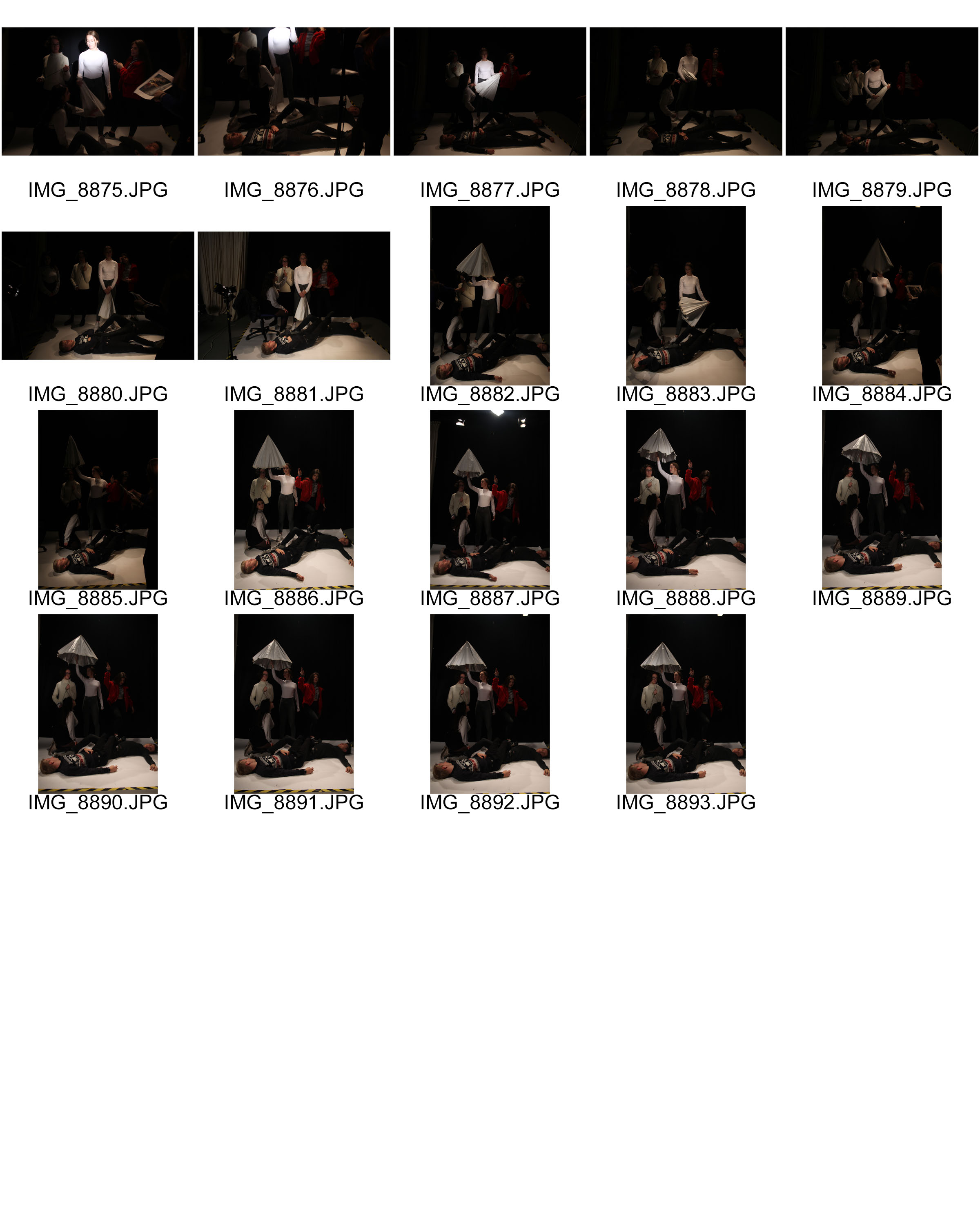
We also decided to re create Eugene Delecroix ‘Leading the people’ as another example of Tableaux photography. This is another painting taken from what seems to be the french accomplishing something, almost like the war which is suggested by the guns and dead people. The reason for doing another tableaux with the class was to ensure that I knew exactly what I was doing for my own tableaux.

Contact Sheets

Final Outcome

This was the best outcome taken from this photo shoot. There is a clear spotlight on the model in the center to ensure she is the main focus point, like she is in the original painting. I ensured the background was black, as we did not have the background of the original image. The main difference between the original and my image is that the props and clothes are different which somewhat ruins the overall effect. To edit these images I just adjusted the levels and curves to ensure the sharpness was accurate.

Tableaux Vivants Recreation

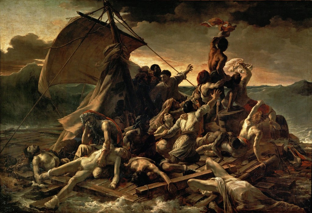
THE RAFT OF MEDUSA: 

WORK STRATEGY: 

WHO – for this  photo shoot, there were multiple models in order to recreate the raft of medusa.

WHAT – the main objective of this photo shoot was to try and stage the raft of medusa, adopting similar mannerisms as the people depicted in the painting.

WHEN – the images were taken during school time, indoors where artificial lighting as used ti light the room.

WHERE -the images were captured inside a classroom.

WHY – to understand the ways in which to direct people and think about aspects such as mannerisms, lighting, facial expressions and positioning.

HOW – I used my regular DSLR camera for this photo shoot, using the artificial lighting provided.

IMAGE ANALYSIS:

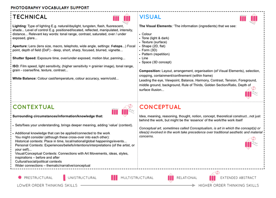
VISUAL: 

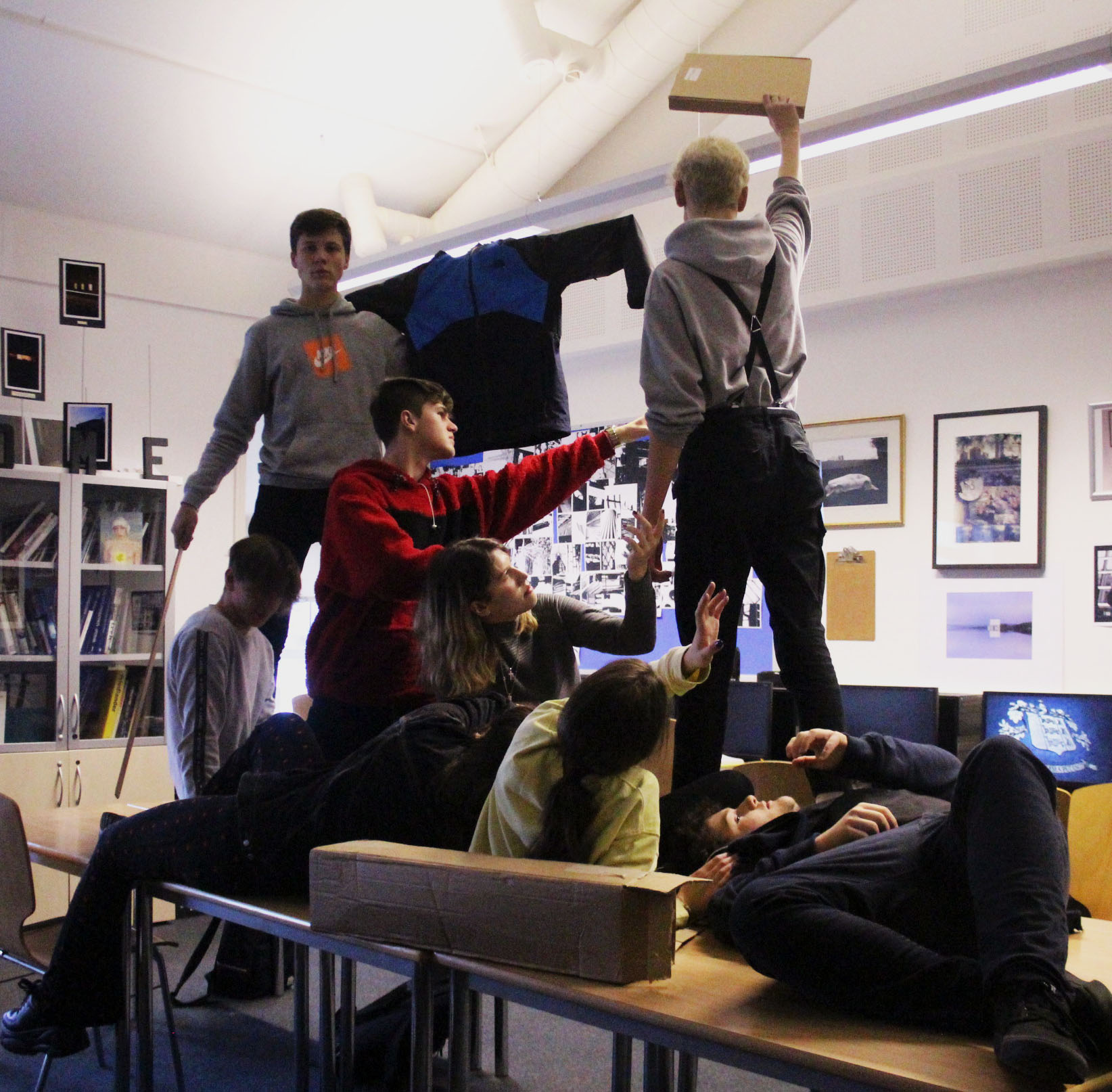
The recreation of our image includes a lot of similar aspects as the original, trying to recreate similar facial expressions and positions as the subjects in the painting. Central in the image is main subject, holding up and waving a cloth to try and get attention, it is the first thing that the eye is drawn to due to the height at which the subject is at, towering above almost everyone else in the image. There is a sort of power play going on in the image, with two of the subjects being above everyone. This positioning is trying to convey the different states of the people on the raft, some healthier than others, whilst some are on the brink of death. We used a few extra props and stood on the table to symbolize the raft, and used a coat to symbolize the sail.

TECHNICAL: 

The classroom environment we were in made it difficult to capture a similar lighting as in the image. There were direct lights which were pointing from up above, to try and correct this and create chiaroscuro lighting, we only kept one light in the room on .In order to have a very crisp and sharp image, a tripod was used to stabilize the camera whilst the image was being taken. The limited lighting in the room meant that the ISO had to be fairly high, being set to 6400 to avoid being under exposed, furthermore the f/stop used for this shoot was also quite large at f/3.4.

CONCEPTUAL: The Raft of the Medusa (French: Le Radeau de la Méduse) is an oil painting of 1818–19 by the French Romantic painter and lithographer Théodore Géricault (1791–1824). Completed when the artist was 27, the work has become an icon of French Romanticism. At 491 cm × 716 cm it is an over-life-size painting that depicts a moment from the aftermath of the wreck of the French naval frigate Méduse, which ran aground off the coast of today’s Mauritania on 2 July 1816. On 5 July 1816, at least 147 people were set adrift on a hurriedly constructed raft; all but 15 died in the 13 days before their rescue, and those who survived endured starvation and dehydration and practised cannibalism. The event became an international scandal, in part because its cause was widely attributed to the incompetence of the French captain.

CONTEXTUAL:

Géricault chose to depict this event in order to launch his career with a large-scale uncommissioned work on a subject that had already generated great public interest. The event fascinated him, and before he began work on the final painting, he undertook extensive research and produced many preparatory sketches. He interviewed two of the survivors and constructed a detailed scale model of the raft. He visited hospitals and morgues where he could view, first-hand, the colour and texture of the flesh of the dying and dead. As he had anticipated, the painting proved highly controversial at its first appearance in the 1819 Paris Salon, attracting passionate praise and condemnation in equal measure. However, it established his international reputation, and today is widely seen as seminal in the early history of the Romantic movement in French painting.
TOM HUNTER: 
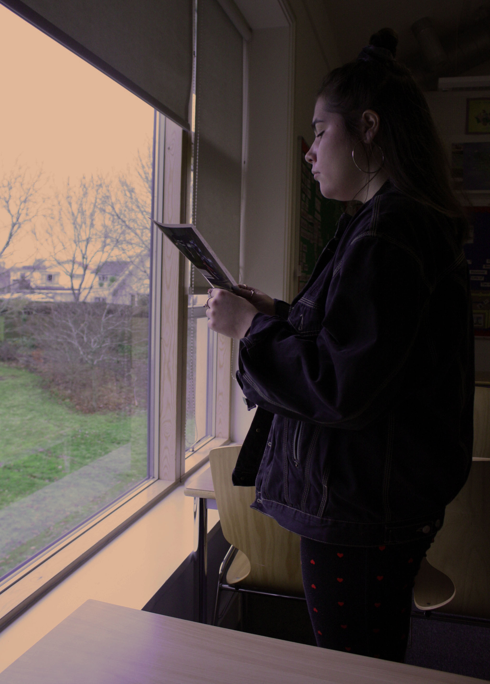
IMAGE ANALYSIS: 

VISUAL:

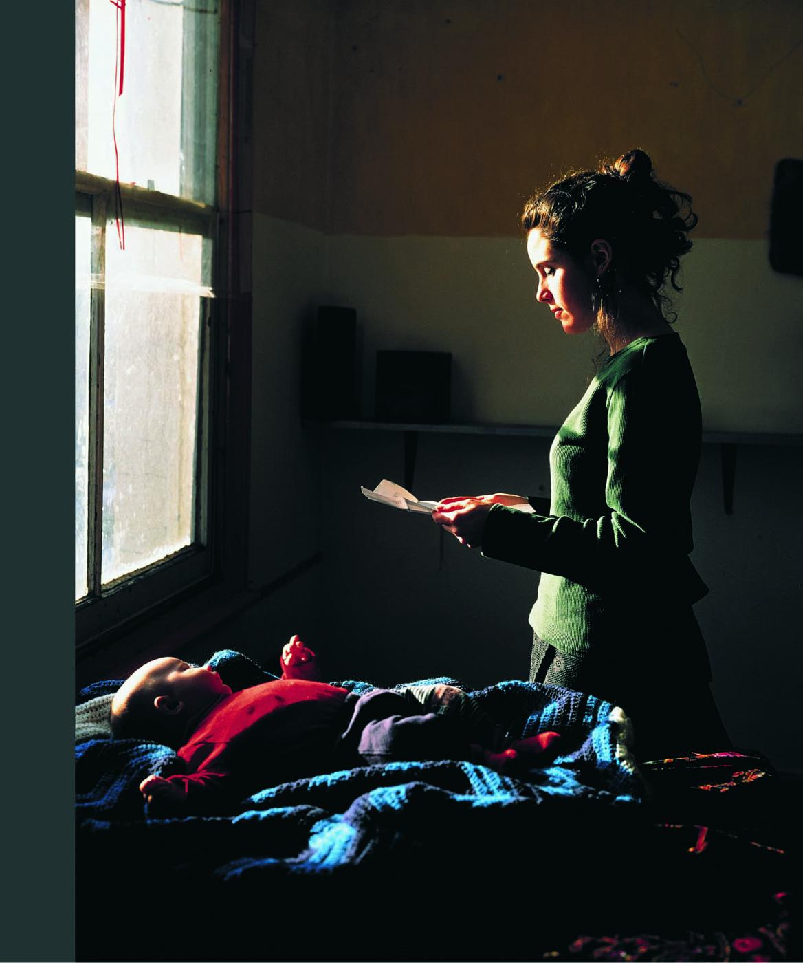
The image below holds a lot of emotional attachment. The baby on the bottom left corner is only noticed after really looking at the image for an extended period of time as the mother is the focal point of the image. The eye is first drawn to her rather than the surroundings. The color in this image is also very bright and saturated. The overall feeling of the image is bright and colorful with the light coming in from the window and the bright lemon colored wall in the background of the image. There is a lot of natural light hitting the front of the model’s face, giving the image a very natural and organic look, as if somebody was simply documenting the woman’s day. The baby in the bottom left corner of the image adds a lot of emotion, yet at the same time blends in with the environment, almost as if it has been forgotten. The subject in the image is not making eye contact with the camera and does not have any clear facial expression suggesting that possibly a sense of shock has hit her, and she is frozen in time. The image almost feels like an invasion of privacy from the angle from which it is taken and the lack of contact made with the camera.

TECHNICAL: 

 The exposure of this image is very balanced, with the highlights and shadows working together to create a very harmonious image. The way in which the natural lighting hits the subject from the left hand side of the image suggests that no additional lighting equipment has been used in this photo shoot. Again making this type of photography seem more documentary style. The colors in this image are also well balanced, possibly being more on the over saturated side as the orange clothing on the baby is very visible and bright. There is a clear foreground, mid-ground and background, with the baby being in the foreground, the woman reading the letter in the mid-ground and the shelf and wall in the background.

CONCEPTUAL: 

Filipa had just had her first baby. We spent the whole day trying things out: we had a bowl of fruit, then we tried some curtains, then incorporated the baby. The light was perfect, a late winter sun coming through the window, really low, like the northern European light.

I used a large-format camera, which really captures that light. And I used the Supachrome process to print it – old-fashioned even then. The exposure was about a second, so it was like sitting for a painting: she had to stand still. I was waiting for the light to pour into the lens, rather than snapping at something.

I phoned her up last week and she’s still happy with the picture. It’s a record of her, her child and her home at the time. The great thing is, the picture got a dialogue going with the council – and we managed to save the houses.

CONTEXTUAL:  

was living in Hackney in London, in a whole street of squats, having spent two years travelling around Europe in a doubledecker bus. Everyone got a letter addressed to “persons unknown”. The council wanted to knock down the street and build warehouses. The Tories had brought in the Criminal Justice Act, which was designed to stop parties. Every time you saw a picture of a squatter or a traveler, it was to go with a story about how antisocial they were. I just wanted to take a picture showing the dignity of squatter life – a piece of propaganda to save my neighborhood.

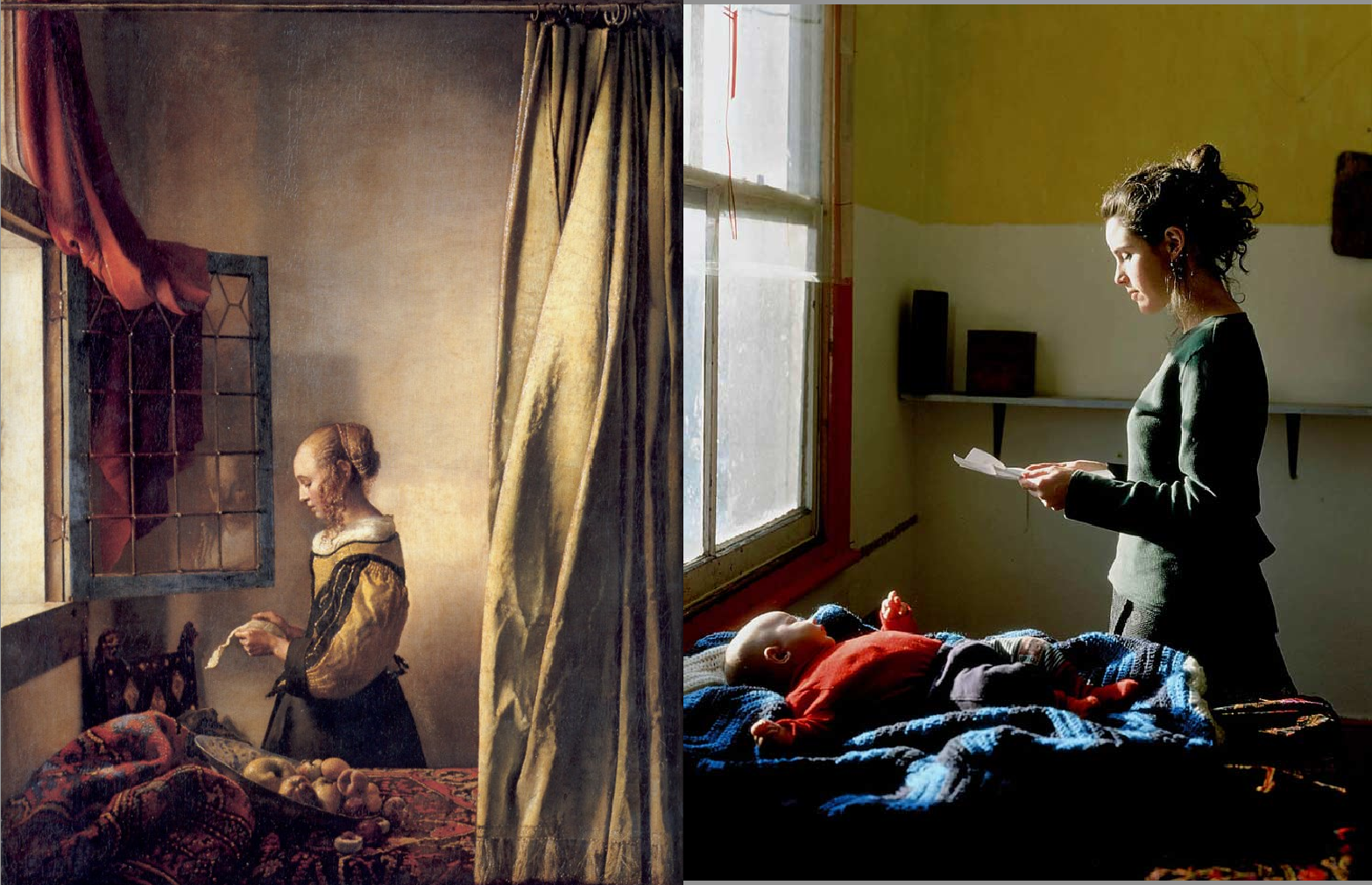
I took this in 1997, for my master’s degree show at the Royal College of Art. The 17th-century golden age of Dutch painting had had a massive impact on me: the way they dealt with ordinary people, not kings, queens and generals. I thought if I could borrow their style for squatters and travellers, it would elevate their status. In this shot, inspired by Vermeer’s Girl Reading a Letter at an Open Window, my next-door neighbour is reading the possession order.

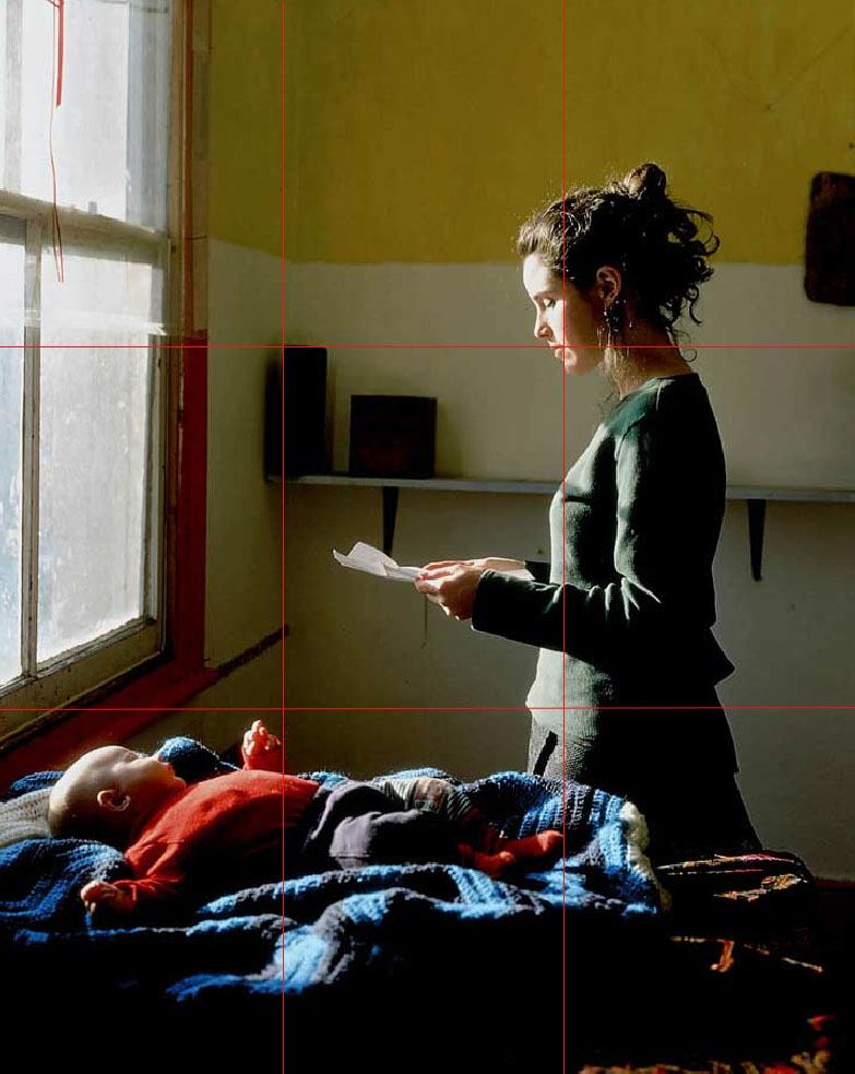
RULE OF 3RD’S:  

This image follows the rule of 3rd s, as can be seen when we divide the image into blocks. The woman is sectioned mostly in the last third of the image, yet the letter she is holding positions itself in the very center of the image, becoming a very clear focal point of the image.
John Rankin Case Study

John Rankin is a British photographer well known for his work with various celebrities. He specializes in portrait, fashion photography and some work in directing. in 2011 he started Rankin Film in order to direct and produce his own directorial and commercial work. Many consider his work to be rather vain with there being little meaning behind his images as he focuses on composing the most aesthetically pleasing image.

Much of his work uses soft single point lighting however he has experimented with various lighting techniques in the past. he consistently uses soft lighting however to best compliment the subject of his photography, since harsh lighting could produce unwanted shadows on someones face. since he focuses on ‘glamour’ photography it is important that he portrays his subjects at their very best and so soft lighting is used.

Since he often uses single point lighting he will frequently use a reflector in order to cast soft lighting to soften any harsh shadows and create a light glow on parts of the face which aren’t direct lit. this allows him to use other techniques such as combining a low ISO with a long shutter time in order to create high contrast/vibrancy images without the risk of harsh shadows across the face.

Much of the ‘visuals’ of Rankin’s photography is achieved by experimenting with lighting however retouching is still used.

Image result for john rankin photographer

Related image

An example of Rankin’s editing, focused on achieving a conventionally ‘beautiful’ pieceImage result for Rankin

Street Photography Part 2:

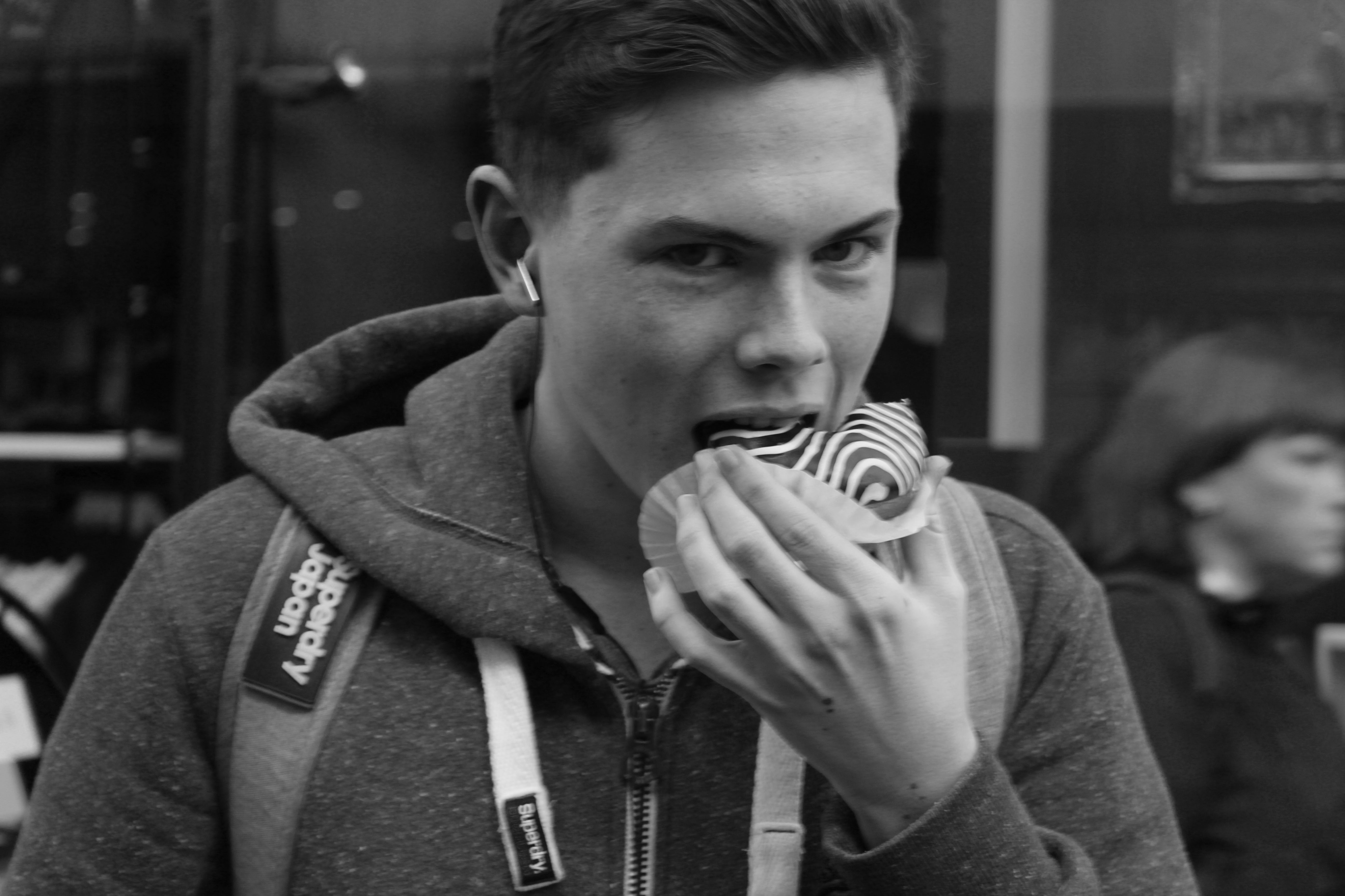
These are a couple of examples that I took for street Photography:

This is the original image
Another final outcome that I am happy with

These are my contact sheets from the street Photography trip

contact sheet 1&2

From this trip if I have learnt one thing is that confidence is key, which is something that in this trip I was lacking too do. Simply because I had watched videos on some of the reactions that famous people received when just photographing random strangers. However having analysed my contact sheet even further I can notice that most of my images are quite blurry, this could have been becuse my shutter speed was too low so the camera was unable to capture the pictures I was after. when I was on this trip in town no comments were actually made so most people I photographed the worst thing that came out of it was sometimes an evil look but nobody actually asked what was going on which also surprised me.

My technique for this trip was simply to sit on benches, lean against shop windows or just simply stand in corners and photograph people  as they continued through there everyday life.  this actually worked sometimes at my own expense apart from there are just some images of buildings instead of people but it was all part of the fun .  Another thing that I have noticed from these images are that there is  quite a lot of backs turned away from the camera, which again was partially my fault for not having tried to capture the front of them but as I was looking at them I realised that even getting 3-5 perfect images would have been great as most photographers will take between 200-500 images and only select 5 or so to actually be published which in this case is what I have done.

Out of all my images there are not very many that I would say worked. The two images at the top of the post are both from people I know but they weren’t 100% sure what I was doing.  I feel like the top image is well focused on the idea that that is how some people approach the idea of portraits as the boy on the right is smiling but seems also confused as to why there is a camera in his face whereas the boy on the left does not seem very happy with what was going on.  furthermore, as I said earlier its warpped around the idea that it is unknown what your going to capture. when I was walking down to go to this trip I was nervous but excited and what I was going to see and capture but not through my eyes but through a camera lens and doing something where your out in a public place sourrounded by people most of the time poeple do become confused but rather smiley as soon as a camera is pointed right to them. (unless they’re just generally grumpy)

Tableau Vivant

A tableau vivant, French for ‘living picture’, is a static scene containing one or more actors or models. They are stationary and silent, usually in costume, carefully posed, with props and/or scenery, and may be theatrically lit. It thus combines aspects of theatre and the visual arts; a group of models or motionless figures representing a scene from a story or from history.

Paul M Smith, uses MULTIPLE EXPOSURE TECHNIQUE

Tableau In Class

The two paintings which the class recreated were “Deposition / The Entombment of Christ” by Caravaggio, and “Liberty Leading the People” by Eugène Delacroix.

Image result for caravaggio deposition

The Entombment of Christ – Caravaggio

Image result for french revolution painting

Liberty Leading the People – Eugène Delacroix

Class Responses

Editing Of Class Response

Own Tableaux Response

Using Paul M Smith’s work as inspiration

Image result for paul m smith photography

Image result for paul m smith photography

Images by Paul M. Smith, from the collection: “Make My Night”     http://www.paulmsmith.co.uk/

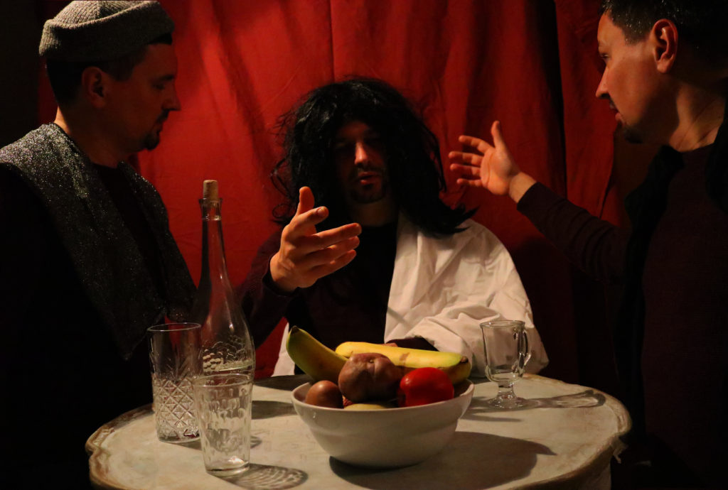
For my Tableaux Vivant and Paul M. Smith response, I would like to merge together and edit three separate images of the same subject; wearing different outfits, in different poses, and the in the same frame.

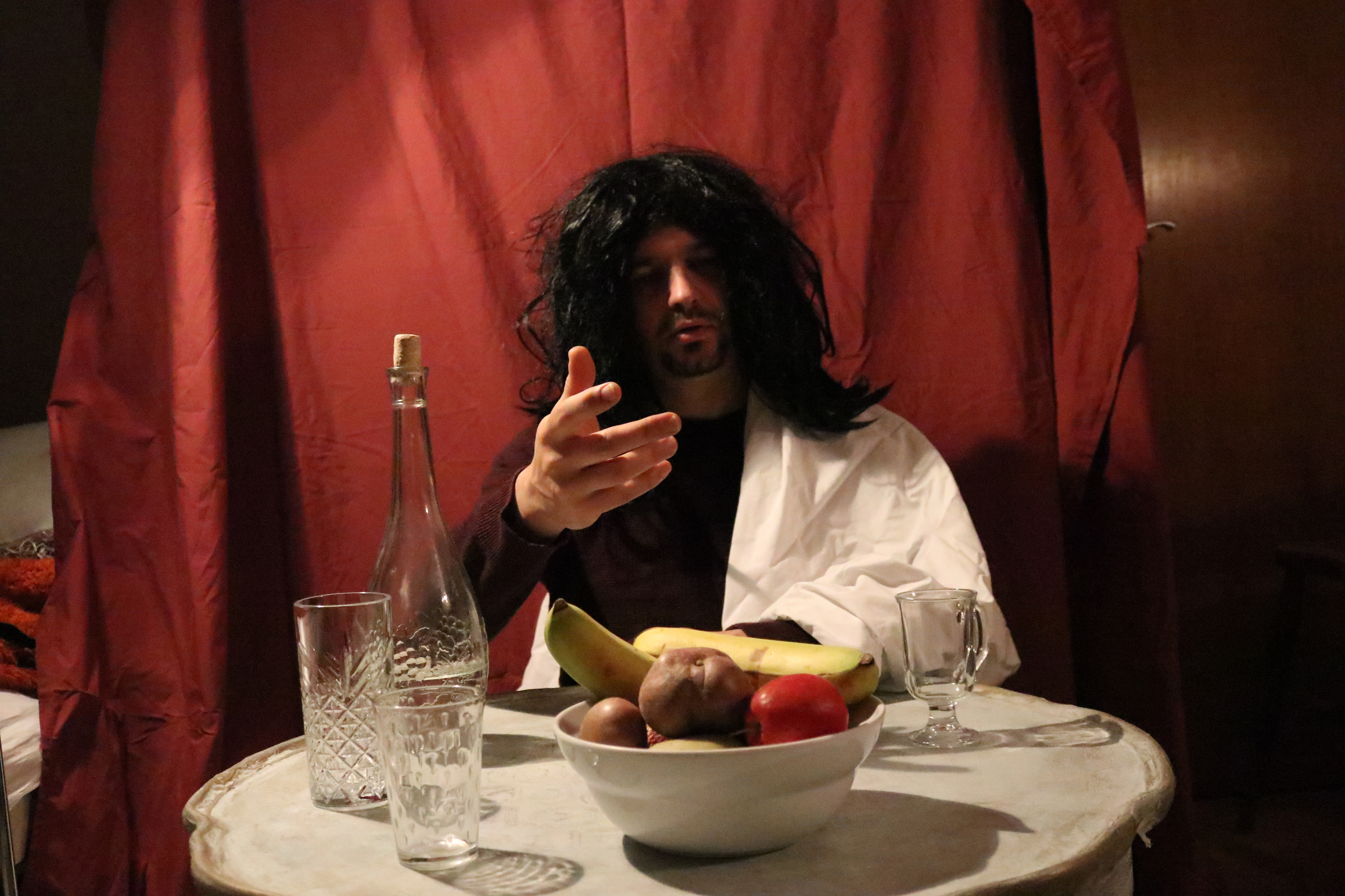
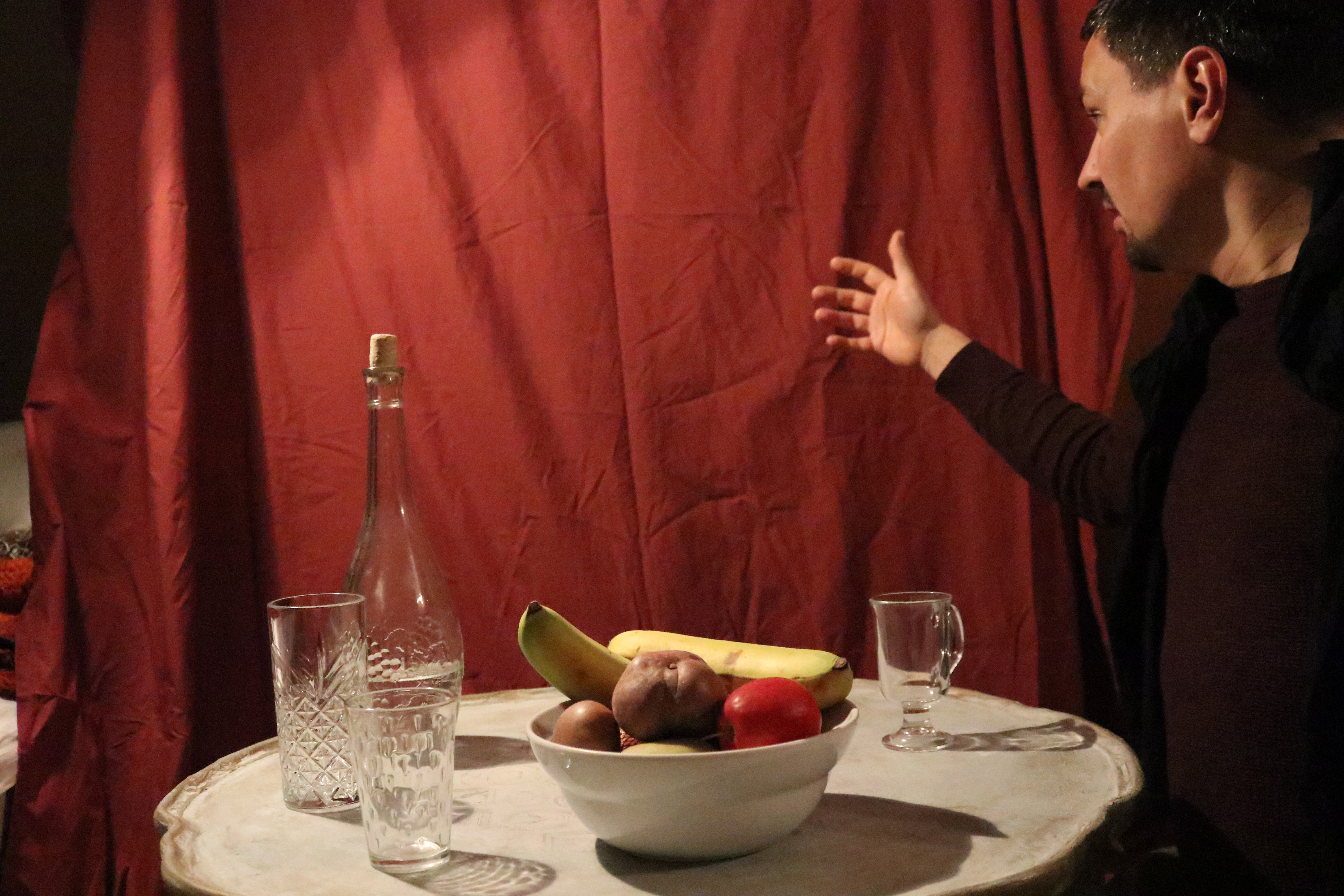
I will be responding to the renaissance work “Supper At Emmaus” – by Caravaggio; featured below.

Images

Image 1; used as base image for the final edit.

Edit

I have edited this image by using a base image as an anchor-point to synchronize the other images and the props, to do this I have also set the opacity of the other images to 50%.


After wards I cut out and set new layers for the crucial parts of the layering images e.g: Shadows, subjects. And then used the eraser tool with low hardness to ensure a smooth transition between the anchor image and the layer images.

Final Edited Image

Studio Photography – Mood-board

Most studio photography typically uses a solid fill background with various lighting techniques. soft lighting will often be used when working with portraiture however different photographers will experiment with various techniques. Such as chiaroscuro lighting which involves only lighting one side of the subjects face, this is similar to Rembrandt lighting however this leaves a triangle on his cheek lit.

Image result for rembrandt lighting

Example of Rembrandt lighting

Image result for studio lightingImage result for john rankin photographerImage result for chiaroscuro lightingImage result for studio lighting

Image result for studio lighting

Tableaux Vivant

A tableau vivant (often shortened to tableau, plural: tableaux vivants), French for ‘living picture’, is a static scene containing one or more actors or models. They are stationary and silent, usually in costume, carefully posed, with props and/or scenery, and may be theatrically lit. It thus combines aspects of theatre and the visual arts.Staged reality is a main aspect of tableaux vivant in which the photographer captures an artificially constructed scene.

Tom Hunter

Tom Hunter (born 1965) is a London-based British artist working in photography and film. His photographs often reference and re imagine classical paintings. He studied at the London College of Printing, and was the first photographer to have a one-man show at the National Gallery of London.

He worked alongside friends, neighbours and family to recreate others work but in a much more modern way. For instance the picture on the left is not this own work it is in fact Johannes Vermeer artwork which entails a young girl standing by a window reading a love letter from her man who is far away, possibly at war. Hunter has recreated Vermeer’s work but with a modern update, the women isn’t holding a love letter she is holding an eviction notice. Tom has spent time with the people he takes pictures, for instance he lived on the same tower block as his women, he knew the problem she was going through as he was also being evicted. Even though the to photos are very similar, there are underlying differences, for instance the open window on the left and the light flooding through has connotations of hope and freedom as she is happy her lover is still alive, whereas on the right the window is closed this has connotations of being trapped with no hope for the future, now she is homeless with a baby. As well as that on the left there is a bowl of fruits yet on the right there is a baby, this is symbolic of the fact that the women on the right has a lot more to lose then the women on the left, fruits can be eaten but a baby can’t just be thrown away, it needs love and care and a roof over its head. There is a clear rule of thirds in this photo, this is symbolic of how the women on the left has a structured path in life, its all going in one direction, she can see her path clearly because soon the war will be over and she can marry the man she is in love with. Whereas the women on the right, her rule of thirds represents a sense of being trapped, she can’t escape this harsh cycle of council housing, she is stuck in this rule of thirds layout.

Recreation

The Raft of the Medusa Painting by Théodore Géricault

This painting was fairly hard to recreate considering it is located on a raft at sea and there are lots of people involved in the photo. We tried to modernize the photo as much as possible for instance we made sure ‘the north face jacket’ which was acting as a flag was clear too see, as the brands represent how society nowadays is materialist and how we need the best of the best not just unbranded, our whole world revolves around money and out doing each other. We were all at different levels in order to create a pyramid shape, a pyramid having connotations of strength, power and sturdiness. As well that it represents society and how those at the top thrive and survive but those ones at the bottom struggle and fail.

Tom Walker

I recreated this photo in school near the window by art. I had to select the window on Photoshop and decrease the exposure as the light coming through was over-exposed and too bright. I also increased the contrast to add depth and emphasis the light outside against the darkness inside. This symbolizes how the girl in the Tom Walker photo was exposed to the light and sunny world but under the surface the world was creating more troubles for her then happiness and the weather can’t change the fact that she is a single mum without a home. It’s as if the world is trying to sugarcoat all her worries with clear skies, but she can’t see its true beauty, the only thing she can see is the eviction letter she is holding.

Tom Walker

Tom Hunter- The Guardian Article

https://www.theguardian.com/artanddesign/2009/nov/04/photography-tom-hunter-best-shot

AS Photography | Mock Exam | Jan 30th and 31st 2019

You will be completing the PORTRAIT UNIT during a day of CONTROLLED CONDITIONS (exam rules apply) at the end of January.

The preparation period begins NOW and continues through the month of January.

Your stimulus is IDENTITY AND PLACE.

We will be exploring tableaux vivants, composite / cut-n-paste / collage portraits, self -portraiture and more over the coming weeks to ensure that you have successful final images ready for your exam.


Exam Arrangements

Periods 1-5 | Breaks as normal | Exam Starts at 9am each day

Group 12 C | Wednesday 30th January | Photography 1

Group 12B | Wednesday 30th January | ICT- MEDIA

Group 12E | Thursday 31st January | Photography 1

Group 12A | Thursday 31stst January | ICT-MEDIA


What do you do in the exam itself…?

  1. Select your final images
  2. Edit and manipulate your final images
  3. Add your final images to the print folder
  4. Show the above process clearly in your blog, including screen-shots of your editing AND annotations

PRINTING : choose at least 1 x outcome for each of the following…

  • response to “identity and place”
  • response to photo-montage
  • response to tableau / staged reality
  • response to studio lighting
  • response to street portraits
  • response to environmental portraits
  • Print size images = 4000 pixels on LONG EDGE
  • BLOG SIZE images = 1000 pixels on LONG EDGE

Ensure you have enough evidence of…

  1. moodboards
  2. mindmaps
  3. case studies (artist references)
  4. photo-shoot action plans / specifications
  5. photoshoots + contact sheets (annotated)
  6. appropriate image selection and editing techniques
  7. presentation of final ideas and personal responses
  8. analysis and evaluation of process
  9. compare and contrast to a key photographer
  10. critique / review / reflection of your work

Picture

Studio photo shoot No. 2

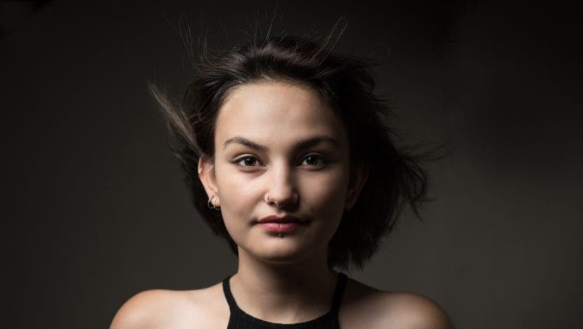
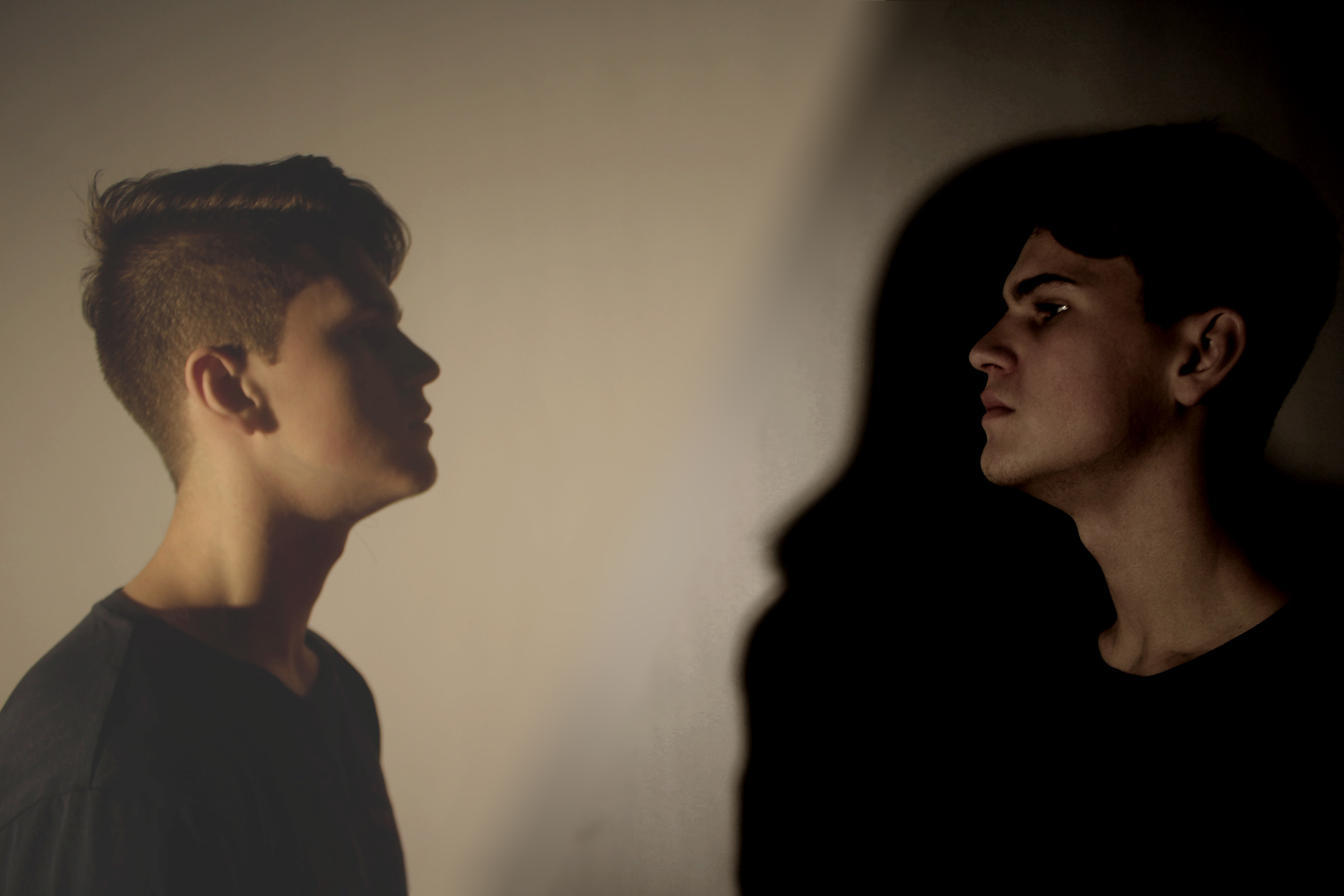
These are my final edited images from another photo shoot in the studio. The main purpose of this shoot was to experiment with different lighting techniques/colours.

This is two photos edited together. The original was two different people staring at each other, but I decided to take another darker photo of myself and edit it into the previous one. This give a bright/dark good/bad side effect.

This photo used two-point lighting. A spotlight with a green tint to the left, as well as a ring light positioned directly in front of the camera. The ring light isn’t visible as the camera was placed in the middle of the ring light. This results in a brighter image, but still keeps the colour lighting.

In both this, and the following photo I have used only one light source, this lights the model in the centre evenly with one colour, it also gives a big clear shadow to one side.
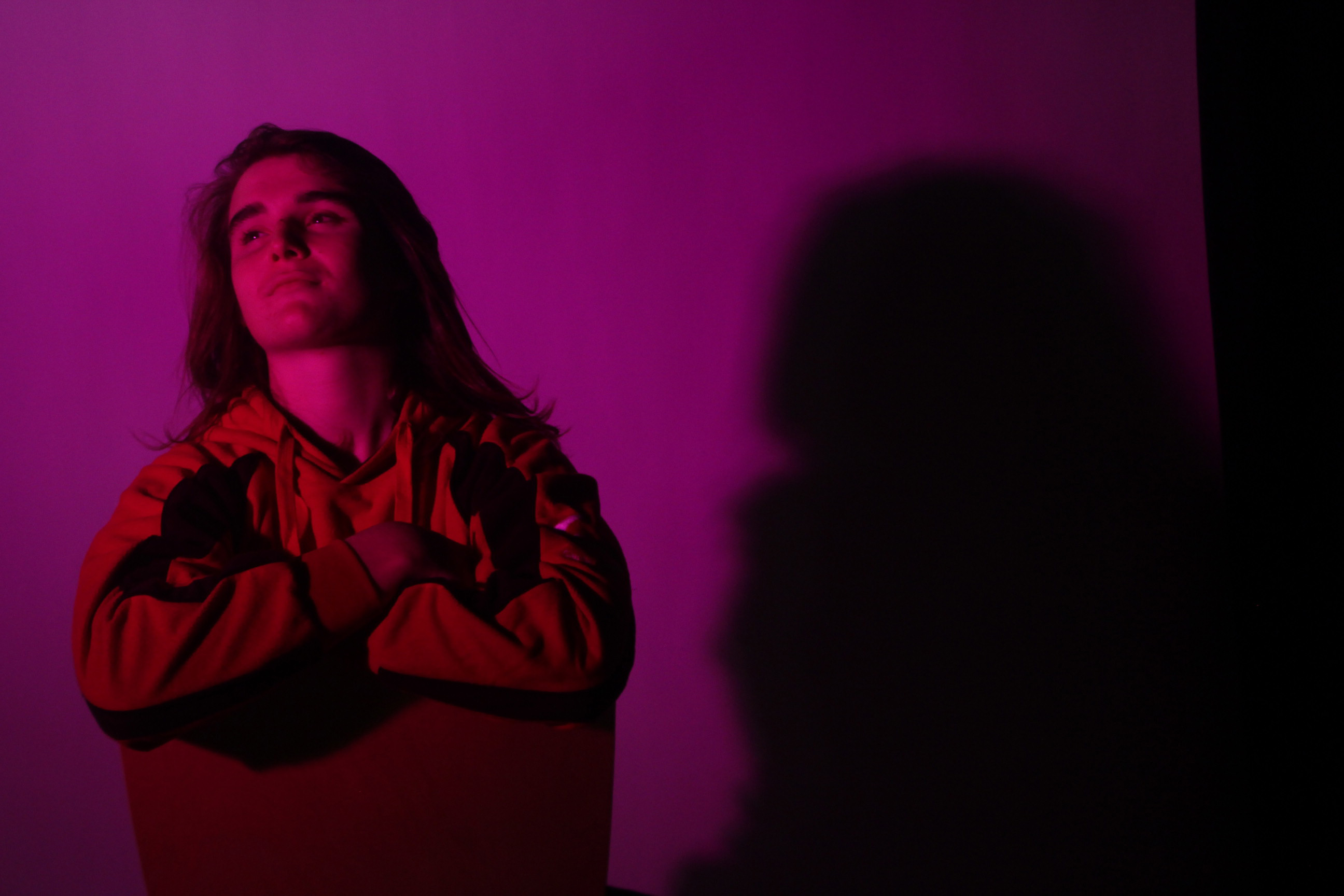
In this photo I used two-point lighting. There was a softbox placed to the right side at a slight angle, and a spotlight with a purple cover placed on the other side. This creates a warm and colourful effect.

The same lighting was used for this photo as the previous one. Only in this photo the camera is positioned nearer the purple tinted spotlight, which gives it a bigger overall impact on the face.